John Ott
-
Posts
38 -
Joined
-
Last visited
Content Type
Profiles
Forums
Gallery
Events
Everything posted by John Ott
-
 Are you being logical again, Marc? This has to stop... Seriously, I've regretted not taking your path and not making and installing chain plates at the same time I attached the stropped deadeyes to the channels. Now I'm stuck retrofitting the chains—somehow without soldering, since soldering elements + styrene = tragedy. I think I'll put off my own wire-bending until your next few posts so I can see how my betters do it.
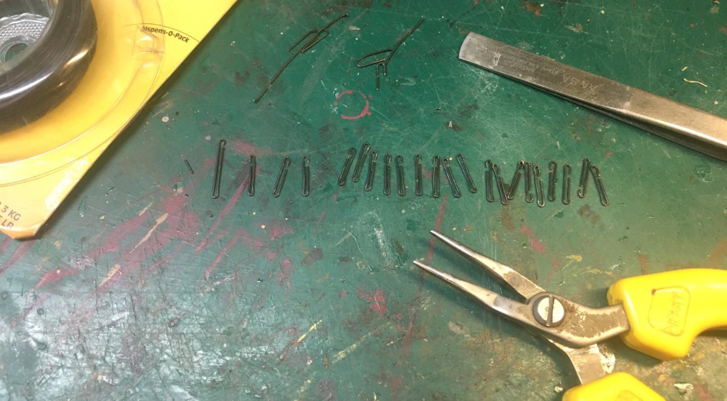
- 2,444 replies
-
- 6
-

-

-
- heller
- soleil royal
- (and 9 more)
-
Yeah, Hitchhiker's, Marc. I suppose that dates me somewhat. I spent the day installing mainmast tackles and mulling over the problem you highlighted. I finally hit on a good rationalization: my Soleil has fish because the model represents the ship as it appeared some time after the Battle of Malaga instead of before, as I previously intended. The masts had battle damage repaired, but remained weakened, hence the fish. Actually, having repaired battle damage justifies a whole host of deviations from the Boudroit norm, so I can use the same excuse next time I get into trouble.
- 2,444 replies
-
- 6
-
-

-
- heller
- soleil royal
- (and 9 more)
-
Wow. Good job on correcting the masts. Boudroit says specifically in his section on masts and fittings that there were no fish, except—"The use of fish was known, but used as pieces of timber intended to correct the least weakness in resistance of a mast that could have been cracked but not broken." (Book's not-terribly-great English translation.) So—live and learn. In my case, I learned too late. I didn't get Boudroit's book until after my lower masts were already installed, and so I'm going to live with them, fish and all. So long, and thanks for all the fish.* (*dated reference.)
- 2,444 replies
-
- 7
-
-
-
-
- heller
- soleil royal
- (and 9 more)
-
Thank you, Kirill. It looks like all my lines may need another coat of stain. It's better to find that out now before any are up.
- 80 replies
-
- 2
-
-
- Soleil Royal
- Ship-of-the-line
- (and 2 more)
-
Hi Johnny. Thanks for the input. I never know what to make of the rigging on historic models. They've either aged several centuries themselves or the ropes have been replaced in restoration. Either way, the lines probably aren't the original color. And I don't know how close they were to reality in the first place. For my model, maybe I should just stain the ratlines dark brown.

- 80 replies
-
- 5
-
-
- Soleil Royal
- Ship-of-the-line
- (and 2 more)
-
Hi Keith. I don't know if it's visible in the photos, but I stain my "light" lines to look (at least to my eye) like old hemp rope, kind of a greyish brown.
- 80 replies
-
- 2
-
-
- Soleil Royal
- Ship-of-the-line
- (and 2 more)
-
Hi Johnny. So far, I think I'll be using light-colored lines. I read somewhere that the deadeye lanyards weren't tarred because they frequently needed adjusting, and the ratlines don't seem to be tarred on OPM (other people's models). Being a newbie, I learn a lot from OPM. If I'm wrong—there's always black paint.
- 80 replies
-
- 2
-
-
- Soleil Royal
- Ship-of-the-line
- (and 2 more)
-
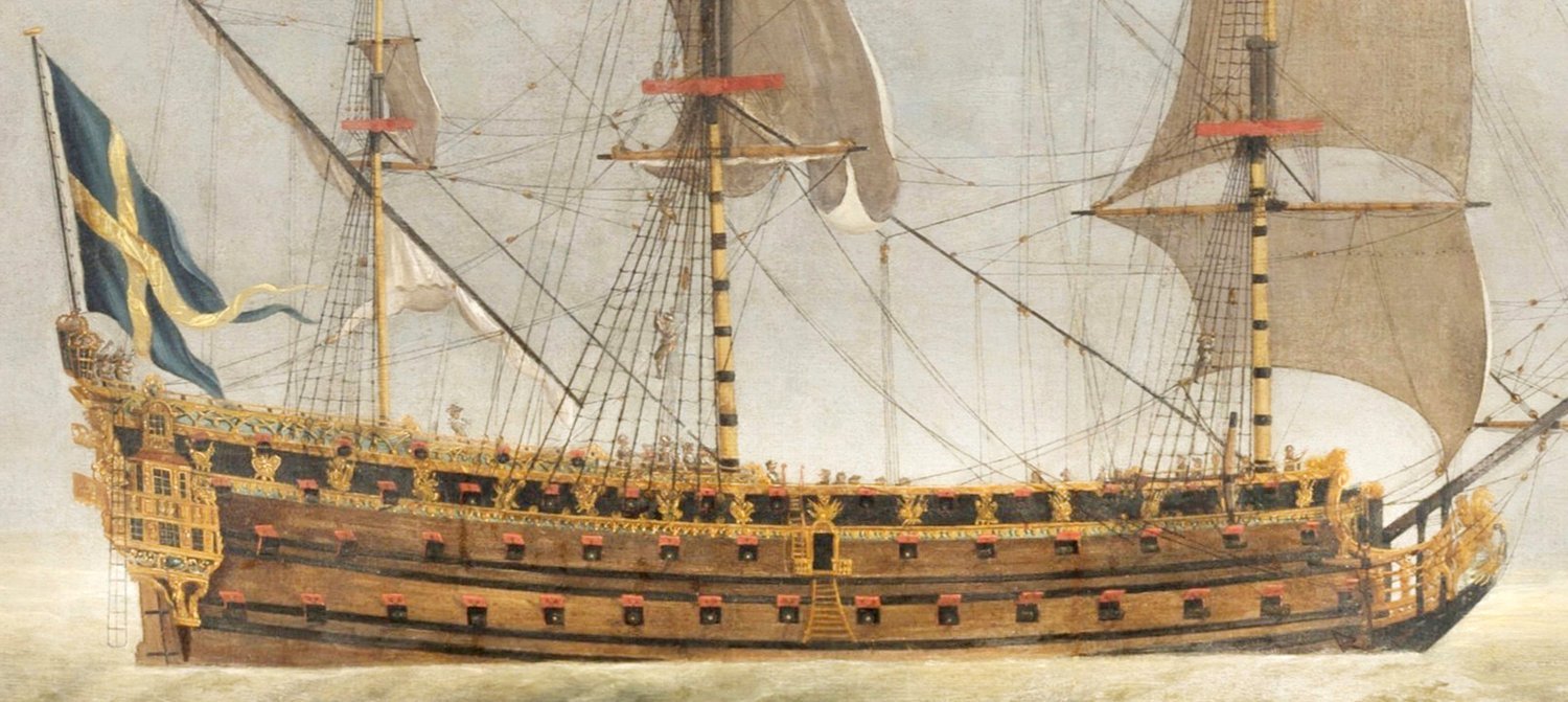
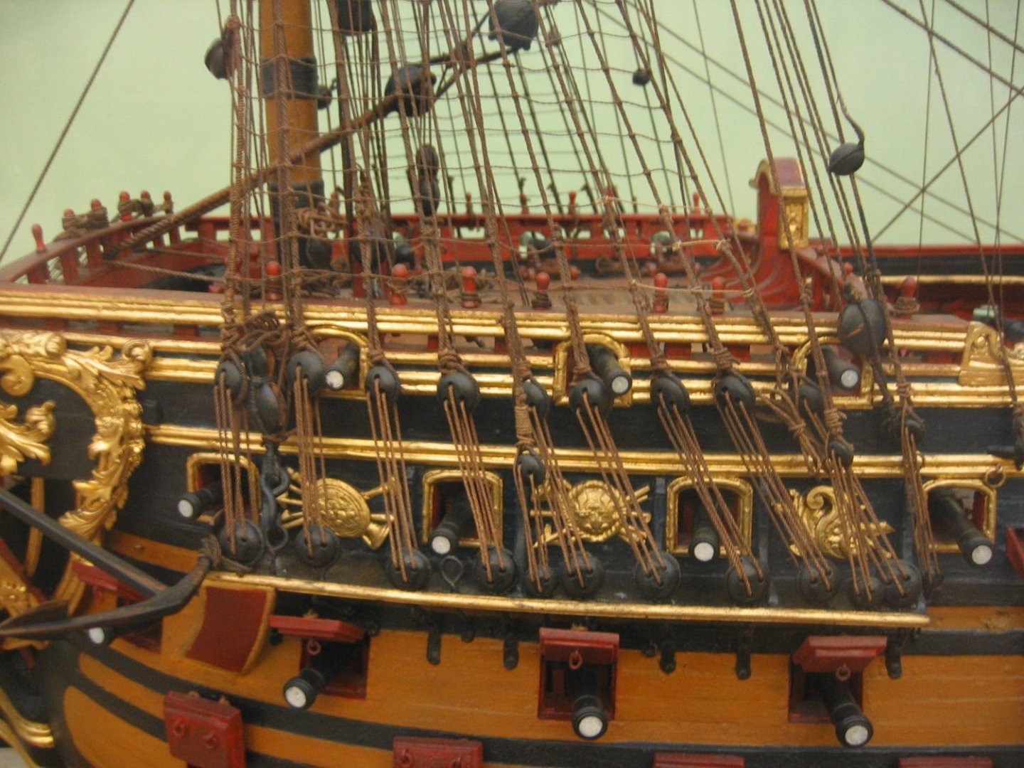
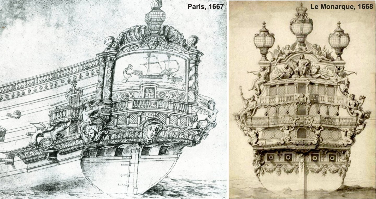
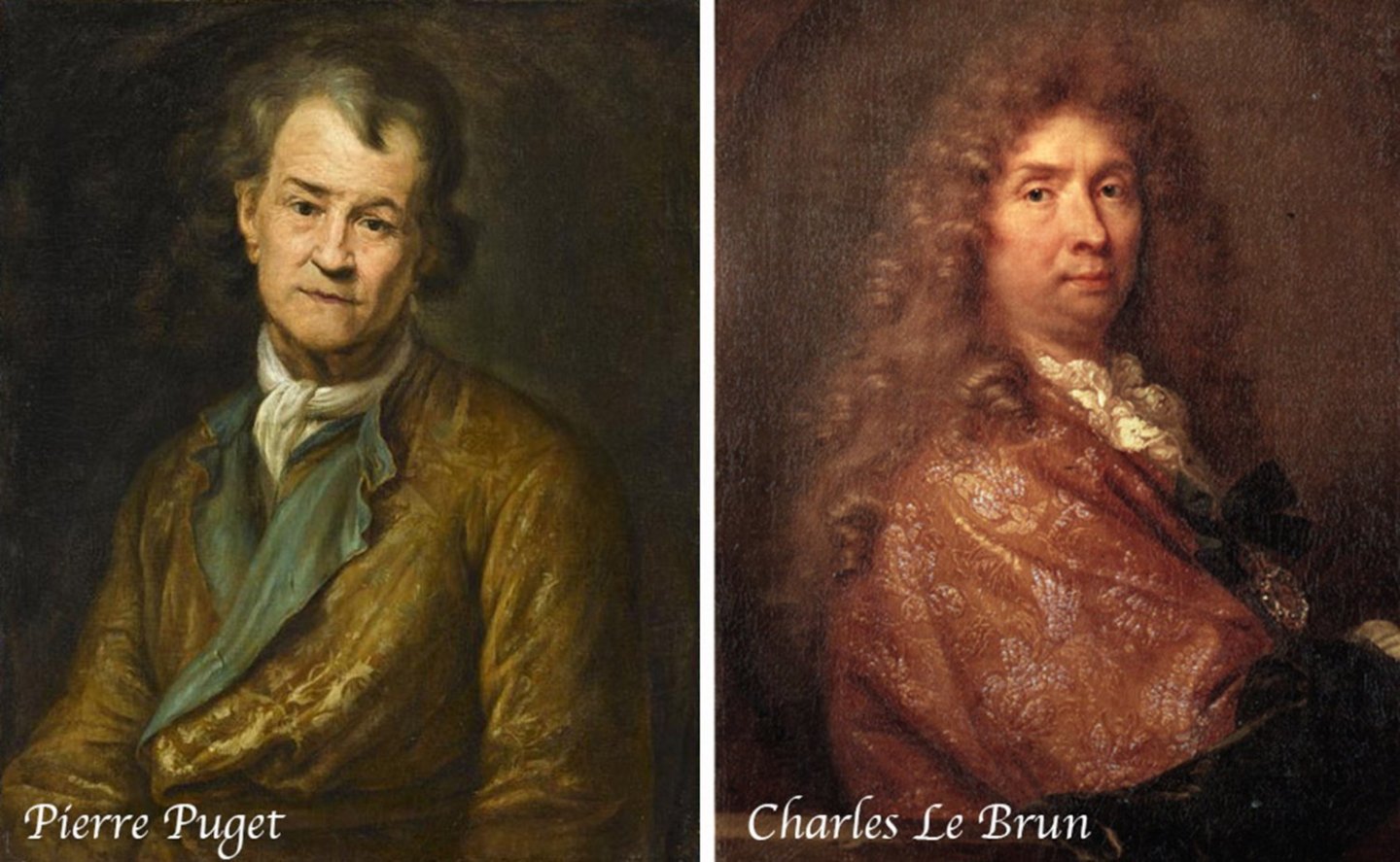
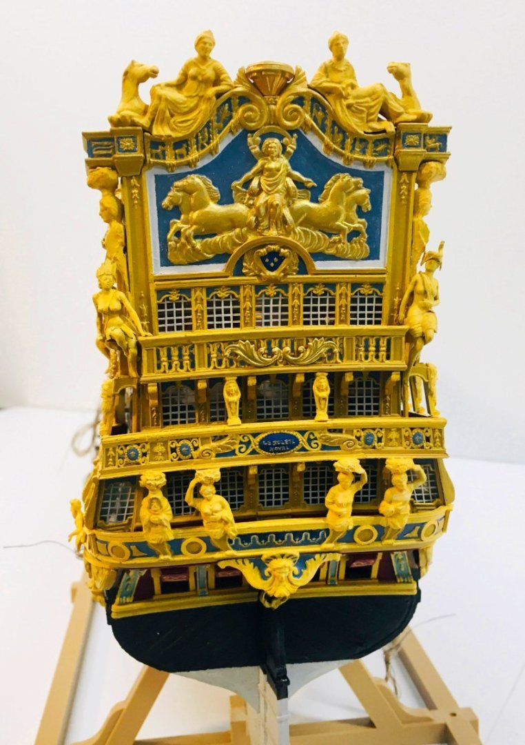
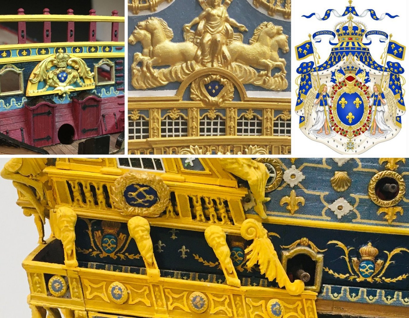
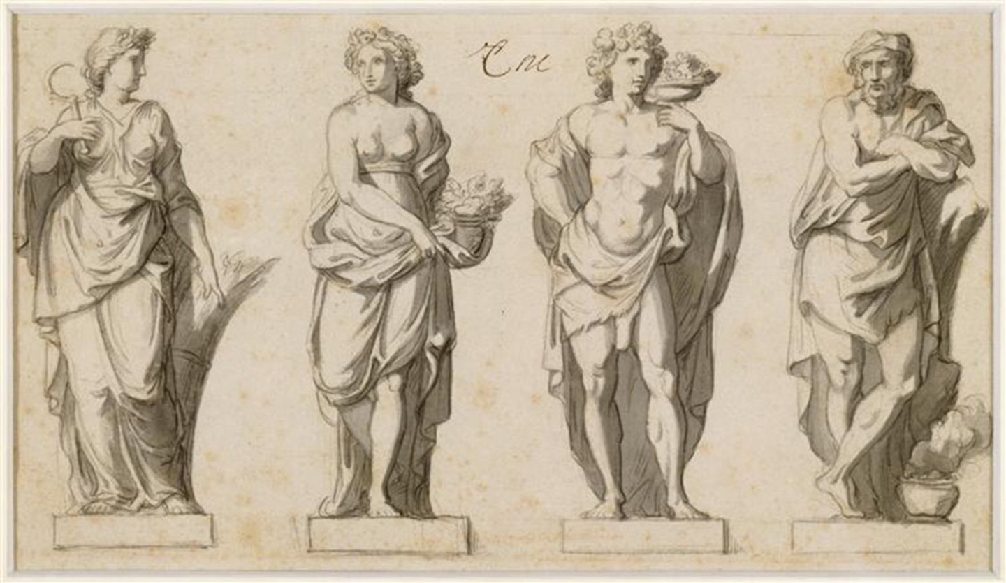
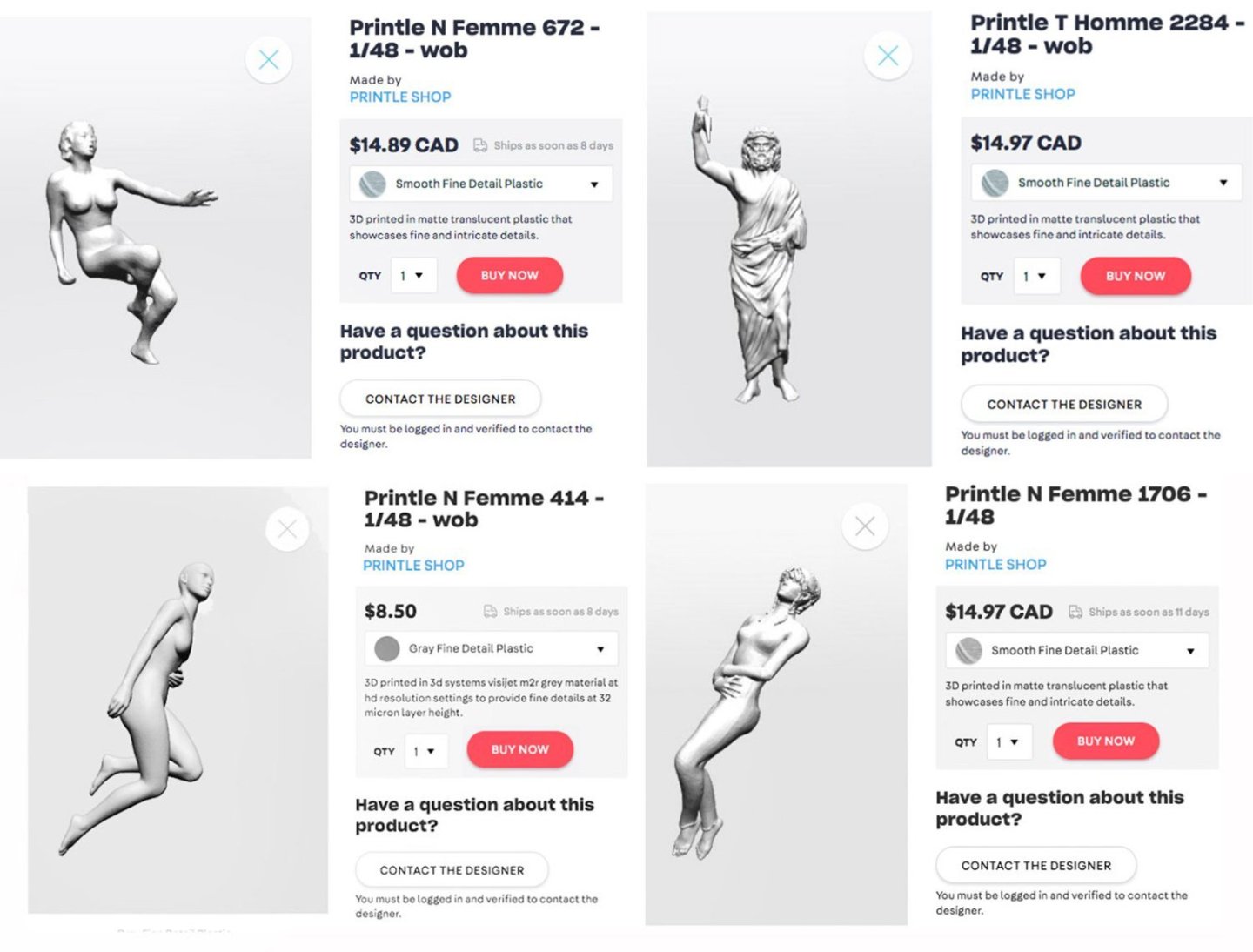
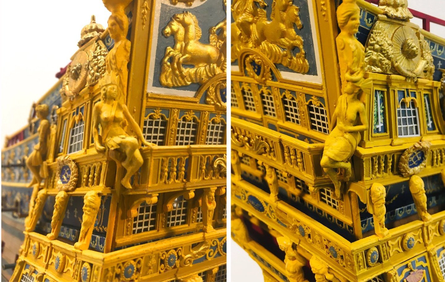
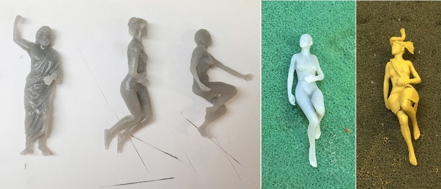
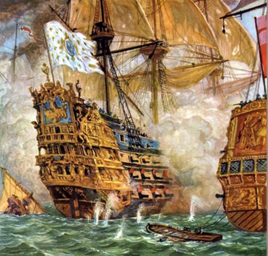
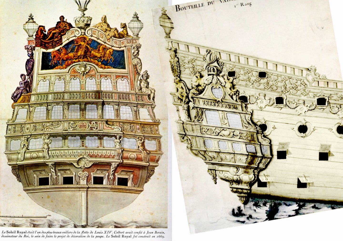
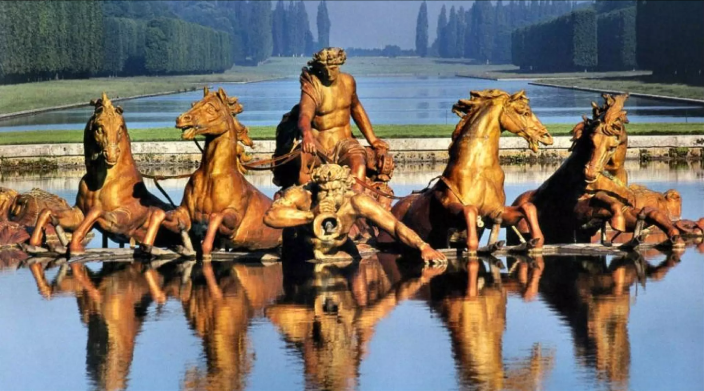
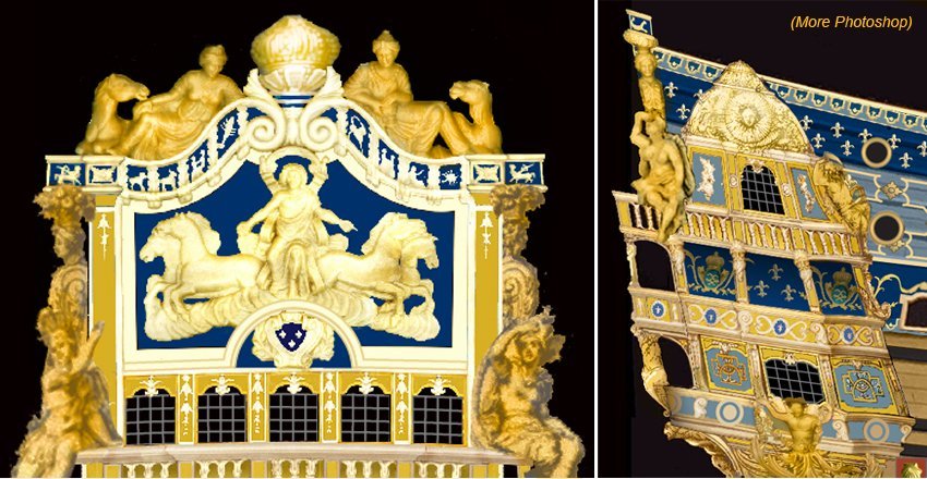
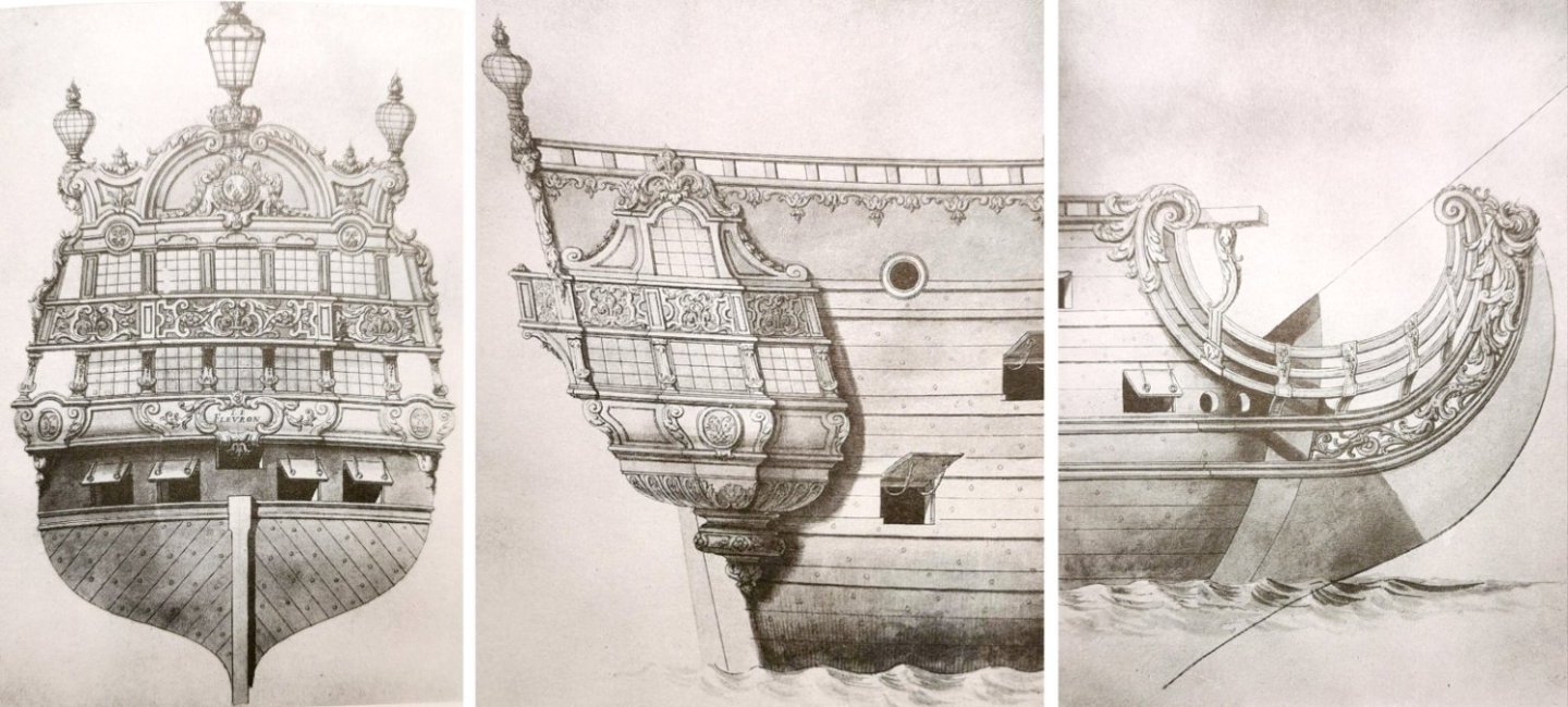
James A. Flood By the mid-1600s, it was taken for granted that warships had to look awesome. Decorations were no longer being painted or tacked on, but were being incorporated into the ship’s architecture. Louis XIV and his ministers were obsessed with having French ships look bigger and richer than their British counterparts. They hired the best artists in France to design statues, friezes, and decorative woodwork. Louis’s chief minion, Minister Jean-Baptiste Colbert, engaged artist Charles Le Brun to design statuary for Versailles, and when Colbert was given the additional position of Minister of Marine in 1669, he made Le Brun responsible for the decoration of the king’s newly-built fleet of ships-of-the-line as well. Le Brun set up sculpture academies in the shipbuilding centers of Brest, Toulon, and Rochefort to train the army of sculptors needed. The task of designing the architecture and decoration for the ships was assigned to the same artists who worked on the palace of Versailles, like Jean Bérain, and they churned out preparatory drawings to be given to the sculptors. The Italian-trained artist Pierre Puget was appointed head sculptor at the shipyard in Toulon after notable success decorating France’s Mediterranean galley fleet. His fanciful statues and designs for the new warships were inspired by Italian theater sets. This was an age when popular stage productions were growing more elaborate. Opera had been newly invented. Music specifically for the stage was being composed. The palace of Versailles had its own theater and the king and his aristocrats took part in the productions. Puget’s theatrical shipboard tableaux were immediately popular and widely copied. They looked a lot like opera backdrops. Two of Puget's ship designs. You kind of expect someone to come out on the balcony and start singing . . . . Puget’s sculptures were unquestionably awesome, but were also huge, heavy, and for the most part impractical. His boss, Le Brun, refused several of his designs with the note that they were “very handsome but not at all convenient for ships.” It was because of Puget’s extreme theatricality that Le Brun issued an order in 1673 indicating that sterns would not be allowed to carry figures so big that they affected the stability of the ship. Puget resigned in 1679, but one of the 1689 Bérain drawings of the Soleil Royal has the scribbled notation that it was made “apres Pierre Puget.” This caused at least one 19th-century French ship historian to attribute all of the Soleil Royal’s sculptures to Puget, in spite of evidence to the contrary. (Puget worked in Toulon; the Soleil Royal was built in Brest.) Instead of Puget, it’s fairly easy to connect the carvings on the Soleil Royal to the work of Charles Le Brun. Most of the figures turn out to be adaptations of Le Brun’s sculptural work at Versailles, especially his statues designed for the Versailles gardens in the grand commande (great commission) of 1674. The statues on the ship were originally made with Puget’s grandiosity in mind, but were later “adjusted” in size—in some cases replaced, in others, hollowed out—to reduce the weight and improve the ship’s stability. In a further effort to improve the ship’s handling, several of the larger statues were unshipped by Admiral De Tourville and left behind when the flagship went to war. These carvings were available for reuse on the Soleil Royal II, built in 1693. The new ship’s builder, Étienne Hubac, had been responsible for rebuilding the Soleil Royal I in 1689 and still had all of les garabits (templates and patterns) for the revised statuary. And so (we suppose), the second ship was decorated much like the first. There’s a weird thing about the symbolism and statuary on the Soleil Royal— well, weird for 1693— and that’s the ship’s total lack of Christian motifs and symbols. We’re used to thinking of the Baroque era as a religious age, one dominated by cardinals and cathedrals, sacred relics, bible-inspired art, witch-finders, and endless Catholic-Protestant wars. The hierarchy of the church was at the top of the social heap and kings wielded their power by divine right. The open-minded period of the Enlightenment was over half a century in the future. But without being terribly anti-clerical about it, along came Louis XIV with his aristocrats, retainers, bureaucrats, and artisans, and overt Christianity suddenly took a back seat to a revived interest in pre-Christian classical paganism. Instead of Christ, angels, and saints, the denizens of Versailles were more fascinated by gods, demigods, and caesars. In paintings, Louis had himself and his family portrayed as characters out of classical mythology. Louis and his over-extended family . . . . just another day of lounging around like Olympian gods. I’m sure the whys and hows are the subject of numerous books I’ll never get around to reading. For the time being, though, we can contemplate how all this influenced the decorations on Louis’s warships. What was in the art on the Soleil Royal? What did it represent? What did it all mean? Why was it there? First point—the art was meant to be symbolism. It consisted of elements meant to be read for their symbolic value by a largely unlettered population. Everybody back then was used to reading symbolism. It was all over their churches. Even if they couldn’t read, the populace knew all the bible stories by looking at the statuary, paintings, icons, altarpieces, carvings, and stained-glass that decorated their houses of worship. Every saint has his/her symbols for identification. Every condition or attribute had its own visual elements for storytelling purposes. The carvings on the Soleil Royal didn’t use Christian iconography, but the same principles applied. Artists like Le Brun even had textbooks of common iconography they could consult, like Caesar Ripa’s Iconologia, which described in detail what visual attributes went with which allegorical or historic figures. Caesar Ripa's Iconologia. Next point—this was Louis’s ship. Louis XIV was an absolute monarch, and when he famously proclaimed “L’État, c’est moi,” he meant it. The ships as well as the state were his, and the most important (gilded) artistic elements on the ship proclaimed his ownership. First, there was his Bourbon coat-of-arms on the bow and the stern, Azure, three fleurs-de-lys or—three gold fleur d’lis on a blue field, topped by a crown to indicate royalty. The fleurs would be repeated many places on the ship. On my model, white, open-faced fleurs (lilies seen from the top) are used on the quarter deck/forecastle level. There was also the king’s monogram, two intertwined, mirrored “L”s, also topped with a crown and surrounded by acanthus stems and chains of bellflowers, on the length of the upper gundeck. On the quarter galleries, the monograms are surrounded with a classical-antiquity-inspired laurel crown. You couldn’t go ten feet in any direction on this ship without being reminded it was Louis’s. The name itself, “the Royal Sun,” was one of his self-aggrandizing unofficial titles. Whose ship was it again? Louis himself is represented several times. The beaming face of the Sun King surrounded by solar rays appears on the headrail medallions and on the dormers of the quarter galleries—looking out from the four quarters of the ship. These were all elements I chose to paint as if they were gilded on my model. The same devices are always gilded where they appear at Versailles. Right, the face of the Sun King at Versailles, same as on the ship. Louis also starred in the most distinctive piece of décor on the ship—the Apollo solar chariot frieze on the stern-plate. The zodiac frieze above the chariot and the clouds below it show that the tableau is supposed to be occurring in the heavens, far above lowly Earth. Louis, as Apollo, drives the solar chariot on its daily celestial path. He's not carrying the sun. He is the sun. The gold leaf would have blazed in daylight. The frieze was patterned after the Apollo fountain, a major sculptural group by Charles Le Brun in the gardens of Versailles. Louis was supposedly a devout Catholic who did a lot to enhance the power of the church, including expelling all French protestants. I don’t know how he managed to reconcile his devotion with presenting himself as an Olympian god. Charles Le Brun's Apollo fountain at Versailles. Charles Le Brun was responsible for the other sculptural groups on the ship’s stern. He designed four statues for the gardens of Versailles to represent the four seasons. Variations of these serve as pillars between the ship's middle deck and upper deck balconies. Louis was being advertised as literally, a “king for all seasons.” Le Brun's original design drawings for the Four Seasons, Autumn, Spring, Summer, and Winter. The statues were executed by hired sculptors. I don't know where or if the statues survived. They no longer seem to be at Versailles. At the bottoms of the quarter galleries are mermen, two split-tailed tritons from classical mythology. These were often used on French ship décor. Their function was to hail Louis as master of the seas. The ship’s figurehead is a classical winged sea nymph on the back of a sea horse (literally, a mer-horse with a fish tail)—a herald for the procession of royal emblems to follow. Another nautical-themed element was the bevy of scallop shells. The ribs on the scallops represented the sun’s rays, so they worked as one of Louis’s solar symbols as well as a symbol of the sea. Surrounding the stern plate are allegorical figures representing the four continents (as they were known at the time), representing the wide overseas reach of French power. Reclining atop the zodiac frieze above the Apollo chariot are the figures of Europe, port, in classical garb with a horse, and Asia, starboard, in “eastern” dress, a turban, and a camel. On the lower port of the stern-plate is a female figure representing the Americas, in a straw skirt and feather crown. Starboard is the figure of Africa, with a distinct elephant-head headdress. These, too, are variants on Le Brun’s Versailles sculptures. The figures of the Americas and Africa on the Soleil Royal have exactly the same headdresses. This and the Apollo's chariot frieze are the strongest links between the ship's sculpture and Charles Le Brun. Pierre Puget—sorry, nope! Charles Le Brun, the Four Continents. Still on display at Versailles. In the Heller kit, I felt that the two figures on the lower stern-plate corners were too large and not very attractive to boot. I needed a smaller Africa and the Americas. I went looking for other model figures to use. What size was okay? I thought 1/48 (O scale)—about 10–12 feet in 1/100— was about the largest that would be reasonable. After an internet search, I focused on some 3D-printed figures by a company named Printle on the Shapeways.com website. Some were copies of classical statues. Some were female nudes. They were cheap enough; I ordered a few. The quality was good. The plastic was easy to cut, so I could make adjustments to the positions of arms and legs. I added clothing (not much, admittedly) and headdresses with scraps of styrene. The figures might not be identical to the ones in the Bérain drawings, but neither is the ship. I think these figures work fine. Shapeways also supplied me with figures to make the two missing statues shown on the Cherbourg Library drawing of the quarter galleries. The starboard one (the only one shown in the Cherbourg drawing) was Kronos, “Father Time,” the Greek-mythology titan, first king of the Olympian gods, whose symbols were a scythe and an hourglass. The figure I got from Shapeways was a standing figure of Zeus. I cut and re-glued the figure at neck, waist, and knees to give him more of a sitting posture and replaced Zeus’s thunderbolt with Kronos’s scythe. Why was Kronos there? What did he represent? What did he have to do with the sun-god Apollo? I don’t know if I ever found a good answer. In mythology, Kronos reigned during the “golden age” (this is where we get the term) before he was slain and replaced by his son Zeus, who in turn was the father of Apollo. So Kronos was Apollo’s grandfather. And his “golden age” might be considered to have returned under the reign of his “grandson,” Apollo-Louis. It didn’t make sense to repeat the same statue on the port side. Another accompanying figure was needed. What figure went along with Kronos, though? I decided it had to be Rhea, Kronos’s consort, first queen of the gods, Apollo’s grandmother, who served as midwife for the sun-god’s birth. Rhea’s main symbolic attributes were a mural crown (representing fortress walls) and a chariot drawn by lions. I opted to give my figure the crown and forget about the lions. Again, I used a nude Shapeways figure and dressed her somewhat with scrap styrene. I think I’ve caught everyone up on my Heller model to the present. Posts from me are going to get less frequent from now on. I’m busy right now working—and re-working—the masts and rigging. I’m on my fourth try at installing foremast shrouds. Man, I thought building the hull was tough. It’s nothing compared to the complexity of the rigging. Slow process. I thought I’d be done with this model in a year. Now I’m giving it two. My model has grown a beard. It’s all the lines running from the forecastle pin rails and deck cleats. I figured I’d better tie them in before the foremast shrouds go on and get in the way. I belayed the lines according to a rigging plan, so I know what each line is and where it is going to go once the masts and yardarms are up. Most of the lines are three feet or more in length. As far as postings go, there’s still a discussion of deck furniture to do, which I’ll put off once more. And my rigging diagram is in a constant state of re-evolution as I absorb stuff from Jean Boudroit's monograph The Three-Decker of the Chevalier De Tourville. You’ll find out more about that next time, whenever that will be. With the holidays coming up, it’s hard to tell how much modeling time I'll have. Happy Meleagris gallopavo day. The bird formerly known as turkey. Let’s all be respectful with our culinary nomenclature this Thanksgiving and eat some nice roast gallopavo with stuffing. And have fun building and rigging model ships over the holiday. Speaking of turkeys—


- 80 replies
-
- 10
-
-

-
- Soleil Royal
- Ship-of-the-line
- (and 2 more)
-
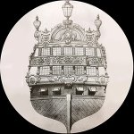
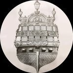
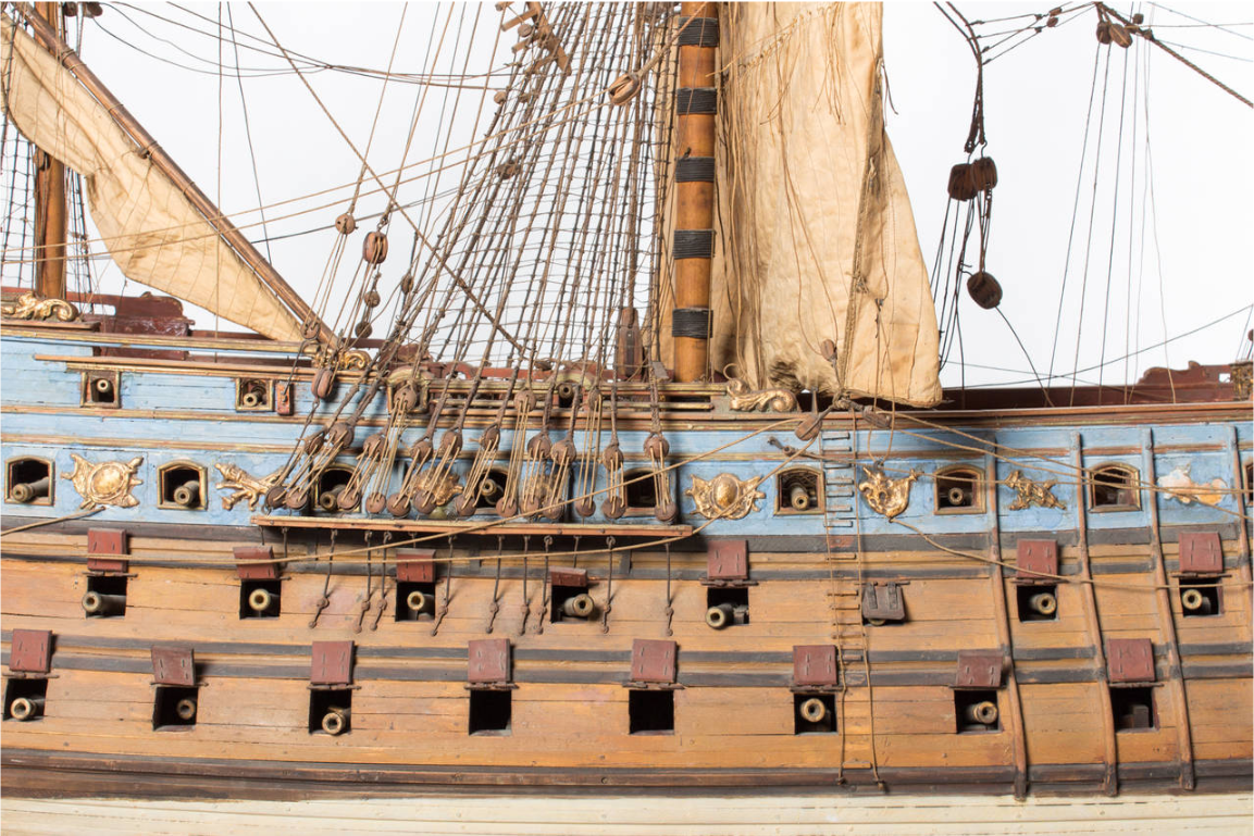
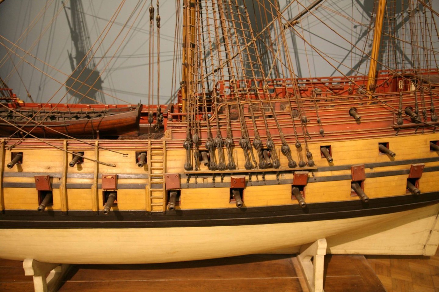
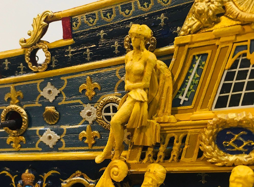
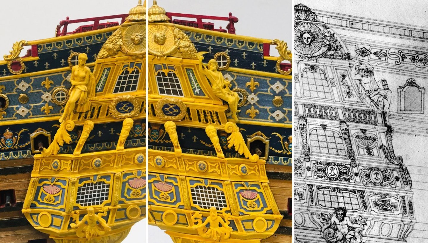
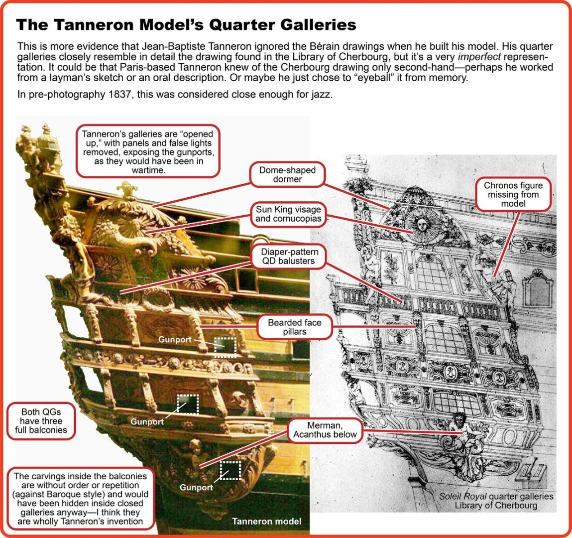
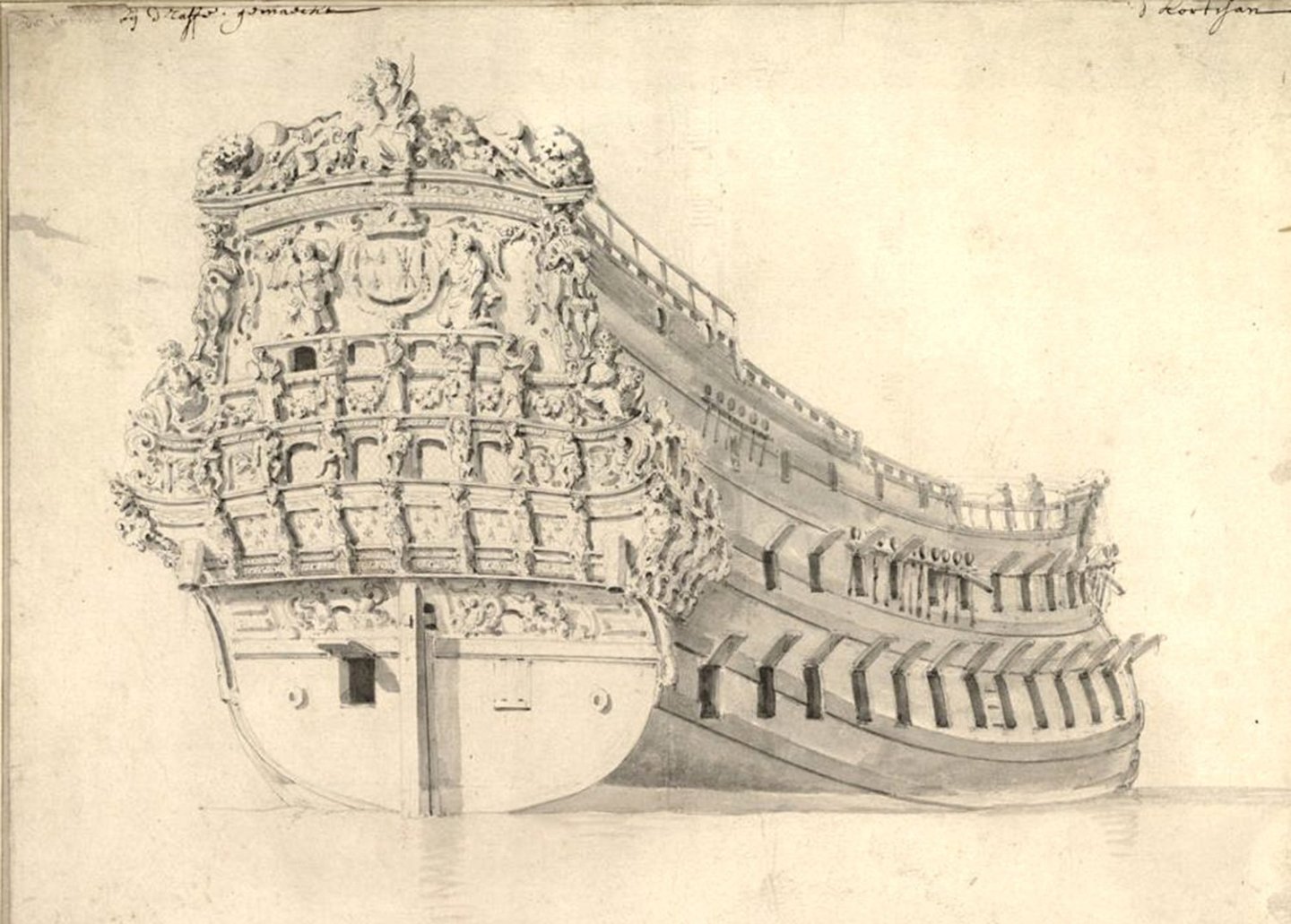
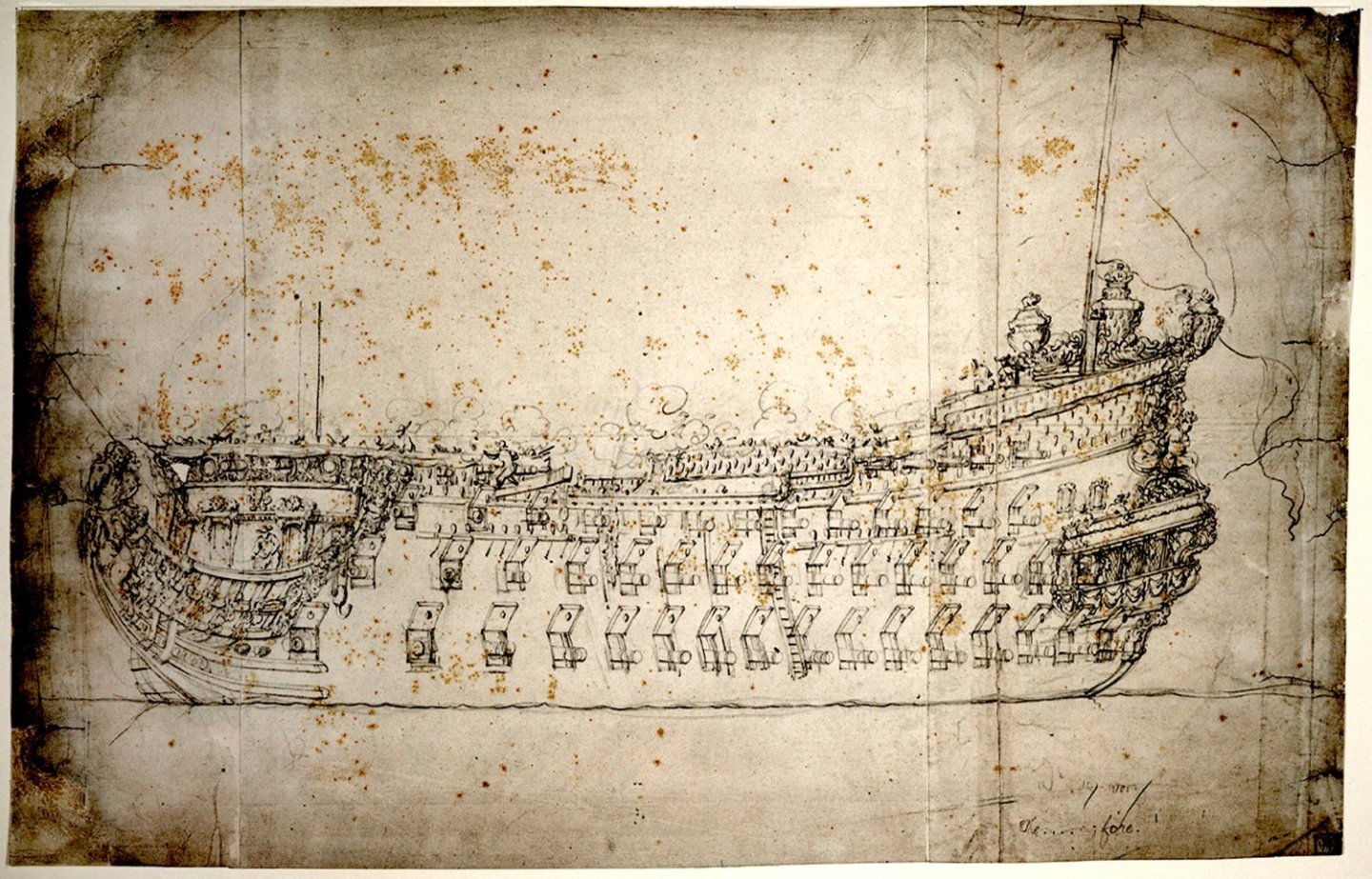
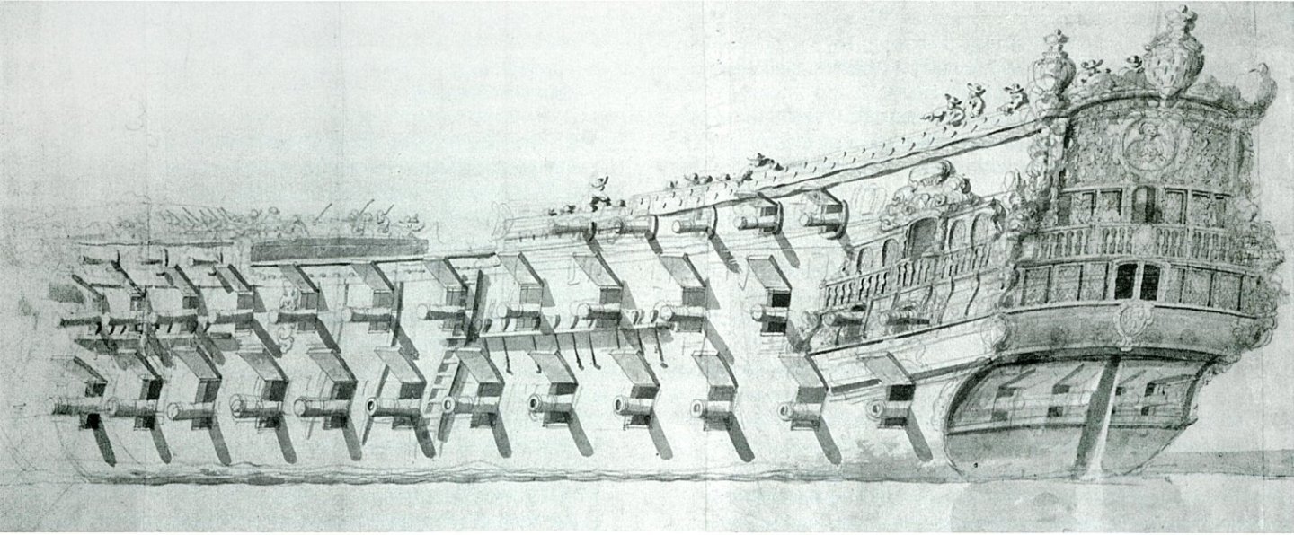
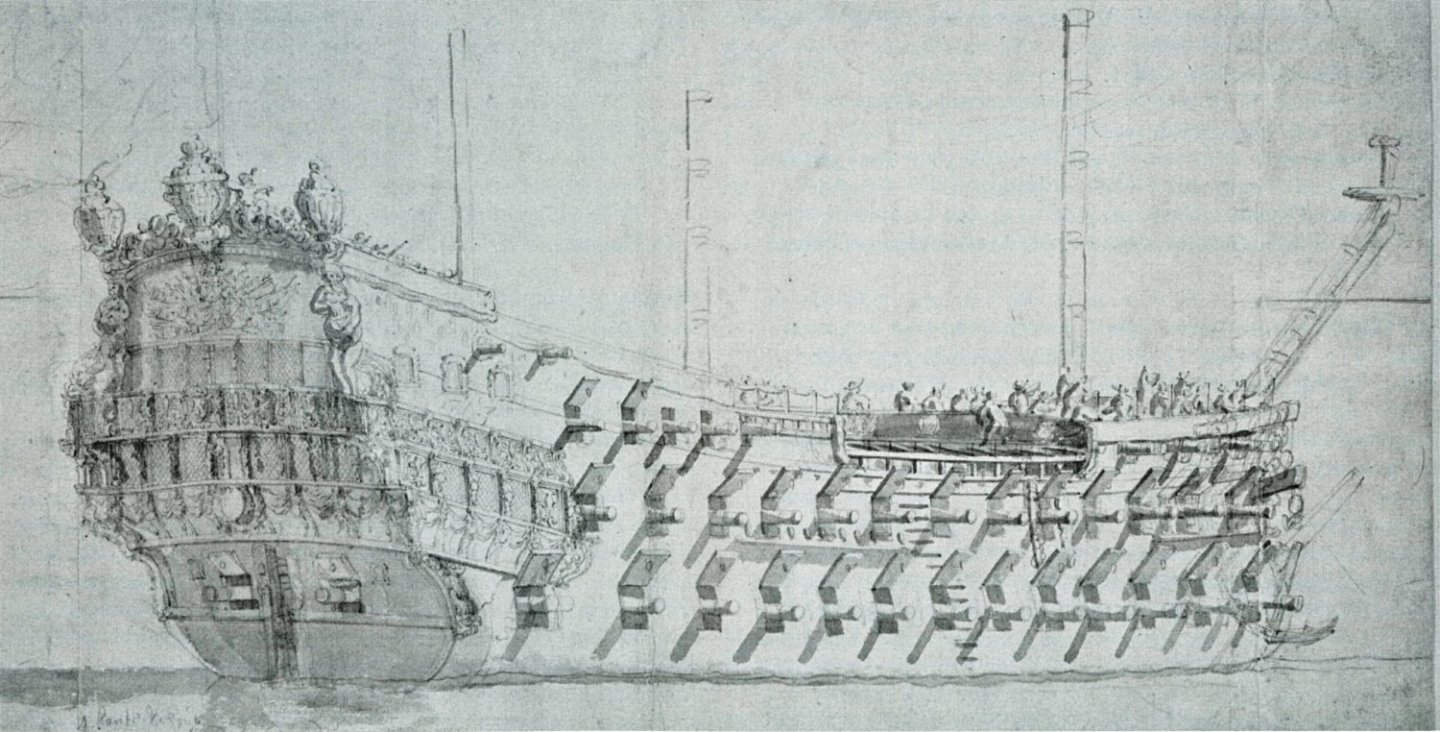
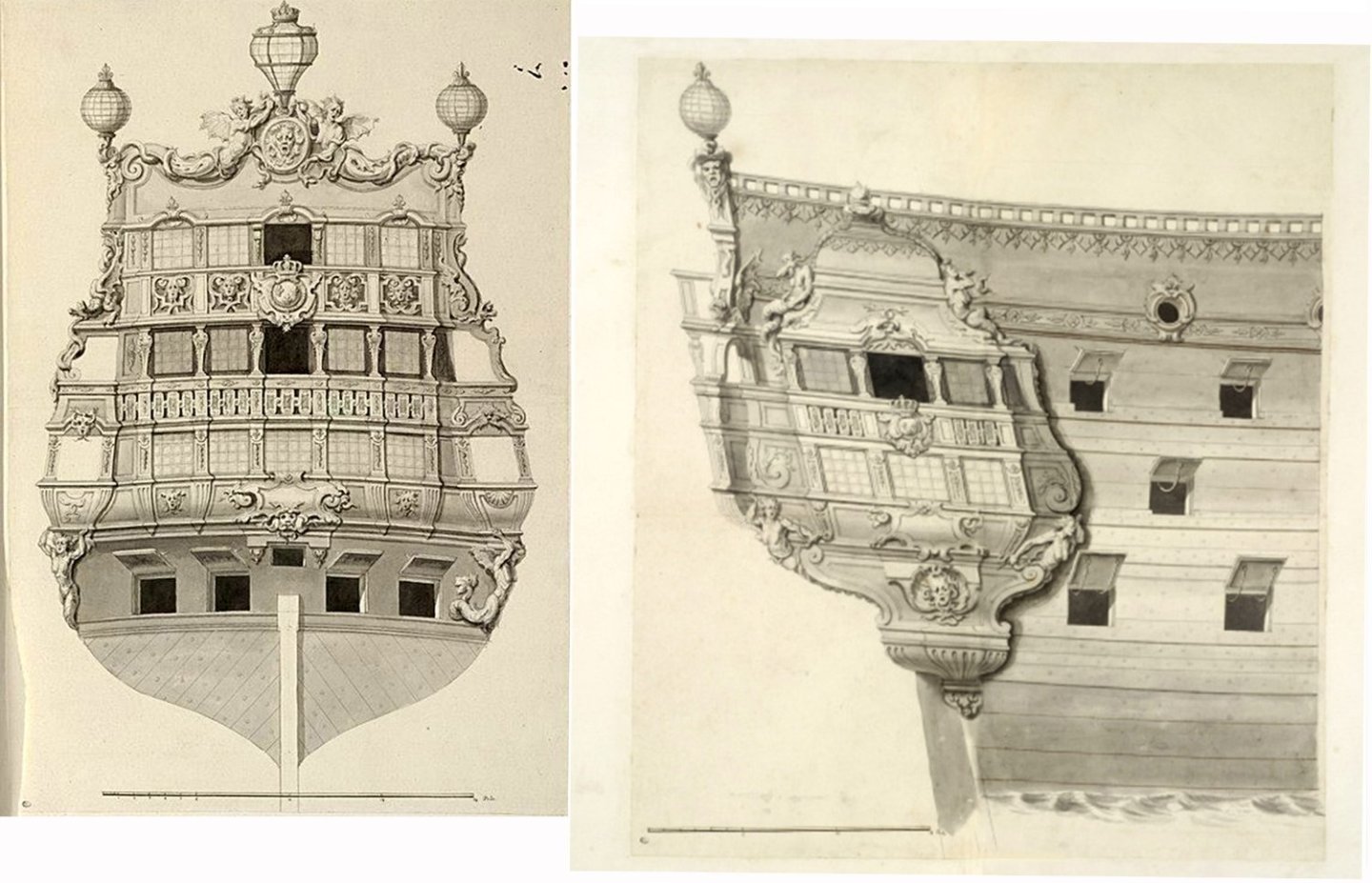
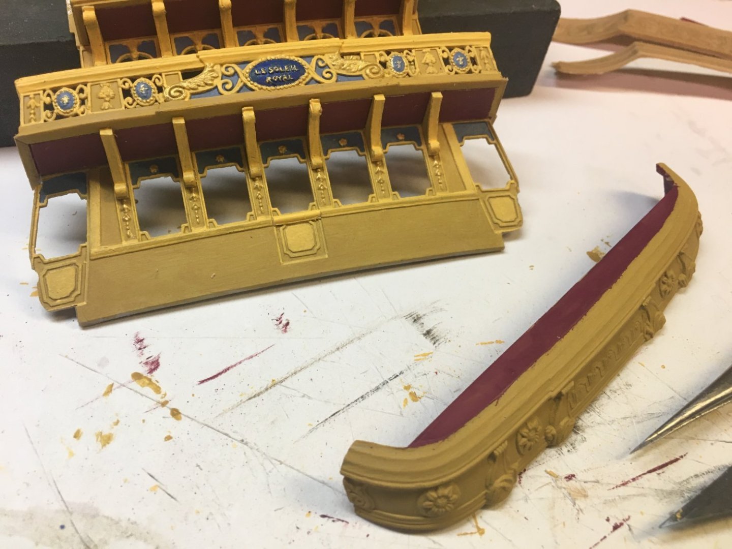
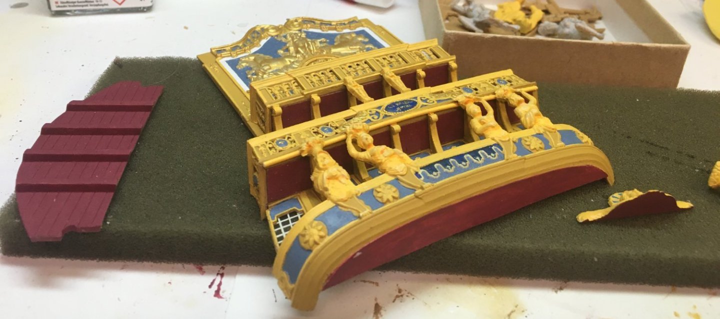
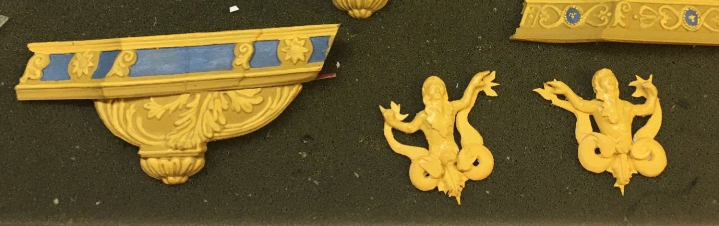
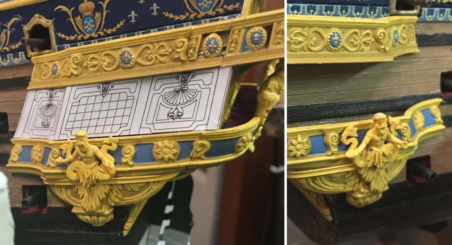
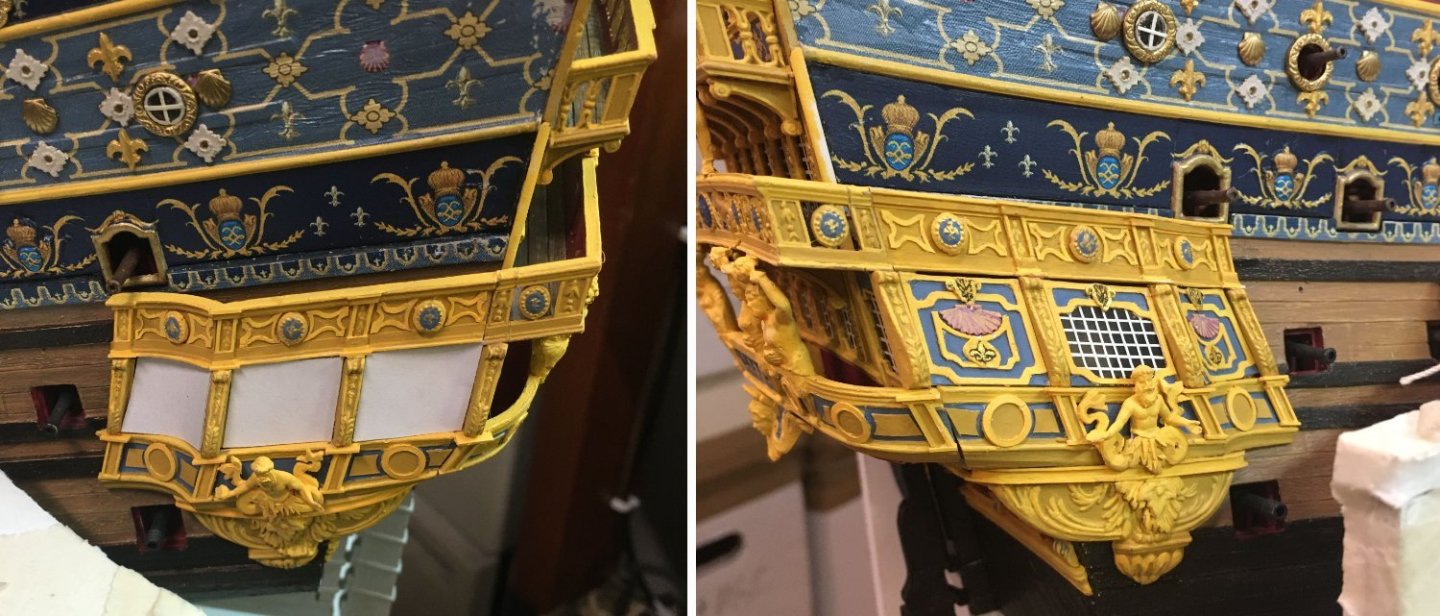
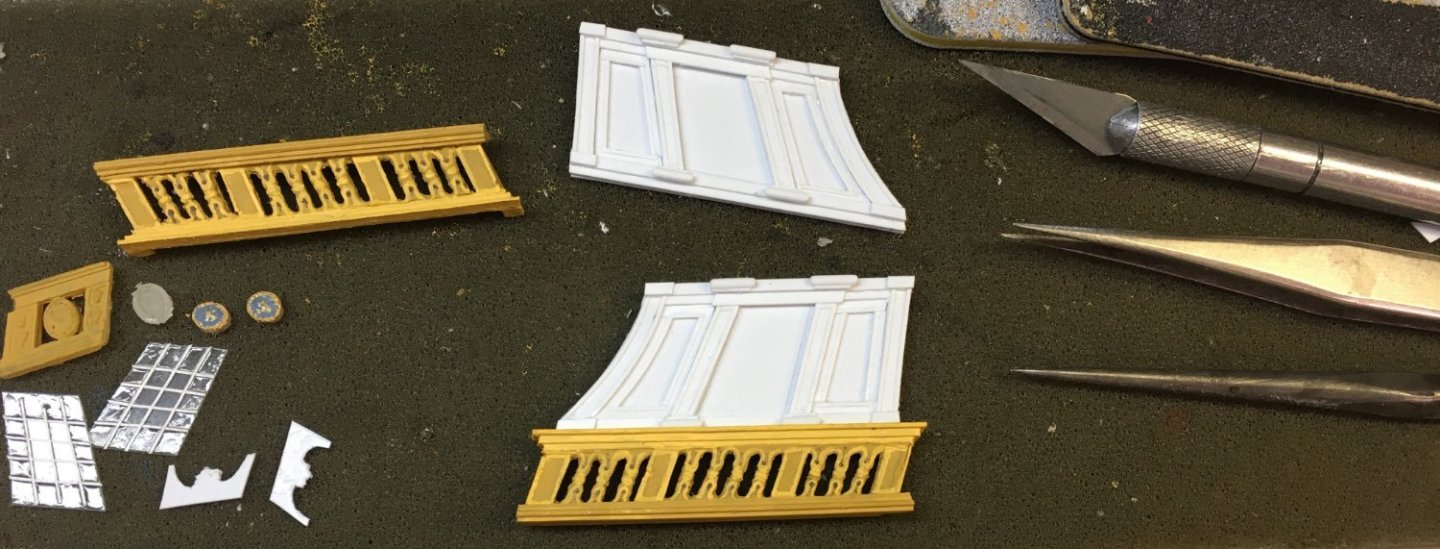
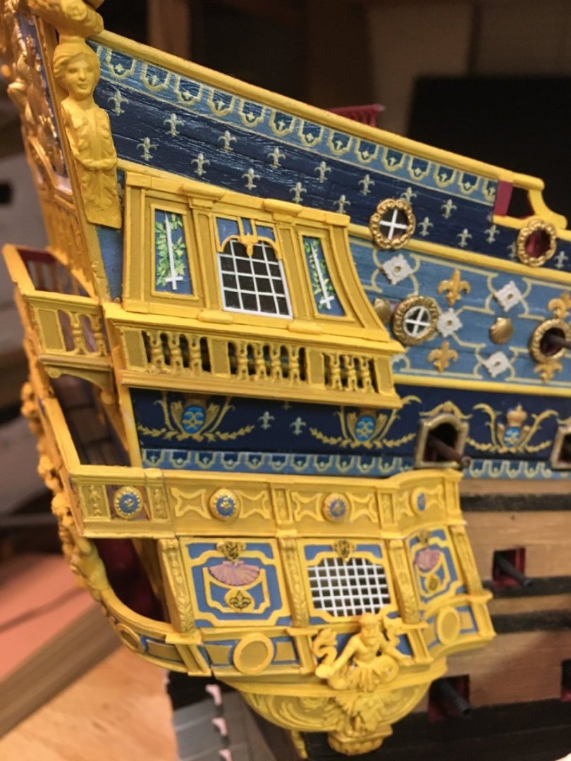
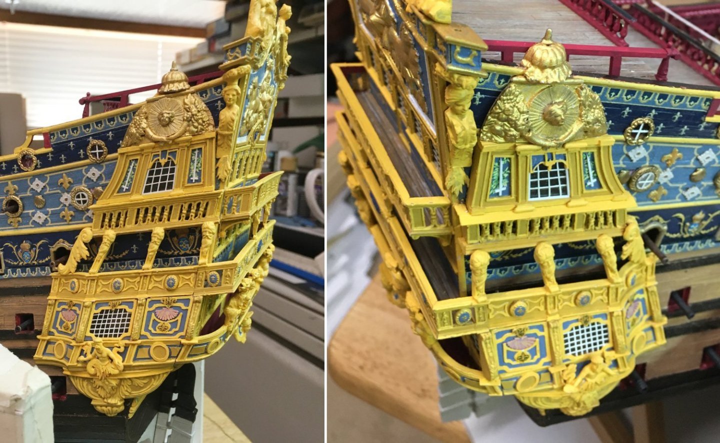
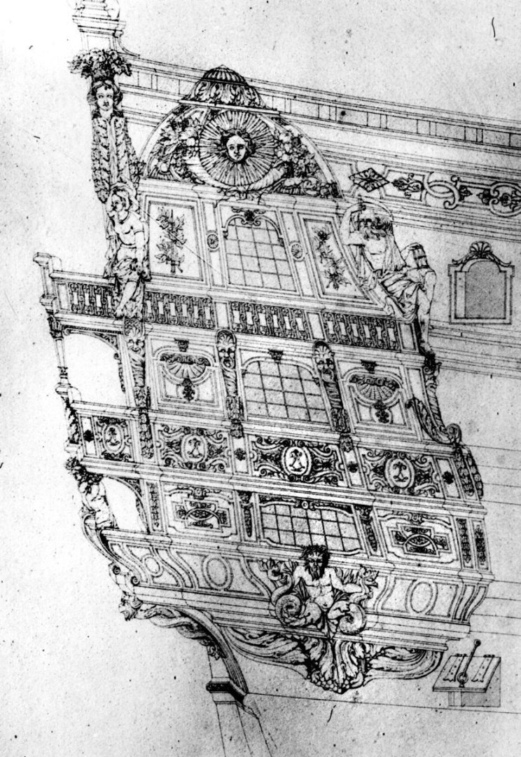
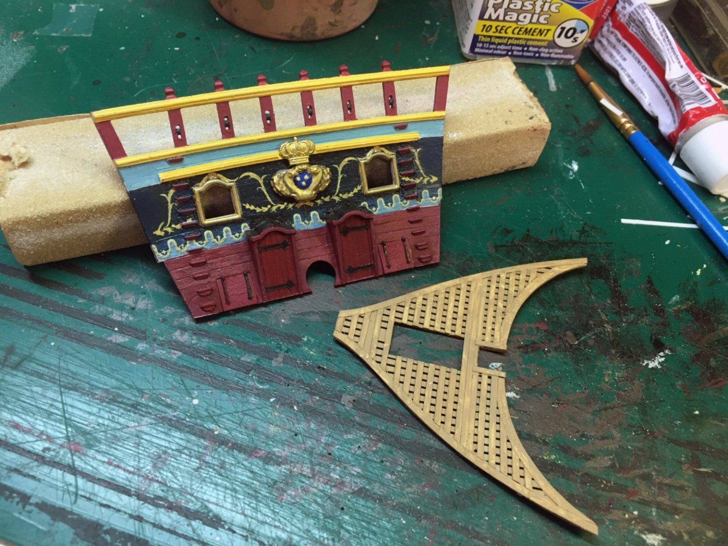
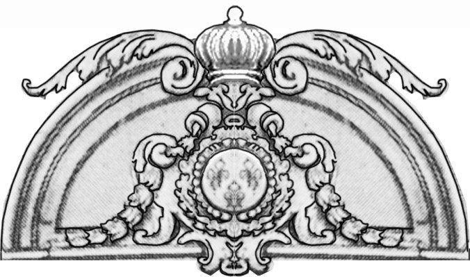
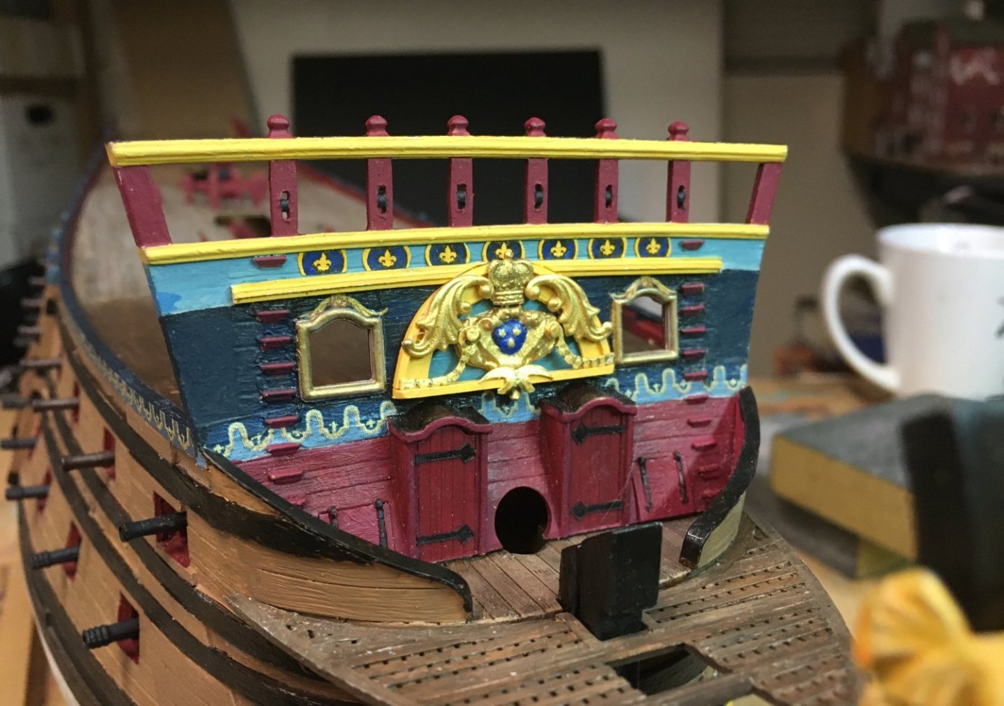
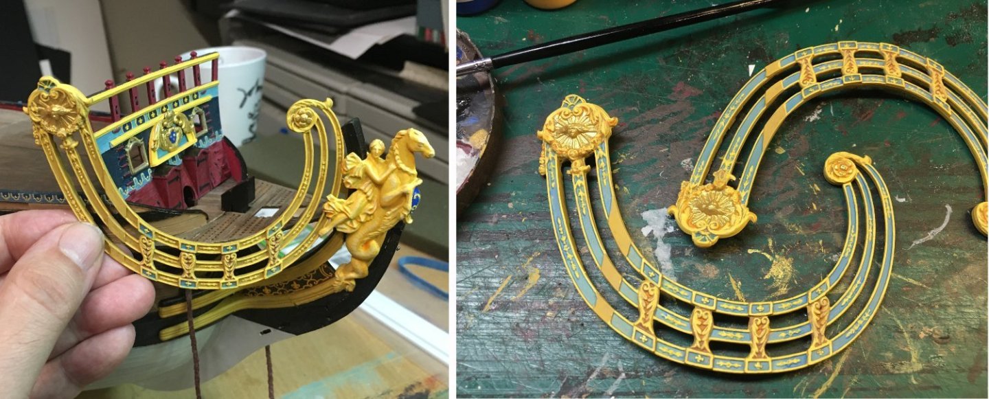
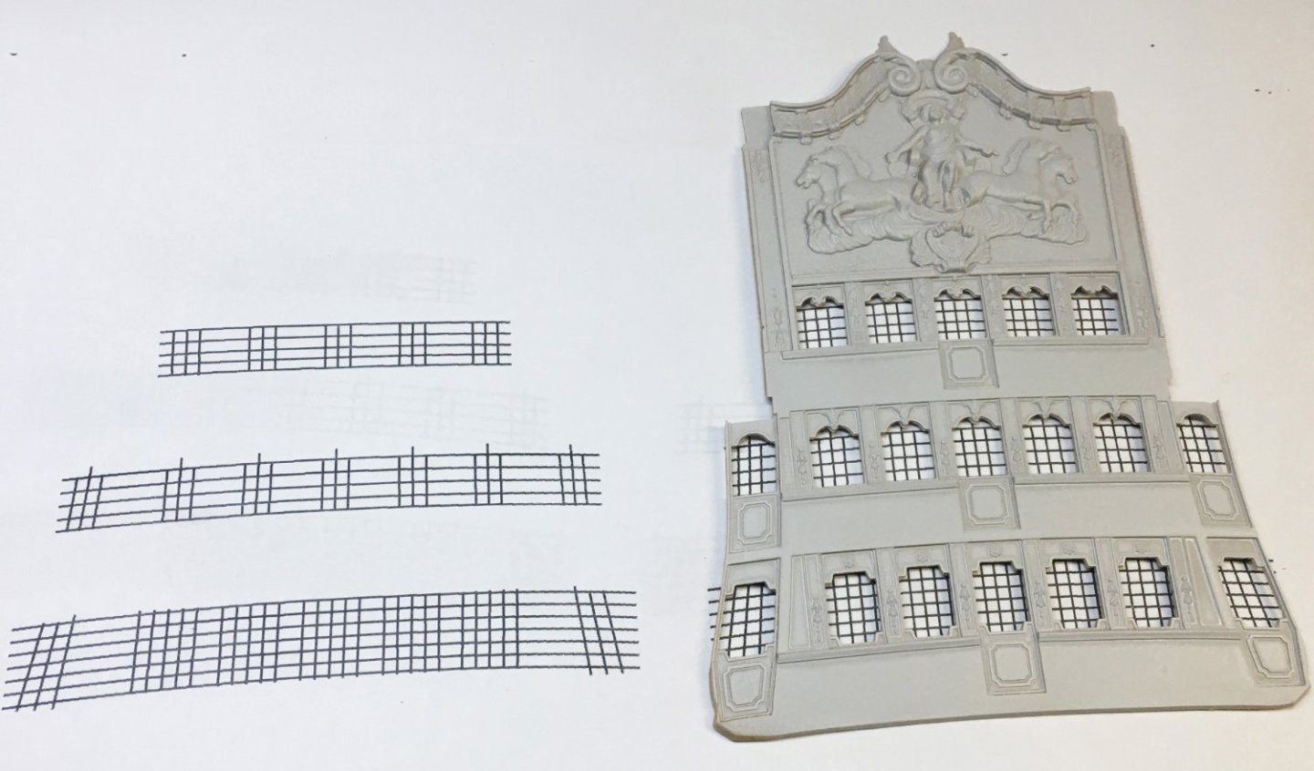
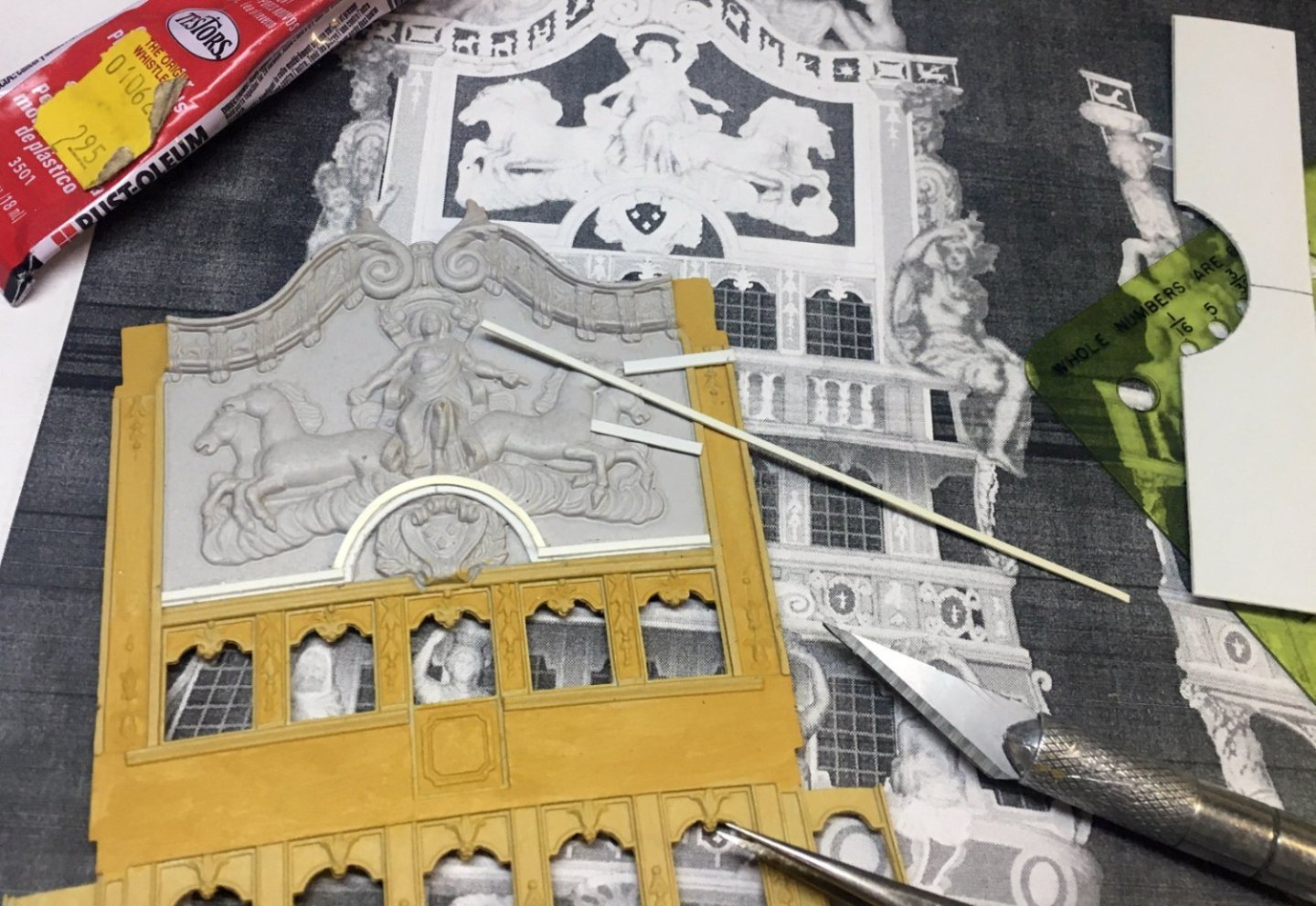
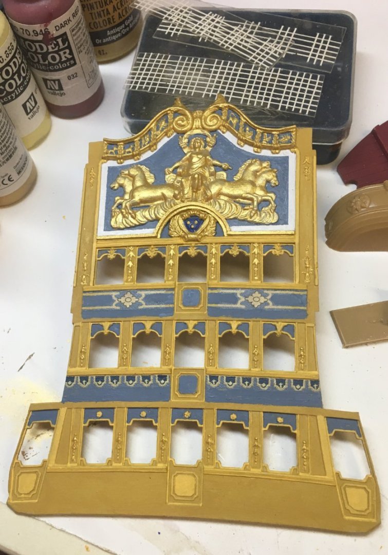
So what do we do with the Heller kit’s quarter galleries? They are kinda problematic, after all. Modelers have had a tough time deciding which version of the Soleil Royal the Tanneron model represents, and some think it’s the first 1669 version because of the open balconies on the quarter galleries. Warships from 1660s had open balconies as a matter of course. Nice . . . but complicating that analysis is the fact that quarter galleries on French warships were often built over the aft-most gunports. In times of war there had to be a way of opening those ports, and the practical solution seemed to be making the quarter gallery panels removable. To back this up, there are pictures of French warships from the 1690s that show open balconies, even though closed quarter galleries had been dictated by the Navy administration back in 1674. So—first version? Maybe so and maybe not. The Tanneron model is pretty obviously not the 1689 rebuilt version, because there are big discrepancies between the model and the Bérain drawings of the rebuild. Others modelers—like me—think Tanneron’s model is the second Soleil Royal, built in 1693, based on the layout of the gunports and the resemblance of the model’s quarter galleries to a drawing from the Library of Cherbourg which is labeled as belonging to the Soleil Royal but is definitely not the Bérain version. Here's the Cherbourg Library drawing. And here are the similarities to Tanneron's model— So where did this drawing come from? When did it come from? Can we tell from context? How do we know it wasn’t from some earlier version of the Soleil Royal? To answer that, we need to go back and look at the development of quarter galleries on French warships over a period of 35 years. The Soleil Royal was one of the first 100+-gun three-deckers built by the French navy. In the 1660s, realizing the need for bigger and better warships, Louis XIV’s ministers attempted to jump-start their shipbuilding program by hiring Dutch-trained shipwrights like Laurent Hubac, builder of the first Soleil Royal, and even by buying Dutch-built ships. Dutch shipbuilding at that time was the most advanced in the western world. Their ships had elaborate decorated sterns, but didn’t have much in the way of quarter galleries. The Courtesan of 1666, below, was one of the Dutch-built French ships. This is the kind of ship design the French emulated. The drawing is by Willem van de Velde. Courtesan Laurent Hubac’s first Brest-built ships had similar abbreviated galleries, like the 1669 la Reine (ex-Royal Duc). It had an enclosed middle-deck gallery (where the officers’ heads were) and an open balcony above it. (These are more drawings from Willem van de Velde . . . .) The first Soleil Royal was built that same year. la Reine Royal Therese, built in Toulon in 1669, shows the same idea. Royal Therese No drawings survive from the first Soleil Royal, but ship historians like Jean-Claude Lemineur were inclined to reconstruct the ship using the same principle. This went on for another five years, including ships like 1671’s le Terrible below, another one of Laurent Hubac’s ships. This shows that Hubac-built ships from both before and after the first Soleil Royal had abbreviated galleries. If I was making a conjectural drawing of the first Soleil Royal, I'd be making notes. le Terrible In 1673, the rather arbitrary decision from Paris was promulgated, advising shipbuilders that henceforth, quarter galleries would be built with all balconies enclosed, like on English ships. At the same time, the stern balconies were supposed to be reduced—in many cases, making the middle deck balcony into a false façade. I’m sure this didn’t settle well with the conservative Dutch-trained shipwrights. Surviving drawings show a lot of halfway measures, like the 1680 rebuild of the 1668 Dauphin Royal, where the upper gundeck balcony was given a little Moorish castle, but the middle gundeck balcony was left open. The next decade more or less corresponded with the arrival of chief decorative designer Jean Bérain, whose plans for sterns and quarter galleries made them look like little multistory Paris palaces or wings of Versailles. Here is le Furieux of 1684, built in Brest, and le Fleuron of 1689, built in Toulon. le Furieux le Fleuron Of course, there’s also Bérain's drawings of the proposed rebuild of Soleil Royal. By the time the second Soleil Royal was built in the early 1690s, the dormers of Bérain’s quarter galleries had taken on a definite dome shape, like on the Saint Philippe of 1693 and the Swedish Konung Karl of 1694. Notice that the Konung Karl sports twin-tailed mermen on the balconies very similar to those in the Cherbourg Library drawing of the Soleil Royal. Interestingly, it looks like all the stern balconies had depth, just like ones in the Cherbourg drawing. In that and other details, I would judge the Konung Karl quarter galleries closest in style to the ones from the Cherbourg Library. le Saint Philippe Konung Karl The Soleil Royal II was built in 1692–1693, one year before the Konung Karl. In other words, the KK drawing was probably made during the time the SRII was under construction. So—back to the Tanneron model. Yes, the model’s quarter galleries have open balconies, like the early French three-deckers. The problem is that it has too many balconies, plus upper works—dormers, domes, panels, and false lights— that just weren’t a thing on 1669 French warships. From the design and the detailing, the closest stylistic matches we have are the 1690s Bérain designs. I think the Cherbourg drawing came from a 1690s ship and so, by deduction, from the Soleil Royal II. This, I think, was the prototype for the Tanneron model. At the start of this post, I outlined the differences between the Tanneron quarter galleries (copied by Heller) and the Cherbourg drawing. I really wanted to redo the galleries to closer match the drawing. This didn’t sound radical at first. Lots of Soleil Royal modelers open up their QGs by carving away the relief panels which seem to have no relation to anything on real French warships. While doing the necessary styrene surgery, I planned on fiddling with the proportions a little—maybe give the QGs new, more accurate dormers. I had already extended the stern by 3/16”, intending to expose two of the three gunports incorporated into the QGs. I made some Photoshop sketches, showing my choices for opening up balconies. I decided to leave the upper gundeck gallery open, like in the second photo. That would give some added interest to the QGs and still give the 1/100 officers some privacy when they visited their heads. First, I had to finish the stern balconies and glue on the stern plate. I noticed that the balconies stuck out too far—four feet. I trimmed them back to 3 feet, similar to the surviving drawing. Had to trim the knees, too. The middle deck balcony was supposed to be a false balcony anyway, so it got trimmed the most—it’s only 2-1/2 feet wide. Oh—and I hated the sunflowers on the middle deck balcony. I checked—and yeah, they were considered official symbols of le Roi Soleil—but I had never seen sunflowers on any drawing of a French warship. On Bérain’s drawings, they were supposed to be cartouches (architectural oval frames), sometimes with Louis’s monogram, sometimes empty. Stern lights were affixed with Testors’ canopy glue. I thought the white cames (lead between the panes) looked cool. Time to take a deep breath and glue on the stern. Now for the quarter galleries. With razor saw and x-acto knives, I carved up the kit’s quarter galleries. Having embarked on an orgy of destruction, I never paused to take photos. Everything usable was trimmed out and set aside—besides the balconies and columns, that included all the figures, faces, and foliage. Then I could start Frankensteining everything back together again. I decided to keep the "drop" from the bottom of the galleries. It hid the waste chute, after all, but I trimmed it and repositioned it to keep it out of the way of the lower gundeck's furthest aft cannon. An important feature of the middle gundeck balcony was the mermen. Tanneron had placed them below the balcony and turned them into winged, garland-draped fairy figures. I wanted to put them back on the balcony where the drawing said they belonged, and also return them to being split-tailed tritons. For a first try, I attempted to repurpose the fairy figures from the kit, giving them fish-tails instead of garlands, and new bearded faces taken from the QG's quarterdeck level. Unfortunately, it soon became apparent that the figures were about 50% too large to fit comfortably on the balcony. This was a genuine moment of frustration. What to do? Carve new figures from scratch? Too bad I’m terrible at it. I have never felt competent making 3-dimensional sculpture. Should I check to see if the kit had any other figures I could use to make castings? Sure—but the answer was nope. Anything around my hobby desk? The house? Nope and nope. Go to the hobby store and see what I can scrounge for new figures? That sounded like a plan. Drink beer afterward? Even better. So a trip to the hobby store led me to a set of 1/72 Nexus plastic figures labeled “Ancient Life.” Are they supposed to be used for games? I don’t know. I don’t care. Looked promising. The set contained a number of bare-chested males with arms spread. Perfect. I cut them off at the waist, added fishtails and beards carved from scrap styrene, and I had my two split-tailed tritons. Excelsior. I glued on the first four balconies. Paper templates told me where the columns were going to go and what size the panels and false lights needed to be. I was making progress—or so I thought. But the columns and panels weren’t lining up with anything. There should have been some vertical elements on the balconies that met the columns. Plus, the sunflowers were bugging me again. Before too long, I called a halt and went to find another beer. Then I ripped away the new balconies plus the stern middle deck balcony, and started over again. This time I built the balconies from scratch using Evergreen sheet and strip styrene. This time, the balconies and panels had their connecting vertical elements. All the sunflowers got deep-sixed in favor of blank cartouches. Happier? Yeah. For the quarterdeck balcony, I had made a lot of little castings of the diaper-pattern balusters from the stern with mold putty and 5-minute epoxy. I cut them apart and assembled them with more strip styrene into railings. The false dormers and lights above the railings were made with more sheet and strip styrene. It took me a while to stare at the Cherbourg drawing and figure out what was painted on the side panels of the dormer—swords and olive branches. War and peace. All righty then. I painted on the foliage and cut the swords from scrap strip styrene. Tanneron’s (and Heller’s) QG domes had the same elements as the ones in the Cherbourg drawing, but Tanneron carved them in a way that I don’t think would have been acceptable in Louis XIV’s time. The king’s beaming face was small and secondary compared to the giant cornucopias Tanneron carved surrounding it. One thing Baroque art teaches you—the king is never to be shown as being of lesser importance. That feature needed to be fixed. The new domes with the smaller cornucopias and the Sun King’s large radiant countenance were made with sheet styrene decorated with small sections salvaged from the kit’s QGs. The showers of fruit and foliage coming from the cornucopias were cut and shaped from the originals. The domes' lanterntops are two stacked bead caps from the local craft store. Since all this involved Louis’s smiling autocratic face, I gave the domes a coat of Vallejo 70.996 gold. As planned, the golden dormer-tops perfectly complimented the gilded Apollo frieze on the stern. Longue vie au Roi. I was pretty much done with the stern and quarter galleries, but there were still other details and figures to add. Does anyone really want to hear about how I tore off and rebuilt the lower quarter galleries a third time? I thought not . . . . Next time, I'll discuss the figures in detail, and French ship carvings in general. And you'll see the discourse on deck furniture and belaying plans that I had promised, but didn’t get to today. Stay out of trouble 'till then. Remember, if it isn't Baroque, don't try to fix it.


- 80 replies
-
- 15
-
-
-
-
- Soleil Royal
- Ship-of-the-line
- (and 2 more)
-
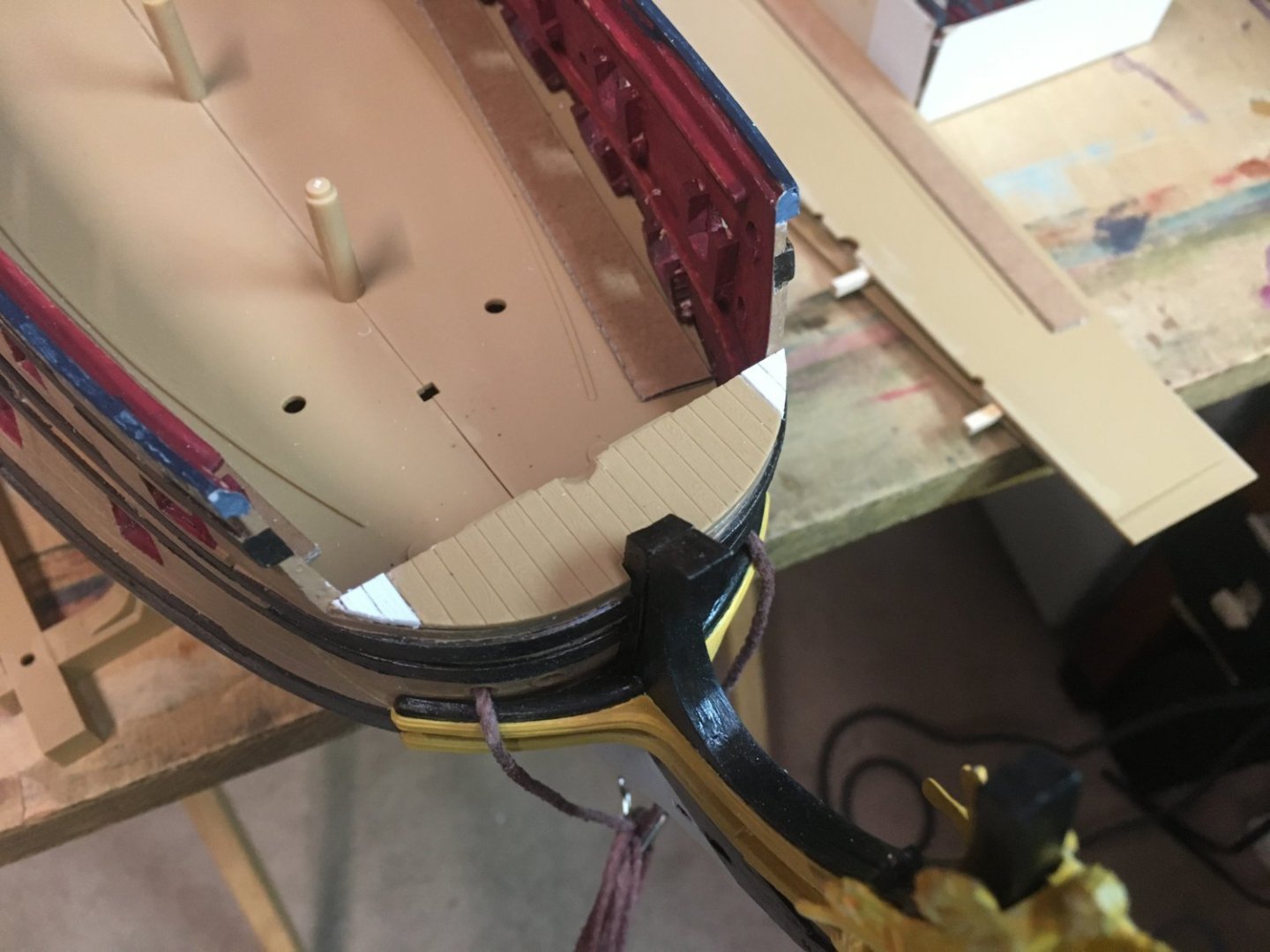
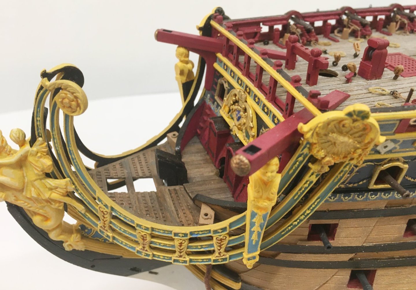
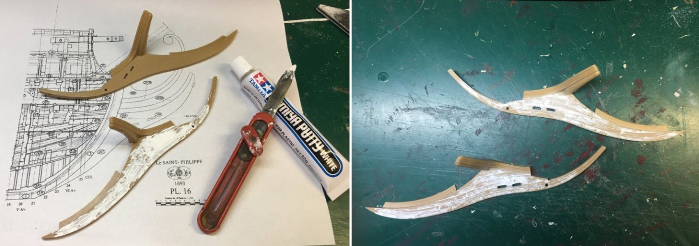
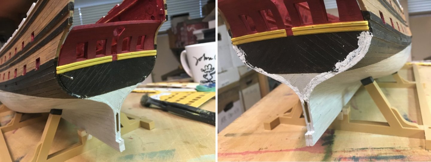
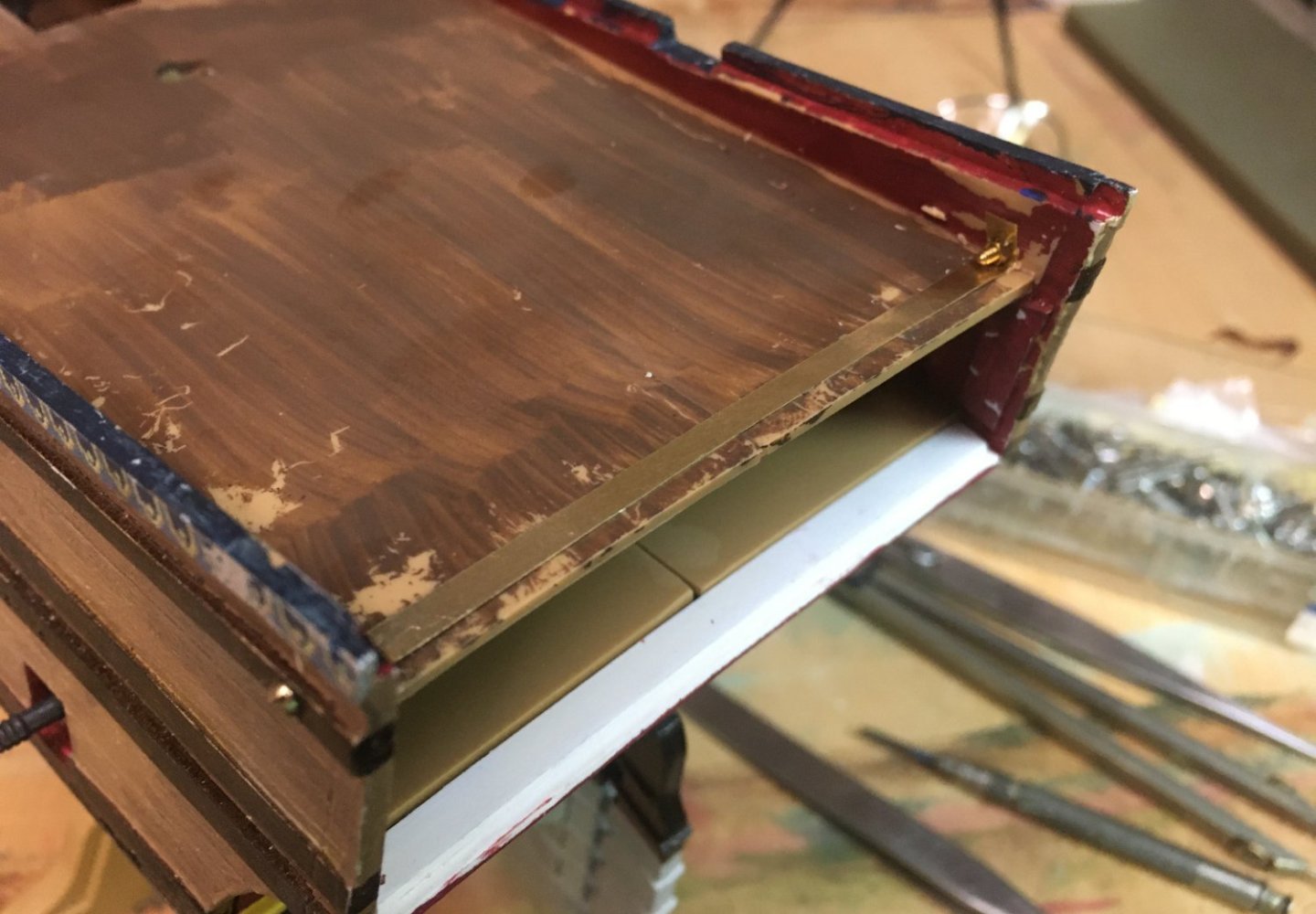
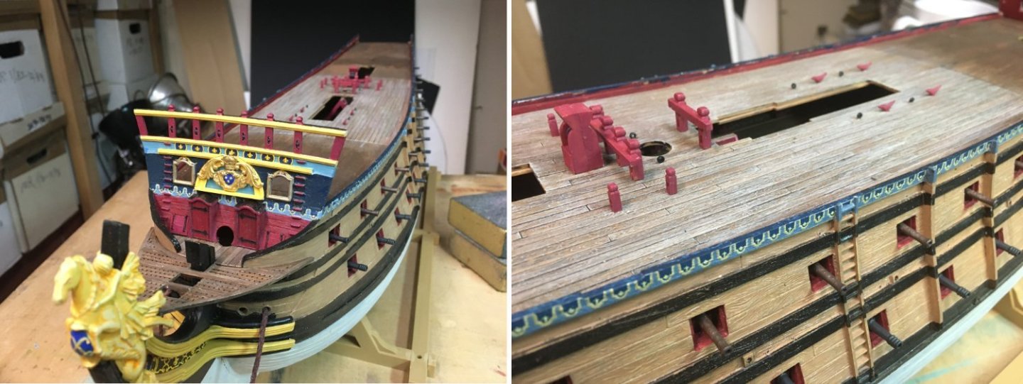
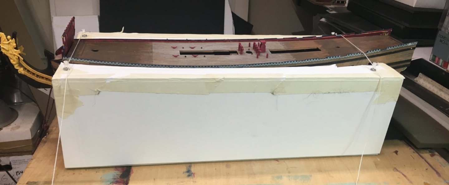
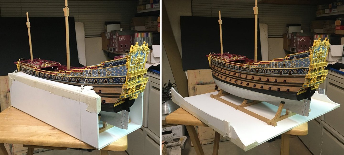
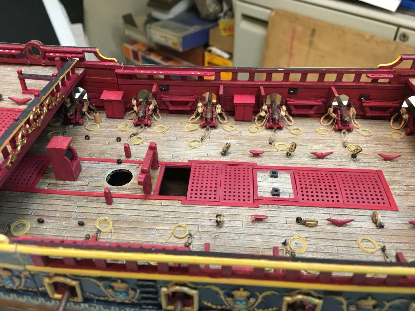
Welcome back. Here's my little tub recently, about half-done, and waiting on me to get a passing grade in rigging 101, as taught by M'sieurs Anderson, Marquardt, et Boudroit, so we can continue the build. Setting the "D–" in rigging class aside, getting to this point was fun and what I'll be blathering about today. At the end of about three months' work, I was finally ready to put some glue to parts and start assembling the hull. Sides and decks were painted. I had the guns ready for mounting. With binder clips, I could put it all together to see how everything fit. But I still had to make some improvements to the bow and stern—the subject for today. So where to start with the bow? One obvious thing is to remove the s—. . . ahem, roundhouses. Nobody except maybe officers could expect privacy on a 17th-century warship (their facilities were in the enclosed quarter galleries). Roundhouses weren’t even introduced until the early 18th-century. This was a period-inappropriate goof made by Tanneron on his model and copied by Heller. It was time for surgery. The roundhouse bases were sliced off the beak deck and replaced by strip styrene. The insets for the roundhouses on the front of the forecastle were likewise patched. Next problem, the front of the forecastle was too plain for my taste. I had a drawing of the 1693 Royal Louis that gave me a clue where to start—blue above; red below. It made sense to me to continue the colors and patterns from the hull sides around the front, so I made decals that matched. I ended up painting over most of them, but you'll see that evolution presently. I had read that the royal ships mounted the king’s arms on the bows. I used mold putty and epoxy resin to copy the royal emblem from the stern. I added a crown—a little brass jewelry stamping from Etsy—because that was how royal arms were always supposed to be displayed. (On the stern, the crown is above the frieze, under the center lantern.) I was sort of okay with this until I got a look at the forecastle on Marc La Guardia’s beautiful ship. Then I wasn’t okay. I was jealous. (It has happened more than once!) I went back and studied every old painting and drawing I could find, looking for a fancier treatment of the royal emblem. I came to realize the king’s arms got special artistic consideration wherever they appeared. They were usually isolated from the other design elements by some sort of containment— a box, a shape, a frame— that indicated how exaltedly separate the king was from everything mundane. He didn’t mix with the hoi polloi. In the Bérain drawing of the Soleil Royal’s stern, the king’s arms were isolated by a lunette. I decided to make a similar complimentary lunette for the prow. Eventually, I settled on copying a lunette from a drawing of another ship, Le Fleuron. The lunette was made from scrap styrene, plus the earlier resin casting and a pair of brass stampings I found on the Etsy website. This was beginning to look better. (Thank you, Marc, for the inspiration!) I continued the planking and wales from the ship’s sides around the front, because that seemed to be a neat thing on certain antique ship models. The beakhead slats were turned into gratings by adding thin styrene strips. It just seemed more logical, if anyone was expected to walk there on a rolling ship without turning an ankle. Eventually, I added a pair of “seats of ease” to the head. They probably should have both been two-holers, but I never could figure out how even four seats could have serviced a crew of 900. I’m sure there were other… avenues of relief. Moving on. Heller’s knee of the head has a lot of odd detail—like the holes for the bowsprit gammoning placed parallel to the waterline, and all those mold lines indicating separate pieces of wood. I saw some modern reconstructions, like Jean Boudroit’s drawings of L'Ambitieux, that show something similar, but other descriptions say the knee was made from just a few large pieces. I decided to just de-emphasize everything. I took the white putty, sanding sticks, and drill bits to the pieces and did some revisioning. When it came time to glue the knee to the hull, there was significant gapping—but nothing a little tapered strip styrene and white putty couldn’t handle. The ship’s figurehead was beautiful, but a mold flaw deprived the fairy sea nymph (or whatever she was) of her port wing. I carved another from sheet styrene. Instead of gold leaf, it looked to me like most ship’s statuary from the Baroque was faux gold—different shades of yellow ochre, with bright lead-tin yellow for highlights and browns or oranges to deepen shadows. Sometimes the formula included a coat of Burgundy pitch (spruce resin) with powdered copper or brass. There are some examples of faux gold nautical statuary in French museums. I used them as color models when I painted the figurehead. This worked out well and I now knew what to do when I got to the figures on the stern. The colors I used were the same mix of Vallejos and generics I had on hand—Vallejo 70.948 golden yellow, 70.858 ice yellow, 70.911 light orange, and a generic craft acrylic, "antique gold" which was a perfect yellow ochre. I couldn’t glue on the headrails until the bowsprit was installed and gammoned, but I could paint them. Here’s another example of special treatment for royal symbols—I decided the face of the Sun King surrounded by the sun’s rays was worthy of gold leaf. It and the royal arms are practically the only gilded parts on the bow and beakhead. I ended up gammoning the bowsprit twice—once, after mis-reading a measurement and using too light a rope. I cut it away to do the job over with the proper diameter rope. I followed the description and diagrams in Anderson’s The Rigging of Ships in the days of the Spritsail Topmast 1600–1720. Once the gammoning was on, I could fit the headrail braces, made from more Evergreen sheet and strip styrene. The oddball geometry of the beak and headrails defied making accurate measurements, so it took forever to cut cardstock templates, fit, cut again, fit, trim, fit—then do the same repeatedly with the Evergreen plastic—cut, fit, trim, fit—start again—cut, fit . . . . Forward to the stern. I decided to paint the lower stern red for a couple of reasons—first, it matched the red on the lower part of the forecastle. Second, I was inspired by this 1834 painting of the Foudroyant by Auguste Étienne François Mayer. Which seemed to perfectly capture the “look” of a Baroque French warship I was trying for. The lower stern piece didn’t quite fit the hull halves without a lot of coaxing with clamps and rubber bands. I didn’t want glue joints giving way at some later date, so I opted for a more metal solution. I drilled for pins to hold the lower part of the stern-piece in place. Then, after the glue was dry, the heads of the pins were clipped off. White putty improved the joints. The upper part was fixed by pulling the hull pieces together into a tight fit and installing a brass strip attached with screw-headed bolts and nuts. The bolt-heads would be invisible inside the quarter galleries. Since I had extended the stern 3/16”, the middle gundeck got an matching extension with a lip to hold the stern plate. The stern plate wouldn’t get glued on until I had finished the balconies and was ready to do the quarter galleries. In the meantime, I made sure the piece fit the new stern extension perfectly. I thought the rear gunports were oddly proportioned—a little too tall—so they were cut down in size by the addition of some decorative framing. The cut-down doors were decorated with the king's monogram (more decals). It was here I decided that the gunport doors throughout the ship were going to be held open by blackened wire—not thread. I disliked the way thread looked when it was slack, and I never found a way to make both sides taut at the same time. The stern lights on the Heller model are supposed to be leaded windows. But instead of thin cames (the proper name for the lead strips between panes), the kit windows have fat three-inch mullions. Kind of typical for a small-scale plastic model, but not optimal. I decided to give them another try. First, I put the stern on my scanner and made a to-scale digital image of it. Then I chopped out the thick mullions— On my laptop, I used the scan of the stern plate as a template to draw new lead cames in Adobe Illustrator. When the time came to assemble the stern, I printed the cames on a sheet of laser printer transparency film. After seeing how the dark cames disappeared against the dark windows, I decided to use the printout as a template and make the cames with thin white chart tape on clear styrene. It made them fatter again, but they still looked better than the plastic mullions. An important but missing element on the stern plate was the lunette that separated and highlighted the king’s arms. This was very evident on the Bérain drawing of the stern. The crest was too important an element to be simply built into the frieze. So, after scribing a guideline with a circle template, I got out more sheet and strip styrene. This element was important to Baroque thinking. As mentioned before, the king’s emblems were almost sacred, and they were almost always isolated and given priority over all other visual elements. The king’s arms here would later get painted with expensive ultramarine blue and gold leafed. The stern plate was given two shades of yellow— yellow ochre (generic “antique gold” craft acrylic) for the lower “background” surfaces and Vallejo 70.948 golden yellow for the higher “foreground” features like frames and decorations. Where blue was needed, I used the same old 70.943 grey blue to match blue verditer paint. The king’s Apollo-in-his-sun-chariot frieze was designed by Charles Le Brun after Le Brun’s similar Apollo fountain in the gardens of Versailles. The fountain statuary had been originally covered in gold leaf (I understand it has recently been restored to gold leaf again). That fit right in with my notion that the only major parts of the ship that were genuinely gilded had to do with the king himself. Back when I was making Photoshop mock-ups, I had planned to gild the Apollo frieze and the Sun King's face on the top of the quarter galleries. I made a few minor changes to the paint scheme on the fly—using the lighter blue on the Apollo frieze and giving it a white frame instead of more gilding. The frieze was painted white. After it dried, I carefully masked to separate the white frame from the frieze’s blue background. The gold followed the blue. I had brand-new fine-tip sable detail brushes, so I hand-painted the whole thing. Apollo-Louis and his steeds got painted Vallejo 70.996 gold with 69.060 old gold on the undersides for shading. Feathered it so there wasn't a hard transition. Gold was also used for the zodiac frieze above and the chains of bellflowers between the lights. The insides of the upper gundeck and quarterdeck balconies got some of the leftover decals, continuing the patterns from the sides around the stern. I later painted the insides of the false balcony on the middle gun deck red, like an interior bulkhead. The lights got their white-chart-tape cames, sealed onto the clear styrene by a coat of Testor’s canopy glue. I would finish the stern balconies later, in concert with the quarter galleries. The model **finally** got glued together. By this time, I had been working on the ship for three months. In the photos below, you can see the mostly-hidden lower and middle deck guns sitting on their simplified carriages glued to cardboard strips. In theory, the cardboard was supposed to provide a little "give" and prevent guns from breaking loose every time they were bumped. I didn’t want any light-colored plastic decks visible through hatchways, hence the big blob of brown paint on the middle gundeck. Around the second time I accidentally knocked a gun barrel loose, I realized my cardboard-strip scheme wasn't doing its job. Some added protection was needed. I made a clamshell box out of 3/16” foam-core, masking tape, push-pins, and string. Same width as the model's cradle. Undo the string and the sides fall away flat. The model wears its boxy cuirass to this day and it’s one of the most useful ideas I’ve ever had. Haven’t knocked a gun loose with my big clumsy hands since. I can carry the ship without disturbing anything on it. This is handy since the model has outgrown my workbench and has to sit beside me on a TV tray while I prepare parts for it. When not being worked on, the model gets boxed up and set on a two-foot shelf that will someday be an extension of my . . . (pardon the expression) . . . ahem, model railroad. As the build progresses, I’ve cut away portions of the box to expose parts of the ship I didn’t want the foam-core rubbing against. Before I could install the upper decks, I had to figure out a rigging plan so I could finalize the deck furniture. Then I needed to make quarter galleries. This will all be discussed next time, along with a little history of the development of French quarter galleries. Until then, Honneur, patrie, valeur, discipline—and 5-minute epoxy. That should cover it.


- 80 replies
-
- 12
-
-
-
- Soleil Royal
- Ship-of-the-line
- (and 2 more)
-
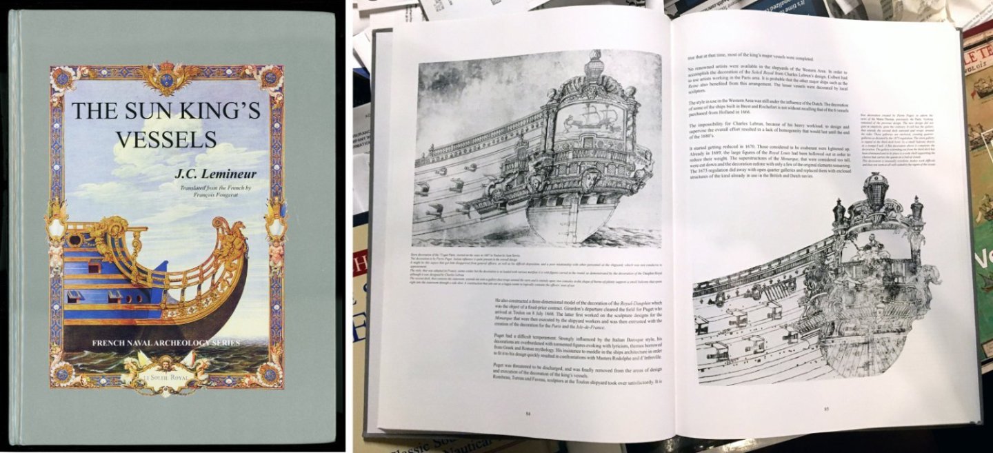
Hi Daniel. The knowledge I have comes from from sources like Winfield & Roberts' French Warships in the Age of Sail 1626–1786 and Jean-Claude Lemineur's The Sun King's Vessels. The latter book is a focused monograph on the development of French three-decker warships. That and all the other sources I've read say that the SRII was built as intended, a 100+-gun three-decker, originally meant to be named Foudroyant. It wasn't modified from a smaller warship. It was already completed and ready for decoration at the time the issue of renaming came up. That being said, it's entirely possible the ship sat lower in the water than intended. Ship design science wasn't great before the age of slide rules. Nobody really knew the displacement of a ship before it was launched. All that had to be adjusted by adding or removing guns, ballast, etc. However, it's hard to escape the fact that Tanneron used a lot of exaggeration with the proportions of his model. Even if we ignore the shallow draft, which isn't close to the 24 feet mentioned in surviving records, there's the issue that Tanneron built his model with eight feet between gun decks. There's just no way any shipbuilder back then would have done that. I think the best suggestion is that Tanneron exaggerated the proportions to give more emphasis to all the remarkable miniature carvings he made for the stern of the model. Good enough reasoning for me.
- 80 replies
-
- 3
-
-
- Soleil Royal
- Ship-of-the-line
- (and 2 more)
-
Thanks, Kirill, for your observations. You are right, I tend to use "found" materials (like the common string I used for breech ropes) on models simply because I'm not very experienced at building large ship models and I'm having to learn as I go where to get correct-to-scale materials. Or learn if they even exist. Yes, I know the gun rigging blocks are large, but I didn't find 2mm blocks until after these guns were already rigged. My six-pounders with the smaller blocks look better. I think I'd have to dismantle the ship if I wanted to re-rig the guns and replace the larger blocks. The project is probably too far along to do that. At some point, I have to live with my mistakes. "Learning experiences." Considering that the model is going to live in a plexiglas case and be viewed mostly from a few feet away, I don't mind that the detailing doesn't match contest-model standards. That was never the intention. But it is nice to learn what's possible, so I can do a better job next time. Thanks again! John
- 80 replies
-
- 2
-
-
- Soleil Royal
- Ship-of-the-line
- (and 2 more)
-
It does looks to me to be more practical and space-saving. Thanks, Henry.
- 80 replies
-
- 3
-
-
- Soleil Royal
- Ship-of-the-line
- (and 2 more)
-
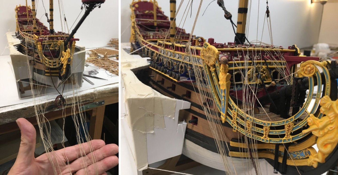
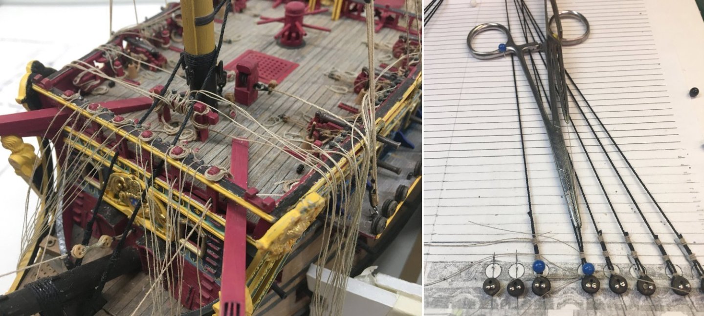
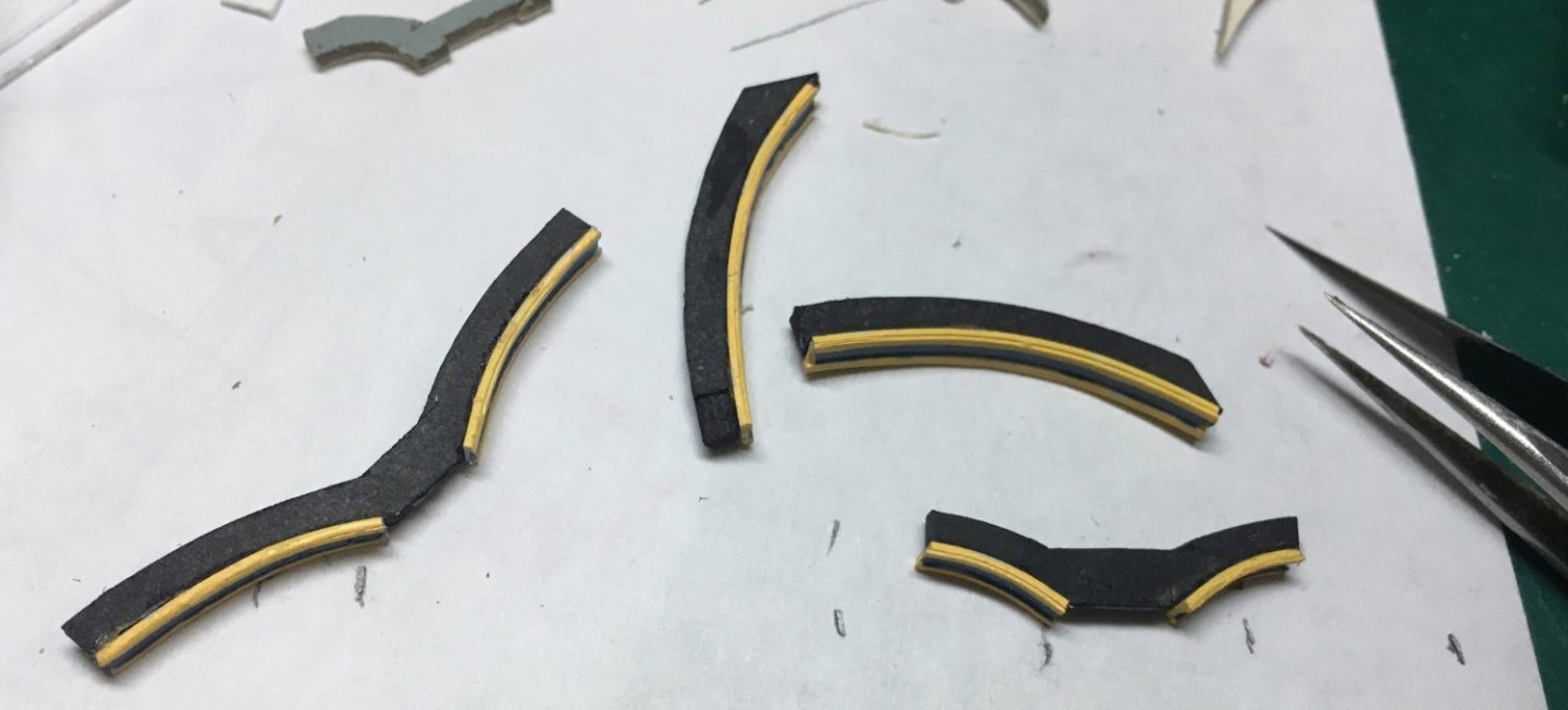
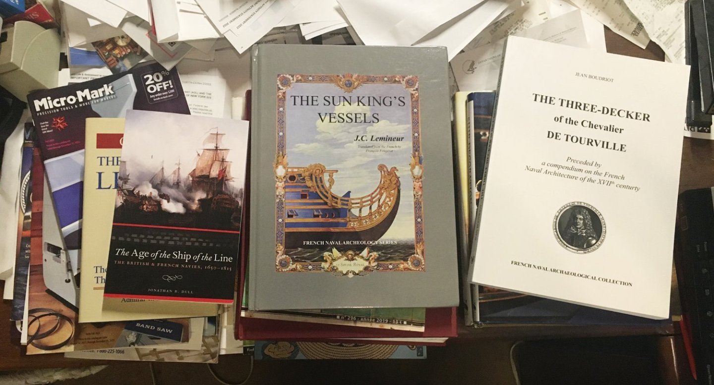
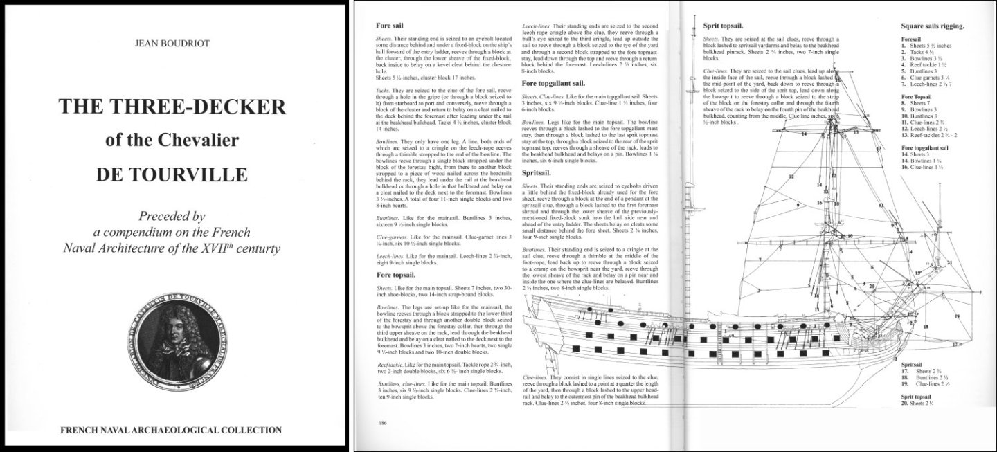
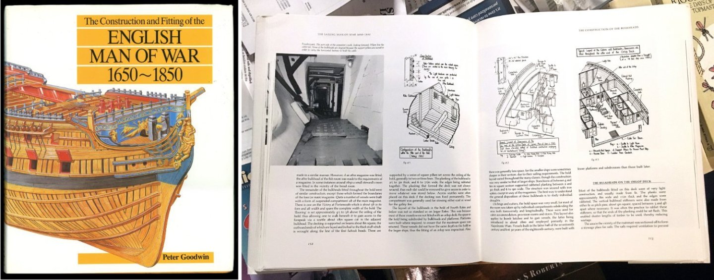
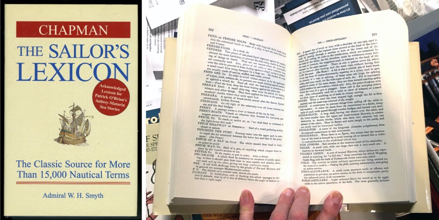
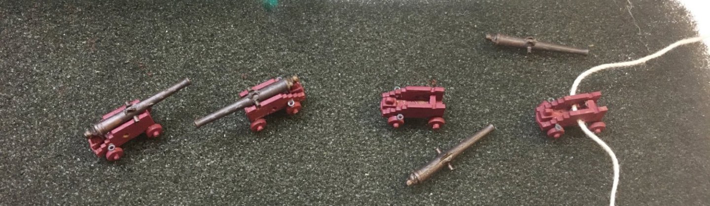
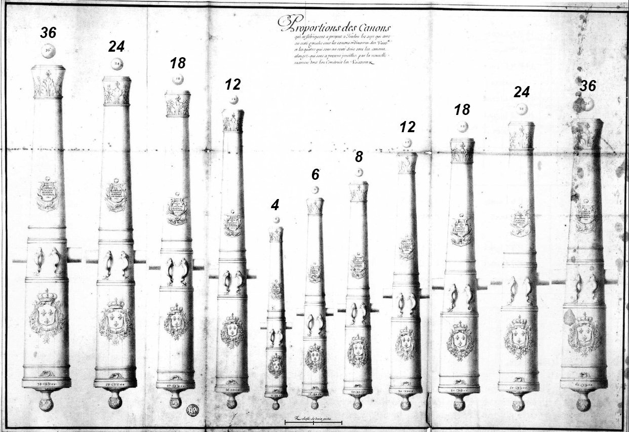
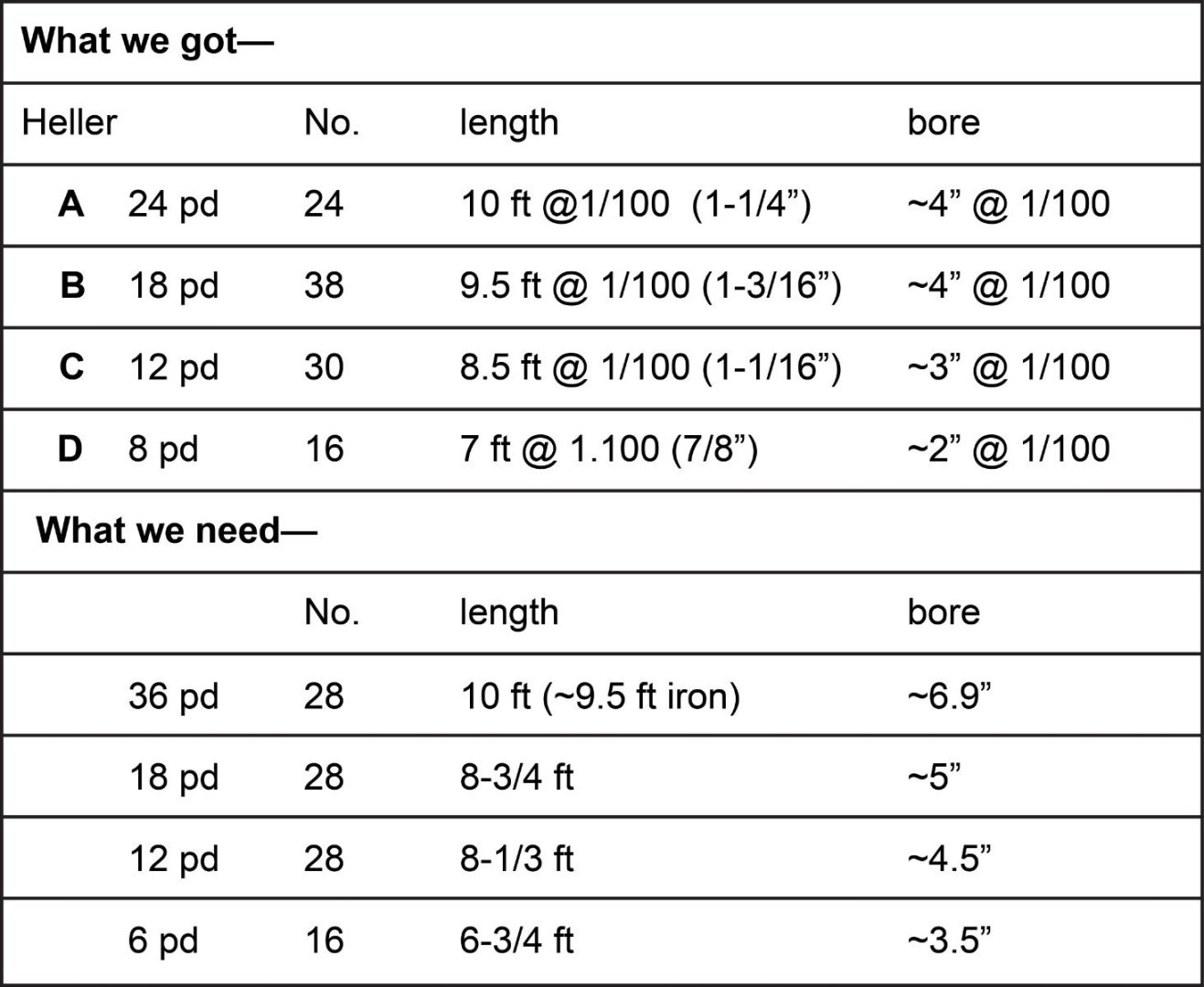
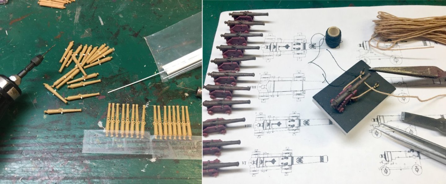
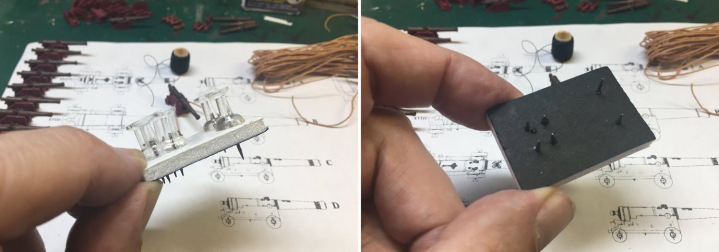
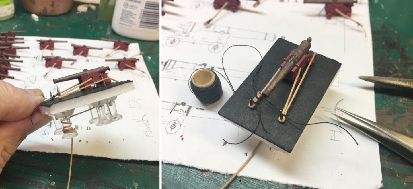
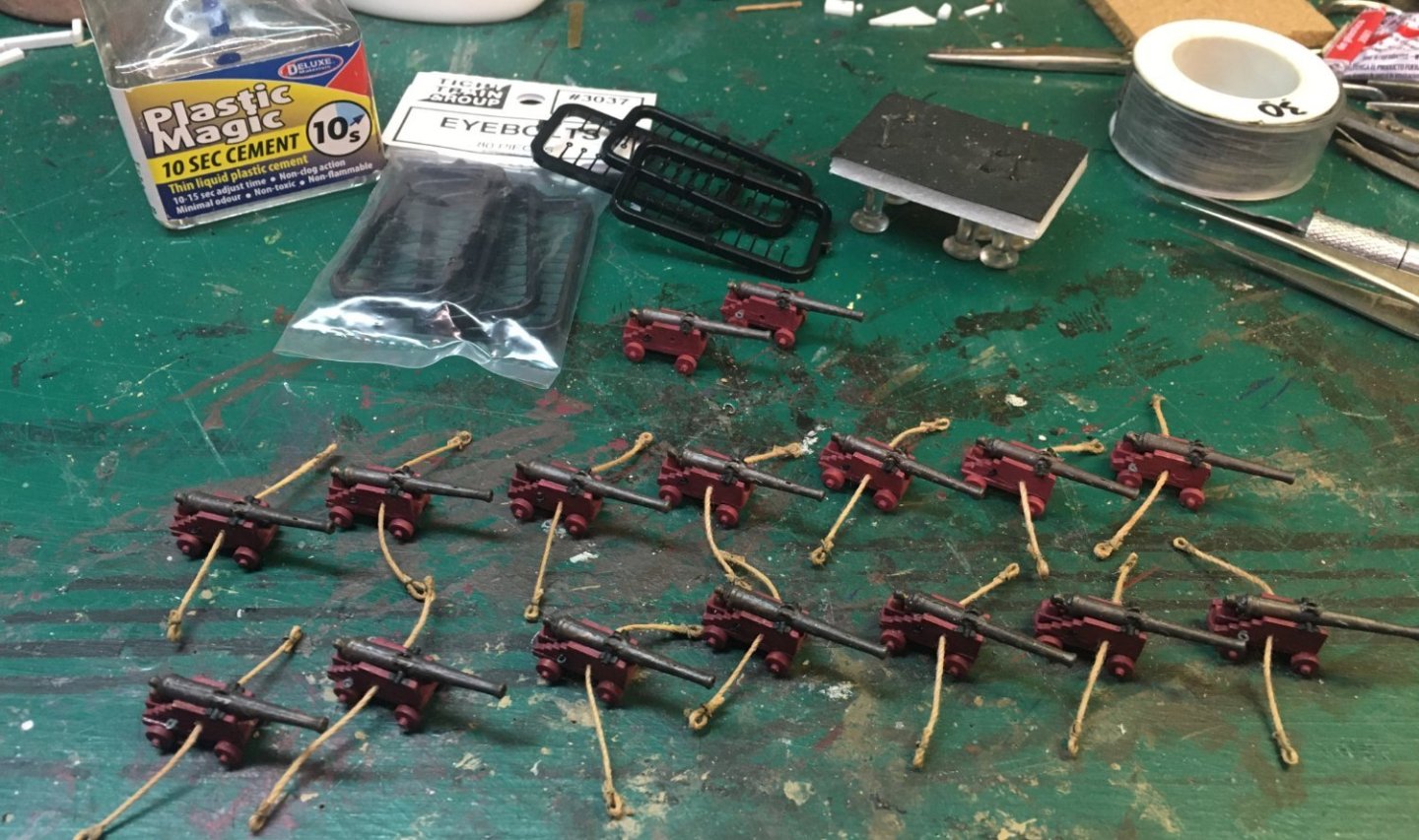
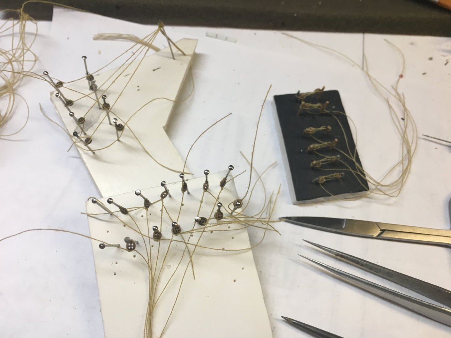
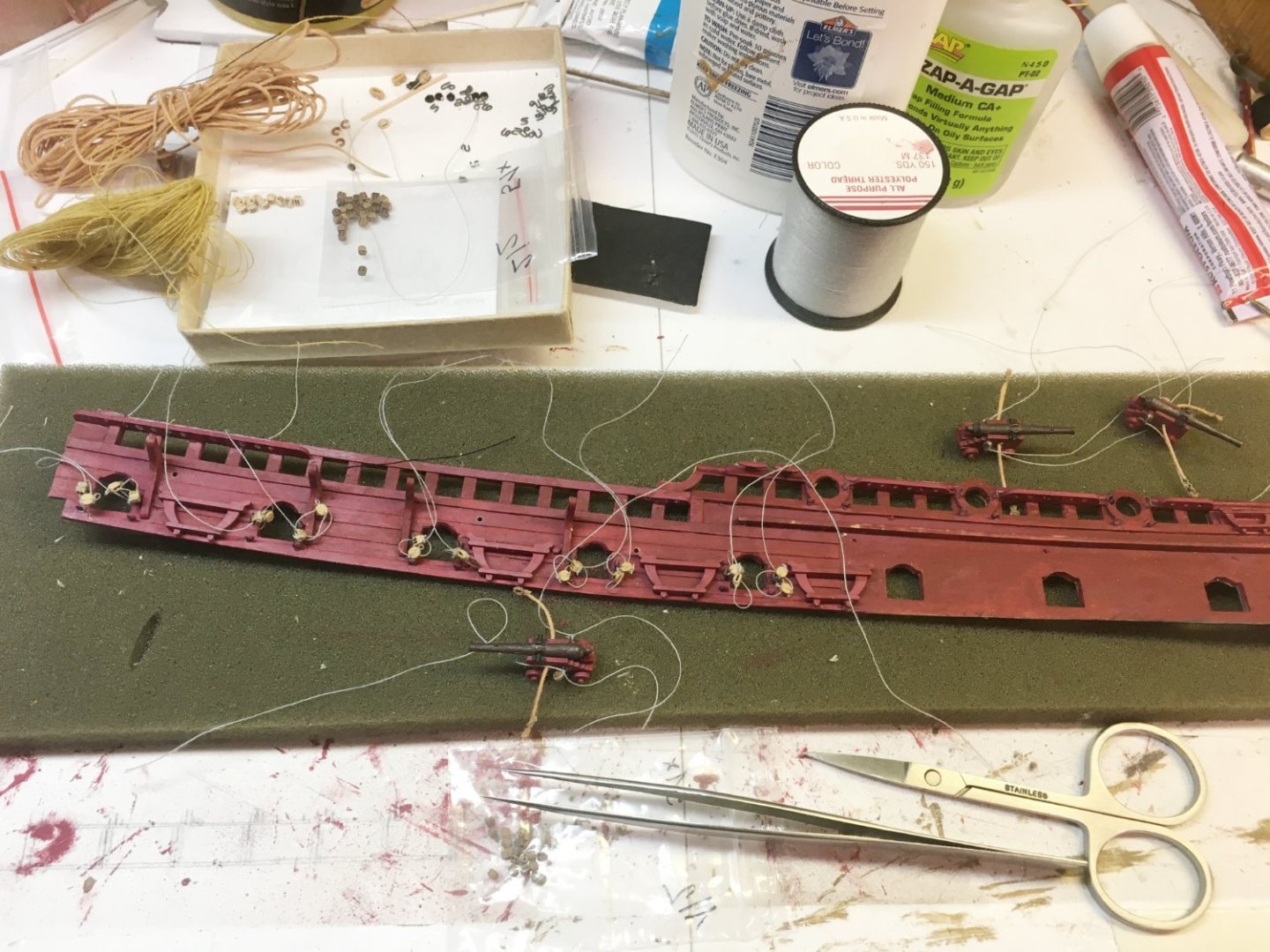
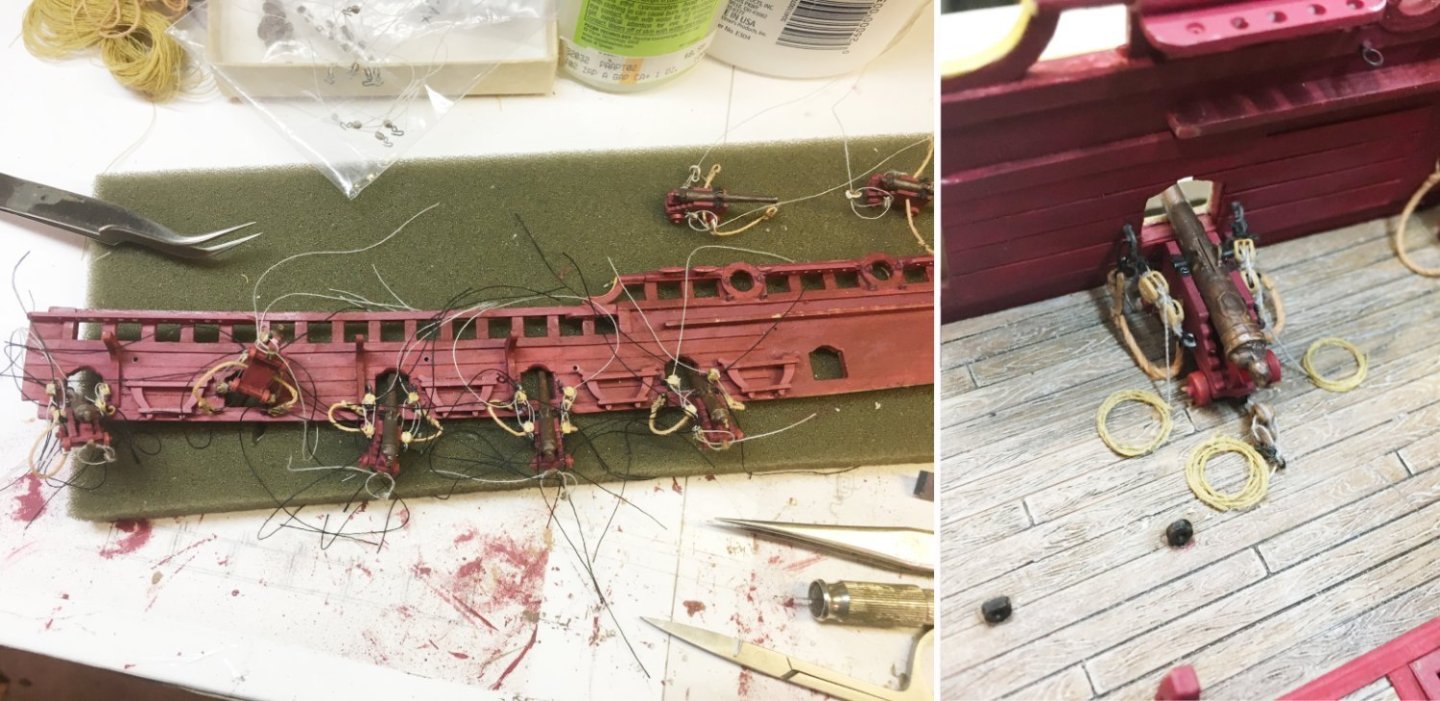
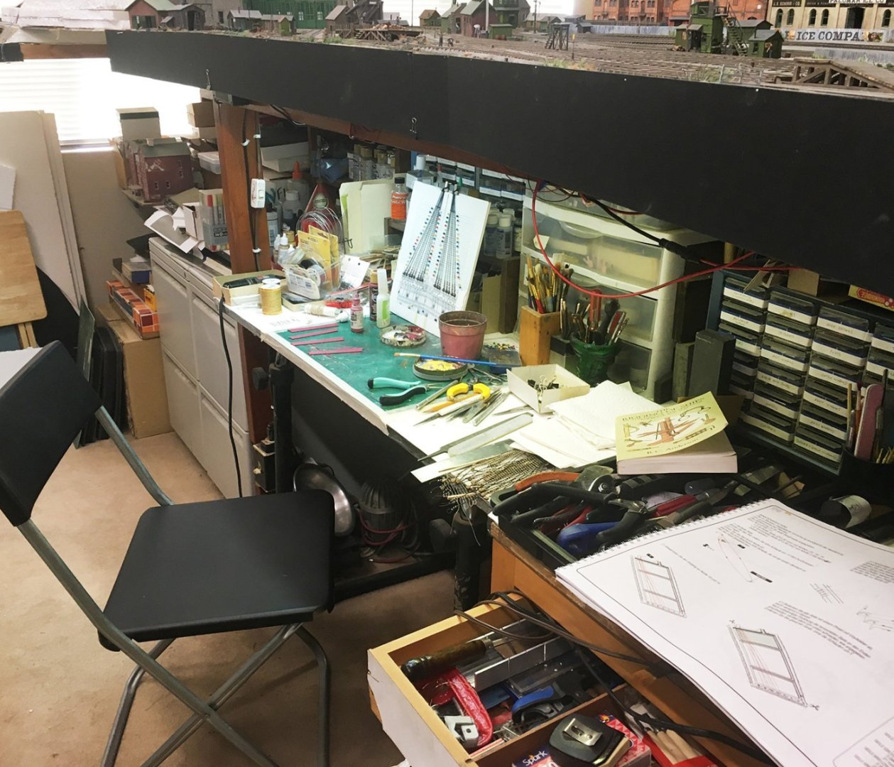
The side of my desk is stacked with books used to support my Soleil Royal project. There will be the matter of finding shelf space for them eventually, since all my bookcases are overloaded, but I'll worry about that sometime in the future, after the build is done. Having good sources to consult for how-things-worked and how-things-looked is part of the fun of model-building for me. Others can do just fine with following the kit directions and come up with a nice model, but for me, that misses out on a lot of the enjoyment. Art needs context. Unfortunately, when it comes to the Soleil Royal, you can't just drive down to Brookhurst Hobbies or The Last Grenadier (or whatever your hobby shop is) and buy a Squadron book written especially for model-builders. Baroque ships are somewhere off the map of popular model-building. You have to find out about sources from other model-builders who have been down the same road before you. So, in that spirit, here are my main text acquisitions that have helped (and will still help me) in my Soleil Royal build. If you have others of your own, PLEASE add them in the comments. French Warships in the Age of Sail 1626-1786 by Rif Winfield and Stephen Roberts. Just really handy, basic stuff. Contains capsule specs, dates, and historical summaries of every French ship from the Baroque. Also includes short summaries of all the wars and battles, ship technology, and gunnery. Find a copy on Amazon— Kindle 4.99, hardcover 60.54, used from 49.98. (I checked just before writing this.) The Three-Decker of the Chevalier De Tourville by Jean Boudroit. This is the best book I've got on referencing and detailing three-decker French Baroque warships. There's a much better review than mine on Ships of Scale: https://shipsofscale.com/sosforums/threads/the-three-decker-of-the-chevalier-de-tourville-le-trois-ponts-du-chevalier-de-tourville-l%E2%80%99ambitieux-1680-by-jean-boudriot.4253/ The book is broken into two parts. The front part, "A compendium on the French Naval Architecture of the XVII Century," is a detailed exegesis on the attempts of Louis XIV's bureaucracy to standardize shipbuilding, including all the letters and documents outlining what the sizes and structures of the ships should be. (This was largely ignored by the shipbuilders, but that's another matter.) It contains a ship-by-ship review of ALL the surviving plans, drawings, and documents in the Paris Marine Museum. The second part is Boudroit's generic reconstruction of a three-decker warship ("L'Ambitieux"), complete with plans, drawings, and specifications for EVERYTHING, including deck furniture, rigging, and belaying points. I know there's been pushback from modelers on some of Jean Boudroit's conclusions. Your mileage may vary. Boudroit also wrote several monographs that I haven't seen on the ships of this period. Based on what I've seen here, if I were rich, I'd get them all. You can get an English-language translation of this book from the publisher, ANCRE. 50 euros plus shipping: https://ancre.fr/en/monograph/68-monographie-de-l-ambitieux-vaisseau-3-ponts-1680.html#/langue-anglais The Construction and Fitting of the English Man of War 1650–1850 by Peter Goodwin. This one is a good explanatory text on the frame-by-frame structure of a Baroque ship-of-the-line—keel, beams, knees, timbers, planking, bulkheads, fittings—that sort of thing. The "English" part shouldn't scare anyone off. Shipbuilding technology wasn't all that different across the Channel in the nation of shopkeepers. Plenty of drawings and diagrams. Really good for figuring out the details of the hull, what sizes they were, where things go, and how they worked. Amazon—hardcover 45.41, used 23.53. The Sailor's Lexicon by Adm. W.H. Smyth. I'm a train modeler. I needed this. Badly. It's a good way to keep terminology at least halfway straight when deciphering the logs of other ship modelers, who will always know much more about ships than you do. Amazon—hardcover 12.15, used from 10.00. The Sun King's Vessels (aka Ships of the Sun King) by Jean-Claude Lemineur. A scholarly study of the development of three-decker French warships in Louis XIV's time and the development of standards for the various ranks of warships. Kind of similar to Boudroit's book. Lots of basic information on the layout and structure of the ships—distance between gunports, overall ship length—stuff like that. Good sections on ship decoration and ordinance. Lots of good hull drawings and ship diagrams. There's not much specific to the Soleil Royal simply because not much information has survived, but this provides a good context. Lemineur also wrote a detailed monograph and ship plans for the three-decker Saint Philippe that I haven't seen, though many modelers swear by it. Amazon has The Sun King's Vessels in English. It's a poor translation that reads like somebody ran the original text through Google Translate, and a lousy layout done by someone who didn't understand typesetting, but all the pictures and diagrams are there and you can make sense of the text with a little work. Hardcover 129.00. Ship Decoration 1630–1780 by Andrew Peters. A book on ship decoration by a guy who decorates ships—at least, reproductions of historical ships. This is more of an art book, but a must-have for anyone who admires and wants to understand the decoration schemes of English, French, Dutch, and other northern European Baroque ships. Want to know why Jean Bérain was different from Charles Le Brun or Pierre Puget? It's all discussed from an artistic and art-historical standpoint. I love this book. Amazon—Kindle 4.99, hardcover 42.09, used from 30.28. The Rigging of Ships in the Days of the Spritsail Topmast, 1600–1720, by R.C. Anderson. This is your first stop for rigging Baroque ships. Anderson's text is well-organized, very readable, and has lots and lots of illustrations. The text is divided up into standing rigging and running rigging sections. He points out where French practice differs from English practice, and gives approximate dates for innovations. It's written by a ship modeler for other ship modelers. Before getting into the weeds with detailed rigging diagrams, read Anderson first. Amazon—Kindle 9.99, softcover 16.94, used from 3.84. So cheap, I can't imagine anyone doing without this book. Eighteenth-century Rigs & Rigging by Karl Marquardt. After you finish Anderson, you'll think this is Anderson on steroids. Every line and every block is broken down mast by mast, yardarm by yardarm, and sail by sail. Not only for big three-masted ships, but every class of ships, galleys, or boats from the era, no matter which nation. Marquardt also includes tables of rope and block sizes taken from period documents, plus complete belaying diagrams. In spite of the title, Marquardt also includes a healthy amount of information specific to the 17th century. He includes French terminology for every piece of rigging. (A bowsprit shroud collar is a collier de hauban de beaupré.) There are many, many more diagrams than found in Anderson. It's easy to get totally lost in Marquardt, which is why I recommend reading Anderson first. Still, this book is indispensable to me. Amazon—hardcover 90.35, used from 89.95. French Naval Sculpture Under the Ancien Régime (1650–1789) by Ronald Portanier. This is a free PDF available from the website below. It's the author's doctoral thesis on the decoration of french warships and goes into great detail on each aspect of the French process of ship decoration, including how the sculptures were made and how they were finished before installation. It's another art book, in essence, but a treasure trove of information on the bureaucrats, artists, and sculptors responsible for the ships, with lots of illustrations. It's free. Get it. https://spectrum.library.concordia.ca/id/eprint/984742/1/Portanier_PhD_S2019.pdf So what else have I missed? Please let me know your indispensable references in the replies. In the meantime, here's what I did with my kit's unextraordinary ordinance. I needed a couple of decks' worth of guns before I could start gluing the hull together. Other people have remarked on the issues with the kit’s guns. Trunnions, carriages, cascabels, calibres, lack of rigging, and just plain general sizes and proportions could use improvement. Fixing and detailing 100 guns is a deep rabbit-hole. To start from scratch, the 1704 version of the ship (the one I’m modeling) needed 28 36-pounders (lower gundeck), 30 18-pounders (middle), 28 12-pounders (upper), and 16 6-pounders (quarterdeck and forecastle). Of these, 26 6- and 12-pounders were going to be on open decks exposed for all to see, needing to be rigged and have all the details right. That’s a lotta guns. The kit provided what it called 24 24-pounders, 38 18-pounders, 30 12-pounders, and 16 8-pounders. Hmmm. It wasn’t hard to go into the books and find the prototype sizes and proportions for the right guns. For instance, a bronze 36-pounder was 10 feet long and had a calibre of 6.88”. An iron barrel of the same calibre was closer to 9-1/2 feet. In the time period I was modeling, bronze guns predominated, but iron guns had been introduced and were becoming more common. The kit’s 24-pounders looked too skinny and had too small a calibre to look right. They weren’t fat enough to drill out to the nearly 7” that a real 36-pounder had. They would have to be replaced. A search through all the naval model suppliers on the internet didn’t come up with many options for 1/100 scale. Since most of the guns were just going to be barrels sticking out of gunports, I decided some liberties could be taken with the barrel sizes. The calibre would be more of a consideration than the length. I penciled up a table— I found some right-sized (fat) guns to represent the 36-pounders on eBay and bought 30 of them. They were only 7.5 scale feet long, but nobody would see anything except their muzzles sticking out from the lower gundeck. More importantly, they had a nice 6”–7” bore. I found out later that they were probably modeled after guns from a century or more after the time of the Soleil, but ehhh. I wasn’t going to take the ship apart to replace them. I decided they were iron 36-pounders instead of bronze, so they were painted black. (The real iron guns were.) If you don’t want things noticed, paint them black. The kit’s 24-pounders became the middle gundeck’s 18-pounders, muzzles drilled out with a #55 bit to get close to a 5” bore. I kept the kit’s 12-pounders, just drilled them with a #56 bit to make 4.5” bores. The kit’s 8-pounders became the 6-pounders, drilled out with a #65 to a scale 3.5”. Four of the kit’s 18-pounders became “iron” 18-pounders instead of bronze—slightly smaller, painted black, and drilled out to the 5” bore. That made up for the shortage of 18-pounders. The rest of the kit’s 18-pounders were surplus. Most of the guns were supposed to be new bronze, but the hobby shop was out of anything closely resembling bronze paint. I mixed my own, using Mission Model’s dark rust and Vallejo 71.072 gunmetal. It came out a rich, shiny, metallic dark brown—just like recently-cast bronze. I didn’t want even a hint of green patina. Most of the guns in the rapidly-growing French fleet of the 1690s were newly-cast, and I imagine gunner’s mates would risk a flogging if their weapons weren’t cleaned, vinegared, and shined. This was the king’s ship, after all. I was going to prepare two classes of guns. The ones hidden in the lower decks were going to be rudimentary, just the barrel sitting on a wheel-less carriage. No rigging or detailing. The 26 visible on the open decks were going to get all their “Hellerisms” corrected—trunnions in the right place, carriages with proper seats for the trunnions, eyebolts for the gun rigging, and holes drilled in the sides of the carriages for the breech ropes. The new lower deck gun barrels from eBay needed something to sit on. I fashioned some simple styrene boxes. Because they and the middle deck guns were going to be mostly hidden, their carriages didn’t have to sit on four tiny wheels with four tiny glue points to come loose. I wanted a bigger and stronger mounting surface that was just a little flexible so that if a gun was accidentally bumped, it might still stay in place. Here's the template I made for the boxes. It got spray-glued to a sheet of 1 mm styrene and used to drill and cut. This ain't to scale, in case anyone is wondering—it's just to show the principle. When it came time to glue the hull together, I attached some corrugated cardboard strips to the decks and glued the flat bottoms of the wheel-less carriages to them. The dressy, visible guns got new trunnions (Evergreen styrene 1.2 mm rod) and breech ropes. The carriages had the raised trunnion blocks carved away, new slots for the trunnions filed in, and holes drilled into the carriage sides for the rigging eyes and breech ropes. The breech rope stock (kite string) was white—ugly and not looking like rope—so about five feet of it got stretched and stained with the same cork brown color I used for the hull and decks. It helped. A little jig made from foam-core board and push-pins insured the breech ropes were all the same length. I didn't bother with too many gun carriage details. I figured things like bolts, etc. weren't going to be noticeable anyway. Some black paint made it look like the trunnions had top brackets. Eyebolts for gun tackle were added to the carriage sides. So far so easy. In the meantime, I was trying to figure out how I was going to do the gun rigging. There were plenty of good diagrams on the internet. The main problem foreseen was dealing with all those tiny blocks. First task—where to get them? I ordered from a few different suppliers. Most were way too large, but Syren blocks were beautiful and small enough for the 12-pounders. Still too large for the 6-pounders, though. I finally got some 2mm blocks from HISmodels, which I used on the 6-pounders. If I had to start over, I would have used them from the beginning. I figured that it was easier to work on the gun rigging with all the pieces on the workbench, so the bulwarks got their guns tied to them before getting glued to the ship. All those blocks and lines… I think each gun needed sixteen knots. This is probably one reason why I build only one sailing ship per decade. It usually came out all right in the end. I’ve seen all the drawings and diagrams that show the gun tackle ropes in neat inspection-ready coils, but I wonder what the gun crews really did with their lines. I didn’t glue the coils down all that securely just in case I see something that changes my mind. I was getting closer to gluing the ship's hull together. I needed to work on the bow and stern first. That'll be in the next post. But now that it's October, I'm finally going on my summer vacation. I'll finally (hopefully) get to make some progress on rigging my ship. (Below are experiments that may or may not work.) See you in two weeks.


- 80 replies
-
- 5
-
-
-
- Soleil Royal
- Ship-of-the-line
- (and 2 more)
-
I'm with you there. I always thought Van de Velde was a more reliable authority because he obviously knew ships well and made his drawings after they were reality, while Bérain's and Puget's drawings were more... aspirational.
- 80 replies
-
- 4
-
-
- Soleil Royal
- Ship-of-the-line
- (and 2 more)
-
Hi Marc—the Furieux drawings are interesting because they have the same problems as Bérain's Soleil drawings—the stern and quarter drawings don't match up. I can understand why Bérain drew the stern asymmetrical, since they were proposal drawings, after all ("which do you prefer, monsieur?"), but someone in the office of ship decoration is going to look at those figures under the wing transom and say some bad words. Maybe Bérain was rushed, maybe he was overloaded with work from Versailles, or most likely he was just unfamiliar with the geometry of a ship. Is there any indication he even visited Brest or spoke to the shipbuilders, or did anything other than exchange letters and drawings? I honestly think the drawings were meant to be advisory only, and nobody expected the ship-decorators to follow them precisely. Still, Le Furieux would make a great modeling project for some brave soul. Lemineur has a drawing of the same class (66 guns, not 88 like I accidentally typed) in his Sun King's Vessels book.


- 80 replies
-
- 2
-
-
- Soleil Royal
- Ship-of-the-line
- (and 2 more)
-
Nice furniture, light walls, wood floor, no carpet, nice, well-lit corner. No clutter, everything necessary in easy reach. A great setting for building and rigging a great model. Of course you know you're making the rest of us look bad.
- 2,444 replies
-
- 8
-
-
-
- heller
- soleil royal
- (and 9 more)
-
Henry and Johnny—thanks for giving the correct spelling and usage of "ded reckoning." I kinda knew that, but my unfortunate propensity for joking around got the better of me. I'm not the one to go to for serieux discussion.
- 80 replies
-
- 1
-
-
- Soleil Royal
- Ship-of-the-line
- (and 2 more)
-
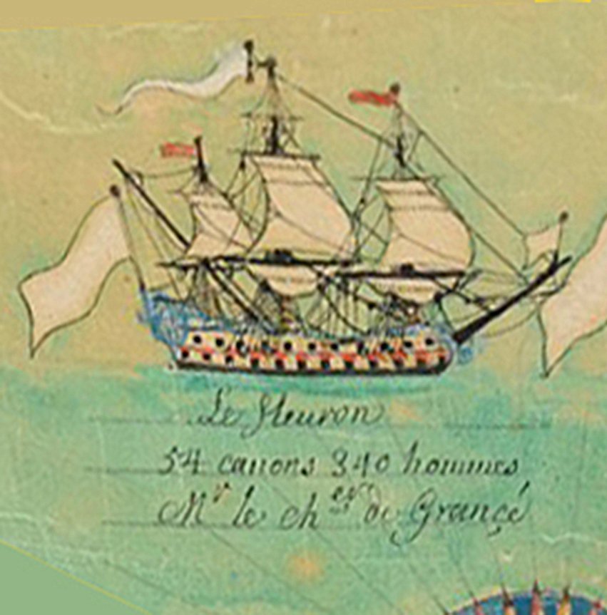
Hello Marc—here is le Fleuron, 60-gun 3rd-rate, 1689. It was wearing blue in 1704. And here's le Furieux, 70-gun 2nd-rate, 1684. Sorry—I didn't write down where I got these. I also attached a PDF that I made of all the sterns and galleries I could find. (Apologies—it's kind of large.) Used it for quick reference. Many of the images are ehhhh because they were low-resolution swiped off the internet. First & Second Marine Drawings by Date.pdf

- 80 replies
-
- 4
-
-
-
- Soleil Royal
- Ship-of-the-line
- (and 2 more)
-
Thanks for the comments, guys. Marc—yeah, I think naval history is pretty dry (ouch!) if you don't consider the personalities aboard the ships deciding what to do. Naval engagements are in many ways like battles between orchestra conductors. I'm sure professional historians would happily rip me a new one for over-dramatization, but I don't care. I like telling stories. Everyone can read the sources and come up with their own. Kirill—thanks much for the information. I'd love to see the books and models you referenced. I went back and forth on the issue of pin rails but finally decided that the model would be more attractive if I used them. Given the other appearance issues with the model, it seemed like a small compromise. Since my aim is to show the Soleil Royal as it more or less looked in the early 1700s, I rationalized it by thinking the ship must have been upgraded and re-rigged when it was recommissioned after sitting idle for eleven years. J.C. Lemineur also seemed to like pin rails. I was influenced by his drawings a lot.

- 80 replies
-
- 1
-
-
- Soleil Royal
- Ship-of-the-line
- (and 2 more)
-
If you're not into naval history right now, scroll down. There's some model-building stuff in the second half of this post. If you are, here's the bloody tale of the Battle of Velez-Malaga. A lot of Soleil modelers are familiar with the adventures of the earlier versions of the ship during the Nine Years War, involving the exploits of Admiral de Tourville, the battles of Beachy Head, Barfleur and La Hogue, and the Soleil’s encounter with a fire ship resulting in it being reduced to charcoal briquettes. Despite this last incident, the War was one of the high points in the history of the French navy. The Battle of Velez-Malaga on Aug. 24, 1704 during the War of Spanish Succession was another high point, this time featuring the Soleil Royal II, and this time the ship survived. The prelude to Malaga was boring in the sense that it was a typical Baroque raison de la guerre prompted by dynastic politics. The Spanish crown was being inherited by Louis XIV’s grandson; the English and Dutch were having none of it because two Bourbon kingdoms were one too many; diplomacy failed; war ensued, etc. The exciting part started in the third year of the war (1704) when the English and Dutch sent their fleets to the Spanish coast. After mucking around a bit trying to capture places of importance, the allied admirals, Sir George Rooke and Gerard Callenburgh, decided to attack someplace easy. Gibraltar was garrisoned by just 100 Spaniards. The English and Dutch took the place on August 4. In pursuit of the perfidious English and their lackey Dutch allies, the French channel fleet left the port of Brest on May 14, 1704 with the Soleil Royal II at the head of 26 ships-of-the-line, four frigates and six fire ships. The Soleil Royal II had been laid down in Brest by Étienne Hubac, son of the builder of the Soleil Royal I, in June, 1692. Originally to be named Foudroyant, the ship got renamed after the Soleil Royal I was destroyed in the Battle of La Hogue on May 24, 1692. Faced with the Sun King’s displeasure at having one of his namesake ships incinerated, it was decided to build a new Soleil as expeditiously as possible. Hubac’s main rival, the upstart Neapolitan shipbuilder Blaise Pangalo, was chosen to do the job. Pangalo had worked with Admiral de Tourville to design new ships along modern (for the 1690s) lines. The keel was laid in Brest in January, 1693. He made just one mistake. His ship—designed to be better under sail than Hubac’s—was only 166 French feet long. By this time, Hubac’s Foudroyant was nearly done. Smarting from the twin losses—his father’s masterpiece Soleil reduced to ash and then being passed over to build her replacement—Hubac pulled rank, bypassed the king’s bureaucrats, and wrote a letter to Louis XIV personally. Hubac argued that his ship should be the one to replace the Soleil Royal I. His father had built the original ship. He himself had rebuilt the Soleil Royal I from the keel up in 1689-90 after the hull rotted from disuse. He still possessed all of les garabits (moulds and templates) for the ship’s sculpture and decorations, designed by the king’s favorite decorative artist, Jean Bérain. Plus—and this was the kicker—his ship was four feet longer than Blaise Pangalo’s. Pangalo woke up one morning to a letter from the royal court. His ship was now renamed Foudroyant. Hubac’s was to be the new Soleil Royal. As soon as it was completed, Admiral de Tourville took the new flagship, armed with 108 guns, out on May 26, 1693. Near Lagos Bay, Portugal, on June 27, the 71-ship French fleet intercepted a large 200-ship English-Dutch convoy heading for the Mediterranean. The convoy and its protecting warships, commanded by George Rooke, were turned back, Rooke losing 40 ships captured and 50 sunk. The “Destruction of the Smyrna Convoy” was a significant victory for the French and considered sweet revenge for the loss of the ships at La Hogue (Rooke had been in command of the attacking force then), but it was mostly a one-sided battle. It was the last time the Soleil was used for eleven years. Like all the other royal flagships, the new Soleil was too big and took too many men to operate economically. It was reserved for big fleet actions and remained decommissioned in Brest harbor until needed. The next time the ship was taken out, for the 1704 expedition to Spain, the Soleil Royal had its armament adjusted. Six guns were removed from its quarterdeck and poop, probably for the simple expediency of lightening the ship to make it handle better. By this time, the prospects for the French fleet had changed. The French still had—on paper—a navy of the first rank. Louis had spent 21 million livres that year to maintain and enlarge his fleet, but French leadership was problematic. De Tourville was dead from tuberculosis. There was no fleet commander of equal stature to replace him. In a typical Baroque fit of royal nepotism, Louis had appointed his 26-year-old bastard son Louis-Alexandre de Bourbon, Count of Toulouse, to command the Spanish expedition. His mother had been Louis’s mistress, the Marquise de Montespan, and he had been a grand admiral of France since the age of five. The position was just one of the small cabinet of sinecures he was gifted with before the age of nineteen, which included marshal of France, commander of the royal armies, and governor of Brittany. What the young man had in the way of seamanship and knowledge of naval tactics could have been stuffed into his egret-plumed hat with plenty of room for his peruke-carpeted head as well. He was, wrote courtier Louis de Rouvroy de Saint-Simon, “a very short man, with as gracious a welcome as a natural, but icy, cold could permit . . . very applied besides . . . to know his navy . . . and hearing of it very well.” At least he was a good listener. It’s doubtful his father or anyone in the royal court gave him any decision-making powers. His mother, by the way, had been exiled from Versailles and Louis’s bed for consorting with poisoners. The French navy not being made up entirely of amateurs and fools, the Count of Toulouse was given a “mentor.” Marshal of France and Vice-Admiral Victor-Marie d'Estrées was a no-nonsense professional soldier who campaigned on land and sea indiscriminately with success. He had served under Duquesne and de Tourville, commanding the Mediterranean squadron but, delayed by weather, arriving too late to aid de Tourville at Barfleur. He made up for it by winning other engagements afloat and ashore, including leading a portion of de Tourville’s fleet at Lagos. He had commanded the Mediterranean fleet during the capture of Barcelona in 1697. Already in the present war, he had successfully used the fleet to bring Spanish king Philip V (Louis’s grandson) to Naples to claim the throne of the Kingdom of the Two Sicilies. He was made a Spanish Grandee for that. His family was high-ranking. His aging father Jean d'Estrées was still Vice-Admiral in charge of the channel fleet, but he was too old to go to sea. d'Estrées himself was rich and powerful, and most important, he was skilled at leading large formations of ships and men. Whenever Toulouse’s orders were handed down, they came in d'Estrées' handwriting. After prudently avoiding the English and Dutch squadrons cruising off the coast of Portugal, Toulouse’s squadrons passed the Straits of Gibraltar and arrived in Toulon on June 11, where they joined the French Mediterranean fleet. The Levant squadron was delayed in its preparations, and it was only on July 22 that the French were able to raise anchor. On August 12, the combined French fleet arrived in Barcelona, where news reached them of the capture of Gibraltar eight days previous. The decision was made to recapture the Rock as quickly as possible and the fleet immediately set sail. They were pausing in the Málaga roadstead to get water on August 21 when d'Estrées and Toulouse were informed of the enemy's approach. After the capture of Gibraltar, the English and Dutch fleet had gone to the Moroccan coast to get supplies. There, Admiral Rooke learned of the movement of the French fleet and led his ships back across the Straits without delay. On August 23, the English-Dutch fleet arrived off Málaga, within sight of the French ships at anchor. Rooke positioned his ships in line for battle, several leagues offshore. In the early hours of the next day, d'Estrées brought out his squadrons. The fleets were massive. The English-Dutch fleet consisted of 51 ships-of-the-line and 17 other vessels, including a few bomb galleots, for a total armament of 3,614 guns and 22,453 men. Admiral Rooke was in the center aboard the 90-gun Royal Catherine. He was seconded by Admiral Sir Cloudesley Shovell in the vanguard aboard the 96-gun Barfleur. Admiral Gerard Callenburgh commanded the 12-ship Dutch squadron in the rear-guard from the deck of the 64-gun Graf von Albemarle. A few English ships were with him under Rear Admiral George Byng. Callenburgh had been a Vice-Admiral and De Ruyter’s second in command during the Anglo-Dutch wars. Byng was a future Admiral of the Fleet and First Lord of the Admiralty. Cloudesley Shovell would be infamous three years after the battle for losing his own life and nearly 2,000 others by running his four-ship squadron onto the rocks of the Scilly Isles one dark and stormy night, in so doing giving literal meaning to the term “dead reckoning.” Louis XIV's imposing naval army was nearly equal in strength, comprised 50 ships-of-the-line, eight frigates, and nine fire ships, supported by 24 galleys, twelve of which were Spanish, and two Dutch flutes. 3,522 guns and 24,275 men total, commanded by France’s most senior officers. The 10-ship vanguard, flying a white and blue flag, was under the command of Vice-Admiral Philippe de Villette-Mursay on the 90-gun Fier. The 24-ship center, under the white flag, was commanded by the Count of Toulouse, “assisted” by Marshal Victor-Marie d'Estrées aboard the 104-gun Foudroyant. Finally, the 16-ship blue-flag rear-guard was under the direction of the Marquis de Langeron on the 102-gun Soleil Royal. There are some minor discrepancies in various sources about the order of the ships in the lines and the numbers of guns. The OB below is from Winfield & Roberts' French Warships in the Age of Sail 1626–1786: One thing I wondered about this battle formation is why the Soleil Royal, the finest, largest, and most prestigious flagship in the fleet, was relegated to the rear squadron. Why wasn’t it the flagship of the entire fleet? I think the answer has to do with the nature of command in the French fleet and the presence of too many seasoned and successful (egotistical) flag officers seeing a rare opportunity for glory. Plus the intricacies of the aristocratic practice of precedence. The highest-ranking noble in the French fleet was possibly Joseph Andrault, Marquis de Langeron, Chevalier de Saint-Louis, Lieutenant-General of the Naval Armies, King’s Lieutenant for Lower Brittany, Baron de La Ferté, Baron de Cougny, etc., who had fought at Solebay, Schooneveld, Texel, Alicudi, Agosta, and Palermo. He was inspector-general of the navy and had commanded squadrons under de Tourville at Cape Béveziers and Barfleur. At the start of the War of Spanish Succession he had commanded the Mediterranean fleet at Toulon. His family was old, noble, powerful, and had supplied France with many marshals and generals. He should have been a candidate to become the Count of Toulouse’s “mentor”—in other words, the commander of the fleet—but maybe Louis XIV or his ministers decided the man didn’t have the right temperament to be a royal babysitter. He was passed over in favor of d'Estrées. As a marquis, de Langeron would have had precedence over Louis’s bastard by-blow son Toulouse, who was only a count. Likewise, he out-ranked d'Estrées, who was also from an old, noble family that supplied France with general officers, but had a shorter (although no less successful) resume. It would have been difficult for de Langeron to surrender rank to a man of lesser stature without some sort of compensation. One can admire the compromises that d'Estrées and his council of senior commanders arranged: De Langeron was granted the rear squadron, but perhaps to placate the man’s ego, de Langeron was allowed the king’s flagship, Soleil Royal, as his platform for martial apotheosis. Vice-Admiral and Marquis Philippe de Villette-Mursay, 77 years old and one of de Tourville’s top commanders, was given the vanguard and one of the most recent three-deckers built, Fier, as flagship. Another marquis, Louis d’Infreville, was to lead the line in the 92-gun Saint Philippe. Other admirals and naval lieutenant-generals were given ships and squadron commands according to their rank. d'Estrées (with Toulouse in tow) would command from the center, aboard Blaise Pangalo’s Foudroyant, which, you will remember, was supposed to have been the replacement for the first Soleil Royal. The lines of battle stretched nearly five miles, each ship separated from the one ahead by at least half a cable. On the French side, galleys and frigates sailed three cables away on the far side of the line, ready to dive in and tow incapacitated ships away from the action. The British frigates were in a similar position and poised to do the same for their invalid vessels. Topsails full, mainsails and foresails reefed, the ships struggled to hold their position in line as the fleets closed with each other. 19th-century French naval historian Léon Guérin picks up the narrative in vol. 4 of Historie Maritime de France: “The combined fleets of England and Holland came to windward on that of France. The Comte de Toulouse and Vice Admiral Victor d'Estrées . . . first tried to gain the advantage of the wind . . . failing that, Villette-Mursay made to overtake and cut off the English vanguard. Shovell foresaw this intention at the same time as Admiral Rooke and both maneuvered to counter it. It was ten o'clock in the morning. The battle signal was given on both sides. “Immediately, the two lines were concealed by thick clouds of smoke, in the middle of which the gun flashes and cannonballs alone opened a blazing passage. The Foudroyant and the Royal Catherine clashed in the most terrible manner . . . The Comte de Toulouse bravely did his duty, and did so with great composure (so says Guérin.) His secretary, du Trousset de Valancourt, was shot in the leg; several of his pages fell to the decks, Toulouse himself was slightly wounded; the intendant of the army, Phelippeaux d'Herbault, rolled dead at his feet.” Rooke put other ships between his damaged Royal Catherine and the Foudroyant, but he did no better engaging the 86-gun Vainqueur, though he killed the squadron commander, Louis, the Bailiff of Lorraine. He was joined in the fight by Lord Archibald Hamilton in the 70-gun Eagle, who kept up the firestorm until disabled. Next in line behind the Foudroyant, Lieutenant-general Ferdinand De Relingue, a Swedish nobleman, fell mortally wounded aboard the 102-gun Terrible, loudly professing his syncophantic loyalty to the royal bastard youth supposedly in charge. The French center held and kept the English at bay. Lord Archibald Hamilton along with four other English captains would be court-martialed for having their disabled ships towed from the line. In the vanguard, English Admiral Shovell laid his 96-gun Barfleur in range of Jean-Baptiste Ducasse’s 84-gun Intrepide and savaged it, but Ducasse, covered in blood and black powder (according to Guérin), dismasted the Englishman and drove him off. Villette-Mursay, at the same time, drove off four other English assailants before the 70-gun Kent, commanded by Rear-Admiral Thomas Dilkes, showed up and lobbed a bomb onto the quarterdeck of Villette-Mursay’s Fier. The bomb penetrated to the third gundeck, blowing up the stern and igniting the five thousand musket cartridges in the gallery. The old French admiral was knocked off his feet by the explosion and several officers standing near him perished. Fier was put out of action to attend to its . . . fires. The 90-gun Magnifique, terribly damaged, was also forced to call in the galleys to be towed away. Despite this, the English were in too sorry a shape to take advantage. Shovell ordered a withdrawal. The rear squadron under De Langeron in the Soleil-Royal II fought well and was equally successful. A perfect storm of shot from the 102-gun French flagship forced Callenburgh to abandon his own flagship, the 64-gun Graf von Albemarle, which (according to Guérin) soon exploded and sank. Only nine or ten of her crew, out of seven or eight hundred, escaped the disaster. The 54-gun Dutch Nijmegen lost her captain, as did three english ships. Captain Desnots de Champmeslin of the 60-gun Serieux attempted three times to board the 60-gun Monk. A raging fire aboard the Monk forced his men to withdraw; but, as evidence of his near-victory, he sent Toulouse the English colors he had seized. The English-Dutch rear squadron was routed. For ten hours the fleets grappled. The battle of the vans ended at five o'clock with Shovell’s retreat. The fight in the center finished two hours later. De Langeron and the rearguard kept firing on the Dutch until it was too dark to see. The day had seen 1,585 French, 2,325 English and 700 Dutchmen killed. One in ten of the entire fleet. This is the dictionary definition of “decimated.” Uncounted more where wounded. Someone estimated that 100,000 cannonballs had been exchanged. That’s probably conservative. Many commentators say that not a single ship was lost from either side. That doesn’t correspond to the writings of French historians like Léon Guérin (who was probably biased), who claimed that several British ships were abandoned and sunk after the battle was over. And “not lost” doesn’t properly describe all the ships like Fier, essentially reduced to burnt driftwood limping under replacement masts. Ship after ship had been towed helpless from the line of battle. Admiral Shovell later wrote that there had not been a single Allied ship which had not been obliged to replace at least one of its masts, and many had been obliged to replace them all. That night, d'Estrées assembled his general officers on board the Foudroyant to deliberate on what course to take in the morning. The veteran officers figured the English-Dutch must be hors de combat and they were right: Rooke’s ships had left Gibraltar with only twenty-five balls for each gun. Consequently, Rooke was doomed from lack of ammunition without even considering the condition of his ships. He had already given orders to twenty-five of his captains to abandon their ships after setting them on fire. He was preparing to desert the Straits and leave the small English garrison at Gibraltar to its inevitable fate. The French commanders knew it was time to finish off the British. The dying General de Relingue aboard the Terrible sent his last message, urging Toulouse to resume the fight at daybreak. Toulouse, Grand Admiral of France, listened, but he was having none of it. The accidental, only-by-royal-decree-legitimized aristocrat, a young man of no particular ability, achievement, martial prowess, or desire for earned glory, had been shaken to his gutless core. He had spent the entire day cringing, choking on smoke, grasping the quarterdeck railing tight enough to leave marks, witnessing carnage and destruction, splinters impaling, bullets striking, blood spattering, seeing his minions fall dead at his feet, and hearing the ear-piercing guns, big and small, along with the endless mutter of airborne iron balls bringing death and dismemberment to screaming men. All he wanted was to go home. The French fleet was in bad shape and low on ammunition itself. We can imagine the exhausted aristocrat-commanders in the council looking from face to face, deciding amongst themselves—what the hell. Let the Spanish take Gibraltar by land. We’ve done enough. The French fleet withdrew to Toulon, leaving the Straits to the amazed English, who couldn’t believe their Britannic luck. Their last view of the retreating French fleet on Aug. 25 was illuminated by the bright sun over Gibraltar. It would be the last time, for a very, very long time, they would see such a large assemblage of ships by the Royal Navy of France. "It was one of the toughest battles I've ever seen.” —Admiral Sir George Rooke Enough history. Let’s build some model ships. I have an issue with the bulwarks. Here’s the problem. The interior bulwarks of the Soleil Royal’s forecastle, waist, and quarterdeck look like… well, like the interior bulwarks of any model ship—in other words, an afterthought. I searched and searched the internet to see if I could find some visual reference for period bulwarks, with scant success. Finally, I simply decided that “more wood is good,” and looked for opportunities to add strakes, planks, and rails, fatten the gunports, etc. The rails got thicker by adding more custom-cut strips of styrene and 2mm half-round strips. The waist rails got bulked up by adding 2mm angle strips to the top and inside—makes them look like good solid wood now. The ends of the rails looked too stark and simple for Baroque times, when there was no such thing as an abrupt transition. Some mild styrene scrollwork fixed that. I planned to add more scrollwork later. At this point, I wanted to add some “bulwark rouge” paint to see how everything came together. I used two slightly different shades of dark mineral red—one was a generic craft acrylic “deep burgundy,” left over from painting HO railroad boxcars, and the other was Vallejo 70.946 dark red. Using the two shades together sort of randomly gave the bulwarks a nice, realistic, uneven quality. The bulwarks at the waist needed planking. I don’t know the thickness of the sheet styrene I used, since I got it out of my longtime supply, but it was almost paper-thin. Fine for my purposes. The kit’s gangway knees were positioned right up against the edges of the gunports. After gluing them and noticing that this didn’t look practical because of the gun mountings, I broke them off, sanded and puttied the scars, and moved their placement slightly away from the ports. Last things for this step were to add the kevels for the rigging and eyes for the gun tackle. Time to do the exterior. Primer paint came first. After the primer was dry, I masked off everything but the rails— —which got painted Vallejo 70.948 golden yellow. The timberheads below the railing got hit with bulwark red and the gunport frames were “gilded” with Vallejo 20.996 gold. They probably weren’t gilded in real life—but maybe they were another kind of faux gold—made with spruce resin and brass or copper shavings. At any rate, I liked how they looked in contrast to the other yellow-painted elements. Before doing anything more with the forecastle and quarterdeck pieces, I checked them for fit on the lower deck halves. I had planned for all the decoration to be finished before the parts were glued, so that meant everything had to be prepared to fit perfectly. There turned out to be some warping and the forecastle pieces weren’t perfectly symmetrical. I bent the plastic with hand pressure and carved away small amounts until the pieces sat on the lower hull perfectly in position by themselves. A little gap-filler was needed on the port side, which I added with strip styrene. I had given a lot of thought to the décor. Heller had made their own version of the repeating king’s-monogram-with-crown device from Bérain’s drawing and moved them down to the upper gundeck. They looked oh-kay and I decided to keep them, but I hadn’t liked the rest of the kit-supplied decoration on the quarter deck—tiny fleurs, shells, roses, and bellflowers in a loose arrangement. They had been sanded off. I went looking for a decoration motif to replace them. There was less historical reference than I would have liked. There was Vary’s painting, of course. Couldn’t find much else that was in color. I did like Vary’s poop-pattern, which was a simplified version of Bérain’s. If I used it, I would have to drop it to the quarterdeck level. From the evidence of surviving period drawings, fleur-de-lis patterns were popular for quarterdecks and poops. These would probably have been gold on blue. Royal colors. Repeating textile patterns under the sheer rail were popular too. These were a hallmark of royal designer Jean Bérain. There was a lambrequin pattern on one of the stern balcony rails in his drawing of the Soleil Royal. Tanneron and Heller copied it, more or less, in a simplified version. Useful. Easy to copy in Adobe Illustrator. I ended up using it under my sheer rail and also on the upper channel wale. In the end, I chose to take inspiration from the Bérain-Vary artwork and make my own version of the pattern for the quarterdeck. It was from the wrong Soleil Royal (the second version instead of the third), but I rationalized it by thinking that maybe Hubac the Younger re-used the pattern from the 1689 vessel. I liked the combination of fleur-de-lis, open-faced fleurs, and shells, and planned to make them relief carvings. I made a series of drawings in Adobe Illustrator. The pattern went through several variations before hitting on the final— If you’re really sharp-eyed, you’ll notice I swapped the fleur-di-lis and the scallop shells in the pattern. Too many fleur-de-lis were getting cropped out because of gunports getting in the way. Now there are fewer shells and more fleur-deedle-dee-dees—a much more potent royal symbol. As I mentioned last post, I liked this pattern because it separated the decks into discreet bands of decoration. We have Compardel’s color painting of the Konung Karl to thank for that little eyeworm. Hand-paint everything? Nope. Too ambitious. I like making decals. A repeating pattern like this is a perfect subject for decaling. This was the main reason I left most of the upper decks in primer grey. When decaling, you want a light background. Most waterslide decals are semi-translucent, and a dark surface underneath will dull the decal’s colors. I could have made decals at home using blank decal stock from Micro-Mark.com and a color laser printer, but my old laser printer had given up the ghost and hadn’t yet been replaced. I searched online for a professional custom hobby decal-maker. To be economical about it, I needed to fit everything on two sheets—port and starboard. They had to be fairly large sheets, because the kit’s pieces were large. Bedlam Creations (www.bedlamcreations.com) makes custom color waterslide decals on a thermal resin ALPS printer at sizes up to 8” x 13”—larger than many other custom decal makers were willing to do. First I had to make the custom decal art, and it had to fit the model right the first time, because custom decals are expensive. This was facilitated by having done a little planning beforehand. During those first few months after getting the model, I had made scans of many of the model pieces on my flatbed scanner. These were guaranteed to be 100% right-sized since they had lain more or less flat on the glass. I used Photoshop to remove the background— And used the images as templates in Adobe Illustrator. I had scanned the forecastle and quarterdeck at a high resolution (600 dpi), so I could extract the king’s-monogram device and colorize it in Photoshop— The rest of the job was just repeating and positioning the device on the template. The same went for the other small devices—fleurs, shells, lambrequins, etc. Finally, I removed the background template and assembled all the Illustrator elements onto two 8” x 13” sheets, port and starboard mirror images. There was plenty of space left over for extras to be used as patches for dumb mistakes. I usually make plenty of dumb mistakes in the process of decaling. A local printshop gave me some proofs on plain paper, which I could cut out and place on the plastic pieces to check the fit. Yeah, they fit. This gave me a good opportunity to binder-clip everything together and see how the ship was going to look. The artwork was emailed to the decal maker as PDFs. I got a quote by email, sent the approval and the payment, and the transaction was done. After a week or three, I got a package in the mail with a set of beautiful waterslide decals. The decals were applied using old time-tested methods—wet the surface with Microscale Micro-Set, apply the decal, let dry, then brush on decal solvent—Microscale Micro-Sol— multiple times, letting the decal dry in between, until the decal settled over all the irregularities on the surface. Bubbles were pricked with a #11 x-acto blade and more Micro-Sol was applied. Since I had to fit the decals around all the gunports, I cut them into small, easy-to-handle pieces. Touchup paints were Vallejo 70.943 grey blue (light blue) and Vallejo 9.25 blue (dark). After everything was dry, Microscale Micro-Flat clear finish was brushed on, followed by more acrylic matt medium over the entire piece. Finished? Not hardly. In the weeks while waiting for the decals to come, I was busy making resin castings of the little devices that would be the relief carvings. Marc La Guardia (Hubac’s Historian) is totally to blame for inspiring me to do this. I haven’t tried resin casting in a generation, and I was totally ignorant about current procedure until I read about it in his Soleil Royal log. I hated the idea of carving the little master pieces out of raw styrene—it’s not normally something in my wheelhouse, but I coaxed myself with the promise—“you only have to make one of each.” I used a generic mold putty (ready in 20 minutes) and 5-minute epoxy. Every hour for the next few days I pried some fresh castings out of the mold and mixed up some new epoxy for the next batch. I took the best castings and made new molds. Eventually, I was making a dozen copies of each device with every batch. The cardboard I glued the masters on got greasy from the mold putty and had to be replaced every so often. The molds themselves wore out after a few uses. If I didn’t mix enough hardener with the epoxy resin, the castings came out rubbery. In spite of a lot of spoilage, it wasn’t long before I had all I needed. A little paint; a little glue—finished quarterdeck. I glued the brass circular gunport frames on at the same time. The shells and the fleur-de-lis were painted gold. I decided to make the open-faced fleurs white for variety. I was beginning to think I had the start of a good-looking ship. It was about time I glued the thing together. But first, I needed to decide what to do about the guns. Then the ship needed some front-end and back-end work. Next time. Keep the powder dry 'till then.

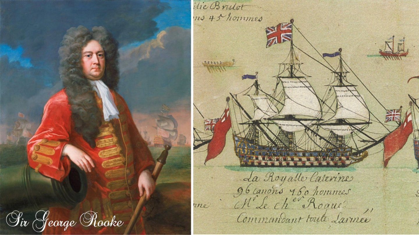

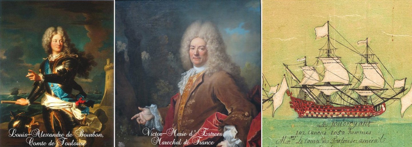
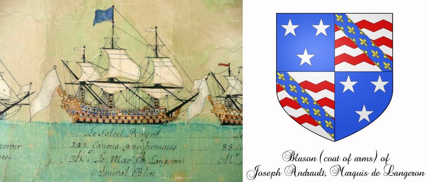
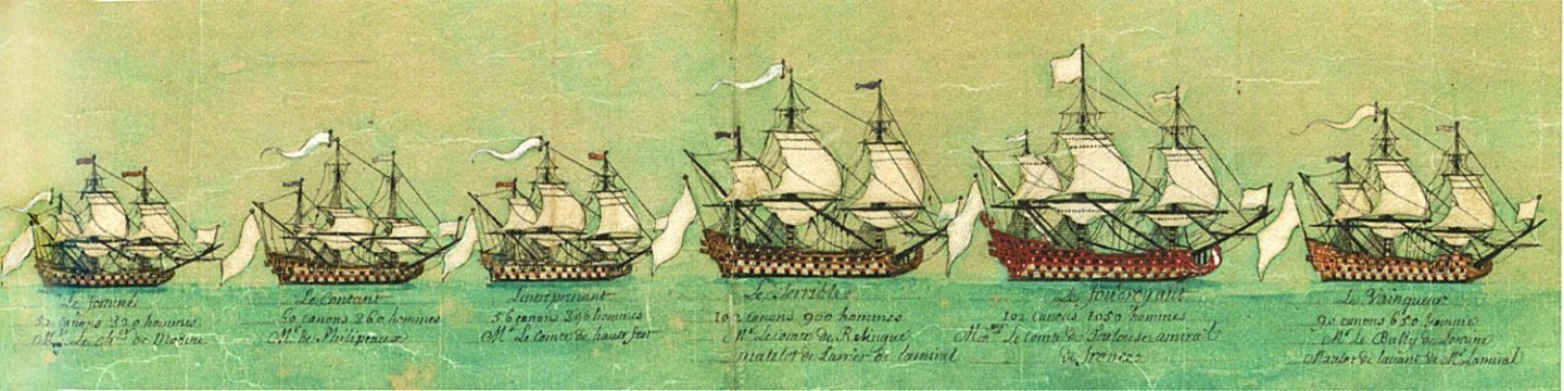
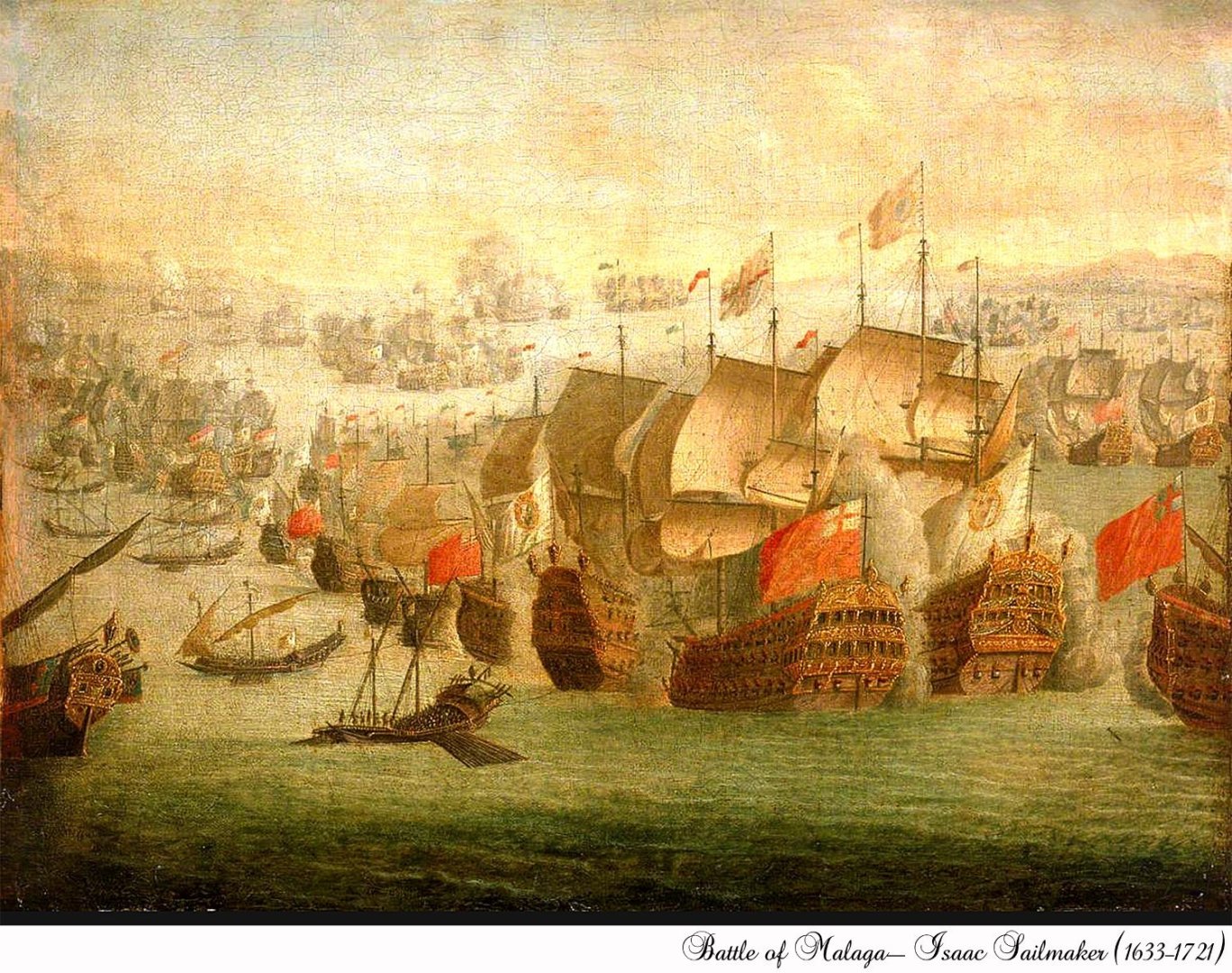
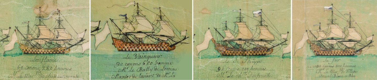

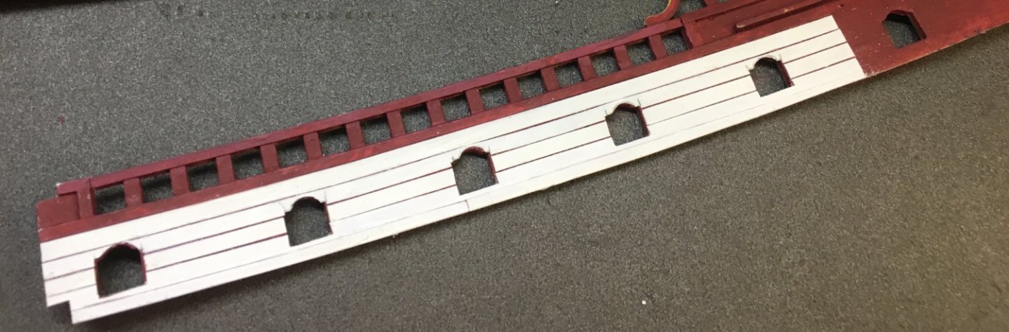


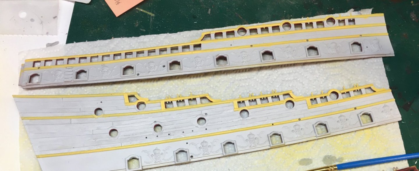
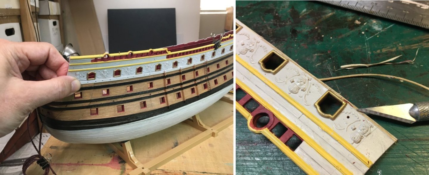
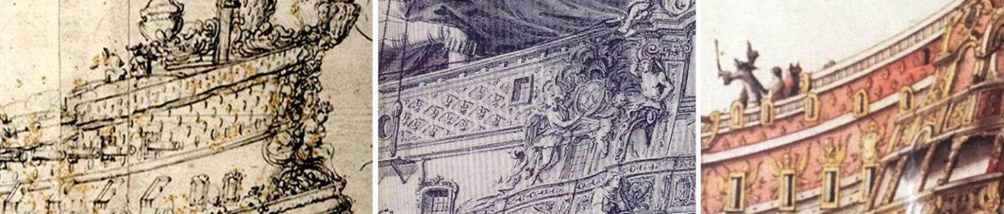
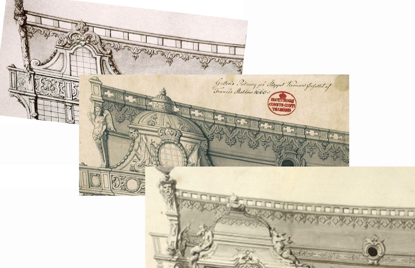
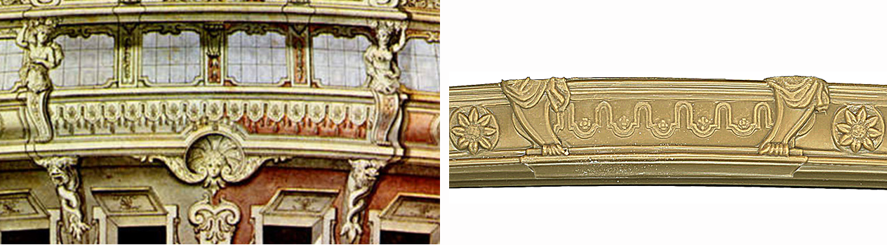
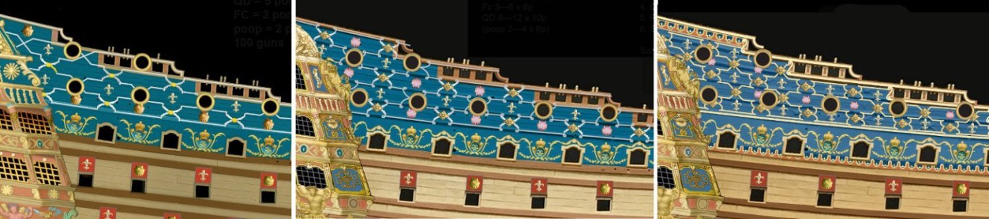

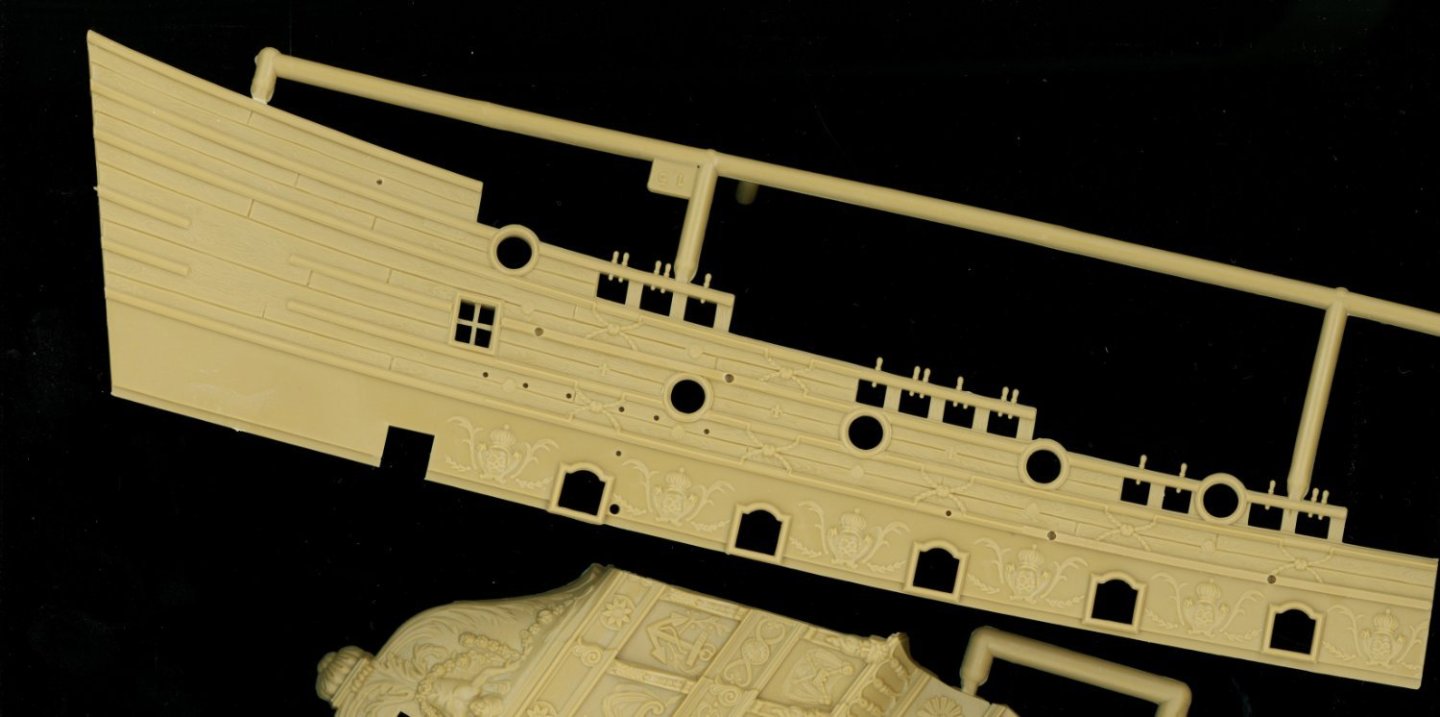

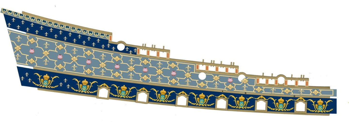
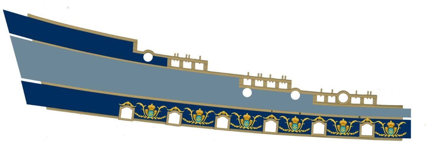
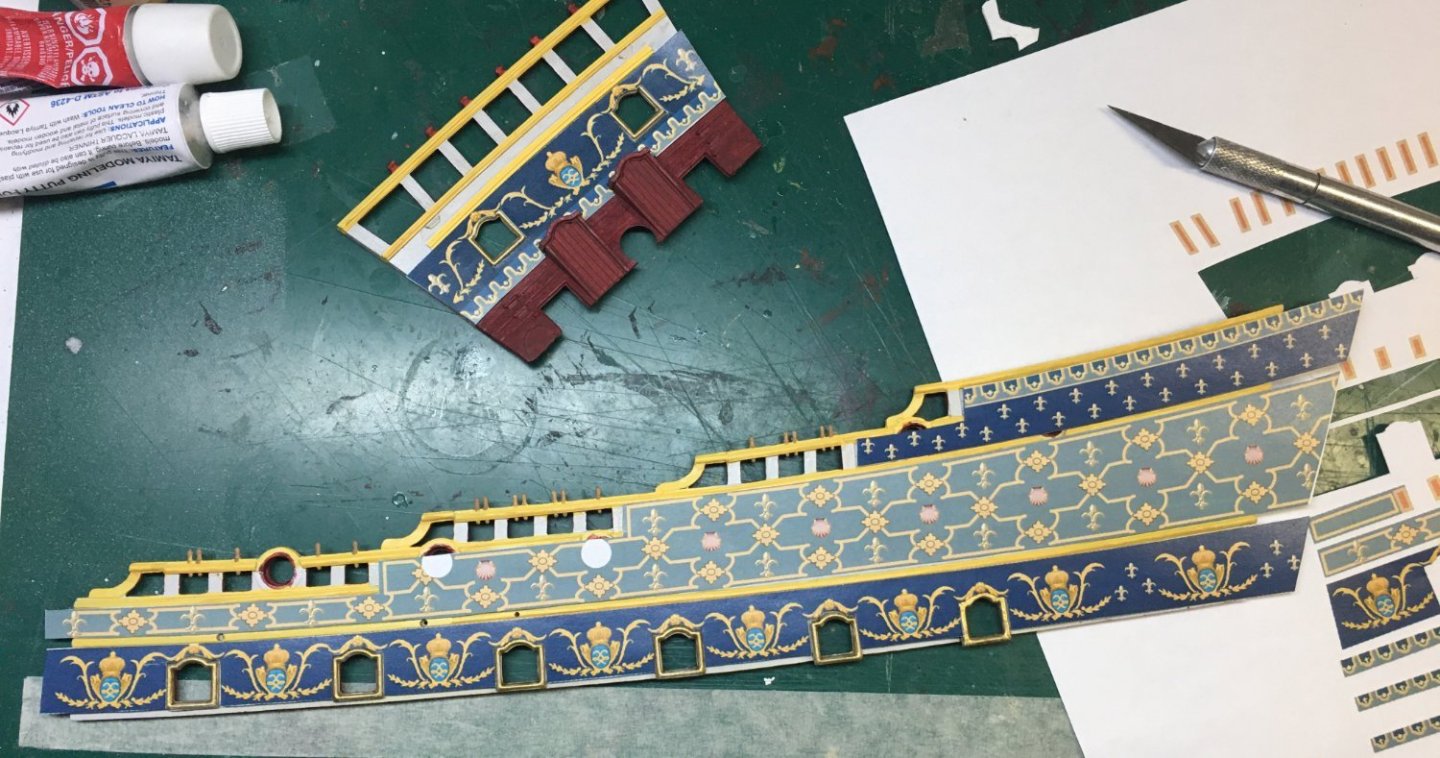
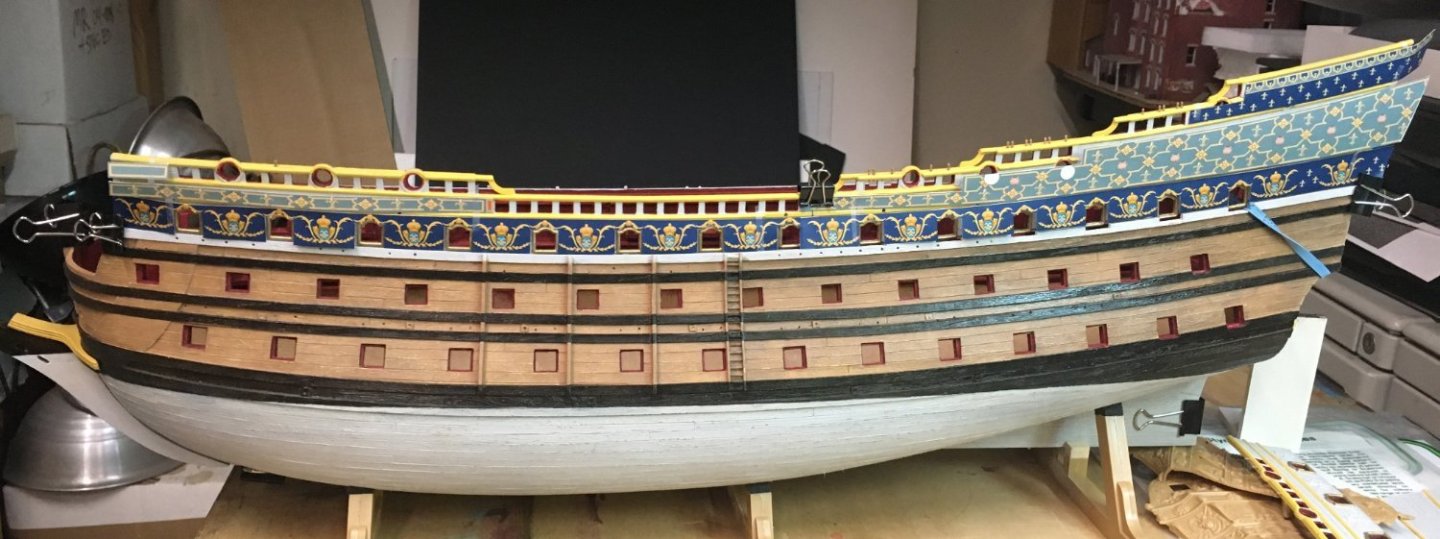
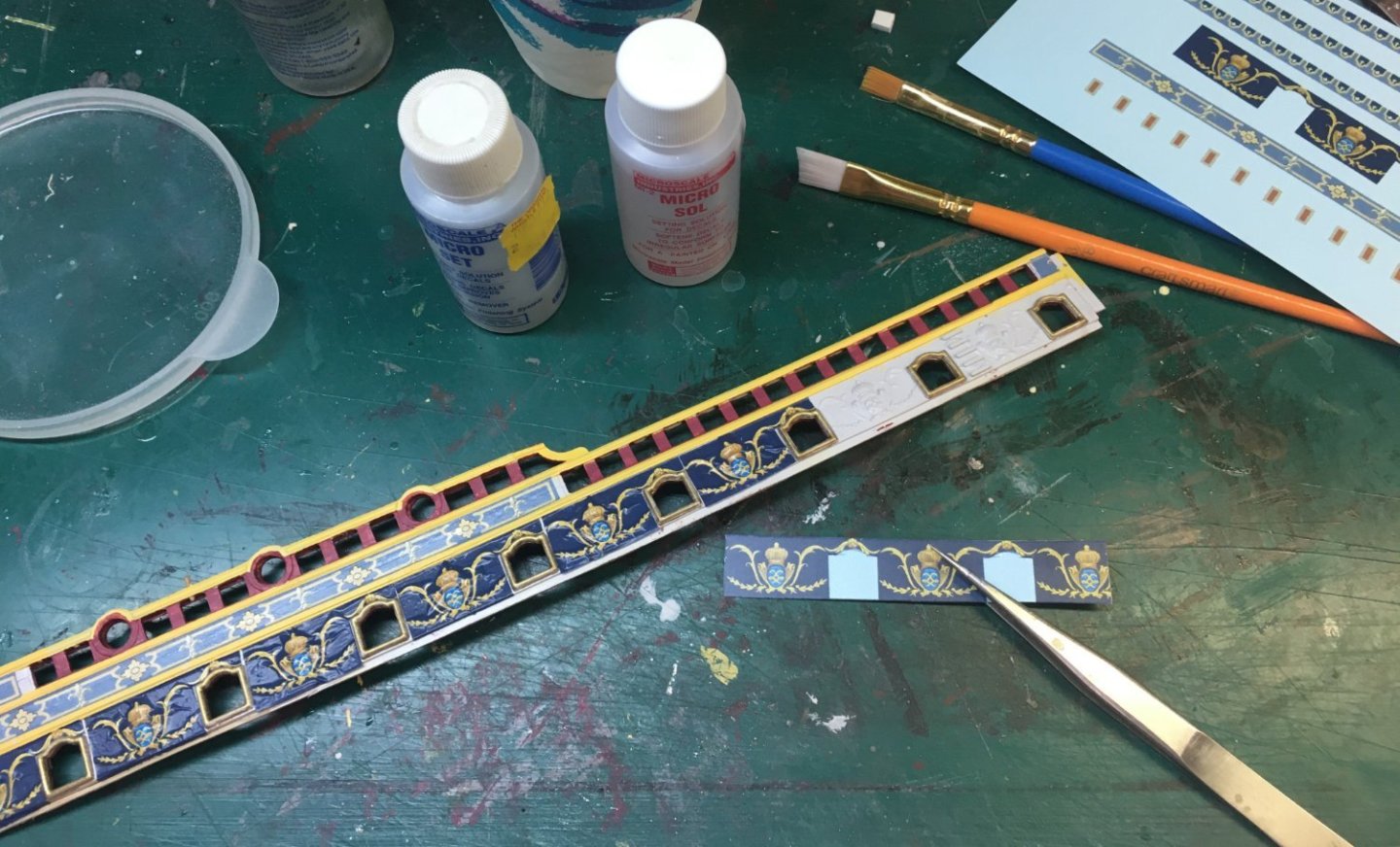


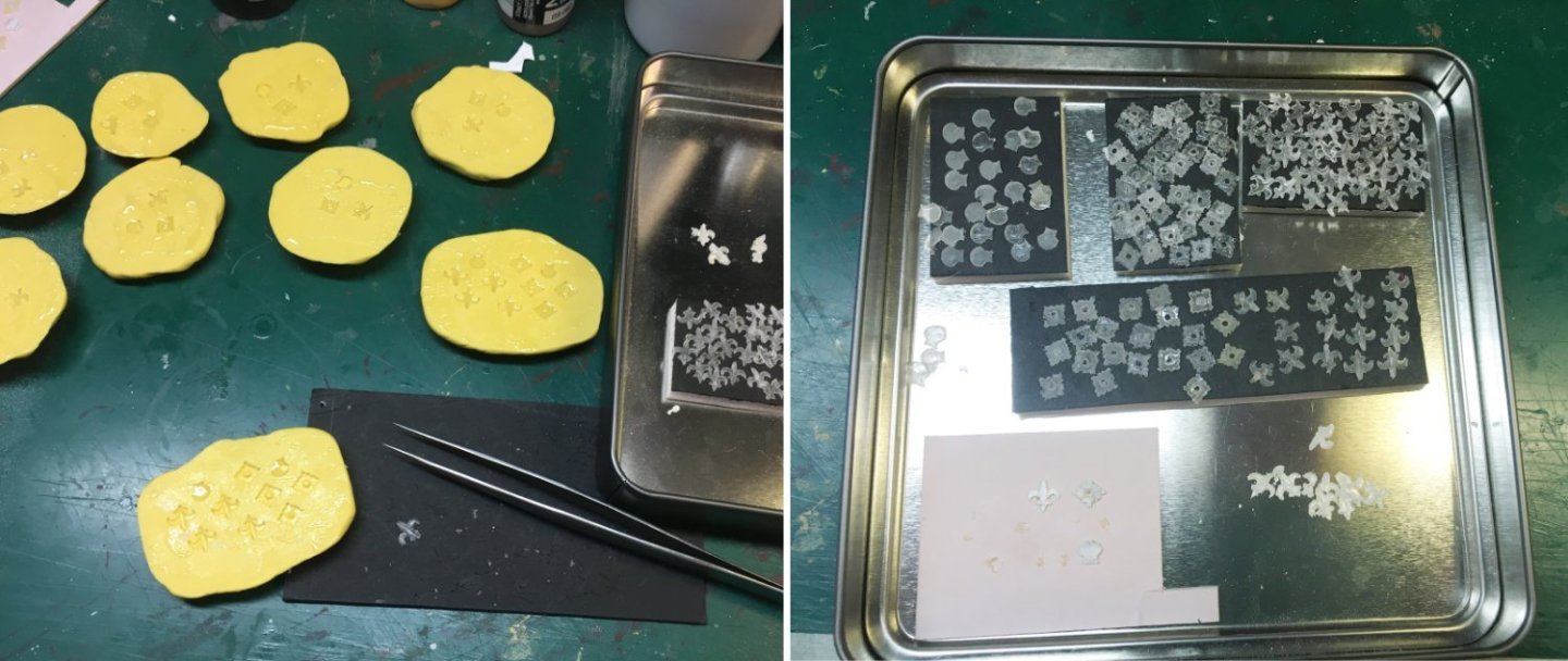
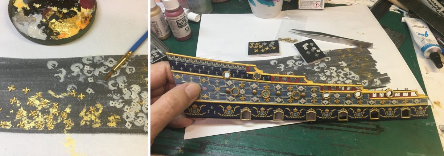
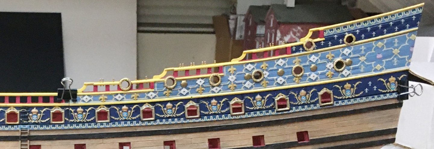
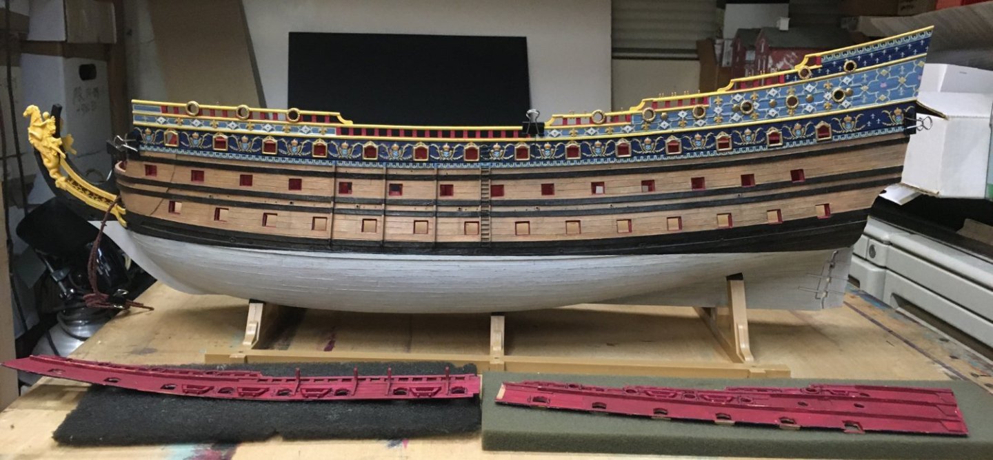
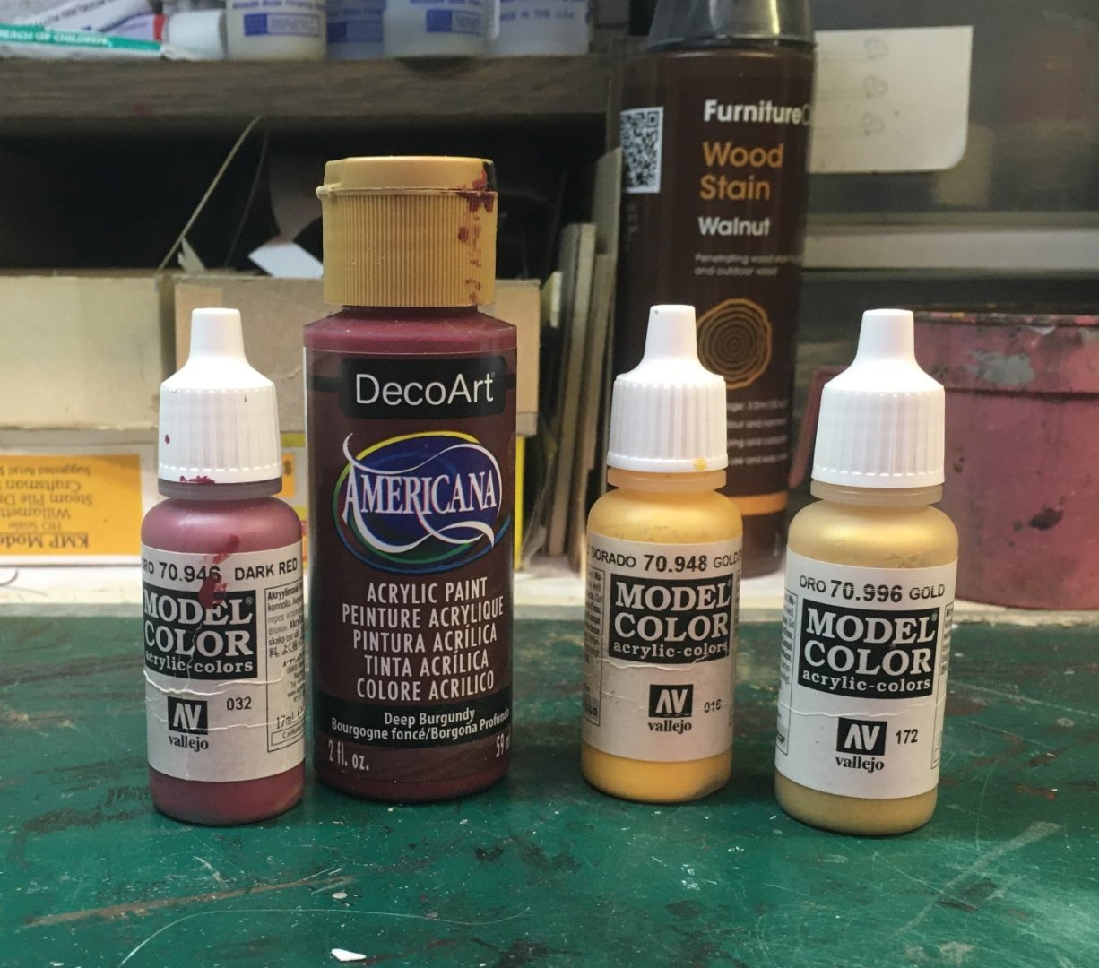
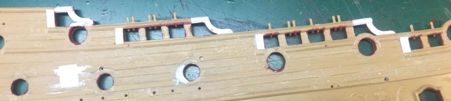
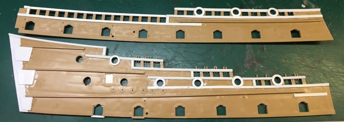
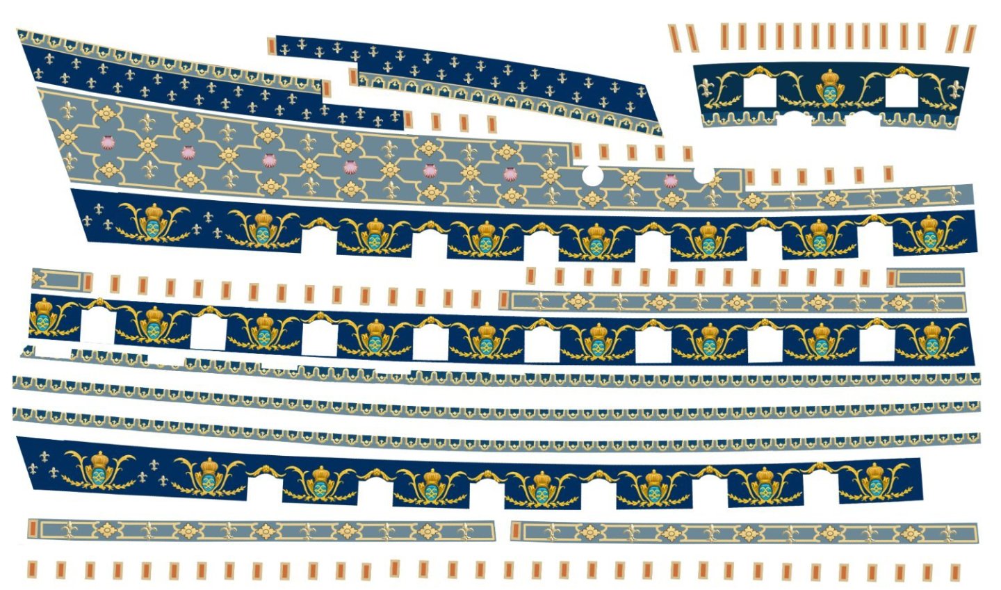
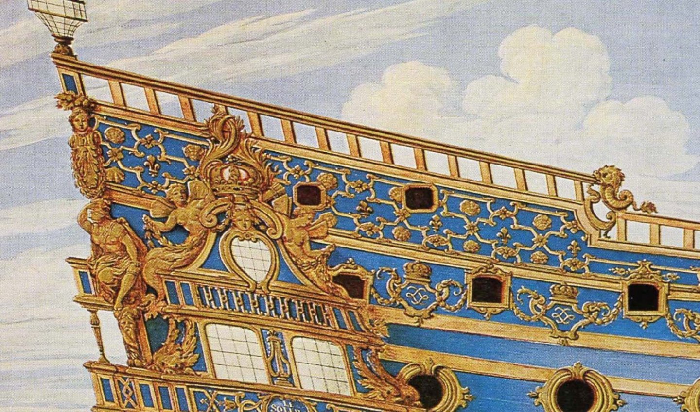
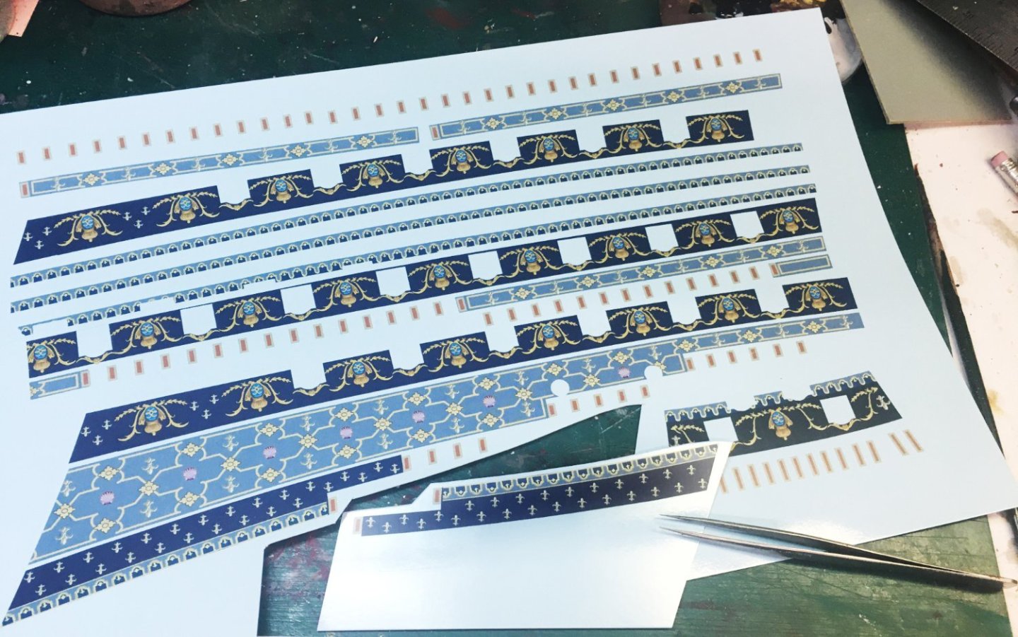
- 80 replies
-
- 10
-
-
-
- Soleil Royal
- Ship-of-the-line
- (and 2 more)
-
Battle of Malaga, by Isaac Sailmaker (c.1633–1721) So what was the Battle of Malaga the Soleil Royal II participated in, and what was the Malaga scroll all about? I’ll save a blow-by-blow description of the battle for another time. (It’s long!) Here’s the condensed version— The Battle of Velez-Malaga on Aug. 24, 1704 was a big, bloody sea engagement off the coast of southern Spain that unfortunately did little to alter the course of the War of Spanish Succession. The short summary is that the English seized Gibraltar from the Spanish and the French navy tried to take it back. Both fleets were big for the time. The French had 50 ships-of-the-line and the English and Dutch, 53. In twelve hours of fighting, 1,585 French, 2,325 English and 700 Dutchmen perished. Many ships were dismasted and heavily damaged, though depending on the sources, few to none were lost. Both fleets were too big and evenly matched to gain a decisive advantage in a single day. Having expended 100,000 cannon shot, both fleets were afraid of running low on ammunition and so avoided renewing the battle the next day. The British, having suffered the worst, retreated back to the Atlantic leaving only a small, suicidal rear-guard of twenty ships at Gibraltar, certain that the French would attack. The semi-victorious French fleet commander, however, was the Comte de Toulouse, the 26-year-old landlubber bastard son of Louis XIV who had never been in a sea battle before. Badly shaken by the carnage, he was all for calling it a day and taking the fleet back to port. The other French commanders accommodated him. They figured the Spanish could take Gibraltar back by land. We all know how that worked out. I’ve seen the Malaga scroll described in print as the “Bayeaux tapestry of the French navy.” It’s proper title is the Order of battle held by the naval armies of France, England and Holland in the Mediterranean in the MDCCIV year, when Monsieur le Comte de Toulouse won a victory over the English and Dutch and forced them to abandon the Mediterranean and leave the Strait [of Gibraltar]. The scroll is made from sheets of paper glued to canvas, 5.87 meters by 0.70 meters (19-1/4 feet by 2-1/4 feet). On it are painted, in watercolor and gouache, the 194 ships of the French, English, and Dutch fleets that fought at Vélez-Málaga. Each ship is shown in line of battle, sailing left to right, labeled with its name, commander, and number of guns and men. The very precise detailing of the ships—colors, rigging, sails, flags, number of ports, etc.—attest to the knowledge and memory of the painter, Jérôme Hélyot, who participated in the battle as a gunnery officer. Regularly spaced holes and cloth rings show that the piece was meant to be hung on display. This leads to the supposition that Hélyot used the scroll as a training tool for young gunnery officers. Coming from a fairly well-established Parisian family, Jérôme Hélyot began his naval career in 1698 as an ensign on the Amphitrite, the first French frigate sent to China on a commercial voyage, before being recruited as a artillery officer in Toulon in 1701. He took part in all the major land and naval operations of the War of the Spanish Succession. In the battle of Vélez-Málaga, he was on the ship Toulouse, part of the rear-guard squadron under the command of the Marquis de Langeron on the Soleil Royal. In 1706, Jérôme Hélyot was promoted second lieutenant of artillery and continued a career that led him to the rank of captain and several commands, including the 64-gun 3rd-rank Saint Michel during the 1740–48 War of Austrian Succession. Knighted, he ended his career commanding the forts guarding Brest and died February 8, 1750. His scroll eventually passed into private hands and apparently remained mostly unknown and unstudied until the French Government acquired it in 2016. The thing I can’t quite understand is why the Malaga scroll hasn’t gotten more attention from those who study this period of warship development. There doesn’t seem to be a good copy of the scroll anywhere on the internet—I’ve found just a few excerpts in European publications, like the Revue Historique des Armées. (If anyone knows otherwise, PLEASE LET ME KNOW.) The scroll contains the only eyewitness art of a Soleil Royal that I know of. There are color sketches of 50 French ships-of-the-line, plus 53 English and Dutch. I would think the scroll would be a primary source for anyone interested in modeling ships of this age. If it were better known, there might be better choices made for colors and paint. As I discussed last time, I worked from the image on the Malaga scroll to make the color scheme for my Heller Soleil Royal. It was time to start painting some plastic. I usually have a lot of paint around, so I tend to use what I already got. Most of it is acrylic or other water-based colors, since I’ve poisoned myself with solvent-based paints enough for one lifetime. Acrylic is forgiving, fast-drying, usually dries to a matt finish, and is easily removable—this is important since I strip off paint and redo my work on a regular basis. I’m also acrylic-agnostic, not preferring one brand of the liquid plastic over another. As long as it’s reasonably sturdy and can be thinned enough to spit though an airbrush, I’m happy. My local hobby shop has a big selection of Vallejo colors, so they were the majority of those who answered the casting call. Also featured is a bottle of Liquitex acrylic matt medium, which I brush on after all is dry to remove any shine and help protect the paint surface. G’wan, cast—take a bow. The interior of the hull got brush-painted with cheap red craft acrylic—"Deep Burgundy." That included the inner edges of all the gunports. The rest of the ship was hit with Vallejo grey surface primer. At one time in the distant past, my Paasche VL airbrush and I made a good team for painting models. Now, after many years, one-half of the team spits, leaks, and clogs, acts temperamental, and needs replacement parts. Fortunately, my airbrush still works perfectly. We managed to successfully apply primer to the outer hull. Since for some unfathomable reason I put the interior red acrylic on first, I had to plug all the gunports with illustration board to keep the primer out. I had scraped and sanded off the kit’s molded-on waterline. The light grey primer was handy for drawing on a new waterline, which touched the lower main wale. I later raised the waterline. Twice. Below are the three colors used for the lower hull halves. The yellow ochre "Antique gold" is pretty generic. The main “doe’s belly” color is Vallejo 70.843 cork brown, and the “black” is a very dark Van Dyke brown—a much warmer hue than cold flat black, which I dislike using on models. After the primer dried, the first coat on the hull was yellow ochre brushed on. The gunports were still plugged with illustration board. The waterline was masked just in case I wanted to use the airbrush. In the end, I didn't need it. After the paint dried for a day, I sealed it with a coat of matt medium. The second color coat was Vallejo cork brown—“doe’s belly.” I didn’t bother painting the main wales, which were going to be black, or the uppermost channel wale, which was going to be left white for now. This coat was left un-sealed. I wanted it removable. Again, after drying, I masked off everything except the wales to be painted black. This time, I used the airbrush in a vain effort to avoid paint bleeding under the masking tape. Ehhh. Not too much touchup needed. Here’s the fun part—the two shades (yellow ochre and cork brown) were intended to help bring out Heller’s wood texture in a semi-subtle way. After everything dried, the hull was distressed with a combination of scraping, hand sanding, and a dirty wire brush. After a while, the high points of the wood texture began to show through with a slightly lighter hue than the “doe’s belly” color. It’s something a viewer has to get up close to see, but it’s just enough “weathering” to satisfy my eye. It was about this time I grew unhappy with the waterline. I felt I could squeeze another foot or so for the draft. I clipped and rubber-banded the hull together to sit it on its cradle and made a “waterline indicator” out of foam-core board to serve as a guide, then hand-painted the waterline high enough to partially cover the lower main wale. There was plenty of historical artwork to back me up on this. Lots of ships had wet main wales. After going through the exercise twice, my Soleil Royal ended up with a draft of nineteen feet. Not great, but three more feet than before. Decks next— The Heller kit has decks with even-width, parallel planking—not very realistic, according to many modelers who prefer planking tapered to fit the curves of the sides of the ship. I first thought to replace the decks with aftermarket ones, but they were wood, not plastic, and they lacked the nice grain detail Heller added. One thing I like in a model’s presentation is consistency, so the decision was made to go with Heller’s decks. I really doubted anyone would notice the taper of the planks anyway after getting past all the guns, deck furniture, and detail. As a compromise, I took some white putty and my scribing tool and made margin planks. Here’s Peter Goodwin, in Construction and Fitting of the English Man of War 1650–1850: “The function of this [margin plank] was to prevent the normal straight deck planking from being tapered to a fine angle where it met the curvature of the ship’s side…. The margin plank was thus fashioned to receive the butts of those planks.” So on to painting. No primer this trip. First coat was Van Dyke brown brushed on, then wiped away while still wet. Second coat was cork brown, dry-brushed on. Began to use a little more, a little less here and there to differentiate some planks. I let it dry. Instead of distressing the top coat like on the hull sides, this time I dry-brushed the planks with light grey. A tiny amount of paint was dabbed on the tip of a ragged, throwaway brush which was then used to scrub like hell until the tops of the raised wood grain stood out. This made the deck look bleached by salt and sun and worn by the knees of too many swabbies and their holystones. After sealing it with matt medium, I added the deck furniture according to the instructions—but the more I saw of other models and drawings, the more this began to bother me. The decks in the Heller kit come with several double-and quadruple-bitts. Plus many free-standing large, medium, and small knightheads, cleats, and rings—few of which were to be seen in the drawings of the Royal Louis, the deck diagrams of J.C. Lemineur or Jean Boudriot, or were apparent on any of the historical models. Were all those quadruple bitts and free-standing knightheads necessary? Royal Louis L'Ambitieux—Boudroit Le Francois—Lemineur By now, I knew to question everything. For reference, I had R.C. Anderson’s The Rigging of Ships in the days of the Spritsail Topmast 1600–1720 and Karl Marquardt’s Eighteen-Century Rigs & Rigging. Both books spelled out each line used in standing and running rigging. Both books had good diagrams and explanations of each line’s function and notes on specific practices used by the French in the time period I’m modeling. In contrast, Heller’s instruction book never gives the names or functions of the lines it tells you to string, and it spreads out the directions over half the book so that you never get the big picture. And then there is the matter of the Heller model having no pin rails. According to the kit, all lines are supposedly attached to pins set into the sheer railing. I know that some historical models do show it this way, but other models have pin rails. It’s hard to find definitive reference, but I think pin rails were in common use by the 1690s, when Soleil Royal II was built. Using Anderson and Marquardt, I made an Excel spreadsheet of all the ropes necessary, mast by mast, yard by yard, sail by sail. There were over 300 lines. Something like 250 of them needed belaying points on or near deck, and Anderson and Marquardt were specific about which ones needed pins, cleats, rings, bitts, knightheads, kevels, or channels. Yah! I needed pin rails! It dawned on me that I had to work out the Soleil Royal’s entire rigging plan and belaying points from scratch before settling on specific deck furniture. Oh joy. Well—I had a ways to go before the hull halves were even glued together. I felt like I had plennnnnnty of time to come up with a rigging plan. Next job on the list was painting and decorating the upper gundeck, forecastle, quarterdeck, and poop. That'll be shown next week. And who knows—? I may finish writing my description of the Battle of Velez-Malaga, if anyone is interested. It's a perfectly Baroque tale of aristocratic vainglory, nepotism, valor, cowardice, prudence, mistakes, unnecessary bloodshed, and cold calculation. Plus, I think I found out why the Soleil Royal wasn't the fleet's main flagship. Stay dry 'till then.
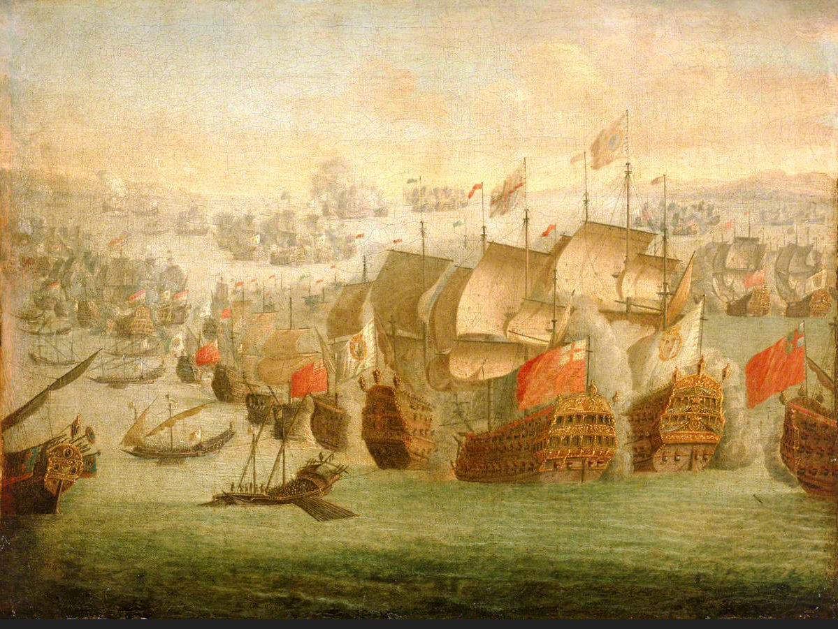
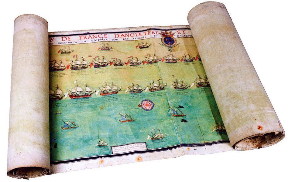
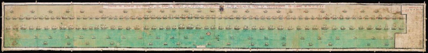
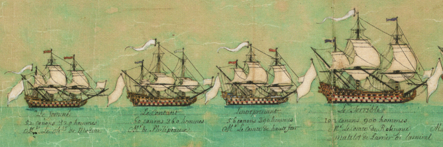
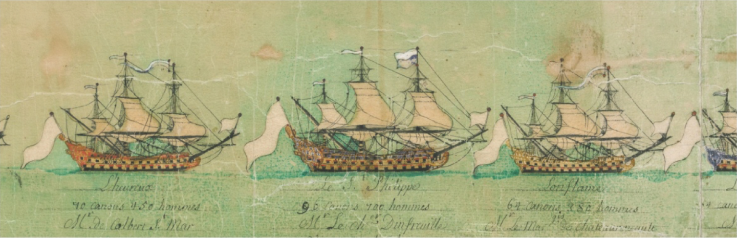

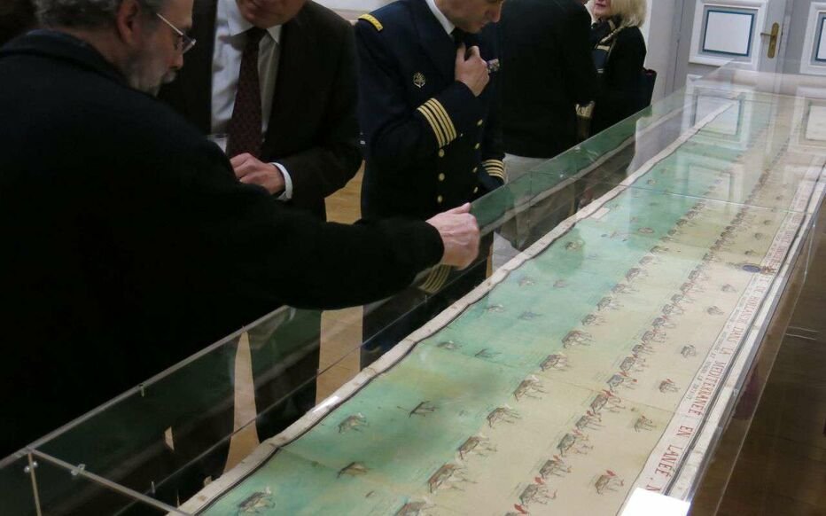

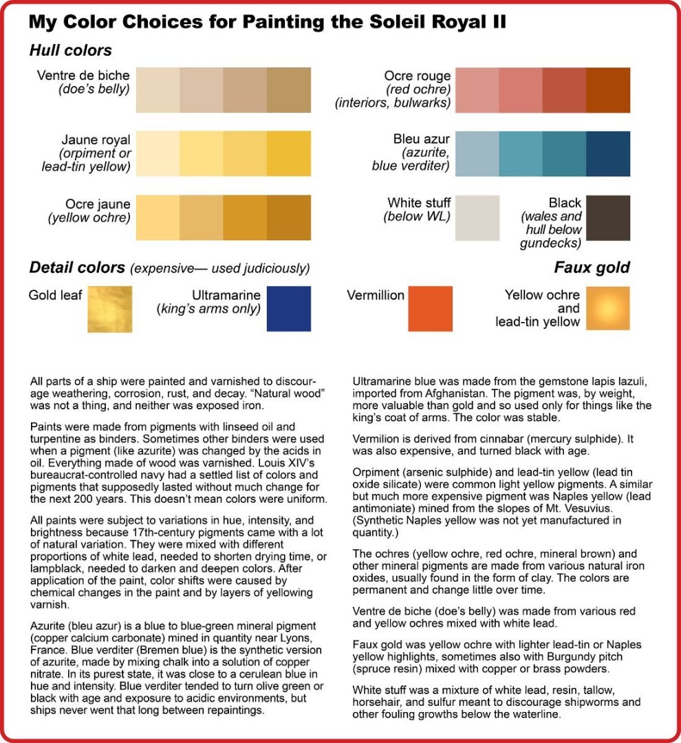
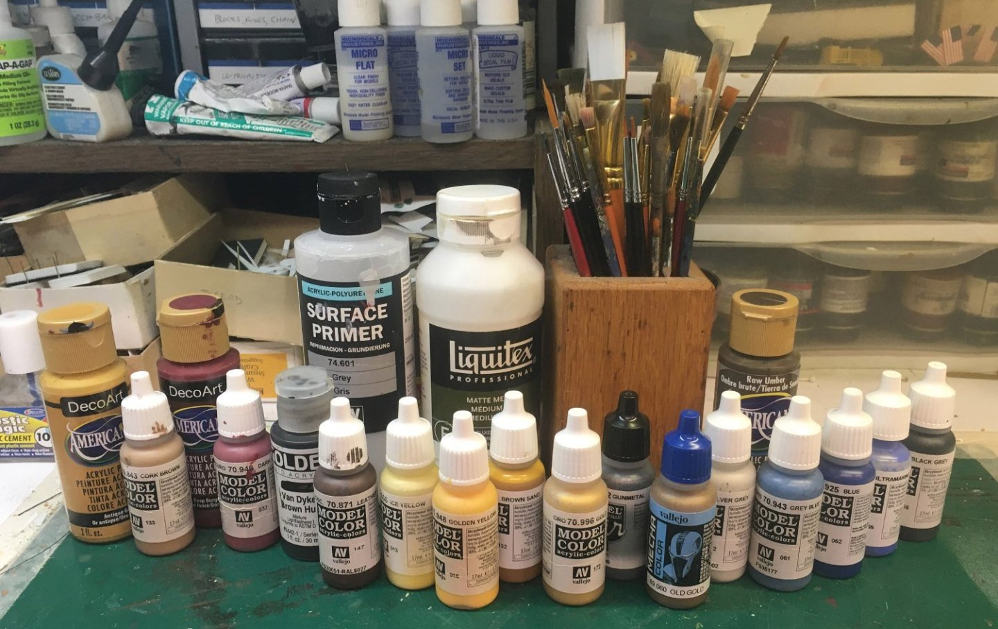


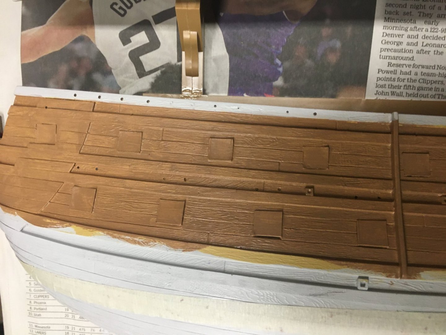

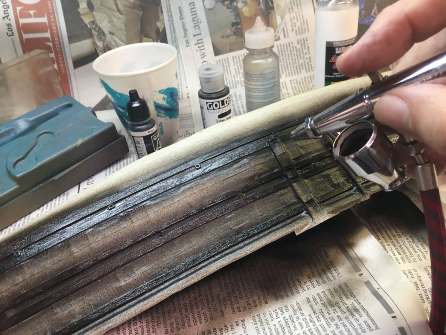


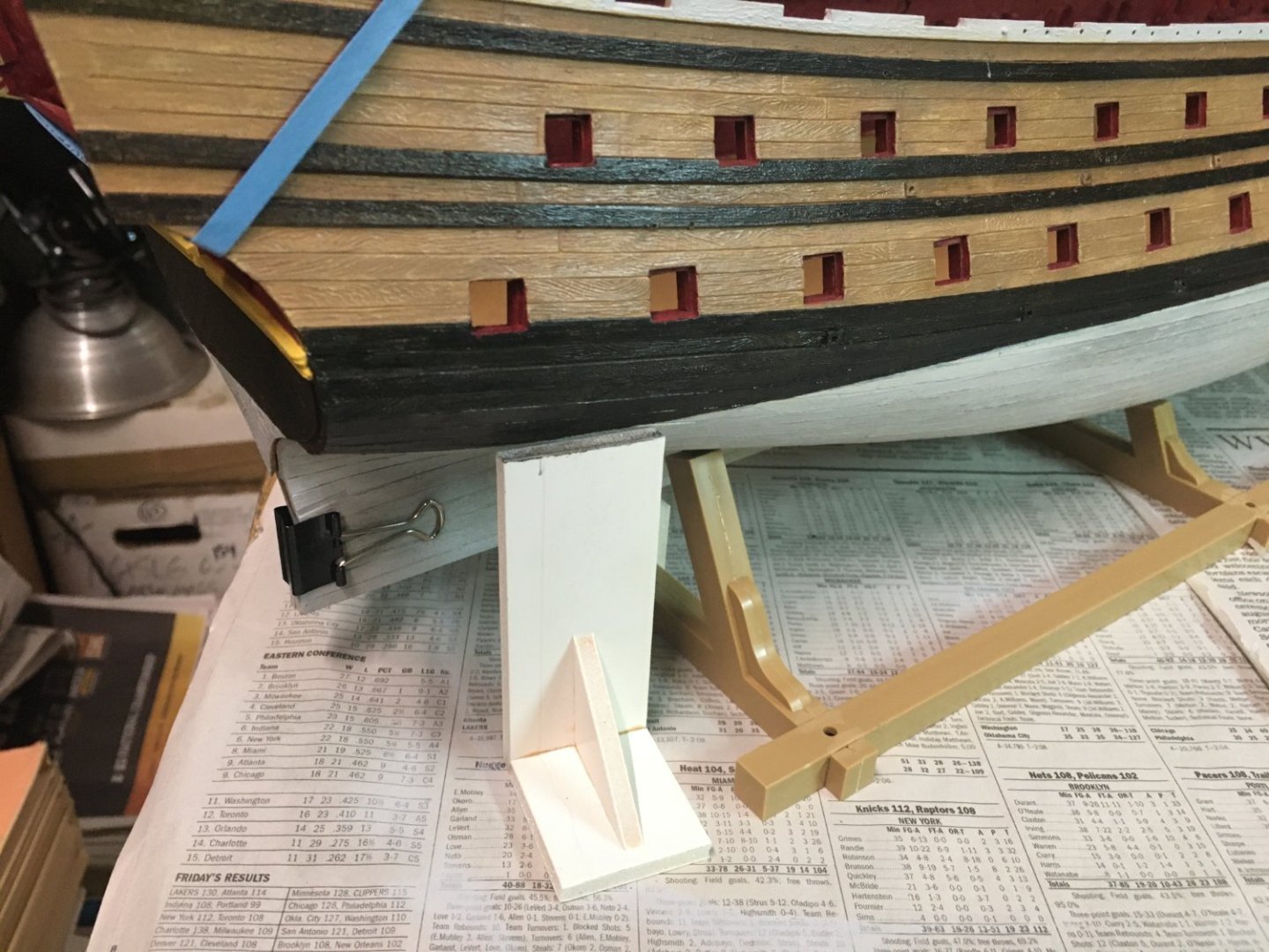


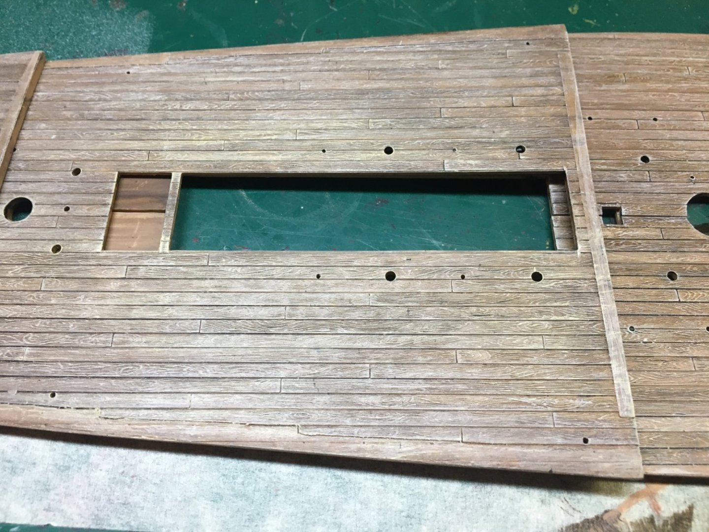
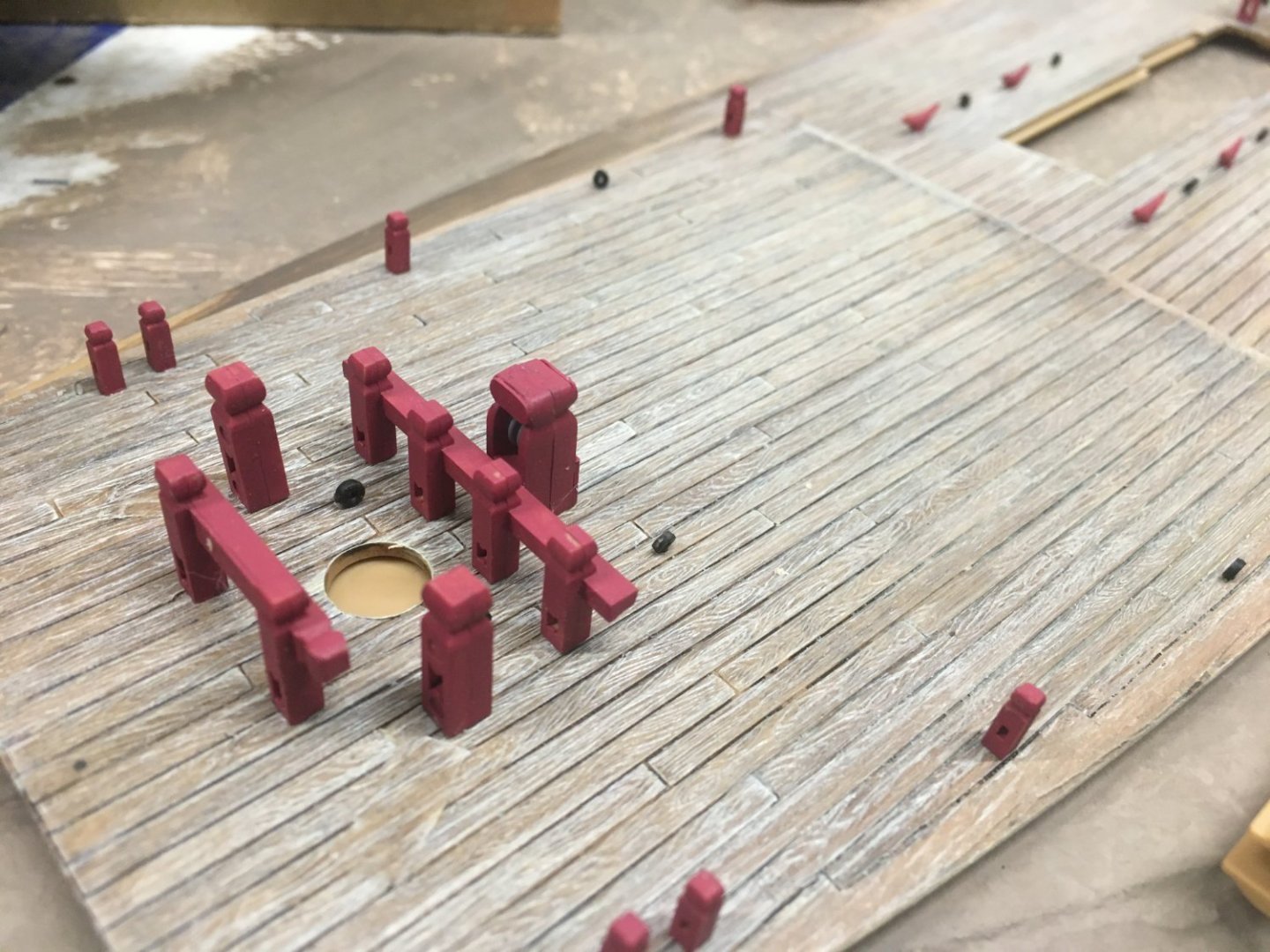
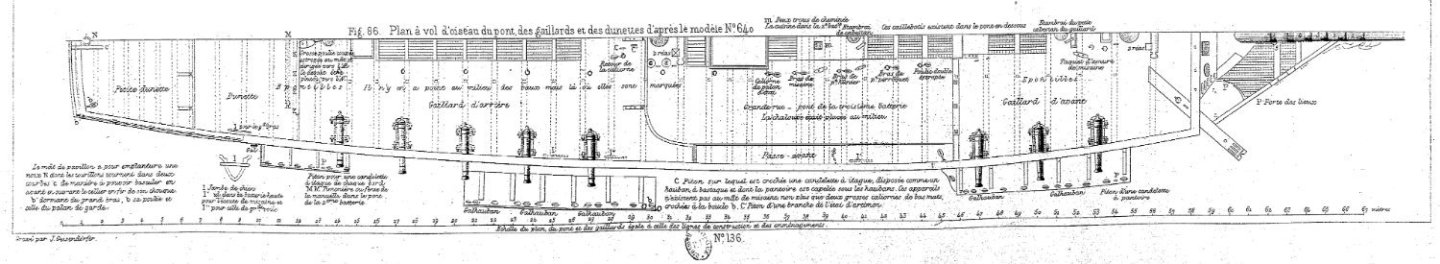
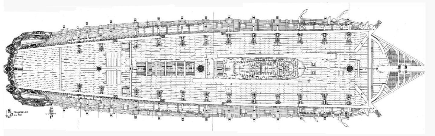
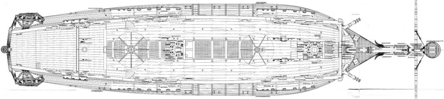
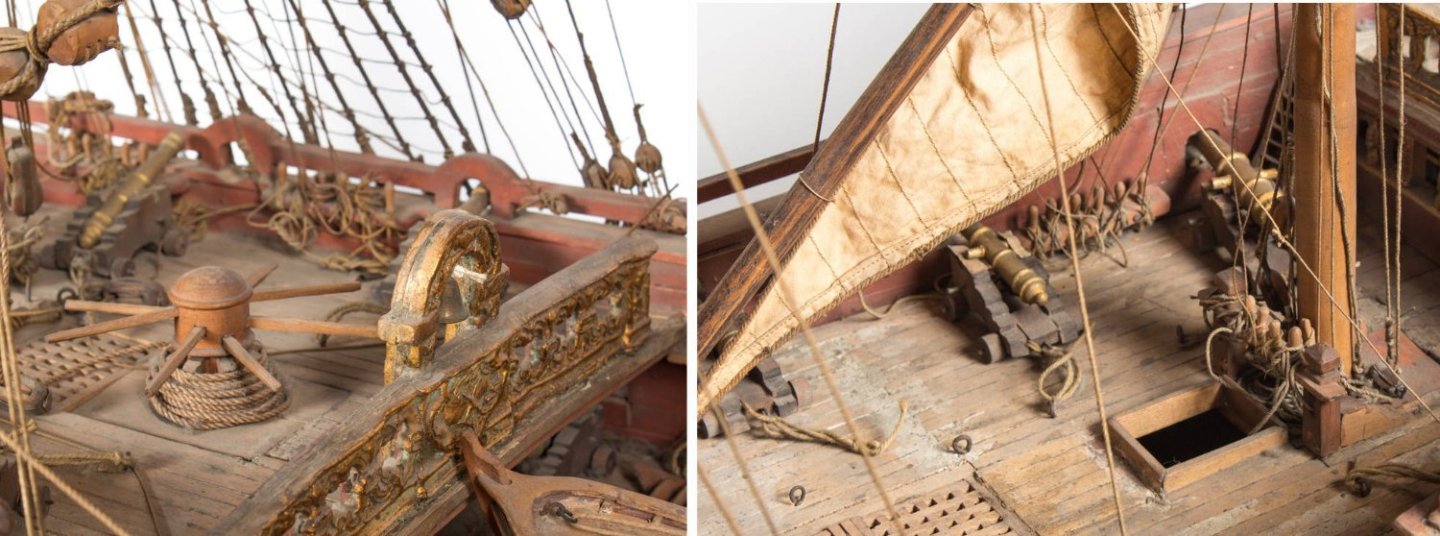
- 80 replies
-
- 8
-
-
-
- Soleil Royal
- Ship-of-the-line
- (and 2 more)
-
Oh, that would be fun. It's possible that with the advances in 3D printing, sometime in the next decade we'll see somebody making a raw hull of their favorite ship with gunports already pierced, ready for planking, upperworks, and details, and making it available as a garage kit. Or maybe a "corrected" Soleil Royal hull and decks. For all I know, this may already have been done. A few friends and I have done that with HO locomotives.
_3D_70g_PUGET_VDV.thumb.jpg.f4e59319d2bd84a58a7aa9c66f10f625.jpg)
- 80 replies
-
- 3
-
-
- Soleil Royal
- Ship-of-the-line
- (and 2 more)
-
Hi Ian—thanks for the encouraging comments. I ended up adjusting the waterline three times to increase the draft. I found artwork that showed ships with a wet main wale and also knew that back then, in the days before slide rules, nobody could really figure a ship's displacement until it was launched and loaded. So, as long as it wasn't Vasa, no big deal. The wet gammoning was a by-blow, but again—it didn't seem to bother J.C. Lemineur in his Saint Philippe plans. So I left it alone. At least I gave it a coat of white stuff. And yeah—I changed the "angle of attack" because it leveled out the gun decks and just looked better to my eye. I like the aggressive look of a down-at-the-bows Baroque warship. I'll let others decide if it was a successful decision.

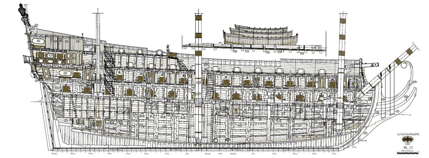
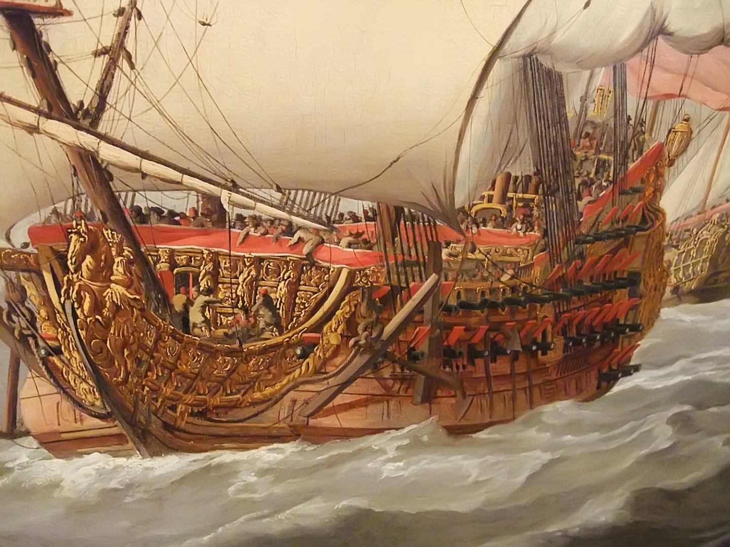
- 80 replies
-
- 3
-
-
- Soleil Royal
- Ship-of-the-line
- (and 2 more)
-
Marc, your ship needs no rationale or excuse. As model-building in styrene, I've never seen anything like it. Apocryphal = my status as a middle-class wage-earner in 2023. Epipelagic = surface waters of the ocean. In other words, don't sink! I pick up strange terms as a science illustrator. —John.
- 80 replies
-
- 1
-
-
- Soleil Royal
- Ship-of-the-line
- (and 2 more)


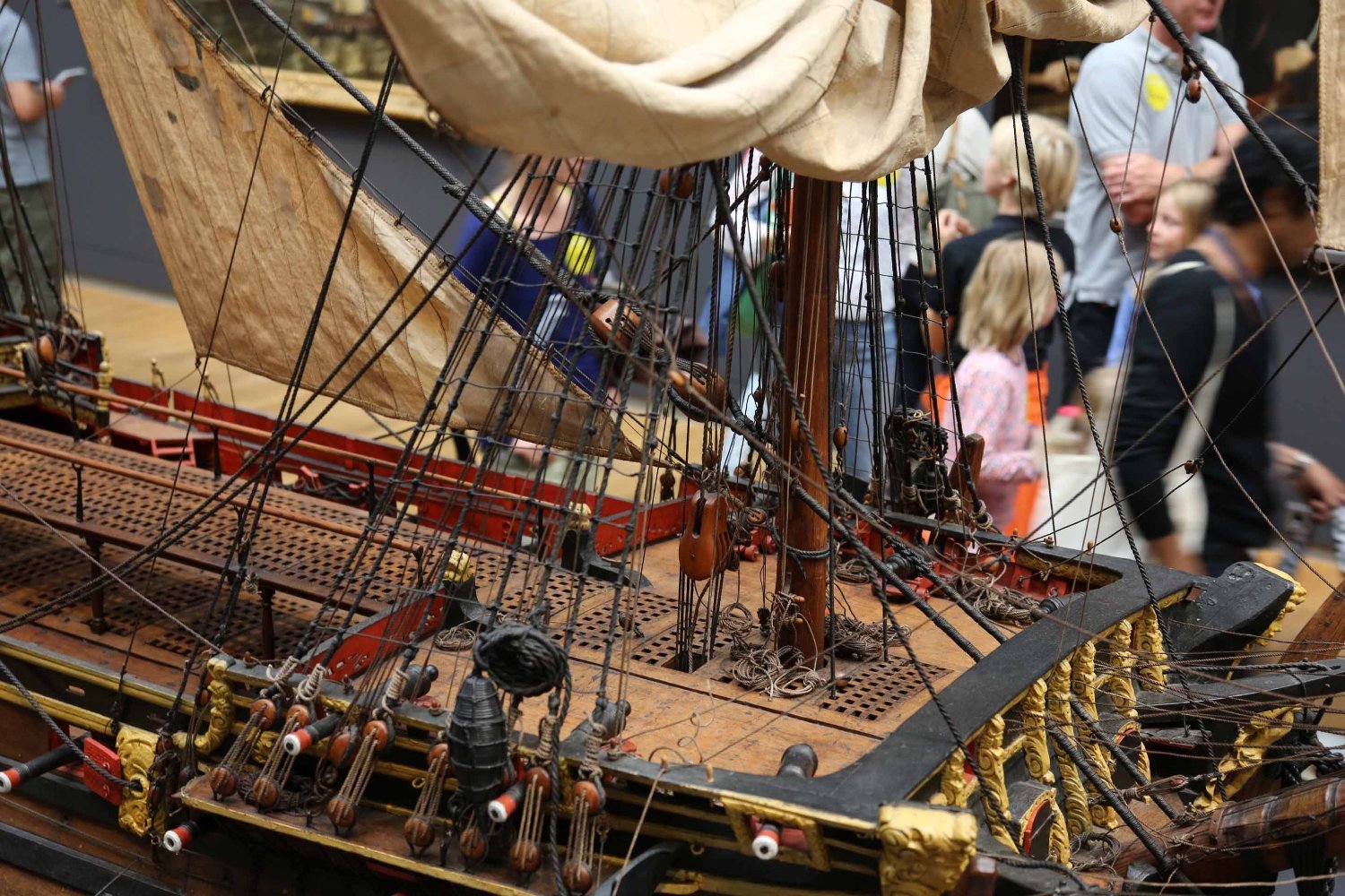
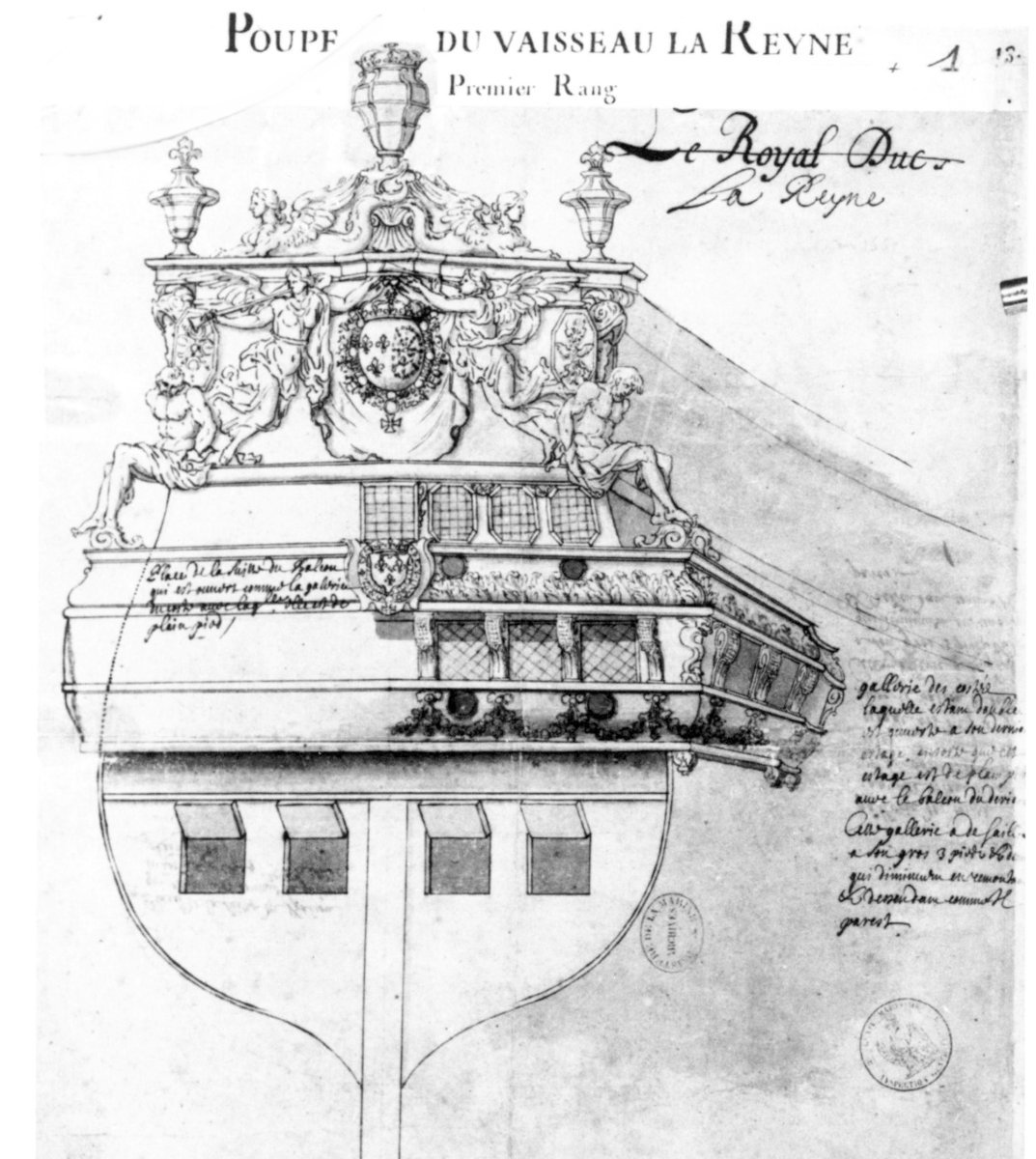
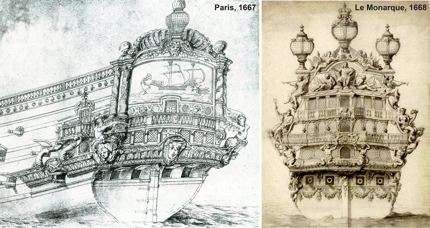
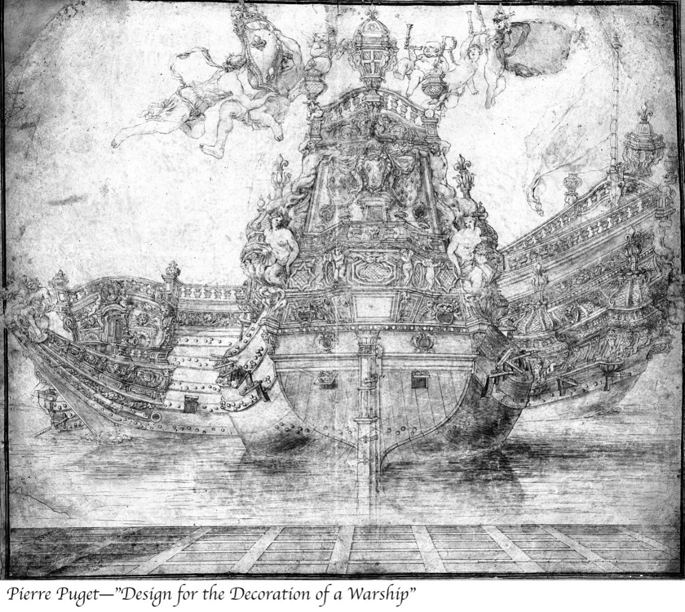

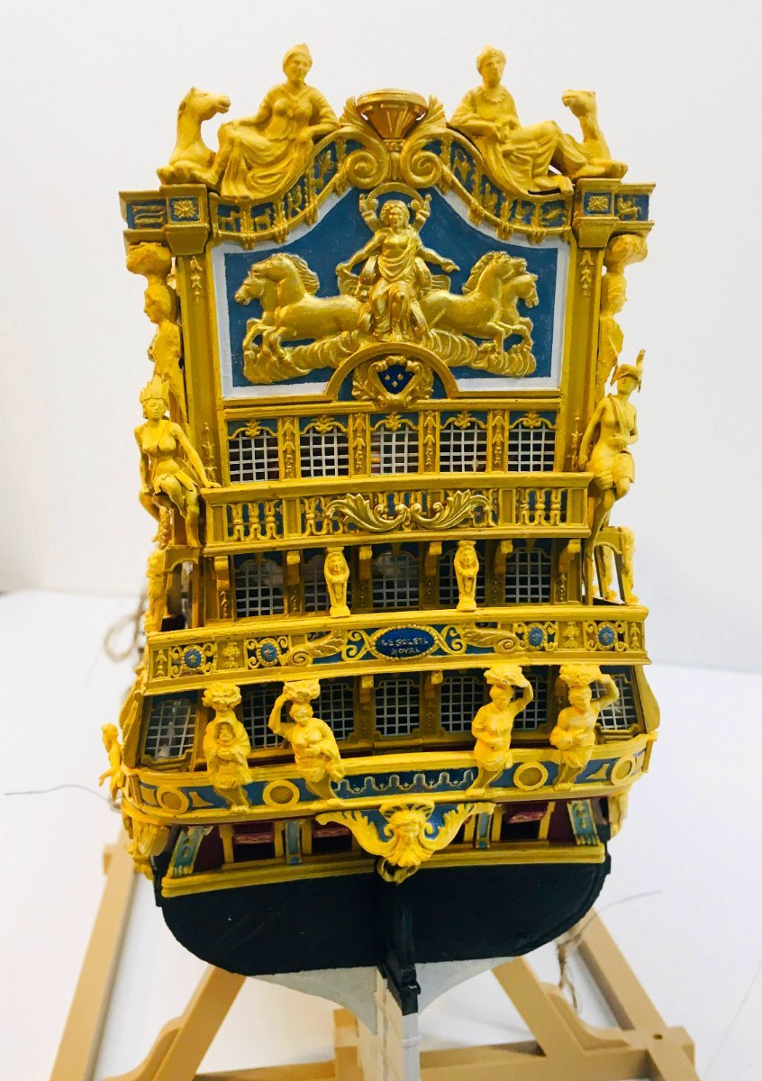
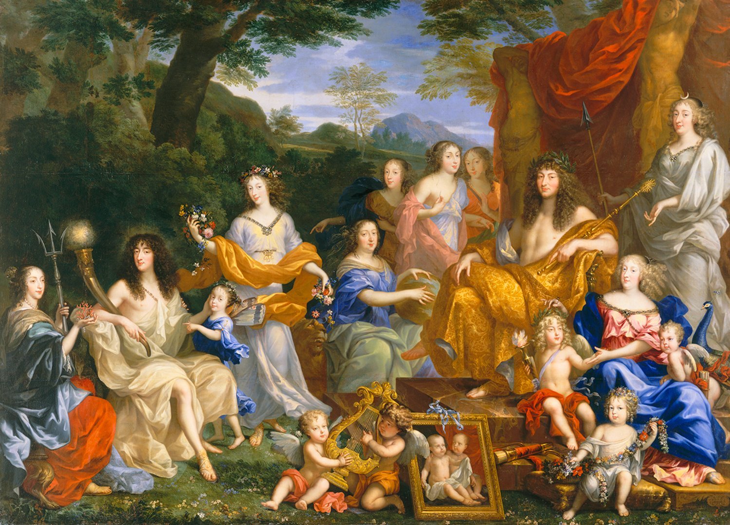

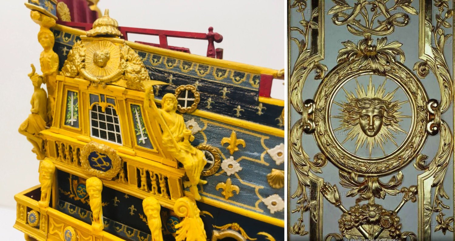

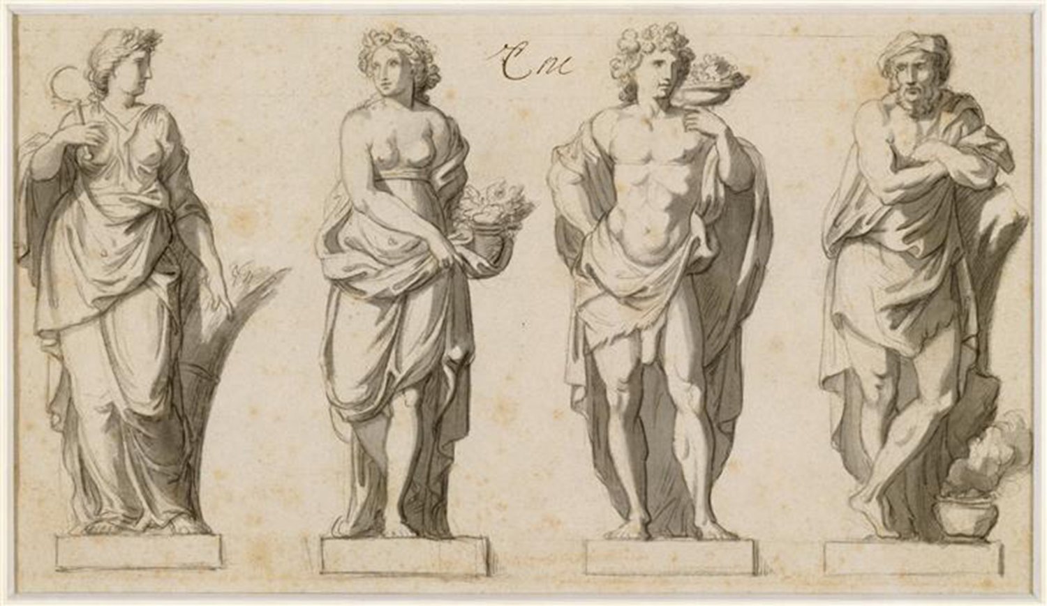
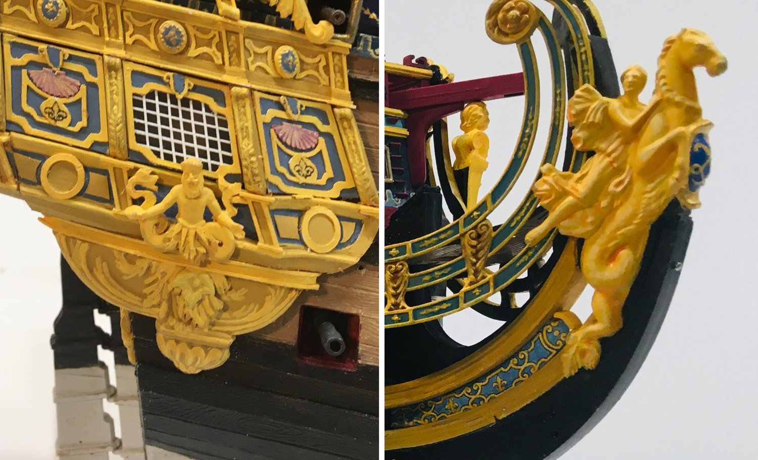
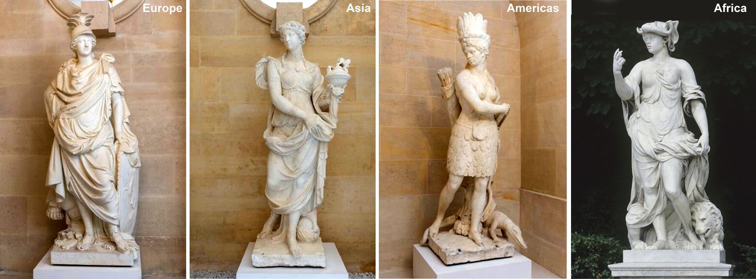
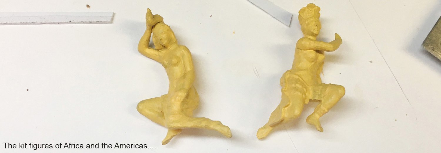
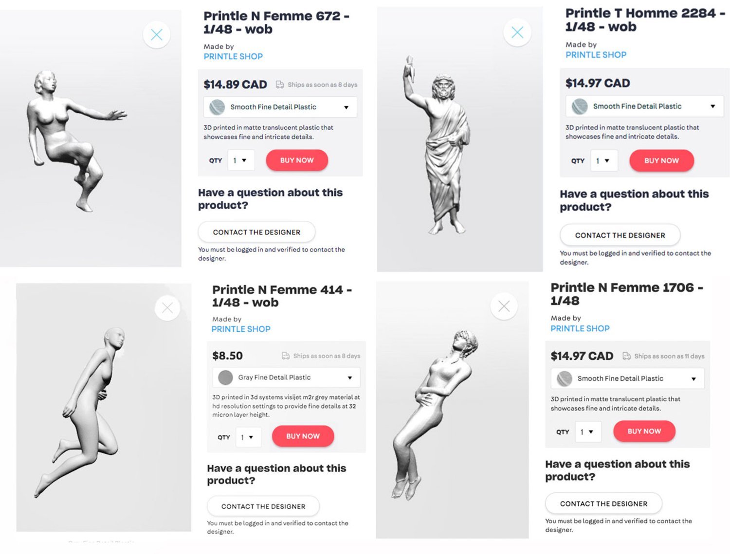

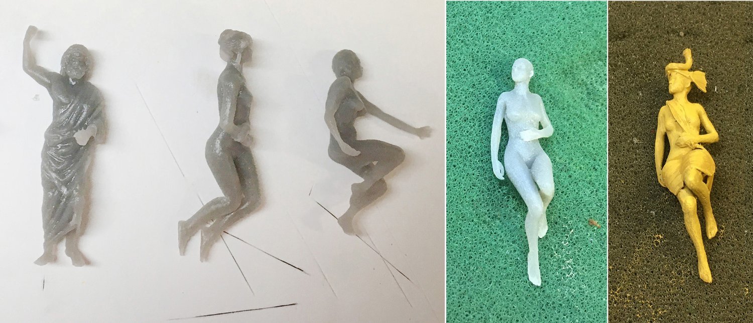

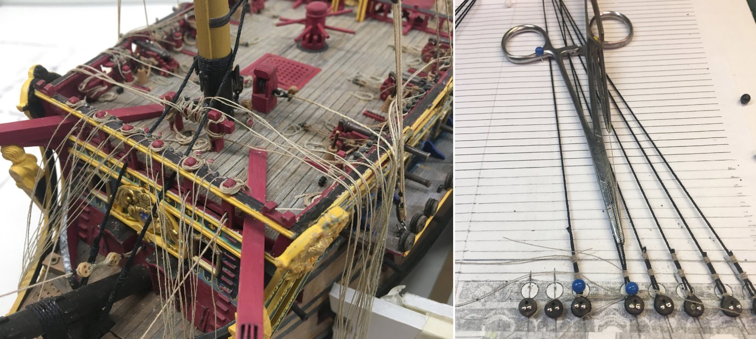


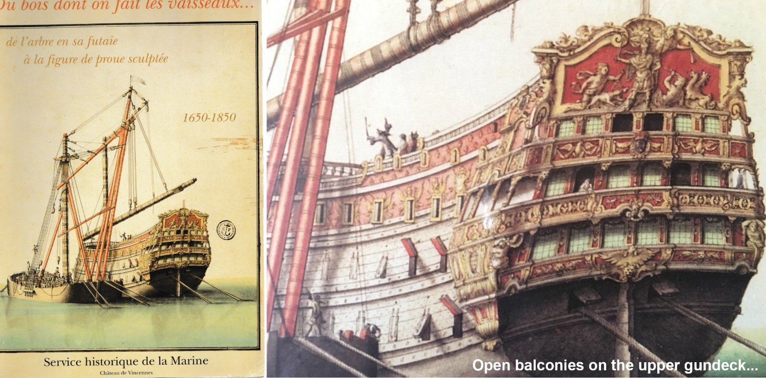
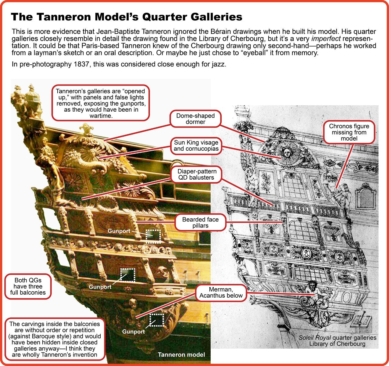
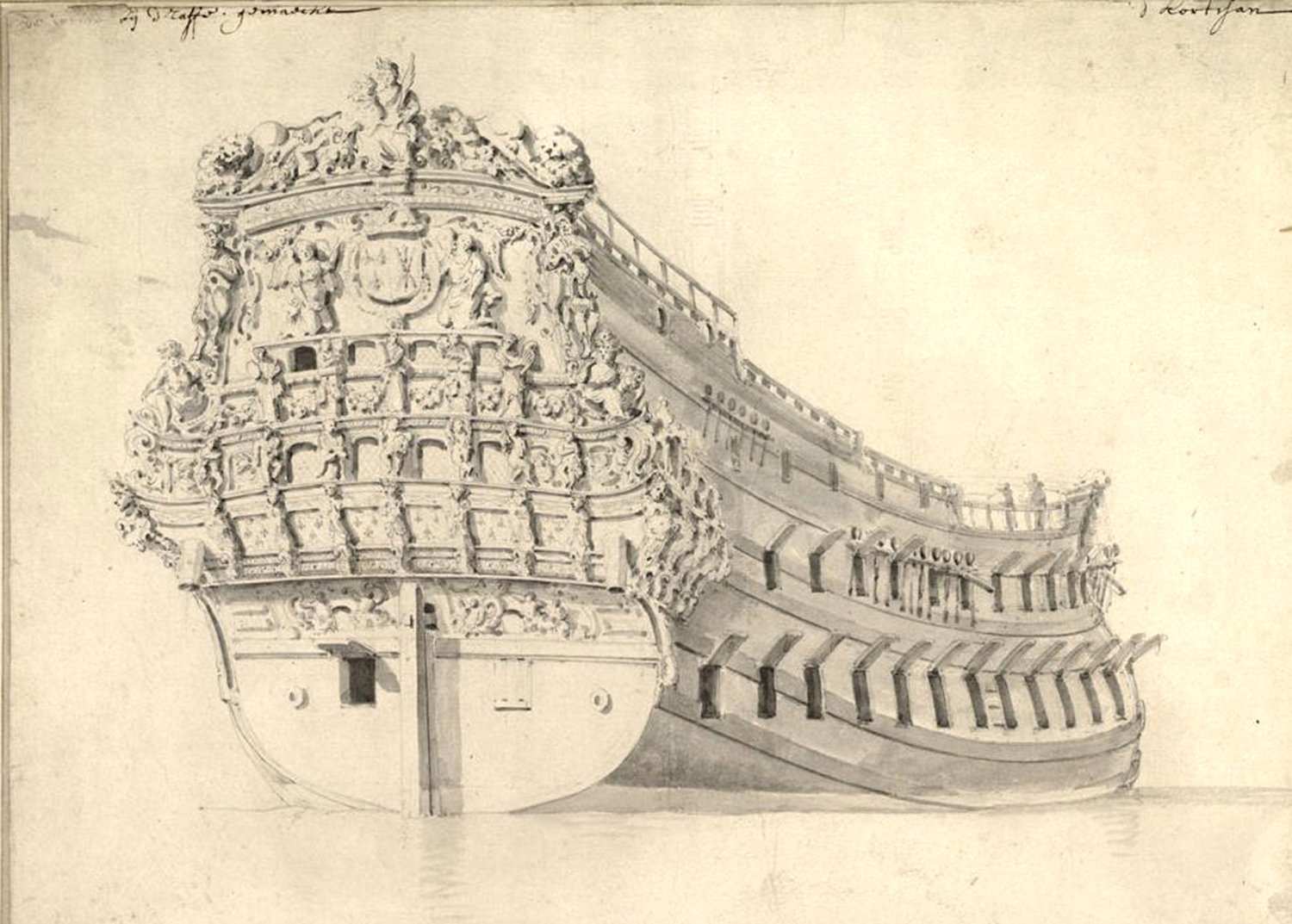
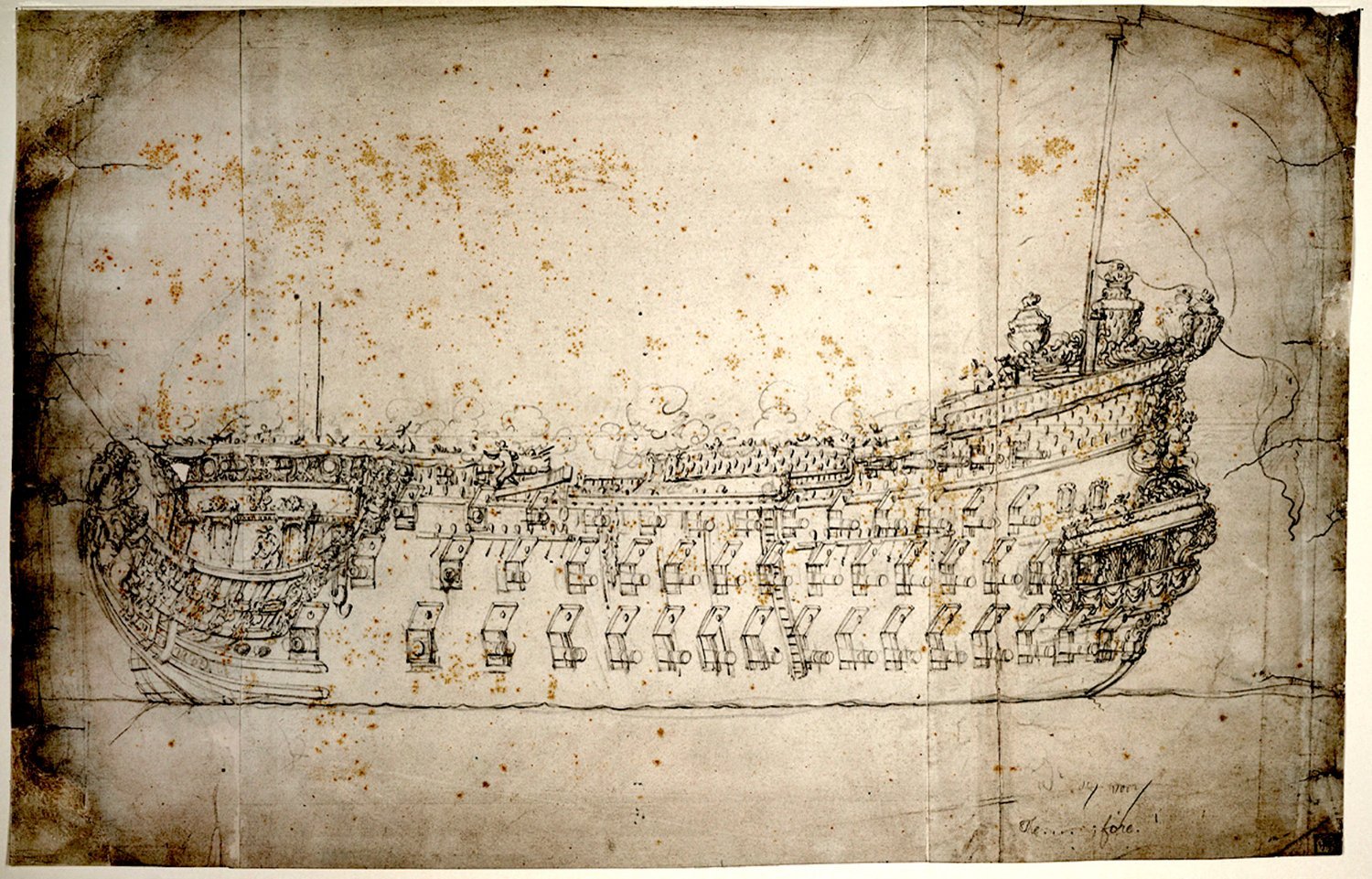
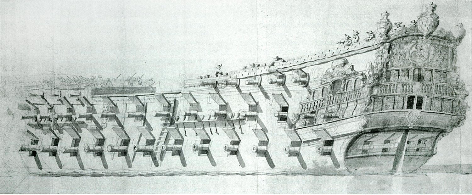
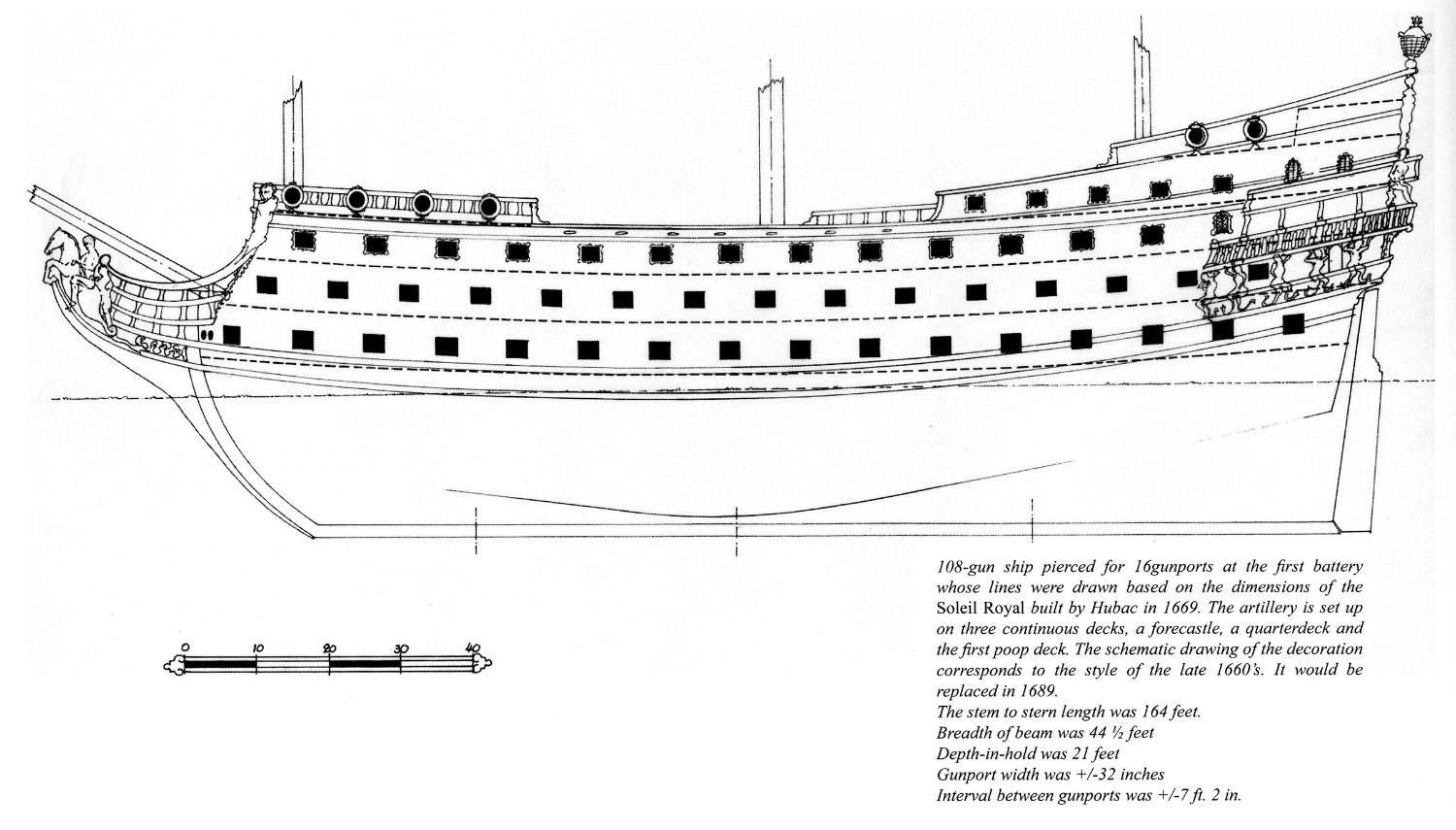
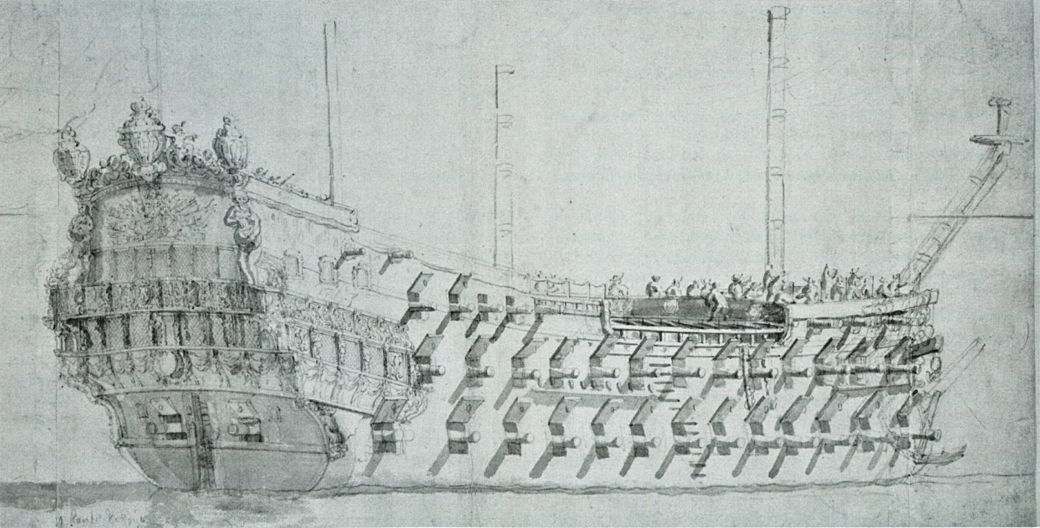
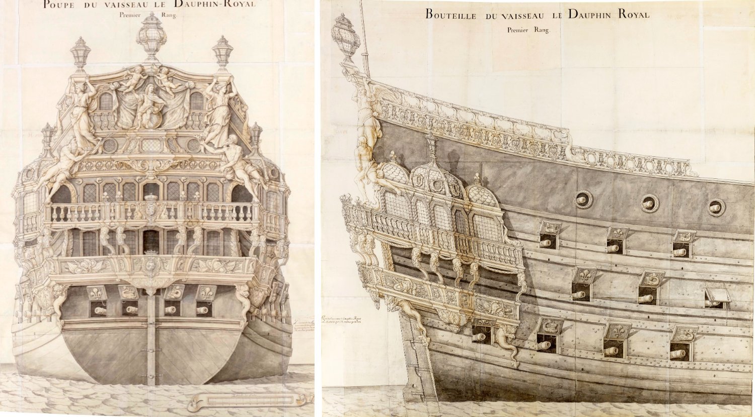

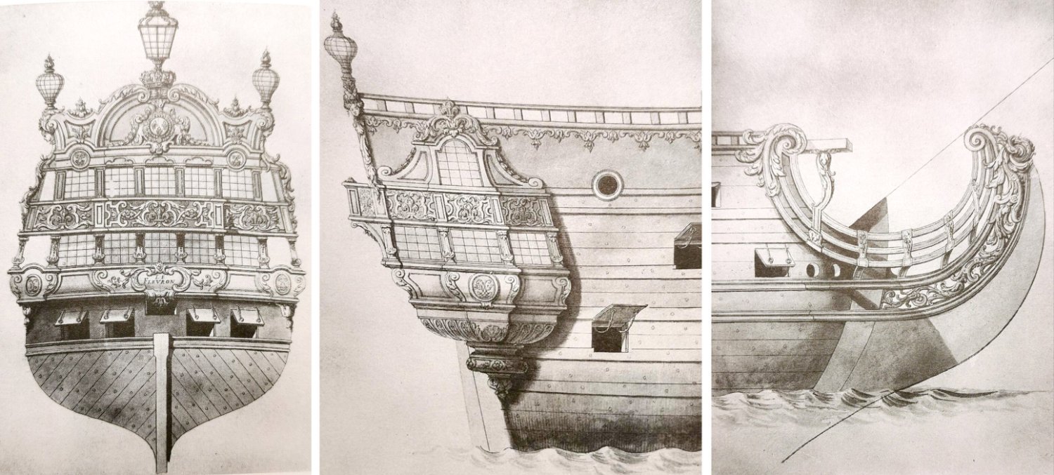

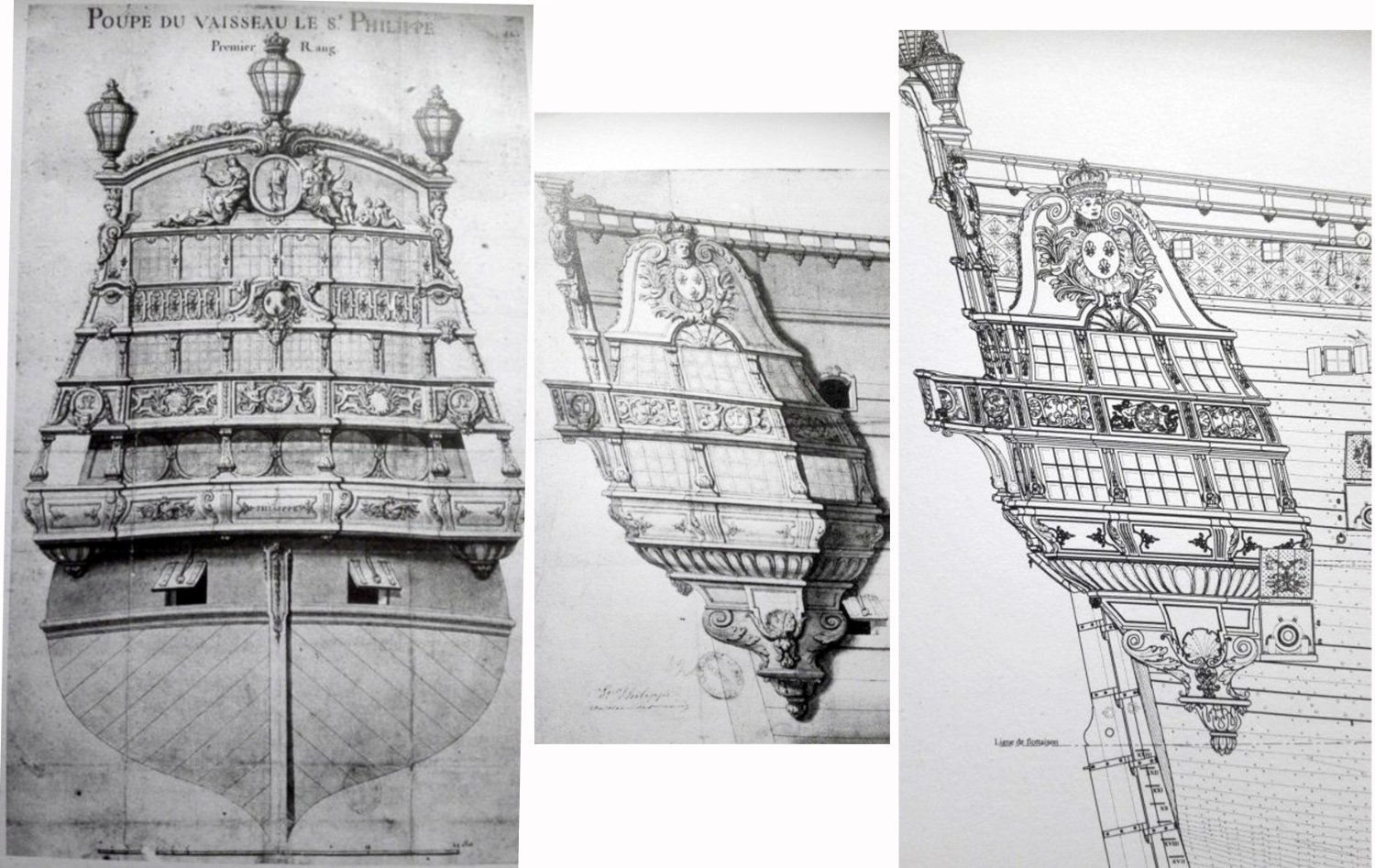
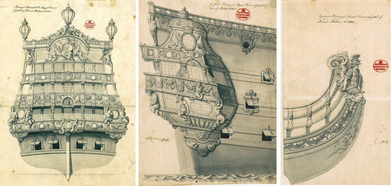
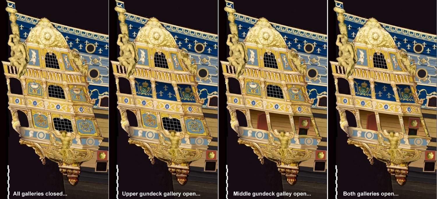


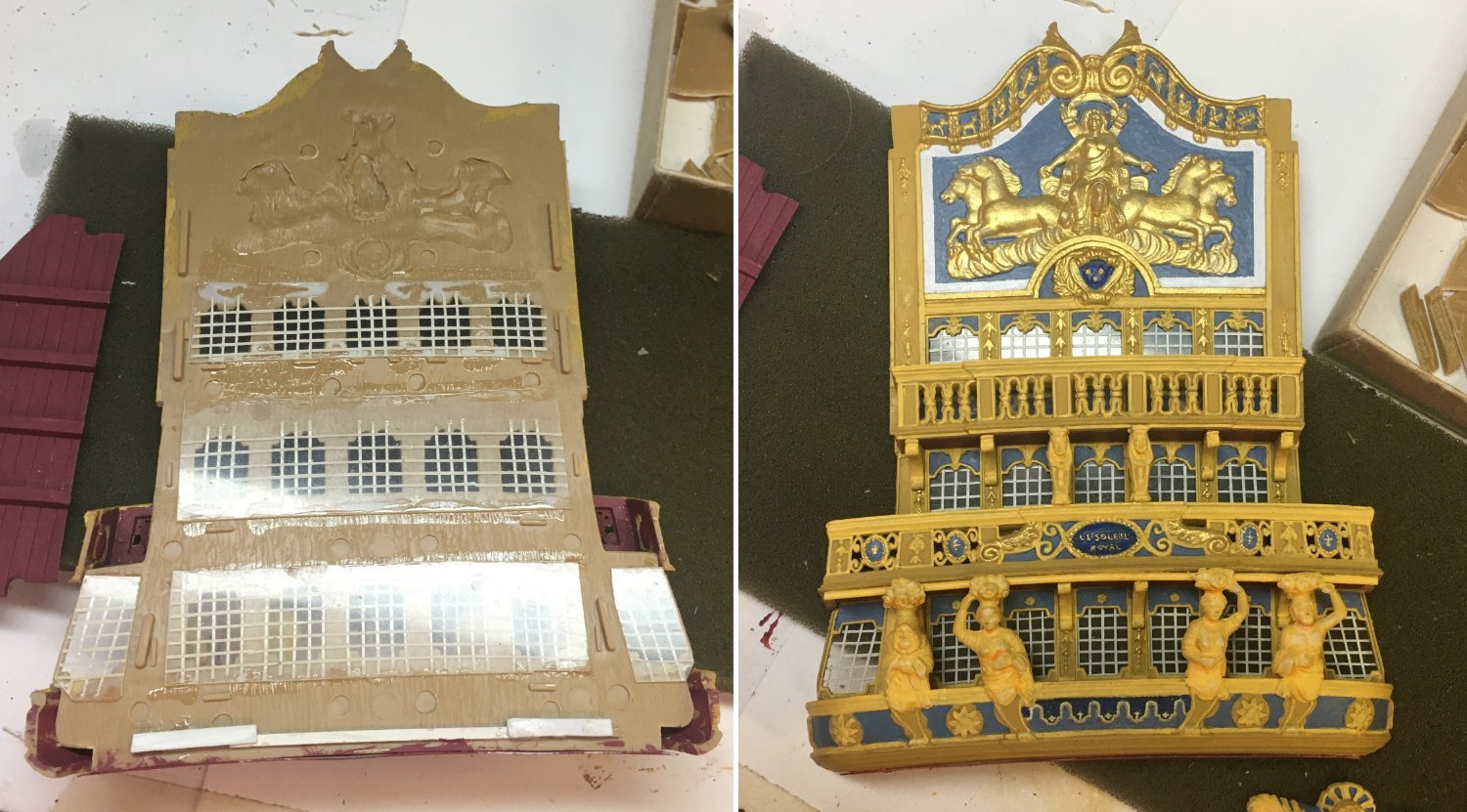
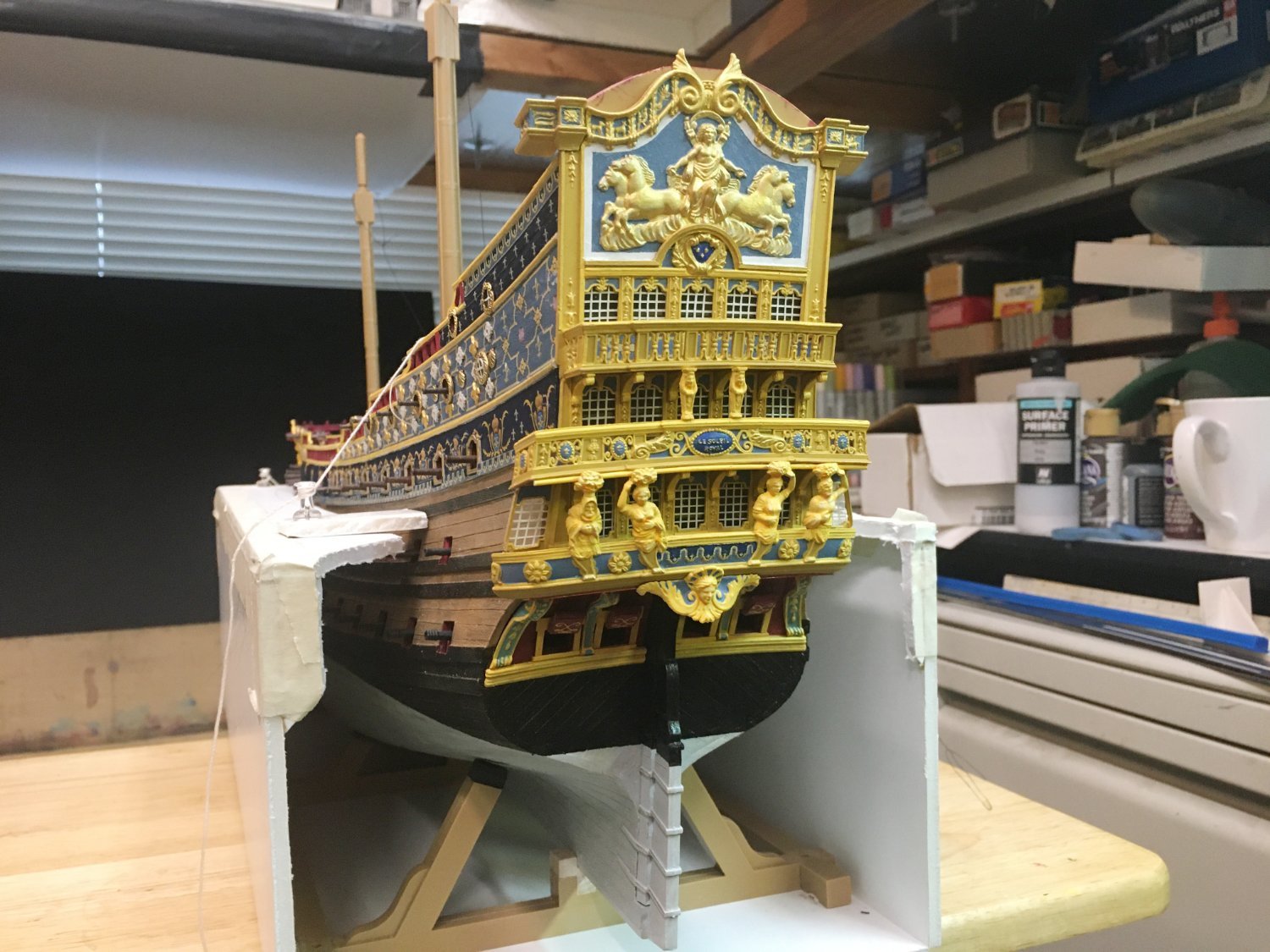
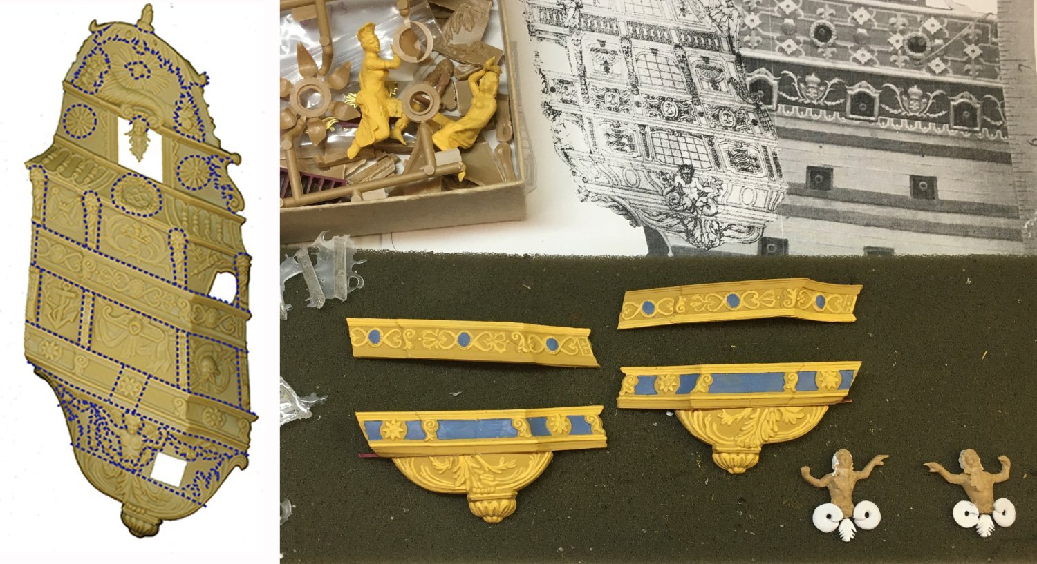
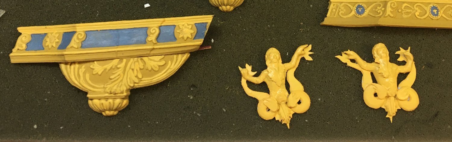
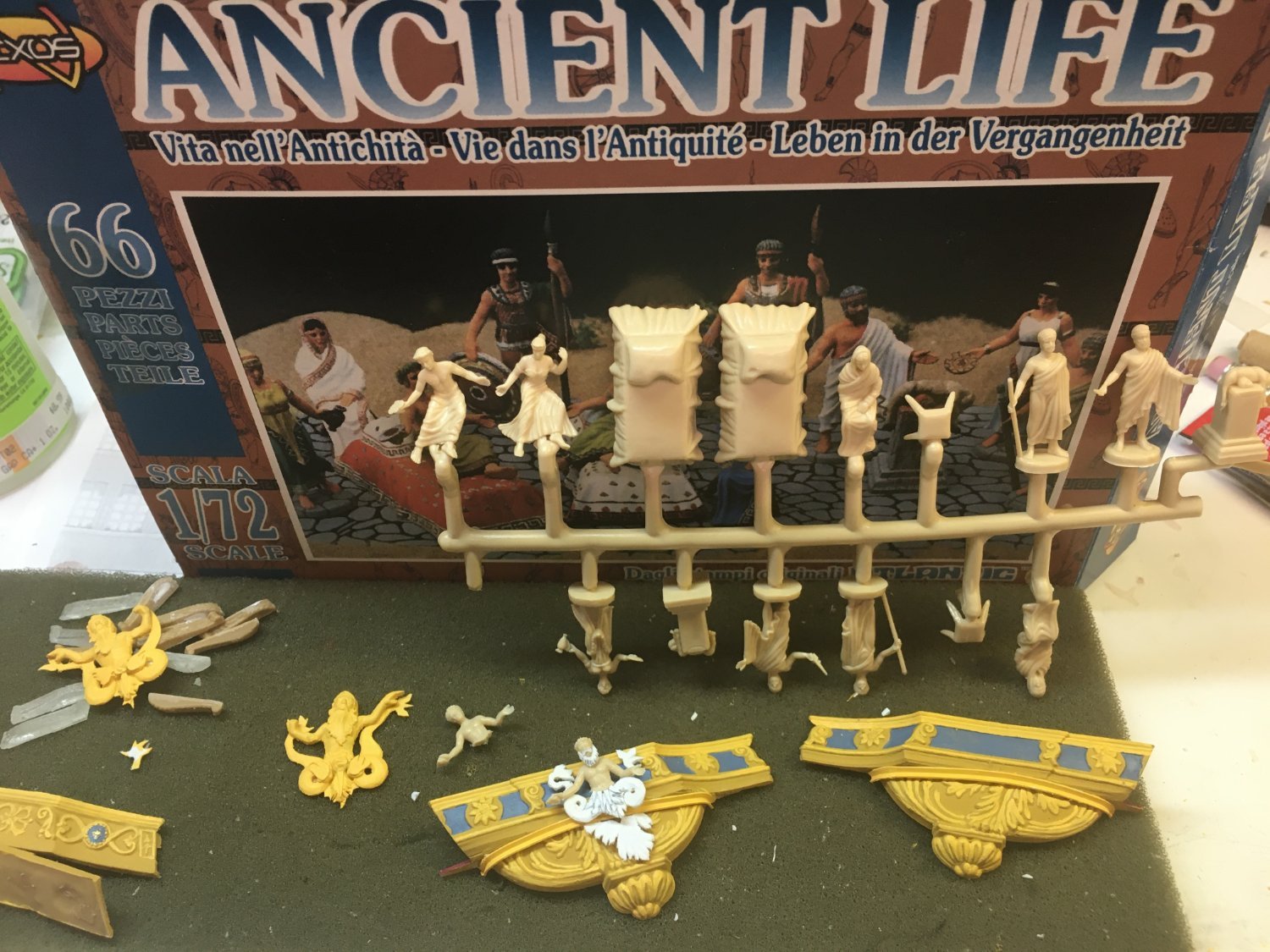


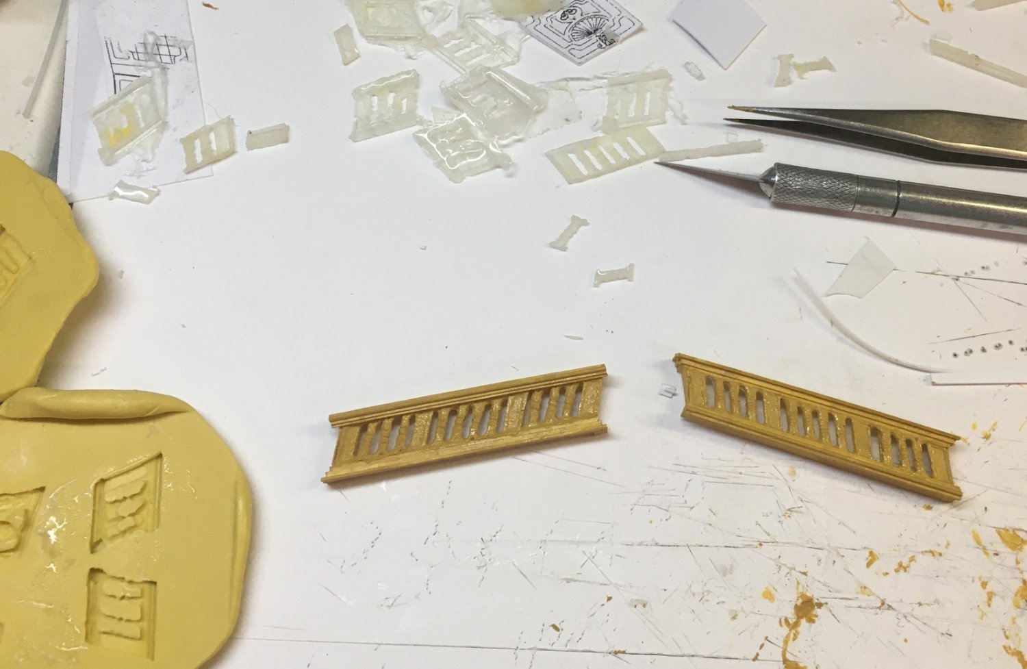


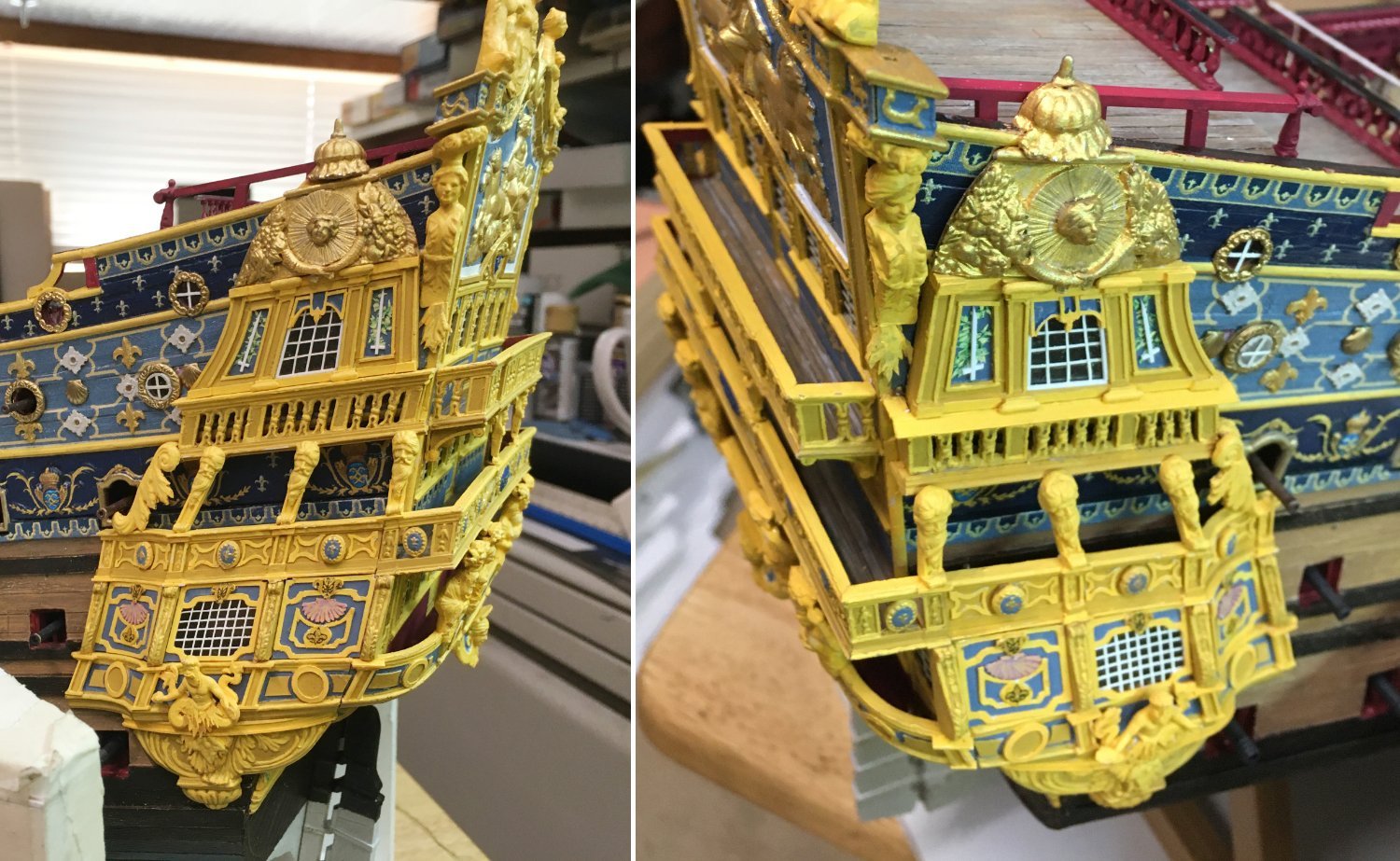
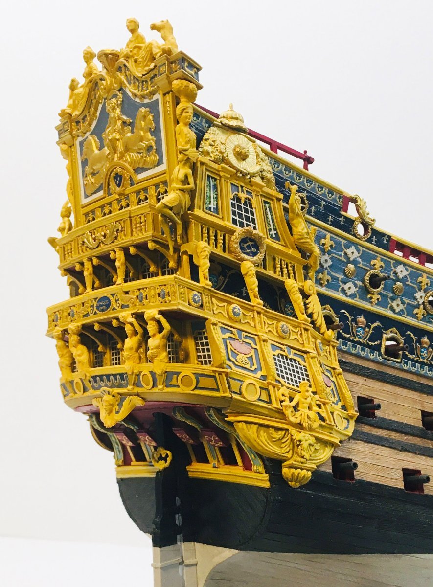

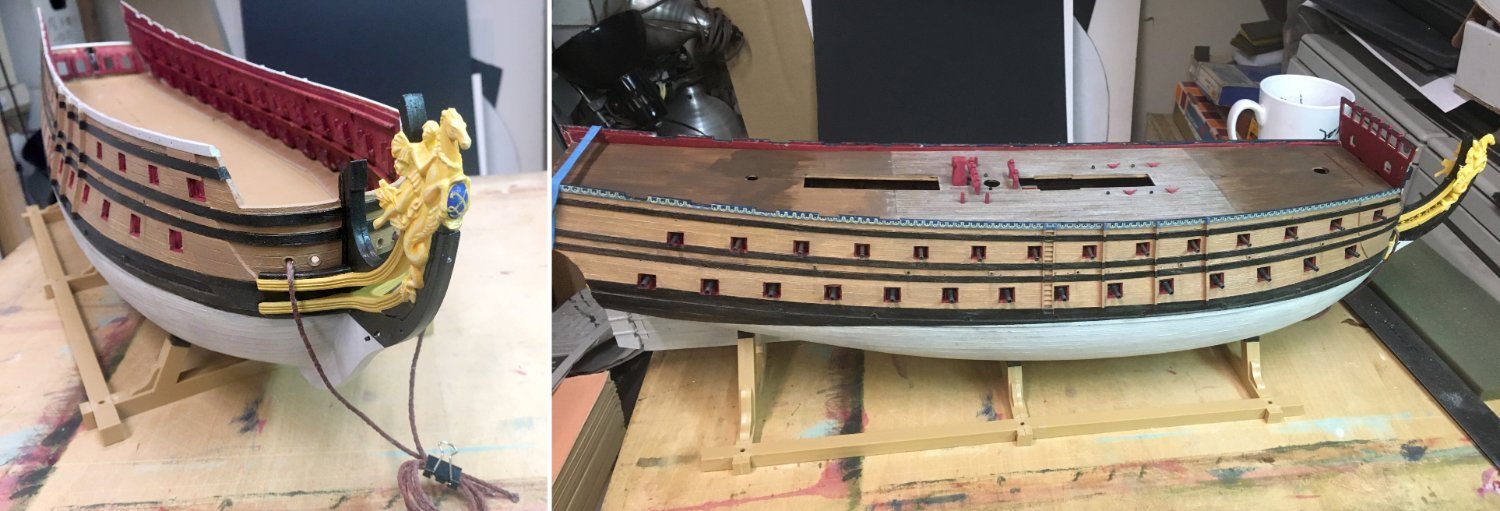
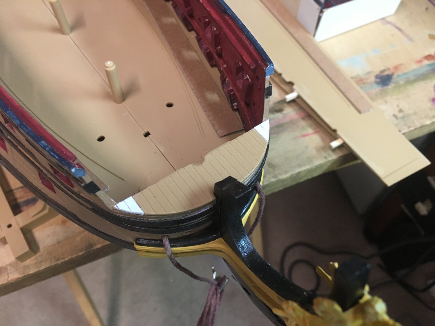
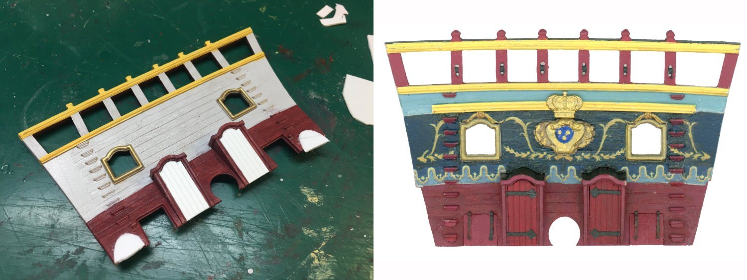
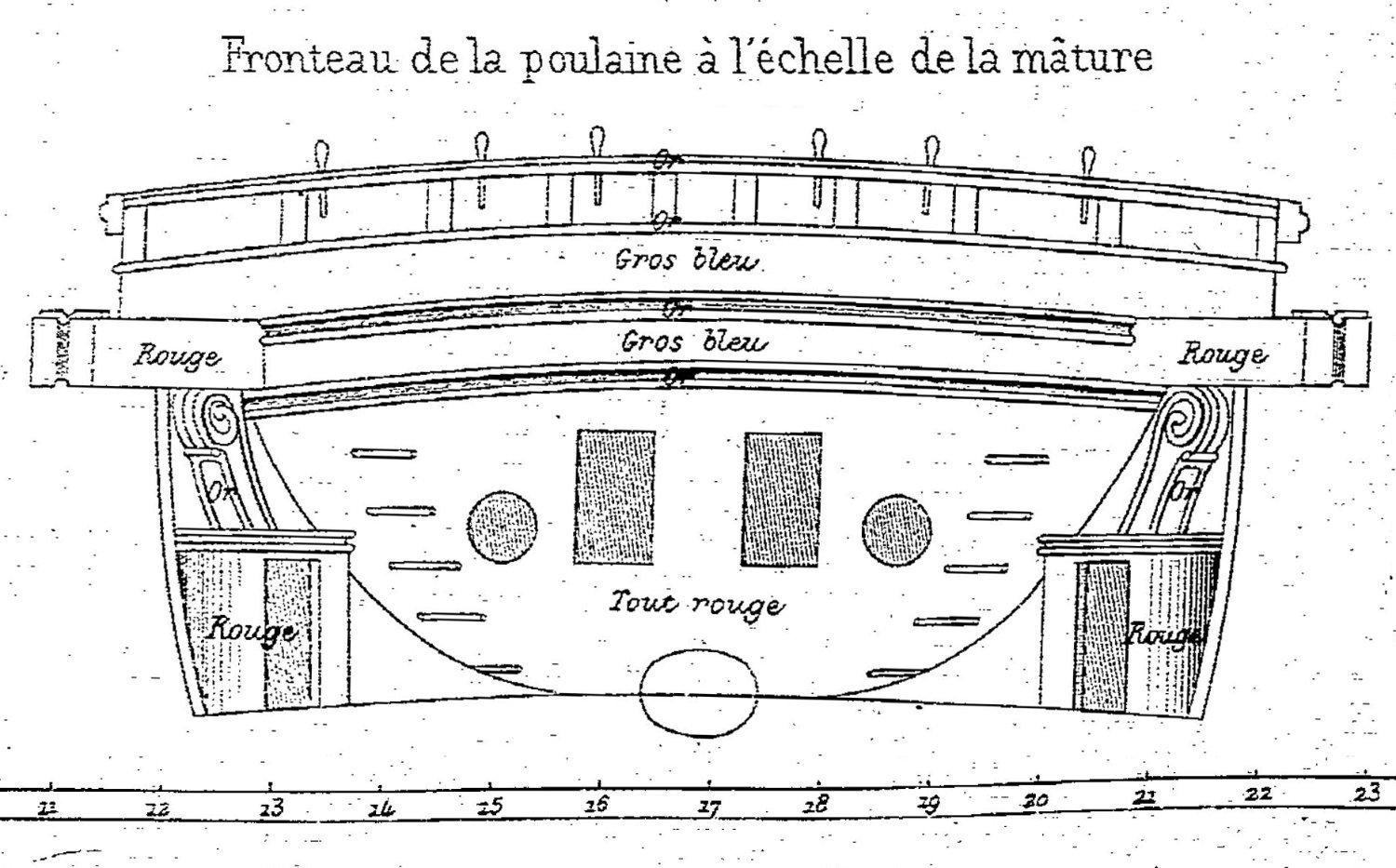


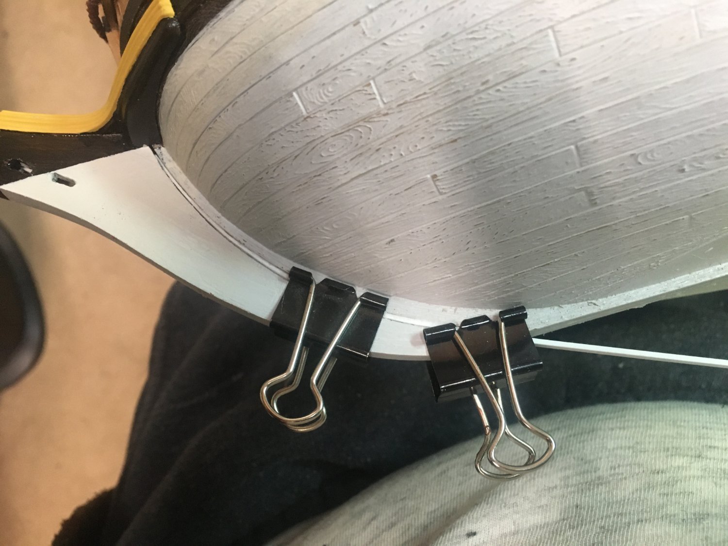
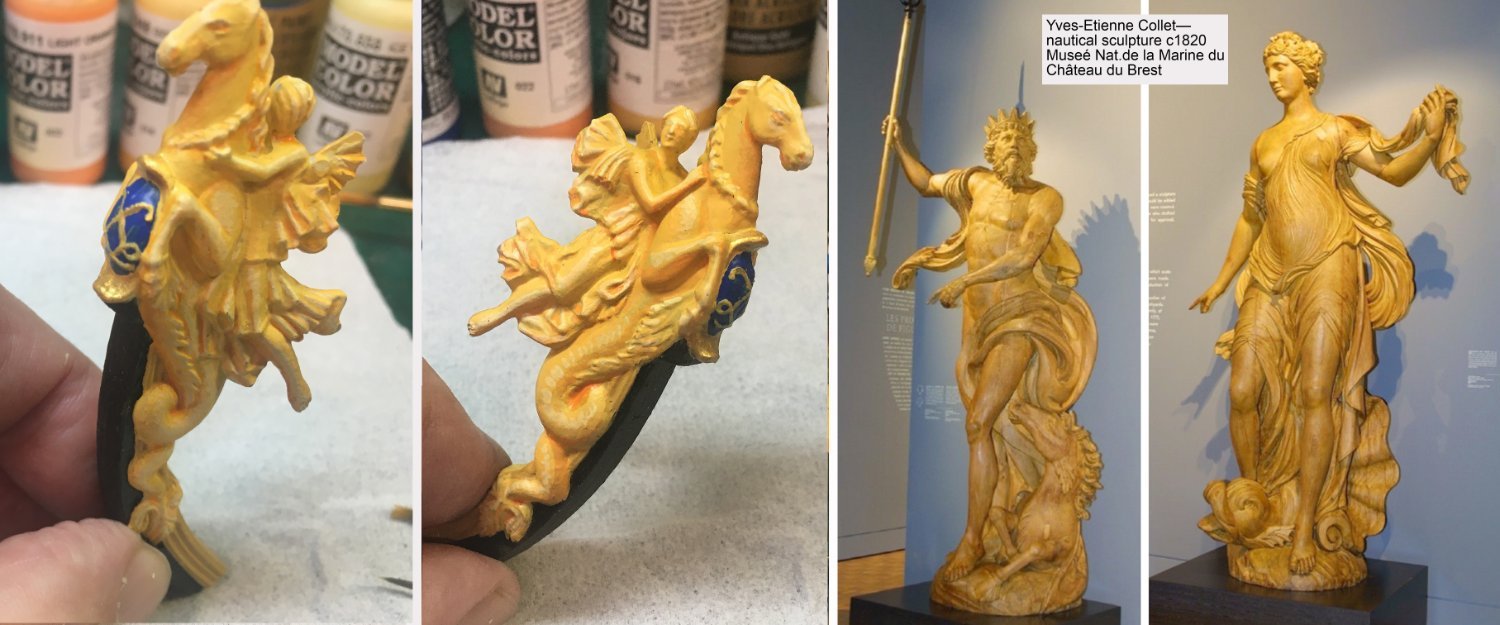

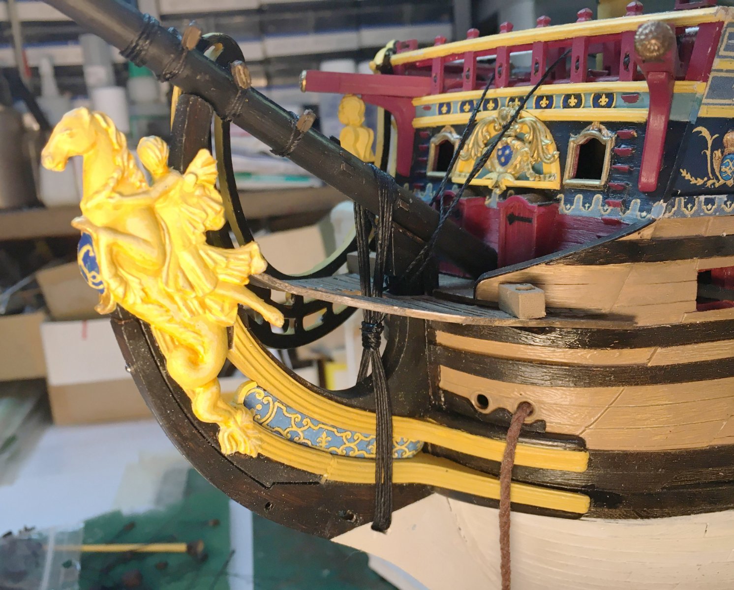

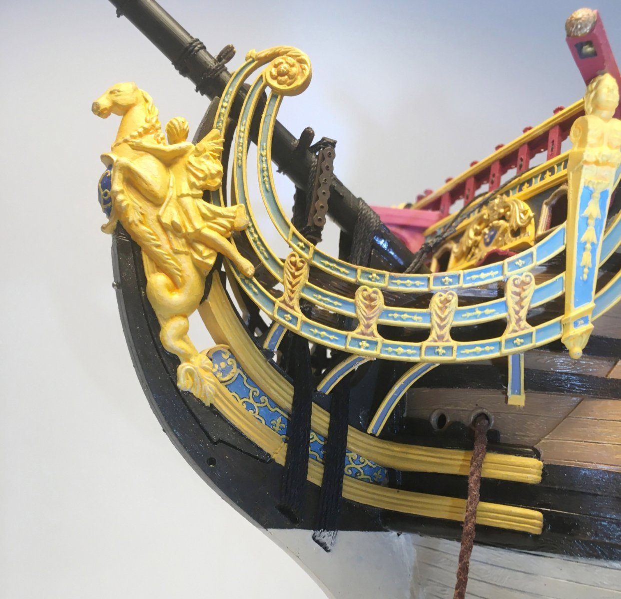
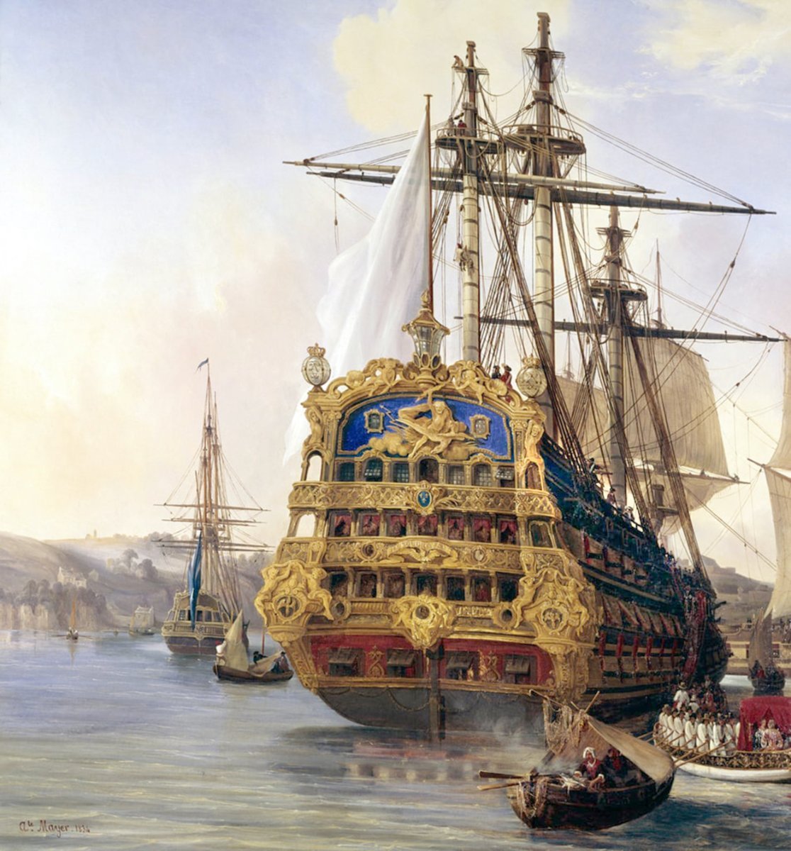


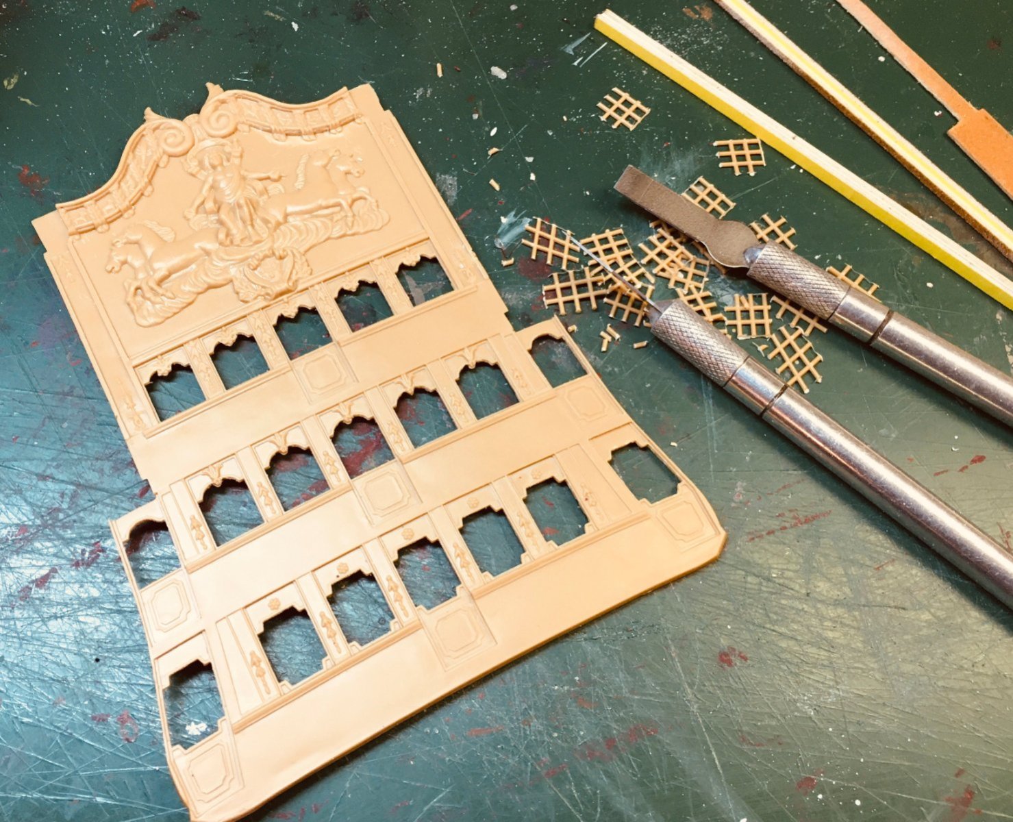


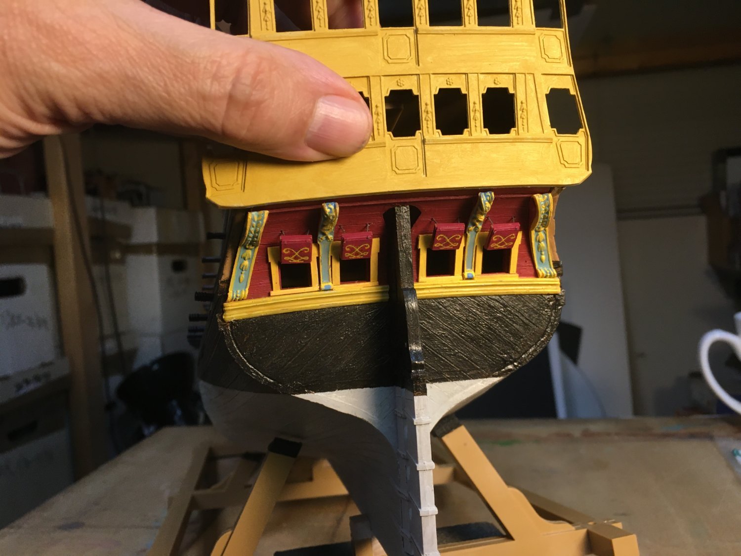

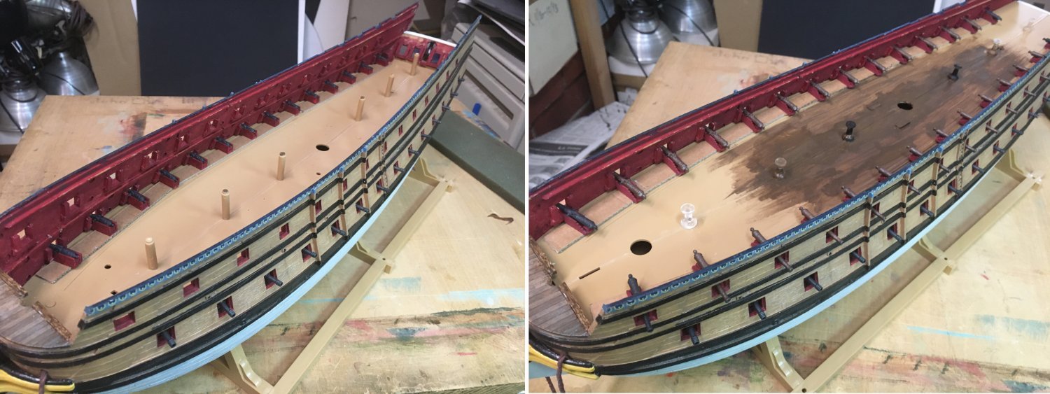

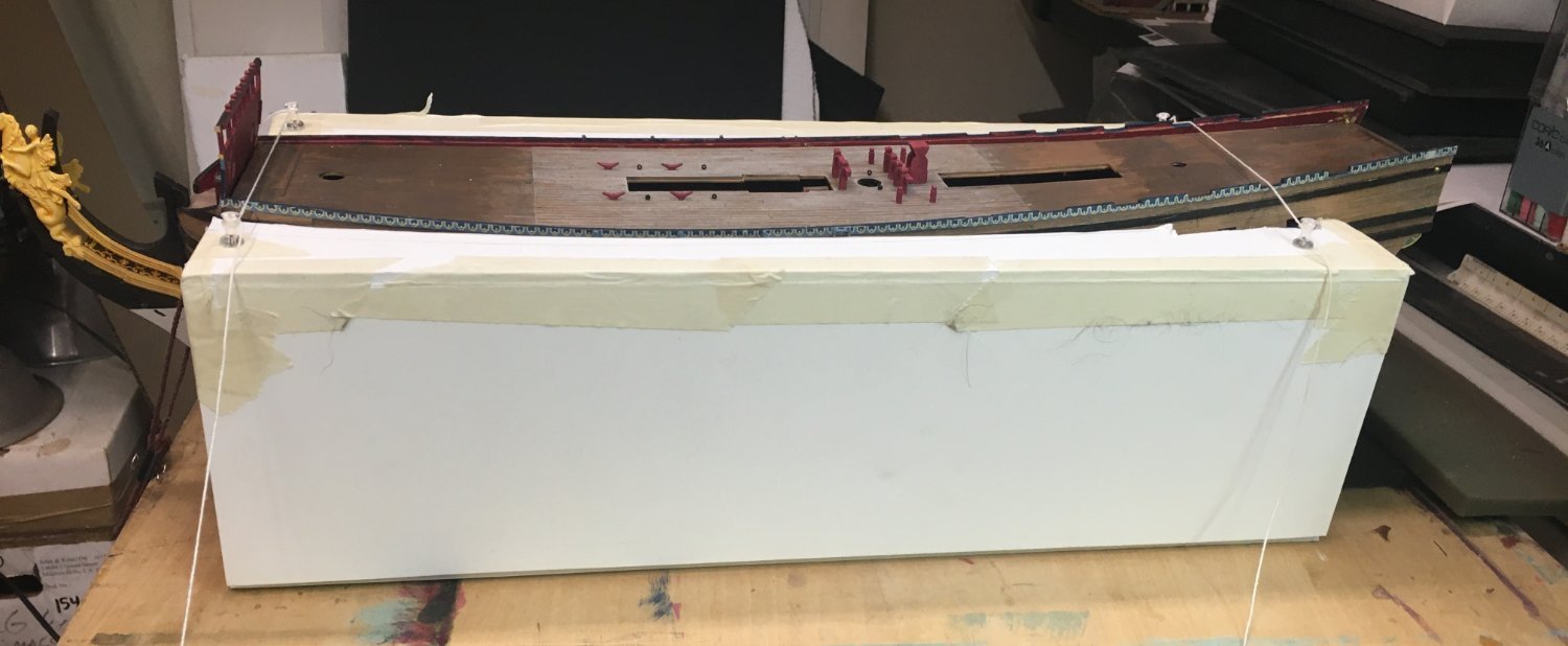

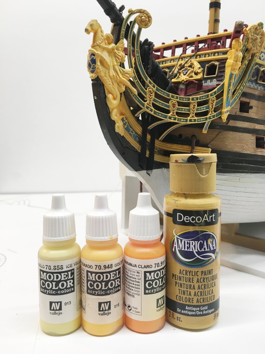
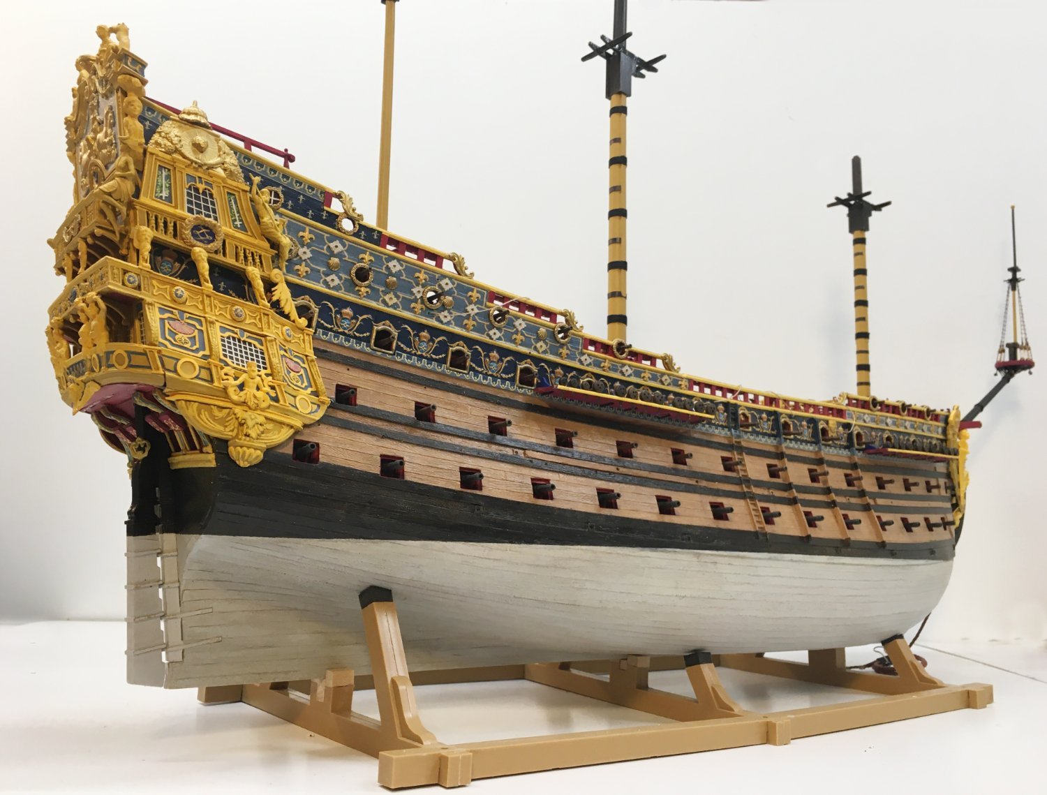

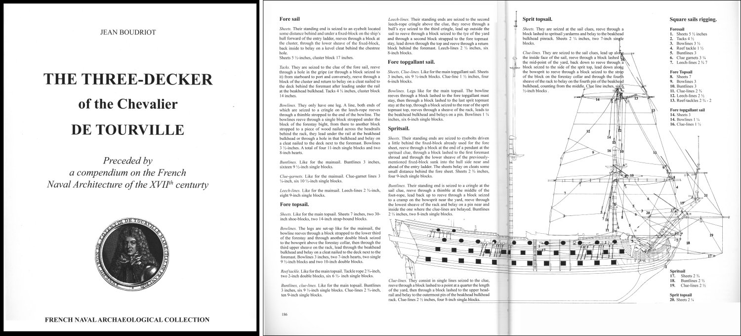

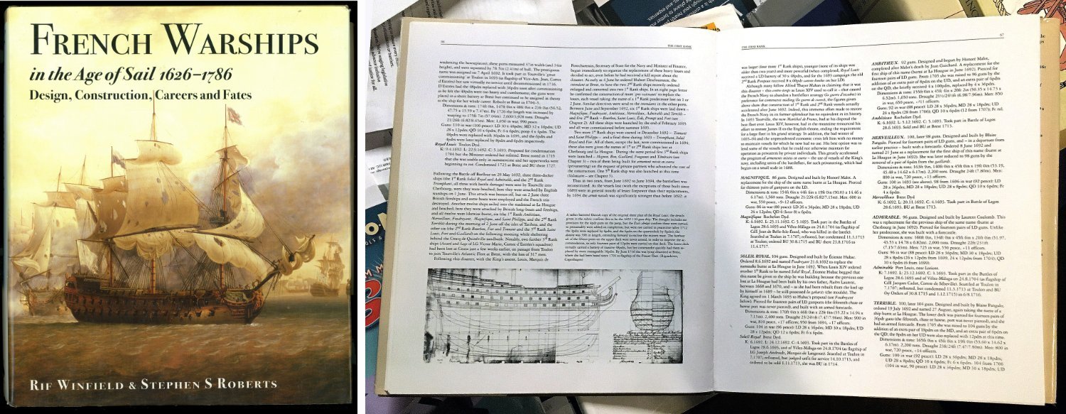

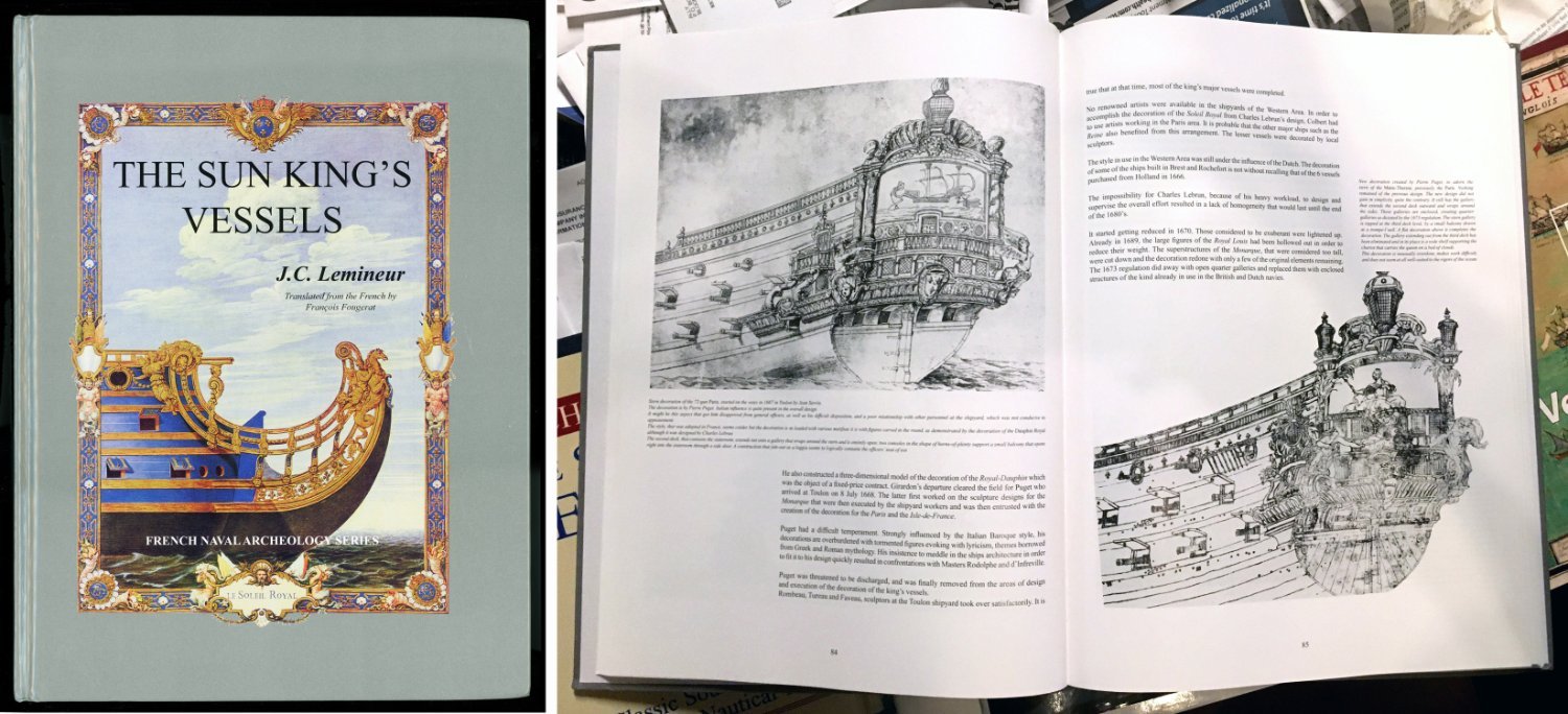
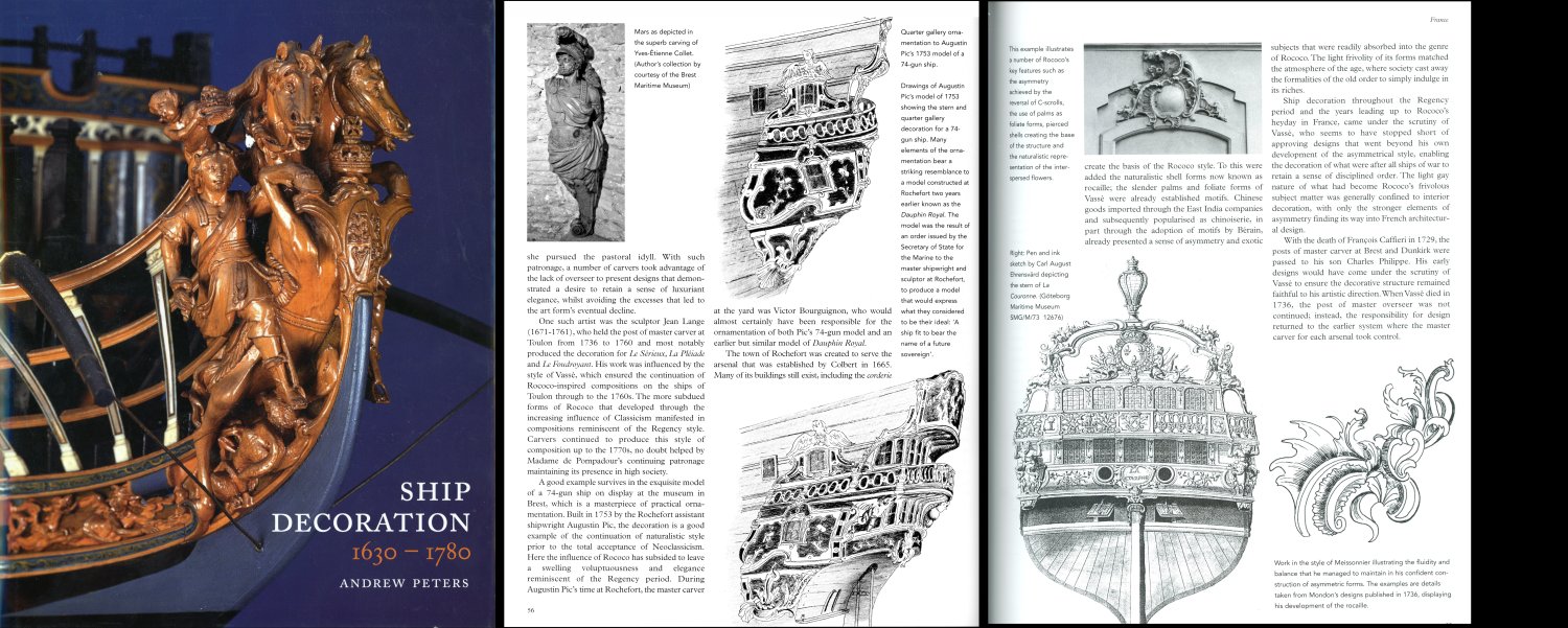
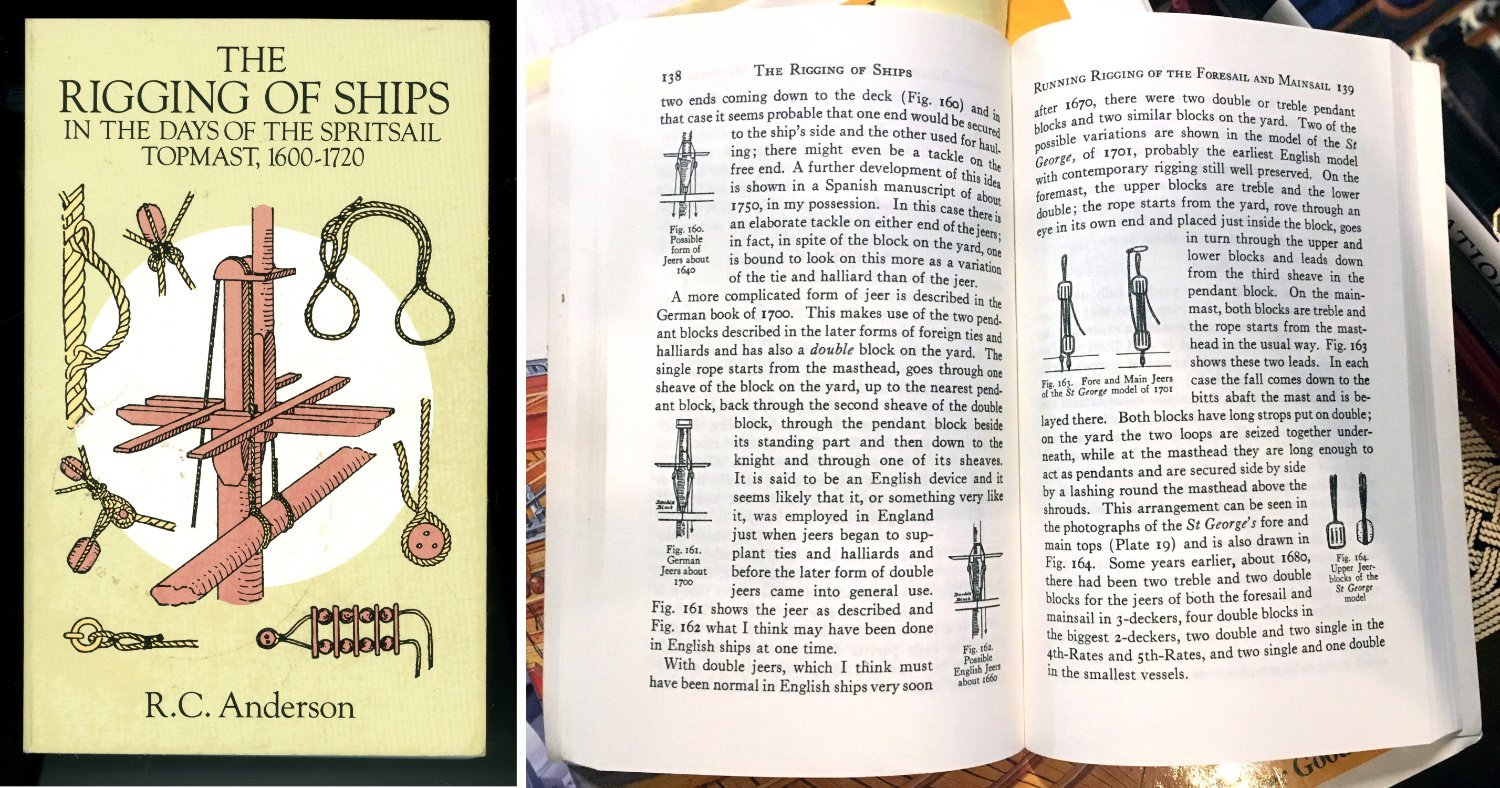
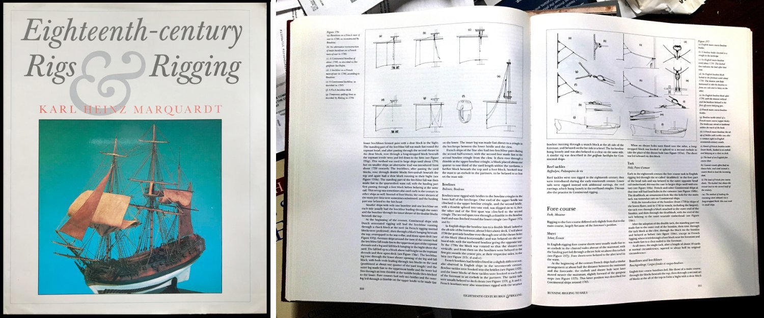
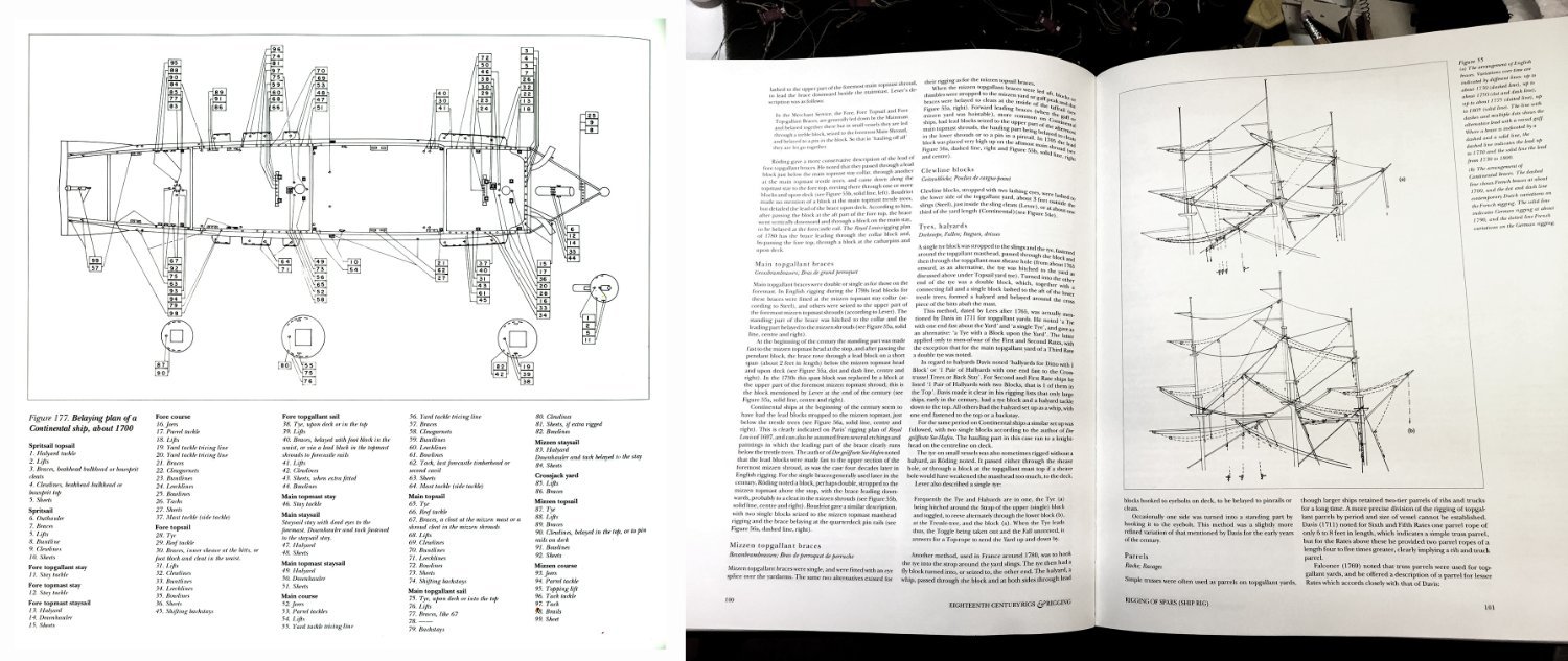

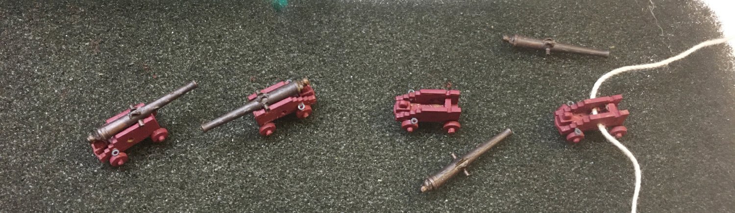

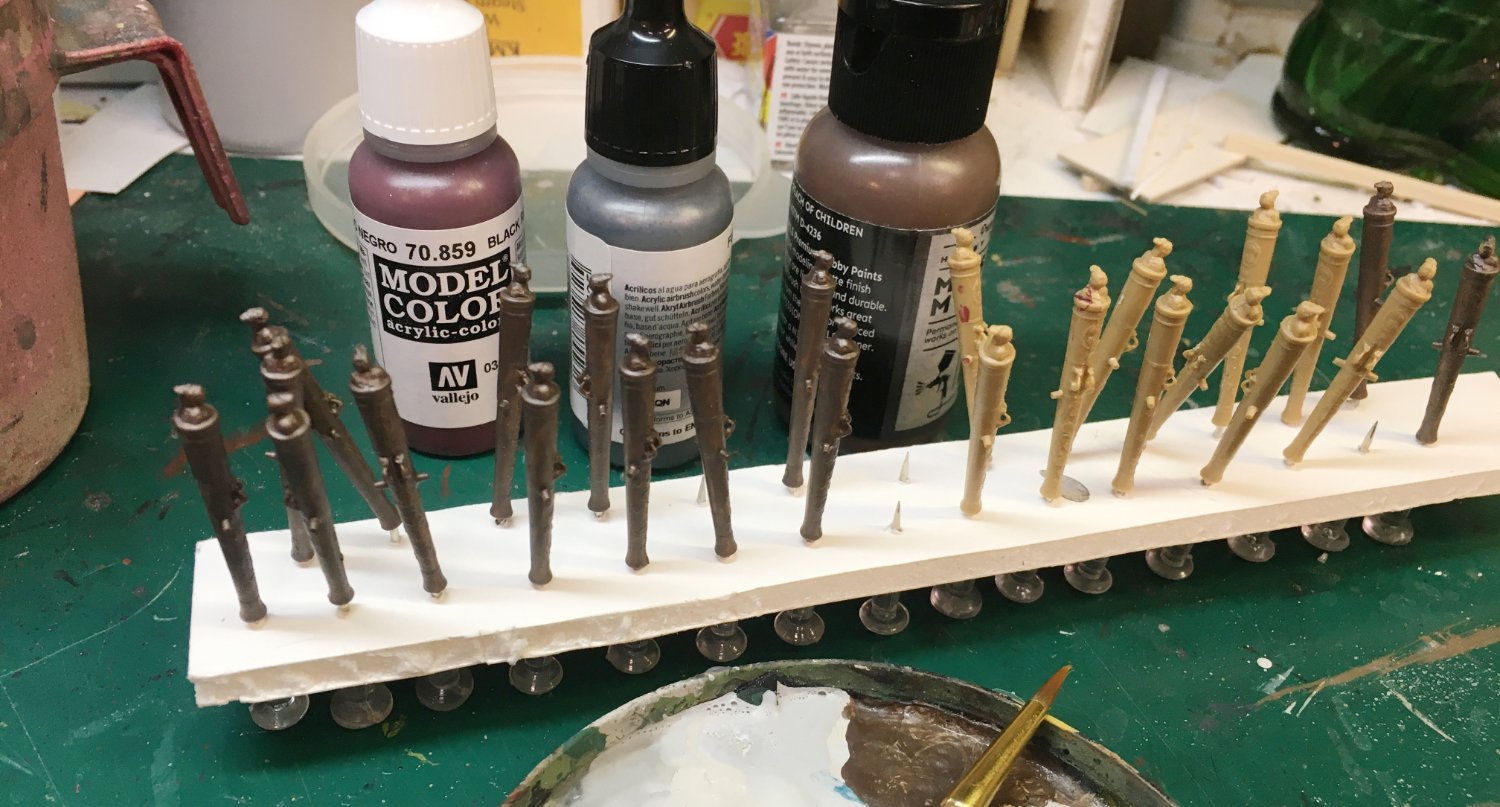
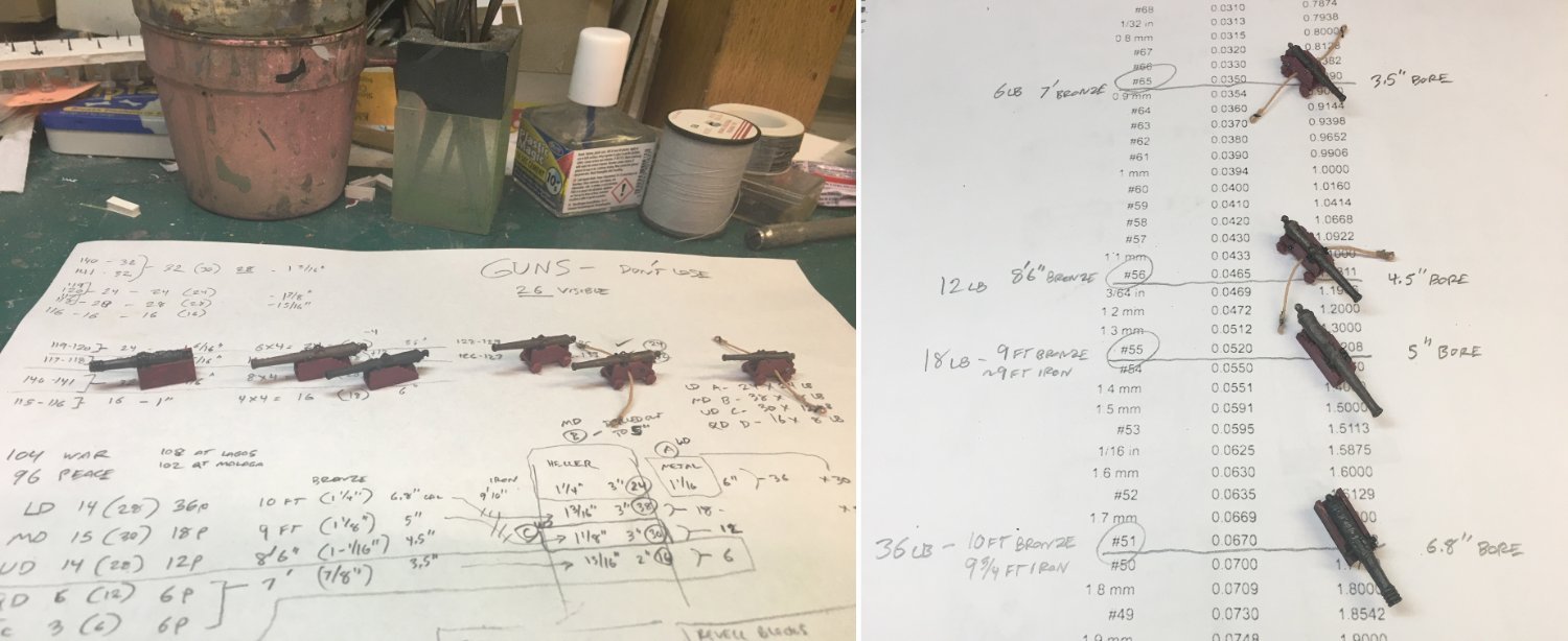
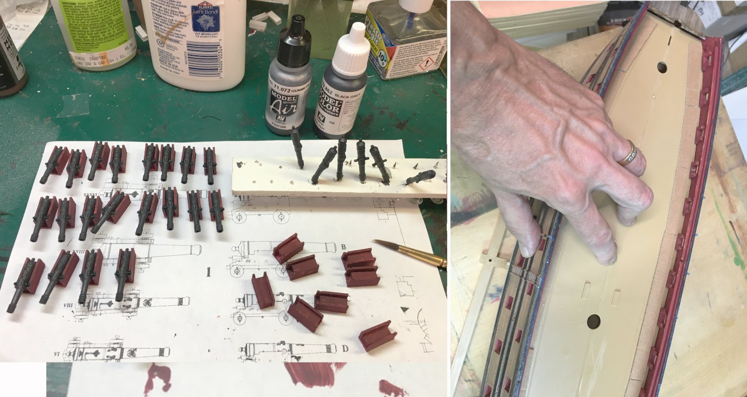
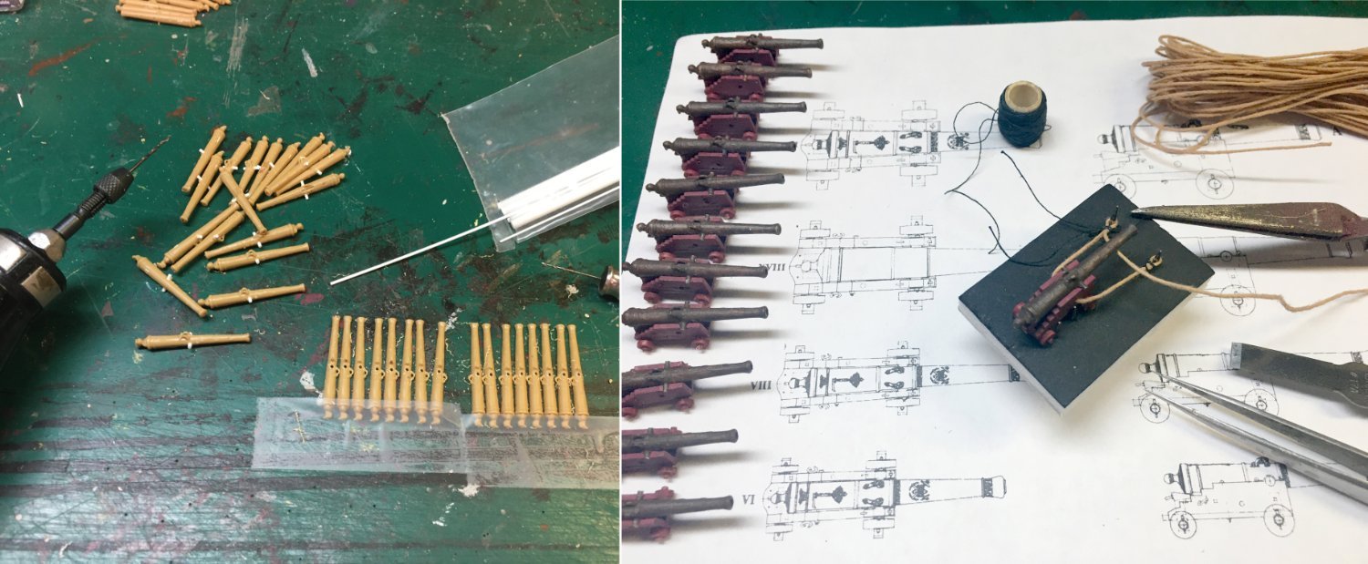


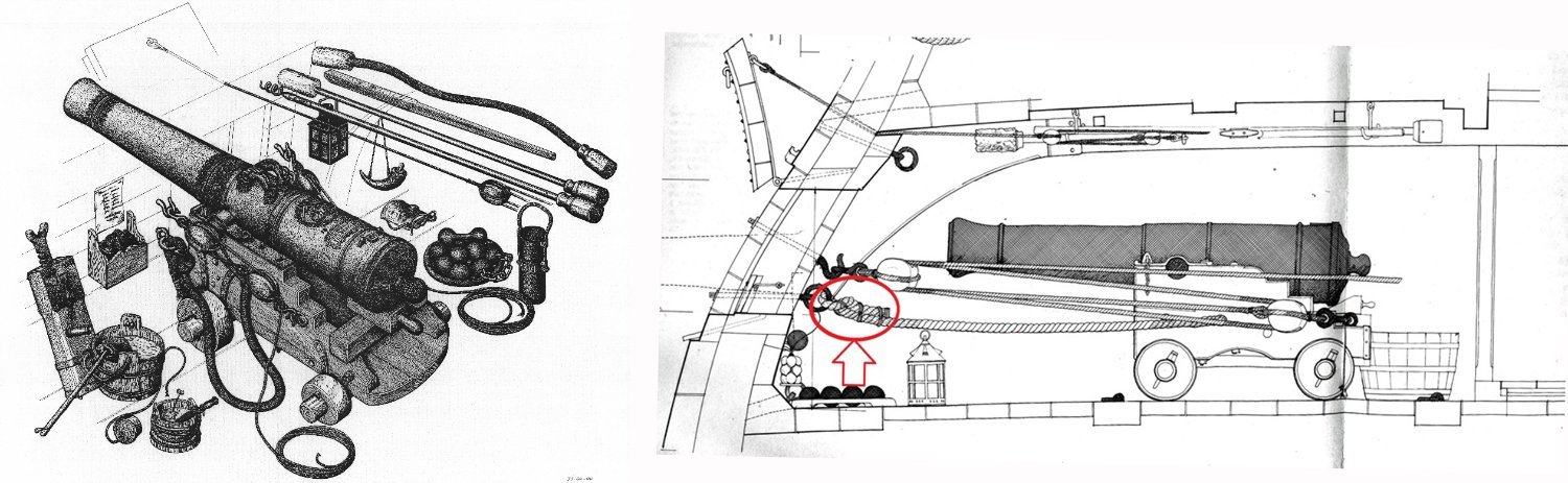
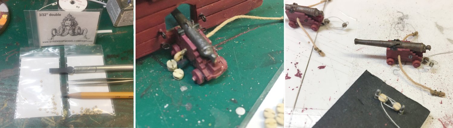
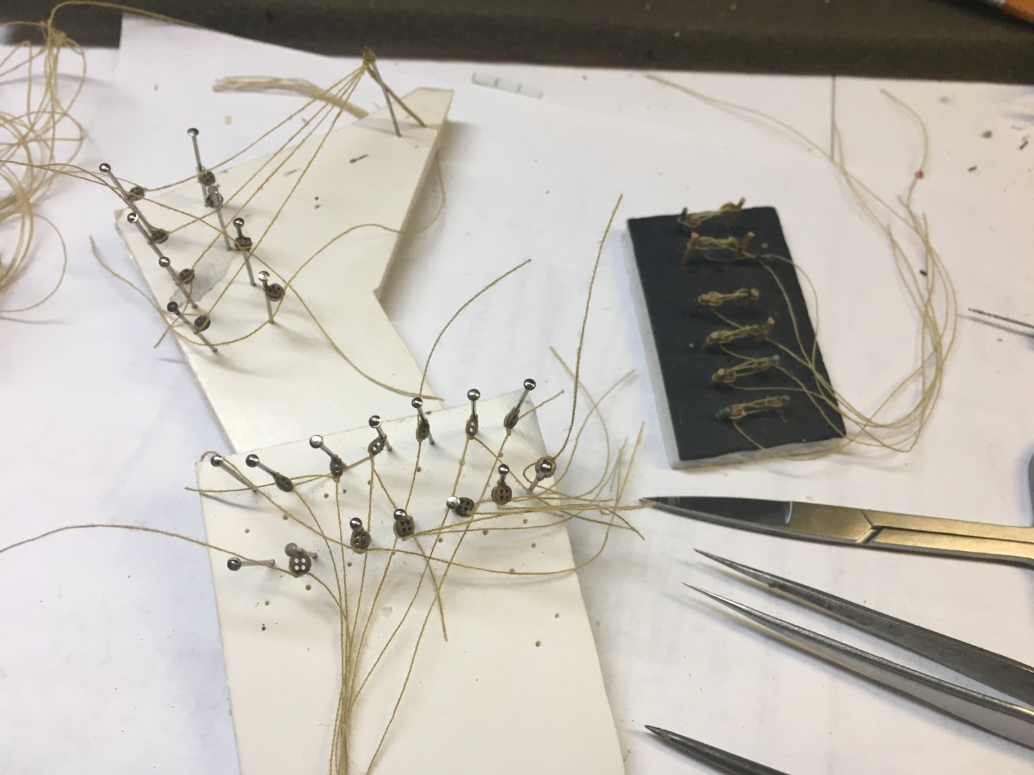
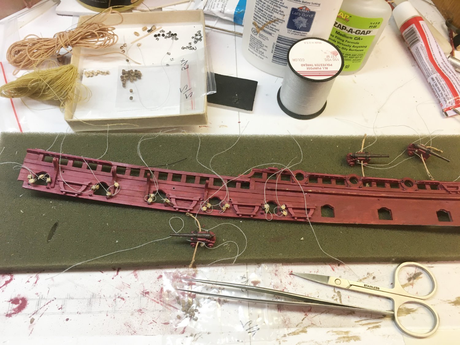


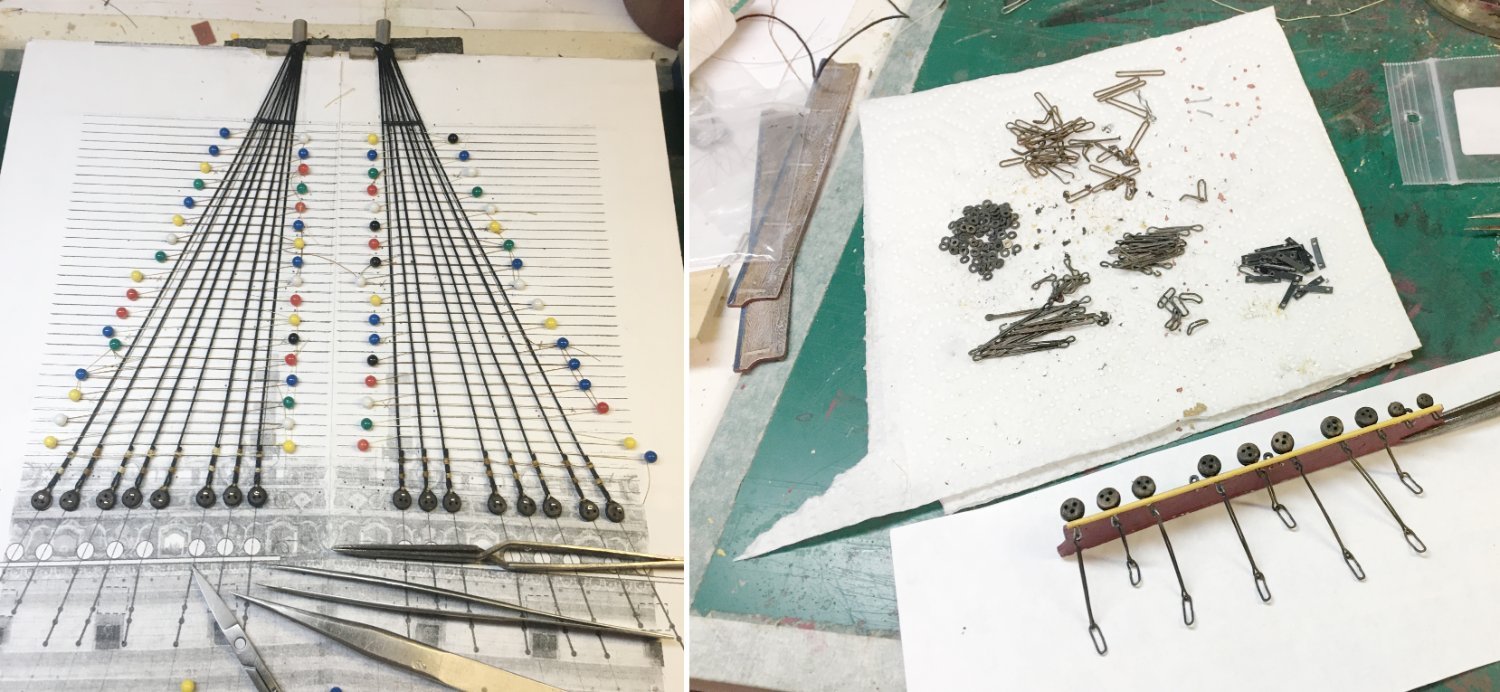
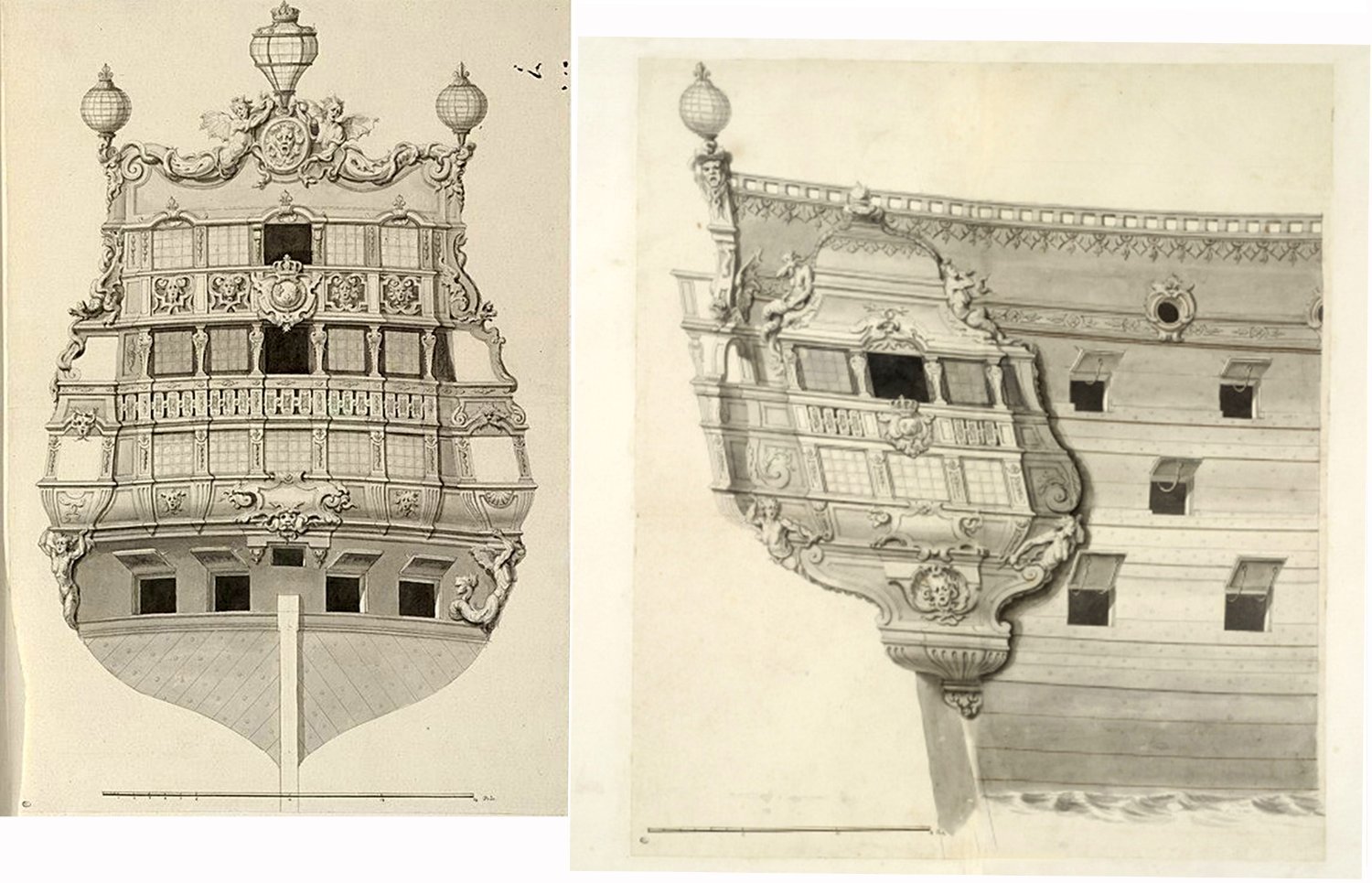
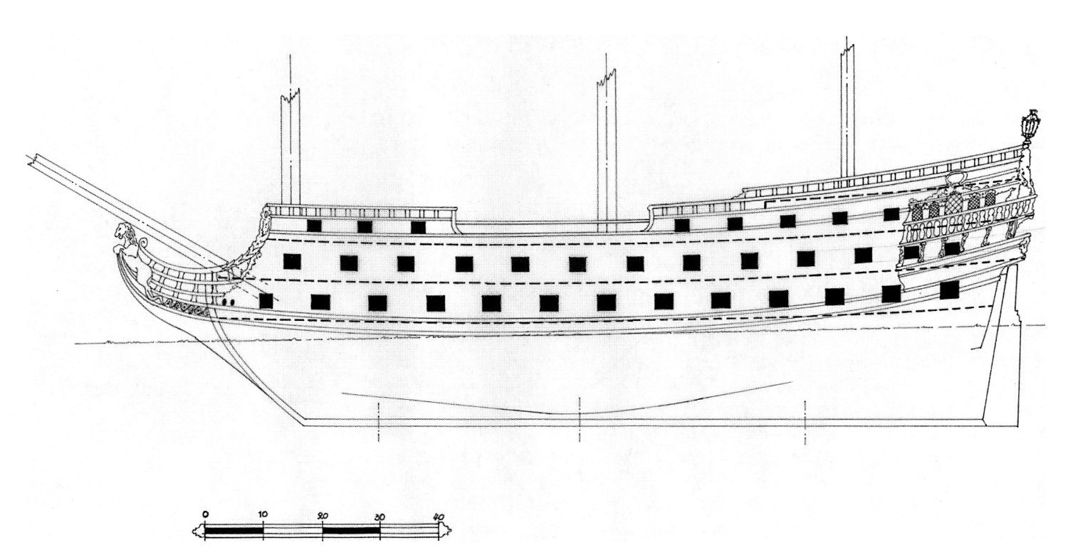


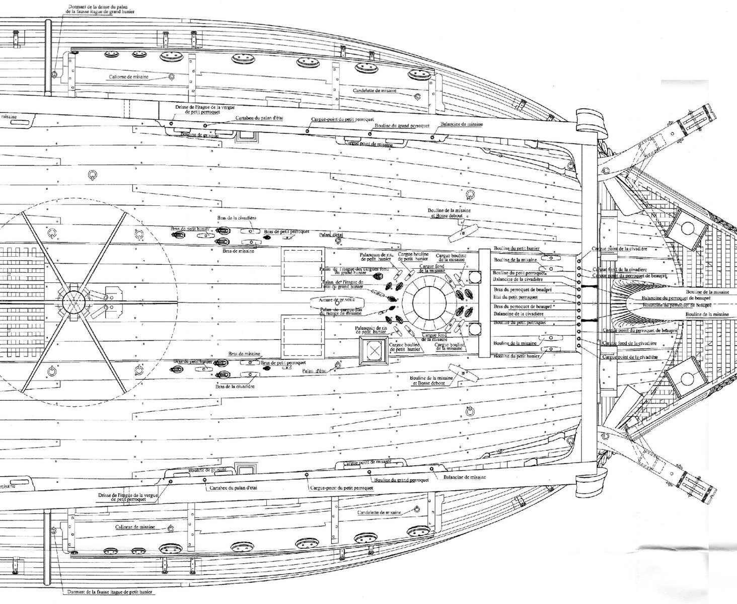
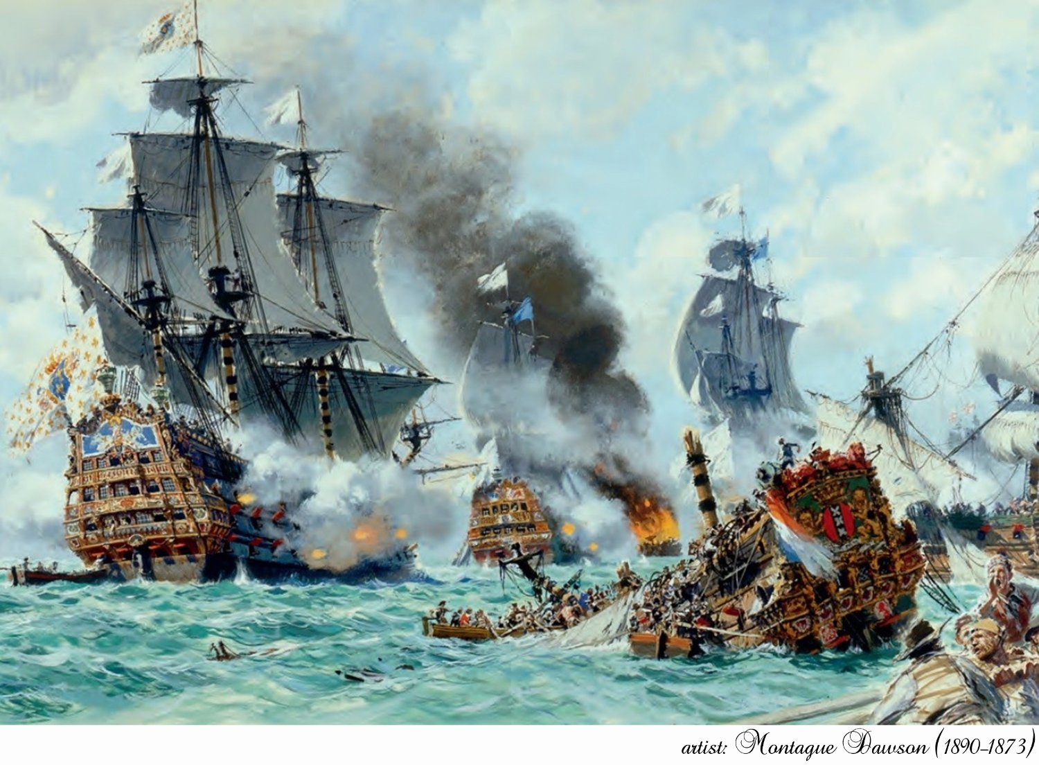


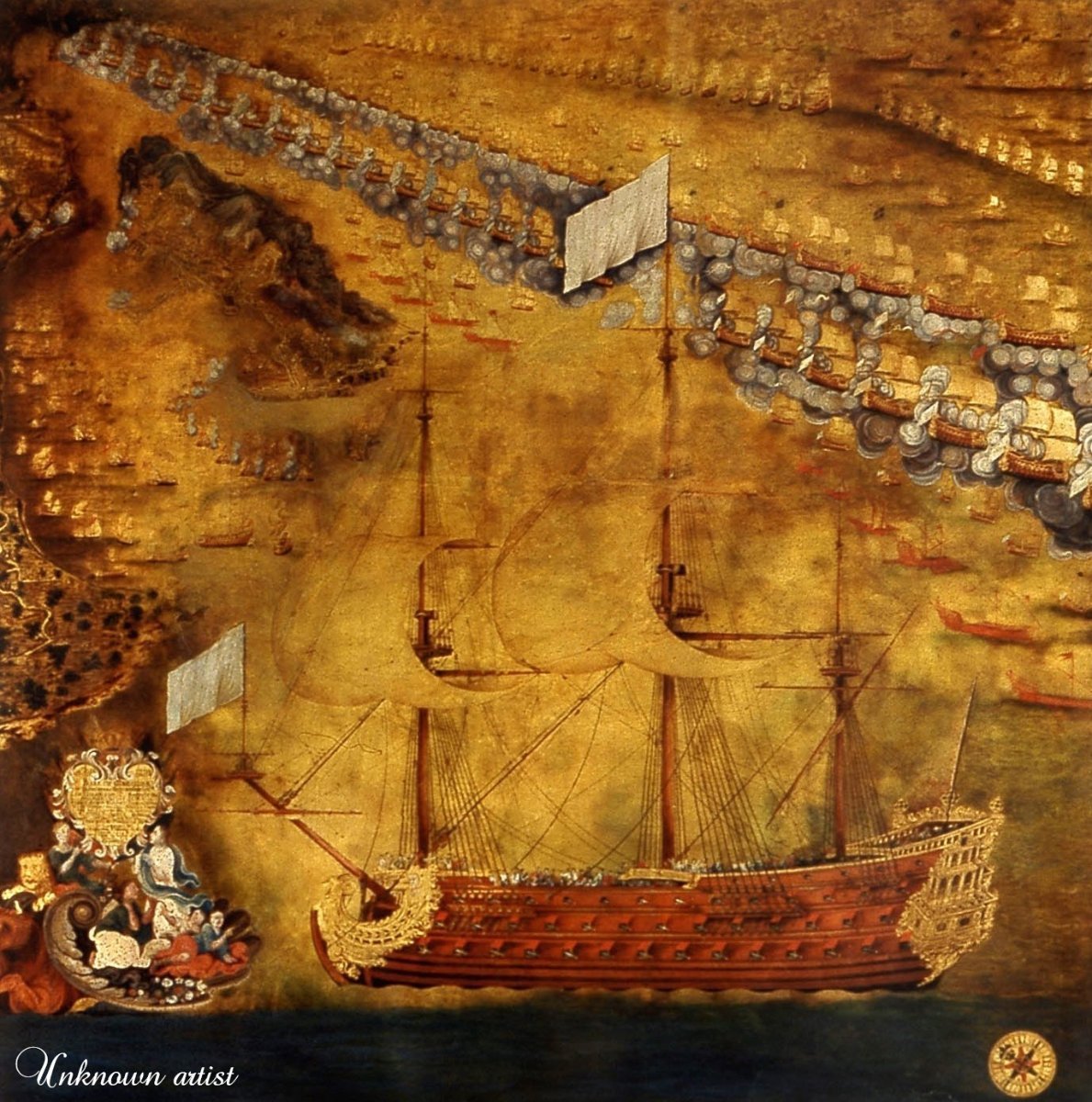

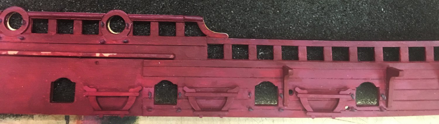
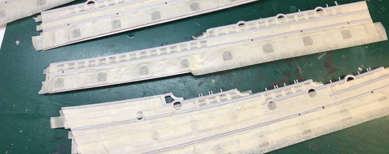


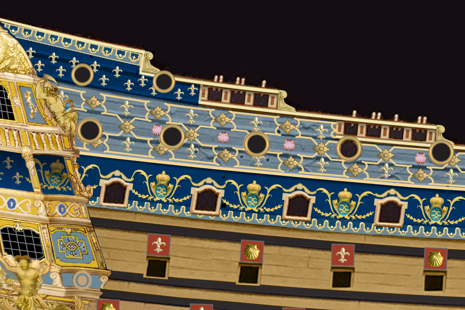

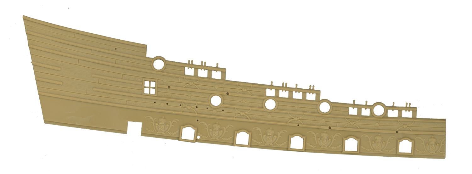


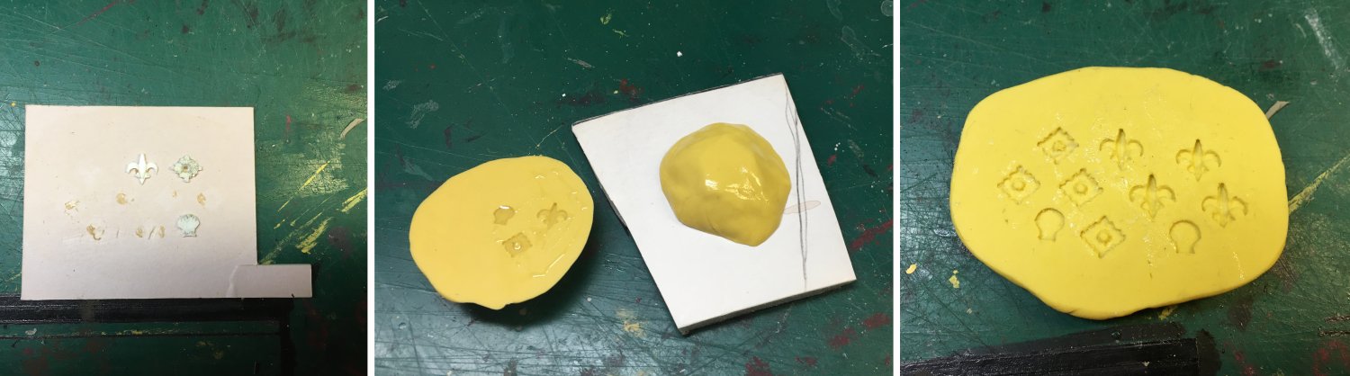

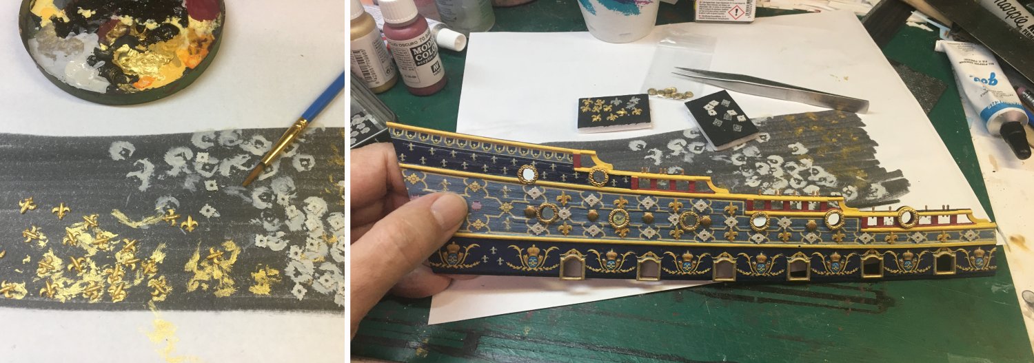


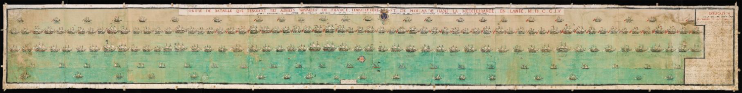
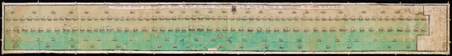

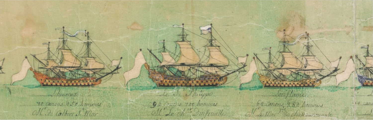
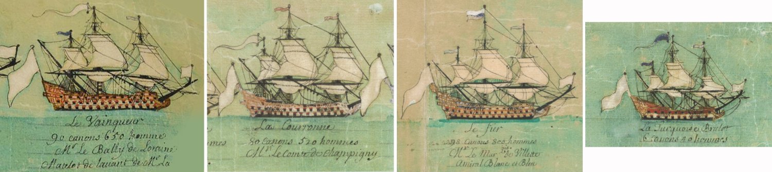
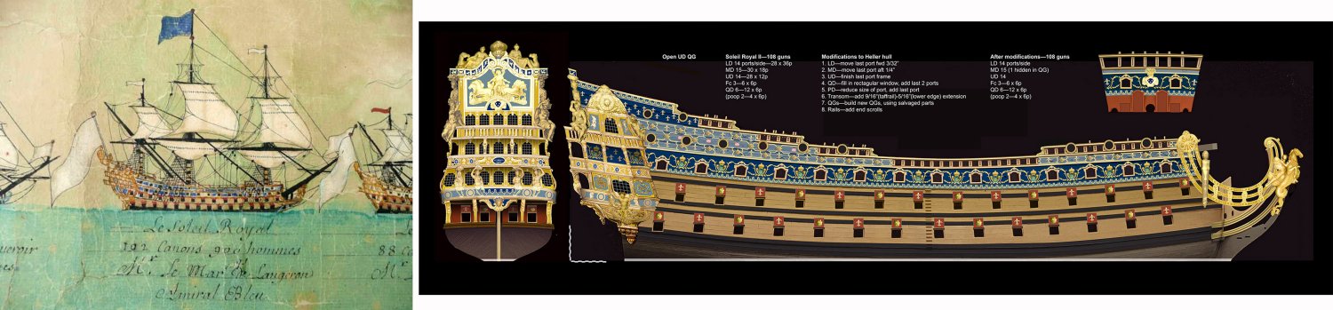


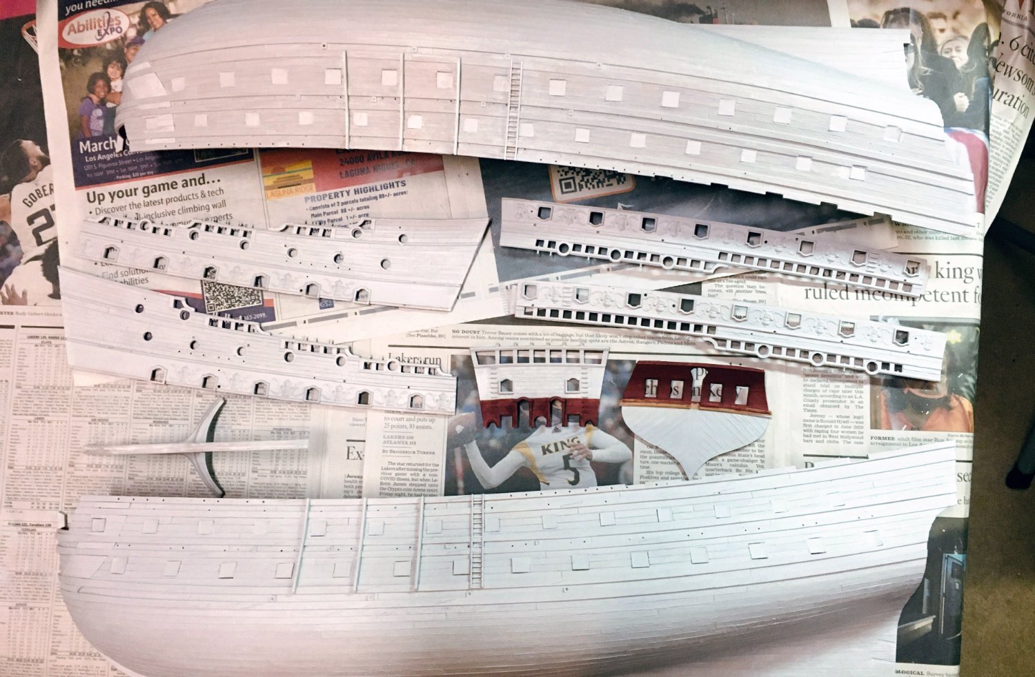
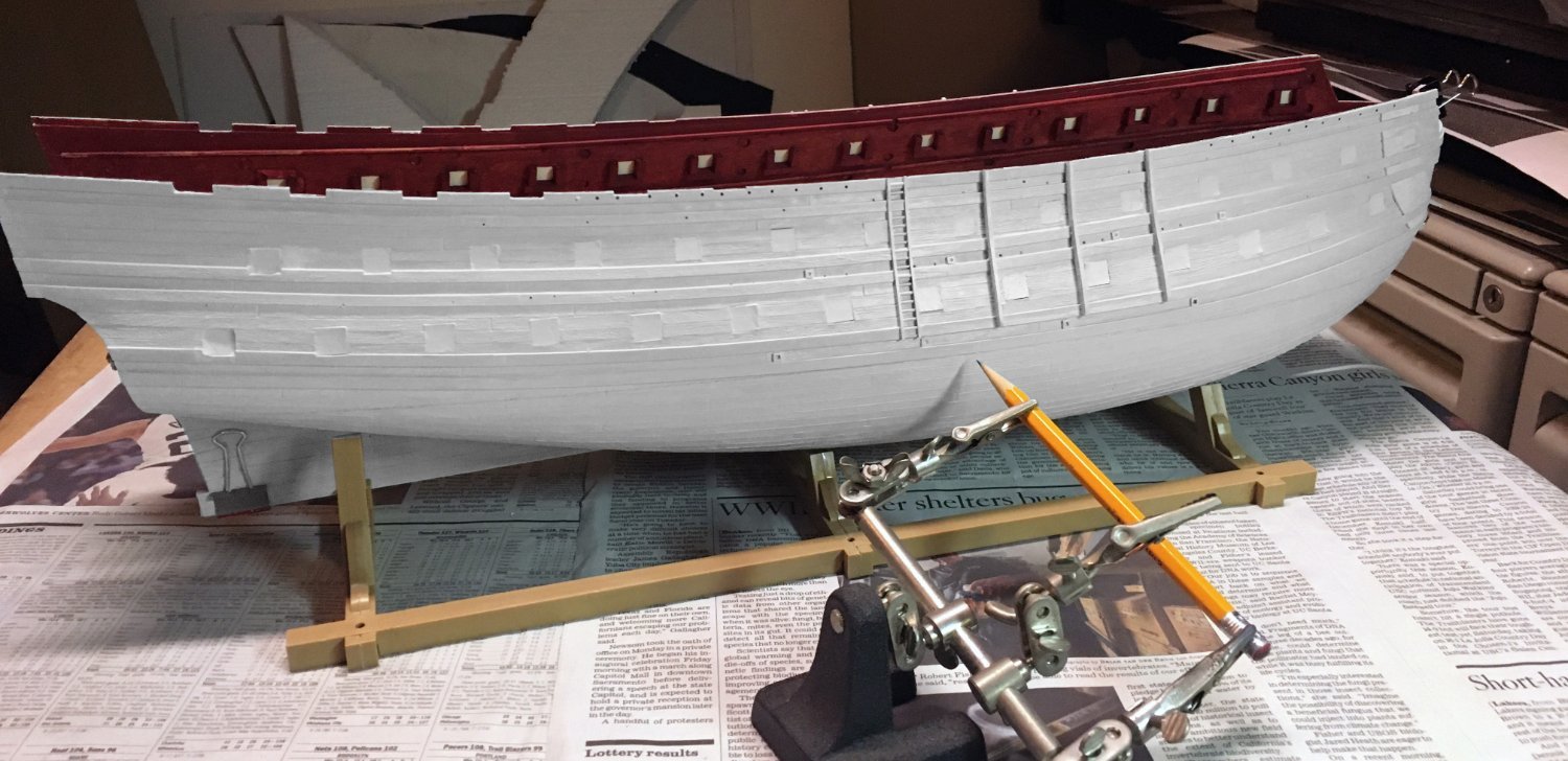
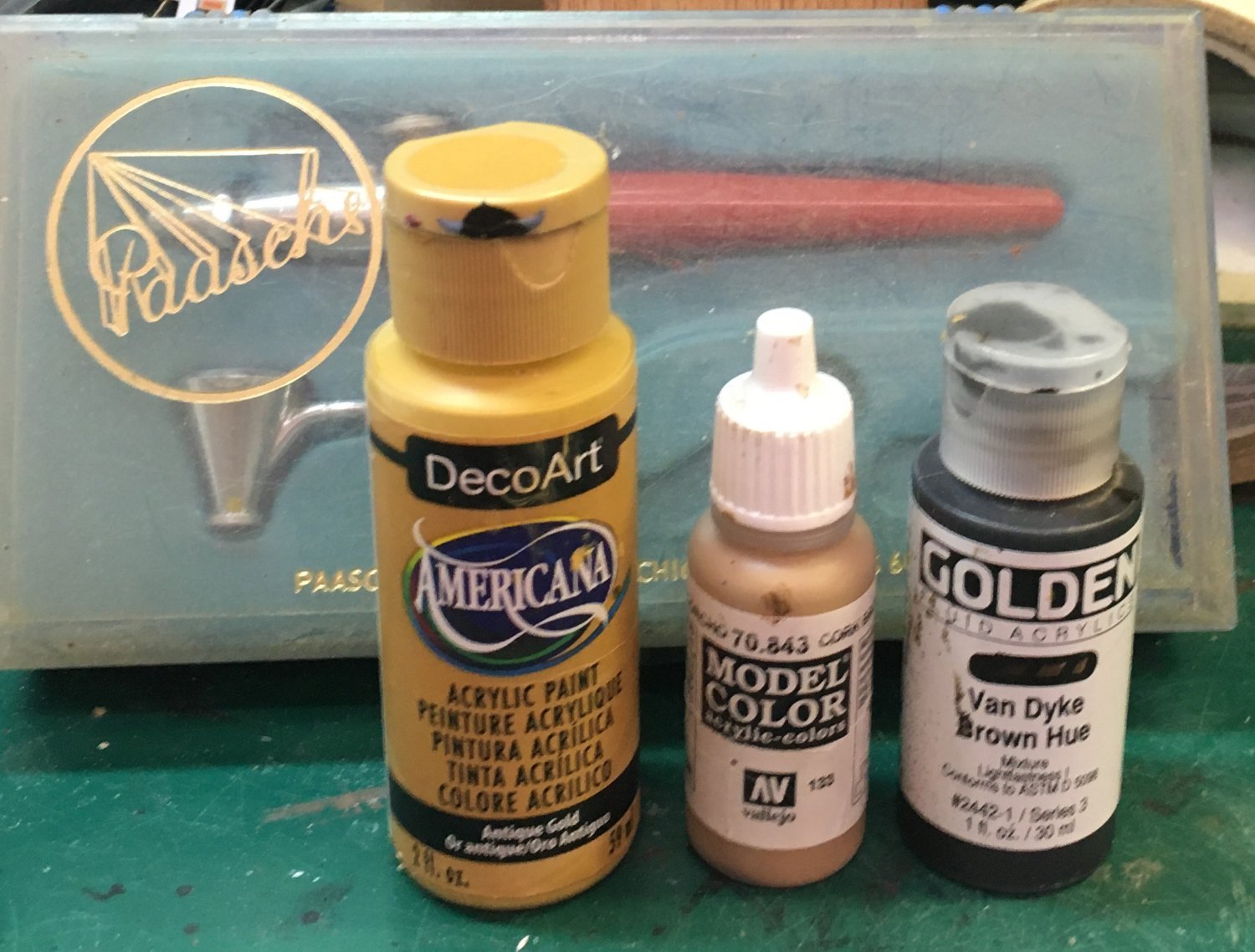
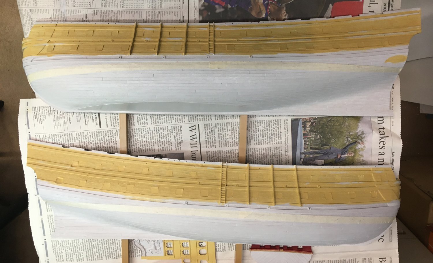
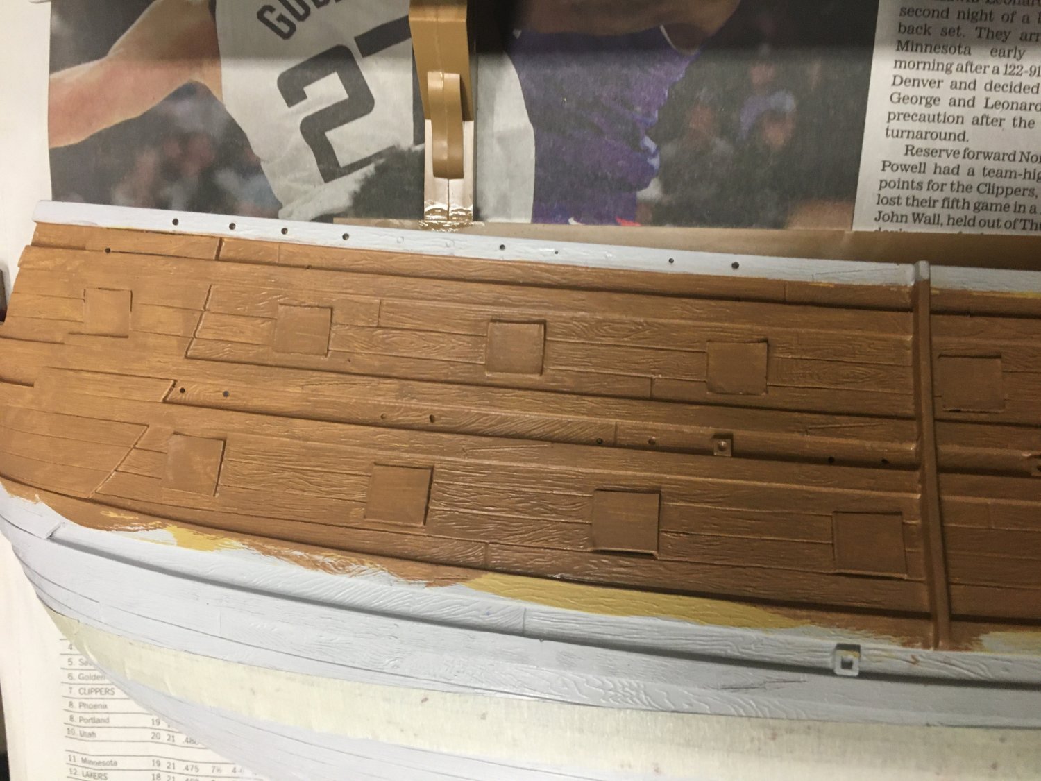
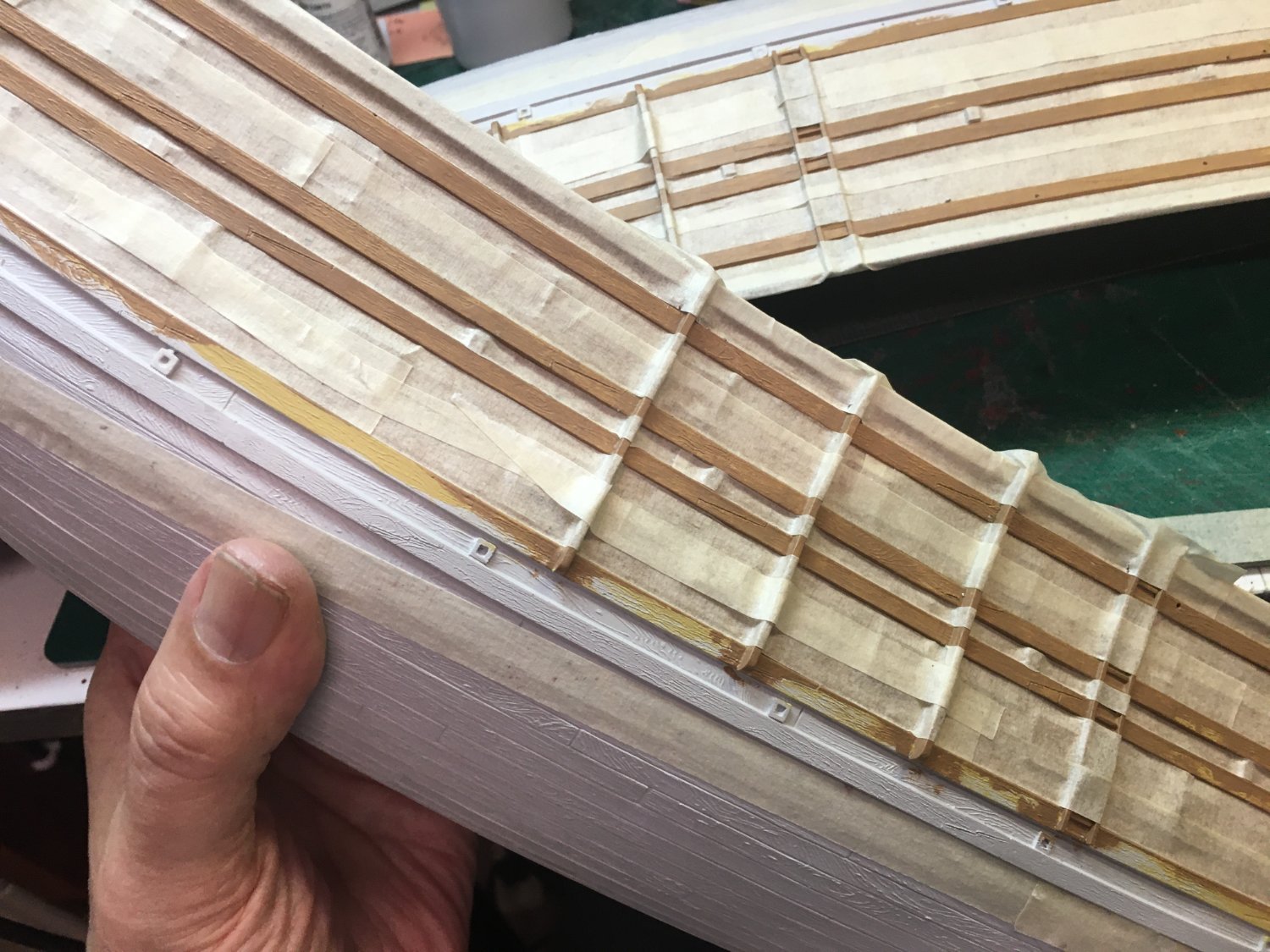

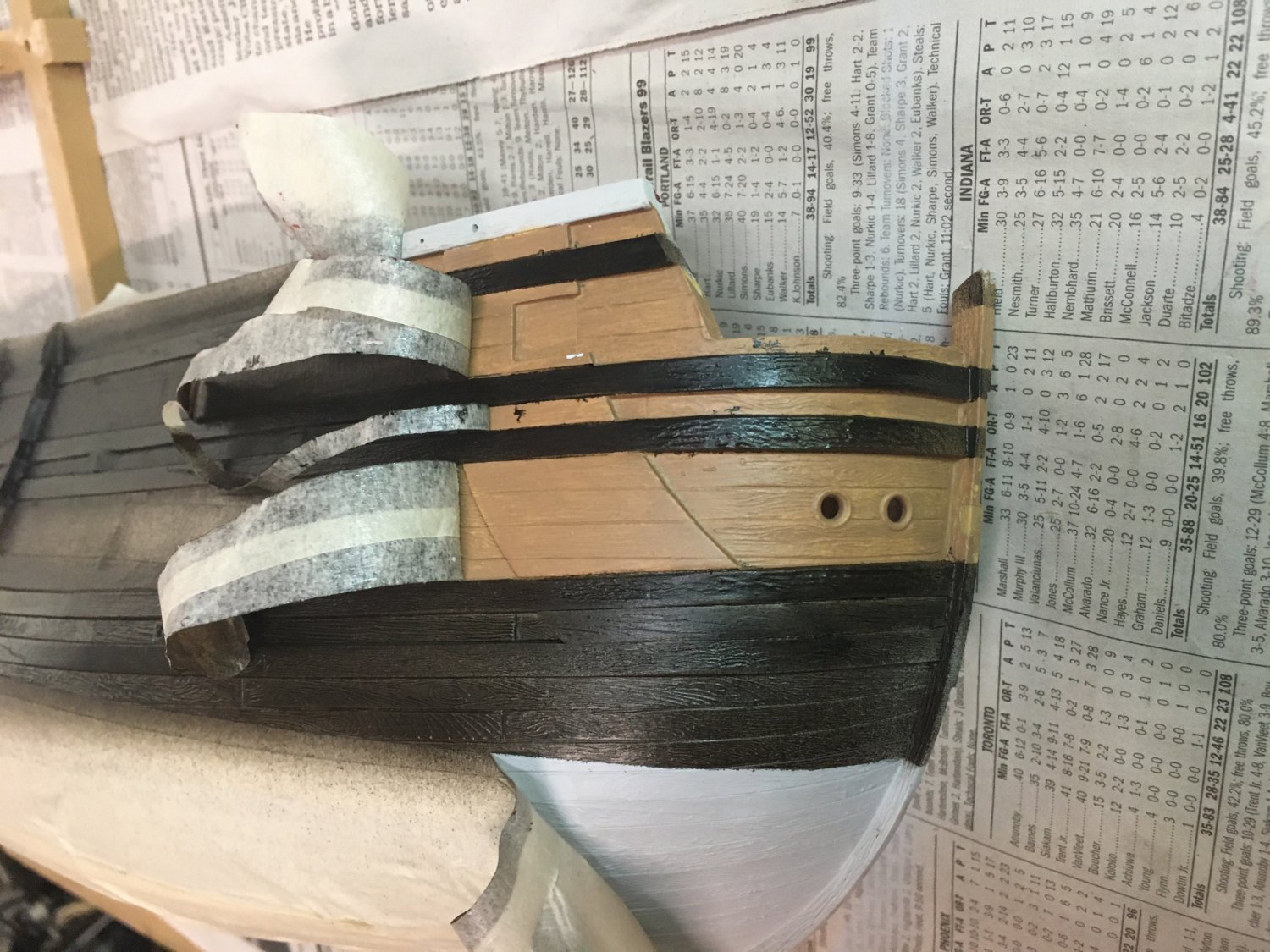
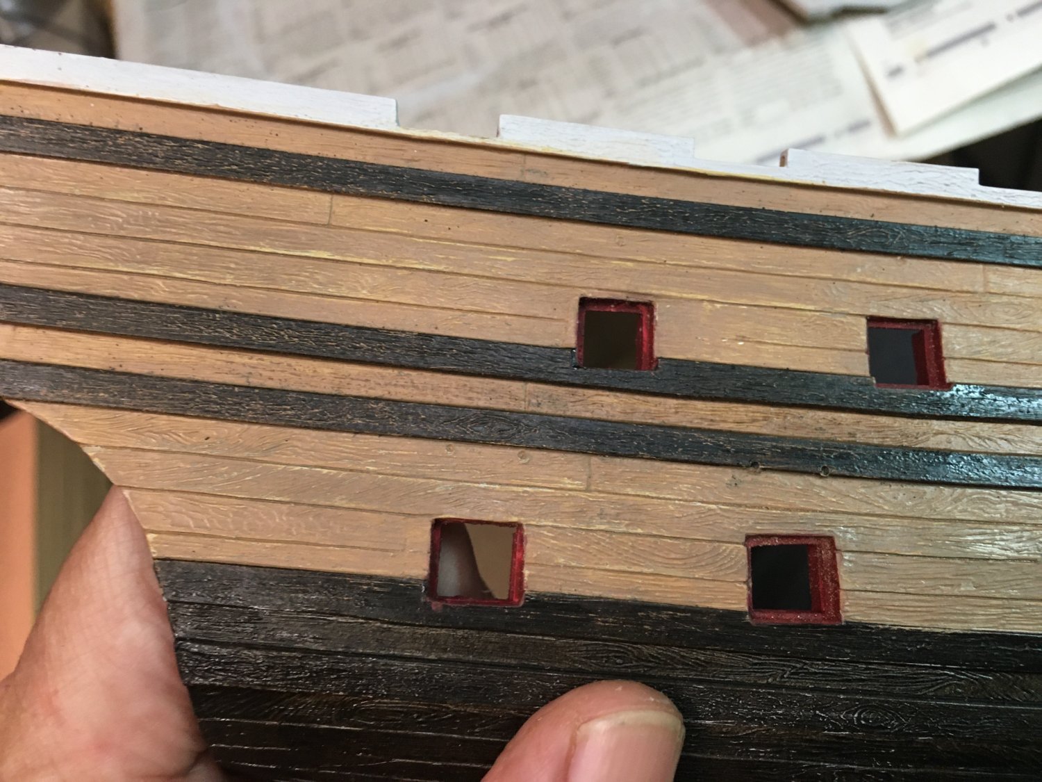
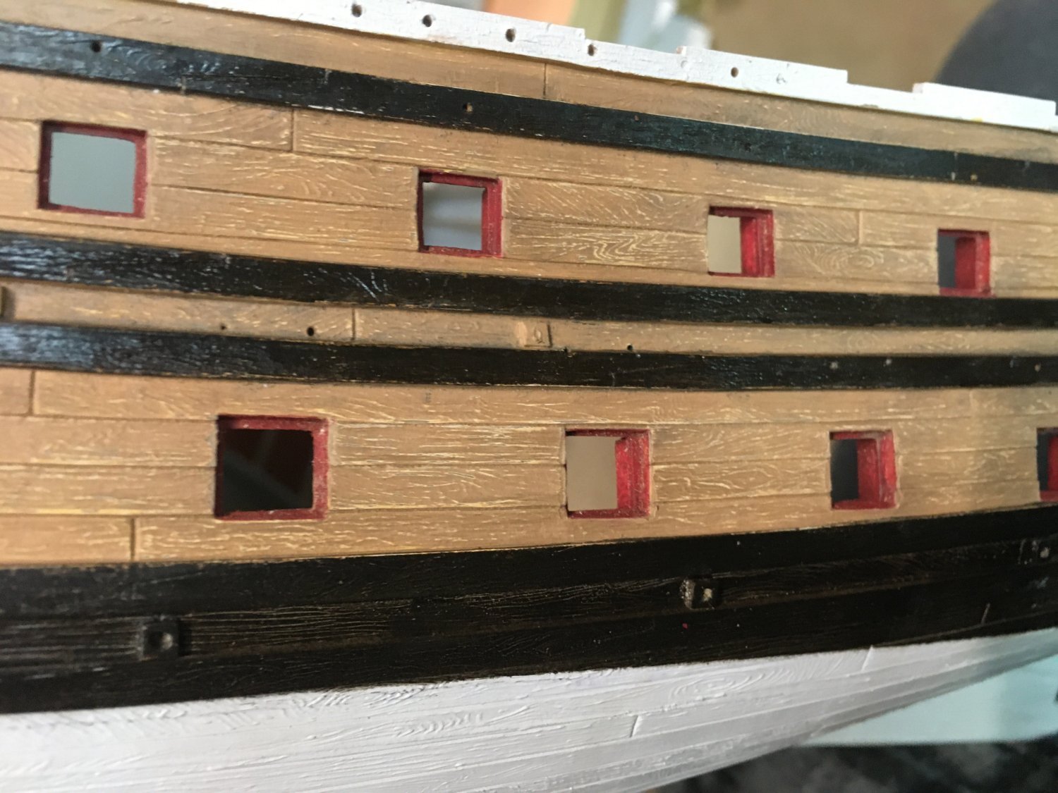

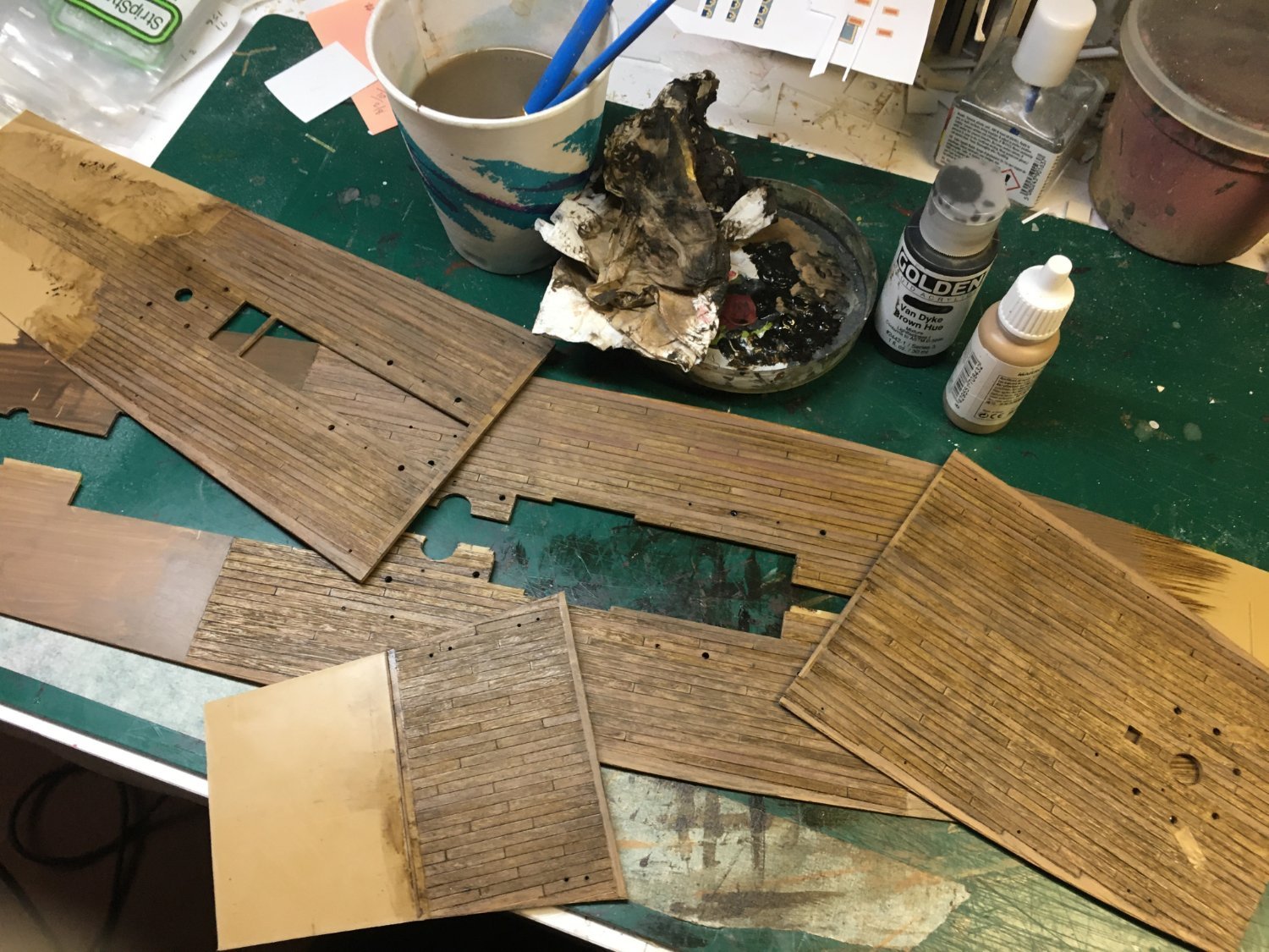
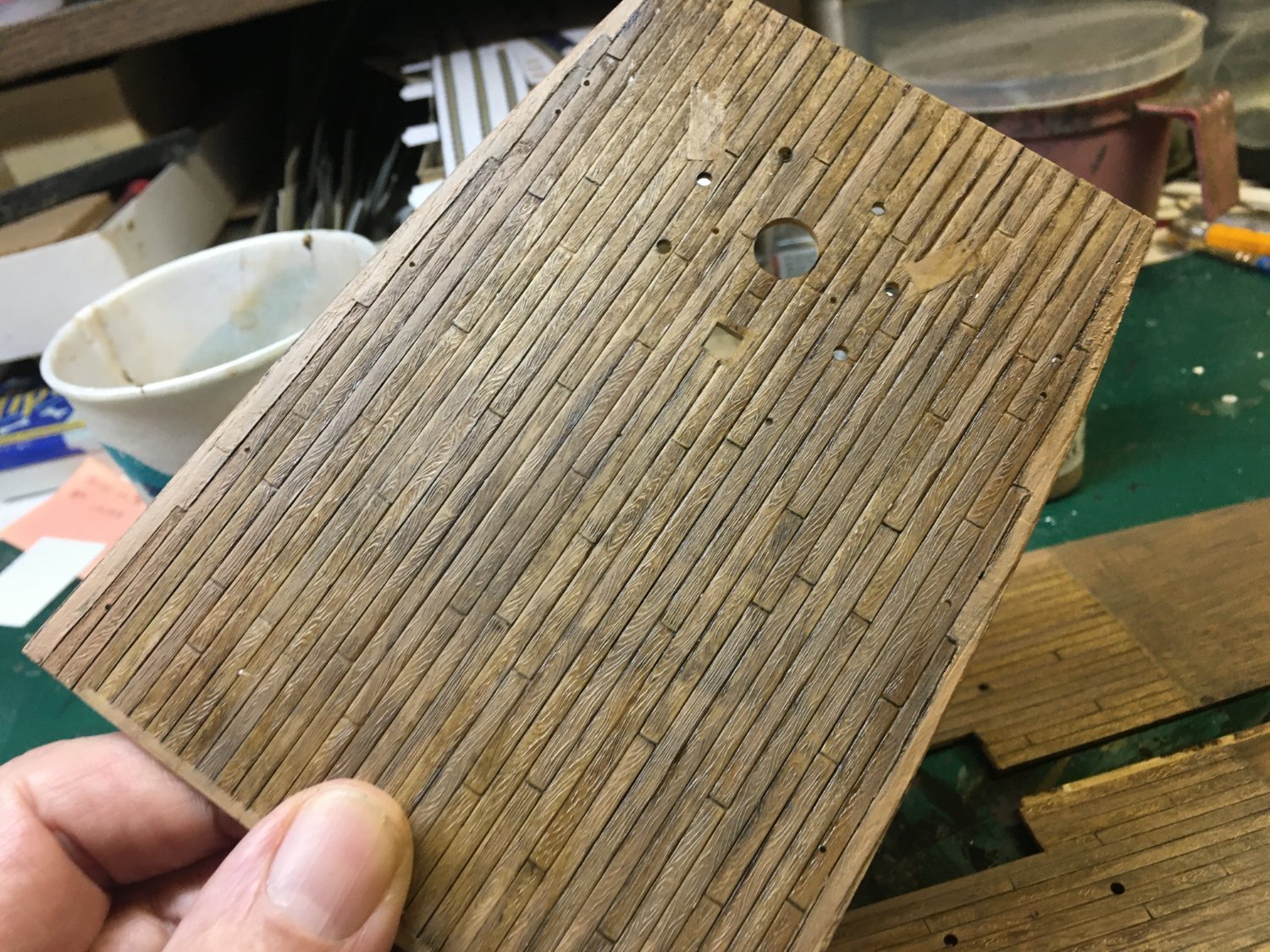


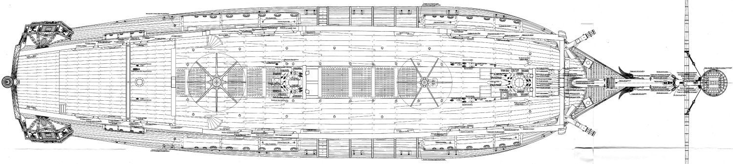
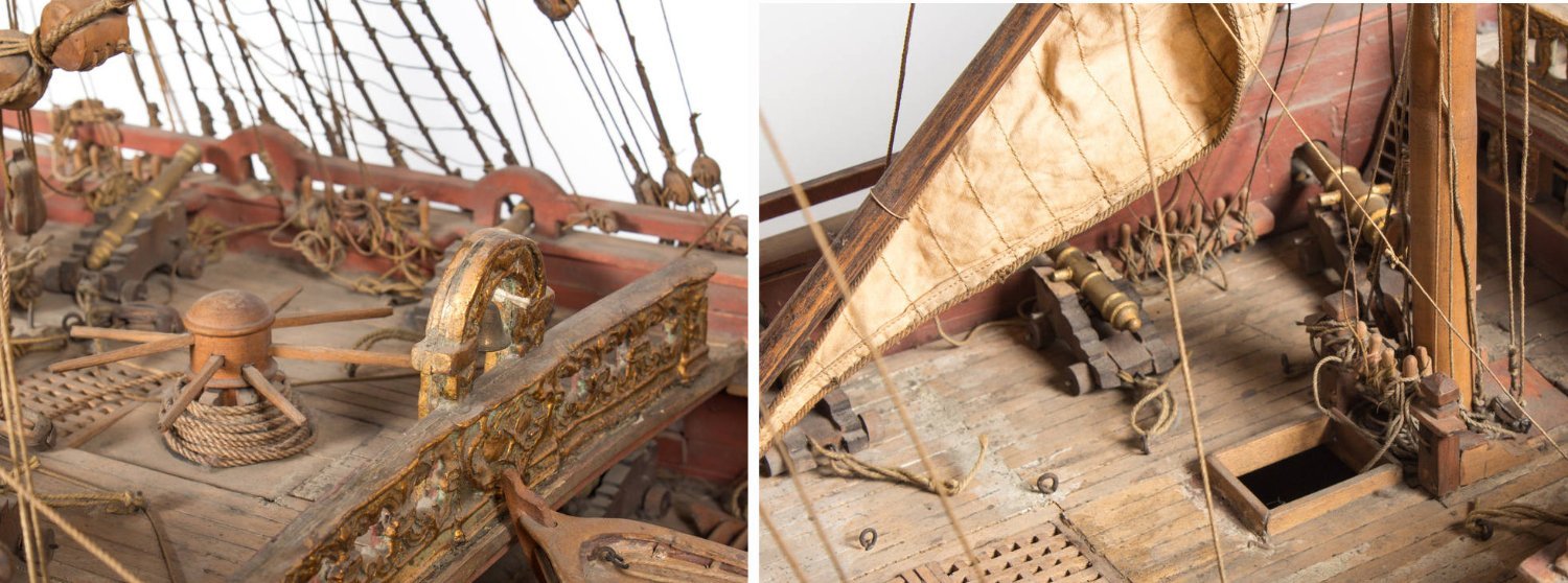
_3D_70g_PUGET_VDV.jpg.c540552f95b2d9813b5402d469161def.jpg)