
HAIIAPHNK
-
Posts
351 -
Joined
-
Last visited
Content Type
Profiles
Forums
Gallery
Events
Everything posted by HAIIAPHNK
-
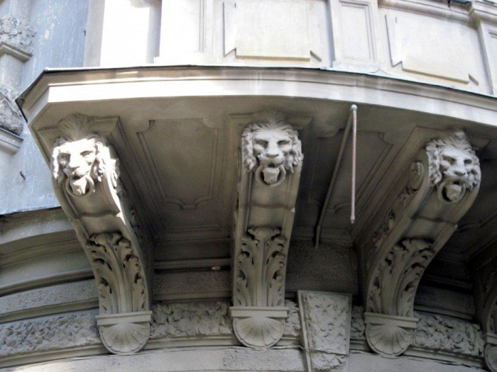
 I apologize for being off-topic. I just couldn't help but react when I saw the familiar lion portals. I'll ask you a question, maybe you know the answer. I am looking for different lions, sculptures of these animals that were placed on the breakwaters of ships. I've found a few. English lions, Danish, French, Turkish, Spanish, Russian, Italian. But no German ones. Maybe you know any German ship, where the decoration was a lion? I apologize for clogging up the thread. The answer can be in a private message, so as not to distract with unnecessary information. P.S. The clay city is really beautiful. It has a lot of interesting things in it. Just like Hamburg, for that matter. Been to your maritime museum twice already, but still have the feeling to go 3 or 4 more times.
- 2,699 replies
-
- 3
-

-
- heller
- soleil royal
- (and 9 more)
-
One last thing about Gustav. That's how the two lions lived for a while. Temporarily took from my wife her cake box ( I don't know what to call this thing exactly, it's a case for cakes). Now instead of cakes, a couple of lions live inside. Convenient. For the lions - protection from dust, for the wife - protection from the smell of oil. I don't understand her, how can she not like the smell? Good thing misunderstandings are rare. But once a neighbor came in and almost fainted. The distortion made her think there were rat bodies in there. I had to calm the poor woman down. Then we laughed for a long time...
.jpg.9d6627a1b065aa78871e567234269a1f.jpg)
.jpg.1e3e862ae5212cdb7046a726a70e9500.jpg)
.jpg.1fb5836214704de059f417f0735432fb.jpg)
- 546 replies
-
- 12
-
-

-
It was interesting to compare. I'll have to shoot it again later in the evening light, so that the shadows would be deeper. Compare it with artificial light.
-
Thank you for the high praise. I too am curious how the carving on the Fulminant will turn out. It's going to have its own nuances. Its own interesting points and its own challenges.
-
Oh, yeah! The smell! That's one of the topics that comes up first! Even wearing a respirator doesn't save you from the smell. At least it keeps out the dust. And the only way to work is to go to a desert island, otherwise the odor is insidious. It pisses off the people around you (family, neighbors). And they're already taking me out of the house. They won't let me back in. It is good that I have a separate room in the basement of our house. I go there, close the doors tightly and work there. Almost like in a submarine. ☢️
-
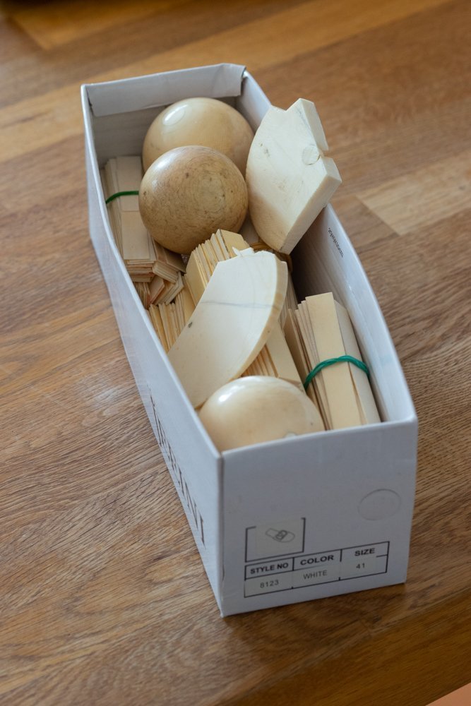
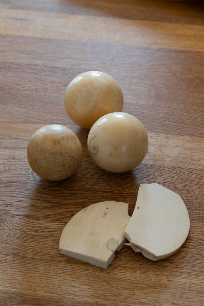
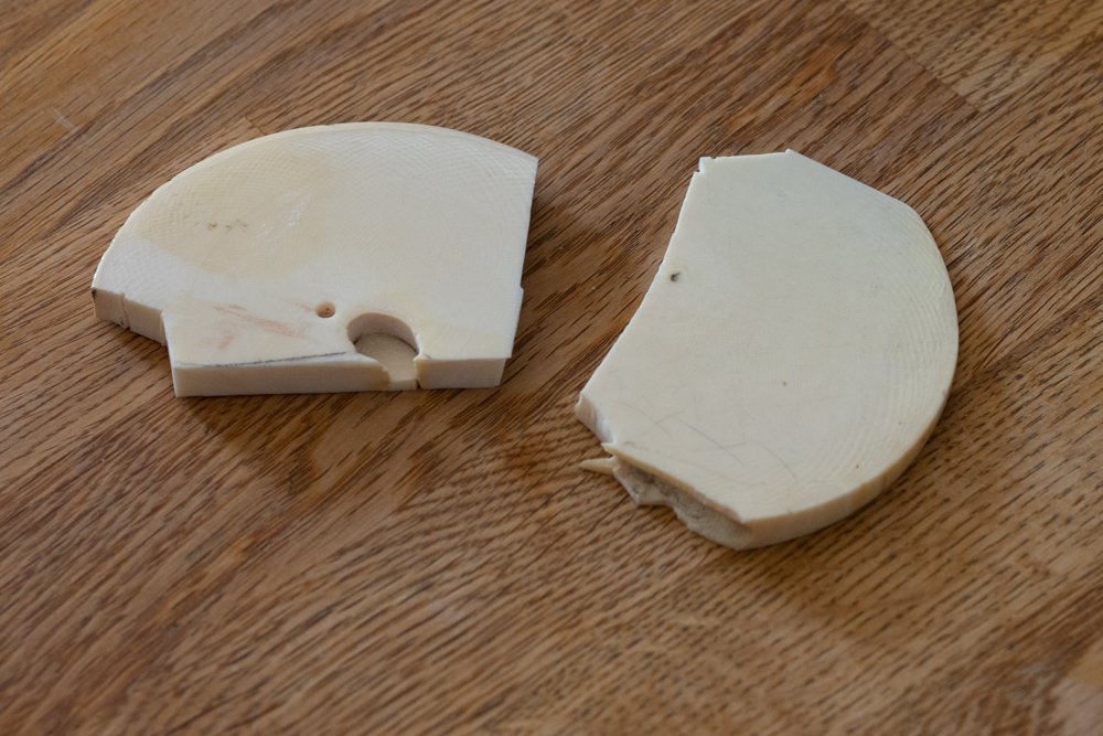
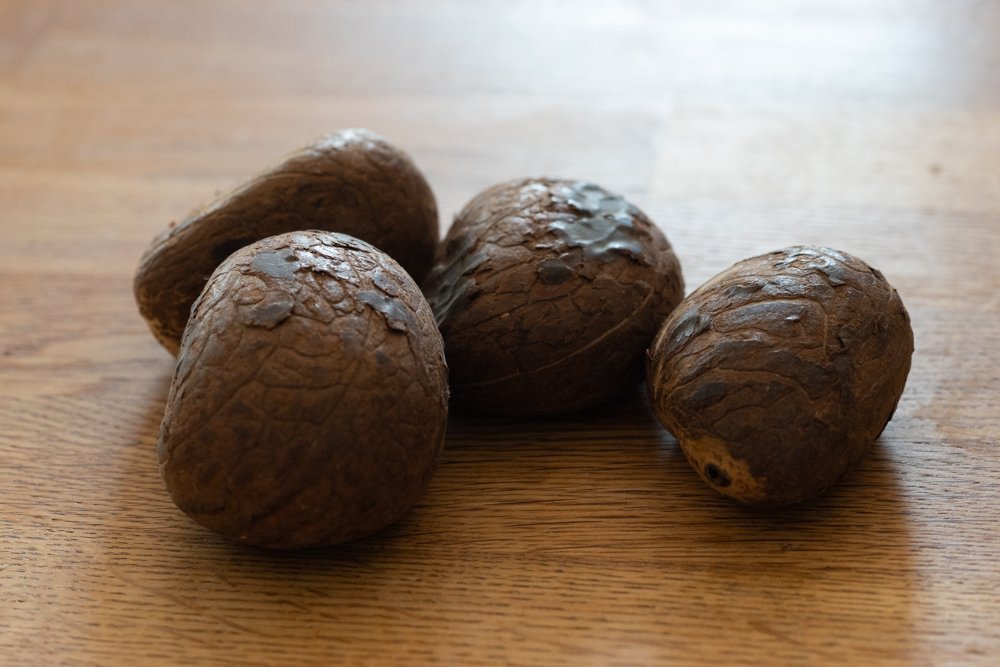
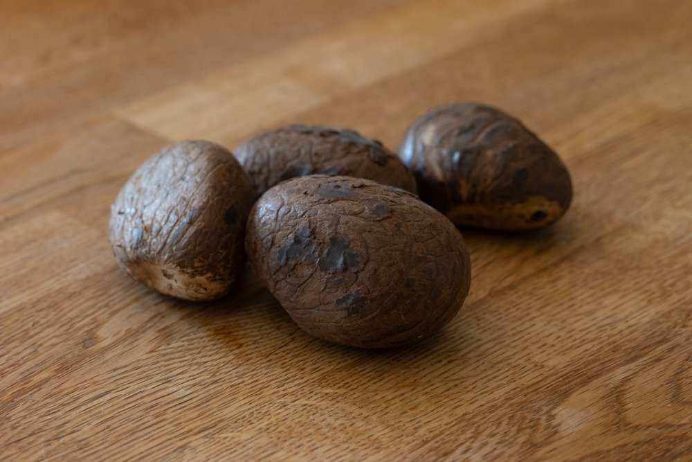
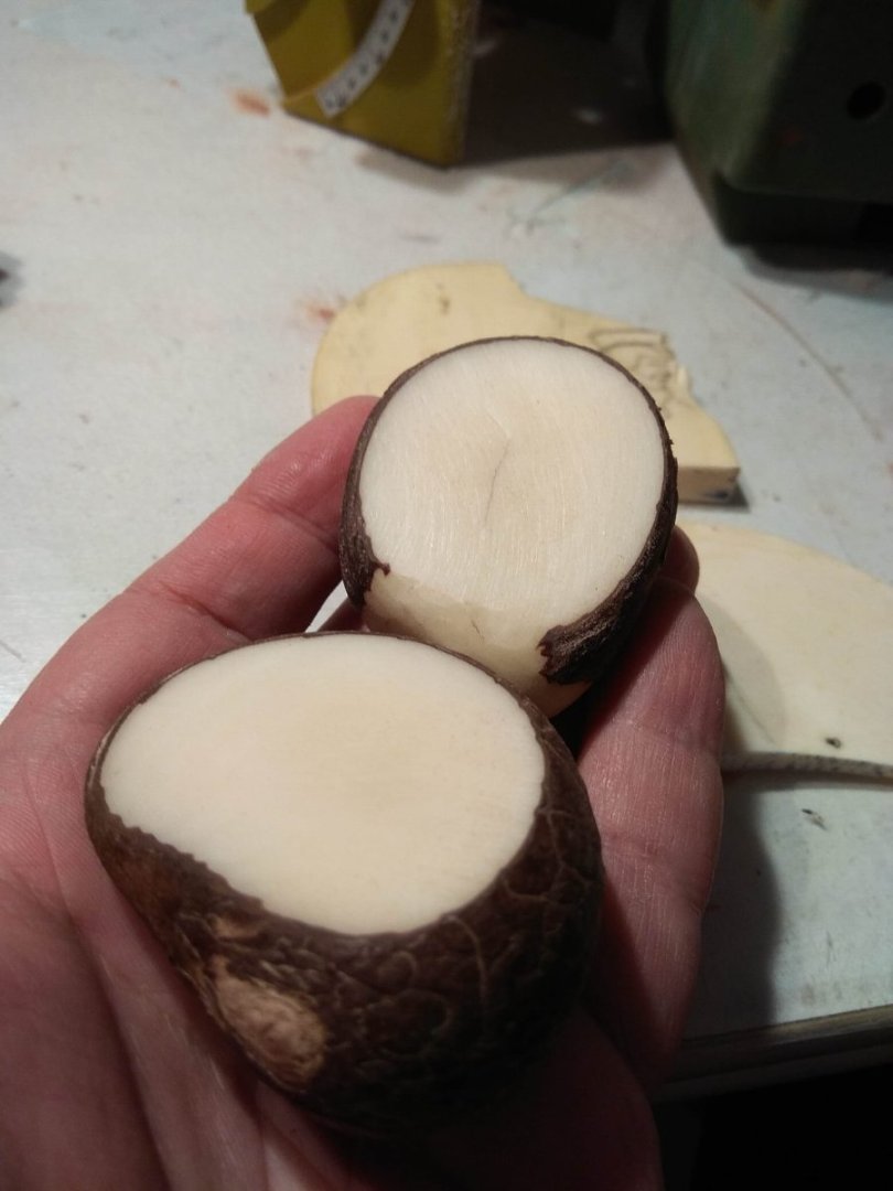
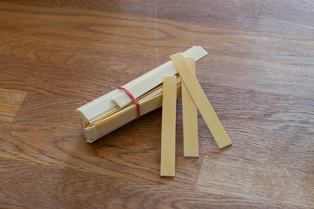
So, I got the materials I need to familiarize myself with. First and foremost is the bone itself. In my case, the customer gave me several different versions of elephant bone. The first kind was old billiard balls. They were once made from elephant tusk. Nowadays it is hard to imagine such a thing, they are molded from plastic, but it used to be different. The second kind of elephant ivory were these scraps. I don't know what they are. Most likely, they are just scraps that are no longer good for anything. Since my carvings are very small objects, scraps like this may well come in handy. Well, one of the things to make from these scraps is training material. Since I have never worked with this material this stage of work is very important. First you need to work on such pieces, which are not so miserable to waste for training. The third bone "donor" looked like this. These small thin strips once made a beautiful melody. These plates were inside a piano or grand piano. And were the percussion tips on the hammers that strike the strings inside that musical instrument. I hope I didn't get anything mixed up in the description, which I might have too. I am not an expert on the piano. In short, all kinds of elephant ivory was in the form of items already in use. And as they say, Fulminant will not be the cause of the death of any living thing. I have failed to mention only the last type of material. Actually, this kind of ivory can no longer be called ivory. It's a bone substitute. And it's a type of material I've never held in my hands until now. Never even heard of it. Or rather not so, I've seen this stuff before on some woodworking websites, but never paid attention to it. And now I'm holding THIS in my hands for the first time..... These are not fossilized dinosaur eggs. Or Khaleesi's stolen dragon eggs. These are tagua nuts. From the outside, they look like this. On the inside, they're a uniform white substance. It's dense to the touch. I don't know if this is the fossilized body of the nut or if it looks the same when fresh. Whether this nut is eaten or used as a material for carving or other crafts. I'm sure it's not hard to find information, I haven't looked. This is the kind of bone substitute that is used. At this point I'll step back a bit. And mention one more option for replacing elephant ivory. I heard about this material by accident. Unlike real bone or even unlike walnut, this material is completely synthetic. It is most likely a type of plastic. This material is called ELFORYN. I easily found several ads on amazon and other sites where you can learn more about this material and order it. In my case it will definitely not fit, I know that my customer is an active opponent of artificial materials and will not agree to the use of something like this. Therefore, I did not even begin to tell about this discovery. But what if someone finds it useful? So this is just information for thinking. I'll stop there for now. If anyone has any questions, I will do my best to answer them. A little later I will tell you about the first stages of getting acquainted with new materials. What advantages I saw, and what disadvantages I found. But about that a little later. I need to prepare the text, and for me this process is not quick.
-
So far, everything written in this thread has been about theoretical searches. Which is understandable. Moreover, I am sure that more than once we will have to pay attention to these or those questions that need to be solved with books in hand, covered with historical sketches. Or simply with a ruler, pencil and paper. But along with this, it is time to develop the topic further. And to touch already practical affairs in the shipyard on my desk. But for that, too, we need to pay attention to the explanations. It so happens that the Fulminant is in many respects a novelty. For the first time this ship is being made. It is the first time we have been able to see documents from the archives. But for me personally, this very "first time" started at the stage of thinking whether to take on this project at all. The thing is that for me personally there is a lot here that I have never done before. And therefore I have no experience. And first of all it concerns the technique of execution. The customer, when he contacted me, said that he wanted this model to use not quite ordinary materials. They are not new, there will not be any creptonide, anaptanium or something fantastic. On the contrary, the materials that the customer wanted to use are familiar. They've been used to make ship models for a long time. But still, it is not a very common material. I personally have never had any experience in this direction. What are we talking about? The customer stipulated that in the jewelry should be used bone and gilding..... And that means that my work will be through experimentation, exploration, mistakes and fixing them. I will also sometimes describe my actions in detail. I don't know how useful and interesting this will be for others. But I think that I am not the only one who discovers new things during this project, so there is hope that my findings and mistakes will be at least interesting not only to me alone. And for myself, this style of presentation will be useful. I have already faced the fact that when I do something new, I eventually forget how I did it. And when there is an opportunity to reread myself, it is a good way to save time in the future. Who knows, maybe someday I'll have to do again what I'm doing now for the first time.
-
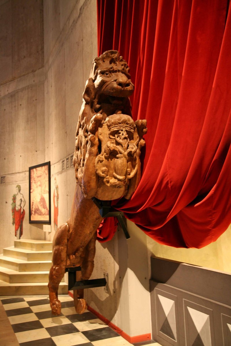
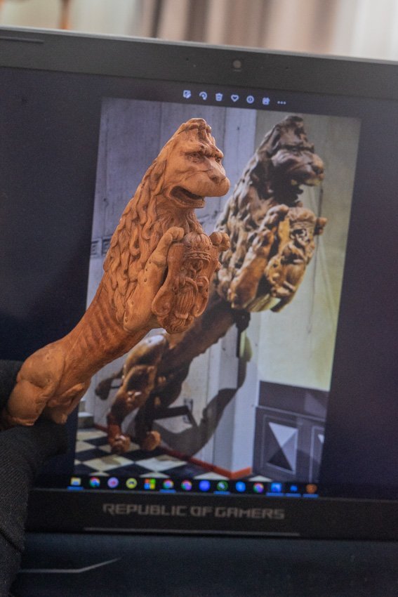
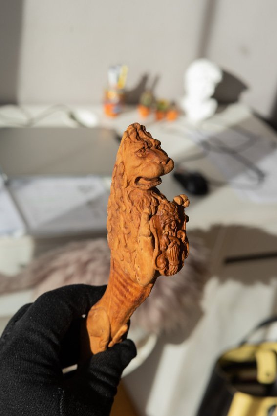
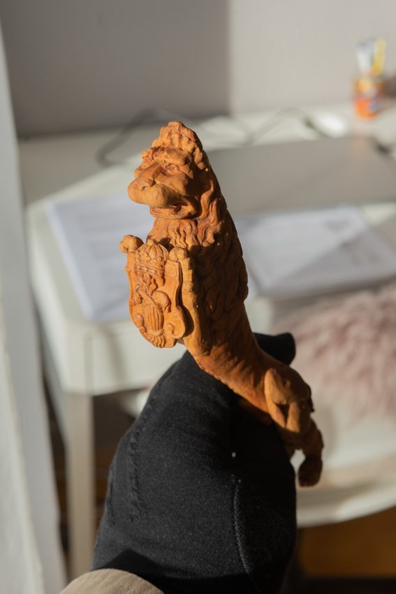
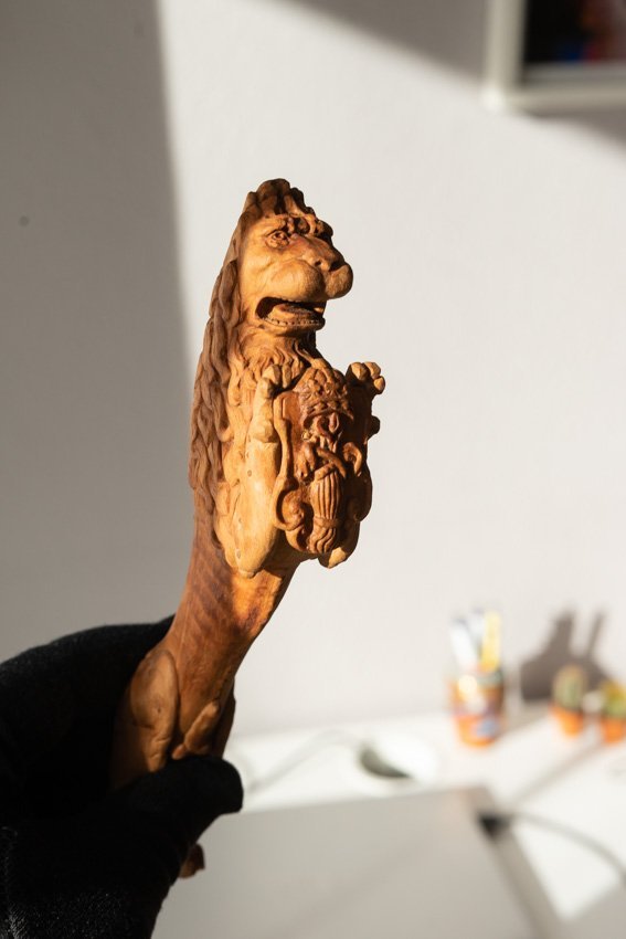
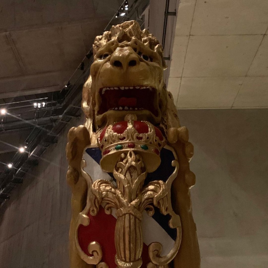
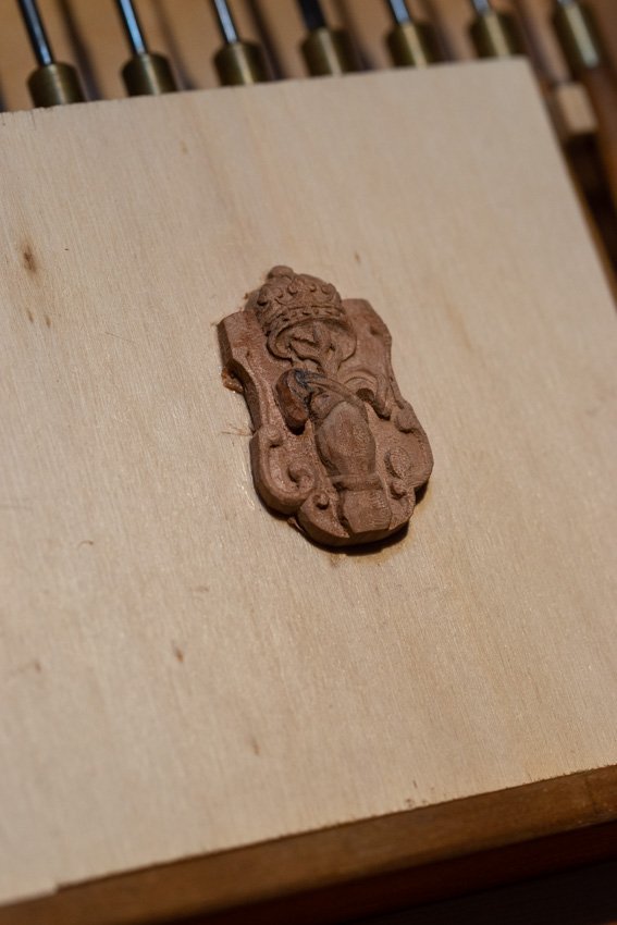
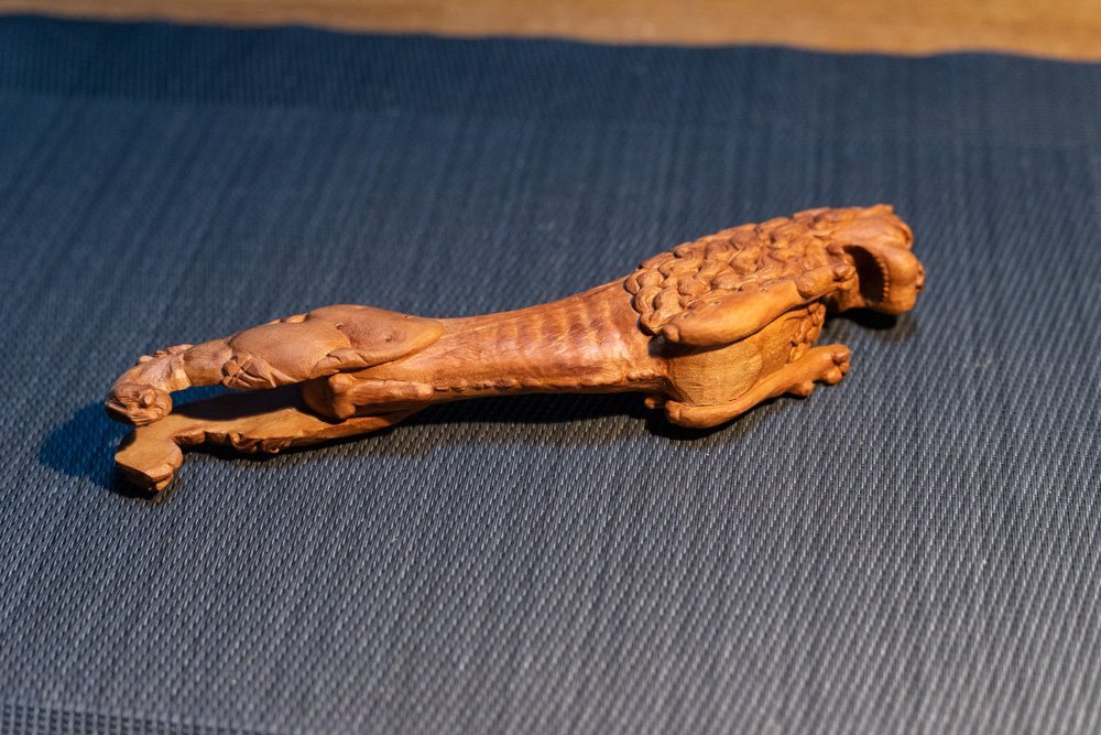
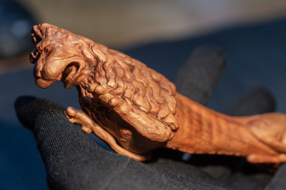
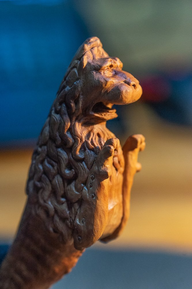
The epic about the lion from the Vasa ship has come to an end. Here are the last photos. As long as the appearance stays that way. The figure is coated with oil and needs time for it to soak in. I already know that gradually the color of the wood will change. It is still an open question whether I will tint the sculpture with something or not? Maybe I will, but not now. I will decide when I gather a small group of other lions and see how they will look. On the one hand, I want to bring this lion closer to the original with the help of color, so that it would be darker, as on the ship. But I'm not sure yet. The darkening may hide the scuffs and scabbiness that I tried to show.
- 546 replies
-
- 13
-
-

-
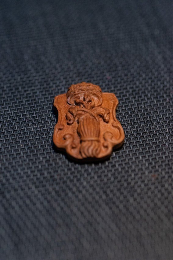
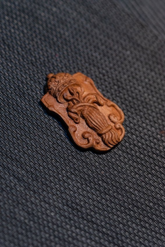
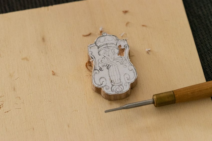
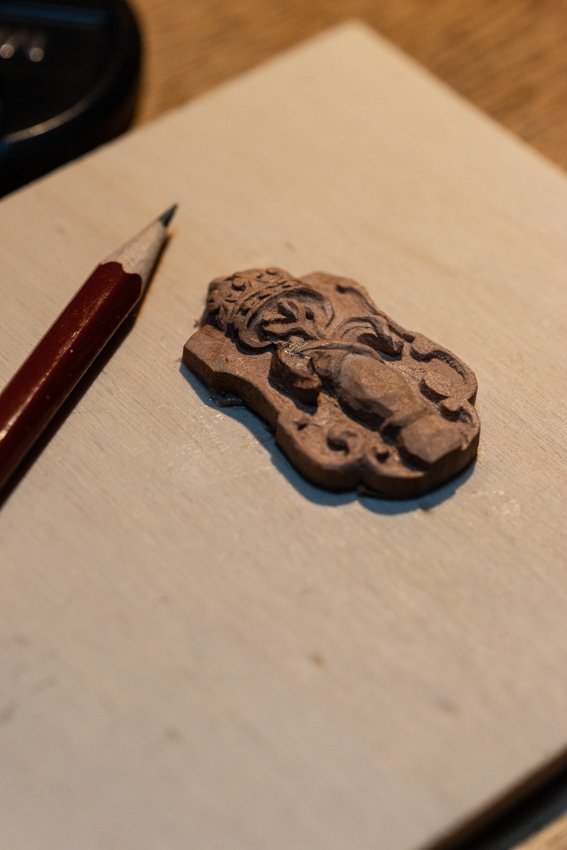
And the final view of the shield:
-
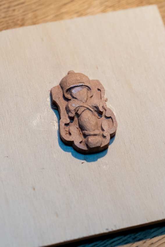
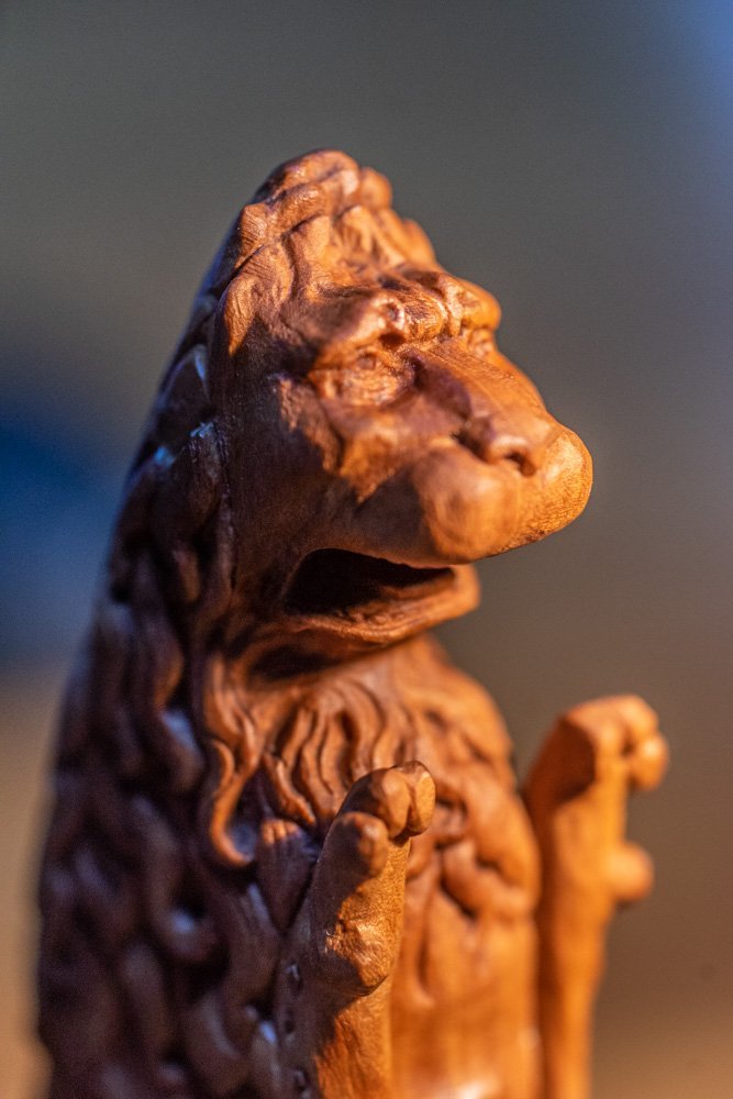
The main sculpture from Vasa is almost to the finish line. Only a small detail remains. The lion is holding a shield with a coat of arms. And that's the shield that needs to be carved. There's not much to tell. The only thing to note once again is the issue of irregular shapes on the sculpture. Which again raises the question of how to evaluate the work of master carvers. How normal it was to do a work with such strong errors. And as I said, the shield stands apart in this regard. It is a piece that fits quietly on the table. The person who carved it had all the conditions to achieve a perfect result. In addition, we can say that a living organism may well have asymmetry in the structure of the body. But here with a coat of arms it can no longer be said in any way. The form should have symmetry, correct curves and if there are repeating elements of decoration, they should be the same with the correct gaps between them. And other rules of ornamentation. And the shield by all parameters and by all possible evaluations has only minuses. Everything that could have symmetry is made crookedly. There is a feeling that it was done by someone in a drunken state or for the first time in his life took tools in his hands. It is especially surprising that the decor looks much better elsewhere. Even if you compare the crest on the transom and on the breakwater you can see a strong difference. Why there could be so many mistakes on the flagship is the question. With this in mind, my task in this phase of the work was turned 180 degrees. Usually you have to try to do everything perfectly. Everything should be even and correct. Now it was necessary to make such errors on purpose, which would be similar to the original. When I first started this project and worked on the facial features (or more correctly the face) of the lion, I already had a very similar situation. I wrote that the lion had crooked eyes, different cheekbones. And then I was wondering if I should do the same. Wouldn't it get the feeling that the wrong parts of the face would look weird. Like the author likes to work with a shot glass in his hands? Then I decided I wouldn't correct the mistakes, I'd leave them the same as on the original. Now, when I look at the finished version of the lion I am pleased to note that in general everything looks harmonious. Asymmetry can be noticed, but it doesn't look too noticeable. So now I was no longer questioning whether to make corrections at the shield? And this is what I got.

.jpg.089ebb9e4328295d311ea3c927ef905a.jpg)
-
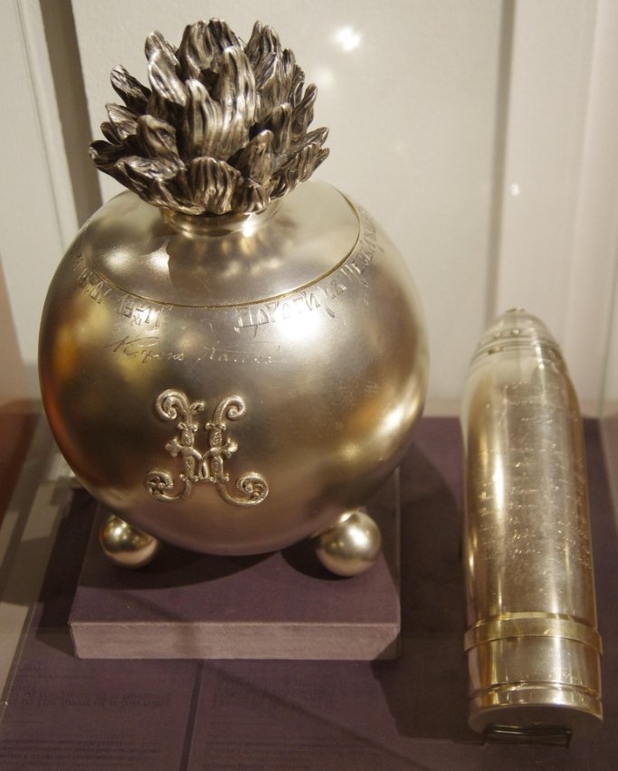
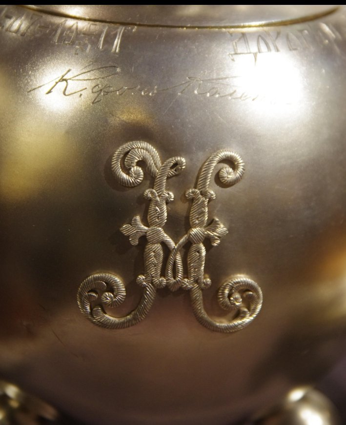
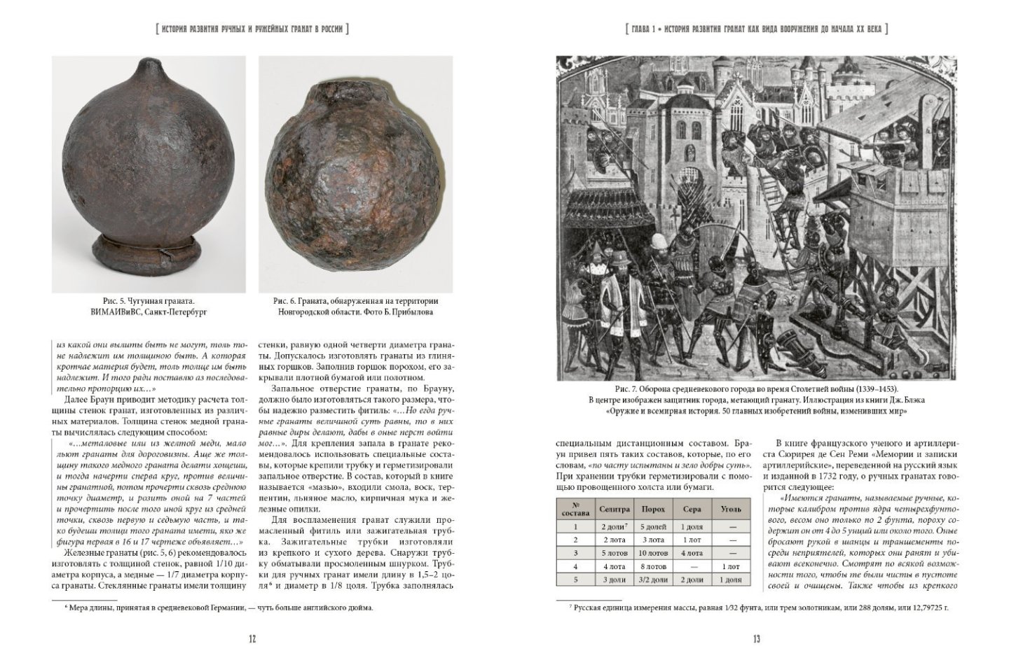
I have never been an expert on the subject. One could say that even now I have not dived deep into it. Rather, I lazily searched on the surface. According to the images found, it can be said that grenadier grenades are depicted in a rather monotonous way. In different countries and at different times almost unchanged. I did not find any examples of any special marks on the grenades. However, there are hand bombs with monograms. But these are either examples of gift souvenirs, where the cartouche denotes a certain person. Or it's the mark of a foundry. If we assume that the signs on Beren's bombs stand for some letter, it is worth noting that it is a letter, as there is no such writing in French, Latin or Greek. I tried to find any word that might begin with the letters "sigma" or "epsilon". But my imagination does not go further than the words "Zeus", "Jupiter", "Fulminant" or "Ludovic". And none of the above has any connection with these letters. The sign only resembles a letter, and if such an image were not repeated on different elements of decoration, it could well be called a simple crack. Of course, cartouches and monograms can have fanciful curves. Sometimes you need to break your head to understand what letters are encrypted in the cartouche. So I haven't found any serious clues to the idea that the mark on the pomegranates means anything. But that could mean I wasn't looking hard enough. The solution lies on the surface: Try to copy Beren's drawn zigzags as closely as possible and make them on both sides of the hull. In this case, I will definitely not make a mistake. You could say that the question was born out of nothing, and the answer is the most predictable. But it was interesting to ponder a small detail. And maybe in time the answer will be found after all.....
-
I suddenly noticed that the cracks had something in common. They are not randomly drawn, but resemble letters. Like "sigma" or "epsilon." And the slope is very similar. Maybe it's some kind of sign, not just a crack. Logically, it probably means a hand bomb, not a cannonball, I think. All ships have cannonballs, and it's not something distinctive that stands out in the decor of the ship. A hand grenade, on the other hand, can be compared to a lightning bolt in the hands of Zeus. He throws them. And it doesn't make sense to tie a cannonball with a rope. I hardly understand why such ropes on the grenade, but here we can assume that it is for hanging or so shown bickford cord. In any case, there is little point in finding an answer to whether this grenade is a hand grenade or a cannonball. That in one case or the other will have no effect on the final appearance on the thread. Whether there is a crack there or some kind of mark is a different question. We'll have to look for other options. I think I've already seen similar parts on some ship somewhere. But I don't remember that there were any signs.
-
By the way, in the letter from the customer, he highlighted the image of the grenades. And now I catch myself thinking that I don't know the exact answer. I just never paid attention to it. In the collection of sketches with Fulminant, there are several places where images of hand bombs are repeated. And everywhere they have different nuances. In some cases, they're just balls surrounded by flames. On the dome of the side gallery, the ropes that criss-cross around the balloon are clearly visible. In other places there are strange touches. What do they mean? I used to take these broken lines as the moment of grenade bursting, when the hull has already begun to rupture and this is how the cracks are shown. And so these cracks can always be in different shapes. But what if I'm wrong? Maybe something else is drawn there? Maybe it's some letter, for example, or some sign that should be only like this? Can I make different patterns on the other side (if they are cracks) or must I copy all the curves exactly (if it carries some meaning)? Decided to find out and saw that there are different variations. There are also balls without any drawings. And there are some that have some decorations on them.

-
Yes, you're right. This survey appeared at the request of the customer. He wanted me to communicate with other modelers and express all the versions that each of us has. And now he has the last word, I will wait for his decision. For my part, I am glad that the difference of opinion is revealed now. When you can discuss and adjust your actions. It's worse when you get a result you're not ready for.
-
Thank you for your participation and opinions. I really appreciate it. I especially noticed the respect you have for the customer. It's very... I don't know what the right word is here. It's very... Let it be weighty, heavy, valuable. In one wise book there are some words like these: a measure filled to the brim, tamped and shaken. A measure to which it is impossible to add anything else. For me, this is especially valuable!
-
It's not long to the finish line. In the meantime, a photo of the general view.
-
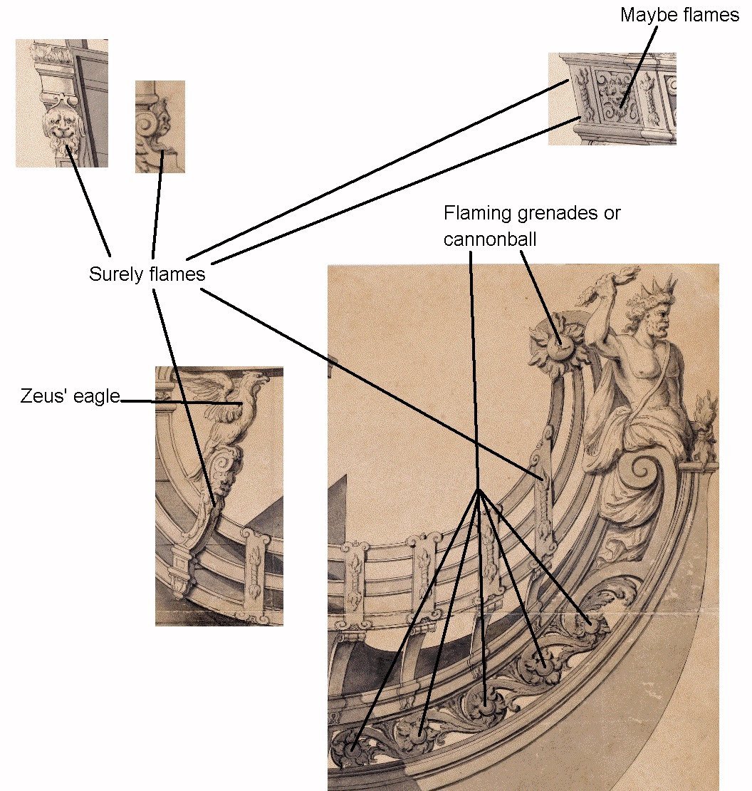
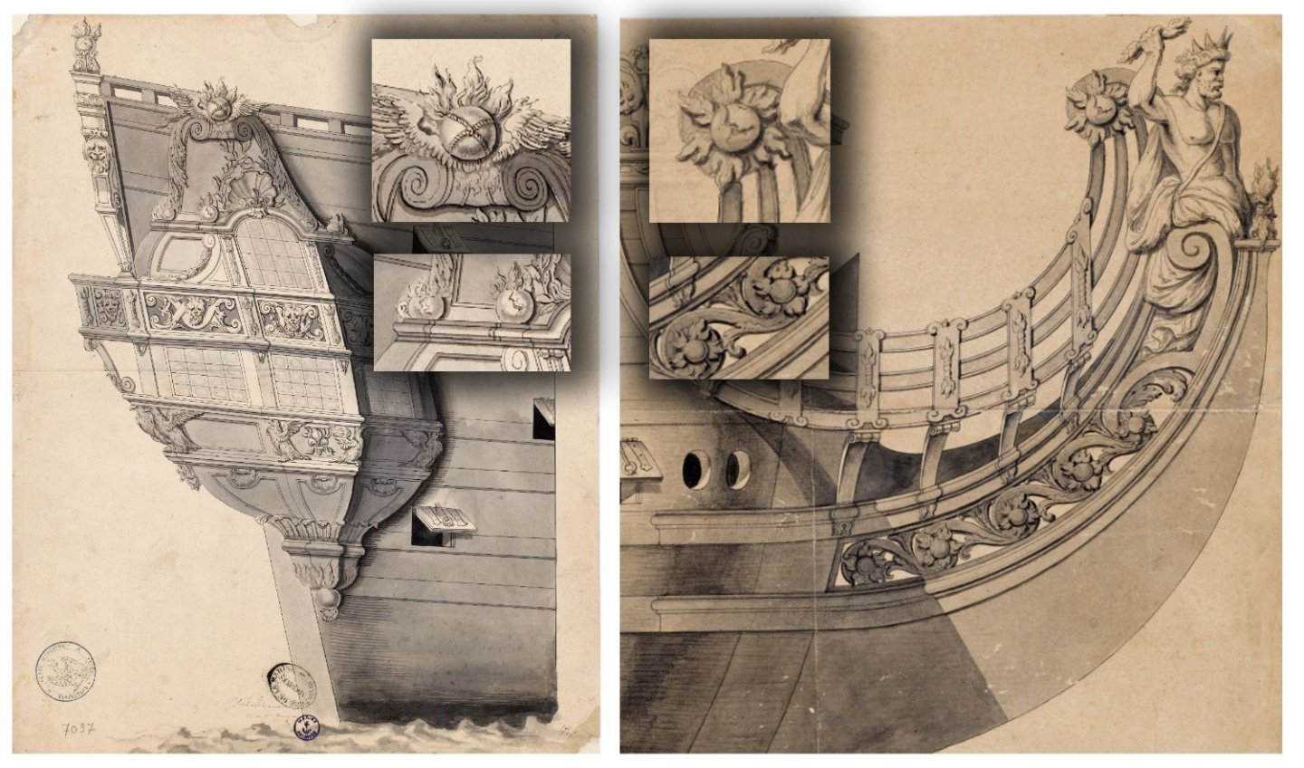
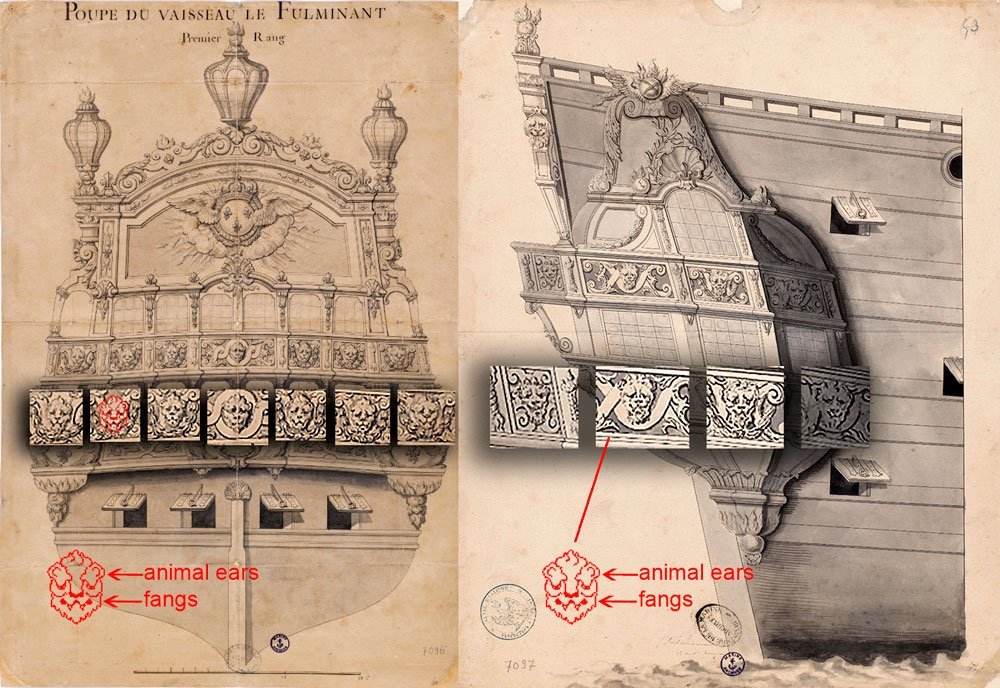
I received another email from a customer. I am showing a visual drawing from him. As you can clearly see from this diagram, the customer thinks that there can be different opinions. For example, what on one side can be interpreted as a lion's chin with a mane can also be seen as a flame. This means that these are no longer lions, but fauns. For this reason, he is inclined to think that the side galleries depict the heads of mythical grotesques, not animals. What do you think? What does your eye see? At this stage I will not describe my opinion so that it does not conflict with the client's opinion and the disinterested viewer can be guided by his or her own conclusions.

-
Thank you for the information. I wanted to see what kind of ship it was. Is that it?
_J0019.jpg.071bc5cc7cbf3196471ef97ab3b724b2.jpg)
.jpg.f99722de3451891e5d0356387f561748.jpg)
-
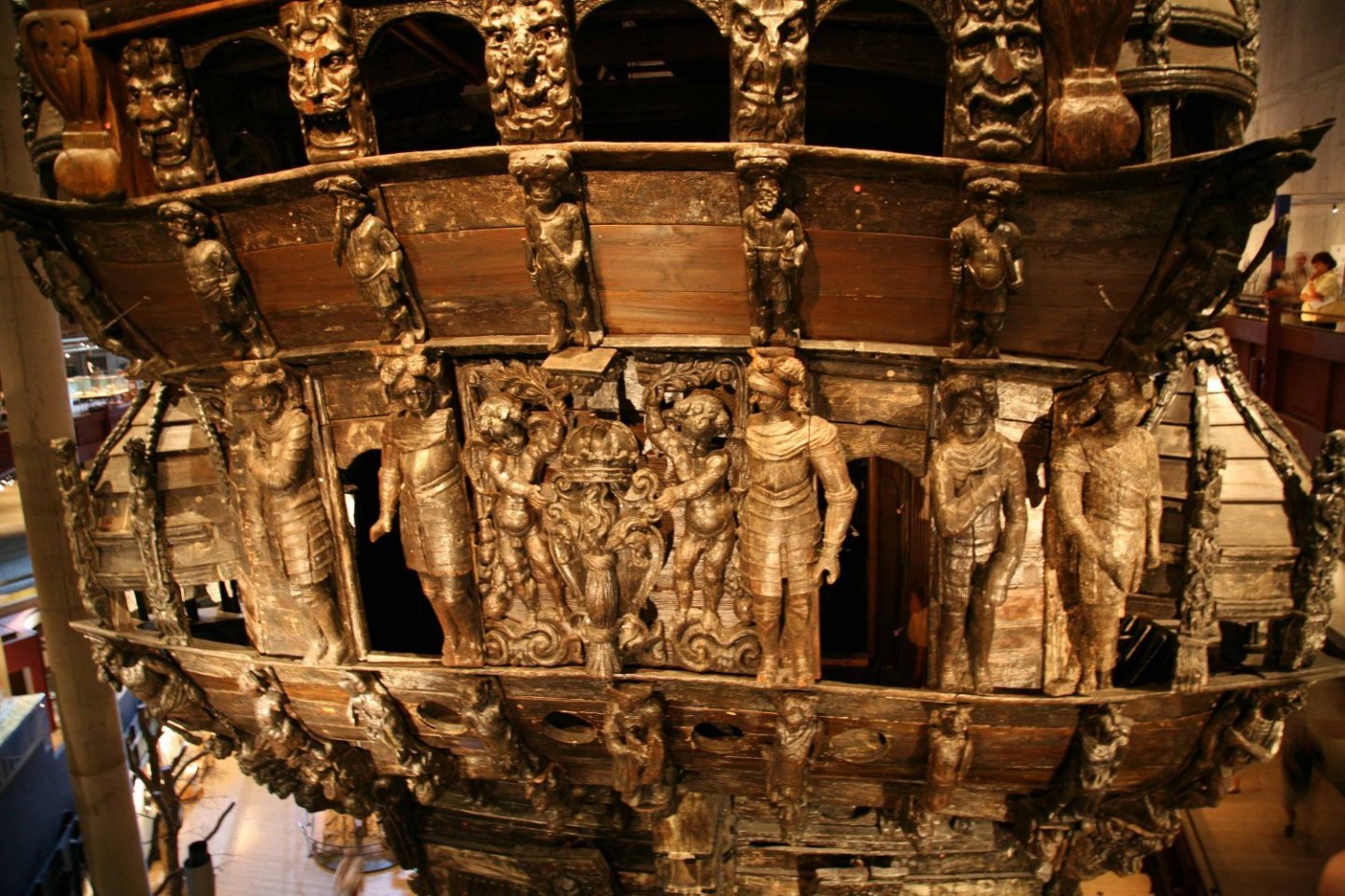
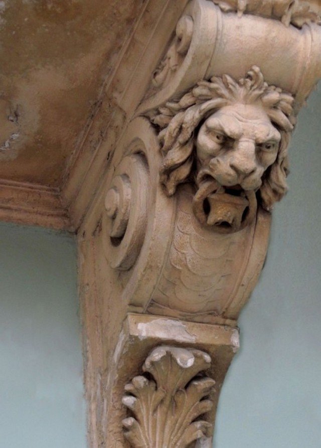
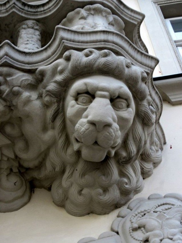
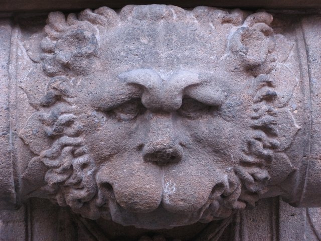
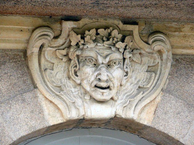
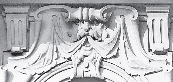
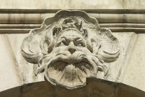
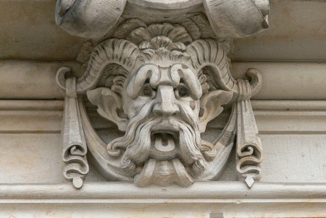
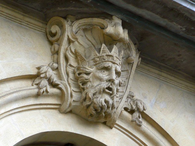
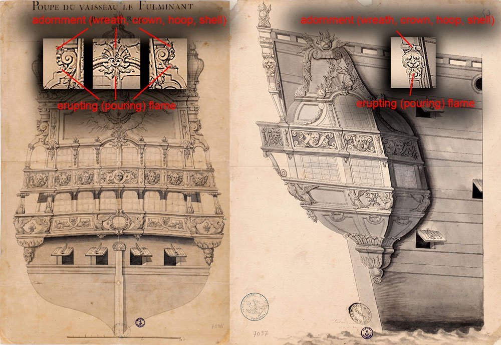
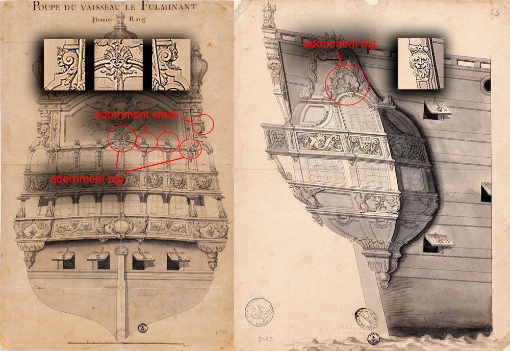
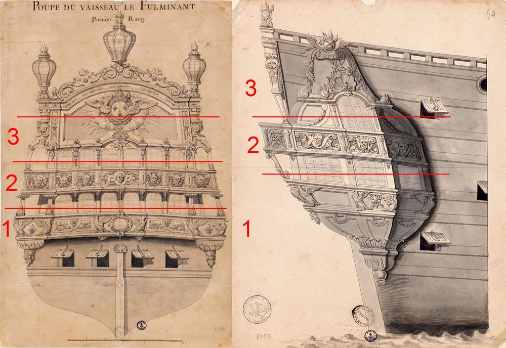
So, what do I see in our drawings? What I agree with you on is that there are two kinds of heads in the drawing. The 1st kind is lion heads. This is a fairly common image in baroque jewelry. It can be found in great abundance in architecture. Here, for example: Now let's move on to our drawing, or rather drawings. I would immediately divide the image into floors or levels. This division is conditional, for different tasks it is possible to divide it differently. But for our discussion this variant is enough. We can call these tiers 1 - design of the lower balcony, 2 - design of the upper balcony, 3 - design of the "roof". And each tier has its own theme. At the bottom is located "bird floor". Above it is the "animal" floor. And even higher is the mystical, spiritual or fairy tale floor. Since we are going to discuss lions and fauns, we mentally remove the lower tier and pay no more attention to it. We will be interested in floors 2 and 3. Clearly, each author has different traits. In our drawing, you correctly pointed out that the lions have fangs. I saw them too. Except that you think that not all heads in tier 2 have such features. You think that among them there are both lion and human heads (or conditionally human (I don't know what to call the face of a mythical faun, let it be a humanoid species). I disagree with you on this one. And here's why. You and I realize that the 17th century drawing was done by hand. It is not a computerized cloning of identical elements. And therefore 10 identical images will quite naturally have their own peculiarities. I think you can easily agree with this position. Also we have a document that has image quality limits, and we are not able to zoom in and compare the smallest details. And the fangs are just such fine details. And we can have a long discussion about which head each of us sees them on, and which one definitely doesn't. We can zoom in and it will bear fruit. We can also note what else the lion's head has in Beren's interpretation. It's the mane, the hair. And we can also see the ears. Cat ears. So we have three qualities by which we can call the painted one a lion. I would call the mane the least of these identifying features. Since mystical faces can also have long hair or beards. And it will be very difficult to argue where the beard is depicted, and where the lion's mane. But the first two signs will help us a lot. We may not notice the small fangs. But if on the same face or face there are animal ears, it will give us enough reason to attribute the head to the company of lions. Some heads have both features clearly visible, both ears and teeth, in some we can clearly see something one of the two. But in this case we will connect another point of logical thinking. Since we are talking about decor, we will help us laws on which and build decorative jewelry. And first of all it is symmetry. It is logical that if we look at a number of similar images, they should be arranged in a certain rhythm. And if on the right we clearly see a lion's head by two signs, it means that on the left in the same place there should also be a lion's head, and not someone else. Therefore, I, using all the above arguments can draw a clear conclusion: the 2nd floor shows lion heads. There are no fauns there. I'll add one more argument. You wrote that in your opinion, the transom side shows lions, while the sides are fauns. If you did not find the above already listed valid, I will mention another reason to believe that from the sides are the same lions as on the transom. I've already written about the tier divisions. The views of the images on the balcony railings are in the form of a continuous ribbon that starts on one side of the ship, goes to the transom and ends on the other side. Look at the 1 "bird" tier. Agree that there are eagles depicted everywhere. There is no interchangeability, for example, on the transom are eagles, and on the sides are already angels or some other characters that can be attributed to eagles or confused with them. The same character is on the whole ribbon. In my opinion, it seems very logical that the same principle should apply to the upper balcony. What do you think? Is my thinking logical? Now about the third tier and mythical Fauns. I can incorrectly name decorative elements, as I have been naming them in Russian all my life, and the names may or may not coincide. In Russian architectural terminology there is a name "Maskarons" Maskarons, unlike the intimidating gargoyles, may also have a comic, neutral, or romantic appearance. The Encyclopedic Dictionary of F.A. Brockhaus and E.A. Efron on the word "mascaron" gives this information: "Mascaron is in architecture a convex stucco ornament in the form of a mask of a human face, with a serious or caricatured expression, sometimes surrounded by foliage and often appearing in the middle of a figural cartouche. It is usually placed as an ornament on the capstones of arches, in the middle of the upper part of the lining of windows and doors, under entablatures and balconies, at the openings of fountain pipes, etc. Mascarones were especially in vogue in the XVII and XVIII centuries and architects of that epoch abundantly decorated the facades of palaces, rich houses, country villas and other buildings with them, sometimes to the detriment of their seriousness and elegance". (Encyclopedic Dictionary, F.A. Brockhaus, I.A. Efron, T.XVIIIa. pp. 716, St. Petersburg, 1896). As a rule, a mascaron is placed in a prominent place: in the lock of an arch, above a window or doorway. Characters for these heads could be chosen by different representatives. Cupids, fantastic grotesque masks, deities, antique characters, male, female or child faces or animals. I don't know exactly what character is drawn in our case. Surely it must be some particular character who tells his part of the story, which is summarized in the whole decor of the ship. But let us call him Faunus. Let's turn again to our drawing. What are some of the distinctive elements that Beren decorated his Fauns with? Are there any repeating elements that you can see in different places. There are. Let's start with the mascaron above the doorway at the stern. I just now noticed that I didn't quite correctly refer to all the Fauns on the ship as mascarons, whereas we only have one arch over the doorway. But since it would take a long time to rewrite, re-translate and layout the text, I'll leave it as it is. I apologize for the imprecision in terminology. So, back to the mascaron. Let's look at the signs on it. Let's start with the most noticeable one: 1 - he has flames pouring out of his mouth, 2 - he has an ornament on his head. I tried to translate the Russian term, but it doesn't sound quite the same in English, there is a double understanding. So I will list a number of words that can, to varying degrees, describe the meaning I am trying to convey: wreath, crown, shell. And also the distinct differences from lions can be noted separately. The head above the door has no fangs and it has no ears. We can call this Faunus conditionally the main, as he is on the central place and has a large crown-shell on his head. His two companion-colleagues on the sides are more like assistants or subordinates. They also have decorations on their heads, but they are much more modest. And if the jewelry of the main one can be called a crown, then the side ones are more like hoops. If you want, you can doubt whether the side heads have any headdress, maybe it's just hair. But if you look at the drawing with the transom of the ship, there you can see how the Faunus henchmen look in profile. I think it is still jewelry and not locks of hair. That's purely my opinion though. In general, there is no point in arguing separately on this element, it will not change the overall picture much. Otherwise, you can still see that it's the same company. They all spew flames and are missing ears and fangs. In this they differ significantly from the heads on the 2nd floor. Even if one can question the absence of ears or fangs on some of the lions there, such as the center lion head on the transom, it still doesn't make it part of the heads on the third floor. No head on the 2nd floor has a headdress or flame, and there is not a single head on the third floor without those attributes. So again I am of the opinion that all the equal images are arranged horizontally: eagles on one level, lions on the second, mythical creatures on the third level. They do not jump above or below. I find the next part of my reasoning weak myself. It is not even a proof, but rather a desire to see this drawing as a proof. Rather, it is a kind of feeling. Let's go back to the fact that the whole decorative ensemble has levels. Let's pay attention to the 3rd level. That's where the Fauns live. Only now we'll turn our attention to the other elements of this level. And I will draw a logical thread to the head ornaments of the Fauns. I've already written that these ornaments look like shells. And exactly on this tier we can meet these same elements, but already as separate decorative symbols. Let's look at the drawing of the ship's transom. In the same row, above the windows, where the main Faunus is located on the ends we can see the same shells as on his decoration. At especially exuberant imagination it is even possible to say that intermediate flowers in the form of three-leaf clovers remind small head ornaments of Fauns-helpers. And in the same 3rd level on the dome of the side galleries there is the largest shell, which by meaning is also connected with the Fauns. Nowhere on the 2nd tier there is not a single shell, which again leads to the idea that all decorative elements are placed by floors.

-
Thank you for the answers. As I said, this discussion should help to find a common solution. And you have already helped very well. You can say that in general all comments stand in the same line. And all opinions confirm each other. The distinction between eagles and phoenixes can safely be omitted, because the cardinally different meaning has not changed. It is important that all of you see one image, not two different ones at the same time. In this example, you can see how differently we are organized. Looking at the same image everyone can have a different feeling. And it is not surprising that my opinion did not coincide with the customer's. In particular, it suddenly turned out that we identify heads differently. According to the customer's opinion on the side galleries under the windows are not the same characters that can be seen on the transom, on the balustrade (on the 2nd floor). And there was also confusion with the heads above the windows. Next I will publish the letter I wrote for the customer. In it I tried to argue my point of view, because I saw in Beren's drawings not the same thing that the customer saw. If you see fallacies or errors in my logical chain, it would be interesting to hear it.
-
Thank you for your appreciation. I tried.
-
Thank you. I like how it turned out, too.
-
The need for another discussion has arisen quite unexpectedly. And I would like to address the question once again. Please express your opinion. The essence is as follows. I looked at the sketches with the decor and I had a complete impression that everything is clear here. Since I see lines and images, then exactly the same explanation of these images have others. But it turned out quite by accident that I see some details with one interpretation, and the customer in the same images sees something completely different. And we began to share our opinions about what is drawn as separate elements on Beren's greisails. And at the same time there was a thought, what if there are not even two such different versions? What if there are more variants? For better understanding I made a small questionnaire. I wrote down each question as a separate item. I think it is easier to give answers this way and it will be clear where to look when reading your answer. For simplicity, I will conditionally divide the images into tiers. Let it be the 1st floor - the lowest level of windows. Floor 2 is the top row of windows with a balcony. and the 3rd floor is called the roof or attic. This is what is above the top edge of the windows up to the skylights. Next we remove the ornaments from our interest. I don't think there's any point in discussing them. And we'll start on the first floor. In my opinion, on the bottom floor, these are eagles. How do you rate whether there are repeating figures depicted everywhere? answer 1a: _______________ Or are there variations in some places? For example, maybe see that somewhere it is other birds? Which ones are they then? answer 1b: ______________ The second tier shows heads that are in the middle of each segment with ornaments. What do you think these heads are, whose heads are they? Is it an animal? What kind? 2а: ___________________ Are all the heads the same or do you see depictions of other characters somewhere? If so, where exactly is something different depicted, in what location? 2b: ___________________ And who is this? 2с: ____________________ On the third floor, I am again particularly interested in the heads. Who is depicted on this level? Is it the same character as below or is it someone else already? 3а: ____________________ In my opinion there are three heads depicted on this floor. One on the transom, right on the arch above the windows, in the very center (Maskaron). And two on the sides. In the transom picture you can see these heads in profile. If I remember correctly, this element on the ship is called Quarter piece. And in the picture with Quarter gallery you can see them in front. And here the same additional question: are they the same everywhere or do you think they are heads of different characters? 3b: ______________________ These questions are enough. Please share your opinion.
-
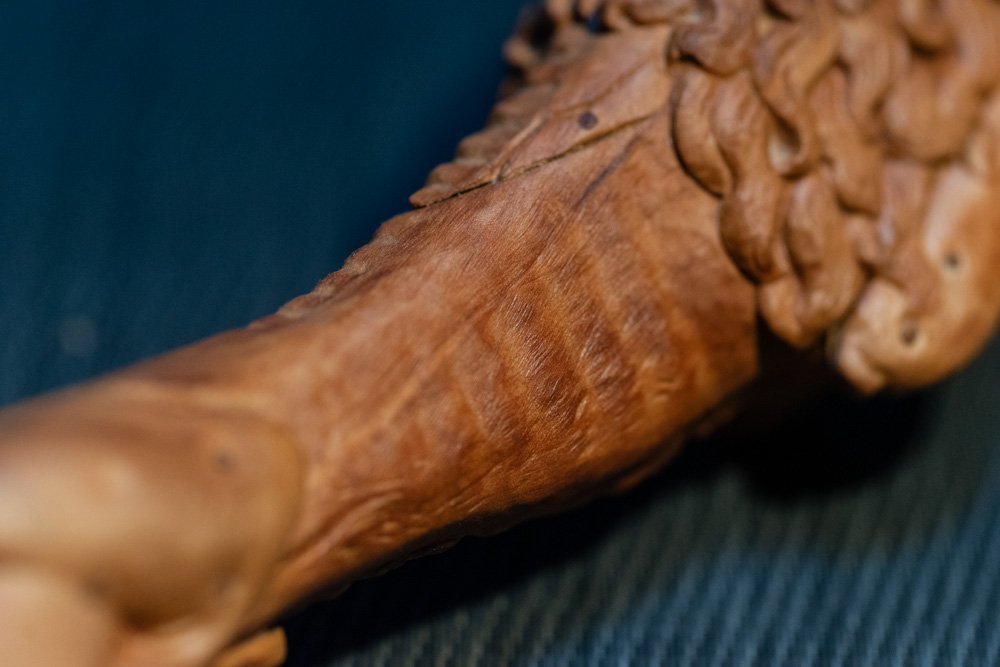
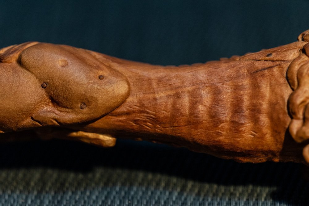
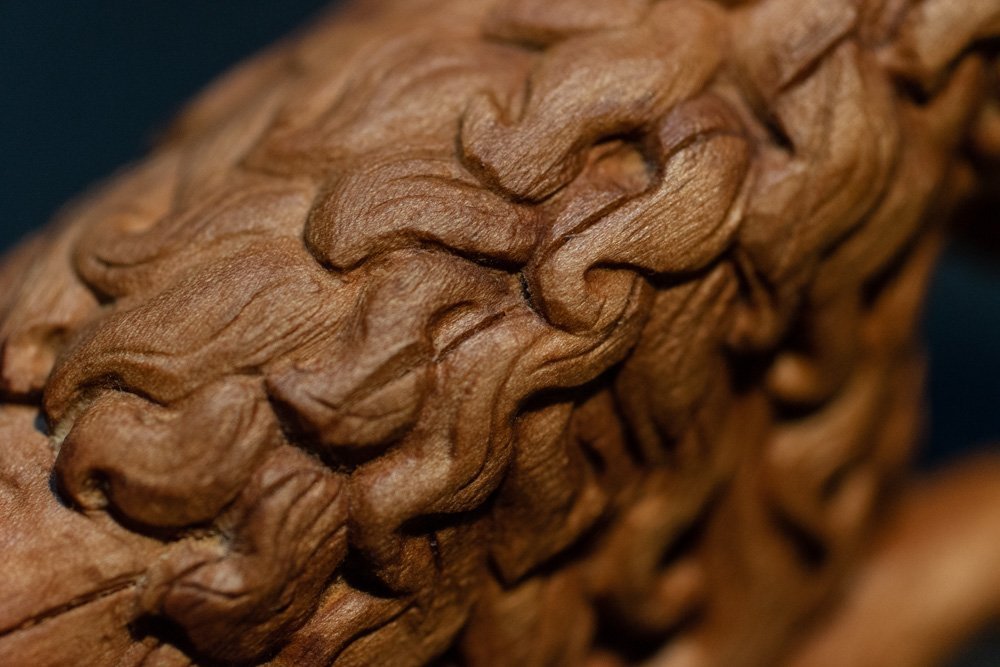
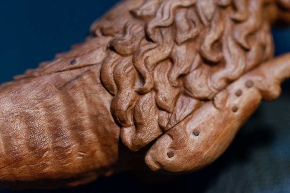
This isn't even the final straight. It's the last meters before the ribbon. The final stage of work on Gustav. Making it authentic. The original sculpture looks different from the others, the structure of the wood is loose. An abundance of microscratches, dents. Plus the shapes themselves have a flushness to them. In normal carving it has always been important for me to leave tool marks, I don't like it when everything is sanded down. It looks like a pillow. Here it's the opposite, we needed the effect of "eating" the shape with water. But sandpaper will not work here, it will be too smooth, I don't need it. And if you take a coarse one, you'll scratch off all the threads in no time. That's not it either. So the last stage was also another challenge. How to make licks, but still have roughness? This is what I ended up with.
-
You've shattered my illusions. I piously believed that every New Yorker has their own skyscraper, robot butler and every pencil has laser guidance and a separate AI. At the very minimum there should be an underground shelter with sophisticated machines, a lab and a Batman suit hidden in the wall. In all seriousness, you are certainly right. And the word New York in your statement can be changed to any other part of the globe. And every man can complain that he doesn't have enough room for his workshop. And would like a little more space. It's a good thing it doesn't interfere in any way with creating great things.
- 2,699 replies
-
- 8
-
-
-
- heller
- soleil royal
- (and 9 more)