
HAIIAPHNK
-
Posts
351 -
Joined
-
Last visited
Content Type
Profiles
Forums
Gallery
Events
Everything posted by HAIIAPHNK
-
 David, thank you very much for the suggestion. This really is a good way to make a two-stage mold without using plasticine. I will definitely keep this in mind and use it if I ever dare to take on making copies again in the future. I did use a release agent and didn’t forget that the model must be coated before pouring. I had this particular release spray. https://www.amazon.de/dp/B083D6NJDX?ref=ppx_yo2ov_dt_b_fed_asin_title Only now have I started to wonder whether it might also have influenced the result in some way. Perhaps it simply isn’t suitable for the silicone I was using?
-
I was really scared—but I managed to clean it off
-
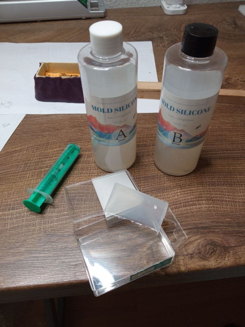
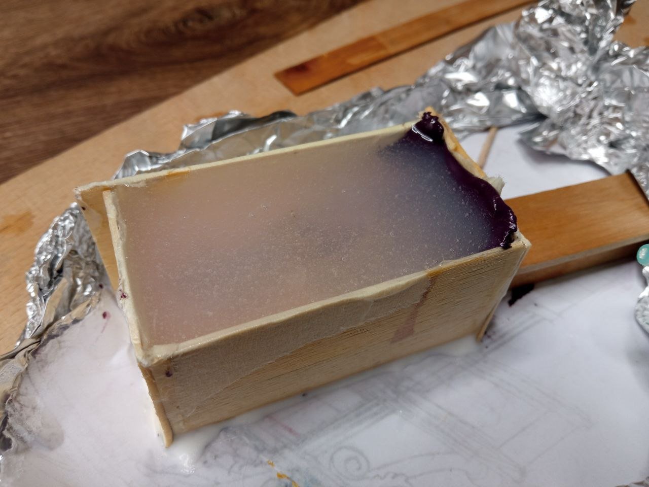
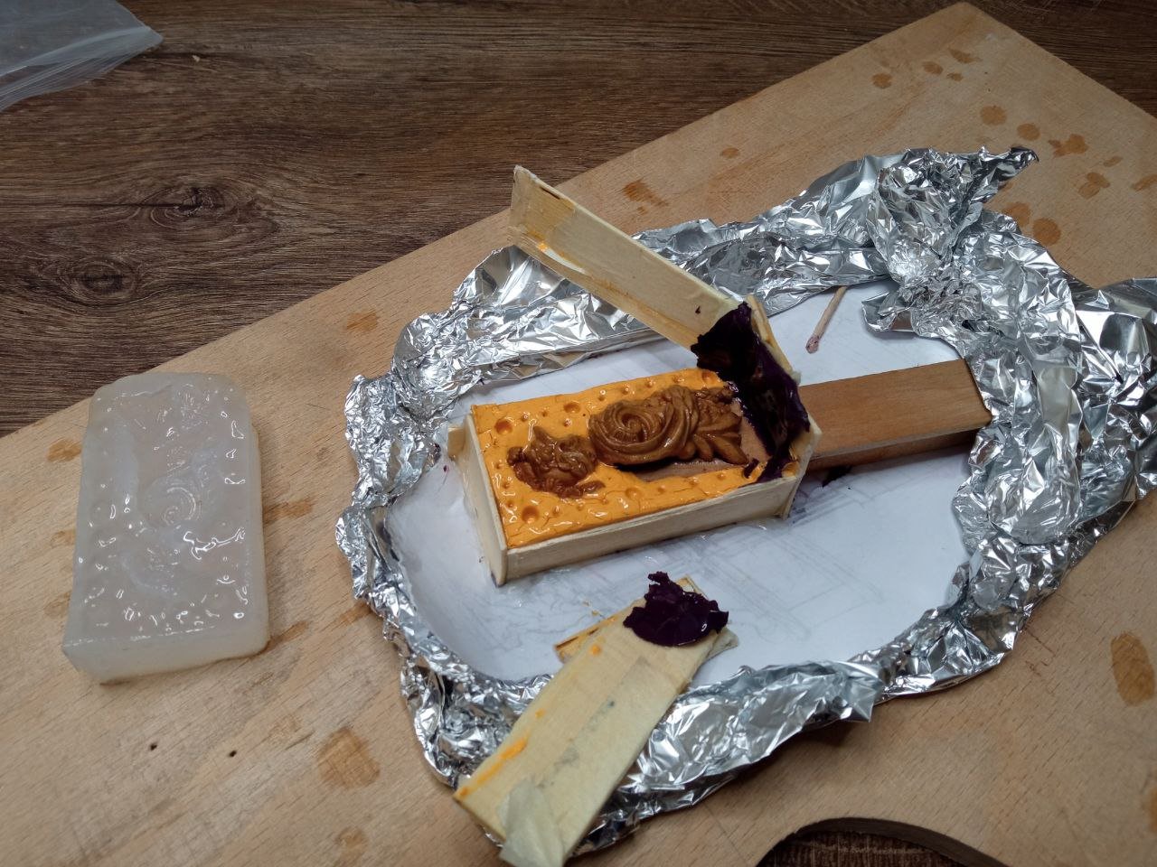
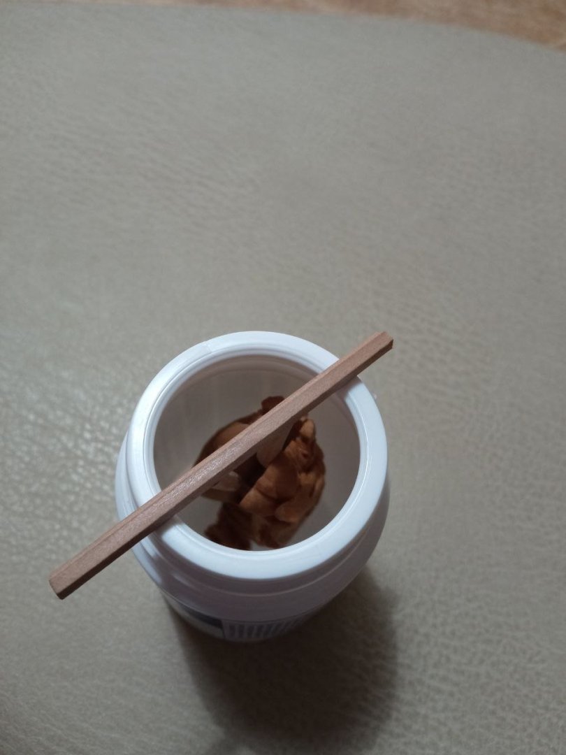
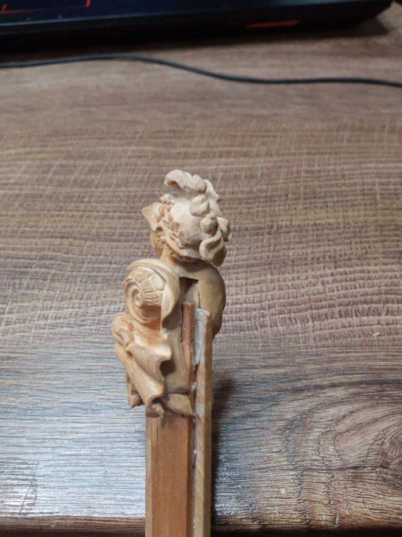
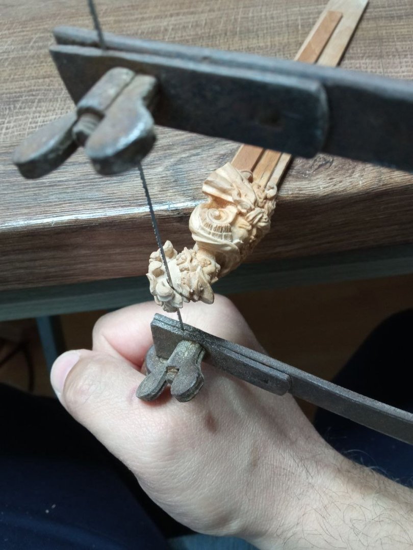
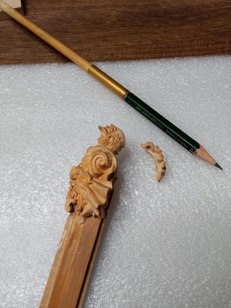
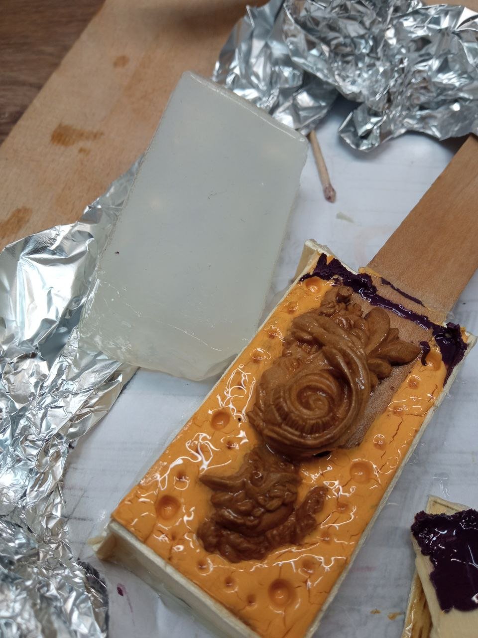
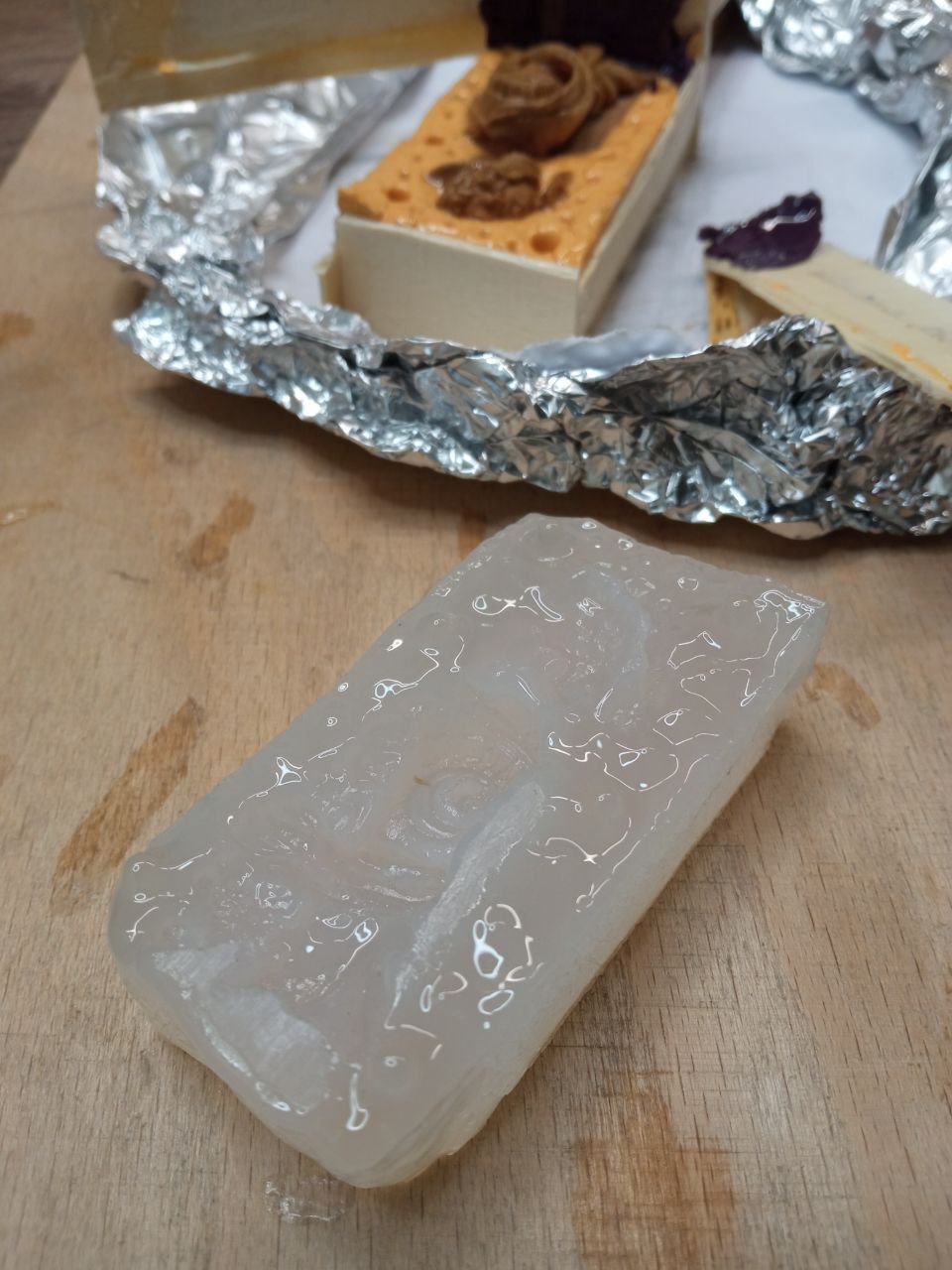
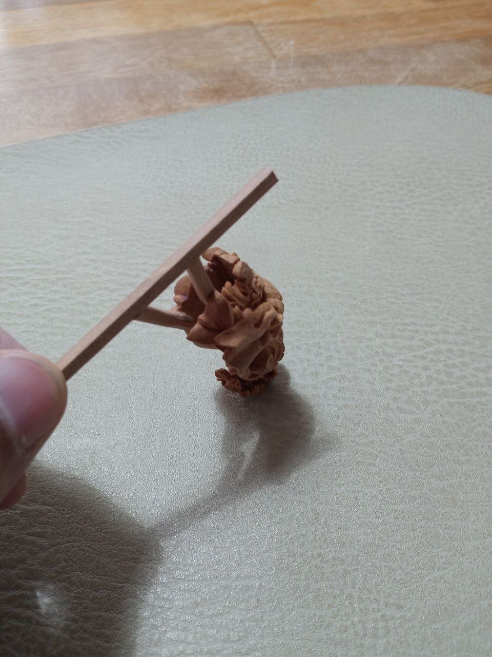
At the very beginning I was naïve and trusting. I watched several videos about mold making, familiarized myself with the basic methods, chose the one that seemed suitable for my case, and ordered the necessary materials. To avoid mistakes, I even asked questions to the fashionable new AI. I settled on the two-stage pouring method. Its principle is simple: the model is divided into two parts. One half is covered with plasticine, while the other is left open and poured with silicone. After the silicone cures, the plasticine is removed and the remaining part is poured with silicone in a second stage. The result is a two-part mold from which the master model can be removed and plastic can then be cast. In theory, everything looked straightforward. The author of the video worked at home, without vacuum chambers or complex equipment—ordinary plasticine and simple containers. Exactly the same conditions I had. If it worked for him, it should work for me as well. Besides, I already had plasticine on hand, so as soon as the silicone and resin arrived, I got to work. This is what the figure looked like when it was prepared for pouring. Today, experts would probably be clutching their heads—but at that moment I had no idea what was coming. I made a test mix of the silicone to check the proportions and make sure it actually cured. Everything went fine, so I poured the mold. Apart from minor leaks through small gaps, the process went smoothly. I checked the mold from time to time, but nothing alarming happened until the very end. The problems became apparent during demolding. The silicone had cured—but not everywhere. On the side where the wall was covered with an additional layer of plasticine, it remained liquid. It became clear that the plasticine was to blame: something in its composition interfered with the curing reaction. I knew that silicone should not come into contact with certain materials. I even asked the AI about this and was told that plasticine containing sulfur should not be used—but the AI assured me that my children’s plasticine was safe and could not contain sulfur components, especially since such plasticine cannot be sold in Germany. Moreover, the tutorial video used ordinary plasticine without any issues. Yet I ran into problems. Can you imagine my frustration? Why I didn’t think to test the silicone together with the plasticine beforehand remains a mystery to me. I was most worried about the figure itself. It was completely covered in sticky slime. The reaction was mutual: the silicone didn’t cure, and the plasticine became viscous and tacky. I washed Alexander, rinsed him in solvents, and cleaned out every recess with a needle. It was a painful process—above all emotionally. That was the end of my first attempt. After I calmed down, cleaned everything, and threw the plasticine away, I decided to try again. This time I chose a single-pour method: pour the model completely, wait for the silicone to cure, cut it open with a knife, remove the original, and cast the plastic. There should have been no surprises this time. This is what the preparation for the second attempt looked like. I went with the simplest possible approach. The only addition was wire: after pouring the silicone, the figure started to float upward. Fortunately, the curing time allowed me to solve the problem quickly by fixing it under the bottom of the container. How the second attempt ended—I’ll tell you in the next installment.


-
David, thank you very much for the high appreciation of my efforts. I truly value it. I won’t try to judge different techniques of execution or say that working with power tools is somehow worse. To me, this is largely a matter of taste—just like opinions about painting or music. Everyone perceives things differently. Personally, I like it when subtle traces of the knife remain after carving. I deliberately avoid heavy polishing with abrasives after the work is done. I want the faceted quality of the surface to stay visible. Of course, when I apply oil to the sculpture, it inevitably makes its own adjustments: it softens the edges and adds a certain roundness. As a result, some of the sharpness is lost and the forms become gentler. Sometimes that works in favor of the piece, and sometimes it doesn’t. I also know very well that I will never achieve the same results as those who work extensively with power tools. What I do will inevitably look rougher compared to their work. But perhaps that’s a good thing. It’s good that there are many different tools and approaches, allowing people to reach results through different methods.
-
Thank you for the advice. As I mentioned earlier, I don’t have solid experience in painting miniatures, so my decisions in this area can’t really be called correct or optimal. I will definitely keep your advice in mind for the future. I’m sure it will come in handy, and that I’ll be taking more steps in this direction.
-
At the very beginning of this whole epic, I mentioned that my final plan was to create a pair of sculptures for two ships: Azov and Mercury. I also said that these figures were meant to be painted. Which means that the story of Alexander I is not over yet. I still have to paint him. And here I need to talk about yet another round of doubts and reflections. I am not a specialist when it comes to painting miniature sculptures like this. I have already painted Mercury several times, and I know from experience that if the result is unsuccessful, removing the paint completely is not so easy. Pigment can soak into the wood, and after that it is no longer possible to present the sculpture in its original, unpainted wooden state. And considering that I had planned a type of paint finish I had never attempted before, I had serious doubts: would I manage to do everything correctly? And would I even like the result of this idea? That is why I seriously started thinking that the ideal solution in this case would be to make a duplicate of the sculpture. Or even several duplicates. So that the original wooden figure would remain as a backup or a reference, while all painting experiments could be done on the copies. I could make ten different versions if I wanted, and then choose the one I liked best. And if I didn’t like any of them, I could simply give up on the idea and display the sculpture as a classic unpainted wooden piece. Which meant that I needed to make a copy. In the modern world, technology makes this possible — and in several different ways. Museums, for example, use optical 3D scanning and then either 3D-print the result or mill it on CNC machines. I won’t go into a discussion of whether these technologies are good or bad. In any case, I don’t have such equipment, nor the skills to use it. But it’s also possible to manage without machines — simply by making a mold and then casting a plastic copy from it. This is a simpler task. Yes, even here some equipment is needed to achieve perfect results. And knowledge is required as well — which I also lack. But why not try? Knowledge can be acquired. And as for equipment, I decided to try doing without it. The task is not critical enough to justify serious investment. Besides, many people achieve good results even in home conditions. With these thoughts in mind, I started looking for video tutorials on making silicone molds and casting with polymer resins. Which means that next I will tell the story of how it went for me. And it will be a story of pain, experiments, discoveries — and pain again.
-
This part will consist of photographs only. I have nothing more to describe here. But if you think this is the end of the story, you are mistaken. The work is far from finished. …to be continued…
-
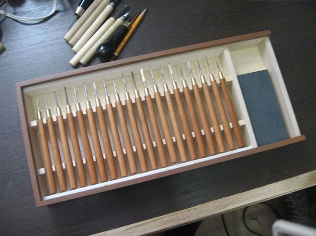
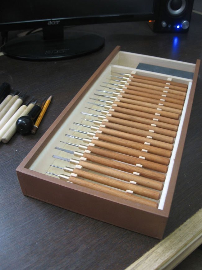
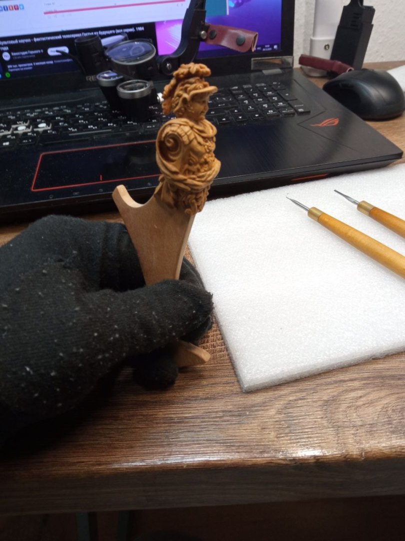
Thank you, Matthias. I'm also happy with the final result. It's all carving; I only use an engraver in very rare cases. And even then, it's more when I need to drill rather than mill. For me, it's too big and rough a tool, which is difficult to control on small details. That's why I only use hand tools. With them, I always know how much pressure to apply so as not to cut off too much. I have several sets of small chisels. They were custom-made. They can be seen on the table in the last photos. The whole set looks like this: P.S. I don't know what advice I can give about carving. I don't know any secret tricks or spells. Just a little patience and something interesting to listen to while you work. P.P.S. By the way, I really liked your acanthus scrolls. I even saved them for myself. They turned out to be very delicate, precise, and elegant shapes. Maybe you should take a break from your work and give your eyes a rest. That's what I do when I don't like what I'm doing. Or I find another theme to work on. Then, after a few days, I come back and look at it again. Sometimes that's enough to realize that it's not so bad after all. And sometimes I get ideas about what I can change.
-
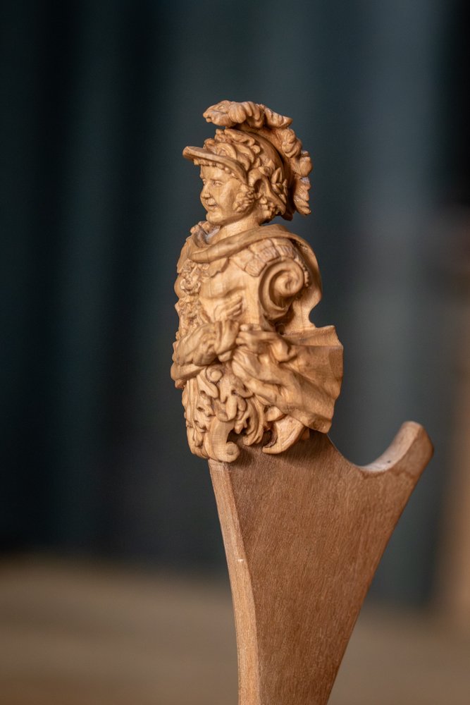
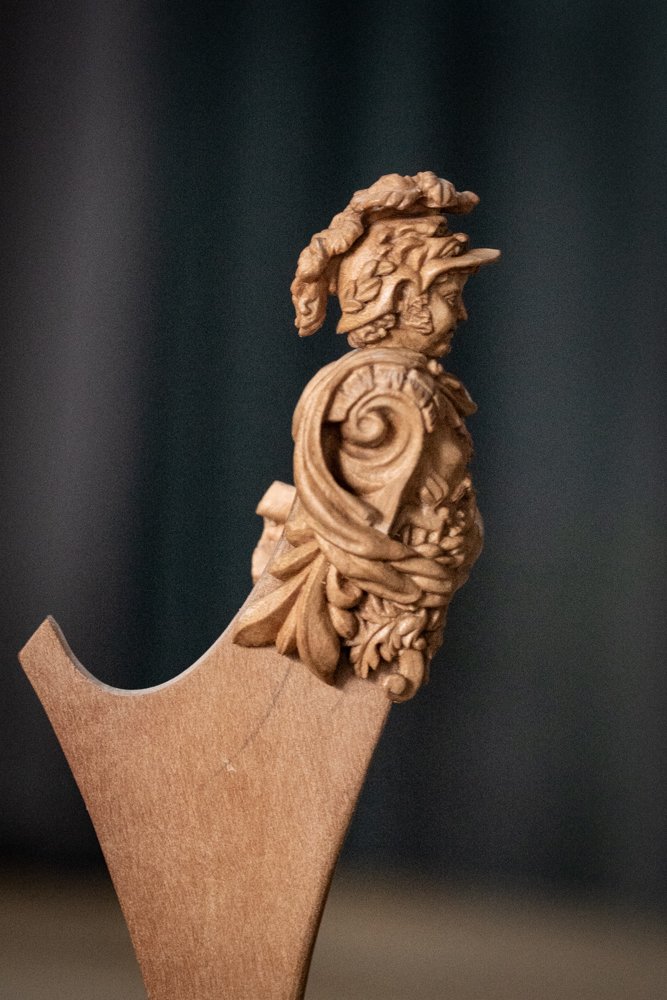
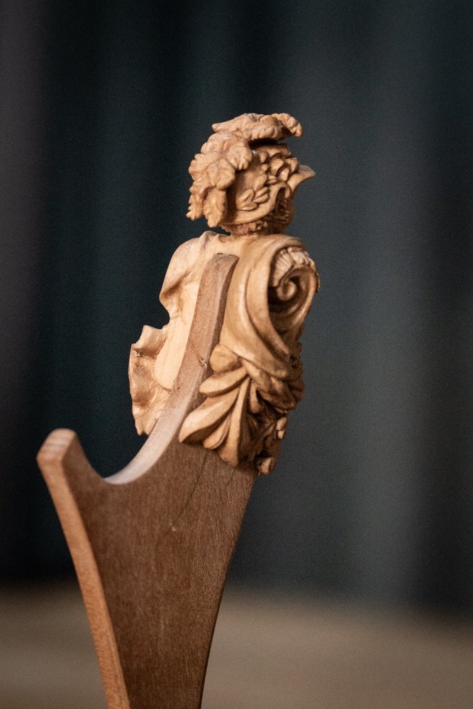
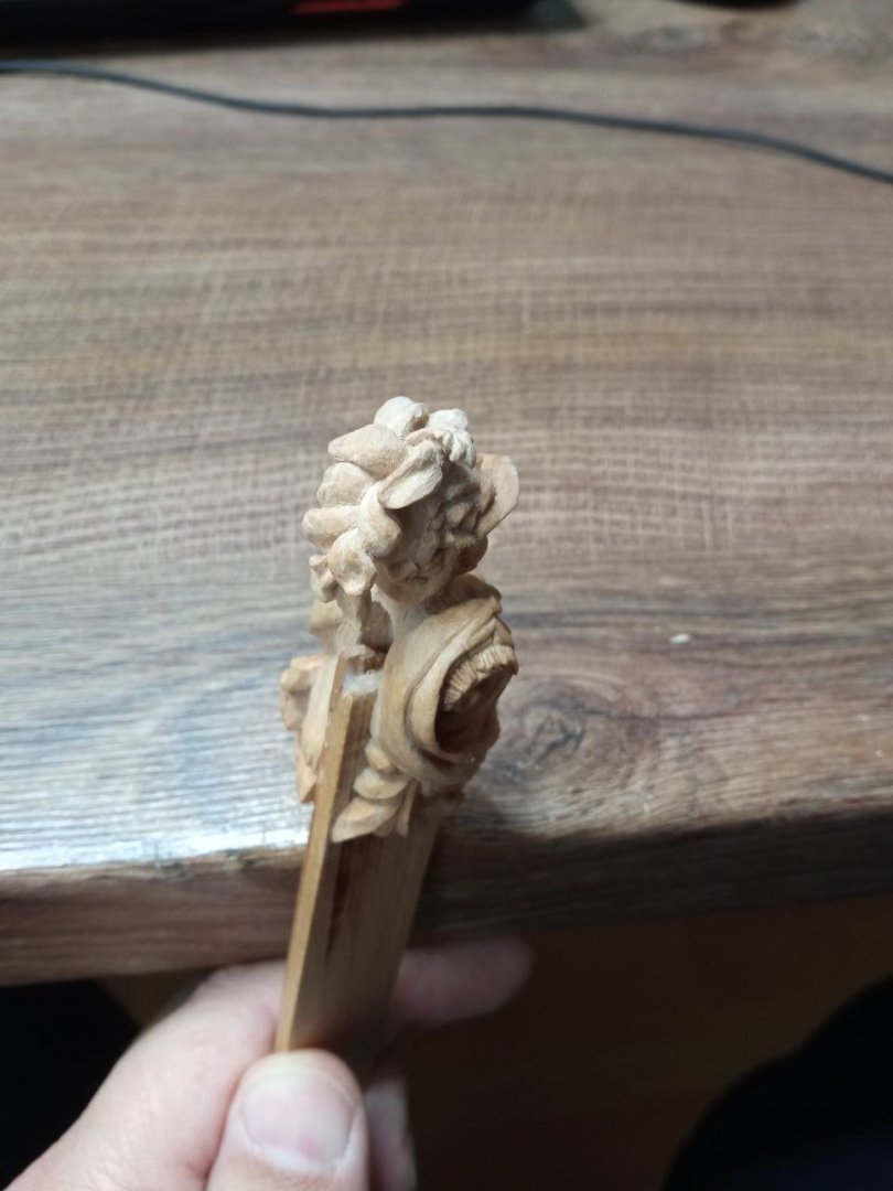
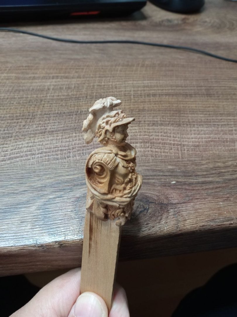
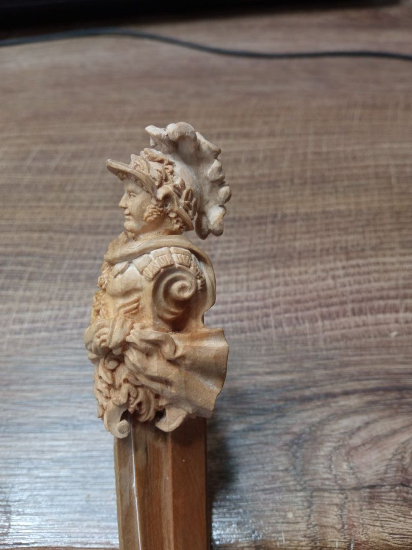
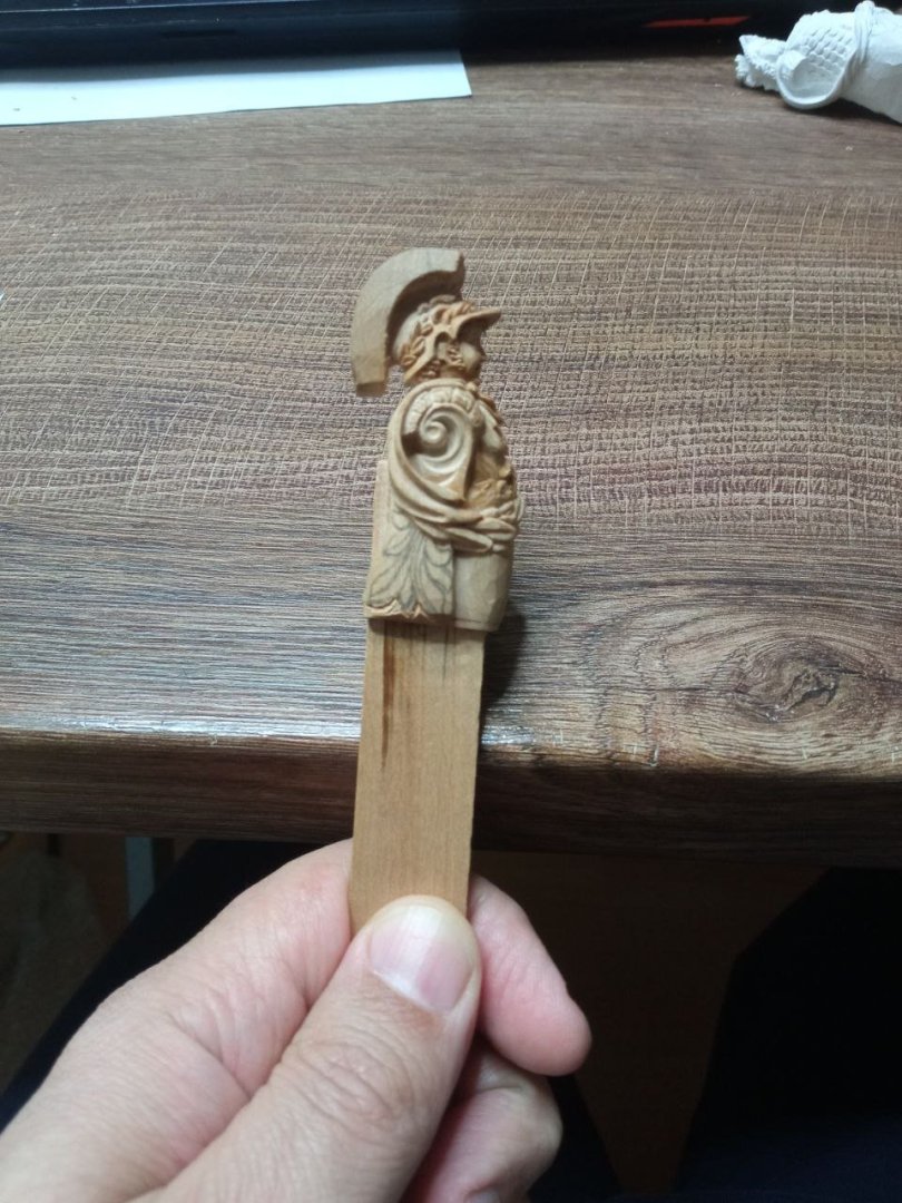
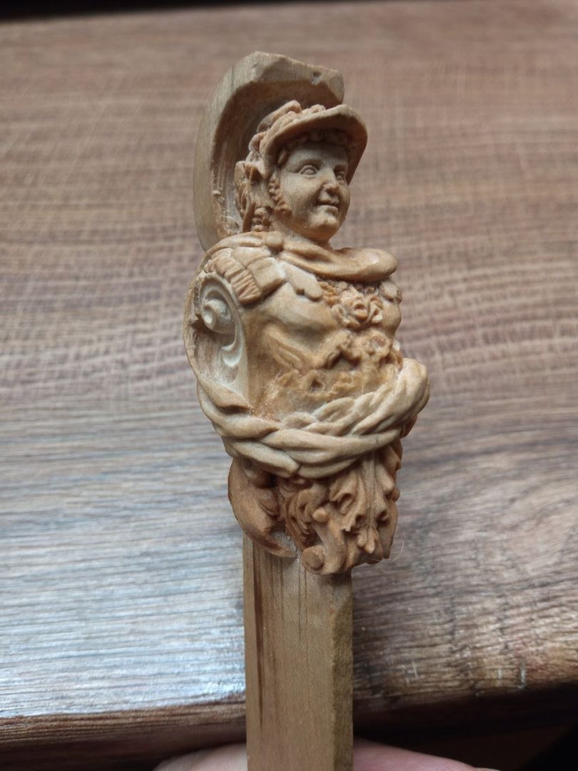
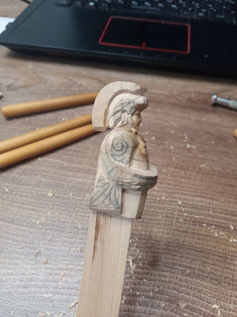
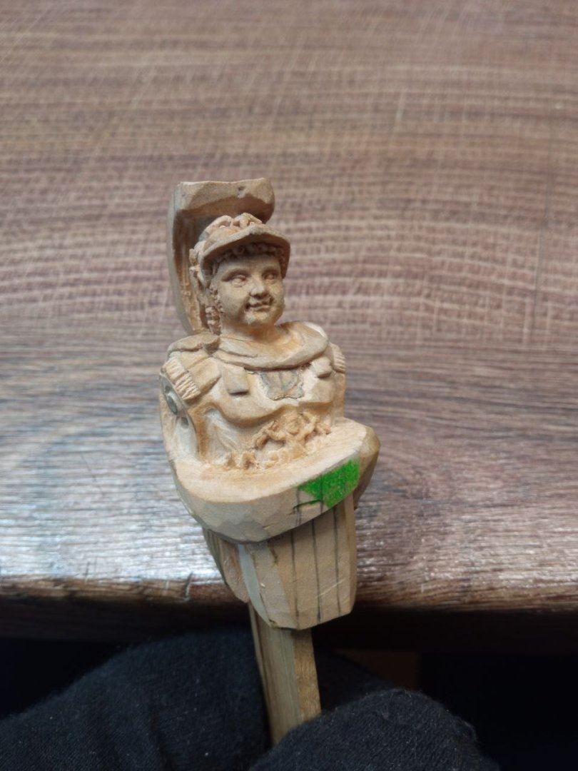
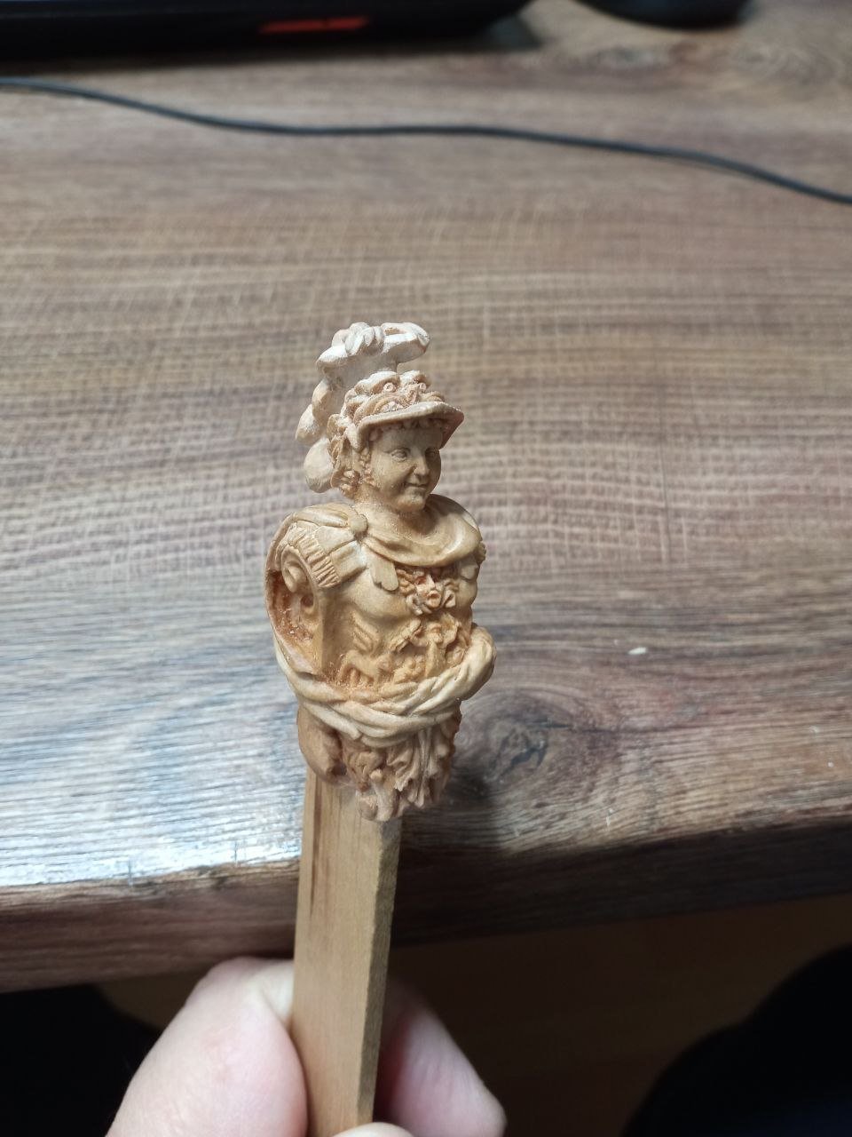
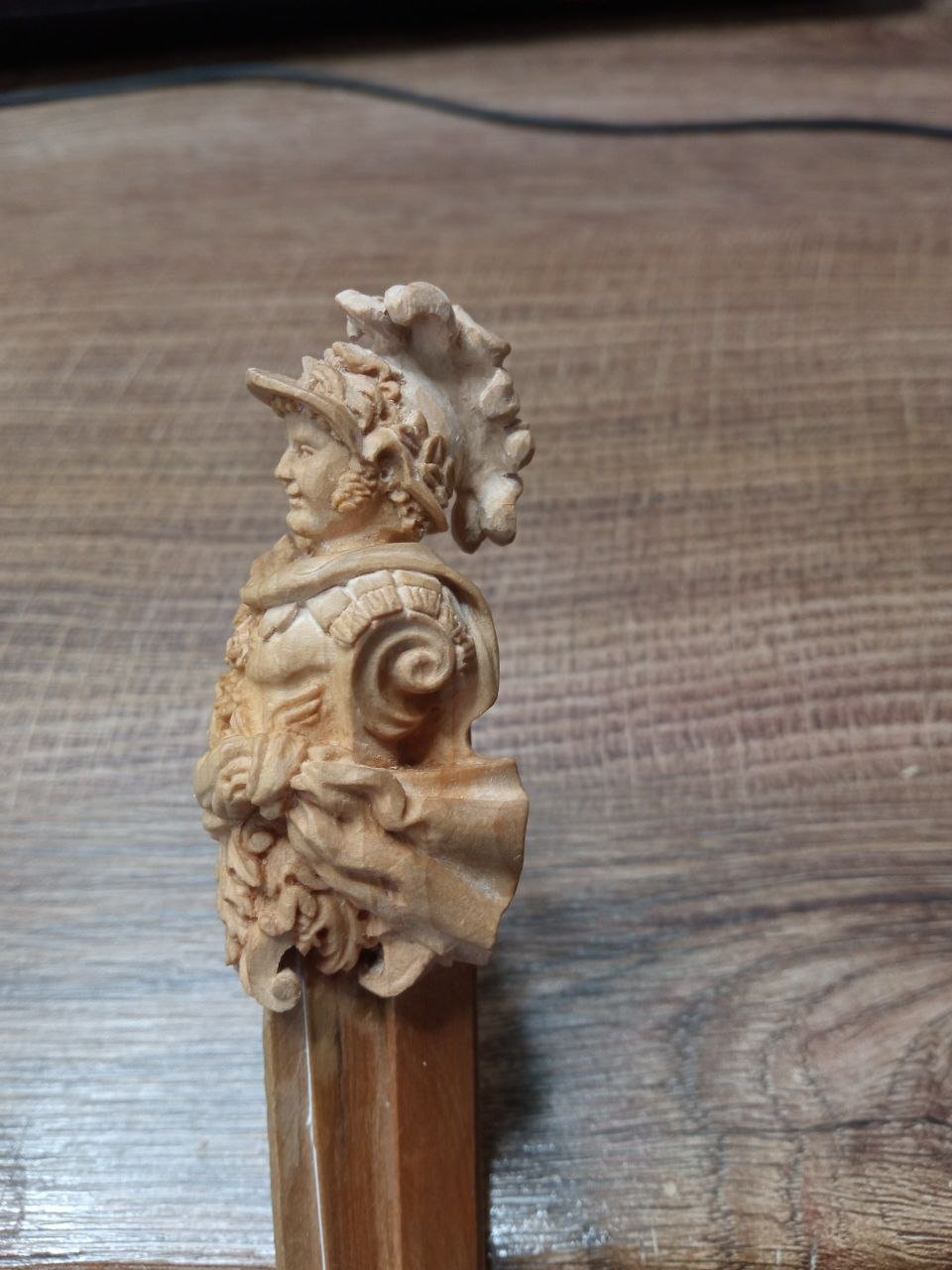
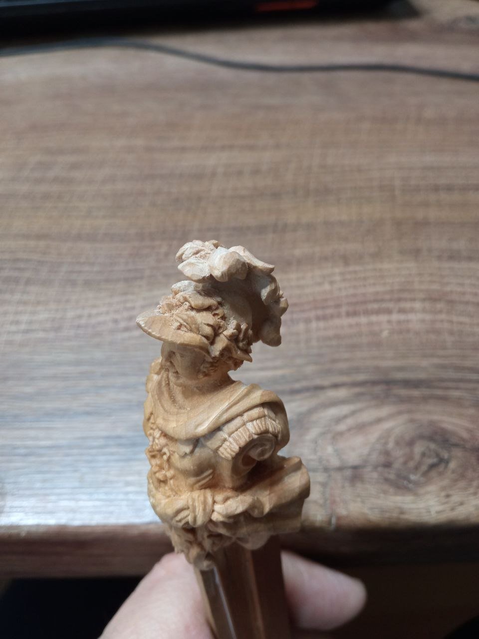
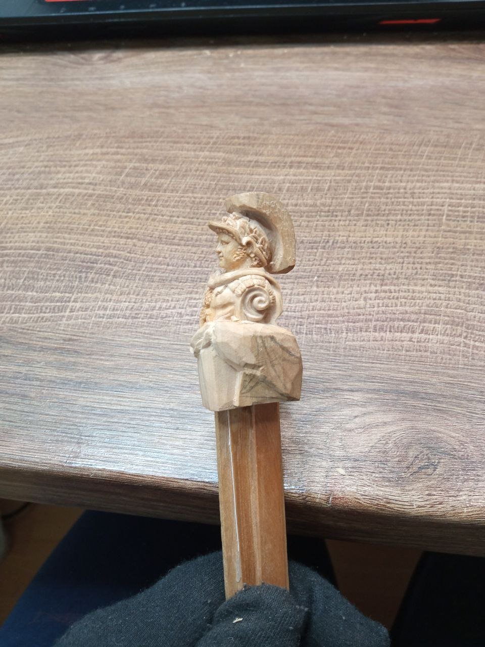
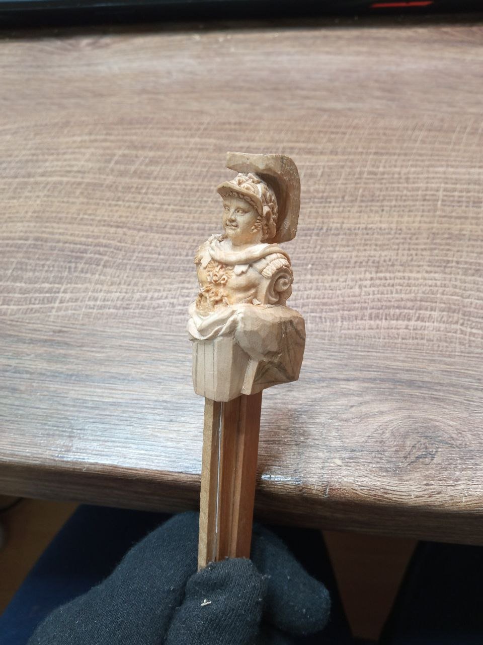
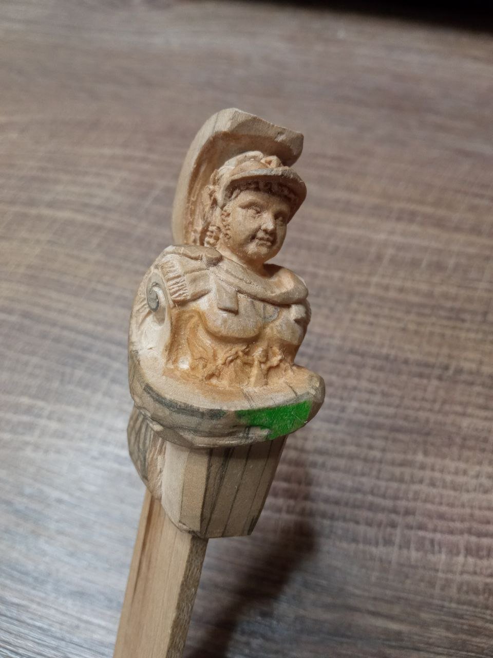
In the previous part of the story, I stopped at this photograph. I will begin this section with it as well. Simply because here it is already noticeable that work has finally begun on the last part of the figure that had not been touched before — the feathers of the helmet: Everything would have been fine, but once again I was dissatisfied after finishing this stage. Again. The crest with the feathers turned out to be positioned too high above the helmet, and it looked unattractive. The mistake had been made at the very beginning, when I was leaving a rough blank for the feathers but cut the lower edge too high. As a result, the lower edges of the feather quills could no longer be brought down any further. I spent several days thinking about what I could do next. I tried to “take a break” from the sculpture, setting it aside and hoping that with time I would be able to look at the result more calmly. But after the pause, my opinion did not change. The feathers still looked wrong. They needed to be lower, closer to the helmet. And what could be done? Only this: And after all — or almost all — of the work, adjustments, and reworking, my Alexander looked like this:


-
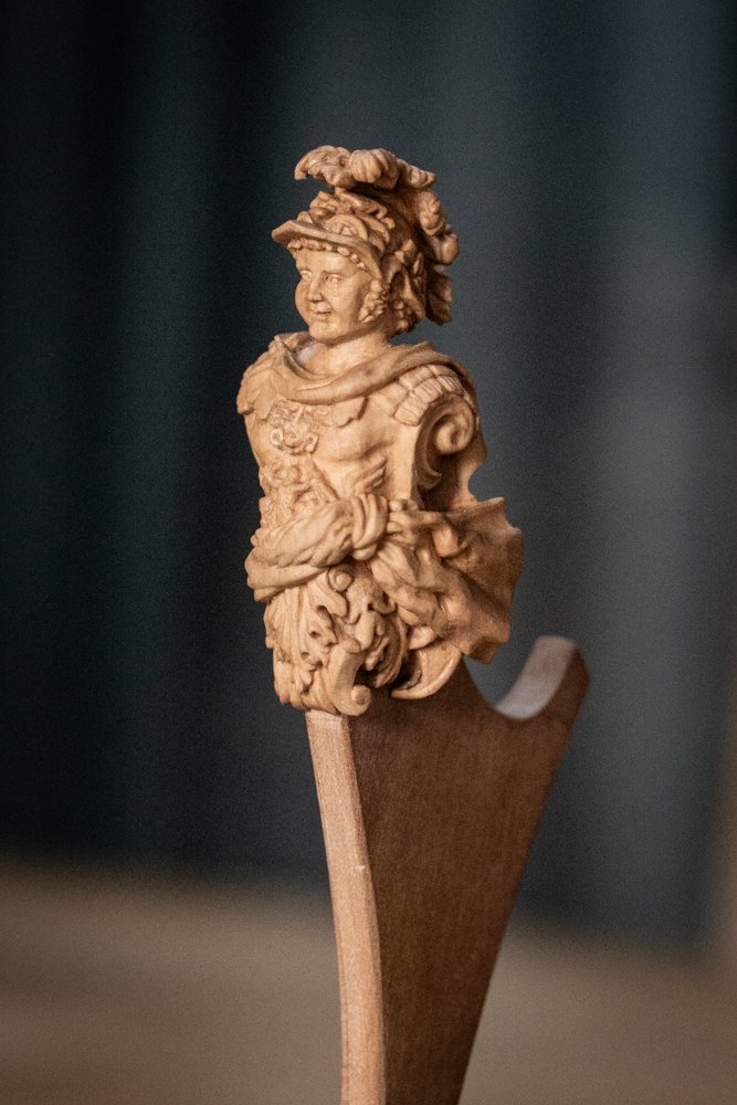
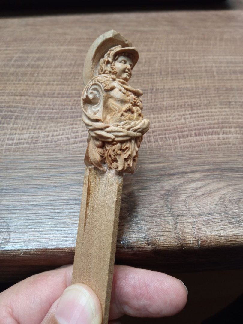
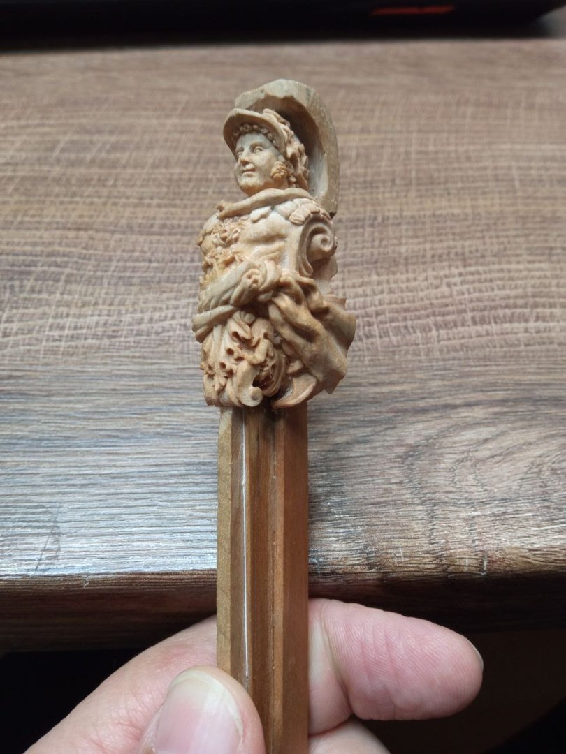
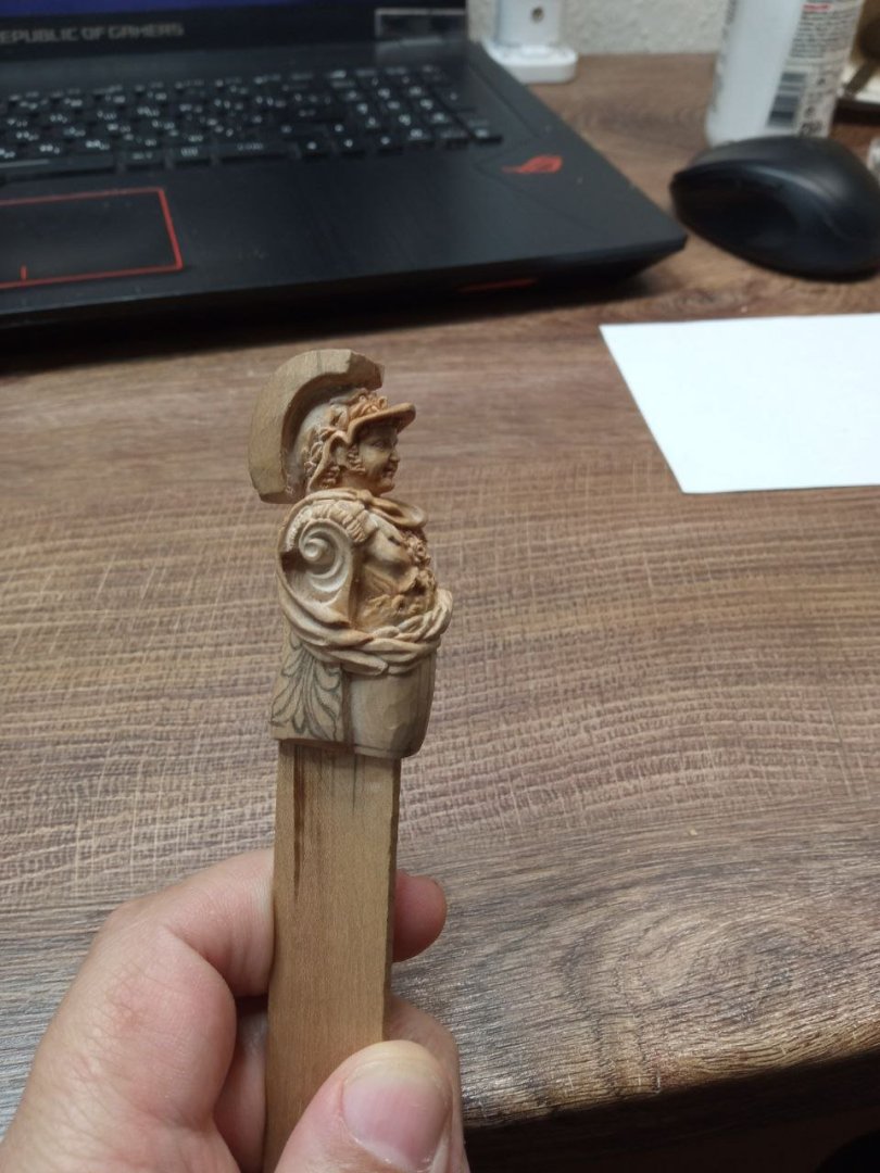
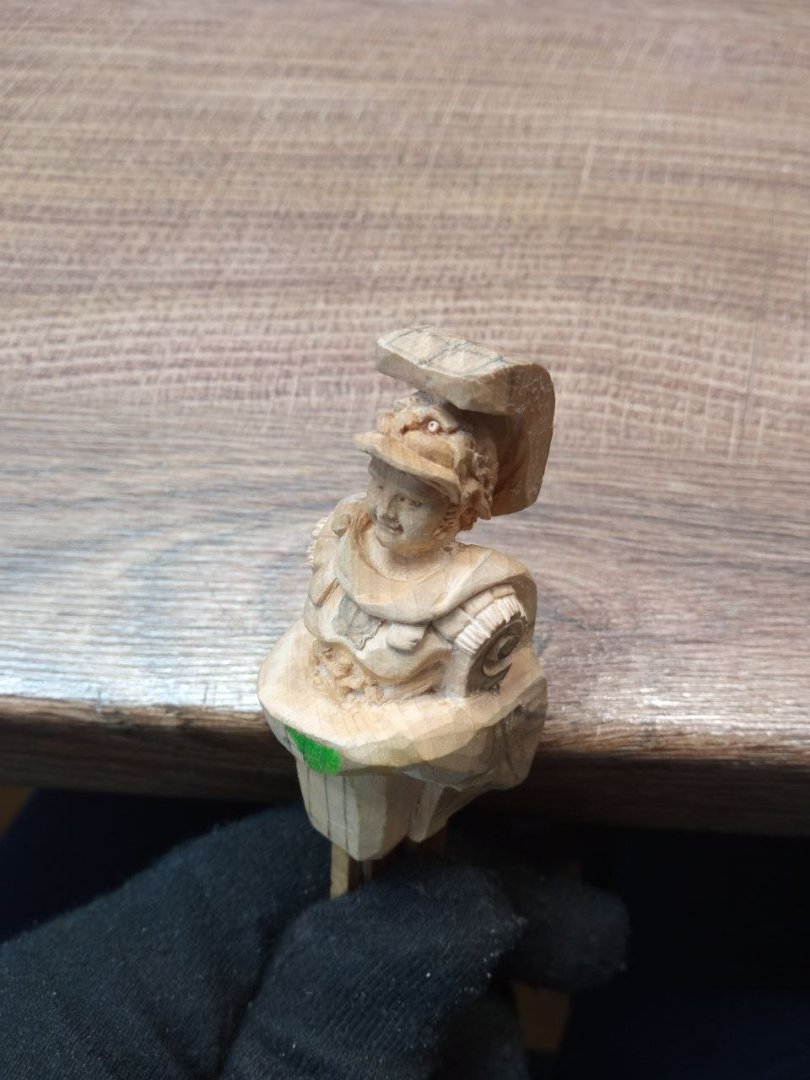
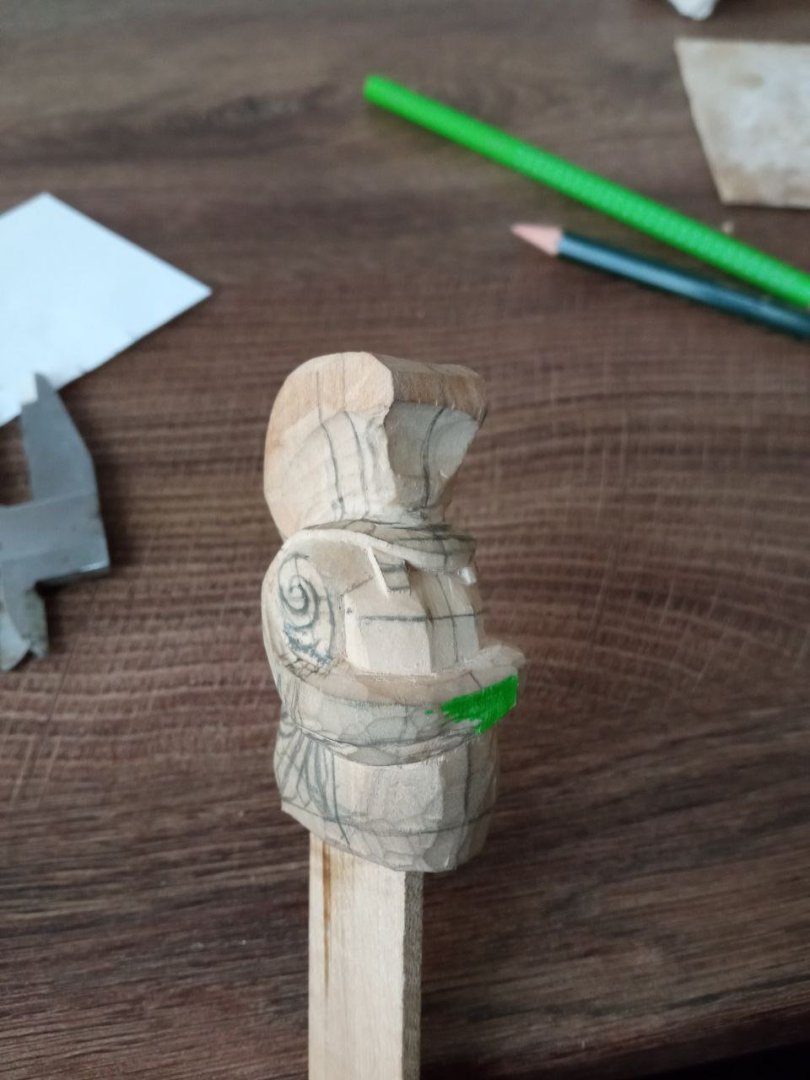
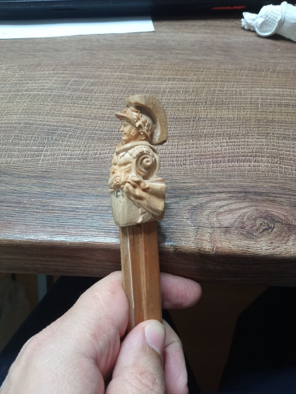
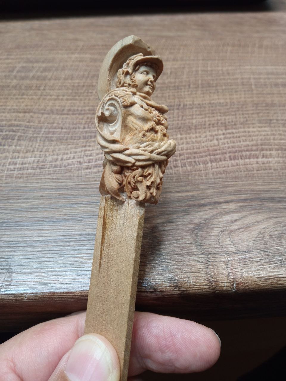
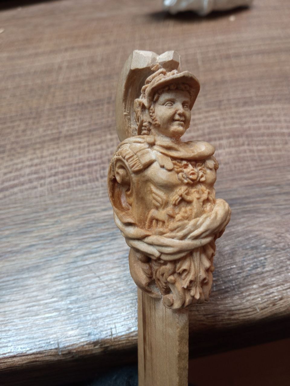
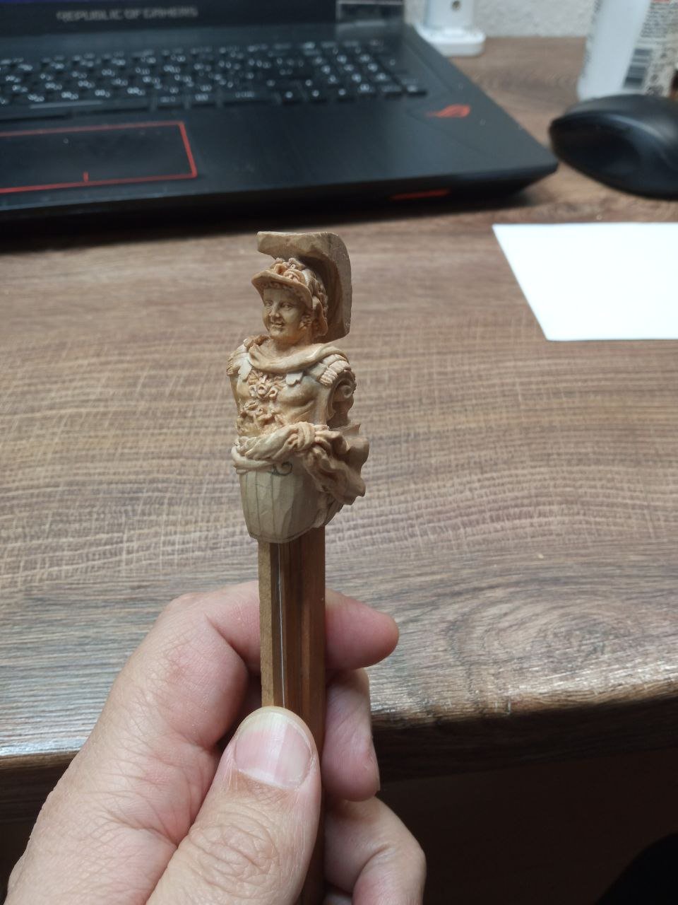
After finishing the work on the folds of the fabric, it was time to move on to the vegetal ornament in the lower part of the figure. During the plaster test I deliberately did not bring this area to a finished state: the overall solution was already clear to me, and I saw no reason to spend time refining it in plaster. Now the moment had come to check whether those earlier considerations were correct. I liked the result of this stage. The work progressed easily, and I genuinely enjoyed the process. It is not often that I feel I can simply continue calmly, without constantly returning to doubts in my mind. At that moment, I allowed myself to relax a little. Nevertheless, there were still plenty of reasons for reflection. I kept turning the figure in my hands, examining it carefully from different angles. This frame already appeared earlier — and that is not a mistake. It is simply needed now for a different discussion. At a certain point I deliberately set aside the cuirass with its fine ornamentation and focused on the cloak. Only after the boundary of the cloak becomes clear can one understand which elements on the cuirass will actually remain visible and which will be hidden. And then, returning my attention to the central area, I realized that the planned French eagle was hardly readable at all. It was getting lost in the overall mass of forms, while the griffin’s wings above it only intensified the feeling of visual confusion. The elements began to interfere with one another. At first I decided to remove the griffin’s wings — they seemed unnecessary. But already in the process I understood that the problem ran deeper. In the end, I made a more radical decision and completely abandoned the figure of the French eagle. Earlier I had described in detail the logic of planning and allegories, building an entire system of meanings. But in practice it became clear that, at this scale, excessive literalness works against the form. I kept only the griffin — as a more generalized yet visually legible symbol. Its silhouette is larger, and it is perceived more clearly within the overall rhythm of the composition. As a result, the abdominal area came to look like this: …to be continued.


-
David, thank you very much for your support and kind words. You are absolutely right that an author almost always sees far more in their work than most viewers do, and is often much stricter with themselves than anyone else could be. I will try to explain my position. I deliberately make a point of talking about and showing problematic areas. First, because this blog is read by people with very different levels of experience, including professionals who see such nuances perfectly well even without my comments. Pretending that these issues do not exist would not be entirely honest. Second, it is important for me to show the work not as a sequence of “perfect” images, but as a process — with searching, doubts, and subsequent corrections. Many of these moments later become starting points for solutions that I myself would not have found if I had not acknowledged the problem in time. I hope this approach will also be useful for those who are just learning to look at form more attentively: to see not only successful areas, but also those that require further work. It is all the more interesting then to observe how such problematic situations can be resolved and brought to a more cohesive result.
-
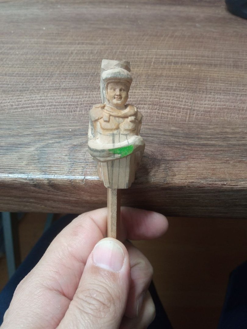
The working area continues to shift — now I have moved on to Medusa Gorgon. If it were not for these photographs, I would no longer remember how she looked at the very beginning. Later, her appearance will change again. The thinnest and most dangerous area was located where Jupiter was placed. That is why I began working on him on the chest earlier than on all the other elements. Everything else was gradually “pulled” toward him. This sequence also proved useful from the standpoint of possible failure: if I had accidentally cut through the sculpture, at least I would not have spent much time on the rest of the work. Thanks to preliminary measurements, however, mistakes were avoided and nothing had to be redone. And once the most risky area no longer caused concern, I could safely remove the measuring base — that is, move on to the drapery of the cloak. As a result, the fabric began to look like this. In general, it will remain this way, although I strongly disliked the folds on the left. I even considered a radical solution: cutting out that entire area, inserting a new piece, and doing everything again. But that would have been a last resort. Such repairs rarely go unnoticed, so for a long time I hesitated to take such a drastic step. Looking ahead, I can say that the sculpture did not require such an operation. It was possible to make corrections through subtler changes of form and achieve a more acceptable result — but that will come only at the very end. Until then, photographs with those same folds, which spoiled my appetite, will keep appearing. I will have to endure it. …to be continued…


-
It looks very elegant!
-
Now everything has become clear. Yes, the translator and their involvement in the dialogue do introduce certain adjustments to understanding .
-
I am confused. Most likely, we have run into subtleties that depend on nuances of translation. Which Alexander are we talking about? The Russian Alexander or the Greek one? I understood your comment as noting a resemblance between my sculpture and the Greek commander. Did I misunderstand you? I replied that I did not set myself the goal of conveying the features of Alexander the Great. Only those of the Russian Alexander. I also did not seriously study the question of whether ancient sculptures depicting Alexander the Great are considered accurate in terms of true portrait likeness. I assumed that most of these sculptures date from later periods, and that sculptors created their images without precise knowledge of the appearance of the Greek king. I may be mistaken, of course — I did not research this topic in depth, so I cannot state this with certainty. If you have other information, I would be very interested to learn more details. At the end of my message I added a conclusion: if my Alexander ended up resembling Alexander the Great, then this happened purely by accident. And that is actually quite amusing. I made a great effort to achieve likeness to one specific person, spent time and energy, searched for additional information… and in the end I achieved a resemblance to someone I had no intention of depicting at all. Let us do a comparison at the very end. For the sake of a fair experiment, we could proceed as follows: you choose a portrait of Alexander the Great (Greek) that is considered an authentic likeness. I have already shown the image of the Russian Alexander that I was trying to approach. Then we place the finished result of my work next to them — alongside two portraits: your chosen portrait of Alexander the Great and the portrait of the Russian emperor — and compare them. By the way, is it possible to create a poll in the chat? It would be interesting to see the results. What do you think of this idea?
-
I forgot to answer the question about wood. I use different types of wood for different projects. This figure is made of pear wood. I don't use linden wood; it's too soft for me. I have only worked with boxwood once in my life. And I didn't like it. It turned out to be too hard. And I ruined my tool on it. Later, I talked to other carvers, and when I shared my impressions of boxwood, I heard that it is not such a hard material. I also heard that very old wood can be hard. Since I don't know where my block came from, I probably just had bad luck with it. And since I didn't like my first experience with it, I haven't even tried using it again for work.
-
Similar to Alexander the Great? I don't know how to answer that. While we are familiar with historical figures from the 19th century thanks to portraits, it is difficult to talk about the appearance of figures from antiquity. Alexander the Great was painted and sculpted in many different ways. I certainly did not set out to look for portraits of him. Therefore, any similarities are purely coincidental.
-
Today, I finished the final touches on Alexander and started repainting Mercury. And when I have to write about what's in the past at the same time, it creates a bit of a disconnect in my mind. When I write for a long time, I try to remember what exactly happened while I was working. What I was thinking about and what problems I was facing. And then suddenly it's all in the past and I know how it all ended. It's an interesting effect. So yes, there will be a happy ending. Probably...
-
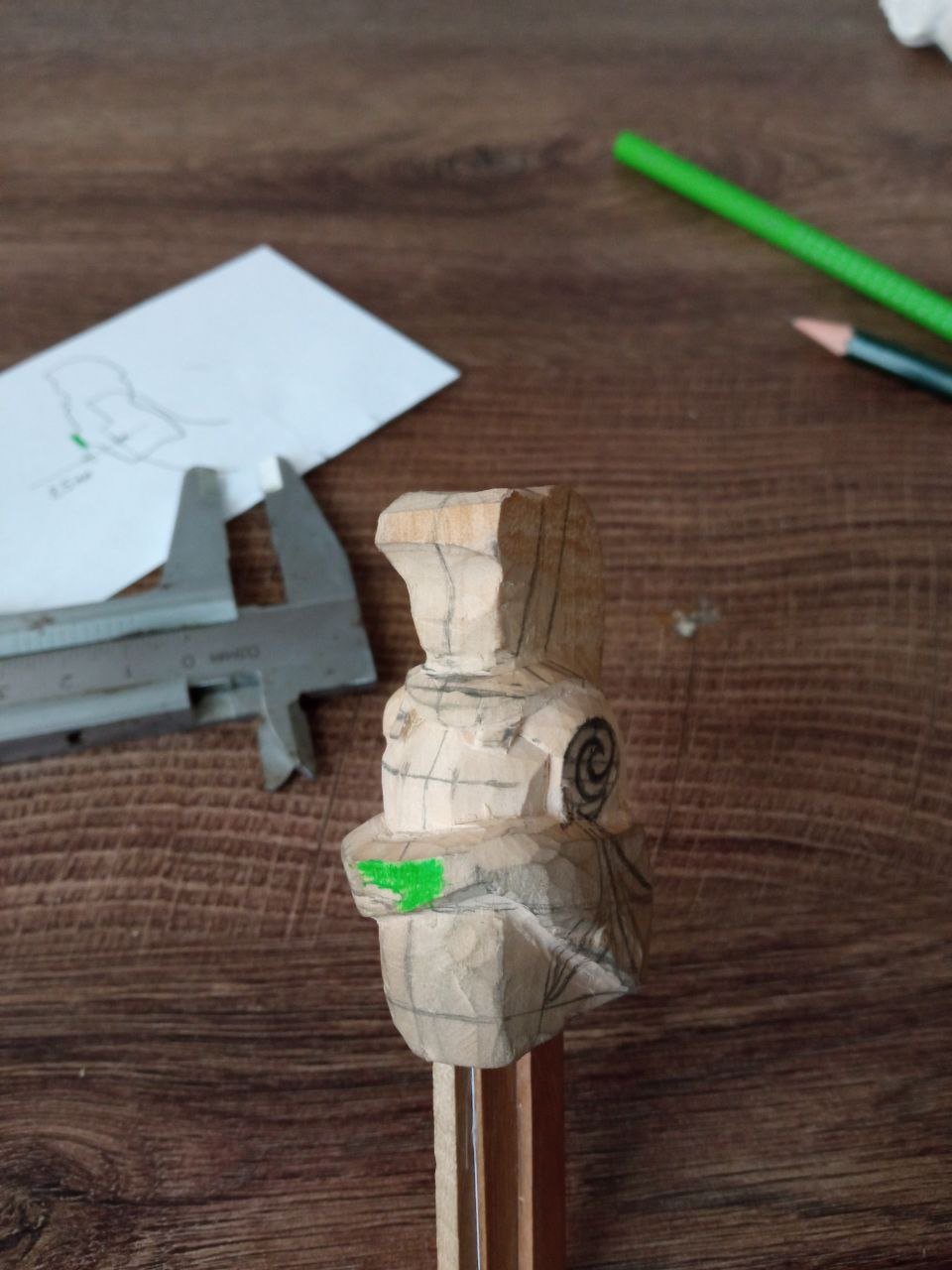
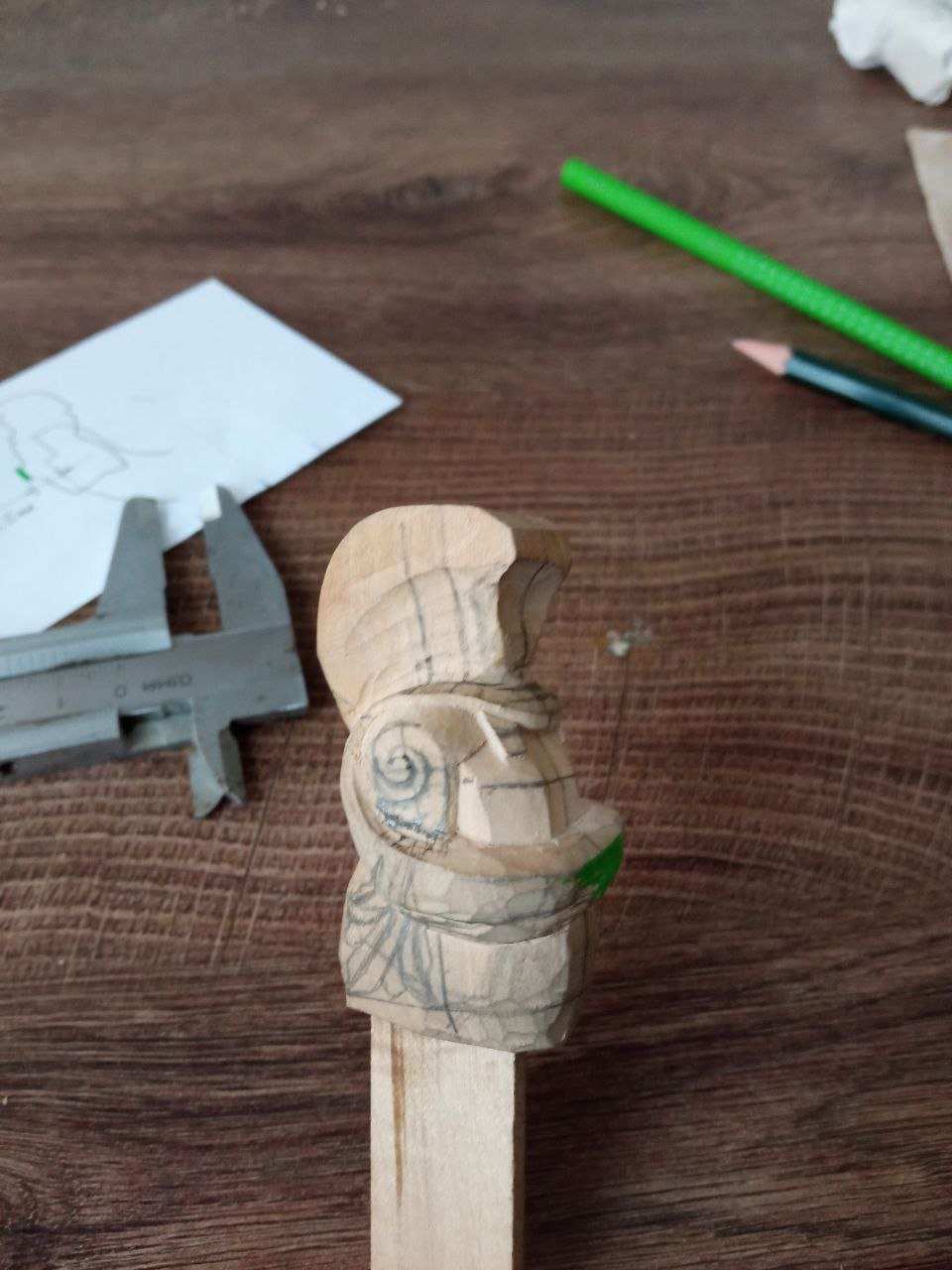
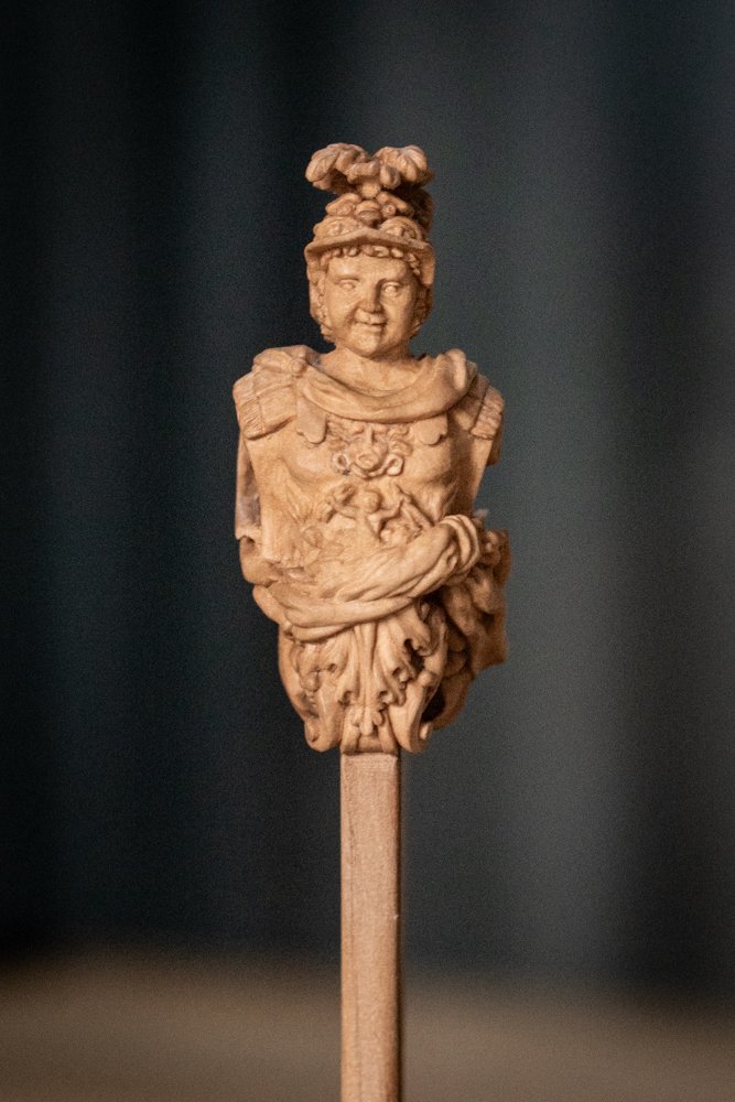
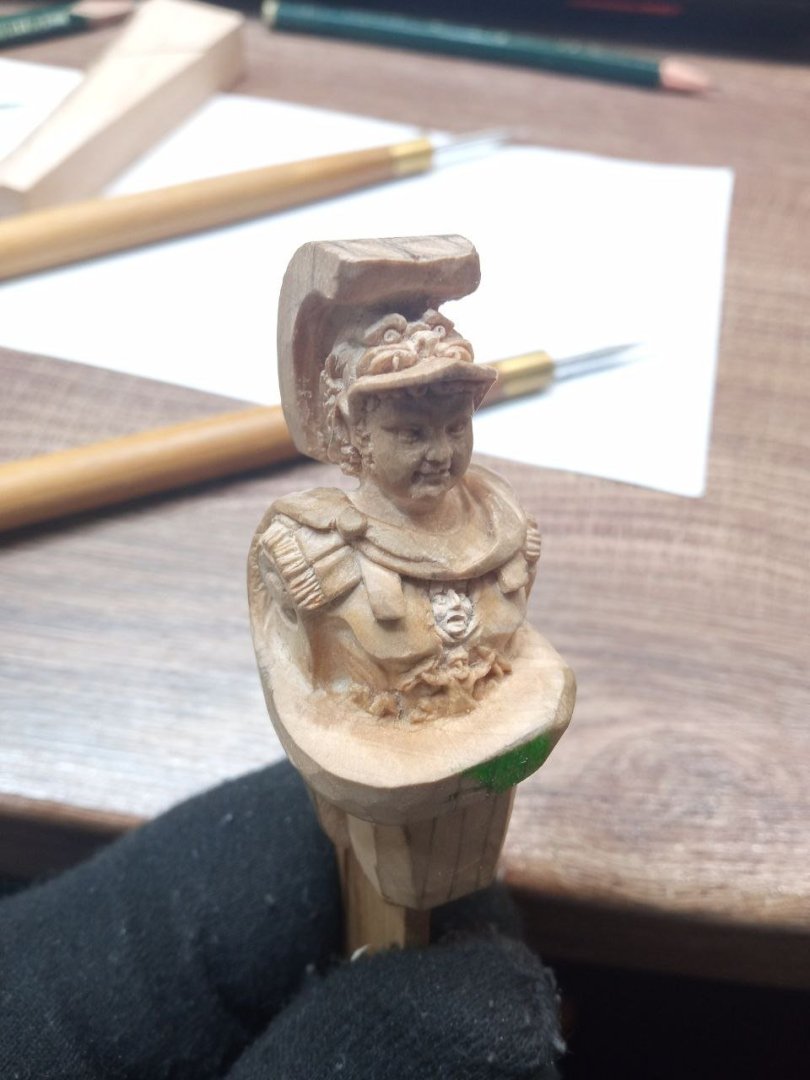
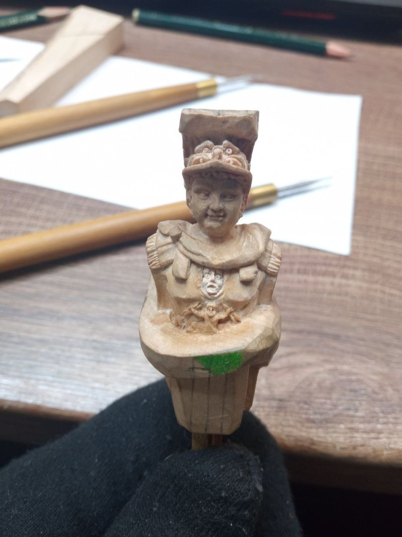
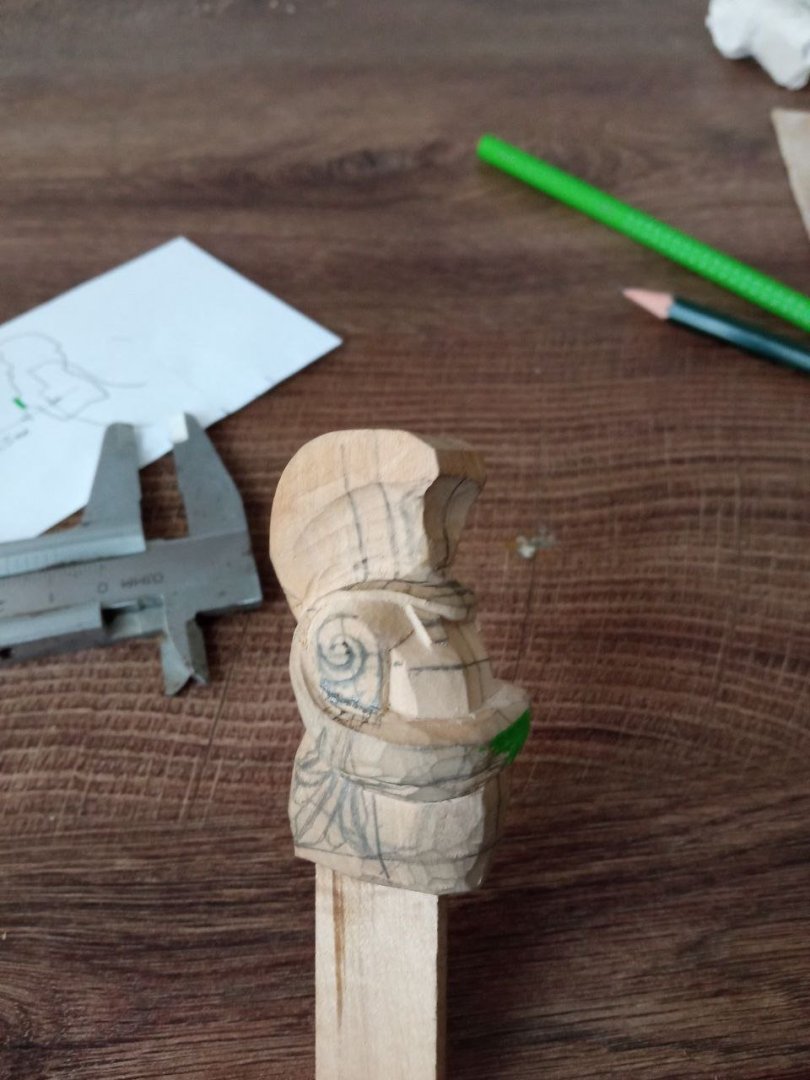
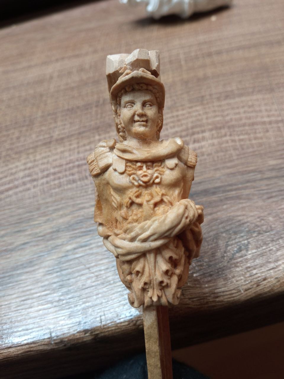
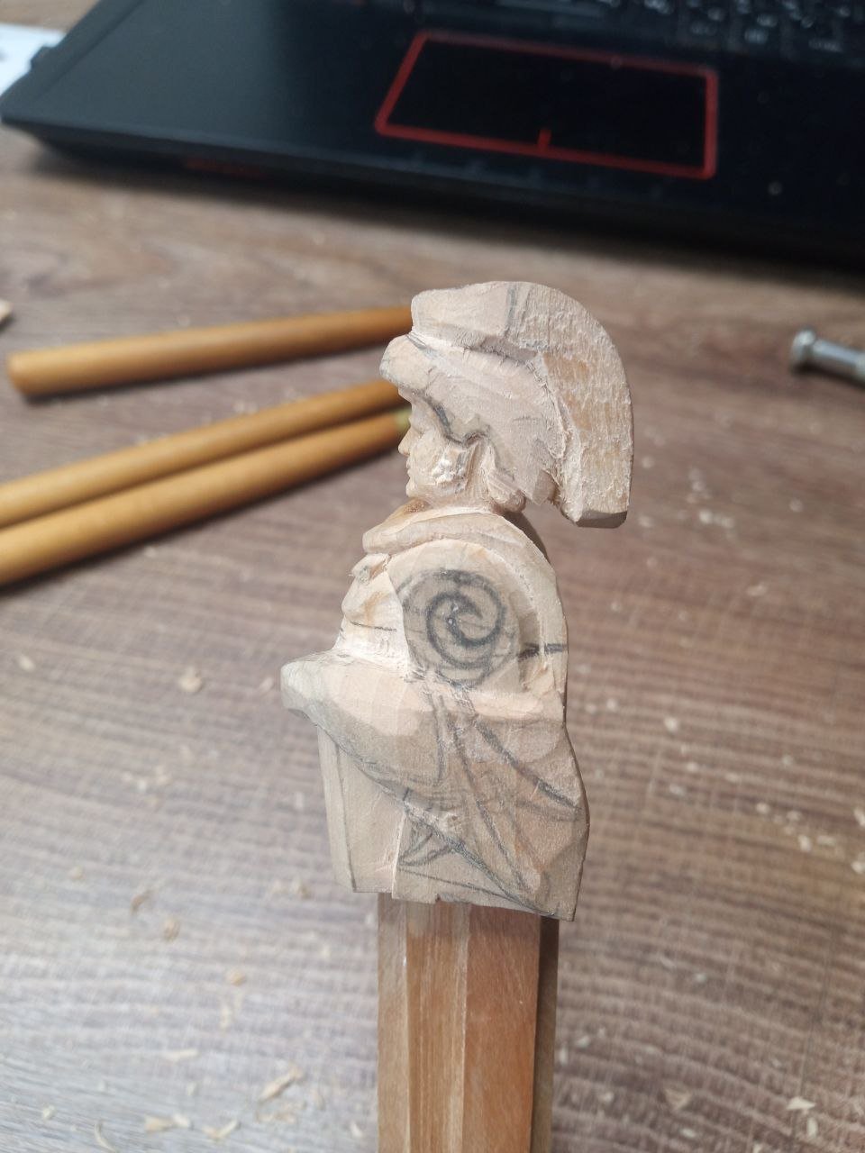
Now it is possible to continue writing about the carving work. The face will continue to change and transform for a long time. Many of the adjustments are difficult to notice, which is understandable, because these are adjustments rather than radical changes. As a result, the work on the face will stretch almost until the very end of the entire project. It is necessary to take pauses, step away from the portrait, and then return to it after some time. Meanwhile, the epicenter of the work is gradually spreading wider. Already now it can be noted that outlines for future actions are beginning to appear both on the head and on the torso. And this is how the figure began to look after the first attempts at depicting Jupiter and the rest of the group. And already I do not like it. Everything is too small and unclear. Jupiter can still be identified in some way, but on the side, where according to my plan the French eagle should be, it turns into a complete mess. I wrote earlier that I planned to place a winged griffin behind the eagle, but only the wings remain. Even in this form it does not work well. For now, I hope that these are only initial outlines and that over time the forms will become clearer. I shift my attention to the helmet and the lion’s head on it. There is a great deal of work around this area. It is important to make refinements in different places — this reduces the risk of making rash decisions. Right now I really want to cut away the entire chest and start over. I do not like what is happening there. But this would be dangerous, because I am getting closer to the depth limit and could break through into the slot for the stem. That is why switching in time to another front of work is extremely important. …To be continued.


.thumb.jpg.4086e6202fc521b44e3a17e5c9b67f50.jpg)
-
David, thank you for your words of support.
-
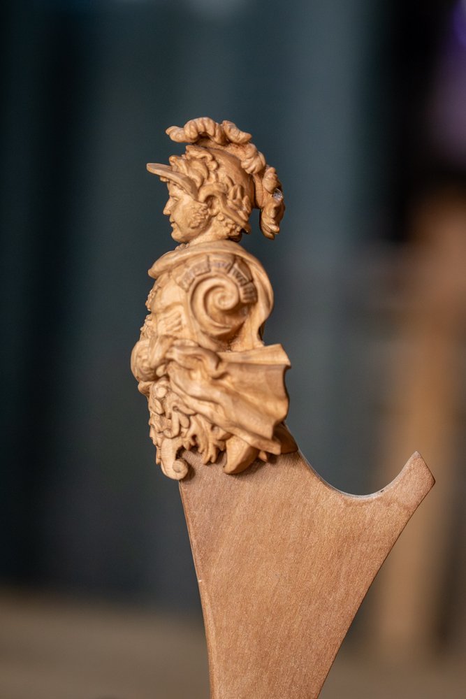
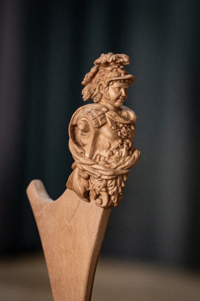
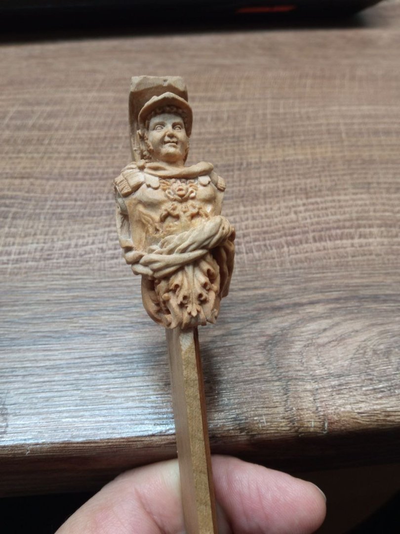
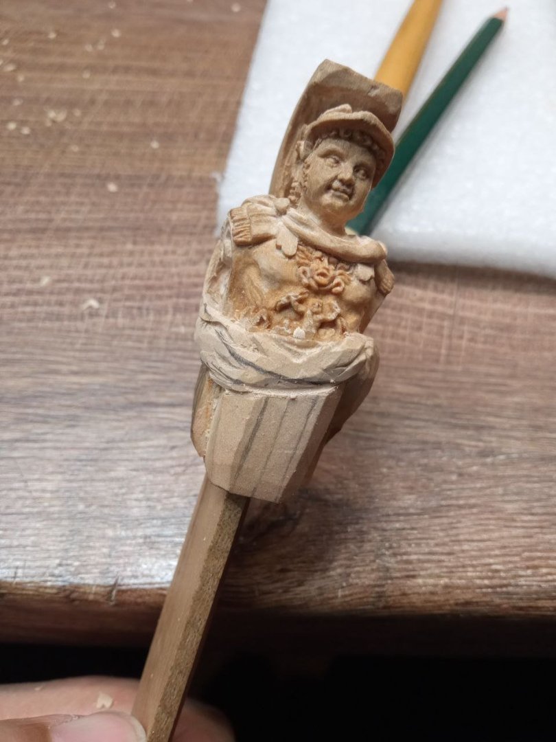
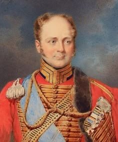
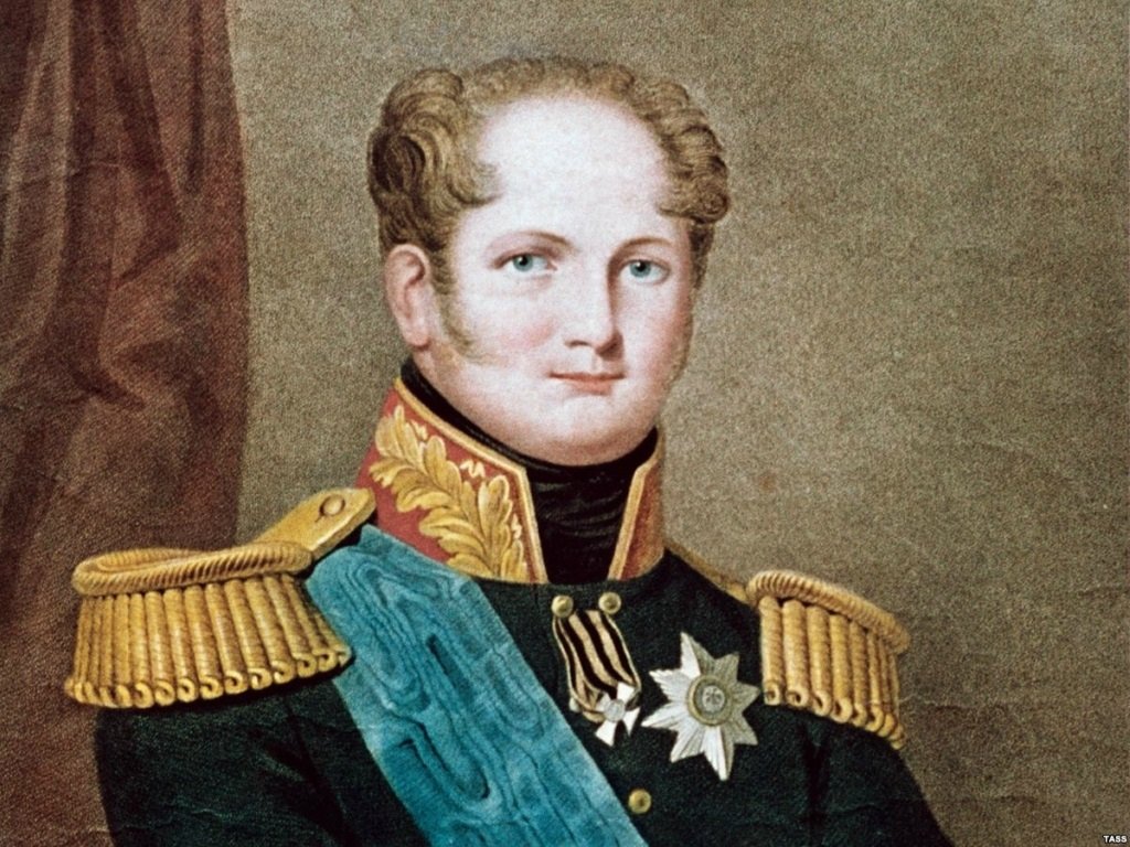
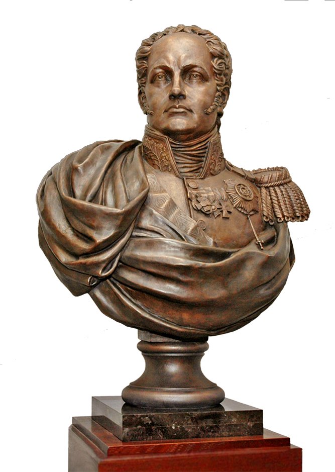
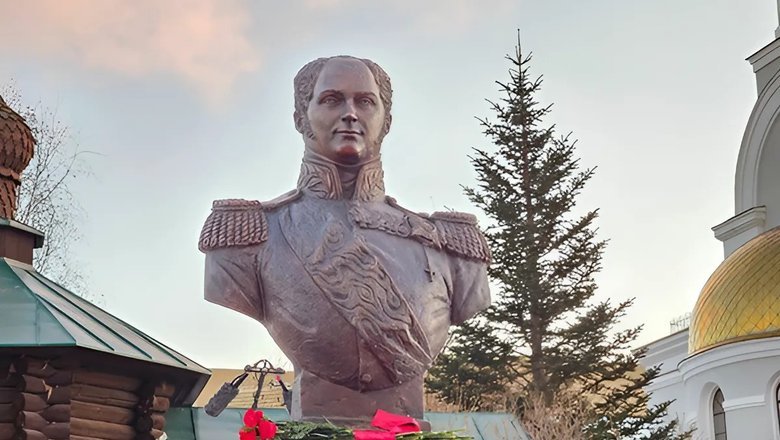
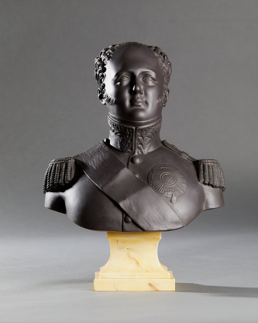
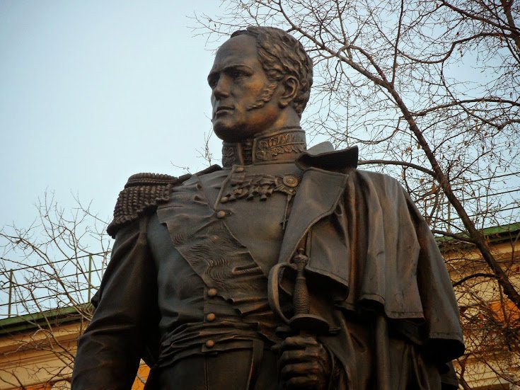
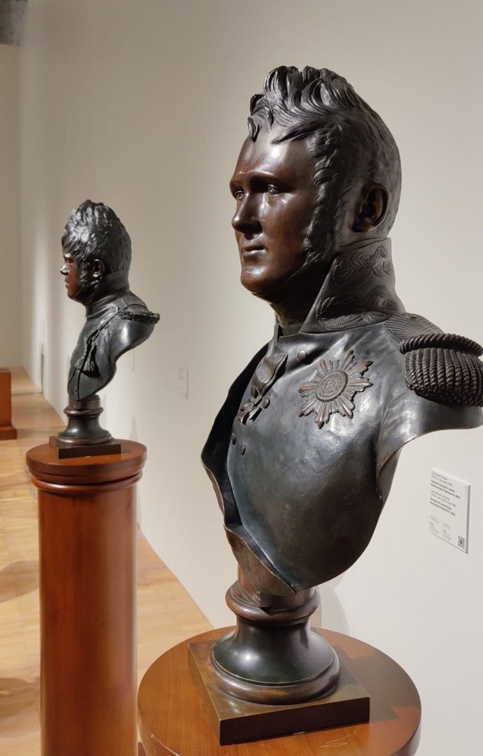
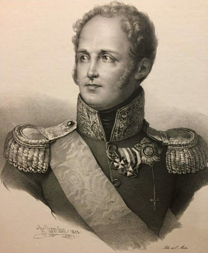
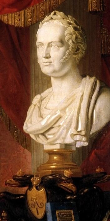
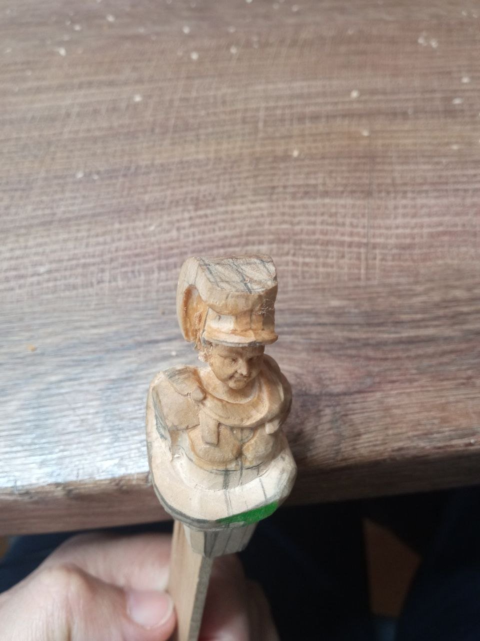
This frame marks a new stage of the work — I began working on the face. This is always the most difficult part. Faces cause the greatest anxiety, and in this project the face is especially important: I need to achieve a likeness to a specific person. For this reason, I will once again have to step aside briefly from the carving itself and show examples together with my reflections. I had thought about the portrait earlier as well. While working on a preliminary plaster figure, I even sculpted the head separately, making it larger in scale so that it would be easier to work with and easier to see. But I did not like the result. This meant that the subject had to be thought through more deeply. Naturally, for this work I collected many visual examples of how Alexander I had been depicted. I also remembered impressions left in my memory from reading War and Peace. There were descriptions of this man. “…The handsome, young Emperor Alexander, in a Horse Guards uniform and a triangular hat, with his pleasant face and resonant, soft voice, drew the full attention of everyone. Rostov … examined the beautiful, young, and happy face of the emperor…” “…Alexander’s face was even more beautiful than it had been at the review of the regiments three days earlier. It shone with such cheerfulness and youth, with such innocent youthfulness, that it recalled the playful liveliness of a fourteen-year-old boy, and at the same time it was still the face of a majestic emperor…” “…He was wearing a blue uniform, open over a white waistcoat that descended over a rounded belly, white breeches tightly fitting the fleshy thighs of his short legs, and riding boots. His short hair had evidently just been combed, but one lock of hair fell down over the middle of his broad forehead. His white, plump neck stood out sharply above the black collar of the uniform; … on his youthful, full face, with a prominent chin, there was an expression of gracious and majestic imperial greeting…” Thus, in my imagination, an image emerged of a fairly attractive man with soft facial features. His appearance could even be described as childlike or feminine. Leo Tolstoy describes a person with a tendency toward corpulence. This is clearly not a sinewy athlete; he should have rounded features and full cheeks. This is the kind of person I needed to portray in my sculpture. It all seemed quite clear. But once I immersed myself in portraits and monuments, a whole avalanche of variants came crashing down on me. The images differed greatly from one another. When I began looking at three-dimensional examples — busts and monuments — it became even more difficult. I found myself staring at dozens of figures that were seemingly similar, yet completely different Alexanders. It felt like being at a party of Elvis Presley lookalikes or at a comic convention: everyone looks alike, yet you cannot tell who is real. I spent an enormous amount of time making a choice. Even before going to sleep, I would mentally return to Tolstoy’s lines and ask myself which of these Alexanders corresponded most closely to the descriptions. In the end, I left only two or three portraits in front of me. In this portrait, in my view, there is something very close to my impressions from the book: an image that is at once a defenseless child and a charming woman. And in this bust I saw exactly the direction I want to embody. An antique image of an emperor — outwardly calm and beautiful, yet capable of being firm and strong. Military attire only reinforces this sense of martial strength. The decision was made. I kept this image for myself as the main source of inspiration and tried to reproduce these facial features in my sculpture. P.S. So as not to return to the subject of the portrait again, I will say right away: I cannot claim that I managed to realize my idea one hundred percent. My Alexander did not become the ideal image I had hoped to create. Most likely, a viewer who does not know whom I was trying to depict will not immediately say, “That is Alexander I.” Unfortunately, I am not completely satisfied with the result. But I truly tried.
-
Thank you, David. That was back in October, and we had a great time. We met up with relatives we hadn't seen in eight years. It was a truly wonderful vacation.
-
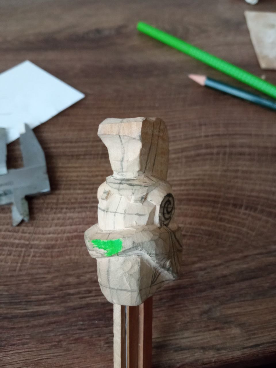
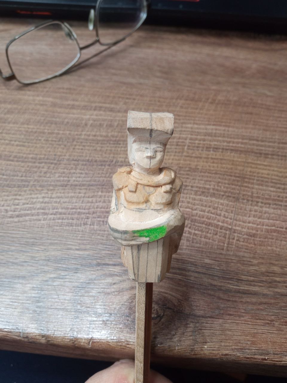
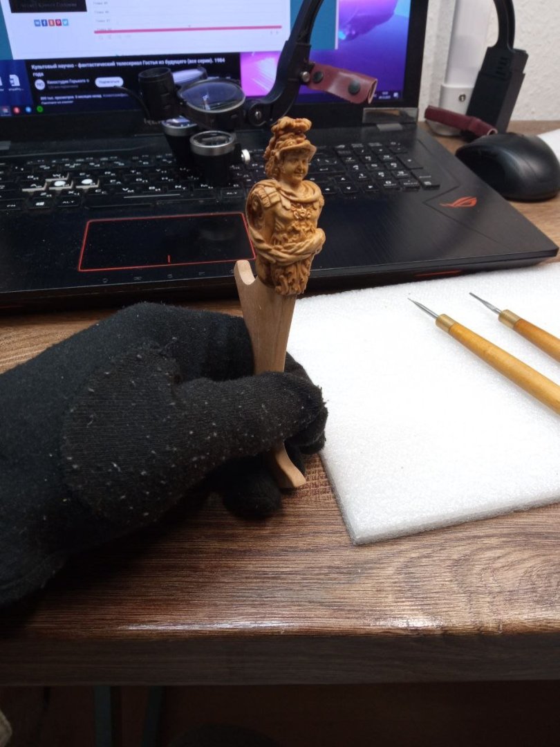
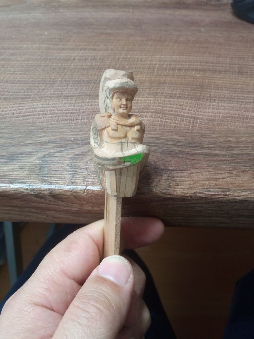
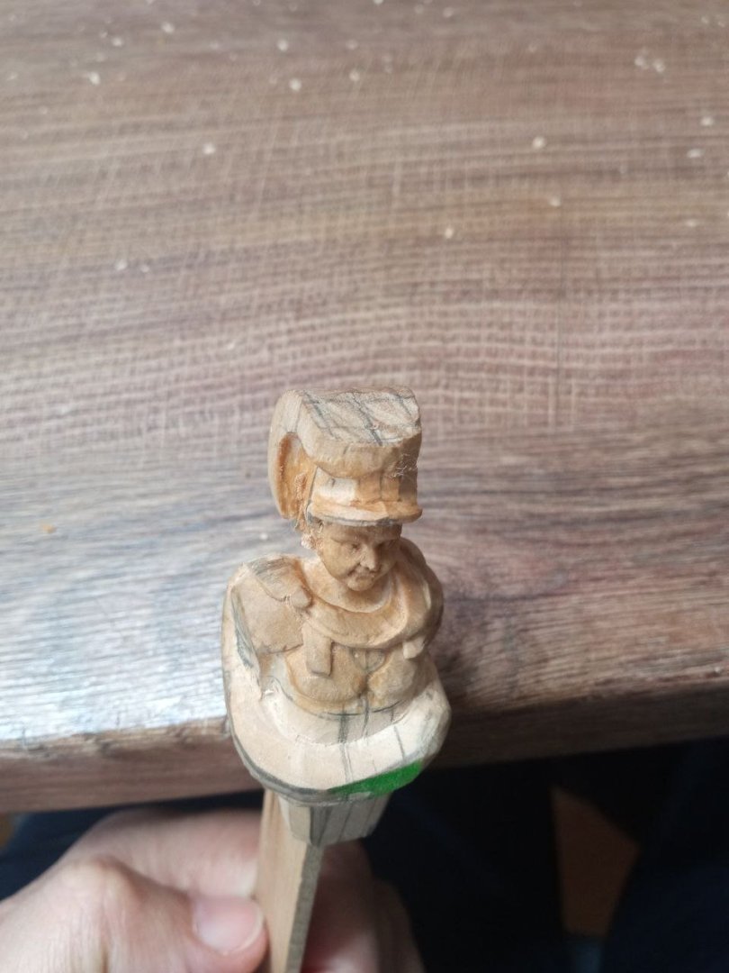
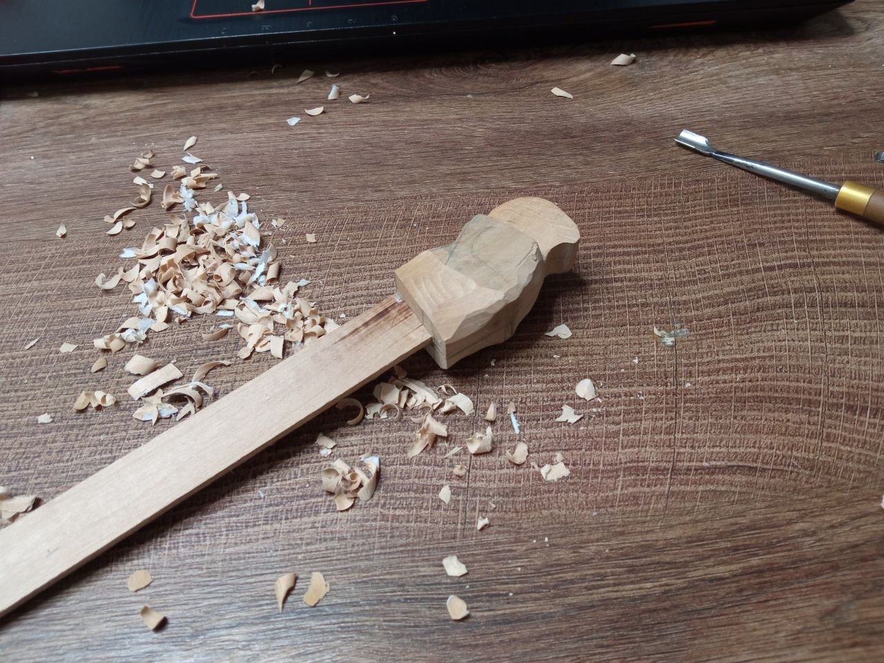
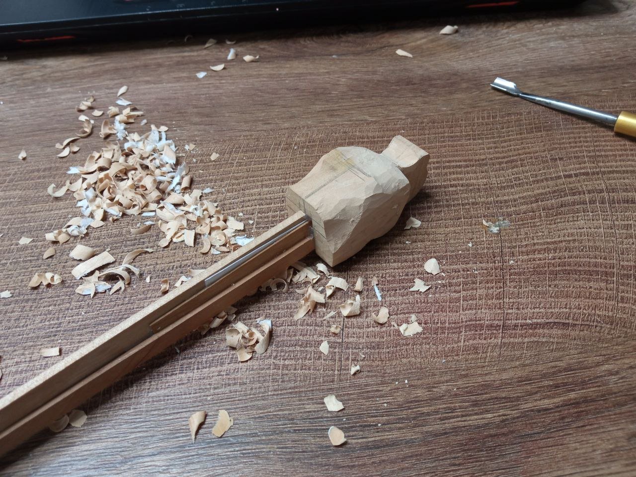
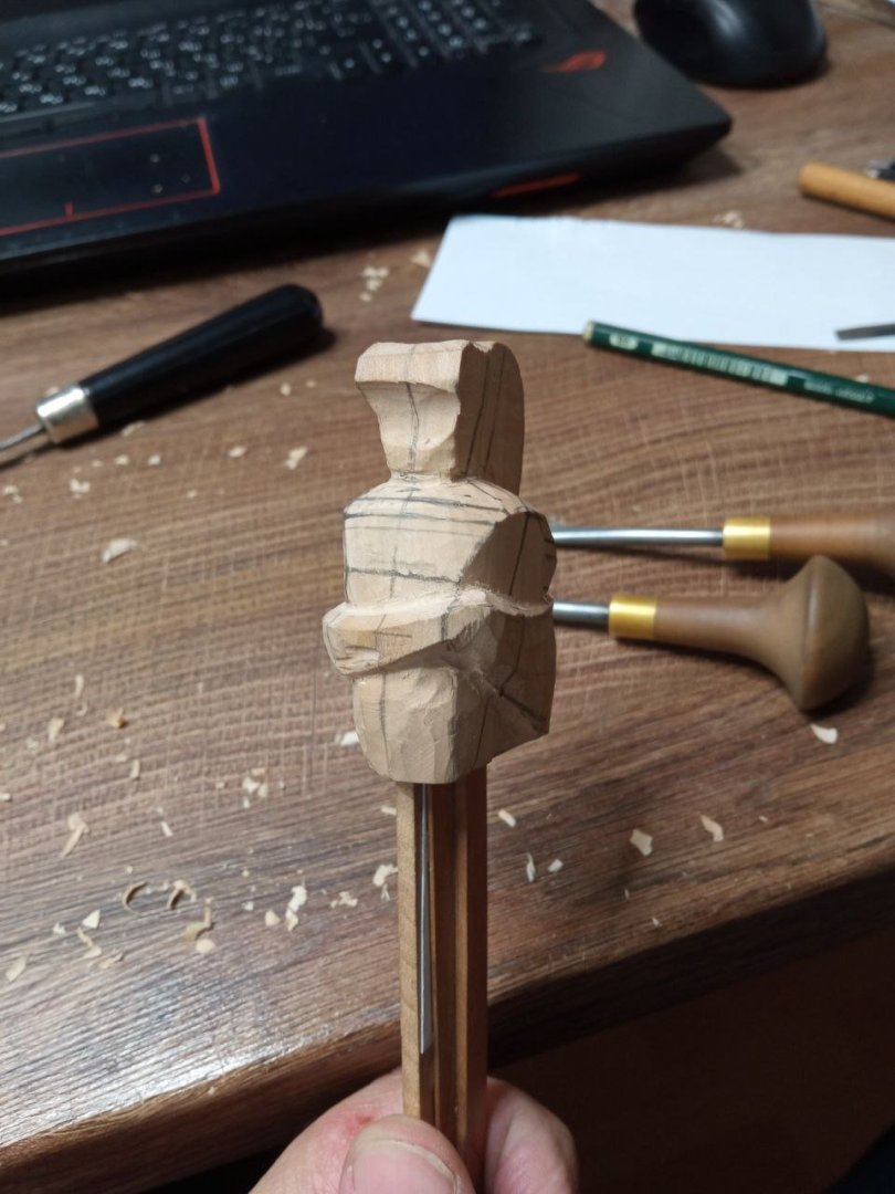
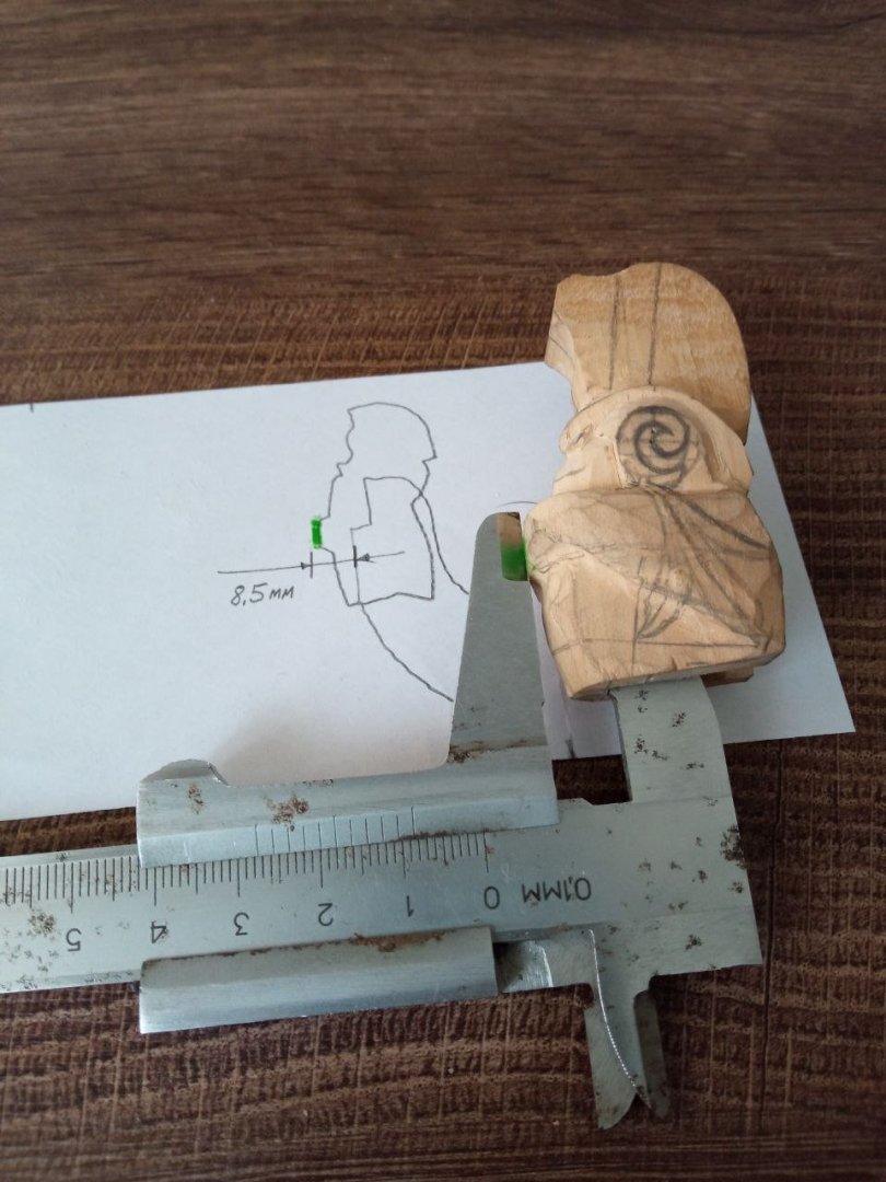
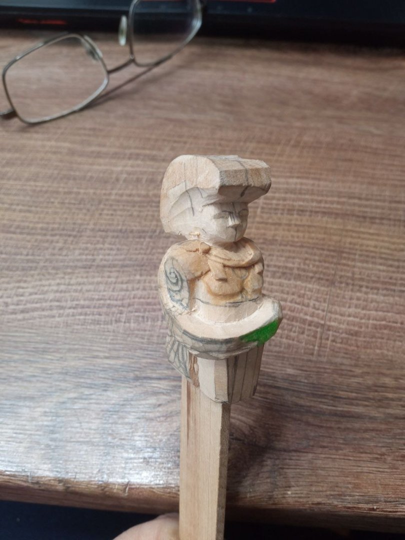
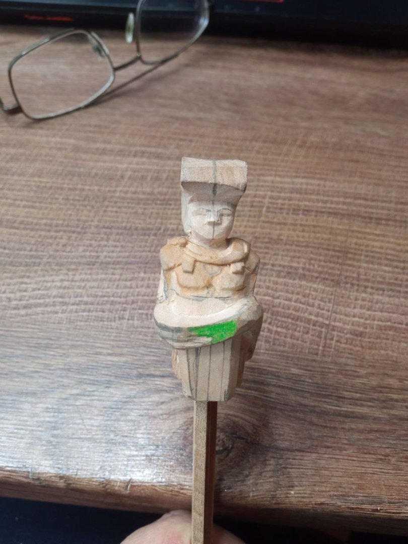
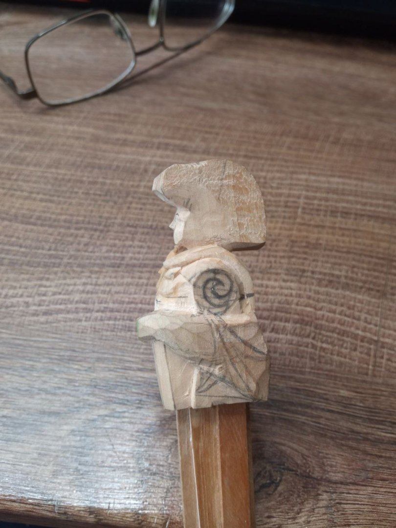
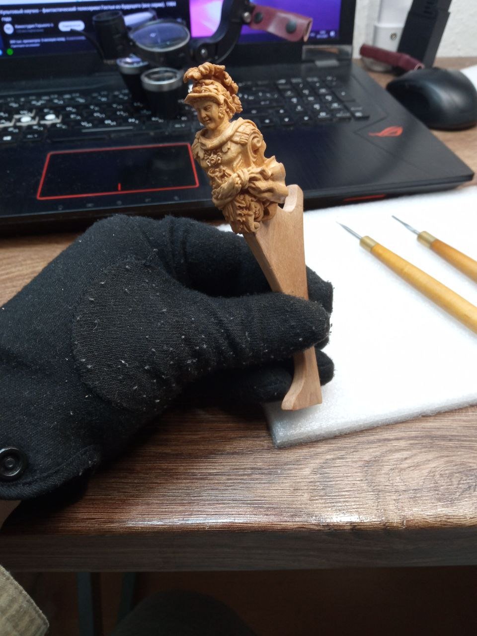
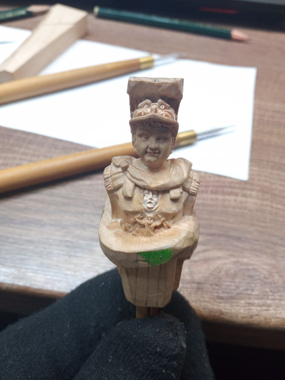
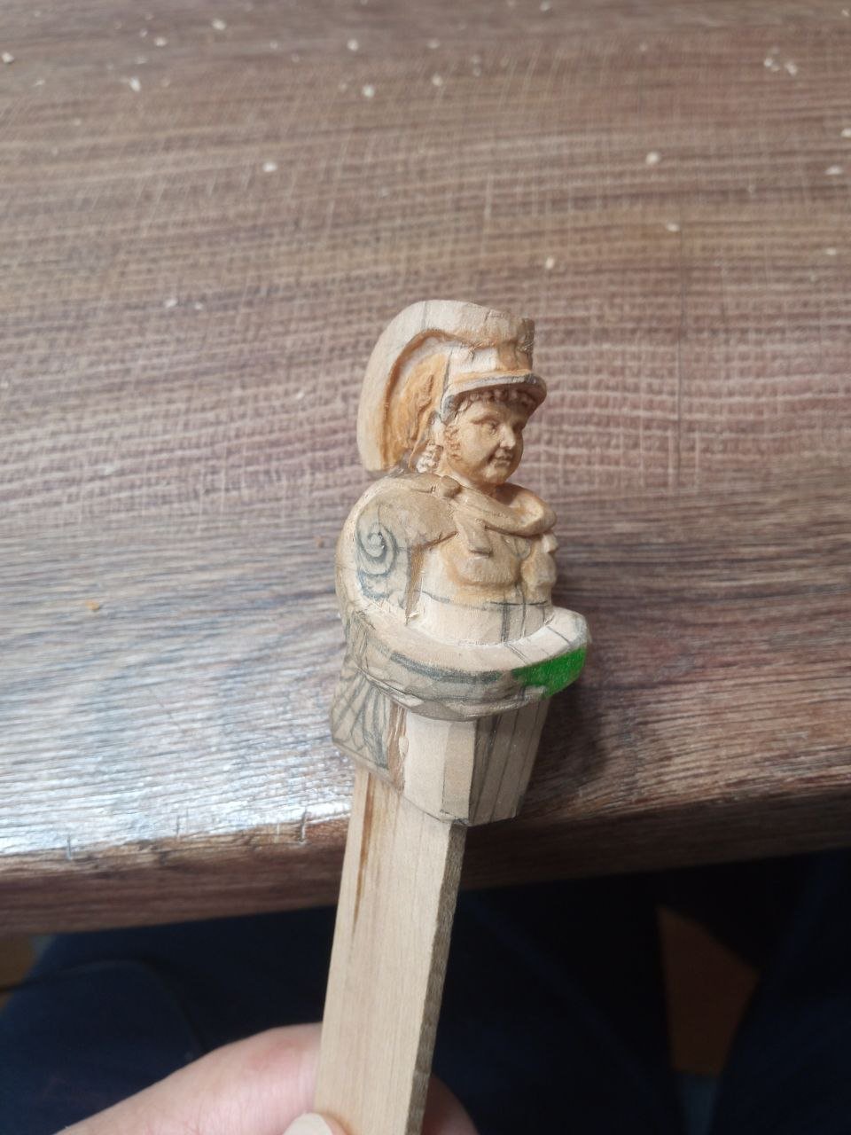
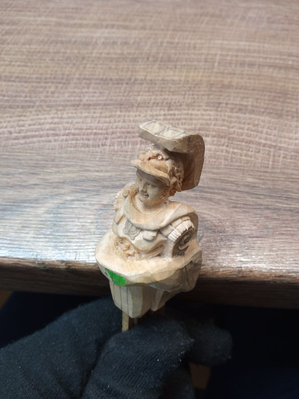
Finally, after very long stories about plans, reflections, and all the rest, I can move on to showing the actual work with wood. The beginning. Everything is standard and familiar. Large masses of wood are cut away, and the desired shape is gradually searched for. Here I need to explain something. In fact, the green color is not just a dirty or stained area. I did this intentionally. At this stage, my whole family and I were leaving for a vacation, and I was afraid that while being absorbed in rest, I might forget exactly where I had stopped in the work. After returning, I could easily make a mistake. So I deliberately marked, with a very visible color, the area where no work should be done in the near future. Why? The sculpture must sit on the knee of the head, and at the back of the blank there is already a slot made into which the stem will later fit. The figure itself is designed in such a way that from the front I will be working very close to this slot. In some places, I could accidentally cut all the way through. It is therefore necessary to constantly monitor how much thickness remains at the thinnest point. The small figure is already mounted on a handle with tiny drops of glue. This means that I cannot remove the handle each time to take measurements and check the thickness at the most critical area. For this reason, before gluing the blank onto the handle, I took measurements and wrote the results down. I even tried to leave a written reminder for myself and photographed it. And now, when I am preparing this text, those photographs I once took for myself have become a clear explanation. Now the main thing is that this base area must remain unchanged, and that I do not cut anything away there and disturb the dimensions. That is exactly why the color marking was made—this area must not be carved. This base was chosen here because this is where the fabric of the cloak will be. That area can be left untouched for a long time. First, I can work on the body, and later it will be much easier to understand how much material needs to be removed in this place. By that time, all work in the potentially dangerous areas will have long been completed, and the need for a reference platform for measurements and checks will disappear. Everything is quite simple. I do not think I have revealed any techniques that you did not already know, but it is better to share—perhaps it will be useful to someone. At the very least, you will not look at the strange spot in every subsequent frame and wonder why it was not wiped off—it would look untidy otherwise. And gradually, one can begin to indicate where smaller details and nuances will be located. To be continued…


- 546 replies
-
- 10
-

-

-
Matthias, thank you very much. This will undoubtedly help with my ideas. Right now, my head feels like a big pot of porridge. In some places it is spilling over, and in others it is already starting to burn. I am thinking about my next works—what projects to take on, and how the entire exhibition should look as a whole. I very much want to manage to do as much as possible by October. It is difficult to convey exactly what I am thinking about and what kinds of logical chains are forming in my head. Your examples are extremely helpful, although they make the porridge in my head boil even more than it did yesterday. But that is a good thing. When there is more than one idea and more than one option, it is always better. At least there is something to choose from. P.S. When I saw your other examples with St. Michael and the bulls from the unnamed ship model, I had the strange suspicion that you somehow see the bookmarks I have been saving during my searches. To select the same ships out of so many is astonishing. If you also show Royal Princess or Victory from 1737 next, I will be genuinely frightened and start to think that there are hidden cameras installed somewhere around me. 🙃
-
I am honestly shocked and a bit overwhelmed. How do you manage to find a suitable example so quickly? I have been sitting for four days in a row, from morning until evening, going through the list ship by ship and trying to find at least something that fits. And you found a similar сюжет in just a few minutes. How is that even possible? I have never come across this ship before, and I do not have it in my notes. Right now I am trying to find photographs. I have even found a few, but the quality is not very good, and the sculpture is visible only from one side. Are there any archives or libraries where the detailing can be examined more closely? Is there anything in the Greenwich collections? There I found only an engraving and a painting of the ship’s loss, but there seems to be no ship model available for viewing.


.jpg.b55ee282d13319f25d1b26b72369a9e0.jpg)