
HAIIAPHNK
-
Posts
351 -
Joined
-
Last visited
Content Type
Profiles
Forums
Gallery
Events
Everything posted by HAIIAPHNK
-
 Yes, I absolutely agree with you. It would probably be easier for me to do some jobs on the machine in the future. For example, I have window frames ahead of me. Or other parts of the structure. I haven't thought about them yet and how exactly I'm going to make them. But in this task, hand tools are enough. And the future will show which way I will go. Maybe I will buy this machine after all. Or maybe in the future there will be alternative solutions. Thank you for your support 🙂.
 -
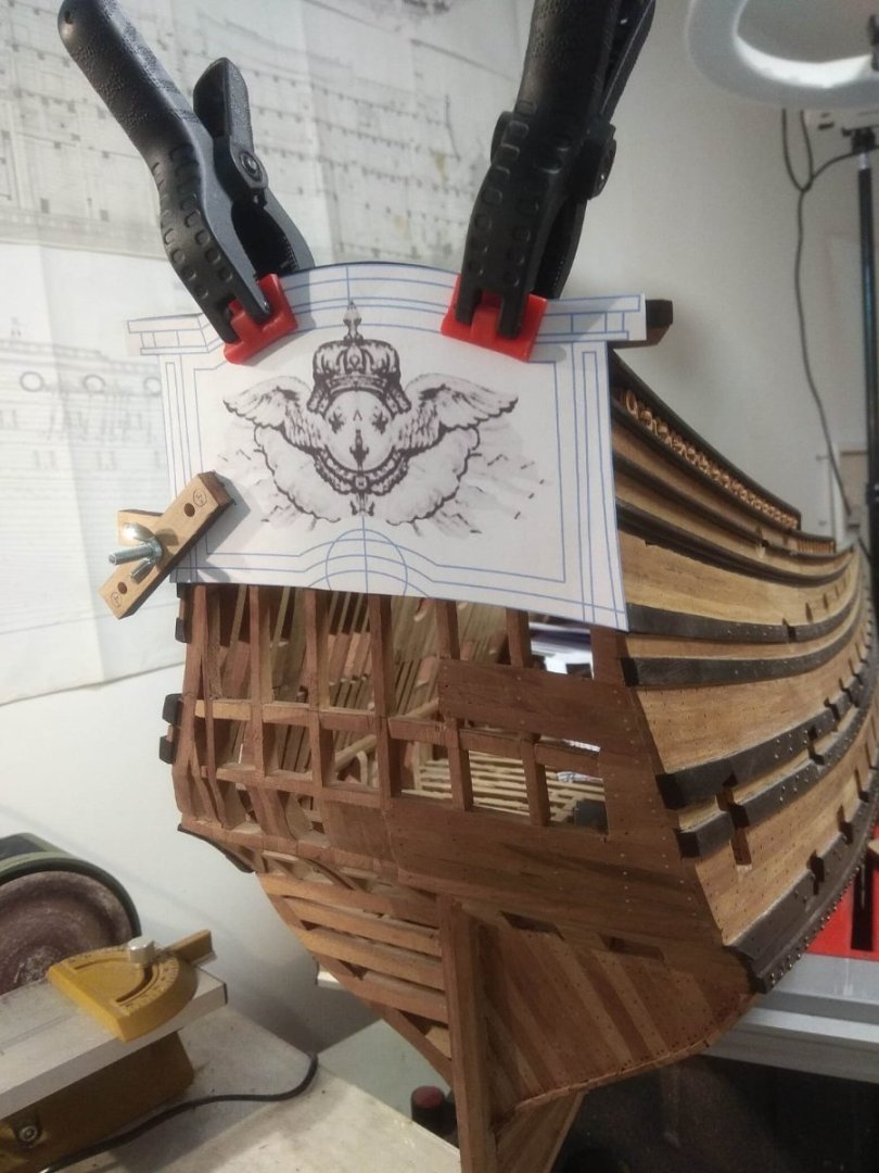
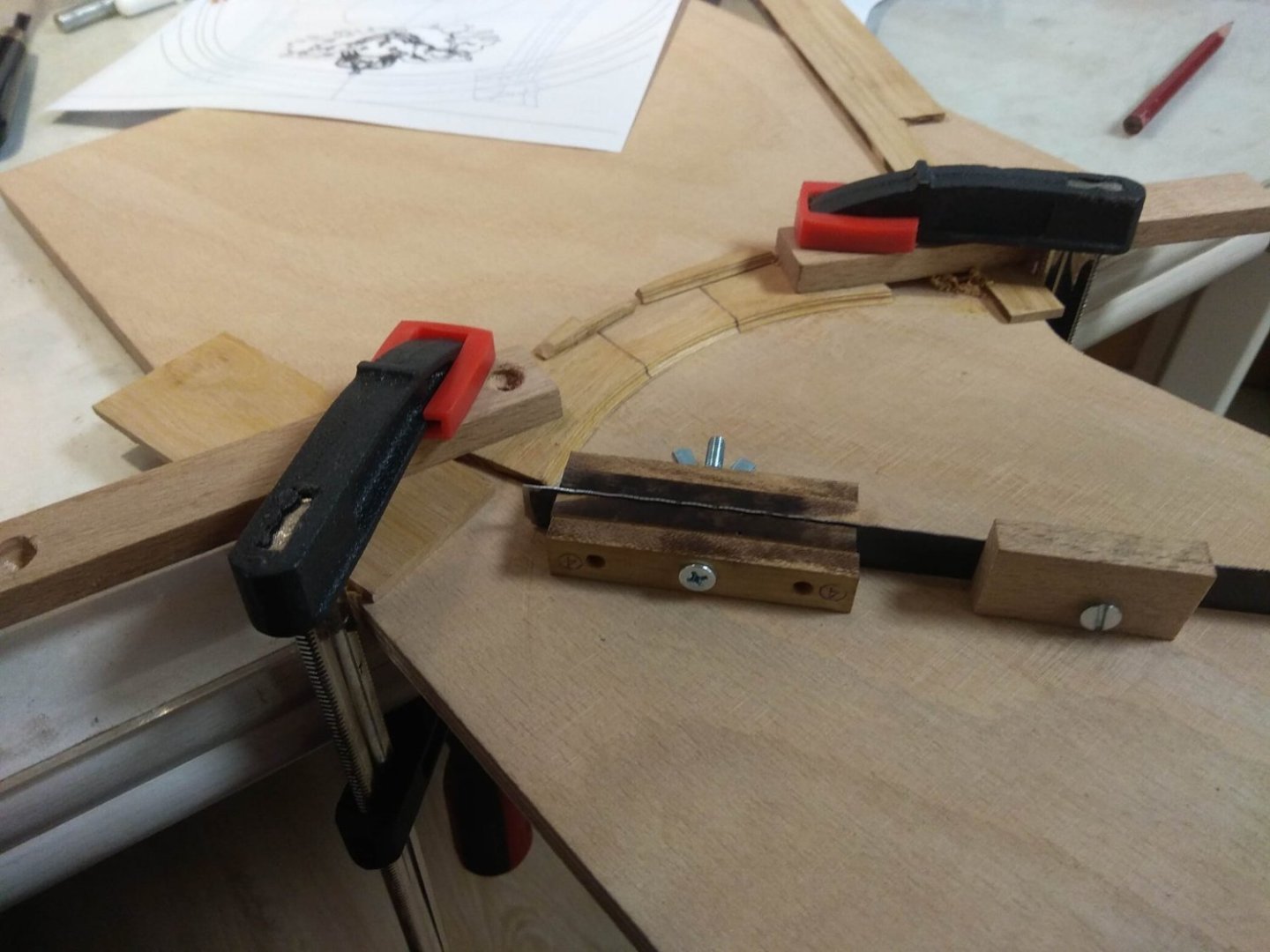
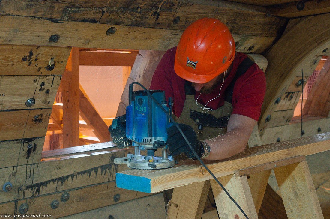
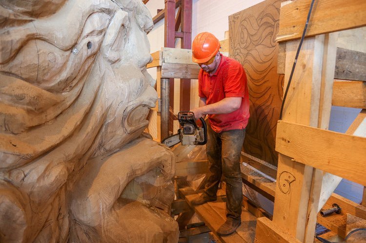
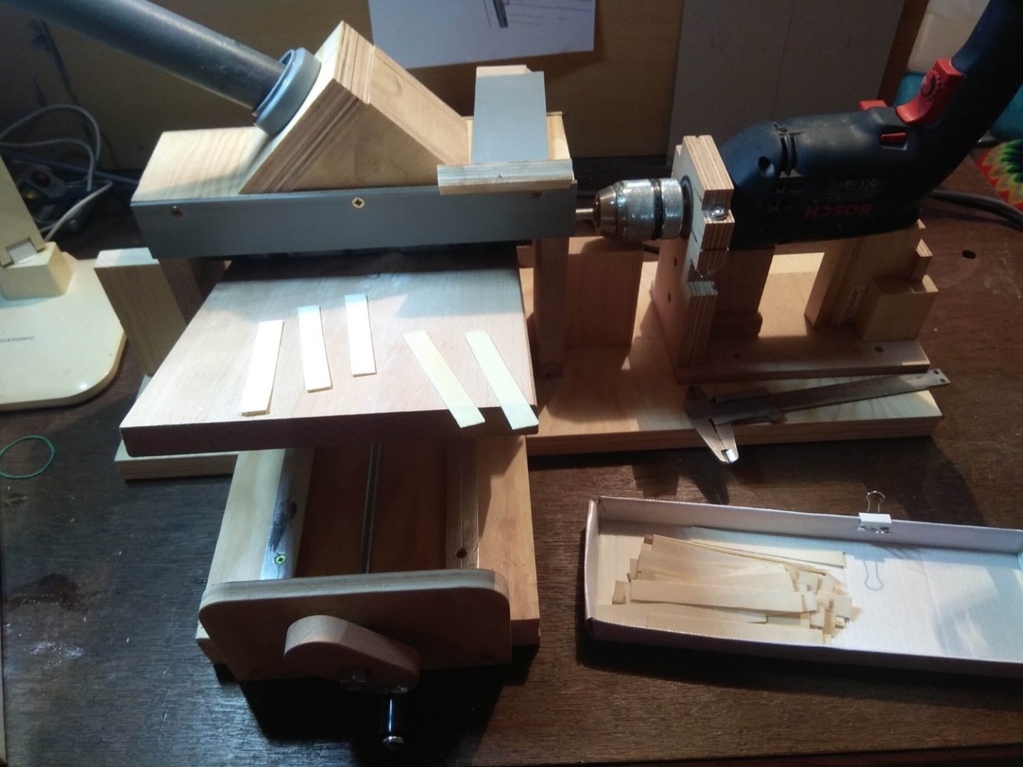
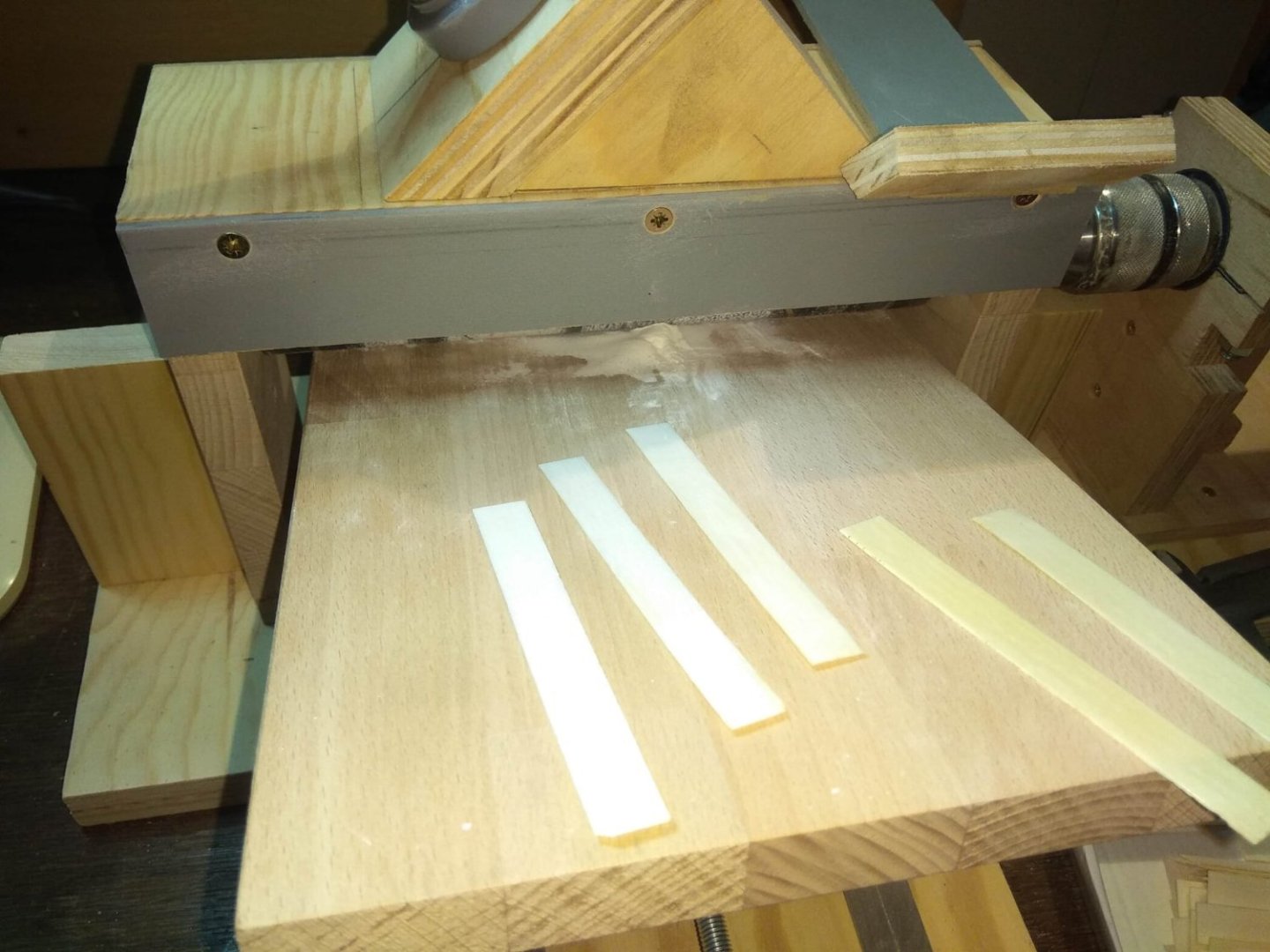
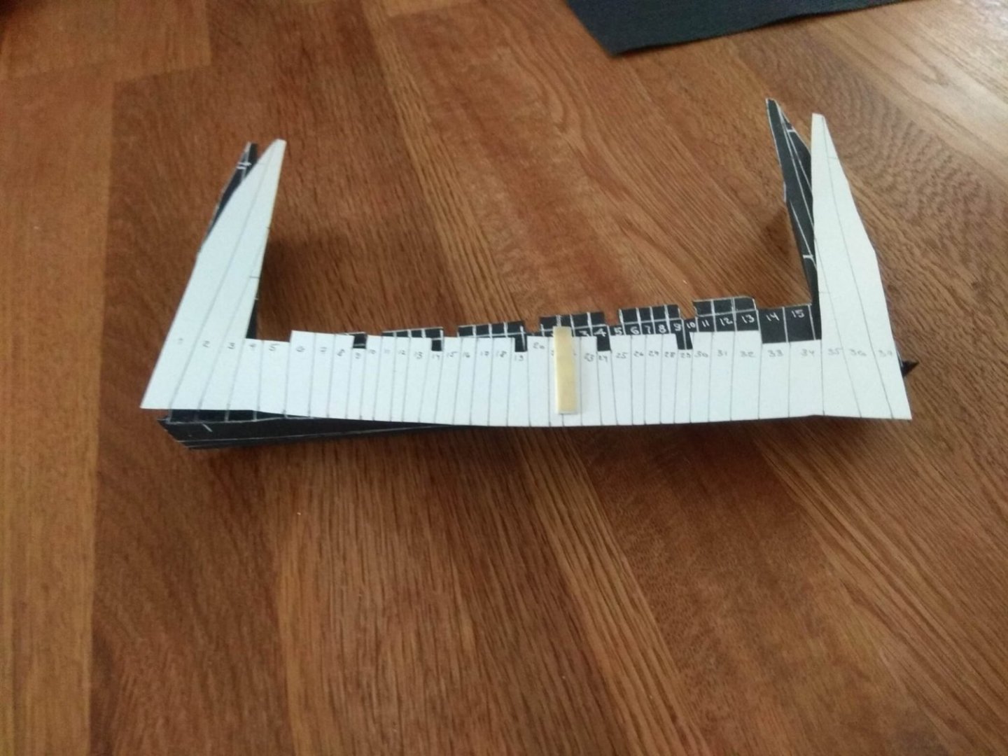
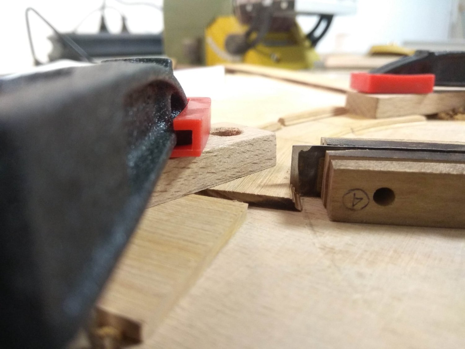
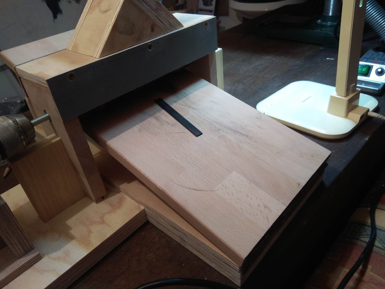
The first layer of the background is complete. We need to move on. The next phase began with a mental tragedy. And it was my own fault. What happened? I knew that there would be a lot of details in this project that would require a milling machine. And it is needed now, because the next layer has shaped edges. And they need to be made with shaped milling. At some point I tried to replace this machine with a vertical drilling machine. But it turned out to be a bad solution, the drilling machine still had a backlash and the cutter cut not evenly. And the idea of doing without the existing equipment did not work. So I gradually saved up money to buy an MF-70. This is the most budget option, maybe you can find something from other manufacturers, but I have not met a suitable option. Buying a new machine is still too expensive for me. I don't know how often I will perform projects of this level in the future, so I don't really want to spend money on something that will just stand on the shelf. But I can't do without a machine either, because I need to do the work now. So the most logical option is to look for a used machine. Yes, there are also a lot of questions and problems. What condition it is in, suddenly it will be caught after a breakdown or with serious errors? From the photos you can not always understand it. But one day I saw an ad that I really liked. The machine was sold as brand new and had not been used. The photos show that the machine is straight in the packaging, the mounting bolts and nuts are in separate bags, the work table is not attached to the machine bed. In short, everything is just like a brand new tool. And I immediately got in touch with the salesman and bought this machine... I've always considered myself a balanced and calm person. I'm not prone to ventures and rash moves. But now I acted exactly like an unthinking baboon. A vague doubt arose as soon as the money was sent. Why didn't I think about it an hour ago? Why didn't I pay attention to the fact that the buyer asked me to transfer the money as a parcel to a friend, not as payment? You've already figured out what happened. An hour later, I decided to search the Internet photos of this ad and very soon saw them on a completely different site, and this product has long been sold. I got on the scammer, who simply put in their ads someone else's photos. So after an hour I realized that I would not receive any machine, and I would not get back the money I sent. Needless to say, my mood was disgusting. So what do I do now? The task remains. And I have to do something about it. I couldn't spend more money looking for a second machine, the very thought was impossible. There is only one option left. To work in the same way as shipbuilders did in previous centuries, when it was impossible to imagine any milling machine even in dreams. You have to make shaped planes by hand. I don't know if the translator's translation of this tool is correct. In my language, it's called a cyclay. In my case, I made a shaped chicle with the cut I wanted. That's what I used. Now I needed to mill radiused areas, so I decided that it would be easier to make a mold on the very edge. The small radius was quick enough, but the larger radius took a bit of work. I decided to make the parts in the form of segments, if to do, so to do as close as possible to the real manufacturing. But because of this, the edges of the segments interfered with the passage of the cutter. In these places it went jerkily and I did not like the result. The solution was simple. I am lucky that I am making a radius and not a wavy line. That means I just need to find the center of the radius and make it so that the cyclic moves strictly along the desired arc tied to the center. Like a circlet. And now the result is much better. There is nothing to write about the rest of the work. It was only necessary to measure and cut accurately. And to join them.


-
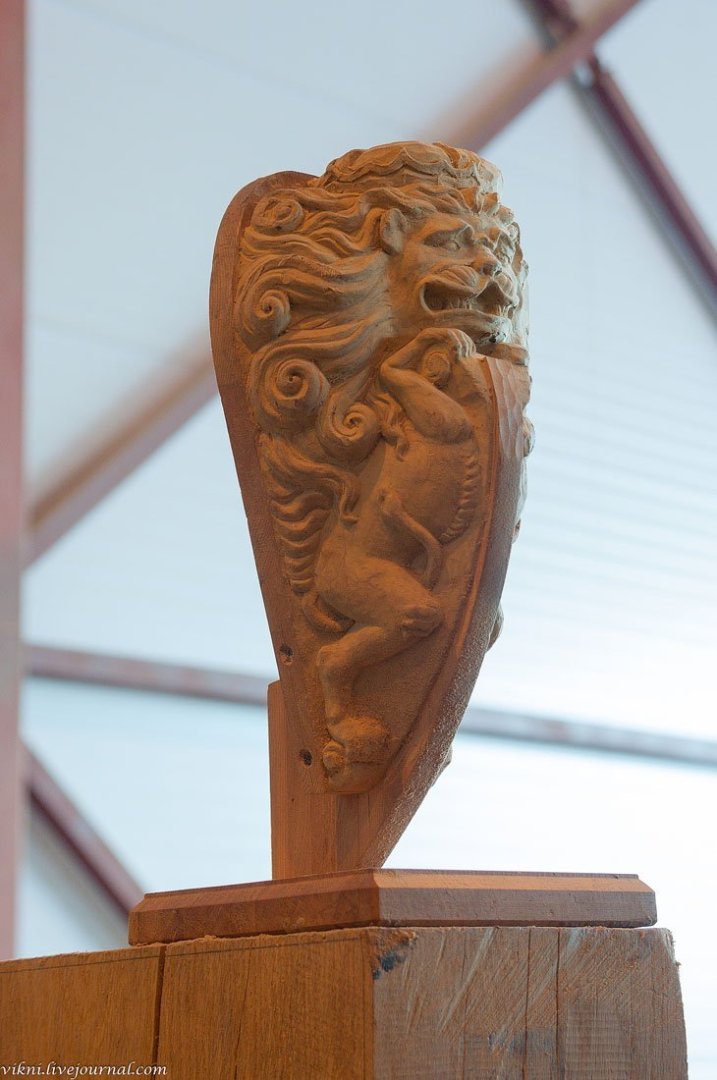
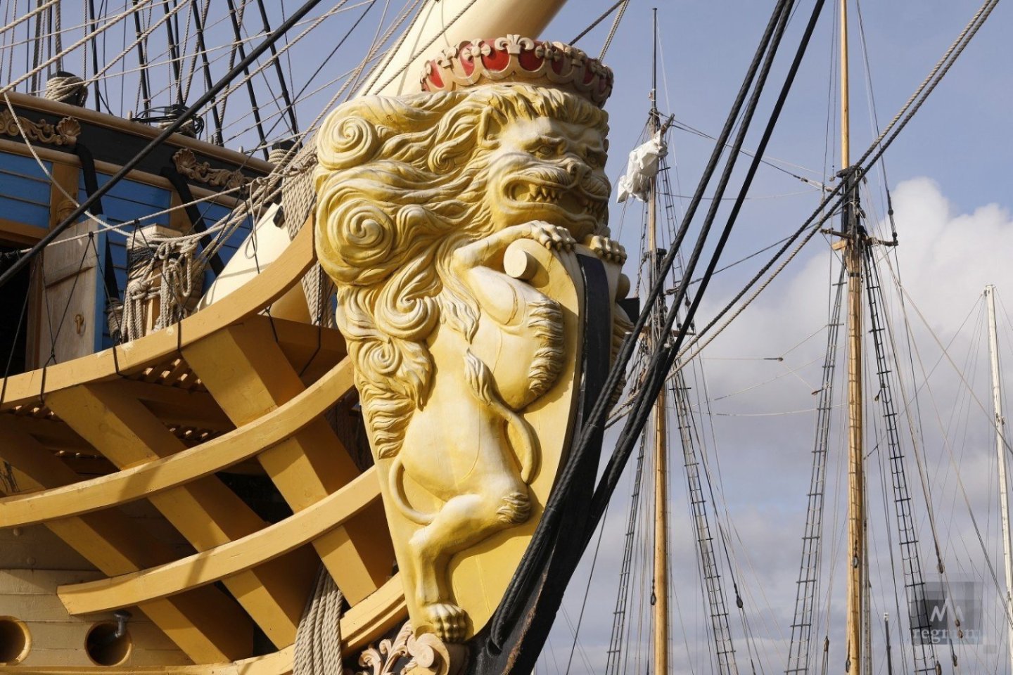
Yes, the lions of the Russian navy of this time had great distinctions. That's what got me interested in it. https://www.youtube.com/watch?v=qJ9700uWjFM&t=172s (short clip about building a ship) It is good that there is an opportunity today to see what the ships looked like in full size. It is a pity that there are not as many of them left as we would like. There's still the Dutch Lion ahead. I really hope I can get to Amsterdam and see the Dutch style of ship sculpture in person.
-
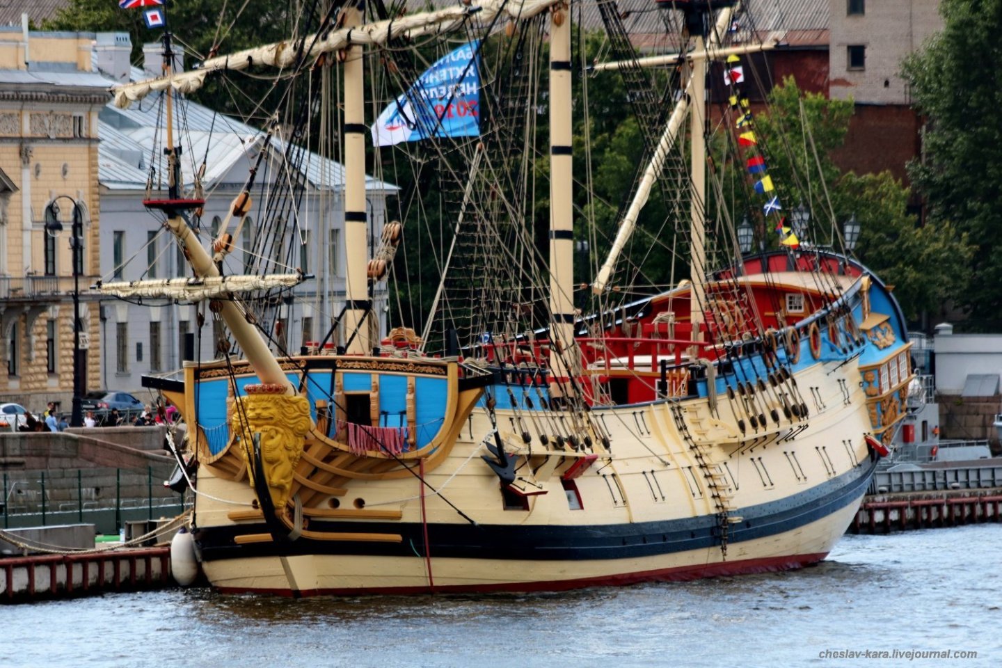
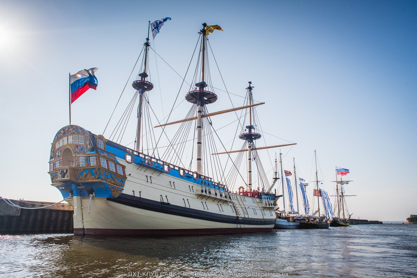
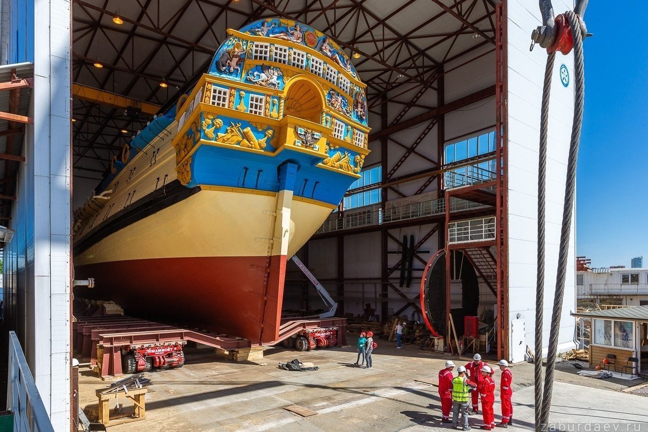
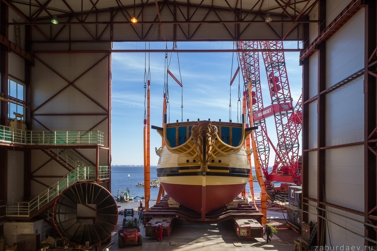
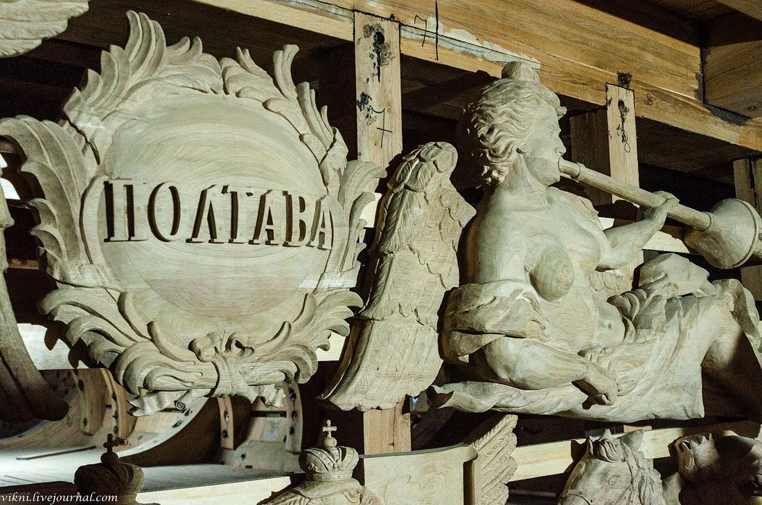
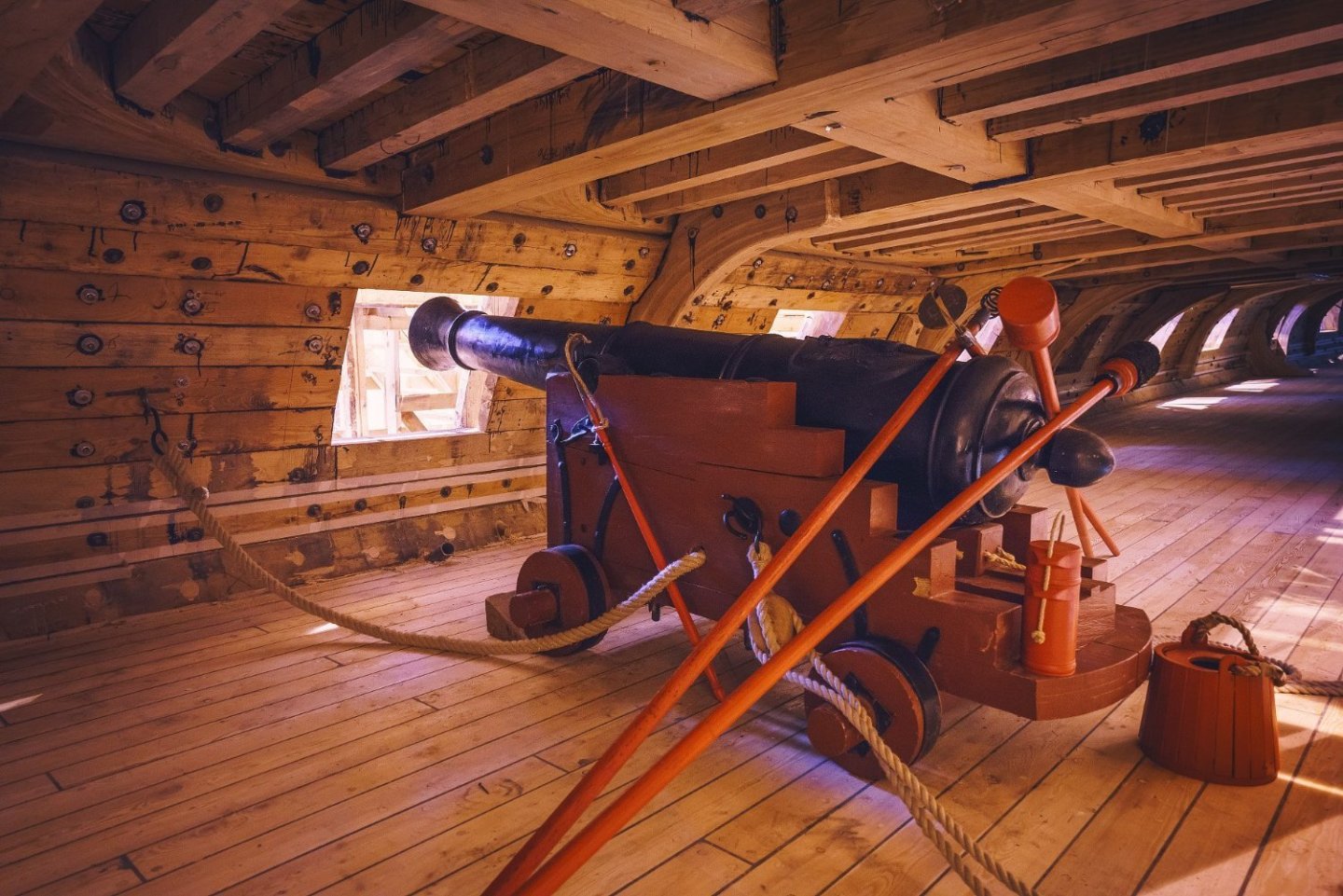
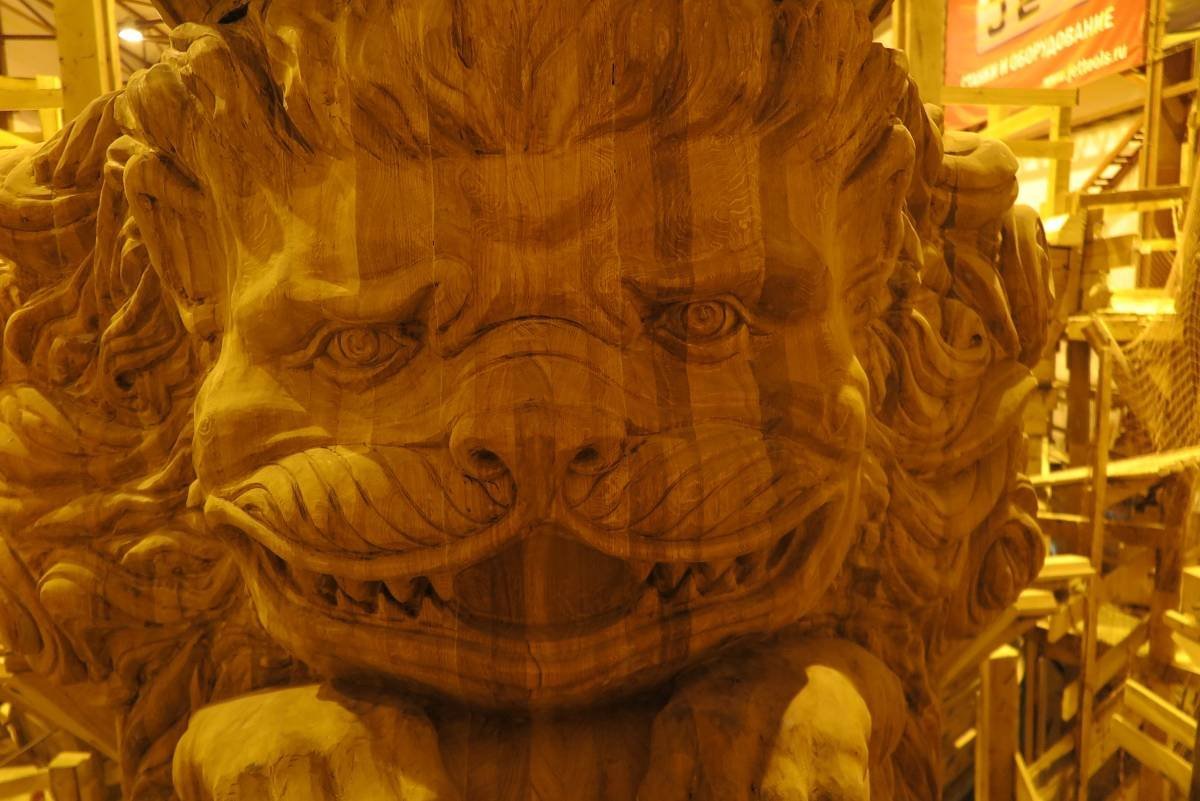
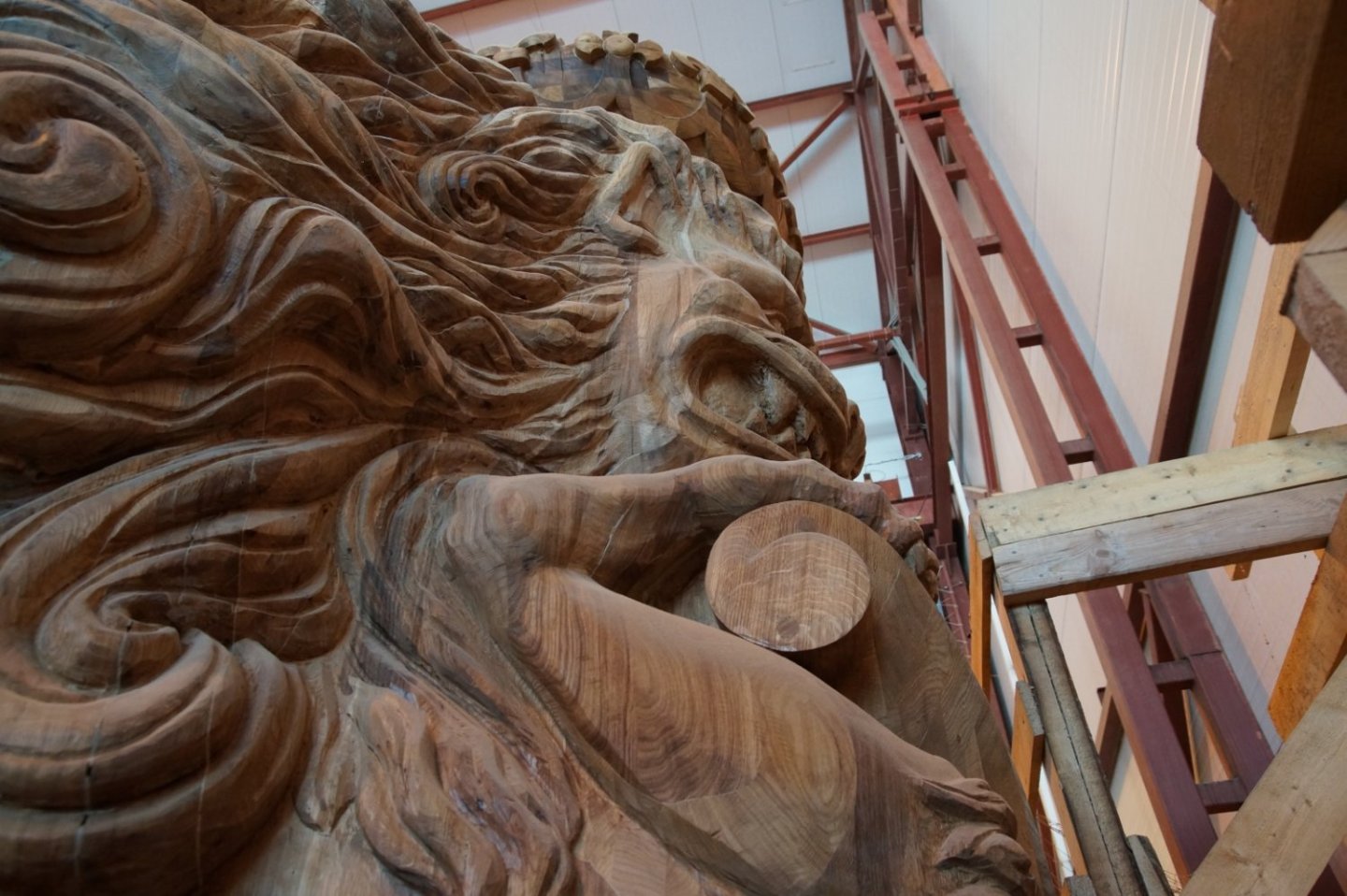
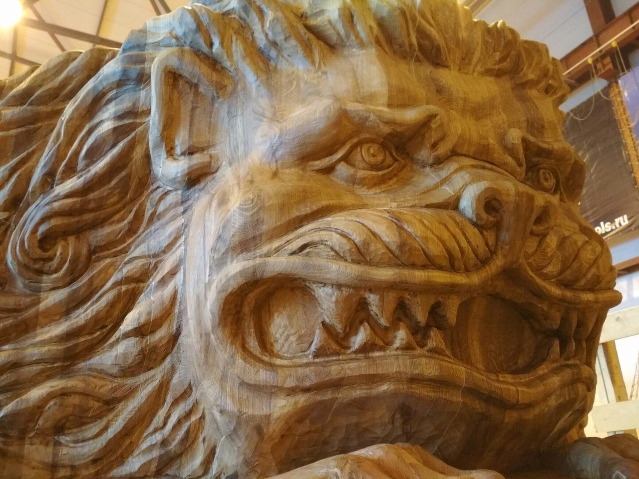
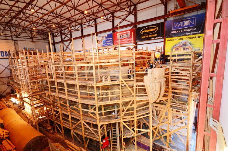
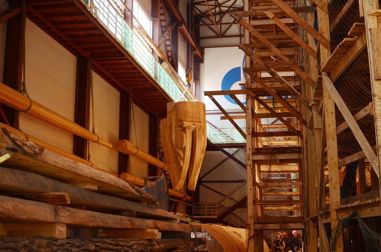
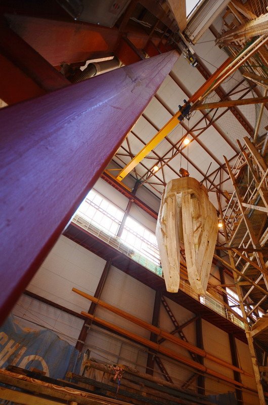
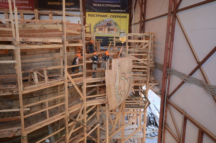
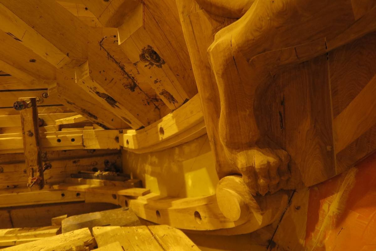
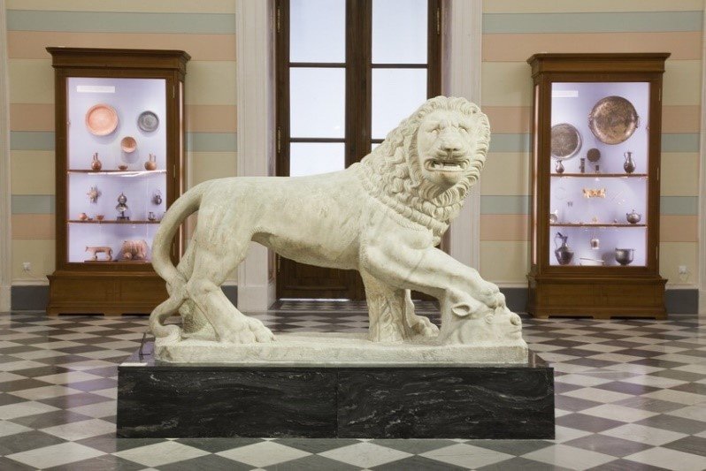
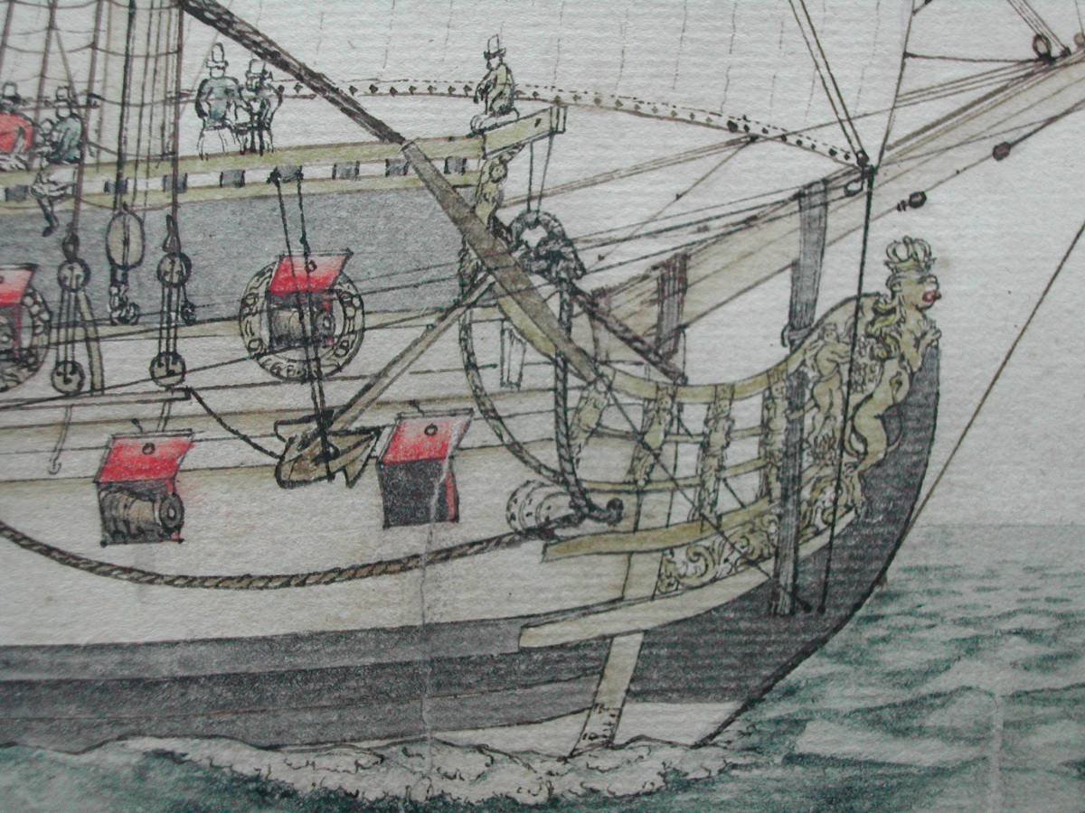
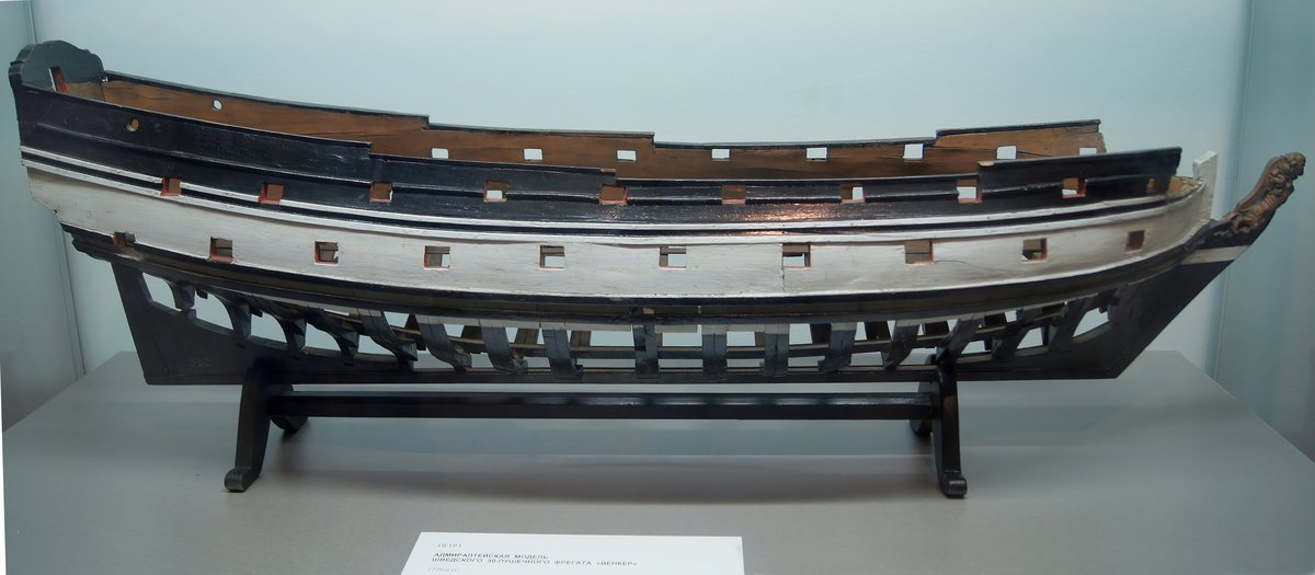
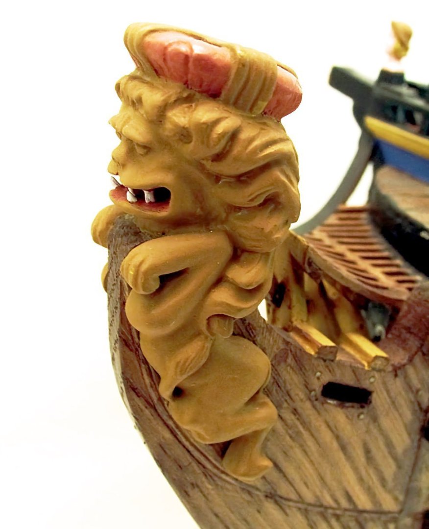
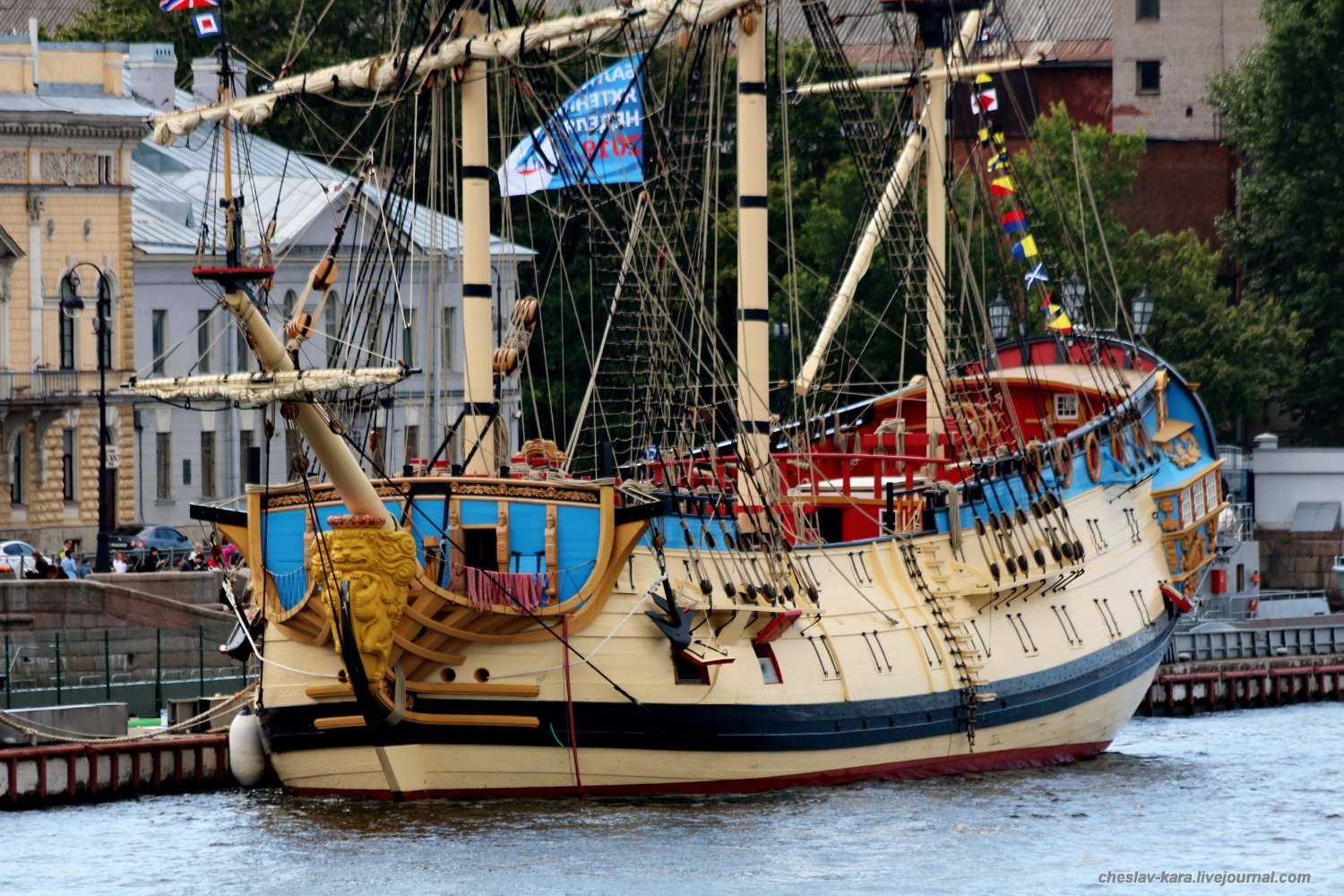
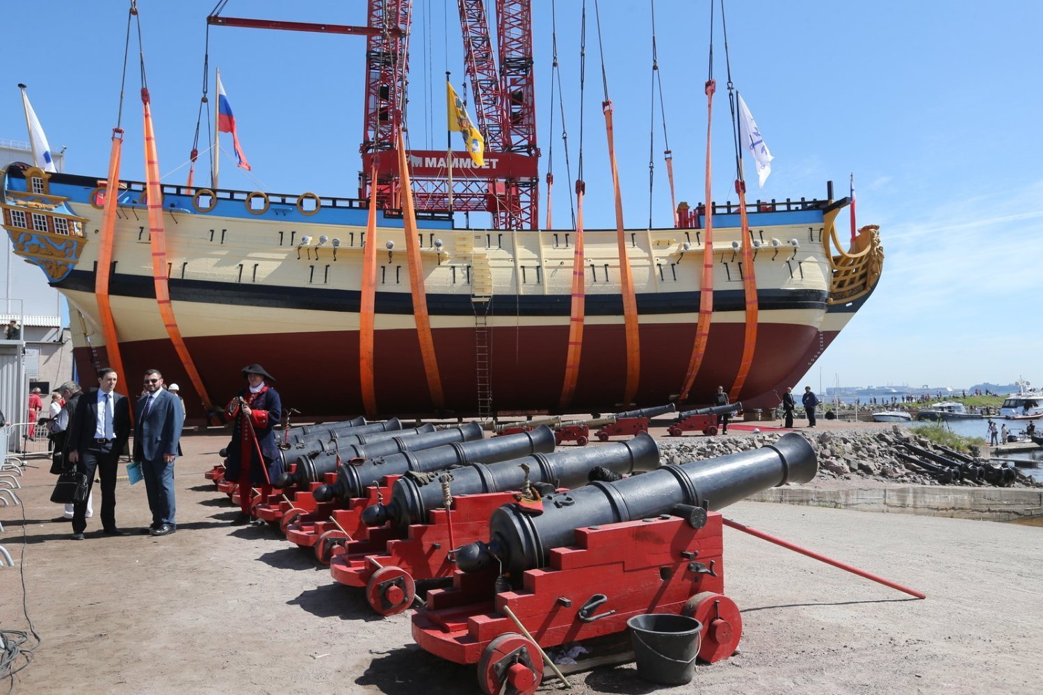
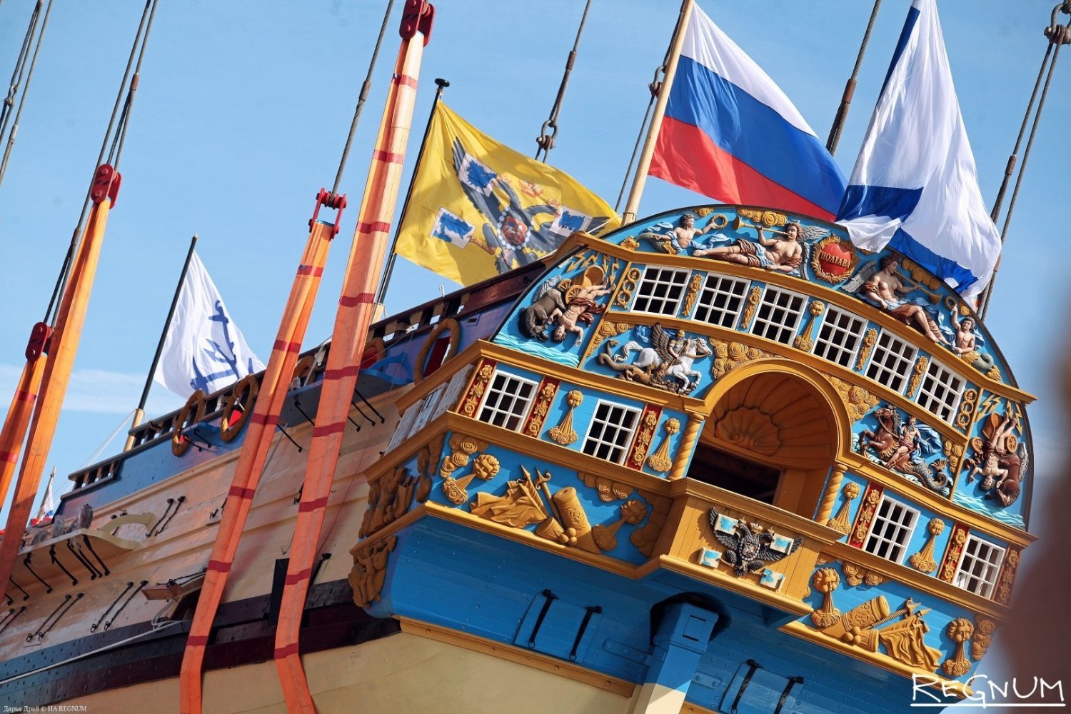
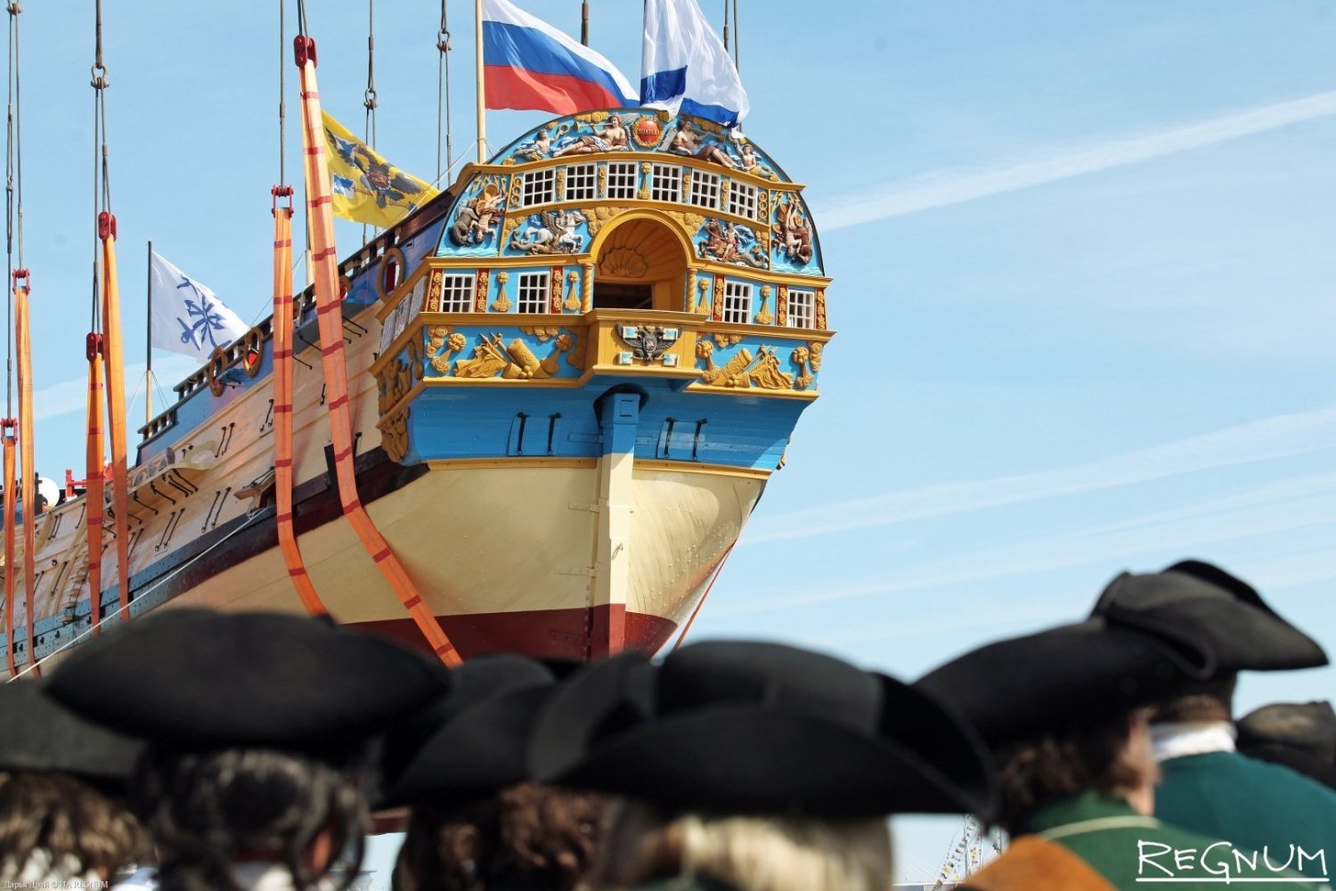
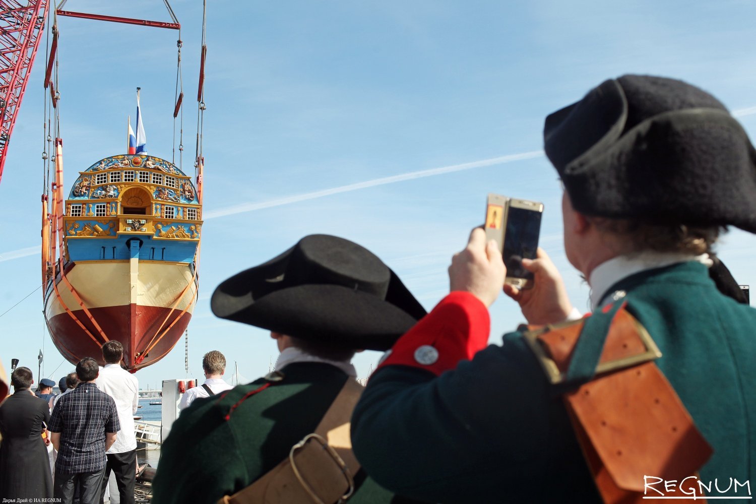
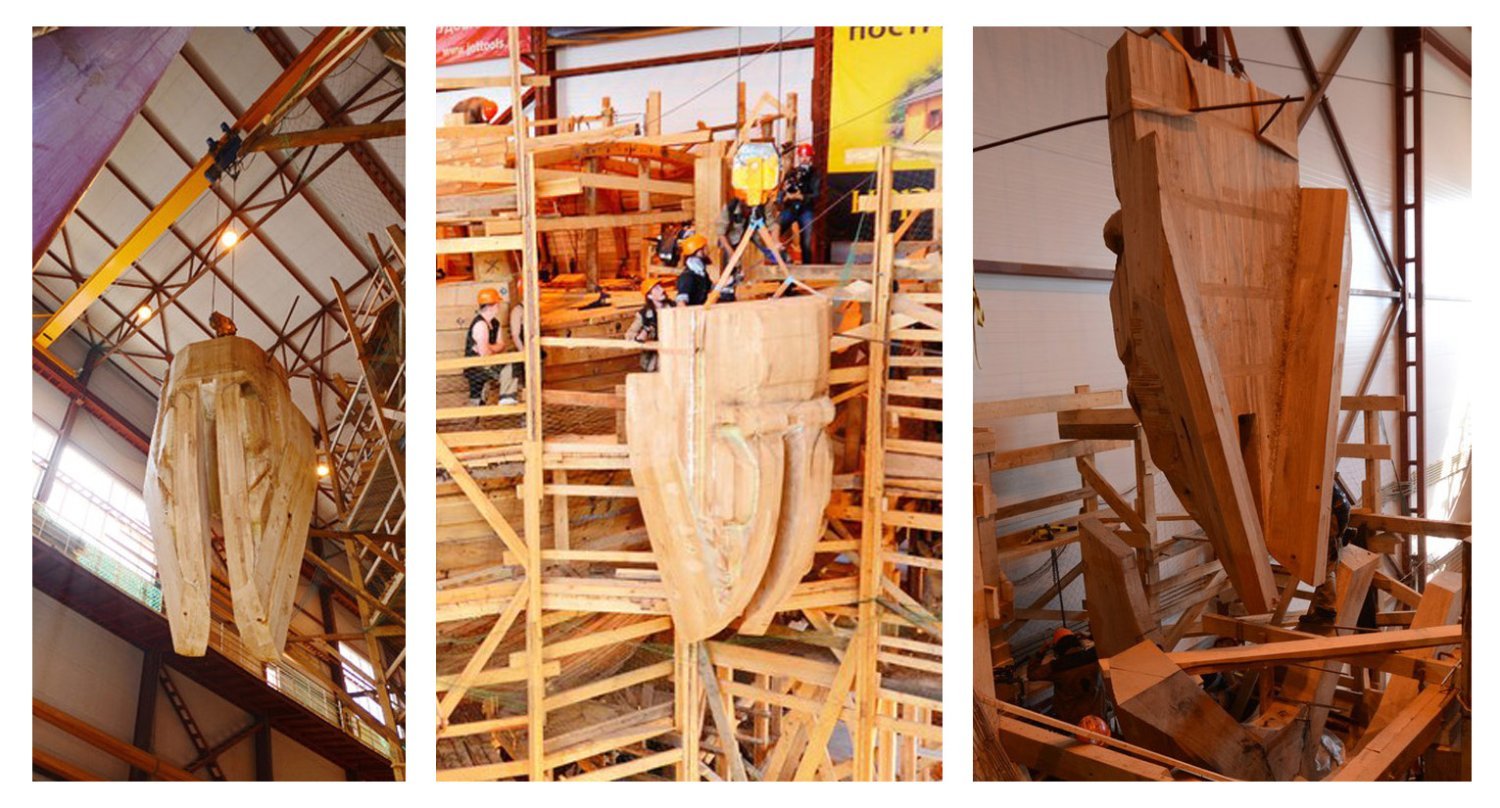
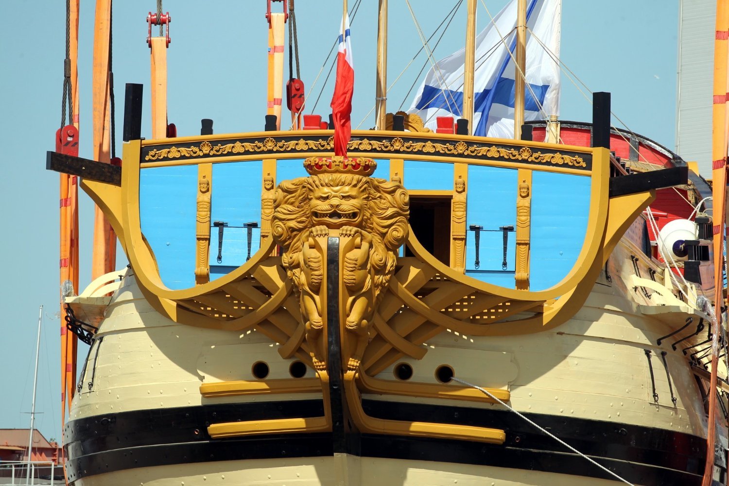
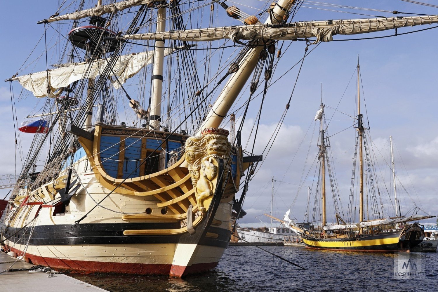
How is that possible? In fact, everything is simple. The fact is that on May 27, 2018 in St. Petersburg was launched the ship "Poltava", which was a recreation of the ship of the same name of the beginning of the 18th century. I won't spend a lot of time to review the construction. It would take a very large volume. I will only allow you to show a few photos of this sailing ship. I will make the main urop on the sculpture of the lion. To be honest, in my opinion, it is not a very successful work. It is different from what I would like to see. But that's my personal opinion. I realize how difficult a task this is. There are no exact laws that define what a correct figure should look like. But this example shows well how difficult it is to translate images into a three-dimensional sculpture. A lot of work was done during this project and the initial sketches were quite far from the image of the 18th century lion. Subsequent changes clearly improved the situation, but still fell short of perfect execution. Again I emphasize that this is just my personal opinion. I would like to see something different. Speaking of which, this variant, which became the basis for the final sculpture is suspiciously similar to this image. This is a working sketch from the reconstruction of the Russian line ship Gangut, which is performed by one of the Russian modelers and published the process of his work on one of the Russian shipbuilding forums. He certainly did not take part in the construction of Poltava. But it seems to me that it was his interpreting taken as a basis. That's how it happens, you are quietly engaged in your favorite hobby at home, and then suddenly see that your work has turned into a real ship, even if it is a replica. But I got distracted again... And even though the appearance of the lion I have some reservations about, there is a huge plus in the fact that I was able to see how such a huge sculpture looks in the material. And I looked with great interest at the specifics of the construction. How exactly the individual wooden segments were arranged, what size they are, how they are connected to each other. And of course, I was separately affected by the size of this lion. What was the result? After working on Gustav, I liked to see my reduced figure as a real sculpture. To try to convey the traces of time. Why not continue something like that this time?


.jpg.4b7878a5bff7fd9a25f7399d696210b6.jpg)
.thumb.jpeg.f36602aef04f768be32b2dd748aca656.jpeg)


-
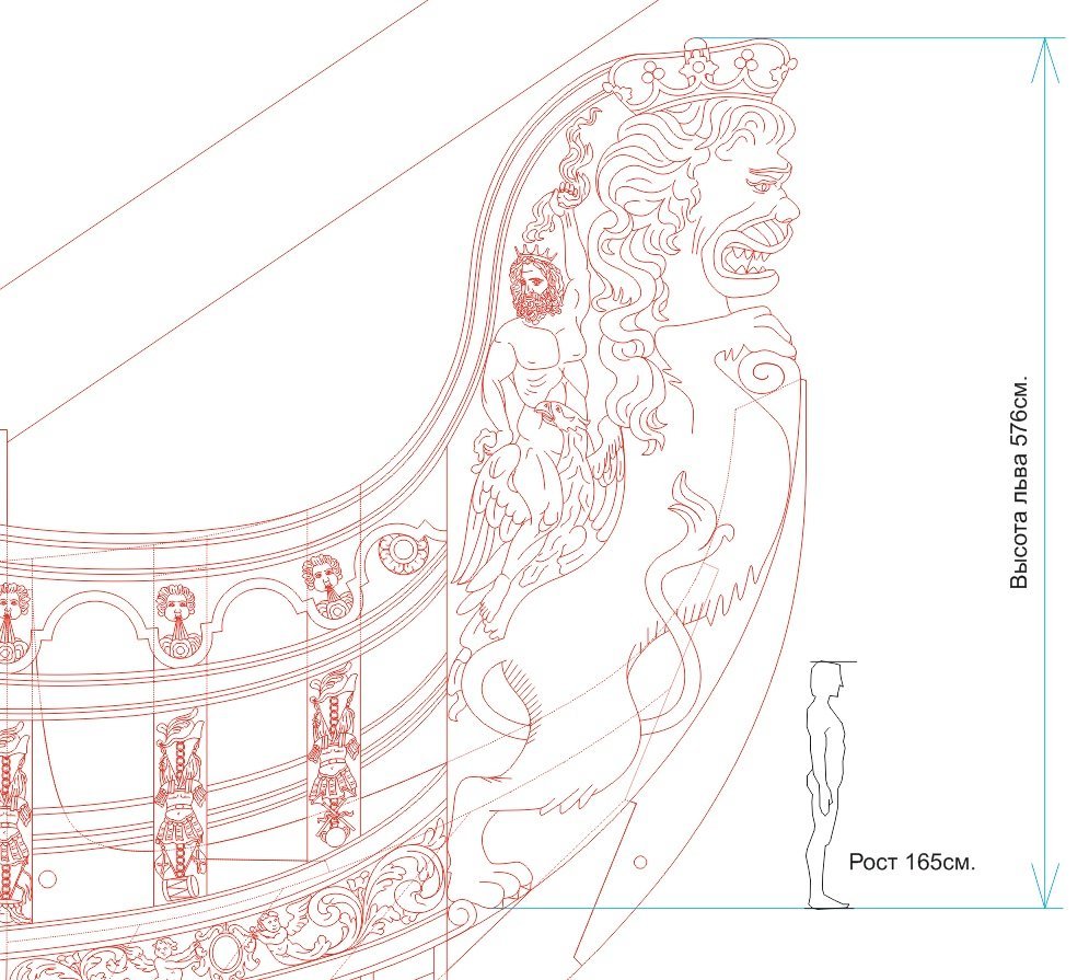
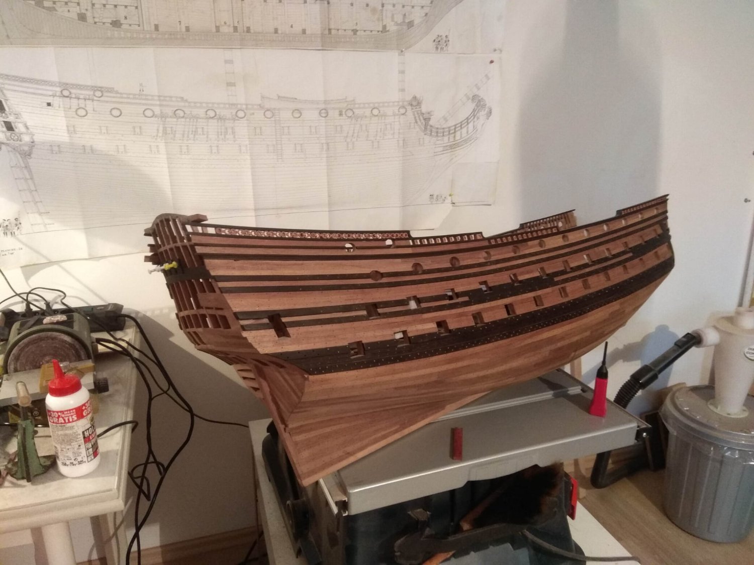
So, I told and showed how Russian lions look like in the ship sculpture of the reign of Peter the Great. A little traced the origins of canons in the appearance of these animals and even described the allegorical meaning that is embedded in the multi-figure composition. What more could be added? This issue I will begin with a problem I have encountered. Two sculptures have already appeared in my collection. There are more to come. They are all representatives not only of different schools of art, but they all stood on different ships. Both the ships and the sculptures themselves are different in size. And quite different. I wondered, what should be the basic rule for my entire collection? I could go by scale. In this case, my lions will be very different sizes. The larger ones would outshine the smaller ones. And I wouldn't want that. So I won't take scale into account. I will make all figures of approximately the same size, so that they were equal to each other and the human eye could not be distracted by extraneous factors and just look at the beauty of the forms of each style, each lion. But this little task aroused in me an interest to compare what were the sizes of the lions. And first of all I began to find out the size of the ship "St. Andrew". And then I found out that the real dimensions of the Russian lion must be simply colossal. Next to the other lions it must be a Giant. Especially funny would look neighbor with small and skinny Gustav from Vasa. These are the dimensions that the Russian lion should have in reality. While working with Gustav, I paid particular attention to the way this lion was constructed. That he was made up of several fragments, he had separate paws. And if several logs had to be combined for such a slender figure as Gusav, what was the Russian lion supposed to be? What were these logs combined in this case? And from that moment there arose in me not only the interest of the artist, who is interested in appearance. In me woke up an engineer, a carpenter, who had to see the drawings with these dimensions and decide how such a sculpture could be assembled. At that moment I could say something like: ah, what a pity it is impossible to see such a figure in real size. What a pity that somewhere in the waters of the Baltic there is not a Russian ship preserved that could be lifted and made into a museum. Yes, it's impossible. Such a museum does not exist... Only instead of "Ah, what a pity!" I will say another thing: "How great it is that I have an opportunity to see such a sculpture, I can see the whole ship of Peter's epoch. to be continued
-
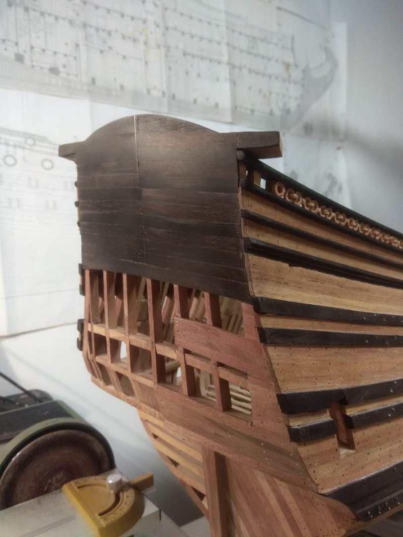
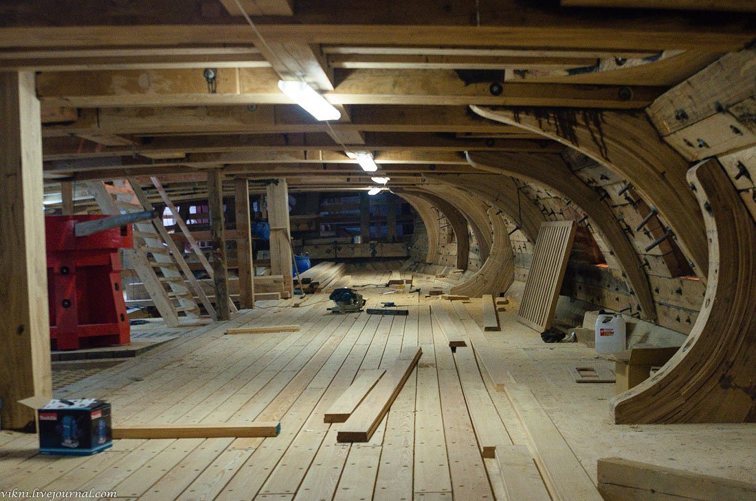
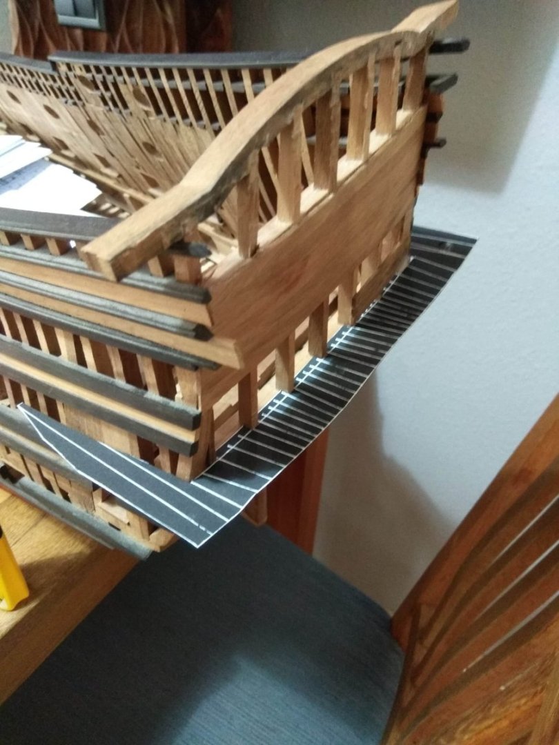
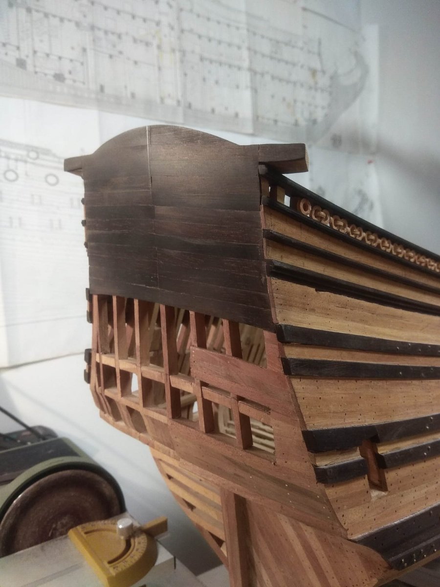
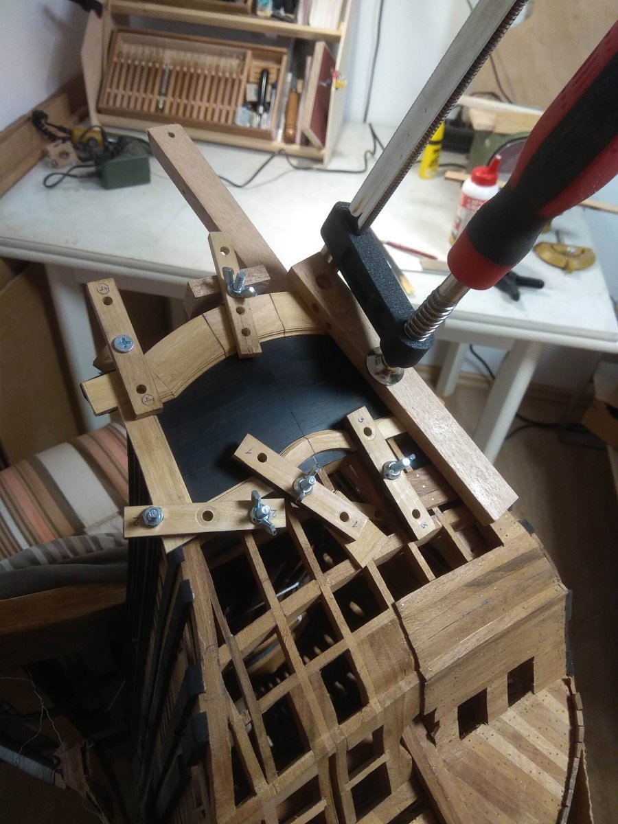
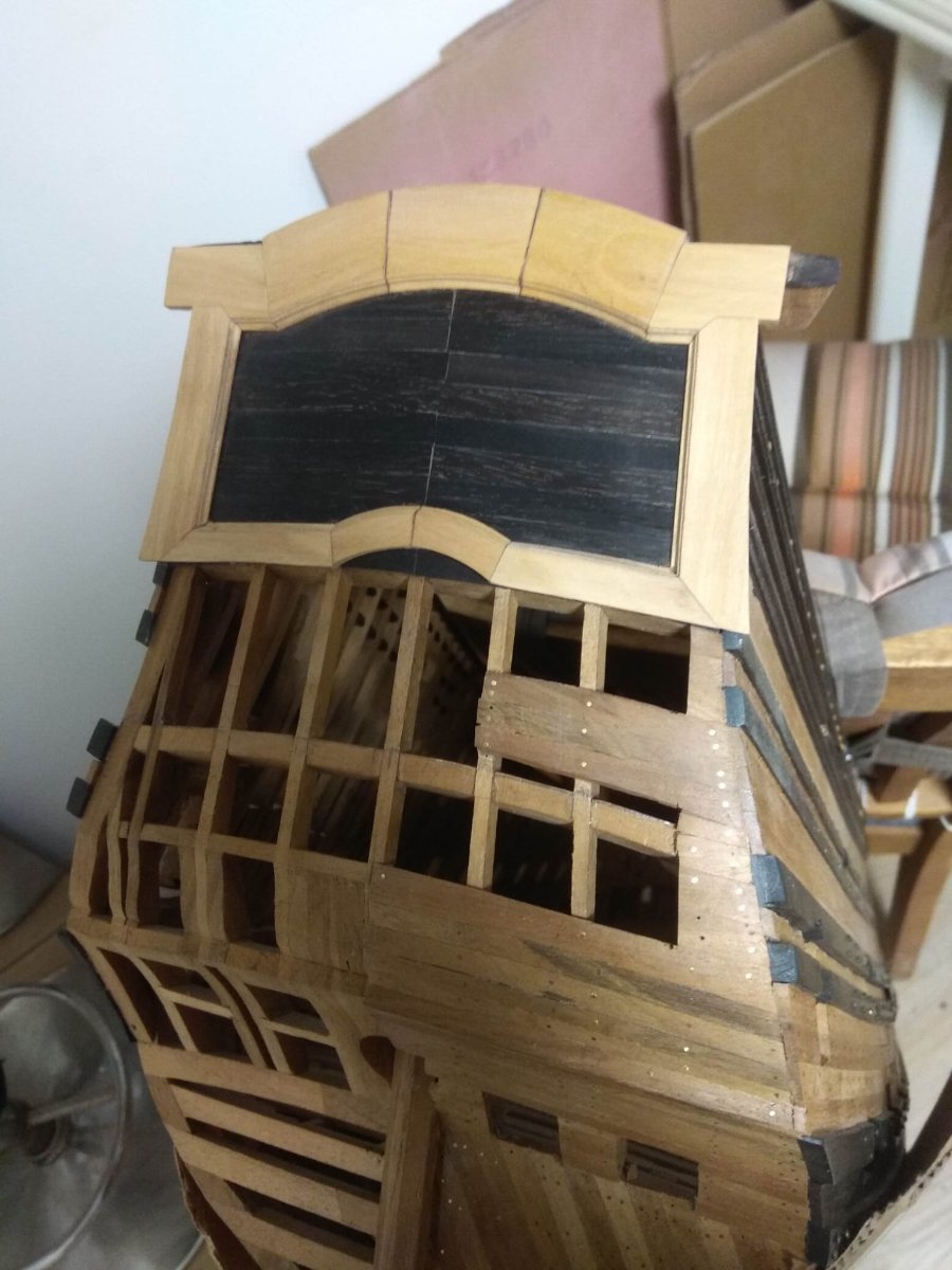
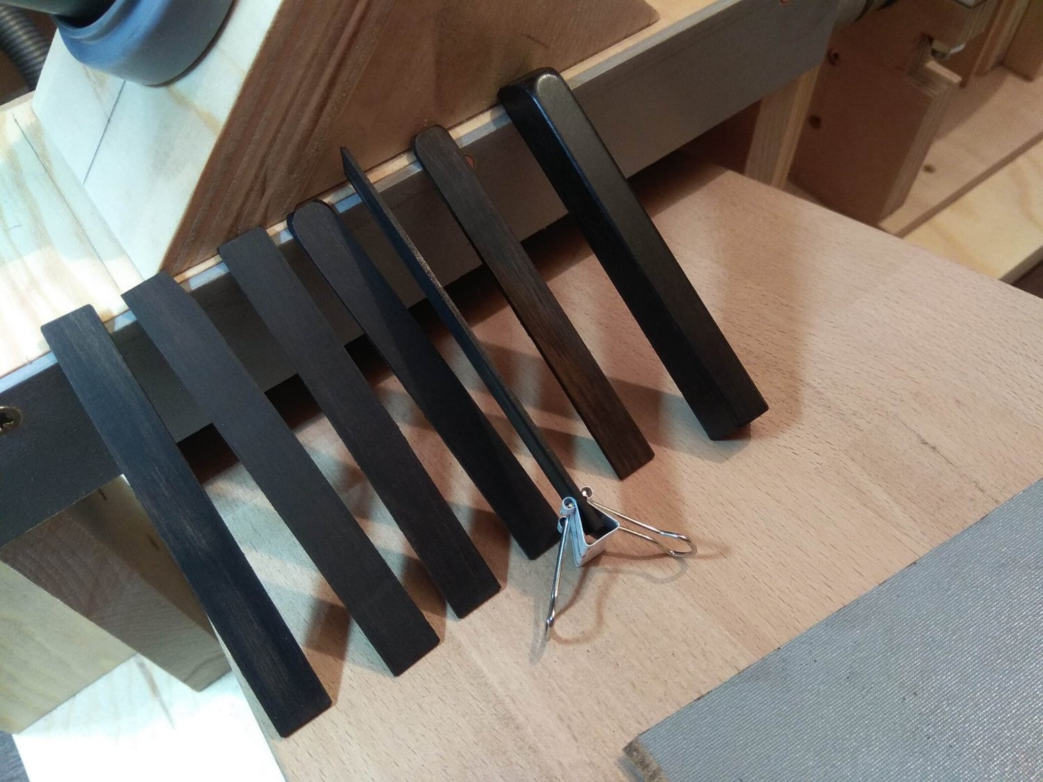
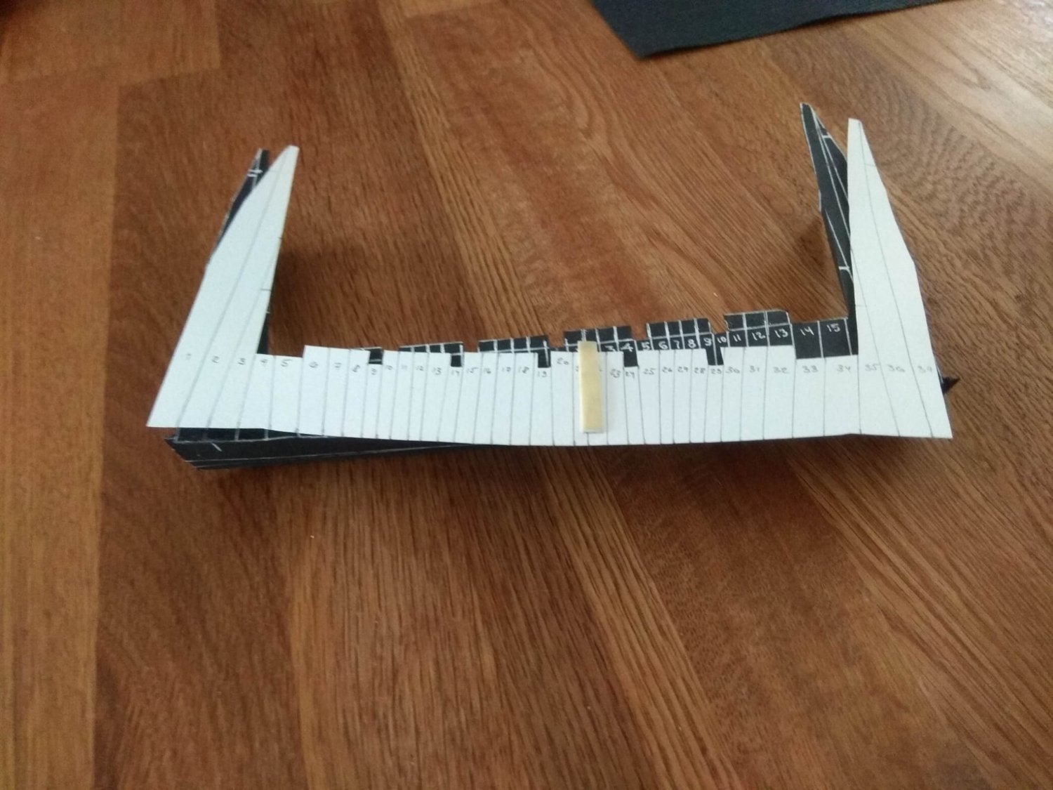
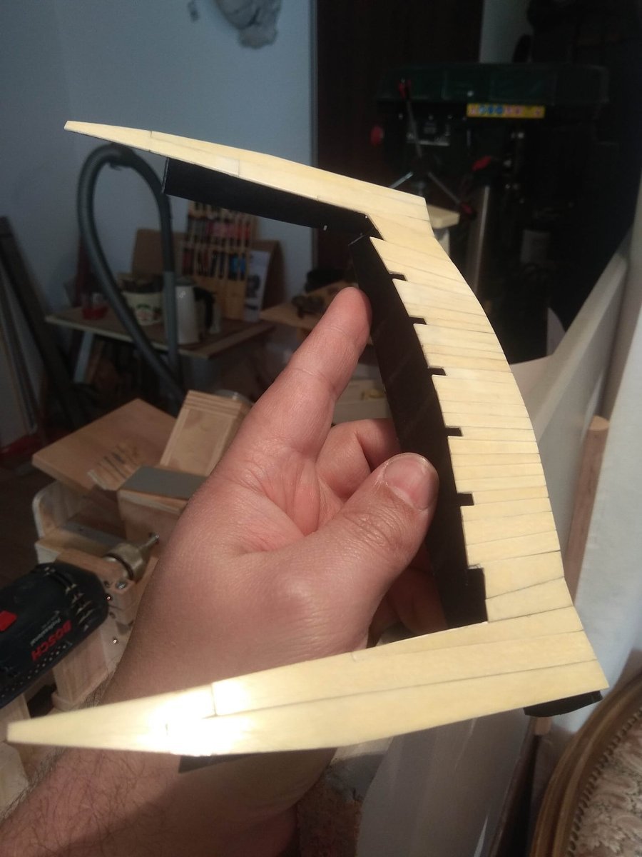
As I said in the last post the next step is a series of jobs that are easier to do before installing the balcony. And first and foremost are the planking boards on the transom of the ship. The old ones had to be removed as it was decided that the background should be wenge. Next will be some photos from this stage of the work. It is simple and easy to understand. The only thing that had to be considered was what kind of wenge wood I had. If the ivory plates were extracted from an old piano or grand piano, it makes perfect sense that the same source was for the wenge. They were black keys. They were also provided by the customer. It's a good idea. If he has access to old instruments, it was a sin not to take advantage of it. The only downside of these buttons is their size. It is not difficult to cut the key bar into thin slats, but they are obviously shorter than I would ideally like. The solution was simple. Just place the seam of these laths right in the middle of the transom. In the future, a decoration will appear on this background, which will cover the joint. That's all. In the future, the black color should be found in other places. And most likely sooner or later I will find myself in a situation where there will be nothing to cover the unwanted seam. But let this task remain for the future. Otherwise I will solve all the problems now, and tomorrow there will be nothing left. And it'll be boring. And then there are the pictures. There are not many of them, as the process is simple.


-
I hope you find my experience useful. I also want to try Elforin, but it will be in another project, with lions. And much later. Thank you for your comment and for following the process.
-
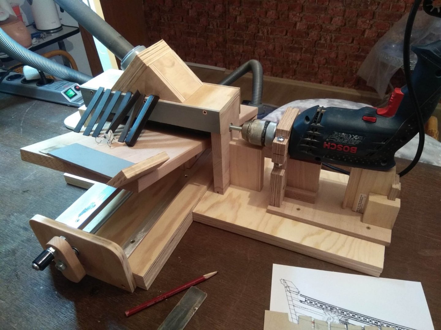
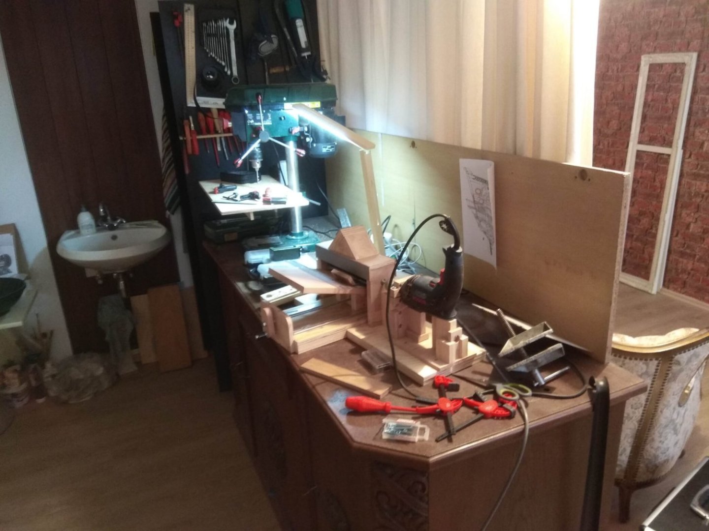
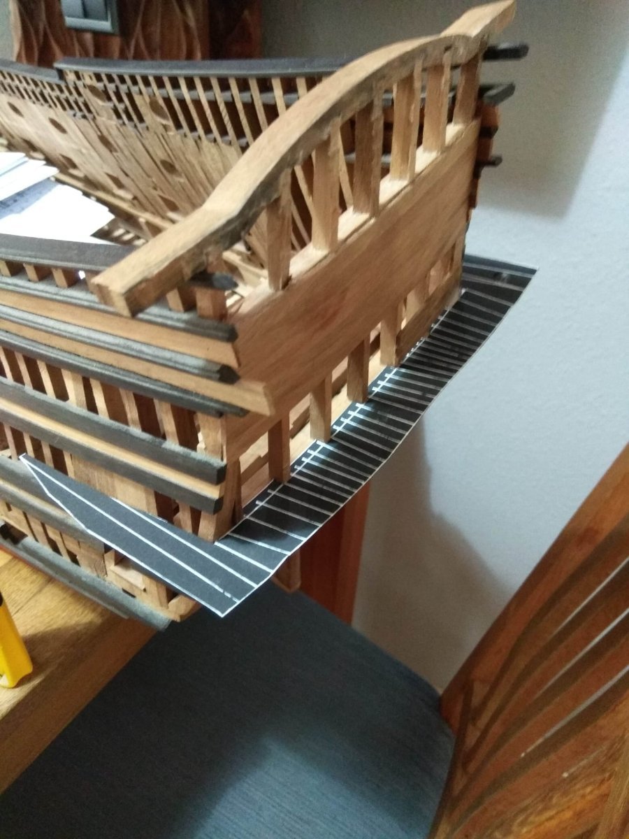
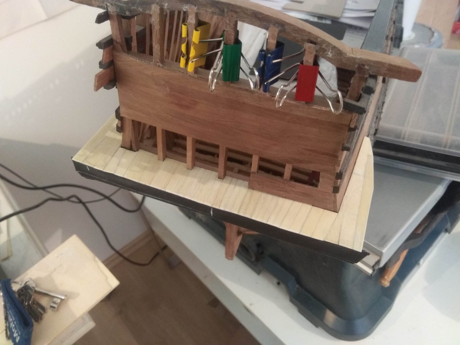
After publishing how things went with the glue experiments, we need to move on. But what exactly should be shown and what should be omitted? The thing is that in addition to the work with the ship itself, a lot of time and effort is spent on what should be done next to it. And it's a long chain. To make a certain part you need the right tool. To get that tool, you have to make it. And then you have to find a place for it to stand. And so on. It's kind of like the story of the house that Jack built. And what exactly is worth mentioning in these adventures is the question. I've already mentioned that now I have to start from scratch. Neither the accumulated fleet of machines is practically gone, nor the workshop. When I do carving, that work doesn't need a lot of input, just an edge on the table, a set of hand knives and chisels, and patience from family members who periodically see shavings on the dining room table. With building a model ship, things are already different. So I've gone down to the basement where I can get more of both dust and noise. I won't go too far into the stories about the workshop. There's nothing new here, I have completely standard tasks. First, you have to figure out where to get furniture to set up a workspace. And then I have to find tools and machines to work with. It's a long process. I suspect it doesn't have an ending at all and every time something needs to be added or changed. So the writing about the workshop is endless. The only thing I'll still mention is the mini loom I needed right now. Urgently. Without it, it would have been impossible to get to work. When working with wood, the first place is occupied by a circular saw. Without it is nowhere, because everything begins with sawing the material. And I already had such a machine. But it's not enough. As I did not try, I still have a saw leaves traces on the laths. And they need to be further processed. That's normal. And in any carpentry workshop, the second most important machine is a jointer. But I don't have one. And since I am not engaged in large serious works, I do not need it. Moreover, since in ship modeling the material is laths, the dimensions of which are measured in millimeters, it can be too dangerous to level the surface of such laths with the help of a jointer. Both for the laths and for your hands. You can, of course, find mini machines, such as Proxxon, but that too comes with additional issues. I won't bother explaining these nuances to you. I decided that I needed a sanding raismus. Pondered and decided that it is easier to make it yourself. There is nothing complicated about it. And it is. But it's not. Very soon I realized that I had taken on a task that was much more difficult than I had anticipated. And the problems were very different. One machine design wasn't as convenient as I wanted it to be. I had to redesign one part or the other. I've also been plagued by strange dimensional mismatches. For example, I ordered bearings. But when the package with them arrived, it turned out that the diameter was different from what was stated in the description. Instead of a diameter of 20 mm these wheels were 19.4. It's a very small difference. But it turned into a problem, because the drills come with a certain pitch. And in the 20mm hole the bearing was hanging out. I tried to put it on glue, measured to make sure that everything was aligned evenly, but in the end there was still run out. I had a similar situation when attaching a drill to the machine. The diameter of the place where the additional handle is attached to the drill was made 43 mm as if on purpose. Not 40, and not 45! Where can I find a drill bit with this size? Again I have to think of something. And each new problem seemed to be solvable, but for this again it was necessary to go to the construction store and look for other options for solving problems. I have to go to a neighboring town, and drive me can my son, he has a lot of his own things to do. So it took me a lot of effort, nerves and time for a homemade machine. The only thing that reassures me is that in the end everything works as I would like it to. The gap adjustment between the table and the sanding drum is the same, no misalignment. And I am even proud of the fact that I managed to solve this issue, because initially those options that were offered on the Internet in practice turned out to be very far from ideal. I can change the dimensions within tenths of mm. Everything works, even if the machine looks unpretentious and simple. Well, now we can move on to what I did with this mini grinding machine? What did I need it for? The first thing I decided to do was the deck decking on the transom balcony. It's supposed to be made of slats from an elephant ivory piano. But there's one thing about them. The thing is, they're not flat. One edge of the bar is slightly thicker than the other. And that means that first of all you need to use sanding to equalize the thickness, to make it so that the slats were even. Otherwise, the differences will be noticeable. And with this task my new machine coped perfectly. I was prepared that this procedure will be associated with odor, but to my surprise there was no bad odor. Well, that's great. I definitely won't be upset about it. The work itself is clear, there is nothing to explain additionally, so I just show the pictures. This is an intermediate result. In the future it is still necessary to remove the ribs, which give the floor plane the desired geometry, and on the reverse side to make a planking of wood. But at this stage I put the balcony aside. Making the balcony was directly related to the bone glue. Before the cooked portion went bad, it was important for me to make something where it could be put to practical use. So decking the deck was also an experiment to show what this glue could do. Whether it would hold the thin plates securely. Whether it would shrink and bend the thin paper backing. I originally thought it would just be a practice version, after which I would remake this piece out of plywood. But over time I gave up on that. The paper soaked in glue became quite stiff yet flexible, so I decided there was no point in plywood, especially since I need to split it into layers to make the backing thin enough. And plywood that thick can change geometry too. Further work on the balcony will continue later. I'll put it aside temporarily. At the same time, I will see what will happen to this part, whether it will not become deformed over time. In the meantime, I will deal with those parts of the transom, which are easier to do without a balcony. And first of all it concerns the very base, the background, on which the decor will be located. And about it already in the next post.


-
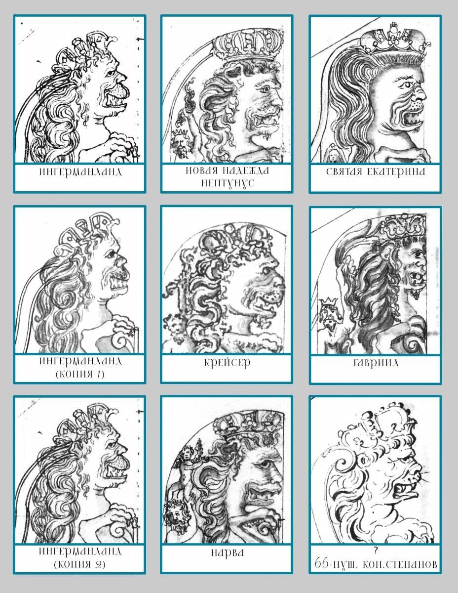
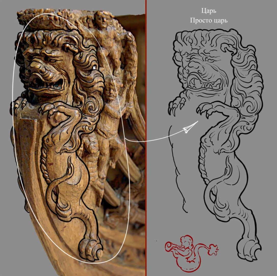
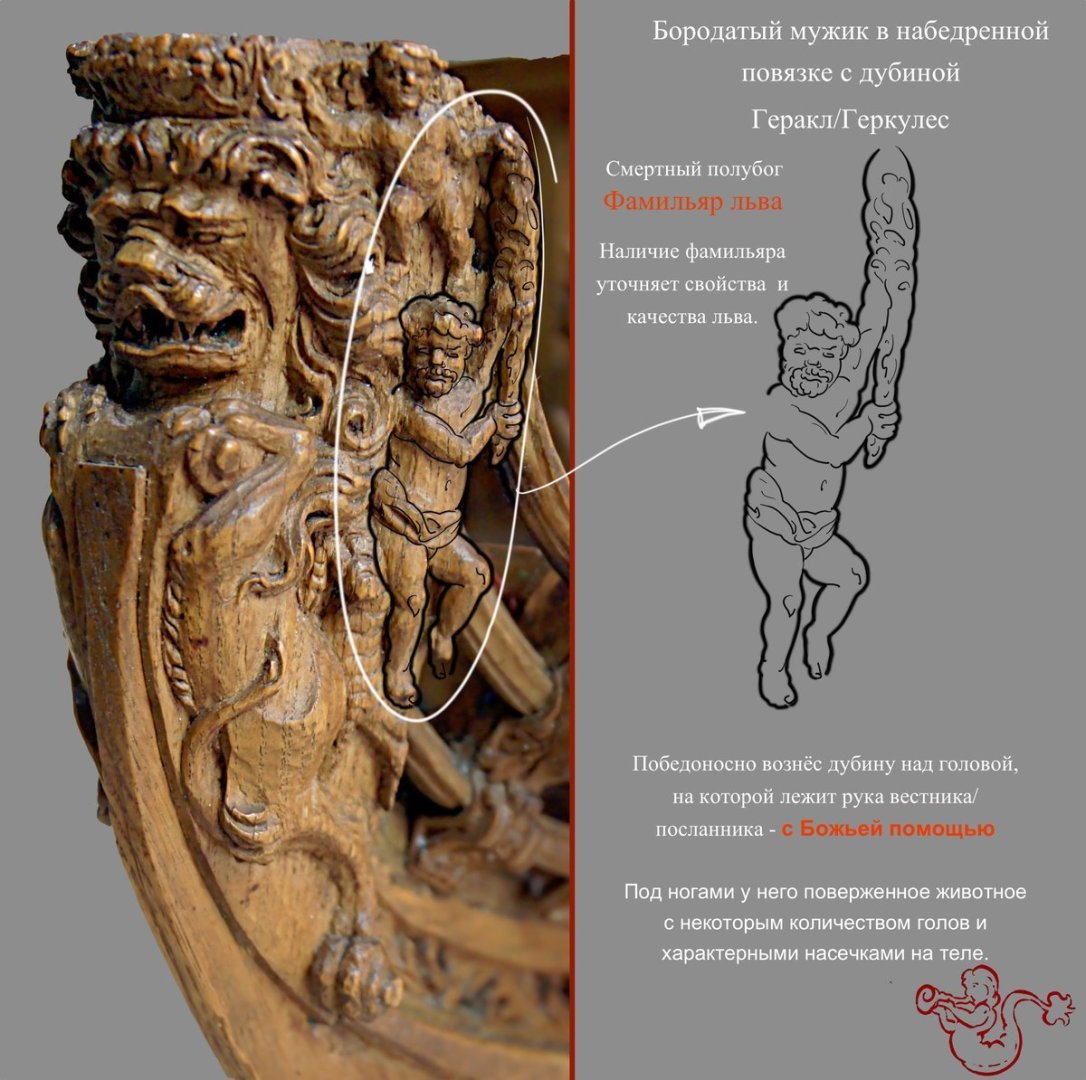
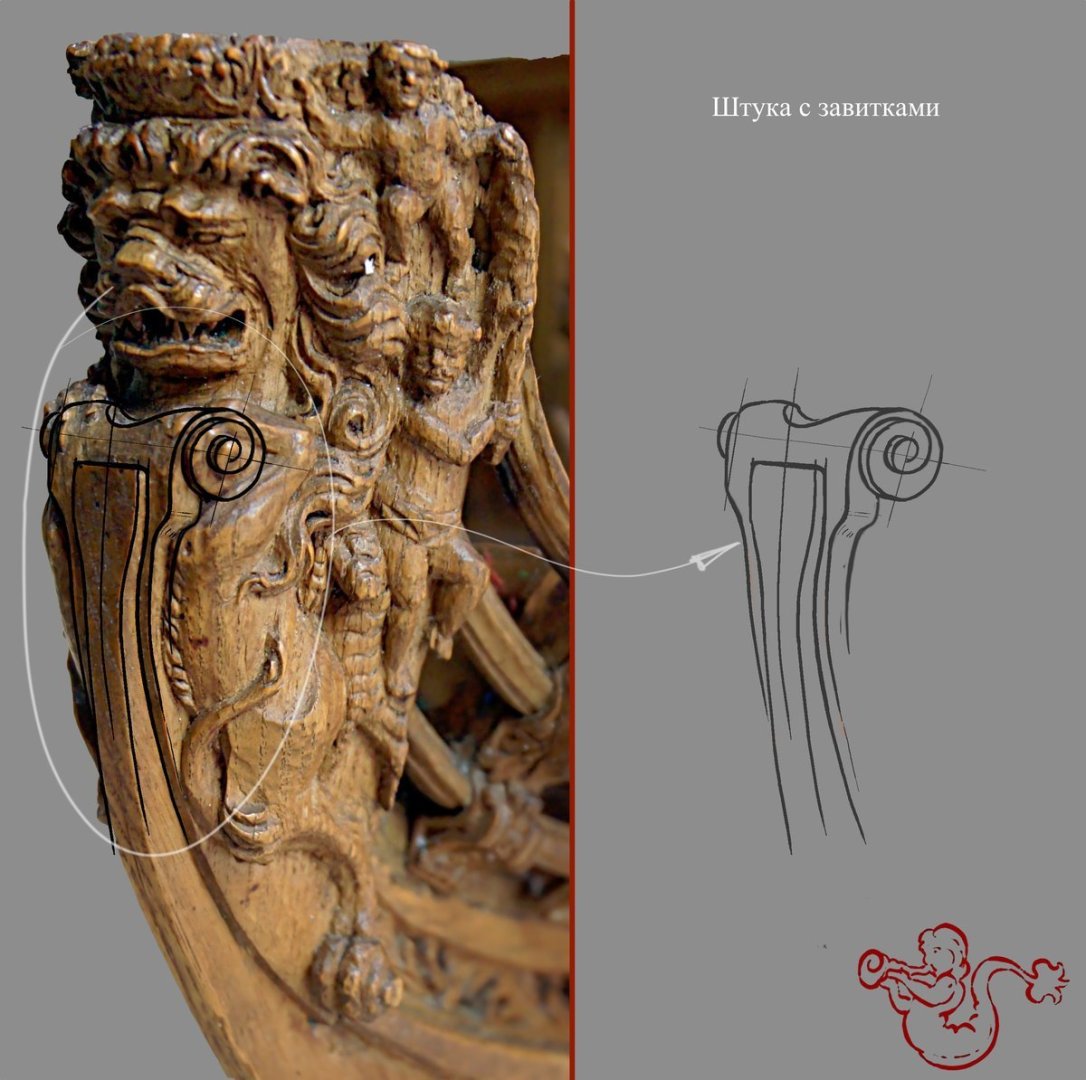
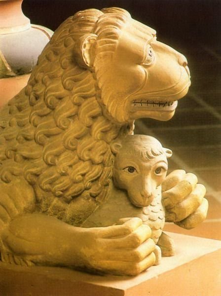
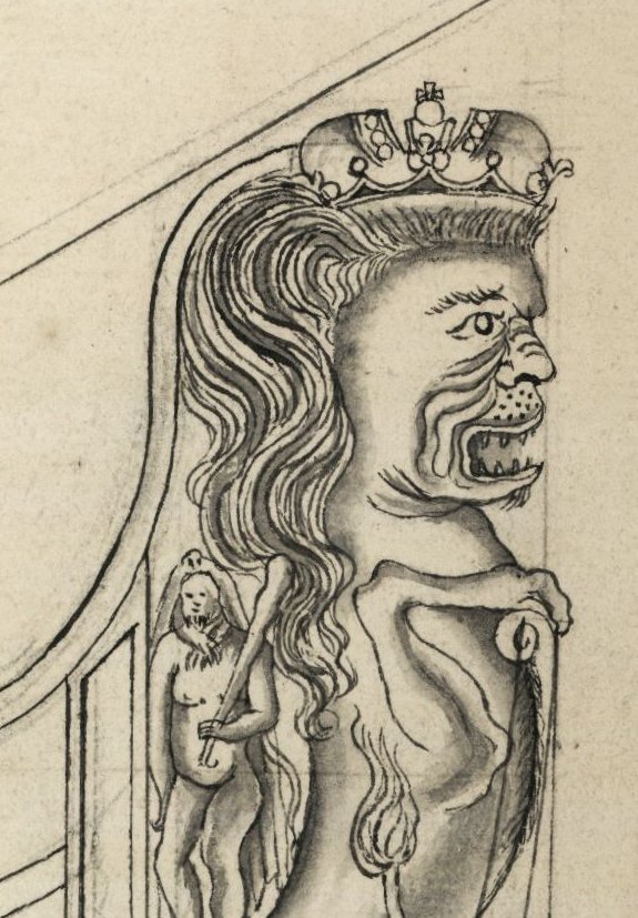
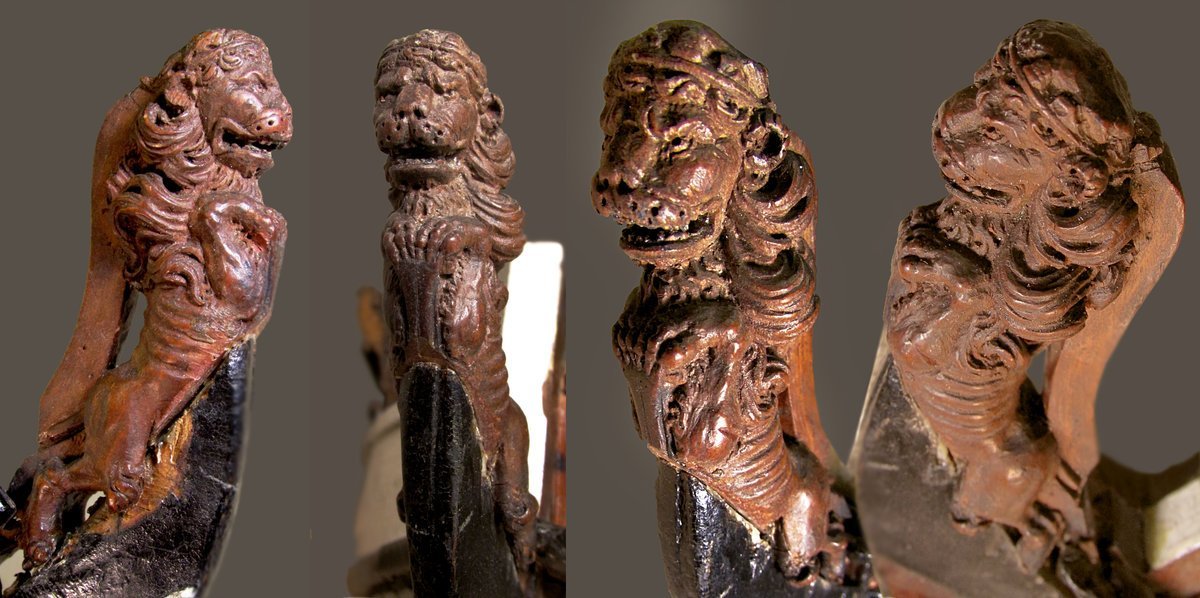
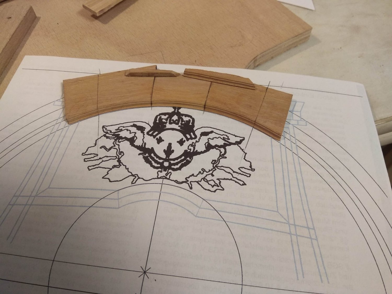
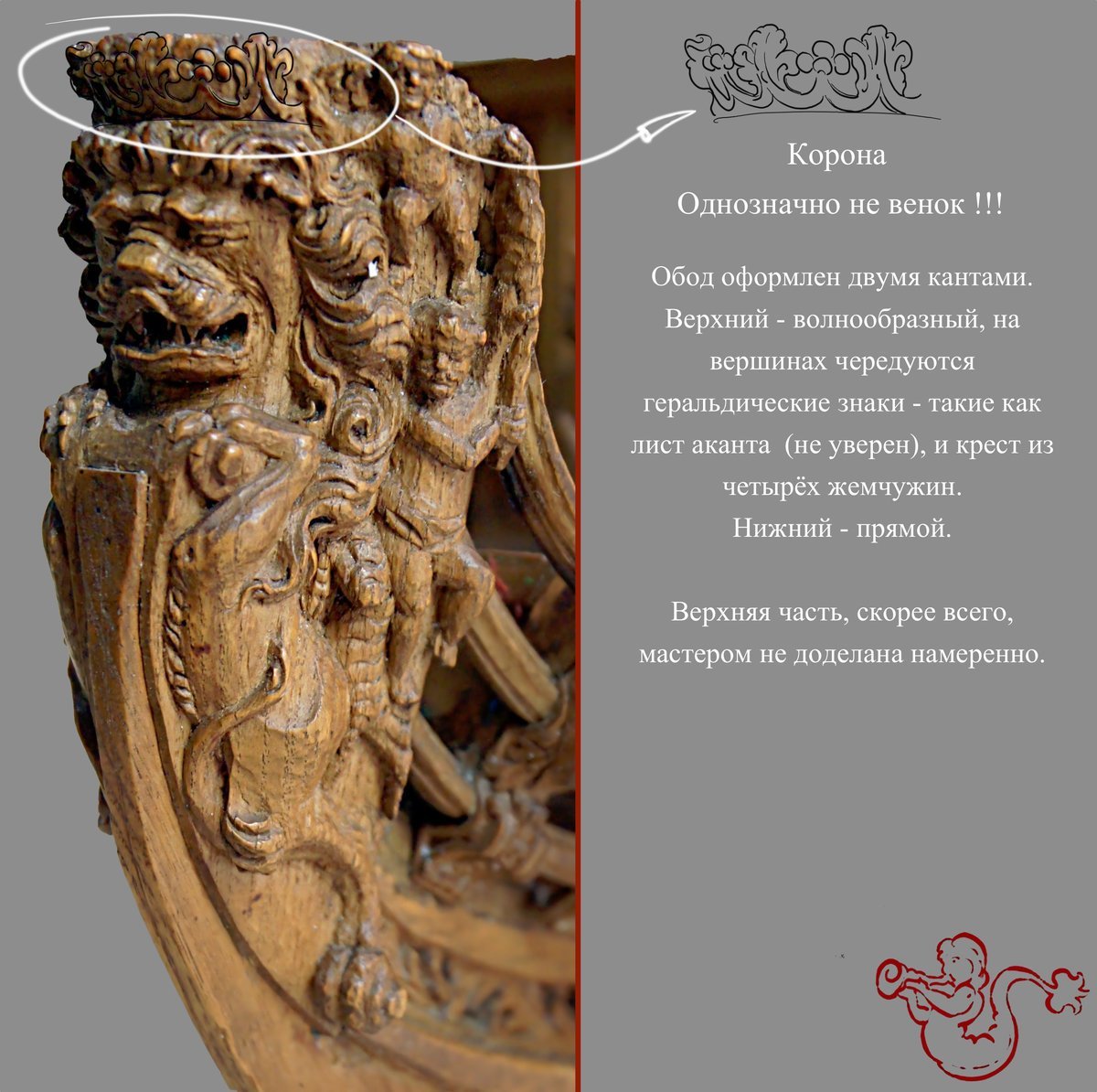
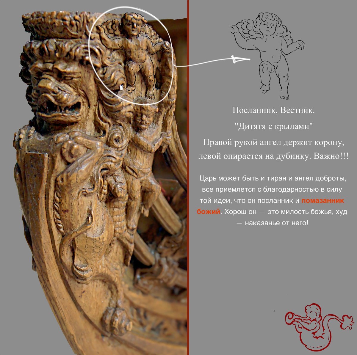
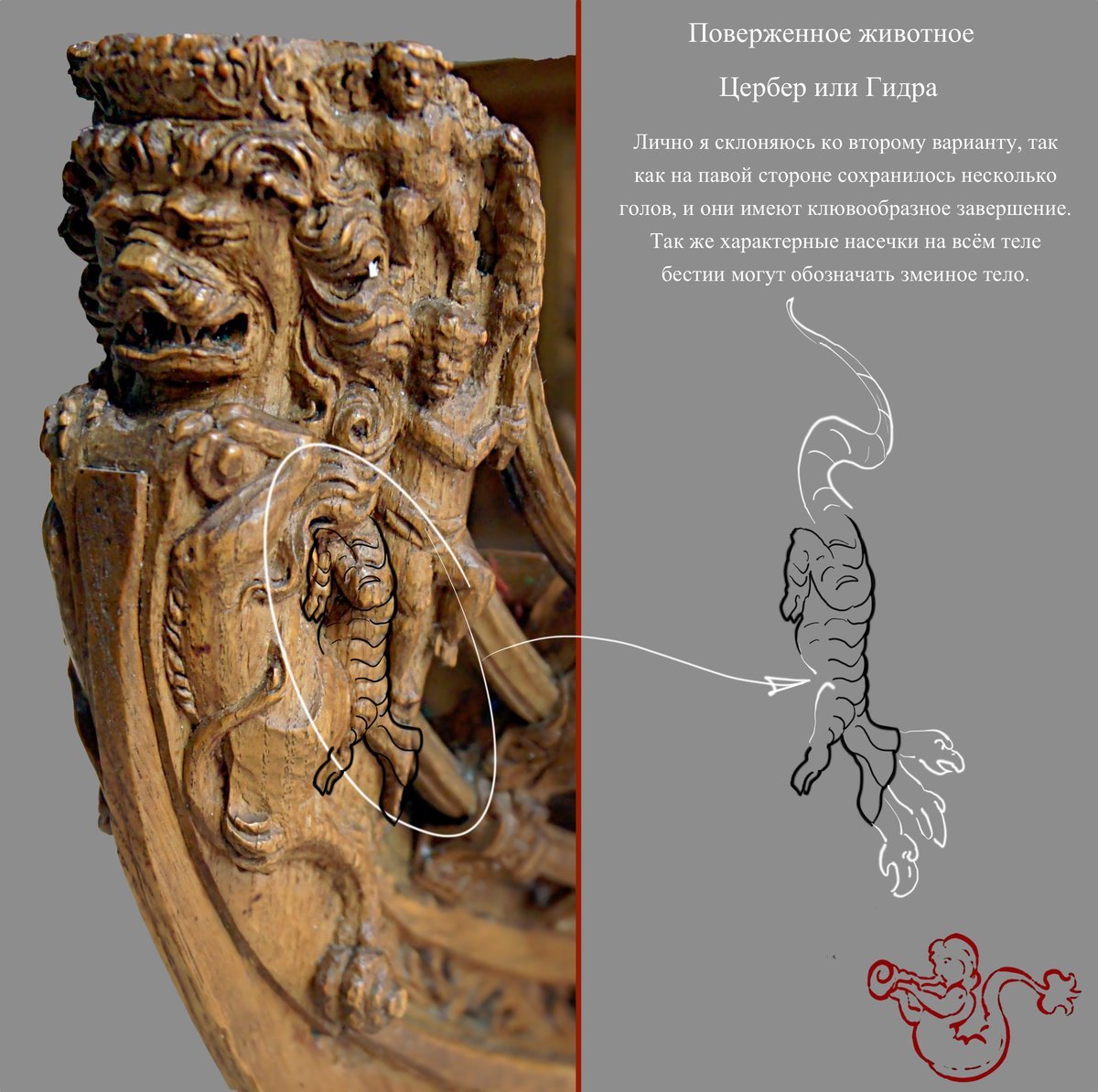
I will now go in a little more detail on the Russian lion I have chosen for my lion project. This lion has differences from the other predators of this company. In addition to the unusual proportions, what immediately catches the eye is that this lion is not alone. He is surrounded by an entire company. And today I will pay attention to who is depicted next to the main character. For what reason these companions are there and what kind of story they are "telling". It's going to be interesting. And before I start developing this topic I want to give a huge thank you to the people who helped me during the work. I learned a lot thanks to the hints and help. And this material is entirely compiled by one of the participants of Russian language community of ship modelers, who publishes his posts under the nickname Antiq. He is a wonderful person, a great artist. And also a very deep researcher of many topics related to wooden shipbuilding. Now let's go step by step through each character on this multi-figure composition. I'll just add a translation, all the laurels of research rightfully belong to Antiq. Crown. Definitely not a wreath!!! The circumference is decorated with two edges. The upper one is wavy, with alternating heraldic signs on the tops, such as an acanthus leaf (not sure) and a cross of four pearls. The lower edging is straight. The upper part is probably not finished intentionally by the master. To this translation I will allow to add a small explanation. The thing is that on the Russian forum there was a very heated discussion about the headdress of this lion, as well as other Russian lions. Since the crown is a heraldic attribute and each country has its own peculiarities, there were also questions about how to interpret the semi-distinct details of the carving. For example, on some lions the crowns very much resemble British crowns. And on this lion we can talk about a crown and a wreath. This has caused a lot of opinions. A czar. King Just a czar. Putti. Messenger, Messenger. A child with wings. With his right hand the angel holds the crown, with his left hand rests on a club. This is important!!! The king can be both a tyrant and an angel of kindness, everything is accepted with gratitude, based on the idea that he is a Messenger and anointed of God. If he is good - it is a favor from God, cruel - punishment from him! Bearded man wearing a loincloth and carrying a club. Hercules/Hercules Mortal demigod. Familiar, companion of a lion. The presence of a familiar clarifies the properties and qualities of the lion. Triumphantly he raises his club above his head, on which rests the hand of the messenger - with God's help Under his feet is a defeated animal with a number of heads and characteristic notches on the body. A defeated animal Cerberus or Hydra Personally, I am inclined to the second option, as several heads are preserved on the right side, and they have a beak-shaped end. Also the characteristic notches on the whole body of the bestiary can mean a snake body. Detail with whorls to be continued


- 546 replies
-
- 11
-

-
Yes, I know about this material. Never worked with it until now. I will try it for sure, but not in this project. I am sure that the customer will be against the use of artificial material.
-
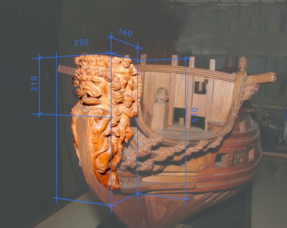
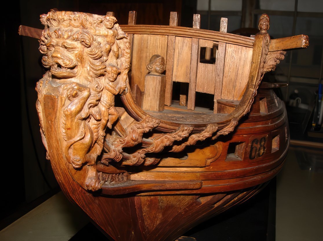
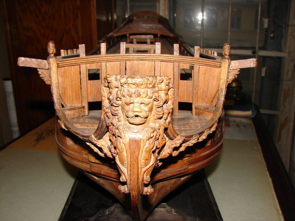
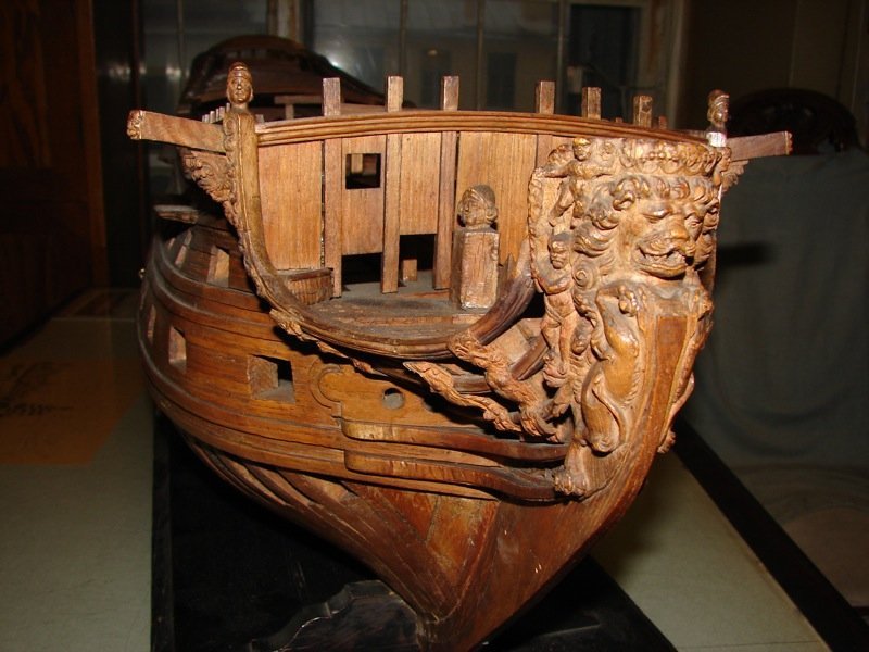
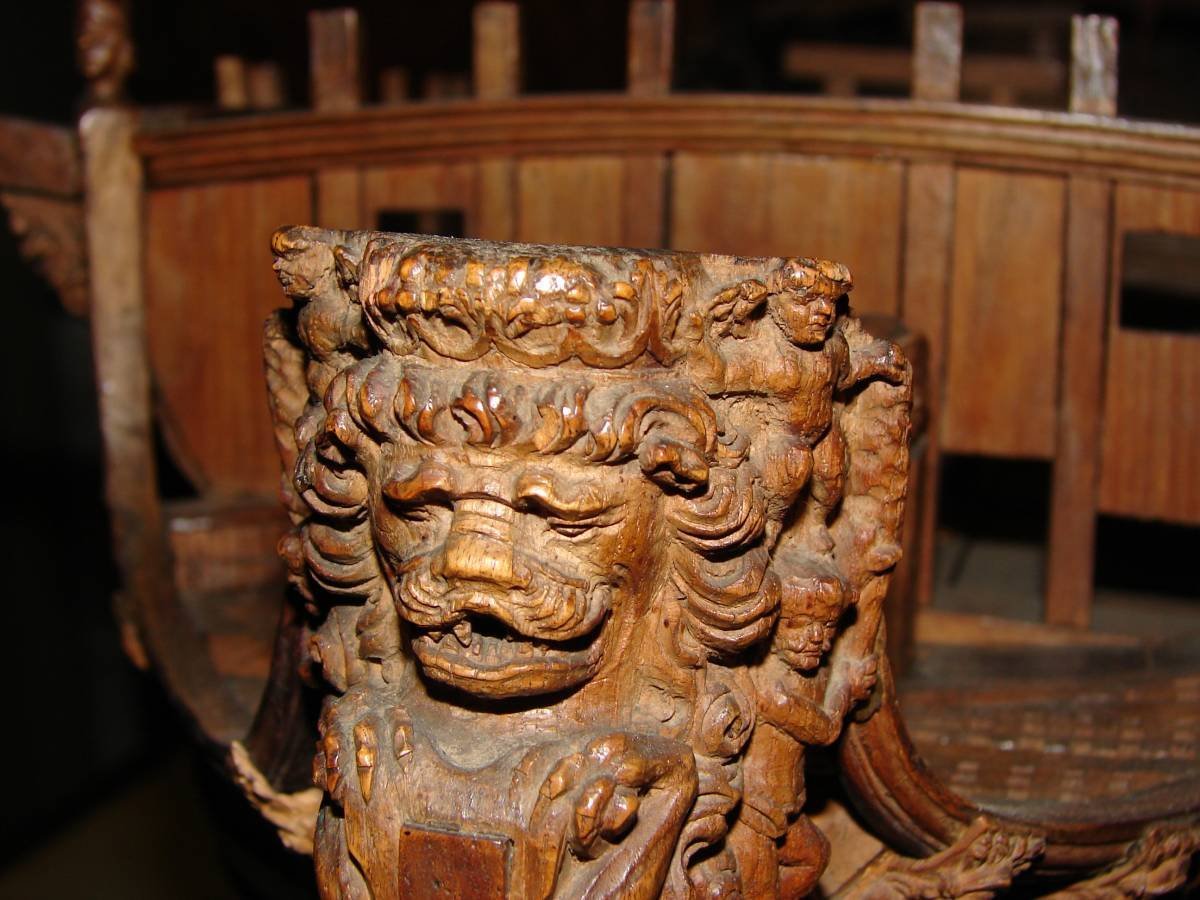
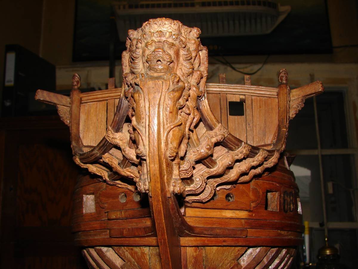
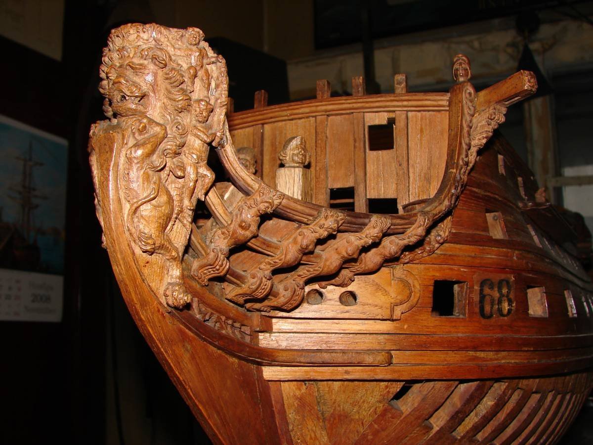
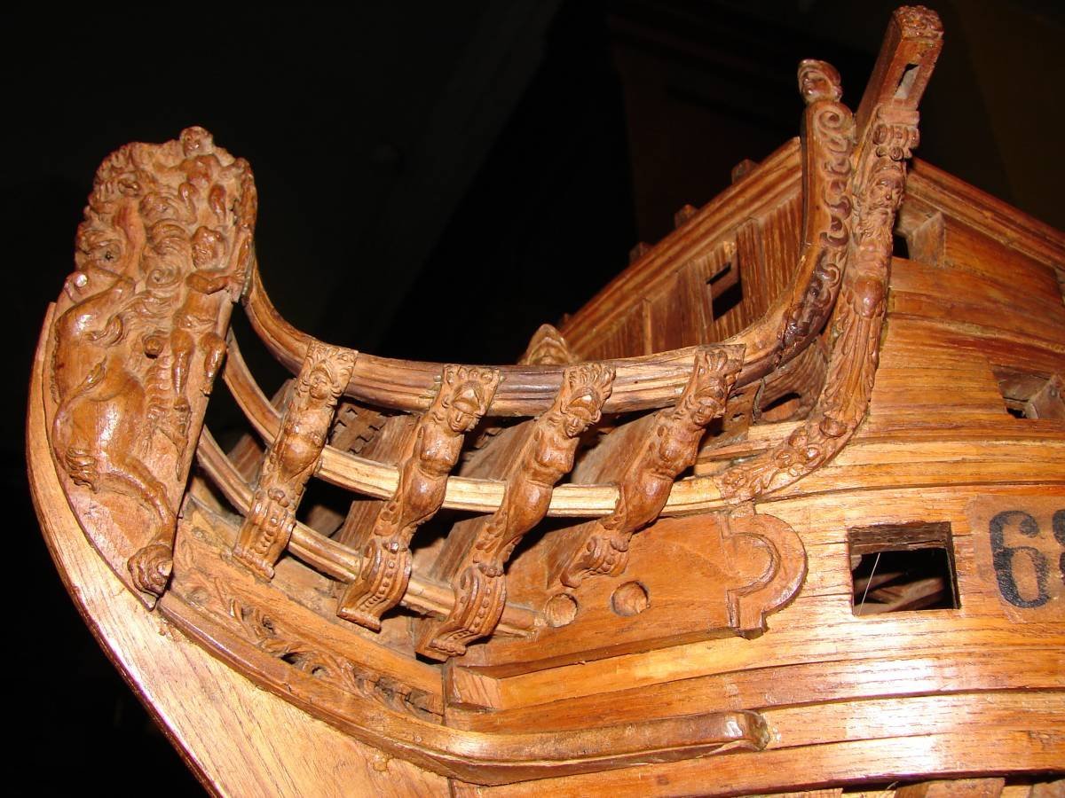
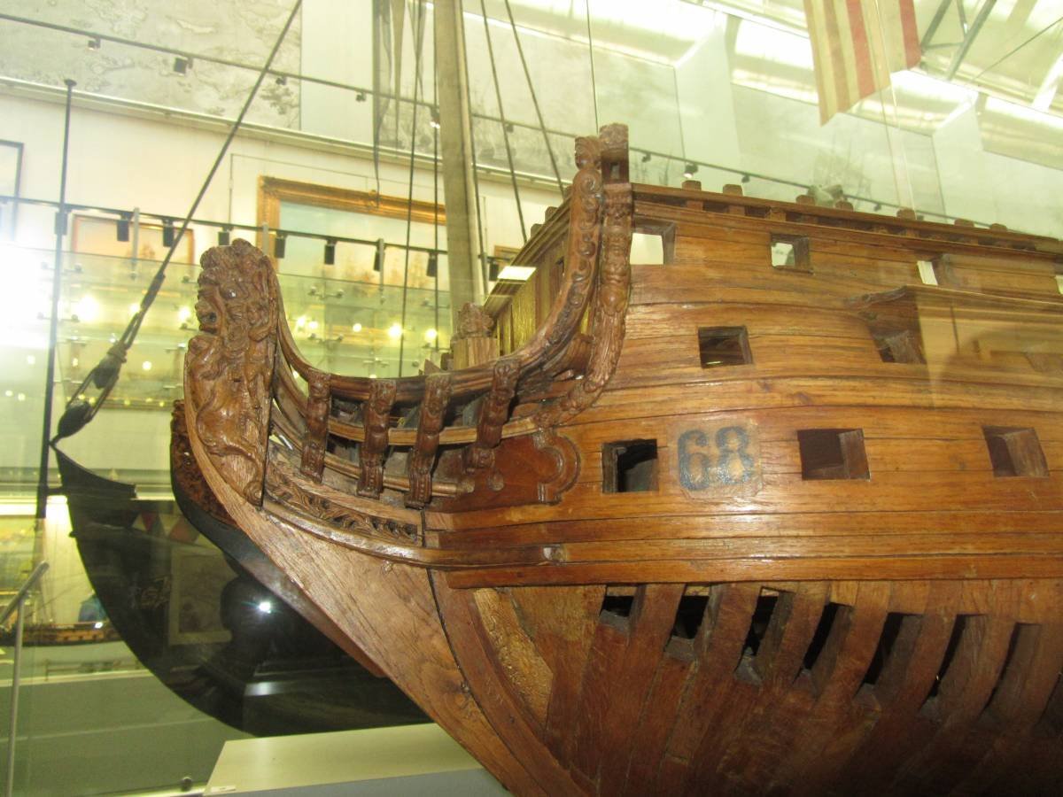
Another part of a long story about the Russian Lion. In the post about searching for references in ship models I did not mention one model. It is different from the others. I did it intentionally. I didn't want to show too early the prototype I chose for my work. This is the lion I have stashed away until the right time. This lion is very different from the others. First of all, it is made with a lot of detail. It is perfectly preserved. To top it all off, this lion has been photographed in great detail. Such an abundance of angles would be the envy of many runway model girls. So there should be no doubt why I chose this particular lion. What kind of ship model is this? Wikipedia lists this model as the St. Andrew. However, there is still no firm belief in the correctness of this version. The fact is that the dimensions taken from this model do not coincide with the archival data. Immediately several different ships can fit the appropriate parameters. And at the same time, each of the contenders has differences in something. There are no one hundred percent matches. So even now, the questions remain, what kind of ship is this? Someone is inclined to believe that this is a model of the ship "St. Andrew", someone believes that it is "Friedemaker". And there are those who call this model "68". Because of the fact that on the model itself there is an inventory number with this number. You can continue to get acquainted with this lion in the next issue...
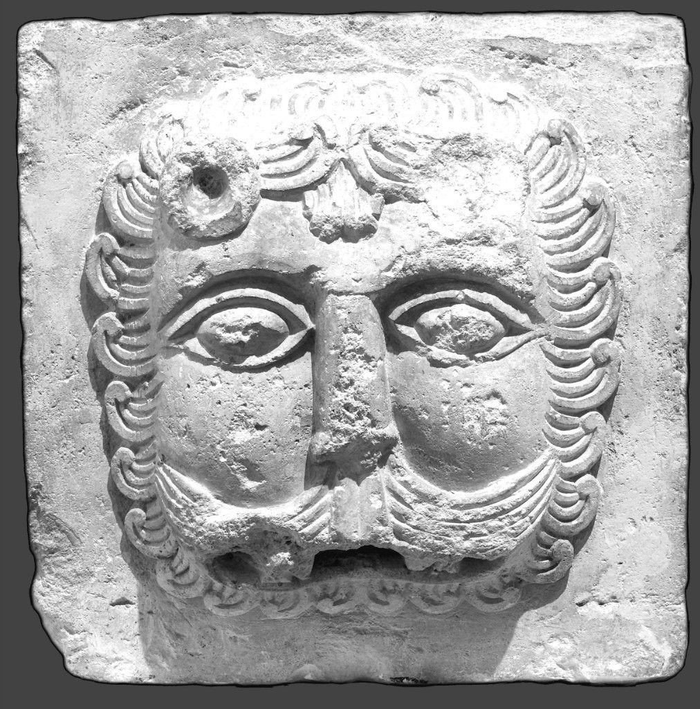
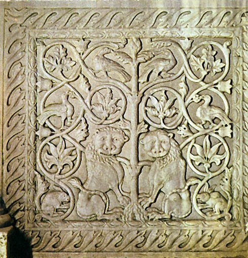
-
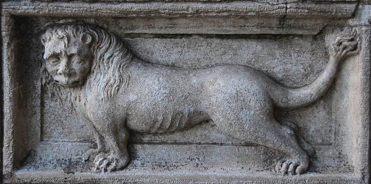
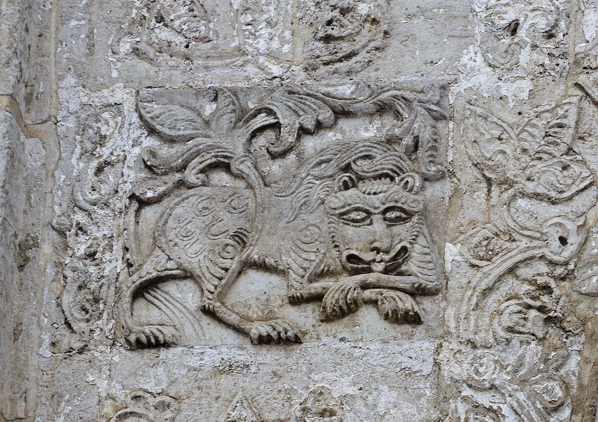
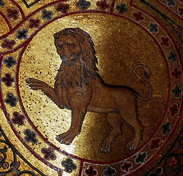
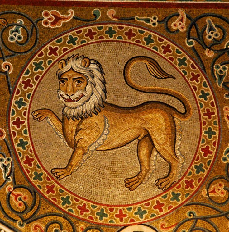
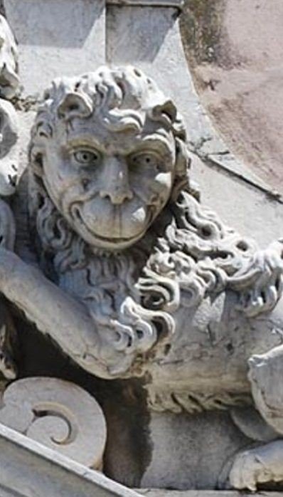
Human beings want the best all the time. When there is no information, any scrap of data is perceived as a great fortune. When there are drawings, one wants to look at ship models and what figures stand there. But even here human nature does not stop and continues to want more. It would seem, live and be happy. But my brain has not found peace here and expresses dissatisfaction. What claims can appear now? Everything is simple enough. The found figures are very small. After all, I make my lions big. And I want to show more nuances and details. How can I find larger samples of Russian lions? What can help in this? It's really not that difficult. You just need to shift the focus of the search a little to the side. After all, the masters who were engaged in ship decoration did not exist separately from the rest of the world. They were also influenced by the same trends, the level of knowledge that influenced other carvers. For example, those who made decor for buildings or interiors. Yes, a carver-builder may make a different material, say stone or marble. But it is more likely that he or she will embody a similar image as a wood carver. And what is even more likely is that it could be the same author altogether. Say, at the royal court worked a certain team that made decorations for palaces or fortresses. And they could have been sent to make sculptures on a new ship. After all, and the ship, which represents its king should be decorated as well as the royal palace. So it makes sense to look at other kinds of sculptures of the right era. And to see what Russian lions looked like in architecture or interiors. I mean, it's a chance to see lions at a larger size. And that's a good idea. Considering the Russian architecture you can see how the traditional stylistics developed, what roots had Russian sculpture. And even understand why Russian ship lions are so different from their counterparts in Europe. Why they resemble human faces (albeit ugly) rather than animal faces. Here are examples of Russian lions in architecture. The same trend in style that we could see in the drawings of ships is readily apparent. Russian lions have something between a human face and animal facial features. And they look very funny. And where did the first images of lions come from in Russia? What was the original source? Here, look at this lion. You'll agree, he's a clear relative of the lions I've already shown you. But this is not a Russian lion. This is the Byzantine lion. And Russia, and before that Ancient Russia took a lot of things from there. And the manner of depicting lions, among other things. It seems like a simple enough task. Just make a few lions. But it is an interesting way to see how different people see the same animal in different ways. It's interesting to see how different styles were formed. Byzantium is the Eastern part of the orgomous Roman Empire. Over time, one common country divided into parts. Rome and its classical style took a lot from Greek painters and sculptors. And the Byzantine style absorbed many features of southern features in drawing, from Phoenicia to Persia. Later, after the fall of the Roman Empire, Western styles were adopted by various European schools of drawing. And Vizania after the collapse continued its pictorial tendencies in Russia, Turkey and other countries. And when I get to the Turkish ship lion this topic may get its own continuation. Unfortunately, I don't know much about the styles and trends of this country. But it will be all the more interesting to learn new things. It is also interesting to notice how the degradation took place. And if we compare the blossoming of ancient culture with subsequent examples in drawing or sculpture, we can see how people first learned to very accurately convey the resemblance to the original, knew the anatomy and plasticity of movements. But then they gradually lost a lot of things. And in the place of that: there was this: And only decades later people were able to regain the lost level of skill again in the Renaissance. But that's a whole other story.... to be continued...
.thumb.jpg.65b55f51a697d60d2460be46b501dfad.jpg)
.jpg.7d619325be4855770a008ec14e1a0c01.jpg)
-
Most likely the glue you mention is similar in composition to the one I bought. It's based on the same principle, just extracted from different animal species. In your case, horses, in my case, rabbits. Other than that, it should be very close. I don't know if there is a difference, for example, one applied in some conditions and the other in others. Maybe a specialist with experience has both of these glues, and a few others on top of that. And he could tell us what he uses in which cases. I have no experience either. When I first started searching, I came across recipes with the following content: Glue for gluing ivory items together Ivory is glued with a paste of slaked lime and raw egg white. A solution of albumin in water with quicklime can also be used. Glued parts are firmly squeezed and left to dry in a cool place for 24 hours. Small items of ivory glued with an alloy of equal parts of wax, rosin and turpentine. This composition is not particularly strong, but it is very convenient to work. I have met other variations. And compared to this recipe, simple dilution and heating is a great relief. But even with this one I managed to do something wrong. No matter what you say, experience is a necessary thing.
-
Mark, thanks so much for these tips. Will definitely look at all of them, I really need it.
-
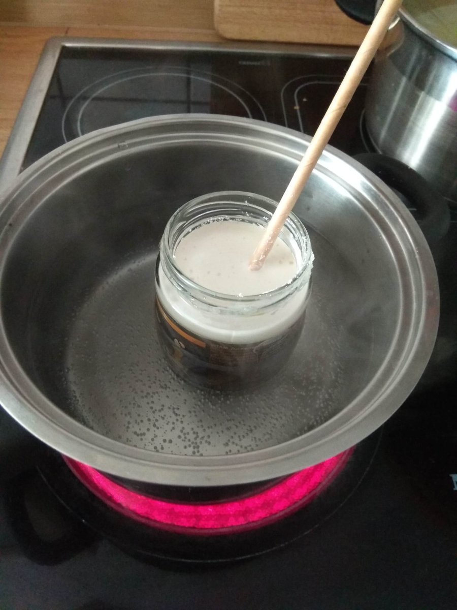
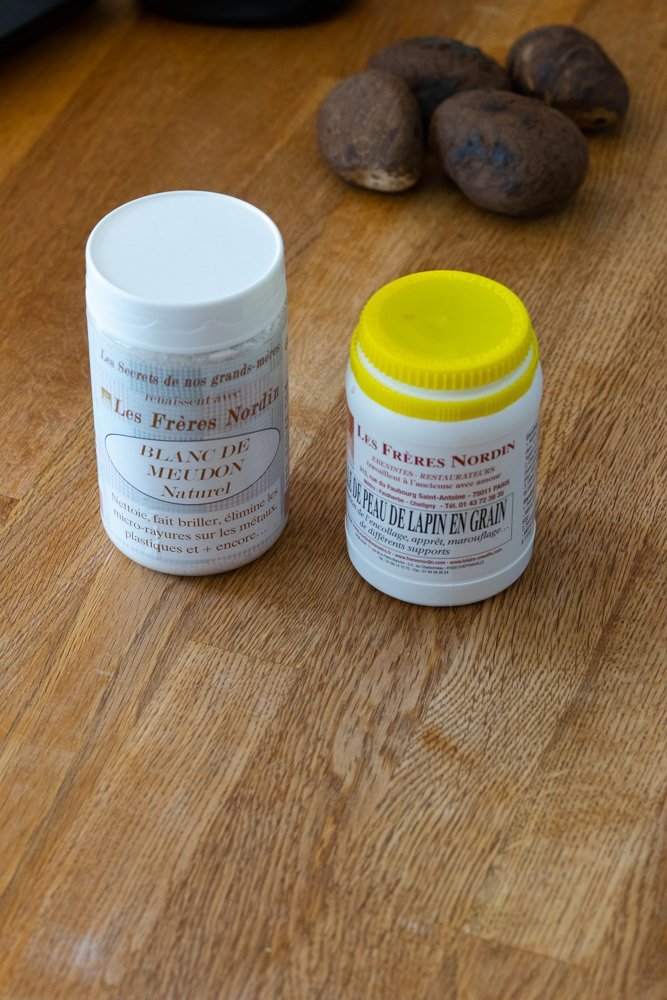
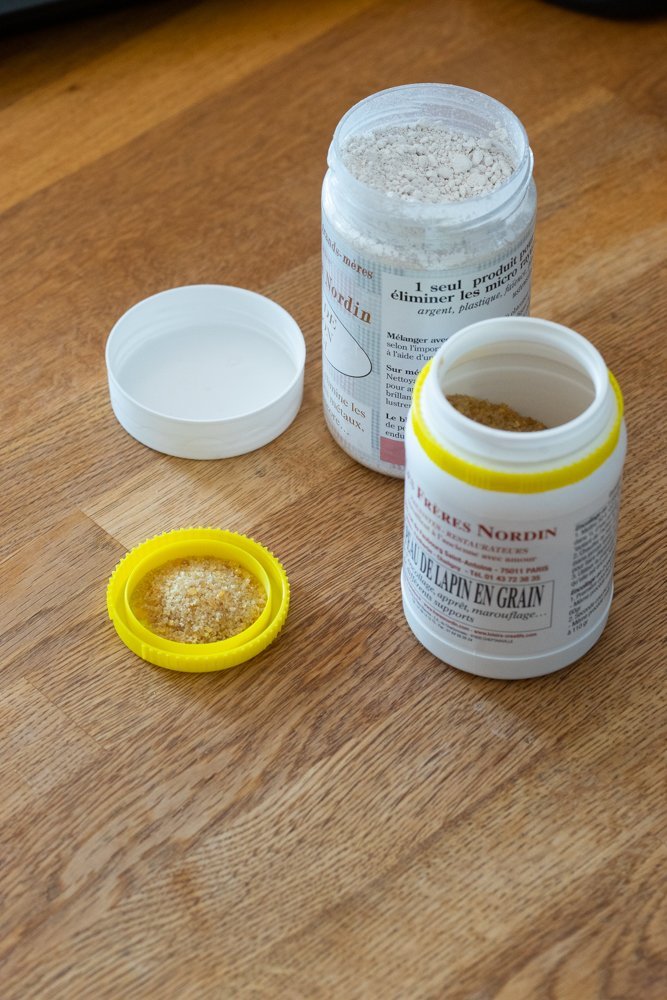
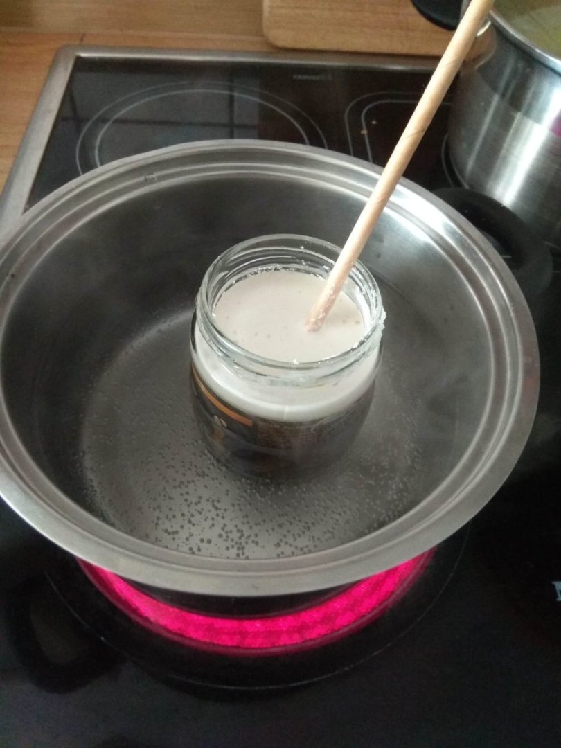
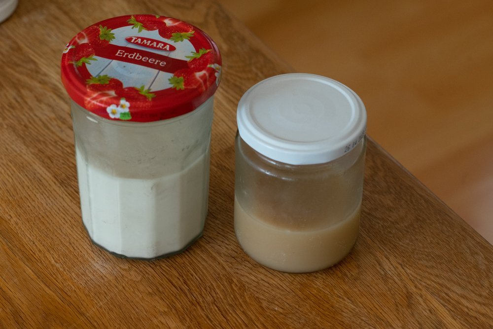
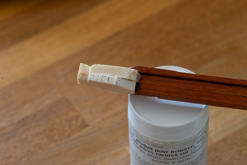
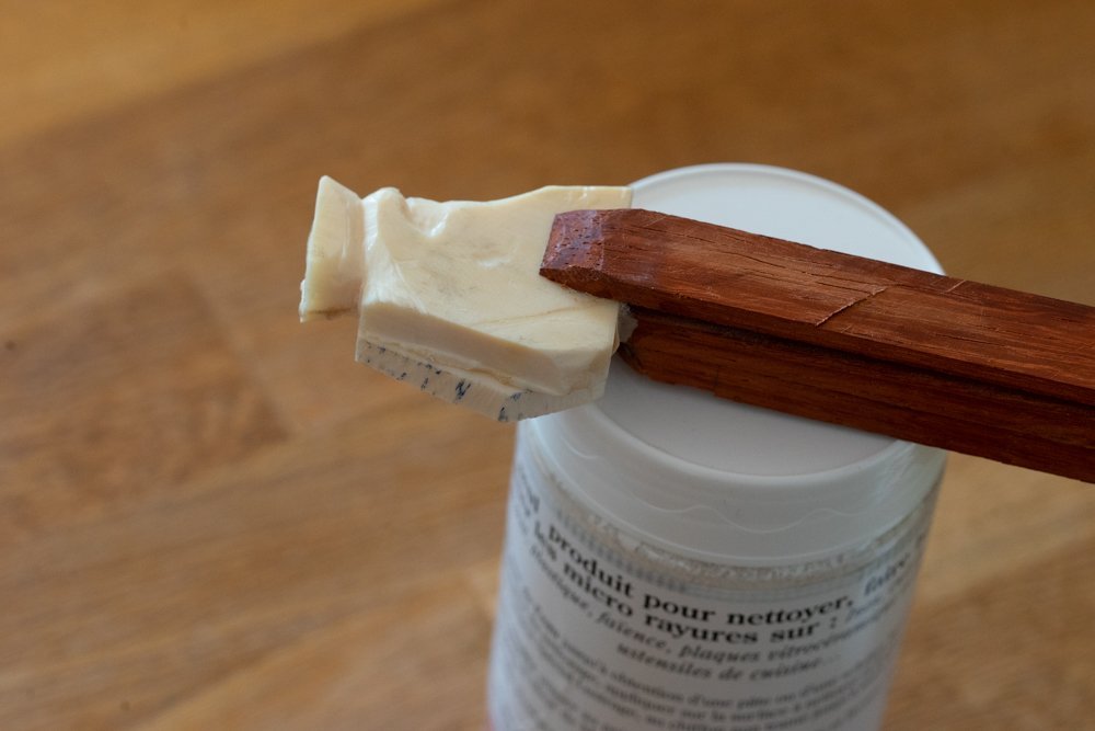
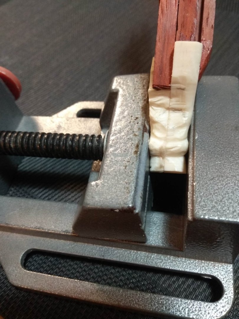
As has been rightly pointed out, since bone carving has been practiced for a long time, there must be a glue with which to glue this material. And again, as has already been said: the glue for bone must be of animal origin. This is indeed the case. And even I, a person who had never been interested in this subject before and had no experience, understood this. You don't have to be too smart to understand this nuance. Simple logic is enough. If I know that earlier this kind of work was done by captive French sailors and they took bone as a material because it was available to them. Then it is logical to conclude that the glue must be one that can be prepared under the same difficult conditions. It is inconceivable that the captive craftsmen were supplied with some complicated means, which can be made only in the conditions of a good workshop. So the answer must be somewhere near. There must be a means that is simple enough. We just have to find that means. And it has been found. With the help of a customer, I found out that there are ready-made jars on sale that are already prepared for cooking bone glue. This is what the jars I bought look like. In my case, there are two of them. Although it is possible to do with one. The first jar is the composition for the glue. These are pellets that are rabbit based. The second jar contains a very fine grind of chalk. It is needed only to give the glue a lighter shade. So that the yellowness of the glue is not so noticeable. This type of adhesive simply cannot be made as a finished liquid. Since it is purely animal particles in diluted form such a solution has a shelf life and will soon go stale. Therefore, only the amount required for the prepared volume of bone should be diluted. Anything that will not be spent in the case can be stored in closed dishes and in the refrigerator and not longer than a week. For those to whom the subject of bone is as new as it is to me I will mention that there are other kinds of material for glue. For example, I've seen videos on youtube where people used hardened pieces instead of pellets. Apparently this is dried glue that looks like plates. Then they were broken into pieces and glue was prepared. After what I've read about multi-component formulations, a jar of pellets like this is a gift. No need to mix different components, look for them separately. Everything is much simpler. However, even in these conditions, I did not get the glue on the first try. For some reason, the first attempt looked quite strange. And that was understandable to a beginner like me. The granules floated on the bottom in the form of a cloudy sediment. Sort of like a dead jellyfish. I don't know what I did wrong. I was expecting something else. So I thought the pellets needed more time, they didn't dissolve enough. So I left them to infuse for another day. Then another day. Then it became clear that nothing was going to change, and the animal material would become very foul smelling as soon as I opened the jar. So I disposed of the first attempt as if it might mutate and turn into some kind of monster. I was careful, quick, and decisive. The second attempt was also unsuccessful. And I still don't know why? The only version of the failure of the first experience I could see was that I had diluted too few pellets in the water. And the second time I poured more pellets into the water. By the next morning, the jar looked completely different. Now it looked much more like a monster. There was no water in the jar at all. All the space was filled with a swollen mass that looked like jelly. Even the lid was dangerously swollen. Next, the glue had to be heated in a water bath. The jelly-like mass had to melt and become the bone glue. I poured some chalk into the jar and began to heat the whole mixture. But then something happened that I didn't expect. I thought the glue was supposed to be thick and viscous. But the jelly turned into a very liquid solution. It didn't even stick to my fingers that much. There was a warning in the recipe that the solution should not be boiled. Which I understood myself. It's a protein and overheating would just curdle it. So I was hesitant whether to heat it further or risk boiling my glue. It was still just as liquid. Since I don't know exactly what the ideal result should look like, I decided to give a second try and tried to glue my test pieces of elephant bone with it. At one point, I even started to have hope. As the glue began to cool in the jar, it became noticeably more viscous, and by the evening it had become solid. Not as hard as glass, more like bisque, if you poke it with a stick, you can feel the elasticity. But who knows, maybe that's the way it's supposed to be. And it needs more time to fully harden. But alas. After a couple days, I took my glued plates out of the vise and they came apart easily. And I had one more try. I wondered, what had I done wrong? What was the reason for the failure? After all, the second time the appearance of the jar was so different from the first version. Maybe it was my addition of chalk that spoiled everything? Maybe it should not be added at all? Or maybe it should be added only to the finished glue? I didn't know the right answer. The only way was to completely eliminate this component from the next attempt. If it's the chalk, it should work. And if it's not the chalk, the glue won't work without the chalk. I also thought that the reason was that I had added too many pellets the second time. The jar was bloated. Maybe the bloating caused air to get in? Maybe that's it? The glued halves held together much better. Honestly, I didn't try to tear them off using a knife, vise or anything else. But the pressure of my hands was not enough to break the bond. Let's see how strong the glue proves to be in the next stages. I'll be doing some test carving on this piece. It will show whether it will remain as strong then. This is how two jars with two types of glue look like. The lighter colored one is with chalk. This is to give you an example of how much chalk changes the color of the glue. There are a lot of questions with this component as well. In the future I will try adding it to the mortar again and see the results. At this point I will stop experimenting with bone glue. I have some answers. Experienced what bad attempts look like for sure. Next I need to build up my experience. Definitely will need to think how to make the solution in smaller doses. I just don't have that much bone for that amount of glue to use up. And to waste pellets every time to throw away so much leftovers is just a crime. At this point I can say I've said all I can on the subject of glue. There is nothing more to add. Only if there will be knowledgeable answers about what I did wrong.
-
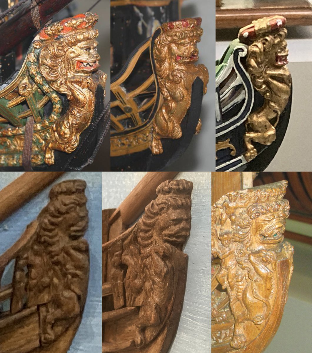
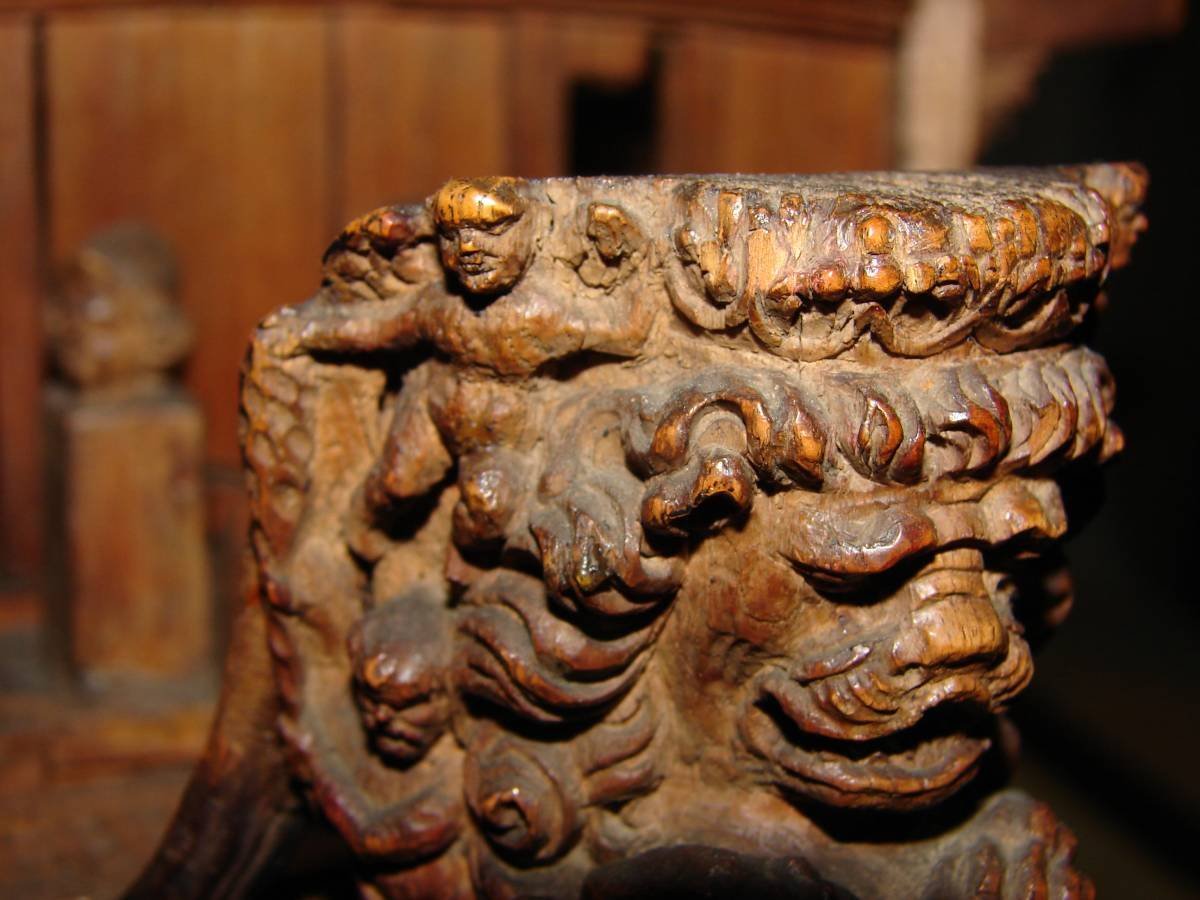
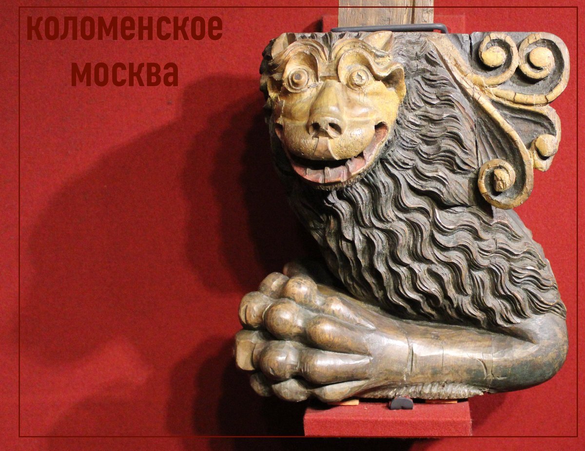
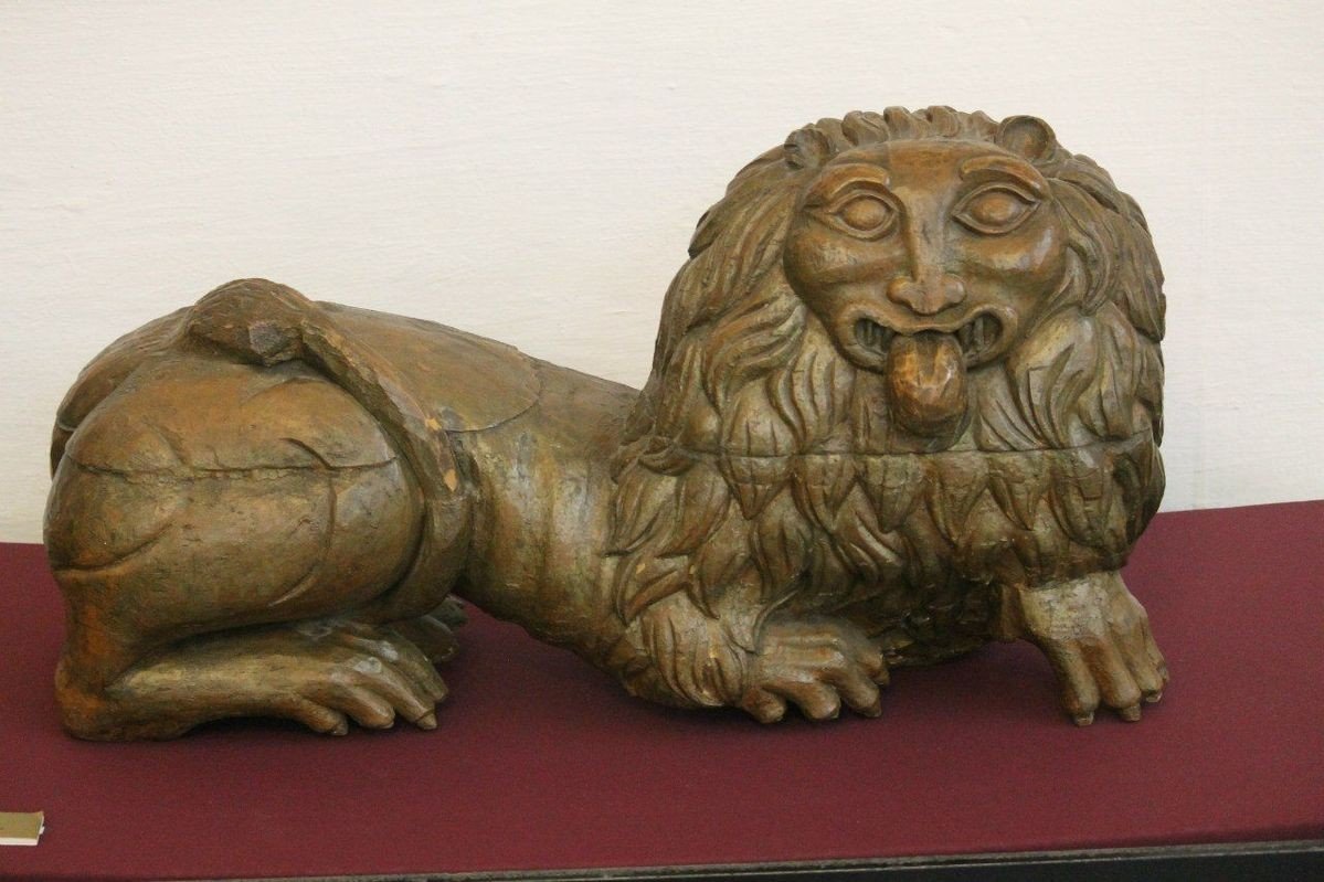
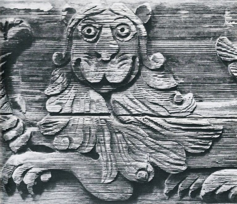
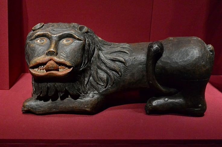
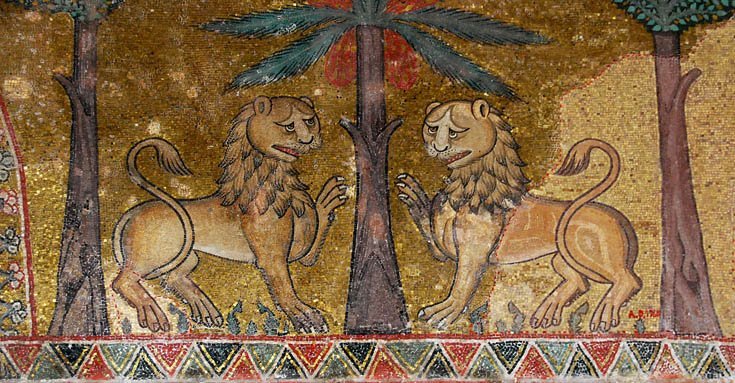
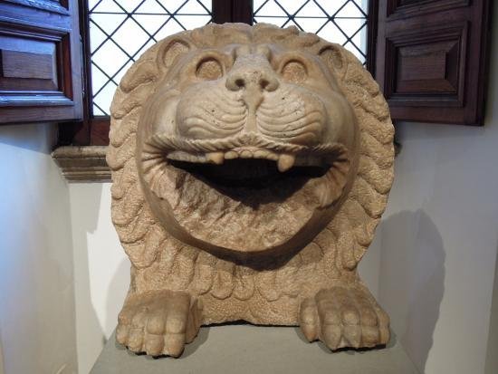
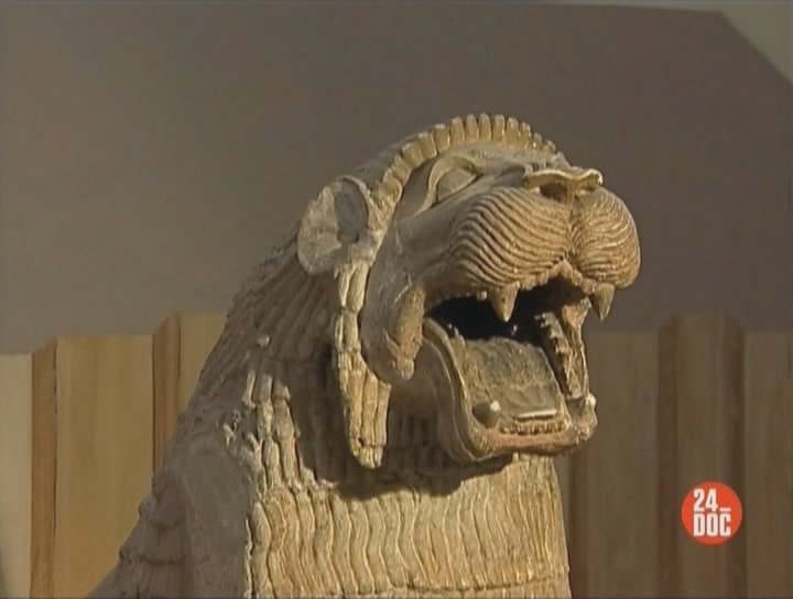
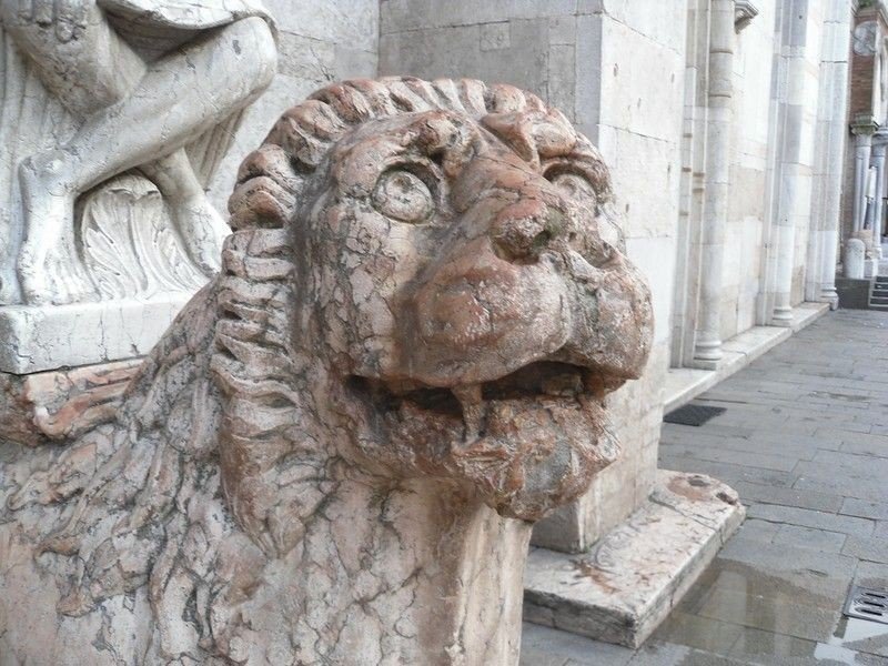
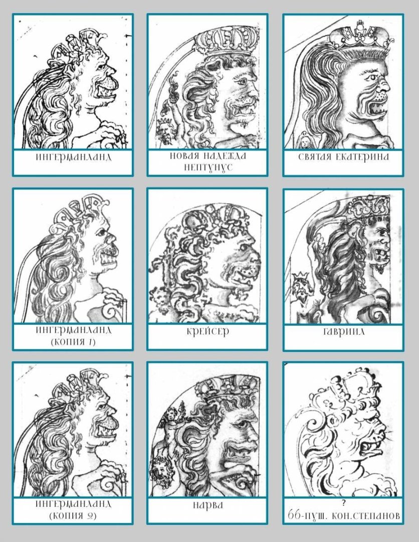
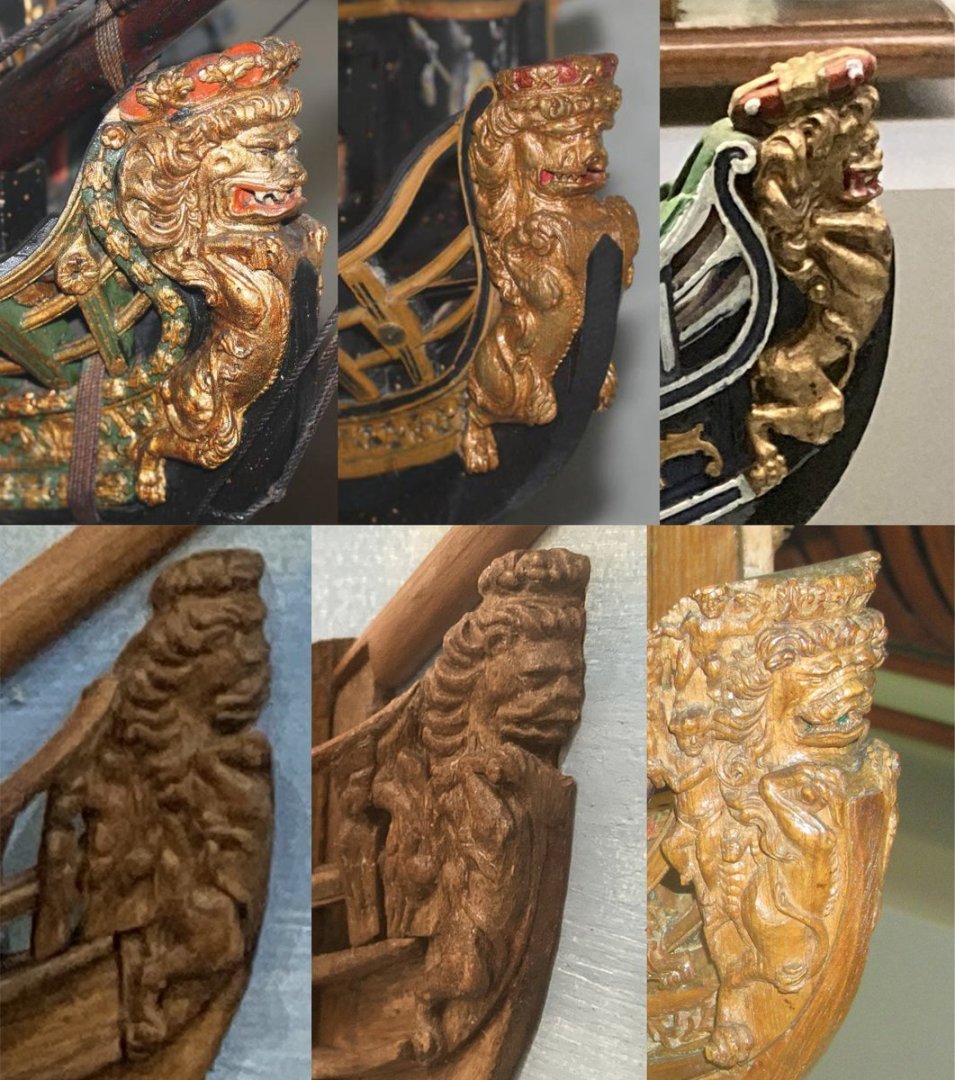
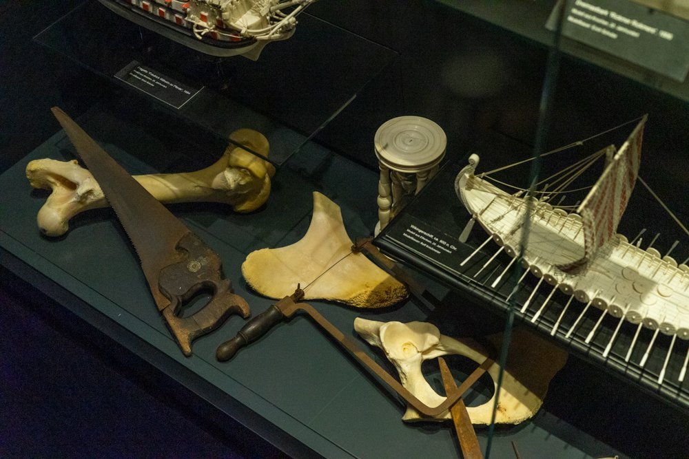
Episode 1 So, I'll start a long story about the next lion. As I wrote earlier, I really want to devote more time to it and describe not only the work itself. One of the reasons is that for this information platform this school of marine sculpture is not as widely known as the French or English. I am talking about the Russian school of shipbuilding. And specifically about what features are characteristic of the sculptures on Russian ships. And it seems to me that acquaintance with this school will be curious not only for me, but also for others. Where does acquaintance with the peculiarities of the shipbuilding school usually begin? Of course with drawings. Preferably with historical primary sources. It is good that we live in times when such information is available and anyone can find enough information: from books, archives or the Internet. Except that looking at drawings, engravings or sketches has one nuance. It is quite easy to draw the design of the hull, engineering features, show the form. And to understand what exactly is drawn on the drawing is also simple. So it's easy to repeat it. But when it comes to sculptures everything becomes much more complicated. Sometimes it is very difficult to understand from a sketch what the artist wanted to draw, how his drawing can look in reality, in life. For example, try to understand what is drawn here? And how can you turn it into a three-dimensional sculpture? Looking at historical drawings of Russian lions it is also difficult to understand them accurately. During this lion project it has already been mentioned that people in the 16th-17th centuries imagined very roughly the appearance of animals. And sometimes drawings of horses, lions and other characters look strange. And this trend applies to different countries. And in ancient Russia the situation was exactly the same. Russian lions of the 17th century are still those amazing freaks. For example: And if you put next to lions from other ships, you can even note that they are relatives: So for a modern craftsman, the desire to replicate ancient ship sculptures seems to be a very interesting task. And looking at ship drawings alone is not enough. Something more is needed. Unfortunately, the example of Vasa's ship, when we have the opportunity to look at a real ship is a single exception. Not a single sculpture of the Russian lion has survived. Which leaves us with only one option. To look for preserved models of ships and to look how lions look on them. Fortunately models of ships have reached our days. Among them there are quite ancient, built during the early development of the Russian fleet. Here, for example, are some examples of surviving Russian sculptures of lions. to be continued...
.jpg.398ceb34a9317beb97a4a32d13bc1c49.jpg)
- 546 replies
-
- 10
-

-
-
Thank you. It's very nice to realize that.
-
Mark, you got me thinking. Indeed, why do we publish our own work? First, we do it when we need help and advice. And then the modeling community provides help, guidance and advice. Secondly, we do it for ourselves. Maybe even this point is the first and more significant. Every creator needs not just a viewer, but a positive response. An artist can draw pictures and hide them from prying eyes. He has the right to do so. But if a person does so, it may speak of problems. The artist wants to hang his work on the wall. It is important for someone to have it on a wall in a museum, and for someone it is enough to have a wall at home. The desire to share with others is a normal desire. In this case, I also hang my work on the wall. I feel emotions when I work with wood. And I want to share these emotions. I thought about the fact that I like not only to look at finished paintings or other works. I experience pleasure when I observe the process of work. I have channels in my bookmarks where authors make videos about how they paint, sculpt from clay, carve from wood or assemble some machines. I am interested in the process itself. That's probably why I'm also interested in showing my work, not just as a finished result, but as gradual progress. I have never thought about it before. It even became interesting to analyze it. It's my version of enjoying a hobby. I hold in my hands a wooden blank on which there is nothing yet, or there are only the first plowed traces. It is impossible to understand what the image is, but in my imagination I can already see how I want the sculpture to look. And I like to look at the new steps every time and compare the actual appearance with what exists in my fantasies. I thought of this as my personal option. Other people may have a completely different opinion. Each of us is different, special. And that means that not everyone can be close to what is close to me. What if everyone else on Earth sees the world differently? Is that enough to decide not to show my version? Maybe it really is. Then I'm like the person who paints pictures and hides them. After all, even someone who hangs his paintings in his house still shows them to others. To his family, to his guests, they can be seen by the letter carrier bringing the mail, by the neighbor who came to borrow salt. On this forum I also have "my own apartment" - this thread. I can put here what is interesting to me. And the rest is already a separate matter. People come here. I see that people leave badges under posts, showing that they liked something. There are those who write comments. And the fact that you wrote that you are interested in watching and reading and that you are disappointed with me made me think. Do I get personal pleasure from preparing large texts? Yes. Do I want to write in detail about my personal discoveries, even if others may have known it for a long time and have not found anything new? Yes, I want to share. If only one person reads me, is that enough for me to consider my costs too high and my feedback too small? I will try to prepare the material so that you will continue to find it interesting to read. I know that many more people read silently, otherwise the visit counter would show different data. We live in crazy times. I feel better when I focus on the ordinary stuff. When I reflect on hobbies, art, how people have been creative at different times. Not writing would be much harder. And if people get at least bits of positivity when they read it too, I'll be nothing but happy.
-
Mark, thank you for your words of encouragement. You always respond very actively to all my publications. It means that you are really interested in what I do. And I really appreciate your attitude and support. Right now I am in a state of bifurcation. On the one hand, I really want to publish in more detail. But on the other hand, I'm not sure if it's necessary for others. The material is quite specific, and not everyone may find it interesting and useful. Which is evident also because you are the only one who responded to my question. I don't know, is there any point in publishing in this case? Sitting for many hours at the computer to compose a text, to make corrections in the translation, there is a desire only when you see the benefit in it. But to go to such a thing without benefit for the readers? I don't know. I guess I won't waste my time. I apologize if I have upset your expectations. I'm not quite sure what you were trying to say. What "new chapter" means. Did you mean to suggest that each individual work should be done in a new topic? Or something else? I have very little knowledge of computers and a lot of things are not clear to me.
-
When you talk to experienced people, their experience comes in handy when you need advice. And this is a huge plus! But it is absolutely impossible to tell about their discoveries, keeping intrigue and not revealing everything at once. After all, experienced readers always know the answer in advance 🙂. You are absolutely right 👍 about what glue should be for this task. I wanted to describe it in the next issue so that I could tell you how I arrived at the right way. I have partially mentioned the right way now, because the internet gave me the answers when I was looking for a way. The problem is that a working glue has to be prepared. It is not available in a ready-made form. And modern man, to which I include myself, has become lazy. When everything can be bought ready-made, the news that you need to cook something is perceived already.... it's hard to find the right word... it is a mixture of fear, laziness and the certainty that somewhere there is a tube or a jar with a ready-made composition. And when I read about recipes for natural glues on websites, they were really perceived as something complicated, as if we are talking about witchcraft. So soon I will describe how I solved this problem.
-
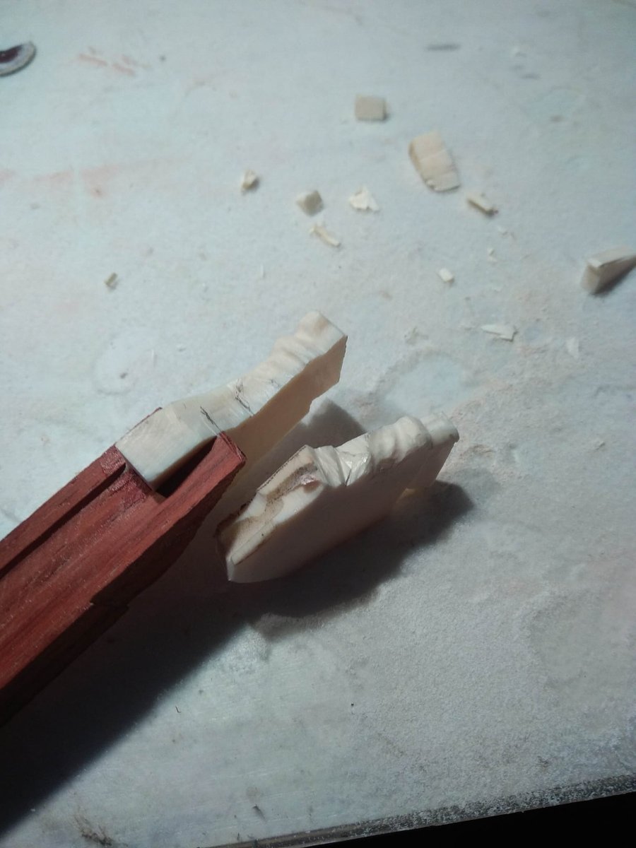
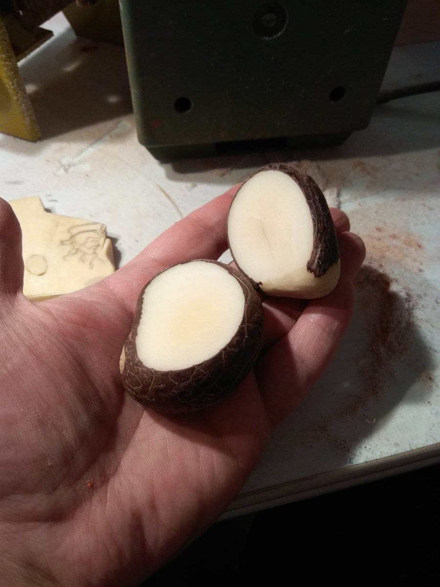
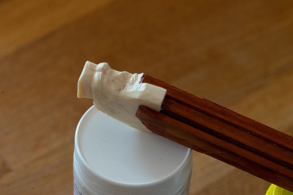
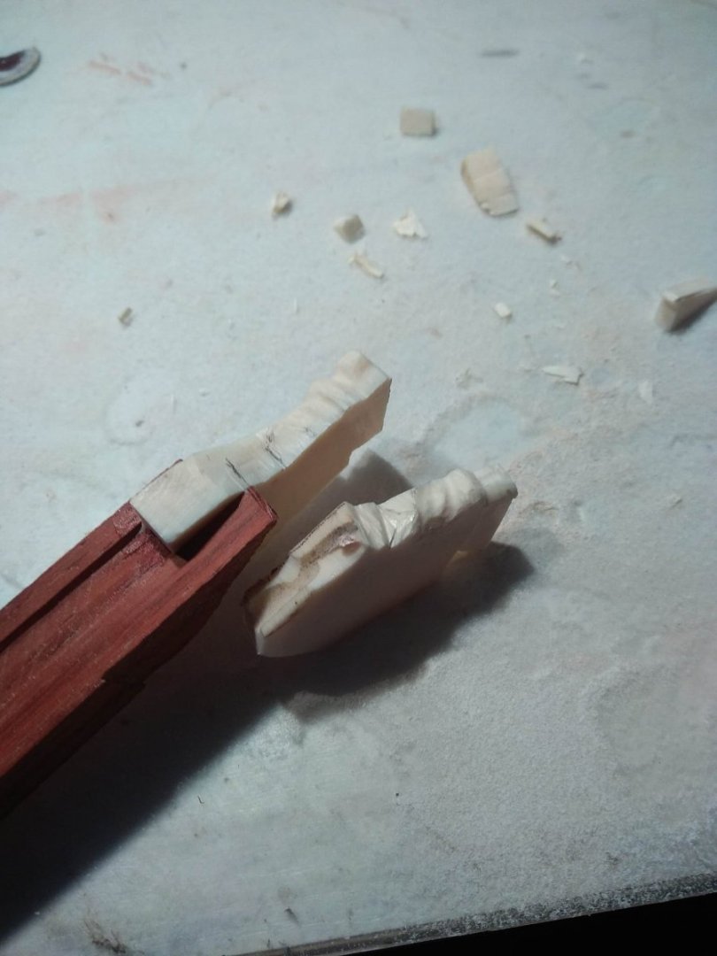
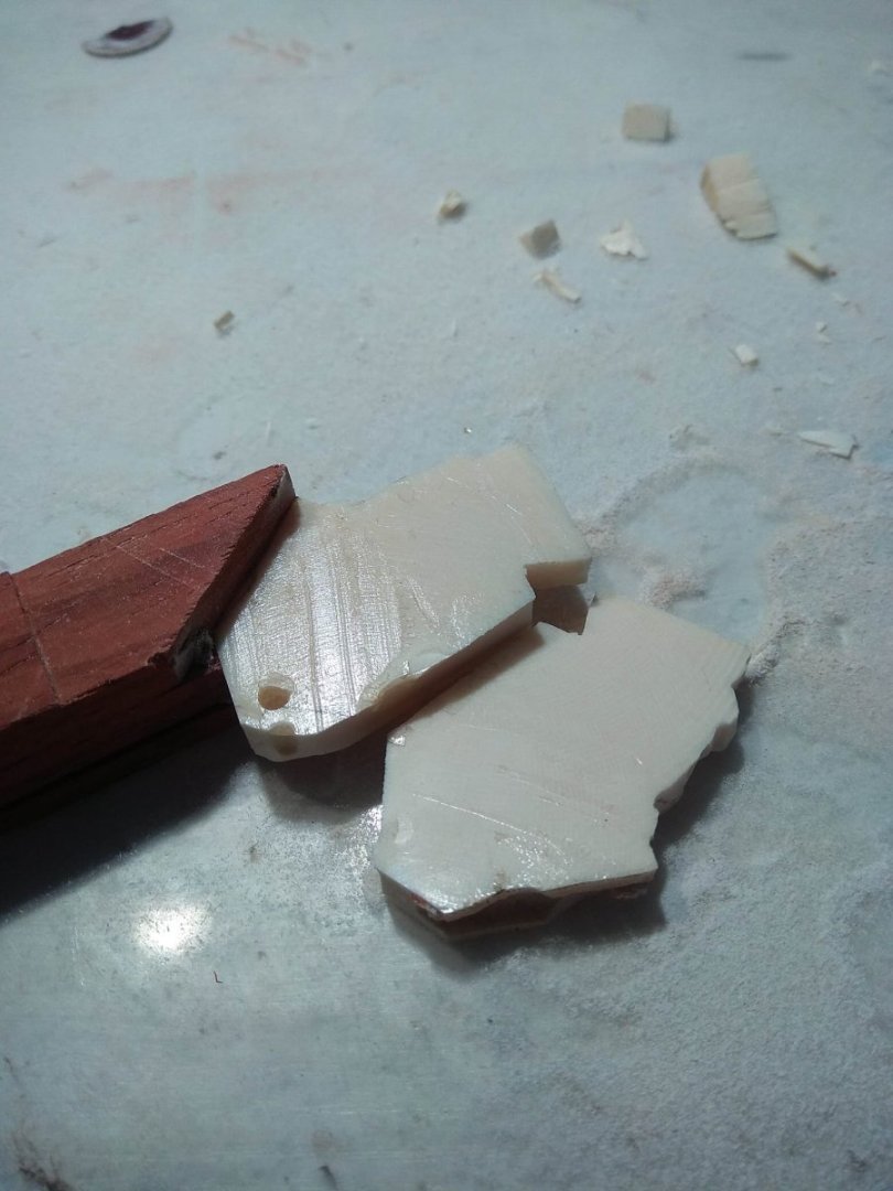
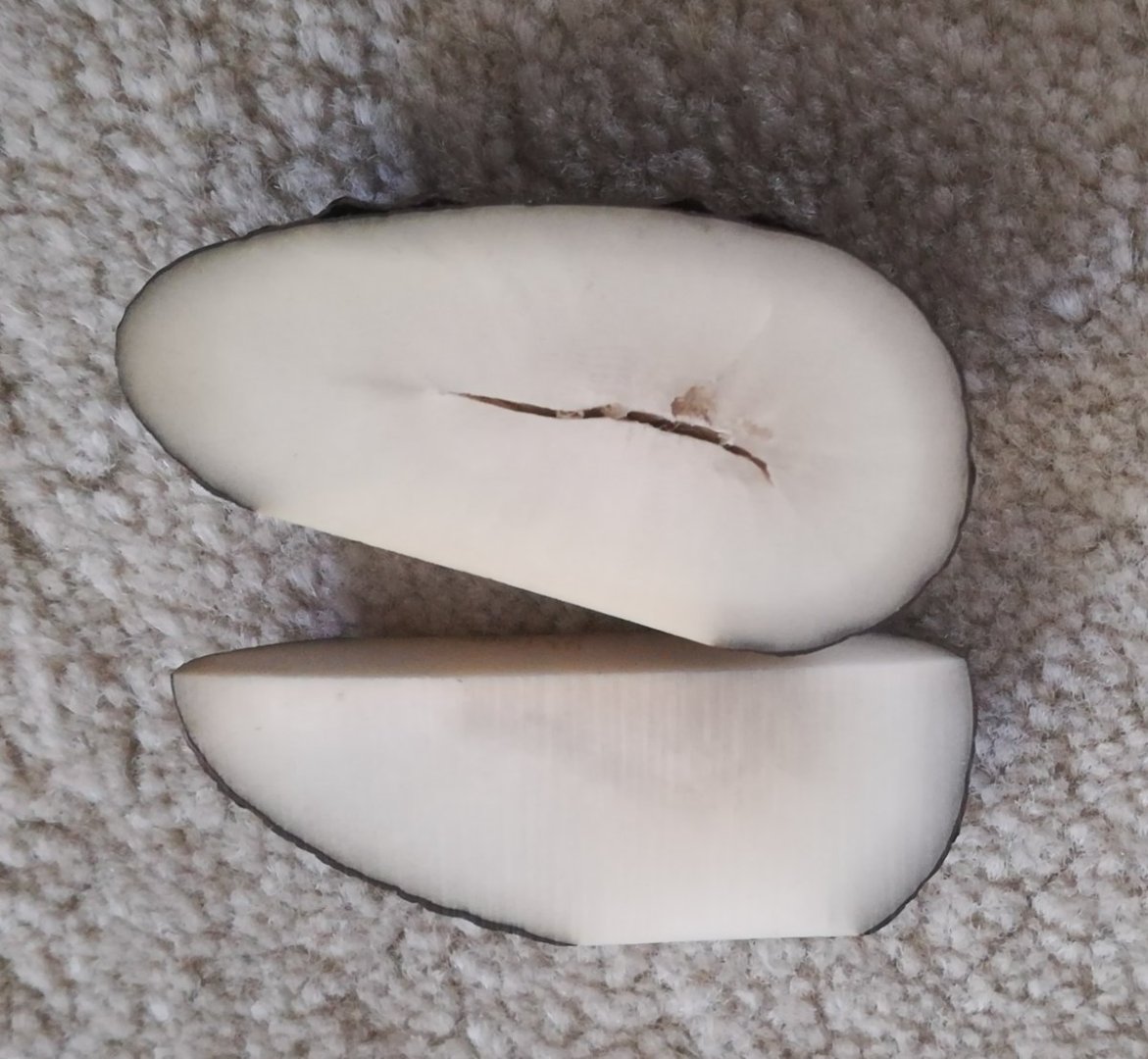
(Didn't even know this photo survived. It was taken a long time ago, at that time it was not yet known about the existence of Beren's sketches of the main figure on the ship. At that time I tried to make my own version of what the sculpture on the breakwater could look like and what kind of character could be there). Now for the gluing. The results for walnut and bone were radically different. Glued together on cyanoacrylate, I could not tear the nuts from each other. The bond was very strong. But the halves of the bone came off very easily after the first attempts to work with cutters. The polished surface of the bone prevented the glue from catching. Other glues didn't work either. So I was faced with the question of what to do next? If I were to use the bone, I'd have to glue it together. And that proved to be a problem. The bone substitute, tagua nut, on the other hand, proved much easier to work with. And if we remember the previous posts about odor, this material gets one more additional bonus. And that's no small argument either. Believe me, ignoring the odor issue is not something everyone can do. The minutes I tried picking bone with a power tool, I was reminded of covida and the fact that many people lost their sense of smell from this virus. And I even regretted that I couldn't temporarily stop smelling. So it turns out that the tagua is the best choice and it has no downside? Mmmmmm.... No. We live in a world where everything has a downside. Or nuances that will have to be considered. So what are the minuses of tagua nuts? I received a whole bag of this nut from a customer. You can see from the photos that they are quite large pieces. However, there is a catch. The customer told me that he once ordered this nut specifically for this project. And this package is just a small portion of what he bought. In fact, he had to buy 8 kilograms of these nuts! But only a small fraction of them were good. And that's easily explained. If you order online, you are simply not able to see what exactly you are buying. And in what will arrive not all the nuts will be of good size. A lot more will be ones that will be small. If you plan on doing something very miniature, this fact may not be a problem. Or it might be. In addition, it is important to realize that the nut inside can have features that even an outwardly good nut can easily turn into a bad nut. The flesh of the nut may have cracks, and from the stem, on which the nut once hung, there is a hollow channel. And it too can fall into the area where it will cross your future sculpture. Walnut has one more peculiarity. I can't call it an outright disadvantage, but it can be called a possible problem. Remember, I said that I tried to heat the walnut during sanding and see if it would affect its appearance? And I wrote that I didn't notice any change in appearance. I can't say for sure now whether I was right then or whether I was wrong and the walnut did darken from heating. You can't just notice that. However, after gluing, a clear border became visible at the joint. I even tried to dig deeper into the joint. Both with a power tool and knives. The clear line is still visible. And there are situations where such a feature would be a disadvantage. Ideally, I would like the joint to be less visible. 5 процарапанный стык At this stage, I can't say for sure what exactly caused this dark line. Maybe, indeed, the aggressive sanding has darkened the walnut structure and it only became visible when gluing. Maybe this is how the material reacted to the cyacrine. Maybe if I change the glue or make sure that the walnut is not heated, the result will be different. Or maybe even under different working conditions the edge will remain visible. Only time and additional tests will tell. This is the end of this part of the descriptions. The topic has not yet exhausted itself completely. Later I will describe further searches for bone glue. And what I got in this search.


-
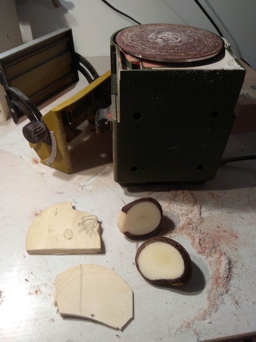
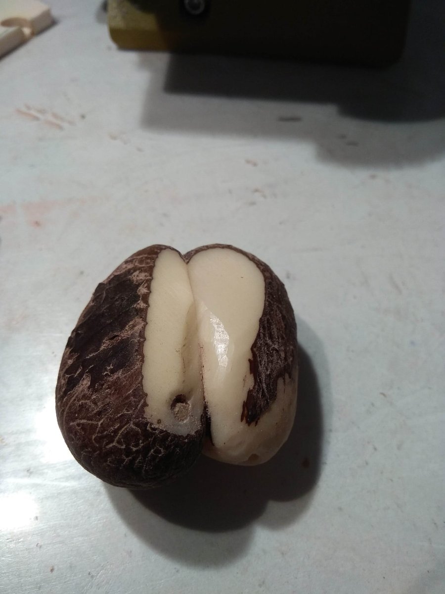
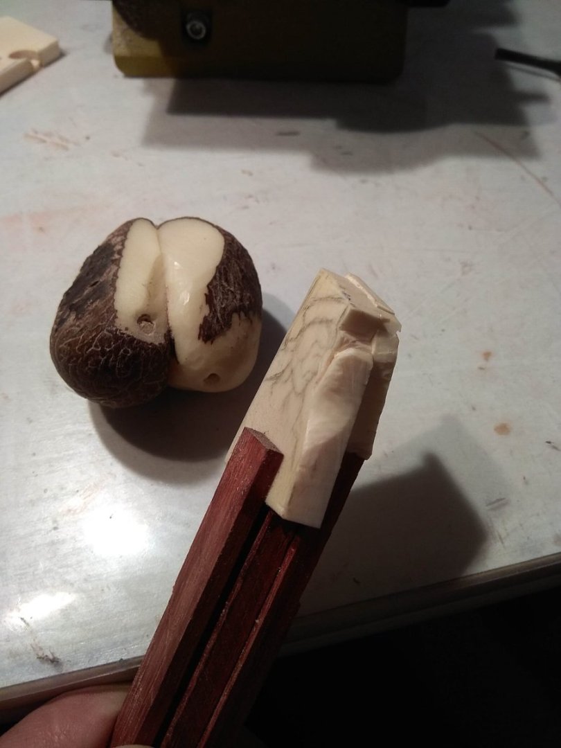
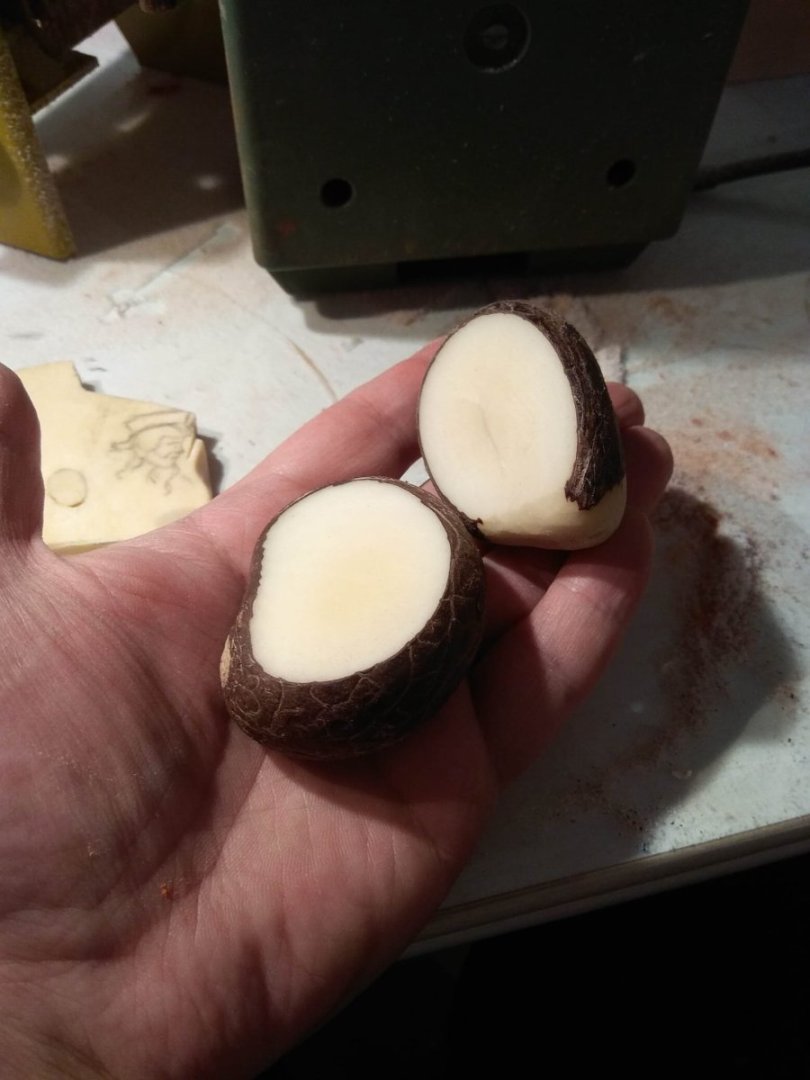
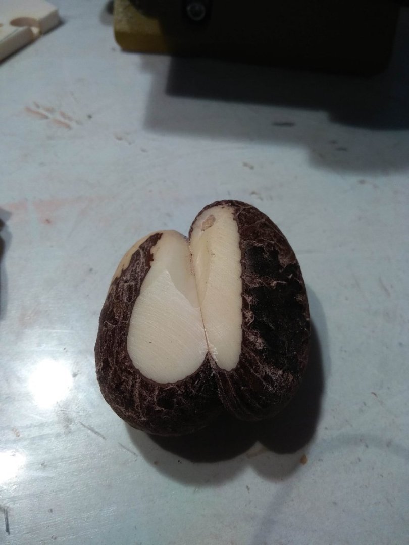
How did I begin to get acquainted with materials that were new to me? First of all, I needed to understand what are the limits of bone and tagua nuts, what are the limitations and disadvantages? And I started with the question of what to glue the bone with? Naive thoughts that I could just pick up glue at the building store were dispelled very quickly. There was no glue anywhere that promised it would work on the bone. I could think as much as I wanted about how easy it was to sell everything in the 21st century. It didn't help the cause. But that's impossible. There has to be a glue, and people have been working with bone for a long time. So I started asking the internet how to glue bone together. And in response, it started sending me to Hogwarts. The recipes were too unusual. Something like the following: take toad's feet, at midnight grind wormwood, grind dried rabbit ears in a mortar. On the night of May 32, start boiling the potion in a bronze cauldron, after the water boils, drop three even drops of unicorn sweat and stir gently with a silver spoon, 28 bars clockwise, then 14 in the opposite direction. Now that sounded about right. Honestly! It even made me scared. I scratched my chin and decided that I would still try gluing with those glues that would keep me safe from the Inquisition or from accidentally turning myself into Shrek. Several kinds of glue were bought at the store, ranging from the usual seconds of cyacrylate to some epoxy kind of glue. And at the same time I decided that I should do experiments not only on the bone, but also on tagua nuts. I was also very interested in them. What kind of material is this? So I took a couple of nuts. First, I tried picking them with knives. The texture of the nut was quite hard. It's like a dense plastic. The shape of the nuts is not exactly round. Rather, it even resembles a pyramidal shape with roundings. So it is enough just to grind the flat side on a grinding machine and get a flat plane at two nuts. At the same time during this grinding I checked how the walnut reacts to mechanical heating. What happens to it from friction? Will it not become darker or change in some other way? After all, if I will use an electronic tool in the future, I should know where unacceptable actions begin, which can spoil the result? Therefore, I deliberately tried to keep the nut in contact with the disk of the grinding machine long enough. I was satisfied with the result, I didn't notice any negative marks. But I will come back to this point a little later.
-
Thank you for your reply. I'll keep looking. The good thing about my lion project is that no one is in a hurry and I already have many applicants in line. So there is time to search. Anyway you gave me a good tip with the pharmacy portal. I had completely forgotten that there are some really cute raptors there. Next time I get to Hamburg I will definitely try to visit the museums you mentioned. Sometimes I think you have more museums than inhabitants. So you can see a lot and for a long time.
- 2,699 replies
-
- 5
-
-
- heller
- soleil royal
- (and 9 more)
-
I would like to publish the story about making the next lion in a broader form. Even wider than it was done when publishing the material about the lion from the Vasa ship. I think it will be more interesting, as the next lion is likely to be from the category of less familiar. And the additional information will introduce something new. At least for me the period of work on the next sculpture was connected with new searches, I do not just sit next to the photos of the source and try to repeat the features of what I see. It was immersing myself in history, looking at several possible candidates for references, studying sculpture from the same period as the chosen figure, and much more. But I don't know if such a long narrative would be of interest to readers? Maybe it is superfluous and just photos will suffice? Is it interesting to watch the stages of work at all or is it easier to show the finished result. Which is better?
-
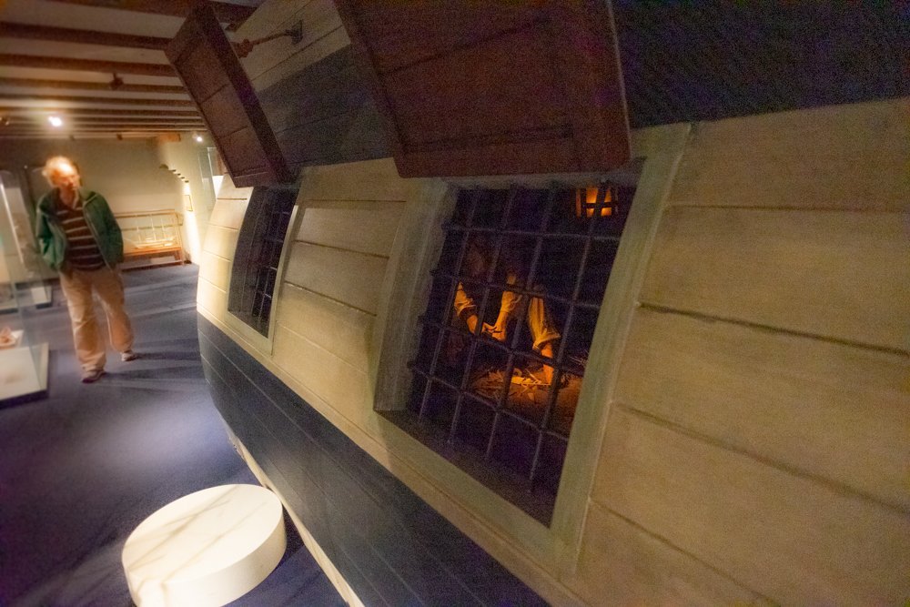
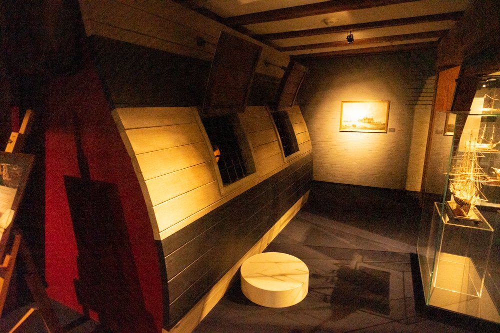
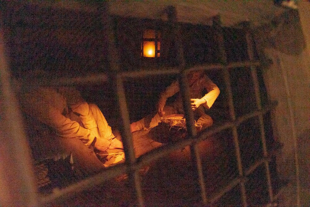
Yeah, that's right. Mammoth tusks are also on the list. I'd even say it's number one on the list. You could also list cow bone. I've never dealt with that kind of material before. I wonder how you can prove you're using a legal type of bone. That you're not illegally sourcing the material? For example, for exhibitions. Do you need to provide receipts from purchases, where it will be written what kind of bone sold? Is the proof of the forum, where the stages of work are published and you can see what the original material represented and in the finished product is it? I've never been interested in such questions, but in case it comes in handy. For example, after I took on this project, I had another idea. And it is related to the lion project. There is another type of bone that is used in ship modeling. It does not look as refined as items made of mammoth tusk or elephant tusk. Next to these materials, it even looks rustic. That's because it's cow bone. But cow bone has its own logic. It's more historical. French modeling of ships made of bone is closely connected with the captive sailors who, while imprisoned, built ship models out of this type of bone. As they were more readily available than even wood. So I had the idea to make a French lion out of bone. And to use cow bone. To emphasize a certain parallel with the historical source. That's a separate conversation. There are completely different complexities here, and it's just an idea for now. (museum installation with captive French sailors who occupy their lives by building crafts and ship models out of cow bones). But if I decide to take on this idea, I need to think ahead of time, what would I have to have as evidence? In terms of structure, cow bone is very difficult to confuse with elephant, walrus or mammoth tusk. But there would still need to be evidence that would be accepted as valid at the exhibition. I'm not likely to be able to show a receipt from the meat department of a grocery store.


.jpeg.32858cffe23a3725eb844eceff82bb54.jpeg)


.jpg.915ce7af8032f7030730947d5172055a.jpg)