
HAIIAPHNK
-
Posts
351 -
Joined
-
Last visited
Content Type
Profiles
Forums
Gallery
Events
Everything posted by HAIIAPHNK
-
 And finally I'll answer your question about my nickname. It also directly relates to the difference in languages. I've been thinking for some time how best to answer it. And I had two options. In the end, I chose both. How's that? If suddenly there is someone near you who is familiar with the Russian language, maybe some friend or acquaintance, maybe at work there is a colleague who speaks this language, then I would like to suggest that you show this nickname to such a person. Somehow I think that you will have an interesting dialog, he will be surprised at first, then he will smile and you will get something new and positive. In this case, just don't read what I write below. Below will be the second answer option. Just in case you don't have acquaintances with knowledge of Russian language. And in this case it's easier for me to give a full answer myself.
 -
I'm not quite sure how I interpreted your words about being eaten. I assume that's your reaction to what I said. I may have used the word myself. But unfortunately I could not find such a place in mine. It is also possible, because different translators may translate the same sentence differently. In one place it is perceived as a positive expression, and in another, next to it already as something negative. So I find it hard to know how to react and what to say. In Russian, the expression "eaten by work" has a positive, good context. Here we are not talking about something that can be compared to an attack by a wild animal, a shark, or something that can harm or kill. When they say that a person is swallowed up by his work, they mean that for this person his work is very important. He completely "dives" into it. He doesn't just have to or have to do the job. He enjoys it. "Amazingly, it was already evening. I hadn't even noticed how quickly the time had flown by. I was so swallowed up by my favorite activity that I didn't even notice that it was already time to go home...". So if these words have a different meaning in English, I apologize if I may have been misleading. I may not have used those words in my text. Then I apologize for not being able to accurately understand the essence of your words.
-
I'm not sure I explained it correctly. Let this be an additional attempt. In the topic I try to describe the emotions I had at the same moment of work. If there were doubts, I write about them. If there were problems, I tell about them too. But as time moved on, I found answers. In the next parts of this story I will write what exactly was the reason for eliminating doubts, how I found a way out. And so on. You know? Imagine you are watching a movie. It already has an ending, it has already been filmed. And it's bound to happen. That's not to say that I want to stop you from writing about your prompts. It doesn't. By all means, write. I may not know what you know and your tips can help a lot. Except I definitely won't be able to make any changes to this work anymore. It's already finished. I will only be able to remember my mistakes and avoid problems in future works. I really do not want to unwittingly turn out that you said something really important and useful, and tomorrow I will publish the next part, as if I did not want to listen. And that it doesn't make for an awkward situation. Oh, I'm not good at expressing my thoughts in two words. In ancient Sparta, where they loved precise and short phrases, I would definitely have been executed long ago for writing too long. I know it's my flaw. I hope I was still able to explain my thoughts.
-
Thank you for the additional information about the paduk. Thank you for your warnings about the variability in the color of this tree. Where do I begin my response? Well, I think I'll start by letting you in on a secret. In fact, what I am posting now about the Russian lion carving is actually a retrospective. That is, it describes events that have already happened. At the moment, the work with this figure has already been completed. And I am telling my story already knowing how it will end. At the same time, I want the story to look like a story, a tale, an adventure. And not just statistics of step-by-step demonstration of work. I don't know how true that is. Most likely, this option has its disadvantages. First of all, short posts that don't take much time to write are much more popular now. Secondly, I realize that since I am not a native English speaker there are a lot of mistakes in my posts. It's hard to read that kind of stuff too. And I didn't immediately decide on this style of posting. I hope that with disadvantages there are also pluses. For example, if a person has never encountered paduk, it will be useful for him to learn about the nuances of this material. So I try to remember not only the positive discoveries, but also the problems. Also, I hope that this style can help someone to try carving something themselves. The finished sculpture might look too complicated. But when you see that it was a simple log at the beginning and the first steps don't look so pretty. More like weird ditches in a field where potatoes are supposed to be planted or just dug up. It goes to show that just because you have something similar in the beginning doesn't mean it's bad at all. A little patience and gradually things will start to change. Plus, describing funny moments or minuses makes the story more alive, real. I feel like this. Maybe it's my own delusions, but it seems to me that there's been less socializing on the forum pages lately. And I want people to get more interesting reading experiences. And more socializing. And this is easier when there is not only useful information, but also descriptions of emotions. Here you are, by the way, a good example of this working. You wrote a lively and interesting commentary. And I'm very happy about that. ---- You guessed some of the themes that should appear in the next issues about this Wookiee. And now you've mentioned some of the nuances of Paduc, which I'll also cover a bit later. I'm not afraid that the paduk will change a lot over time. You could say that this particular lion project is immune to many problems, including the question of what the paduk will look like in a year. I am free from the need for the color scheme to remain exactly a certain color or tone. For example, in the Fulminate project, experimenting with paduk would have been much more dangerous. Here there is no problem with that. In the collection, there will be lions of different material side by side. Some will be light, others dark. I don't have to worry about any of them turning yellow or dark over time. I am absolutely sure that after some time the Russian lion will become very different from its current color. When I showed the very first shots of the purchased firewood, you can already see there how different sides of the same bar look different. I am ready for this. I'm even interested in it. If over time my Wookiee looks like very old and darkened wood, there will be the effect of an ancient find. And I'll be telling stories to all the visitors that I actually found this figurine in the basement of an ancient castle. And I will look at the surprise of gullible guests 😄.
-
Hello. Your comment really impressed me. And this is the second time in a short time. First I was impressed by your posts about your thesis work on French ships. My project with "Fulminant" is my first introduction to the French school of shipbuilding. I had read some before, but I didn't have much experience. So it is very interesting for me to learn new things. And I am very grateful for the links I got thanks to your posts (+comments from other members). I have put them aside and will try to familiarize myself with them more. But since the topic with Fulminant is very extensive, it would not be right to talk about this ship in this thread. I know myself how far I can stray off topic. And then the thread about my carving work will very quickly become a duplicate of the thread about building the Fulminant. And now you surprise me once again. In Russian there is an expression "a bear stepped on your ear". This is what they say about someone who has no musical ear. A bear stepped on his ear. Well, I've had not just one bear on my ear, but a whole family of bears. And they didn't just walk on my ears. They probably had a picnic there and hung out for a season. That's how far I am from making music or singing in any way. The only thing that makes me feel better about my situation is that there is a practical use for my singing. When I start singing, all the mosquitoes in the neighborhood start disappearing. I once personally witnessed one of them desperately banging his head against the glass in an attempt to escape from my house. And he was desperate. Since then I sing very rarely and only in self-defense. 😄 So, for me, I see all people who can sing or play musical instruments as special. And I even envy those who have this gift. So I take my hat off to you. Now, let me try to answer your questions. I'll start in order.
-
Geometry is one of the most interesting sciences. In my opinion. Of course, I will not argue that algebra, physics or chemistry have their own beautiful masterpieces. Our world is designed ingeniously and in it different sciences complement each other. And when you are engaged in the construction of architectural forms, you can feel yourself a little creator and see how you can solve complex problems with the help of a circular or the simplest measuring devices even without knowing long formulas. When it is not possible to do so, one can still feel the splendor of these tasks. And the fact that they did not succumb at that moment only emphasizes that this is really science and not just random lines on paper. I'm interested in this question too. Tell me more about it, please.
-
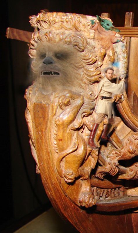
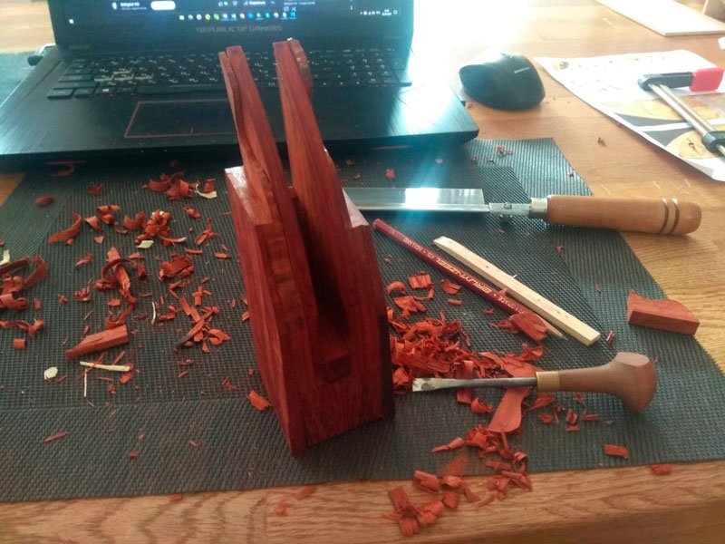
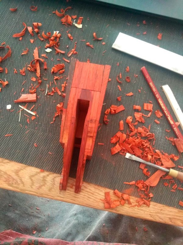
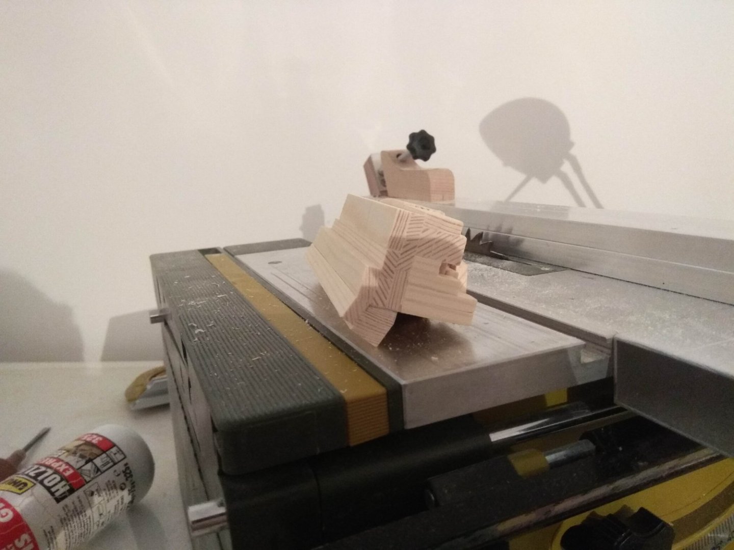
Well, the carving itself has begun. And this story needs to start with a splash page like this. Why? What does this have to do with Lucas? What's the connection? Don't worry, you'll figure it out in time. All you need is a little patience. You can imagine me writing this in Master Yoda's voice: Be patient, young padawan! Trust the force! In the meantime, I will begin my story. Even as I was getting acquainted with the paduk planks that came with the package, I realized that this wood would be different from the way the carving wood I normally use behaves. And those assumptions began to be justified within the first few seconds of working. Paduk is cut quite differently. Sometimes it splits not at the point of the cut, but randomly somewhere nearby. And you can't call it a cut anymore, it would break off and leave chunky chips. So I had a question right on the first day, maybe I was wrong in my choice of material. Maybe I should redo the whole thing before I go too far. If the paduk continues to behave like this, I won't be able to do a good job. I'll just waste more time. But I didn't throw out the paduk. I'm not sure why? There's an expression in Russian called "taking on a weakling." It's when you're specifically told that you're too weak and won't be able to cope with the task. And usually in such a situation you want to do everything possible to prove that this is not true. That's pretty much how I felt. Even though I didn't like what I was getting, I wanted to keep working. I'm a man! I have to do it! To this I talked myself into thinking that this was just the beginning. It should take time for me to get a better feel for the unfamiliar wood. And when my hands get used to it, it will be much better. After all, the stage of work, when you try to remove large pieces of excess wood is always different from work with detailing, when you already cut thin slices. Most likely the paduk will not break off as much as it does now. So I kept working. It was a strange phase. Unlike other sculptures, I was working and not enjoying the work. You could even say it was a torment for me. Such were the first emotions. That's a general description. And now we can move on to the telling of specific stories. I have already mentioned many times that I am used to starting from the head. I always want to work in this part of the sculpture first. I'm used to it and I don't even try to do it differently. This lion was no exception. Here, too, I followed a familiar pattern. However, this lion was different from the other figures. The head is usually the topmost area of the figure. It is very convenient to hold the workpiece by the torso, it is easy to get to the head from all sides. This was different. This lion did not have a standard head. The muzzle was practically drowned in a huge pile of mane. Parts of the face were in a low place, as if it were the vent of a volcano. It had yet to be reached. And that's where the trouble was. Because of this feature, my incisors were forced down too steeply. And at that angle, the knives were not cutting, they were gouging or plowing the wood. So again I could not work as I pleased and get a good result. What to do? Usually this situation should lead to a logical conclusion. Since you can't work the old way, you have to change it. You just work the parts that are easier to approach. Cut out the mane or the paws. That way you'll gradually remove the excess wood in those areas, and get more room to work the muzzle area. I mean, that's the obvious plan to work with. What better way to do it than this? After all, there is simply no other option! There really is. But this time it was in this case that I found another way. Why did I agonize in vain with the workpiece, making it composite? Here you can get the advantages of this complex variant. I disassembled the blank, took out the segments with the muzzle, glued them on the plywood and continued to work with my favorite muzzle in free conditions. As you want, you can climb up, at any angle you want, from any side you want. And that's when I suddenly realized the truth! How could I have never noticed it before?! Look at that face. It's a-- What is this? All this time we didn't even know what kind of model we were holding. It turns out that it is not by chance that there are still differences of opinion as to what kind of ship it is. And the dimensions don't match any of the known archival data. What are you? The Millennium Falcon? Maybe it is evidence of a monument to some heroic deed of this space Furry from what it was immortalized as the main decoration? So, it shows that in the 17th-18th century Pra-pra-Vuki visited the Earth and people knew him very well. And all this time we naive people thought that lions - ugly on the breakwaters - are just ugly. Ignorance and inability of masters of that time to depict lions. In fact, it turns out that they all knew how, and this Lion has even portrait features! Wow! It's a sensation! Everything is falling into place! If you sit through Lucas's movies, you can easily find other evidence. And on the sides of the Lion are not defeated Hydras, but some alien worms or dragons, or whatever they are called, in the movie they are a huge number. And in the hands of "Hercules" is not a club. They're lightsabers immortalized in wood. So Lion... What Lion? From now on, I'll call this figure by the name that has been undeservedly forgotten. Wookiee! This is the way! I'm done! 😄


-
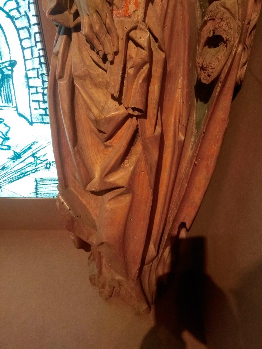
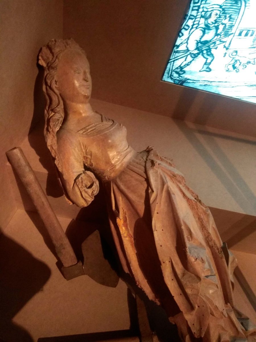
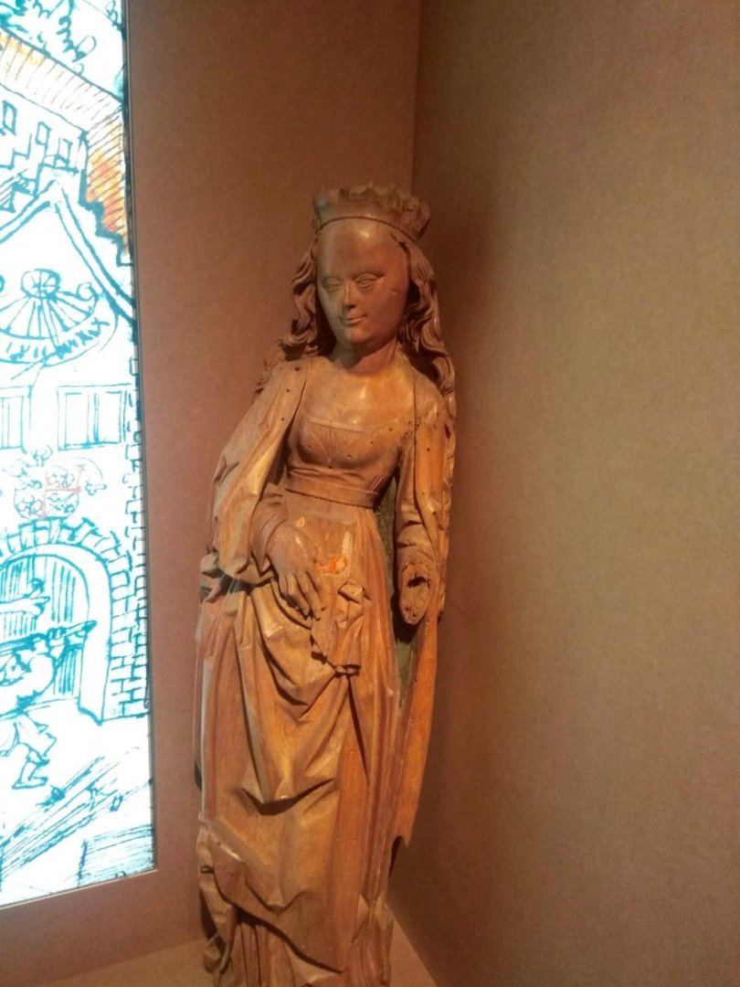
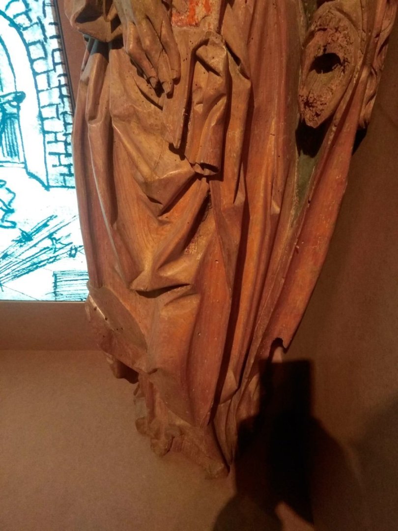
These two female figures are from a museum in a castle near us. Both sculptures are missing palms. Instead, they have drilled canals. I don't know if the main part of the sculpture is also hollow in this case. A lot of wooden sculptures have the whole body hollow too. I've seen a lot of them. Unfortunately, I could not find photos of such sculptures. I know for sure that there are some somewhere, but I don't remember where I saved them.
-
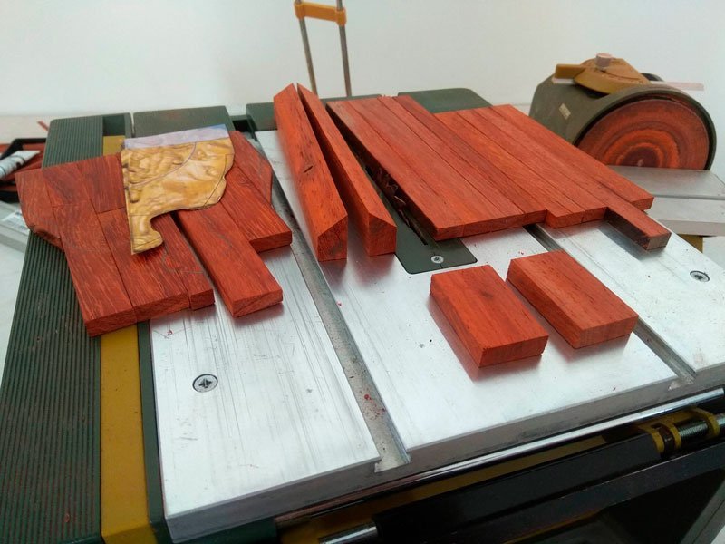
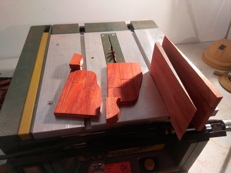
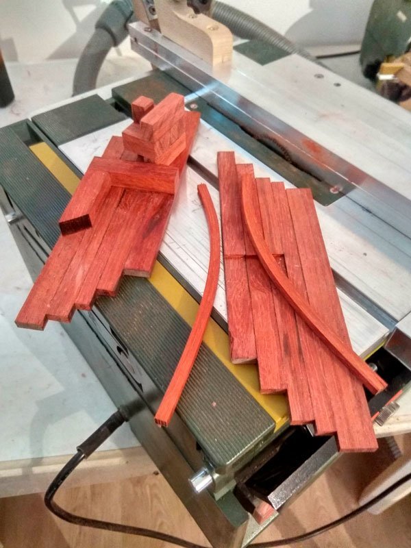
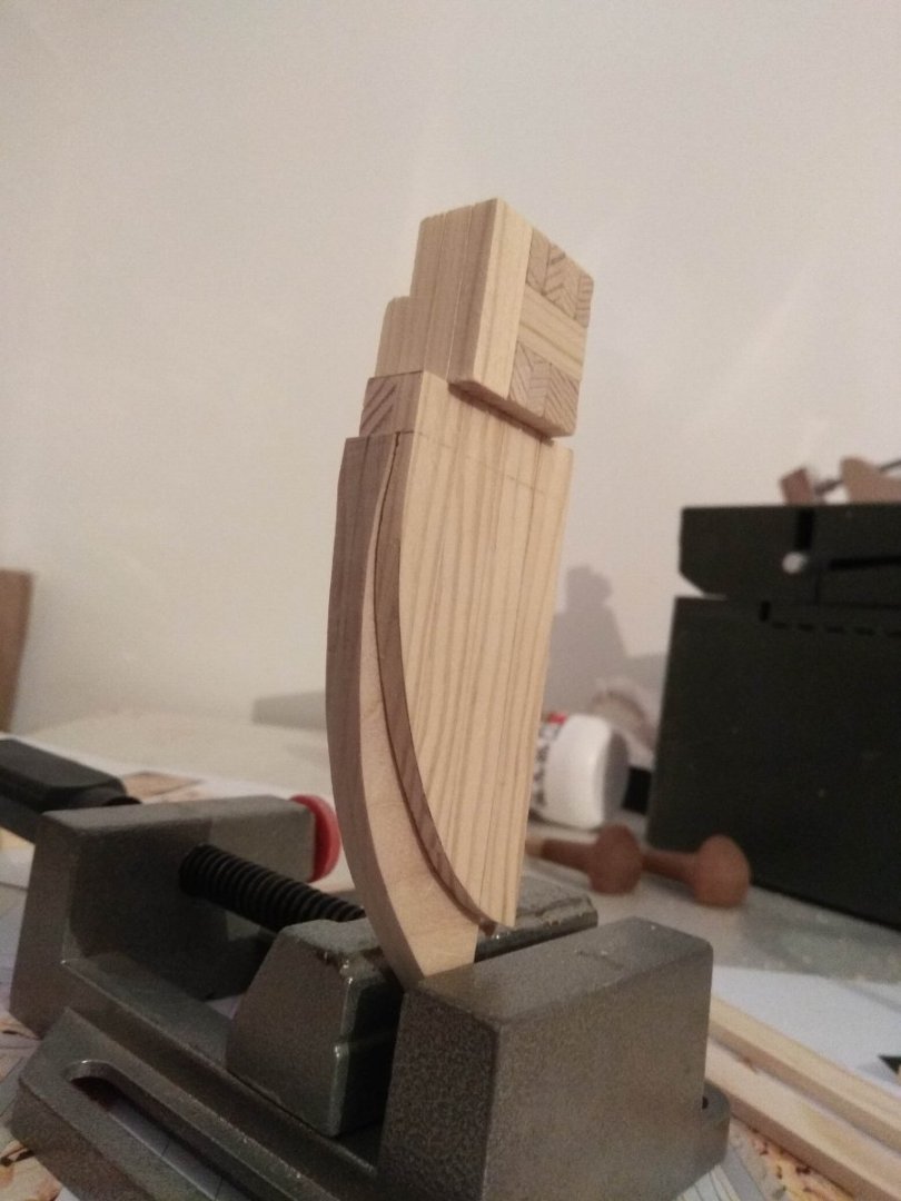
And this is a new layer. And again the lower parts. Now these are the future legs. It is not by chance that you can see this part of the figure on the photo. Here, too, I did not do without small modifications. Here you can see how I have placed thick cubes at the very bottom. Let's call them "boots". In my opinion they remind modern sneakers - massive, huge, with a thick sole and almost automobile tread pattern on the sole. According to my idea, such massive "boots" will help in that they will be an additional support for new layers. Like a stirrup on a horse. But then I realized that such a shape of "boots" is too small. And the smaller the piece, the less support it will have. It would be ripped out by much more massive blocks. In addition, those parts that will become the knees and stomach will remain on the weight, what then will support the "boot"? Practically nothing. So we'd have to redo it. So I just cut them down and made them bigger. Now the stirrups don't look like sneakers, but like boots or booties. All the way up to the knees. Now this support will be stronger and will be able to hold all the weight of the other layers. And I decided not to make them symmetrical. Let them be slightly different. I think symmetry is more suited to our era. I imagined we found the right pieces of logs, but they're still different. Let them be different, they would hardly shorten a longer log to make it the same as the second (shorter) one. Further photos show the most recent layers. Again I skipped some of the stages of work, there was nothing to tell. Just different wooden cubes. I'll tell you a little bit here. In this section of the photos, the topmost layers. Later on they will turn into the top of the head and the crown on the lion's head. And you can notice that this part of the structure is very different from all the previous layers. If all the layers were arranged vertically, I have now done the opposite. The last top layers are across. I decided that this was the right way to do it. Just like with the bottom edge, when I hid the ends of the boards at the shield with an arc-shaped beam, here I also hid the ends of the whole huge figure. And the transverse layers act as a "roof". Exactly for the same purposes, so that as little chance as possible for water to soak into the ends of the boards. Yes, of course, it is not possible to completely hide all the places in the wood. And this "roof" has its ends on the sides, and moisture will also penetrate into them. And, of course, the wood on the ship is covered with paint or other coatings that work as waterproofing. But still, I think that's what they would do on a real ship. You can also see in one of the photos that I sometimes left voids inside. That's a whole other topic. Whether ship sculptures were made hollow or monolithic? Each version has its own arguments, pluses or minuses. In my case, leaving a void is just a way to save material. There just wasn't enough of the right piece. In the future, this void will remain inside, so why would I turn the machine back on and stand in bloody dust again? During this phase with the carving blank assembly, I had done enough with the paduk to last me two lifetimes. So when the question arose in front of me whether it was necessary to saw something else for the sake of a small gap of the hollow, I unequivocally decided that it was better to leave the hollow. Maybe that's how it was in life? I don't know. Certainly ship sculptures were not made like, for example, sculptures for temples or for castles, when all the wood was gouged out from the inside and almost a thin shell was left. It wasn't done on a ship. But maybe if it was a small void between thick logs, it was left. This could be a good conversation too, and if anyone has a desire to develop it in the comments, I'd be only too happy to exchange views. Maybe I'll learn something new or have an excuse to elaborate on my opinions. That's it. That's the whole Rubik's cube. I tried to fit it in as concisely as possible. In fact, if you summarize all the time from initial sketches, information gathering, thinking, and rough and final assembly, it took me somewhere around two months. Roughly. It was an interesting phase. Never before had I spent so much time not carving, but preparing a carving blank. And it was interesting. Pondering and envisioning the little cubes in actual size. Here's a little cube of wood on the table in front of me. And in reality, this "small" piece weighs a ton and can be lifted either with a tractor or by assembling a friendly soccer team. So I took the liberty of trying to convey to you at least some of the emotions I had while working. If you are a fan of short posts or just pictures alone, sorry. And the final shots will be these. Just so you can see how much material was spent. Near lies a whole purchased log of paduk, and next to all that is left of the second. And next to the finished workpiece are the remaining scraps.

-
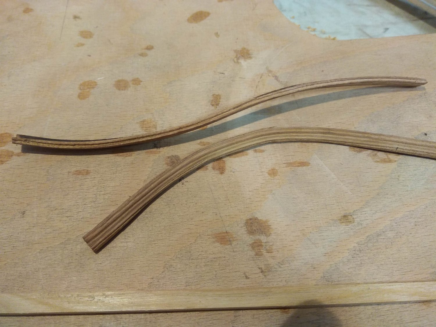
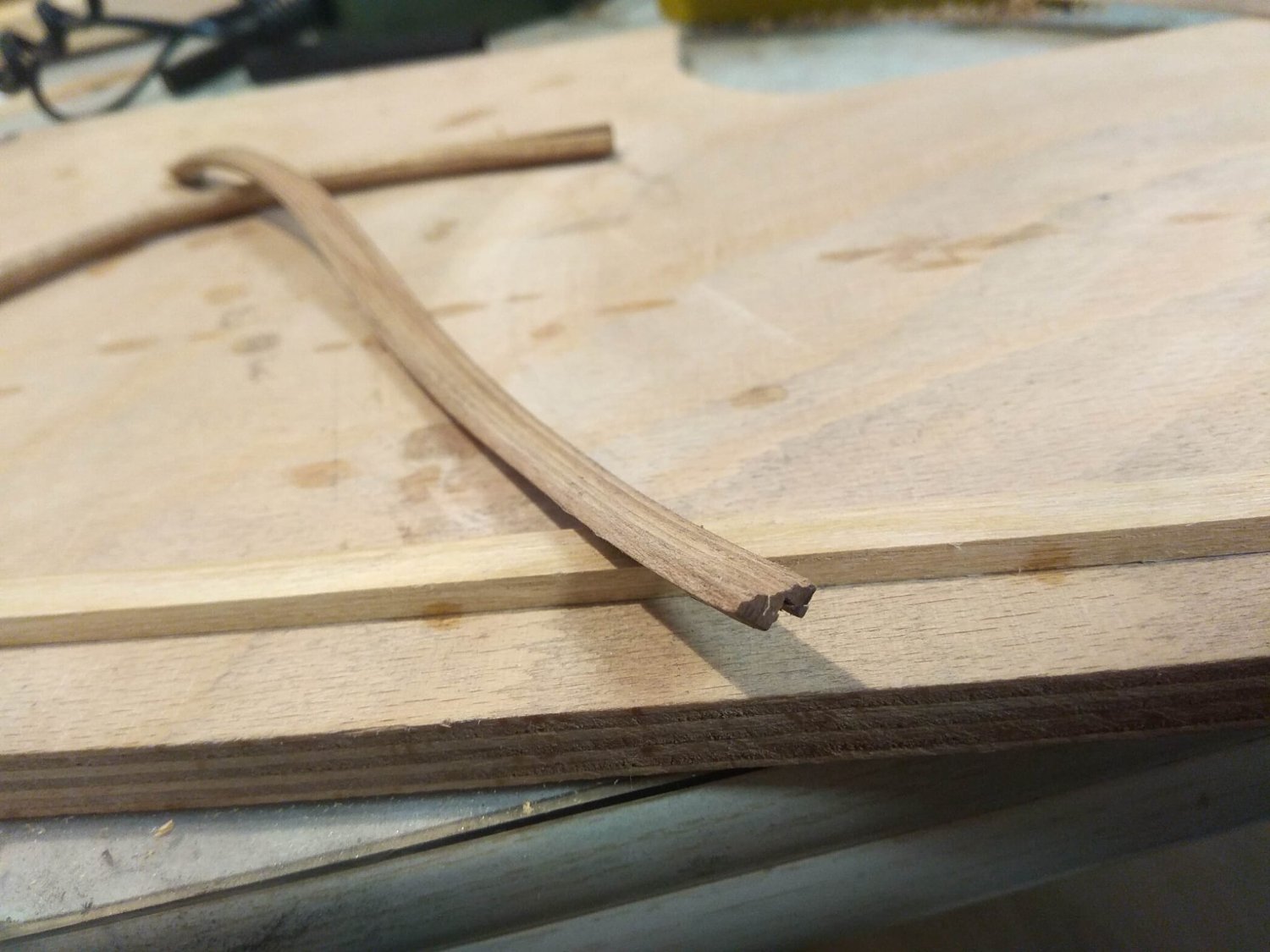
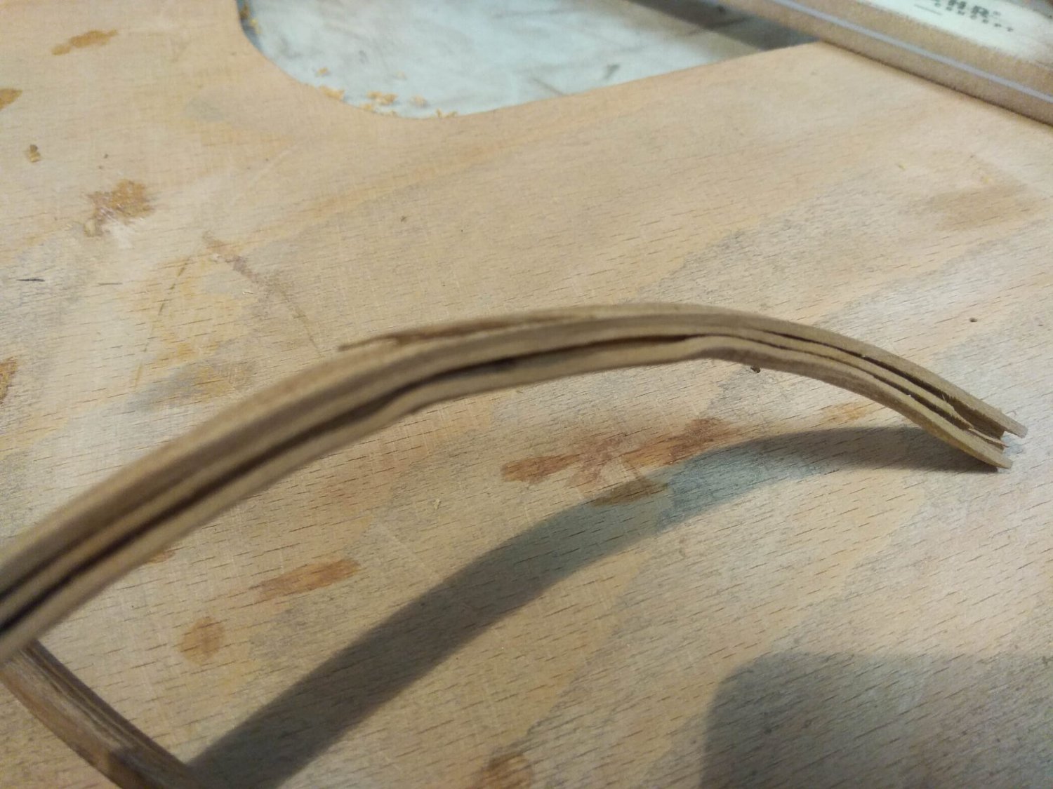
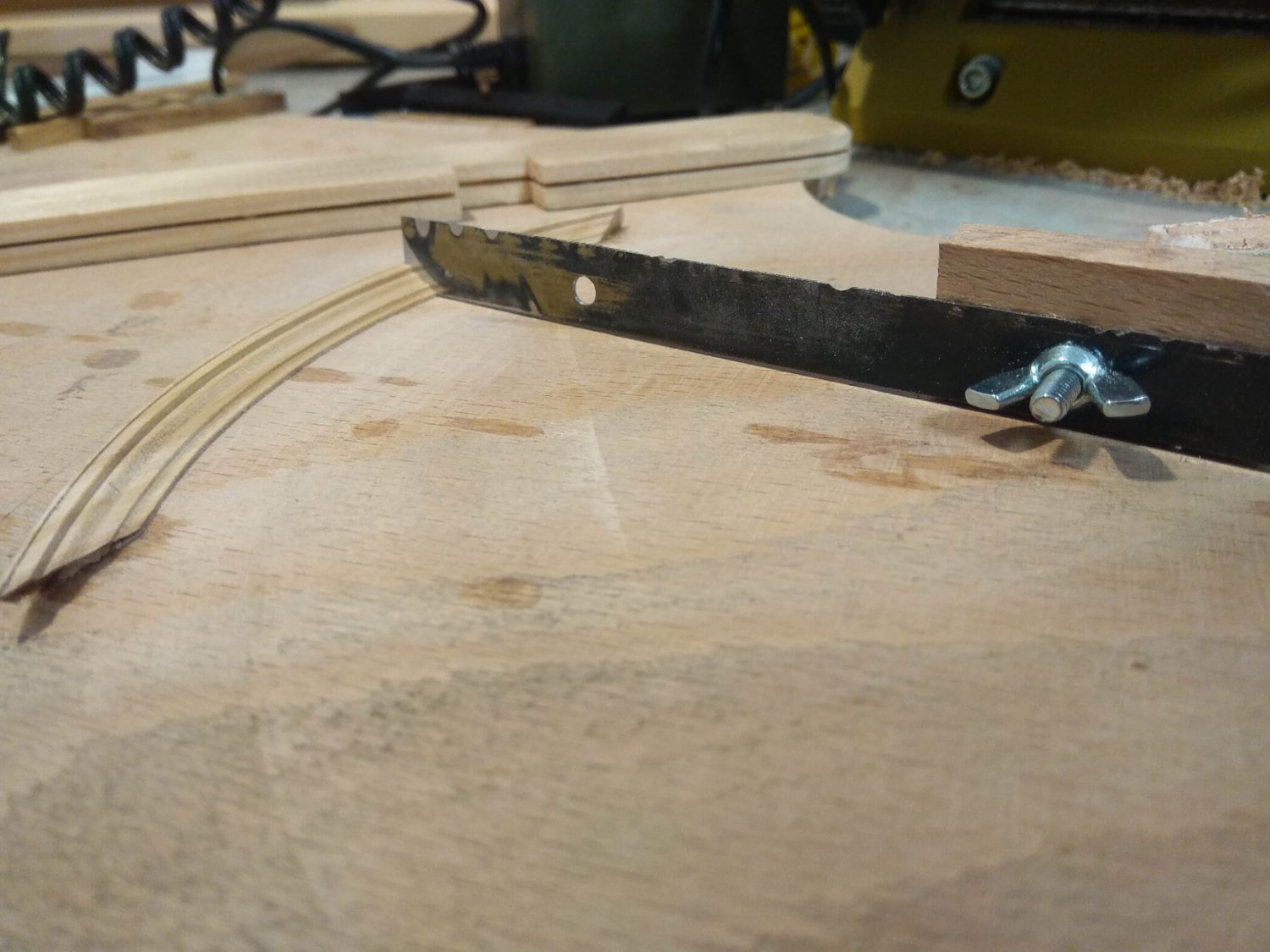
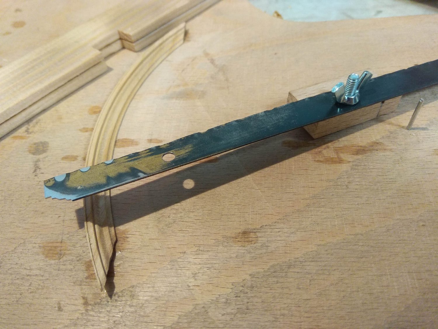
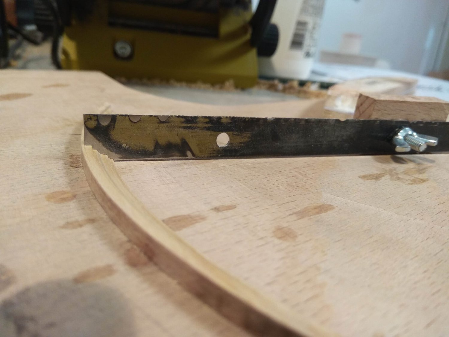
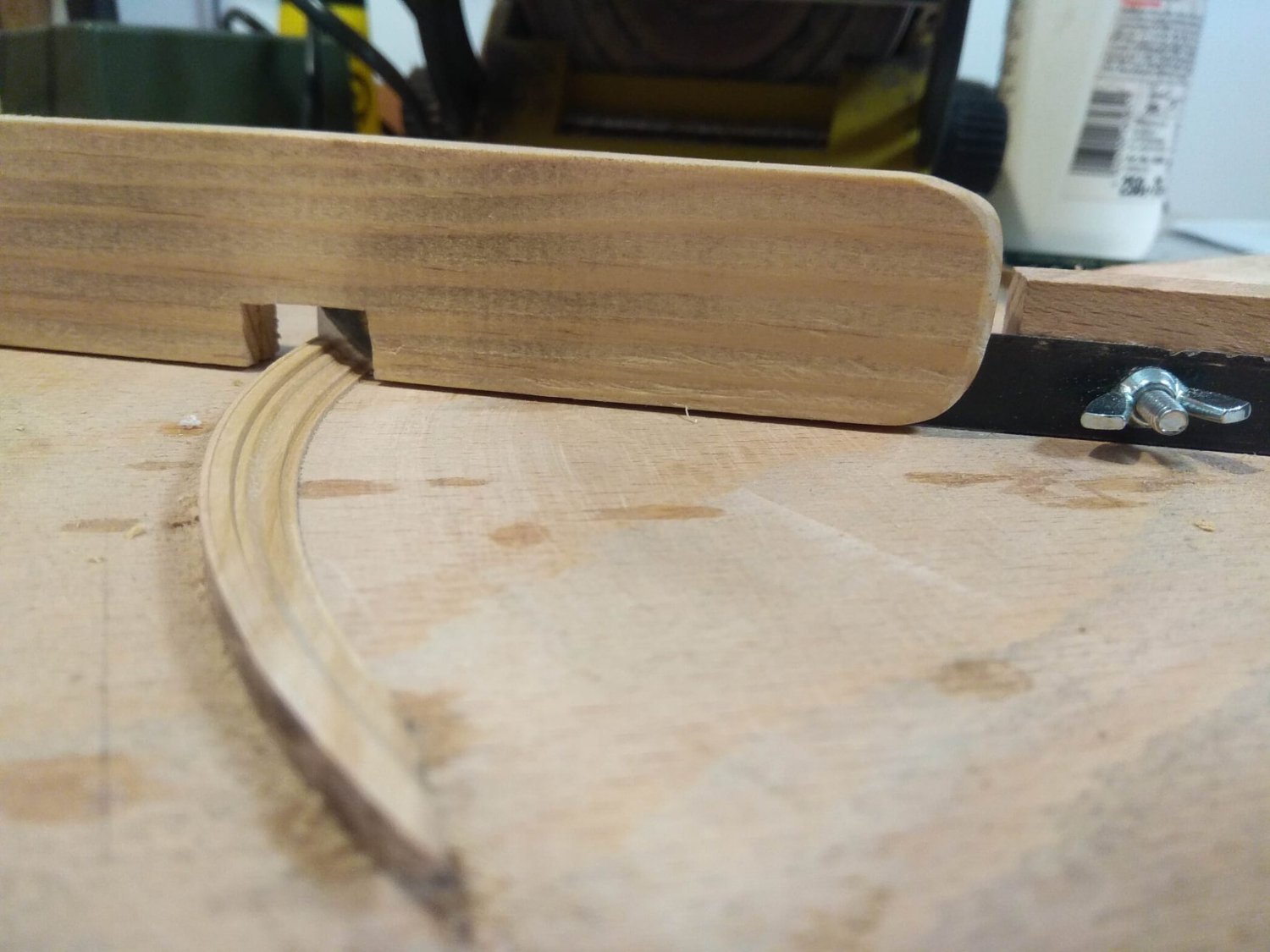
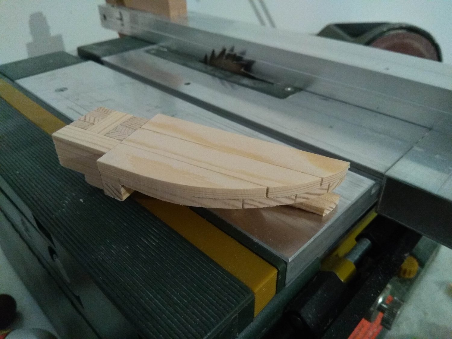
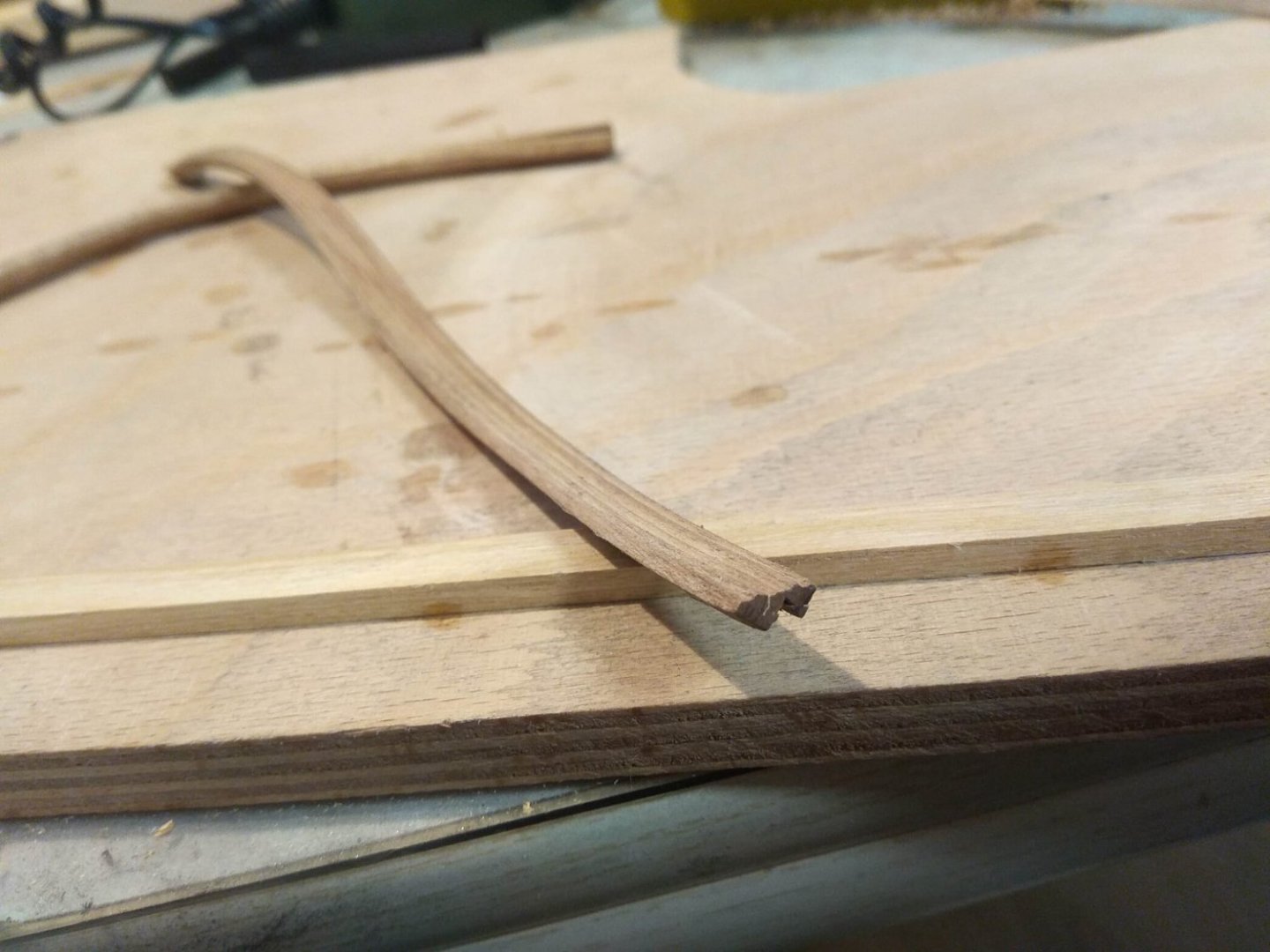
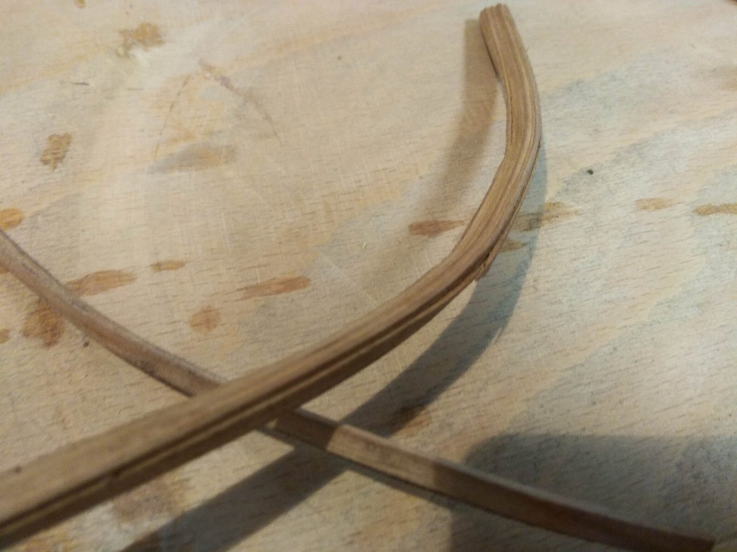
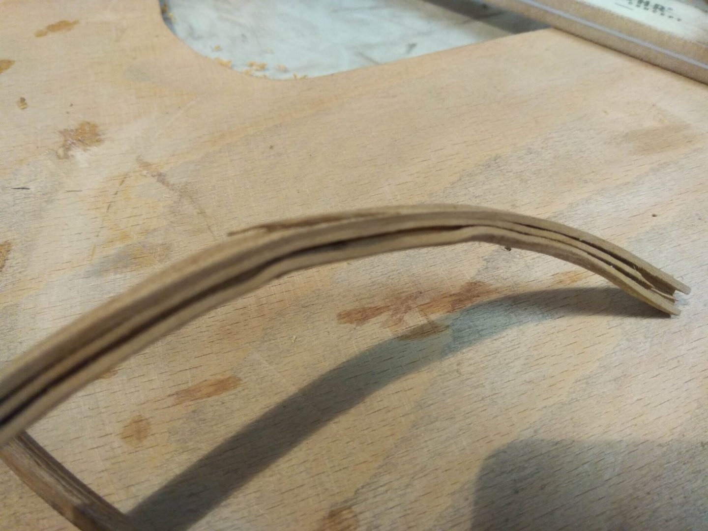
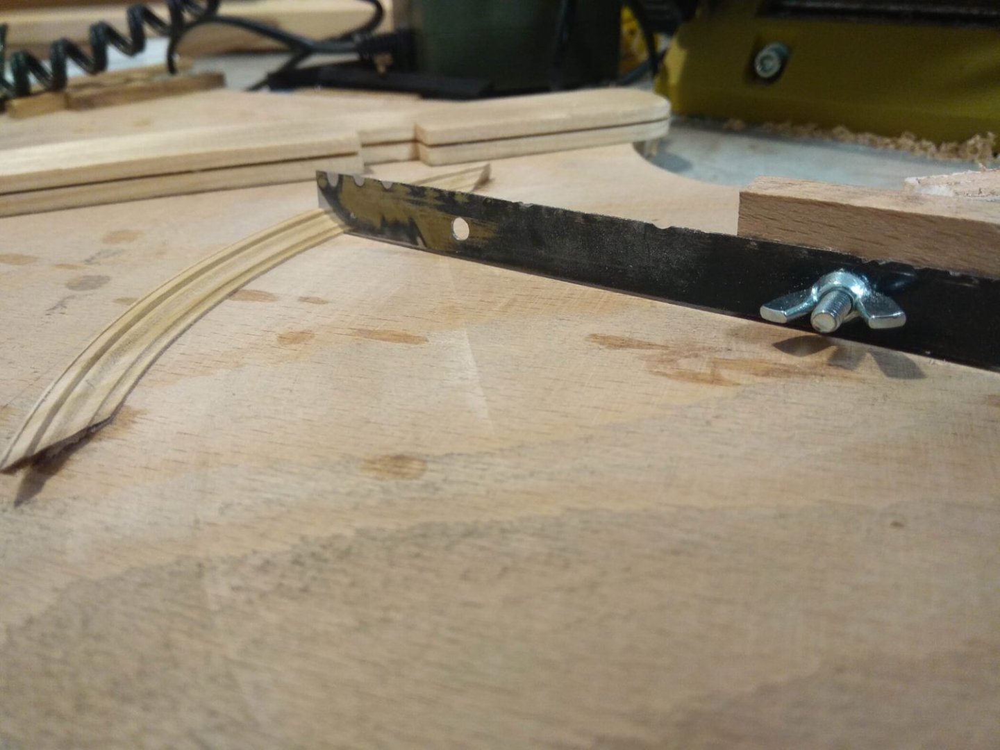
Now it's the turn for the assembly of the paduk blank. For some time I thought about whether it is necessary to write about why I decided to assemble this Rubik's cube in this way. And still I decided to tell a little bit. In brief, my task of how to place a heavy weight piece on a thin breakwater can be compared to this situation. The bottom of the figure can be compared to a cyclist's legs or even his pants. Everything below the top edge of the breakwater should be made of long blanks. The main thing is that these "legs" are securely fastened at the place of the "pelvic section". Then the lower part will sit on the breakwater with its "butt" and the "legs" will hang down quietly from both sides. And the rest of the body mass will lie on top. And then it is very easy and simple to place even a very heavy weight. Everything will be held securely. That's it. The whole figure, like an onion, layer on top of layer will gradually increase to that necessary volume. Of course, this is just my own interpretation. Maybe it wasn't really like that. I would be very interested to know exactly how construction was actually done at that time. So if anyone has a different opinion or more accurate information than my assumptions, feel free to comment. At the moment the figure is already completed, so I can't change it, but I'm always interested in opinions or versions. Maybe it will come in handy in the future? I will also dwell on this stage in a little more detail. These shields are the very "legs" that will hang down below the edge of the breakwater. And to be even more precise - this is the future background, on which the lion's feet will be later on. And since this shield will be at the water's edge, the waves will constantly wet the edge of these shields. And I thought that on a real ship, most likely this whole edge was covered with a bent arc. First of all, this separate part will cover the ends of the shield, because it is the ends that absorb water the most, which can have a negative effect. For example, the shield will swell or turn out a propeller. And secondly, this arc is a good way to fasten the boards in the shield even more securely together. Again, this is just my theory. I don't know of any reliable information. Things did not go exactly according to plan during the making of this arc. I went with the standard plan. The rail, which will play the role of the arc, was soaked in hot water, and then pressed against the mold. Where it then gradually dried out, acquiring the desired curve. After a while I took the laths out of the clamps and everything looked just right. But only for a number of reasons I had other plans and did not have time to immediately attach the arcs to their place on the boards. The laths stayed in the desk drawer for several days. And during this time they gradually began to unbend back. In the photo you can see how they bent back a lot during the pause. So I had to use force and press them forcibly, against their own desire of these laths. I didn't take pictures of the top. I can't remember the reason for not taking pictures. So I'll paste the photos from the practice attempt here. The meaning has not changed. The upper beams lie across the axis and hold both their own weight and the weight of the blocks that will appear above them.

-
Thank you for the high praise. And for your continued attention. It's very inspiring.
-
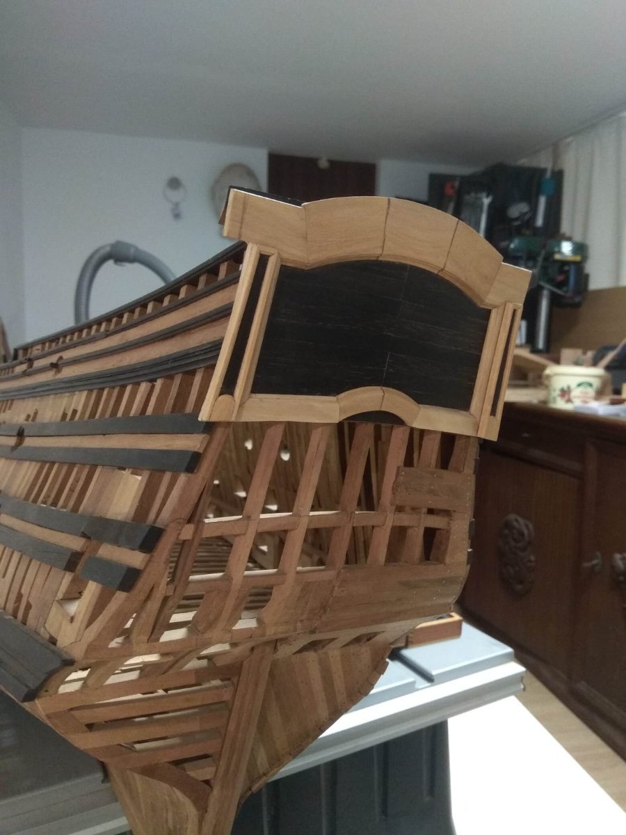
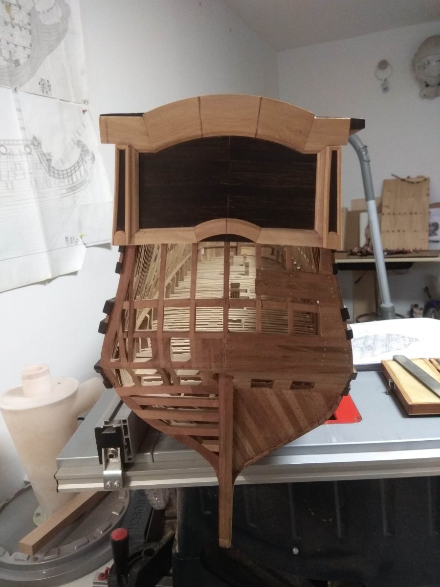
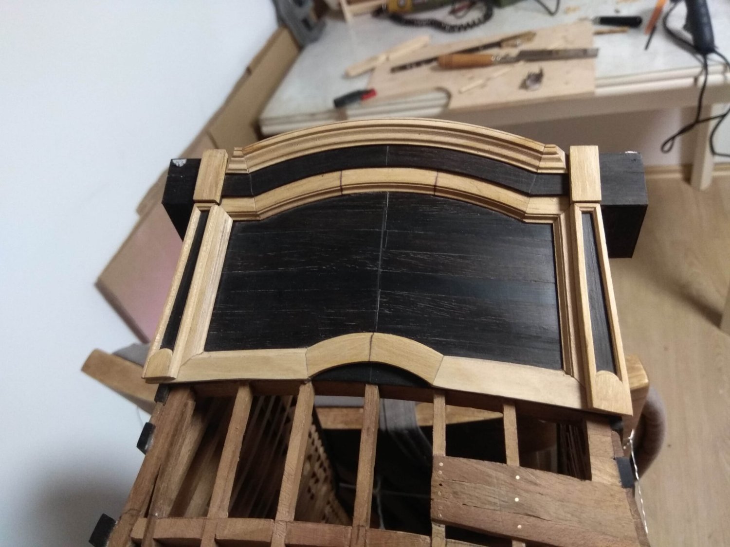
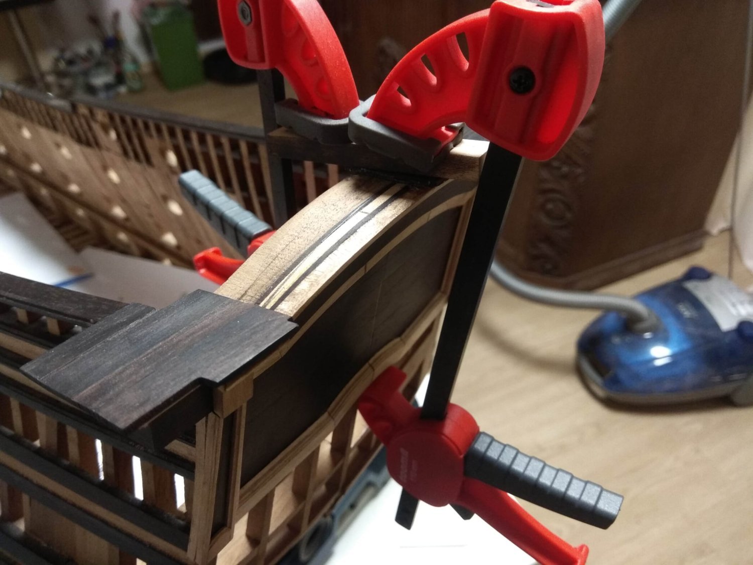
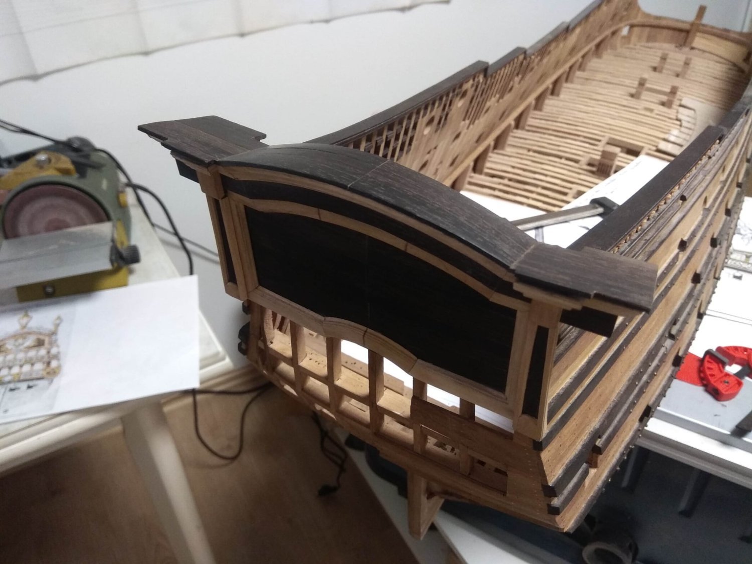
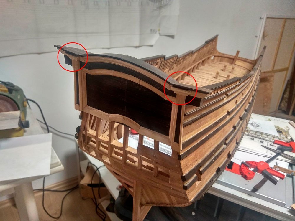
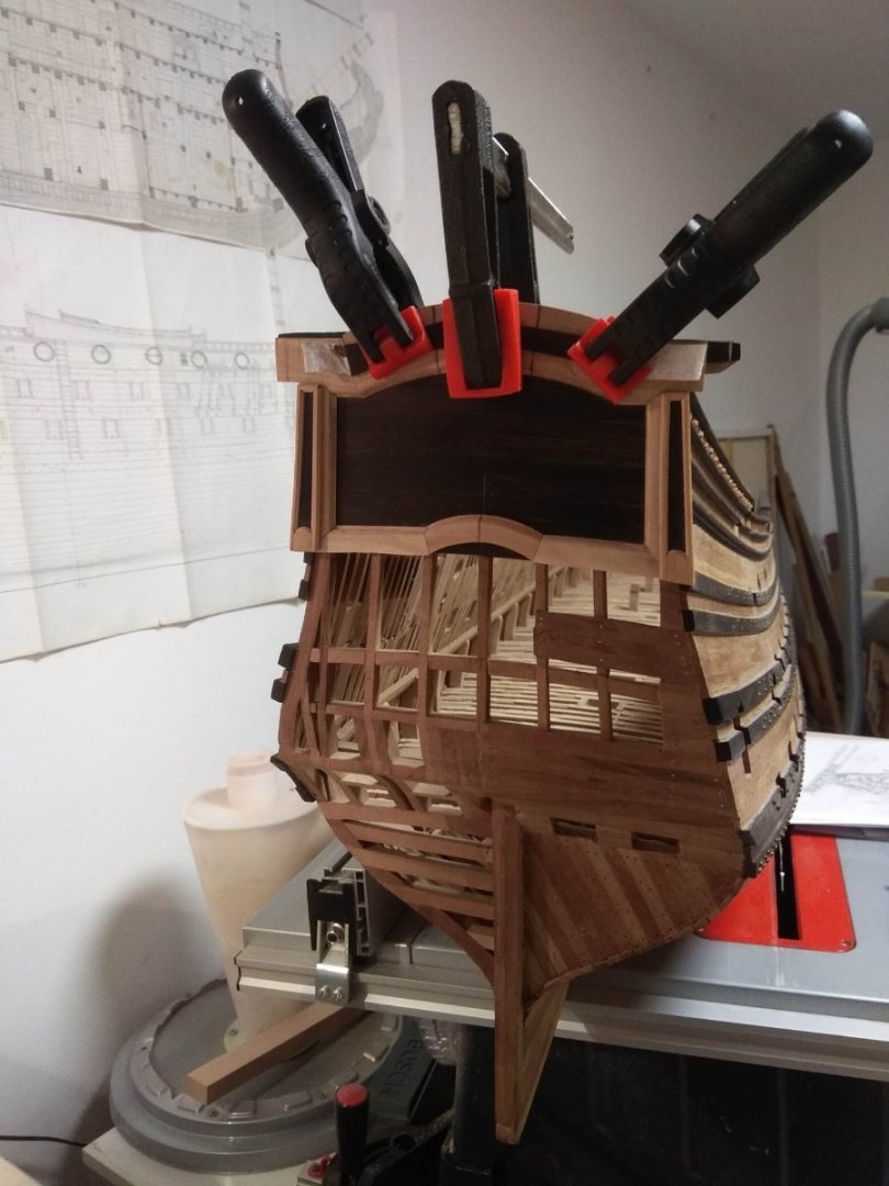
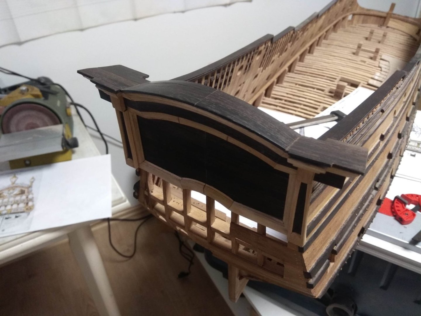
The work is moving, albeit slowly. The details are small, it seems like I've been doing something all day. But in the end, the changes are almost invisible. Well, we've all experienced it. Model building is not a fast process. You have to make a blank before you can make a tiny segment out of it. Then you have to wait for the glue to dry so you can take measurements for the next segment, which is even shorter than the first one. And then you see the mistake, and you redo the whole thing.... So gradually the hours add up to days, and before you know it, the week has already flown by. So to show the changes in the photos are quite insignificant. First of all, I had to redo the previous stage. Last time I showed the work with a shaped profile at the very top of the ship's transom and how I made a curved planking. And where were my eyes? I didn't see that I had made a mistake. The shaped profile on the two columns at the edges were not made with the correct angle of inclination. Here on the photo of the last issue this mistake is clearly visible. See how big the gap is? How come I didn't see it before? I started thinking, what to do now? Should I put plugs there? No. That's not the answer. They'd look exactly like plugs. Trying to hide the mistake. That's no good. So we had to go back and redo that ledge. After that, I began a new task. Making the profile above the windows themselves. There's not much to tell. The whole technology is the same as before. I didn't try to take a lot of pictures. Here are just a few.
-
I would really like to contribute a Chinese lion to this project. Or a Japanese lion. But, unfortunately, I have not found any mention that the image of this beast was used on ships in any Asian country. I've seen dragon heads, but no lions. If anyone can give information that such instances can be found, I would be very happy. Maybe someone has pictures or links to some sites related to the subject I need? So far, apart from the European variants, I have only found a Turkish lion. And only one.
-
Yes, you are right, Chinese lions bear some resemblance to the Russian lion I chose for my sculpture. However, there was no single canon in Russia. There were also "skinny" lions on Russian ships, which looked more like European versions. I chose this particular image for several reasons. Firstly, the original museum figure of this lion has more elaborate detailing. And secondly, it is much more interesting to choose different styles. It would be possible to trace a connection with the Dutch school and the British school on the basis of Russian lions alone. You should have seen how many disputes arose on the Russian forum. There is a ship that is considered the first Russian ship. It's called the Eagle. And of course the first ship was built during the reign of Peter the Great. Not a single image of this ship has survived. Only small descriptions. And since the Russian language of that time has changed very much, and during the construction of the first ship has not yet come into use ship terminology, it is impossible to say exactly what the ship was now. Some believe that it was a flute, others are inclined to the fact that it was a galleon or some other kind of ship. And since it is difficult to determine even with the forms, it is even more difficult to guess what exactly was the sculpture on the breakwater. And there was also a lion, although the ship had the name "Eagle". So the debate was very heated. It's a very interesting subject. Someday I will make my own version of the lion from this ship and it will definitely be very different from this "wide" version.
-
I know about the Chinese lions, of course. If you are interested in how images spread in different parts of the earth, there are already such studies. They're not hard to find. The lion came to China with Buddhism from neighboring India. It is difficult to meet lions in India itself, other types of feline predators are more widespread there. But the world even in ancient times was quite intertwined. And people did not live in isolation from each other. Traders and merchants swam or walked. The silk road across almost all of Eurasia is worth a lot. Silk was transported from China to Europe, spices from India. From the north of Europe, traders from Scandinavia traveled or sailed to Byzantium along the so-called Varangian-Greek route. So there were a lot of different things. It is quite likely that lion skins. It is very easy to imagine ancient "bloggers" who told amazing stories about distant countries and showed drawings. Including lions. Well, wars also "helped" to learn about foreign symbols. For example, Alexander the Great brought to India ancient images from Greece, Africa and Persia. So one should not be surprised that China knew lions. If people in different parts of the Earth know dragons that never existed, they could certainly learn about lions.
-
I'm sincerely glad the topic is of interest to you. When I thought about this project, my thoughts started on a different path. I have been carving ship decor for a long time and I was primarily interested in this particular direction. Agree that carvings come in many different types. It can be a volumetric sculpture, bas-relief and even in the form of engraving on a flat plane. And each part of these styles easily overlaps with other types of creativity. Flat carving is very close to a drawing or fresco. Volumetric sculpture flows just as easily into stone sculpture, bas-relief into architectural types of decoration. And here it is very difficult to find clear boundaries. Everything is interesting. I decided to limit myself to ship sculpture. Even this narrow part of carving can be very diverse and have its own nuances. And I was interested in comparing exactly how jewelry was made in different countries. The best option for comparisons is to choose one common image. It seems to me that in ship sculpture it is difficult to find a more universal and more common image than the lion. That's why I settled on it. It would be possible to take another image as a basis, for example, some anthropomorphic character - a man or an ancient deity. There is also someone to choose from. However, this option will lose. Because there are a number of countries where people were not depicted at all, such as in the Turkish navy or another Islamic country. The lion has a distinct advantage here. This is how exactly I was thinking about it.
-
Hello, druxey. I know that there are several species in paducah. Probably the active odor has some other species. The kind of wood I am working with now does not smell. Maybe it's the fact that I just don't smell it. My sense of smell is a little lower than usual. There are times when I'm baking something in the oven. My wife comes in and asks me what I've burned, because it already smells burnt. And I don't even know it (that's a hyperbolized joke, although I really don't smell as keenly). Or maybe it's simpler than that, and my paduk really doesn't smell.
-
Hello, Keith. Welcome to this thread about carving. I'm glad you enjoyed this short story. And thank you for leaving a comment.
-
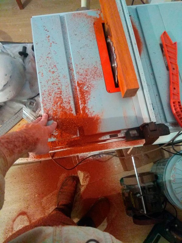
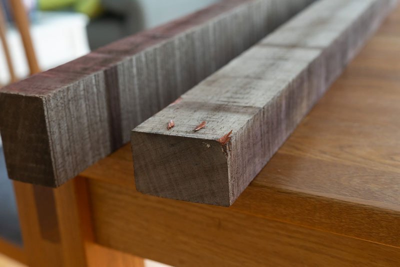
And so the day came when I would finally start torturing my red-faced Pinocchio with saws. It started out kind of normal. In the morning I took a shower, sent my home T-shirt to the laundry basket, put on a clean and fresh one and went to breakfast. And apparently I got up on my left hind leg that morning, because I spilled coffee on my fresh t-shirt. I hissed, yelped, wiped up the spill, fell into melancholy on this occasion and was completely upset when I saw that there was nothing else to wear. The shelf with T-shirts was empty. Who knew it would go like this? My wife reacted to my lamentations about the vicissitudes of fate. - Why are you so upset? What do you mean there's nothing to wear? What's that? - It's a white T-shirt. It's white! - So what? - What do you mean, so what? How can I wear white for home? - Are you saying you'd actually wear it for another occasion? Going into town in it? Or go out? I hesitated. Yeah, I probably won't. - So just take it and wear it. - All right. But I was going to go to the basement to do some sawing. - So? I did not have time to answer something about the fact that white is white, will get dirty, as the wife struck a preemptive strike: - Put on your work jacket, it's cool in the basement. If you want not to get dirty, you won't get dirty. I didn't say anything. I don't like it when adequate arguments are given. I look like a man. like a man again. just another man. And the wife's right again. In any case, the white T-shirt is all that's left, so I don't really have any other options. I'm not going to cancel everything, I've already prepared myself. I've already ironed a wooden log and imagined how the circular machine will wail. There's no turning back. So I went downstairs. It was right after breakfast, I was fed, satisfied and ready to work..... I had lunch without a T-shirt. It was in the same hamper with the dirty laundry. And if in the morning the T-shirt doused with coffee felt like a loser, the next morning it hung and dried with an expression of infinite bliss and considered that it was extremely lucky to be doused. White, however, could never again be called white. And so, I'm sitting there having lunch. Then my son comes home from school. He walks into the room and the first words he says instead of "Hi" are: - "What's wrong? - I don't get it. Why such a question? - Have you seen yourself in the mirror? I go to the nearest mirror and see this looking back at me: or more like this: I'm covered in red-brown pigment. All over! My face, my neck. I look like some Zulu or Maasai, rubbed with red clay and ready for marriage. I'm sure you've figured out what it was all about. But I'll write it anyway. The first thing to do was to level the timber. That is, to run it from all sides through the machine, to remove a millimeter to equalize the geometry and remove irregularities. I knew in advance that there would be sawdust, there was no way to get rid of it. But still I didn't expect the result to be exactly like this. And that's even though I had the vacuum cleaner hooked up to the machine. This is after just one pass. And it was the very last pass, I decided to remove an additional fraction of a millimeter, I didn't like the remaining untouched bald spot on one of the sides. Up to this point I had already vacuumed and cleaned everything up. But changed my mind and decided to do a little refinishing. Can you imagine what was there during the rest of it? I was standing in bloody snowdrifts. Such is the tale of t-shirts and first impressions of paducah. It has a very active pigment, it gets in and doesn't wash out well afterwards. Very fine fraction, almost powder, resembles red brick dust. And in the following days I, already knowing all this, came home from the workshop only through the shower, that is, immediately went to wash. I even had the feeling that this red dust was following me everywhere. Here, in Germany sometimes on the roads they use some red fraction, it looks like ceramic sand or small granules. Usually they sprinkle it on the road after accidents. I do not know the exact meaning, maybe to absorb spilled oil or other liquids. So in the evenings, I go to pick up my wife from work. I take the same route. The usual footpaths between residential neighborhoods, there are no highways, roads and constant car traffic, at most I meet cyclists or dogs on leashes. Suddenly I see that the road is red. At first I thought that I could already see my paduk dust on the street. Then I realized that the road was really red. For some reason they'd spread that road sand around here. Maybe it was slippery or something spilled. I don't know why. And the thought came to me that I'm always in such dust that after me half the city is in red dirt. I'm walking, and it just keeps coming off me. That's the extent to which this paduk got me with its color. In my life I have had to deal with all kinds of wood. Both at home and at work. Before that, the most extreme consequences were probably oak. My hands were always black with tannin, as if I worked as a locksmith, not in a carpenter's shop. But paduk can easily compete with oak. If it were bigger in scale, there would be more significant consequences. Maybe you'd always look red-faced, like you've had a self-tanner, no matter how much you rub yourself in the shower. P.S. In fact, any wood with active color has similar nuances. When you have to saw some red wood, everything around you will be red. If you saw black wenge, you'll look like a chimney sweep. And so on. So if you decide to mess with this kind of wood, keep this in mind. At home, there can be very unexpected reactions from the household. Better have a separate room, and very preferably a vacuum cleaner. That's the way it is. I don't know if this story will be really useful. I just tried to describe these nuances in the form of a little light first-person narrative.


-
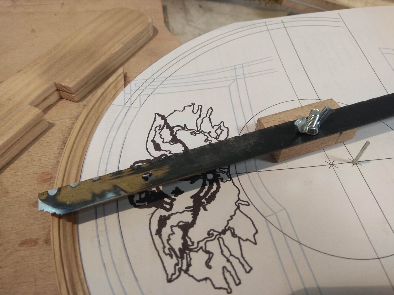
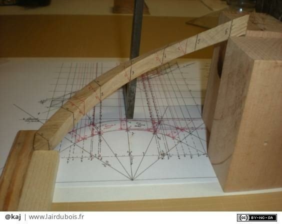
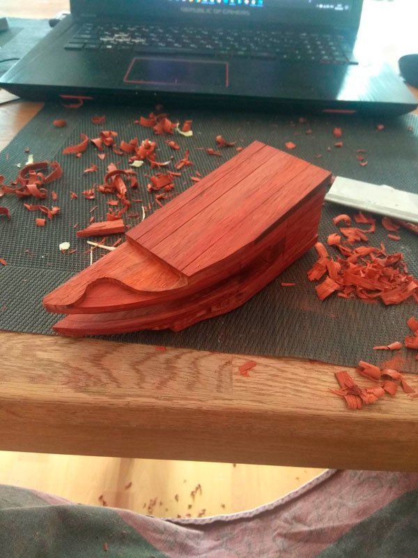
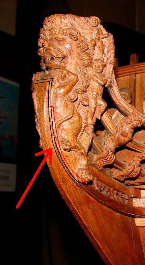
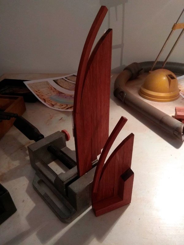
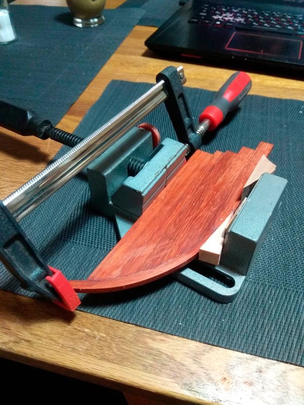
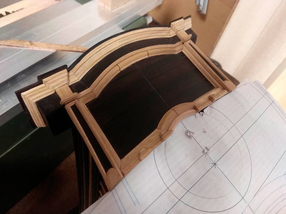
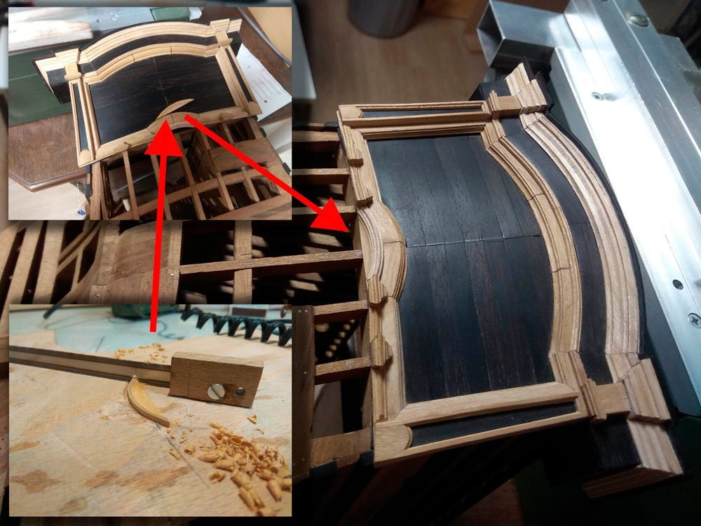
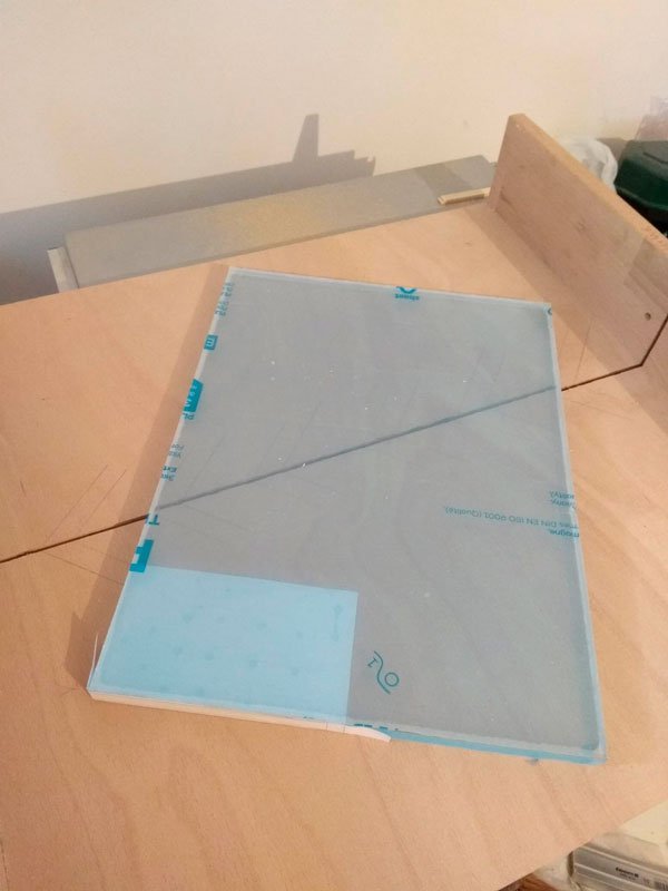
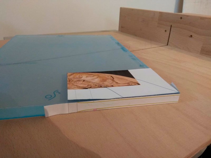
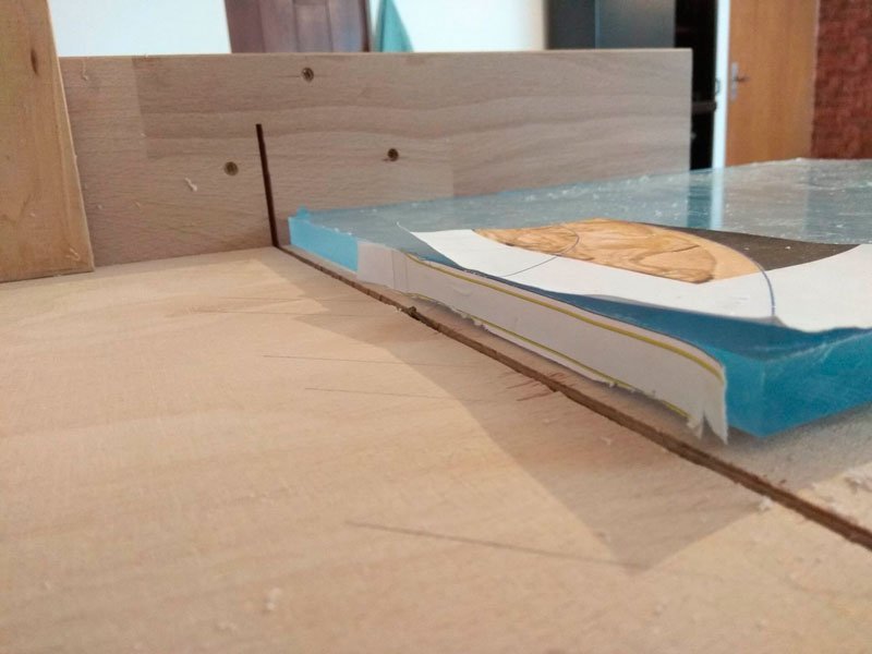
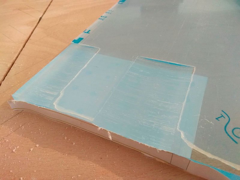
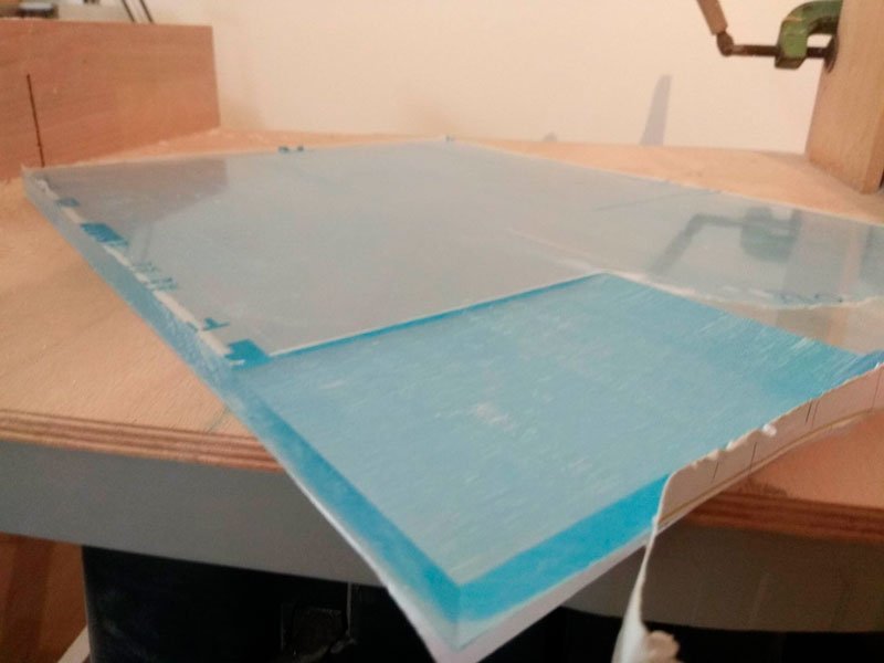
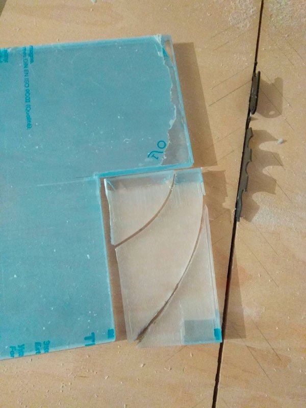
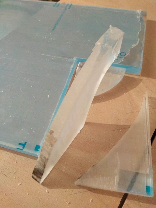
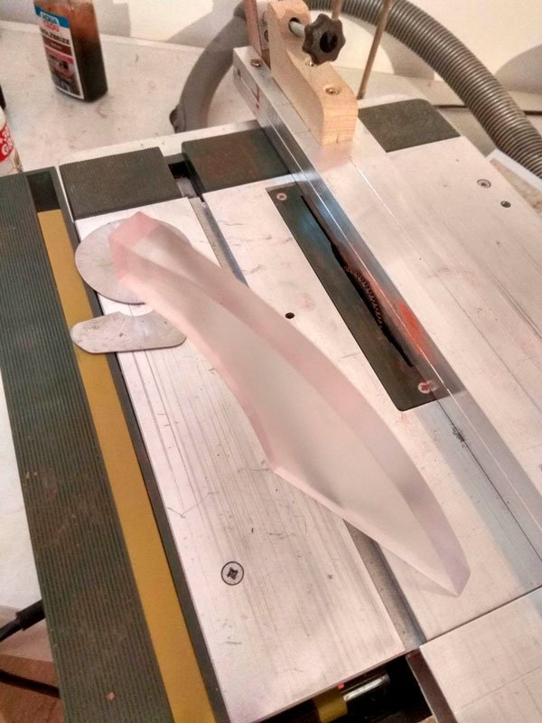
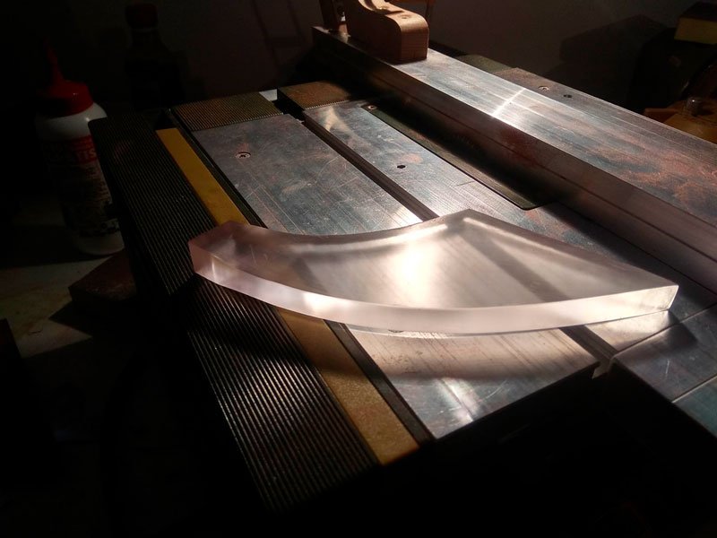
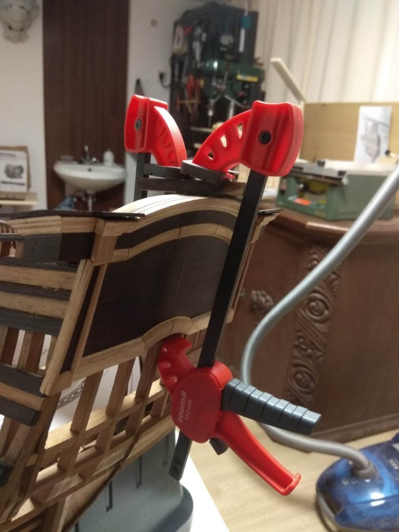
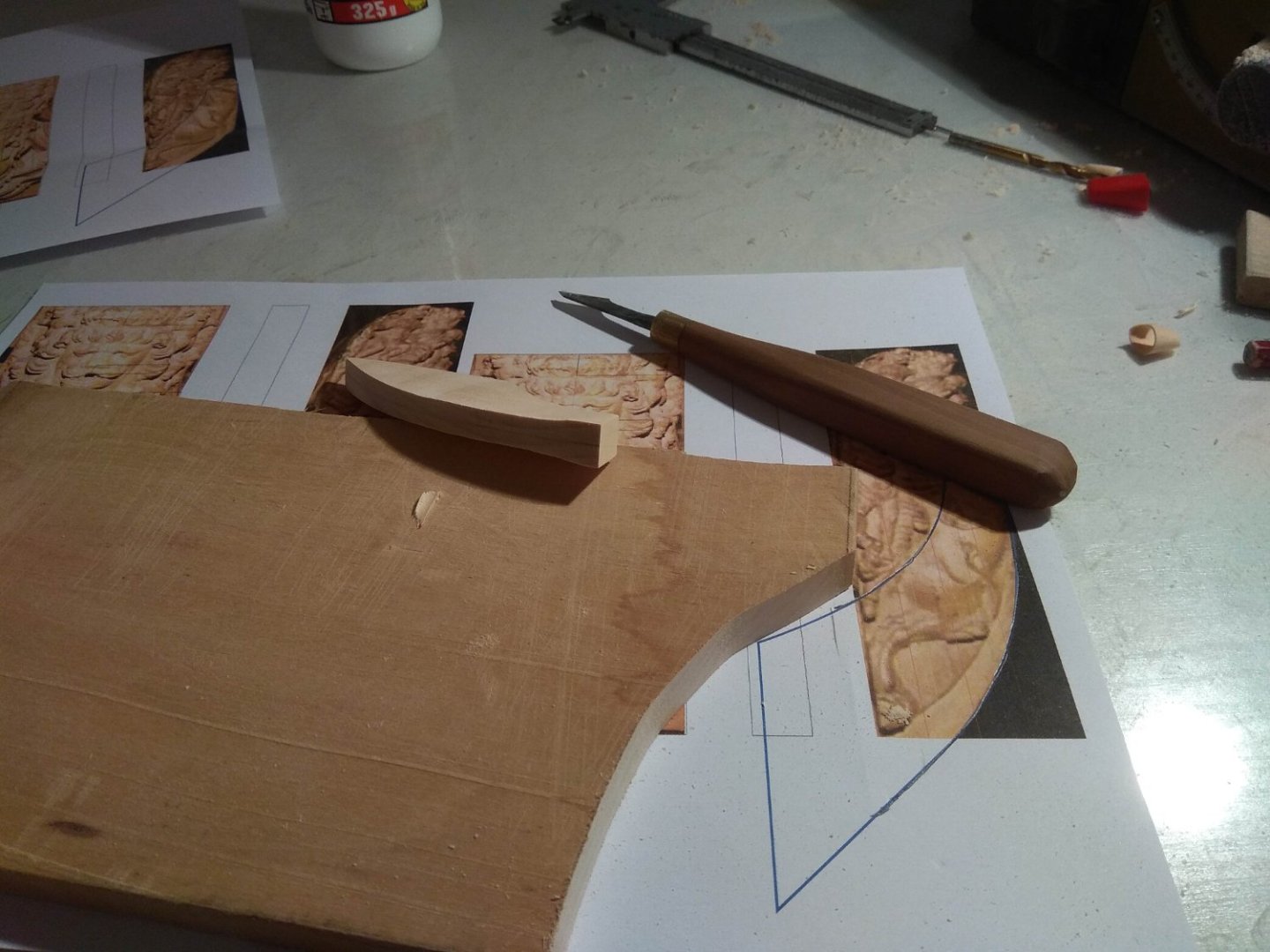
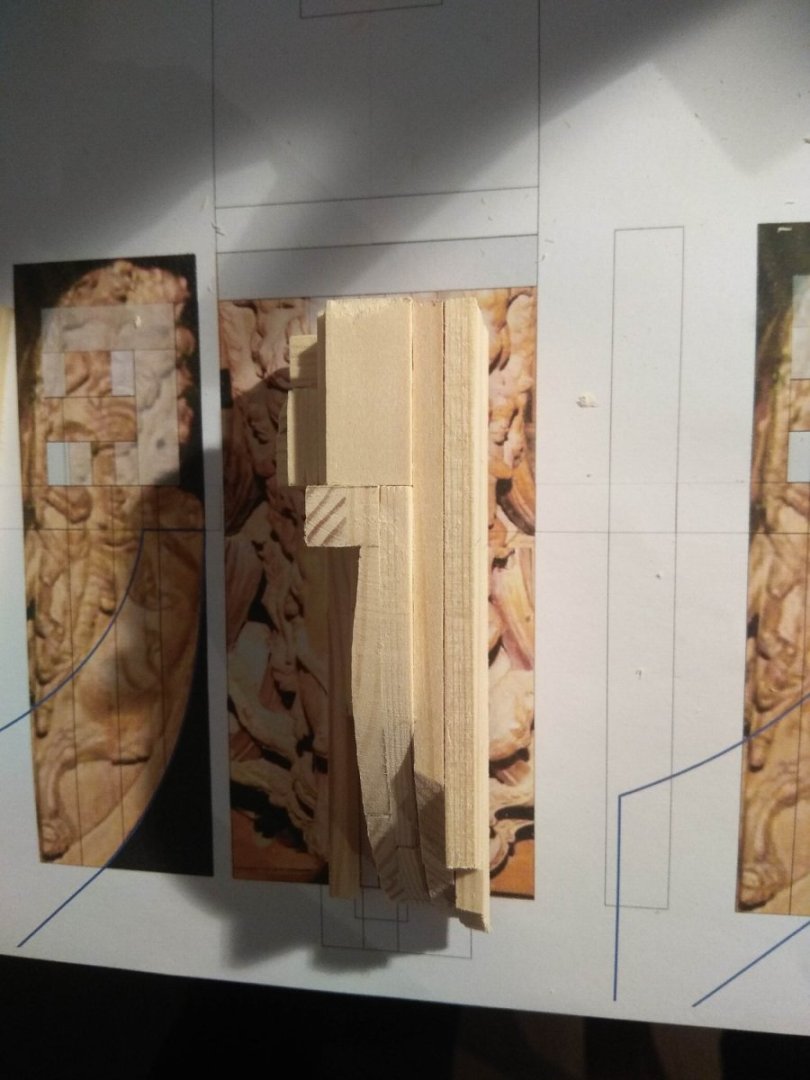
One of the features of this lion, which can be clearly seen in the photos of the original figure in the museum, is that it is not quite a standard breakwater. Usually on ships or models it is straight or reduced in thickness. On the model of "St. Andrew" the breakwater has a shaped profile, it changes in thickness, and not just becomes thinner, but as if a woman's waist after the hips goes to narrowing and then widens again. And it looks very elegant and beautiful. This is definitely one of the highlights of this particular model. On all the previous sculptures, I only worked on the figure itself. Somewhere a groove for the breakwater was made, somewhere the lion just has to lie down on a gentle breakwater, as for example with the lion from Vasa. The breakwaters themselves I left for later. This part of the ship (and in my case the breakwater is also a stand for the sculpture) is not so important. Now, however, this approach will not work. It is necessary to go in the opposite direction: first make the akhterstevnoy, and already on it to plant the figure of the lion. This is the only way to achieve a qualitative and accurate juxtaposition of the two objects. The solution is logical. The only problem is that I decided to make my breakwater pedestals from transparent plastic. According to my calculations, this will be better. Firstly, all breakwaters will be in the same style and it does not matter which lion will sit on it. Secondly, the transparent material will be absolutely neutral and will not distract the viewer from the sculptures themselves. And if on the other sculptures the task I have in mind looks quite simple, what about this lion? So how do you make a waist thin waist thick waveguide? Use a hand tool to pick at the plastic? Doubtful. And if using machines, the plastic will melt from heat and again the result may not be the best. And then how to proceed? I had an idea. But again everything is possible only with practice. The method itself has long been very much wanted to apply. It consisted in the use of a standard cycular machine. I measured the radius of the disk on my machine and was pleased to see that its radius perfectly matched the curve that should be on the breakwater. I lowered the disk so that it was peeking out just a little bit, tried it and it worked. If it's not clear from the photo, I'll describe it a bit. The saw blade practically turns into a router on a milling machine. And if you move the workpiece perpendicular to the disk, it will chew through the plastic in the form of an arc. Only you need to start work with a very small "look out" disk, so that he did not tear the material and not cause injury. Well I didn't need to make several passes for my task. I need to have a very small bend. In some shots you can't even see it at once. The last photo is already after sanding the disk marks. In the future it will be necessary to polish the wave cutter to a completely transparent and shiny state, but this is not in the frame. I did not have the necessary grain size of sanding paper, I had to go to the construction store for it separately, and I wanted to take photos now. It is not yet known when I will be able to take me to the store, this task is not so important and can wait. The main thing is that I already have a starting point to start working on the wooden blank itself. I will have to repeat the step with the cubes, but already from paduk. to be continued...
-
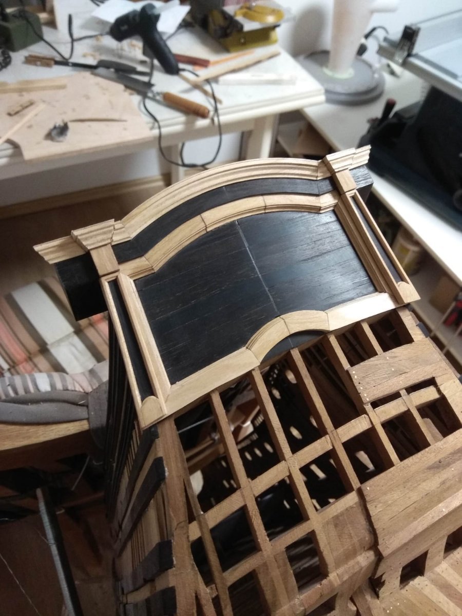
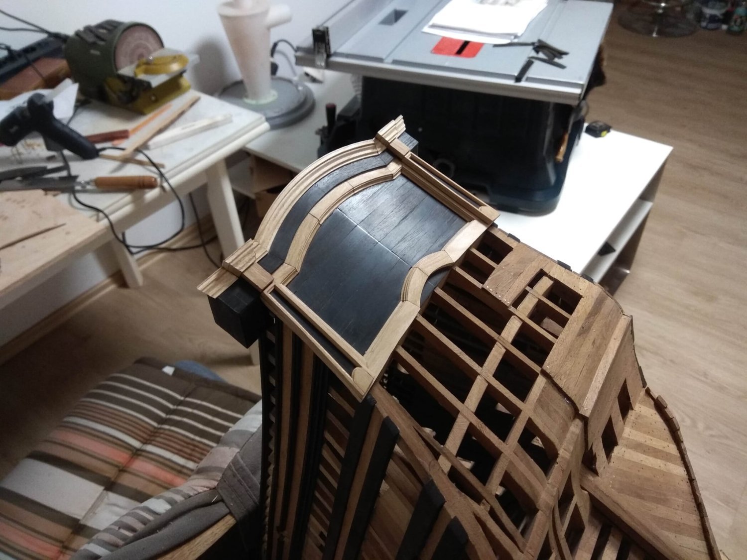
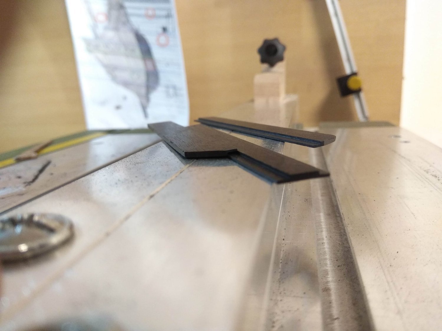
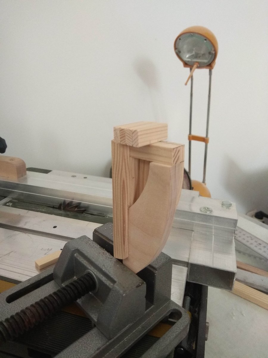
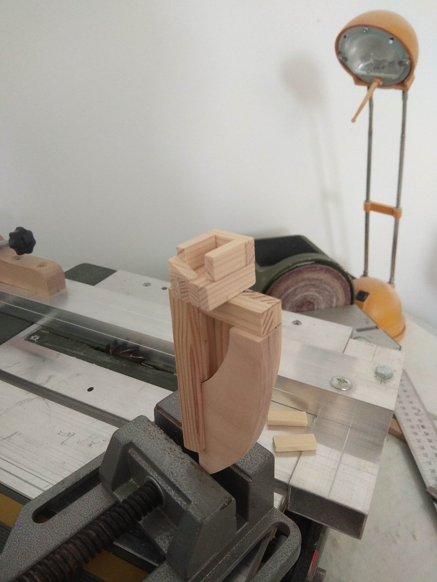
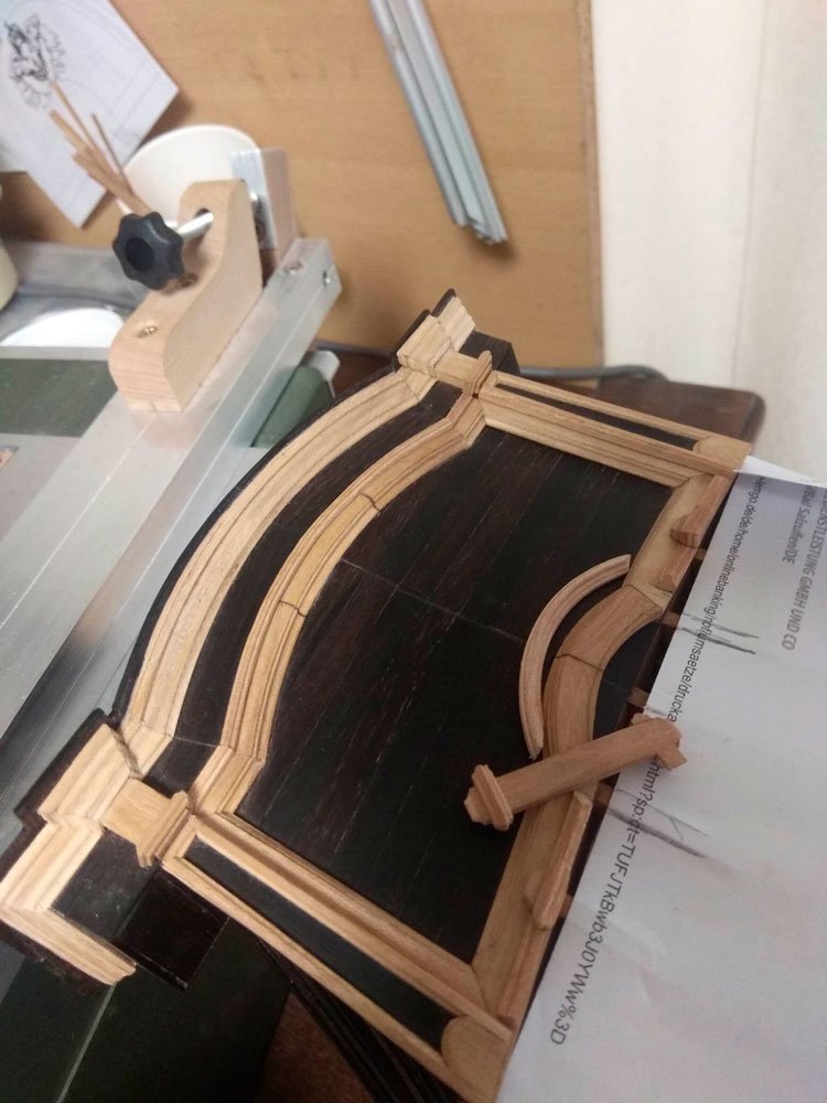
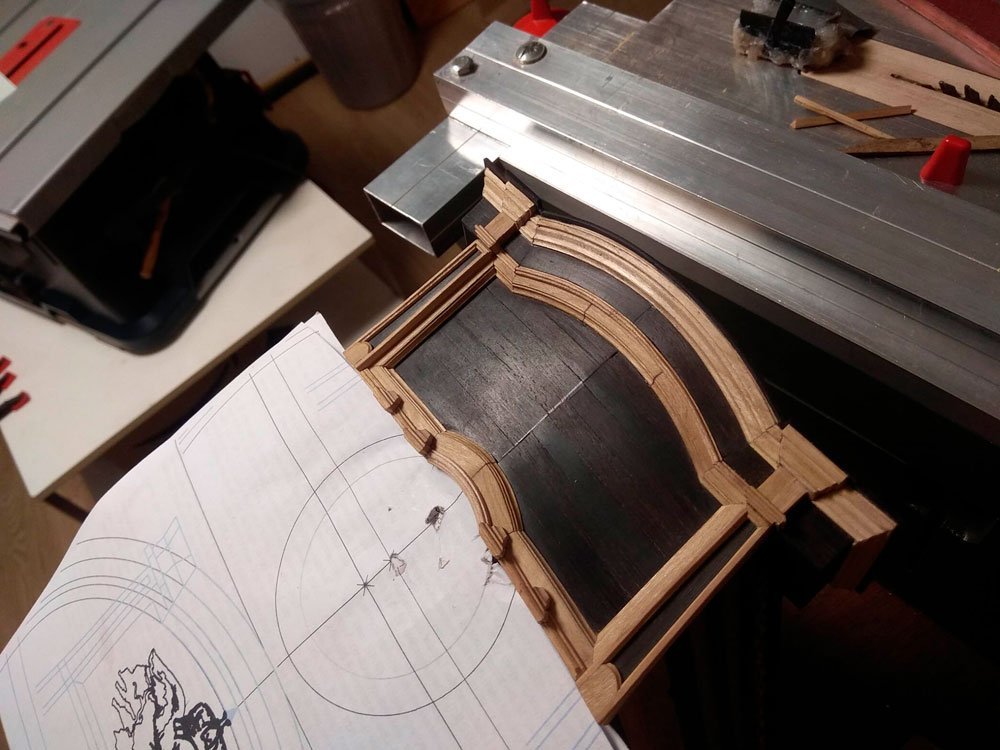
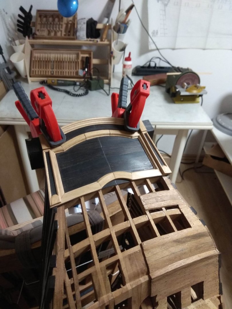
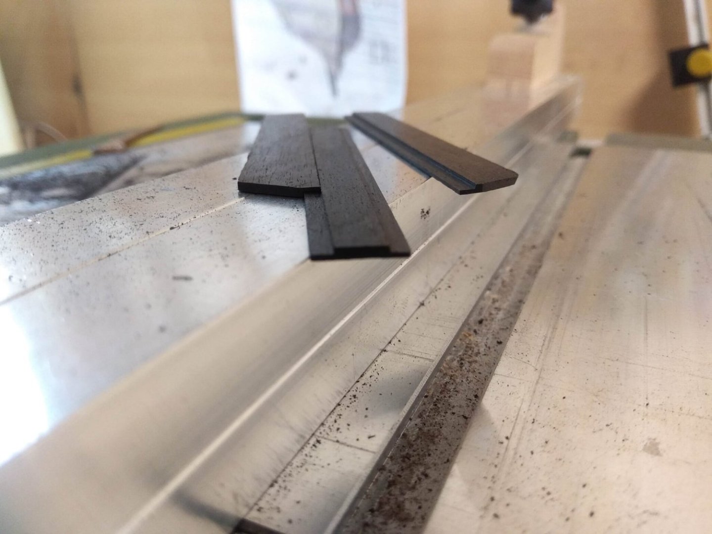
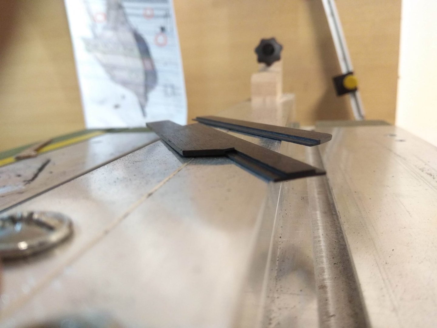
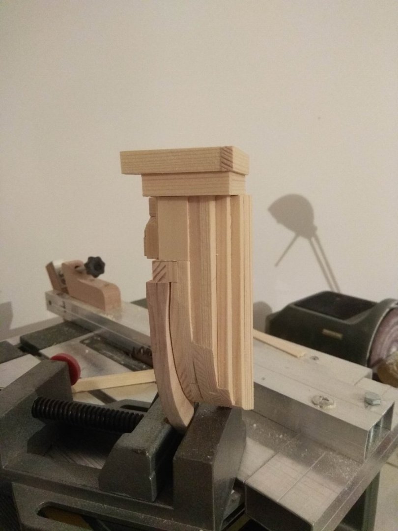
I have a small amount of news accumulated for the new issue. There is nothing to describe here. The vertical side frames have just appeared. And now it's time for not so simple details. I mean the shaped ledge at the very top, on the bow, which crowns the stern transom. Adding another layer with the wenge background. And these photos show a failed first attempt at making a cornice. What happened? I decided to make the cornice profile from a straight lath. The manufacturing technology was the same - with the help of a homemade figure scraper. And this part of the work turned out without problems. Then the resulting cornice should be bent to the required radius. The technology of this stage is also not new. I boiled the lath in water, and then began to fix it in the necessary position, using a template. And here was the problem. The lath was not everywhere the same thickness, and even after the bath it bent reluctantly. It didn't help that I made long kerfs on the underside of the lath to make it easier to bend. In addition, the cornice was difficult to press against the template, as you had to rest the spacer wedges on the face of the cornice, and any careless movement crumpled the shaped profile pattern. This is a glance at what I got. Or it is more correct to say "it didn't work out". The profile is all crumpled, the curves are not smooth. Added to all this was the fact that after cooking the lath swelled and the profile pattern became bloated, and the wood texture itself became rough. In a word, it is impossible to use such a product. And the method is absolutely wrong. It should have been done differently. In particular, the way I did when I made the radial edge of the background layer. It worked out very well then. So, you just have to repeat the same technique. First, I made the cornice itself the desired shape. And then, using a fixed centering cyclic, I gave the workpiece a shaped profile. To the last picture I will leave a small description. Let it be a clue for me, just in case I ever forget this little detail and this picture will be remembered. In Russian there is a simple expression: everything ingenious is simple! This lath with a cut out window turned out to be very simple, but a very nice addition that makes the work a lot easier. When you hold a hacksaw in your hands (from which I make shaped scrapers), your hands get tired very quickly. Holding a more solid bar with the scraper inside is much more comfortable. It is comfortable to hold in your hands. When the scraper is hidden inside the magazine of this rail, it can't be angled, which means the shaped profile will always be perfectly level. There are a couple other advantages, but I won't detail them. A small addition, which greatly contributes to the work and makes it better. But this is not the biggest problem with the cornice. The main difficulties awaited ahead. The thing is that this cornice should "run" in different planes simultaneously, and to the sides, and down, and with a slope. Plus after a few millimeters there should be a new joint and new directions. So each new section was tiny and difficult to hold and handle. But that's why we love ships. Here, every new task is a challenge. It seems like you've only made a couple of small parts, but there's a sense of satisfaction and pride in the fact that they've turned out. Just now you are happy, and already you need to go further, where again new challenges await. How to correctly calculate the joints, how to make, how to hold these little things.... Which means you can't do without boiling the blanks. So I have to boil them first and then glue them together. Otherwise the glue will be destroyed by welding. And there's another problem. I need to glue thin laths with their ends facing each other. And such a joint will be very brittle. Any movement will break the joint. So what do I do? I had to think about it. The first attempt was a failure. No matter how hard I tried, the parts tore, the thin end was too small to hold the parts together. And the bent profile had too much tension to avoid the pressure in the thin seam. A different solution was needed. Finally, on my second attempt, I decided to make quarter kerfs on the laths. This gave the gluing points a much larger area. Maybe this will be enough for a strong seam? And practice has shown that this solution turned out to be correct. The rest was quite simple. It remains to give the glued in a single board laths the necessary geometry and put them in their place. This is how the next stage was completed. It seems that not much has been done. As my wife once said: you spend so much time that it should be enough to build a real ship. I don't know, maybe that's true. But I don't have a better option yet. At least at this rate, the work is moving forward.


-
Thank you. Yes, I read about this wood and some other woods when I was deciding which one to choose. Now I try to describe everything that I have seen new. Maybe it will be useful for someone. In the future there will be many different discoveries, both positive and negative. At the end it will be interesting to compare the final result with expectations.
-
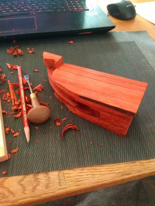
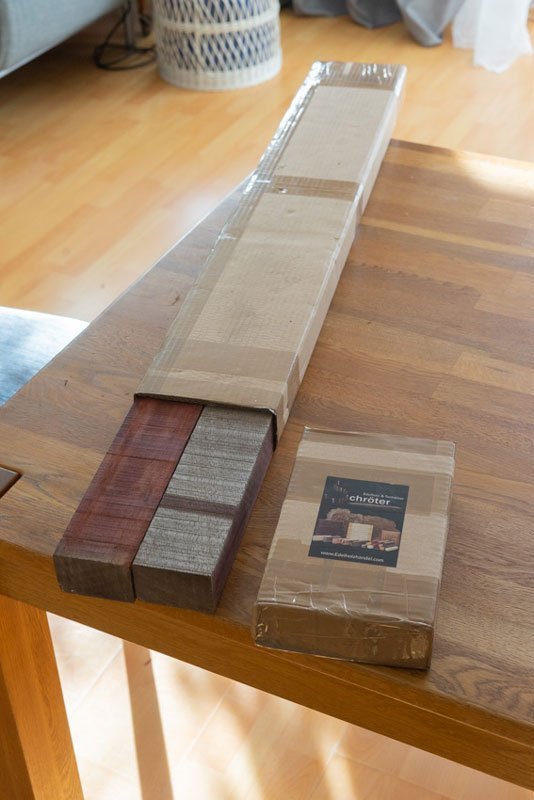
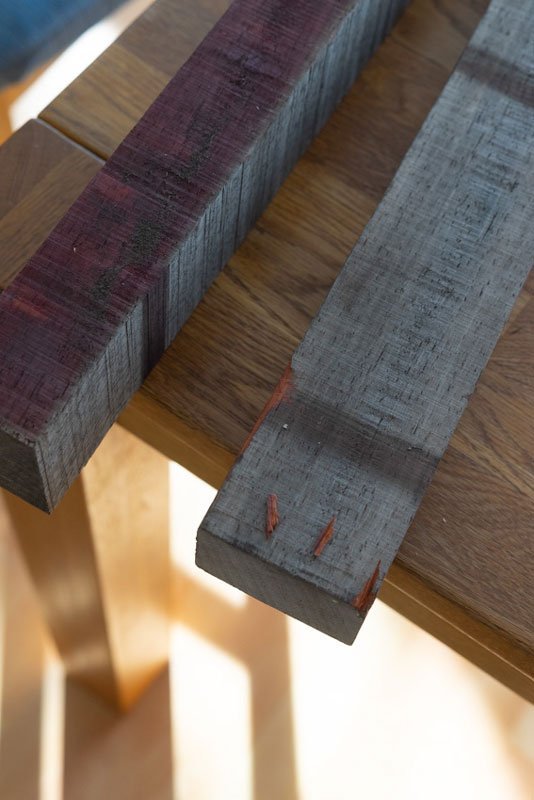
Well, it's time to cover the work on the Russian lion. I'll call him Peter. For some time I have been thinking about what kind of lion he will be? What color? What kind of wood? Usually I use pear or apple wood. But now I've decided that I won't use those woods. The museum's original is made of oak. It's not an easy wood. It's not always suitable for model ships. The grain of this wood is too distinctive. In addition, the veins are not just colored, they have pores. So a small sculpture runs the risk of becoming too rippled. And that would be very distracting. But that's true on a small scale. I want the sculpture to be large. So an active wood grain might not be such a big problem. But I don't really want to go with oak anyway. So I've been thinking. I looked at ads on amazon selling wooden blanks of different types of wood and tried to imagine how it would look like in the finished form. In the end I decided to go with wood that I haven't worked with at all yet. And I don't know at all what to expect from it? Will I be able to cut it well with cutters? Will I like the result? No matter how much I imagine these questions in my imagination, only the work can give me the exact answer. If I don't like it or there are problems, I'll just throw away the unsuccessful attempt and look for another material. And then we'll see what happens. So what did I choose? Paducah. It came to me like this. I ordered two blanks just in case. In addition, I bought another small bar from the same supplier. Also red, but in a different color. Just for fun. Just in case. The moment of unpacking has already given unexpected discoveries of this wood. The photos show that the different sides are very different from each other. You can also see stripes across the length of the board. This is not dirt. Apparently the wood reacts differently to light. In the shade and in the light, it darkens with different intensity. And the stripes are traces of wooden laths, which are placed between the tiers to ventilate the wood. Is it that much different in places that are completely hidden from the light or is it from contact with some other kind of wood? I don't know that. It looks very epic. Strong and active color. It's very representative of African flora. There's a lot of red pigment there in general, for example, the ground is very brightly colored, and many species of trees are also red. It was already clear beforehand, so it didn't surprise me too much. What I did notice was something else. In some places the wood crumbled very easily when pressed. It was as if it was not a fresh body, but had already started to rot and turn to dust. In the photo I even showed the pieces that were easily separated by touching them with my fingers. It's still hard to say what condition the blanks I bought are in. There could be many reasons. It could just be a fluke. Or maybe I really did get a bar that was already starting to deteriorate. I'll know for sure when I start sawing. But I'm not sawing now. I'll get to the wood a little later. First of all, I will start working with other material. But about that in the next issue....
-
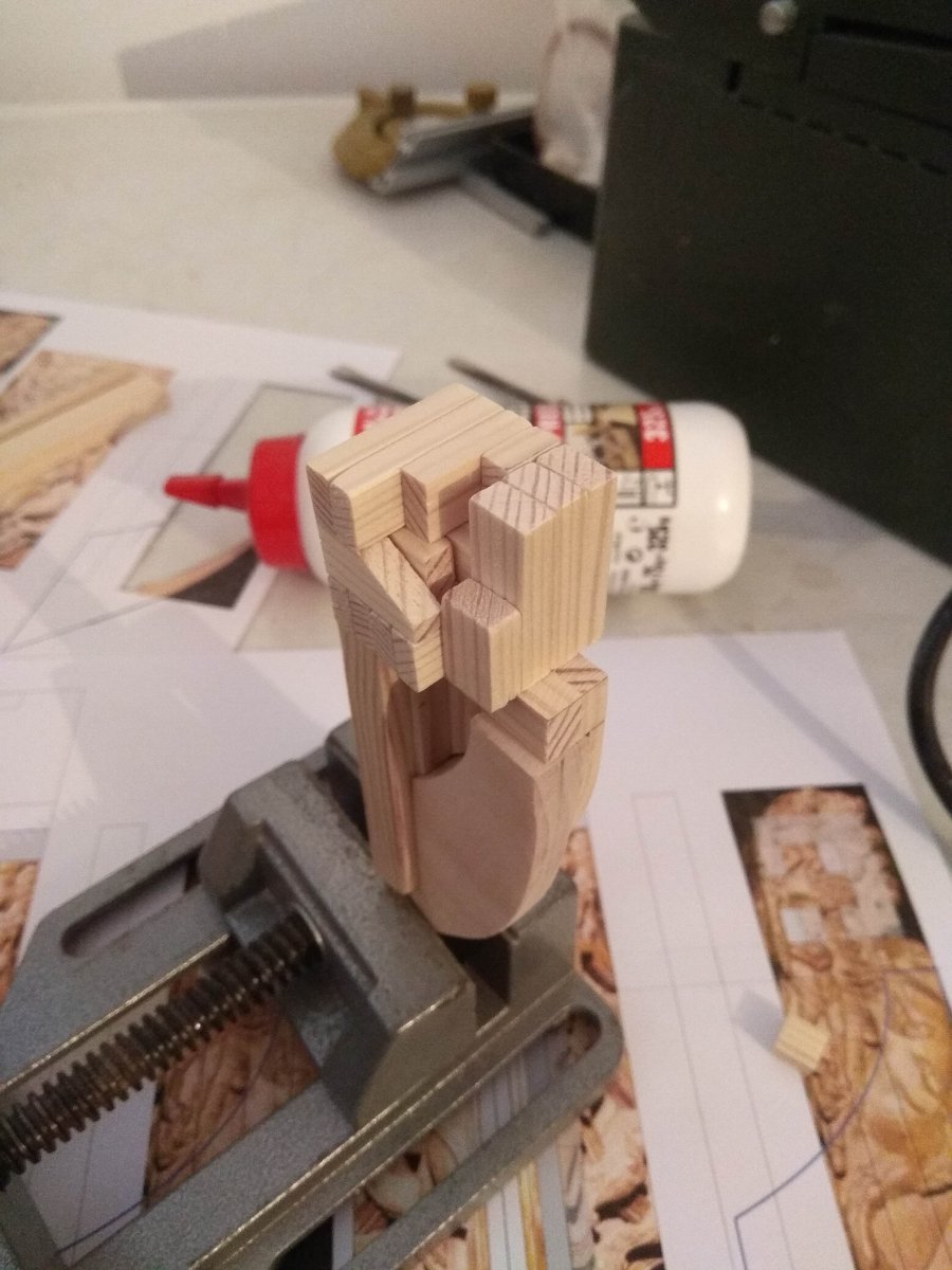
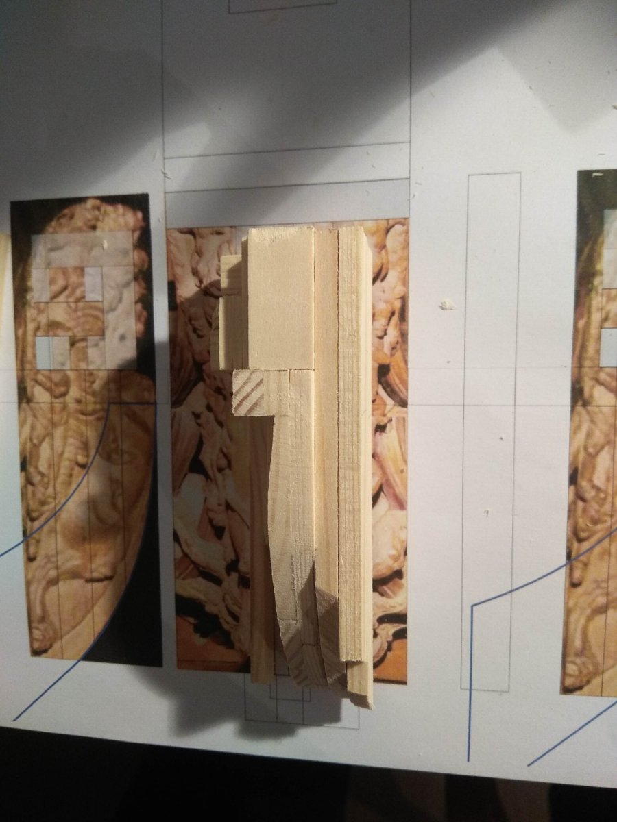
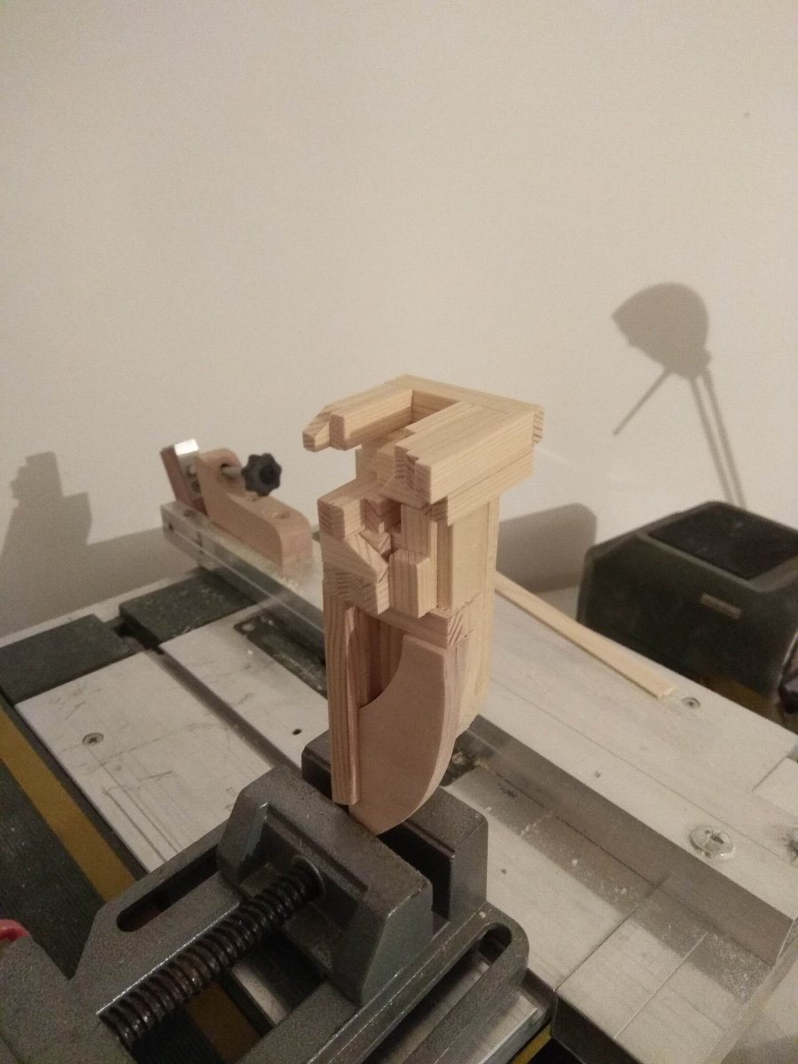
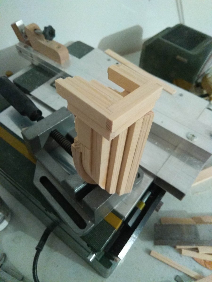
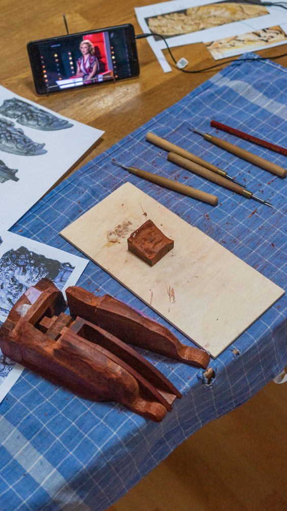
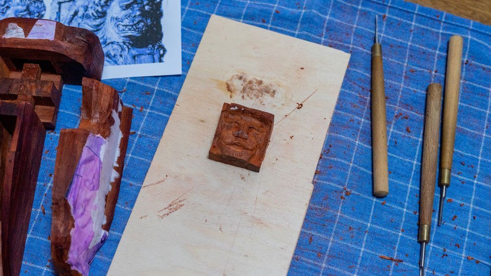
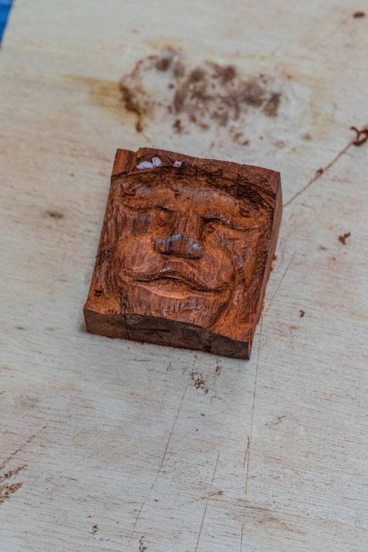
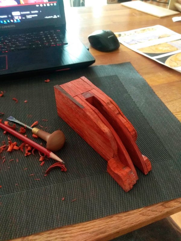
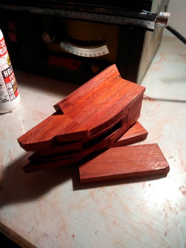
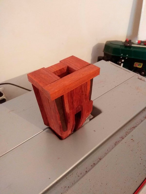
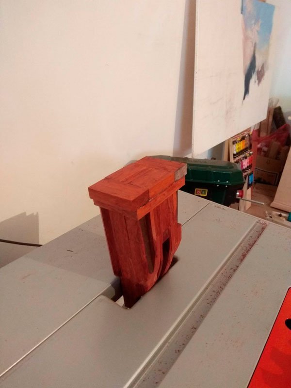
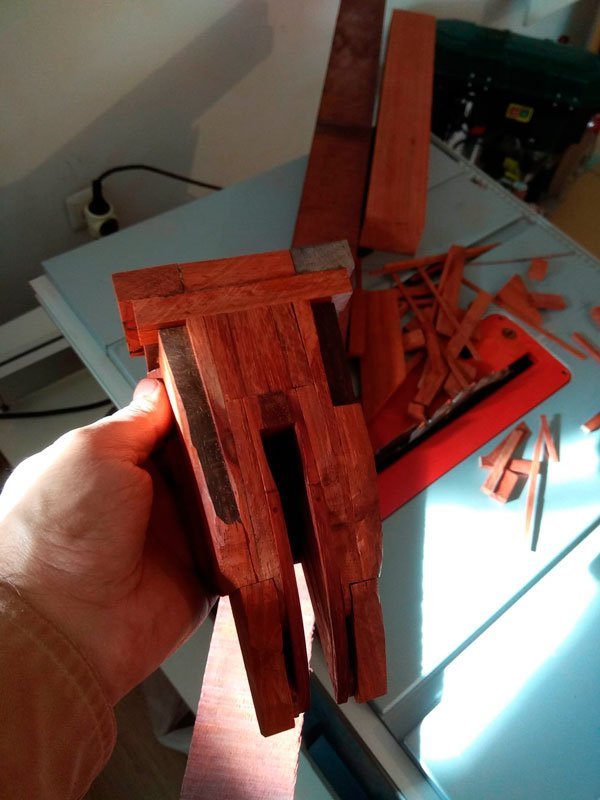
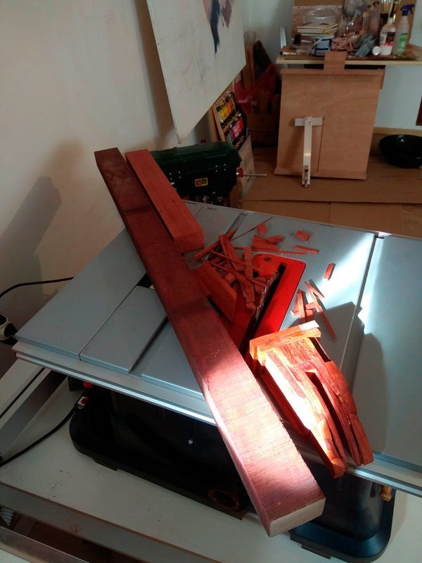
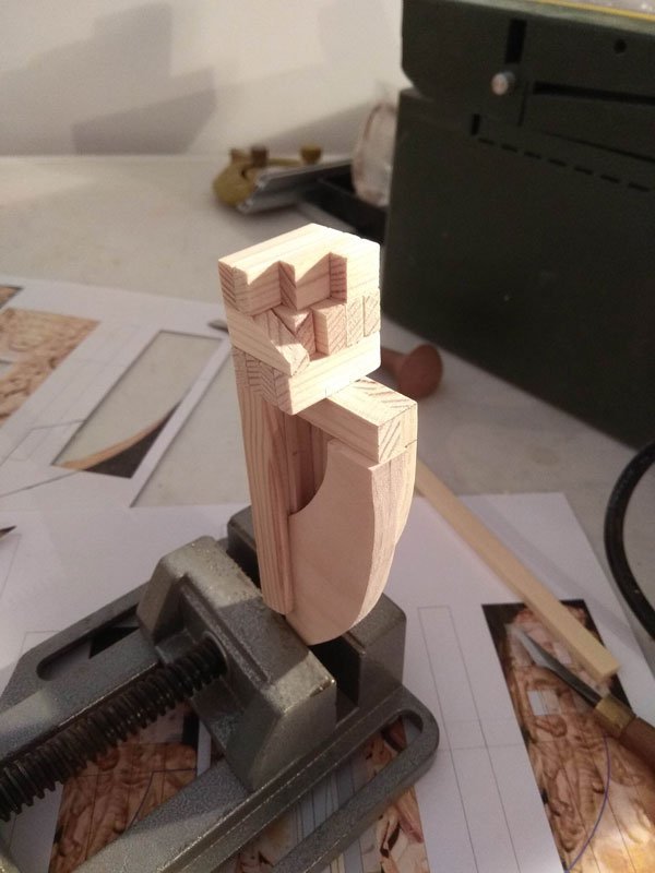
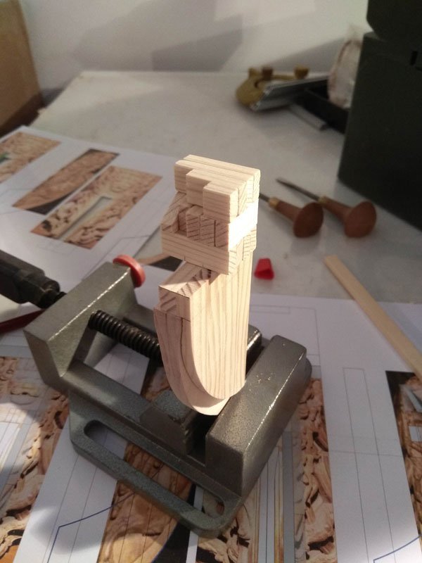
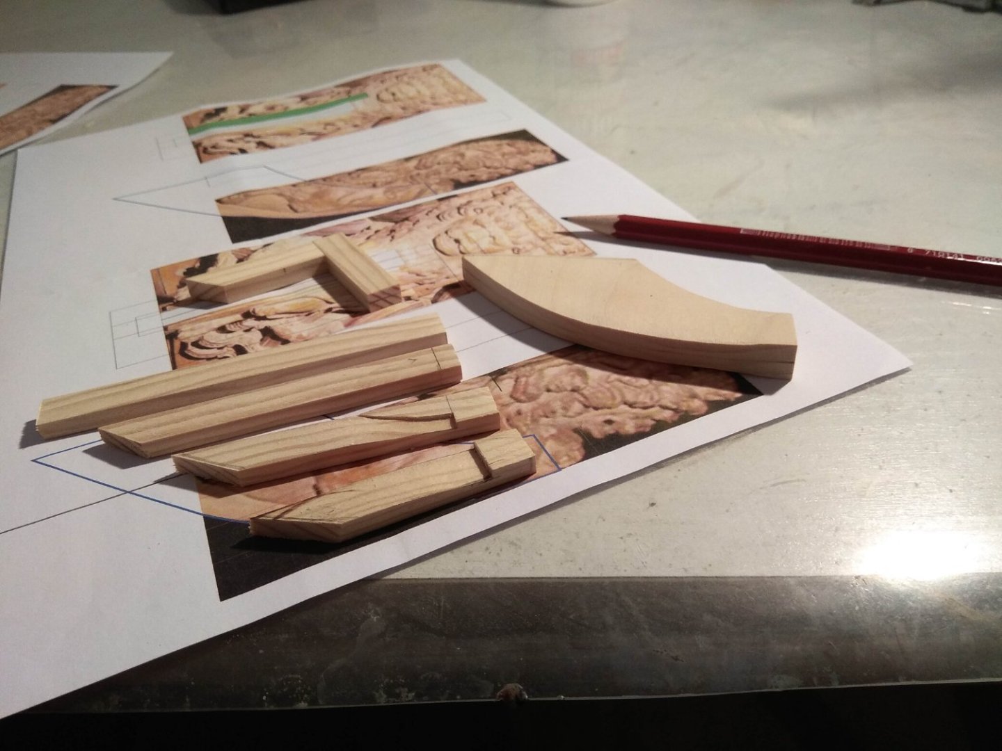
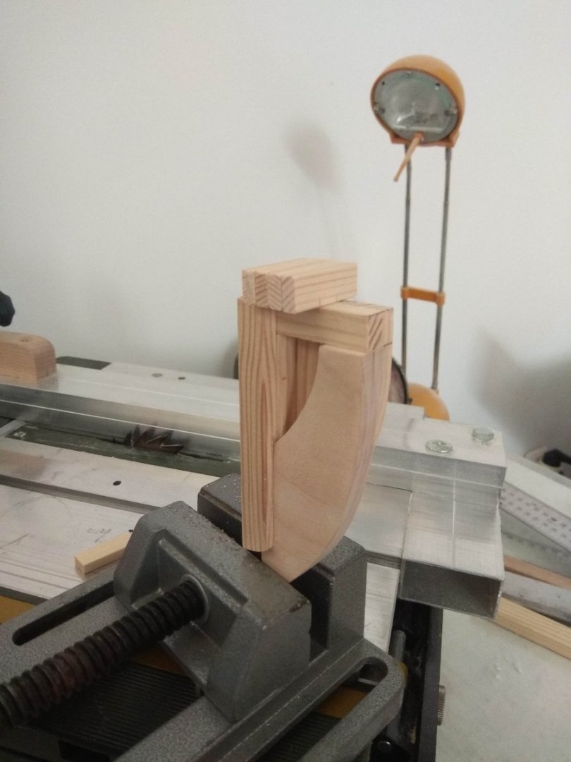
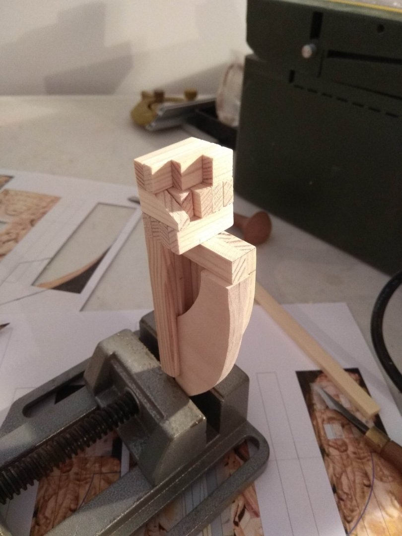
As I warned, the posts will be a bit non-standardized. I spent a lot of time even before the work itself. And I dared to mention it. But without all that, it would be hard to show exactly what I want to do. What thoughts were in my head during the period I was carving. Now I have completed the preparatory descriptions. That said, the description of the work itself will also be a long story. This time I first began the work with a rough period. I mentioned once before that such a stage has always been a weak point for me. Usually the rough stage for a carver is modeling from Plasticine or clay. This allows one to create the image one wants to get. And modeling allows you to make changes, to try several times. And then, while carving in front of your eyes there will be a clue to look at. And being able to take the time to sculpt is a skillful approach. Which I've never been able to do before. Molding has never worked for me in any way. I'm too impatient, and the easily crumpled material always threw me off balance. That's why I've never been able to do preparatory modeling... Nor could I do it now. I didn't even try to do it now. I needed the rough work for something else. I decided that this sculpture would be assembled from segments. Like I was some kind of Gulliver. And I live in Lilliputian country, and I've got tree trunks cut down that fit on my desk. And I have to assemble a billet out of those tiny trunks. But before I start doing this with the actual blank I need to do a similar thing on the roughing bars. I will not stretch this stage over several issues. Although I have a lot to tell about this period, how I thought about segments, layers. But it will be a long story. So I'll just show the pictures. No explanations. Just to show that this stage took me a lot of time and effort. Although even in this period I got the satisfaction that a hobby should bring. Of course, this "Rubik's cube" is specifically made for certain purposes. For example, I made only one half of the construction, and in some places the blocks are specially made so that they do not block the parts that will be inside. After all, in time, when it comes time to do the final construction, I can simply forget about how the layers look. I constantly recalculated the scale of small cubes and looked at what sizes could be in real life. There has to be a balance. What do I mean? Today we are used to wooden blanks being some kind of standard. A log is sawn into boards or blocks. They have clear dimensions. You just go to a store or to a construction base and buy the right size blanks. And in modern ship reconstructions we also see the influence of the modern approach. And it's clearly visible in modern sculptures. It's much easier to build that way. Here: But that's not how things were done in the 17th and 18th centuries. Why spend a lot of effort sawing wood into thin boards and then gluing them together? But completely whole logs won't help either, it might break. As you can already see, the construction of this lion is not a very simple shape. At the bottom is a very thin layer of wood, and on top hang very bulky and heavy layers. How do you attach them? After all, even long ties may not help if you hang a layer that is too thick. How did such a large mass affect the ship at all? Was the figure inside hollow or monolithic? Each step had to be studied separately. It all took a lot of time and there were a lot of options. I leave the abundance of questions behind. A lot of things I've already managed to forget. And here you can already see the latest version.


.jpg.ba9f2d0f3b5f2fbd75a9052881702bf9.jpg)
.jpg.abd3f23368b1bc306214331a609b79fa.jpg)
-
Thank you for your words of encouragement. I try to do my best to make the result worthwhile. You are right, I have done a lot of work. I can imagine how much effort it took. And I am very sorry that the work was not up to its final form. Originally it was supposed to be a classic Admiralty. And a series of lower decks built with all the interior spaces mentioned. But they are not finished to their final form. The upper decks are still missing. It takes a lot of patience and persistence to get this ship "off the slipway". My role as a decorator is a drop in the bucket compared to the huge amount of other work that has yet to be done.