
Tecko
-
Posts
312 -
Joined
-
Last visited
Content Type
Profiles
Forums
Gallery
Events
Everything posted by Tecko
-

HMS Beagle by Tecko - OcCre - 1:60
Tecko replied to Tecko's topic in - Kit build logs for subjects built from 1801 - 1850
The-atlantic-fleet-at-moray-firth-reharding-deck-after-a-heavy-shoot-the-concussion-breaks-up-the-pitch-between-the-deck-planking-and-has-to-be-replenish.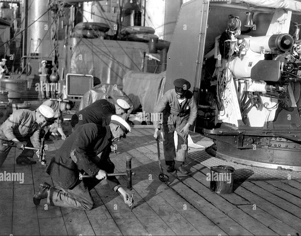
-
HMS Beagle by Tecko - OcCre - 1:60
Tecko replied to Tecko's topic in - Kit build logs for subjects built from 1801 - 1850
This model will have several lights. Six of them will be mounted into the deck. I will be using 3mm dia clear white light LEDs. A seventh LED will be located in the wheelhouse area, but it will be red. I plan to dim the LEDs down from their usual bright recommendations. I have seen too many models using the LEDs at full brightness. I cannot imagine using scale figurines wearing sunglasses in the middle of the night.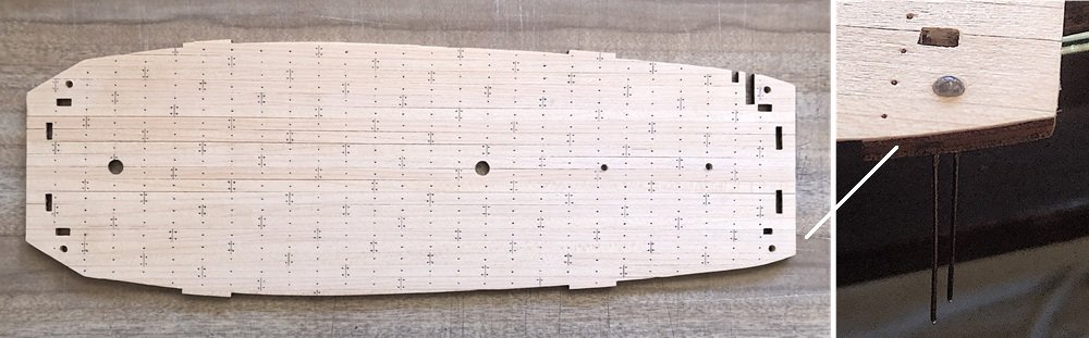
-
HMS Beagle by Tecko - OcCre - 1:60
Tecko replied to Tecko's topic in - Kit build logs for subjects built from 1801 - 1850
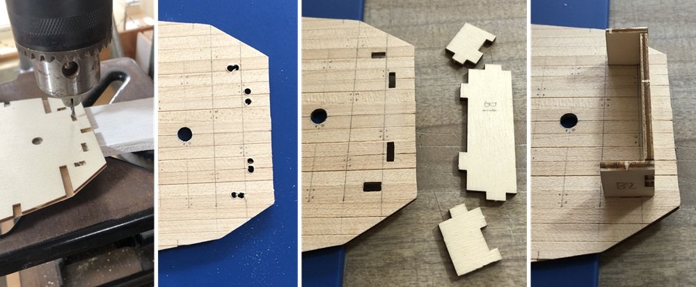
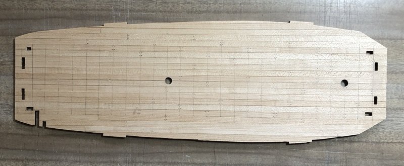
As I was planking the deck, I got to thinking that at this stage I could use the offcuts to fill in the rest of the deck. To do so, I need to know where the plank needs to end. I found (online) a five-plank shift method of planking. I temporarily marked the planks as per the plan instructions. I want to slightly sand down the deck before marking out the joints and fasteners (again). I cut off all the overhang with a scalpel. But I erred to the idea of using the scalpel to cut out the enclosed slots. Instead, I drilled them out and then used needle files. To gauge how much to file, I used the pieces that were to be placed into those slots to get a neat fit. I shortened the extended drill bit to stiffen the drill, so it won't wander if I overlap a hole.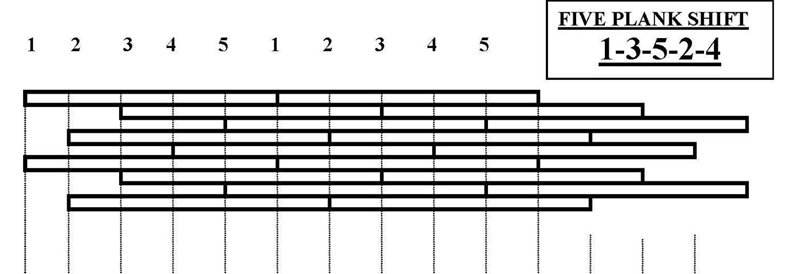
-
HMS Beagle by Tecko - OcCre - 1:60
Tecko replied to Tecko's topic in - Kit build logs for subjects built from 1801 - 1850
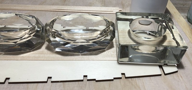
Started planking my first deck. I did not do it as the pros would, but I guess I would have if I were scratch-building. I am using glass, with flat bottoms, as weights. Got them at a secondhand shop. PVA glue doesn't stick to glass.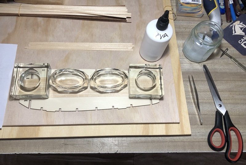
-
HMS Beagle by Tecko - OcCre - 1:60
Tecko replied to Tecko's topic in - Kit build logs for subjects built from 1801 - 1850
Thank you, DonSangria. -
HMS Beagle by Tecko - OcCre - 1:60
Tecko replied to Tecko's topic in - Kit build logs for subjects built from 1801 - 1850
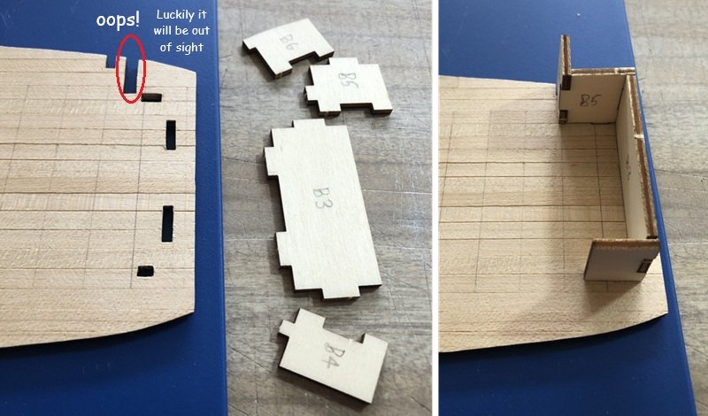
While researching how other builders followed OCCRE's instructions, at times, the deck was not flush with the tops of the bulkheads. I think the problem here is that some of the bulkhead slits are too long and drop into the spine too far. So I decided not to follow the instructions in this case. Instead, I am going to use the deck as a template jig, and have the bulkheads fit flush to the deck before glueing. But first, I need to draw guidelines on the spine to ensure that the bulkheads will be 90 deg. The following photos show what I mean. I have not yet applied any glue, but when I do, I will use superglue to spot glue the bulkheads all straight and flush. Then, when all looks okay, I will use wood glue as welding-runs.


-
HMS Beagle by Tecko - OcCre - 1:60
Tecko replied to Tecko's topic in - Kit build logs for subjects built from 1801 - 1850
Ha ha. Thanks, vvvjames. Perhaps it was not luck, but you have calculated insight. -
HMS Beagle by Tecko - OcCre - 1:60
Tecko replied to Tecko's topic in - Kit build logs for subjects built from 1801 - 1850
Well, right from the start, I put the cart before the horse and got all confused along the way. I missed the page of instructions that shows images of parts with their part numbers. I have now decided to number the parts as I need them. Some are too small to be numbered directly. I forgot how quickly a tabletop can get cluttered up without doing anything yet. A part of me is saying, "Oh yeah! Wait till you start building".
-
HMS Beagle by Tecko - OcCre - 1:60
Tecko replied to Tecko's topic in - Kit build logs for subjects built from 1801 - 1850
Thank you, ccoyle, for the tip. Yes, I believe many have upgraded by adopting a scratch-build approach to certain parts of the ship/boat. They seem to know what the boat ought to look like. However, I would rather do such a thing once I gain some more knowledge and skill about building model period ships. In the meantime, I will do some slight modifications to this model in a free-style way, building without fear of messing up what is expected to be accomplished. -
HMS Beagle by Tecko - OcCre - 1:60
Tecko replied to Tecko's topic in - Kit build logs for subjects built from 1801 - 1850
Thank you, vvvjames. -
HMS Beagle by Tecko - OcCre - 1:60
Tecko replied to Tecko's topic in - Kit build logs for subjects built from 1801 - 1850
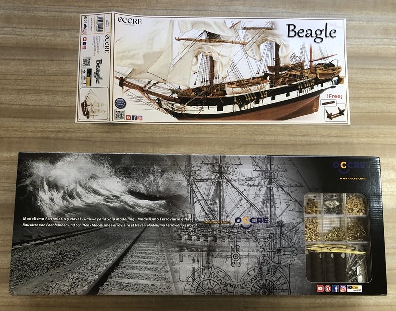
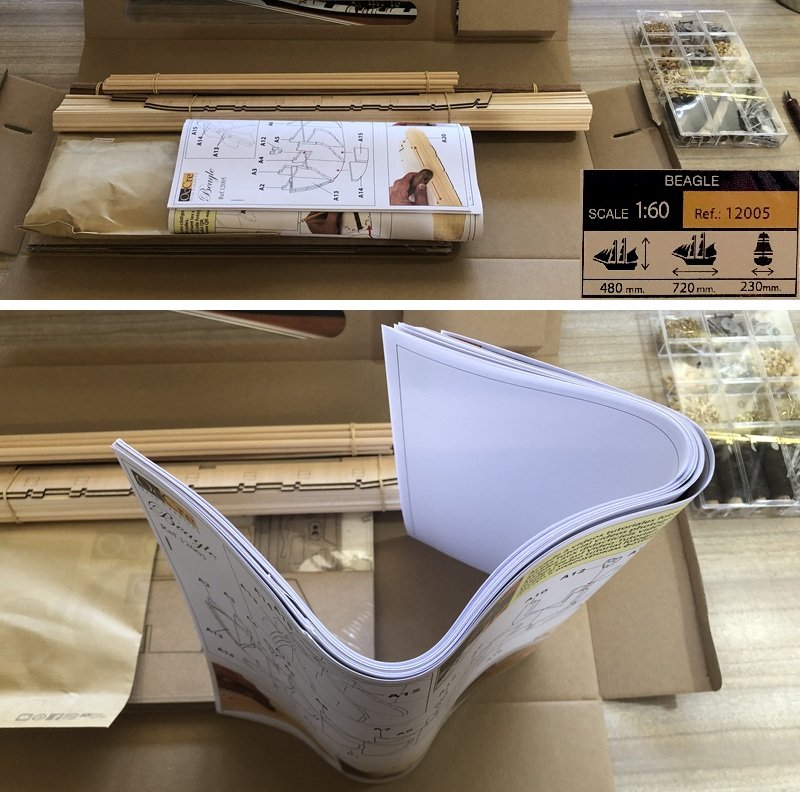
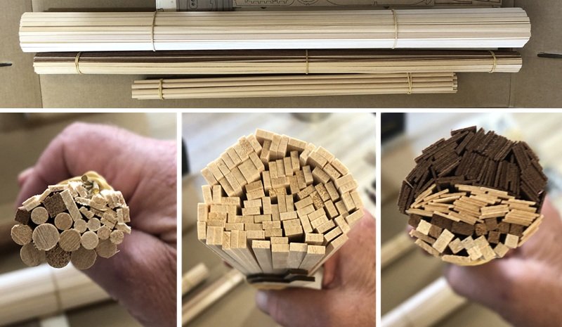
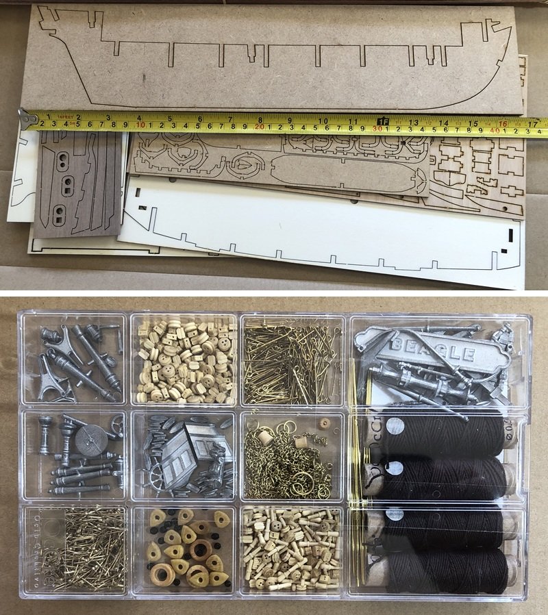
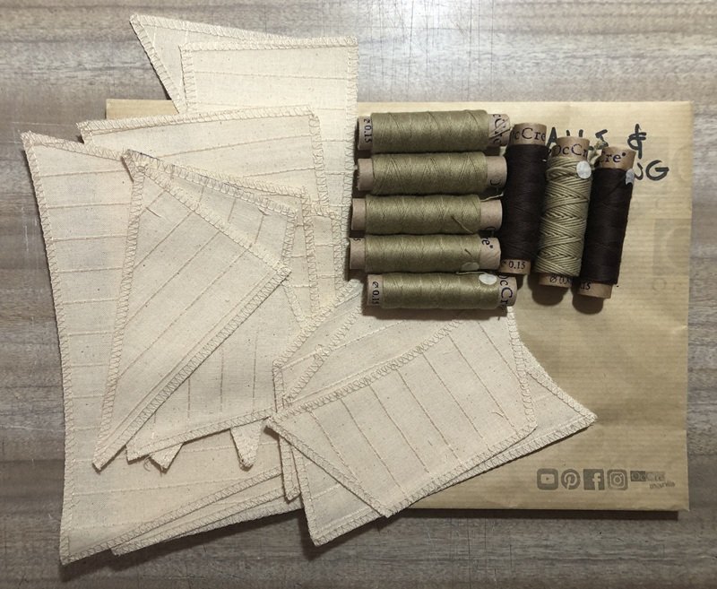
Well, the kit arrived. I suppose I will share images of the unveiling as many others here do...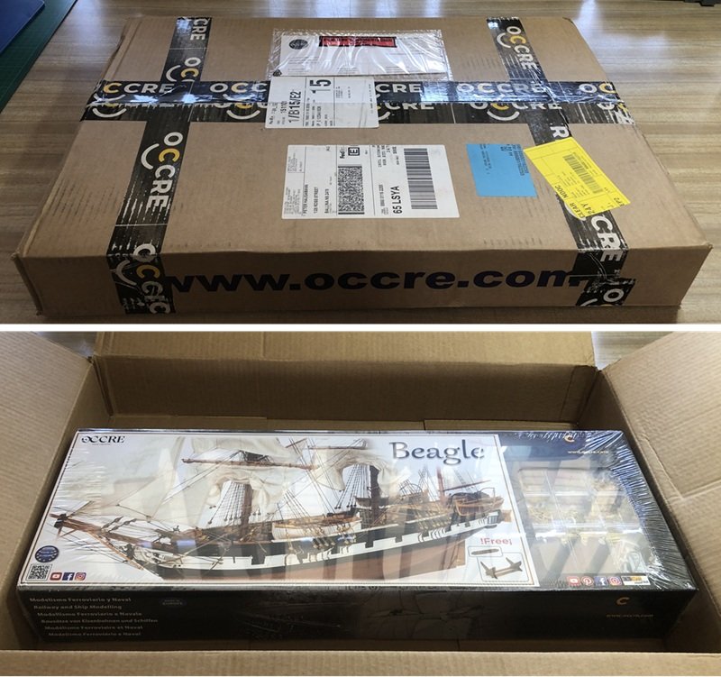
-
HMS Beagle by Tecko - OcCre - 1:60
Tecko replied to Tecko's topic in - Kit build logs for subjects built from 1801 - 1850
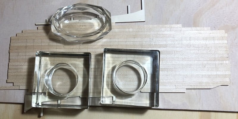
Just playing around to see if I will have plenty of room to include a kraken that is pulling the ship towards it. There is plenty of room.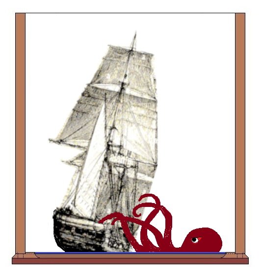
-
Work area pictures only
Tecko replied to Johnny Mike's topic in Modeling tools and Workshop Equipment
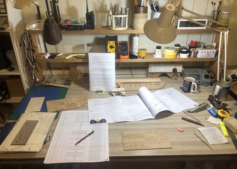
I live in a small unit, and this was my lounge-dining room, which has now been converted into an artisan studio. Here, the bench is waiting for my first sailing ship kit to arrive. The workbench is a secondhand dining table I bought about thirty years ago. It has always been a workbench and has mainly been used for artworks and electronics projects. Seven years ago, it was used for my first modelling projects, and now it will be used again for the same purpose.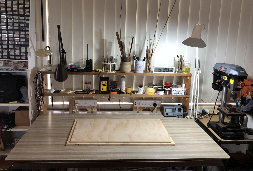
- 47 replies
-
- 10
-

-
Work area pictures only
Tecko replied to Johnny Mike's topic in Modeling tools and Workshop Equipment
Very nice and new-looking. I can hardly wait to mess it up. -
HMS Beagle by Tecko - OcCre - 1:60
Tecko replied to Tecko's topic in - Kit build logs for subjects built from 1801 - 1850
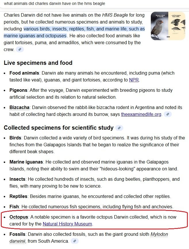
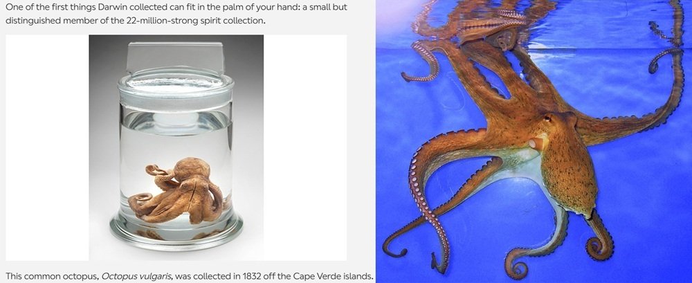
Since this build will be adlib, I am free to do what I like with the diorama part. As a diorama, I always wanted to create a Kracken attacking a fishing boat, or more famously, a sailing ship. My initial thoughts regarding the Beagle (see bottom-right, the easier version). Shortly after making this sketch of a Kracken attacking the HMS Beagle, I came across the following information about Darwin's species collections. The reason Darwin favoured this specimen above the rest is that it can change its colour pattern to blend into its surroundings. Well, well, well! Last night, I came across an old movie on YouTube, and it was in colour... You don't see much of the Kracken until 55 minutes into the film, and onwards. It's quite good.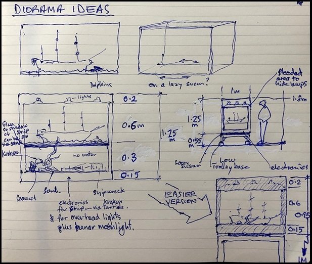

-
HMS Beagle by Tecko - OcCre - 1:60
Tecko replied to Tecko's topic in - Kit build logs for subjects built from 1801 - 1850
Secured the two bases, and everything looks straight and level. My workbench got cleaned up and is ready to go. FedEx said the kit would arrive today, but it's a no-show.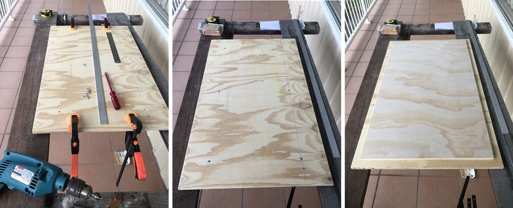

-
Thank you, Jerry Todd, for sharing this thread. I learnt a lot from it.
-
HMS Beagle by Tecko - OcCre - 1:60
Tecko replied to Tecko's topic in - Kit build logs for subjects built from 1801 - 1850
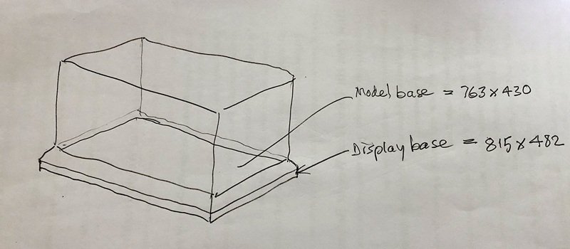
I just cut, from plywood sheets, both display and model bases. Both are slightly warped. What plywood sheet isn't? I will screw them together with each warp opposing the other. Hopefully, that will make a flatter worktop for making this model.
-
HMS Beagle by Tecko - OcCre - 1:60
Tecko replied to Tecko's topic in - Kit build logs for subjects built from 1801 - 1850
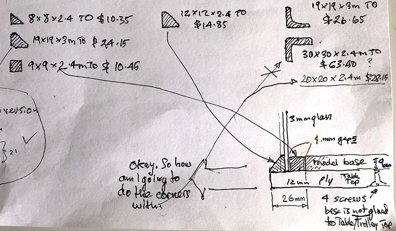
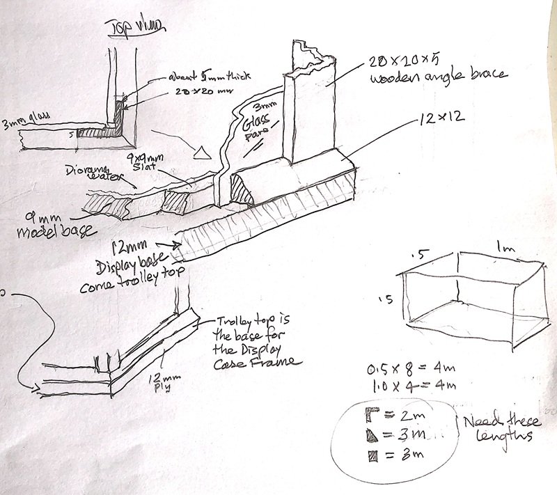
Thank you @LoydB. I also realised that it may be a bit too big for the little space I have at home. The kit will be arriving soon, and I need to prepare a model base for it before I start building. My main concern was how to make a display case with the available materials. I want to be able to remove the model from the case if needed. Also, I need extra space around the model base for the display case. That is, the display base will be larger than the model base. Therefore, I had to compress the surrounding space around the model, which means the diorama will be smaller. Please excuse my mud maps. I don't want to waste unnecessary time redrawing them.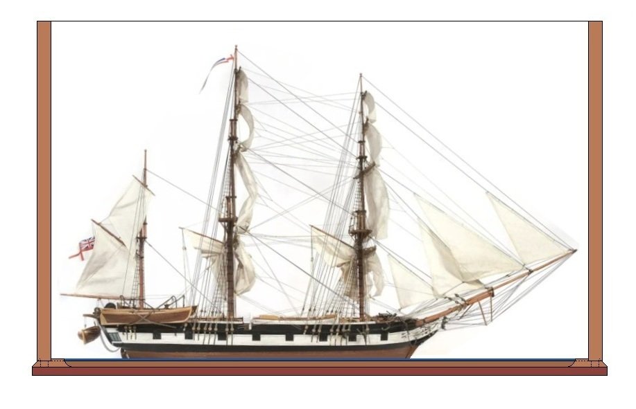
-
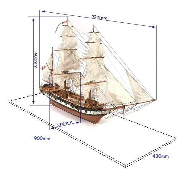
The kit ought to arrive sometime next week from Spain. It will be my second build. My first build was a small trawler-type boat, a cheap Chinese product, built about seven years ago. It turned out okay. I had a bit of a fallout with this Beagle model after I ordered the kit. Apparently, I found out that the kit plans do not follow the redesign of the ship as a survey ship, at the time Charles Darwin sailed with her. There are many Beagle plan versions, and there is still some doubt that the latest version was even drawn correctly. All this did not satisfy the little perfectionist part of me. So, I decided to build this kit in an ad-lib fashion. Heck, I might even cut the hull out and place the ship in a diorama (afloat, so to speak). Leave the more elaborate planking experience for another kit. While waiting for the kit to arrive, I have started researching the HMS Beagle and Darwin. The more I learn, the clearer my vision for the diorama becomes. I am preparing by gathering reading materials and tools for model building. Today I ordered some tools, which will take a few weeks to arrive. I also bought timber from a local hardware store for the base to build the kit on. I can hardly wait to get started. The base is the size of the diorama: 900 x 430mm.
-
Maid of the Mist, it's looking great. Thanks for sharing.

-
Sorry to read about your health issues and side effects, Mac. The road signs that lure us to pull over and distract/delay our purpose for the journey. I have two journeys to complete, one is to be creative for others, the other is to be closer to the truth. Illness brings me closer to the truth about life. Creativity is a way of expressing that life. Thanks again Mac for sharing with me, and for your thoughtful blessing, my friend.
-
HMS ROYAL KATHERINE 1664 by Doris - 1/55 - CARD
Tecko replied to DORIS's topic in - Build logs for subjects built 1501 - 1750
Sorry to read this, Doris. I am in similar situation. Hoping better days will become the normal for you.- 1,035 replies
-
- 6
-
-
- royal katherine
- ship of the line
- (and 1 more)
-
Hello CapnMac82. Have been very busy lately, when I am not too ill to do so. It seems to be all or nothing at this stage of life. Time is running out. Had to temporarily cut out FSM and others. Decided to just focus on the better forums, such as this one. Thank you Mac for your kind and encouraging words.
-
Thanks. Sure hope so.