
HAIIAPHNK
-
Posts
351 -
Joined
-
Last visited
Content Type
Profiles
Forums
Gallery
Events
Everything posted by HAIIAPHNK
-
 While I am preparing the text for the next parts, I will briefly step aside in the narrative with a request for help. For this same project, I am looking for more sculptures, and I need to add a British work with certain characteristics. Ideally, this composition would be perfect: …but it is Danish. Do the English have anything similar? Something with several figures. However, options with horses and riders are not suitable, so no Royal Williams, no Princes, no Georges or Sovereigns. Victory is not acceptable either. And I will not even mention lions—there will be a whole pride of them nearby, so they are not an option as well. I have been scrolling through dozens of images for four days now and still cannot find anything I can choose. Somehow the English seem to struggle with romance and imagination. There are no mythological characters. The French or the Danes have plenty of them—very different ones. But as soon as I need something similar from the English, it suddenly becomes a problem to find anything suitable. Could you suggest what I might look for—something closer to this Dane?
-
Hello, Matthias. As always, you respond to my story with great attentiveness and continue to help with examples and advice. Thank you very much for that. At this point, I could have stopped, but I would like to add a small clarification. The thing is that I am now telling this story in retrospect—that is, I am writing about what has already happened. At present, this project of mine is almost finished; I am working on the final details. They will not change the situation in any fundamental way, but will only add a few small touches. I decided that this approach would make me feel calmer. During the work, I had many questions and many possible paths for decisions. And I was afraid that at any moment the work might be interrupted and take a completely different direction. Why am I mentioning this? Because I believe that my behavior could unintentionally offend you or someone else. You suggest ideas, I thank you, and then a day later I publish the next part of the story in which there is no mention that I took your suggestions into account. From the outside, this could look rude or incorrect. In reality, I greatly value your attention and the genuine involvement with which you treat my search. It was very interesting for me to think through various nuances, and I decided to talk about this side of the work as well. After all, this part often remains in the shadows—we usually show only the final result. As if everything had been known in advance, and the final version emerged on the first attempt. When in fact it was a long journey, with many questions, reflections, and attempts to reach the desired goal.
-
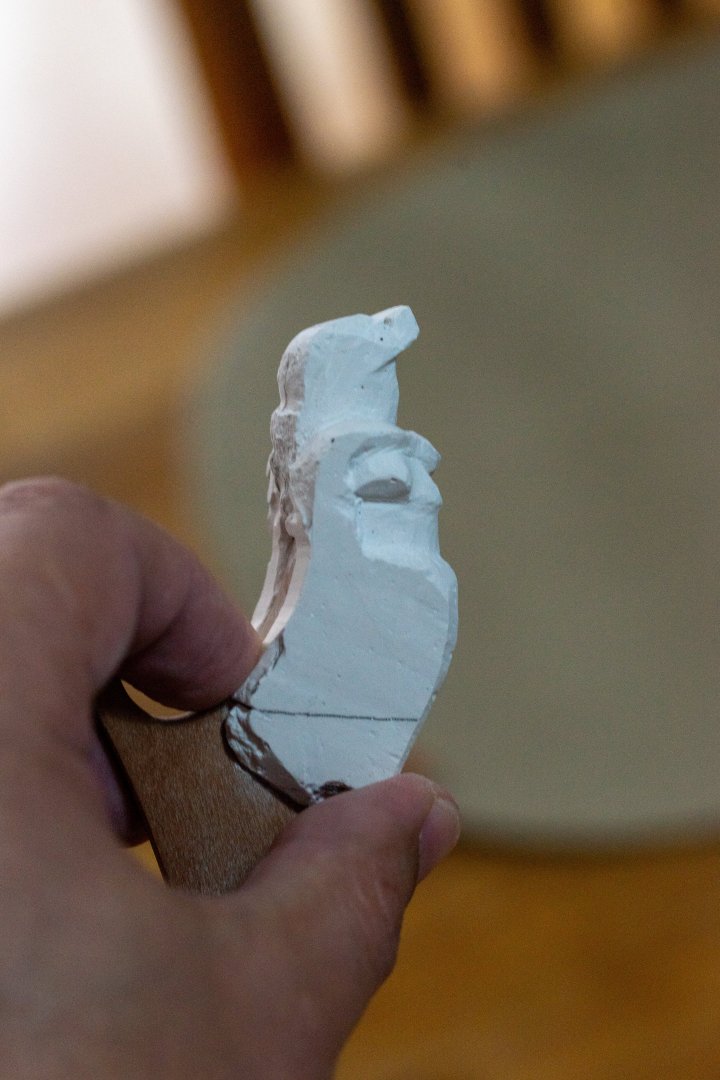
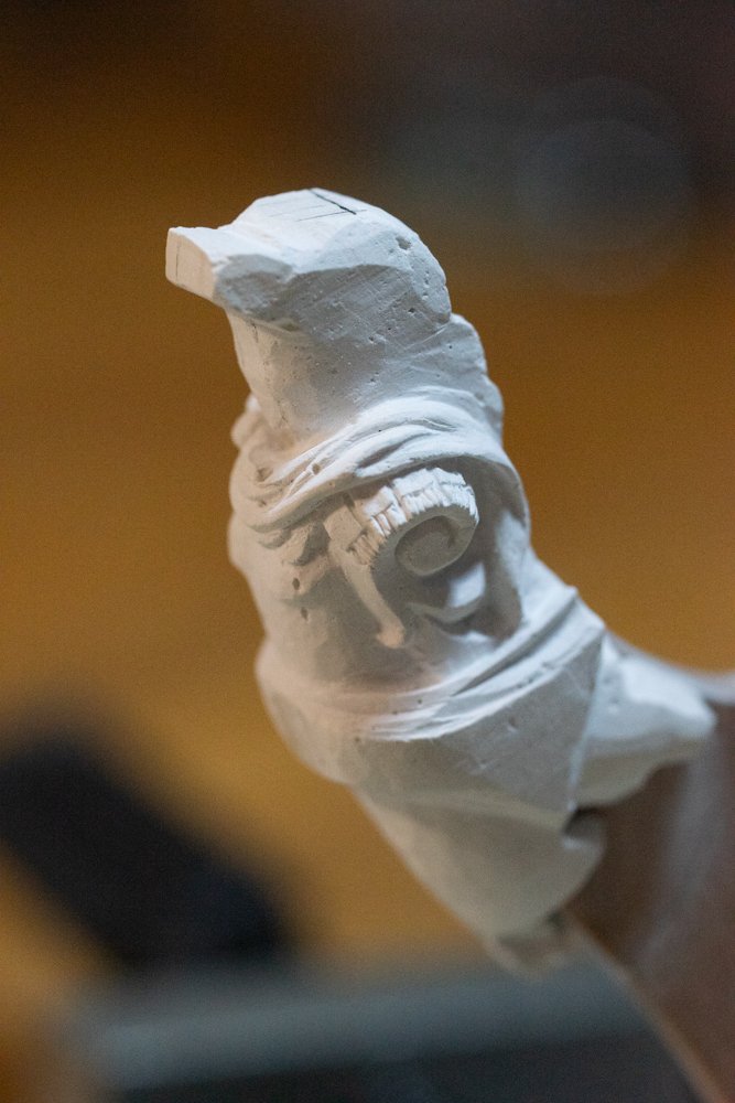
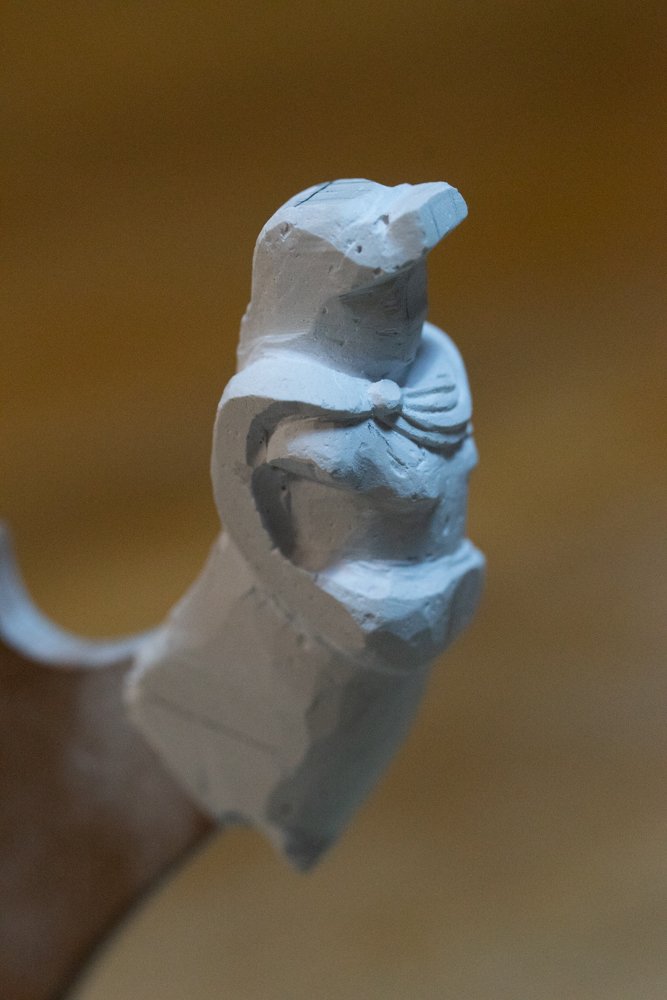
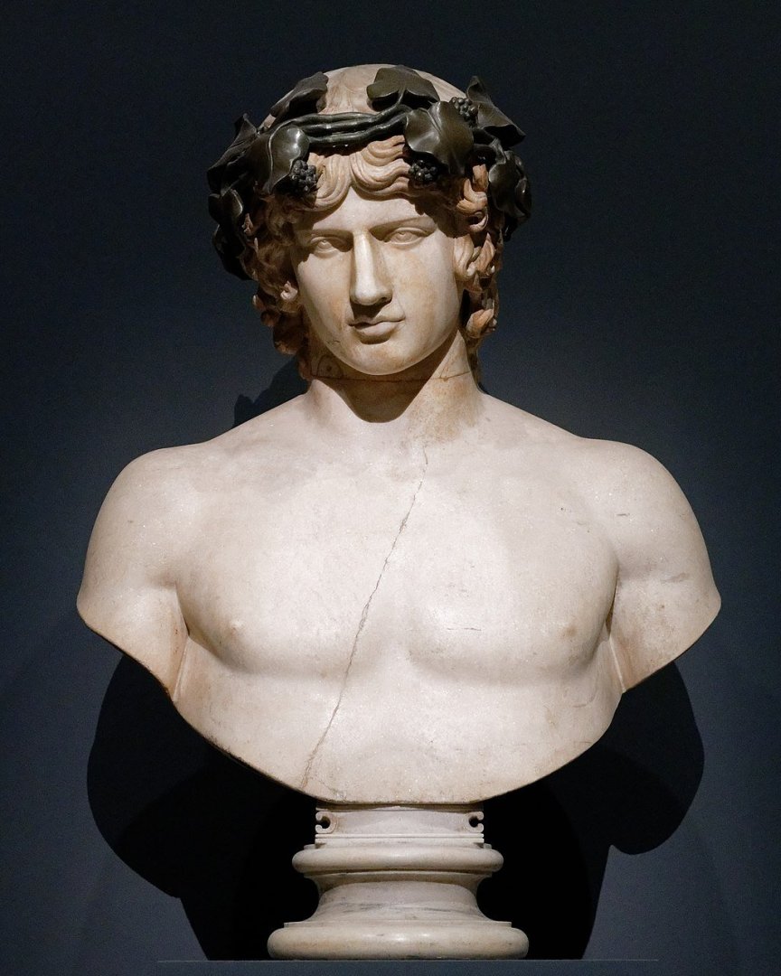
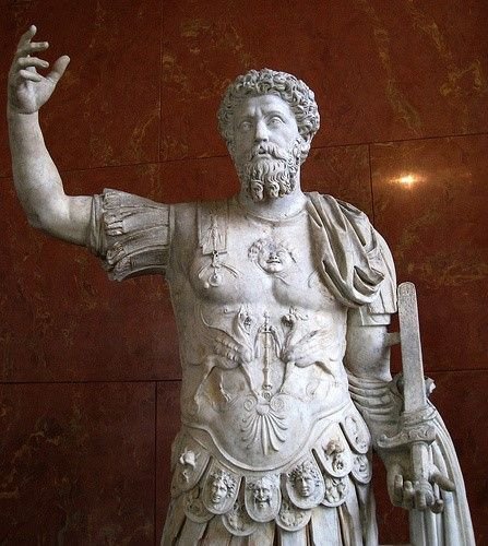
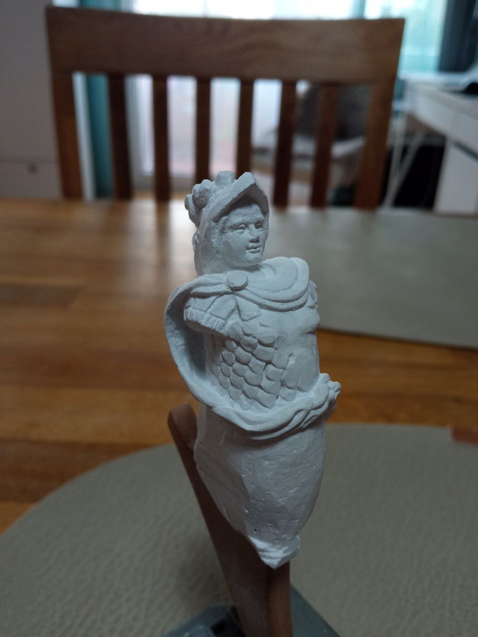
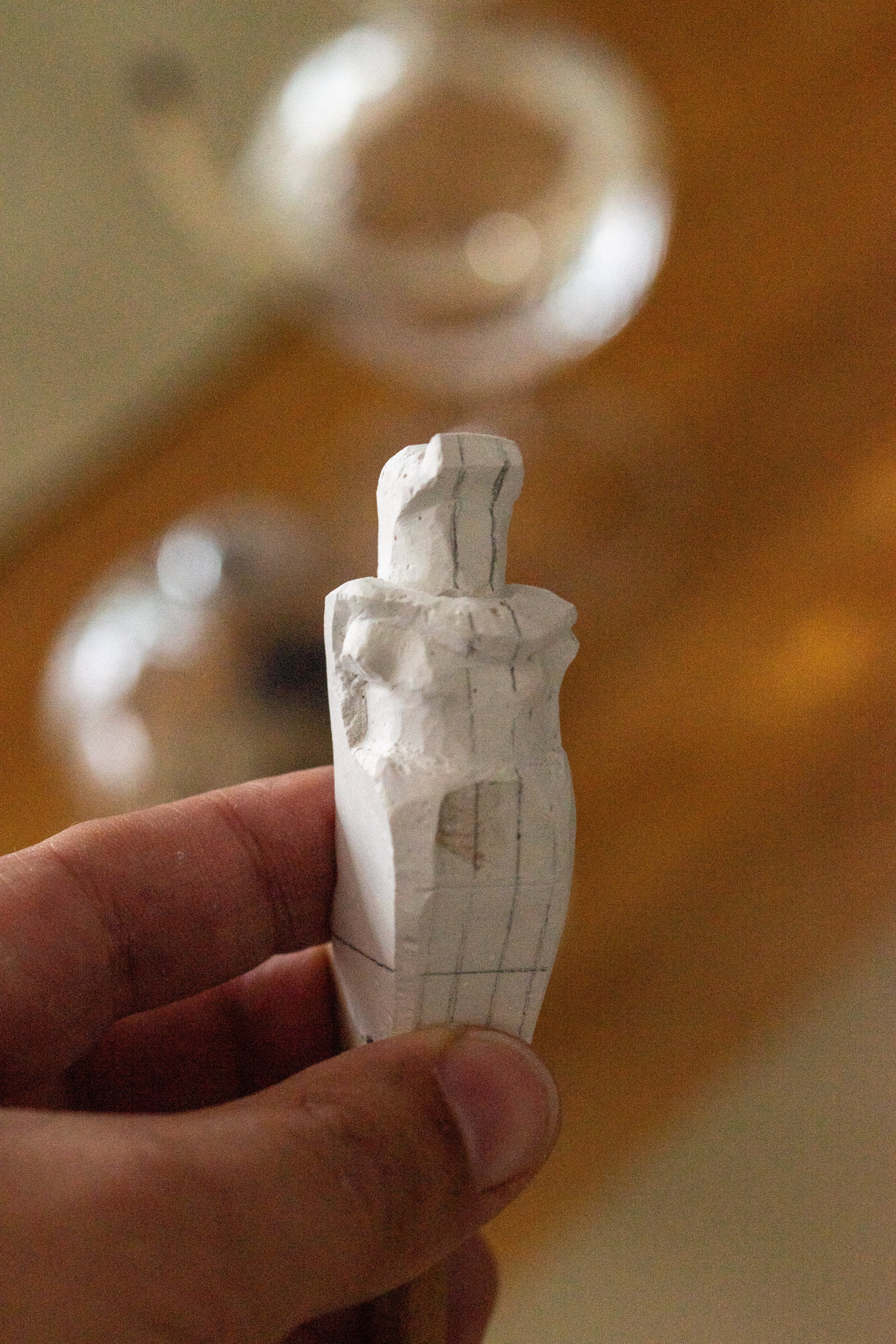
With the helmet, things will be simpler. There is not such an abundance of decorative elements here, so there is less to write about. I found the main answer to how I wanted the helmet to look back when I was comparing different variants and existing drawings of Azov and her sister ships. I immediately decided that I would keep the helmet roughly as it appeared in the drawings. I mean the lavish plumes above the helmet. This is a very characteristic feature, and any changes here would be far more noticeable than liberties taken in ornamentation or even in the detailing of the cuirass. I see no reason to radically alter anything about the helmet. This conviction only strengthened when I made the plaster study. I liked the Renaissance-style version—the long visor of the helmet and the rich plumes on top. I assume these are ostrich feathers. There are plenty of sculptural analogues: One could even say that it was precisely the helmet that gave me the impulse for my artistic liberties. Such a helmet sets a Renaissance mood, with its free and lavish interpretations of costume and expression. If the helmet had been truly antique, then everything else would also have had to be done in that style, adhering to more restrained interpretations. But the helmet in the sketch suggested that I had greater freedom of action. The overall appearance could be lush, elaborate, baroque, or more restrained. This gave me room to be bolder. I am not a great expert in military equipment, but it seems that such helmets are called burgonets. More precisely, this is likely a ceremonial or even a fantasy variant. Combat burgonets were simpler and more practical. When I was making the plaster figure, I did not set myself the task of executing the helmet in its final form. I had other goals—I only gave the helmet its basic features and tried to suggest the luxuriant mass of feathers. In the final sculpture, however, I planned to add more detail. First, a laurel wreath had to appear there. The meaning of this element is obvious: it shows that before us is not merely a warrior, but a triumphant one. It also indicates imperial status. Another important element of the helmet was to be a lion’s mask above the visor. The significance of this detail should also be clear. Alexander the Great is depicted either wearing a helmet with a ram’s head or with a lion’s head. I considered ram’s horns inappropriate here, but the lion variant seemed entirely suitable. Thus, my version was meant to lie somewhere at the intersection of these variants. This would establish logical parallels between the two Alexanders and place the Russian emperor alongside his Greek namesake. At this point, I have fully described all my preliminary research. It was very interesting for me to think through and choose between the options. I hope that reading about it was not too tedious. Now, however, it is time to move on to carving the final sculpture.


-
On both sides of Jupiter, I decided to place the principal victories of Alexander I. During his reign, Russia took part in a series of different wars. But there is no particular sense in accounting for all of the triumphs. One could even mention only a single victory allegorically. Since the subject is the Russo-Turkish War, it would be logical for it to be reflected on the armor. Everything seems consistent. However, I decided that two victories should be shown. This is neither too much, nor just one. And since these references must be composed together with the figure of Jupiter, it is logical that they should be placed on both sides of him. I have already mentioned the Ottoman Empire, and paired with it there must be the victory over Napoleon. What symbols could speak for these countries? Napoleonic France identified itself with the eagle, so let it appear on the cuirass. Depicting a defeated and subdued French eagle is a well-established motif. For example, here, on a commemorative medal, the victory of Great Britain over France is shown. With the Ottoman Empire, however, things are somewhat more complicated. It was not possible to find an animal or bird associated with it that would allow for an ensemble of “beast-countries.” Neither the Ottoman Empire itself, nor anyone else, associated this state with anything of that kind. In all cases where allegories of victory over the Turks were shown in engravings or paintings, they were depicted either as people with large turbans or voluminous trousers, or as banners bearing the crescent. “Well, let it be so,” I decided. However, I soon realized that I would most likely have to depict only France. On one side, the place intended for a relief with the defeated enemy will be covered by the cloak. So be it—it actually makes things a bit easier for me. I also decided that it would be appropriate to show not only the strength and military superiority of the victor. Triumphant figures often try to present themselves as merciful as well, ready to forgive their opponents. This is also a common motif in such allegories. It would be fitting to show that Alexander did not seek to destroy either France or the Ottoman Empire. With the Turks, everything ended when Greece gained its freedom from the Ottoman Empire; with France, it ended with the expulsion of the French from Russia. Allegorically, this can be shown in different ways—for example, by not depicting the eagle as dead, sprawled, or placed under the feet of Jupiter the victor. It is sufficient that it lowers its head before the winner. There are other symbols that indicate that wrath has been restrained. But I decided that at my scale such details would not be visible at all, so there is no point in planning them. As a surrounding element, I decided to add trophy flags behind Jupiter, and to place griffins above the entire composition. At this point, I finished working through the details of the emperor’s cuirass.


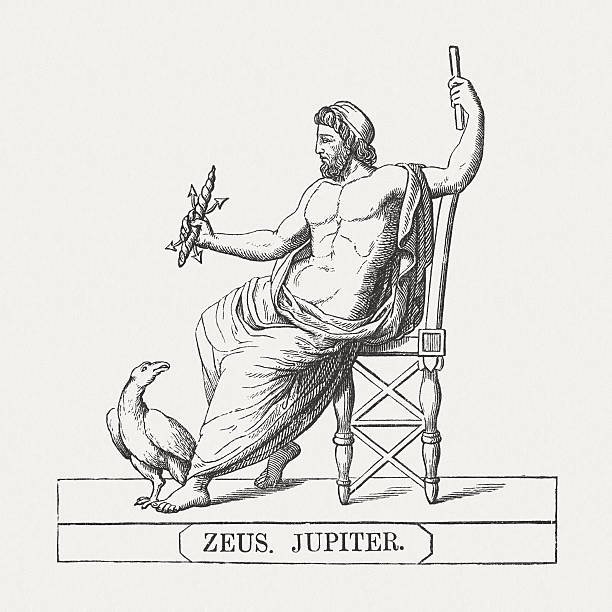
-
Now let us move lower, to the area of the abdomen or the abdominal muscles. What should be depicted here? Essentially, this is often the center of the entire decorative composition and of the allegorical description of the owner of the armor. This is where scenes praising virtues and merits are usually placed, or where victories and conquests are depicted. I examined various options. One could depict it this way, or that way. Or something else entirely. All of these were possible. One simply has to decide what exactly to show. Although there were several options, I decided to settle on placing Jupiter as the main figure at the center. He will be my principal character and the focal point around which everything else will be arranged. Why Jupiter? There are several reasons for choosing this allegory. Let us start with the simplest explanation. This is a fairly standard and frequently used figure on antique armor. This god is perfectly suited as an allegory of power, authority, and might. He stands above all others; he is supreme, and there is no one above him. Who could be a better embodiment of imperial power and strength? If one is to demonstrate one’s power, it makes sense to do so by comparing oneself with someone who stands above all others. That is only logical. But this is not all. I have already said that in my interpretation I want to intertwine several figures at once. I want to show one ruler who places himself on an equal footing with another celebrated ruler. He demonstrates that the coincidence of their names is not accidental, but a sign—an equality in strength, a similarity in greatness, and so on. I hope I have used enough grandiloquent words here. If one is to compare oneself with gods and great rulers of antiquity, there is no reason to be modest with epithets. So, I thought that Jupiter would serve as an excellent link between one Alexander and the other. After all, Alexander the Great considered himself the son of Zeus. Thus Jupiter (who is Zeus) would signify not only supreme power, but also patronage—like a father supporting his famous earthly son. In my mind, there was also a third analogy. Jupiter is often associated with the eagle. This bird was almost like his adjutant and personal companion, and Jupiter himself could also be depicted as an eagle. And this bird, once again, connects the ancient god with the eagle that serves as a symbol of the entire state, since the eagle is a figure of the Russian coat of arms. That is, this is no longer merely an allegory of a single individual—Alexander I—but at the same time a statement that the victor and triumphant force is the entire country. That is quite a turn of thought. So, in the end, Jupiter, according to my idea, should represent the victorious nature of the state, the personal triumph of Alexander I, and at the same time hint at Alexander the Great. …to be continued…

-
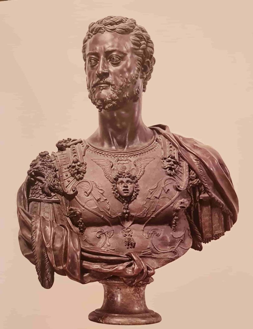
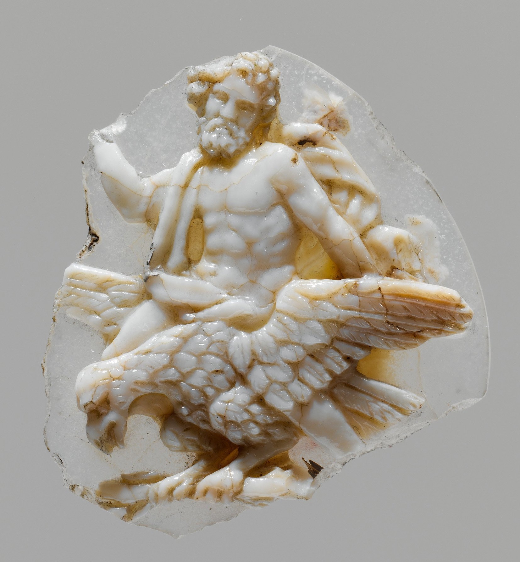
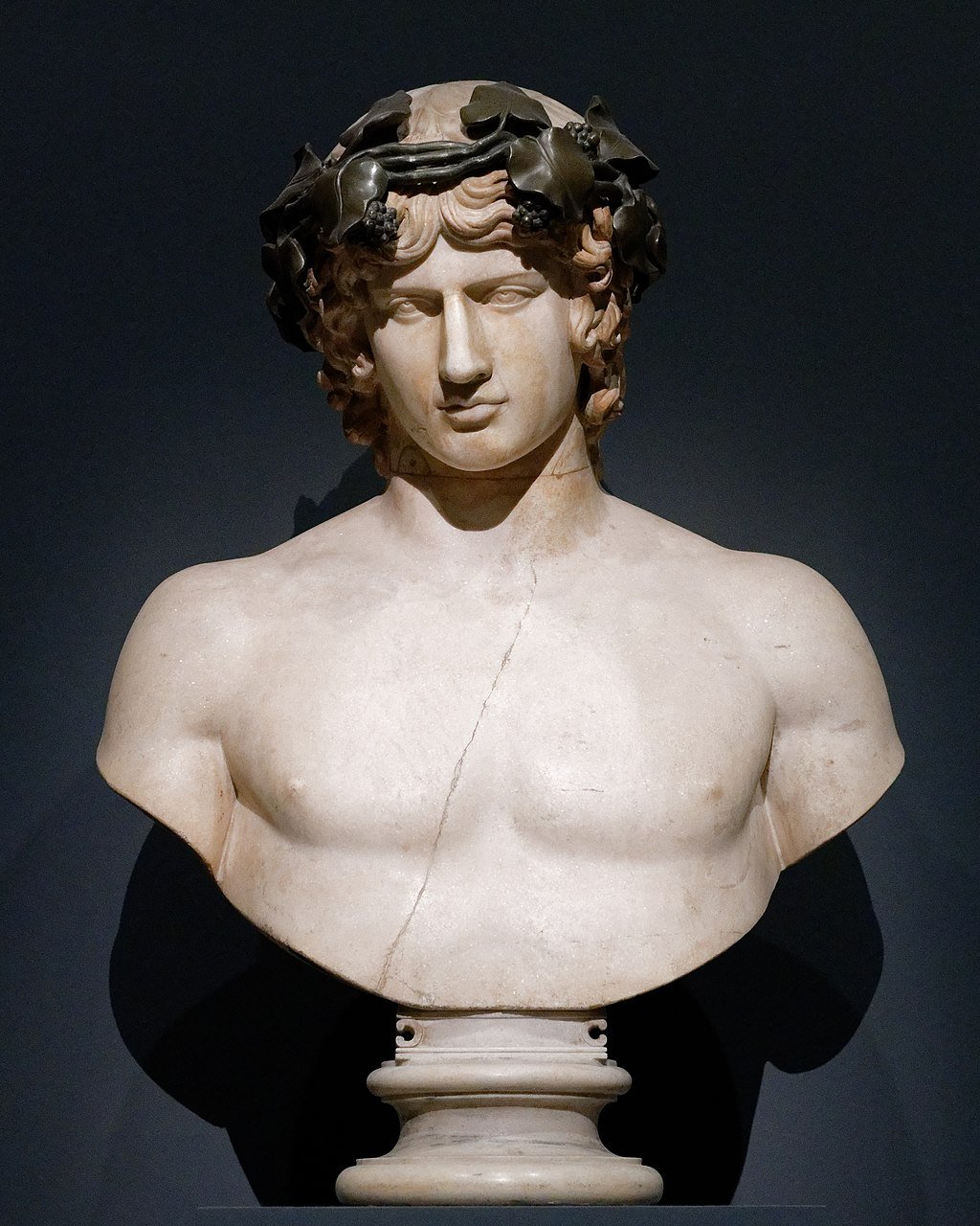
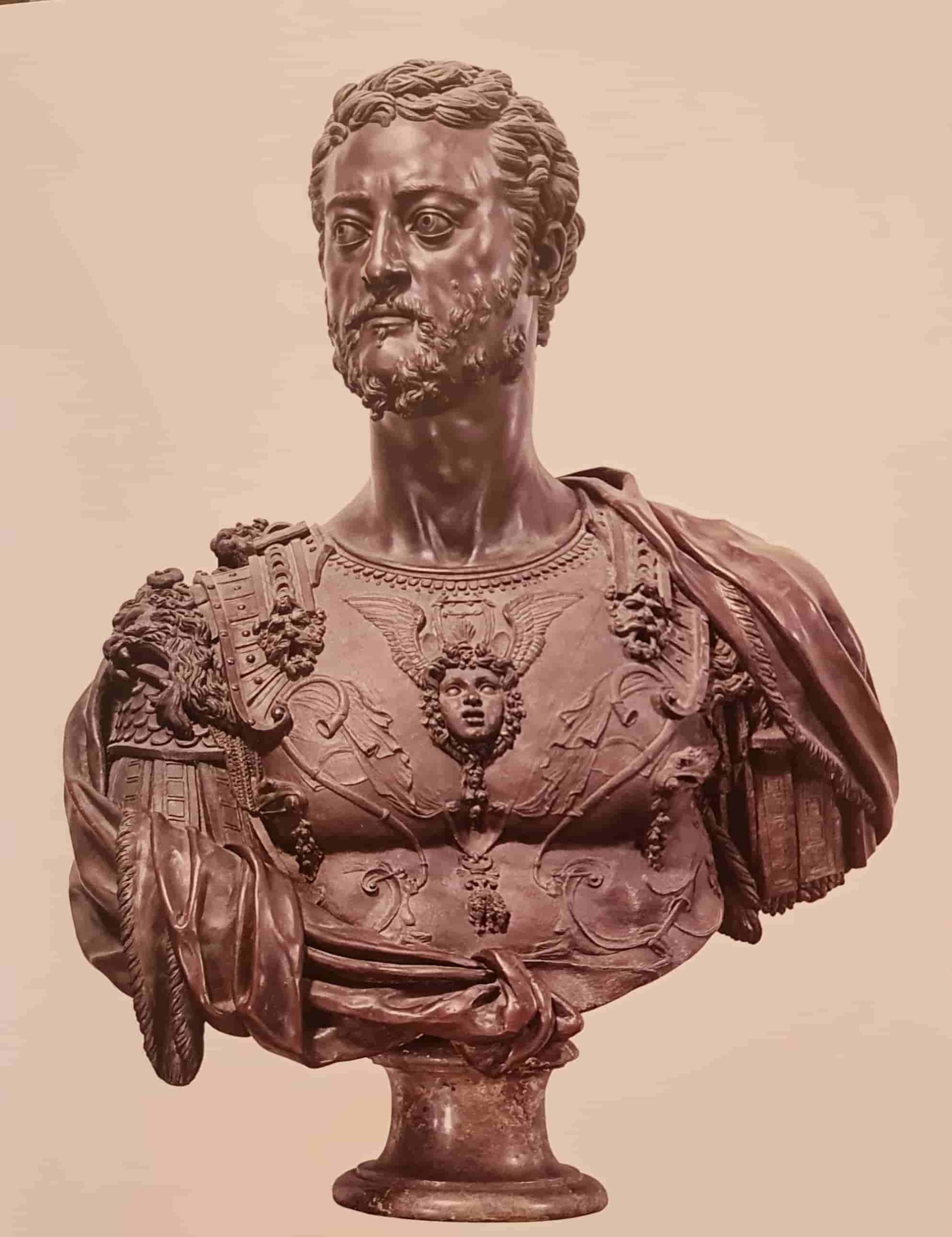
I was satisfied with the results of the preparatory work. I even did more than I had originally planned. Now I am certain that I will make an antique cuirass for my Alexander, rather than chain mail. Which means it is time to talk about my search for how exactly the chest of my sculpture will be decorated. Once again, a substantial section of text follows, devoted to my reflections and research. Perhaps it would have been easier to leave all of this only in my personal memories. But for me, the time spent thinking is no less valuable than the time spent with chisels in my hands. I apologize in advance to those who may not find such reflections very interesting to read. On ancient sculptures, several zones can be identified for placing decorative elements. At the upper part of the chest, one can very often see a gorgoneion — the head of Medusa Gorgon. This decorative element can be called canonical. And here I had no doubts at all. It goes straight into my set of decorations without hesitation. I will not go into the allegorical meaning — everything is obvious and immediately understandable. So, the chest is finished and we can move on… Or rather — no, wait. We are not finished. It is worth pausing here a bit longer. There is something else that I considered and thought through, but for various reasons did not include in my final set. I drew attention to this image. And it interested me. In it, I noticed something that I had not encountered in ancient sculpture. And that is no coincidence, because this is precisely a case where the figure depicted is not an ancient ruler or commander. This is Cosimo I de’ Medici, one of the European rulers of the 16th century. And this bust is exactly an example of a person trying on the image of an ancient character. And in this bust, I was particularly interested in this detail. Looking closer, I realized that this is not just a decoration — it is the pendant of the Order of the Golden Fleece. That is, an award, a badge of distinction, real regalia of this duke, and not an allegorical element like the head of Medusa Gorgon. And this is interesting. After all, I could also show some real orders with which Alexander I was decorated. By the way — what about this Fleece? Here it turns out to be an almost accidental perfect match, because Alexander I was also a knight of this order and had indeed been awarded it. I learned that there are several variations of this order, that they have slight differences, and that it would be important not to make a mistake regarding which version belonged to my Alexander. In short, I was already examining the nuances, searching for ceremonial portraits of Alexander, when I suddenly noticed that in his portraits this pendant is, in fact, absent. No, this is not a mistake — he really was awarded this distinction and had the right to wear it. But he did not. And I began to search for the reason. In the end, everything was confirmed. There were political reasons, and possibly personal ones as well. And I came to the conclusion that including this element would be a mistake for me as well. The second rejected idea concerns elements of personal hints. What do I mean by this? I started thinking: what could be added that would clearly indicate who exactly is depicted here? Of course, the face and portrait likeness come first. But what could appear on the body, on the cuirass? Could there be details that would hint at who stands before us? I had already discarded the idea of showing personal awards. Stars and orders contrasted too sharply with the antique image. So what else could there be? Perhaps a personal monogram somewhere? That was an idea. One could place such decorative attributes somewhere — for example, on the shoulder straps. Often, at the points where these straps attach to the cuirass, cords or buttons, rivets are depicted. And on such an element one could place a personal monogram with initials. That would no longer be just a hint, but a clear indication of the identity. And I began to look at examples of what Alexander I’s personal monogram looked like. I already said that this is a story about ideas that did not go any further and were rejected at the stage of reflection. So what was wrong here? In fact, everything is simple. A monogram with initials has subtle nuances. Yes, initials function like a person’s signature, their identification to others. But it is important to understand in which situations such signs are appropriate — and in which they are not. Alexander could place a seal with his initials, confirming who exactly was the author of certain words. He could sit on a throne bearing his personal monogram. He could use plates, spoons, and other objects marked in this way. But he could not wear his own monogram on his body as part of his attire. Although such monograms did exist — on buttons, epaulettes, and similar items. But not for Alexander himself. How so? It is simple. Essentially, such marks are a continuation of the practice of marking one’s property. Like a brand used by cattle breeders, or an ex libris used by library owners. It is a way to mark something, to show to whom it belongs. Therefore, buttons with imperial initials could belong to the emperor’s personal guard, his adjutants, and other especially close individuals. And this was simultaneously a sign of honor: I am specially chosen, singled out for special service among many others, I have special authority, I act in the name of the emperor himself. And at the same time, it was a sign of personal belonging: I am wearing the mark of my master, therefore I do not belong to myself — I will go where my master sends me. I hope the meaning is clear. Alexander I himself could not bear his own monogram on his person. It would be like a cowboy branding himself with his own mark. So I discarded the idea of including such hints. Why did I decide to spend time describing what was ultimately not adopted? First, because it was an interesting process. Thinking, searching for options — this is very engaging. Various thoughts and ideas arise, and among them are those that do not remain in the end, but still leave a trace. Second, it can be useful. I often write things that I later reread myself. It is a kind of diary for me. With time, precise details may fade from memory, but rereading allows me to refresh my thoughts. Who knows — perhaps someday I will again have to invent the appearance of another historical figure, and this will prove useful once more. Here I will pause. And I will continue further stories about the search for other allegorical details in military attire in the next installment.


-
Matthias, thank you very much for your reply. You clarified a lot regarding the history of the German navy, and that is very valuable. I enjoy learning more. I am familiar with that Danish lion, but you still made a wonderful gift for me, because in my library I have this lion in much poorer quality. The reason is easy to explain. The overwhelming majority of museum photographs available online are taken by visitors. In that case, they are simply overview shots made on phones. People do not aim to focus on nuances or on proper object photography. One has to rely on modelers, who photograph more meticulously—but such images still have to be found. Or it is better to travel to museums oneself, which is not so easy either. Your story about Wiedevelt is also a tremendous gift. I will try to look for more information about him. Your remarks about his work in Denmark raise a very interesting question: how can specific sculptures be assigned to a national school? If a German created a work in Denmark, where should that work be placed? Is it German, or Danish? Everything is intertwined. One can argue for a territorial principle: if it was made in Denmark and later sailed under the Danish flag, then of course it can be called a Danish work. But at the same time, the author may have created it based on experience and an artistic style that he brought from home—or perhaps even from another country. There are many such examples. For instance, the ship Vasa was Swedish, but it was built by Dutch masters, and the decorative style was theirs as well. Or one can recall how strongly Italian masters influenced Europe during the flowering of the Renaissance—and this affected almost every possible field, from weapons and armor to architecture. And one can discuss endlessly where one artistic school begins and another ends. Where is that boundary?
-
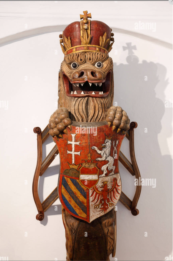
Here is what I know: It is a small museum located in a castle—or, according to other sources, in the manor of the former Erlahof Abbey. It is in the town of Spitz, in Austria. That is all I know. And it is the only lion I have encountered in the German-speaking region. Unfortunately, museums offer almost no examples of German shipbuilding. It feels as if the navy in this region appears only starting with ironclads. I know virtually nothing about Germany’s “wooden” naval history. At present, I have set myself the goal of creating a small collection of sculptures from different countries. I chose one common subject for all of them—the lion—in order to compare different styles. And no matter how much I search, I cannot find a suitable candidate for a German variant. This lion is the closest I have found. Even so, photographs of this sculpture in usable quality exist only from one angle, which is disappointing. For this project, personal imagination—like with Azov—will not be sufficient. Here it is important for me to reproduce something as close to the original as possible.
-
Hello, Matthias. Thank you very much for your reply — now everything is clear to me. What can I say? Knowing myself and my experience with preparatory stages, wax may indeed be useful to me, but I will definitely need to train my self-discipline and patience. If I imagine myself as a sculptor in this context, then rather as someone who would make modeled figures as the final material. Perhaps these would be epoxy compounds that harden over a certain period of time. Even that, however, is a very big question for me. I would have to learn completely different skills. Still, useful information should always accumulate in one’s mind. You never know when it might come in handy. Thank you very much for these very helpful suggestions. Your examples of sculptures, as always, are excellent. You have a real talent for finding the right reference. It does not come so easily to me. I look at a lot of material and read quite a bit as well, but almost everything seems to evaporate. And then, when I suddenly need something for work, I struggle to remember: where did I see this? I am sure I must have saved similar examples in my library — but where did I put them? Are the sculptures from Copenhagen and Brest yours? I have never come across these particular photographs before. Have you perhaps been to the Erlachhof Museum? I am very interested in that lion sculpture. I only have photographs from this angle. From other angles there are only very poor-quality images in which it is impossible to make out any details. The same can be said about the model of Theresa. Unfortunately, the lion is poorly visible in the photographs I have come across. Perhaps you have any information on this subject? I would very much like to recreate the German lion. Although perhaps it would be more accurate to speak of an Austro-Hungarian lion — I am not entirely sure. But the lion is very interesting. I do not know of any others that could truly fit the definition of a “German lion.”
-
Thank you very much for your kind words.
-
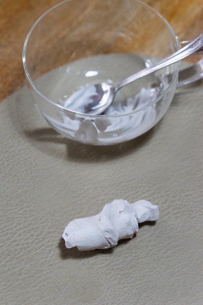
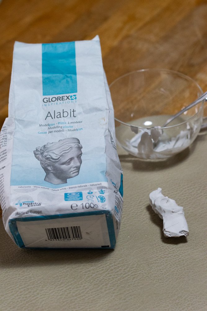
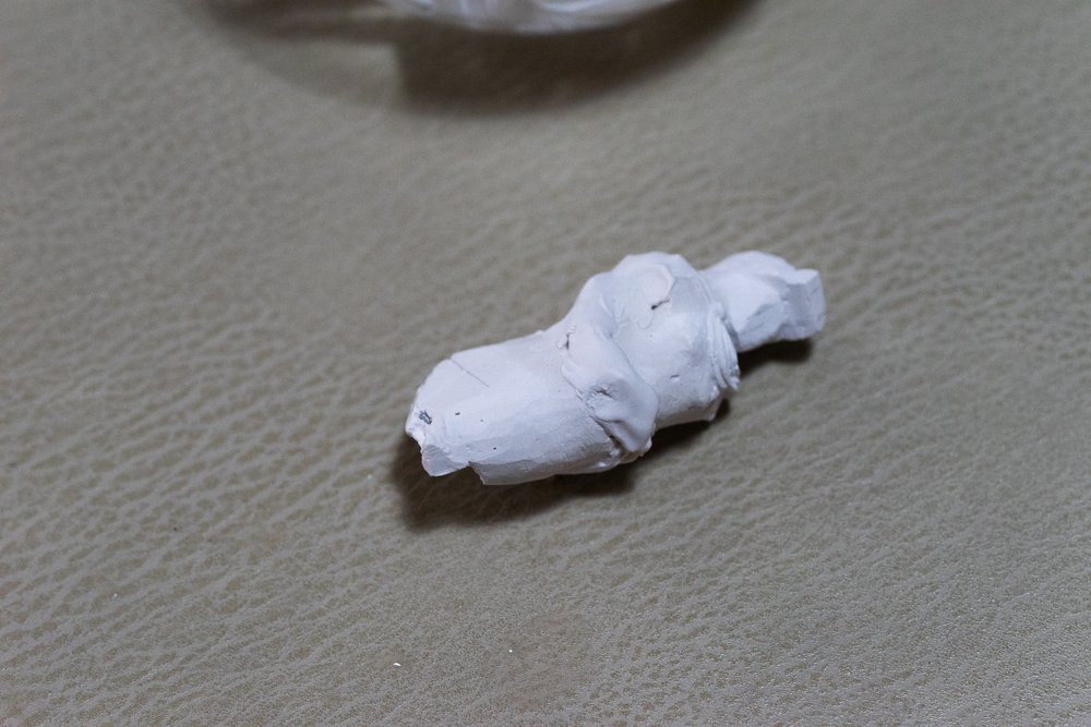
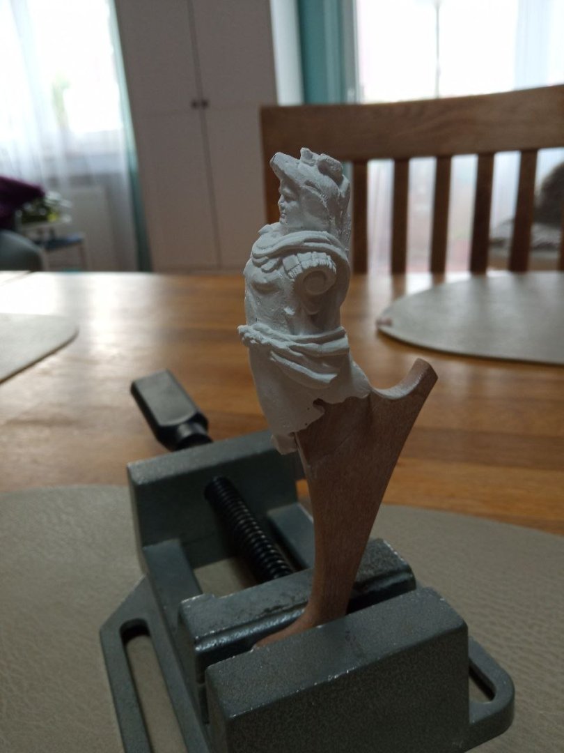
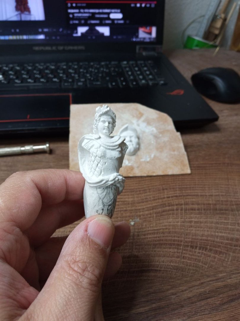
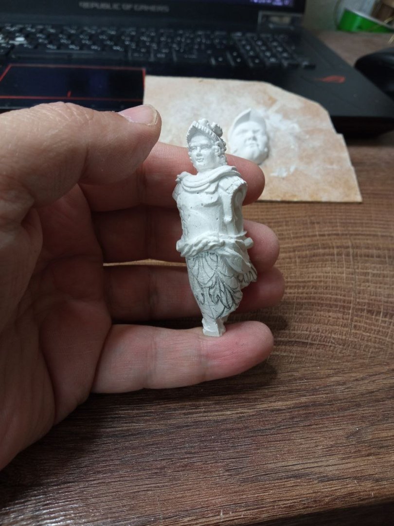
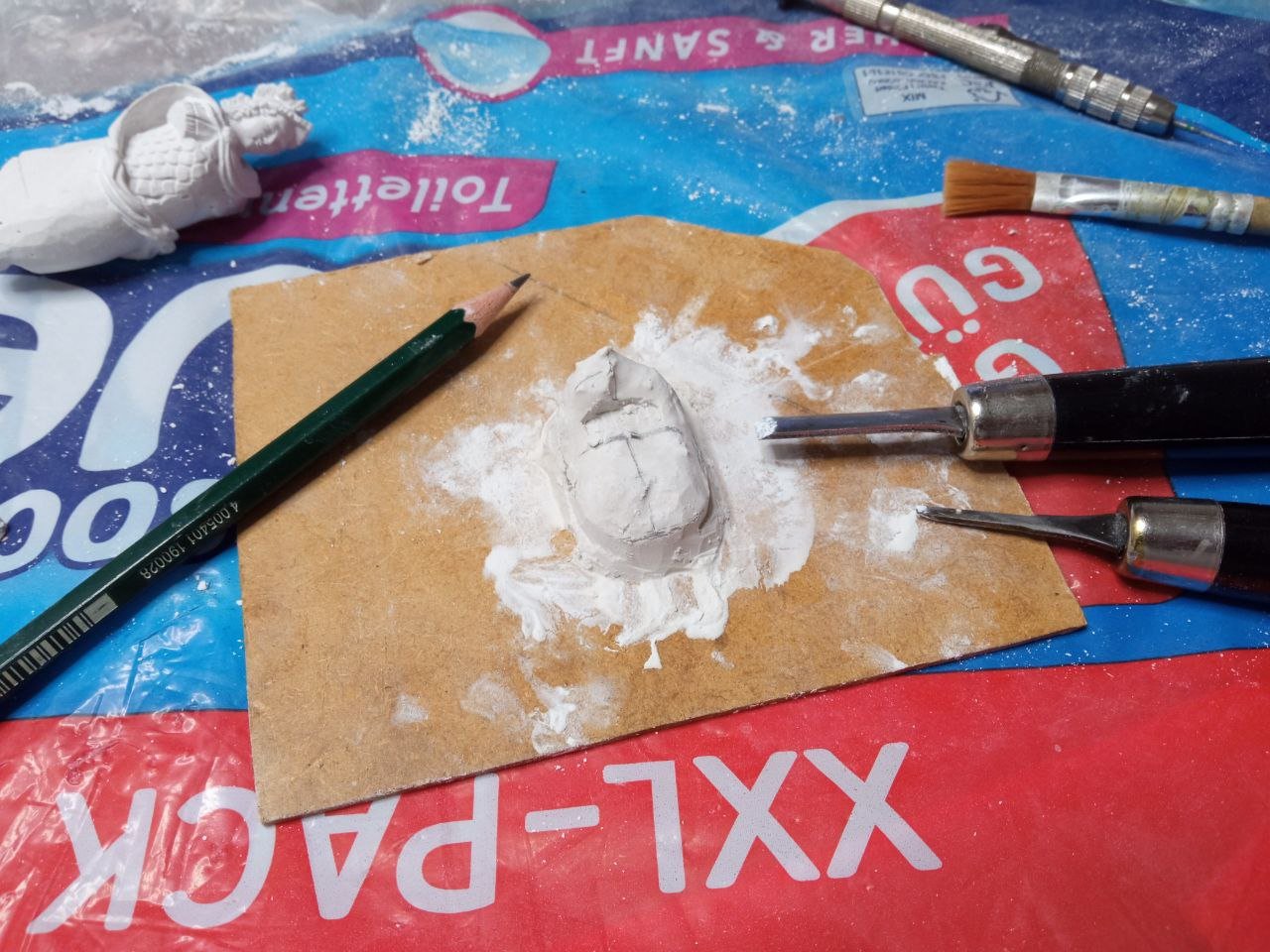
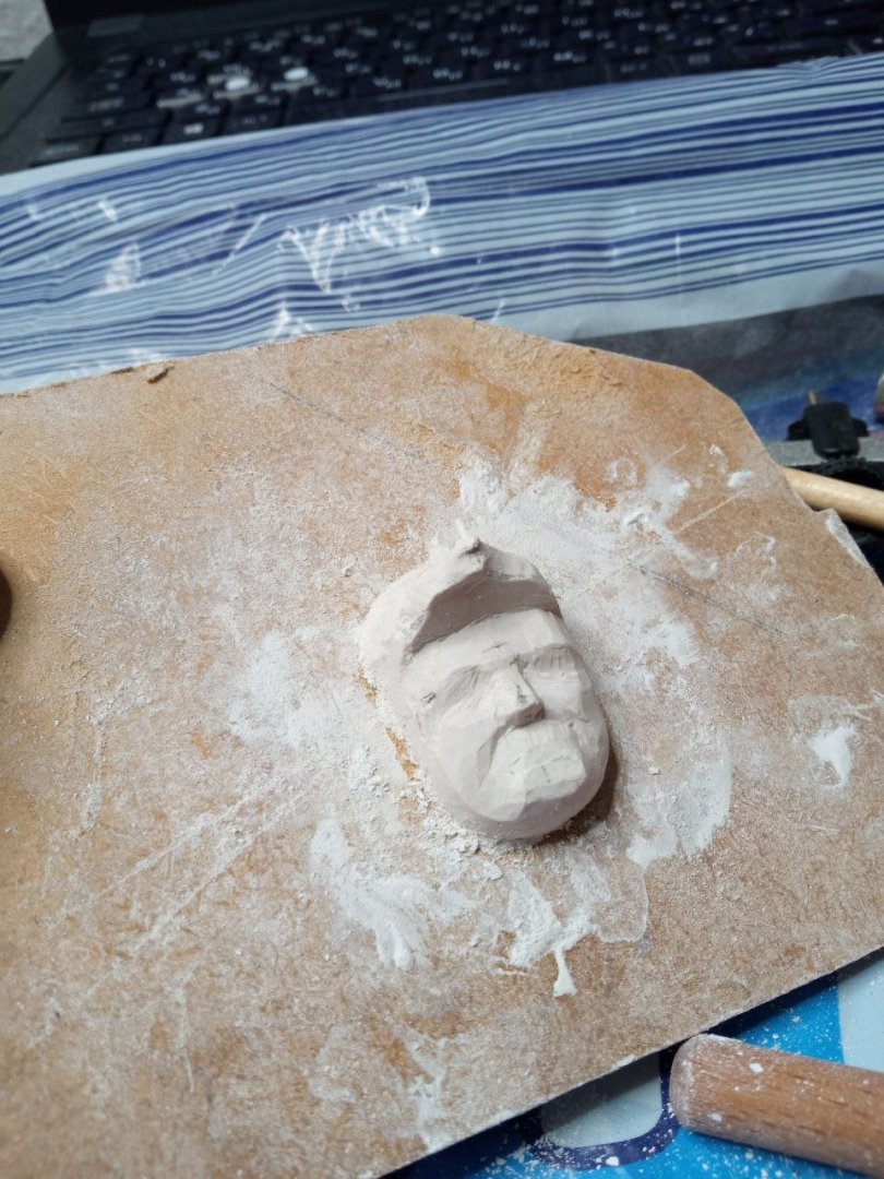
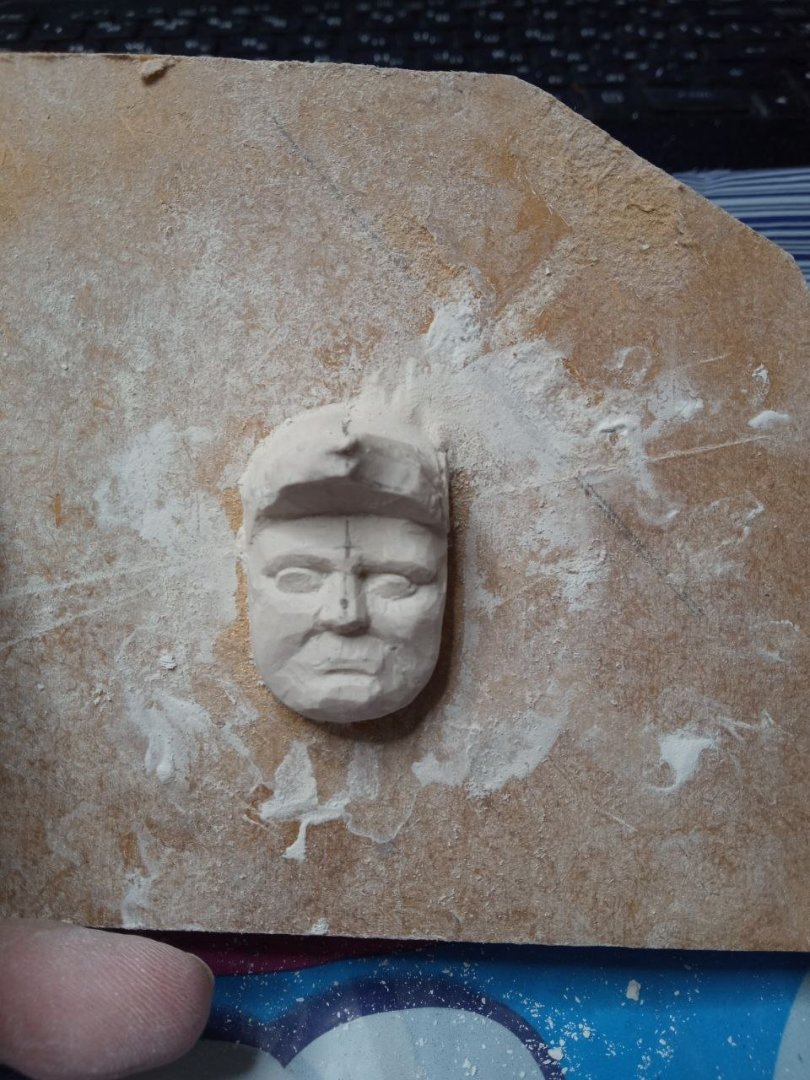
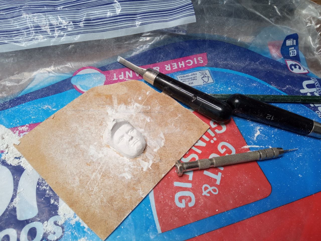
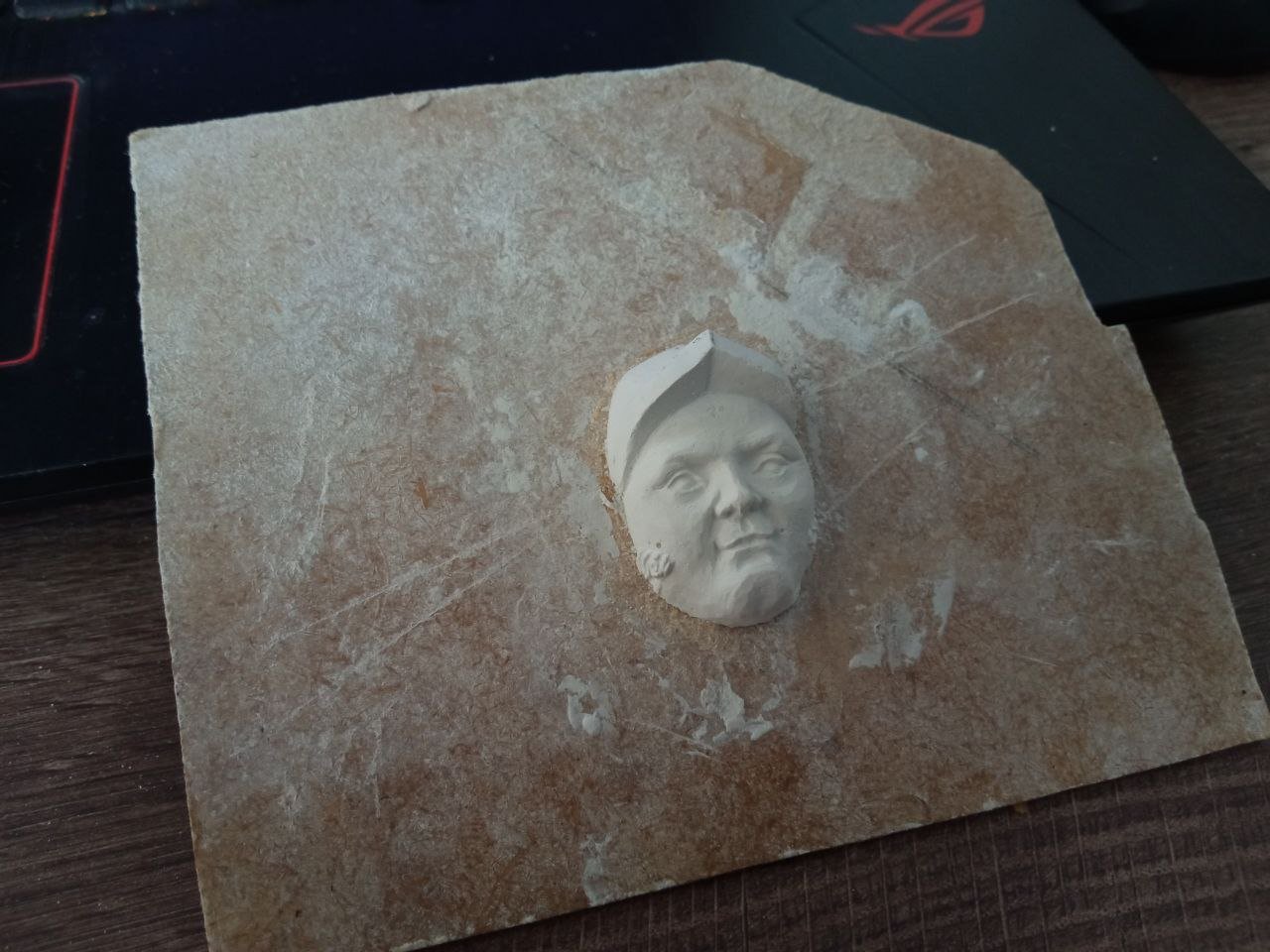
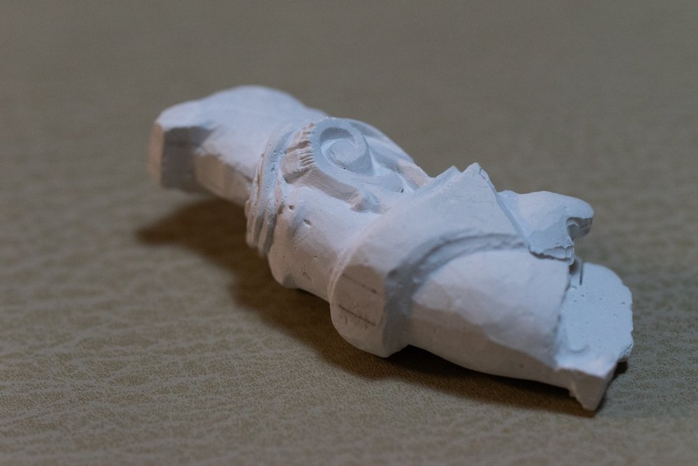
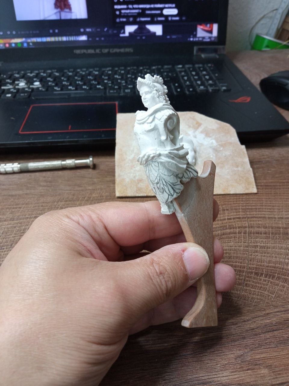
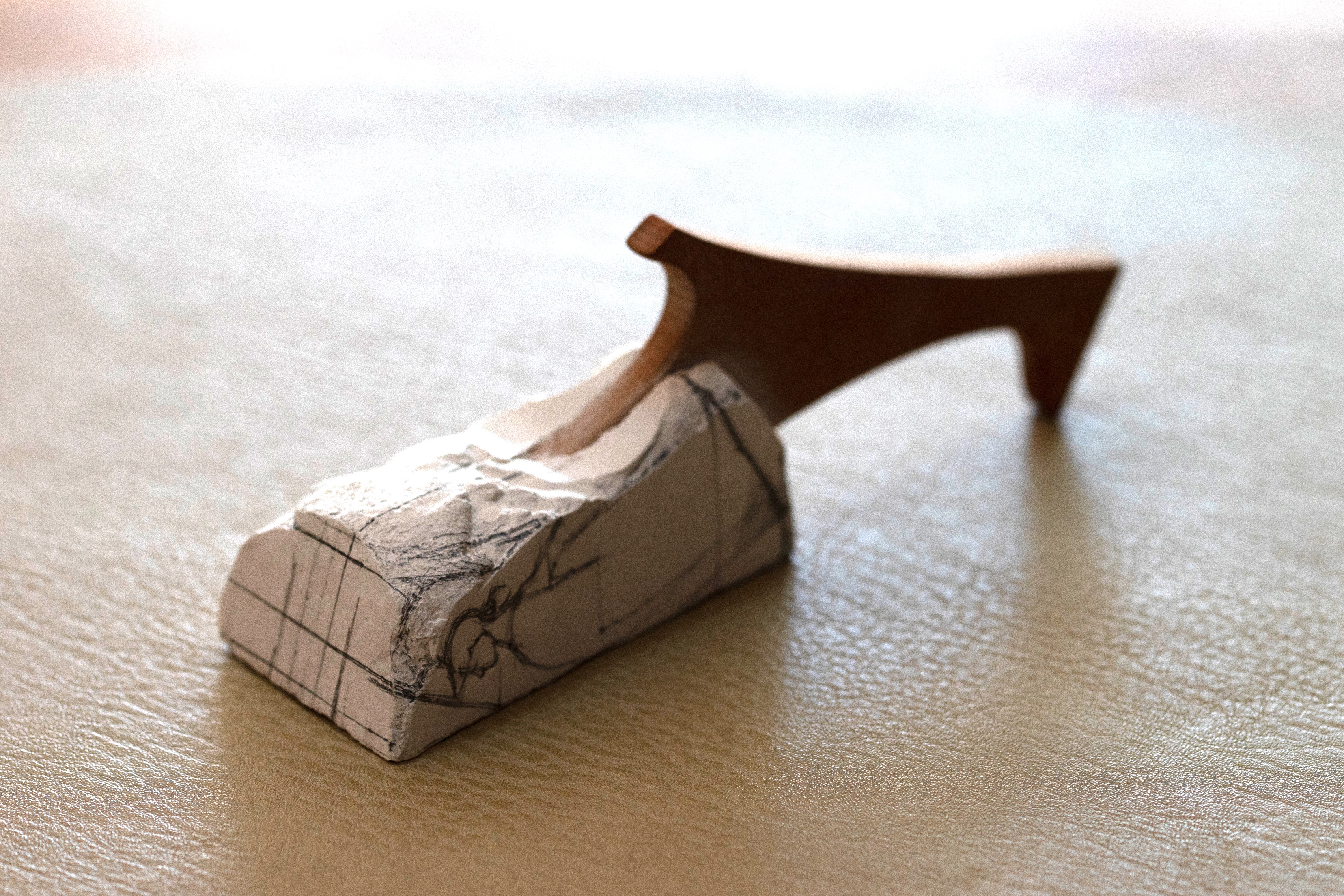
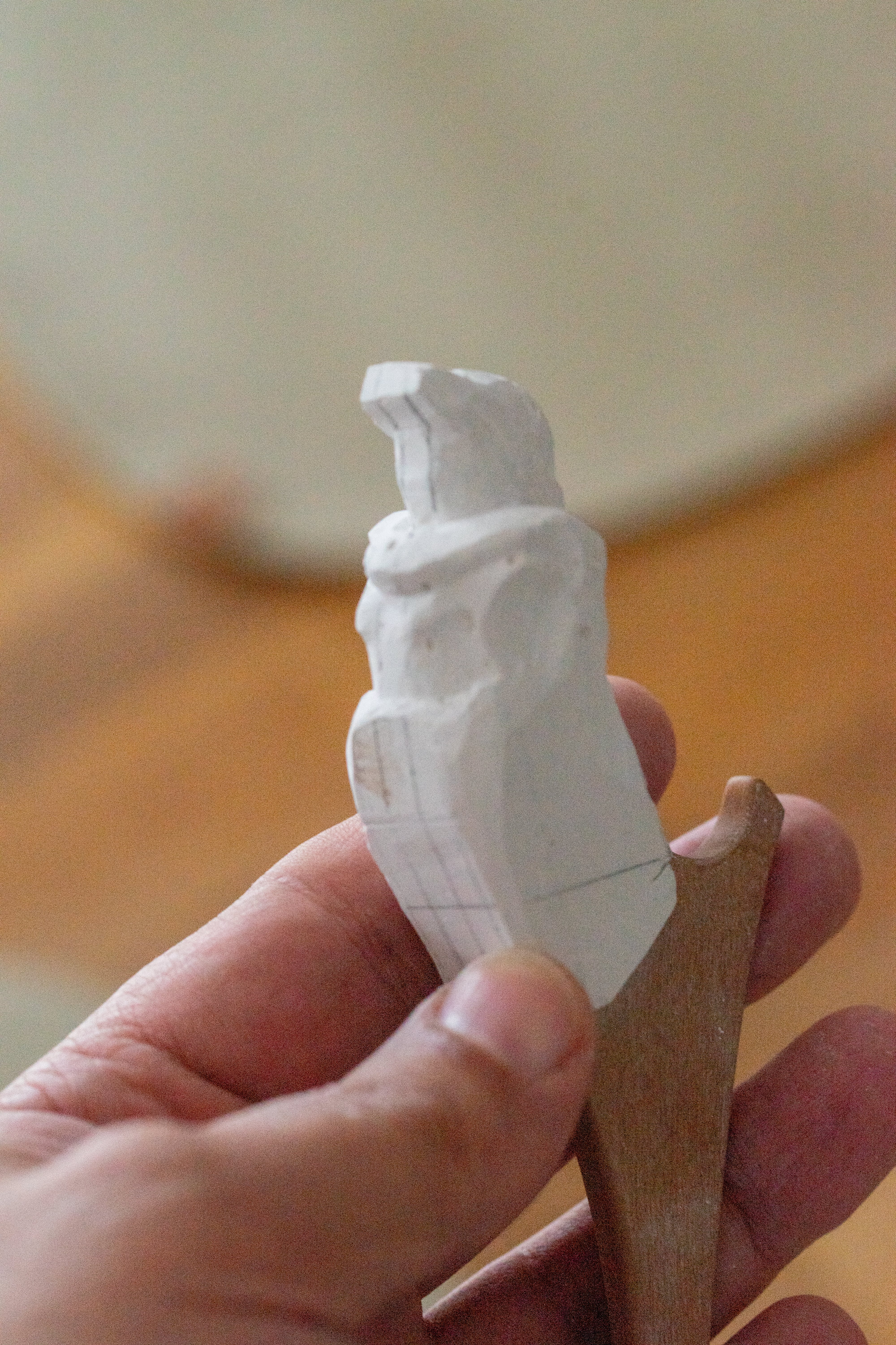
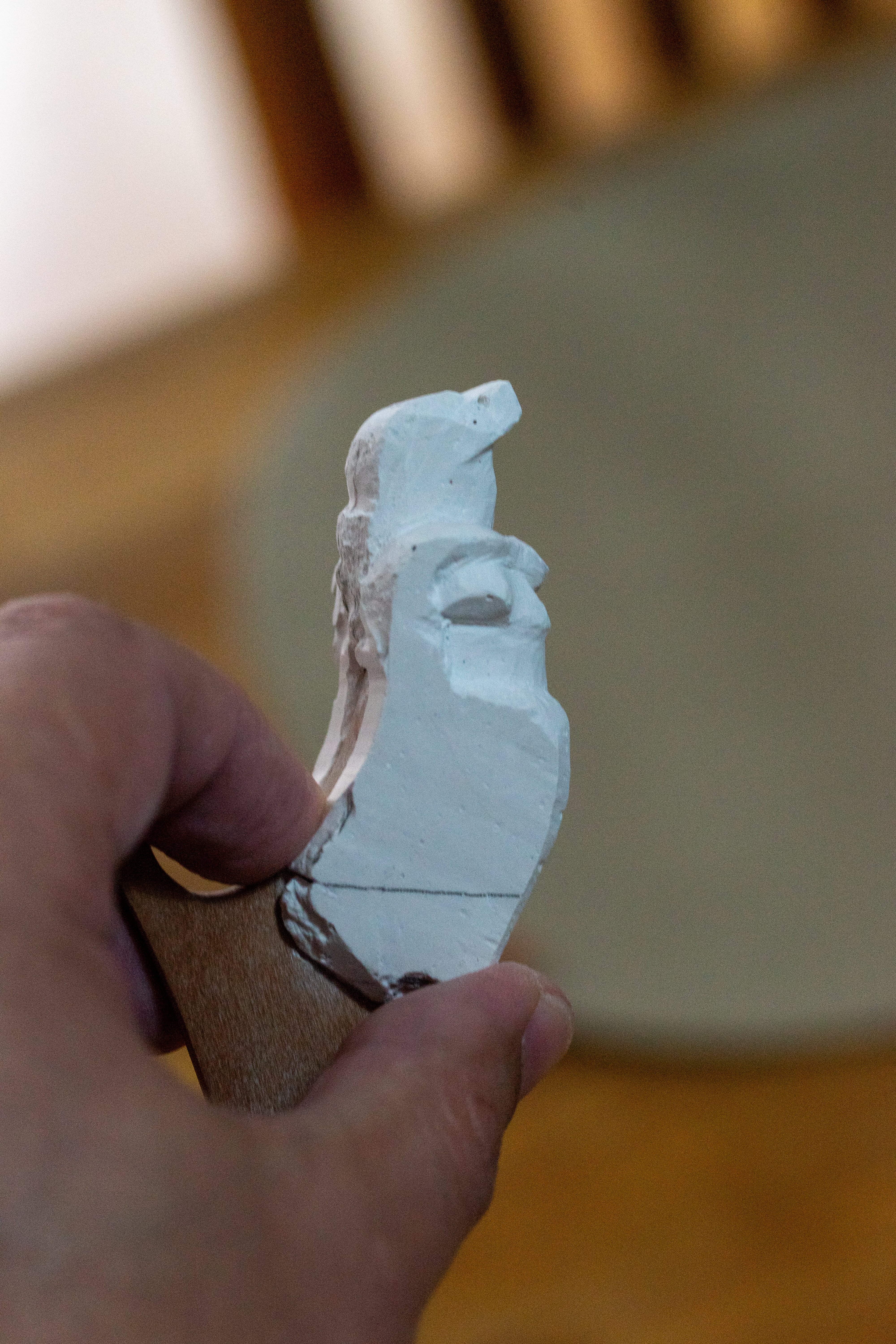
What can I say about the material itself? I liked plaster very much. For me, it was a real discovery. It turned out to be exactly what I needed. Technically, I came as close as possible to carving. Plaster is very easy to work and to cut, yet at the same time it is sufficiently hard and holds even very fine details well. Initially, I thought that I would simply create a rough figure—establish the elements that were important to me in the material and then stop there. But the working process captivated me. I wanted to continue working even when I had already seen what I needed. I made comparisons and drew conclusions, and still I kept refining more and more details. I wanted to see where the limit was—at what point the plaster would no longer hold and would begin to crumble in fine areas. And I never found that limit. Everything I tried, the plaster accepted willingly and behaved exceptionally well. It can be easily restored. I slightly moistened the area of the upcoming operation with water to improve adhesion and simply dripped freshly mixed plaster onto the spot. As you can see, at the same time I decided to rework an area that I did not like. This means that one can endlessly introduce corrections and rework the piece in search of the best possible result. And finally, what did I end up with? You can see that I made the figure different on the two sides. I wanted to compare different options. And I ultimately confirmed my decision not to make the classical truncated arms. I will hide them behind ornamentation. As I said earlier, this solution is very common—perhaps it was invented by an artist just like me, with similar associations. Working with plaster pleased me so much that I decided to separately try working on the face of my Alexander I. The subject of portraiture and individual facial features is very broad. It alone took me a great deal of time, thought, and searching. Later, I will try to speak about this in more detail. For now, let these simply be photographs. Once again, I will say that I liked plaster very much. It is a wonderful material that suits me perfectly as a medium for preliminary carving, and I will continue to use it in the future. When I showed the result, I received advice to try jeweler’s wax—and that is an excellent idea. I immediately purchased wax so that I would have it on hand and could try this material if needed. For now, I will not include a discussion of this material in the narrative. The story already branches into many different directions. Someday, when I do try it in practice, I will give a description of it and everything related to this material. And with that, I can conclude the topic of the plaster stage and move on in my story.


-
Hello, David. You are undoubtedly right. The principles of working with a plastic material through modeling and with a solid material by cutting away the excess are fundamentally different. I will never abandon my passion for carving. Even within this single process there are many nuances and techniques: different tools, different types of wood. All of this has a strong influence both on the work itself and on the final result. In this project, I have encountered the question of which method is more convenient. At the moment, I am describing only the preparatory stage, but these questions will not disappear later on either. Even now, I continue to reflect on whether I have chosen the right method. And I increasingly come to the conclusion that it would have been possible to try a completely different working technique.
-
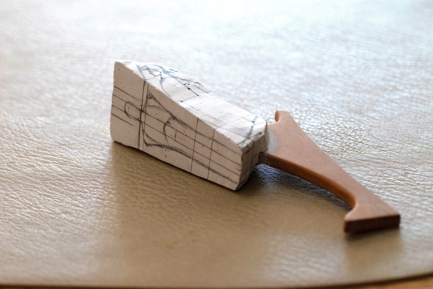
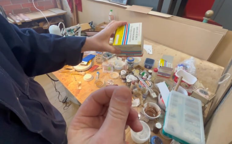
By now, it has become obvious what kind of material this is. And therefore it is clear what exactly I am going to write about. But for those who did not recognize it or have not encountered such material before, I will clarify—it is plaster. It is a very useful material with great potential. First and foremost, plaster is known as a casting material. The same plaster figures used in art schools clearly demonstrate how detailed forms can be made from it. I, however, will take a different approach. I will use plaster as a substitute for wood—in order to carve it. Although in this case it might be more appropriate to say not “carving,” but scraping or hewing. But that is not essential. Next, I will show some stages of working with plaster. Everything began with casting a blank. This part is very simple. You mix plaster powder with water. The mixture can vary greatly. For casting, it is usually made very liquid. I did not need such a consistency, so I mixed something resembling dough and simply shaped a white lump. The main thing is that it should be large enough to accommodate the planned figure. There is not much to describe further—everything is clear even without words. First comes working with large masses, and gradually the excess is removed. Everything is very simple. Plaster comes off very easily. No force is required—only patience. You should not try to dig deep right away; it is better to scrape little by little, layer by layer. It is much more convenient to work by hand. I do not recommend rotary tools or burrs. Although it is possible to use them, there is absolutely no point in doing so—for many reasons. First, plaster has to be scraped, and what you will be removing is plaster dust. It spreads quite far and soils everything around: hands, clothes, the table. The use of any power tools will create air currents, so plaster will not only end up where I have already mentioned—it will be in the air. Which means it will also be in your hair and on every surface on the other side of the room. In a home environment, this already represents an increased level of risk. Household members will automatically switch into a state of dissatisfaction. In addition, working with a rotary tool and burrs is inconvenient for another reason. A burr instantly turns the immediate working area into entire snowdrifts of plaster dust—especially when dealing with recesses. One second, and suddenly both the burr and everything around it resemble the scene of walking a small puppy during its first snowfall. He was just there, and a moment later he has vanished into a snowbank. Within seconds, you will no longer see the tip of the burr and will not know what is happening there—have you already removed the necessary volume of material or not? Perhaps you have long since overdone it and ruined everything. You can only find out once you stop, shake everything off, or at least blow the snowdrifts aside (and do not forget about the household members—they will very soon notice the connection between your puffed cheeks and the new clouds of white haze around). In short, it is much easier to work with simple hand tools. Although here, too, a warning is in order. On the one hand, it is good news; on the other, not so much. The good news is that plaster is so easy to remove that it does not require any special tools. Sharpness is not important. You can make a primitive scraping tool out of any nail, and that will be enough. You can make several different shapes and sizes. The not-so-good news is that if you decide to use your favorite knives, you will most likely have to say goodbye to them. No, they will not break. And they will not be irreversibly ruined—everything is not that dramatic. But if the tool is dear to you, it is better not to let it anywhere near plaster for another reason. As I mentioned earlier, plaster is removed in the form of dust. This is dust whose particles have adhered to each other to form a solid body. But at the same time, it is not exactly dust. These are small, hard granules or crystals. Does that sound familiar? Practically the same words can be used to describe sharpening stones—only there the bonding of the grains is stronger. In other words, when working with plaster, essentially the same thing happens as if you decided to carve a figure out of a sharpening stone. Very quickly, nothing would remain of the sharp edges of your knife. And perhaps the knife itself would become half as long. Yes, this is a hyperbolic, exaggerated example—but the principle is exactly the same. Yes, plaster is softer than even the softest sharpening stone, but you will still dull your tools very quickly. So what should be done? It is simple. Use tools that you do not particularly value. Replaceable blades are ideal. Even those that have already served their time and are lying in the trash can will be perfectly suitable here. From there on, everything is up to you. If very fine tips are needed, they can be sharpened, brought to the required size, and put to work. There are no further nuances regarding tools here. …to be continued…

.thumb.jpg.5d8142fa8e5fca5ac5097fd10921541a.jpg)


-
Excellent news. I will be very much looking forward to updates in your thread when you begin this stage of the work. It should be both interesting and useful. I know ship modelers who create decorative elements using modeling techniques. In this case, epoxy putty is used. Visually, everything looks fairly simple and straightforward. However, there are always nuances that become apparent only in the course of work and with the acquisition of hands-on experience. I myself have never made modeled decorative details. For me, this is an entirely new and unfamiliar area. Why did you decide to settle specifically on this material? What are its particular characteristics? Is this an intermediate stage, with the intention that the decoration will later be cast in metal or plastic, or will it remain on the ship model as is? Will it be painted, or perhaps gilded with metal leaf? Is it even possible to apply any kind of finish to this wax? I have watched several videos showing jewelers working with wax. What I liked is that this wax can be used in different ways: in its hard state, where carving is performed, and in a heated state, where wax can be gradually built up, dripped, and layered to form a rough shape. Later, this form can be refined and brought to a finished state using power tools, heated modeling tools, soldering irons, or knives and chisels.
-
Hello, Matthias. I am not entirely sure that I have correctly understood all the contexts of your question. Judging by it, you seem to be referring specifically to the historical method of producing decorative elements using compo or gesso. I am not certain that an automatic translator would handle these terms correctly. Do you mean a putty-like material based on biological glues, chalk, oil, and similar components (I cannot recall the exact recipe at the moment)? If that is the case, then no—I have never worked with such materials. My knowledge of the technology is limited to descriptions found in books. If I understand the subject correctly, this process is closer to modeling than to carving, or else to forming using molds or matrices. To be honest, I had never really considered this material before. Do you have personal experience working with it? If you do and have something to share, I would be very glad to hear your advice. If, on the other hand, you are referring to a material related to modern hard jeweler’s wax, then I have not worked with that either. However, I have already started thinking that this material could be useful for me. I have purchased two different types to try out, and I hope they will not gather dust in a drawer for too long and that I will be able to test them in practice soon.
-
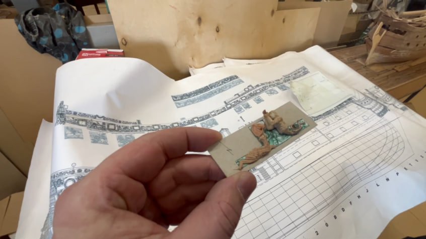
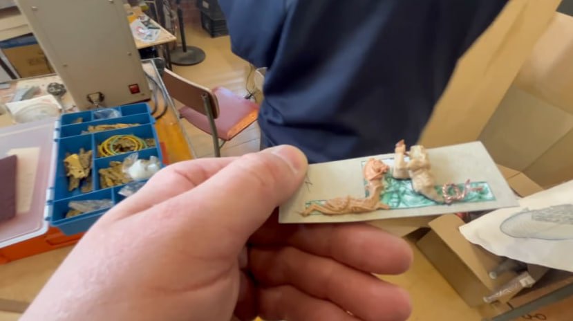
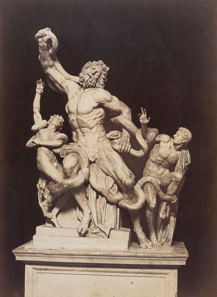
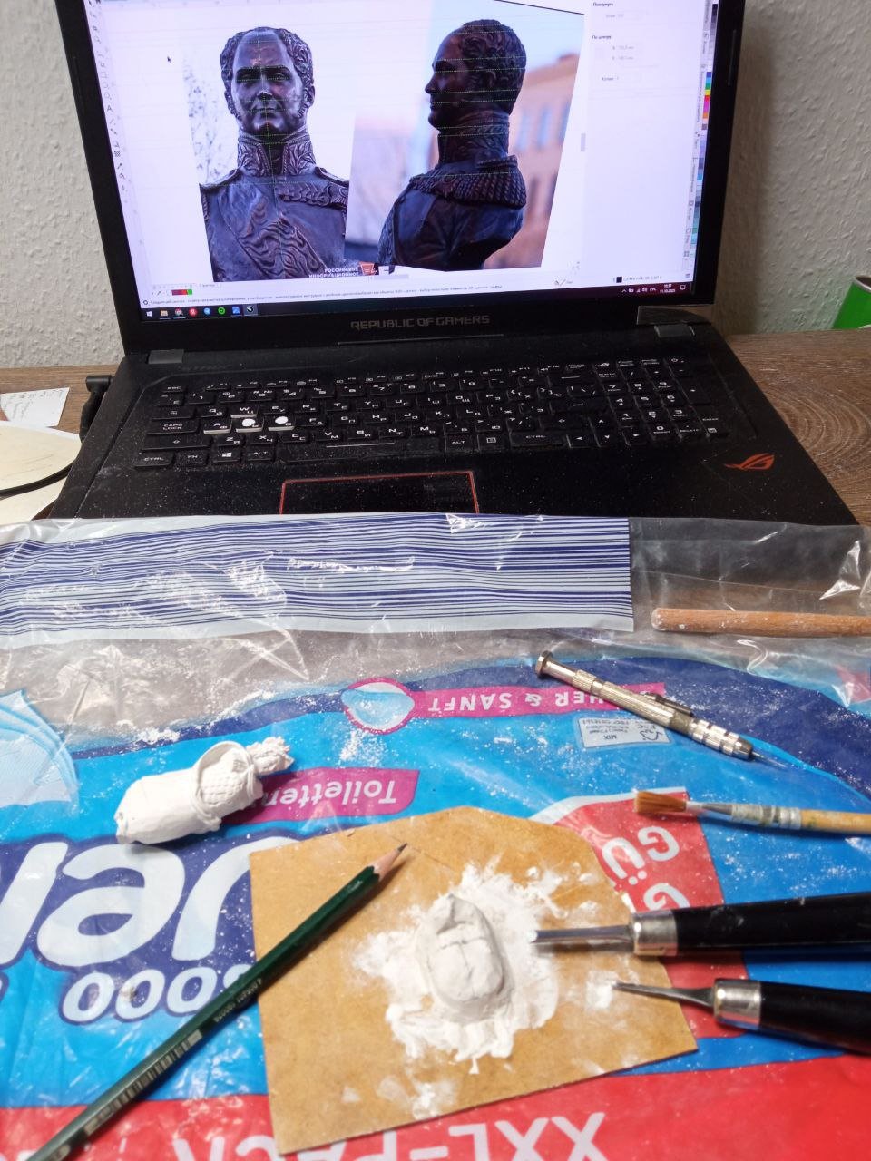
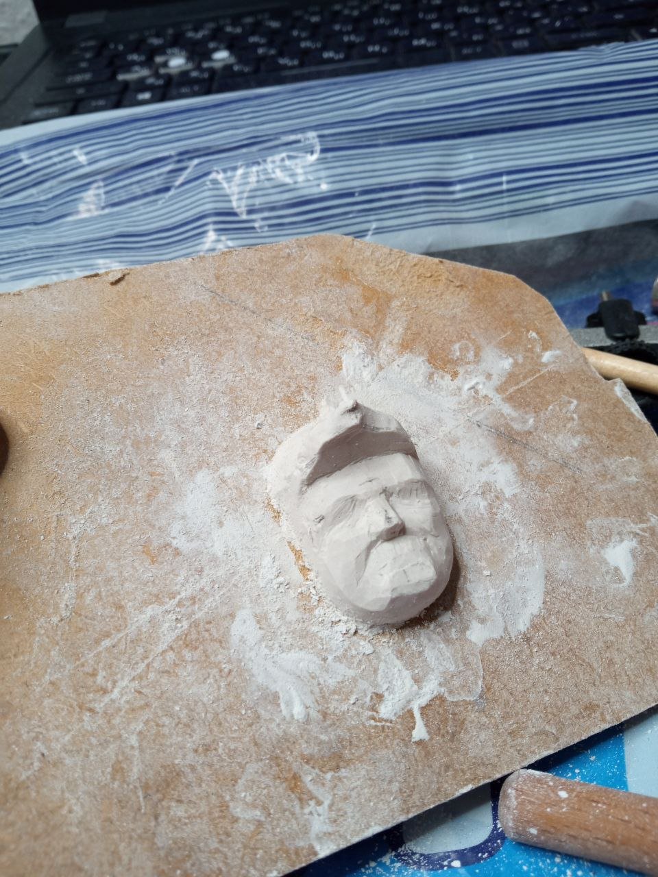
I was also very concerned about the figure itself. How can I explain this clearly? In this case, we are dealing with a classical bust. This is a very common practice: there is a head, there is a torso, but there are no arms. Instead, there are stumps just below the shoulders. And here my own personal perception comes into play. I have never liked such busts. These kinds of portraits look as if they were tortured in the basement of some horror film about a maniac cannibal. I remember that during my studies we drew plaster busts, and in one assignment I was drawing a bust of Laocoön. For those who are not familiar, he is a mythological character. In fact, this is a large multi-figure sculpture depicting the agonizing death of Laocoön and his sons. What we had was only a bust. And it also had truncated arms. And when the plaster face showed a storm of emotions—pain and grief—I always thought that the absence of arms seemed to serve as an explanation for such suffering. I could not relate calmly to other busts either. That suffering Laocoön evokes sympathy, but when you look at exactly the same armless character who is, at the same time, sweetly smiling, it becomes even more frightening. Man, why are you smiling? Your arms have been torn off—are you aware of that? At that point, he no longer looks like a victim of a maniac, but rather like the maniac himself, someone who does not care whom he inflicts pain upon. In short, I have always disliked busts without arms. Perhaps this is a reason for me to question my own psyche. Maybe it is I who am unbalanced? After all, I am completely calm when it comes to plaster heads. You sit in front of the easel, draw a plaster head, and everything is fine. You do not think that in front of you there is merely a severed head… All right, now I am frightening myself. Back to the topic. I was thinking about how I could make a bust non-classical for myself. I had thoughts about how it might be done so that there would be no arms, yet this would not draw too much attention. There is a wide range of artistic solutions: capitals, caryatids, atlantes, and much more. But how would this look in my case? Would I like it? I realized that simply imagining it would not be enough. Even sketches did not fully satisfy me. I needed to make a preparatory sculpture. I have written before about my peculiar relationship with this stage of work. Before this, I had already tried several times to make preparatory sculptures. I tried modeling in clay. I experimented with soap. But none of it worked. I could never bring this work to any tangible result. I lacked patience. Or I disliked the fact that the techniques were fundamentally different. Modeling requires a completely different mindset, a different approach. I needed, even at the preliminary stage, to get closer to carving. But how? Because in that case it would be almost the same as carving what I would later carve as the final piece. Would it not be easier to attempt the final carving right away? If it works—great. If not, I could always make a new one. After all, that was how I had always worked. That logic kept winning every time. But now I had a different thought. I decided to try yet another technique that was new to me. So now I will tell you about one more of my attempts to train myself to do rough, preparatory work. I will begin this story like this: and then I took out this…

-
The main theses of the concept were clear to me. It was necessary to depict a warrior and a commander in such a way that there would be clear hints and allegories within him. And in the end, it should be evident that this is not just an ordinary soldier. Naturally, the first thing I began to study was ancient sculpture. I was especially interested in those works that depict rulers and emperors. How, and by what means, was their status and position conveyed? And of course, it would have been a serious mistake not to consider another important direction as well. These are rulers too, but not ancient ones—those who lived much later. After all, the fashion of presenting oneself in the image of ancient emperors, heroes, and even gods is far from new. And I was interested in looking at such examples. I will try to divide my further observations into parts. Separately, I will consider how exactly a cuirass might be designed, and then I will think in the same way about the helmet. But more on that a little later. While I was engaged in searching and reflecting, I had another question. I was thinking about how the sculpture should be executed stylistically. How far could I move away from the original ship sketches? Added to this was the question of technique. Would I even be able to create armor with fine carving? Would it be visible at all? Would I be able to make such small details myself? I was thinking about the fact that I had not worked with very fine carving for quite a long time. I had made fairly large lion figures before, and that scale is much larger than what I am planning now. Yes, I worked on carving for Fulminant, and there was also a lot of fine detail there. But I still had concerns. Would it work? And would it even be necessary? Perhaps it would be far more appropriate to make not a carved imperial cuirass, but some kind of scale armor instead. That is exactly what appears in the sketches. Rhythmic, repeating scales would be clearly readable, and the viewer would understand what it is. But would it be clear what kind of strange small details appear on the chest if it were an imperial ceremonial breastplate?

-
You are absolutely right, Matthias. This is an excellent example of exactly the same approach to giving sculpture symbolic allegory.
-
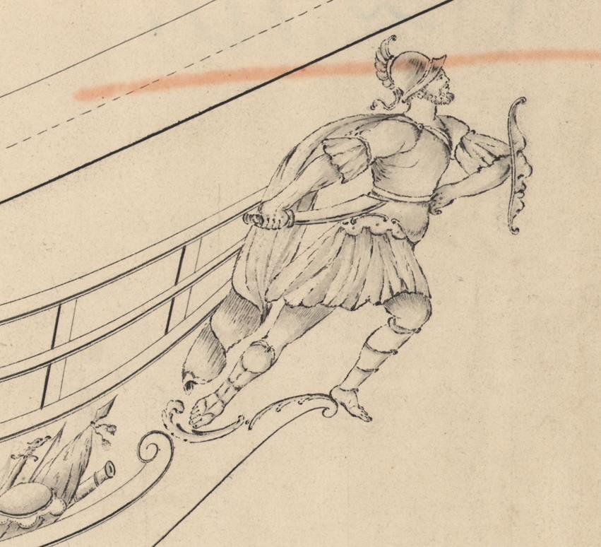
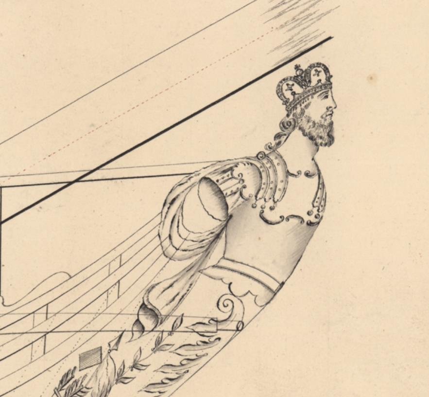
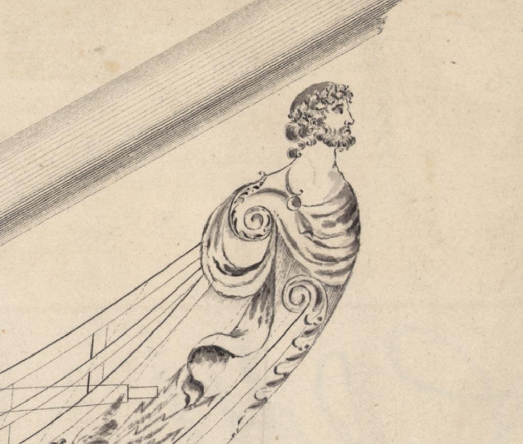
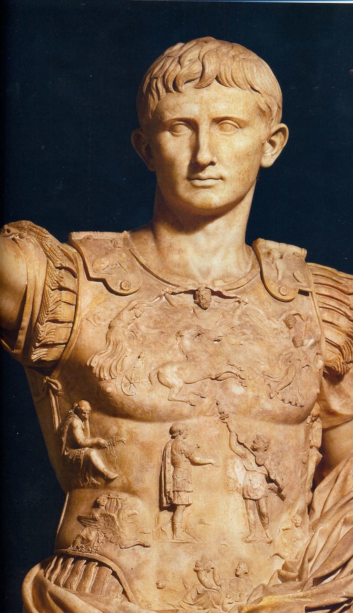
During my research, an important event suddenly occurred. I paid attention to one particular sketch. To this sketch. It is believed that this depicts the ship Pamyat Azova (“Memory of Azov”). In the Russian Navy, there is a tradition of preserving the name of a ship that distinguished itself in a special way and passing this name on to a future vessel. A similar practice existed in the case of Mercury as well: later, a ship named Pamyat Merkuriya sailed. But this is merely general background information. I am sure that similar traditions exist in other countries as well. What is important for us is to focus on what exactly is shown in the sketch. Take a closer look. I understand that it is still difficult for you to grasp what exactly caught my attention—and not just caught it, but made me seriously think. This is no longer just some man wearing a helmet. Something far more significant is clearly depicted here. This face… I have the impression that it is a portrait. That is, the image of a specific individual, not merely a generalized, symbolic human figure. And I need to recall or understand whose portrait this might be. Whose face is it? I realize that even now you do not understand—and cannot know—whose profile can be recognized here. Therefore, I will show you this: These are coins and a medal bearing the profile of the Russian Emperor Alexander I. I am prepared to argue that the resemblance between this profile and the one on the ship is not a mere coincidence. The artist who drew Pamyat Azova replaced the anonymous warrior with the image of the Emperor. This carries great meaning and reflects a commonly used practice. It serves not only to glorify the ship that distinguished itself in a single battle, but to turn it into a symbol of victory in the war as a whole—while placing the ruler in the role of the triumphant victor. At that moment, I decided that I, too, would not create just an antique warrior, but would attempt to convey a portrait likeness of a specific individual. Yes, I understand that most likely nothing like this existed on Azov. Almost certainly, it was simply a man in martial attire. But I liked the idea of creating a conceptual image. On the victorious ship stands the victorious Emperor. And the fact that he is depicted in antique form immediately adds yet another layer of meaning. This is not just Alexander I. It is Alexander I who simultaneously personifies another famous military leader—Alexander the Great. This sculpture seems to proclaim: look, this is our commander, and he is equal to Alexander the Great. I liked this play of meanings and allusions, and I became firmly convinced that this is the version I would pursue. Formally, I will repeat everything that exists in the descriptions of the sculpture of Azov, but at the same time I will create my own interpretation. And this particular version has certainly never been done before. And since I am creating the sculpture not for a ship, and it will always stand independently, it becomes something akin to a monument dedicated both to historical events and to a historical figure. If someone notices my hidden meanings, that is good. And if they do not, I will not be troubled by it either. That is the task that presented itself to me. And I began to think about what exactly in the figure should serve as hints at two Alexanders embodied in a single face. …but I will continue to talk about this in the next part.


-
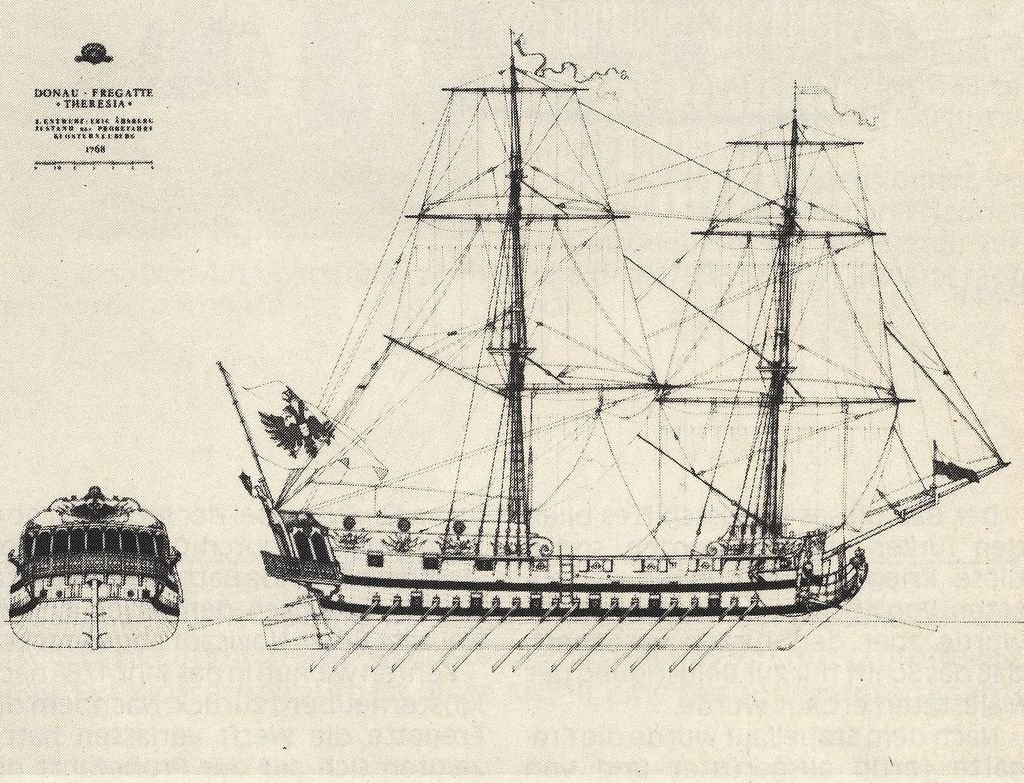
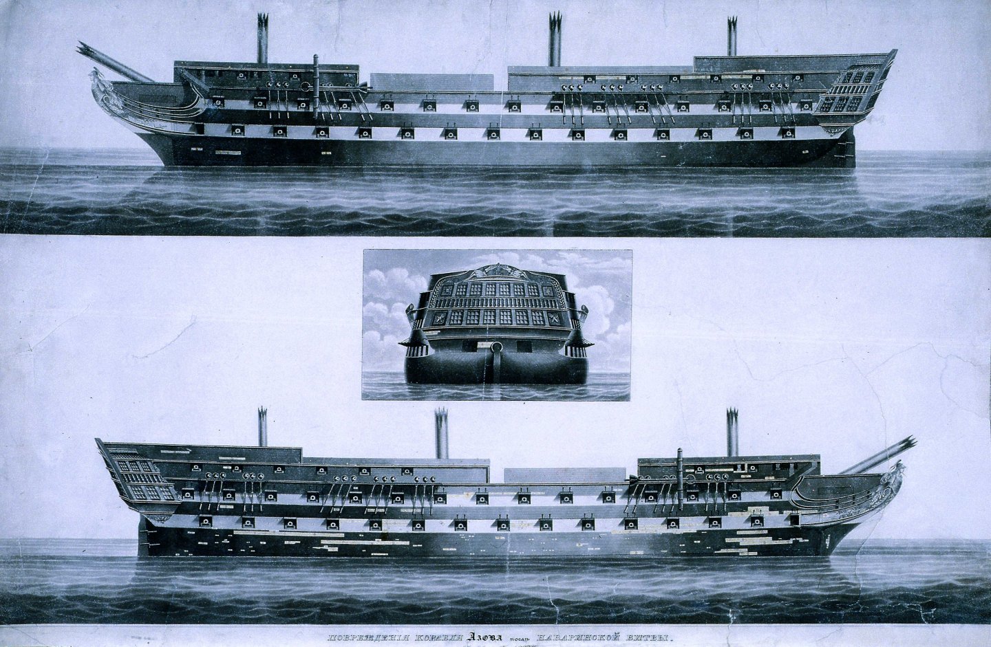
Hello, Matthias. Thank you for your interest in my work and for your help. I am very familiar with Eckersberg’s Danish painting. By the way, in one of the paintings shown earlier, Azov could also be seen. And there, too, she is turned stern-on toward the viewer. Interestingly, the ships differ from one another. This is a fascinating topic, but if we follow it, we will drift too far off course. The issue is not that there is little information about Azov. Although there truly is not much, especially when it comes to decoration. The issue rather lies in what information can be considered reliable. What do I mean by this? First, the name. There were many ships with the name Azov in the Russian Navy—around ten in total. The name is connected with one of Peter the Great’s victories in the 17th century and has been regularly reused since that time. This creates confusion when one relies on drawings identified only by name. Second, the appearance of the ship. Azov, which is the main subject of my project, was launched in 1826. She was built as one of the ships of the Ezekiel type. There were many ships of this design both before and after her, and their figureheads were similar as well. Today, there is an entire range of drawings that can equally be attributed to Azov. On Russian ship-modeling forums, one can read numerous debates discussing these drawings. There are many opinions, and they differ significantly. How does one choose a single option? In the Central Naval Museum in Saint Petersburg there is also a model exhibited as Azov, but even it gives rise to debates and differing interpretations. There are models built by our contemporaries. I spent a long time studying them and thinking about what I should do myself. What do I mean when I speak of my own version? In the works of modern craftsmen, one can clearly see the desire to reproduce as accurately as possible, in three dimensions, what they see in the drawings. This is very logical—after all, it is a drawing. We are accustomed to treating such documents as something to be followed precisely. However, what troubled me in these drawings was that the sculpture is depicted in a very peculiar manner. Parts of the body appear deformed and distorted. What is this? Why does it look this way? There can be two possible explanations. Either everything was drawn with a clear intention, and that is exactly how it was later carved. Or the draftsman was simply not a very skilled artist, and he was not tasked with producing an ideal sketch of the decoration, while the decorative carving itself was handled separately later on. A considerable number of sculptures from the 19th century have survived to our time, and they demonstrate excellent anatomy and plasticity. If one places sketches of ships from that era next to their surviving decorations, the difference between them is quite striking. For this reason, I decided that I would have to find my own path. I will try to stay within the bounds of the descriptions, but I will not make a direct copy of any particular sketch.

.jpg.fd4e24abf4a4b745f36063b76e4cd8aa.jpg)
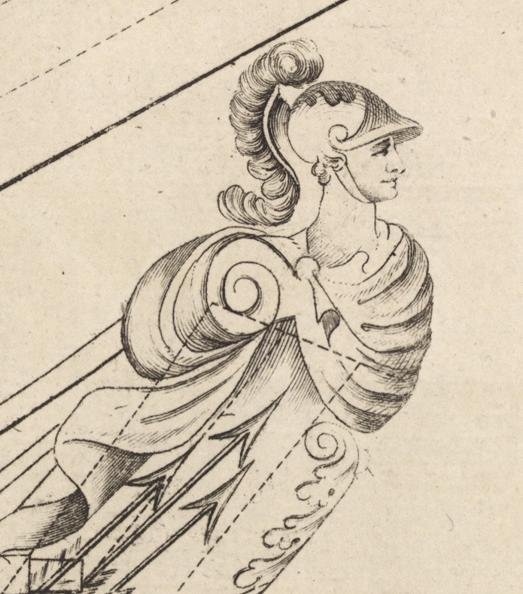
.thumb.jpg.f7197f8aa2e46b9a2d5d9a67745de9a5.jpg)
.thumb.jpg.9e56cb670331fc68b0edca8bf6af9506.jpg)


.JPG.9e6b6fc98bb5448797647cf959672be5.JPG)
.thumb.jpg.628fbec6cc742f888666a682e05ba065.jpg)

-
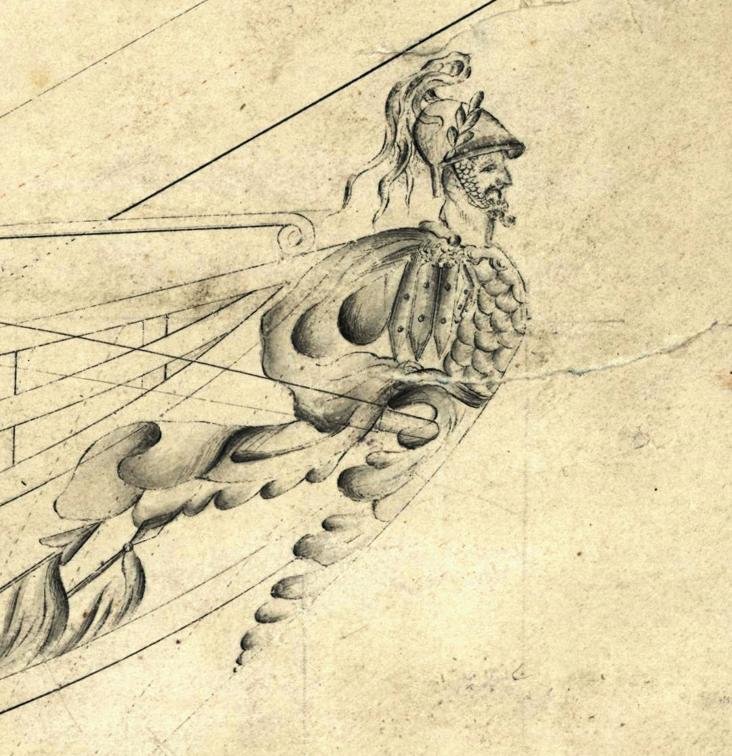
Next, I had to determine what the figurehead of Azov actually looked like. There are the following descriptions: The figurehead of Azov, executed by Nikolai Dolganov, who had been specially commissioned from Saint Petersburg, reached a height of about three and a half meters and depicted a warrior wearing a gilded helmet, armor, and a short cloak. The upper part of the figure was made disproportionately large in order to compensate for perspective foreshortening when viewed from below. After that, everything becomes increasingly vague. Naturally, photography did not exist at that time. The figure itself has not survived either. And the sketches that depicted the ship tended to portray the decoration rather freely. The artists did not strive to create accurate copies. Rather, these were personal interpretations based on brief descriptions. And these are the images that can be found. I will not go into details. To this day, there are heated debates about whether both drawings belong to Azov or to different ships altogether. If one were to delve into this topic, it would be a very long discussion. In both cases, a bust is depicted that smoothly transitions into ornamental decoration below. A helmet, a cloak—that is all the images have in common. Everything else was shown by the artists either according to their skill or according to their imagination. This situation is far from unique. One way or another, all of us who build ship models encounter similar issues. Sketches from the 17th, 18th, and even 19th centuries are by no means the same as the technical drawings or photographs we are accustomed to today. One must always understand that much has to be filtered through careful consideration. Even technical drawings simply cannot capture every nuance. And now I, too, have to combine everything that can be found, think it through, and present my own interpretation. Azov was a ship belonging to a type that was built repeatedly. It was a very successful design. Sister ships of this prototype existed both before Azov and after her. What is particularly interesting is that all of them shared not only structural features, but also decorative elements. These are the figureheads that appeared on other sister ships. It is clearly visible that the theme of a warrior in antique attire was maintained throughout the entire line of these “relatives.” By this point, I had firmly decided that I would create my own version. I have had projects where my primary goal was to produce a copy of a specific sculpture. But here I deliberately allow myself freedom. I want to put myself in the position of a craftsman who is free in his decisions. It is important to me that my sculpture corresponds to the historical descriptions. But I will decide myself exactly how my version will look.

-
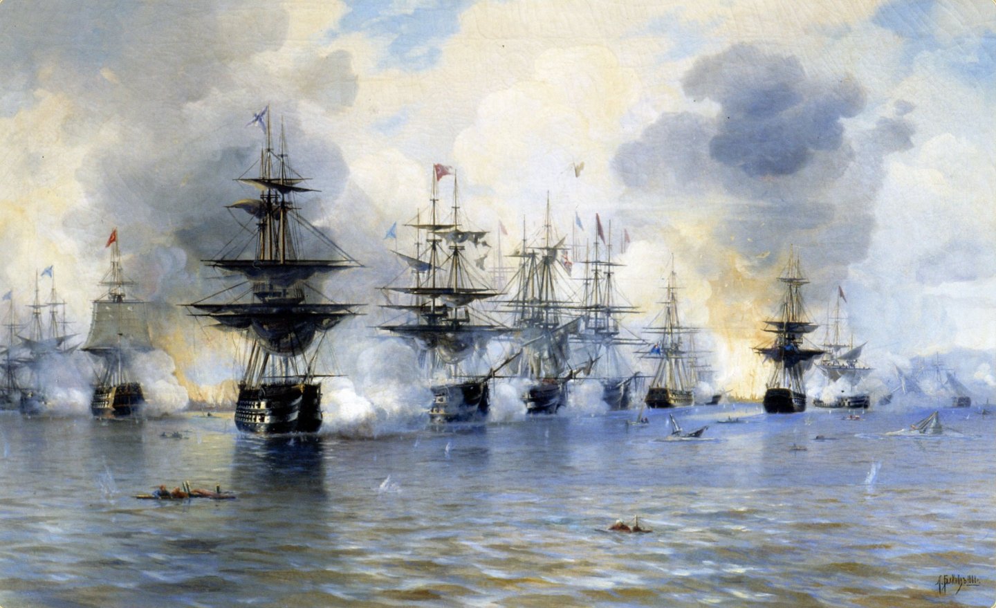
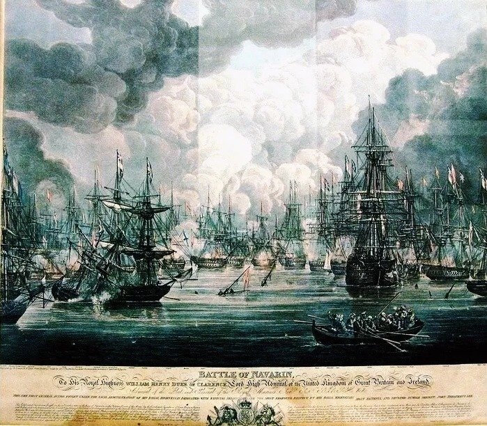
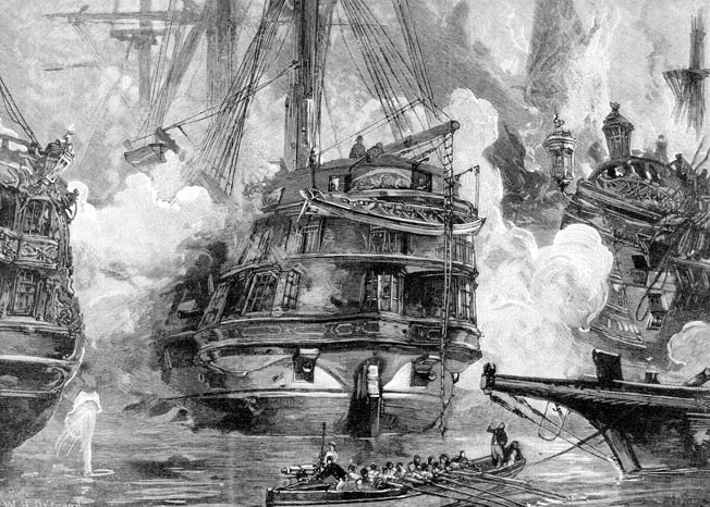
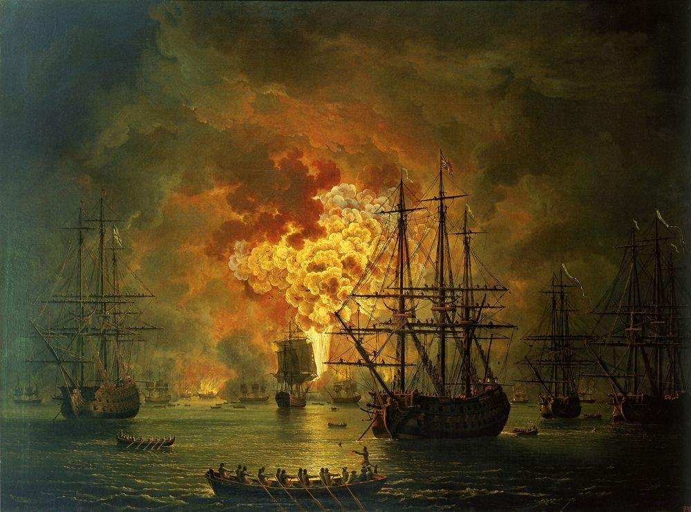
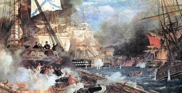
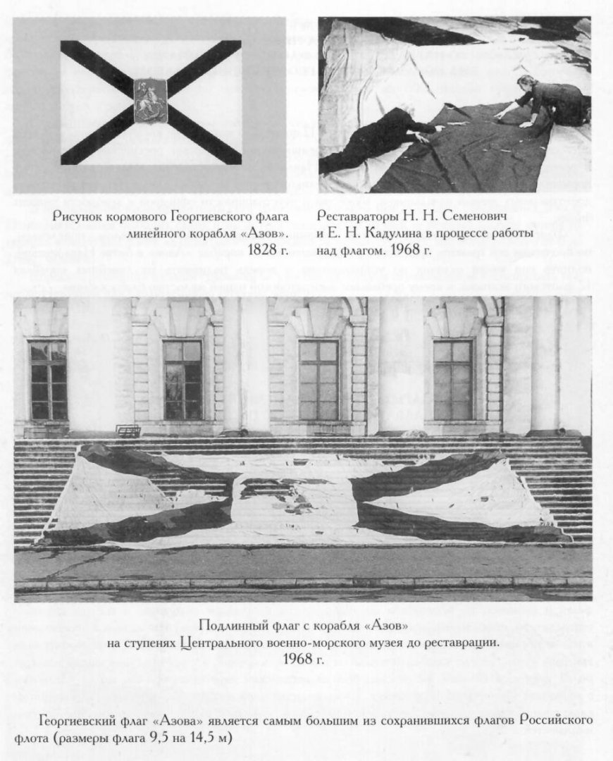
Where should one begin the story of the Azov sculpture? Logically, just as with Mercury, it makes sense to first pay attention to its history. The situation with Mercury was extraordinary. It could easily serve as a ready-made script for a beautiful film. It would be hard to find anything comparable in terms of epic drama. The history of Azov, on the other hand, appears much simpler. It is also connected with the Russo-Turkish War, but everything happened a year earlier. The feat of Azov took place during a naval battle near Navarino Bay, located on the coast of Greece. A combined Russian–Anglo–French squadron entered a Turkish bay, where the united fleet of the Ottoman Empire, Egypt, and Tunisia was stationed. In that battle, the ship Azov sank five enemy vessels. At the same time, she was under fire from eight ships, as well as from batteries located in a bastion and on an island opposite. Undoubtedly, things were extremely intense aboard Azov—both literally and figuratively. The endurance and skill of the crew are beyond doubt. Nevertheless, this is a story about a battle involving many participants, and the merits were collective as well. Therefore, for me—simply as an outside observer—the story of a small ship has always seemed more outstanding. But that is no longer relevant to the matter at hand. And this is that very large St. George’s stern flag that flew on Azov. An enormous piece of fabric! Today it is kept in the Naval Museum of Saint Petersburg. I have only been there once—back in 2014, when I traveled for the Universities Cup. At that time, the museum was in the process of moving from its old building to a new one, and when I visited, not all of the exhibition halls were open yet. Perhaps now this flag is already on display somewhere in the museum, although I cannot say that for certain. I am not sure. It is simply too large. The photograph shows the authentic flag from the ship Azov on the steps of the Central Naval Museum. The image was taken before the restoration work in 1968; above are photographs of restorers during the process of restoration and conservation. The St. George’s flag of Azov is the largest surviving flag of the Russian Navy. The dimensions of the flag are 9.5 by 14.5 meters.

-
Thank you very much, Matthias. I will make every effort to attend the exhibition. I would very much like to see your TRE KRONER in person. It is such an elegant piece of work.
-
What news! I had no idea about the exhibition in Hamburg. I really love this museum—I have been there twice, and I keep wanting to visit it again and again. And now there is such a wonderful reason to do so. I will definitely mark the dates in my calendar and discuss it with my wife so that we can visit the exhibition together. Did I understand correctly that this is an open exhibition? Is it possible to take part in it? And if so, what is required for participation? At the moment, I do not have any large-scale works available, but I would try to prepare what I have for the opening. There is enough time until autumn. Of course, I am familiar with this sculpture. However, in my library I only have the well-known museum photographs that are often found online. Your photograph is of exceptionally high quality. It is a true treasure.
-
Hello, Matthias. I am glad that you discovered something new for yourself and that you found the story interesting to read. I also have a strong interest in history—not only maritime history, and not only Russian history. I find it especially engaging to compare how similar problems were solved in different countries: how geography shapes people and their way of life, and how contact with other cultures influences societies. It is all very fascinating. Of course, I do not intend to limit myself to posts with historical facts only. In this particular case, the external appearance of the sculpture is closely connected with historical events, which is why I am focusing on this aspect now. Later on, I will also show the work process on this sculpture. For me personally, this project involved many things I had never done before, and I am genuinely interested in how each individual stage of the work unfolds. So there will be many posts about the process. P.S. If you liked what you have read here, you might also be interested in looking through and reading about my previous projects. Here I try to show almost all of my work and write in detail about both successes and mistakes in my work—perhaps even in too much detail. P.P.S. You can even see my work in person. We are only about a 4–5 hour drive apart (approximately). I would be very interested in talking with colleagues, hearing other opinions and advice, and perhaps being useful in some way myself. So please consider this an official invitation. If you decide to come, write to me and we can arrange a meeting.


.jpg.78edd7d27895fe2b7ecef44c3049dbf5.jpg)


.jpg.8b48c2e333a3b23236e8bdc3c42b89d0.jpg)
.jpg.4596c4b127de0180d5917a1f88917410.jpg)
.jpg.42e4ec59ffbe87b191f7ec60937ebc95.jpg)