
Drazen
-
Posts
389 -
Joined
-
Last visited
Content Type
Profiles
Forums
Gallery
Events
Everything posted by Drazen
-
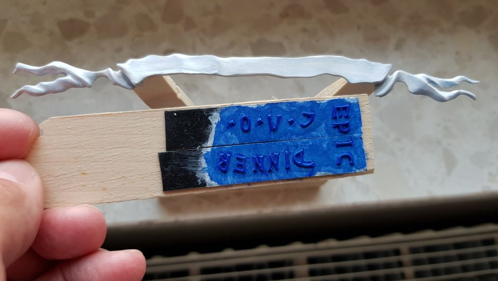
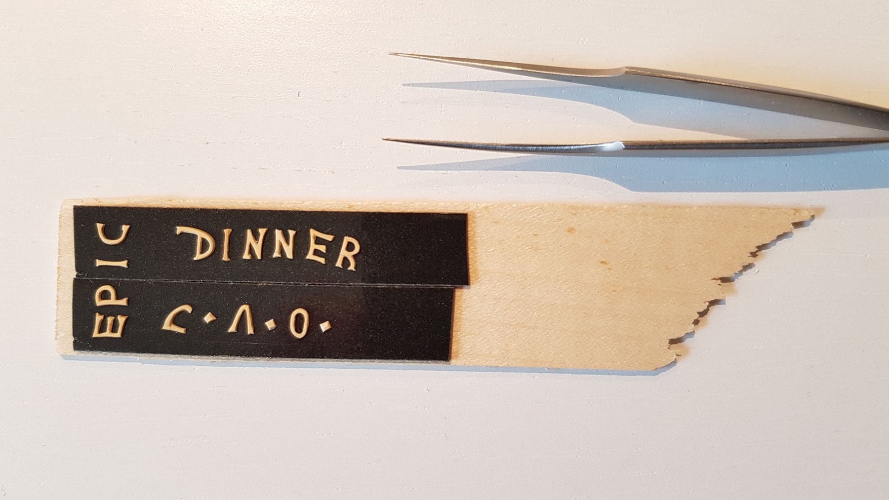
 When I put the letters on the double-sticky- tape, I have noticed, that I got the word: “dinner” (by coincidence). Than, I tried to make some sense with other letters. So, it came out: “epic dinner” ... whatever that means… Painting procedure: sealing wood with Golden GAC100 (against corrosion of wood with oil paint and to prevent wood absorbing oil from the paint) priming with Talens Gesso 1001 (get good bond for the paint and brilliant colours) painting with Schmincke Mussini Kobaltblauton / cobalt blue hue oil paint The same procedure has been done for the ribbon. Just with the difference, that the ribbon got a "pre-shading" on the white paint with the blue and blue/grey shades. Many know what "pre-shading" means, but I will explain shortly: You have a light or dark base layer and put on it excessive forms (lines, shades, letters, whatever you need) of the shades you want to get. This looks awful than, but you go (after completely drying the previous layer) over it with several very thin layers of the basic paint. Airbrushing works very nice and is easily controllable. However, it works also when painting with oil paint. Do not overdo, since you will lose the effect! The key is to stop setting your layers in the right moment. When removing the letters from the tape, 3 letters broke, so I needed to glue them again with epoxy. The letters are very thin and maybe some sort of less sticky tape would be a better choice. Epoxy is neutral. Cyanoacrylate glue may influence the sensitive oil paint. Dražen
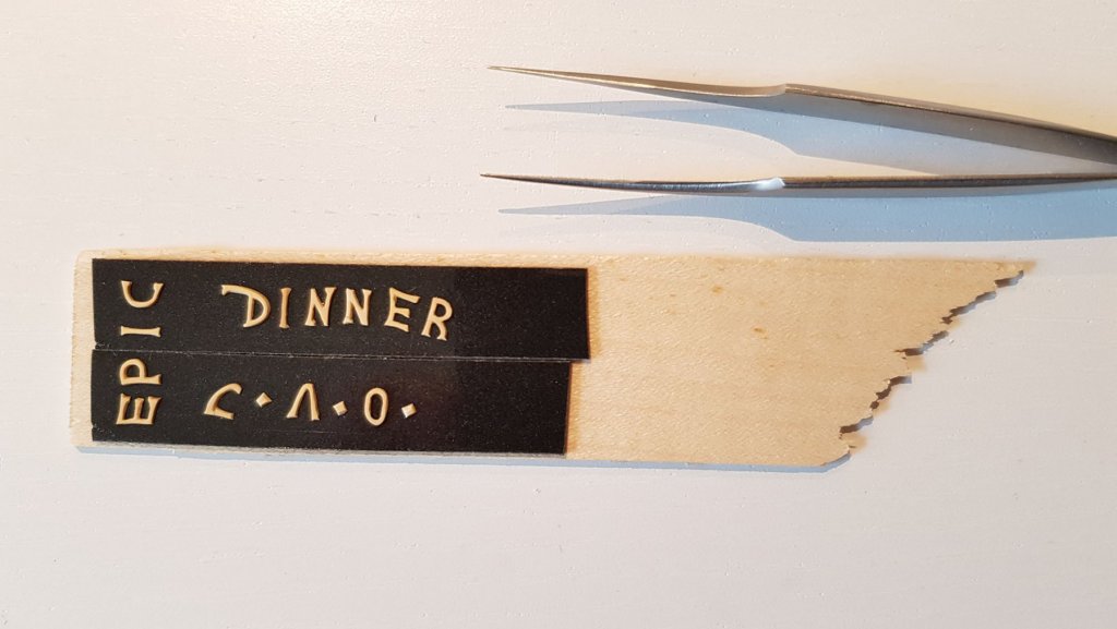
- 487 replies
-
- 7
-

-
- ship of the line
- 80 guns
- (and 1 more)
-
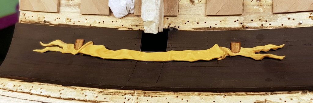
Also, after the painting, again: the fit-check. Dražen
.thumb.jpg.816f45977b50ea3ac947077cdcfc579b.jpg)
.thumb.jpg.0d98c0168a26945c7ee496eb53cfb1cf.jpg)
- 487 replies
-
- 7
-
-
- ship of the line
- 80 guns
- (and 1 more)
-
Before carving the ribbon has been bent on the steam in order to follow form of the wulf. Still, I needed to check the fit and also towards the small windows. Dražen
- 487 replies
-
- 4
-
-
- ship of the line
- 80 guns
- (and 1 more)
-
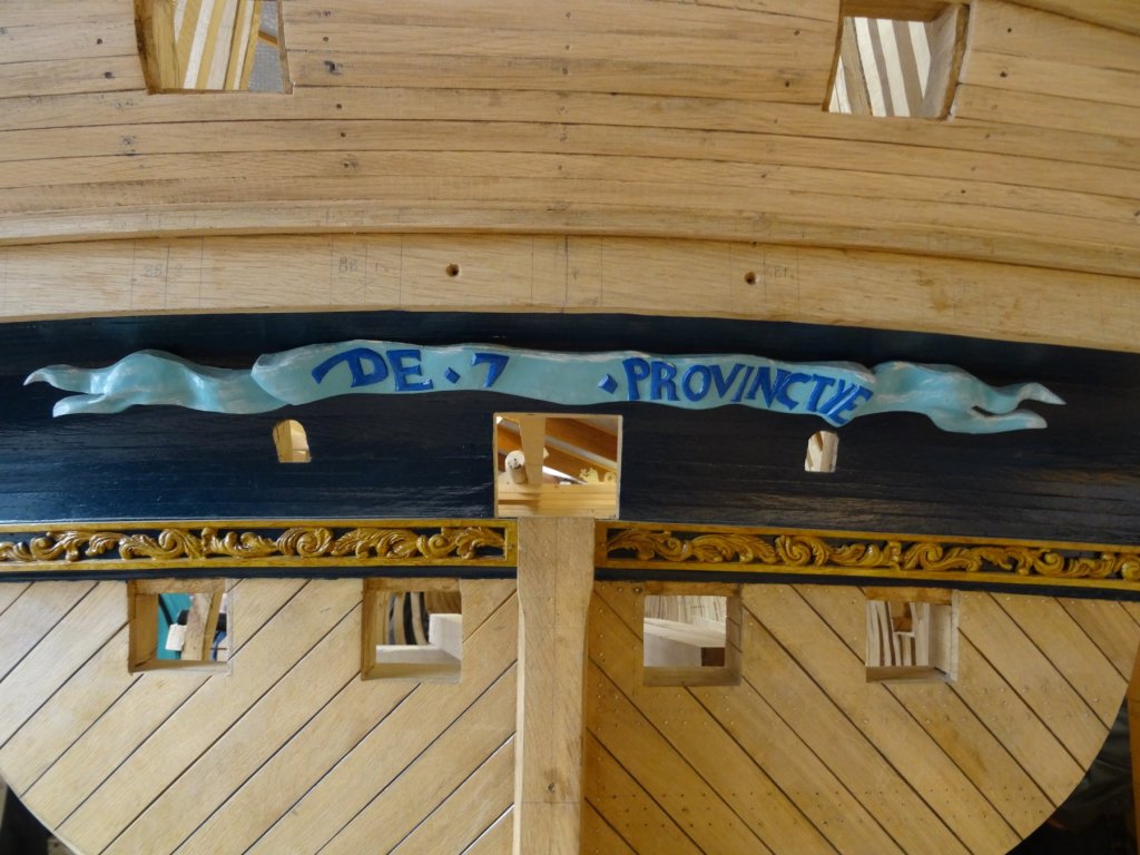
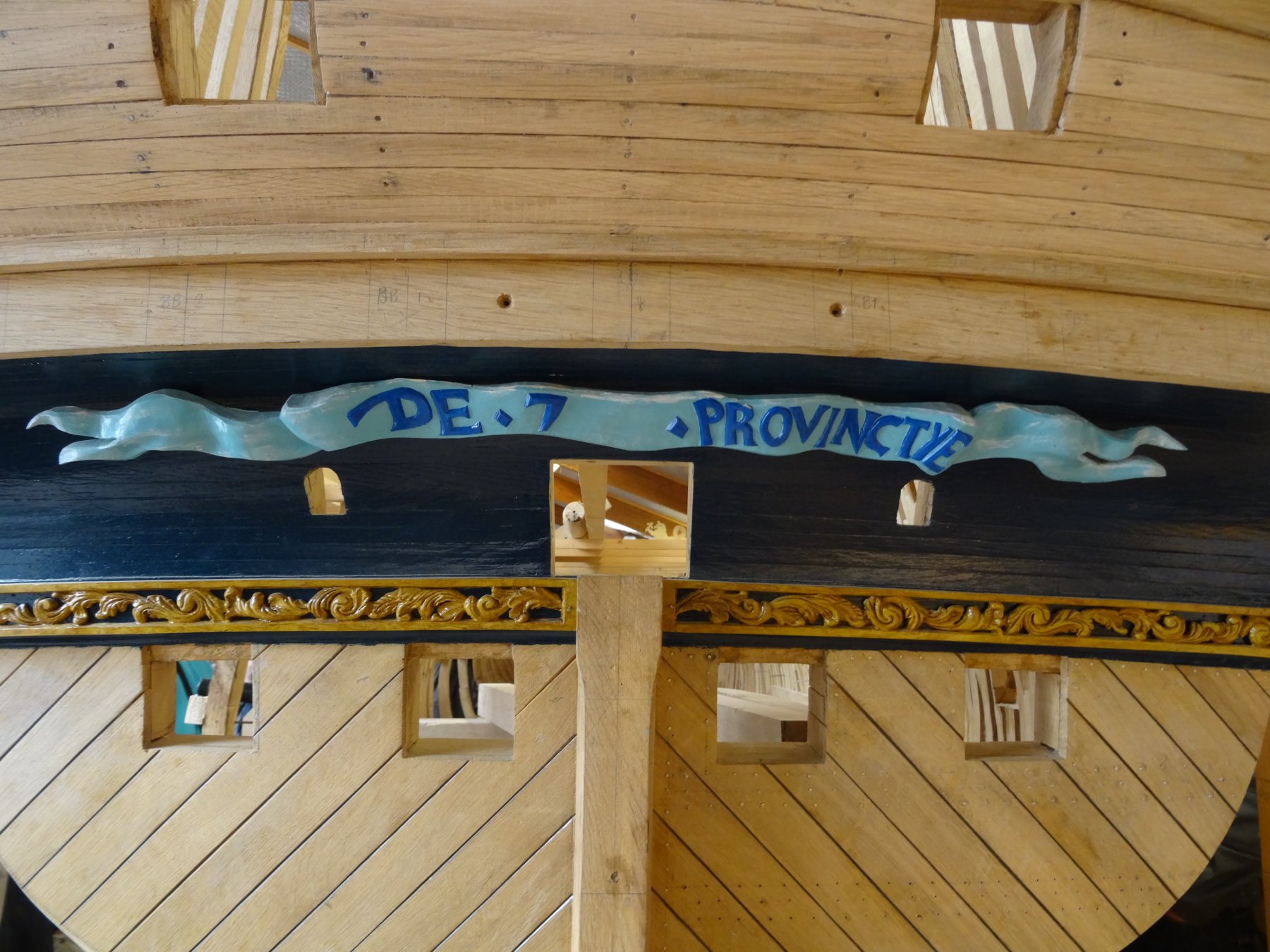
The ribbon (banner)… In my previous postings, you can see the carving procedure of the ribbon. Now, it is “only” needed to be painted. There were several tricks how to get nice/clean painting: Separated painting of the ribbon and the letters Ribbon in pale white (a sort of very light grey – something like Humbrol 28; it still looks very white on the ship) with shades of light blue to simulate depths/shadows. We are not sure if the shades have been done on the real ship although the model in Lelystad shows it too. I went for white ribbon and not light blue as the model in Lelystad has. My discussions with experts and references show me this could be most probable the right solution. Letters glued on double sticky tape and painted separately. I went for a mid-to-darker blue paint (Schmincke Mussini Kobaltblauton / cobalt blue hue oil paint), which showed beatutifully on the white gesso beneath. After painting the ribbon, I needed to “free” the gluing place for the letters in order to get a solid bond (glued with epoxy resin). Dražen
- 487 replies
-
- 2
-
-
- ship of the line
- 80 guns
- (and 1 more)
-
Let us start with the wulf… Since the paint was most probably black and it shall be a pale black, I use the Royal Talens Rembrandt Van Dijckbruin (Vandyke Brown) oil paint. One could go for a deep purple-Black version as the model 1:10 in Lelystad does, but I liked this tone much more – it is just my personal preference. Pure black would be too “new” for some tastes. The wulf planks have been nailed, but due to the very dark paint, it would not bee seen if I went for tiny nails below the paint. Well, I wanted to show the nailing below the paint and did very shallow holes. Covered with the paint, they look nice and simulate the nailing of the planks. Dražen
.thumb.jpg.522ae44cfa008feafd8c37c64a203219.jpg)
.thumb.jpg.3555e46017a8118d7b5877ce5061cd0a.jpg)
- 487 replies
-
- 4
-
-
- ship of the line
- 80 guns
- (and 1 more)
-
Several things have been done in the last weeks and months: · The “wulf” (sorry, I do not know the English word for this part) is ready; · The ribbon painted and fixed on the “wulf”; · The rudder fittings and the whole rudder made, painted and fixed on the ship. Dražen
- 487 replies
-
- 2
-
-
- ship of the line
- 80 guns
- (and 1 more)
-
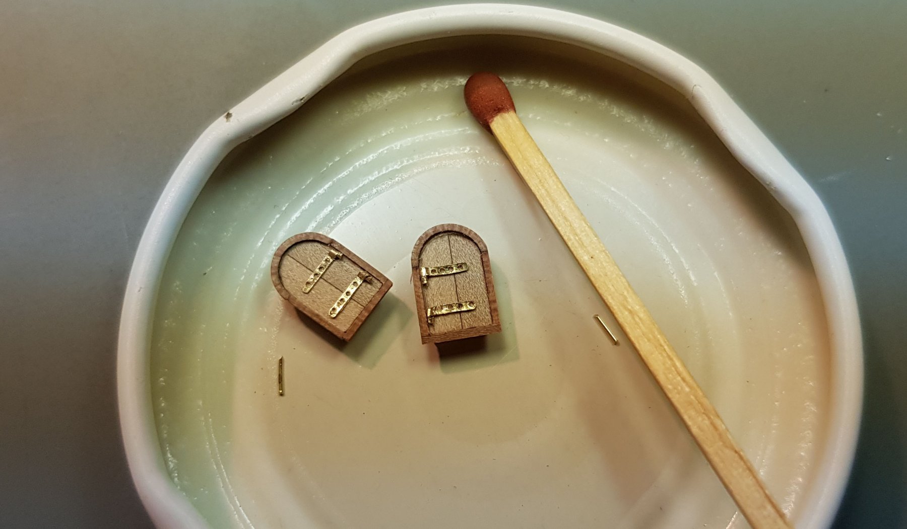
No, the hinges I have made. I mean the locking system for the window - like the door handle/knob. On the plan, it has been shown, but is only from the inside. The small window is opening to the outside. This can be seen often on Van de Velde drawings as well as that there is no door grip from outside. Drazen
- 487 replies
-
- 3
-
-
- ship of the line
- 80 guns
- (and 1 more)
-
Done. Under high magnification, it looks a little coarse, but it is a very tiny part. Drazen
.thumb.jpg.729c32d3dfdd55862aa4a253f8804ef0.jpg)
- 487 replies
-
- 18
-
-
- ship of the line
- 80 guns
- (and 1 more)
-
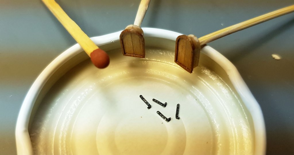
Making the fittings... They are made of 0.1mm brass sheet and are 0,6mm wide. The nails are made out of 0.3mm brass wire. The procedure of making the nails, I will explain later, when I show the whole procedure of making the rudder. Drazen

.thumb.jpg.1aaf1b58b9ed1f19be17c310aaca1c03.jpg)
.thumb.jpg.dfdd5f6a27b9023aed7764c827b2724b.jpg)
- 487 replies
-
- 13
-
-
- ship of the line
- 80 guns
- (and 1 more)
-
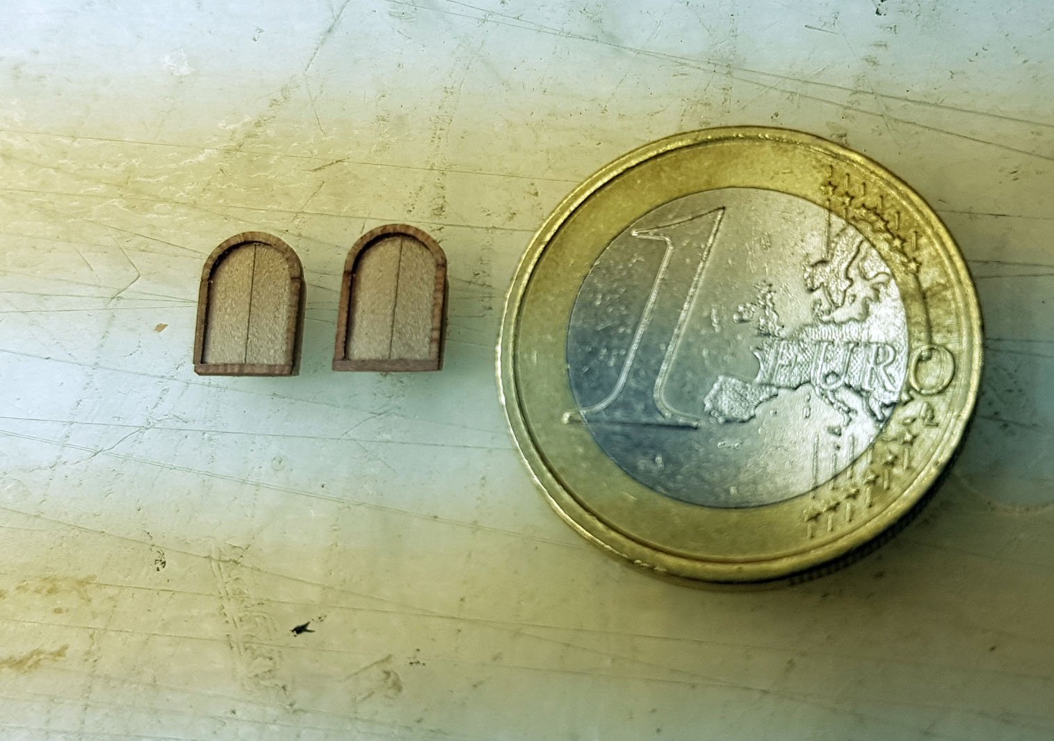
... here the frame and window are ready. Drazen

- 487 replies
-
- 11
-
-
- ship of the line
- 80 guns
- (and 1 more)
-
Than, I made the window itself. The window is made of two parts. In order to keep the rounding nice, a good symmetry of two wood-parts and same dimensions for both windows, I used a trick and inserted a rod between the two wood parts on both windows. This rod I also used for positioning when grinding - in order to get a nice round upper part of the door. Drazen
.thumb.jpg.47d17c5205058f16cfb9470331e423fc.jpg)
.thumb.jpg.cbb4385dcb1cf9e77c8257858de335ee.jpg)
.thumb.jpg.228b7c0904c1a3252ec71f4f01d60c01.jpg)
.thumb.jpg.b785be411d5e38140de1e3cc49fae707.jpg)
.thumb.jpg.157951be50d369c9df4fe84c378bb3d2.jpg)
.thumb.jpg.89448af50a8fc16c92a24b509ed1fe81.jpg)
- 487 replies
-
- 6
-
-
- ship of the line
- 80 guns
- (and 1 more)
-
I prepared the wood for the frame of the window... I first thinned the wood as much as I could (0.7mm) and cut it on the small circular saw in very thin stripes (0,5mm). Than, I bent it on the steam and turned around a 3mm drill. With this, I got the upper round part of the frame. Drazen
.thumb.jpg.932bd725205f3b9a06b8591531d8f9a8.jpg)
.thumb.jpg.2b073ac2746ccf8d3ceafe5eb22b1eff.jpg)
.thumb.jpg.019422b8111e4c738a0b47cd62b9f33b.jpg)
.thumb.jpg.b15f0dd676c2ee9f1d2c582398aba3ff.jpg)
- 487 replies
-
- 8
-
-
- ship of the line
- 80 guns
- (and 1 more)
-
Next, two small windows below the banner... The door grip is a mistake in the plan/drawing and can be seen only from the inside. Drazen
.thumb.jpg.1027ae3183c455744b82979ee65dd1d5.jpg)
- 487 replies
-
- 3
-
-
- ship of the line
- 80 guns
- (and 1 more)
-
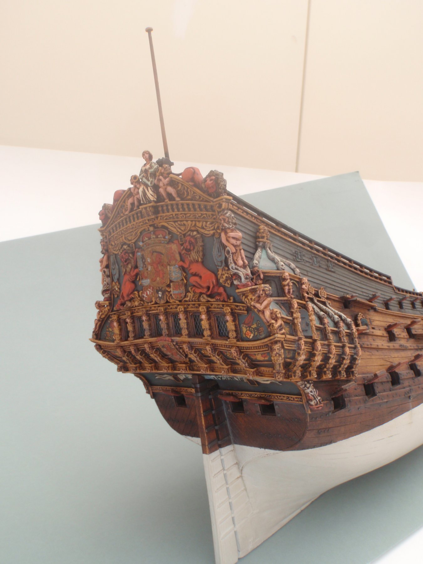
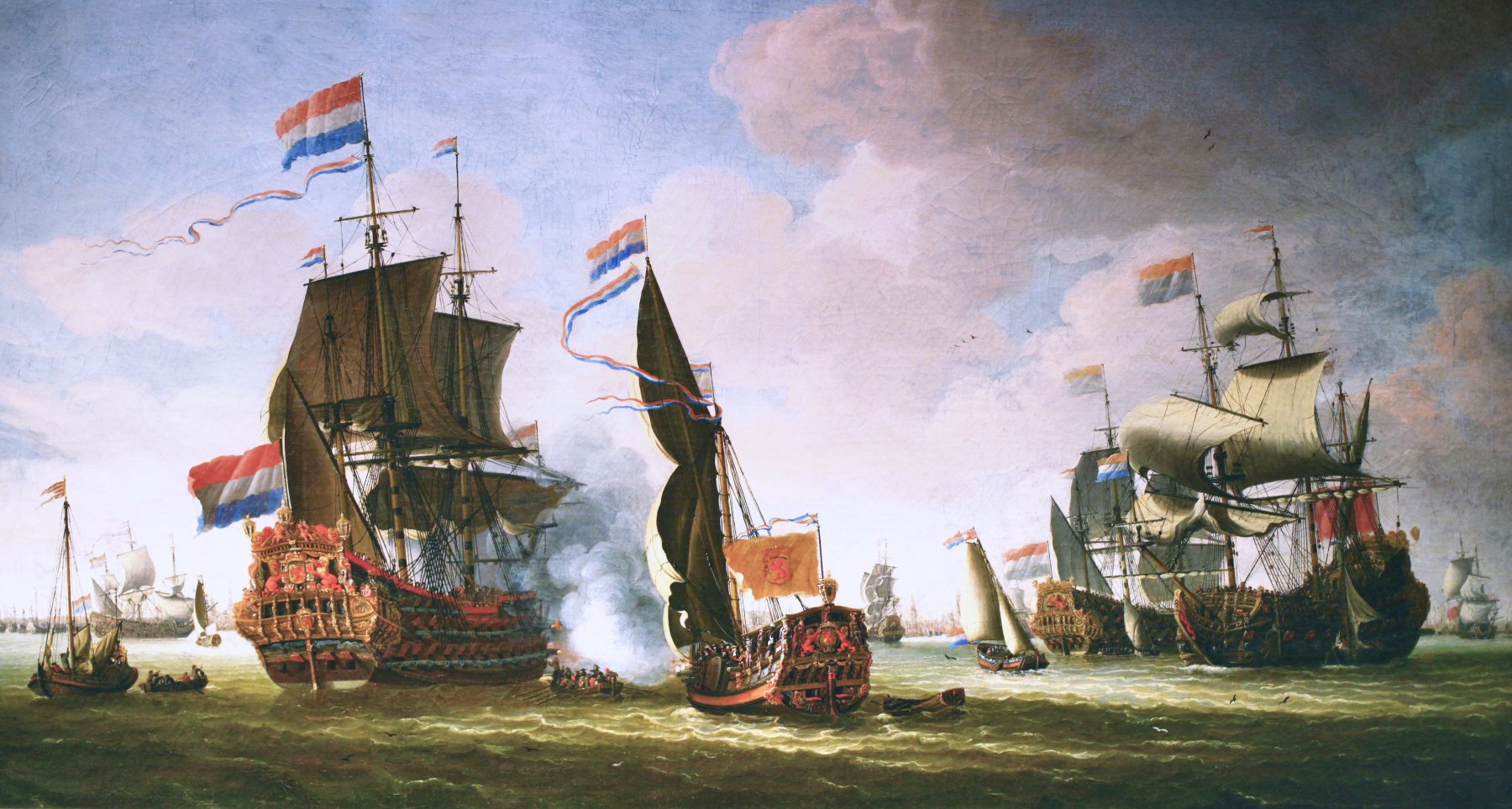
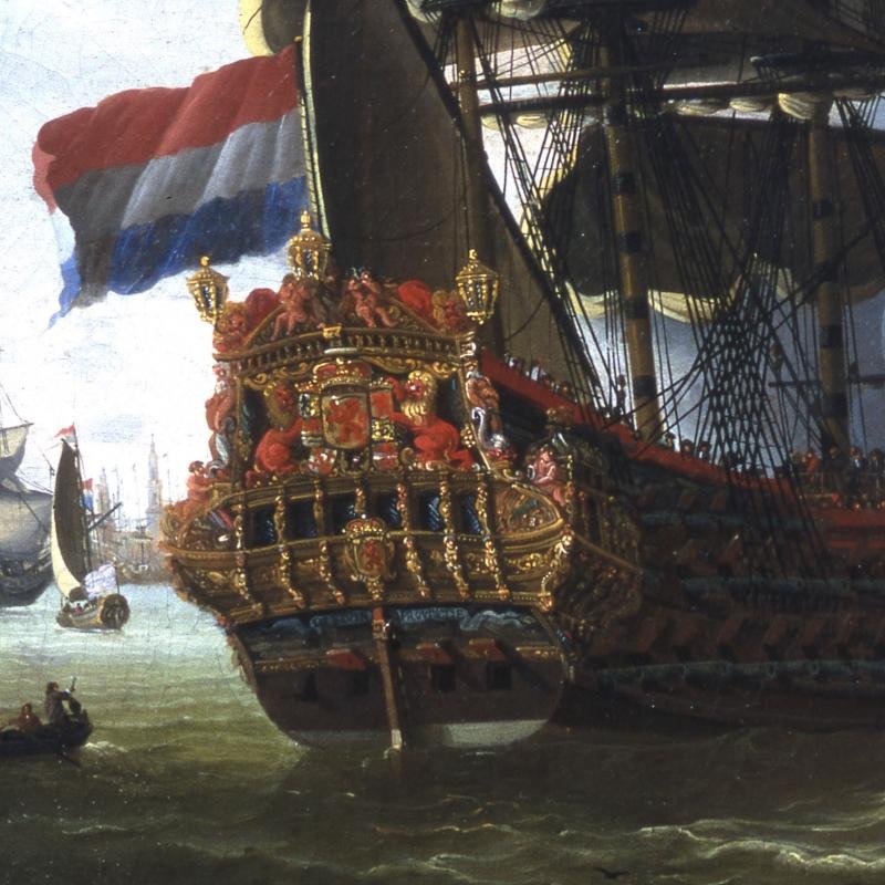
Alan, you brought a new perspective! There is quite some truth in your thoughts. I'll try to "investigate" further: On the right, where the first/lower wale ends and right above it, there is a small sculpture which shall be white (on the painting, it is of the same colour as the ribbon - light blue). I attached here the photo of the model made by Artitec. This model shall be quite relevant. There is this same white sculpture on this model, which is of the same colour as the parts of the sculpture above - near the lion (beard, hair, lower part...). On the painting, this upper sculpture has clearly white parts and the lower sculpture is of the same colour as the ribbon. This brings me to the conclusion that the lower white sculpture on the painting is light blue due to the shadow - same as the ribbon. Again, the part of the ribbon, which is not in the shadow, is more white. Very interesting! The ribbon is on this Artitec model pale white too, but I was challenging this choice due to the light blue on the painting and the light blue on the model 1:10 in the shipyard Lelystad (I have attached also a photo of this model). I think something like white with some shades of light blue would make sense. Dražen

- 487 replies
-
- 5
-
-
- ship of the line
- 80 guns
- (and 1 more)
-
Thank you. I mostly agree with your observations. Just to mention one issue which may be of relevance and I was thinking about it: The banner/ribbon is installed under a degree of approx. 45° towards the water, and it may reflect a certain blue shade from the water (if it is a sunny day - and it is on the painting; The ship stands directly under the sun although the ribbon itself is in the shadow). On the other hand, this is the Dutch see, which is mostly greenish, so I do not believe there is much influence by water towards "blue". The other very valuable observation (thank you druxey!!) is the comparison to the underwater colour. We know 100% for sure the underwater shade ("white" with just slight yellowish/ochre shade). This "right-white" of the underwater can be seen very well and in its' real shade - without any significant influence by the surrounding. I think, if nothing else comes up, the colours are clear to me. The "gold" trim/edge, I cannot recognize, at least not out of this painting. But, I have still some days till I start with painting this part. Dražen
- 487 replies
-
- 3
-
-
- ship of the line
- 80 guns
- (and 1 more)
-
Hi Alan, Definitely a beautiful combination! It would look excellent. Just, my main drive is to make it as historically right as possible. Is there any evidence on this combination? This would be of great importance to me. Dražen
- 487 replies
-
- 2
-
-
- ship of the line
- 80 guns
- (and 1 more)
-
Yes, it is really difficult to 100% say what had been written on it out of paintings/sketches. I can read different wordings, so one shall stick to the old Dutch. But... let's see what do you think on this topic: the colour of the letters. Dik says in his book: "ongetvijfeld goud". (Dik, page 100, end of the text). If I look at the painting by abraham Storck ("Flotte Hollandaise") or Jacobus Knijff ("De Zeven Provincien en andere Schepen") - it is not clear who did this painting but it shall be relevant… WHICH COLOUR DO YOU SEE ON THE LETTERS “DE - 7 – PROVINCIEN”? I see blue, but am happy to hear other opinions and/or get some other source of information. Long time I thought to go for “gold” letters. But, … they would not have been seen well on the nearly white banner. And… they have been clearly painted and very well to read on the old paintings. Dražen


- 487 replies
-
- 3
-
-
- ship of the line
- 80 guns
- (and 1 more)
-
… also, some details which will be seen through the white paint below the waterline. Dražen
.thumb.jpg.37241f9f878a3e555b3914e0d890e78a.jpg)
.thumb.jpg.29050c6d79238ef16a92e5f2deb46428.jpg)
.thumb.jpg.bd86aa9341f3ef5858711bf680844f36.jpg)
- 487 replies
-
- 8
-
-
- ship of the line
- 80 guns
- (and 1 more)
-
Here are the paint tests I have done… I went for the most quality paint available. So, I have bought the oil paints by Old Holland, Schmincke Mussini and Royal Talens Rembrandt. For the gold, I will use the Tamiya enamel paint X-12 (Gold Leaf) since this paint has shown to be of much finer pigment even than Mussini (yellow gold) . For the big canvas-paintings Mussini may have some advantages, but for the fine scale, you will need the finest pigment/crystals possible. Tamiya X-12 is excellent. Still, I must mention, that working with this oil-paints requires a lot of knowledge and experience. It is far more challenging then than working with any other paint I know. Even the metallizing process (chrome, steel, gold, etc.) by Alclad II is a simple game compared to the oil paints. The critical issues are: priming, thickness of layers, progressive increasing of oil-content/thickness of the layers, very long drying time & decreasing drying time with different additives, continuous paint film and sealing the surface. I am still fresh and learning in this area and am curious how the end result will look like... and this cannot be said till the last layer is dry and the sealing (varnish) is on and dry too. I hope, the effort (and the price!!) was worth it. One tube of Old Holland Cadmium Red Deep 40ml was under offer 30€. Rembrandt is cheaper, but some colurs are not covering well (e.g. 228 Ochre Light I cannot use at all and need to mix it from other paints). Some other Rembrandt are just fine (Green Earth, Titanium White and some others). Old Holland and Mussini are top notch. One needs to take care if the paint is totally covering or (partly) translucent – Mussini is known to have many such options one can chose from. Dražen
.thumb.jpg.00a6c9b4a6a4d8e4a9f4c66cfc1c667b.jpg)
.thumb.jpg.628e3b352a62bee72ebf18a2fe16b307.jpg)
- 487 replies
-
- 4
-
-
- ship of the line
- 80 guns
- (and 1 more)
-
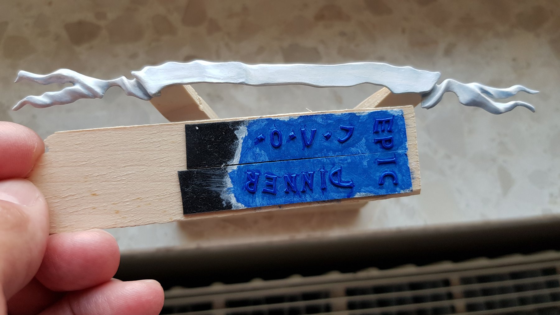
The banner I made separately from the letters. This gives me an opportunity to work more precise and to make the painting work also look better. The letters will be glued on later. On some photos, one can see the 3D-effect of the banner on the edges Dražen
.thumb.jpg.6111a71e63630952456676e65ccedff5.jpg)
.thumb.jpg.93589049519d38f01733bab7f8ef0b3a.jpg)
.thumb.JPG.bfe2dc93f30790db6bd54fa39a485762.JPG)
.thumb.JPG.769a0ba8737657a58e5a1ac1145c3e2b.JPG)
.thumb.JPG.4d4c72625c71998ec53da593030a8a38.JPG)
.thumb.JPG.ca88b7f6da40fffcfa438a410dc234cd.JPG)
.thumb.JPG.d4e28f641e7287dbd884e3e259225b03.JPG)
- 487 replies
-
- 20
-
-

-
- ship of the line
- 80 guns
- (and 1 more)
-
The machine I was using for carving was a real dentist’s machine “W&H elcomed 100”, but some things have been done by self-made carving knives (old drill with a holder-pen) Dražen
.thumb.jpg.9948995883510b65c2ebe93acee9b488.jpg)
.thumb.jpg.7ee028a2ac948383001787b049367f9e.jpg)
.thumb.jpg.f05f25ee52fcf101e0ac0ff42dfcde91.jpg)
.thumb.jpg.451d612f6452fb5d288028079898cd43.jpg)
- 487 replies
-
- 7
-
-
- ship of the line
- 80 guns
- (and 1 more)
-
On one photo, you will see that the 3D of the banner had been exaggerated. I did it by purpose and later, I smoothed the heights – till it started to look fine to me Dražen
- 487 replies
-
- 4
-
-
- ship of the line
- 80 guns
- (and 1 more)
-
In the last months, I have been doing several things in parallel: the banner with the ships’ name, the rudder (nearly finished), the machine to turn ropes (finished) and some other small parts. What I did a lot were the tests of the paints to get the best colour. In order to avoid confusion by jumping from one topic to another, I will post here the results of my work when ready or when an important stage has been completed. Let’s do today the banner… The carving work on the banner, I finished yesterday. What follows now is painting the banner. The banner has been carved out of the boxwood. Since the forms of the banner are not 100% equal on all van de Velde paintings, I have decided on the one I liked the most and which still is looking mostly like the original. I was ignoring to a certain extent the banner made in the 1:10 model in Lelystad and tried to go my own logic in some way. What I did different from the 1:10 model, was to give it more 3D – so it looks like a real thin banner and not like a piece of wood. Second, I will probably go more for the pale white banner and not light blue. For the letters, I will probably choose the mid/darker blue, but the last I am still not sure. Dražen
.thumb.jpg.4f31e6e87e8111916ffea446ca88e769.jpg)
.thumb.jpg.6418795a40b2787ac1f8fbc942c1df5e.jpg)
.thumb.jpg.a04840fe83cb4b8f21d53c9d8ac0359c.jpg)
.thumb.jpg.5413fd6927193561daafa8aa02165823.jpg)
.thumb.jpg.7f0c5f89a69879e3f245692708452747.jpg)
- 487 replies
-
- 11
-
-
- ship of the line
- 80 guns
- (and 1 more)
-
I will make it by hand. I do not know how could I insert the data in the 3D-milling machine. I may need some existing sculptures and make 3D-scan of them. It may be possible to go to Lelystad and ask if I can make such scans on treir carvings (which are definitely nice). Still, the processing of the data, the preparation and the machine itself... this is all completely new to me. For the moment, I am thinking to try by hand-carving. But, I will think about this as an idea... Dražen
- 487 replies
-
- 2
-
-
- ship of the line
- 80 guns
- (and 1 more)
-
Thank you guys. If no other information comes, I will go for "PROVINCIEN" in a carved (3D) version. Do you have any comment on Gold for the letters like Dik suggests? Dražen
- 487 replies
-
- 3
-
-
- ship of the line
- 80 guns
- (and 1 more)
.jpg.3b6ec84dbe4bdfca608cbb80d343d977.jpg)
.jpg.275b24c9dc401d794f123a0f71a85381.jpg)

.jpg.e8d4f73e7cd52a7dd0b2590dea4f6886.jpg)
.jpg.2ac2255789524e203be702c59aa52cc4.jpg)
.jpg.6fd3f96a0302100b7df033b6c38c23ed.jpg)

.jpg.236d733904298b68174a64299a656f7e.jpg)
.jpg.339fb4dcacef94a53c6f711034c55d7e.jpg)
.jpg.7cb4745a46f6946aed8c2bccb6e58121.jpg)
.jpg.923d81493167cc00f6e645532d7ff964.jpg)
.jpg.9881e9dd60ecc3ce3fa0b62d809963f2.jpg)
.jpg.e7622f891eaf22c23496a7e329d0c5d0.jpg)
.jpg.dec2bbb44c0766ada828a3c3926886e6.jpg)
.jpg.38549f6e9bc8e2c55a4f9b5cad6ee9ae.jpg)
.jpg.f5529c40969bfec452b9eb35b6ae44d3.jpg)
.jpg.0ac3a1af7e3e555e1590066b885666ec.jpg)
.jpg.03a4a9b327f11c48f7c0c49fdfe0e924.jpg)
.jpg.a9c945d48e1ceca520d3d87b503c3a5a.jpg)
.jpg.fe999d99cdfc5b9b9c8de78b0ba97331.jpg)
.jpg.2219a09087f38fbbef2a1a6ffb935ce8.jpg)
.jpg.4d6219b1c77d092c264dea9f4943b9df.jpg)
.jpg.a18a241cb0672e1ddbc3cb846993e54d.jpg)
.jpg.31fb98296a08cfe0037789b467330325.jpg)
.jpg.4975d25569283a7e3ebd346e99f04b8c.jpg)
.jpg.1ff478f5c451943fa20277fc92a8744c.jpg)
.jpg.9dc2ca24dcdc01136a568e01bcb62712.jpg)
.JPG.44650d1251c3d2a34df16174ad6dc7be.JPG)
.JPG.eed0b2cc94fc052f3de784febd598904.JPG)
.JPG.52e3e6fd6f3be52e82a981012ba2437b.JPG)
.JPG.f46b3faf90bb7c71c62df54a6764416a.JPG)
.JPG.01e7f8155b7a8cacb971997b18598a88.JPG)
.jpg.3747e2095f2c4d9928636b31f217346f.jpg)
.jpg.c387ec678d5c745b724c9846ee7cfa73.jpg)
.jpg.35ca20670bd49673e37a99ffb5511ef0.jpg)
.jpg.d0ed7b6102bd1f708a222d81b46a2556.jpg)
.jpg.e82cb67c26cadd21b3cf5d820aa809a1.jpg)
.jpg.25971d98223fabcfcbc50aa28aacf3e9.jpg)
.jpg.666d95abd6df9c10888c3f8f3493ff12.jpg)
.jpg.d5c1d6601f124018761f4f081aa27773.jpg)
.jpg.f0ed2f09458bc479973f21ebb63858c1.jpg)