Supplies of the Ship Modeler's Handbook are running out. Get your copy NOW before they are gone! Click on photo to order.
×

CharlieZardoz
-
Posts
969 -
Joined
-
Last visited
Content Type
Profiles
Forums
Gallery
Events
Everything posted by CharlieZardoz
-
 That makes sense Roger especially if you are talking about coating the wood vs penetrating and altering the wood which is what Ive done here. I can say you can make a model using all these approaches and come up with great and varied results at least thats what im seeing. So with that in mind what brand lacquer do you recommend. Perhaps I should try it out and add it to my list. I did try sanding sealer but I had no idea how to use it lol.
- 362 replies
-
- 2
-

-
- active
- revenue cutter
- (and 1 more)
-
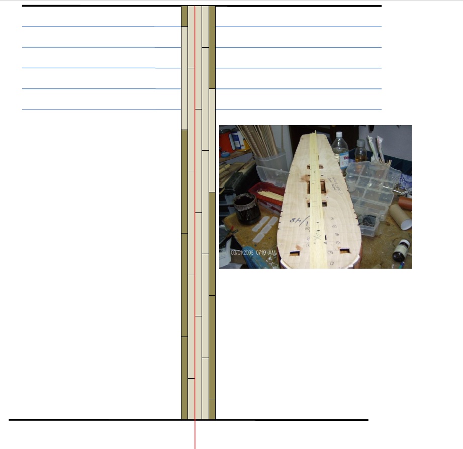
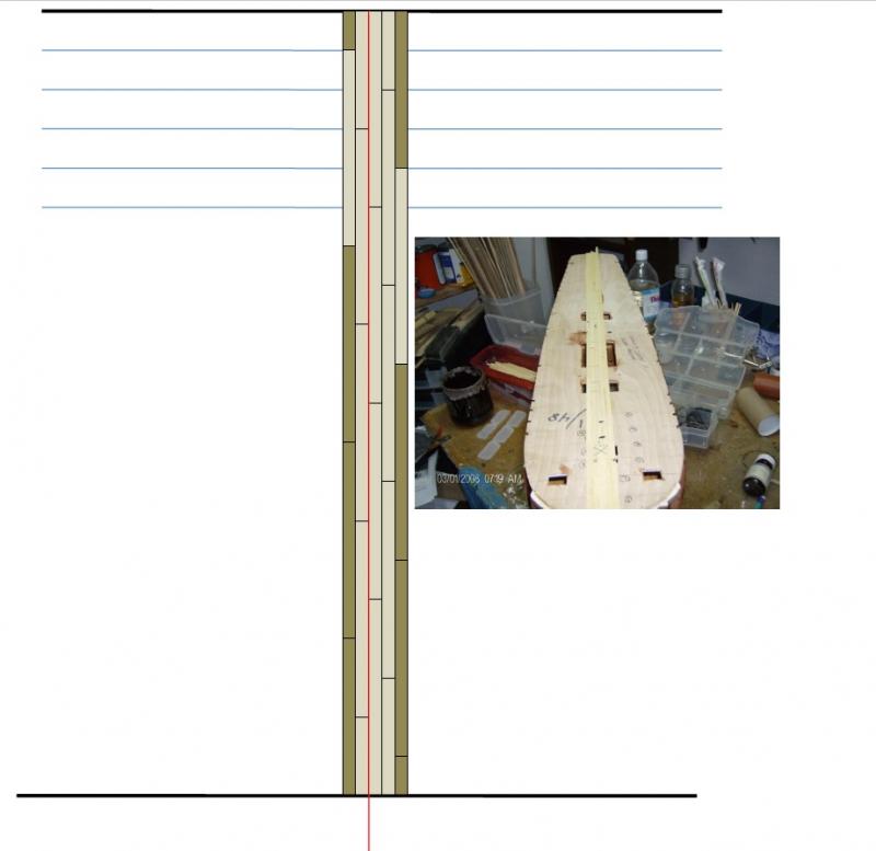
Interesting! I mean miniwax wipe-on poly seems sort of like a lacquer or are they different? I would not use an oil or stain for holly it just doesn't look right. I suppose I should ask around what people put on their holly decks... if anything. Btw here is the planking pattern I was mentioning, I believe this is the right way using the red line as center.
- 362 replies
-
- 4
-
-
- active
- revenue cutter
- (and 1 more)
-
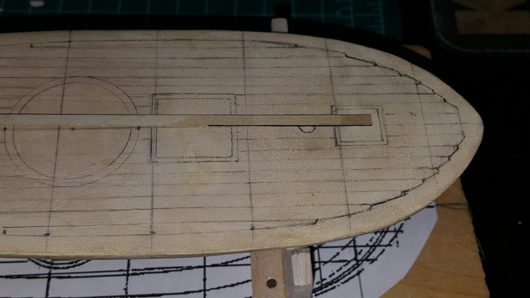
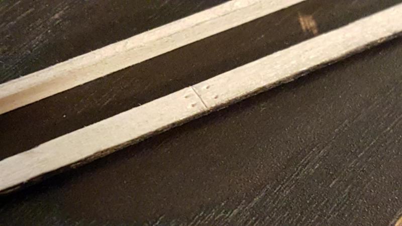
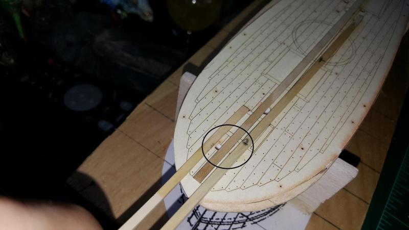
So last bit of intrigue for today is the concept of actual deck planks. I tried the scouring to simulate breaks but with tiny veneer strips perhaps that's not possible? Also the little nail spots which will eventually have treenailing, tried an awl, maybe a thin drill will work better. Regarding the planking layout on this very helpful template sheet I see planks in an angle pattern is my understanding on how planks flow historically. Buuuuuut I noticed they all go the same way regardless of port and starboard side. Is that accurate? Shouldn't they mirror each other when they hit the center of the deck? Not mirror exactly but I assumed the flow would go in reverse? Well that's it for now!

- 362 replies
-
- 5
-
-
- active
- revenue cutter
- (and 1 more)
-
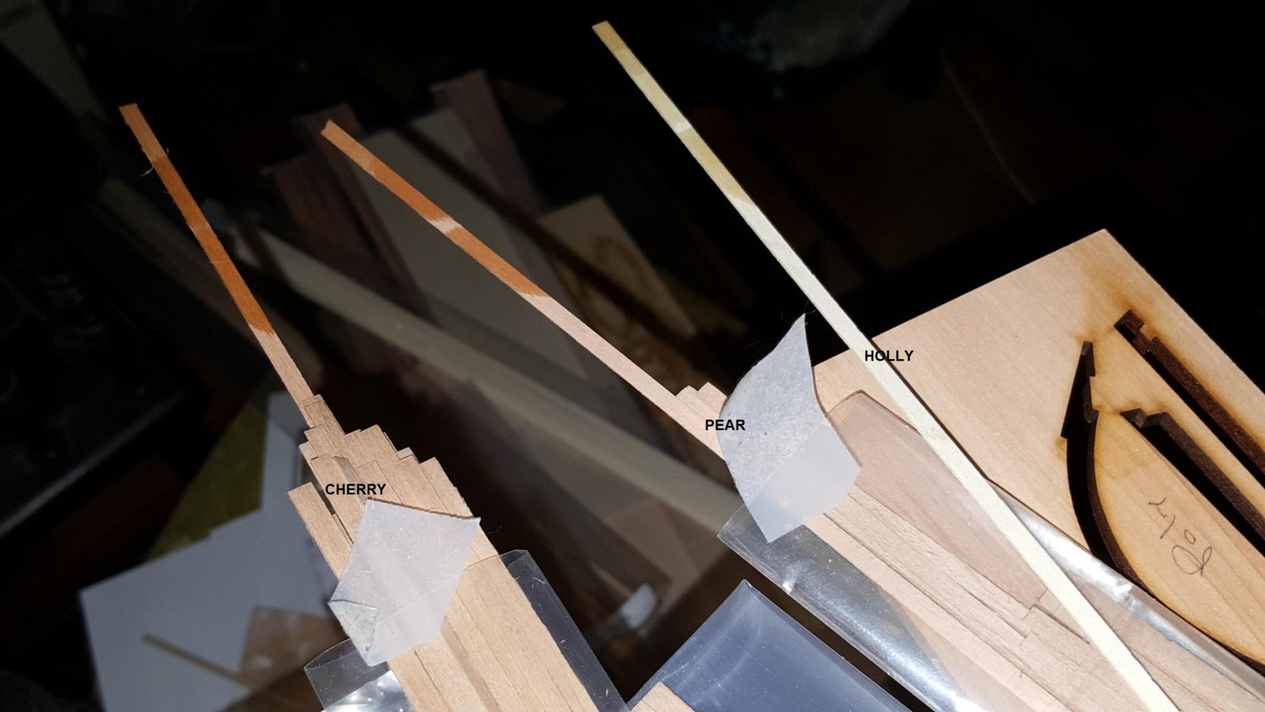
Hi Steve! The hull will be cherry. Much of the hull will be painted and coppered with only a bit of wood exposed here and there. Pear for me looks great on British warships or for interior workings, frames maybe the keel and boxwood I like for simulating yellow ochre, again for British and early American warships. These cutters feel kinda rugged to me, like great lakes ships or Baltimore clippers they were designed for the revenue service and I feel like a nice natural wood like cherry which can peak through in spots and look "workmanhorse-like" if that's even a word (I still have a cold brain only 50% functioning Also cherry happens to be somewhat cheaper than other woods so while I didn't want to use basswood (which is fuzzy and yucky) I figured it was a sensible "good" wood to practice planking
- 362 replies
-
- 3
-
-
- active
- revenue cutter
- (and 1 more)
-
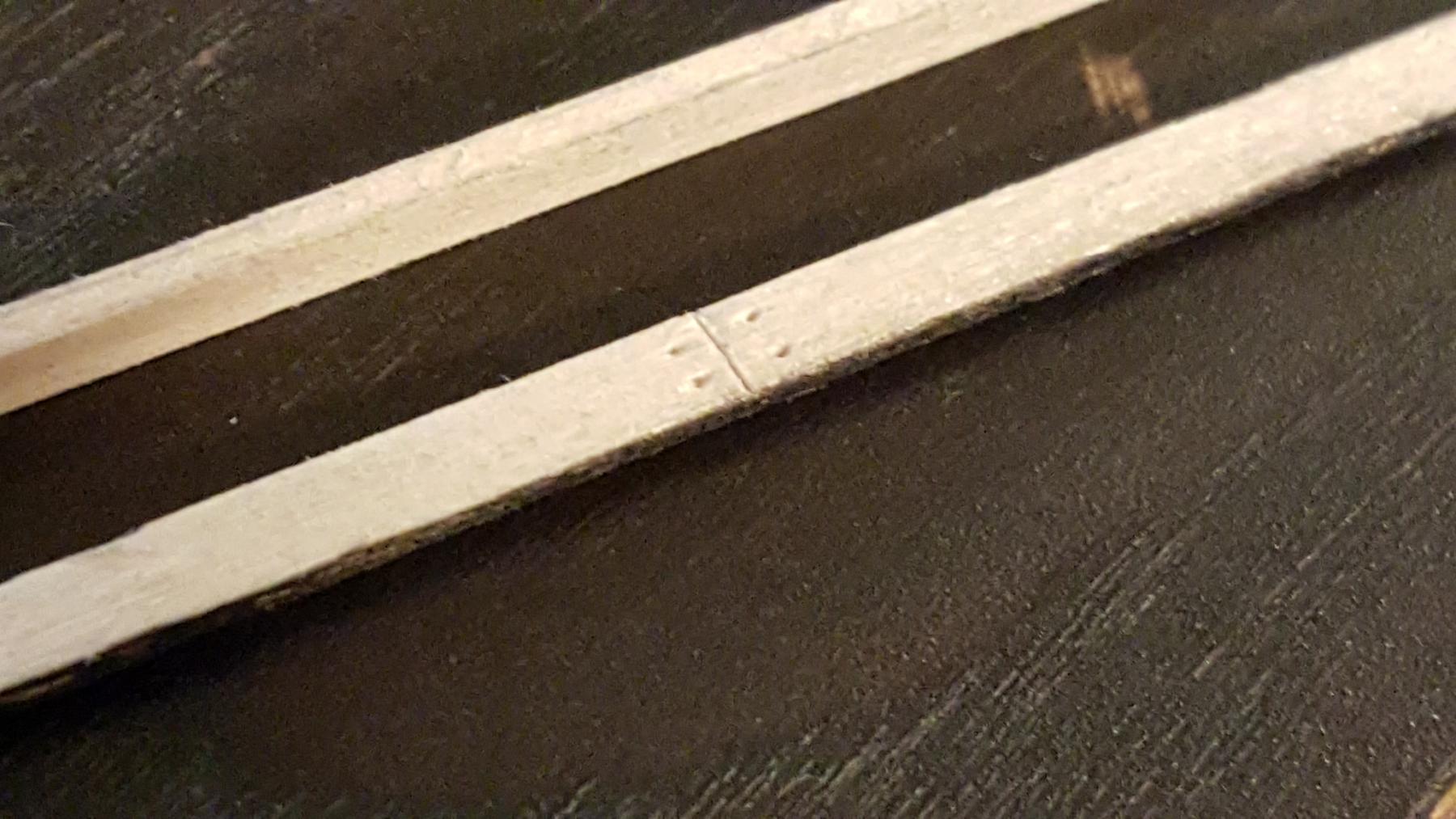
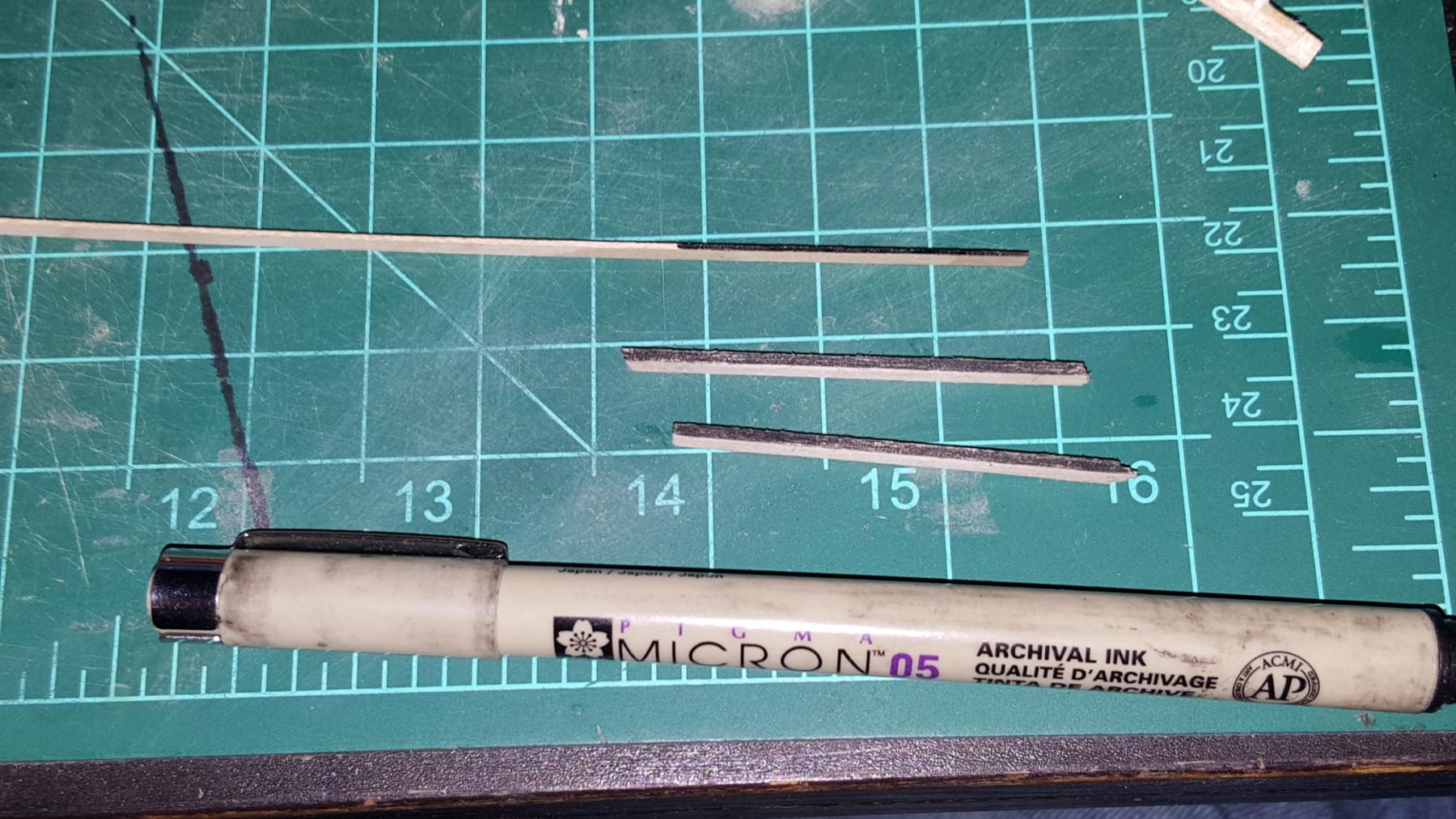
So enough of that. Next up was an attempt at deck caulking. I tried pencil (didn't work too well for me), then charcoal (messy got everywhere), then paint (kinda the same). I also tried the black paper thing but with these veneer strips they are just too thin and the tiny 1/8" strips by 3/128" thickness just seemed silly at that scale. I used wood glue, welding cement and both made a horrible squishy mess. What worked best for me was the archival ink pens, which don't bleed and does the job. Will I change my mind? Maybe but for now this looks like the best way to go.


- 362 replies
-
- 7
-
-
- active
- revenue cutter
- (and 1 more)
-
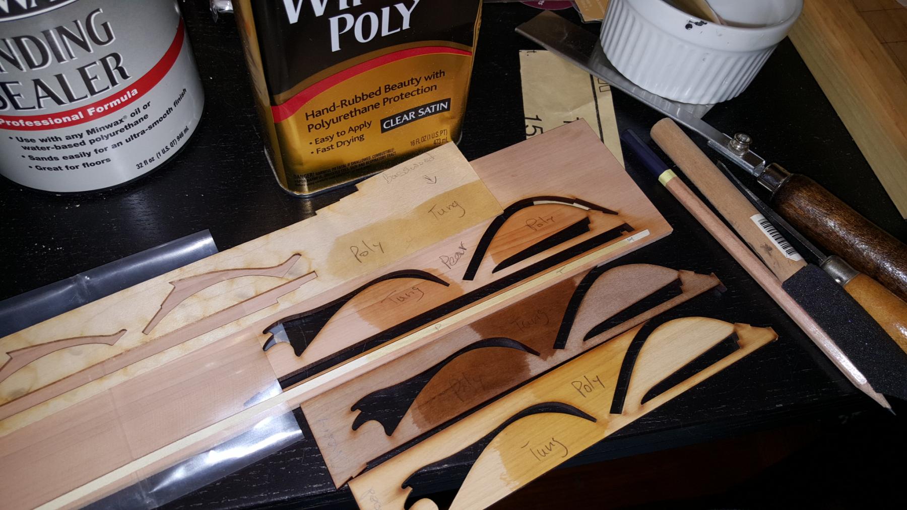
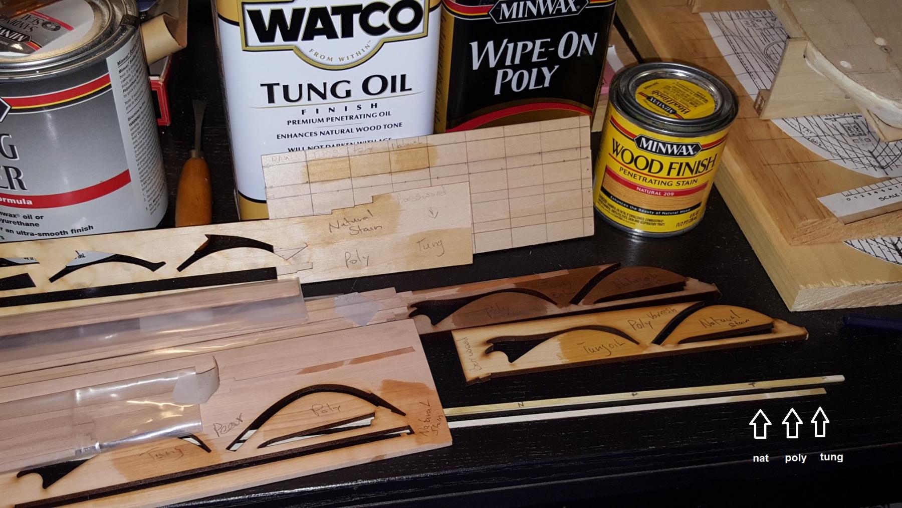
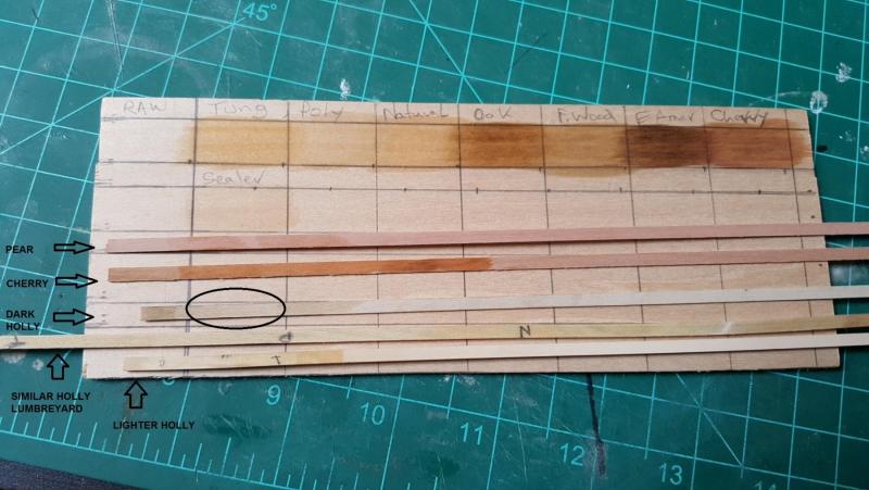
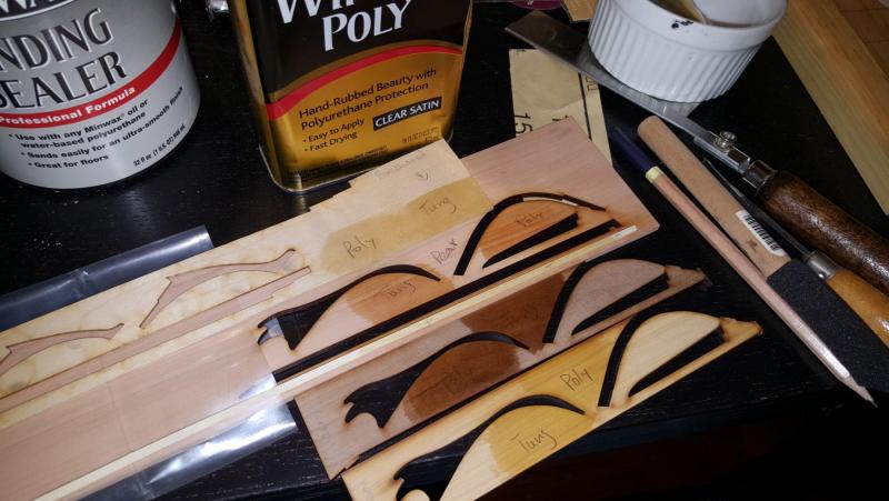
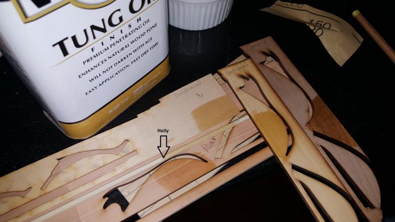
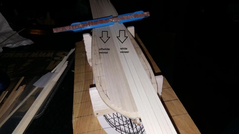
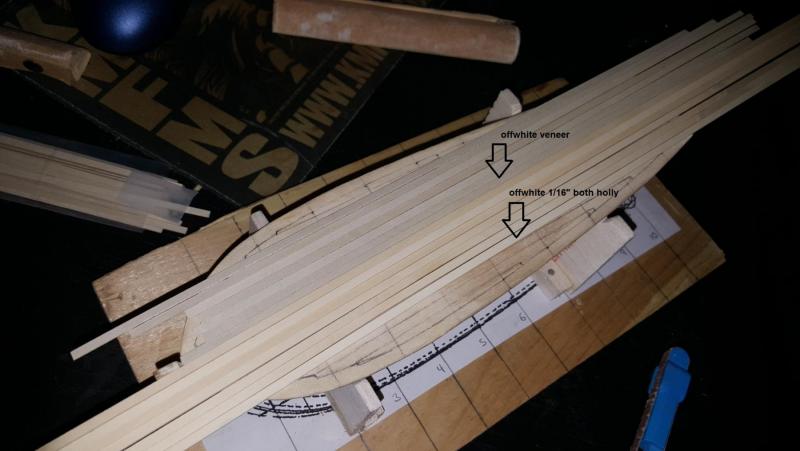
This chart on basswood shows a breakdown of some common stains. After natural, there is golden oak, fruit wood, early American and cherry. Basswood may varnish and oil lousy but it shows stain really well and serves as a good neutral. I tried some stain on the other woods but unless I want something deliberately tarnished (like simulating tarring on wood to which early American on cherry wood could look nice), generally fancier woods really just need polish or oil. The strips on the piece are pear, cherry, and various holly strips. The darker parts are oil or stain while the lighter parts are poly. The strip cherry is lighter than that scrap I used and there are 3 holly variations all offwhite but I circled the section that will represent the deck of the revenue cutter if I choose to use those dark holly strips. Also you can see the 3 strips change a bit when I use the flash. I think this process overall taught me that what I thought I knew about the color of wood needed to be thrown out the window. Holly finished has a yellowish brown look similar to basswood at it's darkest. Cherry can vary sometimes much darker than pear.

- 362 replies
-
- 8
-
-
- active
- revenue cutter
- (and 1 more)
-
Next was wipe on poly and then natural finish stain. Natural dries similar to tung oil while poly seems like more of a varnish. It's not oily like the others and doesn't look as nice on cherry. However poly looks great on holly. I don't feel holly needs oil makes it look weird. So I am already envisioning the deck will have wipe on poly while the other woods could use tung oil and then maybe poly over that to protect it. Is this common practice? Also is natural stain an oil like tung?


- 362 replies
-
- 7
-
-
- active
- revenue cutter
- (and 1 more)
-
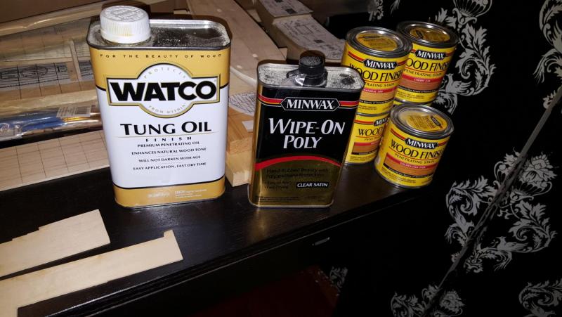
First we have Tung oil. This stuff really is an oil and seeps through anything thin like a veneer strip. It was fascinating watching each type of wood transform. Oil does nothing for basswood but cherry gets all this lovely figure. Pear is pinkish, boxwood and holly is yellowish.
- 362 replies
-
- 6
-
-
- active
- revenue cutter
- (and 1 more)
-
Good afternoon! Well rather than panic about the various shades of holly I decided this would be a good chance to start the process of using the wood finishes I have accumulated and understand wood colorings a bit better. Since this is all new to me I decided to have fun and test everything on scrap. So here we go!
- 362 replies
-
- 5
-
-
- active
- revenue cutter
- (and 1 more)
-
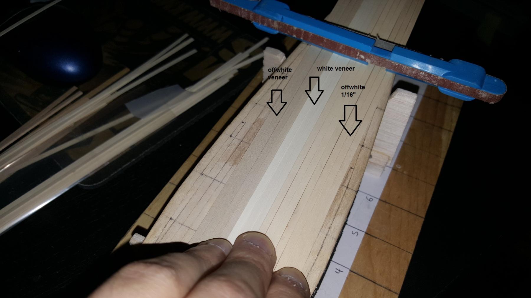
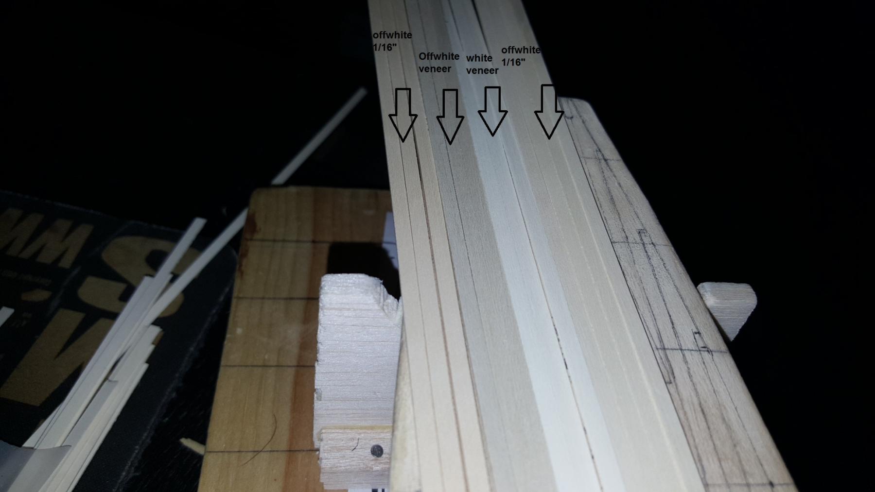
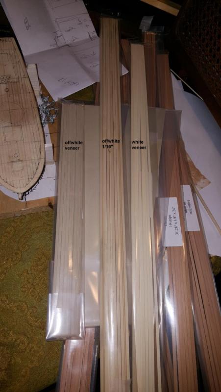
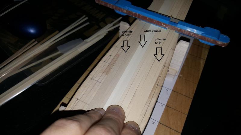
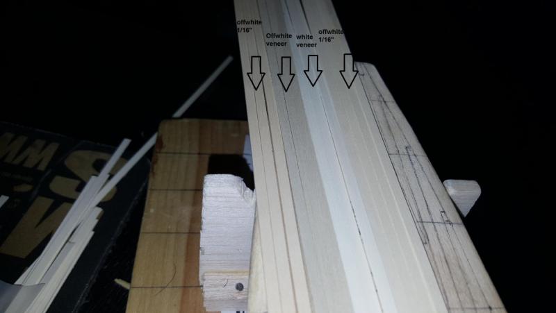
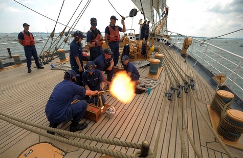
Ok gentle viewers so I received my decking materials and I am a bit concerned and could use some clarity, Explanation, a waaays back I got some off-white Holly at 1/6" thick, before I decided that veneer would work better for solid hulls. I ordered white veneer and decided it was too white for my taste. I could stain or weather it, or I could use silver maple but didn't like the figure. I also don't like a deck being too yellow or brown (like boxwood) so decided on picking up some off-white veneer. However the veneer I got is very grey almost greenish. While it kinda looks like the deck of current sailing ships (Eagle and Victory as examples which are very grey), I was hoping it would have looked like the 1/6" strips I have which kinda look like basswood. (See images below for comparisons). I mean it could work... but my understanding of historical ship decks actually looked like (and how to work with woods for modeling) is limited. The main thing is I want a bit of consistency in my models what I use for one I'd like to use for others down the line. Unless in situations where more weathering is required (military vs non-milary ship) etc. So what say you all? Is this holly veneer too grey/greenish would you consider using it? Maybe I am wrong and the color is perfect for decking! I mean I have limited funds and not sure what to do now..

- 362 replies
-
- 4
-
-
- active
- revenue cutter
- (and 1 more)
-
I'm curious Doc, are you planning on naming this model Independence? There were a couple of schooners in service at this time as the model is a variation of Halifax you have a few options at your disposal, Gaspee for example. Just intrigued
-
For these cutters I will do much of the hull planking in Cherry, the deck in "off-white holly" which has a coloring similar to basswood and considering doing the keel in pear. I'm thinking of doing the cap rail in a tannish wood maybe cherry, maybe beechwood. Any exposed wood should have a tarred look just determining how much exposed wood there should be. Instead of painting the wood outright I might do a composite with stain and paint so the wood peaks through if I can learn how to do that. These ships are somewhat like pilot boats but they are part of the coast guard so I imagine the color scheme was somewhat regimented rather than decorative. I may end up exposing more wood than was historically accurate but that's due to aesthetic appreciation of the wood a shame to have it all buried under paint.
- 362 replies
-
- 6
-
-
- active
- revenue cutter
- (and 1 more)
-
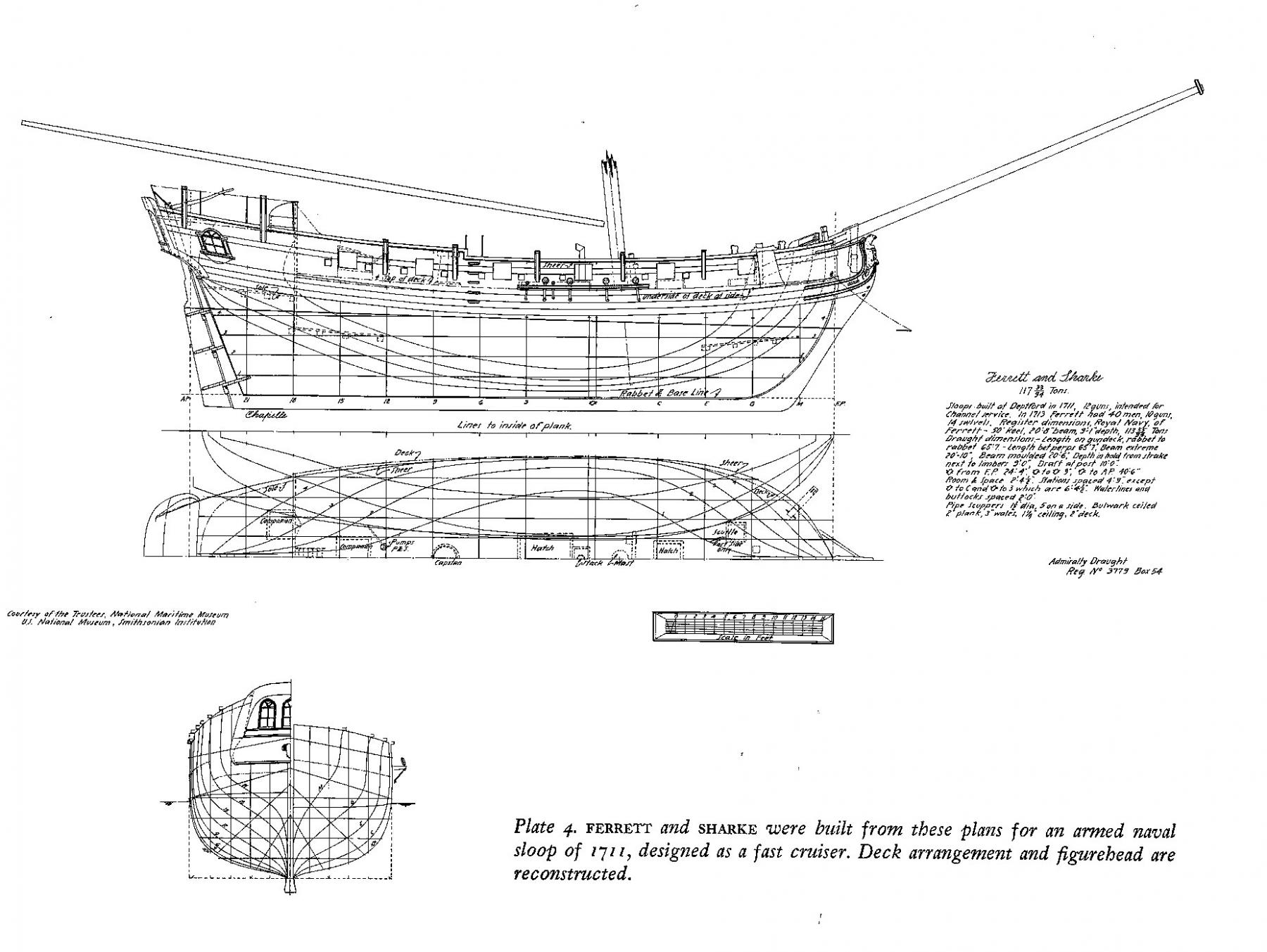
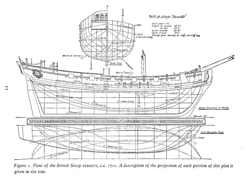
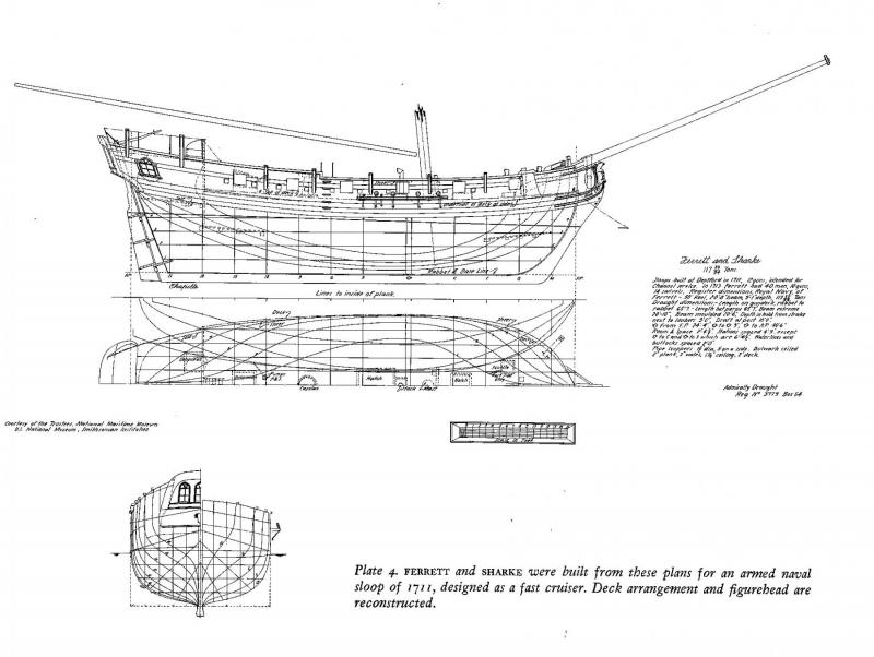
As stated in my other post the Resolution kit mystery has been solved. She is actually a model of the HMS ferret of 1711 frm Chapelle's books here are the plans everything is exactly as it should be.
- 66 replies
-
- 3
-
-
- resolution
- hunter
- (and 2 more)
-
Yes you are correct. It's been explained to me by my "betters" so will redraw the bow and stern lines a bit and will post more pics when I do the other side. The garboard came up too high which affected the flow of the rest. This is why I do pencil first easy to erase and start again!
- 362 replies
-
- 4
-
-
- active
- revenue cutter
- (and 1 more)
-
Vossiewulf well I would say this the Amati nina pinta santa maria is based off those replicas that were built in 1992. Same as model shipways mayflower is based off mayflower II. In that way id enjoy building them since id be building models of the replicas. Also as replicas they seem to have had more thought put into their construction research etc. Regarding Resolution and Virginia they look like they were based off of some plan but finding out will be a matter of research
- 66 replies
-
- 2
-
-
- resolution
- hunter
- (and 2 more)
-
That's another nice one, Spanish galleons are even harder since plans of them typically don't exist the best you can find is contemporary illustrations so I imagine that the best way to go would be to collect books on Spanish galleons and hope to find some sort of painting and sketch from that time period which shows something similar. Could also be an example of a kit company repurposing a model under a diff nationality like for example Soclaine Le Tonnant is really just the Rattlesnake with some extra swirly stuff to make it look Friench.
- 66 replies
-
- 3
-
-
- resolution
- hunter
- (and 2 more)
-
Yeah my point is that kit manufacturers take a kit that was designed by someone 50 plus years ago then market it with some sort of famousish name but offtimes the real ship looks nothing like the kit. Buuuuut that doesnt mean the kit is fictitious often it was based off of some plan or drawing like chapman. For example the jamaica kit shark and shine are all bermuda sloop variations as is that Virginia kit which is some sort of pilot schooner with a cannon added to it. That said the resolution kit is of special interest since that is a model of a sloop not a cutter and ive seen similar type ships so I imagine that model was based off of some plan but I dont have a resource book of small british ships to cross reference designs with. If anyone could recommend such a book that be great.
- 66 replies
-
- 1
-
-
- resolution
- hunter
- (and 2 more)
-
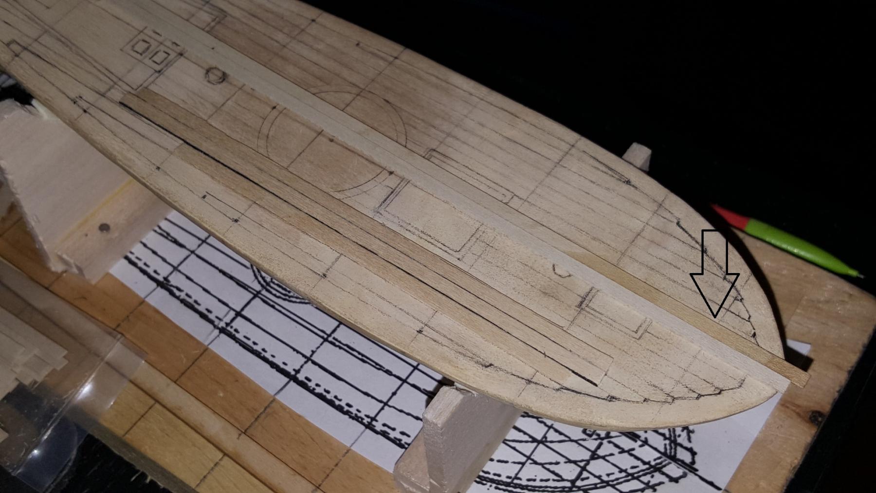
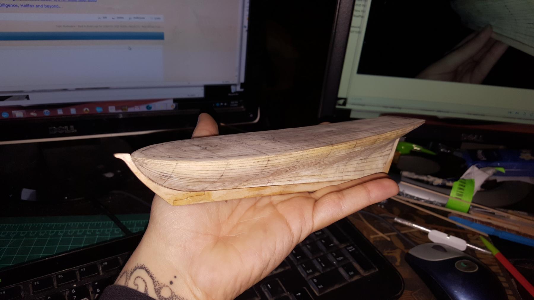
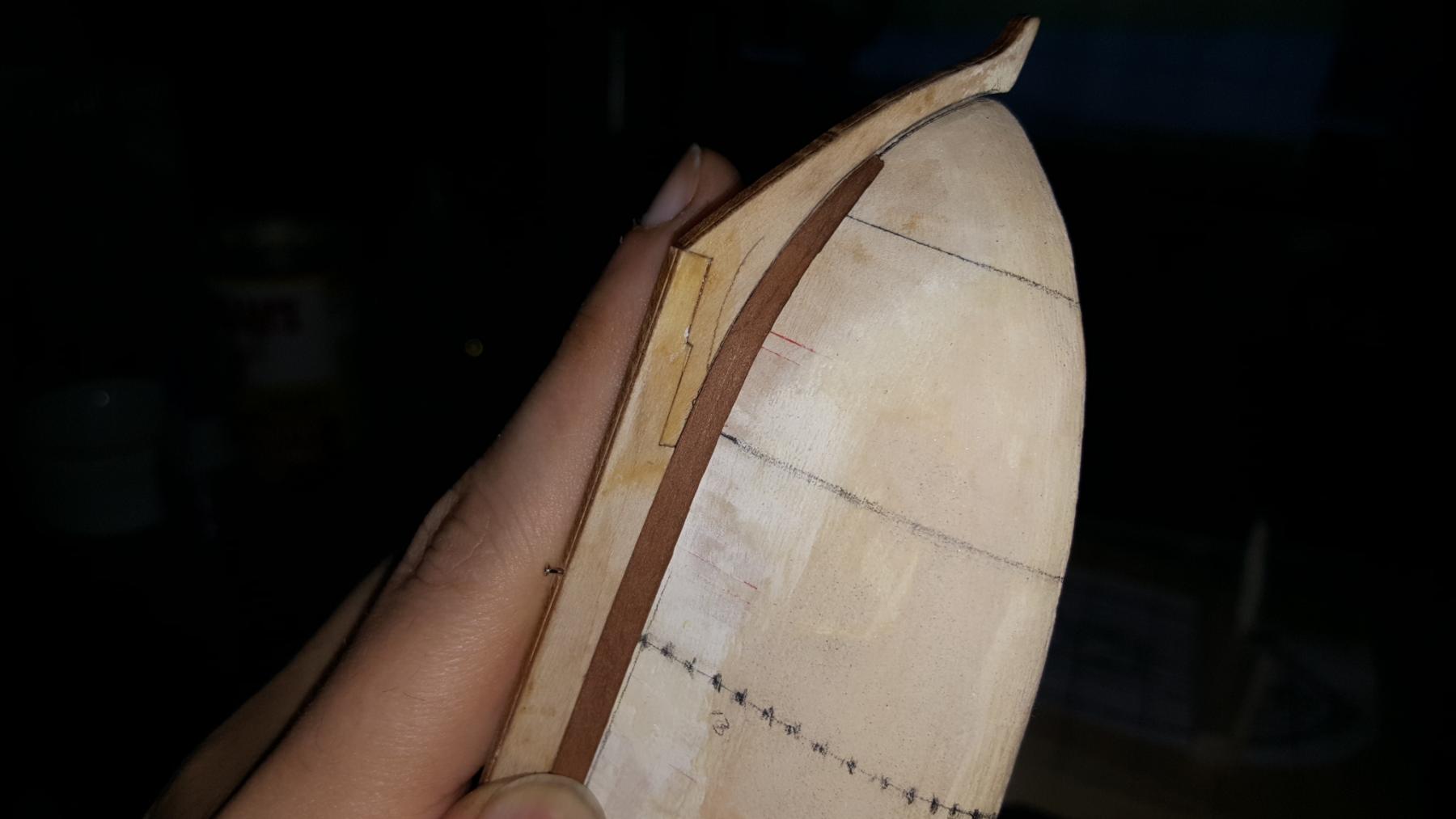
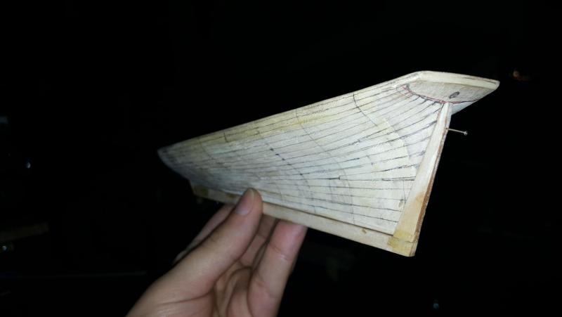
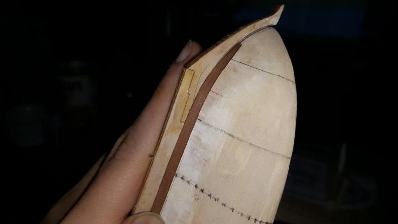
Thank you sir! You can tell by the design these were built for speed like a dart in the water. I'm thinking of moving the drop planks/(steelers?) down by 1 however overall it looks pretty good. Mind you this hull is 8" so the detailing is smaller than it looks in the pic.

- 362 replies
-
- 8
-
-
- active
- revenue cutter
- (and 1 more)
-
And that's one side done. What does everyone think? You can see I did a few steelers and drop planks for this extreme design was necessary. Also remember the planks get thinner the closer to the deck we go and wider the further down to the keel from like 1/8" to 3/32nd". I think it looks fairly decent and flows well.

- 362 replies
-
- 13
-
-
- active
- revenue cutter
- (and 1 more)
-
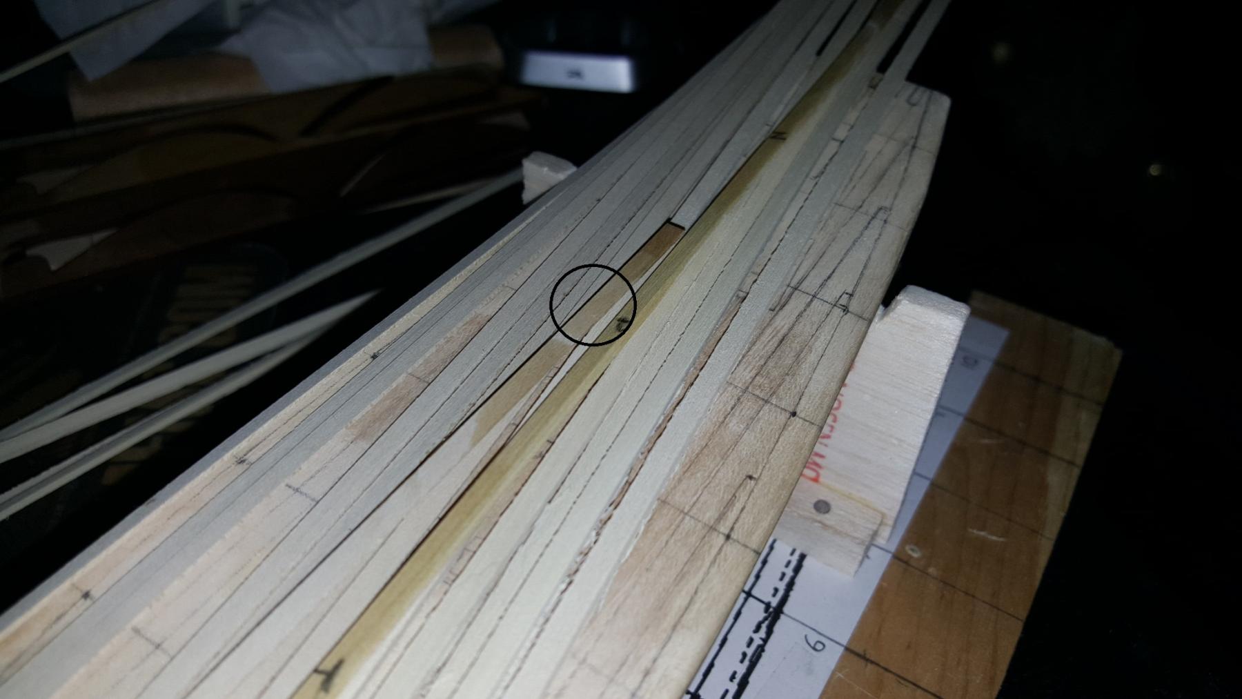
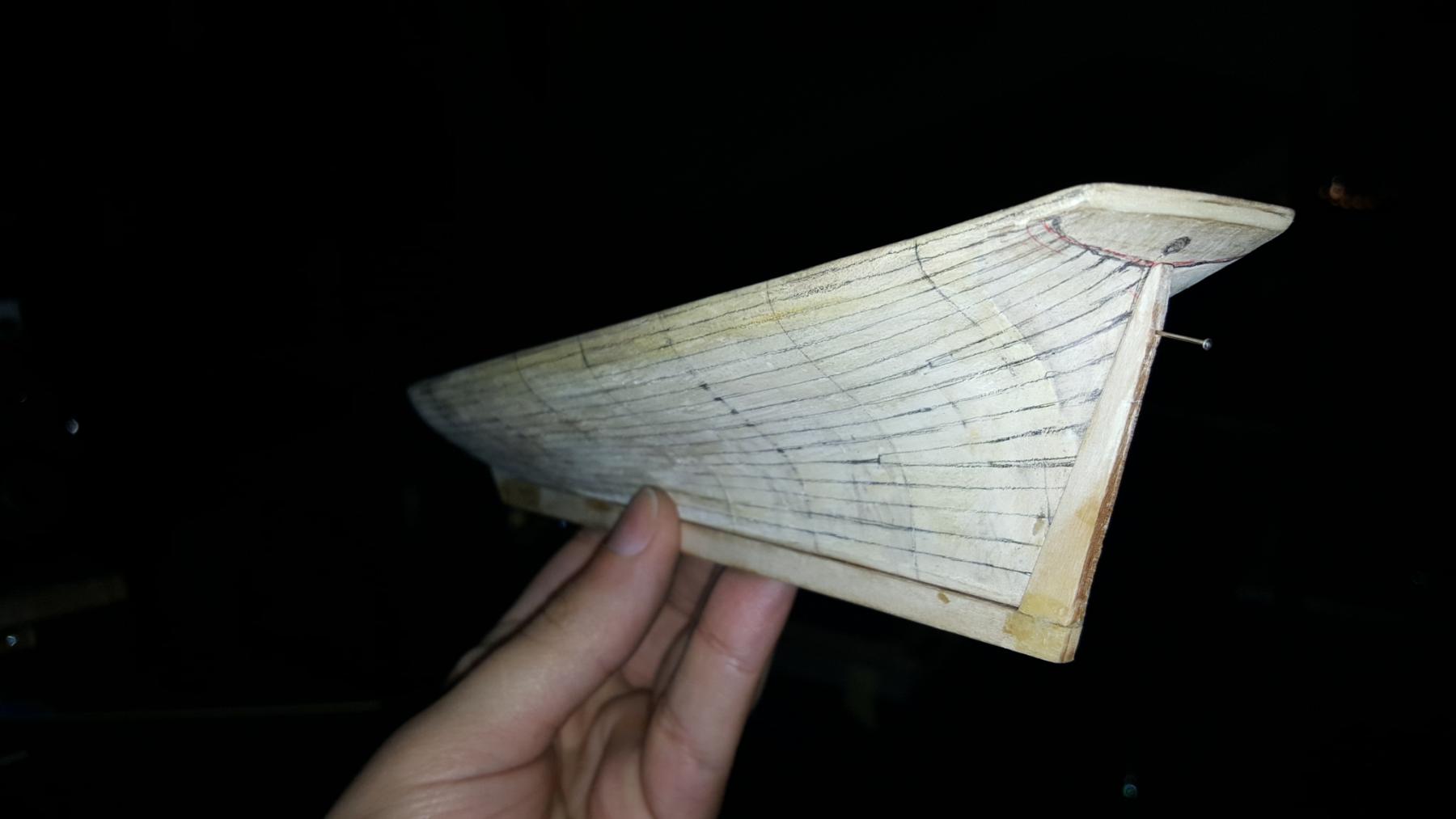
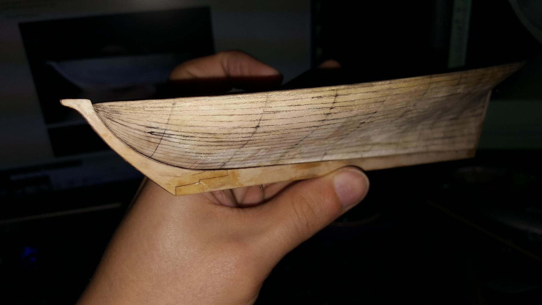
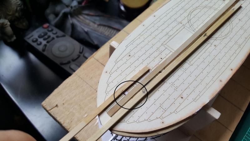
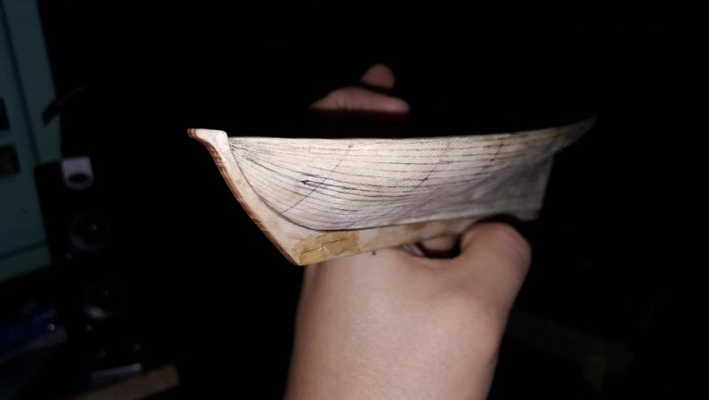
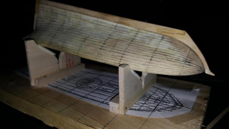
Aaaaand did the planking lines as well. First started by getting the garboard plank laid out then went down from the sheer and up from the keel as so.

- 362 replies
-
- 8
-
-
- active
- revenue cutter
- (and 1 more)
-
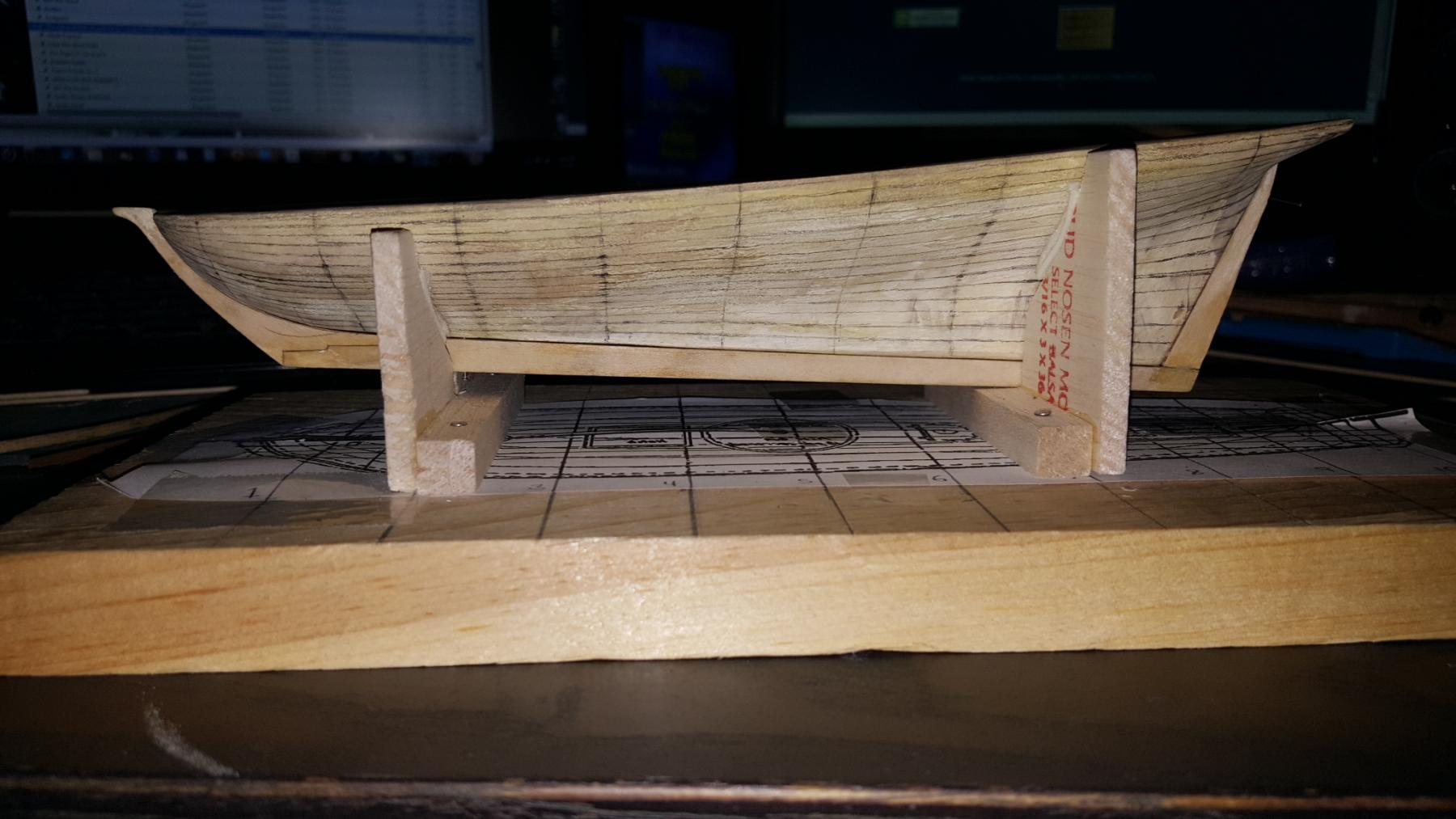
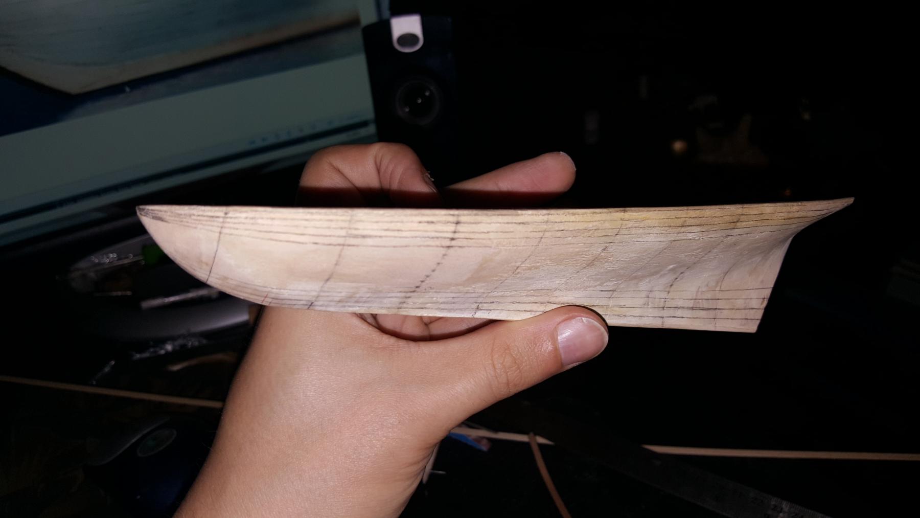
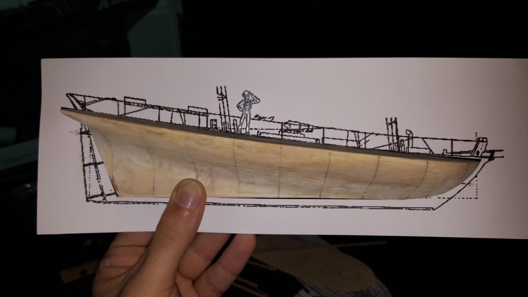
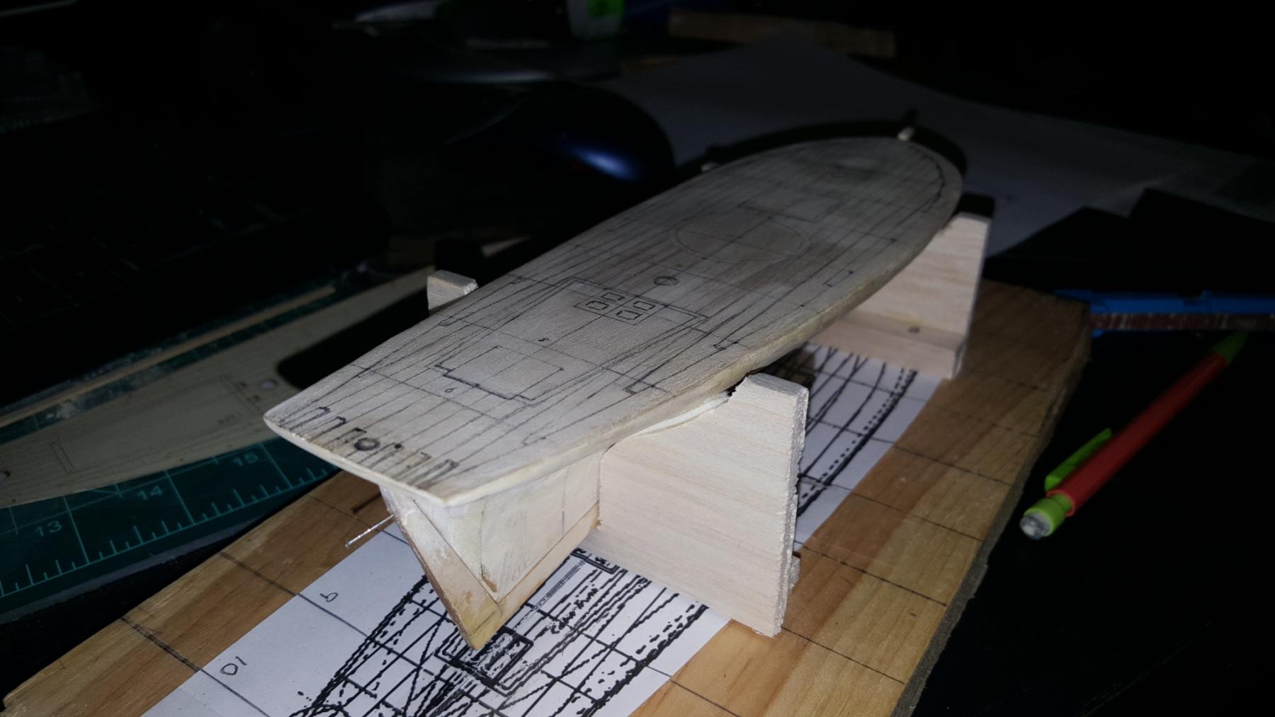
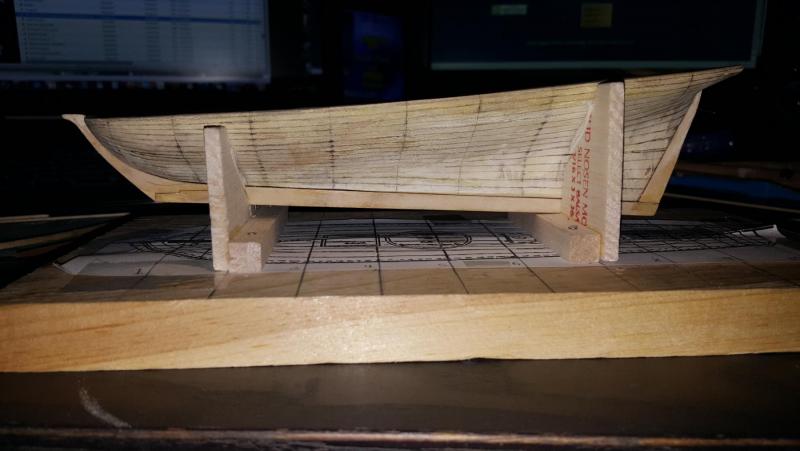
And here is the side profile, fits perfectly. Little crew dude added

- 362 replies
-
- 7
-
-
- active
- revenue cutter
- (and 1 more)
-
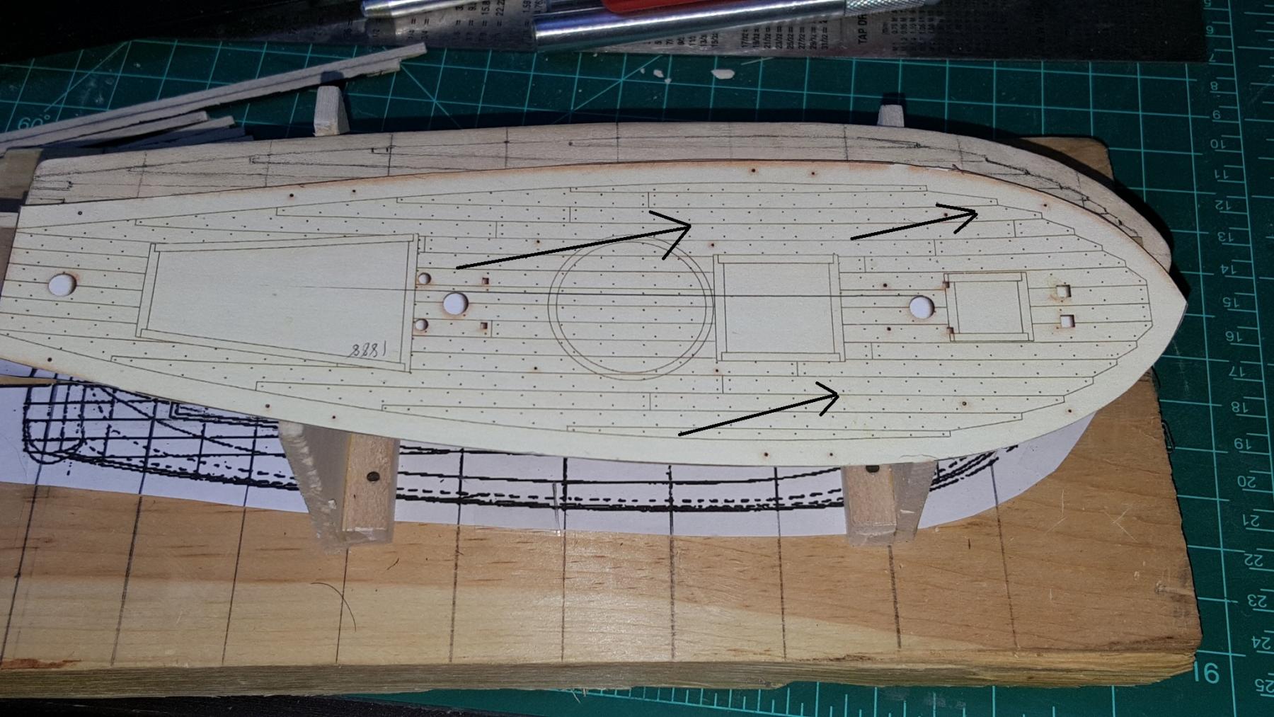
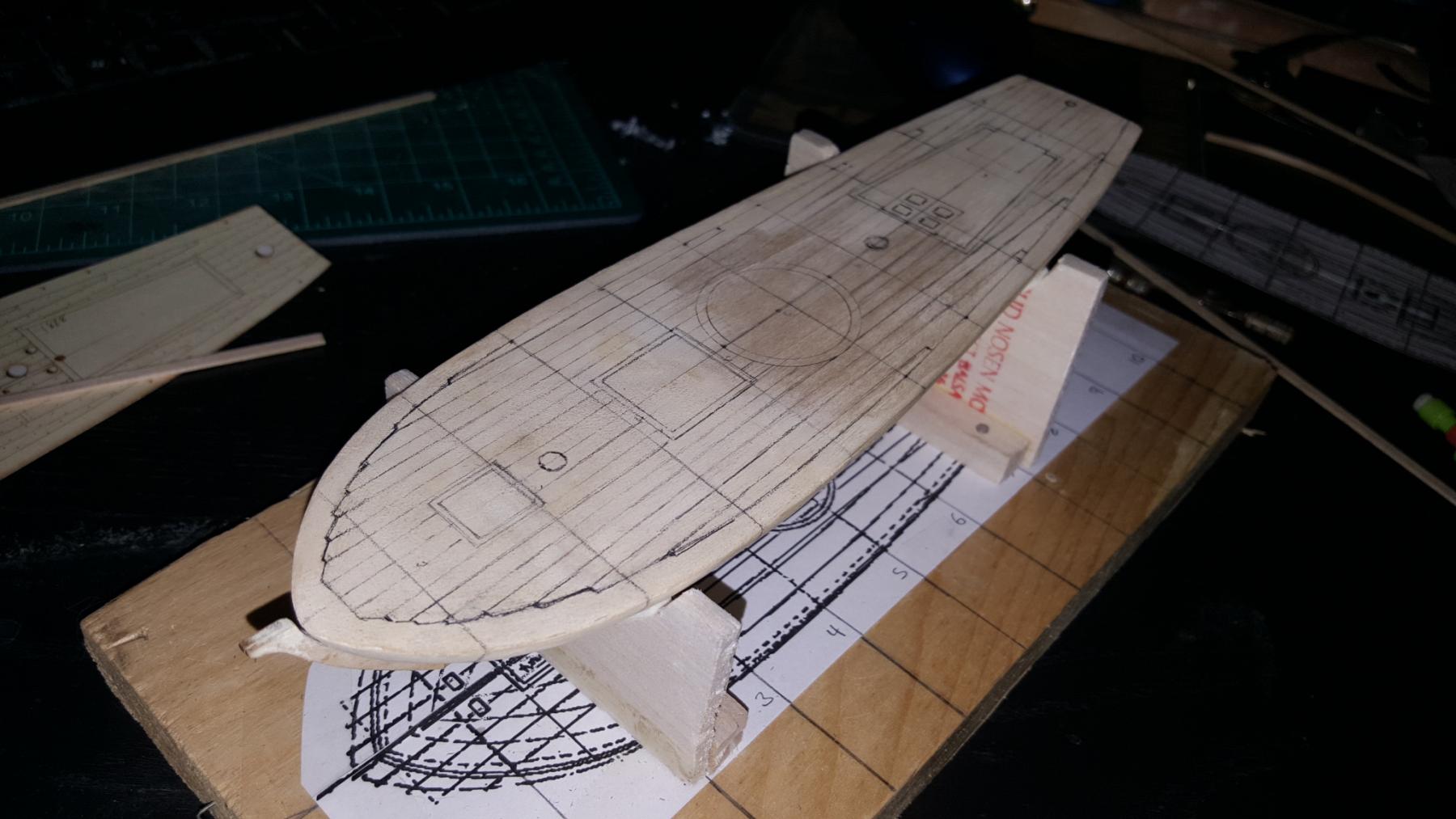
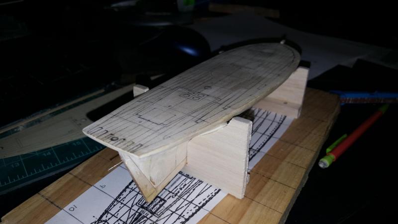
Today I drew the deck detailing where planks, hatches, masts, windows and pivot cannon will go.

- 362 replies
-
- 7
-
-
- active
- revenue cutter
- (and 1 more)
-
Sir meow they should look like this. If that is not the case then let me know this is a screencap
- 362 replies
-
- 3
-
-
- active
- revenue cutter
- (and 1 more)
-
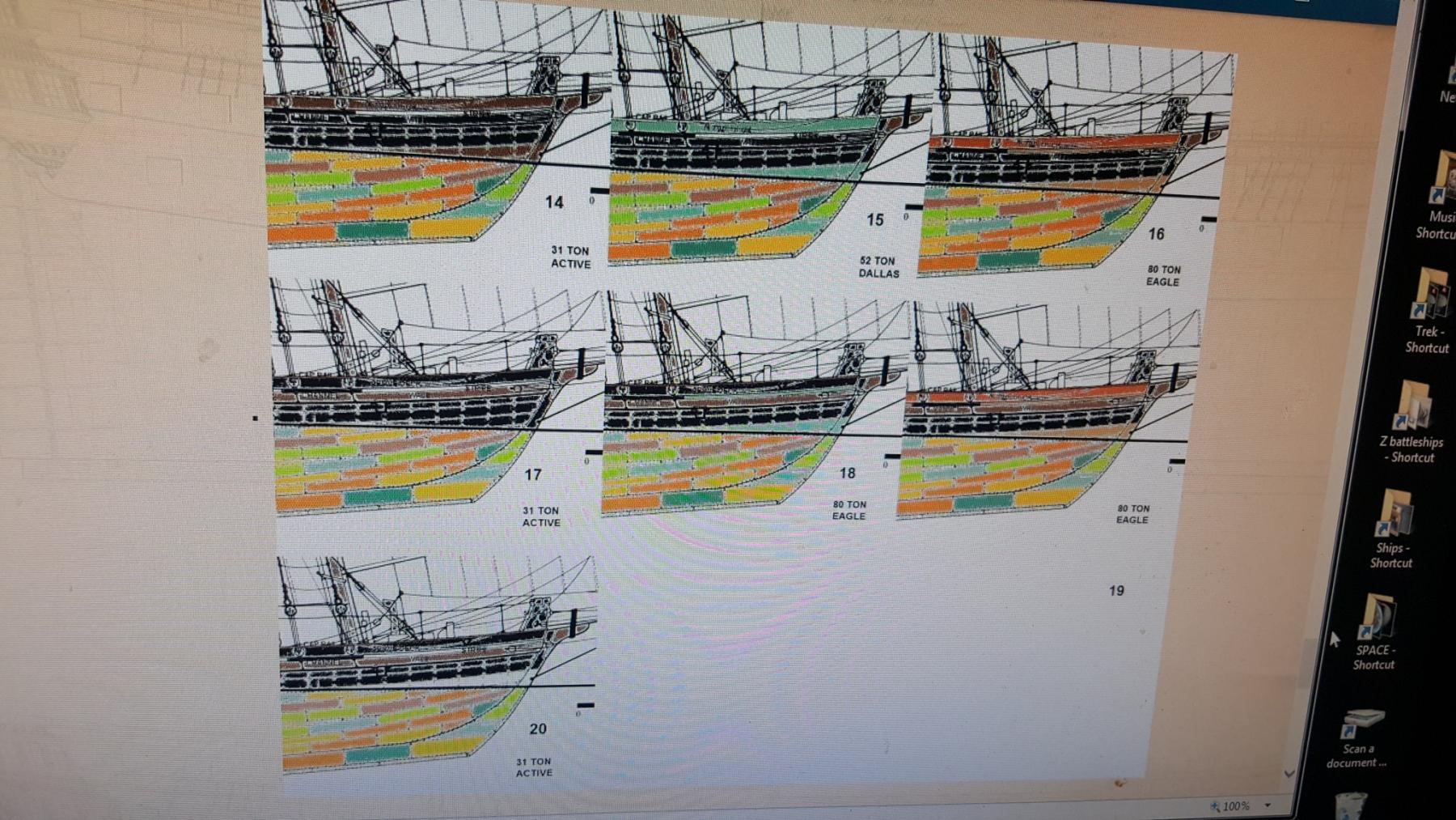
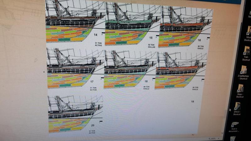
Type III: standard wale In this version the wale does not change color, instead the sheer and lower hull and stripe communicate design. It's more suttle and perhaps more European in it's display of coloring however I've seen a model of Artesania Latina's Dallas done like #16 so it could work as well, though not quite my favorite. So that's the idea, the next step will be to do a mock plank job and see how they look, feedback is welcomed and see ya all next year ya salty sea dogs, arggh!!!

- 362 replies
-
- 4
-
-
- active
- revenue cutter
- (and 1 more)