Cathead
-
Posts
3,557 -
Joined
-
Last visited
Content Type
Profiles
Forums
Gallery
Events
Everything posted by Cathead
-
 That is so absolutely fantastic seeing them all together like that. When do you start on the full harbor diorama? Gonna be weird not having a Keith Black ugly duckling in my feed...
- 401 replies
-
- 1
-

-
- Billy
- sternwheeler
- (and 1 more)
-
I think I would have made the same decision. As I've said in various places on this forum, I also feel strongly that modeling is a balance between what IS right and what LOOKS right. If the viewer doesn't find the model believable, or a detail or choice is distracting from the overall presentation, it might not be the best approach even if it's technically right. For example, a model of a brand-new car or railroad locomotive might be right in presenting it as shiny and new, but in a model setting that'll probably look toy-like, and a bit of weathering to tone down the shine will probably look more right to the viewer even if it technically isn't right. So for the same reason, it's easy to justify your decision because it's too easy for the leaning stacks to LOOK wrong even if they ARE right, since most viewers have no way of knowing that they're supposed to be that way and intuition say they should be straight. And you're happy with it, which is the most important point of all.
- 401 replies
-
- 3
-
-

-
- Billy
- sternwheeler
- (and 1 more)
-
Although that's also the beauty of modeling, is it lets us bring back settings or places that might otherwise remain forgotten! The farther I get in the Rocheport scene, the more fun it is to go back there and walk the railroad, holding the model's vibrant 1900 town in my mind. And soon the same will be true for McBaine, too.
-
That came out SO well!
-
Well, I'm a bit late arriving to the praise party, and it's tempting to say "what they said". But this build deserves more. I really appreciated your way of balancing staying true to the prototype while still applying your own take. I especially like the way you framed the final summary. The way I see it, all modeling is, one way or another, an artistic interpretation of reality, and you've done an especially good job of that in weaving a story around your build and bringing to life the person behind the prototype. That's something we don't often see in ship modeling, since the people are often unknown, ever-changing, or too difficult to represent. This model in particular really had a story that developed along with it, and I enjoyed that. Thank you. The offer is still open to make you a "prototype" photo embedded in the real background, if you take a shot of the model as close to the original angle and framing as you can get.
- 401 replies
-
- 6
-
-
-
- Billy
- sternwheeler
- (and 1 more)
-
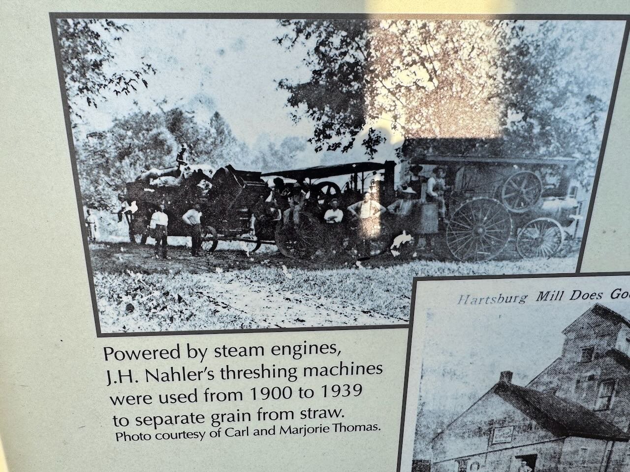
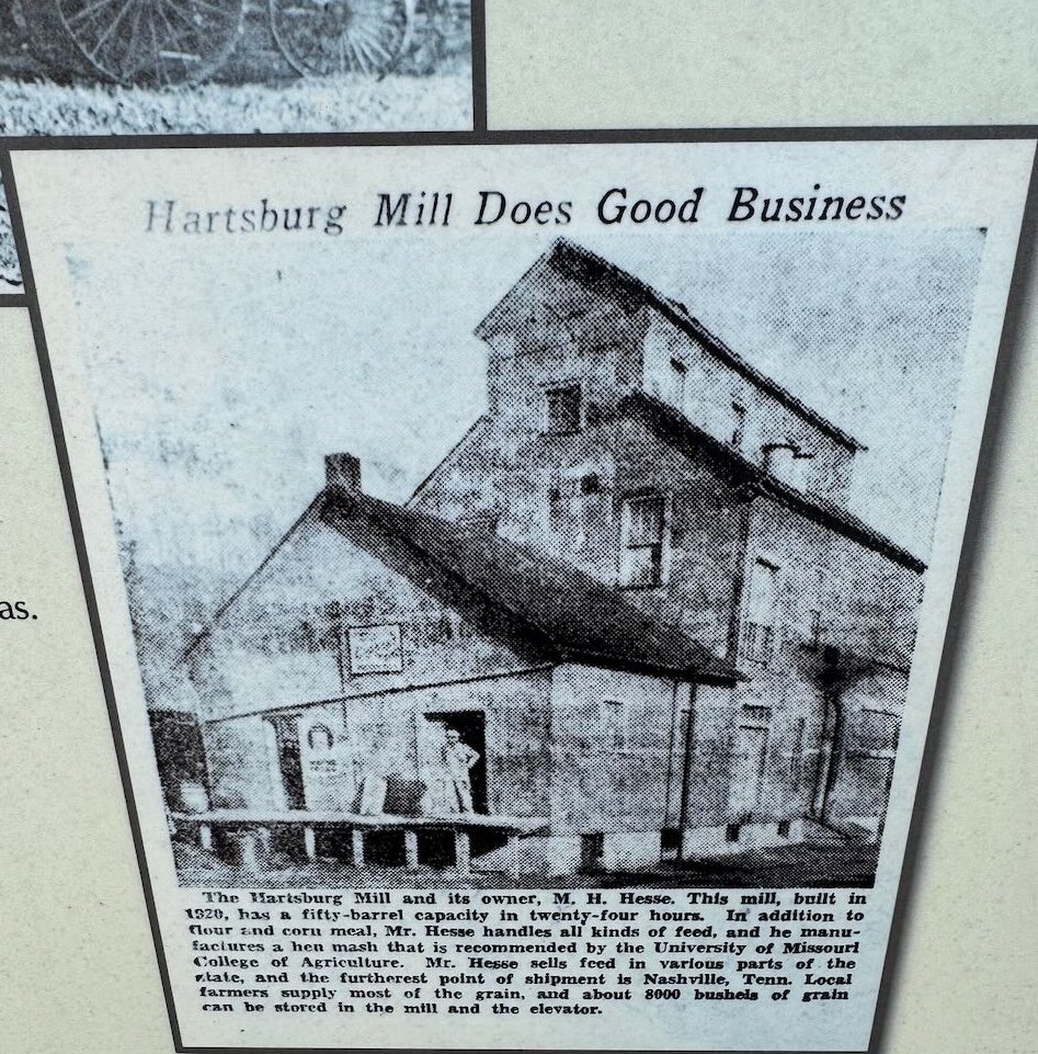
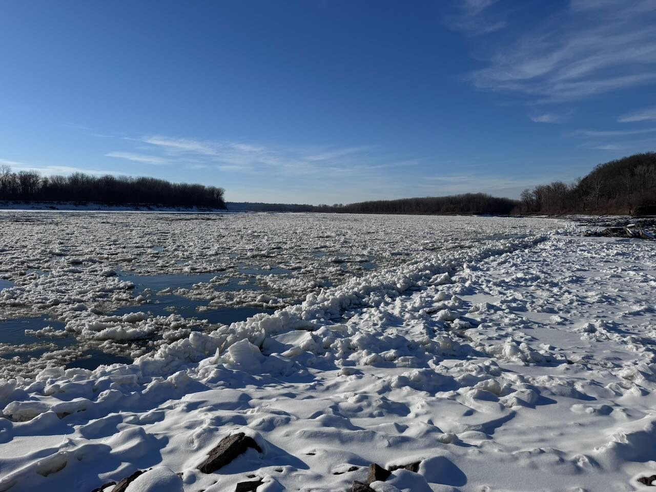
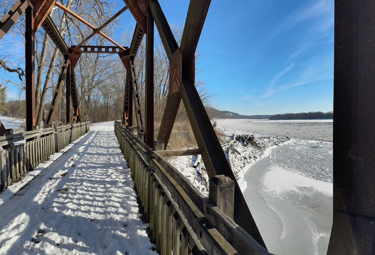
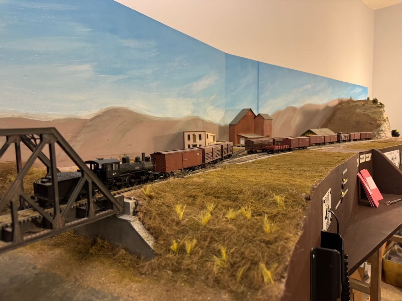
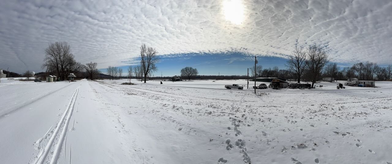
We also went a bit further southeast to Hartsburg, the next meaningful town along the line. I'd mentioned this earlier in the context of thinking I'd read some information about Hartsburg having an active feed mill (in contrast to my understanding of the Rocheport elevator), so I wanted to see if I was right. And I was! Here's an image and caption from the local Katy Trail signboard. The mill dates a bit later than I remembered (built in 1920) but it does confirm that there was a combination elevator/mill here that collected grain from local farmers and produced chicken feed. The listed capacity of 8,000 bushels is comparable to that of the Rocheport elevator (listed as 10,000 bushels in the railroad's business directory). So this helps show that each town along the line had its own unique set of local-ag-related businesses and buildings, at a small scale compared to modern times but still enough to generate railroad business. Just above this was another highly relevant image that I hadn't remembered: This certainly seems to fit the idea that steam threshers were just spreading into the area around 1900. My take is that it wouldn't be wrong to include either a steam thresher or an older horse-powered one, given the transition underway locally. And finally, a few more photos of the general setting right now because I just love this valley and the rail line through it. Winter can be gorgeous along this corridor. Here's a shot from yet another bridge over a tributary entering the Missouri River. We have spectacular pancake ice forming on the main river right now. Another shot of the ice as it's carried steadily along by the river's flow. And a panorama of more bluffs. The Katy line runs right at the base of these, hugging the edge of the valley to try and stay out of the floodplain as much as possible. Here you can also see another example of the blue sky with wispy winter clouds that I tried to recreate on the Rocheport backdrop. Reminder: And finally, as a reminder that this is a modeling project and not just a history/geography project, here are a couple quick shots of ongoing progress on McBaine. I have the first two turnouts laid and wired up to their controls: Thanks for reading and following along!

- 307 replies
-
- 12
-
-
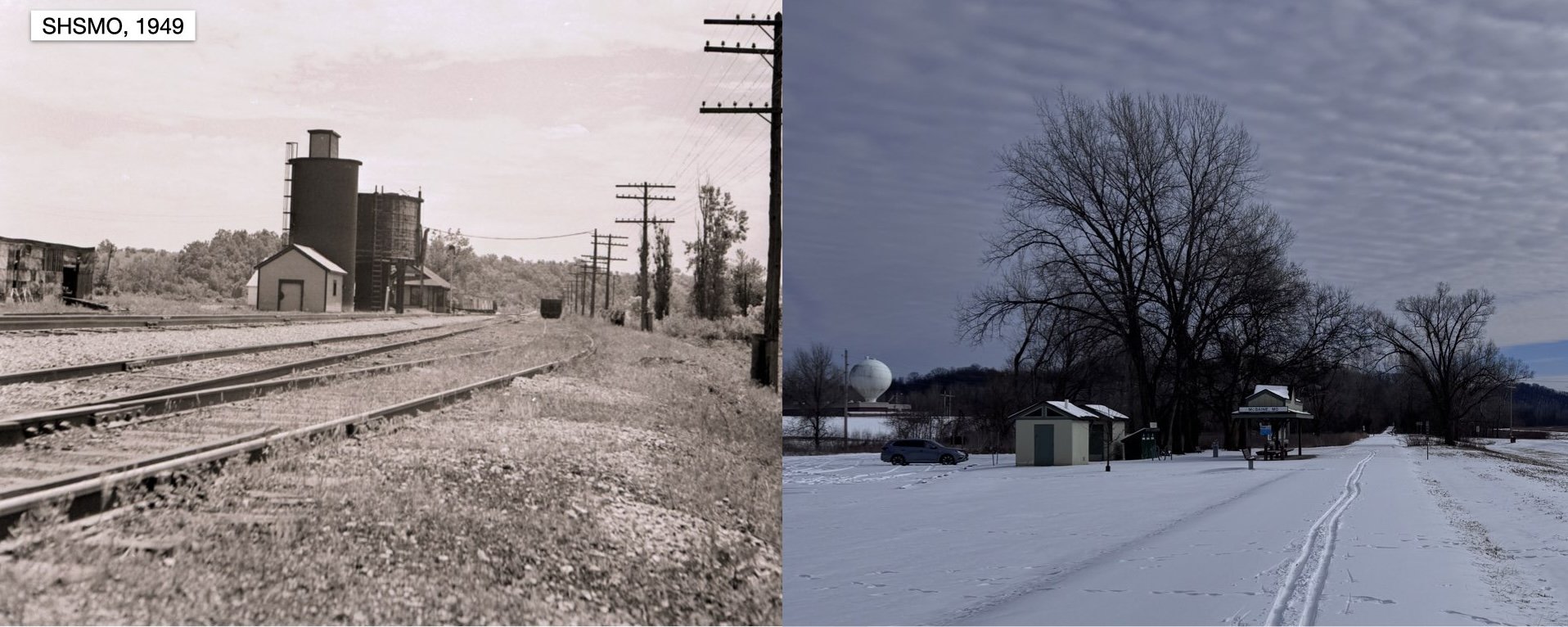
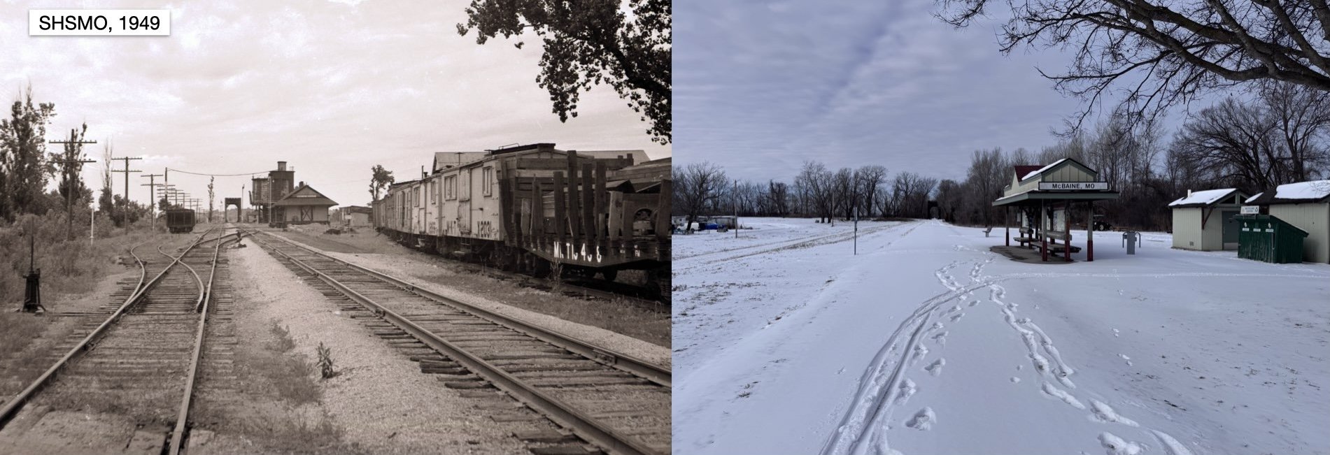
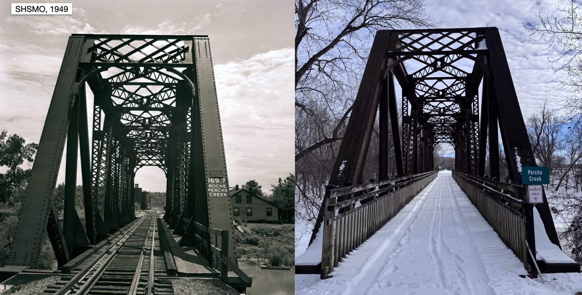
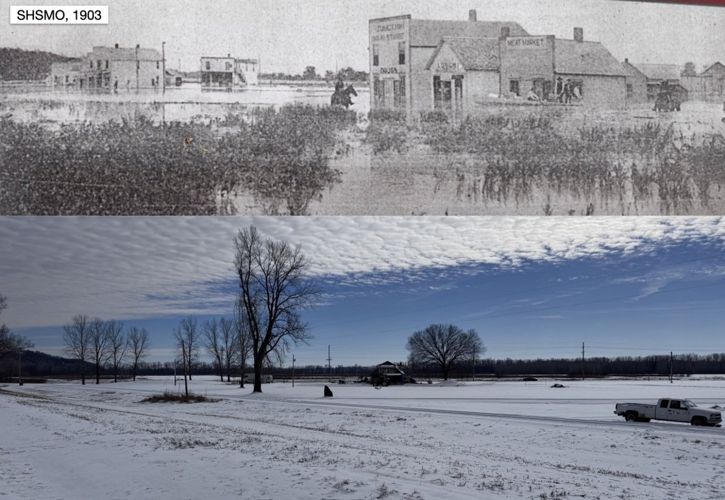
I'd been planning on getting down to McBaine to take some on-site photos, but the big winter storm that moved through the Midwest recently delayed that. We finally went, with our skis, and did some skiing along the rail trail. I made up some photo pairs of historic and modern shots that I thought would be of interest. First, a shot looking southeast toward the depot. The town, such as it was, would be just out of frame to the right. The Perche Creek bridge is behind me. The rail trail's information shelter and bathrooms are roughly where the old depot sat. And now looking at the same location, from the other direction, looking back northwest toward the bridge, which you can see in the distance in both photos. Here I'm a little closer to the depot site than the original photo but the orientation is correct. The town site is off to the left, out of frame. Here's a view taken from the main line looking south across the town site. The road in the foreground is Katy St, where most of the buildings in the 1903 photo face. You can see the same river bluff descending toward the valley at the left side of both photos. You can also see how the rail line is built up on an embankment to cross this low part of the river valley, which is why the flooding in the 1903 photo is affecting the town but not the rail line (at least locally; it did damage elsewhere). Today, the town is basically gone except for a few houses that have seen better days (out of frame). Here's a broader panorama, with no paired photo, taken from a little farther up the line and showing both the old depot site (trail shelter) and the mostly empty site of what was once McBaine. And finally, the Perche Creek bridge, which hasn't changed at all. This one was built in the late 1890s, so it dates all the way back to my modeled era, as in Rocheport. The building to the right of the bridge's far end is now gone. Hope that helps with establishing the visual setting a bit more. In the next post I'll share a few other photos of interest from nearby that relate to both the scenic setting and earlier discussions.


- 307 replies
-
- 10
-
-
Egilman, I really don't understand this comment. Of course Missouri voted to be a slave state. Of course slaveholding was an established practice that was generally culturally accepted even by many non-slaveholders. Where did I question that? I'm pointing out that this statement: is using a statistical average to create a misleading impression that the typical Boone County farm had 10 slaves, and also leaves out the distinct presence of plantation-style agriculture here that was very different from the smallholdings, including accounting for a disproportionate amount of agricultural exports and slave ownership. Using averages like this is problematic when the underlying distribution is very uneven. It's like saying that Missouri has an average annual temperature of around 50ºF when the actual range goes from below 0ºF to over 100ºF. It's mathematically true but functionally misleading. Agricultural slaveholding in Boone County and comparable nearby counties was fairly concentrated on plantation-style farms very different from the smallholdings elsewhere in the county. And I'm still legitimately interested in how you determined an 1880 date for that thresher photo. Finally, to repeat myself again, I don't have a problem with readers raising questions of interest about the build's context. I'd just like to keep such discussions at least focused on issues with a close enough bearing on the actual stage of the project to be of interest and relevance to everyone, and/or to keep broader divergences somewhat focused as a service to all readers.
-
And briefly, here's a little more evidence-based background on McBaine. I went and dug out the actual entry in the 1912 Katy business directory for McBaine: That's it. 80 people, one church, one hotel and LOTS of farming. Compare to Rocheport: The latter is a much more vibrant economic setting. Note that the entries correctly distinguish between McBaine's access to extensive river bottom land as opposed to Rocheport's dominantly hill country setting. Also note that there isn't a single industry listed in McBaine, as compared to Rocheport. Also note, as I said above, that Rocheport specifically lists "flour mill" and "grain elevator" but not "feed mill". Individual entries under specific categories give business names, as I've shared before. So this is further evidence that McBaine never had an elevator or mill, but was still shipping large quantities of agricultural products from the Turner McBaine farm, so it seems logical they were showing up in sacks rather than in bulk. At least, again, that's the interpretation I'm going with in my version of reality.
-
I'm going to make one last response here and then leave this be. With respect, you're partially misrepresenting or misunderstanding the history and geography here (and I'm well aware that Missouri was a slave state). Slaveholding was NOT equally distributed across the county as you imply, but tended to be concentrated on larger, wealthier properties. This county is very geographically diverse and settlement and farming patterns tracked strongly with geography. Southern-style plantation-type agriculture was found on or near the broader river bottoms, recreating the business model generally found further south along the lower Mississippi. This was a pattern seen across a set of Missouri River counties in central Missouri known as Little Dixie. These farms tended to grow bulk commodity crops that could be shipped out by steamboat. These were some of the most concentrated slave-holding counties in Missouri, but most of those slaves were concentrated within the plantations, not distributed throughout the county. But set back from the river in the hill country, as in many other parts of Appalachia (of which the Ozarks can be considered an extension), you had much smaller family farms at a more subsistence or local-sale level. These tended to have few or no slaves, though of course there were exceptions. Again, larger slaveholding properties were concentrated in the larger plantation-style farms along the river corridor, not distributed equally throughout the county as you imply. It's absolutely true that, post Civil War, many freed slaves remained in the area and took up farming, and there's a rich undercurrent of African-American history here in rural areas that's easily overlooked, especially since it's mostly faded away in modern times. In fact, African-Americans appear in quite a few trackside and riverside photos in my collection, a demographic detail often overlooked in model railroading, where commercial figures are overwhelmingly white. They also appear commonly in steamboat photos, working as deckhands or other crew. Here are two examples along the Katy and one of the Peerless: This is a subject I intended to address at the appropriate time, when I eventually start adding figures to the layout. I absolutely want to convey a reasonably accurate demographic balance on this layout. But that sort of detail is far in the future and getting into it now doesn't affect the focus of the build at this stage, so I was hoping not to get sidetracked into yet another longer discussion of a temporarily irrelevant detail. But here we are. As for the thresher photo you shared and copied over the description from, that's one of the ones featured in the link I provided in the previous post for those interested. I'm well aware of it, and its connection to African-American farming history in this county. In fact, I thought about mentioning the fact that multiple local photos in that collection show African-American farmers or farm workers within Boone County, but specifically decided not to because, again, it's not relevant right now. But since it HAS come up anyway, I'll point out that yet another local connection to rural African-American history has a tangential connection to the whole horse barn discussion a while back. Tom Bass, born into slavery in Boone County, became one of the post-war era's greatest horsemen and horse trainers. You can read about him here and here. Note that both articles specifically refer to him being born on a "plantation", not a "farm", which is what I tried to explain above in terms of the differences in agriculture in different parts of this county. I'm not going to summarize his later life, that's what those links are for, but suffice it to say that there's a good chance the fancy horse barn in Rocheport had at least one horse trained by or purchased from Tom Bass. Finally, to try and drag this back around to the first level of off-topic discussion, I'm open to the idea that steam-powered agricultural machinery was established here by 1900. I simply keep asking for direct evidence of such. For example, I'd like to know WHY you're sure that photo is from the 1880s, because (as I noted before) no date is given in the photo's metadata. I'd simply like to understand what you're basing that on, rather than just being told without evidence. To me, this IS what I've been saying. Possible, but not ubiquitous, and not necessarily a representative item to have on display in Rocheport (like an EV in small-town Missouri: possible but not necessarily representative). But MORE likely to be representative in McBaine, which is where it would make most sense to include such a detail. Which, again, is a long way down the road of this project. A final point: at various times, the fact that I leave out a detail doesn't mean I'm unaware of it, it may mean I'm trying to keep this incredibly complex narrative somewhat focused on whatever stage of the build is at hand. If I went off on every interesting tangent I'm aware of, that touches on this build, I'd spend all my time writing essays on here and not building the model that most of you are actually here to see!


-
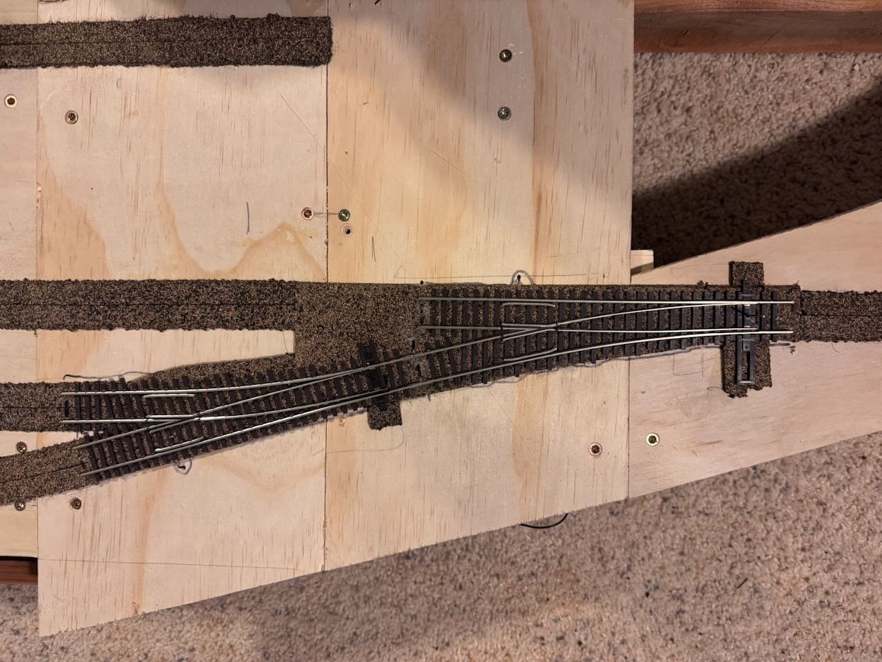
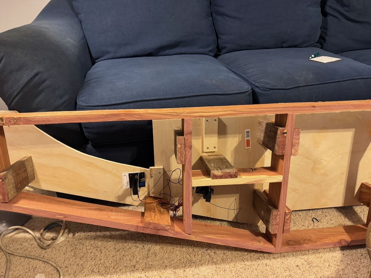
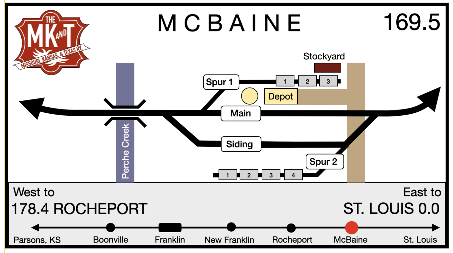
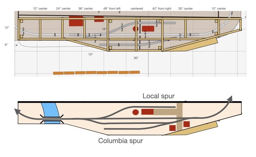
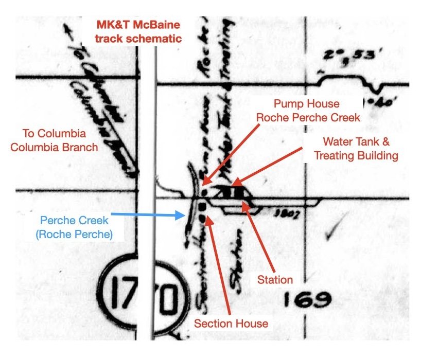
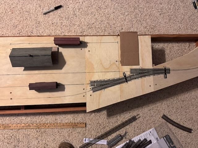
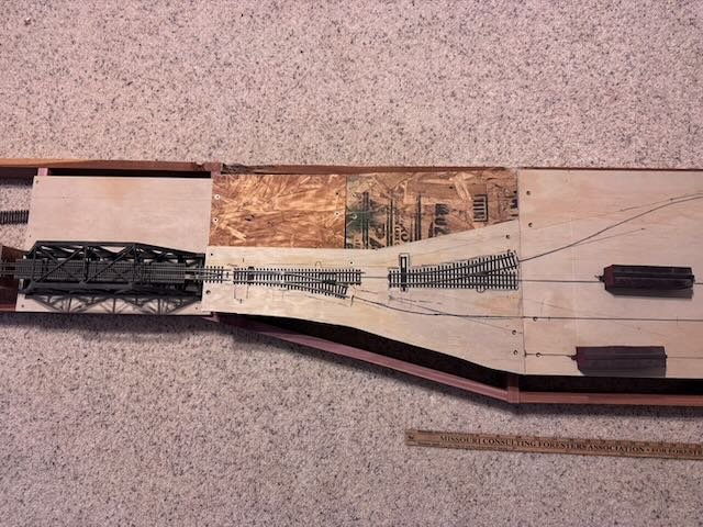
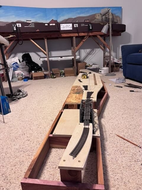
OK, let's back to the actual model railroad design for McBaine. Here's an MK&T engineering diagram for McBaine, clipped from a broader map that covers the entire portion of the railroad I'm modeling. I used this map for Rocheport, too, though I don't think I showed it. I've marked it up for clarity since some of the text is hard to read. This is from around 1920 but it's quite representative of what was present around 1900 in these smaller towns. On the broader document, McBaine is clearly marked as a water stop for locomotives, and that's borne out by the labels for the pump house and water tank. There's a double-ended spur on the north side of the main line that wraps around the depot and likely served local customers. There's a longer passing siding used for meets between trains, then there's another double-ended spur on the south side that I'm assuming was used for cars headed to Columbia (at least that's how I'm handling it on my scheme). You can clearly see how this fits the 1949 photos I shared above, with the creek bridge just west of the depot and other infrastructure, and the Columbia branch junction just west of the bridge. As is usual in model railroading, I had to simplify my version a bit. Below are drawings of the benchwork and of the basic track plan. Some notes: Obviously the entire scene has been compressed for length. If I tried to model the full 3,802' long main siding here, it'd be almost 44 feet long. I converted both spurs to be stub-ended rather than double-ended, just as I did at Rocheport, for two reasons: (a) this saves space and cost, since it takes a lot of room to wrap such a track back down to a parallel line and reconnect it, while turnouts are expensive (b) this makes operations more interesting. The real Katy loved making all its sidings double-ended because that meant they could be worked from either end, making operation more efficient. But on a model railroad, we enjoy doing complex work, so stub-ending the sidings adds interest. And it still follows the overall layout of the setting reasonably faithfully. Again, same approach as in Rocheport. Speaking of adding operational interest, I chose to make the spurs face opposite directions to further increase the operational interest. The Perche Creek bridge (Roche Perche is an older name for that waterway) is faithfully in the right place because it's such a strong scenic element and I just like bridges. The water tower, pump house, and so on have their proper place. I might include a couple of small town buildings along the main road just to hint at the existence of a town. Even though they weren't really in that exact spot (as per the 1903 photo), they'll capture the feel of the setting. But overall this shouldn't look urban. Most of the open space should be farm fields or pastures. I have not included the Columbia branch junction. There just isn't space for it to go anywhere and I don't see the need for a "dummy" turnout. My operating plan assumes that local freights use that south-side spur to drop off and pick up cars from/to Columbia, capturing the essence of that branch's operation with regard to the main line. We'll just assume that another local dealt with those cars between operating sessions. This lets McBaine retain its operating interest as a junction in a very tight space. The north side spur retains its function as place for local cars to be spotted (stockyard, bagged grain, local deliveries, etc.) Speaking of operating, here's the latest draft of the town schematic that will be posted on the fascia to guide operators. This is the same concept I already discussed regarding Rocheport, though the design has been subtly updated since then: This tells operators what every track is called and gives clear numbered locations for every place a car might be spotted. So each car's delivery instructions can be checked against such a schematic to know what to do. Up to three cars can be delivered locally on (1) and up to four destined for Columbia on (2). That's all I have space for, even though Columbia certainly got more traffic than that. But again, this captures the feel of the place. One addition to this schematic from the earlier version shown in Rocheport is a banner at the bottom telling operators where they are along the entire layout. I really like this, both as a bit of practical clarity and as a nudge to feeling that you're part of a larger railroad system even in these small towns. To round this post out, I brought the benchwork up to the railroad room and have been laying out the track plan properly. Here's McBaine with Rocheport in the background: Overhead view of west half: Overhead view of east half: Hope all that helps you see where this scene is going and how it represents the real location!
- 307 replies
-
- 11
-
-
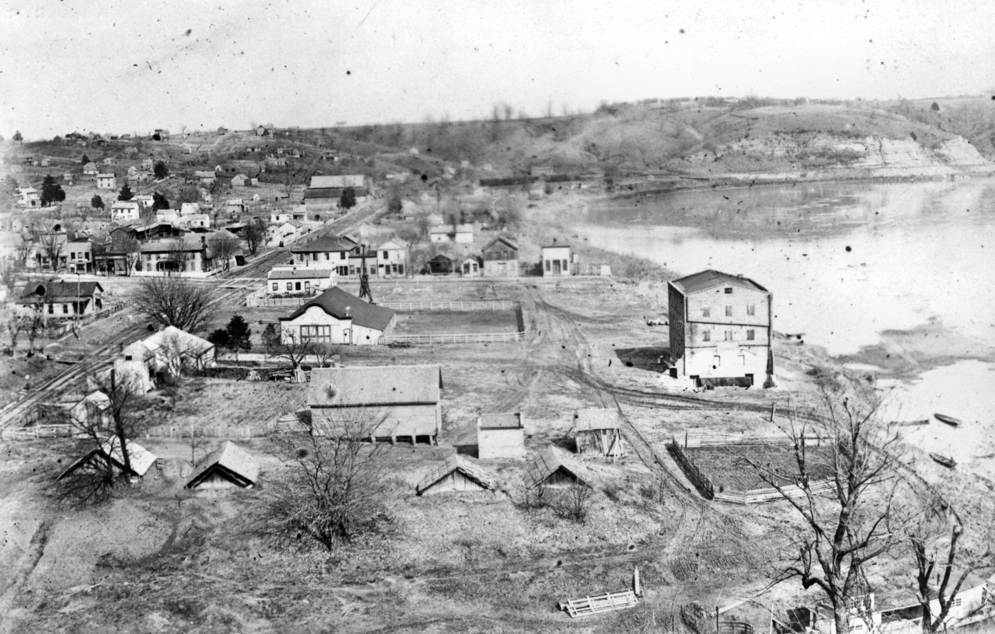
Part two of wrap-up response: agricultural patterns in the area. I wish you'd said this the first time, because now I understand what you're getting at. Let me give you some additional context. Rocheport absolutely was a local receiver of grain, especially wheat. This doesn't mean local wheat was produced at the scale, of, say eastern Montana, but it was still a primary grain crop and thus the focus of both industry and shipping. Let me quote a local historian's article about an example of Rocheport-area agriculture: So here you can see that, as I've said before, assuming this farm is representative, the primary products were hay, livestock, and grain, with some orchards and produce. The emphasis on hay and livestock is demonstrated both in the huge hay barn attached to the elevator, and in the stockyard served by the railroad. Corn and wheat were obviously not dominant on the landscape as a ratio to grass, but were the primary grain crops being grown, meaning that's what the grain-handling infrastructure was built to handle. It's why the elevator is relatively small, but still there. Grain was already a notable product in the Rocheport area, because a good-sized flour mill predated the railroad. You can see it along the riverbank in this photo. This mill was listed in the railroad's business directory along with the elevator. It's not seen on the layout because it's out of the scene for the space I have, but it was there and it was taking in local grain and was likely shipping by river, pre-railroad. I'd bet that its business was notably harmed by the railroad's coming, since (a) the new elevator gave local farmers access to new markets and (b) the railroad could also ship in flour/meal from elsewhere. But it shows that grain production was significant enough to support those industrial buildings in town. The railroad's business directory lists the "Rocheport Elevator" as the only entry under the category of elevators and mills. It uses that name specifically for the business, in notable contrast to other towns where it specifically lists, say, "such and such feed mill". You can clearly see the chute used for loading boxcars, but there isn't any visual evidence of a significant railside unloading facility (for example, for grain being shipped in to mix bulk feed). So while I have no doubt that there was some incoming traffic of farm-supply products (and you can see a large nearby warehouse), I don't have any clear evidence that this was operating as a feed mill rather than as a primary grain exporter of wheat and corn. Furthermore, another nearby town DID have a feed mill. It's escaping my mind which one, and I did some brief searching but couldn't come up with the evidence, but you're going to have to trust me on this one. I have a clear memory of one of the trailside interpretive signs discussing how this mill's proprietor had developed a particularly good poultry mix that won him recognition from state government, and shipped his mix all over the state. It specifically discussed this mill bringing in ingredients by rail and then re-shipping the final product, as you'd expect from a feed mill. The accompany photo, as I recall, was a classic Midwest structure about the same size as the Rocheport elevator. This was in one of the other Rocheport-like small towns along the river, I thought it was Hartsburg but can't prove it without going back to that section of trail. Point being, there were a variety of small agricultural industries along the rail line during this time, but I've got no evidence to suggest that the Rocheport elevator was acting as a feed mill. That role was being filled by at least one other industry elsewhere along the line but not far away, meaning its products could easily be shipped to Rocheport along the railroad. Finally, you could point out that the harvest seasons for wheat and corn are different. In Missouri, wheat is (and was) summer-harvested while corn is/was fall-harvested. I set this layout in the late fall / early winter for a variety of other reasons, meaning that technically the wheat harvest has long since been gathered and probably shipped, so any active grain handling is likely corn. You could also argue that maybe this structure is milling feed between harvest seasons, and I couldn't prove you wrong. Frankly, this is one of those details I'm sort of fudging for the purposes of operational interest. Model railroads often have to simplify reality to practical purposes. I'm comfortable with my interpretation that the elevator's primary purpose was as a shipper of local grain. Especially, and this is important, because this is just my model railroad's interpretation of the setting and not a history book dealing with Facts. This (possibly simplified) approach lets me create a manageable operating scheme while holding to the essence of local facts, even if certain details are unclear. But it's all stuff I've thought through, even if I didn't expect to need or want to go through the reasoning in excruciating detail. As for McBaine, to repeat, I've never found evidence of any sort of elevator/mill there despite the major agricultural presence. The railroad's business directory doesn't list one and no photos or maps ever show one. And to repeat, the huge Turner McBaine farm there predated the railroad, meaning it likely had its own facilities for handling and storing grain, and for shipping it pre-railroad (presumably by bagging it as that would be the only practical way). So again, especially in a model railroad setting, I think it's reasonable to decide that the McBaine farm was shipping bagged grain from a siding at the depot, and no one felt the need to build an elevator because alternate methods were already in place. That has the side benefit of making McBaine a bit more operationally distinct from Rocheport, another justification in a model railroad context. So again, let's close this chapter for now because I'm comfortable with the level of historical and practical justification for how I'm envisioning my version of reality in these settings (again, the difference between a model railroad and a history book), and would like to get back to focusing on the actual design and building of this scene. Thanks for pushing me to explain all this more clearly, since it seems that was needed to help people understand the why's of things, and I again I appreciate the enthusiasm and interest that leads to discussions like these. EDIT: And to circle back to the thresher thing one last time, this is again why Rocheport and McBaine are different. I agree that threshers are of less use in a setting where a bunch of small farms are raising 100 acres of wheat (Rocheport), but that's very different from a single large farm raising 1,000 acres of wheat (McBaine). So if I were to display a thresher, it'd be at McBaine where it would be more logical. But this also shows that you do have to take hyper-local context into account. Two railroad stops roughly 10 miles apart are serving dramatically different agricultural settings, and you can't just take national trends like thresher use or elevator/mill design and assume they apply to these hyper-local settings without some specialized knowledge of the area.
-
I'm going to try and give a wrap-up answer to the two conversational threads, and then move on for now. First, the thresher question. So again, I admit to having relatively little knowledge of the details of agricultural equipment from this era. But what I've been trying to get at, is the difference between when something was invented, and the arc of when it became widely adopted. The question isn't when did steam threshers exist, it's when did they become so widely adopted that it would be appropriate for one to show up in this obscure corner of small-farm 1900 rural Missouri. For example, while the first automobiles started appearing in the 1800s, my impression is that they didn't really take off in widespread adoption until after 1900, especially post 1910. And they certainly started out in cities where the road network was more amenable, and were late to infiltrate rural areas due to road quality (just like today's EVs that work fine for city driving but don't have the infrastructure to support long rural commutes or road trips). The first automobile maker in St. Louis opened around 1898, and the city was a center of auto manufacturing for a while, but I'm sure sales were initially concentrated in the city. So while cars might be appropriate on the streets of a 1900-era layout in urban Chicago or St. Louis, they likely aren't appropriate yet on the roads of small Missouri farm towns in 1900. Just because they existed doesn't mean they're appropriate in my specific setting. Certainly none of the contemporary photos I have, anywhere on the rural portion of the line (such as at small-town depots) shows anything but horse/mule technology. To use the EV analogy, if I were building a layout depicting Missouri in, say, 2022, and someone suggested I include EVs on the layout, it would really matter whether the layout was in small-town rural Missouri or an upscale neighborhood in Kansas City. Just because lots of EVs are being sold right now globally doesn't mean they're an appropriate or likely detail in some settings where they haven't seen widespread adoption. So again, the question is whether steam thresher technology was so well developed as to be so ubiquitous as to be a reasonable detail on this layout. The link given above shows lots of early examples, but I'll also note that a lot of them look to me like the sort of quirky early designs you get of such tech that never really pan out. That link doesn't tell me anything about the use of steam farming technology in this portion of Missouri at my chosen time. I did some searching in the state historical society photo collections for things like "thresher" and "threshing", and did find some nice photos, even two from Boone County, but sadly the most relevant ones don't have dates. (You can see for yourself at this link) They're roughly period-appropriate, but I can't tell from other details whether they're, say, 1880 or 1910, and that's an important difference given the narrow needle-eye I'm threading in the historical record during a fast-changing historical period. As this response nicely put it: And while I'm thrilled that Keith originally brought up this interesting possible detail, and it's fun to think about, this is still a huge discussion about what would at best be a two-inch detail in a ten foot long scene that wouldn't be added for at least a year. I love the ides of adding a thresher to the scene at some point, and I even think there's a good argument that McBaine is the place to do it, as the setting for the largest farm in the county (and with some of the flattest riverbottom land) that would seem an especially likely place to adopt such machinery. It's just not a good use of my (or most readers') time to spend any longer trying to hash out the perfect approach right now. So thank you all for your enthusiasm and contributions, but let's move on from the agricultural equipment theme for now and try to get back to the actual layout-building.
-
Just a thought on your planned water surface...are you planning on painting or coloring that further? Water can be brilliant blue under certain circumstances, but I'd suggest that a more realistic tone overall for the northern waters among ice would be a dark green/blue/grey. Look at the water color in the painting you posted, for example. If nothing else, a more muted color would help better convey the feel of northern waters to the average viewer, who might tend to associate bright blue more with tropical waters.
-
I want to apologize for the testy tone of a previous post. I was checking MSW as a mental break during a fairly stressful work day, and my real-life mood leaked through. This build is such a complex project and I'm holding so many different aspects of the setting in my head (and notes/files) that it can be difficult to reconcile my own thoughts and plans with how outsiders see the project at any given moment. Among other things, I'm a professional scientific editor with significant educational experience, and very much enjoy sharing/teaching/exploring knowledge with others. However, the linear format of an MSW build log can make that very challenging for me. I'd much rather be writing all this up in book form (or even a website), where I could take the time to convey information in a more organized and coherent fashion. Trying to write all this out in a linear mode as the project progresses is something I'm finding very challenging, because there's no coherent way to provide all the background information necessary at any given point. If I wrote a book, you'd be able to read all of it in the space of days or weeks, and I'd have spent years carefully arranging everything I want to say so it all worked together. And you'd easily be able to flip back to an early chapter (or page) for a refresher on something if needed. In a build log like this, information or ideas relevant to (say) McBaine might have first been mentioned 10 months ago, and I can't expect readers to remember everything that's been said even if it's all still clear to me. Heck, I can't even remember what's been discussed sometimes, and it's a very slow process scrolling back through page after page of build log comments. But that also means a lot of repetition at times. The inherently chaotic nature of writing a build log and responding to inquiries within that log creates a very fractured narrative that is really at odds with how my organized brain works, and it's a challenge I definitely haven't mastered. Although I've generally included a fair amount of historical context in earlier logs, I've never done one for a project this complex, and it's very challenging to me. So I find myself getting impatient sometimes when the log takes a direction I wasn't planning (even if it's interesting or worthwhile on its own merits) or when I need to try and explain a bunch of different interlocking ideas in a format that doesn't lend itself to that. Even just the nature of writing comment posts makes it harder to present ideas in an orderly fashion the way I would if I was laying out a more graphical format like a book or website. Over the weekend I will try to respond more clearly to some of the ideas and suggestions raised here. Thanks for being patient with me as I struggle to convey the vast context of this project clearly. In other contexts I really like to take the time to draft, edit, and organize my writing, an approach that doesn't work well with the more casual linear MSW comment-thread format, so at times I don't handle it well. I appreciate the interest every one of you shows in this project and want you to continue feeling comfortable expressing your interests and questions. To the extent that I want to keep discussion somewhat focused on-topic, it's simply a recognition that this is a huge project and I don't want other readers (or myself) to get bogged down in too many rabbit holes that can turn a build log into a rather messy narrative that could even be off-putting to other readers who want to keep their focus on the project itself. Thanks again for your patience! EDIT: Just after posting that, I thought of a good analogy for what I'm trying to explain. Classic example of why this constant-update format is a challenge for me. I am not a very social person. I am perfectly comfortable in a classroom or lecture hall. Put me at a lectern with a presentation, in front of hundreds of people, and I'm fine. Put me leading a birding walk or an education outing, and I'm in my element. Yet put me at a party with random conversation, and I start twitching and looking for a corner to hide in. I'm not comfortable in disorganized settings. Narratives that jump all over the place are hard for me. Writing a build log like this is, for me, like trying to give an extemporaneous years-long lecture but without the benefit of pre-organizing the proper sets of slides/imagery/graphs or an organized framework for the talk. And the enthusiastic audience is constantly raising their hand with interesting questions that are welcome yet nevertheless derail the narrative structure of the talk. It's more like being at a party where I can't keep up. It's not that anyone else is doing anything wrong, it's just that it's not ideal for my personality putting its best foot forward.
- 307 replies
-
- 12
-
-
Let me say this: all this rabbit-hole discussion is interesting and I'm not going to dissuade folks from pursuing it. But what I WILL say is that I'm personally not going to go to deep into the weeds on some of these issues. The thresher question is a very, very minor detail in a room-sized project. Even if I add one, it'd be (like telegraph poles) one of the last things done because it doesn't have a functional influence on the core purpose of the project: a realistic operating model of a 1900s railroad line in this part of Missouri. That's what differentiates this project from the more typical projects ship modelers are used to: this is meant to be USED on a regular basis. And as such, I'm going to keep my eye on the prize of being able to run operating sessions while still developing a realistic and detailed setting that helps those operations feel real. So many of these details, while interesting and worth thinking about, are potentially years away from being realized because they aren't the priority in the near-term, unlike finishing a specific ship model. Discussions of agricultural patterns are more directly relevant in that they inform the operating scheme and even the way sidings and buildings are laid out. But again, in this layout I'm very closely following what the actual Katy did in both these towns. I have the railroad's track schematics for these places. I have the railroad's shipping directory for each town. If there was an elevator in Rocheport and not in McBaine, that's how it really was, not just some detail I'm making up or getting wrong. The operating patterns I'm planning are based on the best information I have regarding who was actually shipping on the railroad from these places. And I live nearby. I've been immersed in local history for decades. That doesn't mean I can't be wrong, or misinformed, about something, but I do have a deep contextual knowledge of this area, its history and economics and geography and geology, that I'm drawing on, but I can't fully share without writing a massive thesis. This project is WAY more complicated to explain in an online setting because it draws so heavily on a collective knowledge and sense of place; it's so different from designing a specific model of a certain item in isolation. From a ship modeling perspective, it's more like trying to develop a working diorama of a major naval yard that somehow incorporates the flow of supplies from near and far, the tidal patterns and estuary geography, and the socioeconomic context of the workers. I'm also making decisions on what to include or leave out based on what works for my operating layout, rather than an attempt to literally recreate the exact reality. Sometimes, as a model railroader, you need to do what works for you even if it diverges slightly from what the railroad really did. There's some other context I can share that will help people understand McBaine a bit better, but I'm tired of writing long entries at the moment. We'll get to some of that soon, when I share the actual track plan and scenic plan for this scene.
-
Andy, you're going to have to trust me that I know this area and its history well. My goal in this log isn't to have to write a fully cited research thesis, so sometimes readers are going to have to believe that I'm reasonably informed. Grain, hay, and livestock were the dominant agricultural products in this area at the time, along with some orchards (for example, the many apple shippers listed in the railroad's business directory for Rocheport). And as Keith's requote shows, I did just post some very specific information about agricultural output from the largest farm in the county. At the same time, keep in mind that much of the landscape around here is hill country, so you're not getting the vast fields of, say, Illinois or Montana. That doesn't mean farm equipment like threshers weren't used on the local farms, possibly as a cooperative or traveling system. Also, I'm not sure what you're judging the Rocheport elevator against, but it's actually not much smaller than plenty of small-town elevators in use along railroads into the 1950s, when farms had gotten a lot bigger. Rocheport also had a three-story flour mill, it's just not discussed in my log much because it's not in the scene. But again that shows a significant enough production to support both an export elevator and a local mill. As for McBaine, don't assume that elevators are the only way to ship grain (or flour). If you go back early in the log, you'll see me sharing photos of contemporary riverboats heavily loaded with bagged grain/flour being shipped downriver that way, rather than in bulk. I don't find it at all difficult to believe that grain was being shipped out in bags from McBaine, especially if most of it was coming from a single farm that probably had its own handling facilities, given that it existed before the railroad and was already shipping grain by river. So McBaine didn't necessarily need an elevator to be built in that otherwise flyspeck town when the dominant agricultural shipper was already set up for a different handling method. As for the specific thresher question, McBaine would be an especially good place to display such a thing. As I already discussed, McBaine sits in the floodplain of a 2-mile-wide valley at a location where the Missouri River is on the far side of the valley. Virtually all the Missouri River floodplain was being intensively farmed in that area. So you actually ARE getting local farms that look a bit more like Illinois or Montana down in there, at a scale that really would support mechanization and consolidation (this is a primary reason the McBaine farm was so large; it's the local geographic setting). Whereas Rocheport is the opposite situation: it's a pre-existing river town without any access to the broader floodplain (all of which is on the far side of the river, for miles in either direction. But what IT'S doing is acting as a funnel for all the smaller farms up the tributary valley and into the hill country to bring their collective products down to the river to ship. So an elevator makes sense there, because it's collecting products from many different small farms to ship out on the railroad. And prior to the railroad, all those area small farmers would have brought products down to the river landing and sent them out by steamboat. In other words, Rocheport is a collective shipping point for many small farms in the general area extending back into the hills; McBaine is primarily a single shipping point for a large consolidated farm in the river bottoms.
-
First one looks horse-drawn, second one looks mule-drawn. Especially appropriate for Missouri. My point is ensuring that if I were to include a thresher model, that it correctly be a non-steam version.
-
My impression, though I'm not an expert, is that 1900 is just a bit too early for the widespread adoption of steam-powered farm machinery. Especially on smaller farms in relatively remote areas like this layout depicts. Even by 1910 it'd be more acceptable. Part of my problem in researching things like this, is that most sources don't really care about the exact year and will just say things like (making this up) "in the early 1900s, steam-powered machinery became more widespread and was widely adopted by WW1", which is fine if you're interested in the general history but not very helpful if you're specifically trying to nail down the situation in a certain narrow time frame within that rapid transition. I've been using "1900" as a shorthand for my layout's setting, but really it's kind of an amalgamation of roughly 1893-1903, essentially the first decade from when the line was first built to just before the massive flood of 1903 did all sorts of damage. And that framing especially nudges the technological level more toward the horse-dominated 1800s than the IC-dominated 1900s. And aesthetically, that's what I want to present: the last era of a horse-dominated culture before autos/IC started taking over. I just find that more interesting, personally.
-
Wow, what a fantastic result! Everything comes together so well visually.
-
Not necessarily. It could be stored under a barn's overhang, or possibly being depicted on a road being moved somewhere. The layout is set in late fall or early winter, so past harvest time for most crops, so it definitely wouldn't in a field. But that doesn't preclude it being present.
-
It's fascinating to me which subjects explode into huge discussions and which don't! You can find similar patterns of land use and ownership in portions of the US that were influenced by early French settlement. For example, on the lower Mississippi River, both banks are lined with long narrow strips reaching back from the river, because each farm needed access to the river for shipping but could extend as far back into the floodplain as they liked. You also see this pattern in portions of southeast Missouri (from St Louis south) where again you get very narrow land boundaries that pre-date Anglo-Saxon settlement. French settlers here had completely different mental models of land use, tending to set up semi-communal villages with shared agricultural land, rather than the Anglo-Saxon model of scattered individual farmsteads that was more common elsewhere in the US. But this doesn't apply to the area this model railroad depicts, where the French influence was limited to fur trappers and traders rather than settlers. Well, the good news is that (a) I won't be stopping scenery progress in Rocheport entirely and (b) McBaine should move forward faster as it's a smaller and simpler scene. I'm not an expert on old farm machinery. Any advice on determining designs that would be appropriate for 1900? My loose understanding is that by, say, the 1910s or so steam-powered machinery was taking over from horse-powered threshers/harvesters, but it feels like 1900 is a real transition time that could make it hard to make a correct choice of model. I'm certainly intending this layout to depict a pre-automobile era, especially in these smaller towns where they would still have been an expensive novelty. So it would feel anachronistic to have a steam thresher sitting there. In the model you show, I can't quite see a detail that tells me definitively one or the other, what the power source would be or what the correct era would be?
-
In earlier eras, yes, but by ~1900 that wasn't really happening in places like central Missouri because most/all of the land was already owned by private landowners long before the railroad came through. The Katy's expansion across central Missouri, the focus here, didn't benefit from such a program. Many Western towns were, indeed, platted by the railroads as part of their land grants, but that didn't happen in this case. There's an interesting side story here related to the Katy, though. When the first portion of the line was being built in the 1800s, heading south from western Missouri and eastern Kansas and heading for Texas, the railroad WAS counting on those large government land grants to fund its construction. It was promised such grants across Indian Territory (now Oklahoma). But those grants got tied up in legal battles that went up to the Supreme Court, since that land was owned by relocated Native American tribes, who argued that the government couldn't just give their land to a railroad since they already held government-granted title to it. Long story short, the Katy never did get any of those land grants and that caused a major financial burden for the railroad that played into its longer-term struggles to succeed and stay independent. That tends to be true of most towns. Few North American settlements weren't/aren't centered on some form of nexus, no matter where they were. Even out on the prairies, towns tended to be either by springs, or on local high ground, or even just centered on a notable stand of trees. Most of the towns along the Katy's line along the Missouri River long pre-dated the railroad because they were river-shipping towns first. There are a few exceptions, like McBaine, but that only existed because of the junction up to Columbia. Another is the town of Mokane, farther east, which grew around the Katy's first chosen location for a division point yard and locomotive servicing facility, roughly halfway to St. Louis. The town's very name is railroad derived, a shortening of Missouri (MO), Kansas (KAN), and Eastern (E), the name of the shell company created by the Katy to build that line. Once it was complete, the Katy absorbed the MK&E but the name of Mokane remained. Eventually the Katy moved their main yards and division point west to Franklin, where their main lines diverged (as depicted on my layout), but Mokane's another rare example of a true railroad town on this line.
-
Andy, Thanks for your input! Your suggestion is roughly in line with what happened at McBaine, though in this case it was a single landowner platting the whole town, which I'd argue still supports my suggestion that the separate areas of growth represent initial focus on the two most important locations (near the road and near the depot). Here's text from an interpretive sign at the McBaine trailhead (full sign text here) : While we're drawing from that sign, and now that Turner McBaine has entered the chat, I'll point something else out that I was going to hold for later. Although the town of McBaine never amounted to much, the local area was as agriculturally productive as anywhere else in the river bottoms, and definitely generated some rail traffic. Here's the sign again: My track plan for this scene includes a small stockyard and enough siding space to load boxcars with bagged wheat (the assumed shipping method since there was no elevator). The contemporary Katy business directory confirms a decent level of agricultural shipments from McBaine. So as you'll see when I post the track plan, I'm accounting for the ability to pick up some local ag business on one siding and handle Columbia traffic on another. When I wrote up the earlier posts, I'd forgotten that I could find the text of that sign online. I've read it many times on-site and am planning to get back down there again soon for some in-season reference photos, but once I saw Andy's post I searched to see if I could find the actual text rather than just drawing on my general memory. So that clarifies a few things but holds up with my earlier presentation of the background.
-
It's interesting you say that. I've never been to the UK, though I consume quite a bit of British literature and other media, and I've always gotten the impression that even small villages were quite densely constructed, especially along their high streets (main streets to Americans). Certainly small-town Germany is that way (I have family there), I'd argue more densely built than US towns and German ones go back many centuries earlier. A great example of that in Missouri is Springfield (now the third-largest city). It was founded well before the Civil War and quickly became a major settlement with a vibrant downtown. Yet when the first railroad finally came through post Civil War, it chose a route several miles to the north along the outskirts of Springfield. Sure enough, a whole new business district sprang up along the tracks, and they actually had to implement "taxi" service to shuttle people between the depot district and the original downtown until the city finally grew to encompass it all. To this day, the railroad district to the north is a very distinct area of the city, with its own business buildings facing the still-active rail line (now a major and very busy yard and junction for BNSF), while the original downtown maintains its core status a few miles to the south.