HOLIDAY DONATION DRIVE - SUPPORT MSW - DO YOUR PART TO KEEP THIS GREAT FORUM GOING! (89 donations so far out of 49,000 members - C'mon guys!)
×


Cathead
-
Posts
3,504 -
Joined
-
Last visited
Content Type
Profiles
Forums
Gallery
Events
Everything posted by Cathead
-
 Looking great!
 -
Love it. I'm a firm believer in doing what "looks" right at times, rather than just what "is" right.
-
2025 MSW Holiday Fund Drive
Cathead replied to ferretmary1's topic in NAUTICAL RESEARCH GUILD - News & Information
Just added to the pot. -
Thanks, Robert! I'm curious what specific ideas you've found useful?
-
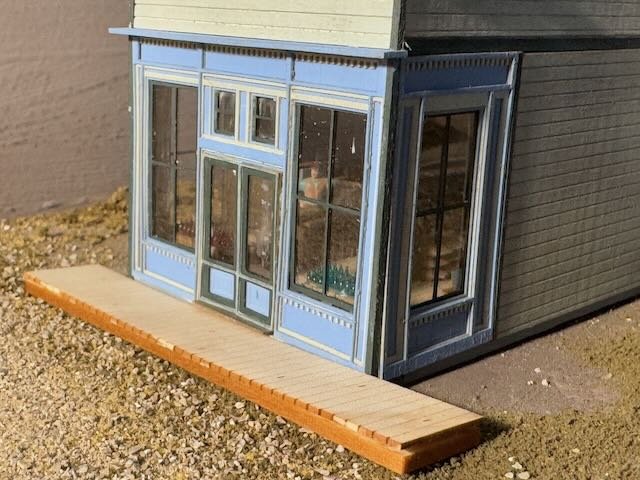
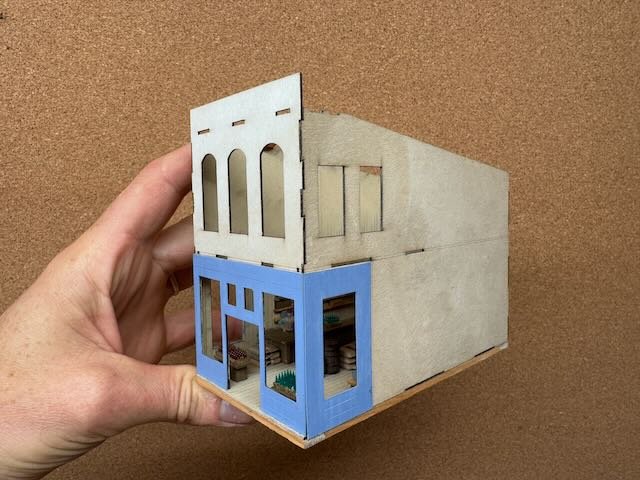
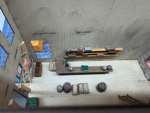
And here's the more or less finished building temporarily in place, just so you can see the context. Still a variety of small details to add, like a main sign on the front, maybe a few posters on the wall, etc. There will be another similar storefront between this and the backdrop. I did a bit of weathering on the walls to break up the smooth paint scheme. I like the "alley" behind this block of buildings and the leatherworks. Gives this area a bit more urban feel and helps with the transition from upscale commercial into the more industrial depot district. And here's a closeup. The sidewalk is just set in place, it'll be painted/weathered appropriately. But this shows how the interior helps; you can see some details of the store and even the proprietor. Much better than an empty box, with this many large windows. I'll use more scenic materials to blend all these buildings in once they're done. But it's nice to start getting this end of town filled in.
- 241 replies
-
- 10
-

-

-
Nailed it! Well, glued it I assume. Wonderful job.
-
I agree, it's just as exotic for me to visit family in small-town Germany and see nothing but stone/block buildings with plaster coating. Many buildings in Rocheport (both in reality and in my choices) have a "Western" feel. That's in part because such designs were far more widespread in the country, but only really get featured in media in "Western" films, so they feel like they should be out in Colorado or Montana. Ironically, this kit was based on a real building from Colorado, but the architectural style is perfectly reasonable for Missouri as well, especially around 1900. And yes, I don't know why they didn't design it as an insert. I did do some of the interior detailing before assembling the "box", but it was really limiting to know that I couldn't do more because of the way the walls were designed. This building will be paired with another similar storefront style, from a different manufacturer, so that will give us all a decent comparison of kit style. It's worth remembering that Rocheport was not a "railroad town" in the sense of springing up along the line, as so many did. It was long established by the railroad came. Founded in 1825 as a river port and some of the core buildings date back to the 1830s. By the 1840s and 1850s it was a bustling steamboat port, I believe with a higher population than when the railroad came through in the mid 1890s. So while the town certainly reoriented itself around the railroad when it came, and I'm sure some new buildings were built, it was quite established by then. So it's safe to assume that most commercial buildings like this one well predate the railroad, as opposed to new constructions like the depot or grain elevator that came with the rails. You'll see that I'm planning to weather this building as a well-kept but long-established store. The commercial core of Rocheport, with its stone and brick buildings, was several blocks inland from the railroad and river, well behind where my backdrop lies. I decided not to move that district forward into the visible area, instead staying more true to reality where wooden buildings dominated this close to the river and the rail line skirted the edge of that district. So stores like this are meant to represent the outermost parts of the business district, not the core. You can see this in the historic photos I've shared in the past. Thanks for the interesting and thoughtful comments, and for all the likes!
-
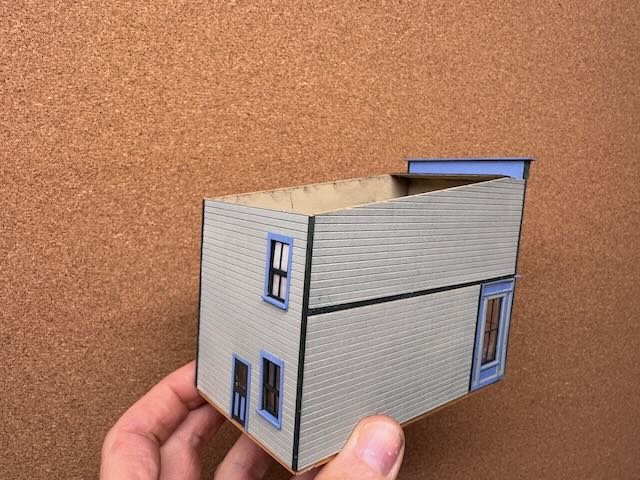
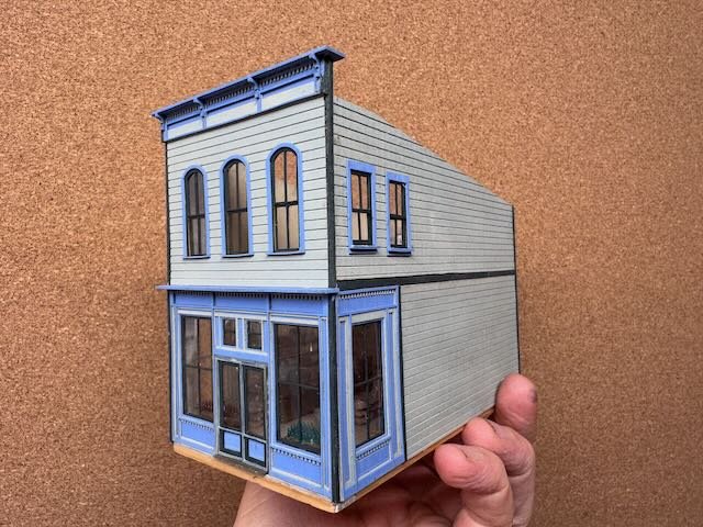
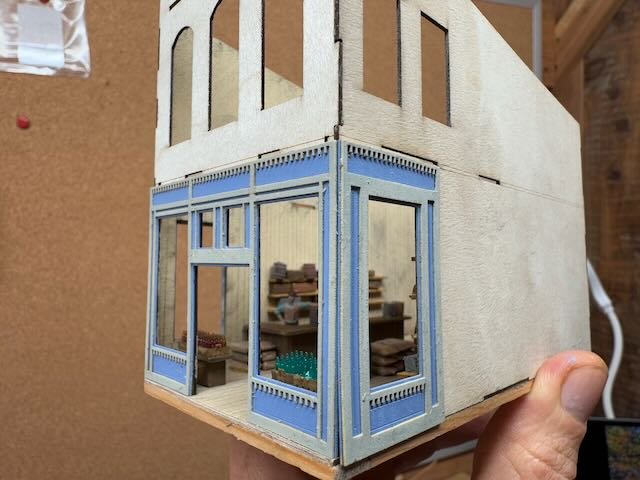
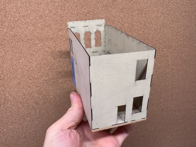
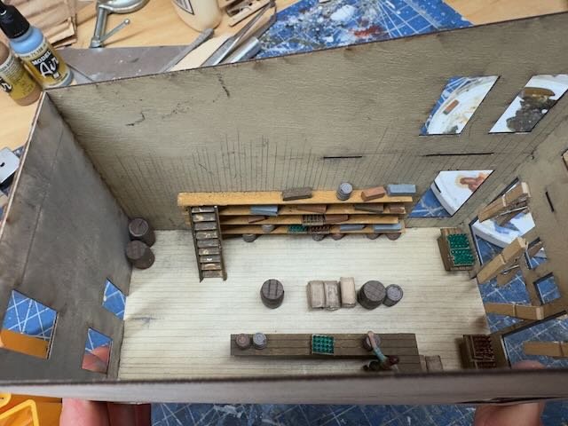
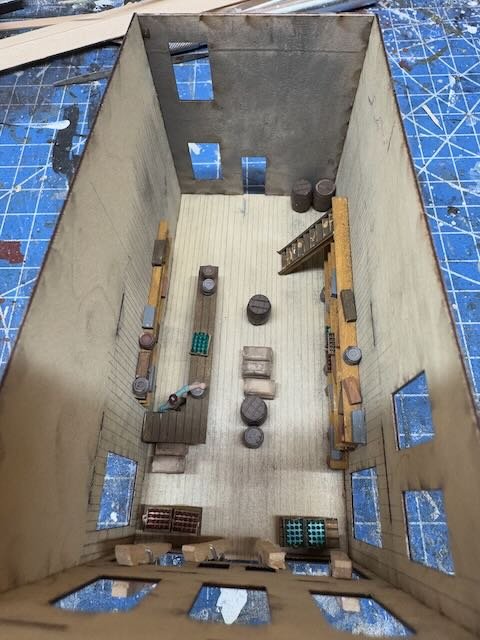
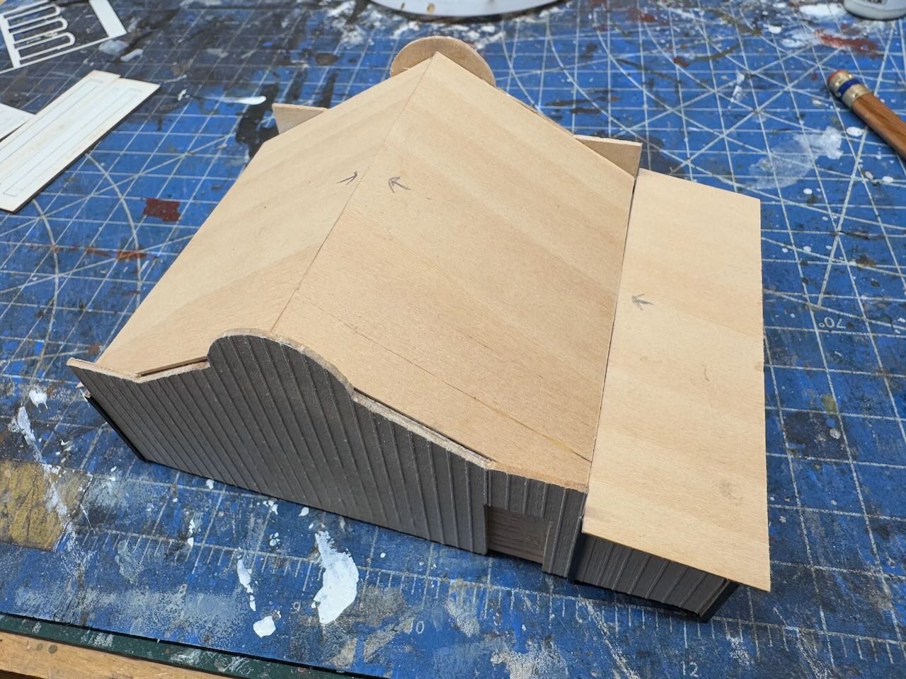
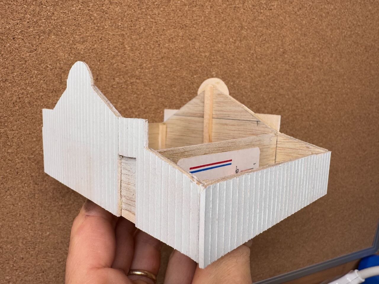
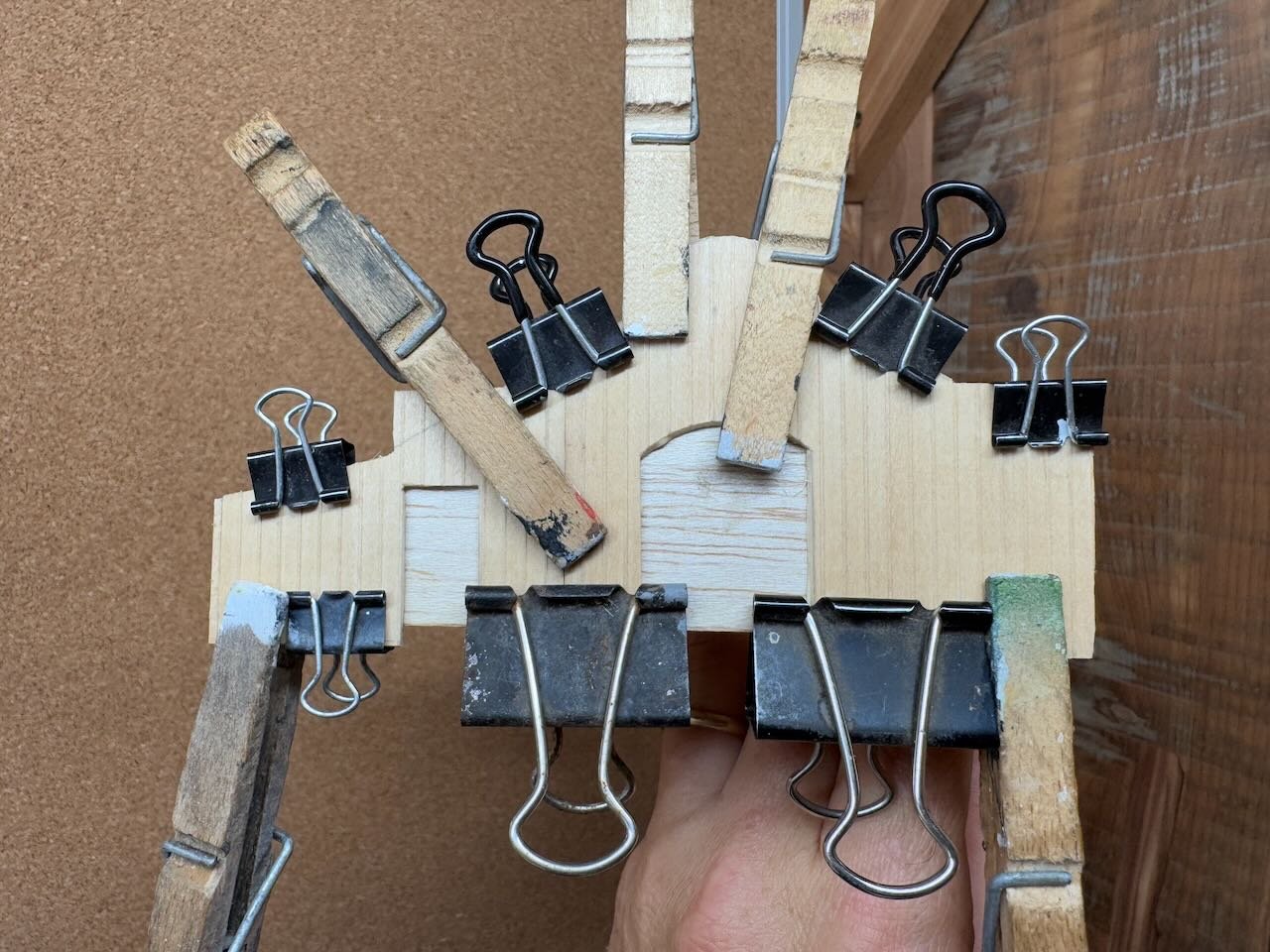
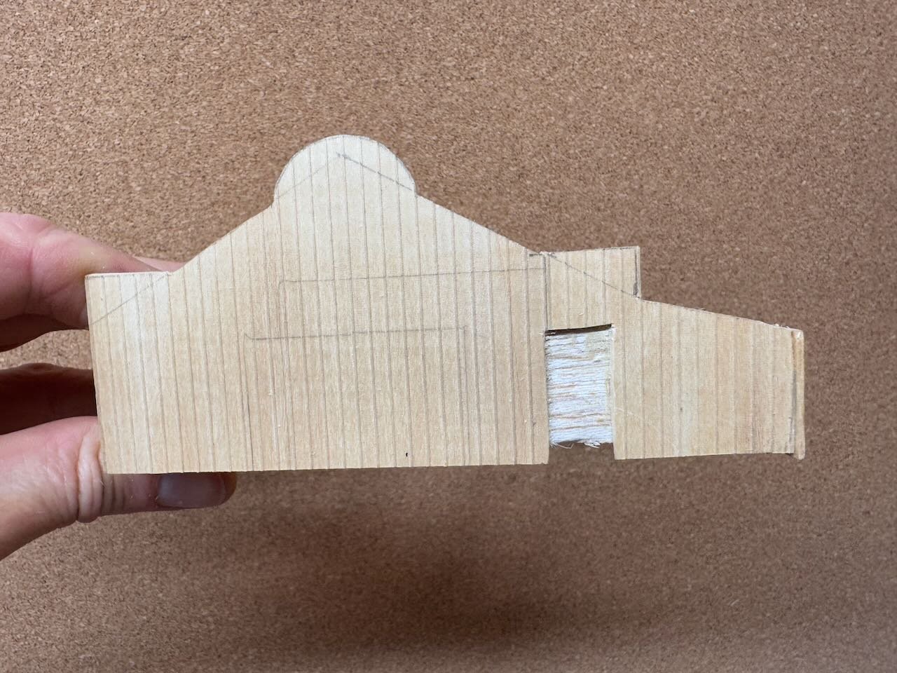
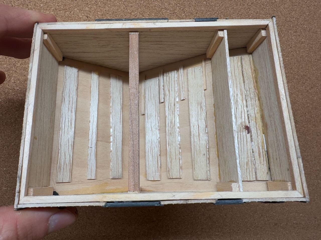
Yet another building! I'll do something else at some point, I promise. This one's a kit from Banta Modelworks. Follow the link if you want to see their version. I've never built something from this manufacturer before, and I have mixed feelings. Nice quality materials, but the instructions are poorly written and organized, and the design of how the kit is meant to go together isn't very intuitive to me. There are a couple design choices I'm not a fan of. Anyway, here's the first part of the build. You start by building an interior frame of thin plywood, onto which you'll attach final siding. The latter two photos above show two stages of building up fancier trim detail on the front. Right away this shows something I'm not a big fan of. It's hard to clamp outer sheets of details onto the inner plywood while glue is drying, when you've already built the inner structure. Especially because the kit assumes you've attached a floor already, so you can't access the sides from the bottom with clamps. And especially because all these sheets are super thin and prone to warping. Sharp eyes will have noticed an interior. Sure enough, I went all out on this one. It has big open storefront windows that make an interior almost mandatory because it's so easy to see in. And this is another frustration, it's very hard to add an interior when the design forces you to integrate the floor into the walls within the initial box, so you have to add all the details down through two storeys of wall. Also, there's no provision in the design for the interior walls to be finished, they're just bare plywood with obvious grain and laser burns. The way the windows work (we'll get to that), it's not easy to add an interior layer of paneling. I decided that this would be a grocer, general merchandise type store rather than the manufacturer's bank. Partly because the only bank in Rocheport is a very distinct stone building that I don't want to scratchbuild, and in any case is set several blocks farther back, well behind where the backdrop is. Whereas a general merchant is a fun interior to do and I can name it for one of the many known businesses shipping with the railroad. So here's the interior I put together, using wood scraps and various details from my scrap/parts box. I really like how this came out. I drew the vertical interior paneling (and the floor boards) on with a pencil, figuring that it made decent boards and also broke up the lines of the existing plywood patterning. Here's another annoying thing about this kit: it's a two-storey building and they assume you'll put in the central floor/ceiling, but that would make it even harder to add an interior. There's no provision for access. So I just left out the interior floor. After some experimentation, I actually don't think it's visibly missing from normal viewing angles given the arrangement of the upper windows. Later on you'll see another adaption I made to help with this. Leaving this out also lets more natural light fall into the lower interior so more of the details can be seen (I'm not adding lighting). After that, it's a slow process of building up three layers of very fine detailing on the front windows/doors, and adding general sheets of scribed paneling around the rest of the walls. All of the windows and doors are made off-model from multiple layers of fine parts, which is no problem. But here's the next annoyance: they expect you to insert all of these from the inside, with glue, after all the walls are built into a tight box. That was incredibly fussy to do, and there are some frustrating glue spots on the glass where I didn't do it perfectly. Most kits I've built do one of two things: make the windows and doors insertable from the outside, or design the kit so inside-mounted details happen before you assemble the walls. This was another case where leaving off the interior floor/ceiling was the right move; following the kit design it would have been glued in before needing to insert the windows from the inside, meaning some kind of crazy tweezer manipulation. No, thanks. But after a lot of careful fussing, and tweaking my approach to minimize the risks of these odd directions, I came out with a pretty nice result. Also, I forgot to mention, I pre-airbrushed all of these parts on a warm day, so they could be assembled with minimal further touchup. Here's the finished shell, sans roof, pre-weathering: For all the fuss, it's coming out pretty well. I like my muted but notably distinct color scheme, intended to make this building a centerpiece of the upscale part of town. You can definitely see a nice swath of the interior through the big lower windows. Next step is to make the roof, which won't be so bad. I'm planning to make it removable, though the kit assumes you'll glue it on. This is another way to show off (and repair?) the interior details. You may also have noticed that I built in an extended base, visible as raw wood in the photos above, that will get painted and detailed as a grey block foundation over which I can blend scenery materials without affecting the actual siding. The kit doesn't have a base, just a very thin (and warpable) plywood floor. This thick wooden base really stabilized the structure. Soon I'll finish this and post more photos, including in place on the layout. In the meanwhile, hope you all enjoy some holiday time however you see fit!
- 241 replies
-
- 14
-
-
Lucky you that the original railings had a nice square corner instead of following the rounded forward edge of the deck! Looks great.
-
Nice progress! Love the anvil.
-
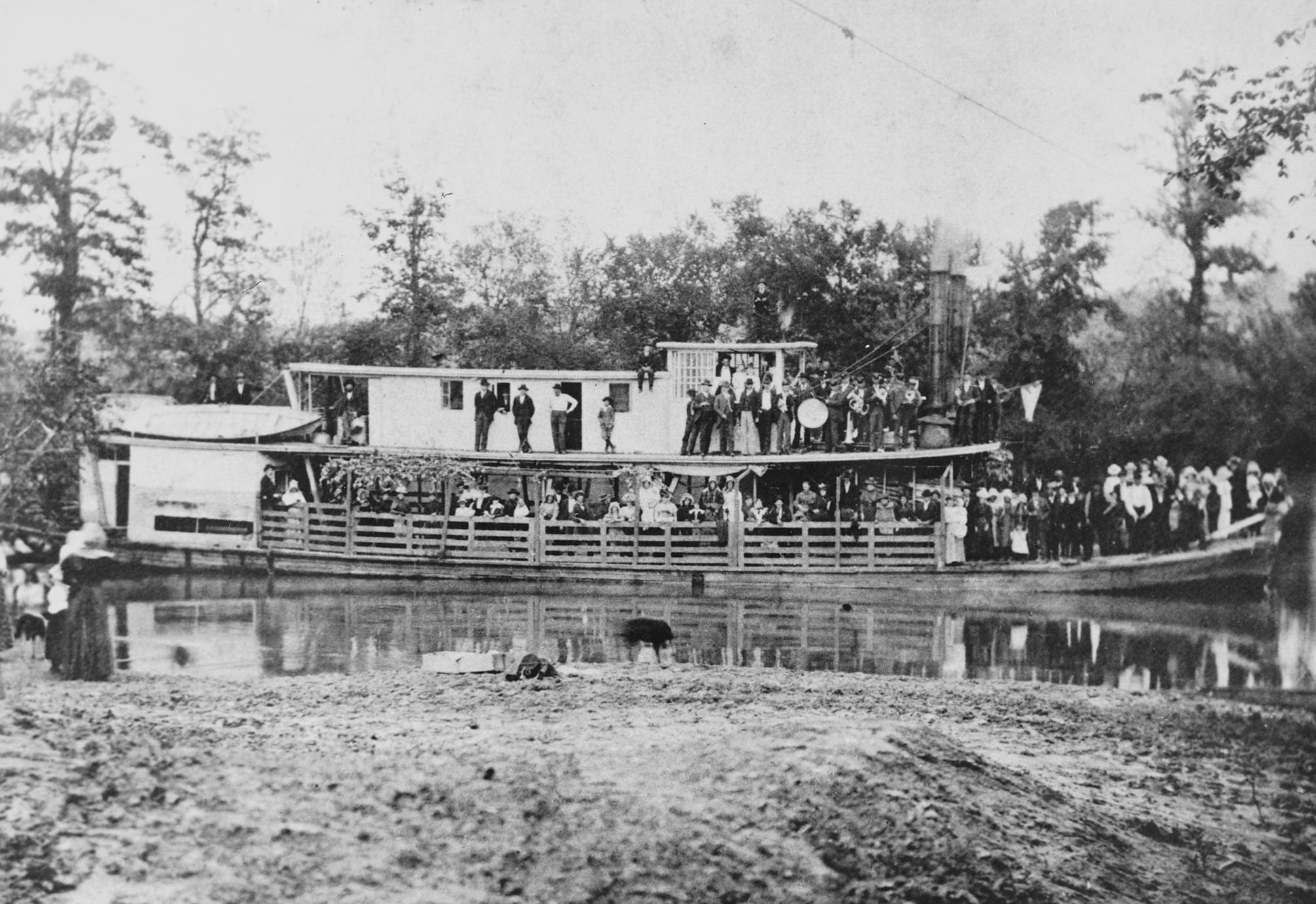
Just occurred to me to wonder if the forward sheer on the boiler deck seen on many steamboats derived, in part, from the basic design that had the fireboxes facing forward and little to no infrastructure blocking them. They needed a lot of air for the fire and draft in the chimneys, and that came in over the bow. Did the boiler deck flare upward to help "scoop" a bit more air in toward the boilers? And once that design got stabilized, it just stayed that way even as steamboats got more complex and tended to build infrastructure in front of the fireboxes? It's certainly more aesthetic that way, since it parallels the natural upward sheer of the bow, but I hadn't thought about the possibly functional role related to the firebox.
-
Hurricane deck is one of the many steamboat terms whose absolute origin is lost to history and almost certainly developed organically and colloquially. Like Texas deck (the one above, when present), and why the boiler deck is the one above the boilers. You'll find many sites repeating the claim that it's because the hurricane deck was especially windy, being high on the vessel and generally unprotected. I can easily imagine being up on that exposed deck/roof, several stories above the water, and feeling like I could be blown off by a strong gust. Not much to hang on to up there in many vessels, not even a railing. And many steamboats had at least a bit of upper deck sheer forward. Peerless certainly did, on the Missouri River. This is just the boiler deck, but if she'd had a forward hurricane deck it would have had to follow suit:

-
What an absolutely glorious build! And you've persevered through some truly challenging times. Without exaggeration, I think this is one of the coolest models I've ever seen on MSW. I've seen enough of these in real life to enjoy just how well this captures the real thing. And it's such a unique and distinct subject, so well captured. Thank you so much for taking all the time to keep this log maintained. I'm going to miss this build and very much look forward to whatever you decide to try next.
-
I dunno, I see a Keith-style tugboat in the background! Or that one too normal for you?
-
Thanks to both of you for your enthusiastic interest in figuring out more about the barn's history and use! Discussions are useful even when I stick to my guns. And I very much appreciate the ongoing interest and curiosity this project generates.
-
Ken, I've considered that approach. I've seen it used elsewhere and my club layout will be doing that in various settings. I think for the windmill it wouldn't make sense for a couple of reasons. One, if you look at its height, it's way taller than a railroad signal, it would be closer to 4-5" and that'd be a very tall and distracting plexiglass panel, even clear. Just as likely to catch an elbow as the windmill itself. Two, while signals obviously have to be in place along the line and thus need protection, a windmill is just a scenic highlight and could easily be removed during operations with no loss. So I think that's the easier answer in this case.
-
Yes, of course horses don't "need" permanent ramps to be loaded onto rail cars. That photo shows the German army loading horses into rail wagons during World War 2, a very different context than peacetime racehorse handling. What I'm trying to get at is that this barn isn't anywhere near big or developed enough to be an organized shipper/receiver of horses by rail, and there's no history of that happening in this area. If you DID plan on routinely handling horses on/off trains at a single location, you WOULD build a permanent loading structure that was more stable (no pun intended) and safe for the routine handling of high-value animals. This is why all railside stockyards had permanent loading chutes with strong rails, etc., including the one in Rocheport east of the depot. And horses are a lot more valuable, per unit, than cattle. It's entirely possible that this wealthy guy's barn occasionally shipped or received a horse, whether he bought one from a high-end stable or did some breeding himself. But if so, he likely would have done so using a temporary ramp on a siding where a car could be left (such as near the depot) because the railroad wouldn't stop a train or leave a car on the mainline just for a horse, or possibly he would have used the actual stockyard ramp with its permanent, safe infrastructure for loading livestock into railcars. Finally, if you were shipping racehorses or high-end breeding stock across the country, the Katy's line across Missouri is about the last route you would choose. As discussed early in this log, it was late-coming to east-west lines across the state and at least two other routes between St. Louis and Kansas City were straighter, faster, and more established. The Katy's line was more roundabout in route, was relatively slow, and wouldn't have been economically competitive for this kind of fast, high-value freight. Even if you were shipping down to Texas, where the Katy was a lot more competitive, you'd probably route the car by a different railroad like the Missouri Pacific as far as Sedalia and then transfer the car/horse south from there on the Katy. You may have to trust me on this one if you don't really want to go into the weeds of 1900s-era rail networks. The point is that I don't think there's any operational connection between this horse barn and the railroad. If it was meant to be served directly by the railroad in any meaningful way, it would be on the siding, not along the main line. I love the enthusiasm, but I think the simple answer is sufficient. It's just a local horse barn, however attractive!
-
Well, there's no question it's a barn, and all livestock need fresh pasture. This is exactly what a horse barn/stable would look like. I just think it's for the local use of a local owner, not tied to the railroad or any kind of shipping. Anyone who keeps horses, in 1900 or now, has a barn with attached paddock to allow exercise and fresh air. I'd also say that those rail fences are very typical for horses, then and now. I'd say no to sheep because (a) sheep have never been a big thing in this part of Missouri and (b) they're not high-value enough to justify a fancy barn and rail fence like that. Again, it's exactly what a moderately wealthy horse owner would construct.
-
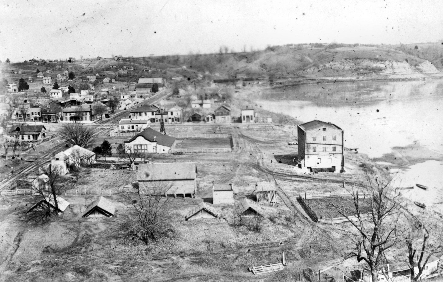
Speaking of water, notice the tall windmill just behind this barn in the historic photo. I assume it's there to guarantee a non-river water supply to Mr. Merchant's horse barn. That's a detail I'll also enjoy adding, though it WILL have to be removable for operating sessions! That's a guaranteed elbow-catcher.
-
Keith, that's a fun idea, but a few factors argue against it. One, there's no loading ramp or other access point visible. Two, it's on the main line side, not the siding, and it's unlikely the railroad would spot a stock car blocking the main, or stop a mainline train to wait for a horse to be (un)loaded. Three, Rocheport is a very minor location between a variety of larger towns/cities that would have been better settings for such an arrangement. No trains would have stopped here overnight. For example, Franklin (only ten miles west) had much larger railroad facilities as the division point and would have been a much more convenient setting for such an arrangement if it ever happened. Same for Sedalia further southwest. But I appreciate you sharing the idea, it's always good to have more than one brain thinking about a question!
-
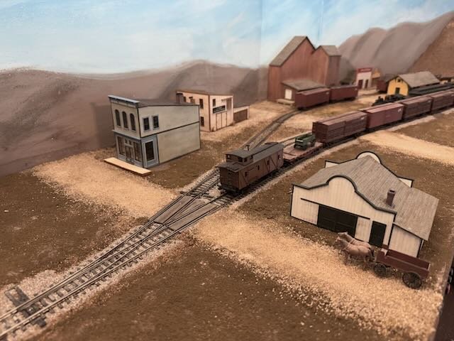
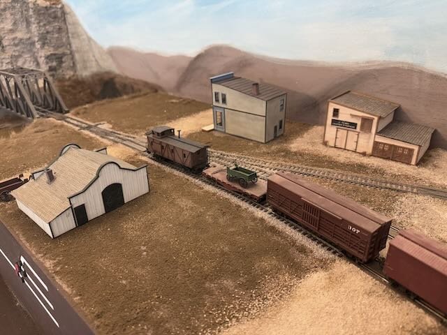
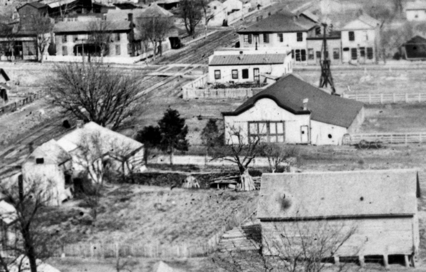
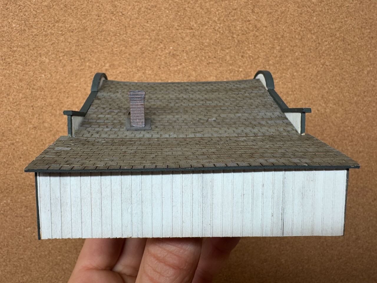
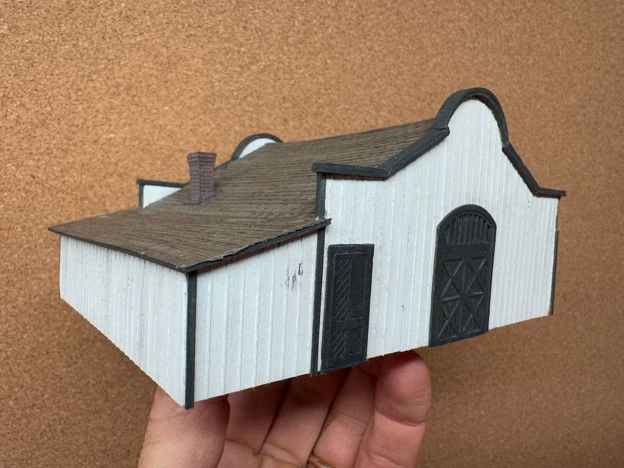
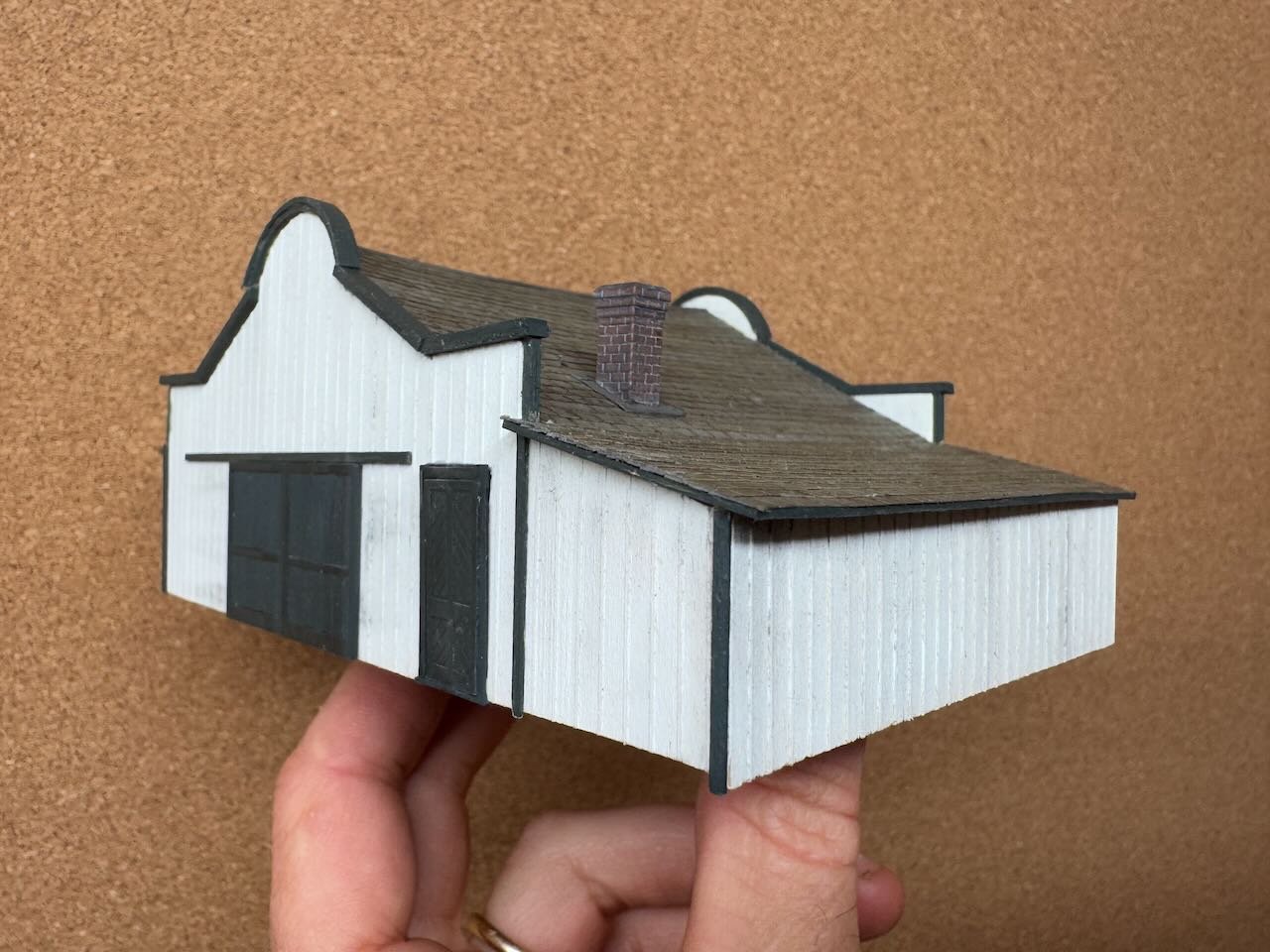
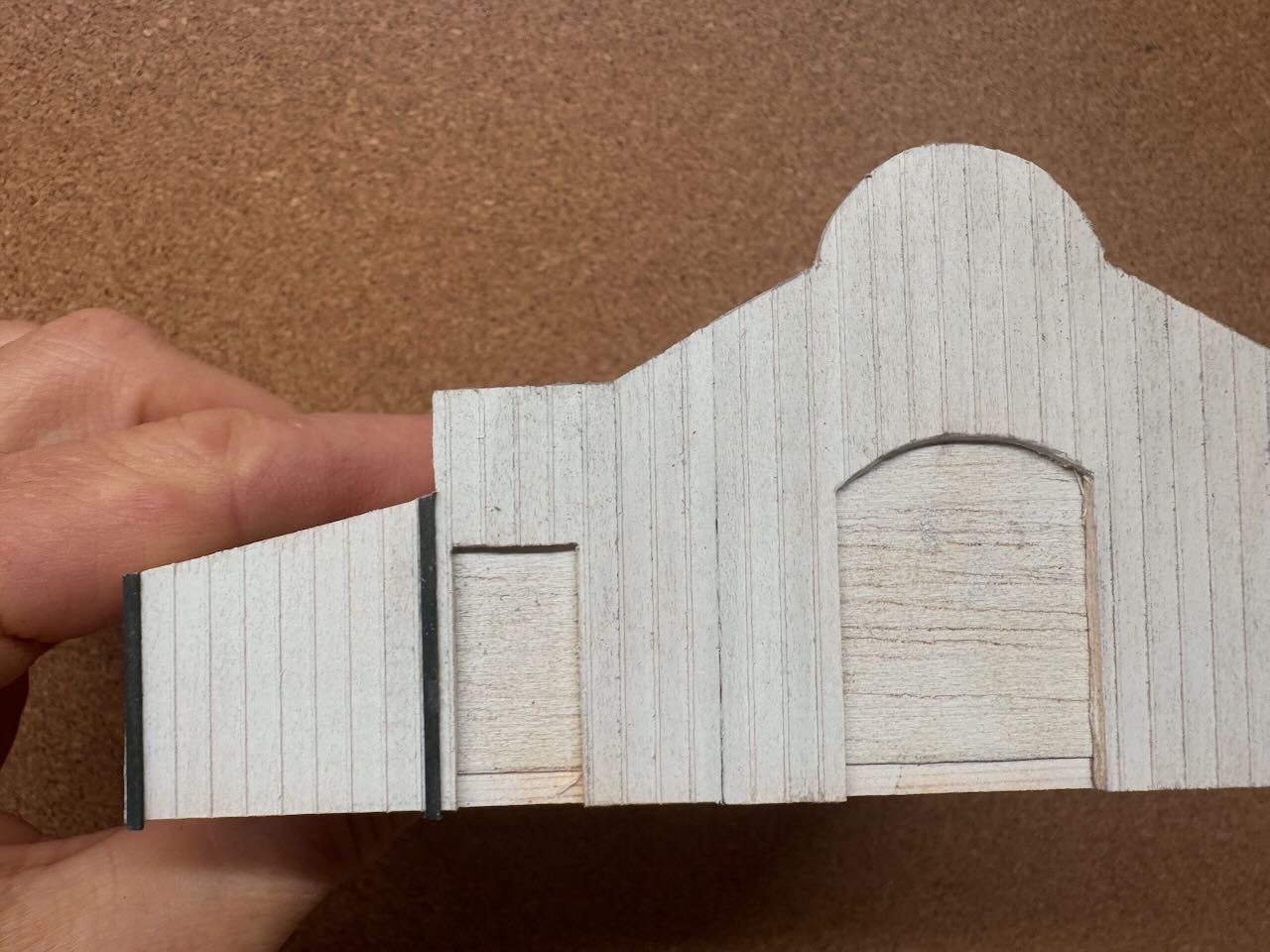
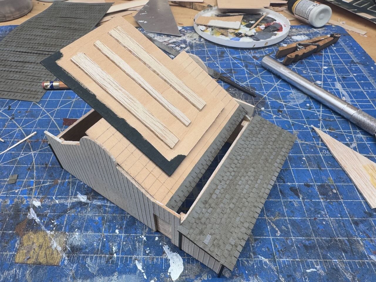
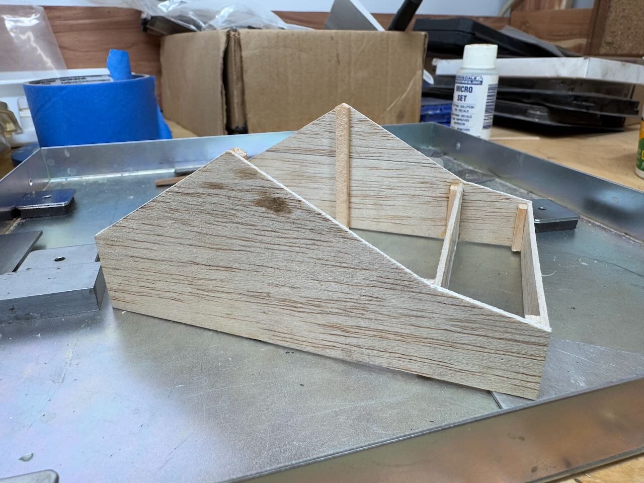
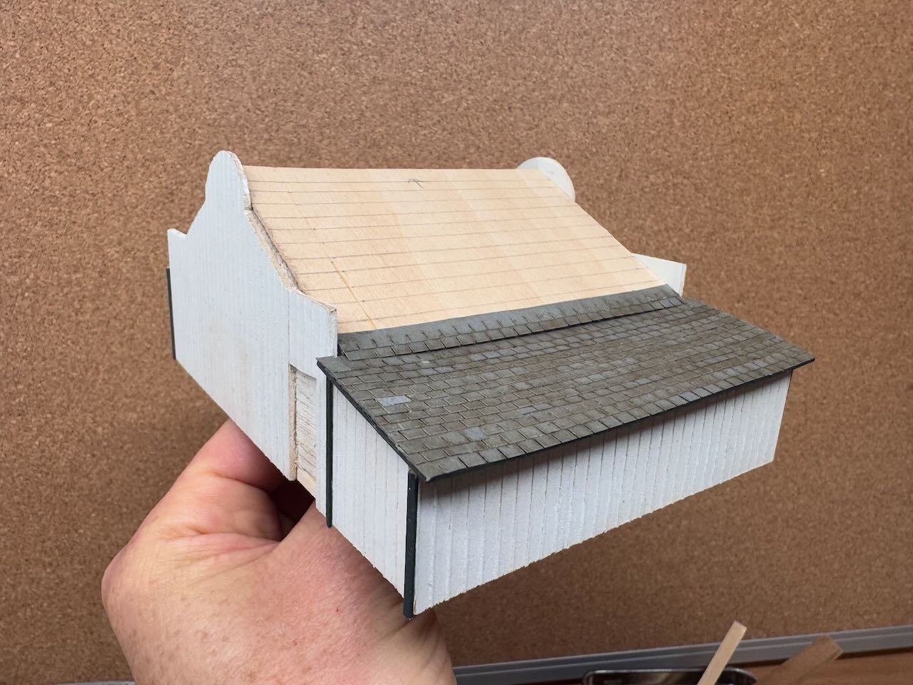
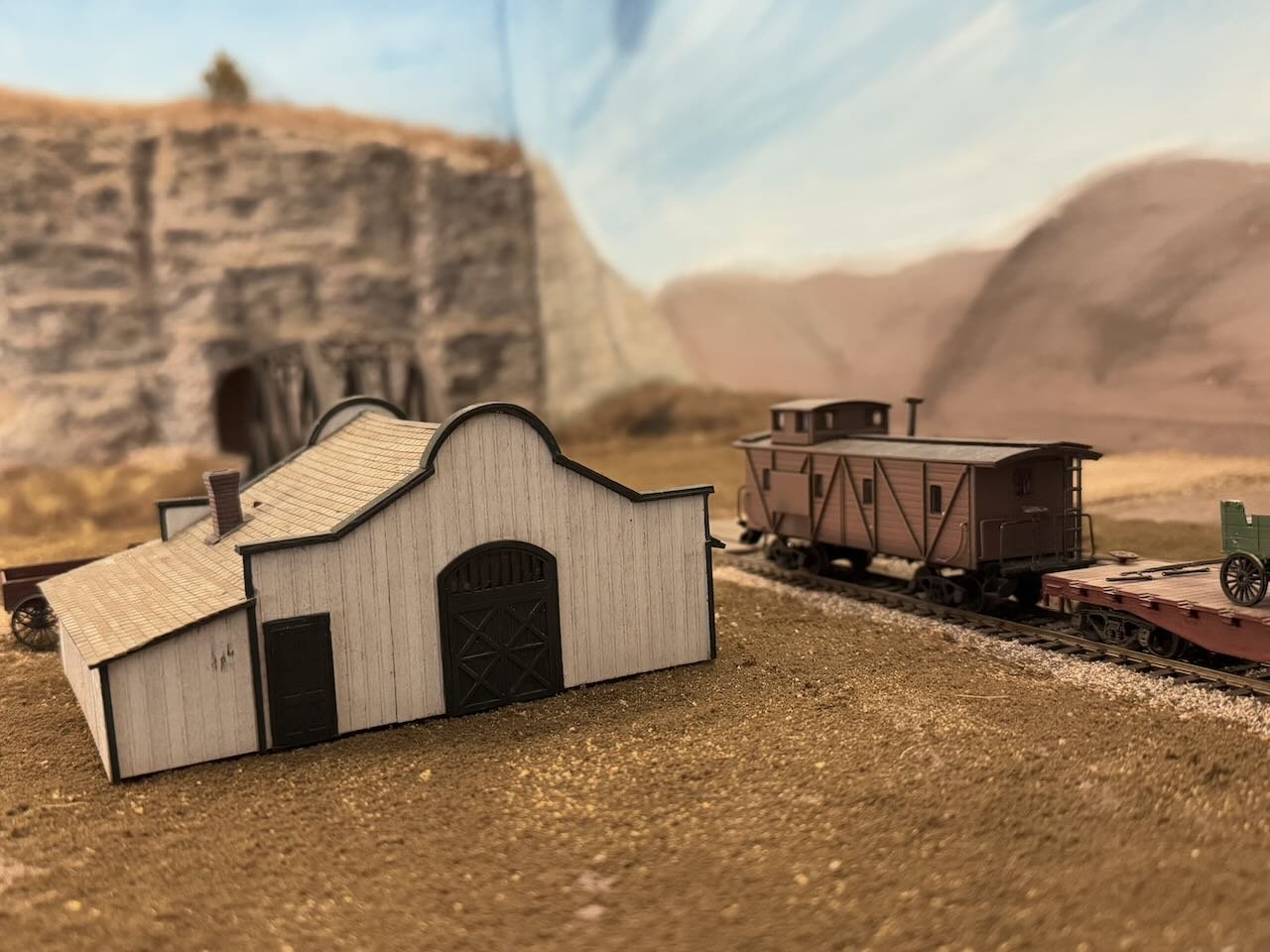
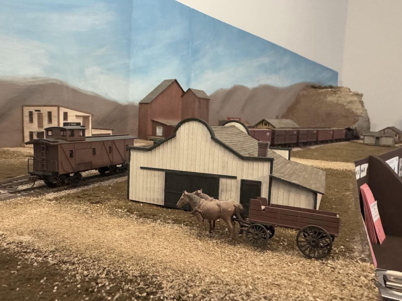
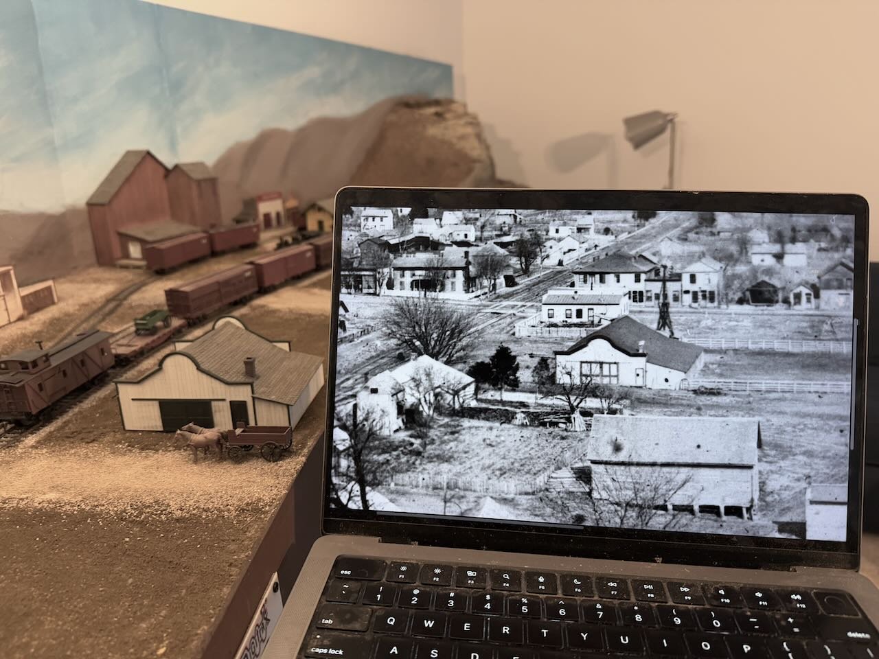
Back to scratch-building! This is a fun project I've been looking forward to, another one of those "keystone" buildings that define the setting as Rocheport, along with the depot and the elevator. Check out the distinct Spanish-style white barn in the photo below, looking east from atop the tunnel's ridge. It's right along the tracks and really stands out among the other, more typical structures. I've known from the beginning that I wanted to build this. Closer view below. It's just such a unique structure. I wish I knew who decided to build this fancier barn here in this part of town, where it's more flooding-prone and buildings are generally simpler. Compare with the perfectly utilitarian small-farm barn just to the foreground of it. I'm thinking this one is a horse stable for a leading citizen, like a banker or merchant. Time to build! I made a central frame of wooden sheets for structural strength. No windows or open doors (with one minor exception) will pierce this, so I didn't need to worry about what the interior looked like. I designed the dimensions by roughly measuring the ratios off the photo, and comparing to what would fit in the dedicated spot on the layout. It came out close enough that only minor compression was needed (which led to one oopsie that you'll notice later on). With the central core done, I sheathed it in wood pre-scribed in a board-and-batten style. I couldn't quite tell how the real barn was sheathed, but as this was a fairly fancy structure for a barn, I decided it would have this more tightly sealed style than just regular boards. All doors will be plastic items scavenged from my scrap box to be both close enough to the real thing, and to look right on a barn. So I cut slots in the siding as needed, to accept these insets. When I was happy with the siding pieces, I glued them on real good. View below shows the other side. I have no photos from this direction, so used a different style of main door that I'll discuss further below. With all the siding attached, I airbrushed it an off-white. Didn't want it too shiny, it's still a barn. Next up was to design and cut the roof pieces. Slightly more complicated than usual since the central part fits within the fancy walls, while the outer shed just extends like normal but is wider. And there's a change in roof angle between the two parts. These are thin sheets, so I braced them underneath to avoid warping. Below is a view showing that, and the beginning of shingle application. These shingles are tedious to apply, but look wonderful. I like to do these off-model, so I can leave overhangs at each end of the roof and trim them consistently. This created a challenge in this particular build, because I needed to make the transition between two roof angles (and thus pieces) but couldn't lay a transition strip over this between the projecting walls because I needed to lay shingles off-model. So what I did was lay the first set of shingles on the upper roof with half of the shingle line extending past the wood, such that when the finished roof piece was installed, they'd naturally overlap the lower roof. The image below shows what that looks like in a test-fit; the overlapping shingles are in the right place and will snug down nicely once these pieces are glued into place. Once all the roof pieces were shingled and the glue drying (great task while half-watching a hockey game), I started working on the final trim. First, simple strips at the corners and joints between parts of the barn, like this. But if you were wondering, model ship-building skills came in very handy for that curved arch at either end of the roof. I cut some thin strips, soaked them, and bent them over a bottle of the right dimension, then left them near the wood stove to dry. Worked perfectly. I stopped taking photos at this point because I was too focused and having too much fun. So here's the final barn. The siding is lightly weathered with pastels to give some variation to the siding, and I added subtle scrape marks where the sliding doors move against the walls. Sharp eyes will notice the compression goof in the wall above. The original barn has two sliding doors that move to either side. I didn't account for the full sliding width when I compressed the building, so the right-hand one only has room to open halfway. Oopsie. I'm considering it an Easter egg for the observant. Below is the other side. As I said above, I didn't have any photos from this side. Arguably it would have made sense to use the same style doors on both sides, but I didn't have two more of those barn doors in my scrapbox, and I did have this very attractive stable-style curved door, which really seemed to fit the barn's style. So that's what I used here and I'm quite pleased with the look. The slotted windows above are the only penetration of the walls, but they're so narrow I just mounted them against black-painted interior wood and glazed them. Thought I can't tell what color the original trim was, I like this green-black color that helps the barn stand out from any other structures but still has a darker palette that fits the overall theme of the layout. And it just feels classy to me. Below is the view from the side that faces the aisle. This shows an unintentional effect that turned out wonderfully. Despite interior-bracing the roof sheets, the collective moisture of the glue used to attach the shingles warped the sheets anyway. But as it turned out, that gave the roof a delightful sag that's just off-square enough to give an extra sense of realism. I don't think I could have done this better if I'd tried. It's pretty subtle unless you're looking directly from this angle but it really gives some added character. You can see some similar waviness in the shed roof at foreground, but again I love how that came out. The chimney is just another casting from my scrapbox, painted and weathered. And a final shot of the interior, showing the internal structure and bracing. And now to place it on the layout. Here's two views in its intended setting, though without any attempt to blend in the base. And for the full context, here's the model in place and the historic photo: The biggest difference is the color of the doors: I tried painting them with the internal panels but just couldn't get the borders clean enough, so decided that solid-color doors were fine with me. Better "wrong" than "looks wrong". The barn is low enough to work as a foreground structure, not getting in the way of reaching the tracks during operation. And it's just such an attractive and distinctive building! I have to say, I'm really pleased with how this came out. Very happy with it. I hope you are too!
- 241 replies
-
- 17
-
-
-
I definitely like how the tricky wheel wells came out. Did you ever try those dry transfer letters you mentioned ordering?
-
That's glorious. I always dreamed of doing a full steamboat interior like that and never have yet. Such a great job bringing this area to life.
-
That followup zoomed in photo means I could go either way on the fabric vs board debate. Either is believable as a method used on the real thing. There's definitely distortion in the photo itself but other aspects of that view do imply fabric. Whatever Keith decides on this one will make sense and look right.