ClipperFan
-
Posts
2,171 -
Joined
-
Last visited
Content Type
Profiles
Forums
Gallery
Events
Everything posted by ClipperFan
-
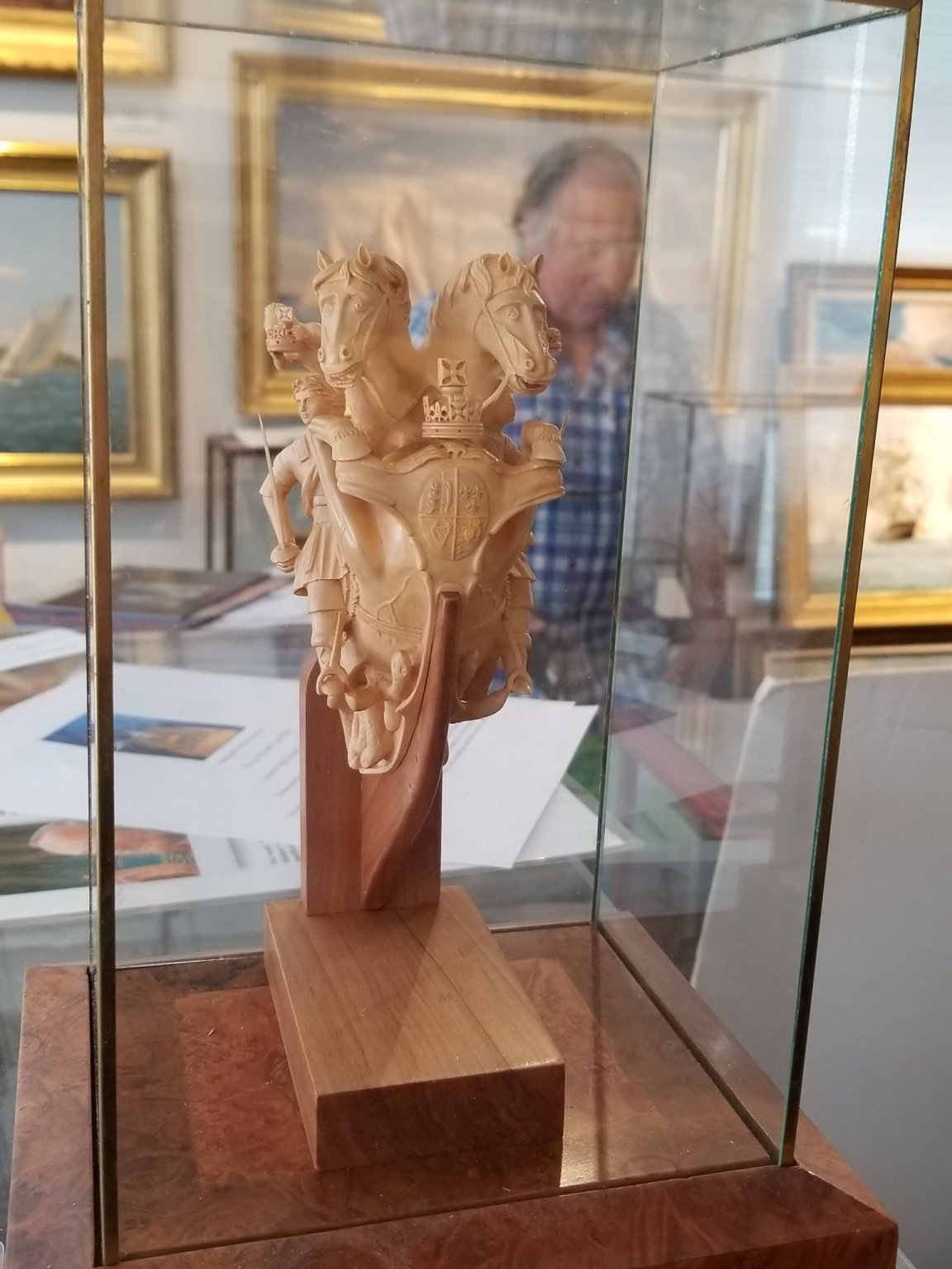
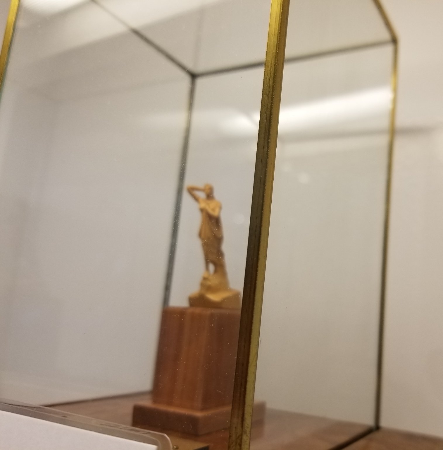
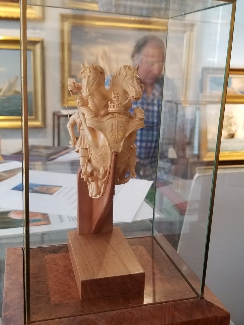
 Rob, what's even more mind bending (to me at least) is that the Royal George double headed horse figurehead with all its intricate details was carved from a single piece of boxwood!
 -
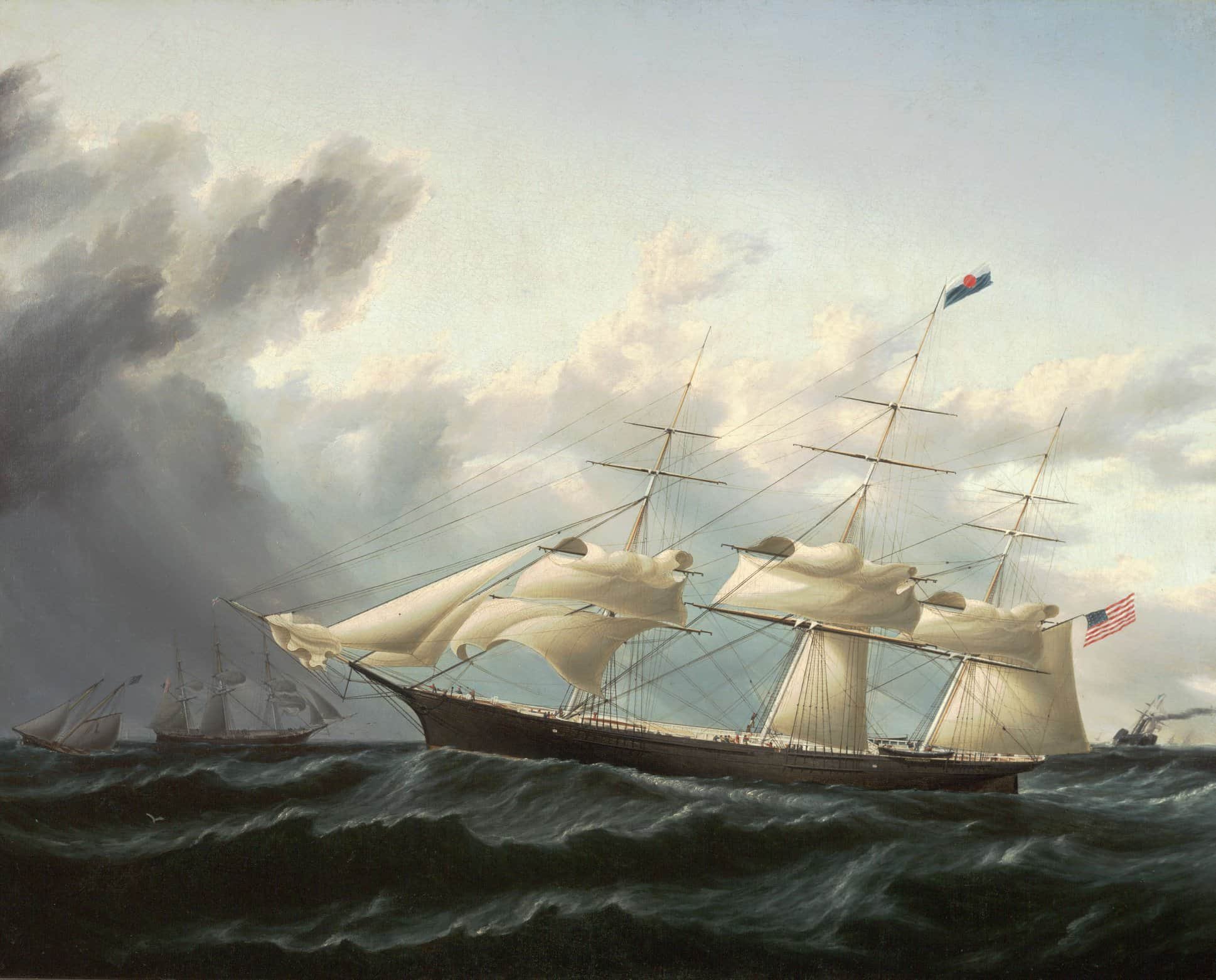
Rob, again the overhead view of Glory's hull really shows in this photo. As a courtesy, I just wanted to remind you that 3'6" below the planksheer, there's a more subtle Hull line that blends in to the lowest molding of Glory's naval hoods at the Bow and ends up being a significant factor in forming her graceful tumble home at the stern.
-
Rob, I recognize some of what you're doing but don't quite comprehend all of it. How did you discover the outsized bulkheads which interrupted the flow of the Hull? Inquiring minds would like to know.
-
Rob, Glory's sleek hull form is quite evident in the overhead view of her Bow. Very nice indeed.
-
Rob, this will be a sturdy vessel indeed. I appreciate the additional structural reinforcing elements.
-
Rob, Here we go indeed. I'm gonna strap in for the wild ride, as I'm sure it will fly by. You're already off to a nice start.
-
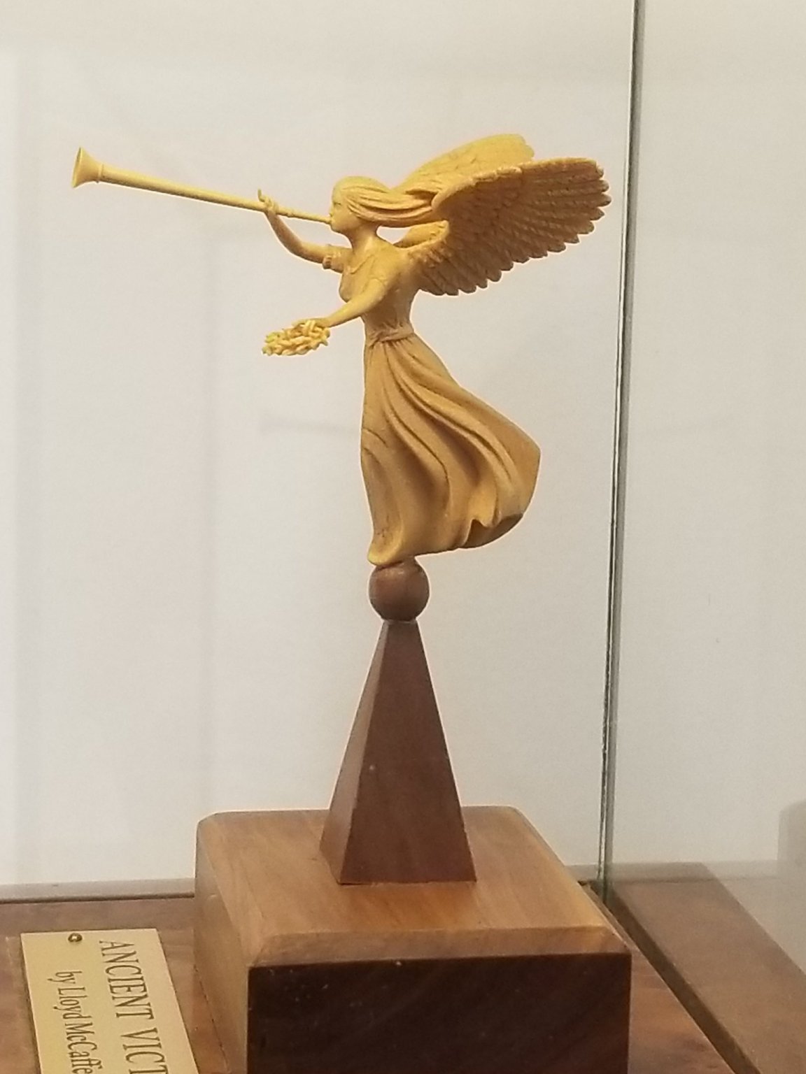
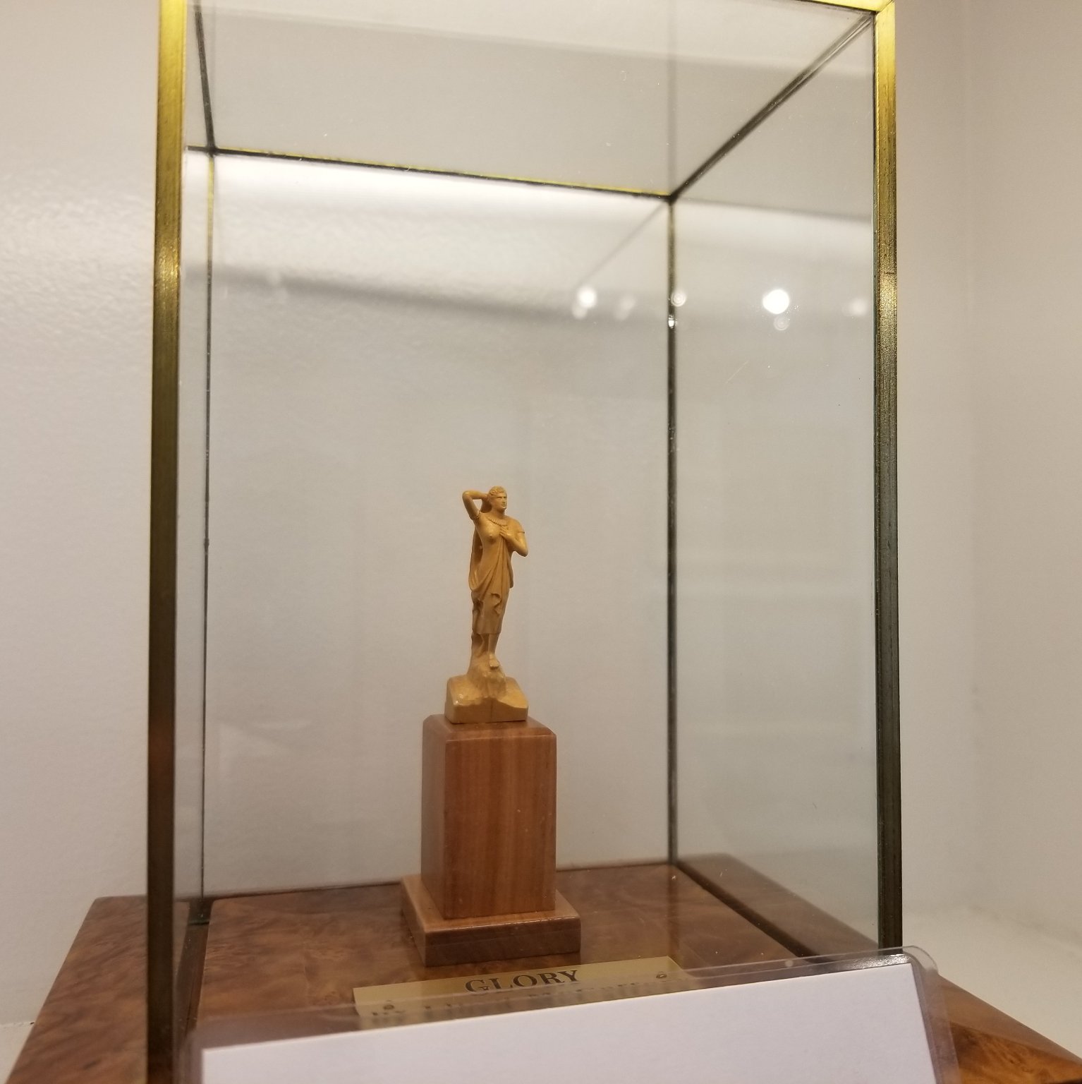
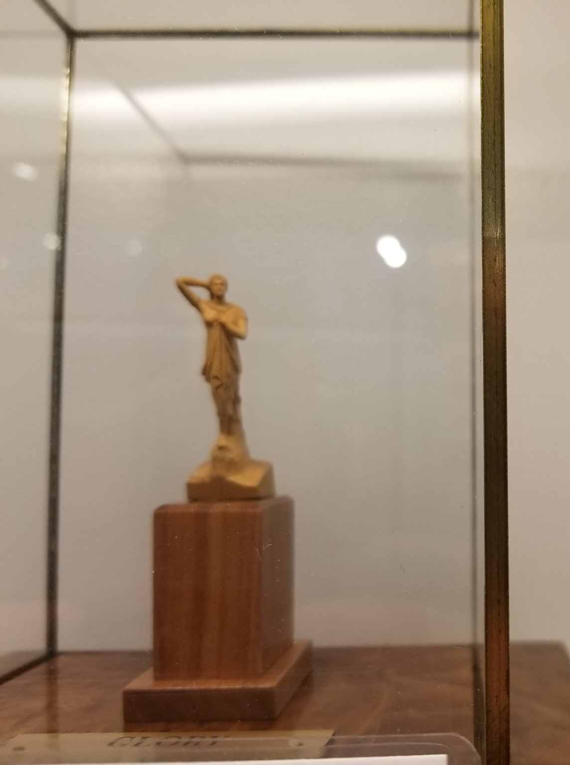
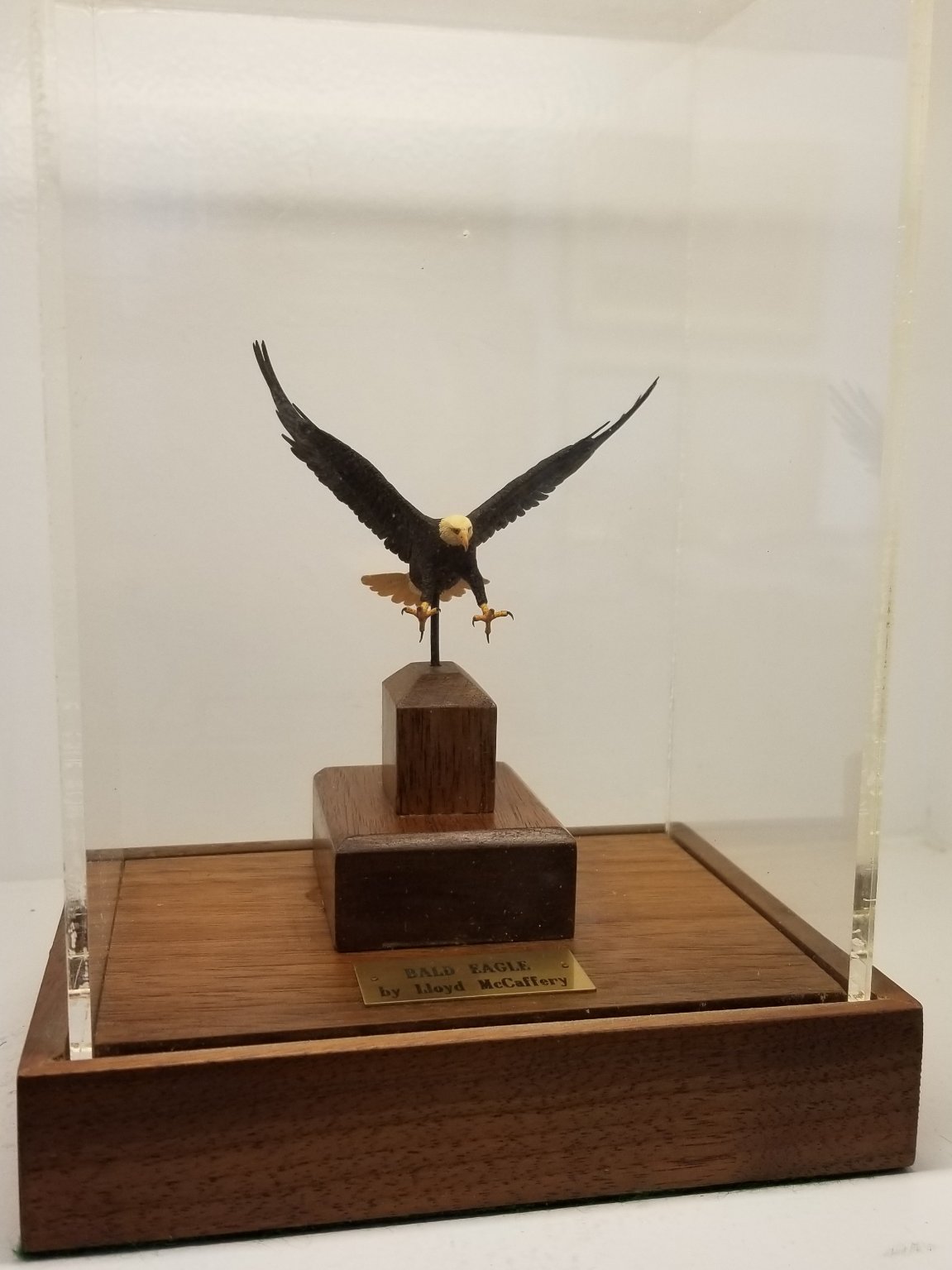
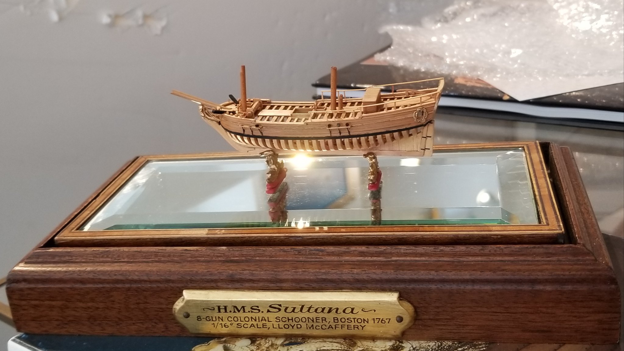
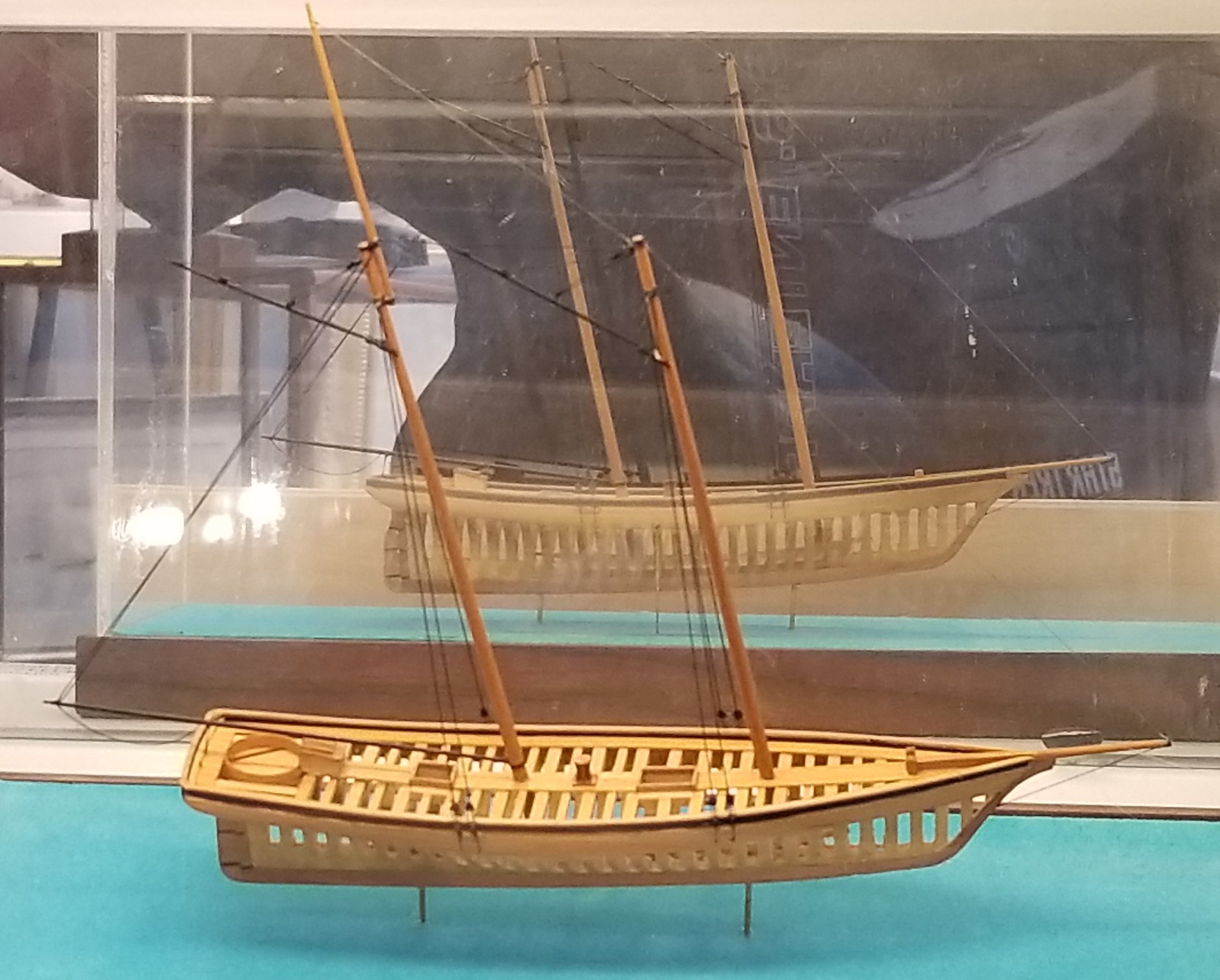
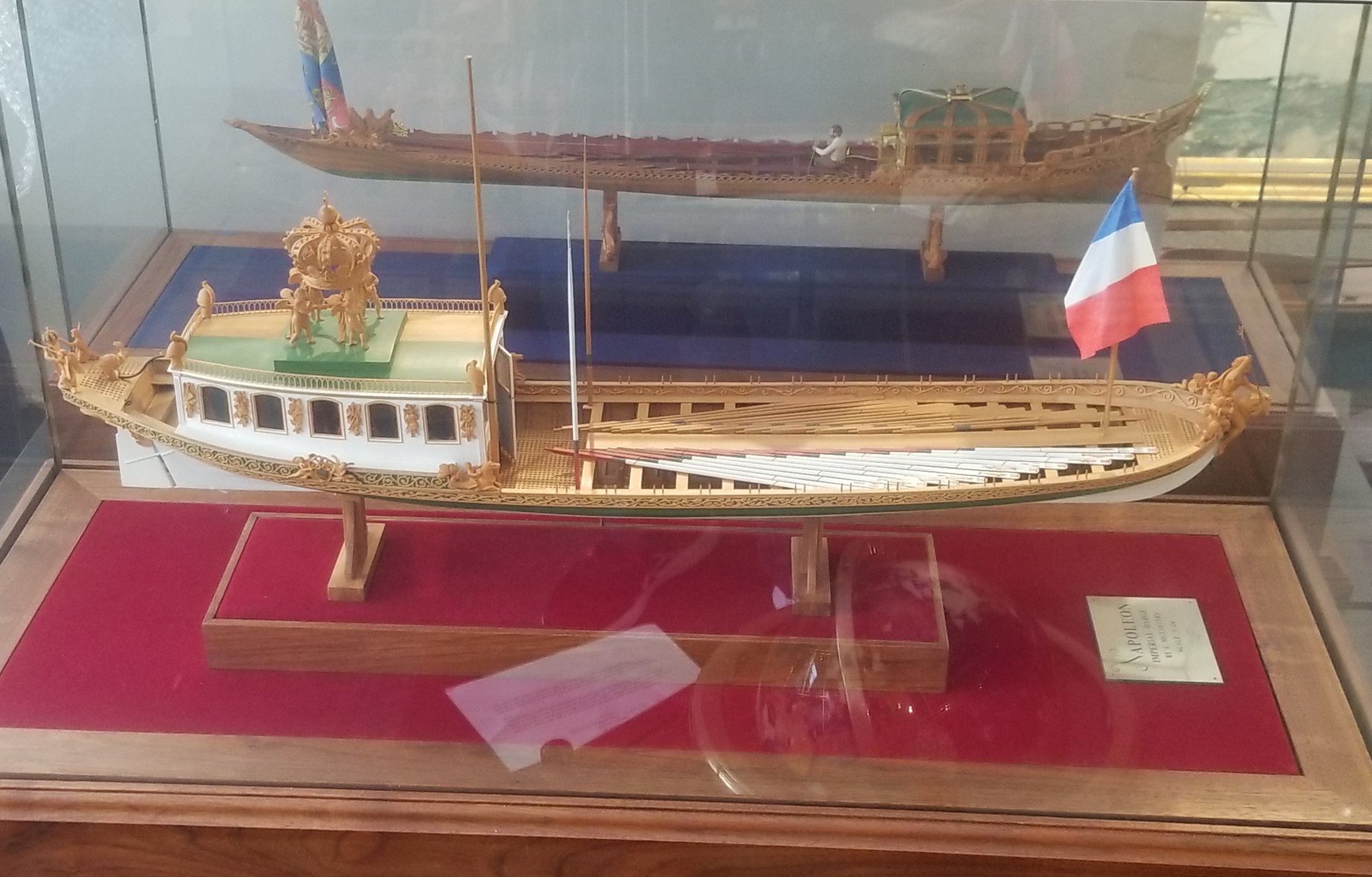
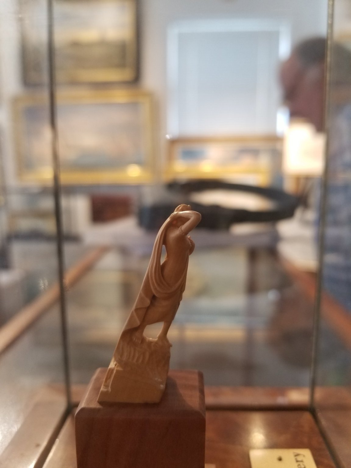
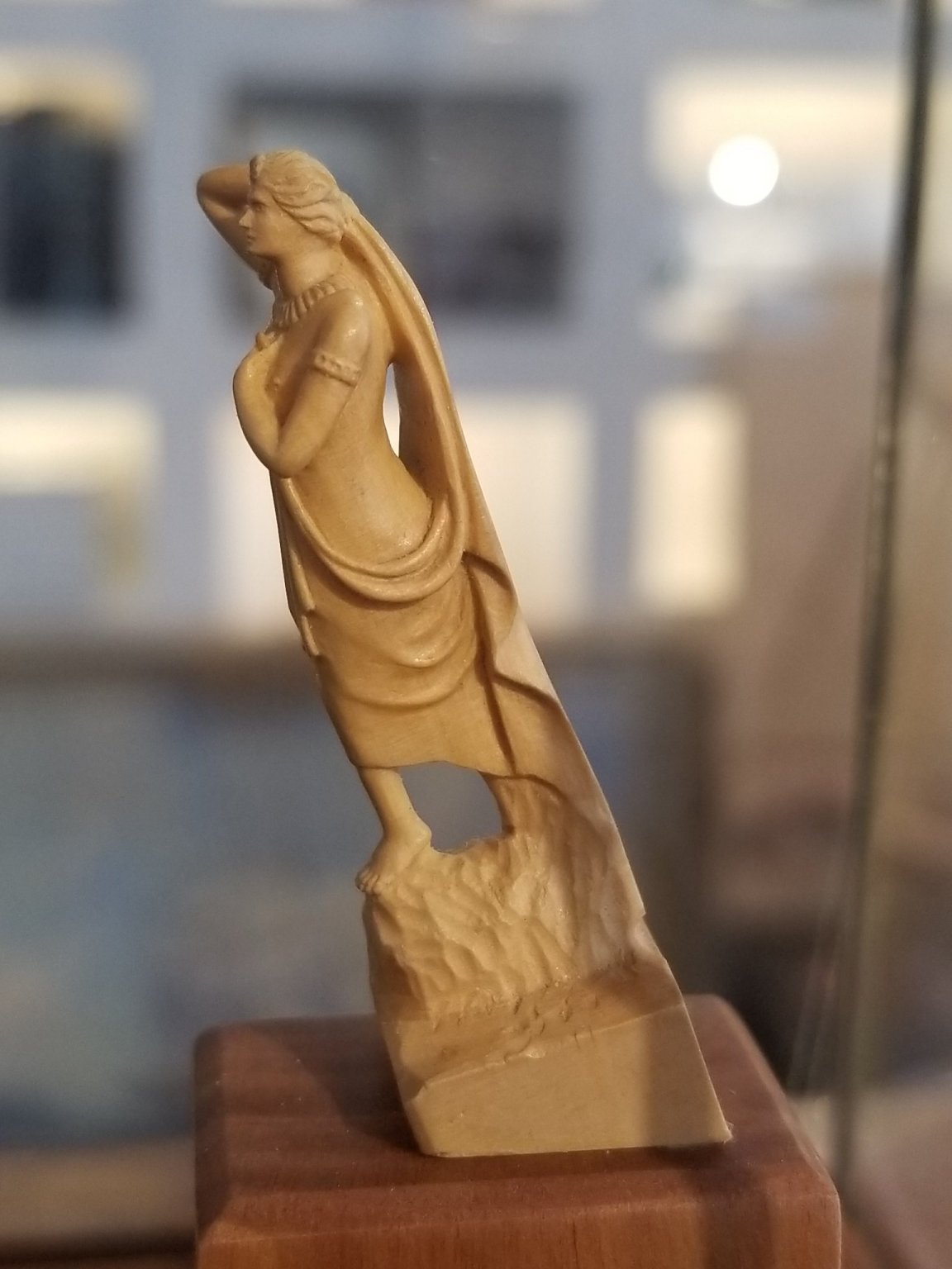
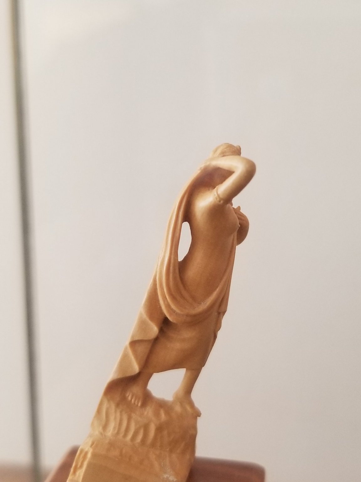
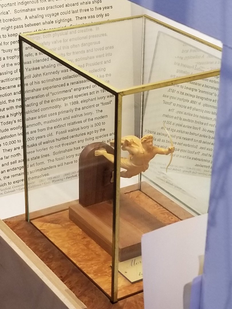
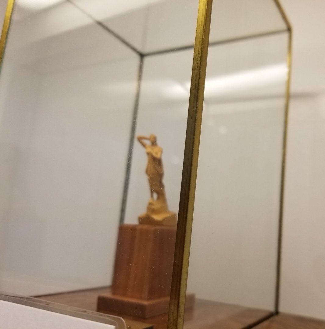
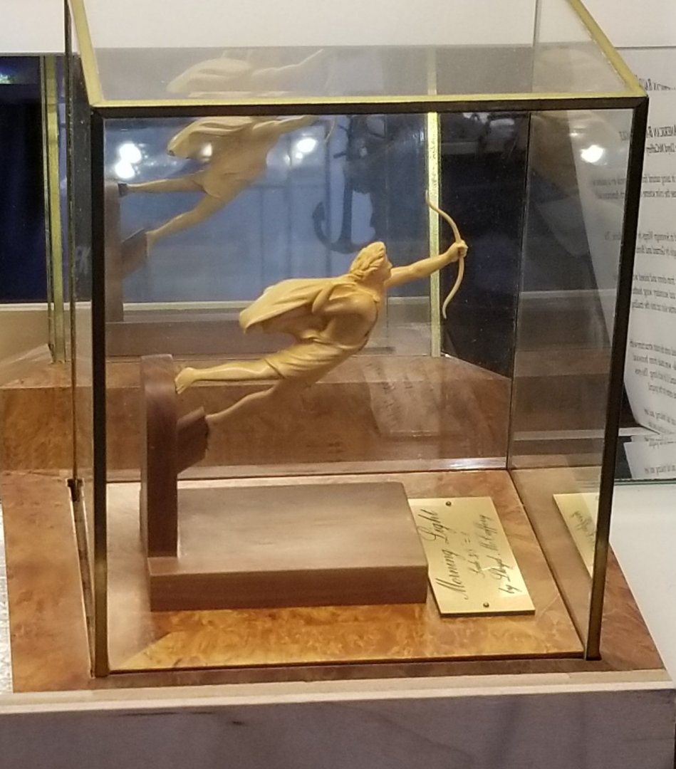
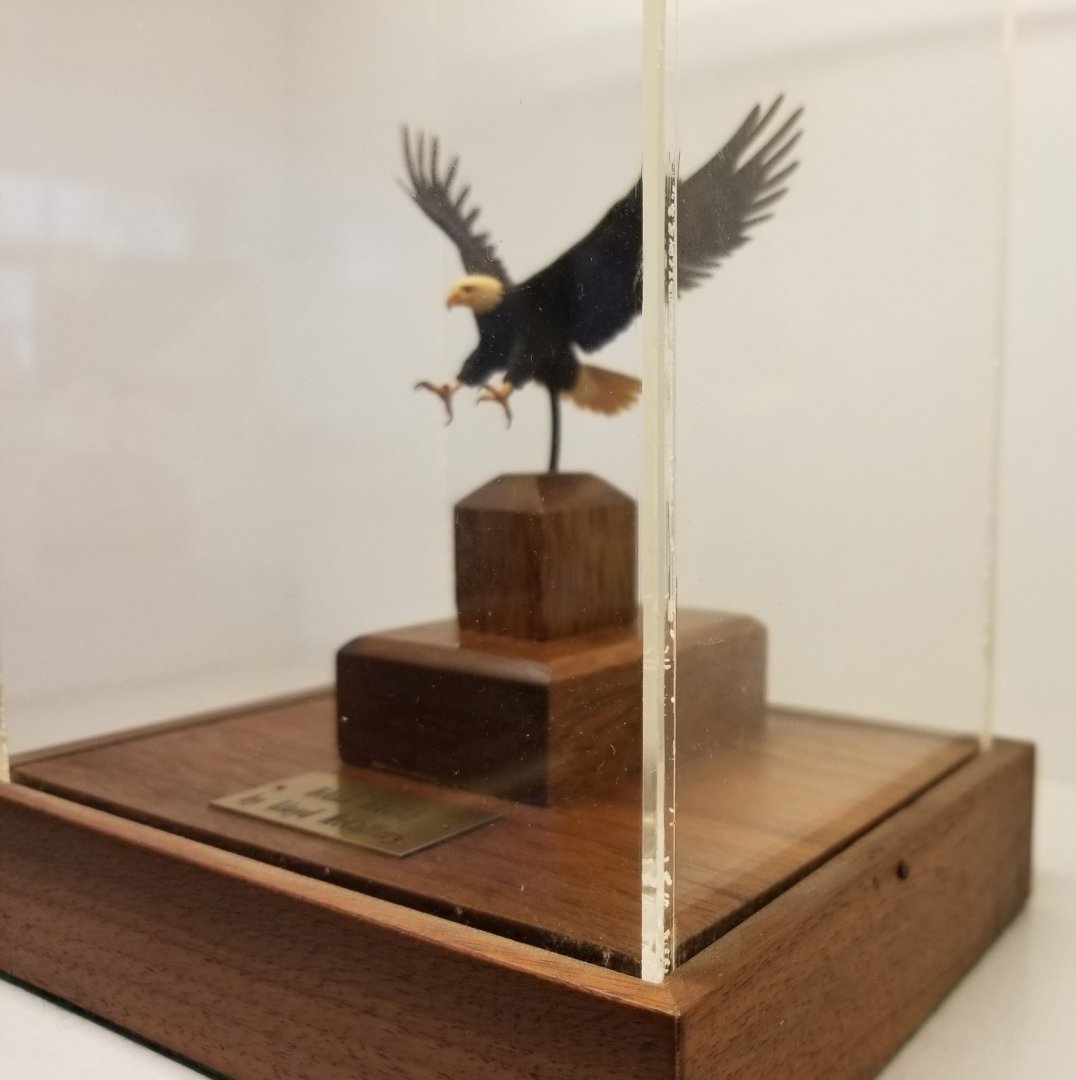
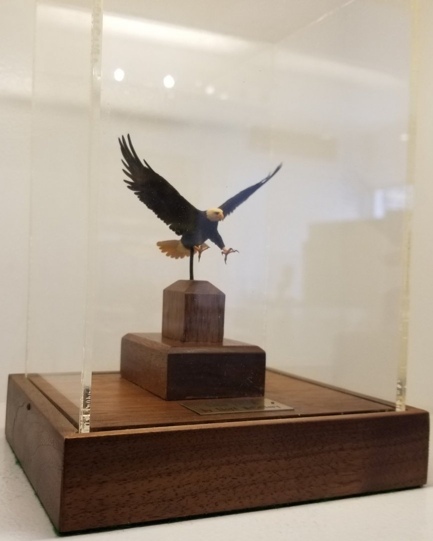
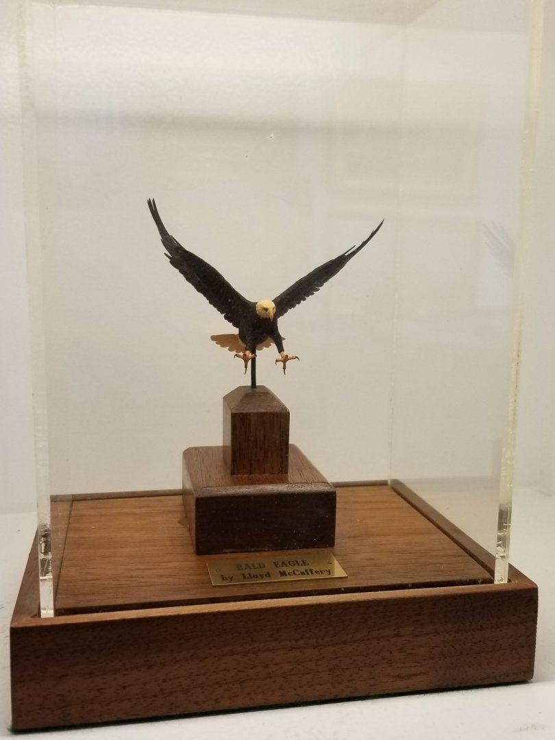
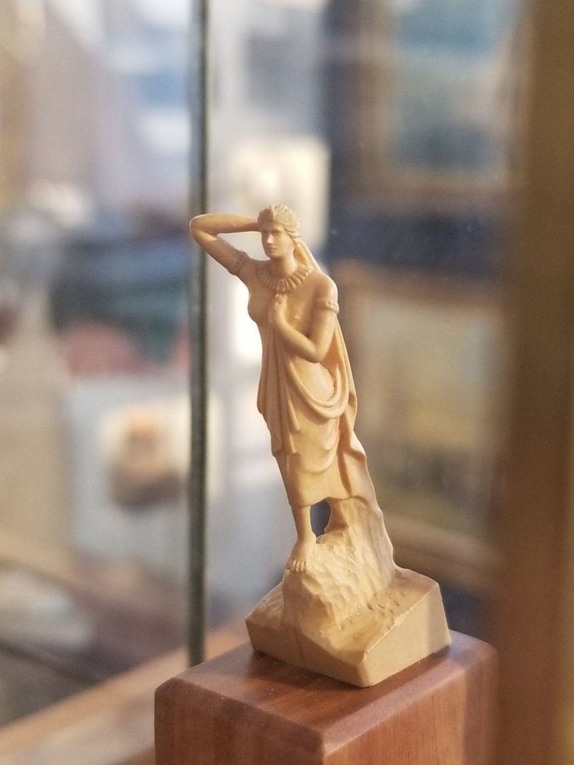
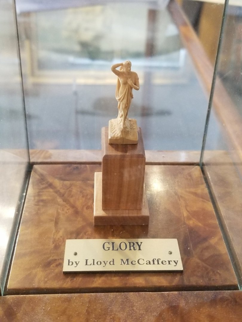
Continuing in the vein of Lloyd McCaffery's brilliant miniatures, known and recognized world wide as some of the finest on the planet, here are more priceless treasures in the most unique Maritime Art Gallery in the Borough of Stonington, CT. (1) "Ancient Victory" (2) Clipper "Morning Light" figurehead (carved by Gleason who also did "Glory of the Seas") (3) Dual horses head figurehead of British Ship of the Line "Royal George" named for the King. (4, 5 & 6) "Glory of the Seas" before Russ offered to move her to an easier spot to take pictures of her. You can see the difference in quality. (7) "Morning Light" different angle (8, 9 & 10) "Bald Eagle" this is simply a stunning piece of work. The eagle looks so lifelike and delicate, these pictures hardly do it justice. Before I discovered Glory this show piece stopped me in its tracks. Magnificent. (11) British Brig HMS "Sultana" which has apparently been recreated full scale in the South. (12) Yacht "America" Winner of the 100 Guinea Cup, forever after named the "America's Cup" leading to the most incredible winning streak in sports history as the USA repeatedly won this prize for well over a Century! (13) two Royal Barges


- 3,560 replies
-
- 1
-

-
- clipper
- hull model
- (and 2 more)
-
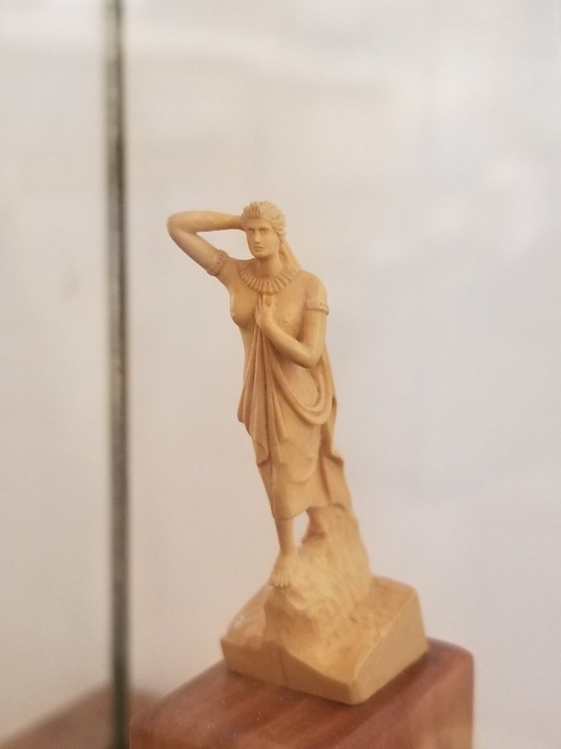
As promised earlier today, here are the many pictures I took of Lloyd McCaffery's incredibly tiny wooden carving of Glory's magnificent figurehead. Mike told me in one of his emails that Lloyd went to the India House, NYC to take multiple angled pictures of the actual Grecian Goddess 'Athene' figurehead, where he had been given extraordinary access to her by India House management, in reparation for this work. Knowing his penchant for thorough research for any artifact he creates, we can all be very confident that this is a delicate recreation of her in miniature.


- 3,560 replies
-
- 2
-
-
- clipper
- hull model
- (and 2 more)
-
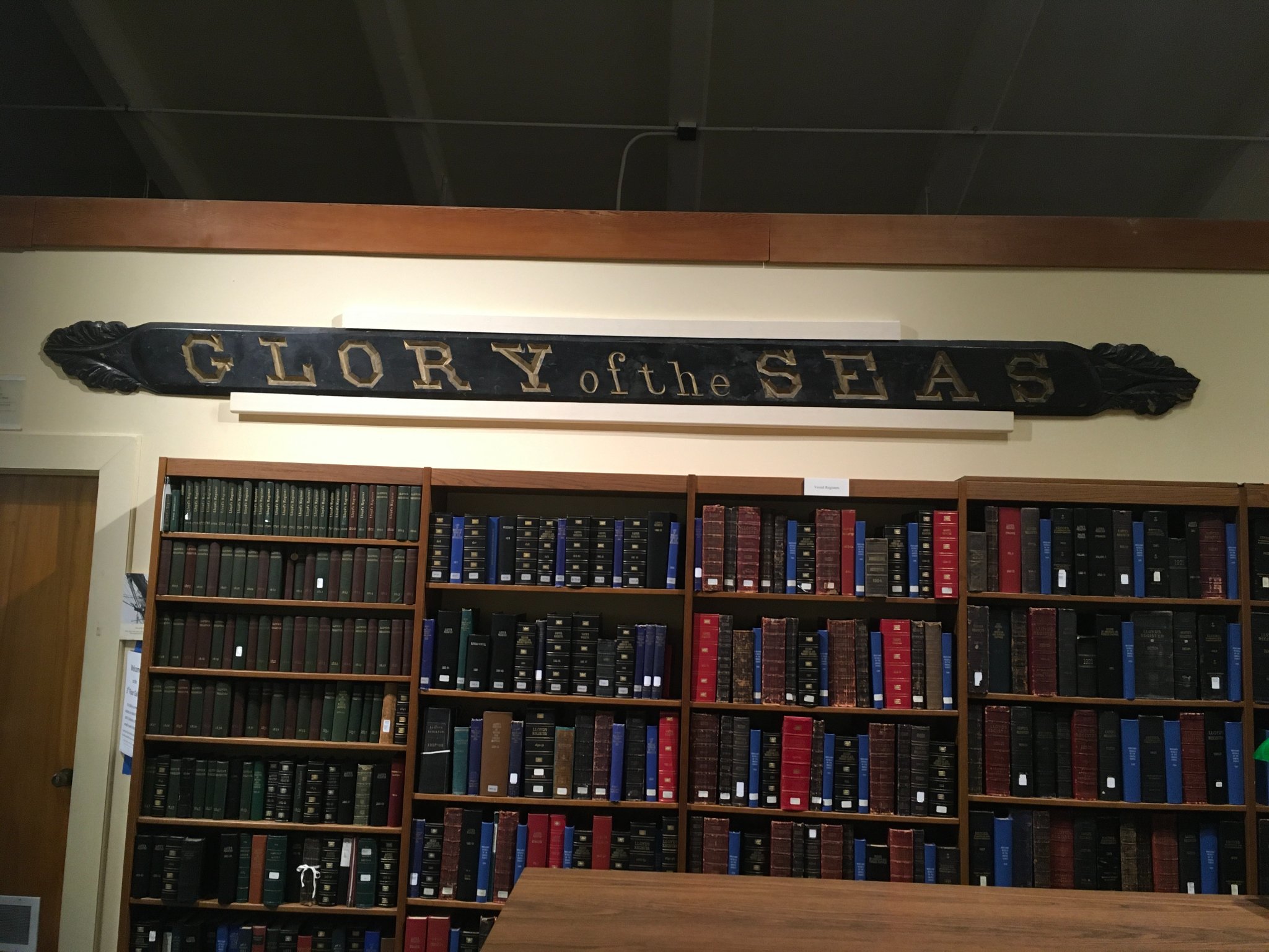
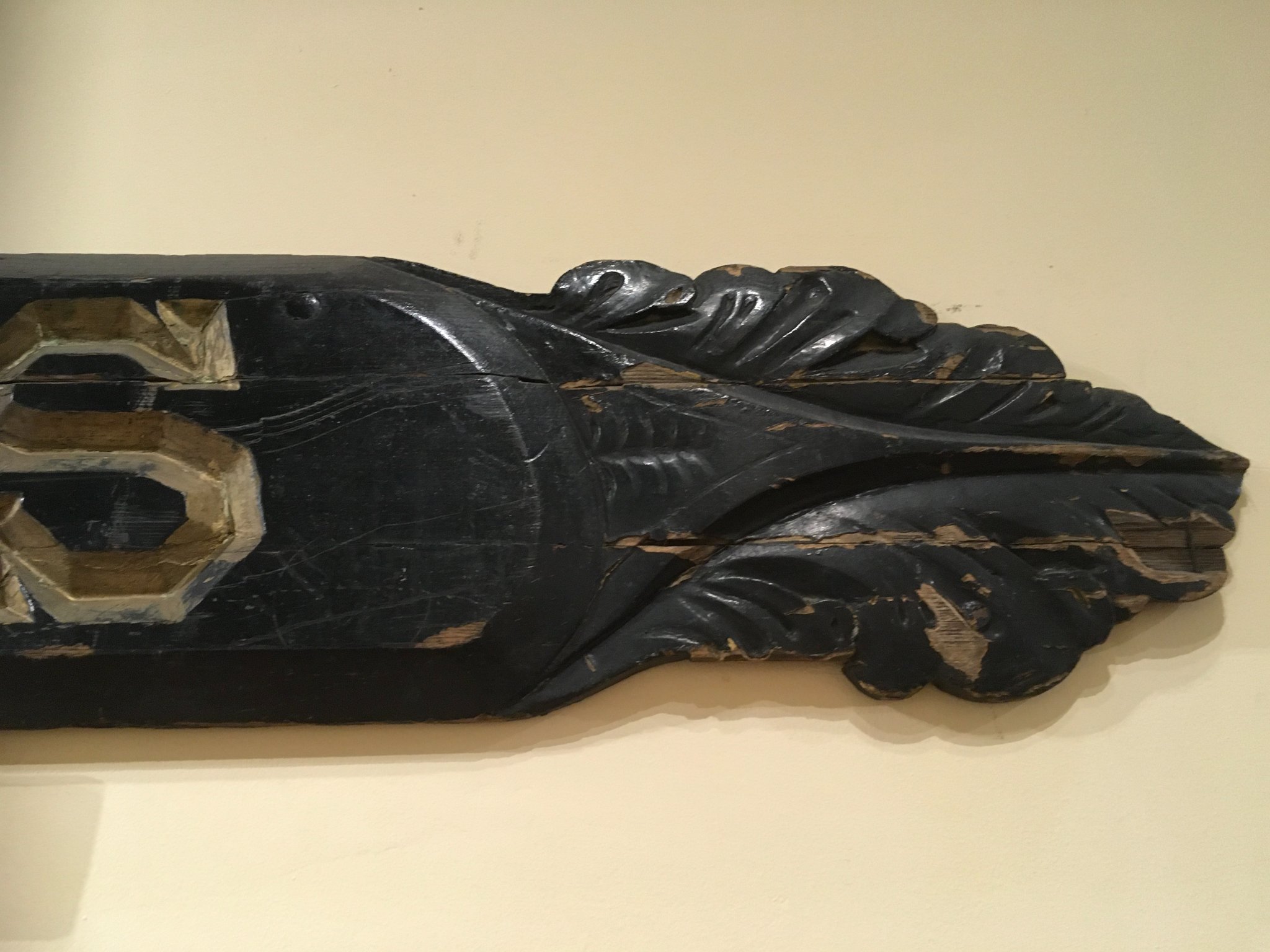
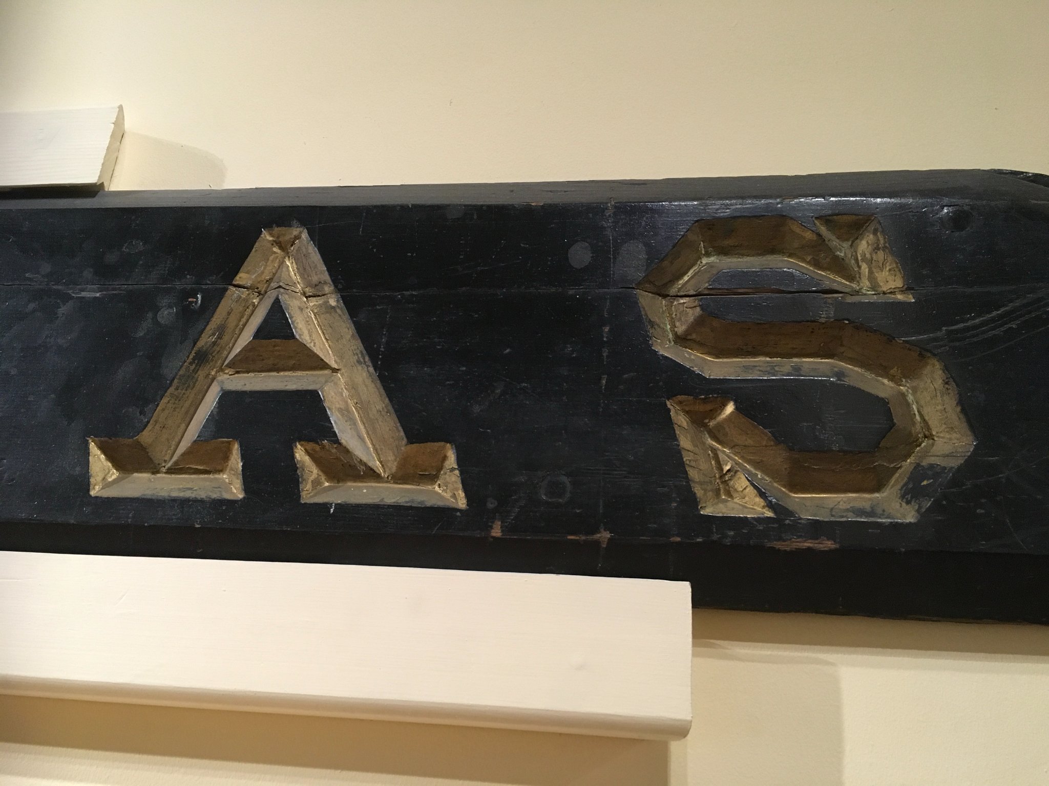
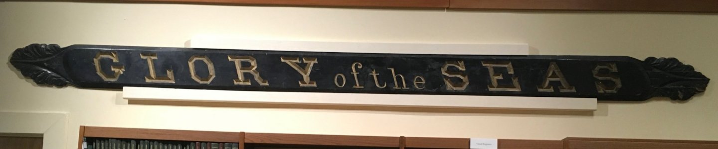
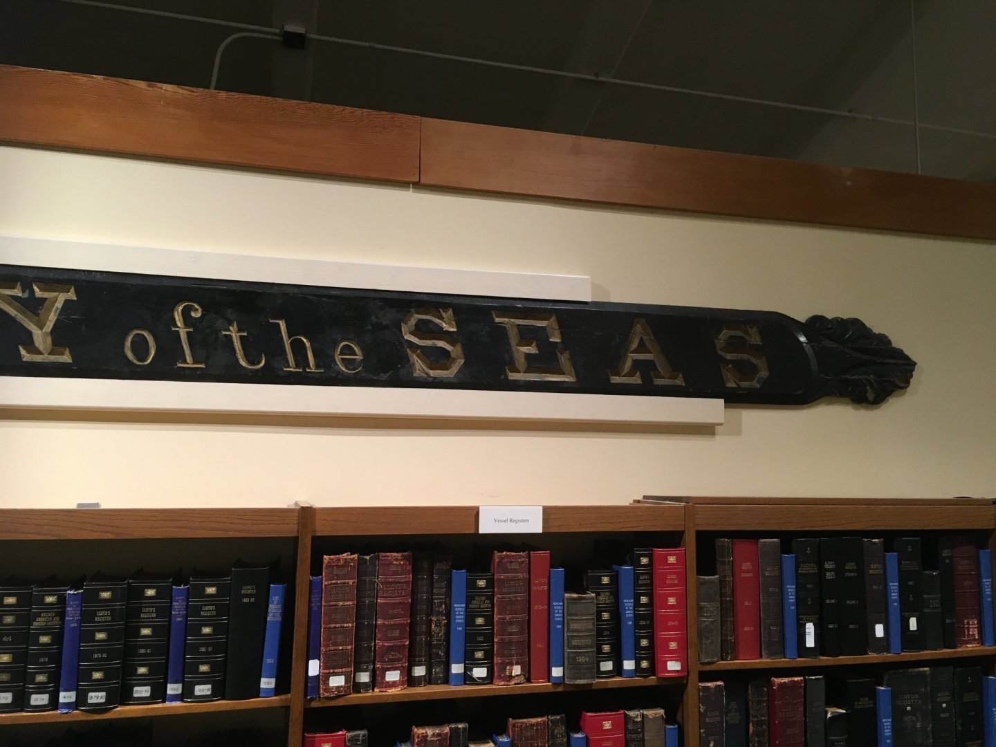
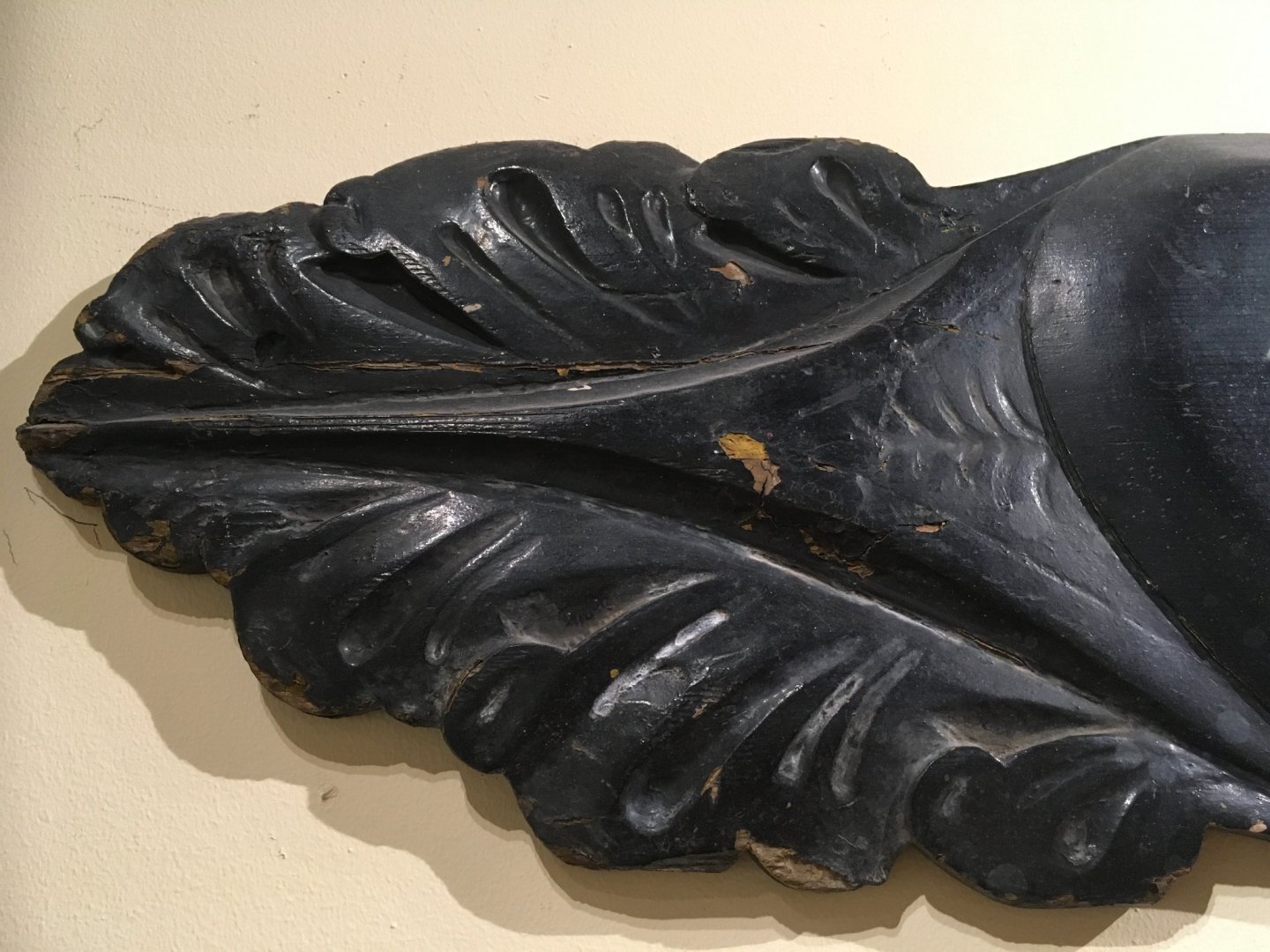
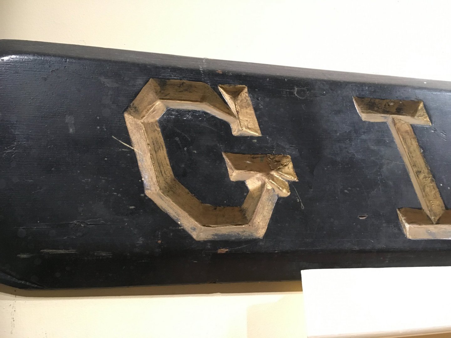
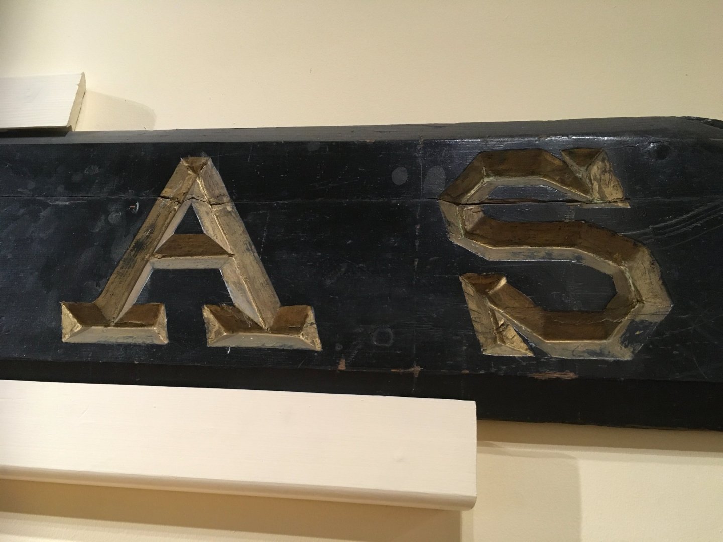
Rob, Vladimir Gina Bardi came through big time for me! Here's the series of images she took of "Glory of the Seas" nameboard. I've enhanced the one image of the entire board so it can be seen close up. Details I noticed are that it appears like both ends of the board with the lovely oaken leave scrollwork were damaged. The fore end lower innermost section looks like it was detached but somehow saved to be reattached at a somewhat awkward angle. Upper fore section appears to be unmarked. Sadly the aft section didn't fare as well. The bottom seems to be missing some parts and there is a large double crease in the center. Still, all in all for having survived possibly from 1869 until 1922, potentially 53 years this artifact is a wonderful tribute to the durability of the cedar it was crafted from. My impression is that this port Bow nameboard is the original device but Michael Mjelde said it couldn't be verified if it had ever been replaced. With the close ups thought, you can clearly see that it was all hand chiseled. He described this as remarkably difficult work due to the somewhat rubbery aspect of the nautical cedar.


- 3,560 replies
-
- 2
-
-
- clipper
- hull model
- (and 2 more)
-
Vladimir, My apologies, the 1st artist's last name is Walters not Warren. He's a very famous contemporary British Ship Portrait artist. His broadside for view of 'Glory of the Seas' is probably the finest depiction of her for accuracy. I think I hot his last name confused with the 3rd artist's 1st name which just happens to be Warren.
-
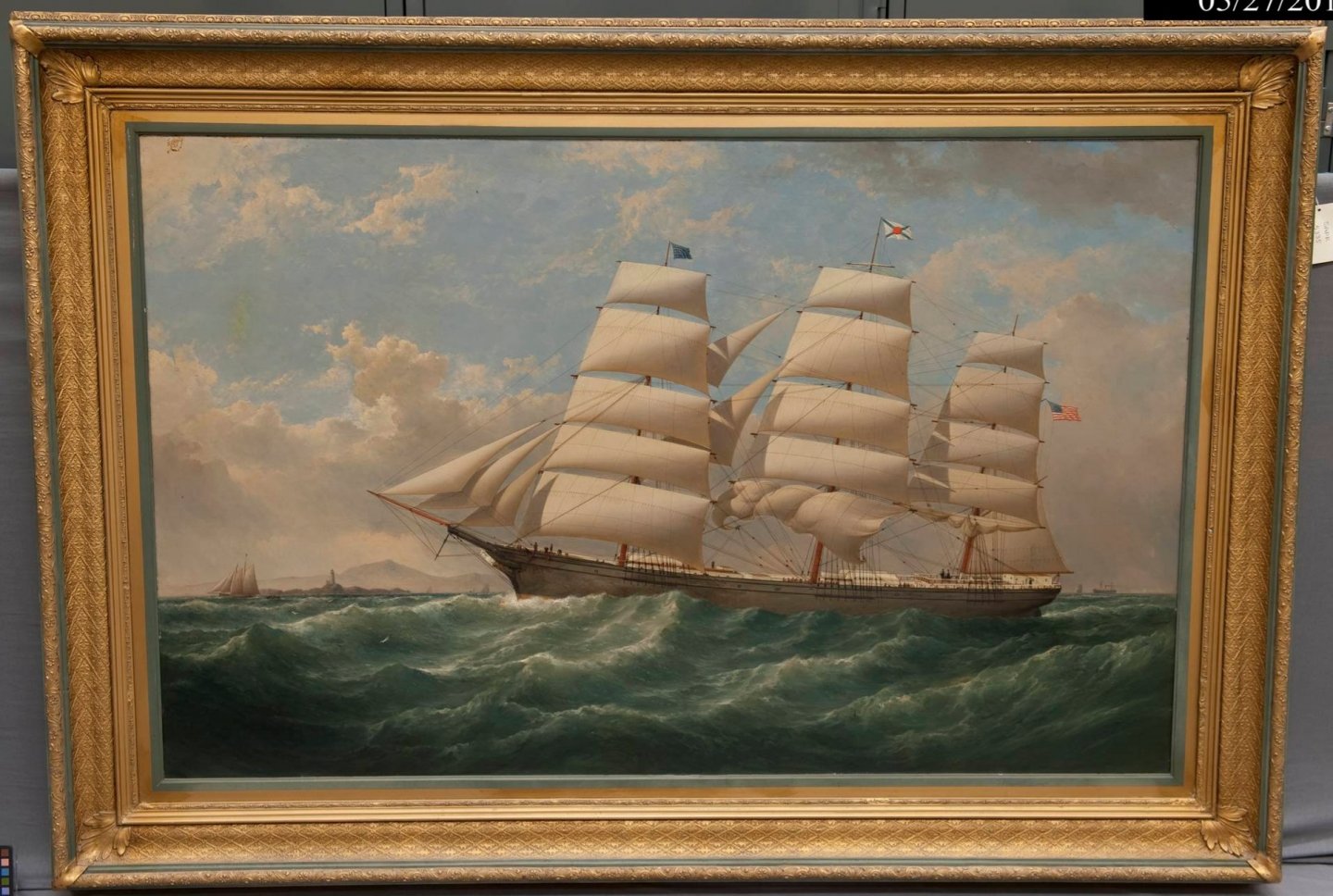
Rob, I wonder if Samuel Walters did this same topic in more than one painting? These 2 works look remarkably similar. Either it's the same one with different exposure resolutions or he did this same work more than once. Most likely it's the same one taken in different lighting. One of my favorite art galleries has closed. I just learned in conversation with Russell Jinishian, previous curator, that the Mystic Maritime Art Gallery closed last year. As serendipity turns out, he recently moved his own Maritime Art Gallery to Stonington, CT and has invited us to tour it tomorrow. Apparently it's in an old dress manufacturing factory and according to what I've read, fills every space. Here's a link to his website which features some of the most beautiful contemporary nautical artists: jrusselljinishiangallery.com I hope he'll give me permission to take some gallery shots to share a general feeling for his place.
-
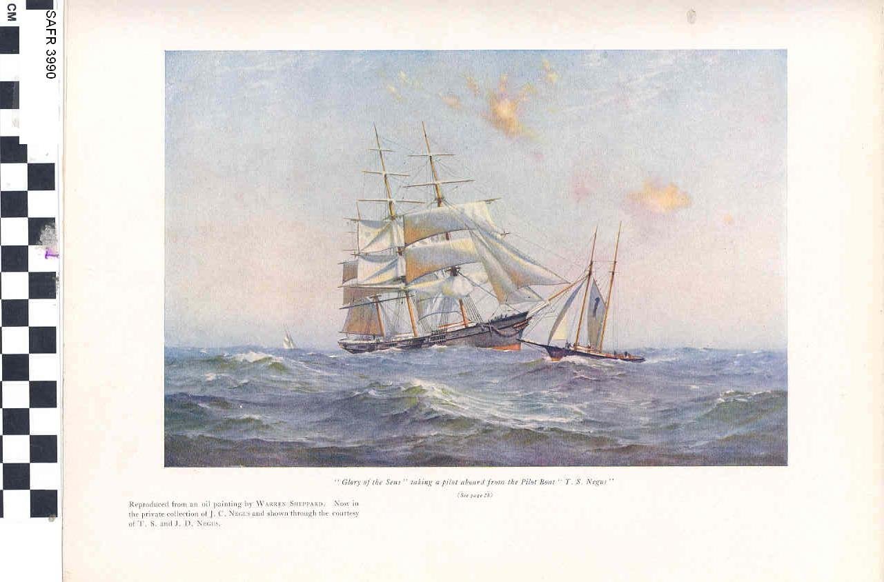
Rob & Vladimir, Here's another special treat from Gina Bardi, Reference Librarian, San Francisco Maritime Museum courtesy of Michael Mjelde who was kind enough to forward my contact information to her. (1) my personal favorite is the entire framed oil painting by Samuel Walters (2) a smaller watercolor by Alcott (3) a well known painting by Warren Shepherd.
.jpg.02da4186bbc2ef145fa6fd69aed8d467.jpg)
-
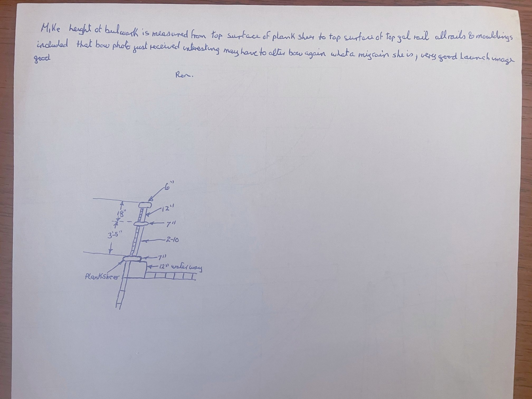
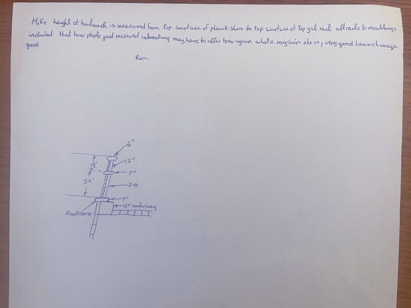
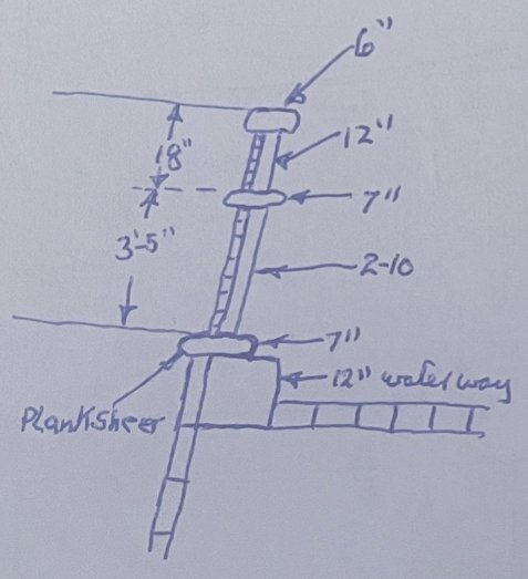
In his most recent email, Mike included this neat diagram by genuine, now retired shipwright Ron Haug from "Down Under." I love his jocular commentary about how further revelations of Glory's sleeker Bow has been giving him migraines! To make it easier to view, I've enlarged that section of the paper.
-
Vladimir, thanks for the "heads up" on slightly low bulkheads 15, 16 & 17. It looks like there's a pen mark at the base of 14 too but it's almost even with the base of the keel. As for your "little" project. Wow! Not being a woodworker myself. I haven't carved a thing since making neckerchief slides in Boy Scouts as a teen. I love all the careful interlocking pieces. I believe it's referred to as "mortise and tenon." There also appear to be round wooden pegs in use too. I'm also impressed with the care to be sure these lovely wooden studs are all elevated to prevent moisture laden wood rot. All in all a very impressive shelter. Just one question. What will it eventually be for?
-
Rob, your 2 day US mail also has a tracking # with insurance which I emailed to you. There should be no worries about it arriving on time. Vlad, I know you also plan to do your own Glory. I look forward to viewing your progress too.
-
Vlad, As I told Rob, June 1st is a good omen as it happens to be Peg and my 36th Wedding Anniversary too!
- 3,560 replies
-
- 1
-

-
- clipper
- hull model
- (and 2 more)
-
Vlad, If 2 day mail can be believed, Rob should get his package by next Tuesday. I too am very excited to see his warp speed progress once he gets started.
- 3,560 replies
-
- 1
-
-
- clipper
- hull model
- (and 2 more)
-
Rob, I sent you and Vlad an email. Our bulkheads arrived in the mail yesterday; too late to be resent. Your kit went out in today's mail and you you should get it Tuesday, June 1st.
-
Rob, you're welcome, of course. I'm hoping they arrive before June 10th. That's the day I go back into Yale New Haven Hospital to have my bladder removed and rebuilt. I will leave instructions to my wife to take care of the mail if I can't. I too look forward to your remarkable progress on McKay's lovely last Clipper "Glory of the Seas."
-
Rob, The day our package arrives, I will send yours out by 2 day usps tracked mail.
-
Rob, furthering our evaluations, a 60" internal mainrail bulkhead would actually be 4' 8 & 1/2", topped by 18" monkeyrail results in 6' 2 & 1/2" with an external bulkhead dimension of 4' topped by the 18" external monkeyrail.
-
Rob, whew. That's a relief. It will probably satisfy Mike too since he was referring to MacLean's reference of Glory's bulwarks being "about" 6'. I think 6' 2 & 1/2" meets that criterion nicely.
-
Rob, I think I follow. A technicality is that while two lower deck waterways were 16", the upper deck waterway was 12". Based on your description, the difference would be 8.5" instead of 12.5" (12" - 3.5" deck height is 8.5"). That would mean a 60" internal bulkhead height would be 51.5" or 4' 3.5" externally. Based on the measurements taken from her broadside photo it looked like 3' 8.5" maybe 4' at most, measuring from lowest molding to upper molding. Adding 8.5" to that would result in 4' 8.5" if we add back in the 3.5" deck gets us back to 5'. So it looks like an internal bulwark height of 5' was not counting the 3.5" thick deck height. Adding 18" to 56.5" gives us 74.5" or 6' 2 & 1/2". Does that now sound about right?
-
Rob, Vladimir, Rick the closest exterior measurement I can get for Glory's bulkheads was 3' 8 & 1/2". IF that's accurate and that's a big if, that would lower her mainrail bulkhead height from an even 5' to 4'8 & 1/2" with a monkeyrail height of 18" that would end up with a total height of 6'2 & 1/2". With a lesser monkeyrail height of 16" it would be 6' & 1/2". Personally my inclination is to believe that McKay wouldn't make his mainrail bulkhead that low so I'm still more inclined to believe in a 5' interior bulwark topped by an 18" monkeyrail for total height of 6'6". I'm seriously beginning to think this could also be trying too hard. I'm curious as to your thoughts.
-
Rick, that's helpful information to know. It means that instead of subtracting 15 & 1/2" from exterior bulkhead height (having 3 & 1/2" added for deck height) in reality we should only be reducing it by a foot instead.