
ClipperFan
-
Posts
2,171 -
Joined
-
Last visited
Content Type
Profiles
Forums
Gallery
Events
Everything posted by ClipperFan
-
 Not that this compares in any way to hand laying 2,000 copper plates but I can remember as a youth wanting an authentic turn of the century water tower for our HO train layout. None of the plastic offerings looked genuine enough. So we scratch built one. For the tin roof we improvised ordinary aluminum foil, dull side out and cut them into scale shapes. That was a tedious, time consuming project. Afterwards we used ordinary tea to stain the entire contraption and imitate rusty weathering. As I recall it came out looking better than we'd hoped but yeah, I wouldn't want to anticipate hand lay a 1,000 or more tiles either.
 -
Vladimir, beautiful work on her Stern and Counter. This is where Michael Mjelde's highly detailed images have given us such in depth knowledge of all the subtleties of McKay's construction. You are doing a great job in capturing it too!
-
Vladimir, no problem. It was just a thought. Anyway if you're considering modeling Glory as first launched, this gives you an idea of what shade her Muntz plates would have been when new.
-
Rob, I see 3 telescopes. A smaller one mounted next to a larger next to it. My guess is you use the smaller first to locate a planet and then view it better with the larger one. But the 3 projecting out of the roof looks huge. Did you build all 3?
-
Rob, Snug Harbor Johnny, your brief reminiscence of crafting telescope mirrors has me curious. Were these for Nautical uses or astronomy? I always suspected Rob was an Engineer at heart, since he's constantly designing all these clever time saving devices for his Ship modeling needs. Crafting those highly polished mirrors to exacting specs must have been quite challenging and fascinating at the same time.
-
Vladimir old buddy, old pal. Not to throw a "monkey wrench" into your plans to invest in relatively expensive Amati copper tiles but I thought you might just appreciate seeing a less costly alternative. Granted, this real brass foil would have to be modified ala Rob's technique but think of the amazingly similar results to new Muntz metal. Of course, this would have to be dulled down but it's dramatically different than copper. Besides, I'm pretty sure that the replications of the Amati tiles are in reverse.

-
Rob, I'm blown away with what you said. All I can say in reply is.... thanks. I have no other words.....
-
Rob, you're probably right. My enthusiasm for the project got the better of me. I don't know of anyone on a par with EdT, then again I have to admit I'm unfamiliar with Banyan's works. Still what you produce does speak for itself too.
-
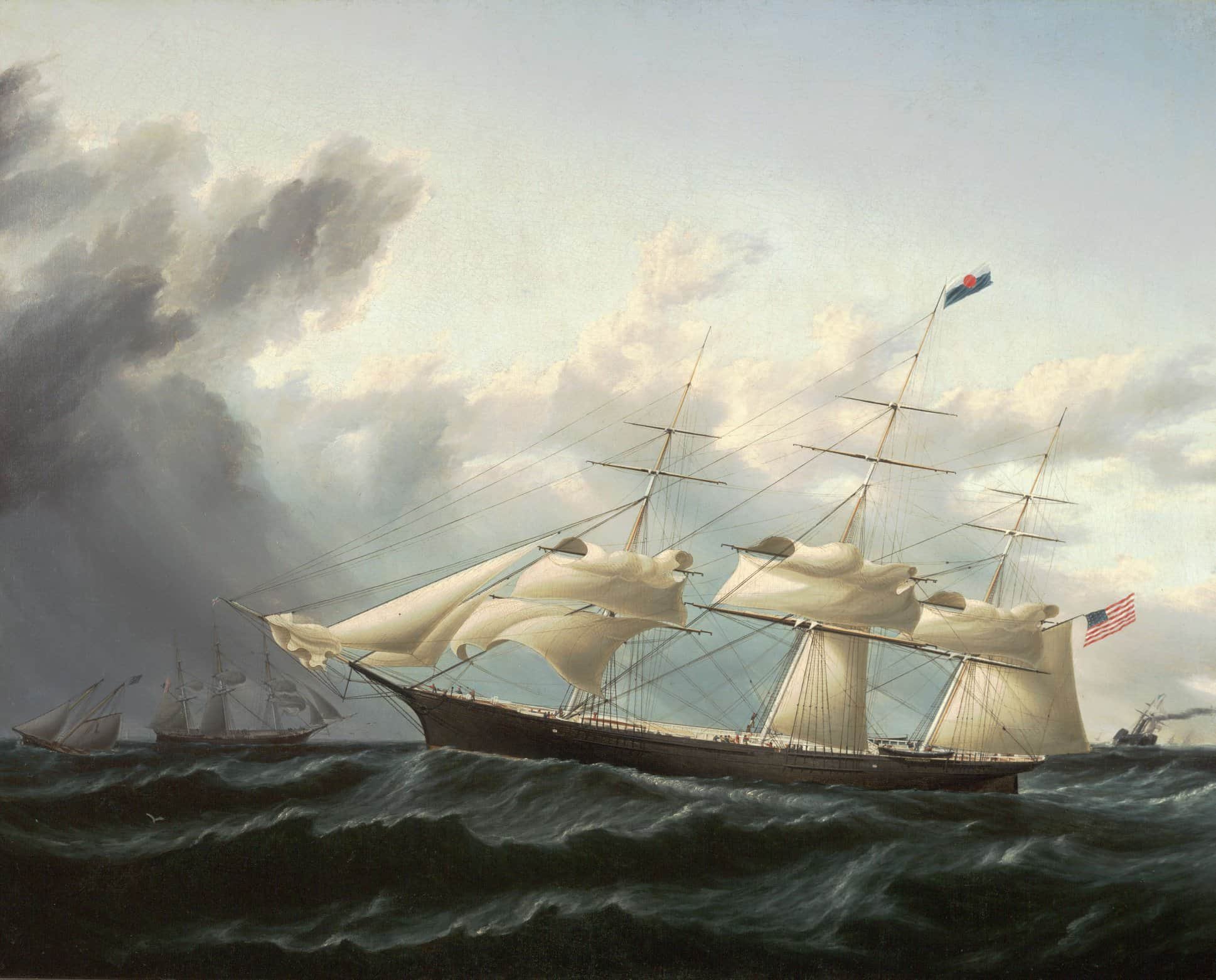
Vladimir you did indeed "make some serious dust." Awesome results worthy of "GLORY of the SEAS" herself! When she was first launched, Duncan MacLean commented that she sides were polished as smooth as glass. Your miniature vessel replicates that look impressively.
-
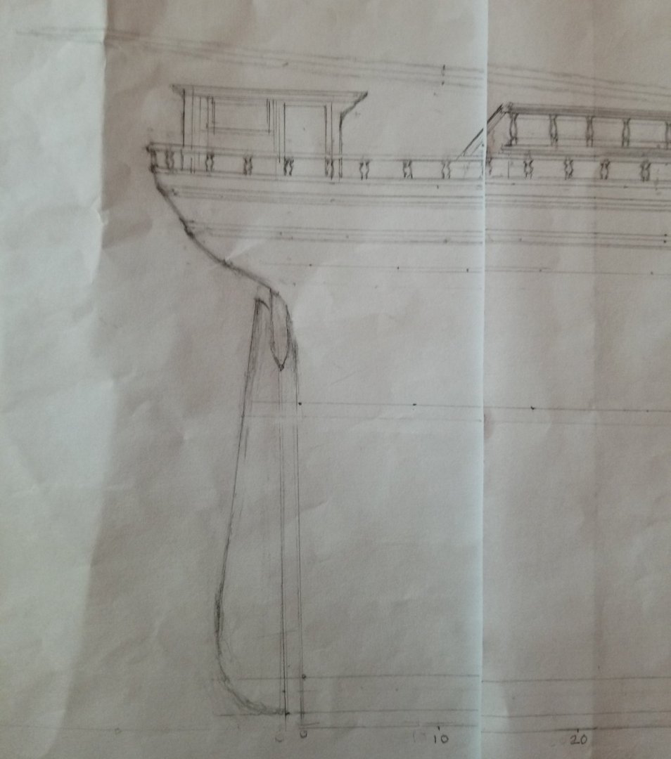
Rob, as usual this rudder with its unusually strong post is Museum quality perfection. That was a great catch and once again will add to the uniqueness of this incredibly durable vessel.
- 3,560 replies
-
- 1
-

-
- clipper
- hull model
- (and 2 more)
-
Rob, Vladimir et all I just received this reply from Michael Mjelede, in response to my update about our year long journey of discovery about the impressively beautiful authentic lines of McKay's last Clipper. Verbatim, this is what he wrote: "Thanks for sending. I will 'digest' all that you, Rob and Vladimir have accomplished this week and get back to you. I think that it is outstanding what you collectively have done."
-
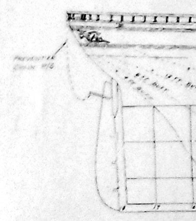
Rob, unless this rudder post is longer than 6 1/2', it won't impede into even a 25' coppering line. When I extended the post to a scale 6 1/2' it should just about touch the yellow metal line but not pierce it, as far as I can tell. By the way, I shared your discovery on Vladimir's site so he can take the necessary steps to correct the oversight. Which brings up another interesting question. Nowhere do I see the traditional hinges so typical of these sailing ships. Do you suspect they're just hidden or is it possible that McKay used a more advanced system of hinges?
-
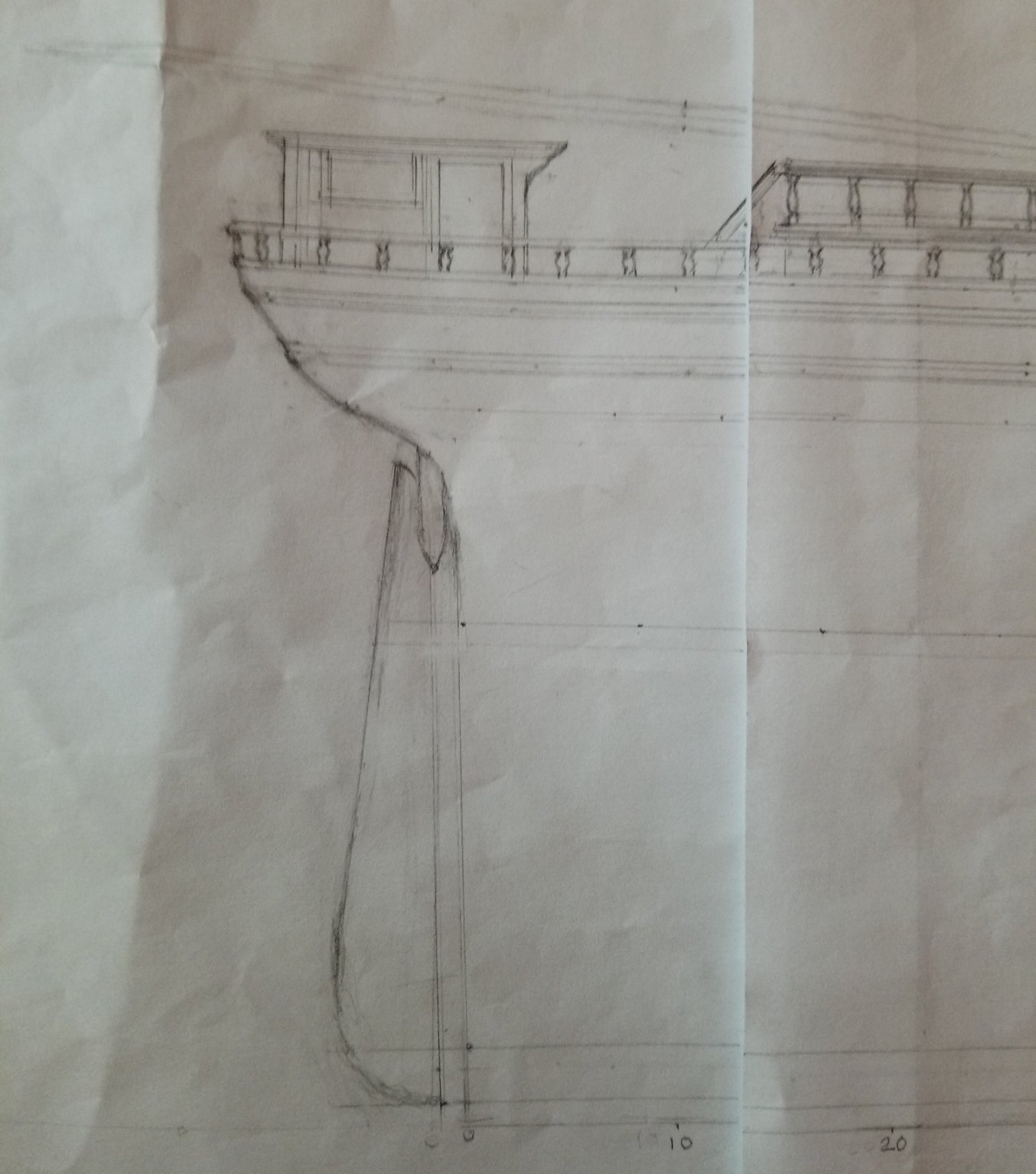
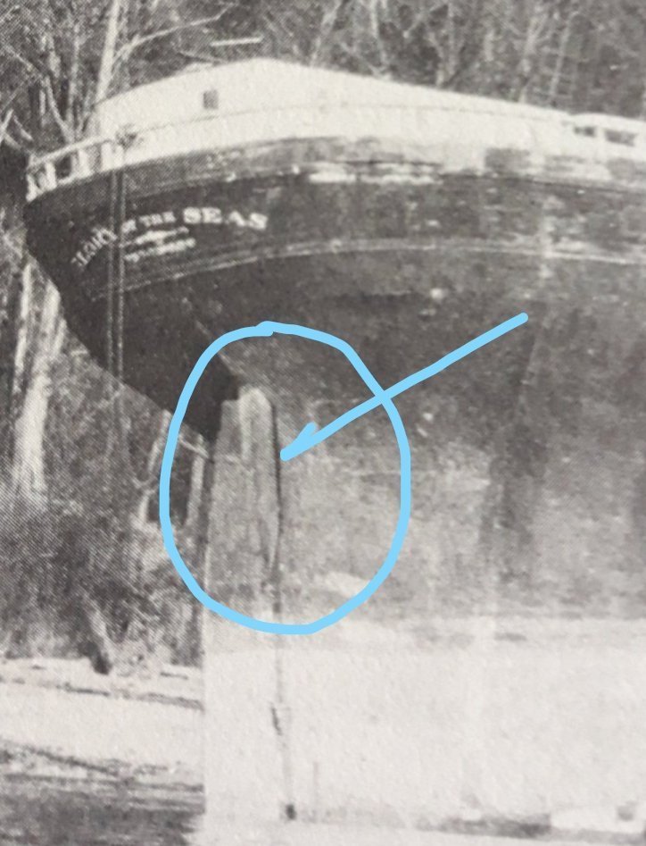
Vladimir, Rob just made an amazing discovery which will require you to adjust your rudder cut out significantly. It turns out the rudder post extends 6 1/2' from where it exists the Stern (this is the length I calculated by comparing this device to the 4' main bulwarks added to the 2' drop which is formed by the transverse structure which shows up as a shadow in the same scene. Rob has circled the picture where he discovered it.
-
Rob, You have sharp eyes! I completely missed that feature until you pointed it out just now. That rudder pin looks to be about 6 1/2' long beyond the exit of the Stern, which is quite substantial. When you consider this must have gone up to the Poop deck, this spar must have been enormous. I arrived at that external figure by adding the distance of the 4' main bulkhead above and the 2' drop below where you see the shadow crease formed by the transverse timber. Now I better understand the issue you're facing. Obviously the little cut out isn't deep enough to accomodate such a significant piece. Here's an idea you might like. Instead of butchering the rudder section on your existing vessel, what about cutting a trench in the rudder piece so it slides neatly over that area? You won't have a flexible rudder but with a static display model, were you even planning to? The only other alternative is to cut 3/4ths of an inch into the rear of the Hull to accomodate this longer rudder mount. Again that's if you want the rudder to function.
-
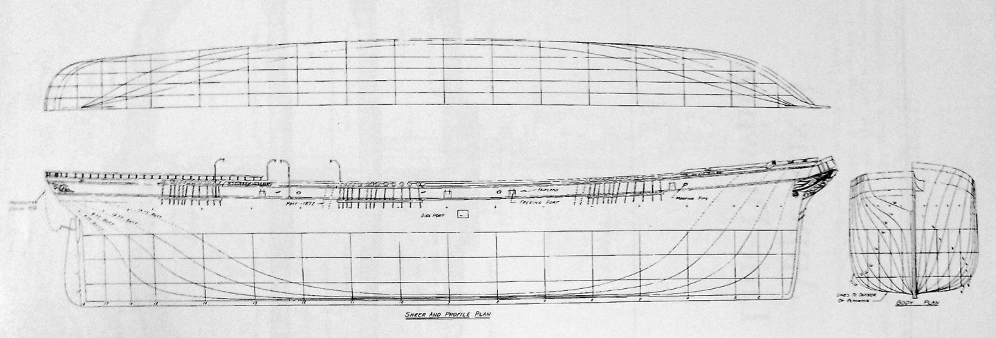
Rob, My sincere apologies, I think I missed correcting the rudder angle on Vladimir's profile. Instead of angling slightly outward as he had done, it should be exactly the opposite, canting just a touch inwards. I was so focused on getting her complex Counter and Stern details correct that I missed that rudder error. As you know, I very strongly disagree with most of this plan ("Clipper Ship Captain", Appendix B page 214), as we've proven over the past year, unfortunately it just doesn't measure up at all to many newer images of Glory herself that Mike has so generously shared with us. However ironically the rudder looks accurate. One thing I recently noticed when more carefully reviewing McKay's "Flying Fish" which I strongly suspect was a big inspiration for "GLORY of the SEAS" is that the rudder mount is not vertical. It cants slightly forward just a little. If you look carefully at Michael Mjelde's rudder section, you can see it. Again, it's subtle but definitely there. To verify this, look at the vertical lines, then look at the rudder line, it's not vertical. I also realized this when I had to adjust this section in my own exacting 1:96 scale lines. The shift forward from vertical is very small 1/8th" or exactly 1' to scale. Lines of my sketch are parallel and straight, the paper is just wrinkly. I hope this helps.
-
Rob, when I look at the remarkable results craftsman like yourself and Vladimir produce, it's tough for me to not feel unworthy to be in the presence of such awesome talent. I feel I can at least contribute by doing my best to get the most accurate plans possible so that you guys can unleash your magic.
- 3,560 replies
-
- 1
-
-
- clipper
- hull model
- (and 2 more)
-
George, thanks for letting me know about the ultimate fate of the USS Chesapeake. Ironic that they flew a flag saying "Don't Give Up the Ship!" Unfortunately they were ill prepared for the British Captain of HMS Shannon which easily tore them to pieces...
-
Rob, wow! Amazing! These miniature vessel comparisons are spot on!! This is pretty much all the proof we need to confirm the year's worth of painstaking research has clearly produced the proper results we all have been hoping for! Congratulations!! Earlier today I sent Mike details on all the discoveries we've made and how our measured, scientific approach has completely reinterpreted what we thought about her appearance. I concluded with Vladimir's computer drafted bulwark profile and his bulwark kit created from it. He's so busy he just sent me a reply that he appreciated the in-progress pics I shared with him. So I don't expect much different from this last message but as soon as I can I will include your latest comparisons. It's uncanny how much they match.
- 3,560 replies
-
- 2
-
-
- clipper
- hull model
- (and 2 more)
-
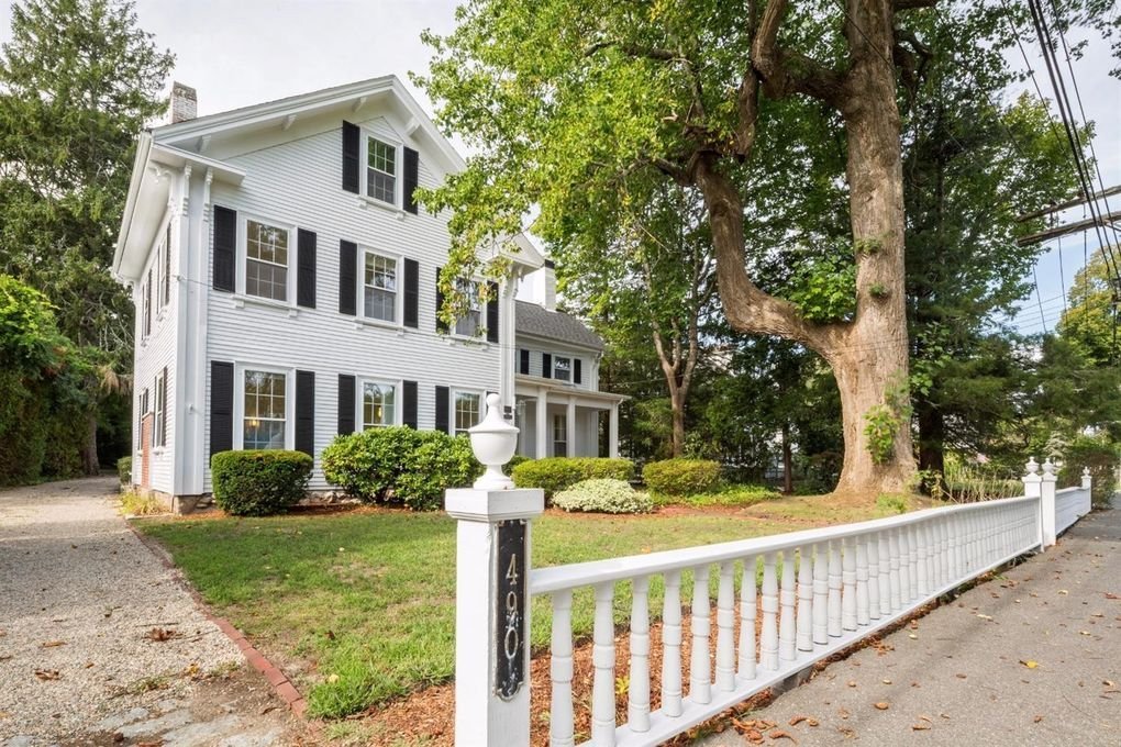
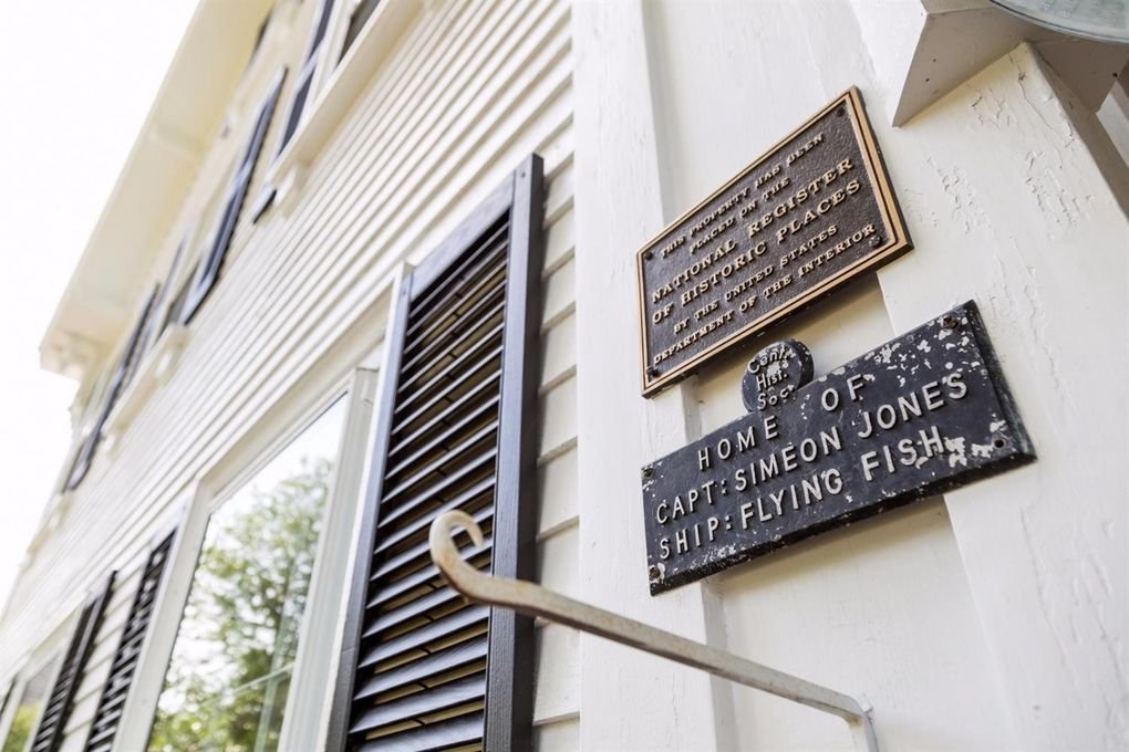
George K this is a beautiful vessel you're crafting. First rate work. I'm constantly in awe of the woodworking abilities you and others display in these build logs. It's artisan craftsmanship at it's best! Here's some fascinating trivia that you might not know. Captain Simeon Jones, who was the Captain of "Flying Fish" had a Greek Revival Home he named "Longacre" built for himself in 1860, at 490 Main Street, Centerville, MA suburb of Barnstable near Hyannis. It's still standing there today. Why I mention it, is because the front fence is supposed to be made up of turned rails which originally came from the Clipper "Flying Fish" herself.


- 602 replies
-
- 7
-
-
- Flying Fish
- Model Shipways
- (and 2 more)
-
Rob, beautiful work as always. This vessel is definitely "GLORY of the SEAS!"
-
Rob, Vladimir, You guys can both relax. I sent Mike 2 emails. The first has a dozen images of Rob's earlier progress on his vessel. The second has a dozen pics of Vladimir's progress. I'm expecting Mike will be suitably impressed with both of your models. I wanted to send him a 3rd with pics on how we developed our plans but I was too tired. The last damn side effect of my procedure. It's how I'm forced to realize I've still recovering.
-
Guys, no pressure. Mike simply wants to see some progress photos. I think I've maybe complicated this issue way too much. For that, I apologize.
-
Rob, Since I have haven't replied to his request for a couple days now, I want to send him something. Don't worry, you've already shared enough progress pics that I can work with what's already been posted. That goes for Vladimir too. I was just thinking if you had the chance you could shoot maybe a couple more. Either way, I'm very confident Mike is going to be major impressed with both of your projects.
-
Rob, Vladimir, Later today I plan to email Mike some progress pics of both of your models. What I think would be most impressive would be to try to capture angles of your Clippers that most recognizably match the many scenes Mike has shared with us. That way I'm hoping it will go a long way to convincing Ron Haug to seriously reconsider his Glory plans.
-
Vladimir, this is word for word, as taken from Seaways, Ships in Scale Jan/Feb 1992, Vol III, No 1 Michael Mjelde's article "Glory of the Seas - Medium Clipper Ship" an excerpt from Duncan MacLean's 1869 description of Glory's construction details: "the floor timbers are sided 15 inches and moulded 20 inches on the keel with 28 inches space of frames from center to center, and as the frames ascend, they vary from 12 inches by 14 inches to eight inches by 11 inches, and the bulwark stanchions at the plank sheer are sided 11 inches and moulded 8 inches." The way I interpret moulded vs sided is that the thicker dimension "sided" would be the part that makes up the backbone of the ship's ribs and "moulded" would be the visible width. So your visible stanchions would be 8" each, 28" apart center to center. Taking into account 1/2 of 8" is 4", your upper bulwark stanchions are 2' (24") apart. Of course, Rob can correct me if I have these dimensions backwards.