Hubac's Historian
-
Posts
3,304 -
Joined
-
Last visited
Content Type
Profiles
Forums
Gallery
Events
Everything posted by Hubac's Historian
-
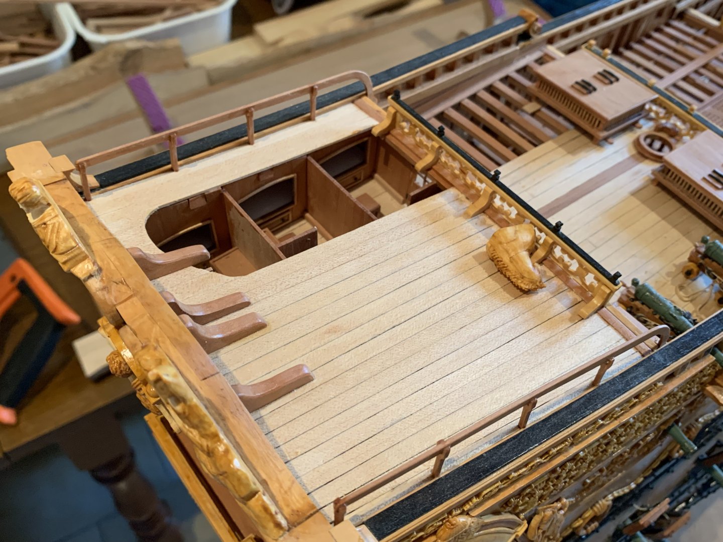
 My only real issue with pronounced pitch on the poop royal deck is that this is one deck that makes sense for the open chicken coops to reside on. However, you could always stilt the legs of the coops so that they are on the level.
- 414 replies
-
- 1
-

-
- soleil royal
- Heller
- (and 1 more)
-
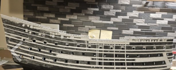
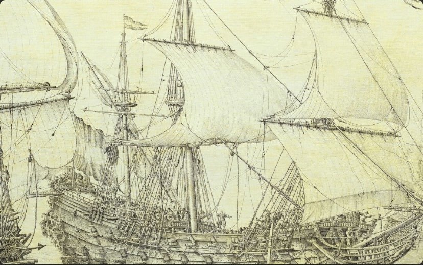
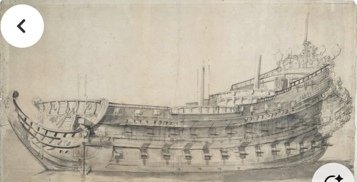
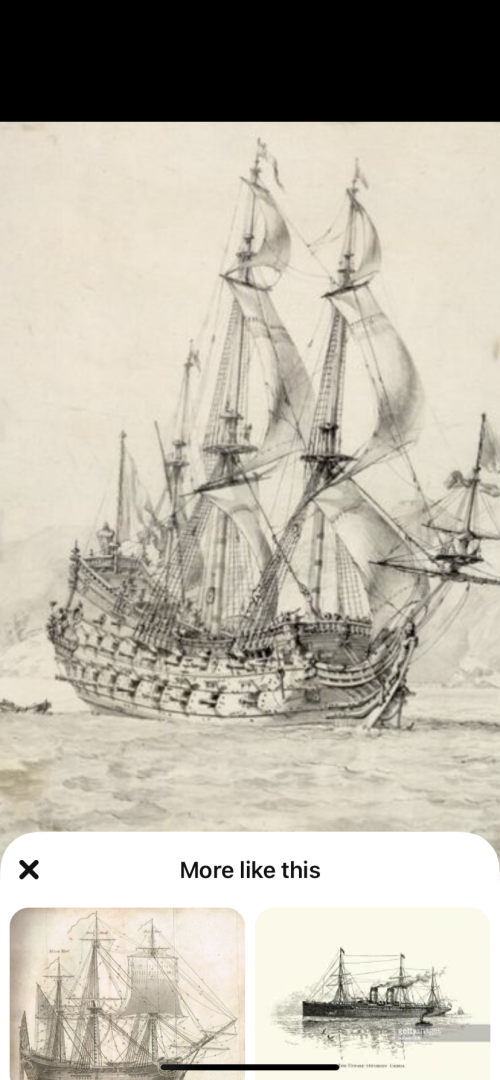
Generally speaking, Eric, your rise over run looks almost about right to me; maybe a little extreme though. I’m afraid this won’t be terribly scientific, on my part, but I would be inclined to nudge the termination points of the pair of lower main wales, down another 1/8”+. That way, you’ll have a better connection to the upper transom moulding that we discussed, above the stern chase ports. Honestly, I don’t think you were too far off on your previous iteration: As for the poop deck, which is carrying guns, it would not have any kind of pronounced forward pitch. The poop royal deck, though, may have had some pitch simply to increase headroom in these birthing cabins. Is that what is happening on the poop decks of these Dutch two-deckers: Hard to say, but it seems so. Or, what about this Dutch-built Frenchie, Le Neptune: Here’s a Puget drawing of a third-rate: I’m on the fence on this one, although Michel Saunier seems to have made a definitive choice on this question: photos, courtesy of Marc Yeu.

- 414 replies
-
- 3
-
-
- soleil royal
- Heller
- (and 1 more)
-
Michael, thank you so much for the kind words!
-
Alright, so I was wrong about SR 1693; her length between perpendiculars was actually 170’ FF. This amounts to an increase of 5.5’ FF, or 5.863’ Imperial.

-
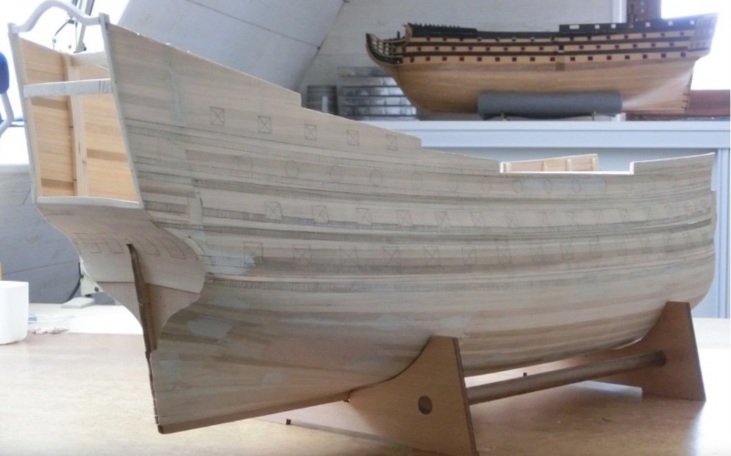
SR1’s keel length was 142 French feet, which is longer than the English and Imperial foot by 1.066. That is one factor. The other is that the Heller Kit is based on the dimensions of SR 1693, which I don’t remember exactly, but I think measured 172 French feet between perpendiculars - which is the measurement from the forward most face of the stem to the furthest aft rake of the stern post.
-
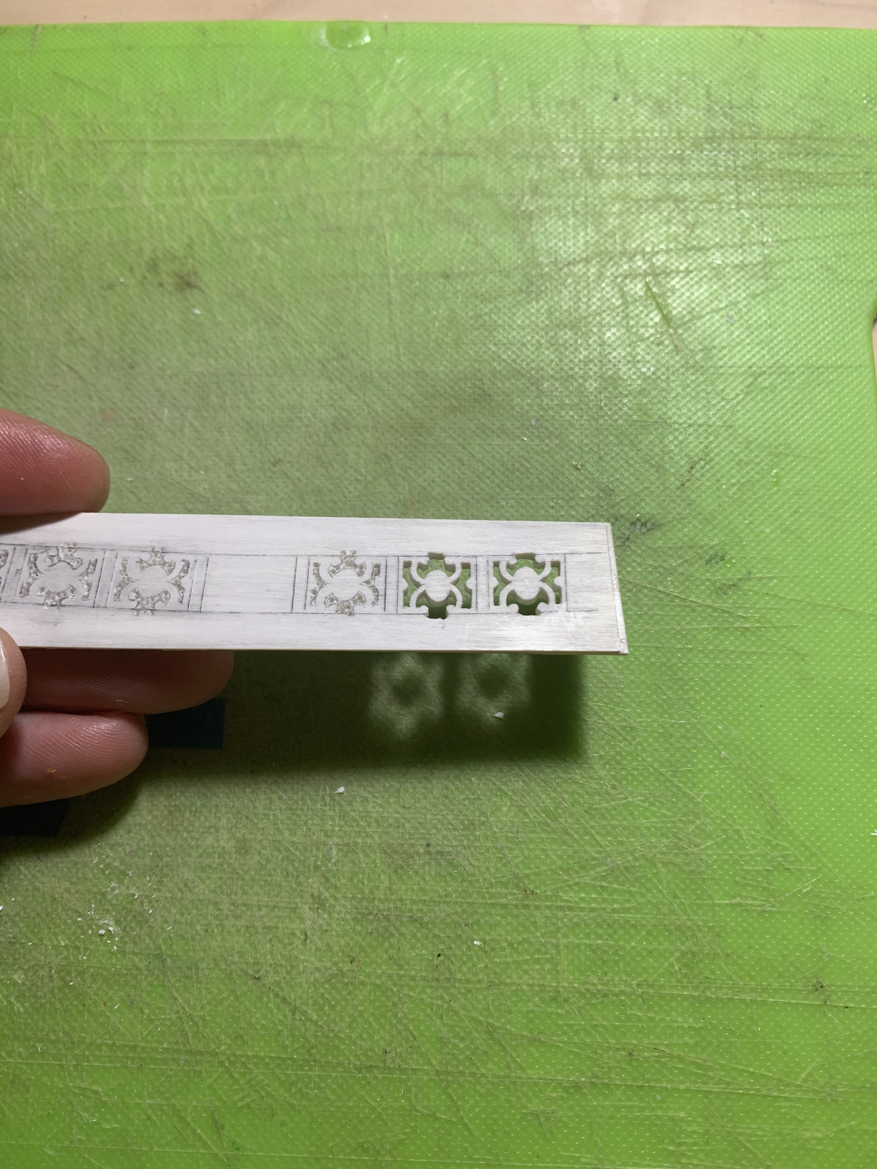
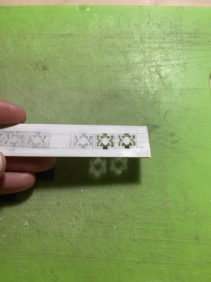
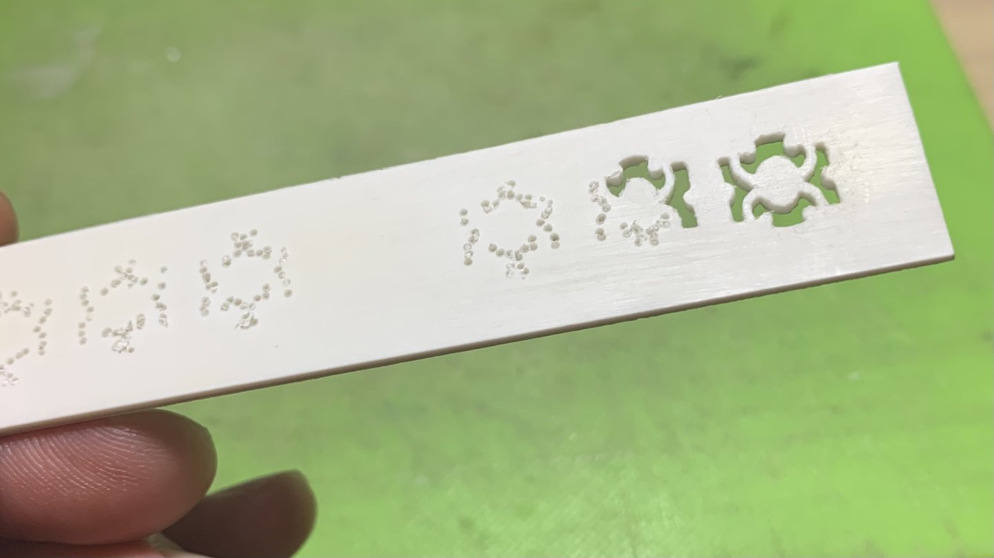
Because this plastic is so thick, my preferred method for cutting openings is to neatly scribe the opening; drill a series of tightly spaced holes within that opening, using a Dremel; cut through the perforations with a stiff box knife; and then square to my lines with files.
- 414 replies
-
- 3
-
-
- soleil royal
- Heller
- (and 1 more)
-
It’s super tedious, Eric, but you’ll want to thoroughly level any wales or ornamental footprints, otherwise there is a good chance they will telegraph through your thin styrene planking.
- 414 replies
-
- 1
-
-
- soleil royal
- Heller
- (and 1 more)
-
Really beautiful execution!
-
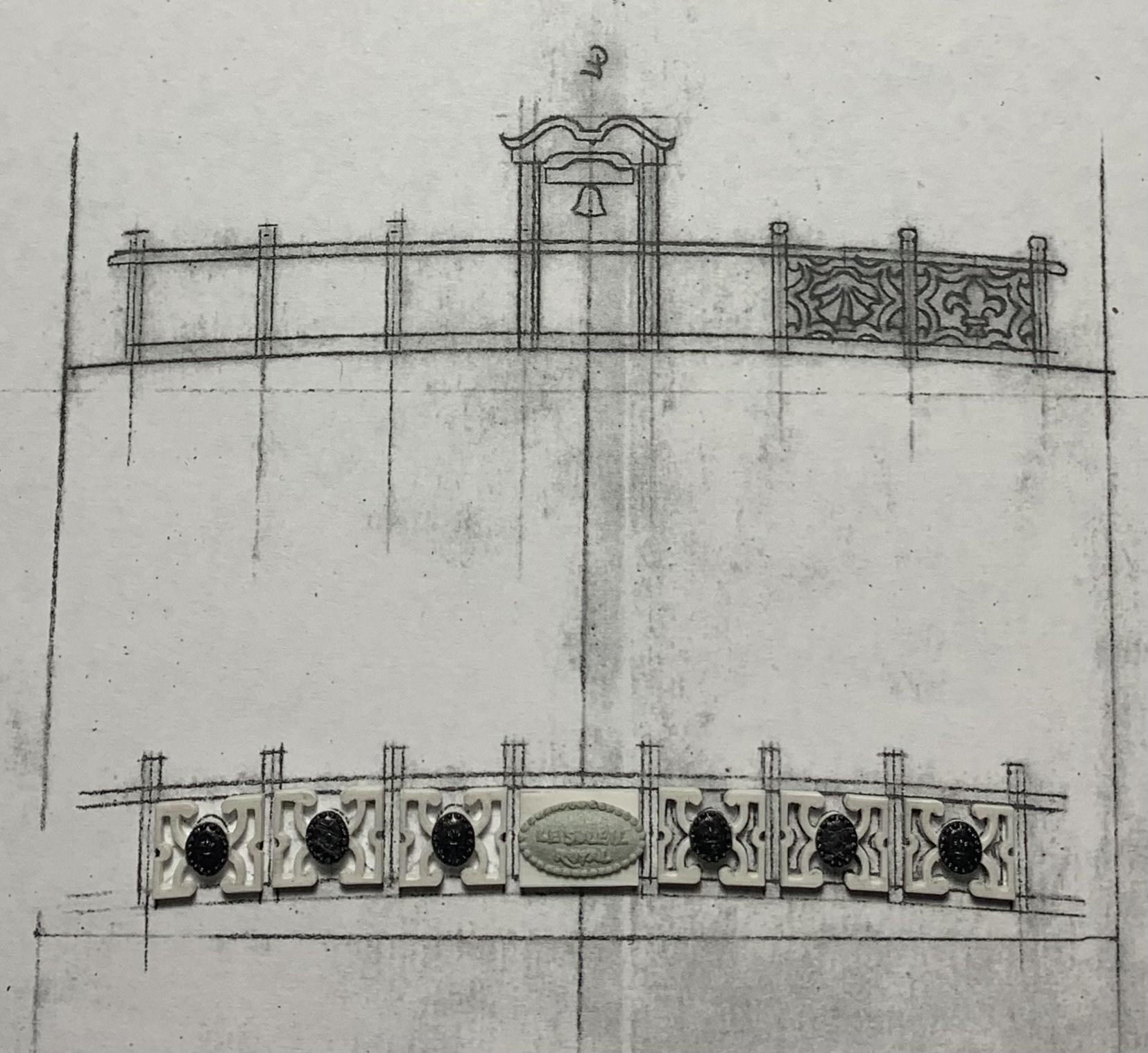
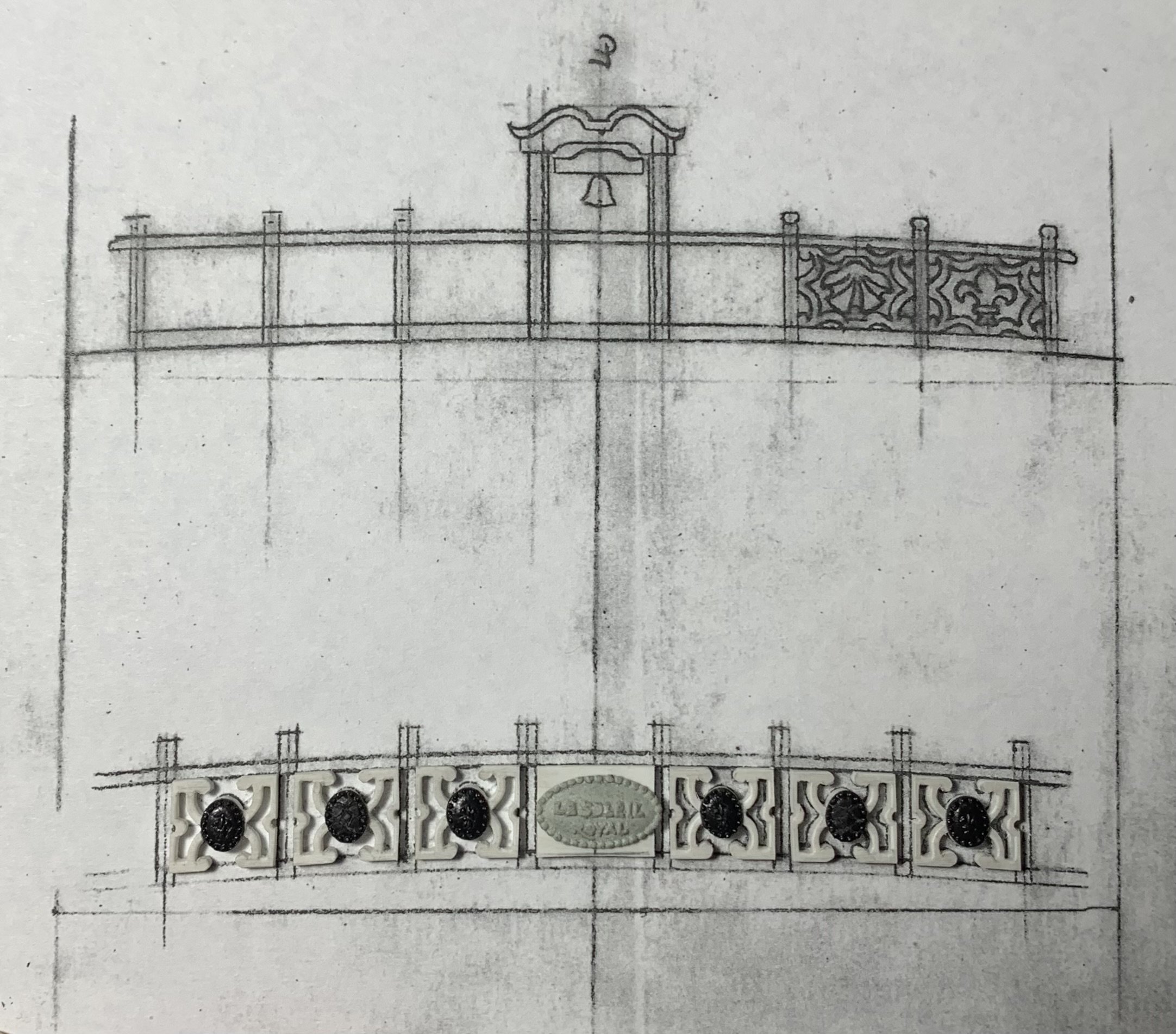
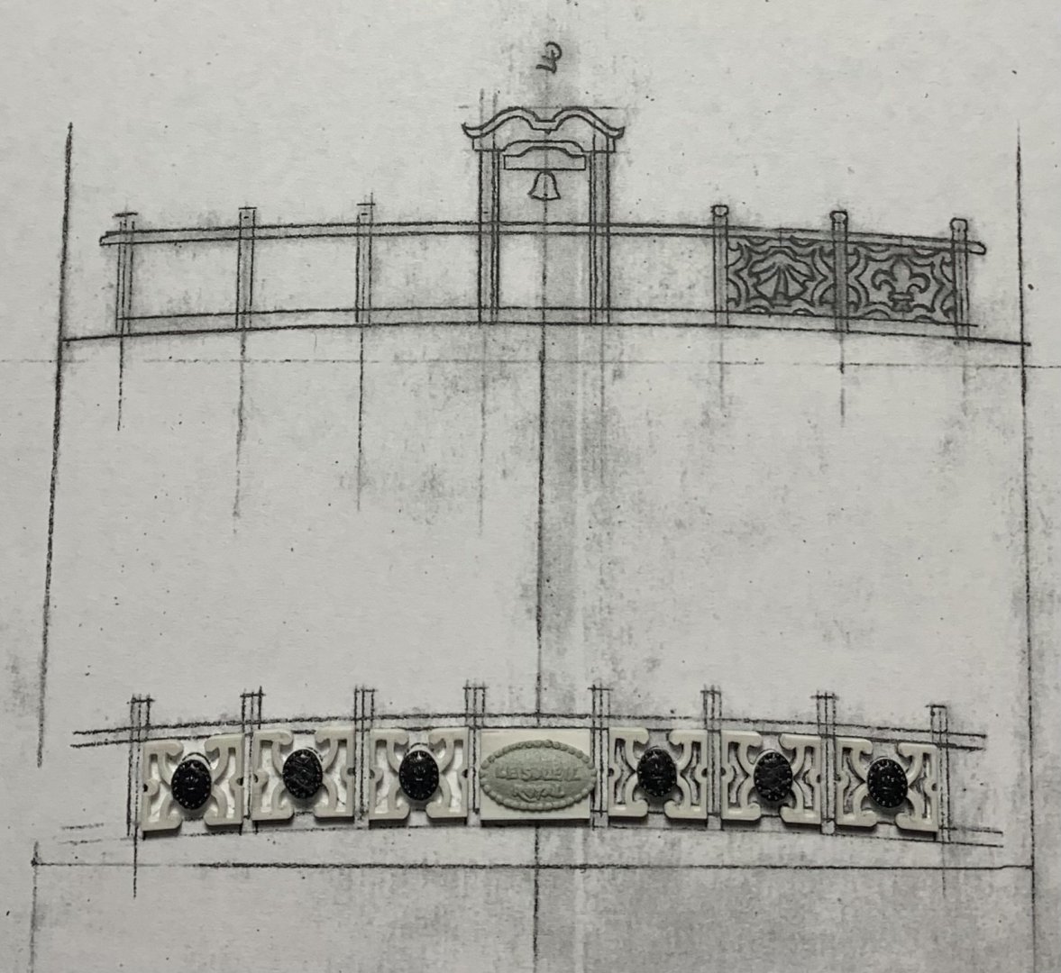
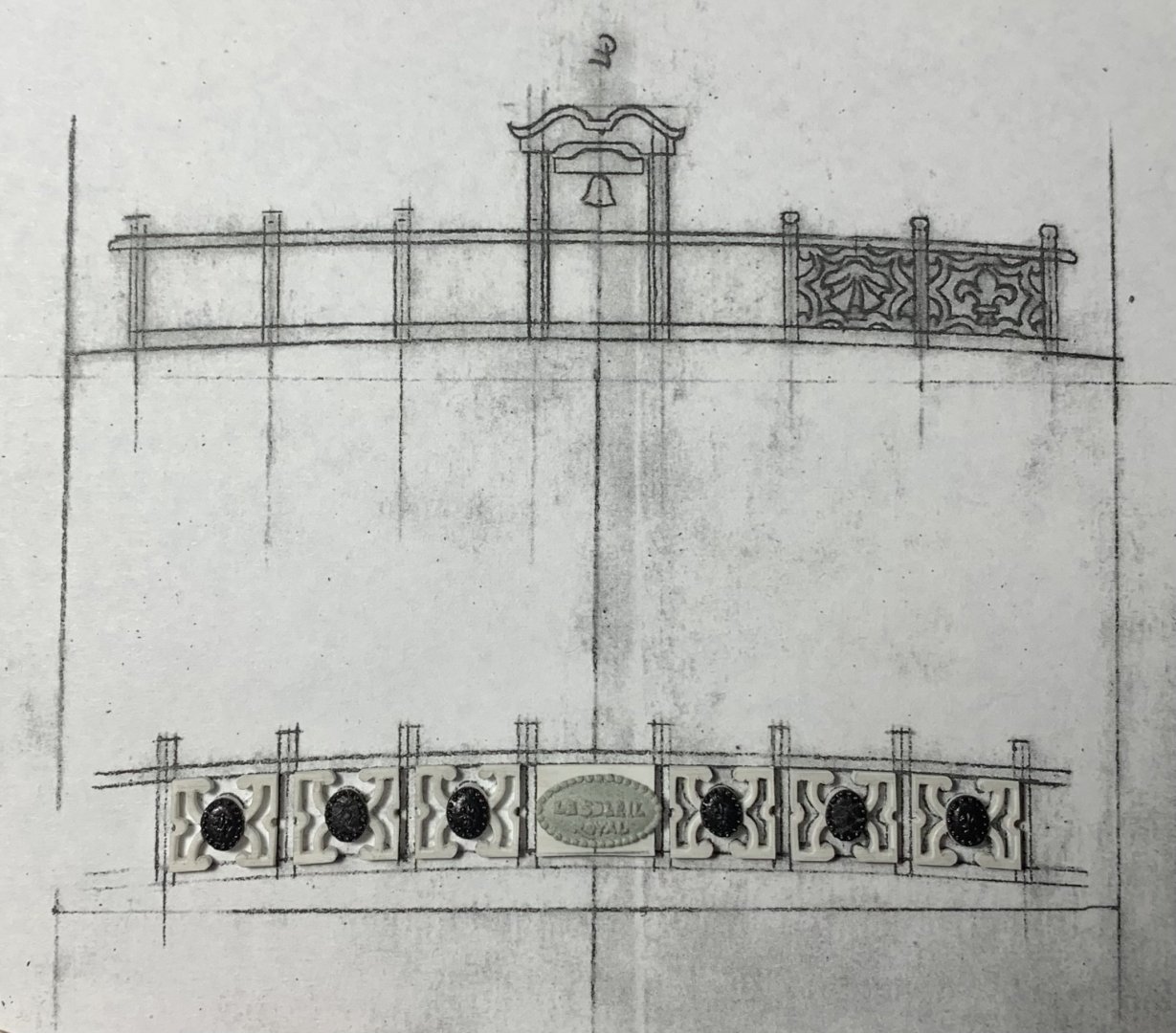
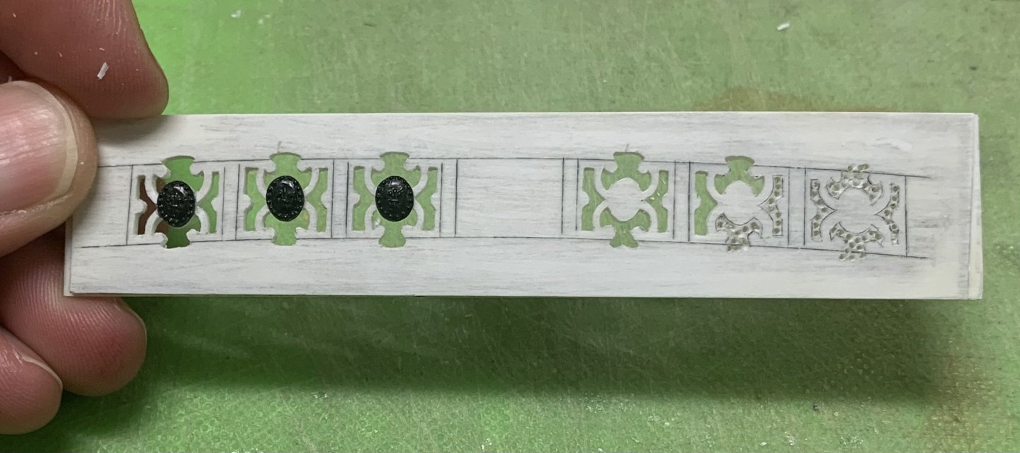
Hello Wefalck, With the busyness of the holidays, I somehow missed this update to the log. I’m just seeing this now. My apologies for such a late reply. I hear what you are saying about the fretwork panels, and ordinarily, I would agree with you. The problem, I have found is with the material, itself. Fretting out styrene - especially such small parts - is very difficult to do without introducing un-intended deformities to the perimeter of the parts; the material is just too flexy. This is why, I like to leave it in-sheet while I fret it. That way, I am much less likely to break these fragile pieces, as I did with the trailbord, when I first tried doing this the more conventional way. For assembly of these breast rails, I will place the central panels first - the belfry and the name plaque for the QD - which are bracketed by their stanchions to either side, and then I will build the breastworks out from the center. I have already glued the peripheral breast panels to their corresponding outboard stanchions. This way, I can bevel the stanchion knee bases to the port/strbrd camber of the deck, while ensuring that the top edges of each panel align in a fair arc. The beauty of this approach is that I will have firmly established stanchion head locations to accurately pierce the breast work caprails. Or, at least, that is my theory 😜 Happy New Year to All! Best, M
- 2,699 replies
-
- 5
-
-
- heller
- soleil royal
- (and 9 more)
-
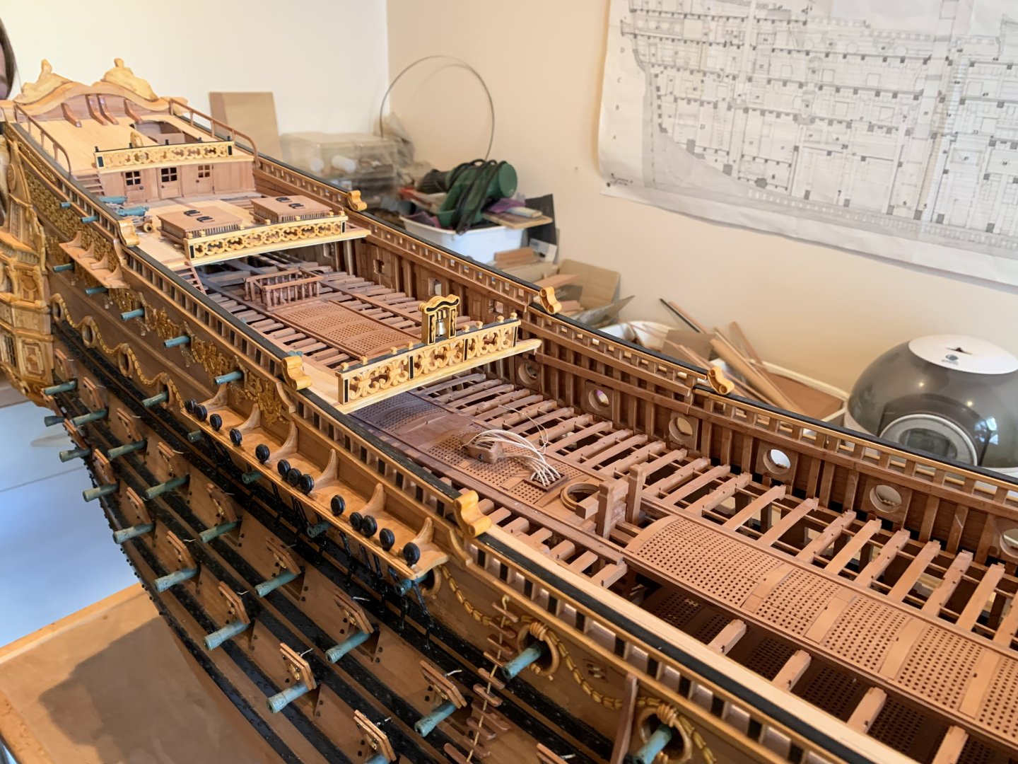
Heller’s SR looks amazing in sheer, but you just can’t focus too much on her underwater shapes. When you minimize the visibility of the lower hull, you vastly improve the credibility of the kit as a scale model.
- 414 replies
-
- 1
-
-
- soleil royal
- Heller
- (and 1 more)
-
The other issue with a lower hull build-out is that the entire midship to bow, along the maximum breadth is just all wrong.
-
Personally, Eric, I would not even consider building out, or expanding the lower hull. It could be done, but you would need to figure out the rising line of the floors and make pattern guides that faired into the maximum breadth line. The number of difficulties in doing this without CAD are numerous, and getting one small thing wrong, or working from an erroneous assumption could compromise the whole project. Not worth it, IMO. Conversely, it is not too difficult to place the un-cut hull into a waterline sea. As for the QG entry doors, there would definitely have been an actual door there, opening inboard. Seaways can get awful rough, and a ship’s capacity to pump out water would be quickly overwhelmed, if she were taking water in through these large openings.
- 414 replies
-
- 1
-
-
- soleil royal
- Heller
- (and 1 more)
-
Gary, this all just looks incredible. Really nice progress, and great to see you active again! Best, Marc
-
And, among the wooden SR kits, the Sergal version does offer some of the best potential for correcting the kit lines, as someone on the web has done here:
- 2,699 replies
-
- 7
-

-
-
- heller
- soleil royal
- (and 9 more)
-
Thank you so much, GP Phil! Aleksandr, that’s a solid idea on templating.
- 2,699 replies
-
- 4
-
-
- heller
- soleil royal
- (and 9 more)
-
Perseverance. Camaraderie. These are the ties that bind us to each other, and to our projects in-hand. As always, many thanks to all who continue to persevere here. Small update. They’re all small these days, but chipping away. I will say that it is always remarkable to me that no matter how scrupulously I draw something, and use straight edges to scribe the lines into plastic, while also accounting for the half-width of the blade-to-point (and the half-width of the drawn line) - there are always WILD discrepancies from the drawings, in the cut parts. It is essential, IMO, to make the actual parts fit the initial drawing, because the pattern/drawing is based directly on the actual deck camber; minuscule discrepancies in angle-to-post will create gaps between panel and rail that are much more difficult to remedy, given my sub-assembly approach to building these breast rails. Here are my panels laid as carefully over the drawing as I can, after they’ve been parted on the lines with a razor-sharp chisel: One has to account for the shortcomings of phone-photography - which does not provide a truly flattened perspective in close range, however, it is evident in the picture above that there are overlaps, and angle-to-post inconsistencies that would make a final glue-up far less than ideal. My advice to anyone that reads this will be to trust the quality of the initial pattern that you make. Base all of your geometry on that. Shape your parts as closely as you can. You will have FEWER surprises on assembly. Part of what is happening here is that I am paring to a line with a really sharp chisel through soft plastic that is less than 1/16” thick. I am squaring that chisel intuitively by eye. I am careful to always leave less than 1/32” for my final paring cut to the line. And. And, yet. The chisel will still drift to an out-of-square cut. I say all of this to say, that fitting these small panels to a drawing: is a process of consolidation; of checking and re-checking against the drawing; a little from the lower left corner; a little from the top right. Oh, and the central panel does require some actual camber along the top and bottom surfaces. A very little here, and a very little there, and eventually I have arrived at a reasonable bet for sub-assembly: I will note that the central “Soleil Royal” badge is, in actuality, 1/64” off center. I point it out only to highlight that this is what the eye can perceive. In this instance, it is a consequence of process and bonding. I’m using C/A to bond BONDO to plastic. The window for placement is limited. I managed to get the top/bottom spacing right. In the end, after all is said and painted, and posts are in-place - the discrepancy will hardly be noticeable. There is too much else for the eye to focus on for it to matter. Next, I will make the knee/post supports. On what I think is a helpful side-note: I wish good mental health to all. On a personal note, I am finding it harder and harder to remain grounded. Take a breath. Visit a friend, in person. And, take faith that better days will prevail. At some point, they will. These are my steps forward. If any of you feel similarly, please know that you are not alone. Take care of yourselves, MSW/SOS. BTW, I am not on any kind of brink or ledge. I have too much to live for, and plastic Soleil Royal is the least of it😜 I am simply acknowledging that what is happening in the world is really stressful; I think, to the vast majority of people. Things will probably still get worse for a while, but they will eventually get better. I think this way because the MAJORITY of people, and what they need and think still matters. It does, and it always will. I like to think that there is a path forward where the modern “information age” actually limits potential bad outcomes. I’m going to go with that! There is always an open ear, h’ear for anyone “having a moment.” Take care of yourselves, friends.

- 2,699 replies
-
- 15
-
-

-
- heller
- soleil royal
- (and 9 more)
-
It’s really starting to come together, Eric. Really nice and clean!
- 414 replies
-
- 1
-
-
- soleil royal
- Heller
- (and 1 more)
-
Coming along nicely Bill. Your paint lines are crisp, and that’s a huge improvement to the kit staircases.
-
This is just beautiful, clean work, Mark. I love the careful spiling of your planking on the round-tuck stern. This is a very difficult thing to do seamlessly, and you nailed it. I am also interested in the middle strakes of your hull planking, just below the main deck level, which appear to have the chatoyant character of alternating grain. If this was selected deliberately, you chose well. It looks fantastic!
-
100% agreed to all, above. I forgot about patience, but that is a big one!
- 2,699 replies
-
- 6
-
-
- heller
- soleil royal
- (and 9 more)
-
I am in total agreement, David. If it feels too much like work, then you probably won’t get there.
- 2,699 replies
-
- 4
-
-
- heller
- soleil royal
- (and 9 more)
-
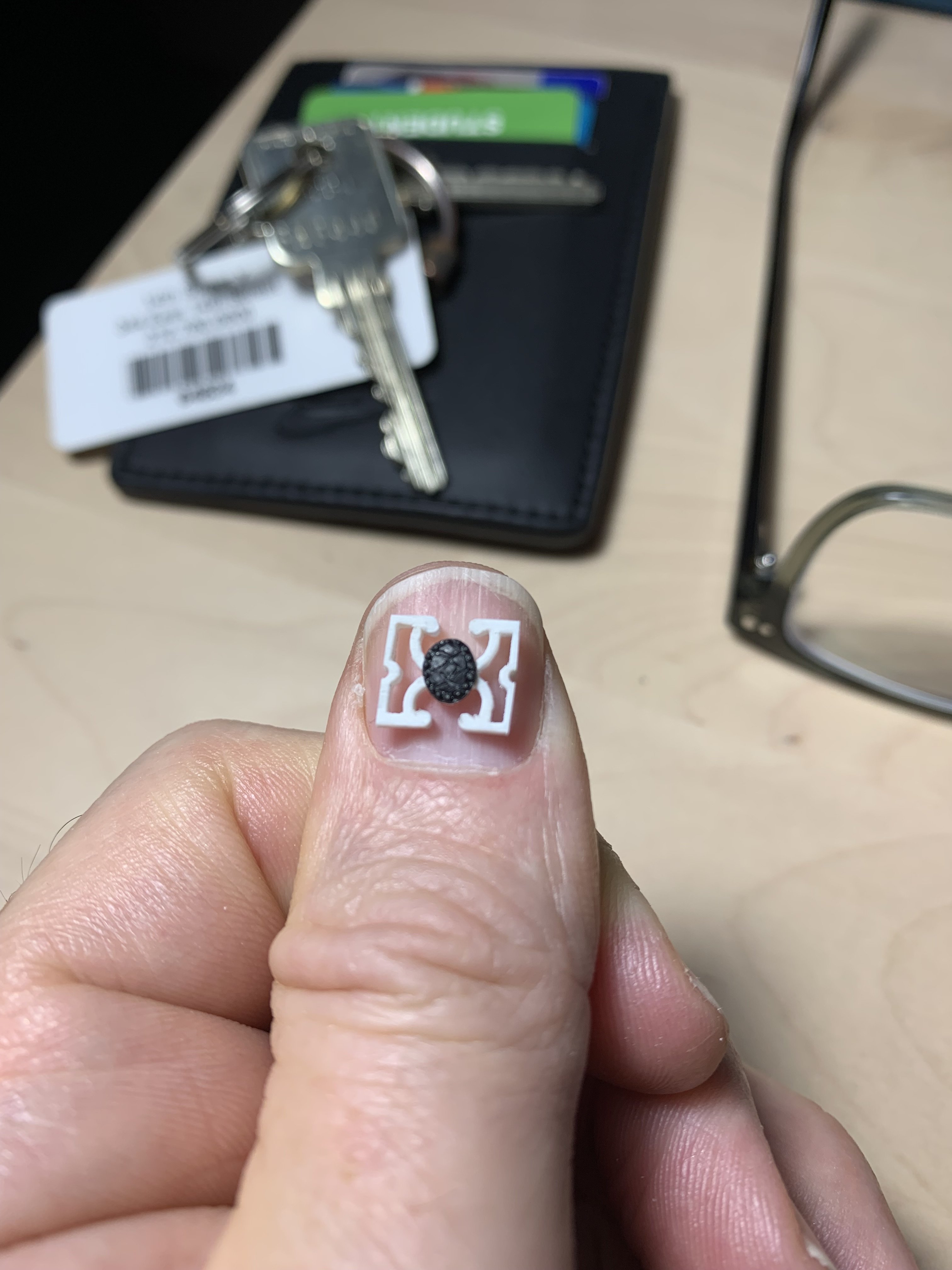
A number of you have reached out and said a lot of really complimentary things about the work on these railings, and the model in general. That is very meaningful to me, and I really appreciate it! I do want to take a minute, though, and talk a little bit about process, as there may be people watching along through all of this and thinking “well, I could never do anything quite like THAT.” My resounding reply to anyone who may be feeling that way is that you absolutely can achieve these things. While it is true that I have developed fine motor skills over the course of my lifetime, and they are essential, I think what is often considered “talent” largely boils down to one’s powers of observation. Here is what I mean. Whether it be 17th Century French warships, or 18th Century American longrifles, or Art Nouveau furniture - to name my three most passionate period interests - I think it is essential to constantly be on the search for previously unknown and increasingly better examples of these things, so that you can better appreciate what constitutes Good, Better and Best (Israel Sack’s guide to period furniture) examples of any given type. This is why I love scrolling through Pinterest so much. Every so often, the algorithm sends me a gift of something I had never seen before! More than any other skill that I posses, I believe it is my ability to really home-in on, and scrutinize the details of a thing, that has enabled me to recreate them with reasonable verisimilitude to their times. I really pore over drawings and photographs for excessively long periods of time, and often revisit them until I understand the details well enough to actually draw them. This has always been my litmus test; when I can finally clearly visualize something in my mind’s eye well enough to draw it in a clear and detailed way - then, I absolutely know that I can make that thing. Perfection is never my goal. All aspects of this model, or anything I have made, are slightly irregular. What I am trying to achieve, though, is the uniform application of my powers of observation, in concert with my dexterities to the object in-hand. In other words: I am committed to maintaining a certain standard of execution. The more contemporary models you look at, the more you will come to realize that they all have in-common these slight irregularities of shape and proportion. This is why the project has carried on for as long as it has. Soleil Royal is a magnificently complicated vessel, and I have endeavored to include as much of that detail as I reasonably can. The QD breast rail is emblematic of this process. When you really study it, you can find all manner of a-symmetries: However, as with painting, it is my habit to work an individual panel, for example; get it fretted pretty close to where I want it to end up; regularly flip the work from front to back to make sure I’m not cutting out of square; and, finally, to come back and re-work each panel so that they are as consistent as I can make them. The secret to all of this is just time. I enjoy the process, so the enormous amounts of time I spend whittling away don’t really matter too much. In closing, all of these things you see me doing were learned right here in the process of making THIS very model. My skills have improved tremendously over that span of time. These things are achievable. You can do them too, and the process of learning to opens doors to what you are capable of within the hobby. You are suddenly no longer constrained by whatever kit manufacturers deem profitable enough for manufacture. Thank you for indulging my reverie. All the best, Marc
- 2,699 replies
-
- 19
-
-
- heller
- soleil royal
- (and 9 more)
-
Thank you, Gentlemen. I am continually amazed by what 3D printing now makes possible, however, I always like the slight irregularities of a handmade thing. For me, this is the fun part of the hobby; you start out with scraps of sheet plastic, and at the end of it you have a super-detailed breast rail.
- 2,699 replies
-
- 7
-
-
- heller
- soleil royal
- (and 9 more)