HOLIDAY DONATION DRIVE - SUPPORT MSW - DO YOUR PART TO KEEP THIS GREAT FORUM GOING! (Only 68 donations so far out of 49,000 members - Can we at least get 100? C'mon guys!)
×


Hubac's Historian
-
Posts
3,295 -
Joined
-
Last visited
Content Type
Profiles
Forums
Gallery
Events
Everything posted by Hubac's Historian
-
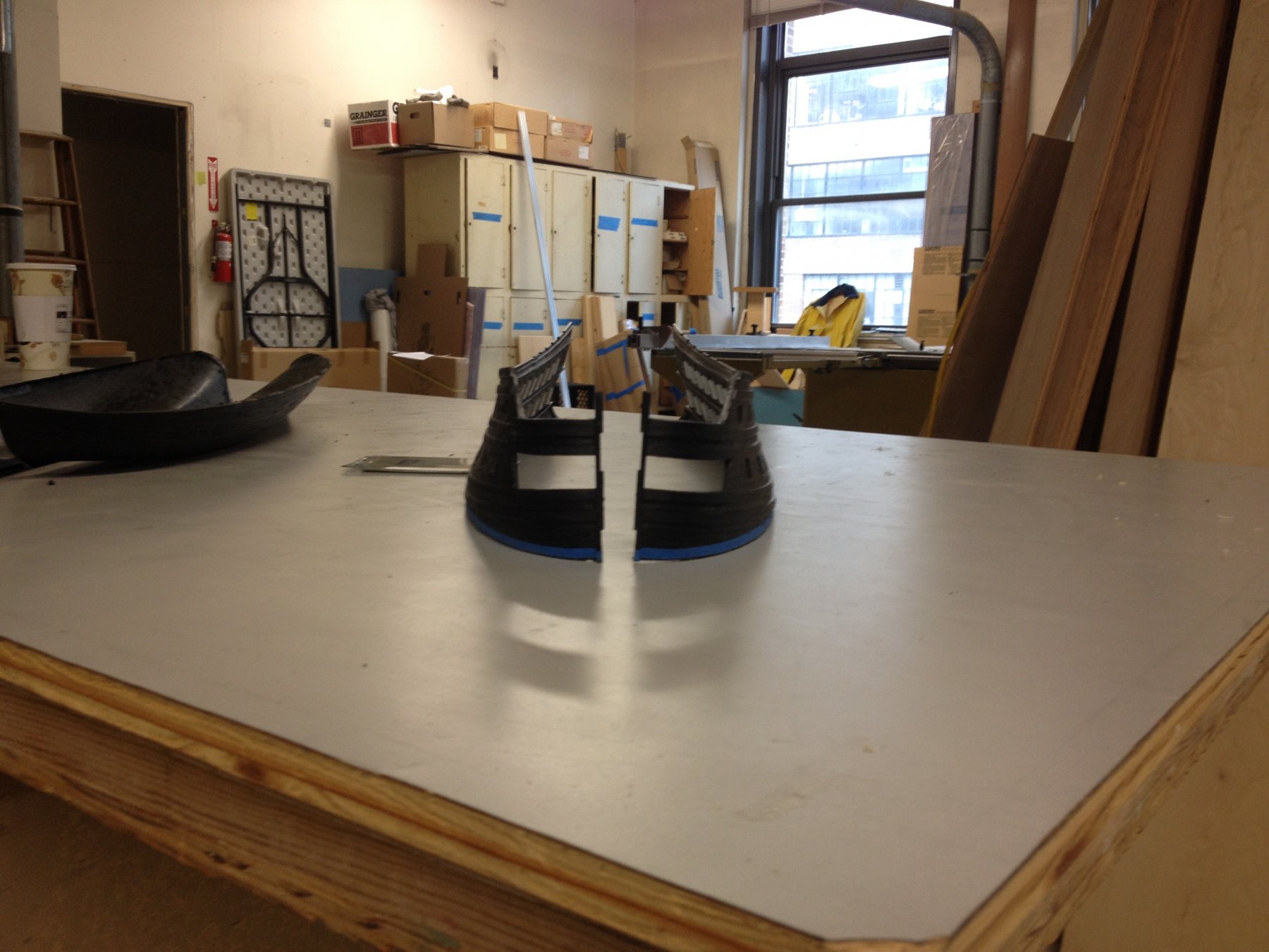
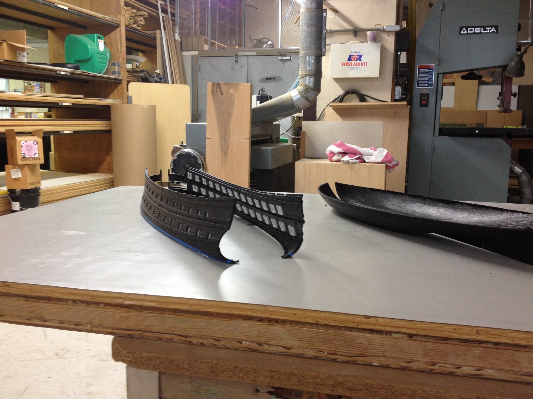
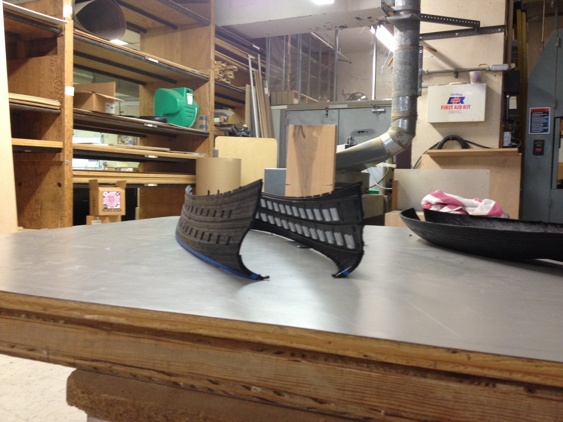
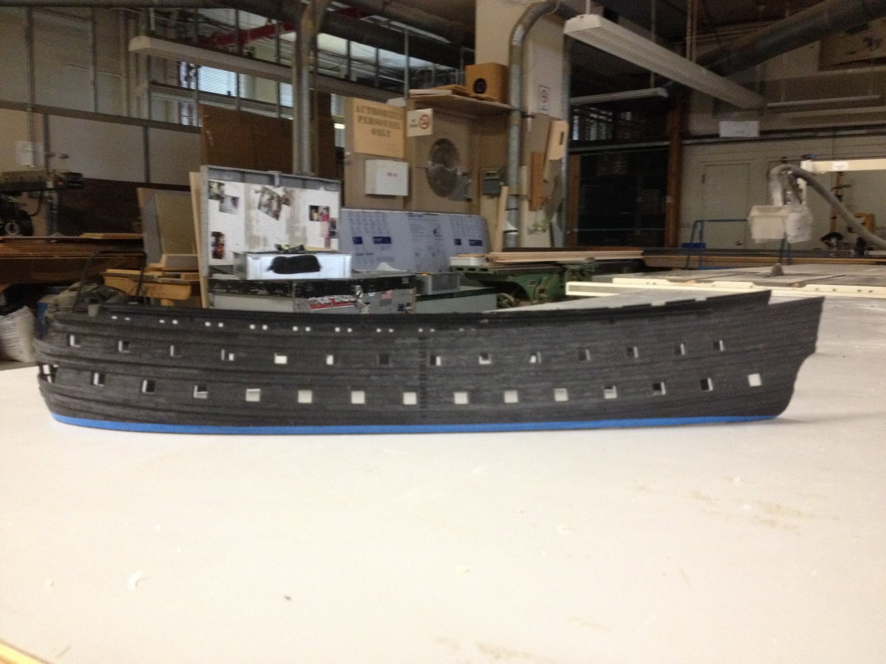
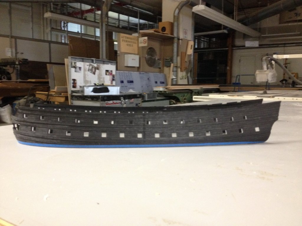
 And so, the long slow journey begins and there's no turning back now! I had the opportunity to get into the shop early, before work began today, and I cut away the bottom of the hull on the bandsaw. The blue tape indicates the raised waterline by 3/16". The instant you cut away the lower hull, IMO, this becomes a much better model. Here, I'm showing the hull halves separated by the 1/2" I will be adding at the stem. The distance across the transom was approximated by eye, but that is very close to what it will be. I'm making a long sanding block to flatten out the waterline. Once I do, these hull blanks should stand with their stem pieces perfectly parallel to each other. I'll be saving the lower hull pieces in order to experiment with my treenail and through bolt simulations, as well as for working up a layered paint protocol that will simulate the look of wood on the water, but not overly weathered. As this is a diorama model of the ship, shortly after her re-fit in 1689, I am thinking about placing her at anchor, on the Penfeld river with the Brest Arsenal towering in the near distance, the morning sun rising to illuminate her gilt work and Tourville on a launch, being rowed out to take comand of his ship. Next week, I go on vacation, and I may bring the blanks with me to start detailing. Substantive updates like this will be slow coming, because I will still work on the drawing when I can. But this is a start, anyway.

- 2,696 replies
-
- 6
-

-
- heller
- soleil royal
- (and 9 more)
-
A well deserved victory lap, Ken! I have really enjoyed all of the care and attention you have taken to clean up the castings, as well as your re-working of the stern gallaries, in order to make everything line-up properly. This really is turning out to he a magnificent model.
-
Hi Ken, I've been meaning to ask you for some time about what particular gold paint you are using, so I am glad to know what that is now. But I also like your sepia tone distressing. Is that also a Tamaya acrylic based wash, or some other brand? And how much must you dilute it to get these results, which really pick out the creases and crevasses, without muddying the gold?
-
Excellent results Dan! Given the success you had with 3-D printing the funnels, might these windowed bulhkeads also be good candidates for 3-D printing? Would there be a similar time investment in cleaning up printe bulkheads vs. laser cut?
- 287 replies
-
- 3
-
-
- michelangelo
- ocean liner
- (and 1 more)
-
The other interesting thing to me, about the Bakhuizen portrait is that the way he has chosen to "illuminate" Soleil Royal as almost a guilden, glowing object suggests that much of her ornament would, in fact, be guilded. I still like the idea of using yellow ocher for a lot of the background, moulded detail of the lattice frieze, which would be ornamented with select guilded ornaments. It would look distinct from other models I've seen, and I think it would give the guilded ornaments a jeweled aspect. This is mostly an artistic choice.
- 2,696 replies
-
- 4
-
-
- heller
- soleil royal
- (and 9 more)
-
As a matter of fact, Dan, this was the painting that gave me that idea in the first place. It isn't clear whether that scrolly thing represents a decorative banner or the rudder chains, or what. I was reading in Laughton, recently, that the surviving ornamentation of La Reale makes use of this motto, "nec pluribus impar" on the tafferal, which also features Apollo and his horse drawn chariot. I have been thinking about your advice concerning following seas and carved ornament close to the waterline; if I decide to include this bit of ornamental license, I thought that instead of doing a relief ornament, the scrolled motto could be painted on. In this time period, for the Dutch at least, it was not uncommon to paint decorative friezes onto the coved arch of the stern counter. On SR, this area has too much other necessary ornament and the tafferal with Apollo is similarly crowded, but a painted scroll beneath the chase ports is both practical and somewhat plausible. I remain steadfast that the motto should have a place somewhere on the ship, and am open to suggestions. The sentiment behind the motto seems to speak to the grandiosity of Louis XIV's ambition and self-conception.
- 2,696 replies
-
- 3
-
-
- heller
- soleil royal
- (and 9 more)
-
What I like about this Bakhuizen portrait is that it provides some sense for the grandeur that must have been Soleil Royal. From my perspective, there are two corroborating pieces of information that can be taken from this portrait (painted by a man who likely had first-hand knowledge of the ship), however the painting raises many more questions than it answers. First, like the Peter Monamy paintings of the Destruction of Soleil Royal, Bakhuizen shows SR's upper bulwarks painted blue; deep ultra-marine blue, in this case, as opposed to Monamy's lighter blue bulwarks that are topped by ultra-marine and fleur-de-lis arming cloths. Earlier in my discussion of the ship's colors, Mr. Lemineur had posited that it was feasible that her upper bulwarks would have been painted red (like the Vasa), with ultra-marine reserved for sections of the tafferal. These contemporary artist depictions, along with the color Compardel interpretation of the Berain bow and stern are enough supporting evidence for me to paint my model with a lighter blue for the majority of the upper bulwarks, and ultra-marine as a secondary band of color, just above the main deck guns. I've thought of a way to use the lattice frieze, at this level, as an interesting line of demarkation between these two colors that will set off the row of gilded fleur-de-lis nicely. I will also use ultra-marine for the recessed paneling of the quarter galleries and stern. The other point of confirmation with the Bakhuizen portrait is the apparent presence of an upper bulwark frieze, which is, here, represented as a continuous field of fleur-de-lis. One can argue that with the ship set in the middle distance, from an artistic perspective it would be easier and better to simplify the depiction of the frieze, rather than to more accurately suggest the latticework, the shells and scrolls, etc, of the Berain drawing. Monamy's painting also suggests the presence of some kind of frieze. So, in summary, there should be an upper bulwark frieze, and I personally enjoy the layered complication of the Berain lattice frieze, so that is what I will model. But, then, there are the questions that the painting raises. First, are questions of perspective as they impact the relative realism with which he depicts the various ships in the portrait. Bakhuizen has a tendency to lavish more time and attention to the realism of the central vessel, and less so to the rest of the composition. The stern of the English ship seems poorly proportioned, in comparison to similar sea battle paintings by the VDVs, for example. And there are many examples of details that are out of proportion on the ships around SR. But it is SR, herself, that raises the most questions. First, he shows her as having only two levels of stern windows, but with a similarly shortened tafferal as seen in Berain's stern drawing. Yet, she is still depicted as a large three-deck ship of 100 guns or more. I have not encountered anything yet to suggest that the ship was cut down and lost a deck during her re-fit. But if a three deck ship like La Reyne, for example, only has two rows of stern windows, she would also have a correspondingly taller tafferal - which La Reyne does. Along that line of inquiry, I also think that Bakhuizen is mis-representing the sheer of the stern, which appears too flat. So, there's that, but there's also the apparent open stern balcony, just above the counter. The thing is that it does not appear to be a projecting balcony, but one that is recessed within the quarter galleries like a screen bulkhead. As far as I know, this was not a feature of French practice at this time in the latter 17th century. There does appear to be some rudimentary depiction of Apollo and his horse-drawn chariot on the tafferal. The tafferal does appear to have the reverse cyma arched pediment. And the four seasons are represented as supporters between the middle deck stern gallery and the main deck windows above it. But then, those seasonal figures seem to wrap around to the quarter galleries, which is wholly inconsistent with any other depiction of the ship. The theme was exhausted on the stern (winter, spring, summer, autumn), so what would these figures be on the quarters? The Bakhuizen portrait does seem to confirm round ports on the main deck level, but he appears to show the quarter galleries as being completely closed in, which is something that I don't agree with. So, in summary, it is a fascinating portrait and appropriately dramatic, but a problematic source of information.
- 2,696 replies
-
- 4
-
-
- heller
- soleil royal
- (and 9 more)
-
I'm curious EJ about this model of SR that you are showing. It seems to have applied the plastic, Heller stern balconies and quarter galleries (painted "walnut" brown to match the planking) to a wooden model. Or, perhaps someone veneer planked over the plastic kit? Anyway, it's interesting. Do you have other pictures of this model?
-
On a closer look, it seems that I may have been wrong about this framing diagram; it does seem to show a diminishing taper (upwards) of the round-up into the fashion pieces.
-
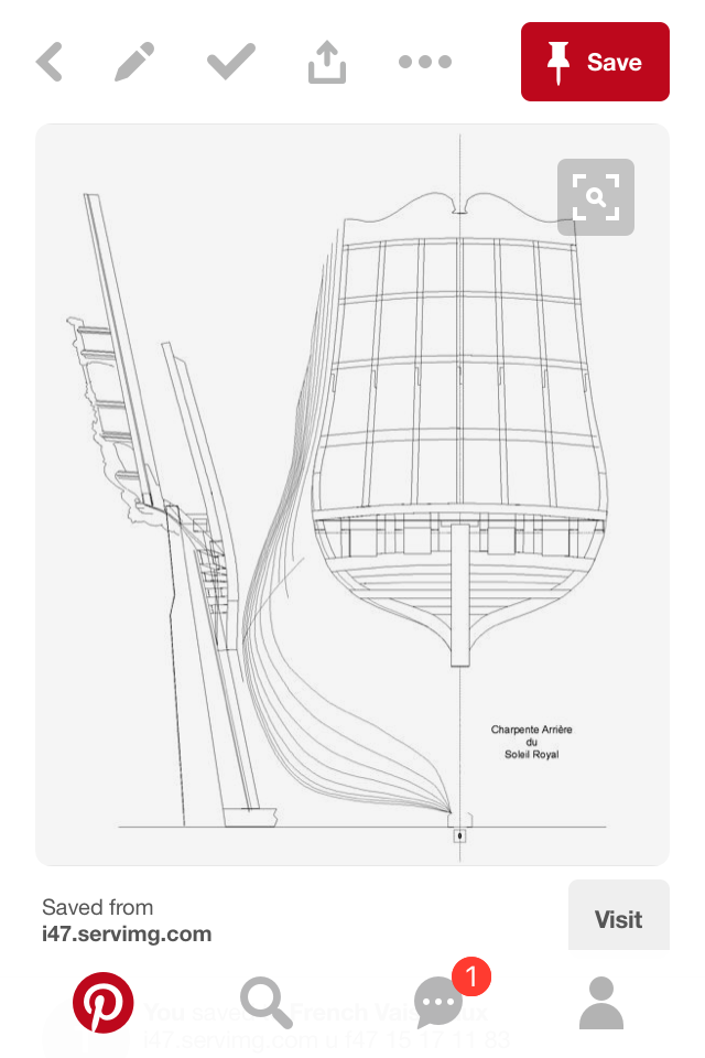
Hi EJ, I think you are referring to the "round-up" of the stern. Most commercial models of square-tuck sterned models present the transom as being flat, but this was not the case in actual practice. There is, as you note, an upward camber of the transom wale (beneath the chase ports) that follows the arc of the stern counter, as well as the galleries above it. However, there should also be a corresponding outward arc of the transom, from the ship sides toward the sternpost. This arc in two planes (upward and outward) carries up and past the stern counter into the fashion pieces. All of the Tanneron models display this characteristic (see stern pics of L'Agreable and Le Brilliant on the first page of my build log), and many good pictures of the Vasa's transom and upper stern display this feature to good advantage. On one of the arsenal sites I found this proposed framing for SR's stern: Below the stern counter, this plan correctly shows the framing for the round-up of the transom, however, it seems to show the upper framing of the fashion pieces as being flat, which is incorrect. The dual arc of the transom timber, above the stern post, is what provides a footing and gives shape to the coved supports to the fashion timbers. Round-up should be continued into the upper stern, but here it is not. The other interesting feature of this framing diagram - for those who are interested in developing plans for a scratch-build of SR - is that it shows the correct profile of a pre-1673 stern, where the widest point of the stern is at the middle deck level, as opposed to the lower deck level on the Tanneron model of SR (which is actually a model of the second SR, ex Foudroyant of 1693). My only other contention about this framing for the first SR (1669-1692), is that the framing of the stern counter should close-in this lowest stern balcony, which shouldn't be a balcony at all. Otherwise, I quite like the shape of the plan and will tweak it for a future scratch-build. I think the cyma curve line of the tafferal is very well drawn, here.

-
That would be excellent, Cedric, if you don't mind doing that. Also, what you are suggesting about windows in the officers' quarters makes sense. That seems quite plausible to me. Perhaps Michel or Neko will weigh in, at some point. If they are officers' quarters, then some attempt at glazing should be made, no?
- 2,696 replies
-
- 2
-
-
- heller
- soleil royal
- (and 9 more)
-
Yes, I will not be modifying the sheer of the wales, nor the upper bulwarks. I will, however, make small adjustments to my tracings of the quarter galleries. And I may, yet, remove that upper most round port, and/or pierce two octagonal ports. Not sure about all of that, as yet, but I will figure it out. My inclination, though, is to leave the round port, arm it with a gun, and add both octagonal ports, un-armed. My reasoning is that adding the octagonal ports, allows for greater fidelity to the Berain drawing, while keeping the round port maintains my armament at 110 guns. A compromise.
- 2,696 replies
-
- 2
-
-
- heller
- soleil royal
- (and 9 more)
-
Cedric, do you have that Boudriot illustration handy? Can you share that digitally? I would love to see that.
- 2,696 replies
-
- 2
-
-
- heller
- soleil royal
- (and 9 more)
-
I was just looking at the comparison photos of SR to Couronne - JeezUS! That is a huge model!
-
After giving it a little more thought, I wonder whether the issue of the tapering windows isn't deliberate. Perhaps the windows are intended to taper taller, as theyprogress aft with the increasing sheer of the stern. That doesn't offer any insight into the dolphins, nor the partially obstructed ports, but the ports won't be an issue on my build and I will trace the dolphins as they are.
- 2,696 replies
-
- 3
-
-
- heller
- soleil royal
- (and 9 more)
-
Dan, to answer your question as to whether the decks of the QGs would really be so steep, as to present problems for the Admiral and the Captain: well, you know the old saying about sxxt flowing downhill! To be honest, your perceptive eye has brought light to an interesting conversation about what the artist's actual perspective may have been. Certainly, the issues of the partially covered gun ports, and the varied dolphins, and the tapering lower gallery windows would all seem to be victims of parallax. That makes sense. However, the overwhelming perspective, as you mention, is that of being athwartship. And that is not consistent with parallax. I was aware that the lower gallery ports tapered in size. My thought was that I would have to work on my tracing of the QG from the top down, and establish parallel guides for the main deck open-walk railing, as well as, the middle deck windows beneath them. The distortion tool you are using here, on the other hand, is a really fascinating thing. I'll have to see whether GIMP has something like that in its arsenal because I agree that perspective of the QGs can be improved a bit, as the relate to the sheer of the Heller kit. I suspect, though, that these variances are merely the result of un-intended artistic inaccuracies. Although our eye can perceive that the windows taper, for example, the actual difference in window height is really quite small, and I think the natural product of a handmade portrait. Nevertheless, it is still something that needs to be corrected because, in three-dimensions, that discrepancy will really become apparent. I am pretty locked in to the kit sheer-line, however, this is another of the kit's details that I really like; it's a nice, gentle curve. The aspect of the Heller kit that bothered me, in this area, was the absence of the ornamental sheer cap dolphin because it appeared too stepped and without transition.
- 2,696 replies
-
- 4
-
-
- heller
- soleil royal
- (and 9 more)
-
Monamy is one who has done a pair of perspective portraits of SR, just as the fireship is closing in at La Hogue. In one portrait, you can see the stern quarters. In the other, you can see the bow. I bought a print of the stern quarters painting that is large enough to discern some detail. He shows here with lighter blue upper bulwarks, closed quarters, and the suggestion of an upper bulwark frieze. Bakhuizen has a portrait if her at the Battle of Barfleur, which is more confusing than insructive (two rows of stern windows, instead of three), but with a darker blue upper bulwark and a frieze seemingly composed of fleur-de-lis, only. Nevertheless, it is a dramatic and spectacular portrait of the ship by someone who likely would have seen her with his own eyes.
-
EJ, you make some excellent points about 17th C. Marine portraiture. For all of the reasons you mention, for me, the gold standard remains the Van de Velde family for their accuracy. Given that the elder VDV was painting and drawing grisailles as early as the 1650s, and perhaps earlier, there is a strong apparent correlation between his drawings and what was discovered through the restoration of the Vasa. He was not exaggerating anything, it seems. their success, as marine chronicalers, has to do with the numerous detailed studies of ships they made, at their moorings, as well as their penchant for recording the composition of a sea battle as it was happening. The father and sons would be aboard a small, nimble craft, on the periphery of the engagement roughing in the principal ships, in their respective lines of battle. This was the 17th centry corrolary to the war-time photographer. So, in thinking about what a mid-to-late 17th C. Ship should look like, one really can't go wrong using them as the basis for their research, and that is what I am doing with this project. While there is no coherent portrait of SR1, I can draw conclusions about mid-seventeenth century French practice through the VDV drawings of SR's contemporaries. I can't say definitely, whether such and such detail was a feature of the ship, but I can in the parlance of the courts, argue that there exists a 'preponderance of evidence' to suggest that such a detail would be present on a first-rate of this period. Other good contemporary marine artists to look at include Peter Monamy, Ludolf Bakhuizen, Adrien Van Diest, and Abraham Storck, among others. But much useful detail can be gained from artist's compositions that lack proper ship perspective. For example, Cedric is using, in part, a detsiled sketch of La Reyne's stern by Mr. Desclouszeaux in order to give shape to the fuzzy ornamental details of the VDV drawings that are really the basis of his build. I am always torn because, really, I have enough layout information to really make a start of it right now. The only thing I really need to still work out is the mast sizes, steps, top sizes, channel and shroud locations. However, time spend building is time taken away from drawing, and I have already learned, with the help of you guys, that certain details of my design really should be re-worked. I am really appreciative for those contributions. As my first woodworking mentor, David Morton, often used to say: in making something, anything, the first goal in planning is to avoid what he referred to as "negative pre-determinants." In other words, don't do something early that locks you in, or makes it difficult or even impossible to do something you would prefer to do later. Understand your project fully. Plan it's fabrication according to all the steps involved. Check your plans over and again. Most importantly - remain engaged throughout the long arduous process of making something that is worthwhile.
- 2,696 replies
-
- 2
-
-
- heller
- soleil royal
- (and 9 more)
-
I have also read through that FineScale build log. It has to be said, though, that it could have been many pages shorter if certain participants in that discussion could have restrained themselves from reminding everyone just how aweful they found the kit to be. To be fair, I am sure some feel MY log could be many pages shorter, if I'd just get busy building something! There certainly was a lot of usefull information there, though. Hopefully, I can push that conversation forward a little, with this model.
- 2,696 replies
-
- 2
-
-
- heller
- soleil royal
- (and 9 more)
-
Thank you, Dan! Yes, with this Berain tracing layer, in place, the full parameters of my proposed model are now in place. I realized, after posting, that I probably should have used GIMP's eraser tool to eliminate the Berain sheer cap because it is so exagerated, and its presence muddles my intent. The only aspects of this drawing that I will incorporate into my own are the quarter gallery, the quarter piece, Africa, and the caryatid figure supportig her. What's interesting to me about the sheer line, as it is represented in Berain's drawing, is that to some degree it must represent the more pronounced sheer line that would have been a feature of ships of the First Marine. However, I do not think it is an accurate representation of what the first SR's sheer line would have looked like. Consider first, that I had to rotate the drawing, significantly, in order for the sheer of the QG to align with the kit's degree of sheer - which is much less pronounced. Having done that, the Berain sheer still rises at a steep angle from my own! The second issue with the Berain drawing that I do not think can be taken too literally is the fact that the Berain sheer is shown to be very straight and stiff looking, when in actual practice almost every battle ship sheer line, up to and including the IOWA class, is a fair curve. In reality, SR1's sheer line was almost certainly more pronounced than shown in the Heller kit, but probably not radically so, ala the Vasa. The truth, I think, lies somewhere between what I feel must be a VDV quality portrait of the Monarch of 1668 (which I have posted many times), and the VDV portraits of La Reyne, where the wale strakes are shown to rise more steeply. It is my belief that Berain, Puget and other designers of ship ornamentation applied what were intended to be, variously accurate representations of the ship's decor (Berain more so than Puget) to a sort of boiler plate template of a ship's side - which I don't think was ever intended to be taken too literally as an accurate presentation of naval architecture; the perspective of the hull in these drawings always seems approximate and flawed to me.
- 2,696 replies
-
- 2
-
-
- heller
- soleil royal
- (and 9 more)
-
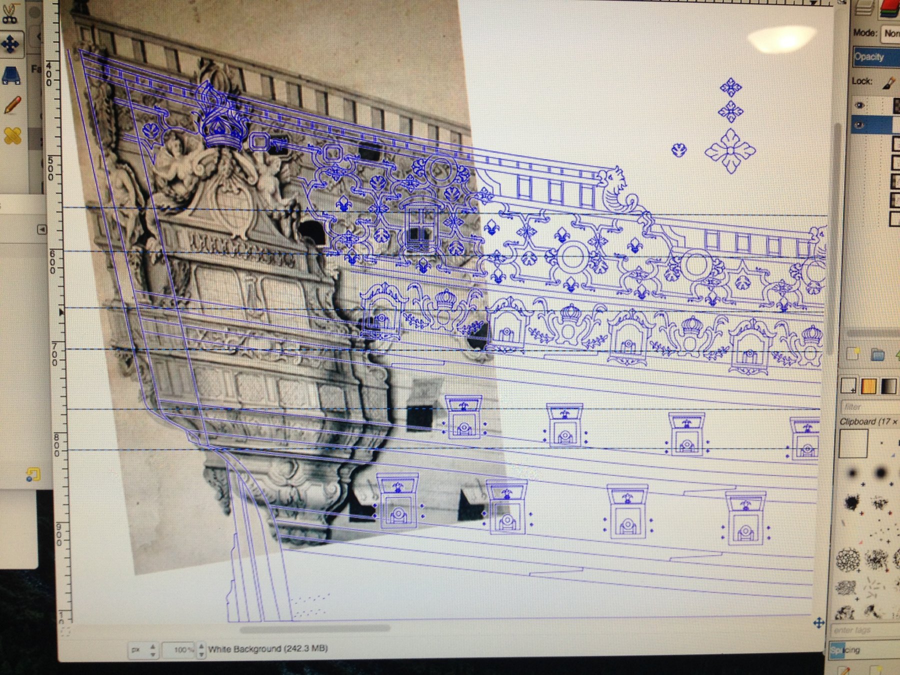
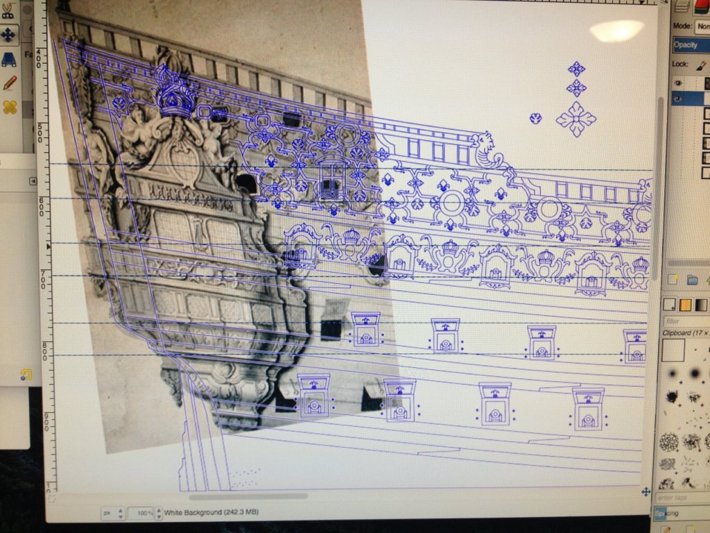
So, with the frieze more or less worked out, I decided to focus on tracing in the quarter galleries. As you know, I already had a partial tracing layer that was my hand-drawing onto a scale area plan of the ship. The more I studied what I had drawn, however, I realized that the quarter gallery levels were nowhere in correspondence with the stern balconies and windows. On the main deck level, in particular, where I intend for the stern balcony to wrap to an open walk on the quarters - there were serious alignment issues. In the time since I did that hand drawing though, two things have happened. I located a really high-resolution image of the Berain black and white drawing, and I have learned to use GIMP's scaling and rotation tools to better align layers and path objects. My first approach was to import the image, and cut the QG out with GIMP's scissor tool, with smart edge recognition. The tool's ability to find an edge depends upon the degree of contrast, and despite what seem to be pretty clear lines, the tool still did a poor job of finding the true edge of the QG. Next, I simply rotated and scaled the Berain drawing so that it corresponded very nearly exactly with the space that I had made available. First, I scaled while maintaining the aspect ratio, but then I scaled the height and width separately until the levels of the QG corresponded almost exactly with the levels that I had established for my stern template. There are three pairs of ruler guide lines that correspond with the upper and lower edges of each stern balcony. They are close enough, now, that I can later draw the stern to exactly correspond with what I trace for the QG, and I think I will still be able to recycle the kit's stern windows from the existing plate. This solves a number of perspective problems for me. My hand drawing of Africa and the quarter piece supporting the side stern lantern was decent, but my tracings will be much improved by using the original drawing as a tracing layer and then scaling the height and width of the quarter piece to drop far enough below the sheer rail, so that I can draw in the mount for the side stern lantern. This also means that I can abandon the "filler" ornaments and mouldings that I had previously drawn in, above and below the middle deck QG windows. The other revelation was that I probably wouldn't have to move the lower deck, aft-most port, 1/4" forward; I could probably get away with only an 1/8" adjustment. Visible now is a second octagonal port that I am experimenting with. Whenever I figure out how to unlock the path groupings that I made for each gunport type, I will then straighten the main deck ports so that they are vertical, and perhaps eliminate the round port on the poop deck.
- 2,696 replies
-
- 2
-
-
- heller
- soleil royal
- (and 9 more)
-
Ken, your planking job really came out beautifully, and all of your trim work is clean and precise. I had a feeling when this all started, that you would produce a first-rate model of a first-rate ship, and you have not disappointed in the least. The stern looks daunting, but I am confident that you will deliver more results that we can all marvel at. I liked, by the way, your idea to tuck the plank transition beneath the lower wale belt. Paint or no paint - I think it will look great either way.
-
If you really want to lose your mind - go read through her royal Caroline build!
- 1,035 replies
-
- 4
-
-
- royal katherine
- ship of the line
- (and 1 more)