
realworkingsailor
-
Posts
3,251 -
Joined
-
Last visited
Content Type
Profiles
Forums
Gallery
Events
Everything posted by realworkingsailor
-
 You think so? 🤔 I have expanded beyond corn over the last few years. This year I’m planning on growing beets, carrots, cucumbers, peas, tomatoes, watermelons, pumpkins and sunflowers (for fun). The pumpkins tend to go feral, so they need considerable real estate. Andy
 -
You’re welcome! I’m glad I could help! 😁 They seem to have a good selection of different offerings from the same era. Failing the exact set, you could probably cobble together everything you need from one or two of the other sets. Andy
-
According to yellow wings, they have the decals in stock: https://store.yellow-wingsdecals.com/1-32-decals/32-008-curtiss-bf2c-1-fighter-bomber-vf-5b-uss-ranger-12-95.html Andy
-
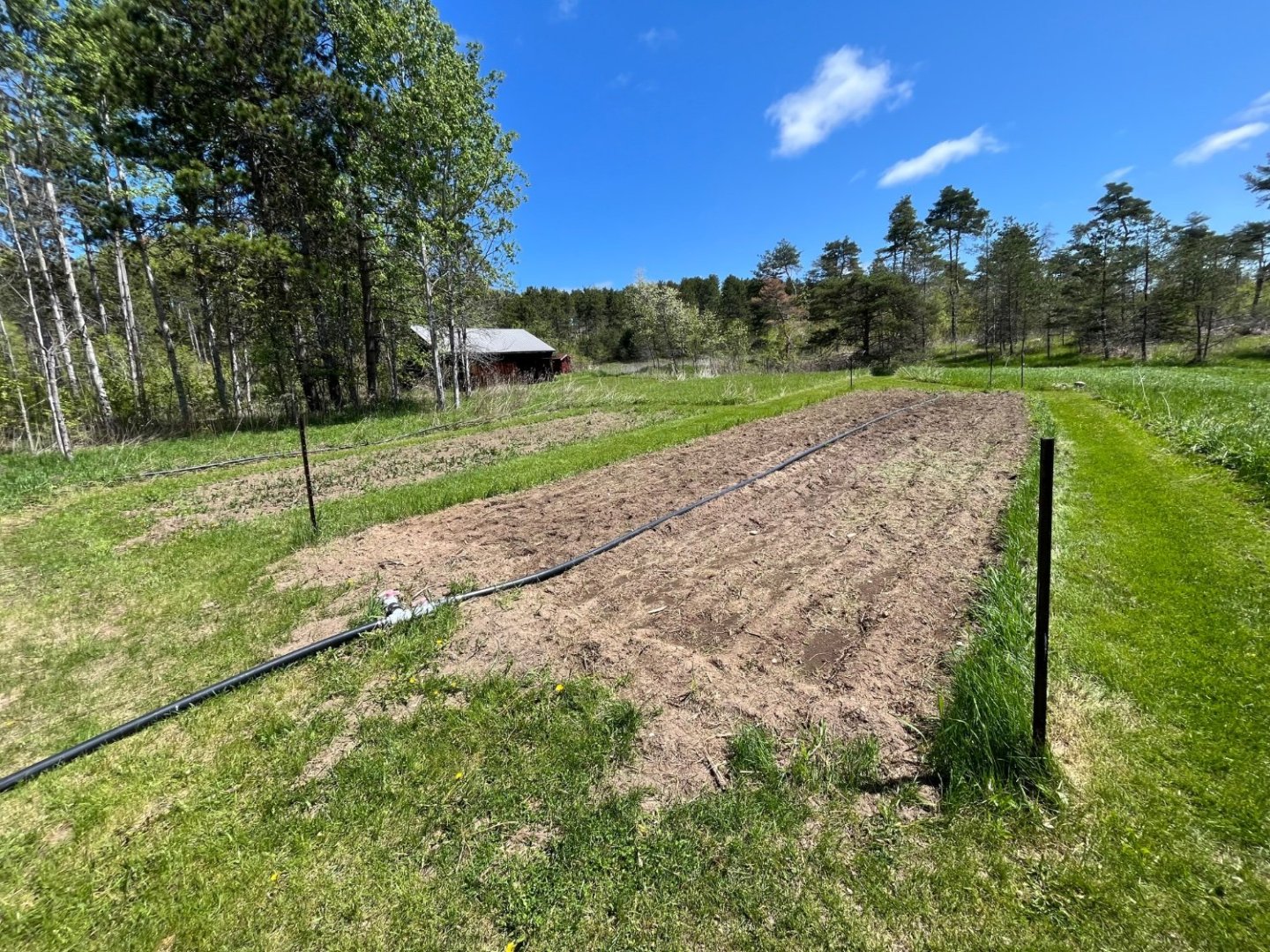
Thanks guys! I forgot to mention, this will also be taking up a bit of my time: I keep a fairly decent sized veggie garden. 😁 The foreground plot is roughly 15 ft by 70 ft, and the smaller (weedier) plot behind is about 12 ft by 40 ft. It started off a couple of years ago with a desire to grow my own sweet corn… and just expanded from there…🙄🤪 Andy
-
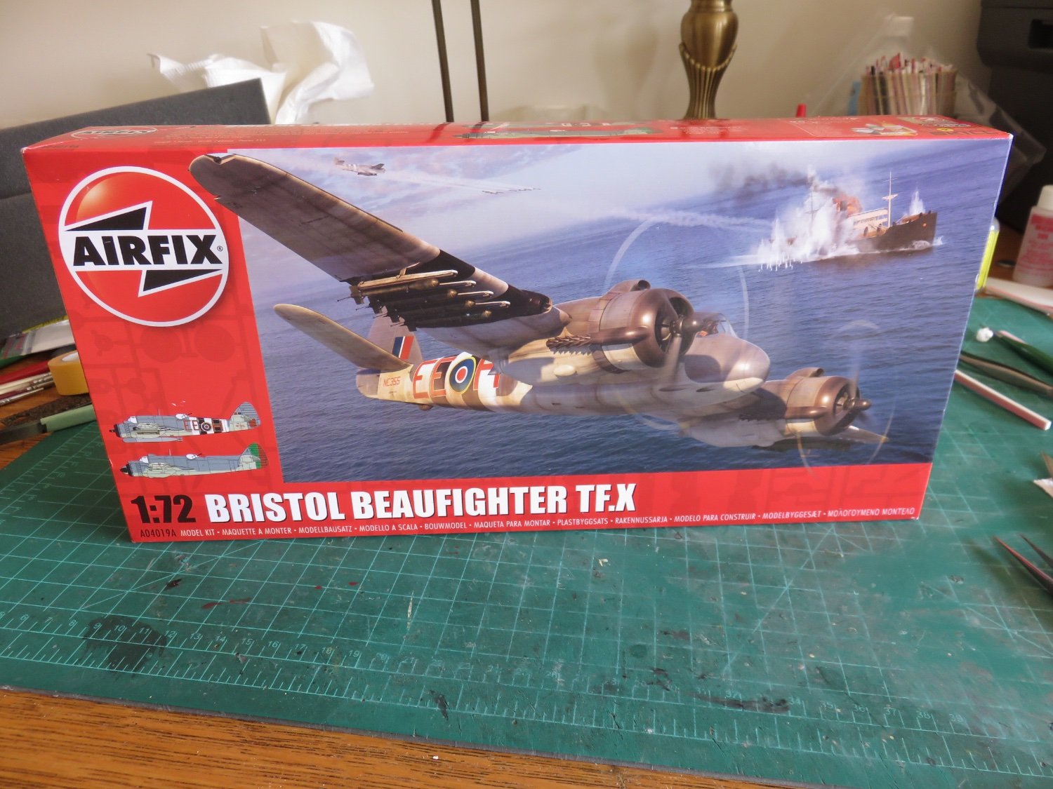
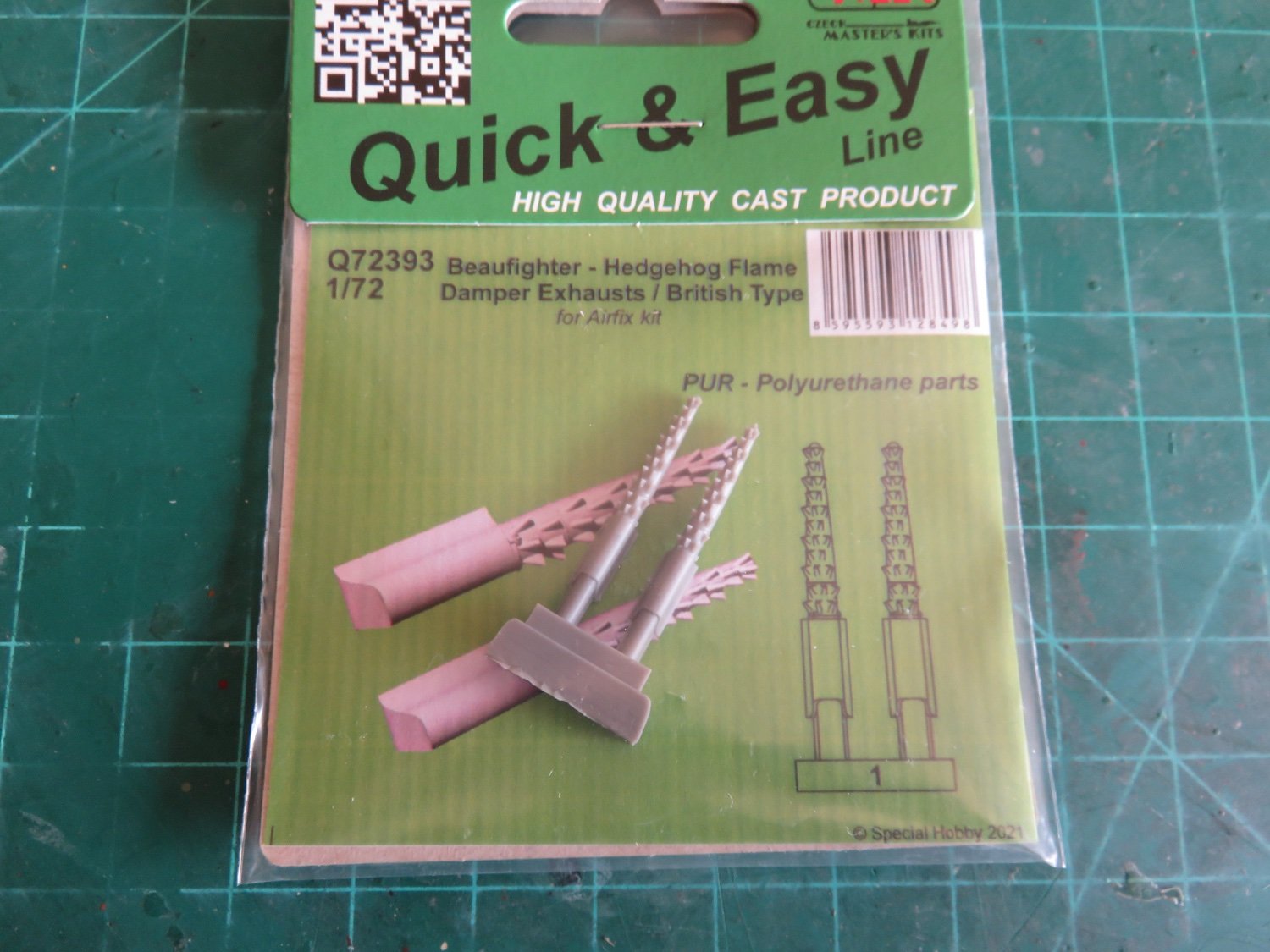
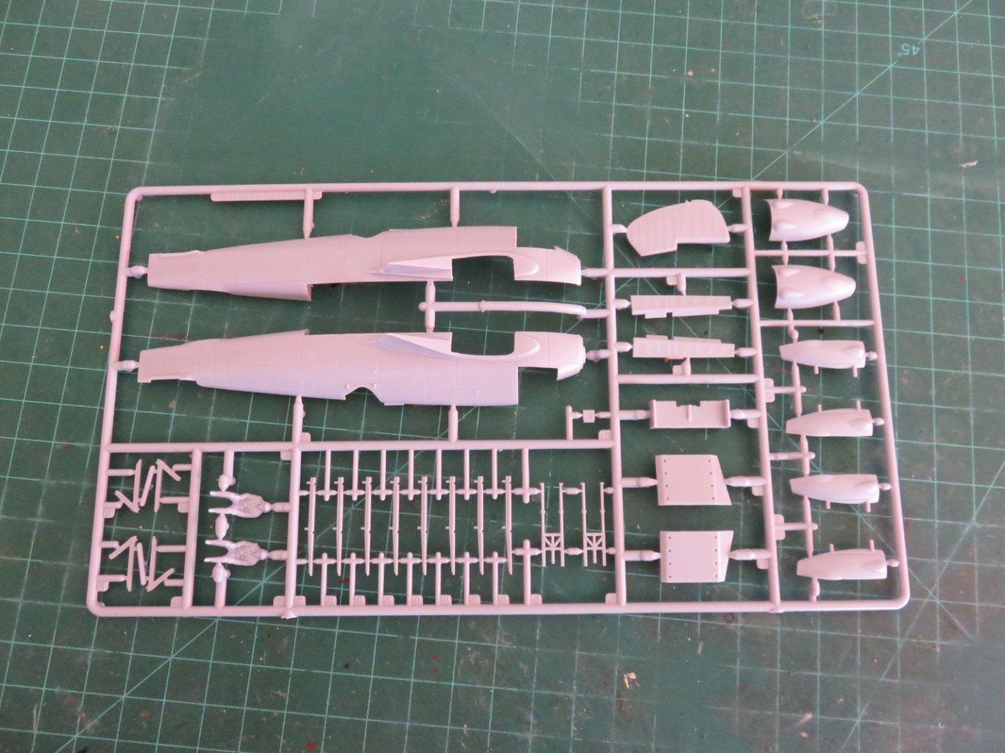
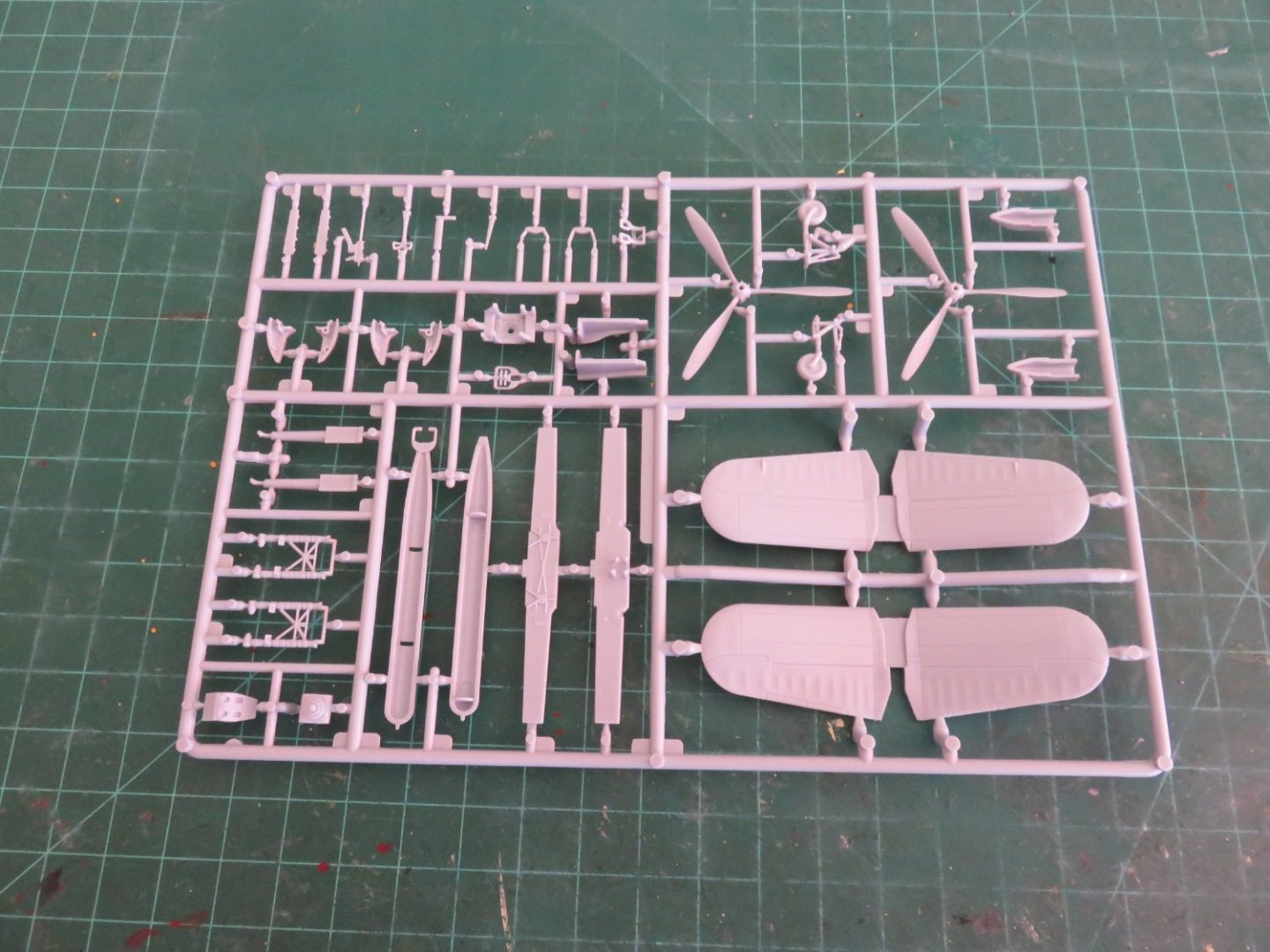
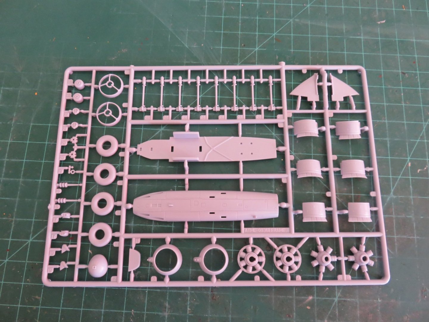
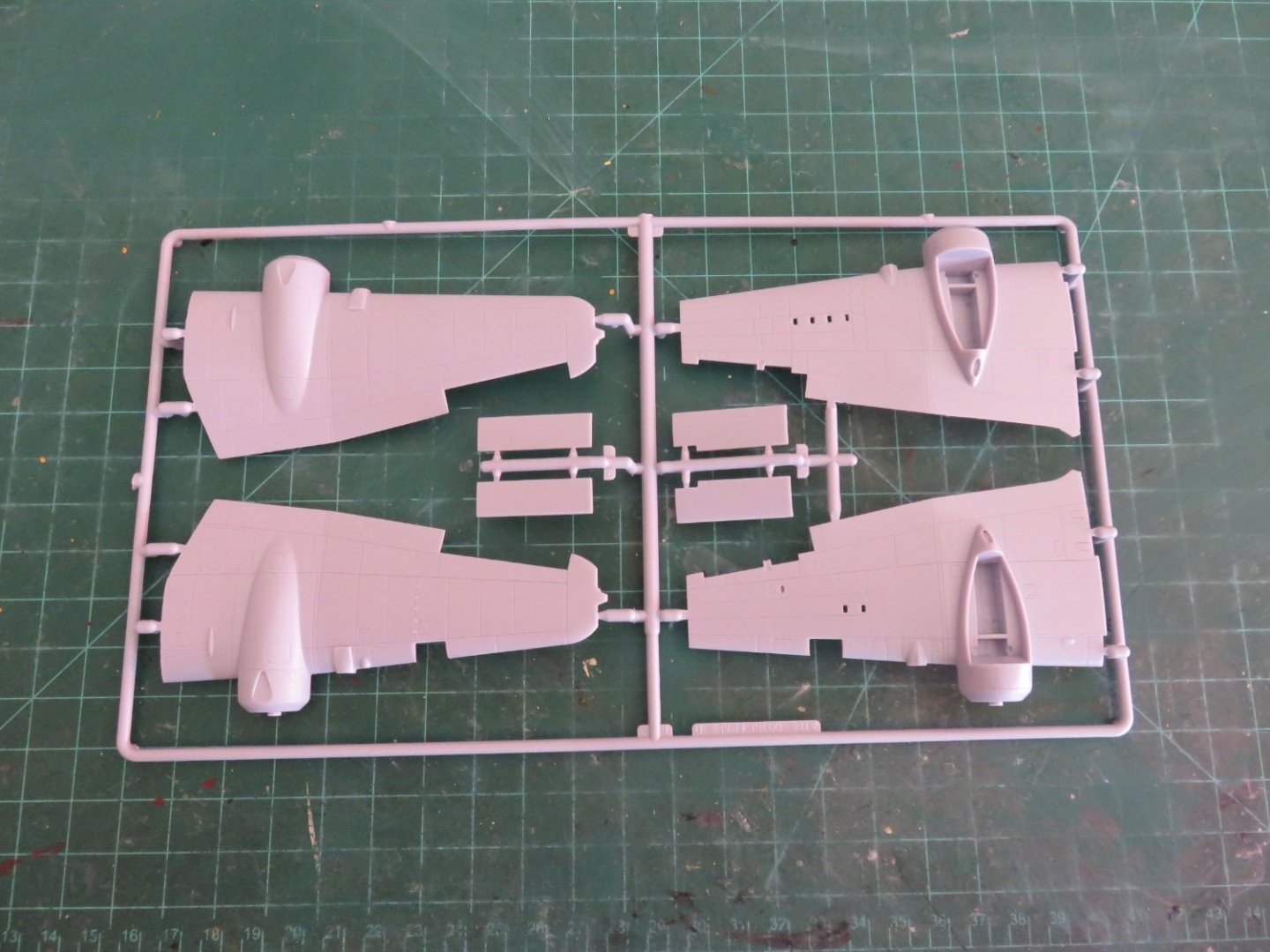
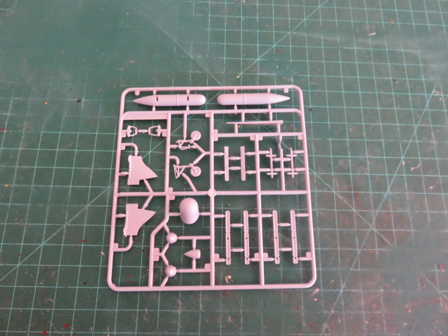
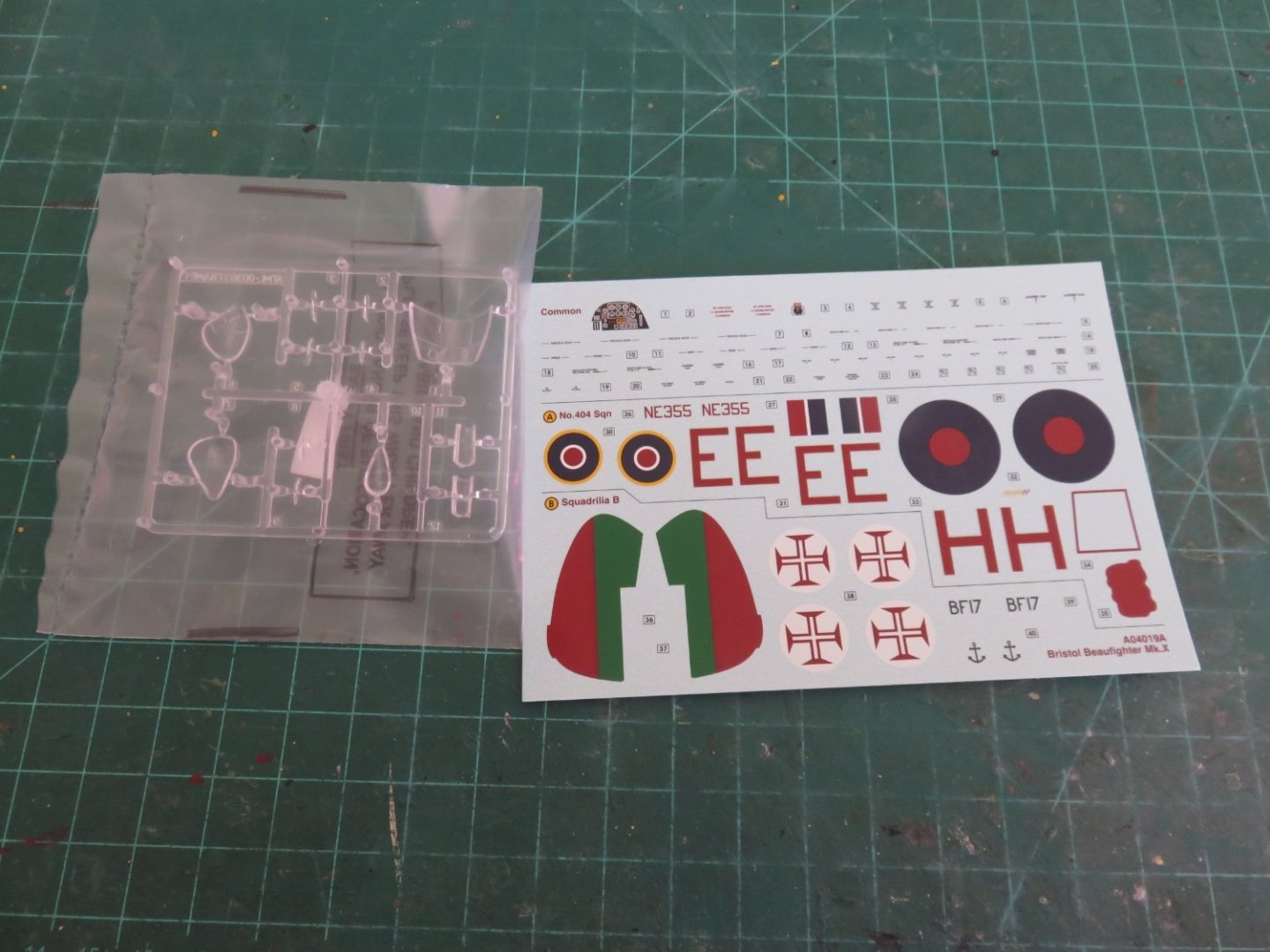
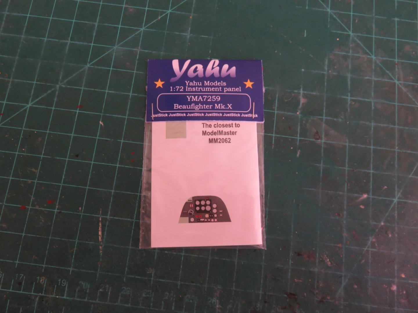
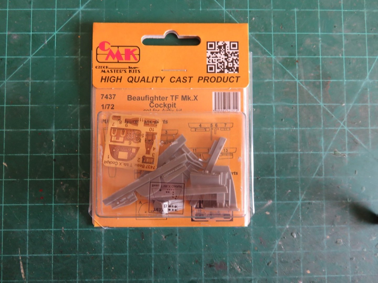
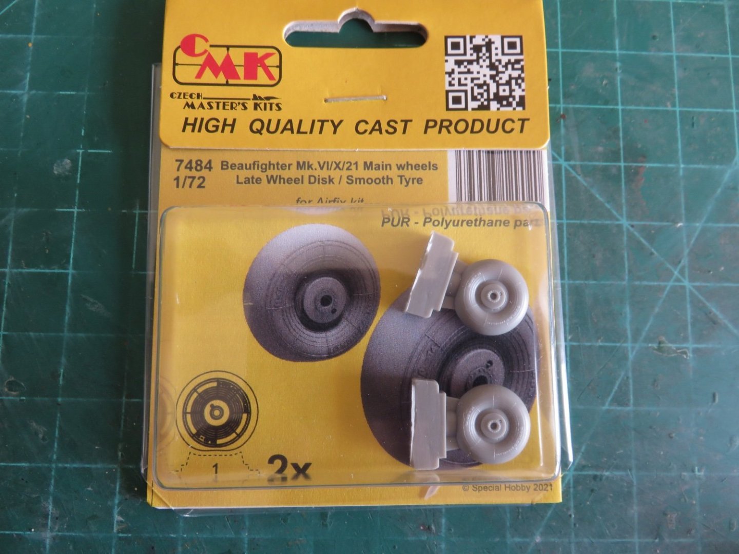
I received a small package in the mail today. It came from overseas, and I was worried it might not have made it. Thankfully Canada Post was correctly able to interpret my address, as it was in European format, but it made it, so I am happy. More on this in a moment. Obviously as per the title, I have decided next to tackle this very nice little Beaufighter kit from Airfix. This particular edition is a 2020 release of a 2015 tooling. I have seen a large number of positive reviews (and build videos) online, so I am looking forward to a largely trouble free build. LPJ models has a pretty extensive build video that's worth checking out. A quick shot of the box art depicting a pair of Beaufighters going after some hapless Nazi shipping (haha). The kit consists of five sprues in the usual grey plastic found in almost all Airfix kits (I think some of their domestic production uses a slightly darker grey), as well as one clear plastic sprue for the canopies and lenses and whatnot. The sprues are pretty much free from flash and other molding defects as far as I could see. Also as per usual, the decals are from Cartograph, so they should be of good quality. There are two variants to choose from when building the kit, and in the case of this release, the variants are dependant on the decal scheme. In the case of this release, the first scheme is for a Beaufighter from 404 squadron RCAF, stationed in Cornwall in June '44. Ostensibly (I'm assuming), to help protect the flank of the invasion. This version has the "normal" nose and lacks the extended filet of the tail fin. The other variant is a post-war version in Portuguese markings which has the "thimble" nose that housed radar equipment, as well as featuring the extended filet on the tail. Although, I don't have a picture, the instructions are up to Airfix's usual standard, clear, concise (and partially coloured). I noted that Airfix credited Terry Higgins for helping with the Beaufighter project, he is the person behind Aviaeology. As if there wasn't enough choices to be made, there are also a few options on fitting out the plane. There are three different choices in armament to select from. The first being a single torpedo (in keeping with the TF designation), as well as two different rocket set ups, a flat "panier" type mounting with the four rockets side by side, as well as a pod type mounting, with the four rockets mounted around a single hard point. And for good measure, an auxiliary fuel tank is included as well. In my case I intend to stick with the supplied decals and go for the RCAF version, just like the box art. Since I didn't get to put rockets on my Typhoon, I get to use them here, instead. Good thing I've had some practice painting invasion stripes, as they are not included in the decal sheet (not that I would have used them anyway), although this time they will be the full stripe, rather than the cut down version. And now for the aftermarket! I had previously purchased the Yahu Models instrument panel to replace the janky kit supplied decal (insert gratuitous eye roll): A simple, yet worthwhile upgrade. Additionally I have managed to secure a few other upgrades from CMK. After my previous rant, I did a little better investigation on the Special Hobbies website and found they offered a cheaper postal option. I was initially a bit confused, as it was with NL Post (which I assumed was the Netherlands postal service, why the heck would they be operating in the Czech Republic(?), but I guess Europe can be weird that way), so anyway after two and a half weeks, a small parcel found its way into my mail box, hooray! First up, the remainder of the cockpit: I will show comparative photos as the build progresses, but the detail in the aftermarket resin is much finer and more complete than what was included in the kit (which isn't bad, per se, but there are better options). The CMK upgrade includes a more complete cockpit floor as well as a proper seat mount and some of the wiring/piping/instruments located immediately behind the pilot. There is also some PE details like seatbelts, the rudder pedals, and another instrument panel, but I likely won't use the last one, since the Yahu one comes pre-painted and assembled. Next up, I will be replacing the exhaust pipes with these cast resin bits. The detail here, again, is much sharper than the kit casting (the hedgehoggy bits are actually sharp and pointy, as opposed to round and lumpy). Finally, the wheels will also be replaced: Just that little bit of extra detail, like the "Dunlop" branding on the sidewalls, that makes things stand out. There is possibly going to be only minimal progress for the next little while, as summer weather and summer chores (and beers, and boating, and BBQ) will take priority over model building. Hopefully I won't wear your patiences too thin! Andy


-
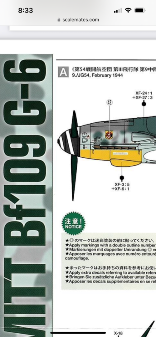
If you’re not above mixing, this is a screenshot of Tamiya’s BF109. It gives their mix ratio to approximate the colour you may be looking for: The XF series are acrylic, but there are equivalency charts to convert to their lacquer paints if you prefer. Great job so far, can’t wait to see the end result. Andy
-
A good sign the resin casting was not put under a vacuum after pouring. Without treatment air bubbles can remain trapped in the resin and leave defects as you describe. If the casting is placed in a vacuum chamber after it’s been poured, the air bubbles will be drawn out, resulting in a much cleaner casting. Andy
-
I saw a similar video from “Model Minutes”: He also made a visit to Airfix HQ: Andy
-
Great photo! (“Hooman look sad, I bring toys, help hooman happy”). Glad to hear you’re continuing on! Andy
- 443 replies
-
- 11
-

-

-
- Indefatigable
- Vanguard Models
- (and 1 more)
-
The other method I just thought you may wish to try, if the “chain” is able to be well supported in the frame, use a straight edge and repeatedly score with your hobby knife (alongside the length of the chain) across the tabs holding the links to the fret. A few passes with light pressure should eventually pop the links free. Andy
-
Something like these: https://www.amazon.com/Stainless-Plastic-Cutting-Tweezers-Jewelry/dp/B01MZ6621X Only perhaps hardened for metal work? I’ve seen a few pricy ones for jewellery makers, but there’s got to be something “good enough” for hobbyists that won’t empty the wallet. Here’s a set designed for electronics: https://www.tdiinternational.com/product-category/hand-tools/tweezers/cutting-tweezers/ Andy
-
SS Keewatin - last Edwardian passenger steamer
realworkingsailor replied to JKC27's topic in Nautical/Naval History
I think there are a few good advantages to relocating to Kingston. Primarily the location. The town is right on Hwy 401 (the main road between Toronto and Montreal), so it’s much easier to access for a lot more people. The Keewatin will be part of an actual museum (which, I think, has a couple of other vessels in its collection), rather than a random artifact at a small port few outside the area have ever heard of (although to be fair, Port McNicoll is closely tied to the ship’s history). There are also a large number of other museums and places of interest in the immediate area, so people not necessarily drawn to maritime history might be interested in visiting (“Hey, there’s this other museum just down the road, let’s check it out”). And, for what it’s worth, there is easier access to dry dock facilities in either Hamilton or Port Weller, when necessary. Although the ship should be good for a while, given that I’m led to understand she will be dry docked in Port Weller prior to being put on display, (attention people in the Niagara/Welland/St Catharines area(s), there will be photo opportunities!). Andy -
But if you did, you wouldn’t have the extra parts for your “spare parts” stash! I have hoards of lost-wax and PE brass, plastic, resin, and laser cut wood fittings and whatnot from my model railway efforts (not to mention a “scrapyard” full of locomotives and rolling stock). All from either projects that didn’t quite work out or from ideas for future projects that haven’t yet materialized. I could probably restore and super detail one or two of those donor locomotives without spending another penny (provided I find the right inspirational subject matter). You’ll find a good home for those seats! Andy
-
Nice to see that, although it looks like they’re not sure which version of the aircraft they want to display. Built as a Mk X, from the factory it wouldn’t have had the long over wing windows, but it would have had the triangular waist windows (for an observer/gunner). It was later converted to a Mk T10 training aircraft (I believe specifically for navigation training), and the over wing windows were added (and the waist windows removed). Seems fair enough, but at the time of conversion, they also removed the nose turret, which the restoration seems intent on replacing (according to the article). 🙄 Andy
-
Just a thought, is it possible the blue is similar (or identical) to the blue in the French tricolore? https://en.m.wikipedia.org/wiki/Flag_of_France Andy
-
Very, very nice! Well done! Andy
-
There is a replica of an earlier model Caudron racer: Is that closer to the blue you’re after? Andy
-
So, I’ve run in to a little frustration. (Not with my tiffy, though. It’s safely on the shelf) After closely examining the parts of my recently acquired Beaufighter kit, I decided that a little upgrade was required in some areas. Namely the cockpit details and the engine exhausts (and the wheels too, but only as a bonus, the kit wheels are okay-ish). So I went hunting around for what was available, I already have the Yahu instrument panel, but I found the resin offerings from CMK, especially the cockpit set, look really nice. This is where things get annoying. While I’ve been able to find CMK detail sets all over the place, I haven’t been able to find a hobby retailer that offers a decent price on shipping (and has the item in stock). Squadron hobbies has all the items I want in stock, but for a $23USD order (of small detail parts), they’re asking $24 in shipping. Uh.. nope! Hannants: same thing (although their quote was in Canadian $) Special Hobby: ditto (back to USD, or EUR) BNA: out of stock ($11.50 est. for shipping, though, so if they ever get back in stock…) Sprue Brothers: no stock (although a more expensive Eduard PE detail set would have cost the same after shipping) Wheels and Wings (in Toronto): no stock Ebay: Nope. Not even. For what it’s worth, I’ve ordered larger quantities of detail parts from Chuck, but the shipping cost was about $10 USD (sometimes less). I don’t know if I should be frustrated with the hobby shops themselves, or the postal services…. If anyone has any suggestions or ideas, that would be great. I would like to up the detail level for this kit, but I really can’t justify the shipping costs. Maybe I should just pour another Scotch and percolate for a while…. Andy
-
You’re gonna hate me: https://www.sunwardhobbies.ca/italeri-r-wessex-uh-5-helicopter-facklands-40th-anniversary-1-48-scale-2720 Sorry… 🤭 Andy
-
Sooooo….. https://uk.airfix.com/products/fairey-gannet-14-a11007 ??🤔 😁 Andy
-
Hmm… I don’t have a subscription, but I have access to read the whole article. Must be something connected with the IP address, it might not like “foreigners”… 😕 Andy
-
Take heart, film photography is not as dead as you may think it is: https://www.theglobeandmail.com/life/article-film-camera-photo-comeback/ Just like vinyl records, there is a growing niche segment that is spurring a revival of sorts. Andy
-
Not necessarily. It doesn’t look like that derrick/crane was designed to pick up particularly heavy loads (probably just enough to avoid having to hand-bomb items from boat to warf). It does, however, look like it was designed to rotate as a unit, so any stays or braces would only impede its use (unless the mast was way taller) Andy
-
I think pretty much all modern Airfix kits have Cartograf decals. If it’s not indicated on the sheet, the Cartograf logo should be printed on the side of the box. Andy
-
People with money….. yeeesh… 🙄