

BLACK VIKING
-
Posts
476 -
Joined
-
Last visited
Reputation Activity
-

 BLACK VIKING reacted to ccoyle in Hawker Hurricane Mk. I by ccoyle - FINISHED - Halinski - 1/33 - CARD
Here's the new shelves that mysteriously appeared while my wife was away in California.
-
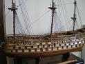
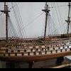
BLACK VIKING reacted to Darius359au in Artesania Latina 1/72 HMS Victory Cross section Trafalgar 1805.
The new AL Victory cross section has finally been released here in Australia and found I one for a decent price so grabbed it while it was in stock!
Received it today and I have to say I'm pretty impressed with the quality and and amount of materials in the box ,reminded me of when I got my victory models Pegasus with whats in there!
All the wood is bundled and clearly labeled with sizes , same as the thread for ropes and all the laser cut parts are clearly numbered and labeled!
I'm not going to start straight away as I want to get Pegasus up to the rigging stage or at least made the masts and yards ,I thought I would post this so people can see whats in the box if their thinking about getting the kit!
now for the photo bump😎🤣
Edit - I forgot ,there's also a colour parts sheet as well
Edit 2 -One thing I will say is this kit is Cheaper than the Corel cross section , larger scale and miles in front on quality and detail!
Richard
-
BLACK VIKING reacted to 72Nova in Sovereign of the Seas by 72Nova - Airfix - PLASTIC
The gun ports I opened up are trimmed out and painted along with the lower hull. once I complete the starboard side and the hull is glued together I'll finish modifying the stern/rudder post, rudder, pintles and gudgeons.
Thanks for looking.
Michael D.
-
BLACK VIKING reacted to Charter33 in Woodwork/Model making workshop. Scale 1:1
Installing the floorboards started with a plan, much used throughout the build, and now well worn....
In keeping with the nautical flavour there was only one method guiding the laying, the four step butt planking pattern.
Once a board was cut to an appropriate length fixing holes were pre-drilled with a 12 mm spade bit and each piece secured to the sub-floor.
A 1/2" plug cutter was used to convert offcuts of boards into covers for the screws.
Mixing metric and imperial tools in this way resulted in a nice tight fit. Once these plugs had been glued in place a sharp chisel made quick work of getting them level and flat.
The floor after sanding -
No, not quite treenails, but visible at this scale?
Oh yes, but nice and subtle.....
The first coat of finish has been applied,
the second and final coat will go on tomorrow evening after a light sanding.
Cheers,
Graham
-
BLACK VIKING reacted to 72Nova in Sovereign of the Seas by 72Nova - Airfix - PLASTIC
Somewhat of a crowning moment, besides some minimal fine tuning, the gilding on the port side is more or less complete along with making the as cast lanterns look as good as possible, they'll suffice.
Michael D.
-
BLACK VIKING reacted to Old Collingwood in Flying Dutchman by Fubarelf - FINISHED - OcCre - 1:50
How did I miss this build - serious face palm from me - I will follow along with much interest - lovely job.
OC.
-
BLACK VIKING reacted to Fubarelf in Flying Dutchman by Fubarelf - FINISHED - OcCre - 1:50
Haven't worked on the Dutchman in a while, as I have been focusing my time on the Bluenose. While I was waiting for some additional rope to come in for the Bluenose, I finished up the starboard side of the hull. I decided I wanted to have the hull planking go all the way to the stem, vs leaving the plywood bow fillers exposed as per the instructions. Still in need of a good sanding. I also installed the below deck lighting while everything was still open.
I started on the port side planking and, in between rows of planking, started on the stern cabin and details. I planked all of the balcony flooring and exterior cabin walls to give them a little more texture and keep the door details the same as the others on the ship. I painted the cast pieces with flat black enamel and highlighted with white with a few red details. I used tiny faux, red jewels for the eyes on the cabin figures.
Will continue on the planking in-between rigging work on the Bluenose.
Tim
-
BLACK VIKING reacted to md1400cs in Sovereign of the Seas 1637 by md1400cs - Sergal - 1:78 - to be hopefully bashed
Hi all,
Patrick – yes, the magnetic panels - seemed to be the best idea given that I much later in this build decided to add lights.
Peter – as always thanks
Mark - thanks as well - your work is so excellent happy that you like how this bit of the build is looking
Richard – so glad that you dropped by and are again working with your awesome Bluenose - thanks for the kind words.
--------------------------------------
It’s been quite a while since I’ve posted an update.
Started work detailing the carriages. Short text - images have some notations.
Thanks so much for your still continued interest in this very “slow boat to China” build log.
Enjoy your year-end holidays….
Cheers,
-
BLACK VIKING reacted to Old Collingwood in Black Pearl by Old Collingwood - FINISHED - 1/72 Scale
Hi there all, I decided to have another mess about with my photo files - so in my Lightroom I cropped a few then lifted the light levels added some contrast - Black levels - Colour and reduced the High lights then I sent them into my Topaz de noise before saving back into Lightroom where they had some selective sharpening and saved back into my files.
Hope you enjoy.
OC.
-
BLACK VIKING reacted to Rik Thistle in Archer self-propelled anti-tank gun by Rik Thistle - FINISHED - Tamiya 1:35 - 1945
Hi all,
Some more build pictures etc on the Archer self propelled gun.
There are a lot of parts to it, much more than the Tamaya Churchill tank, so I'm only posting pics of significant stages.
Below, shows how the Upper Hull is fitted, plus some of the hull parts.
The paint is mostly drab olive, applied with brushes. I've started adding a bit of weathering but lots more to come.
Below, some of the internal fittings installed eg moveable gun mount, seats etc. I'm not sure if the seats would have had padded brown leather upholstery, or just be plain sheet steel. But to add a bit of colour contrast I've given the crew the the benefit of brown upholstery, and added some shiny (worn) metal highlights.
Another pic of the above, from a different angle. The change of colour is due to me using the Flash on my phone, or not.
A good look inside an actual Archer is available here.... 'Inside the Chieftain's Hatch: 17PR SPM Archer, Pt 2'
Above - As you can see, everything has been painted drab olive green. This may have been part of a 'refresh' for the museum, but I suspect the paint job isn't that different from what was used in WWII.
Talking of paint, I have moved away from the AK Interactive 'wet palette' to a small mixing dish. The palette was prone to the colours running in to each other if moved....otherwise, it's still a useful tool.
Now preparing the Fighting Compartment sides for fitting to the hull. The shells should be a shiny brass colour, but the closest I had was a dark yellow.
Instructions on how to attach the sides.
And now it is beginning to look a bit more like a self-propelled gun.
And a final pic from above.
I still haven't figured out a compact scenario for this Canadian Archer.... but there are a couple of wartime pictures here that might give me some inspiration.... https://tank-afv.com/ww2/gb/Archer_17pdr_SPG.php ie ...in amongst a few comrades and some supplies - 'The Archer conducting fire support. Goch, Febuary 1945.' and in a treeline - 'An Archer near Nutterden, 9 February 1945'.
Any other suggestions gladly received.
Well, that's it for this week, back soon,
Richard
-
BLACK VIKING reacted to chris watton in Chris Watton and Vanguard Models news and updates Volume 2
And here are the Adder laser cut and PE parts, not on A3 like Sherbourne, but 50x70cm sheets. Also one of the profile plans, where the 'droop' of the foredeck is clearly visible.
-
BLACK VIKING reacted to chadwijm6 in Supermarine Spitfire Mk. IXc by chadwijm6 - Finished - Airfix - 1/24
Making good progress and trying many things for the first time, as I'm still a very new modeller. I had a go at pin washing the panels and also put in Eduards seat harness after adding a touch of brass paint to it. I also had a go a making the seat look a bit orn. I'm pleased with it so far.
Tomorrow, if I have time, I might try a bit of dry brushing, another thing I've been learning about (YouTube is my best friend at the moment!) to add a bit of light wear to the instruments and interior items. I also have had a change of heart with the scheme I was going for, I've decided to use scheme A which has the invasion stripes now and this meant that I had to change the throttle lever, according to the instructions, so that was some more fiddly painting to be done.
-
BLACK VIKING reacted to Loracs in Revenge 1577 by Loracs - Amati - 1:64
Deadeyes racks and gunport doors installed to the ship. This is no small task... amazing the number of little parts... all having to be fixed with nails. The good news, it is done and no major break (couple of minor ones though). Mark, drill and push in... all the while holding my breath that nothing fall apart. And those little corner parts on top of the racks!! each need to be adjusted to fit, what a pain.
With this done, this officially start the rigging segment of the build, starting with the deck cannons.
-
BLACK VIKING reacted to Louie da fly in The San Marco mosaic ship c. 1150 by Louie da fly - FINISHED - 1:75
I've been a bit distracted by my other build, the Golden City paddlewheeler, but I've also been working on crewmen for the San Marco ship. Here are a bunch I've already finished and have now painted,
and two of them I've also shaded. I've exaggerated the light and shade as otherwise they look bland.
And two new crewmen letting go and hauling on the shrouds as the ship tacks. (Big lateeners had to move the yard to the other side of the mast every time they tacked, and to do this the shrouds had to be loosened off - after tacking the lee shrouds would be somewhat loose and the weather shrouds tight.)
Crewman hauling down on (new) weather shroud.
And opening up the gap between his arms
And the legs . . .
Normally I'd do his face early in the process, as if I got that wrong there'd be no point in continuing - but in this case I couldn't get at it until I'd opened up the arms
And the hands and fingers . . . (I'm getting better at fingers).
And another crewman, belaying a shroud.
Looks a bit like Sir Ralph Richardson at the moment, but that will change. Now more like Noel Fielding . . .
Or perhaps Richard Harris?
Yep, Richard Harris . . .
I've decided to discard the two helmsmen (in the top picture - one in yellow and one in green) in light of the Black Sea discoveries about tiller location on quarter rudders, and I'll be making new ones. So I had to get some photos taken to base their arm positions on.
And here are the two helmsmen just started:
Steven
-
BLACK VIKING reacted to chadwijm6 in Supermarine Spitfire Mk. IXc by chadwijm6 - Finished - Airfix - 1/24
So lots of hand painting of the various cockpit items this evening. There is loads of nice detail in this kit I have to say. The cockpit panels are glossed as well so I'll have a go at some light weathering next before assembling it all together.
-
BLACK VIKING reacted to chadwijm6 in Supermarine Spitfire Mk. IXc by chadwijm6 - Finished - Airfix - 1/24
So, a bit of an update, we're underway with the cockpit. I'm using a combination of the instructions and a build log featured in the Spitfire review and build magazine that you can buy with the model from Airfix.
I've decide to drill out the holes in the bulkheads and airframes, as per the magazine article and then I've started to get some paint on.
-
BLACK VIKING reacted to Glenn-UK in HMS Indefatigable 1794 by Glenn-UK - FINISHED - Vanguardodel Ms - 1:64
Bowsprit Shrouds
I have managed to reattached the broken sword to the figurehead. I also reattached the rails.
It was then a case of adding the 4 shrouds for the bowsprit. The rigging of the shrouds was relatively easy to do.
Next up will be to add the foremast stay and preventer.
-
BLACK VIKING reacted to Siggi52 in HMS Tiger 1747 by Siggi52 - 1:48 - 60 gun ship from NMM plans
Hello,
the carpenters started with planking the QD. Here first the balcony and the parquet in the great cabin for the captain. At that time only the great cabin had a parquet.
And here the painter has oiled the floor
-
BLACK VIKING reacted to chadwijm6 in Triumph 3HW by Tim Moore - Italeri - 1/9
I've been looking at this kit so I'd like to follow along. I have 2023 Triumph Bonneville and I was wondering if I could adapt it to make a Bonny instead of the 3HW. There doesn't seem to be any Bonny model kits out there that I can see. Great job on the spoking.
-
BLACK VIKING reacted to Tim Moore in Triumph 3HW by Tim Moore - Italeri - 1/9
Wheel spoking in progress after finally getting my supplies. I’m using 0.5mm wire rods and short stubs of 0.8mm brass tube to create some sort of nipples at the rim. Remnants of the plastic spokes remain to hold the hub on centre and guide me on location and alignment, easy to screw this up otherwise I would think.
I’m ignoring the assembly sequence of the model in the directions and have put together all the main components of the frame, so I can paint it distinctly from the body parts. Hopefully I can shoehorn everything on board later on. I’ve sprayed on a base coat of black to begin with.
-
BLACK VIKING reacted to Charter33 in Woodwork/Model making workshop. Scale 1:1
Having achieved a water-tight roof covering
it's time to start cutting holes through it!
Took the best part of the day, but the six roof lights are now in place....
Here are a couple of 'before' pictures.....
The camera has compensated in the second image and lightened it. In reality it was as dark as the previous picture.
And 'after'.....
All units are double glazed with the right-hand middle one opening for additional ventilation.
Time now to complete the roof by adding the bitumen shingles.
Progress 🙂
-
BLACK VIKING reacted to Charter33 in HMS Victory by Charter33 - Caldercraft - Scale 1:72
Reviewing the instruction manual for the hull I realized that I had missed one of the final steps on the bow, namely the brass moulding that runs from the base of the cat-heads to the upper bow rails. Before events temporarily halted progress I did get as far as annealing the strip of brass profile. Seems I'm not alone in this omission, this component is also conspicuous by its absence from the photograph of the otherwise completed hull example that adorns the front cover of the manual! 😄
First task was to make a card template to guide the shaping...
The bending jig I made earlier in post #135 came in handy again
After shaping the tricky job of marking out and then removing a section of wale to get the moulding to sit against the hull......
Dry fit....
Before painting the ends were filled with soft solder to be more in keeping with contemporary photographs
Finally glued in place
and after a bit of filler the paint work had its first touching up.
I'll be checking it again under natural light tomorrow.
A couple more views:
Channels and chainplates next.......
Cheers,
Graham.
-
BLACK VIKING reacted to Glen McGuire in Wa’a Kaulua (Traditional Hawaiian Voyager) by Glen McGuire – FINISHED - 1/100 - BOTTLE
As this Hawaiian project comes to a close, I want to extend a huge MAHALO to everyone that stopped by for a quick look, suffered through the whole dang process, or anything in between.
@Keith Black, @BANYAN, @Ian_Grant, @Knocklouder, @gjdale, @GrandpaPhil, @Canute, @mtaylor, @Javelin, @Louie da fly, @Landlubber Mike, @gsdpic, @Bryan Woods, @ccoyle, @John Fox III, @JacquesCousteau, @Thukydides, @Harvey Golden, @kgstakes, @woodrat, @hollowneck, @wefalck, @Boccherini, @modeller_masa, @Ryland Craze, @_SalD_, @BrochBoating, @BLACK VIKING, @Rik Thistle, @Tomculb, @Elijah, @Archi, @ERS Rich, @DanB, @AJohnson, @Brinkman, @Jim Lad
As always, I greatly appreciate your comments that are laden with wit, humor, insight, encouragement, suggestions, and criticisms. I’ll say it again because it’s true once again – doing these build logs on MSW makes the project feel like a team effort. Y’all make everything I try to do a whole lot better. A sincere thanks to each of you.
Here's the final pictures.
-
-
 BLACK VIKING reacted to chris watton in Chris Watton and Vanguard Models news and updates Volume 2
One down, one to go...