HOLIDAY DONATION DRIVE - SUPPORT MSW - DO YOUR PART TO KEEP THIS GREAT FORUM GOING! (Only 64 donations so far out of 49,000 members - C'mon guys!)
×


Hubac's Historian
-
Posts
3,295 -
Joined
-
Last visited
Content Type
Profiles
Forums
Gallery
Events
Everything posted by Hubac's Historian
-
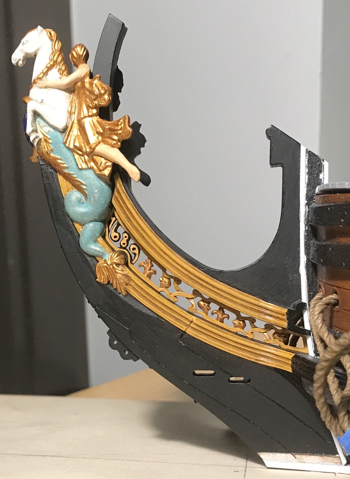
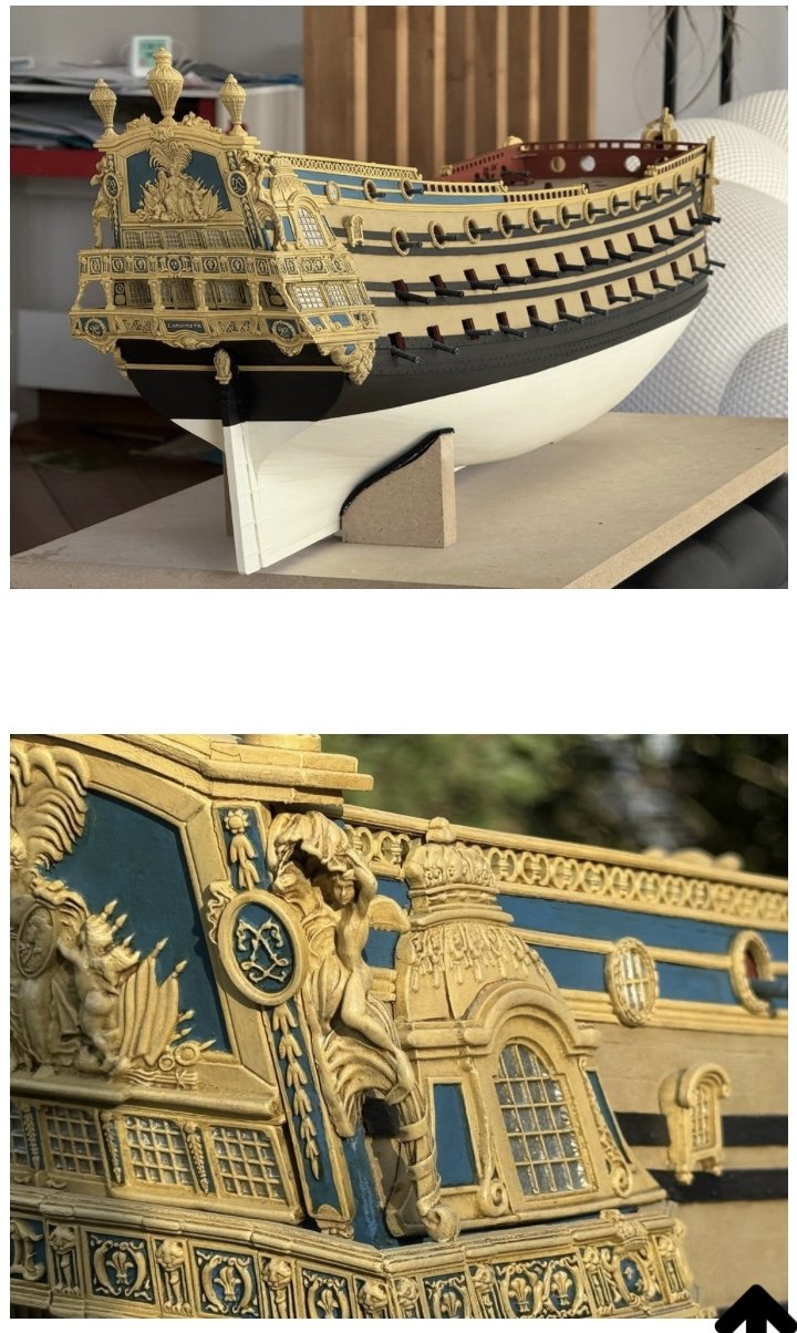
 Wow - I never realized just how out of alignment the beakhead is!
 -
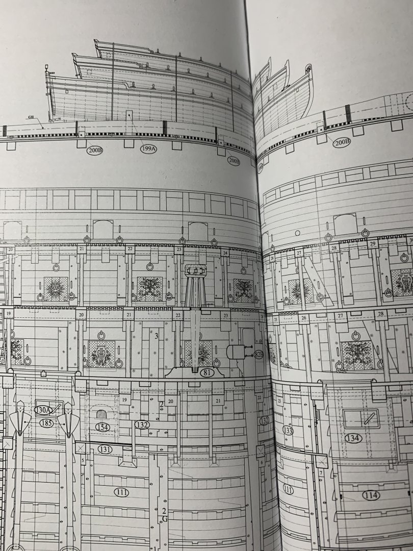
Nicely done drawings, EJ. Now, though, I’m going to be a genuine PITA, once again. Why no deck camber? In smaller scales, this omission is less noticeable, but your model will be quite large and this will jump out at the viewer because - apart from the practical purpose of watershed, all elements of the ‘tween decks bulkheads will read very flat. These early 17th C. ships are all about the curves. For the sake of no-one will ever see it, I can see not worrying about the lower decks, but the visible decks are a different level of consideration, IMO. I mention these things because you are early in the build, and have time to consider them. It’s a big project, and I don’t mean to be annoying, but I want you to be happy with the results of your labor.
-
Yeah, that’s what I was seeing in those early pictures. Sounds like you have it all well in-hand.
-
Well, that’s just the thing - if you continue setting frames on this current base, and then lock them in with your battens, then whatever distortion all of that frame weight introduces to your keel will also be locked-in. I think you will be safer and far less aggravated, in the future, to start from a truly flat and solid base. This ship will be heavy.
-
Over that span, EJ, I have some concern that your keel plinth and mounting board aren’t up to the long-term task of keeping your keel straight, as the hull takes shape.
-
Really nice work on the chains, Marc.
-
As they say - don’t allow the “perfect” to be the enemy of the really very good.
- 396 replies
-
- 1
-

-
- soleil royal
- Heller
- (and 1 more)
-
I know just how crazily small all of this is, and your macros show every tiny detail. If there are flaws, I certainly can’t find them. It amazes me every time! What you do so particularly well, from a paint perspective, is scale wood-graining. The effect is so true to life.
- 321 replies
-
- 5
-
-

-
- Sovereign of the Seas
- Airfix
- (and 1 more)
-
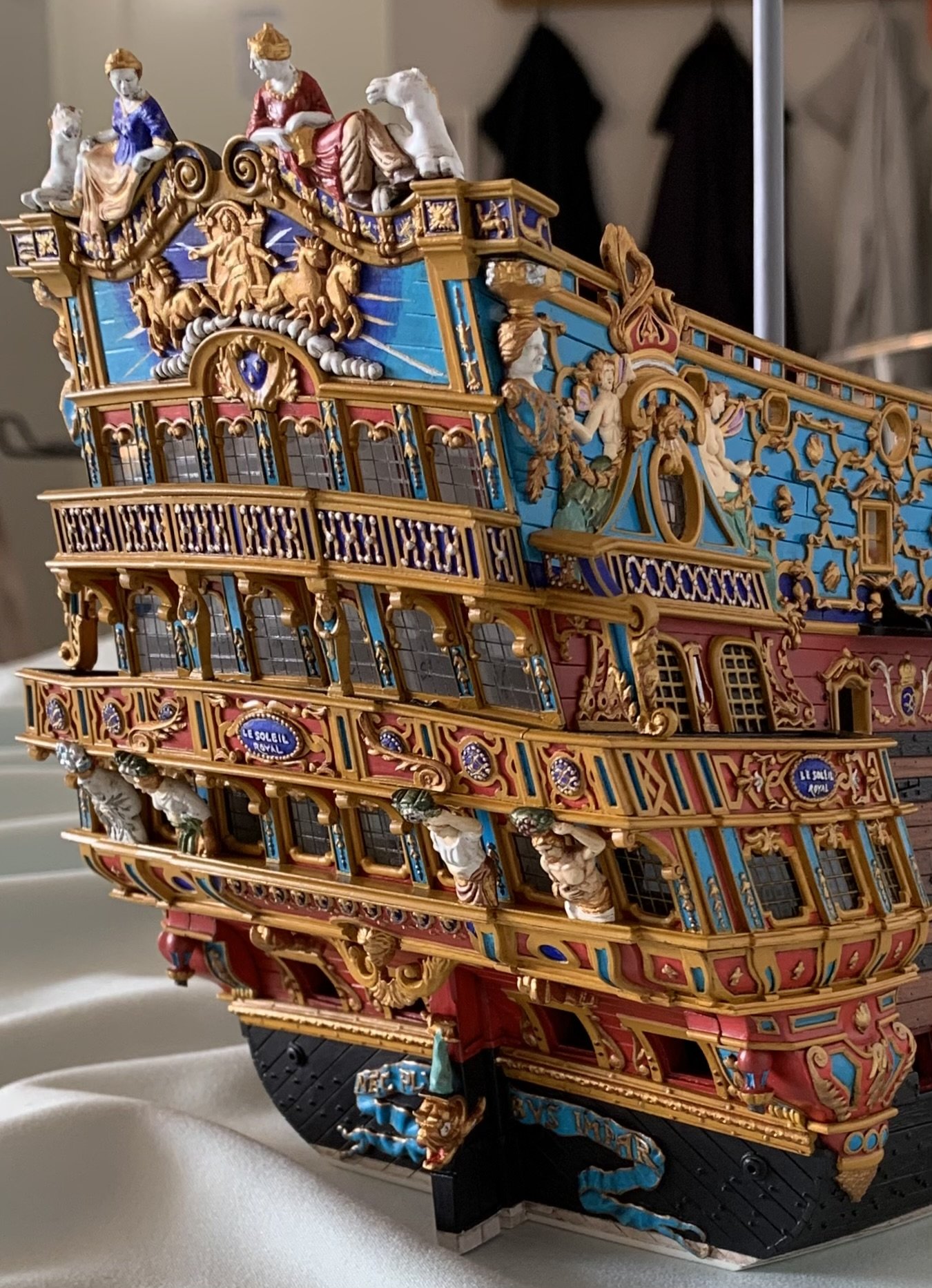
YUM - those port wreaths look awesome! And the washer/wedges look incredible.
- 396 replies
-
- 1
-
-
- soleil royal
- Heller
- (and 1 more)
-
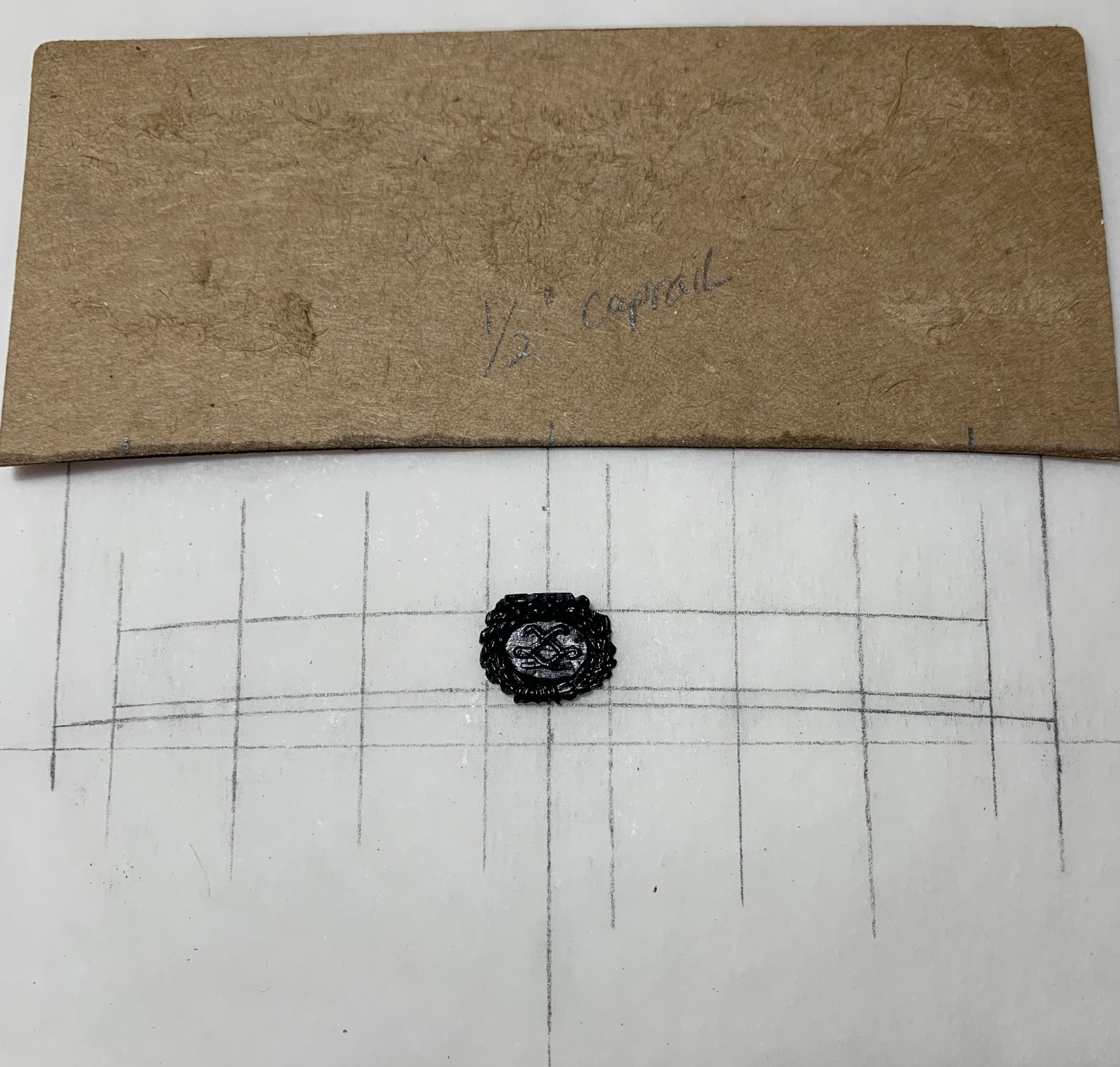
BONDO is just common auto-body filler. The vinyl paste is so fine that it fills-into small details really well. It’s very sticky stuff, though.
- 2,696 replies
-
- 1
-
-
- heller
- soleil royal
- (and 9 more)
-
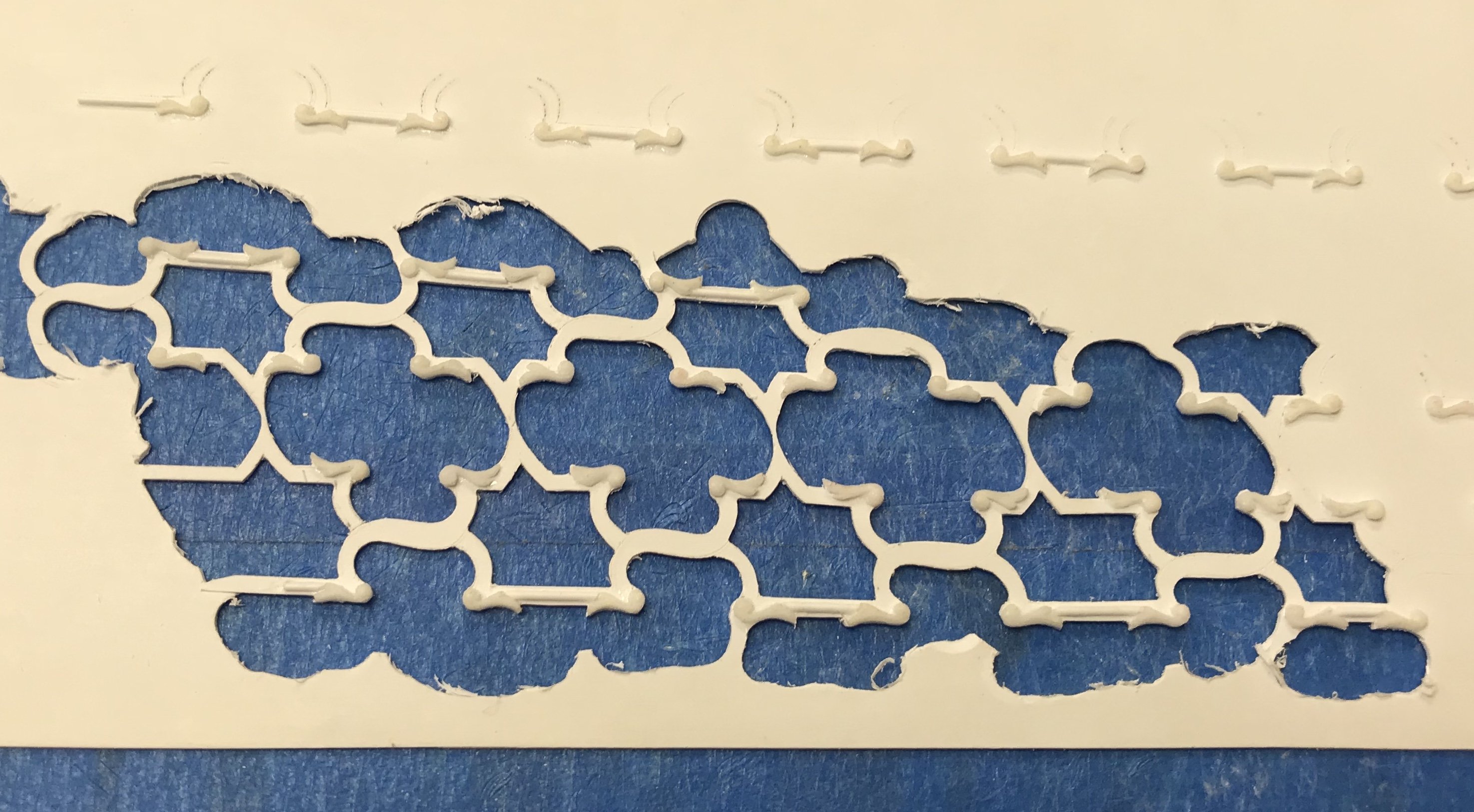
I’ve spent the better part of the week fretting out these panels. They are pretty small, at 3/8” x 7/16”+: As such, I was having a lot of trouble NOT breaking off the ears of my fleurs. I set them aside, to glue them back-on once the fretting was done. Despite that precaution, I still managed to break one off again. I realized I would never be able to model the shells and fleurs unless they were secured to a backing, so I glued the .032 fretted panel to a .020 backer. In order to preserve some sense of lightness, I filed out the scalloped recesses around the perimeter. When I get to painting these, I will use flat black for the ground behind the fleurs and shells - a nod to theater carpentry. The fret-work will be red ocher, and the ornaments will be yellow ocher. I’m going to experiment with Bondo to see whether I can cast extras of the small squiggles that ornament all the corners of the frieze. These might be nice accents for the corners of each panel: I ran out of viable resin and don’t feel like buying more because it has a shelf-life, and I won’t use it enough to justify the cost. As long as the vinyl Bondo releases from the rubber moulds I made, we’re in business. We shall see.


- 2,696 replies
-
- 12
-
-
- heller
- soleil royal
- (and 9 more)
-
The effect is very good - stylized, but in a good way.
- 396 replies
-
- 1
-
-
- soleil royal
- Heller
- (and 1 more)
-
Hey EJ - it’s great to see you back on the forums! I’m excited for the latest project, and I am here for it!
-
Hi Bill - yes, I just recently became aware of this kit. I can see the appeal of open frames, but I don’t think the kit is at all representative of the ship, and I think it is way over-priced.
- 2,696 replies
-
- 1
-
-
- heller
- soleil royal
- (and 9 more)
-
Bravo, Eric! I really admire your willingness to keep revising and developing different processes to arrive at your desired results. Your method of applying the triangles to the mouth, as a means of guiding the buildup, is really an excellent idea. And, of course, the copper wire really does give the dolphin body a dynamic sense of 3D movement. I predict that your build following will really jump, once you begin assembling all of this work that you are so meticulously modifying and scratch-building. Patience and determination have carried you this far, and ultimately they are going to produce an entirely unique interpretation of the Heller kit. You have corrected a number of things like the wale sheer, gun placement and head structure that I did not previously think could be corrected. Hat’s off, my friend!
- 396 replies
-
- 1
-
-
- soleil royal
- Heller
- (and 1 more)
-
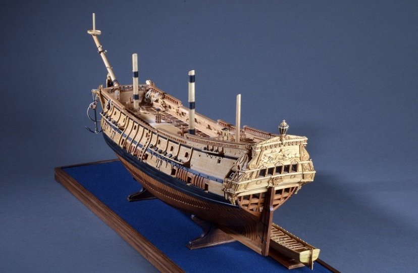
Incredible work, Patrick!
-
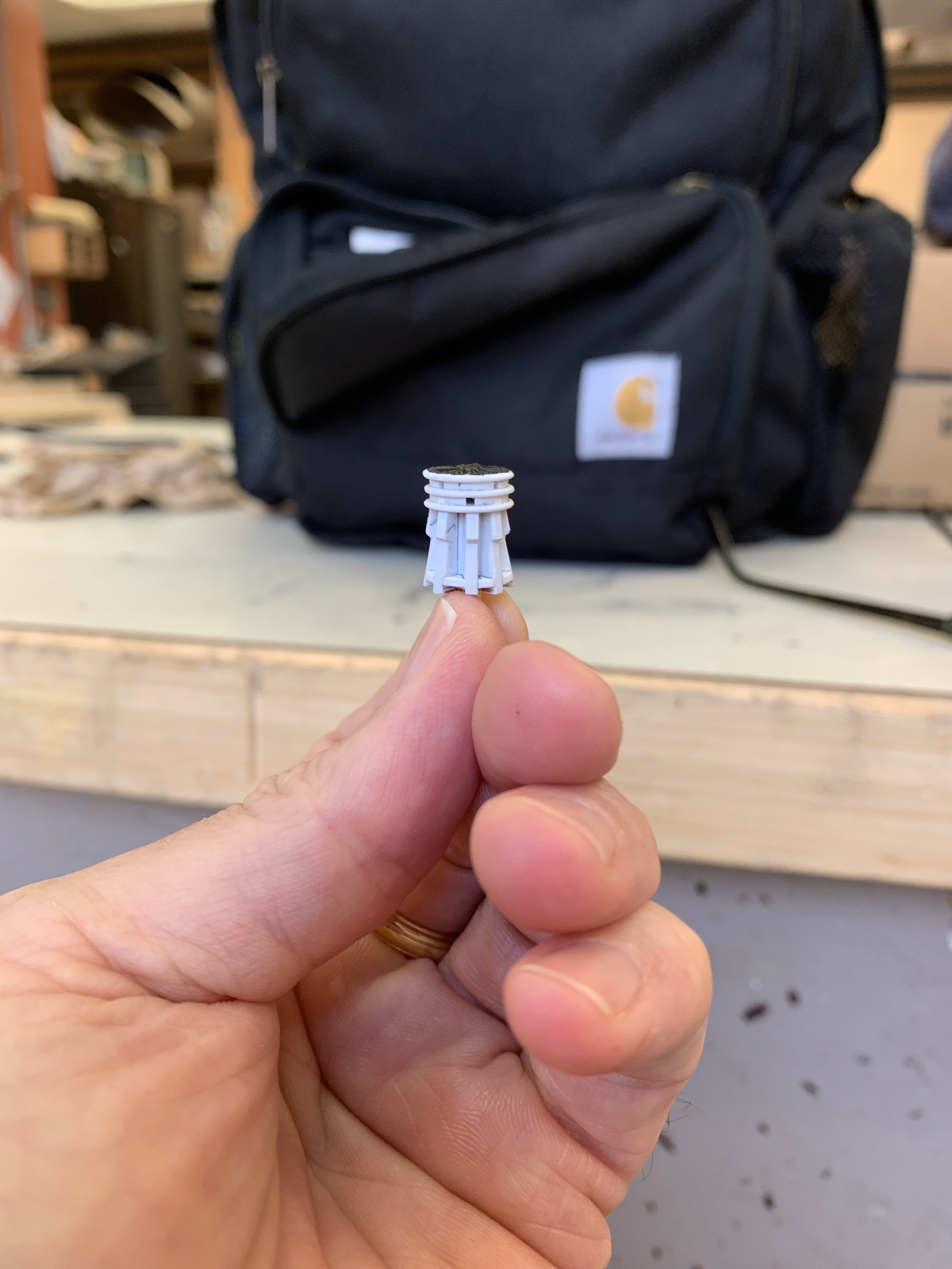
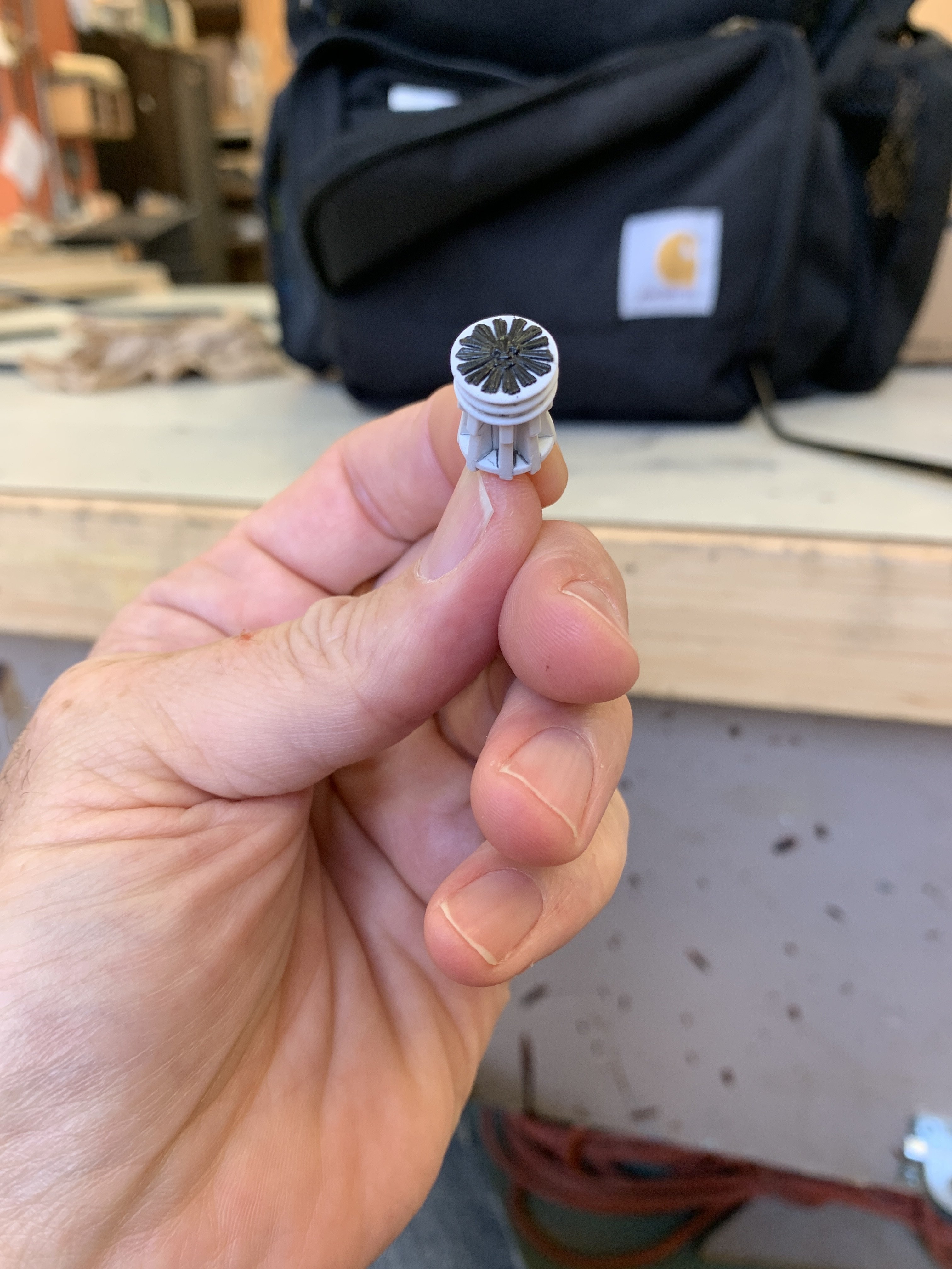
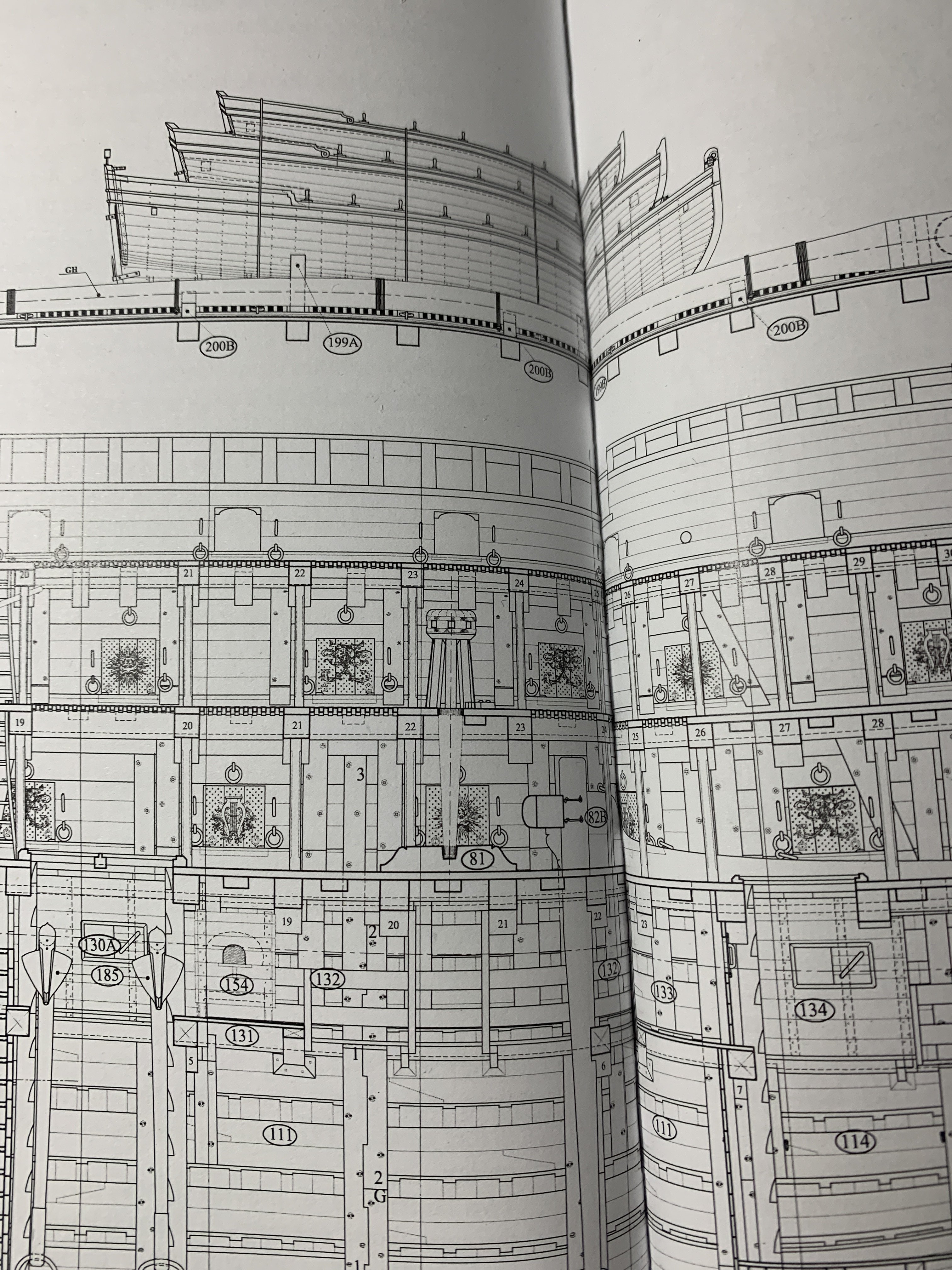
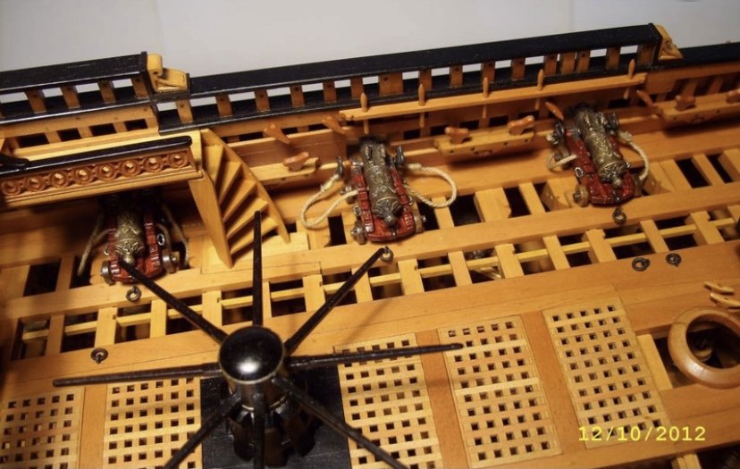
My plan for the poop deck is to make this kind if bridge gangway, over a cannon, and down to the QD: For the poop royal deck, I have not yet decided whether to do this kind of simplified Dutch bulkhead with simple treads attached to the bulkhead, directly, or to do another bridge gangway to a ladder between the 4-pounder guns: In other developments, the capstan mod is complete:


- 2,696 replies
-
- 14
-
-
- heller
- soleil royal
- (and 9 more)
-
Henry - do you mean making custom breast-rails, a capstan or both?
-
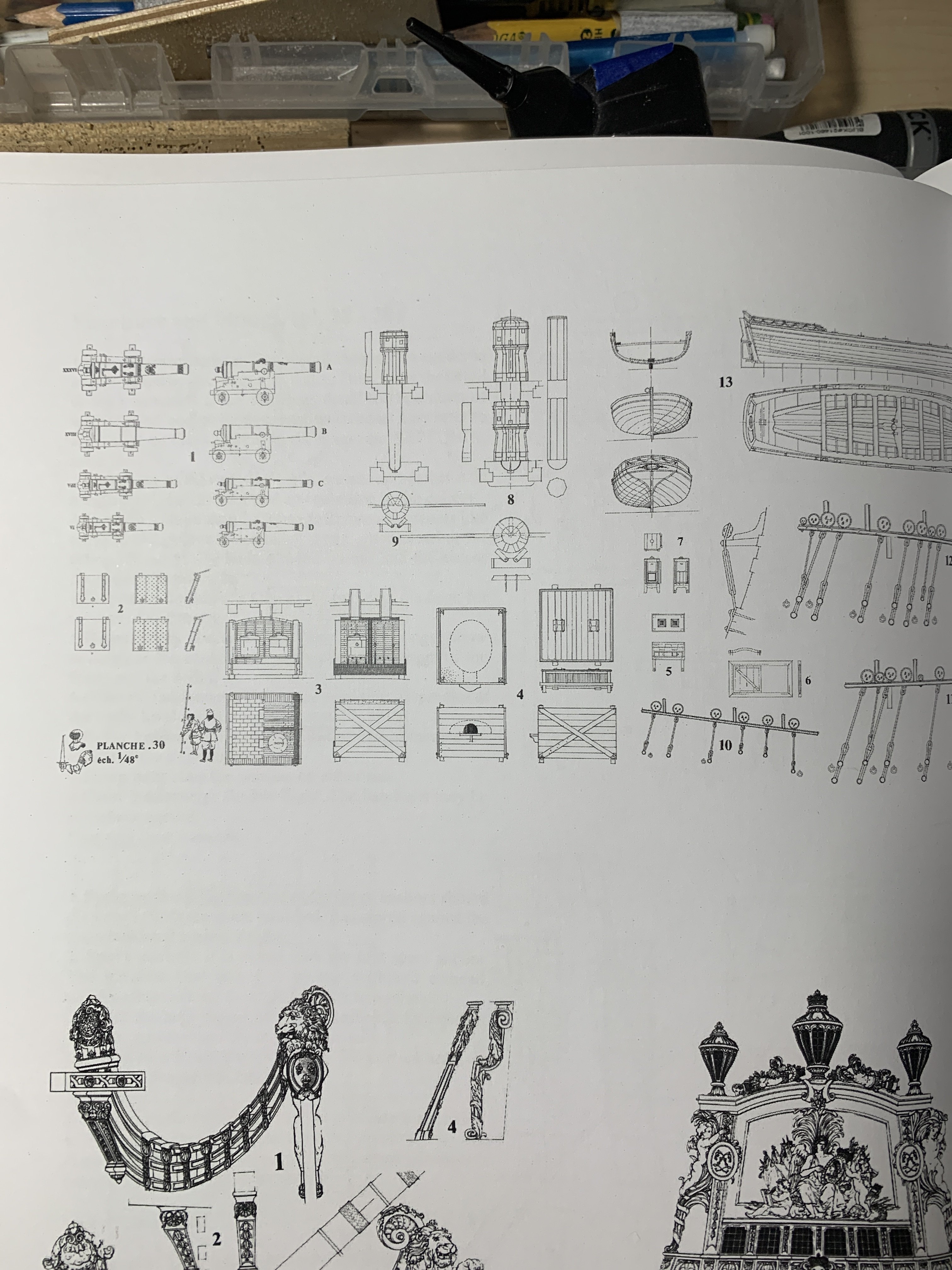
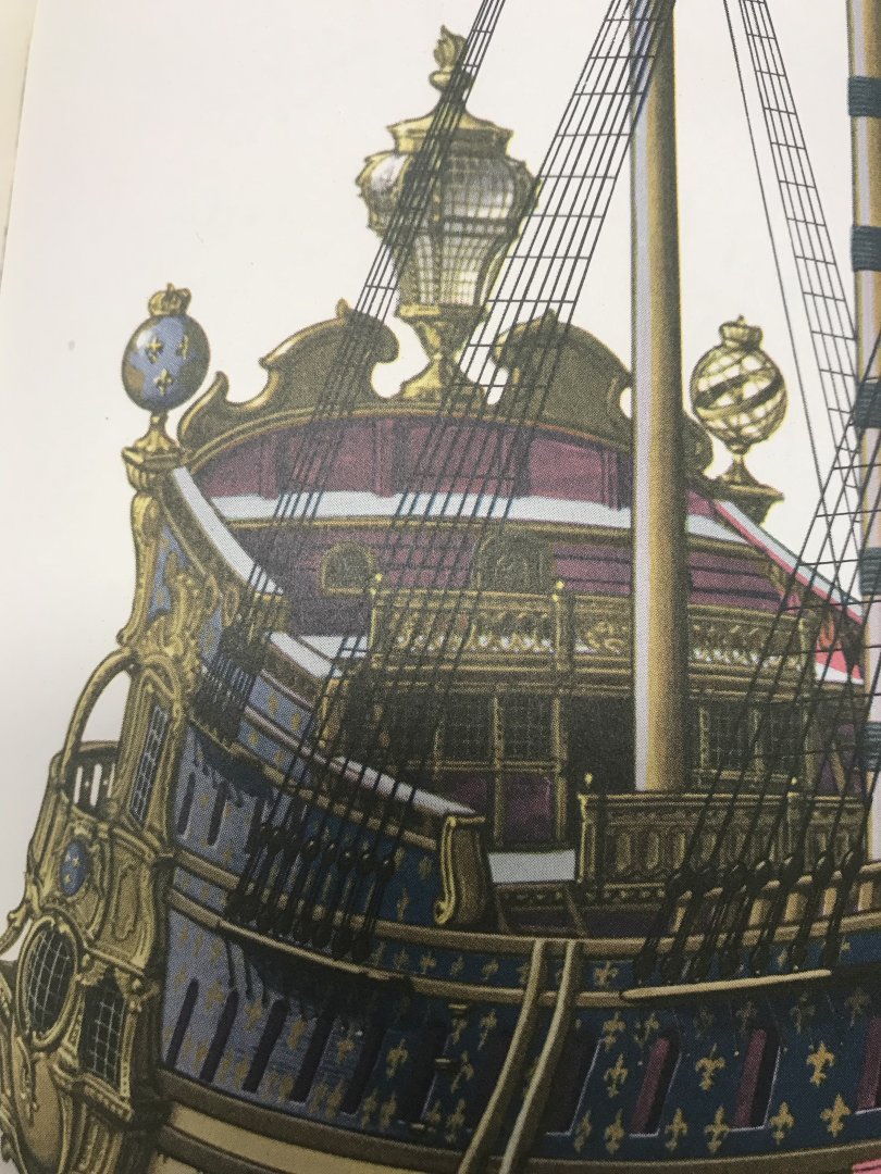
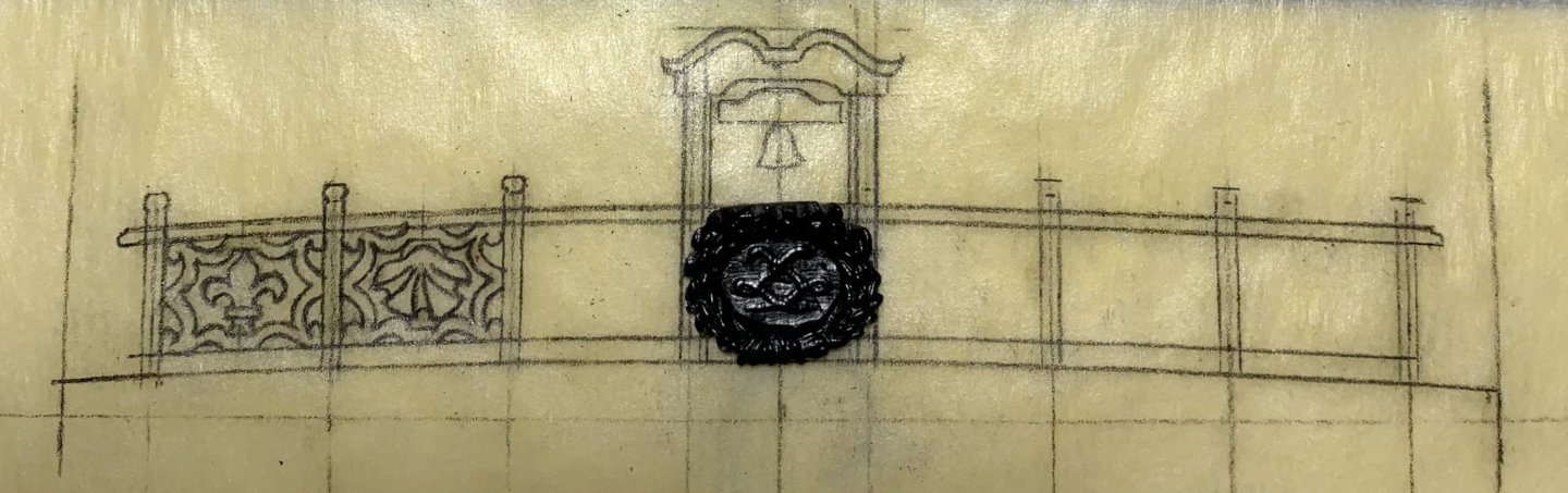
Thank you, Gentlemen. I’m going to go ahead and modify the capstan. Over the course of this build, you guys have made a number of really good suggestions. I don’t always follow-through on them, but here is an instance where I can bring a detail more in-line with historic reality, without having to scrap the truly labor-intensive aspect of the part. I value all of your input, and Waldemar is quite right to point this out. I am also happy to report that I have arrived at my f’ocsle breast-rail design. My idea with the breast-rail will be to adapt an exterior detail - in this case, the bow trailboard - and bring it in-board. For a reminder of the particular framing of the trailboard: The trailboard is, itself, an adaptation of the original design. Where the “X’s” are, there should be shells in the top and bottom negative spaces. At the time that I made this part, that was just too small and fiddly for me to make a good job of, so I chose to leave those spaces open. For this breast-rail, though, I could show alternating shells and fleurs within the same lattice framework: The beauty of this process is that I only have to draw one of each panel. The spacing remains the same for all six openings, so I merely have to make a mirror photocopy for the starboard side. It will be fleur/shell/fleur, which picks up on the alternating design of the bulwark frieze. French belfries tend to be rather plain, in comparison with their English counterpoints. There’s enough ornamental work going on below, so I decided to pick-up the reverse cyma curves of the tafferal for the belfry’s coronation. When I get to the quarter deck rail, I will again draw inspiration from an exterior detail. In this instance, I will adapt the framing and monogramed cartouches of the middle balcony rail: At the poop breast rail, I will adapt the quarter deck level of the gallery, with it’s series of X’s: The Arms of France will also appear at this level. The breast rail of the poop-royal deck will adapt the simple sheer rail “linked circles” of L’ambiteaux: (photo courtesy of Marc Yeu)


- 2,696 replies
-
- 15
-

-
-
- heller
- soleil royal
- (and 9 more)
-
One last thought on Waldemar’s observation - a closer look at the L’Ambiteaux capstan does show a staggered 2-level series of sockets for the capstan bars, while Lemineur’s SP is a single level of sockets. Really, I have no idea whether that represents an evolutionary timeline from 1680 to 1693, or whether it is merely a designer’s assumption that has the privilege of plausible deniability for the lack of primary source information. As I have one more radiant fleur emblem at my disposal - I could grind off the existing emblem; fill every other socket on the existing level; add an upper level of alternating sockets; and re-cap with a new top and emblem. That is a possibility that - so long as I don’t botch the emblem extraction, wouldn’t take too long to do. What do you think guys? Is it worth it? I will weigh your responses, carefully. Currently, I have begun designing the f’ocsle breast-rail and belfry. I’m playing around with another ornamental extraction. This time it is the garland-ensconced royal monogram that would be a fitting central panel beneath the belfry: This whole process begins by fitting a card template (always soda boxes) to the exact camber of the f’ocsle deck beam. Once my sanding stick brings the template to rest, I like to harden the card edge with CA, because this template is now a drawing tool for transferring that camber up the breast-rail. The central belfry will rise up above the breast caprail by almost the same height as the breast-rail.

- 2,696 replies
-
- 4
-
-
- heller
- soleil royal
- (and 9 more)
-
Always a pleasure to look-in, here. Everything is so crisply executed. I love the capstan and breast-rail details. Also, that is a very clever way to make the rudder hinges.
-
Well, as I well know - you have gone to great depths to reconstruct line drawings into more plausible outcomes. Your insight on a wide array of vessels is invaluable. I’ll take a look at the Delacroix forum, though. Thanks for the reference!
-
What are the other main issues you see with Lemineur’s reconstructions?
- 2,696 replies
-
- 1
-
-
- heller
- soleil royal
- (and 9 more)
-
Agreed - I am hearing from a number of friends who are interpreting the SP drawings, in particular, and there appear to be a number of inconsistencies. As for the capstan, I’m not sure whether I will remake it. Probably not, but if it gets under my skin, I will have to revisit that possibility.
- 2,696 replies
-
- 1
-
-
- heller
- soleil royal
- (and 9 more)
-
Hello Waldemar! Your observation, on this point is well-received. Honestly, I did not think to consult the Album de Colbert. I, instead, referenced Boudriot’s L’Ambiteaux: And Lemineur’s SP: Interestingly, the style you reference shows up on Lemineur’s Francoise, which is closer to the 1670’s. I did not think to look here, though, before you raised this question: Generally, I assumed that by the late 1680’s, France had shifted to the more familiar drum capstan.
- 2,696 replies
-
- 6
-
-
- heller
- soleil royal
- (and 9 more)