Hubac's Historian
-
Posts
3,315 -
Joined
-
Last visited
Content Type
Profiles
Forums
Gallery
Events
Everything posted by Hubac's Historian
-
 Voila: https://www.wettringer-modellbauforum.de/forum/index.php?page=Thread&threadID=28516&pageNo=26
- 244 replies
-
- 2
-

-
- heller
- soleil royal
- (and 1 more)
-
It is interesting that raising the load waterline above the lowest sweep of the lower main wale dramatically improves the appearance of the lower hull. And don’t worry - there will be no knee kicking. To me, whatever it is that others attempt to do with the kit is fascinating. A few others have mentioned that they might attempt the Royal Louis or the Monarque of 1668, using the Heller shells. If I can find them again - I think the model resides on a German forum - I’ll post links to a truly spectacular Flying Dutchman that one extremely talented modeler made from the Heller kit. All the figure reliefs have been skeletonized, in ingenious fashion and design. The mold and moss truly look like they’re growing from rotten timber. Maybe, sometimes, plastic modeling isn’t afforded the same credibility as wood, on ship modeling sites, but this model is truly a work of art. I will look for it.
- 244 replies
-
- 2
-
-
- heller
- soleil royal
- (and 1 more)
-
That looks dynomite, Mark!
-
Heinrich - thank you for your kind words! Yes, I have also seen this weathered version of the kit, and it seems as though the modeler has done a similar wash and wipe with oil-based Van Dyke Brown, or something similarly dark. It still looks good - even without scraping off the raised grain - but I prefer the texturing and shading that the coarse sand paper imparts. I will be using two shades of blue; most of the frieze backdrop will be a lighter Cerulean blue, which in the 17th Century would be derived from copper salts. I will make sparing use of Ultra-Marine to highlight various aspects of the lower frieze and tafferal. I will not, however, “gild” all mouldings and ornamental work, as a matter of preference; even if that’s what would have likely been done to the real ship, I think it comes off as a little bit overwhelming; all that painstaking work gets lost in a sea of gold. Instead, the frieze lattice and most upper bulwark port frames will be done in yellow ocher, with a very light distress wash of walnut ink stain. Gold will be reserved for the ornaments, themselves, because I think this presentation will make them pop more. I have brought the model home, now, and I will resume painting soon. Maybe tonight, even. I am also making a protective build-box to completely house the model, until I get into the masting and rigging phase. Ironically, though, I will make the lower sections of each mast (in wood) fairly early on, so that I can step and rake them properly, and play with the proportions until I am satisfied with the run of the shrouds and the heights of the lower tops.
- 2,699 replies
-
- 5
-
-
- heller
- soleil royal
- (and 9 more)
-
Thank you for that link, Heinrich! The discussion of the gammoning was a little hard to follow because Google Translate does less well with German, than say, French. As far as the Heller kit is concerned, I think that it would be perfectly sufficient to raise the load waterline a solid 1/4”, so that it stands within 5 scale feet of the lowest gun port. This will improve the proportions of the lower hull, while still remaining safely clear of the gammoning. You can, of course, take your conversion project to whatever extremes you wish, but I think it may ultimately be less frustrating/more satisfying to accept certain constraints of the kit architecture. To, in other words, build a more impressionistic model of the SP, as opposed to a rigorously accurate one. With Cedric’s conversion to La Reyne, for example, it is his intention to correct the sheer of the decks/run of the guns, the layout and number of guns, as well as the forward sheer of the wales. All of this will necessitate some tricky reconstruction, at the main deck level, with a complete scratch build of the upper bulwarks - not to mention, a total reconstruction of the head. This last bit would be necessary, in any approach, because the structure and arrangement of the head knees and rails on La Reyne of 1672 is totally different from SR or SP in 1689-1693. All of this is not strictly impossible, but it is certainly a very challenging project. I, for one, am fascinated to see whether he follows through on some or all of that bacause doing so will almost surely introduce a number of ingenious solutions and techniques to bring those changes to fruition. Even if he were not to go to those extremes, however, I do believe it is absolutely possible to build a good impressionistic model of La Reyne with the Heller kit. I was, as a side note, really amazed with the German forum builder who converted the Heller Victory into the Commerce de Marseilles. I’m not a student of the Trafalgar era, but that looked mighty convincing to my eyes! In the end, the project has to remain fun, in order to sustain your interest and get to the finish line. I wish the best for you and your model, and I’ll be watching every step of the process.
- 244 replies
-
- 1
-
-
- heller
- soleil royal
- (and 1 more)
-
An interesting observation about the joint lines of the cutwater; when I get to that part, I might just fill the stock joint lines with putty; sand the whole surface level; and, finally, scribe in new interlocking joint lines that more appropriately follow the shape of the cutwater. It’s just one of those things about the Heller kit that doesn’t jump out as completely wrong until you really look at it. Good catch! I still don’t think the gammoning should be submerged, though. Heinrich, can you please post a link to your German forum? I’d like to read the discussion, there.
- 244 replies
-
- 2
-
-
- heller
- soleil royal
- (and 1 more)
-
Hello Heinrich, Well, you have many interesting ideas and techniques to test out; your scrap hull should be an excellent testing ground for your experiments. With regard to the hawser insert piece, it always annoyed me that it doesn’t fair smoothly into the rest of the hull - even though the plank lines align, as though the planking strakes are continuous. And they would be in full-scale. For my model, I took a little extra time to scribe a rebate into the aft edge of the hawser insert, as well as a diminishing to nothing rebate into the top and bottom edges from aft to forward, so that the hawser insert would flow smoothly into the rest of the hull. This is time well spent, as the visible step that remains from a “stock” assembly only contributes to the plastic-y feel of the finished model; like a hugely exaggerated flash line.
- 244 replies
-
- 2
-
-
- heller
- soleil royal
- (and 1 more)
-
Thanks, Mark! The name started out as a bit of alliterative fun, but 26 pages later it has sort of become true. Thank you for taking the time to read through all of my tangents.
- 2,699 replies
-
- 2
-
-
- heller
- soleil royal
- (and 9 more)
-
Hey Mark! No apologies are necessary; you are getting in on the lower deck, so to speak, as far as the actual build is concerned. I’m glad to see you here, and I hope the project will remain interesting to you, as it evolves. I’m in Brooklyn, now, and still settling in, so there hasn’t been any ship work, as yet. We have a club meeting next week, though, and I’ll be picking her up then, if not sooner. Thank you to all for your likes, comments and looking in!
- 2,699 replies
-
- 2
-
-
- heller
- soleil royal
- (and 9 more)
-
Interesting build, and very nicely done! I will follow along, if you don’t mind.
-
Looks great, Mark! Best of luck with the moulds.
-
It really is amazing, EJ, how the ship has come together. You are doing an incredible job!
-
review 1:60 Corel Réale de France
Hubac's Historian replied to schiffebastler's topic in REVIEWS: Model kits
Well, that will be a very interesting project, indeed! Later, when I have a minute, I will write a bit, in the “carving techniques” thread, about my personal approach to scale carving - which is quite new to me, but I have found it to be as effective as carving in full-size. -
review 1:60 Corel Réale de France
Hubac's Historian replied to schiffebastler's topic in REVIEWS: Model kits
Okay, so I replied to your post in carving techniques. Is it your intention to upgrade this kit by making the carvings from scratch? -
I’m sorry to hear that you’re having a rough time, Mark. I hope you’ll be able to find your way again, soon, and we will be here when you do.
-
This is one of the things about the SP monographie that does not add up for me. Although I do not have access to it, at the moment, I think that Lemineur references his waterline from an original draft that is of the same class of ship as the SP - the Tonnant class, if I remember [not sure about that]. Necessarily, though, his hull is a composite of a number of closely related sources - chiefly among them a slightly smaller class of ship that was, in many respects very similar, and better documented. I’m not sure how one would reconcile this problem, if they were using the plans to scratch-build the SP, in wood. Fortunately, with the Heller kit, the gammoning does not dip below the water line - not even if you raise the waterline to improve the apparent depth of the hull.
- 244 replies
-
- 2
-
-
- heller
- soleil royal
- (and 1 more)
-
Really well done Dan! It was a treat to see her, with all the progress you have made, the other day. I look forward to your next update.
- 238 replies
-
- 2
-
-
- leviathan
- troop ship
- (and 2 more)
-
You know who might have a clear and practical answer to this question? Henry - AKA Popeye2Sea. He serves aboard the U.S.S. Constitution, and has a tremendous working knowledge of rigging, and of gun rigging. Maybe send him a message.
-
Got it! Well, it certainly warrants some experimentation on my paint samples. This pastel route may also be the way to achieve the streaky algea look that I want for the thin strip of white stuff, at the waterline.
- 2,699 replies
-
- 2
-
-
- heller
- soleil royal
- (and 9 more)
-
Kirill, what purpose does the dishwashing detergent serve?
- 2,699 replies
-
- 2
-
-
- heller
- soleil royal
- (and 9 more)
-
Well, Druxey, that is a very good question. The actual number I settled on is somewhat arbitrary, but I based my decision to include more, rather than less, on my observation of various Van de Velde drawings, as well as the models of Herbert Tomesan; those models are very close studies of VDV drawings. Then, there are re-constructions, like Batavia, that have four scuppers along the lower deck. I see your point, though, about the weather deck - where it would make more practical sense to have more than less. In fact, the monographie models of Le Saint Philippe, show fewer along the lower deck. Perhaps, on future models, it would be more accurate to show fewer scuppers, here.


- 2,699 replies
-
- 2
-
-
- heller
- soleil royal
- (and 9 more)
-
I’ve been thinking about dry pastels/powders because I want to simulate the water staining beneath the scuppers, and maybe also run-off from the channels. Do you have any advice here about particular products, application techniques and sealing?
- 2,699 replies
-
- 1
-
-
- heller
- soleil royal
- (and 9 more)
-
FYI - I’m working right now, and decided to test a crease where the wale joins the hull. There was some accumulation of VDB in that crease, so I pressed hard with a Q-tip, and it didn’t pick up any VDB paint residue. Maybe the Windsor and Newton has more/better driers in it? I don’t know, but it seems to have cured.
- 2,699 replies
-
- 2
-
-
- heller
- soleil royal
- (and 9 more)
-
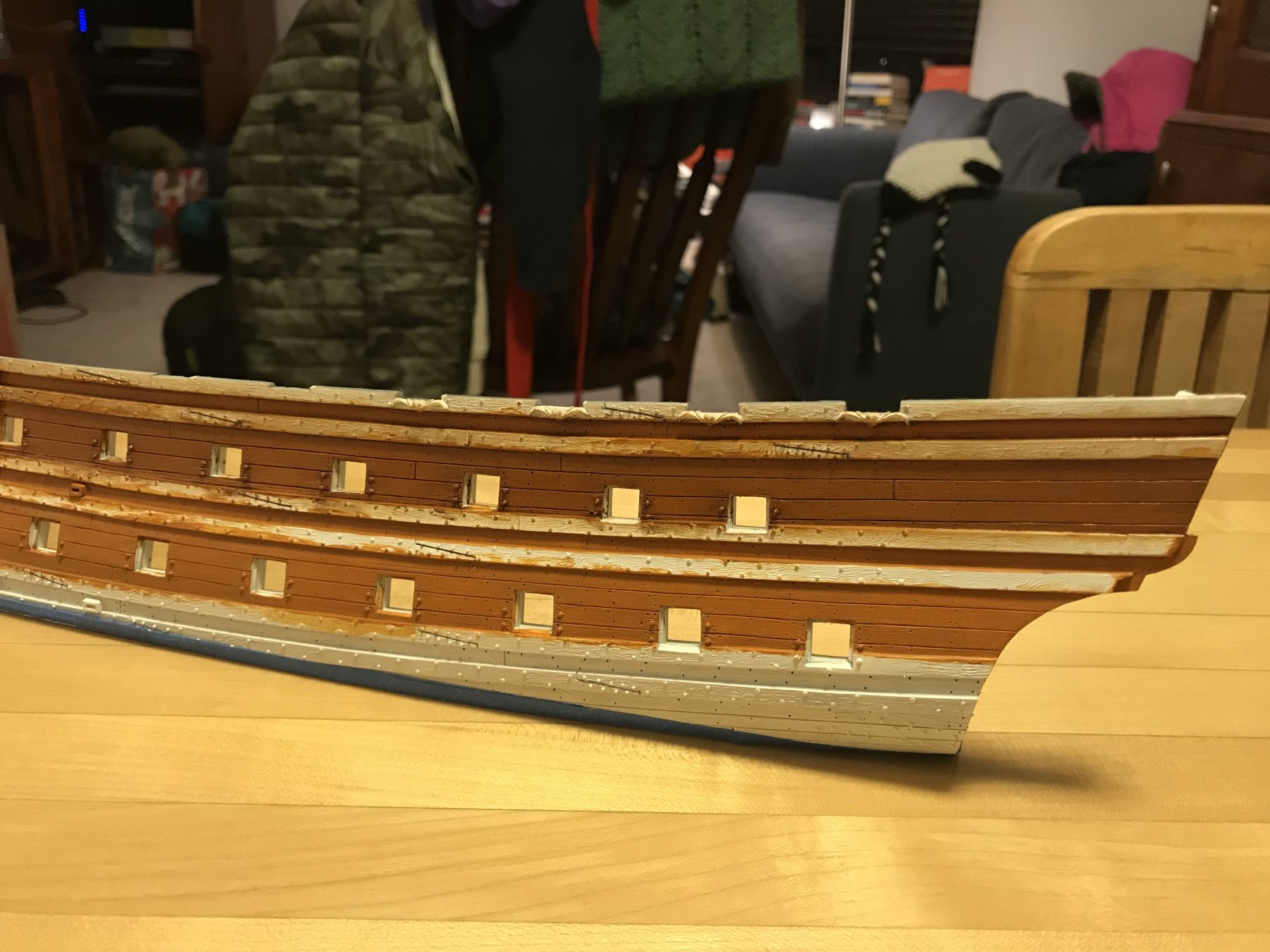
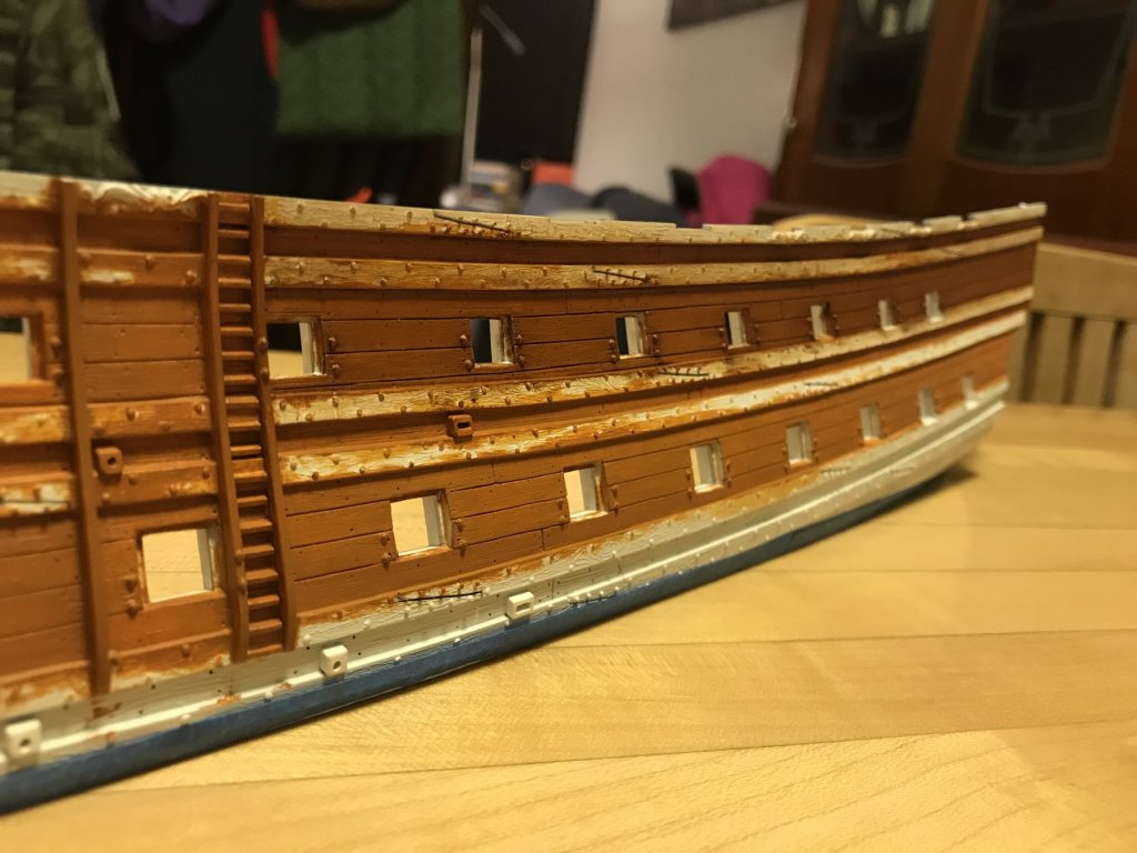
Hi Kirill, Yes, I’ve been using Windsor and Newton’s Van Dyke Brown oil paint for artists. This is part of Herbert Tomesan’s weathering protocol, in which he advises to brush it on heavy like shoe-pollish, and then wipe away as much as possible. Really, the paint effectively stains the underlying acrylic, and there is very little paint left on the surface. Now, yes, in the planking seams there will be a heavier accumulation, and this may take relatively longer to cure. But the wiped and burnished (with a coarse chip brush) surface is not at all tacky; you can handle it without leaving prints, etc. When I met Herbert in 2003, he showed me the models he was making for the Texel Roads diorama; his results were astounding. I felt like Gulliver holding these perfectly crafted plastic ship models that looked like real weathered wood. The process is so simple that I was skeptical that it would work, and yet, with very little effort it yields a surface with great depth and character. I think one could create even more depth with a somewhat streaky application of two different but complimentary brown acrylics, before applying the VDB. For my purposes though - SR’s deadworks would have been painted with this ventre-de-biche color - this is perfectly satisfactory. I’m probably overdoing it a little, but I like it. I had thought about using a fixative top coat, but I don’t want to lose the surface sheen that I have achieved. Given enough time, the paint will cure fully on its own. Because I can handle it without any problems, I’m not too concerned about it. In fact, a topcoat before the paint has fully cured might cause other problems. I think that once I have blacked over the wales and the boot-topping, I will brush over them with acrylic dullcoat because the acrylic is a little too shiny for these details. Other than that, though, time is your friend.
- 2,699 replies
-
- 2
-
-
- heller
- soleil royal
- (and 9 more)
-
Weathering and distress effects coming to life: The scratch pattern is more regular and subtle than my paint samples. These artist’s acrylics, though, are really tricky to work with. I found that you have to water the paint down, and apply multiple thin coats; four complete coats, and another spot coating to get even color saturation. The coarse dry-brushing - after the bulk of the Van Dyke Brown oil paint has been wiped away - leaves a nice patina on the surface that evens out the weathering, IMO.

- 2,699 replies
-
- 8
-
-
- heller
- soleil royal
- (and 9 more)