HOLIDAY DONATION DRIVE - SUPPORT MSW - DO YOUR PART TO KEEP THIS GREAT FORUM GOING!
×


Hubac's Historian
-
Posts
3,292 -
Joined
-
Last visited
Content Type
Profiles
Forums
Gallery
Events
Everything posted by Hubac's Historian
-
 One argument for the lining being flush with all four sides of the lid is that because it is nailed to the outer planking at right angles - perhaps a full height and width lining helps to more completely balance the forces of expansion and contraction, thus allowing for a tighter fit inside the opening. I will say that the Bellona model appears to be a very deliberate and detailed representation of this detail.
 -
I have been here, before, yes. Some good information there. Thank you for posting the link!
- 2,696 replies
-
- 2
-

-
- heller
- soleil royal
- (and 9 more)
-
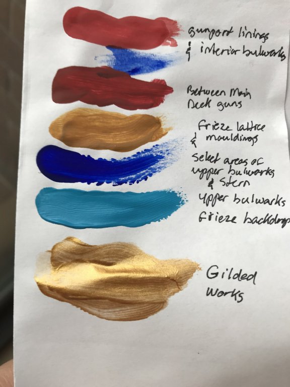
With the exception of a tallow/lead white for the small portion that will be visible below the waterline, I have found all of the other colors I needed for the upper bulwarks. Although it will be used pretty sparingly, this Holbein ultra-marine was just the right shade that I was looking for. It will be a nice counterpoint to the Cerulean blue - which is probably too vivid a color for this time period, but I prefer it for artisitic reasons. Utrecht is the manufacturer of this irridescent gold. The ornaments should really pop against the yellow ocher of the frieze lattice. My beakhead bulkhead, the stern and the area between the main deck guns will be done in this red ocher color, with the acanthus escutcheons picked out in yellow ocher, ultramarine blue and the fronds and Royal monogram in gold. I think that the quarter galleries might also feature this red ocher color, but I have not figured out which areas that might look good on, as the QGs cross over the blues of the upper bulwarks. Perhaps the amortisement will be mostly Cerulean blue and red ochre from the main top wale down. Or, maybe the QGs will be all red or all blue. The answer will become more clear as I go. My SR will be a vivid riot of color above the top wale. It has been a pleasant holiday season, and I hope to soon get back to the scraping/paint prep of the lower hull. My St. Philippe monograph arrived while I was away, and though I have only skimmed through it - it appears well worth the investment. I will be very busy in the new year.
- 2,696 replies
-
- 4
-
-
- heller
- soleil royal
- (and 9 more)
-
I have been following this debate from the sidelines, and not commenting until now. For all practical purposes, and thinking like a tradesman, it would seem to make the most sense to stop the planking a few inches short of the frame siding, along the sides of the ports, and to cut the plank opening around the sills. Although ship carpenters of yore would have been fantastically adept with their tools, chopping additional mortises into the frames and sills would be remarkably labor intensive, with the disadvantage of weakening, to some small degree, the underlying frames. Also, from a practical perspective, it would seem to create a better gasket, if the lid linings were stepped back around all four sides of the lid, so that they fit into the opening. While it is good and usefull to look at surviving examples, like Victory, as Druxey points out, the history of repairs - even on an important ship - isn’t always reliable; sometimes modern carpenters do strange rot-prone things like filling the lower rabbet with short stock - for whatever reason, I can not tell you. Perhaps a better surviving example, albeit from a much earlier time, is the Vasa. She has not been altered, but re-assembled, and she exhibits stepped lid linings and rabbeted ports. It just seems to me that a shipyard, regardless of the epoch, would work as efficiently as possible. And there are sound mechanical advantages to fitting the port lids in this way. Certain details on contemporary models, on the other hand, are often simplified for the sake of making models more quickly.
-
It is interesting that, on this model of the SP, the sheer of the wales, near the quarter galleries, rises sharply enough that the aft three, or so, gunports cut completely through the wales - especially at the main deck level. On the Heller/Tanneron models, the aft most ports cut into, but not through the top wale. You could sand away the wales completely, and increase the degree of sheer of the wales, to match this, but unless you also adjust the moulded sheer strake just above the main deck ports, you will see an unflattering narrowing of the distance between the top wale and this sheer strake. I’d have to check, but I believe the rabbeted bottom edge of the aft upper bulwark runs paralell to this moulded sheer strake. That being said, the moulded sheer strakes/drift rails above this first one, increase in sheer as they extend aft, so that the planks in-between are wider aft than they are in the waist. My frieze obscures this fact of the kit architecture, and it would seem that a conversion to the SP would also require scraping away the SR ornaments and drift rails to make room for the diamond-hatch frieze of fleur-de-lis. If this (the widening aft) happens to also be true for the space between the rabbeted bottom edge and the first moulded sheer strake, then increasing the sheer of the top two wales so that they run parallel to that first moulded sheer strake would be an improvement to the authenticity of the model, in my opinion.
- 244 replies
-
- 2
-
-
- heller
- soleil royal
- (and 1 more)
-
Well, I’m not sure what you are asking, exactly: The Heller kit is in the scale of 1:100, which works out pretty neatly to 1/8” = 1’. If you are asking what scale this would represent for the Saint Philippe, then one would have to take the actual length and breadth of the Saint Philippe and convert that to a common unit (I know inches and feet, so I would use inches), and divide that by the length of the kit main deck, between stem and sternpost, in inches. That would give you a reasonable idea of scale. Now, as it relates to my conversion of the Heller kit into her 1689 appearance, I have so far used 1:100 as a guide for scaling my new, scratch-built parts, but I won’t really have much of an idea what scale my broader and longer model is (relative to the known dimensions of SR1), until after I have mounted my hull halves on their flat bottom and built up the transom to the main deck level. Once I get there, I will take measurements between perpendiculars, just for fun, but the answer hardly matters for this model, as it is an impressionistic effort, and not a wholly realistic one. I just want to see whether my greater breadth and length bring the model closer to scale with the actual ship. For my purposes, though, 1:100 is a good enough guide.
- 2,696 replies
-
- 2
-
-
- heller
- soleil royal
- (and 9 more)
-
I think you can definitely make a very compelling model of the St. Philippe, without going to modification extremes. It just requires acceptance of certain hard realities of the kit. Earlier, in my modification of the upper bulwarks, it was pointed out to me that the main deck port frames appeared to run perpendicular to the top wale, as opposed to parallel with the underlying (in this case, imaginary) framing. Well, since I had the extra set of bulwarks, I convinced myself that it was worthwhile to sand away the aft 7 or 8 port frames and replace them in the correct orientation to the top wale. It’s a small detail, but I am glad I did it because the upgrade lends just a little more credibility to a kit that is full of silly errors. But, then, the actual size of these main deck ports is exaggerated - they should be smaller, as displayed to good effect on the St. Philippe model. I accept this design defect though, because on the balance - the frames are nicely moulded and my ornamental port enhancements worked out well enough; although, if they were the correct size, in the first place, I would not have had to let the very tops into my sheer strake, in places. I was thinking, Heinrich, that I could pay the favor forward and send you the forward halves of the scrap hulls that I’ve been cutting from and experimenting with. The starboard side has a pretty severe heat warp in it, along the upper wale, which is why Popeye2Sea, had to start over, but the port side is good. Perhaps you could use these to experiment with cutting down of wales and replacing with Evergreen to see whether you want to go that route. The upper bulwark pieces still have enough frames attached that you could extract them, if you wanted to correct the port frame issue. I just want to save one piece to experiment with upper bulwark paint protocols. I will say, though, that I felt much more free to cut into my good hull because I could do a dry run/dress rehearsal on the donated kit parts. This really gave me the confidence that the broadening and lengthening of my hull was probably going to work out. Private message me with your address, if you are interested.
- 244 replies
-
- 2
-
-
- heller
- soleil royal
- (and 1 more)
-
I might add, also, that doing all of that would necessitate a complete scratch-build ot the cutwater and supporting knees, because you would be relocating the hawsers, as well.
- 244 replies
-
- 2
-
-
- heller
- soleil royal
- (and 1 more)
-
I suppose you could cut away the upper most wale and spacer plank above the next wale, which would then become your new top wale. Then, you could sand away every wale beneath that; shift the lower and middle deck ports down, in the vertical plane, to align with the new, corrected deck heights. Then, you could add back on the wales, correcting their sheer - particularly at the bow. But the cutting down and filling in of the gun port tops would be quite a lot of work. Huge amount of work. You would also need to cut back in a rebate for the fitting of the upper bulwarks. It’s all doable, but it is labor intensive and probably not worth it. Then, as you mention, there’s the question of to what degree cutting the top wale down cuts into the slope of the tumblehome. In my view, it’s just not worth it.
- 244 replies
-
- 2
-
-
- heller
- soleil royal
- (and 1 more)
-
Heinrich, you mentioned earlier that a Frenchman was building a model of La Reyne, on another forum. Do you have a link to that build page? Cedric, who is Belgian, began his build-log on LaRoyal Modelism, where it still exists. I would be interested to see, though, if someone else were building La Reyne.
- 244 replies
-
- 2
-
-
- heller
- soleil royal
- (and 1 more)
-
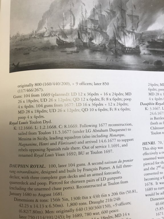
The thing about the Heller kit that bugs me more and more - although I have zero inclination to correct it, at this point - is the height between gun decks. Heller’s model allows for a very generous 7’, or so, of headroom; with those allowances, even Kristaps Porzingis could man the guns. This is something Cedric pointed out a long time ago, and as time has gone on, it is more annoying to me, but I accept it for what it is. In this over/under comparison with the St Philippe, you can really see the difference, as compared with what should be.
- 244 replies
-
- 2
-
-
- heller
- soleil royal
- (and 1 more)
-
This is going to be EPIC. I can’t wait to see how this develops, Heinrich!
- 244 replies
-
- 2
-
-
- heller
- soleil royal
- (and 1 more)
-
That’s quite a build, there, Vic - although it would seem your rowers received some pretty rough treatment, in the painting process; it’s a wonder they can sit at all after that! I just went through the link to ModernNight’s Flikr page on French ships. There are some real VDV gems in there, for sure. Thanks, again, to Kirill for providing the link! Merry Christmas!
- 2,696 replies
-
- 2
-
-
- heller
- soleil royal
- (and 9 more)
-
Heinrich, thank you so much for your generous compliments! Your consideration of the Heller kit is an interesting one. There is a modeler here, Cedric, who is in the process of converting the Heller kit into La Reine. He is quite busy, in life, and has not been visible for a while, but his research is quite fascinating, and highlights many of the practical difficulties of converting a model of a particular ship - Soleil Royal in 1:100 scale - to her kissing cousin - La Reine, which was actually slightly smaller in full size, and consequently, the scale of the model must reflect that. Very tricky! Cedric has made an excellent start of it, and his build-log can be found here under his screen name, CedricL. I highly recommend checking it out. That being said, I do not think the Heller kit is suitable to convert to the Monarque/Royal Louis. Le Saint Philippe, on the other hand, is a highly plausible alternative, in my opinion. There is very much in the Heller kit architecture to recommend this approach. To answer your question about the lower hull, though, I am really captivated by this idea of creating a super realistic diorama, with my ship in a sea - at port of Brest, on the Penfeld. To me, the lower hull of the Heller kit is really problematic, and I just prefer to cut it away altogether.
- 2,696 replies
-
- 3
-
-
- heller
- soleil royal
- (and 9 more)
-
Welcome aboard, Jose! Thank you, I’m so glad that the project interests you. Well, the St Philippe monograph is my Christmas present, but it has been in transit for almost a month now. Perhaps it is sailing over here on Le Saint Philippe II 😉 For clarification, we had an “early” Christmas on Saturday, at home in New York because we flew down to Florida to be with family for the actual holiday. That’s why I know my big present hadn’t arrived. In the meantime, though, I’ve been browsing photologs from the Rochefort conference and this page has a ton of really good pics of the two models made for the monograph: http://www.modellmarine.de/index.php?option=com_imagebrowser&view=gallery&folder=rochefort18-3&Itemid=55 Thanks to Kirill for providing this link! One model is fully rigged, and the other is in the admiralty style. Right away, I can see how helpful this new resource will be for correctly outfitting the decks and resolving certain issues I am bound to encounter in the poop deck/poop royal deck from lowering the sheer. But the greatest advantage, for the model I’m building now, is the masting and rigging. I think it is reasonable to rig SR of 1689 to a 1693 scheme. So, anyway, this is a slow-moving monster, but things are starting to happen.
- 2,696 replies
-
- 2
-
-
- heller
- soleil royal
- (and 9 more)
-
Thank you, Kirill. I am debating whether to make a rope walk for the Soleil Royal project, but I have time before I am anywhere near that decision. I am also considering buying line from Chuck Passaro, but I suspect it would be significantly less expensive to make my own. So, is this Guttermann line polyester?
- 228 replies
-
- 1
-
-
- spanish galleon
- lee
- (and 1 more)
-
Kirill, This is so beyond the beyonds that I am almost speechless. Almost! I love everything about what you have achieved, here, and am completely astounded by your rigorous attention to detail, and the superb results you have achieved throughout; your weathering, your ornamental/heraldic additions, your masting, sails, rigging. The natural lay of your rope coils, and the perfect interplay of taught and slack between the standing and running rigging. It is all truly magnificent and evident of an unwavering commitment to a standard of excellence. I will be re-visiting this build over and again, and I will be PM'ing you for particular advice on rigging cord, sails and the like. I sure am glad that you came out of the woodwork, so to speak 😏
- 228 replies
-
- 1
-
-
- spanish galleon
- lee
- (and 1 more)
-
Welcome, Kirill! I am very glad that you have found the project of interest, and the information useful. I try to update what I’ve learned, as my understanding of period practice improves. I look forward to seeing your model develop, when the time comes to get her started. Thanks to everyone for your likes, comments and looking in. Happy Holidays, everyone!!
- 2,696 replies
-
- 2
-
-
- heller
- soleil royal
- (and 9 more)
-
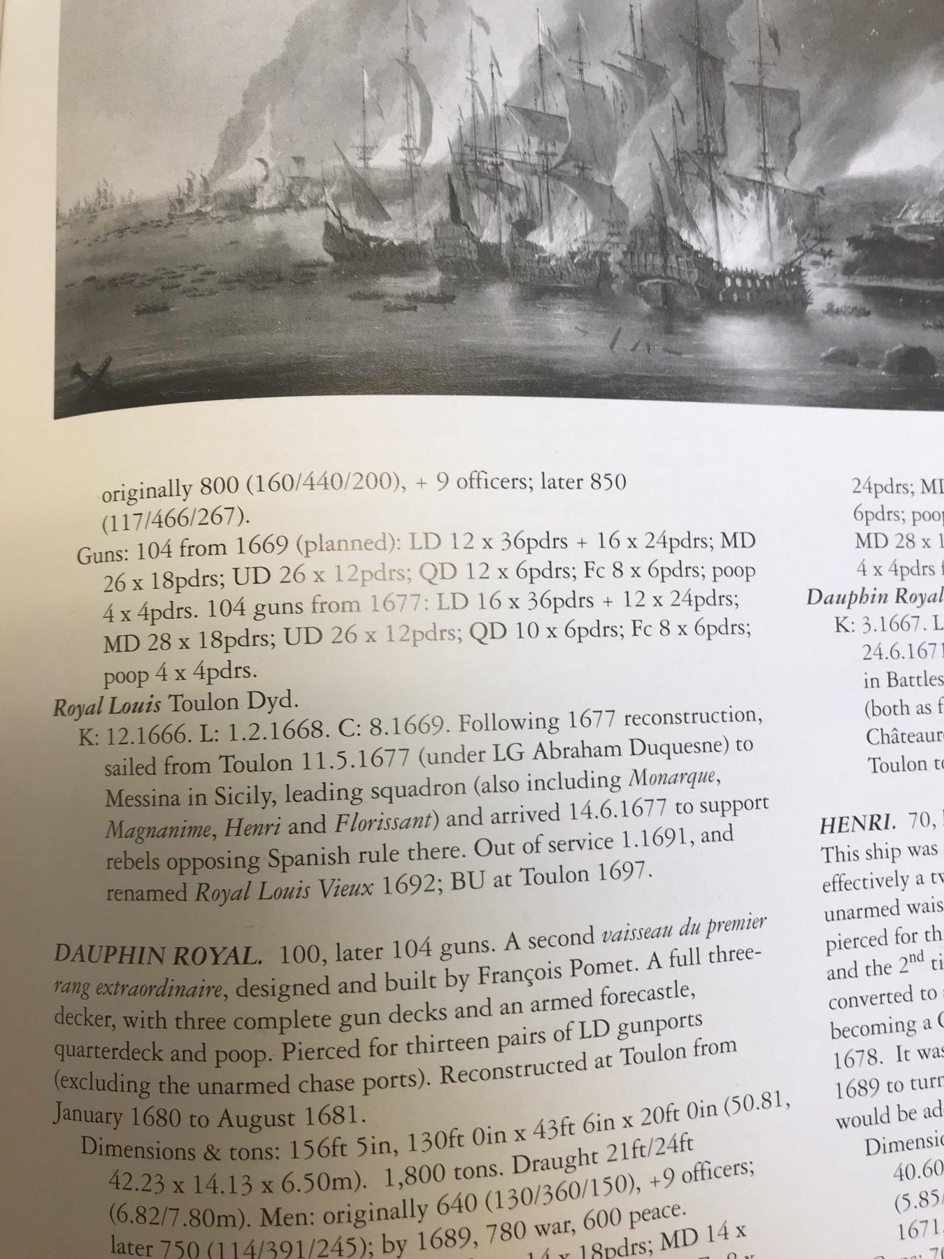
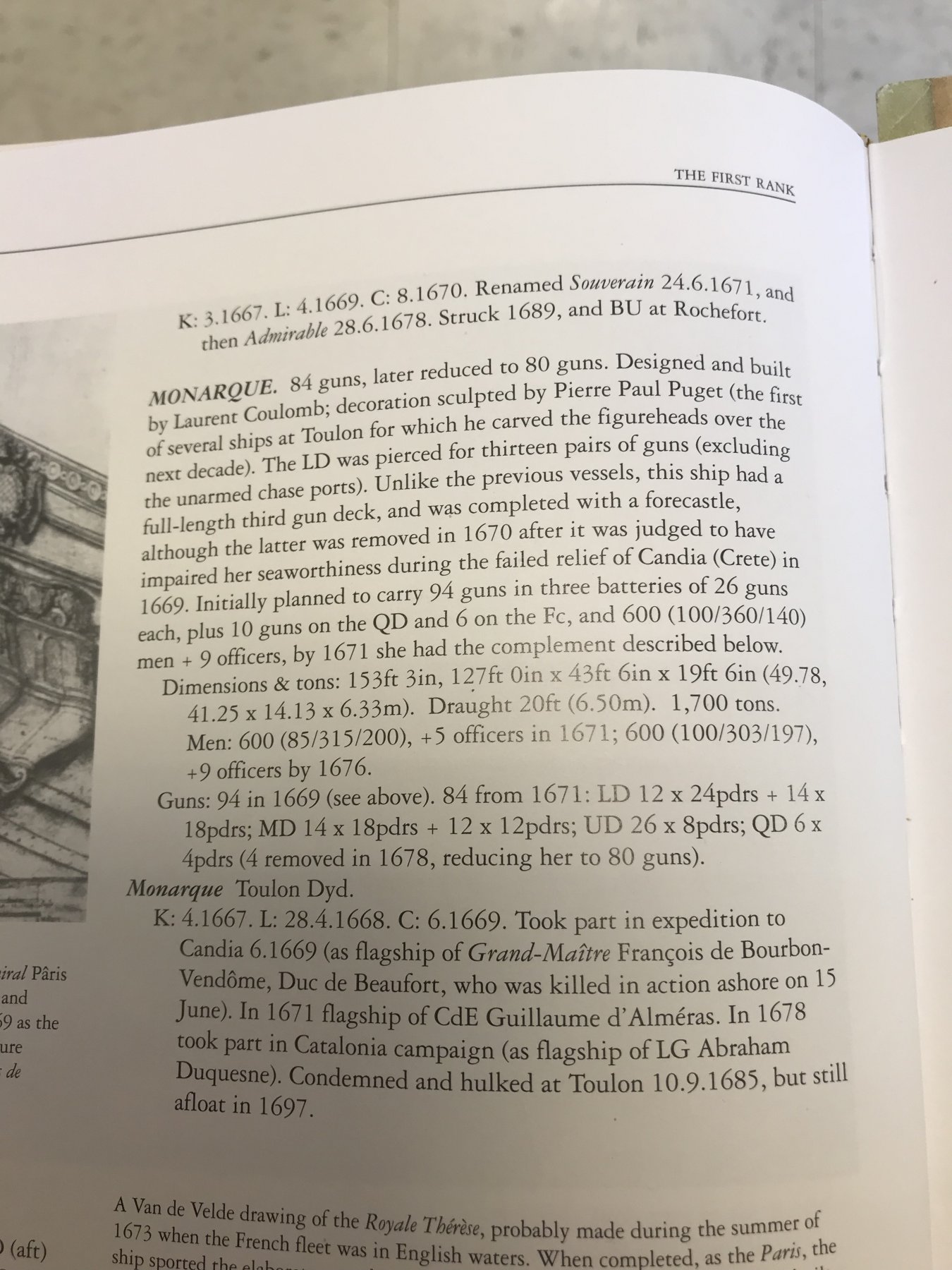
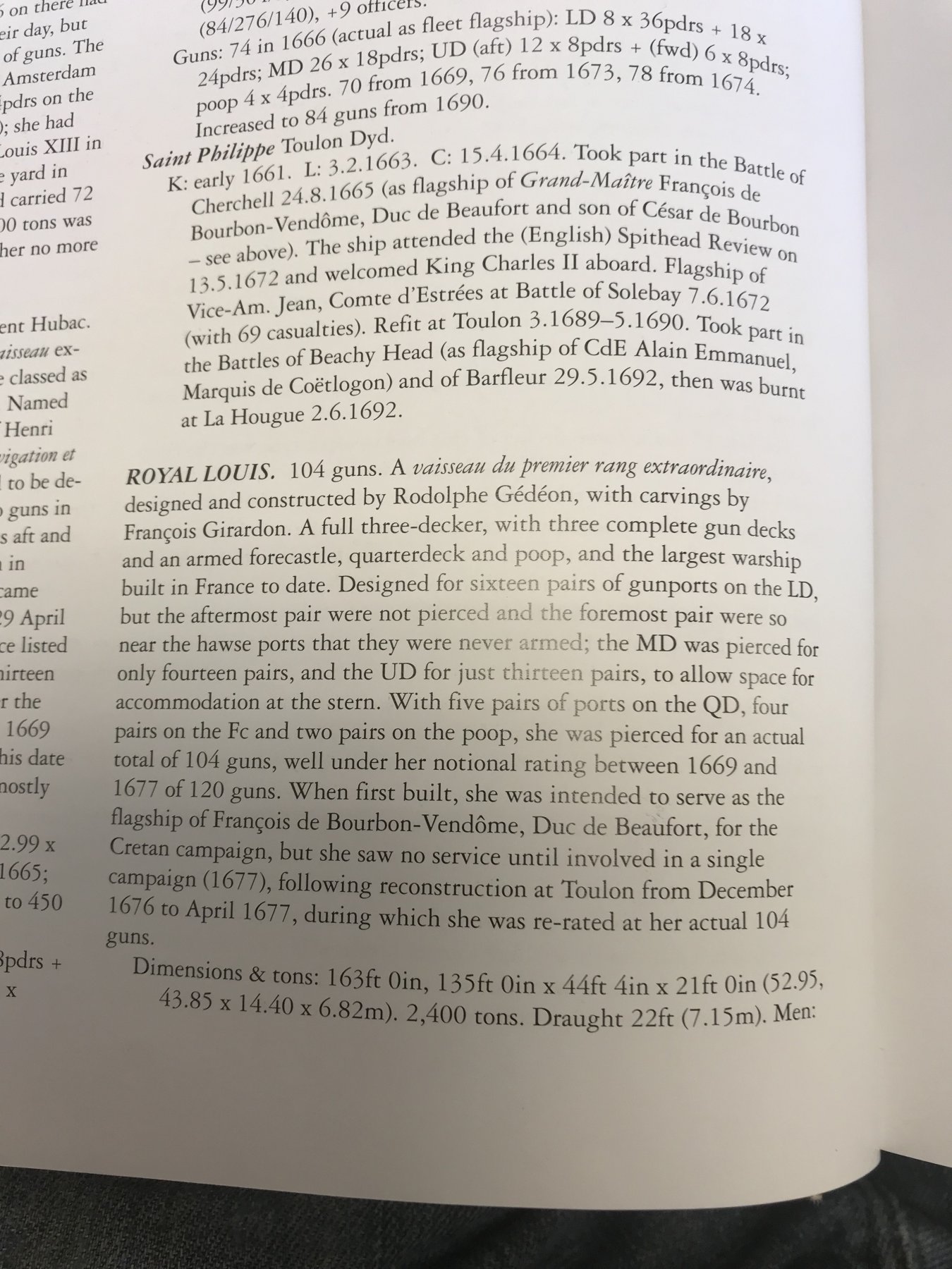
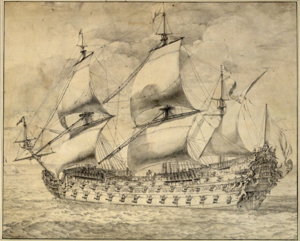
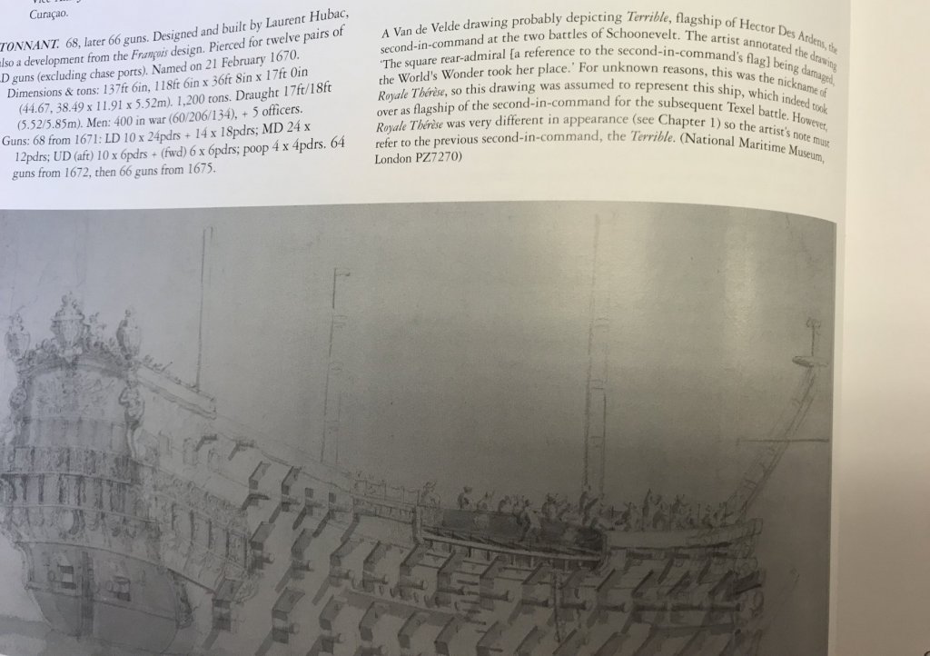
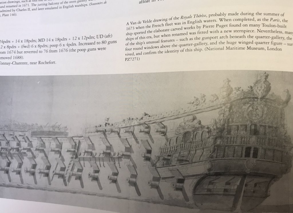
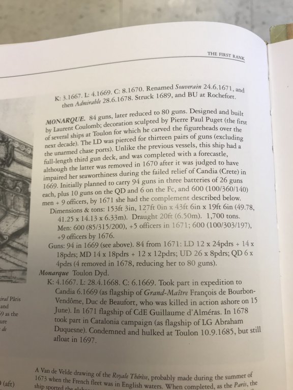
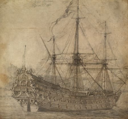
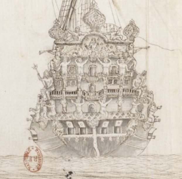
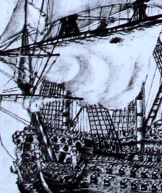
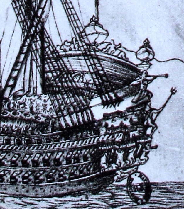
Hello, Chapman. Thank you for returning to this subject of the Royal Louis. And, Druxey, yes the primitive port quarter and stern drawings do agree well with each other. What I should have mentioned yesterday is that I am not completely discounting this German analysis of the RL/Monarque’s carved works. Both ships were named for and celebrate the munificence of Louis XIV. Although it will require a lengthy transcription into Google Translate, I do still plan to buy the book because I would like to better understand the allegory, and hopefully gain a better appreciation of the working relationships among LeBrun, Girardon and Puget. My point in drawing the comparison was simply that few sources are unassailable - unless written by the principle actors, in the time period in question. Pepy’s Diary, for example, is a pretty open window into his life and ship-building times. In the 21st Century, on the other hand, we are tasked with sifting through a variety of primary and secondary (academic) sources. Even among the highly regarded experts - there often appear discrepancies between ship attributions, histories, armaments, etc. I will first illustrate this point using the following captioned images from Winfield and Robert’s book, concerning the Terrible vs. Le Royal Therese. Hopefully, the captions are legible: Now, in a very highly regarded (by me, especially) book that explores the First Marine in depth, this portrait, as well as a less detailed port broadside view of what appear to be the same ship, are labeled as the Royal Therese. However, W & R’s explaination of why this was likely the Terrible, and not the RT, reveals a step further in analysis. In my opinion, then, the attribution seems more likely correct that this is the Terrible. And, then, I feel even more strongly so, when I see this captioned image of the Royal Therese, also from W & R: The particulars of this portrait correspond with numerous other citations of the RT, that I have seen, and agree also, among the aforementioned particulars of the stern and quarter galleries, with a well-circulated portrait of Le Paris, as she originally appeared. So, as my sources improve, the quality of my educated guesses improve, though - of course - little that I am saying is irrefutable fact; I’m just an amateur, really. Returning to the Monarque, following is W & R’s caption describing her early particulars: Now, allowing for certain discrepancies in the following picture (as drawn vs. what is described above) that I believe to be the Monarque, and making an assumption about the presence of four chase guns pierced through the beakhead bulkhead - at most, the description and the ship pictured below could only carry 94 guns. This would place her beneath the Premier Rang Extraordinaire, of which the RL definitively belongs. W & R make mention that the Monarque was intended to have an armed forecastle, but the picture below would seem to indicate that she did not. Also, the portrait must date to a time just after her launching because, by 1670 her forecastle is removed. This portrait shows 15 piercings on the lower deck (including an armed chase port), as opposed to the 13 intended pairs mentioned above, in addition to the chase port. Despite these artisitic discrepancies, I still only count 94 guns, if I exclude the lower deck chase port and add in 4 beakhead bulkhead guns on the middle and main decks. It is primarily on the basis of armament, in addition to the agreement between this portrait and the starboard quarter portrait that is labeled the Grande Monarque, that I believe this ship to actually be the Grande Monarque. Now, consider below, the W & R description of the RL of 1669: There is specific mention of the forecastle armament (8 6lb guns), and the poop (4 4lb guns). At any point in her career, the RL would have been more heavily armed than the Monarque, and I imagine that any portrait of her would reflect it. Anyway, that is why I think what I think, but I remain open to the possibility that this German title might change my mind, or some other, future source may paint a clearer picture. As always, thank you for your interest and your thoughts and for pushing this conversation forward. It is greatly appreciated! Chapman - you mention that you are researching Puget’s work for a project concerning La Reyne. Are you planning a model of her?


- 2,696 replies
-
- 5
-
-
- heller
- soleil royal
- (and 9 more)
-
HMS VICTORY 1765 by albert - 1/48
Hubac's Historian replied to albert's topic in - Build logs for subjects built 1751 - 1800
I will gladly sign-on for this one. You are off to a marvelous start, Albert! -
So, I’ve been thinking about this German language study of the Royal Louis of 1668 that was recommended to me by Chapman. As I commented, earlier, I found it really difficult to find any material difference between the German book cover art closeup of the “Royal Louis’s” stern and a known and inscribed portrait of Le Grand Monarque, par Pierre Puget. Here are a couple of screen shots of the German book: Now take a close look at the Monarque below. At the top, just off the center, left, is the inscription incontrovertibly identifying the ship as the Monarque. Now zoom-in on the stern, and count the number and arrangement of bolts beneath the stern chase ports; look at all the little details of the ship, as well as the shading around the lanterns, and the undulations of the water. Really look closely. The reason I can see no difference between these two portraits is that there is no difference. The German cover art is simply a cropped enlargement of this portrait of the Monarque. It would seem that the authors have mis-identified their subject. This can be confirmed by the fact that this larger picture of the Monarque has an un-armed forecastle, however the RL of 1668 would have had an armed forecastle. Incidentally, the port broadside picture of the Monarque that I have been posting, recently, also is unarmed in the forecastle, and yet it is often mis-identified as being the Royal Louis of 1668. It is interesting to note, BTW, that the stern chase ports in the Puget drawing of the Monarque are shown unarmed. Now, look at the following pics of a primitive contemporary drawing that is always attributed as the Royal Louis of 1668: Because of the primitive nature of these drawings, it is difficult to guage how many grains of salt one should take with them, but there are differences in the number and arrangement of figures. And, yet, there are many similarities. The architecture and overall aspect of the stern would seem to be very close to the Monarque’s. Notice, also, that the armed forecastle is clearly visible, off the port bow. I don’t want to seem ungrateful to Chapman, for the reference, because, really - I do appreciate the suggestion. Unfortunately, for our German friends, this does not appear to hold up. I’m not really sure what the RL of 1668 looked like, but I would not be surprised if she were very similar to the Monarque. Murky waters, here. Tres murky.


- 2,696 replies
-
- 4
-
-
- heller
- soleil royal
- (and 9 more)
-
Yeah, EJ, I’m feeling you on the clay issue. Pretty soon I’m gonna give it a go, but I’ll experiment with a larger figurative carving. I think it might be really tricky to master these new skills on small ornaments like fleur-de-lis. I also like the eyebolt method, Dan, and I think that is definitely the way to go.
- 2,696 replies
-
- 2
-
-
- heller
- soleil royal
- (and 9 more)
-
I like the idea of a stamping block. It’s a bit of a trick to get all of your block points to index in exactly the same plane. Might be worth a go, though. Thanks for the tip, Dan!
- 2,696 replies
-
- 2
-
-
- heller
- soleil royal
- (and 9 more)