Hubac's Historian
-
Posts
3,220 -
Joined
-
Last visited
Content Type
Profiles
Forums
Gallery
Events
Everything posted by Hubac's Historian
-
 Here is what one friend on another forum is doing with his sprit top. He scrapped all the Heller sprit-mast parts, preferring to make them all from scratch. Here is Duarte’s solution: I will copy this approach, myself.

- 1,508 replies
-
- 1
-

-
- Le Soleil Royal
- Heller
- (and 1 more)
-
That’s a nice detail on the anchor stocks, to make them appear as two halves. I’ll have to remember that when the time comes.
-
Thank you, Michael. If by castings, you are referring to the large continental figures, then those are actually just the stock kit parts that I have modified. All of the blue ornaments were simply extracted from a spare stern plate.
- 2,623 replies
-
- 4
-
-
- heller
- soleil royal
- (and 9 more)
-
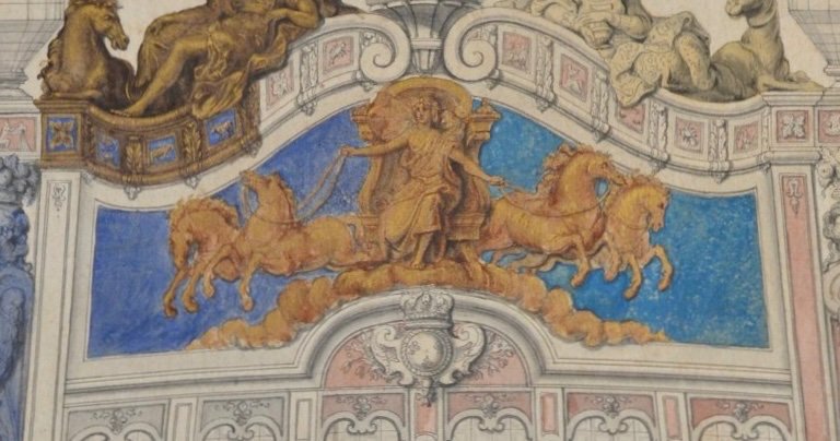
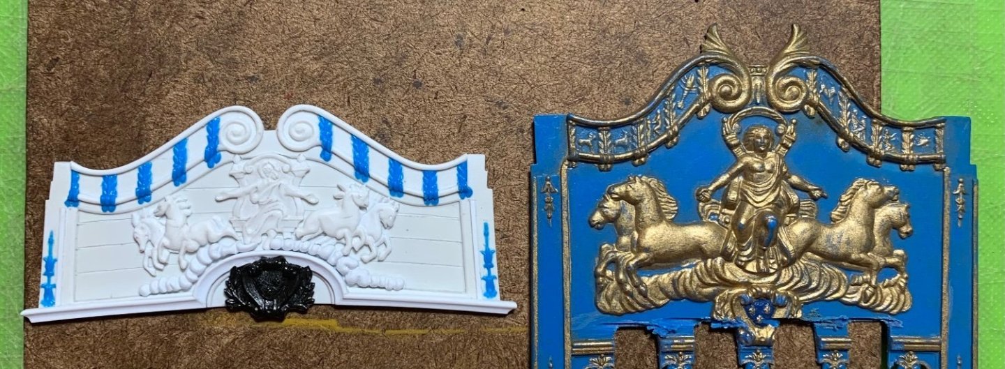
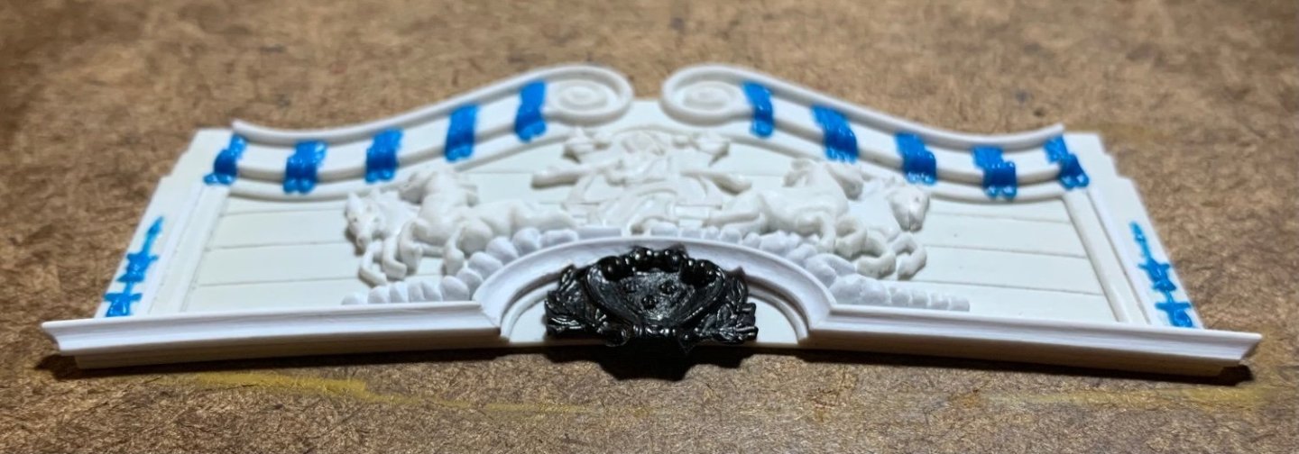
Time well spent: There is some sense of foreground and background. The proportion of the carving, relative to the area of the back board, closely copies the Berain drawing. I am happy. It is fascinating to me how different this is from the stock kit. Thanks for looking-in! More to follow..

- 2,623 replies
-
- 21
-
-

-
- heller
- soleil royal
- (and 9 more)
-
I believe the mizzen mast locates in a square hole on the lowest battery deck. It can only go so far. If the square pin locates properly, you shouldn’t be able to rotate the mast after it is seated. If you didn’t true-up that square locating hole before closing up the deck, that may be a slight problem. Either way, the mast can only go so far.
- 1,508 replies
-
- 1
-
-
- Le Soleil Royal
- Heller
- (and 1 more)
-
It's only a dry-fit, so no harm, but be mindful that your fore, main and mizzen mast sections will need to rotate 180 degrees for the final glue-in.
-
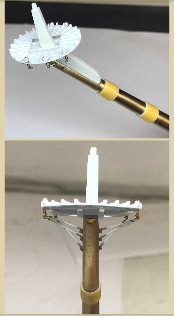
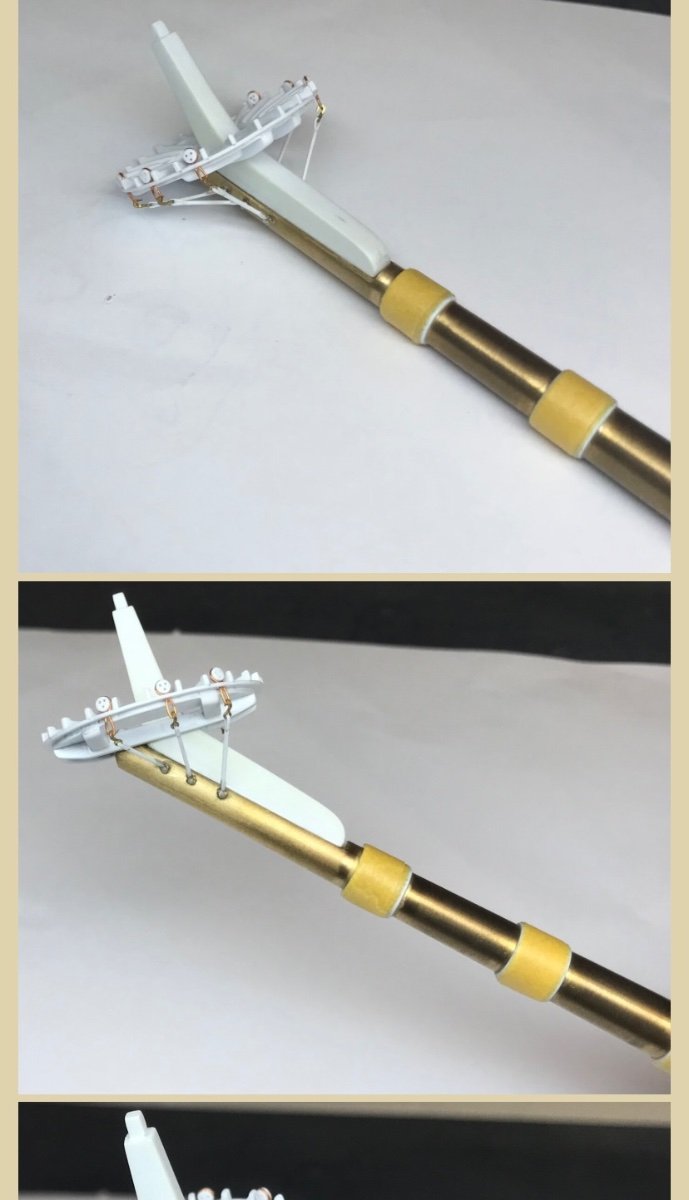
Sorry for the late reply. I am also basically doing the same as Henry, here. I will replace the topmast tops as well, as their scale and design is not really appropriate for the time period. As for the cheeks that support the trestletrees, what Heller has moulded on the topmast and t'gallant sections is this weird conical thing. I will make cheeks that are appropriate.
-
I will comment more in-full, Bill. I just haven’t had a chance yet
-
I haven’t quite decided yet, Bill. I have made my new channels so that the shrouds won’t interfere with the guns above. Because I lowered the channels on the hull, I could not simply copy the layout of the kit channels. I haven’t yet figured out whether I want the chain plates to extend down to the middle band of wales. Doing so would certainly make them easier to fashion. I recently bought some brass 24 gauge wire, so I will begin experimenting soon.
-
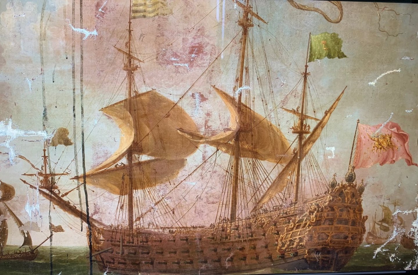
An interesting particularity of French practice: on the Frolich model, you can see that the preventer plate spans two wales. The French fill the space between wales, flush to the surface of the wales, and for the length of the channel above.
- 1,508 replies
-
- 1
-
-
- Le Soleil Royal
- Heller
- (and 1 more)
-
A Dutch ship of the mid 1660s: The Frolich model of L’Ambiteaux, 1680, which was produced from the Boudriot monograph: I think these are reliable guides for period practice on the Continent.
-
From 1670, onward in France, chains are appropriate.
- 1,508 replies
-
- 2
-
-
- Le Soleil Royal
- Heller
- (and 1 more)
-
Unfortunately, FWW doesn’t project much of a market for art nouveau, and so they tend to stick to the tried and true favorites; Mission, Arts and Crafts, Scandinavian Minimalism, etc. My member page is on the FWW website, though.
- 2,623 replies
-
- 2
-
-
- heller
- soleil royal
- (and 9 more)
-
Don’t be too impressed, Ian. That’s just a member page that I created. None of my stuff was selected, as such. Bill, you have certainly filled your home with some beautiful pieces!
- 2,623 replies
-
- 2
-
-
- heller
- soleil royal
- (and 9 more)
-
Thank you very much, Bill! Actually, my background is in woodworking, and I’ve designed a number of projects with varying degrees of carved work: https://www.finewoodworking.com/tag/marc-laguardia
- 2,623 replies
-
- 5
-
-
-
- heller
- soleil royal
- (and 9 more)
-
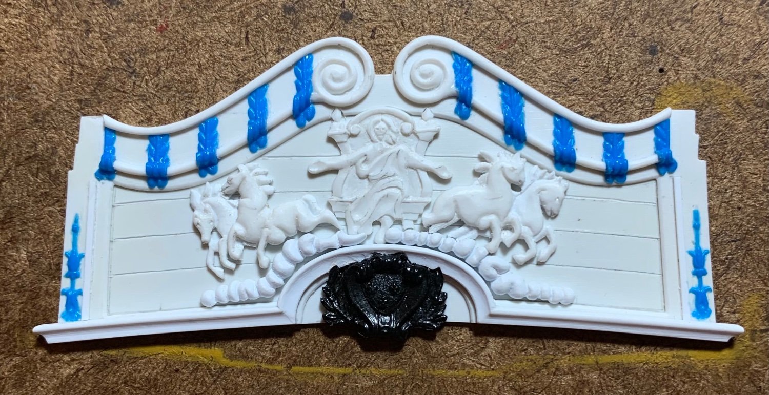
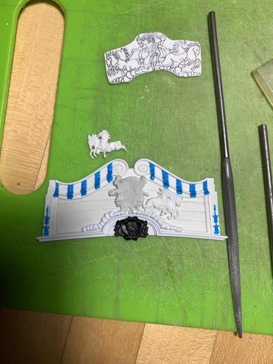
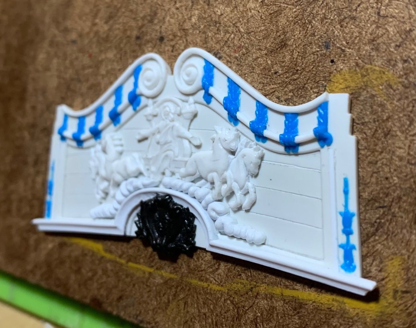
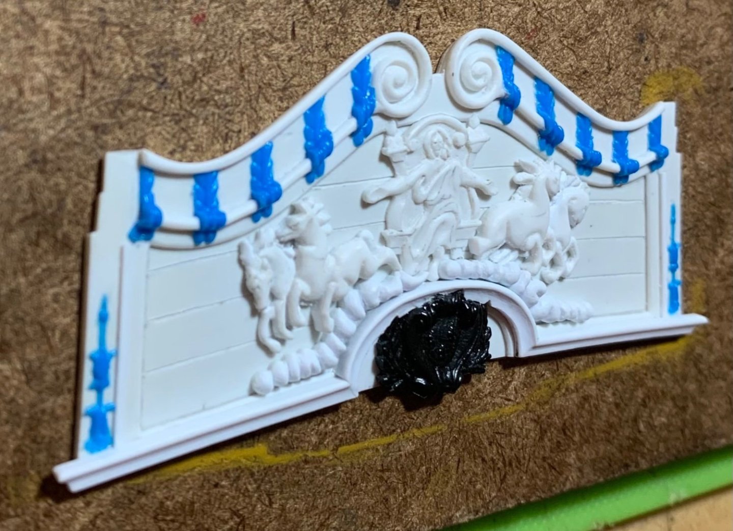
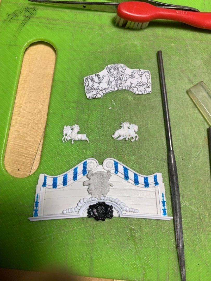
As was the case with the amortisement, it takes a good deal of fettling to get all of these elements to nestle together nicely, the way they were drawn. I now have the clouds positioned and Apollo’s head centered on the cornice archway: As you can see, there’s still profiling to do on the port side of the chariot. I think this last element of the carving should be fun to model. The horses will take some effort to get them to where they need to be: It’s really such a small area, but I can begin to now see where the fade line should be between the Cerulean sky and the Ultra Marine heavens. My idea may not work out the way I hope, but I will try to create this soft transition with multiple dilute applications of the Ultra Marine. Little by little..

- 2,623 replies
-
- 11
-
-
- heller
- soleil royal
- (and 9 more)
-
Superb planking job, Patrick! It is really fascinating to me that the tiller is so short on this ship. I am assuming there is still a whipstaff connection to the tiller, in this early time of large warship construction.
-
I always liked the Endeavor replica!
-
Yes, I saw this on Henry’s build and did the same.
-
From the topmasts, on up, I will just fabricate everything from scratch. I’ve already made all of the round tops to replace the kit ones because I found them to be under scale. The mast caps that connect each higher mast section to the one below are easy enough to make. I’m keeping all of my lower mast sections in plastic because they are certainly string enough with dowels embedded, they are reasonably accurate and can be made more-so with a little modification, and they’re going to be painted, anyway.
-
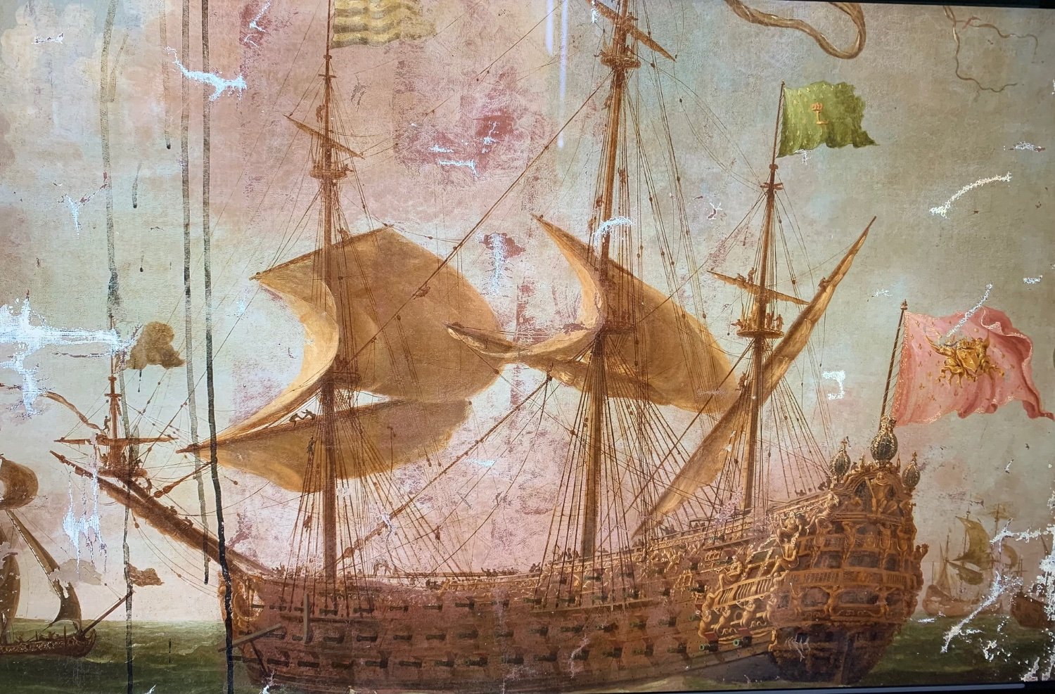
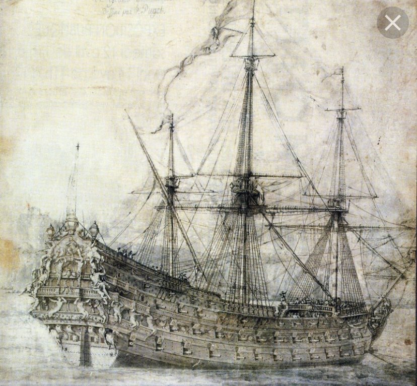
Yes, the t’gallants can’t be re-enforced, but they can be replaced with wood or metal. The issue of overlong topmasts on French ships is interesting to me. On much period portraiture, they are depicted as also seemingly too long. A few examples: When in doubt, Anderson is pretty unimpeachable. There are also fairly reliable mast and spar dimensional tables taken from the Le Havre de Grace survey of SR in 1685; dimensions are in the old French foot, but they are easily convertible to imperial by a factor of 1.066. In case you might be wondering to yourselves - I have not yet applied these dimensions to the stock kit topmasts, just yet. I plan to use the stock kit topmasts as spares lashed to the deck to either side of the main hatch coaming. What I have done is to raise my lower mast sections by about 3/8” above deck level. I will more or less preserve the topmast lengths, but I will replace them with wooden spars, and I will shorten the t’gallant masts, which actually are far too long on the kit. Those will also be replaced with wood.
- 1,508 replies
-
- 1
-
-
- Le Soleil Royal
- Heller
- (and 1 more)
-
Definitely, the mast re-enforcements are a must - especially for the topmasts.