Hubac's Historian
-
Posts
3,306 -
Joined
-
Last visited
Content Type
Profiles
Forums
Gallery
Events
Everything posted by Hubac's Historian
-
 I don’t think the running rigging will be an issue, Bill. It was just the stark contrast between the ratlines and shrouds that didn’t work as well. If it’s any consolation, on my first build I also went for high contrast with my deadeye lashings, jeer block lashings and lower mast tackles: This is actually stark white line, though, as opposed to tan, which would have been a better choice.
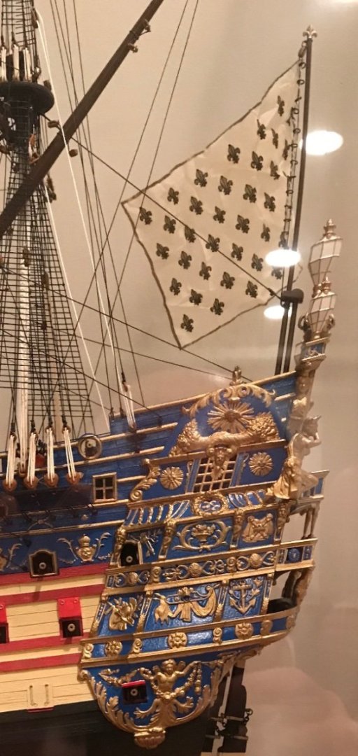

-
Bill, the shrouds look immeasurably better now. I always want to respect people’s aesthetic choices, but Kirill makes a really solid point about how the darker colors improve the scale effect of the ratlines. I wish all of you (Americans and foreign ex-pats) a Happy Thanksgiving!
- 1,508 replies
-
- 1
-

-
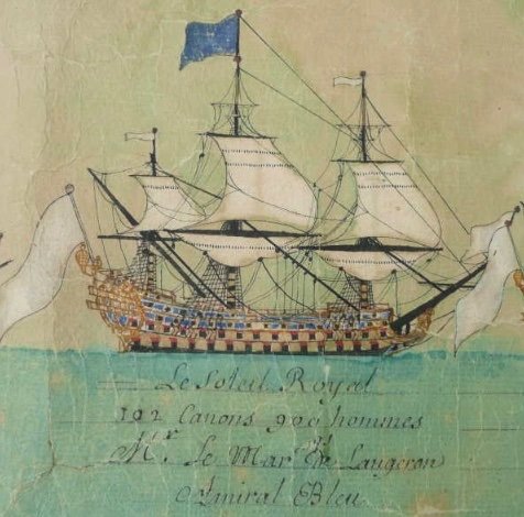
- Le Soleil Royal
- Heller
- (and 1 more)
-
Congrats, Michael! You have been very low-key in your own appraisal of your work, but I will say unequivocally that this is just so excellent and it is the most unique presentation of this model that I have ever seen. It begs the question: what can't Michael D do? I love the way you push yourself to do really difficult things like a full 17th C. rig with fairly flimsy styrene spars, and yet - everything is tensioned where it should be, slack where it should be, and there is ZERO spar deformation. All details in perfect scale. Just incredible! It goes without saying that I'm looking forward to your next build.
-
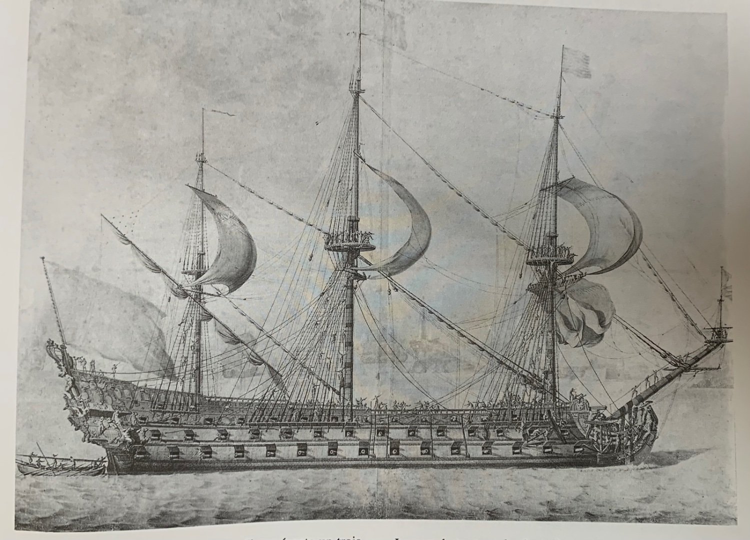
From what I can gather, from at least the mid-1680’s onward, the French were single-reefing main courses and double reefing topsails. Here, evident on RL 1692: The men loosing the fore course appear to be standing on foot-ropes, but the same are not discernible on the topsail yards. Jean Boudriot shows reef points and foot ropes for his L’Ambiteaux of 1680. Lemineur shows reef points, foot-ropes and lower course bonnets for his St. Philippe of 1693: Lastly, the Malaga Scroll (1704) representing SR 1693 shows reef points:

- 1,508 replies
-
- 2
-
-
- Le Soleil Royal
- Heller
- (and 1 more)
-
I am completely naïve on this subject myself, but I was always under the impression that Hide glue (ground up horse hooves, or so I believe), was a simple matter of adding the glue flakes to a melting pot and then they melt right in the pot. You might want to research “furniture restoration/conservation techniques with animal glue,” as this is one arena where these glues are still in use.
-
I think the greatest value in sharing what we do here, is re-enforcing each, our own understanding of process and the many different ways to approach a problem. That is what I find personally satisfying in the hobby - the how - and the thing that I enjoy reading most in other people’s projects. Before your Gustav lion, it would not necessarily have occurred to me to model the under-water degradation of the statue surface. Now, though, I find that a cool idea that I might incorporate into some future project. Also, personally, I find that maintaining build-logs is a good motivator for actually getting the work done because I am simultaneously motivated to share the process as it unfolds.
-
I do not think representing the stun’sail booms is a necessity.
-
Frank, this is simply a stunning piece of work and it is beautifully presented! I congratulate you on the completion of this journey, and extend my sympathies to you and your wife’s families. Like everyone here, I look forward to your next project.
- 510 replies
-
- 1
-
-
- reale de france
- corel
- (and 1 more)
-
Speaking of smells, would not animal-based glues be a candidate for glueing bone? This would have been the adhesive available to early builders of bone models.
-
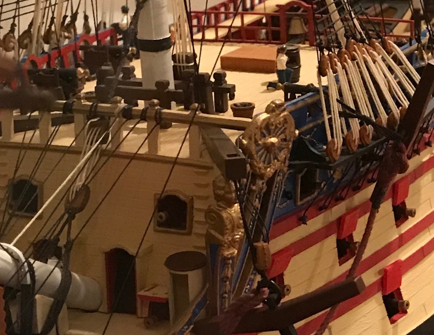
I really like the darker frieze for all the reasons preciously mentioned. It’s good to mix things up from time to time.
-
Hello Siggi, and thank you for stopping by my build page. It was pointed out to me, recently, that my painting of the ship is consistent with the Mannerist style, preceding the Baroque period. That is also the time period of these lovey buildings that you have photographed. Thank you for the pics and for the kind words.
- 2,699 replies
-
- 7
-
-
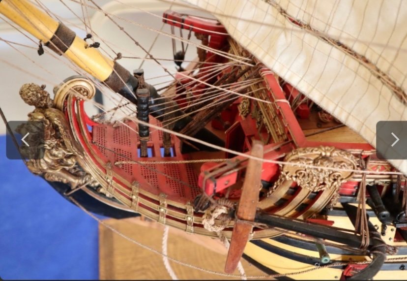
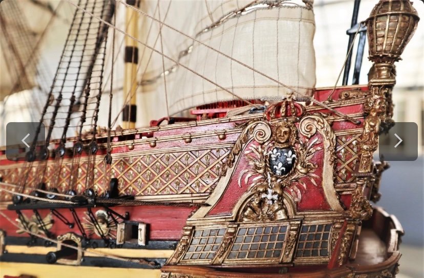
- heller
- soleil royal
- (and 9 more)
-
This really came out well, and is an interesting execution to show the degradation of 300 years under water. I am excited to see what you do with Le Fulminant.
-
The CalderCraft Victory is still tops among the wooden kits, IMO.
-
I see the appeal in a simplified dockyard style, but I find the sheer of the model to be a little stiff, and the transition from quarters to stern to be a little rough. Some may say I’m being unfair, but full lines plans exist for the ship. I don’t understand, in the computer age, why that is so difficult an ask for kit manufacturers. We know what the ship is supposed to look like! And, as often is the case - the masting and spar plan are a complete afterthought. $1,700? Not for me.
-
I’ll look that up. Thanks for the tip!
-
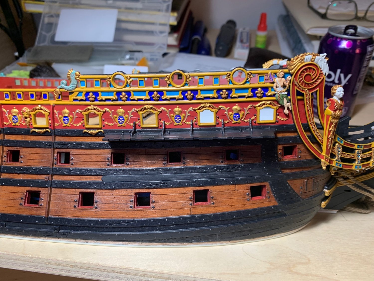
I continue to be fascinated by your process, and your logic for filling-in the blanks is clear and as close to unassailable as one can hope to get. I did not initially understand the framing of arms in your beakhead bulkhead, but now I feel silly for not seeing the connection to the way they are framed at the stern. I wish that I had also made the connection that the arms should always literally be crowned. Who’s jealous now? I can relate to the frustrating tedium of fitting the headrail support timbers. Despite making what I was sure were very close patterns, I still had to do several rounds of subtraction and addition to get everything to mate nicely together. I also realize, now, that I have made the job of gammoning more difficult for myself by glueing-in the headrails early, but I needed them in-place, in order to stabilize the cross timbers. Oh well! That is also a clever hack for making the beakhead grating look criss-crossed as it should be. Also, fitting the figurehead to the stem assembly is another challenging test of patience. I had three to choose from and all three had varying degrees of scoliosis. I like your solution to re-enforcing the lower transom and bringing the upper hull closer together. Using the stock parts really does beg for something appropriately architectural to hold the whole thing together. As great as the kit is, the warping issues in this area are challenging to deal with. A++ As I’ve said before, your particular coloration of the stern plate is just so perfectly balanced and really draws all of the many details to the eye. A+++
- 106 replies
-
- 6
-
-
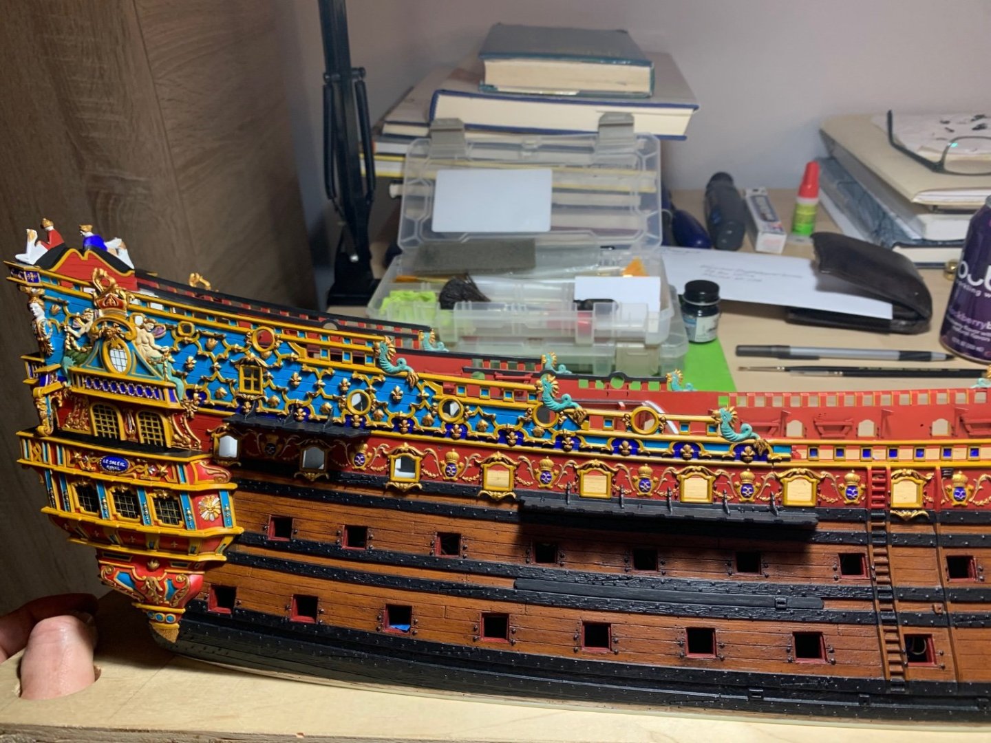
- Soleil Royal
- Ship-of-the-line
- (and 2 more)
-
Your window framing is splendid, Siggi. Looking at the stern drawing, it is a curious thing that the central light of the upper tier is slightly wider than the light beneath it. Consequently, the flanking pilasters of this center light are out of alignment with the ones drawn beneath it. It seems deliberate, as drawn, but unusual in consideration of the underlying framing. What are your thoughts on this?
-
That’s interesting to bring it up a few shades. Looking great, Marc!
-
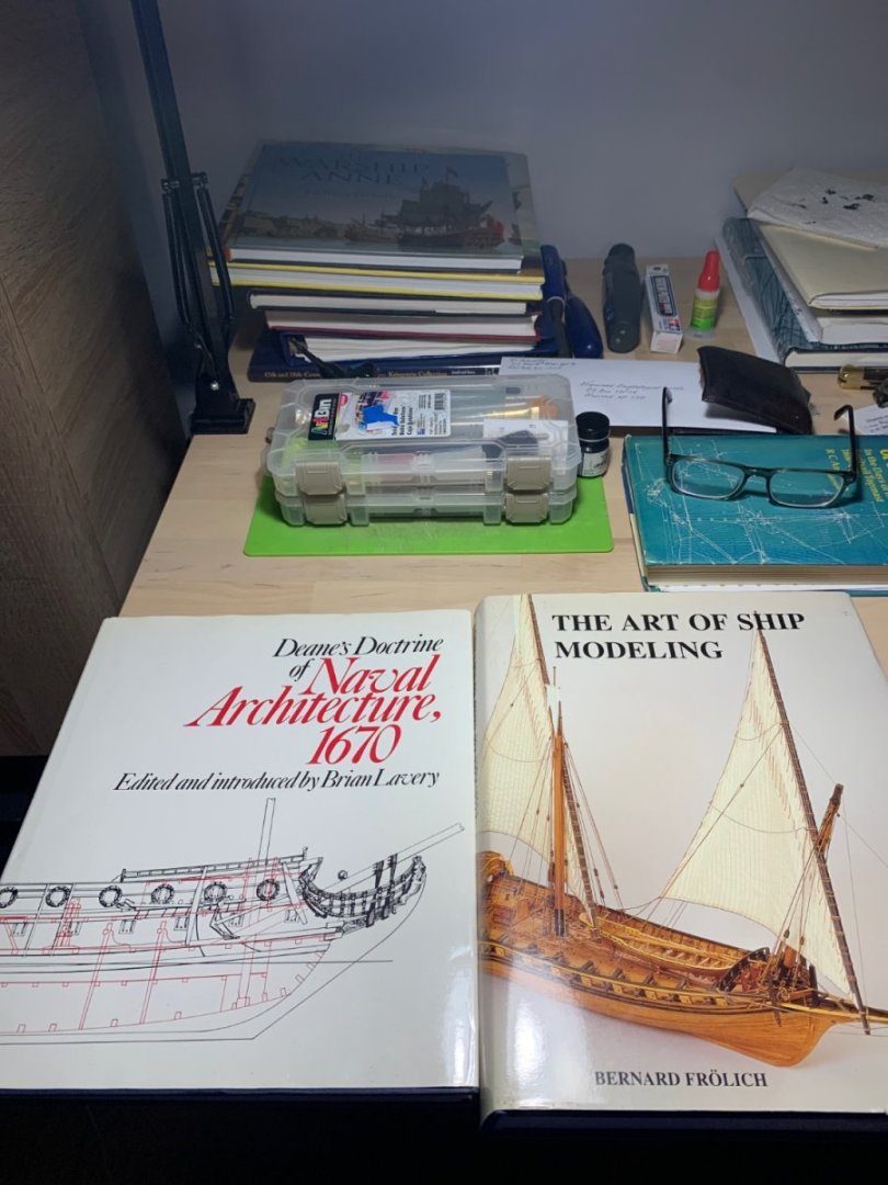
These days, this is what progress looks like for me: I added the filling pieces for the middle band of wales, so that I can properly mount the chain preventer plates. My J-O-B has transitioned to full-employment, lately, and I have completely lost the pockets of daytime to get small-work done. The evenings are mostly consumed with coaching sports teams, and emailing families about said sports teams, and generally being a husband and dad. All good, just BUSY. I don’t have a lot of modeling mojo left in me, to do good work, so I have mostly been reading. About rigging and other things ship-related. R.C. Anderson really is the foundational read for this epoch. As I go through it, I have been re-reading the rigging sequence of several of my favorite builds. The first is Paul Kattner’s intense kit-bash of the DeAgostini Vasa; as a first-time builder, his approach and technical mastery are just incredible. His log is extremely well-photographed throughout. Along the same lines is Michael’s (‘72 Nova) Airfix Vasa, which is just exquisitely well-done in an impossibly small scale. The third is Marsalv’s Le Gros Ventre, which is just a model that I love, through-and-through, and the rigging is truly excellent. Very honorable mention goes to Daniel’s Victory, which like Michael’s build is excellent for the technical tricks of making rigging look truly professional. These are peripheral time periods to my own, with their very specific contributions to the history of rigging, but the sequence of work in these builds is enormously helpful for understanding what is a very complicated process. I am, of course, well acquainted with Archjofo, and all I can say there is - dare to dream. A true Master Class. Now that I have some rigging vocabulary and understanding of what most of the lines do, it has become much easier to conceive of where my belay points should be. Just as with anything else, you can’t really build a rig until you can understand it and visualize it. We are getting there, though. As is my custom, I make frequent visits to The Strand, hunting for obscure, and out-of-print ship books. Most of the time, I come up empty. Occasionally, though, I find a gem! On my most recent trip, there was a veritable treasure trove! Winfield’s First Rate (have it) Lee’s Masting and Rigging (have it) An updated and comprehensively illustrated Pepy’s Navy (don’t have it, yet) And, then, these two: I will likely go back and poach the Pepy’s title on my next paycheck. The two I did pick up are invaluable for both my current and future projects. The Art of Ship Modeling has a very detailed accounting of the construction of Frolich’s L’Ambiteaux, and all of his subjects are beautifully photographed in hi-res. Lavery’s edition of Dean’s Doctrine is also beautifully illustrated and the math of Dean’s approach is very clearly explained. It isn’t a guidebook to reconstructing a French First-Rate of 1670, but it is useful for understanding the methods in vogue for that specific time period. Again, you can’t build it until you understand it. Lastly, John Ott clue’d me-in to the fact that an English only edition of Le Chevalier de Tourville was back in-print by Ancre for a very reasonable sum. I bought that too! From what I have gathered, here and there, the rigging and belay plans of this monograph are relatively easy to follow. Thank you, John! So, I just wanted to say “hello,” and thank you all for visiting. More to follow! Best, Marc

- 2,699 replies
-
- 28
-
-

-
- heller
- soleil royal
- (and 9 more)