Hubac's Historian
-
Posts
3,315 -
Joined
-
Last visited
Content Type
Profiles
Forums
Gallery
Events
Everything posted by Hubac's Historian
-
 Here is one possible source, Bill: https://www.1a.lv/p/puzle-heye-1000-gab/3c6q I did a reverse image search through TinEye.
- 2,699 replies
-
- 3
-

-
- heller
- soleil royal
- (and 9 more)
-
This is lovely progress, Patrick. It is fun to watch the old girl come back to life!
-
I wonder what that would look like in our modern age; small agrarian cells that feed individual communities or regions?
- 2,699 replies
-
- 3
-
-
- heller
- soleil royal
- (and 9 more)
-
Thanks, Bill! The air quality is pretty astonishingly bad today, but we are taking all necessary precautions. It is amazing to consider that states like California live like this for long stretches of every year. If anyone remains in doubt - climate change is a real thing.
- 2,699 replies
-
- 5
-
-
- heller
- soleil royal
- (and 9 more)
-
The following build is one that I have been following with tremendous admiration. The rigging is among the very best I have ever seen, and his particular sequence of masting and sparing and working through the standing and running rigging makes the most sense to me. I think I will follow his lead when the time comes to it:
- 1,508 replies
-
- 2
-
-
- Le Soleil Royal
- Heller
- (and 1 more)
-
Every time I visit this build, I am astounded at your skill and your sensitivity to form. As incredible as the woodwork is, the rigging is even more impressive. Every part of this is aspirational. This is just such a magnificent all-around effort!
- 589 replies
-
- 5
-
-
- le gros ventre
- cargo
- (and 1 more)
-
“In the last 40+ years they were simply not taught anymore about material culture.” It’s a shame because it is the technology, the machinery that enables a society to push forward. This is as true for warships as it was for the discovery of fire.
- 2,699 replies
-
- 6
-
-
- heller
- soleil royal
- (and 9 more)
-
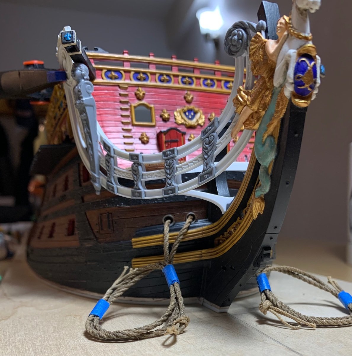
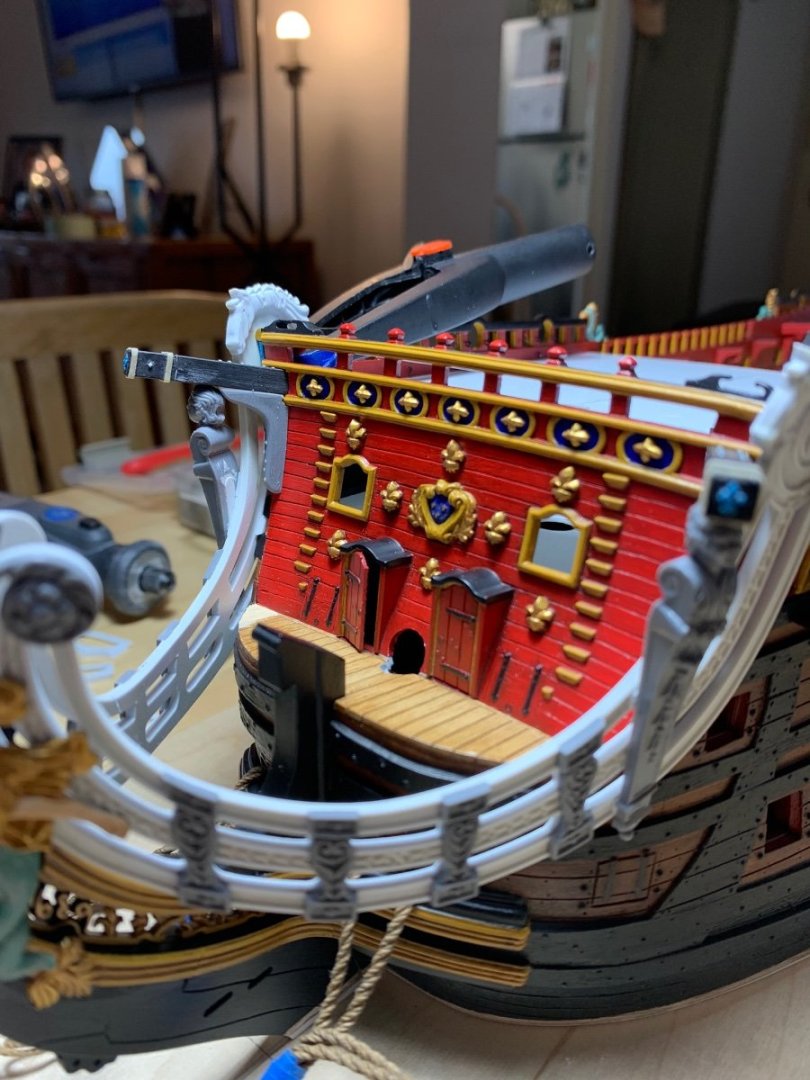
Not necessarily Bill - you’re cathead placement most likely is perfectly fine. Bear in mind that my beakhead bulkhead has been widened on both sides because I widened the hull at the stem. Consequently, there is now space between the bulkhead ladders and the cathead/supporting knees.
-
These pics are from trying to get the fit and alignment of everything right:

- 1,508 replies
-
- 2
-
-
- Le Soleil Royal
- Heller
- (and 1 more)
-
Yeah, Bill - the issue of piercing through the beakhead bulkhead for the cat-head timbers was a tricky one. With some effort, I was able to file tight-fitting holes at the correct angle. This was an issue that I had not thought through, in the beginning, when I was modifying the bulkhead.
-
Roter Löwe 1597 by Ondras71
Hubac's Historian replied to Ondras71's topic in - Build logs for subjects built 1501 - 1750
Absolutely superb result, Ondras, and an honor well deserved - CONGRATULATIONS! -
I went with black because my grating is black and I am mostly trying to minimize inconsistencies between what is and what should be.
- 1,508 replies
-
- 3
-
-

-
- Le Soleil Royal
- Heller
- (and 1 more)
-
I will definitely take a look at Alan Armitage, John. Thank you for the compliment and the reference.
- 2,699 replies
-
- 2
-
-
- heller
- soleil royal
- (and 9 more)
-
Thanks Ian! Just call me Ol’ HMS Indefatigable when it comes to searching for SR arcana 😀
-
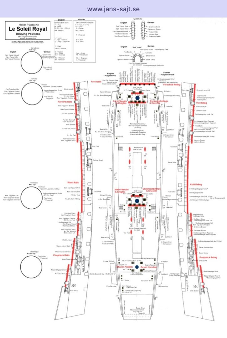
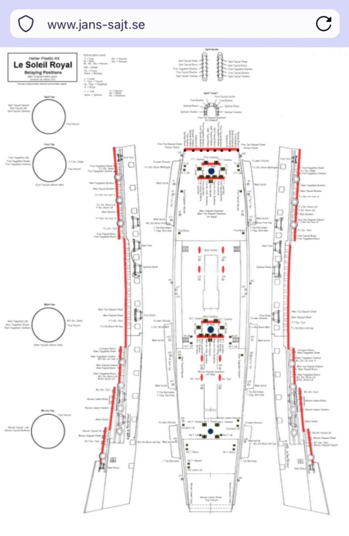
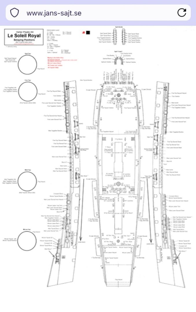
By the way, I’m no expert - especially when it comes to rigging. I haven’t really sorted through all of this yet, but I found an alternative belay plan somewhere on the net by a German builder. I took a few screen shots for future reference:
-
Henry has been a pretty clear voice to me on the practicalities of rigging and his arguments make sense to me. I’ve made my forecastle deck, but I haven’t pierced it for anything yet. When I do, I will follow Henry’s advice, here.
-
Ferrus and Bill - thank you both very much. Your compliments are truly appreciated. I appreciate also, Bill, that this build has given you inspiration to try various things, and the results are coming to fruition on your beautiful model. What you see, here, is mostly a patient layering of detail. My hope with this project is to demonstrate that even complicated looking things are achievable with little prior experience, if you break things down into manageable chunks and take your time. It is exciting to me to see so many people take this kit to places it hasn’t been before. Some day, some one will decide to take a stab at Le Royal Louis of 1668, with this kit, and that will be a fascinating journey to follow along on. I understand why historians aren’t in love with the idea of these sorts of projects, but as long as we are honest about what they are and what they aren’t, I don’t see the harm in it; they are merely an artistic expression of what might have been.
- 2,699 replies
-
- 7
-
-
-
- heller
- soleil royal
- (and 9 more)
-
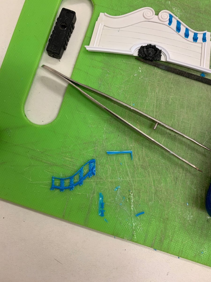
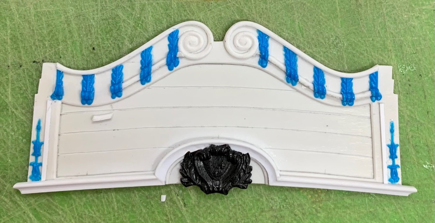
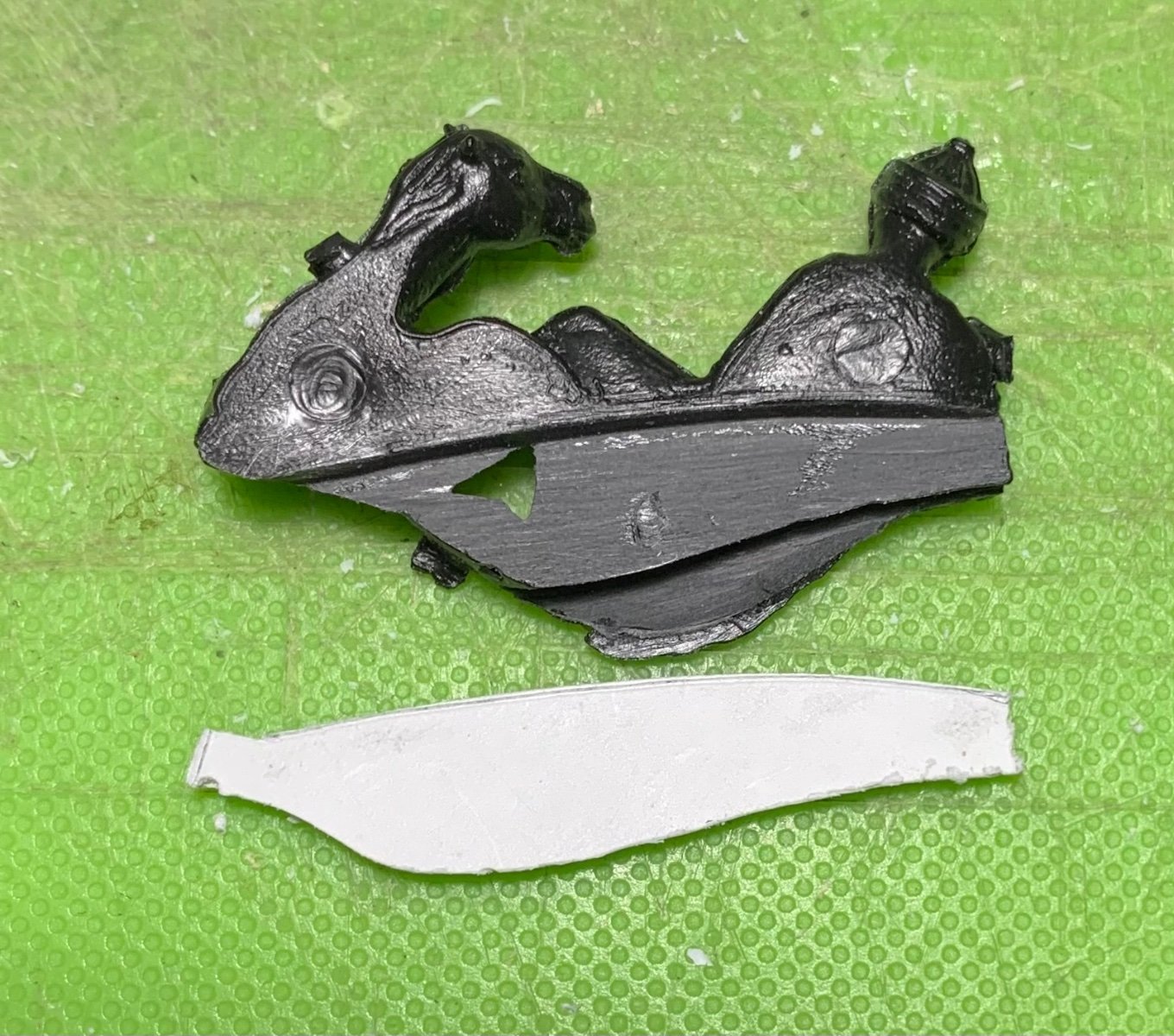
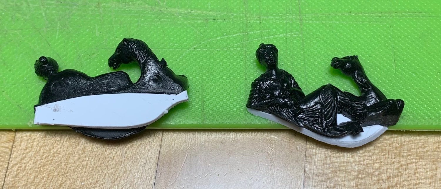
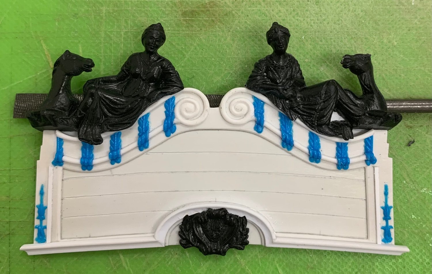
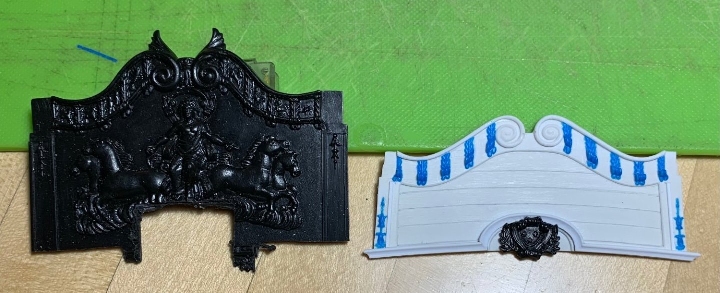
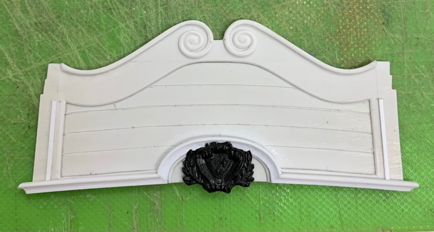
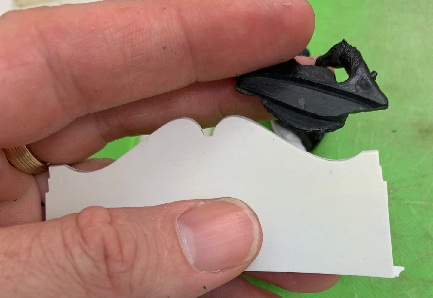
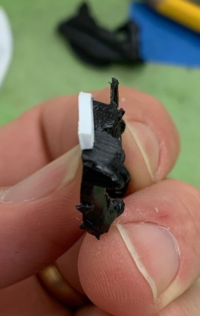
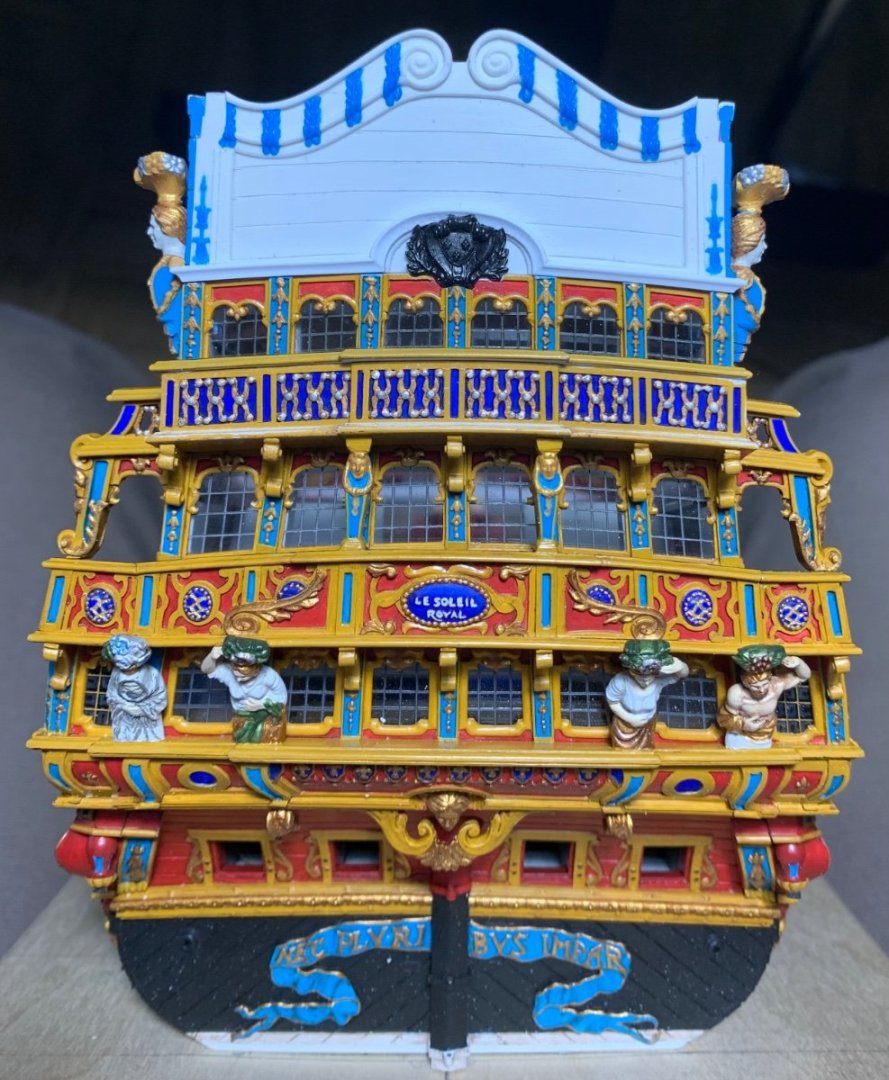
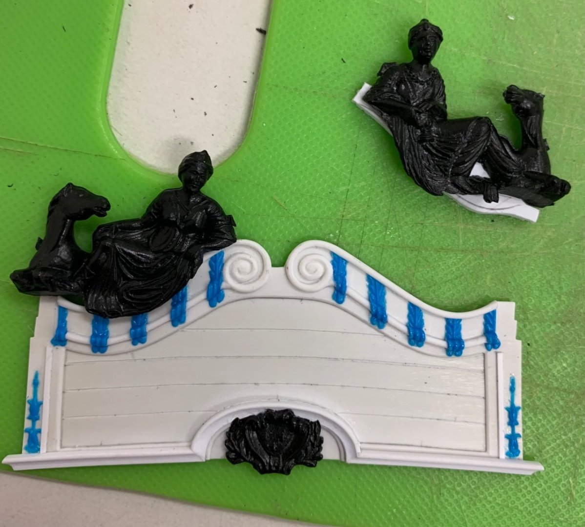
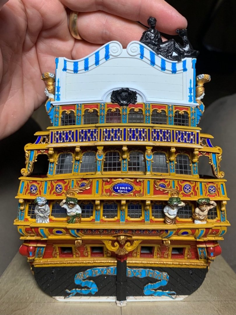
This has been a satisfying week spent detailing the tafferal plate. First task was to complete the architectural moulding and to shape the top mouldings and scrolls: I have taken a somewhat different tack with my adaptation than what Tanneron/Heller show. I have decided to run this large architectural moulding all the way out to the ship sides. The reason for this is that I chose to use the between window pilasters to bracket the outermost windows on all three levels. These window pilasters are notably more narrow than the long rectangular panels on the outside edges of the tafferal plate, so this architectural moulding caps the lower window pilasters and provides a visual transition to what is happening above. The rectangular panels need to be wider in order to accommodate the long bellflower ornaments. The next step was to skeletonize the extra stock stern plates I have for these decorative elements that would otherwise be extremely difficult to carve or sculpt from scratch, in this scale: I use the Dremel grinding disc to excise the relevant sections and then sanding drums to waste away material from the backside. Once I can begin to see light through the plastic, I manually sand the parts with finger pressure against a coarse sanding stick. I frequently check to see that the light is coming through evenly as a gauge of how evenly I’m removing the ground material. It doesn’t take long before the desired elements only need the very tip of a sharp EXACTO to separate them from the ground. I was able to extract the Zodiac symbols in this same manner: But, the shortened height of these recessed panels is such that they no longer will fit in those spaces: That’s okay - I will simply paint them-in with a very fine brush a little later in the process. Above, you get a clear sense of how dramatically I’ve reduced the height of the backboard and the shape of the cornice. The lower cornice moulding had to be pieced-in segment by segment. I think the result is good: The national coat of arms is still not perfectly centered, but I am happy enough with it’s placement. To this point, here’s how the plate looks on the model: Next, was the challenge of adapting the figures of Europe and Asia. I first had to re-shape the backing to sit snugly on top of the new cornice profile: The tricky bit is the bevel that must be incised along this mating surface so that it matches the return bevel of the cornice top. Hopefully, this picture will make what I am trying to say clear: Next, I had to in-fill the back of these figures where the stock kit would have an interior planking plate above the poop royal deck. Out of the box, this plate really serves as the glue surface for these figures. On my version, I want the reverse curves of the cornice moulding to be visible, inboard, so my figures will glue directly to the cornice cap rail. Here, Asia has been faired and filed smooth: As I was going through all of this I began to be concerned that the apparent height of the figures was no longer in-scale with my shortened back board. However, I began to feel better about this after trimming back the lower swag of the figures’ robes, so that the cornice moulding would be visible. Here is trimmed Asia to compare against un-trimmed Europe: And, after trimming and final fitting both: Berain’s drawing does show a little swag dipping below the upper cornice moulding, and I think this is a reasonable facsimile. On the model: I may yet decapitate and then re-capitate the horse and camel heads in an effort to shorten their necks a little bit. I have some time to decide on that. In the meantime, I can modify the big carving drawing a bit, so that I can begin making that. I can also begin painting the backboard. which is obviously much easier to do off the model - particularly those Zodiac symbols. Thank you all for your interest, your comments and for checking-in. Enjoy the holiday weekend!


- 2,699 replies
-
- 23
-
-

-
-
- heller
- soleil royal
- (and 9 more)
-
I also agree with what Ian is saying, here. The plastic in this kit is “chewy” for lack of a better descriptor, and difficult to cut into cleanly.
-
I would leave well enough alone, Bill. The additional windows give the stern view the extra visual “ballast” it needs, IMO.
-
Ferrus, you truly have an awesome name, there. I can’t help but think of Black Sabbath’s Iron Man. All the gilt work looks tremendous, Bill!
- 1,508 replies
-
- 2
-
-
-
- Le Soleil Royal
- Heller
- (and 1 more)
-
With those really fine bits, you really need a rotary tool, like the Dremel micro, on the lowest speed setting. With a pin vise your hand pressure and movement is too variable and you will break them sooner than later.