Hubac's Historian
-
Posts
3,317 -
Joined
-
Last visited
Content Type
Profiles
Forums
Gallery
Events
Everything posted by Hubac's Historian
-
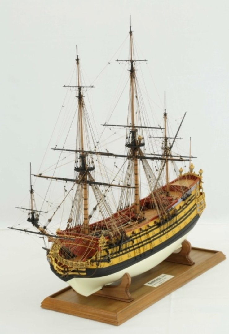
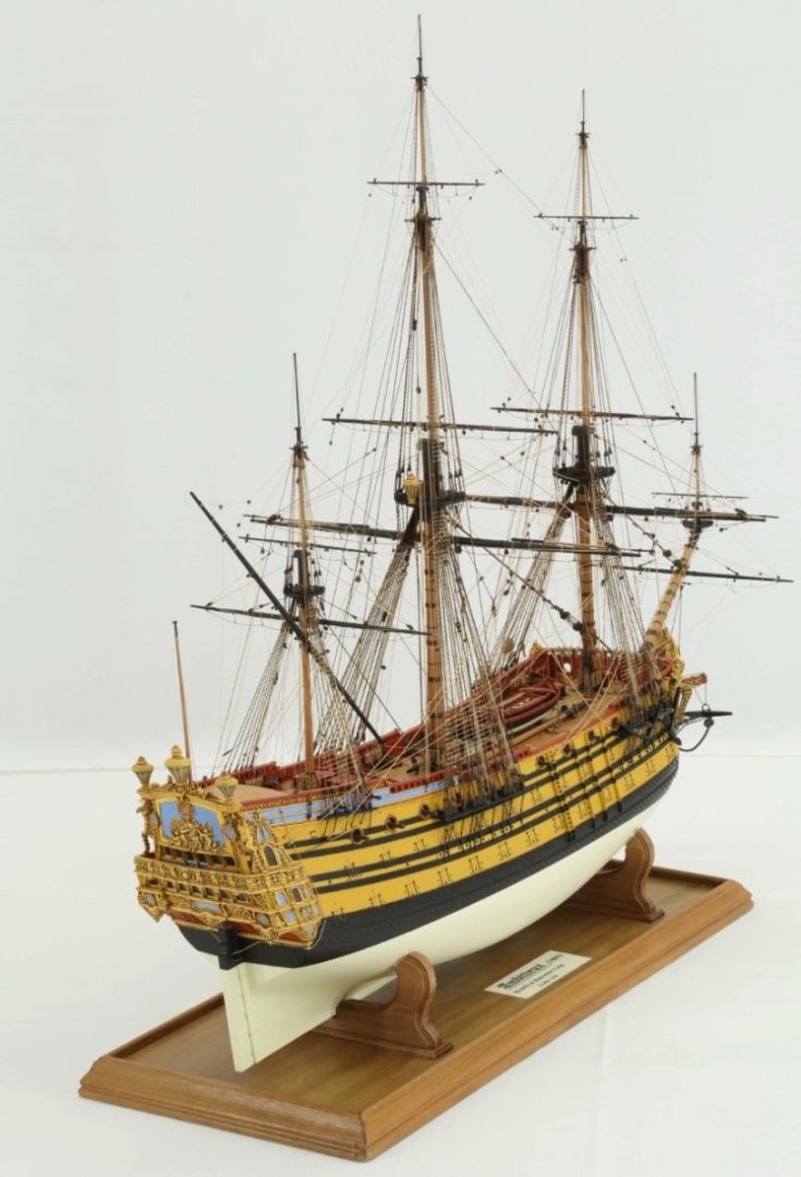
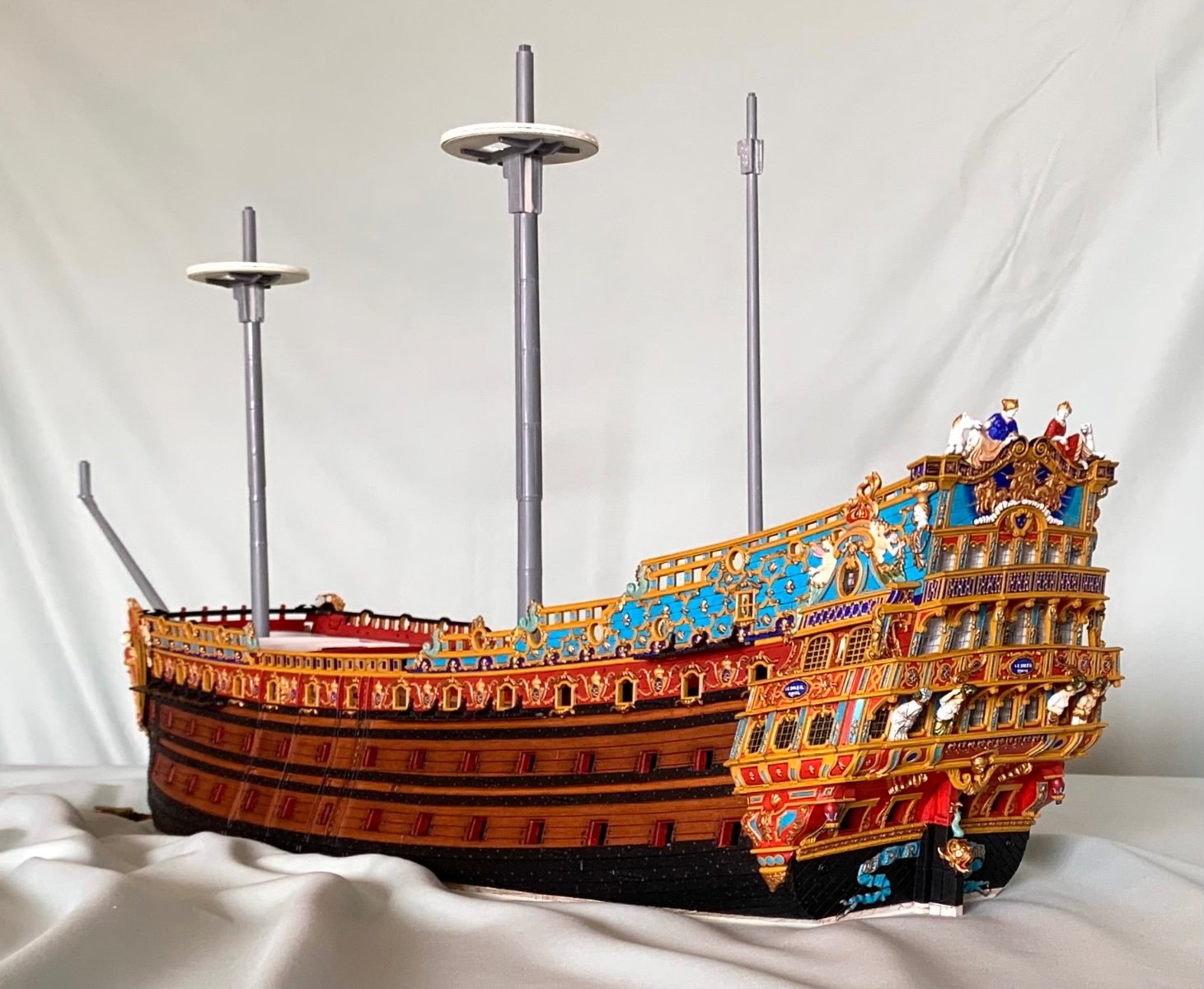
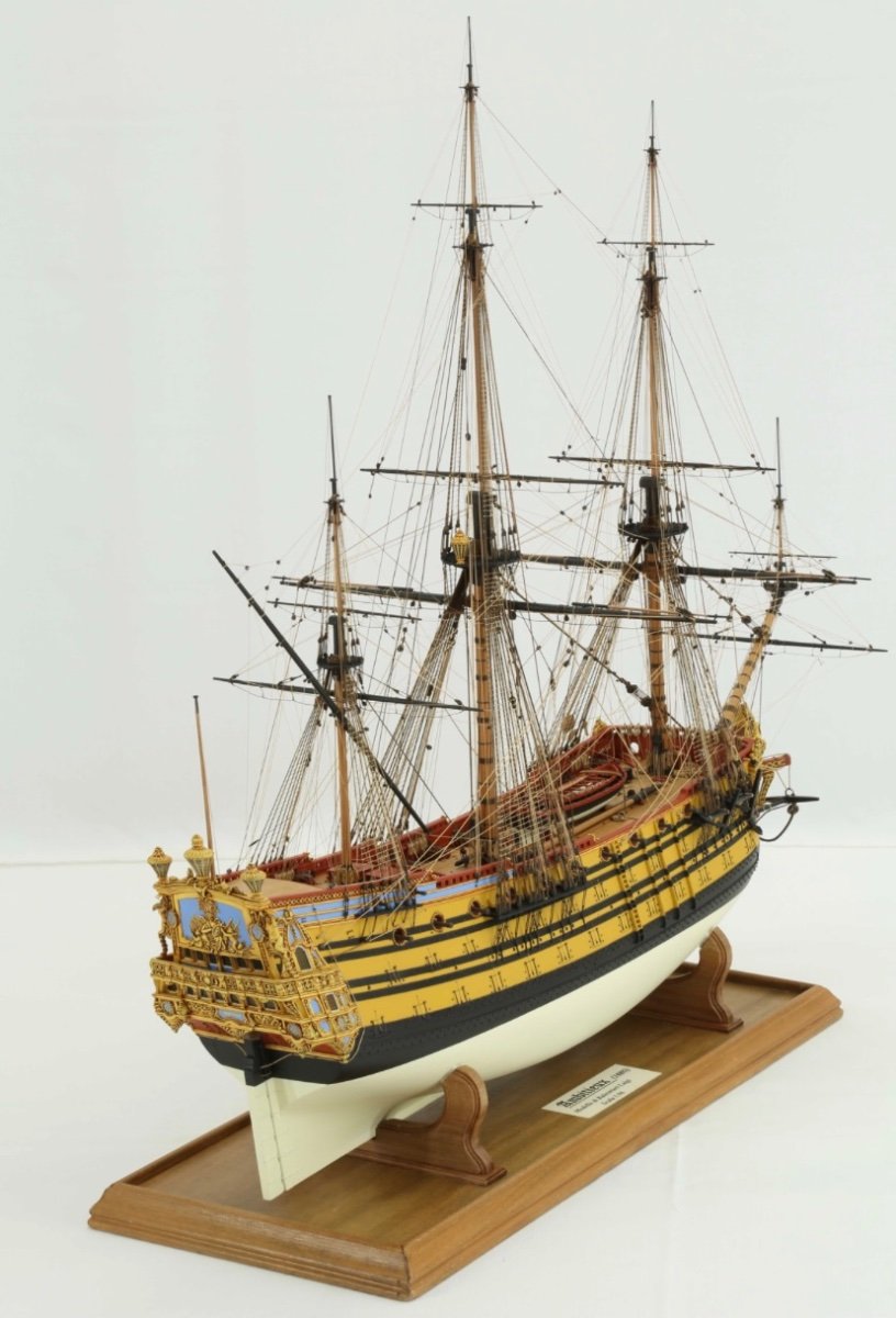
 This is my current project. It is an extreme kit bash of the Heller Soleil Royal. I have reconstructed the entire ornamental program from scratch, in styrene. Yes, it will ultimately be a waterline diorama. There are a few of us doing these transformation projects on the site. This is the reason that your Fulminant project is so interesting to me. I am very interested in broadening the scope of modeling subjects, by developing a better understanding of this less well documented period in French naval architecture.
 -
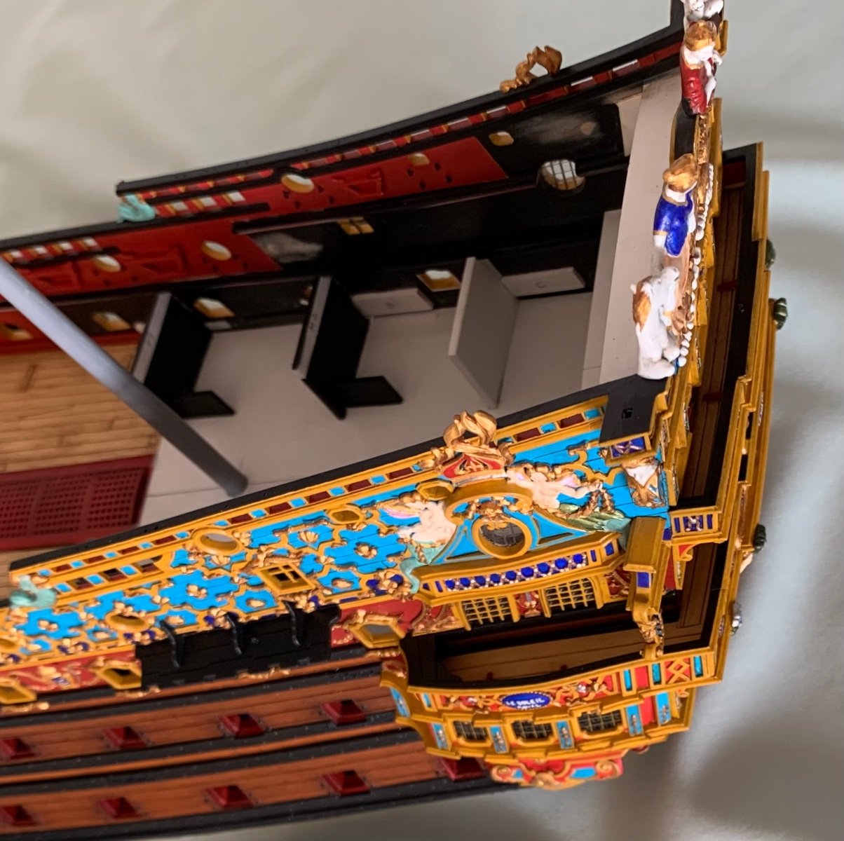
This is my interpretation of the Trompe L’oeil amortisement:

-
By the time of the refit, in 1688, First rates would have been single-reefed on the fore and mainsail, and double-reefed on tue topsails. Aesthitically, I might strike a balance between .4, which seems a little short, and .5.
- 1,508 replies
-
- 1
-

-
- Le Soleil Royal
- Heller
- (and 1 more)
-
I am hoping to have him print lanterns for me.
- 106 replies
-
- 2
-
-
- Soleil Royal
- Ship-of-the-line
- (and 2 more)
-
This guy, Kris from Poland is doing exactly that:
- 106 replies
-
- 3
-
-
- Soleil Royal
- Ship-of-the-line
- (and 2 more)
-
I, if I may be so bold, will judge that this was a solid move. One issue with the Tanneron model is that the forward sheer of the lower wales is a little aggressive. Heller copied this even more aggressively. lowering the head a little, even if it means submerging the gammoning a little, helps to minimize this exaggeration. Well done! On a separate note, some (myself included), have taken issue with this or that assertion from Jean Claude Lemineur. However, he is the only one to delve so deeply into the murky waters of 1680 and beyond. Over the years, and particularly in my early state of broad ignorance, he was always a very gracious correspondent. Everything that he does, and John does and other builders do, pushes the conversation forward, ever so incrementally. Let’s all keep going, sharing, discussing, and trying to put the puzzle together. My hope is to build a broad enough basis of research so that one could reasonably build a model of La Royal Therese - an example of which that still does not exist on any public forum that I know of.
- 106 replies
-
- 2
-
-
- Soleil Royal
- Ship-of-the-line
- (and 2 more)
-
I can definitely relate to the “middle-class wage earner” statement, but your job sounds a lot more interesting than mine.
- 106 replies
-
- 2
-
-
- Soleil Royal
- Ship-of-the-line
- (and 2 more)
-
It all looks as though it grew there like the crystalline perfection of some fantastic geode.
-
Bill, it’s difficult to get a sense of the different t’gallant heights without a perspective shot of the entire rig.
- 1,508 replies
-
- 1
-
-
- Le Soleil Royal
- Heller
- (and 1 more)
-
Karen, it is exceptional in every way. Congratulations on this remarkable model! What might be your next undertaking?
-
This, to me, is even more impressive. Doris, for example, makes this seem simple. It is not at all.
-
The rig all looks neat and taught, Bill!
-
Correct, they are both full three deckers, and were classified as First-Rates. When these ships were first constructed in the 1690’s, they were overloaded with the number of guns in such a way that adversely affected their handling, and subsequently their armament was reduced. When I say that they are the origin point for the 74, what I mean is that this was the first attempt to really standardize efficient fire-power and handling. Ultimately, this tendency culminates in the 74, but there would certainly have been more direct corollaries in the 18th Century.
-
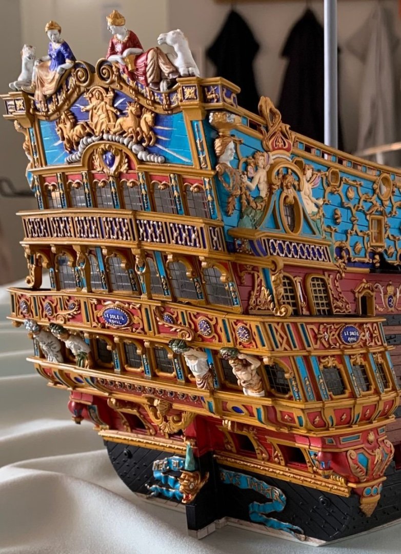
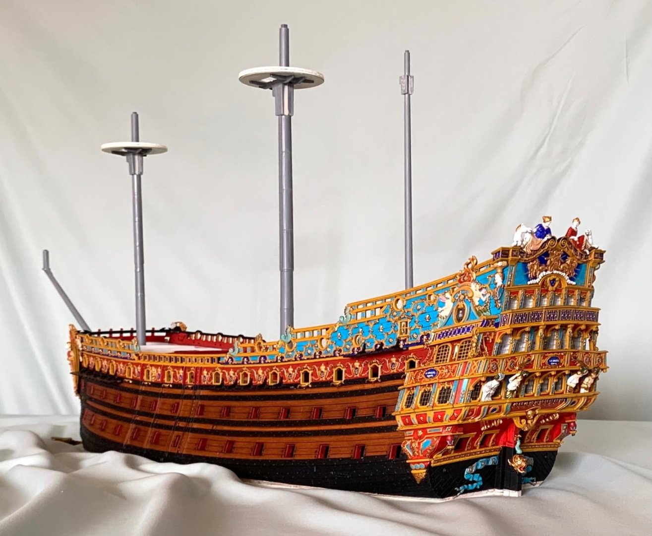
I also want to say that your connection of Versailles to the coloration and architecture of SR’s stern is right-on. For years, I puzzled over just what all of these different color choices were actually trying to represent. I thought the bronze sculptures were maybe to indicate ornamental carvings that were preserved from before the refit. With your parallel color examples to art within Versailles, you have made the probable intent very clear.
- 106 replies
-
- 3
-
-
- Soleil Royal
- Ship-of-the-line
- (and 2 more)
-
John, I have not been challenged to look up so many vocab words since my father was still in his right mind. Apocryphal was on my “frontier” of near-understanding, but epipelagic is a new one for me. I take you to mean something like “keep on truckin!,” but in the water. Keep on swimmin!, maybe? As always, I really love your succinct and well-researched info-graphics. Your historic colorist analysis is the best discussion of 17th Century blues that I have yet seen. As you noted, and have now given me artistic vocabulary to describe it, I chose to paint in the Mannerist style, although not because I was well-versed in the art history of it. Broadly, I reasoned that if the early Baroque Vasa could be painted so, why mightn’t the later Soleil Royal also be painted so - particularly, when there was a mandate to reduce the use of expensive gold; a broader color palate could be used to highlight the ornamental program. Mostly, for me, that was an artistic choice, but I REALLY appreciate the window of plausible deniability that you have opened for me, in referencing the potential preferences of the Dutch-trained Laurent Hubac. His early ships were broad like Dutch ships, fitted with very Dutchy head structures, tall-sheered like Dutch ships, and very boxy in the stern. As intransigent a constructor as he was, perhaps he also insisted on a more Dutchy color scheme. Thank you for that! I think, though, that the scheme you have chosen for your model hews much more closely to the probable truth of the matter, especially toward the end of the century, as the French were moving towards uniform classifications and construction specs for the rates. What you have managed to do so beautifully, is to create tremendous visual interest with the color variations between decks, and in the painting of all supporting ornamental mouldings and panels. Your demonstration of what faux gold might look like is absolutely convincing to me. I’m loving the log so far!
- 106 replies
-
- 3
-
-
- Soleil Royal
- Ship-of-the-line
- (and 2 more)
-
Also, Henry - what a trip! Congrats on your anniversary! How many years?
-
Ahhh, I was not aware of 4H. I did an image search and pulled that extract from Souvenirs from the first site I found. That is the cardinal rule around here, so I will delete the post. It served its purpose for the discussion, anyway.
- 1,508 replies
-
- 1
-
-
- Le Soleil Royal
- Heller
- (and 1 more)
-
In a way, if you think about it, they are the origin point of the French 74.
-
The Ambiteaux and Fulminant were the product of the construction council’s desire to develop the ideal combination of firepower and maneuverability. The big lumbering 100-gunners were necessary, but not ideal.
-
Your friend is extremely talented. His sculpture work best exemplifies the French baroque style, and the model, itself, is beautifully made.
-
Yeah, I would definitely trim the back end, as well. I had the benefit of building this kit before. Over time, the issue of these trestle trees began to bother me. You can monimize this problem, though. Fortunately the t’gallant trees are in scale.
- 1,508 replies
-
- 1
-
-
- Le Soleil Royal
- Heller
- (and 1 more)
-
If you shorten each side of each cross-piece, by say a generous 1/16”, then that would bring the deadeyes that much closer to the mast centerline, which would make them appear less spread-out over a span that is roughly half that of the topmasts.
-
With the shroud spread, it should taper to less and less as you go up the mast. This is the main reason that I widened my main tops.
-
My advice, as far as scale of the mast sections would be to mock it up with dowels and see what it actually looks like with different height t’gallants. It would also be a good idea to mock up your sail plan, relative to these heights. The t’gallant yards, BTW, are also too long. Yes, you are measuring from the foot of the t’gallant to the underside of the flagstaff cap. Now, while you have followed the kit instructions for the topmast tops to the letter, Heller’s tops are more mid-18th Century, in style, and grossly out of scale - far too wide. If you are shortening the t’gallants, then the spread of the t’gallant shrouds will look really wrong, as compared with the spread of the topmast shrouds below. On the stock kit, without any modifications, the spread already looks wrong. My solution, here, would be to shorten the ends of the crosstrees, on each side, to reduce the spread. My plan is to remake these trestletrees from scratch. However, if that idea does not appeal to you, at this stage, I would simply keep the t’gallants the height that they are, and correct the t’gallant yard length, so that at least the sail-plan looks more right than wrong. Compare Heller’s masting to this scratch-built 1:96 of L’Ambiteaux: There are significant differences in scale, there.