Thukydides
-
Posts
1,345 -
Joined
-
Last visited
Content Type
Profiles
Forums
Gallery
Events
Everything posted by Thukydides
-
 It looks much better, and I suspect as I have found to be the case, the difference is both more subtle and yet more impactful in real life than it appears in the photos. Great job!
 -
Great job both on the painting and modelling of the stern. You can definitely see the improvement over the various versions. Lots of nice contrast there.
- 111 replies
-
- 4
-

-

-
- Christiania
- Vanguard Models
- (and 1 more)
-
I would recommend looking at a bunch of build logs. Find a method you like the results of and you think makes sense for you. Jigs are your friend here. Figure out the method and build a jig to allow you to replicate it. You can even try a few different methods to find out which one works best for you. Once you have one you like you can set up your jigs to reproduce it for all the guns. In terms of the rigging itself I personally only rig the side tackles and ignore the training tackle. Take a look at various examples to see what you like the look of best. Some prefer to only rig the breechings. It all depends on what you want to depict with your model.
-
Super cool that you are willing to share this with everyone. Great job.
-
I will send you a link to the presentation vi PM. I think the colour you chose was fine, my point was simply that given the issues noted, I am not confident that your methodology has produced a definitive result. In terms of resources, I would actually say miniature painting tutorials are useful as long as you are looking at similar scales and styles to what you want to achieve. Most miniatures are at about 1/56 (many scale models are at 1/76) scale which is not too far off your scale so many of the techniques would apply. That being said if you are looking for a more realistic look then I would look at scale modelers not general miniature painters. Most miniature painting tends to be more stylistic in nature (which is fine if you want that sort of look). If you look at my alert model you can see how this might look on a model. I painted my alert to depict her as if she was in a painting so it has a very stylized saturated look. You could use many of the same techniques just mute the contrast a little and use less saturated colours if you want a more realistic look. If you have limited painting experience then I would probably limit myself just look into adding some edge highlights and maybe use selective application of a wash in the recesses and upper side of the port to push them more into shadow. This of course is based on my personal stylistic views. At the end of the day the question is really what do you want to achieve. Edit: I will also add the viewing distance matters. Do you want it to look good from 1 foot away or 5 feet away. The further away the desired viewing distance the more you should push the contrast. The closer you are the more important it is to have smooth transitions.
-
I think your colour looks good. I don't think the following caveats are deal breakers to your methodology for determining the paint colour, but I figured I would note them. There are two main reasons why the colours will not match (both of which you noted): The lighting - The issue here is that in real life (and in paintings) things look very different depending on the lighting and what is around them. For example, looking at the door of my office, it is all painted the same colour, but the different faces are very different colours. This means that if you want to adjust using the ai (as you did) you need to make sure that the red deterioration you are measuring on the flag is in a similar lighting situation (in this case it should be in shadow). The yellowing - paintings mostly change colour due to the deterioration of the varnish layer (that is how you get the yellowing of a painting). This does not impact all colours evenly and depends on how much dirt and how long since the varnish was replaced. For this reason I would be careful about comparing colour change between two different paintings. If you want to do the comparison try to stick to the same painting (it was not clear from your explanation if this is what you did or not). That all being said, there is a broader question about how you want to depict the model. Do you want your colour to "be accurate" or do you want it to "look accurate", these are not the same thing. A model is a small scale representation of a much larger object and so light and shadows do not react the same way on these smaller objects. If you want it to look like a miniature version of the real thing then you actually need to do some tricks (your dry brushing was a good start) to try and simulate the impact of a light on the real size object. I don't have enough time to cover it all here, but essentially you may want to consider simulating some of the shadows and highlights as opposed to simply using "the correct" colour. I did a presentation on the topic for my model group (though I am by no means an expert) if you are interested in more info on the topic.
- 233 replies
-
- 1
-
-
- Model Shipways
- constitution
- (and 5 more)
-
One option is just to buy some extra strips and plank the deck yourself. It will look better and then you can control the amount of planking you want to do. Well done on sherbourne, you are making good progress.
- 18 replies
-
- 5
-
-
- Vanguard
- Sherbourne;
- (and 1 more)
-
If it was me it would depend on how visible you expect the frame to be. If you are planning to plank the area (or only plank one side of the hull, then you could choose to do so on that side), then I would just build it up. Otherwise I would probably try to remake it (though I am a bit of a perfectionist, one I know a problem exists I have trouble unseeing it). That being said it is probably best to at least try option two first. You can then decide how much of a blemish it is and if you can live with it. In any case the model is looking great. Looking forward to seeing you progress it.
- 133 replies
-
- 4
-
-
-
- ancre
- Bateau de Lanveoc
- (and 2 more)
-
Bower anchor project by Sizzolo
Thukydides replied to Sizzolo's topic in - Build logs for subjects built 1751 - 1800
Are you able to elaborate on what you are doing with the "double wall"? It appears the end bit looks like it is wormed, but you don't show that process, are those separate pieces of rope or are they the ends of the three strands you split off to make the wall? This is really fantastic work. I am really impressed and am learning so much. -
A very watered down paint, often with additives that help it flow into the recesses. It pools in the recesses increasing the definition of cracks. You can build it up in layers to increase the contrast. Often the second stage in the (very simplified) model painting process: base layer -> wash -> highlight. Edit, it seems I should have read all the subsequent posts before I answered, chuck beat me to it
-
I don't want to derail the conversation from your specific subject too much as my example is only somewhat related (British, smaller ships, earlier date etc...) That being said I am not 100% sure though I have trouble thinking on what else they could be. They can't be sweep ports as they are too low (most of them are just below the planking of the deck about the level of the beams. The contract for Perseus and Unicorn (ships of the same class) also make note of cutting scuttles for each of the officers cabins and the size quoted appears to be similar to that drawn on the plans. Only thing here that might be applicable to your modeling application is that the contract does note that they should be lined with lead. Yes this is the challenge of this, lots of confusing and sometimes contradictory views. If they are vents I suspect they must angle down (similar to the the example you showed), but they appear to largely be around the beams, just below the deck planking. One thought I had was maybe they run through the room and space between the frames. The second example is from 1727 so I suspect given the number (and regular spacing) of them that those are meant to be sweeps. Many of the earlier smaller vessels had them. Your planking is looking very nice. Well done.
- 233 replies
-
- 2
-
-
- Model Shipways
- constitution
- (and 5 more)
-
Very interesting @Marcus.K., I appreciate the amount of work you are putting into this research. As @The Bitter End said I also find the research process to uncover obscure details as much fund as building models themselves. One thing that stands out to me with the vents is how many of them there are. I have found air vents on plans for HMS Camilla of 1776 (https://www.rmg.co.uk/collections/objects/rmgc-object-83800) and also Daphne 1776 (https://www.rmg.co.uk/collections/objects/rmgc-object-83787), but there are only 6 of them on each side. One for each cabin and then one near the bow. They are drawn in black pencil at about the line of the deck.
- 233 replies
-
- 1
-
-
- Model Shipways
- constitution
- (and 5 more)
-
Congrats on reaching this stage. This is a very impressive kit and I am sure there are going to be some great models built with it.
-
Great work Andrew.
-
Bower anchor project by Sizzolo
Thukydides replied to Sizzolo's topic in - Build logs for subjects built 1751 - 1800
I am really enjoying this build log, learning so many things I was not aware of. I don't really have anything to add apart from great job. -
Really good work. How did you handle the lofting at the bow? I found I had a lot of trouble with that when I was faring the hull for perseus.
- 111 replies
-
- 2
-
-
-
- Christiania
- Vanguard Models
- (and 1 more)
-
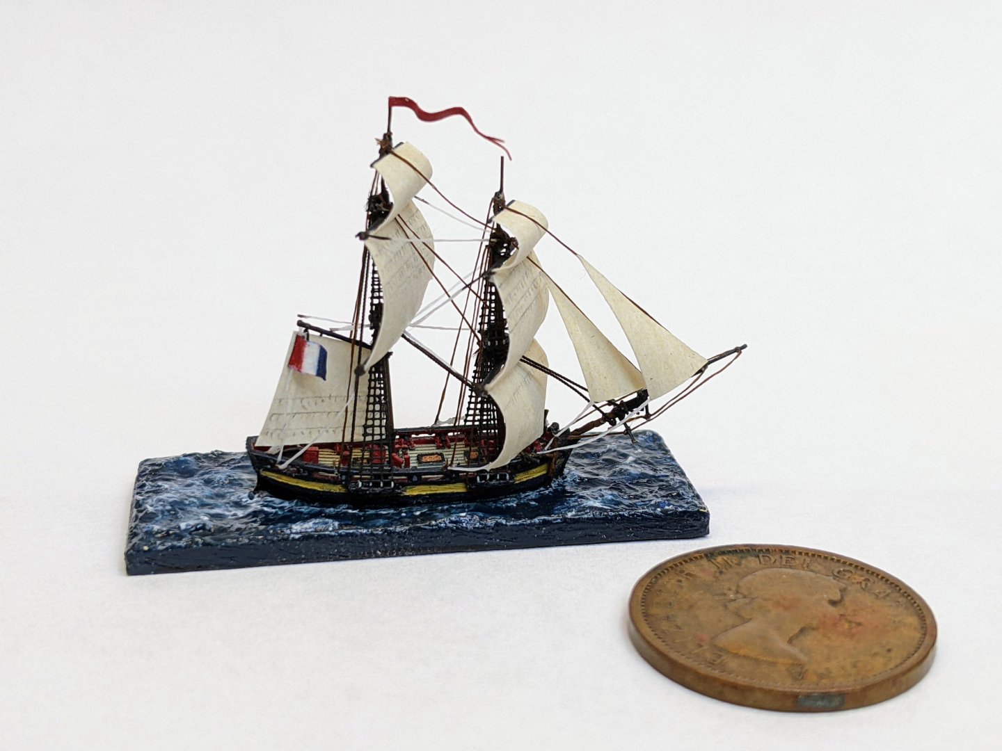
Thanks Glen, the main change is that I have dropped down to about half the size (1/1200 vs 1/700 scale). This certainly brings some modelling challenges, but it allows the ships to be an appropriate size for use of the table top. The age of sail was about maneuvering into position and if the play space is too small then it just becomes a matter or rolling dice for the guns.
- 39 replies
-
- 1
-
-
- Black Seas
- wargaming
- (and 1 more)
-
3D Printing Cannons in Resin
Thukydides replied to thibaultron's topic in 3D-Printing and Laser-Cutting.
These files are a fantastic resource. Very kind of you to make them available for everyone. -
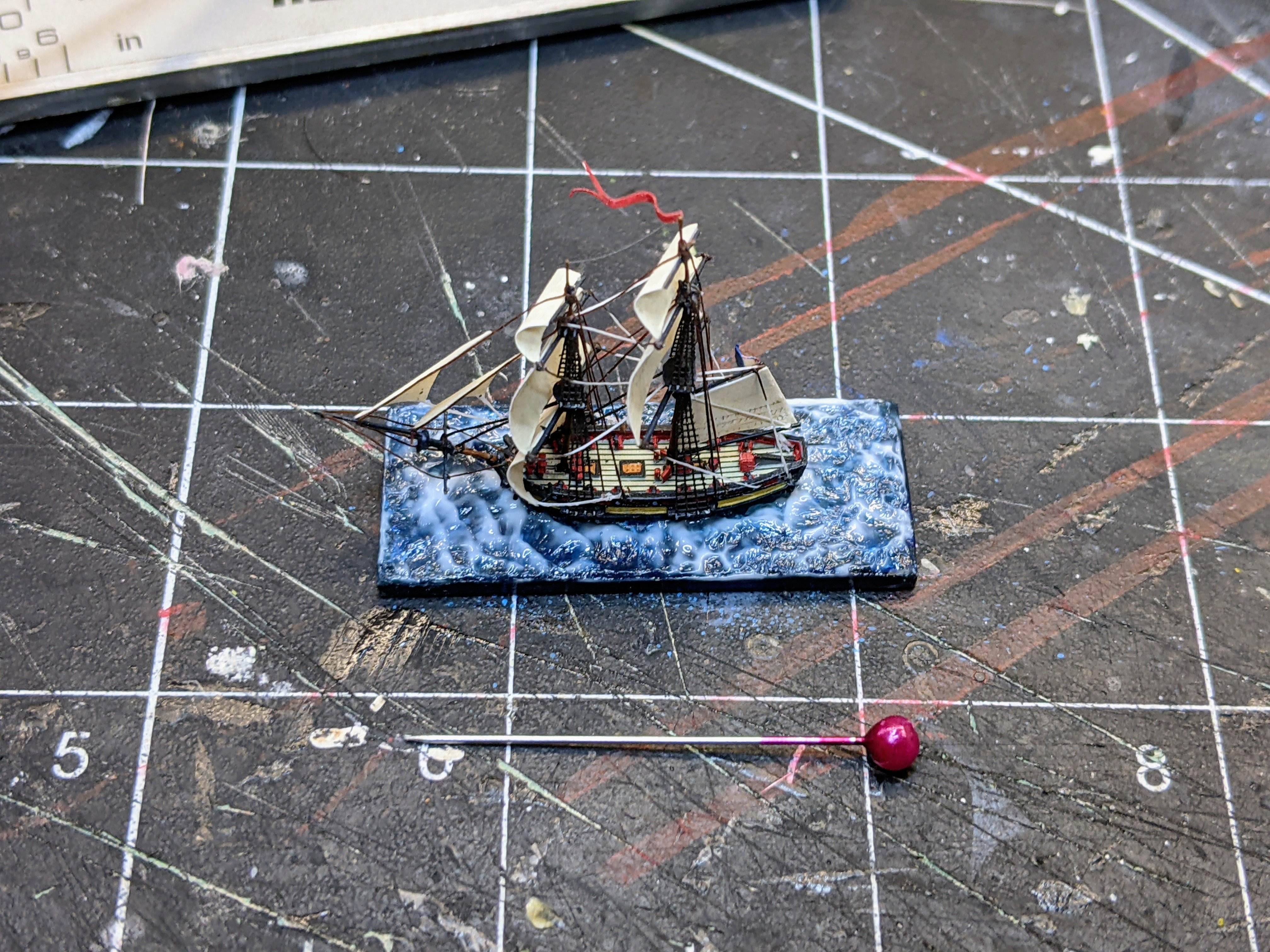
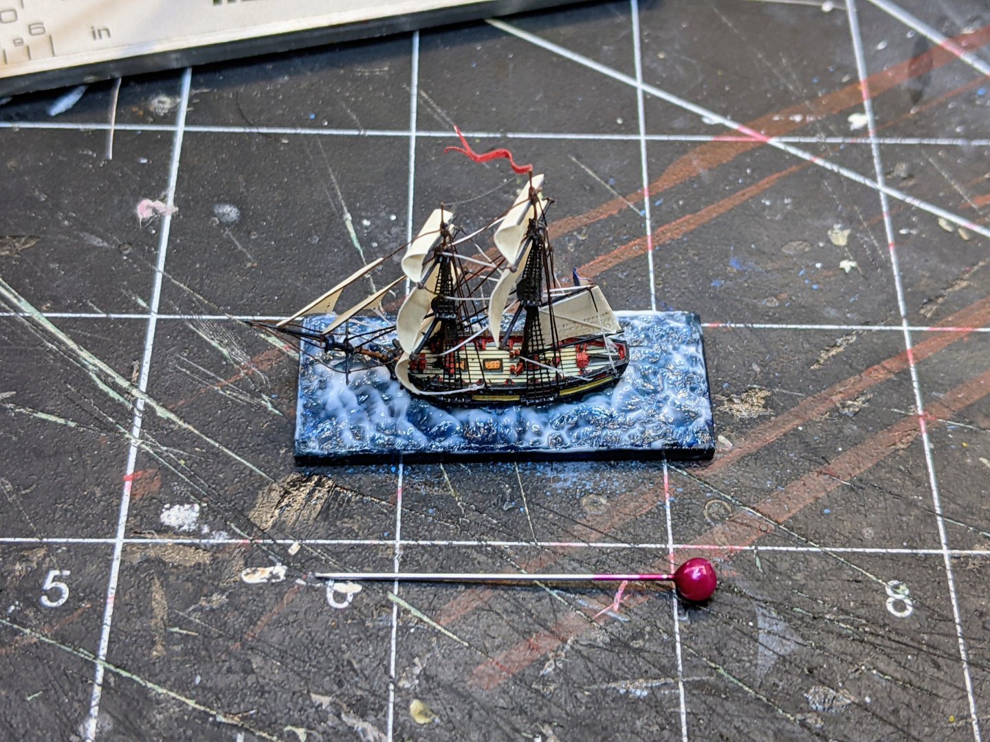
1/1200 Vigilant Class Brig - Finished It has been a while since I updated this log as the vigilant class brig was sitting in limbo waiting on me to get around to varnishing it. Since these pieces are intended for gaming, it is important that a protective layer is applied over the whole model. This also helps to stiffen and strengthen the rigging and the sails as well as protecting them from the natural oils on your fingers. I used satin varnish as I want the colours to pop somewhat and we are at such a small scale that I felt matt varnish would render things too dull. Once the vanish was on, it was time to apply the water effects. First I used a small flat head paint brush to dab on the water effects. I am using vallejo transparent water for this. The paste appears white when added and then dries clear. The dabbing of the paint brush causes it to sit in peaks and valleys which gives the impression of smaller waves. Once this has fully dried, I mix some white ink with a little bit of the water effects and go back in with the smallest paintbrush I have to pick out the crests of waves and paint in some of the foam at the bow and in the wake. And with that the model is finished. You can see it below with a penny for scale.
- 39 replies
-
- 11
-

-
-
- Black Seas
- wargaming
- (and 1 more)
-
Yes hope you are feeling better soon.
-
This is a very cool project.
-
The first source is from a national archives documents I have. The Caruana reference is because he transcribes part of TNA WO 55/1745 (1765) in his book and I don't have the original. The raw data from TNA ADM 160/150 (1794), I have transcribed in my research document for Perseus which I released a first draft of parts of it for a while back (see the linked post for the download): The relevant transcriptions of the primary data can be found on pages 71-73. Essentially, based on the guns carried by a particular class of ship and the stores that accompany them as well as some notes the documents had on the blocks, you can figure out what size of block / rope was used. I just compiled it all into one table to save everyone the effort. Note practice may have varied somewhat from ship to ship and this is mostly based only only 2 sources so a degree of caution with the conclusions is advised. The carronade data is from 1794, so it may not be completely applicable to the earliest use of carronades and things were changing fast at this point so they could also have changed practice in the early 1800s. I should add that I have some other sources from the period that differ slightly on the size of the breechings and tackles depending on the size of gun so that may indicate there could also have been variance on the block sizes, but these are the only ones I have found which give sizes for the blocks and the only one that gives details for carronades.
-
USS Constitution by mtbediz - 1:76
Thukydides replied to mtbediz's topic in - Build logs for subjects built 1751 - 1800
Very nice. Those are some nice neat joints. -
Looking good David. 32 pdr carronades would indeed have a single double combo for the the tackle with 8 inch (3mm) blocks according to a list I found from 1794. The tackles would be 2.5 inch cir or 0.3mm diameter at your scale. That being said the difference will not be super noticable. You could combo the 3mm double with the 2mm single, then you will get the correct flow of the tackles even if the sizes are not exactly correct. Edit: Here is the full table for carronades just for completeness: Table 5.X - Breechings, Tackle and Blocks Per Gun Circa 1765-1794 Breeching Size (in) Gun Tackle Size (in) Blocks (Single) Blocks (Double) Size (in) Number Size (in) Number Carronades 32 pdr 7 2½ 8 2 8 2 24 pdr 6½ 2 6½ 4 18 pdr 5½ 1½ 5 2 12 pdr 5½ 1½ 5 2 Source: TNA ADM 160/150; TNA WO 55/1745; Caruana, English Sea Ordnance, 229.
-
She is quite the model. This will be a very impressive kit. It really is a pleasure to follow along and see how it developes.