Hubac's Historian
-
Posts
3,315 -
Joined
-
Last visited
Content Type
Profiles
Forums
Gallery
Events
Everything posted by Hubac's Historian
-
 Just a quick update: In all likelihood, I will cut away the smaller, inside wings because they interfere with my aft octagonal ports. However, until the amortisement is made and I can see the actual relationships of all these parts, I wanted to keep all options open. Tomorrow I will start the heads, but my own head is growing weary and my neck is getting sore, after sitting hunched over these gals all day. I tend to start making mistakes when I push through. A few of those mistakes, I’ll be filling-in with BONDO, this evening, as I prepare the main deck for painting and priming; some of my nail impressions were poorly placed, and/or ill-conceived. I’m excited to get back to a little painting, though. In addition to the Windsor and Newton Van Dyke Brown, I will experiment with a lightish grey Windsor and Newton oil shade, that will be applied and wiped streakily before a blanket application of the brown. The deck is coarsely sanded, so it should pick up these colors nicely.
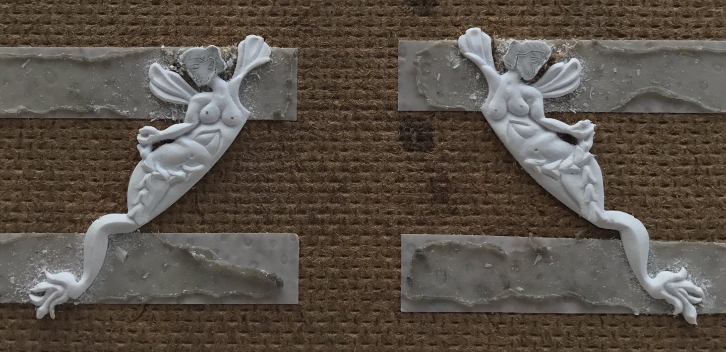
- 2,699 replies
-
- 11
-

-
- heller
- soleil royal
- (and 9 more)
-
If she does, Dan, I’ll vouch for your character. Wouldn’t it be kind of hilarious, if Daryl Hannah were doing a Google search of her name, and landed on this page? Daryl, if you’re out there reading this - we still love you!
- 2,699 replies
-
- 3
-
-
- heller
- soleil royal
- (and 9 more)
-
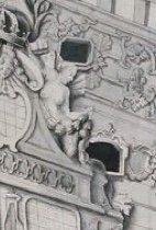
Thank you very much, guys, for your kind compliments. It isn’t so much that Mermaids have legs above the knee, but that Berain was maybe suggesting musculature. Here is what Berain drew, originally: Now, if you compare that with this Nat Geo photo of Daryl Hannah in the wild, I think we can agree that Berain was on to something:

- 2,699 replies
-
- 8
-
-
- heller
- soleil royal
- (and 9 more)
-
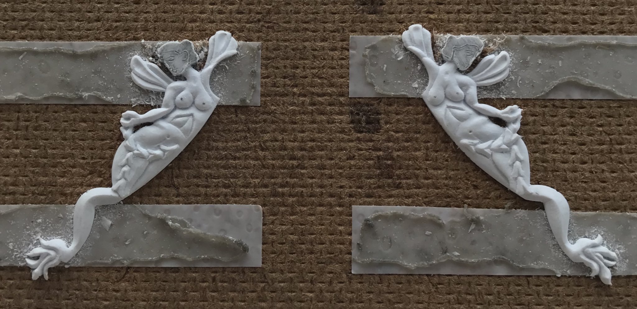
Thank you very much, Shipman! The figures are carved from styrene, but don’t be too amazed; carving styrene is analogous to carving soap, for beginners. Carving these figures in wood would be a whole ‘nother story! Alternating grain makes carving wood much more finicky.
- 2,699 replies
-
- 3
-
-
- heller
- soleil royal
- (and 9 more)
-
I’m excited to see what you do with this one, Micheal. You’re off to a great start!
-
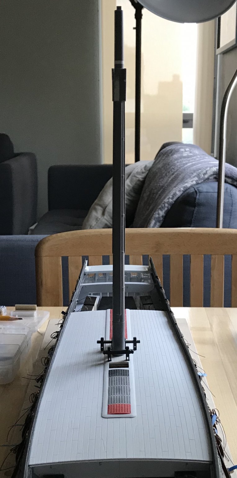
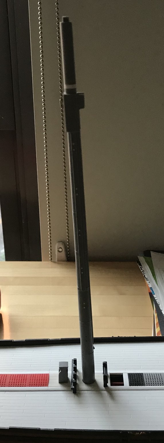
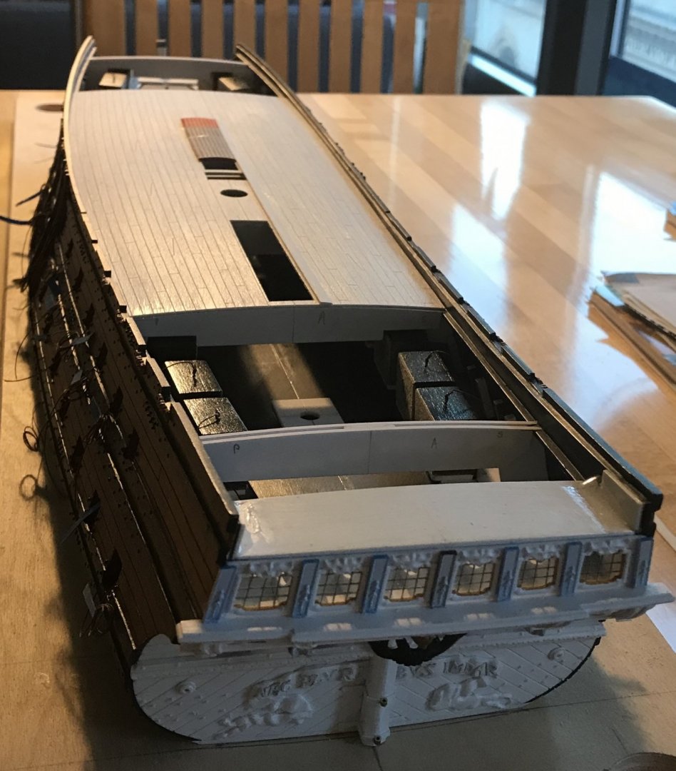
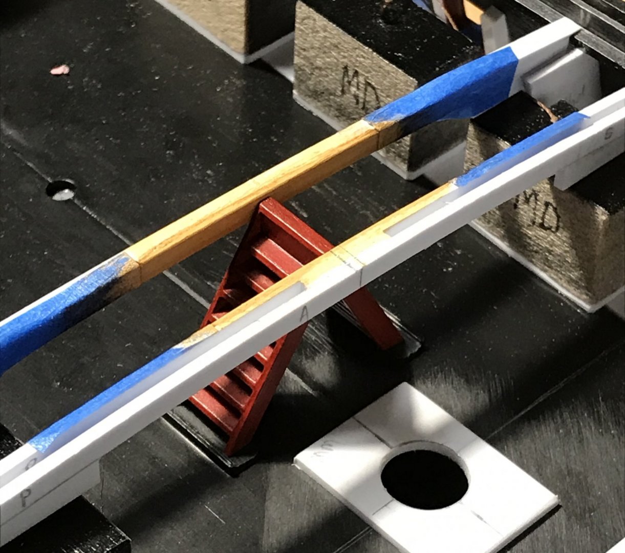
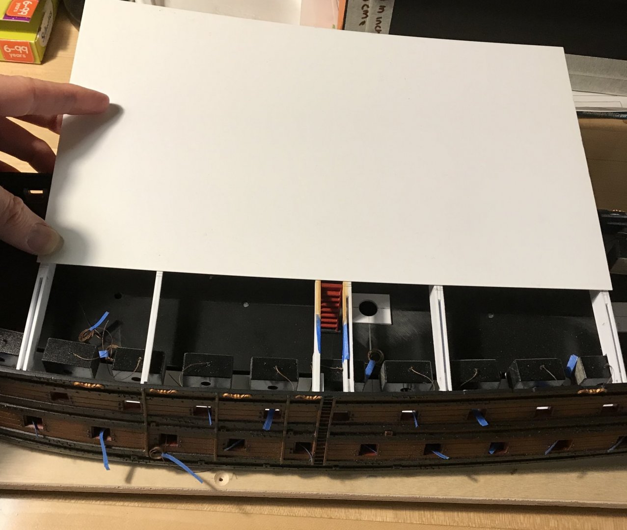
Steady progress: One of the things that anatomy forces you to learn are ways in which to introduce the soft hollows of a body, with whatever tool can get into tight spaces. In the area of the belly and hips, I don’t have a gouge that’s small enough to get in, close to the side of the body, without the arm getting in the way. What I use is the hooked knife to scrape hollows on a bias, according to the same principle of cutting a cove moulding on a table saw, by running a fence at an angle to the blade. The scraping motion, at an angle, gently introduces a hollow that, in this case, defines a fleshy love handle. Each scrape removes just a little material at a time, and eventually you arrive at where you want to be. One other thing I’d like to mention is the undercutting of the upper thigh. I could simply define the lap line, where one thigh rests against the other. This would look okay. However, the pose of the figure suggests that the outer thigh overhangs the other leg. What I like to do here, to suggest this, is that after I have first defined that meeting line - the line that delineates the shape and proportion of each thigh - I come back with sharply angled scrapes that undercut the outer thigh. I use the sharply beveled tip of the EXACTO to do this. The accentuated shadow line creates a false sense of depth in what is a very shallow carving. While I wait for my #80 drill bits to arrive, I have made and fit the fore and aft sections of the main deck. Unlike the middle deck, where I had to make mast plates to fix the plumb and rake of each mast - I now had a reliable reference to measure the exact centerline of the fore and mizzen masts; I could measure directly from the fore and aft edges of the main deck center section to the center of each mast. The masts are all in alignment, now, and the slight bow of the mizzen will eventually be corrected by the stays and shrouds. I have also decided to re-enforce the main deck hatch openings with carlings that are scribed to the longitudinal curvature of the deck. The styrene I’m using for the decks is a bit thinner than what the stock kit provides, and is not as rigid. It is my pathology to overbuild the whole thing, so, here you go: I enjoy the exercise of scribing and fitting these curved parts because it is good practice for when I eventually transition to wooden builds. Thank you for looking in. More to follow...


- 2,699 replies
-
- 12
-
-
- heller
- soleil royal
- (and 9 more)
-
As always, Frank, this is incredible work. I really love what you are doing, here.
- 510 replies
-
- 2
-
-
- reale de france
- corel
- (and 1 more)
-
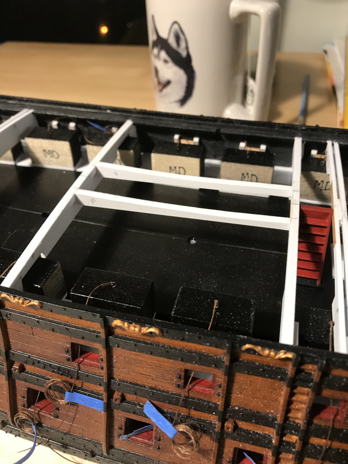
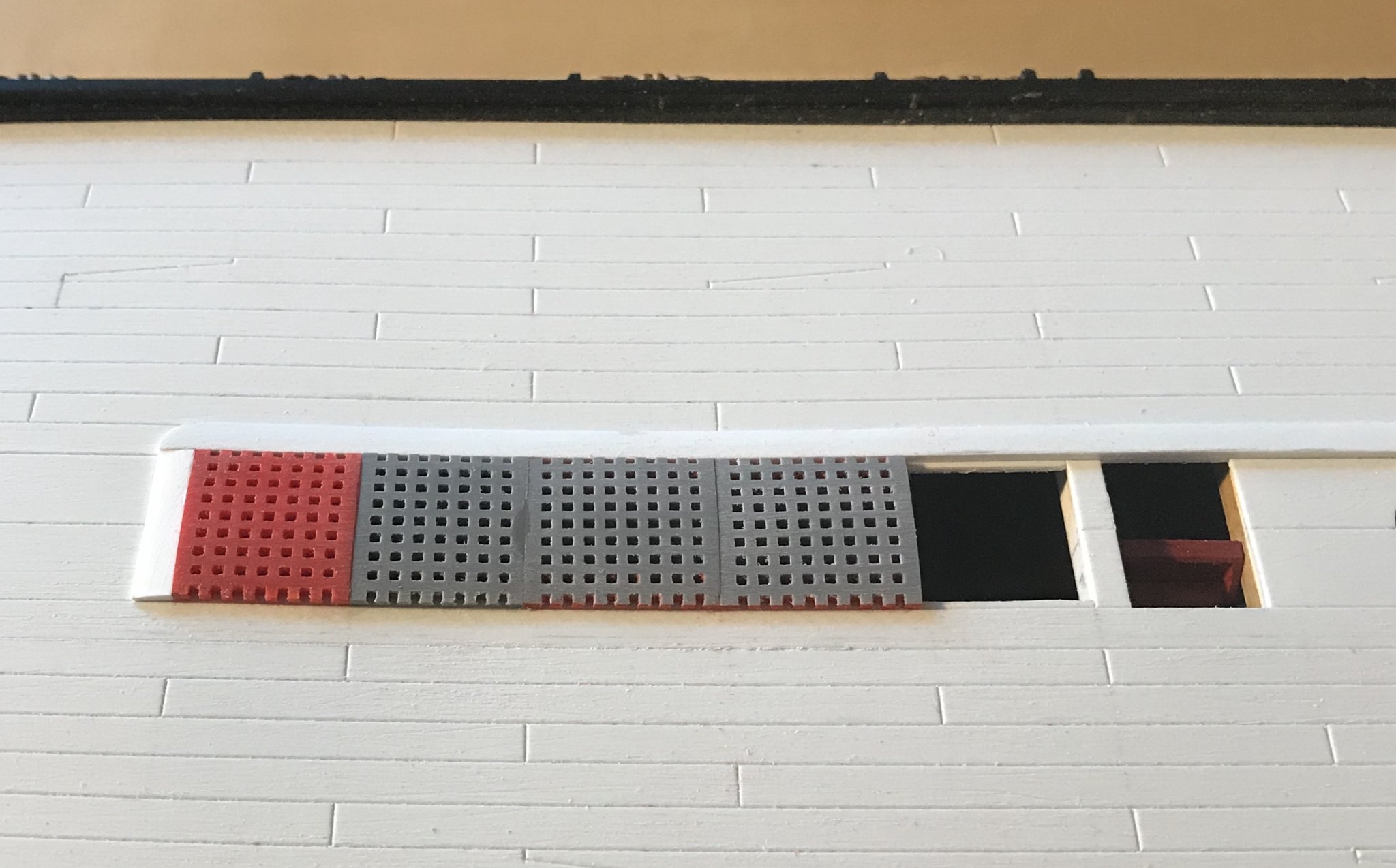
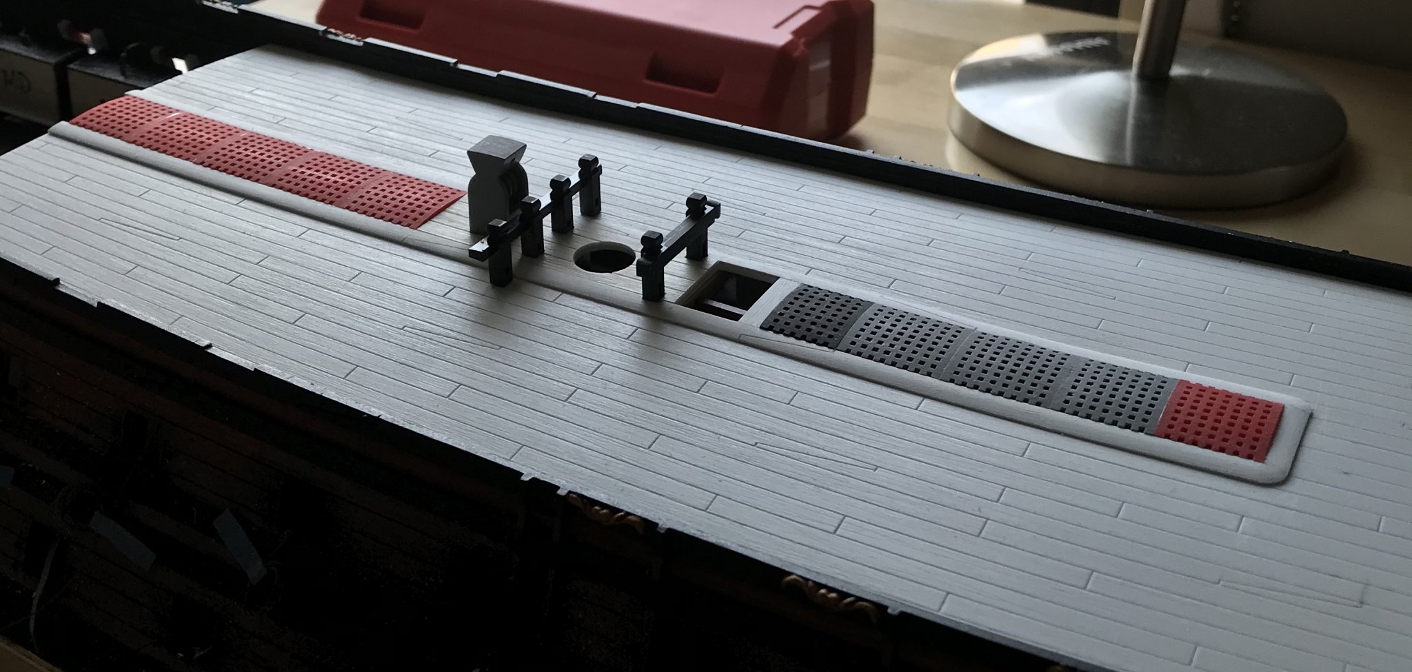
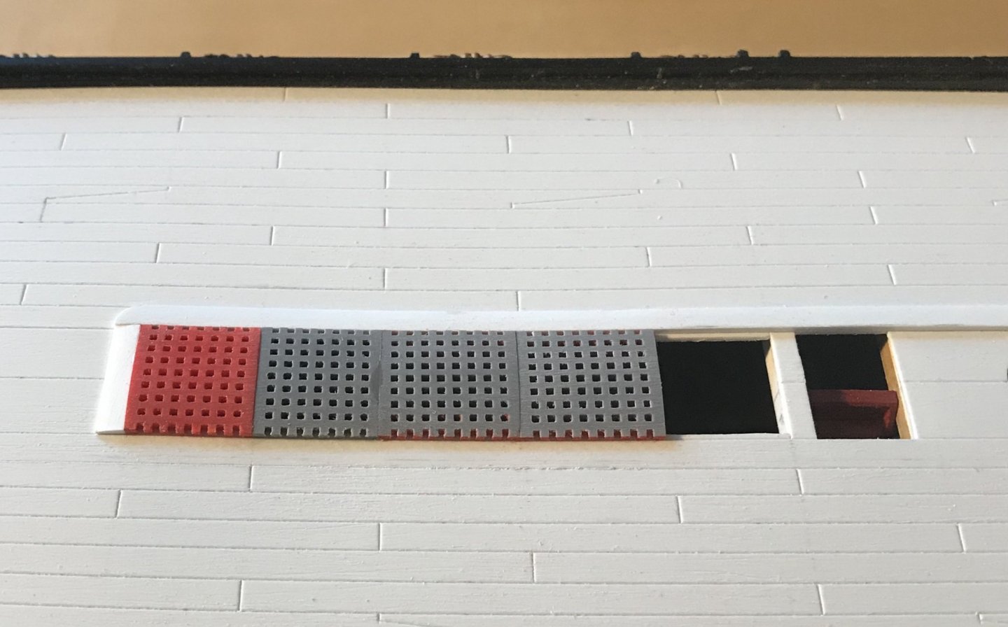
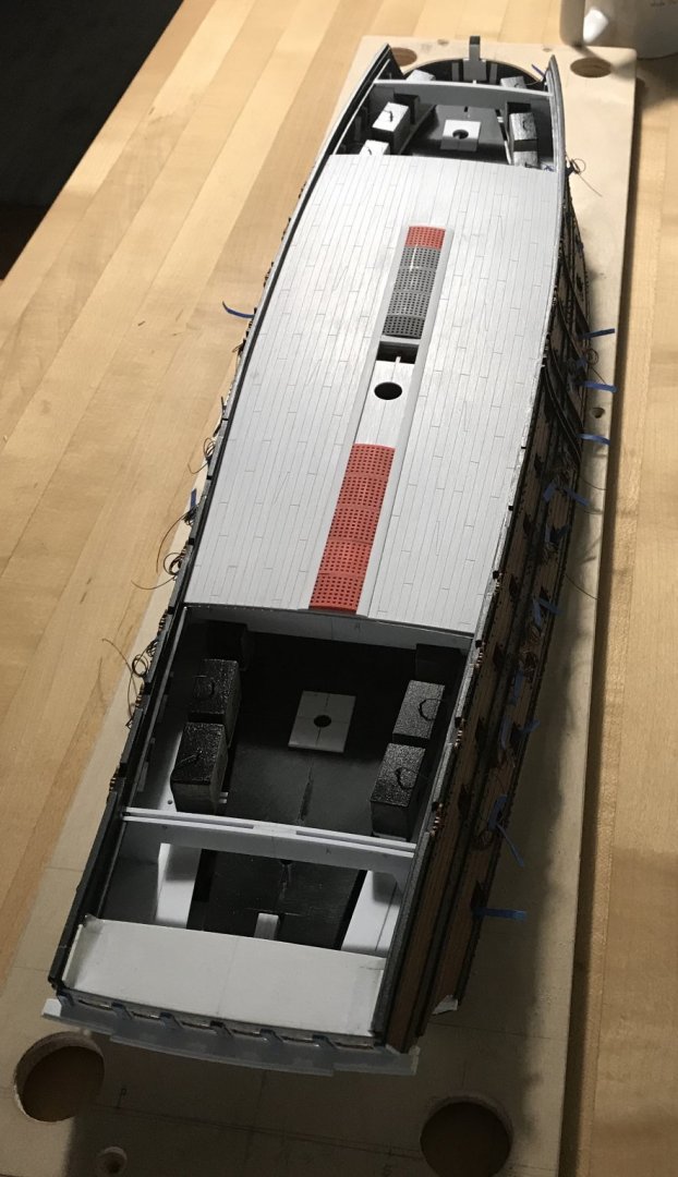
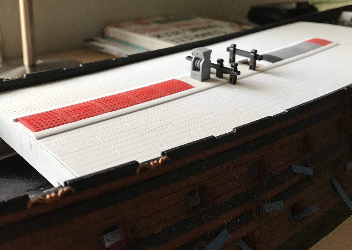
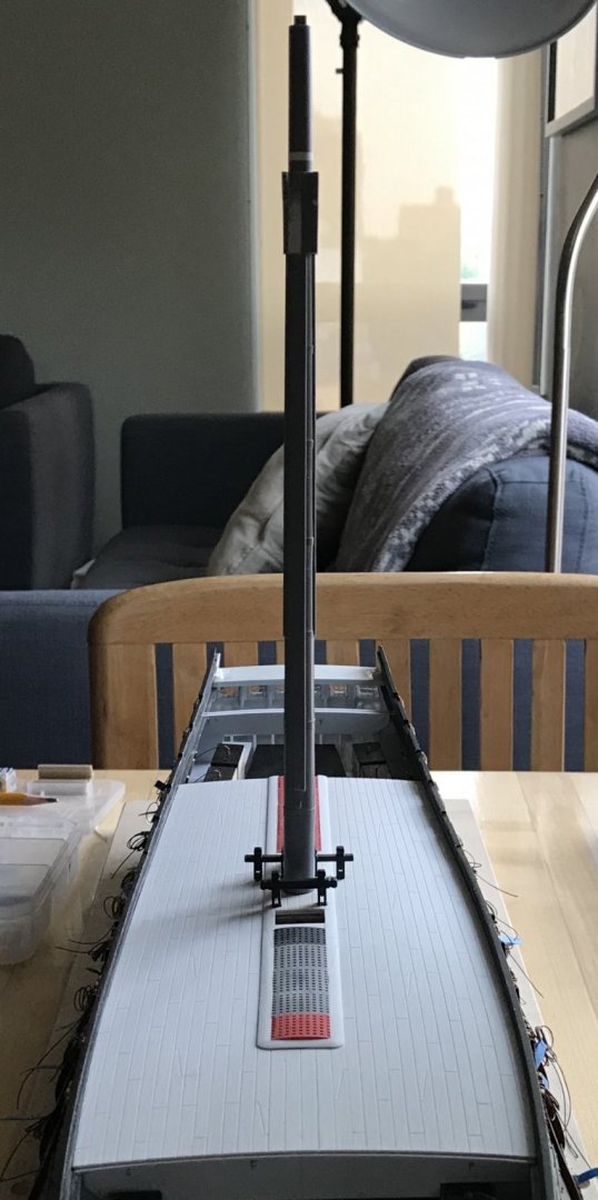
Work on the main deck continues: The gratings required a little extra attention to get them to lay in an even plane. The main mast plate finally secured the mast, perpendicular to the keel, but the extra thickness of the plate and coamings necessitated a little inletting of the deck furniture: Next, I will drill all of the nailing impressions, and then I will paint the deck. Work on the forward MerAngels is proceeding nicely: Thank you to everyone for your likes, your comments and for looking in.


- 2,699 replies
-
- 19
-
-
- heller
- soleil royal
- (and 9 more)
-
Thank you, Mark! This is a simple to use, but wonderful tool 😀
- 2,699 replies
-
- 2
-
-
- heller
- soleil royal
- (and 9 more)
-
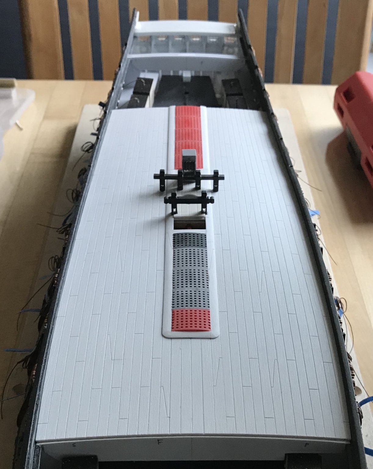
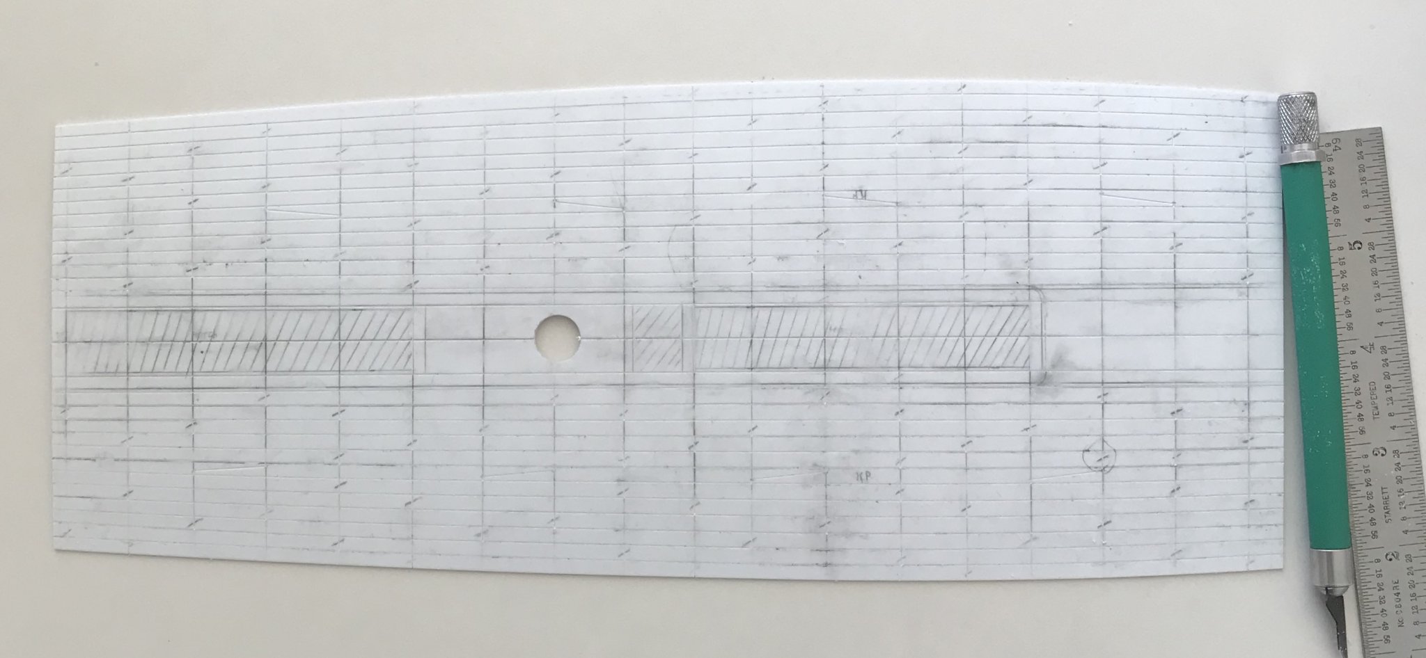
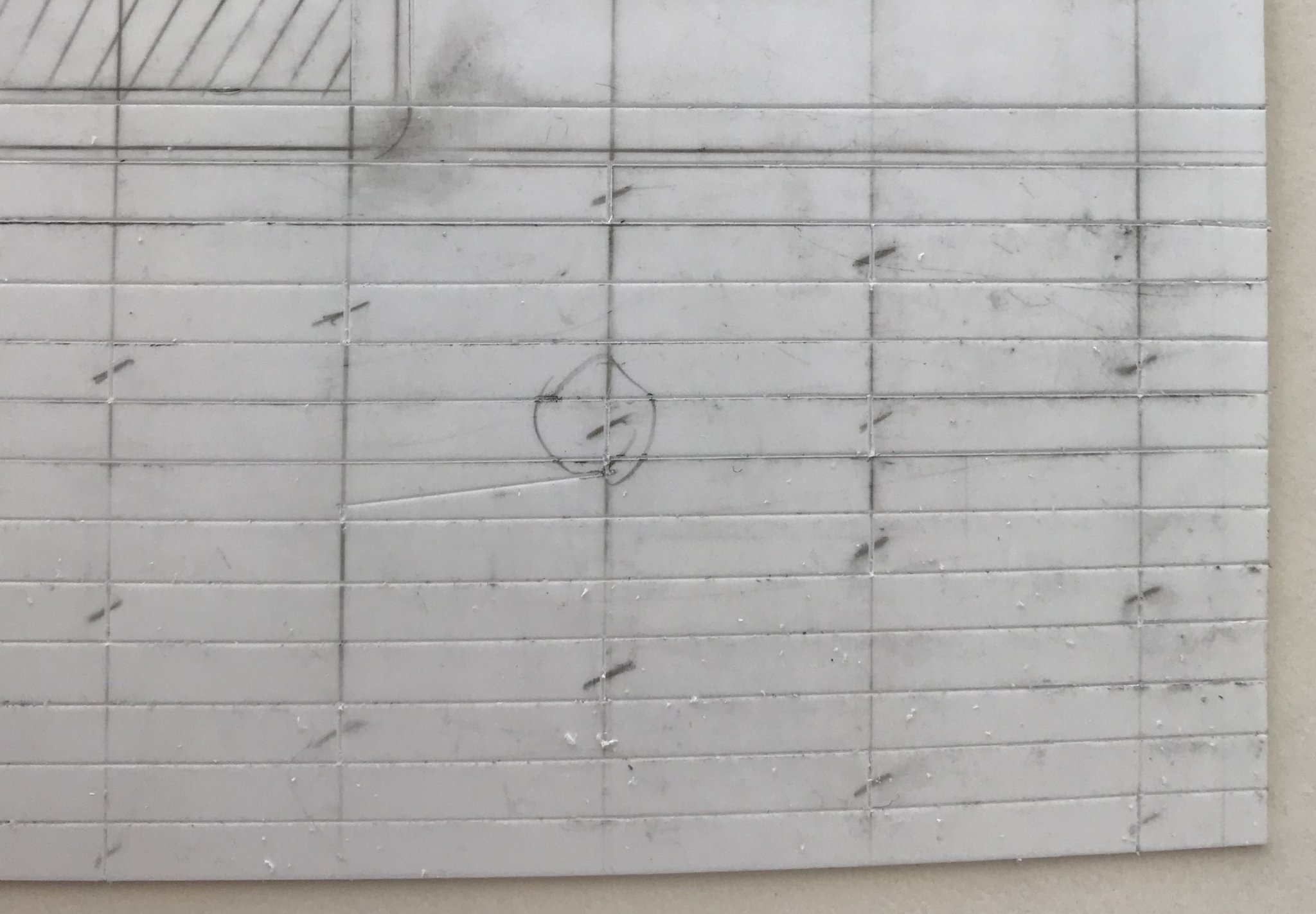
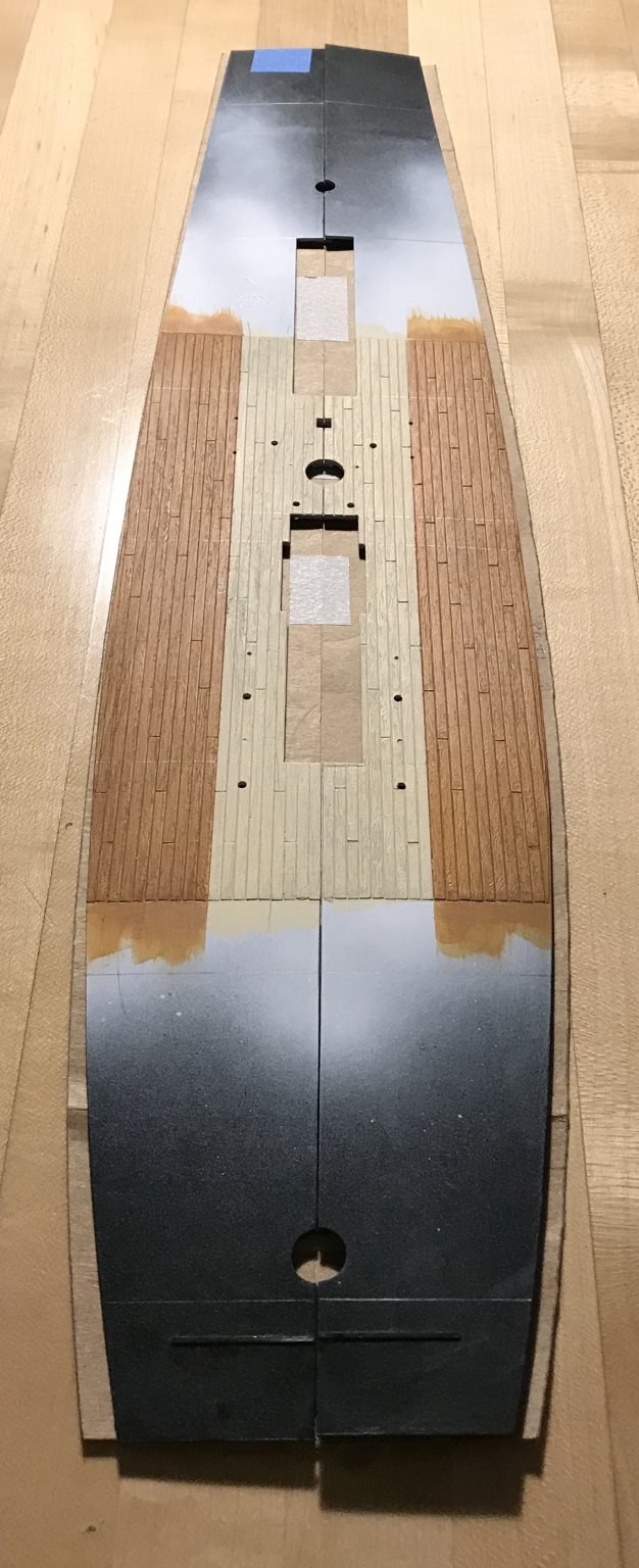
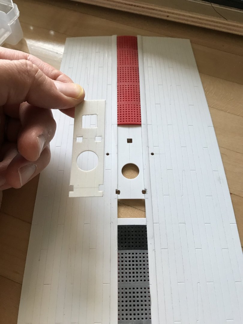
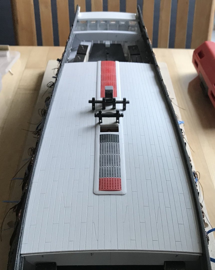
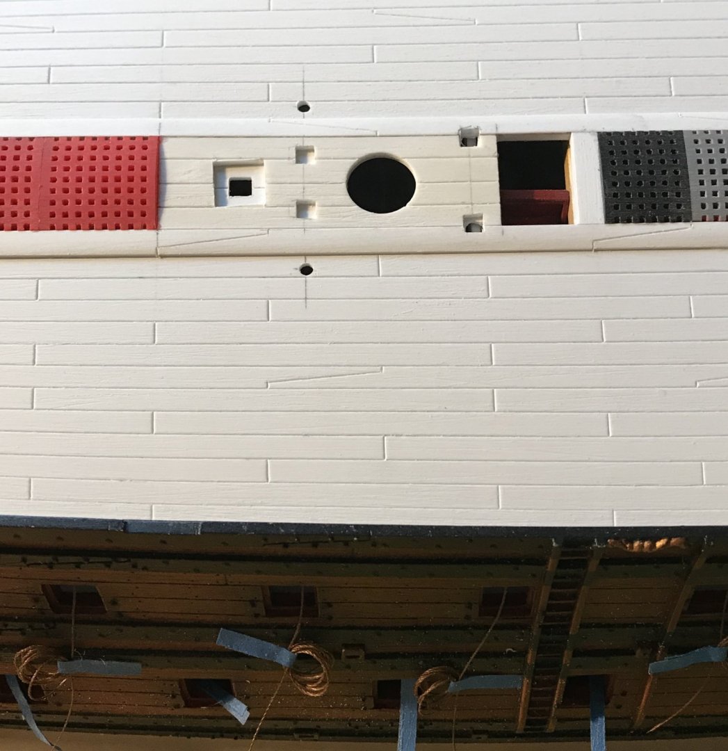
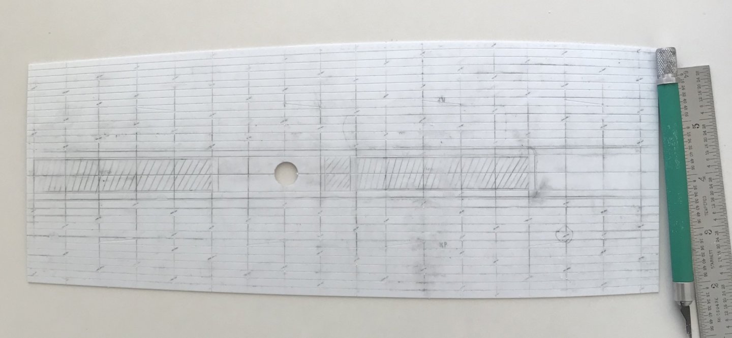
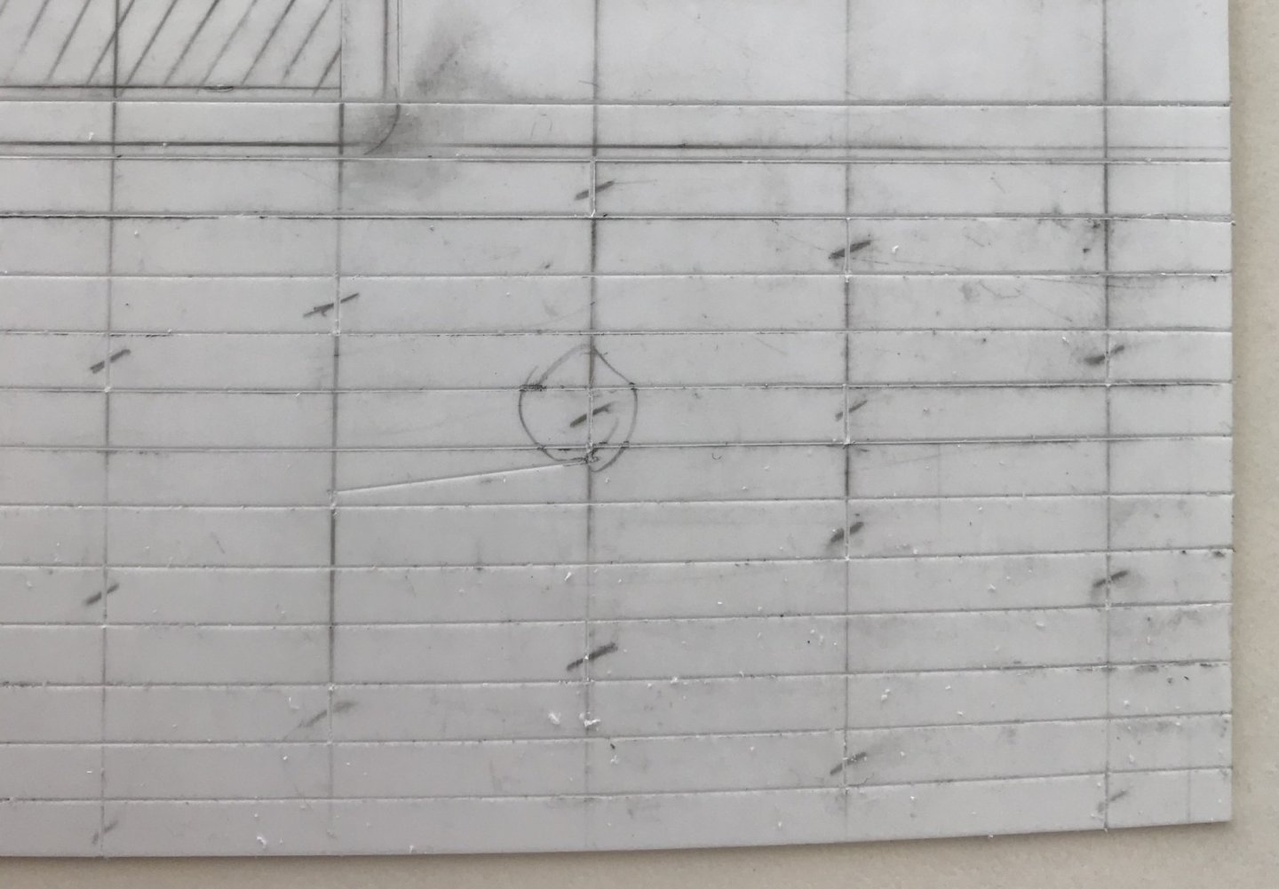
Main deck engraving is complete. With the way the plank lines faired out, the extra port plank really won’t be noticeable at all because the narrowed ends will be covered over by the quarter and f’ocsle decks: What I really enjoyed about this particular scratch-built portion of the project is that arriving at a deck layout requires you to think like a shipwright. Although I may not be laying planks individually, my shift pattern still has to make sense. As will increasingly become the case, I took my cues from Lemineur’s St. Philippe, and I arranged for two belts of five planks each; five between the coamings and the binding strakes, and five from the binding strakes to the bulwarks. The coamings and binding strakes consist of scarfed planks of 30’ scale feet, and the regular plank is scaled to lengths of 24’. Please note that the coamings are not yet in place because they will be applied a few steps from now. My objective was to stagger the scarf joints, among the coamings and binding strakes, so that no two scarfs landed on the same beam. I then chose to go with a three-plank shift of butts for the regular planking. That worked out neatly because the pattern repeats on the fifth plank. The deck is still messy with graphite, and the engraved butts may not be so easily apparent, but they are indicated by hash marks: My objective with the regular planking was to not have a plank butt land right next to a scarf butt. I began with the port side and this was not an issue. Then, I laid out the starboard side. I checked and re-checked the shift pattern to make sure it was correct. To note: the second belt of five planks was layed-out so that the first plank was the continuation from the fifth plank of the first belt. All seemed well, until I started engraving butts, from fore to aft. That’s when I noticed this problem (circled): While this layout error did not occur on the port side, it seemed to me that I couldn’t leave this mistake. I decided to shift that one butt - that lands in the same place at every binding strake scarf - one beam forward. I’ll fill this first one with putty, but you can see that I already engraved the corrected butt, to the right. While this disrupts my shift pattern, ever so slightly, only the most astute rivet-counter would ever notice. On the other hand, a plank butt directly adjacent to a scarf butt would jump out at anyone looking with moderate intensity. Perhaps the wiser layout would have been to mirror one whole side to the other, but what’s done is done. It’s a correction that I can live with. Next, I’ll sand the deck with 50 grit paper. I think that my earlier deck samples could have been improved if the texturing of the deck had been more aggressive; the deeper scratches will catch more of the Van Dyke Brown, and grey distress wash. Following the sanding, I will build up the coamings, gratings and main mast plate. Lastly, I will drill the deck for trunnel impressions, and then mount the knight heads before painting. Happy Fathers’ Day to all!

- 2,699 replies
-
- 8
-
-
- heller
- soleil royal
- (and 9 more)
-
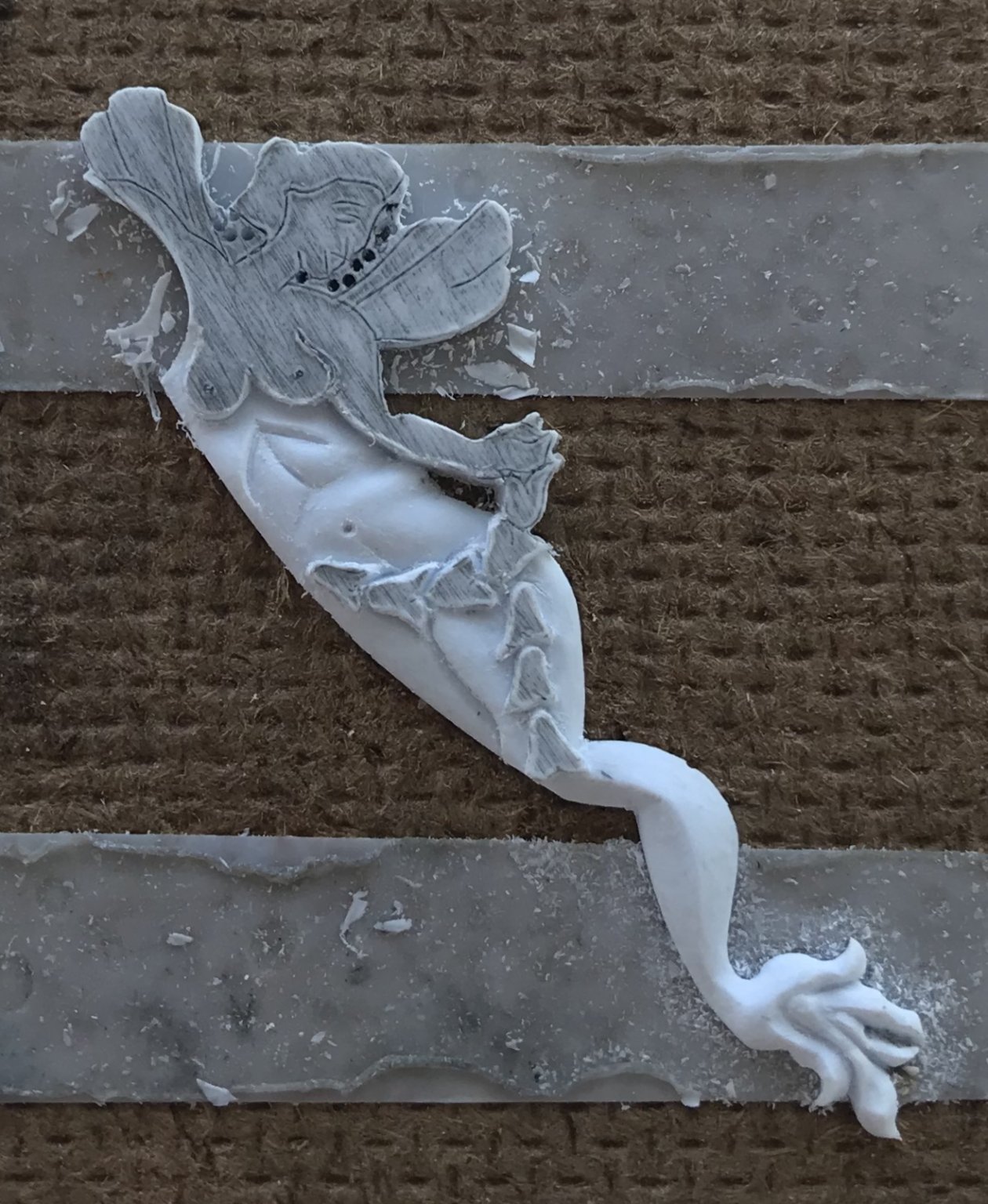
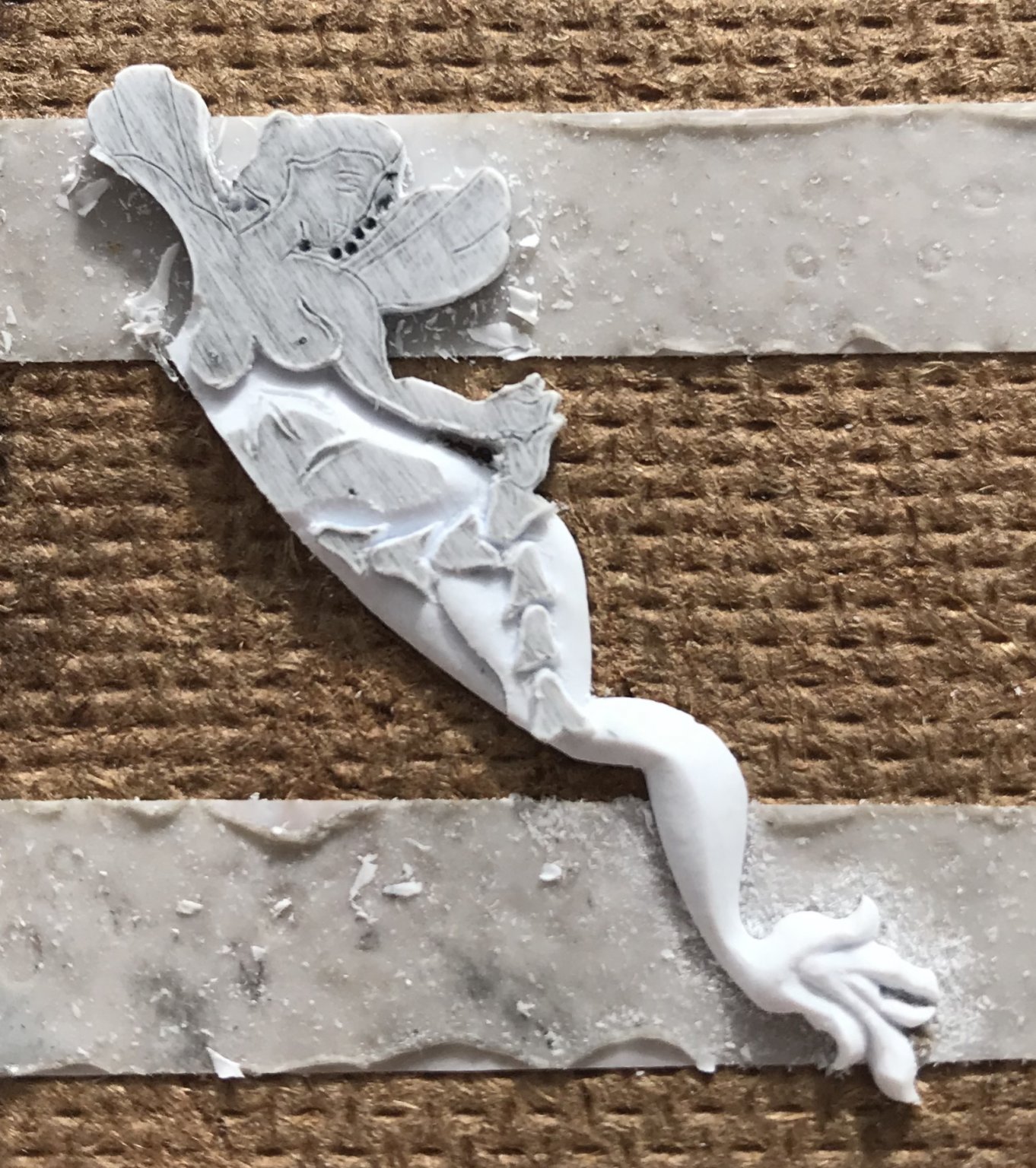
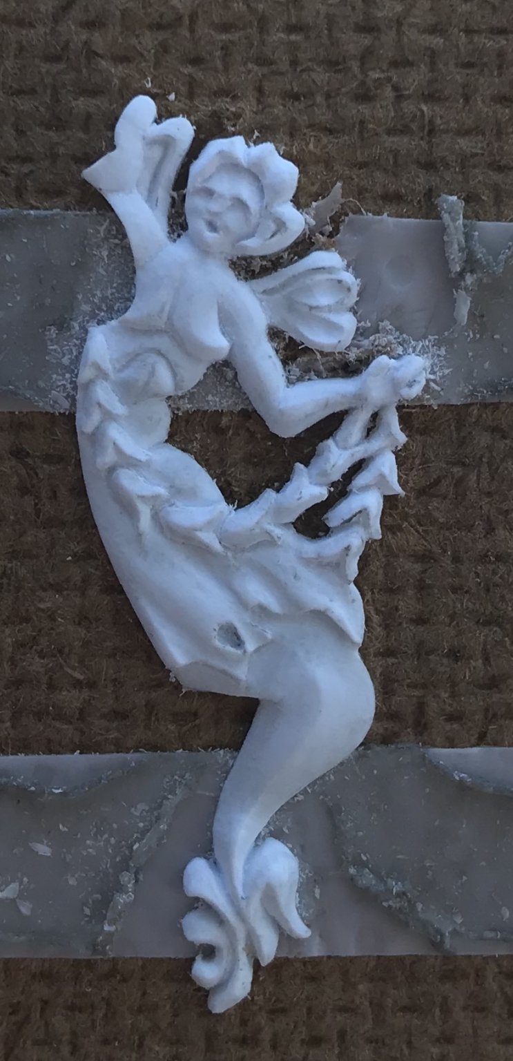
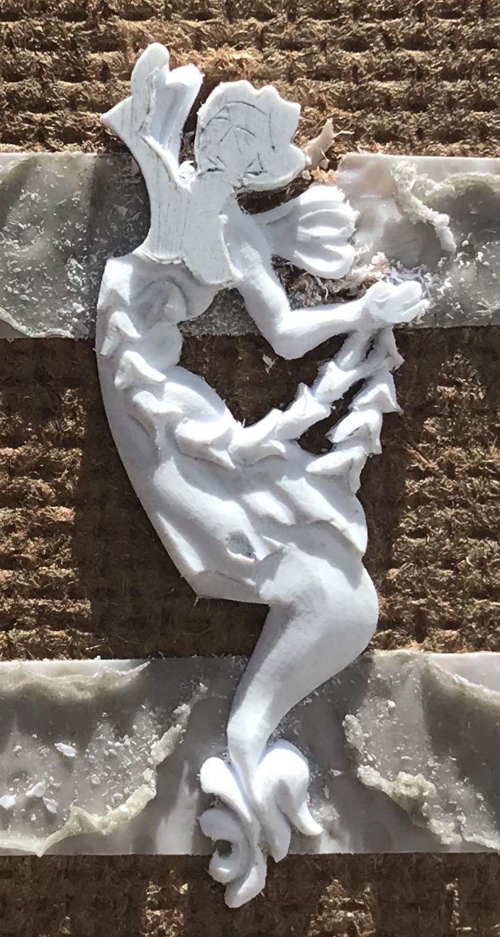
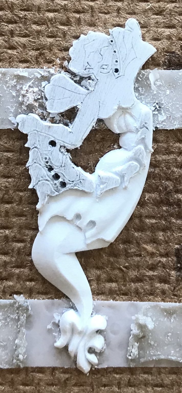
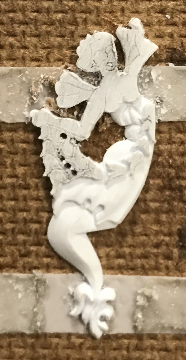
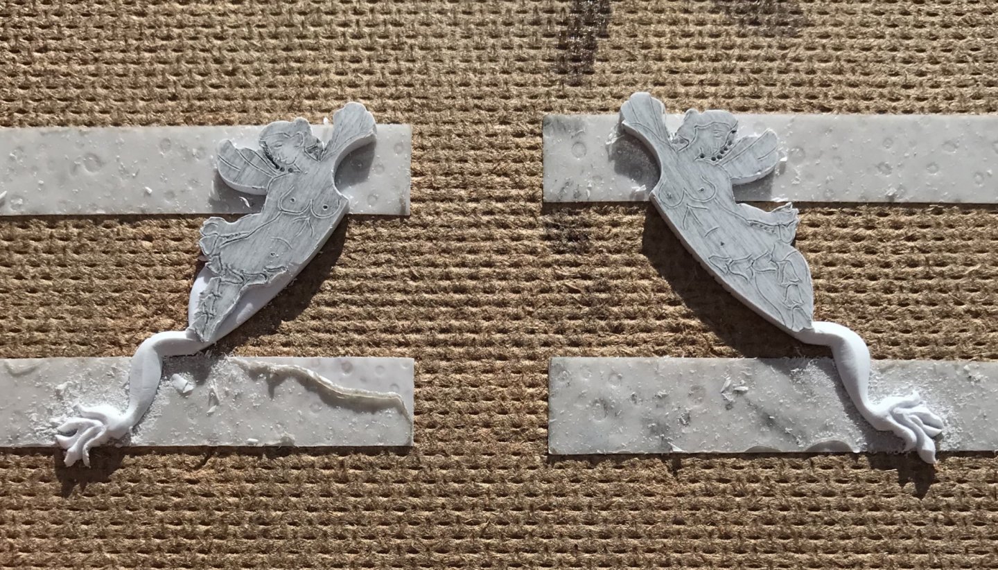
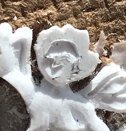
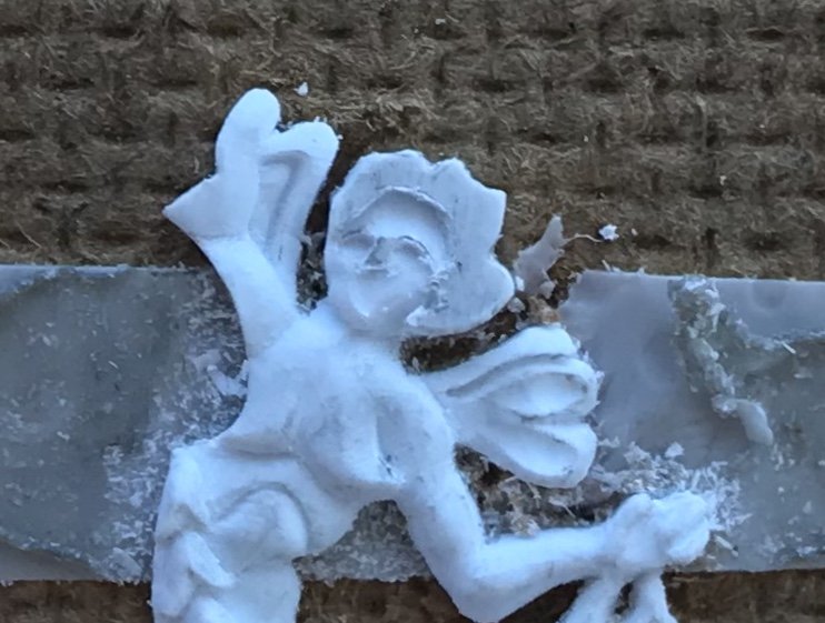
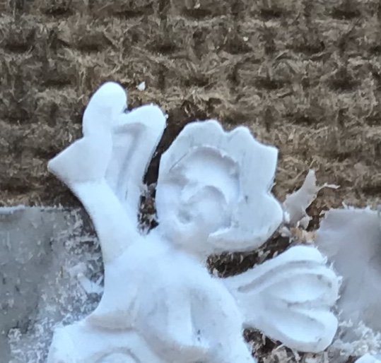
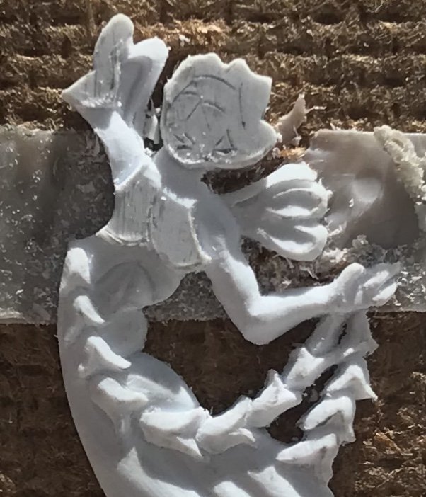
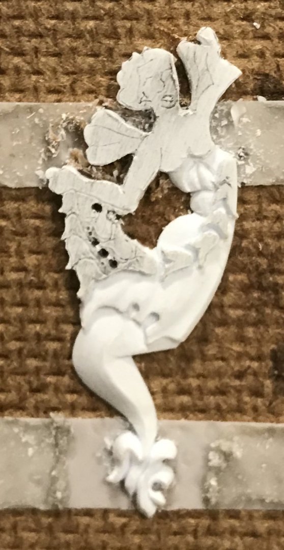
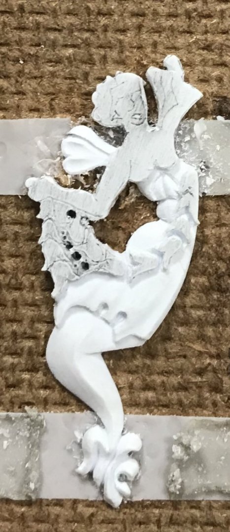
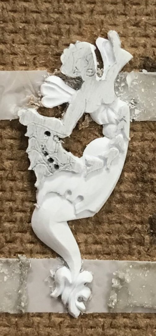
Finally - the head! In observing Druxey’s excellent carved works for his Speedwell project, these past few days, it dawned on me that definition of the brow and position of the nose were the key determinants for getting started. I began by digging down around the hairline, first with score cuts of the EXACTO, followed by pairing slices of the BEEBE. The idea is to approach at a steep enough angle that you creep towards the previously scribed brow line. Keep in mind that this head is just about the size of a pencil eraser head: Once the hairline had been cut deeply enough, and I was satisfied with the rough slope of the forehead, I cut to the line beneath the left brow and down the nose line, setting it in relief. Again, in-between light scoring cuts, I use the BEEBE - this time with a scraping motion - to clear waste and to begin contouring the face around the eye socket. It bears mentioning that I never intended to represent the roundness of the eye, itself. I then cut beneath the right brow, scraped waste and began contouring the cheek area with scraping cuts. At this stage, I started to worry that I was sculpting the MerAngel of Death, and that maybe I should have her holding a scythe, because her facial features began to seem skeletal. When the carving becomes discouraging, like this, the best thing to do is take a breath and evaluate. After leaving it for an hour, I came back and determined that now was a good time to rough in the mouth because its presence would cue me toward how and where to shape the cheeks and chin: As I’ve drawn it, the mouth is just a soft diamond shape. It is achieved with four angled, stab cuts of the EXACTO, that converge at the bottom of the cut. I, then, use the heal of the EXACTO to dig out the waste and extend the corners of the mouth. Although, in the above picture, you can see that I also began to contour the nose, I think it is evident that the simple addition of the mouth animates the face. From there, it was a simple, but deliberative process of defining recesses and hollows around the cheeks and chin until the face appeared more cherubic than Skellator. There does come a point, though, where one has to stop before they risk un-doing all that they worked so hard to arrive at. I found that point, and so I shifted my focus to shaping the coif: defined parts of the hair, rounds and hollows. it doesn’t take much to suggest the movement and shape of hair. The completed figure: I’m not 100% satisfied with the nose, but I have at least five more faces, like this, to carve for the ship, so I think I will get better at it, as I go. Although the difference is very, very slight, you may notice that the bust profile has changed a little. A friend on the site PM’d me to offer a gentle critique. His thought was that, perhaps as I first shaped the one full breast, the end was a little too severe. I agreed with him and attempted to soften the very end of the breast, and make it a little more natural looking. To some degree, the prior shaping of the breast limits modification, at this stage, but I do think this is a little bit better. I want to say that I appreciate the courage it sometimes takes to offer constructive criticism - particularly when it involves matters of artistic interpretation, and most especially when it involves anatomy. We live in our bodies, full time, yet it has become increasingly difficult to talk about them without fear of offense. Anyway, I appreciated that. So, I will complete the second carving, and then I will immediately begin the other pair of MerAngels that flank the forward edge of the quarter gallery amortisment. I have figured out what I need to modify, on these figures, so that I don’t have to eliminate my aft-most octagonal port. It is best to launch right into more figures because the mode of seeing and thinking that it requires is now active in my mind. If I really have the stamina left, after that, I may even carve the pair of bow angels. It may be better to wait on them, though, to see exactly how all of the elements of the head come together. In other news, I have completed my main deck layout and begun engraving the plank seams. Now that I can see the entire layout, I really am not that bothered by the extra plank+, on the port side. I remembered that there’s a plank companionway, above the waist guns, that bridges the forecastle and quarter decks. I also enlarged the main mast hole, in the main deck just enough so that I could plumb the mast perfectly. The mast plate, between the coamings, will be a tight fit and will secure the plumb position of the mast. Onward and upward! Thanks for looking in.

- 2,699 replies
-
- 12
-
-
- heller
- soleil royal
- (and 9 more)
-
Hey Dan - great tip, and very clearly explained. Yes, that would definitely do the trick. I’ll add “coamings” to my internal spellcheck. Hope all is well with you. All the best, Marc
- 2,699 replies
-
- 1
-
-
- heller
- soleil royal
- (and 9 more)
-
Aha! Well, that may explain why I couldn’t find a help topic, if I was calling the timber by the wrong name 🤦🏼♂️ Yes, the binding strakes, that are half-notched into the beams. Before any engraving happens, I’ll draw everything out - maybe I’ll do a double-pencil line thickness on one side, just to see.
- 2,699 replies
-
- 2
-
-
- heller
- soleil royal
- (and 9 more)
-
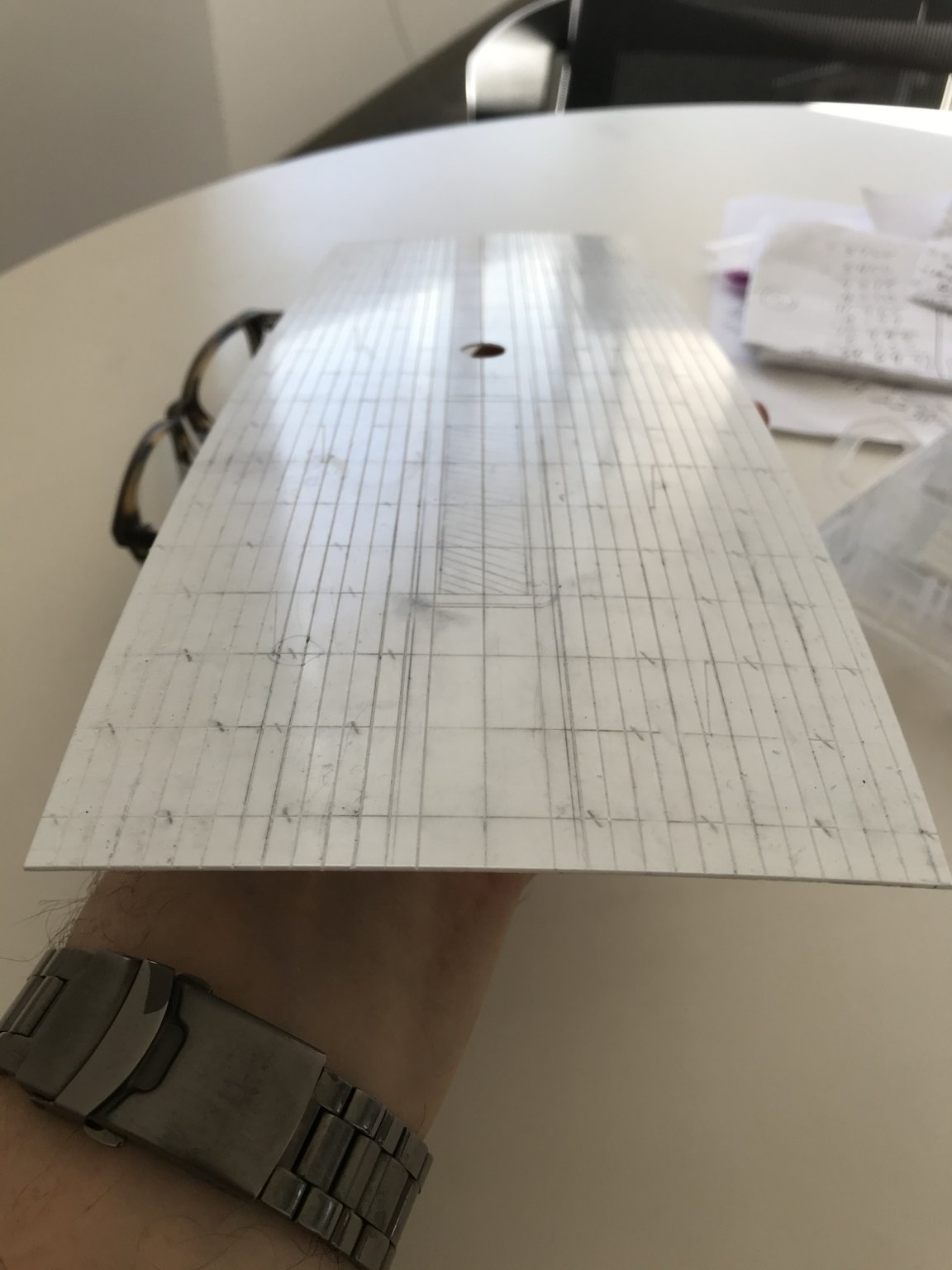
I was having the hardest time figuring out how to lay out this fore and aft tapered deck. I was stuck on the difficulty of representing the second king plank, between the central combings and the bulwarks; sure, I can divide each beam location equally, starting at the greatest breadth, by a given number of strakes - but, how do I consistently account for the slightly wider king plank, in the midst of all of that? I could not find any subject headings in the help sections of either MSW or SOS. I was just about to cop-out and layout a parallel-straked deck of uniform width planks, when it dawned on me to begin by simply laying out uniformly tapered planks. First I divided the port and starboard sides into two uniform belts. I further divided each belt into thirds; this simple exercise in sub-division made it so much easier to reliably tick-off equal plank widths over increasingly narrow spans. I then applied medium tack double-stick tape to a styrene batten that I could lightly tap onto each tick mark, and then nudge into a fair curve: Having gotten this far, I can see that the belts are fair and uniform from starboard to port, which allows me to further subdivide each belt into two planks, each. The deck is becoming a mess of graphite, but that won’t matter as long as the lines remain distinct long enough to get past the engraving process. There are a few considerations, here, worth mentioning. My initial determination for the width of the hatch-combing king plank was not wide enough to account for the increased scale of my, now, wider deck. A too-narrow hatch combing would have necessitated subsequent plank divisions that would be too narrow, and numerous; more like the deck of an Iowa Class battleship. That is the difficulty of this project. I began by increasing the width, at the stem, by a generous 5/8”, so that I could increase the width at the stern, enough for the missing sixth light. The effect these alterations had on the mid-ship breadth of the hull, however, distort the reality of what should be; my hull is significantly broader than it should be. Fortunately, in my opinion, this improves her appearance as a steady gun platform, but it does arbitrarily affect other issues of scale, like the deck planking, which then have to be finessed for visual effect. As I’ve said before: comme-ci, comme-ca - somewhere, in-between will be this model’s reality. As things stand, now, I will have 12 strakes to either side of the combings. This isn’t exactly right, or to perfect scale, but it will look okay and the upgrade of a tapered deck validates the compromise. Because of the A-symmetry issue, there will be an extra strake+, on the port side, but as I said earlier - the busyness of the guns will mitigate the appearance of that defect. Before I go nuts with the cutouts, and engraving of plank lines/butts, and the build-up of the hatches, etc, I will pierce for the main mast and make absolutely sure that my functional center line is where I think it should be; if that’s off, then the whole layout has to be scrapped. Assuming that all works out, I suspect that I can cheat a little and emphasize the second king plank by simply engraving just to the outside of the lines, where the king plank should be. This will, ever so slightly decrease the width of the adjacent planks, but maybe it won’t be so noticeable. Alternatively, I could engrave directly on my lines, but include the scarf joinery that would be present on the king planks to signal their presence. If anyone has any references as to how to properly go about all of this, I would love to know - at the very least, for future projects. Little by little, we are getting there. Thank you all for your support and for following this project.
- 2,699 replies
-
- 4
-
-
- heller
- soleil royal
- (and 9 more)
-
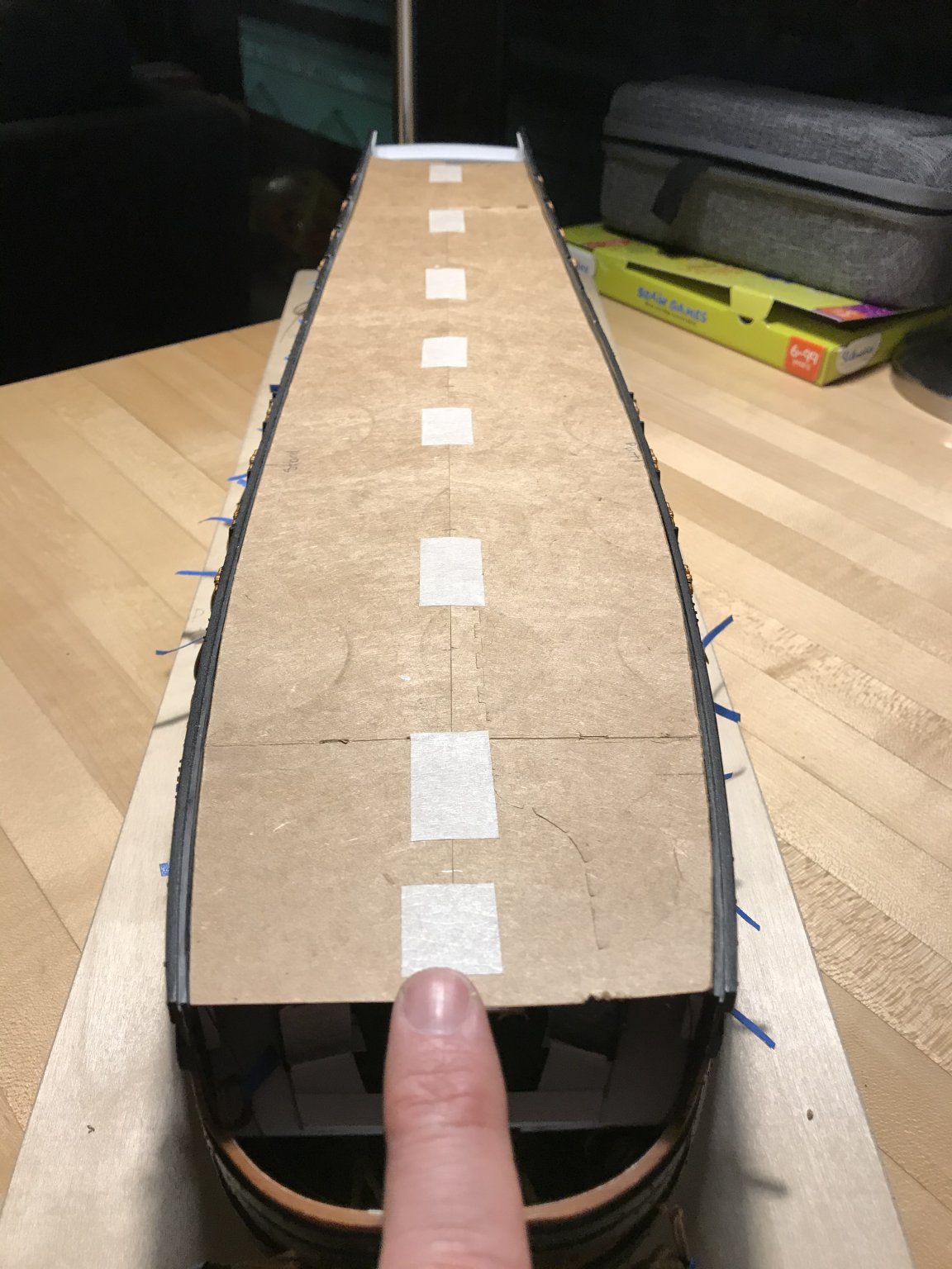
I’ve been designing the main deck and taking my cues from Lemineur’s St. Philippe monograph. The beam locations are taken and extrapolated from the junction of the hatches: The hatch-marked areas are the cut-outs for the hatches and companionway. To either side of the hatches will be the central pair of king planks, which are marked out. The hatch combing will be contiguous with the central king planks, but with radius’d corners at the forward end of the main hatch, where they will drop down to the main deck level. The main mast will have a mast plate that is flush with the combing framing. I’ll cut the opening in the base deck layer a little loose, so that I can make a final plumb on the main mast, which I found to be a little out of plumb, at the mid-deck level. The hashed line, on the port side, is the symmetrical outline of the starboard side; I needed to use the flatter side as my baseline for laying out the tapered fore/aft planking. The trick is figuring out the plank tapering while accommodating the second pair of king planks, with five strakes of regular planks, in-between. I haven’t figured out, just yet, how to lay all of that out. For tonight, though, I’m satisfied with my progress.

- 2,699 replies
-
- 10
-
-
- heller
- soleil royal
- (and 9 more)
-
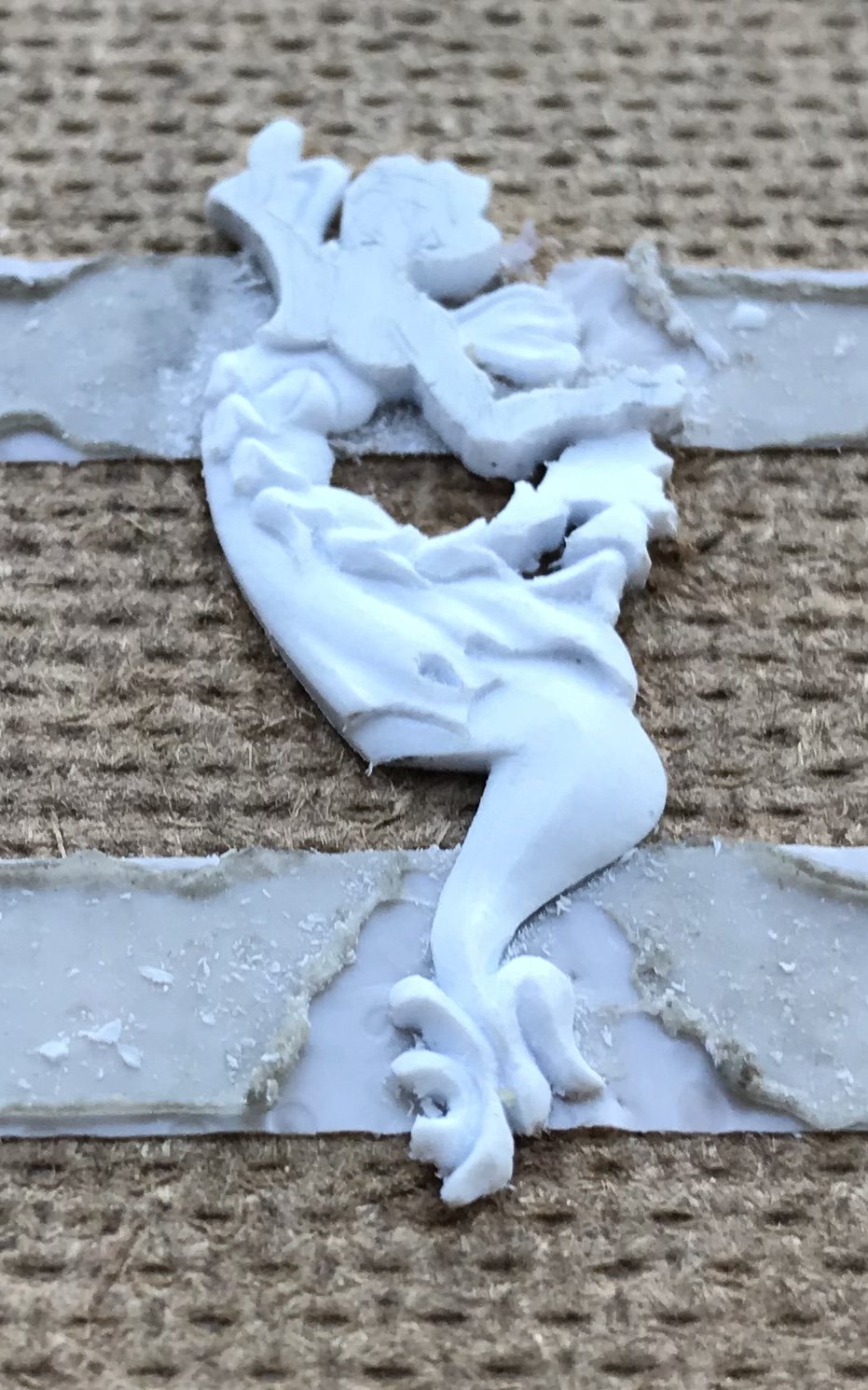
The chest and arms: The forearm and hand were tricky. I had to do some delicate re-shaping of the forearm because the way I cut it in, initially, looked a little squiggly. As for the hand, there’s at least the suggestion of a thumb and clenched fingers. At this scale, that’s plenty good enough. The other arm is ill-defined, but the conceit is that most of the arm is tucked behind the crown ornament. Well, we are almost there! I’ll catch up on the other side, and then I’ll tackle the face.


- 2,699 replies
-
- 12
-
-
- heller
- soleil royal
- (and 9 more)
-
My guess as to the low rail, above the sorting pens Is that this rail has something to do with helping to break, or open the net into the pens. Just a guess, though. I’m still reading through the log, and it is just brilliant work!
-
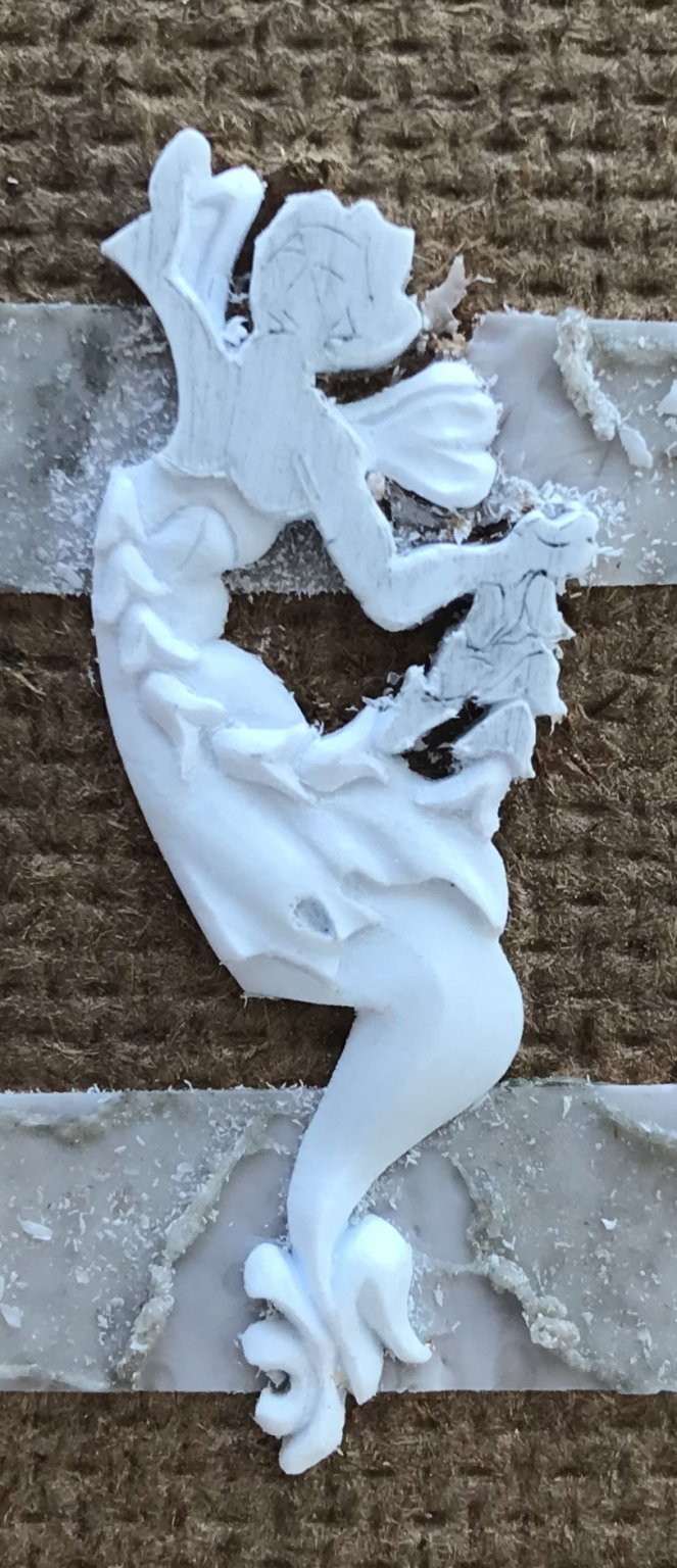
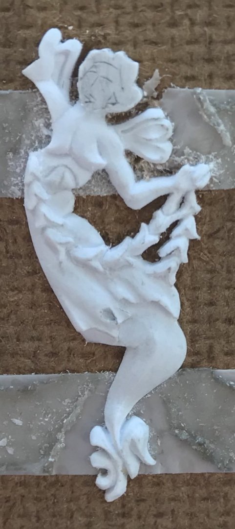
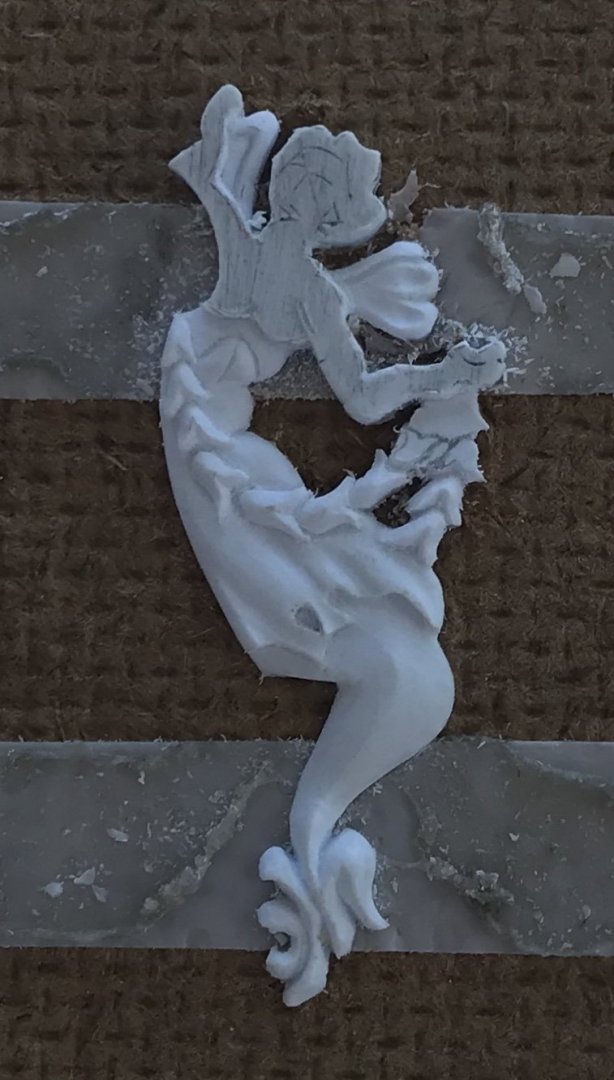
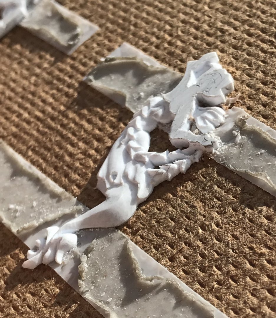
Yeah, I have to say, Vic, that the Tally Ho project has my full TV attention, these days - so good! Just a quick montage of the garland. So far, I have found this to be one of the most enjoyable segments of the carving. Bellflowers look difficult to do, but you really only need the EXACTO and the hooked knife. The whole process is digging-in, paring and scraping as described, before. Once the outlines of the flowers were really clear (digging-in and paring cuts with the BEEBE), I’d begin by parting the bell-bottom of each flower with a flaring bevel. Then, it’s a simple matter of scraping the outer bevel all around the bell-curve. What you are aiming for is to pare the points down closer to the ground, while leaving the top of each bell as the high point: At the outset, I was a little bothered by the separation between bell flowers. As the modeling progressed, however, this seemed less glaring. In the end, because everything is so small, it becomes more an impression of the form: At this point - where the bellflowers separate from the body, it is necessary to taper-down the remaining garland so that the hand and arm finish as higher elements: Once you have reduced the thickness of the remaining garland, here, it becomes much easier to dig-in (with the EXACTO and the tip of the BEEBE), and define the remaining bells, which become very small: A little bit of pencil sketching helps you to define these shapes. Having solved these problems, the starboard side is proceeding much more swiftly. Thank you for your interest!


- 2,699 replies
-
- 9
-
-
- heller
- soleil royal
- (and 9 more)
-
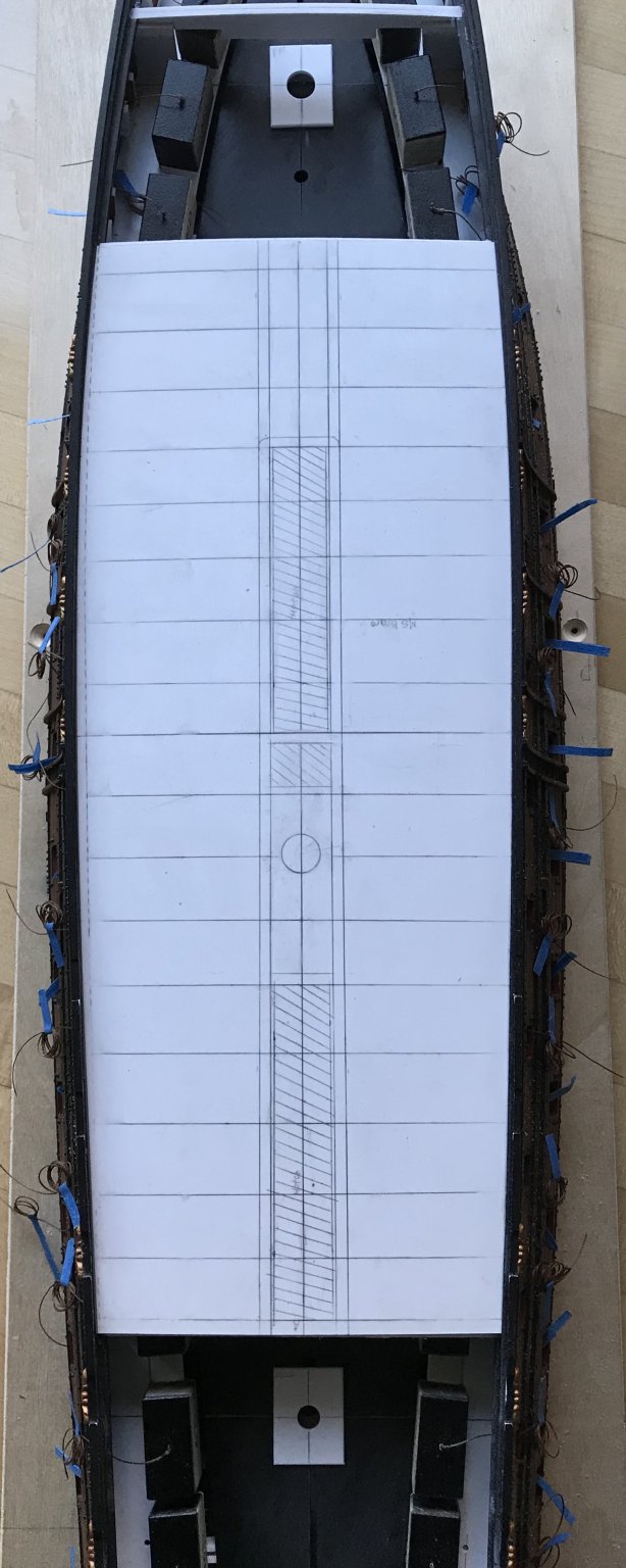
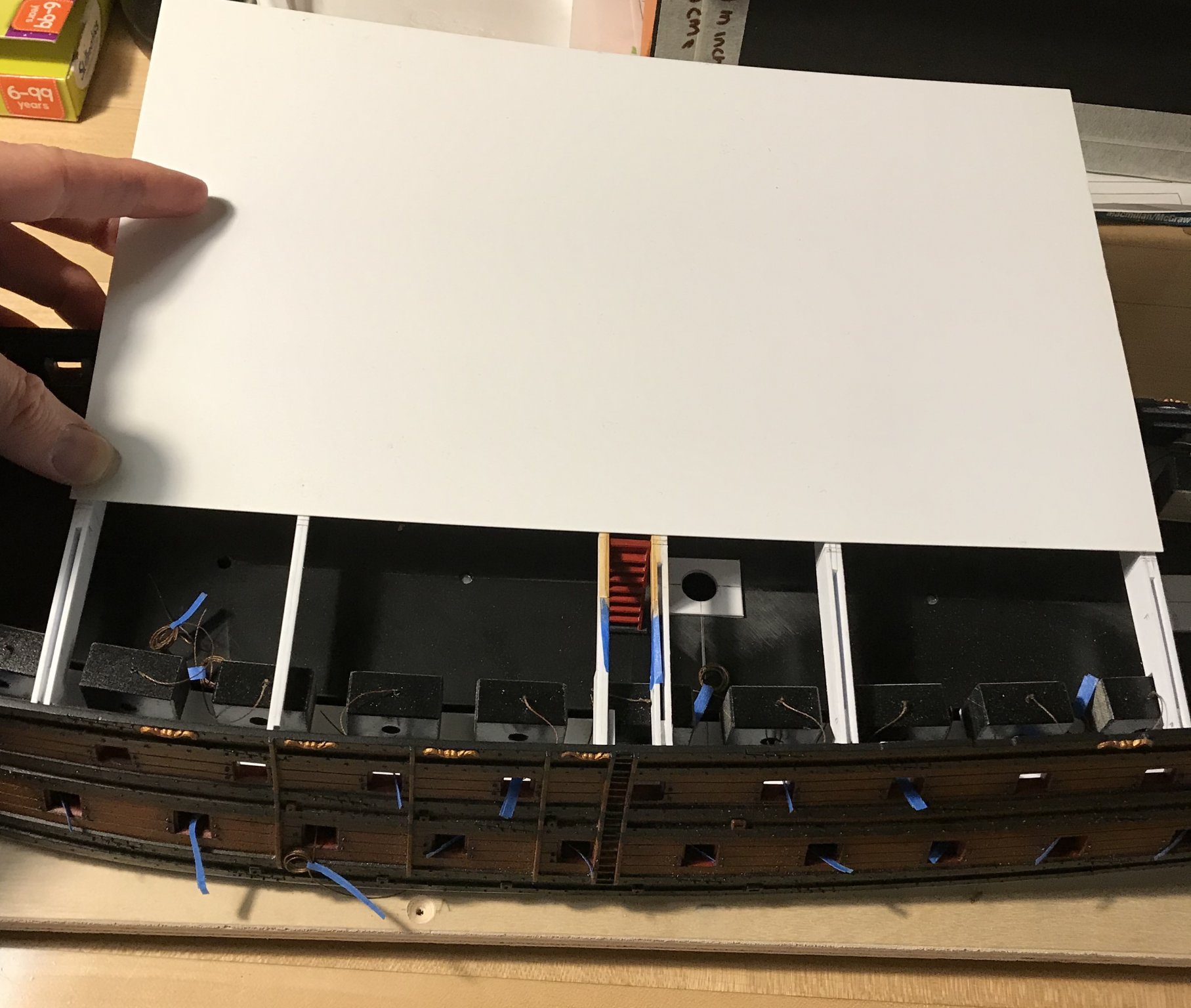
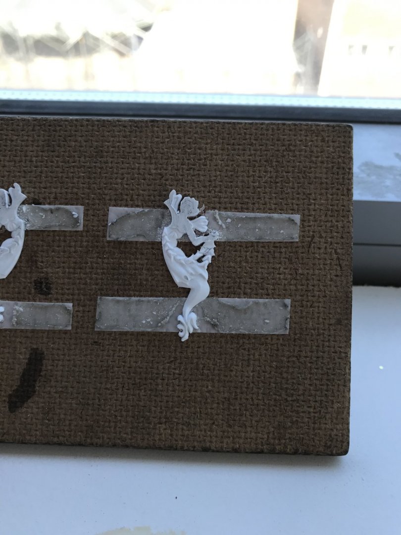
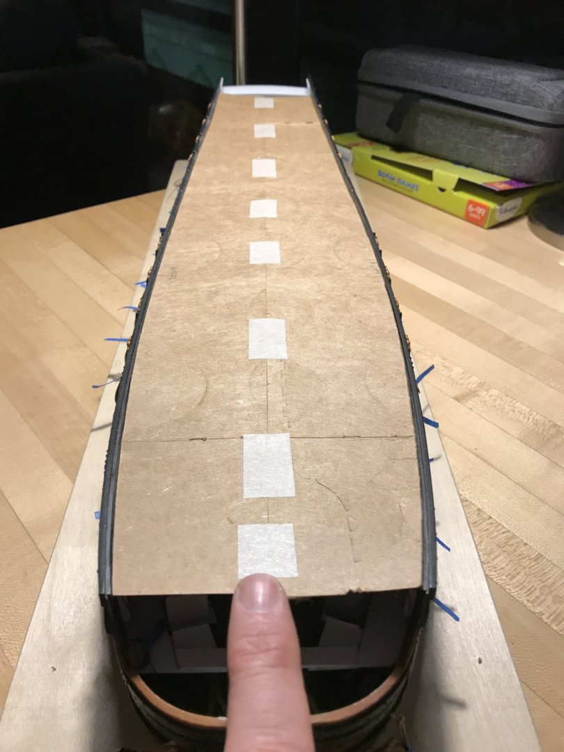
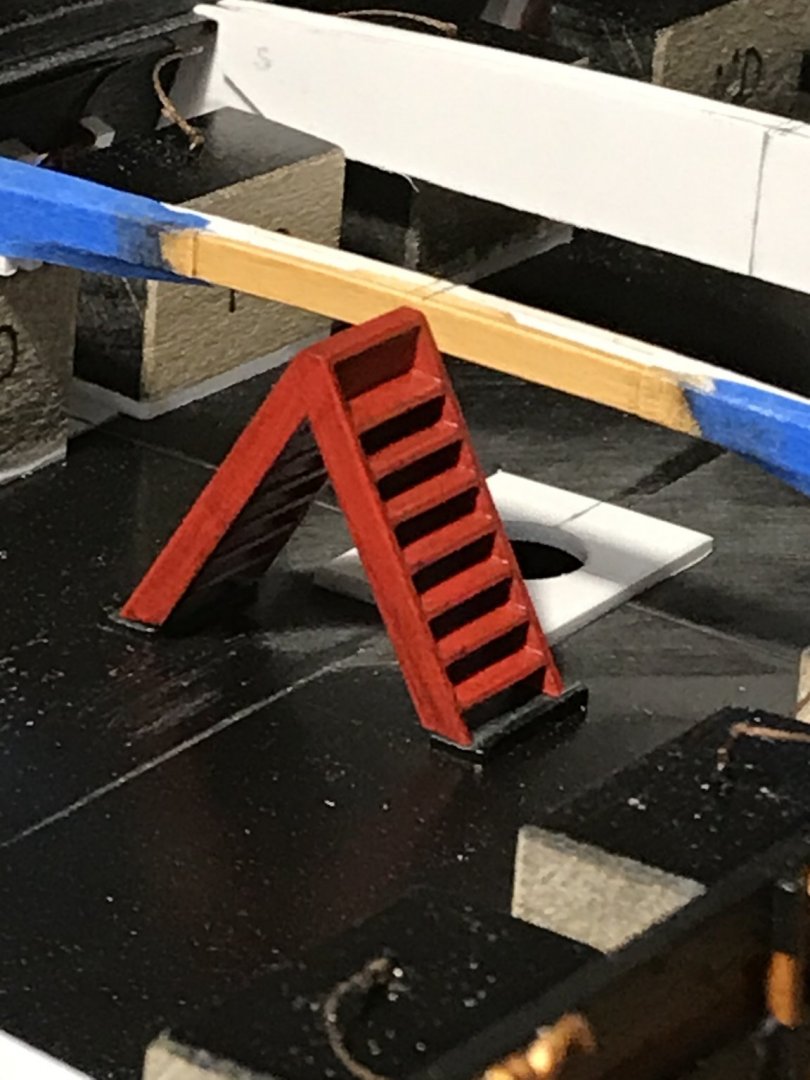
Most of the main deck beams are in. I’m still doing a little paint work on the side beams that frame the main deck companionway. As you can see, the ladders are painted and grunged-up with the walnut ink. I’ve applied the Van Dyke Brown oil over the tan base-coat of the beams. I wanted to give it a few days before applying a wipe-coat of grey wash. Once that’s all set, I’ll glue these pieces in and fair the beam tops. I’ve made a tight-fitting card template for the new main deck, that accounts for the differences between the port and starboard sides, as they relate to the functional centerline: When the kit’s stock decking overlays my template, you can see just how far off the starboard side really is: In the end, as long as it all looks like it fits together seamlessly, these a-symmetries won’t really matter. I will most likely make the main deck up in three segments of 1/32” styrene sheet. I’ll have to check where, exactly, the forecastle breaks, but the standard sheet length falls just beyond what should be two good beam locations: In other works, I’ve caught up on the second Mer-Angel carving and will resume work on the garland today. I desperately needed to hone the tools after all of that scraping. Also of related, but peripheral interest is this English boatbuilder that someone posted a link to on S.O.S.: He has a whole series of videos of him dismantling and re-constructing this 1910 pilot cutter. He manages to impart very clear explanations of function, structure, fastening and approach in an engaging way. His skill as a woodworker and boat-builder are very high, and his ingenuity in managing to safely move around such large timbers and structures is truly fascinating. If you want to better understand the fabric of wooden boats, and stave away the boredom of Pandemic, then this series is for you! Be well 😀

- 2,699 replies
-
- 7
-
-
- heller
- soleil royal
- (and 9 more)
-
You are absolutely correct, EJ - the plastic is much more forgiving for that reason, and also because you can can cut out and replace a portion of a carving, should you mess up. I’m hopeful that I will get the heads right, on these carvings, but if I screw up, I’ll just send them to the guillotine! Then, I’ll Franken-splice new heads onto their bodies; a little putty and paint and none are the wiser.
- 2,699 replies
-
- 9
-
-
- heller
- soleil royal
- (and 9 more)
-
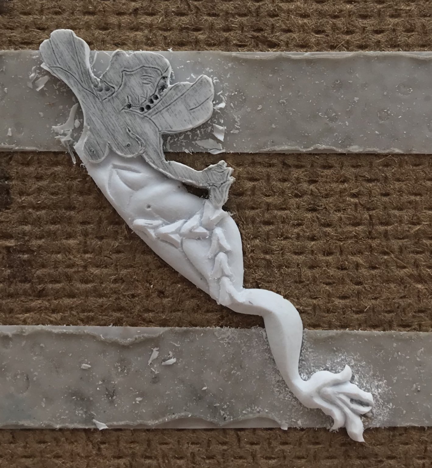
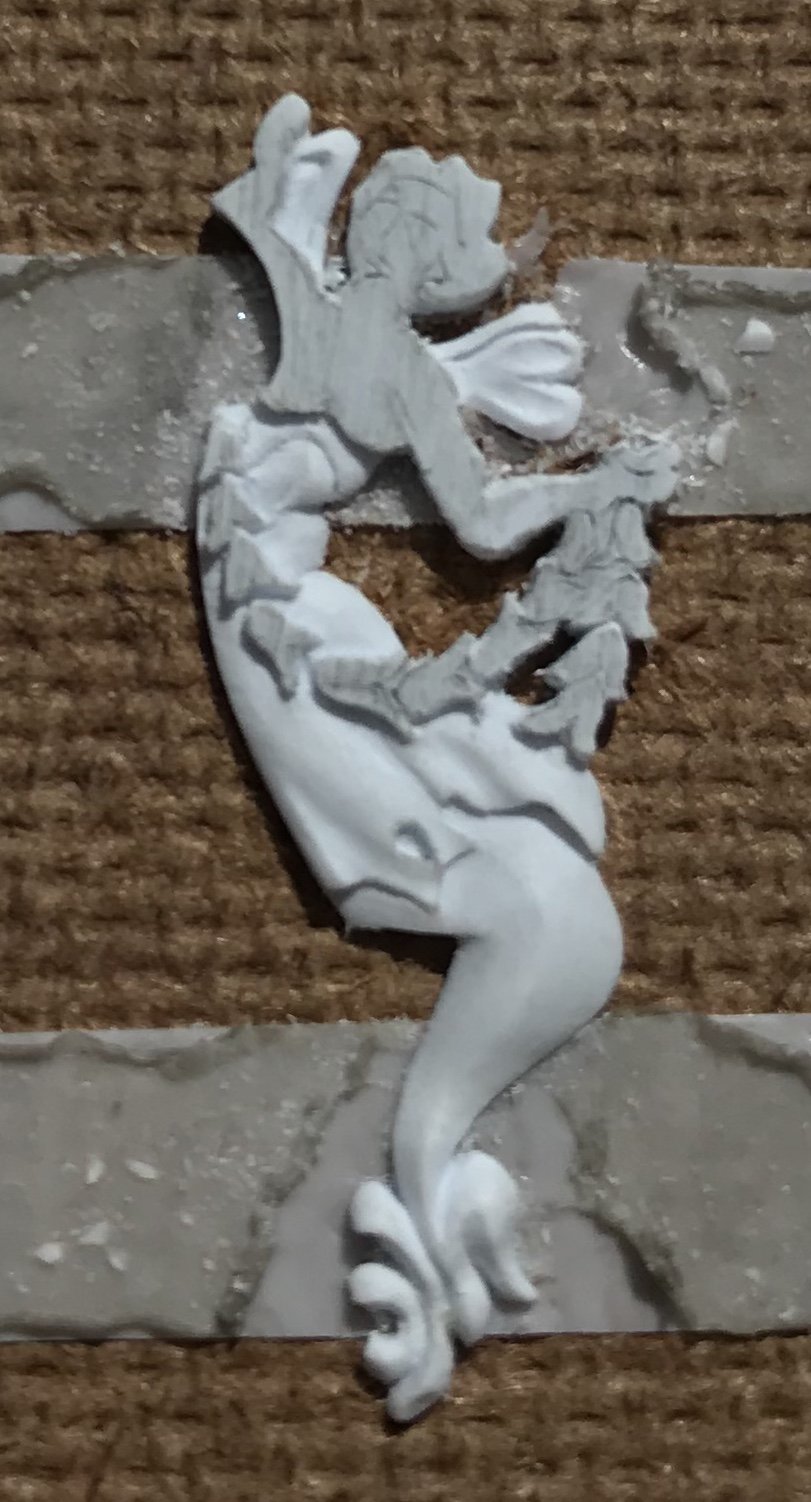
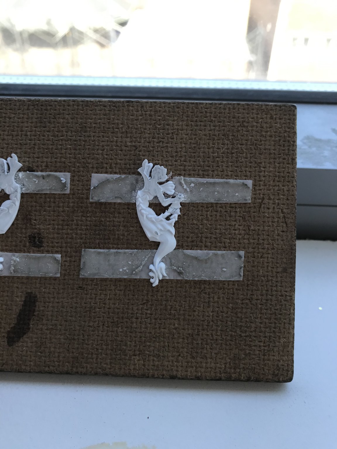
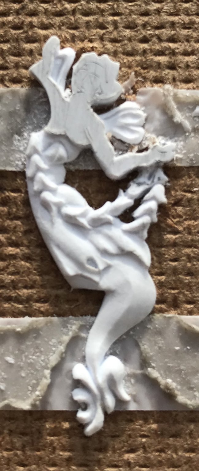
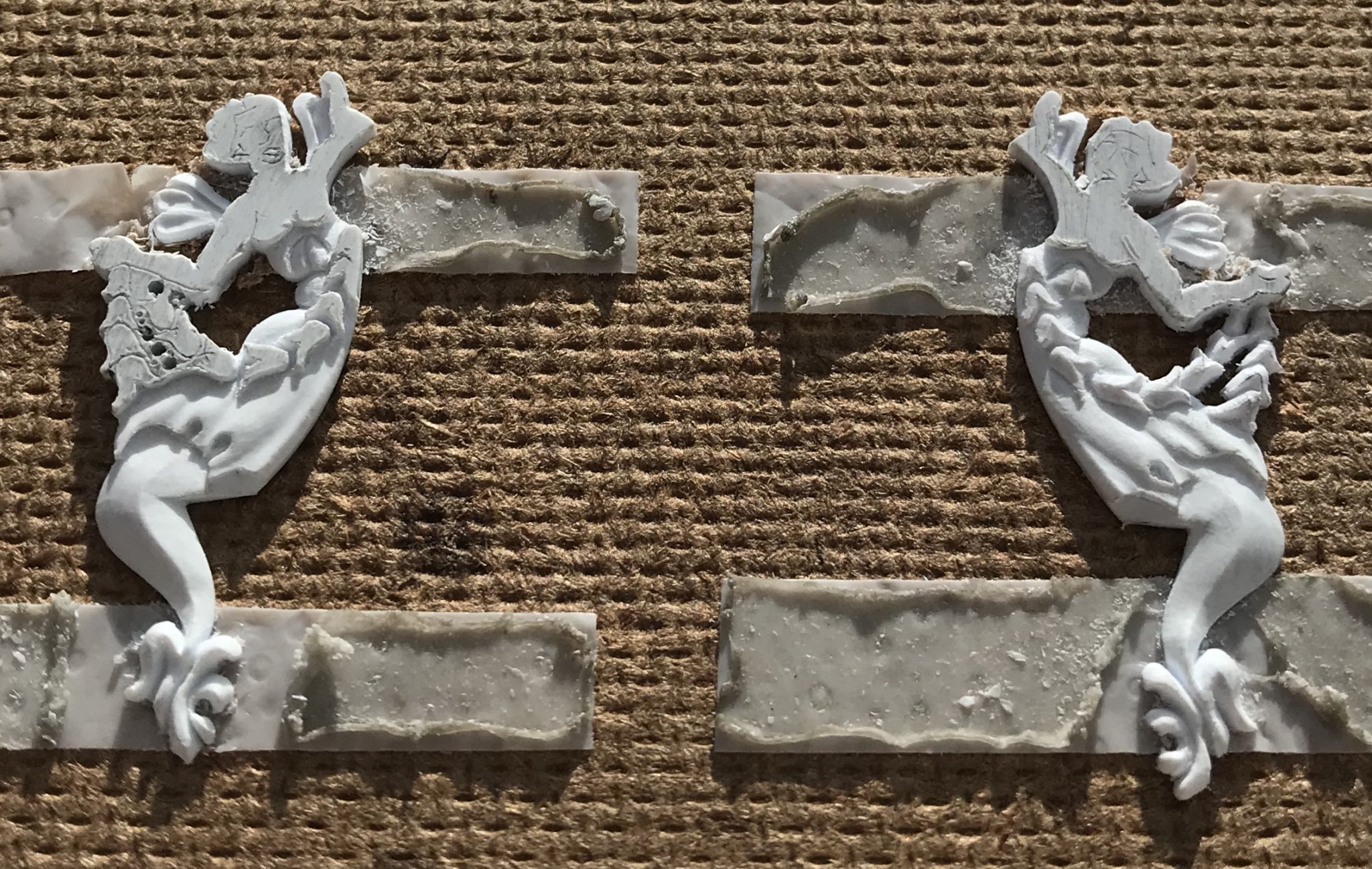
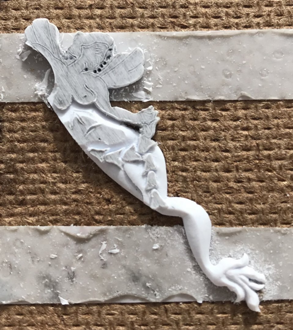
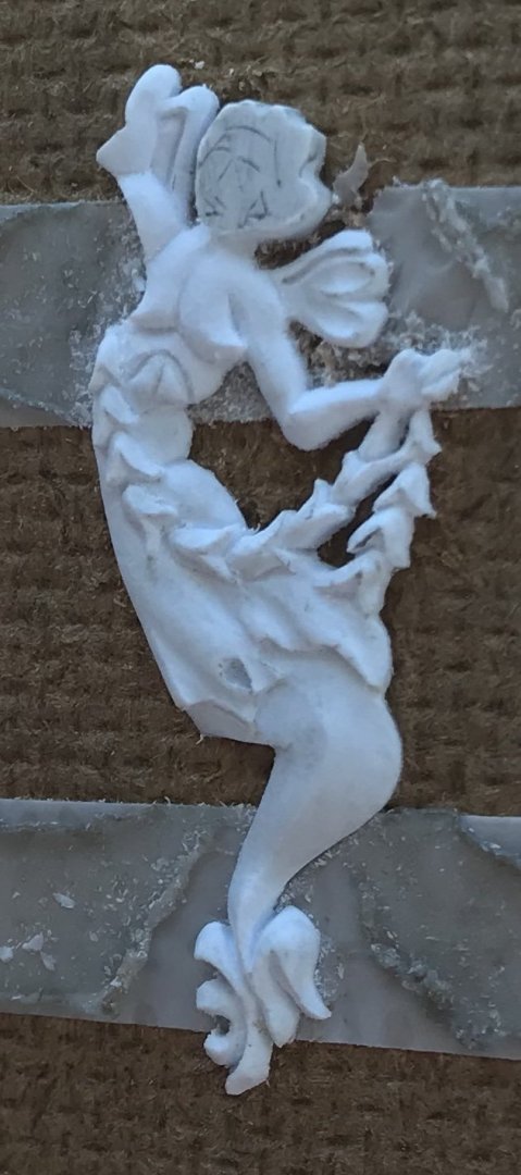
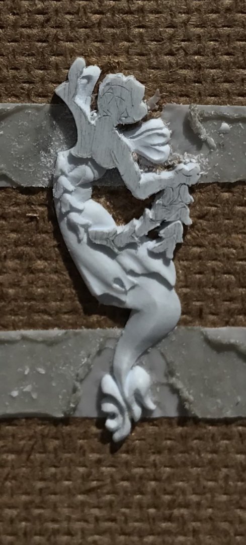
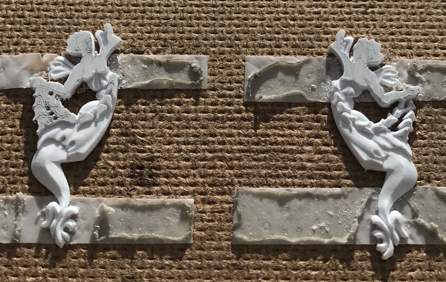
Of the remaining elements to carve, the wings are set the furthest back. I decided that now was the best time to create a clean separation between the head and wings. Certainly, drilling into these areas with the smallest bits I have makes it easier to clear the waste. Initially, I use the heal of my EXACTO blade to drag backwards and connect the drill holes. There are no substitutes, here, for care and patience. Eventually, you will dig a channel deep and wide enough to come in with the tip of your hooked knife to make forward-pushing, shaving cuts until you get to the lines. From there, it’s a process of reducing the wing thickness to slightly less than half the blank thickness, closest to the body. Doing so, enabled me to model a rising, folding shape to the wing surface. From there, I used my veiner to cut two small coves, and I finished by cutting-in a line that demarcates the leading edge of the wing. This last is achieved, first with scoring cuts of the EXACTO, and then finished with dragging scrapes of the EXACTO heal. It should be noted that in a few places, my drill bits wandered a little into the design. At this stage where all the other waste Is removed, and the element is modeled, one can then pare away any remaining traces of the wasting process, so long as doing so doesn’t result in jagged lines or unbalanced looking elements. Finally, it was a simple matter of repeating the process on the other side of the head. As most of the wing is hidden by the arm, the process was greatly simplified. Next up - the garland. Thank you for the likes and for looking in!

- 2,699 replies
-
- 9
-
-
- heller
- soleil royal
- (and 9 more)
-
That planking job is outstanding, EJ! Your skills improve exponentially with each build!
-
Well, Mark, I rarely have any good Scotch in the house, as that habit would quickly become very expensive. When I do, I really love sherry cask finished Glenmorangie Lasanta. Mostly, though, I keep what I like to call maintenance Scotch blends like Dewars in the house, that are highly drinkable, not overly expensive, and equally inspirational. Also - never underestimate a good Irish whiskey! There are many affordable labels to choose from. Thank you, Henry! This project simply would not be happening without your help. Your hull and part donations made the hull expansion possible, as well as the improvement of many common fittings like the hatches. I sometimes wonder whether I could have cast resin bow and stern extensions from my own hull. I am skeptical that I could have made the bow work out so seamlessly because I still had to heat bend the bow extension pieces to match the hull curvature. I do not think this would be possible with resin. Also, the bond between the resin and plastic would be strictly mechanical, and I would be skeptical of the long-term prospects for the model. So, while I will certainly never be doing this again, I wouldn’t be doing it at all without your generosity, Henry. As for the time it takes to make all of the carvings, I often have significant pockets of downtime in my day that would not otherwise be wasted, but which I use to work on things like this. This is when I am freshest and best able to really concentrate. If all of the ornamental work had to happen in the evenings, I would probably still be constructing the frieze, and likely considering giving up on the project because the progress would be agonizingly too slow. As things stand, I am quite happy with the pace of the project, since I only really began constructing the model this past September. To finish the carvings, Vic, they get a final once-over scraping to remove any ridges, and then I brush them with a stiff bristle toothbrush to get rid of the fuzzies. Also, interestingly, Marc Yeu makes his own purpose specific carving tools for his Soleil Royal project. Clearly, his results are extraordinary, and the tools he makes are very clever. Other than moulding scrapers (thanks, Dan!), this plastic model doesn’t require too much specialized tooling. SR 1670 in wood, however, will challenge me to make a set of piano wire chisels and gouges.
- 2,699 replies
-
- 2
-
-
- heller
- soleil royal
- (and 9 more)
-
Thank you both very much! I will definitely be taking that approach when I have a chance to work in a larger scale. That will be when - despite our means to accommodate it, I begin my true MAGNUM OPUS of the fully framed, 1670 Soleil Royal in 1:48 scale or bigger!! - and, my first wife divorces me... And, then, I will need the big, loving eyes of Soleil Royal’s lady/hippocampus figurehead to carry me through to the glorious completion of the project. I can see those eyes now; gilded orbs of trust and un-relenting support. Passion knows no bounds! Neither does Scotch.
- 2,699 replies
-
- 5
-
-
- heller
- soleil royal
- (and 9 more)