Hubac's Historian
-
Posts
3,308 -
Joined
-
Last visited
Content Type
Profiles
Forums
Gallery
Events
Everything posted by Hubac's Historian
-
 Alright, so I just got home from my daughter’s rousing talent show performance of Hamilton. A pleasant diversion, if ever there was one. Of course I couldn’t resist taking a few measurements, once I was home. Taking a closer look, at the main deck level, the stern is actually 3/32” out of square. When you add the upper bulwarks, this grows to 5/32” at the tafferal. Visually, if you did not know this was the case, it would not jump out at you. Holding a straight edge across the span, then yes, it becomes somewhat apparent. It isn’t terrible, though, and the gentle arc of the round-up should help conceal this problem. It kind of is what it is, at this point. The fact that I am making all of the visible decks from scratch also helps things, a bit. I would love to know whether the stock kit is similarly out of square. While it’s true that I flattened the aft edges of the stock lower hull, so that I could add extensions, I doubt that I was so careless as to completely change the rake of the stern, from one side to the other. And I know that the extension pieces were perfectly parallel. Anyway, it will all work out just fine, I think.
- 2,699 replies
-
- 5
-

-
- heller
- soleil royal
- (and 9 more)
-
As ever, thank you all for the likes and looking in. Backer, I’d gladly take one of you over 10 able-bodied shipwrights! That approach, Druxey, would be highly feasible if the sheer of the stern didn’t rise above that level. The trouble is that trimming back from zero to an eighth, at the main deck level, would necessitate an even more extreme trimming back of the upper bulwarks, as well. When all is said and done, I may have trimmed from zero to over a 1/4”, and I really can’t afford to lose that real estate on the upper bulwarks, which were extended, at the outset, in order to accommodate the new quarter gallery. There is a lot going on up there. My hope is that the stern, at the height of the tafferal, won’t appear visibly out of square. The good news is that I only have one wrapping balcony to deal with, at this level, where the discrepancy is not noticeable. We’ll see - it may come down to a little theater trickery to minimize perception of error. Hopefully, not. Although, if I really want to kill my own buzz, I suppose I could hold 6” Starretts up to the aft edges of the lower hull, and read them like winding sticks - just to see how much trouble lays ahead. Let’s take a vote - should I ruin my weekend before it starts, or bury my head until Monday?
- 2,699 replies
-
- 6
-
-
- heller
- soleil royal
- (and 9 more)
-
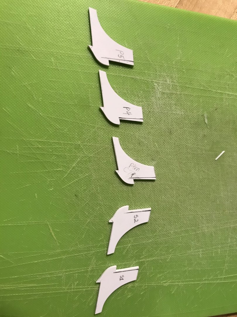
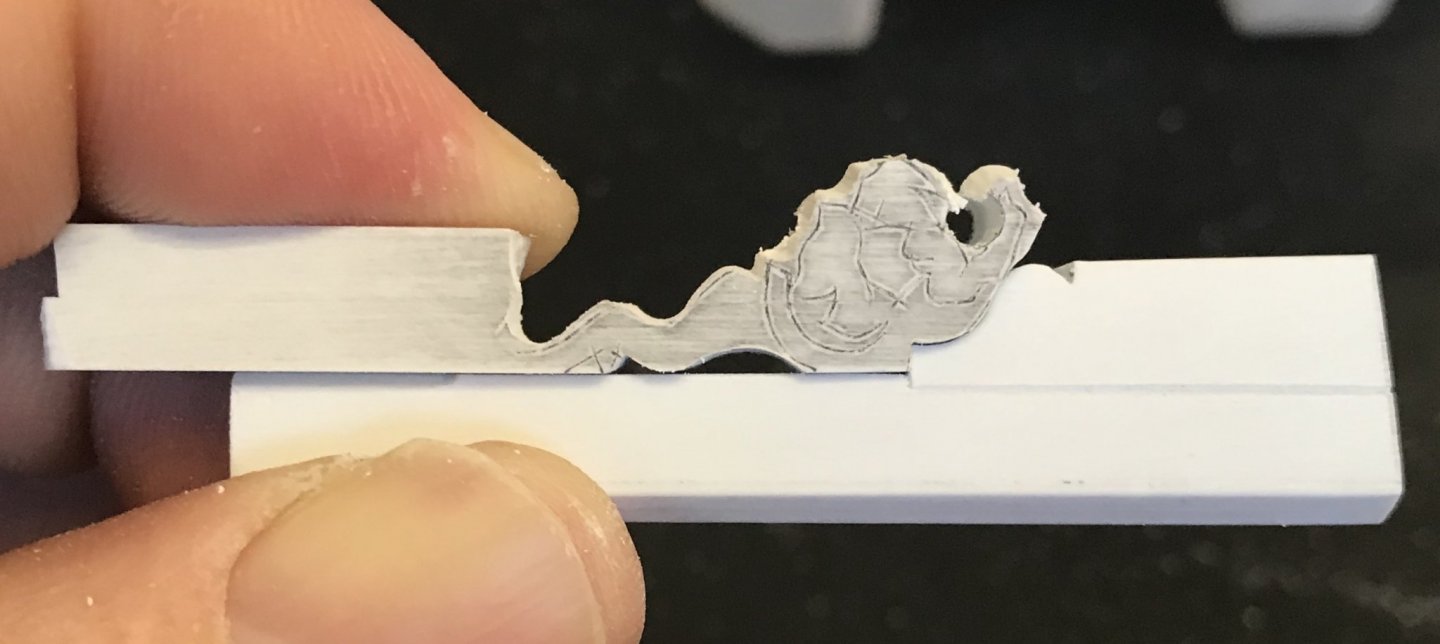
After finally resolving the fairness of my bulkheads, I made ready to install them. Taking a lesson from the prior two levels, on this go-round I decided to glue in opposing indexing tabs for each bulkhead, prior to installation. Each tab (excepting the center bulkhead) is beveled to accommodate the angle of the bulkhead. I took this precaution because the specific placement of the bulkheads is now of critical importance; they must remain as close to center of the pilasters, as possible, so that I will still have room on the interior to glue-in retaining strips for the window glasses. I could also, now, fix the position of the jaumier ornament. Before doing so, I glued a backer to the head for the counter plank-ends to land on. In the picture above, I have glued-in the head to the framing of the stern counter, along the centerline of the ship, and cross-checking to make sure I was centered on my window plate. The starboard side covering board, that abuts this ornament is being fitted. I’ve deliberately filed a small bevel where the covering board joins the face because every succeeding layer of planking and moulding will be similarly beveled in order to create a sense that the ornament is set into the stern counter. Now, with both covering boards installed, and their edges faired, I could proceed with the risky business of letting the acanthus scrolls into the transom planking. Again, the reason for doing this - as opposed to simply surface mounting the scrolls - is that I really wanted to reduce (by half) the gap between the scroll volutes and the head. This is a calculated gamble that I will be able to dress the front face of the covering boards sufficiently with moulding, in order to create a seamless transition. After much checking and re-checking for position, the initial excavation did not look promising: Because of the way that this last transom plank fays into the transverse bulkhead, it was not initially clear to me whether I had broken through the plank to get to the bulkhead. To be clear - I wanted to break through, because the bulkhead is my mounting surface. I wasn’t sure weather to keep digging, or to stop and fair the bottom of my mortise. Just a little further, though, and I saw daylight. With a lot of careful inletting, I eventually arrived at my cleaned-up mortises: And, here are the scrolls glued-in, from a variety of angles: In hindsight, I kind of wish that I had glued some material to the backside of the acanthus scrolls, so that I could have created a more rounded relief, but such as it is, the carving will do just fine.


- 2,699 replies
-
- 14
-
-
- heller
- soleil royal
- (and 9 more)
-
A fitting finish to the fine foundation you set for him, Kevin. Thank you for posting these great pics!
-
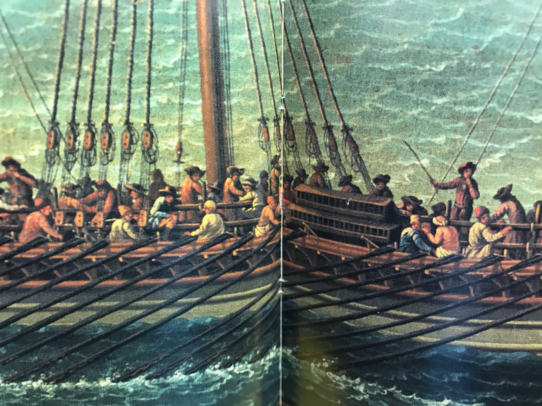
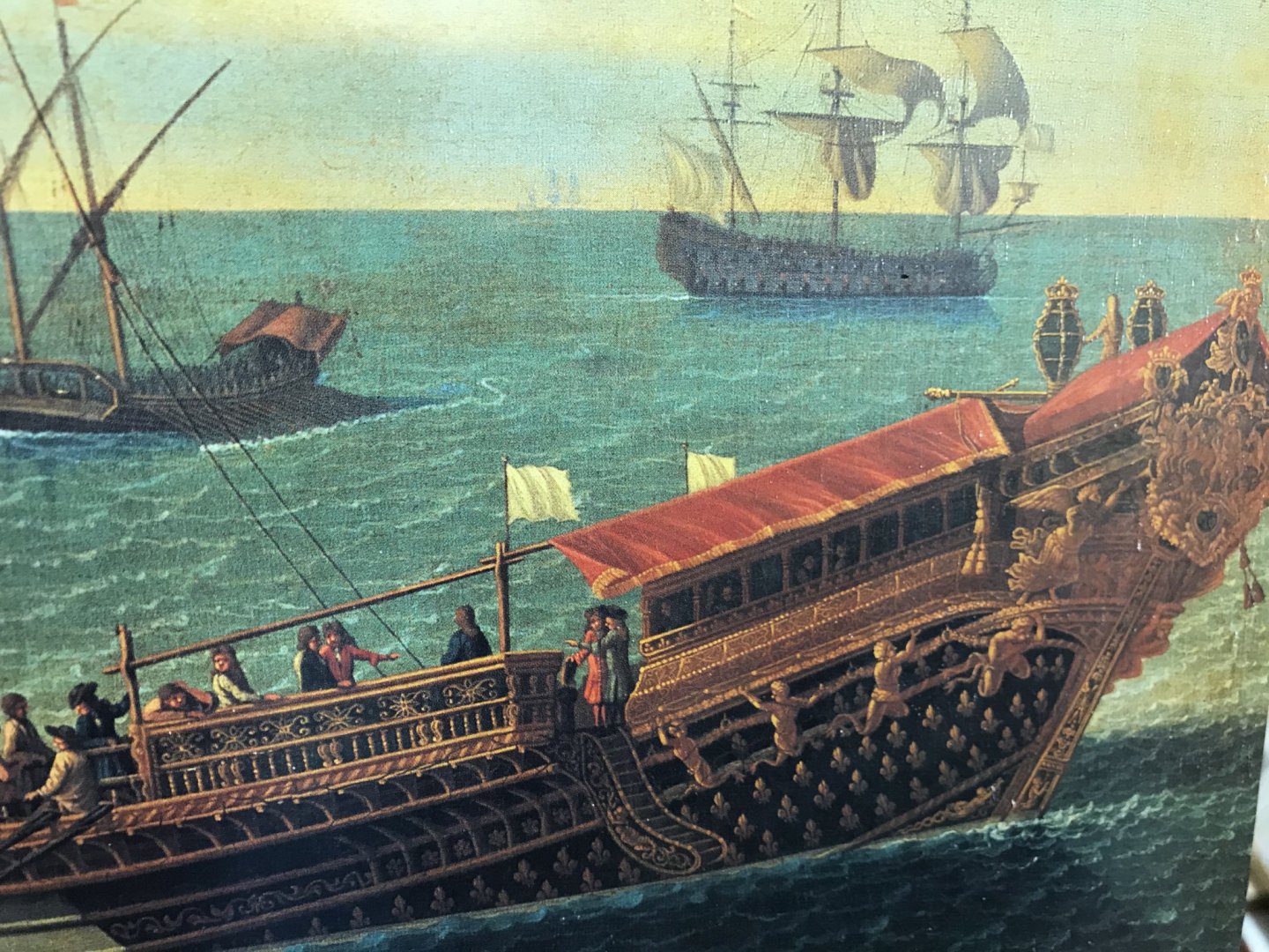
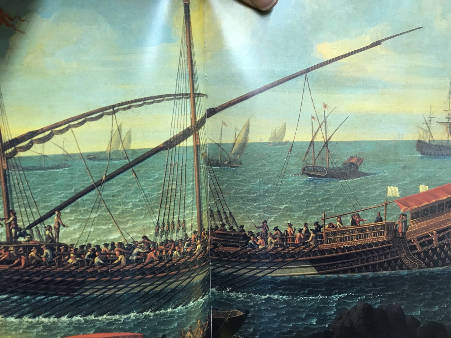
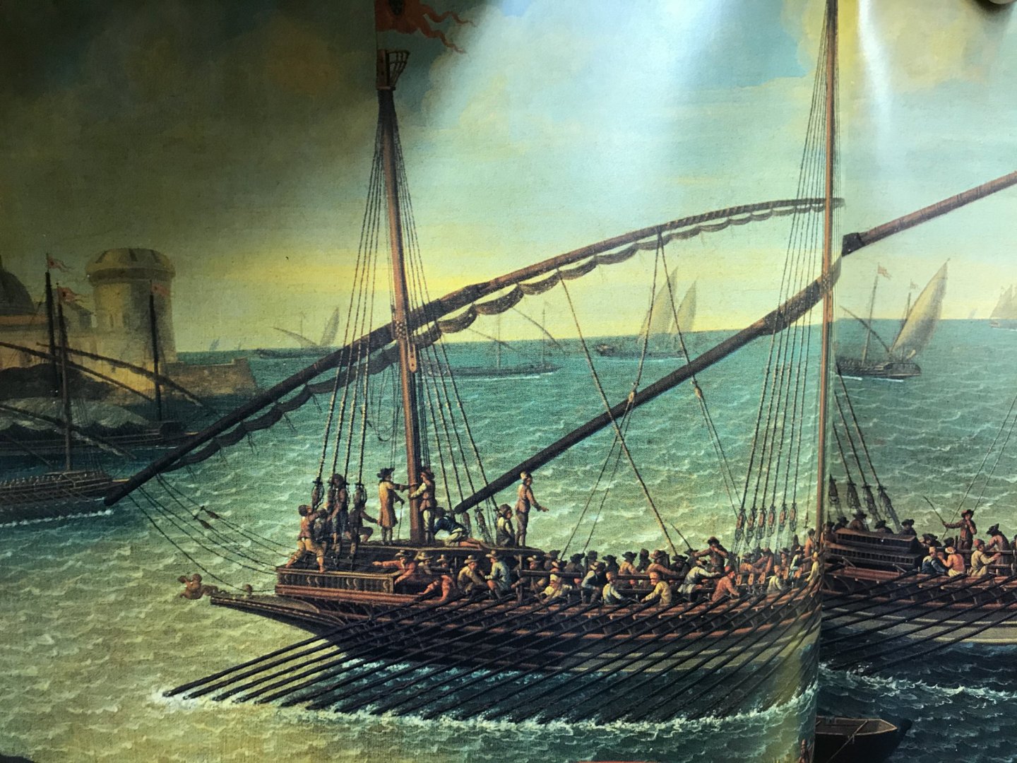
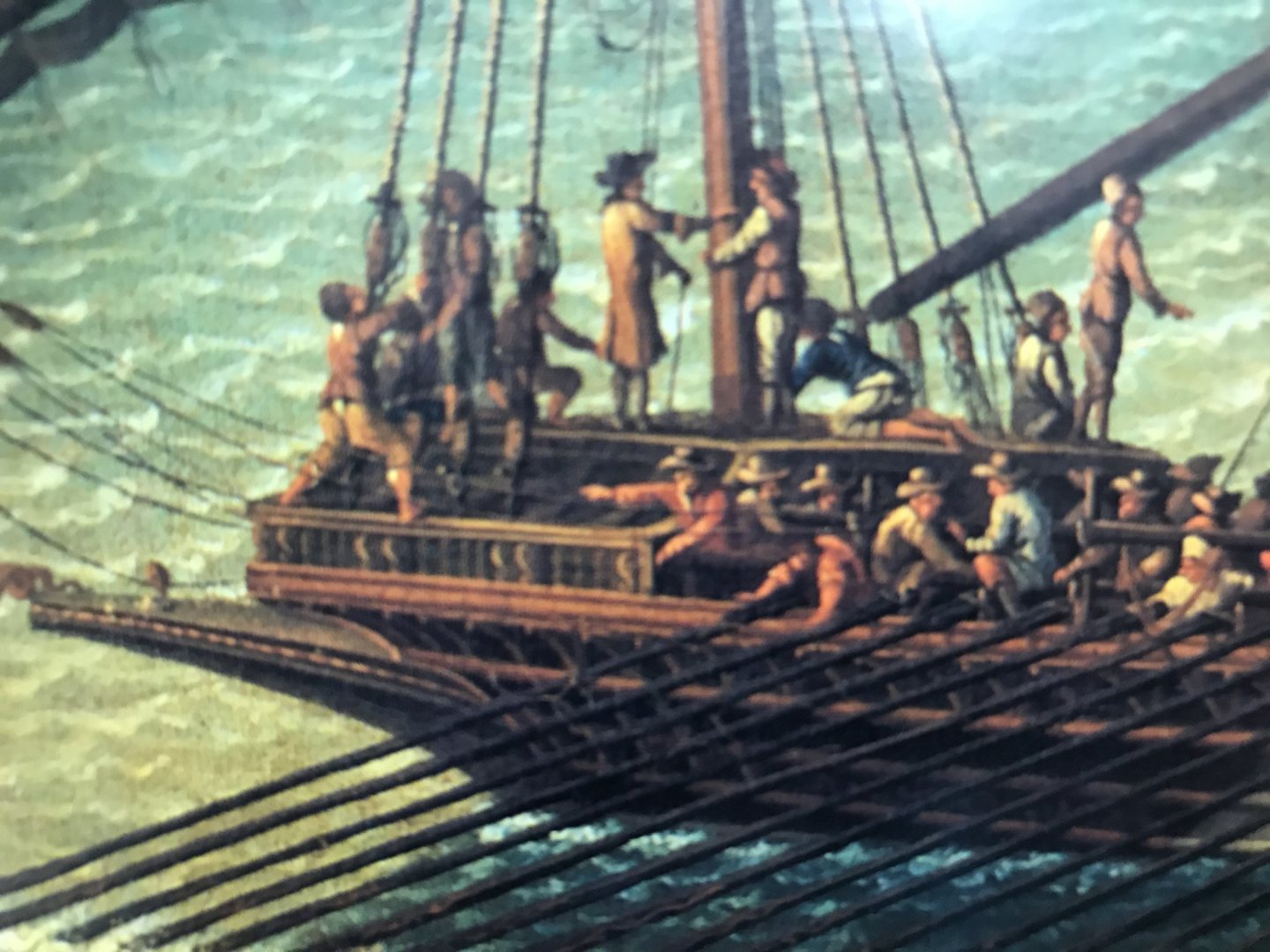
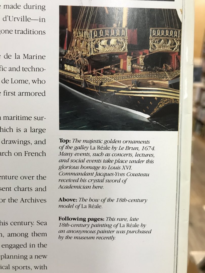
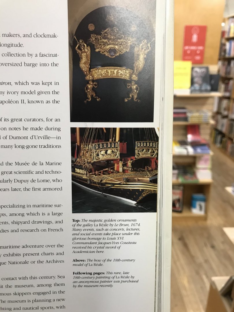
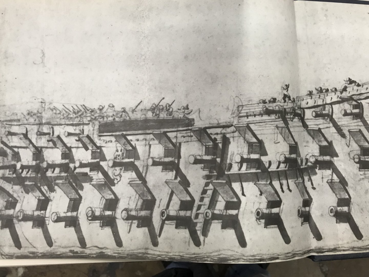
I was in the STRAND today, and was leafing through a book about the great maritime museums around the world. The chapter on the Musee de la Marine, in Paris, had a good re-print of the following: There is no artist attribution for the painting.

- 510 replies
-
- 5
-
-
- reale de france
- corel
- (and 1 more)
-
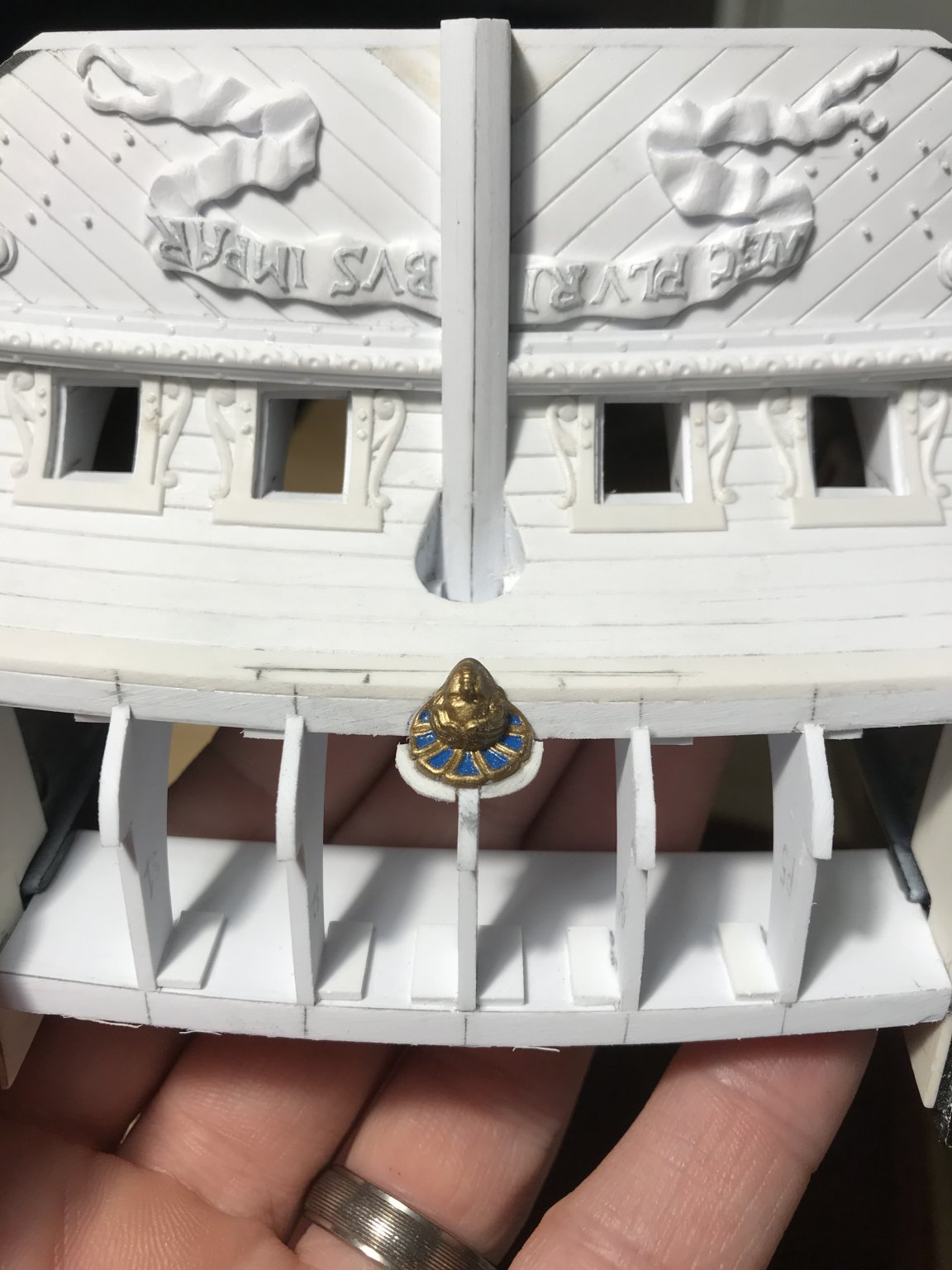
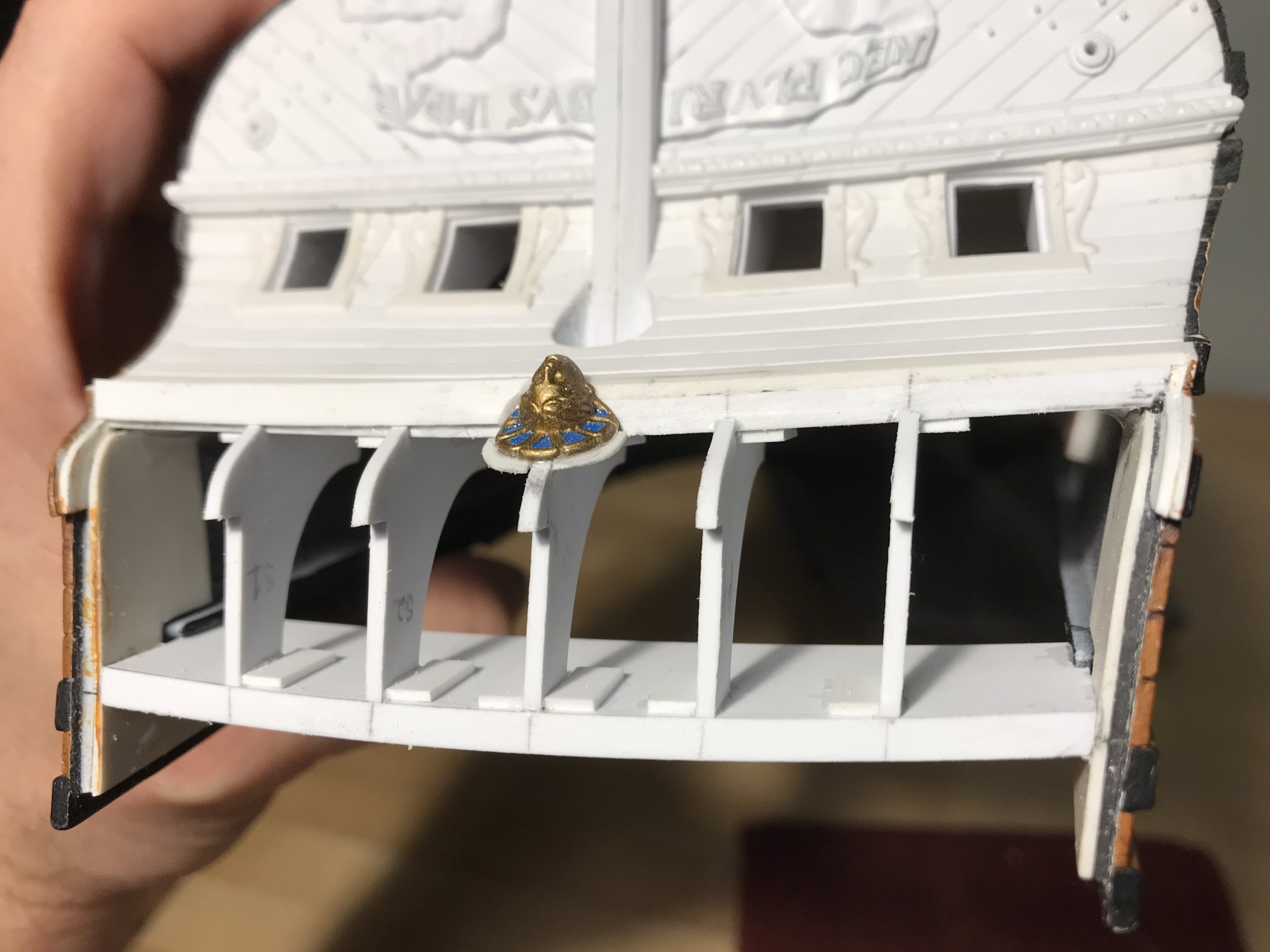
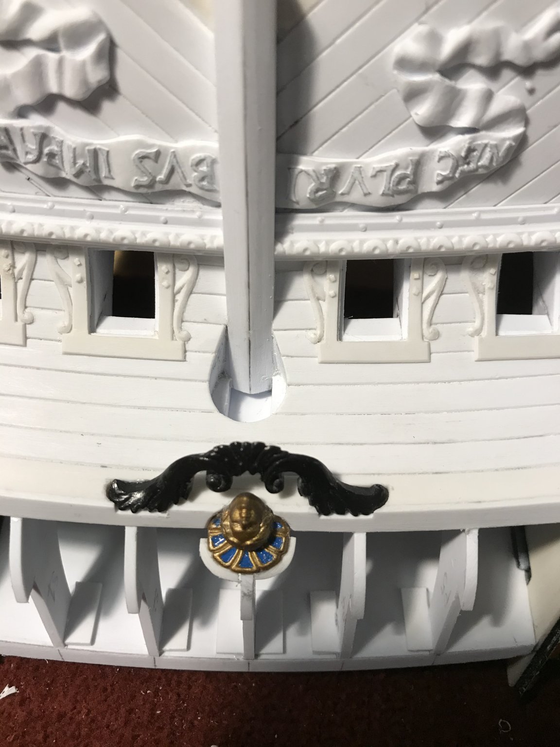
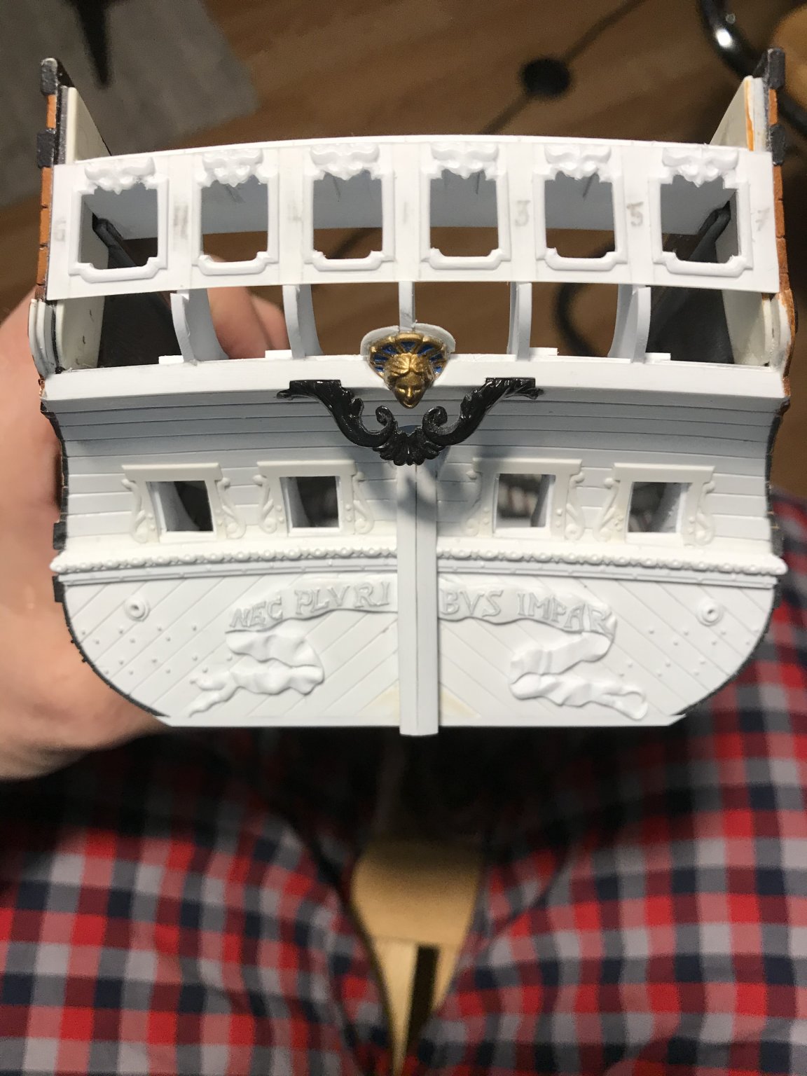
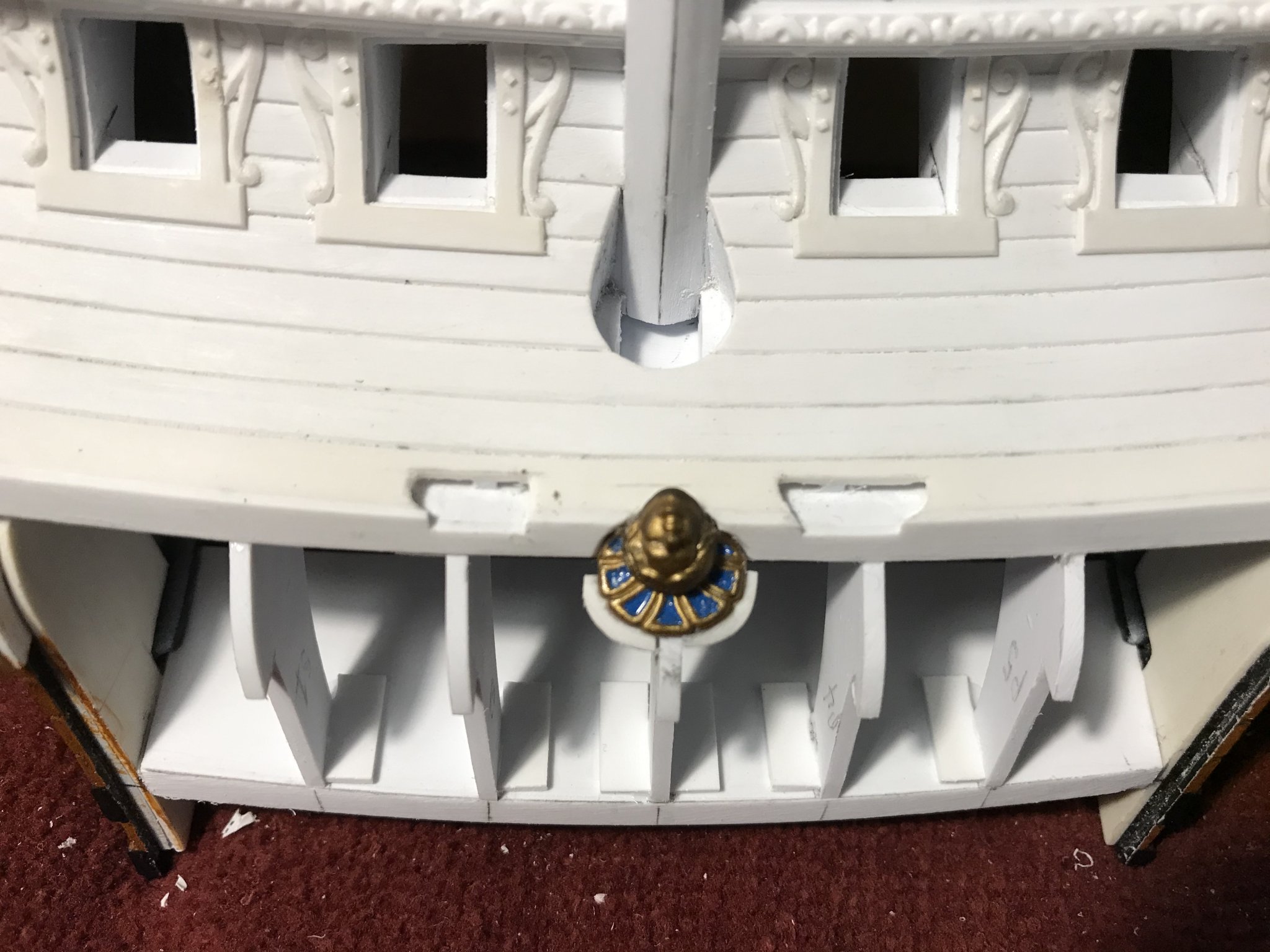
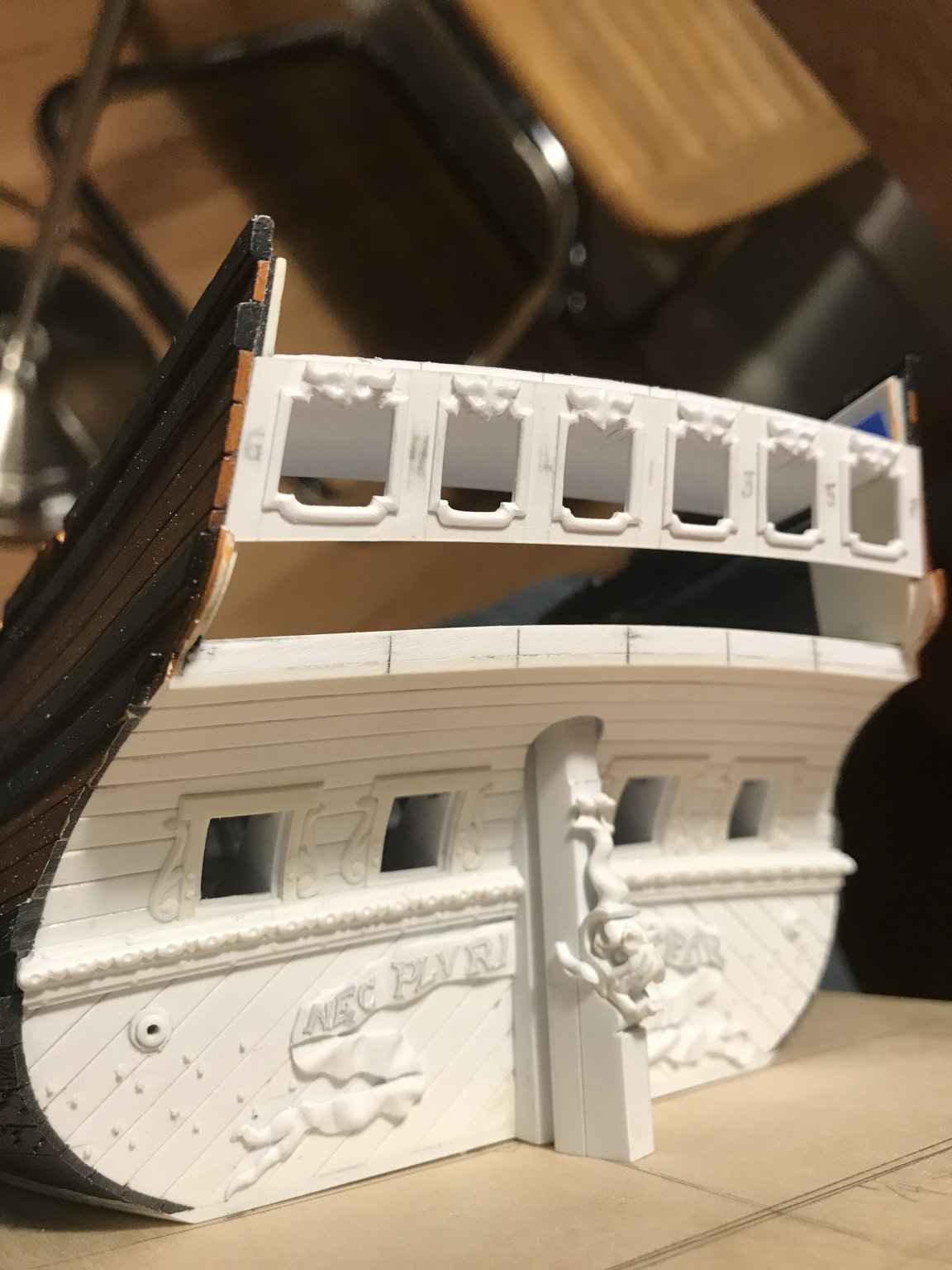
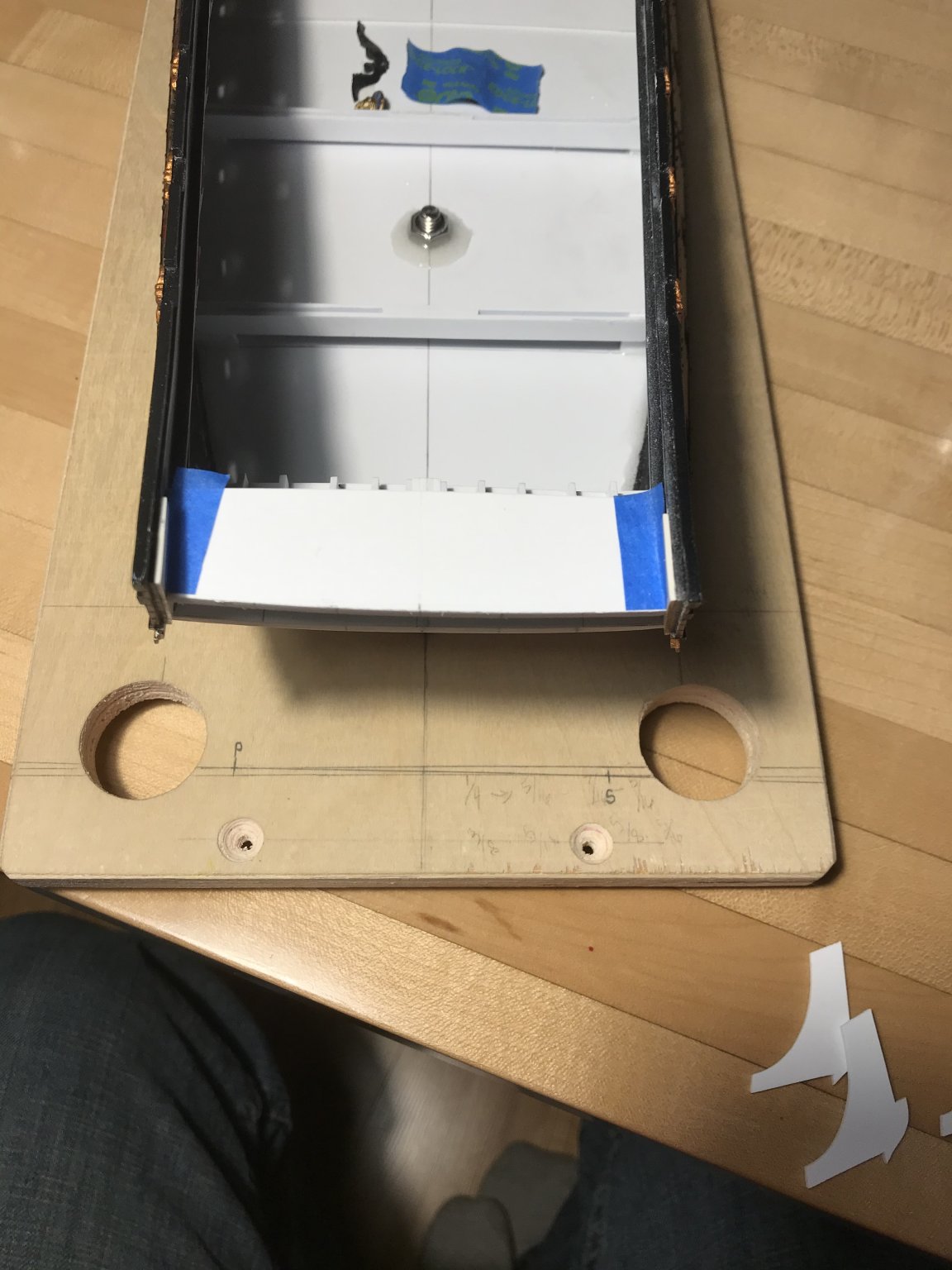
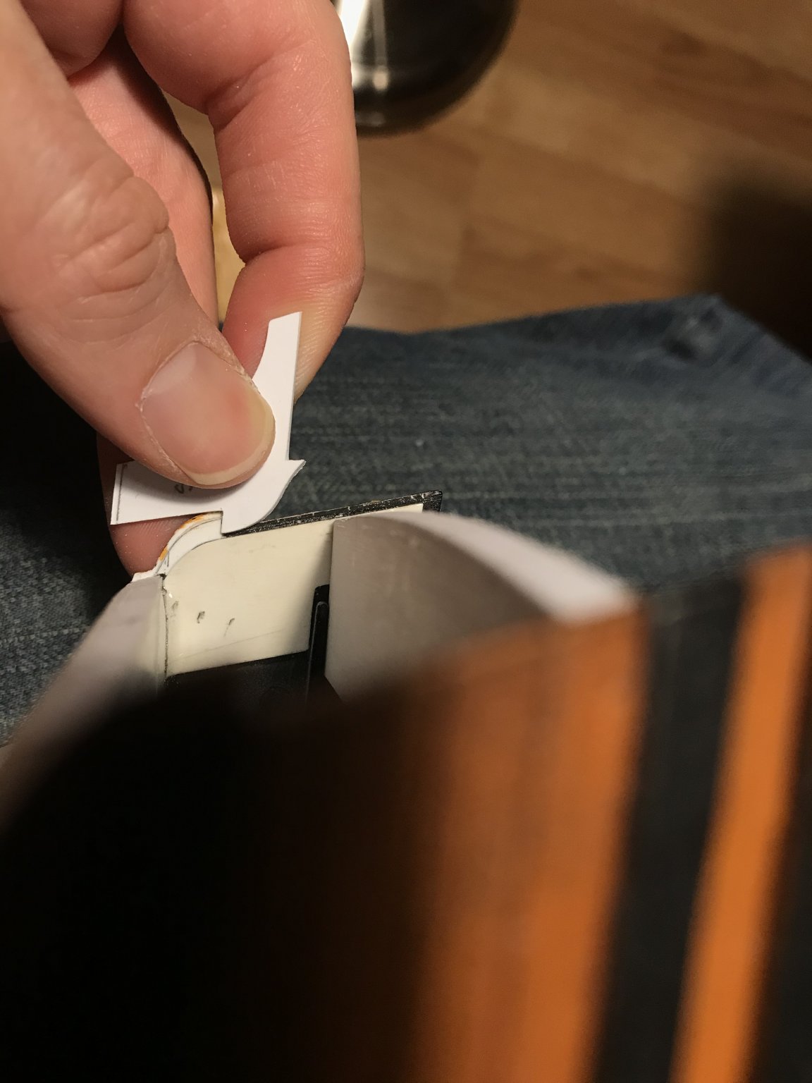
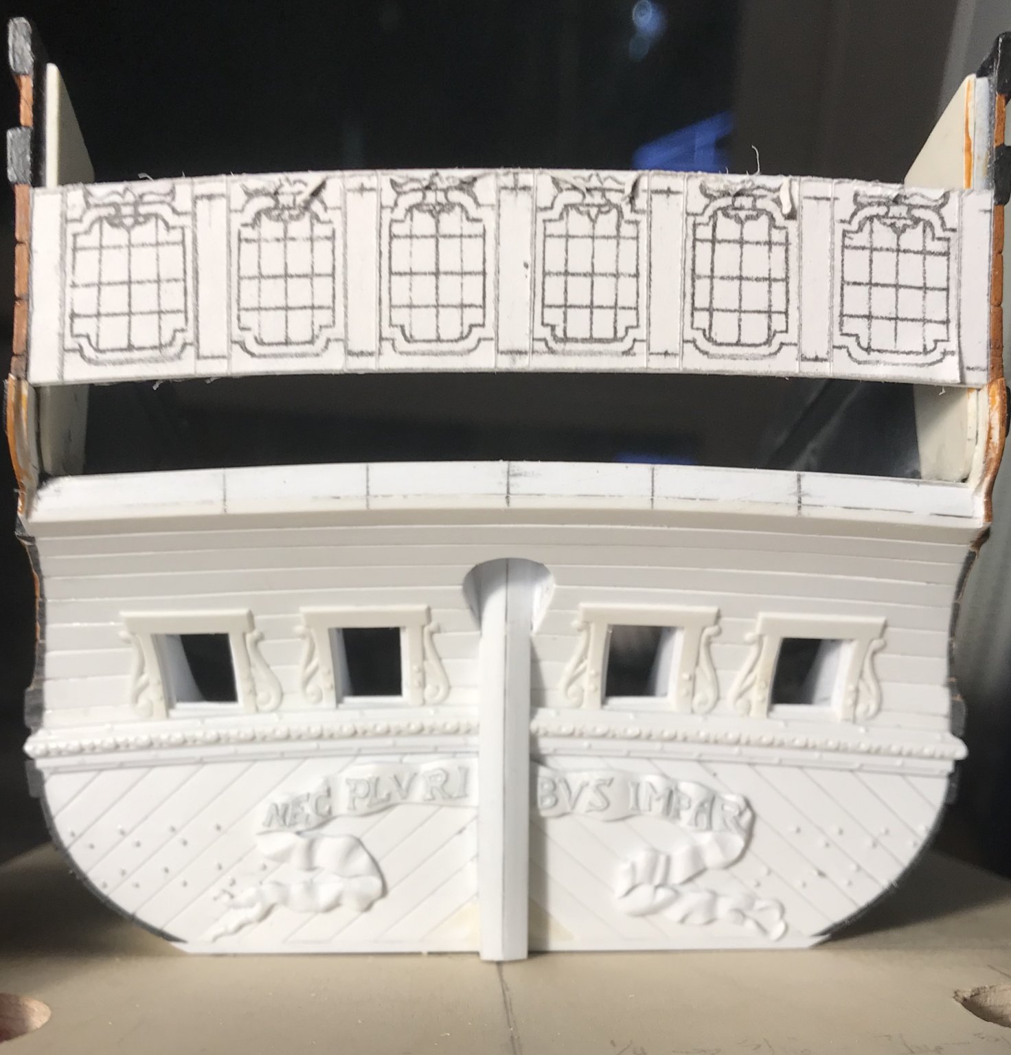
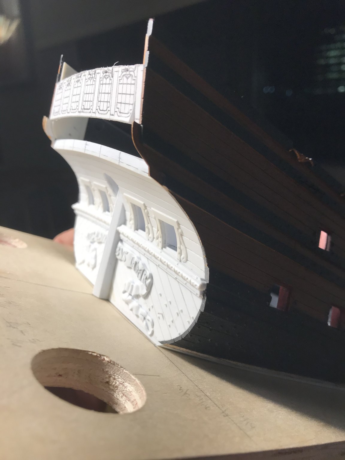
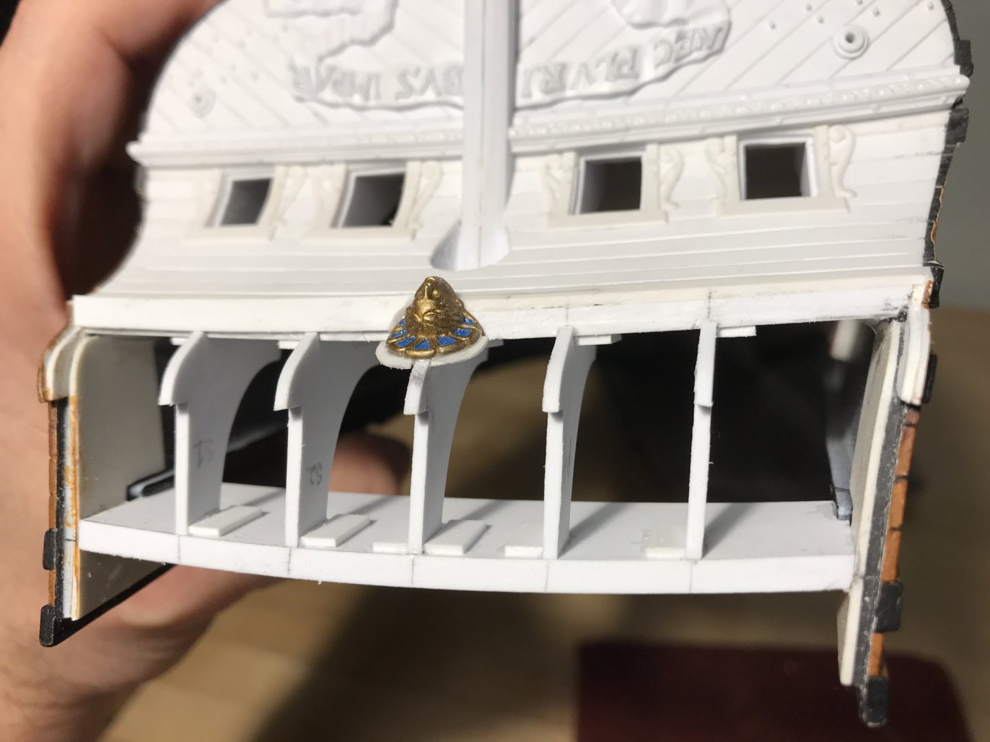
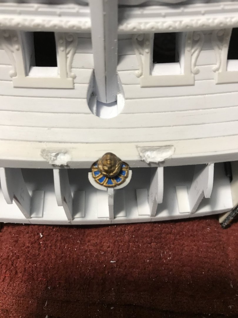
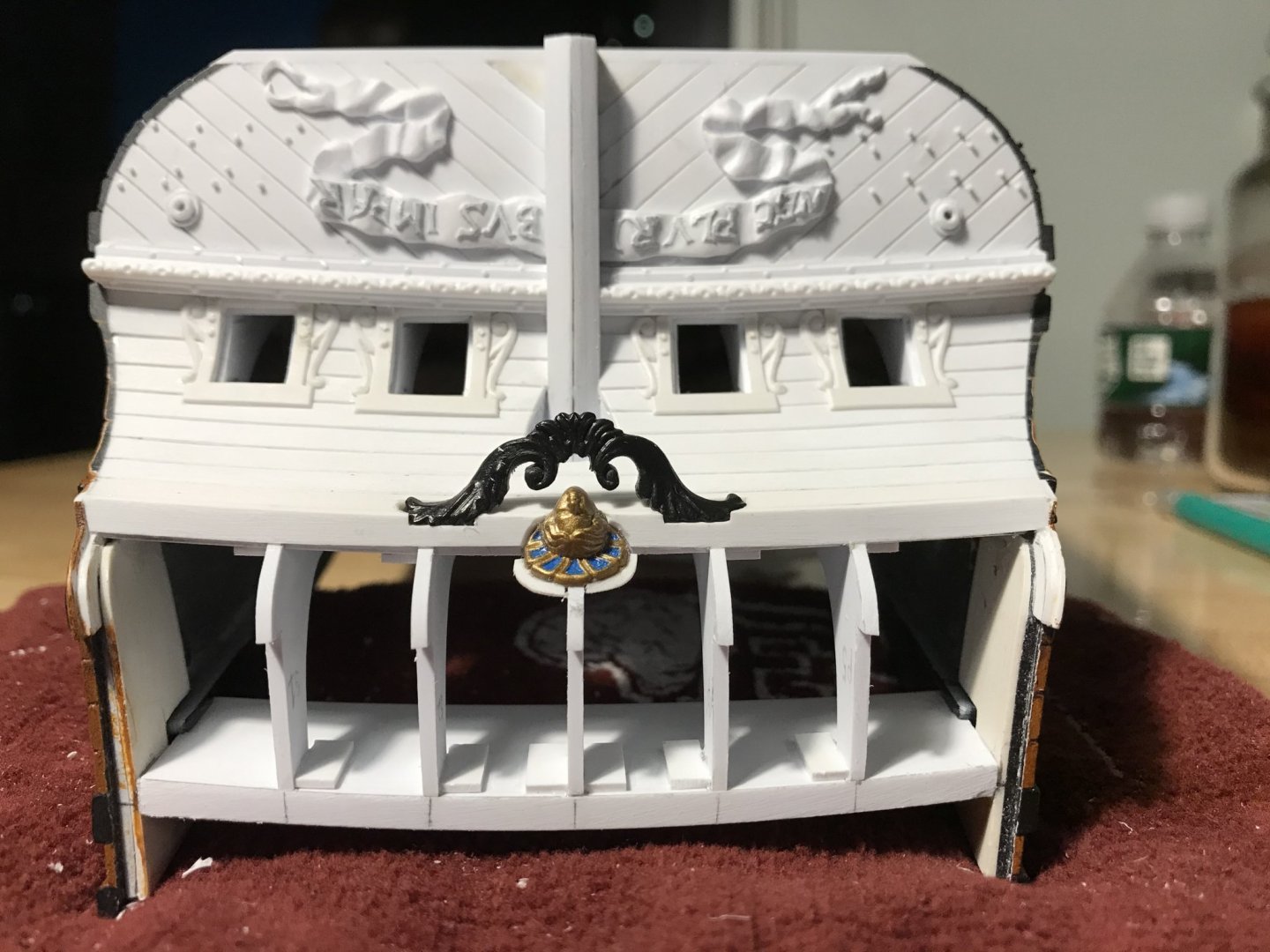
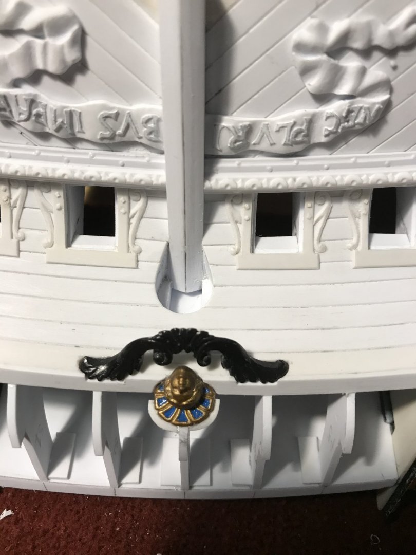
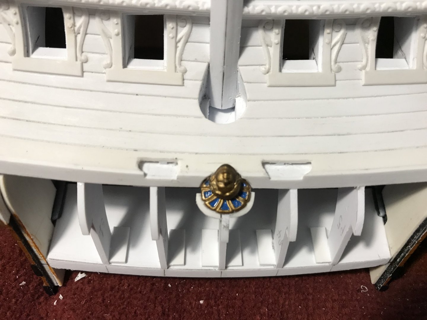
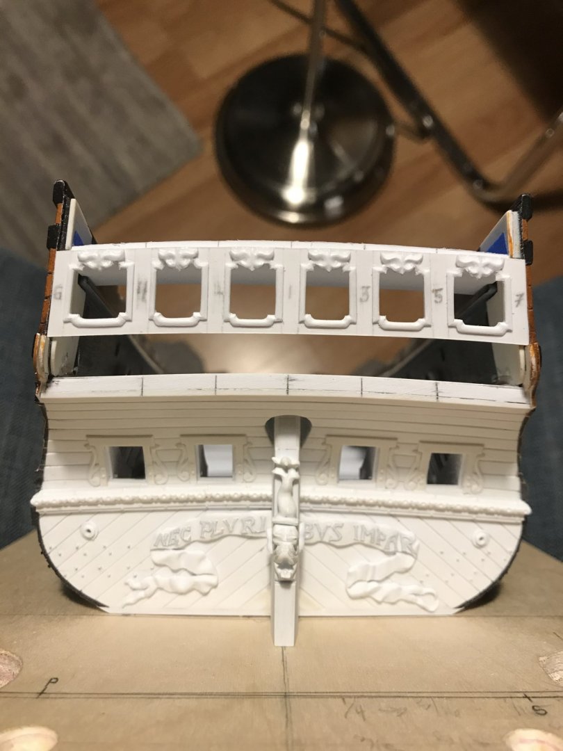
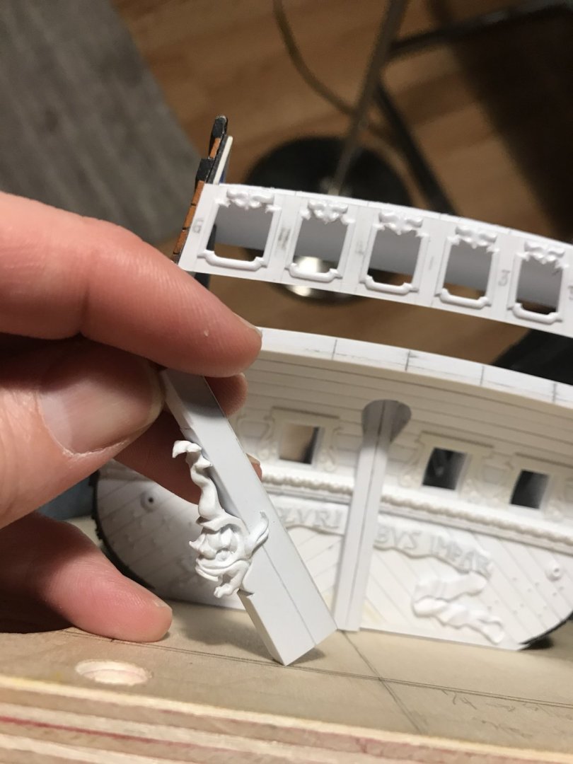
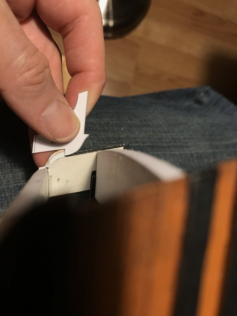
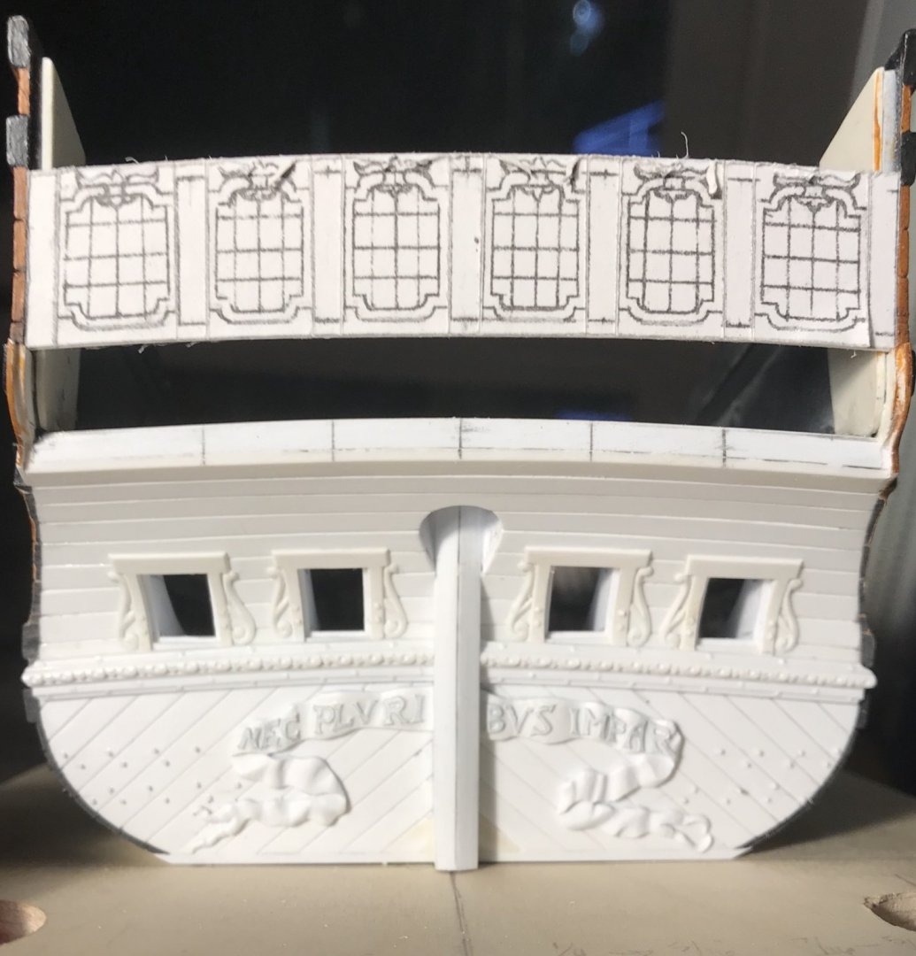
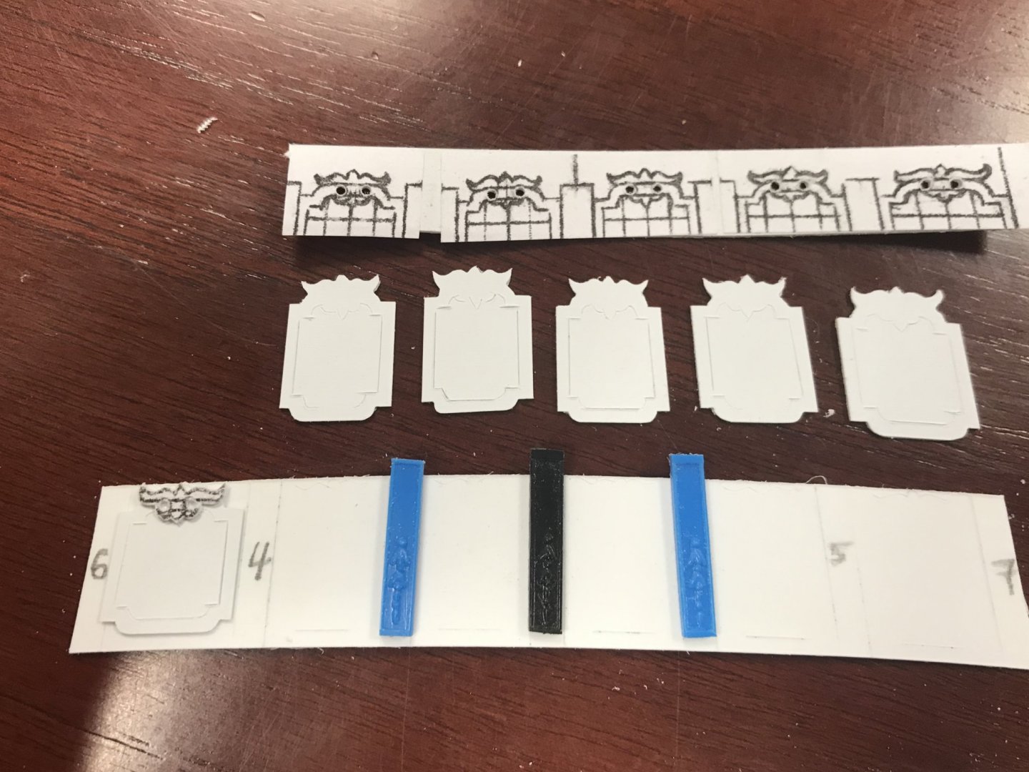
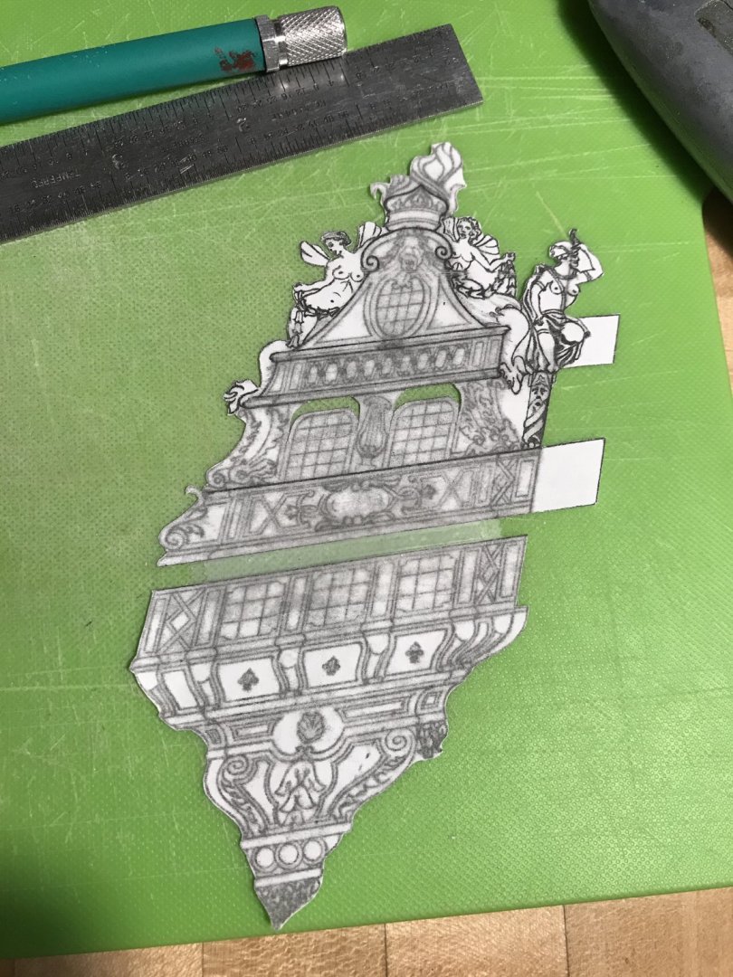
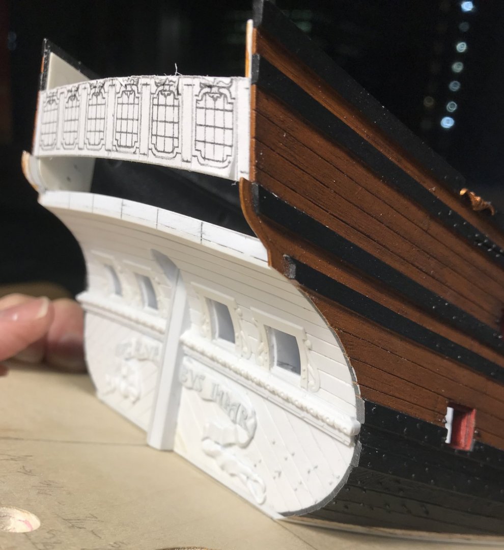
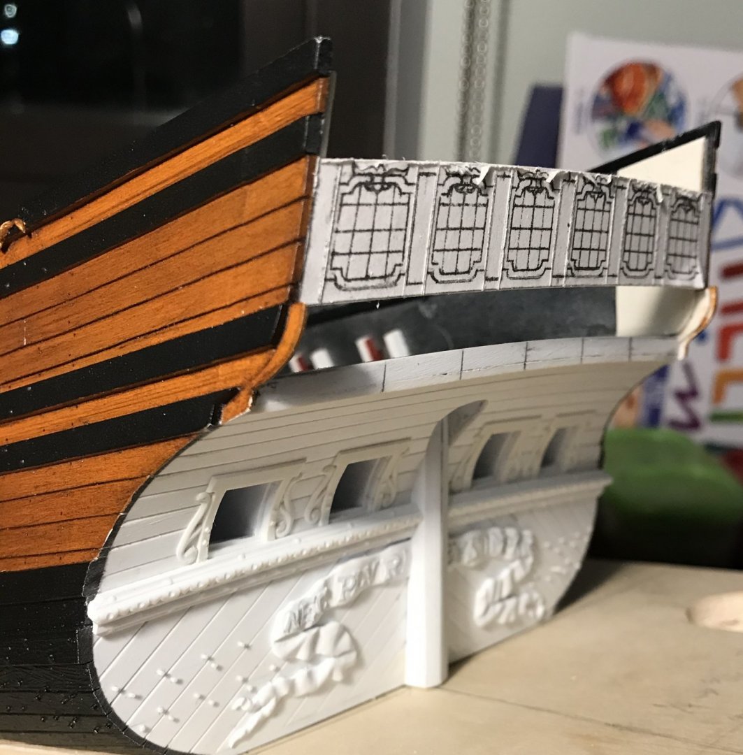
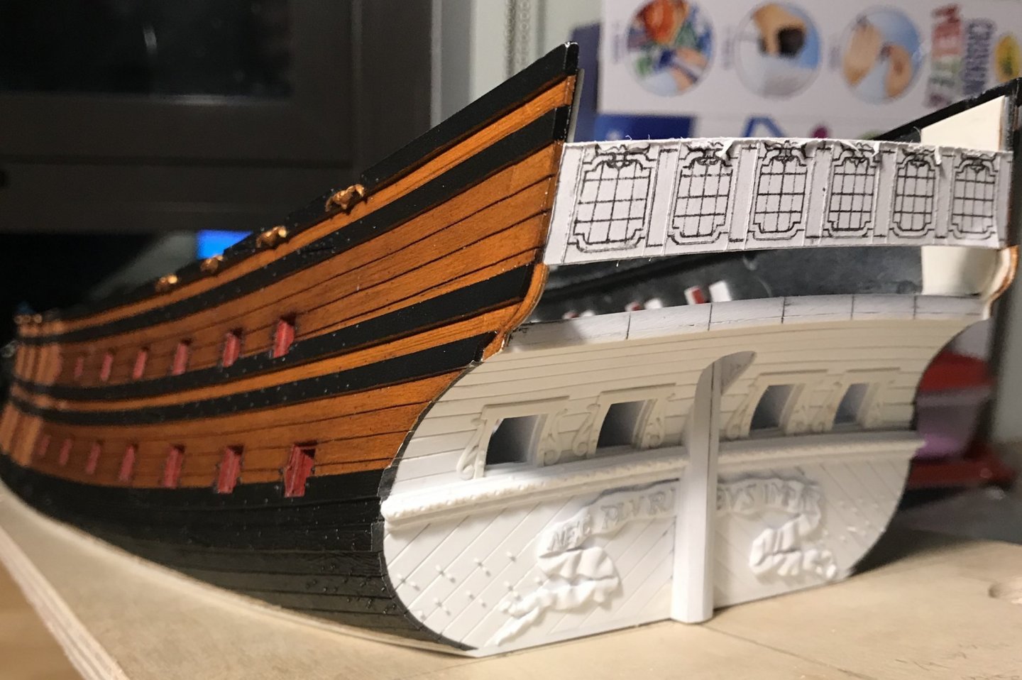
A few more details of note. I have fashioned entry ports, in the lower transom for the rudder chain/rope (nomenclature, Druxey?), from two small discs of styrene. The backing disc is slightly thinner. These were based directly on Puget’s drawings of the Monarque which - in a rarity of artistic convention for the times - actually shows them: I also gave flipper his pupils and pectoral fins: And, I spent a good long time transforming the window frames from flat to softly rounded. While I did fashion a one-sided moulding scraper from old hacksaw stock, I found this tool exceptionally difficult to control without digging into the frames. Ultimately, my trusty old Bebe, hooked chip-carving knife was just the thing for creating a series of micro-facets, which were then blended smooth with the well-worn fine-sides of emory sticks that I had cut down to suit my purposes. The frames look good, and I am happy with them. In the present, I am using Druxey’s method to fashion the glass panes from acetate, and that is all going swimmingly: I also made the false quarter gallery lights, but screwed up the engraving on the port side, and will have to re-make that one. In the next few days, I will buy a suitable shade of grey acrylic and fill-in the leaded cames. Hopefully, I didn’t engrave them too deeply, but the paint will reveal all. On the other hand, what has proved to be much less straight-forward - despite the earlier protocol established with the lower transom - is the framing of this next level of the stern. I had thought the hardest thing about it would be the planking of the lower false gallery/stern counter. I was so wrong about that! If this post has a title, it would be MODERN PARABOLA’MS, starring ME in the Chevy Chase role, as the utterly baffled modelmaker attempting the unravel the ghostly mysteries of the 17th Century shipwright. There are a number of things about framing the stern, from scratch, that I did not recognize, from the outset, as being problematic. For starters, as mentioned in the prior post, there is a certain degree of asymmetry that Heller built into the standard kit. To this day, I am still baffled as to why it was necessary for me to shift the starboard rear, upper bulkhead forward 1/16”, so that the waist ladder would align, properly, with its counterpart on the lower hull. Nevertheless, it was necessary to do so, in order to make the whole thing work. Another thing that I did not realize is just how far out of square the stern skews, as the ship rises above the waterline. I began my construction by squaring the transom waterline to the ship’s centerline. However, by the time I got to the level of the upper main wale (where the upper bulwarks join the lower hull), the starboard side was projecting a shy ⅛” further aft, than the port side. I discovered this as I was letting-in the latest transverse bulkhead, taking care to stay square with the centerline. In this picture, you can see that I am flush, to port, but still an ⅛”-, out, to starboard: So, the first order of business was to fir-out the aft edge of the bulkhead former to make-up this discrepancy. After gluing on an extension, I faired the edge from zero, on the port side, to an ⅛”-, at starboard. I then beveled the aft edge, downward, to match the rake of the stern. In the following picture, you can see the corrected bulkhead, but also a pair of parallel lines, an ⅛” apart, with a diagonal line between them. These lines illustrate the degree that the stern becomes skewed: Now, this creates all sorts of problems for the framing of vertical bulkheads, which I had already patterned. I was hoping to salvage the bulkheads I had made so, one at a time, I dry-fit them and then marked at the top of each vertical bulkhead, the point at which it extended beyond the transverse bulkhead. I also realized, though, that I had not cut-in deeply enough, the stepped juncture between the window plate and what will be the support for the false balcony ledge. First I marked back a consistent 1/32”+, on each bulkhead. After connecting the top and bottom points, my bulkheads looked like this: After trimming, I again offered each bulkhead to its place, to check for fit. The top juncture was now just slightly proud. This allows for a little final fairing, once all of the bulkheads are glued in place. I noticed, though, that the aft edges of the vertical bulkheads were not running parallel with the plank rabbets, at the ship’s sides. This discrepancy, in turn, necessitated an additional 1/32”+ trimming at the false balcony shelf juncture. So, at least now, the window plate is evenly supported across all of the vertical bulkheads without any one of them forcing the plate out of its proper position. This whole exercise in reconciliation has been a domino-fall of discovered mis-calculations and erroneous assumptions. I next discovered that I had made no allowance for the plank thickness of the stern counter/false balcony, and will next need to cut that back 1/32”, all around. After all of that, though, the bulkheads should be ready for glue. So, finally, onto the parabola’m that my post title alludes to. While I make my living working as a carpenter, I have to admit that I am not particularly strong at math. Wherever possible, I try to take the pencil and paper calculation out of my project work. Occasionally, this short-coming of mine rears up and bites me! I mentioned, in an earlier post, that I thought the previous transverse bulkhead had a somewhat exaggerated camber. Observe how the middle of the bulkhead appears to rise higher, towards the window plate, than at the sides: Well, that’s not what is actually happening here. First, I compared the bottom edge of the window plate with the camber pattern that I made for glueing up the transverse bulkhead laminations. Good on me - it’s a perfect fit: The more I thought about it, though, I realized that the camber pattern came directly from the stock Heller stern plate, which is dead flat. I, on the other hand, have chosen to model the round-up of the stern, as this is an appropriate architectural detail for the time period. So, what happens to that joint, when you rake the plate aft, and induce the round-up curve? Parabola’ms happen, that’s what: To say that I am somewhat invested in this window plate would be the understatement of the new year. While my math may be lacking, I am good in the field, as when the shop, for example, sends a custom-made thing for a space that was poorly measured; I can almost always find a way to make it work. THE WAY, in this case, will be to cover any gaps or discrepancies between the window plate and the stern counter with what will be a fairly generous (3/32”) transitional moulding that wraps to the quarters. The shape of the top edge of the window plate will inform the camber of the walkable main deck stern balcony, that abutts it. Now, it is true that this middle balcony will have an ever so slightly flatter camber than the false balcony beneath it. It is also true that the bottom edge of the window frames, out toward the ship sides, will not hug the transitional moulding line as closely as intended. On the plus side, moving up the stern, I should not encounter this problem again, as I will simply allow the round-up curvature to establish the camber. The camber of all three tiers of windows will be consistent. In the grand scheme of things, these are nits that I prefer not to pick. I’m pretty sure I can live with the results. I hope this cautionary tale will be helpful to anyone else out there who might be planning a similar foray into plastic surgery.


- 2,699 replies
-
- 17
-
-
- heller
- soleil royal
- (and 9 more)
-
Hi Dan, More than anything, this has to do with designing within certain constraints of the kit architecture. You’ll notice that Berain’s windows are rather short, by comparison, and his ornamental cartouche is much closer to the frame outline. The height between decks, on the Heller kit, is exaggeratedly tall; a 7’ person would he quite comfortable manning the guns on Heller’s ship. So, in order to preserve a sense of elegance with the window mullions, I just added a pane.
- 2,699 replies
-
- 4
-
-
- heller
- soleil royal
- (and 9 more)
-
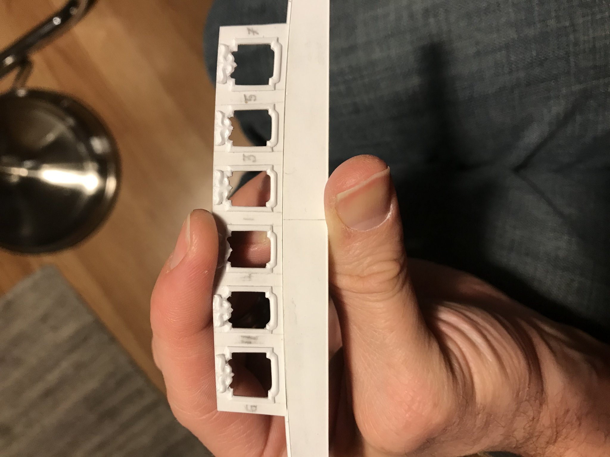
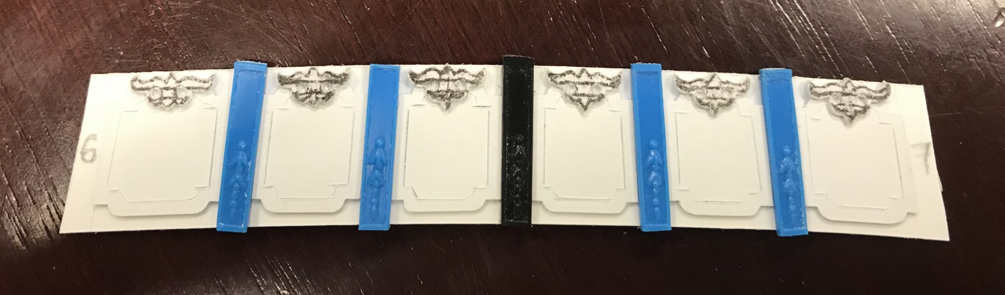
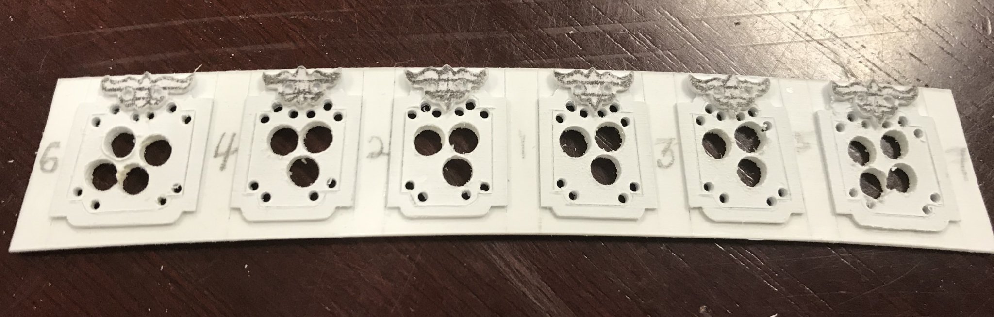
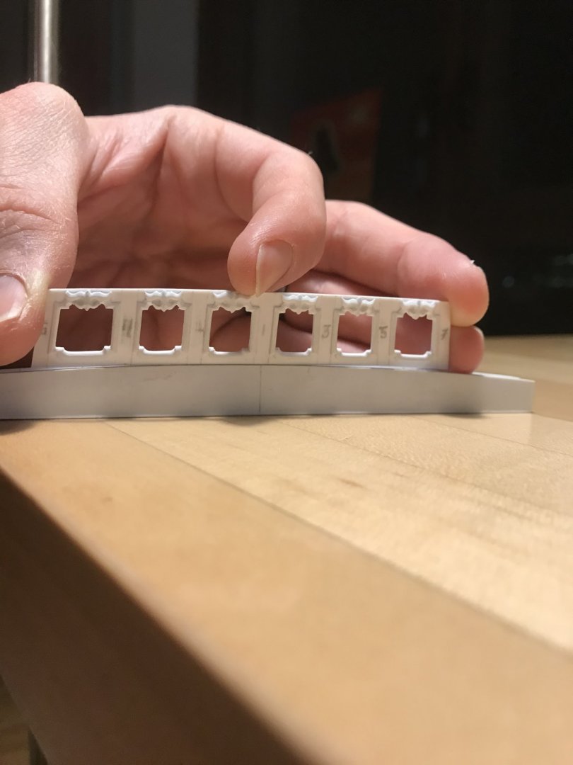
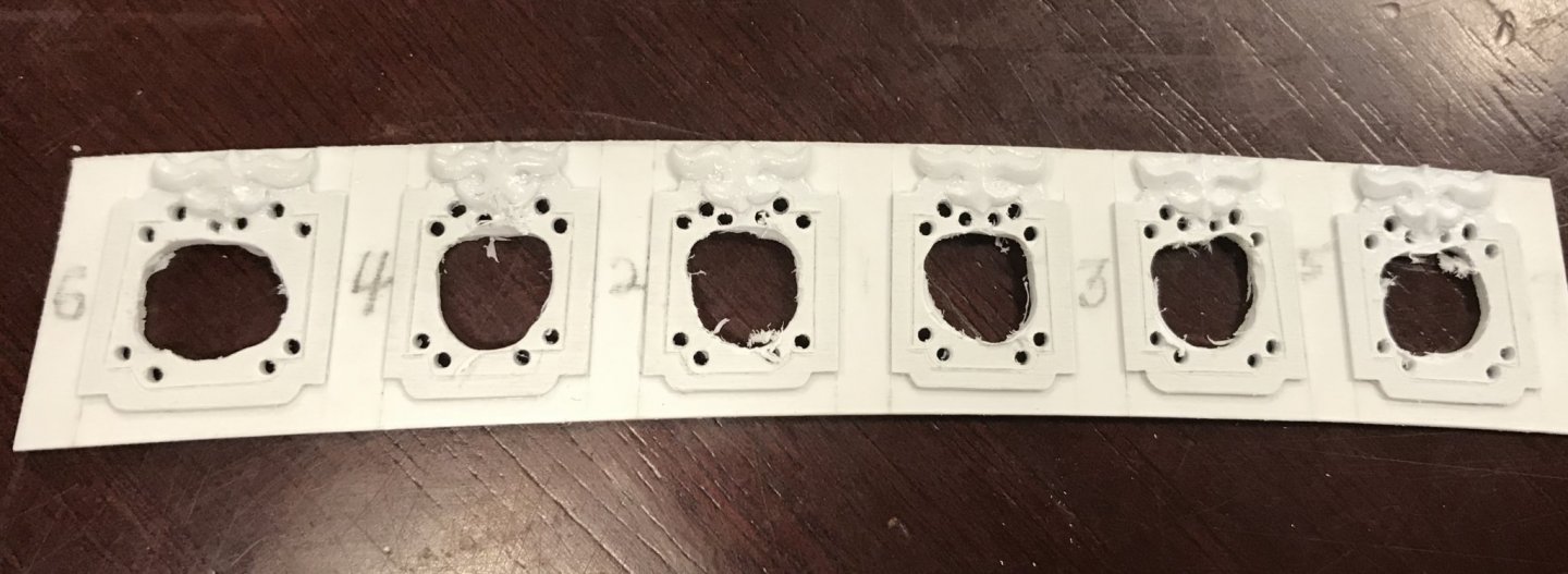
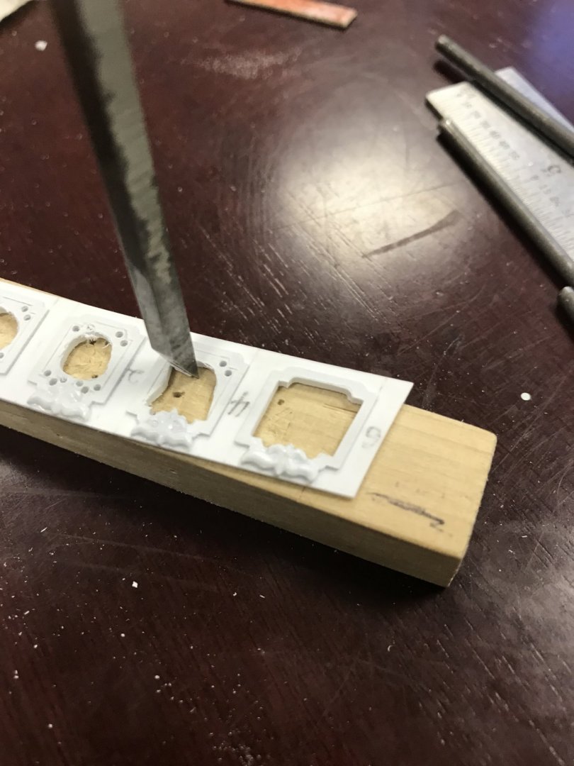
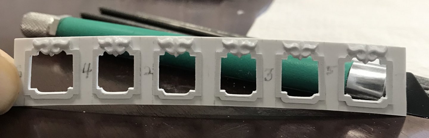
So, I’ve been focused on making this lowest tier of window lights, just above the false balcony: I have my general layout, which I pasted to a piece of 3/64” sheet styrene, and then fitted into place: The primary question was how to go about crafting the raised lip of the window frame. I knew I had to create a series of layers; the base plate layer, the window frame layer, and the ornamental cartouche layer. The problem is that cutting out the window frames before mounting would result in flimsy parts that would be difficult to shape properly, or glue in place without distortion. My solution was to paste my layout to the 1/32” sheet and cut blanks to the outer line of the window frame, including the cartouche: I then extracted pilasters from the stock kit stern plate because the bell flower carvings on these would be challenging to reproduce. Before glueing these window blanks in place, using the pilasters as spacers, I pasted the cartouche layout onto a second strip of 1/32” sheet, and then very carefully cut these to their outline. After doing so, I glued the cartouches down to the frame layer, and then the frame blanks to the base layer: Before removing the window waste, I thought it would be best to carve the cartouches, while the backing plate still had some structural rigidity. These are very shallow relief carvings. Once they are carved and all the remaining fuzz is removed, I like to coat the carvings with liquid cyano. This serves to ensure that all the tiny tendril-like bits are fixed in place and the cyano smooths over any surface imperfections in the carving. Now - rather than cutting out the window interior twice, I could cut once through the frame layer AND the base layer. First, I drilled a series of relief holes to make material removal faster and easier: Then I came in with the Dremel to hog out the middles: Finally, though, it becomes a matter of careful paring with chisels and files: What I like about this approach is that it affords me the opportunity to occasionally ignore my scribed lines, in an effort to balance out the stile widths, where necessary. I will still need to fashion a pair of scrapers to profile the edges of the window frames so that they have a slightly rounded profile. They are not a uniform width, all around, so I will have to make scrapers that only cut one edge at a time. I’ll need opposite bevel scrapers so that I can get into and out of all the corners. Later, I will get to making the glass panes from acetate. This is all a fair amount of effort, of course, but the results far exceed what Heller provides for, IMO. Thank you for looking in. More to follow soon, as I frame in the next level of the stern to which this plate attaches. Once again - sorry about the picture orphans below:


- 2,699 replies
-
- 16
-
-
- heller
- soleil royal
- (and 9 more)
-
Oh, good - I was wondering whether you used acrylics or oil-based paints. I’m relieved to know that it’s acrylic, as I find that to be the most brush-friendly paint medium of all.
- 1,784 replies
-
- 2
-
-
- winchelsea
- Syren Ship Model Company
- (and 1 more)
-
Excellent tutorial! I think this all looks incredible, Chuck. I have a question about painting, as I will some day transition to wood builds. When you paint the cove, for example, do you prime/seal first, or can you go directly to color? Thanks, in advance - you are doing an incredible job. I appreciate your care and attention to detail very much!
- 1,784 replies
-
- 3
-
-
- winchelsea
- Syren Ship Model Company
- (and 1 more)
-
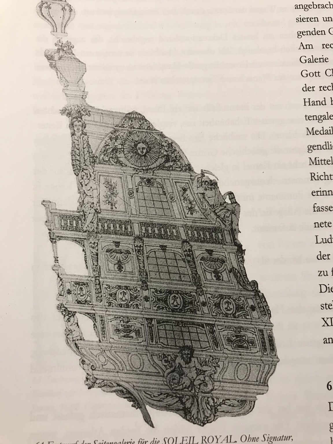
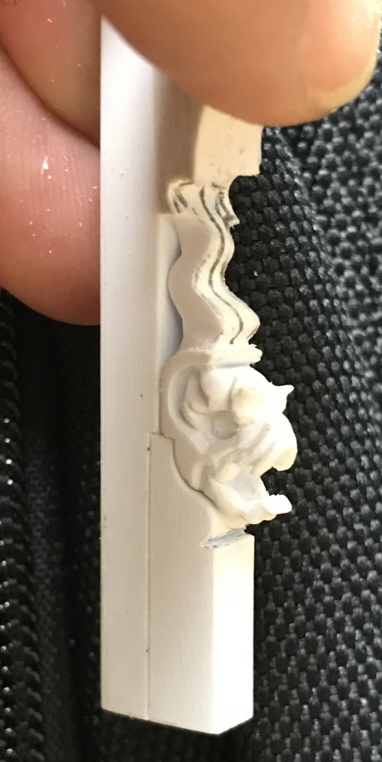
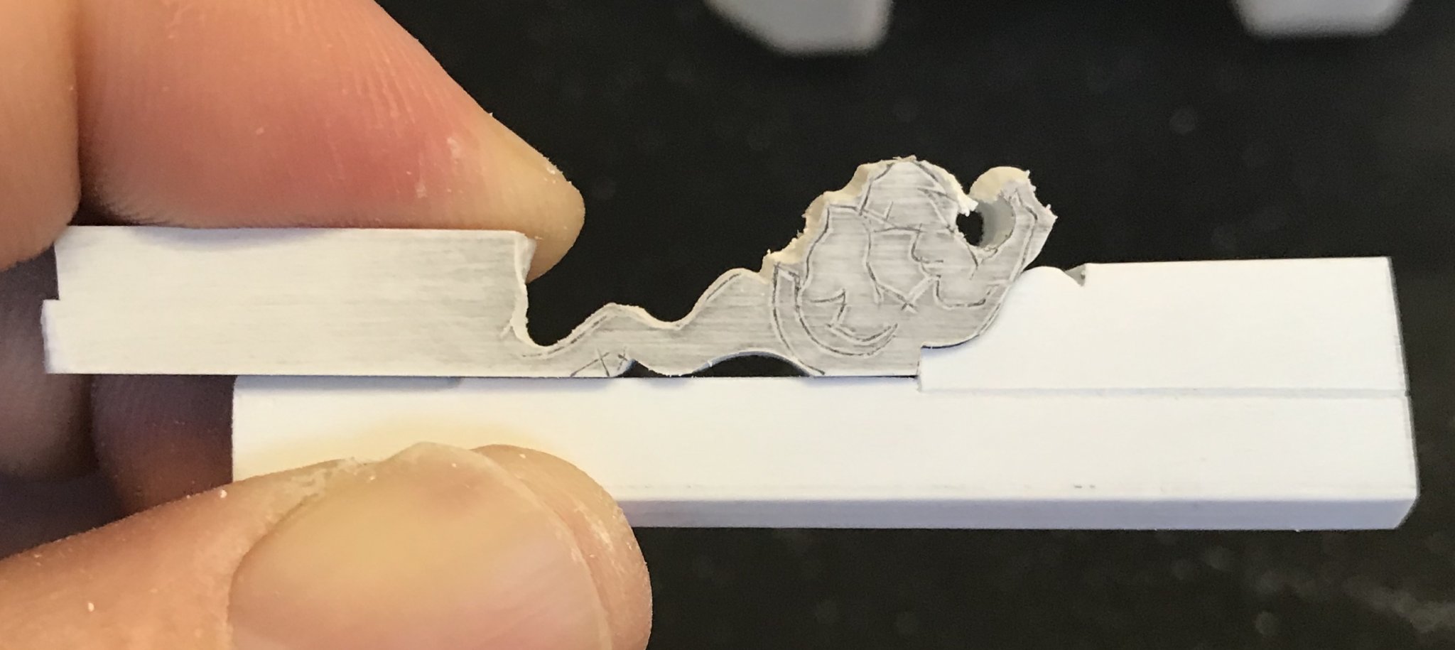
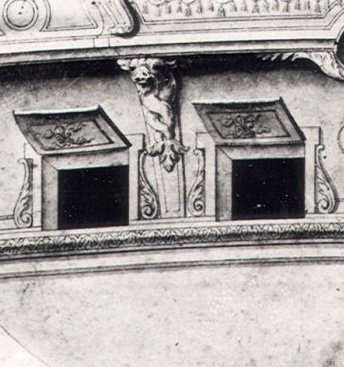
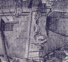
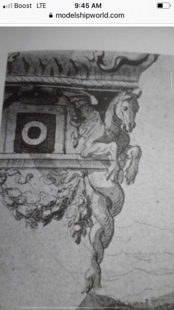
Thank you very much Kirill, Dan and Druxey for your thoughts and kind comments, and thank you to everyone else for your likes and looking in. Well, I’ve been quite busy working on a number of small details that will complete the lower transom. To begin with, I will say that I am searching for suitable tubing with which to make the rudder pintels and goudgeons, so that I can complete that detail. I am also making small round escutcheon ports for the rudder chain/rope. Not much to see, there, yet. However I have completed the “nailing” of the transom moulding, the through-bolting of the lower transom knees (which is just a continuation of the side hull detail), and the gun carriage through-bolting of the chase ports. I will not simulate the plank nailing, as I did on the ship sides, as this detail is only barely visible, if you are examining the model closely. The overhang of the stern is sure to obscure it completely. I have created the ornamental chase port surrounds. This has been an interesting foray into the pitfalls of not starting from a fully realized scale drawing. My initial hope was that I could use the small frieze scroll ornaments that were left over from the upper bulwark frieze. I quickly realized, though, that they were not nearly long enough. So, I made each element, individually. This simple pencil-rub technique gave me very accurate parameters for the port openings, so that it was only necessary to sharply delineate those lines with a sharp pencil and rule. From there, I patterned the port surrounds and scrolls: Now, here’s where I got into trouble! Even though I did a cursory placement of the caryatid carvings - which have an architectural extension that comes down between the ports and rests upon the transom moulding - I soon realized that there just was not going to be enough room for all of these elements to co-exist. Here is the detail, as drawn: Neither the Heller kit, nor the Tanneron model account for these port enhancements. Now, despite my increasing the breadth of the stern by a healthy 5/8,” overall, I would have to have considered this detail when I was framing the chase ports, in order for it all to fit. At the time that I was doing that, I was not thinking that far ahead, and was merely playing with different spreads for the ports. The more spaced layout may have accommodated everything, but to my eye, the ports were too implausibly far apart, and the outer chase carriages would have been too close to the ship’s sides. So, I made a visual judgement, there, and I think it was the right call. After thinking about it for a while, though, I realized that I could still incorporate the caryatid carvings, if I eliminated the lower architectural base. There is plenty of space, above the chase ports, for these carvings to exist in their proper relationship to the chase ports, as well as the supporting corbel figures of Spring and Summer, one tier above them. If we examine what I believe to be the slightly re-designed starboard quarter drawing of Soleil Royal II (1693), the caryatid carvings are shown, in profile, without the architectural extension: With all of that in mind, I got to work, cutting back the caryatids to their essential carving: Below, on the left, you can see the carving before I decided to further relieve the sides and back, in an effort to give the carving a lighter and more rounded appearance: By the way, it was also necessary to first reduce the upper thickness of the carving - before pedestal removal - and then re-scribe the upper portion to my new upper transom profile. All of that is well and good, but I will not cement either those carvings, nor the jaumier-concealing scroll and head before I frame-in the next level of the stern. My bulkheads are made. Because placement of the stern windows is the paramount detail (they have to fit within a very specific proscribed space of 5/8”), I have decided to start by making the window plate first, so that I can make whatever necessary adjustments are needed to the bulkhead framing as I go; apparently, my lower transverse bulkhead former has slightly more camber than what I want. I can fair this out in the bulkhead framing and tweak the false stern gallery planking, accordingly: What also has become apparent to me is that my 5/8” spacing is right-on, on the port side: The windows fit neatly between the wales, here, but the windows rise a heavy 1/32” on the starboard side: I think this variance has to do with the process of prototyping the kit, in the first place; there are numerous a-symmetries from one side to the other that have only become apparent as I pattern this or that element of the modification on one side or the other. Ultimately, this variance will only be barely perceptible in the relationship between the starboard quarter gallery rail, and the upper main wale. The stern windows will be in a level plane, and that is what matters most. Learning from my mistakes, though, I am already troubleshooting the ways in which I will have to adjust my quarter gallery drawing, in order to fit the reality of what I am building. I definitely need to increase the height of the middle deck gallery windows so that the main deck QG walk lines up properly with the wales - this is a heavy 1/8” increase: I’m also debating the possibility of shortening the main deck windows to match the height of their counterparts on the stern, which are precisely 9/16”. The dolphins could remain the height that I initially drew them, and the harp height could be shortened, or in any case re-drawn to at least properly reflect the rake of the QG. A perspective shot, or two: Lastly, as I often do, I visited the STRAND today. I’m always searching for a better image of my “Guilded Ghost.” I didn’t find her, today, but in the back overleaf of a book that seemed much less specific to the 17th Century, I found this extremely clear enlargement of Van de Velde’s portrait of La Royal Therese: I have many smaller prints of this portrait, but they fail to capture the detail and broad gesture of VDV’s hand, to quite the degree that this reproduction does. Usually, I take a photo of the book cover, when something like this interests me, but today I failed to do so. Anyway, it’s all great reference material for my forensic files.


- 2,699 replies
-
- 17
-
-
- heller
- soleil royal
- (and 9 more)
-
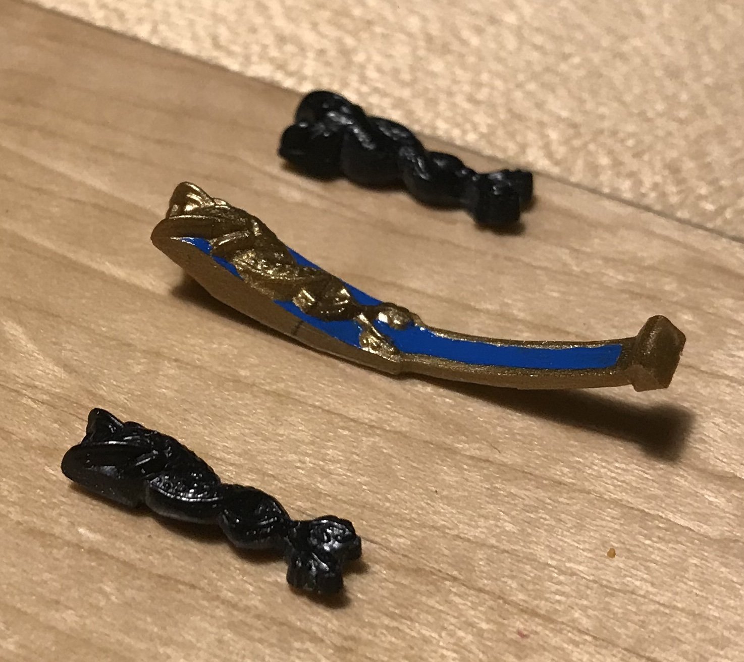
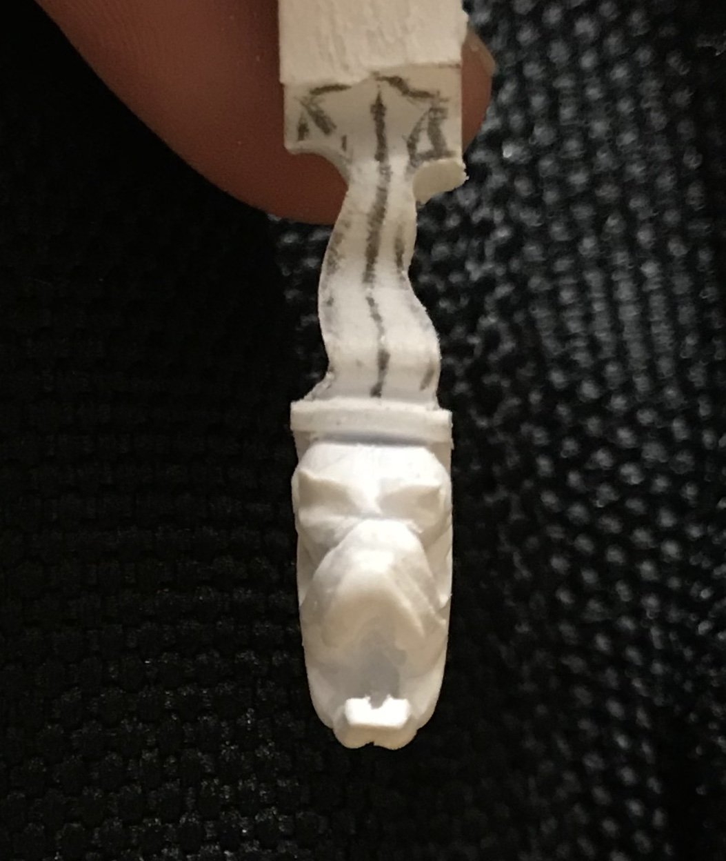
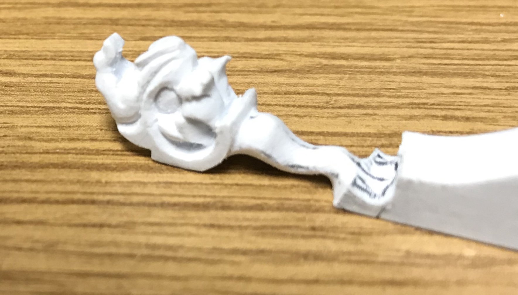
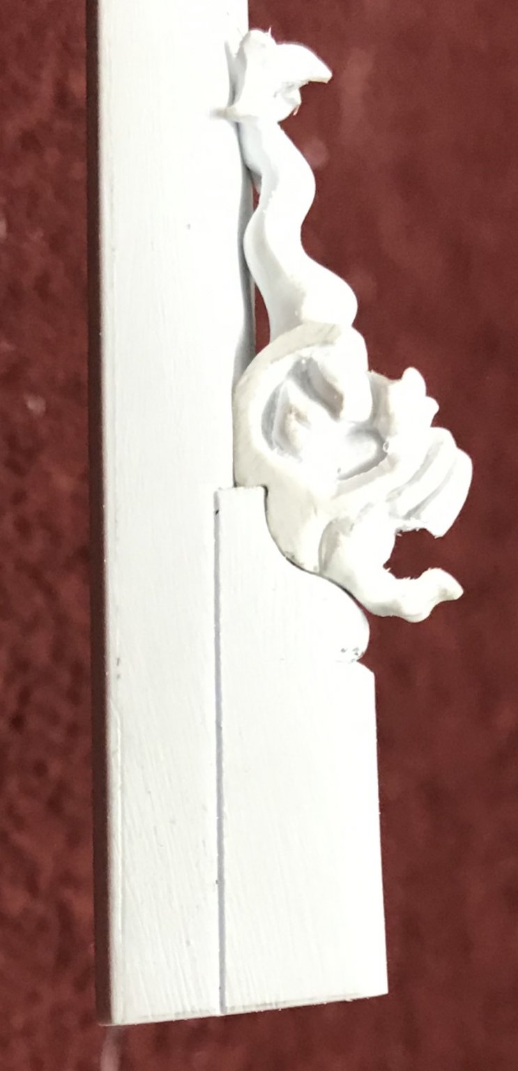
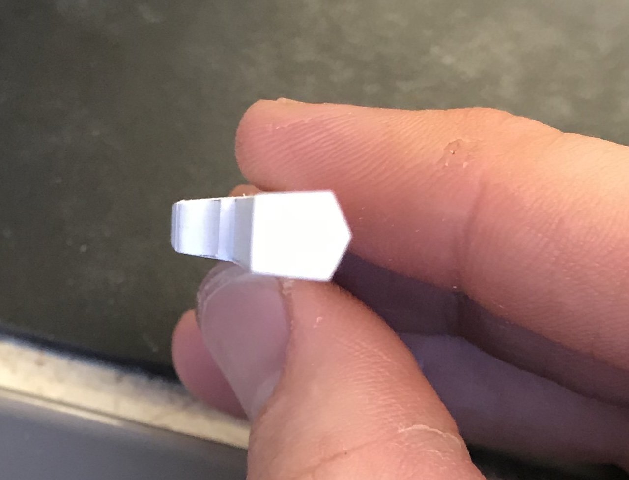
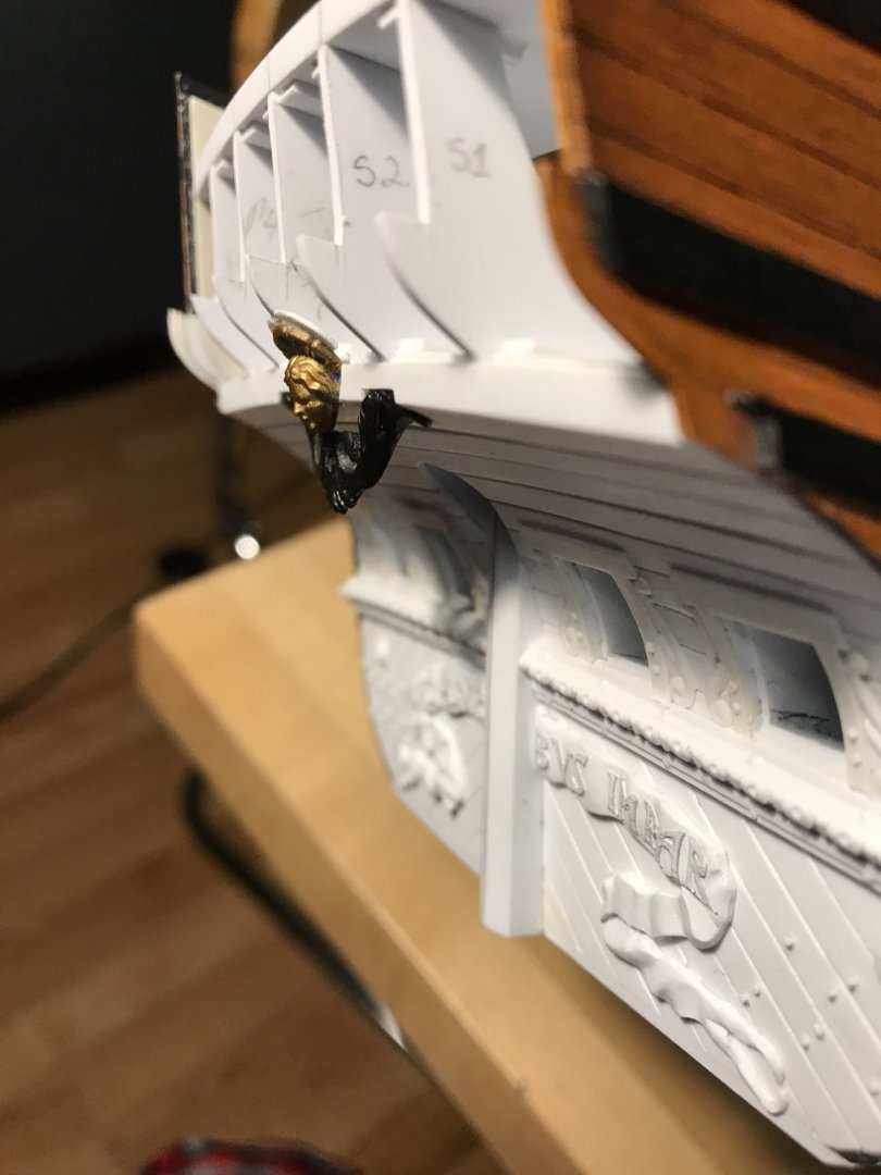
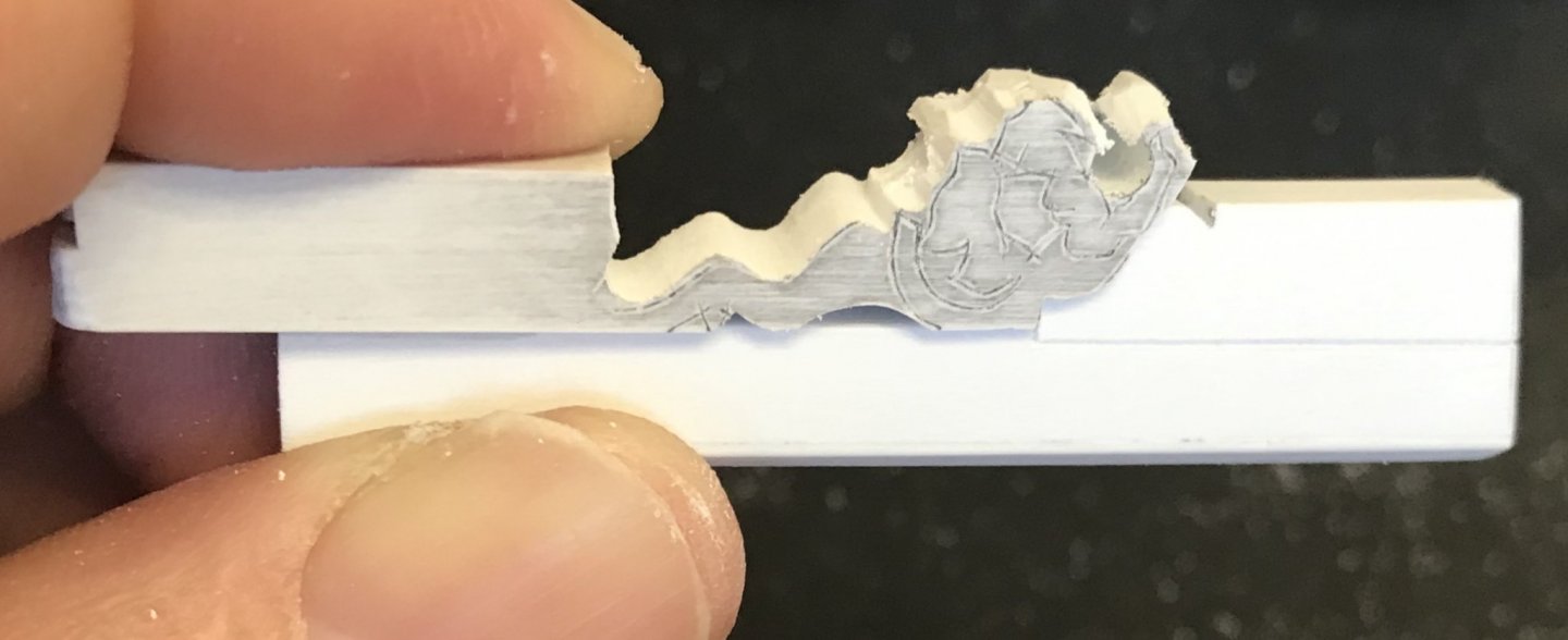
So, I’m almost finished with the rudder-head dolphin. Earlier, last week, I tried to upload a video I made, once I had arrived at the cleaned-up outline of the thing. The video resolution was, apparently, too high to upload from my mobile phone. At 10+ minutes, the video was also on the long side. Not even my attempts at breaking the video up into seven shorter segments seemed to work. In any case, I couldn’t see a way, on my iphone to reduce the resolution, so I gave up on that. The point of the video was to illustrate the importance of setting-in, deeply enough, certain key features of the figure, so that once my scribed lines disappeared, after the modeling process began, I’d always be able to reference these features in their correct location. In the case of this dolphin carving, the eyes and “mane” would be difficult to continually pencil back-in, as I did the rough modeling, so I simply set them in as deeply as I possibly could. With the way that the mane creates a sort of brow, above the eye, you almost can’t go wrong by setting deeply. So, here are some process photos of the modeling: Here is the last photo I took, just before setting in the eye sockets and the negative space between the mane and the transitional collar: With all of the facial features fully defined, it was time to model the body. Puget’s drawing, above, requires some effort at interpretation, IMO. I could, simply have done a straight tapering of the body from head to tail, but I thought the carving would exhibit a greater sense of vitality, if I incorporated a serpentine curve: After doing so, and also establishing a centerline along the side of the body, it was a simple matter of filing soft curves up and down, between each centerline; in cross-section, the body is almost diamond shaped. After modeling the tail, as best I could (I don’t love it, but it is good enough) - here is what “Flipper,” as I’ve dubbed him, looks like on the rudder-head: I will still need to come back, after he has been glued in-place, and apply his two flippers to the flats I left just below and to the back of the eye socket. The flippers will be shaped to their outline, before gluing, and modeled afterwards. I will also apply “pupils” to the eye sockets using the same technique that I discovered for representing the nail heads, along the wales. Otherwise, work on the aft chase port enhancements continues. These were particularly fiddly bits, but they are nearing completion. More to come.


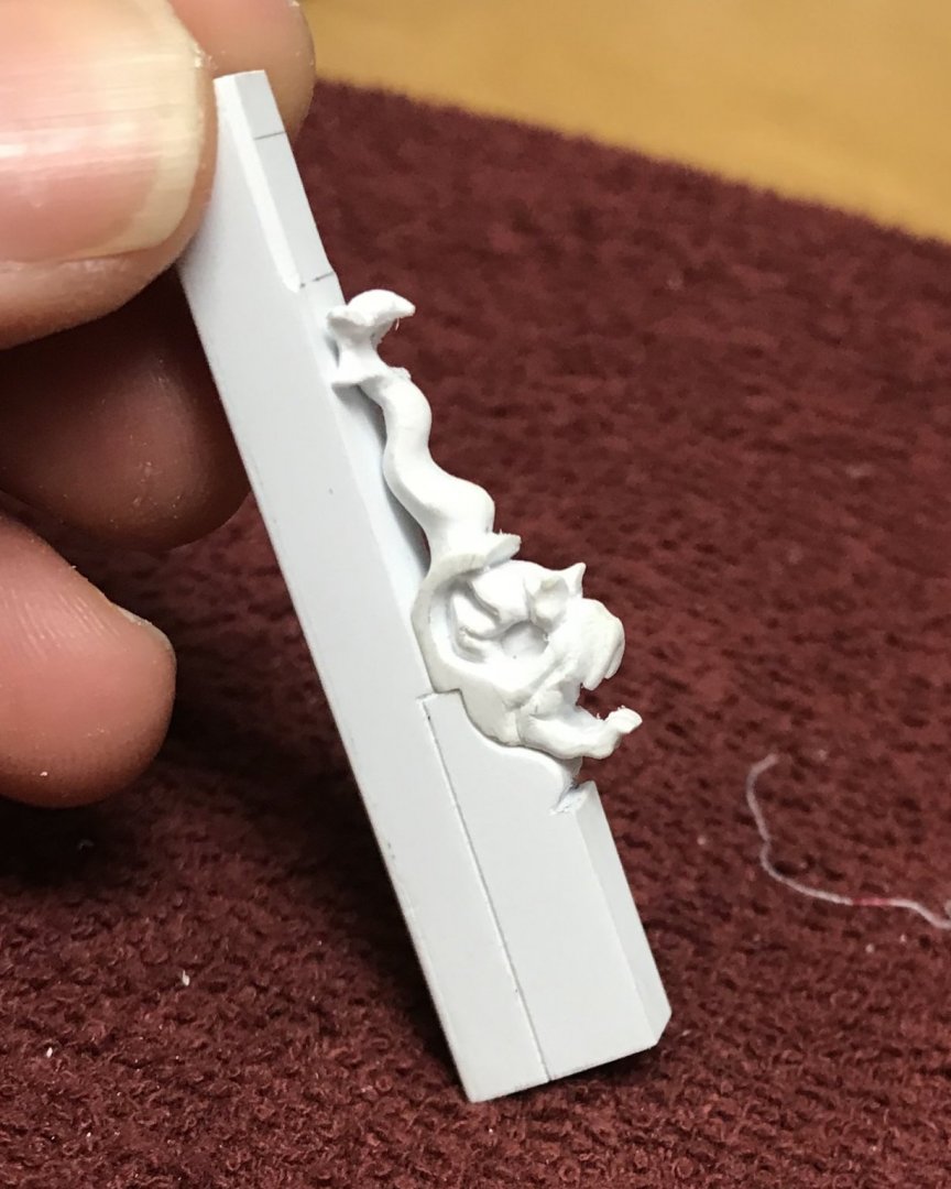
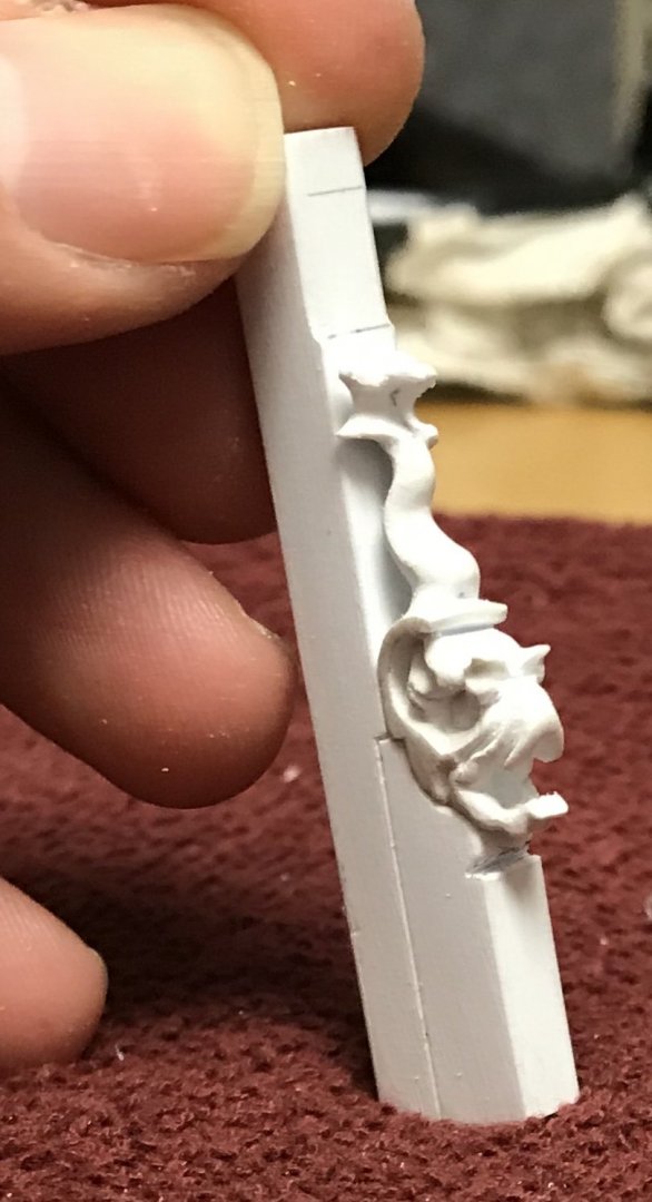

- 2,699 replies
-
- 15
-
-
- heller
- soleil royal
- (and 9 more)
-
I just thought that you were doing such an incredible job of up-grading the kit. I wanted you to finish with a flourish befitting of all the excellent work you have done, and now you have. Well done! All the best, Marc
-
My guess is that they are lifts for the ship’s boats. That would be where I start looking anyway.
- 1,035 replies
-
- 3
-
-
- royal katherine
- ship of the line
- (and 1 more)
-
All fascinating technique, B.E. It is an interesting peculiarity of the Heller kits that they, mostly all, seem to have this un-detailed patch along the mid-ship floors. I’ll have to take a look at my un-built 1:100 Victory, but I seem to recall that is the case, there, as well. Also, I noticed the subtle wearing of the black on the edges of the wales. This is a nice touch, and I wish I had thought of that when I was doing my undercoats for S.R. Maybe I’ll dry-brush some dark brown before my final clear top-coat. Anyway, I’m enjoying very much this continued discussion of a very fine model.
- 126 replies
-
- 2
-
-
- le superbe
- heller
- (and 2 more)
-
To be honest, I wasn’t 100% sold on adding the lion mascaroons, but now that I see them in place I really love them! I agree with you that they tie-in nicely with the whole decorative program, and now the lantern looks a part of the ship, IMO. Great work!!
-
micro challenges = MACRO HEADACHES I love the trial and error. Keep on, keepin’ on, Mark!
-
Your work is just so clean and precise, Mike! Always a pleasure to see. Happy New Year!!
- 607 replies
-
- 3
-
-
- winchelsea
- Syren Ship Model Company
- (and 1 more)
-
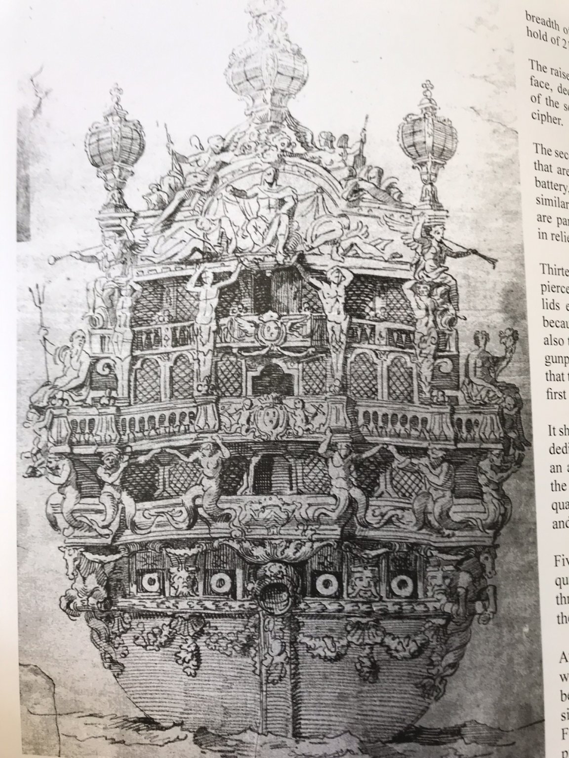
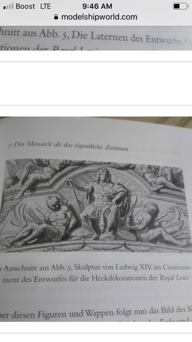
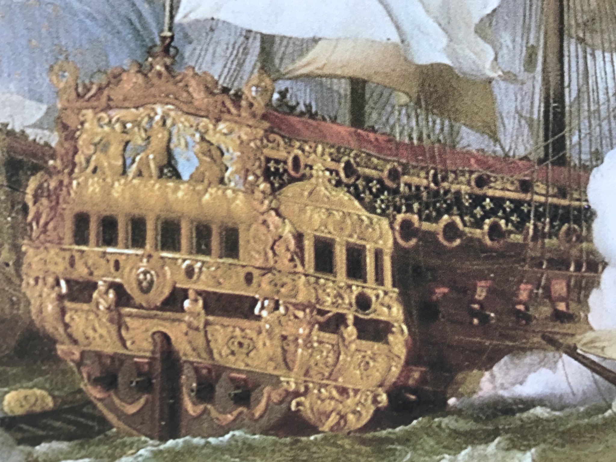
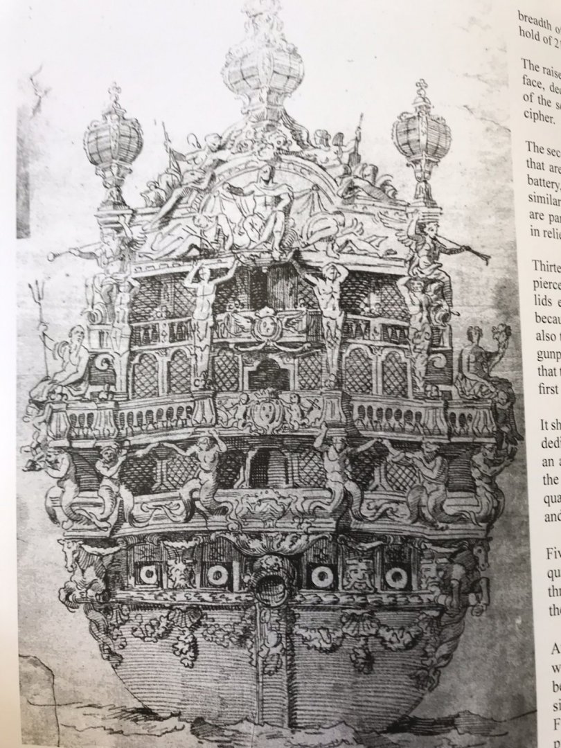
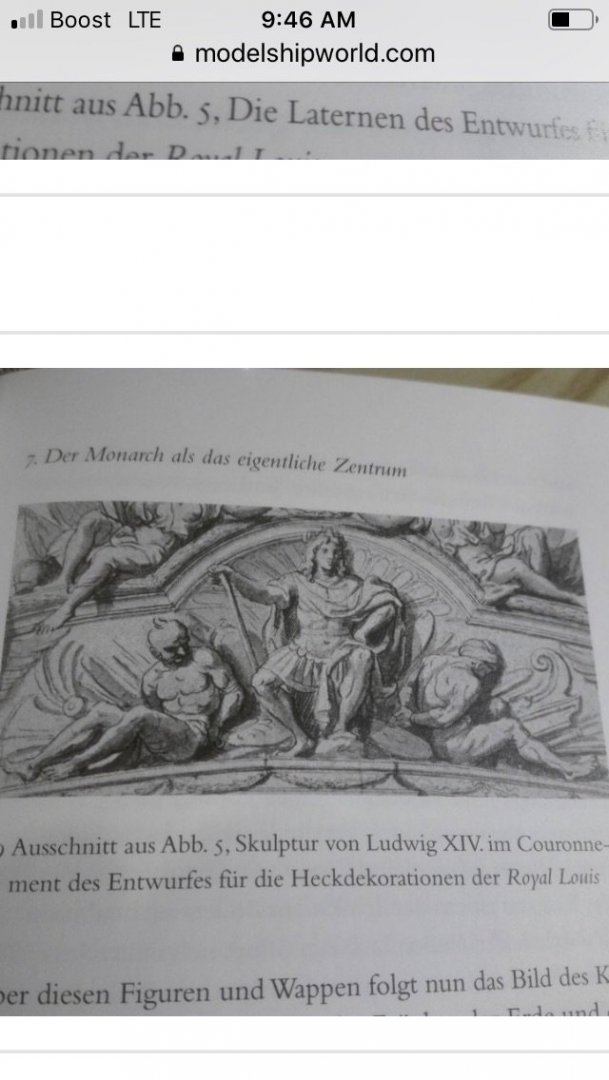
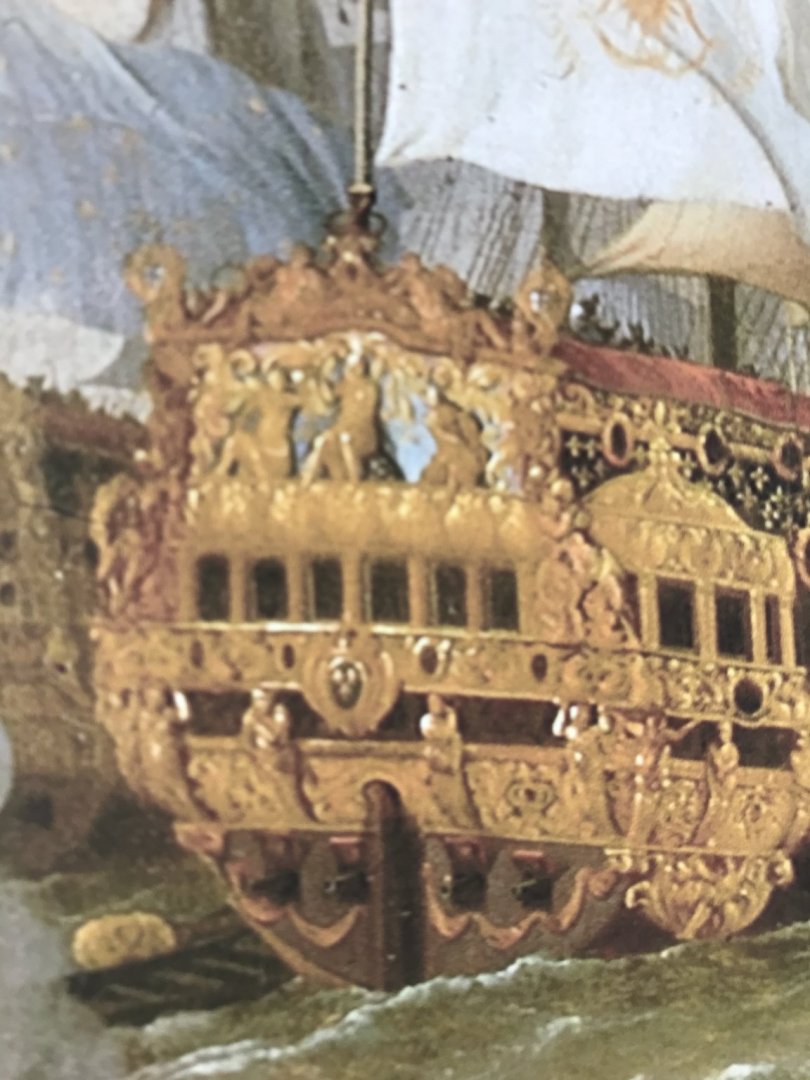
So, I’m three years into this project, and all of this time, I’ve been poring over imagery of Soleil Royal and her near contemporaries, and trying to make sense of it all. As a gift for my wife, over the holidays, I took advantage of a 1/2-off framing sale, at BLICK, to have one of her favorite Broadway posters re-framed. While I was at it, I had my Royal Maritime Museum print of Peter Monamy’s Burning of Soleil Royal framed. They did a wonderful job, and I’d show you, but the whole thing is shrouded in protective plastic, at the moment. But then, I considered framing my other print of SR, which is Bakhuizen’s Battle of Barfleur. So, I took out the print, and for the first time in those three years, I really examined SR, in the portrait up close. Now, I have written before about the many fictions and discrepancies of the Bakhuizen portrait, and none of those realities has diminished my appreciation for the spectacle and grandeur that his portrait conveys. Nonetheless, I did take a closer look... A little bit closer... The first thing that struck me was that this is not Apollo’s horse-drawn chariot rumbling across the sky of the tafferal. And the shape of the tafferal cornice is not the reverse-cyma curve of Berain’s drawing. And those recumbent figures on the tafferal cornice are neither “Europe” with her horse, nor “Asia” with her camel. On the other hand, Bakhuizen’s representation does seem to bear an uncanny resemblance to the better documented Royal Louis: The tafferal shape is a central dome, beneath which are large reliefs of the triumphal Monarch and two shackled slaves at his feet. The posture of the recumbent figures is much closer to that of the winged angel figures, above. And Bakhuizen’s squiggly banner?/rudder chain? beneath the transom moulding actually bears some resemblance to the swagged foliate garland of the Royal Louis: And so, all of this, once again, reinforces for me that the marine artists, of their day sometimes were limited in their first-hand experience and knowledge of other Country’s ships, and so they made composite portraits from several different sources. To this day, Hayat’s description of the Royal Louis is the best and most complete description of a French First-Rate, from this time period. Perhaps it was this document that Bakhuizen used to fill-in the blanks. Maybe the Royal Louis’s reputation as SR’s “sister ship” was reason enough for Bakhuizen to treat their allegories as interchangeable. While, previously, I have posted what I hope may be an authentic description of Soleil Royal, prior to her refit - the specific contemporary correspondence from which the description, supposedly, originates is not made clear in “The Life and Times of Pierre Puget.” Short of combing through the archives, myself, to find that correspondence, I will just have to take the author’s word for it. Anyway, I just thought this was interesting and worth the mention. As ever, I am greatly appreciative of everyone who is following along, as well as their likes and comments. That people are interested in wading into the murky waters of the French 17th C. is a tremendous inspiration to me!

- 2,699 replies
-
- 6
-
-
- heller
- soleil royal
- (and 9 more)
-
Hey MD! This is going to look much, much better! I like your candle idea - it’s a clever work-around to not hollowing out the center. Can’t wait to see the finished result.
-
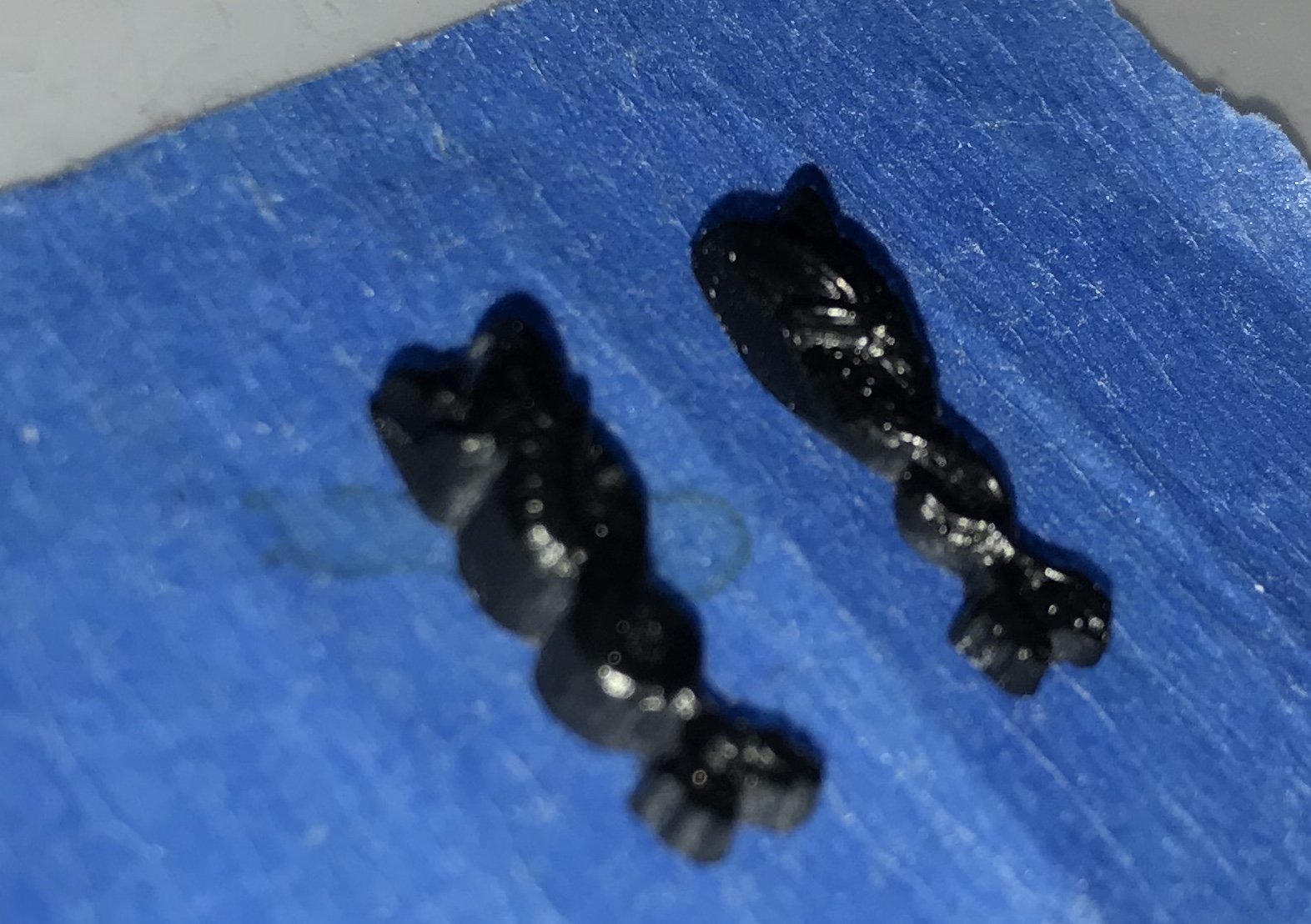
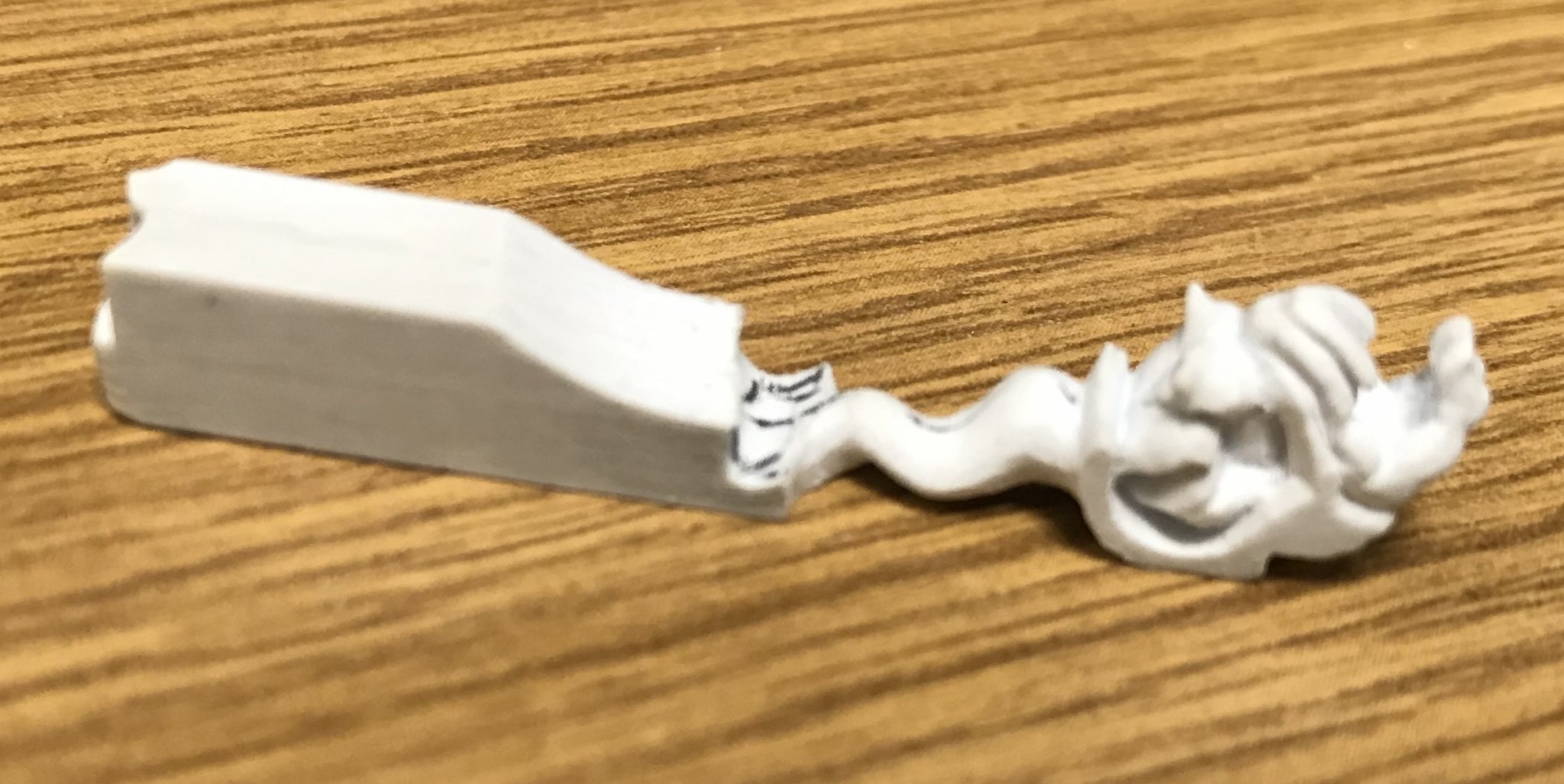
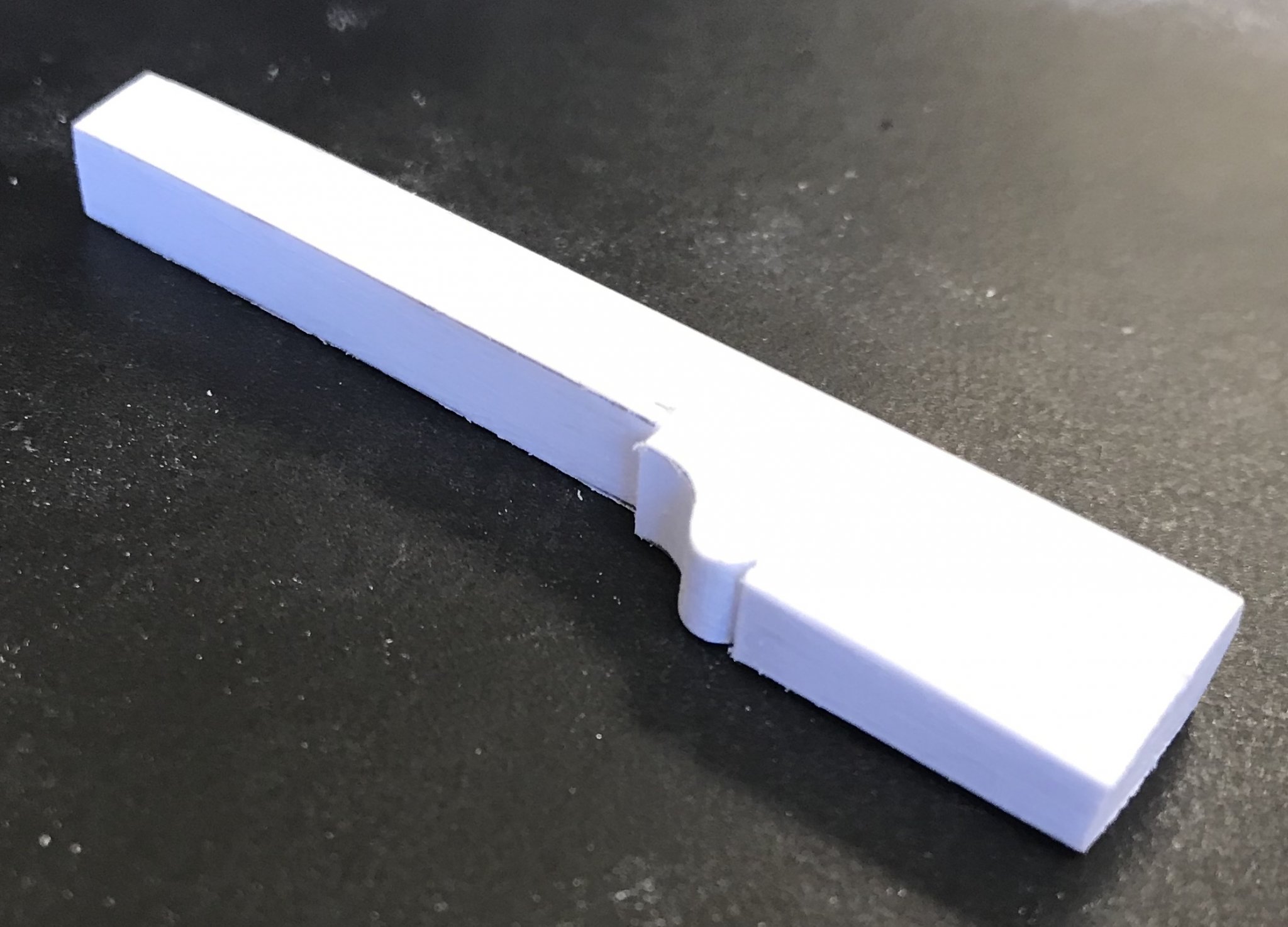
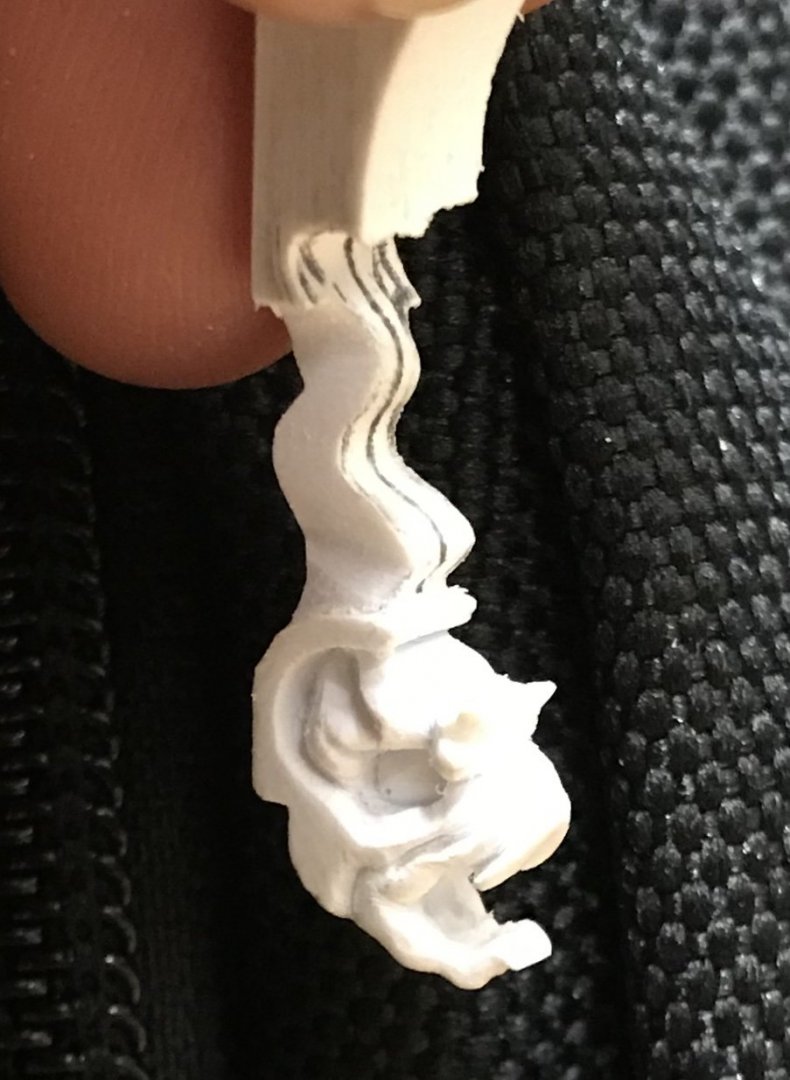
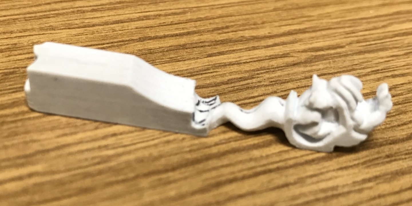
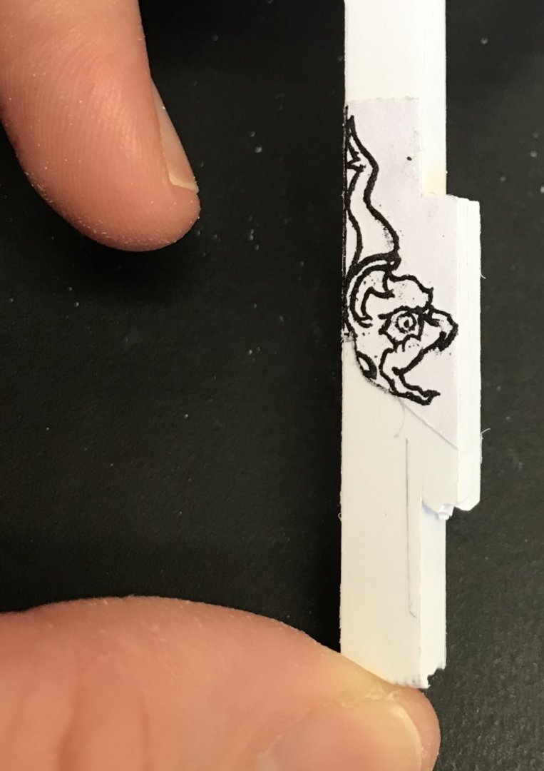
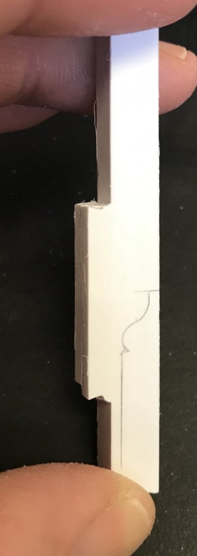
Decent day in the ol’ Beeldsnijderij: A great deal of time was spent just getting a good fit between the blank and the rudder head. Also, it turns out my right and left patterns were not in perfect alignment, so there will be a bit of a skew to the carving, but that may actually enhance the finished work. The outline of the body is defined, but the head is complicated and will take more time than I have, today, to sharpen up its parameters.

- 2,699 replies
-
- 9
-
-
- heller
- soleil royal
- (and 9 more)