Hubac's Historian
-
Posts
3,317 -
Joined
-
Last visited
Content Type
Profiles
Forums
Gallery
Events
Everything posted by Hubac's Historian
-
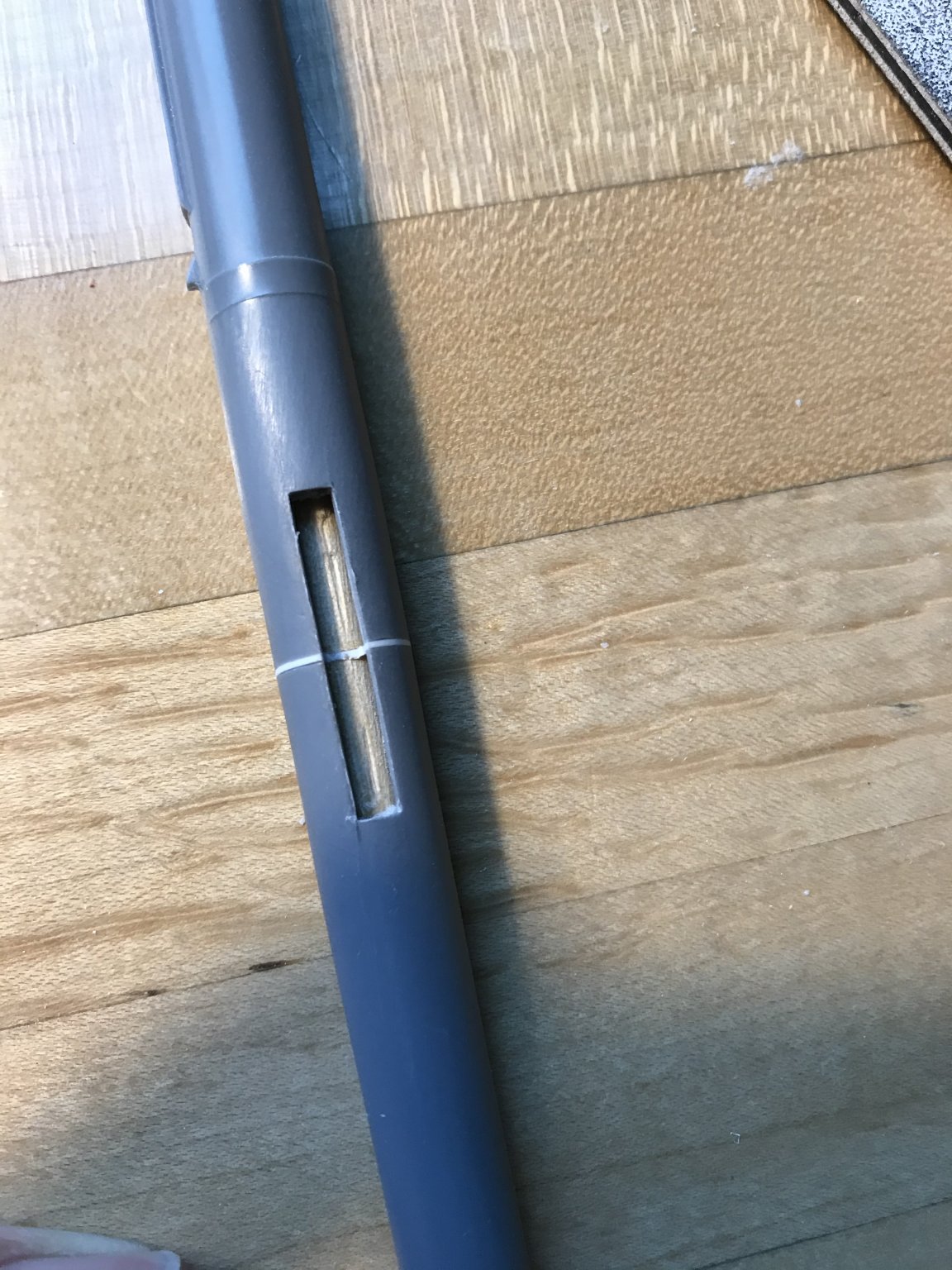
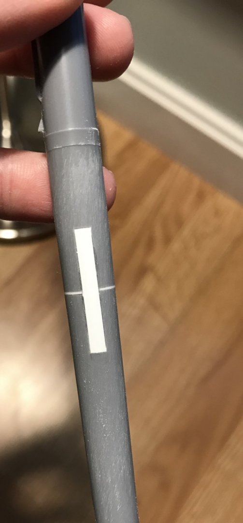
 It’s a little annoying that I spent all of today’s allotted model time fixing this problem, but I am happy enough with the outcome, and have restored faith in the integrity of the mast: The dowel, in this section, apparently favored the un-cut half of the mast, so it appears that about half the dowel was still intact. Thanks for looking in😁
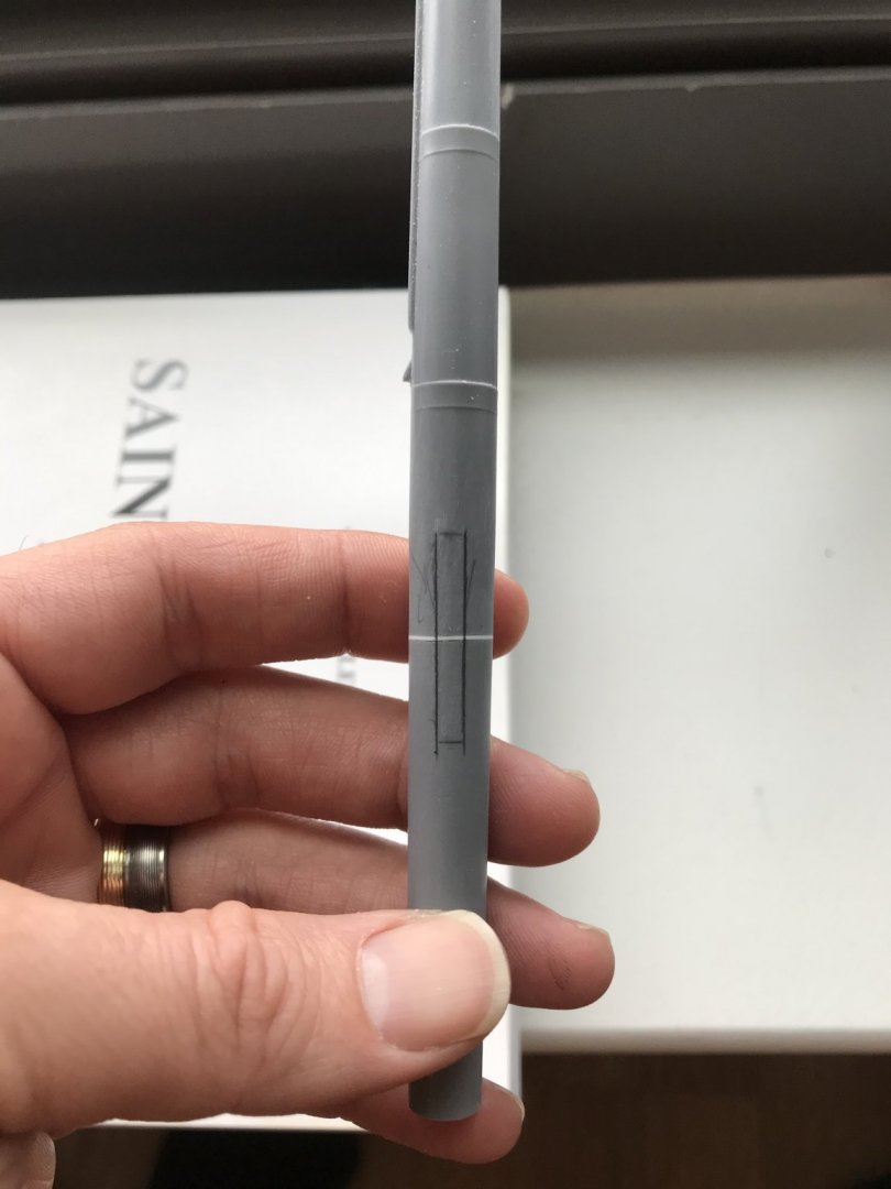


- 2,699 replies
-
- 12
-

-
- heller
- soleil royal
- (and 9 more)
-
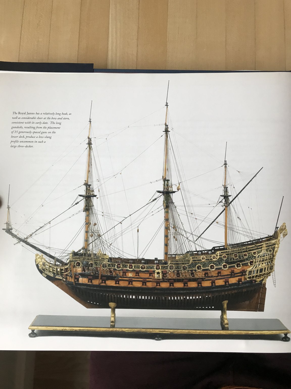
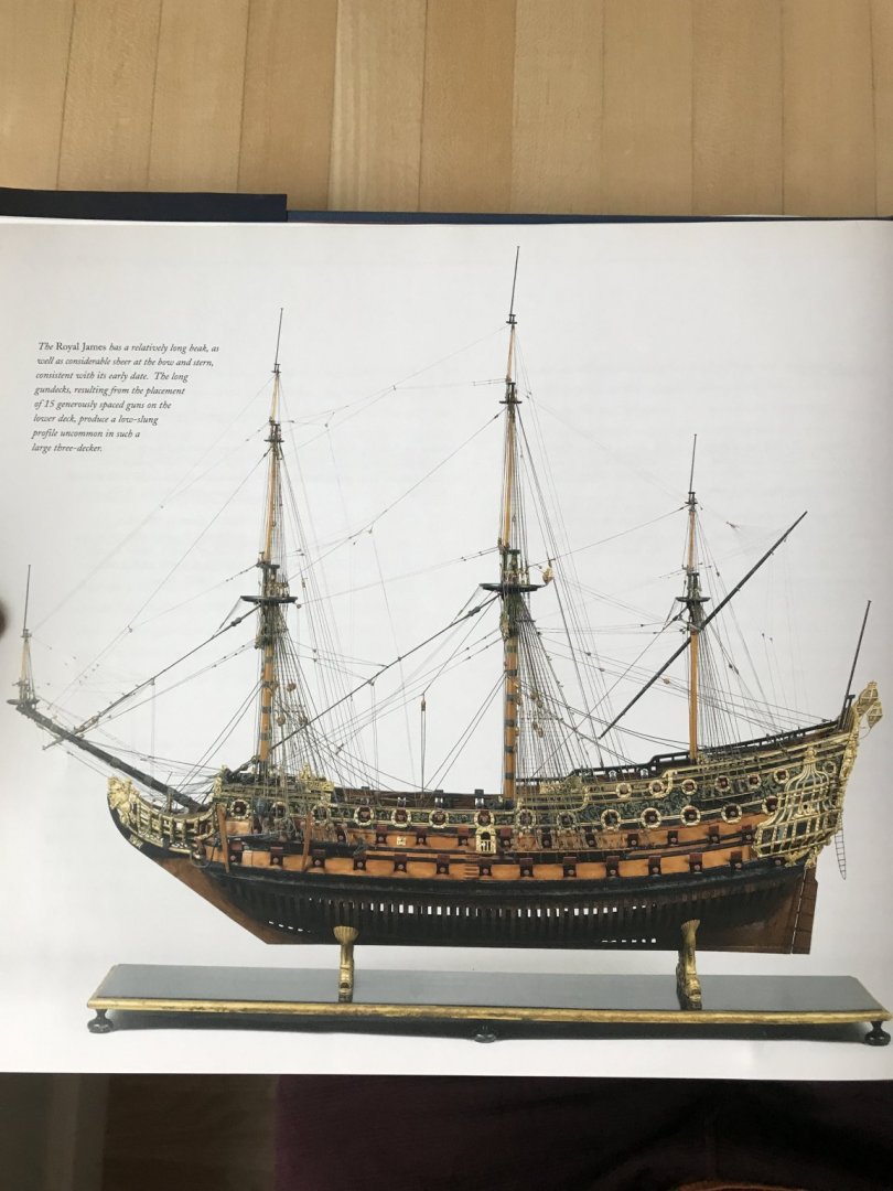
Well, certainly I can appreciate the difficulty you describe, as when I’m reading all of these French language texts, and the technical descriptions often don’t translate well to English. Well, I have another book for you that may be a good visual guide for you: In particular, this section concerning the Royal James of 1671 is well described and beautifully photographed. The James is a few years later than the Katherine, but I would think the rig would be largely the same. I few years ago, I took a bunch of pictures of this model while on a trip to Washington D.C. If you P.M. your email address to me, I will send you the pictures that I have. I hope this is helpful.

- 1,035 replies
-
- 8
-
-
- royal katherine
- ship of the line
- (and 1 more)
-
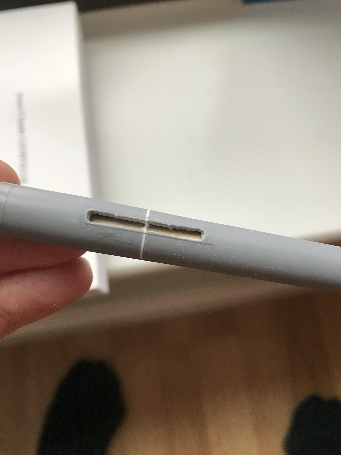
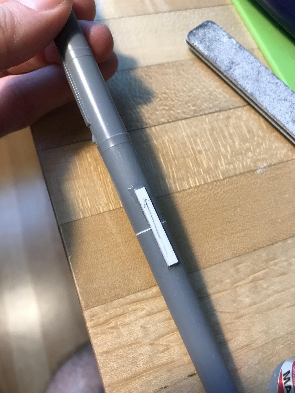
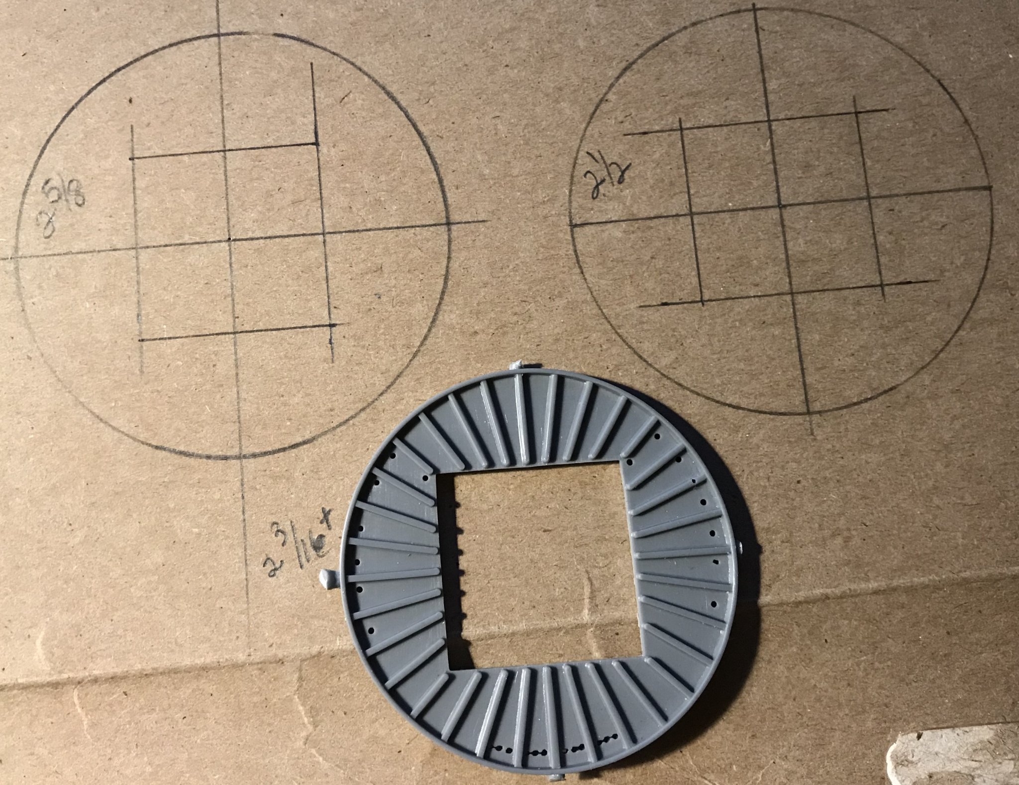
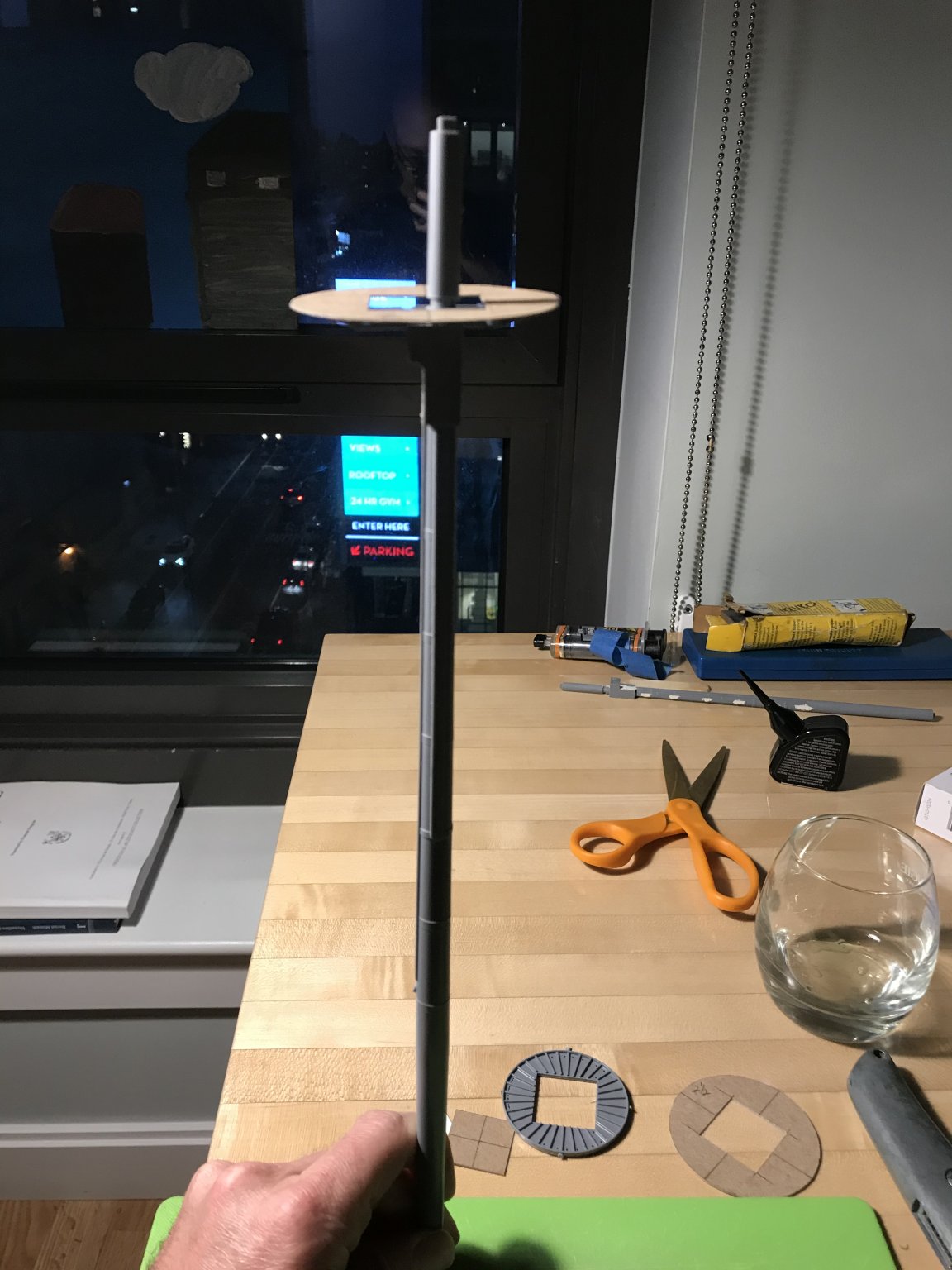
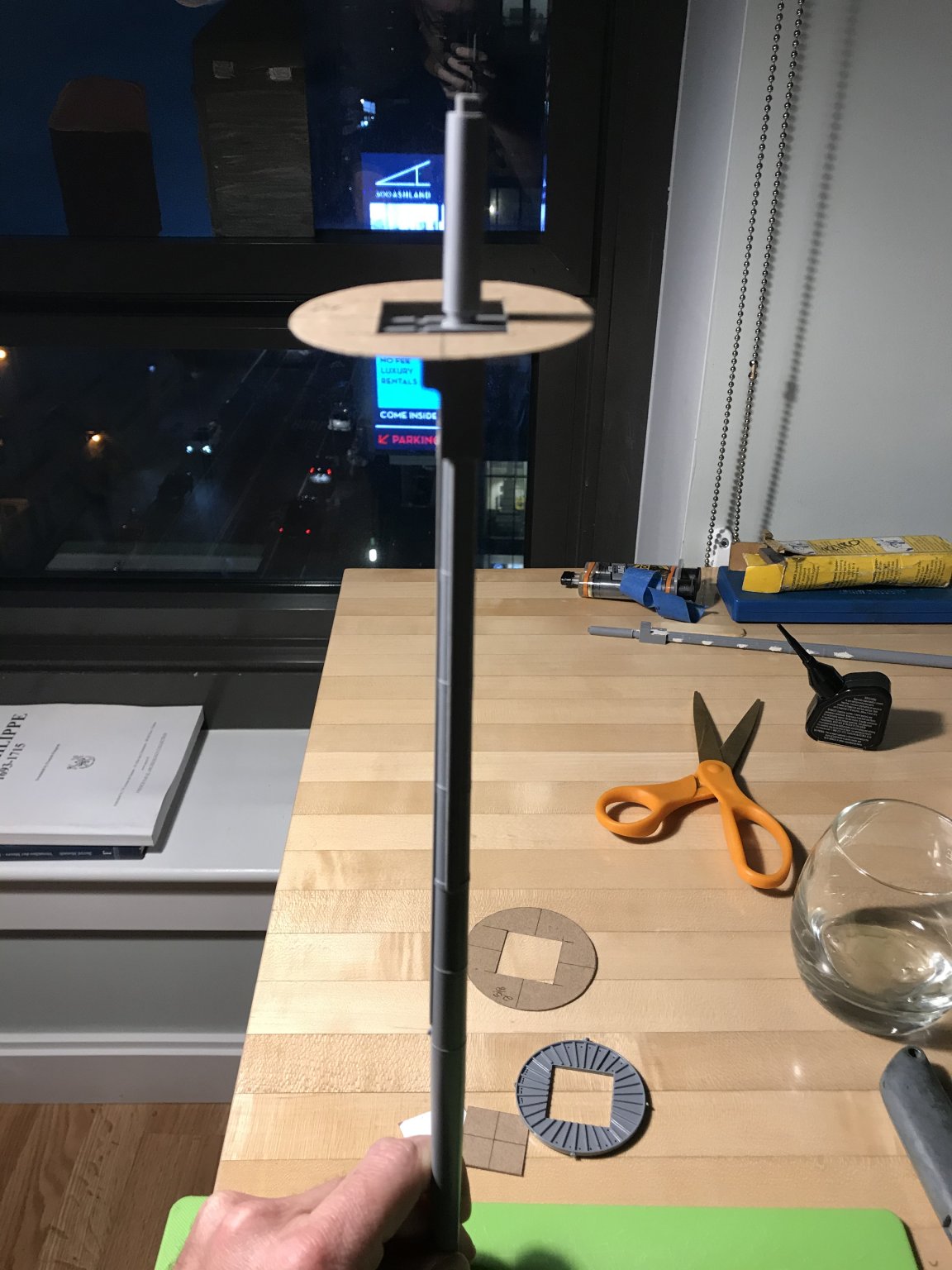
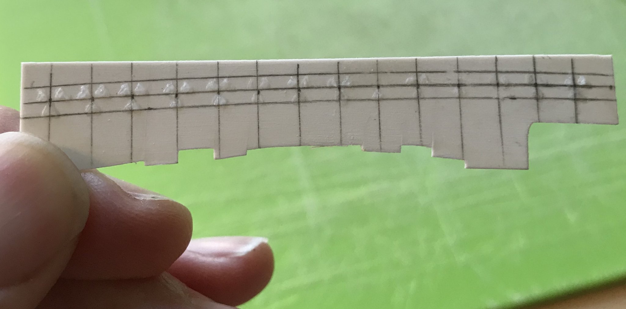
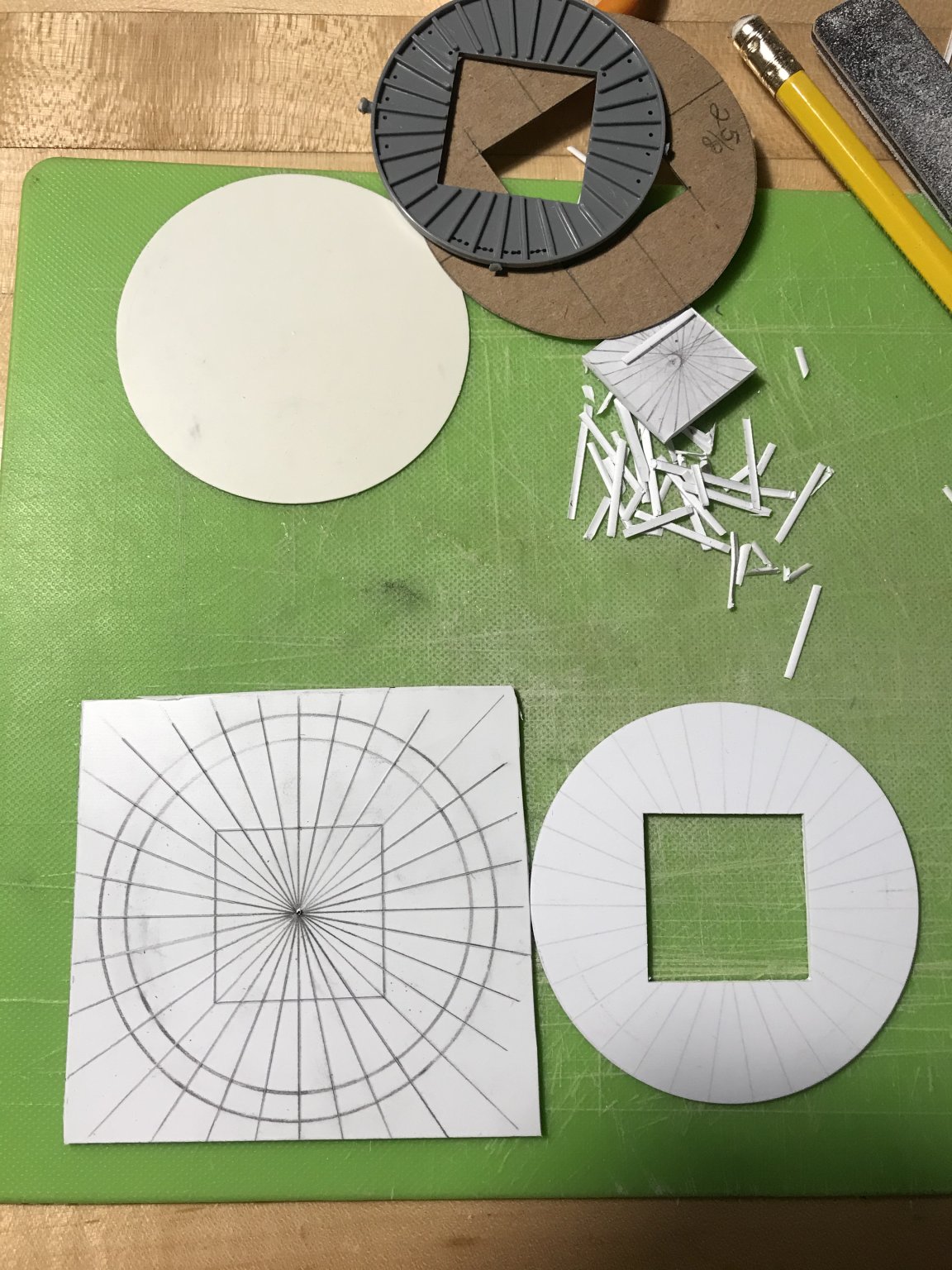
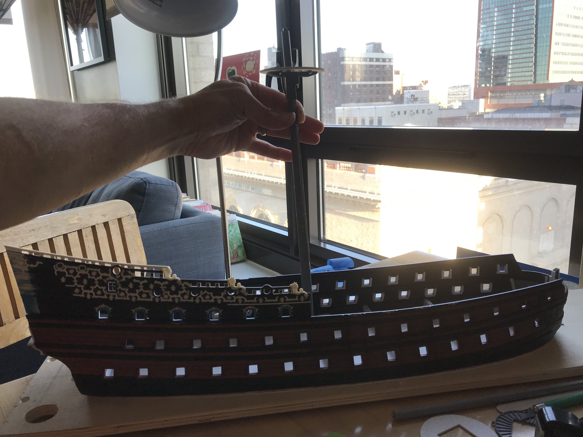
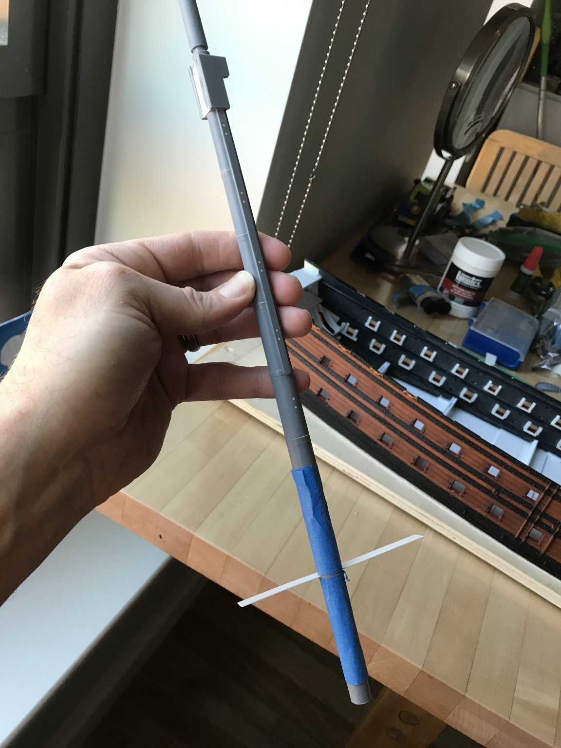
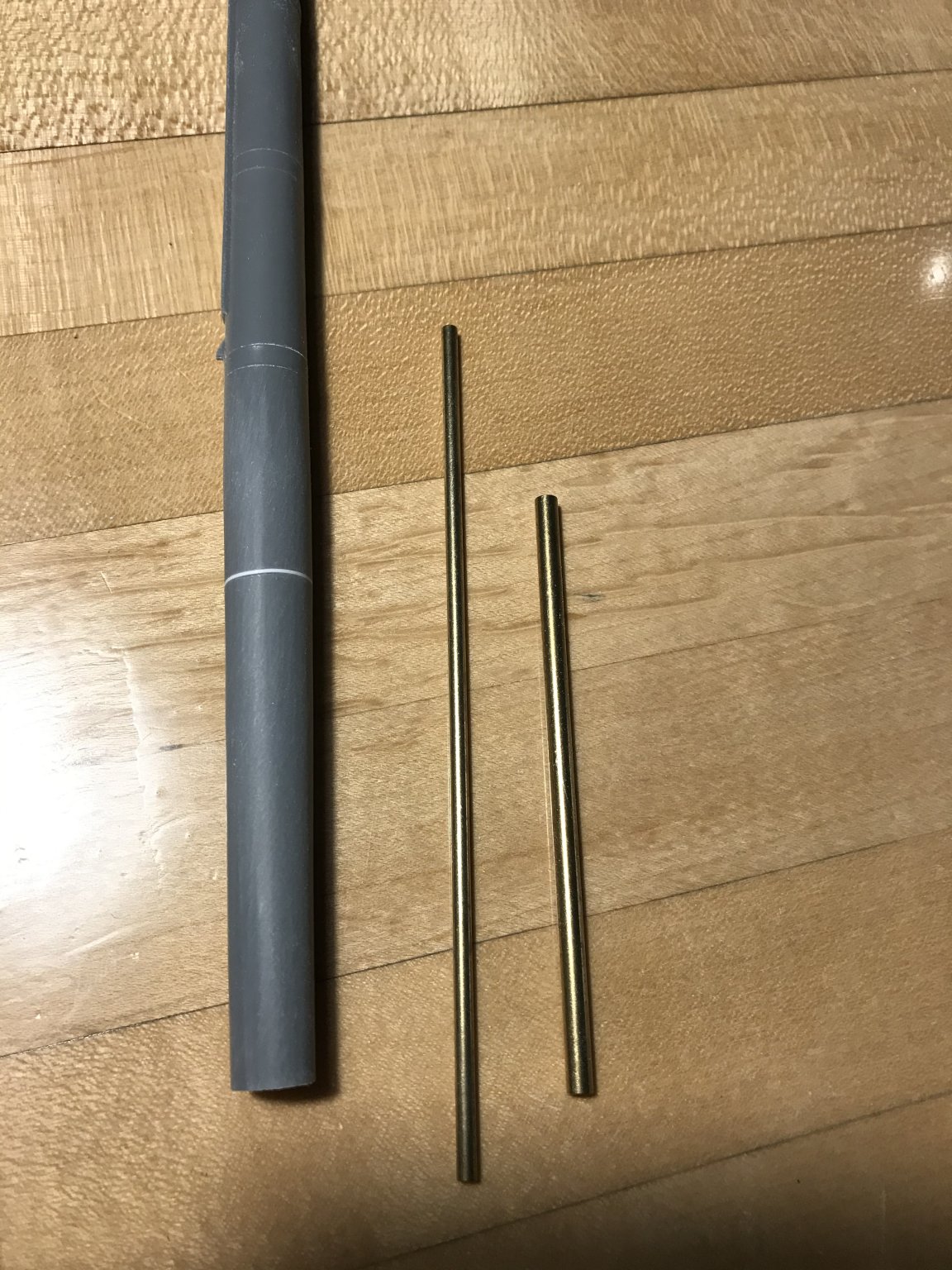
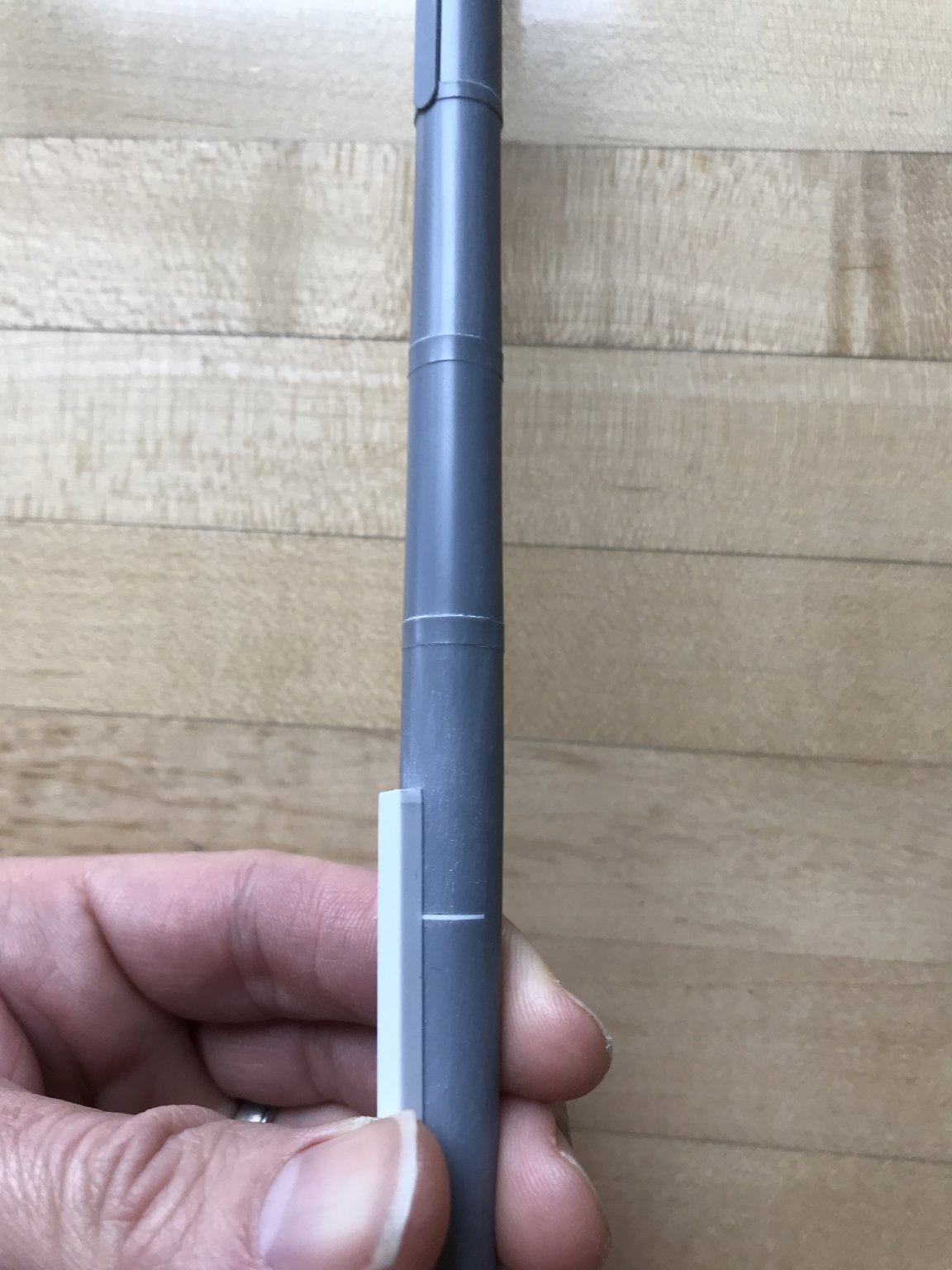
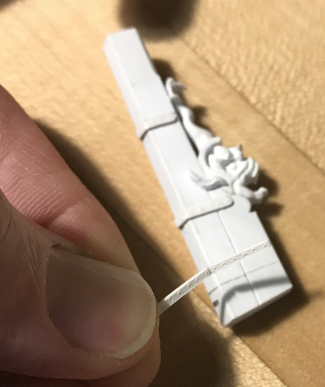
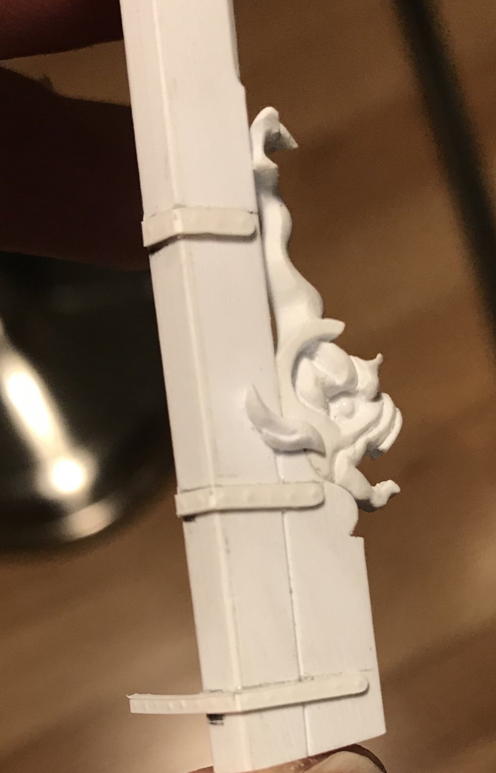
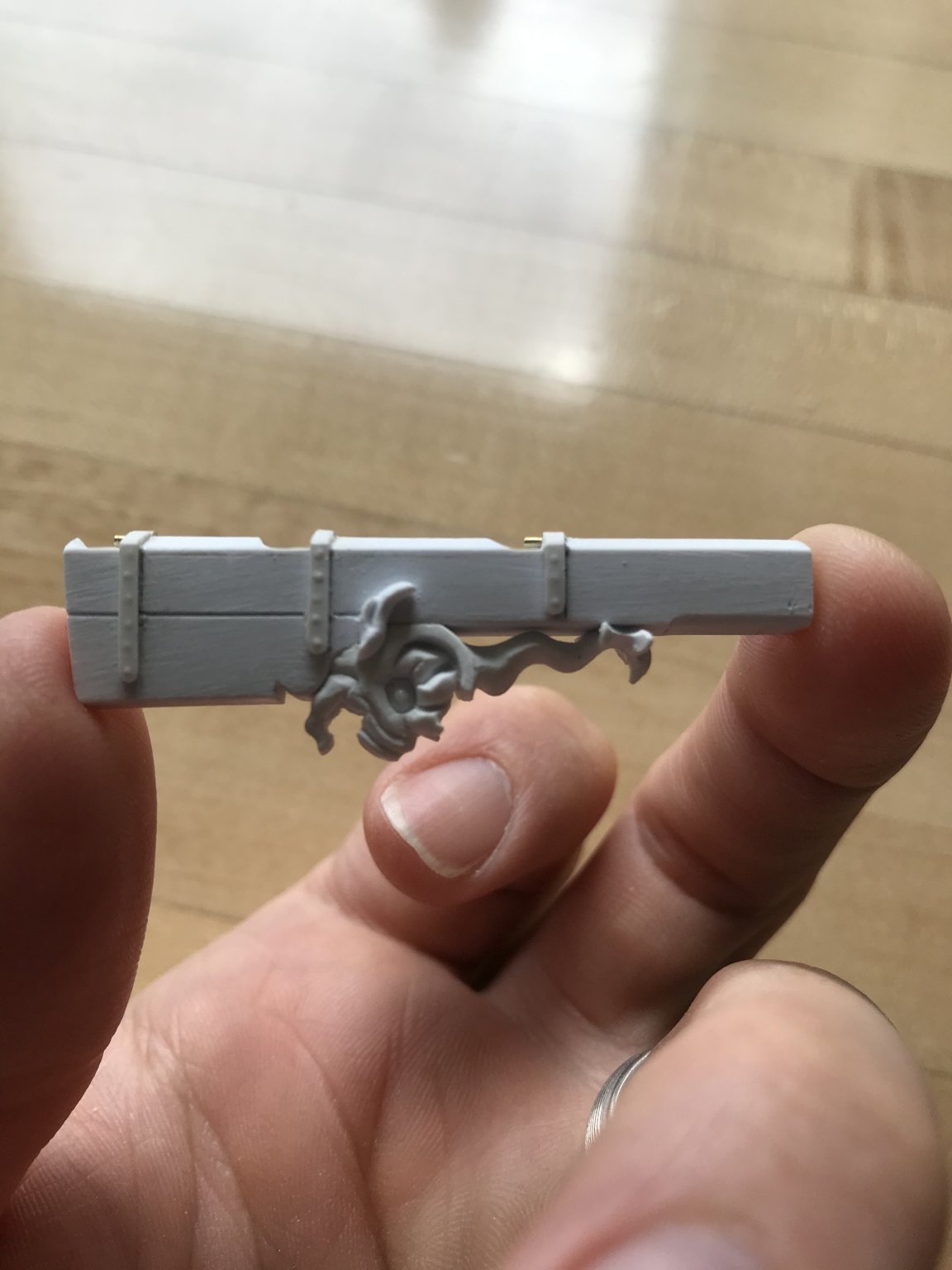
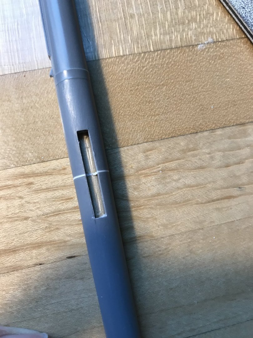
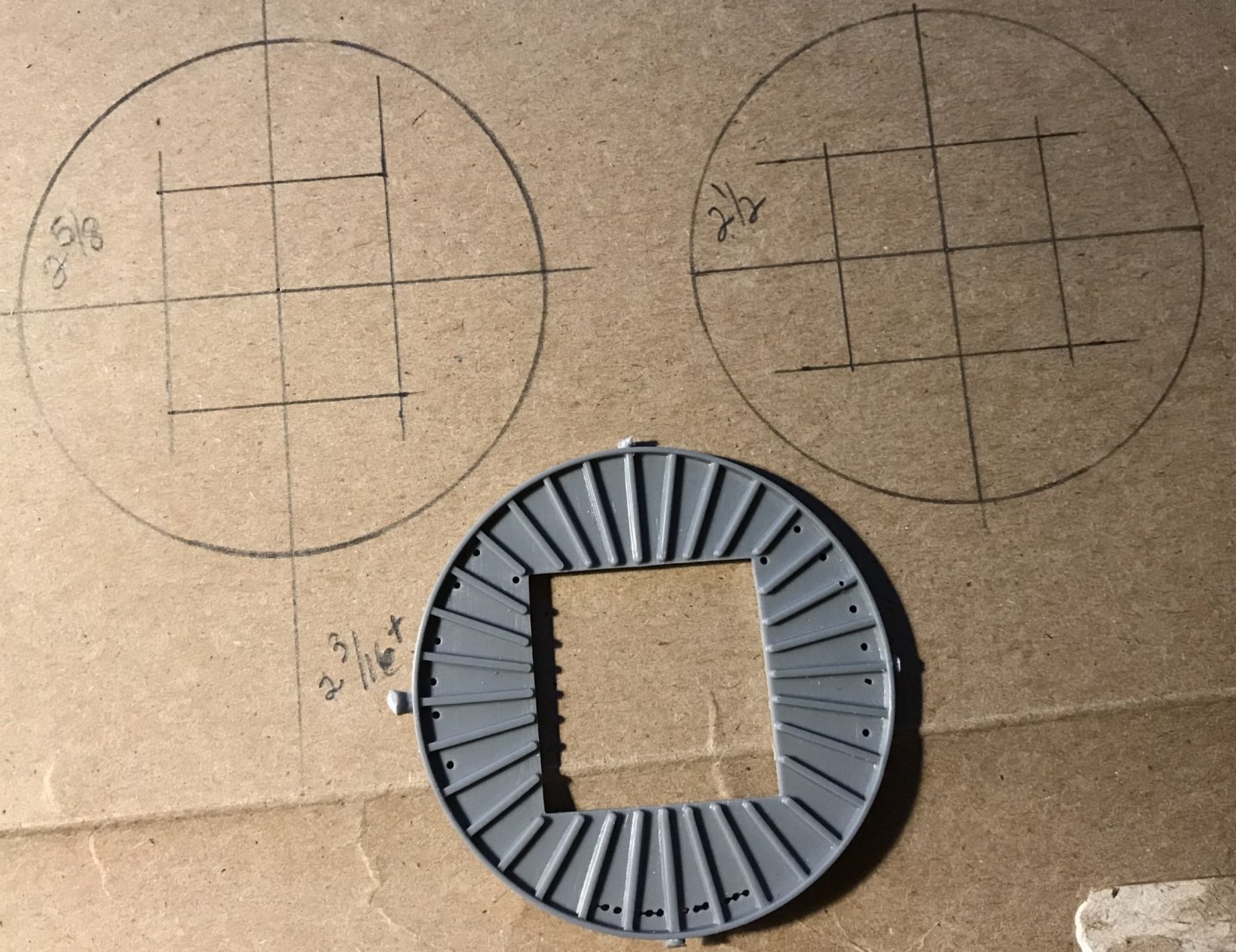
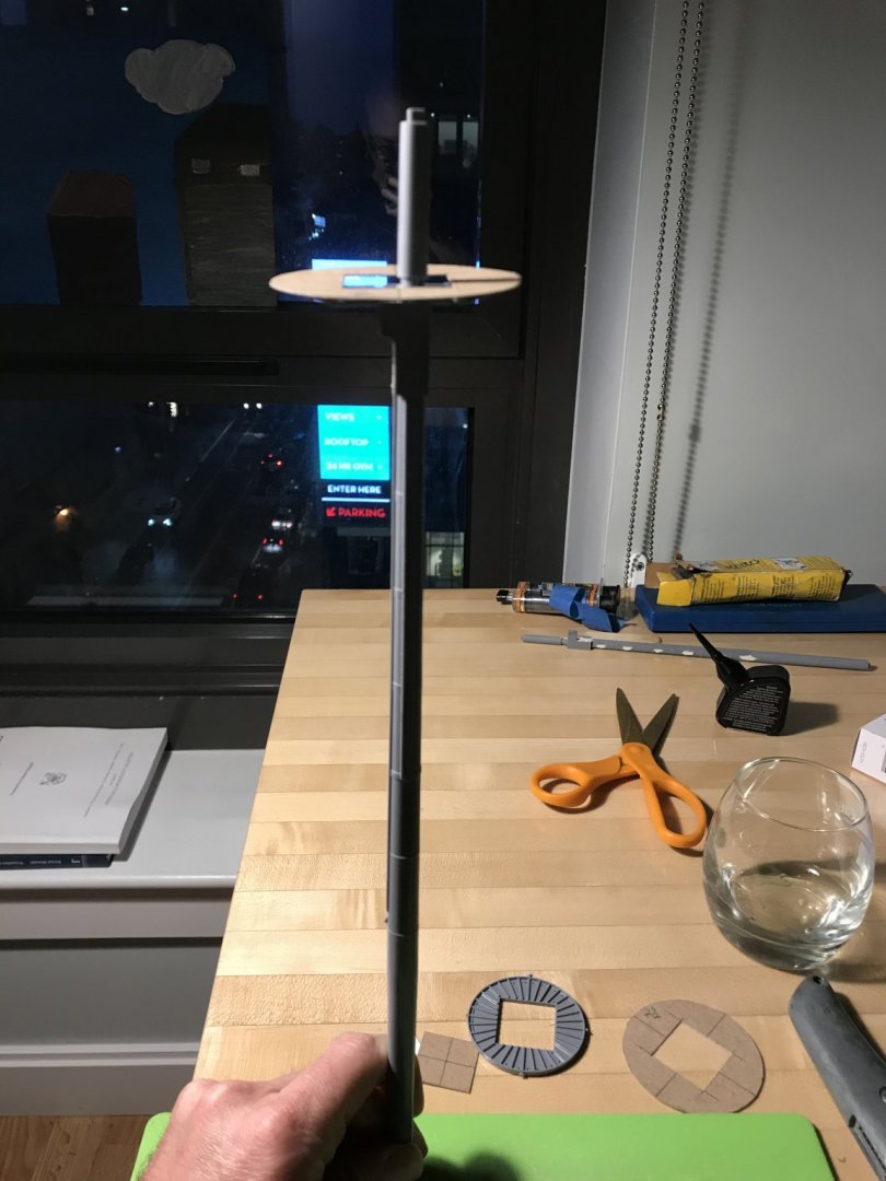
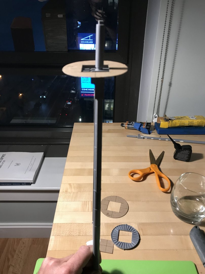
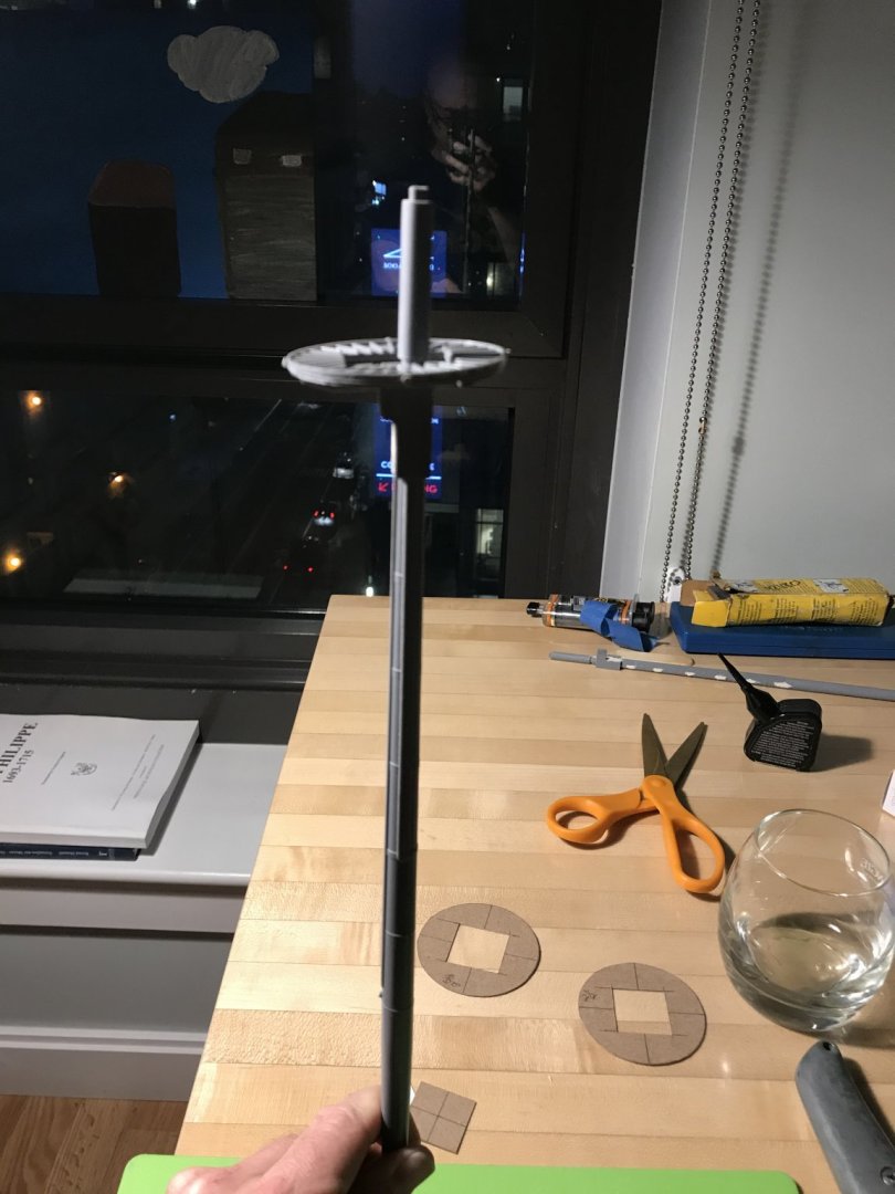
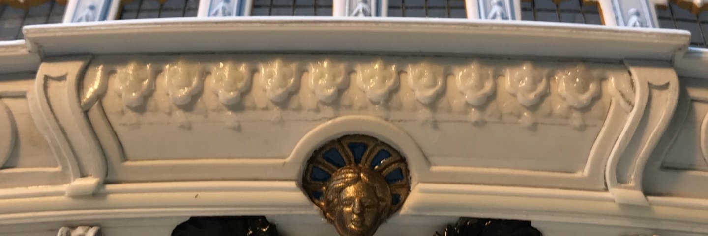
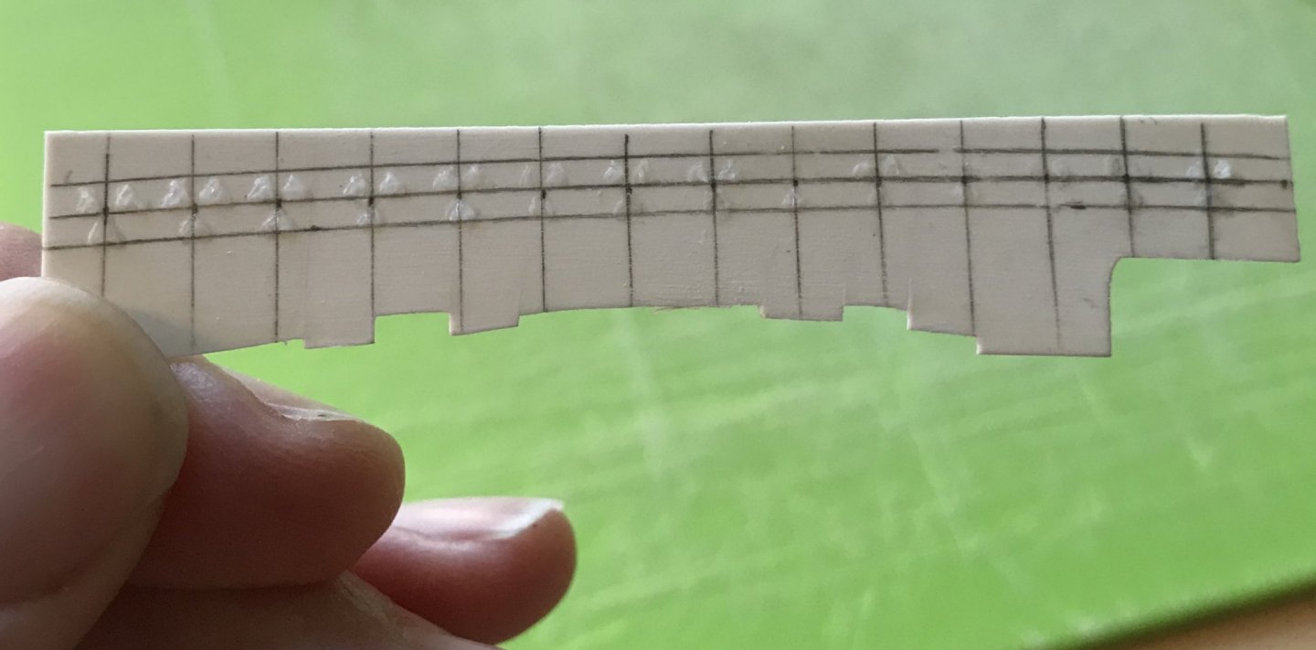
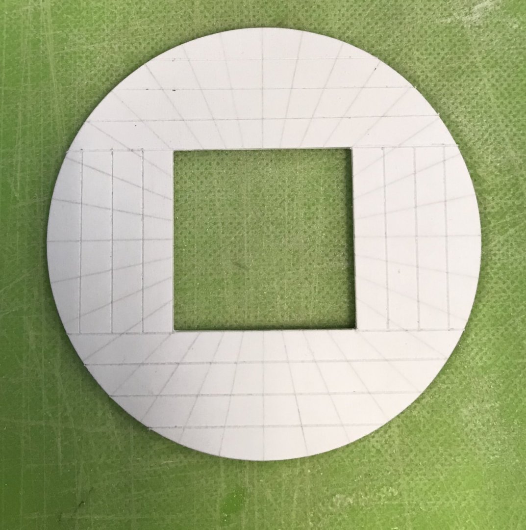
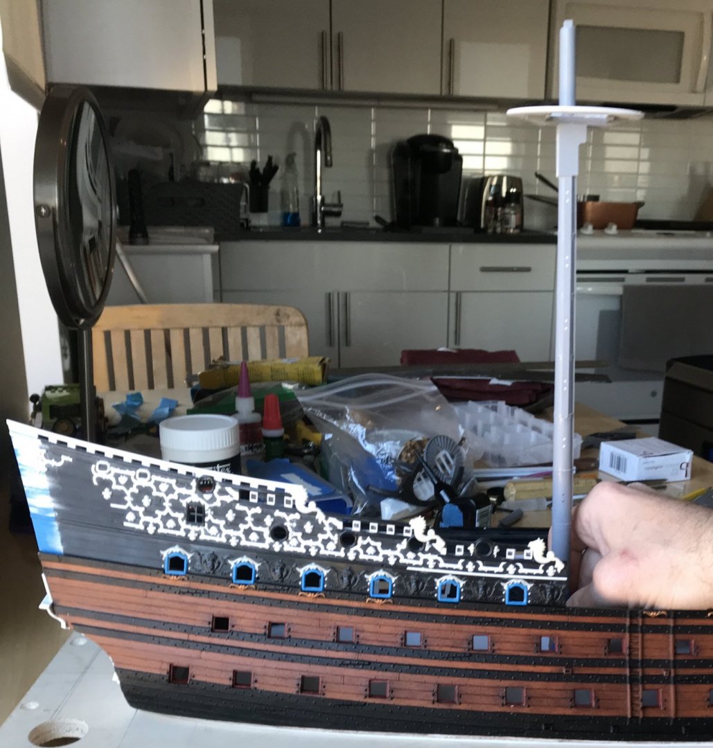
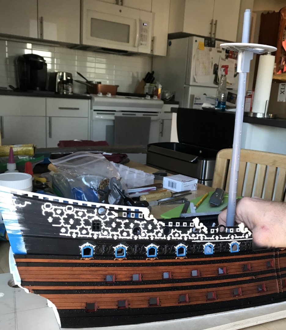
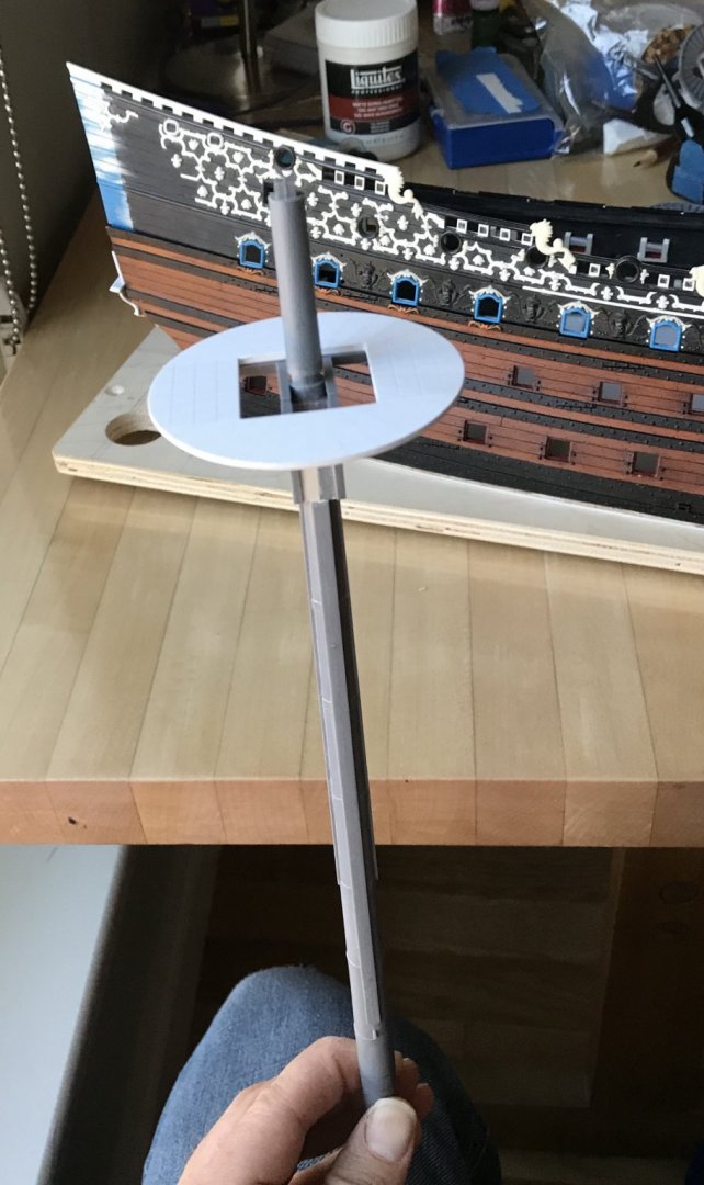
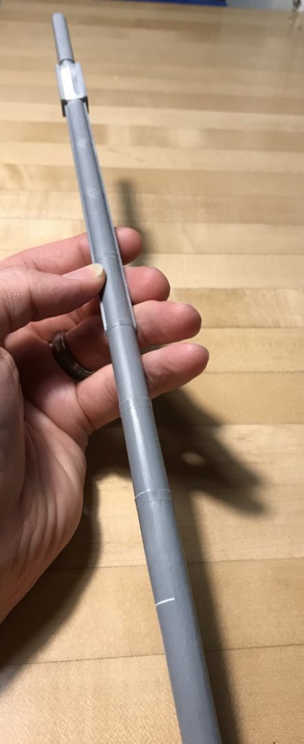
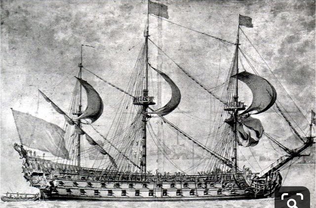
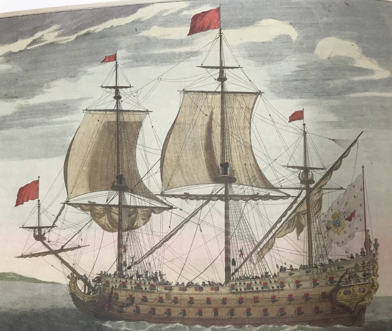
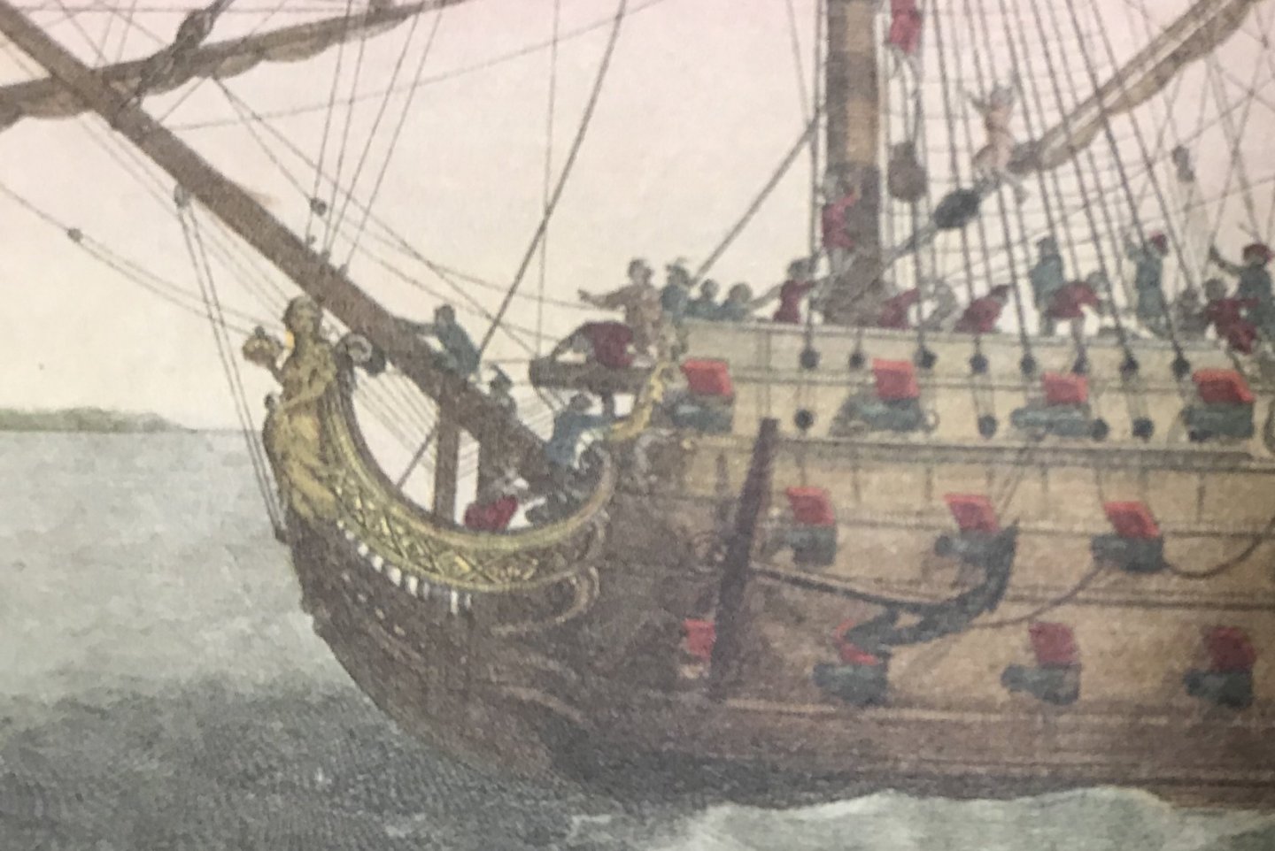
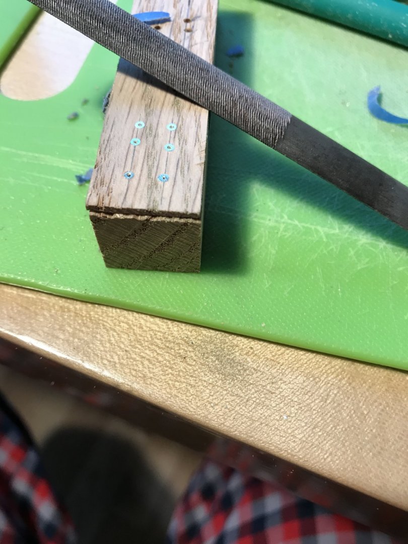
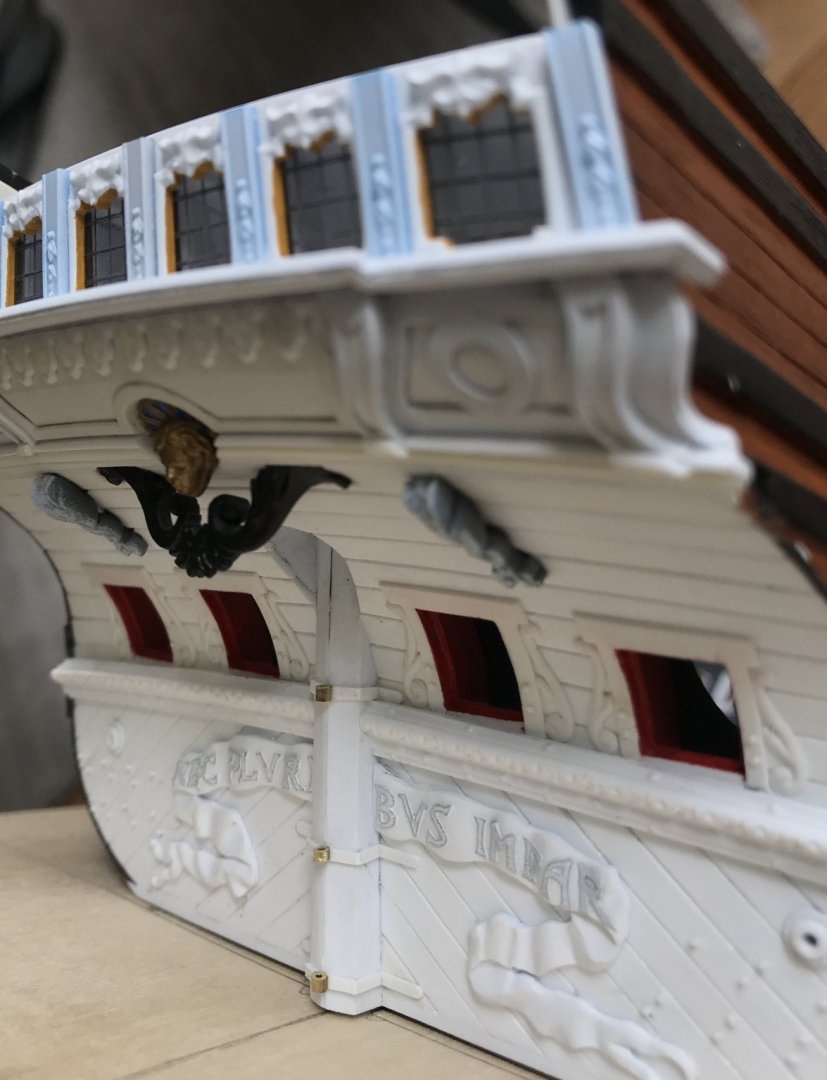
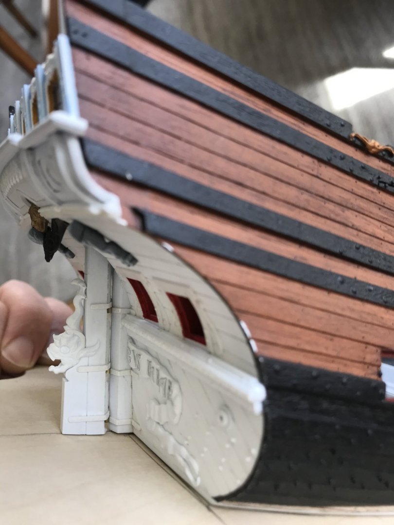
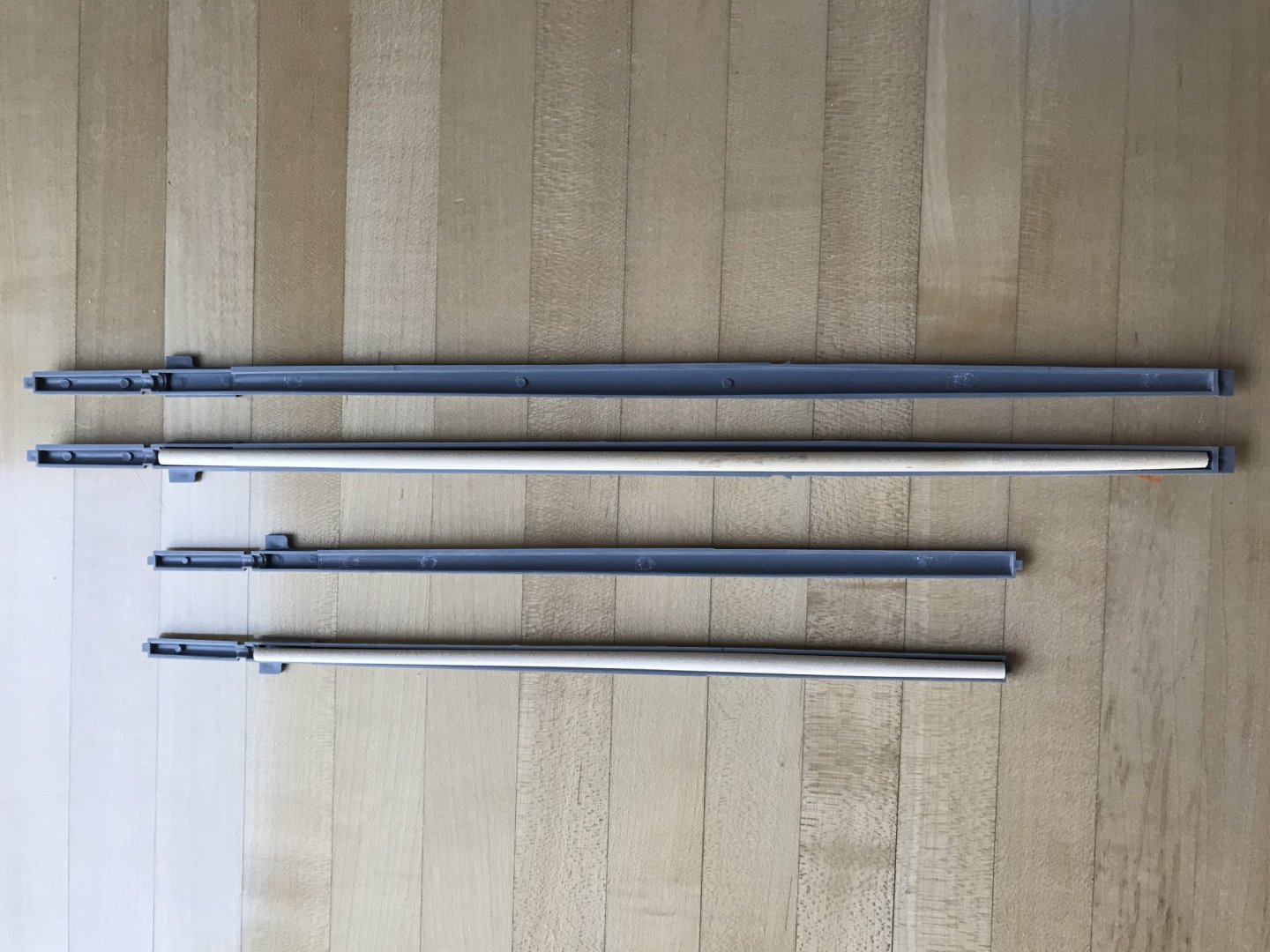
Yes, the dreaded fireship. Can you imagine the gruesome spectacle of the English fireship slowly drifting toward the beached and battle-scarred, but still magnificent Soleil Royal? I continue to distract myself from the pandemic and my isolation from my family with work on the model. As you know, I’ve been experimenting with Liquitex Extra Heavy Gel medium. At first, I was trying to brush it in place, but I lack a fine enough brush, and all art stores are closed for the foreseeable future. But then, I happened upon this build video on YouTube, and I was fascinated by his use of common toothpicks to paint in the fine statuary on this Revell 1:150 kit of the Vasa: This inspired me to sharpen the end of a toothpick and try that as an application method. First, I made up a piece of scrap that gave me the spacing I need for the tasseling: The Liquitex is an interesting product. It has the consistency of thick moisturizing cream, and I found that the dime-sized dollops that I would dole-out onto a paper towel, would skin-over within a few minutes. It was necessary to “stir” the dollop every few minutes, in order to apply the product with ease. After a few stirrings, a new dollop would be necessary, but there is an entire lifetime of product in one small jar, so it is not a big deal. What I was aiming for was a sort of Hershey Kiss, triangular shape. I found that three applications gave enough depth of relief that I will not have trouble picking the tassels out with a brush, or maybe a toothpick 🙃 I found that the cured gel medium could be scraped away from my sample strip, without too much effort, using your finger nail. The counter area on the model, however, is more coarsely sanded and should provide a better mechanical bond. That being said, I will probably paint over the finished tassels with thin cyano, just for the added insurance that provides. I am sure the eventual paint film would he sufficient, but this cyano treatment is fast becoming part of my process. So, at this stage, I became free to focus on building up the lower gun deck. Before I can do that, I needed to cut the lower main mast to height, and create a boxed footing for the mast. I also wanted to mock up, and then make the larger diameter main top, in order to get a sense for what the slightly increased height above deck needs to be. If you are new to this log and wondering why I am increasing the main top diameter, I will ask you to consider that my addition of 5/8” to the breadth of the hull makes the stock tops seem even more in-adequate than they were to begin with. The other consideration is that I hope to improve the spread of the topmast shrouds; on the stock kit, the slope is negligible. I began by drawing a few different diameters onto a scrap of cardboard: The stock main top is 2 3/16”. As you see, I went up from there to 2 5/8”. Then, I took each size and placed them on the stock cross trees: Then, 2 1/2”: Then, 2 5/8”: This may seem to be a big jump in diameter, but not so much when you consider the height of the masthead, above the top, and the scale of the cheeks, supporting it. Now, I know that purists may be appalled that I am not referencing known tables for correct dimensions relative to the height and breadth of the main mast, etc and so forth. On this go-around, though, that is not the kind of rigidly accurate model that I am building. In many ways, this is an artistic and impressionistic model, in which I am trusting my eye and sense for the proportion of these things to arrive at a better overall impression. With specific regard to the tops, what I am going for is what you see in this Puget portrait of what I believe is the Royal Louis of 1692: Ultimately, I decided to go ahead and pattern the largest top in styrene. The tops are not difficult to make, but they present an opportunity to incorporate a wealth of detail that is missing from the stock tops. My first attempt at laying out the ribs wasn’t quite right, though: On the right, you can see that the rib layout is slightly off-center; there should be a rib radiating from each corner of the lubber hole. Rather than expend all of that effort to carefully make and glue all of those ribs to a wrong layout, I decided to just make a new top (on the left) Each top will have a lower, base layer of thinner styrene, that is of a slightly smaller diameter than the main layer. The main layer is of 1/16” styrene. I’ll have to rip strip stock from 1/32” styrene sheet for the ribs, and I would like to use 1/2-round moulding for the banding that runs around the perimeter of the ribs. I will also, eventually, make a lantern for the main top, but I haven’t figured out how I want to approach that, just yet. So, here is the top as it stands, now, with the lower and main layers glued together, as well as the rib and planking lines engraved into the plastic: For a sense of scale, here is the top at the main deck level: And here is the top on the masthead: So, next, I was attempting to determine what the new height above the main deck should be. On the stock main mast, there is a subtle transition where the mast tapers from it’s widest diameter to the narrowing of its foot. That place is where my thumb is in the picture above. I was considering a 1/4”, 3/8” or 1/2” increase in height above the main deck. using a straight edge, spanning the main deck ledges (clamps), in the location of the main mast, I determined that there was 2 3/8” to account for from the top of the deck to the plinth base if the model. This dimension includes both the thickness of the deck material, and the camber at the ship’s centerline. So, to begin with, I measured a 1/2” below where the mast tapers down to its footing, and then I measured down a further 2 3/8” from there. This was to be my first cut-down. I attempted to account for the rake of the mast top in my cut of the footing. I also placed the starboard upper bulwark, so that I could get a truer sense of proportion: I liked this. This looked good to my eye. I decided, though, to cut down an additional 1/8”, and I will explain why in a moment. Here’s what 3/8” looks like in better light, after the second cut: This is what my main mast height will be, and I will use this dimension to establish the relative heights of the fore and mizzen mast tops. Now, here is why I cut a little further. Bear in mind that I love the comedian Patton Oswalt, and I have recently discovered that Siri will play any stand-up I can think of in an endless loop, almost without repeats; this really helps me keep my mind off of the dreariness of what-all is going on. I was listening to Patton and laughing away, as I distractedly taped off my first cut. Unfortunately, I was a little past halfway through the mast when I realized that I had taped off the location where the mast rises above the deck, and not the footing! 🤦🏼♂️🤦🏼♂️🤦🏼♂️🤦🏼♂️🤦🏼♂️ Well, that is a BUMMER! I was so angry with myself for falling asleep at the saw, so to speak. I didn’t cut completely through the dowel, on the inside; there is maybe a 1/3 of that diameter still intact. My initial solution was to pack the kerf with medium viscosity cyano and then fill the kerf with perfectly mating styrene sheet. After trimming and fairing the surface, the repair looks well enough. It will be un-detectable, anyway, because it will now sit below the deck surface (the reason for that extra 1/8” cut), and the repair seems strong: Me being me, though, I wish to ensure that it is extra strong. My first thought was to attempt to drill up through the end of the birch dowel, and into the repaired area, so that I could epoxy in a length of either 3/32” or 1/8” brass tubing: I am skeptical, though, that even if I work through a progression of bits - that I will be able to keep a drill bit on-track through that expanse of end-grain. My woodworking background, on the other hand, has given me another, I think, safer idea. Much as you would to stop an end-check in a solid wood table top, for example, I can let-in a key (maybe dovetail, but considering the size, probably not) that crosses the repaired kerf. The goal is to get deep enough in the dowel to increase glueing surface area and unify the whole construction: This 1/8” styrene extrusion should be up to the task, and it matches my smallest woodworking chisel. A half inch above and below the kerf will be more than enough, and my repair will never be in danger of failing. If I don’t do a perfect job of inletting, the gel cyano will pick up the slack, and this reinforcement will also be undetectable. So, a Dremeling we will go! And with much greater care, this time 😉


- 2,699 replies
-
- 11
-
-
- heller
- soleil royal
- (and 9 more)
-
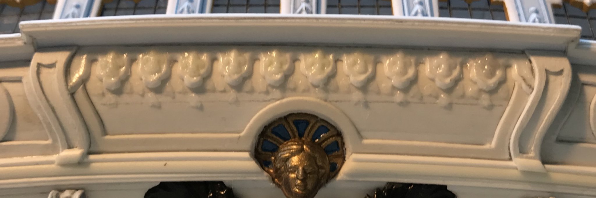
Really beautiful detailing, Marc! Is it your plan to make every ornament from scratch, by hand, or will you 3-D print some of the ornament?
- 208 replies
-
- 3
-
-
- le soleil royal
- 104 guns
- (and 2 more)
-
Hi Dan - this is one of two models made for the St. Philippe monograph. It is a pretty good model, but not nearly as good as Jose Tussett’s fully rigged version. It appears to me that they were in a rush to complete the admiralty model so that they could release the monograph in time for the Rochefort conference in 2018, where both models were on display. This is just conjecture, on my part. I don’t know whatever the story may have been, but there is plenty of evidence of a rushed job, despite the talents of this second modeler being plainly evident, otherwise.
- 2,699 replies
-
- 3
-
-
- heller
- soleil royal
- (and 9 more)
-
Never-mind - I see, now, how Lemineur’s chimneys open forward, and not at the top: Also, according to Lemineur the chimneys are copper lining within a wooden frame, and they can be removed before battle, with deck caps in their place to cover the holes.
- 2,699 replies
-
- 7
-
-
- heller
- soleil royal
- (and 9 more)
-
Nicely done, Jose!
-
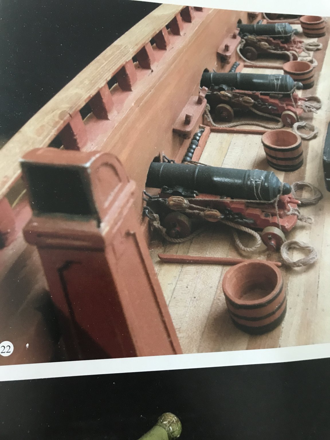
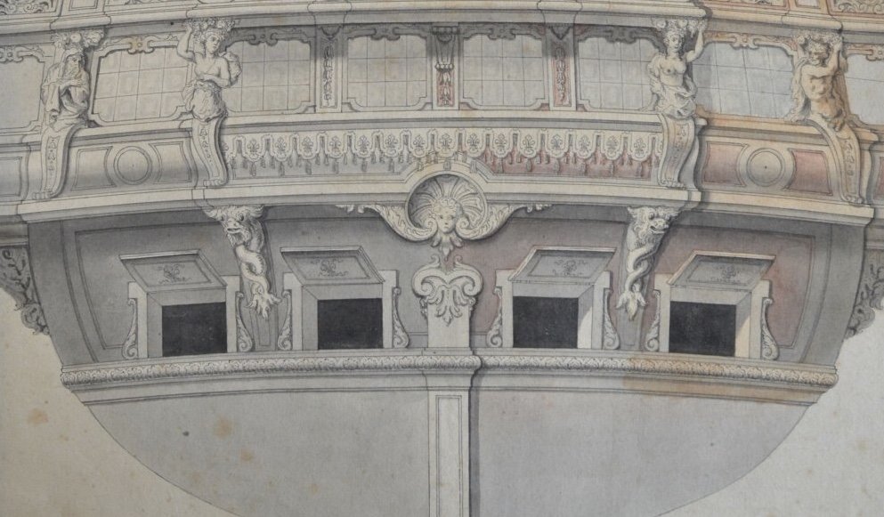
Yes, the question of the ship’s stoves is one that I’ve been turning over in my head. On the St. Philippe, where there is no cover of a forecastle deck, it makes sense for the stoves to be placed on the middle, or weather deck. As Soleil Royal is equipped with a forecastle deck, it would be appropriate to place the stoves higher, where they pose less danger to the ship, as a whole. That being said - because SR’s forecastle deck is armed, it would not be possible to pierce the forecastle deck for a chimney, along the sides, because there would be a forecastle cannon above where the stove sits between two main deck guns. So, it seems to me, the best placement for the stoves would be beneath the forecastle deck, but centered between the guns, and sharing one common chimney. Now, whether the chimney should resemble the simple, open boxed construction that Lemineur shows, or a weather-shielded construction with a 90 degree bend, I can not say. Presumably, if the exterior of the chimney is a wooden panel and frame, it would be lined with copper or iron. Or, perhaps there is no wood in the construction, and it is all copper or iron. Anyone with insight, here, would be greatly appreciated.
- 2,699 replies
-
- 3
-
-
- heller
- soleil royal
- (and 9 more)
-
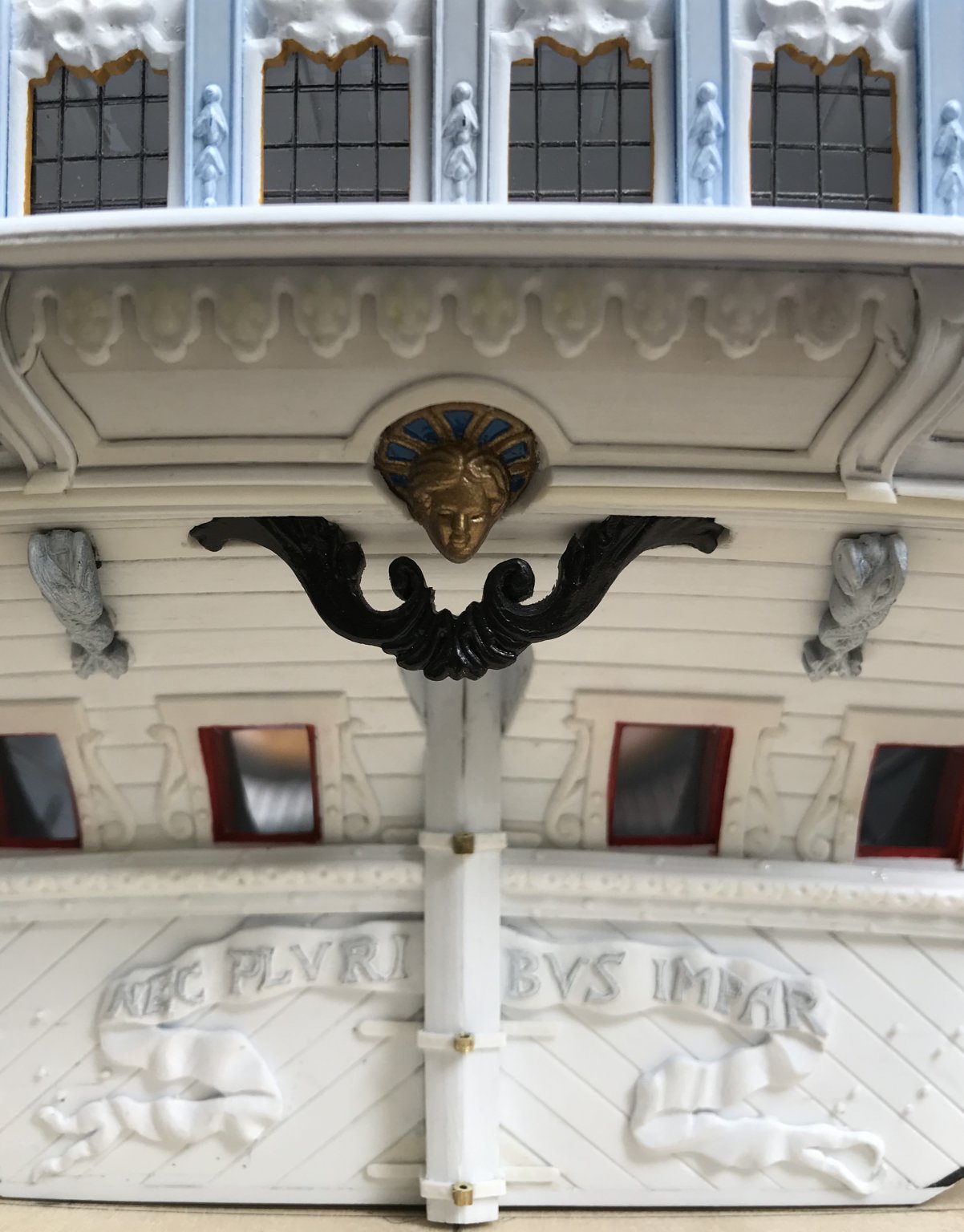
Hello Chris! Thank you for some interesting drafts that I haven’t seen before - particularly Le Fleuron. The upper finishing of the bottle, there, only reinforces my resolve that this is the correct quarter gallery for 1689. To answer your question, I don’t have any definitive answer to the painting of the battle stations in red. I can only suppose that the inner painting of the port lids is a broader indication of the color in use. If not red, then white would make some practical sense in that it would bring reflective light to the ‘tween decks, where it is needed most. Druxey, yes the Liquitex is an acrylic medium, so it should behave as you say. Thank you, Dan, and Mark for your kind compliments and thank you to all for looking in. Mast work continues. The lower fore and main masts are good and strong now, and rounding into shape. More to follow...

- 2,699 replies
-
- 7
-
-
- heller
- soleil royal
- (and 9 more)
-
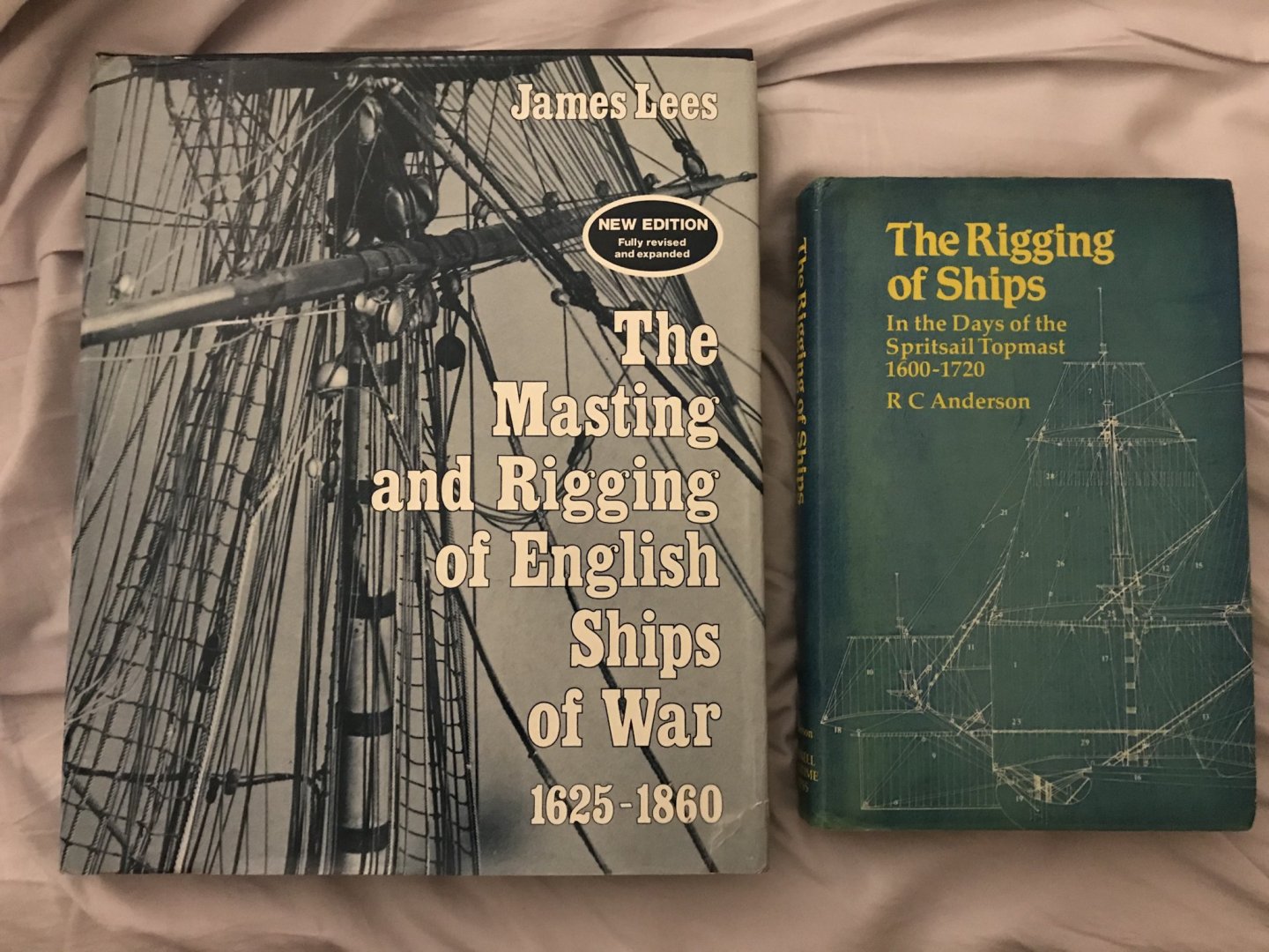
It would surprise me, if you did not have these books in your collection, but I will go-ahead and mention them, just in case: Anderson is the Godfather of knowledge on this subject. While his book is a little more primitive, in terms of illustrations, he provides clear insight into the why and wherefore of all the rigging elements, as well as fundamental Continental differences. Lees is a much drier, technical read, but the book is absolutely loaded with beautiful, clear photographs. These books, together, are as reliable a cross-reference on rigging English ships like the Katherine as you could ever hope to find. No one could ever credibly fault you for following their guidance. I might say that this is my personal opinion, but it is actually a matter of fact. I wish you the best, however you choose to proceed.
- 1,035 replies
-
- 16
-
-
- royal katherine
- ship of the line
- (and 1 more)
-
She’s a Van de Velde drawing come to life, Doris! You really should consider a French ship for your next project, in order to maximize your sculpture talents. If anyone can do justice to the Monarque, it would be you.
- 1,035 replies
-
- 8
-
-
- royal katherine
- ship of the line
- (and 1 more)
-
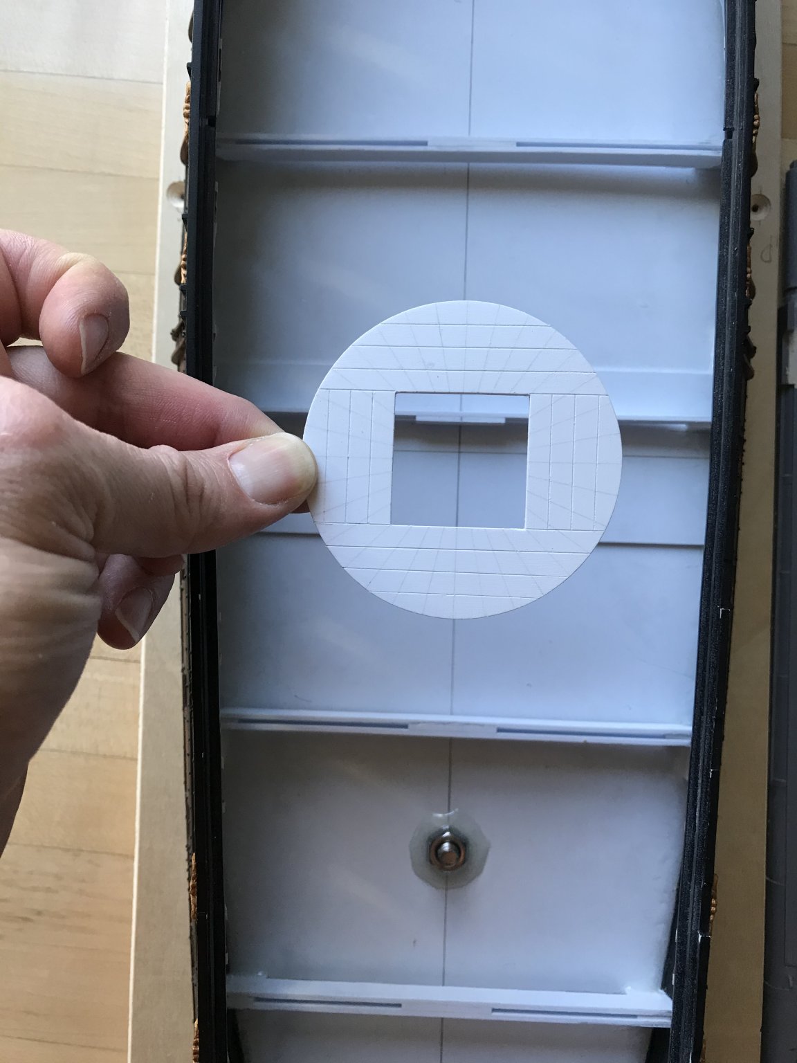
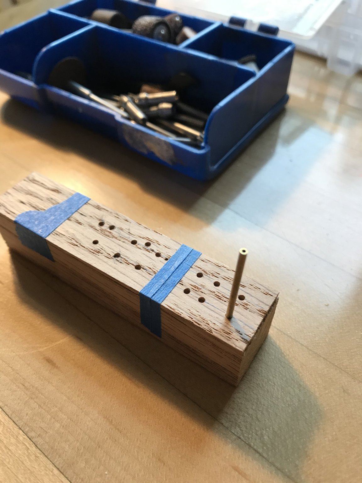
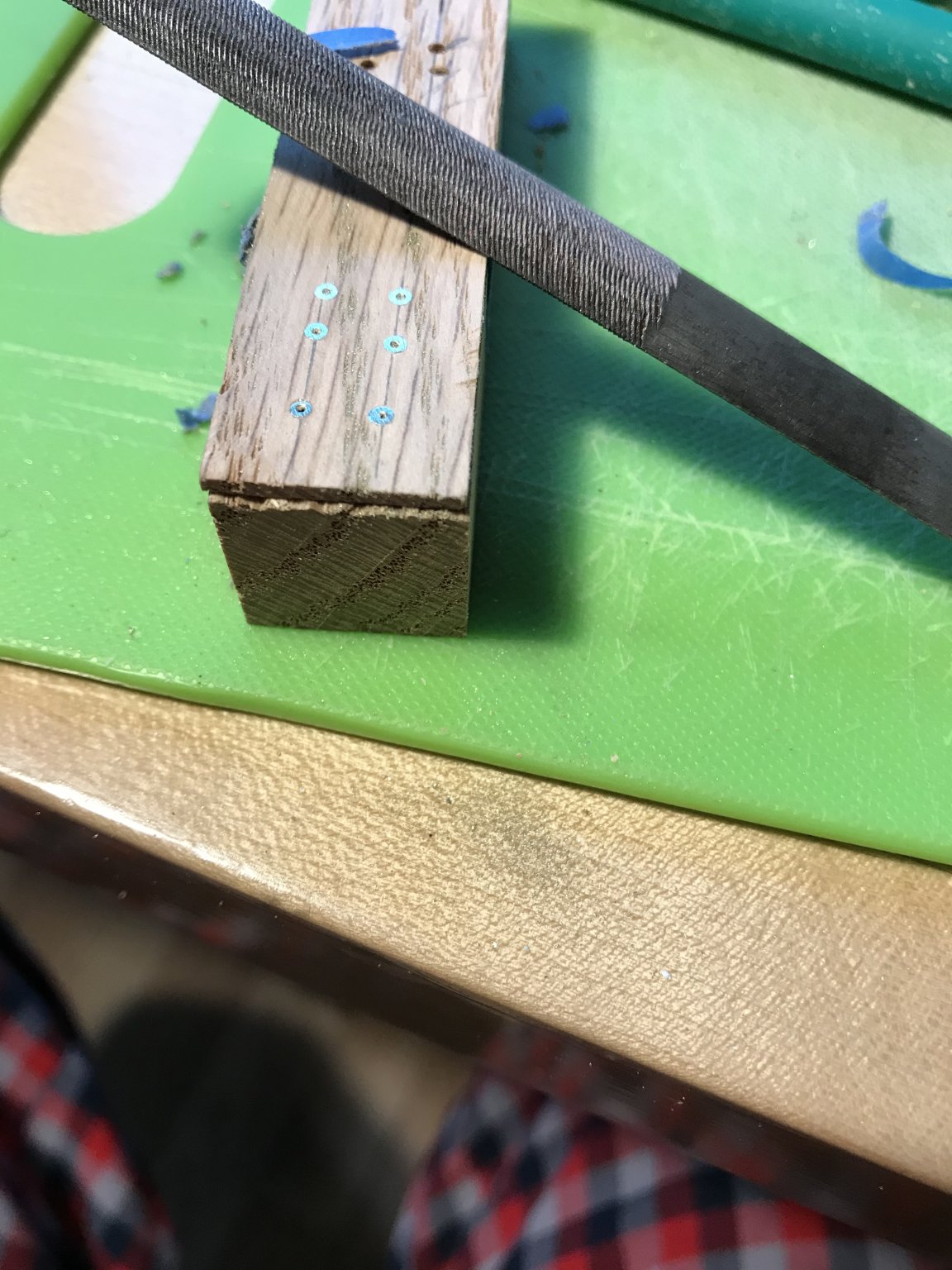
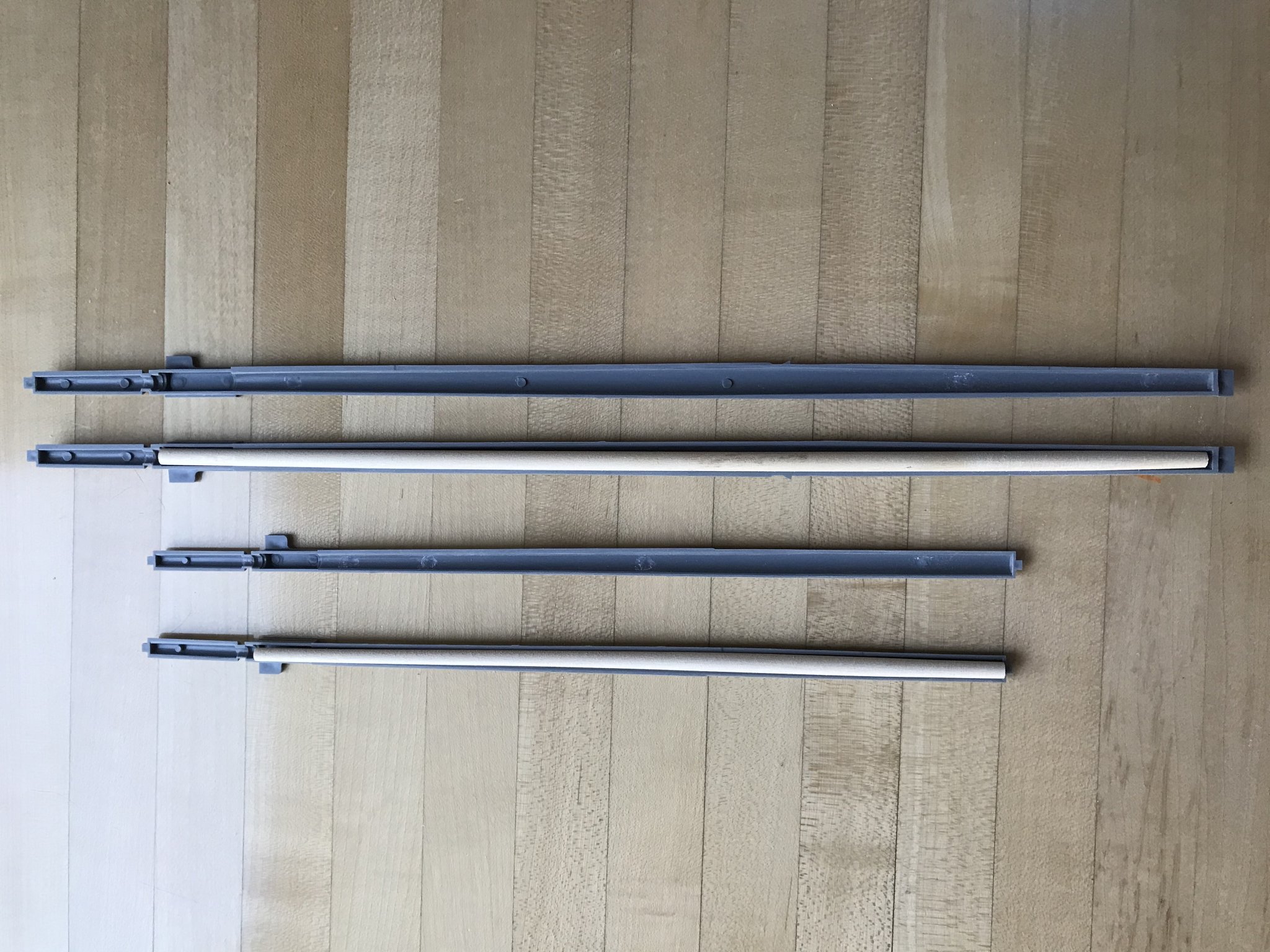
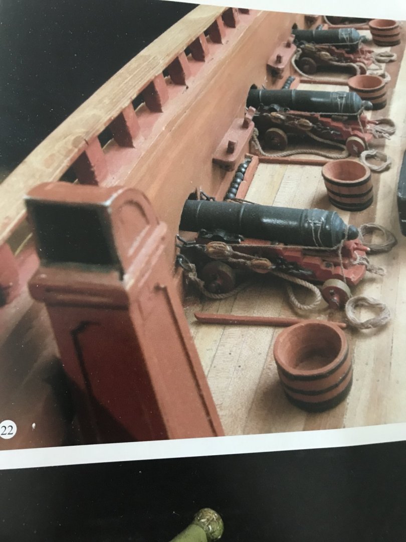
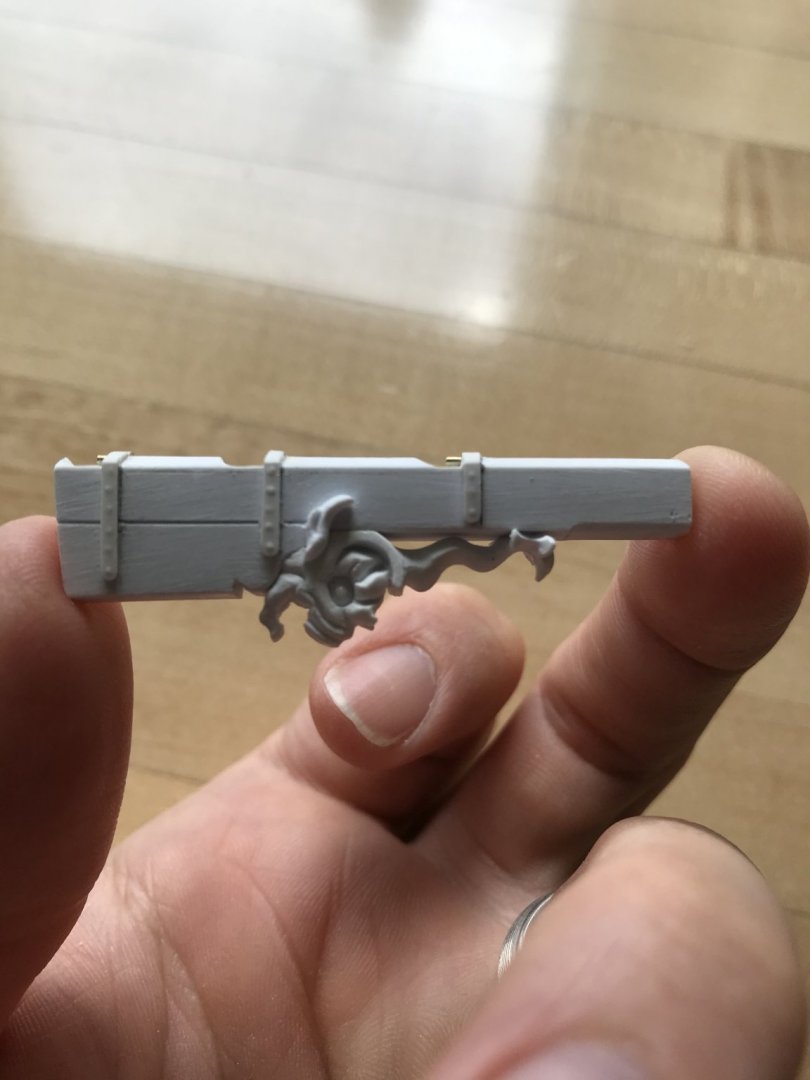
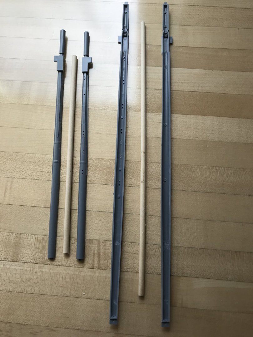
It seems as though the smallest of details have been taking the longest time to get in order. The only benefit of the Pandemic has been time, and I have been using a lot of that time to create rudder hinges. I thought I had done a better job of photographing this whole process, but I did not. So, somewhat out of sequence, I will try to illustrate what I did. The layout for the hinges is determined by the reasonable available spaces on the lower transom. The best contemporary portraits and models I can find, show 3-4 hinges above the waterline. Here is a picture that shows the layout I arrived at, albeit a little further along in the process: What I failed to take pictures of was the marking out and making of pin impressions into the back of 3/64” wide styrene strip that make up the strap stock for the hinges. The strips are first scored, but not cut through; because they remain attached to the bigger styrene sheet, it is much easier to make your pin impressions, while using a steel ruler as your guide for spacing. Once you are satisfied with the outside appearance of nail heads, you can cut through the strip. It’s a good idea to true the styrene sheet edge with a file, before making the next strip, as the pin impression process sometimes deforms the edge. On the lower transom, these straps had to be applied in two segments to either side of the stern post; I couldn’t make a 90 degree bend without snapping the thin strap stock. So short strap ends were first glued to the transom surface, taking care to round the ends into a pleasing shape. The segment that joins the first and wraps around the stern post, toward the stern post centerline was eased around the corner after first filing a V-notch into the back of the strapping material. Here’s a shot of that same process to the rudder head: I then filed semi-circular accommodations, at the very center of the stern post for the gudgeons. These were cut from 1/16” brass tubing that BLICK art supply sells as a bag of random odds and ends of mostly brass, but some aluminum. While my execution of the following didn’t turn out absolutely perfectly, I thought the easiest way to make such small hinge knuckles would be the following. Because it is what I had at hand, I ripped some red oak into a 1/16” veneer and a backing block. I then drilled 1/16” holes in a straight line, through to the backing block. Oak is not ideal for this because the open grain has a tendency to pull the bit off-track. So, I drilled plenty of holes, until I had 6 that were satisfactory. Maple or birch would be ideal. I then inserted my brass tubing into a hole and used a DREMEL grinding wheel to cut just above the wood surface. I then used a file to make them flush with the wood surface (hardwood a plus here), and uniform. If I were to do it over again, I would ensure that I had definitely seated the brass rod against the wooden backer block before trimming; as it happens, what I used for the middle hinge knuckle was a shy 1/64” thinner than the others because the rod hung up in the hole, while filing. I ended up using it, anyway, because I wasn’t going to insert a pintle into the middle knuckle. Doing so would have made aligning the whole assembly unnecessarily complicated. From the angle this detail could possibly be viewed, the small gap is invisible. Making of the pintles should have been relatively straight-forward. The basic plan was to cyano appropriate brass rod into two of the remaining three knuckle segments. I could have made my life easier, if I had fitted the completed pintle assembly to the rudder head before applying the straps. The reason I did not do that was because I wanted to be absolutely certain of where to mark and cut into the rudder for the pintle reliefs. With the straps in place, though, I was compelled to bore-out circular openings for the pintles that would he housed by the straps. Access for doing so is limited by the shape of the pintle reliefs. I hope that makes sense. Here are some pictures: the rudder is actually somewhat functional; it’s port-to-starboard arc is restricted, somewhat, by the jaumier opening. This is a static display model, however, so I am happy enough that everything lines up. In other news, I’ve been experimenting with Liquitex Extra Heavy gel medium to brush in the tassel reliefs for the lambrequin carving: Liquitex is definitely the right medium for this sort of very low relief, however, my current stable of brushes is not fine enough, or up to the task. I will continue my experiments with other brushes. Work on the gratings continues, and eventually Henry’s extras will complete the complement. I also started to prepare the fore and main-mast, lower sections with reinforcing dowels that are drill-tapered to fit snuggly along their length: Before tapering, above. And after tapering, below: I definitely want to use styrene adhesive to join the mast halves, but am currently unsure about whether to bed the dowels in the masts with some combination of epoxy and cyano, or one versus the other. Any insight, here, would be greatly appreciated. Once the lower masts are assembled, I can cut the lower main mast down a bit, to accommodate the diorama set-up, while also accounting for my desire to raise the main top by about 3/8” to 1/2”. Ultimately, this will make better sense of the stock kit topmast dimensions (which will be scratch-made from wood, anyway), and the extra height there, will be cut from the t’gallent masts which are too tall. The main flagstaff, though, will be lengthened. So, that’s where things stand for now. I hope all are well and taking good care of themselves and family. We will all get through this difficult time. Thank God for the art and craft of ship modeling!


- 2,699 replies
-
- 14
-
-
- heller
- soleil royal
- (and 9 more)
-
I am always so impressed with your skill, Mike, and your tireless attention to detail.
- 607 replies
-
- 4
-
-
- winchelsea
- Syren Ship Model Company
- (and 1 more)
-
Keep your head up, Mark. I’m sorry if you are having a tough time. All the best, M
-
You are right, Marc, that these small adjustments to the rake of sheer do make a difference. I think what you have here, now, is very pleasing. When you refer to the “susbandes,” are those the iron straps that run across the barrel trunnions, thus securing the barrel to its carriage? I like your plan to carve a balsa model of the QG. My hope is that you will take and post as many pictures of that process as possible. I know you work in the medical field, so take good care of yourself in the midst of this crisis.
- 208 replies
-
- 3
-
-
- le soleil royal
- 104 guns
- (and 2 more)
-
Really beautiful work on the LANA, Dmitry. Your craftsmanship is superb!
-
Thank you so much Henry! I’m going to have to dedicate the diorama case to you, seeing as how you have made so much of this possible.😀
- 2,699 replies
-
- 3
-
-
- heller
- soleil royal
- (and 9 more)
-
Really beautiful turnings, Siggi! The Crown emblems and proof marks look fantastic. Really delicate banding. Superb!
-
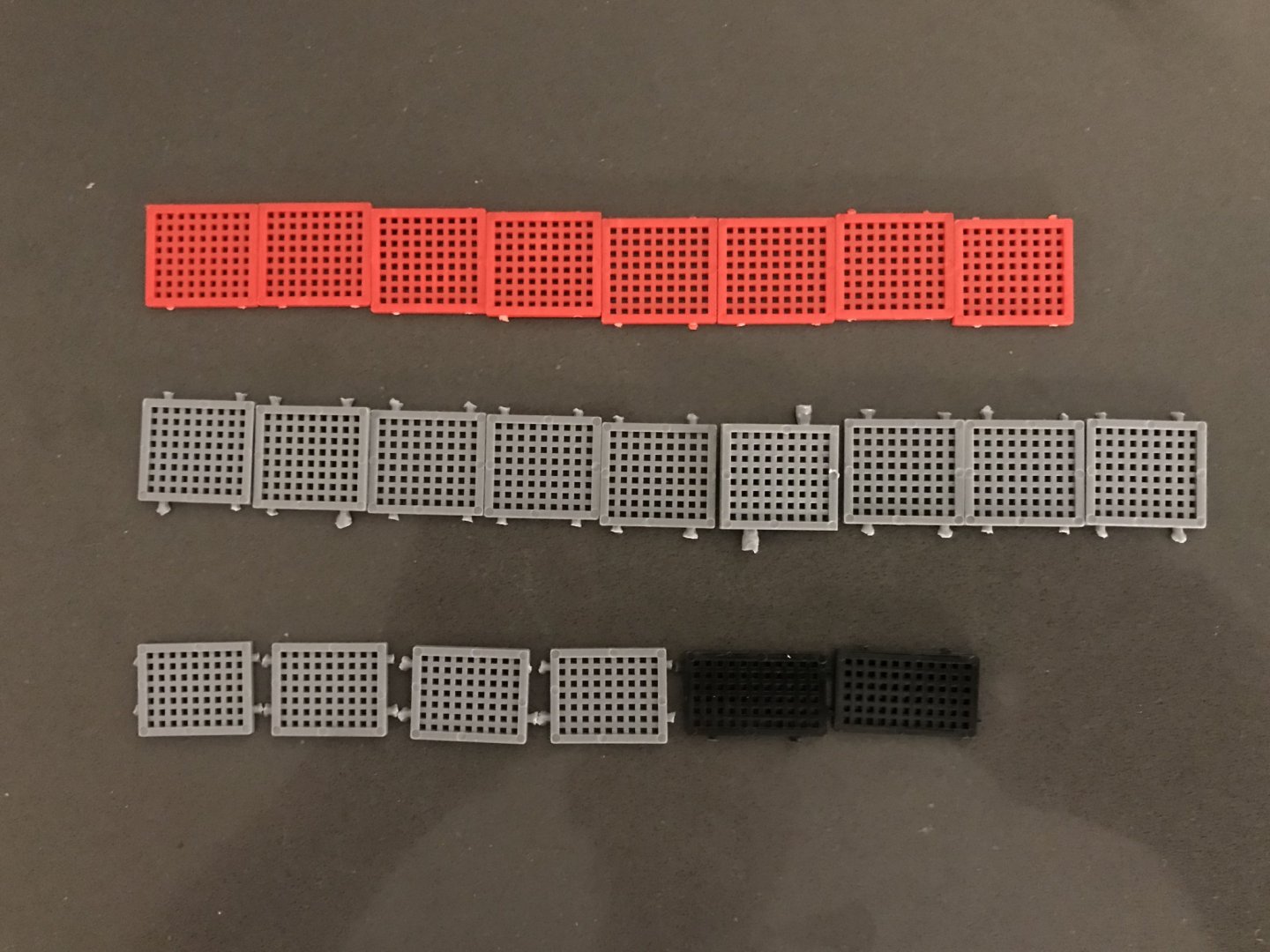
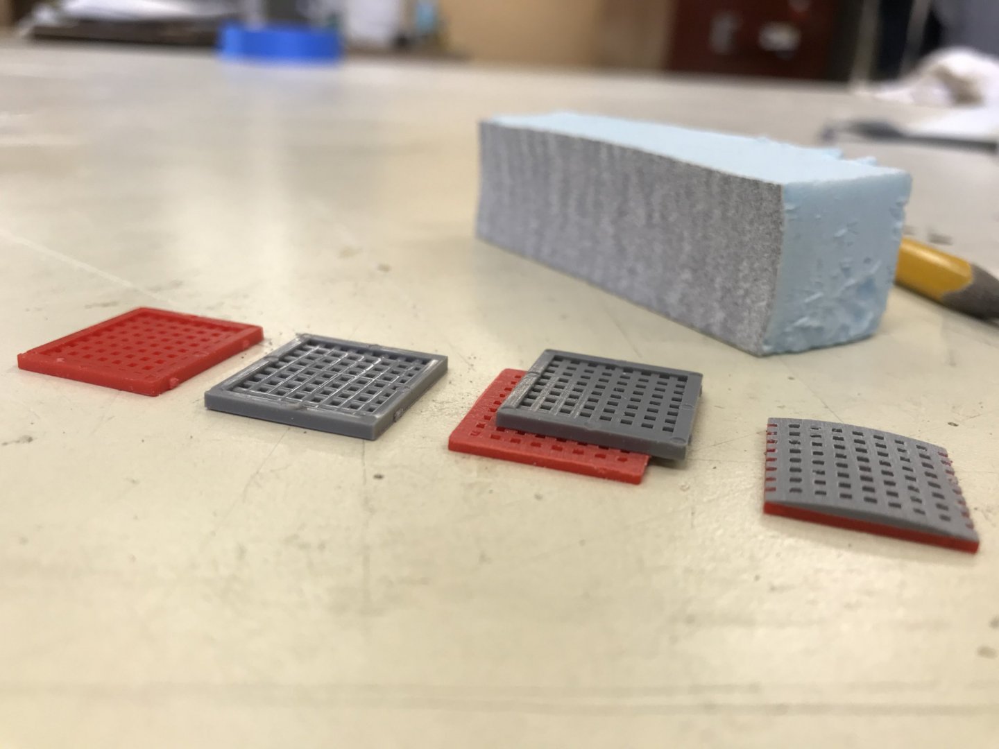
My latest foray into kit-bashing madness, is improving the kit gratings, in an effort to convert them from flat to cambered. Below is my current inventory of grating pieces for the main and quarter decks. Mr. Maher donated an incomplete set of red gratings. The grey and black are my own complete set: I wanted to first see whether my idea was going to work, so the following picture illustrates the basic process, from left to right: Laminating one set of gratings to the other affords me the extra thickness I need for the camber. The blue-board sanding block I made is designed to feather the top grating layer down to near-zero at the edges. When it comes time to install these gratings, I will create new hatch combings for them. If anyone out there still has a spare set of complete gratings that they wouldn’t mind donating to the project, they will be put to good use here. As always, I endeavor to either return or pay the favor forward. All the best from Brooklyn, Marc
- 2,699 replies
-
- 7
-
-
- heller
- soleil royal
- (and 9 more)
-
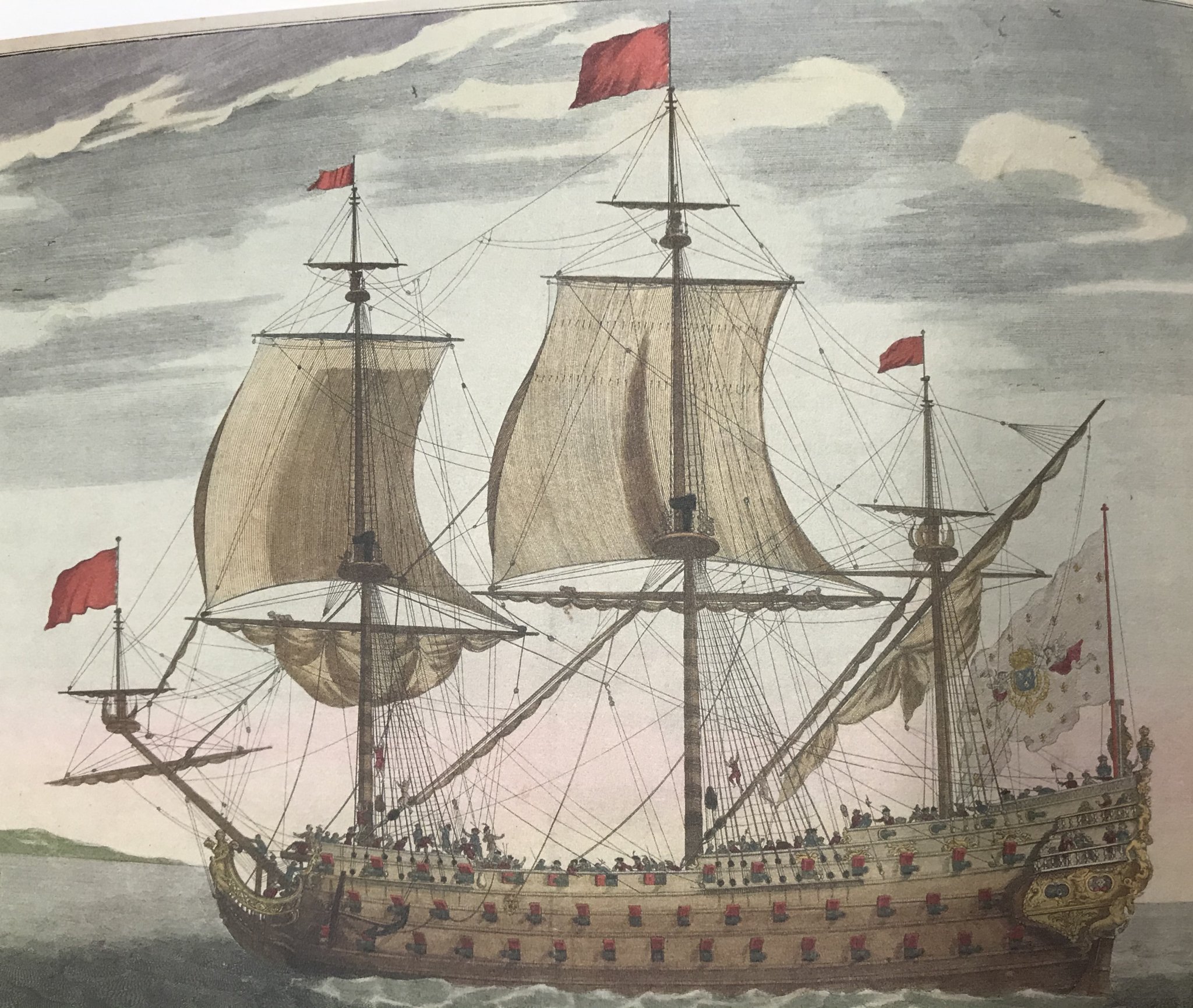
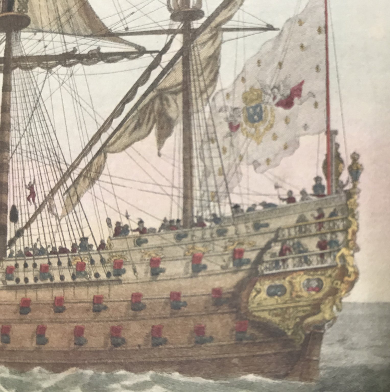
Well, there was certainly no “retreat,” on the part of the French, at Barfleur. It is interesting to consider whether Soleil Royal would be dreamed of, in the way we do today, if Tourville had ignored the King’s initial orders to engage at all costs. Tourville’s success against all odds has elevated both he and the ship to mythical status in the popular imagination. Or, so it seems to me. Marc, you are very kind, but I happen to think your “Royal Balsa” will soon become the gilt-standard for all SR models, going forward. Both you and Tony Devroude (Dauphin Royal, 1668), have managed to capture these early hull forms with tremendous authenticity. Anyway, I am glad to see that you are back at it, and bringing the ship into sharper focus. It has been an interesting week of reading, and attempting to read a variety of interesting things. One thing of particular interest, here, is a 75-page manuscript by Quebec native Guy Maher. Guy is someone whom I came to know through the comments section of Trois Ponts. For a good number of years, now, Mr. Maher has been combing through the archives - original correspondence between Colbert and the Ponant/Levant yards, as well as older and more recent histories and biographies - to assemble what I personally believe is a very plausible and coherent history of Soleil Royal from her inception, through her refit. I don’t necessarily agree with every word, but he makes interesting arguments for the arrangement of her artillery, as determined by certain vagaries of her generally accepted dimensions. There is quite a lot of interesting biography on Puget and his influence, as well as many other key figures that were directly engaged in the development of the First Marine. There is even a truly fascinating discussion of period colors that were likely used on the king’s ships. A good number of pictures, as well! Mr. Maher is eager to share his research, but less so to start a blog of his own. It truly is fascinating reading, though, and I will be happy to send it to anyone who PM’s me. While written in French, it translates pretty clearly through Google Translate. Thank you to everyone for looking in, your likes, and comments. More to come...
- 2,699 replies
-
- 3
-
-
- heller
- soleil royal
- (and 9 more)
-
Well, Marc - THIS - THIS was absolutely worth the wait! Just spectacular craftsmanship, and your sheer reduction looks pitch-perfect for 1689. I like the accommodation you made in scarfing together stock for the sheer-strakes before moulding them - very clever. What is your construction plan for the lower finishing of the quarter galleries, up to the main deck open walk? Personally, because my model will be completely painted, my plan is to carve the lower finishing from wood (something very close-grained) and then build the lower quarter gallery lights from styrene, as I did at the stern. I will have to create horizontal styrene formers that establish the outboard parameters and shape of the quarter galleries, while giving me an edge-surface to scrape-in the various transitional moulding profiles. There are so many complicated shapes, in this area, that I was just wondering how you plan to approach it.
- 208 replies
-
- 3
-
-
- le soleil royal
- 104 guns
- (and 2 more)
-
Hello Cedric - how goes it with La Reyne? Have you had much time for the model, these days?