Hubac's Historian
-
Posts
3,308 -
Joined
-
Last visited
Content Type
Profiles
Forums
Gallery
Events
Everything posted by Hubac's Historian
-
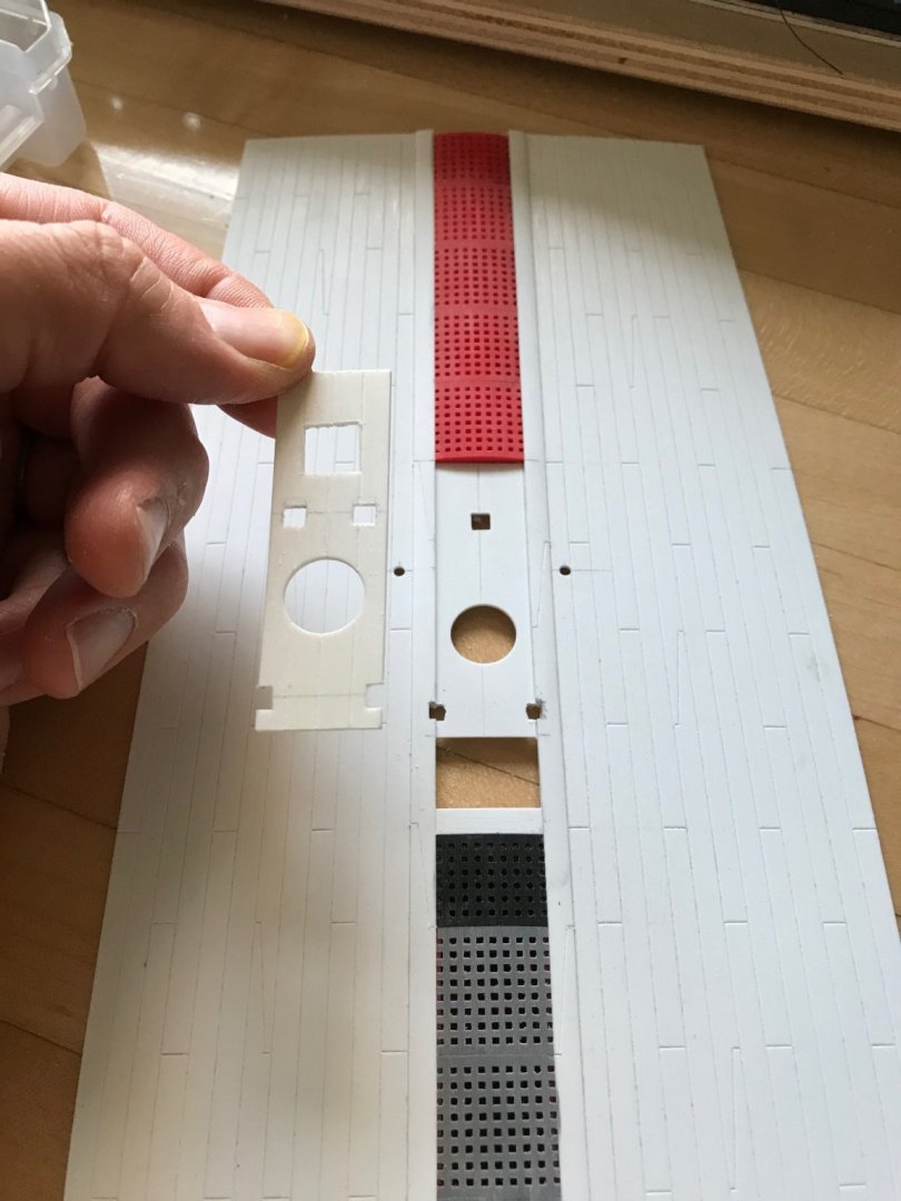
 Thanks, EJ! I have found that when I “fight” the styrene sheet by trying to cut through it, I tend to slip. Also, the blade raises a lip around the cut, which is just more work to level. The Dremel makes quick work of a perforated cut line. I’ve done so much of that for this project that I can hear and feel that the Dremel bearing is about shot. It was well-worth the small investment, though, and I won’t mind replacing it.
- 2,699 replies
-
- 6
-

-
- heller
- soleil royal
- (and 9 more)
-
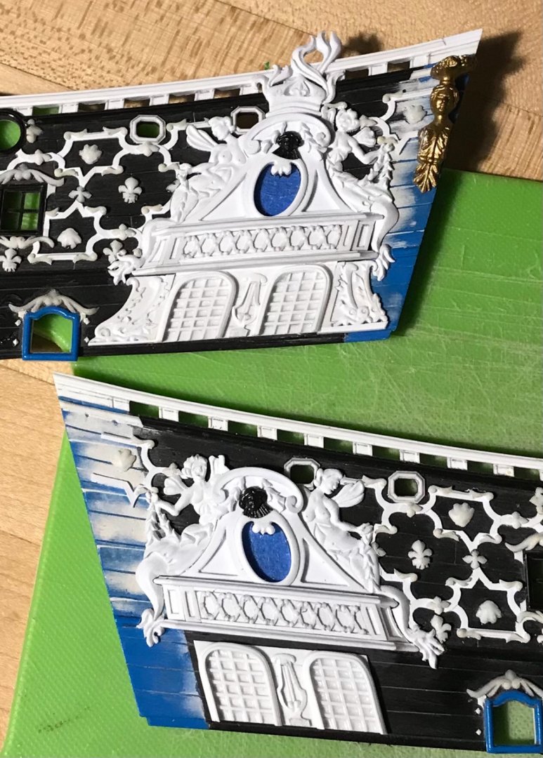
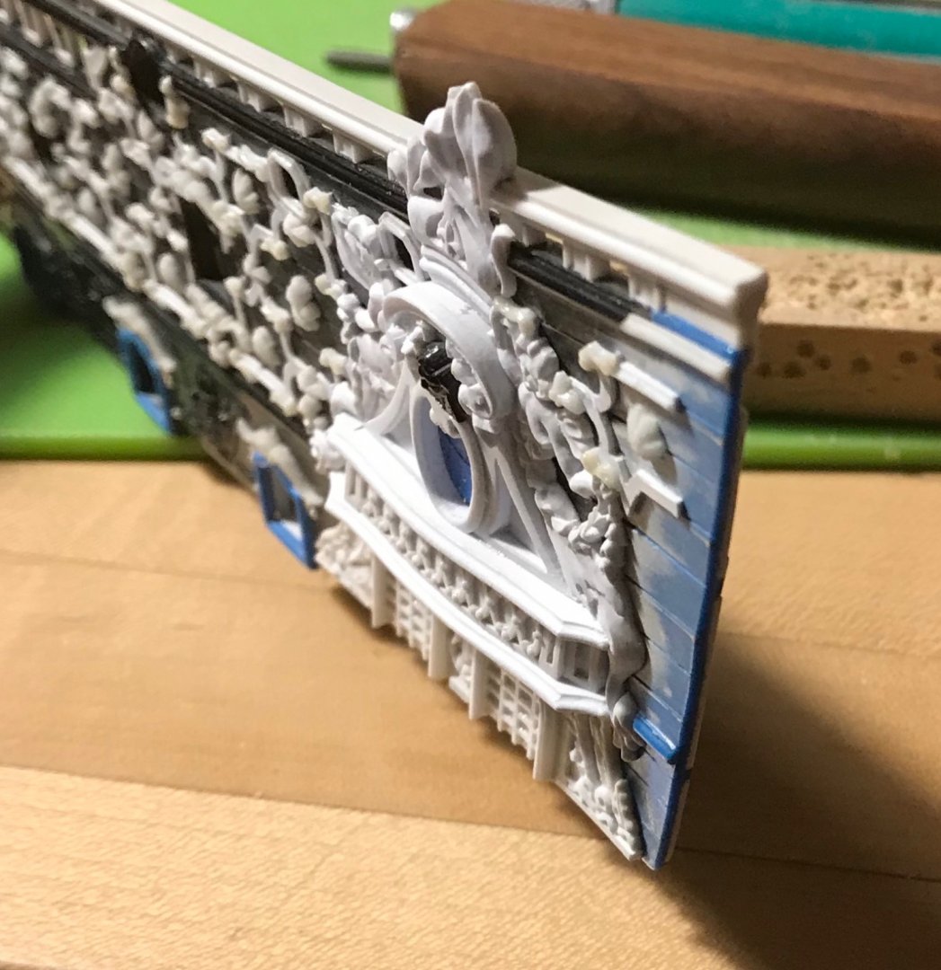
Those carvings are spectacular - they fit the space perfectly!
- 510 replies
-
- 1
-
-
- reale de france
- corel
- (and 1 more)
-
I know these setbacks must be incredibly frustrating J11, but hang-in there, Dude! You are doing an amazing job! This is always the problem with these old plastic kits. I dread the eventuality, myself, as the pressing of SR I am making is about as old as I am; 47. Keep going, steady as she goes - you will get there, and we will all celebrate!
-
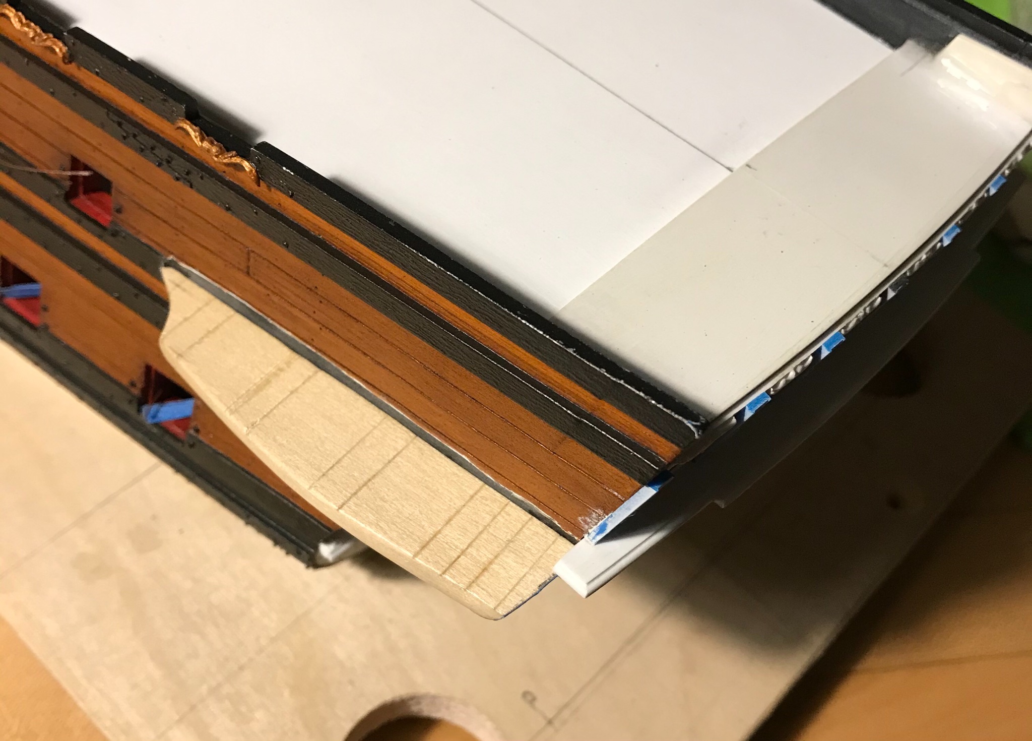
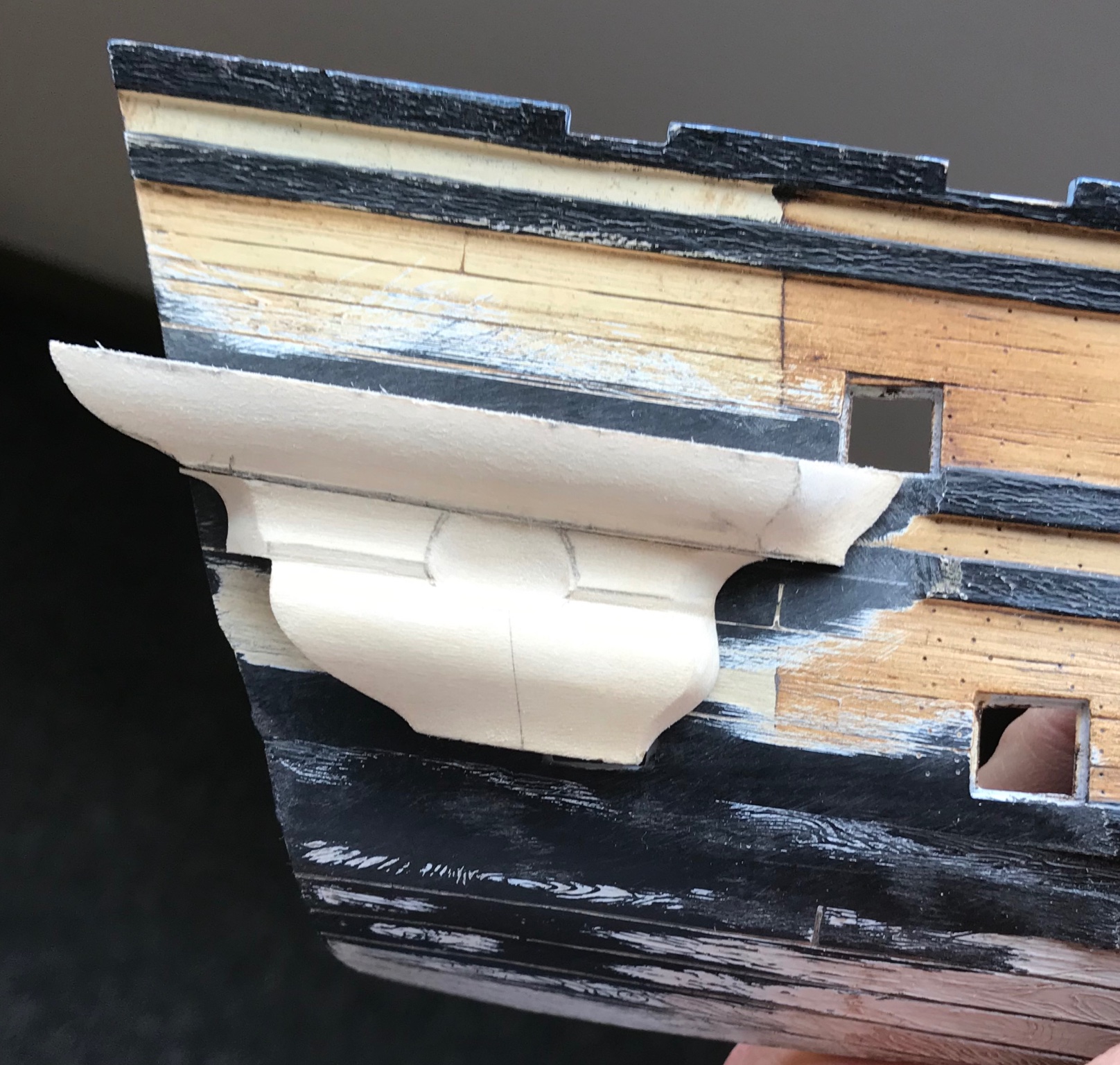
The stuff does look good, John! Thanks for the reference. The lower-finishing pieces are now ready for prime and paint: I have yet to make the waste pipe rosettes that mount to the aft overhang of these pieces, but I will tackle that shortly. Today was a very productive day spent trimming out the next level up - the functional seats of ease. The first order of business was to clear away the wales and let the forward edge of this section into the wales, as neatly as possible. My goal was not to disrupt any of the paint that will remain visible, as the touch-ups were such a pain: The pre-shaping on the scrap hull created a good mating joint: I am quite satisfied with the subtle outward, billowing shape of the piece. One thing that dawned on me, here, is that the aft end of this section should follow the round-up of the stern. The picture, above, reflects this, however - before, the back ends were square to the mating surface, which created a weird back-angled appearance, considering that the ship sides taper inwards, at the stern, like a wedge. This is one of many small details that are not immediately apparent, if one hasn’t first made a full set of drawings. One benefit of altering this profile into the roundup is that it enabled me to bring the side profile of the stern counter into more of a vertical plane. The difference is slight, but an improvement, nonetheless. A montage of the paneling process: There is no substitute for the gradual process of arriving at a line; draw, erase, repeat! I still need to add the rail pieces, between the pilasters, which will create the sunken panel effect. I also have to cast a series of fleurs for these panels, but this has been a very satisfying step in the project. Thank you for the likes, your comments, and for looking in!


- 2,699 replies
-
- 18
-
-

-
- heller
- soleil royal
- (and 9 more)
-
This is a lovely model you are making, Robert. I remember seeing the English galleon in the hobby store, when I was a kid and being completely captivated by it. I had done an absolutely terrible job of building the Spanish Galleon, and thought that one day I might try the English version with its bonaventure mizzen. Anyway, it's nice to see such good, clean work.
- 165 replies
-
- 2
-
-
- english galleon
- revell
- (and 2 more)
-
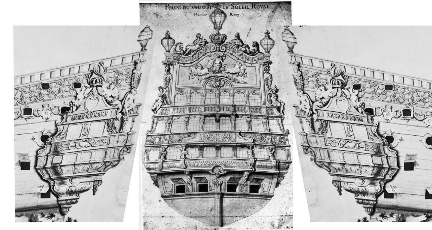
Thank you so much, John, for taking the time to read through the whole log. It is extremely gratifying to me that you have taken such an interest in the project. I will be interested to see what you do with the kit, so please start a log, if you haven’t already, and I will gladly follow along. I’m pretty sure that the St. Philippe monograph has a plate showing the grand chamber of the Royal Louis, along with a schematic of Soleil Royal’s paneled ceiling. These would he highly instructive for your efforts to fit out the interiors. I briefly entertained the idea, myself, and decided against it because I knew how labor-intensive the exterior would be, and I would like to finish this project, at some point. I am also thinking that the tafferal with Apollo’s horse-drawn chariot would likely have been a more colorful affair. I have some ideas about what I might like to do, there, and will probably use one of my spare, stock stern plates to do a mock-up - even if the proportions will be entirely different. I will have to look up HisModels. I have never heard of that company before, but it certainly sounds worth a look. My gun modifications were extremely time consuming, but ultimately worth the effort. Mr. Delecroix did plant that seed in my mind that the Heller representation of the trunnion support is laughably ridiculous. He is, of course, right about that. I have yet to see whether correcting that problem will place the barrels too low in their port openings. Maybe it might be worth swapping them out - we will see. Anyway, I’ll be looking for your work, and happy to help out in any way I can. I have personally benefited tremendously from the knowledge, advice and spare parts of so many here. All the best, Marc
- 2,699 replies
-
- 3
-
-
- heller
- soleil royal
- (and 9 more)
-
A while ago, I was researching greenmen for a furniture project I was designing when I discovered Mr. Gibbons. He sure did some truly fabulous work! Thank you for sharing these.
- 2,699 replies
-
- 3
-
-
- heller
- soleil royal
- (and 9 more)
-
Thanks, Druxey! You may be right about the wood. I have no prior experience with lime, either, so I can’t really say. As I have plenty of it, I thought I was going to use it to carve the new figures of Africa and The Americas. While it seems perfectly suited for the QG substrate, I don’t think it is hard enough to hold fine detail. I’ll have to get my hands on some boxwood for the figures.
- 2,699 replies
-
- 2
-
-
- heller
- soleil royal
- (and 9 more)
-
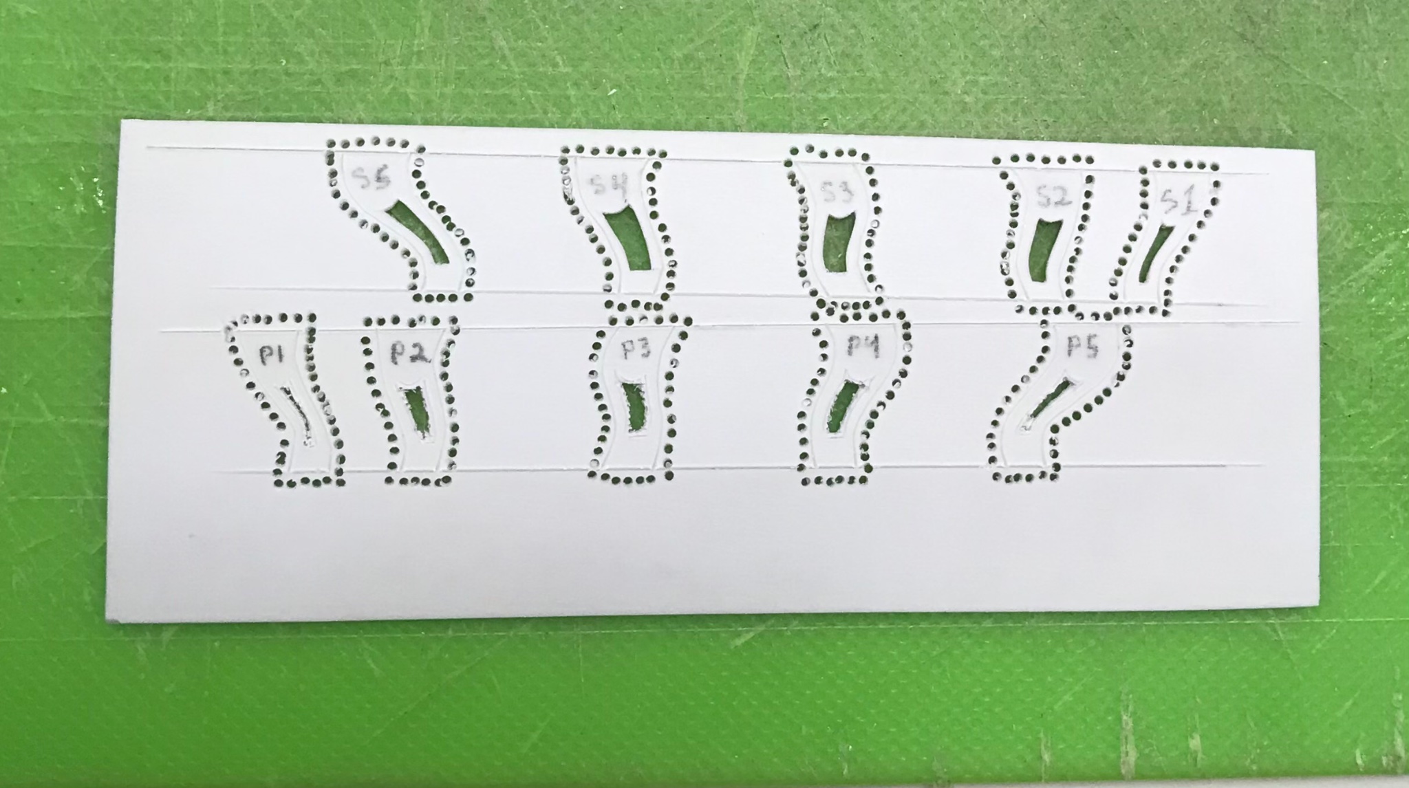
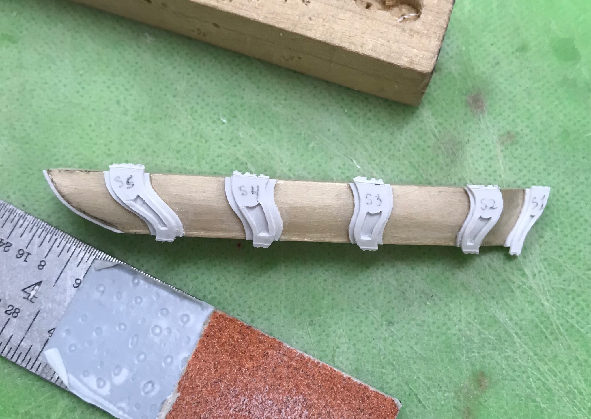
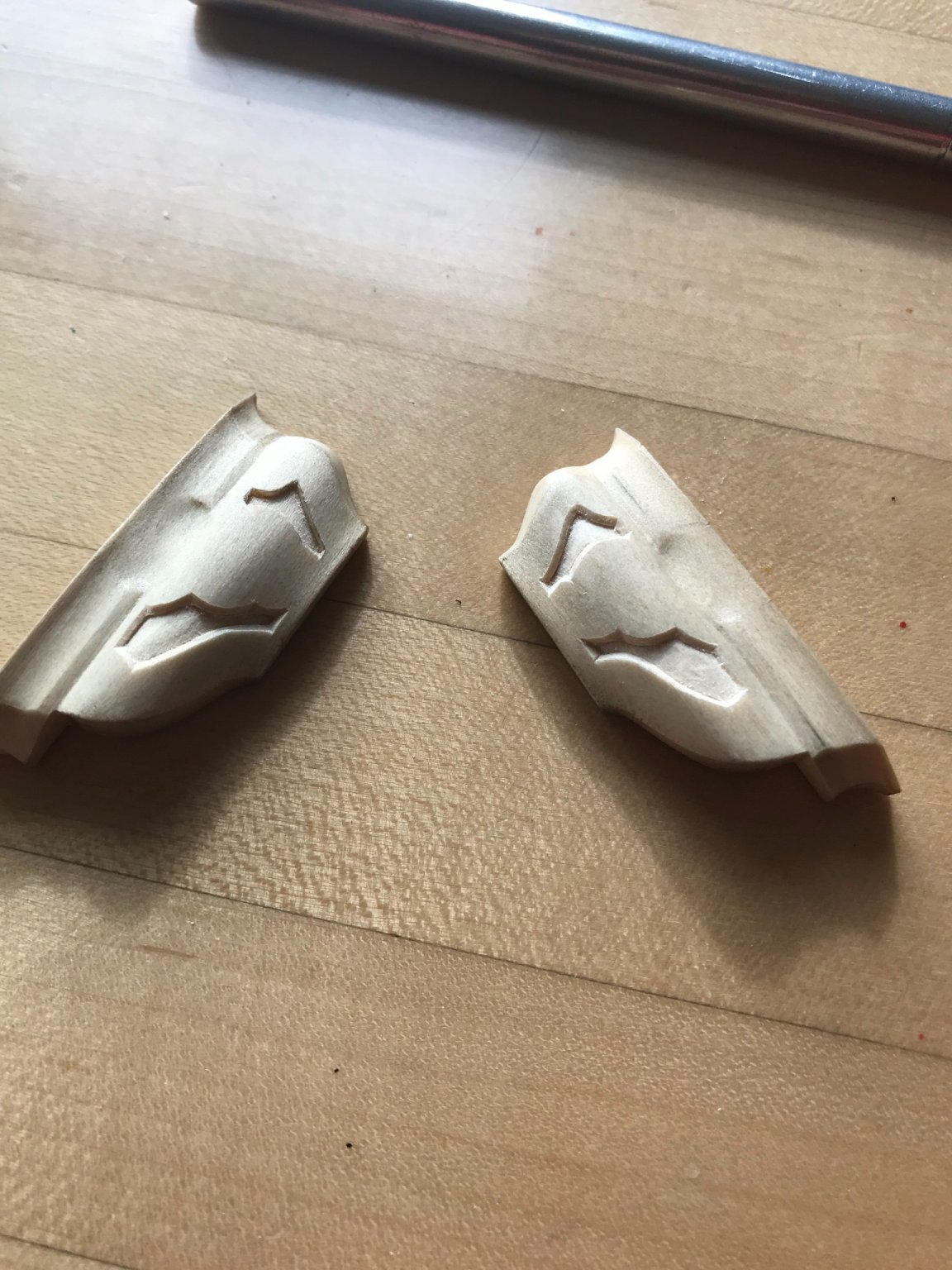
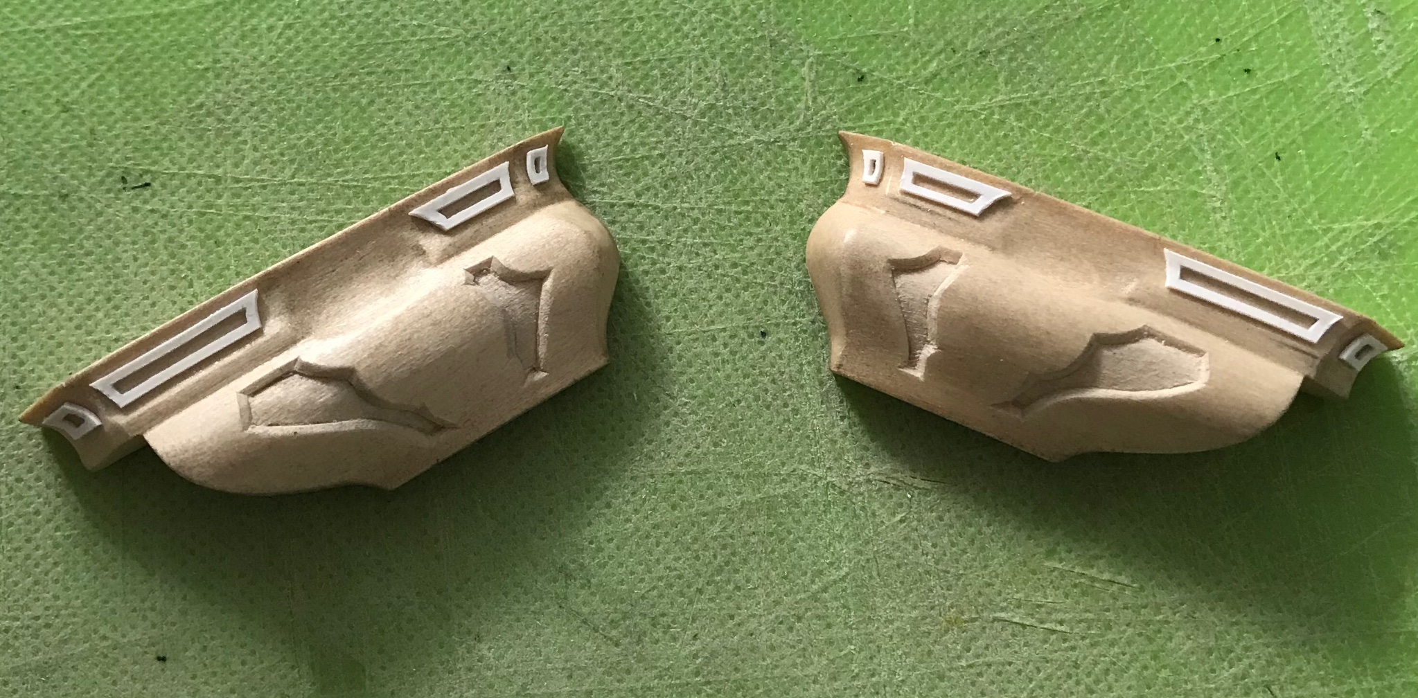
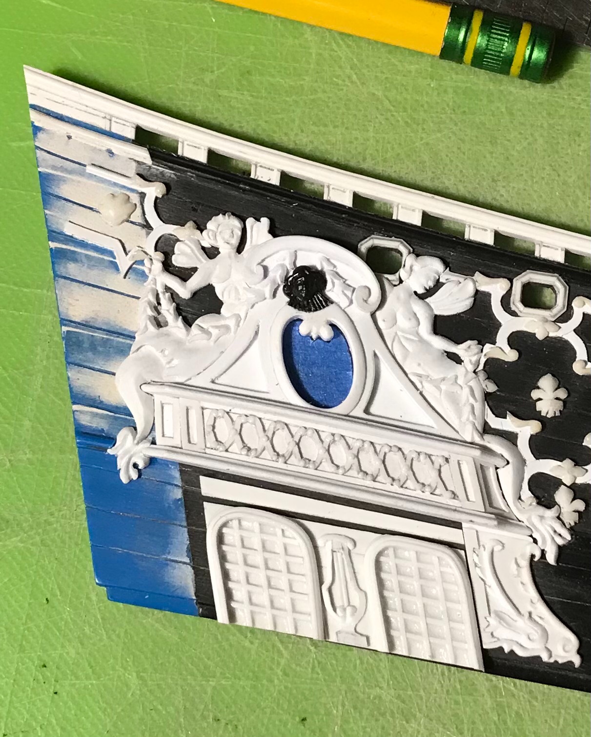
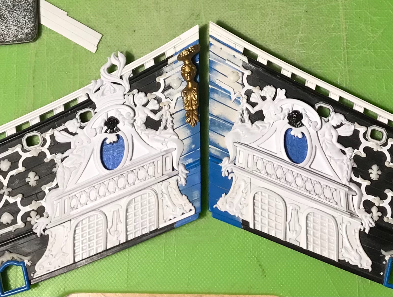
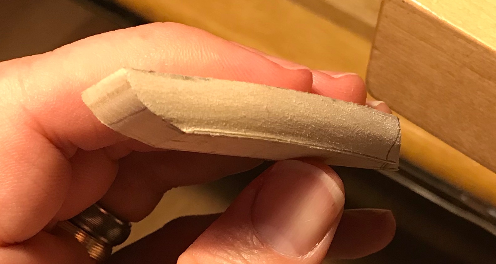
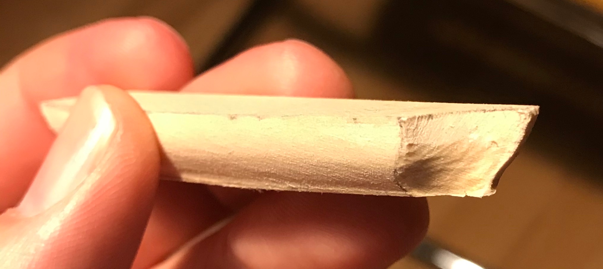
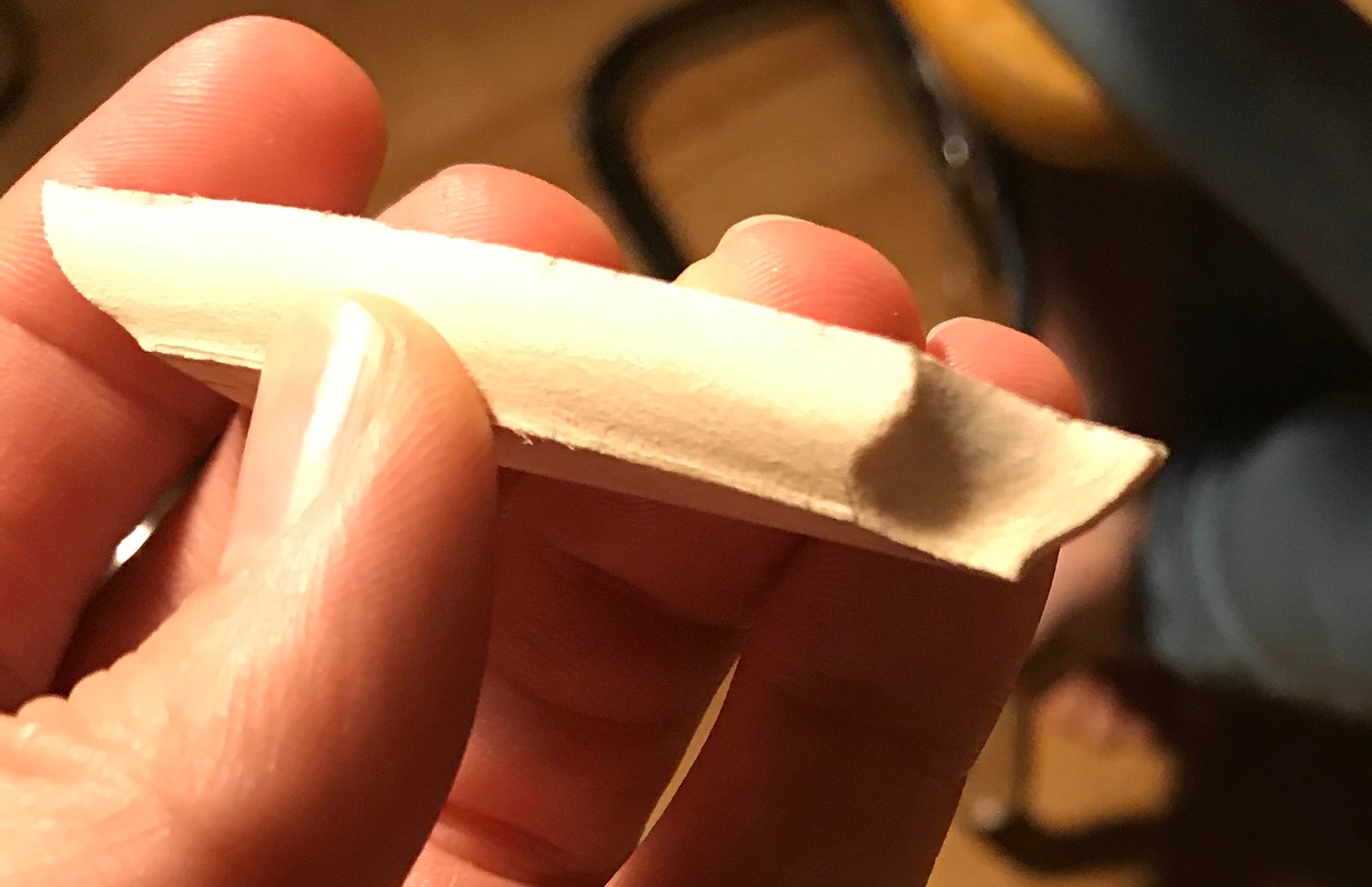
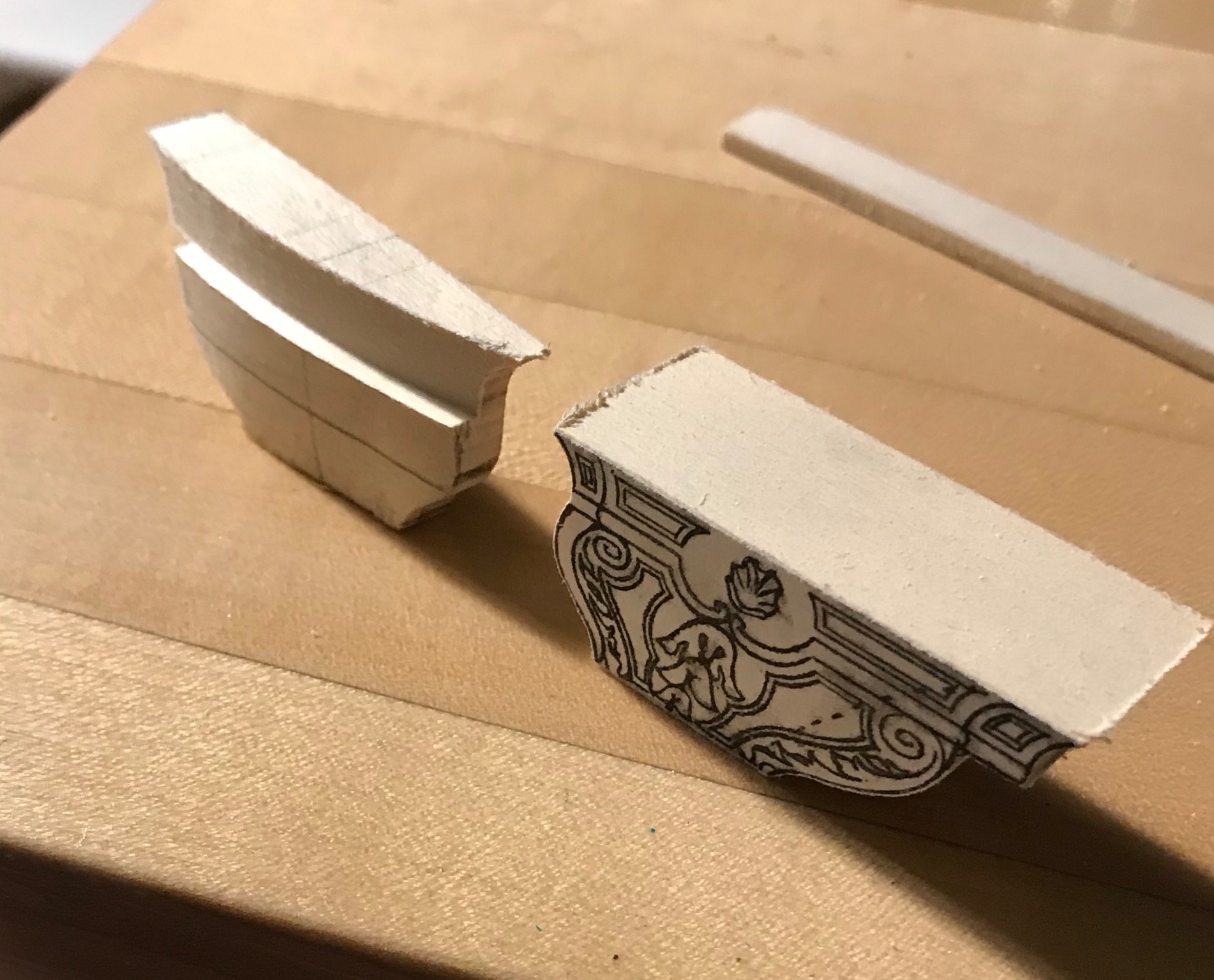
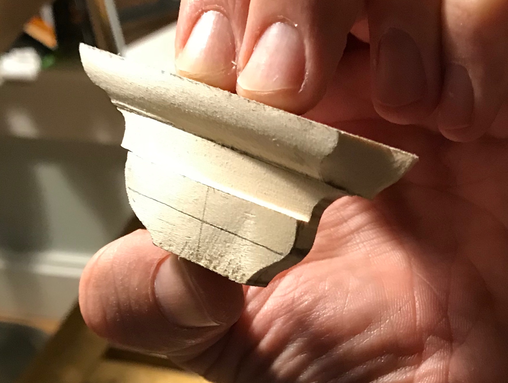
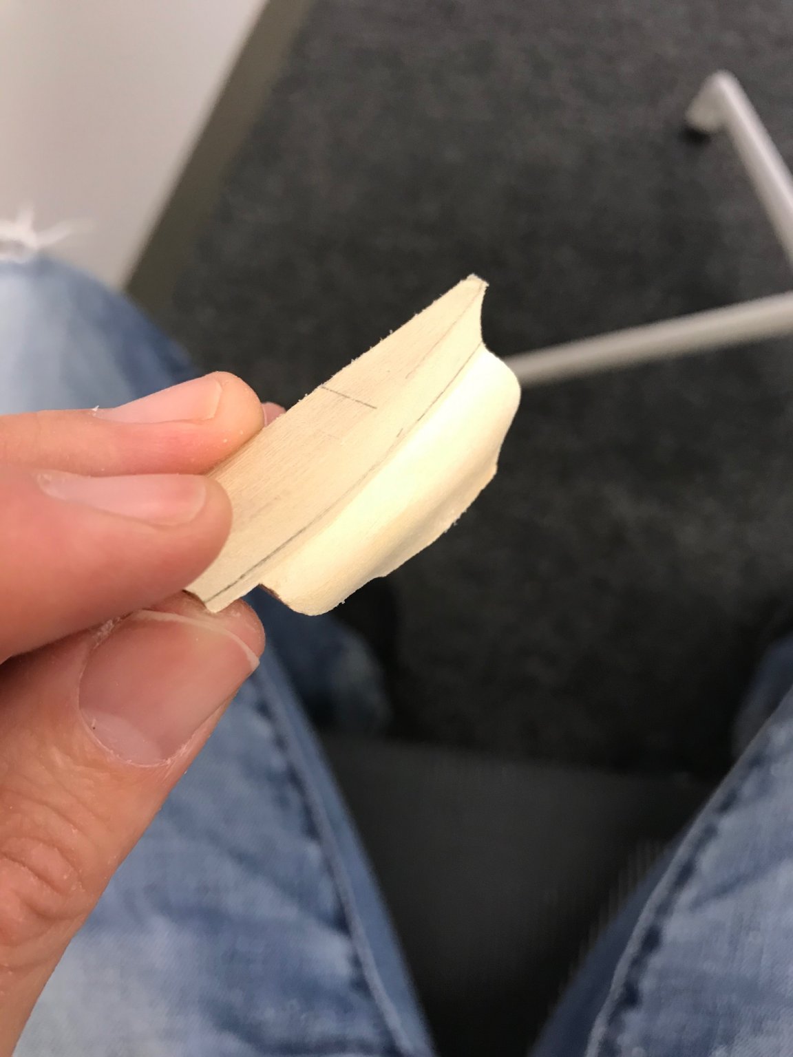
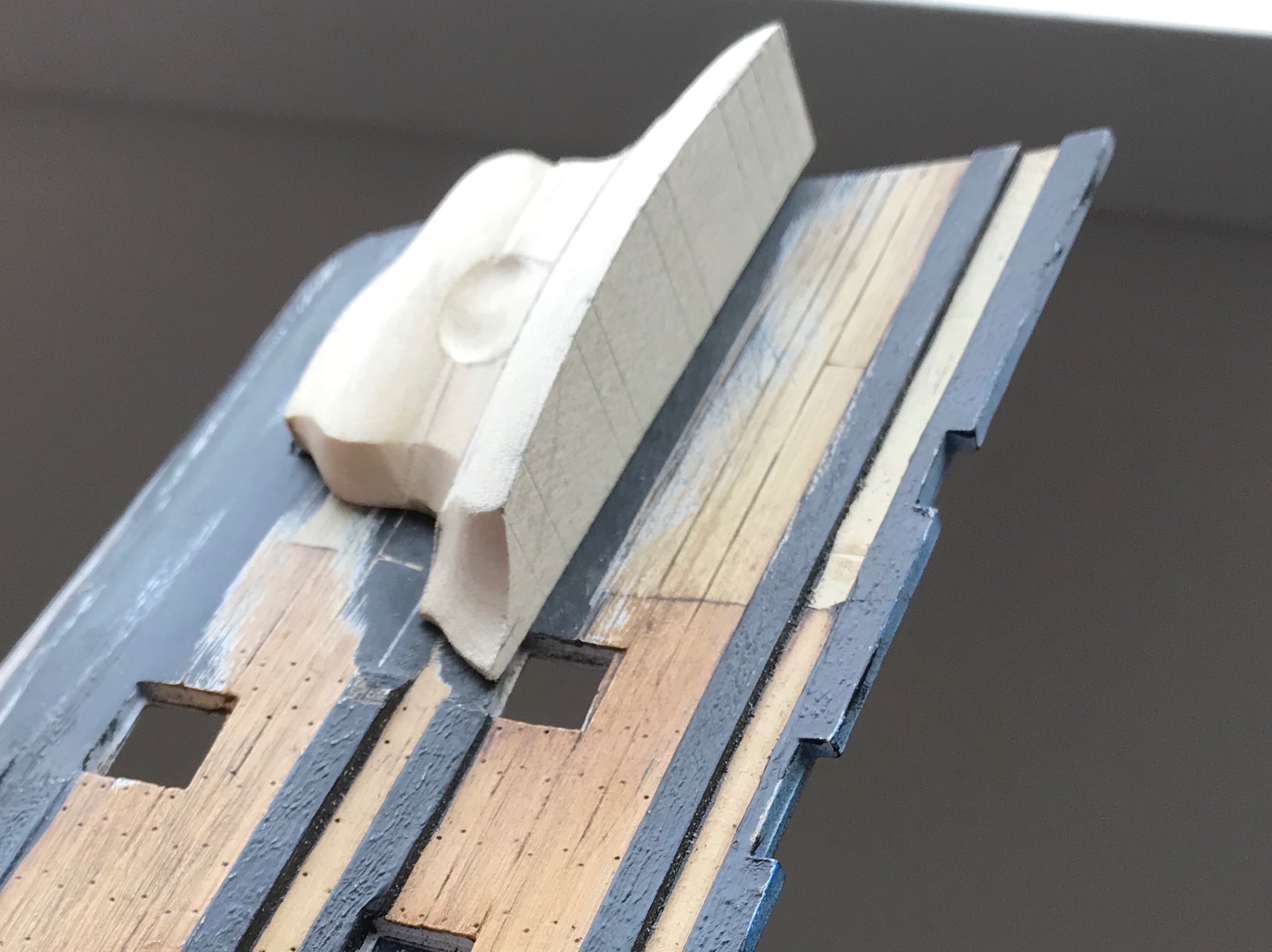
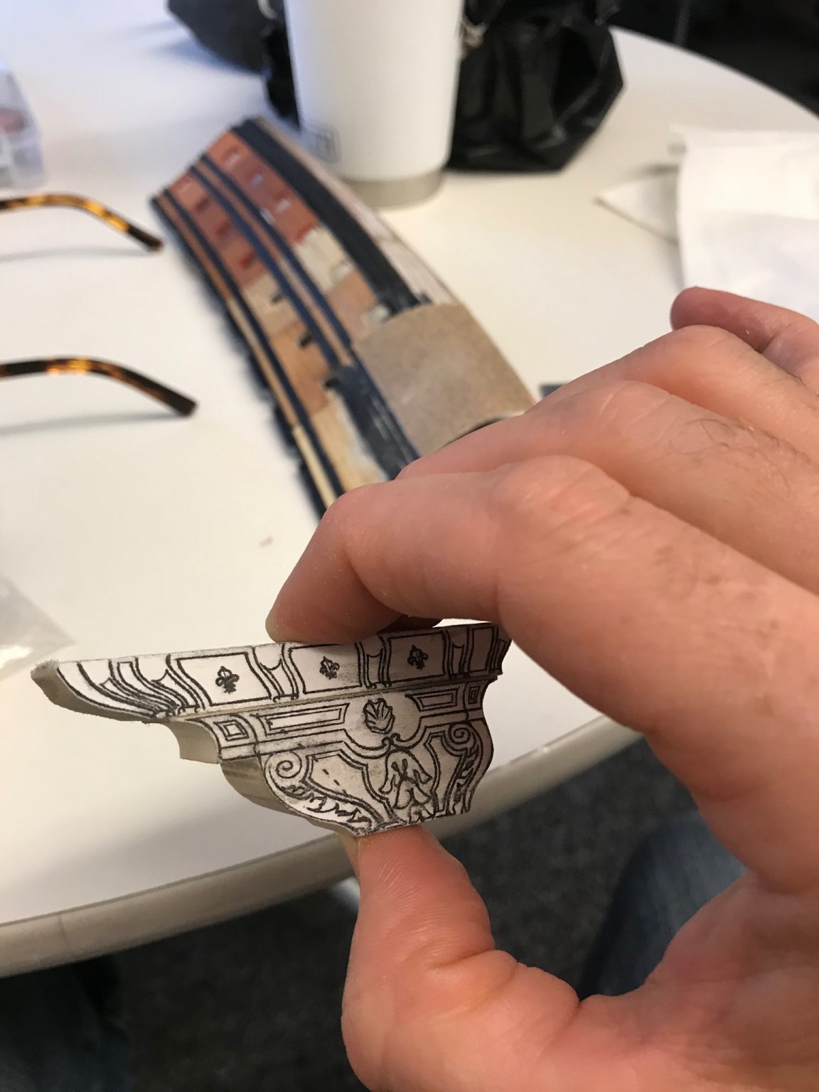
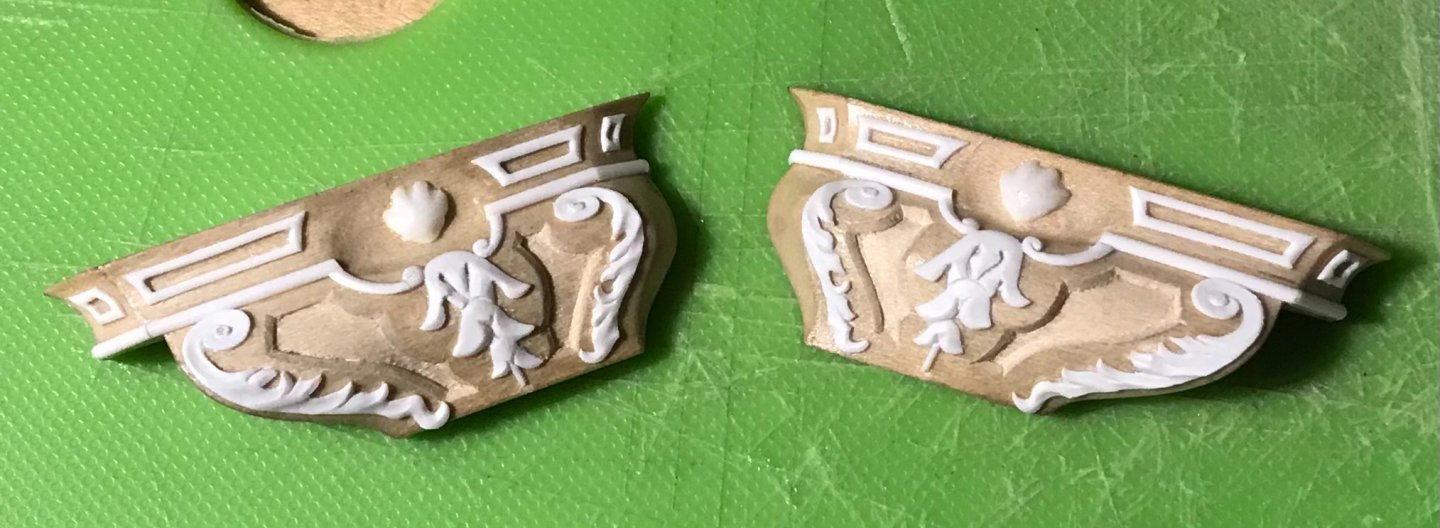
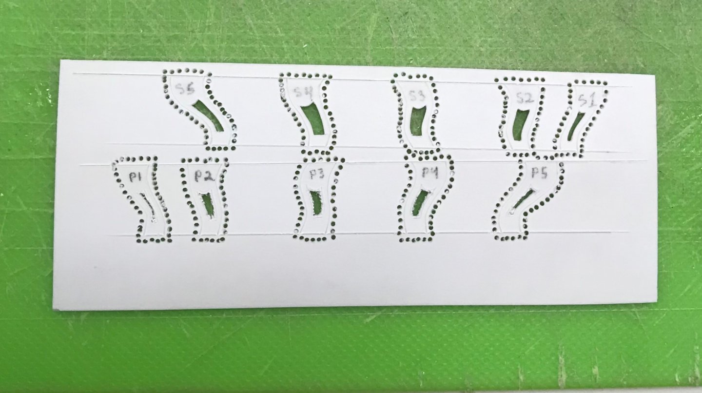
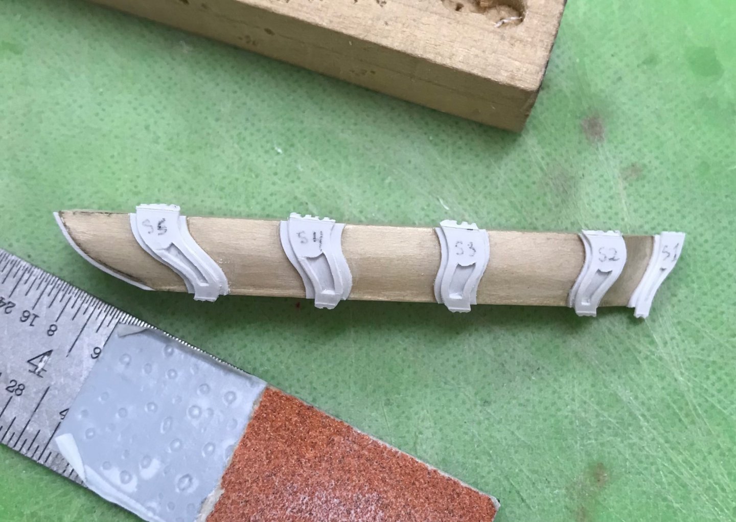
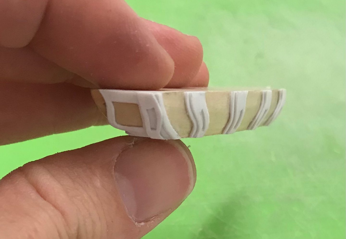
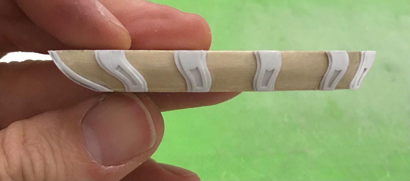
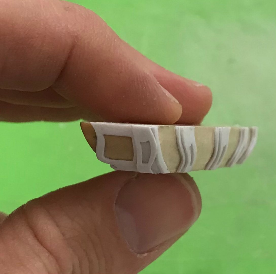
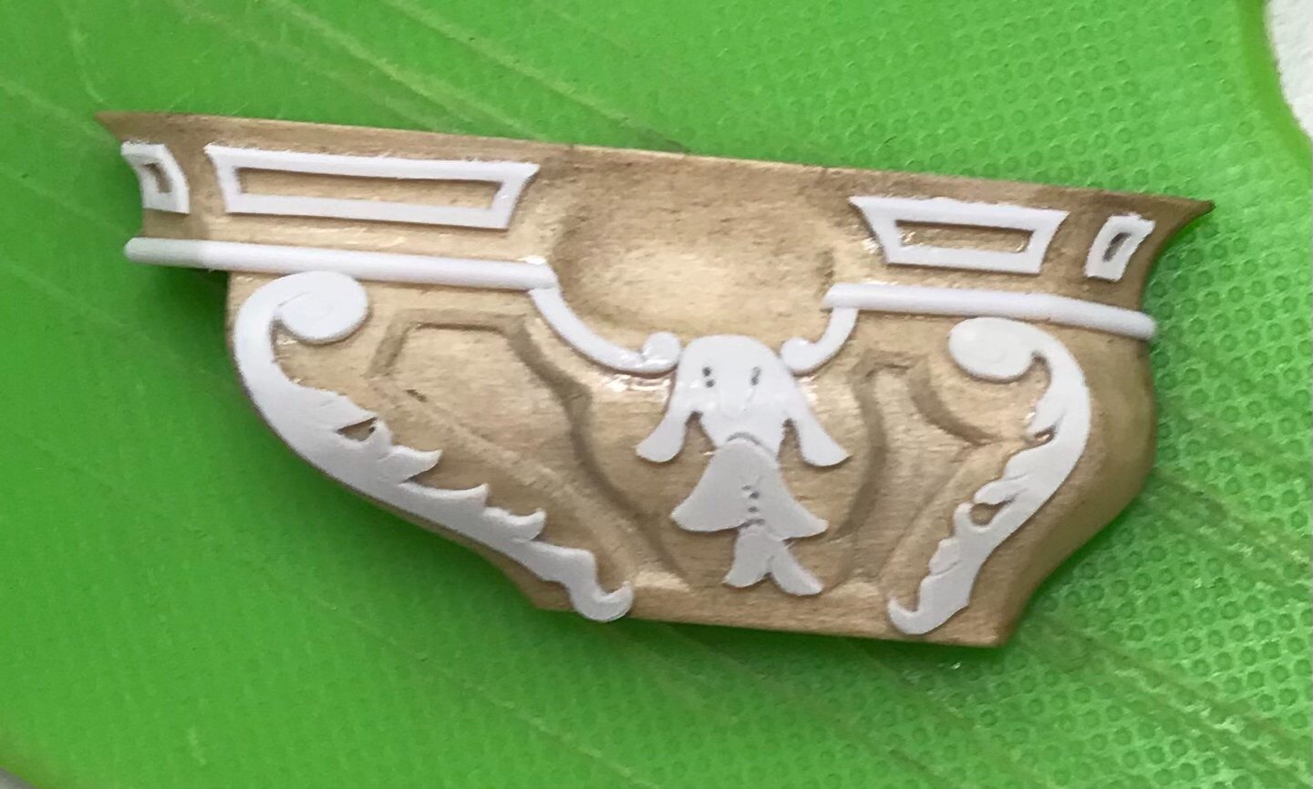
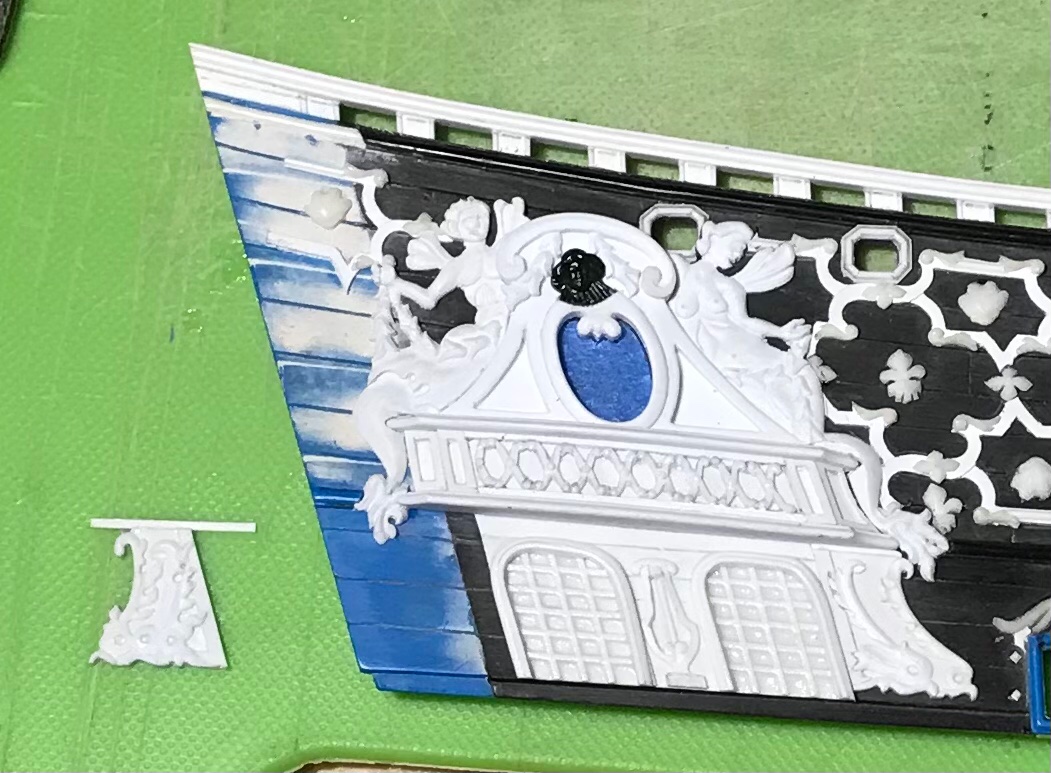
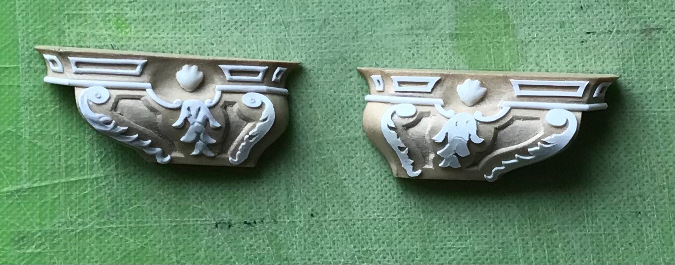
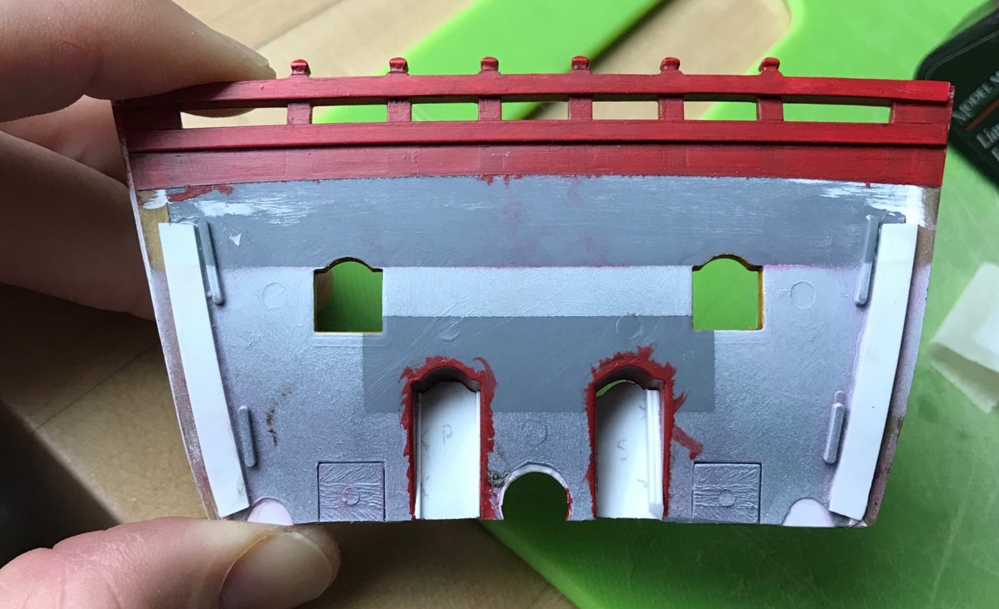
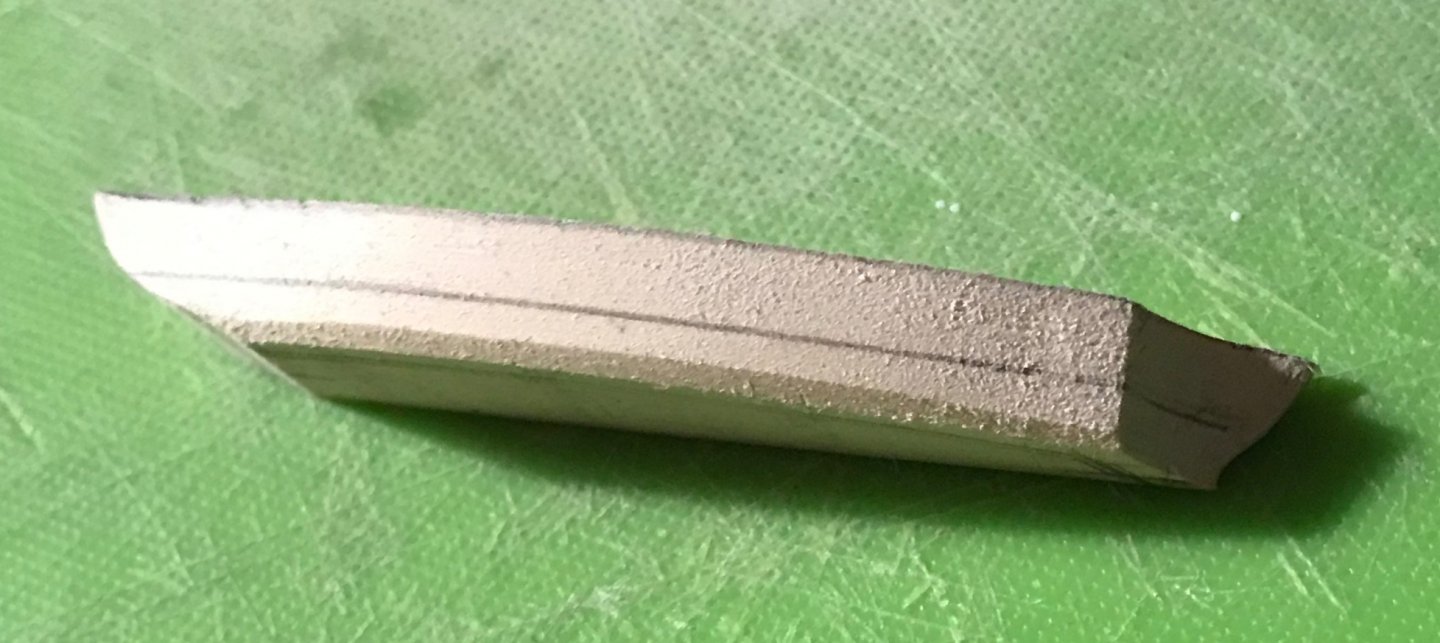
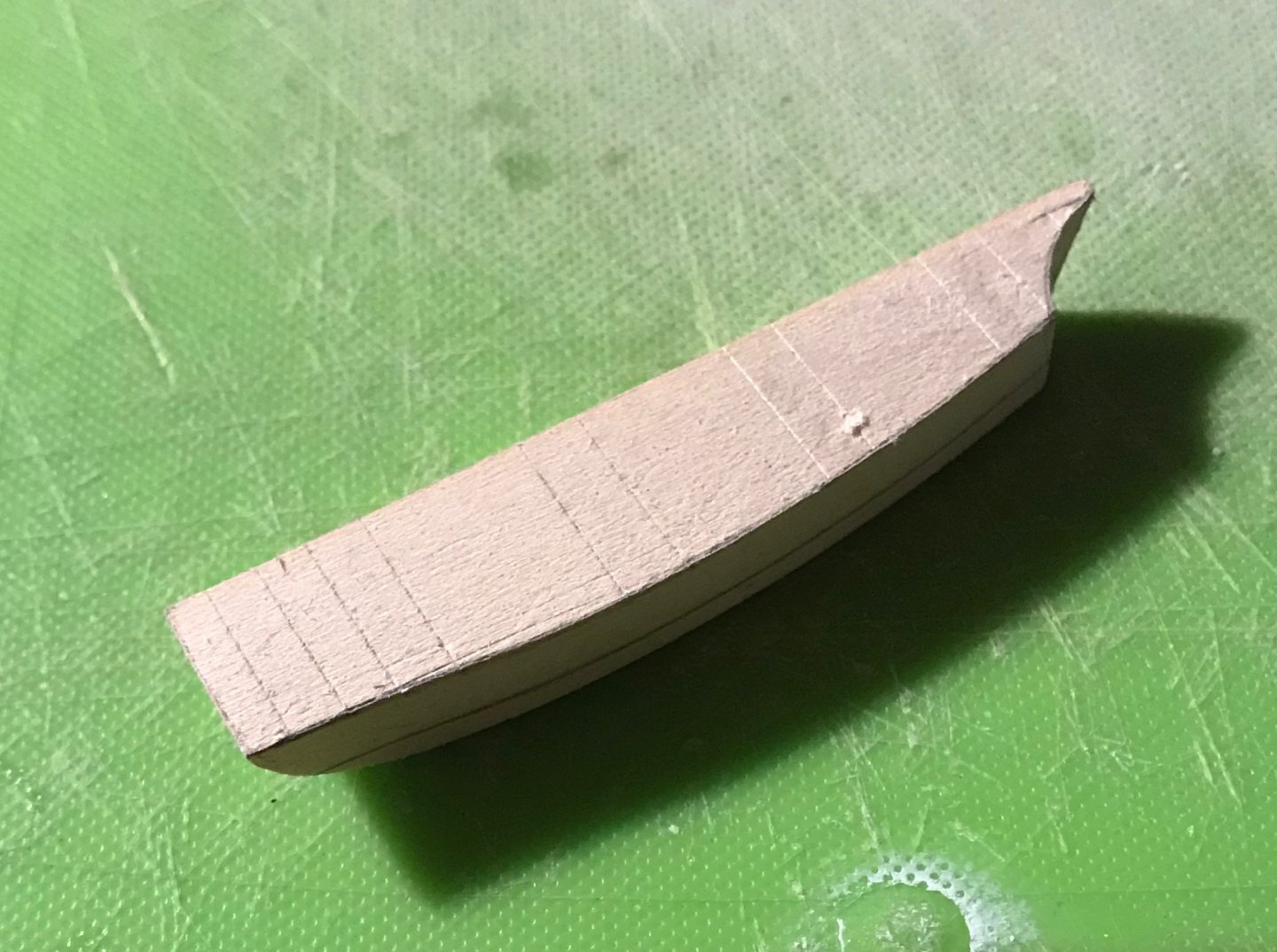
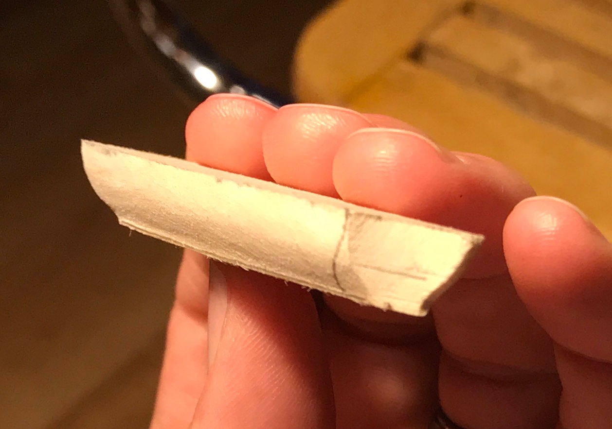
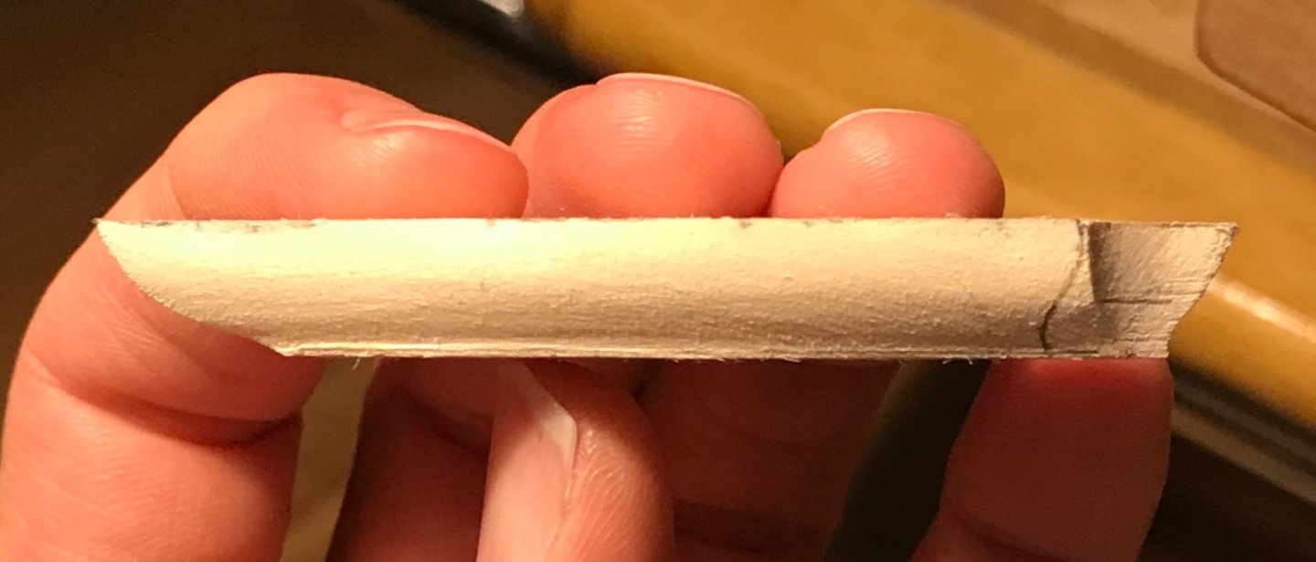
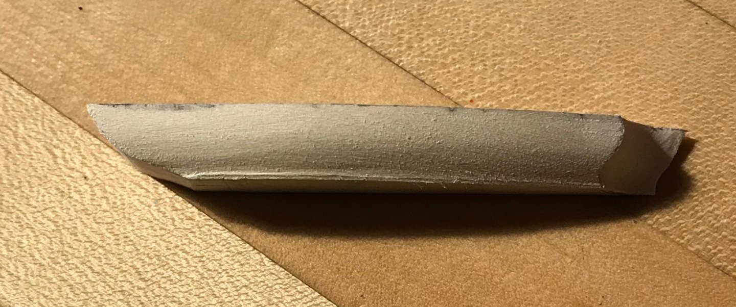
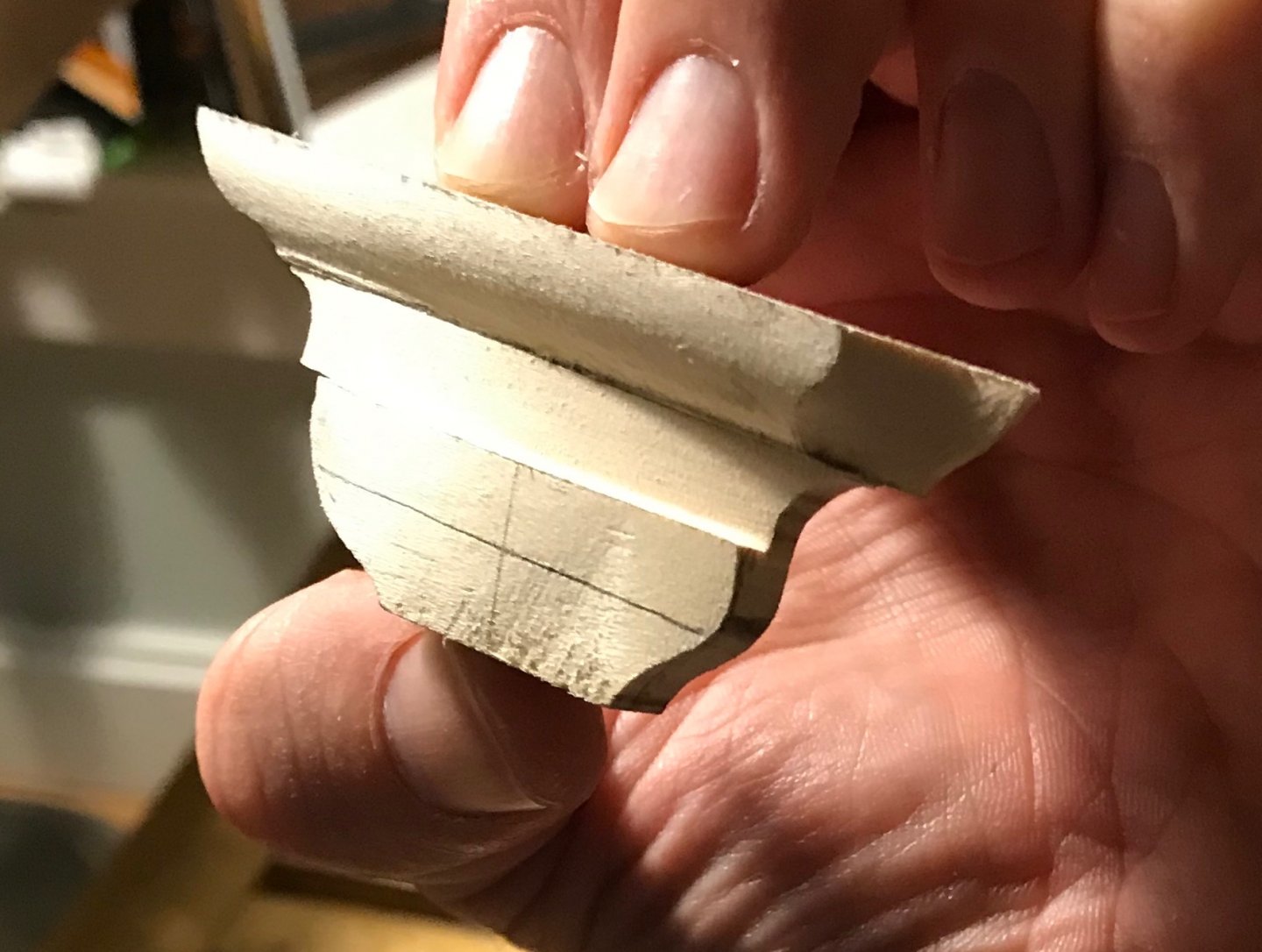
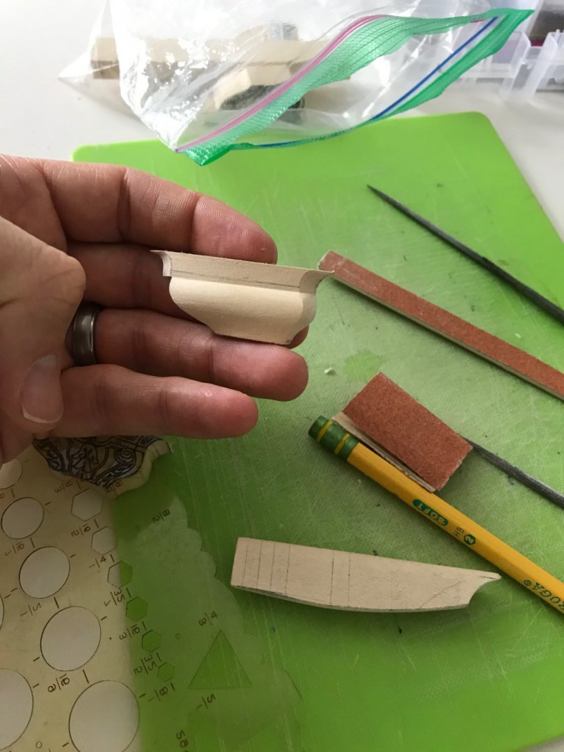
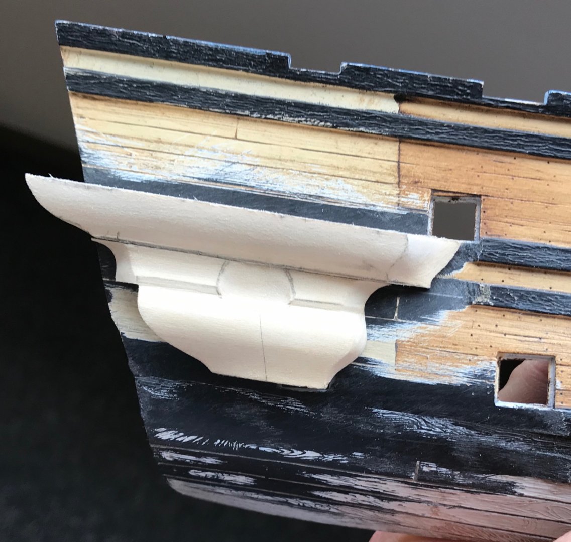
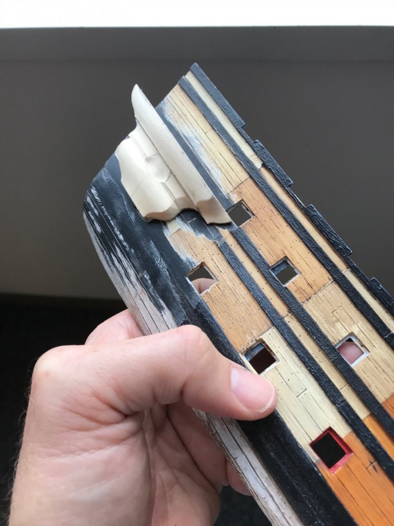
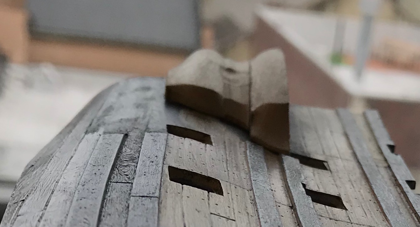
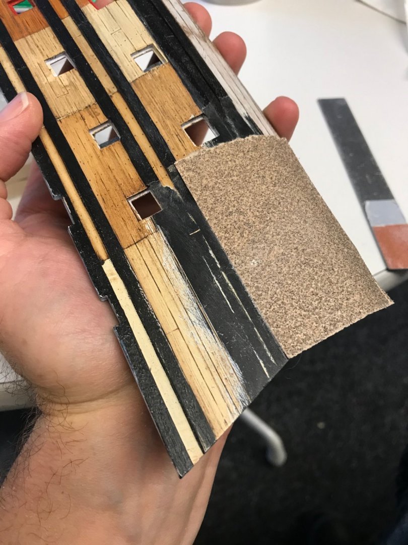
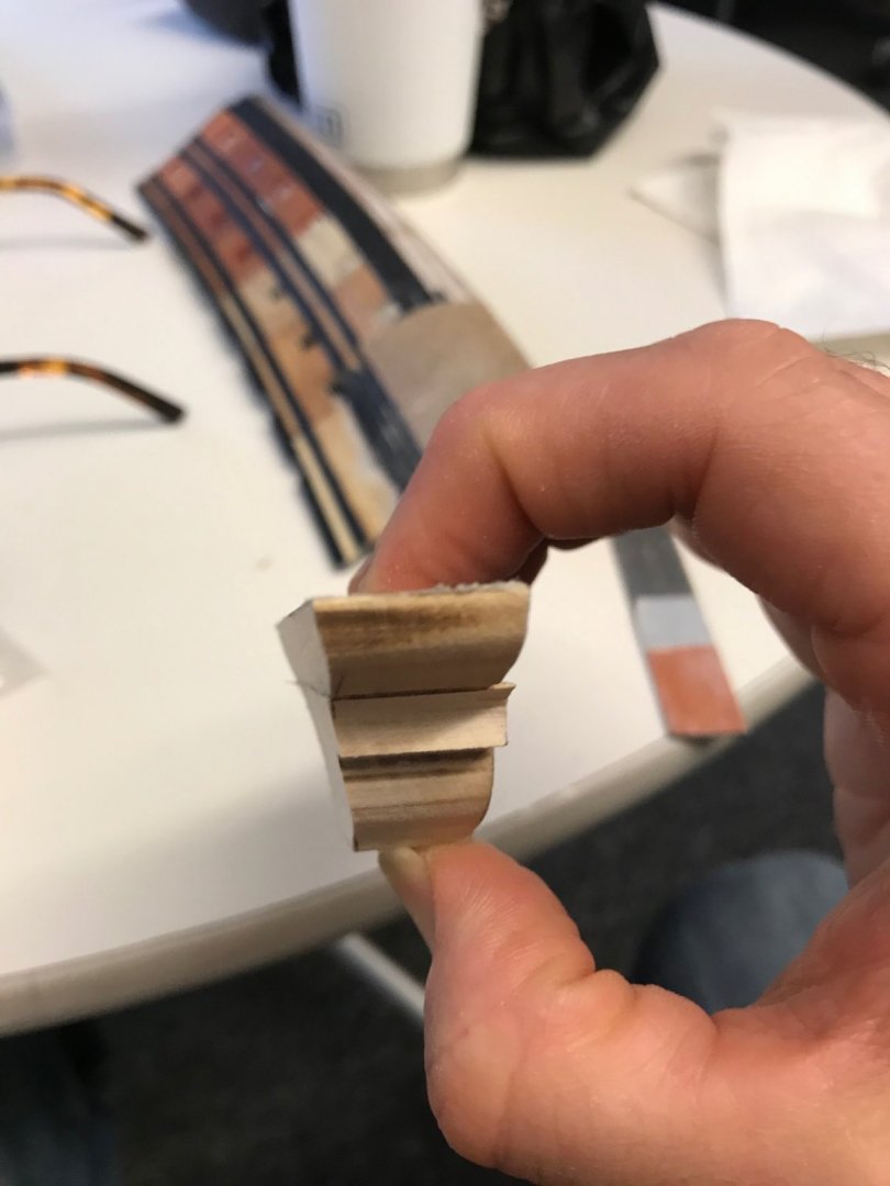
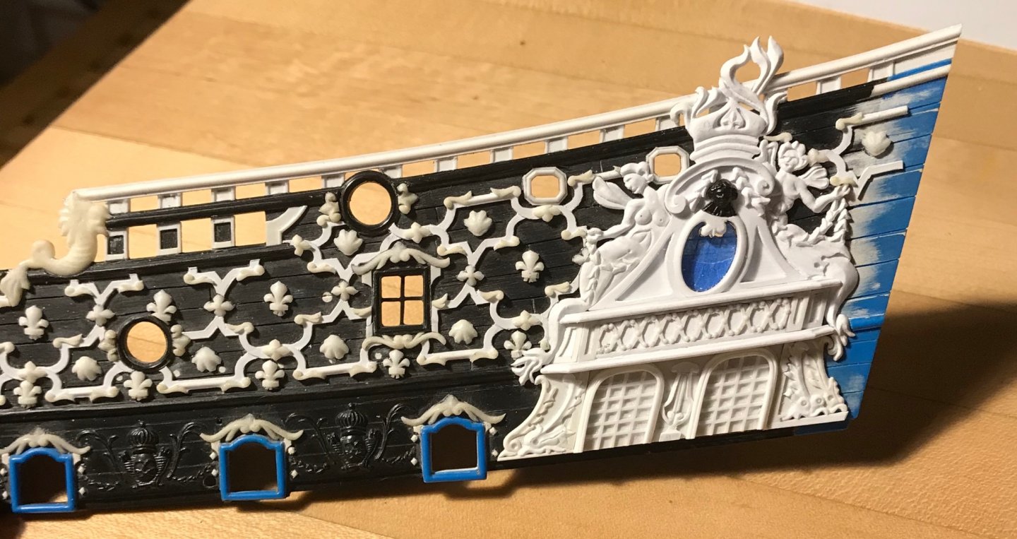
Thank you, Jonathan! After sealing with plain old brush-able Crazy Glue, I sanded smooth with 320, and then transferred the patterns for the inset panels. When Dan gave me this wood, he told me he thought it might be apple, but that it had been sitting around so long, he had lost track of what it was, or why he had bought it. I was impressed with the stuff because the grain was absolutely clear and even, and the stock had remained perfectly flat and straight for over a decade without any special handling. Although I had never worked apple before this, I have to say that I think this wood might be some other species. I was expecting “apple” to work with roughly the same density and hardness of cherry, for example. This material is nothing like that. It shapes beautifully, and easily, but it is fairly soft and a little thready; strands of grain can pull away from the surface, fairly easily, if you are not careful, and if your tools aren’t razor sharp. While I thought my knives were sharp, they were crushing/compressing the grain, as I tried to carve the beveled border. So, I sharpened my knives. Here is a montage of the lower finishing as it has come into focus: Now, I made a mistake, here, in the placement of the bellflower ornament. I placed it according to how I thought it was framed best by the central stile. However, that’s not what was drawn. Notice how the scrolls meet in the middle, above the bellflower: I should have placed the bellflower a little lower, in order to accommodate this detail. A little finagling later, though, and I found that I like this alternative layout just as well. Grinding away and remaking the bellflower, on such a fragile substrate, did not seem worth the risk of ruining all of the work done so far. Here are a few more detail images that show just what a difference a little modeling makes, once the outline of the carvings is clearly defined: Obviously, there is still some work to do on these. I’ve been much busier than usual, so progress has been slower. I have continued to assemble the starboard side amortisement. Everything from the canopy and above went down smoothly enough. I’ll have to do a few minor putty fills. What I found really fascinating was the space available below the canopy, where the two false windows go; the space between the upper main wale and the canopy is a full 1/8” bigger on the starboard side than on the port side! Now, for the port side, I did fill above the windows with a 1/32” square shim, and I didn’t even bother to fill above the dolphin ornaments because I got lazy and figured that the viewing perspective wouldn’t ever reveal that gap, anyway. On the starboard side, though, this is an additional 1/8” gap. Up until now, I have encountered a number of these dimensional anomalies of the kit. In certain instances, while unaware, my modifications have probably exacerbated these differences. In this instance, though, it is a difference that exists and must be dealt with. I think it is likely the case that when this kit was prototyped in the 1970’s, by hand, there likely was not the high degree of symmetry that computer modeling offers us, today. As a result, the model was made to fit together and had visual symmetry, if not actual symmetry. This is just something to keep in mind, for anyone contemplating a similar modification project. There is no way that I was about to re-draw and re-make the windows and dolphins. I am a field carpenter, after all, and being such requires one to just make things work, visually. A few things are certain: the windows must meet the upper main wale, so that necessitated filling that space, above, with a tapered wedge of styrene. I also wanted the added framing pieces, beneath the dolphins to match what I had done on the port side. Toward that end, I started with the forward dolphins. I coped them into the mermaid’s tail. I had to trim a solid 1/32” off the aft straight edge of both dolphin carvings, so that they’d fit between the mermaid’s tails. I then filled above the forward dolphin so that the space beneath these dolphins would match that of the port side. Here it all is in pictures: I still need to fill in those lower framing pieces, but I think that, overall, I managed to mask those differences well enough. One can only look at one side of the ship at a time, in any case😉 Well, steady as she goes. I’ve cleared the space on the hull where the active seats of ease are located. Soon, I’ll scribe in the wales, so that I can fit those pieces and then I can clad them with all of the styrene rails, stiles and ornaments. After struggling mightily to paint the bowsprit, on the model, I will certainly paint these QG sections off the model and install, afterwards. As ever, thanks for the likes and for looking in!


- 2,699 replies
-
- 10
-
-
- heller
- soleil royal
- (and 9 more)
-
Your plank work looks really fantastic, EJ! This has all been time well-spent establishing the foundation for the next phase. BRAVO
-
Would you mind describing what different glues you used to construct the sails - particularly the bolt ropes (think that’s what they’re called) around the sails?
-
I am thoroughly convinced that this silkspan method is the way to go. As long as you go to the effort of proper scale and silhouette - which you certainly did! - then, they read so much more naturally, at this scale, than cloth. These sails are really going to accentuate all of the other upgrades and modifications you made, Jonathan.
-
Interesting. Thank you!
-
It seems to me that you have the ventre-de-biche color just right, Oliver. What specific pigment are you using?
-
Definitely still interested! I am happy that you and your family have found your way through COVID. This past year has been a DOOZY! The sails are really looking fantastic - I love all the detailing. The sail silhouette, up and down the mast, looks just right to me 👍
-
I think what you are doing with what you have is both incredible and fascinating. I love the resourcefulness of your approach. You are off to a great start!
- 14 replies
-
- 1
-
-
- card
- flying dutchman
- (and 1 more)
-
Incredible work, Don - really nicely done!
-
A very impressive video presentation, Mr. Budzik!
-
Actually, T_C, I had not thought of that, but it sure makes a lot of sense. Thanks for the tip! And thank you, Mark, for your continued interest and support - I appreciate it very much.
- 2,699 replies
-
- 3
-
-
- heller
- soleil royal
- (and 9 more)
-
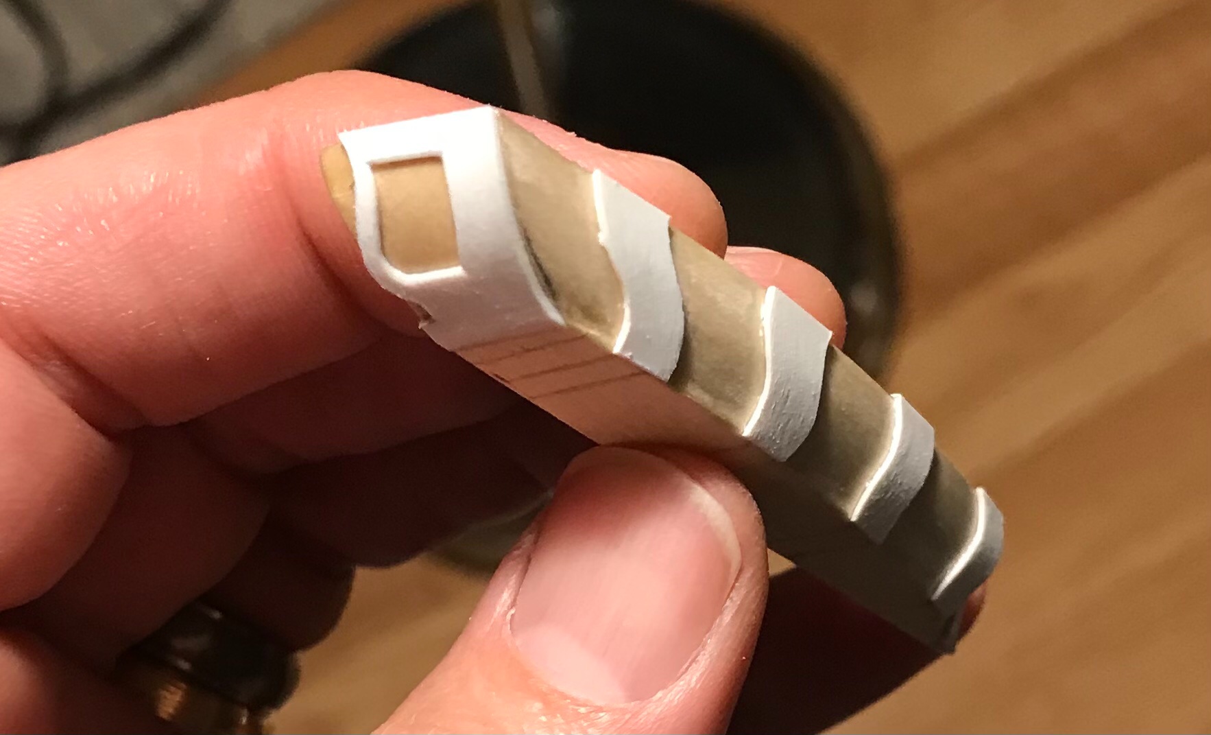
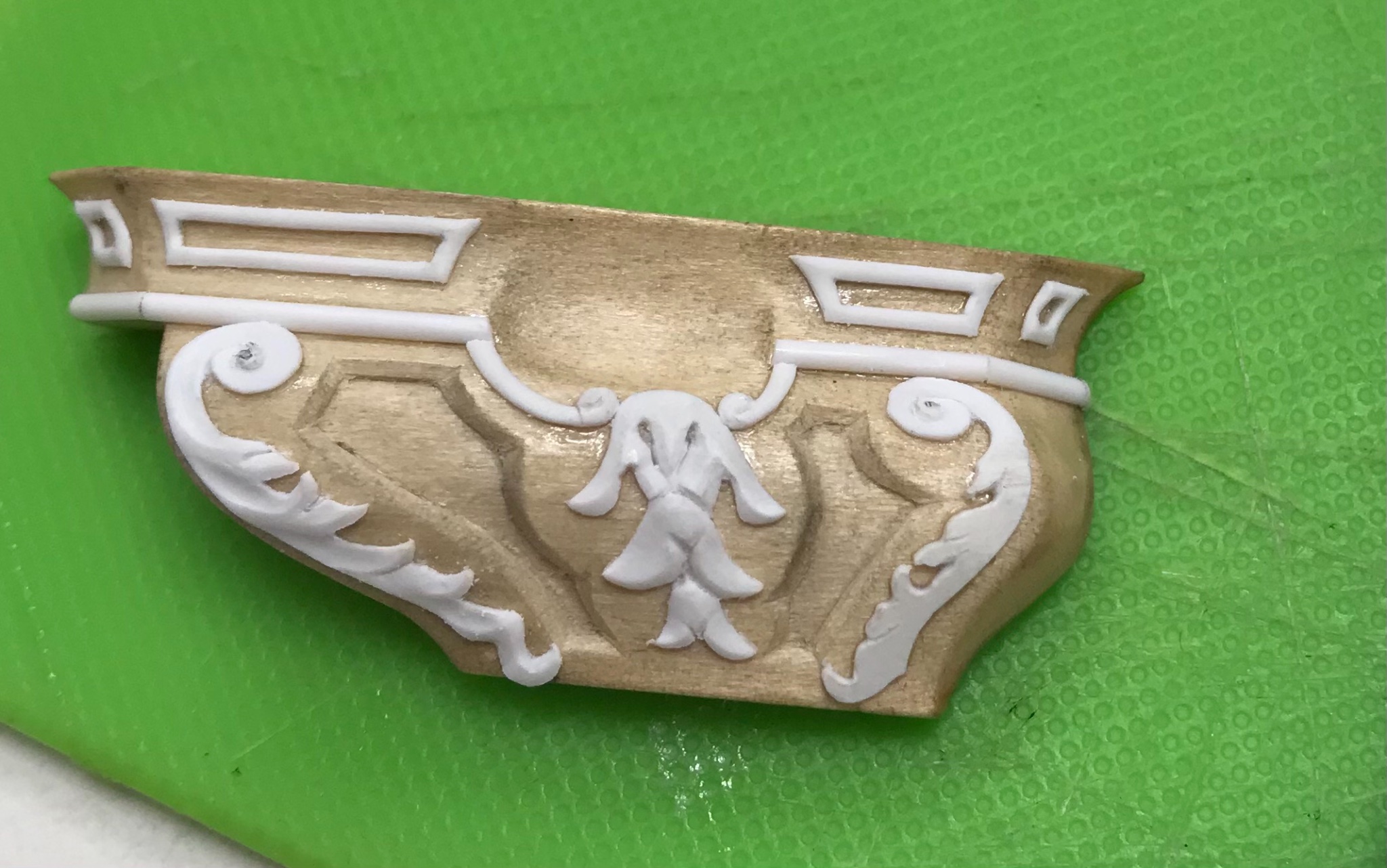
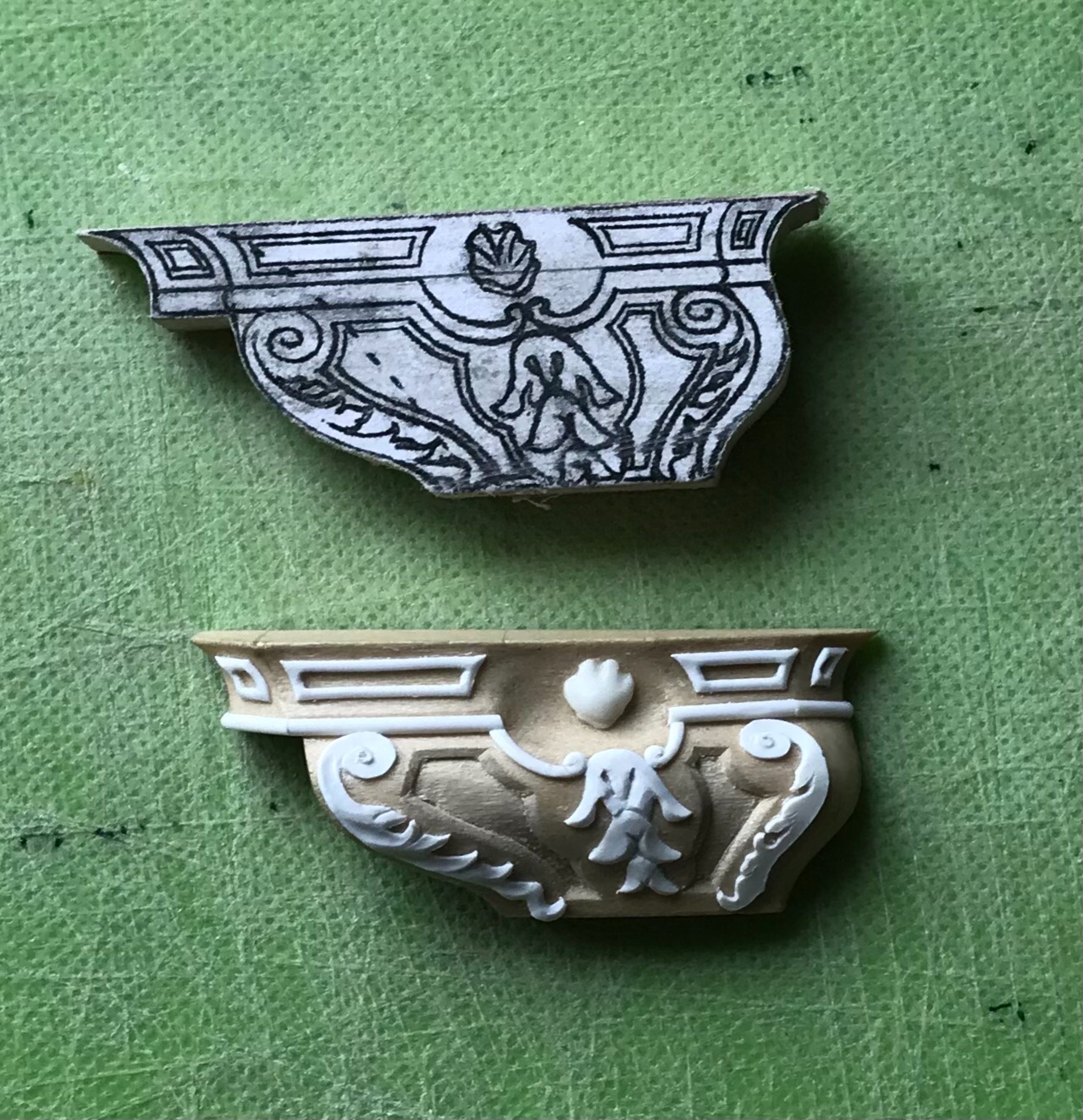
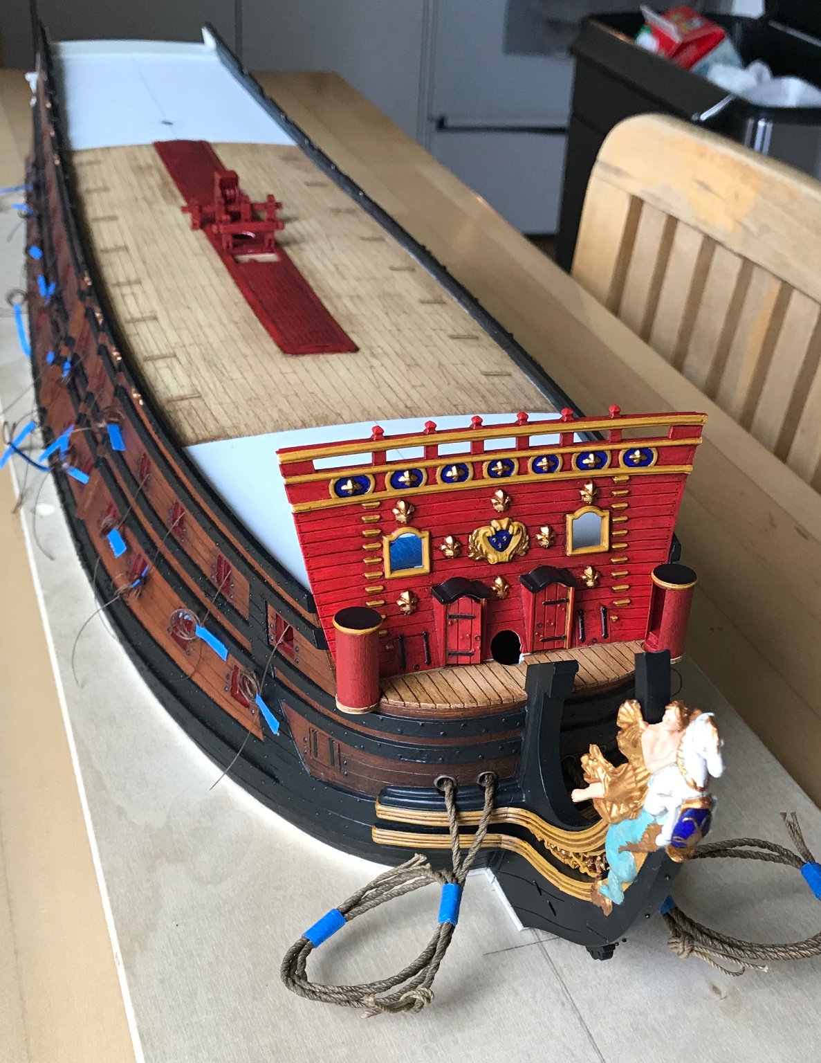
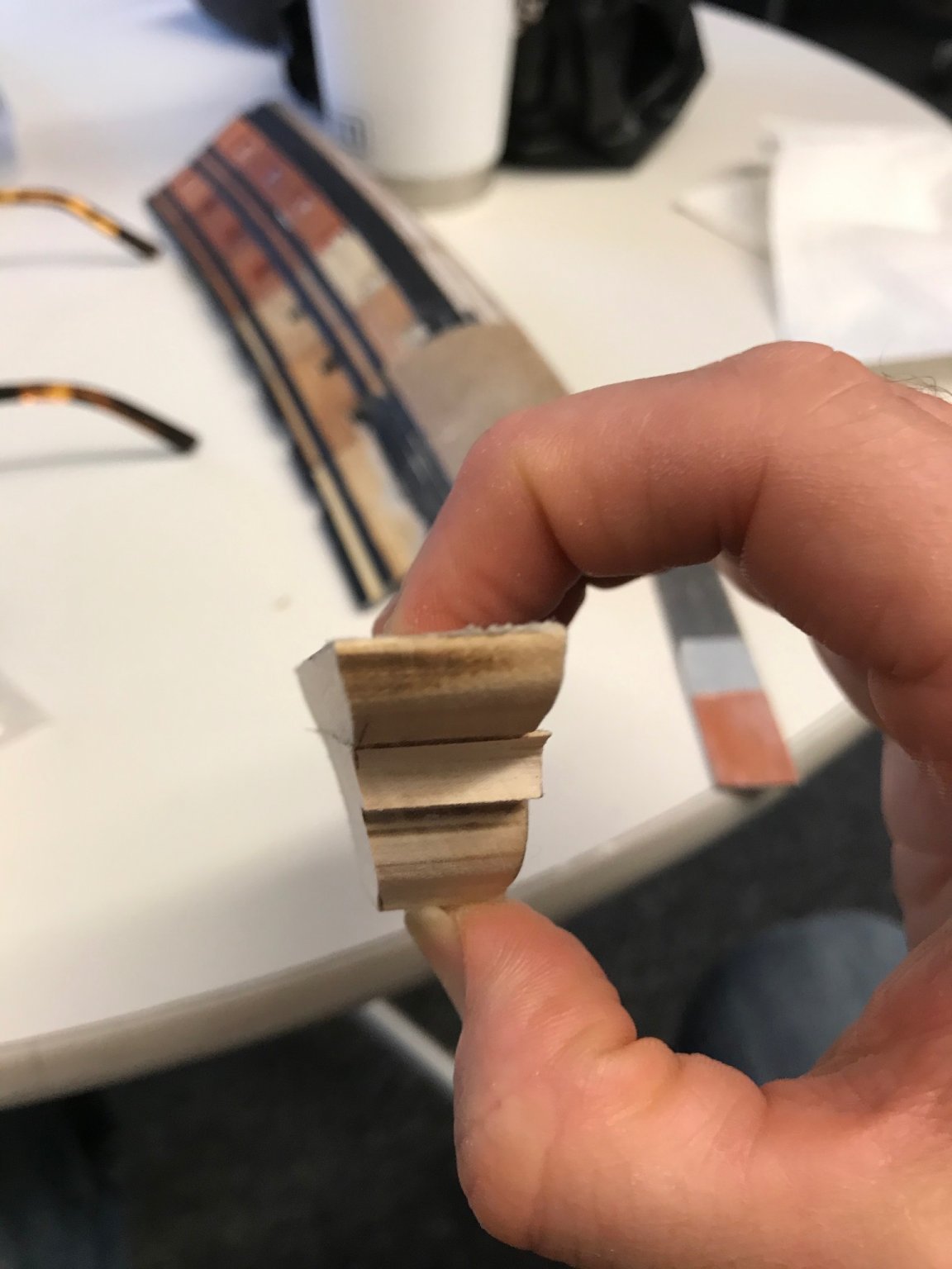
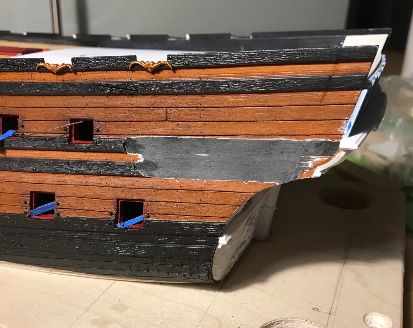
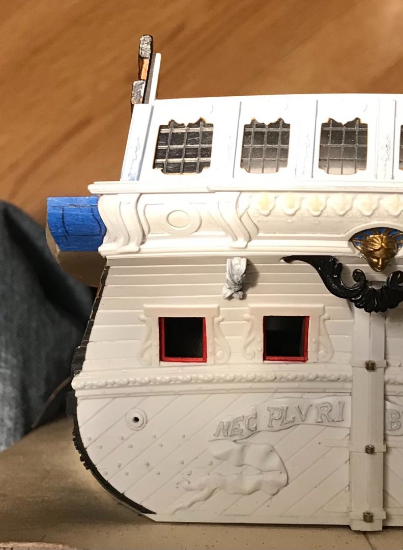
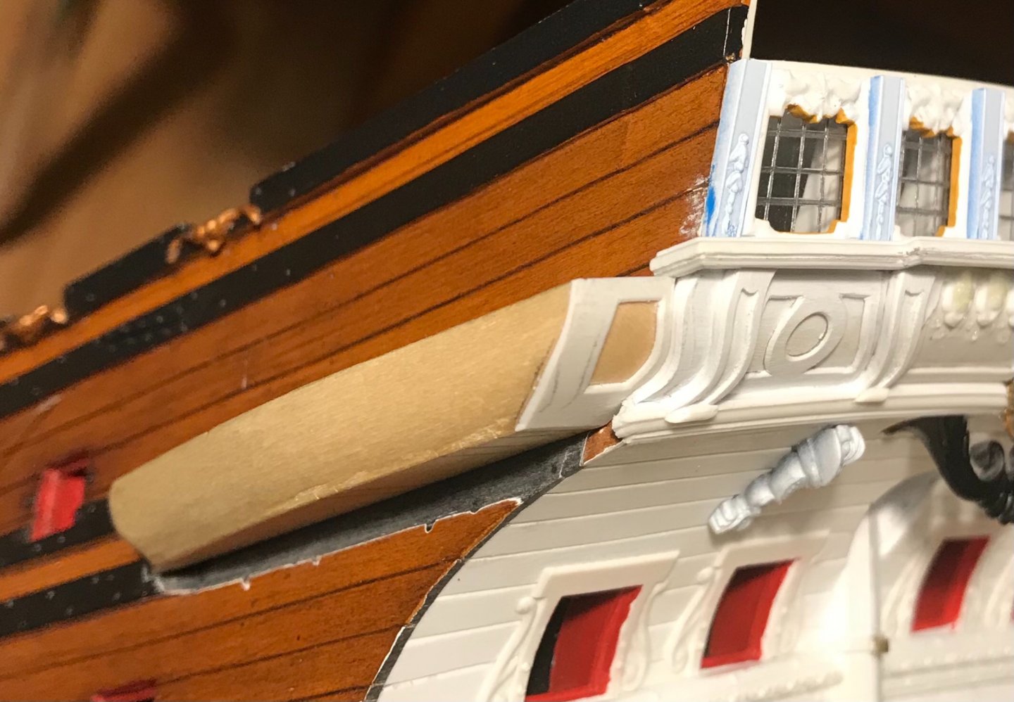
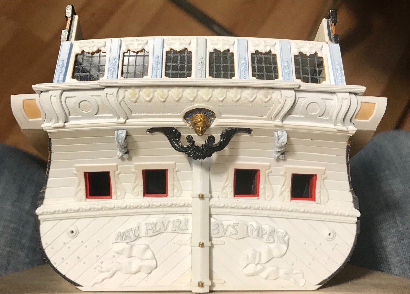
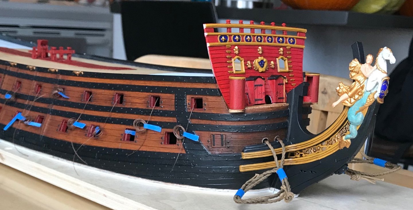
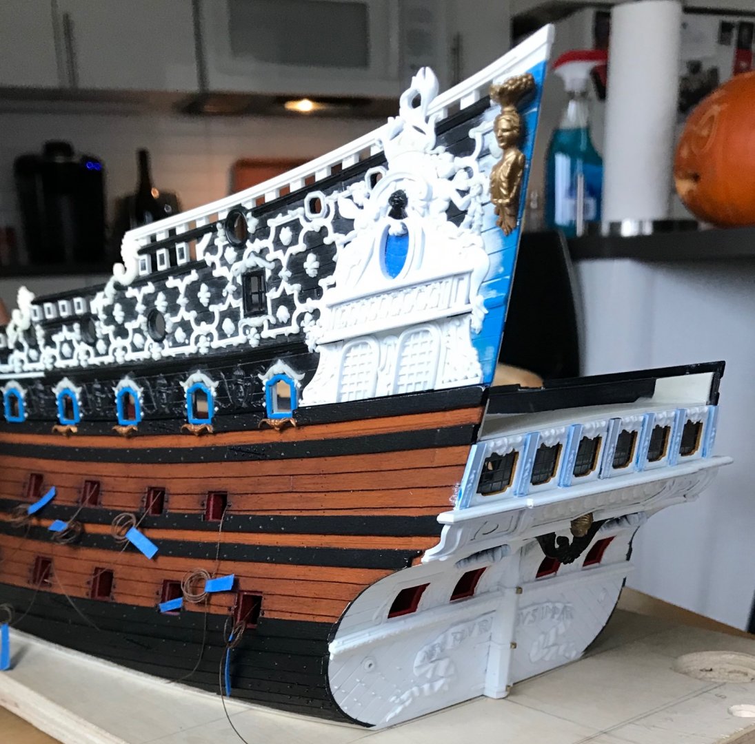
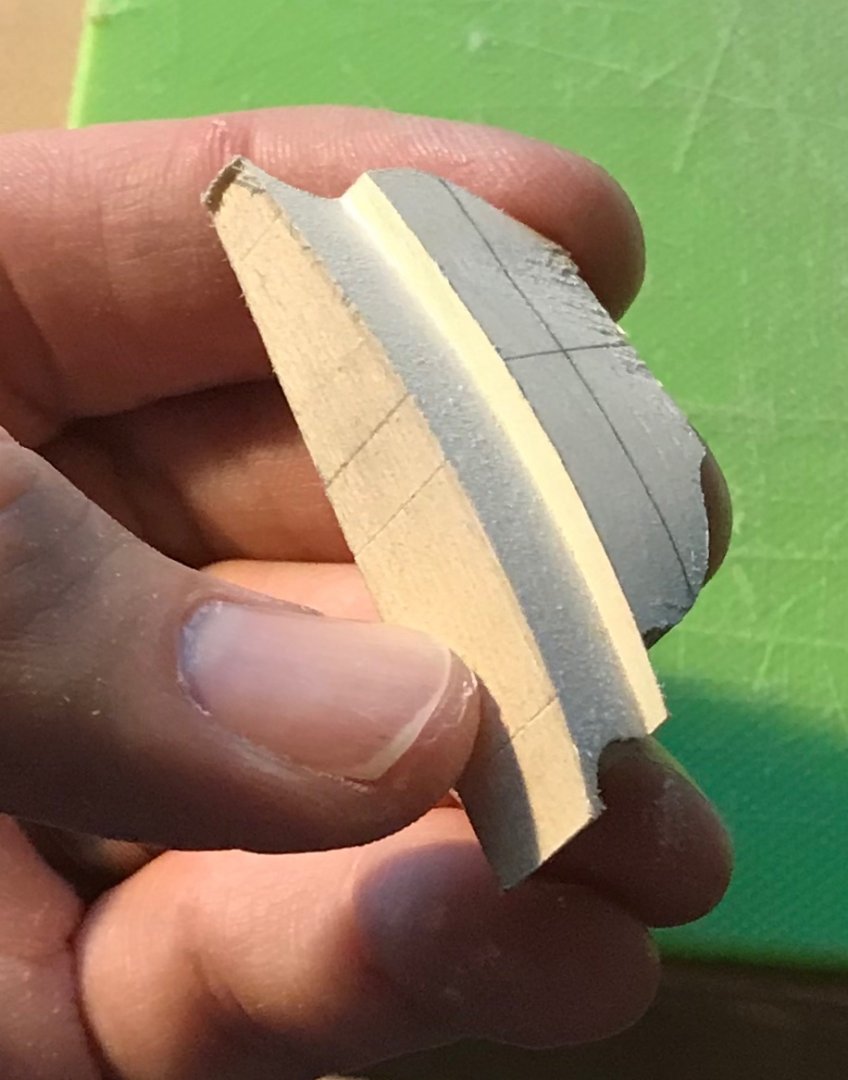
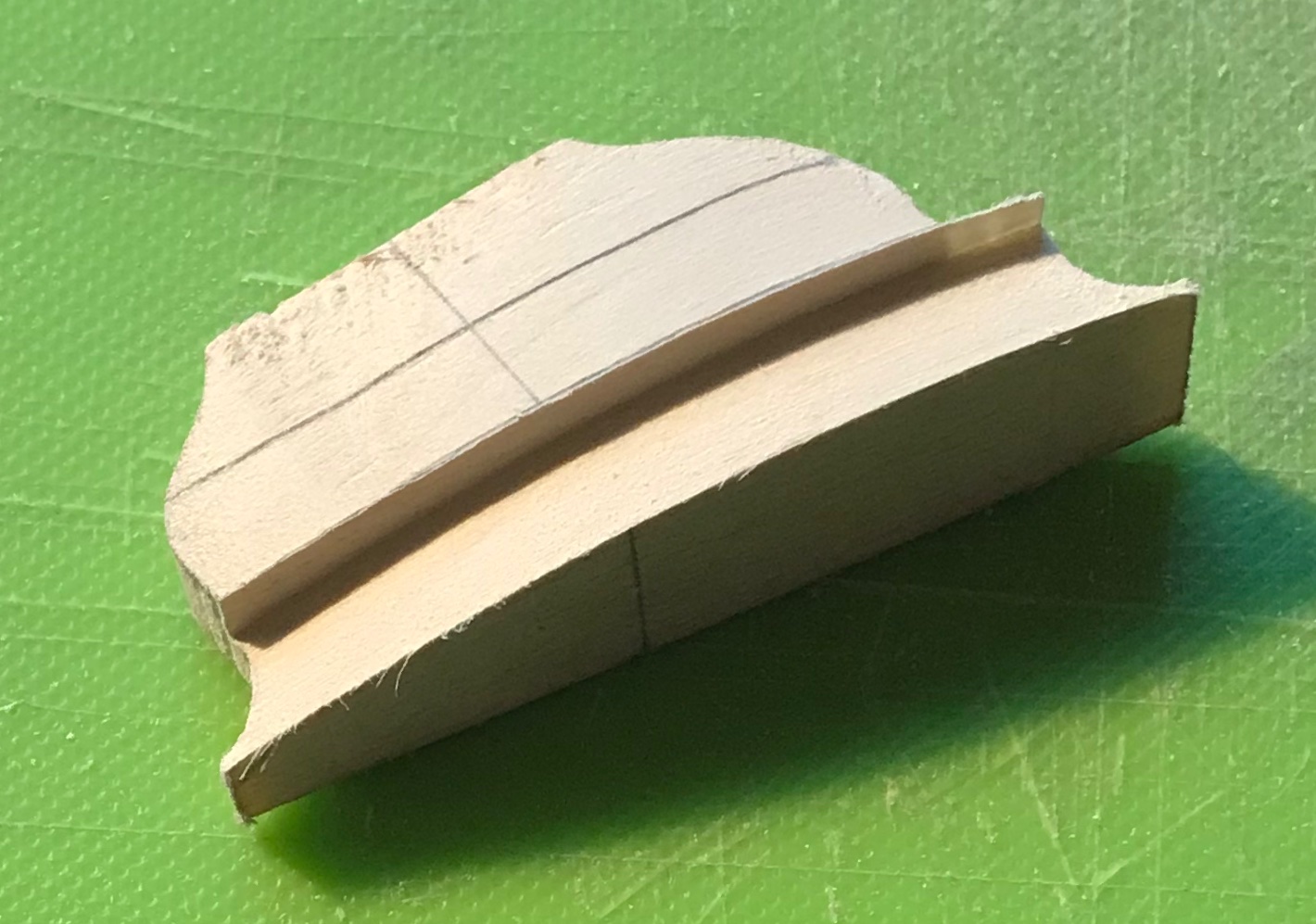
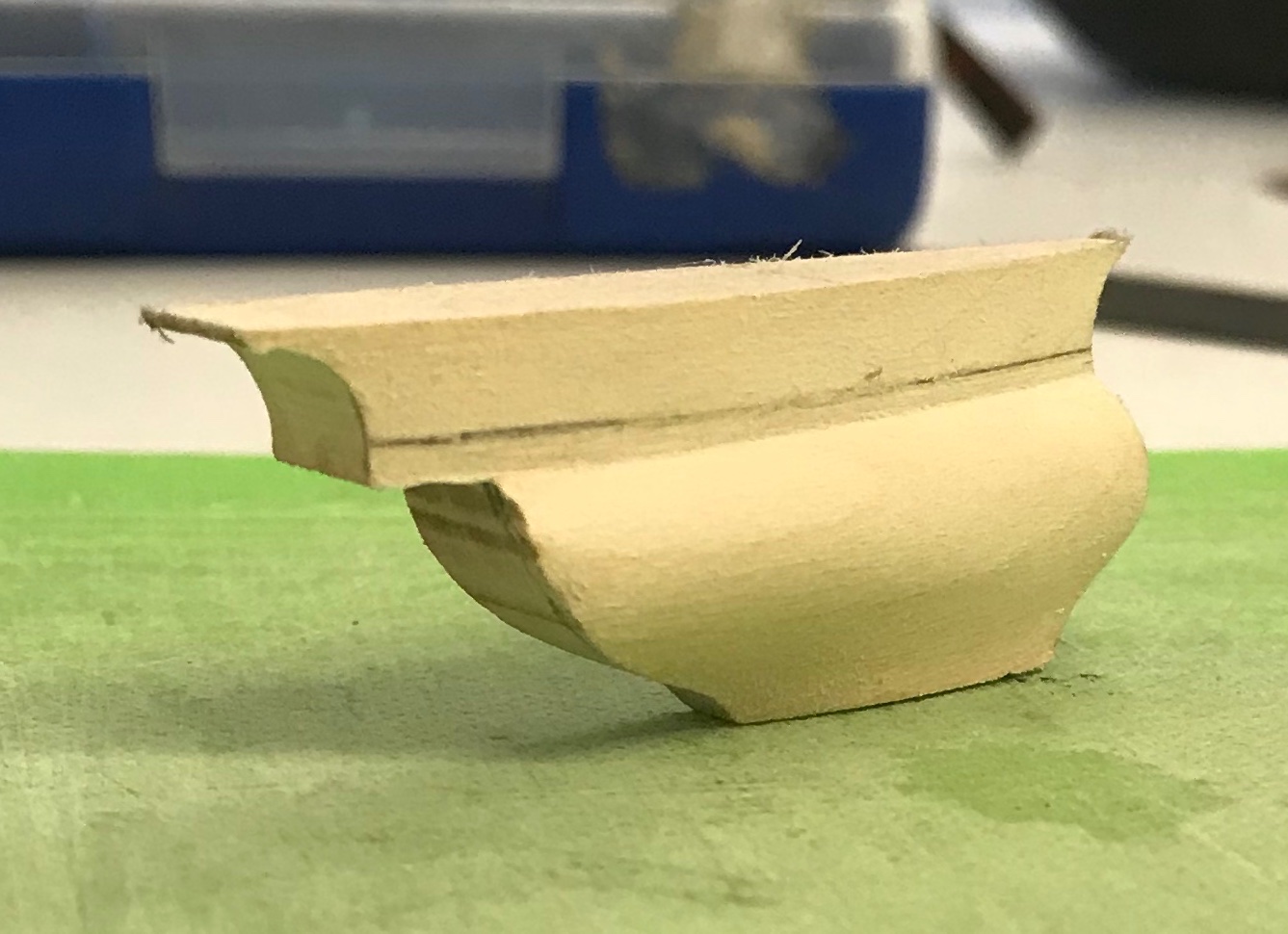
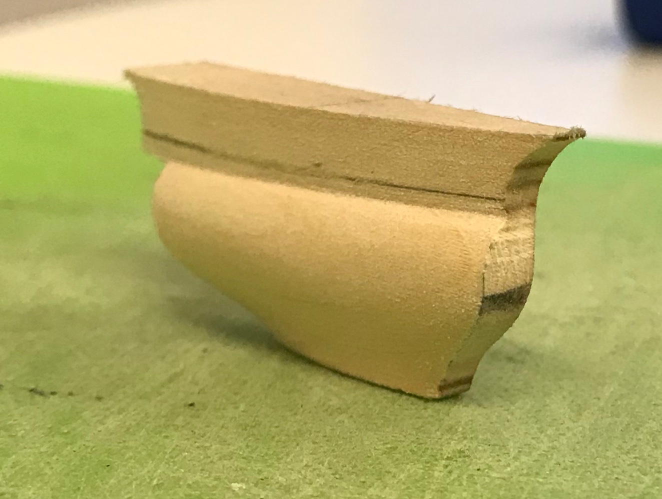
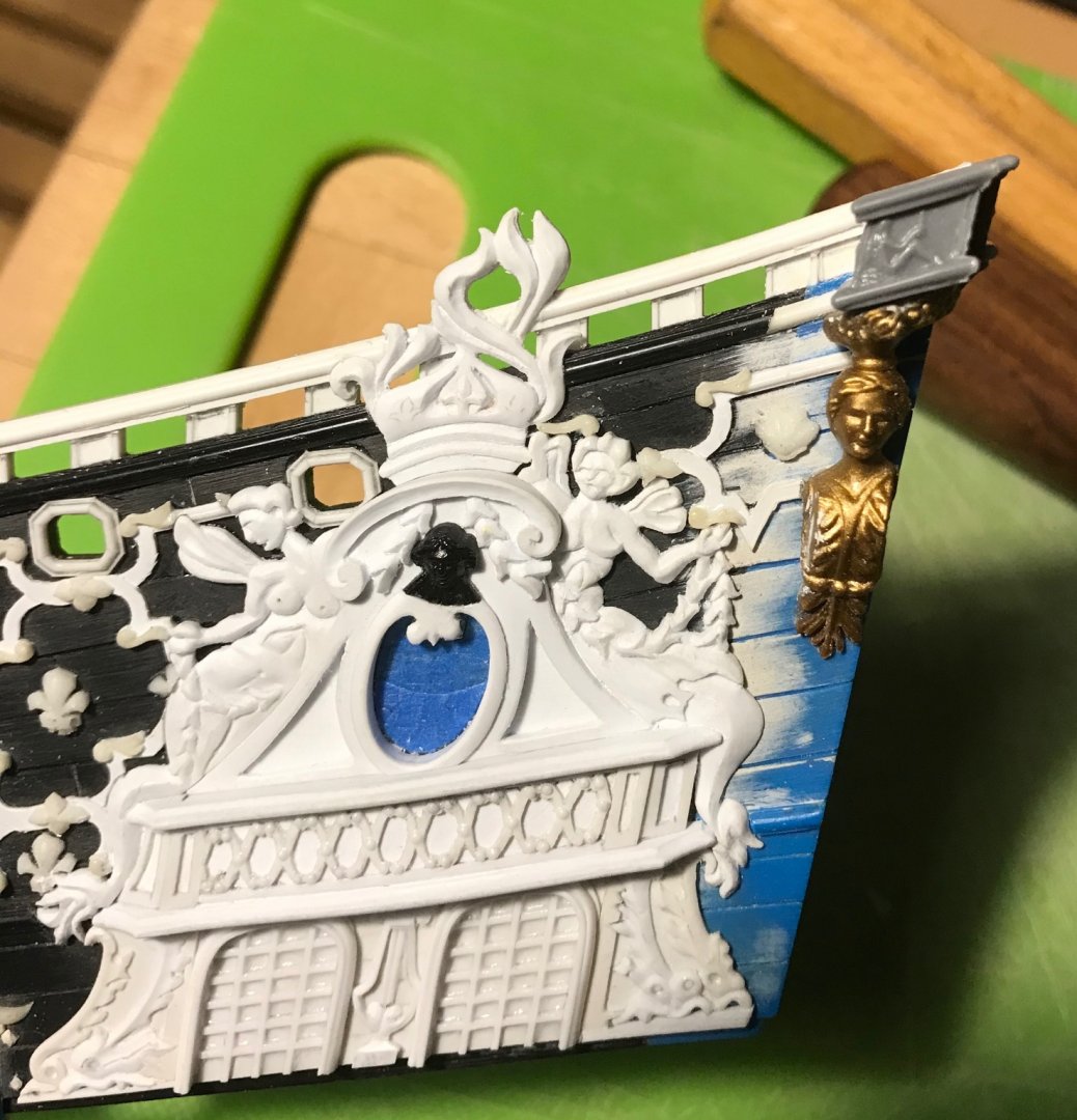
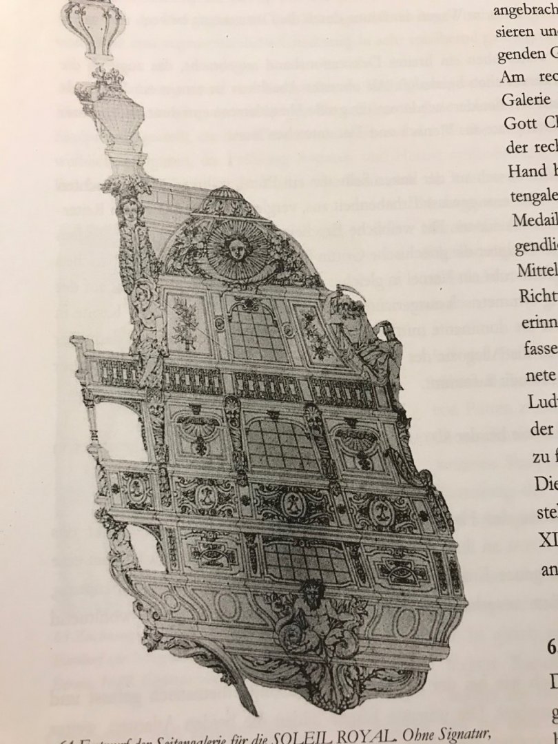
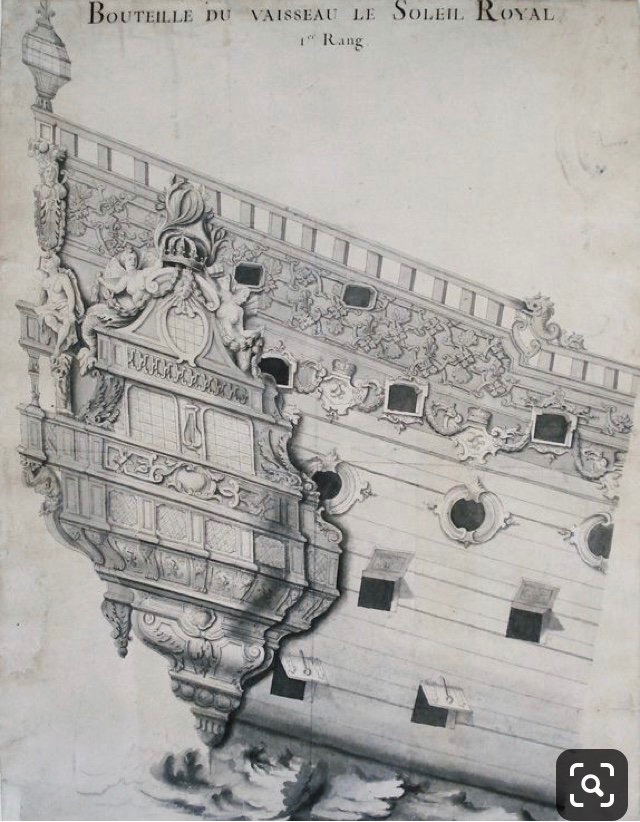
Thanks, EJ! So, here are a few pics of the bow area with everything re-touched and distressed, the beakhead doors in-place, etc: I realized that I shouldn’t glue-in the beakhead bulkhead until I have painted the lower transom because I will need to remove the model from its working base and flip it over, in order to access the underside of the stern counter. Just for fun, here’s what the built-up amortisement looks like in place: I also realized that I can’t paint the lower transom until I’ve made the lower section of the quarter galleries. I’ve held off on doing this for a long time, while I tried to figure out what exactly my approach would be. The greatest difficulty is in trying to ascertain what the volume and shape of the sub-structures should be. Ultimately, I decided that I would carve these sub-structures from apple solids, and use the pieces above to inform the shape of those below. For additional reference, I looked back on Drazen Caric’s excellent tutorial for the making of his QGs on the Provincien: The logical starting point of this process seemed to me to be the widest section of the QG - the middle-deck section, which is the functional level of the officer’s toilet. I know that the projection from the ship sides should be about four scale feet, or a 1/2”. As the above amortisement hints at, I wanted there to be a slight rounding of this level, at the middle, before tapering in towards the hull, at the foremost end. The pictures below are a pretty clear evolution of this shaping process: One thing worth mentioning, here, is that the projection of the false stern balcony is a bit exaggerated. This owes to the fact that I did not, initially, realize that there needs to be a shelf of sufficient depth to support the four seasons figures. Consequently, I had to graft-on an extension piece: Ideally, the end-shape of the counter should match the moulded shape of the sides. That won’t be the case with this build, but it does not appear too distracting on the model. Lesson learned! Now that I had established this shape, I could trace its bottom onto the top of the piece below it: Please bear in mind that positioning on this scrap hull is only approximate, as the hull was cut down, in order to make my hull longer. At this stage, I can begin applying all of the styrene pilasters, mouldings and ornaments that decorate these sub-structures. Once, they are fully sheathed in their paneling, I can use them to determine the outside dimension and overhang of the transitional mouldings between sections. I am wondering whether I should sand and seal the wood with something before using CA glue to attach the surface ornament. Or, would I be better off sanding, applying surface ornament and then sealing with poly, or something else? I’m just concerned about CA adhesion, here. Also, considering that these wooden surfaces will be painted, how fine a grit do I need to sand to. Is 220 sufficient? The wood grain is very fine. As always, any advice is welcome. Thanks for taking the time to visit! More to come...


- 2,699 replies
-
- 12
-
-
- heller
- soleil royal
- (and 9 more)
-
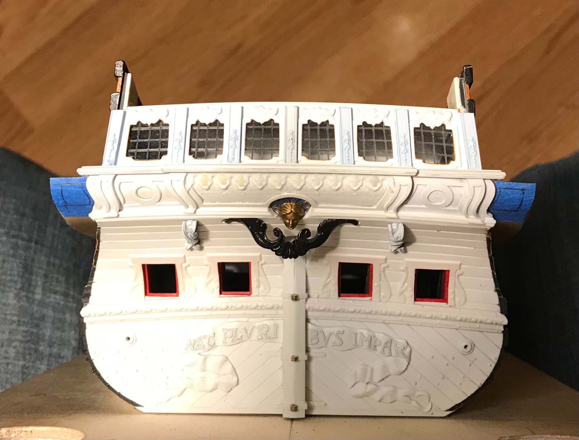
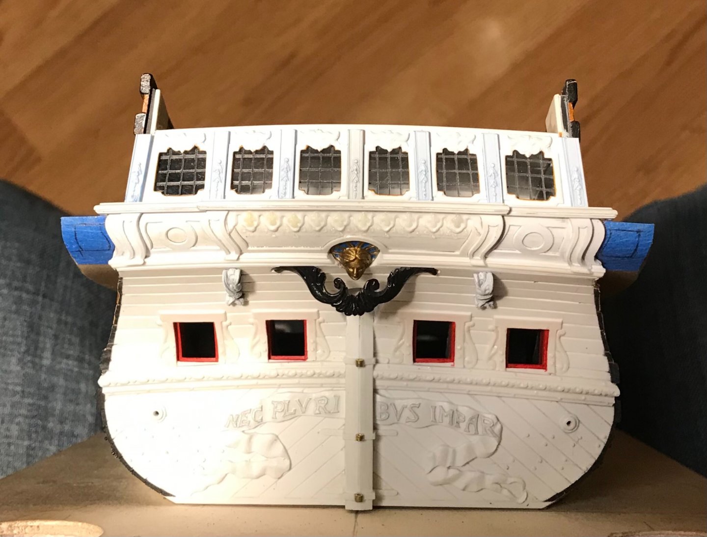
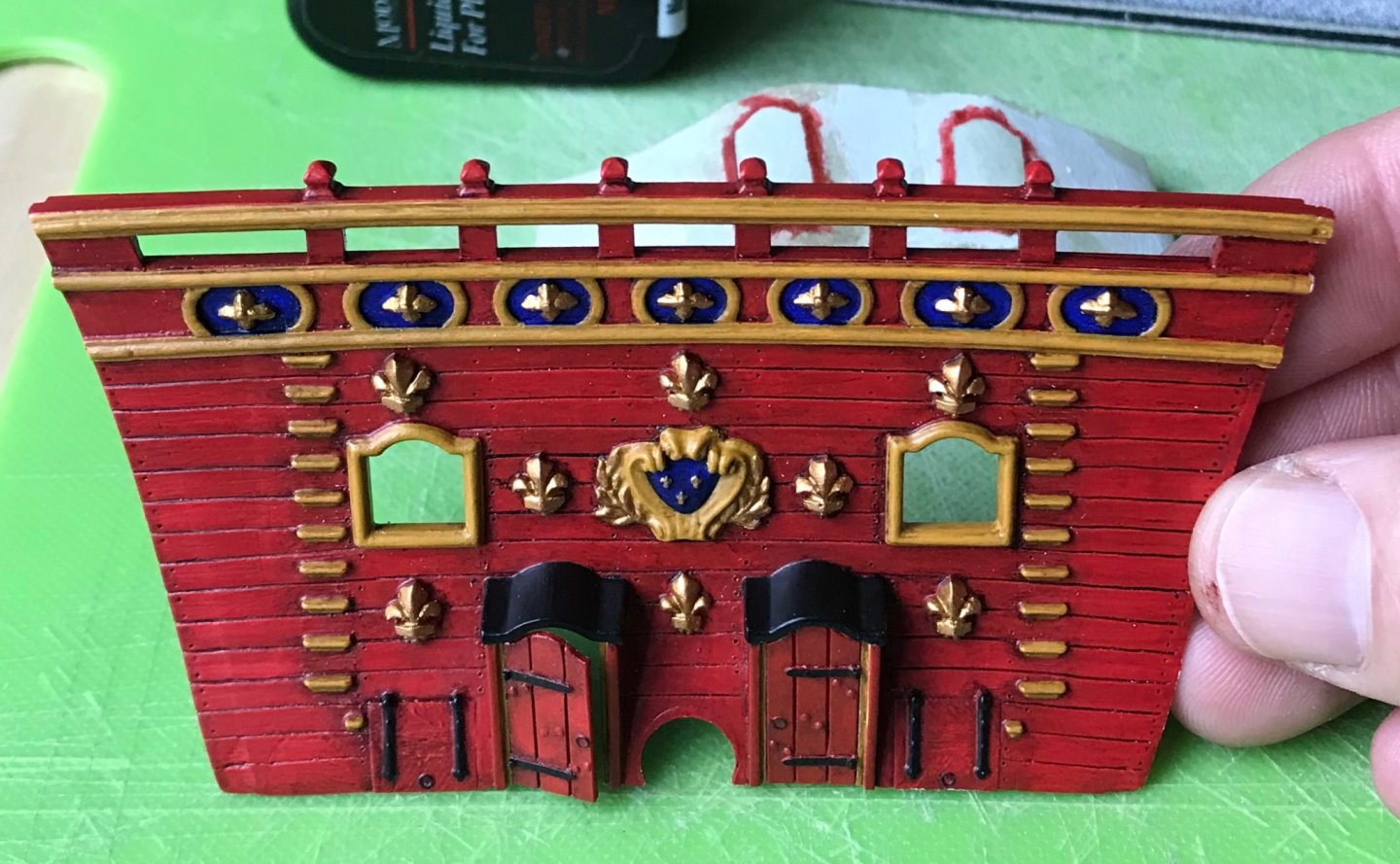
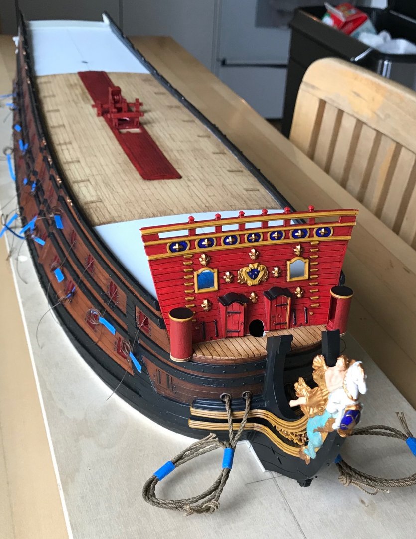
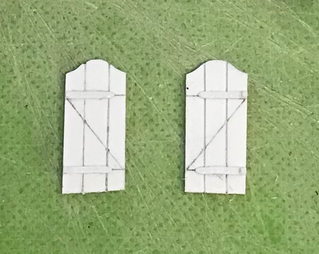
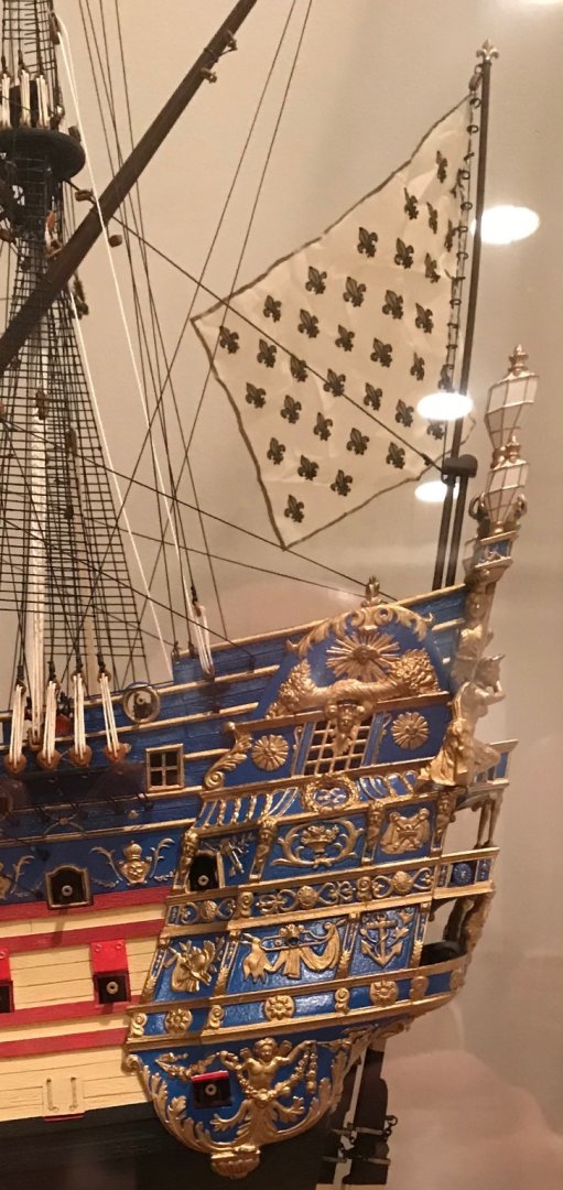
The past few weeks have been mostly about tying up loose ends. The bow area is nearly done with the paint re-touches. I also realized, recently, that the beakhead bulkhead should be equipped with doors, in order to prevent heavy seaways from swamping the middle gun deck. I got myself busy making a pair of those: I also spent quite a lot of time building up the port side amortisement: I took extra care to beef-up the portion of the crown that rises above the sheer rail: One can get a very good sense, here, of just how shallow the amortisement really is. The next detail I wanted to affix before priming the upper bulwarks are the quarter pieces that support the side lanterns. One peculiarity of the Heller kit, vis-a-vis the Tanneron model, is that the side-lantern support boxing rises above the sheer rail. This contributes, greatly, to the exaggerated height of the tafferal. For reference, here is that detail on my first SR: Note, the extreme difference in style between the kit QG and the 1689 version. This transformation has been the primary motivator of the entire project. I suspect that Tanneron took his cue for the lantern boxing from this later QG drawing for SR2, in 1693: The earlier drawing, though, shows the boxing below the rail: As a constructor of things, and considering just how massive the side lanterns actually were, it makes much more practical sense for the lantern boxings to mount solidly to the ship’s sides. There also exists a solid foundation of Van de Velde drawings to support this detail. Using Dan Pariser’s Photoshop collage as a reference, it seems more likely that this, in fact, is the arrangement that was intended to correspond with the stern drawing: Thinking back to the start of this project, this lowering of the side lanterns was how I decided to shorten the tafferal tableau for Apollo’s horse-driven chariot. As I do when the opportunity presents itself, I more deeply defined the acanthus detail of the quarter pieces, while cutting away the unnecessary lower portion: My hope had been that I would be able to re-cycle the kit figure of the Americas, for the port side, but she is scaled for the much taller tafferal, and she now looks too far out of scale. As I was going to have to carve Africa, anyway, it is best that the Americas be proportional. I have also begun making the lower section of the QG. Henry’s hull continues to be invaluable. Without being too delicate about it, I could grind away the wales in the QG area, so that I could closely fay each section to its location: There will be 1/16” styrene spacers between these sections that define their shape, while providing the moulded transitions. More to come! As always, thank you for the likes and for looking in.

- 2,699 replies
-
- 13
-
-
- heller
- soleil royal
- (and 9 more)
-
I submit that Revell’s Batavia was a nice recent addition to the cannon of plastic ship modeling; what’s moulded into the kit is good, and the model provides a solid foundation for upgrades. On the other hand, Revell’s Vasa doesn’t come close, IMO, to bettering the Airfix version. In response to the earlier question of gravers, I use the back of a #11 blade to engrave plank lines, after first taking a few light, marking passes with the sharp side of the blade. As Dafi mentions, a steel rule is essential for straight lines, but I have found that the curving plank lines of a deck can be scribed and engraved without a template guide. The trick is to make a series of shallow passes until your groove is sufficiently deep enough to track easily - then, you can make more aggressive scraping passes. If I go too far, I just nock it down a little with the 50-grit paper that I use to represent wood grain/structure. This is in 1:100 scale. Nailing patterns, admittedly, are probably taking it too far in anything smaller than 1:96. Engraving your own deck, though, affords you the opportunity to upgrade to a realistic butt-shift pattern, and to build better hatch coamings and deck furniture. These details are apparent under even mild scrutiny. Most of these details are not difficult to scratch from sheet and strip styrene, and they greatly enhance the pleasure of the build, IMO.