MORE HANDBOOKS ARE ON THEIR WAY! We will let you know when they get here.
×


Dr PR
-
Posts
2,338 -
Joined
-
Last visited
Content Type
Profiles
Forums
Gallery
Events
Everything posted by Dr PR
-
 Valeriy, Good to hear from you again! Very nice work! Your model is beautiful. I only wish I could see it in person.
 -
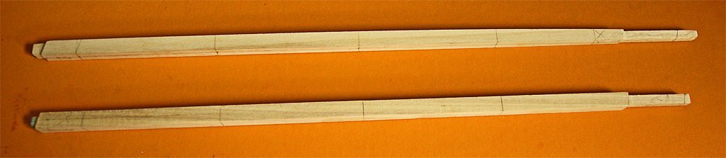
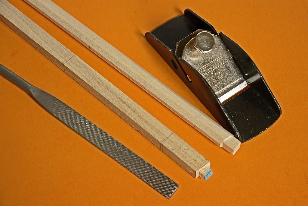
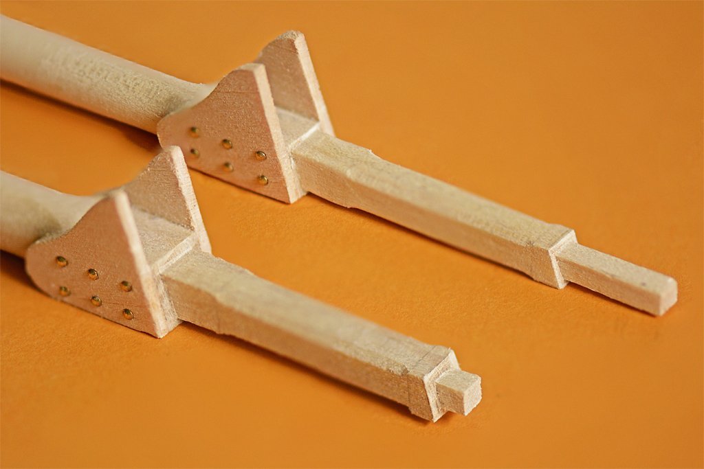
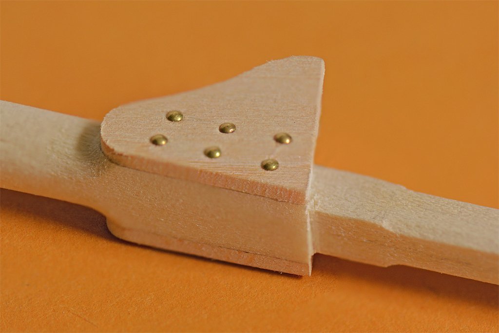
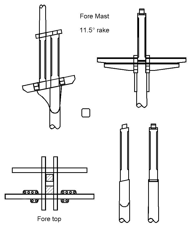
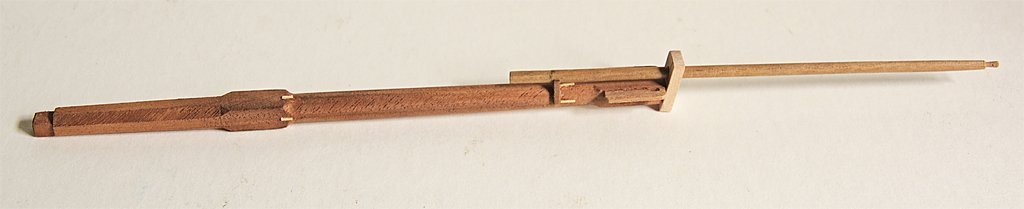
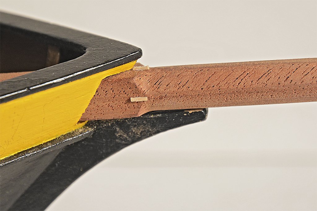
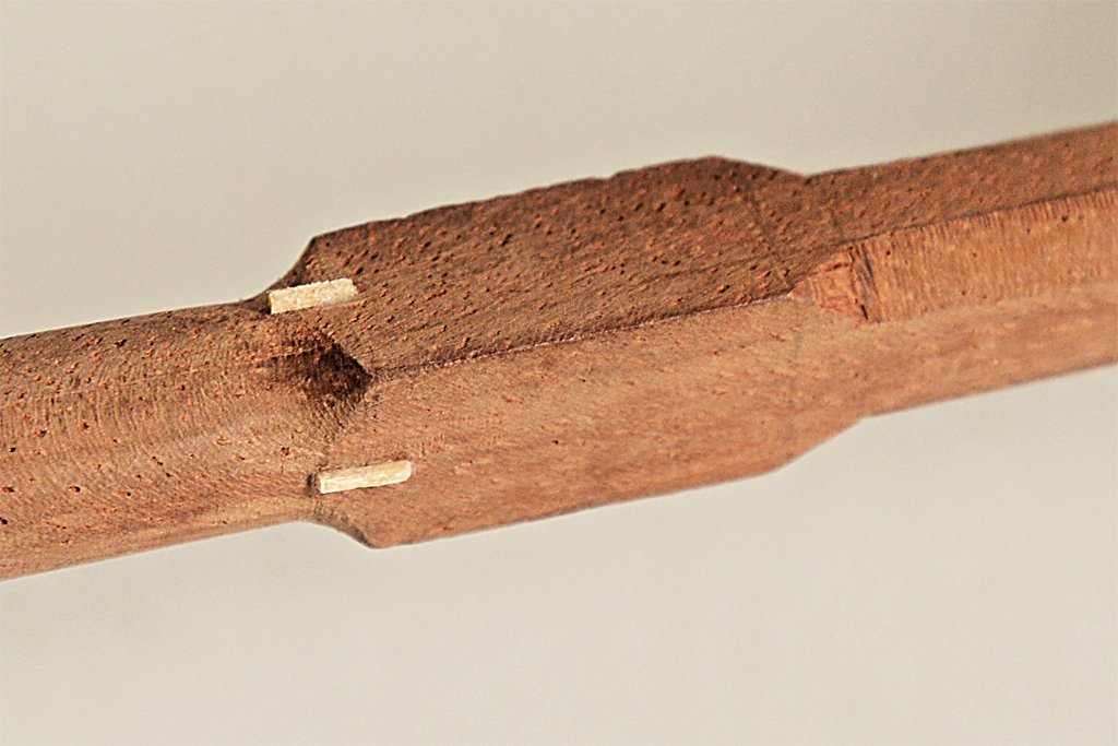
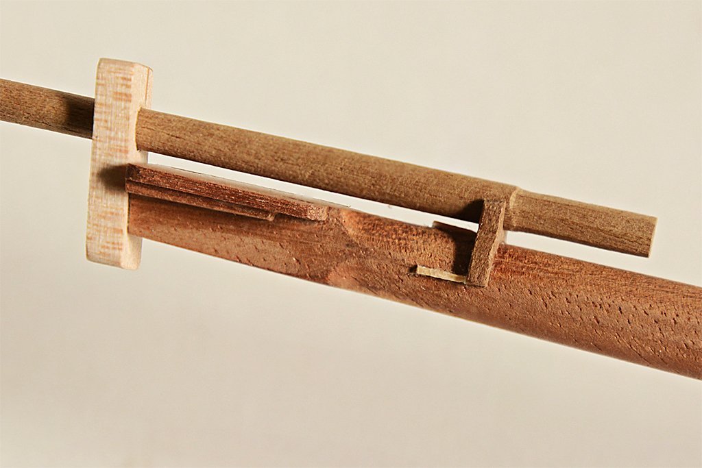
I am continuing with the masts. The first step was to reduce the 3/8 inch (9.5 mm) square dowels to the desired mast diameters of 0.350 and 0.322 inch (8.9 mm and 8.2 mm). The fore masts on topsail schooners often were larger diameter than the main masts. The fore mast carried square sails and their rigging in addition to the gaff sails so they needed to be sturdier. However, it was also common for both masts to be the same diameter. I used the Dremel power tool and "drill press" to cut off the excess material from the sides and create the rough taper. Then I sanded the masts down to the finished dimensions. The next step was to trim the square cross section to octagonal. For this I used a tiny Stanley plane that I have carried in my tool kit for decades. It made short work cutting the parts down to size, and I used the file to finish them. Then I planed the eight edges to get sixteen-sided pieces, again finishing the job with the file. After this I chucked the masts into a drill and sanded them with 100 grit sandpaper to finish rounding them. Again, I have to say it is really easy to make masts this way! The masts were rounded to just below the hounds and were left square where the cheeks would attach. Above the hounds the size was reduced to 0.219 inch (5.6 mm) square for the fore mast and 0.200 inch (5 mm) square for the main mast head. Part of the head was champfered and the top was trimmed to create a 0.125 inch (3.2 mm) tenon for the mast cap. The excess tenon length will be trimmed after the cap is in place. The cheeks were glued in place, and then I used 7 mm brass nails to simulate bolt heads. After the glue had dried I used round files to trim the square part of the mast round and curved to match the curvature of the cheeks. I should note that larger vessels often had much longer cheeks that extended down the mast below the hounds for a length about equal to the length of the mast head. They were also tapered toward the bottom. But smaller ships often just had this simple arrangement. Having completed the masts this far I was ready to assemble the trestletrees and cross trees for the top "platforms." They will look like this: The trestletrees run fore-and aft, resting on top of the cheeks, flush against the sides of the square part of the lower mast and top of the cheeks . Crosstrees run athwart-ships (port to starboard) and rest on the trestletrees (actually set into notches in the trestletrees). The after crosstree on the fore mast had fairleads to guide rigging coming from above. This looks pretty straight forward, but what should the dimensions of these pieces be? I obviously had something in mind when I created the drawing, but I didn't remember the source I used for the dimensions! So I went back through the literature and discovered a problem. I looked in eight different references, and most of them gave different answers! Anderson, R. C., "Seventeenth Century Rigging." 1955 Chapman, Frederick, "Treatise of Shipbuilding" ("Architectura Navalis Maercatoria"), 1820 Cock, John, "A Treatise on Mast Making," 1840 Hedderwick, Peter, "A Treatise on Marine Architecture," 1830 Kipling, Robert, "Rudimentary Treatise on Masting, Mastmaking and Rigging," 1864 Lees, James, "The Masting and Rigging of English Ships of War," 1979 Marquardt, Karl, "The Global Schooner," 2003 Mondfeld, Wolfram, "Historic Ship Models," 1989 The main problem is that most of these references do not mention schooners, and treat wooden vessels as if every one was a 100 gun square rigged ship of the line. Cock and Marquardt do describe schooner rigs but they give very different definitions for the dimensions of the parts of the tops. Another problem was that the older references used a different English than is spoken today - at least here in North America - and some translation was necessary. After wading through a lot of apparently contradictory formulas it was clear that they all gave pretty different results. Another problem was that most of the references described complex tops for the lower masts, again like would be found on a large man of war. The dimensions for these lower tops were always given in terms of the dimensions of the larger top platforms. Schooners had very simple tops with no platforms. Trestletrees The trestletree centers should be aligned with either the center of the lower mast, or the front edge of the lower mast top. Trestletrees were notched to hold the crosstrees. Length. The length of the trestletrees on lower mast tops were usually defined in terms of the top platform size, usually the same length fore-and-aft as the top platform, or 2/3 to 1/2 the top platform width. But that's not very helpful if there is no platform. One author says trestletree length was 5 times the diameter of the mast at the hounds (the hounds was the part of the mast the cheeks fastened to, just below the trestletree). Another author says the length was 5 1/2 to 6 diameter of the mast at the hounds. Other definitions are 3 3/4 inch per yard of the topmast length (0.104 times the topmast length), or 3 1/2 inch for every yard of topmast length (0.097 times the topmast length). I used fairly average mast lengths and diameters for my schooner model. The foremast diameter at the hounds is 0.270 inch (6.8 mm). So the trestletree length would be 5 to 6 times this diameter, or 1.35 to 1.62 inches (34.3 mm to 40.8 mm). The topmast length is 7.5 inches (190.5 mm) so the trestletree would be 0.104 to 0.097 this length, or 0.78 to 0.73 inches (19.8 to 18.5 mm). Clearly these different methods do not generate the same results! Height The height of the trestletrees is said to be 1/2 the diameter of the mast at the hounds, but a different author said it was 5/6 the diameter of the mast at the hounds. Another author said the height was 1/2 the diameter of the mast at the partners (the partners is where the lower part of the mast passes through the ship's deck). One source says the height in inches was the topmast length in feet divided by four, less half an inch. Or the height is 1 inch per foot length of the trestletree (1/12 the length or 0.083 times the length). But another author say the height is 1 1/8 inch for every foot of trestletree length (length x 0.094). Using my model mast dimensions I get a trestletree height of 0.135, 0.23, 0.175 or 0.145 inches (3.4, 5.7, 4.4 or 3.7 mm). It's better than the length calculations, but still highly variable. Width The trestletree width is given as 1/3 the diameter of the mast at the hounds, or 3/7, 1/2, 2/3 and 5/7 of the trestletree height. Take your pick! Crosstrees The crosstrees were notched to fit into the notches in the trestletrees, typically the depth of the notch was 1/2 the crosstree height. Length The length of the crosstrees for the lower masts was often given as a fraction of the ship's beam width. It was 1/2, 5/9 or 11/24 of the beam width. Sometimes it was specified relative to the trestletree length, 1 1/3 to 1 2/3 the trestletree length. One author said it was the length of the masthead, or a little more. Height The crosstree height was usually a fraction of the trestletree height, 3/7, 1/2, 7/8 and 1 times the trestletree height. One author said it was 1/13 the trestletree length. Width The crosstree width was said to be 7/8, 9/10 , 1 or 1 1/4 that of the trestletrees. Or it was 2/3 or 5/6 of the crosstree height. **** Well that is as clear as mud! I guess I will just use the original dimensions I came up with for the drawing shown above. No matter what they are they will probably be close to what one or two of the authors said they should be!
-
Dove by jlefever - 1:48 - Pinky Schooner
Dr PR replied to jlefever's topic in - Build logs for subjects built 1851 - 1900
Jim, The two vessels do make for some interesting comparisons. The pinky schooners were a later step in the evolution of the schooner from the period I am modeling. You are right that my build is not an accurate model of a real vessel, and it is something of a hodge podge of fittings and deck furniture from the early 1800s. For me it is a learning experience, and learning new things is one of my favorite things. -
OS50, Thanks. I have seen several variations of designs for jacks. I think some may have been for State vessels and some private. We often forget that the US was originally a loose confederation of colonies and some had vessels of their own. And the US Navy didn't have formal rules for painting and such until well into the 1800s. A lot of what a vessel looked like was the prerogative of the ship owner or Captain. Many American vessels followed British practice. So unless you have information specific for a particular vessel I guess you can do pretty much as you please with a model so long as it isn't too far out of line. Right now I am trying to determine the color of the masts, mast tops, spars, bowsprit and bowsprit head. In the late 1800s white was popular for the doublings on the masts. But I read somewhere that white wasn't used early in the century because it would be too easy to spot at a distance. Frankly, I think this is nonsense! A little bit of white on a mast carrying huge sheets of canvas isn't going to make any difference. At sea a tall mast with sails cannot be camouflaged! Some people say the tops were painted black, and I have seen some models painted that way. But I haven't found anything definite about the color of masts and spars.
-
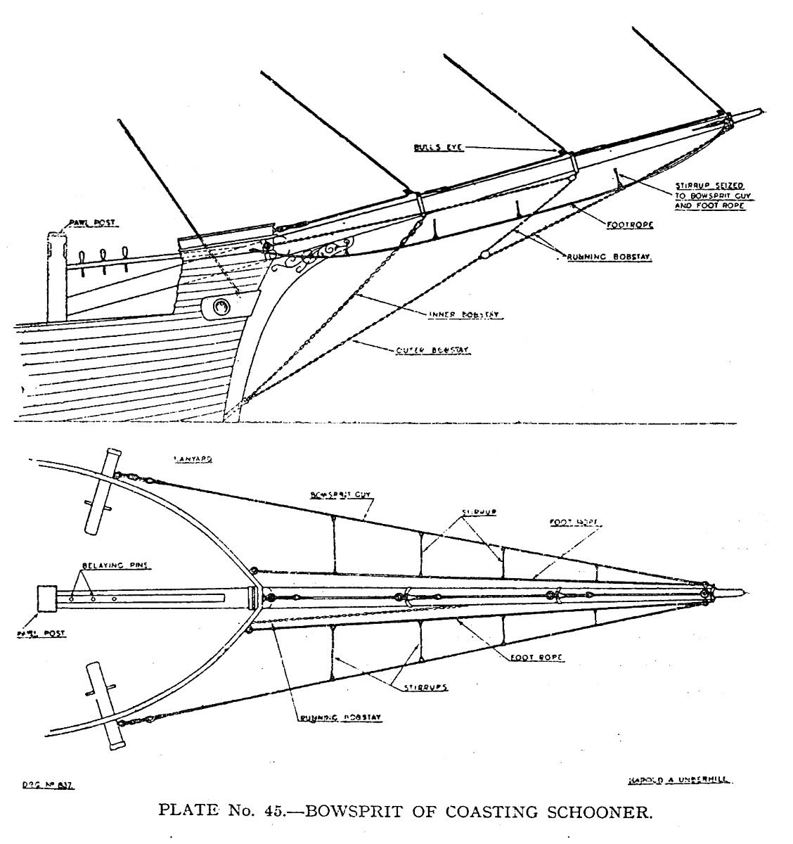
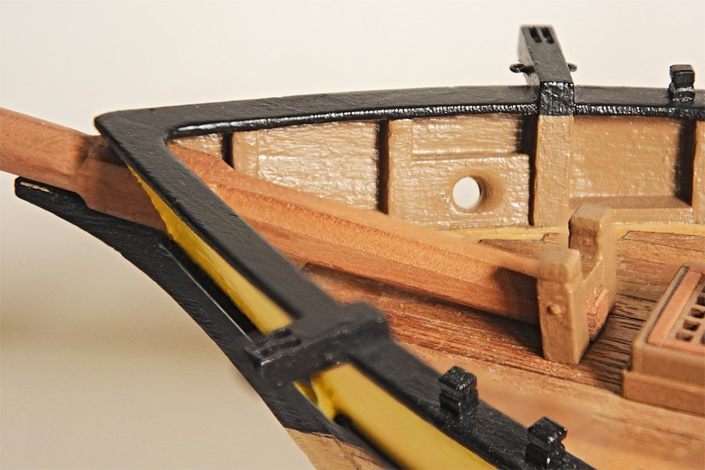
Underhill ("Masting and Rigging the Clipper Ship & Ocean Carrier," Plate 45, page 250) calls the ladder-like lines running between the bowsprit shrouds (or bowsprit guys) and foot ropes the "stirrups." They "hang" from the guys to support the foot ropes, although they do not hang beneath the guys but angle inboard to the foot ropes. While these lines (and nets in the same position) might make working on the bowsprit and jib boom safer, one of their purposes was to catch sails when they were lowered and prevent them from dragging in the water. Note: This shouldn't be confused with stirrups hanging from spars to support the foot ropes, although they serve the same purpose. Following this nomenclature, the upper lines from the plates on the sides of the hull would be the bowsprit guys and the lower lines would be the foot ropes, with stirrups between them. The upper (smaller) plate on the stem might be for an inner bobstay, while the larger one at the waterline would be an outer bobstay. At least this gives you an excuse to rig them all.

-
Richard, Good point about temperature effects. Putting styrene (any plastics) on wood is definitely not a good idea if the model will be exposed to direct sunlight for long (as will happen with R/C models). Plastics have a relatively large coefficient of thermal expansion compared to wood, fiberglass or even metals. On another forum a fellow from down south in Australia built a 1:72 aircraft carrier with a wooden frame and styrene flight deck and sides. When heated in the sun the plastic expanded faster than the wood. The flight deck buckled and some of the side pieces buckled. As an example, a 6 meter piece of styrene will become about 5 mm longer with a 20C temperature rise. Wood does not expand that much. There is no glue that will hold wood and plastic together with that much difference in expansion. Considering the size of your model it is very wise to use wood sheeting!
- 454 replies
-
- 4
-

-
- Union Steamship Company
- Stepcraft 840
- (and 3 more)
-
You can fiddle with the exposure time to fine tune some dimensions. Long exposures cause things to be fatter. The light scatters through the resin. This allows some resin to be cured around the exposed area, adding to the intended dimension. Also, some light diffuses through thin sections, causing additional resin to cure "on top" of previous layers. I have found that minimum exposure times work best for fine details. But I still can't get very small holes (0.010 inch or 0.25 mm) to come out even though this is 5x the diameter of a single pixel on my machine. Maybe this is just because I haven't been able to wash uncured resin out of the holes before I cure the pieces?
-
Actually, some vessels did have "piggybacked" shrouds - two per chain plate. See Petersson's "Rigging Fore-And-Aft Craft" page 73 for an example. It was taken from a period schooner model. Two shrouds to the lower mast top was common on schooners without square sails. Often there were no ratlines. The beauty of the fore-and-aft rig was that almost everything could be done from the deck, without anyone going aloft. If you needed to go aloft you climbed the mast hoops or were pulled aloft with a tackle.
-
Kevin, I have used the sunlight technique to clean the IPA (and water for water washable resins). I have also just put the container in my light box and zapped it for an hour or so. You have to use a clear glass container that passes UV light (many plastics do not). It worked even here in Oregon where it is mostly cloudy from November to May. It takes a while (a week), but the resin cures into a soupy suspension. I pour it through a coffee filter to recover the alcohol (I use denatured (95%) ethanol camp fuel - it's cheaper by the gallon than 95% IPA). I have two wash baths. The first has been used before to wash prints, and the second is fresher alcohol. Like you, after the first bath becomes cloudy I put it out to cure, switch the second bath for the first, and start a new clean second bath.
-
Dove by jlefever - 1:48 - Pinky Schooner
Dr PR replied to jlefever's topic in - Build logs for subjects built 1851 - 1900
Jim, The model is looking good! I would say your soldering technique is also pretty good. One trick I have learned is to use a brass or steel wire brush in a motor tool to polish the soldered joints. It makes a much shinier finish than I get with files. But you need to be careful, especially with the steel wire brushes. They can remove a lot of solder quickly if you use too much pressure. In fact, I use this technique to remove excess solder to get nice clean joints. Another trick I have used for decades to fashion things like your wyes is to cut a narrow strip of brass and fold it to make an ear. Then I clamp the ear in pliers and open the strip so I have an ear at right angles to the rest of the strip. After adding solder to the ear to prevent the sides from spreading I wrap the strip around the spar to the next point I need an ear and repeat the process. For the last ear I just bend the strap so both ends come together and solder them. Then I cut them off to the right length for the final ear. It takes a bit of practice to get the ears to come out at the right angles, but the resulting part is very strong. You can practice with a strip of paper to get the dimensions right. Finally I drill out the holes in the ears and shape them with a file. Here is a simple example at the bottom of the dolphin striker.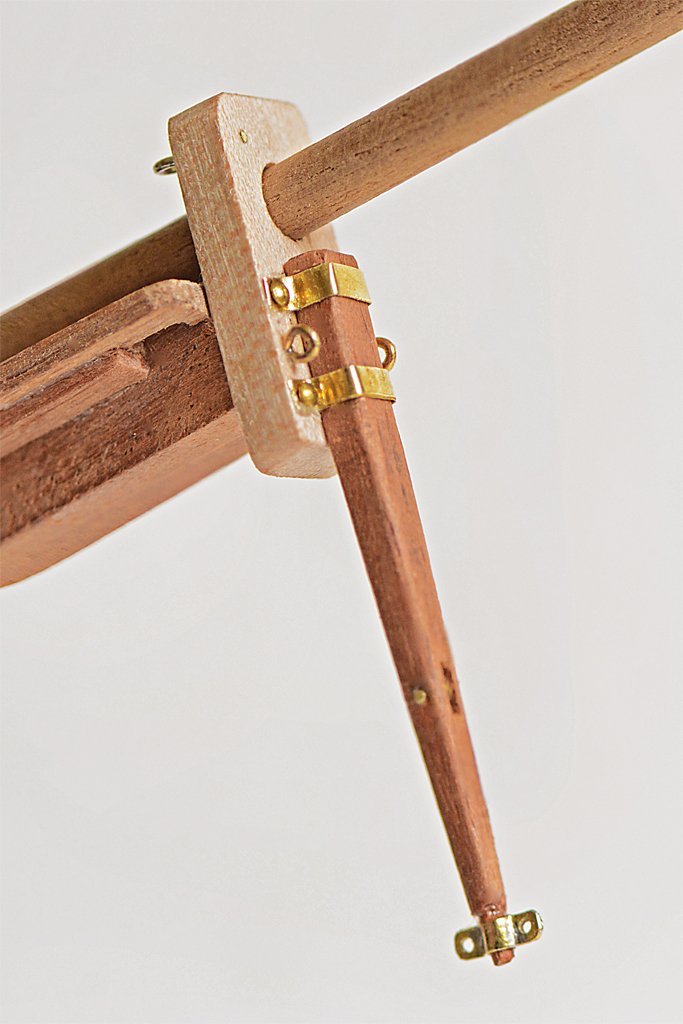
-
Gregg, Your build is coming along nicely. Like George said, don't worry about the pump location. I don't recall the thread now, but in another build by a pretty experienced modeller a lengthy discussion ensued over the location of pumps - whether they should be farther aft or midships. What appeared to be original plans seemed to show them midships, even though this point was about a foot above the low point of the bilges. It was an interesting, but inconclusive discussion. For a ship pitching in rolling seas just about every point of the bilges is the lowest point at some time. But in port some water will accumulate at the lowest point. So chalk this one up as a learning experience. I have had a lot of learning experiences in my schooner model build, and there will be more to come!
- 65 replies
-
- 2
-
-
- Ballahoo
- Caldercraft
- (and 1 more)
-
A thin two-part liquid epoxy "paint" would work to attach the styrene hull plates to the wood. It will give you time to adjust the position before it hardens and will give a very strong bond. For attaching the thin styrene rods to the grooves in the plating I would use styrene cement (MEK or methyl ethyl ketone). Just use a small paint brush and apply a thin coating along the seam. The MEK will flow immediately into the grove and melt the two parts together. It dries in a few seconds and will not mar the surface of the parts. You might also consider using very thin square cross section styrene strips instead of round strips. This will leave a "V" shaped bead that could be sanded/scraped down for a lower profile weld bead than the semi-circular bulge with the round strip.
- 454 replies
-
- 3
-
-
- Union Steamship Company
- Stepcraft 840
- (and 3 more)
-
Mike, The shrouds will not be the same length exactly. The forward shroud is close outboard of the mast and the aft shroud is farther back. Since the mast has some rake (leans aft) the distance from the deadeyes to the mast top will be a bit different.
-
George, I thought about a jackstaff, but it I don't know if smaller vessels flew the jack. Although the US Navy technically had a Union Jack with white stars on a blue field (like the US Ensign). But the first Navy Jack was the "Don't Tread On Me" flag with red and white stripes and a rattlesnake. I don't know when it became common practice to fly it - and where. Some illustrations show the jack flying from the top of a mast. Virtually no drawings or illustrations of American schooners show a jackstaff or jack. But this could be simply due to the fact the jack is flown only in port when anchored, moored or tied up to the pier. Even in the Navy today the jack is raised when the anchor is dropped or the first mooring line goes over to the pier, and it is pulled down when the ship signals "under way" (three toots on the ship's whistle). Most drawings and illustrations show vessels at sea, when the jack wasn't flown. Very few of these drawings show a jackstaff. It is common on modern ships to lower the jackstaff after getting underway. I wonder if it was the practice in sailing ship days to remove the jackstaff after getting under way? Having a pole sticking up on the bowsprit would certainly foul a fore sail when the vessel tacked. I have seen a drawing somewhere of a jackstaff that was attached to the bowsprit cap with metal straps (without a notch in the cap).
-
It is definitely a pond yacht! Real schooners did not have the mast doubling (where the lower and upper masts overlap) anything like what you have on the model. On real ships the shrouds would loop around the mast head, with both legs of the loop coming down on the same side of the ship. On the model I suppose the shrouds may have been fastened to the eye bolt loops below the spreaders. I wonder if there is an Internet forum for pond yachts? If you can find someone that sells modern pond yachts they might know if there is a Forum.
-
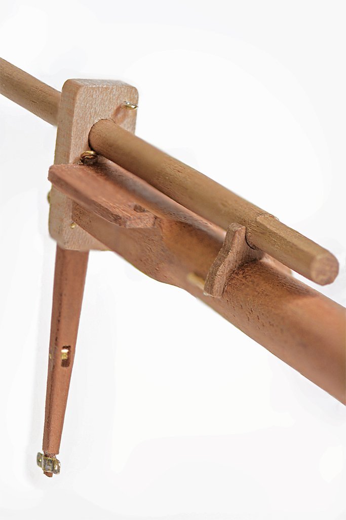
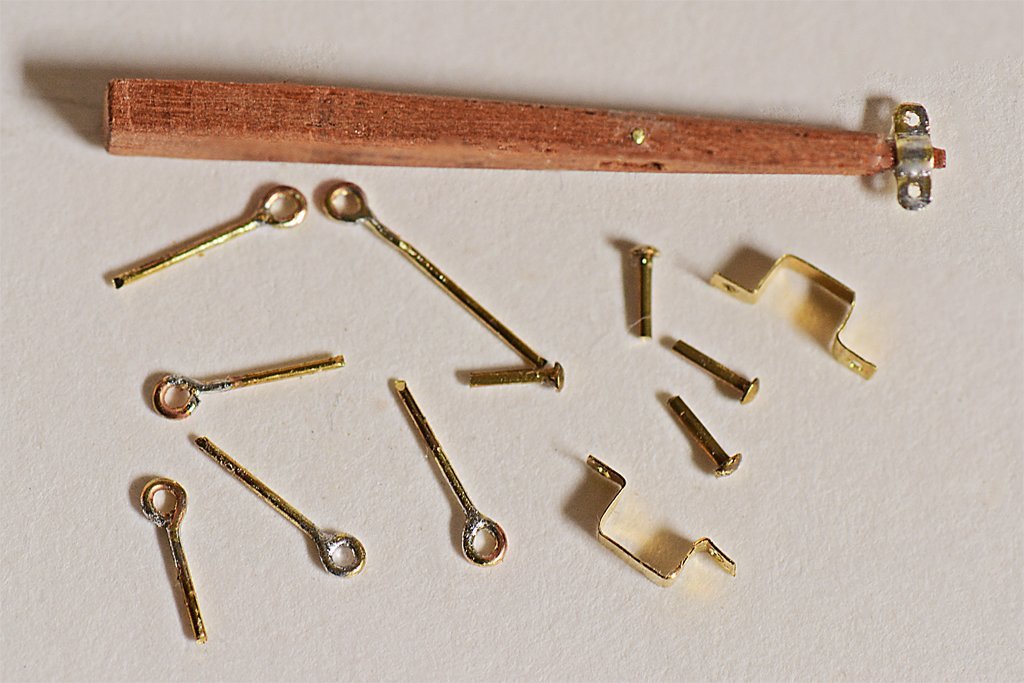
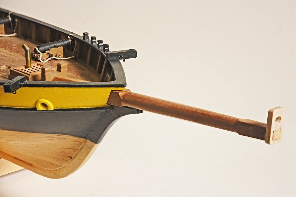
To finish the bowsprit cap and install the dolphin striker I had to make a few parts and finish the fitting of the cap. I drilled holes for the ring bolts and dolphin striker fasteners before attaching the cap to the bowsprit. The tenon was a bit too long so I used a file and sandpaper to finish the end of the tenon smooth with the face of the cap. The dolphin striker straps were cut from 0.005 inch (0.127 mm) brass sheet, and the ring bolts are from 0.020" (0.51 mm) brass rod. I soldered the gap in the ring bolts. The "bolts" are 7 mm brass nails that have been cut to length. I cut a short piece of 0.0625 inch (1.6 mm) brass tubing for the sheave in the dolphin striker and pined it in place with brass rod. The fitting at the bottom of the dolphin striker was made from 0.005 inch brass sheet that was folded and soldered. It is for the martingale stay and backstays. Assembly was pretty straight forward. I used Duco cement to glue the bowsprit cap in place, and also put a bit in each of the holes for the ring bolts and nails. I probably spent more time on my hands and knees looking for wayward tiny parts than I did with the assembly. The ring bolts on the face of the cap are there in case I discover I need them. I originally thought that one would be used for the traveler outhaul, But if I use this configuration the flying jib stay would be attached to the traveler and run through a block or sheave at the mast top, and back down to a tackle somewhere on deck near the base of the fore mast. But this is already too crowded with belaying points. The sheave in the dolphin striker will allow me to attach the flying jib stay to the mast top, run it through a thimble on the traveller, then through a sheave/block at the end of the jib boom, down through the sheave in the dolphin striker and then to a tackle attached somewhere in the bow. In this way the stay acts as a support for the sail and as the traveler outhaul. The two ring bolts on the back side of the cap are for the jib boom outhaul. I need to put a sheave in the base of the jib boom for this rig.
- 421 replies
-
- 14
-
-

-
As Druxey said, the deadeyes with the sheer pole were for shrouds that lead up to the lower mast tops. One line ran up from one deadeye set, looped around the mast, and then back down to the other deadeye set. The shrouds were lashed together with small line at the mast top. I think you said you had Petersson's "Rigging Period Fore-and -Aft Craft." Look on page 78 to see how the shrouds looped around the mast top and were lashed together. Pages 76 and 77 show the way to rig the deadeyes. It was traditional to rig the starboard side shrouds first and the then port side shrouds (if there were more than two per side they altered stbd, port, stbd, port, etc. starting with the forward shrouds and working back). On pure fore-and-aft schooner rigs it was common to have only two shrouds per side. Some smaller vessels didn't have ratlines, but it appears your ship did. Page 83 of Petersson's book shows how some backstays were also rigged with deadeyes.
-
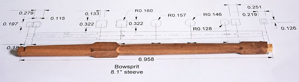
Thanks. Although I am happy with the rigging plan I came up with I am still ruminating about the belaying points. It seems to me there are too many lines crowded around the base of the fore mast. Some of the lines could be belayed to cleats fastened to the shrouds. Also, I have no provision for studding sail rigging and belaying. I guess these lines could be belayed on pins already in use for the topsail rigging. I will place two ordinary cleats on the housing of the bowsprit about half way between the foot and the bed. One will be the attachment point for the jib boom outhaul. The other could be for a traveler inhaul. These cleats cannot be installed until after the bowsprit is permanently in place. I should also add that I am following plans and descriptions in four books to develop the bowsprit and its rigging: Darcy Lever's "The Young Sea Officers Sheet Anchor." Karl Heinz Marquardt's "The Global Schooner." James Lees' "The Masting and Rigging of English Ships of War." John Leather's "The Gaff Rig Handbook."
-
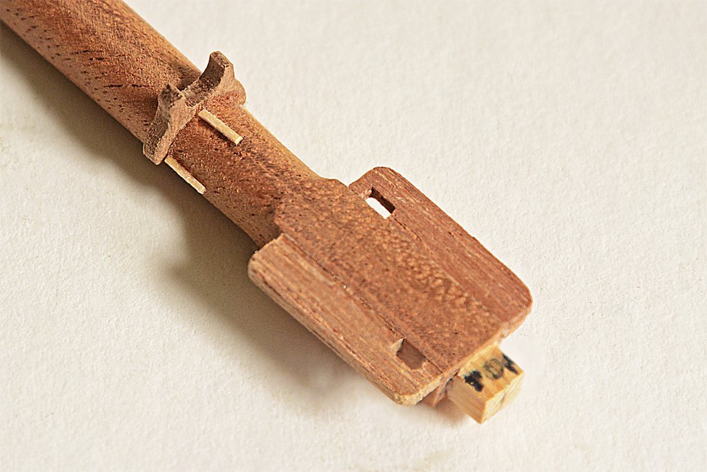
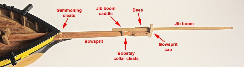
I have added some small details to the bowsprit assembly: The gammoning cleats (also called thumb cleats) are to prevent the gammoning ropes from pulling back farther on the bowsprit: The bees and bee blocks fit onto the forward end of the bowsprit behind the bowsprit cap. They have holes for the jib stay (starboard) and preventer (port). Behind the bees are three more thumb cleats to hold the bobstay collar in position. The jib boom saddle fits right behind the cleats to support the foot of the jib boom. The jib boom crupper (essentially the same as gammoning rope) fits around the bowsprit and jib boom immediately behind the saddle. I fashioned a new bowsprit cap that makes a slip fit onto the tenon on the front end of the bowsprit. There will be some ring bolts added to the cap and a dolphin striker will fasten to the front of the cap. I created a short octagonal base on the jib boom. Sometimes there was a sheave near the base of the boom for the jib boom outhauler that was used to pull the boom outward into position after it had been unseated and retracted inboard when docking at a short berth. There also should be two sheaves at the forward end of the boom for the fore top stay and the traveler outhaul. However, the boom is only about 0.130 inch (3.3 mm) diameter at the base, and 0.075 inch (1.9 mm) diameter at the front. I might be able to drill out narrow slots for the lines to pass through, but I doubt that I will put actual sheaves in the boom.
-
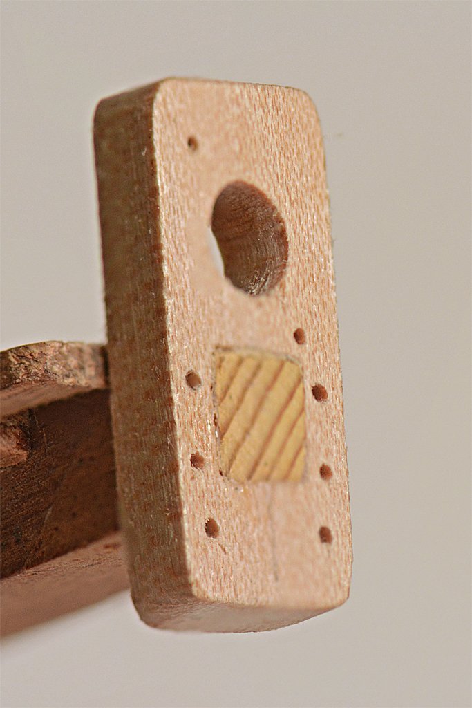
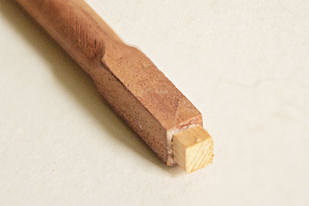
Thanks. I will add a lot of details that weren't in the kit plans. Up to this point everything went pretty smoothly. But yesterday it turned into a minor nightmare. I cut the forward end of the bowsprit to length and then sawed and filed the tenon for the bowsprit cap. Then when I was fitting the cap the tenon broke off! This was a surprise because the wood seemed to be very strong. I contemplated starting over and didn't like the thought of having to repeat the work already done. So I came up with a solution to drill out the end of the bowsprit and make a part with a cylindrical end to fit into the hole and a square part for the tenon. I started with a 1/16 inch drill in a pin vise and made a hole about 1/2 inch deep. Then I used sequentially larger drill bits to create a hole 1/8 inch diameter. But part way through this process a corner of the end broke off! Now it really was a mess! I didn't stop to make photos, but you can see the seam where the corner broke off in the picture above. I went ahead and finished drilling out the hole. Then I looked through all the wood I had to try to pick the sturdiest piece to work with - I didn't want the thing to break off again after I glued the repair part in place. You can see from the photo above that I eventually got it glued together, including the broken corner. So that was all of Thursday, just to make a simple tenon. Today went a lot better. I tapered the housing of the bowsprit (the part between the bed and the foot) and trimmed it to an octagonal cross section. I also cut back the round to square transition at the forward end of the bed to make a bit more room for the gammoning. Next I will attach the bee blocks and start work on the jib boom and boom saddle.
- 421 replies
-
- 11
-
-
Make a tool box and put it beside the engine compartment with the cover off. It will look like the engine was being serviced. Whatever you do it will be a beautiful model!
-
I think you have it right about the fore staysail, jib and flying jib. The connecton points for the stays look OK, but in some cases the fore stay and jib stay connect at about the same point. There is a lot of variation on this. Many vessels did not have a dolphin striker so the Gloucester schooner style bowsprit is OK. I'm pretty sure the larger, upper plates on the side of the bow were for the bowsprit guys. The smaller plates may be for foot ropes as you suggested earlier. One think to keep in mind is that racing boat sails and rigging were often quite a bit different from working boats like fishing schooners. Even so, at first glance they look a lot alike.
-
Various applications of 3D drawing
Dr PR replied to 3Dships's topic in CAD and 3D Modelling/Drafting Plans with Software
The DesignCAD program has seen better days, and it has a lot of bugs. But I continue to use it because I am familiar with it and it is much easier to use than any of the other half dozen CAD programs I have used. Most programs have just one fixed user interface, and often I find that the menus and commands make no sense (Photoshop is an excellent example of a user hostile user interface). DesignCAD allows you to execute each command/function in five different ways, menus, keystrokes, tool bars, command line and macros. You can create your own menus, or assign functions to keyboard keys/key combinations, and you can create custom tool bars with icons for the commands you use the most. A command line where you type in command sequences is a throwback to the early days. And you can create macros that you can assign to menus, tool icons, key combinations and use in command lines. You can modify or disable all of the original menus, tool bars and keyboard layouts. Some users have generated their own custom user interfaces. Something I rarely see mentioned for CAD and drawing programs is macros or a programming language. I know trying to learn a programming language in addition to learning how to use a CAD program is probably the last thing you want to do. But it can be useful for command sequences you use often. For example, DesignCAD has a function to Set Drawing Center (the point that the view rotates around) and a separate function to Rotate View around the drawing center. I got tired of repeating the two commands so I use a macro that combines them into one operation - point and click then drag the cursor to rotate the view. I then redefined the keystroke that started the original Rotate View function to execute the macro. Macros can be created just by starting the macro record function and then performing a sequence of commands. When you stop macro recording you give the macro a name. Or you can write a more complex program in the BasiCAD language, a modified BASIC for CAD work, and save it as a macro. Macros are recorded in plain ASCII text that you can edit over and over if you need to. Macros can be general drawing functions that prompt for certain variables, such as the number of times to repeat a command or the specific dimensions of the objects that are generated. They can be quite complex and can even execute other macros. One fellow wrote a program that unfolds 3D objects into flat planes. It is very useful for generating 2D patterns that can be folded into a 3D shape. Another macro generates an exploded parts view. I have done these things manually and even for simple objects and assemblies it can take quite a bit of time. But with the macros you just start them running and go get a cup of coffee! One thing to look for in a program is the ability to customize it to fit your personal work style. After you have been using the program for a while the ability to tweak the way it operates can save you a lot of time, energy and frustration. -
Various applications of 3D drawing
Dr PR replied to 3Dships's topic in CAD and 3D Modelling/Drafting Plans with Software
You hit on a type of problem that is common in CAD software because the programmers have never used the program they are creating. I cannot imagine a CAD program without layers, and the ability to create assemblies and sub assemblies on multiple layers and treat them as single objects. The CAD program I use has Groups and Solids. You can create multiple pieces on different layers, select them all and create a Solid or Group with them. Solids behave like real solids, and you can perform boolean operations (add, subtract, etc.) on them to make holes, etc. You can add bits to existing solids, but if you explode the solid it falls apart into the individual basic components (planes, surfaces, etc.). Groups are collections of different objects, like Solids. But groups can be nested, with groups of groups of groups, and so on. And each level in the nest can be exploded to release the groups and objects in that nest. The sub groups remain intact. Think of an automobile engine. The engine block is a solid. It can be grouped with other solids like pistons, piston rods, crankshafts, etc. to form an assembly. The alternator can be a different assembly of solids like the shell, rotor, etc. Ditto with the water pump , power steering pump and air conditioning compressor. These can all then be grouped into a basic motor assembly. This motor assembly group behaves like a single object, and it can be grouped into a chassis assembly, and so on.. But if you explode this group each of the other groups remains intact. It would be a great system, BUT! For some reason the programmers placed an invisible Group "handle" on whatever layer was active when you selected all of the parts to be in a nested group, even if none of those parts are on the active layer (the handle should be on a layer containing a part of the group). Thereafter this invisible handle follows the nested group and you cannot select it. If the handle is on a locked layer you cannot select the group, even if all parts of it are on unlocked layers. And there is no way for you to discover what layer the hidden handle is on! The programmers had a great idea for nesting groups of groups, but totally screwed it up with the invisible, unselectable handle! It makes nested groups essentially worthless! If the bozos had ever used a CAD program to design complex assemblies they would not have created such a stupid design flaw! Unfortunately, such design flaws can be found in almost all software, primarily because the programmers don't use the programs they create. -
I would guess the larger upper plate on the side of the bow is for the bowsprit guys. "Guys" is a term applied to cables attached to spars to give a horizontal pull. In the case of the bowsprit they are for stability and strength. On booms that swing the guys pull it from side to side. The smaller lower plate on the side might be for martingale back stays if the vessel had a dolphin striker. This was pretty common. The martingale stay ran from the tip of the bowsprit down to the bottom of the dolphin striker. From there two martingale backstays led out in a "V" to attachments on the port and starboard sides of the bow. I think the large metal plate on the stem at the waterline is for the bobstay. If the ship had the martingale stays to support the end of the bowsprit/jib boom the bobstay would attach somewhere near the middle of the bowsprit where one of the fore mast stays attached. If there was no dolphin striker the bobstay would attach farther out near the end of the bowsprit. I don't know what the smaller plate on the stem is for. It could be a fastener for a block that is part of a tackle that controls strain on some part of the running rigging (sail rigging) such as a traveler on the bowsprit. Some fore sails were attached to a traveller that could be pulled in on the bowsprit to furl the sail or run out forward to hoist the sail. This made it easier to handle the sail without having to climb far out on the bowsprit, and was very common. If the vessel had footropes they could have been attached to cleats on the bulwarks at the bow. **** Keep in mind that the standing rigging always forms triangles with the mast and hull. The mast is the vertical side and bears the weight of the rigging. The hull/deck is the horizontal side that connects the bottom of the mast to the belaying (attachment) point for the rigging. The rigging provides support for the mast to absorb forces from the wind and sails that try to mend/break the mast. So for every piece of the standing rigging try to find the other two sides of the triangle. There may be two similar lines on opposite sides of the mast to form a triangle with the hull, as with the martingale backstays. **** Leather's "Gaff Rig Handbook" is the best reference I know of for racing yachts in the 20th century, but it mainly talks about British vessels. He doesn't mention the Elmina in the index. However, the book is a horrible reference! He mainly gives the history of the fore-and-aft rig, with details scattered all through the text. None of the rigging details are listed in the index so to find one small bit of information you have to search through the book! **** Schooners are my favorite vessels and I have lots of reference books. I am happy to help with details if I can. You can send me a personal email message (PM) through the forum.