-
Posts
1,566 -
Joined
-
Last visited
Content Type
Profiles
Forums
Gallery
Events
Everything posted by Vladimir_Wairoa
-
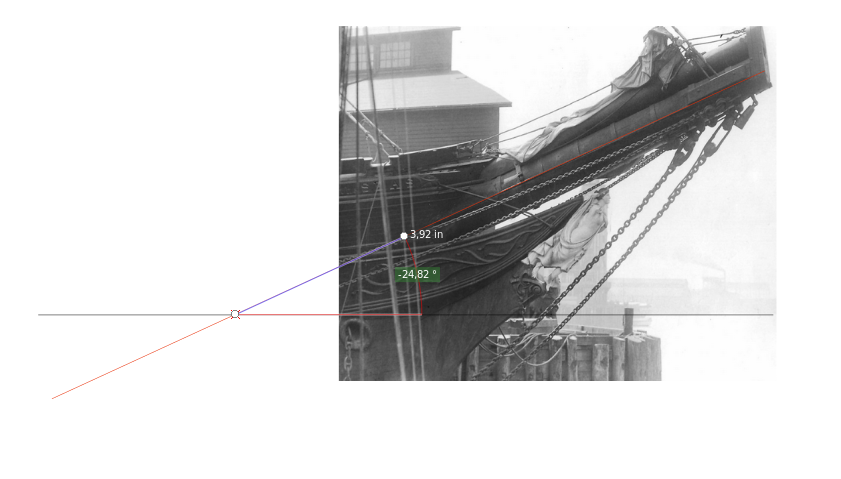
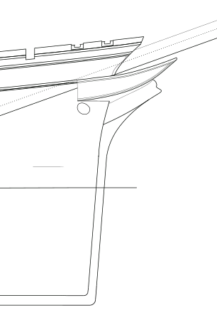
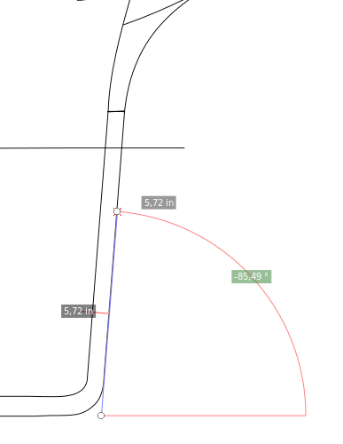
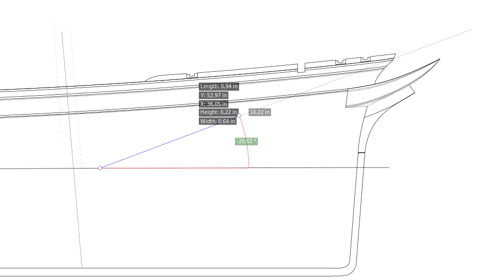
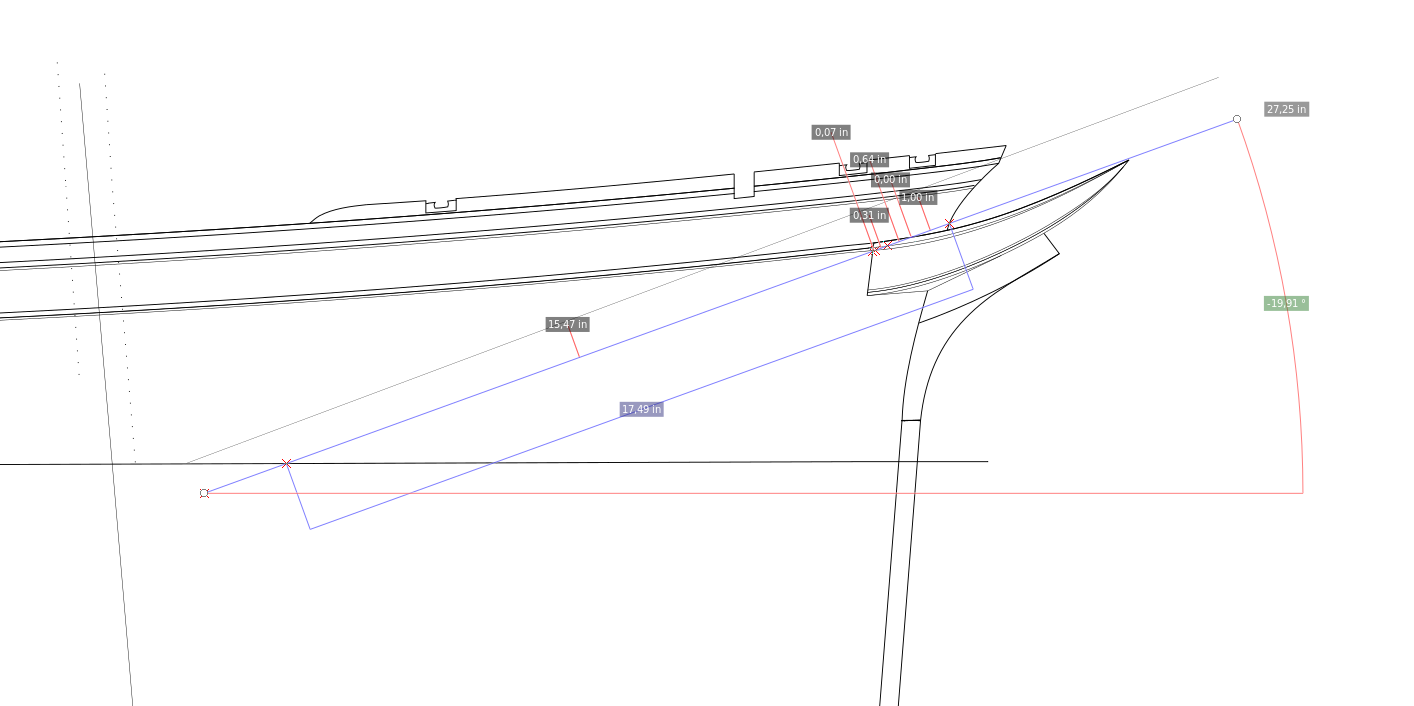
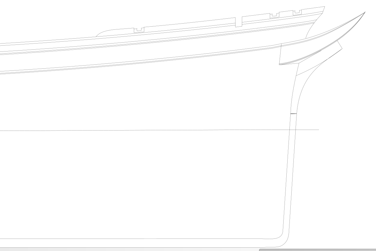
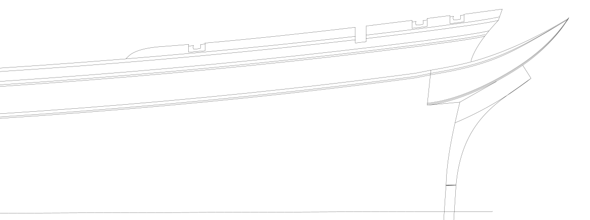
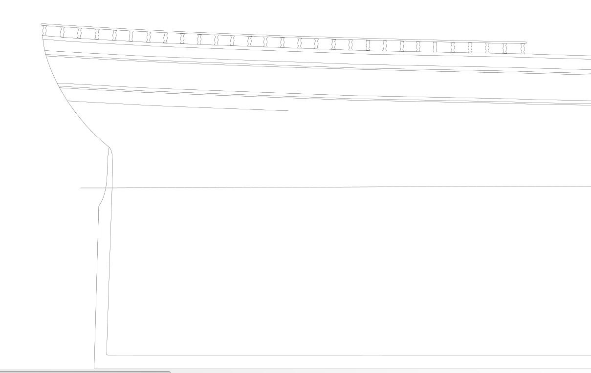
Richard, whoooa, not having you Guys, would be useless task for me for sure. I noticed broken spray rail, but Ididnt think much more can be damaged, sily me. I am pleaaased to hear from you that hood finally settled I call this an achievement. Interesting stuff about bowsprit angles, I couldnt not measure it towards seaharbour line....anyway I left it at 21 degrees. regarding stern ....that is way tougher nut to crack, for sure as I requires reconfiguation of bulkheads / but not only shortening them but calculating corresponding curvature ! so I am leaving this at it is i managed to lower it to 1 foot, as well as monkey rail....but thats about it for the moment. yes RIchard i have same feeling that stern is still smaller in reality observing photos..but ....I will look into it later if I can find a nondestructive way and skill to properly lower bulkheads without moving with its curvature.. If you trace that line, it appears to be a perfect match for the beginning of the Naval Hood. It's very difficult to see because it's neatly matched to the Hull. just FYI i am now working with rounding top of the bulkheads to form curvy base for floor calculating 12 cinch waterway so lowering them to that which is pretty straightforward. after I will return to thinking about how to manage the stern. Appreciated and thank you.
- 3,560 replies
-
- clipper
- hull model
-
(and 2 more)
Tagged with:
-
- 3,560 replies
-
- clipper
- hull model
-
(and 2 more)
Tagged with:
-
I am very curious what you all say ..completely reshaped....stern lowered. hood shortened, below hood widened and shortened, etc...
- 3,560 replies
-
- clipper
- hull model
-
(and 2 more)
Tagged with:
-
Rob, going to work on tis topic this evening . i can plausibly use both sources your measurments and layering real glory photo up to the srawing which is way precise than my old approach. pencil - which was pretty silly in accuracy respect ...
- 3,560 replies
-
- clipper
- hull model
-
(and 2 more)
Tagged with:
-
well actually i had same feeling from late photos - definitely to work about this....thx Another item to be refined is Glory's Stern. If you look at her magnificent 1877 dockside photo, it's readily apparent that her Stern, while slightly higher than her lowest point, midway of the Main Shrouds, is much lower than her Bow V.
- 3,560 replies
-
- clipper
- hull model
-
(and 2 more)
Tagged with:
-
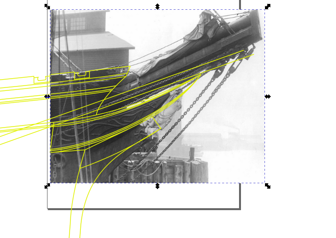
This is noted as well . will revise as above photograph we or I didnt have in time of drafting is of a significant help . even hood ornamentation is to be depicted i would say pretty acurate from it. as other poorer photos deasnt show each details... Pity below ornament is washed out. if not it would be complete 100 reference of the bow.... i have plenty to work on...:)
- 3,560 replies
-
- clipper
- hull model
-
(and 2 more)
Tagged with:
-
Very important reminder , thanks . i will foloow this today evening, its clearly observable that pespective again took its toll. second photographed from much below resulted in steeping curvature more agressively. i will check on this one.
- 3,560 replies
-
- clipper
- hull model
-
(and 2 more)
Tagged with:
-
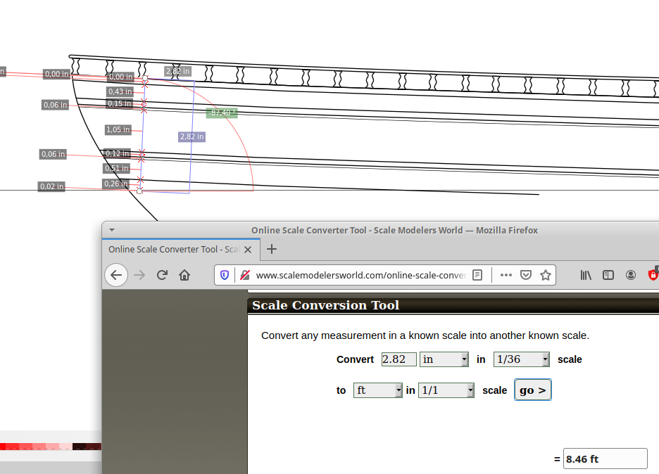
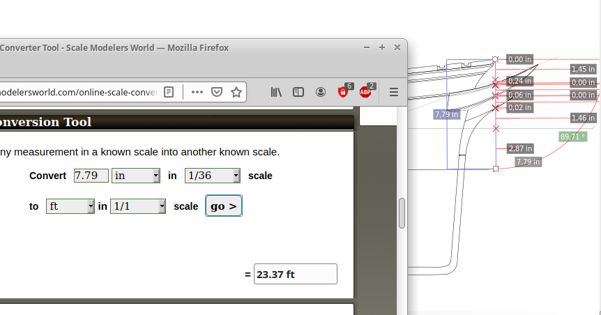
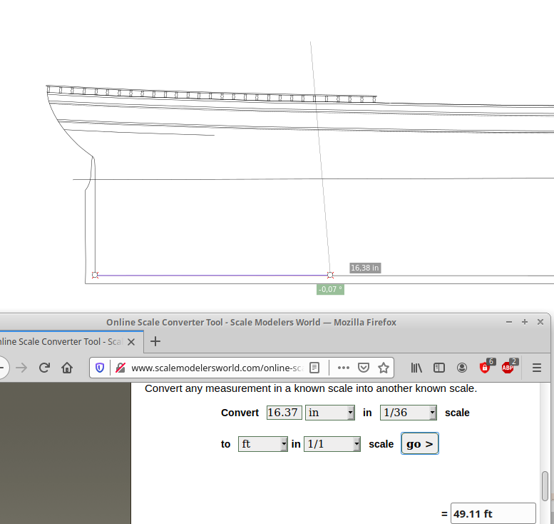
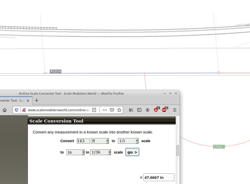
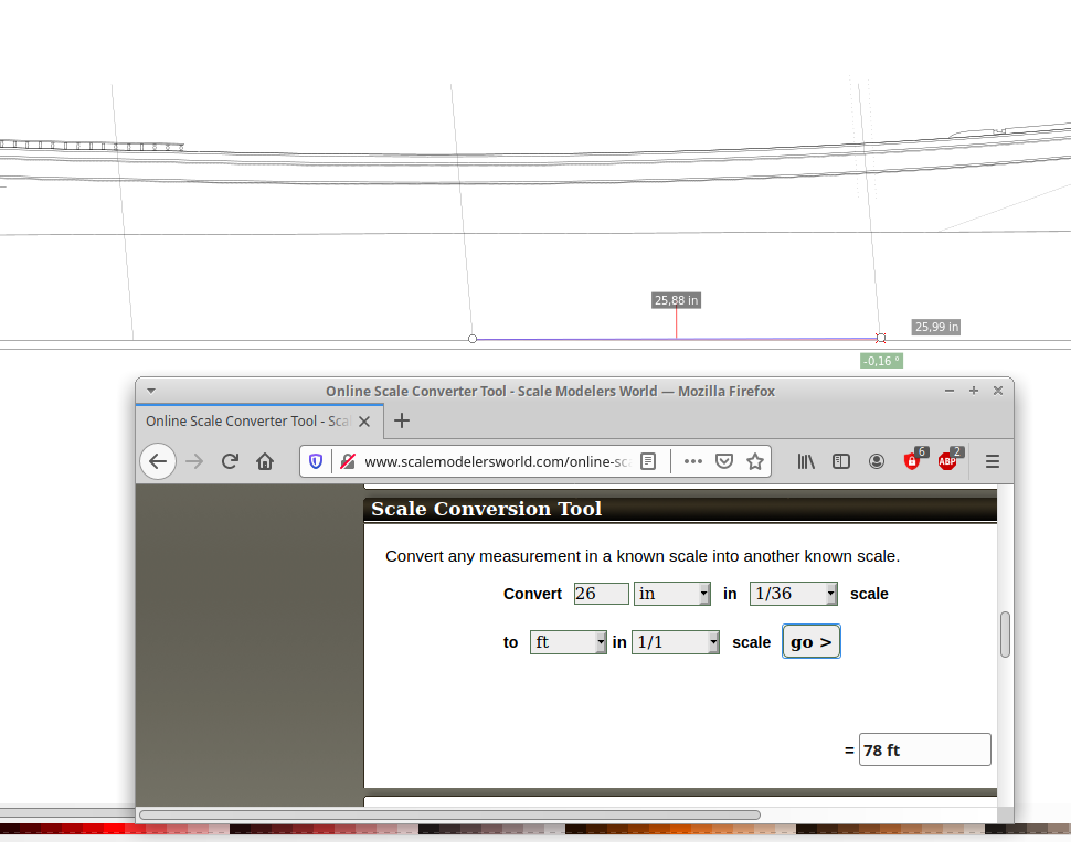
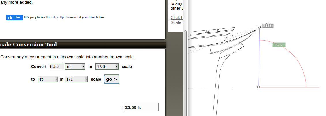
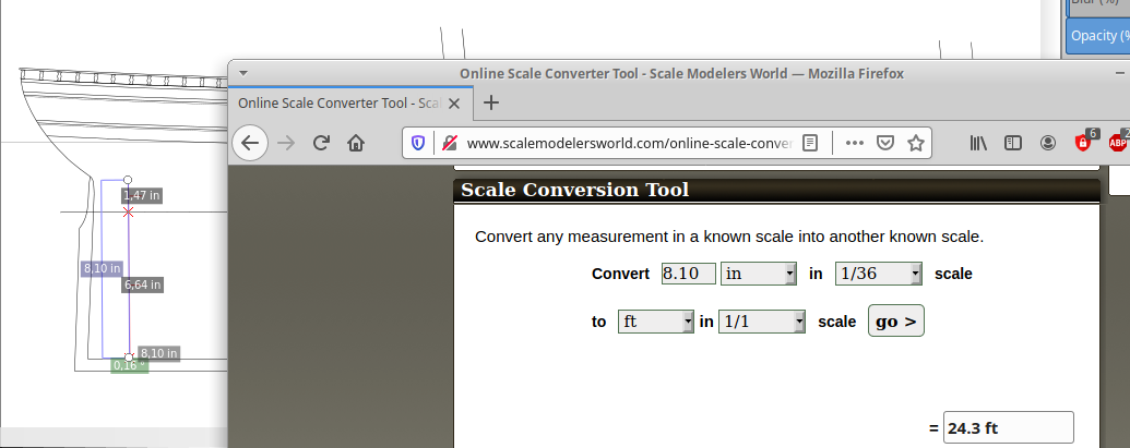
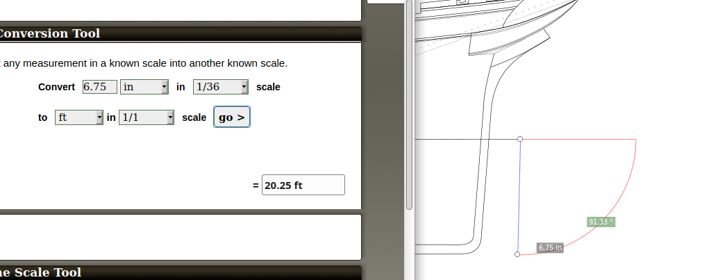
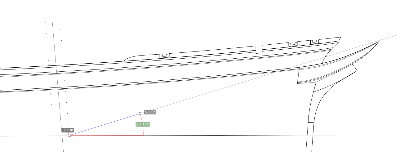
exactly. this will be exciting i am measuring her in scale but need a bit o assistance here. ...... seems point of waterline to be lower is correct and pays off in favor of 20 degrees bowsprit angle, and apex of bow above WL gives me 25' now. however in cost of WL reaching 20' which is simply wrong. grrrr. i will post pics. few discrepancies here folks. Rob states copper line of glory from keel 22 feet. but i read in Michel book copper line 25 ' ....1 strake about loadline which is normally 24' . this adds to confusion a bit to me...from Michael we have depth of hold measure but that doesnt help really. despite of this all fundamentals pretty much sets, I count this for half of foot missalignments which is easy to correct in program... well here goes.....its pretty clear from photographs...there are ones with waterline. One more thing I need to correct seemingly, sheer is stated 7 foot, and it gives me 8 something at the stern, looks like i have to lover it it is very high up.... I straightened sternpost, etc.... goodnight now here you can see Michaels WL mark , apex 23,3 FT this is with higher WL mark . allowing only 17 degrees angle...20 would be pretty off ...below... lowered WL about 2 feets but only 20 FT below after lowering WL...:(((
- 3,560 replies
-
- clipper
- hull model
-
(and 2 more)
Tagged with:
-
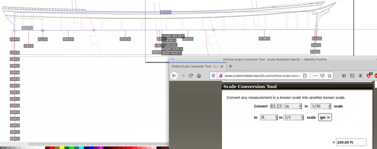
can i give you this Richard? ❤️ ? thanks a milion . i know what you and Rob need here - measures ! as it is very blatant to look at whatever drawing and it speaks nothing of a precision... so i am going to measure drawing upside down for myself and you so you have something more valuable to see and comment on...but it will take ne few evenings as i am busy with other work during day so please bear with me. This helped me enormously. Vlad
- 3,560 replies
-
- clipper
- hull model
-
(and 2 more)
Tagged with:
-
Apreciated Richard, thank you. I will go to drawingboard by evening. My assumption masts position might be off also proves some photos. Distance of foremast is way forward in his placing i can say for sure. V.
- 3,560 replies
-
- clipper
- hull model
-
(and 2 more)
Tagged with:
-
Thanks Richard i take it favourably as a big help in process. i will show all degrees tomorrow nevertheelss i spent paintstaking time and work already and would be foolish if i ignored your wisdom. already seted calculations abotu masts and there are some discrepancies bettween Michaels drawing and ohotographs observed already...bowsprit oh well. wont allow me 20 degreed or - i have hood positioned rather agressively with tip facing a little too more into bowsprit.... with that line it might not represent waterlone its either 2 wl or bulkhead cut position mark taken from book draw....oh by the way @Rob, there is no scale atm i work in percentage scaling so i can size her whatever screen allows ... thanks for sternpost mentioning yes i took it from Michael drawing i will straighten it tmw. I expect there to be some compromises and probably even slight measure offlinesin my hull but i dont expect fundamental flaws at this point. when i see wghat some companies did to cutty sark stern shape...i mean .... mess by mess....
- 3,560 replies
-
- clipper
- hull model
-
(and 2 more)
Tagged with:
-
thanks Rob. well its water lien mark from Michaels book but frankly im not certain could it be 2 wl mark maybe? tmw evening i will play with bowsprit ans mast angles. i will need a bit of your sharp eye with adjusting to achieve 21 degrees at the mast touch guys , but its just a littel doinciding with cheek tip. im probably willing to sacrifice one degree as i know if i move that cheek a tiny bit i will destroy the shape of it completely what i dont want...more of it tmw. well yes, i got last year friendly contact to one guy who made me cut already for quite a cheapish price so im going to have it definitely cut. i can work around late summer / autumn on hull ...and thinking of researching for deck and cabins thri next winter along zull is completed. pretty exciting plans. once i have her on paper im a bit more donfident. till then V .
- 3,560 replies
-
- clipper
- hull model
-
(and 2 more)
Tagged with:
-
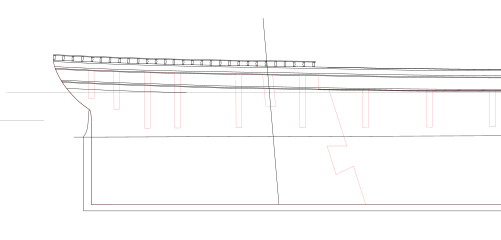
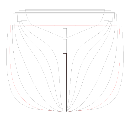
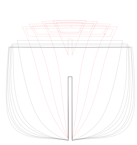
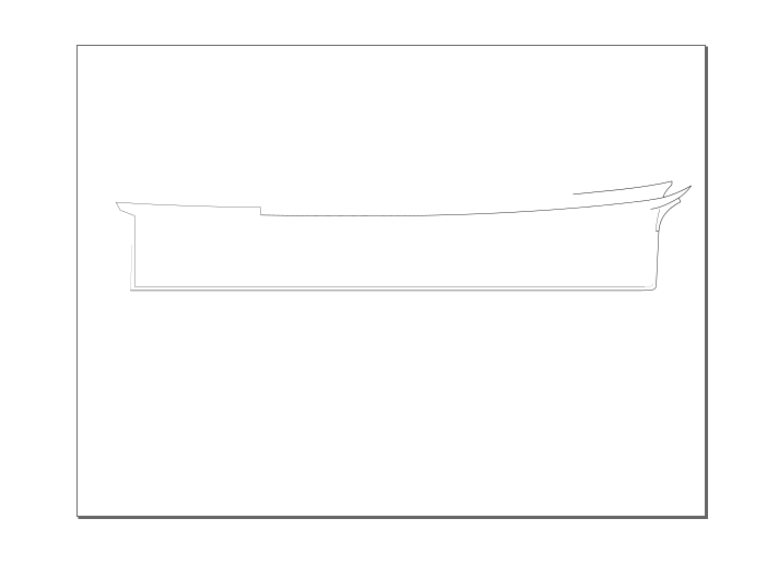
well Guys, I could not sleep last two nights . Probably her ghosts were hunting me There she is... its quite meticulous work, I will continue working on detailing her when i have time..., looks like masts holes are what i forgot, need to find out angles. this is pretty much Michaels glorys design with reshaped bow, I would say it is ready for laser cut i am quite confident, only with little sanding due to tenths of milimeter. probably snug fit even better. I put position for A bulkhead I consider optional, with centerline bulkhead already with shaped bowsprit angle and those important cheeks position.
- 3,560 replies
-
- clipper
- hull model
-
(and 2 more)
Tagged with:
-
Thanks Rich I had a feeling it angles back towards bowsprit, i will check on it tmw as my eyes hurt already. I would say slightly though to the straight line, around nameplate it can be seen. there is no curve for sure. thanks for pointing out, ill correct. V.
- 3,560 replies
-
- clipper
- hull model
-
(and 2 more)
Tagged with:
-
fantastic photo in that respect Rob! tip of the prowe can be almost seen, felt or sure.
- 3,560 replies
-
- clipper
- hull model
-
(and 2 more)
Tagged with:
-
Noted Rob. thank you youre way too kind to my minor contribution.v.
- 3,560 replies
-
- clipper
- hull model
-
(and 2 more)
Tagged with:
-
You can mention our Gratitute to Michael in return. his legacy keeps glory alive and interest of many myself included.
- 3,560 replies
-
- clipper
- hull model
-
(and 2 more)
Tagged with:
-
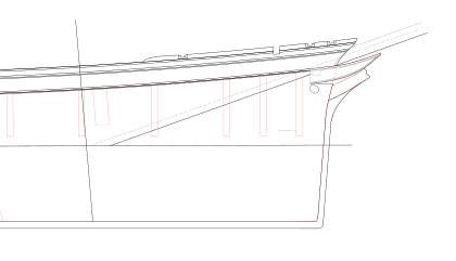
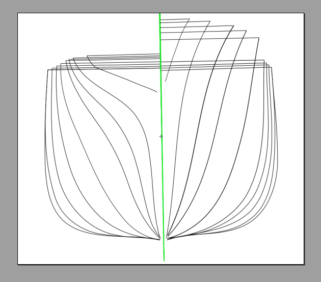
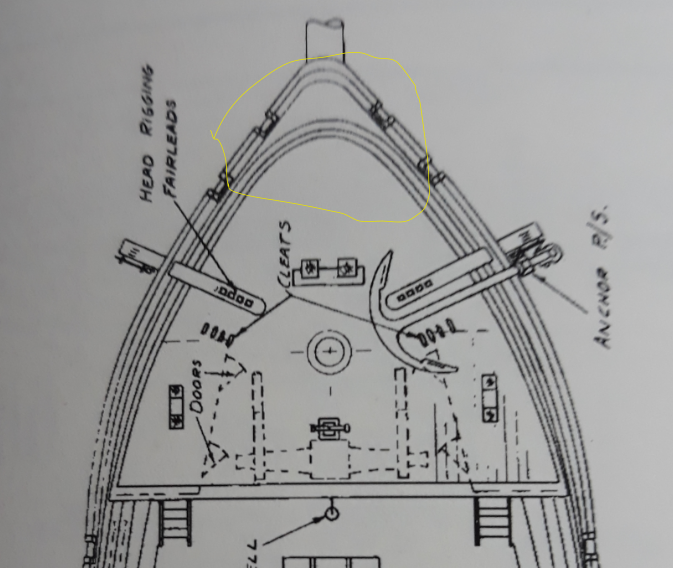
wow Richard, your erudition is astounding, fantastic. Well, sometimes I try to keep up with vocabulary, rest aside, i will sure rely on your knowledge and advice guys, atm im properly redrawing Michaels original plan from the book. Its clon of it. Most in progress but seems i can have something of value by end of weekend. Feel free to comment on it etc... its all welcomed. its only fdraft of lasercut centerline to be...so it will go lower. bulkheads are pretty much done....center bulkhead shows her dashing full line ...oh there is mistake i have to remove forecastle extension from bulkhead no 4 - its only A plus first three. by the way I added so called A bulkhead in front of 1 that touches angle of flower hood in position and concluded its shape to follow 1 bulkhead observing same addition in flying fish plans...
- 3,560 replies
-
- clipper
- hull model
-
(and 2 more)
Tagged with:
-
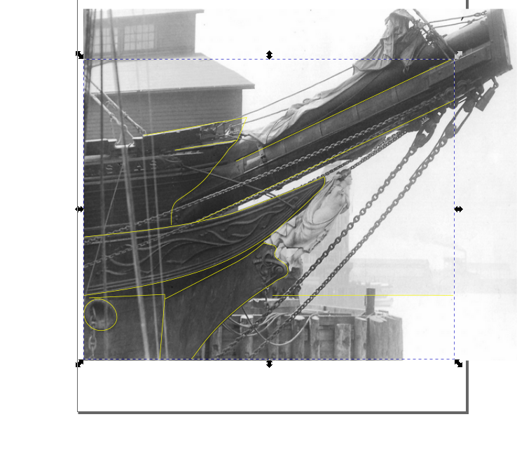
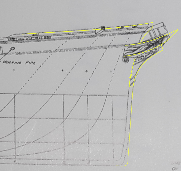
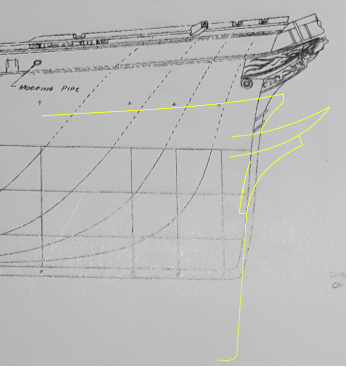
many thanks Rob, With that info in hand lets take a look at what you've drawn. Your proportions are not far off but it appears your naval hood is a bit elongated and the stem beneath it is not thick enough compared to the thickness of the hood. Take a look at the new very clear image we all got of the figurehead/bowsprit of Glory at her conversion. If you can see...her hood is nearly the same thickness of the stem directly behind the figureheads feet. The stem is actually slightly wider...not narrower as you have depicted. i had it wider but tried to fit it a bit to drawing. ill corect it accordingly and post. looking forward as discussions continue.... V.
- 3,560 replies
-
- clipper
- hull model
-
(and 2 more)
Tagged with:
-
Im a bit hard on you today little moving on again...do we know shape of the tip is this rounded please ? is it corroborated with photos or described in books? I assume there wont be photo taken from above there was not such cameras at that time....and there isnt any photom of the foredeck in books 1 &2. I hope more light will shed Rob& Richard regarding this.. from my obervation. but Not only tip....entire sheerline of the bow looks to me pretty un extreme clipperish - comparing to extreme sharp arrows of flying fish and cutty sark for example. maybe this shape is well described in books or Mr. Mjelde or you have pretty clear reason for it to be...Thank you all.. V.
- 3,560 replies
-
- clipper
- hull model
-
(and 2 more)
Tagged with:
-
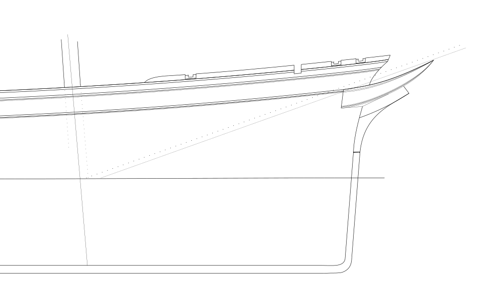
Gentlemen, my thought... actually Mr. Mjelde was pretty on the money in all !!! perspective angles of outer object proportion ...vertical lines and horizontal (sprayline) .... lines, which is astonishing achievement. seems only cheeks to be prolonged....and ....tip or whatever it is called curvature to be little more agressive....well i am learning to draw in these vector programs.....I am astounded how just slight outmove from original line can dramatically change the shape... or distort or whatever.... i played with dock photo we drawn final conclusion compared to Mr. Mjeldes book plan. stem and spray angle is my take , so feel free...probably should be straight not tiny bit curved. If butt of the ship is correct according Mr. Mjelde drawings I can have my own reference, so I can build her for myself. one thing to consider. I would love to have 22 bulkheads not 19 as it seems too little to be sufficient.... your knowledge and utmost effort has one effect of me gentlemen...on one side it is necessary to portray her faithfully, but it can have discouraging impact on oneself, thinking, whatever I do it will be critisized. well, probably there should be one plan with authority of all of you folks, ...but its normal. I am looking atm at my plan of flying fish from model shipways and sighing i wish Glory was such meticulously done for crafters. bear in mind I am novice in american clippers, never built any andthis probably plays understandable part in these lines....im not used to those shapes as Rob is or whoever.... so I am hard thinking of building flying fish first before I jump into glory despite core of her is laid out. at the same time it would take probably 2 or more years to complete it and I know myself i would regret not trying glory......these are just mine inner thoughts to be outspoken I know Rob is machine worker but rest of us would approach it differently. I know it is joined effort of many of you to get her together piece by piece and truly much was achieved. probably my impatience play here....I can try after MrMjelde design with the changes and it can be pretty much spot on...but i am just not that self assured not seeing sheer shape from the top atm...i dont know we are there yet just Michaels top side view...I know it will probably never be the plan i long for and many will always rely on your knowledge and advice...it goes without saying... but I would like to have sheerstrake profile set...etc..well these are just thoughts sorry to spam it with length....my pessimism is rather unjustified it should be otherwise... suppose I am soaked in Richard philosophy a bit...perfectionism... i have to brush it off a bit
- 3,560 replies
-
- clipper
- hull model
-
(and 2 more)
Tagged with:
-
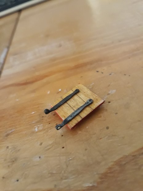
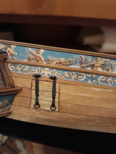
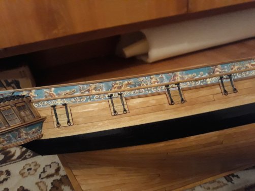
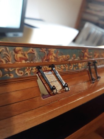
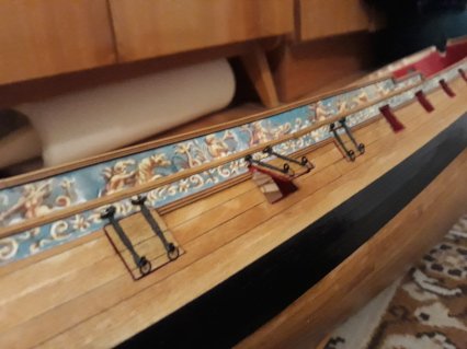
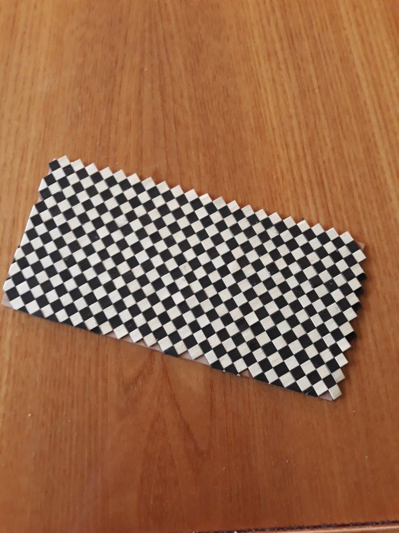
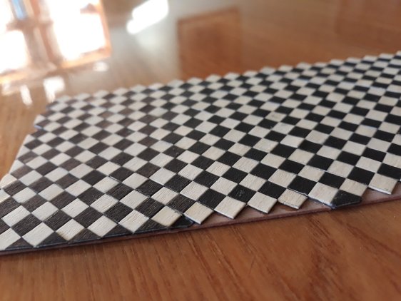
Folks, small update from what I could do without parts 4&5, I decided to work gunports. I made such thing first time, it was very enjoyable. what do you say ?I have to finish another half. I tried to make them with apropriate size but im a bit sad that hinges are little wider and therefore more prominent as they should be, but they match perfectly round openings so they open nice tightly. Im thinking to make another side smaller, wel.. also made checkered board ahead getting inspiration from Matthias Beckmann, i like it without painting- its thin baswood. only black is painted. meanwhile one weekend / made of inlayed woods/strips... tiles are little smaller than scale i will see if i keep them. Vlad
About us
Modelshipworld - Advancing Ship Modeling through Research
SSL Secured
Your security is important for us so this Website is SSL-Secured
NRG Mailing Address
Nautical Research Guild
237 South Lincoln Street
Westmont IL, 60559-1917
Model Ship World ® and the MSW logo are Registered Trademarks, and belong to the Nautical Research Guild (United States Patent and Trademark Office: No. 6,929,264 & No. 6,929,274, registered Dec. 20, 2022)
Helpful Links
About the NRG
If you enjoy building ship models that are historically accurate as well as beautiful, then The Nautical Research Guild (NRG) is just right for you.
The Guild is a non-profit educational organization whose mission is to “Advance Ship Modeling Through Research”. We provide support to our members in their efforts to raise the quality of their model ships.
The Nautical Research Guild has published our world-renowned quarterly magazine, The Nautical Research Journal, since 1955. The pages of the Journal are full of articles by accomplished ship modelers who show you how they create those exquisite details on their models, and by maritime historians who show you the correct details to build. The Journal is available in both print and digital editions. Go to the NRG web site (www.thenrg.org) to download a complimentary digital copy of the Journal. The NRG also publishes plan sets, books and compilations of back issues of the Journal and the former Ships in Scale and Model Ship Builder magazines.


