HOLIDAY DONATION DRIVE - SUPPORT MSW - DO YOUR PART TO KEEP THIS GREAT FORUM GOING! (Only 72 donations so far out of 49,000 members - Can we at least get 100? C'mon guys!)
×

Vladimir_Wairoa
-
Posts
1,566 -
Joined
-
Last visited
Content Type
Profiles
Forums
Gallery
Events
Everything posted by Vladimir_Wairoa
-
 congratulations. beautiful.
 -
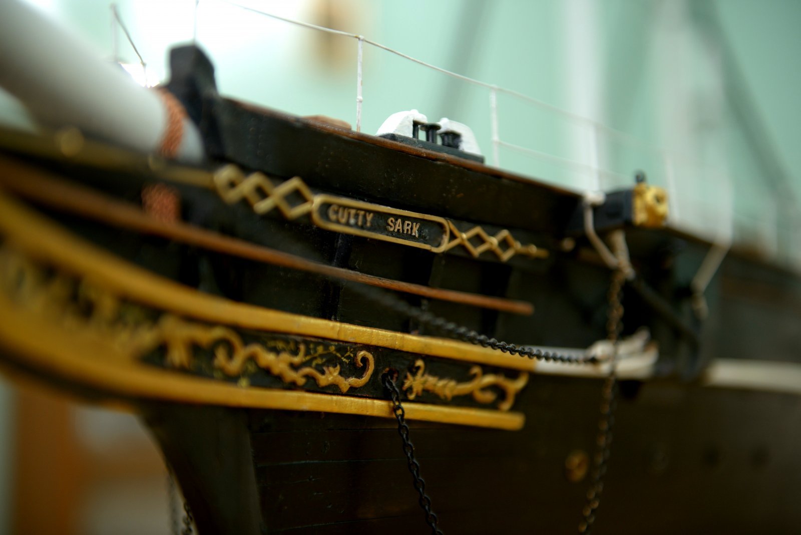
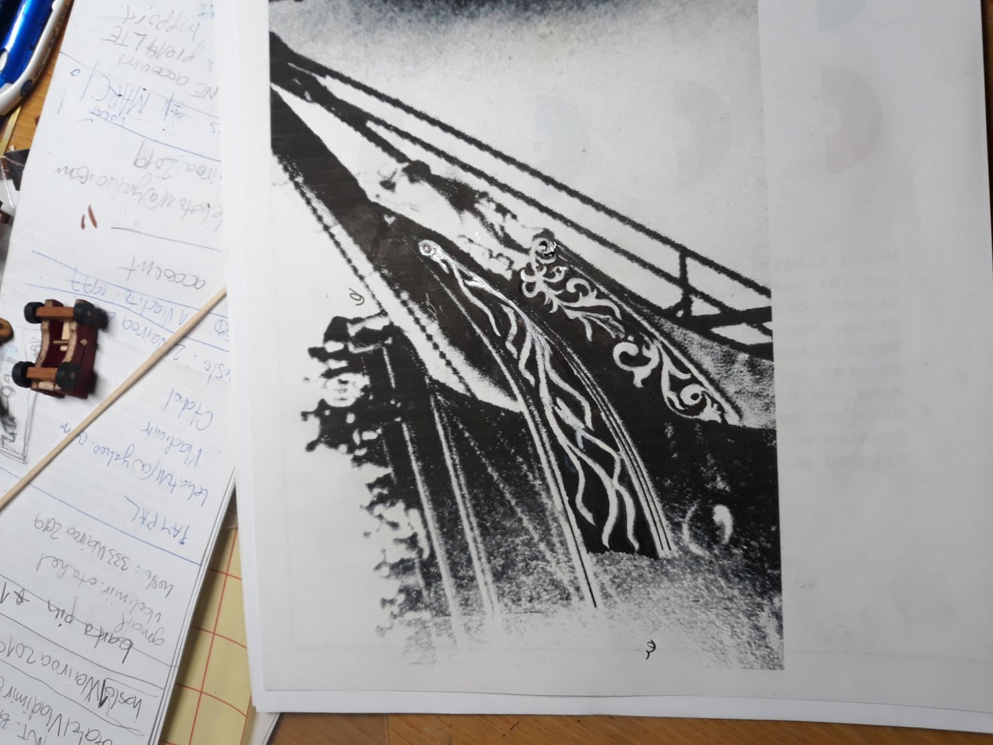
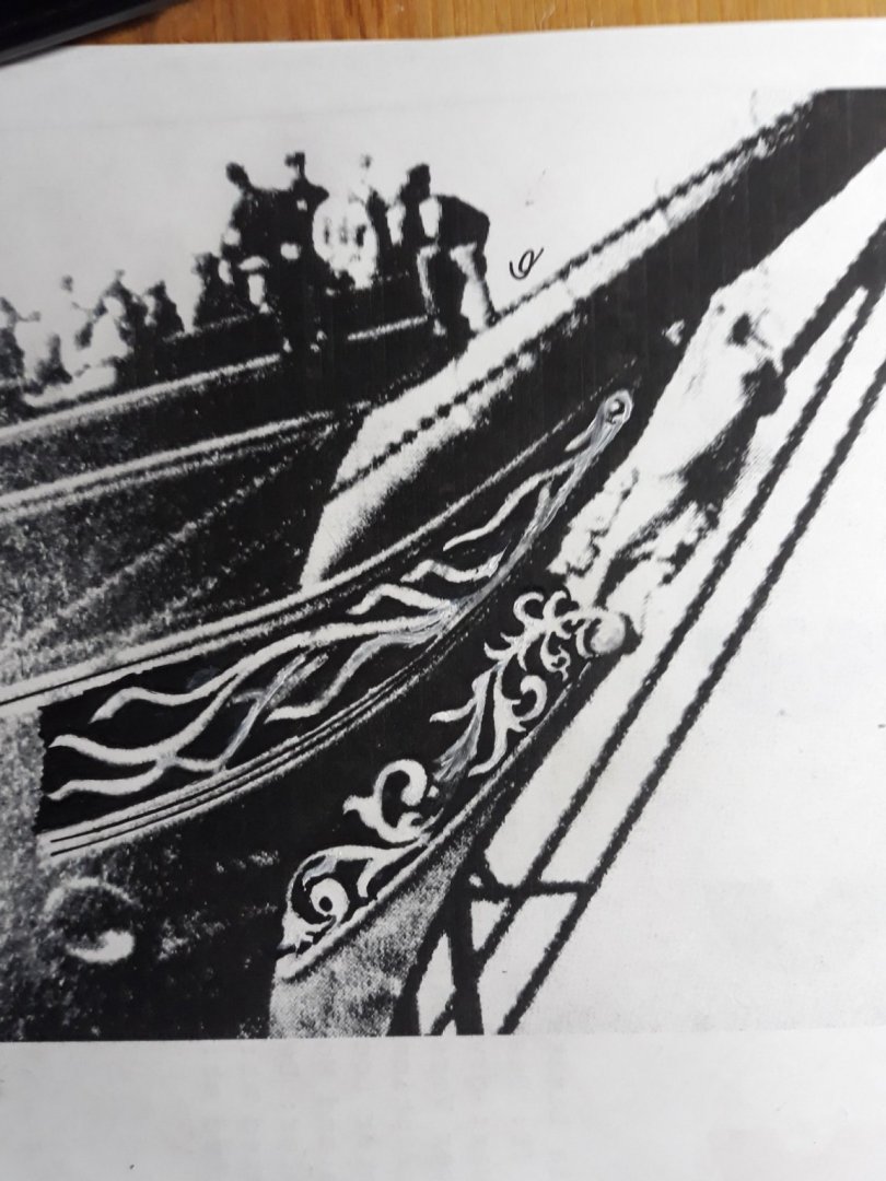
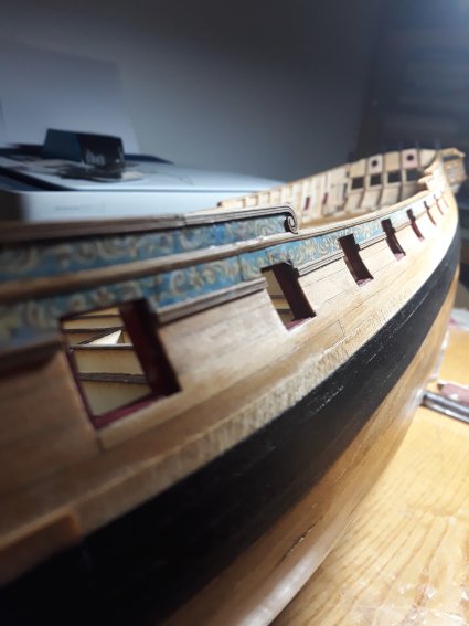
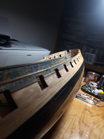
Richard thanks i am over the moon to see this detailed close picture. absolute best regarding view of figurehead and details of bowsprit etc. now this is the view everybody speaks about what it must have been like to see it in person . seems you got some 13 treasured apartement unlocked. clapping hands. @Thanks Rob .
- 3,560 replies
-
- 1
-

-
- clipper
- hull model
- (and 2 more)
-
Im pleased you liked my effort Rob, Im glad to help with my tiny bit if i can, think you will be pleased to escape from renovation to supervise it here , I already had them to get laser engraved so I will show up when testing samples come out. Im thrilled I cant wait for outcome, if there is any likeable we will see. surprise can be positive or rather bland but i am optimistic. I reworked upper watersplash completely, as I had to move curve of that cheek properly, and prolong it...again, we can see what can perspective do on photos.....its is under i would say about 130 degrees angled and curved in half from bow towards bowsprit so it is pretty deformated...but I made sure entire ornament follows original place pattern...so from my point i am pretty satisfied atm....upper cheek is withould moldings ....i thoughtit would be proper to install moldings next to the cheek as per observing. so slimmer......but lower flowered pattern I left space for molding to be glued up to the place so it looks wider because of that.... well regarding nameplate, that one is pretty straightforward and easy to make two leafs at the corners i guess but I spent whole day trying to find similar to freehand vintage carving fonts resembling original, finally set on this one, not sure the name but well, its called Calson Antique ... it is not perfect though. At least G. but some letters are pretty close I guess, but i am open to disagreement, itreminds a bit of handcarving of that time...If someone could be of help I would be greatly thankfull...thanks everyone here for contribution, Druxey etc...oh by the way there are in 1:72 and 1:96 samples....


- 3,560 replies
-
- 2
-
-
- clipper
- hull model
- (and 2 more)
-
Thank you Chris! Background plate was gold leafed? Around carvings? I tohught opposite. As usually like cutty sark. Very interesting. It must have been staggering to see. I would almost faint indeed. i bettered the round startibg points but i will nit touch it anymore as i will ruin it i know myself.
- 3,560 replies
-
- 1
-
-
- clipper
- hull model
- (and 2 more)
-
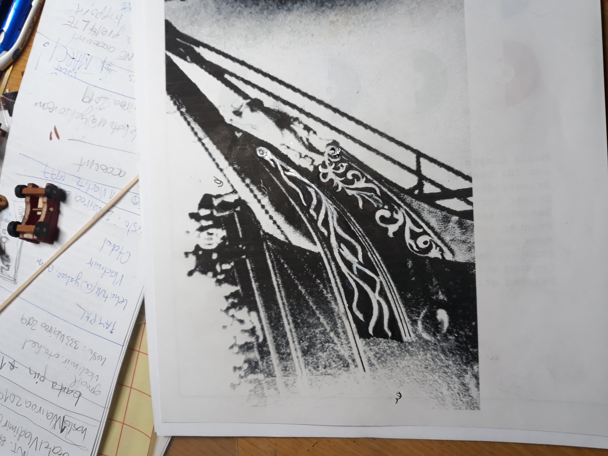
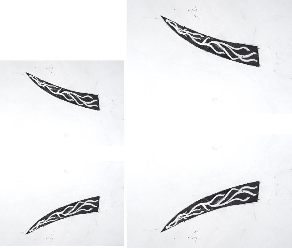
I found it Richard. Great stuff indeed. Photo with ropes is excellent for upper flower but distorted in length so its difficult to outline it for me. Your drawings are pretty excellent, i tried today different approach. That grainy photo with complete ornamentations is excellent yet pretty terrible at the same time for outlines picture not only for high contrast and big big grain, but contrast and light unfortunately shows only enlighten shades of carvings which is clrearly seen at upper thin leafy ornament. But for the lower it is better thankfulluy. That carving is pretty complex and 3d sort. At the scsle i want to build her /1:72/ i wish just for laser engraving the way that outline of flower stands out of background, norhing more. So My aim was to try take out or differentiate flower from the board to kick off grain and clar the lines its engraved to....so i printed it out and blackened background with ink pen by hand and tried to restore flower with white pencil and acrylics and same tome.... In hope that after minimalizing picture back and taking photo rougher edges will go away... Than i pictured photo with gausian blur in gimp...i have problem with upper flower its not that good and thought it will be easier. but for the lower From this preliminary approach im quite satisfied though here is it...V.
- 3,560 replies
-
- 1
-
-
- clipper
- hull model
- (and 2 more)
-
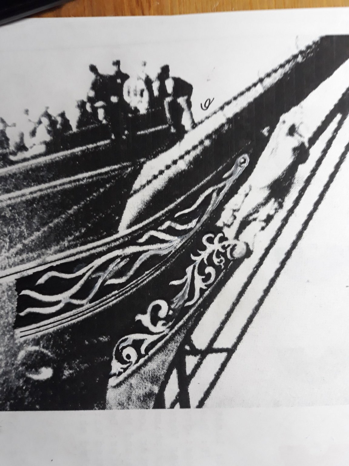
wow what a close and detailed pic. thanks. you are doing great great guys.. yes. i see also knee she stands on is stepped not straight line. its complex. Id like to aks a question. i see that ornamentation below figurehead comes damaged to non existent on spome photographs.im not sure ive seen it closeup on existed photos s ofar... i hope you guys can restore it it would be a pity - the complete one from launch photo is too far away though. im playing with vector software atm trying to render those decorations as i have frend who can lasercut it for me... so i will post only if i manage to get something of any interest. have fun researching V.
- 3,560 replies
-
- 1
-
-
- clipper
- hull model
- (and 2 more)
-
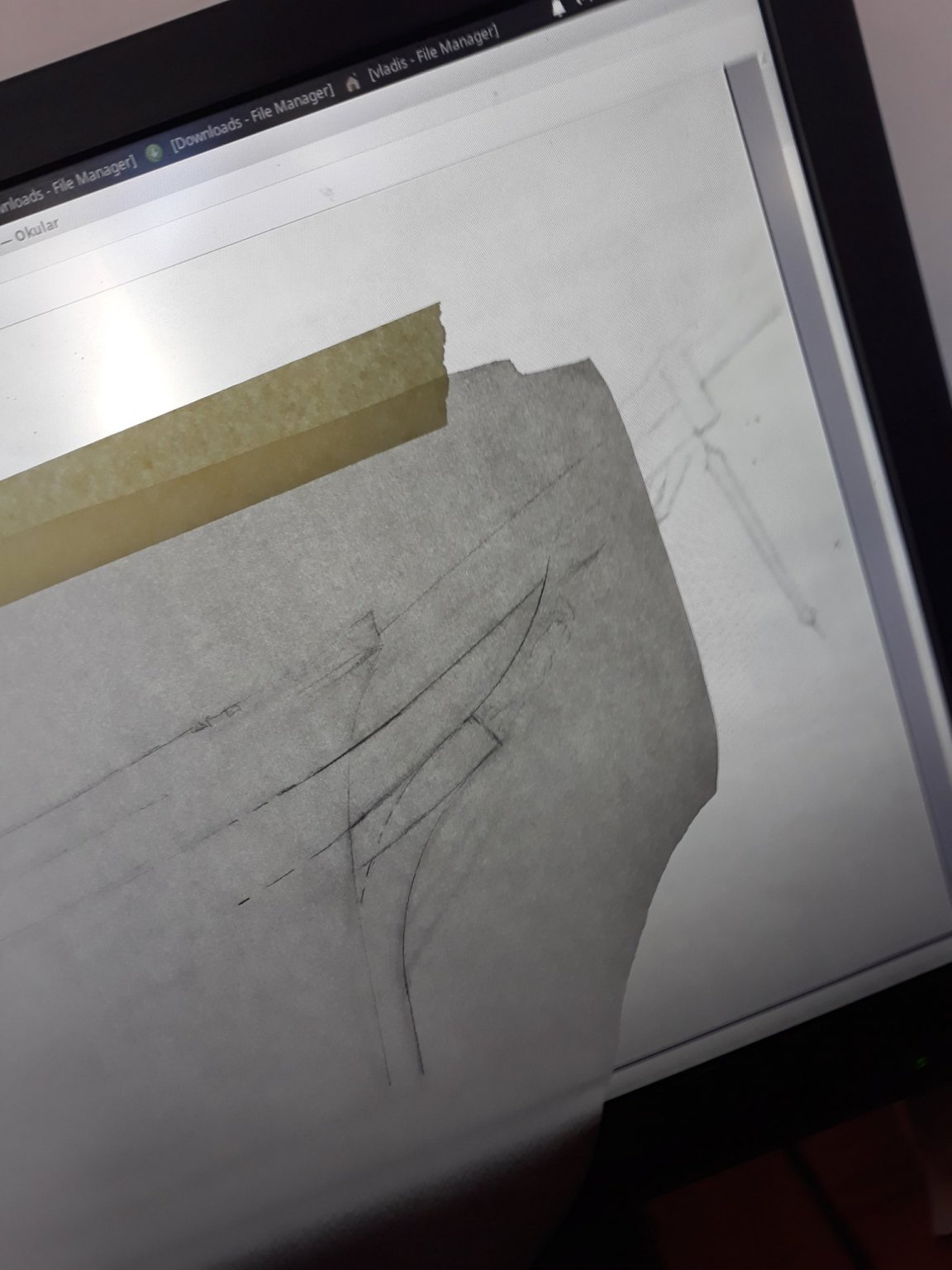
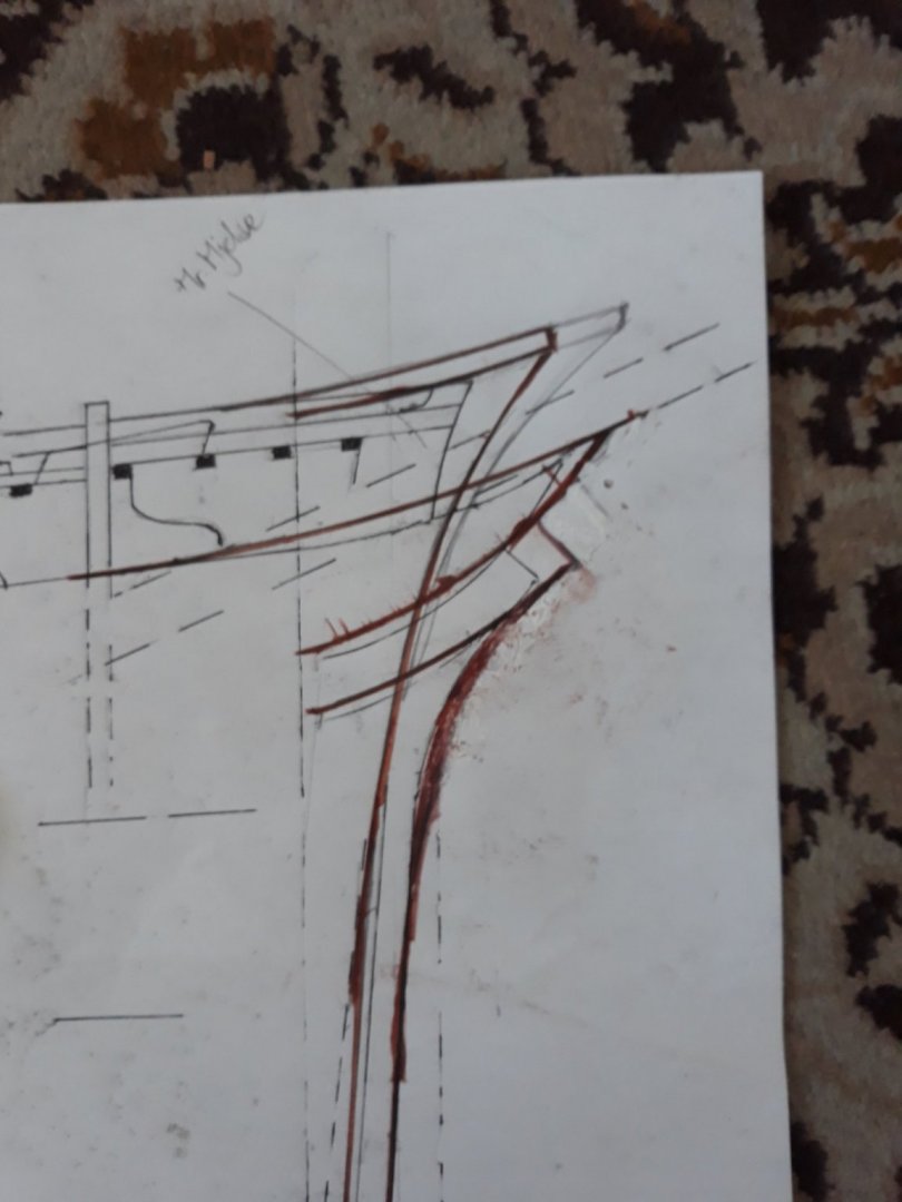
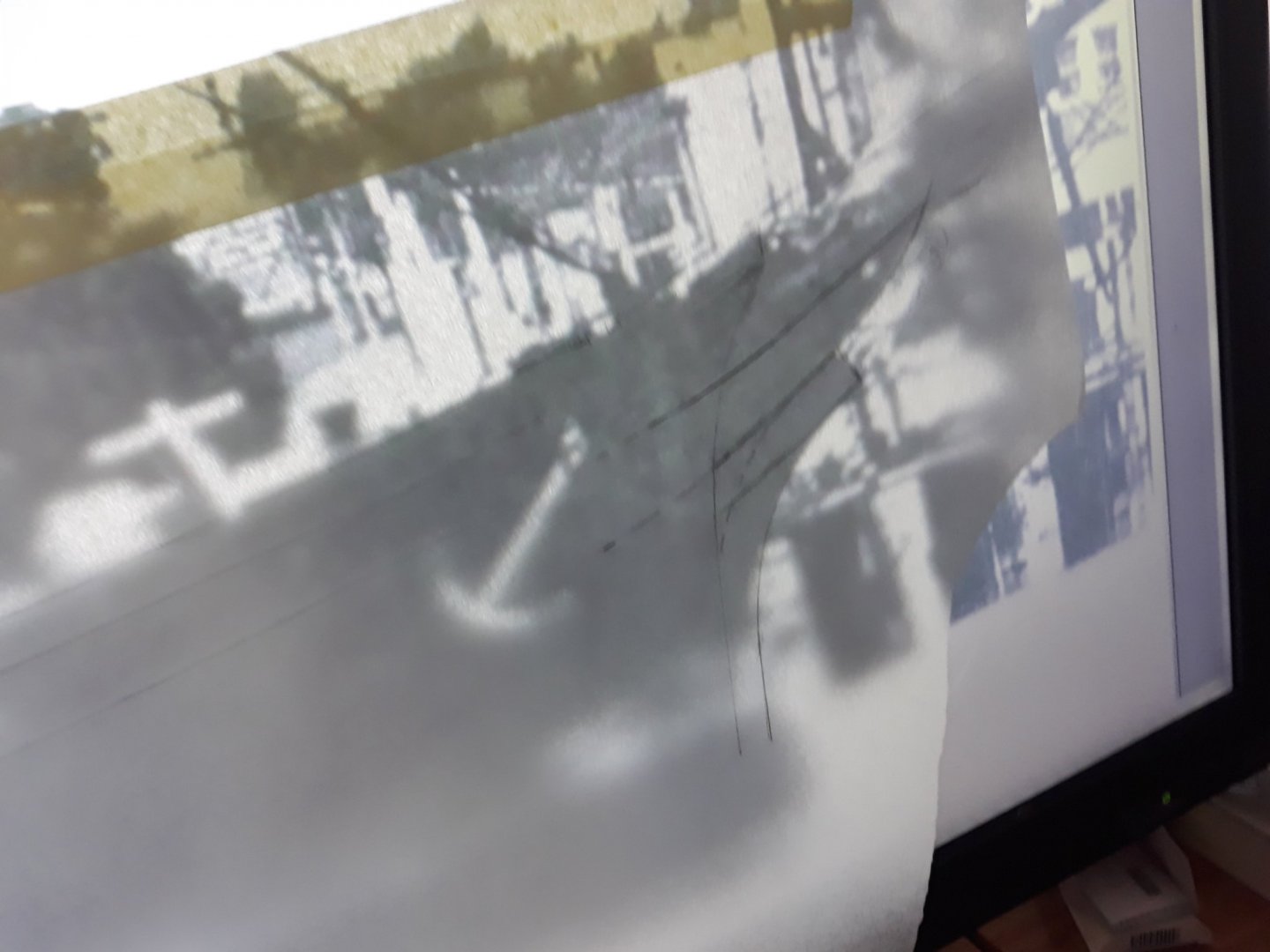
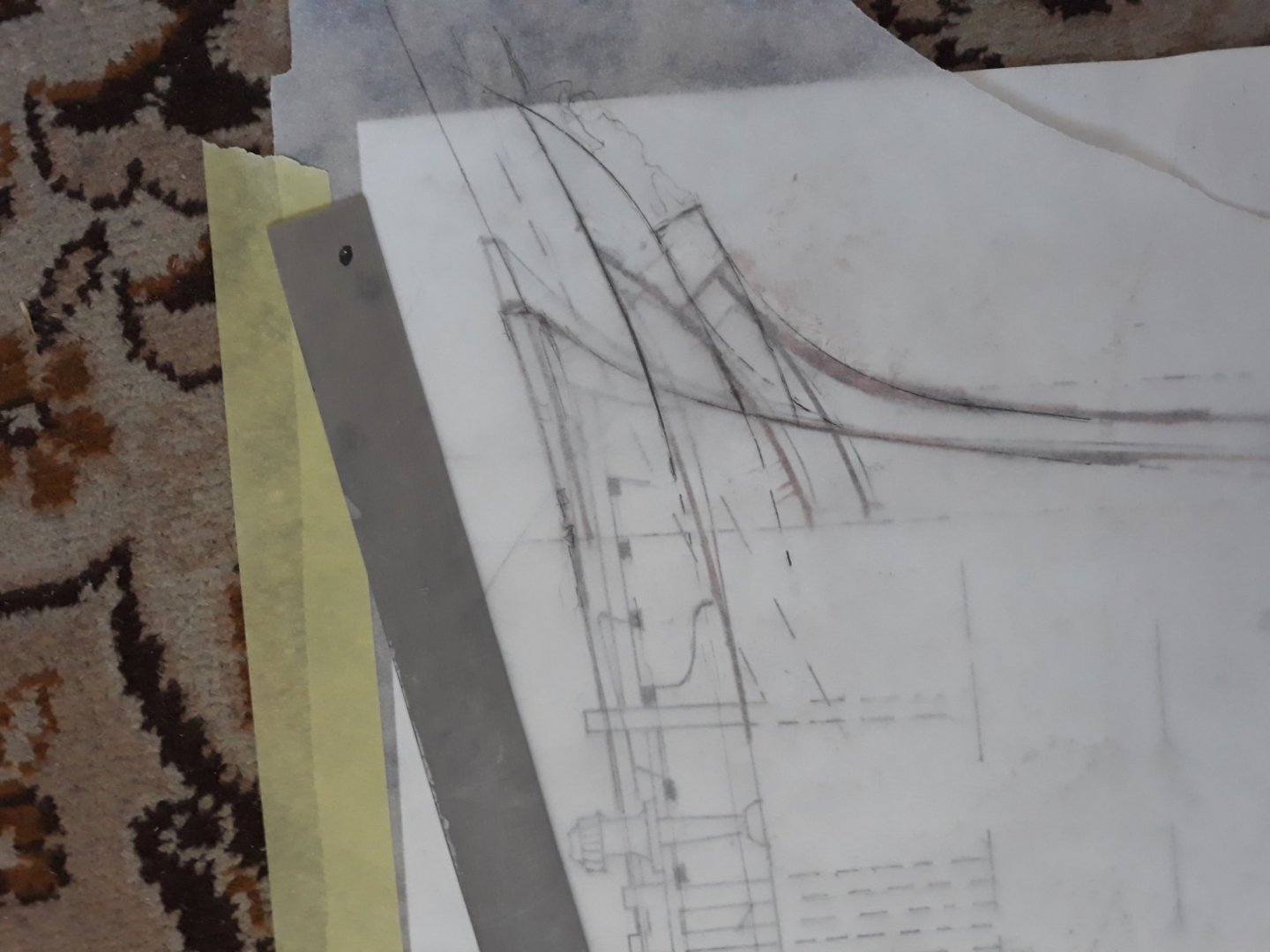
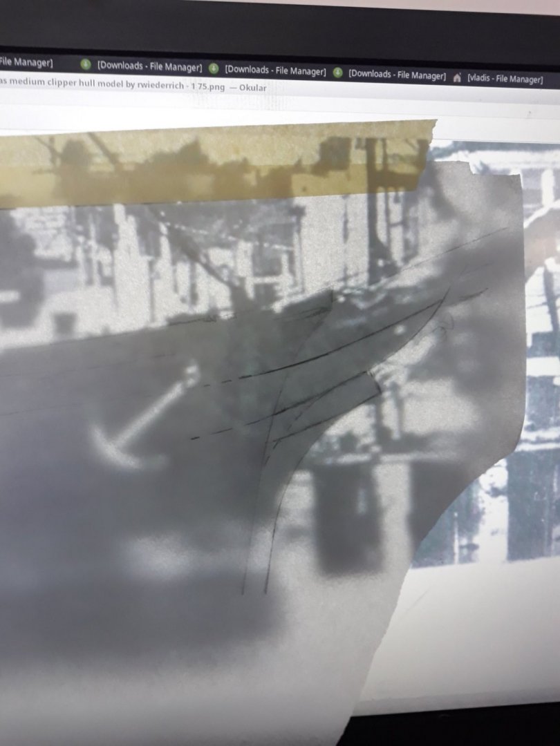
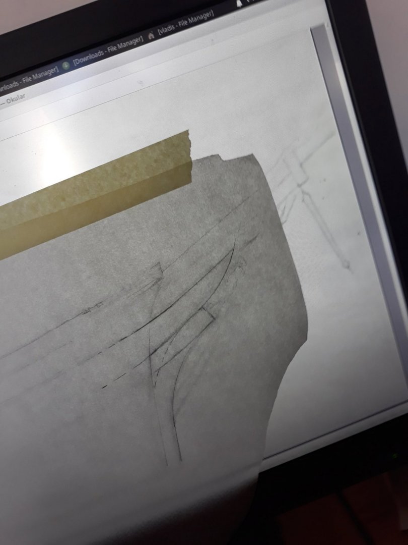
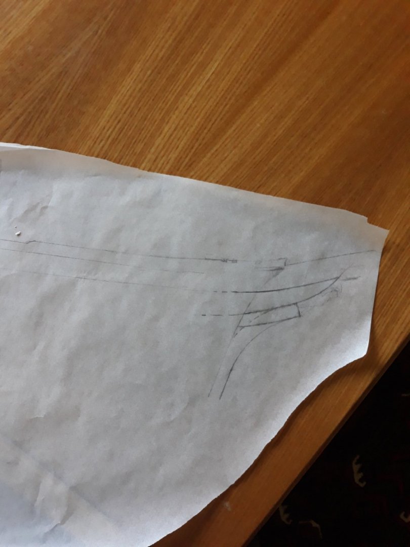
I rolled out my old 1:65 sketch today. So im about to beat the horse last time for my view. Biggest credit to clipperfan pointing distortion of photography plays biggest role. I compared that middle photograph with "white" anchor - with all assumptions were taken before photo appeared. Guess what? Length of the tip was assumed correctly. But i was stunned how short cheeks were even on Mr. mjelde design from distorted angles of photos until that photo apeared. I tried to draw the lines according photo and briefly clmpared with Clipperfan and Rob sketch- its clear match +- i dont play exactness here....so its definite bow for me as well. Enjoy comarisons. There is mess of the various overlayers but its visoble enough to see it..transparent paper is The photo stransfer... .v.
- 3,560 replies
-
- 1
-
-
- clipper
- hull model
- (and 2 more)
-
folks, excellent obsevation . be it me i would grab second photograph as definite reference and forget about all rest just my 00.2 V. we discussed it aplenty again and again. first photo clearly heavily distorted perspective of bow as photographed from rear - second probably the best photo so far. . last photo heavily distorted look again as took close to centerline - aroud 30 to 45 digrees to centerline... for hull shape useless. ...i guess. V
- 3,560 replies
-
- 1
-
-
- clipper
- hull model
- (and 2 more)
-
thanks for thorough explanation Marco, its great. i will post mine soon. Vlad
- 399 replies
-
- 1
-
-
- cutty sark
- revell
- (and 2 more)
-
Thanks for reply Bruma, I will try enamel than as I have original. well well, I will open window for her , despite it is only 2 weekends project i think. Looking at your yards I am impressed . l see you ditched plastic ones, are those way too fragile? Can I ask how did you make those rings ? presumably soldering. very nice. V.
- 399 replies
-
- 2
-
-
- cutty sark
- revell
- (and 2 more)
-
Hello Bruma, youre doing magic with yards. amazing. Id like to aks you for an advice. I started to assemble my revell kit, but i am terrible with paints. I have email paint for hull plates. but i can paint only by hand. is it better to dillute it and put on more coats please? i dont want to ruin with thick terrible mess. Thanks a milion Vlad. i see they dont have copper in spray unfortunately.
- 399 replies
-
- 2
-
-
- cutty sark
- revell
- (and 2 more)
-
its beautiful > thanks
-
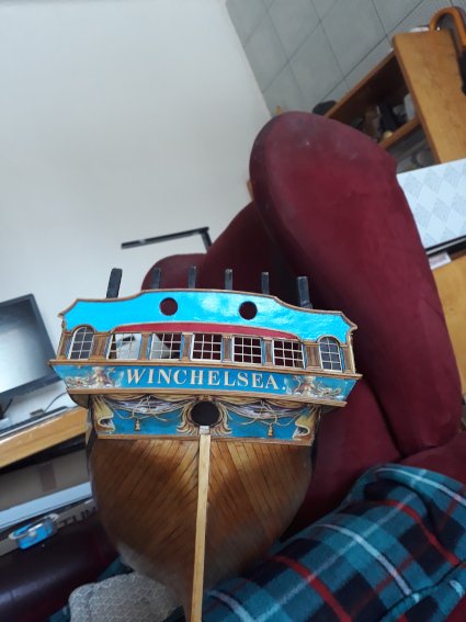
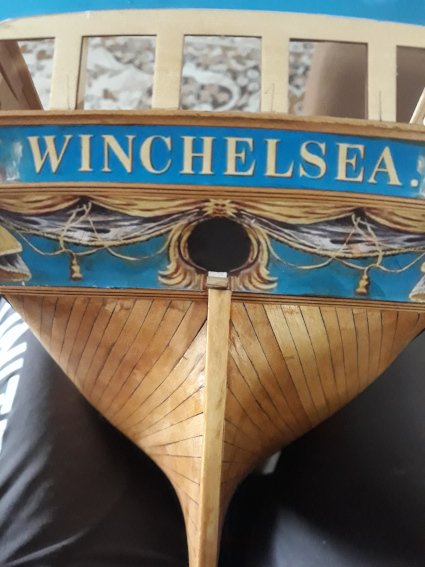
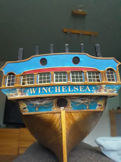
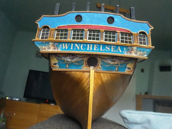
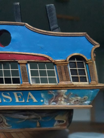
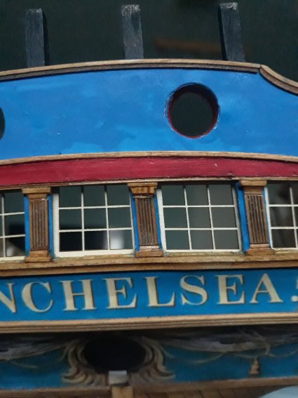
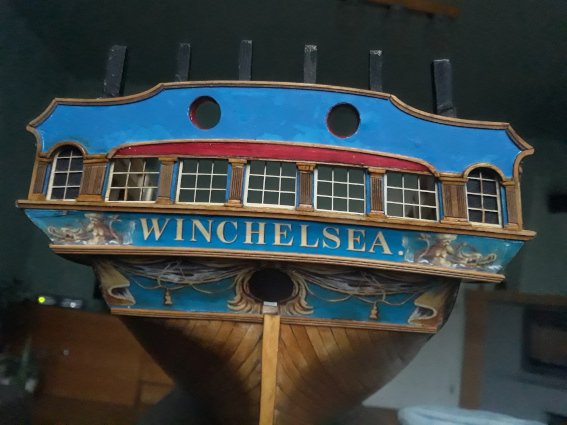
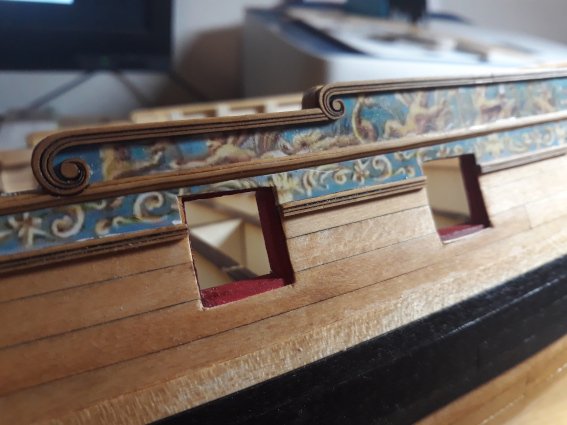
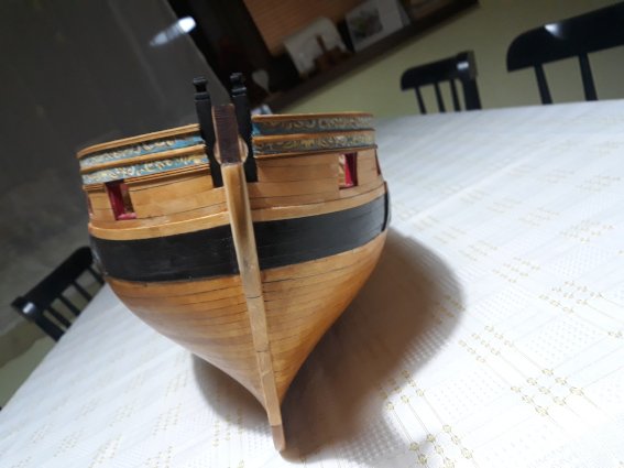
there is an update on sternpost part. here is how it turned out with whitish windows... i guess i little drowned side windows so i could have posture upper molding a bit higher, but it could have been far worse anyway ..so long part 3 for me. as i dont have figures im done I painted black scarf around boat glossy, as greenwich protoype better or worse for you ? first pic is carulean still not quite dry. but its easy on eyes i guess enough. i had to repaint darker one. no matter how long i tried my very best on sternpost. i cant better picked very simple column pattern , sorry for that . didnt i promise in november i m goona catch up with you folks...?. now long break ...but i will enjoy your progress... thank you all.


-
lovely indeed.
-
ticking all boxes Chuck. Thank you for your amazing effort.
-
very nice i follow with interest.
-
Hey Mark, how are you doing? all good in new year and safe these times. been scrolling thru past pages lately, if you want you can check my recent udergoing in group project winchelsea , i jumped that wagon for the moment building from rest what left from cutty with ordered stuff from Chuck. all good Cheers, Vlad
- 200 replies
-
- 1
-
-
- cutty sark
- clipper
- (and 1 more)
-
wow your panels look fabulous Mathias. I will try to mimic same idea though.V.
-
thanks Matt, yeah it was great weeeknd.
-
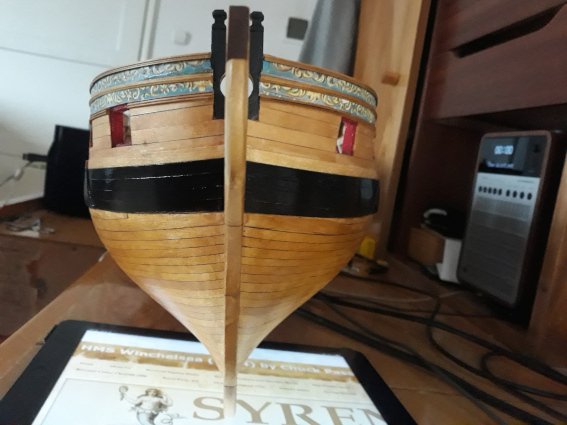
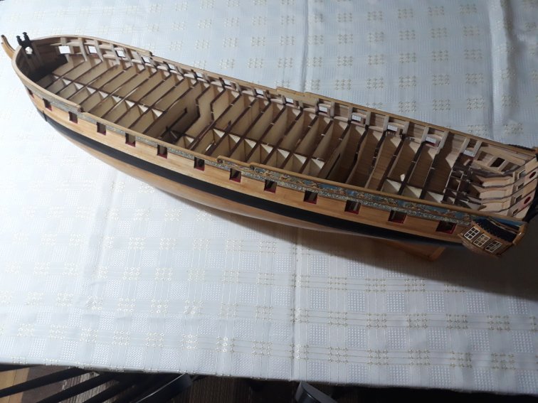
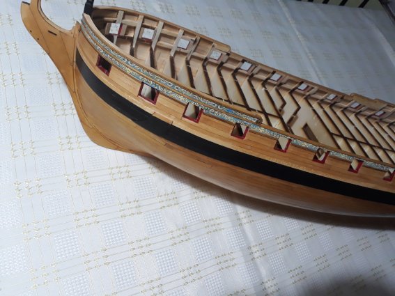
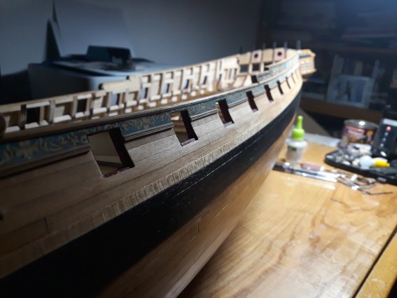
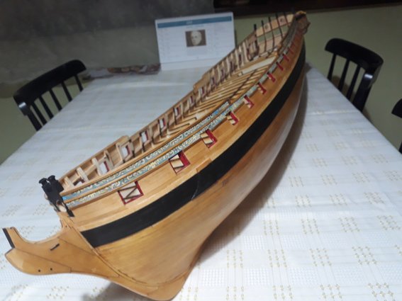
Ok, she is half dressed now. I left stern for the last part. little messed up those frezies at the bow though...and some moldings are little wobbly, but anyway...here it goes...thanks for any comment criticism...etc...
-
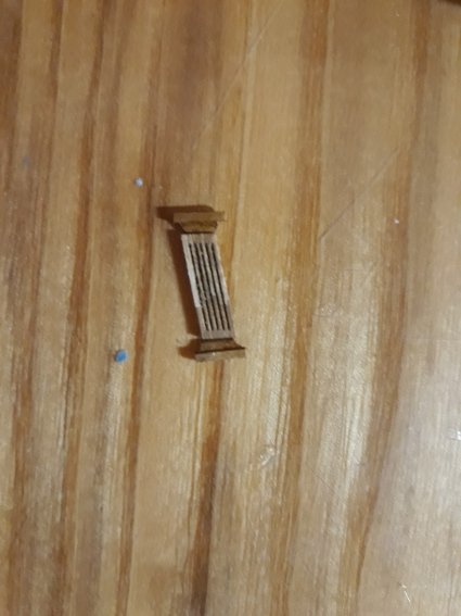
Ron you are an angel but I hold my breath as I dont think much of my skill or my winnie there is plenty of mistakes but anyway. we are picky about it. i feel still pain for few mistakes i could avoid but at the end i tell myseldf im proud i planked properly despite of mistakes... ;( but i grow on her as at this moments it would be about thousands upon thousands time i took her in hands ! and we all know it means a lot for us. oh by the way hat happened recently. i tried to polish and polish planking at the stern forgetting its already so thin - guess what happened? yea i sanded off small hole ! into planking hru 2 planks. just near molding covering imperfections.... . you can imagine pain i was going thru :(((( no magic here Ron - . i used standard artesania latina scrapers...i got new one...tthose are little off beams measurments so i just sanded off from them to make scrapers smaller.... i already started working on stern part and formed different columns so you will see hopefully soon. thanks. v.
-
Thanks a lot Matt , glad you like it. it warms the mind & helps to keep going. Vlad