

JohnE
-
Posts
309 -
Joined
-
Last visited
Content Type
Profiles
Forums
Gallery
Events
Posts posted by JohnE
-
-
Good progress. Defined the ribbands (lisses) and plotted the offset points onto the body plan. Only needed very small adjustments to the station frames. The drawing is a .jpeg but the tiny marks are the offset points, if you can see them.
That wasn’t too bad, and I figured out the more ambiguous entries, so it’s off draw the aft station frames and construct a half-breadth of the ribbands as diagonals. Since (if) the station frames will be accurate, I can set some arbitrary waterline intervals and do take-offs for the second (waterline) half-breadth. I’m drawing in 1:12 so I can get some pretty decent accuracy.
The first 6 (F, 1, 2, 3, 4, 5) plot very well along straight diagonals. Above that 6, F-I, 7, 8, and 9, were along a trending curve; offset points were defined by hauteur (height above top-of-keel) and demi-largeur (distance outward from the center-line).
Some of these ambiguities were a pain till I realized I had four sets of Devis’: Venus, Cornelie, Justice (1810), and Pallas. Some of the devis’ had certain offsets with ‘h’ and ‘d-l’, while others only had ‘d-l’, which was subtly different from the more specific tables. I went back to the master lisse position table and plotted these ‘half-datum’ points using the master and, sure enough, they fell along the previous curve. So now I have a couple of offset tables for 6, F-I, 7, 8, and 9 that serve as checks.
Presumably, the constructor and the yard dogs would see ‘h’ and ‘d-l’, and do that. If they only saw ‘d-l’ and not ‘h’, they would do the ‘usual’. That’s my guess and it has been working out very well. I welcome different views and thoughts. I’m trying to think like an 18th century shipbuilder but am 200 years behind the times. Any thoughts on this subject matter will be sincerely appreciated.
John
-
Simply stunning, Gianpiero.
Now, all I have to do is find where I put my magic wand, and shout Ingrandire !!
Then you could take us all sailing and I'll bet everything works.
-
-
Beautiful, Mark. Nice to see that the buttock lift worked out so well. Can't wait to see her all planked out. She has beautiful lines, doesn't she?
John
- CaptainSteve, Canute, mtaylor and 3 others
-
 6
6
-
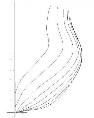
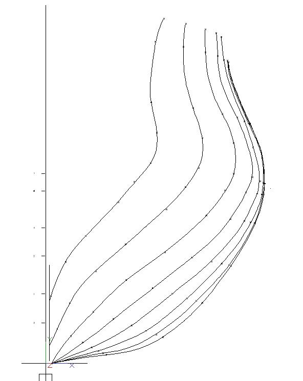
Getting a good body plan is an interesting process. The French used diagonals a lot. They were the ribbands (lisses) that banded the ship and defined the shapes of the intermediate (filler) frames between the stations. The drawing shows straight lines, but that was only for a particular station (in this case, the forward master couple); the diagonal for next station would start at the same centerline mark, but terminate in an entirely different place.
So the diagonals aren’t really diagonal; they are ribbands having compound curvature in two dimensions. Fortunately, the French defined the termination points of each ribband (lisse), for each station, in tables of offsets with a master table giving end point termination of each on the vertical planes of the bow and stern with respect to the centerline.
This is really cool, because one can get a tracing of the body plan from a draught, and then plot the ribband terminations for each station against the tracing of the station. This allows for rational adjustments to the traced curve, to fit the “waypoints” defined by the tabular data. Don’t ya just love CAD and beziers.
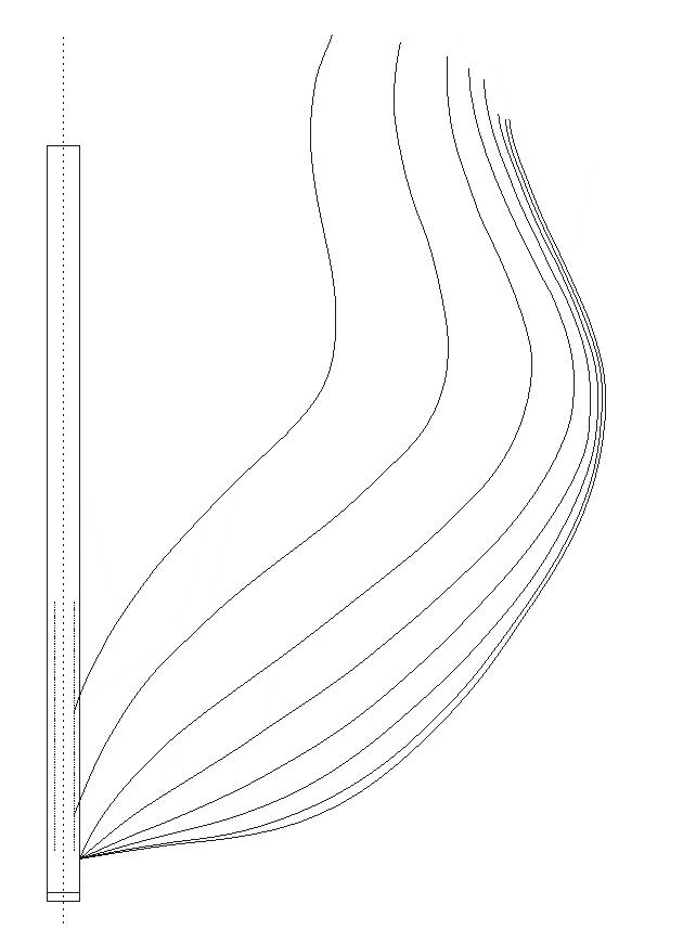
What’s even nicer is that the collection of termination points plot into a very useful half-breadth, when stood on end and rotated. So there’s going to be a couple of half-breadths; one with traditional horizontal waterlines, another from the ‘lisses’. I will, perhaps, have to include the tabular data in the plan set, so things make more solid sense.
[edit] Oops, was reminded that I have to do two profile plans; one with the lines of the lisses, and another one with traditional buttock-bows. My choice. This is becoming a frégate de 18 par Monsieur LaDrague (a shameless pun on my name, but it sounds fun, doesn't it?) Oh, well ...
John
-
Progress. Timbering of the head. The cutwater (gorgere) and gammon knee (courbe capucine de l’eperon) are derived from the Virginie draught. The other individual timbers are speculative and not strictly specific to any particular vessel. However the main pieces follow Vial and their particular arrangement follows Boudriot and Delacroix and what seems to be standard practice at the Brest yards. Position of the gammoning slots is also speculative.
The ensemble of the head (l’Eperon) is not quite as long and elegant as in Boudriot’s Venus, but neither is it as short and spiky sharp as the Rochefort plans of Justice. Boudriot gives the steeve of Venus’ bowsprit as 33 degrees; The steeve of Justice is 28 degrees from the Rochefort draughts. I am arbitrarily giving Cornélie a steeve of 29 degrees, but that may well go to 30.
The flow of the ensemble is taken from the Eyeball, Corrective Lens Assisted, Mk-I. It’s subject to a bit of tweaking once the cheeks and the rest of the decorative pieces, including the carving of Cornelia, get dialed in.
Still doing detail work on the apron and rising wood. Have to loft the frames first, because this is an iterative process. So detailing the contre- étrave/apron and rising wood will have to wait a bit.
John
-
Hi Bill,
Found some stuff from the antique artillery collector folks.
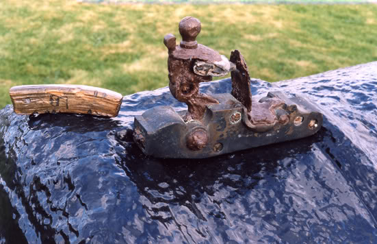
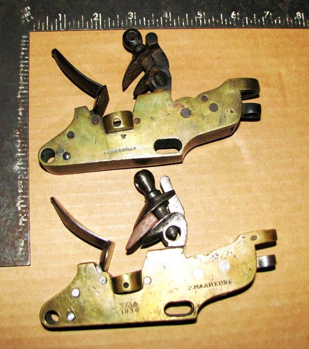
First is a gunlock recovered from the wreck of HMS Colossus (ca 1790), sitting atop a gun from the ship, for comparison. Note the size of the touch hole peeking out at the back corner of the gunlock. Presumably the lock would be mounted to the side of the touch hole and the hole aligned with the pan orifice.
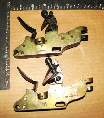
Next are British and Russian gunlocks from 1838, but the principle is the identical. They discharge to the side through the downward aperture to the touchhole. According to Fred Stevens at International Military Antiques, this discharge is often further channeled by a brass plate (cup shaped hood) that surrounds the distal side of the touch hole. This could be what you are seeing as a “pan”.
He remarks that it was also used to hold an extra dollop of priming powder (so that ‘something’ would ignite the priming quill), or make it easier to prime the piece (make a nice drain) from a gunner’s powder horn, if necessary. Some hoods were hinged to make it easier to get at the touch hole with a new priming quill, or with a worm, if there was a screw up somewhere. Unfortunately, no photos or drawings, but hope this helps some.
John
- CaptainSteve, Canute and mtaylor
-
3
-
Before finalizing the shape and scantlings of the rising wood, I found I needed to loft the frames from, at least, station VI forward to get a ‘best fit’ for the heels of the ‘fourcats’. The rising needed some slight adjustment in the moulded dimension to receive the frame timbering and make for a smooth bearding. CAD is invaluable for this kind of stuff.
While I was at it, I also lofted the master frame, ‘maitre couple’, from the offsets in the specs. Some people have asked about offsets, elsewhere, so thought it appropriate to ‘show and tell’, as it were.
The offsets are in tables that give “height above top of keel” and “horizontal length from keel center, at that height”. When you plot them, you end up with a series of horizontal lines, of varying length, arranged up the centerline and with varying amounts of separation between them. Connect the endpoints with a Bezier curve(s) and you get a nice outline.
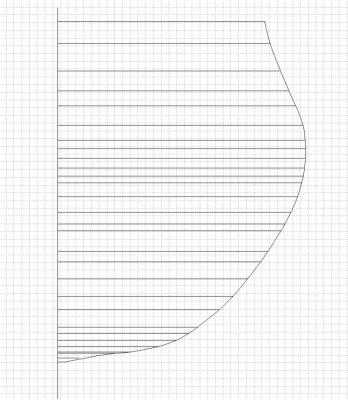
Wayne Kempson prefers to use arcs and reconciling arcs, and I agree with this approach. But where one doesn’t have the initial geometry tags, a good Bezier can set up a good set of sweeps to define the curvature changes.
This curve represents a slight departure from Boudriot’s curve of the master couple for the Venus.The bilge arc center is moved and the radius extended, as is main arc. Thus, the reconciling curve is a bit outside Boudrio’s, perhaps reflecting the nominal added displacement of Sane’s follow on designs. All things considered, it’s a matter of ‘pouces’.
John
-
-
I think you are quite right. The issue for me is defining dimensionality and scaling for the plans set. I hope to do the lines and frame disposition plans in a manner as accurately and precisely as how Ed Tosti did his for Naiad. I say “I hope” because he is the touchstone and can only be approached. If I get even close, I’ll be a very happy camper.
I think the initial CAD drawings might have to be in metric. French pieds, pouces, and lignes, have well established values in metric; as do English feet and inches. This way, the drawings will be scaled suitably for both French and English “feet” and it only remains to adjust a value by one number or another.
Yes, indeed, a spread sheet would do it. It could take metric and generate French, English, 1/32, 1/36, or whatever. I’m using TurboCAD with 4 sigfig accuracy, so should be fine. Been fighting the scale factors for a while, so going metric should be a good thing. It’s a simple twist to expressing metric in F or E, if I need to speak of a piece of timber in generally understood terms; think you have solved my problem for me.
Thanks for poking me with the sharpie.
John
-
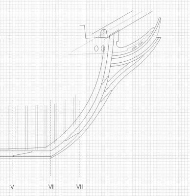
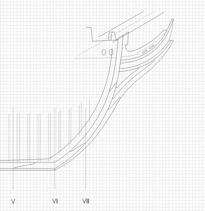
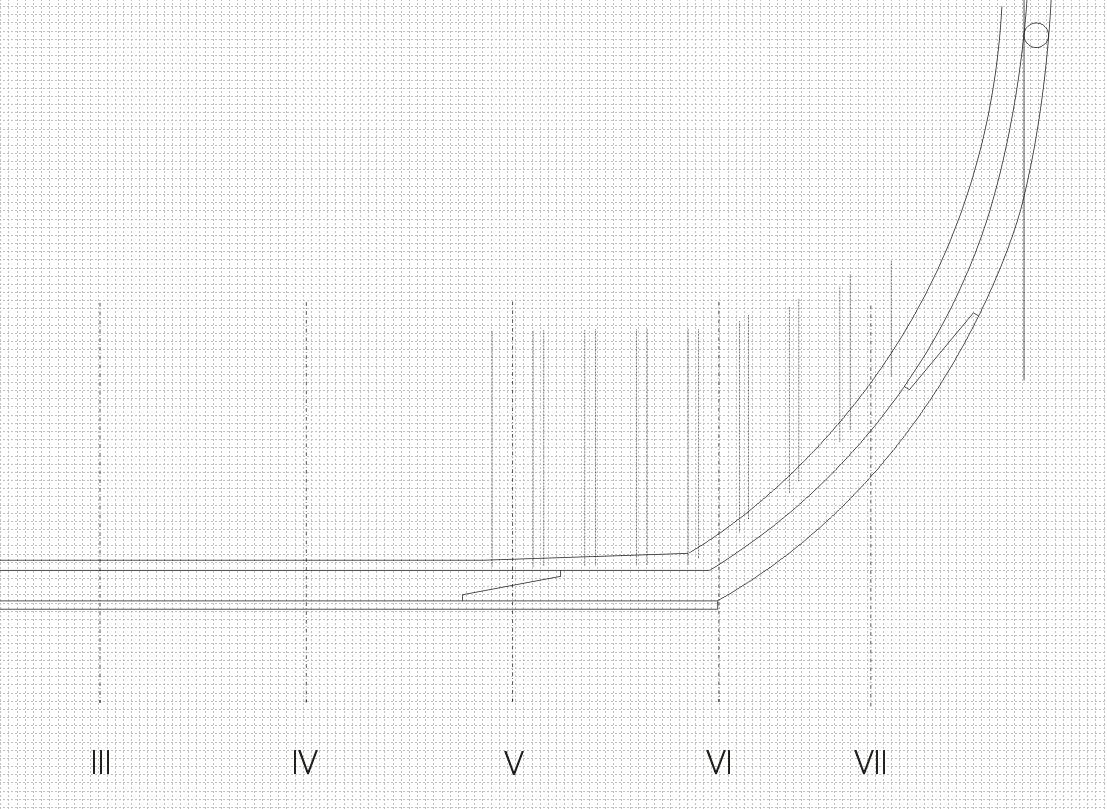
The rising wood (contre-quille) fairs into the apron (contre- étrave); a rather interesting timber.
The apron supports the heels of the ‘fourcats’ (forked, highly angled, frames from station VI forward), as well as the heels of the hawse timbers ahead of the “beakhead” frame (Station VII). There is a lot of vertical angularity going on here and the frame timbers need a rest stop to sit on.
In an earlier period, there was another member, the marsouins (the dolphins), fayed to the contre- étrave that had all the steps cut in, righty tighty. The dolphins because the timber went up-and-down, up-and-down, like a dolphin. In our period, the contre- étrave could be disposed with sufficient moulded dimension to accommodate the length of the chocks of the fourcat couples and the hawse timbers. In this case, the extension of the contre- étrave is sometimes also referred to as les marsouins.
The bottoms of all French frame timbers are substantially straight; there are no cheeks to speak of. The rising wood is cut with steps that receive each frame timber. A fourcat receives the same treatment, but being on a rising curve, needs a bit more attention; thus the marsouins or their alternatives.
Not so much forward, as aft, but nevertheless, the siding of the rising (marsouins) is decreased by twice the plank thickness in the lower hull area: slowly increasing until it reaches the nominal value in the neighborhood of bow planking having an appropriate angle of incidence to the stem rabbet.
As I mentioned, a very interesting timber.

Ciao. John
-
Thank you all.
Greg,
I’ll try to do more of that. 18th century French shipbuilding terms can be a real pain in l’etambot. It’s a lot like cooking with Asian vegetables. Who ever heard of ‘odo’, anyway?
Citoyen Bava,
All of your top 4 choices are very interesting. Will be nice to see another French design take shape.
It seems the errata are starting early. I’m still not all that flexible in going back and forth between French and English measurements and 1:32 and 1:36 scale. Suffice to say, I went down instead of up and the sided dimension of the keel is closer to 15 than 12 nnglish measurements).When the Brits took the dimensions off the Fidèle, they recorded 14 inches (English), sided. That’s 13+ pieds (French). Then they recorded the hull plank at 4 inches (English), thickness. That’s 3.75 pouces (French). But the ‘devis’ for the ship lists “the siding of the stem, at center of rabbet” at 9 pouces. Given the French stem siding, this can only happen with 3 po plank thickness (3.5 po, pushing it really hard). This is 3.2 – 3.8 (English).
It’s kind of important because it sets up the frame ends and defines the bearding line. Clearly, they can be ‘developed’, but the characteristic curves and dimensions need to come from somewhere.
Sorry for the confusion.
John
-
The keel (quille), false keel (faux quille), and stem (l’etrave). Basic things, I know, but there’s some food for thought in even these beginnings.
Sané was quite complete in giving, not only the radius of curvature on the stem, but also the “rake” (elancement) of the member. Elancement has several translations, rake, elongation, overhang, and is a bit different from the normal quête (rake) in terms of specificity, although not in sense. Elancement of the stem is from the forward perpendicular to the top of the keel. From these two points, it’s an easy fit to a curve with specified radius.
The keel is moulded (height) 15 po and sided (thickness) 12 po. The keel extends into the stem by a forefoot timber (brion or ringeot) that extends the keel flat and adds a first portion of the stem curvature.
Although the orientation of the keel scarfs are irrelevant, the orientation of the brion scarf is somewhat important. If, as in the drawing, the angle of the scarf is away from the concave curvature of the wood, a compass timber need not have quite as severe a curvature. The same principal applies along the length of a curved member. Simply take an interior tangent along the endpoints of the concavity. Fiddly-bits, but something the yard-dogs would know very well.
The stem stars out moulded at 15 po, at the end of the keel, but gradually and gently slims down to 12 po, at the perp, which continues up to the tenon. Sided 12 po, all the while. The position and number of asarfs is completely arbitrary. The actual position and number will depend on the availability of appropriate compass timber. There is no rule.
Lot of fiddly-bits involved. More to come.
Ciao. John
-
You guys crack me up! Just think of it as putting the lass on a nice course of pilates, to tighten up her .. er .. lines.
Chapelle was always very concerned with the straightness/curvature of the buttock lines as they cross the waterline, as a speed indicator. Also, and it was known even back then, areas of higher water pressure would scour the copper and make it shine more than the rest. Areas of high water pressure along the hull are primary sources of skin/wetted surface resistance.
(OK, I’m going to give you all a hook, but please don’t push it) A polished buttock is indicative of a source of hydrodynamic resistance (please no references to cotton or satin sheets). In modern terms, decreasing a curvature allows quasi-laminar flow to continue further aft and increases the effective length. Moving the turbulent flow boundary further aft is a good thing. Sometimes, a few inches is sufficient.
In the period in question, the French were just coming out of the quest for the mathematically perfect ‘bow solid’. They were great up-front, but they seemed to lack enthusiasm for defining a ship’s buttock areas. Jean Boudriot, in his monograph on La Venus, made some special lines (a, b, c, d) that served to help visualize and configure the ‘buttock’ planking and timbering of la Venus, because it was so obscure.
This is inferential, and sometimes apocryphal, but the yard dogs at Brest hated planking the butt of the Virginie. Mark Taylor knows exactly why from his build of Licorne. So they shifted the positions of the aft stations, a bit, and made things a teensy bit more easy to plank. The ships worked and Sané liked the result. Of such small things, much comes.
- druxey, uss frolick, mtaylor and 1 other
-
4
-
Hello All, and Thank you for the ‘likes’.
Mark - Wood comes a bit later. This is the up-front part; developing the plan set. The idea is to do a complete hull construction plan – body, sheer, two half-breadth plans (horizontals and diagonals), disposition of frame, construction of bow and stern sections, detail of the pieces, scarphs, etc..
My paradigm is to build the plans following the same steps, sequence, and procedures that are laid out in Morineau, Duhamel and Vial, but using scantlings and dimensionality from Sané; somewhat the same procedure as if I was doing it in wood. There will be some gray areas, particularly since the fin du 18e siècle authors were concerned mainly with detailed descriptions of 74s, giving short shrift to frigates. But where these appear, I will run screaming to Monsieur Delacroix, or this forum, or wherever else occurs to me, for assistance.
After this part is finished, it would probably be time to make some sawdust and at least get a hull in frame in the shipyard. It will take a while to get the plans done because everything is from tables of dimensions and offsets, and will need to be plotted and smoothed so as to be fair.
Part 1 comprises, of course, the keel and all of its component parts, as well as the stem, the post, the brion (wood ahead of the forefoot), dead and rising wood, etc.. Where appropriate, I will attempt to give the French names for the pieces, in conjunction with the English.
One always seems to begin with an outline. I guess I’m no different. So I made a basic outline using the principal dimensions of a base Sané frigate.
As the different parts get done, I’ll append them into the ‘outline’. After a few iterations, it should end up looking pretty much like a ship.
Ciao. John
-
Quote: "... something happened at Breast (in the region of the buttocks) ..."

Oh, my friend. The rounded upturning of a perfect sphere, soft, smooth, and awaiting the touch of a lover. Is it any wonder that ships are feminine?
- wq3296, uss frolick and mtaylor
-
3
-
A project to make/build plans for a French frigate.
A Virginie class frigate, Cornélie was launched in 1797, at Brest, and was built on the same lines as Courageuse, launched at Brest in 1794 (renamed Justice, April, 1795). Something happened at Brest (in the region of the buttocks), and these two ships exhibited such superior sailing qualities that Cornélie was subject of several sailing trials, under “Commandement du Citoyen Villemaurin, Capitaine de Vaisseau”.
One thing led to another, and Sané’ went on to design the penultimate Pallas class, but notably, the “lines” were from the Justice/ Cornélie, with minor variations to reflect the minor changes in principal dimensions instantiated in the Hortense class. Notwithstanding the Réglement of 1808, Sané prepared a document, dated March 1810, entitled “Devis d’execution des frégates la Justice et la Cornélie” whence he detailed every single line, in tabular form.
Why do this in 1810, when both ships were off the rolls, and the 1808 réglement was in effect? Maybe because they fulfilled requirements so well, that he simply had to have a record of these ships for his portfolio. Who really knows. Suffice to say that he did and they are taken as the sine qua non of Sané frigate design.
Something wonderful appears in the SHD official records for this and a few other devis’; there are marginal notes, in Sané’s hand, interspersed throughout the document, but there are other notes, annotated in light pencil, that serve to relate certain dimensions to their earlier form. I like to think these were annotations by Monsieur Boudriot, in furtherance of his research. I can’t imagine the SHD allowing anyone to deface their holdings, except for Jean Boudriot. Needless to say, they were totally appropriate and substantively important.
So why the Cornélie? A good question. Apart from the historical significance of the ship, I am, like Messieurs Boudriou et Delacroix, a hopeless romantic. She had 11 very productive years in service, the longest of any of her class, and saw action at Finisterre, the Med, and Trafalgar.
Cornelia is often taken as a Romanization of Helen: a woman who launched a thousand ships and whose beauty set the ancient world afire. She had to be a redhead.
Cornelia Scipionis Africana was the daughter of Publius Cornelius Scipio Africanus. She was the mother of the Gracchi (Tiberius and Gaius) and Sempronia, who married Publius Cornelius Scipio Aemilianus (Scipio the younger). She is said to have been beautiful beyond the art of men to describe. She refused a marriage proposal from King Ptolemy Euergetes (king of the Ptolemaic dynasty in Egypt) because she was Roman. A model of duty, virtue, and feminine pulchritude, Rome worshiped her, and upon her death voted a statue in her honor at the entry of the civic forum.
Right … The info comes from the French Devis d’execution of Cornélie, Justice, Virginie, Pallas, and Venus, from SHD. Some lines come from the build draught of la Justice, from SHD Rochefort, modified by Sané’s lines tables. Some fiddly bits and niggling details come from the NMM draughts of Virginie.
Should be good enough to go, don’t ya think?
John
-
Really nice Mark. I like how you set things up to be inserted later. Smart.
GLakie,
Yep, the pied du roi was 1.066 times the English equivalent. There were 12 pouces (inches) per pied, and 12 linges per pouce. Nothing below that, so the 1/24ths or 1/32nds recorded by the English dockyards are simply artifacts of the difference in measurement systems. And then you get some dockyards using metric and the equivalence matrix gets a bit 'largeur' if you know what I mean.
 Woof !
Just a couple centimes.
John
-
-
Mark,
She sure is looking good. Welcome to the wild, wonderful, whacky, world of French ship construction
 Looks like you have it totally under control.
[ed] I certainly agree la Vénus is a completely different animal. Licorne was the only ship of this type designed by Geffroy (père) so she could be considered a one-off with detail differences from the standard. Since you have the book, I'm sure you know that a lot of the fiddly bits are closer in similarity to la Renommée. You are doing a wonderful job, and helping the rest of us with your take on the "speed bumps". They are invaluable.
Just remember, French ships are sensitive creatures and must be spoken to occasionally in French. So when/if you hit a bump in the road, just shout "Zut alors! Zut alors! Zut alors!"

John
-
Hi Mark.
Wales and things are a hot button with many modelers. The French did it way different from the British (and Americans). I know what the paradigm was from my research into French Revolutionary and Empire period designs, but wanted to see if earlier generation ships followed the same system. Hermione (1770) does. I have pictures and a detailed explanation that I will put up on the Hermione in Castine thread.
Licorne was the name ship of a class of four ships designed in 1754 by Jean Geoffroy. But the construction treatises relevant to 1740/1750 (Duhamel, Ollivier, Vial de Clairbois) show the same technique, so it may be presumed that the Hermione detail will equally apply, in many instances, to ships designed/constructed 20 years earlier.
Caveat: construction techniques, scantlings, etc, apply to National warships of the frigate class. Liners and Corvettes, and as such, will be different in their own particular way from other sized vessels
Ciao. John.
-
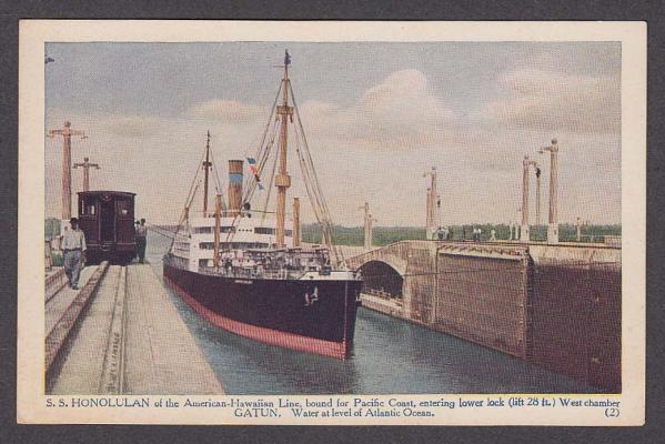
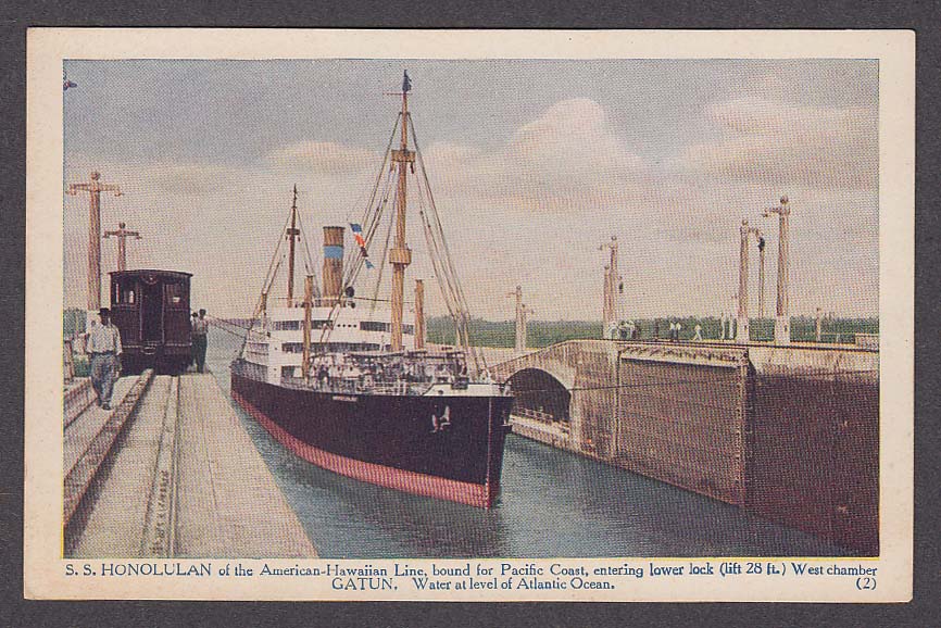
I do believe I have identified her.
SS Honolulan, built 1910 by Bethlehem, Sparrows Point, for American-Hawaiian Steamship Co.
A pain to identify because there were three Honolulans sailing under the A-H flag at various times up to 1921. This one was the first (1910-1916) and was noted for her traditional masts and a distinctive second deck, just as depicted in your photo. She was much of a muchness with the other A-H vessels, but had that second deck. She was one of the first A-H ships to transit the canal and there are many commemorative postcards of her doing just that. Not surprising she would be a showpiece in a period photograph.
Her tale is somewhat tragic; like that of a late orphaned child. But she sure was a beauty in her day.
Ciao. John
-
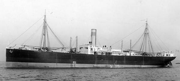
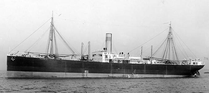
I believe what you have is a ship of the American-Hawaiian Steamship Co., NY. Reason I propose this is because the funnel is distinctive and (in black and white) matches up well with other A-H ships. It’s a faded blue band on a faded tan background (sea blue on yellow, but after six months …). This is a picture of their Panamanian showing the distinctive funnel in it’s distinctive grey-tone shades.
A-H had extensive routes to the Hawaiian Islands from it’s termini in NY, SF, and Seattle/Tacoma, bringing manufactures west, and sugar home. Half their fleet went from NY to HI by way of Cape Horn. When the canal opened, they were on it like flies on …. A-H wasn’t part of the RR Company, but was a major player nevertheless so her ships presence in the canal in 1915 is to be expected.
Most of her ships were cargo/passenger, like the Panamanian, above. Some others were passenger/cargo ships, that were just like the others, except they had the second deck abaft the bridge structure, like your photo. Unfortunately, the P/C vessels were taken into naval service for War-I so the remaining photos extent of these vessels show them in their grotty gray paint jobs.
There’s only a few ships to look at, if they are (as I believe) A-H vessels: canal transit records, passenger diaries, etc..
Can’t answer your question, but hope I gave you some focus for your search.
Ciao. John
-
Hello Terry. I'm late to the party, as usual.
In 1900 the West Coast was no different from anywhere else when it came to ship technology. The old SF Engineer’s Gazette and WC Marine Transactions from 1900 show a complete familiarity with contemporary discoveries and practice in NE, NY, and UK. Anti-fouling was a sexy topic back then and California was up to speed on it.
For period anti-fouling, the popular metal salts were oxides and chlorides of copper and mercury, along with some admixture of zinc, tin, antimony, lead (even arsenic). The metal salts were suspended in a binder; think they called it varnish back then, but it was basically a ‘relatively’ permeable paint. The metals added some pigmentation to the base but it all depended on what color the base was on how the mix eventually turned out.
Then, as now, the antifouling mechanism was the active component leaching through the binder. After a few years (two to four, depending), all the good stuff leaches away and it’s time for a new paint job. Grind away the old stuff with big blocks of volcanic pumice (today’s fart rock), and slather on a new layer of paint. It may or may not be the same composition, so it’s quite reasonable for a vessel to have a different bottom color every few years.
I do believe if you paint her bottom in a dull, dingy, green or a dull, dingy, reddish brown, you would be perfectly accurate for at least one period in her life.
John


Frégate d'18 par Sané , la Cornélie
in CAD and 3D Modelling/Drafting Plans with Software
Posted
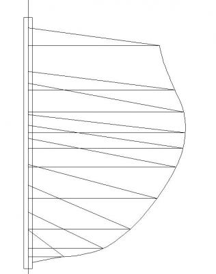
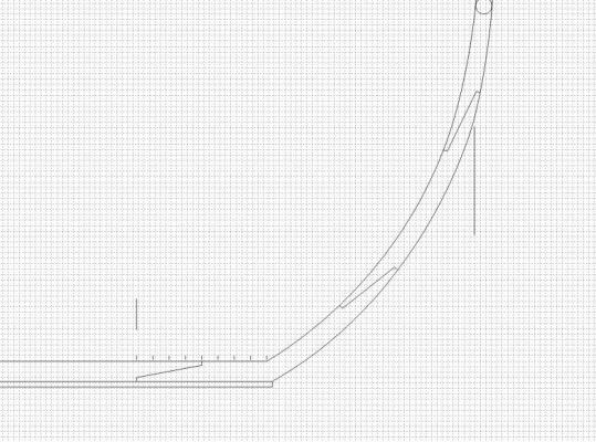
OK, this is just how squirrely body plans and station lines can get.
On the left are the plotted lines superposed on Monsieur Boudriot’s lines of the Venus. On the right are the plotted lines superposed on a dockyard draught of ‘Justice’ I got from SHD Rochefort. Jean Boudriot was noted for his demands for accuracy and his meticulous attention to detail, so I put his plans in the same ballpark as ‘yard’ draughts.
Below the design waterline, the plotted curves depart significantly from Boudriot’s plans (defining a bit sharper forebody), while above, they conform relatively well. Below the waterline, the plotted curves conform relatively well to the ‘Justice’ draught, while above (along height of breadth), they depart significantly. Where the curves conform to Boudriot, they do not conform to the draught. Where the curves conform to the draught, they do not conform to Boudriot. Notably, the master couple conforms to both extremely well.
Although the draught says ‘Justice’, I don’t believe it is the historical Justice, launched 1794 at Brest, as Courageuse. There are too many anomalies and there are references on the plan itself, to features from ships that weren’t constructed till 1806 (Justice was captured in 1801). I am of the opinion the Rochefort ‘Justice’ draught is a trial-horse, wedded to Sané’s 1810 definition of ‘Justice’.
If that’s the case, I’m back to square 1 on the fausse lisse intermediare. No worries, though. I have a plan.
Ciao. John