


Hubac's Historian
-
Posts
3,220 -
Joined
-
Last visited
Content Type
Profiles
Forums
Gallery
Events
Posts posted by Hubac's Historian
-
-
If you shorten each side of each cross-piece, by say a generous 1/16”, then that would bring the deadeyes that much closer to the mast centerline, which would make them appear less spread-out over a span that is roughly half that of the topmasts.
-
With the shroud spread, it should taper to less and less as you go up the mast. This is the main reason that I widened my main tops.
-
My advice, as far as scale of the mast sections would be to mock it up with dowels and see what it actually looks like with different height t’gallants. It would also be a good idea to mock up your sail plan, relative to these heights. The t’gallant yards, BTW, are also too long.
Yes, you are measuring from the foot of the t’gallant to the underside of the flagstaff cap.
Now, while you have followed the kit instructions for the topmast tops to the letter, Heller’s tops are more mid-18th Century, in style, and grossly out of scale - far too wide. If you are shortening the t’gallants, then the spread of the t’gallant shrouds will look really wrong, as compared with the spread of the topmast shrouds below. On the stock kit, without any modifications, the spread already looks wrong.
My solution, here, would be to shorten the ends of the crosstrees, on each side, to reduce the spread. My plan is to remake these trestletrees from scratch.
However, if that idea does not appeal to you, at this stage, I would simply keep the t’gallants the height that they are, and correct the t’gallant yard length, so that at least the sail-plan looks more right than wrong.
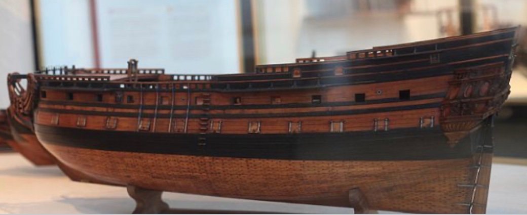
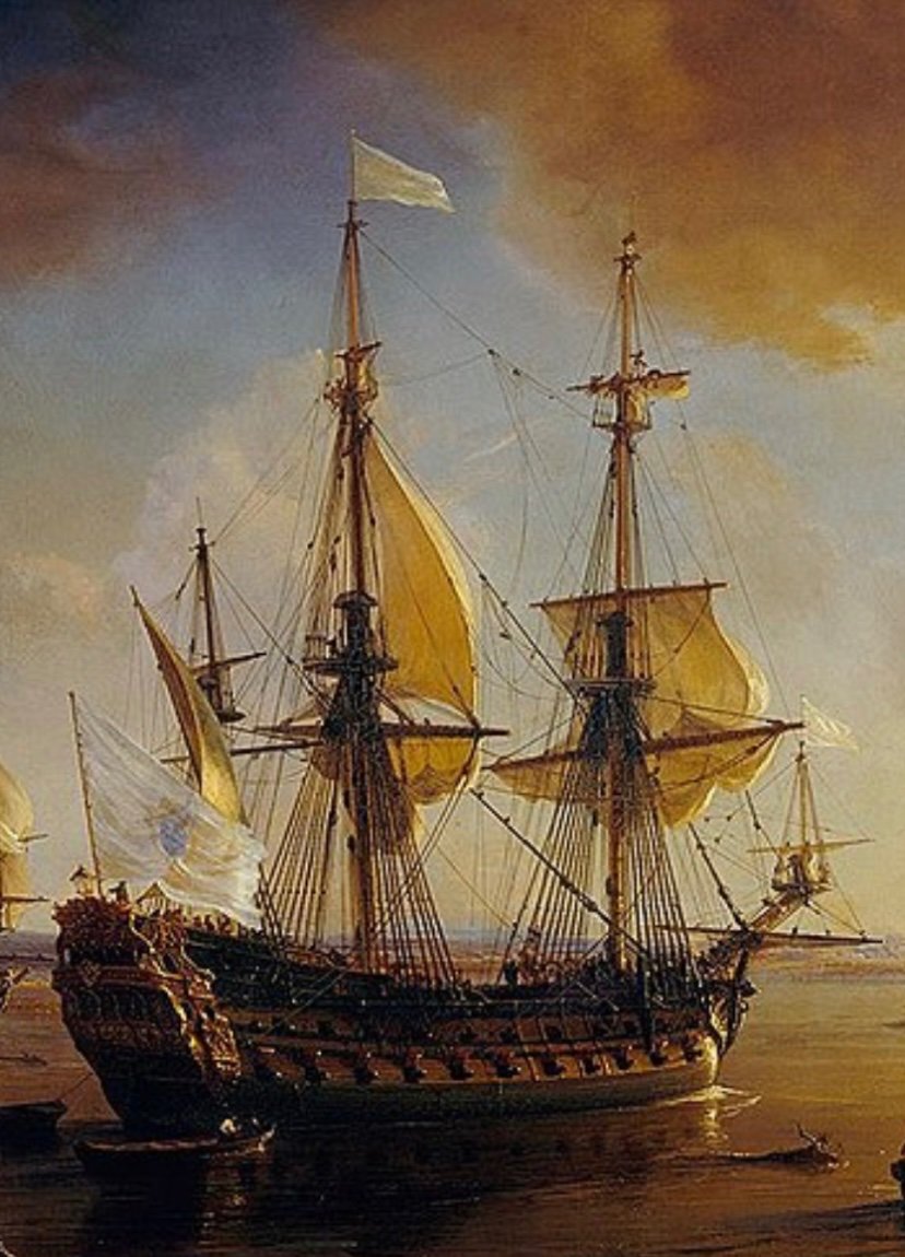
Compare Heller’s masting to this scratch-built 1:96 of L’Ambiteaux:
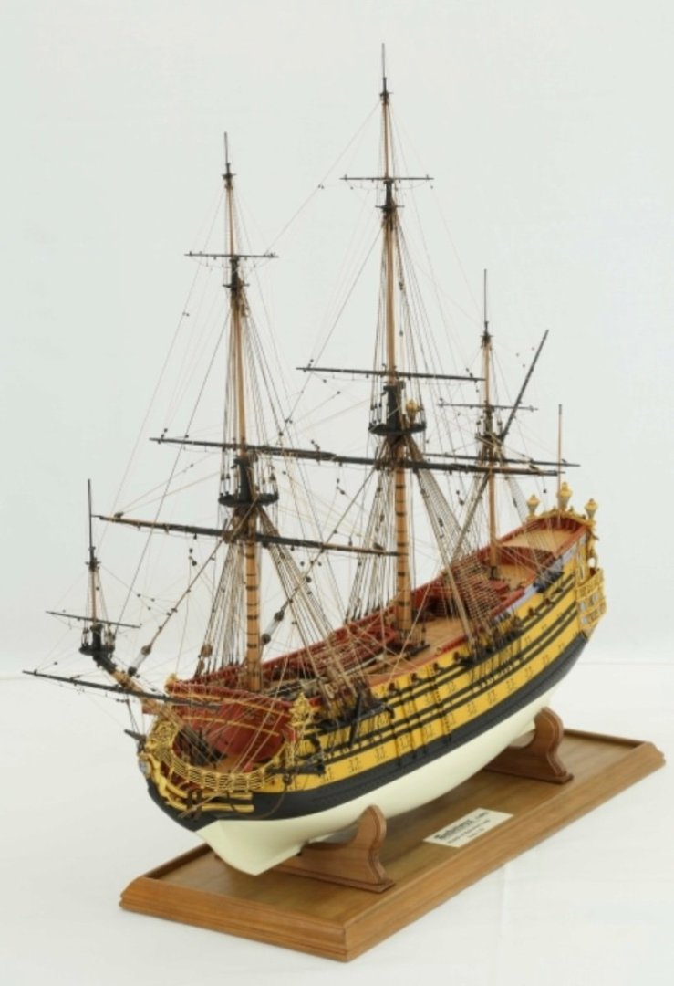
There are significant differences in scale, there.
-
If you went with the slightly smaller ratio of .4:1, then the t’gallant would be 3 5/8”, up to beneath the mast cap.
-
1 hour ago, Ian_Grant said:
Hi Bill; in short, yes. Anderson has some ratios for English and foreign ships at the start of Chapter III. Bear in mind that when he says a topmast is x/y as long as its lower mast, he means the entire lower mast to the step in the keel.
No problem, Ian, now it’s my turn. Yeah, thanks for clarifying this. Since I have no lower hull, and the Heller depth of hull would be wrong, anyway, I am only concerning myself with what can be seen above the main deck. ‘Definitely cheating, here!
-
Don’t quote me on this, but in actual practice everything is derived, proportionally, from the lower main mast.
I’m taking the easy way out and just figuring out relative proportions for each mast, based on each’s lower mast section, according to what I see on the SP plans.
And, I’m doing that, also in-part, because I chose to use the lower mast sections of the kit, despite what are sure to be various proportional inaccuracies, i.e. the length of the cheeks, as well as certain detail discrepancies like the longitudinal stiffeners that run along the sides of the mast. I’m not sure what those are called, but they wouldn’t be present at this time.
If I were making everything from scratch, I’d follow all of the rules, but since I’m making what is in many ways and impressionistic model, based on my observations of contemporary artwork, I am more concerned with the overall impression of scale.
-
Hi Bill - last week, I was referencing the St. Philippe monograph plan in 1:96, to begin figuring out what line diameters I needed, and the deadeye dimensions, and so forth.
Then, I realized that because I want my masting to proportionally resemble that of the SP monograph. I could simply figure out what the relative proportion of the main topmast (from topmast heel to just beneath topmast cap) was to the lower main mast (from main deck level to just beneath mast cap), and then apply those proportions to my topmast. For the t’gallant, I could apply the same process, relative to the topmast length.
Now, I don’t have this in front of me, right now, but my recollection is that my main mast rose 10” above the main deck to just below the mast cap. For a sense of proportion, that is about 5/8” more than what is shown on the 1:96 SP plans. That is okay, as far as I’m concerned. I raised my main mast height early in the process, back when I thought I would copy the kit topmast lengths.
This idea for a proportional rig only just occurred to me. Again, it isn’t in front of me, but the SP topmasts work out to something like .825 of the main mast height above deck level. Applying that proportion to what will be my scratch made topmasts, I come up with something like an 8 1/4” topmast.
Applying the same logic, the t’gallant height is something more than half the height of the topmast below. I don’t remember the exact figure.
Overall, my rig will probably seem a little taller than it should, but I have also extended the overall length of the hull by 1/2”, so maybe it won’t be too noticeable. It is more important, given this compromise, that the mast sections at least be proportional to each other because that is what makes them functionally able to be lowered and removed.
-
-
-
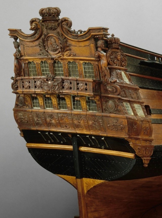
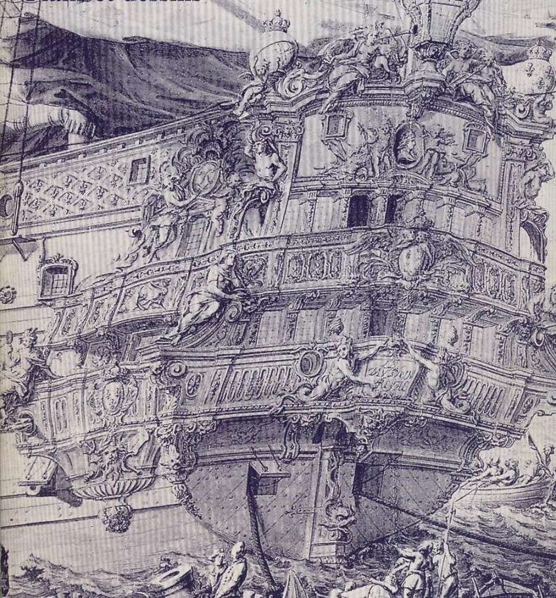
This is always, IMO, the difficulty of interpreting Berain drawings - even among known sets of drawings that are signed and dated by the arsenal intendant of the time, e.g. Desclouszeaux circa 1690s, there are often weird incongruities between the stern and quarter view; the stern or quarter drawing may not always support the logic of the one or the other. More on that in a minute.
I agree that your observations of the shading along the forward edge of the upper quarter gallery, as well as the oddly broken plane of the quarter deck window, would seem to indicate a fully closed quarter gallery. However, I will do my best to articulate why I think the quarter gallery upper finishing is actually a shallow trompe l’oeil amortisement.
When it comes to Berain drawings, one conceit of his style appears to be that when he draws the stern view - whatever details of the quarters that may still be visible from the stern, in real life, are simply not included. Let’s begin by looking at your work-up of Le Fulminant’s stern:
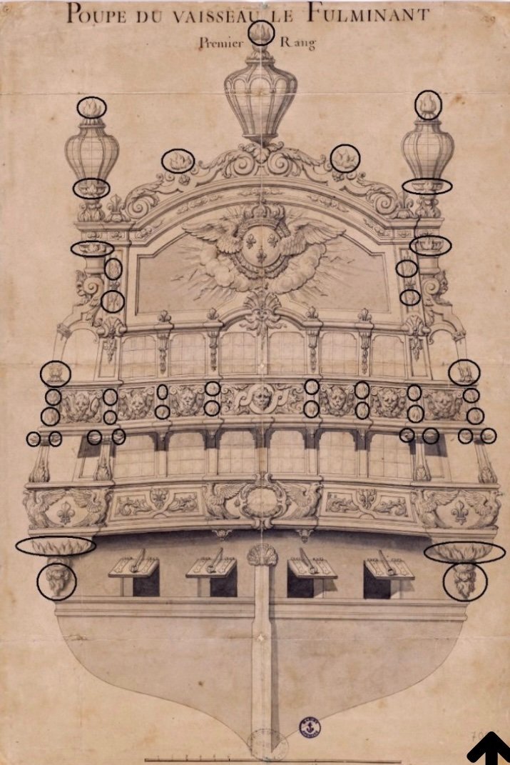
Focus first on the lower tier of lights. At the corners, where the stern wraps around to the quarters, this is shown as completely open. In reality, though, this lower corner is the functional seat of ease; there would certainly be a false window panel, integral to the quarter gallery and visible from the stern. This whole lower level of the quarter galleries would be enclosed with false lights.
Now, look at the upper tier of lights, where the stern wraps to the corners. There is what appears to be an open, pass-through archway. Whether the design intent be a trompe l’oeil amortisement - which, in reality, would still be visible through this stern archway - or a fully rounded upper finishing, Berain has not drawn any representation of either.
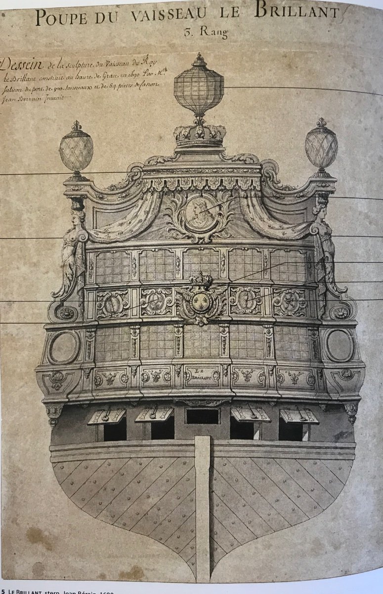
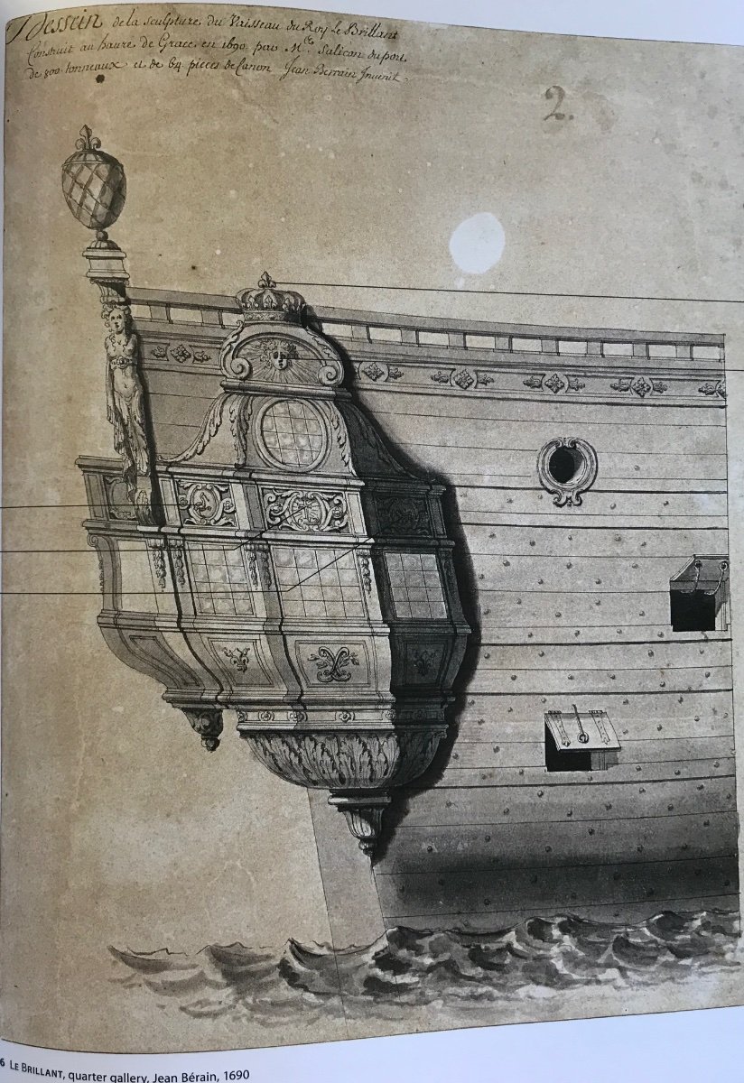
Consider, now the stern and quarter view for Le Brillant of 1690:

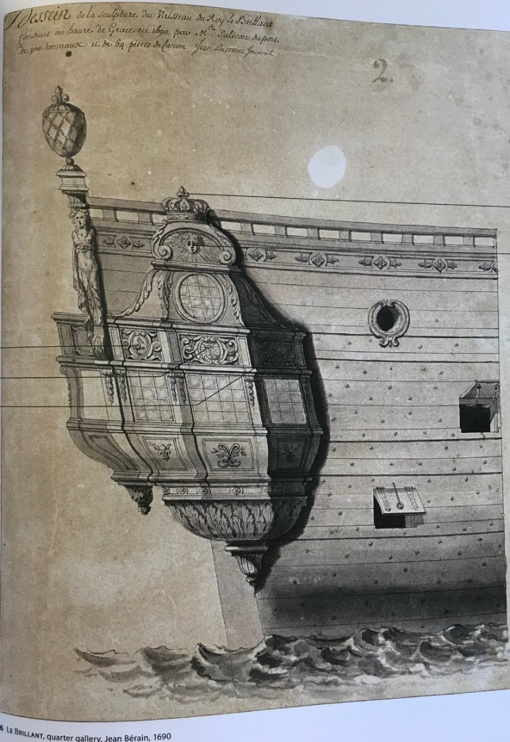
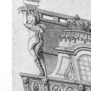
Here, it is a somewhat different story. On the lower wrapping corner, there is an oval frame for a shaded blank panel, concealing the functional toilet.
On the upper wrapping corner - rather than a pass-through archway, there is a scrolled buttressing bracket that clearly delineates the boundaries of the upper stern balcony as being within the five lights of the stern, as opposed to wrapping to the quarter galleries. The quarter view confirms this interpretation.
Interestingly, though, Berain’s quarter view of Le Brillant appears to show an open and walkable stern balcony at the counter level. This simply would not have been the case, at this later stage in the development of stern architecture. By the 1680s, these fragile structures, which were vulnerable to following seas, were done away with completely. The stern counter facade, on the other hand, continued to be decorated with pilasters and reliefs that were consistent with the balcony decor on the levels above; it became, in other words, a kind of shallow “false” balcony to support only carved figures or brackets.
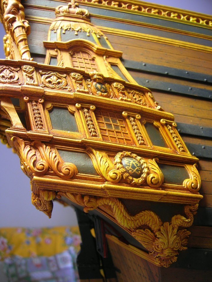
I believe that Tanneron’s model of Le Brillant interprets this architecture correctly:
Although, it must be noted that Tanneron makes interesting departures from the drawing, with his interpretation of the big carving below the tafferal.
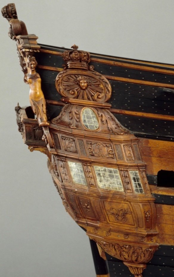
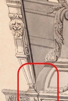
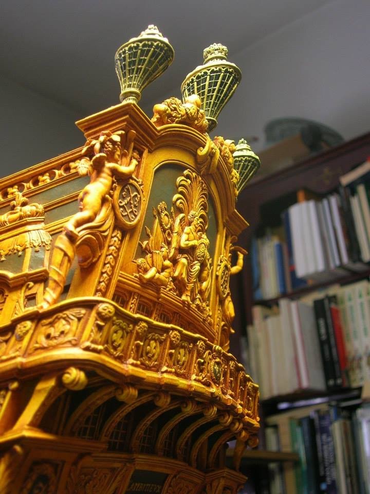
Next, consider the drawing set for L’Agreable:
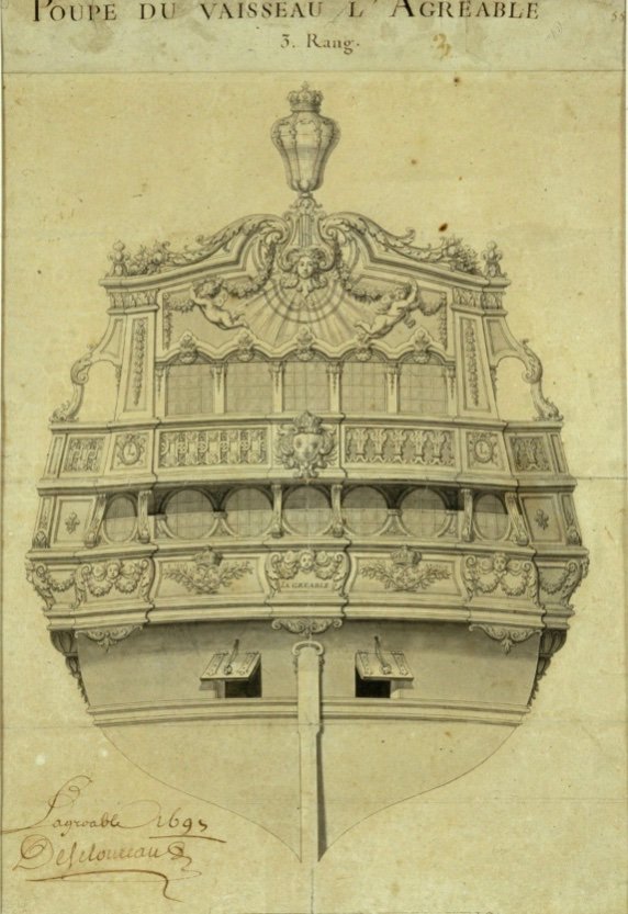
Again, we see the open archway at the top corner. Interestingly, the balcony overhang shadows do not continue to the quarters, which would seem to indicate that the balcony only extends to the ship sides, as opposed to wrapping around to the corners.
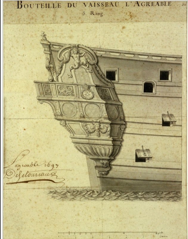
The quarter view seems to confirm this as the side of the upper balcony is noticeably shaded, as though set-in from the sides of the quarters. If the upper finishing of this quarter gallery is fully rounded, it seems to me like an awkward transition, beginning at the balcony level caprail and diminishing at the sheer rail. Perhaps Tanneron thought the same and preferred to represent the upper finishing as a Tromp L’oeil amortisement:
The model is damaged, but Tanneron’s intent of a wrapping and walkable balcony through the now missing pass-through arch is clear.
This interpretation is consistent with that of Tanneron’s contemporary, the Court Marine painter (1830’s), Theodore Gudin. Here is a famous painting of the LaSalle expedition of 1684, featuring a consort warship, Le Joli, of the same class as Le Brillant and L’Agreable:
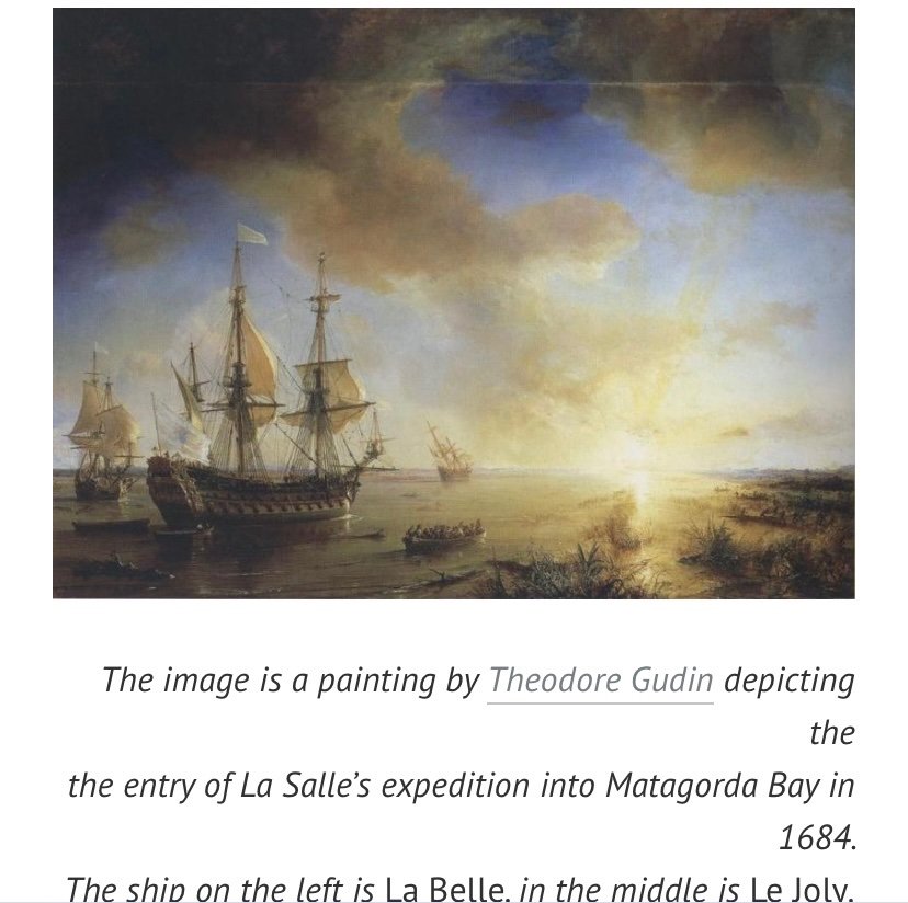
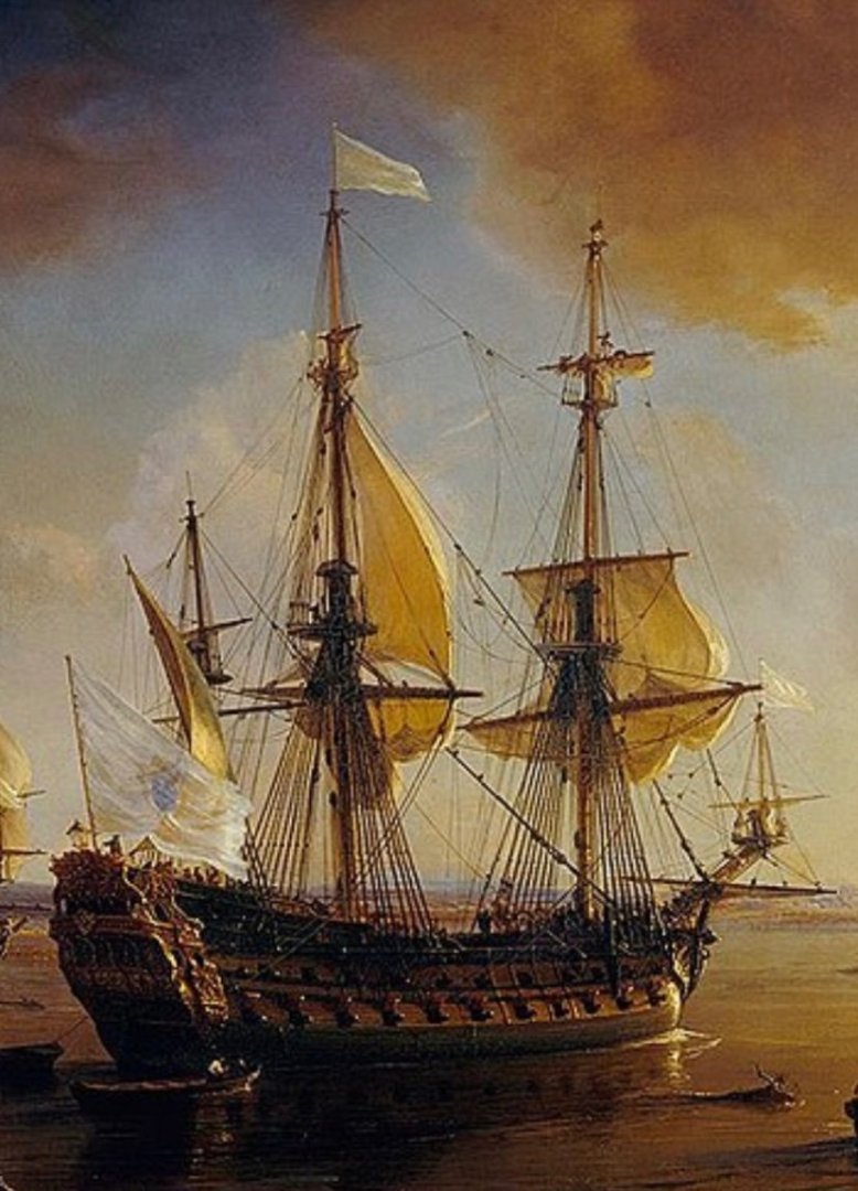
The structure of the quarters and stern is very close to that of Tanneron’s L’Agreable. It is impossible to know exactly what sources were available to these two artists, who were recording structures from 145, or so, years prior, but their agreement on the matter must carry some weight, IMO.
One last example comes from a slightly earlier time, and from a rigorously detailed artist. Puget painted, below, not a proposal for decor, but the actual refit appearance of Le Dauphin Royal in the early 1680s:
Here, the pass-through archway and wrapping upper balcony to a shallow amortisement upper finishing are plainly decipherable. Interestingly, the lower level of the quarter gallery is open on it’s sides - an artifact of the early First Marine (1670s) stern architecture, but closed-off from the stern view with buttressing brackets. I maintain that by the late 1680s, this level would have been completely closed up with false/removable lights. Another possible artifact of this earlier time may be a small “Juliet” balcony at the center of the stern counter. It is hard to know whether that is actually a place where someone can stand. Personally, I doubt it.
With all that said, and considering the Fulminant drawings, in particular, I will draw your attention to two small details.
Going back to the stern view:
The upper balcony casts a shadow beneath that extends fully to the ship sides - a point beyond the shadow that would be cast if the balcony ends were actually located between the second and third lion mascaroons. This suggests that the balcony extends to the end of the quarters.
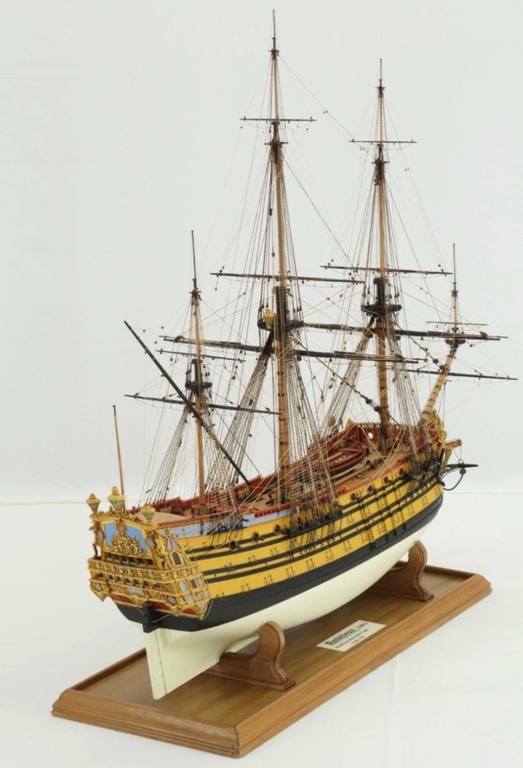
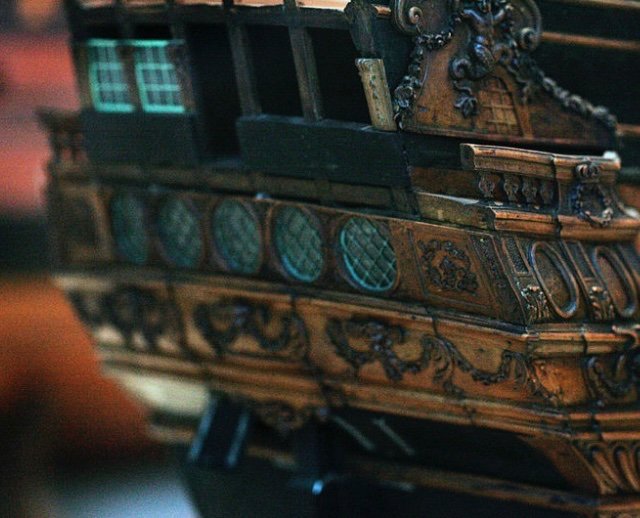
Now, take a closer look at the archway for L’Ambiteaux:
Notice the shading just visible beneath the pass-through archway. The same is present for Le Fulminant:
Given the way that a fully-rounded upper finishing would scallop back towards the ship’s upper bulwarks, in the characteristically concave French Style, this would be a really weird and awkward transition, if one were to walk to the ends of that upper balcony and look through that open archway.
It’s not impossible, but it would not be very coherent. The tromp l’oeil amortisement just makes more sense here. I think that Boudriot’s monograph interprets this correctly.
-
-
1 hour ago, Ian_Grant said:
John, I am really enjoying your historical analysis and will follow to the end, of course. I hope to start my SR in about two years from now, God willing, and am very interested in where you go from here. Thanks for posting!!
After seeing your Victory, Ian, I will be very excited to see what you do with this kit.
- Bill97, Bill Morrison and Ian_Grant
-
 2
2
-
 1
1
-
Awesome historical recap, John. The two best books in my library are both Rif Winfield books: French Warships, as you reference, and First Rate.
I do think it is probable that the ship was repaired after Beveziers and her ornamental program completed (I have repair estimates from the archives, after the fleet’s return to port), before Barfleur in 1692. However, like most other things related to SR, there are no concrete records detailing the specifics of this. The screen shots I have of these repair estimates are barely legible.
I will have to remember “Harbor Queen,” as I design my conjectural 1670 SR. It’s hard for me not to imagine the members of ABBA as Admiral and supporting officers 😀
-
Where did you source 3.5 MM from? I’ve been referencing the St. Philippe monograph because, included among the plates is a sail and rig plan in 1:96.
According to that schematic, 5MM (3/16”) is appropriate for the lower main and fore deadeyes. The trick is finding a good balance of scale graduation for everything else.
On the monograph plans, the spritsail and mizzen top deadeyes are impossibly small - as you noted earlier in your log. 2.5 MM is the smallest size I can find. Forget about the t’gallant crosstree deadeyes, which look practically non-existant! I was thinking about 2.5 for the sprit, fore and main t’gallants, and the mizzen top.
I could probably get away with 3 MM on the fore and main tops, as well as the backstays. Then maybe 3.5 on the mizzen shrouds.
My annoyance is that the Amati deadeyes are not nearly as nice as the Dockyard Models version, but Dockyard doesn’t offer half sizes. Maybe I can do a little dressing of the Amatti product to make them look more like Dockyard.
-
Bill, your lower deadeyes are 5 MM, correct? And 3 MM for the fore and main tops?
-
-
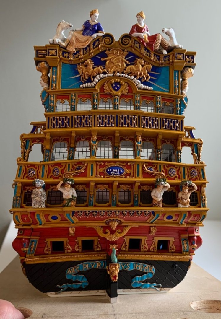
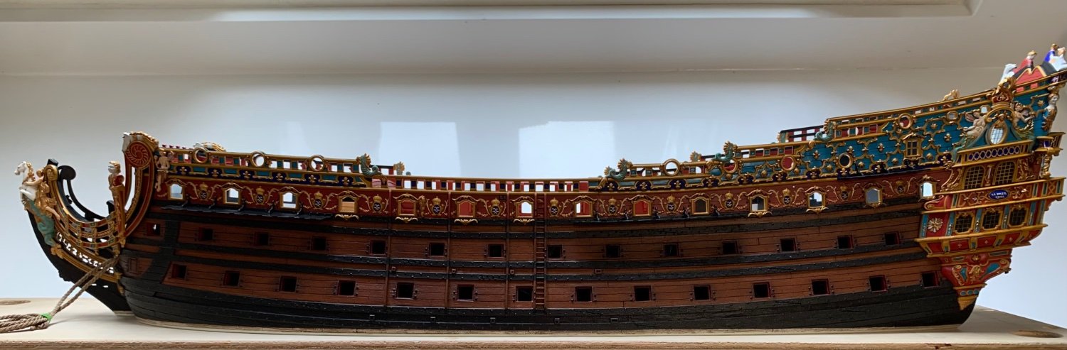
The paint work is exquisite. That is more like what the ventre-de-biche color is supposed to look like.
It looks as though the flood caused black mold to grow along the baseboards. Did you cut away and replace the bottom foot of sheetrock?
Be very careful of black mold - a serious danger to your respiratory health.
-
30 minutes ago, 72Nova said:
Just a masterful and well engineered job on this kit Marc 👍 and I second your fancy on the Dockyard Model blocks, It's what I use and the best I've seen IMO.
Michael D.
Yeah, there are a number of really good block suppliers out there, but the shaping of the Dockyard blocks is really superb, and they offer the smallest sizes. Their violin blocks look particularly good to me.
Thank you guys for all the kind words!
-
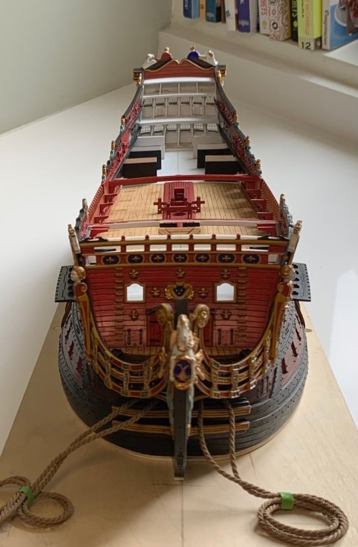
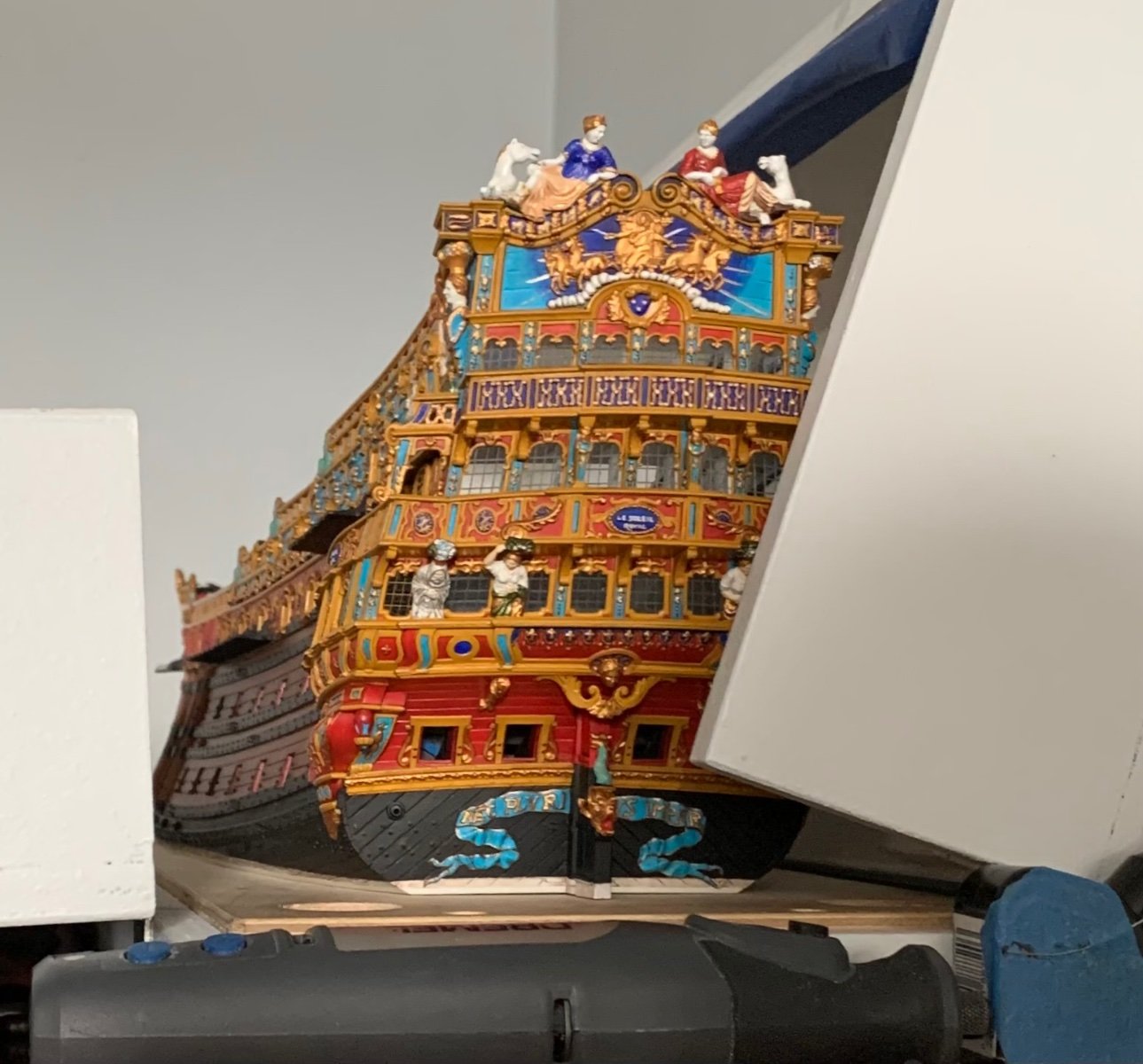
Yesterday witnessed the arrival of our first adult dining table and chairs which, sadly, ushers out the butcher block trestle table that was my work station and the backdrop of this project for the past six years. It was a bitter-sweet day because I love that old workhorse of a table. I bought it second-hand for $50 and refinished the top three times. On the other hand, it is very nice to walk into our place and immediately see a touch of sophistication. There will be no painting or gluing on that marble-top table, though!
Fortunately, IKEA makes a very nice birch gate-leg table with built-in drawer storage, which will soon become my new designated work station. In the meantime, though, I wanted to get the model to a stage of crispness and clarity before I had no place for paint re-touching.
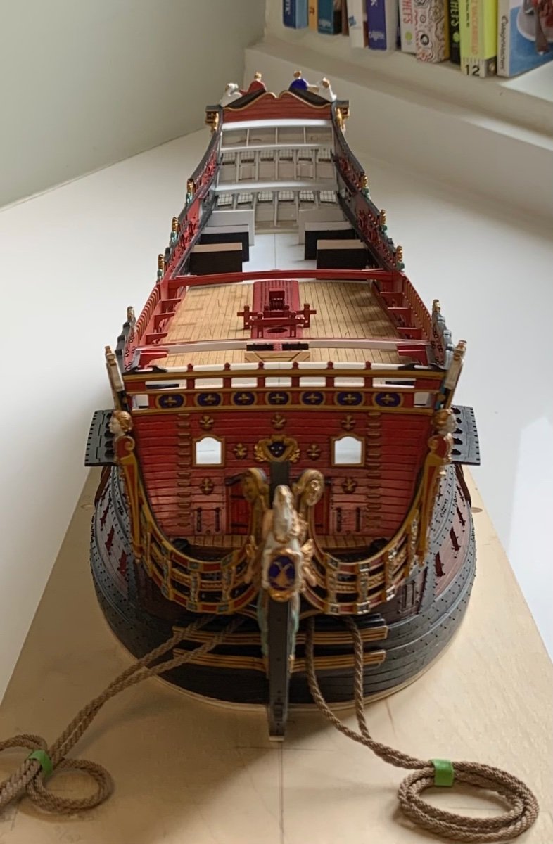
Please forgive me my self-indulgence. Here is where we are at, presently:
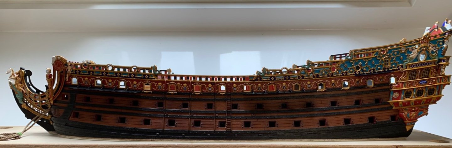
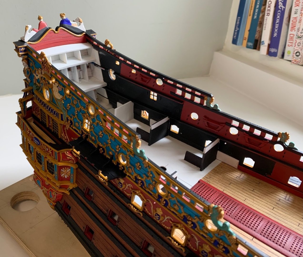
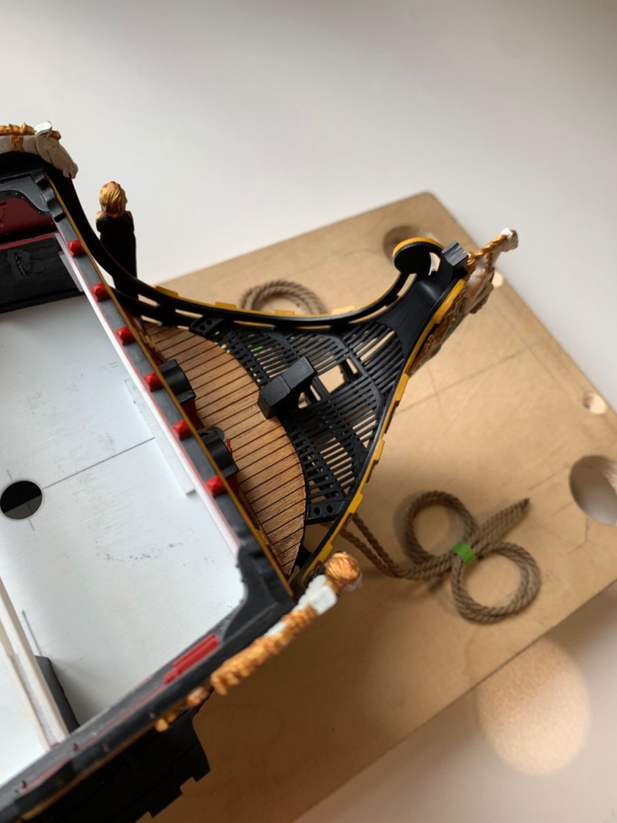
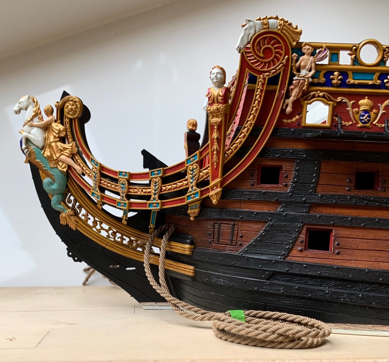
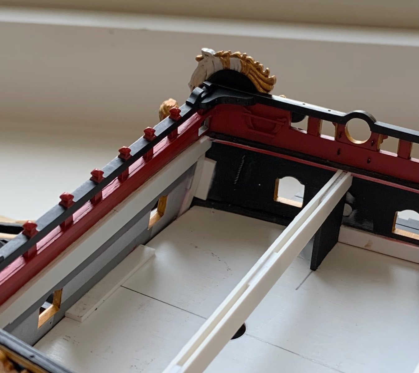
I am very satisfied with the head-grating, and the way that all of the head elements integrated together:

One thing that was niggling on my conscience, though, was the fact that the aft headrail rosettes were glued under tension. I have a solid welded bond, and I did wick CA into the joins, where I could, but I wanted a little extra insurance. My solution was to drill two small holes a side, through the third headrail and upper bulwarks, to feed a length of annealed wire. You can see where I painted over the exposed wire with red:

And inside, you can see how I twisted the wire ends taught, and then fixed the whole thing in-place with liquid CA. This is all minimally detectable and will quickly fade out of view with everything else that will be going on around it. I feel better now 🙂

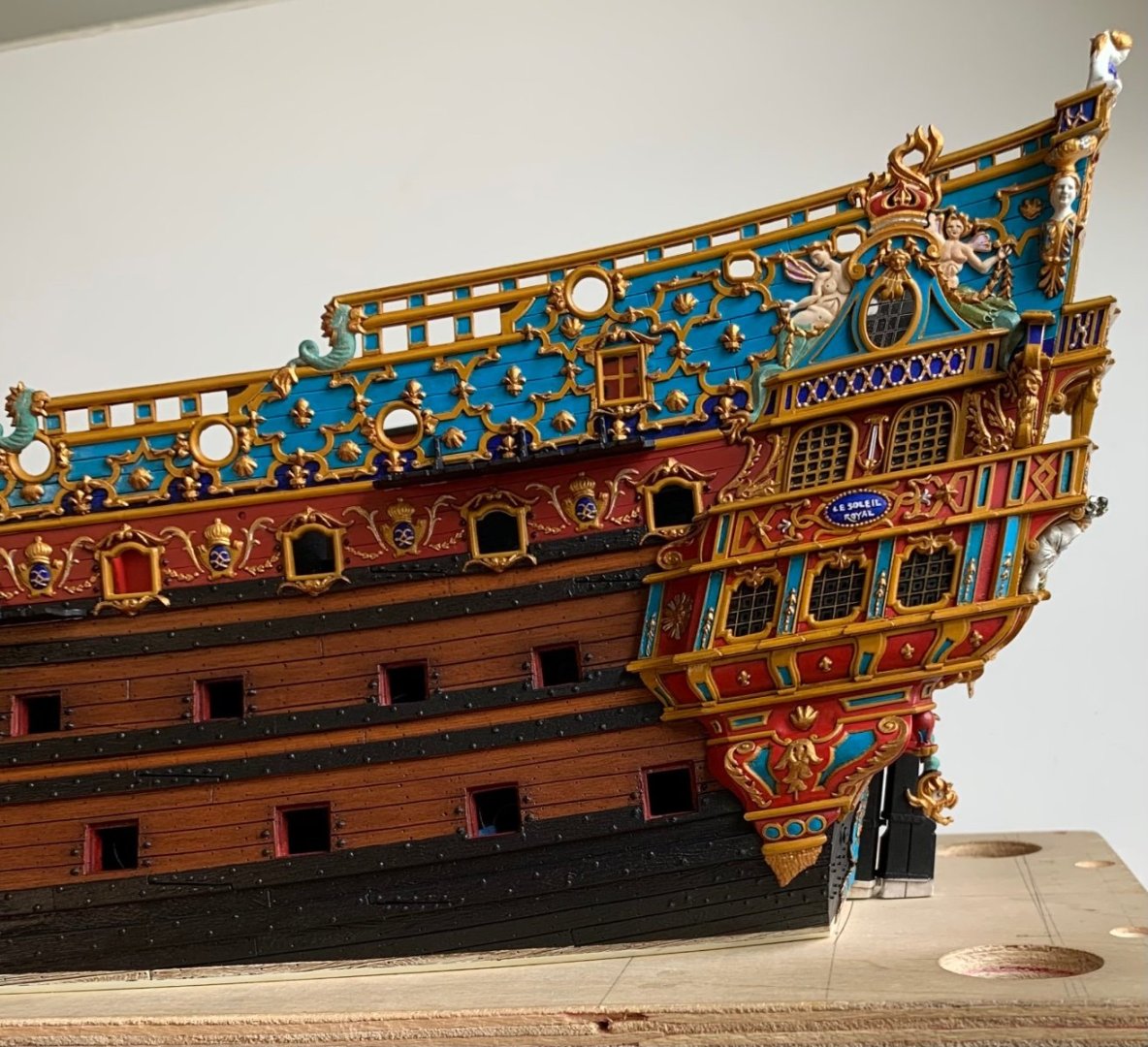
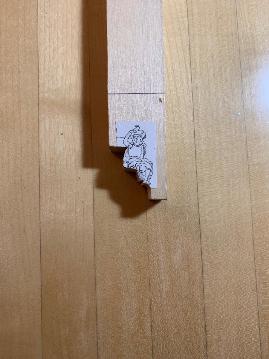
I made a start at roughing out the figure of Africa. I had quite a lot of the same wood (linden, maybe) that I used for the lower quarter galleries.

Unfortunately, this material really isn’t suitable for carving fine detail. I will have to get my hands on a little boxwood, or some fruit wood like apple or pear.
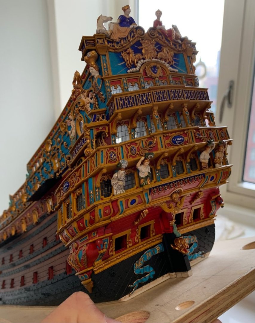
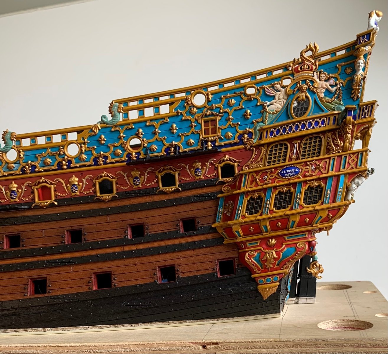
A little fun with pictures. Here, the juxtaposition with John Ott’s near-Van de Velde:
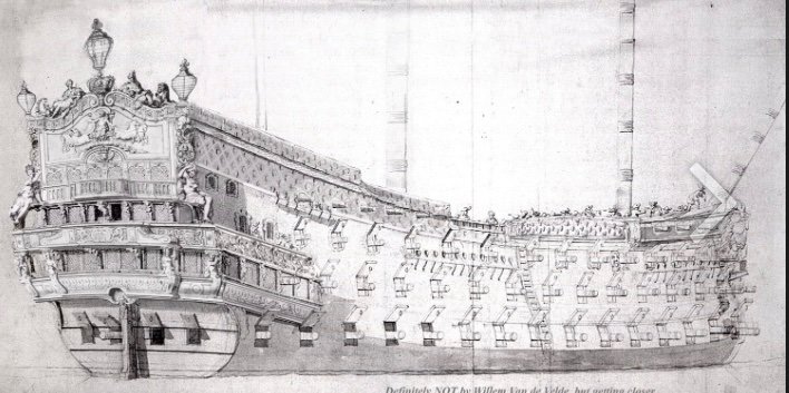
As I’ve said before, Heller really does manage to capture the early sheer of these ships very well. Despite it’s many imperfections, my hypothetical recreation does, I think, capture something of the essence of what may have been.
Moving forward, I have been figuring out where I will source line and blocks and pins and cleats. I really like the blocks from Dockyard Models, and the polyester rope from Ropes of Scale. I can get most accessories I need from Dockyard, but anything else I will obtain from HisModel.
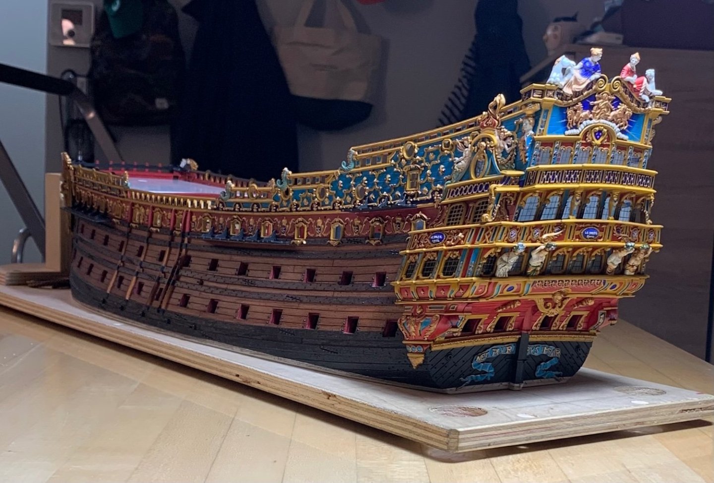
For the time being, and until the new worktable arrives, Soleil Royal Redux will shelter in her dry-dock:

I will occupy myself, until then, taking measurements of the materials I need, and developing an understanding of what needs to be done with the rigging. Along those literal “lines,” John Ott has been a tremendous help in sharing his sources, and the rig and belay plan that he has developed for his model. My belay plan will likely look a little different, but only because I do not intend to make the same use of pinrails.
If anyone is not yet aware, John has begun a build log for his magnificent Soleil Royal of 1693, which can be found here:
Many thanks to you John, for your help and generosity, and to all of you for sticking with this project for such an absurdly long time. It is greatly appreciated!
- GrandpaPhil, Sluicemaster, CiscoH and 17 others
-
11
-
 9
9
-
On 9/4/2023 at 10:10 PM, Bill97 said:
Yes they are Ian and as a result it makes the shrouds seem narrow. Would not be surprised if Marc, or someone else, informs me for accuracy they should have been cut shorter. I hope not because it is to late now to change them.
To compensate for the long topmasts, I raised my lower main mast by 3/8”, if I remember correctly, and the fore and mizzen lower masts were raised, accordingly. In order to improve the spread of the topmast shrouds, I made wider tops from scratch. The mast sections which are really overlong are the t’gallants. Those I will make from scratch and shorten.
-
-
-
It is ironic because just the other day I was scanning through documents I had saved to my Google Drive. Here among them:

Oh, and what have we here:
I’m sorry that this did not occur to me sooner. Anyway, it will be exciting to see what turns up.
- mtaylor, druxey and GrandpaPhil
-
3
-
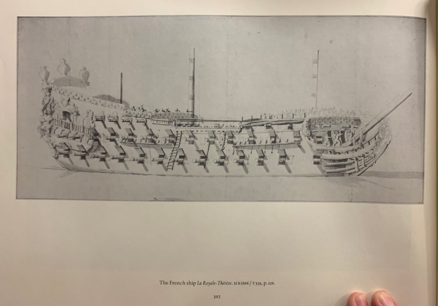
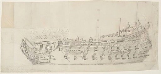
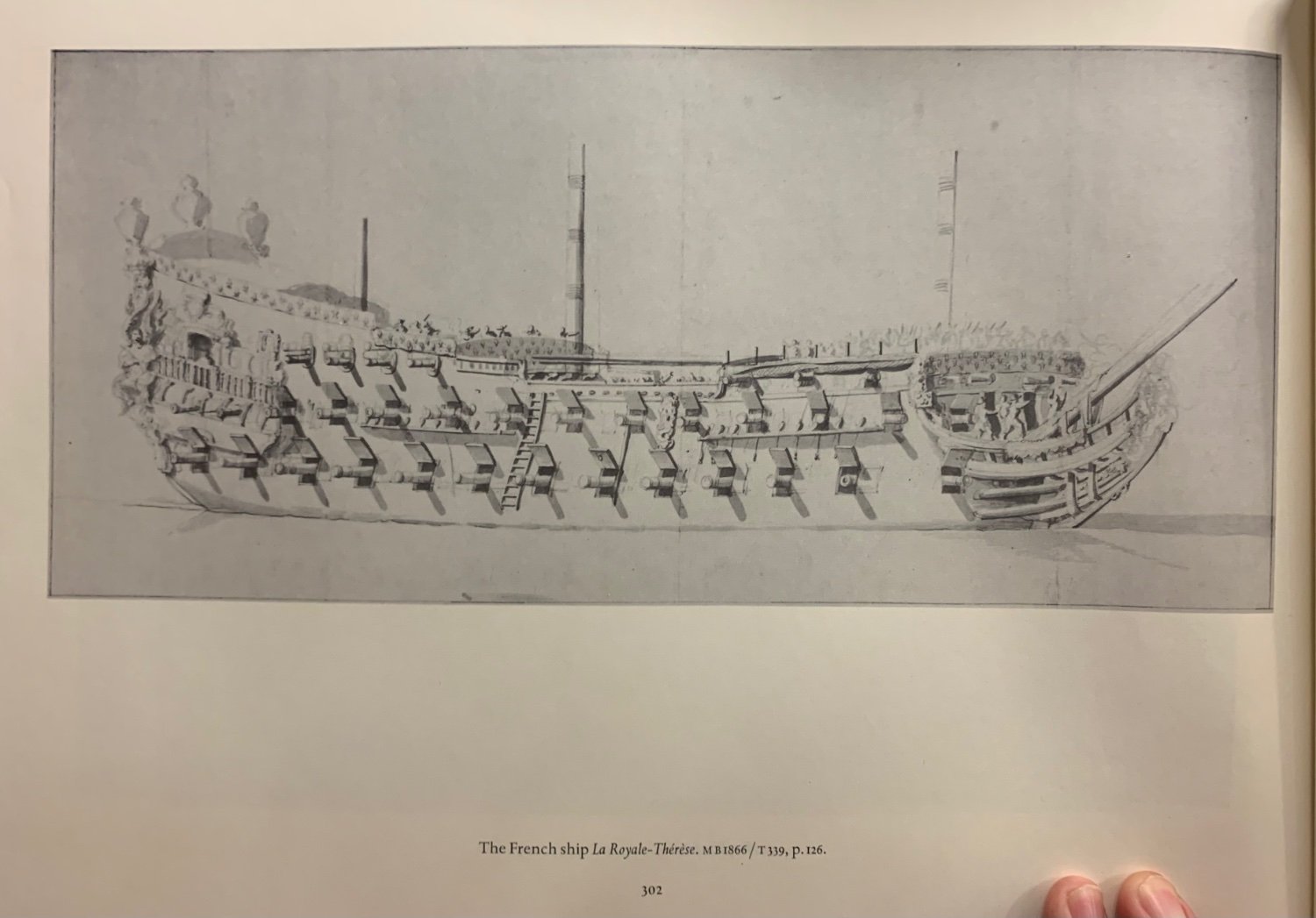
My French figurehead resources are sparse. In the 1670s, the hippocampus figure was a popular subject, as seen below on Le Royal Therese and Le Terrible:
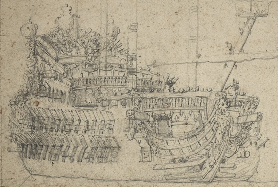
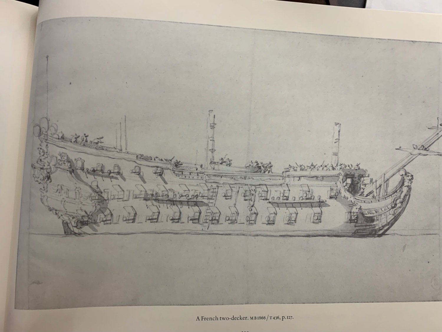
The following 2-decker, perhaps L’Orgieullieux, does have a lion:
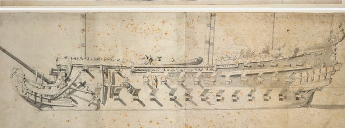
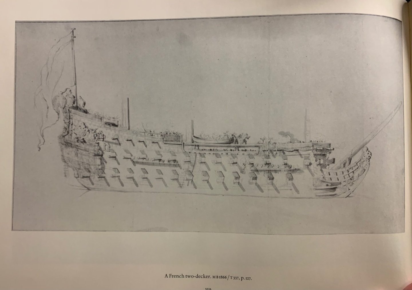
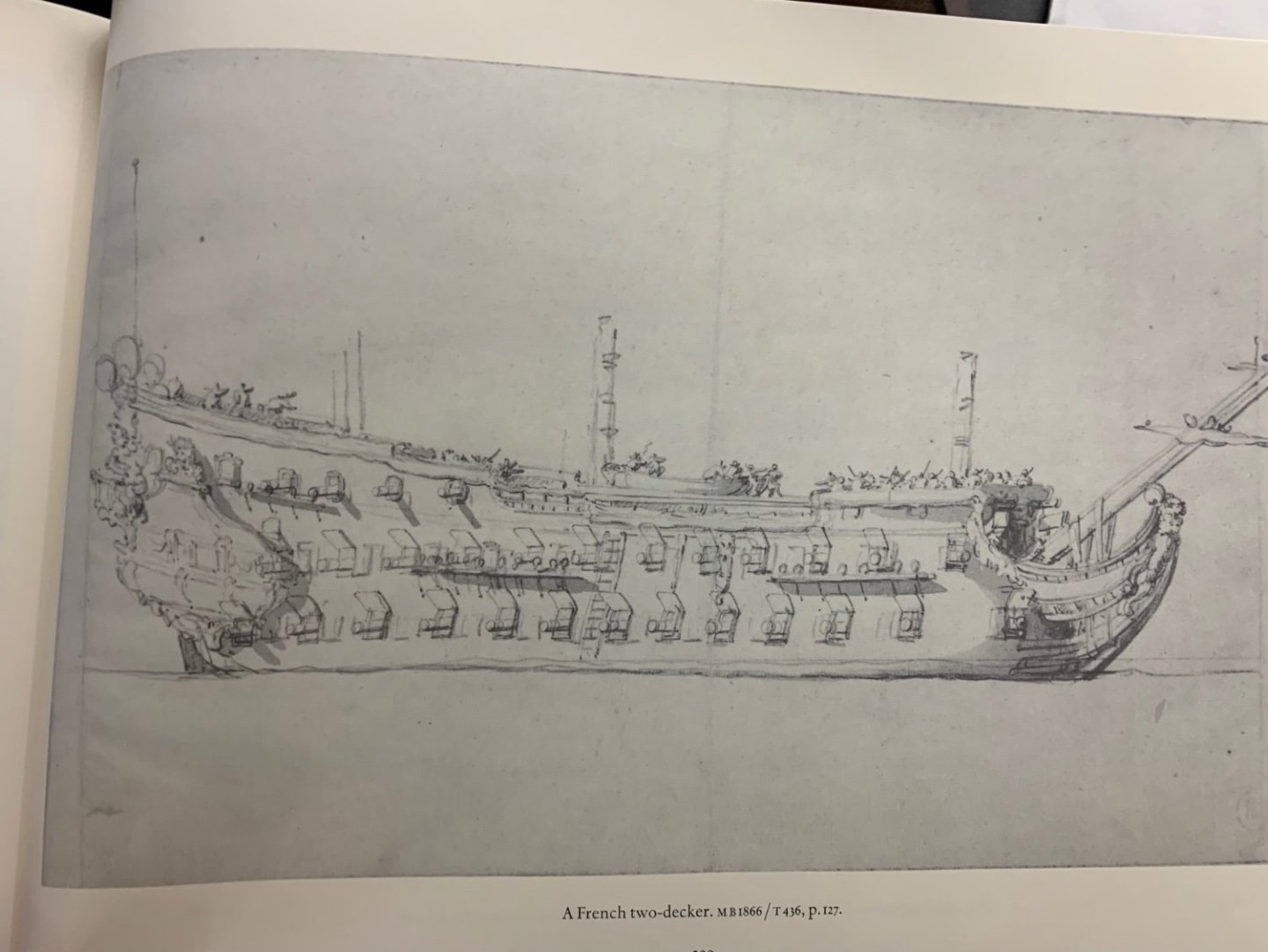
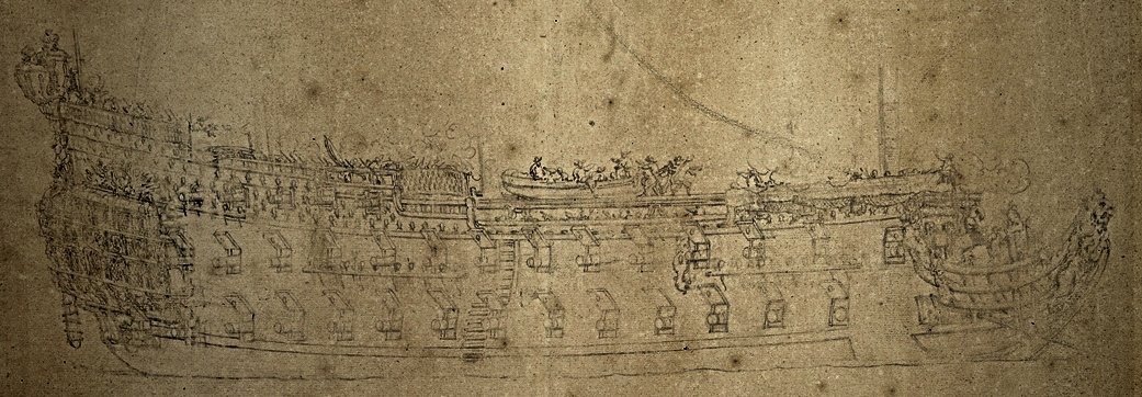
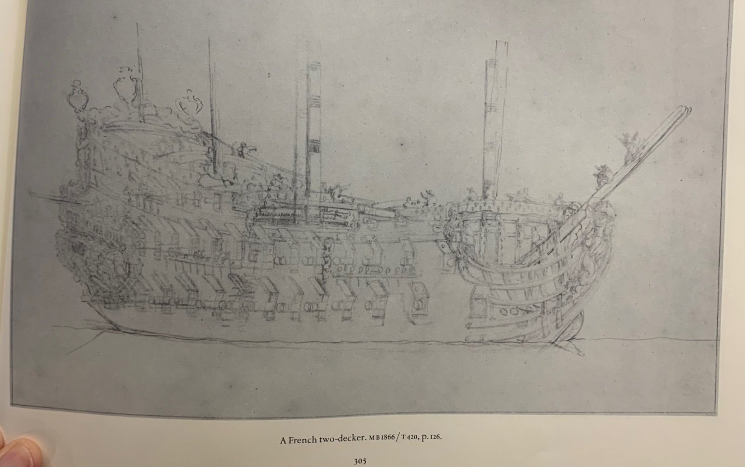
A few more French 2-deckers of indeterminant provenance:


Le Soleil Royal by Bill97 - FINISHED - Heller - 1/100
in - Kit build logs for subjects built from 1501 - 1750
Posted
Yeah, I would definitely trim the back end, as well. I had the benefit of building this kit before. Over time, the issue of these trestle trees began to bother me. You can monimize this problem, though. Fortunately the t’gallant trees are in scale.