


Hubac's Historian
-
Posts
2,950 -
Joined
-
Last visited
Content Type
Profiles
Forums
Gallery
Events
Posts posted by Hubac's Historian
-
-
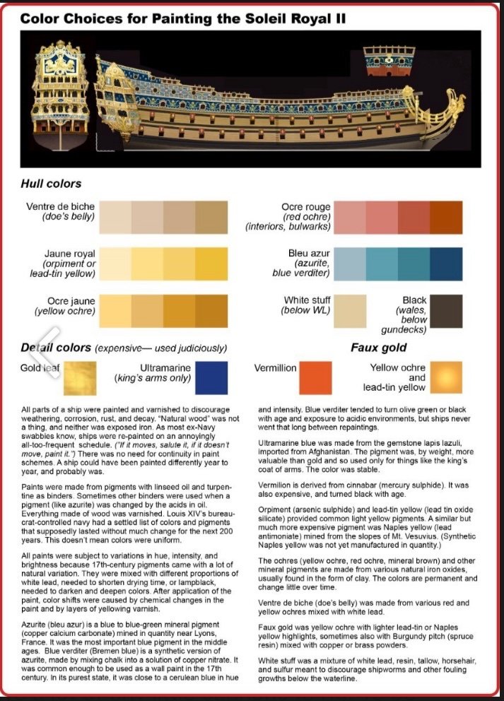
The subject of period colors often comes up on this forum and, fortunately, John has an info-graphic for that as well.
And some additional insight:
WHITE—I think they mostly used lead white for mixing hull paint. Guy says "calcium oxide," quicklime, which, along with calcium carbonate (chalk), made whitewash. I know they used whitewash sometimes in ship's interiors, but I don't think it's sturdy enough for exposure to wind and waves. Also doesn't cover as well. Lead was a superior mixing pigment, dried fast, was cheap, opaque, and was permanent as hell.
BLACK—lampblack. Lampblack was also known as "vine black" because the French had to do something with all those old grapevines. Burnt them to ash and made dry pigment out of them.
RED—red ochre, basically red clay. Vermilion (mercury sulfide) was made from cinnabar. It could only be synthesized in small quantities and was very expensive. Almost in league with ultramarine.
YELLOW—yellow ochre. More clay. Lead-tin yellow (lead-tin oxide) was the lightest and brightest yellow. Orpiment (arsenic sulfide) was up there with it. Naples yellow (lead antimonate) wasn't common in the middle 1600s because it hadn't been synthesized yet. A natural form of Naples yellow was dug from the side of Mt. Vesuvius, but as you can imagine, it wasn't common.
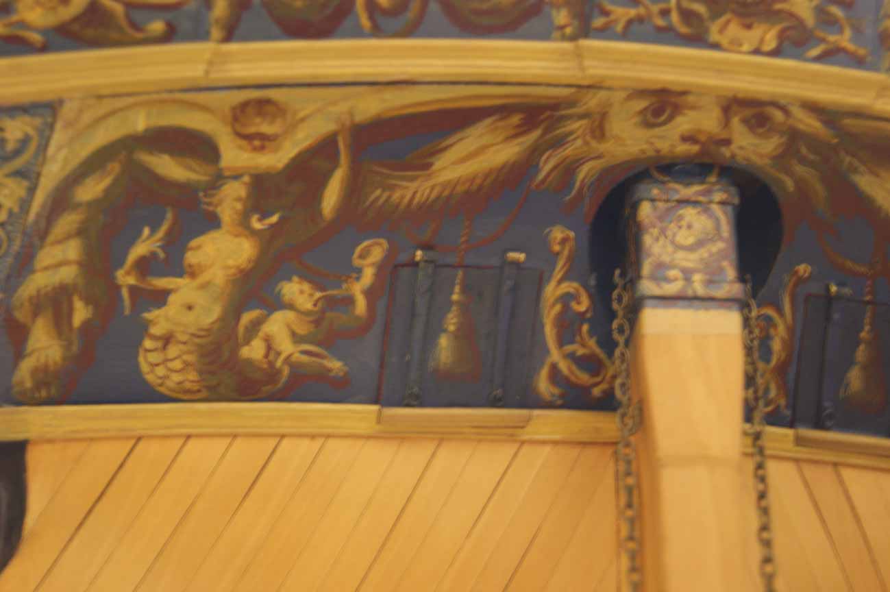
FAUX GOLD—was yellow ochre with painted-on lead-tin highlights and red ochre in the shadows and undersides. Sometimes they painted over it with Burgundy pitch (spruce resin) and brass or copper powders to give it a metallic lustre.
BLUE—this is the big one. Guy says it was "copper carbonate mixed with sulfur." Partially right. In all your posts and in all the other discussions about the blue used on 17th-century ships, I haven't seen anyone mention blue verditer. Blue verditer was the synthesized version of azurite (copper calcium carbonate—which had been the most important blue paint pigment in the middle ages). Blue verditer was made by some alchemical mixing of chalk with copper nitrate. You can watch YouTube videos about hobbyists making it with their home chemistry sets. The synthetic pigment was manufactured in France and the Low Countries, and cheap and common enough in the 1600s that it was used as wall paint.
Verditer comes from verd de terre, because natural azurite was to some degree mixed with malachite (copper carbonate hydroxide) which was green. The natural pigment was more or less greenish blue, but the less malachite in the mix, the more blue it got.
It's not used much any more because the pigment reacts chemically with the low pH in linseed oil and turns dull green or black. Works best with non-oil binders. (I used to have a Winsor-Newton tube of blue verditer watercolor.) It also greened or blackened with age, but ship paint obviously never lasted that long. Interestingly, it also turned black with exposure to sulfur or hydrogen sulfide.
Somehow—I don't know how, chemically—but it was often mixed with lead white and somehow that made it compatible with oil paint. (Lead is pH neutral, maybe that buffered the acidity of the oil.) That's why there's all the light blues in Versailles. It was also mixed with lampblack to darken it. When I decided on the light and dark blue hues for my ship, I started with verditer.
-
I think a set of spare fore and main topmasts make sense, but beyond that it’s just clutter and carnage. The carpenter’s stores would have been down below on the orlop deck. Big timber may have been stowed in the hold.
- Bill97 and Ferrus Manus
-
 2
2
-
Well, the English must have been blind that day, cuz they sent the fireships in anyway.
- Ferrus Manus, mtaylor, FriedClams and 1 other
-
3
-
 1
1
-
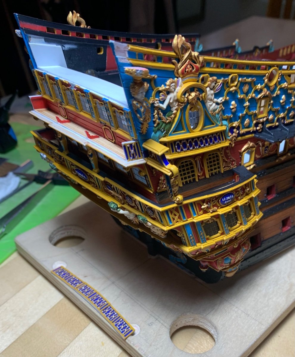
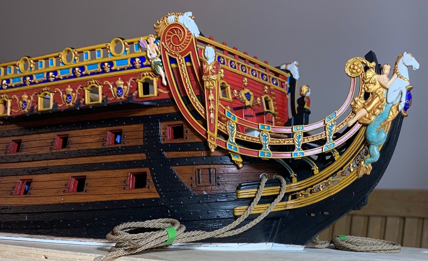
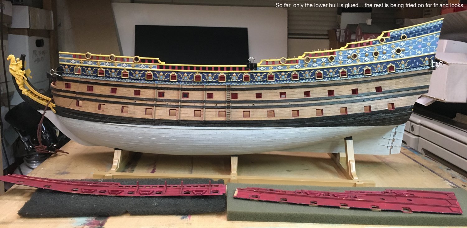
There are still distress washes to apply and some touch-up to do, but things are progressing.
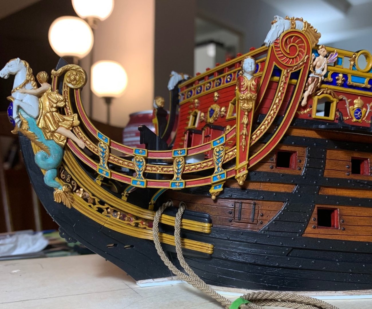
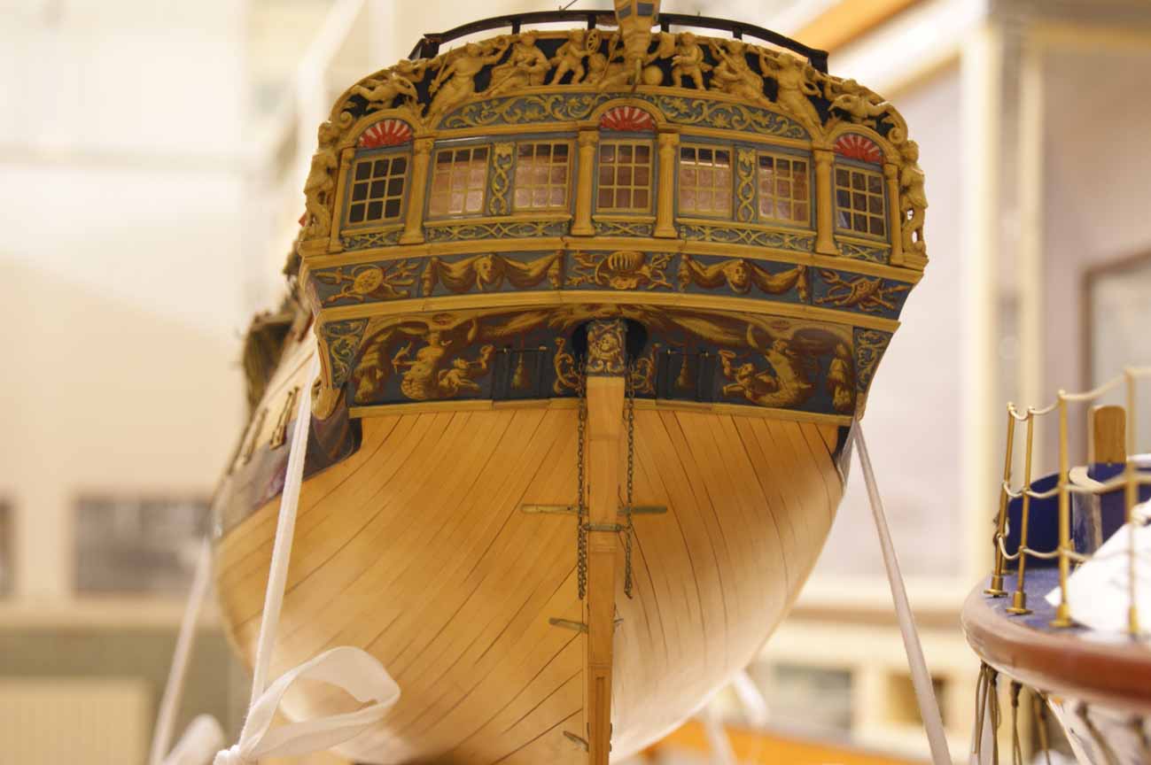
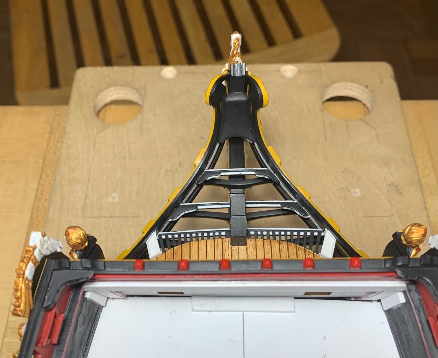
The upper stern balcony is finally rounding into form:
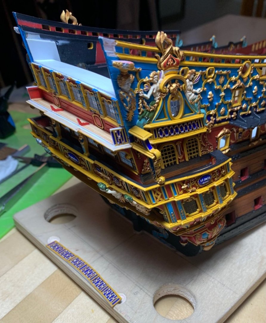

The balcony rail completes my circumference around the ship with a band of ultra-marine. Maybe I will get to fixing this part in-place tonight.
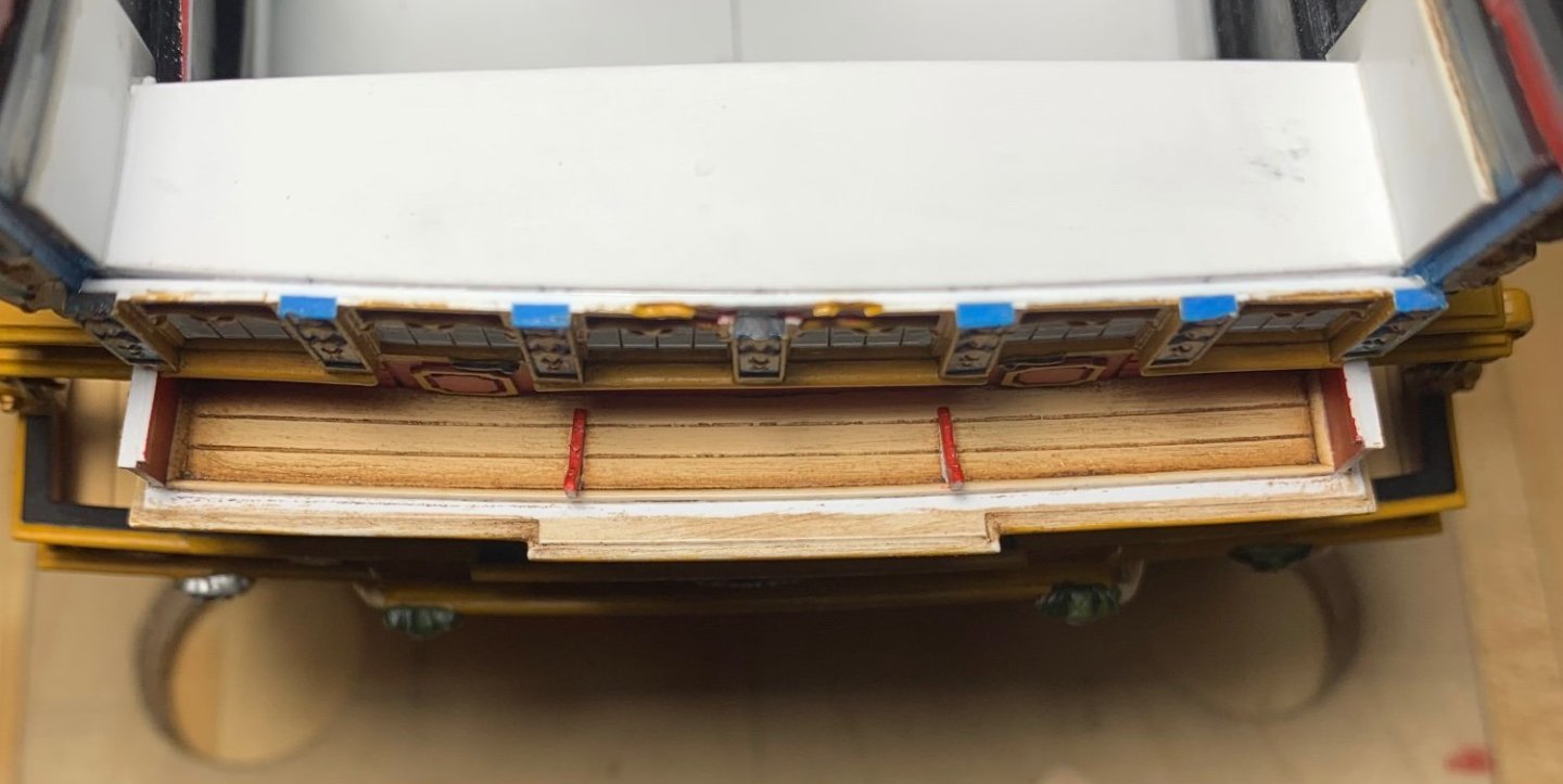
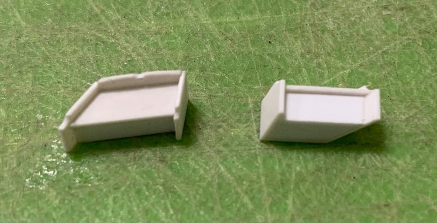
There is still quite a lot of work to do with the head and the head grating, itself, but it is all finally coming together. Yesterday, I made a new pair of seats-of-ease, which are sized according to the space available to them, and reflect the imperfect geometry of my custom head structures:


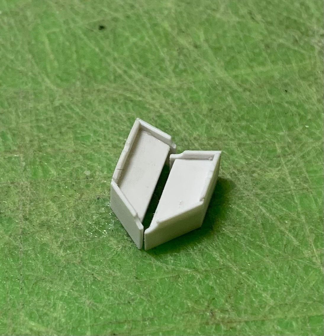
I have subsequently drilled the waste holes in these, but I wanted to tweak their fit to the model before I did so. Here they are in their places:
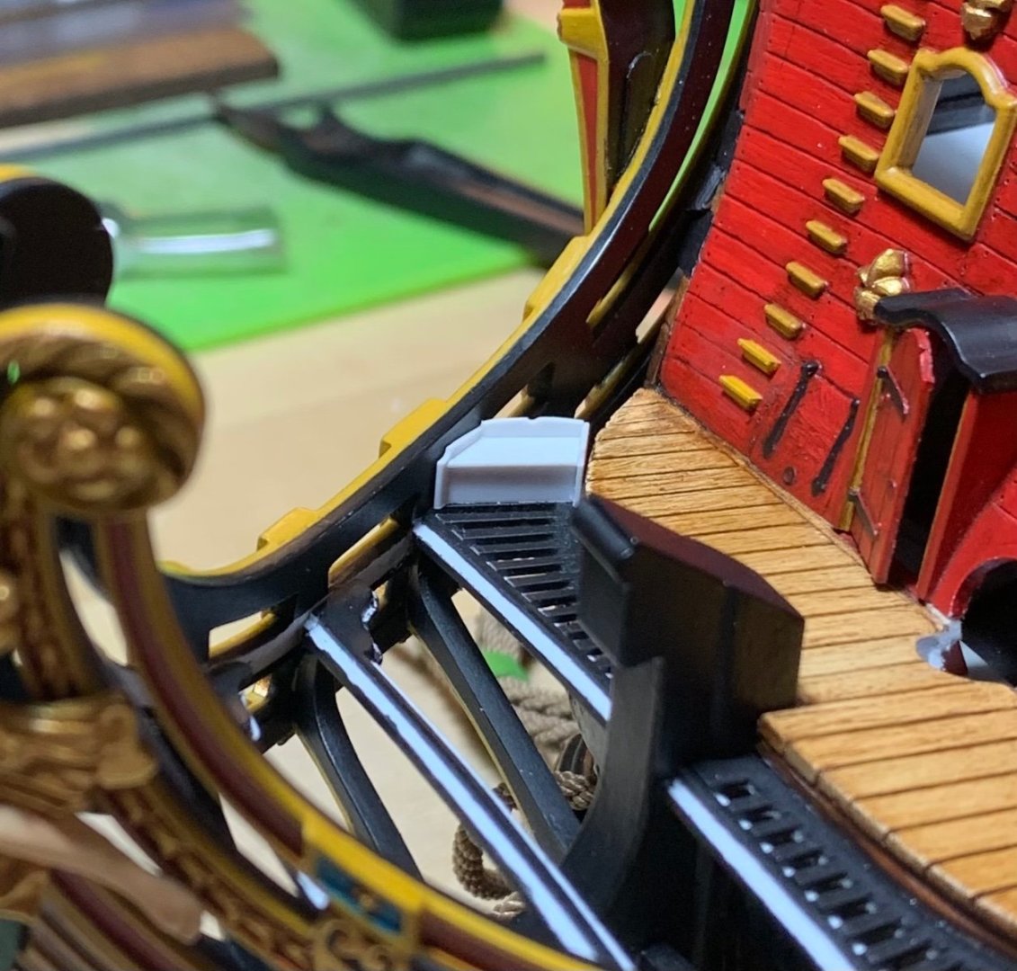
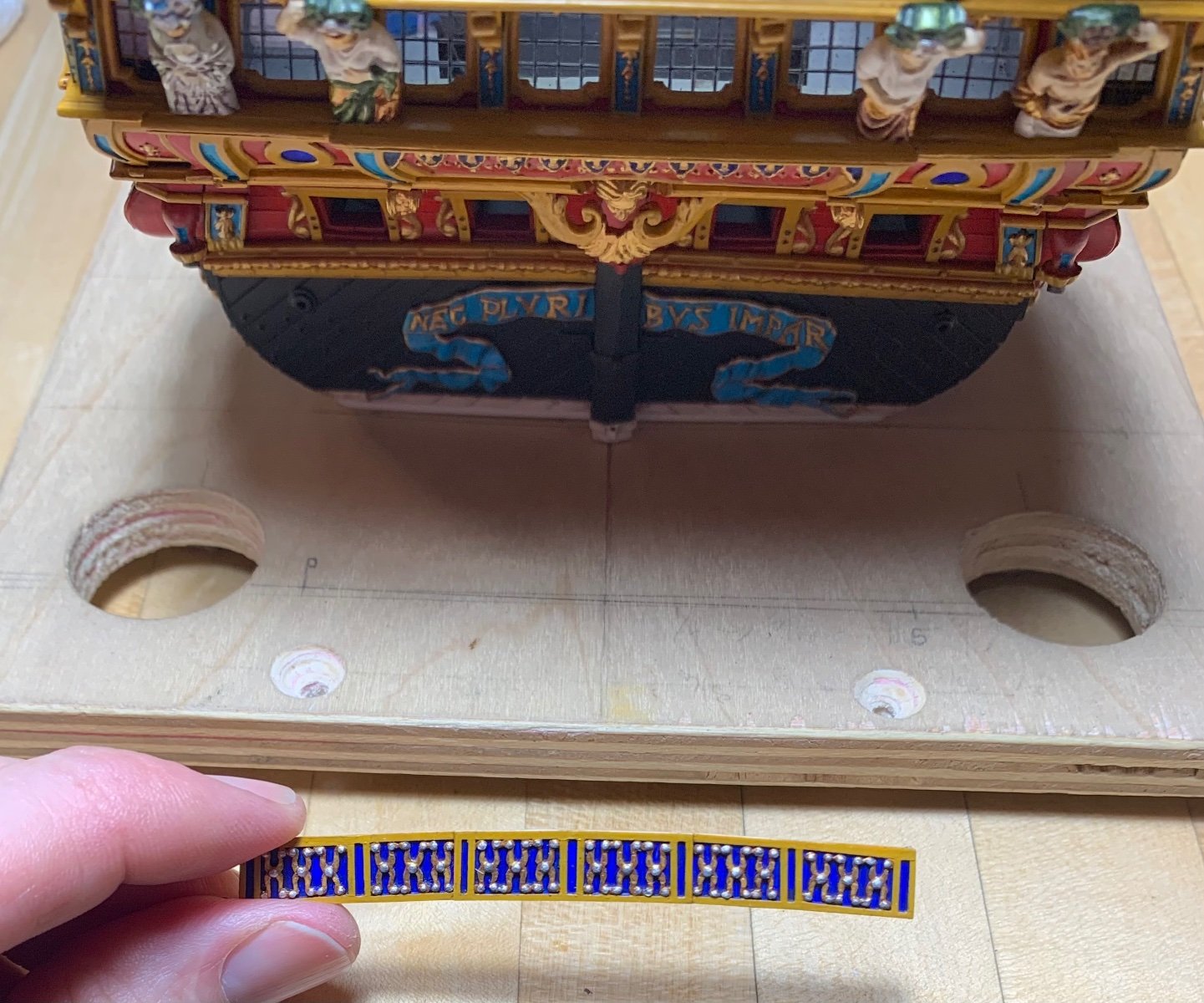
Here is the forward grating terminus in-place and re-touched:

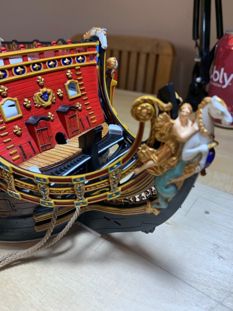
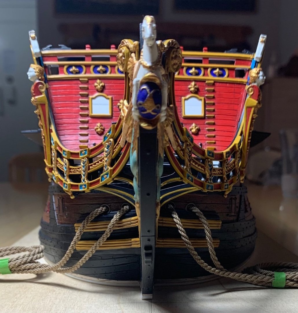
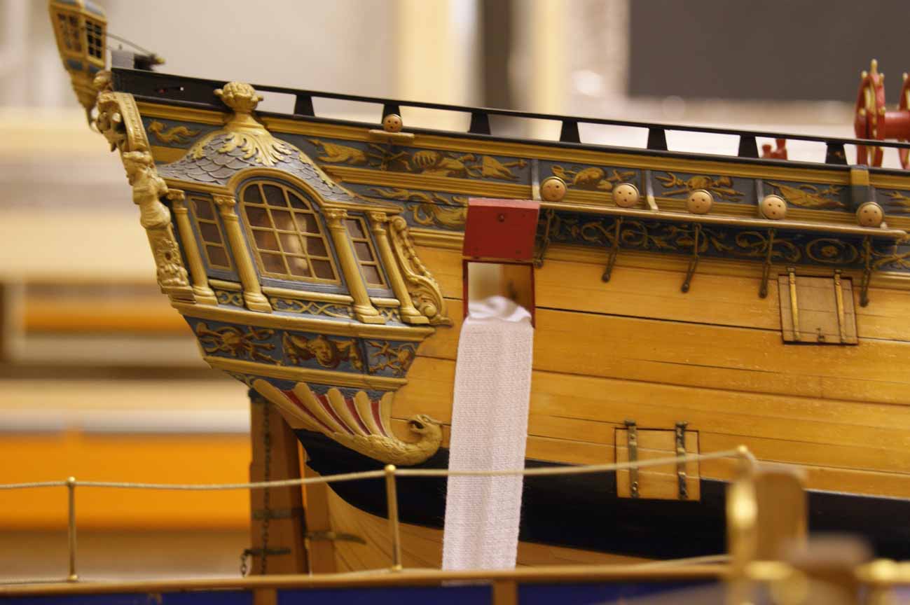
Can anyone spot my homage to modern seamanship and navigation, from starboard:

to port:
It’s a little subtle on this side, but don’t overthink it 😉
My greatest satisfaction rests in the fact that I created enough space below the headrails to craft reasonable headrail supports:
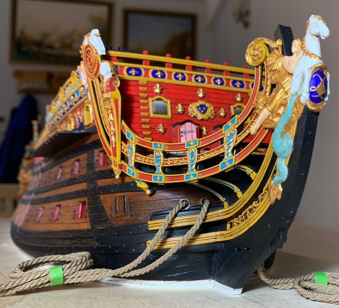

As I often say, this is all something of an imperfect approximation, but it is a significant upgrade over the stock kit.
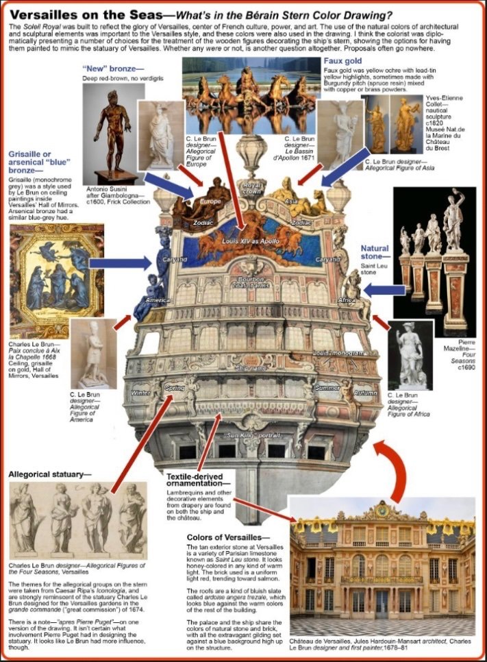
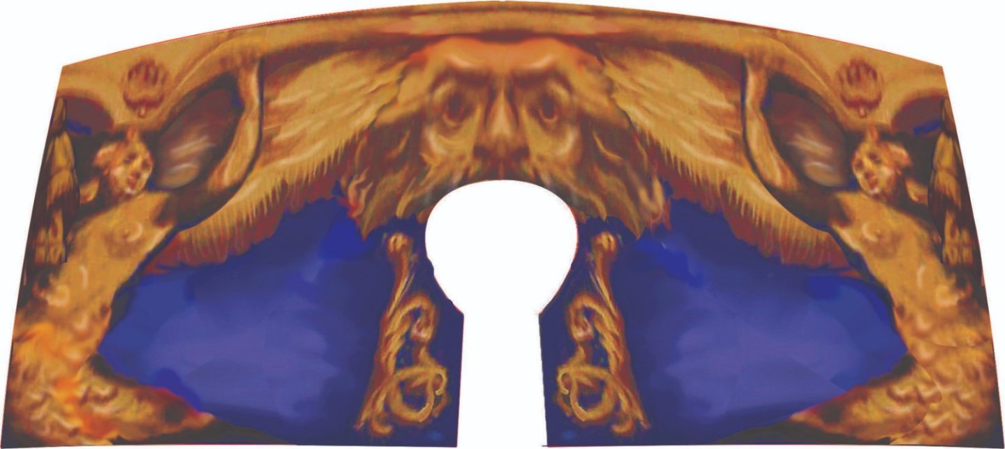
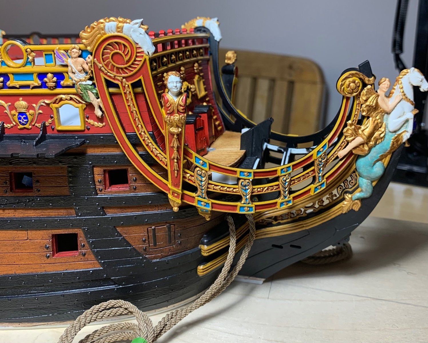
As a bonus, John Ott has put together a highly informative info-graphic on the statuary and colors of the stern:
As always, thank you for your interest, your comments and likes, and for stopping by.
More to follow!
-
On 4/23/2023 at 3:57 AM, John Ott said:
Marc, any reply to an offhand comment like you gifted me with deserves a detailed response of its own.
Although I never meant to go back to it, I've attached a new version of the sketch that incorporates a lot of your suggestions—higher taffrail, upper balcony balustrade and figures in better proportion, windows and decks lining up better, etc. I left the lower and middle stern lights alone, since the whole point to the exercise was to see how well SR's features would graft onto a drawing of a real Hubac hull. I can very easily see that a seven-light solution would be practical, though, and Tony Devroude's DR framing corresponds nicely with similar diagrams in Peter Goodwin's book.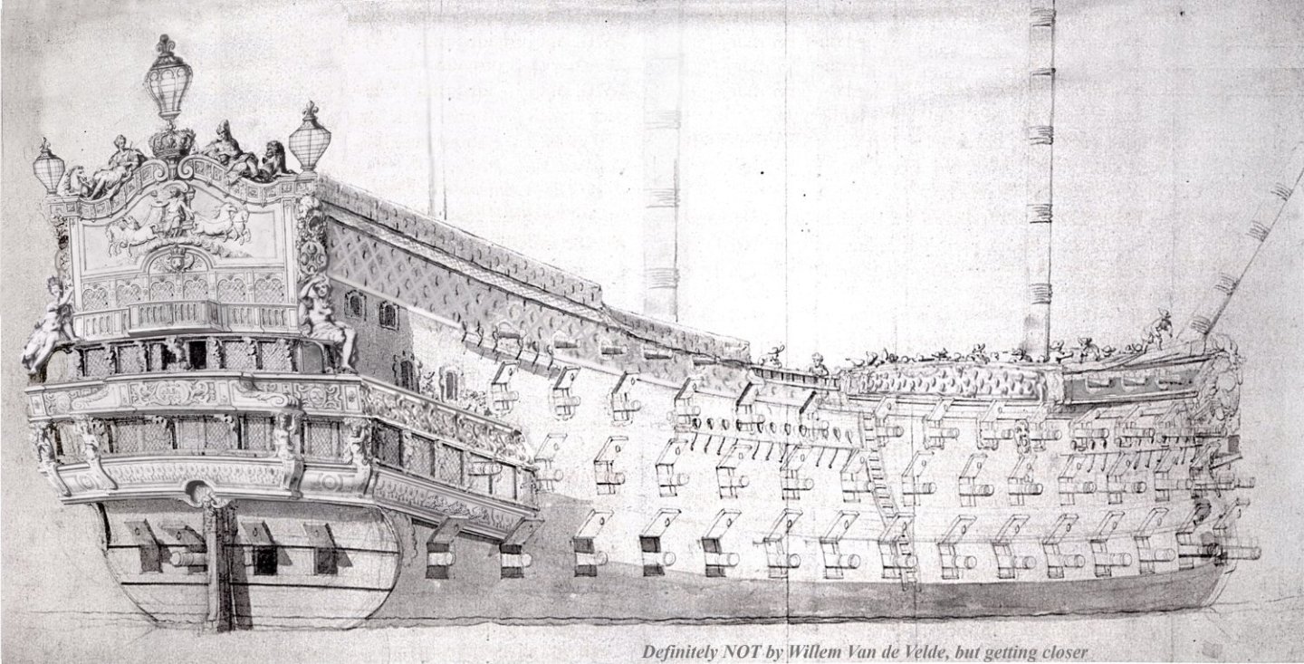
Not to be contrary, but the field of fleurs on the upper bulwarks was used on both Hubac ships that I have VDV drawings of (La Reine and Terrible). They also show up, as you pointed out, on Le Monarque and DR. Looks like it was a First Marine thing. So unless somebody can provide an authoritative description of the first SR's bulwarks, I'll stick with the fleurs. It's the lys amount of effort. Same goes for the vestigial QD upper balcony tier. No tiers shed.
Besides, if I work on this Photoshop thingie any more, it'll take time away from my own Heller SR build.There were some other things in your reply that spark conversation. I—uh,—swiped the 1853 D-M-J Henry description of the SR the first time you posted it. It looks like it was written by someone who saw this version of the stern drawing:
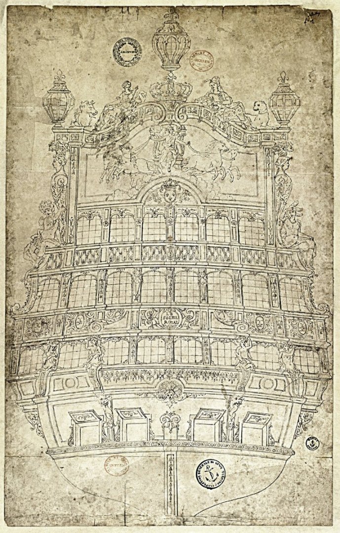
As opposed to the version we all know and love, and everybody wants to attribute to Bérain.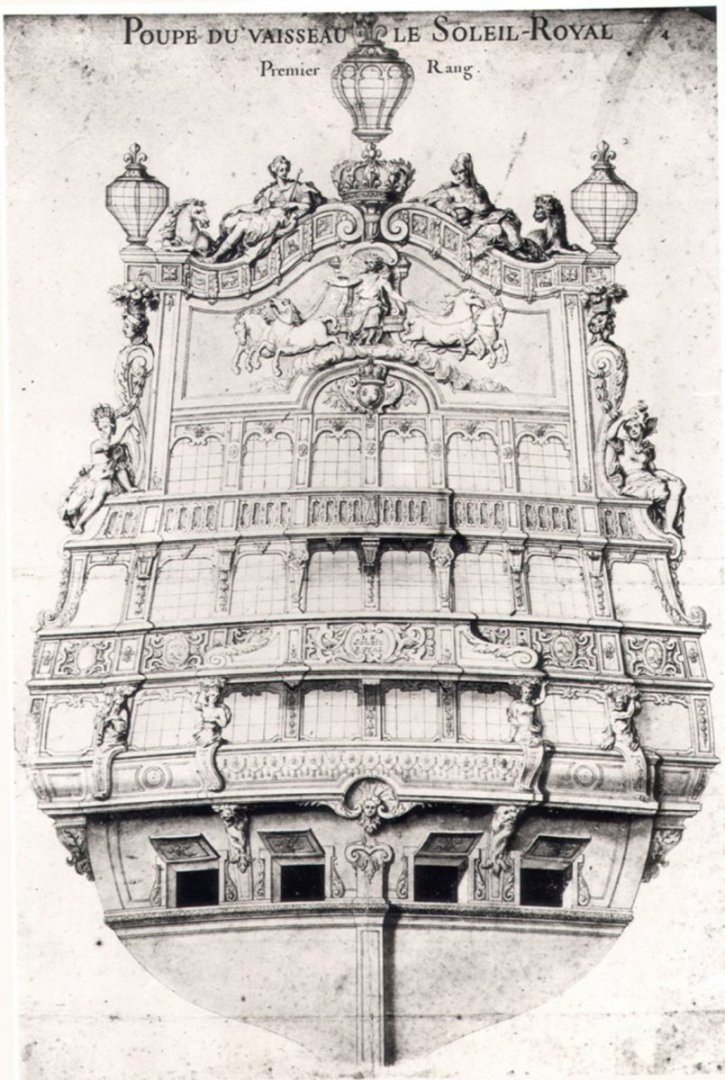
The mention of the ostrich feathers is a dead giveaway. Has anybody come to any conclusions about who did the original artwork and which version came first? The figure of Africa in the Bérain drawing has the same elephant-head headgear that's on Le Brun's Africa at Versailles. This might be a telltale as to who actually designed the SR figures.
It's weird that D-M-J Henry didn't mention that the figures represented continents, not just "East" and "West." Attributing the designs of the figures to "the pencil of Puget" seems to me a misplaced leap of faith, considering that Le Brun had already designed all the allegorical statuary with the same subjects and attributes for the Versailles gardens. Makes me doubt that Henry had any more insight into the ship than researchers have now.
You mentioned all the gold leaf at Versailles and the likelihood the first version of the ship was adorned similarly. I recall that in one of your posts you discussed some period document that gave a budget for gold leaf for one of the warships. I can't find that post, but I remember that the amount was scarcely enough to do much more than gild the figurehead. I've been thinking about how to limit the amount of gold leaf on my own Second Marine SR build. One thought was to use most of the gilt on the stern Apollo frieze and the upper reaches of the quarter galleries—keep all the major areas of gold leaf high up on the structure surrounded by blue, just like at Versailles.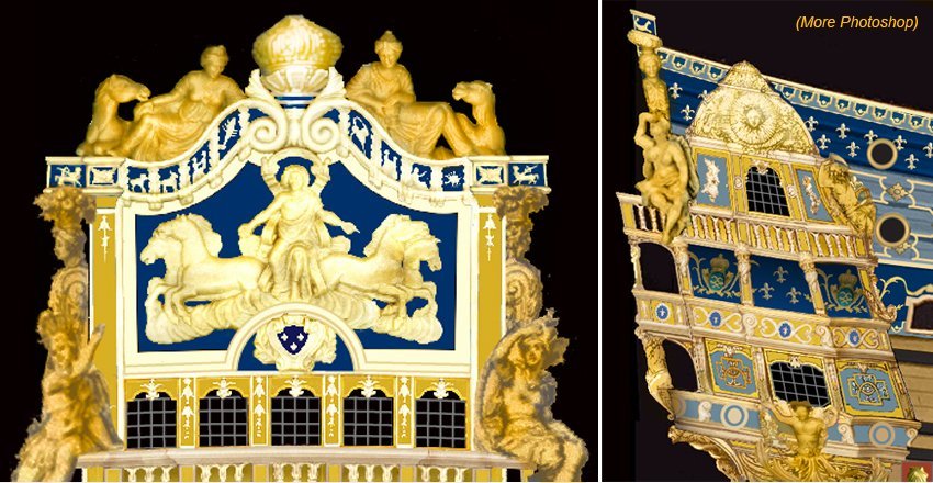
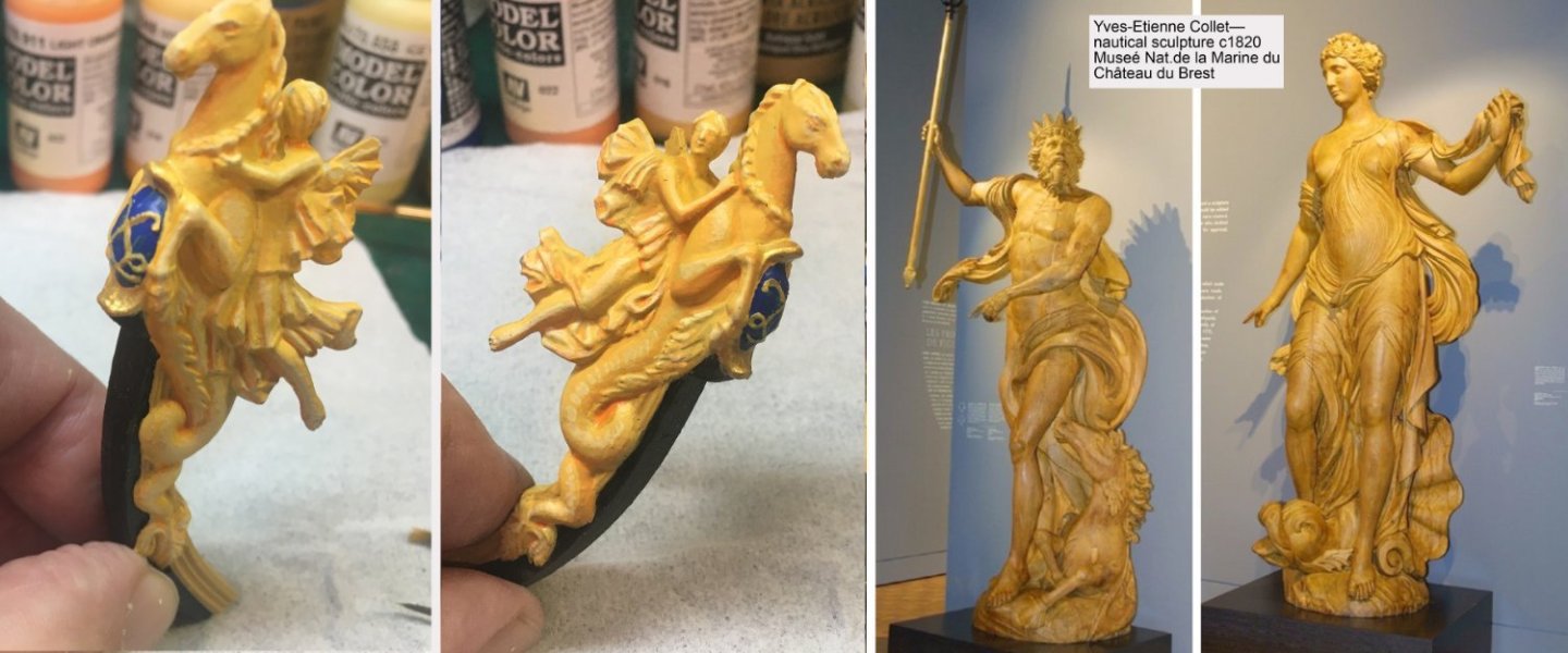
Under this plan, I'd paint the major figures in shaded faux gold (original formula was yellow ochre with lead-tin or Naples yellow highlights, and darker yellow—red ochre mixed in—for shadows. I painted the SR figurehead this way as an experiment. (I can still repaint it metallic gold if I want to.) There would still be the Bourbon crest and crown on the forecastle surrounded by gilded ornament, so there would be some gilding forward. Any thoughts on how much gold leaf seems appropriate for the Second Marine period?
Thanks again for the information and all the inspiration. This has been a sweet deal— I post an odd little Photoshop and get a college-level education in return. Looking forward to your next post. Building and painting 104 guns in the meantime.
John O

This past week, John and I have been corresponding and hashing through a number of the issues he raises in this post.
First of all, I’d like to say that the revised almost-VdV portrait of SR is so good that it is completely passable, until you take a closer look at those lower window tiers, or a few other tiny details, like the side-lantern quarter pieces, for example. By his own admission, there are simply limits to how far he was interested in taking that exercise, and it was never his intention to correct everything. The skill it takes to do something like that is just beyond me! John also has a wonderful turn-of-pun - good stuff!
Now, the stern drawing John posted above was one that I had always assumed was a re-draft for the replacement SR of 1693. My main line of reasoning, there, was that the stern lights extended to the quarters, seeming to indicate fully closed quarters. This is pretty definitely a feature of the Second Marine.
The eye sometimes sees what it wants to, though, and I had always just taken for Granted that Africa was wearing the elephantine headdress, as on the original Berain drawing. Well, those are in fact the same ostrich plumes that Henry describes for the very first ornamental scheme. I can’t find any other D.M. Henry divergences in the drawing, but it is nonetheless a curious detail.
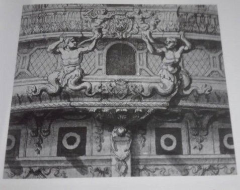
John and I have also traded a fair amount of discussion about the curious placement of carvings within the quarter galleries of Tanneron’s famous model. As John notes, they are so random. He offered a fascinating possibility, though; these carvings don’t exactly mirror those that existed on the Grand Chamber ceiling, but they are very closely related. Maybe their placement, here on the model, was intended as a visual allusion to what can not be seen inside. Whatever the answer may be, this is an interesting theory.
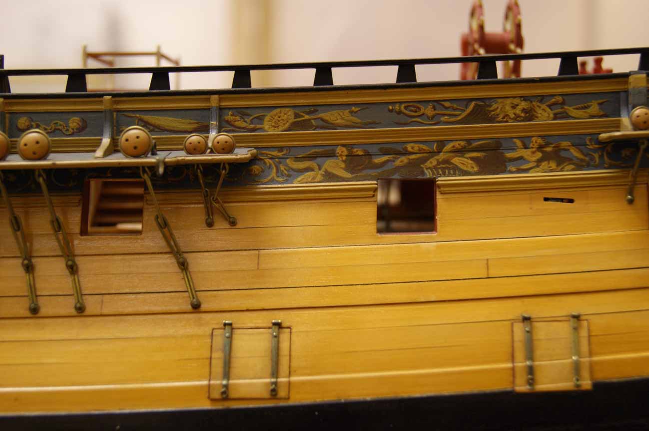
Since John first posted photos of his project proposals and the model, itself, my head has been spinning at the wonder of it. The coloration and ornamental work is so brilliant, but he has done a masterful job of adding so many small and essential details like skids, scuppers, hancing pieces along the sheer line - which do so much to “finish” this aspect of the model - and an excellent fretted trailboard. This is just a thoroughly remarkable and well thought-out modification of the Heller kit! Thank you so much, John, for posting and I hope you will continue to do so.
-
2 hours ago, Chuck said:
LOL...I suppose I could have put those two Syrens in a pants suit for the more conservative model builders out there. But I think it best to stick with the typical imagery used during the time period.
I chose the syrens for an obvious reason. If I can sneak one into a project I am working on I wont pass up the opportunity.
And by the way...choosing a frieze of the best color and shape is not an easy task at all. I may yet do a third version. Its a big part of the models visual appearance. I look to find actual friezes used on Contemporary models and then adapt them to my projects and change them up. Adjusting the shapes and colors etc. The inspiration below....adapted for the Speedwell. Oneof my all time favorite contemporary models. If I could find the drafts for this I would build her in a second.

Chuck
I like this alternative version just above, but I think the scroll work to either side of the stern post entry would look better if it more closely followed the outward billowing form of its inspiration. I think it will make for a better interplay with the purple field color.
-
One other thought, John, which might offer additional clarity and insight into the specific questions you raise: have you read Guy Maher’s research on the development and appearance of SR? If not, and if it interests you, simply PM me your email address and I will send it along.
There are so many things I like about your rendering for 1693, and I am just completely blown away by your treatment of the upper bulwark frieze and your color choices. I implore you to open a build-log, if only with sporadic updates, because your followers would be legion for this particular rendition, the coloration, of which, would likely be more palatable to SR traditionalists.
More questions and commentary to follow.
-
Holy Christ, John - you’re gonna force me into prayer and swear! Does that last pic represent the actual status of paint and ornamental work you have achieved so far, or is that merely a photoshop proposal for now? Either way, it is stunning and completely fascinating. I will respond more fully in a bit. I spent about three hours composing the previous post, but I don’t have that kind of time, this morning.
- druxey, mtaylor and FriedClams
-
3
-
Vic, you are both too kind to me and too modest of yourself.
- mtaylor and FriedClams
-
2
-
Yeah, that was the other interesting period anomaly, now that you mention it - main t’gallant sails only. It makes for a very tall and rakish looking rig.
- mtaylor, Waldemar and scrubbyj427
-
3
-
-
Wow, John-O! You have truly blown my mind here with a masterful job of photo-editing; somehow you have taken a barely more than 2-dimensional Berain stern drawing, in plan view, and made a fully 3-D perspective drawing. And you are pretty close to my own thinking on this subject. I hope you don’t mind that I have screen-shotted your drawing for the sake of an over/under comparison:
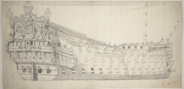
One can see on the LR drawing that just to either side of the tafferal carving - the Arms of France - are two small arched port windows that correspond with two of the same ports at the quarters. You are quite correct, in my view, to shorten LR’s tafferal from the bottom, so that you can introduce the upper tier of 6 stern lights for SR.
One gentle critique I’ll offer is that in manipulating the Berain drawing, the height of this upper balcony tier is a little too far reduced to make it practical; for a man of the times standing on this balcony, the cap rail might only reach mid-thigh. See what I mean, comparatively, in plan view:
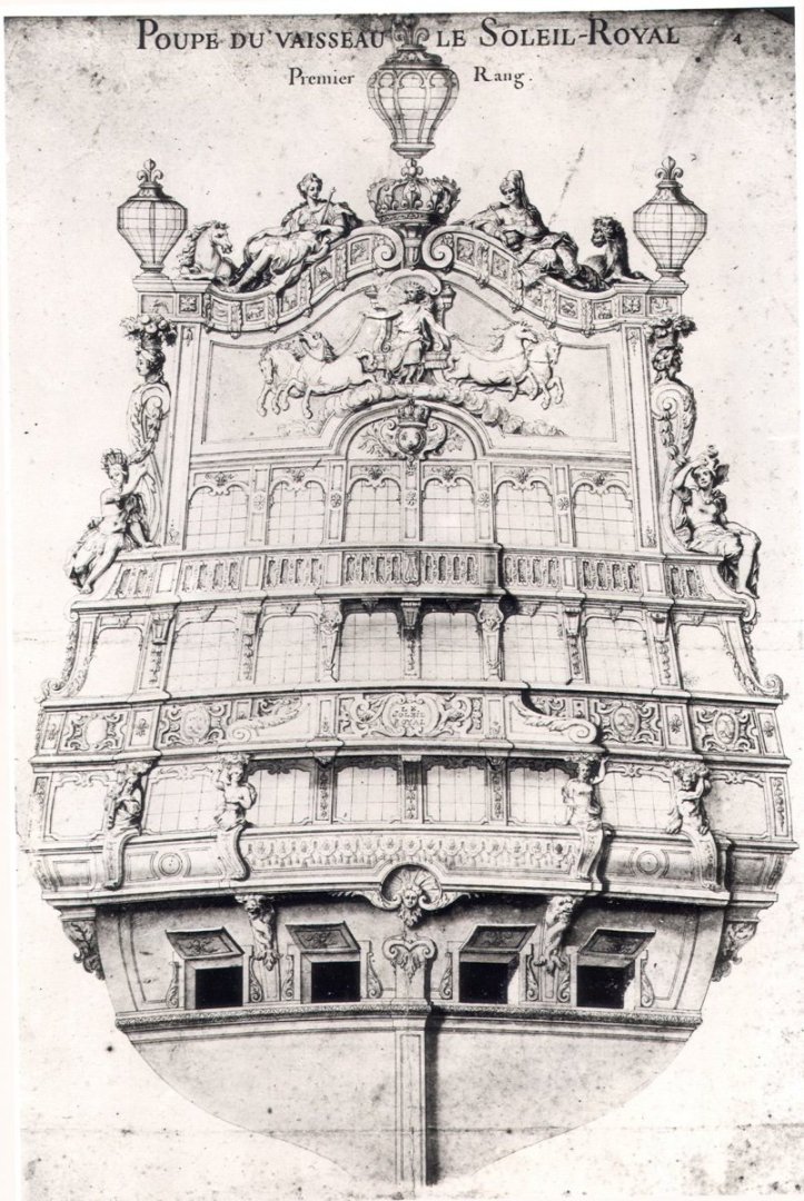
The height of the upper balcony bulwark is slightly reduced from that of the middle balcony, but not by half.
If you were to nudge that upper balcony rail upwards by an additional scale thickness of caprail - a highly imprecise measure, if there ever was one - you would arrive at a scale impression that at least looks more right to the eye. This incremental increase should also be transferred to the top of that upper window tier so that it is just a little more closely aligned with the quarter port openings. Right now, my eye reads that upper tier of lights as being just a bit lower than they should be.
”But Marc,” you might be saying to yourself right now, “that reduces the tafferal height for the big carving of Apollo and his quadriga. WTF, man, don’t mess me up like that!” You probably aren’t saying that exactly, John, but I like to amuse myself 😏
Okay, so, here are my thoughts on LR’s tafferal height. By the time the VdVs are sketching the French fleet in 1673, it is reasonably likely that LR’s original sheer height of stern had been reduced, somewhat, to comply with the new Reglements of 1671. Alterations to the height of stern and previously top-heavy ornamental figures were undertaken for the ships that were to be part of the allied French/English fleet.
The French did not wish to embarrass themselves in the eyes of the English, whom they were studying closely, in order to improve their own construction measures and proportions. It is the particular observations of Tourville, Etienne Hubac and Seignelay while boarding and taking principal measurements of The Royal Charles in late 1672 that ultimately results in the comparative study between the RC and SR, presented to the construction councils in December of 1672. As flagship, I think it likely that LR’s height and ornamental program would have been reduced to comply.
However, La Reyne was a commissioned warship, while Soleil Royal remained a symbolic beacon, at anchor, on the Penfeld. There may not have been any immediate urgency for razee’ing her deadworks to comply with the Reglement of 1671, and it is known that her ornamental program, at the very least, took into account the failures and excesses of the Royal Louis of 1668; while SR still has large rounded figure carvings, they have been hollowed-out to reduce weight.
In consideration of your drawing, I think it is reasonable to raise the reverse-curve coronation a few scale feet (perhaps by the same height of the band of astrological symbols), in order to represent this higher sheer height of the earliest constructions (1667-1670), and to give more room to Apollo’s quadriga. I suspect the overall impression of sheer height would have been quite similar or the same as that of the Monarque:
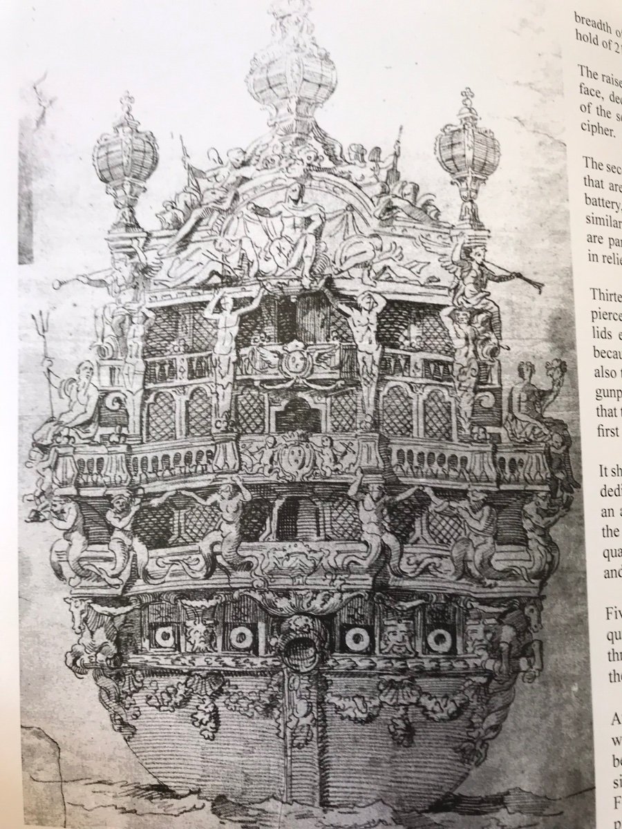
I also think that the shape and projection of the lower and middle balconies would have followed more closely what you see on the Monarque, or the refit Dauphin Royal (below in blue) but that the lower balcony was probably already a mere vestigial “shelf” for the Four Seasons figures.
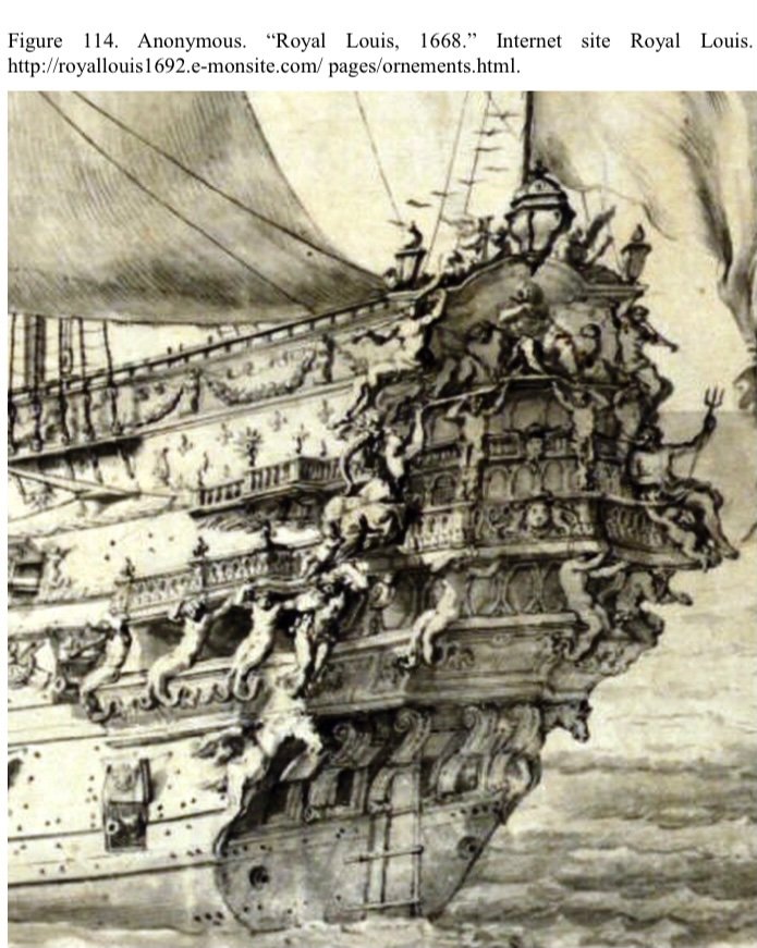
Now, with regard to the number of stern lights that may have been present on the earliest ships, there does seem to be enough corroborating evidence among the Monarque, the RL and the Dauphin Royal to suggest seven windows between quarters.
The RL of 1668, as perhaps roughly sketched by LeBrun or Girardon:

A more finished version of the same:
And the DR:
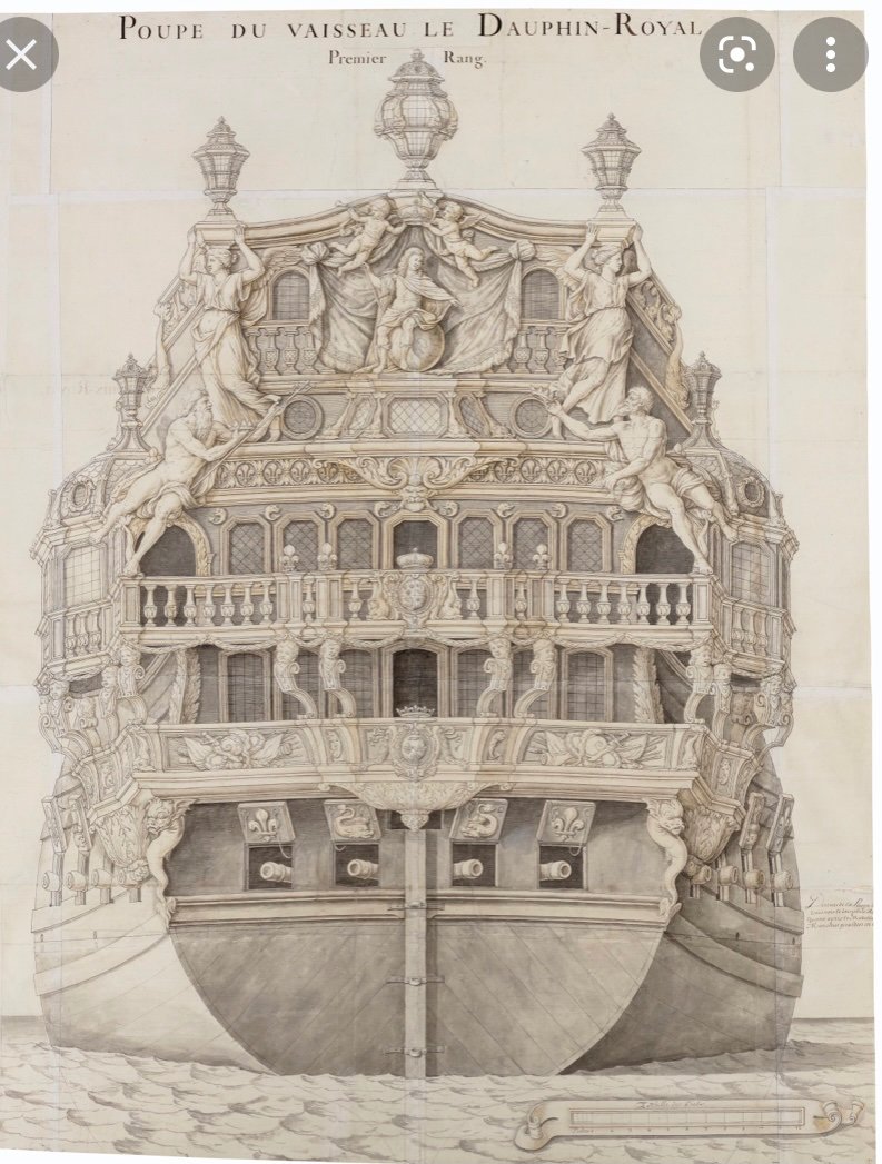
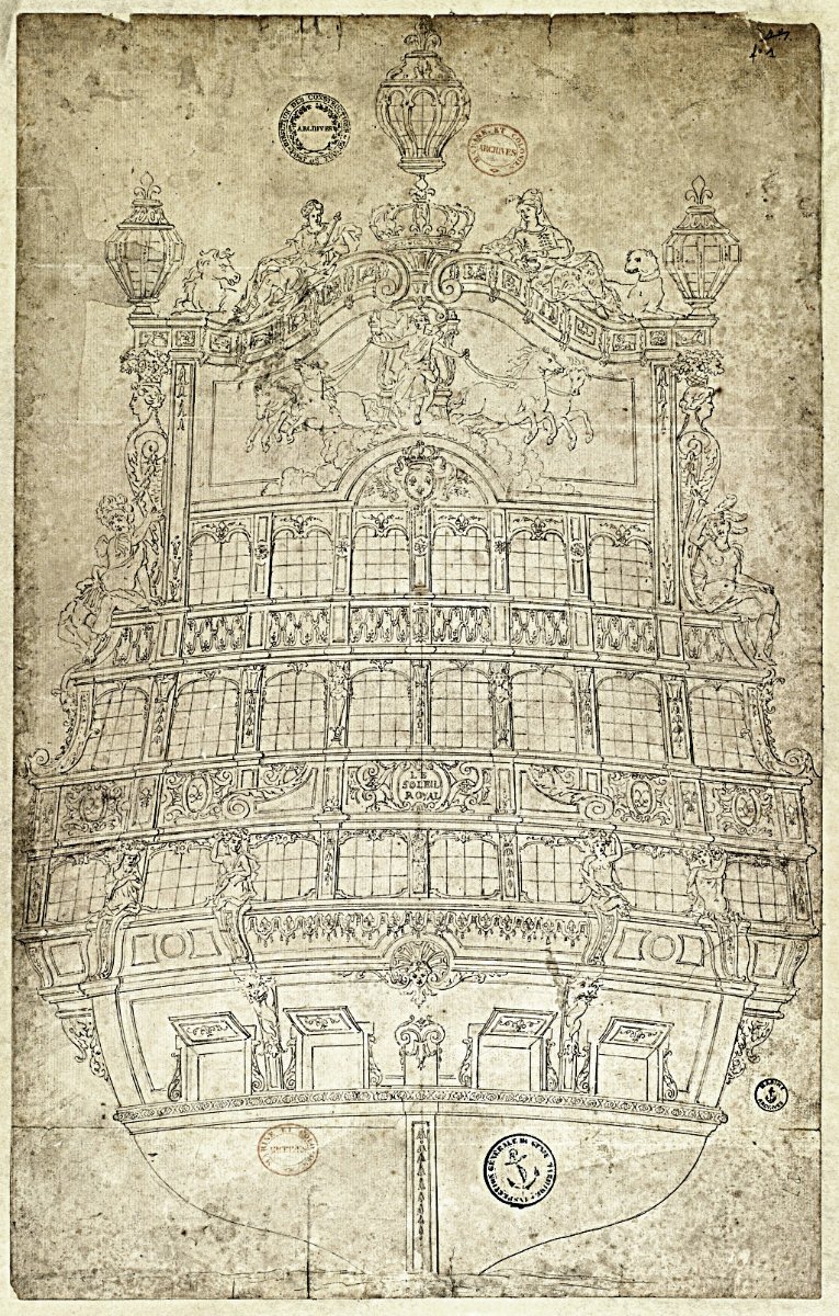
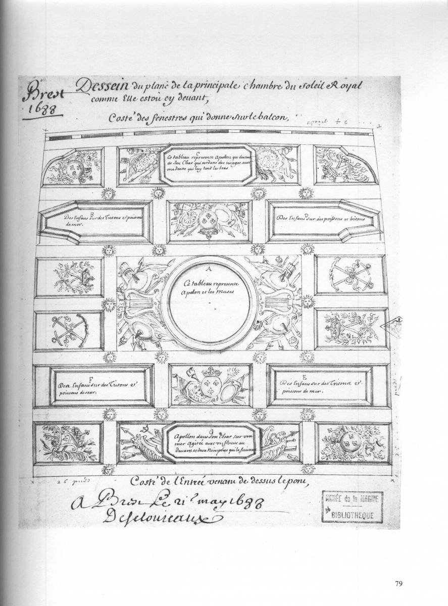
That is conjecture, on my part, but there is some concrete reference to this possibility, in the form of the survey drawing of the original grand council chamber ceiling in May of 1688:
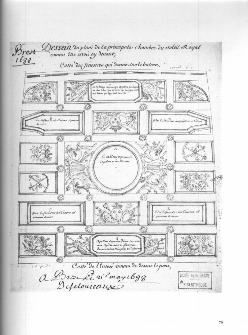
There are what appear to be five full window openings, bracketed by two half-lights at the extremities for a total of seven.
One exercise in drawing and proportion that I have not yet gotten to is to map out the stern widths at each level, which are also known and recorded from this same 1688 survey. That might provide a reasonable guide of the ship’s degree of tumblehome at the stern, and ultimately may suggest whether it was possible or even likely to continue two additional upper tiers of seven stern lights.
It may be the case, though, that there is a reduction from seven on the lowest tier, with five full and two blank-panel reliefs on the middle tier, and five full on the top tier that are book-ended by ornamental pilasters.
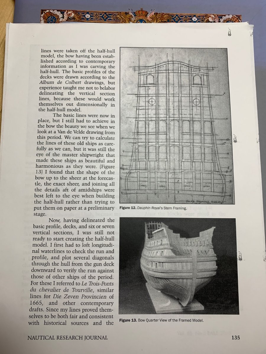
If it is possible to cary seven at each level, I like very much what Tony Devroude arrived at for the framing of his DR of 1668:
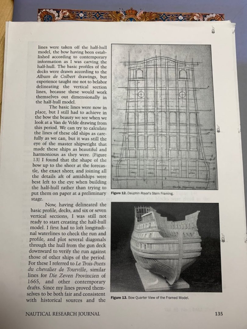 (NRJ Vol. 55, No. 3, Fall 2010)
As for the particular ornamental differences between the original SR allegory, suggested by LeBrun and perfected by Puget, I am fascinated by the following excerpt from:
Sur la vie et les oeuvres de P. Puget , par D.-M.-J. Henry,...
Author : Henry, Dominique-Marie-Joseph (1778-1850). Auteur du texte
Publisher : impr. de E. Aurel (Toulon)
Publication date : 1853…The stern of the Royal Sun, whose decoration is also due to the pencil of Puget, seems to testify to the account held by this artist of the need to restrict the extent of decoration. In the design of this new vessel the upper gallery, that is to say, the one which in the other vessel culminates in the coronation, is suppressed, and the figures are less gigantic. The vault
it is a duty and a real pleasure to express to this laborious writer all my gratitude for the obliging competition which he has kindly lent me by searching, in the archives of the Ministry of the Navy, the documents which could not be furnished to me by the archives of the port of Toulon, and sending me textually a copy of the various pieces of Colbert's official correspondence which I use in this work.
38 ON LIFE AND WORKS
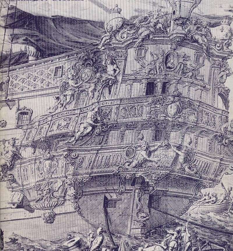
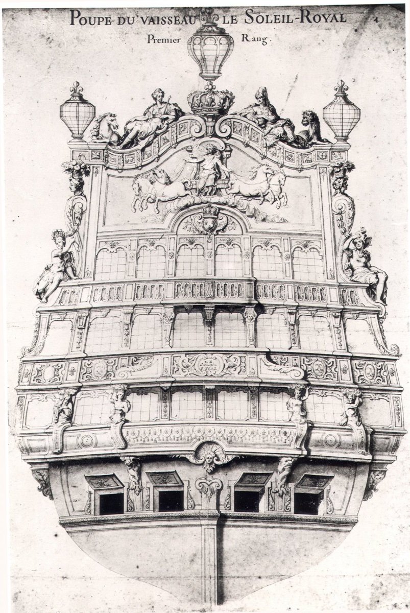
other ornament than simple moldings and a mascaron to cover the opening of the jaumière. To this seems to be reduced the apparent modification made in the profusion of ornamental riches, the composition of the painting always retaining a great and noble character. It may be, however, that the absence of ornaments in the vault was less akin to the modification demanded by the minister, than to the quality of the vessel, which being of second rank did not admit so much luxury of decoration. The area that bears the name of the vessel, covered with beautiful arabesques, is, at the Sun Royal, supported by four baths indicating the seasons that the star of the day shares in its annual race, because it must be noted, everything is allegorical in the decoration of this building whose name itself alluded to the young monarch. The succession of seasons begins with the left, where winter is represented under the appearance of an old man wrapped in a drapery covering his head and body; the other three seasons are graceful figures of women carrying on their heads a basket full of flowers or fruits that characterize them. The gallery extends from one end of the stern to the other, and its two extremities serve as the seat of two beautiful figures representing warriors of lesser proportions than those of the first vessel. These warriors, whose defensive armor differs as well as attitude, still refer to the two great regions that the sun illuminates. The east, on the starboard side, had its helmet adorned with floating ostrich feathers, while the crest of the port warrior, composed of feathers of other birds, formed a broad plume framing with great taste all the top of the head . With the hands of the two hands, which were near the ship, on the cornice of the gallery, which served as their seat, both of them held up the arm on the opposite side, so that the hand served as support.
P. PUGET. 39
next to the top of the board. These sides are formed of an inverted console whose notch accommodated at the reentrant part of the flanks of the building, at the height of the second battery. A bust of a woman carrying on the head a basket of flowers for one, fruit for the other, comes out of the small winding of these consoles. The great bas-relief, left blank in the project of decoration of the first vessel, but drawn in this one which had already received its name, represents the young king under the figure of Phoebus, driving his chariot harnessed of the four mythological horses launched at a gallop, and in the ancient style, that is to say, thrown two on the right and two on the left. The coronation of this beautiful stern, of better taste than that of the other vessel, is formed by two figures of women seated with their legs extended along the very slightly arched border of this coronation, and turned on their hips so to present face all the upper body. Their costume still indicates in them the symbol of the East and the West. Nobly draped one by one, the figure of the west holds in his right hand a long scepter leaning on his shoulder, while in front of her, at her feet, a horse with a bristling, floating mane, with her head held high, her mouth open, and her nostrils wide, looks at her, neighing. To starboard, the symbol of the east carelessly holds in its hands, in front of it, a vase from which rises a plant apparently indicating that of perfumes. At the foot of this figure and symmetrically with that of the opposite side, is lying a tiger that a necklace passed around his neck seems to show as tame and submissive animal. This remarkable composition is, as we see, only an ingenious flattery by which Puget celebrated in his own way the glory of the young monarch, who at the same time dominates the East and the West, the East by the establishment created or
40 ON LIFE AND WORKS
encouraged, (1) the West by the power of its weapons, and making its domination accept with love. An immense royal crown placed between the two symbolic figures, in the middle of the arch of the coronation, serves as a support for the only stern lantern. As in the other vessel, the whole surface of the painting is still noticeable by the profusion of details of the accessory ornamentation: L-stamped cartridges, crisscrossed, faces of radiant sun, fleur-de-lis medallions, strips of lambrequins between all the carvings of which is showing a fleur de lys, and this.
The design of the Sun-Royal still bears, as we see, several great figures; that was splendor, brilliancy, magnificence, it flattered the vanity of the king, who was as dazzled by sumptuousness as by victory, and Colbert, whatever his conviction, was not a man to be opposed to. his master on this article: the large figures, a little modified as to size, were still tolerated despite the formal disapproval of sailors, despite their incessant claims. However, Puget, in order to remove the inconvenience of too great a weight, had decided to hollow out as much as possible these masses of wood, as we see by those of those figures which still remain. Ten years had elapsed in this sort of struggle since the great minister had engaged the great artist to diminish the proportions of these ornaments, when the Sun-Royal received the decoration which I have just described. As this sculpture work was executed in Brest and that this port lacked or (1)…
———Among the notable differences are that the “vault,” or area above the stern chase ports and below the stern counter is relatively plain. The Four Seasons figures are all female, with the exception of Winter. There is the suggestion that the “warrior” figures of Africa and The Americas are male, and that they are seated upon the extremities of the middle balcony rail; this detail differs from Berain’s re-working of the design in 1689, in that Berain has these two figures perched above pass-through archways on the upper balcony tier. I think the warrior figures seated on the middle balcony rail is actually what is being vaguely suggested in the Gilded Ghost portrait:
And more concretely confirmed by the RL and Monarque drawings, above.
One notable similarity is what appears to be the quarter pieces that support the side lanterns in Berain’s drawing. Contradictorily, though, the author describes only a large central lantern for this early version of SR, which he suggests is of a lesser rank. Frankly, this seems just wrong because as the principal ship of the Ponant (Atlantic) fleet, SR would always have been a first-rank ship with three stern lanterns.
The other truly fascinating difference is the “docile” tiger at the feet of the East, as opposed to Berain’s Camel. I can only project that, if this was indeed Puget’s original design, perhaps Berain did not like the A-symmetry of the West’s proud horse with head raised high, opposite the East’s docile tiger with his head lowered upon his fore-paws. Perhaps the solution, there, was to substitute a camel who also has his head raised high. I don’t know. I can only guess.
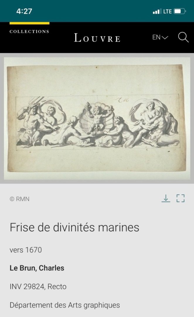
Returning to your drawing John, I like your extension of the tasseled lambrequin to the quarter galleries, below the window tier. This seems a harmonious and fitting extension of the stern decor. I think that early SR, though, would have had a cul-de-feu, or lower finishing of the quarter gallery that may have been comprised of some form of the following elements, drawn by LeBrun:
And I think early SR may still have had a vestigial balcony tier at the quarter deck level of the quarters, that was framed by a trompe l’oeil amortisement of foliate ornament - much as you see with the refit DR of 1680:
While I have some more or less specific ideas about how to assemble all of that into a coherent narrative that supports the stern allegory, I have yet to begin sketching any of that, myself.
It is fairly certain in my mind that early SR would have had a more elaborated upper bulwark frieze than the simple field of fleurs seen on La Reyne, though.
And one last thought, after my 12 days in Paris and Normandy, I have come to think that it is not unreasonable that the majority of ornament on the first version of SR likely was leafed in gold. Despite the massive expense of the times associated with this extravagance in the 1660s, the Royal Palace at Versailles is covered in gold leaf and the richest paintings and tableaus imaginable. Incroyable!
So, this is already a book unto itself. I will conclude here, for now. John, I really look forward to the continued development of your project - this is really great stuff, so far!
-
Brilliant first planking run
- mtaylor, chris watton and Blue Ensign
-
3
-
-
My apologies, Jorgen, but I am not understanding your question.
Generally, many POB builders fill the spaces between bulkheads (and below the lower gun deck) with pieces of balsa that they then fair to the bulkhead shapes.
This has the dual advantage of always providing a firm glue surface in these complicated areas of the underwater hull, where plank must taper at the ends, but it also makes it easier to gauge a fair hull before planking begins.
In the how-to section of MSW, you should be able to easily find Chuck Passaro’s fool-proof method for lining out the hull. His advice really helps clarify all of the potential pit-falls that stand in the way of a really nice result.
As a matter of fact, here it is:
-
This is all exquisitely well-done, Mark!
- No Idea, mtaylor and Keith Black
-
2
-
 1
1
-
-
The gussets serve two purposes:
For one, I was not confident in the small rabbeted glue joint because I needed to flex these parts quite a bit to get them to seat all the way home. So, these additional gussets were carefully scribed to the inside reverse curve of the forward bulwarks. They increased glue surface-area significantly, while helping to ensure that the angle of the bulwarks was consistent and what it needed to be.
The second advantage of the gussets is that it provides mounting surfaces for the cambered deck beams that give my forecastle deck shape.
Where the forecastle deck overhangs the main deck, I created a pair of hanging knees that would be visible just behind the only visible deck beam. I just wanted to add a touch of realism with these details. The same thing is happening at the quarter deck location.
The stock Heller deck is perfectly fine on its own, but I have to make a deck from scratch because the stock deck is no longer wide enough.
The trip is still going well. At Rouen for a couple of days, on the far extension of the cruise. There is a Beaches of Normandy excursion, but that is an all-day affair and Dad will not have the stamina for that. In fact, it sounds as though he’s coming down with a chest cold.
This trip has presented numerous challenges at his present stage of dementia. He is very limited in what he can process and he is often argumentative and un-reasonable because he hasn’t been sleeping well.
It has been great, but it is challenging!
-
-
That sounds like a plan!
-
Your ruler test on the starboard side does, indeed, appear to be flush and straight. The problem is more evident on the port side, from an overhead view, although the eye-test from fore-shortened perspective does indicate the starboard side has the same problem. If it were me - I would remove any current plank strakes and pad the 1-2 problem bulkheads on each side. I would then use something a little stiffer/thicker than the kit plank to fair the bulkheads down to where they need to be. This seems easier to me, ultimately, than adding bulkhead material for each strake of planking. When fairing, rely more strictly on the fore-shortened fore/aft, aft/fore perspectives to gauge how close your fairing is to where it needs to be. Those are the perspective views that pick up those discrepancies on the finished model. The human eye is amazingly sensitive to dips and hollows.
-
It does seem to be the case that warships ready for action only tended to carry main and topsails - the t’gallants shortened or removed for action, and usually the main sail furled to avoid sparking fire in the rigging. I suppose the rationale had partly to do with a diversion of manpower (necessary) to manage the t’gallants, as well as the safety issue of more top-hamper crashing down and having to be cleared after a dismasting.
-
-
May I gently suggest, before the planking begins in earnest, that you take a little more time to fair the bulkheads. It is evident, on your first plank, that there is a not insignificant mid-ships dip. If you are double-planking, you could fill depressions after the base layer, but if you are only single-planking, these depressions will be very evident, if the under-framing has not been faired.
- Jörgen, BLACK VIKING and Baker
-
3


SMS WESPE 1876 by wefalck – 1/160 scale - Armored Gunboat of the Imperial German Navy - as first commissioned
in - Build logs for subjects built 1851 - 1900
Posted
Your progress, Eberhardt, is incredible, and I am just catching up now. On this point, though, I am inclined to agree with Banyan.