Hubac's Historian
-
Posts
3,316 -
Joined
-
Last visited
Content Type
Profiles
Forums
Gallery
Events
Everything posted by Hubac's Historian
-
 I’m not sure what scale your Sovereign is, but assuming it is the same as Katherine - this is a fascinating evolution in warship design. Your work and progress are remarkable. I really like the blocks you are using and will have to look into those, myself.
- 1,035 replies
-
- 4
-

-
- royal katherine
- ship of the line
- (and 1 more)
-
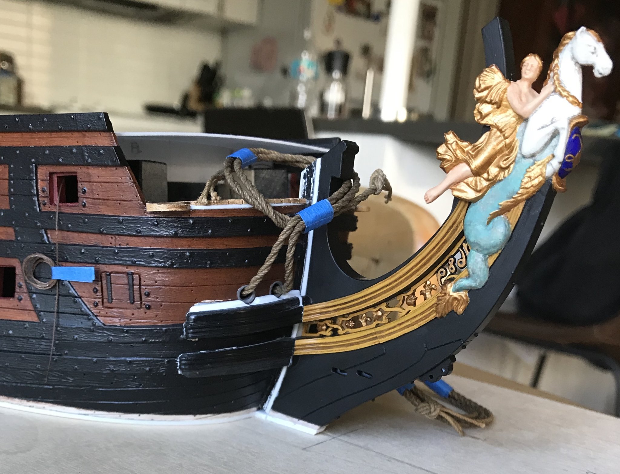
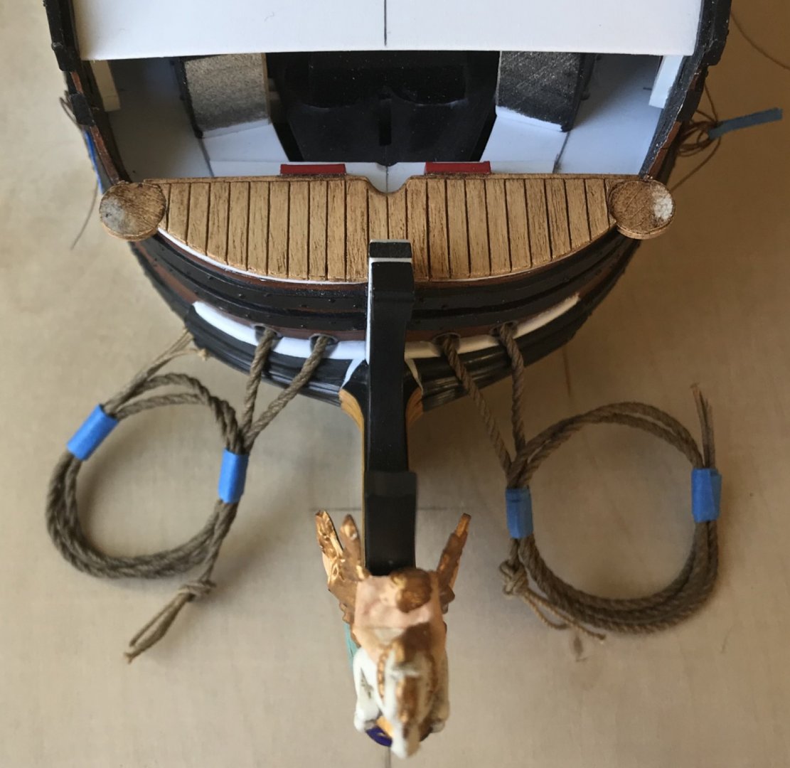
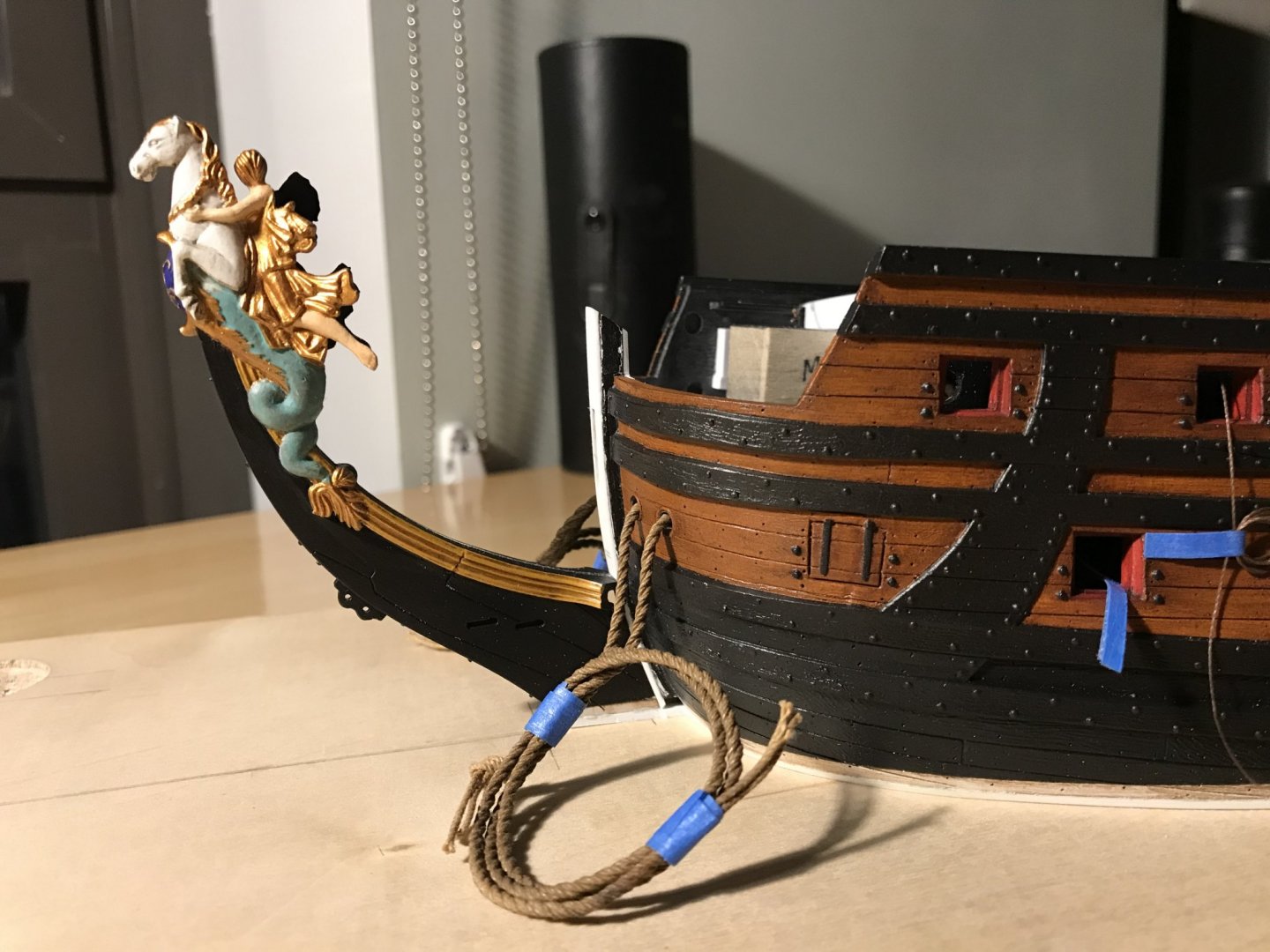
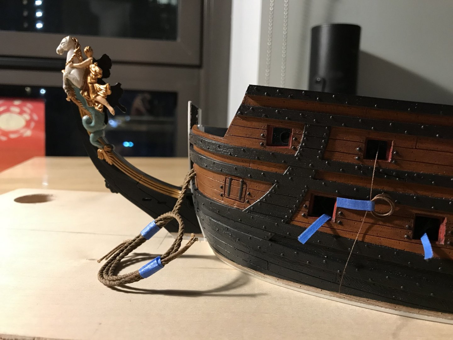
I have heard that sentiment here and elsewhere, and it is my guiding ethos on this build. My objective, always, is to maintain a standard that will allow the viewer to get up really close and scrutinize the work. It isn’t that they won’t find flaws, errors or omissions, but they definitely won’t find any distracting sloppiness. So, the knee extensions are glued-in, and I think the run of their sweep is fair and consistent. I like the look of the raised bolsters around the hawse holes. Given how fragile the artists’ acrylic, raw sienna was when I applied it - I was surprised at how difficult it was to scrape away from the glue areas, a year later. Granted, there was a clear topcoat applied, but it took real effort to scrape the yellow, once you were past the topcoat. There’s a little bit of putty work that still needs to happen, here, and then I’ll prime, paint and repair finishes in the bow area. The beakhead deck is secure, now. You can see the styrene fill, along the leading edge: Filling that gap facilitated a natural camber which should be present, anyway. Ultimately, I have decided that I will maintain the roundhouses. While I agree with Chapman that they probably are not correct, the wrapping hull modification was complicated by the fact that this sweeping wrap extends up into the upper bulwarks. Builders of this kit know that the upper bulwarks are separate pieces that I am nowhere near ready to install. So, I think I will just avoid all of that, on this build, and look to install additional simple seats of ease. Here are the roundhouses painted, but not installed: I have not yet applied the walnut ink wash. This red color, though, will be what I apply to the beakhead bulkhead, along the run of the main deck ports, selectively throughout the lower quarter galleries, and throughout the stern facade. It is also an artist acrylic, proprietary mix for BLICK. I’ve thinned it considerably with water, and the color lays down beautifully in thin coats. I have found that the artists’ acrylics are hit or miss. Fortunately, my blues are going to work! I also picked up a bottle of the Tamiya X20 thinner for acrylics, and this helped with the application of my yellow ocher, so that was a great help. I’m finishing up my starboard amortisement dolphins, and I was amazed to realize that they are about 1/32” taller than the port side: Here, I have the P&S forward carvings back to back: I double-checked the 90% reduction photo copies and there is no distortion from one side to the other. They match up perfectly. I can adjust this, so that both sides match, but it remains a mystery. I have figured out what the process will be for making the false amortisement windows that go between these dolphin carvings. Those will be my next small-work project, and I think they should be relatively straight-forward. Here is the stock port headrail, as it currently aligns: Unfortunately, I will not be able to use these; the headrails need to lap the hull by about another 1/4”, and there is no feasible way to stretch or modify these so that they look good and right. Patterning new ones will enable me to correct the problem of the forward scroll rising up, alongside the sprit-mast, thus spoiling the line fairleads. I will also be able to space the headrail vertical timbers (decorated with lyres in Berain’s drawing) so that they align with the headrail supporting timbers. This way, I can space those supporting timbers, along the trailboard, in a way that makes sense. Ultimately, I believe that I can graft the forward scroll and rear escutcheon onto the new headrails, thus saving an enormous amount of time. If I can achieve all of that, I will have done justice to the bow. Before I do my paint touch-ups, I’ll get busy extending the beakhead bulkhead and getting that in place. Thank you all for looking in. Enjoy this last week of the summer, as best you can!


- 2,699 replies
-
- 18
-
-
- heller
- soleil royal
- (and 9 more)
-
Thank you so much, Mark! I’ve been thinking quite a lot, lately, about the relative ease of constructing the model straight out of the box; with the number of hours that I have invested in these head structures, one would reasonably expect much more to show for it. In fact, it is absurd to me, at times, to consider that this is the single project that I have ever undertaken, that has consumed the greatest amount of focused concentration and effort. A plastic model. But there is no rhyme or reason to what the heart desires, and my heart wishes to transform this really pretty good plastic kit into something fairly spectacular. Despite its relatively ephemeral nature, the project has given back to me everything that I have put into it, so far. But, I won’t be doing this sort of project ever again 😉
- 2,699 replies
-
- 3
-
-
- heller
- soleil royal
- (and 9 more)
-
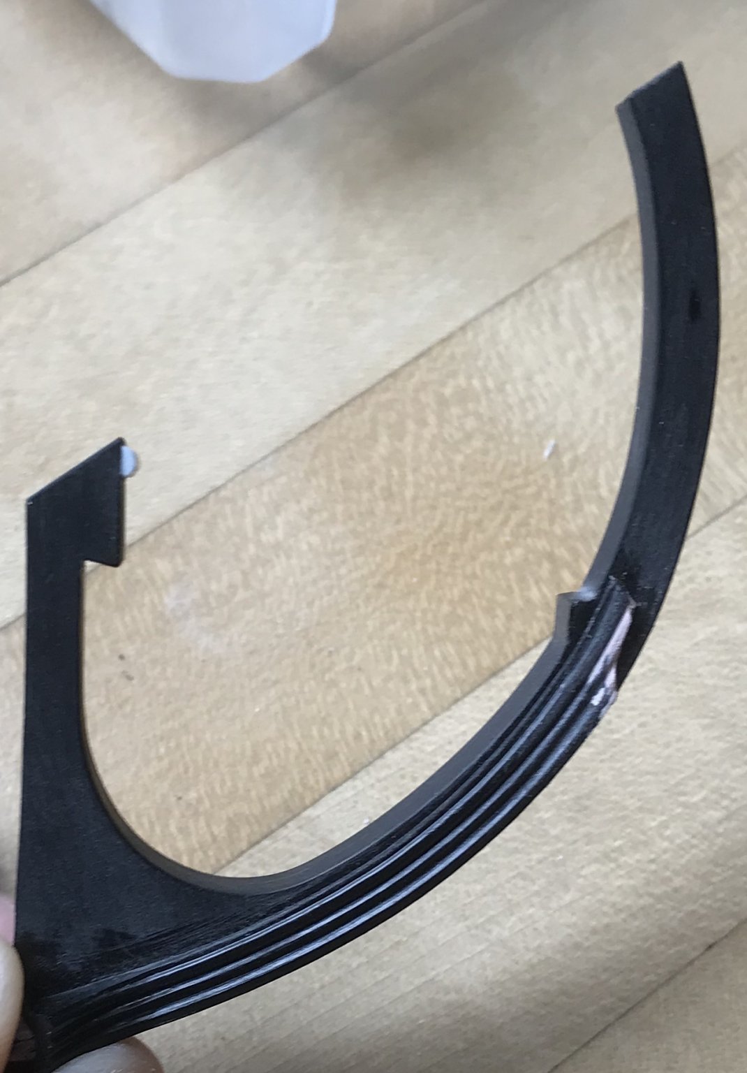
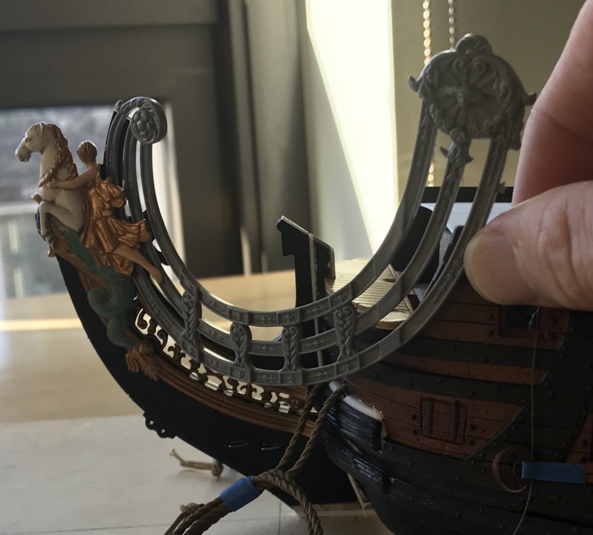
These upper knee extensions have been a real challenge to fit, so far. A big part of the challenge is that I raised the upper knee a solid 1/32”, in order to buy a little extra space for the trailboard. That modification, though, did result in the need to add and shim with new plastic. One upgrade that I wanted to attempt was to raise the cheeks, surrounding the hawse holes, which I think I reasonably succeeded at. In this reverse-engineering environment, it isn’t perfect, but I think it is passably better than stock. Be well, and thank you for looking in!
- 2,699 replies
-
- 11
-
-
- heller
- soleil royal
- (and 9 more)
-
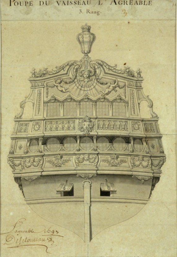
Here’s a small, but I think interesting realization I had over the weekend. Berain’s new ornamental scheme for L’Agreable also incorporates small winged fairies: This is interesting to me because even at this later date, winged fairies are still part of Berain’s design vocabulary. Skeptics of the authenticity of the mermaid pixies, on the amortisement, tend to view them as something that may have been present much earlier than 1689 - perhaps as part of the original ornamental scheme. I tend to think that their presence, here on L’Agreable, at the hand of Berain, re-enforces 1689 as the more likely contextual time frame for my quarter gallery design. These figures are cherubs, and not specifically female, but note the presence of swaged garlands, below. This is all consistent with the ornamental language of Soleil Royal.
- 2,699 replies
-
- 5
-
-
- heller
- soleil royal
- (and 9 more)
-
Every bit of this is just astonishing. I don’t often comment, here, but I have been watching with great interest. Your care and precision of execution are enviable, indeed!
-
I hear what you’re saying Chapman, although if I were serving on a ship like this, I wouldn’t mind having a little extra shelter around me while I do my business.
- 2,699 replies
-
- 1
-
-
- heller
- soleil royal
- (and 9 more)
-
These are difficult to photograph, but I am very happy with the modeling and the overall impression of these: Now that I have worked through the problems, the starboard pair should come out even better. To finish these off, I’ll insert domed bits of styrene rod into the eye sockets. I really appreciate all of the likes and kind comments!
- 2,699 replies
-
- 10
-
-
- heller
- soleil royal
- (and 9 more)
-
The ship is looking really fine, Gary, and I could not agree with you more about the Tally-Ho project!
-
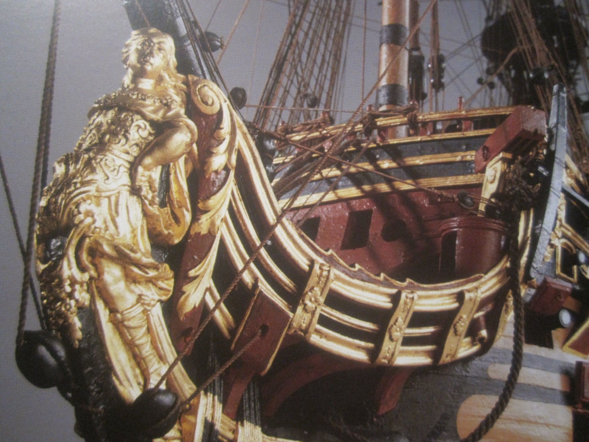
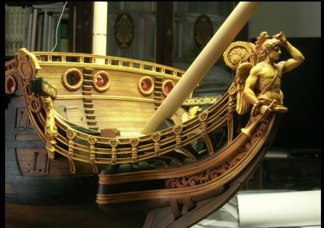
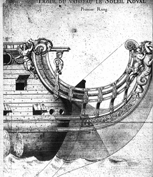
Hello Chapman, A while back, I had a conversation with Michel Saunier about this, and I have to say that I agree that the roundhouses are most likely incorrect for a French ship of the First Marine. To borrow an example of one of my favorite models of all time, here is the head of L’Ambiteaux: As a side note, this modeler’s rendering of the ornamental program is the best and most faithful to the spirit of the epoch, IMO. What I think is notable, here, is the way that the hull wraps around, past the beakhead bulkhead, in a diminishing crescent, towards the stem. What I have most often seen for ships of this period are these lower, simple seats positioned as seen above. I suspect, though, that Tanneron pulled this detail from the Louis Quinze model: That the Quinze model is a first-hand document of the early 1700’s, lends that detail some considerable credibility. Now, whether that detail extends back to SR1’s rebuild in 1689, and just prior to the birth of the Second Marine, I cannot say. Perhaps, if Mr. Delecroix is looking in, he may be able to offer some perspective on the matter. Now, the Heller kit vis-a-vis Tanneron, does not have the forward wrapping of the hull around the beakhead. I have been toying with whether to re-construct this detail, or whether to maintain the roundhouses, while also including the short seats. On a ship so large as Soleil Royal, additional seats would certainly have been needed. For the time being, I am leaning towards the latter, as it is somewhat plausible, given the not too distant future that the Quinze model represents. I am certainly open to advice and suggestion, here.

- 2,699 replies
-
- 8
-
-
- heller
- soleil royal
- (and 9 more)
-
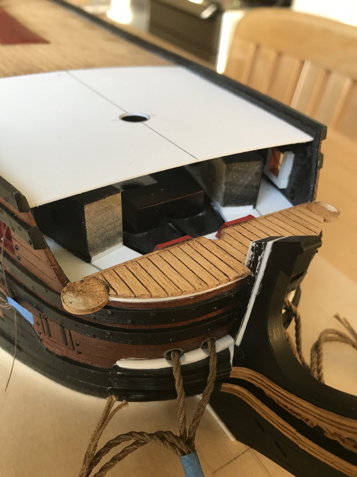
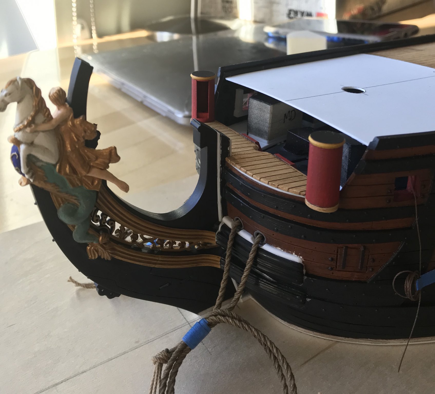
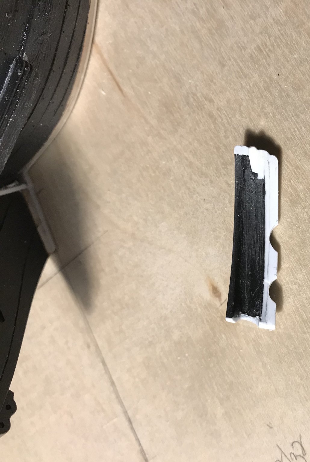
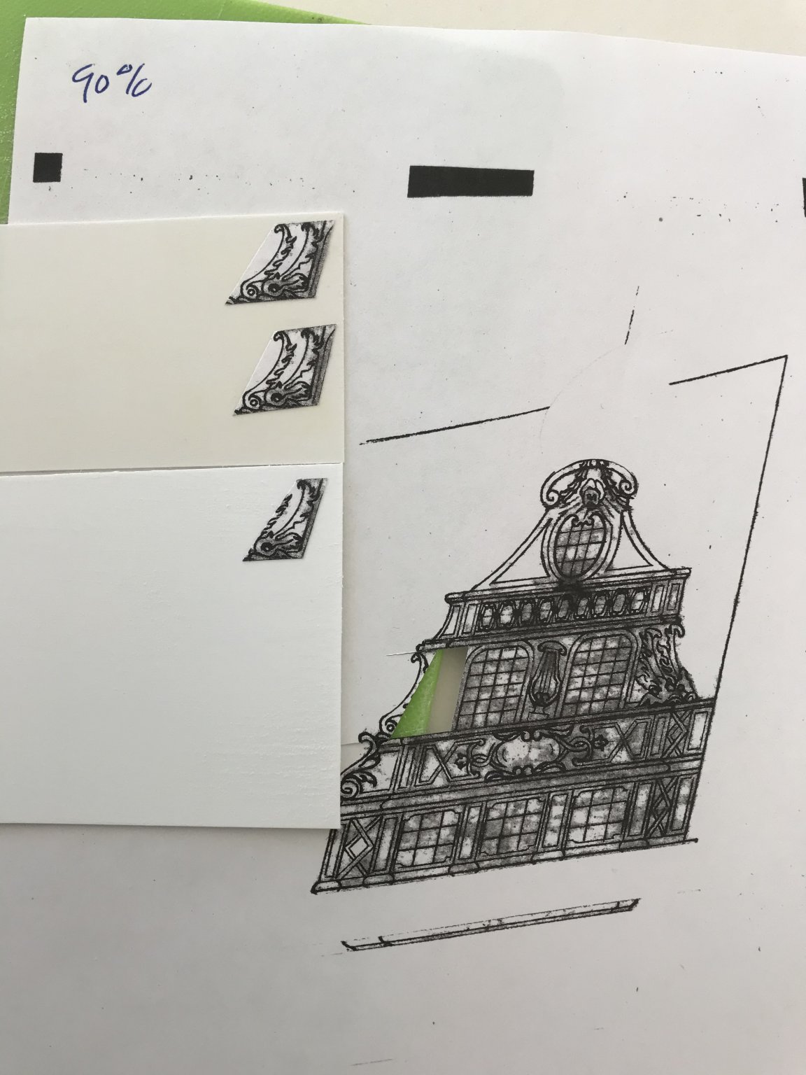
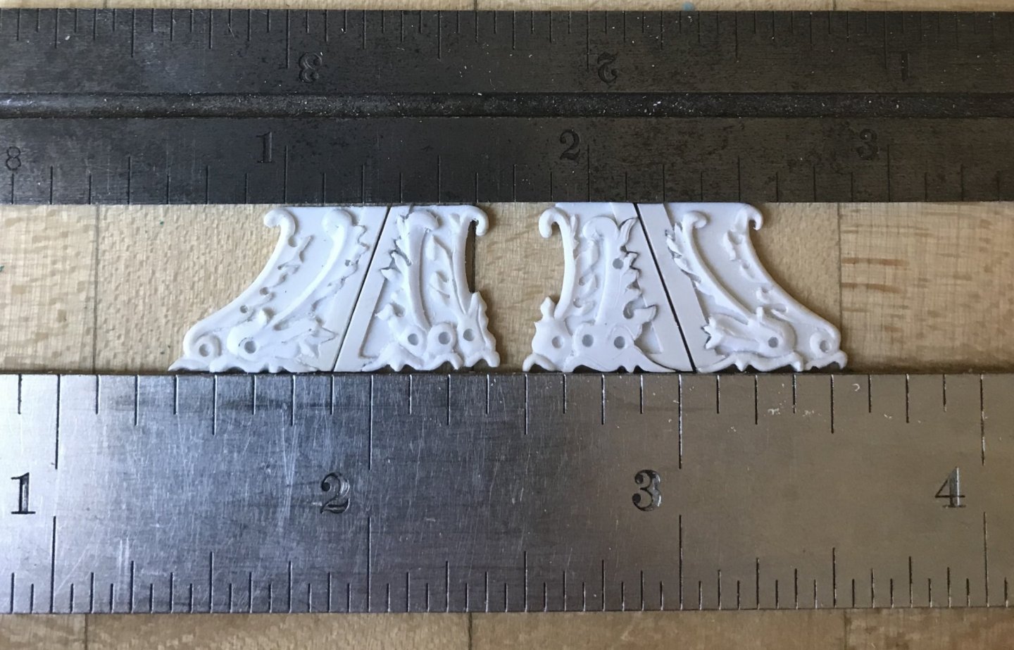
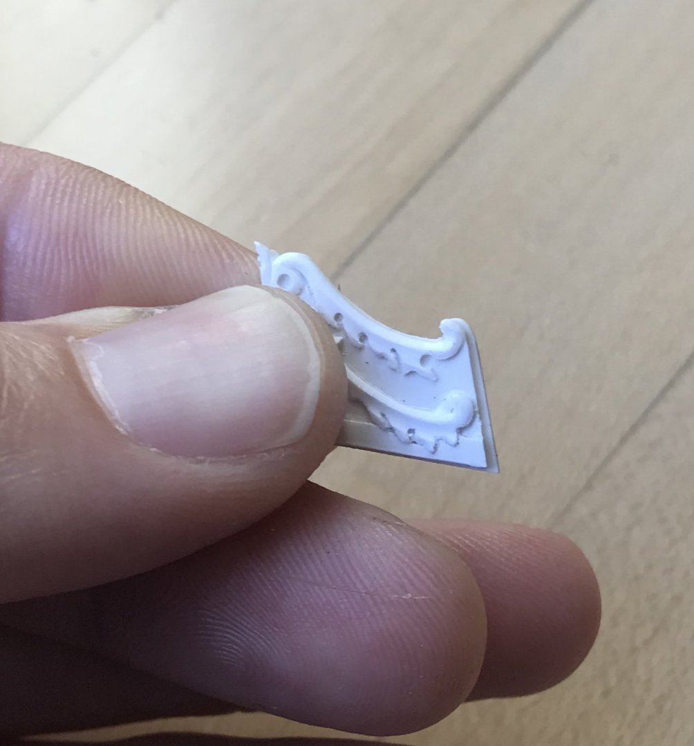
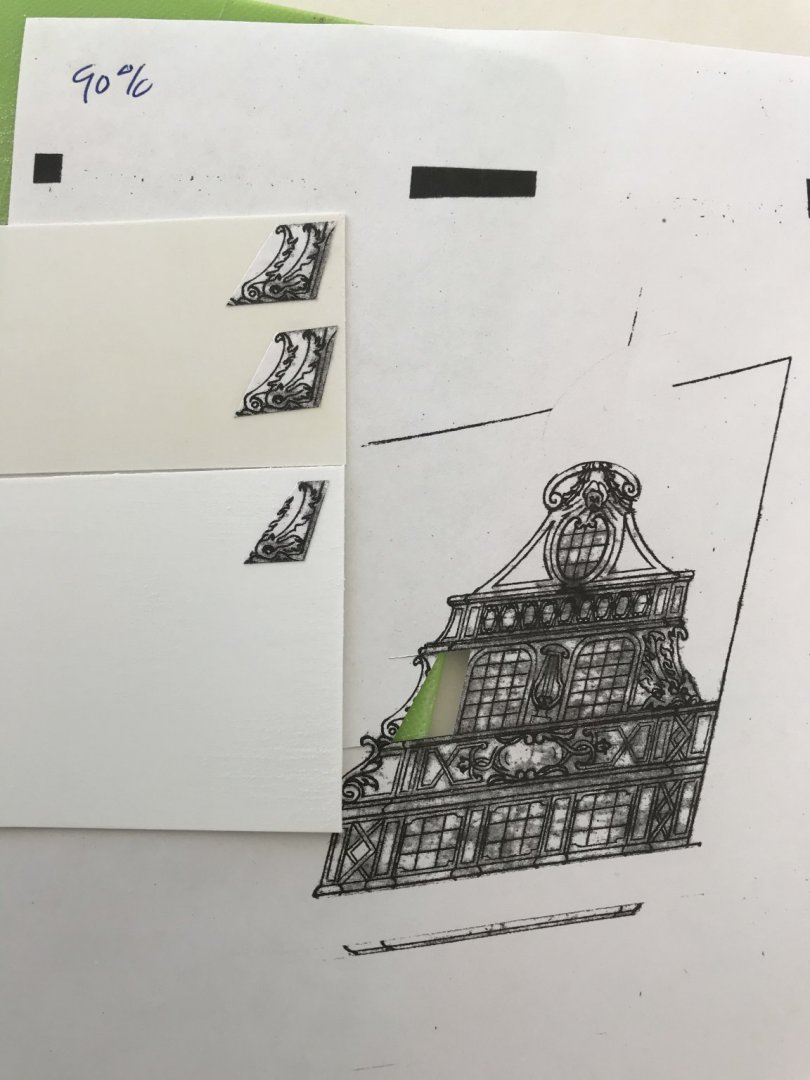
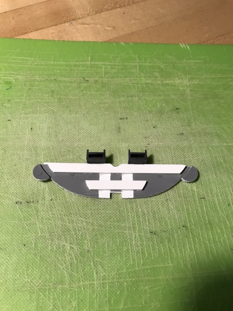
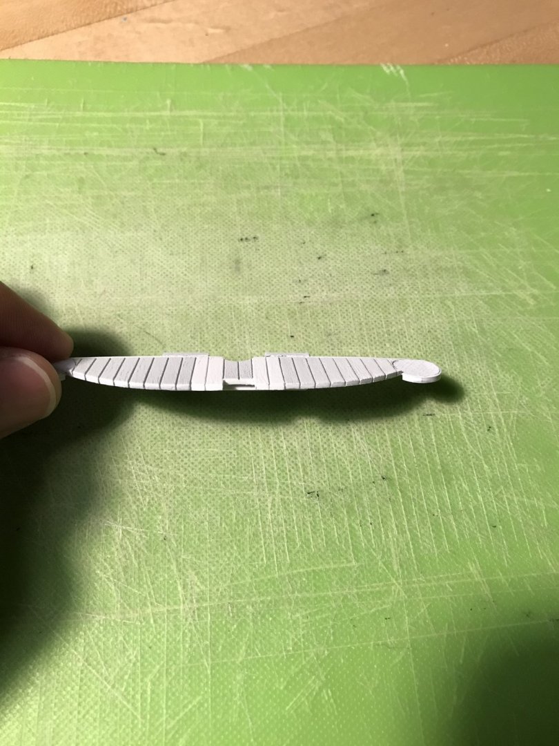
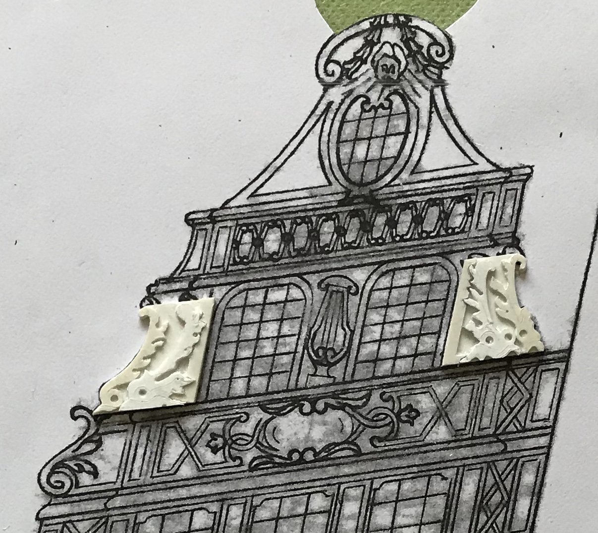
One of the primary benefits of the long time that it has taken me to get to this point is that I have had plenty of time to figure out how best to tackle the more vexing aspects of the ornamental program. The amortisement of the quarter galleries is tricky because it must all remain very shallow, while giving the impression of a full relief. The specific aspect of the amortisement that I am working on now are these pairs of dolphins, flanking the two windows, on the main deck level: My interpretation of this carving is that the inner dolphins should project, outboard, just a bit further than the outer dolphins. First, I considered attempting to cut the relief into one solid piece of 1/16” styrene. I thought, however, that it would be extremely challenging to level clean grounds, around the bas relief, at this scale. Then it dawned on me to build the relief up as a series of layers: a background layer, or base of thin stock; the outer dolphins and inner border from the same thin stock; finally - the inner dolphins from slightly thicker stock. The other consideration I was weighing is that I wanted to find a way to reduce the verticality of the amortisement just enough so that I didn’t have to alter my forward pixie, in order to keep my aft octagonal port. This main deck level of the amortisement proved to be the ideal location for this height reduction. First of all, as Berain originally drew them, these two false windows are out of proportion with their counterparts on the stern; a height reduction, here, would help to harmonize the quarters with the stern. Cutting the window height down is no big deal, and I had to re-draw the harp, anyway. However, the dolphin carvings needed to shrink proportionally. By increments of 5%, I reduced my quarter drawings until I arrived at 90% of the original. This resulted in a full 1/16” reduction, in height, of the dolphin carvings, and a hair less in their width. Ultimately, this reduction may not fully clear the pixie from the octagonal port, but the interference between the two should he greatly reduced. It will be impossible to gauge that until I’m actually assembling the amortisement. Ultimately, the dolphin carving blanks consumed most of the additional width allowance I had incorporated into the base layer. This won’t affect the overall width of the amortisement, on this main deck level, as you can see below: I could even leave these as they are, and they would he passable, however, with just a little modeling they will really pop. Back when I was drawing all of this, I thought these dolphins were just going to be murder to make. As it turns out, they should actually be one of the more straight-forward bits of carved work on the ship. Here are a few shots of my extended beakhead deck: As I have throughout the model, I engraved plank seams along the edges. It was necessary to fill and fair the glue-edge beneath this beakhead deck with a strip of styrene, but that will all be seamless, now, once the deck gets glued down. I’ll actually have a little time in the shop, today, so I plan to rough out my blanks for the lower portion of the QGs, on the bandsaw. More to follow - thanks for looking in!


- 2,699 replies
-
- 11
-
-
- heller
- soleil royal
- (and 9 more)
-
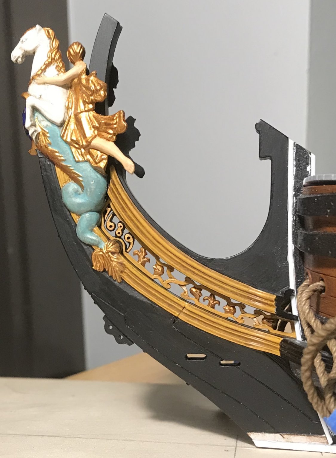
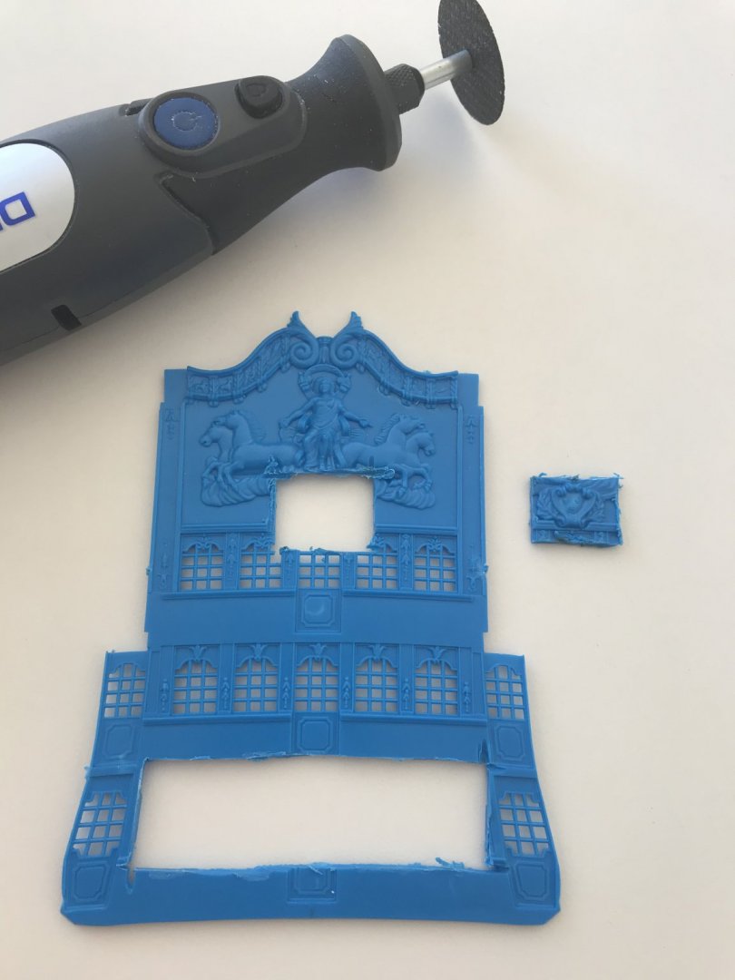
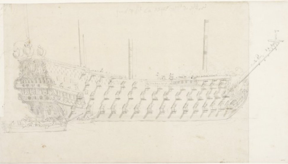
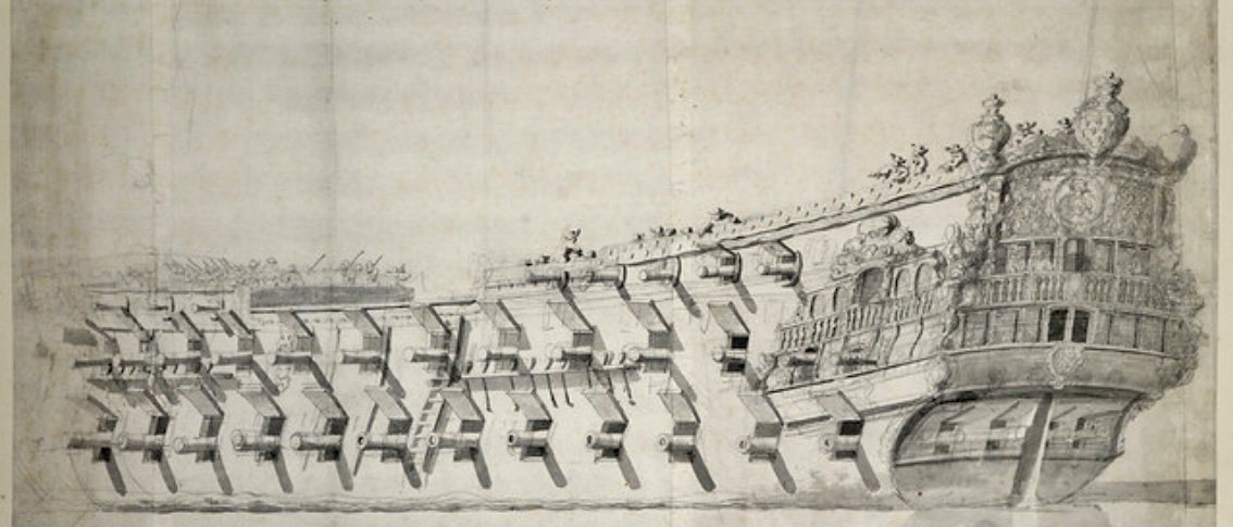
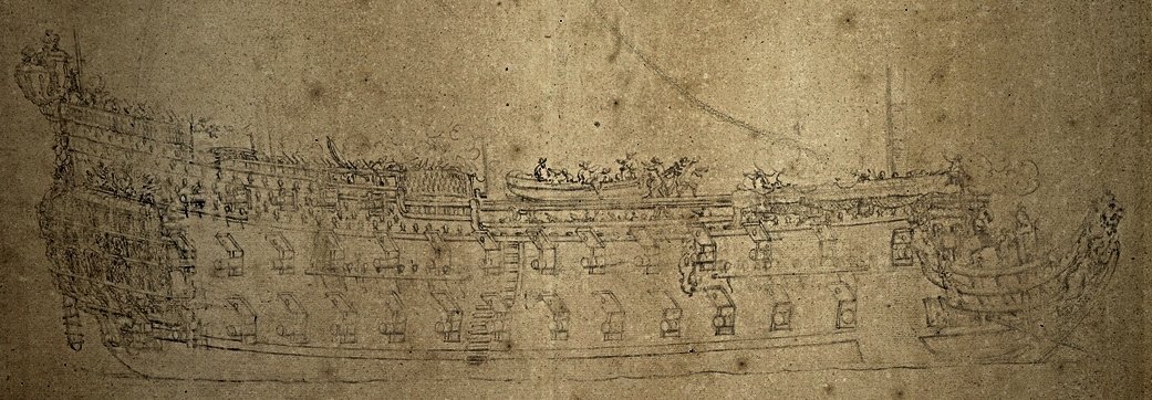
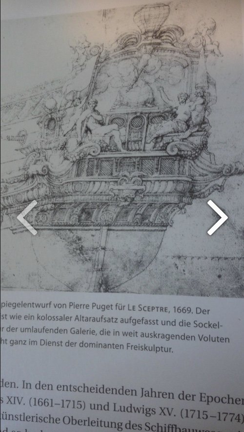
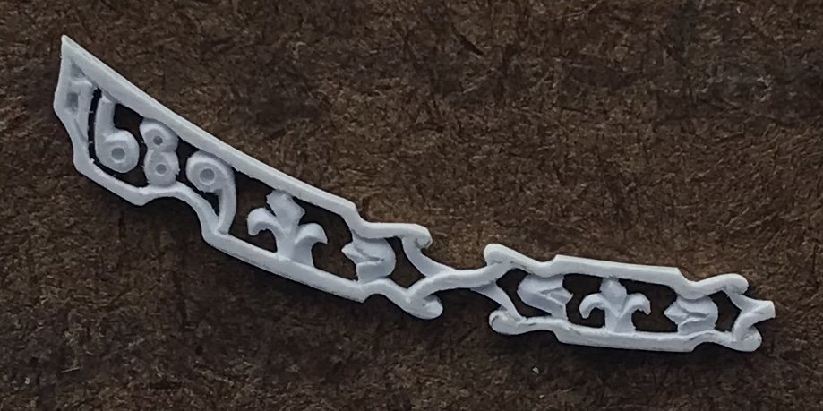
Thanks, EJ! The year marker is my own idea as a way to fill an awkward space in the trailboard, where Berain’s design no longer fit neatly. As far as I know, this was not a known practice, in 17th C. France, and the only specific year marker I can think of appears on the tafferal of the Vasa. In build news, I’ve extended the beakhead deck (15/32”, overall), from the center/out, and am thinking about ways in which I will modify the beakhead bulkhead. Since I have a number of stern plates to pull from, it was a no-brainer to include the Arms of France and place them where they traditionally appear on the bulkhead: I was looking for the port bow view of La Reyne, for a direct reference to this placement, when I stumbled upon a VDV starboard quarter view of the ship that I had never seen before: It provides a somewhat different sense of the vessel’s mass and bearing, as compared to the other, well-circulated portrait: These portraits are the result of a French naval review, in English ports in 1672. What is interesting to me is that the quarter galleries and stern of La Reyne were probably cut down in anticipation of this visit, out of Colbert’s concern that the English may view the new French fleet through the prism of the Royal Louis; bordering on grotesquely excessive and overloaded with top hamper at the expense of the vessel’s handling characteristics. The vessel we see here is none of that. While decorated, the ornament does not distract from the awesome presence of her artillery. That, to be sure, was Louis XIV’s reason for being there, in the first place. The same can be said of all the other French vessels that the VDVs sketched on this occasion: Le Terrible Perhaps another of Le Terrible Orgieullieux La Royal Therese (formerly Le Paris) An unidentified vessel: La Royal Therese is an awesome example of this cutting away of the excess of ornament. Here she is as Le Paris, in 1667: This original iteration is very much the imprint of Pierre Puget, the sculptor of marble.

- 2,699 replies
-
- 8
-
-
- heller
- soleil royal
- (and 9 more)
-
Thanks, Guys! Druxey, I’ll give rubber cement a try on the next go-round. I’ll be making the supporting dolphins that flank the middle pair of windows, of the amortisement.
- 2,699 replies
-
- 3
-
-
- heller
- soleil royal
- (and 9 more)
-
Excellent tip, Dan! I will look into it, as this yellow ocher color I mixed is exactly what I want. It would just be nice to not have to waste so much paint, in the process - overloading the brush, wicking off the excess and trying to apply before having to rinse, etc. Welp - at long last - SUCCESS!
- 2,699 replies
-
- 7
-
-
- heller
- soleil royal
- (and 9 more)
-
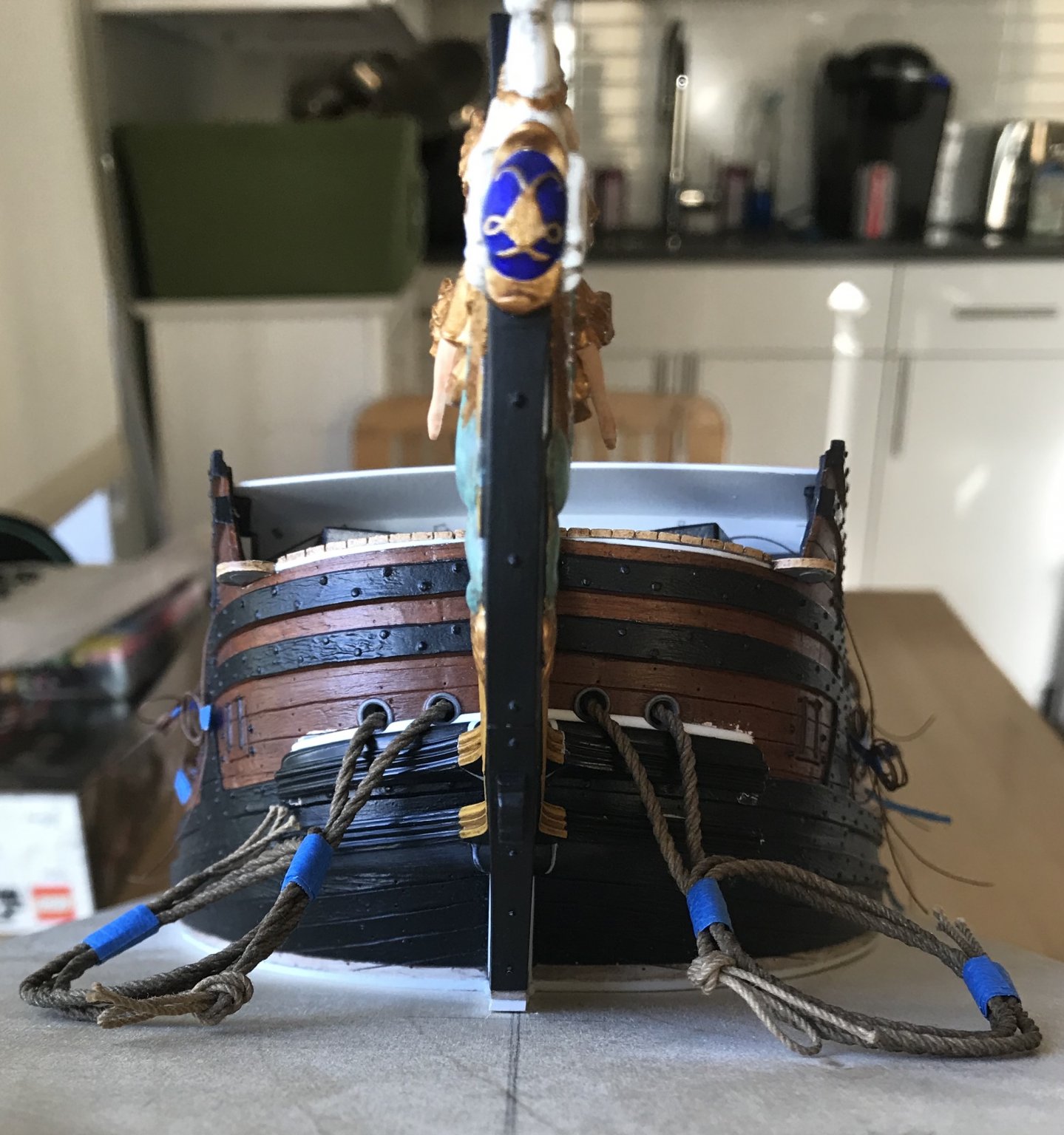
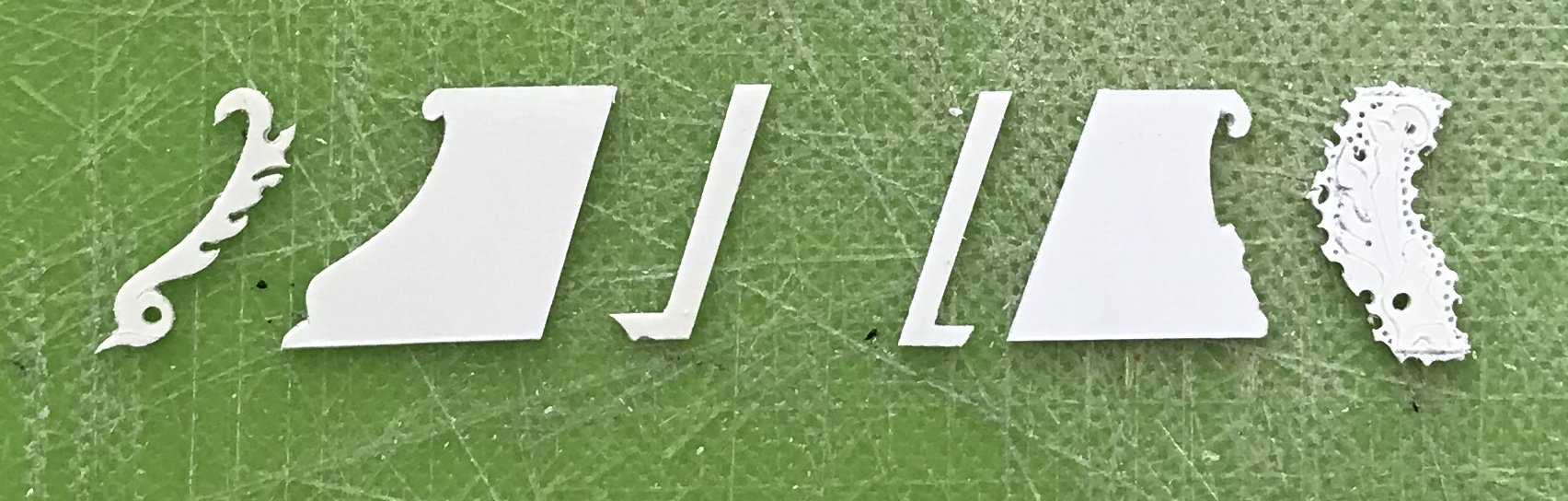
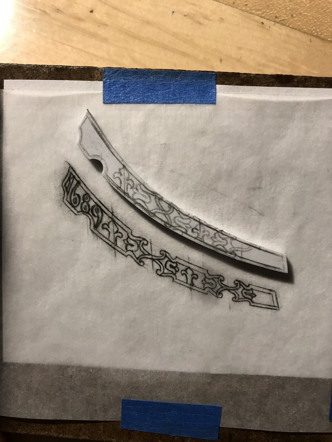
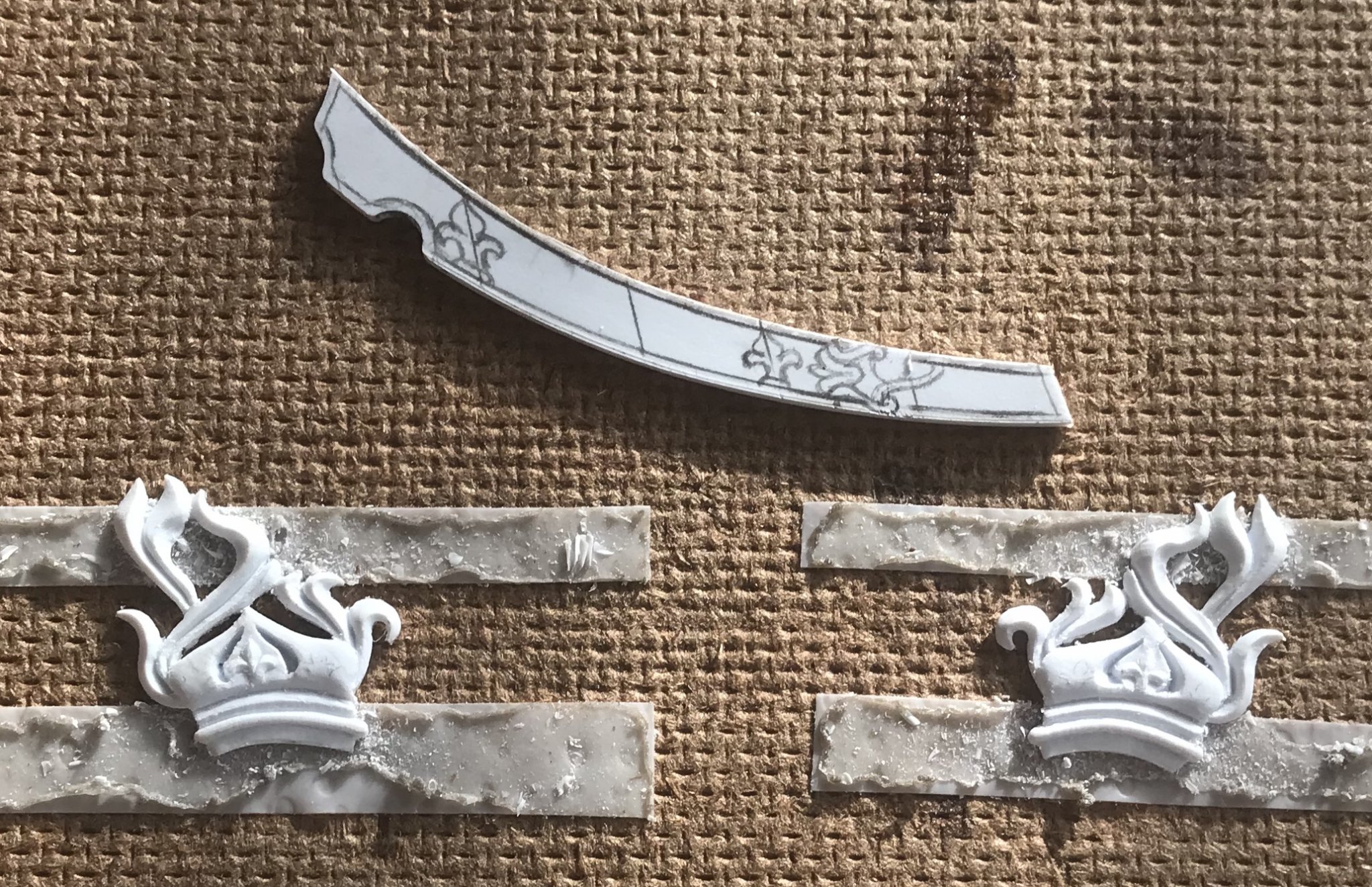
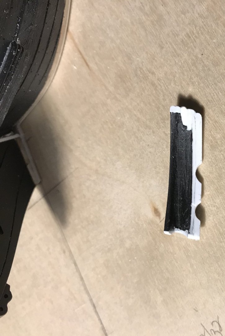
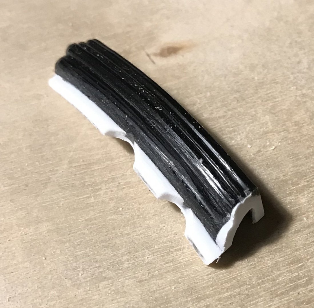
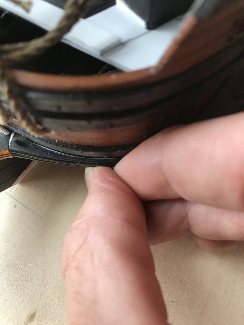
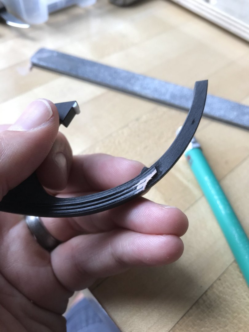
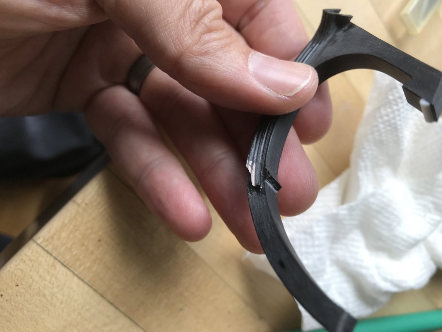
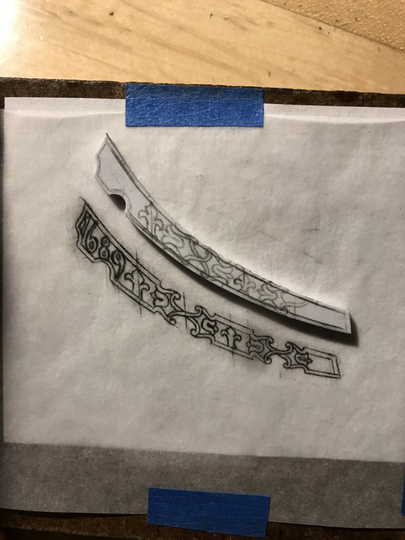
Of all the carved work that I have done for this project so far, the trailboard has been the most vexing, by a long-shot. While I usually double-stick the work to a scrap of masonite, I reasoned that I would need to work this carving, constantly, from one side to the other. The necessity of this approach, as I quickly discovered, is underscored by the fact that - despite a sound indexing point, in the half-round forward notch - the paper patterns were just askew of each other, from one side to the other. I wonder whether this can be attributed to the paper expanding unevenly, upon application of the water-based glue stick. I don’t use solvent-based spray adhesives because of the plastic. Whatever the case may be, working both sides enables you to meet at the middle and smooth a transition between the two sides. It’s all just extremely time consuming, but then, I’m a glutton... While it seemed like a good idea to work from the outside, in - my mistake was in relieving the Xs, first. I should have saved this for last because doing so made the work especially fragile. The design calls for shell reliefs inside these X’s, but I just did not think I could pull that off in this scale. Instead, I opted for the lightness and visual interest that opening up the negative space provides. These pictures don’t reflect the current, near finished state of the carving, but they do provide a sense of scale: Presently, I’m carving the year marker, and will soon clear up any fuzzy bits, re-join the broken bit and paint before installation. I am happy with the way that it came out, but it was a real devil of a job to get there. The other project that has consumed an in-ordinate amount of time was fairing back the knee extensions of the head. This has been a process of adding back plastic and slowly fairing to the new contour of the bow, until I had a solid joint at the cut-off point, all along the top edge of the knee extension and connection at the side. What makes all of this difficult, of course, is that the bow extensions that I installed, earlier, flatten the bow a bit, near the stem. But, then, I also filled the space between the lower two wales, as an extension of the anchor lining. And, for good measure, I padded-out the leading edge of the stem by a 1/16”; that is all a lot of new reality to fair to. As such, I decided not to worry about connection along the bottom edge, as long as I had a solid glue joint at the joint, top and sides: In these two pics, you can see how the first round of shims didn’t quite get me where I needed to be. After more shimming, I finally got the port side secured: But, the starboard side was a real PITA; I’d shim, file away too much in the wrong spot, then re-shim, etc. Eventually, I got it right: Though, I still have some putty work to do, before painting these extensions, you can see that they align neatly with the wales and present a fair transition: With that at an acceptable state, I set to work making a few slight modifications to the upper knee. I filed more of a hook for the collar of the main stay, and added a half round moulding to the profile just above: You can see the bit of BONDO patch to the forward end of the fluted moulding. That was because of this gap between the tail of the figurehead and the moulding: All of the parts of the head are warped just enough that problems like this are un-avoidable, despite best efforts to fair and straighten things out as I glued the figurehead to the cutwater assembly. This gap does not exist on the port side. Leaving the gap, though, spoils the illusion that this is more than just a plastic model. Re-shaping the patch didn’t take long, and it was time well spent: Unfortunately, I made a dog’s breakfast of my first attempt to paint the upper knee. The black went on gloppy, and I had to scrape the whole thing clean and re-do it. I’ve also painted in the yellow ocher and now this part is ready for installation, following the trailboard piece. As a side note, I have found the Tamya acrylics to be very difficult paints for brushing; they practically dry on the brush before you can apply them, and it takes multiple applications for the necessary depth of color. Does anyone know of any additives or conditioners that make them more user-friendly for brushing? Next, I will tackle the short beakhead deck and the beakhead bulkhead. I have figured out ways to re-cycle the stock kit parts, which saves me from the sort of frame and plank job I did on the lower transom. As ever, thank you for your interest, your likes and your comments. Be well!


- 2,699 replies
-
- 11
-
-
- heller
- soleil royal
- (and 9 more)
-
Hey EJ - ‘just catching up with your log. The stern and QGs are very neatly framed and trimmed out. Beautiful work on the scarfed wales, as well.
-
Thank you, Mark! My goal, always, is to reduce the impression of plastic as much as possible. Sometime in the not-too-distant future, I’ll begin painting the stern, and then the thing will really start to come to life.
- 2,699 replies
-
- 2
-
-
- heller
- soleil royal
- (and 9 more)
-
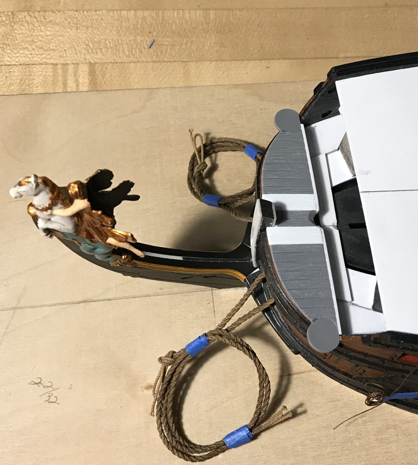
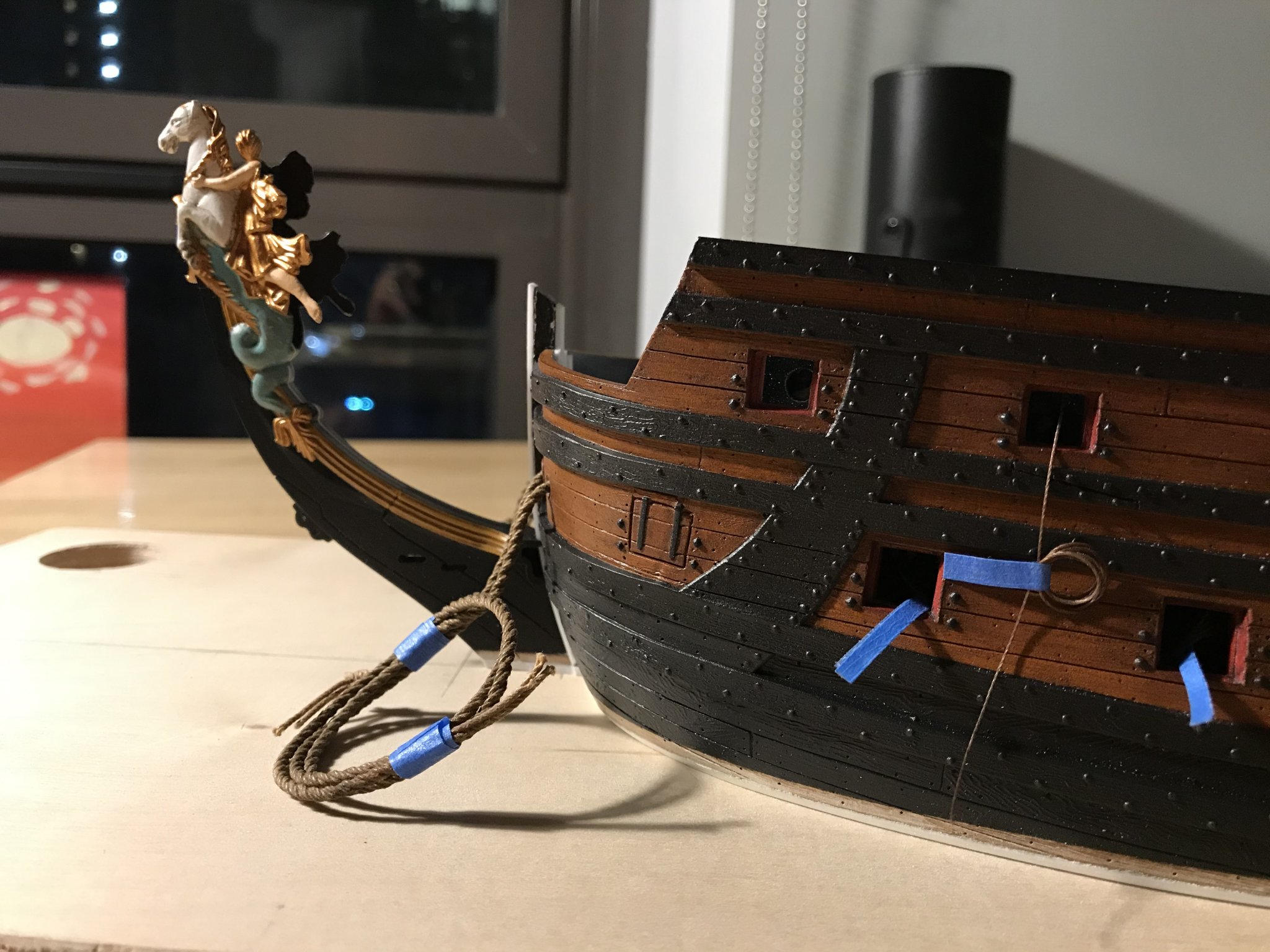
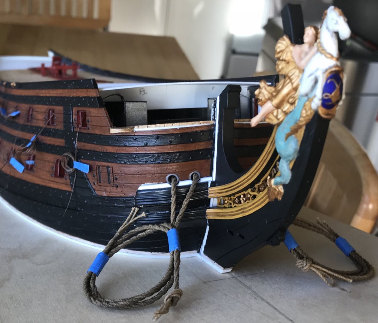
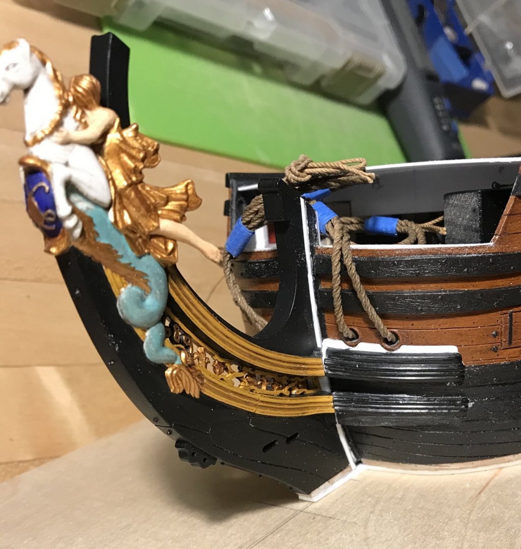
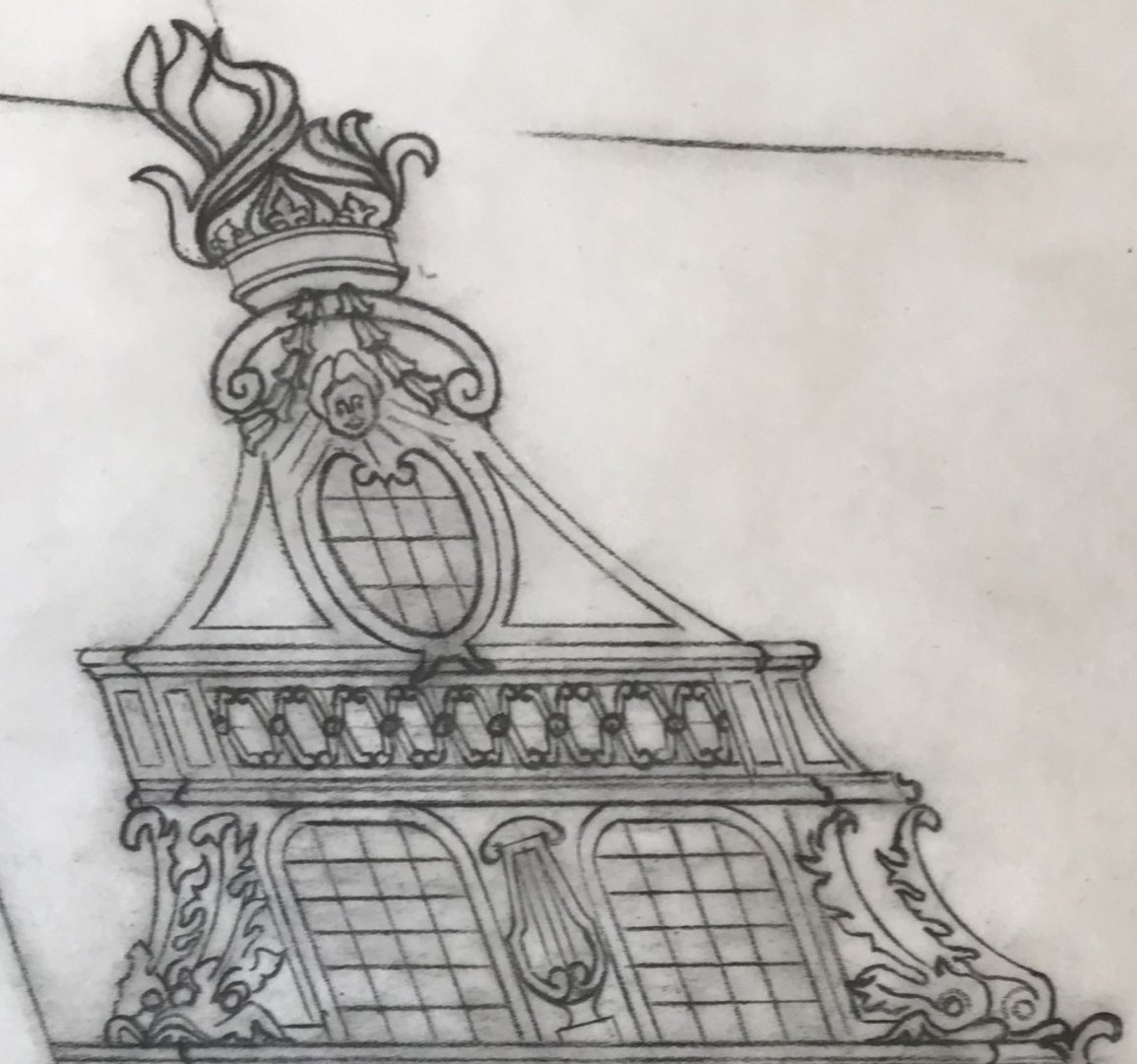
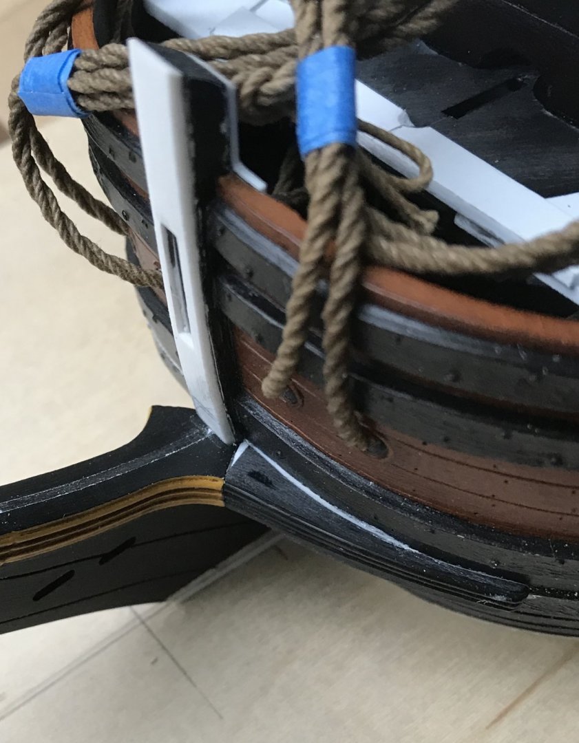
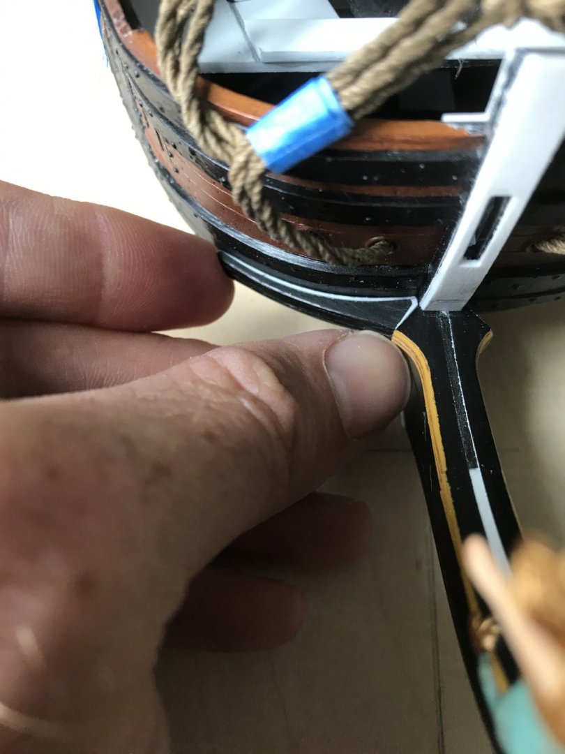
The stem and figurehead in place: This is the trailboard layout that I have arrived at: I find that it is much easier to neatly draw something on vellum because you can mark-out reliable reference lines, and the paper has tooth. You can also erase easily and forever on vellum which, in the case of something like this, is extremely helpful. My layout of the Berain design was going very well until the foremost section, in front of the big fleur. The essential problem is that Heller threw a wrench into the design with the way that the tail of the figurehead resolves. In Berain’s drawing, the tail resolves between the knees of the head, and fully forward of the trailboard lattice: Perhaps because Tanneron did not address the figurehead or the trailboard, Heller took some creative license. The Heller tail resolves mostly below the trailboard, but the upper lobe of the tail intrudes into the trailboard space in a very inconvenient way. This small semi-circular intrusion is a design disrupter! Rather than attempt to continue the lattice in an unsatisfactorily asymmetrical way, I chose to take a little creative license, myself. To my mind, leaving the space open and unsupported would not make any structural sense. I considered adding one larger shell to this forward space, but there was no way to do that without it looking grafted on - an afterthought. Ultimately, I chose a year marker for the rebuild - not because it is plausible historic convention, but because it adds something of historic relevance and context to this particular depiction of Soleil Royal. I employed a similar rationale for the inclusion of the motto banner on the lower transom. The statement, however imperfectly, that I am trying to make with this model is that these Berain/Vary portraits represent her refit appearance in 1689. And so, this will be my time-stamp signature in the trailboard. Also, numbers have a wonderful malleability for filling odd spaces.
- 2,699 replies
-
- 10
-
-
- heller
- soleil royal
- (and 9 more)
-
Gaetan, as always your work is impeccable, and your ship is rounding into form beautifully. Thank you for posting that listing of NRJ article subjects. I will have to obtain a set of the CDs. If I may ask about the chatter groove on the aft face of the rudder - in what period of French naval architecture did this groove first appear?
-
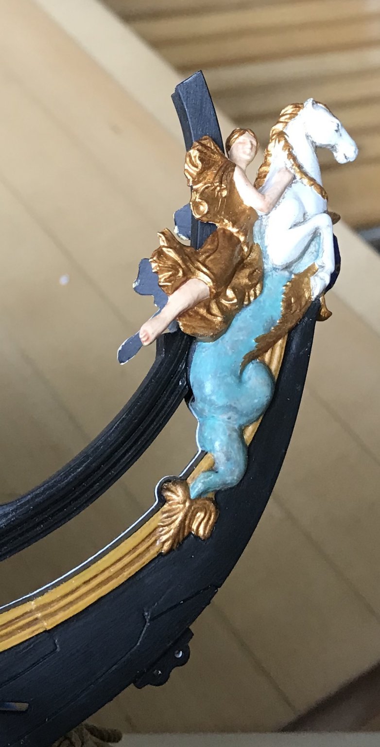
Thank you, Louie! Just wait until you see the actual stem/figurehead; the paint work in that really is the best of my ability. In particular, there is a greater depth of grey-shade on the white portion of the horse. This looks so good, IMO, that I have decided that the four continental figures will be done in this fashion; grey-shaded white flesh with gilded vestments. The Four Seasons figures will have natural flesh tones with gold leaf vestments, and possibly silver leaf washed with translucent green for the foliate head-dresses. I’ll have to see what that looks like. The Pixies will have natural fleshtones, gilded hair and bellflowers, and the same mottled green/grey tail treatment that I gave the figurehead. If the silver base/green wash effect looks good, I can use it for some of the smaller ornaments of the frieze. We shall see. I glued-in the stem before I left, and now need to get this trailboard patterned and carved, so that I can continue constructing the head. I did a little more rough sketching, last night. I’m close! As always your interest and support are greatly appreciated!
- 2,699 replies
-
- 4
-
-
- heller
- soleil royal
- (and 9 more)
-
Exquisite workmanship!
-
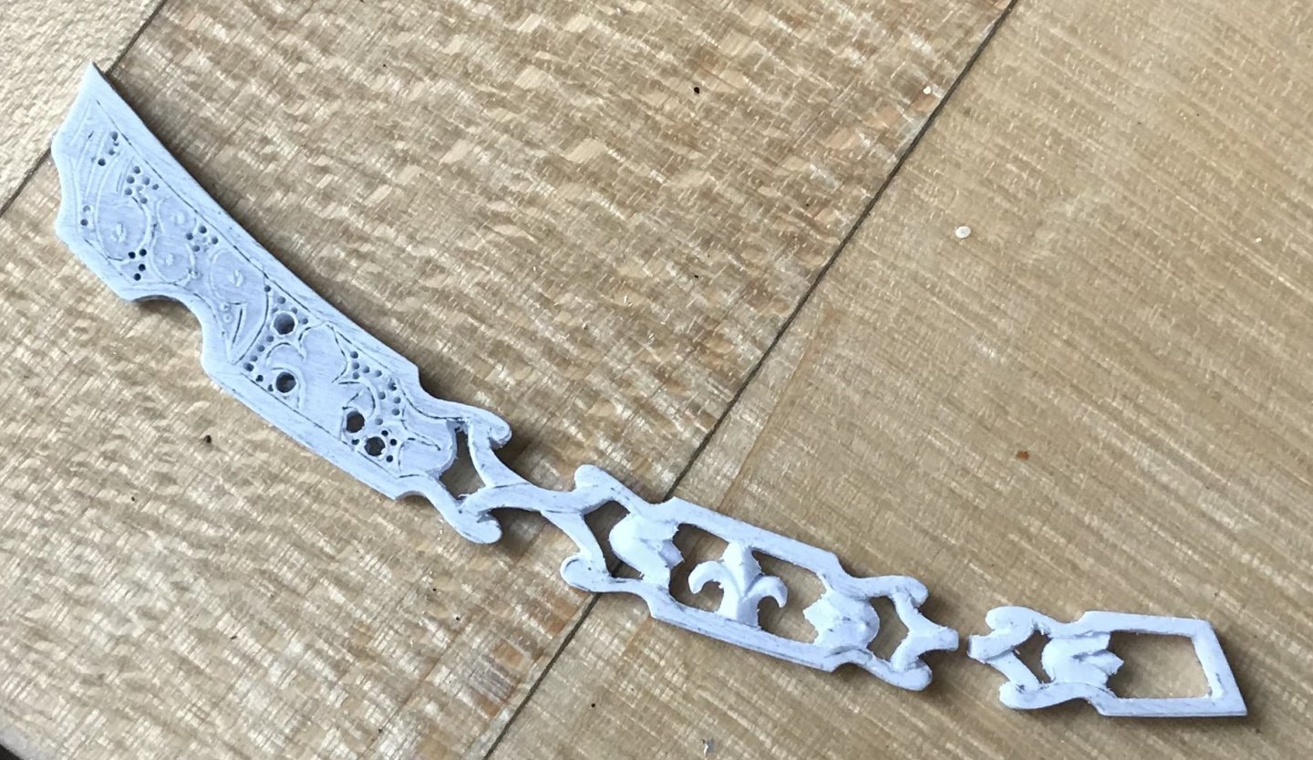
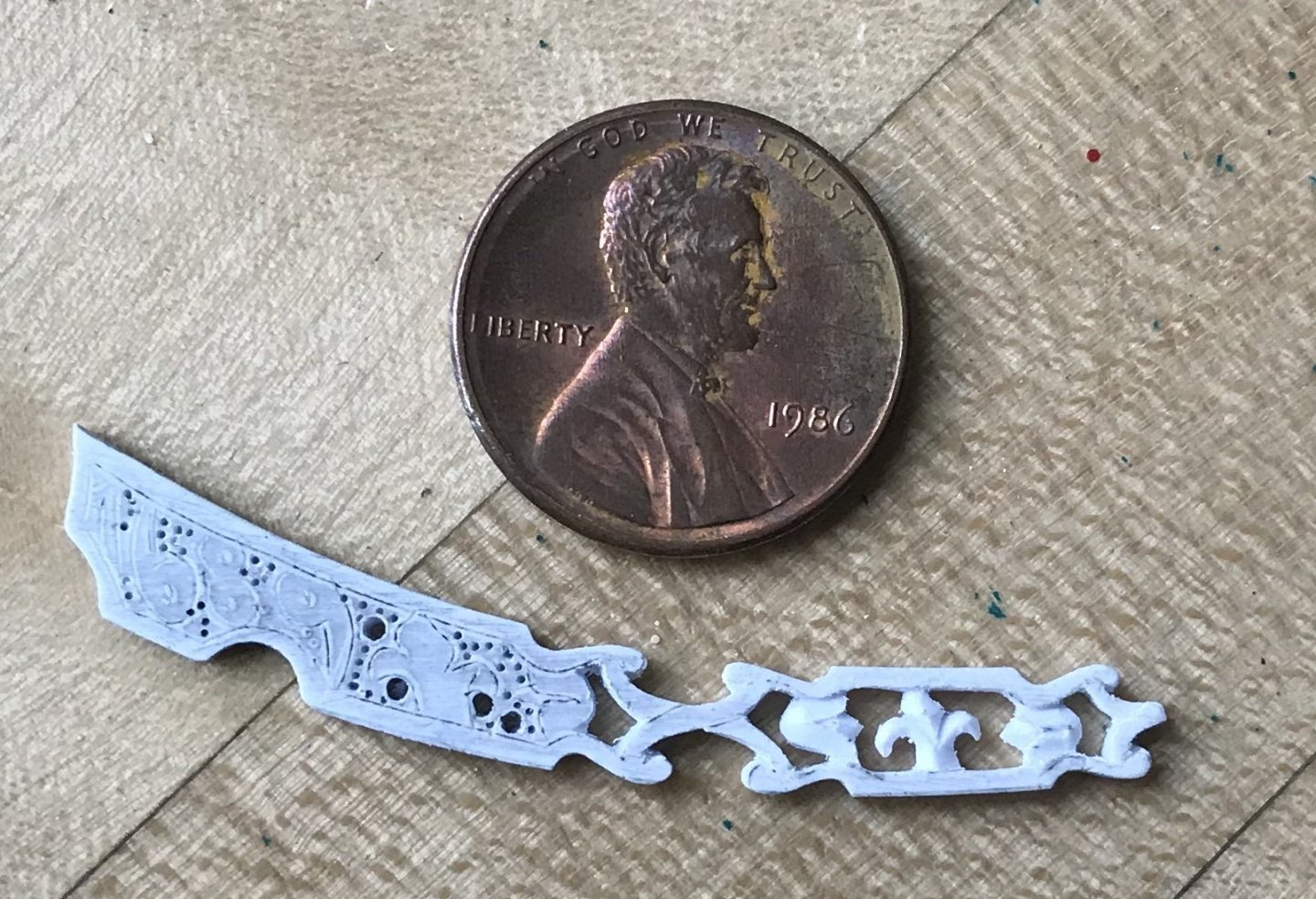
I’m enjoying a very pleasant and relaxing family vacation in Dennis Port, Cape Cod. I was close to finishing up the amortisment crowns, so I brought them with me. I had to simplify the design a little bit; the fleur-de-lis are really tiny, so while the design calls for three, I found I could only really make a good relief for the central one. I’m also attempting to layout the trailboard, but it is difficult to reliably draw something so complicated onto styrene - the pencil skates across the surface. Even if I don’t come up with a polished design, I can at least work out the rough parameters, while I am away. Once I get home, I can layout the final onto vellum, photocopy it and then transfer the design to the part. The layout hinges upon the aft-most fleur, which is centered between the gammoning. You can appreciate, now, how the scale of the fleurs increases, as you move forward - this, owing to the tapered space between the knees of the head. Although, I would prefer to have three fleurs, I think that I will be hard-pressed to make that look good, in such a small space. I feel that a better impression of the original design, in this case, supersedes absolute fidelity. I can eventually align one headrail supporting timber with the aft fleur, but I won’t upset myself if the forward fleur does not neatly align with a headrail supporting timber. The Berain/Vary portraits show the headrail supports in-line with the shells, but that arrangement would mean that the fleurs are mostly hiding behind the gammoning. As a symbolic decorative element, it seems to me that the fleurs should be the most visible, and so, I have chosen to reverse that arrangement. As is sometimes the case with this modification project - the mere inclusion of missing details (trailboard, headrail supports) is an upgrade, even if they can’t be realistically rendered as a unified whole, where everything is in its proper place.

- 2,699 replies
-
- 5
-
-
- heller
- soleil royal
- (and 9 more)