Hubac's Historian
-
Posts
3,308 -
Joined
-
Last visited
Content Type
Profiles
Forums
Gallery
Events
Everything posted by Hubac's Historian
-
 I’m sorry to hear you are hurting, Tom. Get your body right, first, of course. It will help making decisions about ship modeling easier. Personally, I have benefitted tremendously from a daily regimen of basic yoga and light stretching. I have a lot of disc compression issues. Whatever you end up doing, I look forward to seeing it. P.S. while I am not part of Chuck’s build group, his model is the best and most thoughtfully prepared “kit” I have ever seen. There is plenty of latitude, within that build, to express your individual talents and aptitudes. ‘Just a thought, if you are considering re-framing along those lines. I realize that I am preaching to the choir, here. All the best, Marc
 -
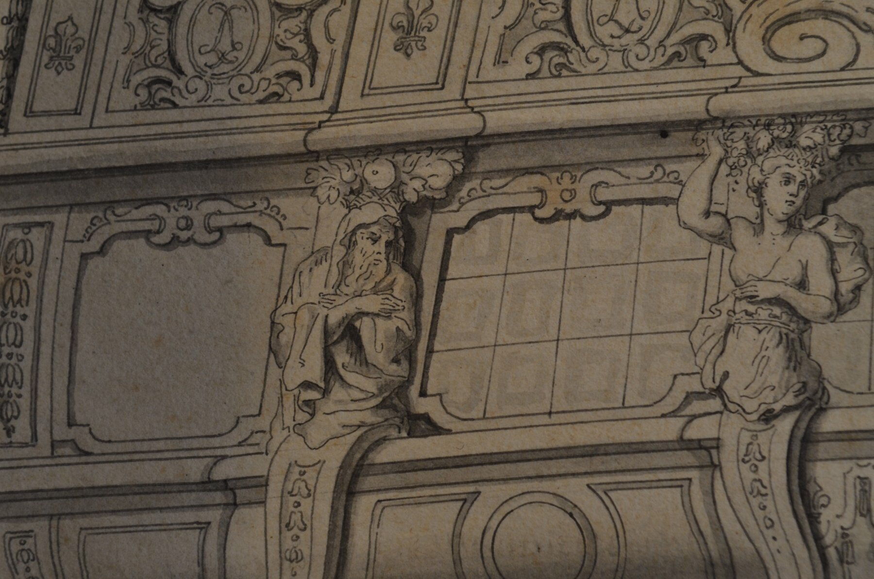
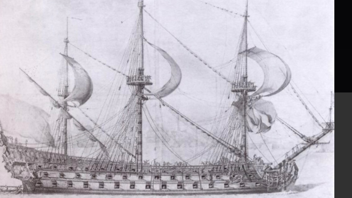
Hello Kirill! Yes, I suppose this presentation of Soleil Royal is maybe a little jarring, as we are all so accustomed to thinking about French capitol ships as being almost entirely "royal" blue and gold leaf. I've been ruminating over color choices for the entirety of the build. Lemineur's research and work on the St. Philippe has had much to do with my choices, here. It seems pretty clear that true ultra-marine was cost-prohibitive for use beyond the national coat of arms, the King's coat of arms, and a few other select areas, like the tafferal. Other blues were likely significantly lighter and the product of copper oxides. By the dawn of the early second marine, concurrent with Soleil Royal's rebuild in 1688/89, the liberal use of gold leaf would have been greatly reduced. This was particularly so, as the re-build survey of the ship had so drastically underestimated the extent of rot. While the ship would certainly have been lavishly ornamented, it is much more likely that much of the rails and moldings would have been painted in yellow ocher, in order to keep costs down. In fact, SR went off to Beveziers without even having completed the new ornamental program; her stern carvings were merely primed in pearlescent grey paint, according to Winfield and Roberts. What will eventually become apparent, when I get to painting the upper bulwarks, is that this lighter blue will predominate, above the main deck guns. By treating it with the walnut ink, it loses it's cerulean brightness, and instead, takes on a slight brown/green cast that is more period-appropriate. I have chosen to use red vermillion as a prominent unifying color, throughout the ship, for several reasons. Firstly, and not least important, I am bored with seeing essentially the same representation of the ship, over and over again. Also, as I discuss somewhere earlier, the recent discovery of Vasa's true colors only seems surprising to us because we had become conditioned to think of her as only being painted in blue and gold. In the high baroque period, it seems perfectly fitting to me that vivid colors would be used to further embellish the carved works of the ship. Hyatt's description of the Royal Louis certainly seems to support this possibility, and the French palace interiors re-enforce this idea. I have read a very brief description of Soleil Royal's colors from the Intendant at Brest, D'Infreville (if I remember correctly), who lists her primary colors: white, black, ventre-de-biche and blue, with gold throughout. Presumably, this is a banded description from the waterline, up, but there is nothing of any great specificity, there. On that basis, alone, the popular scheme for Soleil Royal could never be said to be "wrong." As I say, though, I no longer find it interesting to look at. On the other hand, Berain's drawing of the stern has a red wash applied to the "ground" areas for the starboard side of the drawing. There does appear to be historic precedent for painting both the stern and beakhead bulkhead in a red vermillion. My idea is to unify these areas, along the band of main deck guns with this red vermillion color. It is a superb backdrop for the yellow ocher, and the monogram cartouches between the guns will show more impressively in a combination of yellow ocher, ultra-marine and gold. After spending so much time to create the ornamental program from scratch, I do not want the details to disappear in a sea of gold. The choices I am making are stylized, yet they exist within the realm of plausible deniability.' Lastly, I recently found again these pictures of a model of the Royal Louis. I will post a link to them, as I can't re-publish them here. If you scroll down the page, you will find an image of what appears to be a contemporary model of her from the starboard quarter. It is most definitely a first-marine representation. I don't know who made the model, or when exactly. It is somewhat primitive, but the use of red vermillion, throughout is instructive. https://www.kalpana.it/photographs/italy_bologna/city13.htm and here: https://www.bing.com/images/search?view=detailV2&ccid=EGzg2iT%2f&id=EB6C4118F4B9B88A5DB3BBB12B831619C0B2AE68&thid=OIP.EGzg2iT_XdYpYmYp0b9tPgHaG_&mediaurl=https%3a%2f%2flookaside.fbsbx.com%2flookaside%2fcrawler%2fmedia%2f%3fmedia_id%3d1223148461361194&exph=1933&expw=2048&q=University+of+Bologna%2c+warship%2c+model%2c+Royal+Louis&simid=607989867282497839&ck=0639D0FC2A385D7D2BBEC87603F09E63&selectedIndex=1&FORM=IRPRST&ajaxhist=0
- 2,699 replies
-
- 7
-

-
- heller
- soleil royal
- (and 9 more)
-
Hi Dan - more optimistic times await, but we will still have to wait a while longer before we can have our club meetings again. I’m really hoping the Joint Clubs meeting happens, as planned. I won’t be muting the colors for distance and haze, in particular, but I will mute them with walnut ink to approximate the daily dinge of mooring in the polluted waters off the Port of Brest arsenal. I will make some visual allusion to distance by representing the parapet walls of the arsenal at a greatly reduced scale.
- 2,699 replies
-
- 5
-
-
- heller
- soleil royal
- (and 9 more)
-
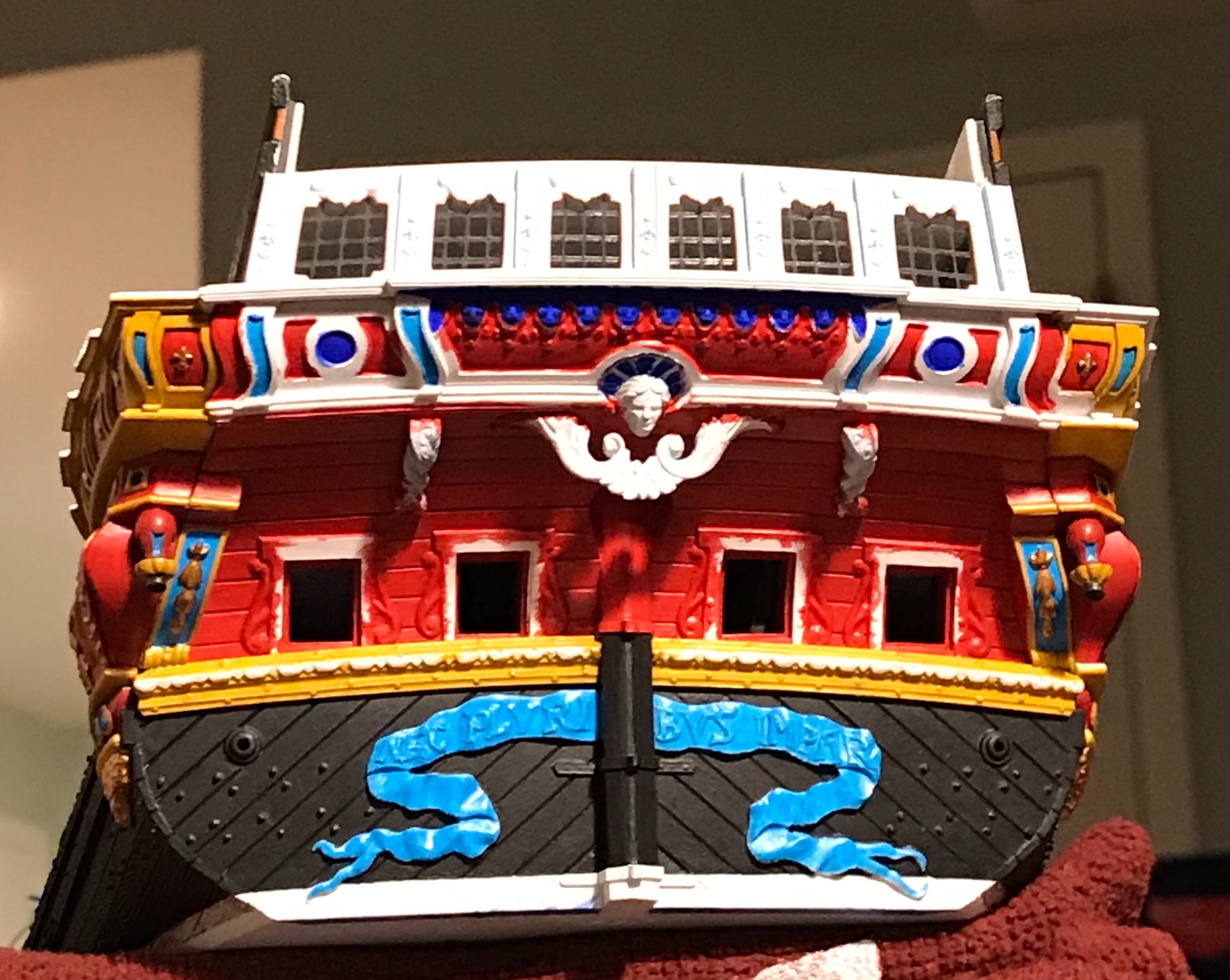
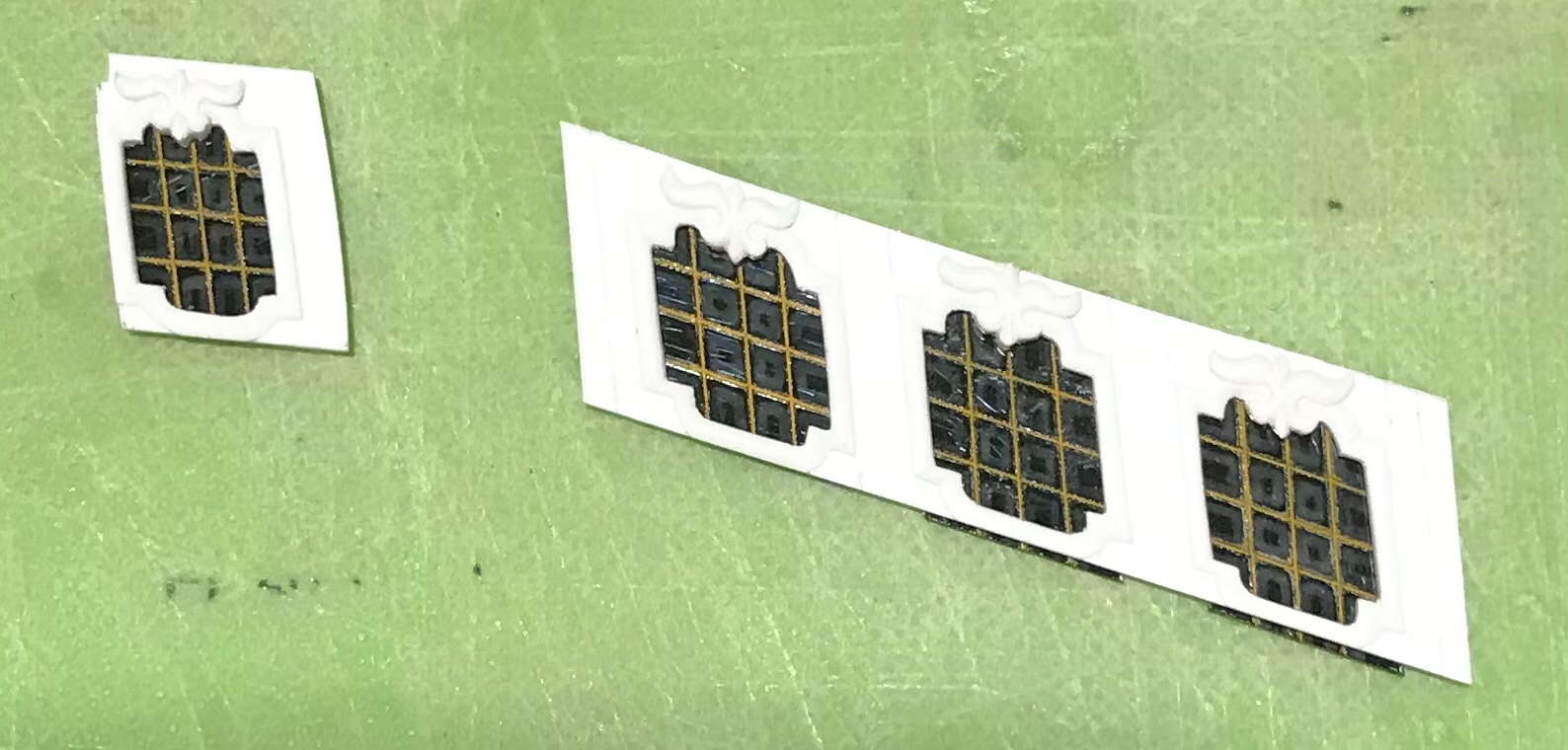
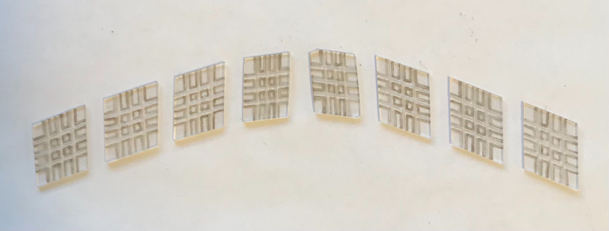
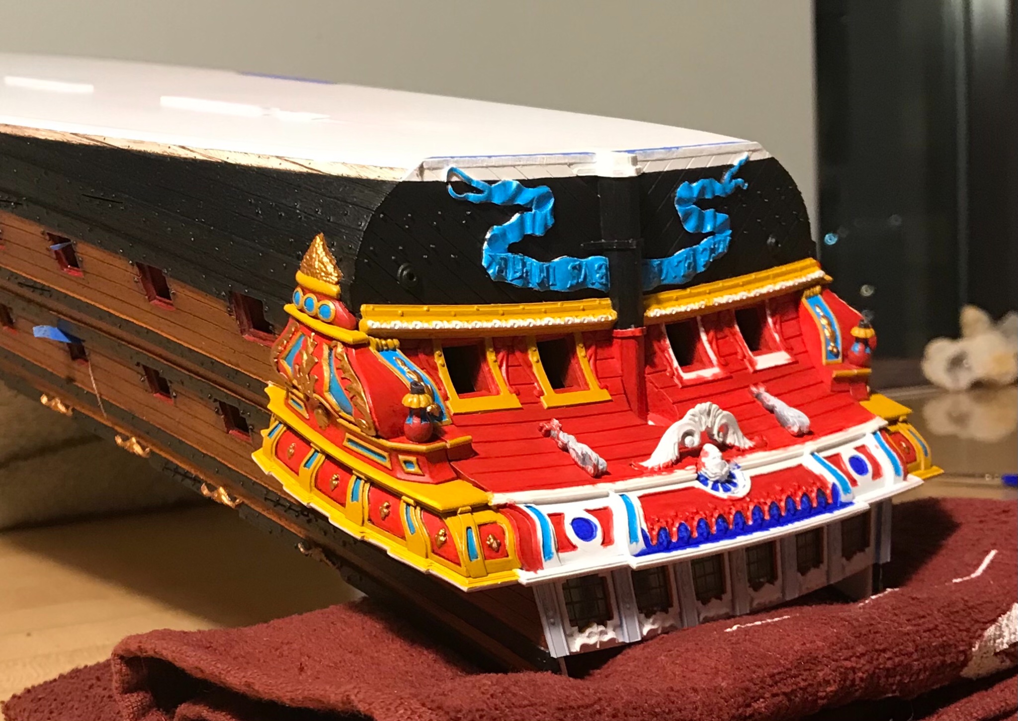
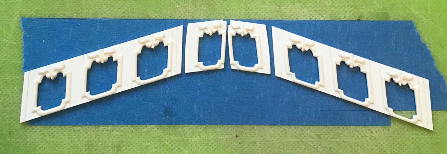
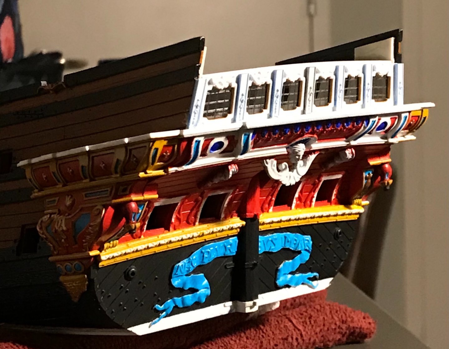
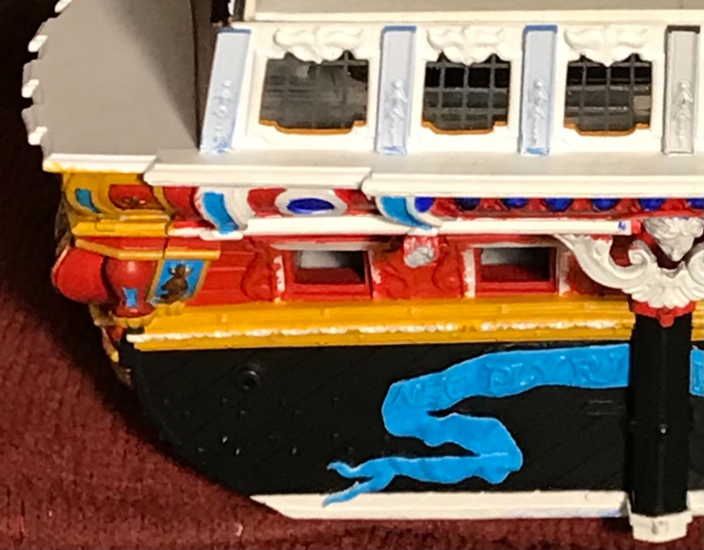
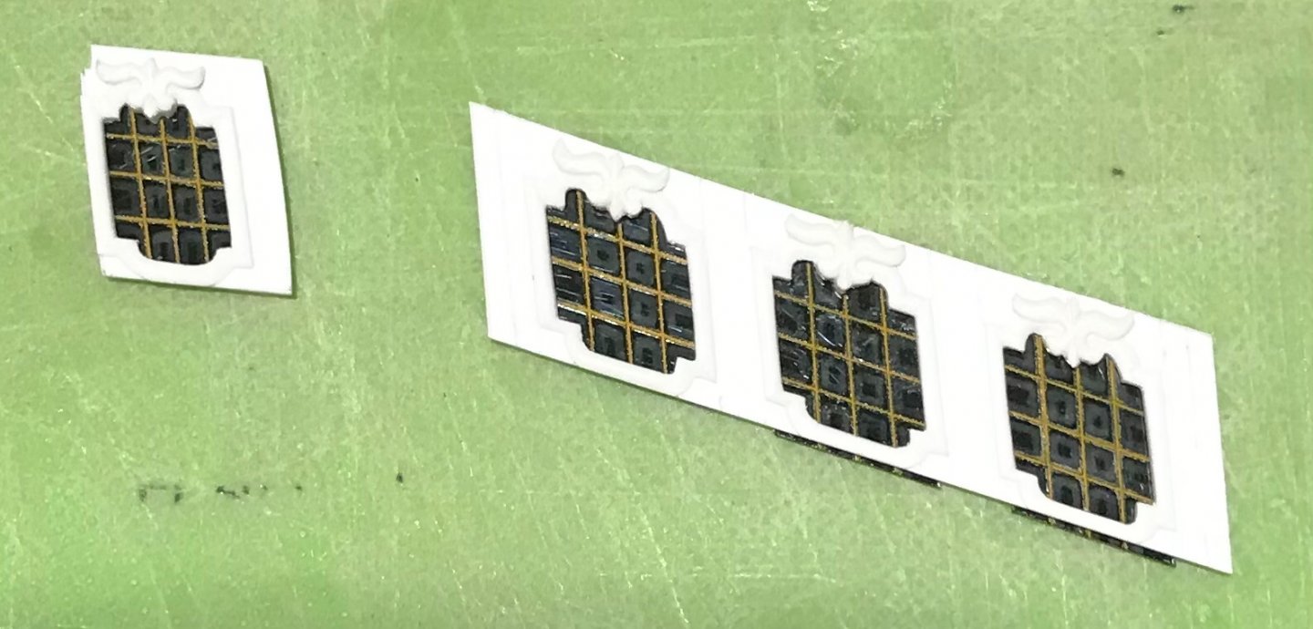
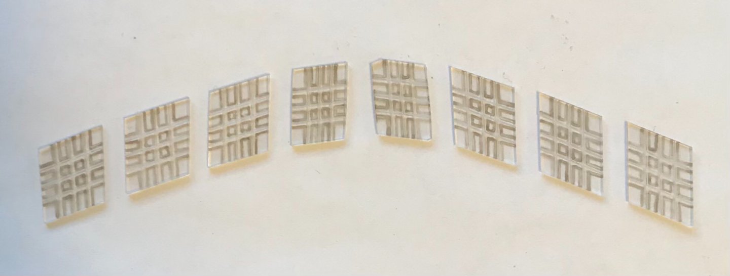
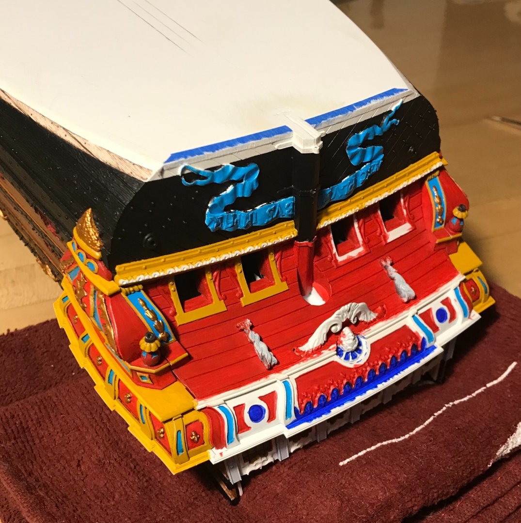
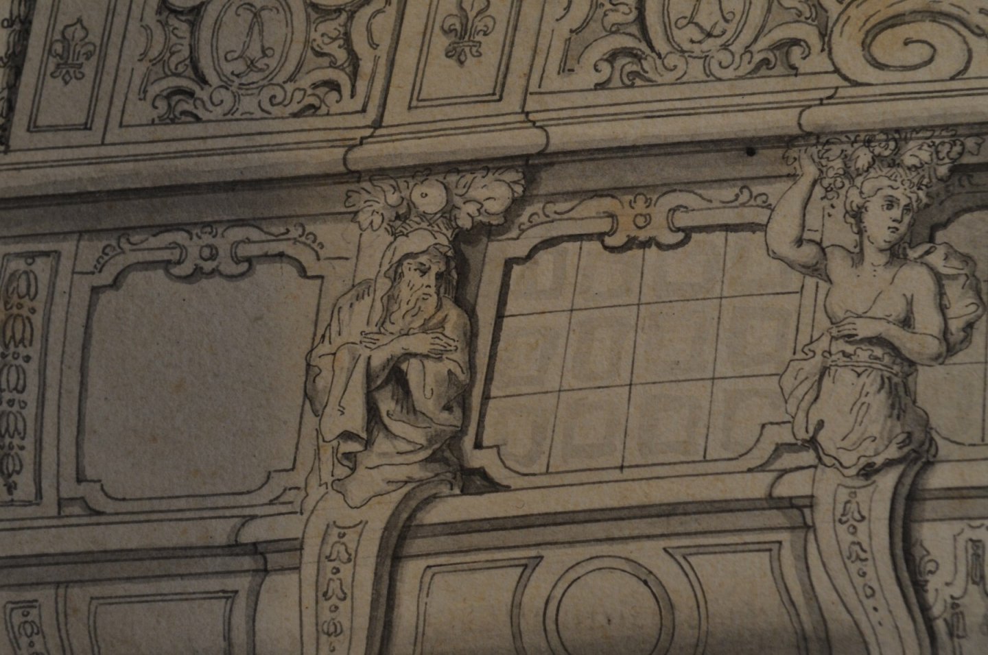
Thank you, Gentlemen, for your kind words and likes, and to everyone who stops by now and again. I have completed the quarter gallery window frames: I, then, spent quite a lot of time deliberating how I wanted to represent the fact that these windows were likely all superficial. There were probably removable panels, within the false windows, that could serve as either additional gun ports, or as ventilation, but they were not glazed windows, as on the stern. On the following section of the original stern drawing, Berain indicates glass panes with square shadow boxes, within the leaded cames: All contemporary evidence suggests that the six windows within the quarter galleries were actual windows. This drawing device gave me an idea for a stylized, false window. I used a semi-opaque grey enamel wash to paint-in those shadows, within my engraved lines: After spraying the backs of the panes flat-black, the shadows show-up as a subtle indication of individual glass panes: I decided to use yellow ocher for the cames, in order to draw attention to the fact that these false windows are different from the clear panes seen on the stern and quarter deck, admiral’s cabin. The two stylized windows on the main deck level of the QGs will also be painted yellow and black. So, before I can actually get busy constructing these windows, I must first finish painting the lower stern. Let me tell you - I have made quite a difficult job for myself, here. The overhang of the stern counter is such that finding a comfortable angle at which to reach the furthest corners and cut a straight line has proven to be the most difficult aspect of this build so far. The hull is relatively large and so full of extra structural plastic that it is quite heavy and awkward to move around and hold steady as you paint your lines. Even just brush-priming the surface so that it was reasonably tidy was very time-consuming. Nevertheless, if the paint work is not impeccable, this has all been a waste of time. This is obviously a work in progress, and the colors are very stark and garish without the eventual walnut ink wash, but these pics give a stronger sense for where this is all headed: I didn’t really need to paint the top and bottom edges of the transom moulding, however, doing so conveys the full depth of its scantling: There will be small touch-ups, yet, but the results were worth the extra time. Last night, I completed all of the transitional mouldings of the QGs, and started cutting-in the chase ports: As I’ve mentioned before, the use of ultra-marine will be relatively sparing. I was going to leave the inset circles red, but I realized that there are oval monogram cartouches on the balcony railing above that will also be painted ultra-marine, thus balancing the composition. All will become clearer as we go. Today, I will re-pattern the transitional moulding plate that sits atop the QG windows, and serves as the base for the wrapping balcony. It is identical in profile and depth to the denticulated transitional moulding beneath the windows. The only difference is that this platform will extend aft, four scale feet in order to wrap to the stern balcony. I am kicking myself for not tracing the original pattern that I had made 🤦♂️ Little by little, we are getting there! As always - stay healthy and thank you for looking in.


- 2,699 replies
-
- 15
-
-
- heller
- soleil royal
- (and 9 more)
-
Your methodical and meticulous nature are really shining, Tom. In my opinion, the only way to ensure that a hand-made thing is truly good, and able to hold-up to intense scrutiny, is to invest whatever time is necessary in the process. Your efforts, here, are exemplary.
-
Dan, you have really perfected the subtleties of moving water - very impressive! The model is no slouch, either; lovely details interspersed throughout, and I really like the little things like the slight deformations of the handrails. The bone model sounds really intriguing, and I look forward to following your restoration.
- 33 replies
-
- 3
-
-
- James B Colgate
- whaleback
- (and 2 more)
-
I’ve heard varied reports on the durability of Modelspan, once it has been saturated with dilute glue. Most seem to say that it is more resilient than expected, once dry. I have purposefully over-built every aspect of this model so that it will stay together for the duration of my lifetime, and hopefully my childrens’ as well. Given that, it would probably make a lot of sense to go with Dafi’s method, which is almost certain to age better over time. I’ll have to look for that translation button. I use Apple devices, though, so that may not work for me. Thank you, Kirill, for bringing this technique to the forum!
- 2,699 replies
-
- 3
-
-
- heller
- soleil royal
- (and 9 more)
-
Hello Kirill! Yes, as is his usual, Dan has found an ingenious method. The translation of this site is not perfect, so it is not entirely clear to me what particular fabric and paper he is using. I also could not open the second link. The results do look very good, though. My inclination, as an introductory experiment, is to attempt making sails from ModelSpan tissue, using a method so clearly described by Blue Ensign on his build of La Superb. Dafi’s method probably creates a more realistic sense of light penetration, but it appears to be significantly more labor intensive. I’m not ruling it out, but I will probably first try something a little easier. I will be attempting, though, to re-create the billowing shapes seen, here, in the unfurling of the main topsail and foresail of Le Royal Louis: Dan’s method may allow for better modeling of the sails into these billowing shapes. I imagine that, either way, the use of annealed wire, folded into the edges of the sails will be an integral component of that process. That, and the liberal application of dilute glue.
- 2,699 replies
-
- 3
-
-
- heller
- soleil royal
- (and 9 more)
-
A remarkable accomplishment, Kirill! So what is next for your prodigious talents?
- 228 replies
-
- 1
-
-
- spanish galleon
- lee
- (and 1 more)
-
I appreciate the backstory, and your intrepidness to take the journey. I’m in!
-
Ad Infinitum, for sure. My wife, of education, can attest that I am a poor speller. However, the Iphone is little help. Spell Correct - PLEASE!! I’d be saying much worse or wronger things, if I relied on that. Not, ad-nauseam, though. I never tire of this stuff.
-
Complexitus Communitus Ad-Infinitium
-
Thanks, Mark! I will check this out.
-
Gaetan, thank you so much! This is all very helpfull
-
Gaetan, this is a work of spectacular complexity and execution. Your chaloupes are so elegantly constructed; they are ship models unto themselves. The ship stoves are of particular interest to me. Thank you for taking so many good photos of them. Would the basic structure of these stoves have been more or less the same in the 17th Century? For his St. Philippe, Lemineur shows two smaller stoves between the middle deck guns, at the bow. For my Soleil Royal, it only makes sense for there to be a larger stove, perhaps with two separate cooking bays, in the center of the main deck, beneath the forecastle deck. What you have constructed would work quite nicely, it seems to me. I just wonder whether it is reasonably appropriate for my time period. Also, presumably, the top of the stove would be some sort of iron hood funneling hot exhaust up the chimney? If you have some recommendations, here, I would really appreciate it. Thanks, Marc
-
Ingenious - I love it!
-
Thank you for your thoughtful reply, Tom.
-
Great prep and early construction progress, Tom! In thinking about this method, I was wondering about grain selection for the various lifts - particularly the bottom lift. Most of the poplar stock you have shown appears to be rift-sawn. I wonder, though, whether it may he particularly advantageous to use quarter-sawn stock for the first lift because you won’t be cutting out the middle. Do you find that the relative stability of poplar negates this consideration?
-
Roter Löwe 1597 by Ondras71
Hubac's Historian replied to Ondras71's topic in - Build logs for subjects built 1501 - 1750
This is just some beautiful work you are doing, here, Ondras. -
You know, I just marvel at the fact that even the parts of the model that aren’t to be seen - in the end - can be looked at freely.
-
I can see from your organization of thought and shop that this is going to be a good one. I love the lines of this ship, and really look forward to watching how you approach the build. Health, of course, is everything. I'm glad you are feeling more like yourself. Let's see what you are going to do!
-
WOW -really impressive scale work, Mike! I am always impressed when modelers go this small. I will be following with great interest. You are doing an amazing job, here!
- 179 replies
-
- 8
-
-
- hatsuzakura
- pit road
- (and 2 more)