HOLIDAY DONATION DRIVE - SUPPORT MSW - DO YOUR PART TO KEEP THIS GREAT FORUM GOING! (89 donations so far out of 49,000 members - C'mon guys!)
×


Hubac's Historian
-
Posts
3,301 -
Joined
-
Last visited
Content Type
Profiles
Forums
Gallery
Events
Everything posted by Hubac's Historian
-
 I’m very sorry to hear about the passing of your husband, Doris. This has been a very difficult year for you. In the face if these challenges, though, you have done a spectacular job with your Katherine - simply one of the best models I have ever seen.
- 1,035 replies
-
- 4
-

-

-
- royal katherine
- ship of the line
- (and 1 more)
-
Wow, Marsalv - what a talent you are! I'm just completely blown away by all of it. This is truly inspiring stuff! I particularly like your cut-aways. I have never seen anyone else approach it in quite this way; you seem to have maximized the long-view through the ship, in places, while adding a uniquely a-symmetrical artistic flair to the openings. It is all just so good. The lead-lined manger is just perfection, from my point of view.
- 589 replies
-
- 4
-
-
- le gros ventre
- cargo
- (and 1 more)
-
Well, I won't miss out on this work of art! I'm a little late to the party, but there still seems to be plenty of build ahead. All of the smallest attention to detail is so lovely and perfectly rendered. You're giving ArchJofo a run for his money in the Chandlery.
- 589 replies
-
- 1
-
-
- le gros ventre
- cargo
- (and 1 more)
-
This is truly a magnificent effort - well deserving of the gold it has won and the recognition it will garner, in the future. I'm sorry I missed this one!
-
As you should be EJ! The stern is coming along beautifully.
-
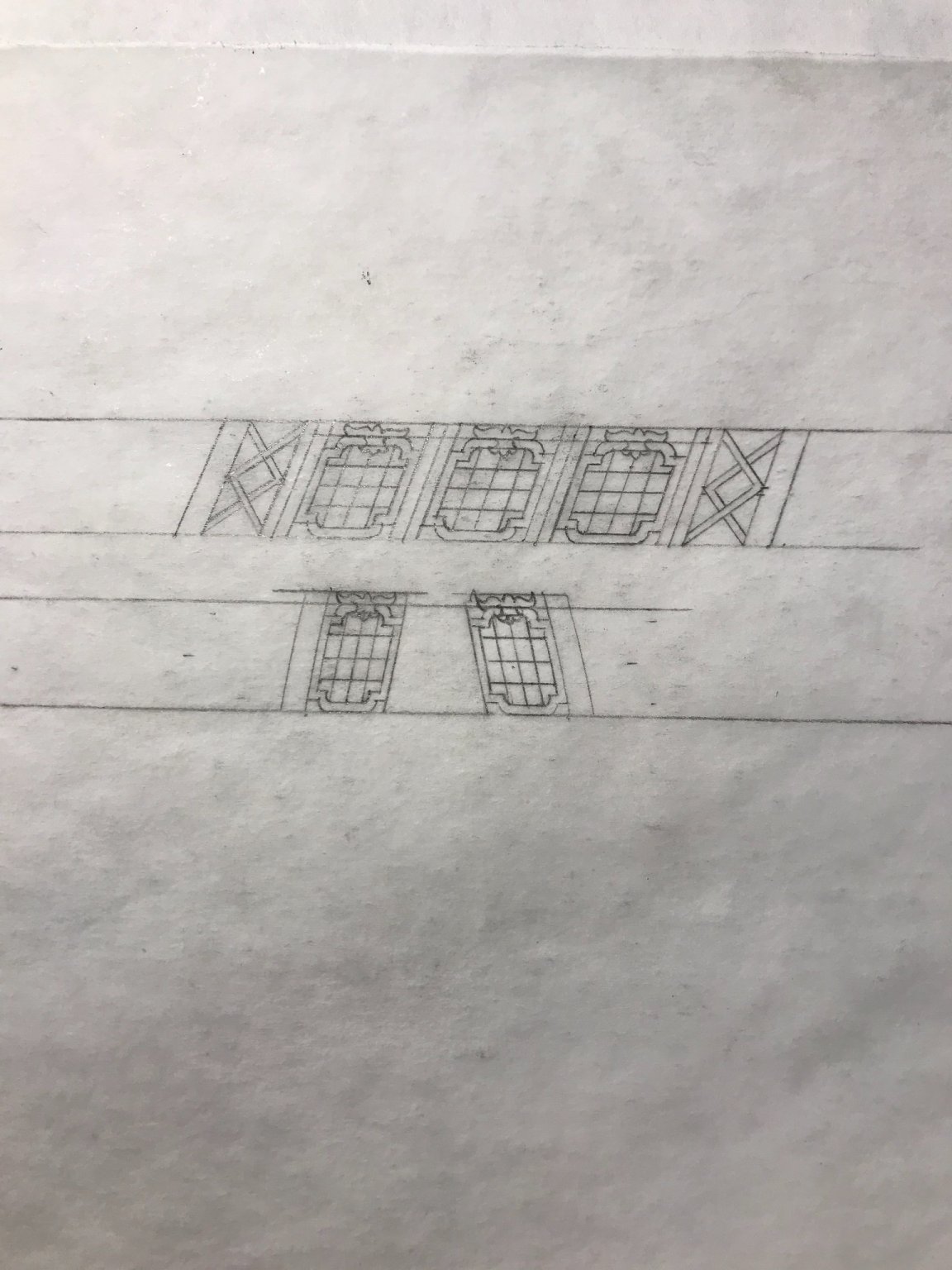
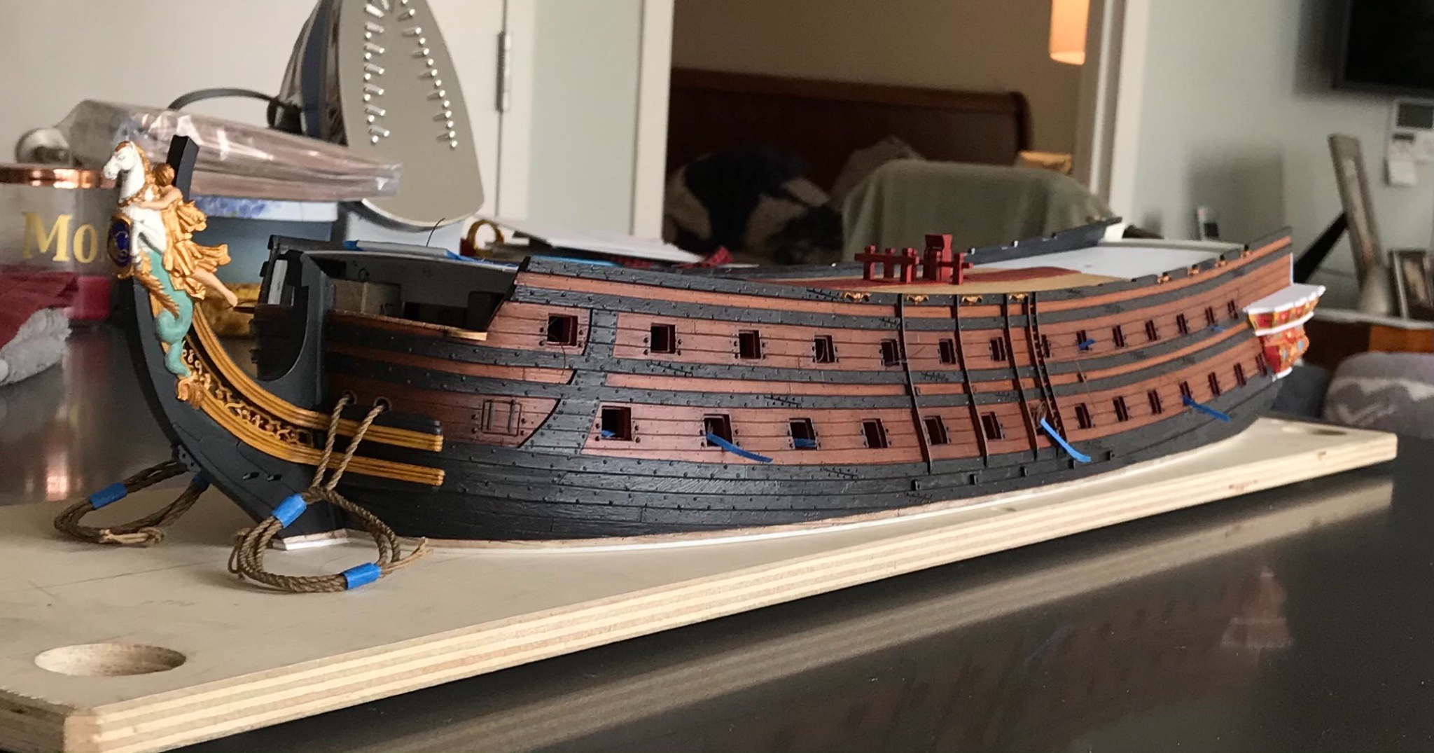
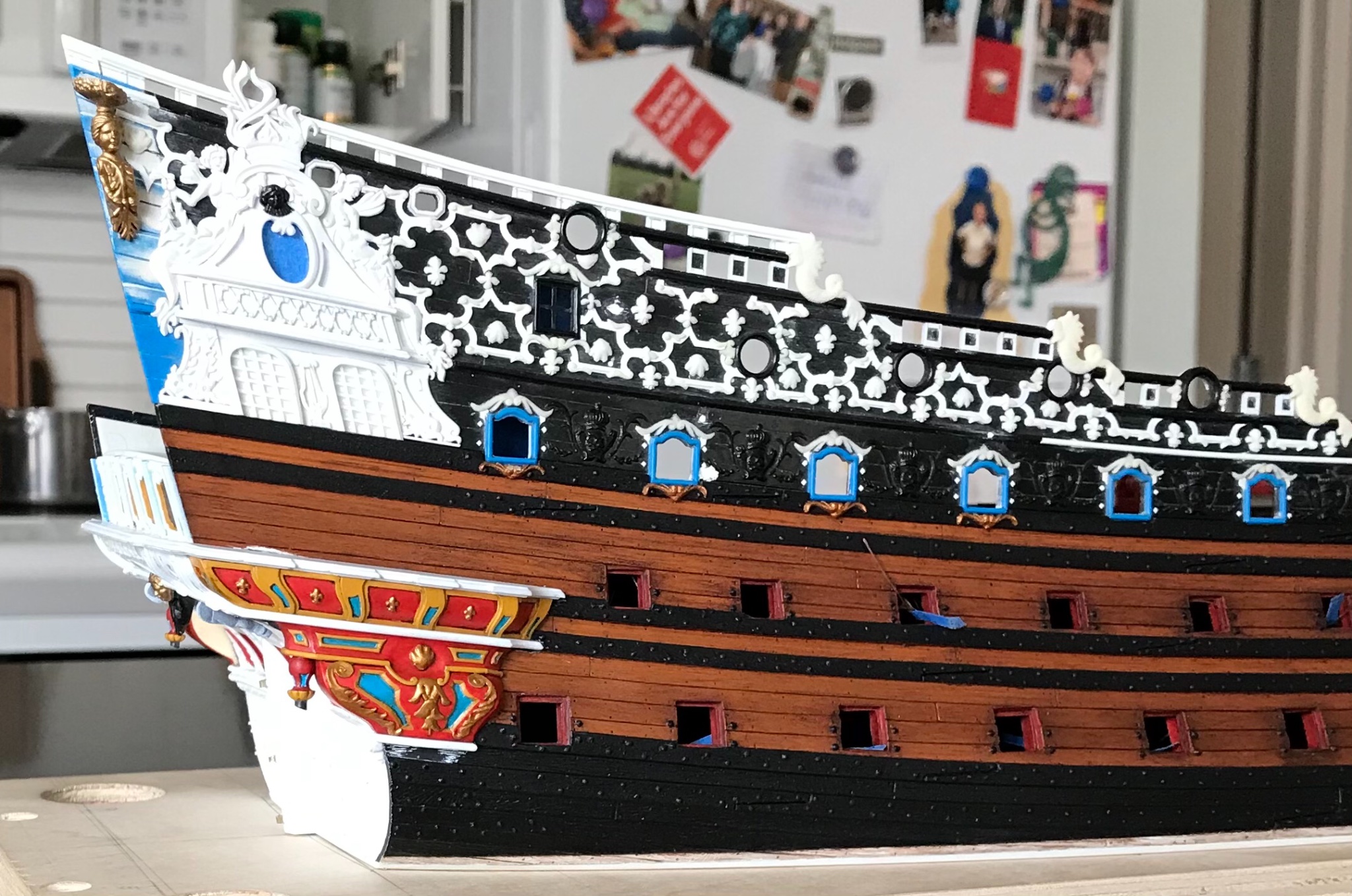
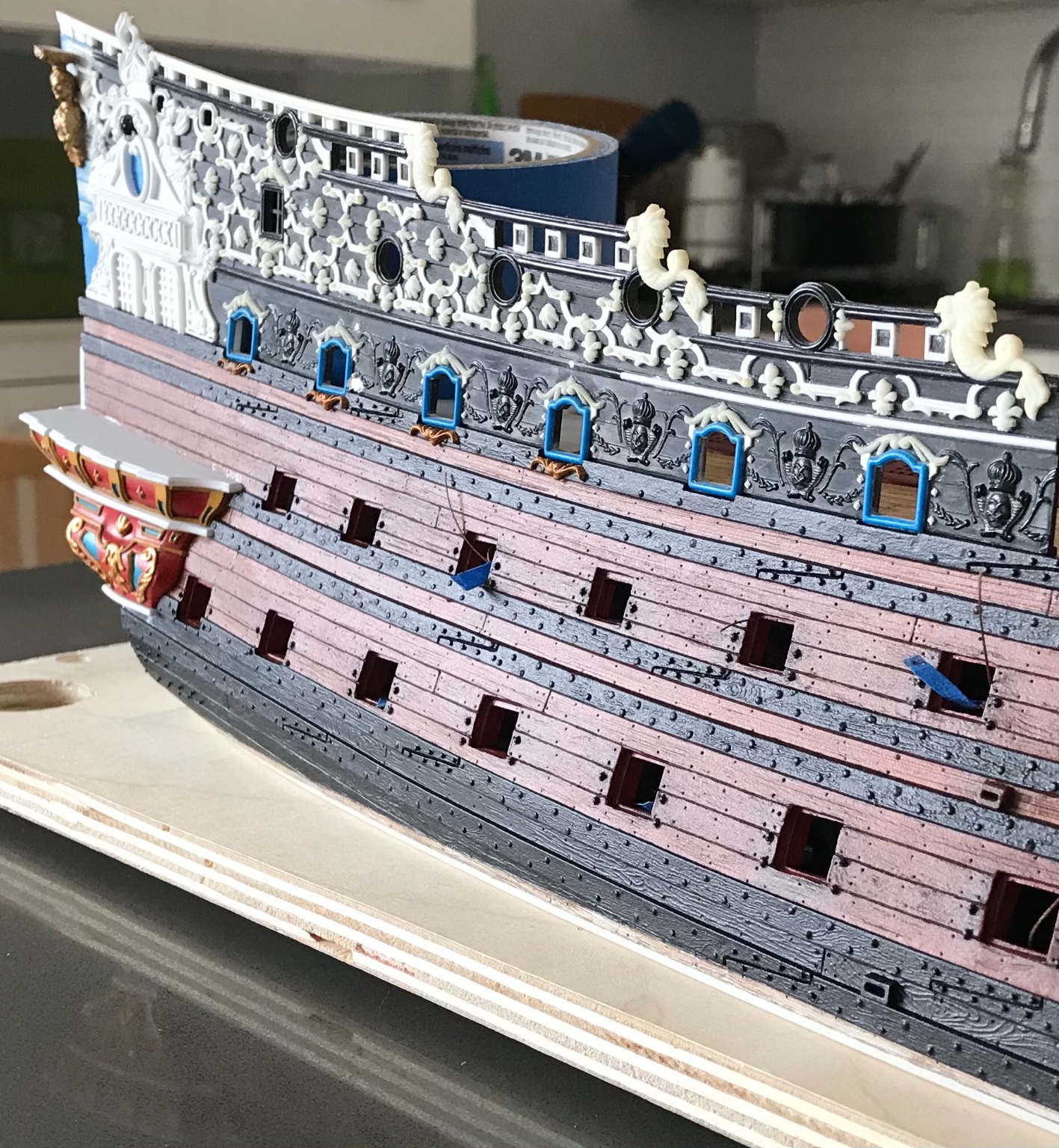
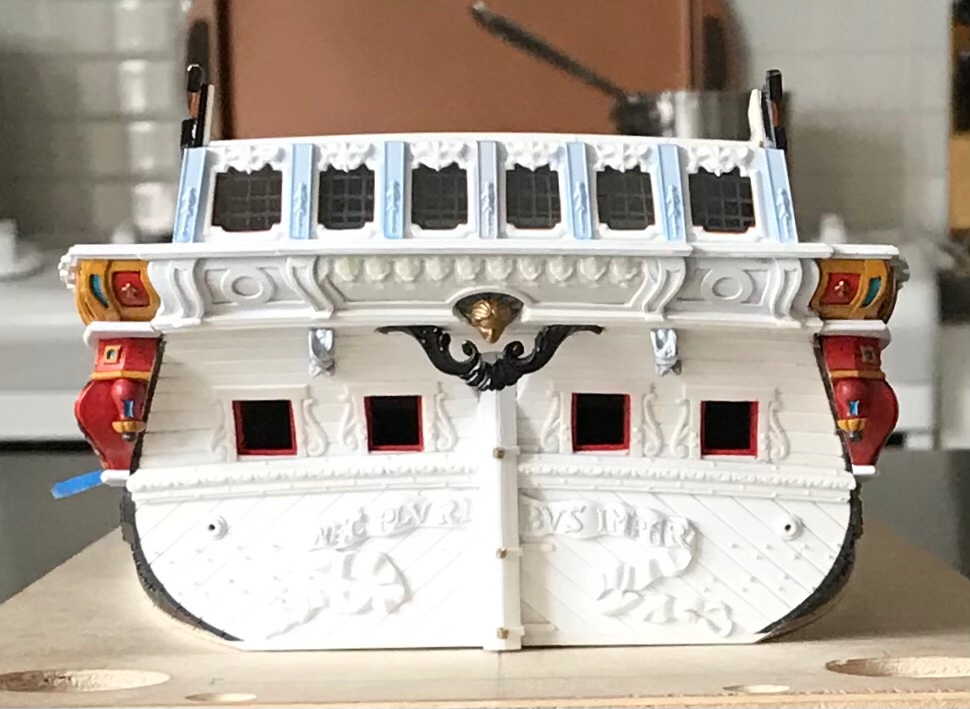
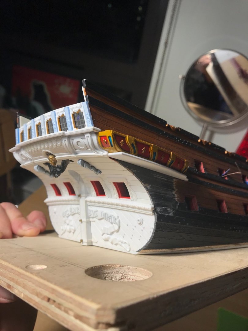
‘Just a quick update. Corbels are painted and in-place. Yes, I will fill and fair that joint at the top 😉: I have the port side and stern quarter windows drafted: One of the problems/complaints, concerning the Berain/Vary drawing is the sometimes confounding inconsistencies between the irrefutable Berain stern drawing and the quarter drawing. Because the, now, concrete reference points of the model enable me to make reliable drawings for this next phase of the build, I decided to address these inconsistencies. The reality of the kit meant that the actual space available for these windows is taller than what I initially drew: One way to effectively deal with that real height discrepancy, while also helping with consistency, was to include the same window ornament, along the top stile, as seen on the stern. The fact that I have reduced these QG windows, in number, from 5 to 3 helps with the overall width to height ratio. This is different from what Berain/Vary drew, but more consistent with better understood examples of the time (SP, 1693), while also paying respect to the hard realities of the kit. HAPPY NEW YEAR!

- 2,697 replies
-
- 18
-
-
- heller
- soleil royal
- (and 9 more)
-
I understand your mentality, Kevin, but I think you are being to hard on yourself. The stairs and entry port look incredible from my seat in the gallery. I think the best way to tackle the balusters is to black-in the ground and then dry brush the yellow. Even if it takes a few passes, you will get there. Dry brushing is less daunting than it seems.
-
This is all looking very spectacular, indeed. The carved works are very good! I just like how the whole model is coming together; all the framing is fair, and the lapstrakes neatly laid, and the paintwork is clean, and the decks and gratings are beautifully laid. Congrats on your efforts, so far!
-
Thank you so much, Mark! I really appreciate that you have stuck with me from the start of this project. It has been a slow build! As I think we all are, I’m really hoping for a better 2021. It may be a rough start, but I think we’ll get there. I wish you health and happiness in the coming year, Mark! ATB, M
- 2,697 replies
-
- 2
-
-
- heller
- soleil royal
- (and 9 more)
-
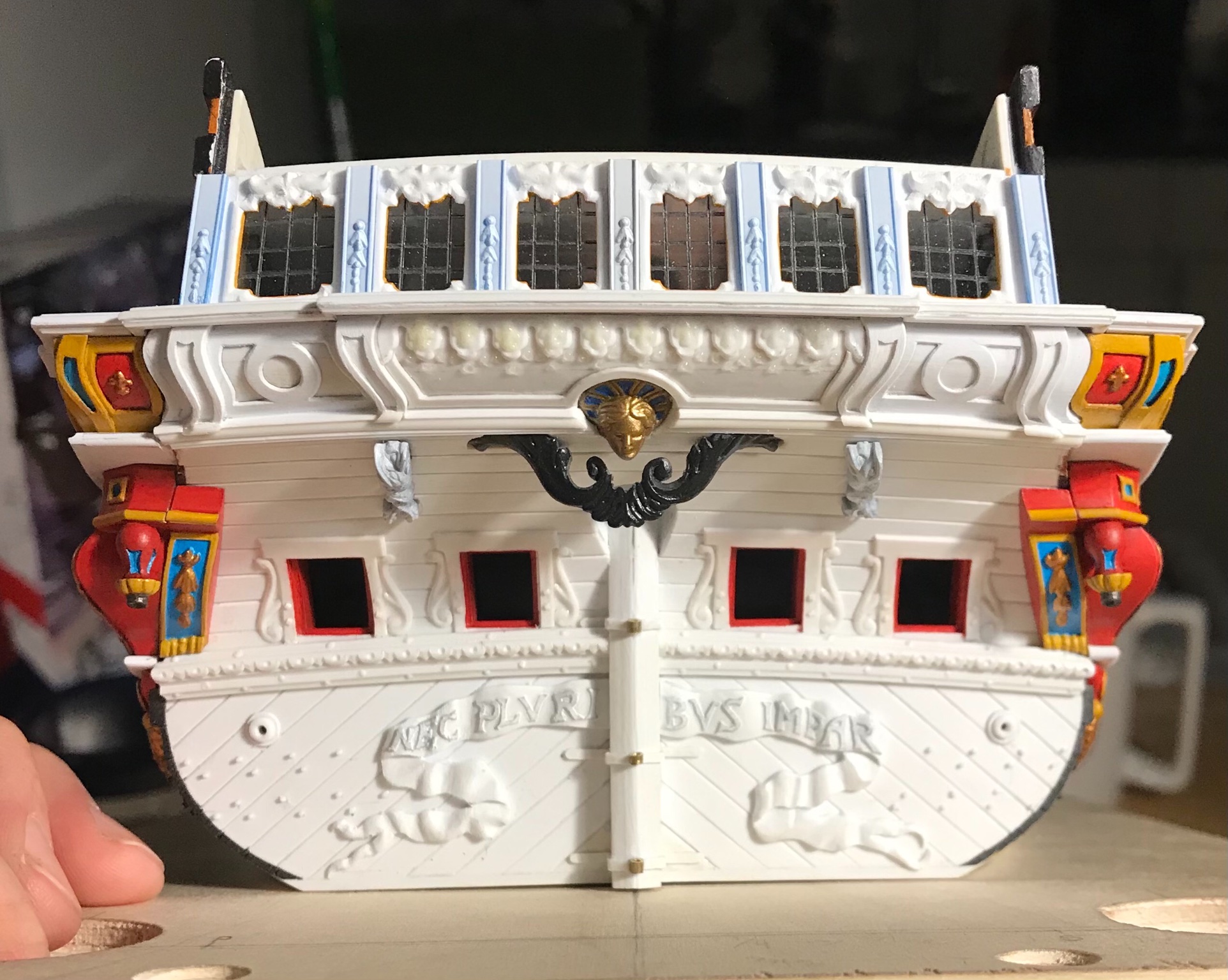
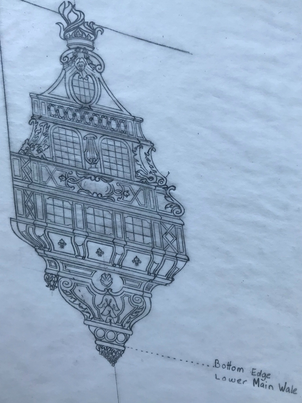
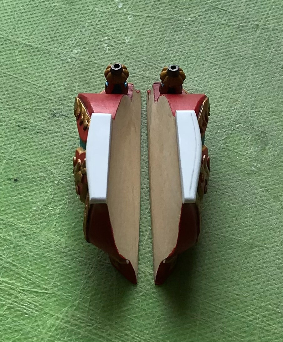
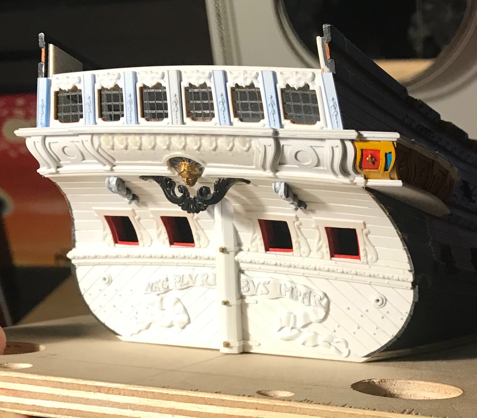
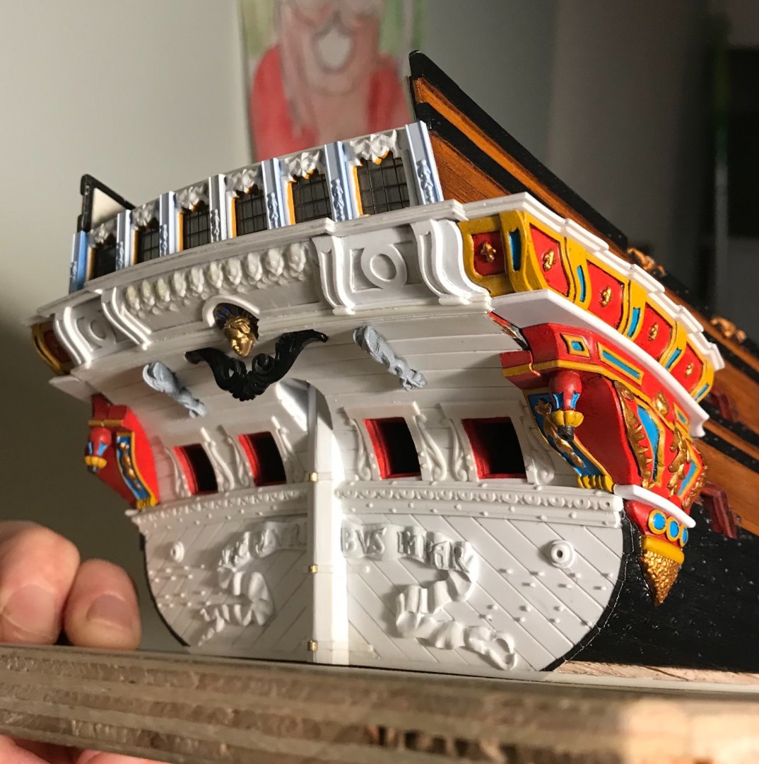
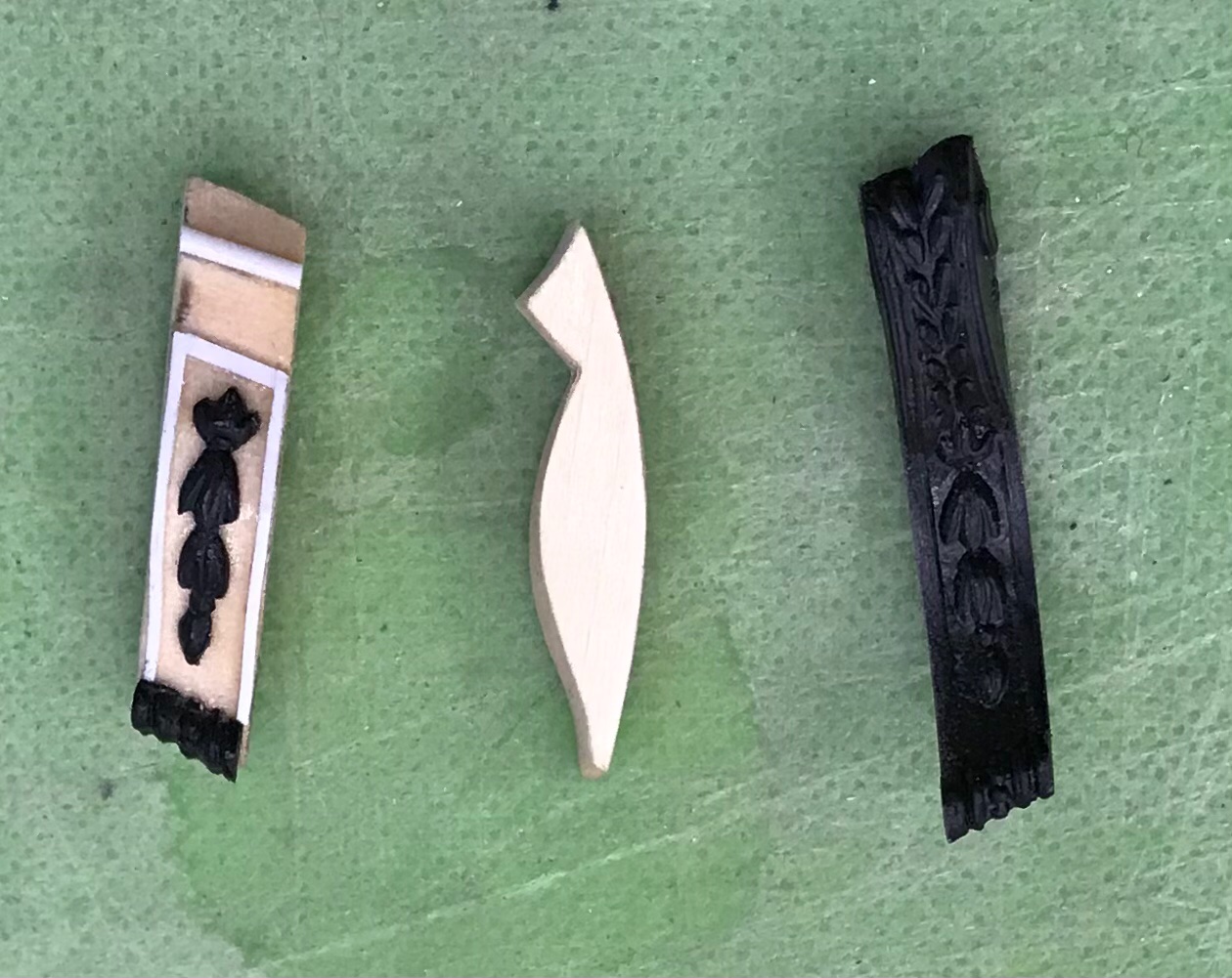
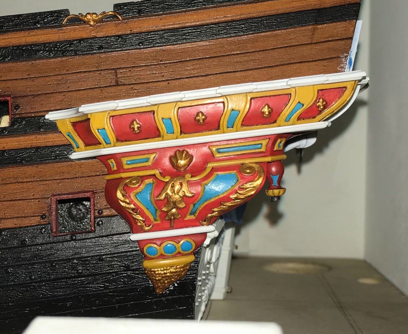
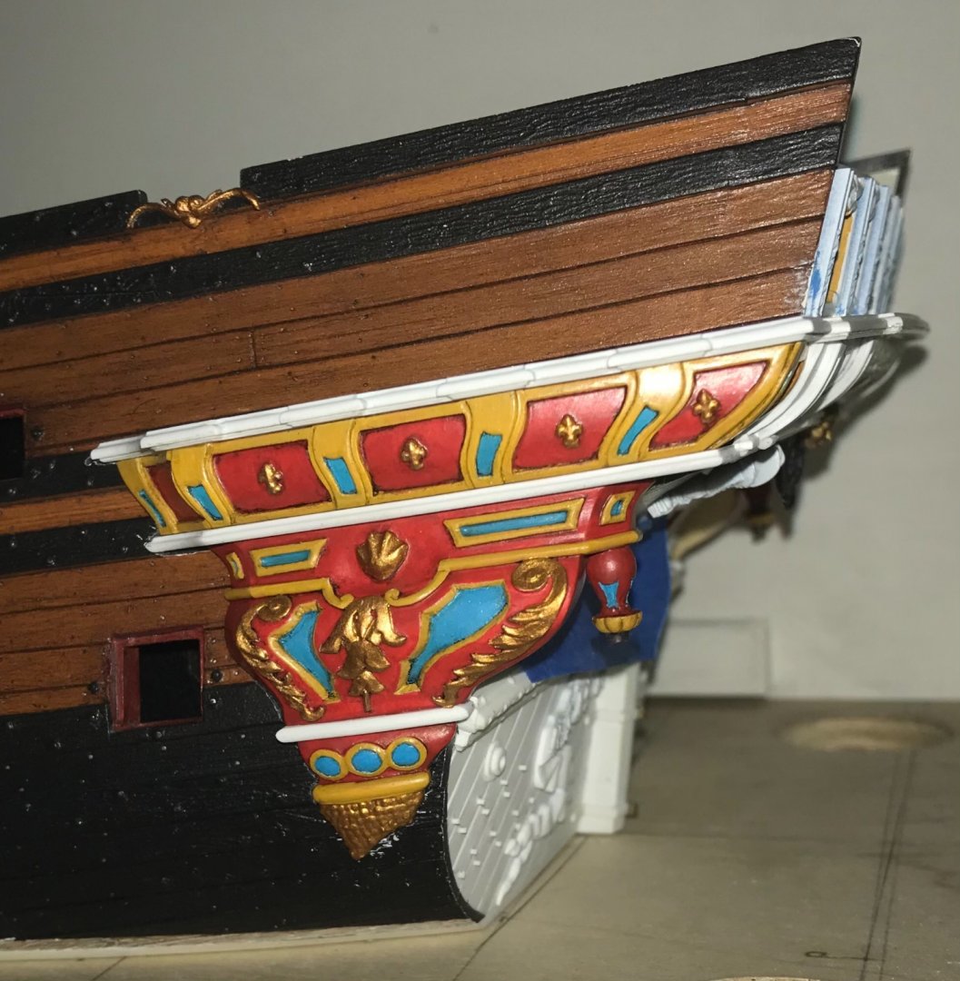
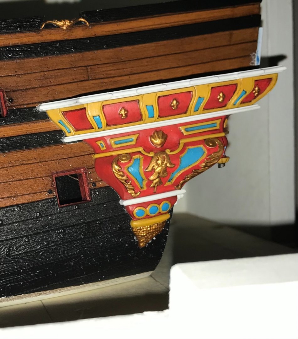
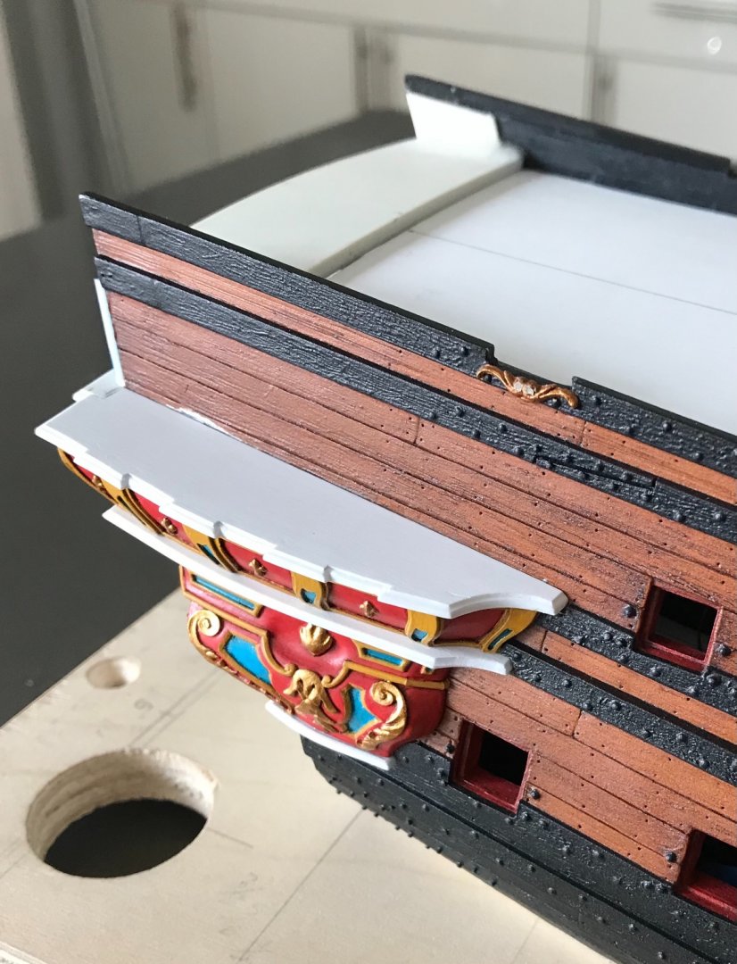
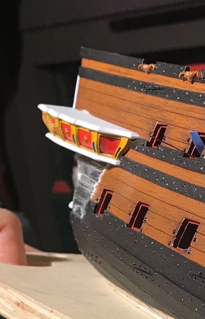
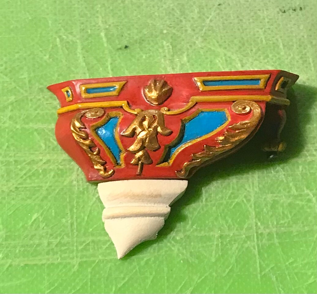
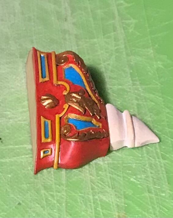
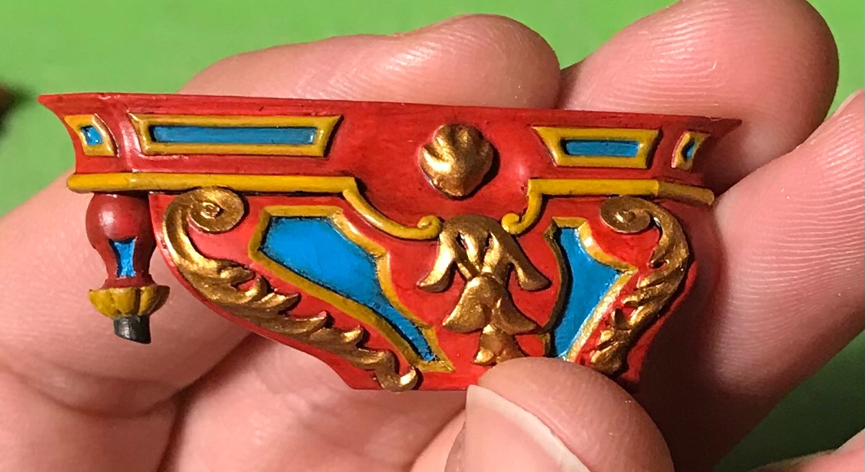
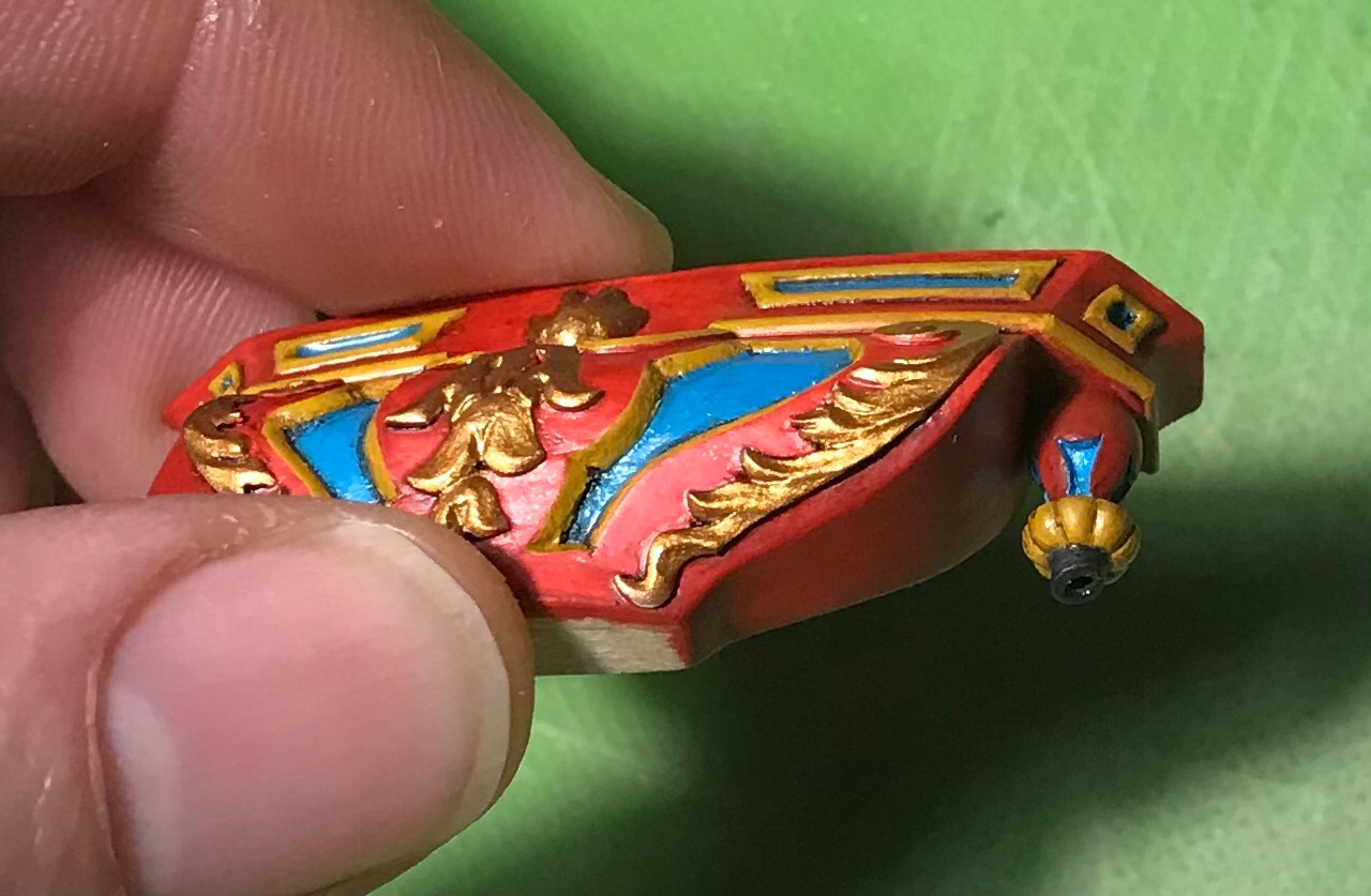
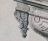
Thank you, Mark! So, the low finials are now painted and in-place. You can see, below, the 3/16" spacing (18", full size) between the last gunport of the lower deck and the quarter gallery. This resulted from filling-in and moving the port forward 1/4" from its stock location, at the start of the build. Here are a few less than stellar pics of that: There will be some re-touching to do, but I am very pleased with how this all resolved. The past few days, I’ve been making the wrapping corbels. The ones the kit provides are perfectly lovely, and I had hoped to adapt them to the new shape of the lower finishing. It turns out, though, that the new shape was too radical a departure, and the available space for them is now shorter. All of that considered, though, I still found it to be an efficient process to extract the ornamental scrolls and bell-flowers. The new corbels are shaped like this: As was true for the QG sections, most of the work, here, was scribing these corbels to the compound curves of both the counter and the lower finishing. Extracting and glueing-on the trim was easy. I can’t quite remember who suggested it - maybe T_C - but painting these soft “lime” parts with CA is really the best approach. The wood essentially becomes case-hardened, and after a light sanding with 220, the grain fully disappears under paint. This is ideal, as I did not want the tell-tale signs of mixed-media. I’ll prime these tonight and paint them before installing on the model. I’ve been strategizing how best to represent the false windows of the QG. I have an idea that picks up on the individual shading of panes on Berain’s drawing. I have at least one scrapped window to experiment with. We shall see. I will begin drafting and making these window frames in the next few days. Thank you for looking in! More to follow.
- 2,697 replies
-
- 13
-
-
- heller
- soleil royal
- (and 9 more)
-
It is not at all surprising, Gary, but that looks like a mighty impressive library that you have there, as well. Best wishes for a much happier New Year!
-
Stunning work, George! Your sea is modeled in Plaster of Paris?
- 22 replies
-
- 3
-
-
- royal louis
- heller
- (and 1 more)
-
Okay, now I see - thanks for taking the time to post this, Chuck. ‘Much appreciated!
- 1,784 replies
-
- 1
-
-
- winchelsea
- Syren Ship Model Company
- (and 1 more)
-
Thank you, Mike, but that is surely an honor I do not deserve. There are many more substantive and worthy projects that are happening here, IMO. I appreciate the thought, nonetheless.
- 2,697 replies
-
- 3
-
-
- heller
- soleil royal
- (and 9 more)
-
Hi Chuck - great lid-making tutorial! Forgive me if you have covered this elsewhere, but I have a question about making split rings. How, exactly, do you saw down the shank of a #50 drill bit? What are the specific tools you use? I have tried, with zero success, to part them with a razor sharp, single-edge carpet blade. If you don’t mind sharing, what’s the trick? I have to say, the lines of these fifth-rates are so sweet!
- 1,784 replies
-
- 1
-
-
- winchelsea
- Syren Ship Model Company
- (and 1 more)
-
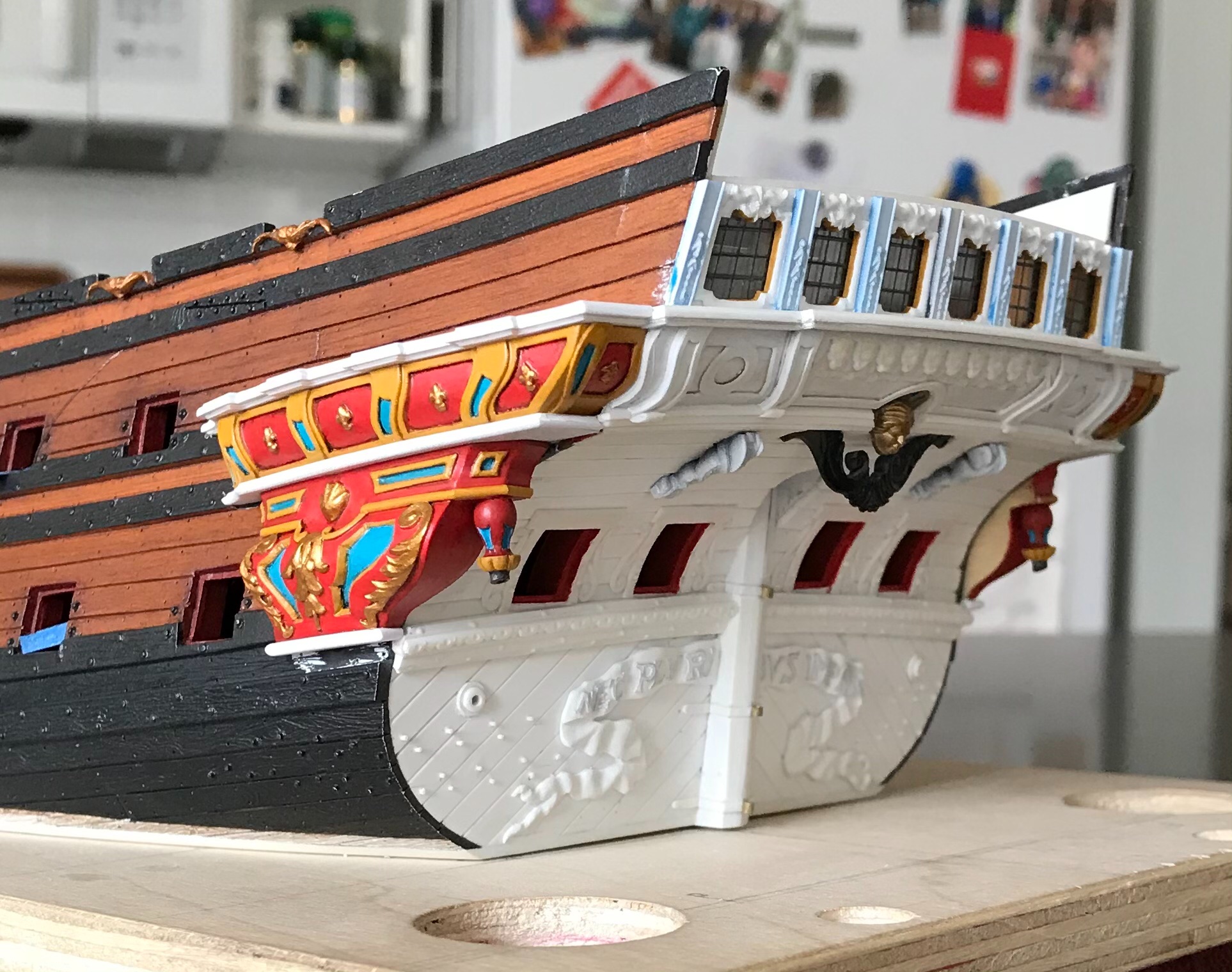
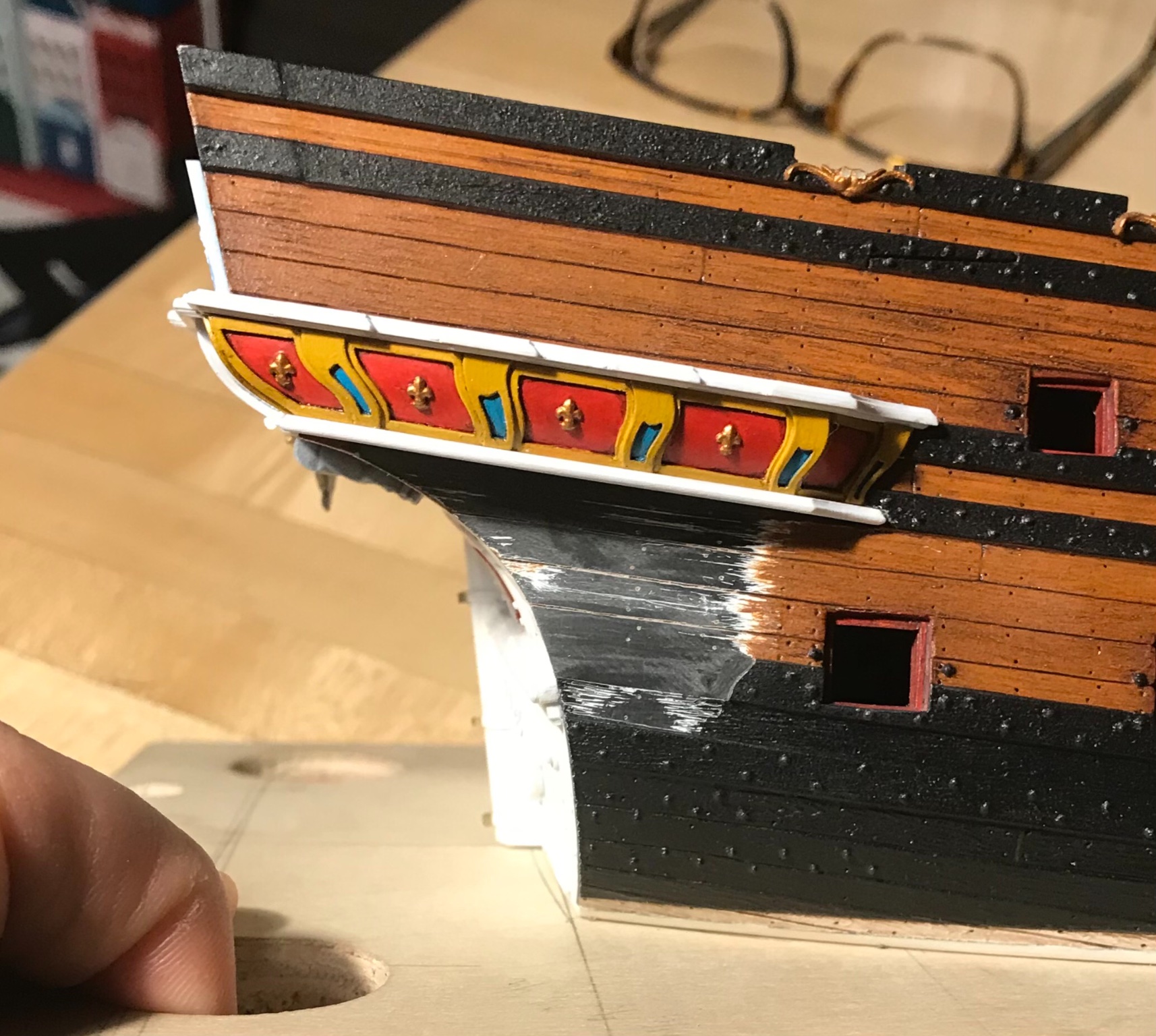
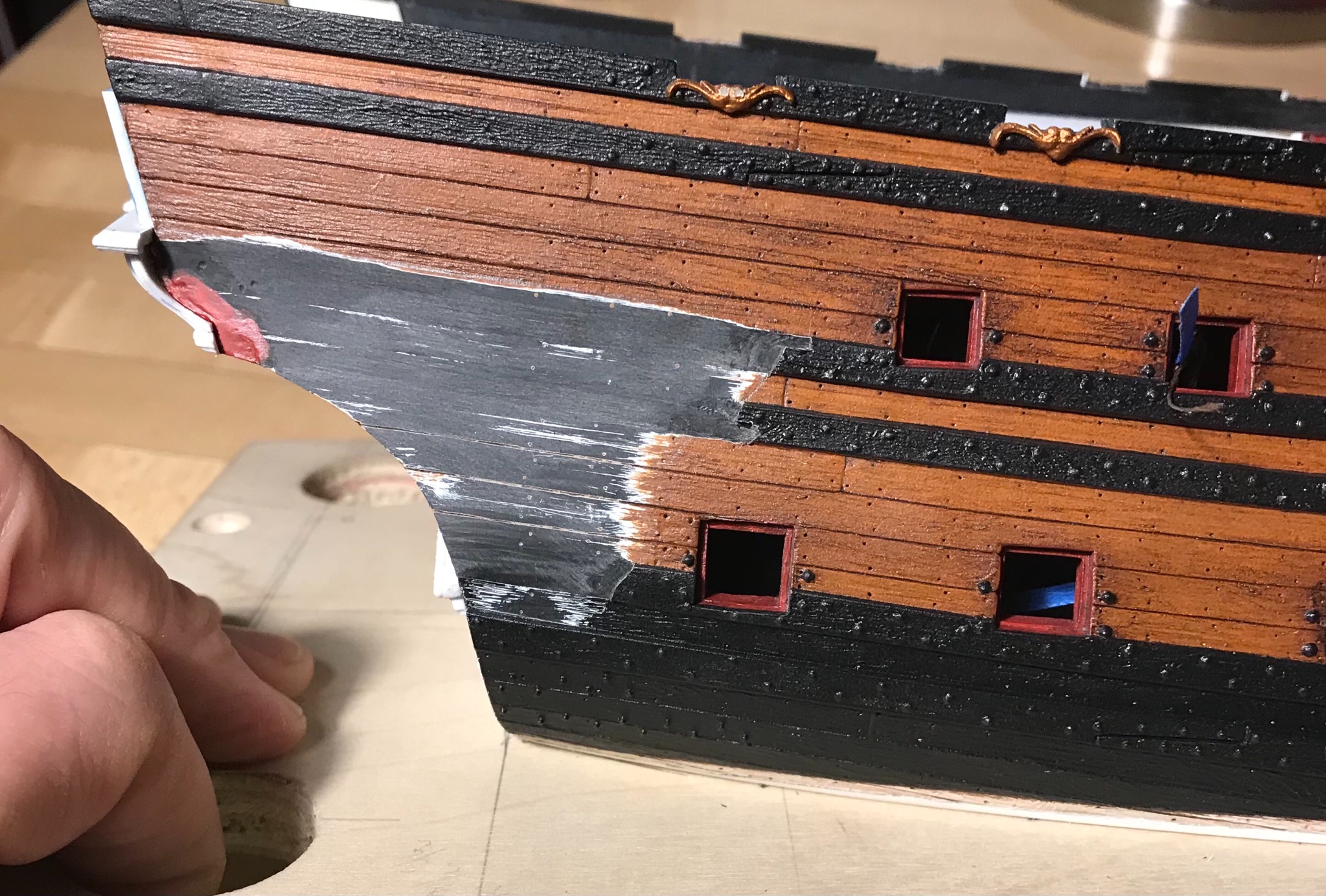
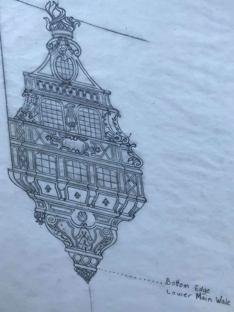
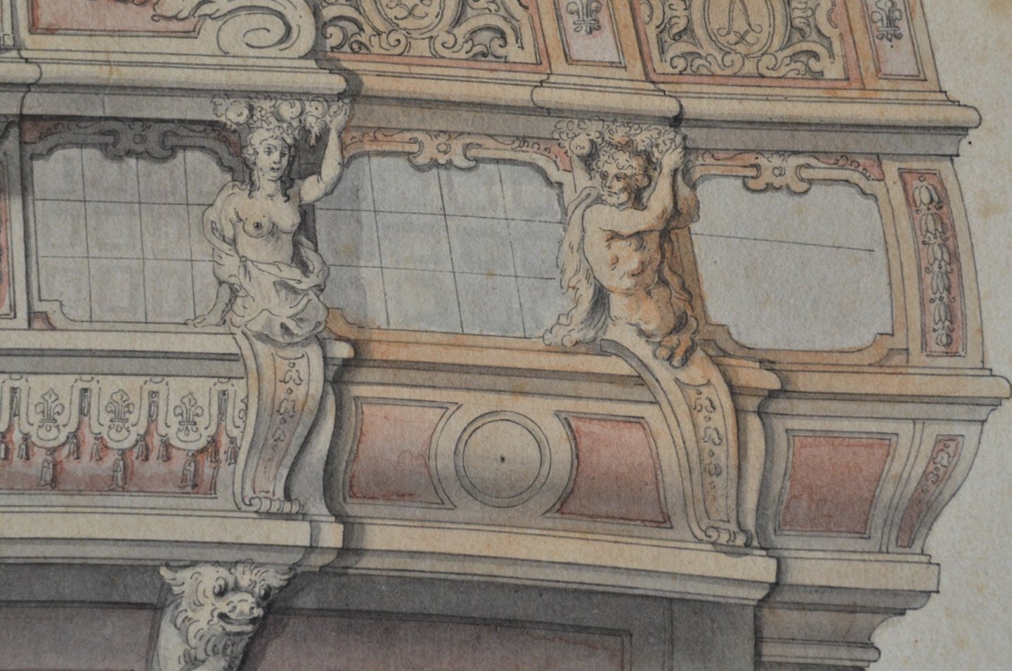
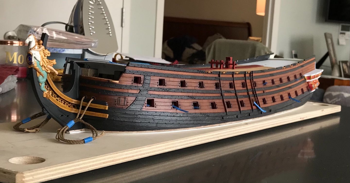
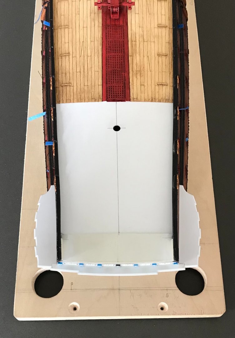
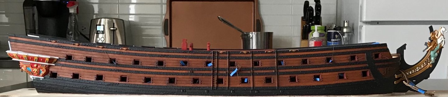
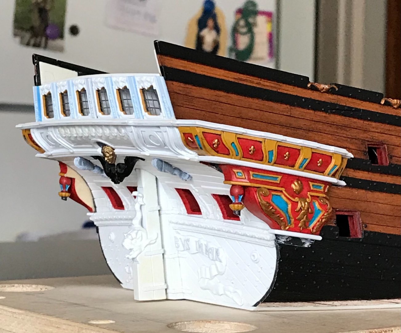
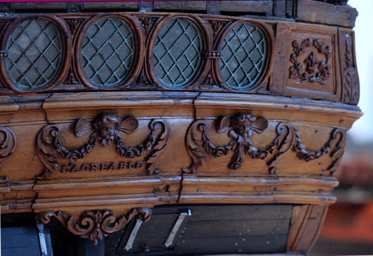
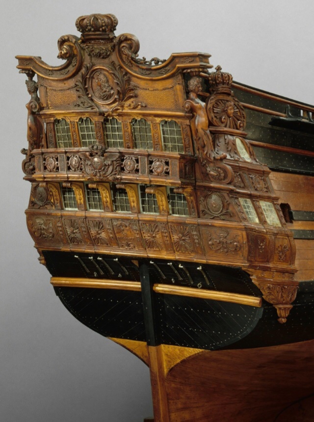
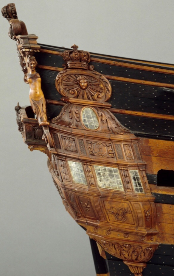
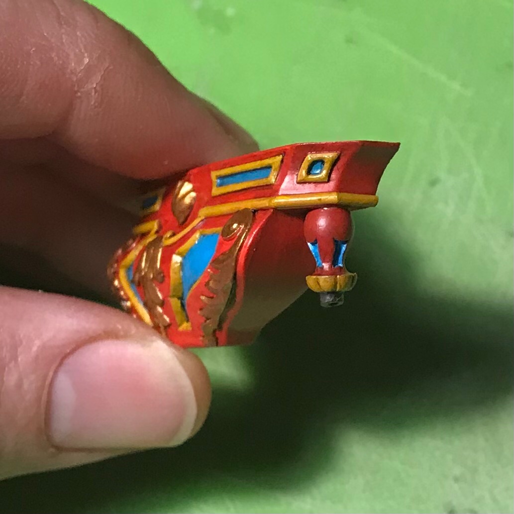
Hello again! I was surprised to discover that my initial fairing to the shape of the hull, for these lower finishing pieces, was only approximate. I was sanding them along the curving arc of the lower main wales, but not accounting for their actual rake in the horizontal plane. It was also only possible, initially, to guess at what the connecting angle would be with the transitional moulding above. When I first offered these up to the hull, after securing the section above, I found that there was significant daylight in the middle of the piece, and the top angle was all wrong. It took a fair amount of careful contour sanding and re-checking, but eventually I got the pieces flush up to the hull, fore and aft, and a closed joint at top. Here you can see the changing tumblehome as reflected upon these inner surfaces: One mistake I made was painting these before final fitting. All of that handling burnished through much of the gold. I also found that, while ordinarily sure-handed, I kept dropping these delicate pointed things on the floor. Lots of swearing! My kids wrote a song in my honor for dad’s hobby-time: “Oh EFF!!, I dropped my model... Oh EFF!!, the paint is scuffed!” Anyway, after fitting and retouching, I was finally able to secure them in place: Now, while I could not be happier with how this is progressing, I do sometimes think it is important to talk about some of the things this model IS NOT, even though it aspires to be them. While I’m pretty sure that I have an accurate read on the shaping of the active seats of ease, I am less certain about the lower finishing. In this port quarter drawing of La Royal Therese, one can see the seats of ease section pretty clearly: There isn’t really a lower finishing beneath, so it fairs back pretty closely to the hull. Nevertheless, I think I’ve captured the shape and weight of this section pretty well. Here is another example in Le Terrible: I do wonder, though, whether I’ve left the aft end of the lower finishing as too full. While I think I have the general contours correct, a part of me thinks that the aft end should probably round back more closely to the hull. I am not going to change it, but it is something to keep in mind for anyone else attempting to model these early QGs from pictures, alone. The other issue to note is the exaggerated overhang of my stern counter: As I’ve discussed before, this is a byproduct of my approach for including the round-up of the transom; in a tapering arc, I pared back the transom edge of the hull, towards the waterline, so that my stern post would not be positioned too far aft into the stern counter. This is a difficult thing to explain, and my whole line of reasoning may have been flawed, there, but it was an educated guess, at the time. The result was a very rakish stern counter, which I find aesthetically pleasing, but it is not strictly accurate for the period. One look at Tanneron’s models of Le Brillant and L’Agreable confirm a flatter, more vertical counter: Lemineur’s monograph for the SP re-enforces this notion. It is notable, also, how Le Brillant’s lower finishing is relatively less bombastic than mine, and fairs much more closely with the hull. Anyway, making this model in the manner in which I am is sometimes a guessing game. One particular benefit of this QG is that it extends beyond the line of the transom, and obscures the exaggeration. I will have to make a pair of wrapping corbels that finish this detail of the model. Here are the pattern tracings I have made for this purpose: Anyway, EFFIT! as this moderately old man is wont to say. Taken in its entirety, these small architectural variances should not be too glaring: So, I’m just finishing up the low finial of the lower finishing. I will wait to paint these until after final fitting: Once those are in place, I can concentrate on making the window section above. Now that I know the North East Joint Clubs meeting is slated for October, I will try to get a certain amount of work done. I would like to get the upper bulwarks up and painted, the structure of the upper stern framed and planked, the quarter deck installed, and perhaps make a start on the galley stove. Given my pace, so far, this is ambitious, but not altogether impossible. When I last showed the thing, two years ago, it was merely a collection of un-assembled parts. However far I get, it will be a vast improvement. As ever, thank you for stopping by, and for your likes and comments. Happy Holidays!


- 2,697 replies
-
- 16
-
-
-
- heller
- soleil royal
- (and 9 more)
-
The stern is shaping up beautifully, EJ. I’m looking forward to seeing your new carvings for this ship. A happy holiday season to you and your family!
-
I love the tree, Mark - it’s the King’sKnees! Ship looks pretty great, too!
-
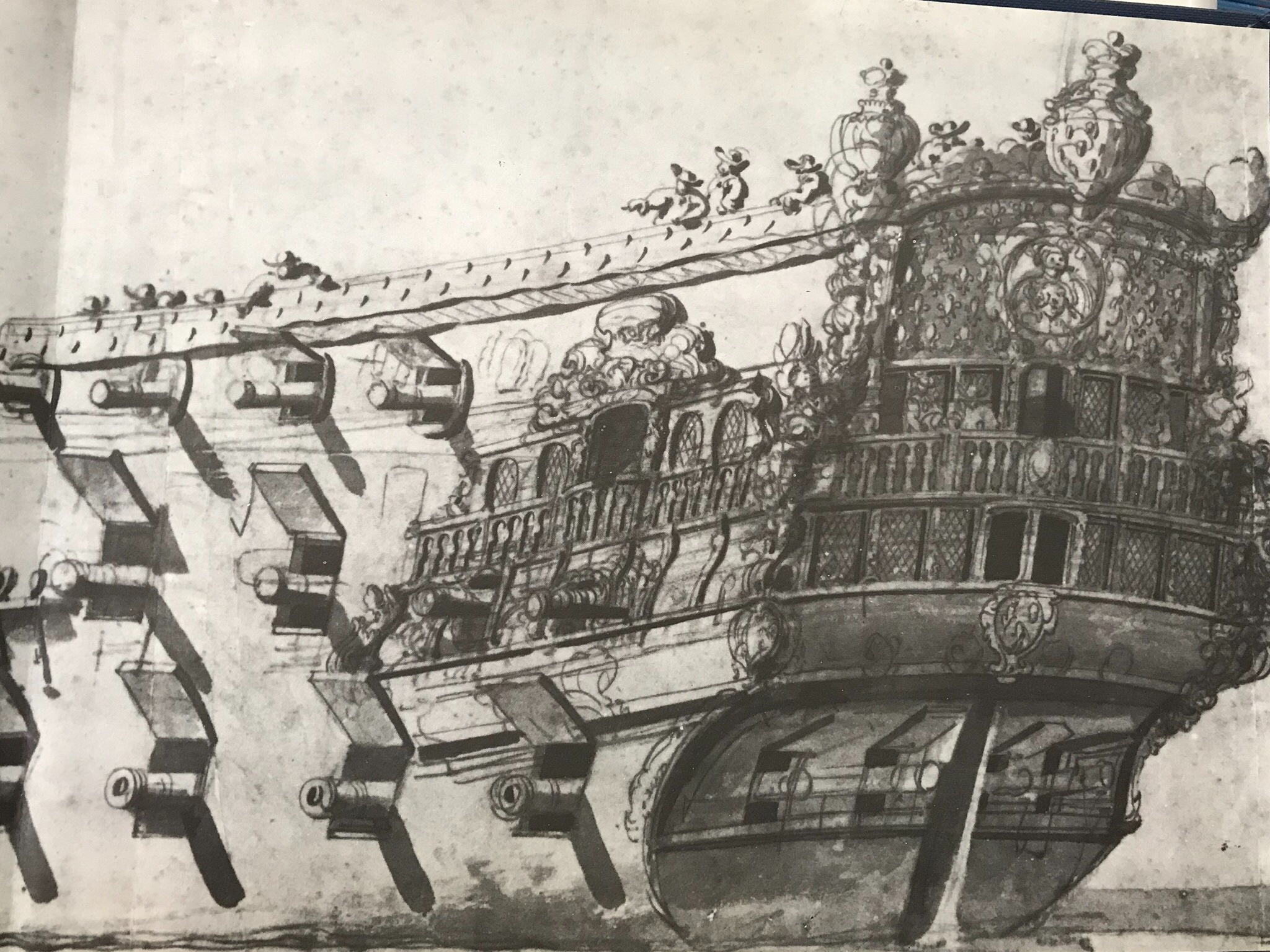
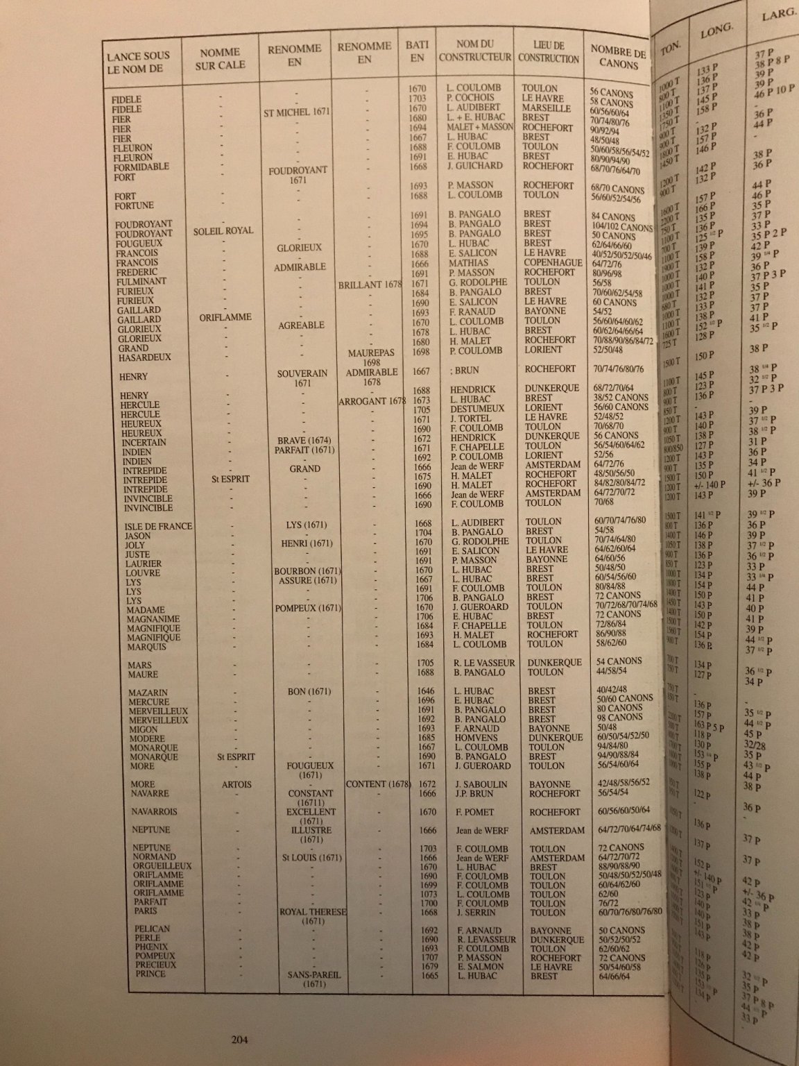
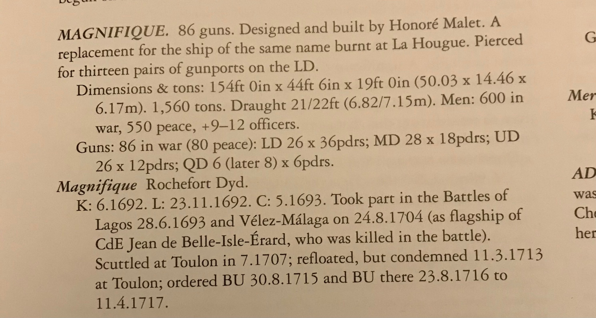
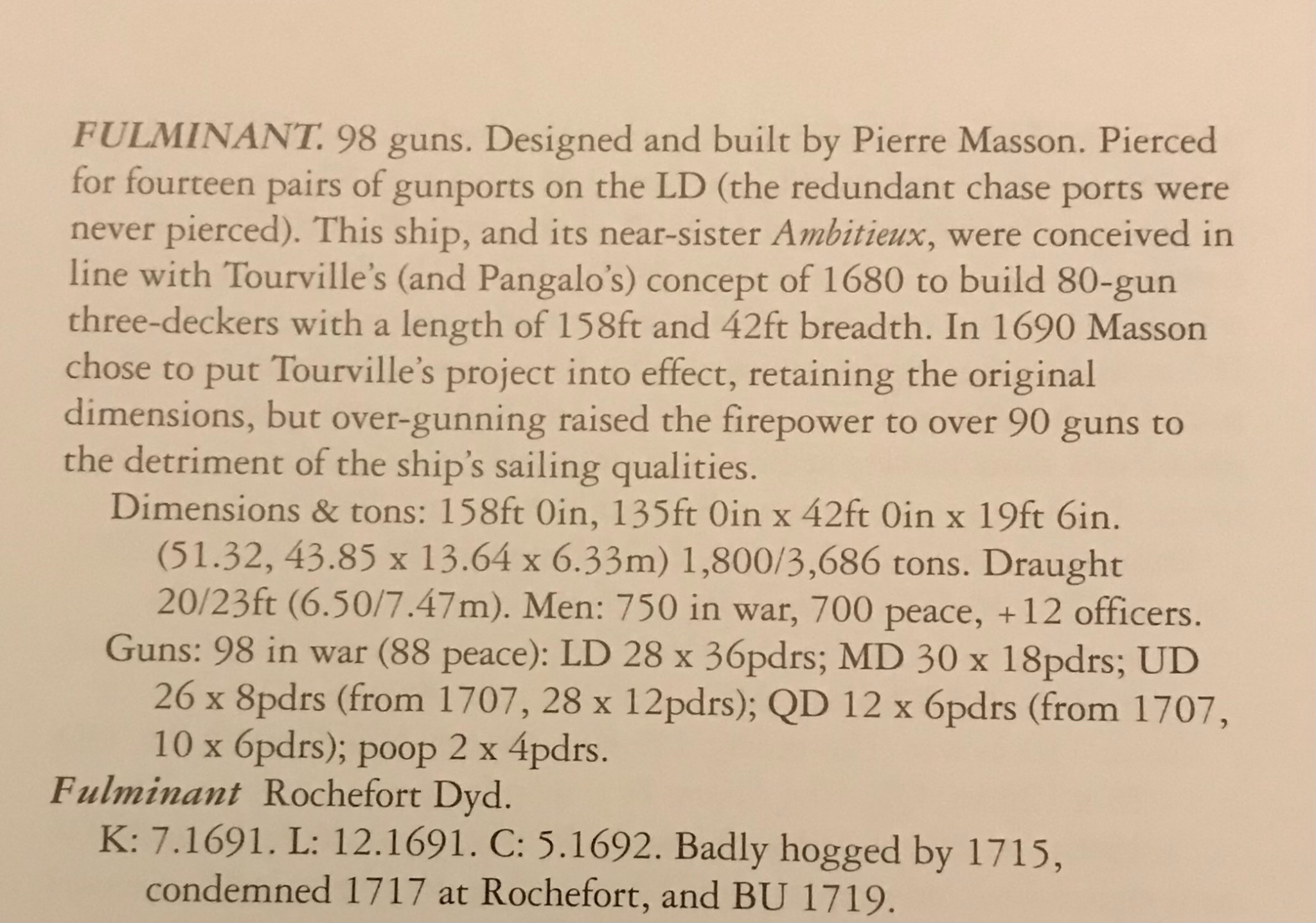
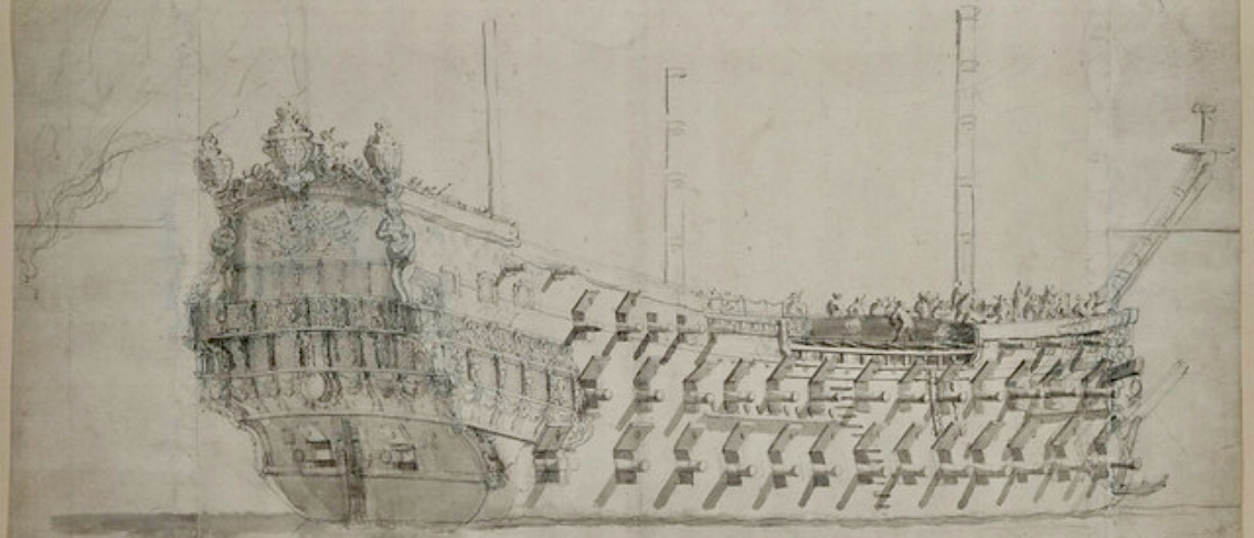
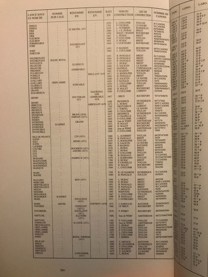
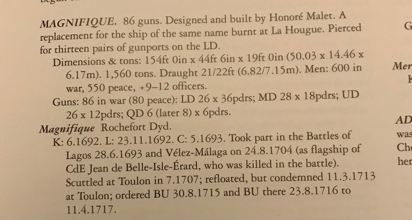
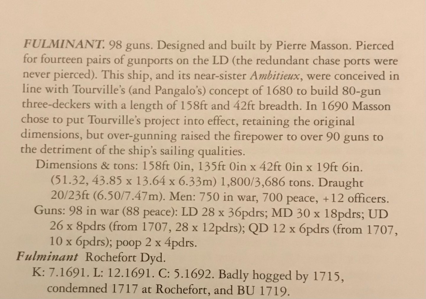
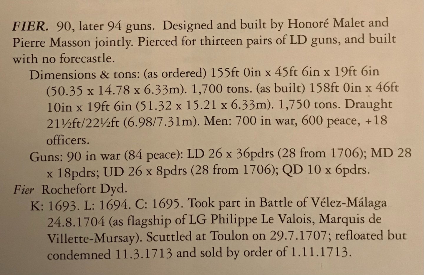
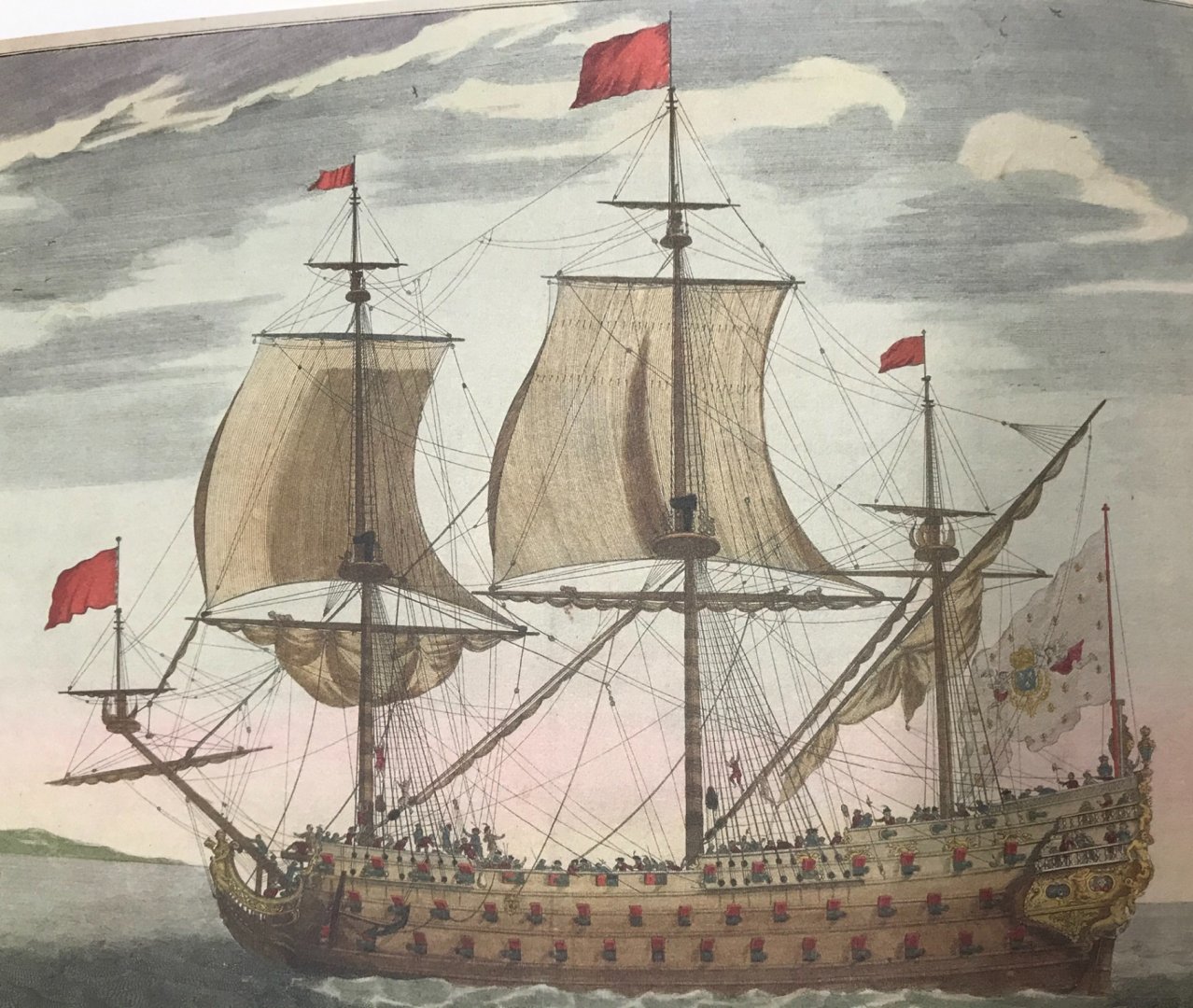
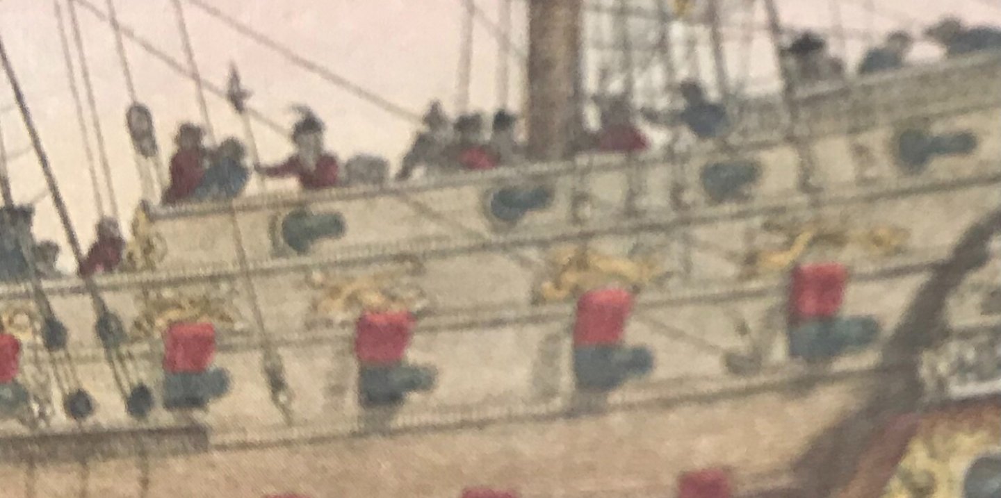
Thank you, Druxey! Little by little, we are getting there. T_C - I have used a heavy body gel medium by Liquitex to build up fine detail before painting - in particular the triple tasseling of the lambrequin carving, on the stern counter. This worked well, and I sealed it under a coat of liquid CA to ensure that it never de-laminates. So I had a look at the lists, as re-printed in Lemineur’s Vaisseaux Du Roi Soleil: While the color print, in the prior post, is cropped and does not show the forward end of the ship - I can see, in the B&W version that she is approximately pierced for 88-90 guns (excluding bow and stern chase ports). With the masting hulk, in the way, and the foreshortening of perspective, it is a bit of a guessing game. So, considering First-Rate ships from Rochefort, in the latter half if the 17th Century, there appear to be three possibilities that are close to this armament: The Fier, the Fulminant and the Magnifique. Regarding uncertain questions like these, I like to fall back on the following reference: Here are the capsule synopses for each ship: One thing, armament-wise, that does seem pretty clear in the color print, is a QD armament of 10 guns. Also, there is the clear absence of a forecastle deck. The Magnifique carried 6 on the QD, and the Fulminant 12, until 1707 when the number was reduced to 10. Perhaps this is a portrait of the Fulminant, around 1707, during a refit. However, the name Fulminant alludes to a violent explosion or flash of lightning. It would seem more likely that the tafferal tableau would make some visual allusion to lightning, or an explosive force. Also, the Fulminant carried more guns than seems likely in this portrait. You mention the possibility of Cerberus, and perhaps a connection to the 12th labor of Hercules, however I agree with you that the soldier is dressed in Roman garb and that is at odds with the Greek mythology. The soldier holds his sword up high, yet Hercules is traditionally shown as armed with a club. The name Fier, in French, means proud, and that certainly seems to be the bearing of the Roman Soldier, having vanquished his enemies. So, that is my best guess. I think this ship is the Fier.

- 2,697 replies
-
- 6
-
-
- heller
- soleil royal
- (and 9 more)
-
I have the lists for all rates, during this period. I’ll take a look, John - thanks for the clues!
- 2,697 replies
-
- 2
-
-
- heller
- soleil royal
- (and 9 more)
-
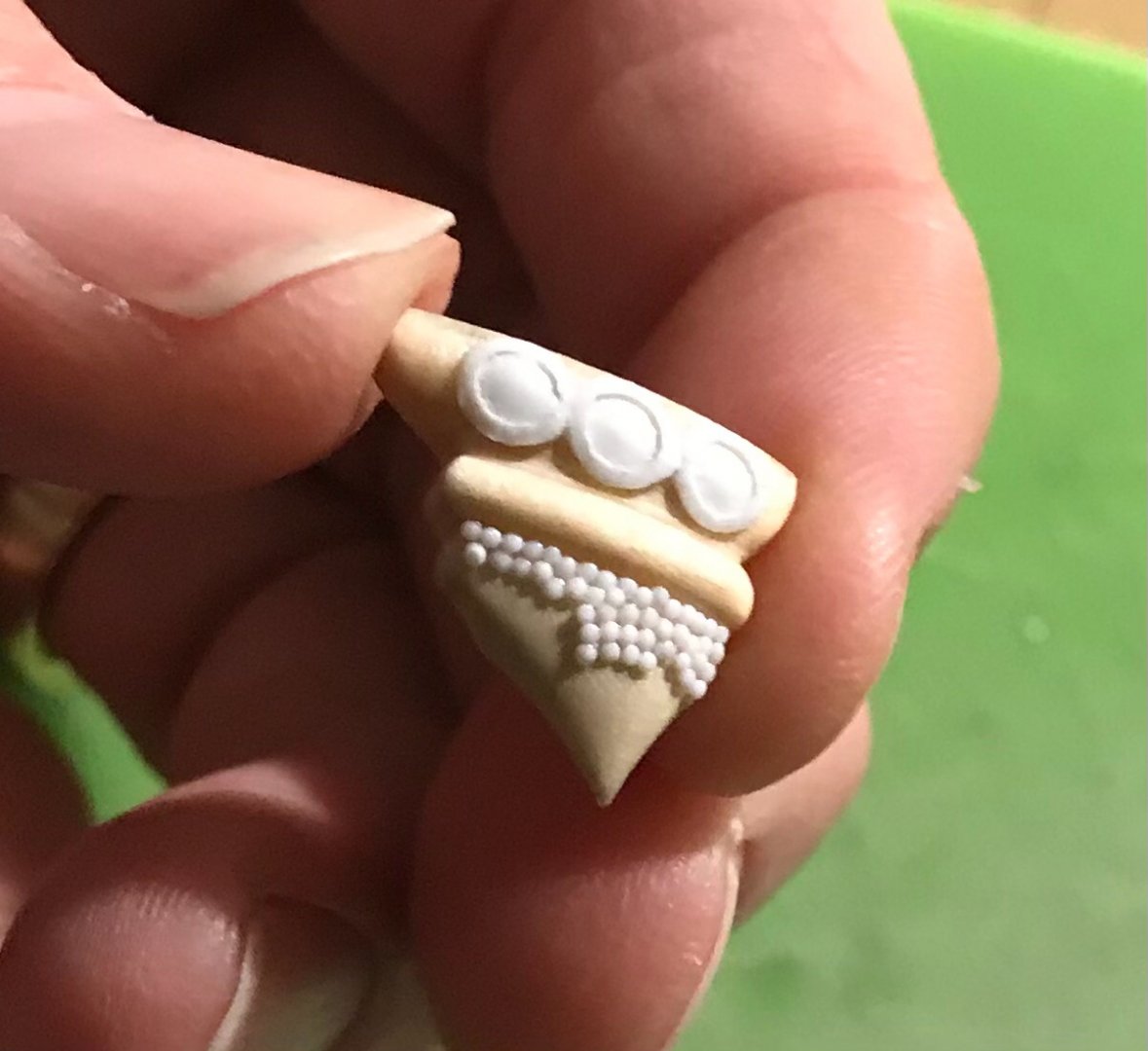
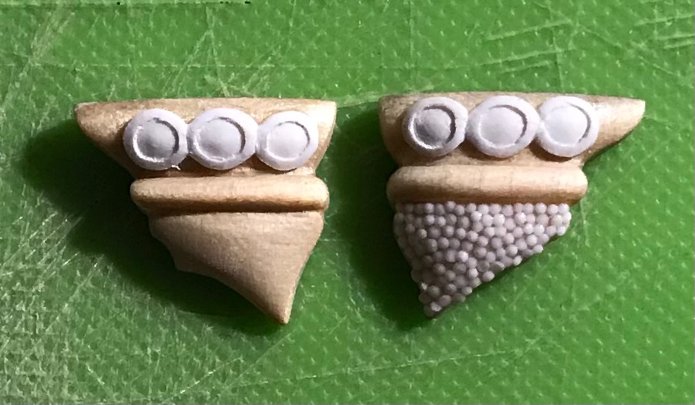
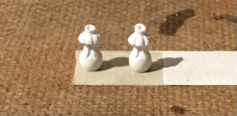
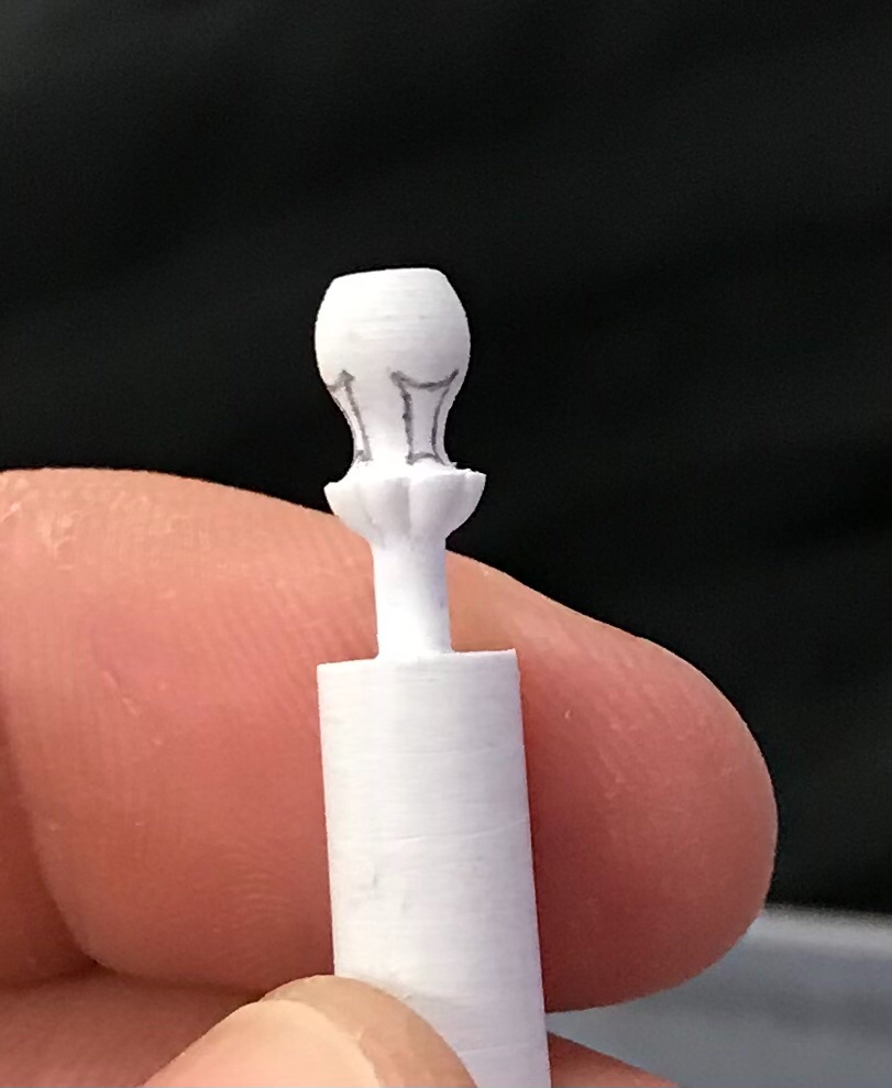
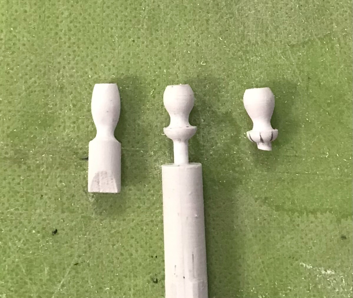
I spent a good part of the prior week making these waste-pipe rosettes: I really wanted to represent these, as shown, with acanthus leaves folded-in, around the pipe. At this scale, though, that proved impossible for me to make something that looked good and right. I began, one day, with a scrap of 1/4” x 1/4” stock, left-over from the rudder head ornament. I didn’t have my drill or Dremel, that day, so I attempted to facet to round and then shape entirely by hand. What I ended up with was approximately the right diameter, but too long and reminiscent of a saggy boob. It was informative, though, in so far as what proportions I needed to arrive at. So, I made up some more 1/4” stock and made a proper turning in my drill, the next day: Middle and right are the neat little vasi-forms I was after. From the top to the bottom of the “cup” is 5/16”, and the turning sprue gets cut into the waste-pipe end, adding another 1/16”, overall. The trouble with Soleil Royal is that nearly every square inch begs for some form of embellishment. I could simply have painted these red ocher and called it a day, but it seemed to me that they would look too pedestrian right next to the gilded acanthus carvings of the QG lower finishing. I decided that I could subdivide the cup into quarters and eighths, easily enough, and scribe a reeded pattern into their surface. On its own, this new embellishment, highlighted in yellow ocher, would probably be enough. I decided, though, to take it a step further and try to create some nice recessed paneling, as on the lower finishing: This was just as time consuming as it seems it would be. In colors, though, the results proved worth the effort: I even gave the waste-pipe a light ver-de-gris wash for the added realism. Next, I was finally ready to begin installing the largest QG segments with their top and bottom transitional mouldings. Here is the area, scraped and prepared for gluing: The trickiest bit was the juncture of this bottom moulding with it’s counterpart on the stern; the trouble was that I didn’t have space, in my QG design, for the full thickness of the stern moulding which is, itself, a very close copy of what Berain drew for the stern. So, I had to simplify the QG moulding and cope it around the stern moulding. What’s happening, here, is more evident if you zoom in: The top moulding, while also coped, does at least match the profile of its stern counterpart. A few perspective shots: The wooden substrate is CA’d to the plastic hull and mouldings, and the inside edges of the mouldings are styrene-cemented to the hull. As always, I seek to ensure maximum connection and bond. Tonight, I’ll install the port side, and I can then begin final fitting of the section below. In the meantime, I’ve been shaping the very bottom section of the lower finishing, and making up the corresponding transitional mouldings: I have an idea about how to represent the grape carving, of this lowest bit, which I think will work out much better than actually attempting to carve that detail - oh, for the love of paint! Thank you for your interest and for stopping by. More to follow...


- 2,697 replies
-
- 14
-
-
- heller
- soleil royal
- (and 9 more)
-
Lastly, since I’m on a roll of conjecture and potential discovery, I noticed the following while reviewing this portrait, yet again: The attribution for this portrait is always Soleil Royal. If so, this would be her early appearance, sometime between 1670 and 1685. Two things about this are interesting to me. First - they may be approximately representing the pale blue/green upper bulwarks that I tend to think may be correct for this period. Looking closer at the upper bulwarks, though, I think I may finally have made sense of these ornaments: They appear to be two dolphins, crossed at the tails, with perhaps a shell nestled between. This could have been the early precursor of the frieze that is re-worked in 1688/89. If so, that would be consistent with a tradition of re-working/updating previous ornamental schemes to reflect current tastes and styling. My operating theory is that Berain’s stern is merely an updating of Puget’s first design, which was an elaboration of LeBrun’s original allegoric concept for the ship. In any case, at some point, I will do a detail drawing of this form because it is easy for me to imagine this as a repeating relief, perhaps with fleurs in-between, for my conjectural SR of 1670. Alternating strakes of this crossed dolphin motif might have harps between the dolphins, or suns, or some combination of the above.
- 2,697 replies
-
- 7
-
-
- heller
- soleil royal
- (and 9 more)
-
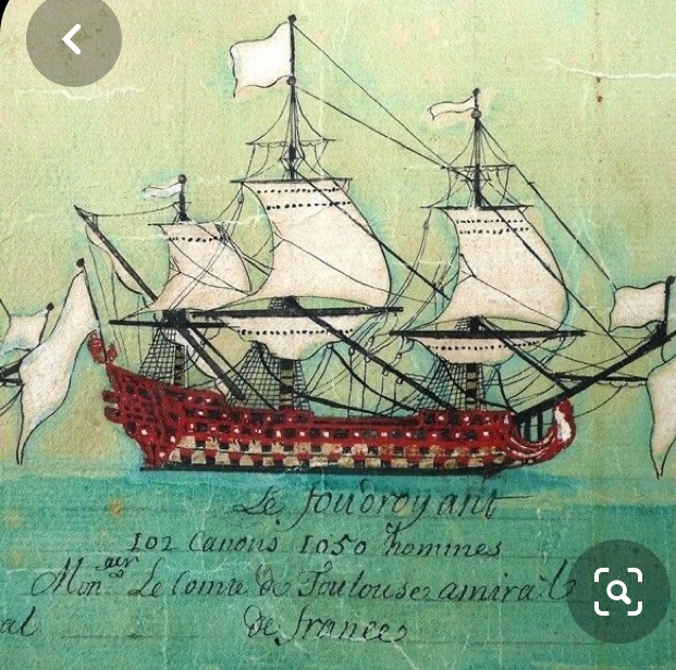
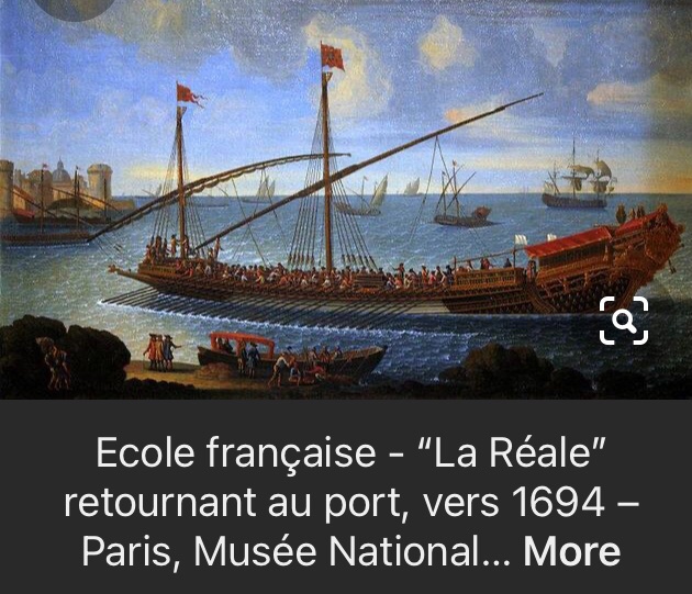
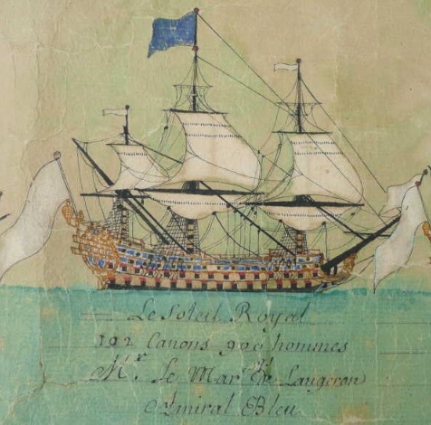
Admittedly, the following is a feeble basis from which to draw any serious conclusions, however the following contemporary reference to the battle line formation for the battle of Velez and Malaga, 1704, shows SR2 in the following colors: This is in distinct contrast to the Foudroyant: Interestingly, these two ships, in particular, began on the construction slipway as the other, but the official designation was changed, mid-construction; Etienne Hubac was, initially, constructing the Foudroyant. Adding insult to confusion is this other contemporary portrait of La Reale from 1694: The 2nd-rate warship, in the background, appears to be all blue. Also, interestingly, all of La Reale’s hull appears to be painted ultra-marine, which would have been extremely costly at this later date. So, I’m not really sure what to make of all of that.
- 2,697 replies
-
- 6
-
-
- heller
- soleil royal
- (and 9 more)
-
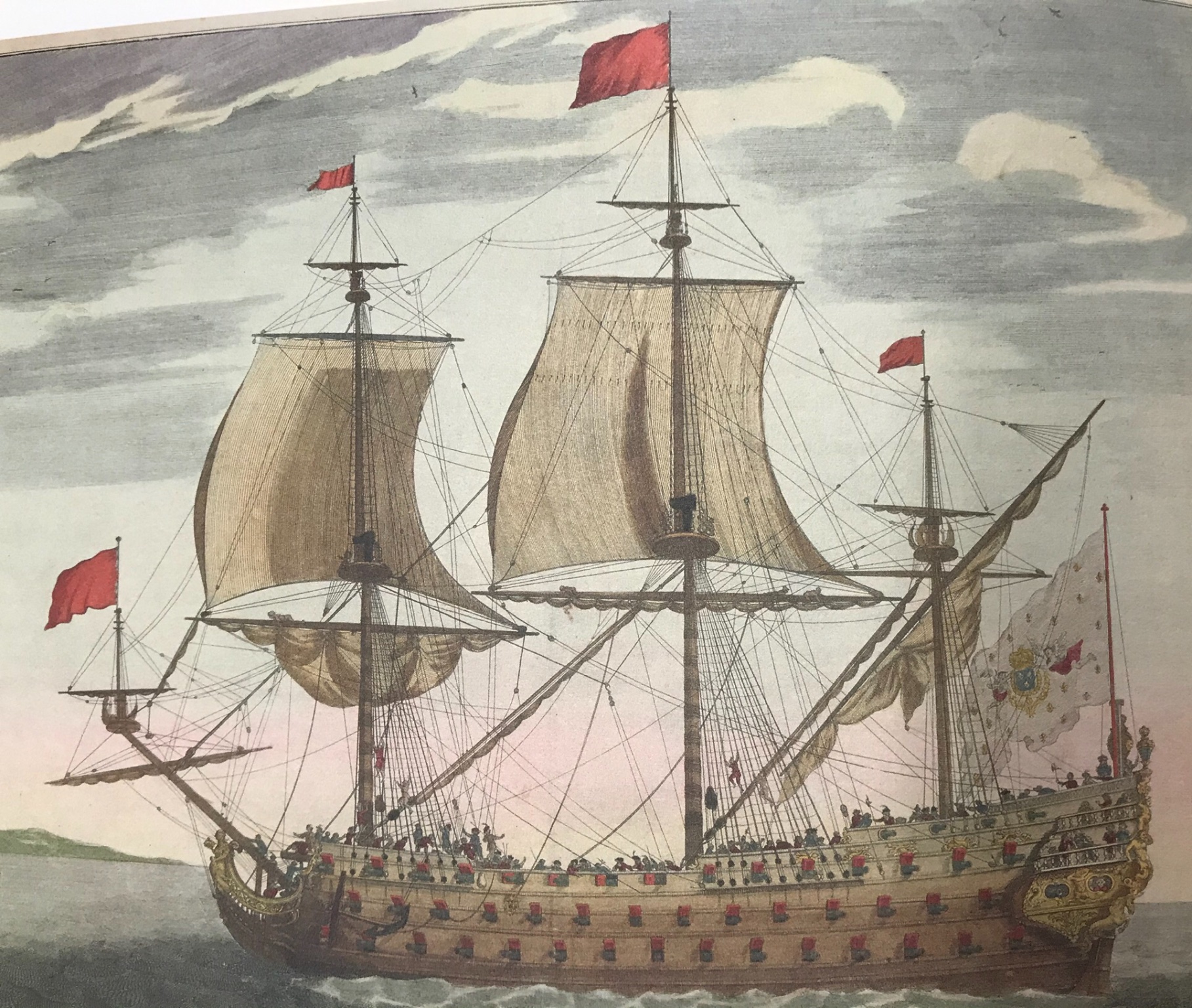
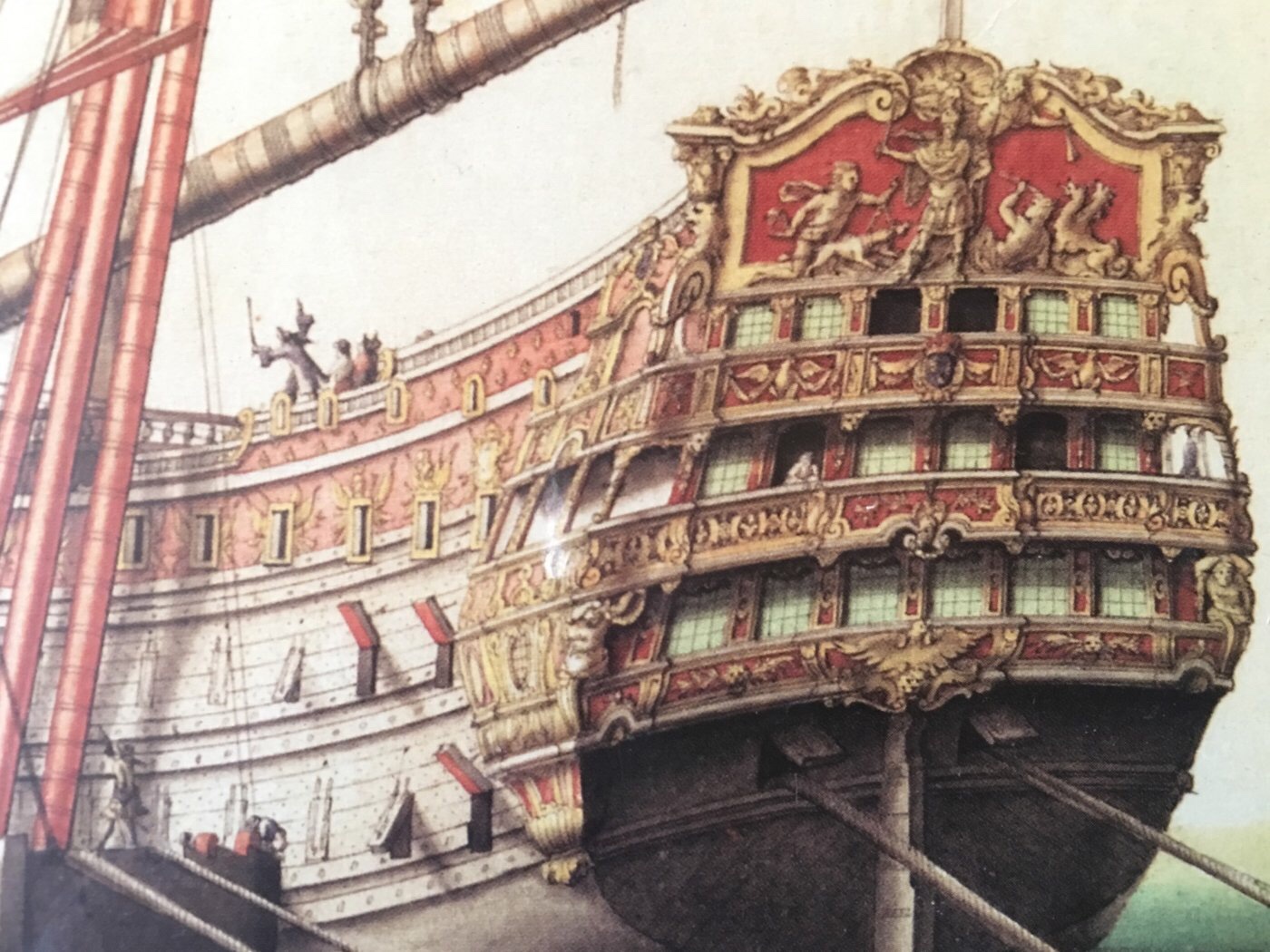
This plate appears in the St. Philippe monograph. It is contemporary to the times. I don’t know the artist or the vessel, but as I’ve mentioned before, the similarity in stern architecture to SR is striking. This ship is almost entirely red and yellow ocher. Only the Royal coat of arms shows a little ultra-marine. Also, barely visible on the upper finishing of the QG is an ultra-marine background for the crossed Ls of the royal monogram. Interestingly, the Phoenix bird figures prominently in the stern, but I am not familiar with the allegory on the tafferal. Whatever the ship’s name is, is tied to those clues.
- 2,697 replies
-
- 6
-
-
- heller
- soleil royal
- (and 9 more)