


mugje
-
Posts
943 -
Joined
-
Last visited
Content Type
Profiles
Forums
Gallery
Events
Posts posted by mugje
-
-
Slowly and steady progress...taking my time with the ratlines
- egkb, Old Collingwood, Retired guy and 4 others
-
 7
7
-
Wow you got great skill! It's really nice to follow your log
")
-
-
-
-
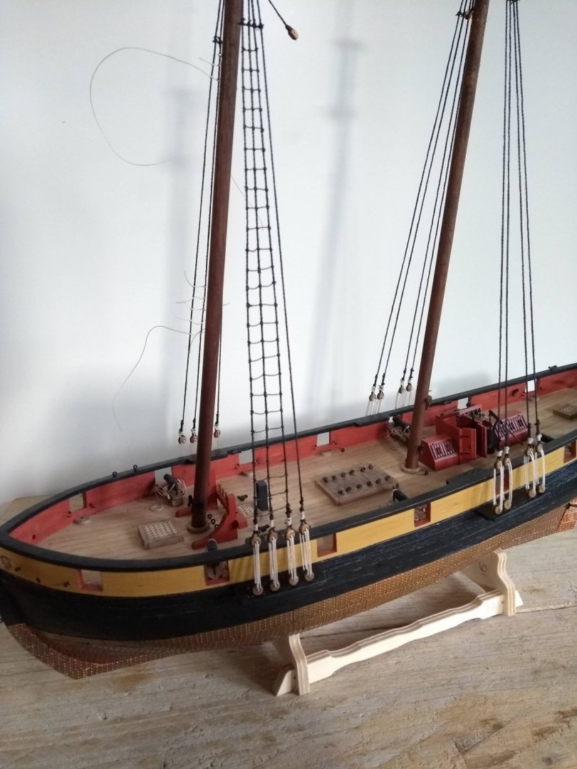
I've tightened the lanyards, and the twist is almost gone. It looks much better, also the lanyards. So...a bit extra work on top of tying the ratlines...but that's part of the learning process.

- GrandpaPhil, Dubz, Retired guy and 5 others
-
8
-
-
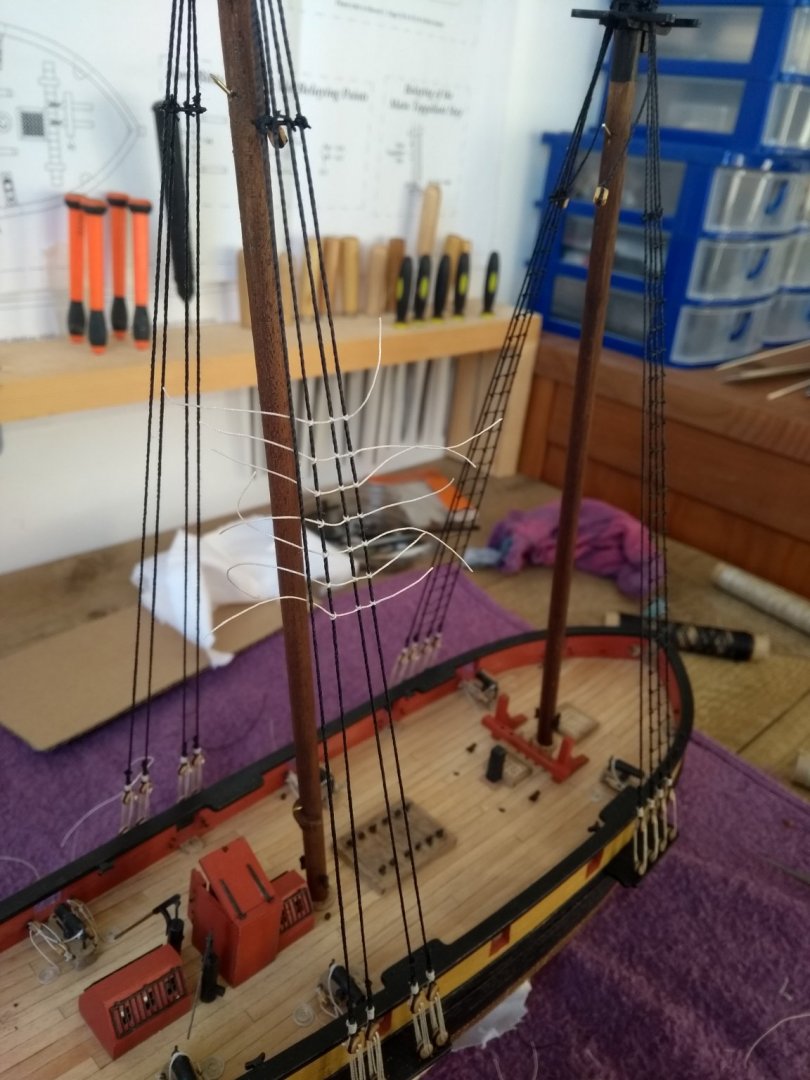
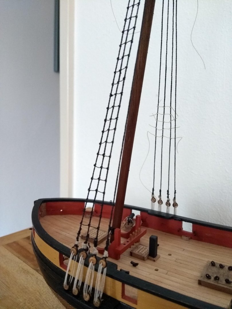
Busy with the ratlines! The first batch ready, it wasn't easy but i'm pretty happy with the result.
The only thing is, that there is a twist in it, from top to bottom. Probably because of the paint and glue that added some
stiffness to the whole.
Anyone an idea what I can do about that? Or is there in this stage nothing what I can do to fix this?
On the first not so sharp picture you can see the problem.


-
4 hours ago, Old Collingwood said:
Tnx! There's a whole story about the Pickle, that's nice!👍
-
Busy with the ratlines! The first batch ready, it wasn't easy but i'm pretty happy with the result.
The only thing is, that there is a twist in it, from top to bottom. Probably because of the paint and glue that added some
stiffness to the whole.
Anyone an idea what I can do about that? Or is there in this stage nothing what I can do to fix this?
On the second not so sharp picture you can see the problem.


- egkb, Retired guy, Old Collingwood and 5 others
-
8
-
you are going pretty fast, good job!
-
Thanks for the elaborate answer and compliment Peter, and everybody tnx for the likes.
Good point on the tightness of the lanyards/shrouds. I'm making a mental note in my head for the next time i'm going trough that process. With building a model there are often questions about authenticity or just good looking for the modeller.
-
Next step is knotting the ratlines. Caldercraft supplied for this 0.10 naturel thread that need to be stained black when it's knotted against the lower shrouds.
Why they didn't supplied black thread in the first place? I don't know. Or is it mean't to be more authentic? Because they tarred it maybe? 🤔
-
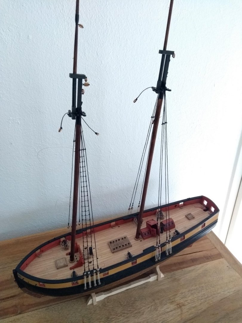
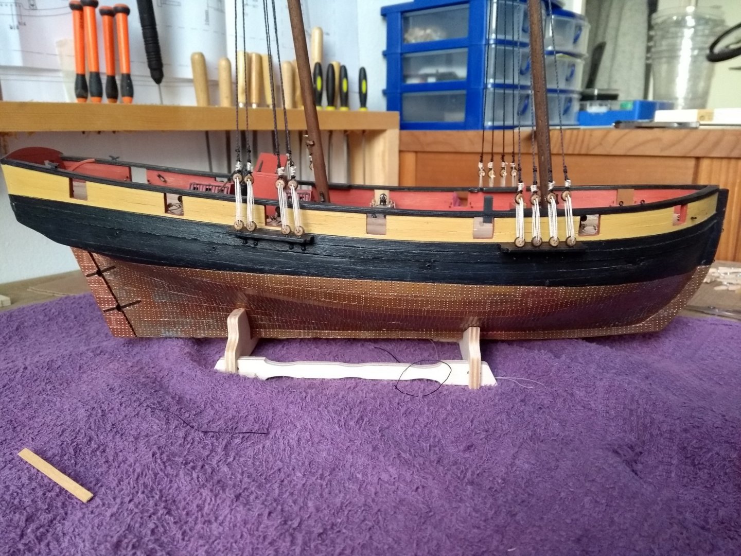
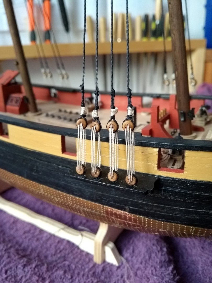
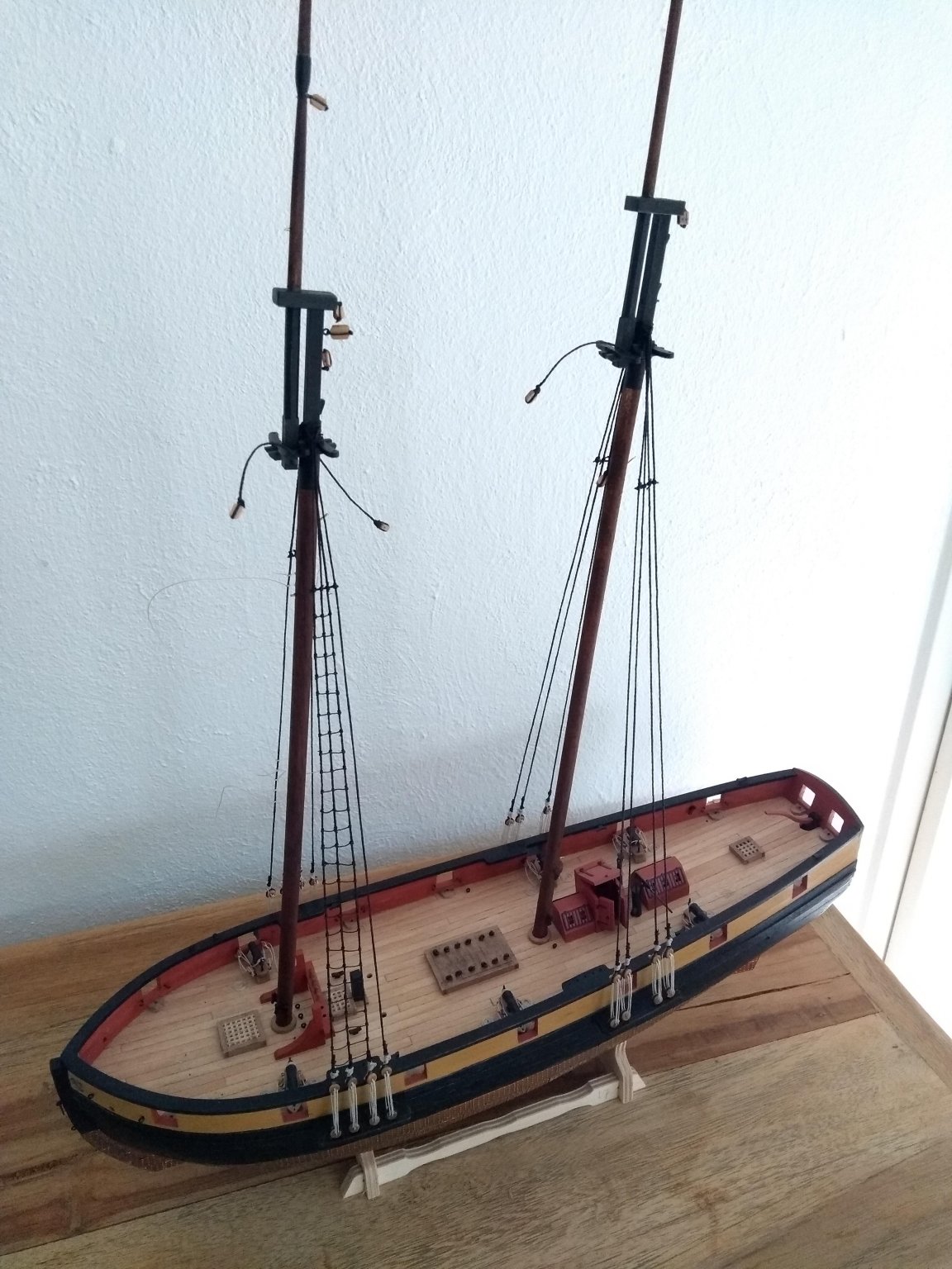
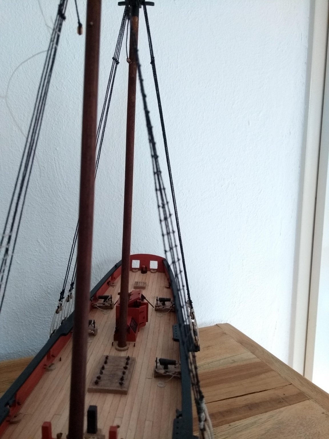
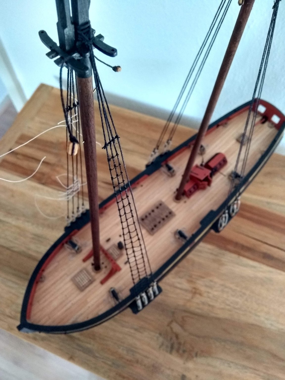
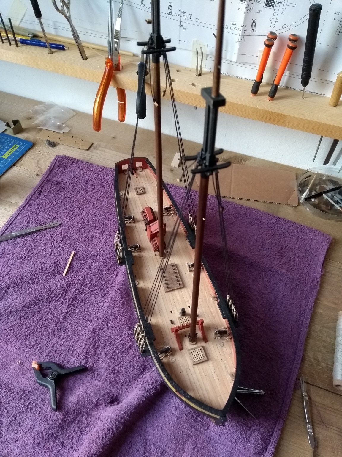
The lower shrouds are finally done. After retrying a few times i'm happy how it turned out 🙂
The lanyards could a bit tighter, but it's not to bad in my opinion for now.


- Dubz, oneslim, Edwardkenway and 6 others
-
9
-
-
Tanganyika looks more like the ship on the box 🙂
- Jim Rogers and Ryland Craze
-
2
-
5 hours ago, druxey said:
Y.T's trick was to use a new, very sharp scalpel blade. I've done the same thing. I pre-painted the paper (stretched,as I was using acrylic paint), traced the outlines down using white transfer paper (traces wash off afterwards), cut the letters out and glued them on.

Beautiful!🙂
-
33 minutes ago, druxey said:
If you had asked this question 30 years ago, the answer would have been simple. Since the introduction of graphics programs on computers, Letraset became a dinosaur. I doubt if you can find any these days. In any case, old Letraset tended to craze and lose adhesive strength. Y.T's solution is an elegant one. You could start by printing off a computer-generated version of the lettering as he did. Alternatively, use a fine artist's brush and paint....
Tnx! Yes the solution that Y.T. used looks like a good alternative. I'm going to experiment with that. I wouldn't trust myself yet to paint the letters directly on to the ship 🤪
-
1 hour ago, Y.T. said:
I resolved same issue as follows. These letters I just printed on paper sheet, carved them out with scalpel and painted gold acrylic. After gluing to the hull I applied transparent acrylic varnish over for protection.

That looks really good I must say. You used just normal paper?
-
Hello everyone!
Not sure if it's the right subforum to post this question.
But i'm look for dry-rub transfer letters, and the Letraset 5mm Times new roman gold are looking real good for the job.
I'm working on the Pickle kit from Caldercraft and the photo etched letters that are supplied with the kit are horrible.
I saw with other builds on the forum that they use the Letraset letters.
But the problem is that I could not find them on the web? Does someone know an adress?
-
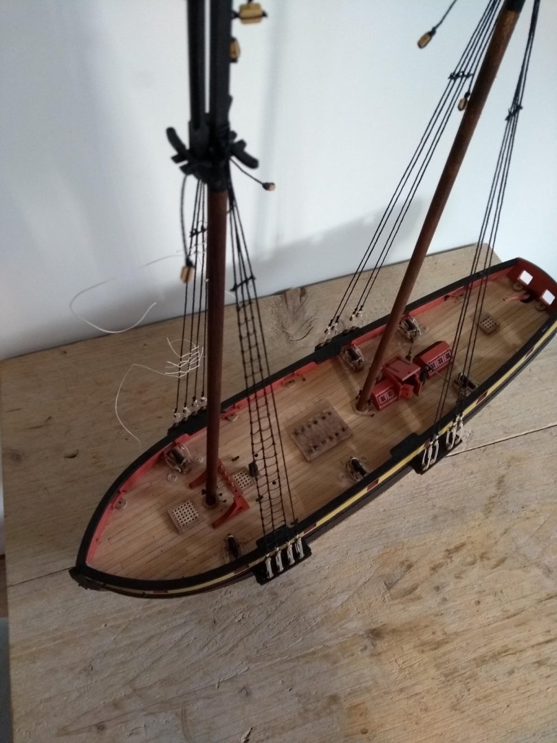
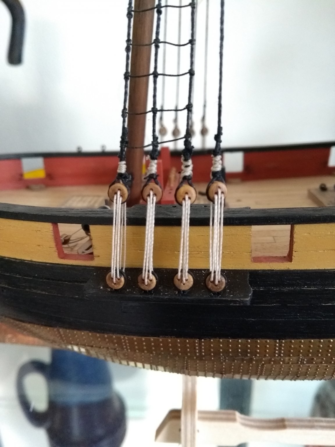
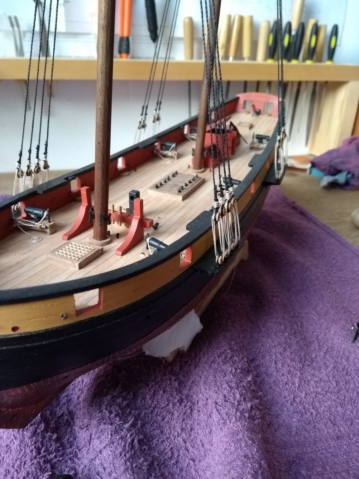
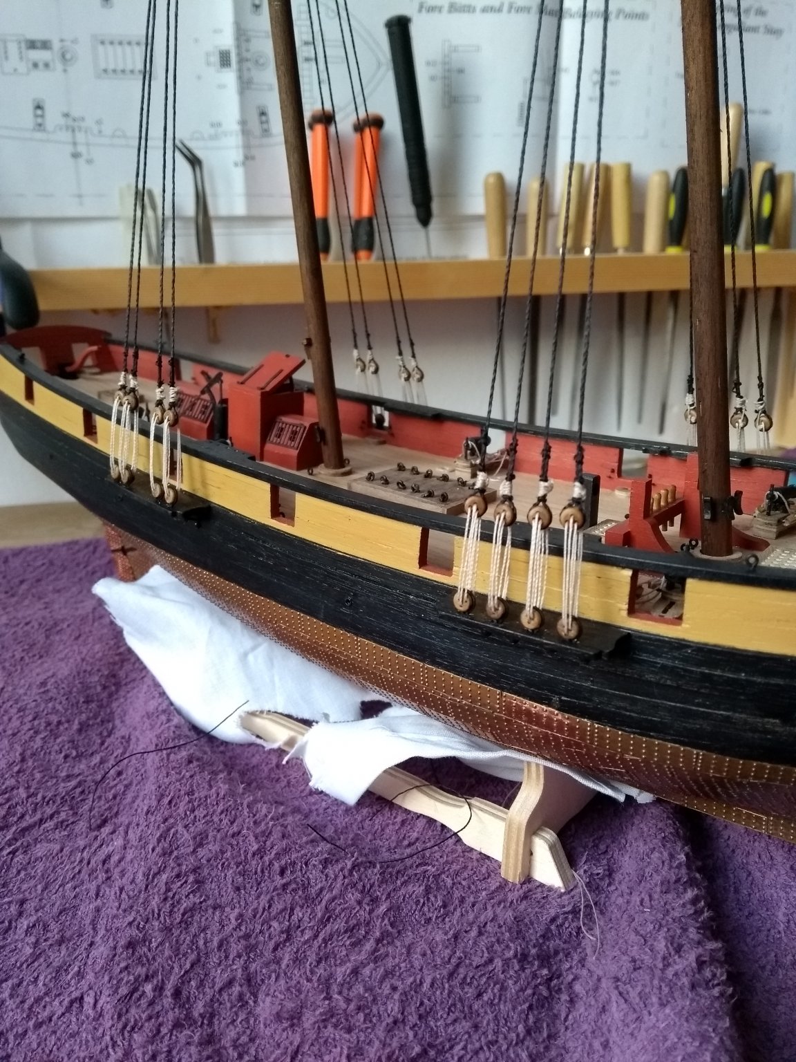
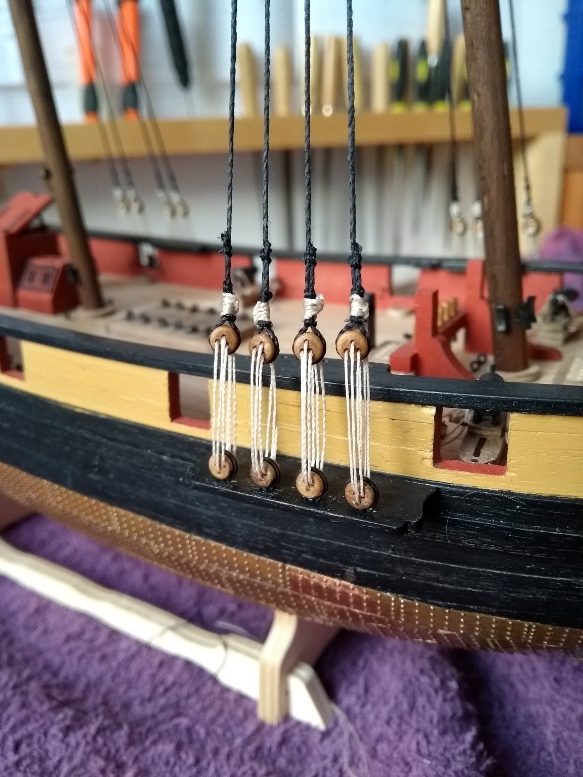
I wasn't happy with how the knots of the lanyards turned out. It was to sloppy and it irritated me.
I had already knotted about 6 of them but cut everything loose. And searched how it could be done better and neater. I took a look in the practicum of the Syren from Chuck Passaro. He uses the cow hitch, or lark knot for that. With a lot of practice it became this, which i'm very happy with.
Way more neater then the first effort!
-
-
That's a great idea! Tnx!
-
Tnx Lazy Saint!
Do you always make new diluted glue for the knots when you need it? Or do you make it once and store it somehow?


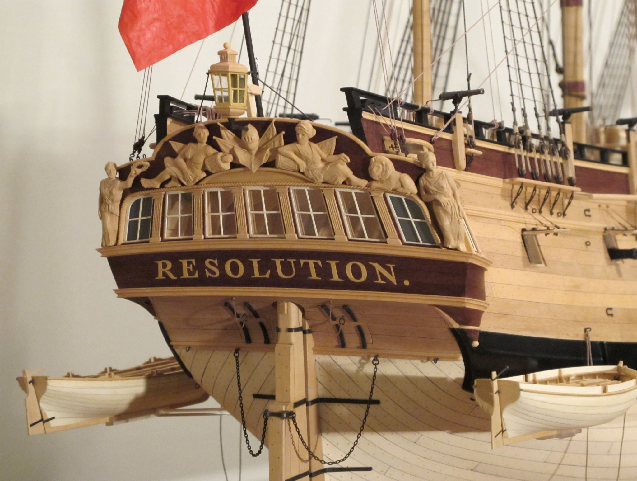


HMS Pickle by mugje - FINISHED - Caldercraft - 1:64 - first build
in - Kit build logs for subjects built from 1751 - 1800
Posted
Tnx for the tip David!👍