Hubac's Historian
-
Posts
3,316 -
Joined
-
Last visited
Content Type
Profiles
Forums
Gallery
Events
Everything posted by Hubac's Historian
-
 Consider me a "like" for every post! I really appreciate your methodical approach and precise workmanship. I will follow with great interest.
 -
Super crispy! This is the standard of work that I would like to read more about in the Nautical Research Journal.
- 589 replies
-
- 2
-

-
- le gros ventre
- cargo
- (and 1 more)
-
Fair enough. Pictures often don’t do justice, so I will definitely give you the benefit of the doubt.
- 355 replies
-
- 2
-
-
- vanguard models
- Sphinx
- (and 1 more)
-
The model is first-rate, but that plastic base is lacking, IMHO. The manufacturer should consider upgrading this, even just a little.
- 355 replies
-
- 1
-
-
- vanguard models
- Sphinx
- (and 1 more)
-
EJ, your carving skills are improving exponentially! Fantastic work on the headrails and figurehead!!
-
I think this will work out just fine, Bill.
-
I believe the head rails wrap behind this opening and conceal it.
-
Not having built the kit myself, yet, it’s a little difficult to say with certainty, but I believe the lower extension of these round houses is deliberate, so that the waste pipes have a means of ejecting through the headrails.
-
An excellent look behind the scenes: https://youtu.be/ZTJBXmFnxOU
-
Chuck, this is all as good, or better than the original.
- 1,784 replies
-
- 2
-
-
- winchelsea
- Syren Ship Model Company
- (and 1 more)
-
I’m not sure how this one escaped my attention, but this model is truly extraordinary. What a beautiful piece of work!
-
Thank you very much, Dan! Yes, I’m really looking forward to New London. While I have you on the line, so to speak, what company produced the PE gun tackles you gave me a while back? And yes - to the stars and beyond, hopefully!
- 2,699 replies
-
- 2
-
-
- heller
- soleil royal
- (and 9 more)
-
Tricky, indeed! Nice recovery, though.
-
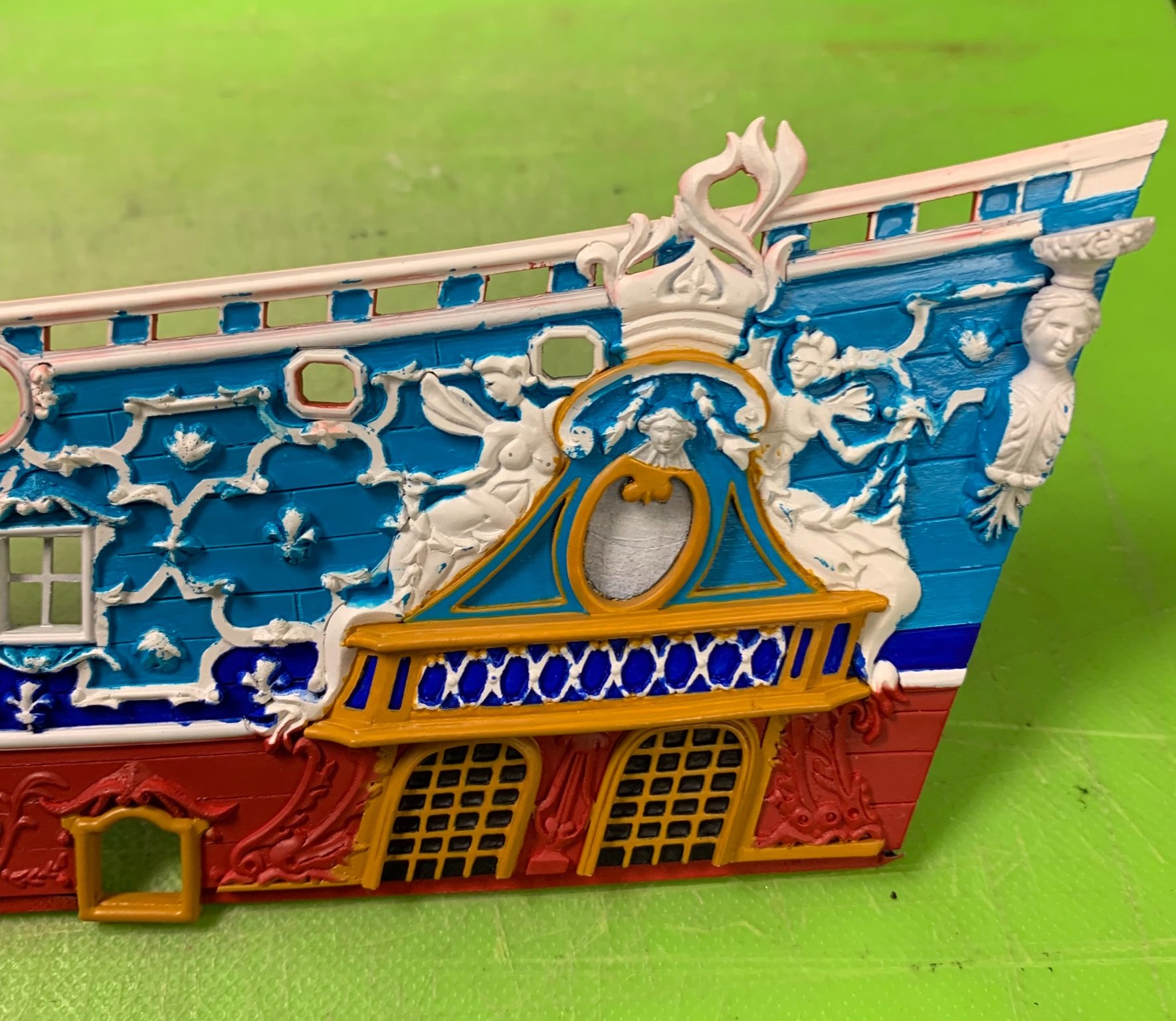
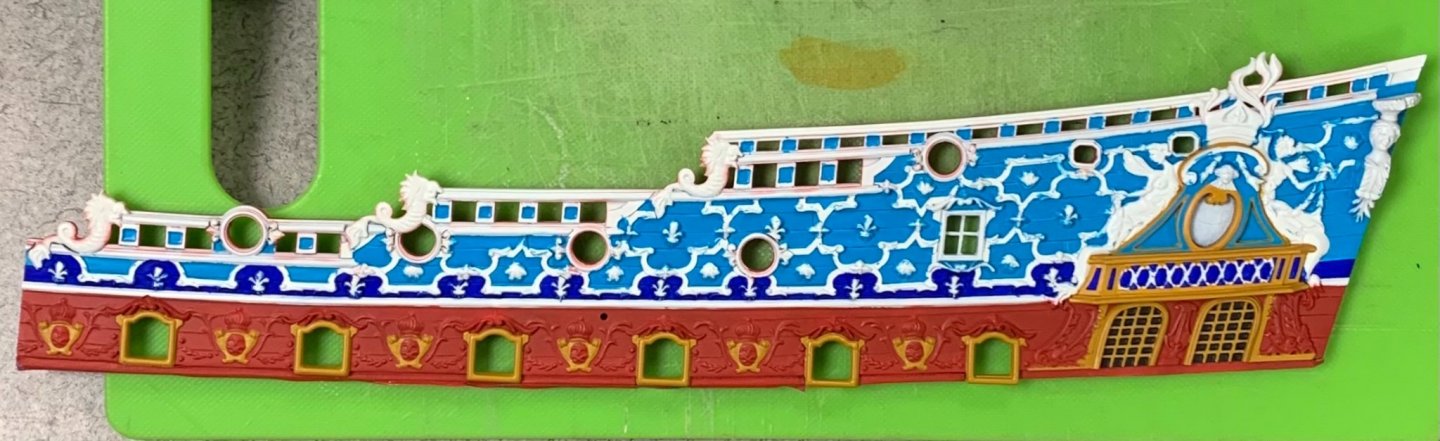
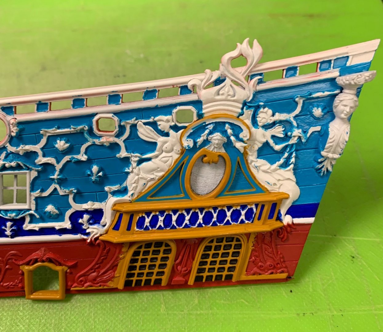
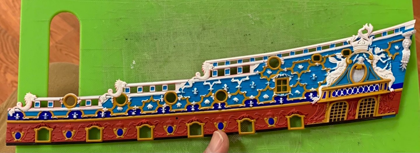
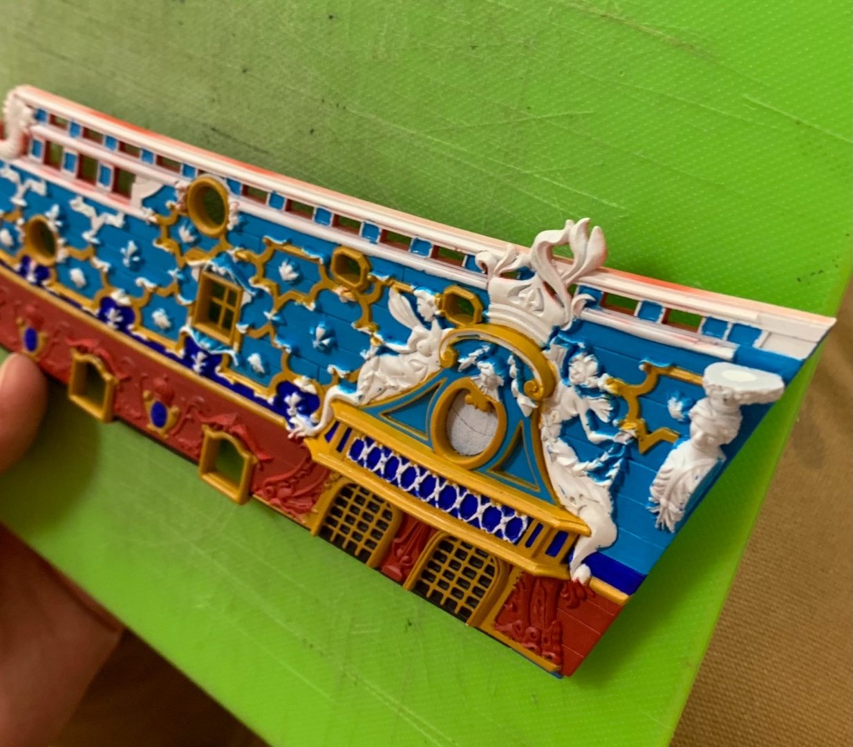
I managed to get the red sprayed before leaving for the Cape. We had a wonderful week in Hampton Bays with lot’s of family fun, good dinners, and plenty of medicinal scotch. I also managed to have a productive week laying down all of the primary colors: Unfortunately, in my haste, I forgot to mask off the monogramed escutcheons between the main deck guns. The centers, which will be painted ultra-marine really require a white undercoat for the color to come out right. This now necessitated hand-priming of these little ovals. I deliberated, from the start of this whole project, whether the red should extend up into the amortisement. Ultimately, I decided that it made more sense to follow a continuous, banded approach to each of the three primary colors, with the yellow ocher serving as a unifier. The impression of the amortisement is a bit skewed, at the moment, because I have yet to pick out the supporting dolphins in gold and silver. I took great care to hand-paint subtle edge borders, in yellow ocher, around the triangular panels of the upper section. From here, it is the long, steady march of careful cutting-in, followed by rounds of re-touching: Perhaps, above, it is more apparent how my idea to use ultra-marine along the lower band of fleurs, accentuates the scalloped design of the frieze. This is probably more ultra-marine than would have actually been applied, owing to the expense, nonetheless it is an artistic choice that highlights the effort of making the whole thing. Slowly and surely, we are getting there! As ever, thank you for looking in.
- 2,699 replies
-
- 18
-
-

-
- heller
- soleil royal
- (and 9 more)
-
The beauty of our hobby is that it rewards us for our resourcefulness - for simply finding a way that works for us, individually. The beauty of your ship is that it is remarkably beautiful, and a testament to your skill and craftsmanship. It can be difficult to filter out the “noise,” but try not to pay any mind to blowhards like that. Your presence, here, has been missed very much YankeeD. Welcome back!
-
I can believe it, yes! I remember buying my first pair of titanium eyeglass frames, which were wonderful in every way, but EXPENSIVE for the times. At least I got about six years out of that pair. I would certainly agree that that experience has been beneficial for you. Disciplined best practices, taught from the outset, instill a rigorous approach. My woodworking apprenticeship was administered by a man who insisted I mill material to the nearest thousandth of an inch, as I did the final planing on a KUNDIG sanding machine. His point was not that those tolerances were critical to the work we were doing, but that paying attention to the process was. David was forever reminding me to think things through, in order to avoid “negative pre-determinants.”
-
This looks interesting!
-
This is really a very impressive kit, and your finish work is impeccable.
- 355 replies
-
- 2
-
-
- vanguard models
- Sphinx
- (and 1 more)
-
Wonderfully, practical approach, very well explained and a beautiful result!
-
C'est parfois vrai, mais souvent la logique prévaut.
-
It is nice to see you again, Marc. Beautiful work on the port framing!
- 208 replies
-
- 5
-
-
- le soleil royal
- 104 guns
- (and 2 more)
-
Happy Birthday, Bill!
-
Thank you for the birthday wishes, Bill, and thank you very much for reading through my log! Over the years, it has grown to an absurd length for the progress made, but the research, therein, is essentially the book I will eventually write, in its unedited long-form. To your question, I would probably display one side with a fully open broadside, and the other side fully closed - if I wanted to show the contrast in appearance. On my first SR, I closed some ports on the lower tier, because I was copying the box cover artwork. As time went by, I came to regard that as a sort of arbitrary display without much logical grounding in what would have really happened on the ship. One other possibility would be to close all of the ports on the lower deck, as would be done if weather conditions would not allow for those guns to be run out.