HOLIDAY DONATION DRIVE - SUPPORT MSW - DO YOUR PART TO KEEP THIS GREAT FORUM GOING! (89 donations so far out of 49,000 members - C'mon guys!)
×


Hubac's Historian
-
Posts
3,301 -
Joined
-
Last visited
Content Type
Profiles
Forums
Gallery
Events
Everything posted by Hubac's Historian
-
 Thank you, Michael! The thing about the Heller Prestige Series is that these kits date back to a time when kits were still prototyped and mastered, more or less, by hand. Naturally, there is going to be some degree of a-symmetry engineered into the kit. I am sure that I have exacerbated those issues, though. To use the most shop-worn cliche - it is what it is, and SR slowly inches forward.
- 2,697 replies
-
- 5
-

-
- heller
- soleil royal
- (and 9 more)
-
All very true, Druxey. I mention it more for the sake of anyone else attempting a similar waterline-ectomy. I might have approached things a little differently, if I had a better idea how these large hull parts would behave, after you remove the structure that maintains their shape. Or, maybe I would still have ended up in the same place. Thank you for checking in!
- 2,697 replies
-
- 4
-
-
- heller
- soleil royal
- (and 9 more)
-
Thank you very much, Kevin! The reality is that I am quite slow, but meticulous and committed to the project. What I am doing is not really magic, but the product of time. Doris, on the other hand, truly is supernatural. She does what she does while simultaneously working on other equally detailed projects, and she works very quickly. I hope to gently persuade her to do a French ship, someday, where her sculpture talents will be fully expressed.
- 2,697 replies
-
- 3
-
-
- heller
- soleil royal
- (and 9 more)
-
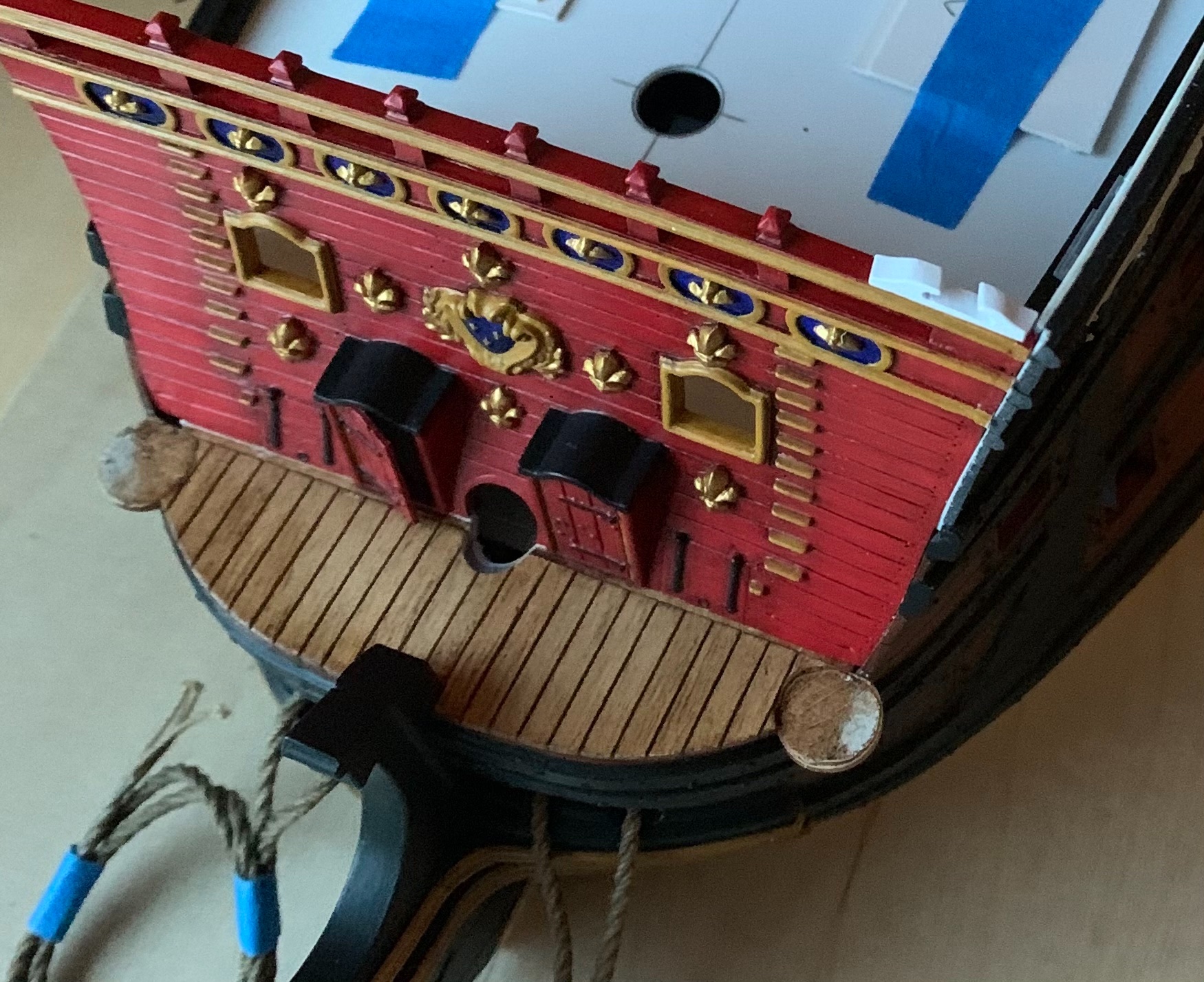
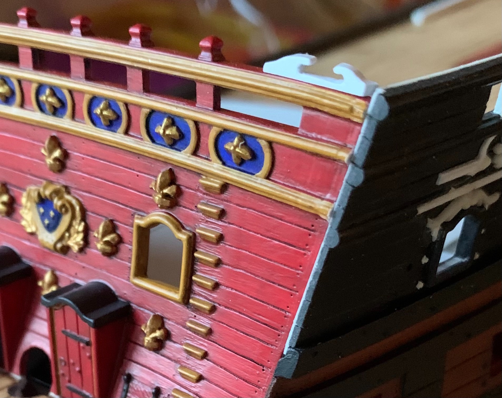
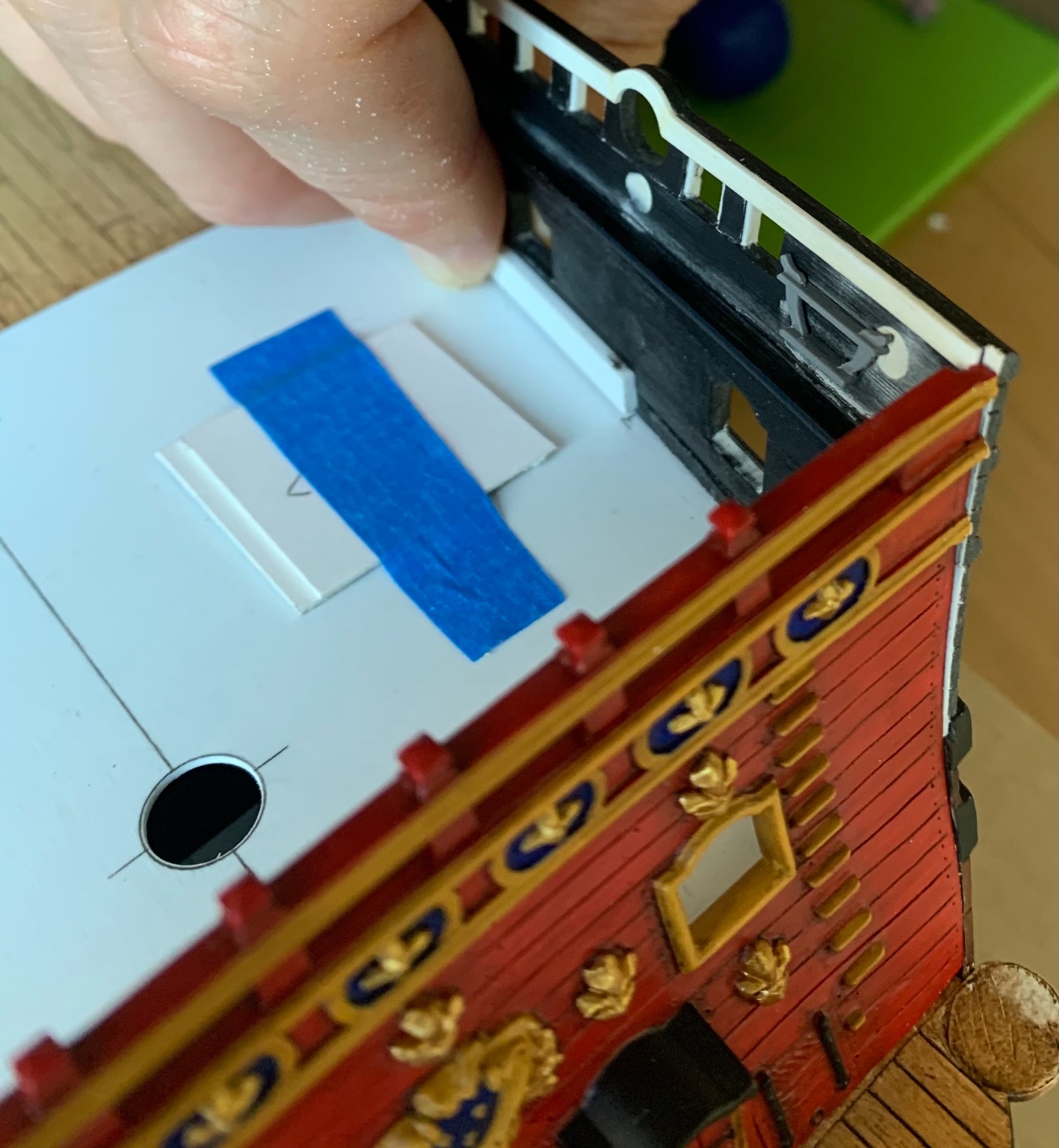
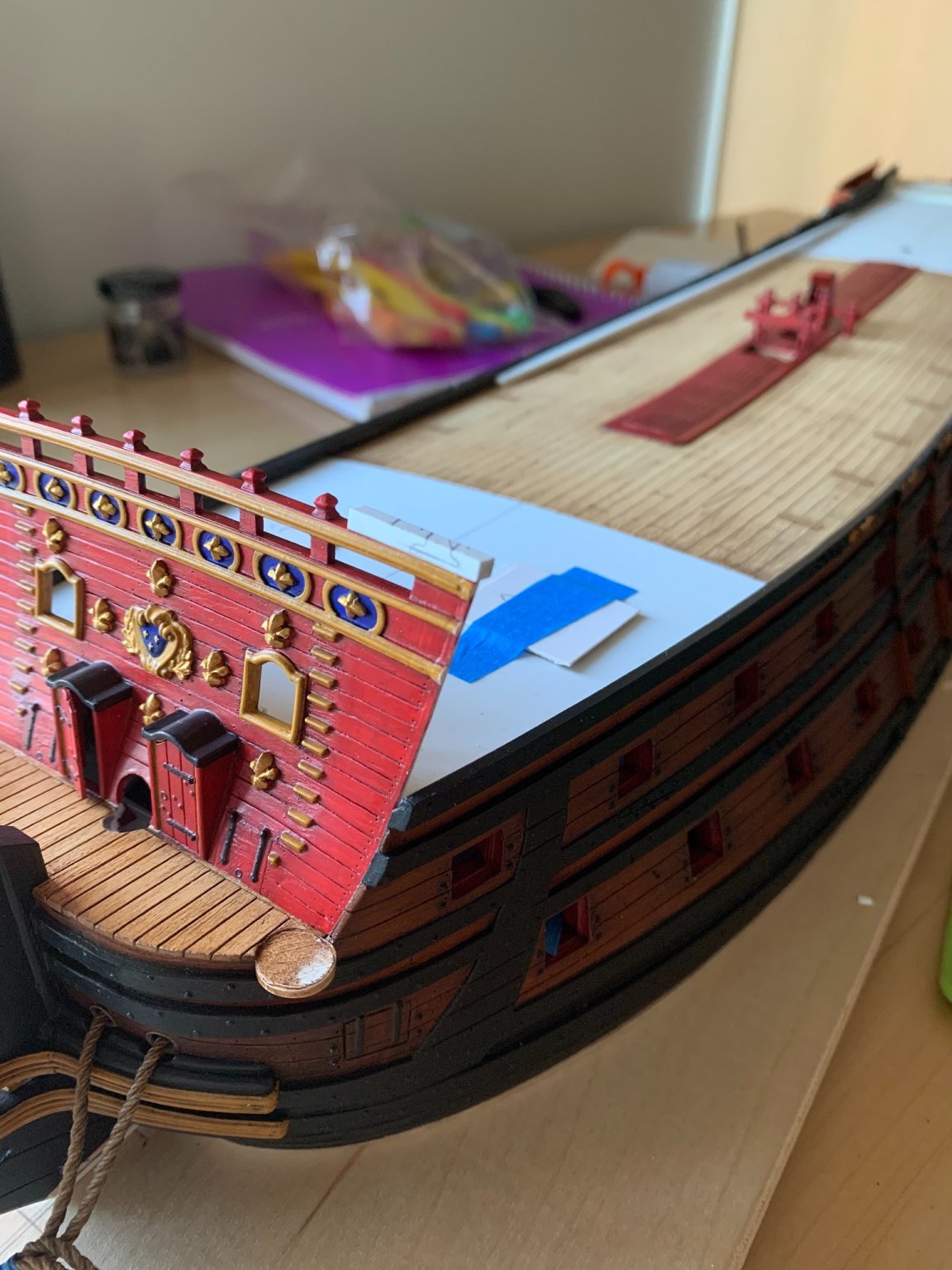
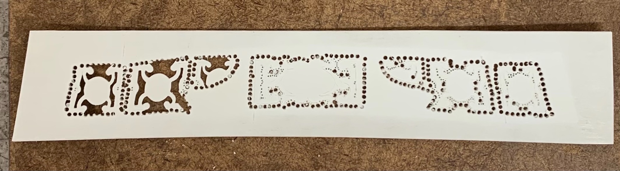
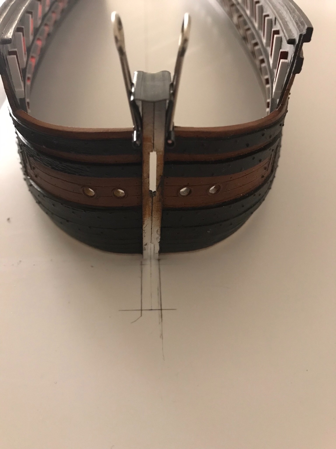
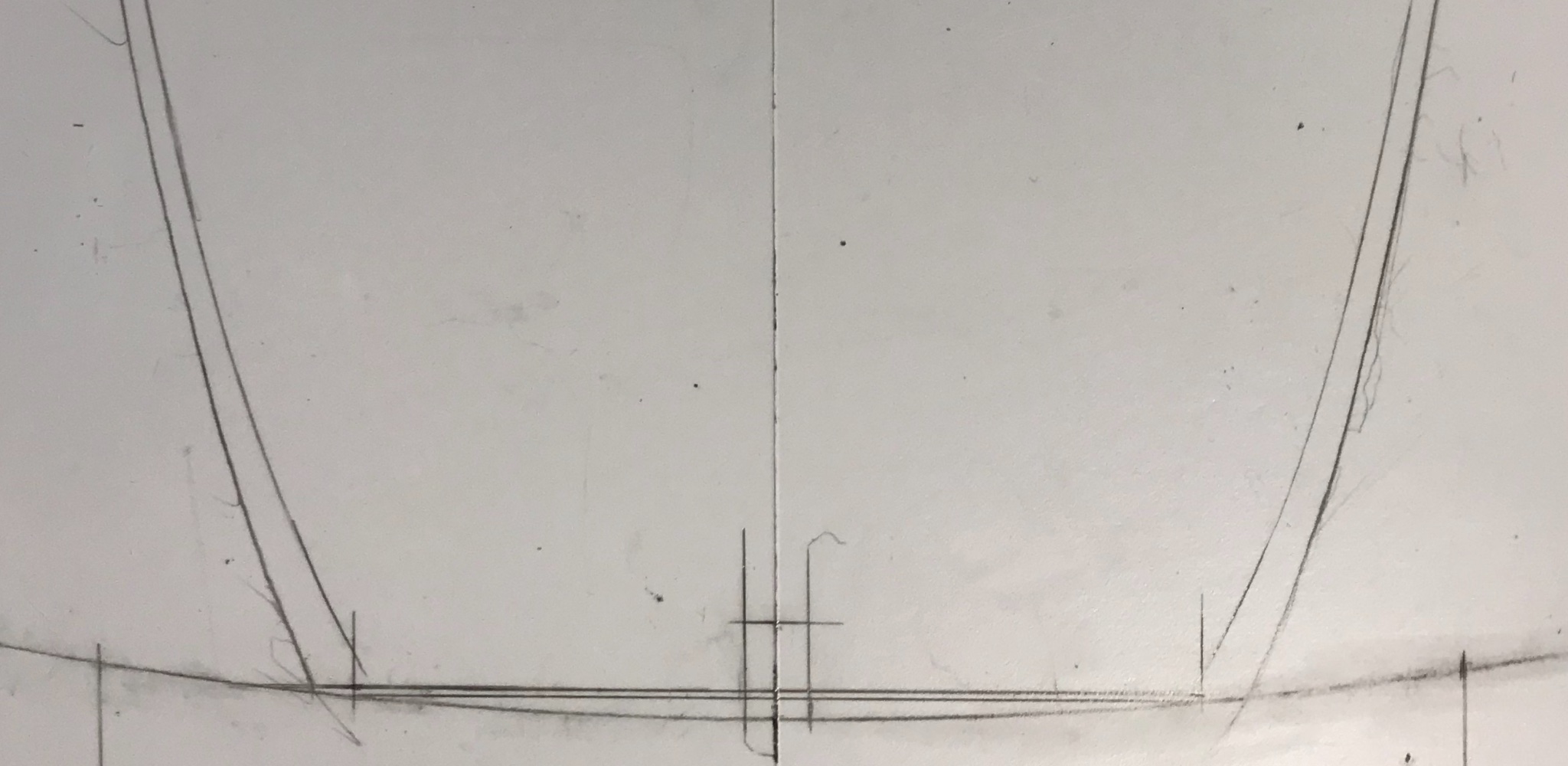
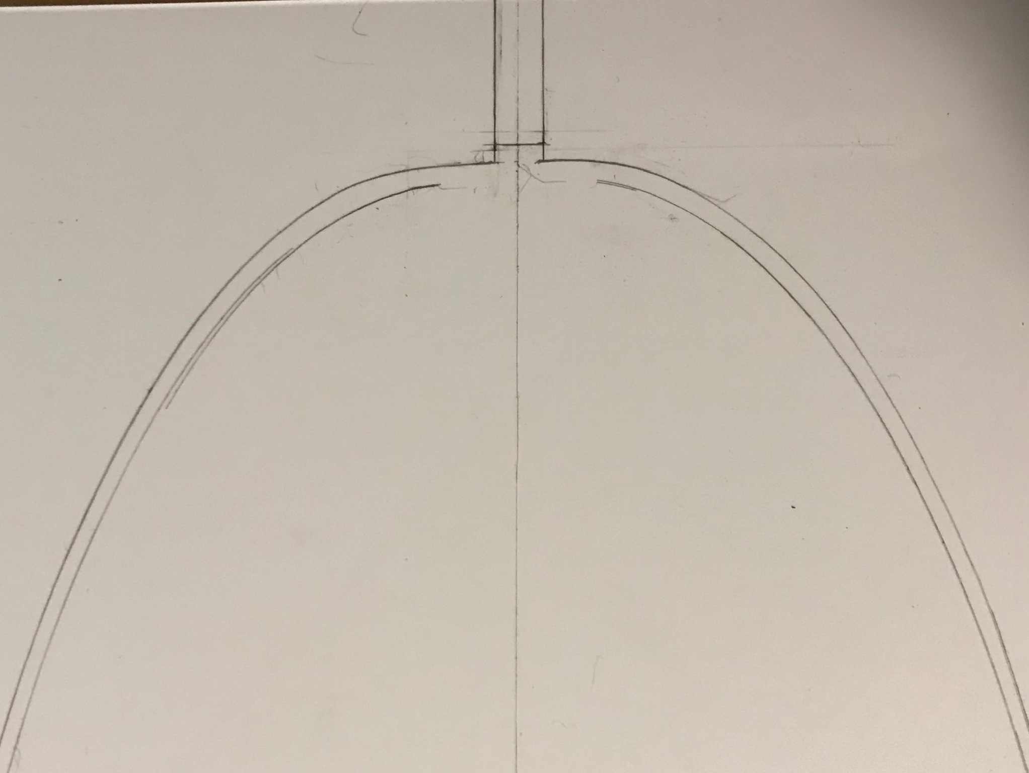
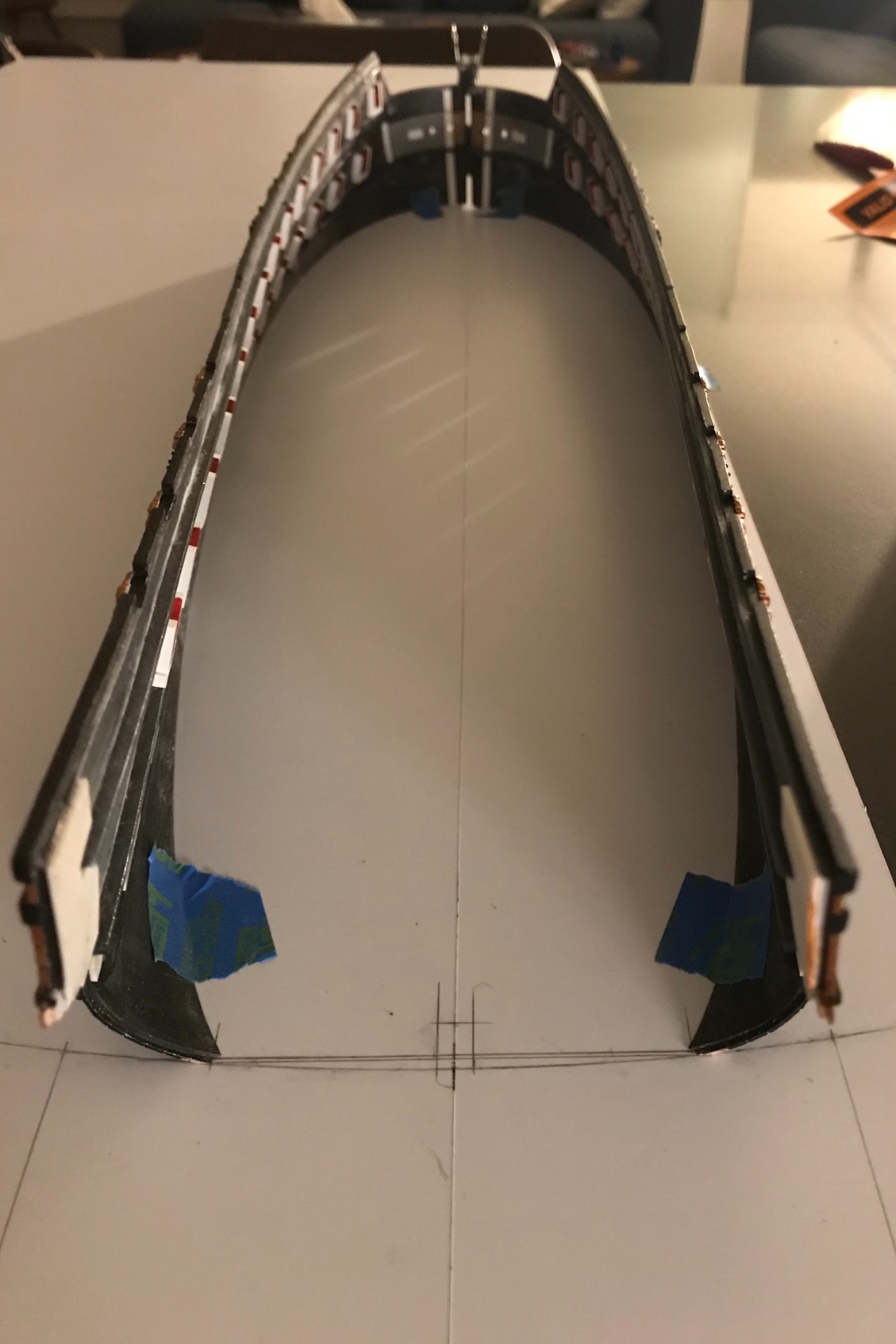
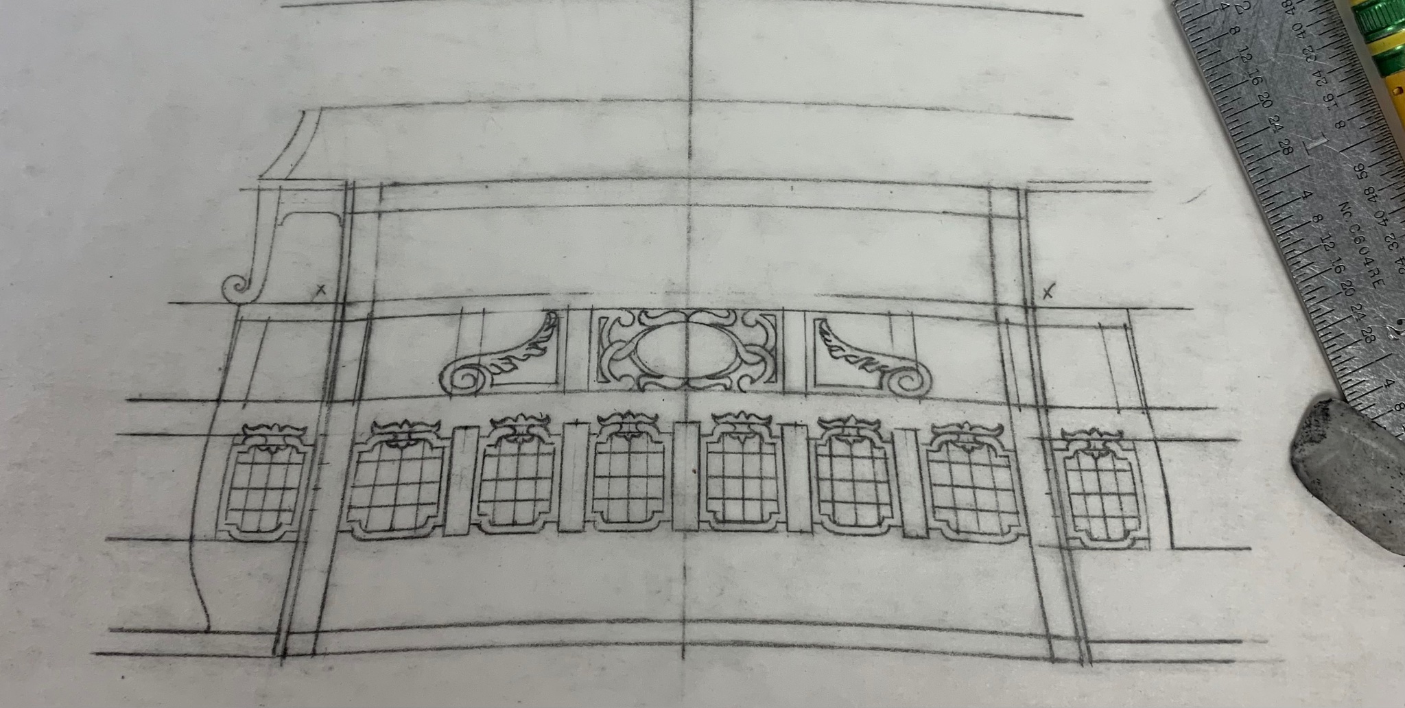
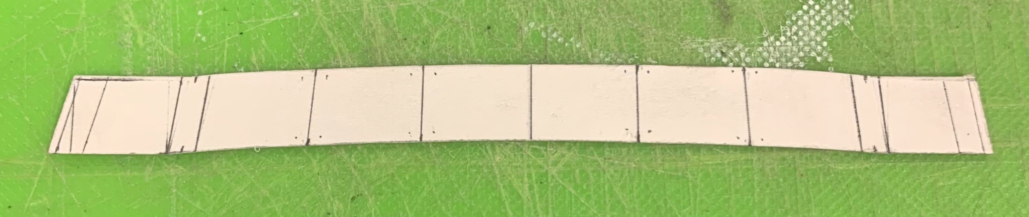
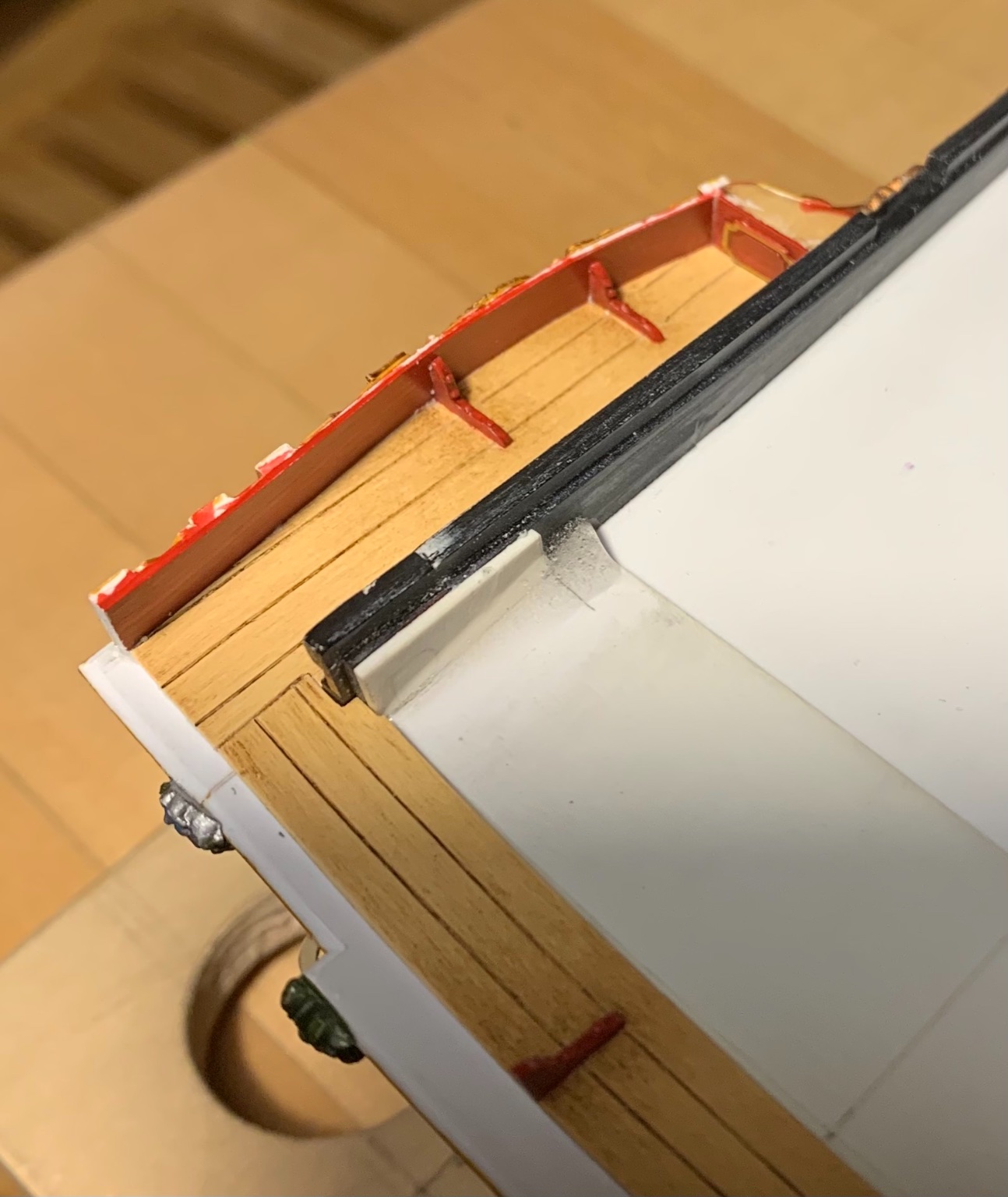
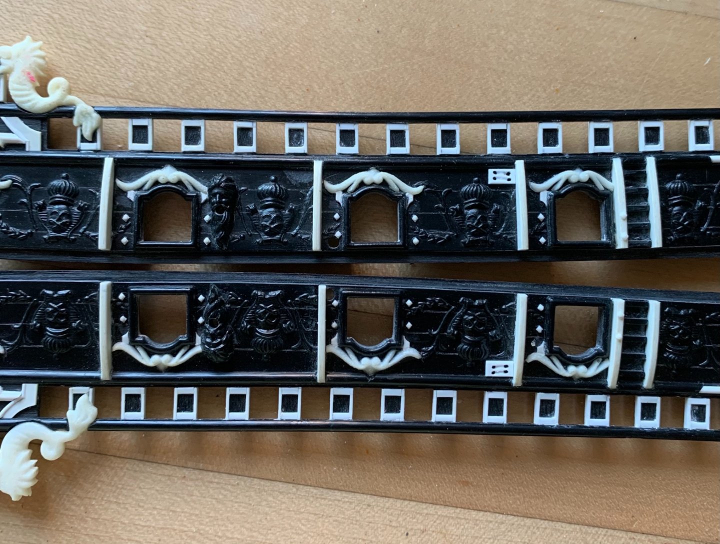
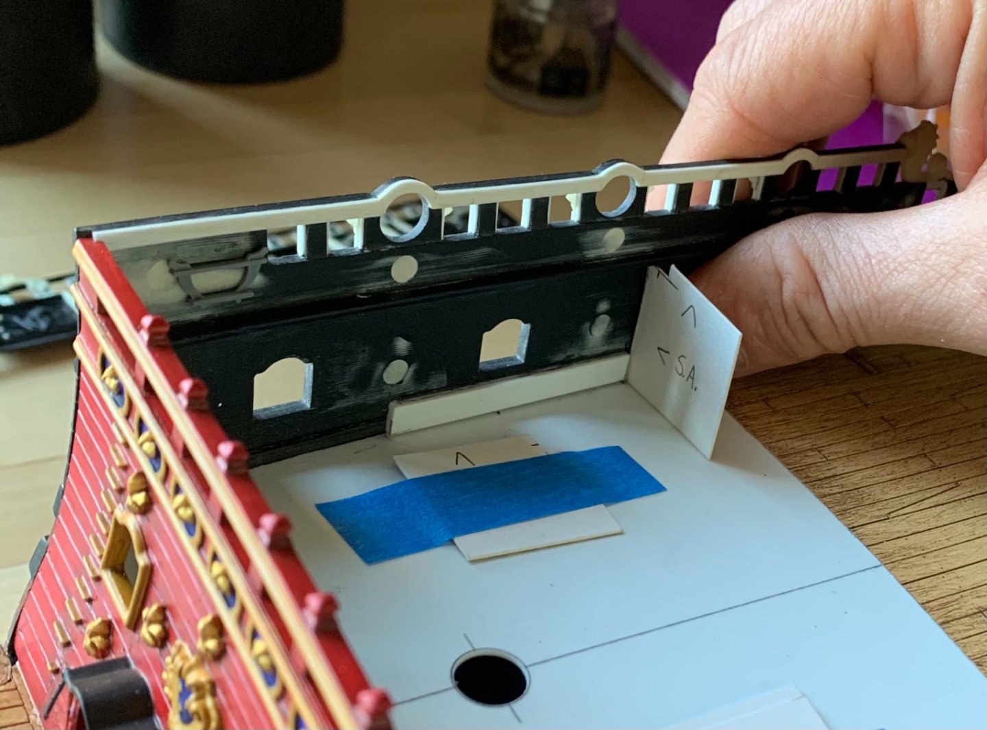
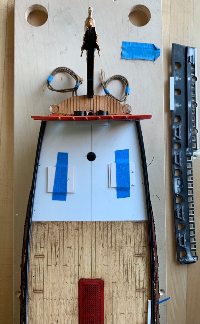
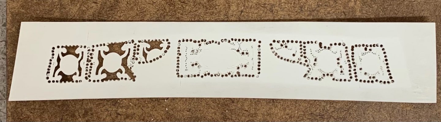
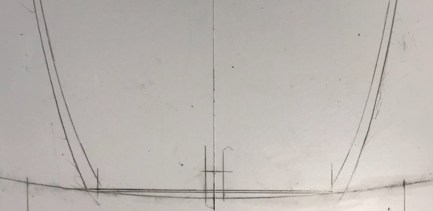
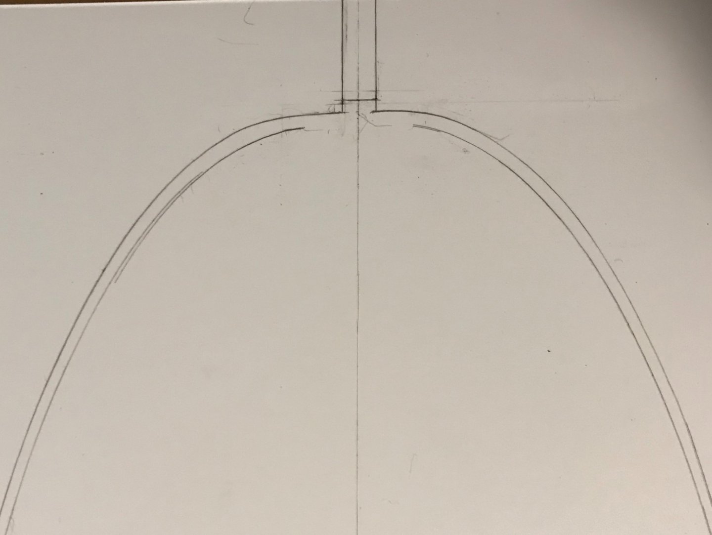
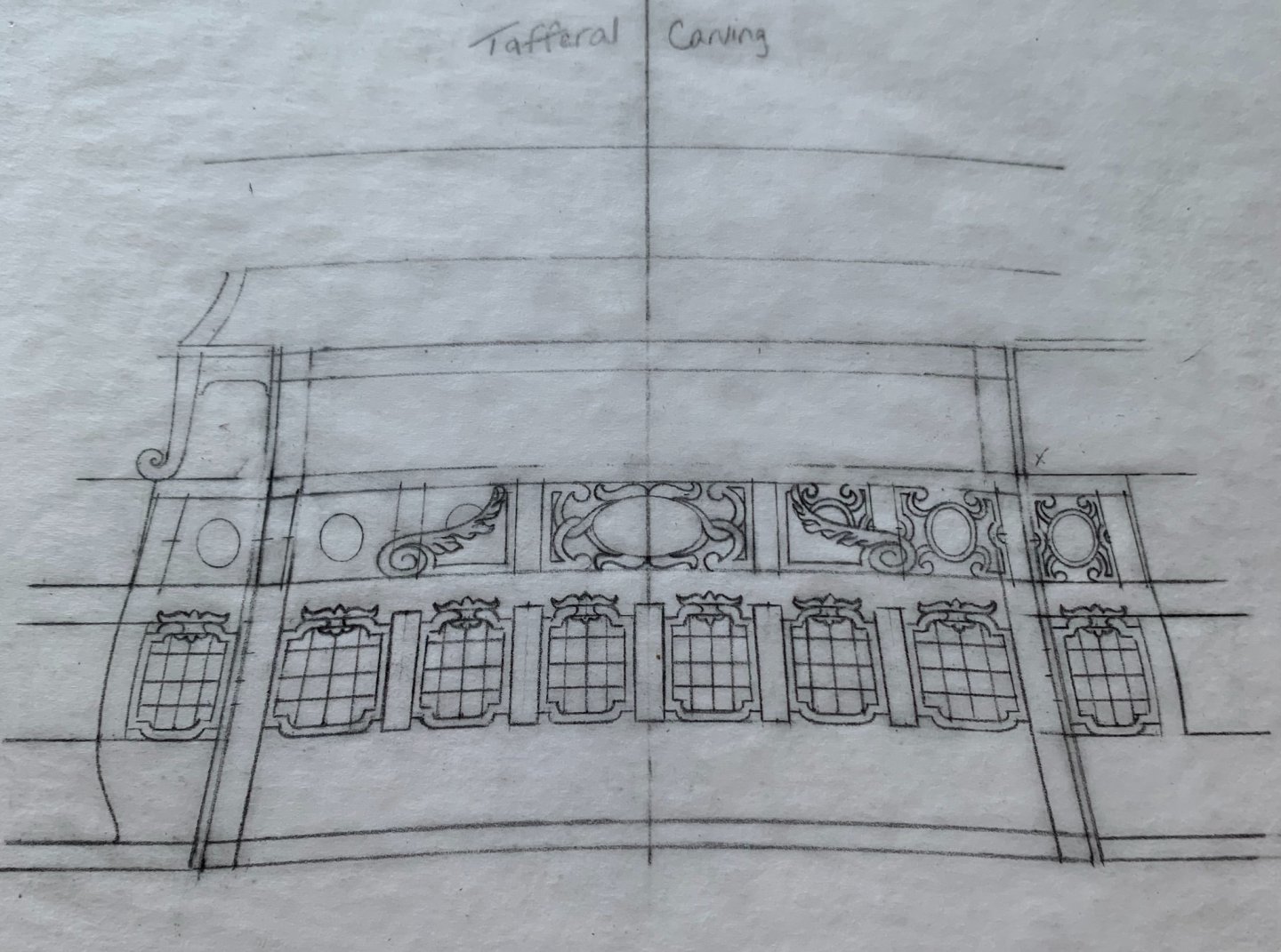
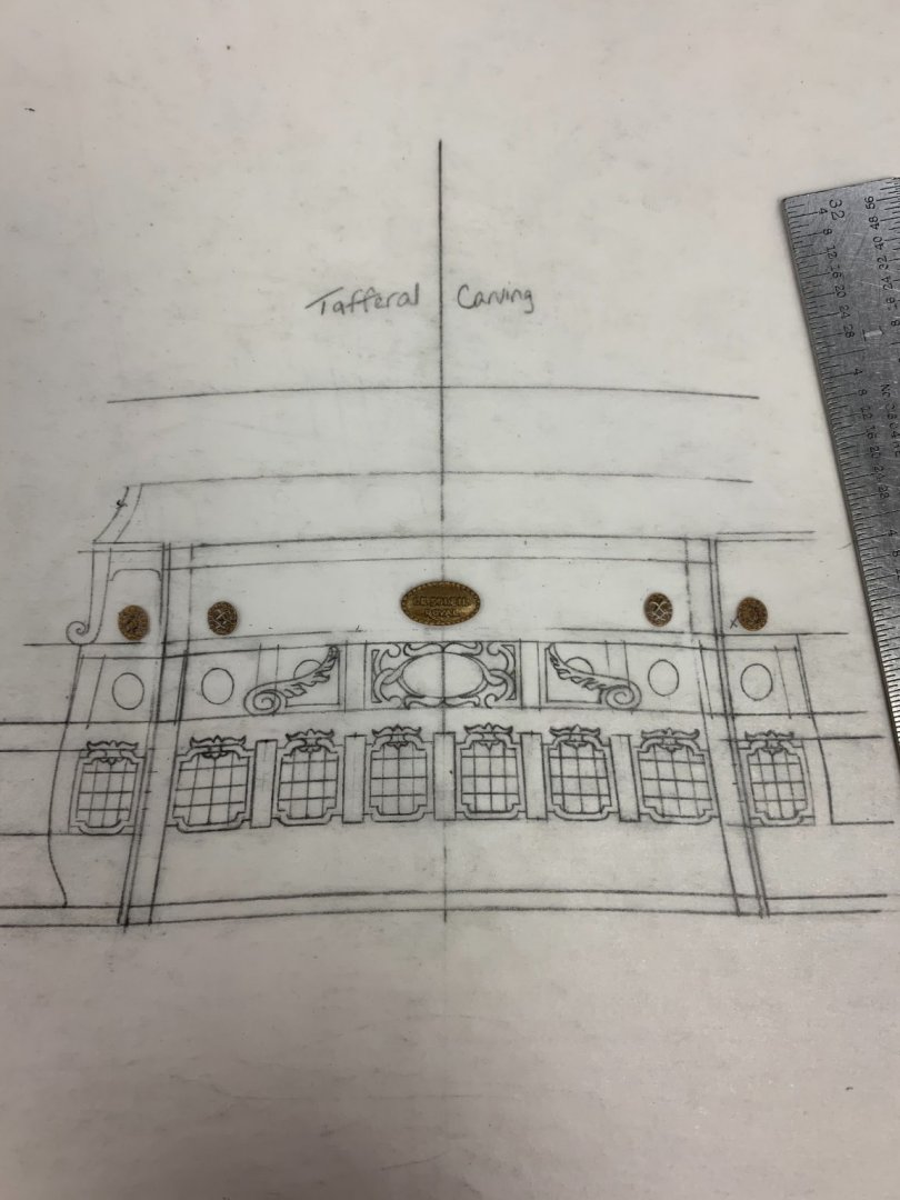
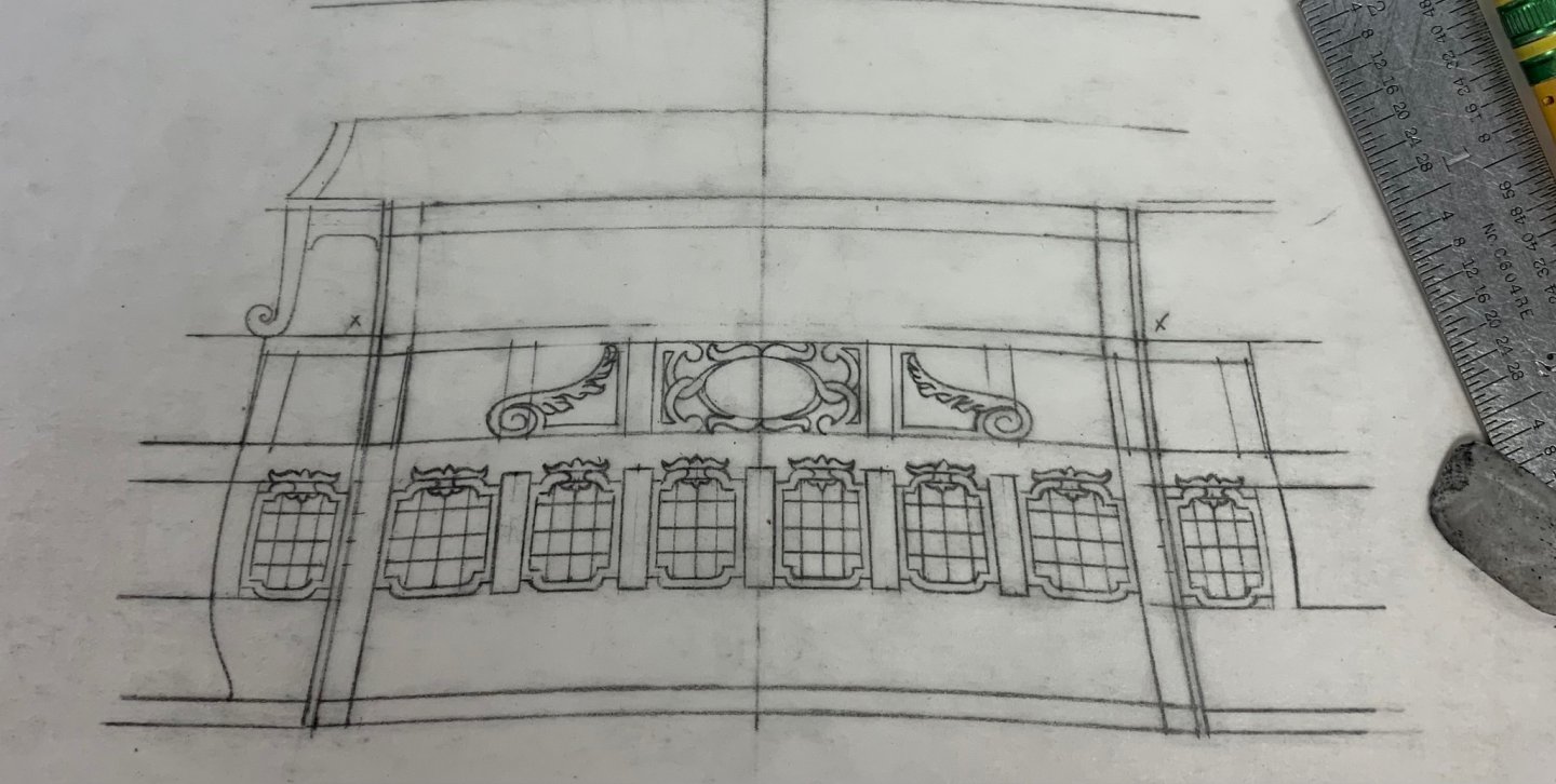
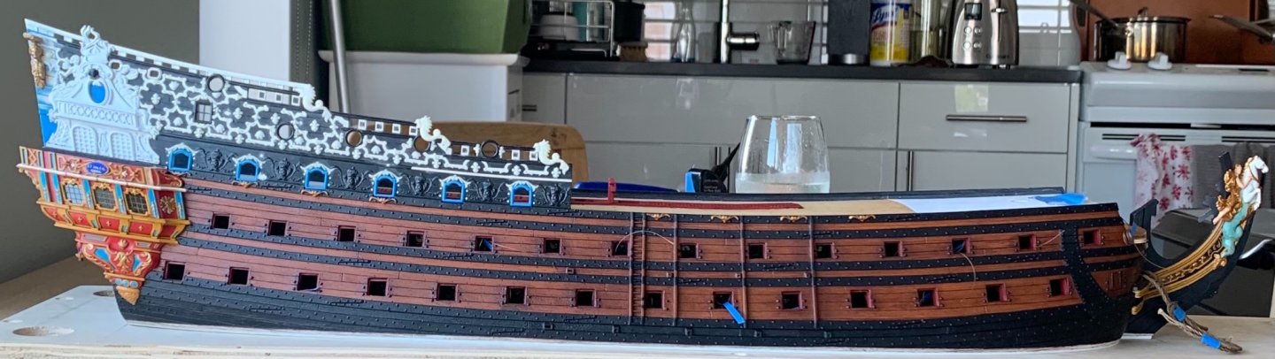
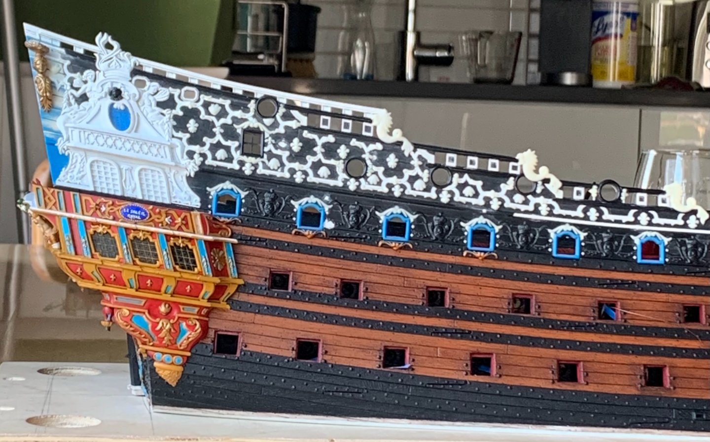
Work on the open-walk aft bulwark, continues at a steady pace. The piercings are too narrow to work with files, so the entirety is cut to the line with a No. 11 blade: It is an easy thing to extract these panels, all around their perimeter, but I will leave them intact for the time being. Next, I will cut the pilasters and the projecting center portion. Then, assembly can begin from the center, outwards. As I mentioned, prep of the upper bulwarks is proving to be quite intensive. I decided the best approach for building up the hull was to begin with the forward bulwark pieces. To that end, I installed the beakhead bulkhead, and glued-in a strip of re-enforcement, where the bulkhead meets the main deck. What immediately became apparent, once this piece was secure is that the bulkhead is not square with the centerline: This mirrors the same problem that I have noticed at the stern. Essentially, my ship is a parallelogram: Obviously, this is not ideal. It is hard to say with any certainty, at this point, but the error must have been introduced at the very earliest stages, when I glued the lower hull halves to the plinth-base; I must have induced the port side to slide aft, somewhat, or perhaps didn’t realize the geometry that I was creating through some other error or oversight: This second stern picture seems to show the problem, but this is really a perspective problem of the photograph. I know that my rounded stern counter started as a squared layout with the centerline. Whatever the case may be, now the job is to make it all look okay. Among the myriad tasks for the upper bulwark prep, I glued-in the kevels, scraped away the forward-most monogram escutcheon (because there will be a robed figure just aft of the headrails), filled all of the remaining holes and low fairleads for the sheets and tacks. One error of the Heller kit is that the entry points for these lines are all low, where they would run a-foul of the gun carriages. To correct these errors, I recycled one of the Four Winds carvings to make chess-trees for the fore and main tacks. I then decided to make a housed double sheave for the fore and spritsail sheet lines: I based the decision to do this on Puget’s drawing of the Royal Louis, following her refit in 1677: Frolich’s L’Ambiteaux of 1680 is also a solid reference for this detail. One other unintended consequence of my hull-widening modifications is that the extreme ends of the beakhead bulkhead now sit about a 1/16” below the top sheer of the forward upper bulwark piece: This was perplexing to me until it dawned on me that the beakhead bulkhead side-extensions follow the top-rail camber, so that now that arc extends further outboard and intersects with the bulwarks (which are still the same height, naturally) at a lower point. This creates something of an interesting dilemma. For the time being, I have decided to take a little authorial license, here. Although I can find no pictorial evidence for this on contemporary models from the 17th C., I have fashioned an entry-point for the cathead line, along the top of this beakhead railing: I have subsequently filled that small forward gap and refined the shape of this cleat(?), a little. My argument for plausible deniability, here, is that the intersection of the cathead timber with the beakhead bulkhead is now closed-in with plank, yet the cathead line needs a working contact point for sweating onto the small kevel. In the end, there will also be a horsehead sculpture that rests on top of the bulwark top sheer. Even if this detail isn’t correct for the period, it’s presence will be minimized from the outside looking-in. The other major consideration for these forward bulwark pieces is that the joint to the lower hull is just garbage. I had to do quite a lot of fairing to close the gaps along the outside of the joint, and there remains some significant tension as one flexes the part into its place. I may, ultimately, induce a bit of a bend into the part by clamping it into a form and leaving it like that for a few weeks. That should take tension out of the piece and ease the assembly process. Regardless, though, I wanted some added insurance, and so I glued an additional re-enforcing strip that will bridge the joint and increase glue surface-area. Just fore and aft of this strip, I will fashion gusset pieces that lend additional strength, while also providing deck beam mounts for the forecastle deck. Above, I am fitting card templates that I will use to pattern the 1/16” styrene sheet gussets. All of this structure will not be visible from the waist, nor will it interfere with the ship’s stoves. In the waist, where this joint would be visible, I will cover the joint with spirketting. Just as before, the added glue-surface will really solidify the construction. Before I can paint these bulwark pieces, I still need to fashion a supporting knee that will be visible from the waist overhang of the forecastle deck. In a departure from my usual, I will be airbrushing the primary ground colors, as there is too much fine detail that might be obscured by brush-painting. All of this will, of course, take time. Thank you for stopping-in!


- 2,697 replies
-
- 18
-
-

-
- heller
- soleil royal
- (and 9 more)
-
Michael, Wefalck and Bill - thank you so much for your kind compliments! I really appreciate your support of the project. In the next week, or so, I will have a good update on the prep for installation of the upper bulwarks. These have proven to be the most perplexing components of the kit, and I have had to do much fettling and a little engineering to ensure a solid join. Until then, thank you for looking in, and for your likes and comments, as well. All the best, Marc
- 2,697 replies
-
- 4
-
-
- heller
- soleil royal
- (and 9 more)
-
As I’ve said before, this work is spectacular! I agree that the rope border is maybe a bit over-scale, but the effect is pleasing and I don’t think I would change it. The question, related to that, is whether you will have enough clearance to fold the scroll at the far ends of the mid-tier of windows. I think you will. Although I may be perceived as a “turgid member” by others of the forum - for even venturing a guess - I will propose that your construction fault is one of omission; on the stock sternplate (and the actual ship, though I’m not inclined to look it up right now - turgidity levels remain high 😬!!), there are corbel-like structures that bookend the lower tier of windows. What I find incredible about this approach is the facility to key-in locations for all of the ornamental elements, thus eliminating placement errors. There just isn’t a lot of margin for error at 1:100, which I consider the dividing line of the “big” scales. Your Victory will still be a big model, but the constituent parts are tiny! You are making an incredible job of it with an innovative approach to modeling. Fantastic work!
-
The frieze application is a tricky business that you have executed very cleanly, but then, that is typical of your standard of work.
- 185 replies
-
- 1
-
-
- queen anne barge
- Syren Ship Model Company
- (and 1 more)
-
I marvel at the way that you make the spars (and oars) look like real wood. It’s one thing, when you have a broad surface, but a spar shows everything. Awesome work!
- 222 replies
-
- 3
-
-
- reale de france
- heller
- (and 1 more)
-
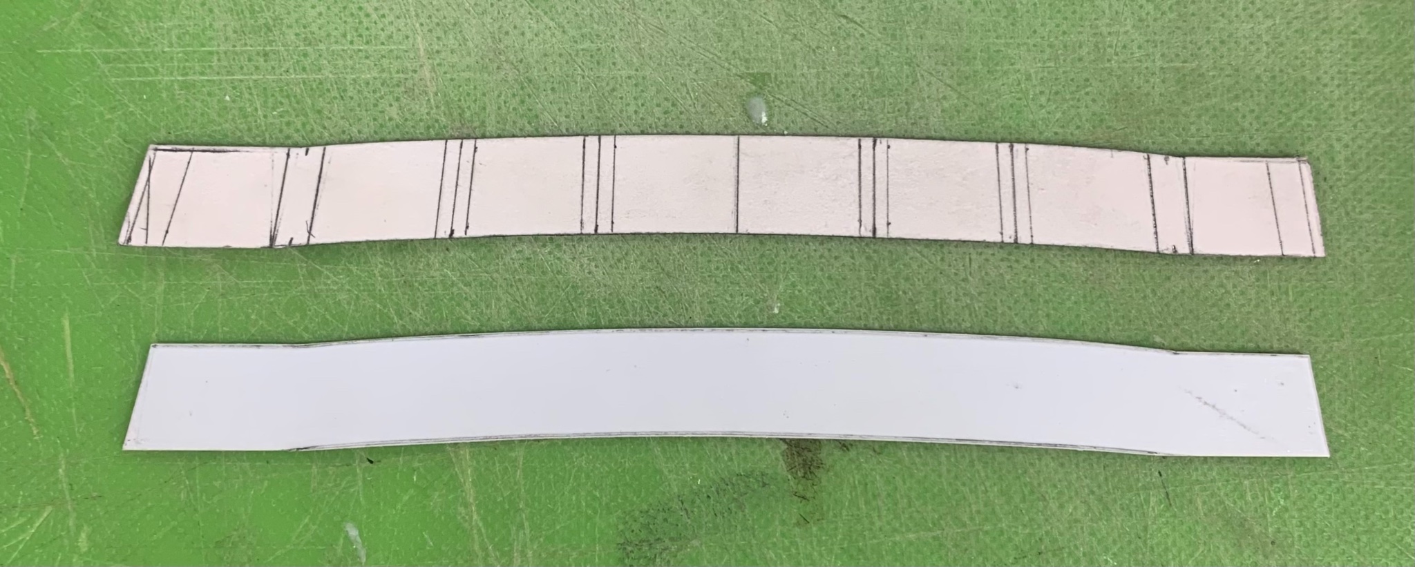
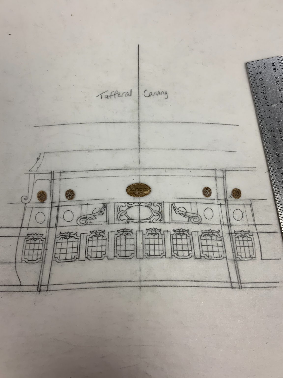
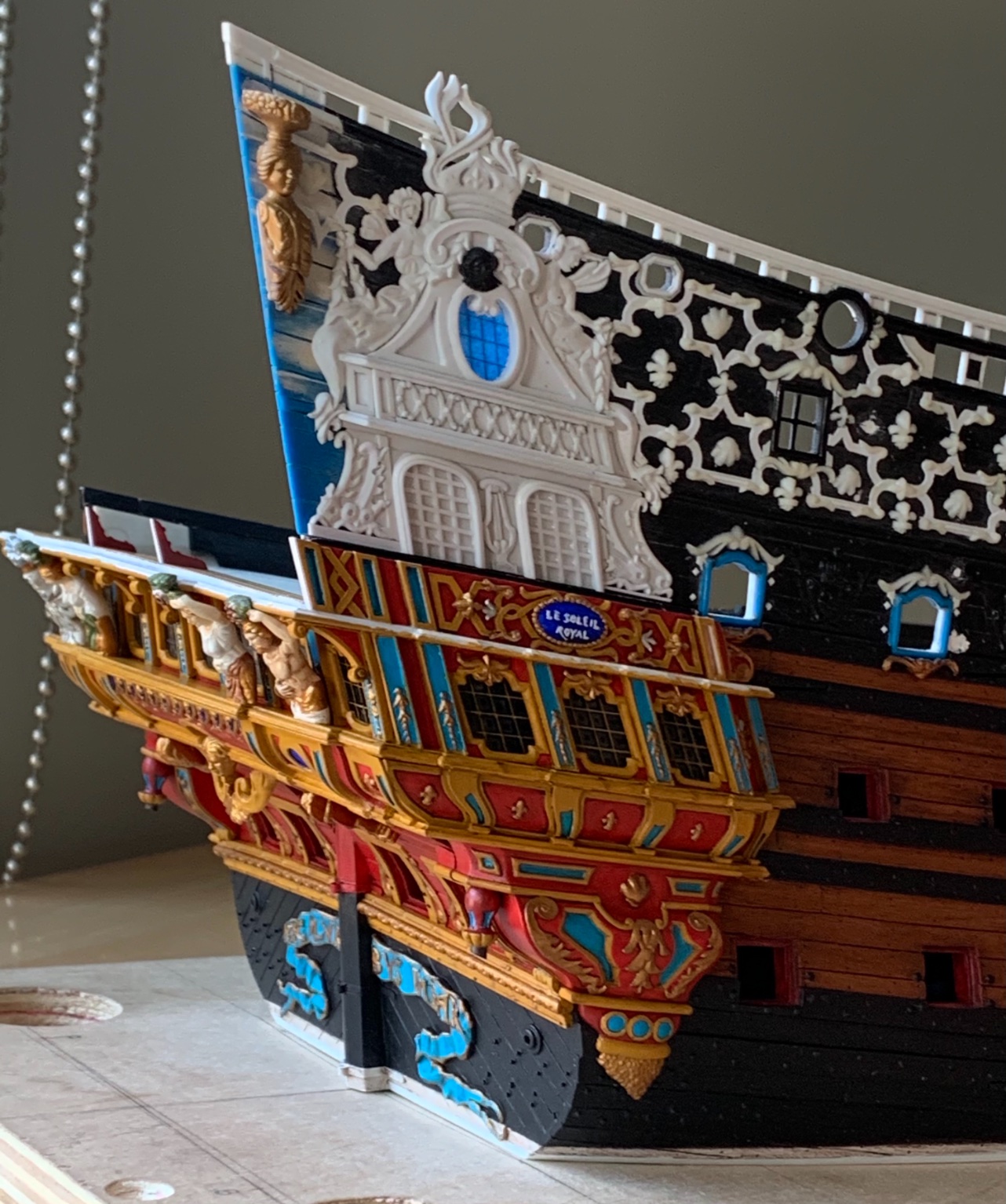
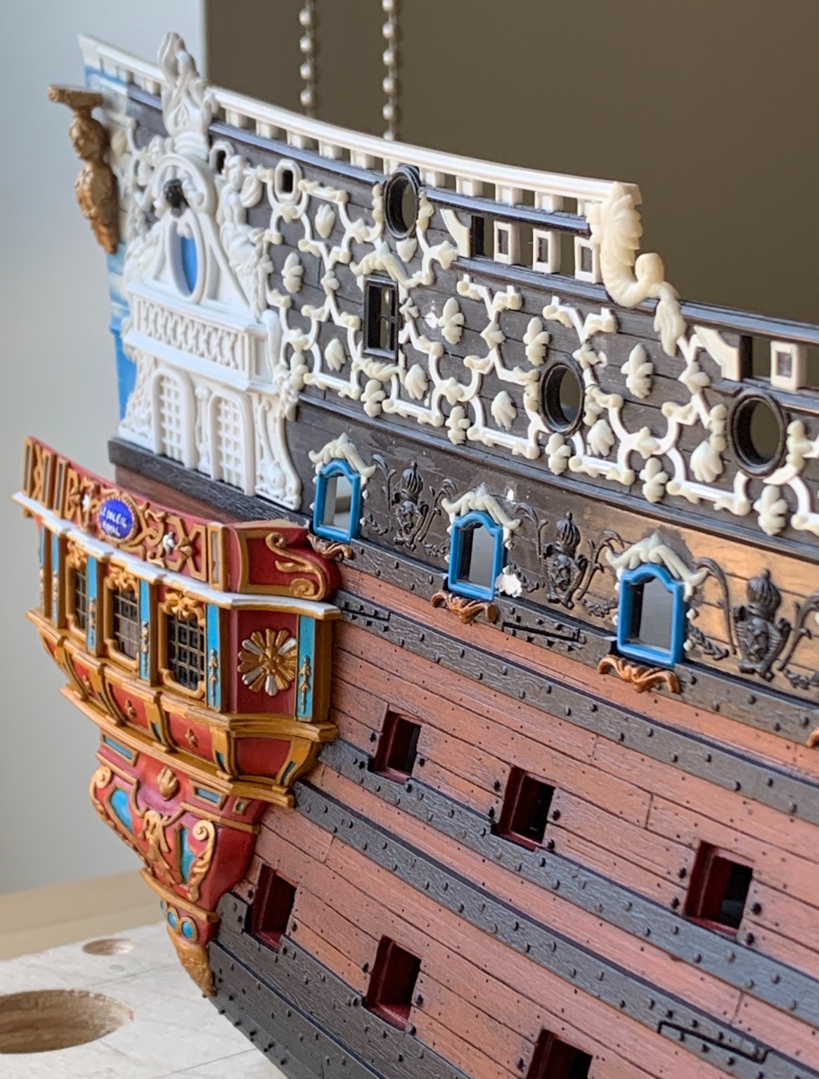
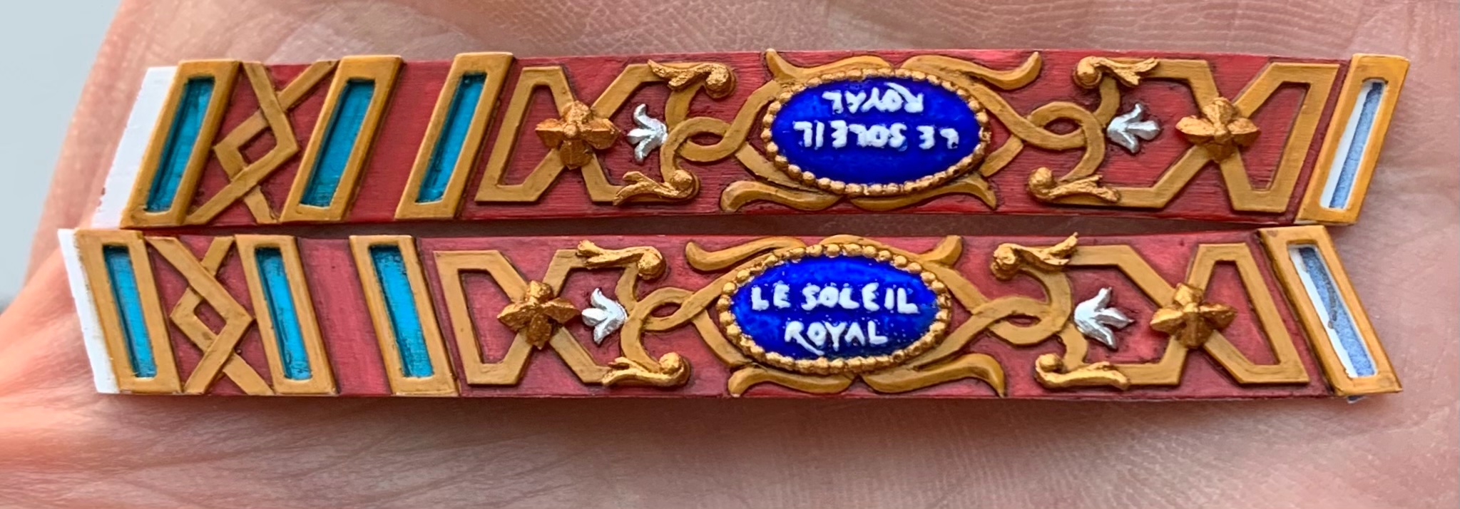
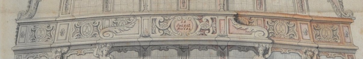
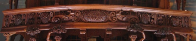
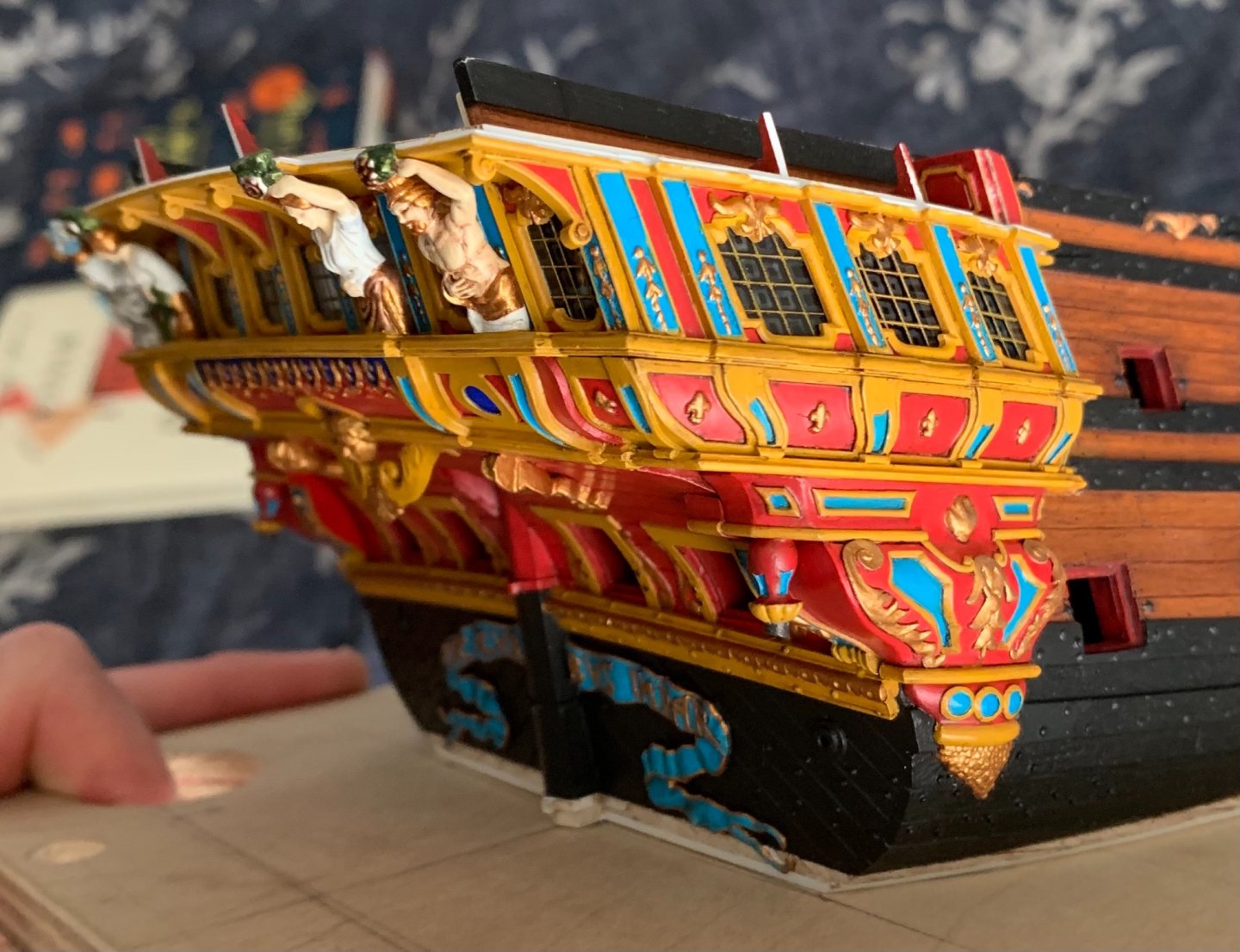
I want to use this post to explore the more artistic considerations of this kind of kit-bash because this particular piece is literally a mid-point in the stern decor, and it ties together everything below to everything above. Berain’s intent: Tanneron’s adaptation: Heller follows Tanneron fairly exactly. For reasons that became clearer, as I attempted to draw this, Tanneron simplified Berain’s design. While I understand that I will not be able to copy Berain’s design, exactly, my goal was to arrive at something a little closer than what Tanneron achieved. The first step is to make a cardboard template that exactly fits the opening, while accounting for stern round-up and camber: From there, I could exactly mark centers for continuation of the ‘tween window pilasters, along the bottom edge of the bulwark piece. From there, I could flesh-out the pilasters and just go ahead and make the styrene foundation for this part: I made the part a little oversize to account for the back-raking angle that needs to be sanded into the top and bottom edges of this part. Besides the pilaster locations, the other constraining factor is my intense desire to recycle the name plate and the monogram escutcheons from the stock balcony. The stock escutcheons have fleur-de-lis, in relief: I decided, though, to shave these away and incise the crossed-L monogram emblem: Because these were so small, it was much easier to do this while they were still attached to the balcony piece. Layout for this bulwark piece necessarily begins at its center. The main artistic conceit, here, is that I am trying to strike the balance between faithful detail and the interplay between positive and negative space. This translates to much erasing and redrawing; this is why I love vellum so much. The nameplate and monogram escutcheons were removed, shaped, and then traced to the drawing; these parts really define exactly the parameters of everything happening around them. Of course, they restrict the available space in ways that are less than desirable, but I think I am on-track to a reasonable compromise: At this point, in a perfect world, I could stop drawing and just make a mirror photocopy for the port side. This is not a perfect world, though. The depth of the quarter gallery segments differs from port to starboard. I’ve drawn the less-deep starboard side. That won’t, nearly enough, correspond with what’s needed for the port side. At the least, I’ll have to draw that port QG segment, as well. So, that’s where things stand for now. I can’t do perfect, but I can do plenty well-enough.


- 2,697 replies
-
- 14
-
-
- heller
- soleil royal
- (and 9 more)
-
A well-deserved dram! Your frieze-painting looks incredible - wonderful depth and shading. What took you three hours would have easily taken me twice that. Also, that is a clever work-around to use the campaign chairs in that way.
-
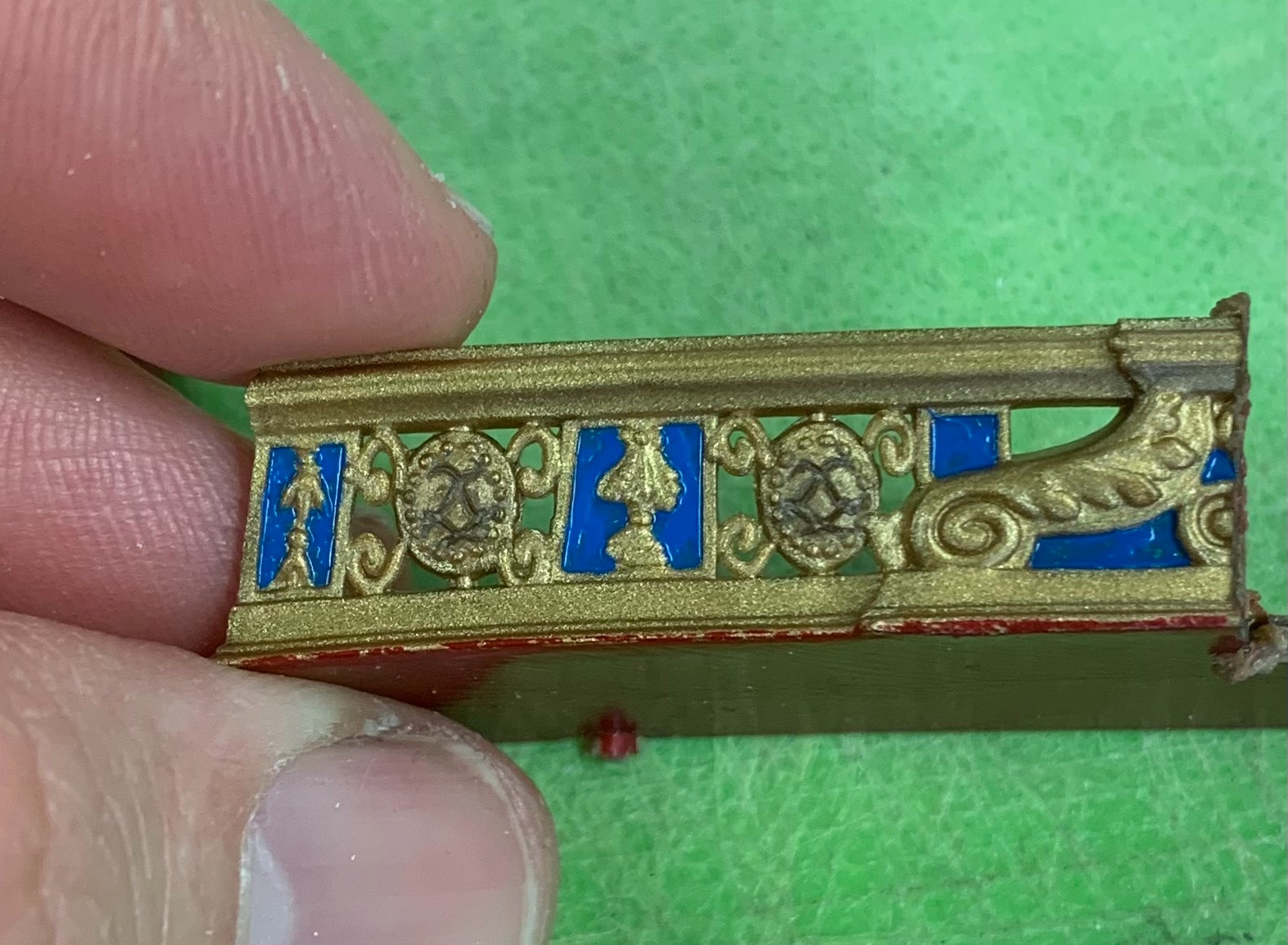
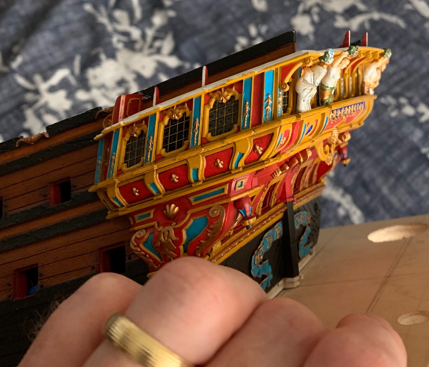
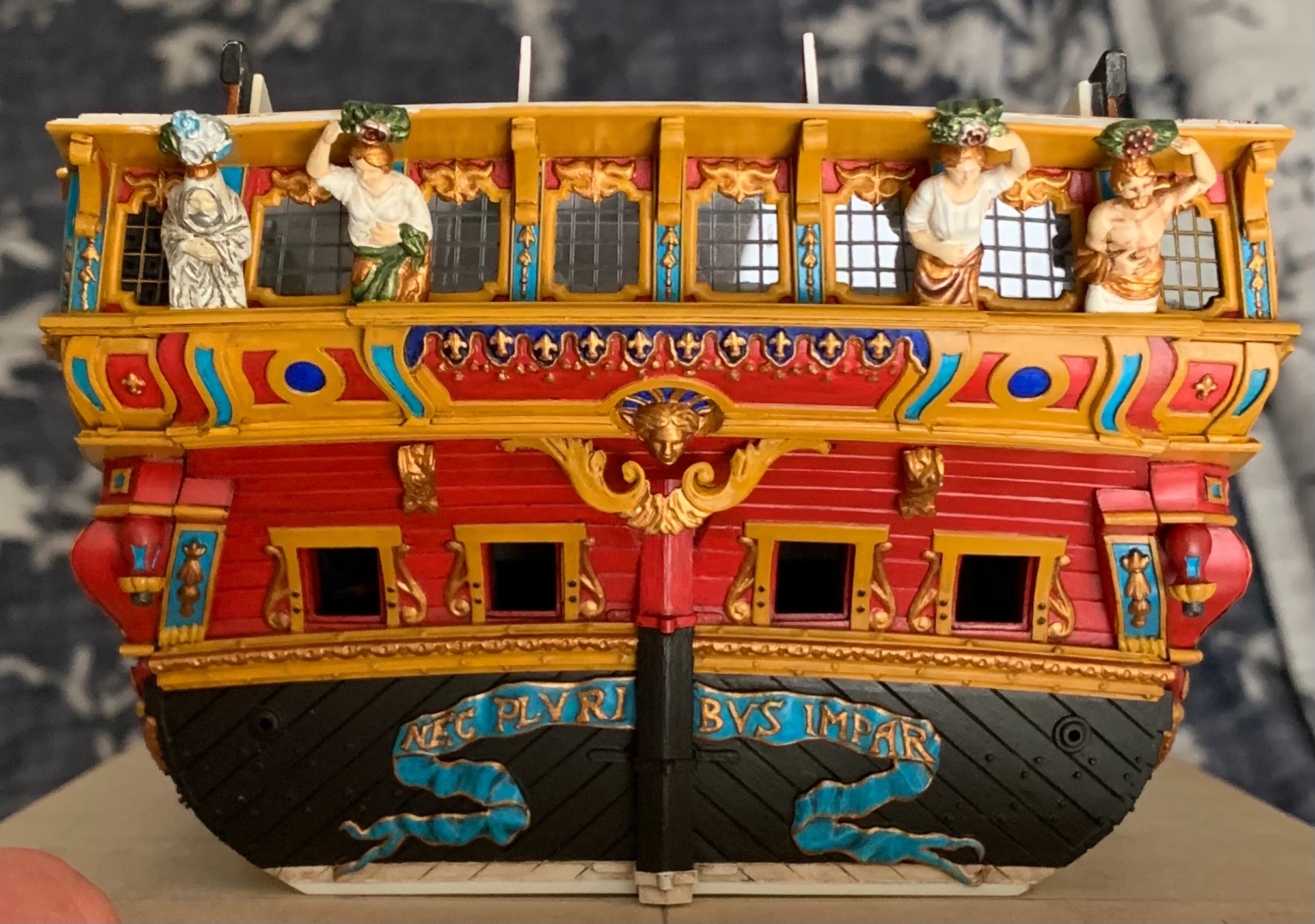
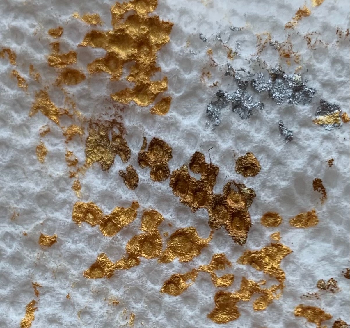
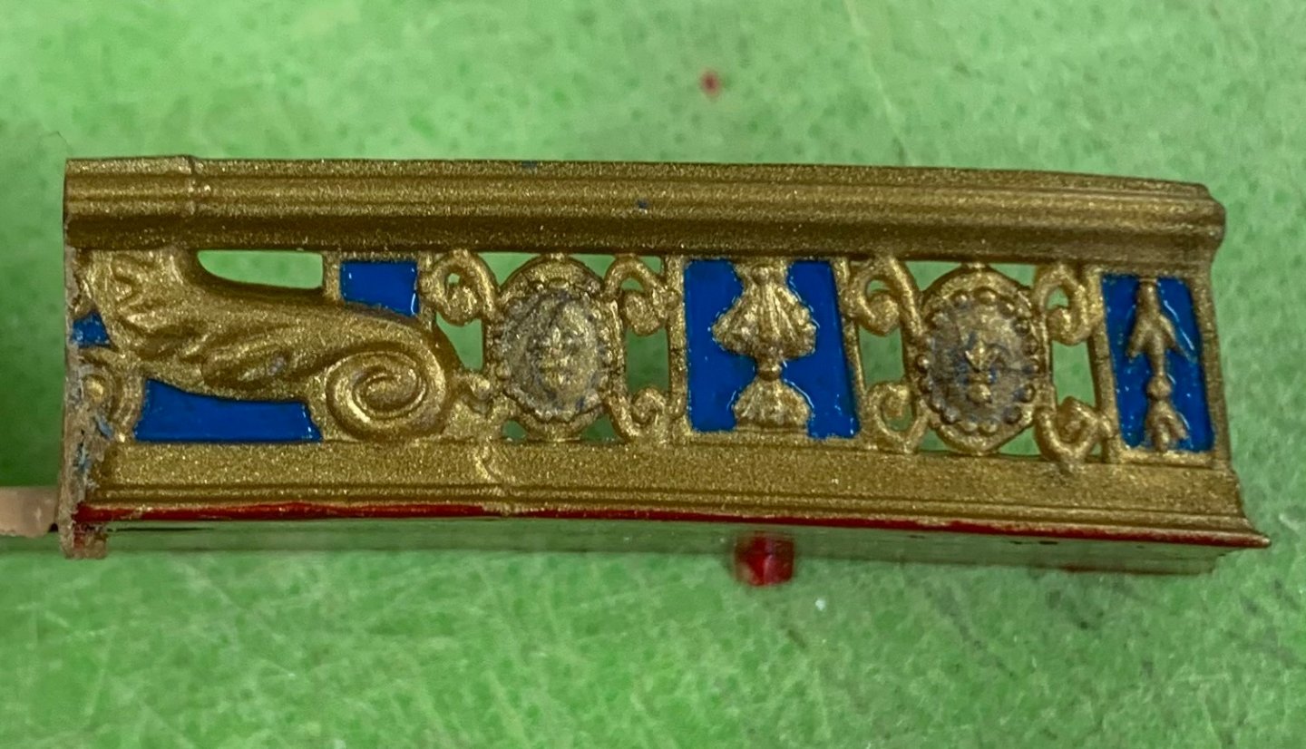
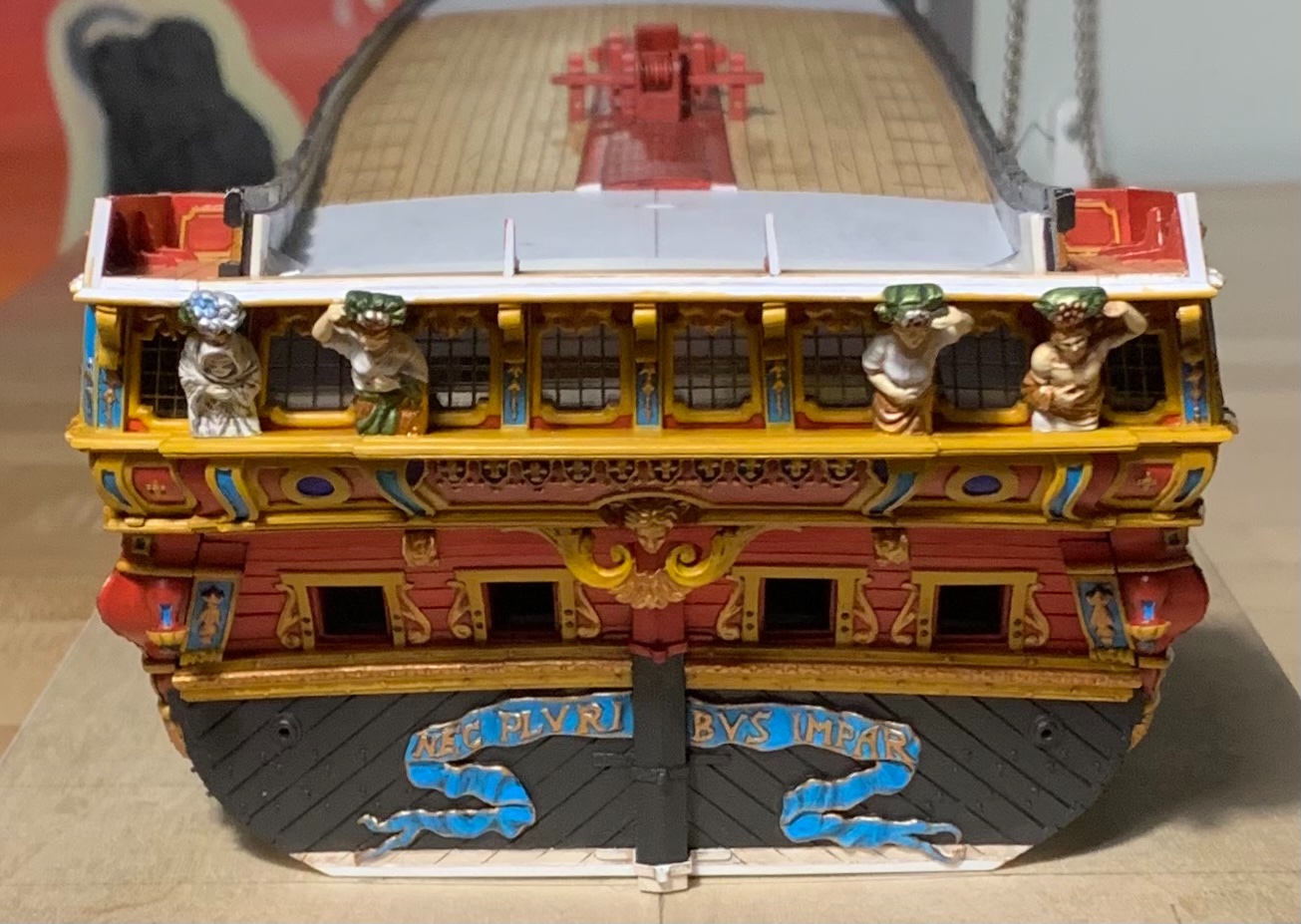
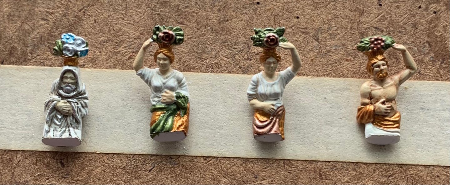
Thank you, John and Mark! There is often a temptation to rush things along, a little, here and there. I am always happy when I manage to resist. The Four Seasons are secure now, and re-touched. I used styrene cement, first, for a welded-bond, and then later allowed capillary action to draw-in thin CA for a little added insurance. As compared with Berain’s drawing - absolutely, these figures are a little too broad. The overall impression, though, is good and I think the adjusted posture of these figures conforms nicely with the new architecture: Part of me wishes I had thought of the stylized false-window treatment earlier. If I had, I probably would have done that throughout, as I like the way it looks, and it would have eliminated any concern for dust accumulating on the i side window surfaces. Anyway, c’est la vie! I can still get canned air in there to blow away most of the plastic particles. The open-walk bulwarks took a while to paint because I insist on not simply dry-brushing the top surface of the frieze elements, but cutting-in to the ground. One realization was that I did not need to thin the Vallejo artist acrylic yellow quite so much because I wasn’t painting broad surfaces; so, instead of a 5:2 ratio of paint to water, I could get away with 5:1, or even 6:1. Painting yellow over red is particularly difficult for achieving good color saturation. Nevertheless, by not thinning the paint so much, I was able to get there in two passes, as opposed to five. I discovered, on Kirill’s Spanish Galleon build, a very clever little hack for adding depth to the gold brightwork; He uses two different shades of gold paint. Once I had that in my head, I couldn’t get it out, so I went to the Warhammer shop over the weekend, and picked up their bright gold. This gives an idea of the contrast: In practice, the effect is much more subtle. Here, the lower bulwark piece has had the highs and edges of the ornaments brightened: The yellow ocher has a way of muting the gold effect, a little, so whatever enhancements one can make are helpful. I will gradually go back and add these highlights to all of the other gold ornaments. I decided to leave the nameplates untouched by the walnut ink wash because I wanted them to really pop. The lattice, here, gives a good impression of what the main frieze will look like. As I did with the bellflowers flanking the name plate, I will continue to search for opportunities to incorporate silver gilt. Once these bulwark pieces were finally painted, I could do a final fitting and secure them in-place. It was necessary to pre-bend these bulwark pieces so that they would conform easily to the curve of the gallery. I found it was easiest and safest to induce these reverse curves with my fingers. The heat experiments I tried with a hair dryer and open flame on scrap sheet plastic were way to difficult to control. Fingers are also, often, the best glueing clamps. The forward edge/pilaster is CA-glued to the wooden return, while the bottom edge is weld-bonded with liquid styrene cement. Inevitably, there will be touchups, but at this stage I declare these quarter galleries a successful marriage to the amortisement: Next, I will pattern the back bulwark, in cardboard so that I can design an exact layout of all of the ornamental elements. I won’t be able to install this back bulwark until after the main deck level of stern lights is in-place and painted, but making this part is a good small-work project. I will probably do a short series on its creation because it will be made from several layers and the process of getting where I want to is a little more involved than other parts I’ve made so far. I can also make up the bulwark cap railing that will finish this structure, while simultanously re-enforcing the corner join of the bulwark pieces. In the evenings, I will begin finalizing the upper bulwarks and preparing them for paint. I have to drill new fairleads for the sheets and tacks, and secure all the kevel pieces. Without the stock stern plate to anchor the aft bulwarks to, construction of the upper stern takes on a few shades of complexity. I have some ideas for a work-around, there, that should provide for a much more robust construction. She’s a BBG (big beautiful girl) - Soleil Royal! Little by little, we are getting there. As always, thank you for your likes, your comments and for looking in.


- 2,697 replies
-
- 17
-
-

-

-
- heller
- soleil royal
- (and 9 more)
-
Michael - I’m noticing on these large, single sheave blocks, at the bow, that you have even seemed to represent the sheave pin/axle. What is happening there? Do you use a darker brown shade of very fine point marker to make a small dot for the axle?
-
Daniel, you work with tremendous precision and feeling for the subject. This work is just outstanding. And, I'm just getting started, reading through your log!
-
Hi - This is all really excellent! I love your lines and your carved work, and the detail, overall, is outstanding. I will gladly follow the rest of the build, and I'm about to get caught up by reading through your work. Great stuff!
-
That is very helpful, Daniel. I will soon need to begin populating my ship. Do you make up a sort of gesso to modify the clothing of the figures, or is it simpler/better to use Squadron white putty, which actually adheres to the plastic? Fantastic work on your Vic, as always!
-
As I’ve said before, this is work of the highest quality. If I may be so specific, though, what I love most about your log is that you de-mystify the practicalities of scale rigging; much can be accomplished with articulated alligator clamps! This, in itself, is really inspiring to me. One can do really excellent hull work, masting and spar work. However, if the rigging isn’t crisp and detailed to match the rest of the model, then something is lost there. I really appreciate what you are accomplishing, here.
-
<<KICK>> There you go, Bill. You're welcome. As I'm sure you have seen, there are numerous truly excellent Heller Victory builds on this site. Daniel/"Dafi's" build "To Victory and Beyond," is by far the most "beyond" build of them all; he really has taken it to levels of plastic modeling that very few people ever imagine. And, my recollection of the early phase of that build is that he had started it, shelved it for a period of time, and then came back only to realize how dissatisfied he was with his paint scheme. If ever there was a Victory build with a good painting tutorial, this is it. Of course, there are countless other tips, insights and techniques that he has to offer. Here's the link to Dafi's build: Brace yourself for the monumental undertaking that Heller Victory is. Oh, and by the way - SafeMaster did a phenomenal alteration of this kit to her 1765 appearance. Take your time. Make a plan, and everything will come out beautifully. I will follow with great interest!
-
Awesome - her expression of detachment, bordering on dis-interest, is pitch-perfect! Your hair modifications give me a good idea what I might look like in that particular get-up; #TWINING. I'd be pretty psyched to be in the boat, though.
- 185 replies
-
- 1
-
-
- queen anne barge
- Syren Ship Model Company
- (and 1 more)
-
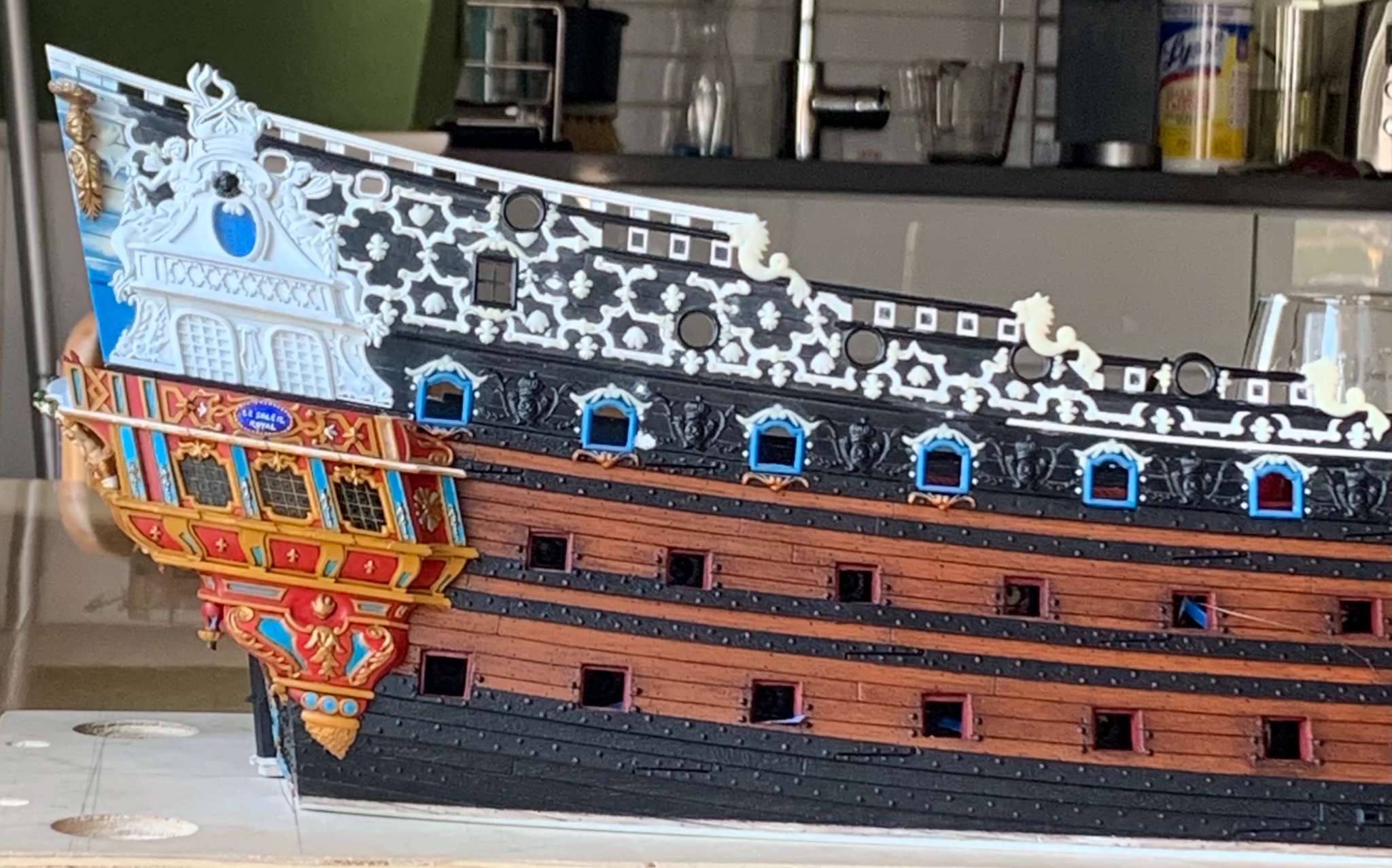
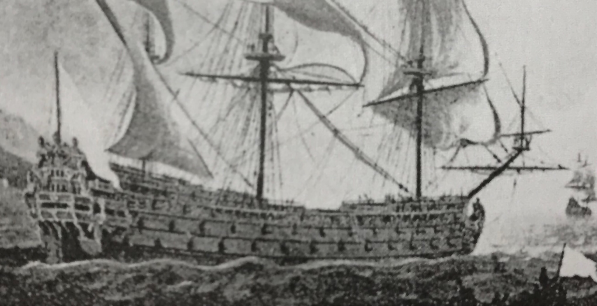
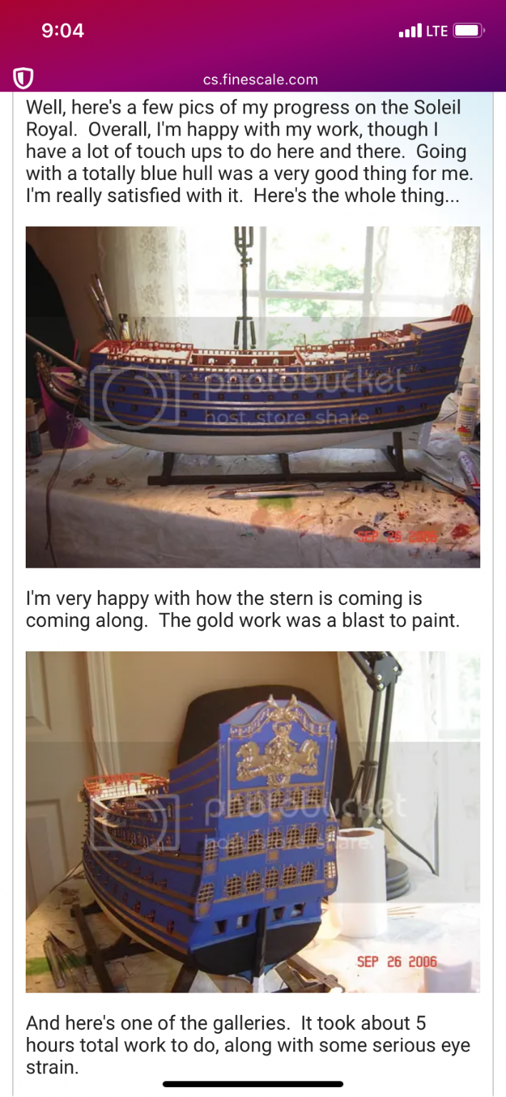
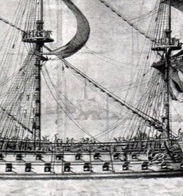
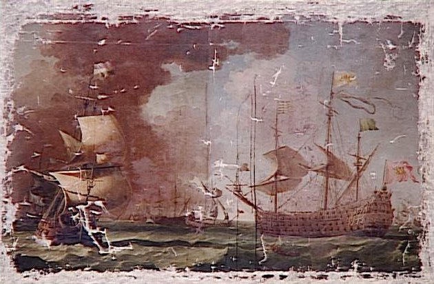
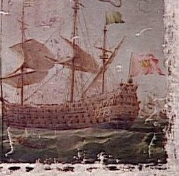
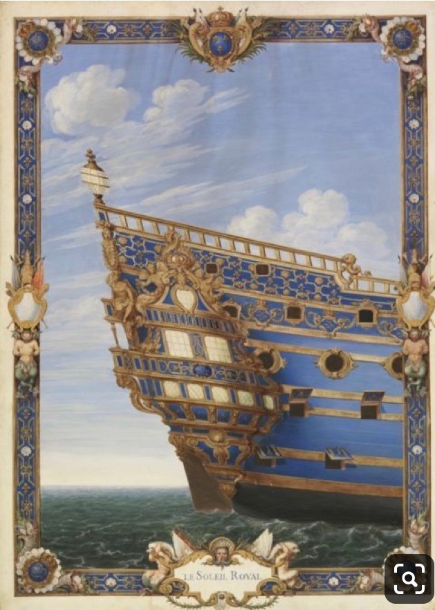
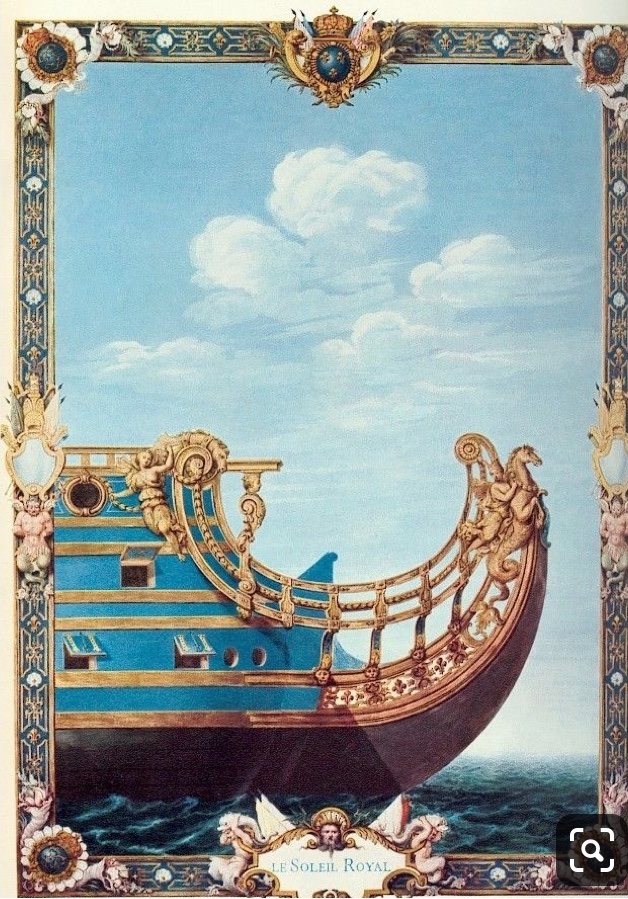
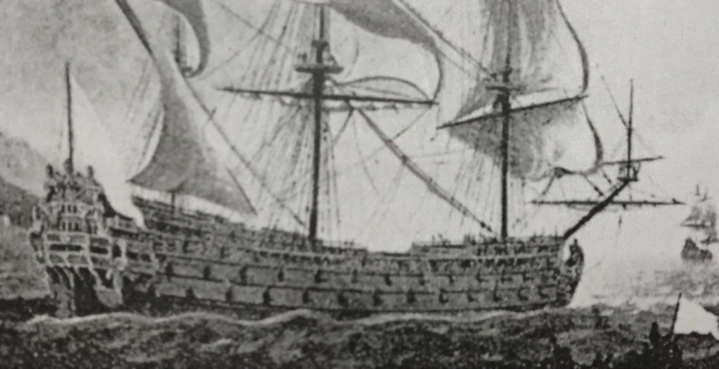
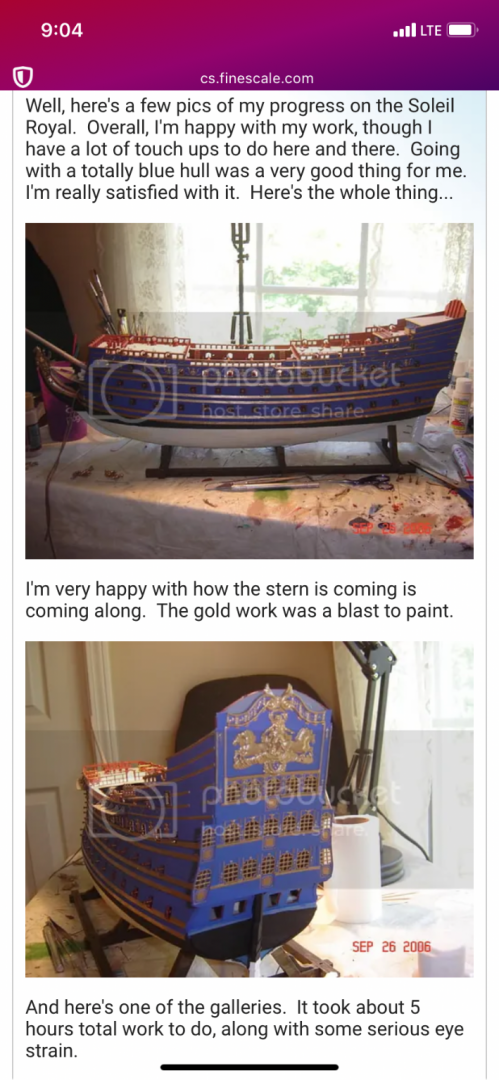
From the very beginning, this project has been an effort to apply context to the fragmentary imagery of Soleil Royal. One thing that has puzzled me from the moment that I came into possession of Lemineur’s Vaisseaux Du Roi Soleil, is the cover art illustration of Soleil Royal. Was the ship actually ever painted all blue? As is well established for this project, by now, you all know that I believe this structural representation is of the refit of Soleil Royal in 1689. I also make a strong argument for the likelihood of red vermillion and yellow ocher being prominent features of the refit color palette. So, then, why might this refit representation be colored all blue? I believe a strong clue may be found in Hyatt’s description of the Royal Louis, in 1677. Therein, he describes the deadworks, above the waterline, as being painted all white, as a backdrop to the richly gilded ornamentation. If one were to simply see a ship portrait or model of a French ship from this time, painted all white, but without understanding of that historic context (Hyatt’s description), then that might seem very strange. But, then, here’s Soleil Royal, in gouache, represented as all blue. What are we to make of that? Well, I have a theory: Perhaps, after Berain created the pen and ink drafts of the stern, quarters and bow - at the time of the refit - Pierre Vary was commissioned to put these drawings into color, according to the original color scheme of the ship between 1670-85. My theory is that, as beacons of the Ponant and Levant fleets, respectively, Sr and the RL were originally painted in representative colors; blue for the Ponant fleet and white for the Levant fleet. I am searching for a more concrete confirmation of that notion, in the historical record, but I have yet to find it. Whether or not the refit SR was actually painted all blue above the lower main wales, remains an open question. I suspect that ventre-de-biche had become a fixture on the lower two gun decks by the late 1680’s. Perhaps in her original incarnation, though, SR really was painted all blue above the lower main wales. It certainly makes for a striking presentation, as evidenced by a modeler calling himself Grymm on FineScale Modeler: A link to the page: http://cs.finescale.com/fsm/modeling_subjects/f/7/t/68572.aspx Maybe that is what this vaguely blue seeming portrait of a ship, pierced for 16 on the lower gun deck, is actually all about: And, although the thumbnail, below, is black and white, the original is almost certainly a full-color portrait. Also of interest, between these two portraits, is the marked similarity in the style of the wave painting. Are both of these portraits by the same hand? Is the color palette of the above portrait representative of the portrait, below? Do both of these portraits represent the same subject? As my theory currently stands, I believe the subject is either Soleil Royal or the Royal Louis. So, which is it? Well, if the actual portrait shows a blue ship or a white ship, we may just have an answer.
- 2,697 replies
-
- 8
-
-
- heller
- soleil royal
- (and 9 more)
-
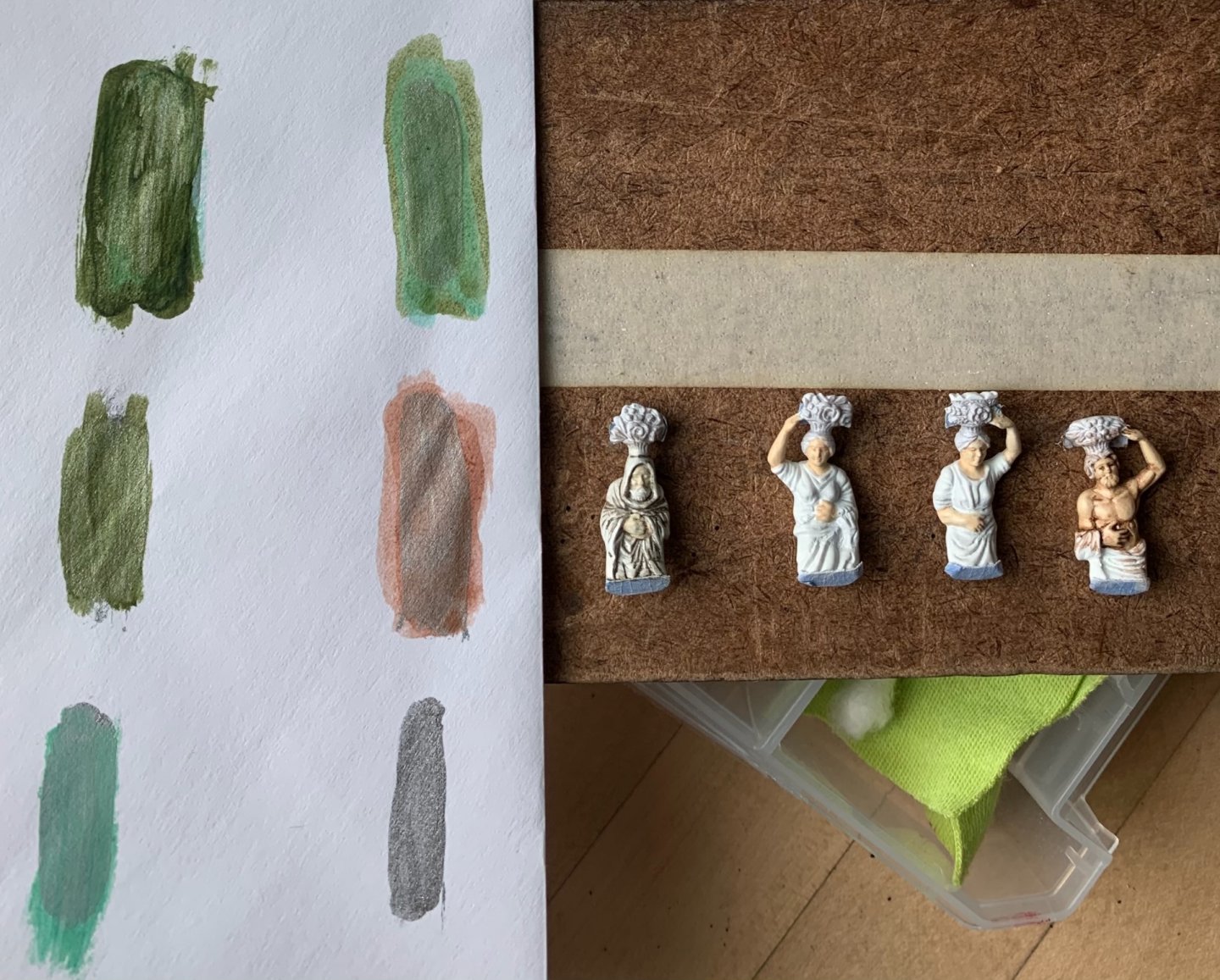
Nice to hear from you, Michael - thank you very much! I present for you now, The Four Seasons: I attempted to modulate their complexion to reflect their time of year. I also wanted to incorporate silver gilt. Winter is a natural fit for this treatment. He has the same grey enamel wash coat that I used for the figurehead, and I then picked out the creases in his robe and his beard with silver. I wanted, though, to experiment with silver gilt as a base-coat for red and green translucent washes. I did a little experimenting: I thought the middle selections were pleasing colors that allowed the silver to peak through. The effect is similar to what you sometimes see with glass Christmas ornaments that are glazed with a metallic base color. I like this well enough that I will incorporate this treatment selectively into the amortisement, as well as between the main deck guns where there are acanthus branches flanking each royal monogram escutcheon. I am also painting the open-walk bulwark pieces, but these are particularly slow to cut-in, right down to the ground. As always, thank you for stopping by.
- 2,697 replies
-
- 21
-
-
-
- heller
- soleil royal
- (and 9 more)
-
Siggi, she looks as shipley and shapely to me as the real thing. Your frieze layout looks spot-on!