Hubac's Historian
-
Posts
3,311 -
Joined
-
Last visited
Content Type
Profiles
Forums
Gallery
Events
Everything posted by Hubac's Historian
-
 Again, much appreciated, Bill! I am happy that you have continued to support the project.
- 2,699 replies
-
- 3
-

-
- heller
- soleil royal
- (and 9 more)
-
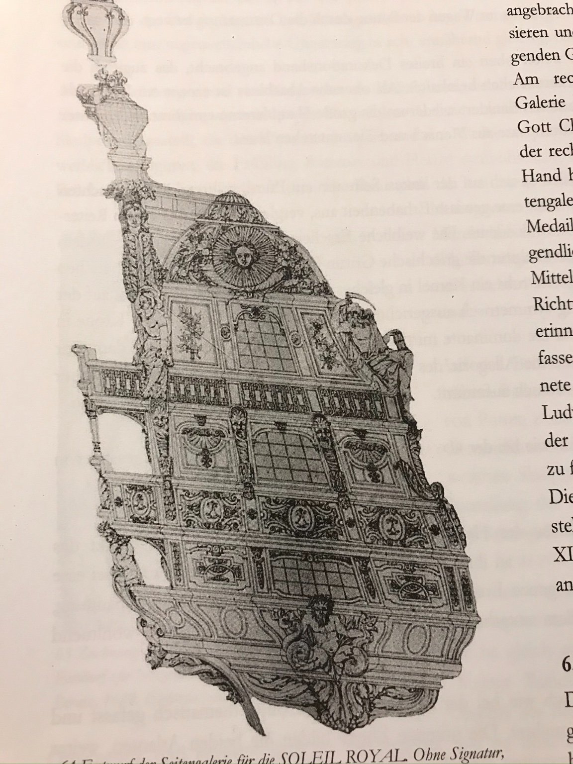
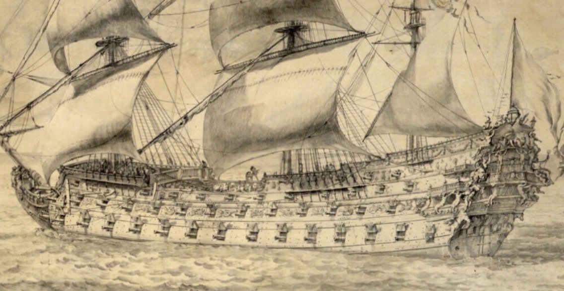
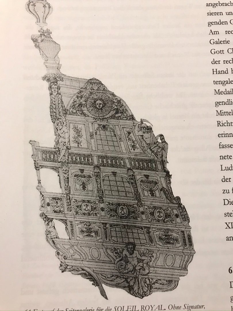
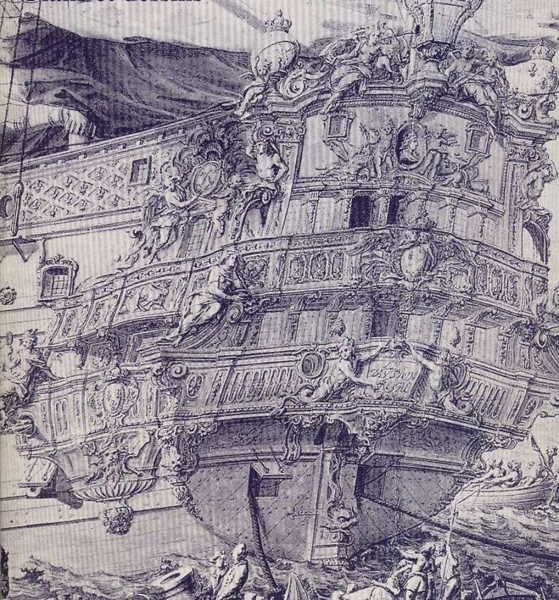
Thank you, Bill! I am more than happy to elaborate. Over the course of this project, I have come to the conclusion that Tanneron was attempting to show Soleil Royal at both ends of the spectrum of her development; 1669 and the newly-build SR2 of 1693. His model’s stern embodies specific characteristics of these two very different eras in French naval architecture. Specific to 1669/1670, you have an extremely tall sheer, with an expansive tafferal space in which to display Apollo’s horse-drawn chariot. Tanneron also chose to show three tiers of open, walkable stern balconies that wrap to open, walkable quarter galleries. This detail is mostly consistent with the Vienna portraits of what I still believe to be the Monarque. It is my observation of Puget’s portrait of the Dauphin Royal, however, that this lowest stern balcony was most likely only a centralized Juliet balcony that did not allow direct passage to the quarters: The primary difference between Tanneron’s representation of the quarters, and what appears to have been actual practice in 1669, is their shape. Above, on the Monarque, you have three balustraded tiers, supported by split-tail tritons between the first and second tiers, and by corbels for the third tier. Yet, Tanneron chose an overall shape and structure that is more consistent with the late development of the “bottle” style of quarter gallery, in which, the quarters are completely closed. This is what I believe to be the re-worked quarter drawing for SR2, in 1693: And so, likely owing to the multiplicity of conflicting and fragmentary primary sources, it is my opinion that Tanneron tried to have his cake and eat it too. While I have yet to find an authenticated confirmation, I do believe that Puget was initially contracted to refine LeBrun’s original draft for the stern allegory. With a few exceptions - notably, that the figures of Africa and the Americas were male, and that a docile tiger sat at the foot of Asia - the composition was only lightly altered to fit within the more restrained and compartmentalized style of Berain. The model I am making reflects a particular transitional moment in the evolution of the French quarter gallery - a middle stage between completely open and fully closed. The lowest tier is fully closed, as that was the functional toilet. There is one open walk on the main deck level that communicates directly between the stern and quarters. The upper stern balcony does not extend beyond the quarter pieces that support the side lanterns. The tromp l'oeil structure of the upper amortisement is a weight and cost saving measure that came into voque as so many of the early First Marine ships had their sheer reduced (1672), and their ornament pared-down, in an effort to improve their handling characteristics. My belief that this is what is intended by the Berain/Vary quarter portrait is perfectly supported by the 1677 refit portrait of the Royal Louis: The only notable difference, here, is that the third level of the amortisement, that corresponds with the rail of the upper stern balcony, projects away from the hull and is supported from below by female figures. The windows, above that, are a more flattened tromp l'oeil structure. And so, that is essentially why I am doing what I am doing.
- 2,699 replies
-
- 7
-
-
- heller
- soleil royal
- (and 9 more)
-
That sounds like a solid plan, Bill. When I become overwhelmed with one aspect of the project, I have always found that there are any number of smaller assemblies I can work on, until I get my motivation back for the big stuff.
-
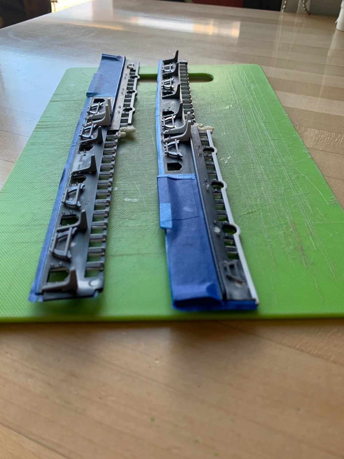
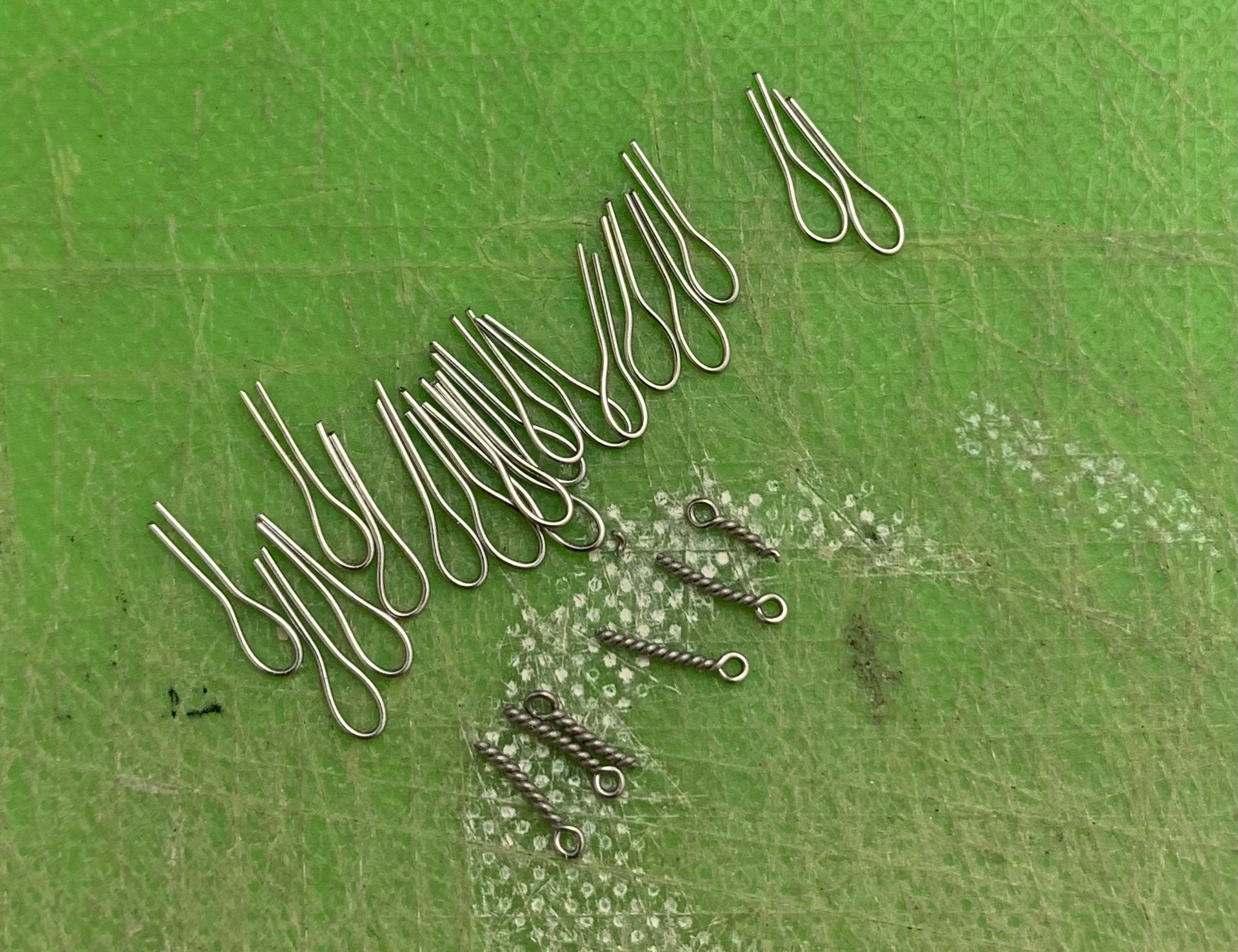
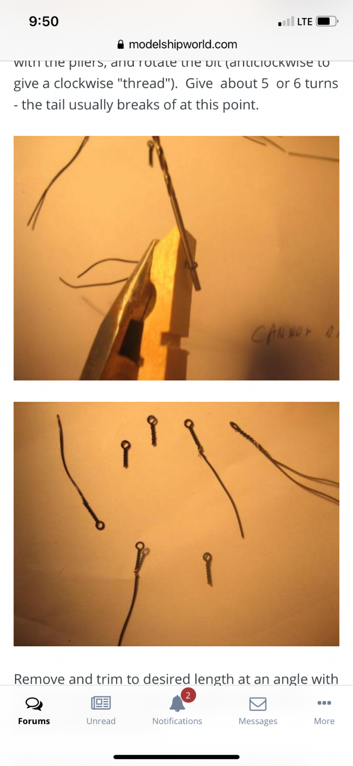
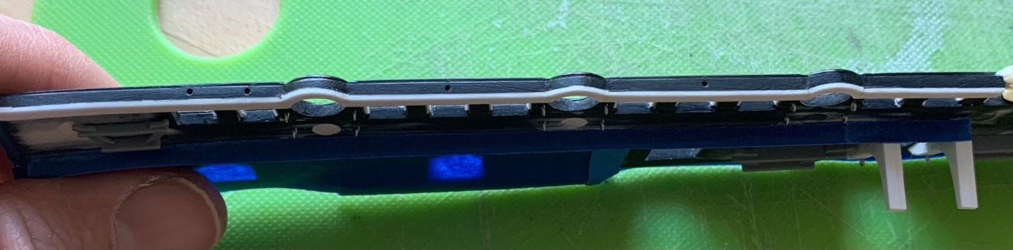
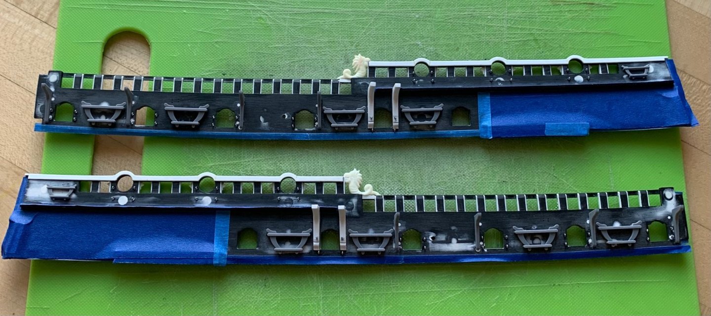
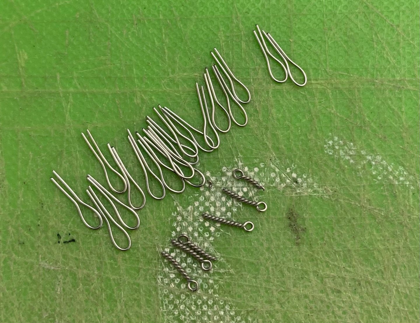
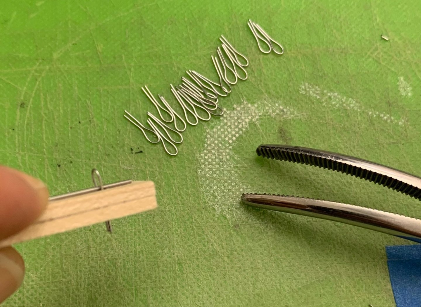
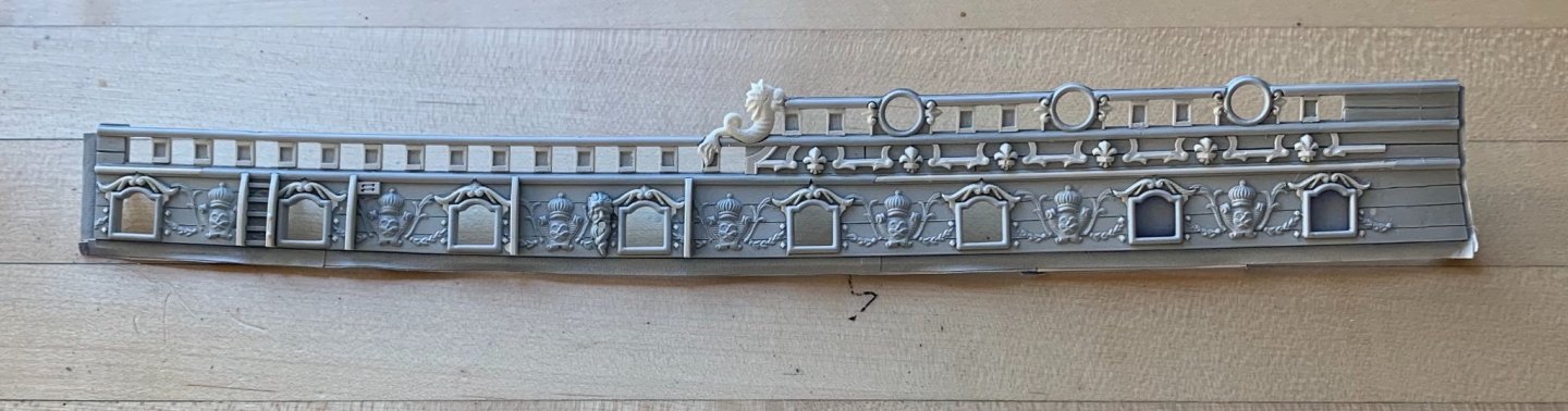
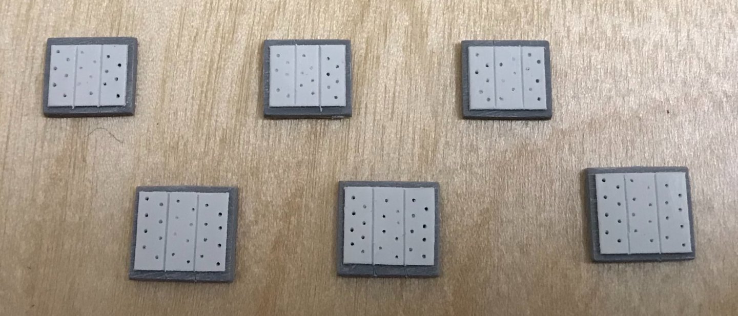
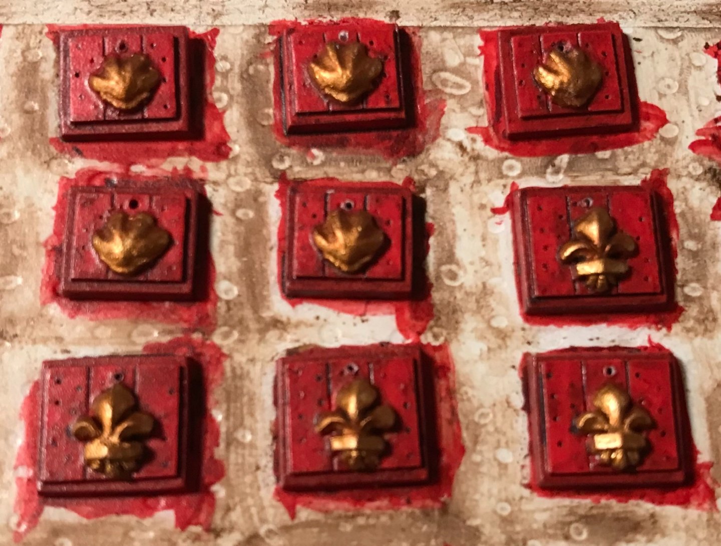
Progress has been a bit slow, lately. I have continued to be amazed by the amount of prep that is necessary before painting the forward bulwark pieces. I was having trouble making good eyebolts out of 28 gauge annealed wire. The scale wasn’t quite right, and the eyes were more ovoid than round, before the stems would break from twisting. So, I switched to 32 gauge galvanized steel wire, and consulted Marsalv’s amazing log for Le Gros Ventre: Somewhere, in there, he shares his particular technique for making these eyes, and it involves twisting the shank through a hole drilled into a clothes pin; doing so ensures a straight shank and a neatly centered eye: I did not happen to have any wooden clothes pins, on hand, so I took a poplar scrap and was able to achieve the same results: I found that I had some difficulty while drilling into the bulwarks for these eyes. I repeatedly drilled all the way through the bulwarks. On a wood model, this would be a disaster! On this model, I could simply plug and fair the holes, on the outside, with .030 styrene rod. I had been debating whether to glue-in the gangway supporting knees, before paint and assembly. Ultimately, I decided that it would be much easier to locate these accurately before assembly. As with all of the stock kit parts, I spend a significant amount of time and effort cleaning these parts up and breaking all sharp edges. Lastly, I drilled through the cap rails for the baying pins that I will add later: After masking any surface that I didn’t want to scrape away paint from, later, the parts were ready for a coat of spray primer: The beauty of the primer coat is that it always reveals whatever might need a little additional attention. I can see that there are a few places where I let the upper port enhancements into the drift rail, above, but was a little overzealous. A small bit of filler will clean that up. Thank you all for looking in. More to follow!


- 2,699 replies
-
- 16
-
-
- heller
- soleil royal
- (and 9 more)
-
I do not take the least bit of offense, Ian. I have great affection for the Heller kits, as they are, but that certainly doesn’t mean they can’t be improved. In my estimation, the efforts of people like Michel Saunier - who refused to listen to the orthodoxy that an authentic rendition of Soleil Royal was even possible - opened the door for people like me to continue digging. Likewise, Daniel’s work on the Victory has legitimized plastic ship modeling as something much more than an enjoyable pass-time for teenagers and retirees. Accomplished modelers from all over the world now view his work through the same prism of appreciation and respect as they do any of the best arsenal-style models. I don’t think of it as “bashing” the kit in a negative way. I think of it as bashing down orthodoxy and conventional thinking about a subject; that any given kit represents the sum-total of all there is to know about the ship. Kit-bashing on forums like MSW only serves to bolster the hobby, as others begin to see that various techniques for modification and augmentation aren’t merely possible, but quite achievable, with only a little extra effort. Your deck weathering looks really good, Bill!
-
…And, the undertow grows stronger. Yup, these plastic sheet and strip goods open up whole other worlds. I thought you would like the thickening of the ports!
-
Okay, Ian - what did you do for thread to rig the model? Did you purchase someone else’s scale rope? Make your own scale rope? Syren got out of the rope making business. I’m debating whether to lay-up my own line.
-
Do you have any after-college age children still living at home, upon whom you can impose a modest ship-tax?
-
This is just a remarkable piece of work, all around!
- 433 replies
-
- 4
-
-
- open boat
- small boat
- (and 1 more)
-
Yes, that’s me - Marc LaGuardia. Interesting application of foils. I am considering something like that for deck sheathing under my stoves.
-
The coppering of the belfry is also an interesting detail, as it makes perfect sense to sheath the belfry roof in copper.
-
Fantastic post, Ian! Also, amazing eye-candy of a model that you have built, there! Incorporating wooden deadeyes is such an improvement.
-
Thank you all very much. I am ever grateful that so many of you have stuck around from the earliest stages, when not much was happening, to now, when the project is finally taking shape. I take away as much and more from your respective builds as you might here. Happy Fathers’ Day to all!
- 2,699 replies
-
- 7
-
-
- heller
- soleil royal
- (and 9 more)
-
Oh, this is awesome! I love this model and can’t wait to see it at the show. I look forward to meeting you, Gary.
-
I haven’t built a model, yet, that has photo-etch parts made for it, but PE offers a higher degree of sharpness to things like the rows of stern balusters, beneath the windows. Speaking of Daniel’s set, in particular, things like the plastic window mullions, which are kind of heavy and out of scale looking (the limitations of plastic moulding), become much lighter and refined looking. In the case of Heller Victory, Daniel has taken an already excellent kit and elevated it a couple of notches. That being said, scraping all of the existing detail from the stern and quarter galleries is a significant undertaking. Different builders take different approaches. Some like to cut the bulk away with a hobby knife, I like to waste away most of it with Dremel sanding drums and burrs. It is all a matter of personal preference, and deciding how far EXTRA you want to go with it. Hands-down - straight out of the box - it makes a fantastic model.
-
Personally, I don’t care for that salmony yellow color, even if it is correct for 1805. Port linings do look good, Bill!
-
I am doubtful that the deck surfaces were painted at all. The gun trucks would have made a mess of any sort of top-coat, and generally, the decks were regularly “holy-stoned” with bible-size stones to keep them clear and fresh. Dafi’s build indicates white interior planking and deck beams, and I believe the underside of deck planking. I believe that is what is indicated on the actual ship. To answer your earlier question anout thickening port lids, I did add port linings to mine because the kit did not represent them: My understanding of Victory, though, is that the lid interiors do not have this lapping step-rebate around their perimeter. As with virtually everything Heller Victory, you can probably find a detailed discussion of this on Dafi’s log. And, I am sure I do have family in Kentucky. Until she got thrown and badly hurt, my mother jumped horses.

-
My mother was from Louisville. She and her mother left in 1955, when my mom was 15, and they re-settled in White Plains, NY. My mom never talked much about why they left, and she only remained in contact with a pair of cousins. My mom passed five years ago, and it is kind of incredible to think, sometimes, that I have an entire extended family out there that I know nothing about. But, I digress… You have begun your journey, and now you are equipped with the Evergreen that will help get you there. This is going to be fun!
-
For the record - I also wasn’t doing any sort of involved search. That was just the first representative link I found to show the product. If you shop around a little, on-line, you may be able to find better selection and pricing. I am fortunate to still have at least one old-school hobby shop in NYC - Jan’s Hobby - where they carry a pretty wide assortment. The old French lady, there, charges $4 “cold, hard cash!!” for any individual packet of Evergreen. When you pay cash, she doesn’t charge sales tax. If you hang out long enough, she will tell you stories about the Nazi occupation that she lived through. Anyway, I bought a bunch of different sizes and shapes, and am constantly finding new applications for all of it. As for sizes, the great thing about 1:96/1:100 scale is that 1/8” equals 1’. From there, it is relatively easy to deduce the scale sizes of any component. In the end, it doesn’t need to be EXACTLY right, but at least close. If anything - err on the side of a little too small, rather than too big. If it is any encouragement to you - this thickening of the gun ports is the very first modification I made to my SR project. In fact, it was the first significant alteration I had ever made to any out-of-box kit. After that small success, I just kept on adding and modifying. While it is true that I had complimentary skill sets, going into the project, my skill set has grown exponentially as a result of the project. Once you get a taste for modification and scratch-building, the hobby takes on entirely new dimensions. You literally learn to “think outside the box.”
-
It comes in all different shapes and sizes and in sheets of varying thickness. It is fantastic for scratch-work because it is relatively soft: https://yankeedabbler.com/evergreen-110-styrene-strip-015-x-020-thick-14-long-pkg-10-scale-ho-part-269-110/?gclid=EAIaIQobChMIrs_G0P-h8QIVz8DICh3-dACREAQYAyABEgIlVfD_BwE
-
I’m glad that Ian mentioned this about using Evergreen to frame-out the gunport openings. In my opinion, no matter how well you paint and assemble a plastic ship model, the unrealistically thin hull depth, through the gunports, draws way too much attention to the fact that this is a plastic model. Because Heller Victory is going to be a big project, anyway, why not go the extra mile, here? If this ends up being the one substantial modification you make, you will never regret it. If you want to take it even a step further, use a slightly thicker plastic on the lowest gun deck, followed by a slightly less thick plastic for the middle deck; doing so, gives a sense of graduation in frame thickness that would be present on the real ship. In 1:100, I used .125” square strip stock to frame the lower ports, and then .100” stock for the middle deck . I didn’t bother with the main deck ports, but I did increase the thickness of the caprail by .030”, because that is what your eye is drawn to.
-
The brushes I use are mostly inexpensive synthetics. I bought a variety set at Michaels that has held up really well, although there has been some edge distortion. I really like the BLICK synthetics. Those hold their shape really well and clean easily. I bought a War-Hammer detail brush that is a synthetic and natural blend. I haven’t used that one yet. Since I’m painting with acrylics, soap and water cleanup is all that is necessary, but I will periodically dip them in enamel thinner, when the ferrules start getting stiff. The thing I like about the BLICK brushes is that the handles are super long, and I’ll steady the tail end of the handle on my cheek, as I’m cutting-in a line. This little trick affords me complete control over the brush.
-
That is a very nice English Man-O-War. The sails are particularly good. As for the authenticity of the design, Revell loosely approximated the known portraiture of England’s race-built galleons. It is not an extremely accurate representation, but it makes for a very attractive model, all the same. Like all the big kit manufacturers, at the time, they capitalized as much as possible on one design by spinning it off into another complementary design - in this case, the Spanish Galleon. Yes, that is the case that I have hand-painted my entire model up until now. I will be airbrushing the ground colirs for the upper bulwarks, though, as I really want to avoid muddying up all the detail. As for your yellow ocher stripes - I may be wrong, because I don’t have the kit in front of me, but I believe that Heller moulded fine lines that show exacty what the top and bottom boundaries of each stripe should be. To follow the run of the wales would be more consistent with a significantly earlier period of time, and not the 1805 time-frame that the stock kit represents. It is up to you, of course, to proceed as you wish.
-
Roter Löwe 1597 by Ondras71
Hubac's Historian replied to Ondras71's topic in - Build logs for subjects built 1501 - 1750
Really well done, Ondras! -
Simply from the standpoint of the actual ship still being in existence - Heller Victory is the finer kit, and probably the finest plastic sailing ship kit in existence. Heller Soleil Royal is an extremely close copy of the Tanneron model in the Musee de la Marine, in Paris, from the mid-1830’s. Out of the box, as a representation of what French ships may have looked like in the last 5th of the 17th C. - it is the best commercial kit available. It is seriously flawed, in numerous respects, yet Heller made an admirable attempt to fill-in the numerous blanks left by Tanneron. Airfix Vasa and Prince are technically more accurate, but only because they could measure directly from the real ship (Vasa), and from the Science Museum model (Prince). Likewise, there are very few contemporary models of French ships, from SR’s time, from which to draw conclusions/comparisons. While the English made full “dockyard” models, in wood, to sell the proposal for a new ship, the French made wax models for the proposals of decor, in the mid-to-late 17th C., and none of these earliest models still exist. There is only a fragmentary patch-work of original drawings and portraits from the 1670s and 1680s. The Heller Soleil Royal is flawed, but salvageable; this idea is the entire thrust behind my build-log of this kit.