Hubac's Historian
-
Posts
3,311 -
Joined
-
Last visited
Content Type
Profiles
Forums
Gallery
Events
Everything posted by Hubac's Historian
-
 All of this is very precisely done, EJ. I really like the scale of the gratings and the stairs. Well done, my friend!
 -
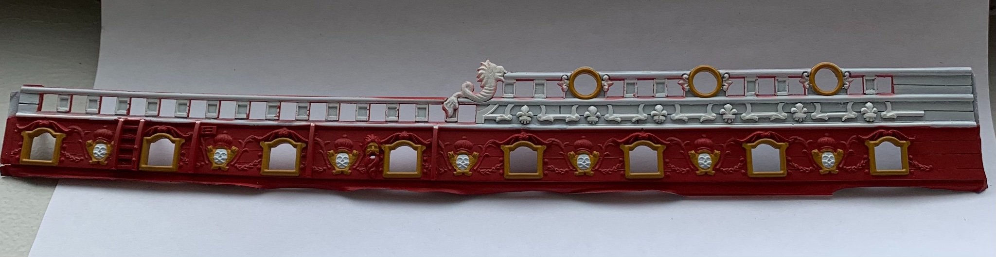
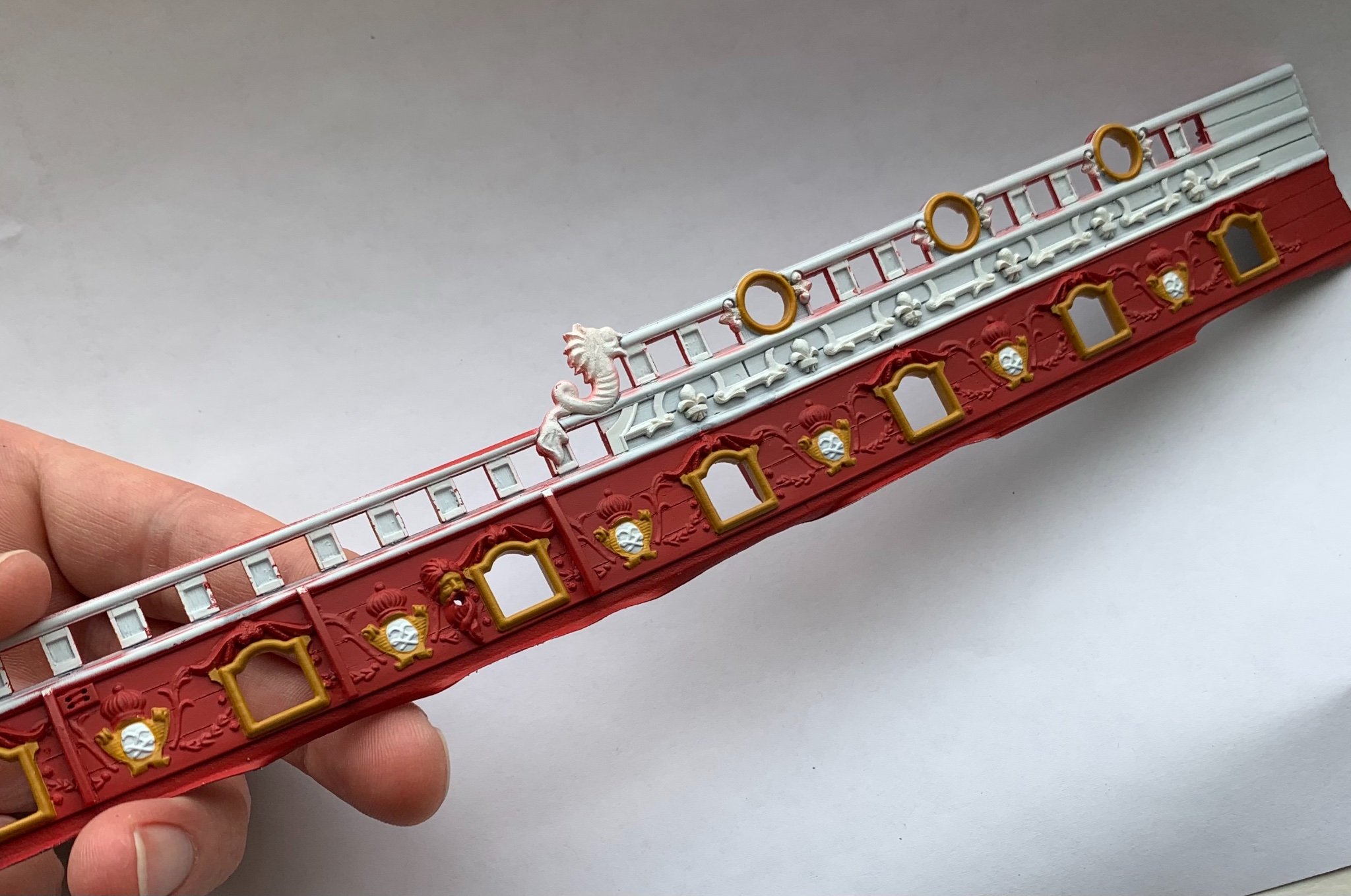
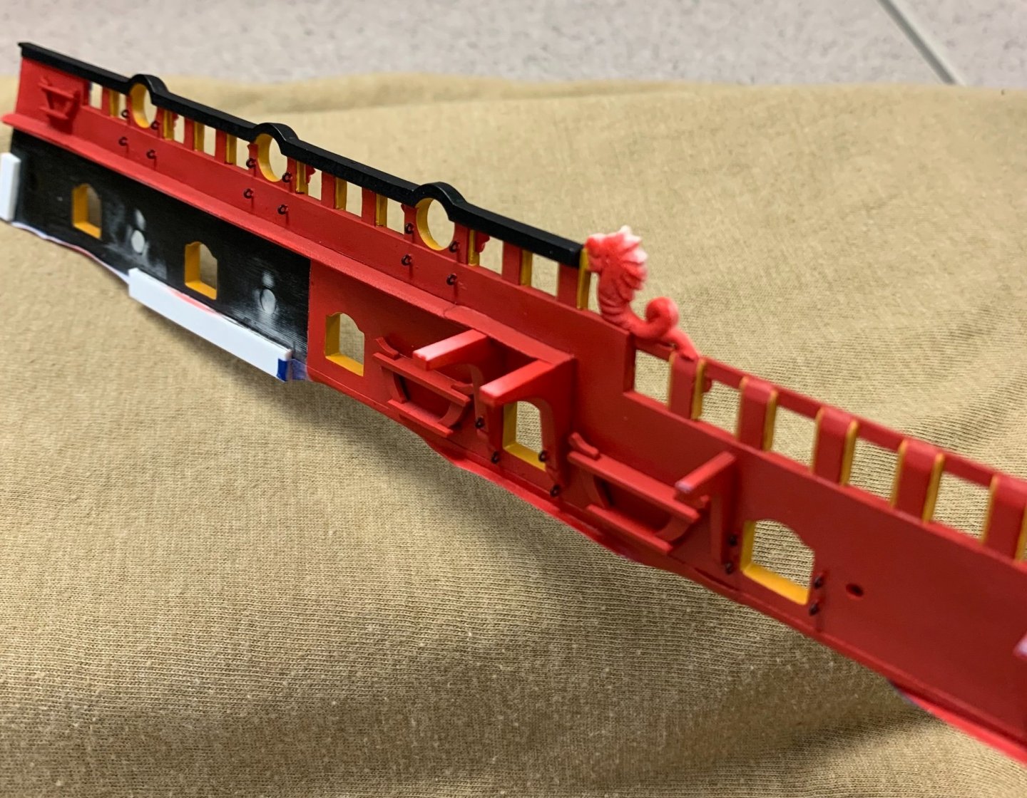
Thank you, Michael! Yes, there is certainly a lot going on, there. It will eventually become clear, but these colors and patterns were chosen to emphasize certain aspects of the frieze and to unify the whole ornamental program into a coherent tableaux. It looks a little crazy, right now, but it will all come together. Thank you John, but the truth is that my hand is not nearly steady enough to hold these lines, unsupported. I like to think of my painting hand as though it were a rock climber; I use the pinky and ring fingers to nestle into crooks of the piece I’m painting, or to anchor into the fingers of my part-holding hand. In doing so, I create an absolutely steady frame that frees the three brush-holding fingers to move without tremor or strain. Usually, when I mess up, it’s because I miscalculated the amount/flow of the paint on my brush tip. I always roll excess paint from my brush before applying to the model. This removes excess and refines the shape of the brush tip. I’ve learned to do this paint rolling on a ceramic plate, instead of paper towels because the paint invariably picks up lint from the paper towel and transfers it to the model. I’ve also learned not to swipe excess paint from the paint pot lip, as the excess quickly crusts, and then your brush eventually picks up crust flakes and deposits them in your finish. My approach wastes paint, but produces cleaner results. If I mess up, I always keep a wet brush nearby to mop away the mess, and that minimizes touch-ups. That is the real beauty of acrylic paints. In the end, it is mostly a test of time and endurance that leads to these results. I think it is fair to say that I averaged five hours a day, over five days for this bulwark piece, so far. Thank you, EJ! I think I will remain consistent with my beakhead bulkhead, and paint the quarter and poop deck bulkheads the same red color. This is what was done on the Louis Quinze model, and I think it makes sense to do so.
- 2,699 replies
-
- 9
-

-
- heller
- soleil royal
- (and 9 more)
-
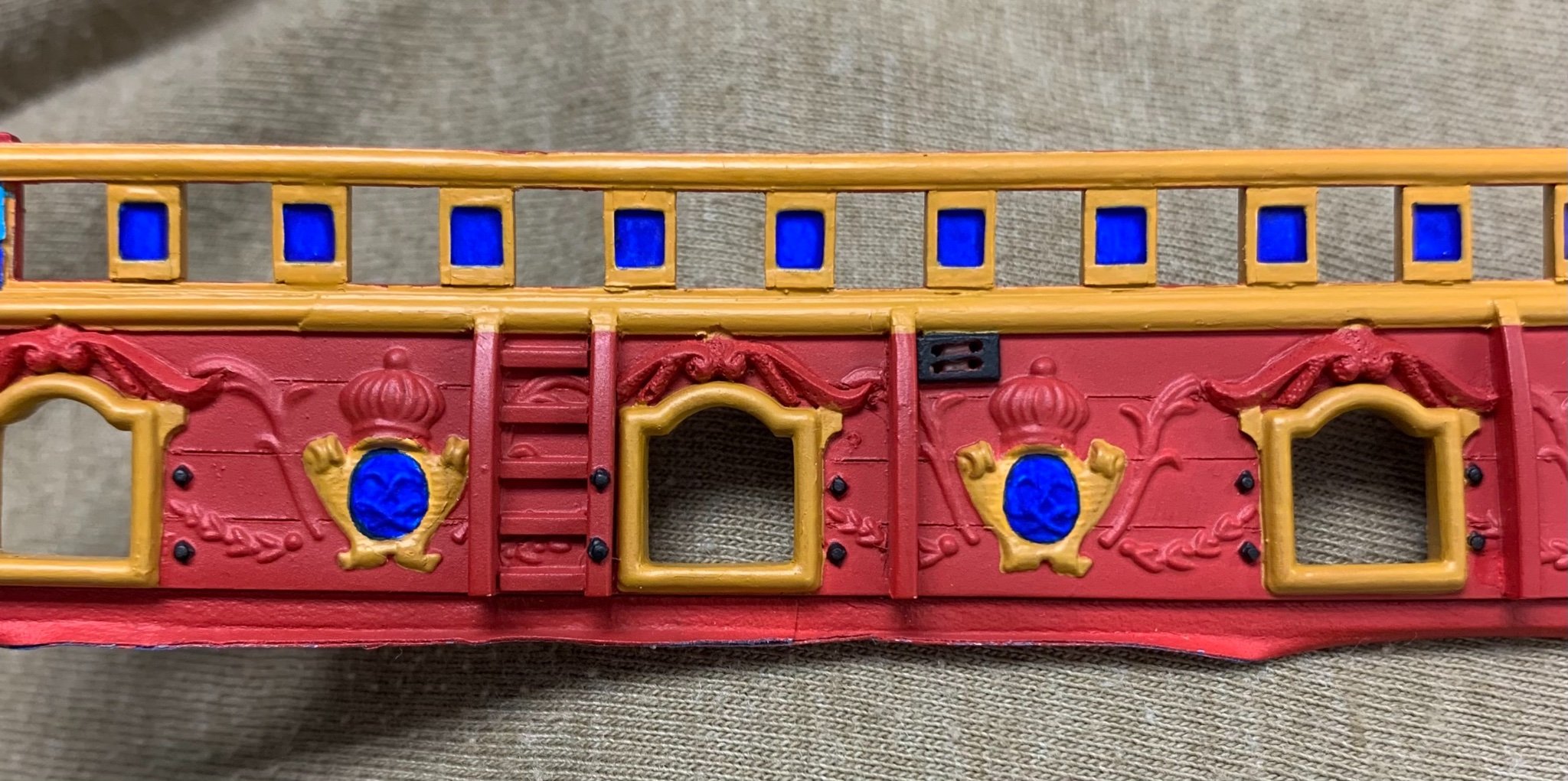
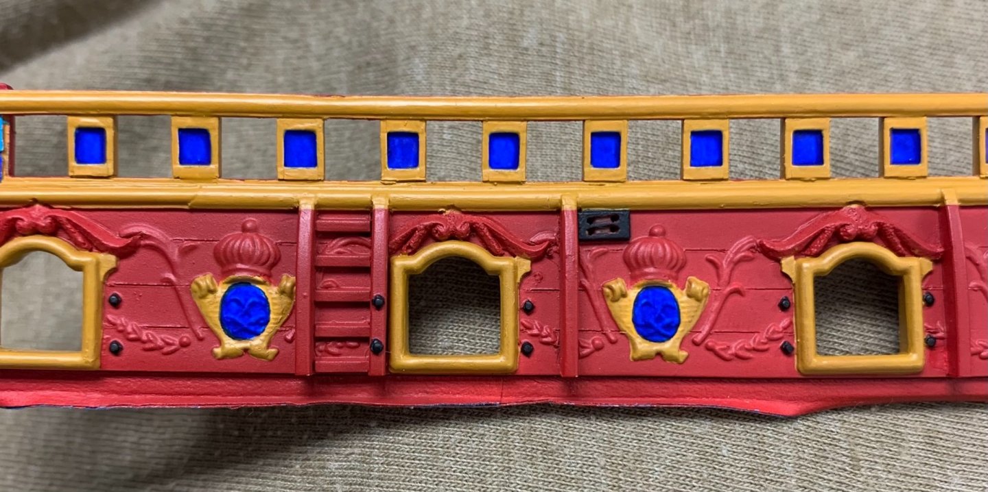
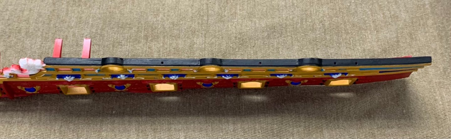
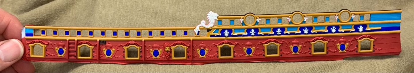
To say that my self-imposed deadline has lit a fire under me would be an understatement! It has been a week, now, and I’ve been painting in the day AND in the evenings. At this stage, all of the primary colors are down and I am ready to spray the ink wash before the gilding of the ornaments. It is all extremely vivid, right now, but these pics will give a sense of how the frieze will come to life on the aft bulwark pieces: Yellow ocher, I think, is a good unifier of these three colors as they all seem to play nicely with the yellow. Figuring out exactly how I wanted to highlight the timberheads took a minute, and execution of the painting took many more minutes! I wanted to draw attention to the fore and sprit sheet block entry, so I painted it black. It seemed unlikely that the sheaves, at this time, would be cast bronze, so I painted them a dark wood brown. Merely by padding the thickness of the sheer railing by 1/32”, I have created a much more realistic sense of scale for this detail: So, I will finish up the wash and ornamental paint for this piece at home. Incidentally, the dolphin hances will get the same aqua treatment as the figurehead, and this will be a consistent theme that runs through the ship, all the way to the dolphin on the rudderhead. Tonight, I’ll airbrush the red base-coat for the port side bulwark piece, and the whole process will begin again! Despite my urgency, this is the standard that I will doggedly maintain. Thank you for the likes, comments and for looking in.
- 2,699 replies
-
- 17
-
-
- heller
- soleil royal
- (and 9 more)
-
Well, color me impressed! This is going to be a fabulous model!
-
I agree with Druxey - you sure seem to know what you're doing! I'm in!
-
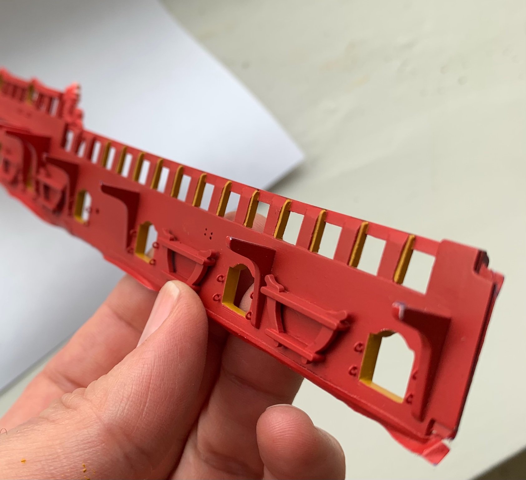
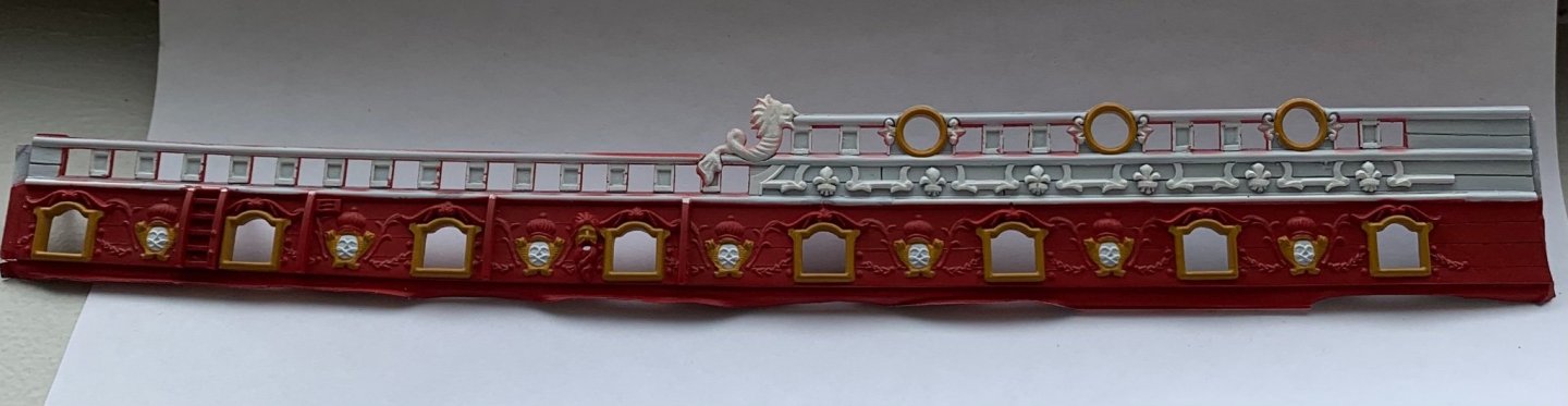
Thank you guys so much for your kind compliments! And, so, the elephant eating contest goes into full swing. Fortunately, because I was such a good little brother, when we were kids, and I let my (now) superstar makeup artist sister use me as a hair and face model, my sister has agreed to let me borrow her airbrush and mini compressor that she sometimes uses to apply makeup. One hand washes the other! Buried, somewhere in the boxes from our move to Brooklyn, is my own Badger airbrush, but for the life of me - I can’t find it. Anyway, it has been such a wonderful rediscovery of the magic of airbrushing. There is simply no better way to paint broad, highly detailed surfaces. Early returns on the forward bulwark pieces are looking very good, so far. I was careful to mask off the monogram escutcheons - the crossed “L”s - because an undercoat of red would make the cobalt look dark and purplish - definitely not what I’m after. I am also very pleased that I took the time, during the modification stage, to engrave plank lines between the main deck guns. Without a doubt, it will always be the yellow ocher that is the most time consuming stage, but I have determined that a 2:1 ratio of paint to tap water is the perfect viscosity for even application with good coverage. It still takes 2-3 applications, over a color like red, but that is far better than the 6-7 I was averaging before. The most fiddly painting is the timberhead trim that I applied to box-in the timberheads. It is exactly as tedious as painting a picket fence: Eventually, the walnut ink wash will work its magic to lower the volume on these colors, while adding depth and dimension to the surface. Whereas, in the past I cringed at the thought of traveling with these fragile, bigger parts that I already have invested a huge amount of time in - I have now acquiesced to the reality that that is the only way I will be able to jam-in the number of hours it will take to cross the finish line (of this build stage), by October. Wish me luck!


- 2,699 replies
-
- 12
-

-
-
- heller
- soleil royal
- (and 9 more)
-
Exquisite work, Matiz!
-
Yes, I absolutely think you can add detail at your will. I think what you may find is that making these additions has a cumulative seductive effect. The improvements you make might motivate you to continue making improvements, so that gradually you totally settle into the process of making the model, without stressing too much about the finish line. Everyone finds their “hard-line” when it comes to adding/changing this or that. Some things will be worth the effort to you, personally, while some will not - and all of that is perfectly okay.
-
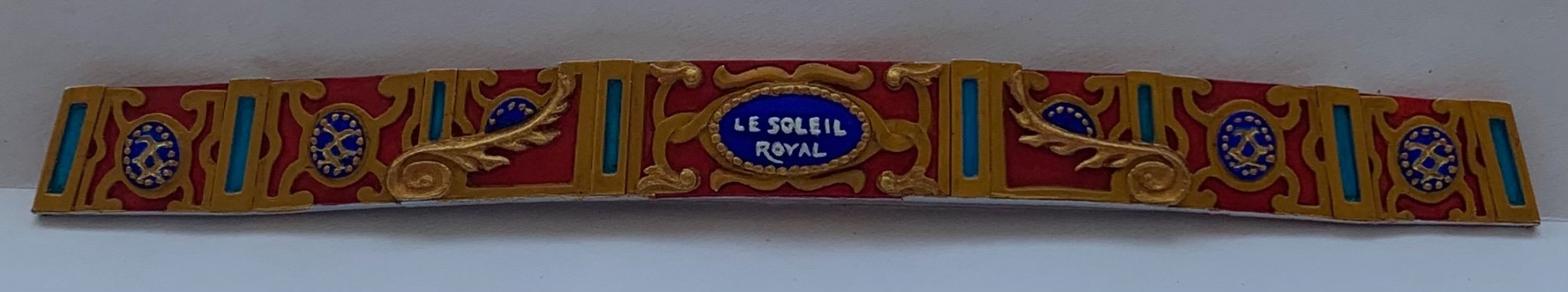
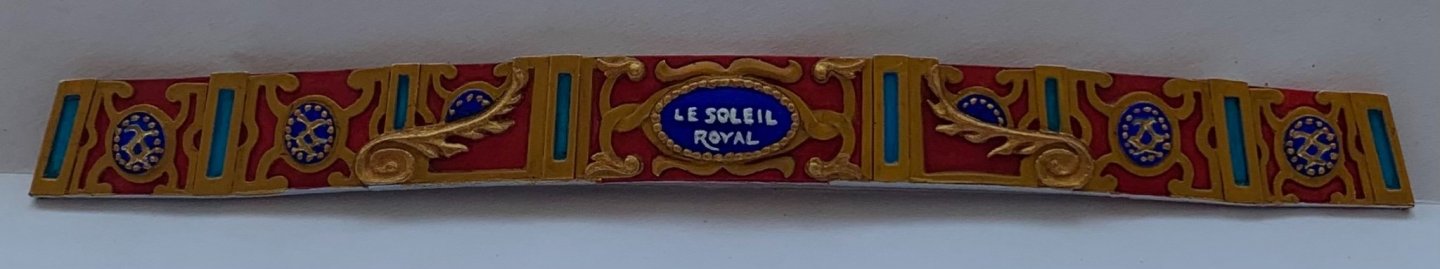
‘Much appreciated, Michael! Well, it was a sweltering and otherwise frustrating day, but I managed to finish painting the stern gallery bulwark. My moment of zen: Interestingly, the brighter gold highlights only seem to pop in muted natural light. The monogram escutcheons were interesting to paint because the carved detail is incised; I first fed gold into the V-channel, and then veeery carefully painted the cobalt color up to the edges. I can’t say with absolute authority that this color scheme is completely authentic to the times, but it does make for a very vivid display. It is just time consuming. I have three complete months until the Joint Clubs conference in New London. Completing the bulwark painting and installing them in time for the show seems like a daunting task. The paint work must be impeccable in order to show the frieze and amortisement to best advantage. At the least, maybe I’ll get one completed broadside. I will try. We shall see.
- 2,699 replies
-
- 12
-
-

-
- heller
- soleil royal
- (and 9 more)
-
If it works out for you, Henry, it’d be nice to meet you. I’ll be there, so stop by and say hello, if you have the chance. ATB, Marc
- 2,699 replies
-
- 2
-
-
- heller
- soleil royal
- (and 9 more)
-
Beautiful care and attention to the carved works, BE. They really clean-up nicely!
- 185 replies
-
- 1
-
-
- queen anne barge
- Syren Ship Model Company
- (and 1 more)
-
It may seem surprising, but for sanding grain effects into plastic - that will show through paint - you have to go pretty coarse; 60 grit minimum, but 50 grit picks up the wash-coats nicely.
-
No problemo! Another interesting detail is the anti-chaffing protection, over the tops of the gammoning. I have never seen that detail before. but it makes perfect sense. Most likely, it is leather that is nailed to the sprit-mast.
- 35 replies
-
- 1
-
-
- Mantua
- Sovereign of the Seas
- (and 1 more)
-
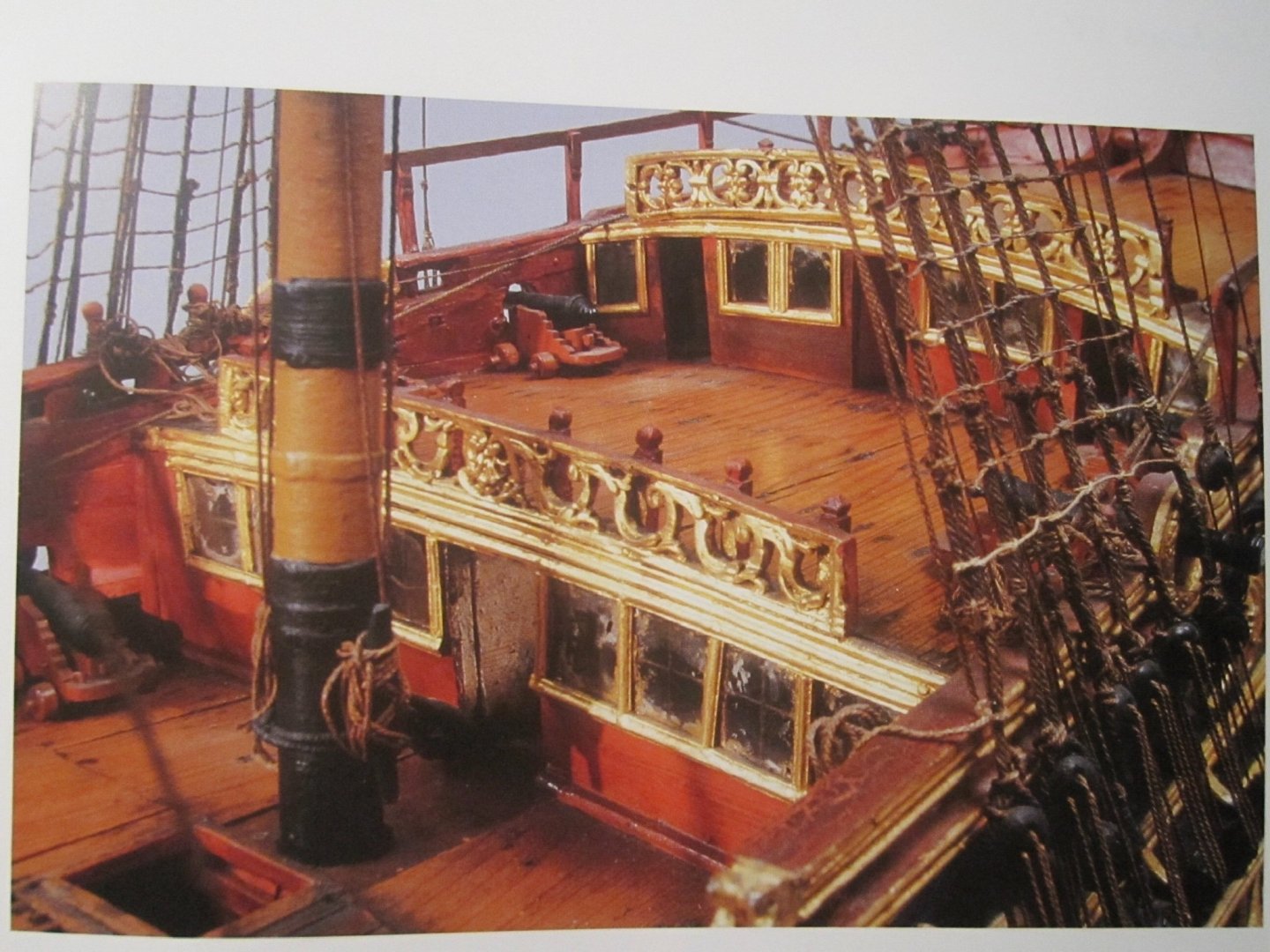
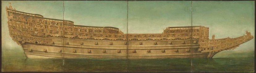
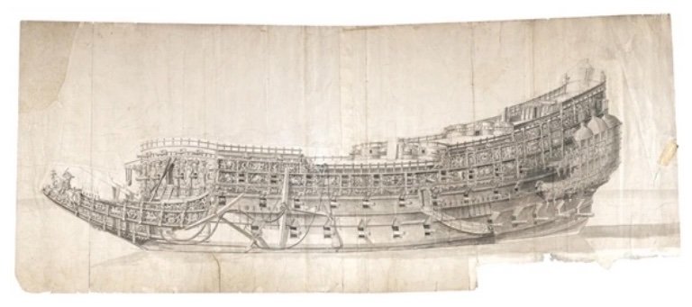
Here are a pair of fairly spectacular portraits of the Sovereign, in her original incarnation. The first Van de Velde portrait shows the correct bowsprit entry angle: This second portrait, in colors, is really fascinating because it illuminates pretty clearly how the particular compartmentalization of the ornamental frieze is organized, visually. In the pen and ink drawing, this impression flattens out a bit. In life, she must certainly have lived up to her moniker as the “Golden Devil.”
- 35 replies
-
- 3
-
-
-
- Mantua
- Sovereign of the Seas
- (and 1 more)
-
I’m not, by any means, a Victory expert, but I think what may be confusing, here, is that Daniel’s photo guide illustrates the widening of the wales with Evergreen strip (what is necessary for less complicated seating of the chain plates), but he also shows scratch-built upper bulwark extensions that rise above the gently curved sheer-line; I believe (although, I could very well be wrong), these were modifications that were made to the ship, prior to her engagement at Trafalgar, in 1805. The restored ship, at Portsmouth, does not display these raised bulwarks.
-
I haven’t seen Daniel’s set or the instructions, up close. Can you please post a pic or two of what you are looking at?
-
Henry, that is still a workable method for me; I’ll only have to close the rings around the eyes. Great tip! Will you be attending the NE Joint Clubs Mtg in October?
- 2,699 replies
-
- 2
-
-
- heller
- soleil royal
- (and 9 more)
-
Ah, yes, Jan - that makes sense. Thank you! I also appreciate your presence, here and throughout MSW, as you always have something insightful to say. Thank you for sticking with the project!
- 2,699 replies
-
- 2
-
-
- heller
- soleil royal
- (and 9 more)
-
For my part, I use CA glues when I am bonding dissimilar materials; wood to plastic, metal to wood, or even metal to metal, when I need a good mechanical bond. When it’s plastic to plastic, I always use Testors liquid cement with the needle applicator. I like this stuff because it is not too thin that it has no body, but the viscosity is not so much that it won’t still wick into a joint. It melts the plastic pretty efficiently and always ensures a really good welded bond, as long as your parts mate nicely.
-
I’m not sure what you mean in this last post, Kirill.
- 2,699 replies
-
- 2
-
-
- heller
- soleil royal
- (and 9 more)
-
That is just picture perfect, Mike! If I were building this model, one thing I would be tempted to experiment with would be to use the printed frieze as a template to overpaint with either an oil, or a full-bodied acrylic. My objective would be to try and approximate the slight relief one sees on the original models. As it is, the printed frieze looks fantastic, but it could be interesting to see whether hand-painting enhances or detracts. Anyway, it is just a thought. I really enjoy watching your progress, here, Mike.
- 607 replies
-
- 2
-
-
- winchelsea
- Syren Ship Model Company
- (and 1 more)
-
Actually, Kirill, I am definitely going to make split-rings for attaching the breaching ropes. I just need to purchase a pair of super-fine jewelers’ shears to cut them. Speaking about the breaching ropes, I had an idea for a cheat to make it easier to seize to the rings. Off the model, I could seize each end to a ring; cut the breaching rope in the middle; attach the rings to the eyes; feed each cut end into the breaching rope holes in the carriage; a spot of thin CA will hold the ropes in their holes. Otherwise, I have no idea how one would get into such a cramped space to actually seize directly on the model. My haul-in tackles will be fine PE, and while I will probably fasten rings to the deck for the haul-out tackles, I may not actually rig haul-outs. I’m un-decided as to whether that makes the deck look too busy.
- 2,699 replies
-
- 2
-
-
- heller
- soleil royal
- (and 9 more)
-
This is excellent Kirill! I will need to make hooks like that, eventually, so this is very timely advice. You appeaR to flatten the hooked end to give it a more "forged" appearance. Do you achieve this with pliers, or do you actually peen the hook with, like, a fine nail-set maybe? What I found most interesting is your method for lashings/seizings; a series of single, over-hand knots. This is really great, because I was searching for an easier method to do this, without a serving machine. I will be well-served 😜 to re-read both your log for the Galleon, and Popeye2Sea's log for SR, as I begin to think about the rigging. I really want the rigging to be good!
- 2,699 replies
-
- 3
-
-
- heller
- soleil royal
- (and 9 more)