Hubac's Historian
-
Posts
3,316 -
Joined
-
Last visited
Content Type
Profiles
Forums
Gallery
Events
Everything posted by Hubac's Historian
-
 A well-deserved dram! Your frieze-painting looks incredible - wonderful depth and shading. What took you three hours would have easily taken me twice that. Also, that is a clever work-around to use the campaign chairs in that way.
 -
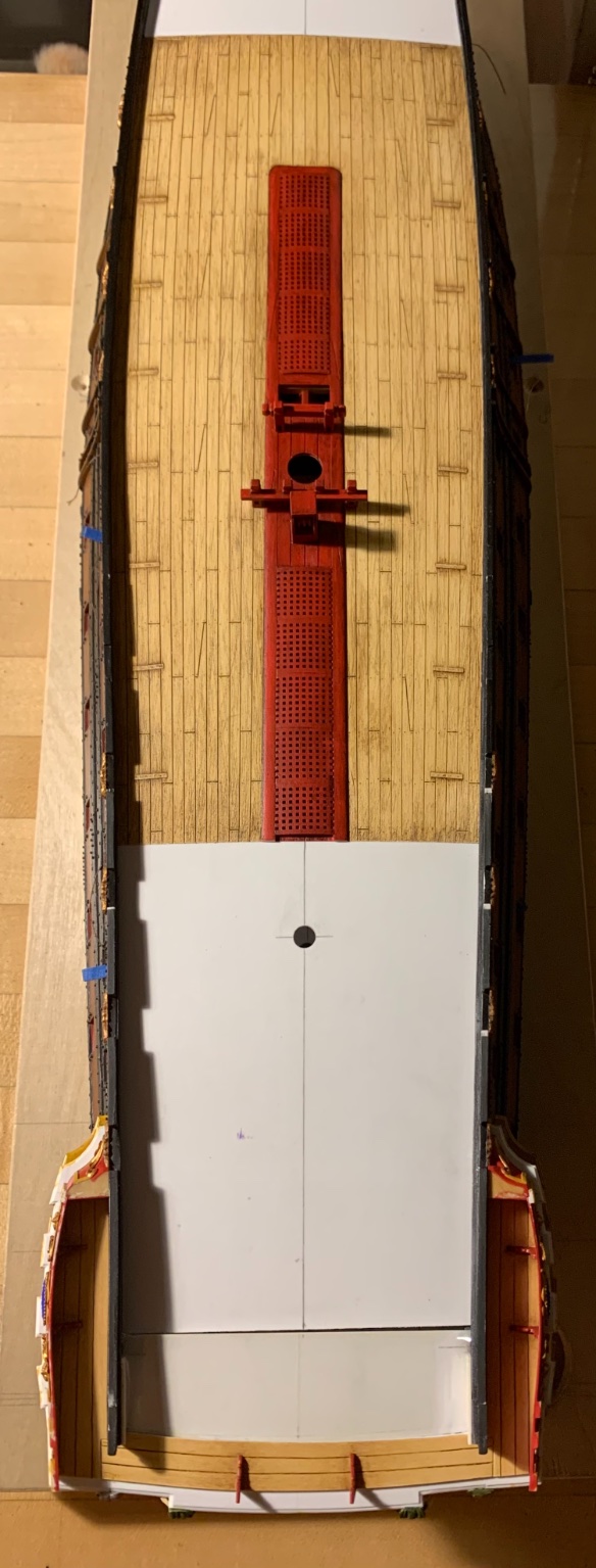
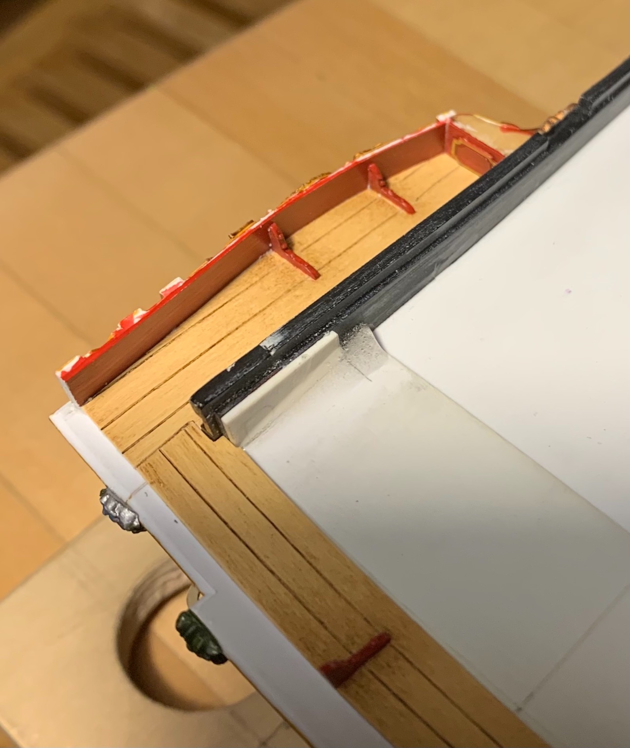
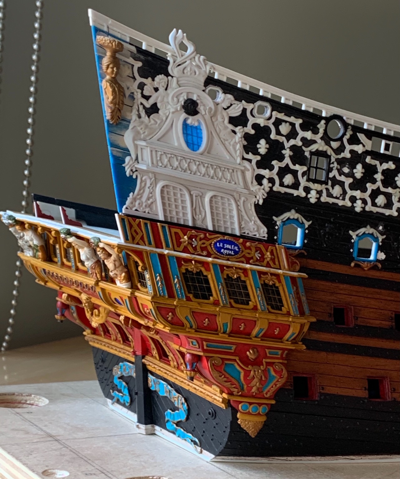
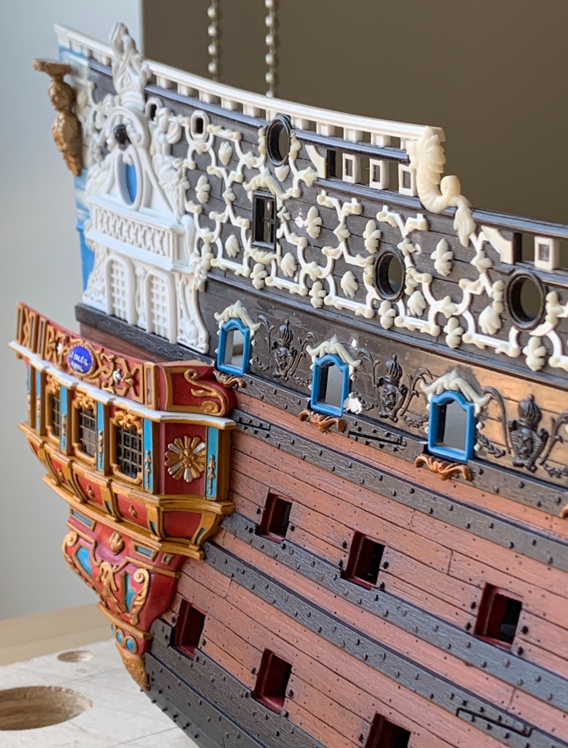
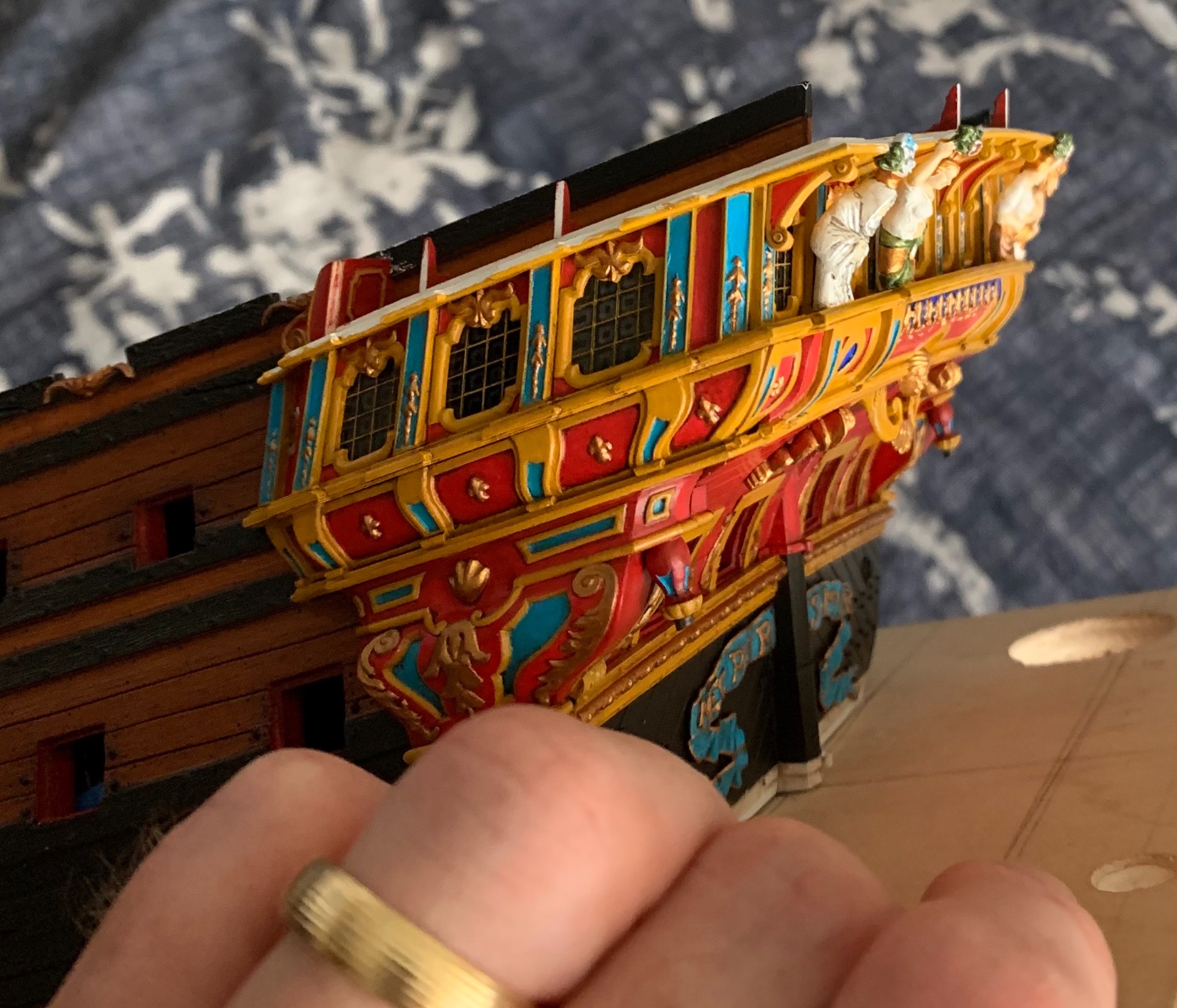
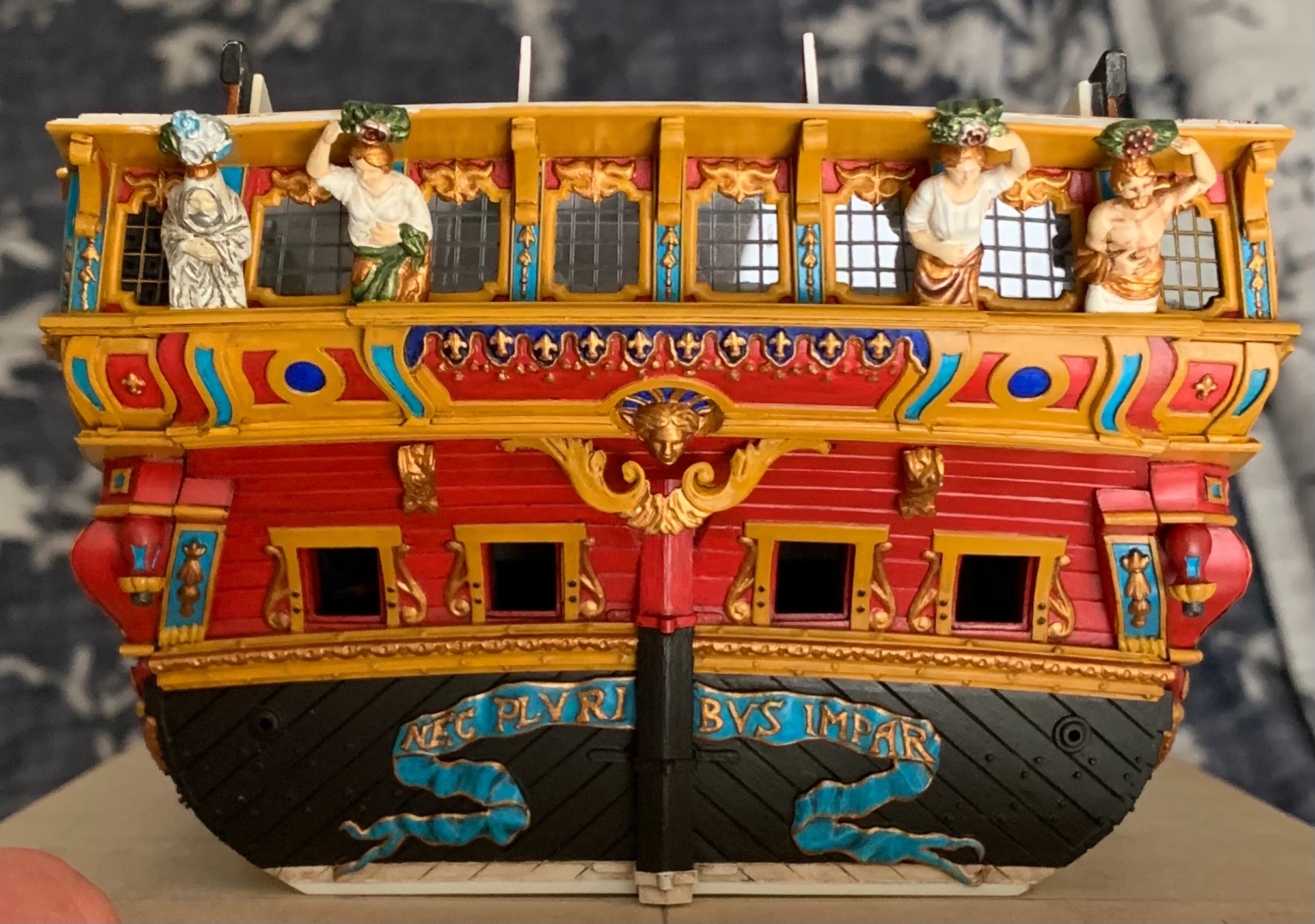
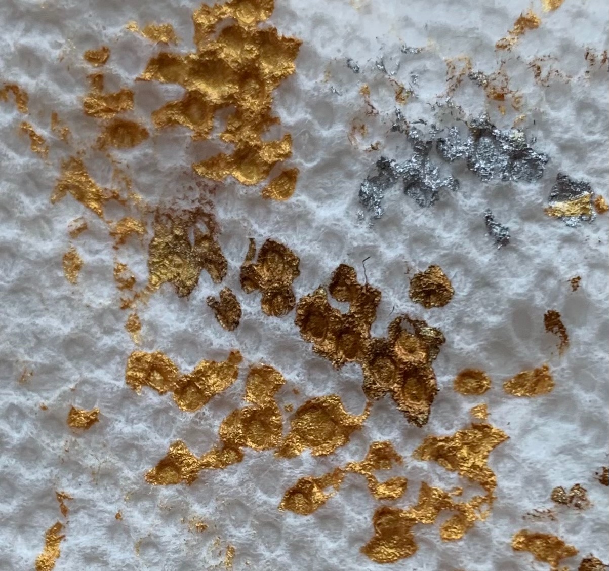
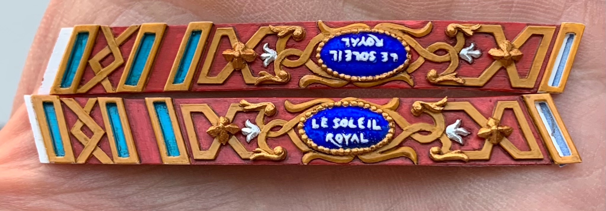
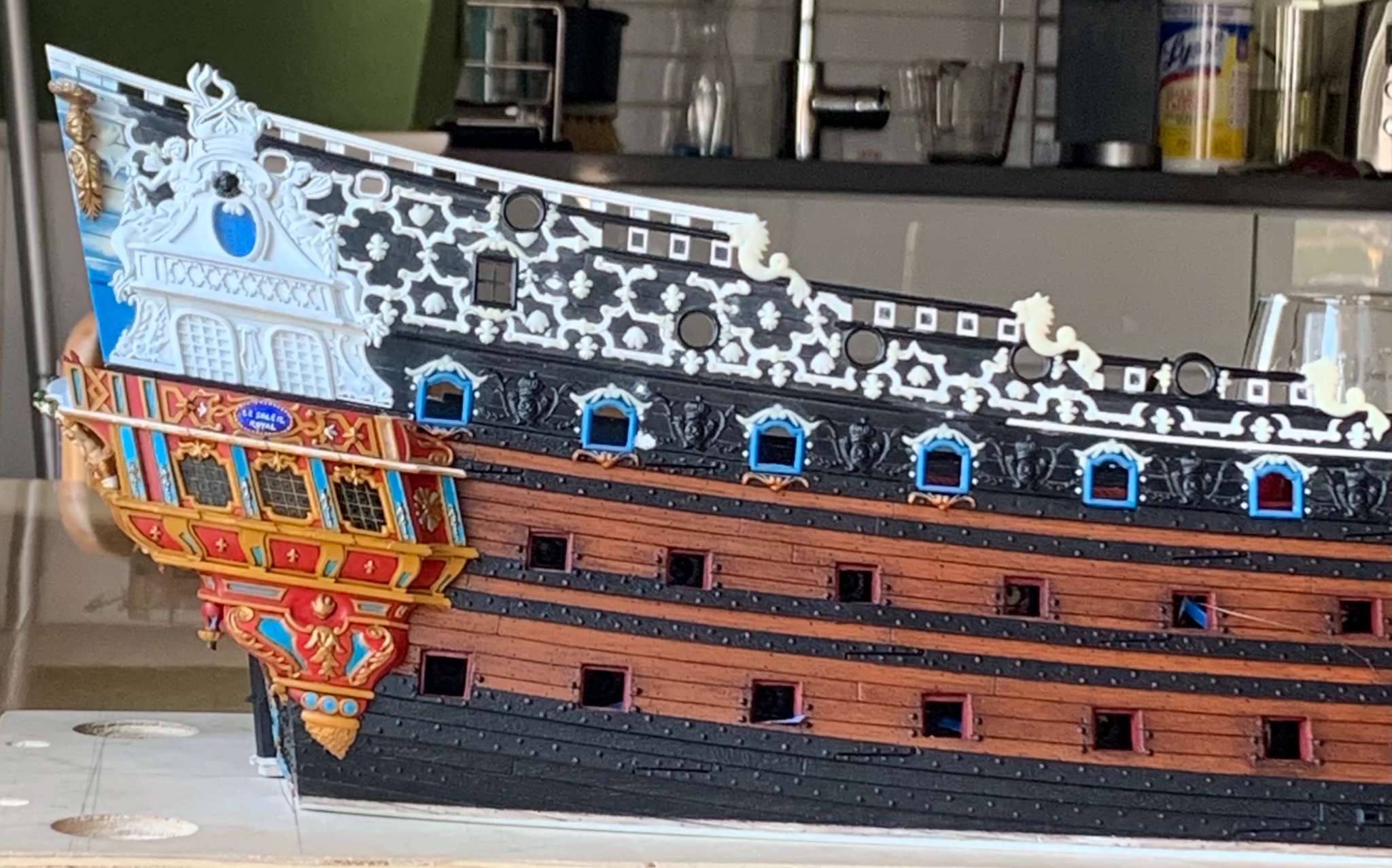
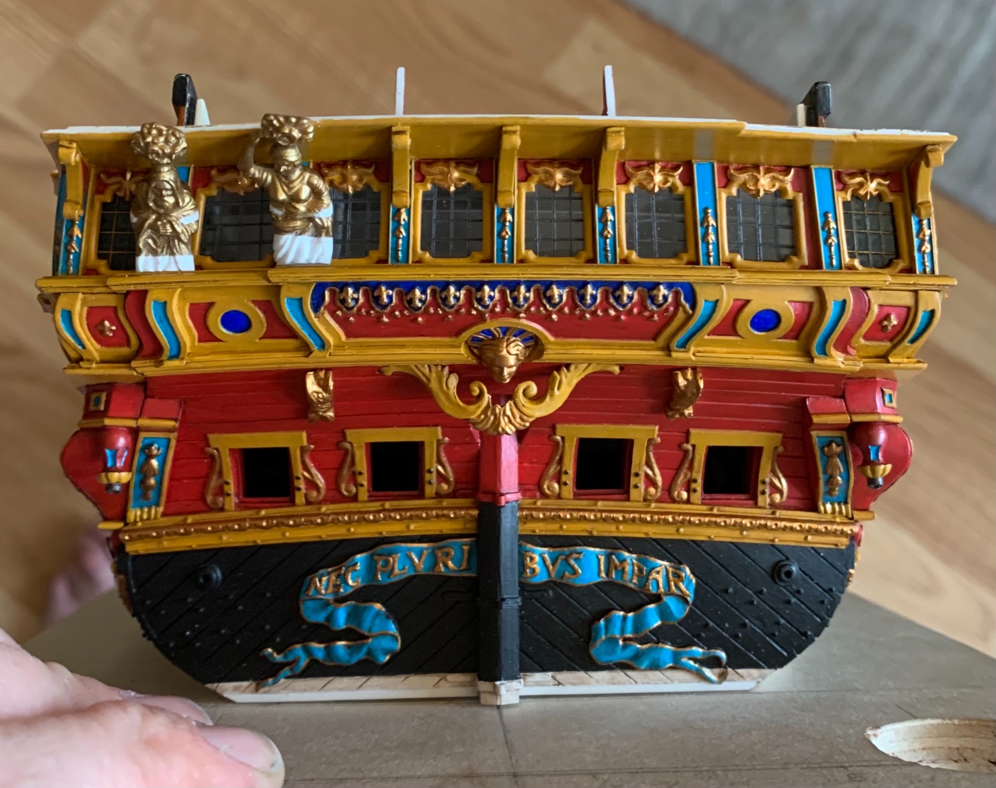
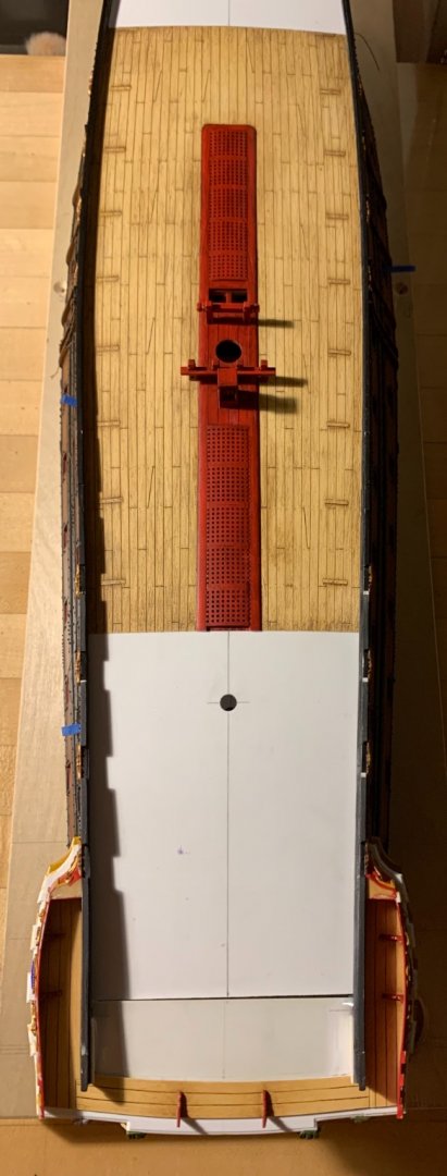
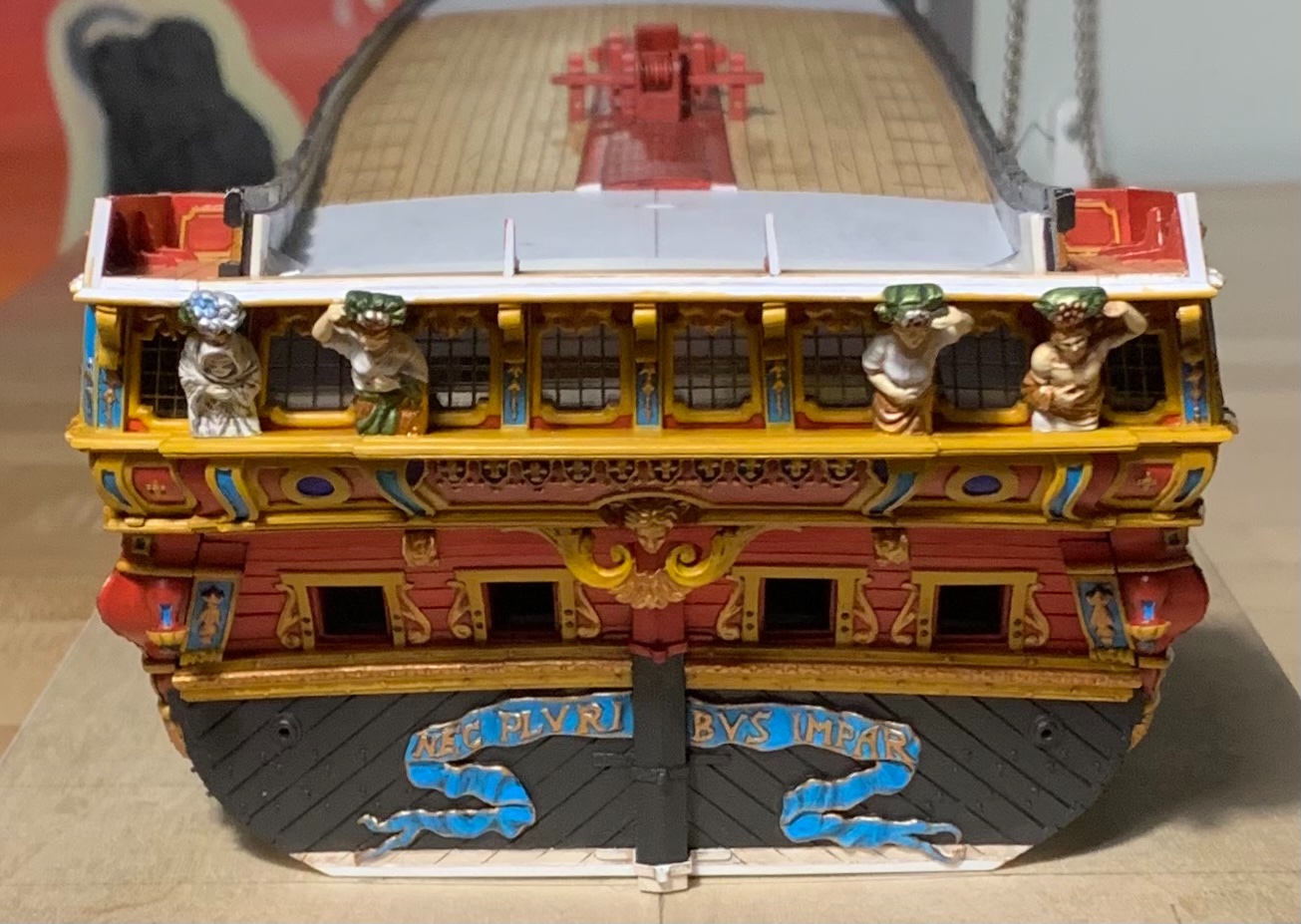
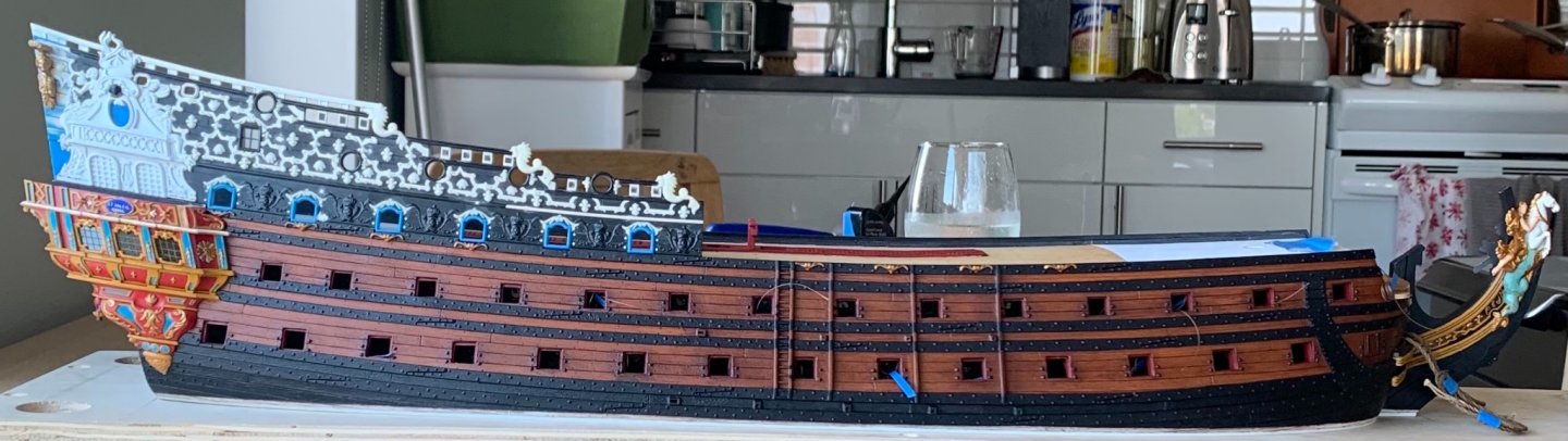
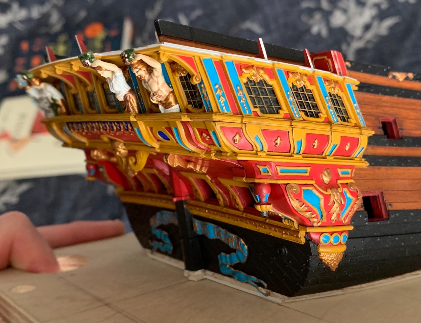
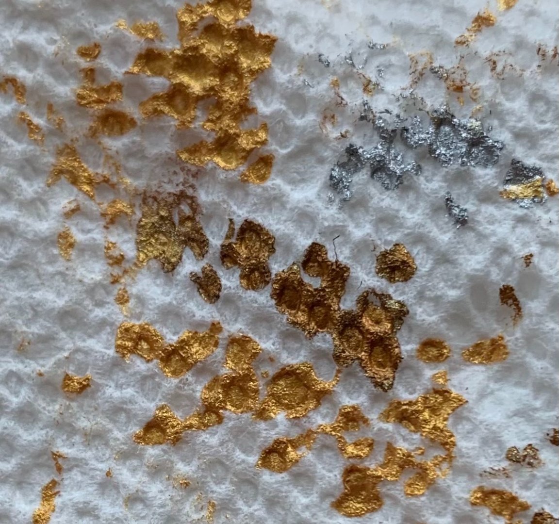
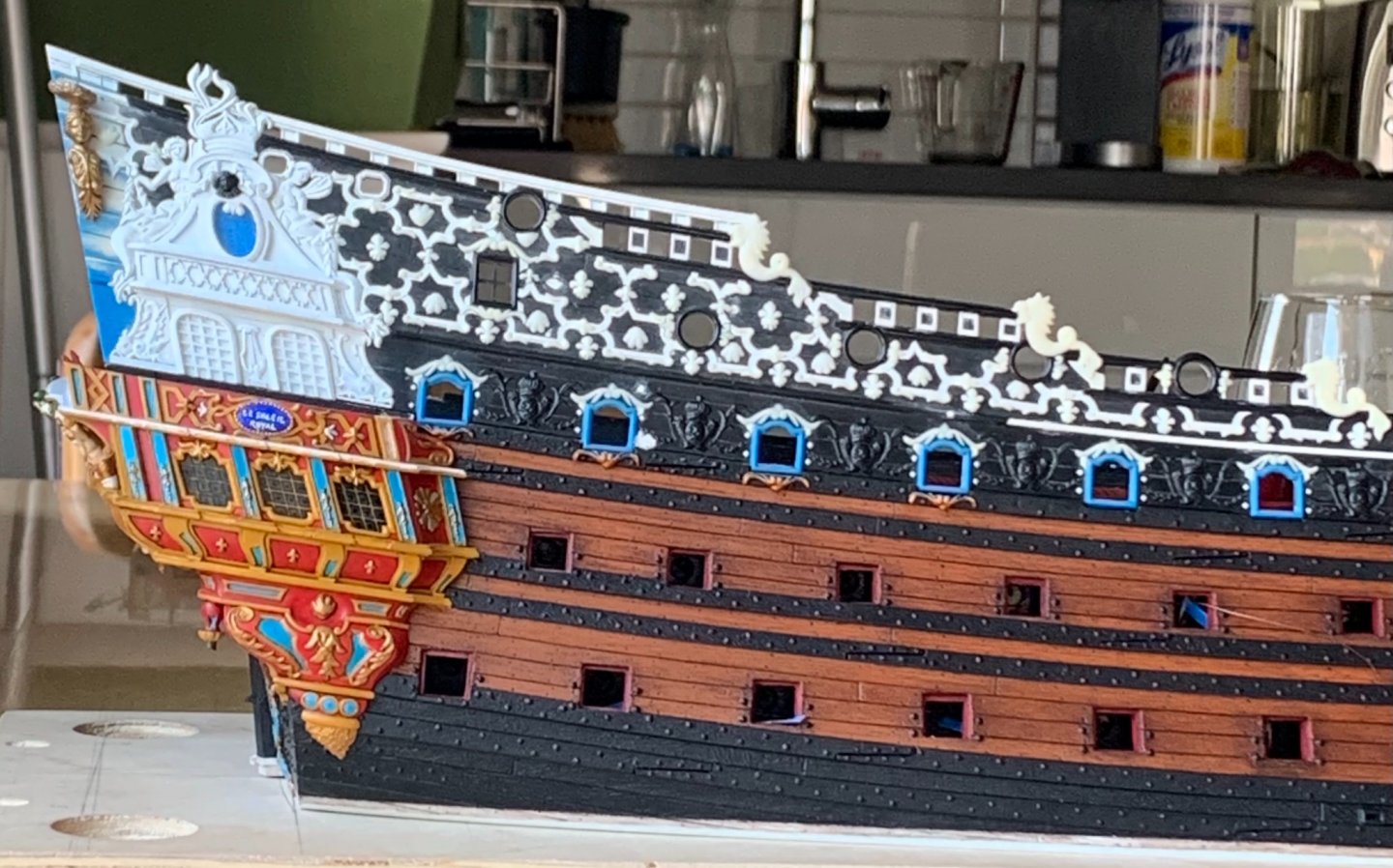
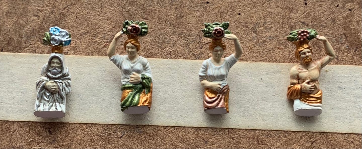
Thank you, John and Mark! There is often a temptation to rush things along, a little, here and there. I am always happy when I manage to resist. The Four Seasons are secure now, and re-touched. I used styrene cement, first, for a welded-bond, and then later allowed capillary action to draw-in thin CA for a little added insurance. As compared with Berain’s drawing - absolutely, these figures are a little too broad. The overall impression, though, is good and I think the adjusted posture of these figures conforms nicely with the new architecture: Part of me wishes I had thought of the stylized false-window treatment earlier. If I had, I probably would have done that throughout, as I like the way it looks, and it would have eliminated any concern for dust accumulating on the i side window surfaces. Anyway, c’est la vie! I can still get canned air in there to blow away most of the plastic particles. The open-walk bulwarks took a while to paint because I insist on not simply dry-brushing the top surface of the frieze elements, but cutting-in to the ground. One realization was that I did not need to thin the Vallejo artist acrylic yellow quite so much because I wasn’t painting broad surfaces; so, instead of a 5:2 ratio of paint to water, I could get away with 5:1, or even 6:1. Painting yellow over red is particularly difficult for achieving good color saturation. Nevertheless, by not thinning the paint so much, I was able to get there in two passes, as opposed to five. I discovered, on Kirill’s Spanish Galleon build, a very clever little hack for adding depth to the gold brightwork; He uses two different shades of gold paint. Once I had that in my head, I couldn’t get it out, so I went to the Warhammer shop over the weekend, and picked up their bright gold. This gives an idea of the contrast: In practice, the effect is much more subtle. Here, the lower bulwark piece has had the highs and edges of the ornaments brightened: The yellow ocher has a way of muting the gold effect, a little, so whatever enhancements one can make are helpful. I will gradually go back and add these highlights to all of the other gold ornaments. I decided to leave the nameplates untouched by the walnut ink wash because I wanted them to really pop. The lattice, here, gives a good impression of what the main frieze will look like. As I did with the bellflowers flanking the name plate, I will continue to search for opportunities to incorporate silver gilt. Once these bulwark pieces were finally painted, I could do a final fitting and secure them in-place. It was necessary to pre-bend these bulwark pieces so that they would conform easily to the curve of the gallery. I found it was easiest and safest to induce these reverse curves with my fingers. The heat experiments I tried with a hair dryer and open flame on scrap sheet plastic were way to difficult to control. Fingers are also, often, the best glueing clamps. The forward edge/pilaster is CA-glued to the wooden return, while the bottom edge is weld-bonded with liquid styrene cement. Inevitably, there will be touchups, but at this stage I declare these quarter galleries a successful marriage to the amortisement: Next, I will pattern the back bulwark, in cardboard so that I can design an exact layout of all of the ornamental elements. I won’t be able to install this back bulwark until after the main deck level of stern lights is in-place and painted, but making this part is a good small-work project. I will probably do a short series on its creation because it will be made from several layers and the process of getting where I want to is a little more involved than other parts I’ve made so far. I can also make up the bulwark cap railing that will finish this structure, while simultanously re-enforcing the corner join of the bulwark pieces. In the evenings, I will begin finalizing the upper bulwarks and preparing them for paint. I have to drill new fairleads for the sheets and tacks, and secure all the kevel pieces. Without the stock stern plate to anchor the aft bulwarks to, construction of the upper stern takes on a few shades of complexity. I have some ideas for a work-around, there, that should provide for a much more robust construction. She’s a BBG (big beautiful girl) - Soleil Royal! Little by little, we are getting there. As always, thank you for your likes, your comments and for looking in.


- 2,699 replies
-
- 17
-

-

-

-
- heller
- soleil royal
- (and 9 more)
-
Michael - I’m noticing on these large, single sheave blocks, at the bow, that you have even seemed to represent the sheave pin/axle. What is happening there? Do you use a darker brown shade of very fine point marker to make a small dot for the axle?
-
Daniel, you work with tremendous precision and feeling for the subject. This work is just outstanding. And, I'm just getting started, reading through your log!
-
Hi - This is all really excellent! I love your lines and your carved work, and the detail, overall, is outstanding. I will gladly follow the rest of the build, and I'm about to get caught up by reading through your work. Great stuff!
-
That is very helpful, Daniel. I will soon need to begin populating my ship. Do you make up a sort of gesso to modify the clothing of the figures, or is it simpler/better to use Squadron white putty, which actually adheres to the plastic? Fantastic work on your Vic, as always!
-
As I’ve said before, this is work of the highest quality. If I may be so specific, though, what I love most about your log is that you de-mystify the practicalities of scale rigging; much can be accomplished with articulated alligator clamps! This, in itself, is really inspiring to me. One can do really excellent hull work, masting and spar work. However, if the rigging isn’t crisp and detailed to match the rest of the model, then something is lost there. I really appreciate what you are accomplishing, here.
-
<<KICK>> There you go, Bill. You're welcome. As I'm sure you have seen, there are numerous truly excellent Heller Victory builds on this site. Daniel/"Dafi's" build "To Victory and Beyond," is by far the most "beyond" build of them all; he really has taken it to levels of plastic modeling that very few people ever imagine. And, my recollection of the early phase of that build is that he had started it, shelved it for a period of time, and then came back only to realize how dissatisfied he was with his paint scheme. If ever there was a Victory build with a good painting tutorial, this is it. Of course, there are countless other tips, insights and techniques that he has to offer. Here's the link to Dafi's build: Brace yourself for the monumental undertaking that Heller Victory is. Oh, and by the way - SafeMaster did a phenomenal alteration of this kit to her 1765 appearance. Take your time. Make a plan, and everything will come out beautifully. I will follow with great interest!
-
Awesome - her expression of detachment, bordering on dis-interest, is pitch-perfect! Your hair modifications give me a good idea what I might look like in that particular get-up; #TWINING. I'd be pretty psyched to be in the boat, though.
- 185 replies
-
- 1
-

-
- queen anne barge
- Syren Ship Model Company
- (and 1 more)
-
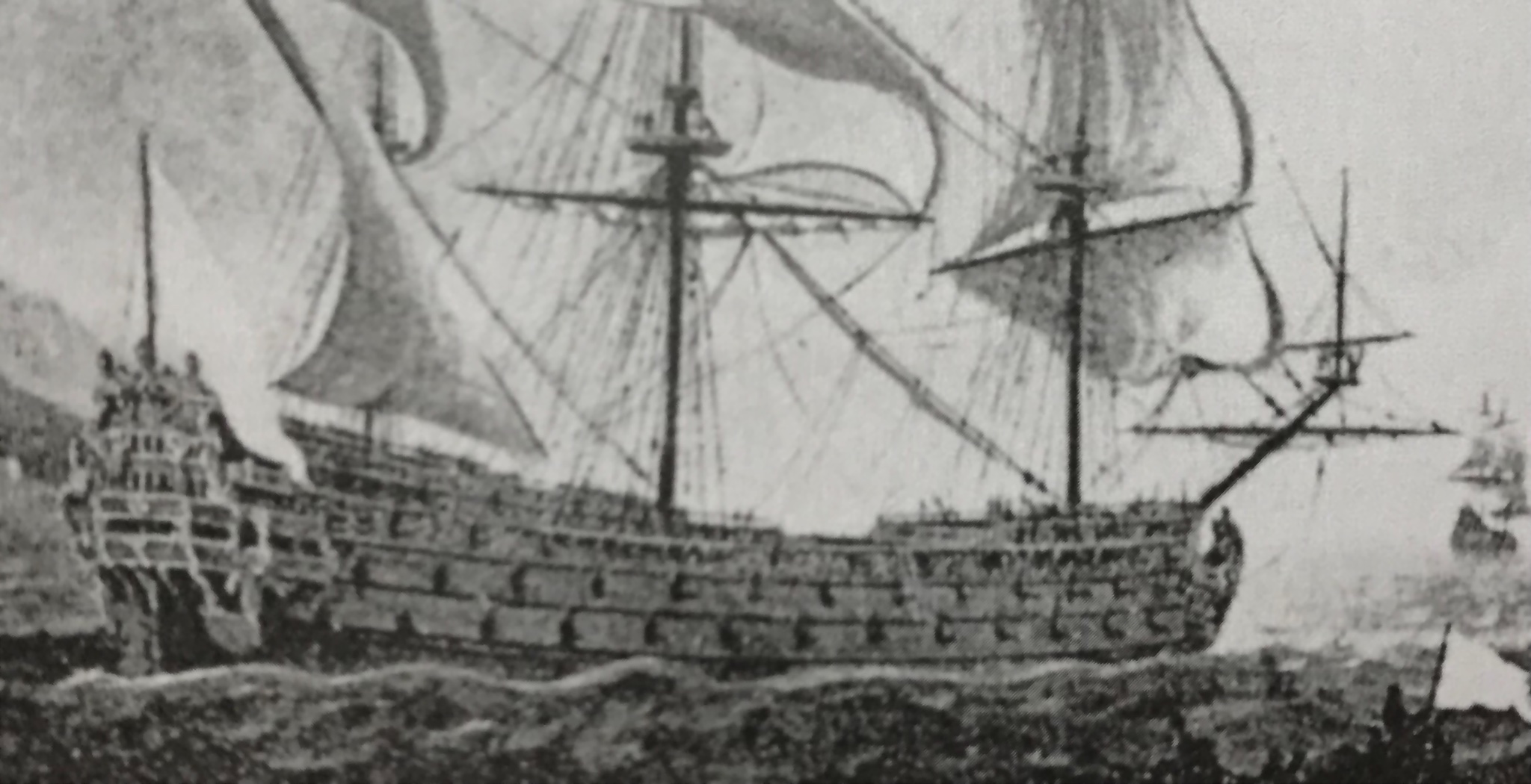
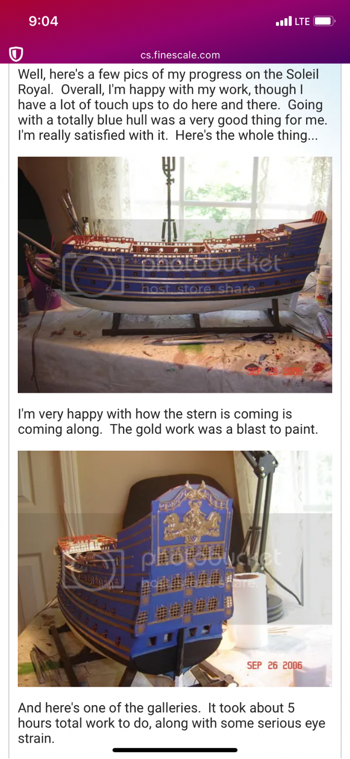
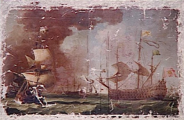
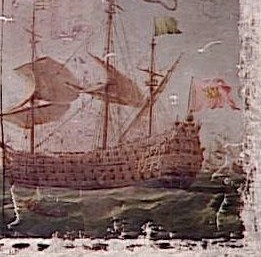
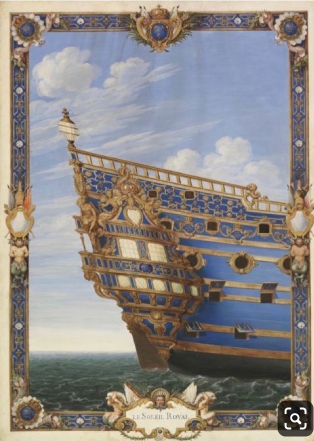
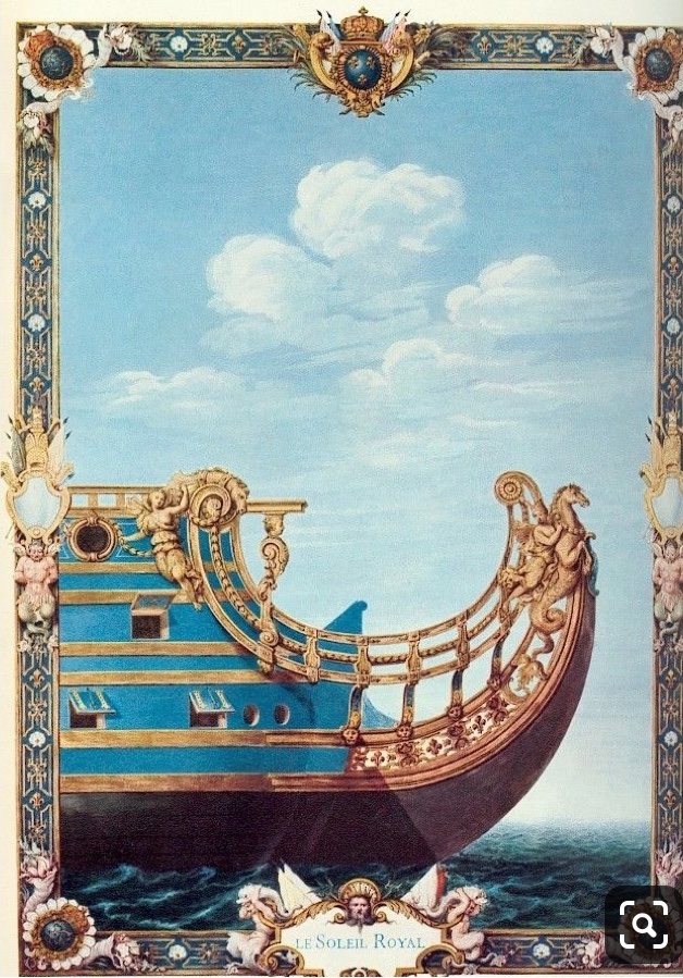
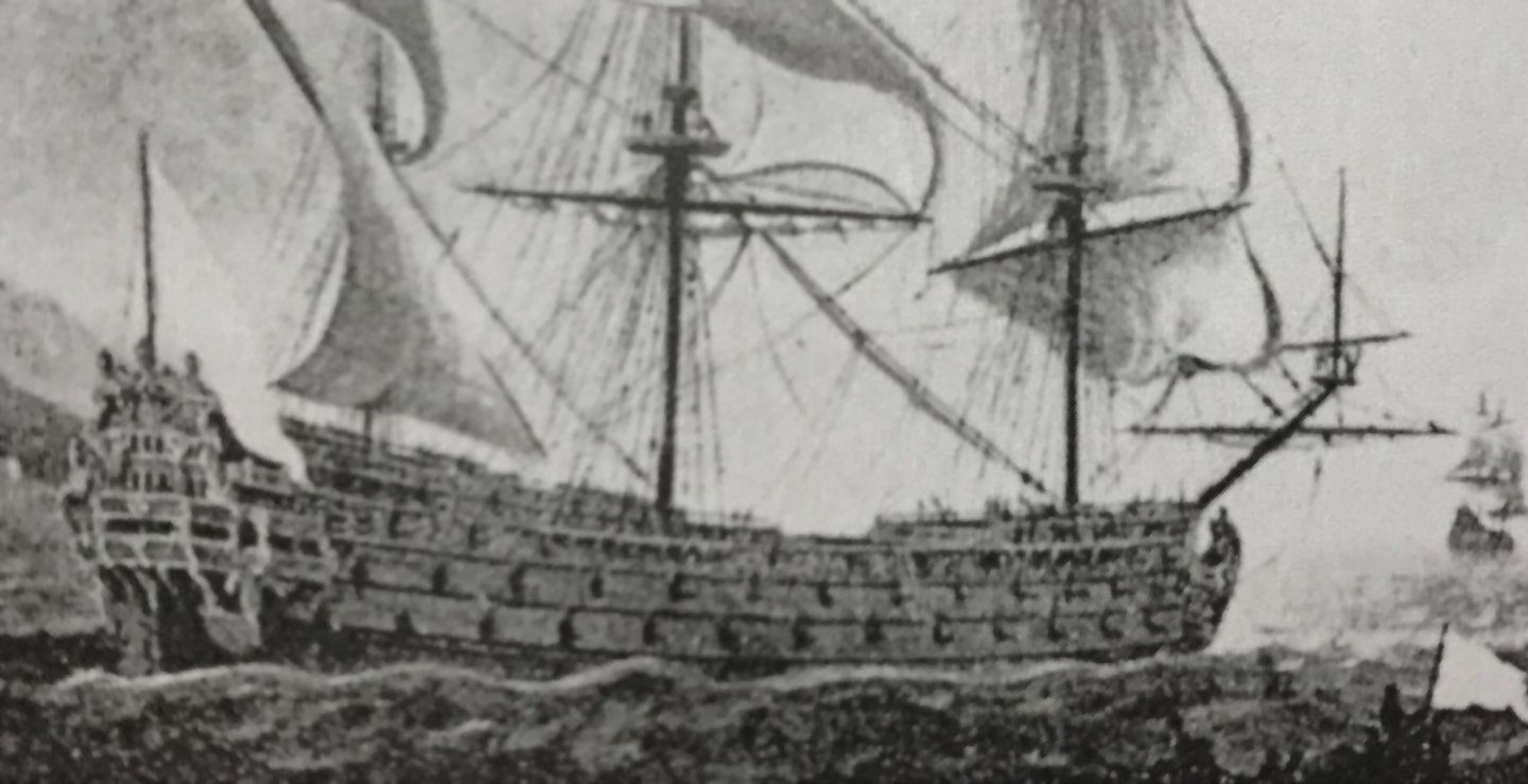
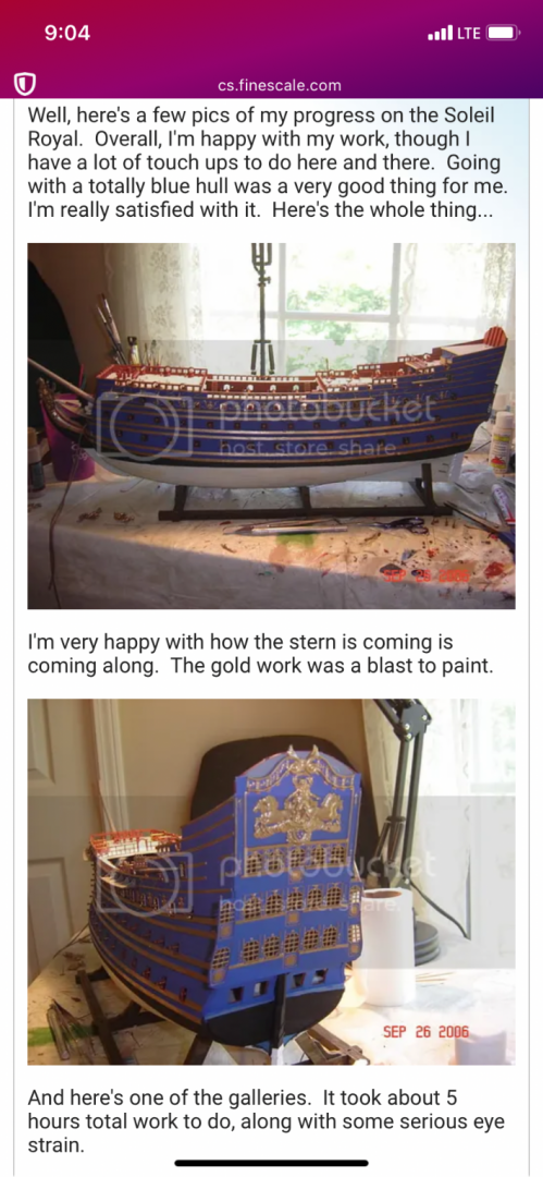
From the very beginning, this project has been an effort to apply context to the fragmentary imagery of Soleil Royal. One thing that has puzzled me from the moment that I came into possession of Lemineur’s Vaisseaux Du Roi Soleil, is the cover art illustration of Soleil Royal. Was the ship actually ever painted all blue? As is well established for this project, by now, you all know that I believe this structural representation is of the refit of Soleil Royal in 1689. I also make a strong argument for the likelihood of red vermillion and yellow ocher being prominent features of the refit color palette. So, then, why might this refit representation be colored all blue? I believe a strong clue may be found in Hyatt’s description of the Royal Louis, in 1677. Therein, he describes the deadworks, above the waterline, as being painted all white, as a backdrop to the richly gilded ornamentation. If one were to simply see a ship portrait or model of a French ship from this time, painted all white, but without understanding of that historic context (Hyatt’s description), then that might seem very strange. But, then, here’s Soleil Royal, in gouache, represented as all blue. What are we to make of that? Well, I have a theory: Perhaps, after Berain created the pen and ink drafts of the stern, quarters and bow - at the time of the refit - Pierre Vary was commissioned to put these drawings into color, according to the original color scheme of the ship between 1670-85. My theory is that, as beacons of the Ponant and Levant fleets, respectively, Sr and the RL were originally painted in representative colors; blue for the Ponant fleet and white for the Levant fleet. I am searching for a more concrete confirmation of that notion, in the historical record, but I have yet to find it. Whether or not the refit SR was actually painted all blue above the lower main wales, remains an open question. I suspect that ventre-de-biche had become a fixture on the lower two gun decks by the late 1680’s. Perhaps in her original incarnation, though, SR really was painted all blue above the lower main wales. It certainly makes for a striking presentation, as evidenced by a modeler calling himself Grymm on FineScale Modeler: A link to the page: http://cs.finescale.com/fsm/modeling_subjects/f/7/t/68572.aspx Maybe that is what this vaguely blue seeming portrait of a ship, pierced for 16 on the lower gun deck, is actually all about: And, although the thumbnail, below, is black and white, the original is almost certainly a full-color portrait. Also of interest, between these two portraits, is the marked similarity in the style of the wave painting. Are both of these portraits by the same hand? Is the color palette of the above portrait representative of the portrait, below? Do both of these portraits represent the same subject? As my theory currently stands, I believe the subject is either Soleil Royal or the Royal Louis. So, which is it? Well, if the actual portrait shows a blue ship or a white ship, we may just have an answer.
- 2,699 replies
-
- 8
-
-
- heller
- soleil royal
- (and 9 more)
-
Nice to hear from you, Michael - thank you very much! I present for you now, The Four Seasons: I attempted to modulate their complexion to reflect their time of year. I also wanted to incorporate silver gilt. Winter is a natural fit for this treatment. He has the same grey enamel wash coat that I used for the figurehead, and I then picked out the creases in his robe and his beard with silver. I wanted, though, to experiment with silver gilt as a base-coat for red and green translucent washes. I did a little experimenting: I thought the middle selections were pleasing colors that allowed the silver to peak through. The effect is similar to what you sometimes see with glass Christmas ornaments that are glazed with a metallic base color. I like this well enough that I will incorporate this treatment selectively into the amortisement, as well as between the main deck guns where there are acanthus branches flanking each royal monogram escutcheon. I am also painting the open-walk bulwark pieces, but these are particularly slow to cut-in, right down to the ground. As always, thank you for stopping by.
- 2,699 replies
-
- 21
-
-
-
- heller
- soleil royal
- (and 9 more)
-
Siggi, she looks as shipley and shapely to me as the real thing. Your frieze layout looks spot-on!
-
Kirill, it is all so brilliant and resourceful; I love the way in which you made the spear tips, and all of the pendants and flags. Your rig and spars and sails all have the patina of use and the super-realistic interplay between taught and slack lines. As a talent, you truly are one in a million!
- 228 replies
-
- 5
-
-
- spanish galleon
- lee
- (and 1 more)
-
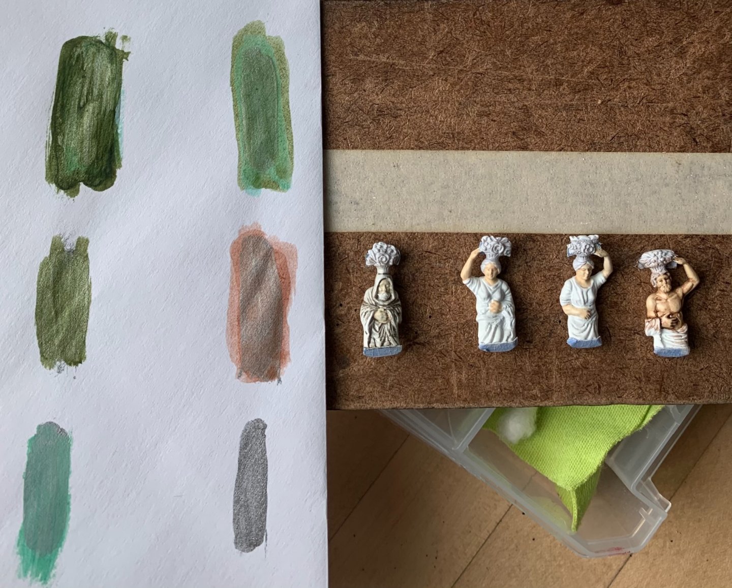
Thank you, John! Short update; two fitted and two to go: This has been a little bit of a guessing game. I had to add significantly more new plastic to the bases of the two middle figures (Spring and Summer) because of the more pronounced arching back posture that the extra overhang of the balcony necessitated; I literally had to stretch these figures to their max. Some careful filing of the base angles aligned the figures with the inboard pitch of the window pilasters. After establishing the base angle/joint, it was necessary to add back some plastic to the top mounting surfaces, in order to make a good plastic to plastic bond. I promise that painting of these figures will be interesting, and I will be taking cues from this portrait: As is intrinsic to this kind of reverse-engineering kit-bash, it is impossible to truly capture the original; the figures obscure more of the windows than I would like, but this is an acceptable compromise. I always appreciate your support, your likes, kind compliments, and even your criticisms. Enjoy the weekend!

- 2,699 replies
-
- 17
-
-
- heller
- soleil royal
- (and 9 more)
-
There are excellent arguments for both approaches. For my part, I appreciate the practicality of builders long-gone-by; I am certainly guilty of “historical bias,” whereby I assume that earlier craftsmen were just so supremely skilled at all aspects of fabrication, that they’d hardly blink at the daunting prospect of painting frieze-work directly onto the model. Despite the difficulty, I know you will succeed, Siggi!
-
Also of interest, here, is that the frieze appears to be painted on paper that is applied to the hull - much like Chuck’s Winchelsea.
-
I somehow failed to comment on your quarter piece carvings, EJ, but I think they came out really well; nice relief and I really like the use of color.
-
Roter Löwe 1597 by Ondras71
Hubac's Historian replied to Ondras71's topic in - Build logs for subjects built 1501 - 1750
Ondras, you are moving at a fast and furious clip, without any sacrifice in quality. I love all the detail - particularly the scarfing of the stem - NICE! Thank you for bringing to my attention this Barent’s ship replica project. I will look that up - looks fascinating. I’m not sure what to say about the pinrail issue on early 17th century vessels, other than perhaps Vasa is your best guide. When in doubt, personally, I like to fall back on the Van de Veldes for the clarity of their drawings. -
Oh, WOW, this is truly excellent and exciting! I love the work of the card modelers on this site. This is really a very finely worked model. I will be following along. The hull form is very reminiscent of the Dutch-built Vasa - particularly the bluff bow and the bow form below the water line, as it approaches the stem boxing.
-
Lease signing happens this weekend - virtually - so that will be interesting. And yes, while the model overall is quite large, some of the component parts are pretty tiny. Somewhere, Lloyd McCaffery is laughing at me; “you call that small?!”
- 2,699 replies
-
- 3
-
-
- heller
- soleil royal
- (and 9 more)