Speaking of research, John…
As I haven’t had much time at all, to devote to the current model, I have spent quite a fair amount of time conducting research for Soleil Royal 1670. As a GenX’er, I am continually amazed by the strides we have made in computing and on-line connectivity; we’ve come a long way from DOS!
It took a little fiddling, but I finally figured out how to navigate the database for the French Archives Nationales. If you recall, I was initially intrigued by a footnote I found in Ronald Portanier’s dissertation on the evolution of ornamental carving, in French naval architecture.
Back in June, I sent a digital file request for this comparison, dating to 1672, between Soleil Royal and the Royal Charles, ex Naseby. I referenced the archive location noted in Portanier’s work MAR/B/5/3 (the archival coding specifically relating to armaments and naval technologies), and included a description of the specific subject matter in the additional information section of the request form. With boundless hope, and breathless anticipation, I pressed SEND, and heard nothing back, thereafter.
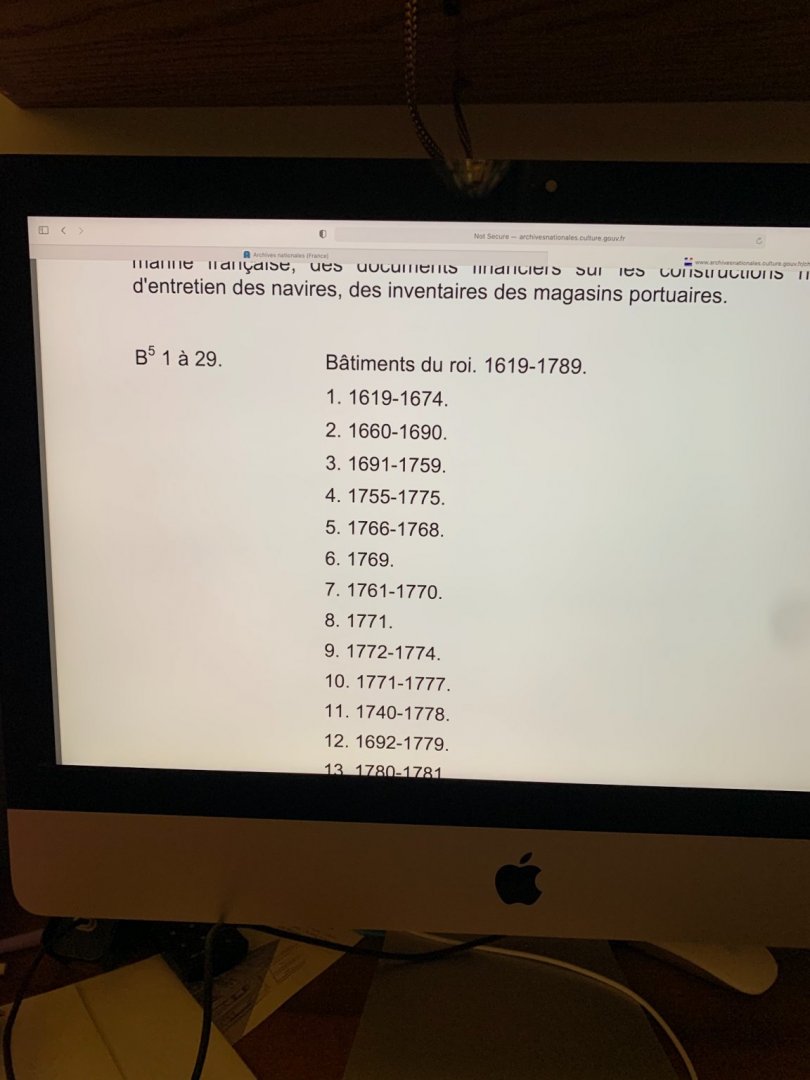
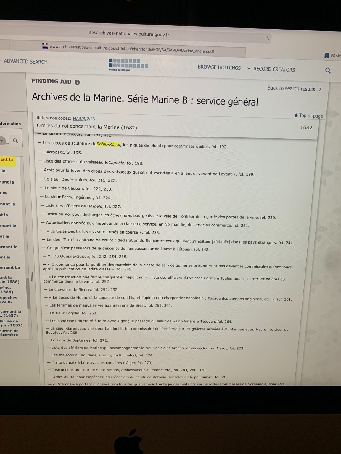
Or, so I thought. After the New London show, I decided to re-visit these archives. Searching through abstracts of other files that mention and/or discuss SR, I found the following array of interesting things:
I had great hope that this file, “Les Pieces de sculpture..” might be a Hyatt-like description of Soleil Royal’s stern. I requested this document.
More recently, I discovered this document which apparently discusses the wax model made for the re-fit ornamentation in 1688. I hope to receive this document some time this week.
Eventually, I will request this document, which describes the flags carried by SR:
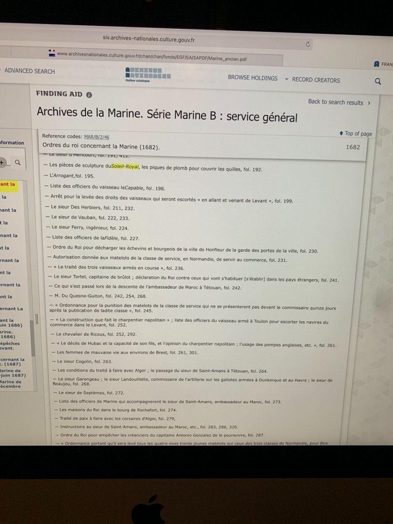
So - back to the first request I made for the SR/RC comparison of 1672. I had thought that Mr. Portanier had mis-identified the location in his footnotes because MAR/B/5/3 seems to reference documents between the years of 1691-1759
Surely, he must have meant MAR/B5/2. So, I sent a second request referencing this other file location, along with a request for the sculpture document.
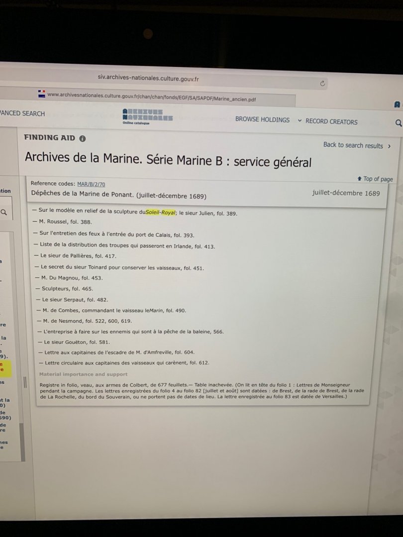
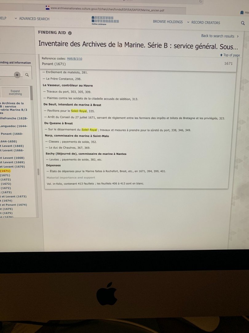
Much to my amazement, within five days I noticed an email containing a link to the sculpture document from the file-sharing server WeTransfer. Now, this was enlightening to me. I had been expecting these documents to come from an email address directly connected to the Archives Nationale. When I looked back to my emails from June, I discovered the WeTransfer document linking me to the SR/RC comparison! I had the damn ship in my back pocket for months, and didn’t even realize it! Naturally, the link had expired. ‘Turns out - Mr. Portanier’s referenced location was correct, and I had only succeeded in confusing matters with my second request for the wrong location.
I wrote to my contact at WeTransfer explaining how I had managed to gum-up the works; she was, naturally, having a lot of trouble finding the document in the wrong location.
Anyway, at the end of the day, Ms Wulf ended up sending me the comparison, the sculpture document, what seemed like a fascinating accounting of the “radoub”, or rebuild, and also the ship-log of SR2, from the Valez/Malaga campaign of 1704. To say that I was overjoyed just does not adequately express how I really felt.
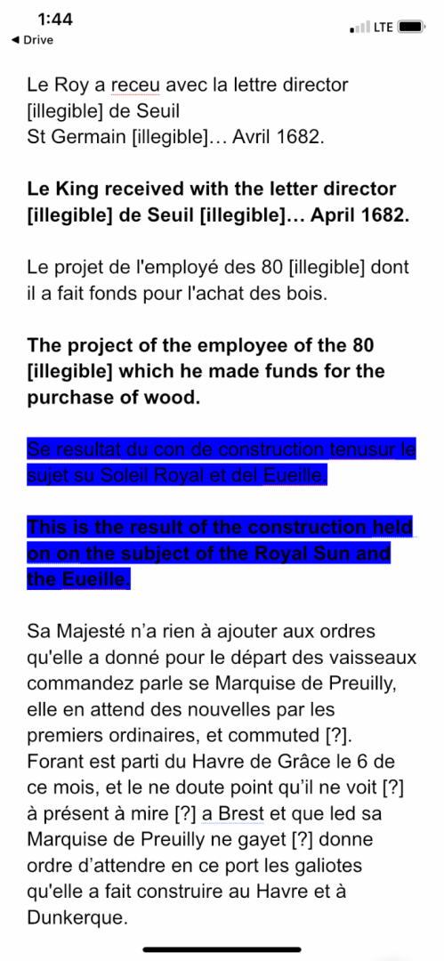
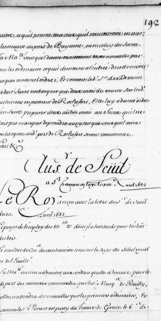
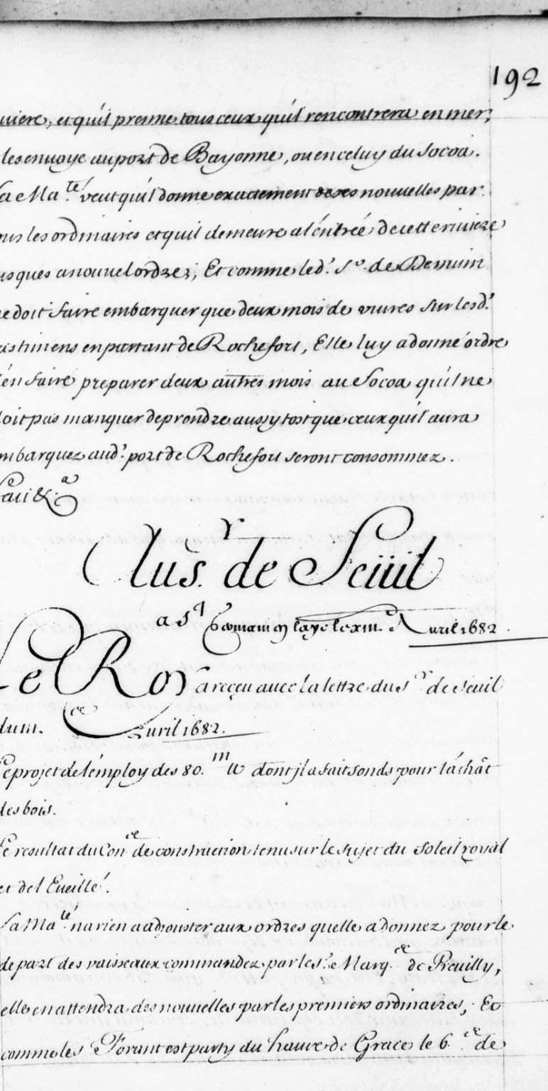
And, so, I began the lengthy process of transcribing and translating these variously legible, hand-written documents. I started with the sculpture document. To give you an idea, this letter which is addressed to the Intendant at Brest, Msr. de Seuil, looks like this:
Deciphering something like this is particularly challenging because the spellings are sometimes antiquated, words often run together and seem like one word, and writers of the time employed a strange and archaic form of abbreviation.
In Google Docs, I began to key in a letter by letter transcription, fortunately the software seems to recognize archaic spellings and often suggests the modern spelling and/or phrasing. This combined with my keying possible words into my Google Translate app, helped me to parse a likely meaning from the most opaque sections. I have found that, as I work through a document, I will often encounter more legible examples of words and characters, that help clarify other less clear sections of the text. It is a backward and forward process of revision.
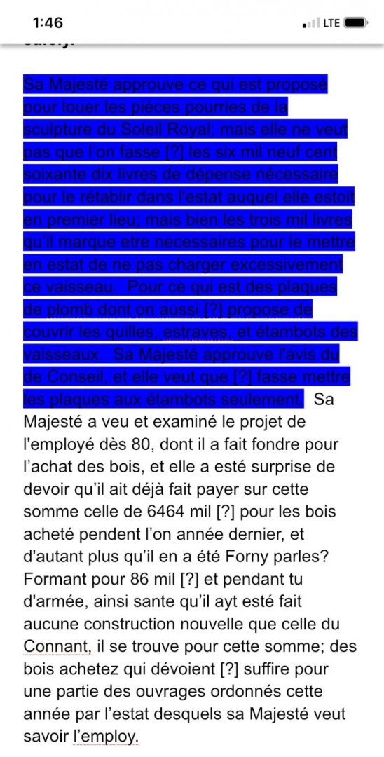
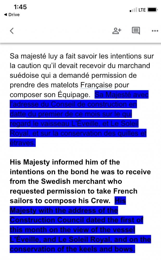
My method is to alternate, paragraph by paragraph the French transcription with the rough English translation. I then highlighted, in blue, any particular passages that had to do with SR, specifically.
Well, this particular document did not turn out to be the treasure-trove I was hoping for. Mostly the correspondance (from a sender I have not yet identified, which does not look like the hand of Colbert) concerns the amassing and distribution of sailors and soldiers, among the major port fleets.
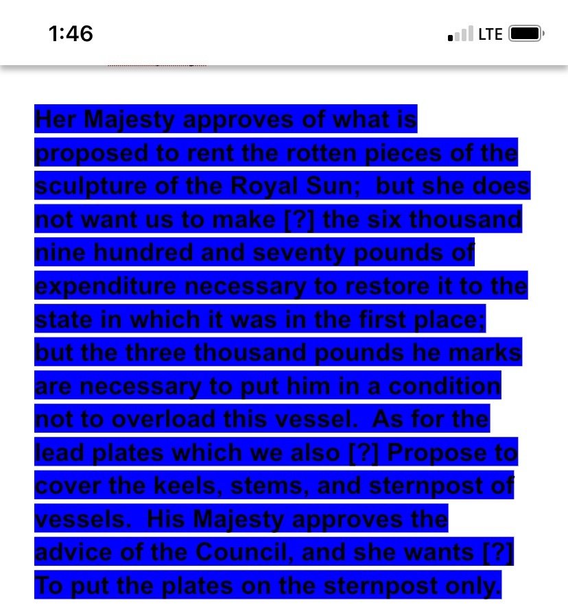
Here is what I found of interest, relating to SR:
also,
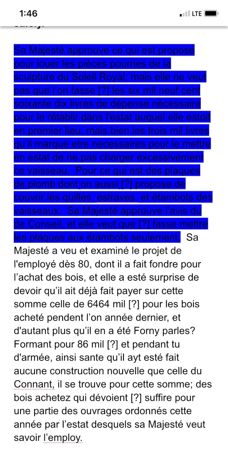
What is interesting to me about these passages is that they were clearly experimenting with methods aimed at preservation of the backbone of the ship, while simultaneously considering a scaling-back of the ornamental works, which were decaying, some 12 years after launching.
Okay, all well and good. Next, I turned to the radoub document:
I quickly discovered that a lengthy and thorough translation would not be necessary. This was not, after all, a lengthy accounting of the specific cost estimates for the re-build in 1688/89. Instead, this is an aggregate estimate for the ships returning to port of Brest in August of 1690, one month after Tourville’s victory off Cap de Beveziers. The costs listed are for the radoub (repair of battle damage), careening and general maintenance of the listed ships. It is a fascinating document in its own right, but not especially illuminating toward my quest for understanding the ship as she first was.
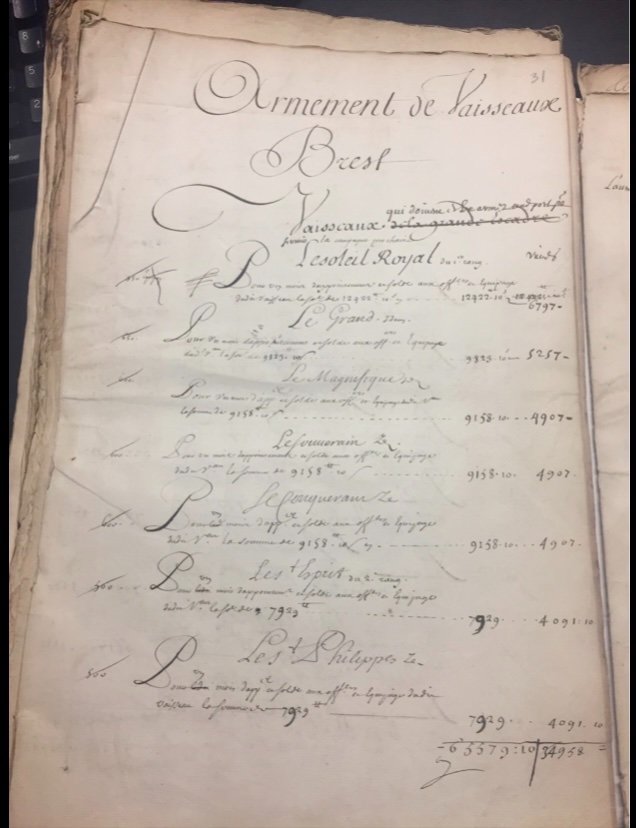
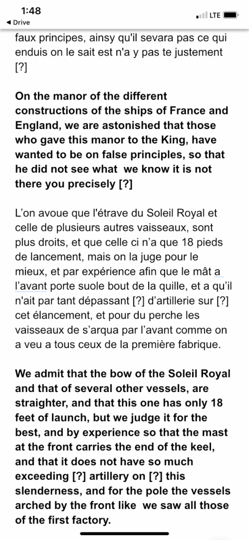
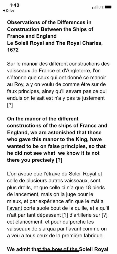
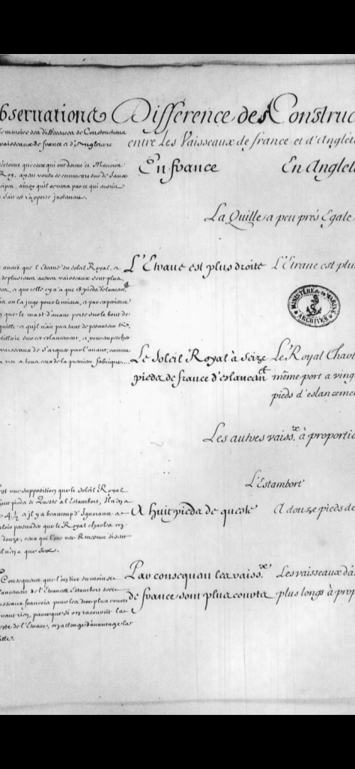
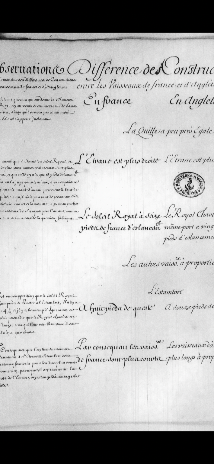
Next up, I have turned my attention to the quite lengthy (16 pages!) comparison survey of SR and the RC:
The observations and conclusions noted in the left margins are written in such a small and stylized cursive that they are incredibly difficult to decipher. I have found that my letter for letter transcription has to be conducted via magnification of the PDF files on my phone. Even then, the translations are only approximate, but nonetheless illuminating. Here is what I have so far:
And, so, this is all a process that only slowly yields fragments of a mosaic that might, or might not add up to a portrait of the ship. Perhaps I am merely re-treading ground already covered by Lemineur and others before me. I believe that is a journey I must embark upon for my own edification, though. I will not give up!
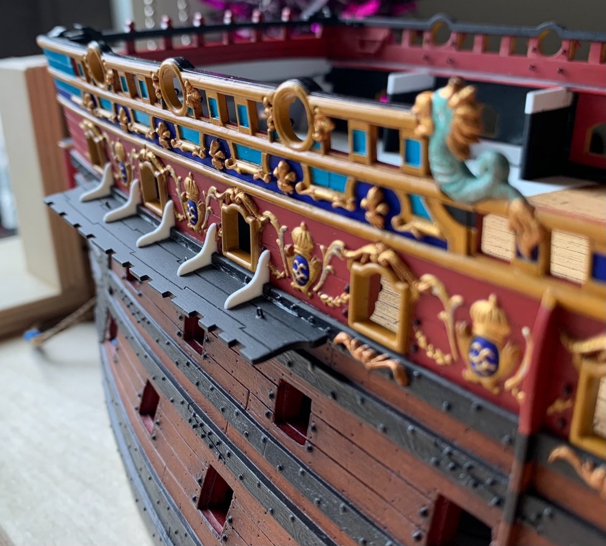
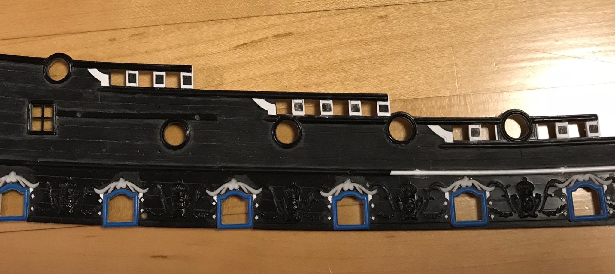
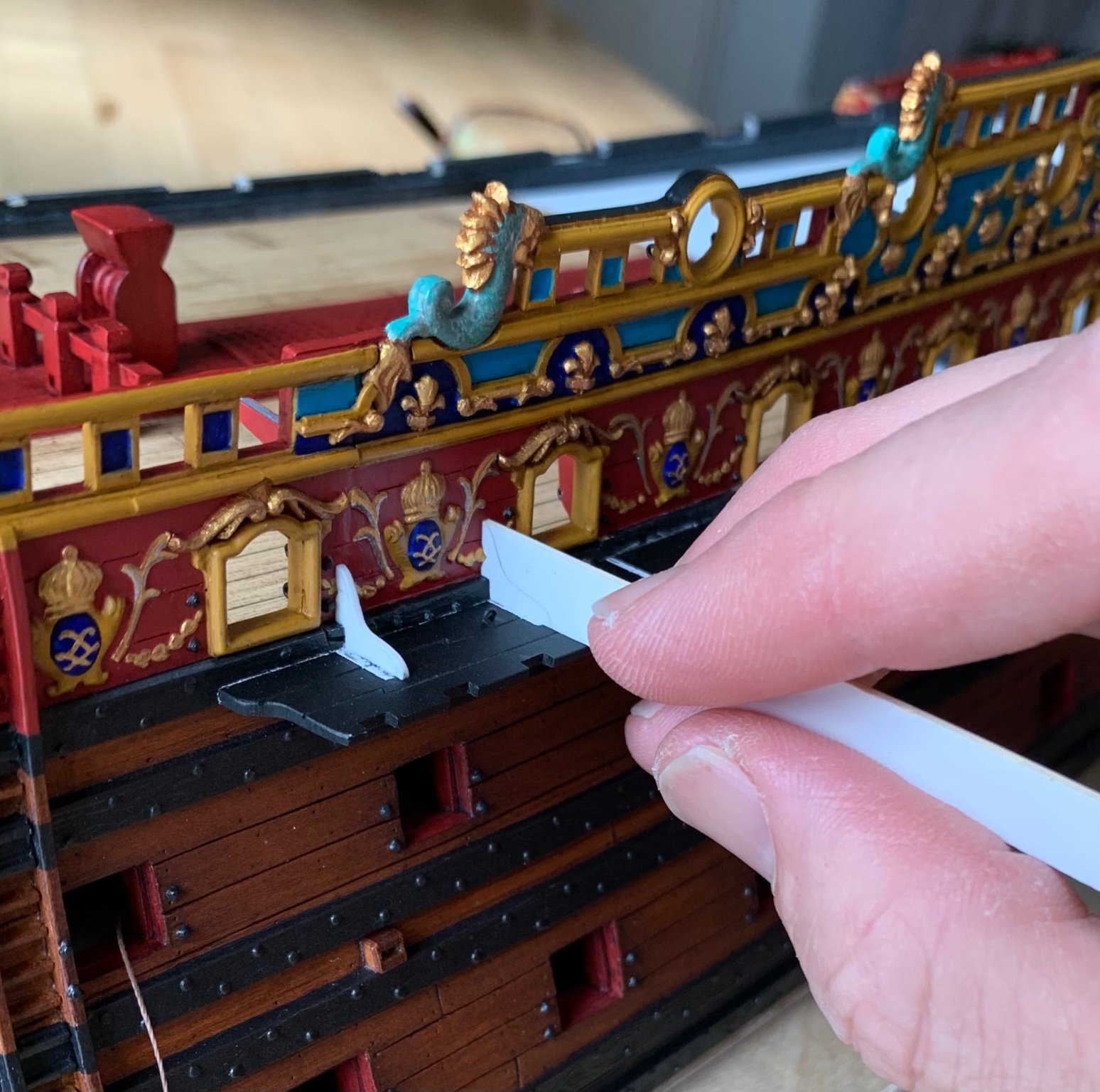
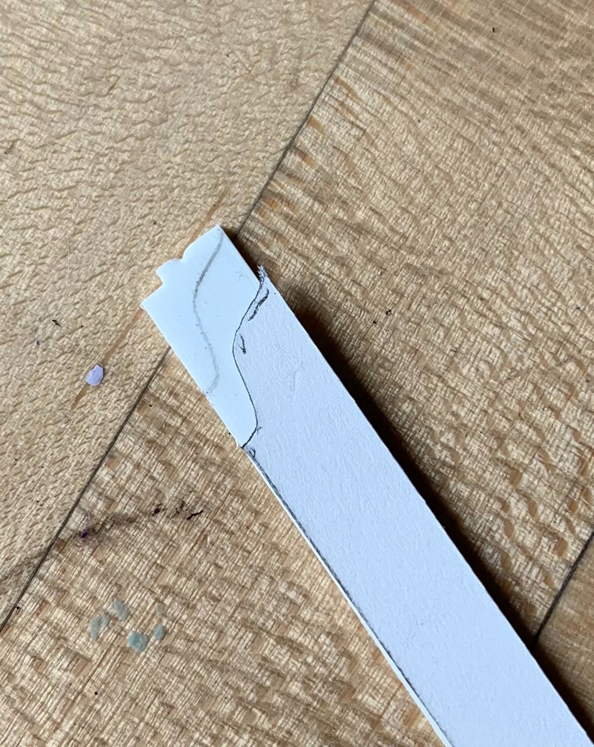
What little modeling I have done concerns the buttressing knees of the channels. One advantage of lowering the fore and main channels to below the main deck guns is that there is now more surface mounting area to allow for a more credibly functional support than what the stock kit provides. The process requires some careful coping around the top edge of the upper main wale, and around the garland carvings. It is slow work:
Eventually, I will add the simulated bolt heads, as I have done elsewhere throughout the model. Note how the forward end of the fore channel flares out further than stock, in order to compensate for the lower positioning; this is necessary so that the shrouds will clear the reverse tumblehome of the upper bulwarks.
Well, that was all a mouthful. I hope I have not bored you all to death with my process. Until next time, thank you all for your continued interest, your likes, and your comments.


 I have to say - the Auriou do look like finely made tools.