Hubac's Historian
-
Posts
3,314 -
Joined
-
Last visited
Content Type
Profiles
Forums
Gallery
Events
Everything posted by Hubac's Historian
-
 Aaah, okay - now I understand. This sounds like a good strategy at reconciliation.
- 50 replies
-
- 1
-

-
- vasa
- deagostini
- (and 1 more)
-
My apologies, Jorgen, but I am not understanding your question. Generally, many POB builders fill the spaces between bulkheads (and below the lower gun deck) with pieces of balsa that they then fair to the bulkhead shapes. This has the dual advantage of always providing a firm glue surface in these complicated areas of the underwater hull, where plank must taper at the ends, but it also makes it easier to gauge a fair hull before planking begins. In the how-to section of MSW, you should be able to easily find Chuck Passaro’s fool-proof method for lining out the hull. His advice really helps clarify all of the potential pit-falls that stand in the way of a really nice result. As a matter of fact, here it is:
- 50 replies
-
- 1
-
-
- vasa
- deagostini
- (and 1 more)
-
This is all exquisitely well-done, Mark!
-
This is just a brilliant continuation of your super crisp work. I’m very glad to see you at it again!
-
The gussets serve two purposes: For one, I was not confident in the small rabbeted glue joint because I needed to flex these parts quite a bit to get them to seat all the way home. So, these additional gussets were carefully scribed to the inside reverse curve of the forward bulwarks. They increased glue surface-area significantly, while helping to ensure that the angle of the bulwarks was consistent and what it needed to be. The second advantage of the gussets is that it provides mounting surfaces for the cambered deck beams that give my forecastle deck shape. Where the forecastle deck overhangs the main deck, I created a pair of hanging knees that would be visible just behind the only visible deck beam. I just wanted to add a touch of realism with these details. The same thing is happening at the quarter deck location. The stock Heller deck is perfectly fine on its own, but I have to make a deck from scratch because the stock deck is no longer wide enough. The trip is still going well. At Rouen for a couple of days, on the far extension of the cruise. There is a Beaches of Normandy excursion, but that is an all-day affair and Dad will not have the stamina for that. In fact, it sounds as though he’s coming down with a chest cold. This trip has presented numerous challenges at his present stage of dementia. He is very limited in what he can process and he is often argumentative and un-reasonable because he hasn’t been sleeping well. It has been great, but it is challenging!
-
Simply amazed by this project!
-
That sounds like a plan!
-
Your ruler test on the starboard side does, indeed, appear to be flush and straight. The problem is more evident on the port side, from an overhead view, although the eye-test from fore-shortened perspective does indicate the starboard side has the same problem. If it were me - I would remove any current plank strakes and pad the 1-2 problem bulkheads on each side. I would then use something a little stiffer/thicker than the kit plank to fair the bulkheads down to where they need to be. This seems easier to me, ultimately, than adding bulkhead material for each strake of planking. When fairing, rely more strictly on the fore-shortened fore/aft, aft/fore perspectives to gauge how close your fairing is to where it needs to be. Those are the perspective views that pick up those discrepancies on the finished model. The human eye is amazingly sensitive to dips and hollows.
- 50 replies
-
- 1
-
-
- vasa
- deagostini
- (and 1 more)
-
It does seem to be the case that warships ready for action only tended to carry main and topsails - the t’gallants shortened or removed for action, and usually the main sail furled to avoid sparking fire in the rigging. I suppose the rationale had partly to do with a diversion of manpower (necessary) to manage the t’gallants, as well as the safety issue of more top-hamper crashing down and having to be cleared after a dismasting.
- 2,699 replies
-
- 3
-
-
- heller
- soleil royal
- (and 9 more)
-
Tres bien!
-
May I gently suggest, before the planking begins in earnest, that you take a little more time to fair the bulkheads. It is evident, on your first plank, that there is a not insignificant mid-ships dip. If you are double-planking, you could fill depressions after the base layer, but if you are only single-planking, these depressions will be very evident, if the under-framing has not been faired.
- 50 replies
-
- 3
-
-
- vasa
- deagostini
- (and 1 more)
-
Wow - SHJ, this is a fascinating observation and one that I hadn’t picked up on before. There is no representation of a tiny t’gallant top and corresponding doubling with the flagstaff. I’m not sure what to make of that, other than - WOW! Good eye!
- 2,699 replies
-
- 2
-
-
- heller
- soleil royal
- (and 9 more)
-
As I prepare for our special dinner at Lasserre, a thought occurred to me in the shower: There is a strong possibility that I will never find the “Gilded Ghost” portrait, and even should I be so fortunate - I will still be making broad leaps of inductive reasoning and artistic license. My mother, as long as she lived, always called my daughter her “Shining Star,” and Mairead certainly is every part of that. I try to remain mindful and sensitive to the true historians and arsenal modelers of the world, and that is why I think I may rename my conjectural SR 1670 project: “L’Etoille Brillant, a Conjectural Construction of a French First-Rate, Circa 1670”. This would be in honor of both my mother and daughter and in keeping with a time-honored tradition of naming beautiful ships after beautiful women. The name would also be a loose reference to it’s inspiration, Le Soleil Royal - the most brilliant star we can understand on this earth. It’s just a thought, but I think there is some sense in that.
- 2,699 replies
-
- 6
-
-
- heller
- soleil royal
- (and 9 more)
-
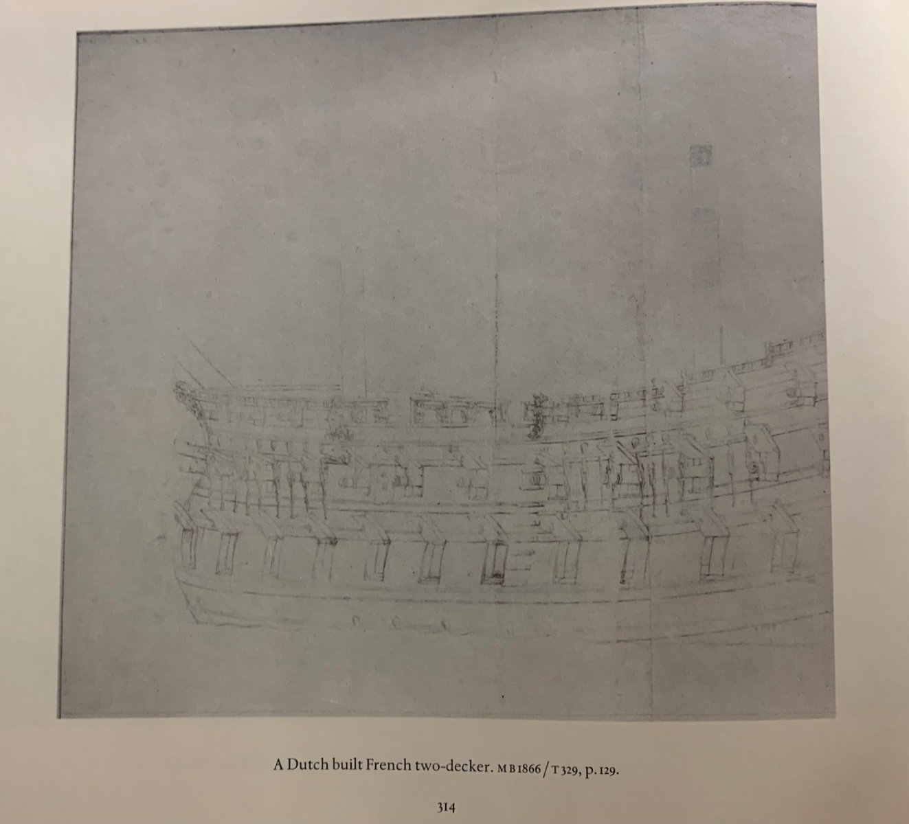
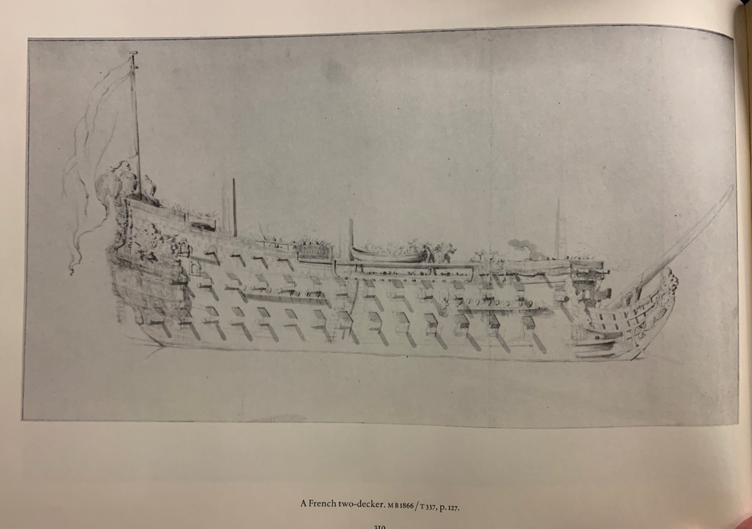
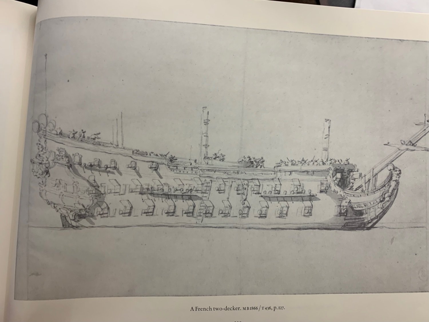
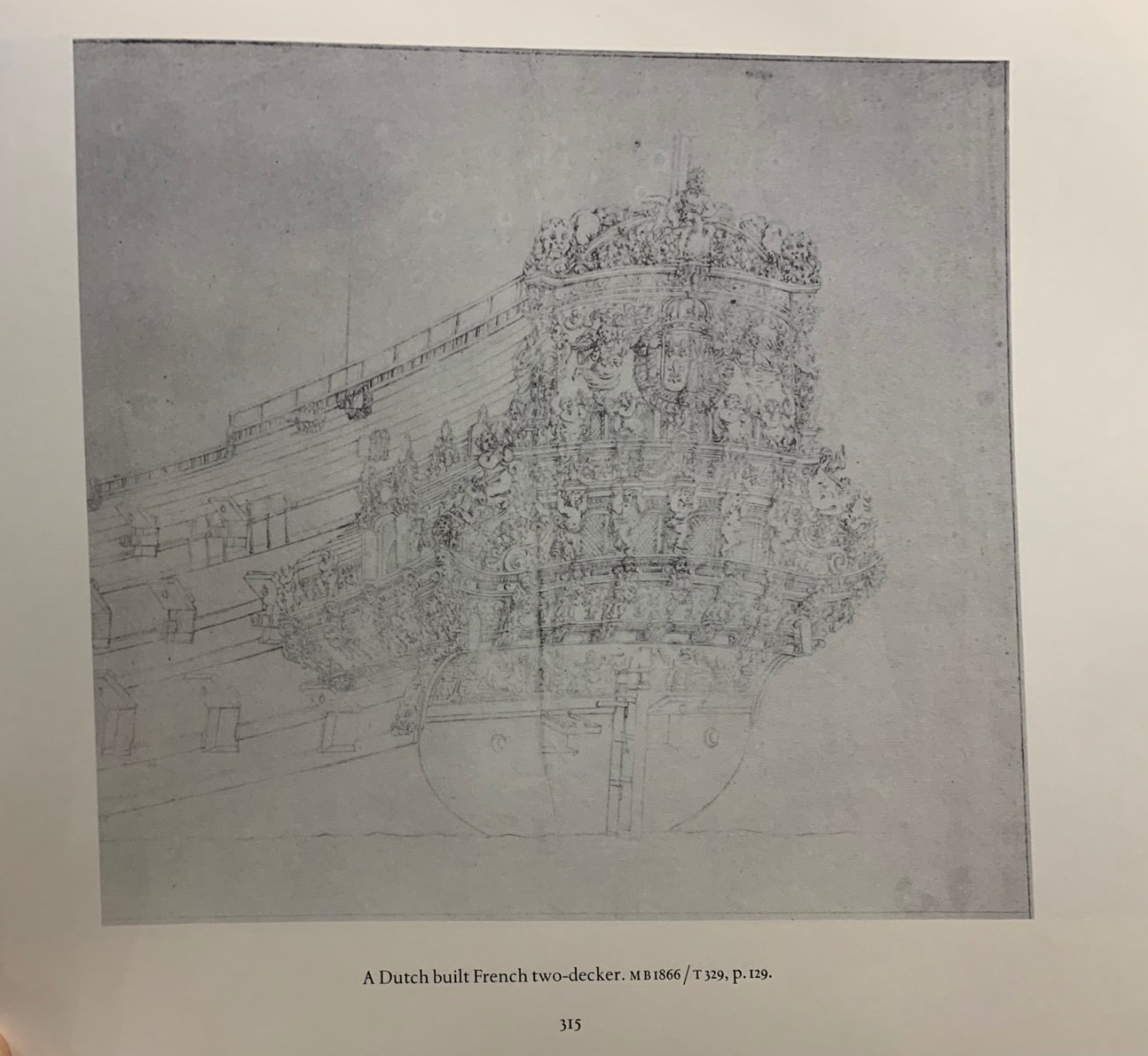
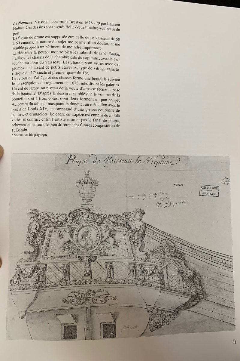
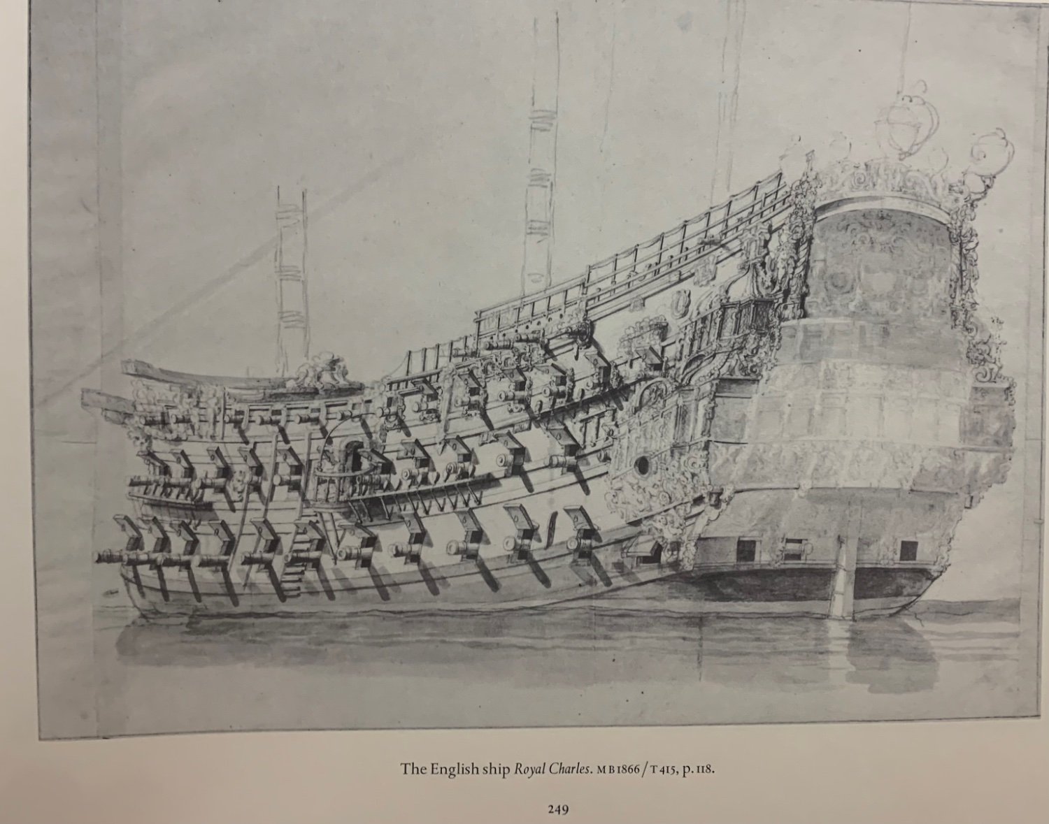
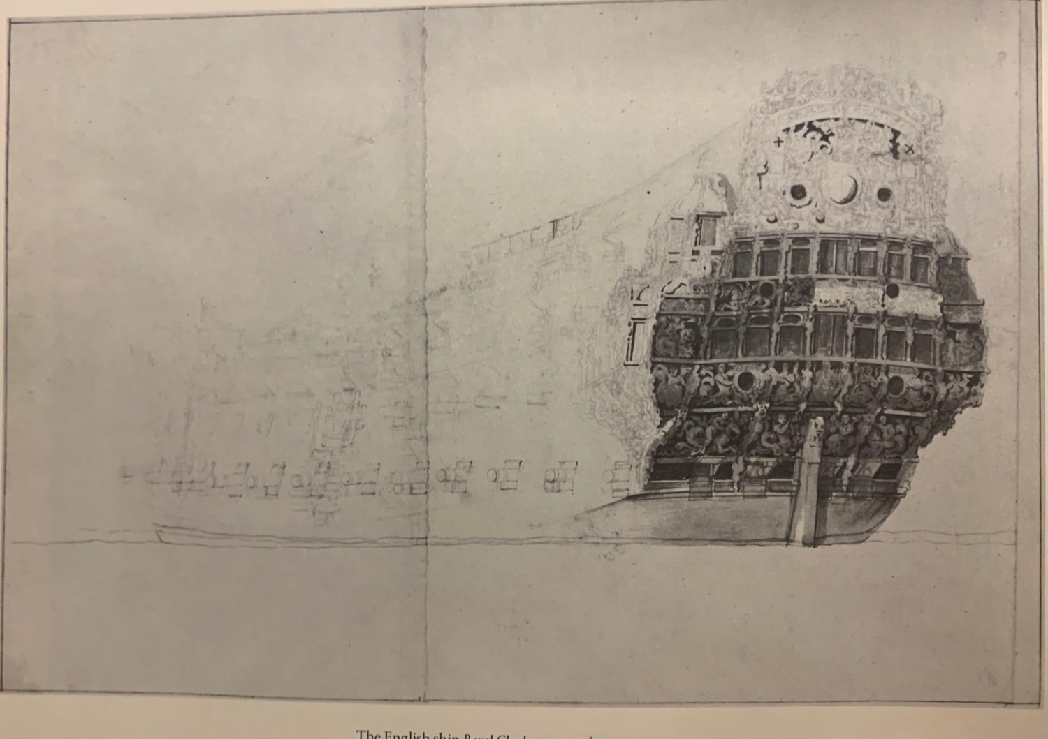
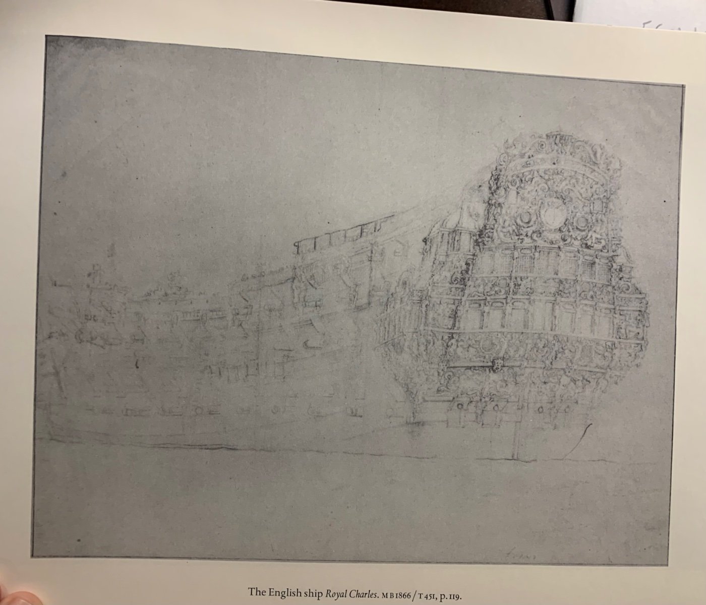
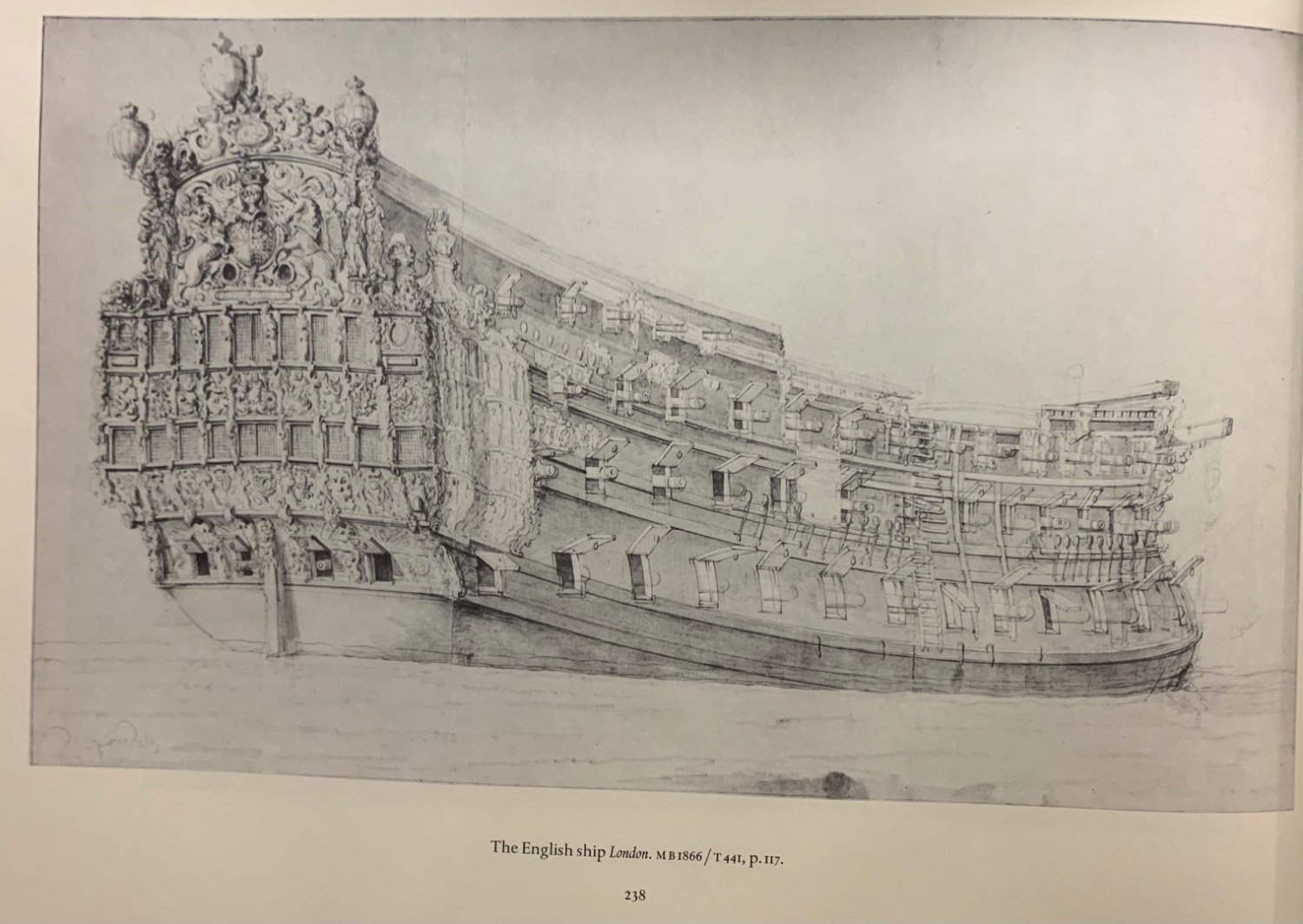
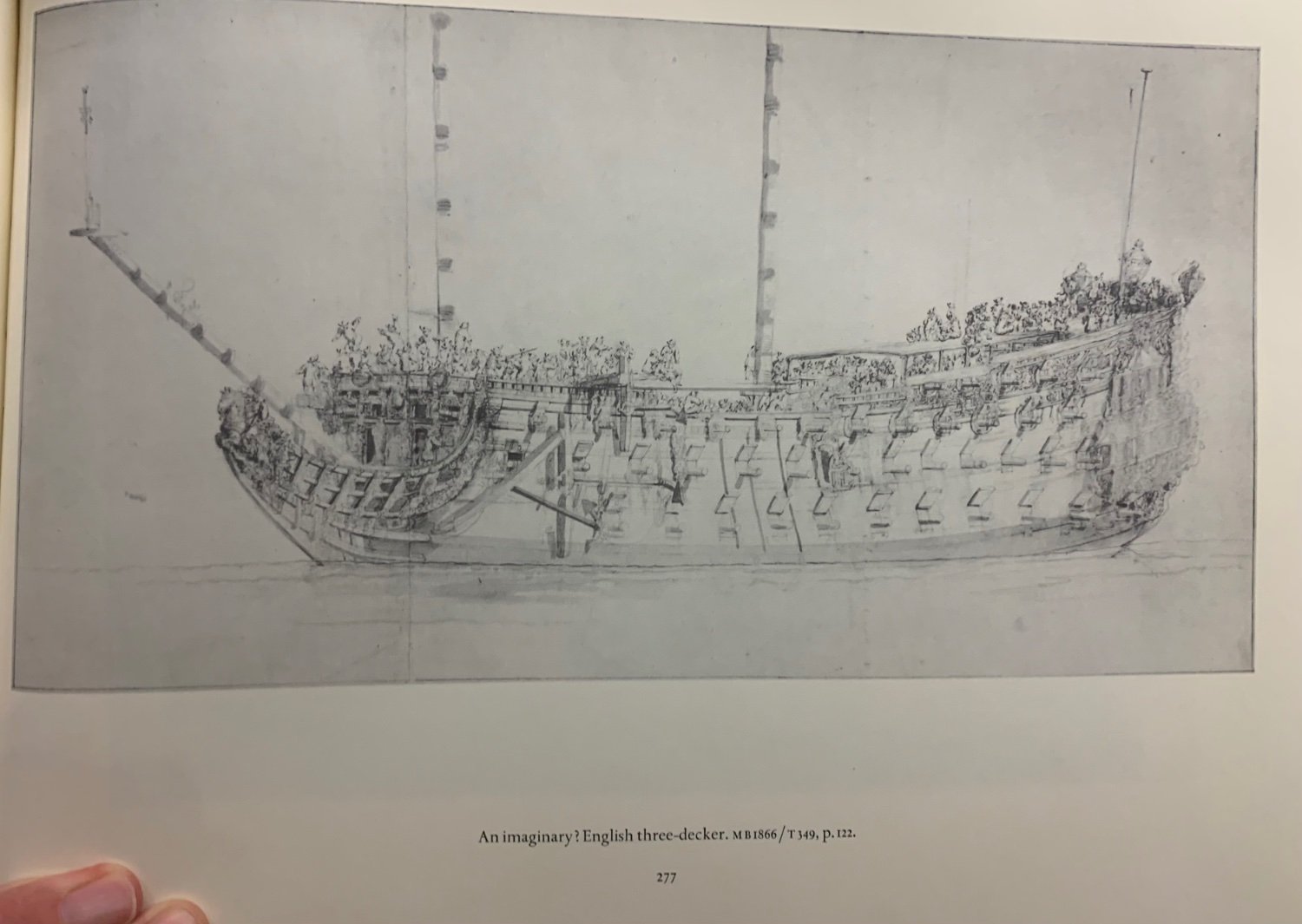
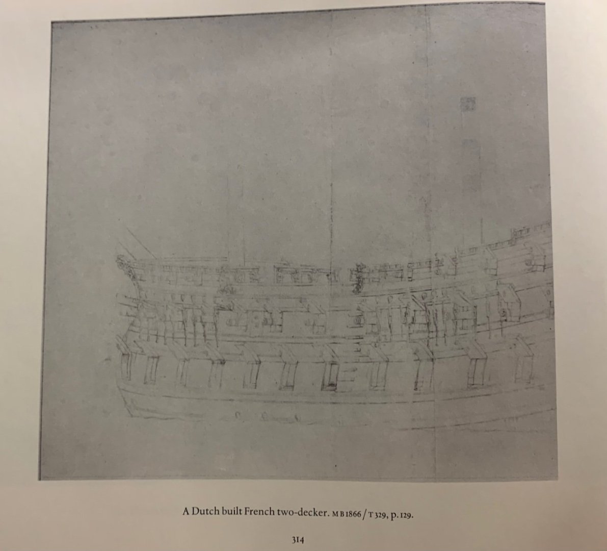
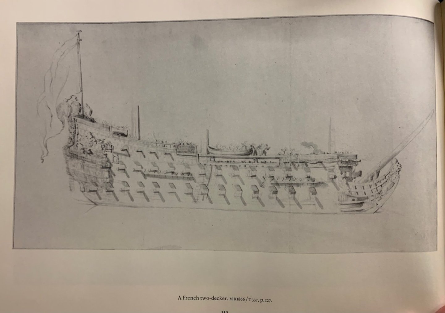
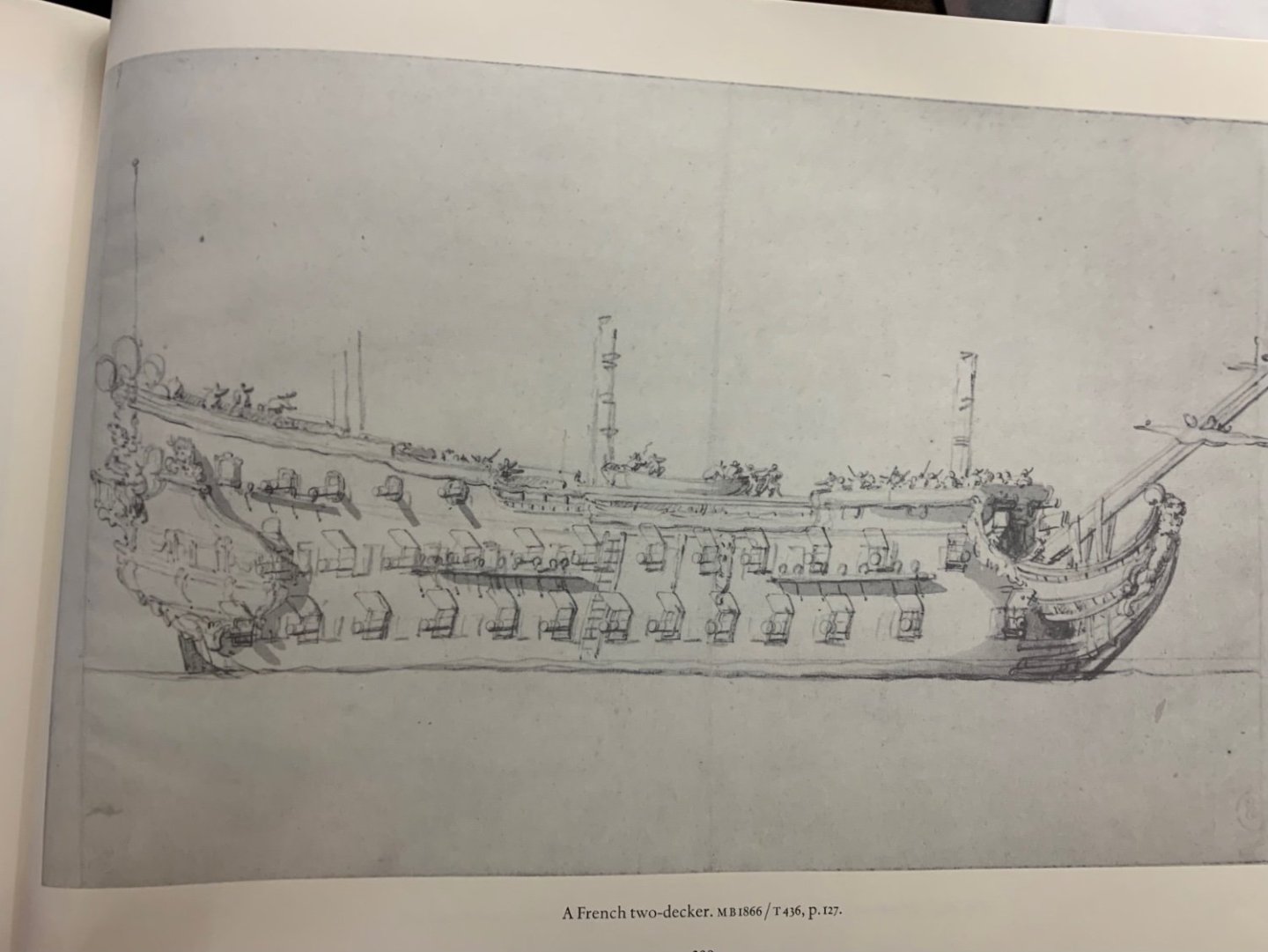
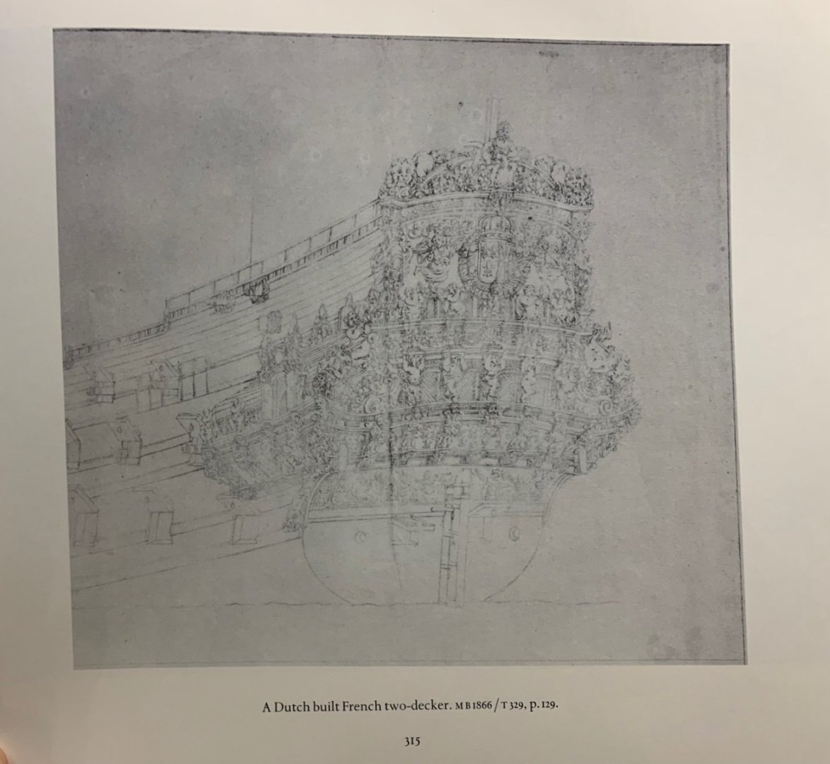
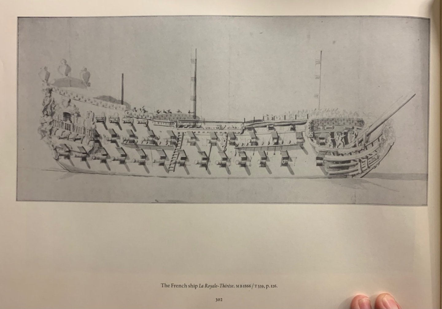
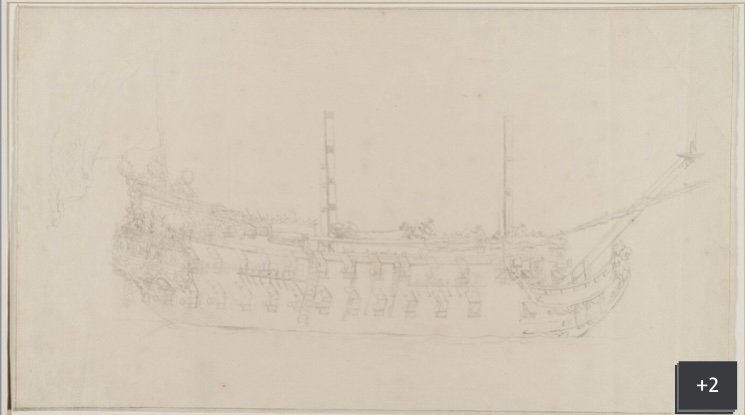
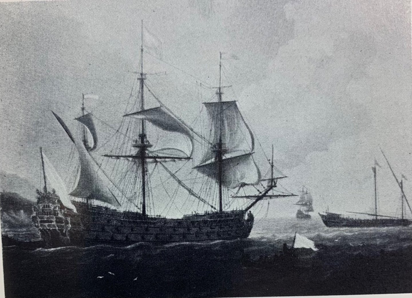
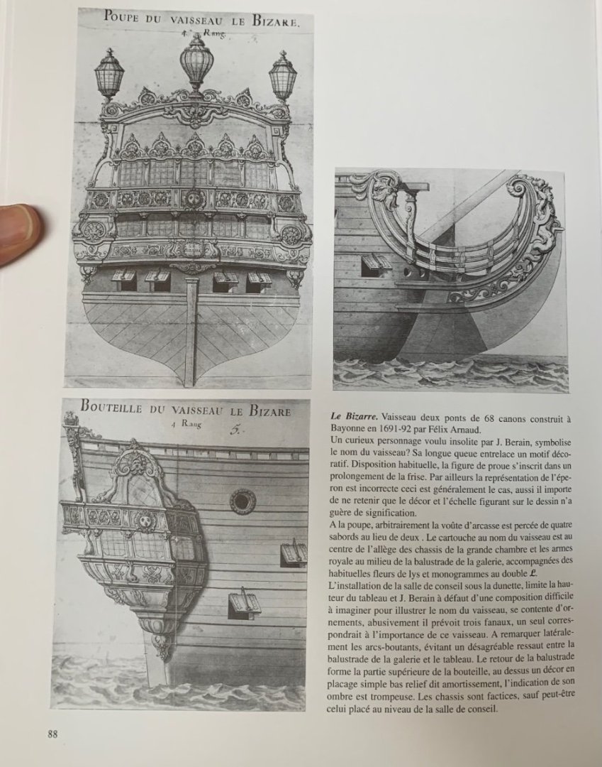
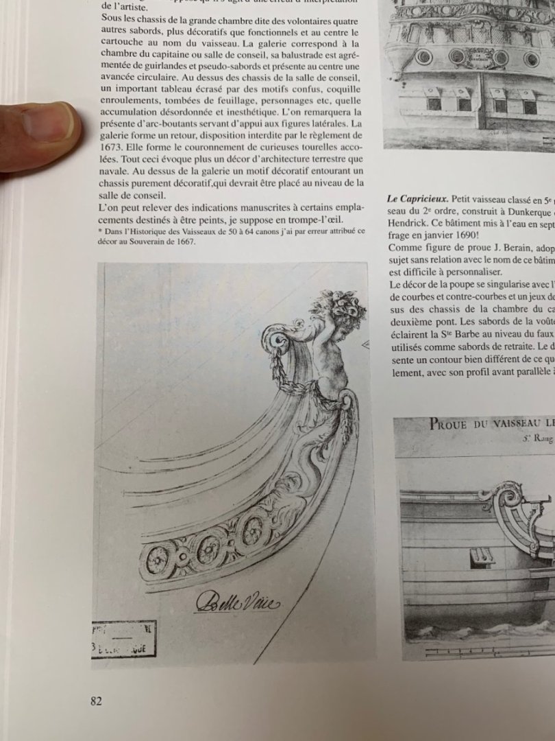
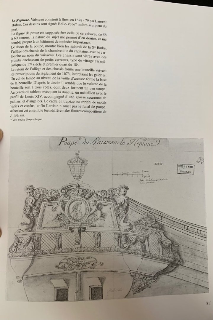
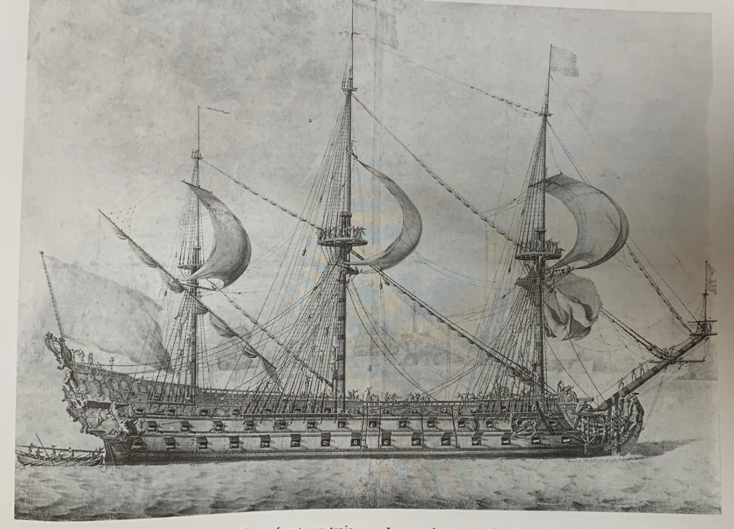
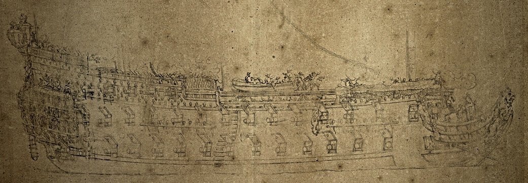
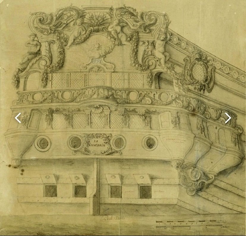
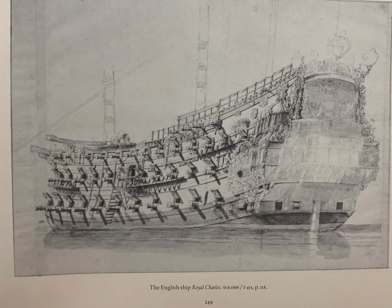
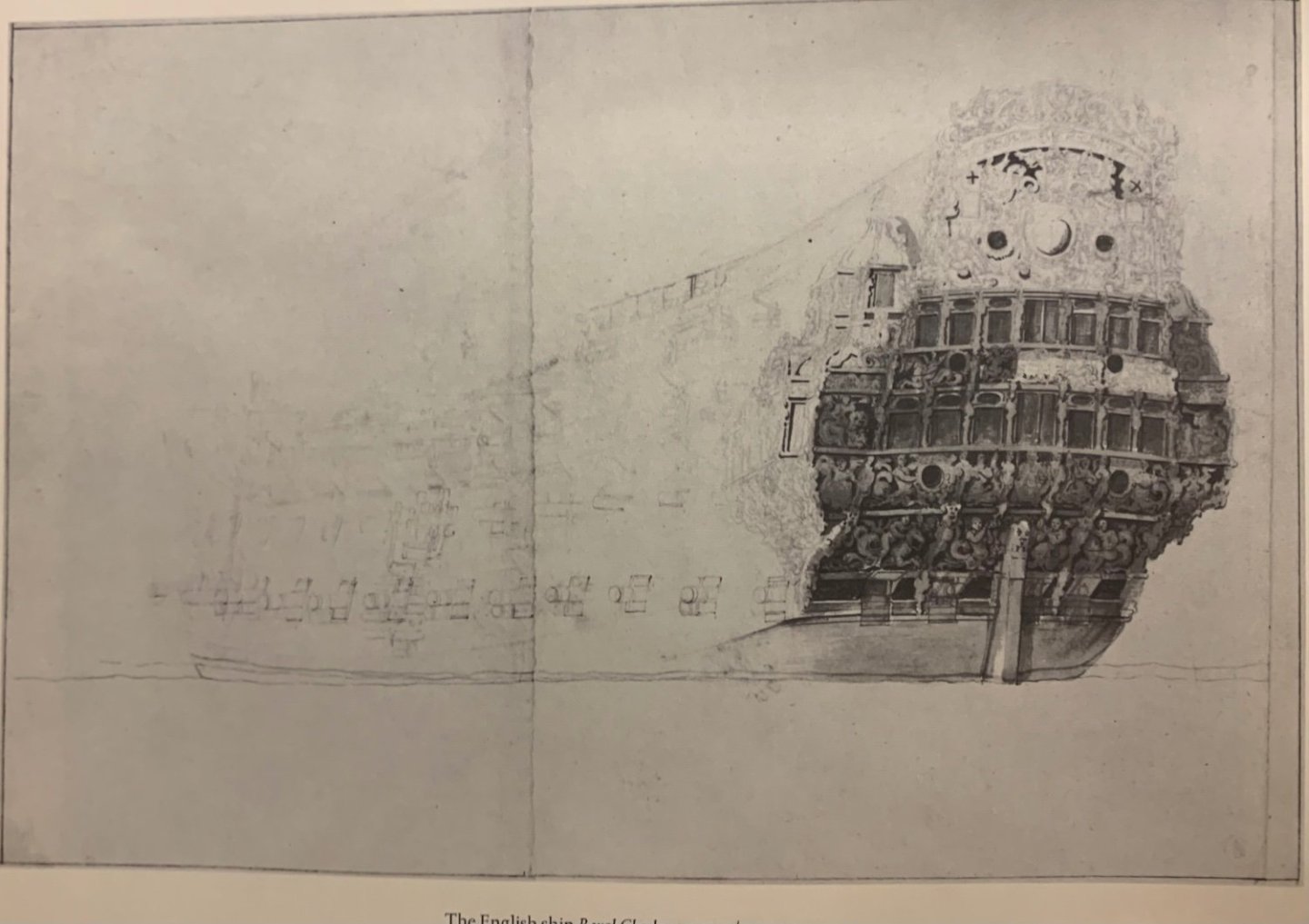
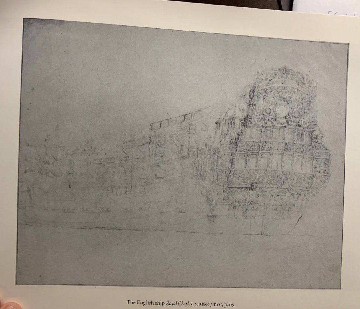
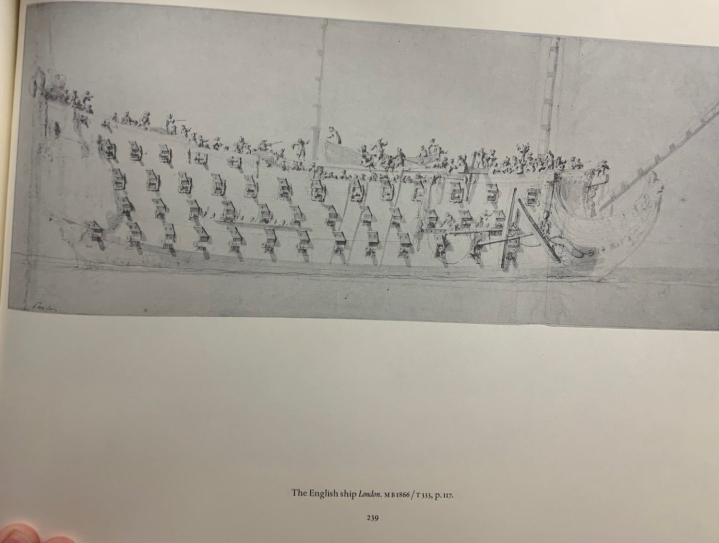
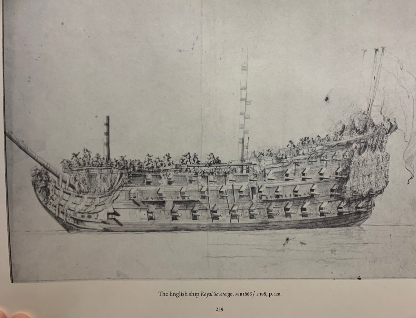
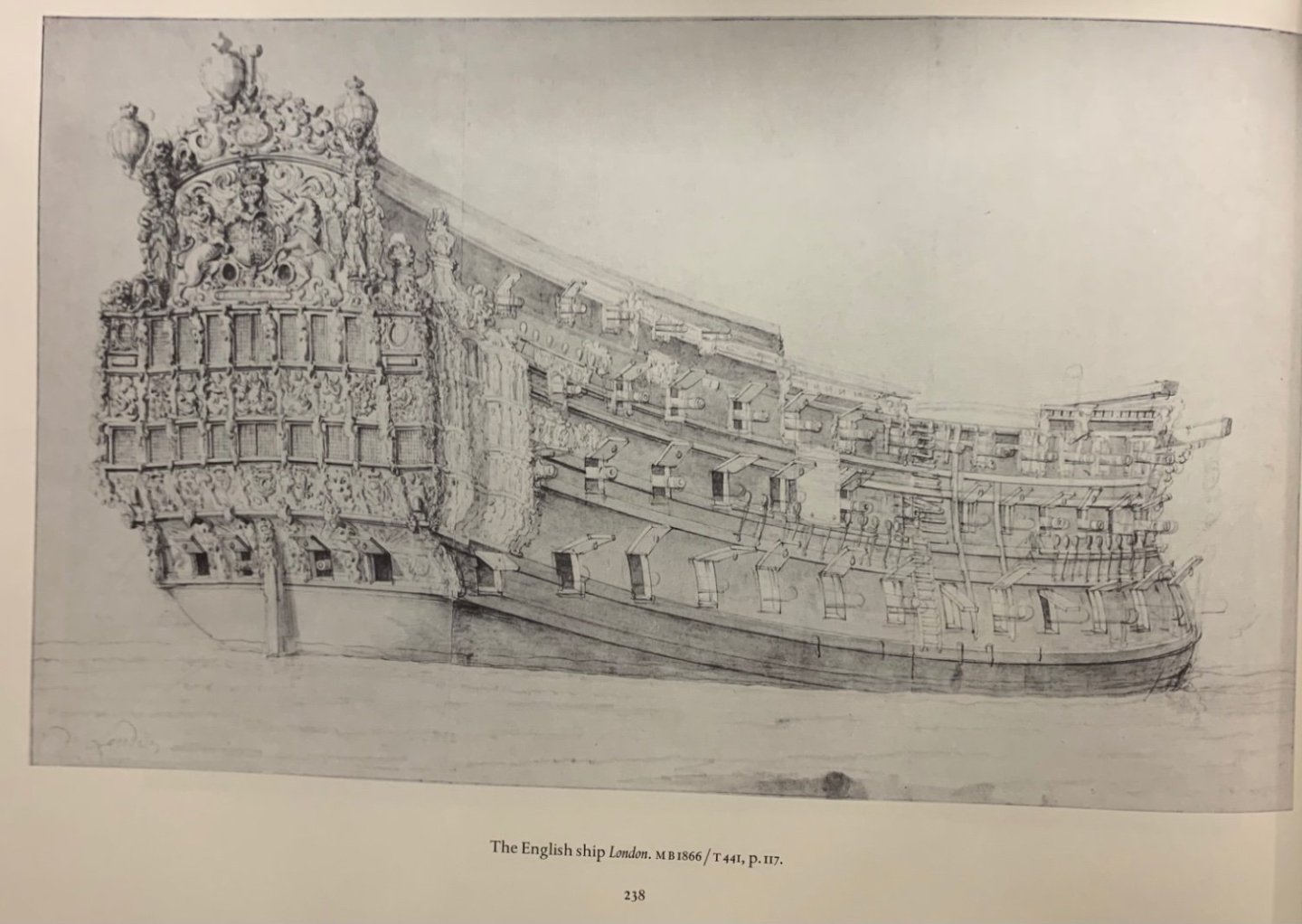
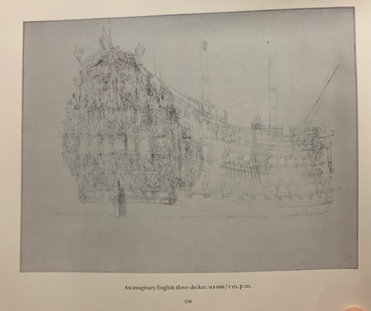
My visit to the INHA, National Library of France was interesting, if not as directly productive as I had hoped. One thing that I was able to request and look at in the fantastic oval reading room was Le Chevalier de Tourville, the Boudriot monograph of the proposed 1680 First-Rate L’Ambiteaux. It is an impressively documented project and a beautifully hand-drawn monograph. The plans, in 1:48, give a strong impression of just how large a model one can produce from this set. Even at 1:72, one needs a slipway to launch such a behemoth. There were a few new plates of interest in the monograph that I hadn’t seen before: Belle Viue is the same Brest sculptor and draftsman responsible for the following drawing of the highly fascinating Souverain of 1678: As an added bonus, the following is the best and clearest image I have yet seen of the RL of 1692: While I was really only skimming the monograph, in the interest of limited time (I had a 3 hour window that I stretched to 4), I will say that I was fascinated by Boudriot’s skepticism of the VdV drawings of La Reyne, with specific regard to the sheer and placement of the artillery. Perhaps this is my personal failing in that I imbue the work of the VdV’s with a degree of photo-realism only paralleled by Puget for these times. All I can say for sure is that I am no expert. My primary objective for this visit was to see whether there were any catalogued references to the “Gilded Ghost” portrait: Unfortunately, an image search produced no direct result. Upon walking amongst the stacks, I realized that I happened to be in a room divided between artists both pre and post 1845. And so, I did what I usually do when I visit the STRAND bookstore in NYC; I went in search of my coterie of famous French artists, sculptors and Dutch Master marine artists. And so, I skimmed through the six books in the stacks for Charles LeBrun, the four for Antoine Coysevox, the six for Puget. There was nothing in the stacks for Van Beecq. Regrettably, I did not think to look for Francois Girardon. Only the works on Puget made any specific pictorial reference to his work at the arsenal at Toulon; not much there that I hadn’t seen before. But, then I found the three volume Robinson set on the Van de Veldes. Again, if I had more time, I could probably have pulled more, but following are a number of fascinating portraits that help clarify things I couldn’t see clearly before. For example, this whisper of a portrait: Appears to have very much in-common with this portrait: They do not appear to be the same vessel, but perhaps the same type of Second-Rate - that of the “interrupted” third deck (an un-armed and open waist). Other corollaries: I have never seen the following two before: The boutielle, below seems out of proportion, but it is nonetheless fascinating: Here is one of the early Holland-built ships of the 1660’s: Fantastic detail! A different perspective and fascinating study of La Royal Therese: And then, of course, there were quite a number of fascinating studies of famous English ships. SR’s early rival, the Royal Charles: The London: A particularly interesting re-fit of the Royal Sovereign: And, a perhaps conjectural ship: At least I can say there may be sound artistic precedent for pulling a ship out of thin air! All interesting to me, and so the journey through Paris and maritime history continues! Dad is having a great time, despite the expected travel exhaustion of his 88 years. More to follow, and thank you for looking-in.


- 2,699 replies
-
- 9
-
-

-
- heller
- soleil royal
- (and 9 more)
-
So far, the trip has been a great success and our Dad has been very happy to visit so many familiar places. This morning, I am sitting in the grand oval reading room of the INHA, which is a part of the National Library of France. I am continuing my quest for the “Gilded Ghost” portrait. I’ve made a request to see the 2 volume set of Les Chevaliers de Tourville monograph, which I have never seen, in person, before. It’s a bit of a dreary day, so I’m not sure what the afternoon has in-store for us. Tonight is our fancy dinner at Lasserre!
-
I agree that this is a reasonable work-around, Bill. The fact that you are even going to the trouble to rig the visible guns is a tremendous upgrade and you can’t fail to achieve a nice result. First day in Paris: Not at all surprisingly, Dad is completely jet-lagged and now taking a late-afternoon nap. He did much better on the flight than we expected, though, so that’s a huuuuge plus! If I manage to see any cool ship stuff, I’ll post those pics later. All the best, M


- 1,508 replies
-
- 3
-
-
- Le Soleil Royal
- Heller
- (and 1 more)
-
My impulse would be to use smaller blocks - 2mm. Or, perhaps, to even simulate the blocks with knots, a little gesso, and paint.
-
That’s an awesome model of a 74. I like the planking cut-away to the framing.
-
Awesome pics, Bill! The plastic to wood dilemma is one that I think about a lot. I’m building this particular model because I had a very particular idea about what to do with the kit, and my living situation - extremely limited space, often shared with high-school homework - precludes any real shop set-up. I hope, while I’ve still “got it” to set-up an actual shop space for wooden modeling. As far as I can figure, there are a few essentials: micro table-saw thickness sander/planer small bandsaw/fret-saw small combo disc/belt sander dust collection; portable or permanent Luxuries would include a mill (especially if you are doing full plank-on-frame models), and a spindle sander. That’s all a little gold off the nest-egg, but if it brings you joy, I know that Marie Kondo would endorse it 😀 To my mind, available space is the biggest blockade 🙃
- 1,508 replies
-
- 1
-
-
- Le Soleil Royal
- Heller
- (and 1 more)
-
I’ve carved one figurehead in wood (walnut) for a walking stick, which is about twice the size of what you are making for Bellona. It was my first attempt at figure carving. The only advice I can offer you is to take your time and appreciate that the process is sort of analogous to onion peeling; a gradual definition and refining of shapes through layers and layers of relief, until you can get to the fine detail. I puttered around with this small carving for about six months and learned a ton in the process. The linen-fold brow (this was a copy of the Provincien’s lion) was especially confusing to me and I had to rout away my first botched attempt and end-grain-glue new wood; the repair is not so obviously visible, fortunately. When I saw Greg and David’s model of the Speedwell, I asked David about his figurehead with it’s perfectly proportioned and sculpted facial features. He said he always begins figure carvings with the face, and this sounded like pretty good advice to me. You are, in my estimation, doing the most fundamentally important aspect of any sort of carving, which is to establish natural looking proportions. Fantastic work, as always, Mark!
-
I really like your stylized plank ends, where you are making cutaways to show the deck framing. This looks deliberate and elegant, as opposed to un-finished.