Hubac's Historian
-
Posts
3,314 -
Joined
-
Last visited
Content Type
Profiles
Forums
Gallery
Events
Everything posted by Hubac's Historian
-
 Thank you guys for the well-wishes and kind words. Michael - up until what age did you live in Paris? This trip is a last hurrah for my father, who fell in love with the city while stationed there from 1957-‘59. At 88, there is not much remaining of my father’s mind and memories, but we are hopeful that the experience of being back there will re-awaken something inside him. C’est la vie.
- 2,699 replies
-
- 5
-

-
- heller
- soleil royal
- (and 9 more)
-
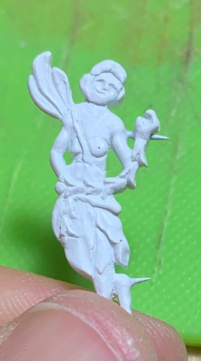
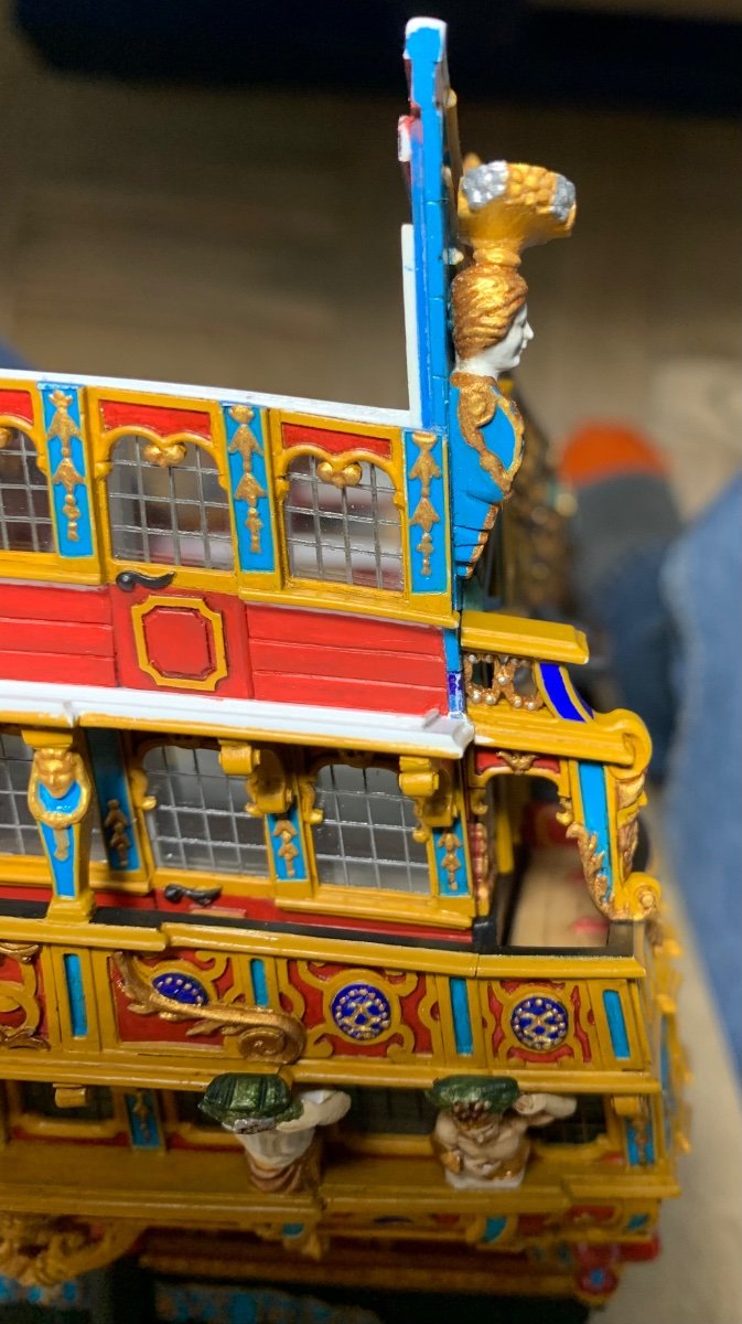
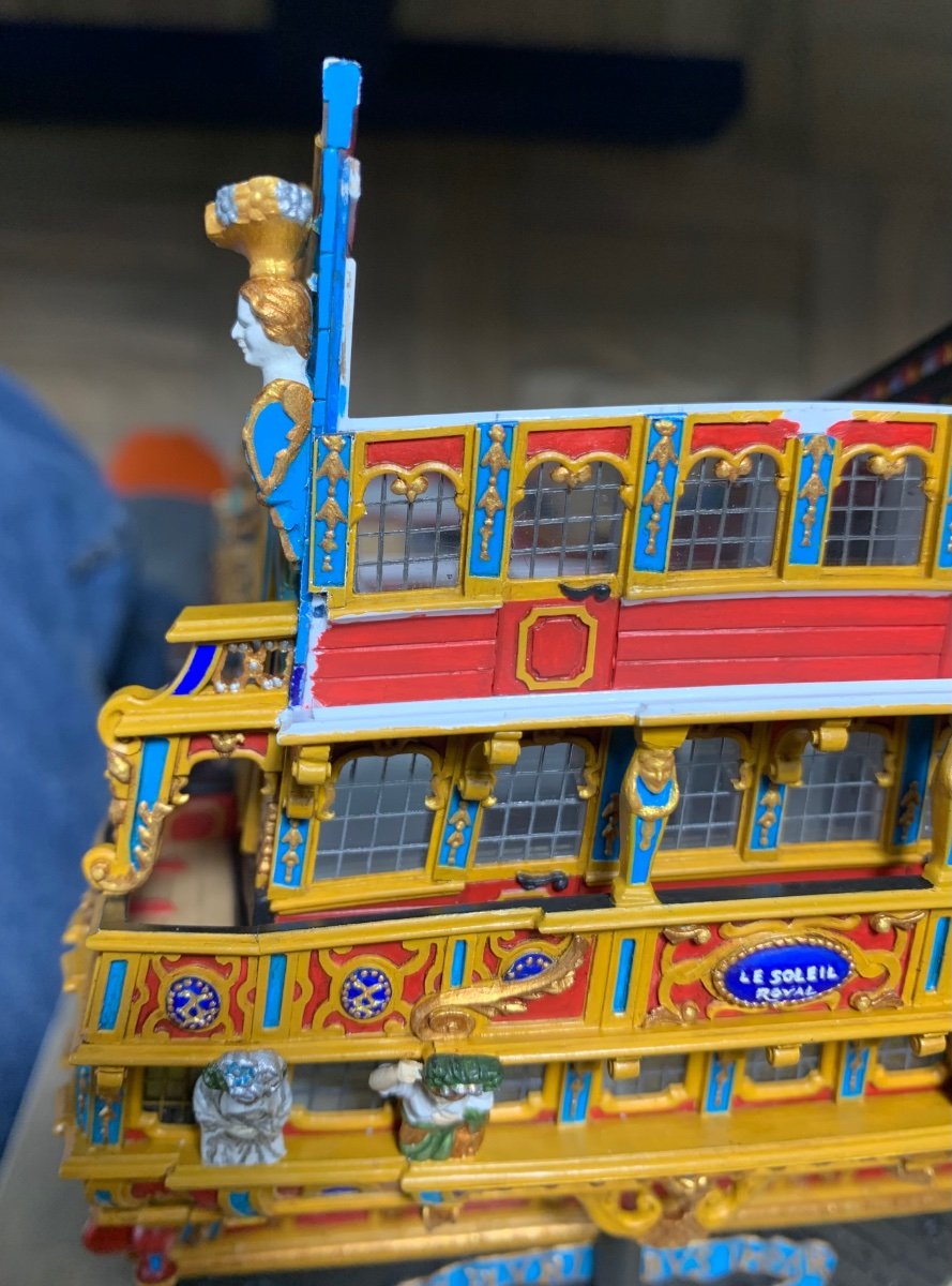
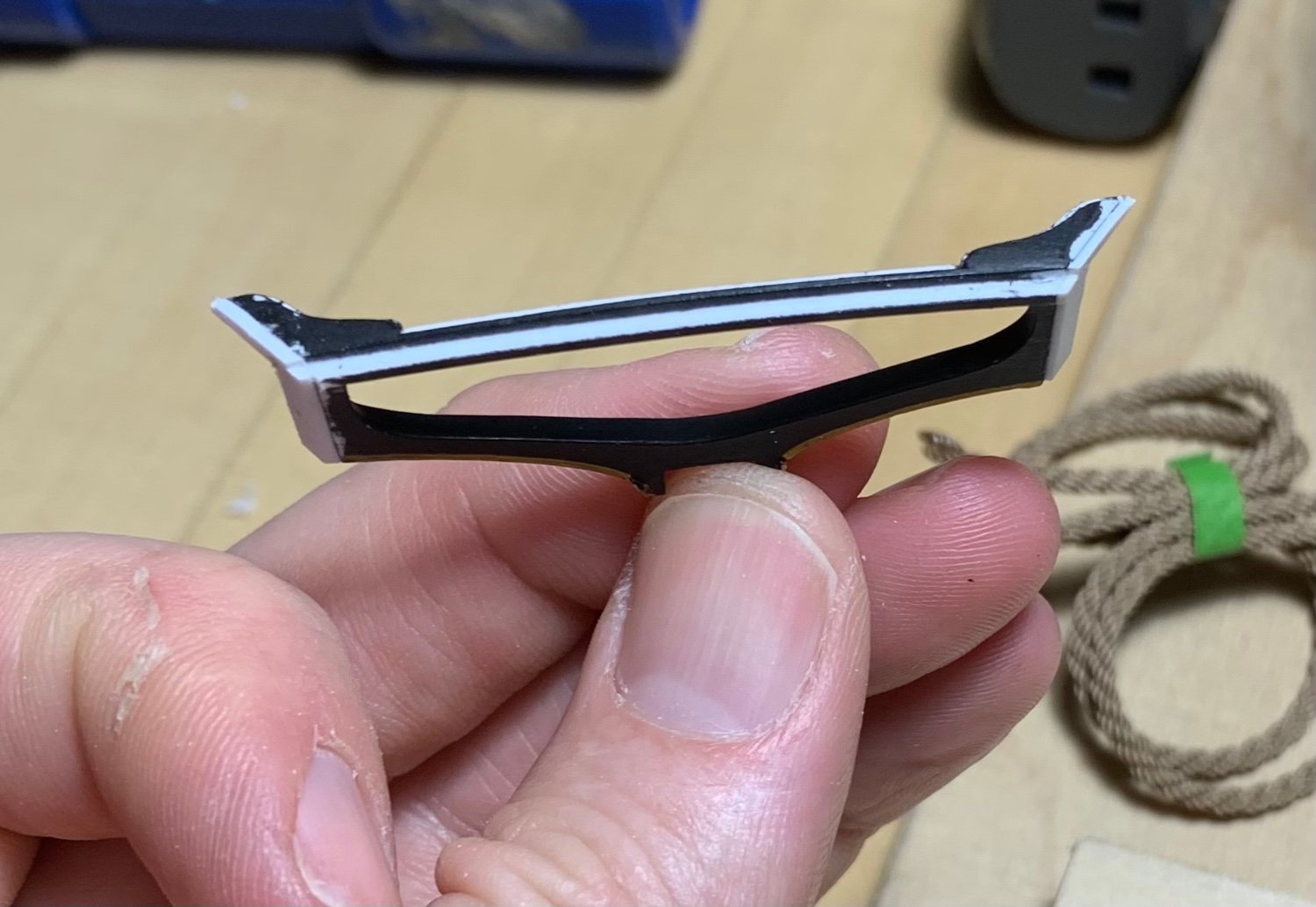
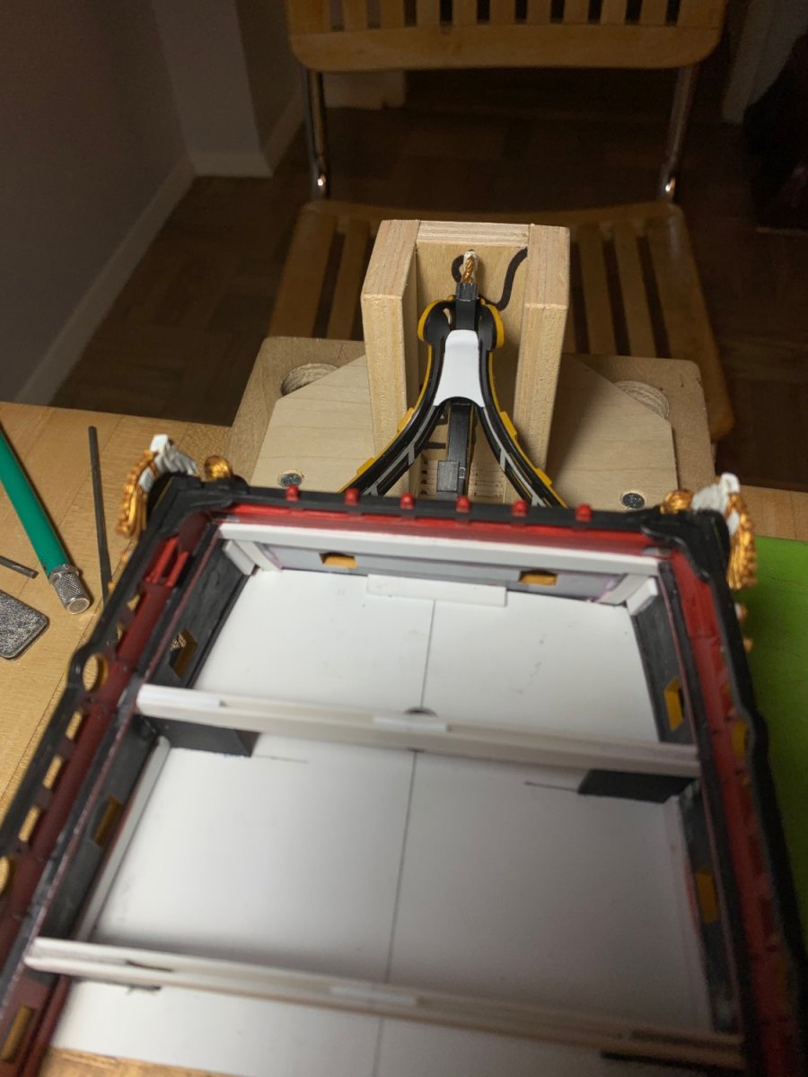
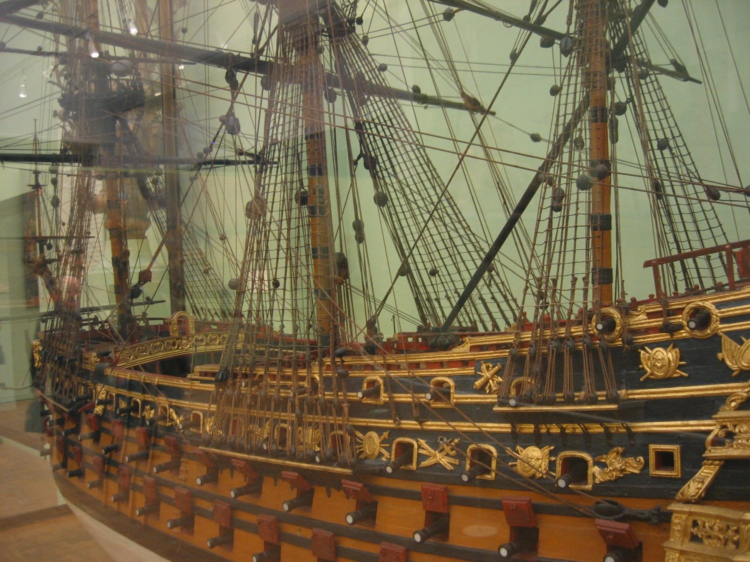
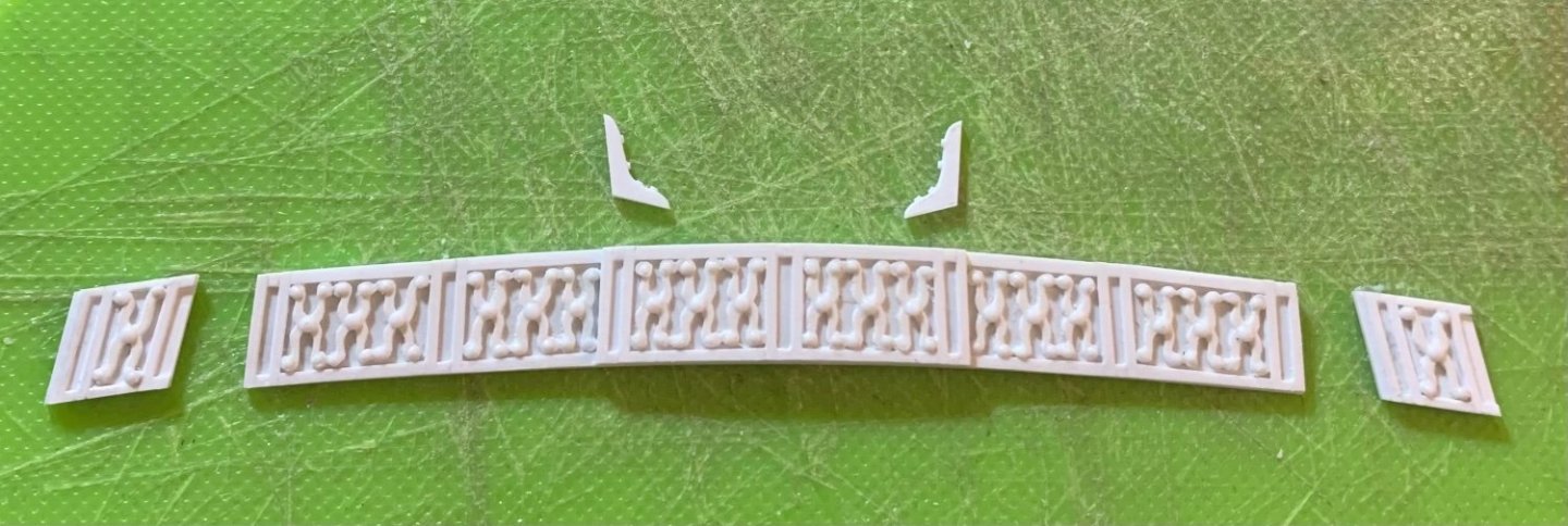
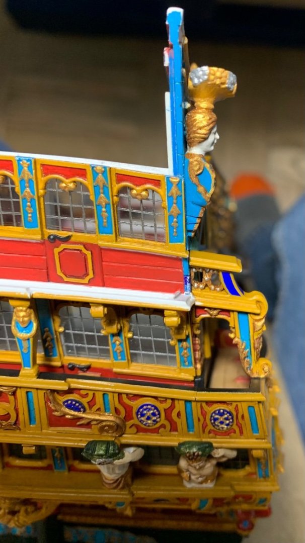
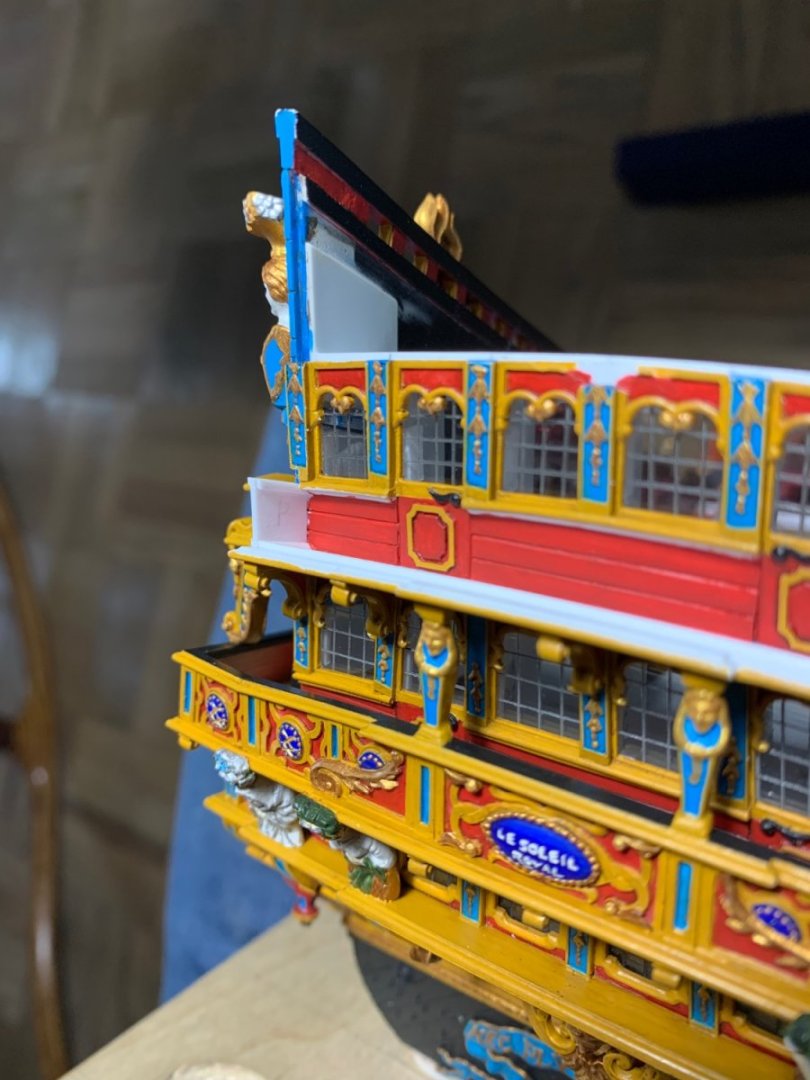
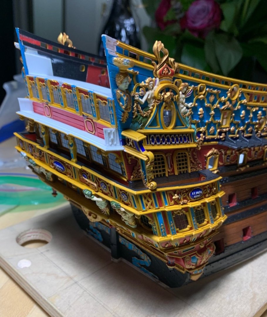
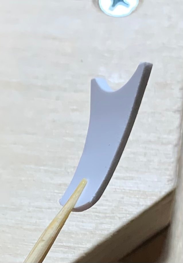
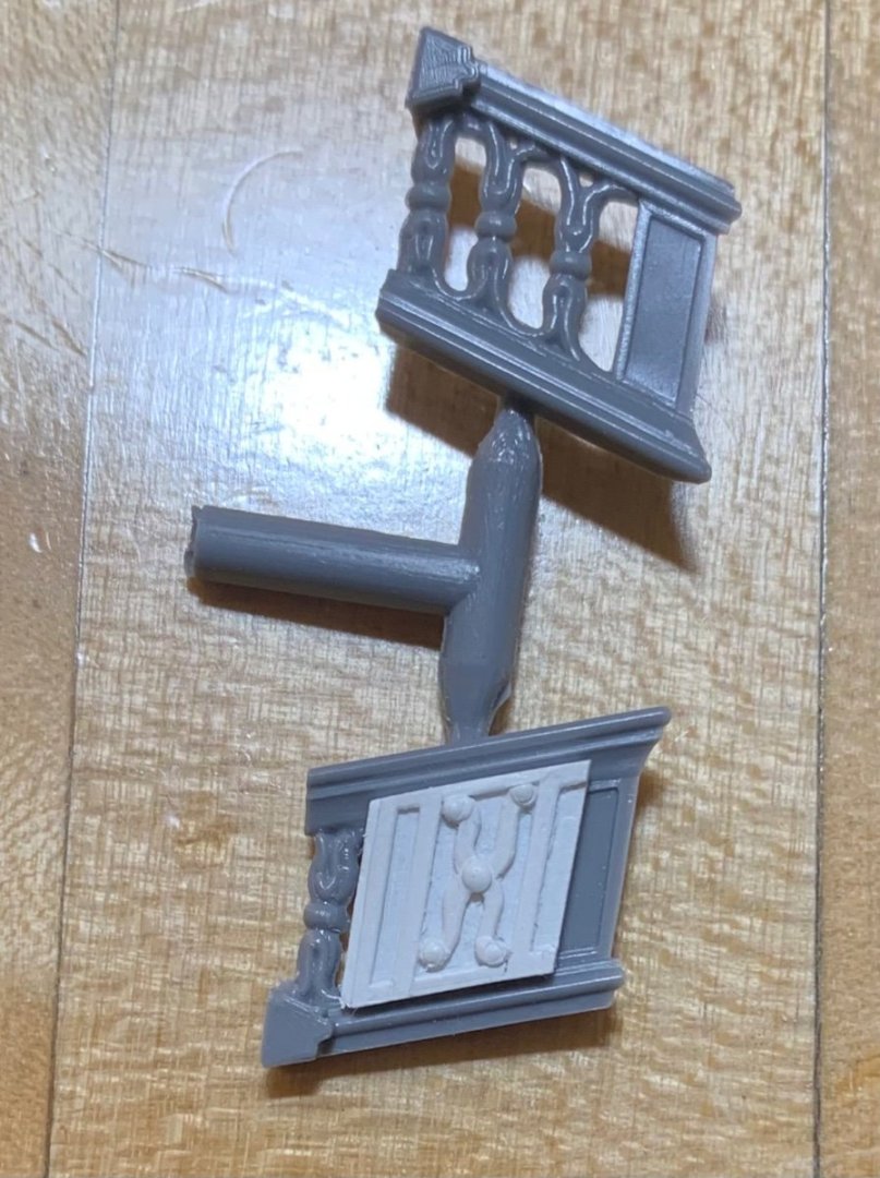
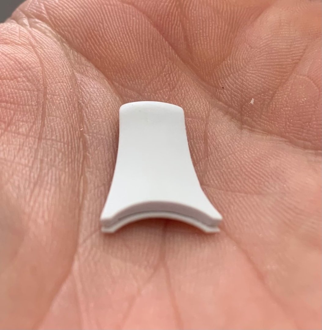
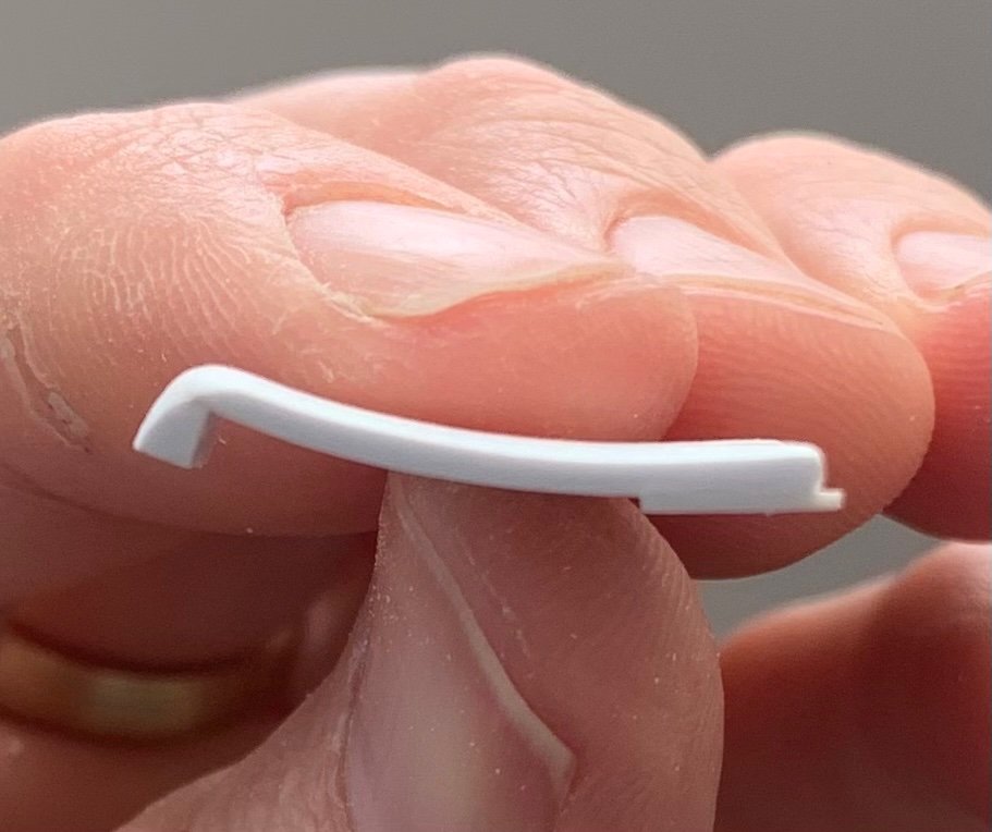
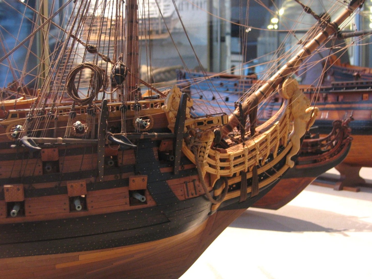
I am less than a week away from our trip to Paris, and then the North East Joint Clubs Meeting is shortly around the corner, once I return. My objective, before the show, was to get the head fully together and re-touched, as well as the upper balcony level. Well, I’m not going to cross that threshold before April 29th. There were a number of competing priorities, throughout March, and I just couldn’t find the time I needed to make that happen. I say all of this in the event that even one of you had hoped to see the model in New London. I’ve decided not to bring it because these areas at the bow and stern will remain too un-finished looking for display. These also happen to be particularly challenging areas of the model to bring together. I am satisfied enough with the balcony bulwark parts that I made: Fitting the end pieces to the model required some tricky cutting-in to the outside window pilasters. You can see that the sill moulding for the window tier extends fully to the ship’s sides: The rebate has to accommodate both the end piece and the 1/16” caprail that I have yet to make: It’s a slow and winding business that necessitates painting in stages. One thing that was a little surprising to me is that the fore and aft depth of my middle and upper balconies is significantly more shallow than the stock kit: Thinking about my process, I realized that I had made a design decision, earlier, when I was figuring out the middle balcony; I realized there would be limits to the degree to which I could bend the posture of the Four Seasons figures, so that they could stretch from the now “false” lower balcony to support the projection of the middle balcony. By necessity, then, the middle balcony determined the depth of the upper balcony. Proportionally, I am not displeased by the more shallow depth. One failed experiment had to do with the bow angels that seat just behind the headrails. I used a combination of C/A and liquid plastic cement to secure the headrails. Before glue, though, I had dry-clamped each headrail in-place for several days, in order to better induce the shapes and relieve unwanted stress on the subsequent glue joint. Now, bear in-mind that I am fully aware these headrails should be flat. The design of the kit figurehead, in combination with my widening of the bow, does not allow for any reasonable projection of the aft escutcheon of each headrail. The gap you see on Frolich’s model, below, would have been more than double on mine: photo, courtesy of Marc Yeu With such a distracting projection away from the forecastle bulwarks, these escutcheons would have looked like jug ears. In consideration of that, I decided it was better to perpetuate the in-accuracy of the stock headrails, which are also rounded to seat up close to the hull. In an attempt to distribute any remaining stresses across a broader glue surface, I thought I could literally pin those escutcheon ears down with the bow angel carvings: Unfortunately, one must drill for these pins at the precise depth and angle. This proved quite difficult to do with the headrails already in-place, and the result of my attempt was that the carving did not lay flat against the ship’s side. Forcing it to do so would have, in fact, introduced additional lever strain on the headrail glue joint. Consequently, I ground the pins away, filled the holes and simply glued the bow angels in-place. I’ll post pictures of all of that once the re-touching is complete. The other surprising thing to me was just how much shimming was necessary for the other remaining headrail supports, now that both headrails were fixed in-place. In hindsight, it would have been much wiser to pattern these supports after the headrails had been installed. Instead, I had attempted to dry-fit them one side at a time. Using this approach, though, I could only eyeball the centerline, and only poorly at that! Just look at all the plastic I’ve added back to these parts: Finally, though, I can do the necessary touch-ups and glue these in-place. One part that could only be made once the headrails were installed was the forward terminus of the headrail grating. In the stock kit, Heller provides a mostly flat headrail grating, the forward end of which rests on a small ledge just behind the figurehead. As an upgrade, I want to create a new headrail grating that is both cambered, athwartships, and that follows the upward sweeping arc of the headrails. This is a tricky piece to make and fit. I seem to have lost the picture of the cardboard template I had made to start this part, but I transferred that pattern to a piece of 1/16” styrene. In my first attempt, I tried to muscle a bend into the part, but it snapped. On the second attempt, I used an open candle flame to soften the plastic so that I could easily induce this curve: There was some melty distortion, at the edges, that was removed during the fitting and shaping process. As I had with the pattern, I temporarily CA’d a handle to the part for ease of fitting in this tight area. Once I had a perfect fit, I glued a piece of 1/8” square stock to the forward end so that I could shape a neat bullnose that transitions into the knee of the head: You can also see the thinner stock that I glued to the aft end, on the under side, to create a ledge for the grating slats. To finish off the piece, I filed a gentle camber into the top surface of the part, which is now ready for paint and installation: And so, it is a lot of fiddling around to make this imperfect geometry coalesce into something that looks purposeful and a reasonable facsimile of a ship’s head structure. If I were starting this whole project all over again, one thing I would definitely do would be to fabricate a continuation of the middle battery planking past the beakhead bulkhead, in a downward tapering arc towards the stem. By the time I realized this was actually a feature of French practice, it was too late to incorporate the detail. Thank you for the likes, comments and for looking-in. When I next return, later in May, I will have some nice finished pictures of the head. Until then, be well!


- 2,699 replies
-
- 14
-

-
-
- heller
- soleil royal
- (and 9 more)
-
This problem of carriage block sizing, at this scale, is one that I’ve been considering for a while. I think the max that one can get away with is 2mm. For my part, I will probably play around with simulating blocks with knotting and paint.
-
For my tastes, personally, it would be distractingly odd for the middle six guns to be run in, on one side.
-
I might have one gun run in, with a gun crew tending to it, if I wanted to demonstrate the working of the guns. I personally would not do a zigzag pattern in a static display.
-
The quality of this kit is very impressive. Lovely progress, B.E.
- 648 replies
-
- 4
-
-
- Indefatigable
- Vanguard Models
- (and 1 more)
-
No worries, Henry. Your answer was more precise.
-
Hi Bill, yeah, these are all main deck guns. The quarter deck and f’ocsle decks are above this level. Like you, I see no point in rigging carriages that won’t be seen.
-
Looking good, Bill! Welcome back to the shipyard.
-
Roter Löwe 1597 by Ondras71
Hubac's Historian replied to Ondras71's topic in - Build logs for subjects built 1501 - 1750
Just catching up, Ondras - remarkable and beautiful results, as always. You really have the knack for the polymerized clay. -
People (my extended family, included) have been spelling my name wrong my entire life. Marc with a C is more common among Jewish families and the French. While I am neither, I have always preferred this spelling.
-
I filled the kit entry point for the main sheets and raised it to run above the guns, per the Louis Quinze model.

- 1,508 replies
-
- 1
-

-
- Le Soleil Royal
- Heller
- (and 1 more)
-
This is just amazing stuff. Brilliant ingenuity.
-
A couple of things: I see the super-fine stringer you wrapped around your tops; I’m not sure whether it’s wire or painted thread, but the scale effect is awesome. Nice detail. Also, I’m taking note of your beakhead railing, which is very well done. I’m not sure why I hadn’t really registered this before, but it looks great!
-
This is a fascinating foil to the type of project I am working on, where there are few reliable primary sources. Titanic is probably the most written about ship of all time, but this presents a challenge of a different stripe; sifting through all of that source material and deciding where your threshold will be - beyond which, additional modification is not personally worth the effort. I’m certainly no Titanic expert, but I will happily follow along. You’re off to a wonderful start, Evan, and I like that you have taken-on such a monumental project for your daughter’s enjoyment.
-
I was referred to your log by another member, with specific reference to your sails. They are truly amazing and well-worth the look - thanks, Michael! Overall, though, the build is pretty incredible and I will do a more thorough reading of the project. You are clearly extremely attentive to detail.
- 399 replies
-
- 3
-
-
- cutty sark
- revell
- (and 2 more)
-
A brilliant completion to this beautiful ship - What a difference those corrected lines make. I give it 100 out of 100!
-
Seamlessly well done, Michael!
-
The dog’s breakfast is looking pretty appetizing to me, Ian. Just catching up on your project, here, and I really appreciate your adjustments on the fly!
- 536 replies
-
- 3
-
-
- Quadrireme
- radio
- (and 1 more)
-
You shouldn’t have that problem with enamel primer.
-
So, like, Kleenex tissue?
-
Beautiful work, as always, Michael. Are you using SilkSpan tissue for your sails? Sorry if I missed that detail, somewhere along the way.
-
My advice would be not to do this. Sure - scratch away your paint, first, before attaching stern plate to the model. However, it is critical that the ends of the lower and middle balconies align with the quarter galleries, and you are far better off attaching the QGs first, so that you know exactly where the balconies need to be placed. I know the QGs fit around the outside edges of the SP, but that is a joint that may require a little finessing.