Hubac's Historian
-
Posts
3,314 -
Joined
-
Last visited
Content Type
Profiles
Forums
Gallery
Events
Everything posted by Hubac's Historian
-
 Yeah - the instructions are a let-down for this particular step in the build. It’s an easy thing to miss. All is well, here. My son’s basketball schedule will be fast and furious for the remainder of the month, but I continue to make progress on the project. Life is good - can’t complain.
 -
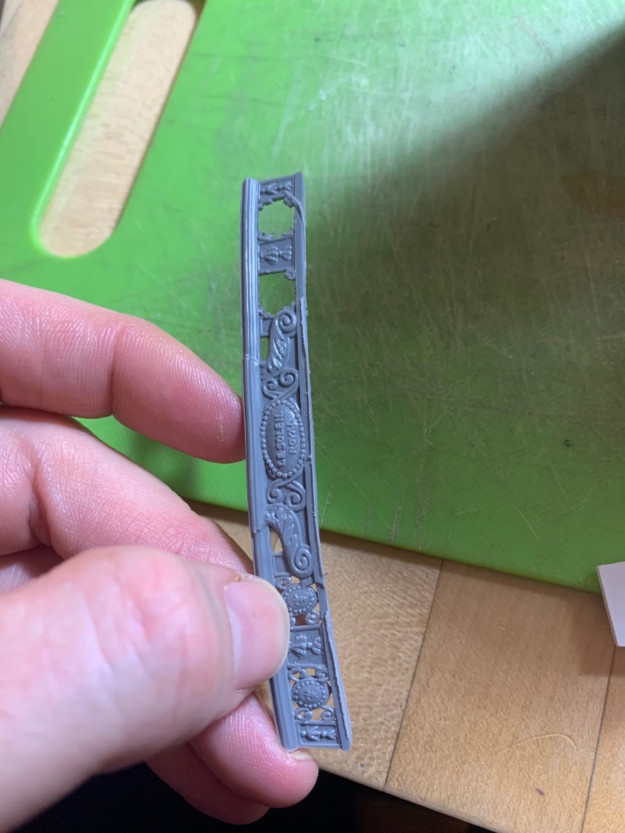
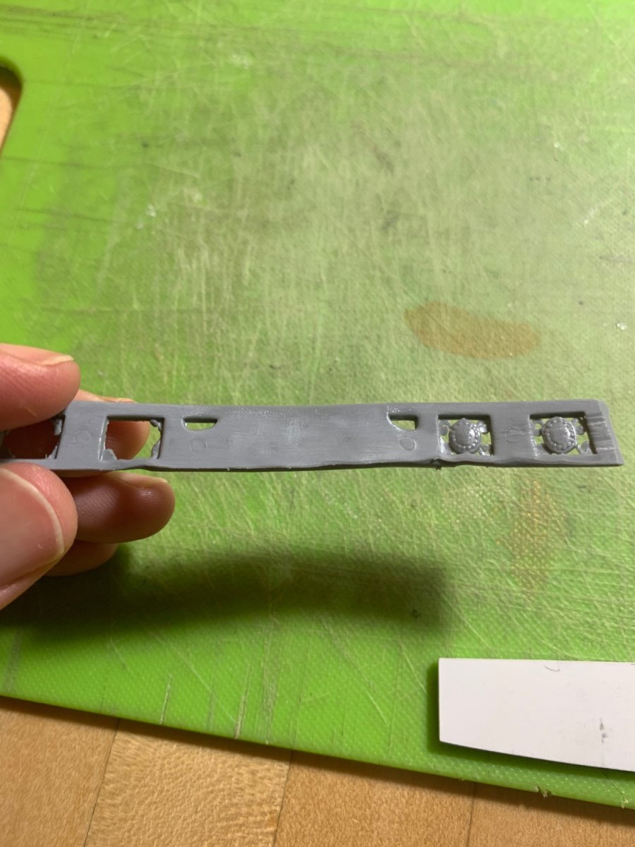
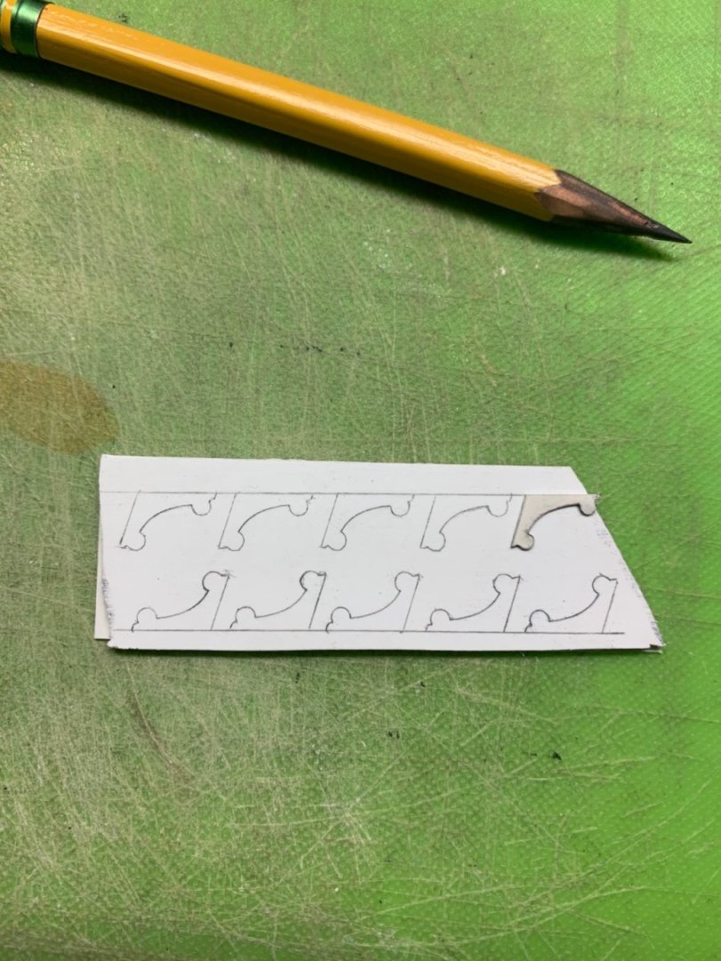
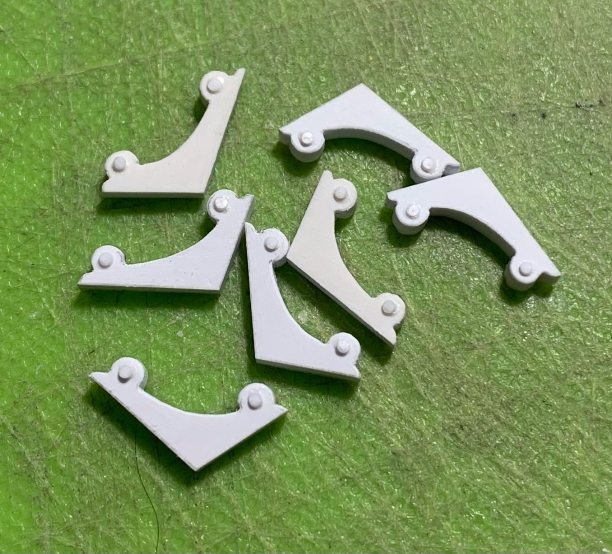
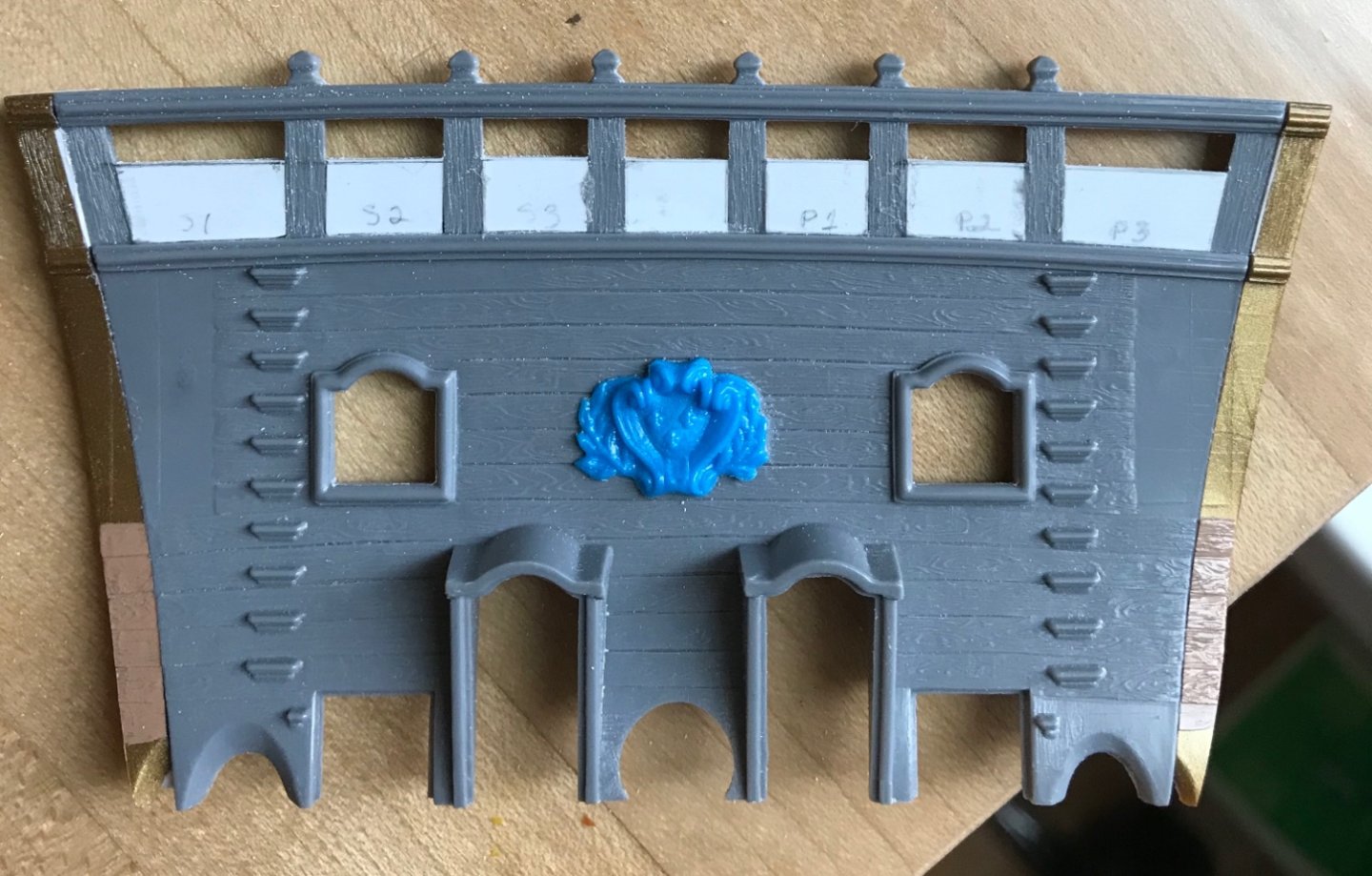
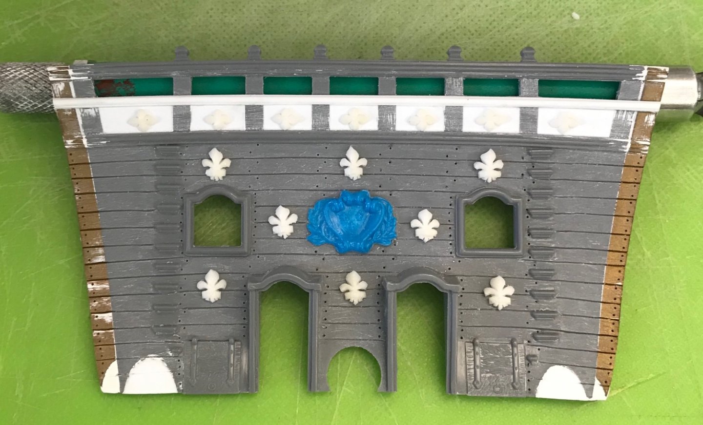
Thank you, guys, for all of the ideas and input. Dan, as a glasses-wearer for most of my life, I had that same thought about bending eyeglass arms in sand. I took a look at Heller’s on-line part order form, and that all seems very straight-forward. I may, yet, try another more gentle heat approach. I’m leaning toward securing the straight part into a rounded form and submerging in merely very hot, and not boiling water for a period of time. In the meantime, It was necessary to make new corbels for the upper balcony. The stock is made up from a piece of .0625 and a piece of .020 styrene laminated together: Below is the kit’s stock corbel for this balcony level: I ordered my Bitumen of Judea from an Italian vendor, who subsequently emailed to say that he couldn’t ship this small bottle of combustible material. So, then, I tried to order from a UK vendor. We’ll see whether that order sticks. I’ve made the window panes and have begun painting the third-gallery window plate. There’s a whole bunch of stuff that is very nearly ready to go together. Thank you for your interest, the likes, your comments and suggestions.
- 2,699 replies
-
- 11
-

-

-
- heller
- soleil royal
- (and 9 more)
-
Superb! Where did you source the crew figure? Or, did you carve him from scratch?
-
I didn’t take any pictures of this detail, Bill. These little steps are directly behind and lead up to the beakhead bulkhead door openings, onto the beakhead deck. Since you have installed doors, here, they really wouldn’t even be visible at all. The difficulty you are having is that one really needs to install these before glueing in the beakhead bulkhead because, afterwards, you won’t have access to the middle deck, where they are installed. I wouldn’t worry about it. Even without beakhead doors they are barely visible.
-
These steps are from inside on the middle deck to outside on the beakhead deck.
- 1,508 replies
-
- 1
-
-
- Le Soleil Royal
- Heller
- (and 1 more)
-
Nice work on the rail, Bill! Yes, I made my own doors. It’s kind of a puzzling omission from the kit, as the middle deck would be washed in a heavy seaway, without them.
- 1,508 replies
-
- 1
-
-
- Le Soleil Royal
- Heller
- (and 1 more)
-
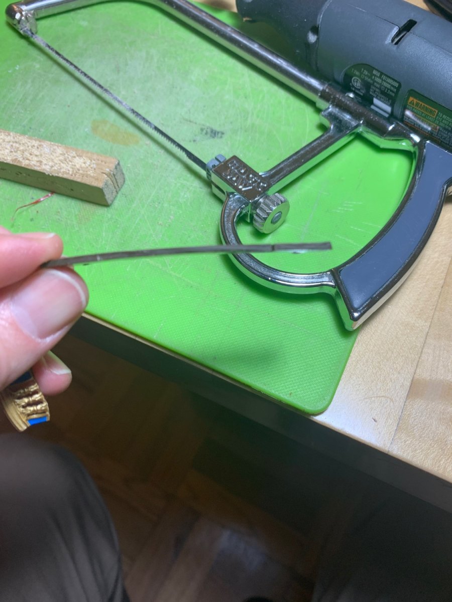
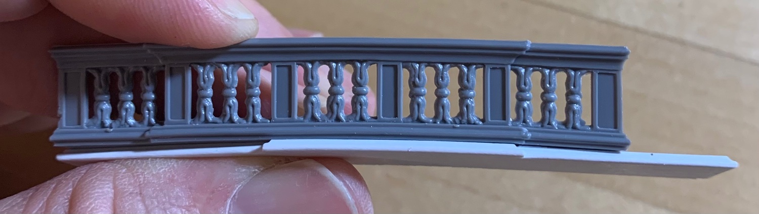
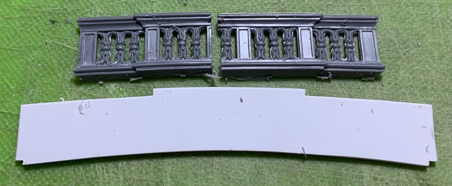
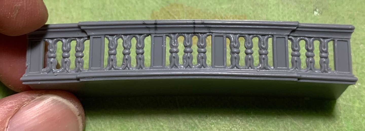
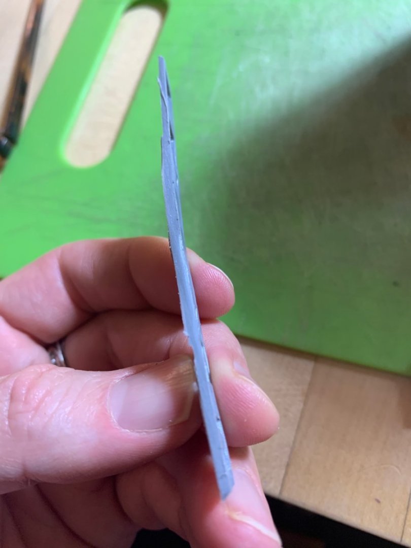
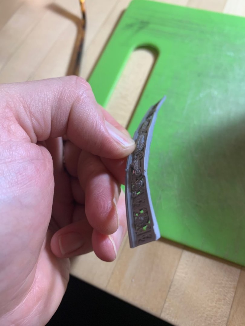
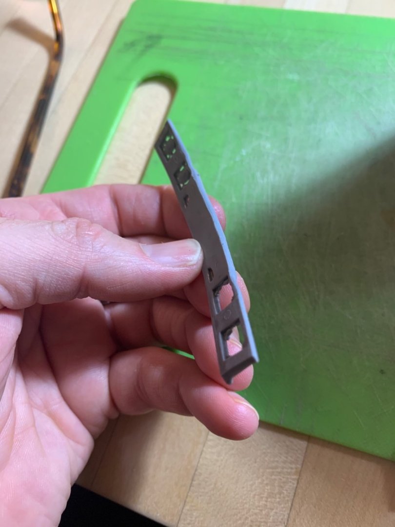
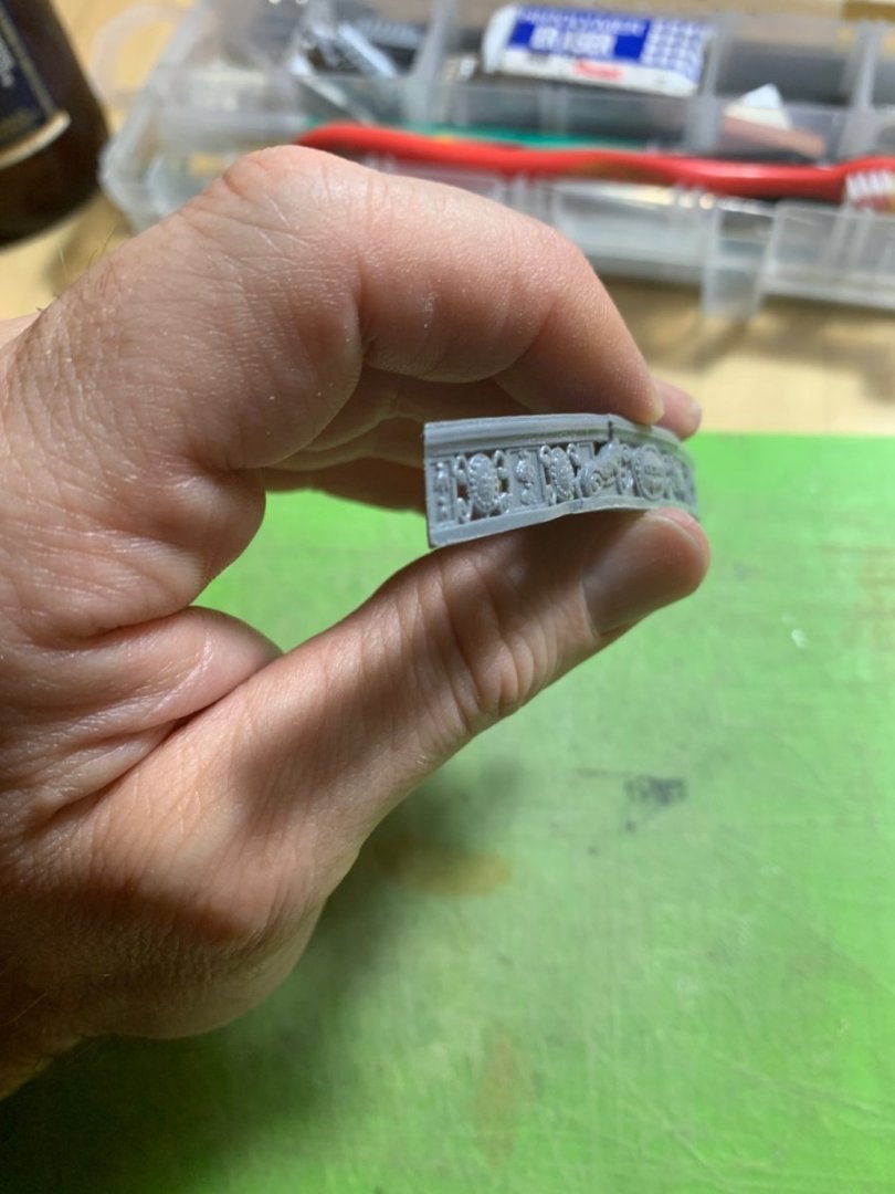
Well, like Michael, I had a spare section of the same railing that I was trying to bend, so I prepared it in exactly the same way. I also kept the plastic floor that I had cut out. Results were mixed. I had the water at a low boil, and I started with the floor piece first. There was a distinct moment when the plastic became floppy, so I took it out and had enough time to press it around my camber form: Not too bad. When I did the same for the pierced railing, results were not too good. When the part became malleable, it shrank and distorted in the thinner areas: This would not be salvageable. I wonder whether tying the part down to the form and submerging in less than boiling water might induce the bend I’m after, without all of the distortion. The other variable is that my test pieces are made from this brittle gold styrene, which lacks the suppleness of the grey stuff. I could just go for it and try a second experiment on my keeper piece tomorrow. I glued the center sections together today, and wanted to give them a day to fully harden. Or, I could simply extract the pierced rail stanchions and build up everything around them, as I did for the middle balcony. I’ll mull it over for a day. Re-making those rail stanchions by hand would be a very time-consuming carving project to do well.

- 2,699 replies
-
- 5
-
-
- heller
- soleil royal
- (and 9 more)
-
This was exactly the sort of practical advice I was hoping for. Thank you, Michael! I will give that a try. I appreciate the compliment, as well.
- 2,699 replies
-
- 1
-
-
- heller
- soleil royal
- (and 9 more)
-
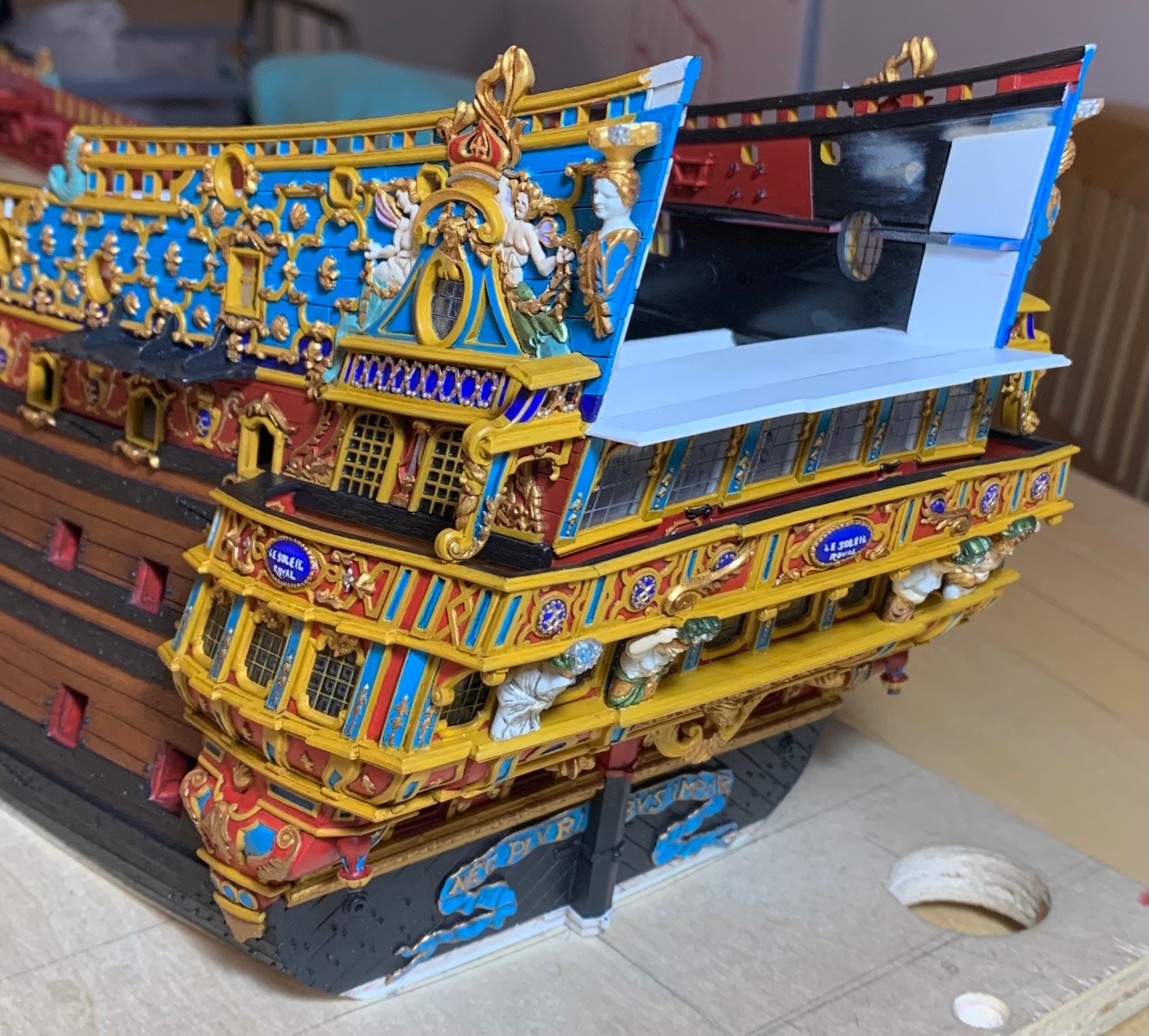
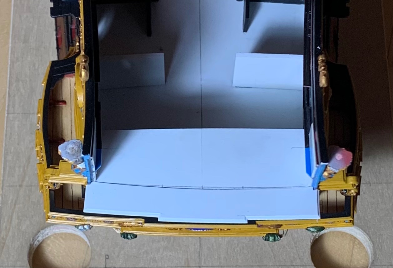
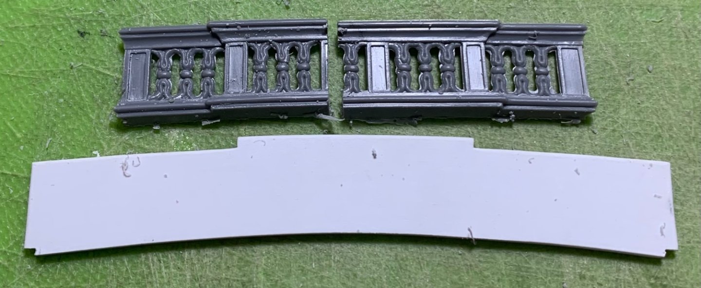
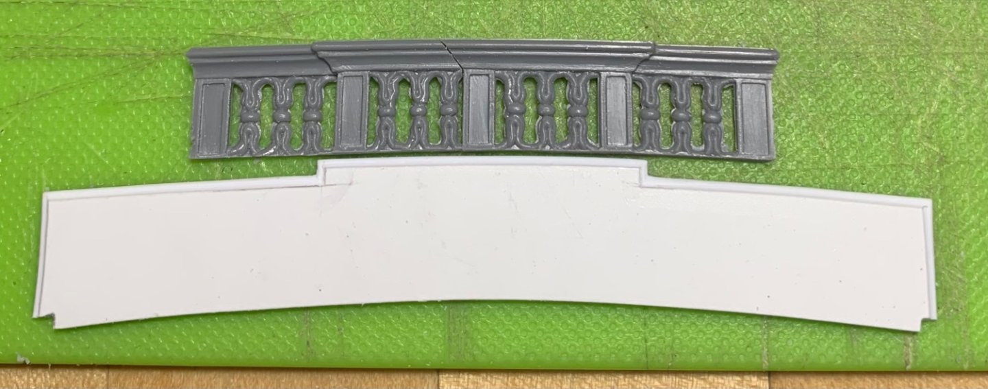
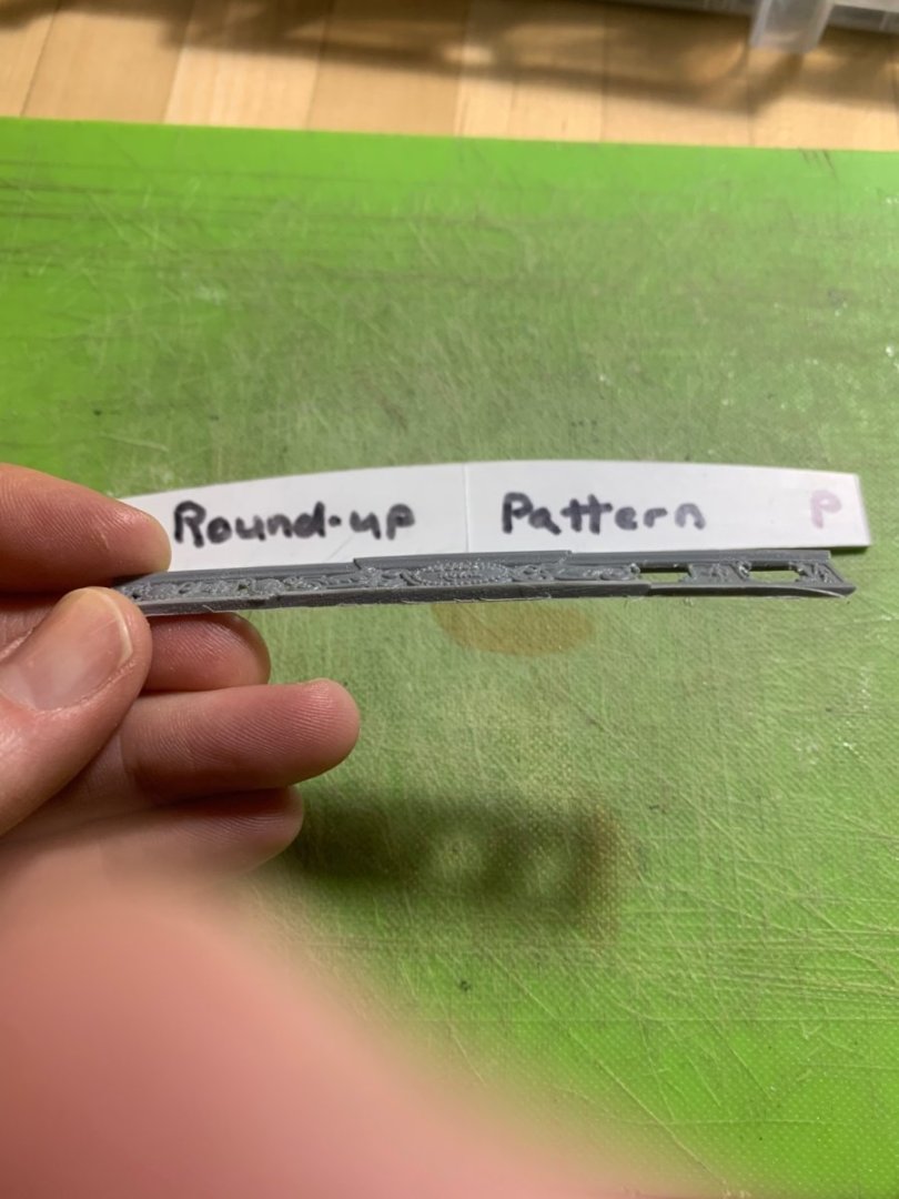
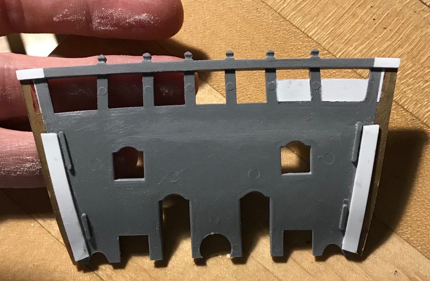
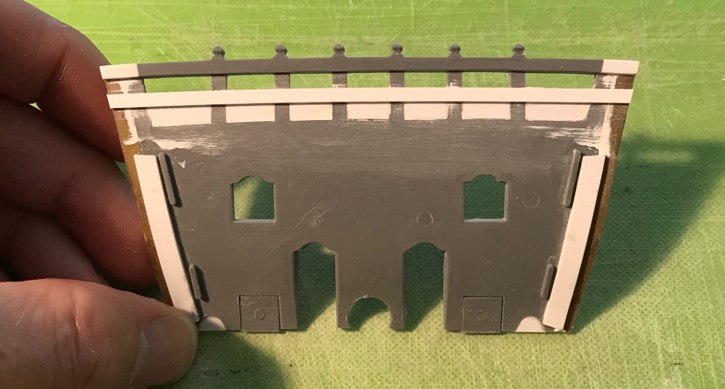
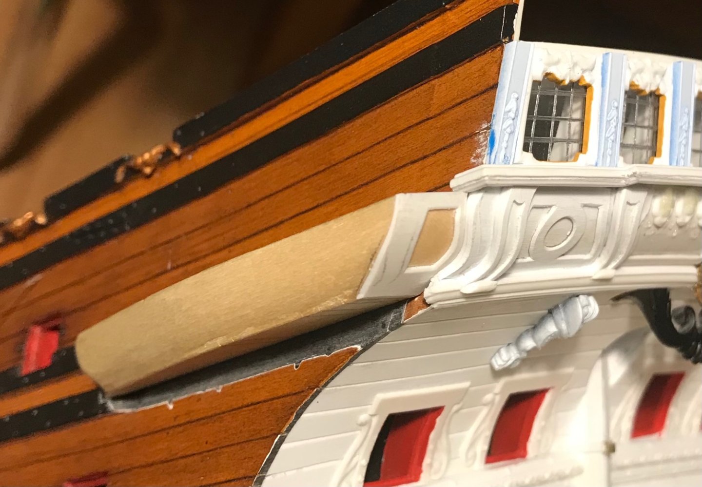
I’m a little stalled on the bow, while I await delivery of Liquid Bitumen of Judea, for staining of the hawser cables. And, so, I have returned to the stern. I’ve made up and fitted the upper stern balcony base: Relative to the balcony below, you can see to some small degree how the starboard side projects slightly further aft. It is not so visually disruptive that I absolutely must decrease the starboard depth of this upper balcony to compensate. If I have to, I will do so later, but in the meantime - I am doing a bit of an experiment. I am trying to see whether I can salvage the ornamental facade of the stock upper balcony, while successfully incorporating the round-up of the stern. The stock part is flat-faced, but I have two of them to pull from. As it happens, I can see a path toward filling the center section and the step-back panels to either side: After cutting out the floor and rough-wasting: After cleaning up the top scarf and wasting the bottom moulding: If I were to extract the outboard panels from my extra balcony, and splice them-in the same way, then I can perfectly fill the span with what would be a relatively labor-intensive thing to make from scratch. The deck camber is right-on. The difficulty lies in introducing the round-up. I had a spare middle balcony, so I cut out the floor and tried to induce a heat-bend over an open flame. The results were not so good: The variable thicknesses of the part lead to unequal heat distribution of the flame, and when the part becomes malleable, it happens very suddenly. If you’re a second too late, the thin parts become irreversibly distorted. I don’t think this is the way. I will cut out and join the additional segments I need, and I will join and glue them together. I may glue the whole thing to thin backing plastic, and then I will try taping the assembly to my camber form, which is almost identical to the round-up pattern. I will see whether a natural bend can be induced over a period of time. For a moment of Zen, here’s the Tanneron model on her waterline:


- 2,699 replies
-
- 15
-
-
- heller
- soleil royal
- (and 9 more)
-
Well, you got me, there - that is true 😀
-
I can appreciate the authenticity of the detail, but this would not bother me, personally. It also may have been better to mention this earlier. For me - personally - it wouldn’t be worth the re-work.
-
Tell your wife I appreciate the compliment! As for doing that, I created that ornamental space by reducing the beakhead railing by half. I filled-in with styrene between the stanchions, and added mouldings and ornaments to the exterior face.
-
Hi Bill - What you see with your and Henry’s build is the way the kit is intended to go together. Because I made the bow wider, it was necessary for me to extend the beakhead bulkhead on it’s outside edges by a tapering 5/16”. I saw this as an opportunity to make a realistic plank joint. In actual practice, the side bulwark planking overlays the beakhead planking. Heller does the opposite, I can only presume, because it simplifies their manufacturing process in some way. This is hardly a critical detail as it gets covered, mostly, by the headrails. For all of the effort I took to cut neat rabbets into the fore and aft edges of these bulwark pieces, very little of my end-plank detailing will remain visible. At the stern, below the counter, it remains, but above at each balcony level a pilaster ends up covering it:
-
Hi Bill - yes, that is precisely my recommendation. Without the beakhead bulkhead in-place, one can only guess at the actually correct tumblehome of the forward bulwarks - so, you may create what you think is a pleasing fit only to discover gaps opening later, once the bulkhead is in-place. The whole objective, as you seem very aware of, is to minimize handling of these painted parts.
-
This is a brilliant piece of work, George! I’m sorry I missed this one, but I’ll be keeping closer track of what you do next. All the best, Marc
-
Burnishing should help, but a light touch is recommended, so as not to burn through the leaf. Glueing the upper bulwarks together before installation is probably easier, as far as concealing the seam, but only if you have first created good joints between the individual bulwark pieces and the upper main wale, first. If you haven’t really tested those fits yet, you may want to do that before glueing anything together. I think the instructions call for installing the beakhead bulkhead first. This provides a useful and necessary reference for the required tumblehome of the upper bulwarks. On my current go-around with this kit I have spent an incredible amount of time and effort fitting these parts to get as good a lap-joint as possible. Even then, I have thought it a good idea to re-enforce the joints on the inner bulwarks wherever they can’t be seen. Trust me when I tell you this is time well spent. You can only really appreciate how poor the general fit of these parts is, once you really try and dry-fit the required hull curves, relative to the actual beakhead bulkhead. The bulwark parts have to flex quite a bit to seat properly in the lap-joint.
-
The flag looks pretty incredible! This is Silkspan tissue, or Kleenex tissue? As for the fit of the kit parts, I recall that on my first attempt of this model, I was duly impressed by how cleanly it all went together. I kind of regret chucking it in the garbage, after I realized that the ship topsides were painted red and not blue. In any case, I have a second kit sitting in the stash. Your unique approach to painting her, opens up the door of possibilities. Like, maybe it would be fun to do a diorama of the ship 10 years after her sinking as primitive diving bells descend to retrieve her cannons; what state of decay and deliberate deconstruction/destruction would she have been in, by that point?
-
The paint work looks very clean, Bill, and the wale bolting shows very well at scale. One thought on the gold leafed figurehead: I can’t tell whether it is just the light and photograph, but the surface of the gold looks a little textured. Have you tried lightly burnishing the surface with a Q-tip wrapped in T-shirt scraps?
- 1,508 replies
-
- 1
-
-
- Le Soleil Royal
- Heller
- (and 1 more)
-
This is an extraordinary build!
-
Das ist bedauerlich. Ich freue mich, dass Sie an Ihren Bemühungen festhalten.
-
May I ask - what were the main issues that prompted you to start over?
-
Hi Bill - those holes in the upper main wale are for the plastic kit eyebolts that the “chains” attach to. I lowered my chanels down to this upper main wale because that would have been the correct location in the late 1680’s. Where Heller has placed the Channels is correct for 1669. So I filled those holes and my bolt pattern remained the same, except for where the channels are located.
- 1,508 replies
-
- 1
-
-
- Le Soleil Royal
- Heller
- (and 1 more)
-
Fantastic and assiduous research - love it!
-
I prefer to save my sea legs for real action.