


Hubac's Historian
-
Posts
2,967 -
Joined
-
Last visited
Content Type
Profiles
Forums
Gallery
Events
Posts posted by Hubac's Historian
-
-
-
-
ClipperFan, indeed it will be!
Your Norse mythology poster sounds like its rightful place would be airbrushed along the side of this sweet honey:

An actual 1975 Dodge (MOPAR MADNESS!!) panel van. I love 70’s Dodge, and obviously, I will exploit any opportunity to incorporate it. Seriously, though - the ground color of this particular Dodge seems perfect for the 8-legged horse you describe. Just the idea of it reminds me of Spinal Tap; “These amps go to ELEVEN...”
I know it’s a reach, but do you still have the poster?
- mtaylor, GrandpaPhil and EJ_L
-
 3
3
-
It is fascinating to me which aspects of this whole discussion of SR - my build log - take off. I am enjoying the debate!
Clipper Fan, while I have been pretty emphatic, at times, about various aspects of my interpretation, I have discovered over time that many of my early assumptions were just wrong, and it is people like yourself, who have helped me to see that. Discussion and debate is the primary goal of maintaining this build log, as filling-in the missing details is often vague.
Now that you have brought it to my attention, I share your fascination for McKay’s secrecy. In that time, though, I suppose maintaining competitive advantage was what the windjammers were all about. If life ever returns to semi-normal, I’ll have to make a visit to the India House to see that figurehead. It is a lovely example of the art form. For a good stretch of time, I lived only blocks away from there.
So, it’s official - we are collaborators! Specific projects and renumeration, TBD. It is a while off, though. Whenever it is that I finish this project, I will immerse myself in whatever the best-suited drawing software there is for creating a monograph-style set of plans. I’m hoping that these things will have become super user-friendly, by then.
Once I can navigate something like that, I can begin developing a plausible hull form. Once I’ve made a simple foam maquette to test the volumes of my hull, I can begin drawing all of the structure, in detail. Once we have a structure to reference, we can begin to flesh-out the ornamental program.
Much of the discussion of the book is already written, long-form, in the pages of this log; of course, my arguments and observations will need to be better substantiated by primary sources. Going to France on a research junket will be hell, but I think I’ll be able to soothe myself with their food and wine😉, and their general joie de vivre. So, it’s all a ways off, but this is my plan, anyway.
Last night, I distress washed my main deck. The Windsor and Newton grey does a fabulous job of getting into all of the engraving, while silvering the random tan, acrylic base-coat. Then, the Van Dyke Brown works its magic and the whole thing looks appropriately weathered.
I’ll give the oil a few days to cure before I paint the hatches and coamings red ocher. As I have done, elsewhere, I’ll use the walnut ink to wash the red.
Now, speaking of missing details, I am trying to work out the details of the stove. Unfortunately, the St. Philippe monograph isn’t much use for me, in this area, because the main hearth and bread oven are two separate structures that are placed between the guns, on the middle deck; one to port, and one to starboard. I want to centralize these two things on the main deck, beneath the forecastle deck, with one chimney.
While I have a good idea what the timber cladding and iron strapping would look like on the outside of the brickwork, I can’t find any reliable references to what the brickwork should be for a combined cauldron stove/bread oven. Would they even have been combined? For all practical purposes, very little beyond the timber clad bulkhead will even be visible, but I would like to know what should be, for SR 1670.
Your likes comments and input are all greatly appreciated.
- yancovitch, druxey, EJ_L and 5 others
-
8
-
As a side note, one of the vexing incongruities of the bow and quarter drawings is that the bellflower garland does not run continuously from stem to stern, all on one level.
In the quarter drawing, the Pixies are holding the garland, but it terminates, at the quarter deck level, into the roof of the amortisment.
The bow Pixie has a garland in each hand, and the drawing suggests that swags of bellflower garland will run continuously, the whole length of the ship, between the round main deck ports. From the bow Pixie’s forward hand, the garland even runs through the middle headrail to the hippocampus Pixie. Yet, the garland is conspicuously absent in-between the round ports of the quarter drawing.
As I have noted elsewhere, though, Berain’s drawings often have strange incongruities from one view to the next. Much as I imagine the original sculptors had to do, modeling this ship is an exercise in interpretation.
-
It is very easy to become myopic on a project like this, and so it is refreshing to see something new through another person’s eyes.
ClipperFan, your interpretation of the Pixie/Mermaid figures is really interesting to me for a number of reasons. Mermaids challenge one to wonder why they’d be included in the ornamental program, in the first place. My best and honest guess was that they were sort of visual companions to the lonely, conscripted crew, whom would be obligated to spend long periods of time away from the actual women in their lives. In the folklore of the sea, though, Syrens always seem to lead hapless sailors to their untimely end.
On the other hand, Pixies offer an alternative rationale as figurative guardians of the ship. It is interesting to note that Berain’s drawing of the head includes a third Pixie-like figure, just aft of the headrails. She has fully formed human legs:
Another Pixie rides the hippocampus figurehead. And so, from stem to stern, their magic spell would shield the ship and her crew from undue harm.
With specific regard to the stern figures, though, I just really like the playfulness of your idea, where dolphins have swallowed the Pixie’s lower legs, thus adapting them to their aquatic task. With this interpretation, there is also a nice interplay with the four dolphin figures on the main deck level of the amortisement.
Your idea speaks to the duality of these ships that I have always found so fascinating, and that is that these truly terrifying machines of war were ornamented so impressively, and with the greatest artistic sensitivity to their times.
I am also really impressed, ClipperFan, with the apparent ease and naturalness of your own quick sketch. Drawing anything is something that I really have to labor over, in order to capture the essence of the thing. You appear to have a real talent for it!
Perhaps, down the road, I could hire you to help me visualize, in 3D, the ornamental program of SR 1670 - my so-called Gilded Ghost.
While even now, I can see pretty clearly in my mind’s eye, what the basic shape and parameters of that project need to be - to capture a sense of the ornamental style of the early 1670s is a tall order! The project essentially amounts to combining the substance of LeBrun’s conception of the allegory, in the artistic style of Puget, and supported by appropriate ornamental embellishments of the time.
I am also wondering whether you are an L.A. Clippers fan, in addition to being a fan of clipper ships.
- mtaylor, GrandpaPhil, Archi and 2 others
-
5
-
All very impressive, George! I’ll be happy to follow along on this one, as well.
-
-
Just a quick update:
In all likelihood, I will cut away the smaller, inside wings because they interfere with my aft octagonal ports. However, until the amortisement is made and I can see the actual relationships of all these parts, I wanted to keep all options open.
Tomorrow I will start the heads, but my own head is growing weary and my neck is getting sore, after sitting hunched over these gals all day. I tend to start making mistakes when I push through.
A few of those mistakes, I’ll be filling-in with BONDO, this evening, as I prepare the main deck for painting and priming; some of my nail impressions were poorly placed, and/or ill-conceived.
I’m excited to get back to a little painting, though. In addition to the Windsor and Newton Van Dyke Brown, I will experiment with a lightish grey Windsor and Newton oil shade, that will be applied and wiped streakily before a blanket application of the brown.
The deck is coarsely sanded, so it should pick up these colors nicely.
- EJ_L, bruce d, marktiedens and 8 others
-
11
-
-
Thank you very much, guys, for your kind compliments.
It isn’t so much that Mermaids have legs above the knee, but that Berain was maybe suggesting musculature. Here is what Berain drew, originally:
Now, if you compare that with this Nat Geo photo of Daryl Hannah in the wild, I think we can agree that Berain was on to something:

- fmodajr, kirill4, popeye2sea and 5 others
-
8
-
Thank you very much, Shipman! The figures are carved from styrene, but don’t be too amazed; carving styrene is analogous to carving soap, for beginners. Carving these figures in wood would be a whole ‘nother story! Alternating grain makes carving wood much more finicky.
- EJ_L, Louie da fly and mtaylor
-
3
-
I’m excited to see what you do with this one, Micheal. You’re off to a great start!
- md1400cs, FrankWouts and EJ_L
-
3
-
Steady progress:


One of the things that anatomy forces you to learn are ways in which to introduce the soft hollows of a body, with whatever tool can get into tight spaces. In the area of the belly and hips, I don’t have a gouge that’s small enough to get in, close to the side of the body, without the arm getting in the way.
What I use is the hooked knife to scrape hollows on a bias, according to the same principle of cutting a cove moulding on a table saw, by running a fence at an angle to the blade. The scraping motion, at an angle, gently introduces a hollow that, in this case, defines a fleshy love handle. Each scrape removes just a little material at a time, and eventually you arrive at where you want to be.
One other thing I’d like to mention is the undercutting of the upper thigh. I could simply define the lap line, where one thigh rests against the other. This would look okay. However, the pose of the figure suggests that the outer thigh overhangs the other leg.
What I like to do here, to suggest this, is that after I have first defined that meeting line - the line that delineates the shape and proportion of each thigh - I come back with sharply angled scrapes that undercut the outer thigh. I use the sharply beveled tip of the EXACTO to do this. The accentuated shadow line creates a false sense of depth in what is a very shallow carving.
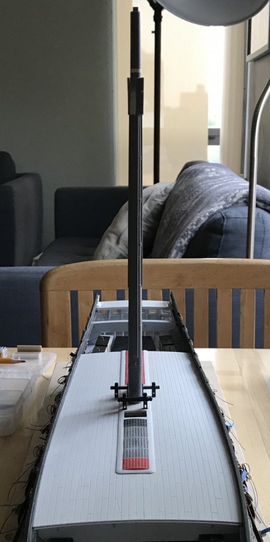
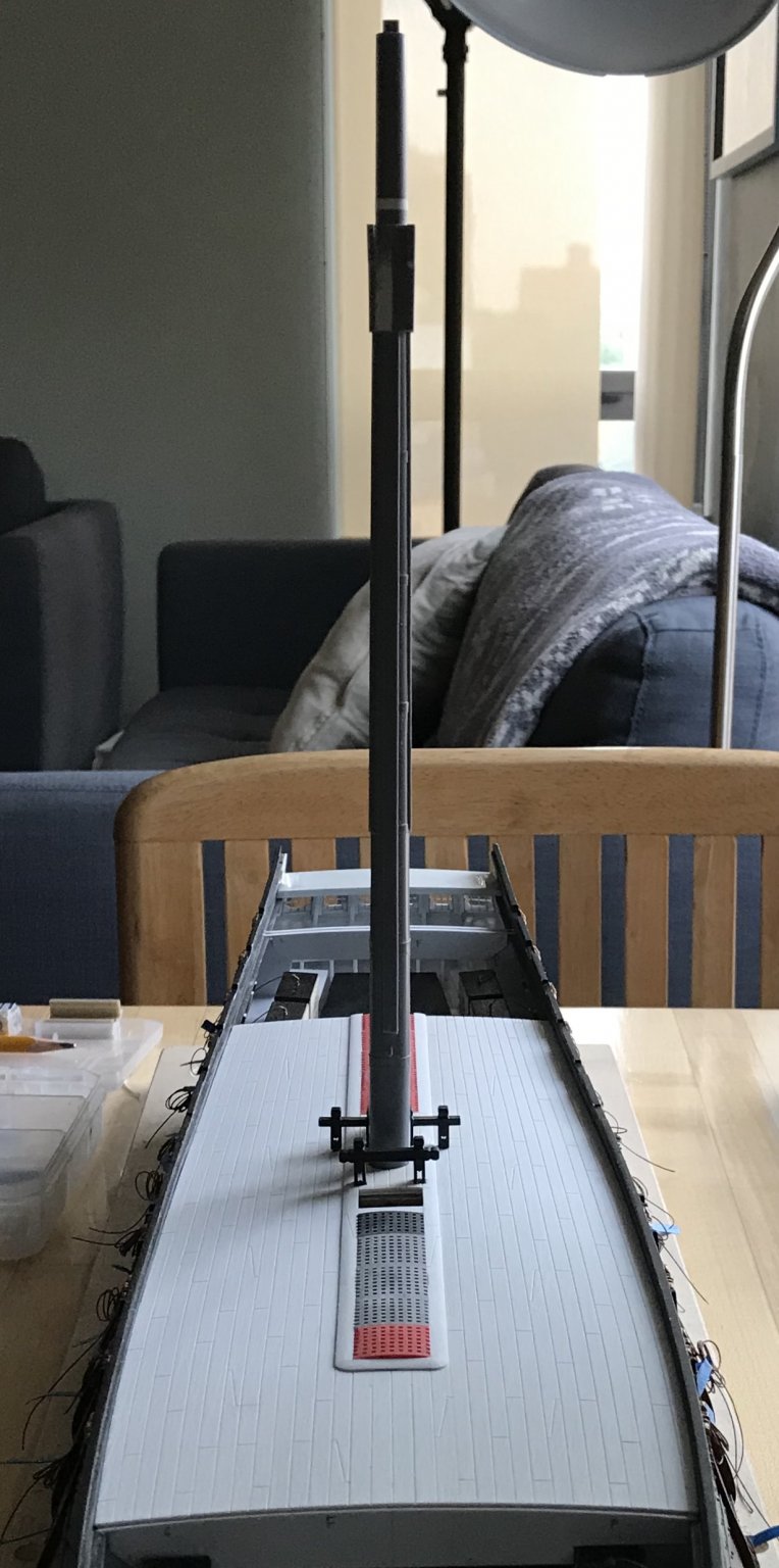
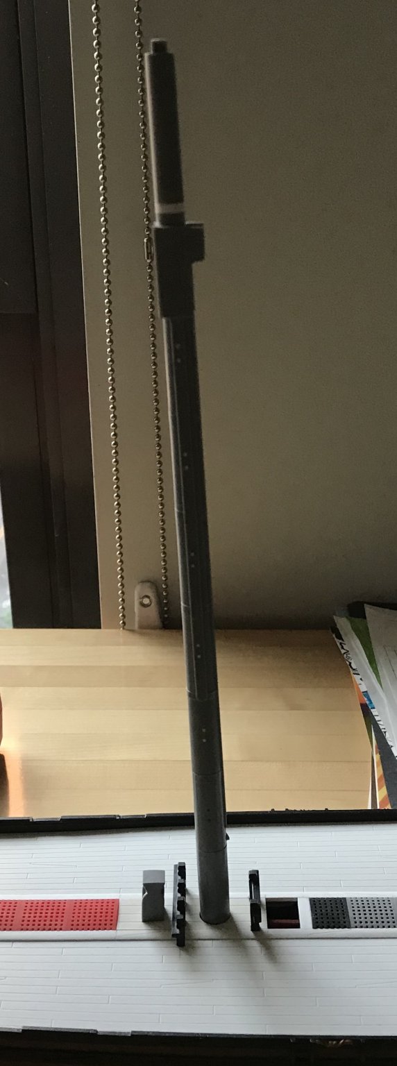
While I wait for my #80 drill bits to arrive, I have made and fit the fore and aft sections of the main deck. Unlike the middle deck, where I had to make mast plates to fix the plumb and rake of each mast - I now had a reliable reference to measure the exact centerline of the fore and mizzen masts; I could measure directly from the fore and aft edges of the main deck center section to the center of each mast. The masts are all in alignment, now, and the slight bow of the mizzen will eventually be corrected by the stays and shrouds.
I have also decided to re-enforce the main deck hatch openings with carlings that are scribed to the longitudinal curvature of the deck. The styrene I’m using for the decks is a bit thinner than what the stock kit provides, and is not as rigid. It is my pathology to overbuild the whole thing, so, here you go:


I enjoy the exercise of scribing and fitting these curved parts because it is good practice for when I eventually transition to wooden builds.
Thank you for looking in. More to follow...
- rybakov, shipmodel, marktiedens and 9 others
-
12
-
-
-
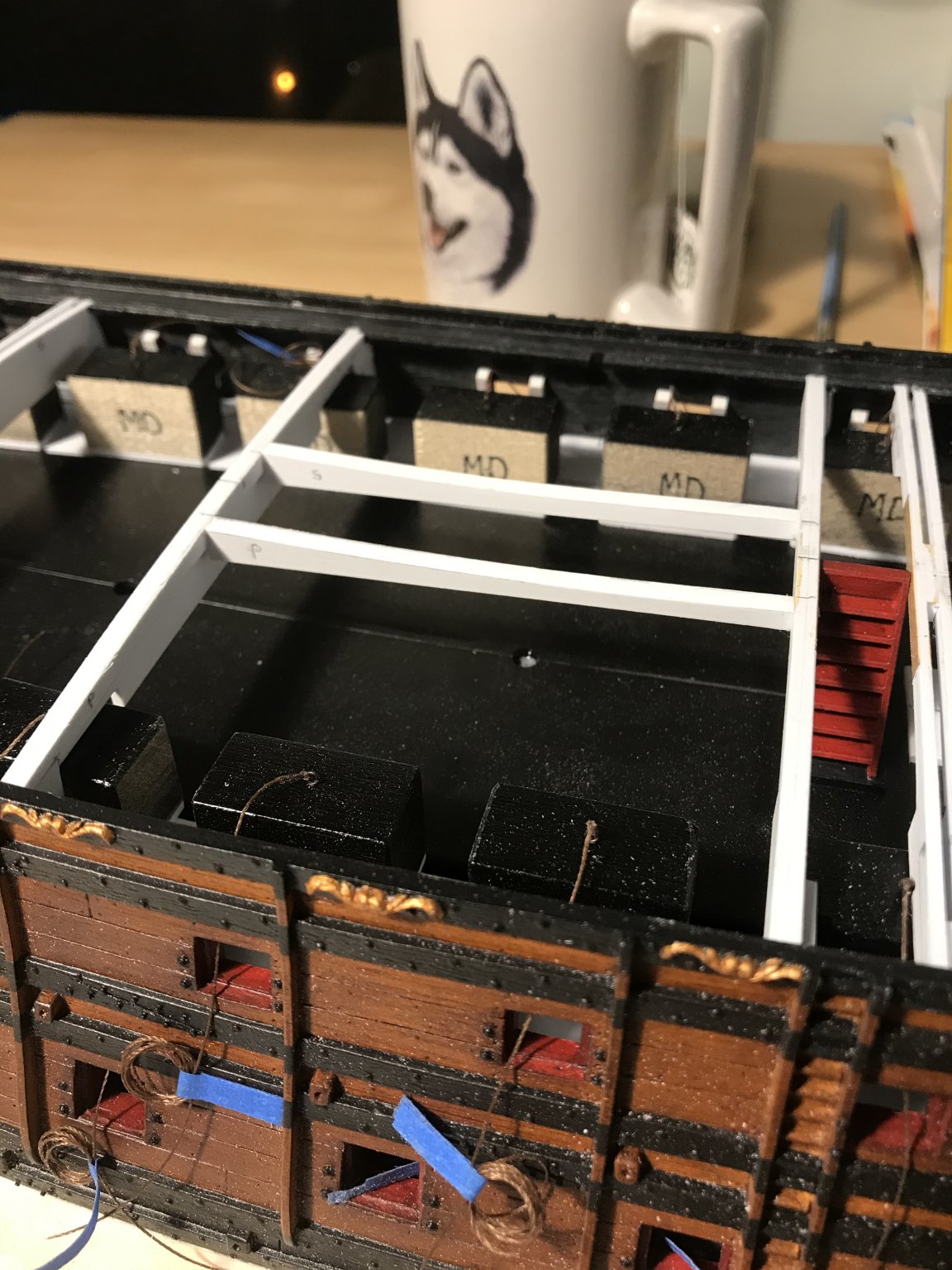
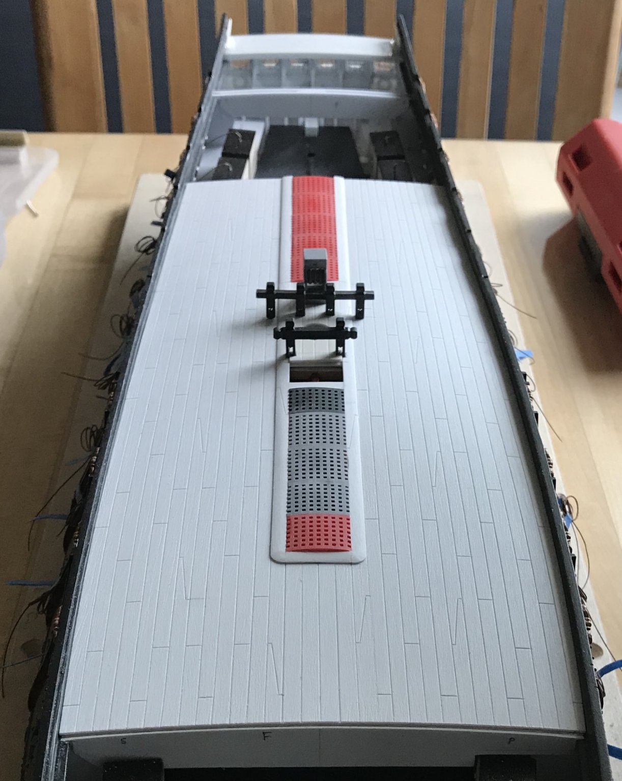
Work on the main deck continues:
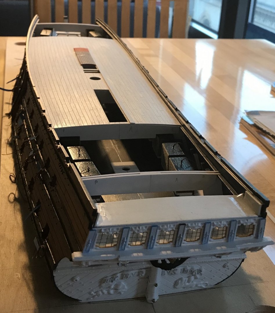
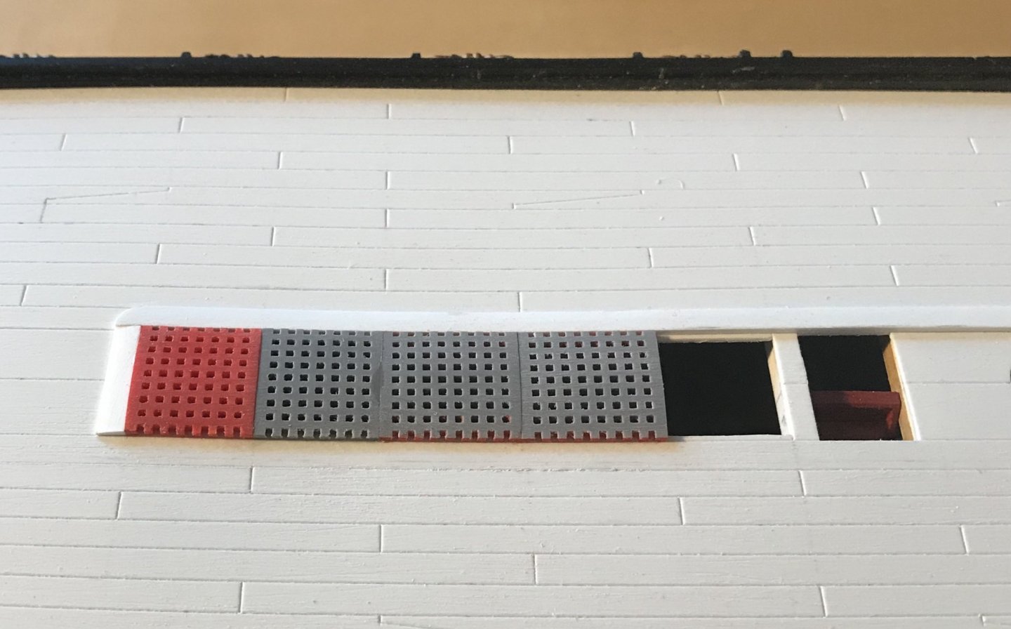
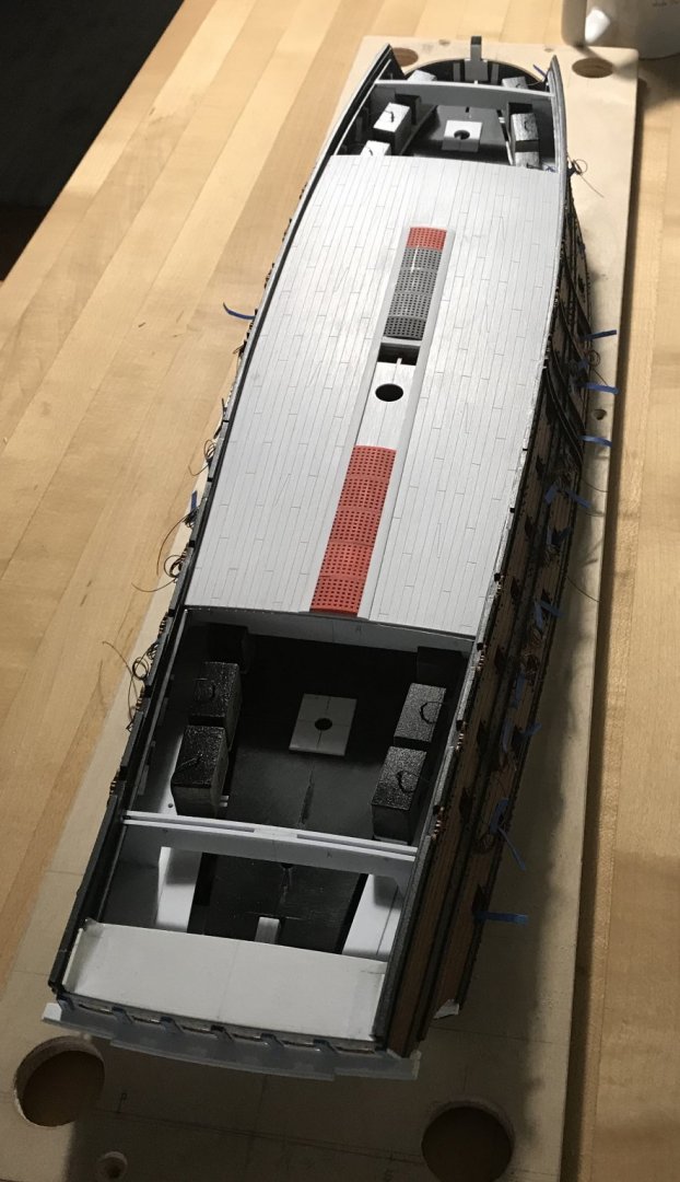
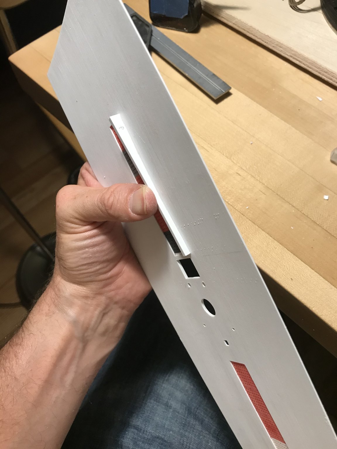
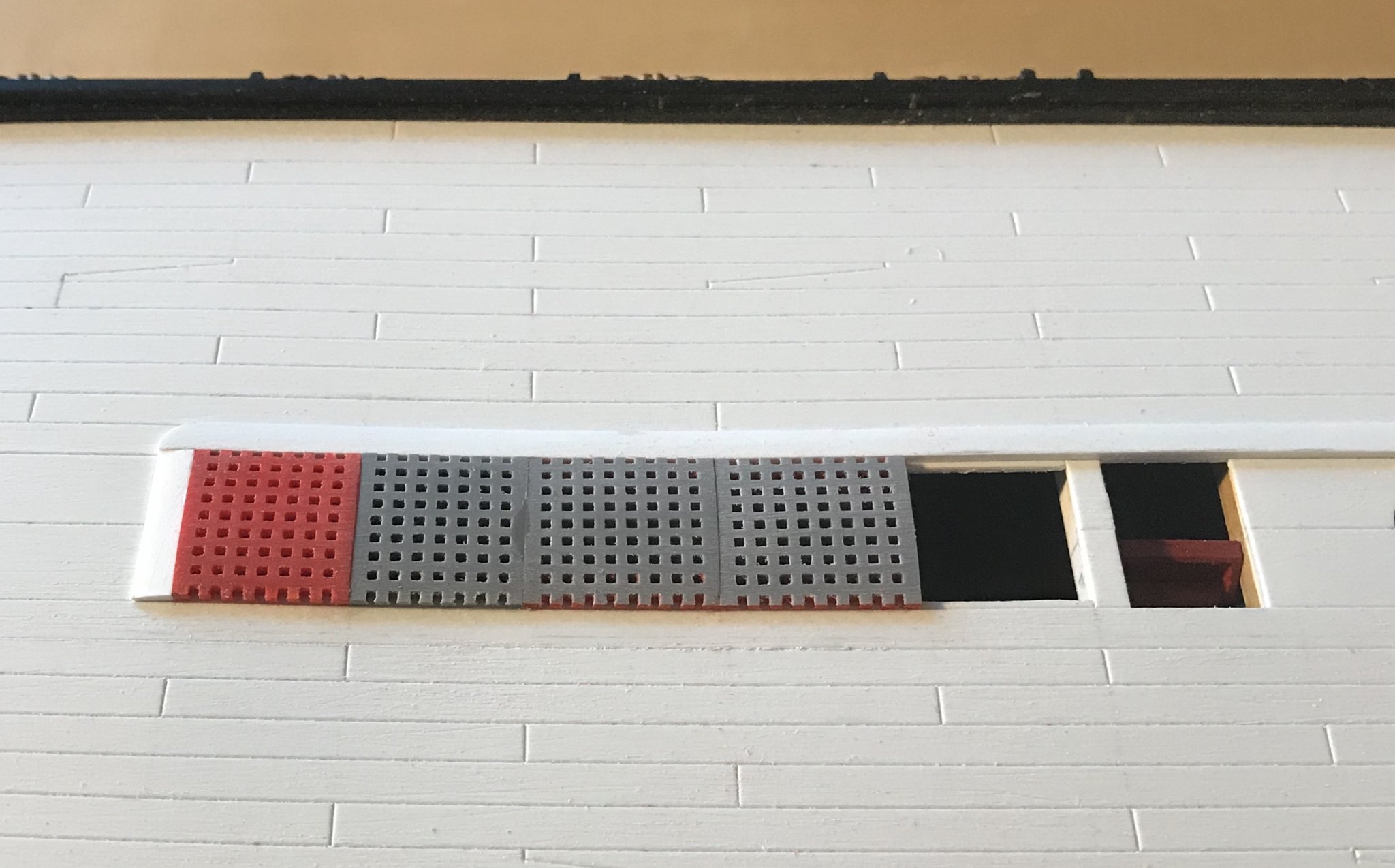
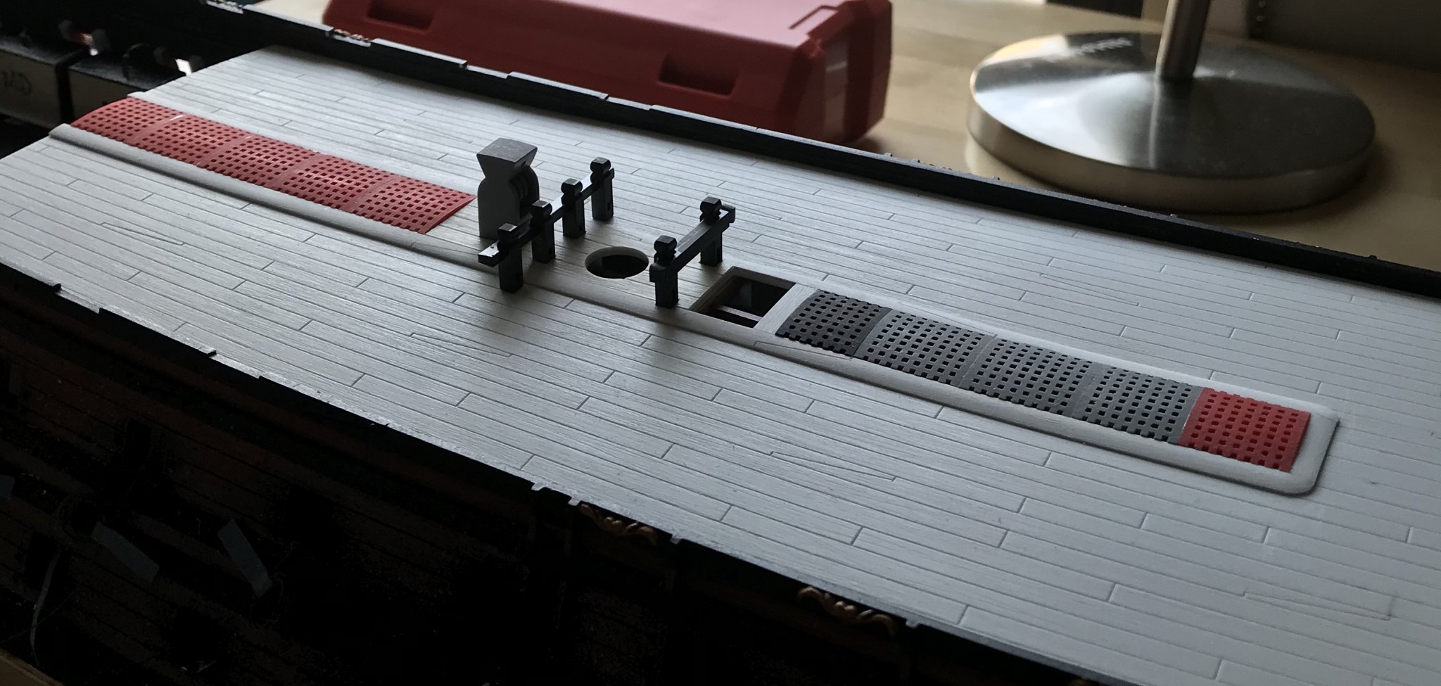
The gratings required a little extra attention to get them to lay in an even plane.
The main mast plate finally secured the mast, perpendicular to the keel, but the extra thickness of the plate and coamings necessitated a little inletting of the deck furniture:
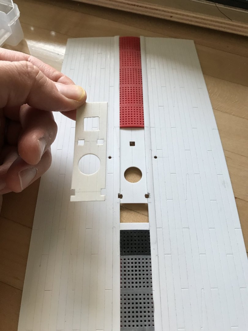
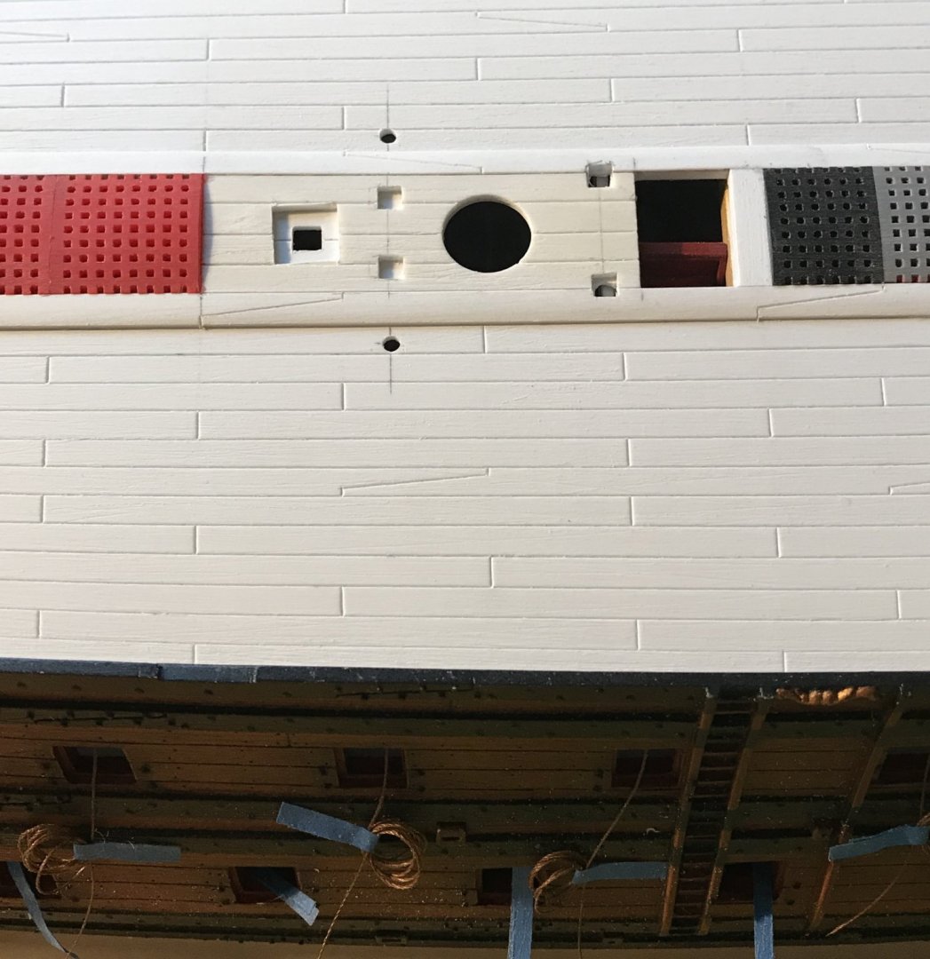

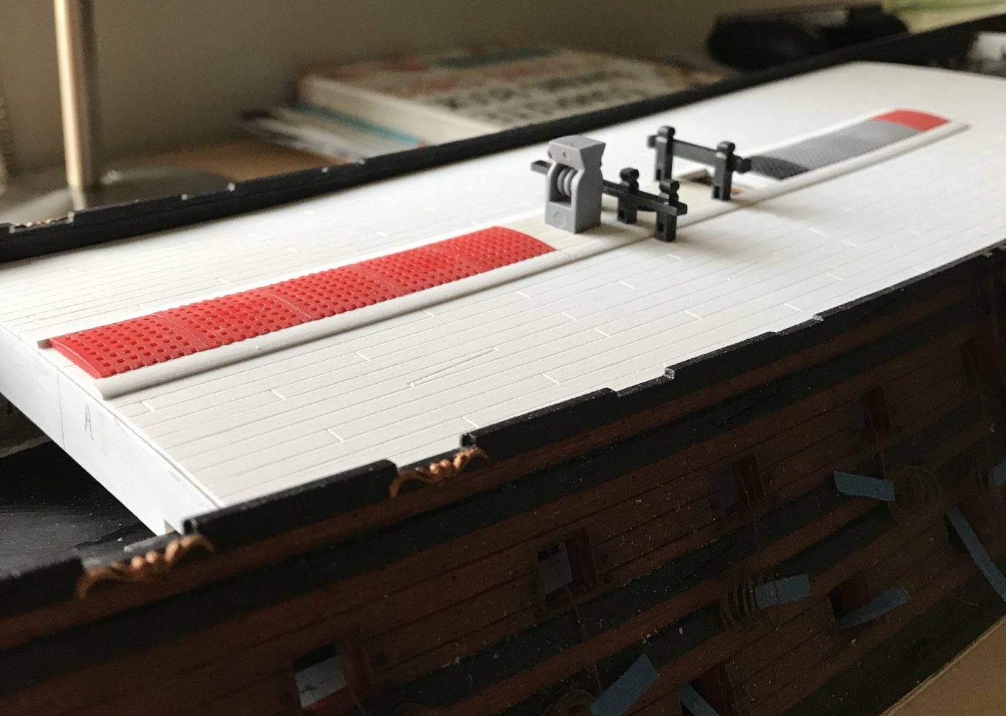
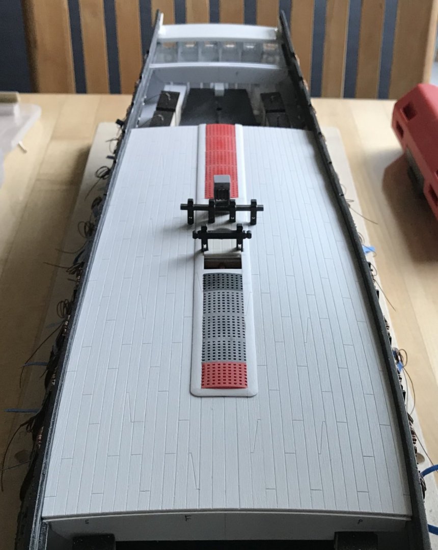

Next, I will drill all of the nailing impressions, and then I will paint the deck.
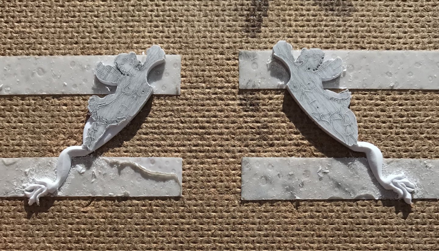
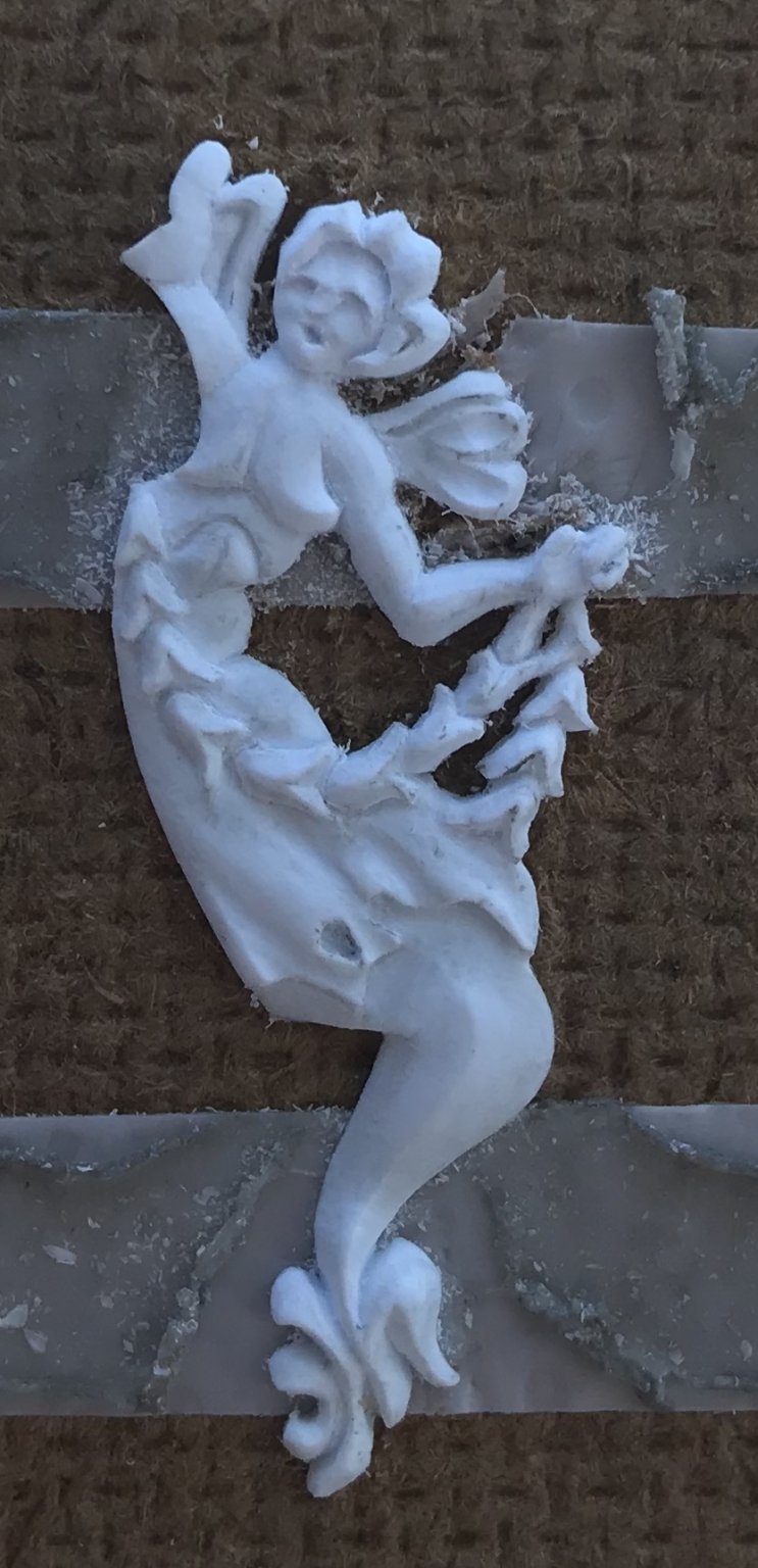
Work on the forward MerAngels is proceeding nicely:
Thank you to everyone for your likes, your comments and for looking in.
- popeye2sea, rybakov, shipmodel and 16 others
-
19
-
-
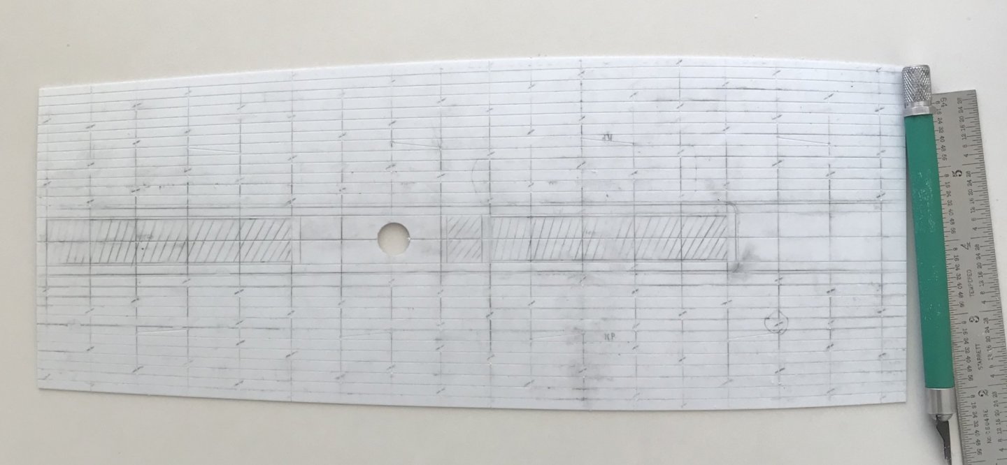
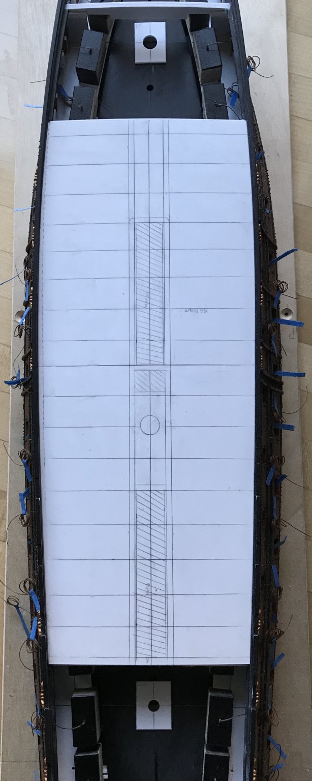
Main deck engraving is complete. With the way the plank lines faired out, the extra port plank really won’t be noticeable at all because the narrowed ends will be covered over by the quarter and f’ocsle decks:

What I really enjoyed about this particular scratch-built portion of the project is that arriving at a deck layout requires you to think like a shipwright. Although I may not be laying planks individually, my shift pattern still has to make sense.
As will increasingly become the case, I took my cues from Lemineur’s St. Philippe, and I arranged for two belts of five planks each; five between the coamings and the binding strakes, and five from the binding strakes to the bulwarks.
The coamings and binding strakes consist of scarfed planks of 30’ scale feet, and the regular plank is scaled to lengths of 24’. Please note that the coamings are not yet in place because they will be applied a few steps from now. My objective was to stagger the scarf joints, among the coamings and binding strakes, so that no two scarfs landed on the same beam.
I then chose to go with a three-plank shift of butts for the regular planking. That worked out neatly because the pattern repeats on the fifth plank. The deck is still messy with graphite, and the engraved butts may not be so easily apparent, but they are indicated by hash marks:
My objective with the regular planking was to not have a plank butt land right next to a scarf butt. I began with the port side and this was not an issue.
Then, I laid out the starboard side. I checked and re-checked the shift pattern to make sure it was correct. To note: the second belt of five planks was layed-out so that the first plank was the continuation from the fifth plank of the first belt.
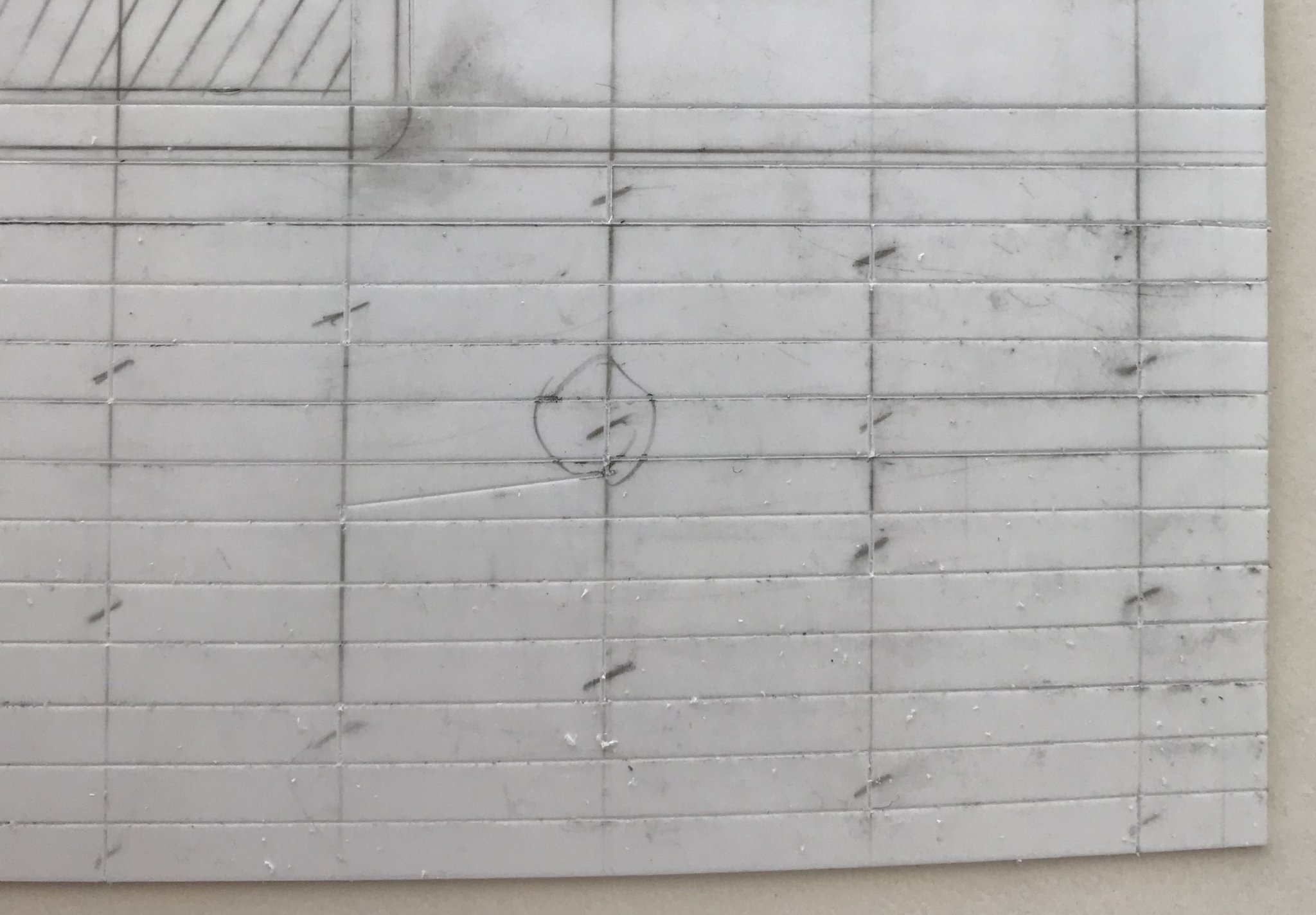
All seemed well, until I started engraving butts, from fore to aft. That’s when I noticed this problem (circled):
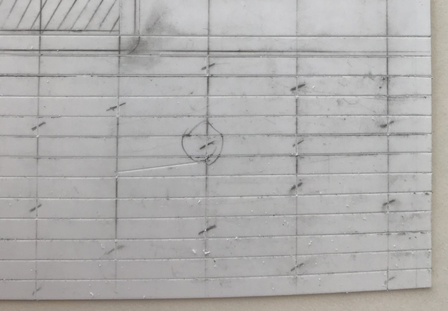
While this layout error did not occur on the port side, it seemed to me that I couldn’t leave this mistake. I decided to shift that one butt - that lands in the same place at every binding strake scarf - one beam forward. I’ll fill this first one with putty, but you can see that I already engraved the corrected butt, to the right.
While this disrupts my shift pattern, ever so slightly, only the most astute rivet-counter would ever notice. On the other hand, a plank butt directly adjacent to a scarf butt would jump out at anyone looking with moderate intensity. Perhaps the wiser layout would have been to mirror one whole side to the other, but what’s done is done. It’s a correction that I can live with.
Next, I’ll sand the deck with 50 grit paper. I think that my earlier deck samples could have been improved if the texturing of the deck had been more aggressive; the deeper scratches will catch more of the Van Dyke Brown, and grey distress wash.
Following the sanding, I will build up the coamings, gratings and main mast plate. Lastly, I will drill the deck for trunnel impressions, and then mount the knight heads before painting.
Happy Fathers’ Day to all!
- yancovitch, shipmodel, Rudolf and 5 others
-
8
-
Finally - the head!
In observing Druxey’s excellent carved works for his Speedwell project, these past few days, it dawned on me that definition of the brow and position of the nose were the key determinants for getting started.
I began by digging down around the hairline, first with score cuts of the EXACTO, followed by pairing slices of the BEEBE. The idea is to approach at a steep enough angle that you creep towards the previously scribed brow line. Keep in mind that this head is just about the size of a pencil eraser head:
Once the hairline had been cut deeply enough, and I was satisfied with the rough slope of the forehead, I cut to the line beneath the left brow and down the nose line, setting it in relief. Again, in-between light scoring cuts, I use the BEEBE - this time with a scraping motion - to clear waste and to begin contouring the face around the eye socket.It bears mentioning that I never intended to represent the roundness of the eye, itself.
I then cut beneath the right brow, scraped waste and began contouring the cheek area with scraping cuts.
At this stage, I started to worry that I was sculpting the MerAngel of Death, and that maybe I should have her holding a scythe, because her facial features began to seem skeletal.
When the carving becomes discouraging, like this, the best thing to do is take a breath and evaluate.
After leaving it for an hour, I came back and determined that now was a good time to rough in the mouth because its presence would cue me toward how and where to shape the cheeks and chin:
As I’ve drawn it, the mouth is just a soft diamond shape. It is achieved with four angled, stab cuts of the EXACTO, that converge at the bottom of the cut. I, then, use the heal of the EXACTO to dig out the waste and extend the corners of the mouth.
Although, in the above picture, you can see that I also began to contour the nose, I think it is evident that the simple addition of the mouth animates the face.
From there, it was a simple, but deliberative process of defining recesses and hollows around the cheeks and chin until the face appeared more cherubic than Skellator.
There does come a point, though, where one has to stop before they risk un-doing all that they worked so hard to arrive at. I found that point, and so I shifted my focus to shaping the coif: defined parts of the hair, rounds and hollows. it doesn’t take much to suggest the movement and shape of hair.
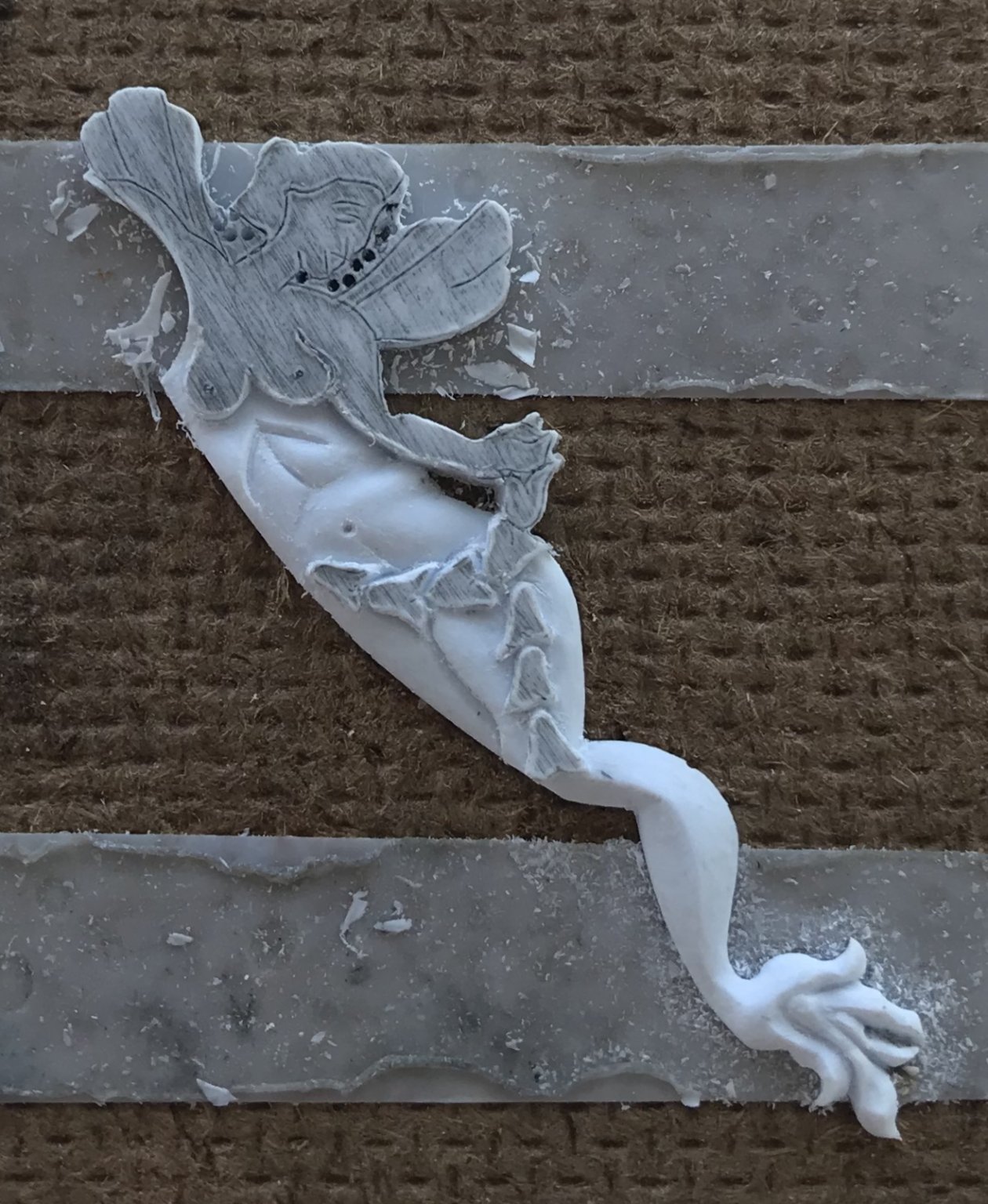
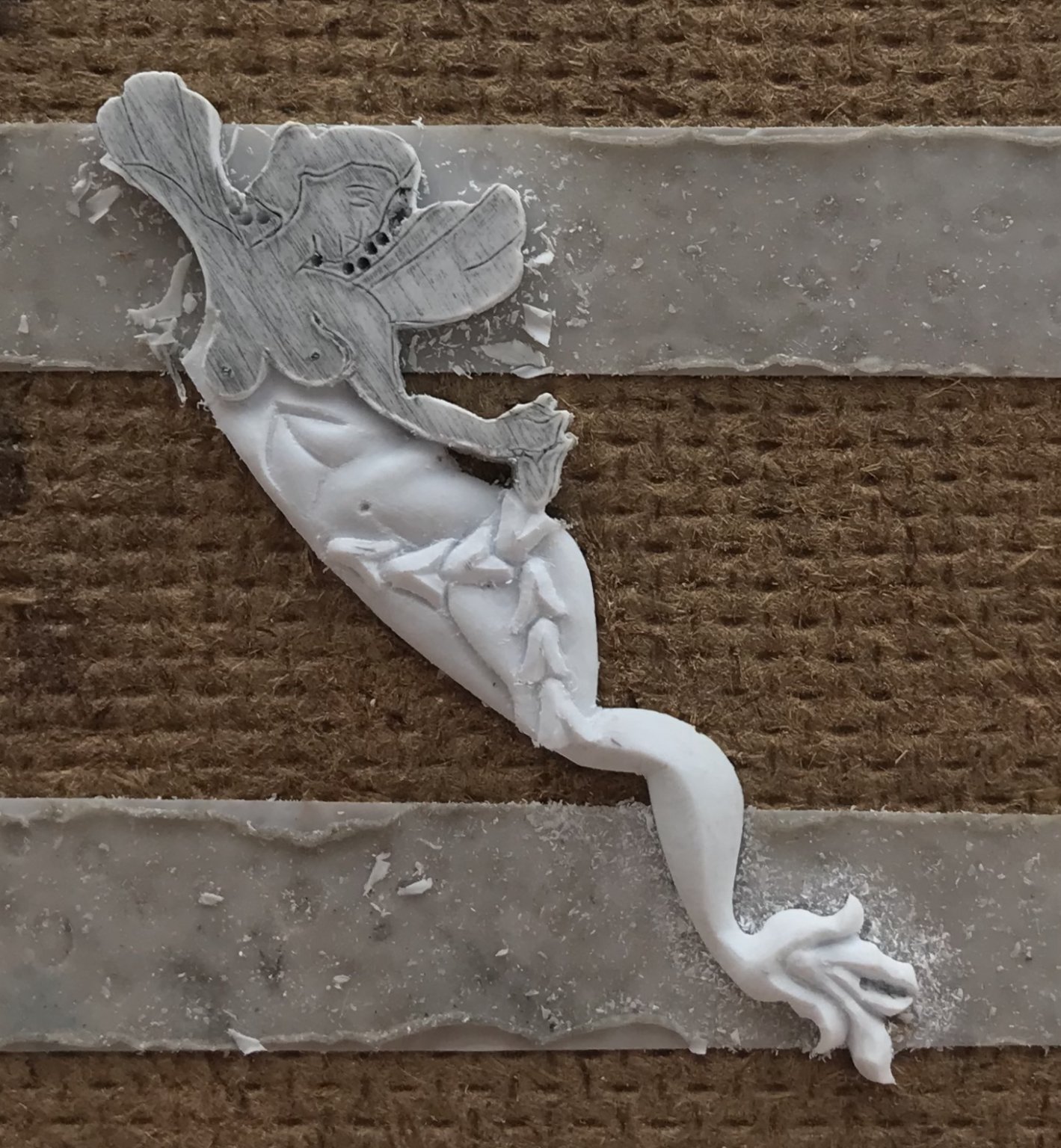
The completed figure:

I’m not 100% satisfied with the nose, but I have at least five more faces, like this, to carve for the ship, so I think I will get better at it, as I go.
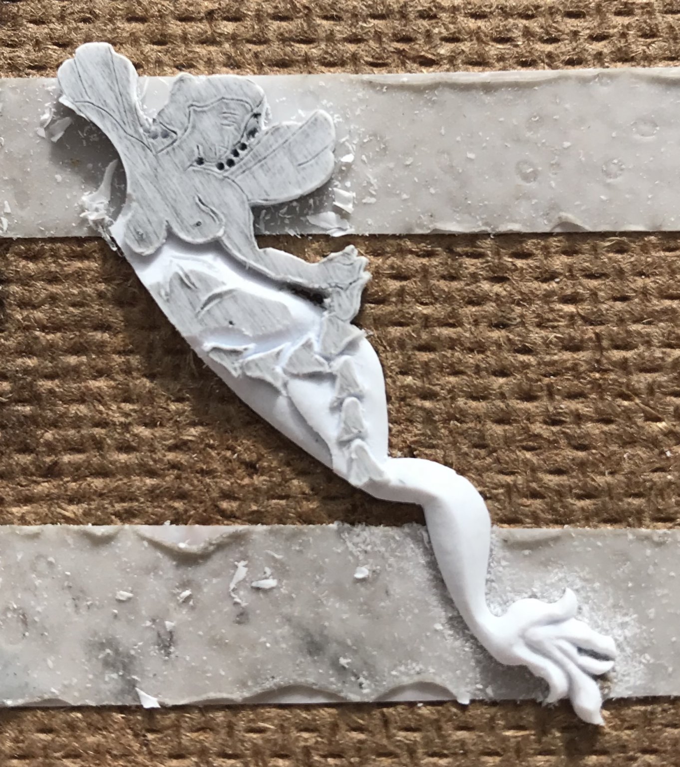
Although the difference is very, very slight, you may notice that the bust profile has changed a little. A friend on the site PM’d me to offer a gentle critique. His thought was that, perhaps as I first shaped the one full breast, the end was a little too severe.
I agreed with him and attempted to soften the very end of the breast, and make it a little more natural looking. To some degree, the prior shaping of the breast limits modification, at this stage, but I do think this is a little bit better.
I want to say that I appreciate the courage it sometimes takes to offer constructive criticism - particularly when it involves matters of artistic interpretation, and most especially when it involves anatomy. We live in our bodies, full time, yet it has become increasingly difficult to talk about them without fear of offense. Anyway, I appreciated that.
So, I will complete the second carving, and then I will immediately begin the other pair of MerAngels that flank the forward edge of the quarter gallery amortisment. I have figured out what I need to modify, on these figures, so that I don’t have to eliminate my aft-most octagonal port.
It is best to launch right into more figures because the mode of seeing and thinking that it requires is now active in my mind. If I really have the stamina left, after that, I may even carve the pair of bow angels. It may be better to wait on them, though, to see exactly how all of the elements of the head come together.
In other news, I have completed my main deck layout and begun engraving the plank seams. Now that I can see the entire layout, I really am not that bothered by the extra plank+, on the port side. I remembered that there’s a plank companionway, above the waist guns, that bridges the forecastle and quarter decks.
I also enlarged the main mast hole, in the main deck just enough so that I could plumb the mast perfectly. The mast plate, between the coamings, will be a tight fit and will secure the plumb position of the mast.
Onward and upward! Thanks for looking in.
- EJ_L, GrandpaPhil, Louie da fly and 9 others
-
12
-
-
Aha! Well, that may explain why I couldn’t find a help topic, if I was calling the timber by the wrong name 🤦🏼♂️
Yes, the binding strakes, that are half-notched into the beams. Before any engraving happens, I’ll draw everything out - maybe I’ll do a double-pencil line thickness on one side, just to see.
-
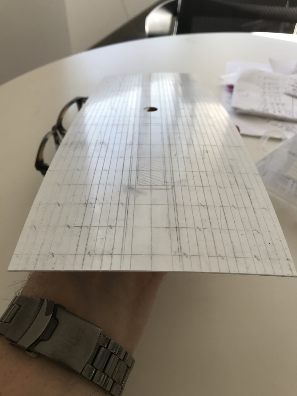
I was having the hardest time figuring out how to lay out this fore and aft tapered deck. I was stuck on the difficulty of representing the second king plank, between the central combings and the bulwarks; sure, I can divide each beam location equally, starting at the greatest breadth, by a given number of strakes - but, how do I consistently account for the slightly wider king plank, in the midst of all of that?
I could not find any subject headings in the help sections of either MSW or SOS. I was just about to cop-out and layout a parallel-straked deck of uniform width planks, when it dawned on me to begin by simply laying out uniformly tapered planks.
First I divided the port and starboard sides into two uniform belts. I further divided each belt into thirds; this simple exercise in sub-division made it so much easier to reliably tick-off equal plank widths over increasingly narrow spans.
I then applied medium tack double-stick tape to a styrene batten that I could lightly tap onto each tick mark, and then nudge into a fair curve:
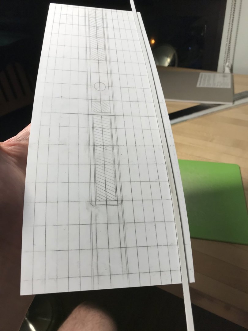
Having gotten this far, I can see that the belts are fair and uniform from starboard to port, which allows me to further subdivide each belt into two planks, each. The deck is becoming a mess of graphite, but that won’t matter as long as the lines remain distinct long enough to get past the engraving process.There are a few considerations, here, worth mentioning. My initial determination for the width of the hatch-combing king plank was not wide enough to account for the increased scale of my, now, wider deck. A too-narrow hatch combing would have necessitated subsequent plank divisions that would be too narrow, and numerous; more like the deck of an Iowa Class battleship.
That is the difficulty of this project. I began by increasing the width, at the stem, by a generous 5/8”, so that I could increase the width at the stern, enough for the missing sixth light. The effect these alterations had on the mid-ship breadth of the hull, however, distort the reality of what should be; my hull is significantly broader than it should be. Fortunately, in my opinion, this improves her appearance as a steady gun platform, but it does arbitrarily affect other issues of scale, like the deck planking, which then have to be finessed for visual effect. As I’ve said before: comme-ci, comme-ca - somewhere, in-between will be this model’s reality.
As things stand, now, I will have 12 strakes to either side of the combings. This isn’t exactly right, or to perfect scale, but it will look okay and the upgrade of a tapered deck validates the compromise.
Because of the A-symmetry issue, there will be an extra strake+, on the port side, but as I said earlier - the busyness of the guns will mitigate the appearance of that defect.
Before I go nuts with the cutouts, and engraving of plank lines/butts, and the build-up of the hatches, etc, I will pierce for the main mast and make absolutely sure that my functional center line is where I think it should be; if that’s off, then the whole layout has to be scrapped.
Assuming that all works out, I suspect that I can cheat a little and emphasize the second king plank by simply engraving just to the outside of the lines, where the king plank should be. This will, ever so slightly decrease the width of the adjacent planks, but maybe it won’t be so noticeable. Alternatively, I could engrave directly on my lines, but include the scarf joinery that would be present on the king planks to signal their presence.
If anyone has any references as to how to properly go about all of this, I would love to know - at the very least, for future projects.
Little by little, we are getting there. Thank you all for your support and for following this project.
- shipmodel, EJ_L, GrandpaPhil and 1 other
-
4
-
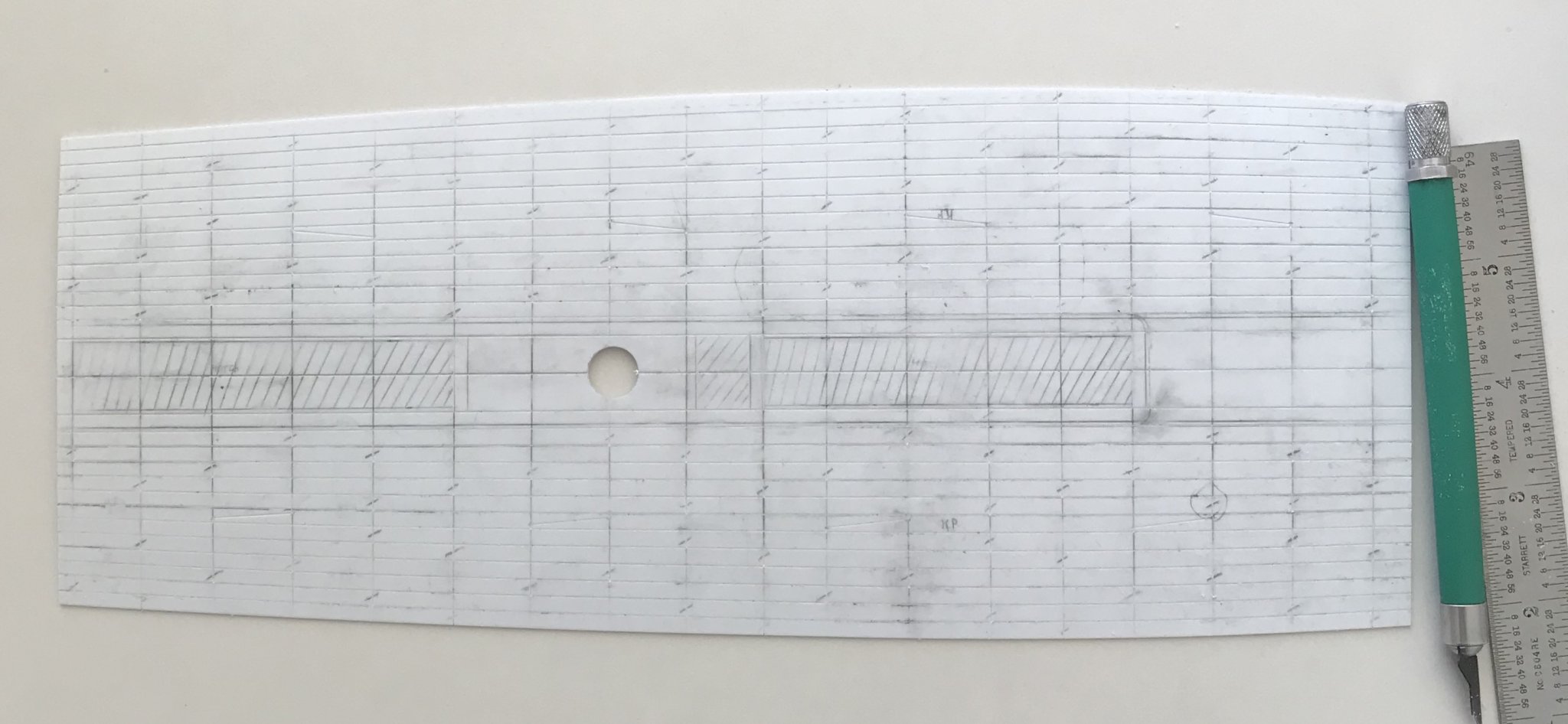
I’ve been designing the main deck and taking my cues from Lemineur’s St. Philippe monograph.
The beam locations are taken and extrapolated from the junction of the hatches:

The hatch-marked areas are the cut-outs for the hatches and companionway. To either side of the hatches will be the central pair of king planks, which are marked out.
The hatch combing will be contiguous with the central king planks, but with radius’d corners at the forward end of the main hatch, where they will drop down to the main deck level.
The main mast will have a mast plate that is flush with the combing framing. I’ll cut the opening in the base deck layer a little loose, so that I can make a final plumb on the main mast, which I found to be a little out of plumb, at the mid-deck level.
The hashed line, on the port side, is the symmetrical outline of the starboard side; I needed to use the flatter side as my baseline for laying out the tapered fore/aft planking.
The trick is figuring out the plank tapering while accommodating the second pair of king planks, with five strakes of regular planks, in-between.
I haven’t figured out, just yet, how to lay all of that out. For tonight, though, I’m satisfied with my progress.
- Chapman, Beef Wellington, EJ_L and 7 others
-
10


Soleil Royal by Hubac's Historian - Heller - An Extensive Modification and Partial Scratch-Build
in - Kit build logs for subjects built from 1501 - 1750
Posted
While I wait for my deck to cure, I thought it would be a good time to start constructing the head.
Now, I knew that I would have to adjust the knees of the head to accommodate the increased width, at the bow, but I naively believed that it would be a simple matter of scribing them to fit. Well, that’s not going to work out so neatly, after all:
I think the only way around this is to cut off the knee extension pieces, scribe the loose ends to fit, and the rejoin the cutwater with a styrene filler piece that can be shaped and moulded to match. It seems iffy, but I think I can pull it off.
Assuming this works out, and I can use these parts, I would like to introduce a taper to the leading surface of the cutwater. The plastic is thick enough that I can represent the taper without compromising the part.
Since doing so will eliminate most of the timber structure and graining, I will go-ahead and re-engrave a more likely timber structure than what Heller has provided for.
Both of the figureheads I have are somewhat warped, but one is a better fit than the other; its irregularities can be finessed and minimized.
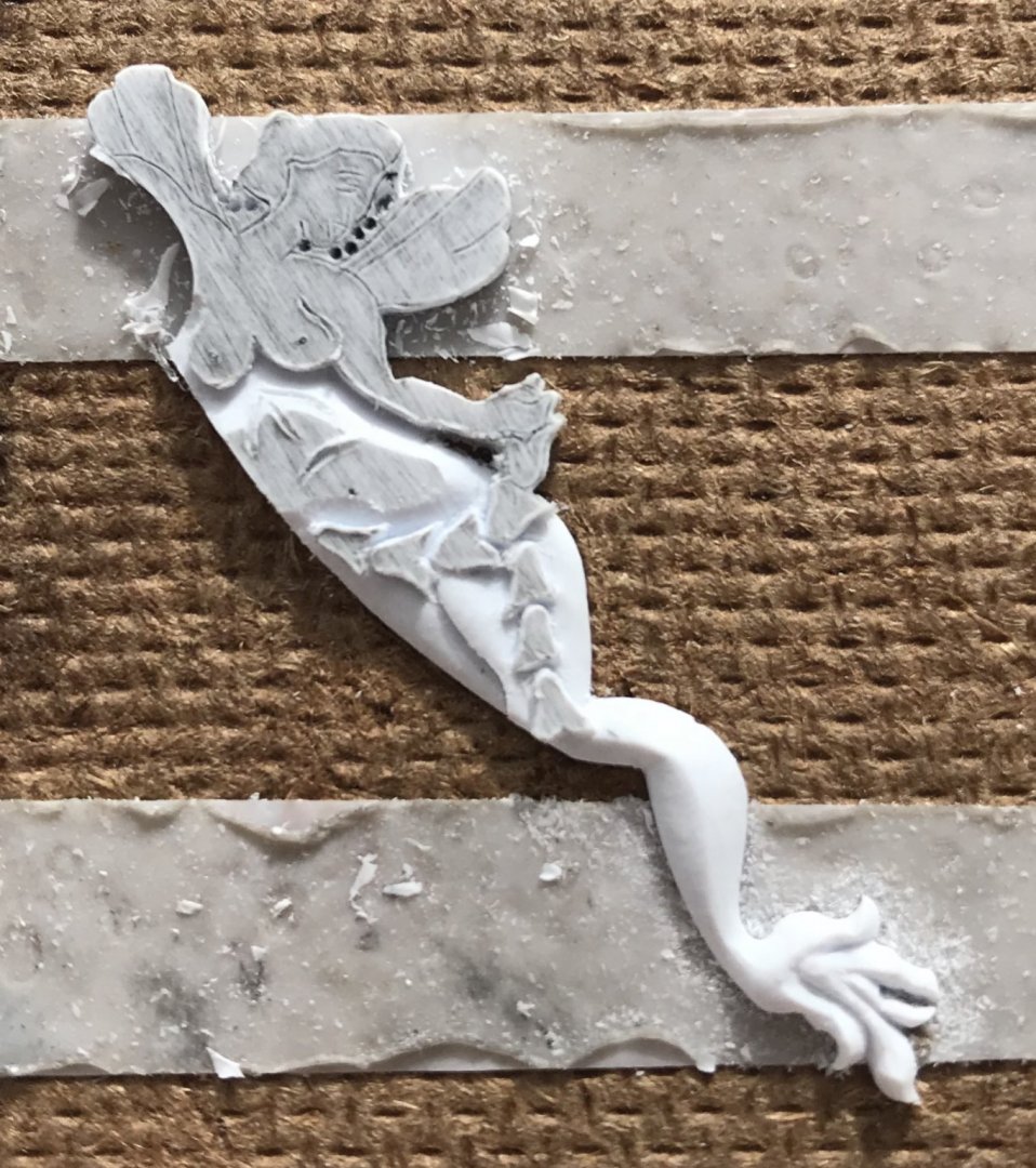
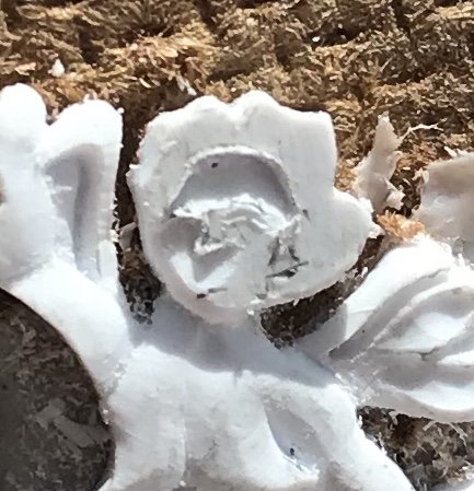
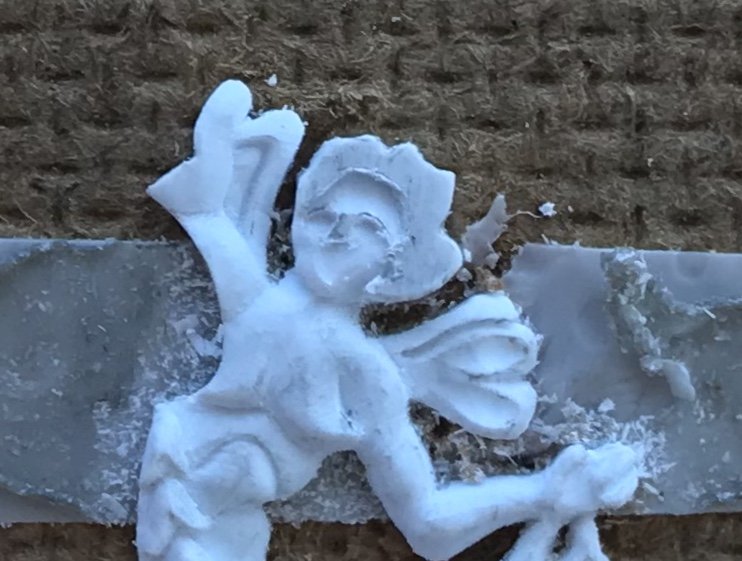
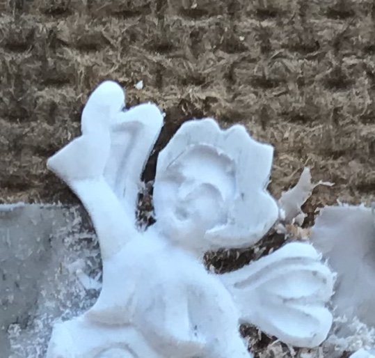
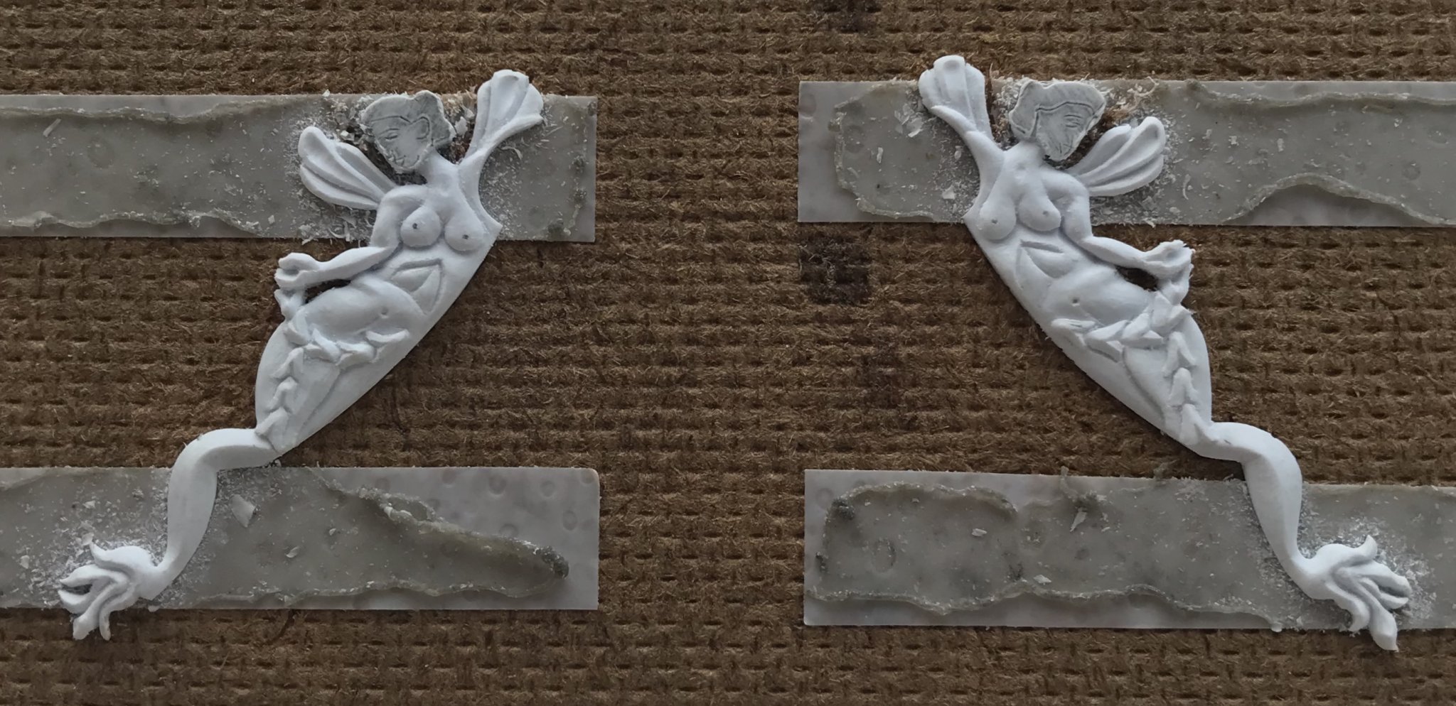
Today, I finished the Pixies. I wish that I were better at carving faces, but this was the best that I can do, for the time being:
Next, I’ll make the crown ornaments that the Pixies are supporting. By the time those are done, I should be ready to pattern and carve the trailboard that fills the space between the head knees.