


Hubac's Historian
-
Posts
3,052 -
Joined
-
Last visited
Content Type
Profiles
Forums
Gallery
Events
Posts posted by Hubac's Historian
-
-
-
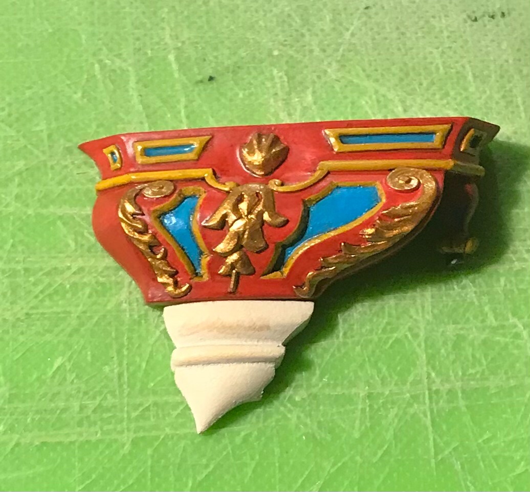
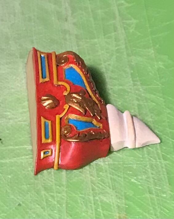
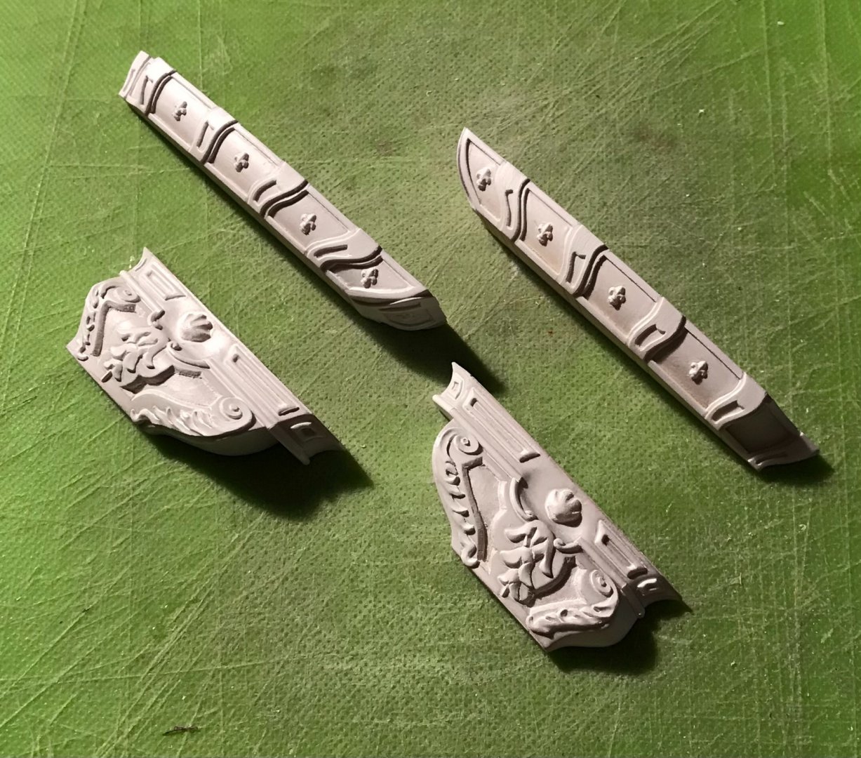
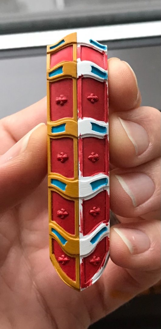
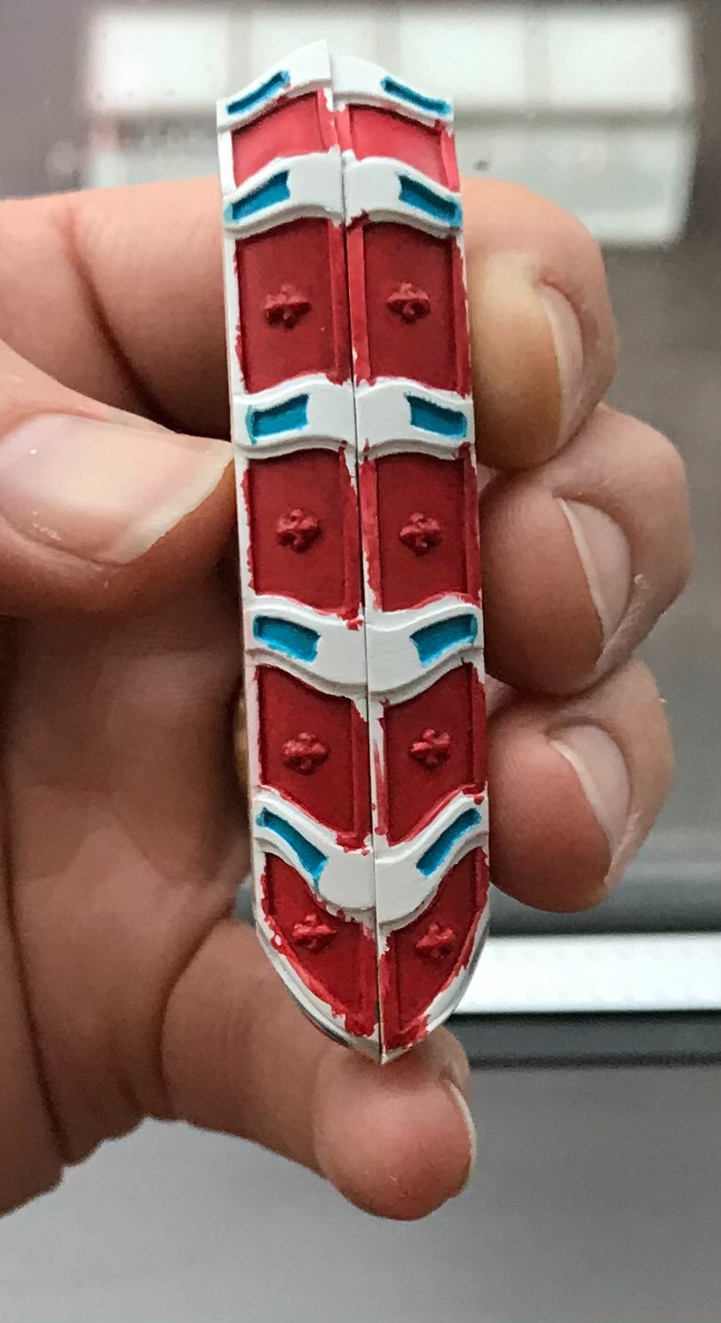
I spent a good part of the prior week making these waste-pipe rosettes:
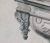
I really wanted to represent these, as shown, with acanthus leaves folded-in, around the pipe. At this scale, though, that proved impossible for me to make something that looked good and right.
I began, one day, with a scrap of 1/4” x 1/4” stock, left-over from the rudder head ornament. I didn’t have my drill or Dremel, that day, so I attempted to facet to round and then shape entirely by hand. What I ended up with was approximately the right diameter, but too long and reminiscent of a saggy boob. It was informative, though, in so far as what proportions I needed to arrive at. So, I made up some more 1/4” stock and made a proper turning in my drill, the next day:
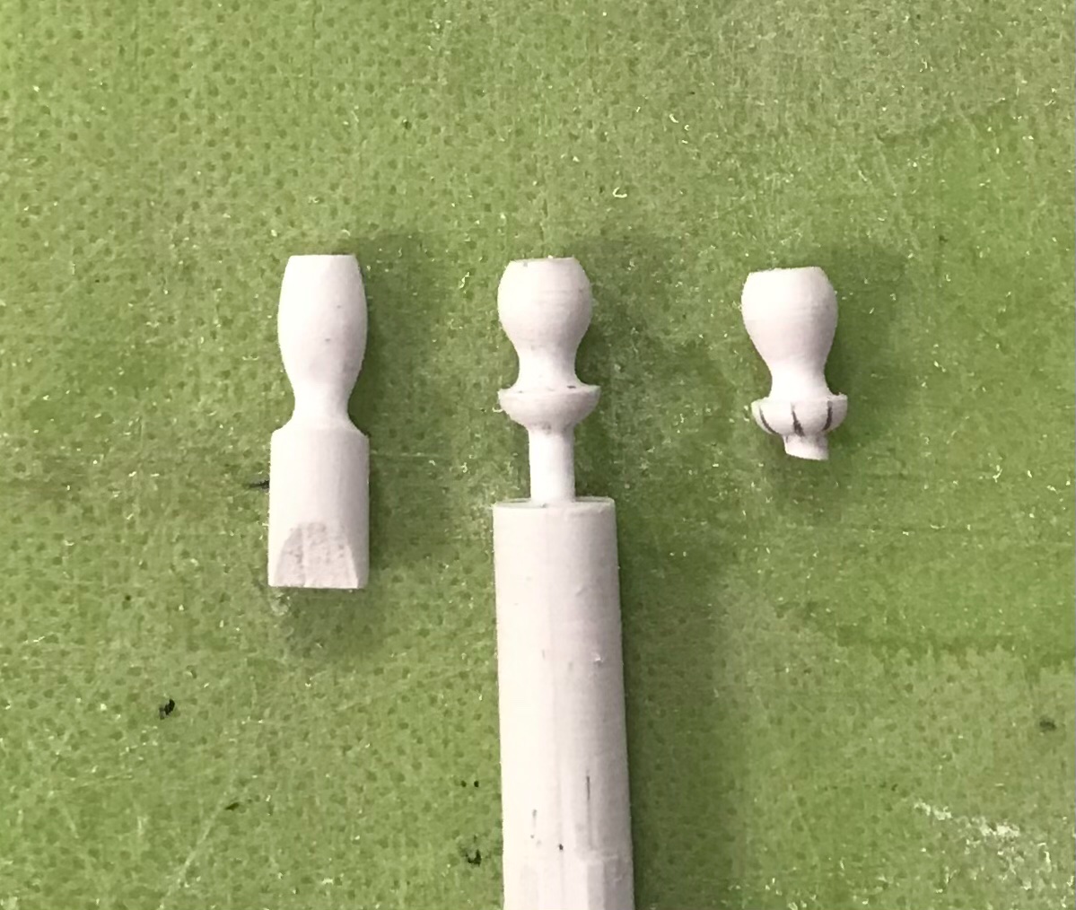
Middle and right are the neat little vasi-forms I was after. From the top to the bottom of the “cup” is 5/16”, and the turning sprue gets cut into the waste-pipe end, adding another 1/16”, overall.
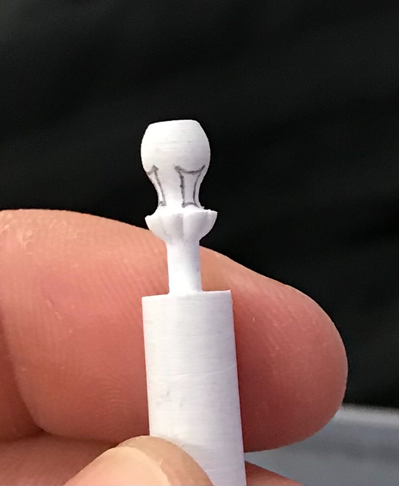
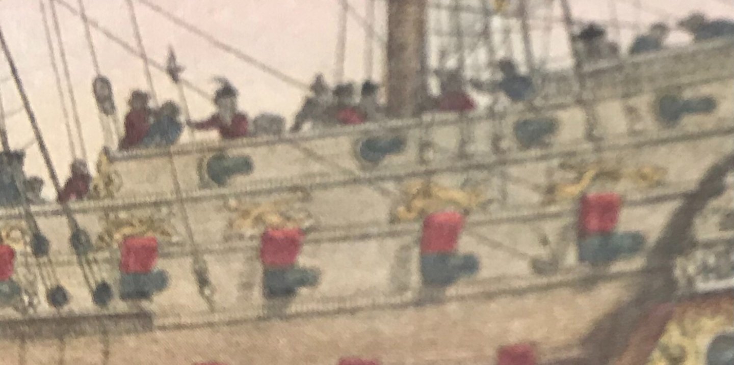
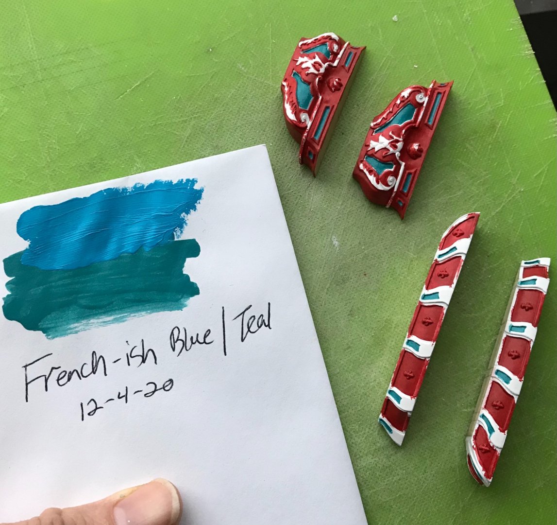
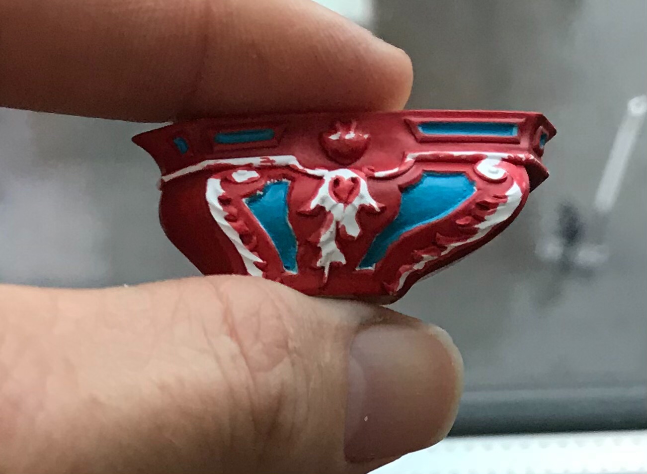
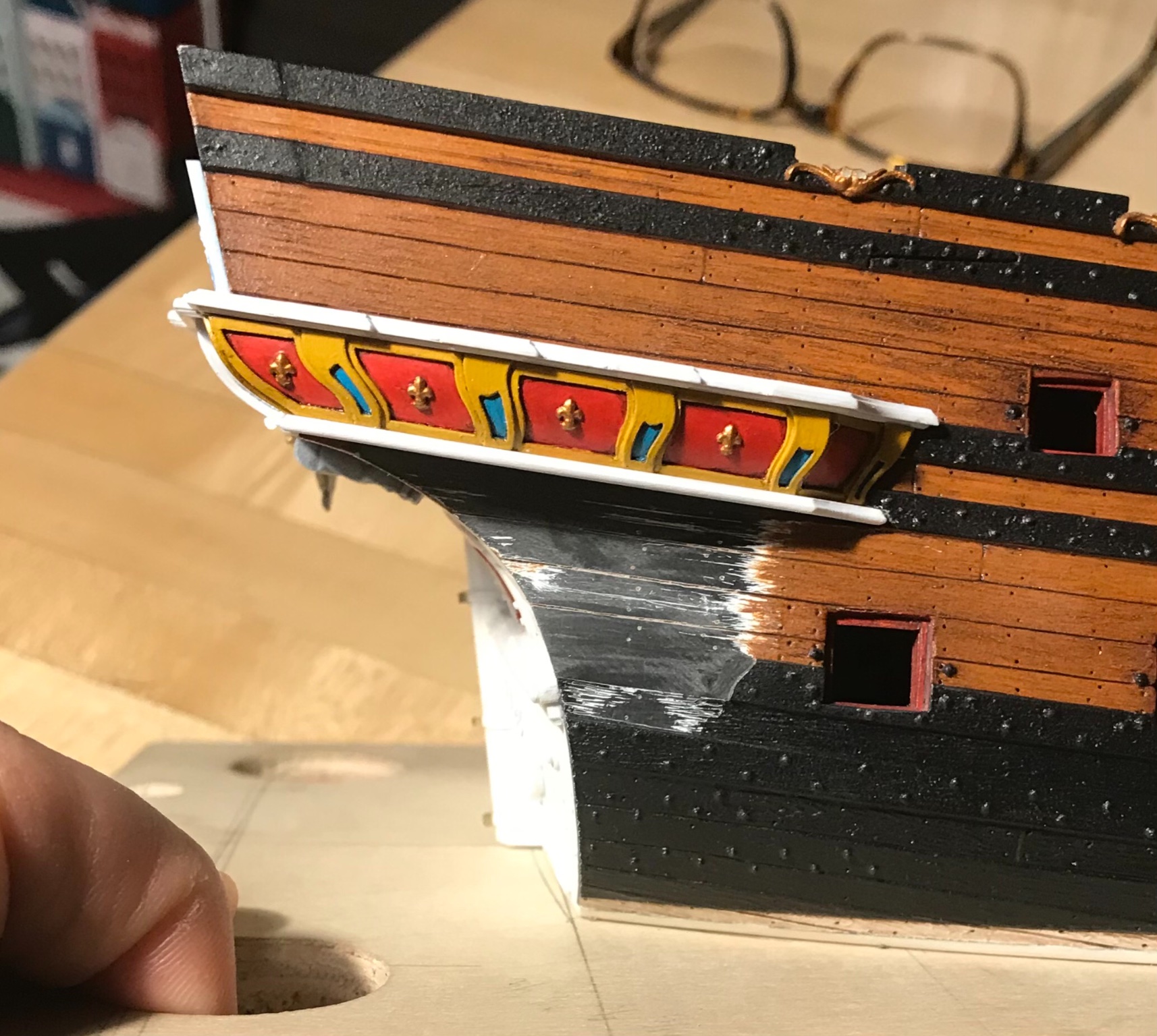
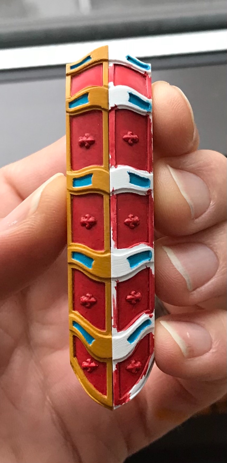
The trouble with Soleil Royal is that nearly every square inch begs for some form of embellishment. I could simply have painted these red ocher and called it a day, but it seemed to me that they would look too pedestrian right next to the gilded acanthus carvings of the QG lower finishing.
I decided that I could subdivide the cup into quarters and eighths, easily enough, and scribe a reeded pattern into their surface.
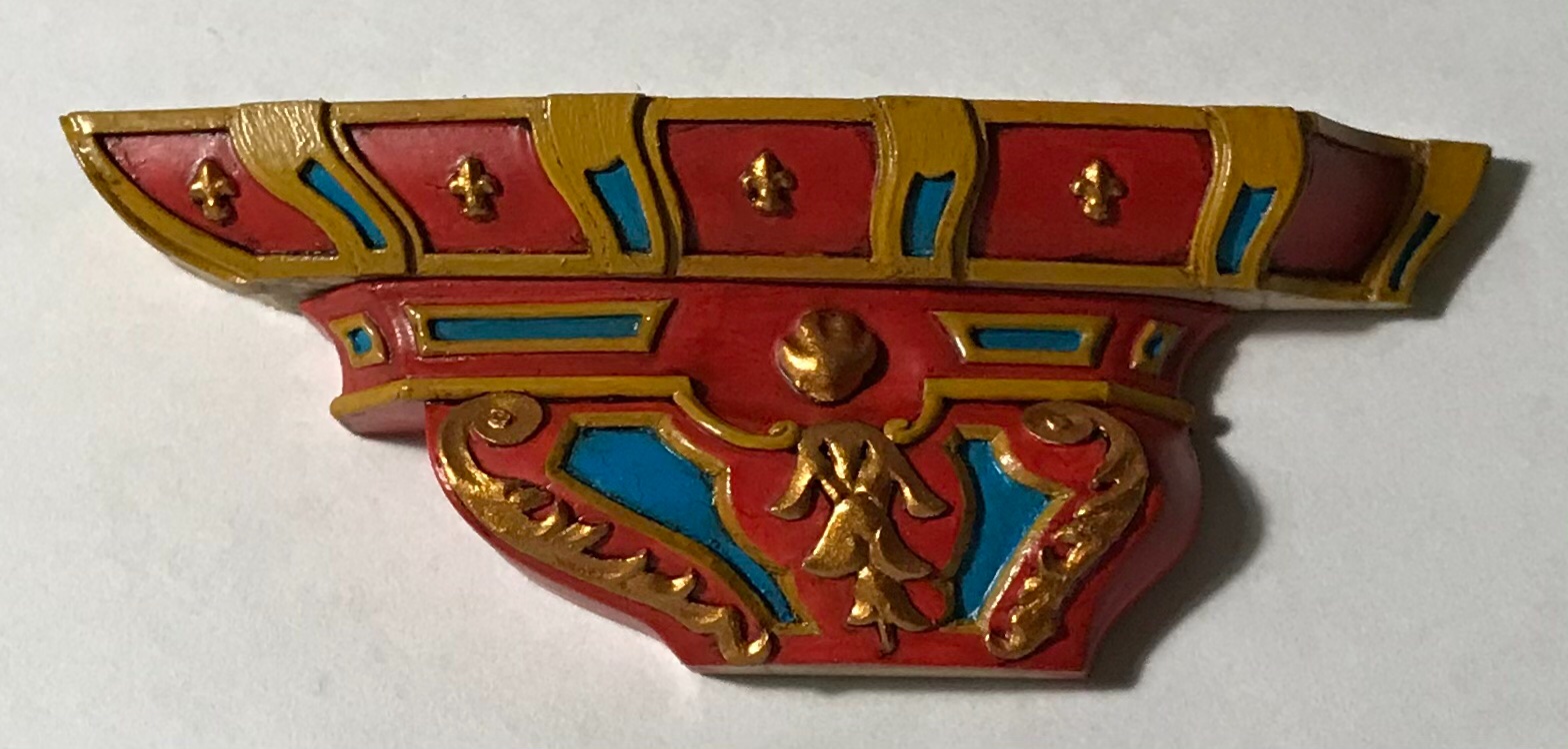
On its own, this new embellishment, highlighted in yellow ocher, would probably be enough. I decided, though, to take it a step further and try to create some nice recessed paneling, as on the lower finishing:
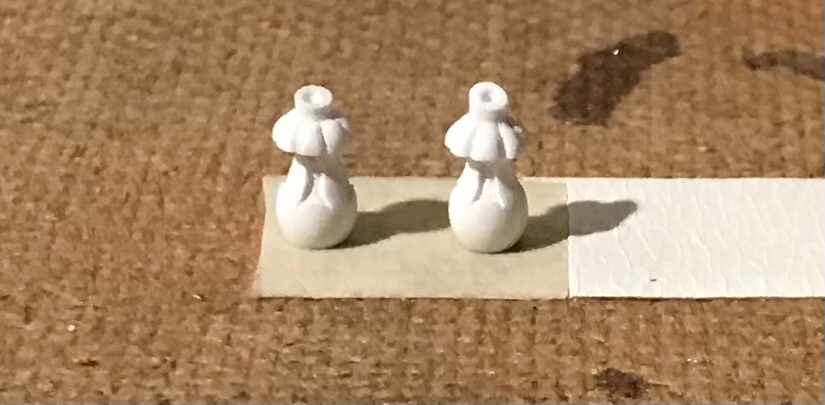
This was just as time consuming as it seems it would be. In colors, though, the results proved worth the effort:
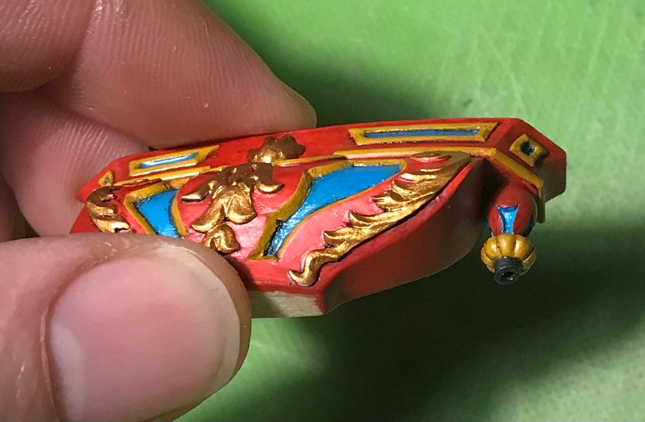
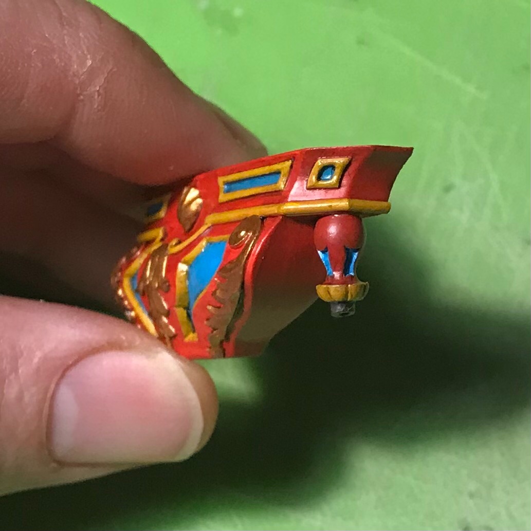
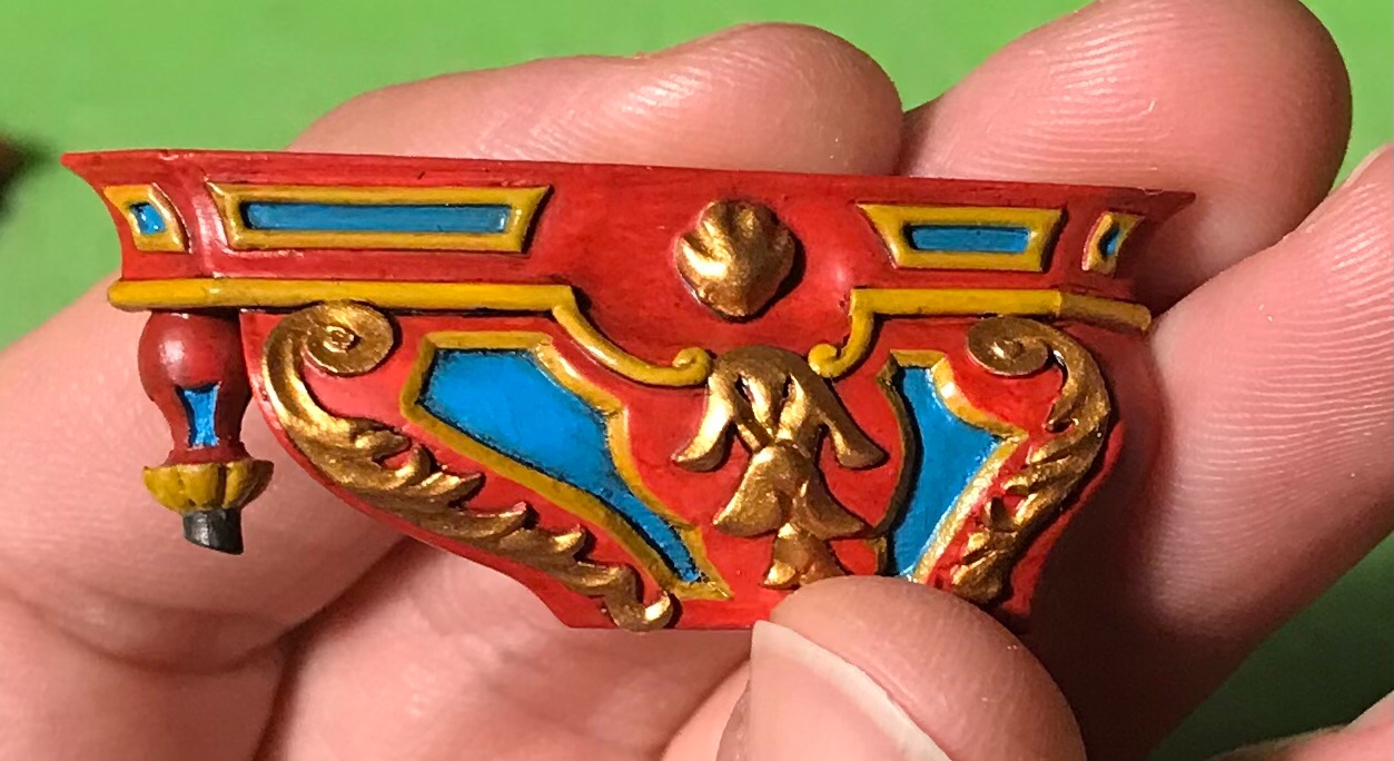
I even gave the waste-pipe a light ver-de-gris wash for the added realism.
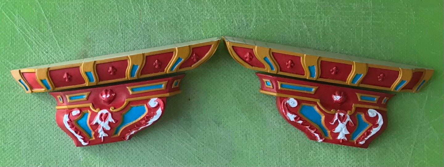
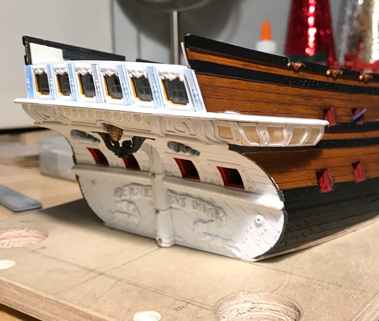
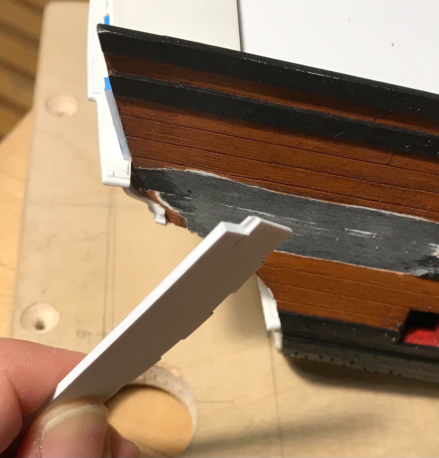
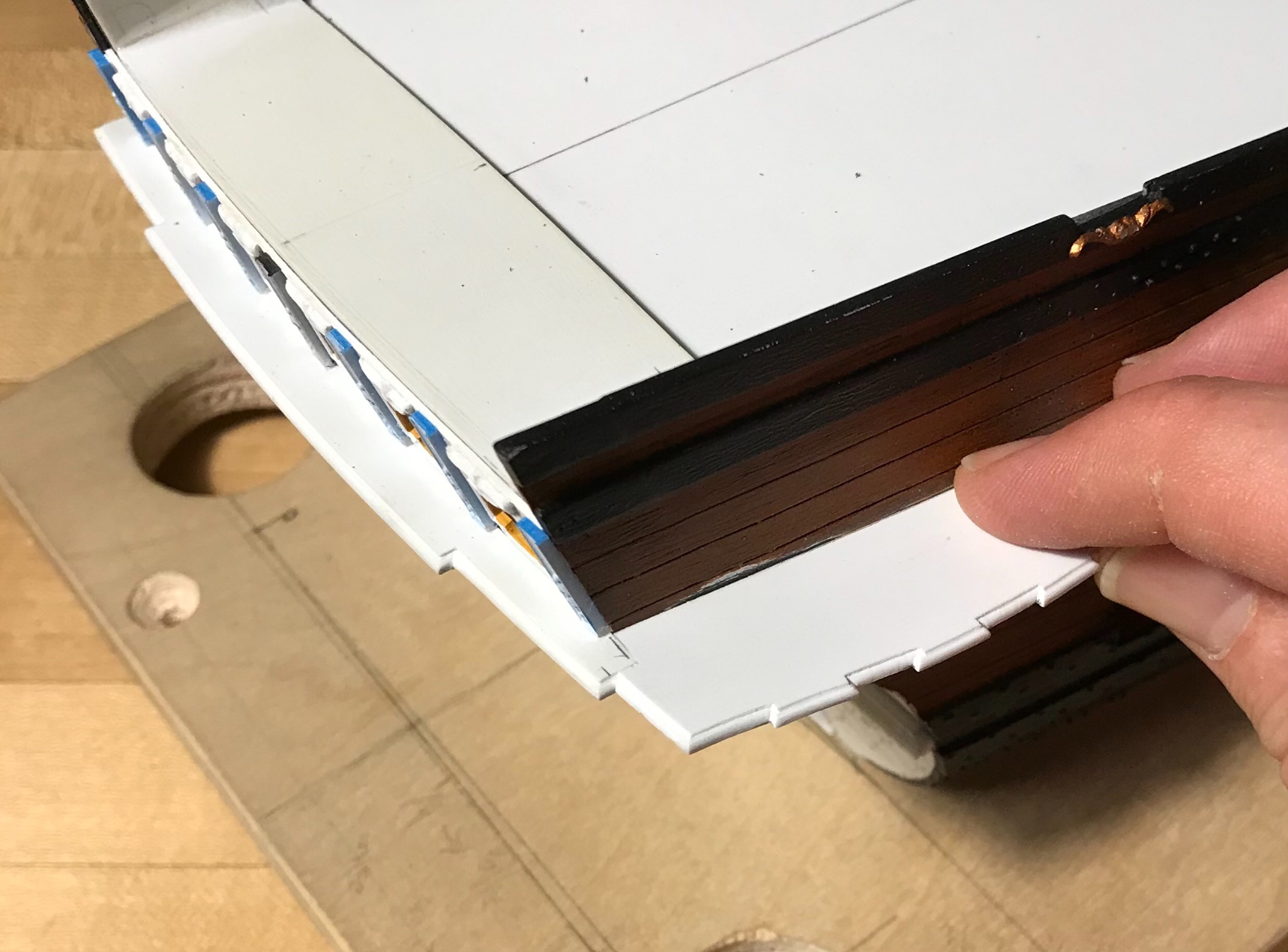
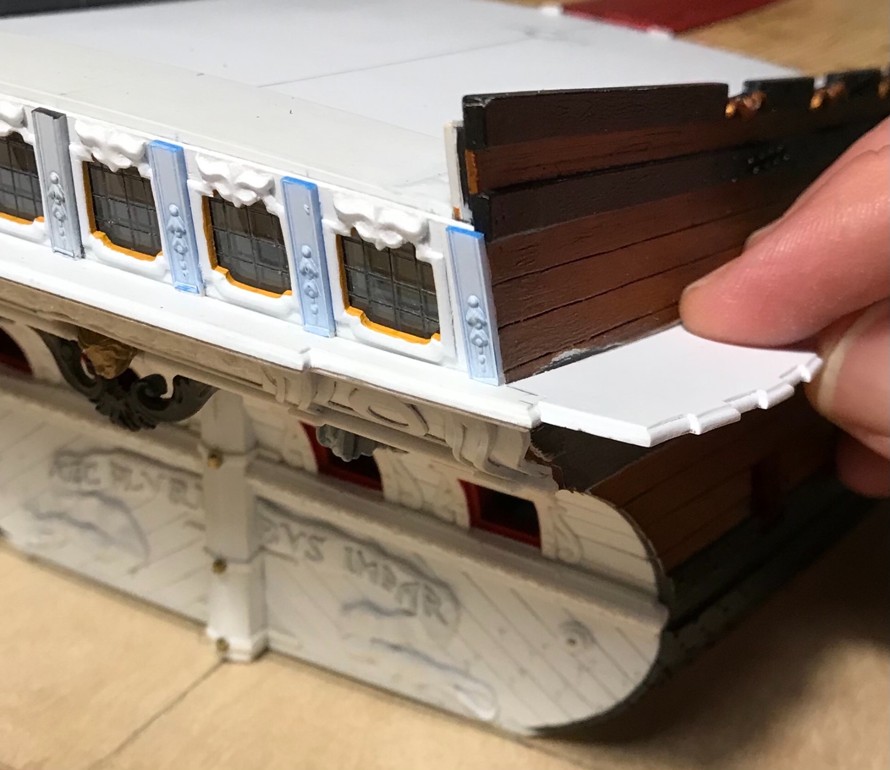
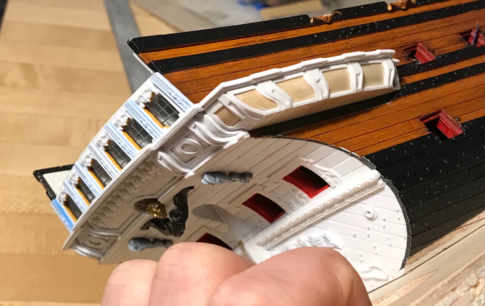
Next, I was finally ready to begin installing the largest QG segments with their top and bottom transitional mouldings. Here is the area, scraped and prepared for gluing:

The trickiest bit was the juncture of this bottom moulding with it’s counterpart on the stern; the trouble was that I didn’t have space, in my QG design, for the full thickness of the stern moulding which is, itself, a very close copy of what Berain drew for the stern.
So, I had to simplify the QG moulding and cope it around the stern moulding. What’s happening, here, is more evident if you zoom in:
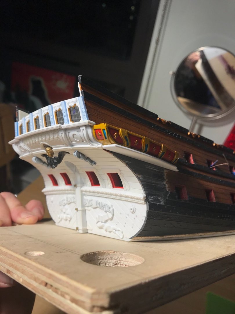
The top moulding, while also coped, does at least match the profile of its stern counterpart. A few perspective shots:

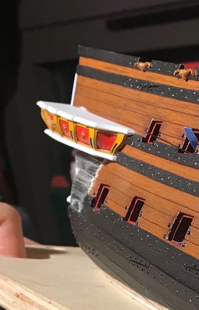

The wooden substrate is CA’d to the plastic hull and mouldings, and the inside edges of the mouldings are styrene-cemented to the hull. As always, I seek to ensure maximum connection and bond. Tonight, I’ll install the port side, and I can then begin final fitting of the section below.
In the meantime, I’ve been shaping the very bottom section of the lower finishing, and making up the corresponding transitional mouldings:
I have an idea about how to represent the grape carving, of this lowest bit, which I think will work out much better than actually attempting to carve that detail - oh, for the love of paint!
Thank you for your interest and for stopping by. More to follow...
- GrandpaPhil, mtaylor, md1400cs and 11 others
-
 14
14
-
-
Lastly, since I’m on a roll of conjecture and potential discovery, I noticed the following while reviewing this portrait, yet again:
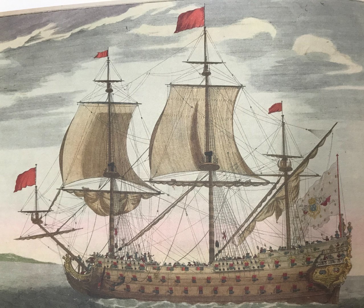
The attribution for this portrait is always Soleil Royal. If so, this would be her early appearance, sometime between 1670 and 1685.
Two things about this are interesting to me. First - they may be approximately representing the pale blue/green upper bulwarks that I tend to think may be correct for this period.
Looking closer at the upper bulwarks, though, I think I may finally have made sense of these ornaments:
They appear to be two dolphins, crossed at the tails, with perhaps a shell nestled between.
This could have been the early precursor of the frieze that is re-worked in 1688/89. If so, that would be consistent with a tradition of re-working/updating previous ornamental schemes to reflect current tastes and styling.
My operating theory is that Berain’s stern is merely an updating of Puget’s first design, which was an elaboration of LeBrun’s original allegoric concept for the ship.
In any case, at some point, I will do a detail drawing of this form because it is easy for me to imagine this as a repeating relief, perhaps with fleurs in-between, for my conjectural SR of 1670.
Alternating strakes of this crossed dolphin motif might have harps between the dolphins, or suns, or some combination of the above.
- GrandpaPhil, rkwz, mtaylor and 4 others
-
7
-
Admittedly, the following is a feeble basis from which to draw any serious conclusions, however the following contemporary reference to the battle line formation for the battle of Velez and Malaga, 1704, shows SR2 in the following colors:
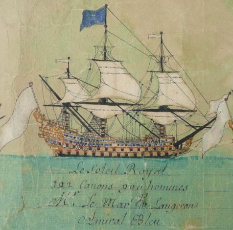
This is in distinct contrast to the Foudroyant:
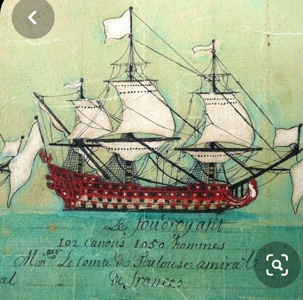
Interestingly, these two ships, in particular, began on the construction slipway as the other, but the official designation was changed, mid-construction; Etienne Hubac was, initially, constructing the Foudroyant.
Adding insult to confusion is this other contemporary portrait of La Reale from 1694:
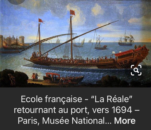
The 2nd-rate warship, in the background, appears to be all blue. Also, interestingly, all of La Reale’s hull appears to be painted ultra-marine, which would have been extremely costly at this later date.
So, I’m not really sure what to make of all of that.
- GrandpaPhil, EJ_L, shipmodel and 3 others
-
6
-
This plate appears in the St. Philippe monograph. It is contemporary to the times. I don’t know the artist or the vessel, but as I’ve mentioned before, the similarity in stern architecture to SR is striking.
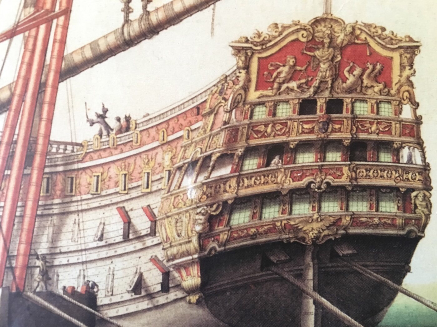
This ship is almost entirely red and yellow ocher.
Only the Royal coat of arms shows a little ultra-marine. Also, barely visible on the upper finishing of the QG is an ultra-marine background for the crossed Ls of the royal monogram.
Interestingly, the Phoenix bird figures prominently in the stern, but I am not familiar with the allegory on the tafferal. Whatever the ship’s name is, is tied to those clues.
- EJ_L, shipmodel, John Clements and 3 others
-
6
-
Thank you, John! I’ll be interested to discover what parallels you discover between French Baroque art and French ship ornamentation. In large part, that is what the German text Uber Den Wellen was attempting to do, with regard to the ornamental program of the Royal Louis of 1668. Unfortunately, this text was almost un-intelligible to Google Translate, and I barely grasped much of what the book had to say. Interestingly, Versailles Der Meer translated beautifully.
I have corresponded with Lemineur on a number of issues relating to ships of the period. He has convinced me that the scheme he shows on the St. Philippe is much more likely and representative.
That being said, my upper bulwarks will still have a lot of blue. There will be a wide band of red ocher, along the main deck guns, connecting the red of the beakhead bulkhead with the red of the quarters and stern.
Just above that, the inset frieze ovals that frame the lowest tier of fleurs will be ultra-marine. This will set them off nicely, while highlighting the rakish layout of the frieze.
The frieze backdrop above that will be the lighter Cerulean blue.
I look forward to your build-log. They are invaluable tools to the build, particularly because they boost your own investment and motivation in the project.
-
That looks very good, indeed, Kevin! I’m also glad to pick up a new vocab word in fettling.
-
-
Thank you, EJ! I hope that presenting an alternative scheme will spark debate.
Before the Vasa was found and fully re-constructed, popular depictions of the ship were only approximate in structure and the ship was always shown in the Swedish national colors.
While the structure of the Vasa has been understood in my lifetime (1973), I remember how astonished I was to discover that her topsides were red, and later - that her sculptures were a riot of colors. This fundamentally changed the way that I thought about the appearance of the Baroque warship. If we accept that the galleons of the prior epoch were vividly painted in geometric forms, why would the affinity for painted decoration disappear in the Baroque period? If anything, the increase in ship size presented a larger canvas for artistic expression, and that is what the Baroque period was about, as it related to warship design; being impressively magnificent, or as young people say - being “EXTRA!”
Warships were always expensive to build, and the cost of gold leaf - if used on the scale that we, as modelers, are accustomed to thinking it was used - would quickly match or eclipse the overall cost of building the vessel.
I have read about an early process of approximating the appearance of guilding with some form of metallic-appearing undercoat, with a varnish topcoat that prevented oxidation. Perhaps, the truth of the 1670s was a mixture of real gilt work, this other faux process, and vivid color work.
Hyatt’s description of the Royal Louis of 1668 (in 1677, if I remember correctly) does seem to indicate that she was leafed extensively. Because both the RL and SR were only intended to be port beacons (Levant and Ponant, respectively) of the wealth and might of the crown - perhaps the crown truly spared no expense on those two vessels, and leafed them much more-so than any others. Even if that were the case, though, I still think it is highly probable that their sculpture work would be a vivid riot of colors.
By 1688, as France was preparing to directly engage the allied forces of England and Holland, the cost of extensive gold-leafing would be prohibitive. Making sure that there were cannon to arm the ships would have taken top priority, especially considering the lavish costs of re-furbishing so many of the ships, at this time.
What I am doing is highly conjectural, of course, but I think plausibly debatable.
-
This build is just ripping along, Dan - looking very fine, indeed!
- Canute, FriedClams and mtaylor
-
3
-
It’s been a good weekend for painting.
The primer coat is always a pretty solid indicator of how uniform your surface prep was:
I love the primer coat because it homogenizes all of the different materials.
A few pics of the process:
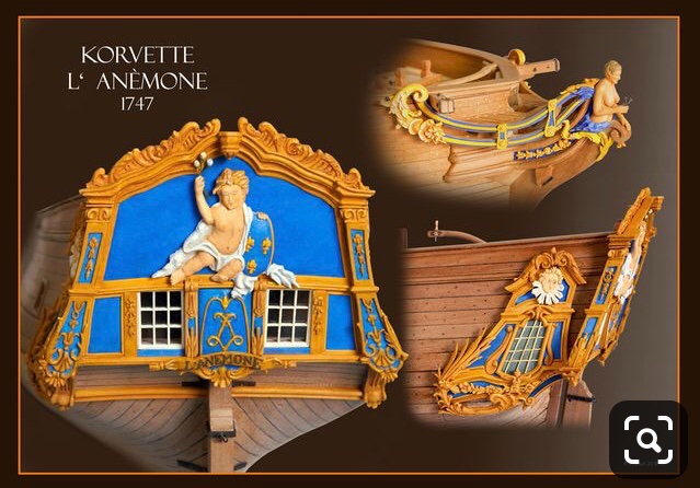
My initial thought was to take the cerulean blue (Utrecht artist acrylic, heavy body), and add yellow ocher to arrive at a more greenish blue; a light blue with a greenish cast would be a more period-correct, common blue that would have been derived from copper salts. What I arrived at was teal, and while I like the Charlotte Hornets uniforms, this is not quite the look for Soleil Royal!
So, I went back to my cerulean base. After all, the following Corvette model was largely my inspiration for my color scheme. I really liked the way this light blue relates to the yellow ocher, even if it is a more stylized choice for my period:
My cerulean base-coat looks like this:
Here’s the rest of the process:

Et, finalement:

I spent quite a lot of time dialing-back the walnut ink distressing so that it wouldn’t be too much. I think the walnut ink does dial-back the blue enough to be plausible for 1689.
I also switched from my self-mixed Tamiya yellow ocher to Vallejo’s Mars Yellow, which is pretty exactly the shade I want right out of the bottle. While I still have to go over the work 2-3 times for the color saturation I want, the next coat doesn’t lift the previous coat, as with Tamiya. This characteristic of the Tamiya paint makes it extremely frustrating to work with. Considering the sheer volume of ocher paint that is going onto this model, a change to something more user-friendly was imperative.
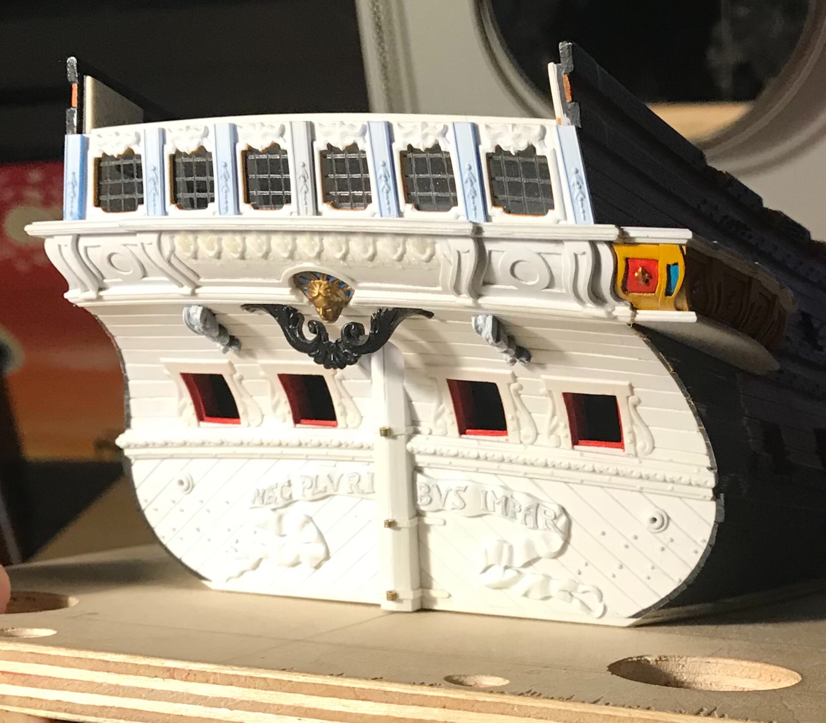
This is probably the best window into what the general paint scheme of the stern will be. Ultra marine will make very selective appearances. I thought about painting an oval of ultra-marine around the shells, but I didn’t like the only partial framing of moulding.
It’s obvious, I suppose, but worth re-iterating how much easier it is to paint these ultra-detailed surfaces, off the model; you can find whatever angle you need. As I consider it now, I’m really starting to dread the paintwork I have waiting for me on the lower stern. At the time, though, I couldn’t see any other way forward than to construct the stern in-place.
Tomorrow, I will start the waste-pipe rosettes.
As ever, thank you for the likes, comments, and for stopping by!
-
Thanks EJ! I tried moulding the edge and then “ripping” it off with a straight-edge and matt-knife, but my rip cuts were always uneven, and with raised lips. With wood, and a miniature tablesaw, this method would be much more effective.
I have been turning the problem of how to make these QGs over, in my head, for a long time. So far, this approach seems to be working with minimal headaches, fortunately. Just slow.
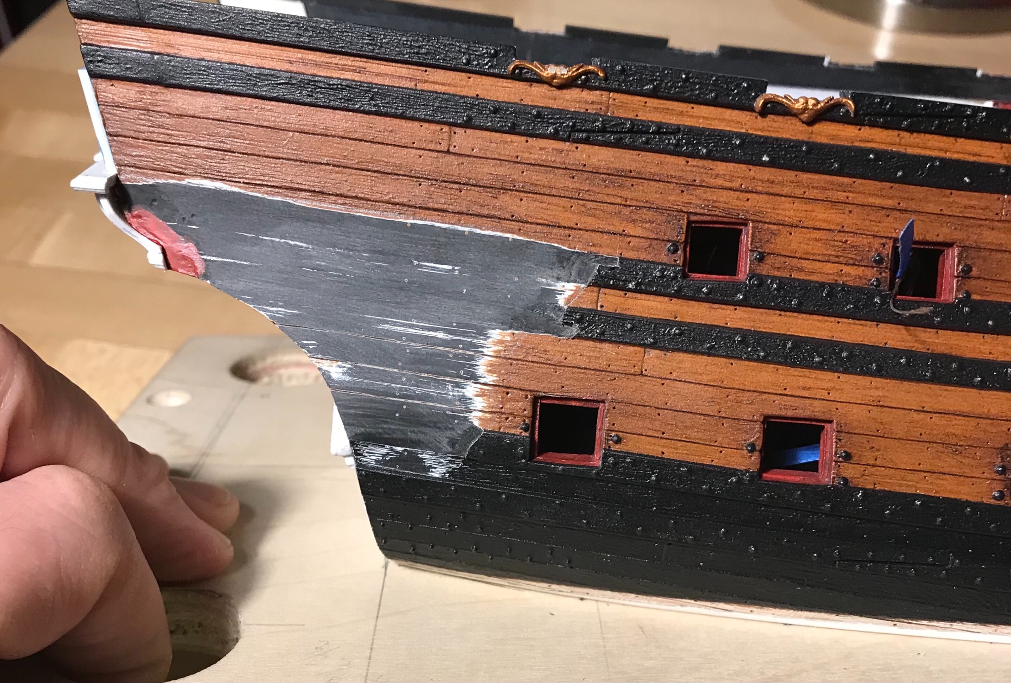
Last night, I thought I was going to cope-in the bottom moulding on the starboard side, tape and prime the four QG sections, and prep stock for the waste-pipe rosettes. That was my plan!
Instead, I spent 2 1/2 hours coping that one moulding into place. It does sit sweetly, though, and I’ve managed to minimize the disparity between a simplified version of the much more involved stern counterpart moulding.
Future pics will elucidate that much more clearly.
All the best,
Marc
-
-
Gentlemen, thank you very much for your kind words and encouragement. I can not overstate how much I appreciate all of you who have stuck with me, from the early stages of the project, up until now, when it is finally rounding into form. I am, of course, equally happy to see new faces here. A hearty welcome to you all!
If I had truly understood just how much effort would be involved in getting this far, then I may not have ever started. Going on this journey has really increased my appreciation for all of the modelers who make every last thing from scratch; to do so, and maintain a consistently high standard - as so many of you do - is a true test of commitment and perseverance.
I have learned every bit as much from your logs, as you have from mine. Thank you!
-
-
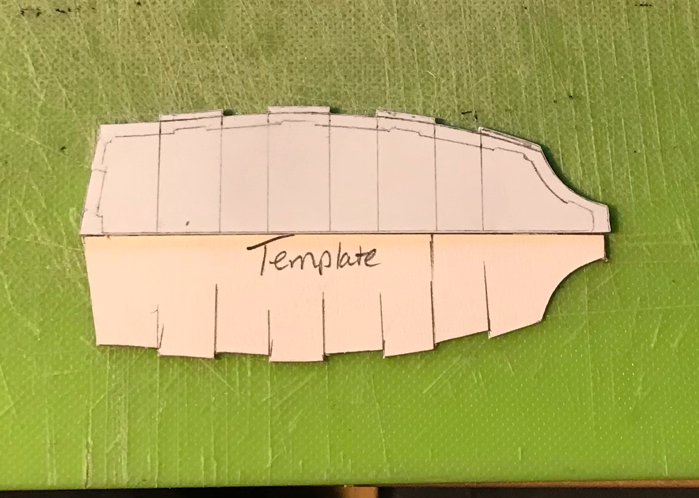
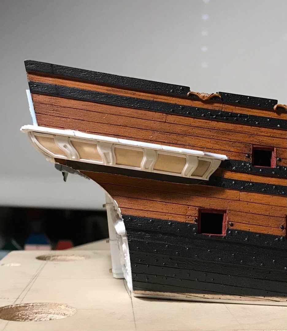
The first transitional moulding I needed to master runs just beneath the false windows of the quarter gallery.
I was unsure, at first, whether I would be able to successfully recreate the turreted appearance of the moulding, above each pilaster.
The difficulty has to do with the fact that moulding scrapers do not get into inside corners very well. Ultimately, I found that I could clean to those inside corners with my 1/8” straight chisel and my #11 EXACTO.
The moulding is actually made up from two layers, laminated together. The thin, under-layer has a tiny cove cut into it’s edge, and it is stepped-in, slightly, from the upper layer. The piece, below, marked “template” is a card pattern I made for the under-layer:
The trick to all of this was to try and cope this side moulding into the overhanging ends of the stern shelf-moulding that the Four Seasons will sit upon. It took a good deal of patient fitting, but eventually I got there:
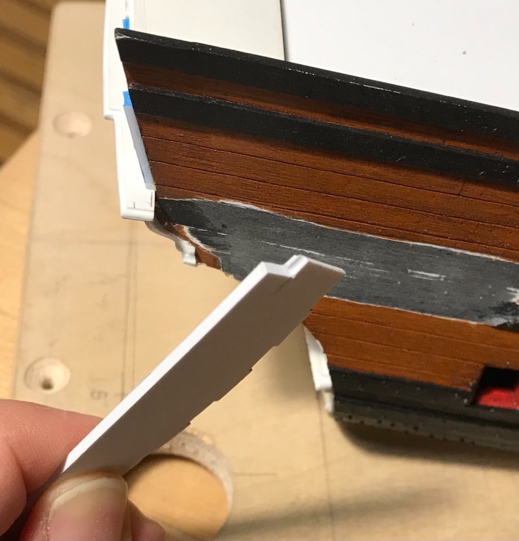
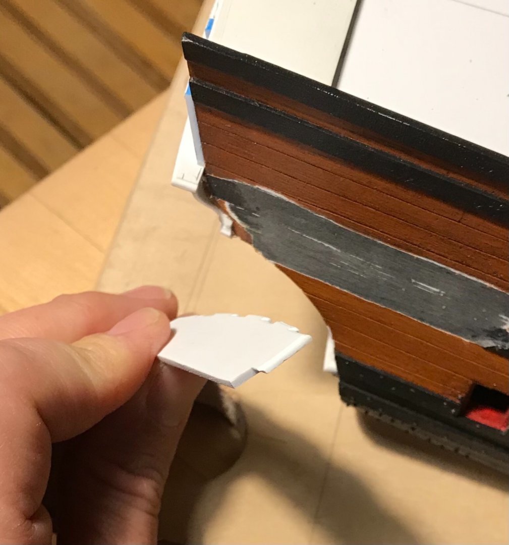


Once I had fit the upper layer, I could cope-in the lower layer and then laminate the two:
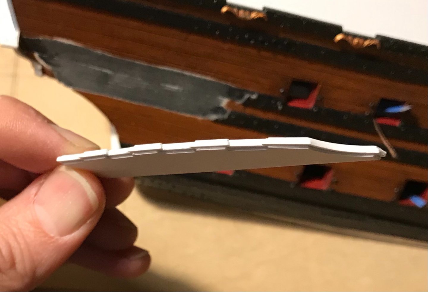
A few pics to give a sense of this section:

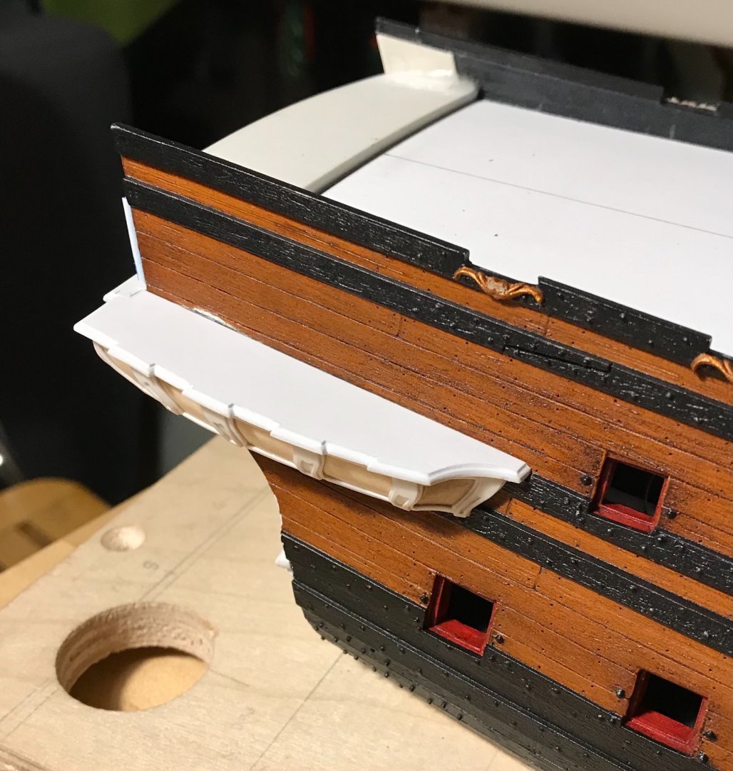
After I make and fit all of this for the port side, I will make up the transitional moulding for the underside of the seats of ease. The connection with its counterpart, at the stern, is a little funky, but the answers will become clearer as I work my way through it.
Thank you for the likes, your comments and for stopping by.
- Chapman, GeorgeKapas, druxey and 15 others
-
18
-
Maqnifique!
- mtaylor and Oliver1973
-
1
-
 1
1
-
-
Welcome back, welcome back, welcome back!!
(pop-culture reference, intended!)
-
Every last superlative applies, here, FC. You have really created a masterpiece, and it has been a pleasure to become acquainted with your work. I can’t wait to see what your next project will be!
- Keith Black, druxey and FriedClams
-
3
-
-
Joe, you are doing a fantastic job with the Heller kit; it is difficult to build, without modification, as few parts fit together easily.
I really appreciate your kind compliments, and would like you to know that my project is the beneficiary of time; I have almost a life-long obsession with this vessel and my patience in building her knows (almost) no bounds. The main thing about any of this hobby, in my opinion, is to take your sweet time - as you have, so far.
Keep on going! Don’t be discouraged by the ambiguities and fit problems of this kit. You will get there!
- Bill Morrison, Jeff T, Baker and 1 other
-
4
-
Tremendous precision, Mike!
- Stuntflyer and FrankWouts
-
2


Soleil Royal by Hubac's Historian - Heller - An Extensive Modification and Partial Scratch-Build
in - Kit build logs for subjects built from 1501 - 1750
Posted · Edited by Hubac's Historian
Thank you, Druxey! Little by little, we are getting there.
T_C - I have used a heavy body gel medium by Liquitex to build up fine detail before painting - in particular the triple tasseling of the lambrequin carving, on the stern counter. This worked well, and I sealed it under a coat of liquid CA to ensure that it never de-laminates.
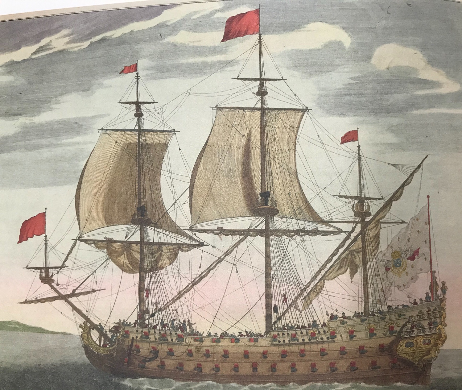
So I had a look at the lists, as re-printed in Lemineur’s Vaisseaux Du Roi Soleil:
While the color print, in the prior post, is cropped and does not show the forward end of the ship - I can see, in the B&W version that she is approximately pierced for 88-90 guns (excluding bow and stern chase ports). With the masting hulk, in the way, and the foreshortening of perspective, it is a bit of a guessing game.
So, considering First-Rate ships from Rochefort, in the latter half if the 17th Century, there appear to be three possibilities that are close to this armament:
The Fier, the Fulminant and the Magnifique.
Regarding uncertain questions like these, I like to fall back on the following reference:
Here are the capsule synopses for each ship:
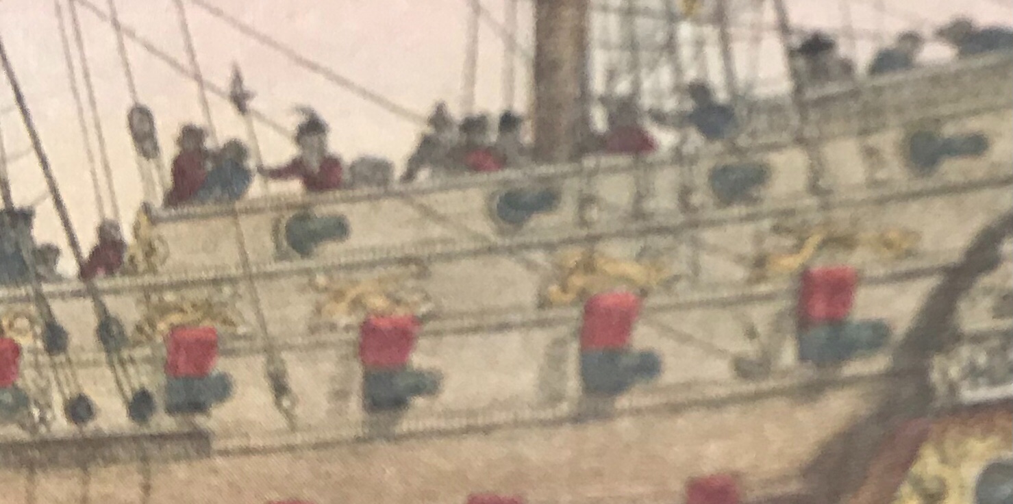
One thing, armament-wise, that does seem pretty clear in the color print, is a QD armament of 10 guns. Also, there is the clear absence of a forecastle deck.
The Magnifique carried 6 on the QD, and the Fulminant 12, until 1707 when the number was reduced to 10.
Perhaps this is a portrait of the Fulminant, around 1707, during a refit. However, the name Fulminant alludes to a violent explosion or flash of lightning. It would seem more likely that the tafferal tableau would make some visual allusion to lightning, or an explosive force. Also, the Fulminant carried more guns than seems likely in this portrait.
You mention the possibility of Cerberus, and perhaps a connection to the 12th labor of Hercules, however I agree with you that the soldier is dressed in Roman garb and that is at odds with the Greek mythology. The soldier holds his sword up high, yet Hercules is traditionally shown as armed with a club.
The name Fier, in French, means proud, and that certainly seems to be the bearing of the Roman Soldier, having vanquished his enemies.
So, that is my best guess. I think this ship is the Fier.